Embed Size (px)
Citation preview

Visualizing Future Extreme
Water Levels in Halifax’s
Northwest Arm in 2100
Thesis Project by Florian Goetz, B00610816
Advisor: Eric Rapaport
Dalhousie University, School of Planning, PLAN 4500
April 8, 2016

i
Acknowledgements
There are many people who I would like to thank for helping me complete my thesis
project. Firstly, I would like to thank Eric Rapaport, my thesis advisor who has helped,
encouraged, guided me and has done much more for me this last year. I could not have
completed the project without Eric’s support. Patricia Manuel, the thesis classes’ course
instructor, also deserves my thanks and acknowledgements. I noticed the quality of my writing
greatly improve this year as a result of Patricia’s critique and feedback. Jennifer Strang and
Dalhousie University’s Geographical Information Sciences Center deserve recognition for being
an extremely helpful resource. Jennifer and the Centre helped me with my GIS concerns and
provided me with data not only during this year, but for my entire time at Dalhousie University.
My family, friends, and classmates are more than worthy of a huge thank you. I would like to
specifically thank two classmates and friends, Cole Grabinsky and Shannon Junor. Cole
accompanied me during a fairly cold site visit to help record measurements, and Shannon
because together we learned how to create Esri Story Maps with the new technology, and later
critiqued each other’s Story Maps to improve the overall quality. Lastly I want to thank you, the
reader, for taking the time to read about my project. I appreciate the thought that others are
interested in my work.
Summary
The world’s climate is changing, but the kind of change and the severity of its impact will
vary from place to place. For example, coastal areas are threatened by rising sea levels, coastal
erosion advancing further inland and more frequent storms with greater intensities (IPCC, 2015).
Coastal communities have begun preparing for the potential impacts of sea level rise and further
reaching storm surges. For example, Halifax Regional Municipality (HRM) has produced
scenarios which varied in future sea level rise predictions and storm intensities, to identify the
extent of extreme water levels (Forbes et al., 2009); enforced a bylaw to restrict residential use
below a certain elevation near coastal areas (HRM, 2015); and released a guide to mitigate and
adapt to climate change’s impacts (HRM, 2010).
HRM and other municipalities use visualizations to communicate changes, such as sea
level rise impacts, to the public. Research scientist Don Forbes and colleagues (2009) produced a

ii
set of sea level rise scenarios for the Halifax Harbour for the year 2100. Forbes et al. (2009) also
made maps to represent the different scenarios and to show the horizontal extent and depth of the
flooding. HRM did use the scenarios and maps to set a policy reference point to plan for sea
level rise and storm surges(NRC, 2010), but the maps are arguable not the most effective method
of communicating the change to the public. I researched visualization methods that HRM has yet
to use to display the impact of extreme water levels for my thesis project. It was then my
project’s purpose to produce visualizations based off of my research of visualization methods
and to have the visualizations represent extreme water levels of a study area in Halifax. I chose
Halifax’s Northwest Arm as my study area because the Northwest Arm has many public parks
and areas that are vulnerable to future sea level rise. HRM is investing in projects to protect these
areas (Bundale, 2015 & CBC, 2014), and visualizations could help reinforce the projects’
rationale.
The visualization method that I used was inspired by the National Oceanic and
Atmospheric Administration’s (NOAA) Sea Level Rise Viewer (2015), which is an interactive
map of the United States that displays different water levels while simultaneously changing the
water level in photo manipulations of coastal areas. NOAA created its photo manipulations with
its CanVis software, but I used Adobe Photoshop along with Flaming Pear’s Flood plugin and
then I presented my photo manipulations in an Esri Story Map. A more specific description of
my method includes: using ArcMap and a digital elevation model to identify susceptible areas to
coastal flooding; visiting the Northwest Arm to record GPS coordinates and to capture photos for
the photo manipulations’ base photos, height reference photos, and of storm-like conditions;
manipulating the photos in Photoshop to fix errors, simulate storm-like conditions, perform
photo scaling calculations, and simulate the extreme water levels; and then displaying the photo
manipulations into a Story Map.
In my research I also found the work of Landscape Architect, Professor Stephen
Sheppard, who describes seven principles of effective landscape visualization:
comprehensibility, representativeness, accuracy, credibility, defensibility, engagement, and
accessibility. I used the principles to guide me throughout my project’s entire method, and once
completed, I also critiqued my project against the principles. Meeting these principles were also
my project’s objectives, and I found that I was successful in meeting the principles. Aspects of

iii
my project could be changed to improve the accuracy and engagement, but this is a future
consideration for my project.
After I completed my Story Map, I compared it to NOAA’s Sea Level Rise Viewer and
found that both products have clear strengths over the other when it comes to the software used
and the layout of the product. The Sea Level Rise Viewer’s layout is better in most aspects, but
using Photoshop and Flood creates more realistic photo manipulations than NOAA’s CanVis
software. Both products however serve their purpose of communicating change, and are
examples of how visualizations are a useful tool for professionals and planners. There may not
be a perfect visualization method, but it is important that HRM and other coastal communities
use visualizations to help prepare for climate change’s impacts. As Stephen Sheppard once said
“The climate is changing and our communities will, too. If we can visualize that change, we can
manage it.” (Arvidson, 2013).
The Story Map can be found at this link http://arcg.is/1W3bFcR (if the link does not work, send
me an email [email protected])

i
Table of Contents
Acknowledgements ........................................................................................................................................ i
Summary ........................................................................................................................................................ i
List of Figures ............................................................................................................................................... ii
List of Tables ............................................................................................................................................... iii
List of Acronyms ......................................................................................................................................... iii
Glossary ....................................................................................................................................................... iv
Introduction ................................................................................................................................................... 1
Project Purpose ............................................................................................................................................. 2
Rationale ....................................................................................................................................................... 2
Project Objectives ......................................................................................................................................... 3
Background Research ................................................................................................................................... 4
Intergovernmental Panel on Climate Change’s Climate change 2014 synthesis report .......................... 4
CBCL Limited & Nova Scotia Department of Fisheries and Aquaculture’s The 2009 state of Nova
Scotia’s coast technical report .................................................................................................................. 5
Forbes et al.’s Halifax Harbour extreme water levels in the context of climate change: Scenarios for a
100-year planning horizon ........................................................................................................................ 5
Richards and Daigle’s Scenarios and guidance for adaptation to climate change and sea level rise –
NS and PEI municipalities ........................................................................................................................ 6
Rahmstorf’s A semi-empirical approach to projecting future sea-level rise report ................................. 7
Sheppard et al.’s Landscape visualization: An extension guide for first nations and rural communities 7
Collaborative for Advanced Landscape Planning’s Delta Regional Adaptation Collaborative Project . 8
C2C’s CoastaL Impacts Visualization Environment................................................................................. 9
National Oceanic and Atmospheric Administration’s Sea Level Rise Viewer ........................................ 10
Zhang et al.’s A 3D visualization system for hurricane storm-surge flooding ....................................... 11
Method ........................................................................................................................................................ 13
Step 1 Scenario Creation ........................................................................................................................ 14
Step 2 Identifying Susceptible Locations ................................................................................................ 14
Step 3 Site Visits ...................................................................................................................................... 15
Step 3.1 Base Photos and GPS coordinates ........................................................................................ 15
Step 3.2 Height Reference Photos ....................................................................................................... 16
Step 3.3 Storm-like Condition Photos ................................................................................................. 17

ii
Step 4 Converting GPS Coordinates into a GIS Point Shapefile ............................................................ 17
Step 5 Creating the Photo Manipulations ............................................................................................... 17
Step 5.1 Cleaning Up the Photos ........................................................................................................ 17
Step 5.2 Simulating Storm-like Conditions ......................................................................................... 18
Step 5.3 Photo Scaling Calculations ................................................................................................... 18
Step 5.4 Simulating the Water Levels .................................................................................................. 18
Step 6 Creating the Story Map ................................................................................................................ 18
Failed Methodology .................................................................................................................................... 19
Findings ...................................................................................................................................................... 21
Feedback from Peers ................................................................................................................................... 23
Future Considerations ................................................................................................................................. 24
Limitations and Errors ................................................................................................................................ 24
Reflecting on Halifax’s Visualizations and My Contributions ................................................................... 26
Synthesis ..................................................................................................................................................... 27
Conclusion .................................................................................................................................................. 30
References ................................................................................................................................................... 31
Appendix A – How to record and display accurate photo locations ........................................................ A - 1
Appendix B – How to fix errors and blemishes in images with Photoshop ............................................. B - 1
Appendix C – How to simulate storm-like conditions with Photoshop ................................................... C - 1
Appendix D – How to perform photo scaling calculations ......................................................................D - 1
Appendix E – How to simulate extreme water levels with Photoshop .................................................... E - 1
Appendix F – Email from National Oceanic and Atmospheric Administration regarding Sea Level Rise
Viewer method ......................................................................................................................................... F - 1
List of Figures Figure 1. CoastaL Impact Visualization Environment
Figure 2. Collaborative for Advanced Landscape Planning
Figure 3. The proximity of the Northwest Arm to my residence
Figure 4. Representing extreme water levels in the Halifax Harbour
Figure 5. CLIVE in use
Figure 6. A hurricane probability map
Figure 7. A hurricane simulation by Zhang et al.
iii
Figure 8. A visualization created by 3ds Max and Civil 3D
Figure 9. A visualization created with Virtual Terrain Project
Figure 10. The identified susceptible locations
Figure 11. The difference in water levels during different site visits
Figure 12. My friend standing with the metre stick with the green glove on the end
Figure 13. Comparing Google Earth’s ground-level view with the real view
Figure 14. Comparing ArcGlobe ground-level view with the real view
Figure 15. Altimeter and geodetic pin
Figure 16. High tide and low tide by Deadman’s Island
Figure 17. The transition between water and land is not very convincing
Figure 18. Lines AA and BB are not parallel with the horizon
Figure 19. The Flood plugin will only work if the perspective is above the water level
Figure 20. The map shows some of Halifax’s buildings completely submerged
Figure 21. Visualizations in the Sea Level Rise Viewer
Figure 22. The National Oceanic and Atmospheric Administration’s Sea Level Rise Viewer
Figure 23. Florian Goetz’s Story Map
List of Tables Table 1. Extreme Water Level Worst Case Scenario
Table 2. Visualization Method/Software Comparison
List of Acronyms
CALP: Collaborative for Advanced Landscape Planning
CLIVE: Coastal Impact Visualization Environment
Delta-RAC: Delta Regional Adaptation Collaborative
GIS: Geographic Information System
HHWLT: Higher High Water at Large Tides
HRM: Halifax Regional Municipality
IPCC: Intergovernmental Panel on Climate Change
LIL: Landscape Immersion Lab
MSM: My Story Map
NOAA: National Oceanic and Atmospheric Administration
NS: Nova Scotia
PEI: Prince Edward Island
SLRV: Sea Level Rise Viewer
VTP: Virtual Terrain Project

iv
Glossary
Harbour Seiche: Longitudinal and transverse oscillations determined by the harbour’s basin
dimensions will raise wave height above normal levels (Forbes et al., 2009, pg 9).
Higher High Water at Large Tides: The average of the highest high waters, one from each of
19 years of predictions (Fisheries and Oceans Canada, 2015).
Storm Surge: The temporary increase, at a particular locality, in the height of the sea due to
extreme meteorological conditions (low atmospheric pressure and/or strong winds) (IPCC, 2015,
pg 127).
Subsidence: Sinking of land relative to the sea (CBCL, 2009, Executive Summary pg 6).
Thermal Expansion: The increase in volume (and decrease in density) that results from
warming water. A warming of the ocean leads to an expansion of the ocean volume and hence an
increase in sea level (IPCC, 2015, pg 128).
1
Introduction
Sea level rise will impact coastal communities as Earth’s climate continues changing.
Rising global sea levels are a result of glaciers melting and oceans experiencing thermal
expansion. According to the United Nations International Panel on Climate Change (2015) by
2100, scientists predict that global mean sea level would rise between 0.26 and 0.82 metres.
Furthermore, the amount of precipitation and the frequency and severity of storms are also
predicted to increase in certain areas (IPCC, 2015, & CBCL, 2009). More precipitation and
storm events will increase the impact of coastal flooding because strong storms cause storm
surges, which increases wave height. The North Atlantic Ocean, where Nova Scotia is situated, is
predicted to have more storms and major hurricanes (CBCL, 2009, & Global Change, 2014). The
province also has a higher sea level rise prediction than the global average due to land
subsidence. By 2100, Nova Scotia’s sea level could rise between 0.46 and 1.02 metres (IPCC,
2016, & CBCL, 2009). Sea level rise combined with subsidence is known as relative sea level
rise (Penn State, 2015). The Nova Scotian communities adjacent to the coast are at risk of
inundation and will experience increased coastal flooding in the future. Harbour communities are
especially impacted because of a phenomenon known as “harbour seiche” occurring. Harbour
seiche occurs when water is disturbed in a closed or partially closed basin, such as a harbour, and
the waves are reflected by the basin’s perimeter, which then makes wave height higher than
normal (Forbes et al., 2009).
Coastal communities should be aware of the potential future impact of sea level rise and
coastal flooding. Planners and professionals often rely on using visualizations, such as physical
models and digital renderings, to help show the impacts to the public (Al-Kodmany, 2002). The
public may not grasp the severity of the impact by reading about the rise or by looking at a chart,
so spatial visualizations are used instead to improve comprehensibility (Sheppard et al., 2011).
There are many methods of visualization that professionals use to communicate the impacts of
coastal flooding and other planning concerns, such as development proposals. Many of these
methods however have not been used to represent coastal flooding in Halifax. In 2009,
professionals showed the extent of coastal flooding in different scenarios by making maps in a
Geographic Information System (GIS) (Forbes et al., 2009). Others have constructed a flood tank
representing Eastern Passage (Maher et al., 2012); made a physical model of a flooded Eastern
2
Passage (Maher et al., 2012); and produced renderings that show the impact to downtown
Halifax’s built form (Hindrichs, 2015). There are many visualization methods and software that
have yet to be used in Halifax’s context, and they may prove to be more efficient in
communicating the impacts of sea level rise and coastal flooding to the public.
Project Purpose
This project was exploratory research on visualization methods of sea level rise and
coastal flooding. From the research, I produced visualizations for a case study area in Halifax,
Nova Scotia. The visualizations were produced with a visualization method that Halifax
Regional Municipality has yet to practice to represent sea level rise and coastal flooding.
Rationale
There are many methods of visualizing sea level rise and coastal flooding. Their
effectiveness varies depending on the audience because everyone’s background and knowledge
differs. In terms of learning, some are visual learners, others auditory and some learn by
interaction (Education Planner, 2011). In the same way some prefer reading maps, while others
can get a better understanding from a physical model. A perfect method may not exist, but some
methods have proven to be effective in other municipalities and case studies (Salter et al., 2008).
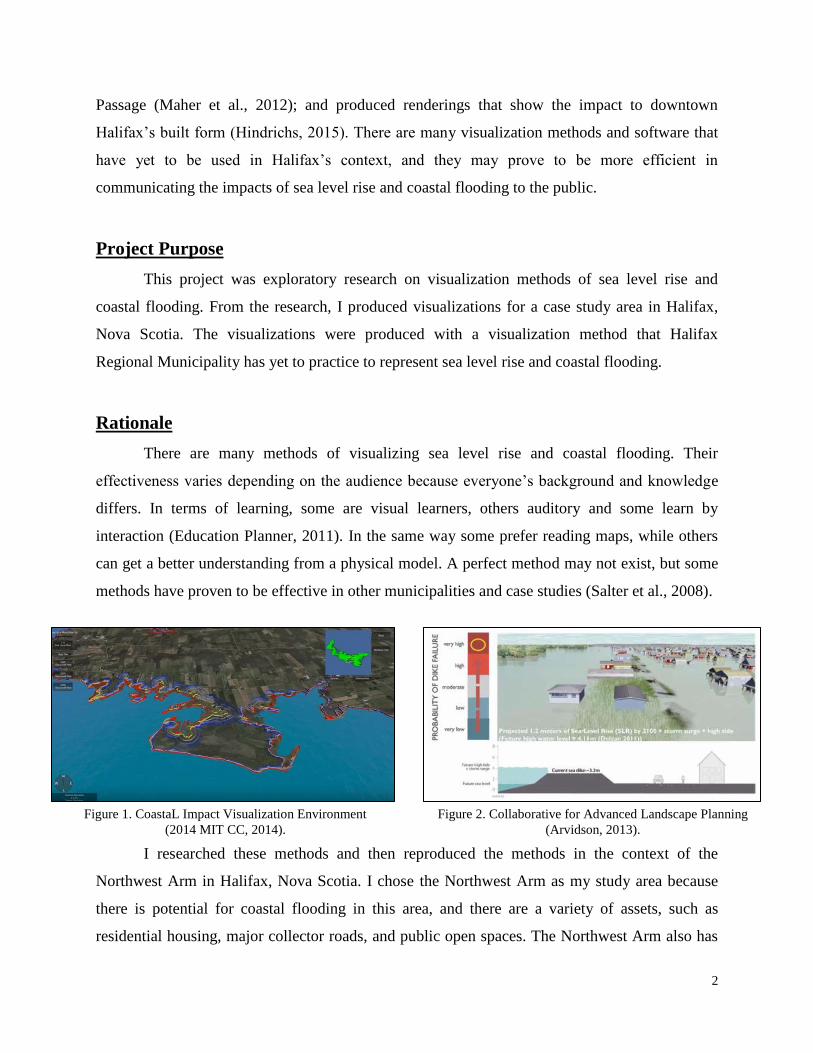
I researched these methods and then reproduced the methods in the context of the
Northwest Arm in Halifax, Nova Scotia. I chose the Northwest Arm as my study area because
there is potential for coastal flooding in this area, and there are a variety of assets, such as
residential housing, major collector roads, and public open spaces. The Northwest Arm also has
Figure 1. CoastaL Impact Visualization Environment
(2014 MIT CC, 2014).
Figure 2. Collaborative for Advanced Landscape Planning
(Arvidson, 2013).

3
three seawalls that are regularly used by the public, but are in poor condition. The seawalls
however are being raised and restored to mitigate the effects of sea level rise (Coldwater, 2010).
The four million dollar restoration project’s current phase is focusing on the Dingle Tower area
seawall (Bundale, 2015), but the seawalls by Regatta Point and Horseshoe Island Park are still in
a vulnerable state. I think it is important to show why the municipality is investing so much into
the restoration project. With this
reasoning in mind, my intended
audience is the general public and I
wrote my project’s information and
explanations in terms that the
general public should comprehend.
Finally, I chose this site because it is
relative easy for me to access
multiple times in order to collect
information needed for my
visualization tool.
Project Objectives
My primary objective was creating an informative means to show the extent of future sea
level rise and coastal flooding in the Northwest Arm. In order to know if a visualization
technique is informative, my second objective was to design my visualization tool using
principles of effective visualization. Landscape Architect, Professor Stephen Sheppard stated
there are seven principles of effective landscape visualization (2004). Once I created my
visualizations, I achieved my second objective by evaluating and critiquing my results against
Sheppard’s principles. The principles are:
comprehensibility – the audience can understand the visualization;
representativeness – the visualization shows key views;
accuracy – it shows the area and the proposed changes while resembling the real location;
credibility – it can convince the audience by looking realistic;
Figure 3. The proximity of the Northwest Arm to my residence
(Goetz, 2016a).
Current Residence

4
defensibility – I can explain to the audience how I made the visualization and how accurate
it is;
engagement – the visualization (and myself if I am presenting) is able to capture and hold
the audience’s attention by remaining interesting;
and accessibility – the audience and other interested people can acquire the visualization,
whether that means visiting a webpage, downloading a file, or reconstructing a physical
display.
Background Research
I researched two topics before I started creating my visualizations, the first being aspects
that contribute to extreme water levels, such as sea level rise, storm surge, and seiche, and the
second being visualization methods. Researching extreme water levels gave me an understanding
of the worst case scenario that Halifax could experience by 2100 and the research formed the
basis for what my visualizations would represent. Researching and reviewing visualization
methods provided me with valuable information for which method I would later follow and other
aspects to keep in mind. One of these aspects is what factors are commonly considered in the
extreme water level scenarios, such as only projected sea level rise, or sea level rise and other
factors like storm surge and high tide. I also looked at visualization methods that were used to
represent other changes such as development proposals. Some of the reports regarding extreme
water levels also had visualization aspects, so I also noted these as a part of my visualization
methods research.
Intergovernmental Panel on Climate Change’s Climate change 2014 synthesis report
The Intergovernmental Panel on Climate Change’s (IPCC) Climate change 2014
synthesis report provides information on current global climate conditions and predictions of
how climate conditions will change. It includes predictions on global mean sea level rise and the
amount of precipitation and storm events. By 2100, sea level may rise between 0.26 and 0.82
metres, and the North Atlantic region will experience more precipitation and storms (IPCC,
2015). The sea level rise predictions vary due to uncertainty in future greenhouse gas emissions,
but I decided to take a pessimistic or precautionary approach when creating the scenarios and
visualizations. This approach makes the impact of coastal flooding more obvious and provides a
worst-case outcome. I used this report to construct my scenarios because this IPCC report is the

5
most recent document that provides global sea level rise projections. Other reports have
referenced the previous IPCC report, which was published in 2007. IPCC’s 2014 synthesis report
provides useful insight to global conditions, but I was also aware that I needed to consider local
conditions when I created the extreme water level scenarios.
As for the visual aspects of this report, the report uses tables and charts to show how sea
level will rise globally, but the tables and charts are difficult to apply local context to because
they only offer numbers. Seeing the extent and affected area of sea level rise is more
comprehensible through maps.
CBCL Limited & Nova Scotia Department of Fisheries and Aquaculture’s The 2009 state of
Nova Scotia’s coast technical report
Nova Scotia’s sea level rise rate is higher than the global average and is predicted to stay
over the global average (CBCL, 2009). This information is detailed in CBCL’s and Nova Scotia
Department of Fisheries and Aquaculture’s report (2009). The sea level rise data came from the
2007 IPCC report to predict that Nova Scotia will experience a rise between 0.38 and 0.79
metres by 2100 (CBCL, 2009). The prediction also takes into account the province’s rate of
subsidence (0.2 metres per century). The report also states that “climate change will cause an
increase in the intensity of storms in the northern hemisphere, as well as a possible northward
shift of storm tracks” (CBCL, 2009, pg 164). Increasing storm strength and frequency
contributes to coastal flooding caused by storm surges. This information shows how susceptible
Nova Scotia will be to sea level rise and coastal flooding.
The report also shows initiatives that Nova Scotian communities are taking to educate the
public on sea level rise. It does not explain the visualization method used, but GIS was used to
make 2D mapping visualizations. One of the projects shows extreme water levels in the Halifax
Harbour. This project is reviewed below.
Forbes et al.’s Halifax Harbour extreme water levels in the context of climate change:
Scenarios for a 100-year planning horizon
In 2009, Halifax Regional Municipality (HRM) produced maps that showed the
extent of extreme water levels in the Halifax Harbour (Forbes et al., 2009). HRM staff planned to
use the project to help develop the Halifax Harbour Plan (Forbes et al., 2009), but have since
used the project to “set a policy reference point…for developing an adaptation plan”
6
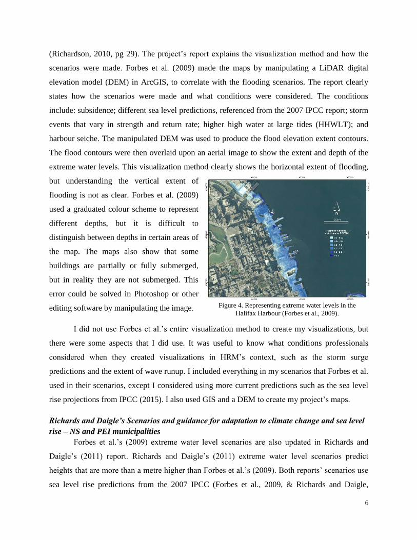
(Richardson, 2010, pg 29). The project’s report explains the visualization method and how the
scenarios were made. Forbes et al. (2009) made the maps by manipulating a LiDAR digital
elevation model (DEM) in ArcGIS, to correlate with the flooding scenarios. The report clearly
states how the scenarios were made and what conditions were considered. The conditions
include: subsidence; different sea level predictions, referenced from the 2007 IPCC report; storm
events that vary in strength and return rate; higher high water at large tides (HHWLT); and
harbour seiche. The manipulated DEM was used to produce the flood elevation extent contours.
The flood contours were then overlaid upon an aerial image to show the extent and depth of the
extreme water levels. This visualization method clearly shows the horizontal extent of flooding,
but understanding the vertical extent of
flooding is not as clear. Forbes et al. (2009)
used a graduated colour scheme to represent
different depths, but it is difficult to
distinguish between depths in certain areas of
the map. The maps also show that some
buildings are partially or fully submerged,
but in reality they are not submerged. This
error could be solved in Photoshop or other
editing software by manipulating the image.
I did not use Forbes et al.’s entire visualization method to create my visualizations, but
there were some aspects that I did use. It was useful to know what conditions professionals
considered when they created visualizations in HRM’s context, such as the storm surge
predictions and the extent of wave runup. I included everything in my scenarios that Forbes et al.
used in their scenarios, except I considered using more current predictions such as the sea level
rise projections from IPCC (2015). I also used GIS and a DEM to create my project’s maps.
Richards and Daigle’s Scenarios and guidance for adaptation to climate change and sea level
rise – NS and PEI municipalities
Forbes et al.’s (2009) extreme water level scenarios are also updated in Richards and
Daigle’s (2011) report. Richards and Daigle’s (2011) extreme water level scenarios predict
heights that are more than a metre higher than Forbes et al.’s (2009). Both reports’ scenarios use
sea level rise predictions from the 2007 IPCC (Forbes et al., 2009, & Richards and Daigle,
Figure 4. Representing extreme water levels in the
Halifax Harbour (Forbes et al., 2009).
7
2011). While the data was up-to-date at the time, the 2015 IPCC report contains projections of a
higher rise in sea level. I thought it was best to update the scenarios so that the visualizations
accurately represent the extent of sea level rise and coastal flooding.
Halifax’s storm surge predictions were noticeably different in the Forbes et al. (2009) and
Richards and Daigle’s (2011) reports. Forbes et al. (2009) stated that a 50-year storm would raise
the water level by 1.74m, while Richards and Daigle (2011) stated that the same storm would
raise the water level by 0.98m. Richards and Daigle’s predictions come from an older source,
which could explain the discrepancy. I however used Forbes et al.’s storm surge predictions
because I think it is best to prepare for the worst-case scenario.
Rahmstorf’s A semi-empirical approach to projecting future sea-level rise report
Stefan Rahmstorf’s (2007) includes sea level rise predictions of 2100 that are higher than
the highest projections from IPCC’s (2015) synthesis report. Rahmstorf’s projections are higher
because the projections took the acceleration of draining glaciers from Greenland and Antarctica
into consideration (2007), while the synthesis report did not (IPCC, 2015). The synthesis report
is more current, but like with the conflicting storm surge predictions, I think it is best to prepare
for the worst-case scenario. I used Rahmstorf’s projections to base the sea level rise projections
with this reasoning.
Extreme Water Level Worst Case Scenario
Contributing factor to raising
sea level by 2100
Height raised above current
mean sea level
Source
Sea level rise 1.30m Rahmstorf, 2007
50 year storm surge 1.74m Forbes et al., 2009
Subsidence 0.16m Forbes et al., 2009
Higher high water large tide 1.36m Forbes et al., 2009
Seiche and wave runup 1.00±0.70m Forbes et al., 2009
Total 5.56±0.70m
Table 1. The contributing factors to raising sea level with the highest projected values. The 5.56±0.70m raise
represents the worst case scenario.
Sheppard et al.’s Landscape visualization: An extension guide for first nations and rural
communities
Stephan Sheppard et al. (2004) describe the principles of effective landscape visualization
in Landscape visualization: An extension guide for first nations and rural communities. These

8
principles include: comprehensibility; representativeness; accuracy; credibility; defensibility;
engagement; and accessibility. These principles were helpful because they guided me in deciding
what I should consider when I created my visualizations, and the principles structured the
questions of the self-critique of my final visualizations.
The book also provides insight to creating visualizations, despite the title referring to
itself as a guide for a specific audience. It includes a flowchart that shows the process of creating
a digital 3D visualization. Parts of the flowchart, such as defining the simulation’s purpose and
scope, were useful. The book is by no means a step-by-step guide for a specific method or
software, but the book does encourage and recommend using specific software. I questioned how
reliable these recommendations were due to how dated the material is, but I trusted the
recommendation to use Adobe Photoshop for creating photo manipulations. This is because
Photoshop is regularly updated and I am aware of how useful the software is.
I first decided to use Photoshop in part of creating my visualizations because I was able
to use it free Dalhousie’s computers. I also found online a Photoshop plugin (a download that
adds a tool or feature to Photoshop) that creates realistic water effects. This plugin was Flaming
Pear’s (2015) Flood. I was unable to use the plugin on a Dalhousie computer because I lacked
administrative privileges, so I then bought Photoshop for my personal computer at a reasonable
price ($20/month). After I created my visualizations, I discovered that Flaming Pear released an
updated plugin called Flood 2. I did not use the updated plugin because it was released after I
created my visualizations.
Collaborative for Advanced Landscape Planning’s Delta Regional Adaptation Collaborative
Project
Stephen Sheppard is a recognized expert in landscape visualization. Researching his
current work provided insight on modern visualization methods. In 2012, Stephen Sheppard and
his team of researchers in the Collaborative for Advanced Landscape Planning (CALP) worked
with the municipality of Delta, British Columbia to complete the Delta Regional Adaptation
Collaborative (Delta-RAC) project (CALP, 2012). The team produced a series of maps and
visualizations of different flooding scenarios in Delta and then presented these in a series of
workshops in their Landscape Immersion Lab (LIL). LIL was set up so that the audience sat in
front of two large screens which displayed interactive landscape visualizations on one screen and

9
static information (such as text, charts, and maps) on the other. The interactive visualization
allowed the audience to see Delta from any perspective while the static information showed
relevant information at the same time. The relevant information included depth of flooding, the
probability of Delta’s dike failing, and how water levels are affected by varying storm events.
Sheppard has also used LIL to represent wildfire scenarios (Arvidson, 2013), and neighbourhood
development proposals (Salter et al., 2008). After showing the development proposals to a
workshop group, the group was surveyed and based on the results, the researchers argued that
presenting landscape change in LIL’s format increases and improves participants’ understanding
and is more effective than showing a 2D map and explaining the change (Salter et al., 2008).
LIL made me realize that I needed to consider how I would present my visualizations,
because how I presented my visualizations would improve their effectiveness. I thought that the
best way to improve my visualizations’ engagement was to give my audience complete freedom
when presenting the visualizations.
Delta-RAC’s landscape visualizations were produced in Google Earth and Sketch Up. I
was impressed by the quality and detail of the visualizations. While I did not use Google Earth or
Sketch Up to create my visualizations, I did use Google Earth for height reference object
measurements and photo scaling calculations.
C2C’s CoastaL Impacts Visualization Environment
One of the most recent sea level rise visualization
methods comes from the work of researchers from the
University of Prince Edward Island and Simon Fraser
University. The team (known as C2C, a reference that the
universities are at opposite coasts) created an analytical
geovisualization tool that shows how Prince Edward
Island’s (PEI) coastline has, is, and will change due to sea level rise and other elements that
contribute to coastal erosion (C2C, 2014). The tool is known as the Coastal Impact Visualization
Environment (CLIVE) and it uses aerial photographs from as far back as 1968, recent LiDAR
data, and IPCC climate change predictions to display PEI’s shrinking coastline (C2C, 2014).
What sets CLIVE apart from other visualization methods is how users interact with the tool.
CLIVE runs on the Unity 3D videogame engine and is controlled by a gaming controller (Jaffer,
Figure 5. CLIVE in use (UPEI, 2014).

10
2014). This allows users to freely and easily fly over PEI, find and obtain a human perspective,
and then change and display the coastline to past, present, and future locations. I did not produce
visualizations that ran on a videogame engine due to my lack of understanding how videogames
are developed, but CLIVE made me consider how I wanted my audience to interact with my
visualizations. I wanted my audience to have fun and freedom with my visualizations.
National Oceanic and Atmospheric Administration’s Sea Level Rise Viewer
America’s National Oceanic and Atmospheric Administration (NOAA) is responsible for
producing storm warnings, managing fisheries, monitoring the climate and more (NOAA, 2015).
One of NOAA’s recent products is the Sea Level Rise Viewer, which is a free-to-use, web-based,
interactive map (NOAA, 2015). The tool shows America’s coastline and five different layers
show how sea level rise will affect the coastal areas. These layers include: sea level rise;
confidence – which shows the probability of coastal flooding; marsh – which shows how
wetlands will either migrate or disappear; vulnerability – which shows where the impact of sea
level rise may be greater because of the built form and population attributes; and flood frequency
– which shows which areas will experience coastal flooding more often (NOAA, 2015). The tool
is unique because it is not showing predicted sea levels at certain years, but it is simply showing
sea level at different heights, those levels being the current sea level, a 1ft rise, a 2ft rise, a 3ft
rise, a 4ft rise, a 5ft rise, and a 6ft rise. Viewers are then able to understand what the extent and
impact of a certain change will look like, and not be confused by a prediction based on complex
climate scenarios. I decided to follow a similar approach with the water levels that my
visualizations would represent, those levels being current sea level, a 1m rise, a 3m rise, and a
5m rise.
The tool’s sea level rise layer also provided me with insight on other elements that I
considered implementing into my project. The layer considers hydrologic connections to
determine if an area will be inundated. Having this in mind helped me create more accurate
visualizations. For example, an area may be below a predicted sea level, but if water has no
connection or means of reaching the area (say it is protected by a raised seawall) the area will not
flood. NOAA’s Sea Level Rise Viewer also has photo manipulations that show the impact of sea
level rise from a human perspective, and the photos change in sync with the changing sea level
on the map (NOAA, 2015). This inspired me to not restrict myself to only use one tool or

11
software, because using multiple tools made my visualizations more informative. This is why I
used Esri’s Story Map app to present my project’s work. The Story Map app allows users to
display one or more maps made in ArcGIS and then add text, audio, pictures and videos (Esri,
2015). I believe NOAA’s Sea Level Rise Viewer is an advanced Story Map that was coded to
add more features.
I contacted an affiliate at NOAA to learn about how they created the photo
manipulations. I was told that NOAA used CanVis to manipulate the images and used a photo
scaling technique that uses a height reference object and a scaling formula to determine where
the raised water levels would reach (McBride, 2016). I also found that NOAA offers a guide for
creating photo realistic visualizations (NOAA, 2016). The guide also refers to five of Sheppard
et al.’s seven principles of effective landscape visualization (2004). The guide highlights the
importance of a visualization’s accuracy, credibility, defensibility, representativeness, and
accessibility (NOAA, 2016).
Zhang et al.’s A 3D visualization system for hurricane storm-surge flooding
Hurricanes and storms can cause storm surges. The
media warns the public of forecasted storms and uses maps to
show the probability of the storm making landfall. In Zhang et
al.’s (2006) article they argue that without having a first-hand
experience with a hurricane, the public is unable to understand
the severity and full impact of a storm by looking at a map
similar to figure 6 (NHC & NOAA, 2006). They believe that a
better understanding could come from a digital 3D animation,
which is what they produced. The animation’s goals are to
perform near-real-time animations for forecasted hurricanes and
offline animations for hypothetical hurricanes (Zhang et al.,
2006). The article does not mention if the animations were able
to achieve these goals, but this is likely due to the animations
being only prototypes. Images of the animation shown in the
article do look convincing in simulating a hurricane, but the
building and tree models do not look realistic.
Figure 6. A hurricane probability
map (NHC & NOAA, 2006).
Figure 7. A hurricane simulation
by Zhang et al. (2006).
12
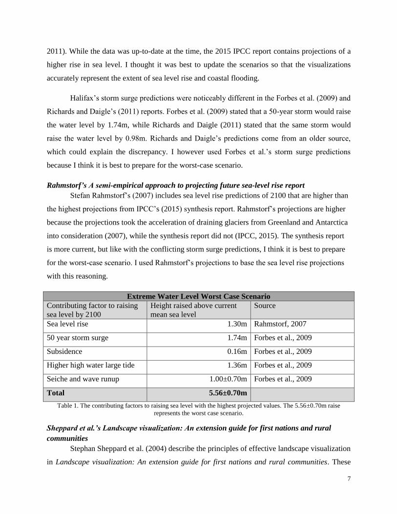
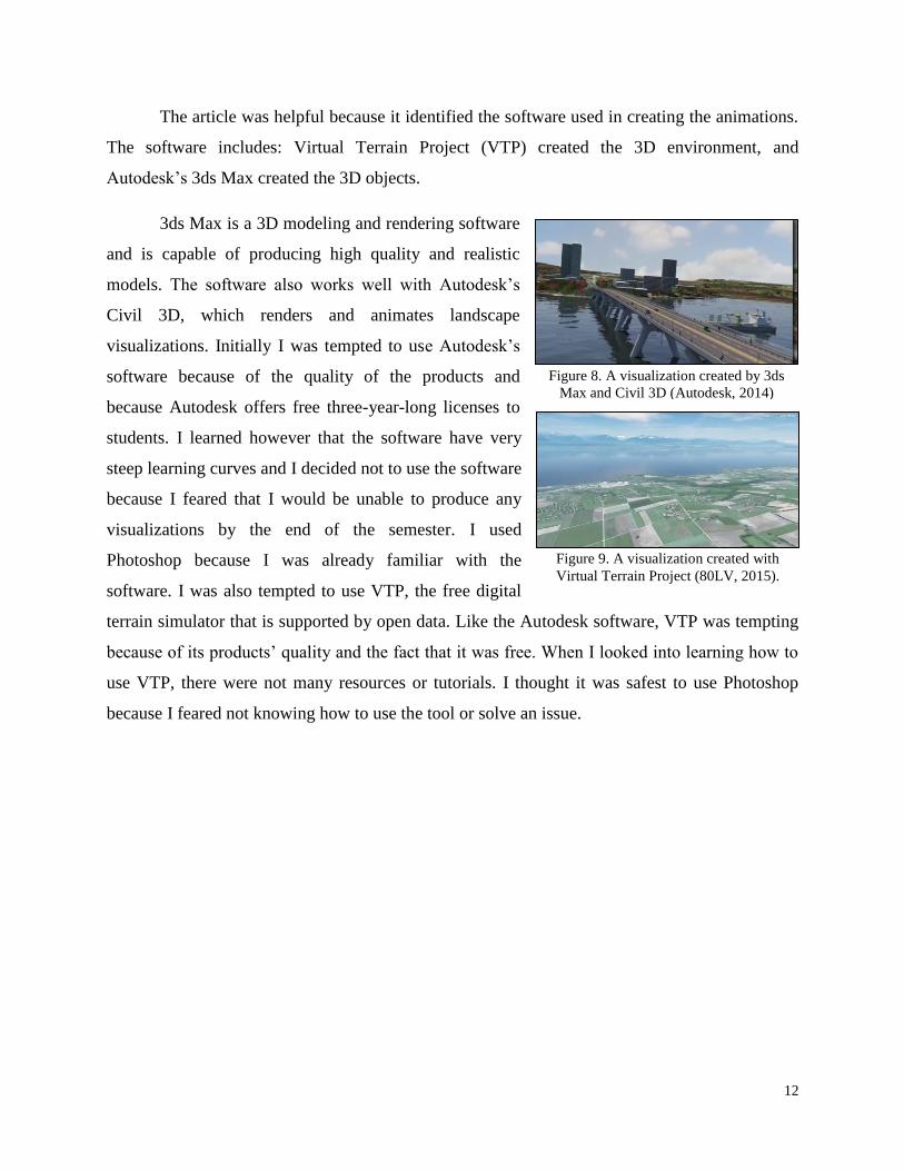
The article was helpful because it identified the software used in creating the animations.
The software includes: Virtual Terrain Project (VTP) created the 3D environment, and
Autodesk’s 3ds Max created the 3D objects.
3ds Max is a 3D modeling and rendering software
and is capable of producing high quality and realistic
models. The software also works well with Autodesk’s
Civil 3D, which renders and animates landscape
visualizations. Initially I was tempted to use Autodesk’s
software because of the quality of the products and
because Autodesk offers free three-year-long licenses to
students. I learned however that the software have very
steep learning curves and I decided not to use the software
because I feared that I would be unable to produce any
visualizations by the end of the semester. I used
Photoshop because I was already familiar with the
software. I was also tempted to use VTP, the free digital
terrain simulator that is supported by open data. Like the Autodesk software, VTP was tempting
because of its products’ quality and the fact that it was free. When I looked into learning how to
use VTP, there were not many resources or tutorials. I thought it was safest to use Photoshop
because I feared not knowing how to use the tool or solve an issue.
Figure 8. A visualization created by 3ds
Max and Civil 3D (Autodesk, 2014)
Figure 9. A visualization created with
Virtual Terrain Project (80LV, 2015).

13
Visualization Method/Software Comparison
Landscape
Immersion
Lab
Autodesk
3ds Max +
3D Civil
Sea Level Rise
Viewer
Esri
ArcMap
Adobe
Photoshop
CoastaL
Impacts
Visualization
Environment
Can it show the
horizontal
extent of
flooding?
Can it show the
vertical extent
of flooding?
Can it show the
depth of
flooding?
Are there static
elements?
Are there
dynamic
elements?
Can fly-
throughs be
performed?
Is more than
one medium or
software used?
Am I familiar
with the
software?
Table 2. The chart I used to compare the different visualization methods and software. The chart also helped me
determine which method I would follow and which software I would use.
Method
I decided to design my visualization technique similar to the NOAA’s Sea Level Rise
Viewer. I decided to use the technique because it can show the horizontal and vertical extent of
the water levels using maps and photo manipulations, the product is then static and dynamic, and
I can use different software and still have a product similar to the Sea Level Rise Viewer. My
final product is not an exact replica of the Sea Level Rise Viewer, but there are common
elements in both products such as interactive maps that show different water levels, and
manipulated images that show the water levels from a ground-level perspective. The products
differ though because I used different photo manipulation software (instead of using CanVis I
used Photoshop). I also used Stephen Sheppard’s seven principles of effective landscape
visualization to guide me throughout the entire process of creating my product. Some of the

14
principles were implemented throughout most of the process, while some principles were only
implemented in a single step, such as accessibility.
Below is a summary of my project’s summary and more details can be found in the appendices.
Step 1 Scenario Creation
Before I started making the visualizations of extreme water levels, I needed to know
which water levels I would represent. From my background research I knew that sea level for
2100 varied, the extent of storm surge and seiche depended on a storm’s intensity, the impact of
wave runup and overtopping depended on the coastline’s structure, but the rate of subsidence and
the value of Higher High Water Large Tide would be consistent. Considering all of this, the level
for 2100 could be less than a metre higher than current mean sea level in a best-case-scenario or
be five metres higher than current mean sea level in a worst-case-scenario. Based on by how
much the 2100 water level could vary, I decided that the three scenarios would represent 1m, 3m,
and 5m above current mean sea level. These scenarios then range in likelihood of occurring. For
example the 1m scenario could occur with the lowest predicted sea level rise plus the added
impact of a 10-year storm, or the scenario could also be the result of the mean tide during the
highest predicted sea level rise. The 5m scenario however could only occur with all contributions
of extreme water levels happening at once. I also think that the public will comprehend the three
scenarios more effectively if they are presented as scenarios that represent likelihood rather than
presenting a specific situation, much like in Forbes et al.’s report (2009) where the scenarios
were a specific sea level with the added impact of a specific storm and other conditions.
Step 2 Identifying Susceptible Locations
The next step was to identify areas along the Northwest Arm where the effects of extreme
water levels would be most obvious. Using the 2m Digital Elevation Model (DEM) provided by
Halifax Open Data, I manipulated the DEM to represent the 5m water level in ArcMap. The
manipulation included reclassifying the layer’s symbology so that the DEM showed elevations
between 0 and 5 metres as one colour, and all elevations above 5 metres as a different colour.
The specific inputs being: DEM Layer>properties>symbology>Show:Classified>Classes:2>
Classify…>Break Values: 5 and the highest elevation). I simplified identifying areas by setting
the symbol colour of the elevations that are greater than 5m to “No Color”, setting the DEM’s
transparency to 50% in the Display tab, and I added the imagery base map ( symbol to click

15
>Add Basemap…>Imagery). Keeping Sheppard’s representativeness principle in mind, I
identified: areas in the map where coastal flooding was obvious; recognizable landmarks, such as
the Dingle Tower; and public areas, such as Regatta Point Walkway. It is also important to
identify locations where the photographer’s perspective is above the highest predicted water
level.
Step 3 Site Visits
I visited the site three times. The purpose of these site visits was to capture base photos
for my photo manipulations, to capture height reference photos, to capture photos of storm-like
conditions, and to record GPS coordinates. In retrospect I could have completed all of these tasks
with one site visit, but I did not because weather conditions did not coincide with when my
friend was available to help with the height reference photos. I completed the following tasks
accordingly.
Step 3.1 Base Photos and GPS coordinates
I planned my site visits to coincide with the rising tide. I decided to take photos slightly
before high tide because then my base photos would have fairly similar water levels. Had I taken
Armdale Roundabout
Saint Mary’s Boat Club
Horseshoe Island Park
Deadman’s Island Park
Regatta Point Walkway Regatta Point Walkway
Dingle Tower
Seawall Walkway
Dingle Tower
Seawall Walkway
Figure 10. The identified susceptible locations (Goetz, 2015b).

16
the photos during mean tide, the photos’ water levels would have been quite drastic in
comparison (see figure 11 below). I took panoramic photos (multiple photos that are later
merged/stitched together to form one photo) of the identified locations. Panoramic photos
capture more detail than a single photo, and the panoramic’s larger area allows the viewer to
look around the photo, unlike the smaller single photo which confines the viewer to a single
frame. The ability to search around the panoramic can create the sensation of looking around the
area. I also recorded GPS coordinates of my locations after I took each photo. These coordinates
are crucial for providing accuracy in the steps following the site visits. The GPS was provided by
Dalhousie University’s Earth Science Department.
Step 3.2 Height Reference Photos
During my second site visit I captured height reference photos. These photos are essential
for steps 5.3 and 5.4 because these photos helped determine a water level’s vertical reach in the
base photos. These height reference photos were taken from the same locations and perspectives
as the base photos, but they also included an object of a known height in the scene. This object
was a metre stick held by a friend, and I also attached a bright green glove to the sticks end to
help identifying the stick in step 5.3. NOAA used a similar method when they created their sea
level rise photo manipulations. In an email a NOAA affiliate told me that he often looks for an
object of a known height, such as a traffic sign, to base his photo scaling calculations (McBride,
2016). This calculation will be explained in step 5.3. I used one object of a precise measurement
for all of my height reference photos to make things more consistent and accurate. Had I used
Figure 11. The difference in water levels during different site visits (Goetz, 2016b).

17
NOAA’s approach, I would have spent much more
time measuring the reference objects. I also saved
myself time doing multiple calculations by taking
multiple height reference photos of one site but with
my reference object placed at different distances from
me. It would have been more accurate to have my
friend record GPS coordinates at his different
locations, but instead I asked him to stand near
recognizable objects that I could locate in Google
Earth’s air photos, such as a single tree or park bench.
Step 3.3 Storm-like Condition Photos
I visited the site on an overcast day to capture photos of storm-like conditions to improve
the credibility of my visualizations. My base photos were taken during clear blue skies. The
visualizations however are meant to represent a storm’s effect on water levels. Having the blue
skies in the photos would reduce the realism of the photos, because one would not expect to see a
clear sky during or soon after a storm. These photos would be used in step 5.2.
Step 4 Converting GPS Coordinates into a GIS Point Shapefile
I converted the GPS coordinates from step 3.1 into a point shapefile with ArcCatalog and
ArcMap. Refer to Appendix A. This shapefile was used for creating maps in ArcMap,
performing calculations in Google Earth, and are an essential part of the Story Map.
Step 5 Creating the Photo Manipulations
I used Adobe Photoshop to create my visualizations using the photos from my three site
visits. I prepared the photos by editing out errors and flaws, editing in the storm-like conditions,
and placed my height reference photos, before I implemented the water effect with Flaming
Pear’s Flood plugin (2015).
Step 5.1 Cleaning Up the Photos
It is common for a panoramic image to have errors when the individual photos are
merged together. There were also some objects in the photos that were distracting, such as litter
on a lawn or a buoy in the water. Refer to Appendix B.
Figure 12. My friend standing with the
metre stick with the green glove on the end
(Goetz, 2016c).

18
Step 5.2 Simulating Storm-like Conditions
I edited in the overcast skies into the base photos, using the photos from step 3.3. Refer to
Appendix C for instructions.
Step 5.3 Photo Scaling Calculations
The next step was to add the height reference photos from step 3.2 onto the base photos.
Then using the point shapefile from step 4, Google Earth, and NOAA’s photo scaling formula
(2016), I calculated heights for locations that did not have a height reference photo. I could
determine where in the photos the 1m, 3m, and 5m water levels reaches using these
measurements. This photo scaling process is explained in Appendix D.
Step 5.4 Simulating the Water Levels
The last process in Photoshop was creating the extreme water levels by using Flaming
Pear’s Flood Photoshop plugin (2015). I knew approximately where the extreme water levels
should reach using the calculations from step 5.3 and the DEM of the Northwest Arm. NOAA
used the same approach when they created their photo manipulations, however instead of using
Photoshop and Flood to simulate the water levels, NOAA used their CanVis software (NOAA,
2008). The process that I followed is documented in Appendix E.
Step 6 Creating the Story Map
The final step in my project was creating the Story Map to present my visualizations. The
process of creating a Story Map is simple, and the Story Map website provides support
documents and videos to help with creating a Story Map, many of which I used. Story Maps also
have multiple layouts that display information and visual elements differently, and some have
unique features. I used the Map Journal layout because it displays text in a scrolling sidebar and
the centre “Main Stage” area displays visual elements. Following and clicking on the prompts to
add a section will open a window to title the section, a field to enter the sidebar’s information,
and options for the main stage’s visual elements. There are many methods for adding images,
videos, and maps to a Story Map, but I used my Flickr account for photos, my Youtube account
for videos, and my ArcGIS Online account for maps. I decided to present my visualizations in a
Story Map because Story Maps can be easily shared and accessed simply by sending someone a
web link. I also find Story Maps to be engaging because users can interact with a moveable map,
and you can also display images, videos, audio, and text at the same time. I also included a

19
section in my Story Map where readers could access my thesis report. This is to account for the
defensibility of my project in case I cannot personally defend my product.
Failed Methodology
Prior to contacting NOAA, I attempted determining elevations in my sites with four
different methods, each of which were unsuccessful. I first tried using Google Earth’s ground-
level view along with Google Earth’s Add Image Overlay feature. The feature places images
over Google Earth’s surface and the image’s elevation can be manually adjusted. Thaler (2013)
placed large translucent blue squares over cities at certain elevations to show what these cities
would look like flooded. I used this feature to make layers that were 1m, 3m, and 5m above
mean sea level. The idea was to import the GPS point shapefile, enter the ground-level view at a
GPS point, bring the perspective in line with the base photo’s perspective, and then turn on the
layers that represent the 1m, 3m, and 5m water levels that were created with the Add Image
Overlay feature. When I compared the Google Earth ground-level view with my base photos
however, the two images di not line up properly. This error was caused by Google Earth’s digital
elevation model, which is not precise enough.
I then attempted a similar method with ArcGlobe, however this time I began with adding
the 2m DEM file provided by Halifax Open Data. Once again though, the two images (the base
photo and ArcGlobe) did not line up properly due to a lack of precision.
Figure 13. Comparing Google Earth’s ground-level view with the real view (Google & Goetz, 2015c)

20
My next attempt to determine elevations was using an altimeter, a device that can
measure elevations accurately to ±10cm. The altimeter was provided by Dalhousie University’s
Earth Science’s Department. There are many ways for using an altimeter, most of which require
two altimeters, but because I only had one altimeter, I used the method where I calibrated the
altimeter at a known elevation (a geodetic survey pin outside of the Killam Library), and then
recorded elevations on my site while also recording air temperature and wind speed. Altimeters
are very sensitive to atmospheric conditions, which can effect measurements. These effects can
be accounted for by measuring the atmospheric conditions and following a calculation. My plan
was to use the altimeter to find where the 1m, 3m, and 5m elevation points were in a site,
flagging these points, and then taking a photo of the site
from the base photo’s perspective. At first I thought I was
recording accurate elevations when I was in Horseshoe
Island Park (my first site), but when I measured the first
elevation along the Regatta Point seawall right beside the
water, the altimeter read that I was 5m above mean sea
level. At that point I knew that I could record accurate
elevations with an altimeter if I had a second altimeter,
which I could not attain.
Figure 14. Comparing ArcGlobe ground-level view with the real view (ArcGlobe & Goetz, 2015d).
Figure 15. Altimeter and geodetic pin
(Goetz, 2016d).

21
My solution to determining elevations was to ask NOAA how they determined elevations
in their photo manipulations. I was very fortunate that they replied and that their method was
fairly simple. NOAA used objects of known heights in the images as height reference objects,
such as a park bench or street sign, to base the photo scaling calculation off of. Before I took the
height reference photos with my friend, I tried taking the height reference photos during low tide
from the same locations and perspectives of my base photos. I thought I could compare the high
tide and low tide photos, and with knowing the height of the high and low tide, I could get a
height reference. This did not work though because it was too difficult to determine where the
specific high and low points were. I could not get an accurate reference measurement without
knowing where the points were.
Findings
I am satisfied with the quality of my Story Map and photo manipulations, and I believe
that I succeeded in achieving my project’s goal and objectives. I created a product that shows
what future extreme water levels would look like in Halifax’s Northwest Arm with a
methodology that has yet to be practiced in Halifax. Using Stephen Sheppard’s seven principles
of effective landscape visualization to self-critique my project, I have determined how successful
I am in meeting my project’s objectives.
Comprehensibility: This is somewhat difficult to self-critique because this principle
depends on the understanding of my audience, the general public. I believe that the title of my
Figure 16. High tide (left) and low tide (right) by Deadman’s Island (Goetz, 2015 & 2016).
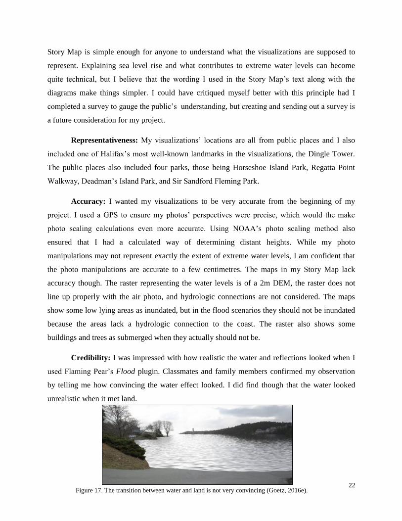
22 Figure 17. The transition between water and land is not very convincing (Goetz, 2016e).
Story Map is simple enough for anyone to understand what the visualizations are supposed to
represent. Explaining sea level rise and what contributes to extreme water levels can become
quite technical, but I believe that the wording I used in the Story Map’s text along with the
diagrams make things simpler. I could have critiqued myself better with this principle had I
completed a survey to gauge the public’s understanding, but creating and sending out a survey is
a future consideration for my project.
Representativeness: My visualizations’ locations are all from public places and I also
included one of Halifax’s most well-known landmarks in the visualizations, the Dingle Tower.
The public places also included four parks, those being Horseshoe Island Park, Regatta Point
Walkway, Deadman’s Island Park, and Sir Sandford Fleming Park.
Accuracy: I wanted my visualizations to be very accurate from the beginning of my
project. I used a GPS to ensure my photos’ perspectives were precise, which would the make
photo scaling calculations even more accurate. Using NOAA’s photo scaling method also
ensured that I had a calculated way of determining distant heights. While my photo
manipulations may not represent exactly the extent of extreme water levels, I am confident that
the photo manipulations are accurate to a few centimetres. The maps in my Story Map lack
accuracy though. The raster representing the water levels is of a 2m DEM, the raster does not
line up properly with the air photo, and hydrologic connections are not considered. The maps
show some low lying areas as inundated, but in the flood scenarios they should not be inundated
because the areas lack a hydrologic connection to the coast. The raster also shows some
buildings and trees as submerged when they actually should not be.
Credibility: I was impressed with how realistic the water and reflections looked when I
used Flaming Pear’s Flood plugin. Classmates and family members confirmed my observation
by telling me how convincing the water effect looked. I did find though that the water looked
unrealistic when it met land.

23
Flaming Pear recently released Flood 2 and from what their website showed, Flood 2 looks even
more realistic then Flood. For a future consideration I would redo the photo manipulations with
Flood 2 to improve credibility, but for the time being, I am still satisfied with Flood’s quality.
Defensibility: This principle relies on the quality of my thesis report, specifically on my
method section and the appendices that further explain the method. It is difficult for me to judge
how clear each step is, but diagrams and images show the processes sequences, tools, and inputs.
I have also provided a link at the beginning and end of my Story Map which directs users to my
thesis report and my contact information in case someone has a question for me.
Engagement: I used a Story Map to present my photo manipulations because the
interactive elements of the app foster freedom and engagement. The maps compliment the photo
manipulations by providing viewers two distinct perspectives, a human perspective and an aerial
perspective. The dynamic maps also allow viewers freedom that is not possible with a static map.
With the dynamic maps, viewers can zoom in and out to different scales, pan around the
Northwest Arm, and waterfront property owners can then see their properties could potentially
be impacted by extreme water levels.
Accessibility: My project and its visualizations are accessible. Story Maps can be shared
through a web link, which means anyone who has access to a computer with an internet
connection can view the visualization project. I am aware that not everyone has the means of
viewing my Story Map, but a large portion of Halifax’s population does.
Feedback from Peers
I asked my classmates and family to critique my Story Map and visualizations and
provide feedback for how I could improve them. My peers mentioned that the Story Map’s title
was too technical and more suited for the report, the text and descriptions were comprehensible
but at times too wordy and technical, the photo manipulations looked impressive, it was helpful
to explain how the Story Map is controlled, and it would be helpful if you could switch between
photos without closing and expanding each photo. I have since changed the Story Map’s title,
and rewrote the text.
24
Future Considerations
I am satisfied with the quality of my thesis project, there are however certain aspects that
I would like to improve upon. These improvements I would apply if I continue on with the
project in the future. These improvements include: redoing the photo manipulations with
Flaming Pear’s improved Flood 2 plugin, because this would greatly improve my photo
manipulations’ credibility; create more photo manipulations of different areas and perspectives
in the Northwest Arm, such as Point Pleasant Park, and the Armdale and Royal Nova Scotia
Yacht Clubs; recreate the maps so that the raster is in line with the air photo’s coastline and that
buildings and trees are not shown as submerged when they should not be; and creating and
sending out a survey to the public to receive feedback about my Story Map. Afterwards I would
apply the public’s feedback.
Limitations and Errors
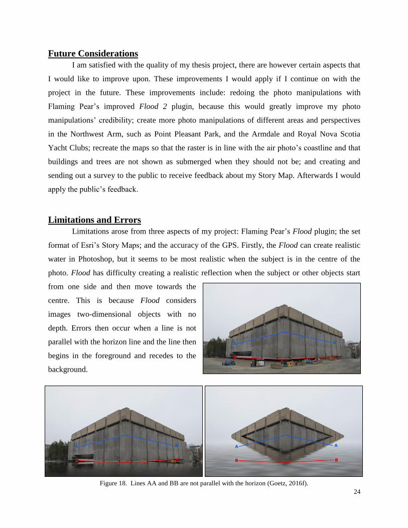
Limitations arose from three aspects of my project: Flaming Pear’s Flood plugin; the set
format of Esri’s Story Maps; and the accuracy of the GPS. Firstly, the Flood can create realistic
water in Photoshop, but it seems to be most realistic when the subject is in the centre of the
photo. Flood has difficulty creating a realistic reflection when the subject or other objects start
from one side and then move towards the
centre. This is because Flood considers
images two-dimensional objects with no
depth. Errors then occur when a line is not
parallel with the horizon line and the line then
begins in the foreground and recedes to the
background.
Figure 18. Lines AA and BB are not parallel with the horizon (Goetz, 2016f).

25
Flood can create realistic water effects only when the viewer’s perspective is above the desired
water level. This error in my photo manipulations occurred because I was unaware that I was
under specific water level heights, which meant that those photo manipulations would place me,
the photographer, underwater.
Story Map’s format can be quite restrictive without knowing how to code a website. The
app only has one font style and users can pick between two layouts for each Story Map style. For
example my Story Map’s style allowed me to format my content by putting an opaque white bar
for the text on the left side of the screen, or putting a translucent grey bar on the right side. Map
elements, such as the legend and overview map are set at specific locations on the screen and
their text and style cannot be changed. Esri does allow users to make custom styled Story Maps,
but this requires website coding, which I do not know how to do.
When I converted the GPS coordinates into the GIS point shapefile, some points in
ArcMap appeared offset by a few metres. For example, some points were in the middle of the
road, when I was actually on the sidewalk. This error could have been caused by trees and
buildings blocking the GPS’s signal or the GPS’s datum was a different datum then my map’s.
Figure 19. The Flood plugin will only work if the perspective is above the water level (Goetz, 2016g).

26
Reflecting on Halifax’s Visualizations and My Contributions
Halifax Regional Municipality (HRM) is aware of the potential impacts of future extreme
water levels and have begun preparing for the rising sea level. Forbes et al.’s report (2009) used
maps to show the extent and depth of water in different scenarios, and HRM staff then used one
of the scenarios to set a policy reference point to plan for sea level rise and storm surges (NRC,
2010). Downtown Halifax’s Land Use By-law (2015) now has a section specifically for
protecting residential uses against storm surge. The section requires all new or rebuilt residential
sections of a building in the waterfront area be built at an elevation of 3.8 metres above mean sea
level or higher. Forbes et al. show that maps are effective tools used to help with policy creation
and decision making. Maps can also be effective visualization tools to help communicate change
to the public, but I would argue that other visualization methods, such as the three dimensional
imagery used in my project, are more effective at communicating change, especially to people
not accustomed to reading maps. Maps lack a human perspective and in the case of representing
flooding, people can be confused about a building, structure, or tree either being partially
inundated or completely
submerged by water.
This confusion is caused
when the water layer is
not “clipped” properly
to structures and the
result shows a building
submerged when the
water is actually only a
metre deep. Maps lack
the ability to show the level of inundation relative to a structure because maps are two
dimensional mediums, while inundation is a three dimensional phenomenon. This problem can
be solved by using ground view images to complement the map. The map shows the horizontal
extent of the inundation, while the images show the vertical extent of inundation. My project and
the Sea Level Rise Viewer both use maps and ground level images to complement each other and
thus can effectively communicate to the public what extreme water levels would look like.
Figure 20. The map shows some of Halifax’s buildings completely submerged
(Forbes et al., 2009)

27
In 2010, HRM updated their 2006 Climate SMART Community Action Guide to Climate
Change and Emergency Procedures (HRM, 2010). The document’s two main goals are to
mitigate the effects of climate change by creating a plan to reduce HRM’s GHG emissions, and
to adapt to the potential impacts of climate change, mostly those caused by sea level rise and
storm surges, by developing a management plan. I found the document easy to comprehend and
the images of Hurricane Juan’s impact clearly conveyed the potential impact of storms. As
impactful as the images were, I found it difficult to relate to the images because I did not
recognize the images’ locations. The document could benefit from using visualizations similar to
the ones I created because there is the freedom of creating visualizations with recognizable
locations and landmarks. The visualizations need to be further edited to show the damages
caused by the storm and water for the visualizations to be as impactful as the photos of Hurricane
Juan’s aftermath.
From my opinion, it seems as HRM has a larger focus on planning and protecting the
Downtown Halifax’s waterfront. HRM is also aware of the Northwest Arm’s vulnerability to
extreme water levels. HRM is currently investing millions of dollars to repair and raise the
seawalls by Sir Sandford Fleming Park, Regatta Point Walkway, Horseshoe Island Park, and the
Saint Mary’s Boat Club (Bundale, 2015 & CBC News, 2014). My Story Map and visualizations
could be used to help reinforce the decision to invest so much into protecting some of Halifax’s
public areas.
Synthesis Comparing my Story Map (for this section now referred to as MSM) against NOAA’s
Sea Level Rise Viewer (for this section now referred to as SLRV), at first glance both seem
similar in concept, but I think each have unique aspects which make both at times better
visualization tools than the other. The most noticeable strength that SLRV has over MSM is the
slider which changes the water level in the map and image at the same time. This provides
viewers a seamless transition between water levels which then makes SLRV more engaging than
MSM. I would like to code this kind of slider into MSM, but for the time being viewers need to
select the appropriate map for the corresponding water level. SLRV’s engagement is also better
because it can switch to a different location’s photo manipulation by clicking on the location’s
camera icon. For MSM to switch locations, viewers can either scroll to a different location or

28
click a bullet which shows the name of the location. Both of MSM’s methods are not as intuitive
as SLRV’s method of switching the photo manipulation’s location. A strength that MSM has
over SLRV is that MSM can zoom in to a much finer scale, which gives viewers a more detailed
perspective of the inundation’s extent. SLRV finest scale is at approximately 1:12,000, while
MSM’s finest scale is at 1:1,000. I also found MSM’s photo manipulations’ locations more
representative than SLRV’s, this is however somewhat subjective because I am more familiar
with Halifax than I am with the
United States’ coastal cities
and their landmarks. I still
found it strange though that
some of SLRV’s photo
manipulations are of normal
streets and regular buildings,
but again, this is subjective on
my part.
What distinguishes MSM from SLRV the most though is the photo manipulation
software. MSM used Adobe Photoshop with Flaming Pear’s Flood plugin, while SLRV used
NOAA’s CanVis program. Photoshop is a much stronger photo editing software due to its larger
selection of tools, filters, added plugins, and editing features, but CanVis has the appeal of being
free. The cost of visualization software is relevant to municipalities because not every
municipality can afford visualization software that can cost hundreds or even thousands of
dollars a year in licensing fees to operate, and additionally to that cost, could also require a
trained specialist. I was fortunate enough to pay a student rate for Photoshop, which I considered
affordable, and I have experience working with it prior to this project. With my experience I find
Photoshop easy to use, and I cannot say how difficult or easy CanVis is because I have yet to try
it. NOAA does offer training documents and videos that are helpful to new users and even I used
the CanVis Distance Calculations guide to create my photo manipulations. This document taught
me about photo scaling. Flaming Pear’s Flood plugin only offers a simple explanation of the
tool, which resulted in me learning through my own trial and error. Despite being self-taught, I
am still very satisfied with how realistic my photo manipulations’ water and reflections look.
Although it is subjective, I find using Photoshop and Flood produces a more convincing and
credible photo manipulation than CanVis.
Figure 21. Visualizations in the Sea Level Rise Viewer (NOAA, 2015a).

29
Figure 22. The National Oceanic and Atmospheric Administration’s Sea Level Rise Viewer (2015b).
Figure 23. Florian Goetz’s Story Map (2016h).

30
Conclusion
The effects of climate change will greatly impact coastal communities around the world.
Rising sea levels will threaten coastal areas, and an increase in the number and intensity of
storms will put even more coastal areas at risk of coastal flooding. Halifax Regional
Municipality (HRM) is aware of this risk and is doing much to mitigate and adapt to the
changing climate. An important step in the mitigation and adaptation process is communicating
the potential changes to the public. Planners and professionals rely on using visualizations to
communicate the change. Many visualization methods exist, some of which HRM have used to
communicate the rising sea levels. For my thesis project I found a visualization method that
HRM has not yet practiced to represent sea level rise and I then used the method to create
visualizations of Halifax’s Northwest Arm. The visualization method that I followed was heavily
inspired by NOAA’s Sea Level Rise Viewer, as my final product has an interactive map that
shows different water levels while also showing photo manipulations of simulated flooding from
a ground-level perspective. My product is different from NOAA’s because instead of using
NOAA’s CanVis software to create my photo manipulations, I used Adobe’s Photoshop software
with Flaming Pear’s Flood plugin. I then presented all of my photo manipulations into an Esri
Story Map app. It is arguable as to which is better, my product or NOAA’s Sea Level Rise
Viewer, but both do have strengths over one another. I was guided by Stephen Sheppard’s seven
principles of effective landscape visualization throughout the entire process of creating my
visualizations and Story Map. Meeting these principles were also my project’s objectives, and I
am satisfied with how well I have achieved the objectives. I assessed the success by self-
critiquing my project, and while some of the principles are somewhat subjective on my part, a
future consideration for my project is to survey the public’s response towards my project. I
would also like to recreate my photo manipulations because Flaming Pear recently released
Flood 2, but for the time being I am satisfied with the quality of my project. I am satisfied
because I achieved my project’s goal of using a visualization method that HRM has yet to
practice for representing extreme water levels, and I am hopeful that my visualizations and
project could one day contribute to HRM’s efforts to mitigate and adapt to the impacts of climate
change.

31
References
Al-Kodmany, K. (2002). Visualization tools and methods in community planning: From
freehand sketches to virtual reality. Journal of Planning Literature, 17(2), 189-211. Doi:
10.1177/088541202762475946
Arvidson, A.R. (2013, December). A Canadian researcher helps communities foretell what
climate change will look like. Landscape Architecture Magazine. Retrieved from
http://visualizingclimatechange.ca/in-the-media/landscape-architecture-magazine-see-the-
change/
Bundale, B. (2015, January 13). Northwest Arm seawall work to carry on. The Chronicle Herald.
Retrieved from http://thechronicleherald.ca/metro/1262692-northwest-arm-seawall-work-
to-carry-on
C2C. (2014). The world according to CLIVE (coastal impact visualization environment).
Retrieved from http://climatecolab.org/plans/-/plans/contestId/1300801/planId/1309316
CBCL Limited, & Nova Scotia Department of Fisheries and Aquaculture. (2009). The 2009 state
of Nova Scotia’s coast technical report. Retrieved from
https://www.novascotia.ca/coast/state-of-the-coast.asp
CBC News. (2014, March 2014). St. Mary’s Boat Club to be raised due to climate change fears.
CBC. Retrieved from http://www.cbc.ca/news/canada/nova-scotia/st-mary-s-boat-club-to-
be-raised-due-to-climate-change-fears-1.2563173
Coldwater Consulting. (2010). Northwest Arm shoreline restoration study technical report.
Retrieved from https://www.halifax.ca/district09/documents/NWArm_Report_CW_v1.0-
Compressed.pdf
Collaborative for Advanced Landscape Planning. (2012). About Delta RAC sea level rise
adaptation. Retrieved from http://delta-adaptation-bc.org/689/
Education Planner. (2011). What’s your learning style? The learning styles. Retrieved from
http://www.educationplanner.org/students/self-assessments/learning-styles-styles.shtml
Esri. (2015). Story Maps. Retrieved from https://storymaps.arcgis.com/en/app-list/
Fisheries and Oceans Canada. (2015). Glossary – tides, currents, and water levels. Retrieved
from http://www.tides.gc.ca/eng/info/glossary
Flaming Pear. (2015). Flood Photoshop plug-in adds water to photos. Retrieved from
http://www.flamingpear.com/flood.html

32
Forbes, D.L., Manson, G.K., Charles, J., Thompson, K.R., & Taylor, R.B. (2009). Halifax
Harbour extreme water levels in the context of climate change: Scenarios for a 100-year
planning horizon. Retrieved from
http://www.halifax.ca/regionalplanning/documents/of6346final.pdf
Global Change. (2014). Changes in hurricanes. Retrieved from
http://nca2014.globalchange.gov/report/our-changing-climate/changes-hurricanes
Halifax Regional Municipality. (2010). HRM climate SMART community action guide to climate
change and emergency preparedness. Retrieved from https://www.halifax.ca/energy-
environment/environment/documents/ClimateSmartGuide_Final_PressRes.pdf
Halifax Regional Municipality. (2015). Land use by-law downtown Halifax. Retrieved from
http://www.halifax.ca/planning/documents/downtownhalifax_lub.pdf
Hindrichs, H. (2015). A methodology for visualizing the vulnerability of buildings to sea level
rise on the Halifax Waterfront. Retrieved from Dalhousie University’s School of
Planning’s Thesis Collection.
Intergovernmental Panel on Climate Change. (2015). Climate change 2014 synthesis report.
Retrieved from http://www.ipcc.ch/report/ar5/syr/
Jaffer, S. (2014, March 3). Meet CLIVE: an environmental fortune teller. The Peak. Retrieved
from http://www.the-peak.ca/2014/03/meet-clive-an-environmental-fortune-teller/
Maher, P., Rapaport, E., & Manuel, P. (2012). Visualising sea-level rise. Retrieved from
http://atlanticadaptation.ca/sites/discoveryspace.upei.ca.acasa/files/Visualising%20sea%2
0level%20rise_0.pdf
McBride, M. (2016, February 1). Re: New submission to: ContacUs [Email]. See appendix F.
National Oceanic and Atmospheric Administration. (2015). About NOAA. Retrieved from
http://www.noaa.gov/about-noaa.html
National Oceanic and Atmospheric Administration. (2016). CanVis distance calculations.
Retrieved from
https://coast.noaa.gov/digitalcoast/_/pdf/Height_and_Horizon_Calculations_in_CanVis.p
df
National Oceanic and Atmospheric Administration. (2015). Sea level rise and coastal flooding
impacts. Retrieved from https://coast.noaa.gov/slr/

33
National Oceanic and Atmospheric Administration. (2008). Using CanVis for visualizations.
Retrieved from
https://coast.noaa.gov/digitalcoast/_/pdf/CanVisGuidanceDocumentSeptember2008.pdf
National Oceanic and Atmospheric Administration. (2016). Using photorealistic visualizations.
Retrieved from
https://coast.noaa.gov/digitalcoast/sites/default/files/files/1366314503/visualizations.pdf
Natural Resources Canada. (2010). Adapting to climate change: An introduction to Canadian
municipalities. Retrieved from
http://www.nrcan.gc.ca/sites/www.nrcan.gc.ca/files/earthsciences/pdf/mun/pdf/mun_e.pd
f
Penn State. (2015). Absolute versus relative sea level change. Retrieved from https://www.e-
education.psu.edu/earth103/node/732
Rahmstorf, S. (2007). A semi-empirical approach to projecting future sea-level rise. Science,
215(5810), 368-370. Doi: 10.1126/science.1135456
Richardson, G. R. A. (2010). Adapting to climate change: An introduction for Canadian
municipalities. Retrieved from
http://www.nrcan.gc.ca/sites/www.nrcan.gc.ca/files/earthsciences/pdf/mun/pdf/mun_e.pdf
Richards, W., & Daigle, R. (2011). Scenarios and guidance for adaptation to climate change and
sea level rise – NS and PEI municipalities. Retrieved from
http://www.gov.pe.ca/photos/original/ccscenarios.pdf
Salter, J.D., Campbell, C., Journeay, M., & Sheppard, S.R.J. (2008). The digital workshop:
Exploring the use of interactive and immersive visualisation tools in participatory
planning. Journal of Environmental Management, 90 (2009), 2090-2101. Doi:
10.1016/j.jenvman.2007.08.023
Sheppard, S.R.J., Lewis, J.L., & Akai, C. (2004). Landscape visualization: An extension guide
for first nations and rural communities. Edmonton: Sustainable Forest Management
Network.
Sheppard, R.J.S., Shaw, A., Flanders, D., Burch, S., Wiek, A., Carmichael, J., Robinson, J.,
Cohen, S. (2011). Future visioning of local climate change: A framework for community
engagement and planning with scenarios and visualisation. Futures, 43(4), 400-412. Doi:
10.1016/j.futures.2011.01.009

34
Thaler, A.D. (2013). #DrownYourTown: Exploring sea level rise through real-time, interactive,
GIS modeling. Retrieved from http://www.southernfriedscience.com/drownyourtown-
exploring-sea-level-rise-through-real-time-interactive-gis-modeling/
Zhang, K., Chen, S., Singh, P., Saleem, K., & Zhao, N. (2006). A 3D visualization system for
hurricane storm-surge flooding. Computer Graphics and Applications, IEEE, 26(1), 18-
25. doi: 10.1109/MCG.2006.4
Images Used
Cover Photo
Goetz, F. (2015a). Northwest Arm from Horseshoe Island [Photo]. Photo taken November 29,
2015.
Figure 1
2014 MIT CC: Channel 2. (2014). The world according to CLIVE (coastal impact visualization
emvironment [Youtube video]. Retrieved from UPEI
https://www.youtube.com/watch?v=XiagWbIvI8k
Figure 2
Arvidson, A.R. (2013, December). A Canadian researcher helps communities foretell what
climate change will look like. Landscape Architecture Magazine [Article image].
Retrieved from http://visualizingclimatechange.ca/in-the-media/landscape-architecture-
magazine-see-the-change/
Figure 3
Goetz, F. (2016a). Proximity to Northwest Arm [ArcGIS map]. Created March 20, 2016. Data
provided by Dalhousie GIS Centre.
Figure 4
Forbes, D.L., Manson, G.K., Charles, J., Thompson, K.R., & Taylor, R.B. (2009). Halifax
Harbour extreme water levels in the context of climate change: Scenarios for a 100-year
planning horizon [Report image]. Retrieved from
http://www.halifax.ca/regionalplanning/documents/of6346final.pdf
Figure 5
UPEI. (2014). CLIVE – Coastal impact visualization environment [Youtube video]. Retrieved
from https://www.youtube.com/watch?v=XiagWbIvI8k
Figure 6
National Hurricane Center & National Oceanic and Atmospheric Administration. (2006).
Tropical wind speed probabilities [Map]. Retrieved from
http://www.nhc.noaa.gov/pdf/NHC_WAF_Advances_Challenges_200904.pdf
Figure 7
Zhang, K., Chen, S., Singh, P., Saleem, K., & Zhao, N. (2006). A 3D visualization system for
hurricane storm-surge flooding [Report image]. Computer Graphics and Applications,
IEEE, 26(1), 18-25. doi: 10.1109/MCG.2006.4

35
Figure 8
Autodesk 3ds Max Learning Channel. (2014). Using 3ds Max with Civil 3D – Part 24 –
Animating Cameras [Youtube video]. Retrieved from
https://www.youtube.com/watch?v=uHLYSNbFK60&list=PLnKw1txyYzRli2ZElR-
w9BcH8K8ltgntd&index=24
Figure 9
80LV. (2015). Virtual Terrain: Flight over Switzerland [Youtube video]. Retrieved from
https://www.youtube.com/watch?v=qm9zdozDfLU
Figure 10
Goetz, F. (2015b). Identified susceptible locations [ArcGIS map]. Created on November 20,
2015. Data provided by Halifax Open Data.
Figure 11
Goetz, F. (2016b). The difference in water levels during different site visits [Microsoft Word
graphic]. Created March 29, 2016.
Figure 12
Goetz, F. (2016c). Friend with metre stick [Photo]. Photo taken February 13, 2016.
Figure 13
Google Earth, & Goetz, F. (2015c). Google Earth ground-level view vs real view [Google Earth
and photo]. Photo taken December 12, 2015.
Figure 14
ArcGlobe, & Goetz, F. (2015d). ArcGlobe ground-level view vs real view [ArcGlobe and photo].
Data provided by Halifax Open Data, Photo taken December 12, 2015.
Figure 15
Goetz, F. (2016d). Altimeter and geodetic pin [Photo]. Photo taken January 27, 2016.
Figure 16
Goetz, F. (2015 & 2016). High and low tide by Deadman’s Island [Photo]. Photos taken
December 12, 2015 & February 11, 2016.
Figure 17
Goetz, F. (2016e). Horseshoe Island Park flooded [Photo manipulation]. Photo manipulation
created February 18, 2016.
Figure 18
Goetz, F. (2016f). Killam Library flooded [Photo and photo manipulation]. Photo taken March
29, 2016.
Figure 19 (2016g)
Goetz, F. (2016g). Importance of perspective [Word and Photoshop graphic]. Graphic created
April 5, 2016.
Figure 20
Forbes, D.L., Manson, G.K., Charles, J., Thompson, K.R., & Taylor, R.B. (2009). Halifax
Harbour extreme water levels in the context of climate change: Scenarios for a 100-year
planning horizon [Report image]. Retrieved from
http://www.halifax.ca/regionalplanning/documents/of6346final.pdf

36
Figure 21
National Oceanic and Atmospheric Administration. (2015a). Sea level rise and coastal flooding
impacts [Website images]. Retrieved from https://coast.noaa.gov/slr/
Figure 22
National Oceanic and Atmospheric Administration. (2015b). Sea level rise and coastal flooding
impacts [Website screenshot]. Retrieved from https://coast.noaa.gov/slr/
Figure 23
Goetz, F. (2016h). Visualizing future extreme water levels in Halifax’s Northwest Arm [Website
screenshot]. Retrieved from http://arcg.is/1W3bFcR
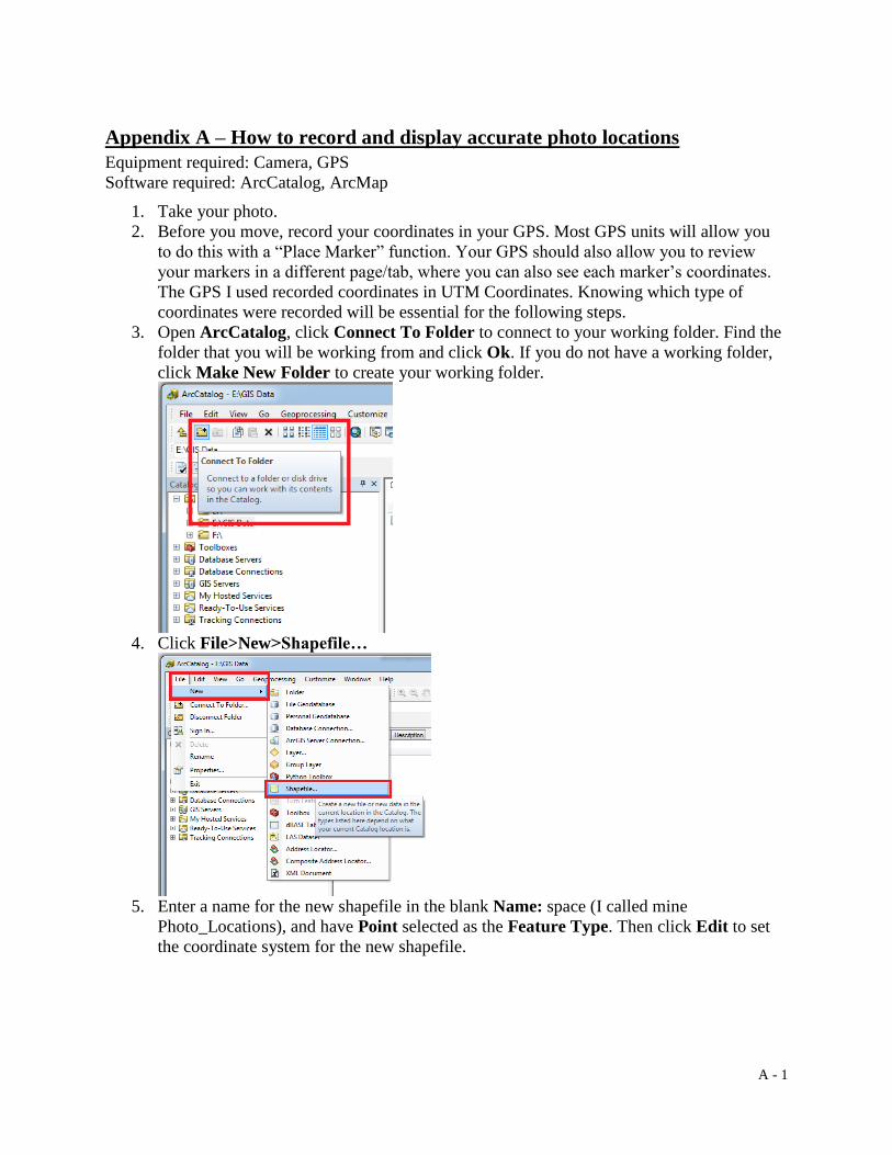
A - 1
Appendix A – How to record and display accurate photo locations
Equipment required: Camera, GPS
Software required: ArcCatalog, ArcMap
1. Take your photo.
2. Before you move, record your coordinates in your GPS. Most GPS units will allow you
to do this with a “Place Marker” function. Your GPS should also allow you to review
your markers in a different page/tab, where you can also see each marker’s coordinates.
The GPS I used recorded coordinates in UTM Coordinates. Knowing which type of
coordinates were recorded will be essential for the following steps.
3. Open ArcCatalog, click Connect To Folder to connect to your working folder. Find the
folder that you will be working from and click Ok. If you do not have a working folder,
click Make New Folder to create your working folder.
4. Click File>New>Shapefile…
5. Enter a name for the new shapefile in the blank Name: space (I called mine
Photo_Locations), and have Point selected as the Feature Type. Then click Edit to set
the coordinate system for the new shapefile.

A - 2
6. Click Projected Coordinate Systems>National Grids>Canada>NAD 1983 CSRS
UTM Zone 20N and then click Ok and Ok to close out of the dialogue boxes. Note that
the coordinate system that you select will vary depending on where your photos were
taken. I took my photos in Halifax, NS, which is why I am using NAD 1983 CSRS UTM
Zone 20N.
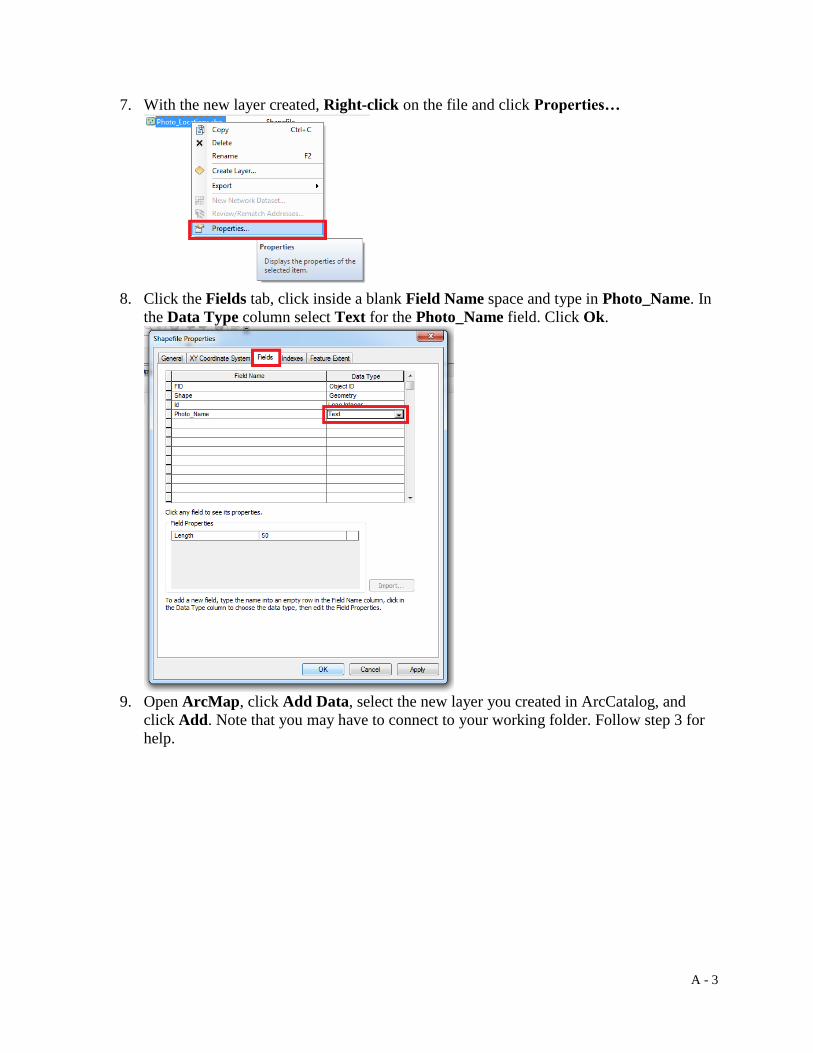
A - 3
7. With the new layer created, Right-click on the file and click Properties…
8. Click the Fields tab, click inside a blank Field Name space and type in Photo_Name. In
the Data Type column select Text for the Photo_Name field. Click Ok.
9. Open ArcMap, click Add Data, select the new layer you created in ArcCatalog, and
click Add. Note that you may have to connect to your working folder. Follow step 3 for
help.

A - 4
10. If Editor is not in your toolbar, right-click on your toolbar and click Editor.

A - 5
11. On the Editor tool click Editor˅ >Start Editing
12. In the Create Features window, select the file you created in ArcCatalog, and in the
Construction Tools section click Point.

A - 6
13. Right click on the data frame and click on Absolute X, Y…
Note that I added a base map to my data frame. This is not a necessary step of the
process, but it will help in providing context when placing points. Base maps can be
added by clicking on the ˅ of Add Data and then clicking Add Basemap…
14. In the box that appears click the ˅ and click on UTM. In the blank dialogue box first type
in the UTM zone (I entered 20N), then the easting (I entered 451396), then the northing (I
entered 4943177), and then press Enter on your keyboard. The full coordinate I entered
was 20N4513964943177

A - 7
15. Right click on the point that was created and click on Attributes.

A - 8
16. Click in the blank space beside the Photo_Name field and enter the desired name for the
point. This is not a necessary step, but is useful if you later want to label points on a map.
17. Repeat steps 12-16 until all photo locations have been placed. Once done, click Editor ˅,
then click Save Edits. Click Editor ˅, then click Stop Editing.

B - 1
Appendix B – How to fix errors and blemishes in images with Photoshop
Equipment required: Camera
Software required: Adobe Photoshop
I used ZoomBrowser EX, a program that comes installed with my camera (Canon G11), to stich
my photos together. Stitching is used to combine multiple photos together into one panoramic
photo. Using the program is quite simple (simply upload the photos, arrange the photos, and then
the program stiches the photos), but will often produce errors in the final photo
Notice how the images did not line up perfectly. These errors can be fixed in Adobe Photoshop.
1. Open the image you are fixing by clicking File > Open… (or press Ctrl + O) and select
the photo you intend to fix. Before editing the photo, save the photo as a Photoshop file
by clicking File > Save As (or pressShift + Ctrl + S) and then select Photoshop
(*PSD.*PDD) as the format. Remember to save frequently while using Photoshop.

B - 2
2. In the Layers tab, Right click on the image you opened (it should be labelled as
“Background”) and click on Duplicate Layer… Keeping the layer’s name as
Background Copy will be fine.
3. With the background layer selected, click on the Clone Stamp Tool (or press S). Note
that if Pattern Stamp Tool is selected, click and hold the Pattern Stamp Tool button
and then click on Clone Stamp Tool.
Notice how the photos did not line up perfectly so now there is an odd transition from
grass to pavement. We can use the clone tool to either add more grass or add more
pavement.

B - 3
4. To add more pavement, hold the alt key and click on pavement. This will set the
reference for what will be cloned when using the Clone Stamp Tool. Release the alt key,
then click and swipe the grass that is near the pavement, the result being:
If you wanted to instead add more grass (press Ctrl + Alt + Z to undo the previous
cloning) hold the alt key and click on the grass. Release the alt key, then click and swipe
the pavement that is near the grass, the result being:
The Spot Healing Brush Tool is useful for removing small objects and marks in a photo. I will
be removing ducks from the water with the tool.

B - 4
5. Click on the Spot Healing Brush Tool (or press J). Remember to click and hold and
then select the tool if the Spot Healing Brush Tool is not already selected.
6. Now click and swipe over the ducks. Once the click is released, the ducks should be
removed.
Light settings will sometimes change when taking photos for a panoramic photo. This can
happen because a cloud suddenly blocks the sun or the camera automatically adjusts light
settings. One photo will then be brighter or darker than the other photo(s). This error can be
fixed in Photoshop as well.

B - 5
7. Click on the Rectangular Marquee Tool (or press M). Remember to click and hold and
then select the tool if the Rectangular Marquee Tool is not already selected.
8. Click and drag a square over the area that needs its lighting adjusted. It helps to first click
outside of the image if you want to select the entire or most of the image. You may have
to zoom out (using the Zoom Tool (press Z)) in order to click outside of the image.
9. The selected area will have a dotted square around it. Click
Image>Adjustments>Brightness/Contrast…
10. Have the Preview box checked, this will show you how the selected area is changing as
you move the Brightness and Contrast sliders. Adjust the sliders until the selected area
has a similar lighting as the unselected area of the image. Then click OK.

B - 6
11. Press Ctrl + D or click Select>Deselect to unselect the area that was just being adjusted.
12. Save your work once you are satisfied with the adjustments you made to fix and clean up
the photo. Afterwards click File>Save As (or press Shift + Ctrl + S) and then select your
desired image format.
Before
After

B - 7
Sometimes when photos are merged together into a panoramic photo, the panoramic photo will
look warped and have an unnatural bend. This can be fixed by rotating sections of the photo.
13. Select the warped area with the Rectangular Marquee Tool. Then click
Edit>Transform>Rotate.
14. Hover the cursor outside of the selected area. The cursor will look like a bent line with
arrowheads on both ends. Hold click and drag to rotate the selected area until it is level
with the unselected area. Then move the selected area by clicking within the selected
area, holding the click and then dragging (or use the arrow keys to move) the
selected area until it is in line with the unselected area. Press Enter/Return to stop
rotating the selected area, then click Select>Deselect.
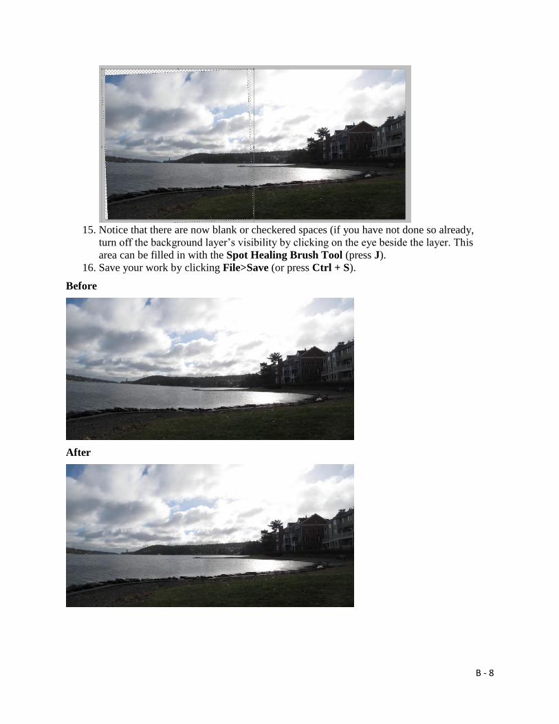
B - 8
15. Notice that there are now blank or checkered spaces (if you have not done so already,
turn off the background layer’s visibility by clicking on the eye beside the layer. This
area can be filled in with the Spot Healing Brush Tool (press J).
16. Save your work by clicking File>Save (or press Ctrl + S).
Before
After

C - 1
Appendix C – How to simulate storm-like conditions with Photoshop
Equipment required: Camera
Software required: Adobe Photoshop
1. In Photoshop, open the cleaned and fixed base photo (in its Photoshop file). The photo
should open as the Background layer. Duplicate the layer by right-clicking the layer and
then select Duplicate Layer… or with the layer selected press Ctrl + J. The duplicated
layer will appear as Layer 1.
2. Open the photo with the gray sky (File>Open…>select the photo). This will open the
photo in a new tab in Photoshop. Select the entire image by clicking Select>All or press
Ctrl + A. With the entire image selected click Edit>Copy or press Ctrl + C. Then switch
to the base photo tab and click Edit>Paste or press Ctrl + V to paste the gray sky photo
into the base photo tab. The pasted gray sky photo will appear as Layer 2.
a. Consider renaming Layer 1 and 2 to avoid confusion. Rename Layer 1 to Base,
and Layer 2 to Gray. Rename a layer by double clicking the layer name in the
layers tab.
3. Click and drag the gray sky layer so that it is between the background layer and the base
photo layer.
4. Select the base layer and click Add layer mask. The layer mask will be used to remove
areas in the base layer so that the gray layer shows underneath. Unlike using the erase
tool though, removed areas can be restored with the layer mask. This will be
demonstrated later on.
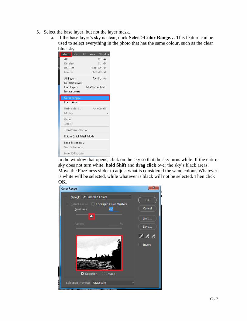
C - 2
5. Select the base layer, but not the layer mask.
a. If the base layer’s sky is clear, click Select>Color Range… This feature can be
used to select everything in the photo that has the same colour, such as the clear
blue sky.
In the window that opens, click on the sky so that the sky turns white. If the entire
sky does not turn white, hold Shift and drag click over the sky’s black areas.
Move the Fuzziness slider to adjust what is considered the same colour. Whatever
is white will be selected, while whatever is black will not be selected. Then click
OK.

C - 3
b. If the base layer’s sky is partially cloudy, use the Quick Selection Tool (press W)
to select the sky. Click and drag over the sky. If the wrong areas are selected
press and hold Alt and click drag over the wrong areas to remove them from the
selection. Adjust the brush size to select smaller areas.
6. With the base layer’s sky selected, select the layer mask, and then select the Brush Tool
(press B).
a. The brush’s default colour in the layer mask should be black and white. If it is
not, click Default Foreground and Background Colors or press D
.
To switch between black and white click Switch Foreground and Background
Colors or press X
.
7. With the brush tool and the colour set to black, click drag through the selected sky. This
will reveal the gray sky layer. Enlarge the brush size to make the brushing process
quicker. If you ever make a mistake (i.e. removing something that is not the sky) press
Ctrl + Z or brush over the area with the white colour (switch between black and white by
pressing X).
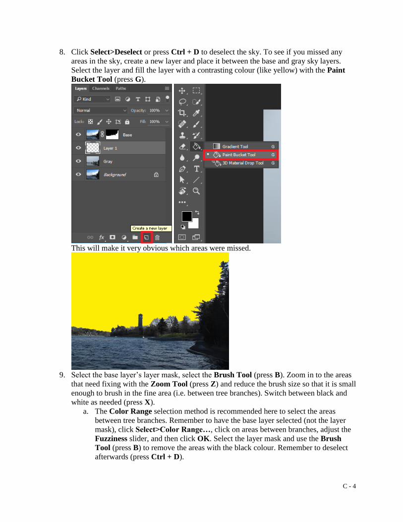
C - 4
8. Click Select>Deselect or press Ctrl + D to deselect the sky. To see if you missed any
areas in the sky, create a new layer and place it between the base and gray sky layers.
Select the layer and fill the layer with a contrasting colour (like yellow) with the Paint
Bucket Tool (press G).
This will make it very obvious which areas were missed.
9. Select the base layer’s layer mask, select the Brush Tool (press B). Zoom in to the areas
that need fixing with the Zoom Tool (press Z) and reduce the brush size so that it is small
enough to brush in the fine area (i.e. between tree branches). Switch between black and
white as needed (press X).
a. The Color Range selection method is recommended here to select the areas
between tree branches. Remember to have the base layer selected (not the layer
mask), click Select>Color Range…, click on areas between branches, adjust the
Fuzziness slider, and then click OK. Select the layer mask and use the Brush
Tool (press B) to remove the areas with the black colour. Remember to deselect
afterwards (press Ctrl + D).

C - 5
10. If you turn off the visibility of the contrasting layer, you might notice some of the base
layer’s trees have a blue glow.
To fix this, select the base layer, and use the Lasso Tool (press L) to select the branches
with the blue glow. To lasso multiple branches, hold Shift while encircling an area. With
the branches selected, click Image>Adjustments>Hue/Saturation… (or press Ctrl + U)
and in the dialogue box that opens, move the saturation slider to reduce the saturation
which will remove the blue glow. Then click OK and deselect the branches (press Ctrl +
D).
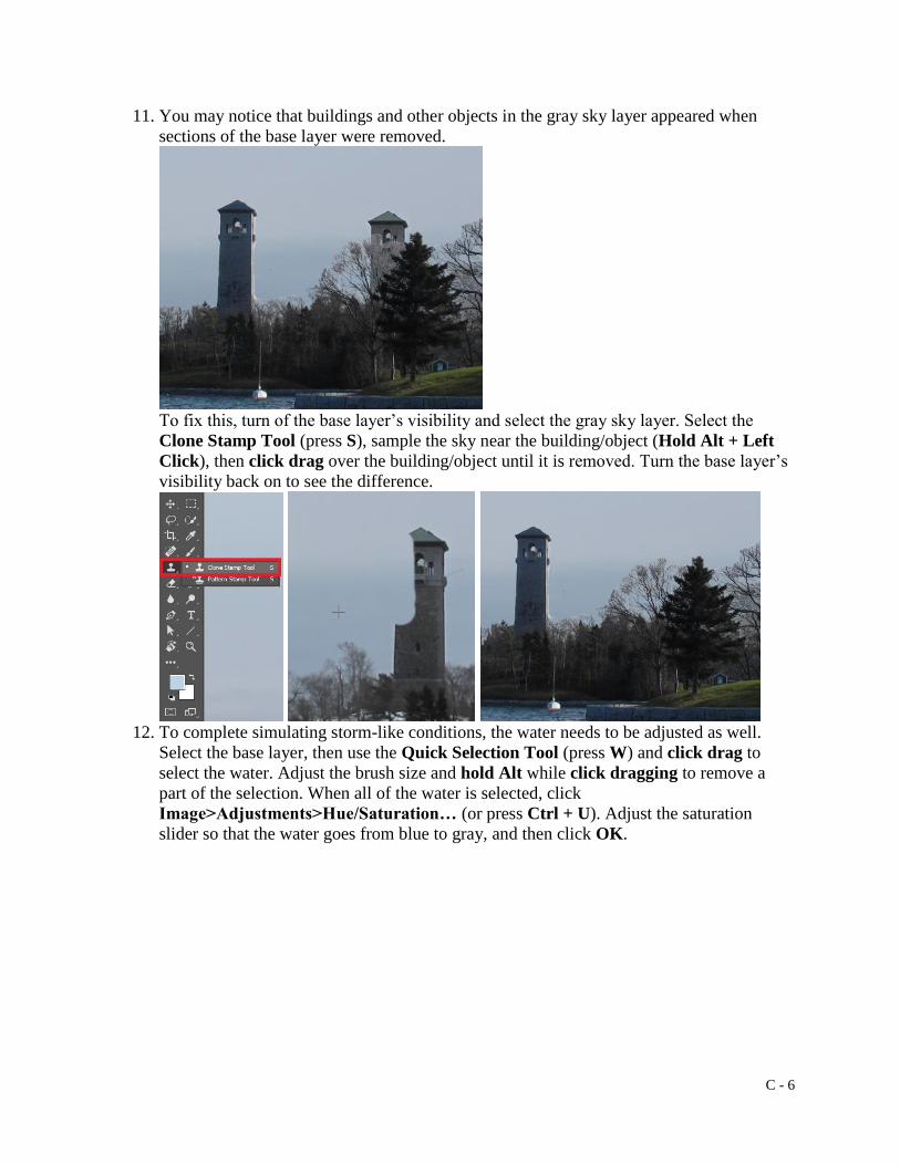
C - 6
11. You may notice that buildings and other objects in the gray sky layer appeared when
sections of the base layer were removed.
To fix this, turn of the base layer’s visibility and select the gray sky layer. Select the
Clone Stamp Tool (press S), sample the sky near the building/object (Hold Alt + Left
Click), then click drag over the building/object until it is removed. Turn the base layer’s
visibility back on to see the difference.
12. To complete simulating storm-like conditions, the water needs to be adjusted as well.
Select the base layer, then use the Quick Selection Tool (press W) and click drag to
select the water. Adjust the brush size and hold Alt while click dragging to remove a
part of the selection. When all of the water is selected, click
Image>Adjustments>Hue/Saturation… (or press Ctrl + U). Adjust the saturation
slider so that the water goes from blue to gray, and then click OK.

C - 7
13. Select both base and gray sky layers (Ctrl + click each layer), right click and select
Merge Layers. Save your work (press Ctrl + S).
Before
After

D - 1
Appendix D – How to perform photo scaling calculations
Equipment required: Camera, GPS
Software required: Adobe Photoshop, Google Earth Pro, ArcMap
1. In Photoshop, open the base photo Photoshop file and the height reference photo(s). In
the height reference photo, use the Rectangular Marquee Tool (press M) and drag a
rectangle over the height reference object (I used my friend and a metre stick) and
noticeable features near the object (such as tree, bench, or sign). Copy the selection by
clicking Edit>Copy or press Ctrl + C.
2. Switch to the base photo and paste the selection by clicking Edit>Paste or press Ctrl +
V. The height reference photo selection will appear as a new layer. For better
organization, rename the layer by double clicking on the layer name, and name the layer
to what the layer refers to (I named it Friend 1. My next height reference selection would
be called Friend 2, the next Friend 3, and so on).
3. Select the Friend 1 layer and reduce its opacity to 50%. Then move the layer with the
Move Tool (press V) so that it lines up with the base photo. Look for the same noticeable
features (tree, bench, sign) to help line up the layer.

D - 2
You will likely need to transform (scale and rotate) the Friend 1 layer so that it properly
lines up with the base photo. Transform the layer by clicking Edit>Free Transform or
press Ctrl + T. Hold Shift and click drag to scale the layer. Click drag outside of the
layer (the cursor should look like ) to rotate the layer. Press Enter or Return to stop
and keep the edits from the free transformation.
4. Restore the Friend 1 layer’s opacity to 100%. Use the Rectangle Tool (press U) and click
drag a rectangle that is as tall as the height reference object (I used a metre stick). It is
crucial that you know the height of your height reference object. I also suggest changing
the rectangle’s colour to a colour that is more obvious, such as red.
When the click is released, the rectangle is created in its own layer. The Properties tab
should also automatically open. If not, click Properties. The H: refers to the rectangle’s
height. The rectangle also represents the height reference object, which means in my case

D - 3
where my friend was standing at a specific distance, 1m is 76 pixels (px) in the image.
This information will later be used for the photo scaling calculation.
a. Double click on the rectangle layer’s name and rename it so that it refers to the
height reference layer. I renamed the rectangle to 1m Friend 1.
5. Repeat steps 1 through 4 for your other height reference photos.
6. In Google Earth, add the GPS point shapefile that was created in Appendix A by clicking
File>Import>Select the Shapefile (.shp)>Open.
7. Draw a line/path from the base photo’s GPS point to where the height reference object
was. Do this by clicking on Add Path (Google Earth – New Path dialogue box should
automatically open), click on the GPS point, click on where the height reference object
was, but before clicking OK, click on the Measurements tab in the dialogue box and set
the length’s units to Meters. This length measurement will also be used in the photo
scaling calculation. If you need to review the path’s length after clicking OK, in Google
Earth’s sidebar right click on the path and select Properties to open the dialogue box.

D - 4
8. Now draw a line from the GPS point to a point where you do not have a height reference
photo. Record the line’s length.
9. We now have the necessary information to complete a photo scaling calculation by using
the National Oceanic and Atmospheric Administration’s (2016) photo scaling formula.
If = Image Height (in Photoshop) of Feature. This will be calculated in step 9.
Af = Actual Height of Feature. For simplicity, have the feature’s actual height the same
as reference object (in my case, 1m).
Ar = Actual Height of Reference Object. My reference object is the metre stick, which
has a height of 1m.
Dr = Distance from Reference. This is the line’s length that was determined in step 7.
Df = Distance from Feature. This is the line’s length that was determined in step 8.
Ir = Image Height (in Photoshop) of Reference Object. This is the rectangle’s pixel height
that was determined in step 4.
Using the information used in this appendix’s examples, the filled in formula looks like
If = (1m/1m)X(22.2m/234m)X(76px) = 7.2px
At the location without a height reference photo, 1m will be 7.2 pixels tall in Photoshop.
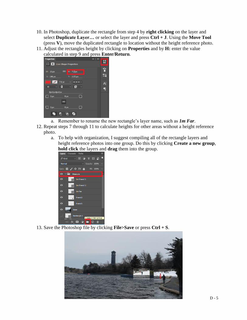
D - 5
10. In Photoshop, duplicate the rectangle from step 4 by right clicking on the layer and
select Duplicate Layer… or select the layer and press Ctrl + J. Using the Move Tool
(press V), move the duplicated rectangle to location without the height reference photo.
11. Adjust the rectangles height by clicking on Properties and by H: enter the value
calculated in step 9 and press Enter/Return.
a. Remember to rename the new rectangle’s layer name, such as 1m Far.
12. Repeat steps 7 through 11 to calculate heights for other areas without a height reference
photo.
a. To help with organization, I suggest compiling all of the rectangle layers and
height reference photos into one group. Do this by clicking Create a new group,
hold click the layers and drag them into the group.
13. Save the Photoshop file by clicking File>Save or press Ctrl + S.

E - 1
Appendix E – How to simulate extreme water levels with Photoshop
Software required: Adobe Photoshop, Flaming Pear’s Flood plugin (note that I used the Original
Flood plugin, not Flood 2)
1. In Photoshop, open the Photoshop file that has the height reference measurements by
clicking File>Open… or press Ctrl + O (from Appendix D).In the layers tab, create a
new group and drag the base photo into the new group.
2. With the base photo selected, click on the Lasso Tool (press L) and select the immediate
foreground by hold clicking and trace the foreground. When the click is released, the
trace will close and the foreground will be selected.

E - 2
3. With the foreground still selected, duplicate the foreground by pressing Ctrl + J. This
input should also deselect the foreground, but if not, click Selection>Deselect (or press
Ctrl + D).
4. Select the base photo in the layers tab and repeat steps 2 and 3, but instead of selecting
the foreground, select objects at further depths.
With the base photo’s visibility turned off, the image should look like this.
5. Select the group folder with the base photo and the different depths, and duplicate the
group by pressing Ctrl + J until you have as many duplicated groups as the amount of
water level scenarios. I had three water level scenarios in my situation. I also left one
group as “Normal” because it is important to show current conditions as well, and I
wanted to have a backup copy in case I made a mistake.

E - 3
a. It also helps with organization to rename the groups so that they represent the
specific scenario.
6. In the Measure group, select every 1m rectangle that was created in Appendix D by
holding Ctrl and clicking on each rectangle in the group tab. Then duplicate the
rectangles by pressing Ctrl + J. The duplicated rectangles should still be selected, but if
not select them again, and then move them slightly to the side with the Move Tool (press
V).
7. Select one of these duplicated rectangles and alter its height so that it represents the
height of the first scenario. This can be done by clicking Properties and then entering the
pixel height of the corresponding water level in the H: section.

E - 4
In my situation, my base photo was taken during high tide, which is 80cm above mean
sea level. A 1m rise above mean sea level would then be 20cm above the water level in
my base photo. Because my height reference object was a metre stick, I know how many
pixels tall one metre is, and then I can multiply the pixel number by 0.2 to get the pixel
height of 20cm.
8. Repeat step 7 for the remaining duplicated rectangles. Using the Move Tool (press V),
move the rectangles so their bottoms are where the water meets land by the height
reference object.
a. Rename the rectangles so that they reflect the height they now represent (i.e.
20cm Friend 1, 20cm Friend 2, etc.).
9. Change the visibility so that only the Measure and 1m Rise groups are visible. Expand
the 1m Rise group and select the base photo.

E - 5
10. Using the Zoom Tool (press Z), zoom in to the water’s horizon line or the furthest depth
if there is no horizon line (like in my example).
11. Select the Flood filter by clicking Filter>Flaming Pear>Flood…
a. The zip file that comes with Flood plugin will also have instructions for installing
the plugin into Photoshop. Follow these instructions if the filter does not appear.
12. In the window that opens, click the + button to zoom in to the area where you previously
zoomed in, then Adjust the Horizon slider so that the flood effect meets the top of 20cm
rectangle at the furthest depth. The Horizon line is represented as the green dotted line.
In the situation where the water has a horizon line, adjust the Horizon slider so that it is
slightly above the horizon line. You’ll notice that adjusting the slider by one point may
not be very precise. Adjust the Offset slider to adjust the flood effect with more
precision. The offset line is represented as the purple dotted line.

E - 6
Zoom out by clicking on the – button. Adjust the Perspective slider so that the water
effect looks normal. Perspective is used to match the perspective of a wide-angle or
narrow-angle lens. I’m not sure which lens my camera had, so I adjusted the slider until
the water effect looked normal. Adjusting the Altitude slider will change the water effect
so that it looks as if the camera is at a different height. Because the current scenario
represents a rise in the water level that would meet the photographer’s feet, I set a high
Altitude. As you create the flood effect for the other, higher scenarios, lower the
Altitude slider so that the water looks as if it is reaching close to the camera lens.
Adjust the Waviness, Complexity, Brilliance, and Blur sliders to change the flood

E - 7
effect so that it meets your desired water and wave effect. Waviness will adjust the wave
height, so that the water can be completely calm or have tall waves. Complexity will
adjust the waves from smooth waves to choppy waves. Brilliance will adjust the water’s
brightness and darkness. You can also adjust the water’s darkness colour, but I suggest
keeping the colour set to black. Blur will adjust the water’s clarity, at one extreme the
water will look like a mirror reflection of what is above the water.
Before clicking Ok to implement the flood effect, I suggest clicking on a small circle
around the larger square to save the parameters (the sliders’ positions and value) of the
flood effect. This will be useful if you ever need to recreate the exact flood effect.
a. The remaining sliders and buttons I did not use to simulate the extreme water
levels. More information can be found in the plugin’s guide, which is found in the
plugin’s zip file.
13. Now select one of the depths and select the Flood filter by clicking Filter>Flaming
Pear>Flood… ONLY adjust the Offset parameter (slider) so that it meets the top of the
20cm rectangle. Then click Ok to implement the flood effect.
a. If other parameters were adjusted, click on the small circle from the previous step
(a) to return to the previous settings.
14. Repeat step 13 for the other depths. Then arrange the depths in the group so the depths
are ordered that the immediate foreground is at the top and the background/deepest depth
is at the bottom of the group.
15. If you selected too much when you selected the depths in step 4, you will notice that
over-selection is very obvious.

E - 8
To fix this, select the corresponding depth in the layers tab and click on Add layer mask.
Then select the layer mask and click on the Brush Tool (or press B).
With black as the set colour (press D to get black and white, and press X to switch
between black and white) hold click and brush over the errored area to remove the area.
a. If you make a mistake, press Ctrl + Alt + Z to undo, or brush over the area with
white to bring back the removed area.
16. Repeat steps 6 through 15 to simulate the extreme water levels of the other scenarios, but
by step 6 remember to alter the rectangle’s heights so that they represent the
corresponding scenario.
17. Save your work by clicking File>Save (or press Ctrl + S).

F - 1
Appendix F – Email from National Oceanic and Atmospheric Administration
regarding Sea Level Rise Viewer method