Embed Size (px)
Citation preview
- 1 -
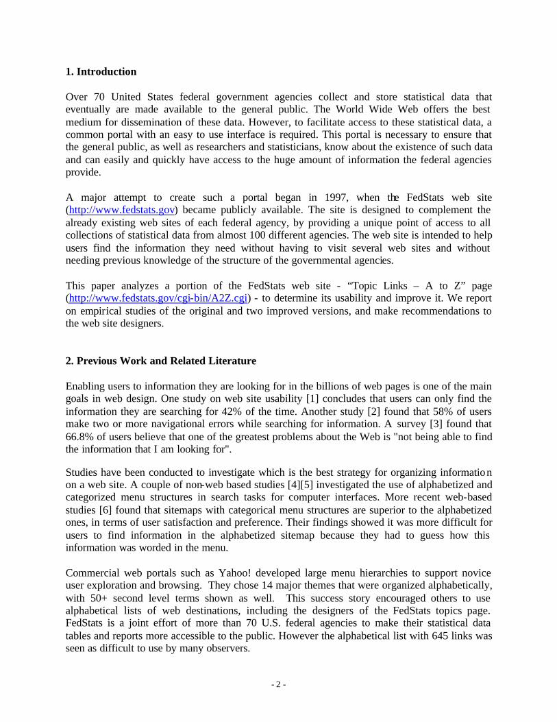
Finding Governmental Statistical Data on the Web:
Three Empirical Studies of the FedStats Topics Page
Irina Ceaparu and Ben Shneiderman {irina,ben}@cs.umd.edu Department of Computer Science &
Human Computer Interaction Laboratory University of Maryland College Park
Draft: May 13, 2003
Abstract Governmental agencies provide statistical data on their web sites. These large collections of data need appropriate interfaces that would guide the general public, as well as the researchers, to easily and successfully find information they seek. This paper summarizes the results of three empirical studies with 15 users in each group of the FedStats Topics web page. The evolution from 645 alphabetically organized links, to 549 categorically organized links, to 215 categorically organized links tied to portal pages produced a steady rise in successful task completion from 15% to 28% to 42%. User satisfaction also increased. We make recommendations based on these data and our observations of users. Keywords: digital government, statistical information, usability, web page design, categorical indexes, web navigation
- 2 -
1. Introduction Over 70 United States federal government agencies collect and store statistical data that eventually are made available to the general public. The World Wide Web offers the best medium for dissemination of these data. However, to facilitate access to these statistical data, a common portal with an easy to use interface is required. This portal is necessary to ensure that the general public, as well as researchers and statisticians, know about the existence of such data and can easily and quickly have access to the huge amount of information the federal agencies provide. A major attempt to create such a portal began in 1997, when the FedStats web site (http://www.fedstats.gov) became publicly available. The site is designed to complement the already existing web sites of each federal agency, by providing a unique point of access to all collections of statistical data from almost 100 different agencies. The web site is intended to help users find the information they need without having to visit several web sites and without needing previous knowledge of the structure of the governmental agencies. This paper analyzes a portion of the FedStats web site - “Topic Links – A to Z” page (http://www.fedstats.gov/cgi-bin/A2Z.cgi) - to determine its usability and improve it. We report on empirical studies of the original and two improved versions, and make recommendations to the web site designers. 2. Previous Work and Related Literature Enabling users to information they are looking for in the billions of web pages is one of the main goals in web design. One study on web site usability [1] concludes that users can only find the information they are searching for 42% of the time. Another study [2] found that 58% of users make two or more navigational errors while searching for information. A survey [3] found that 66.8% of users believe that one of the greatest problems about the Web is "not being able to find the information that I am looking for". Studies have been conducted to investigate which is the best strategy for organizing information on a web site. A couple of non-web based studies [4][5] investigated the use of alphabetized and categorized menu structures in search tasks for computer interfaces. More recent web-based studies [6] found that sitemaps with categorical menu structures are superior to the alphabetized ones, in terms of user satisfaction and preference. Their findings showed it was more difficult for users to find information in the alphabetized sitemap because they had to guess how this information was worded in the menu. Commercial web portals such as Yahoo! developed large menu hierarchies to support novice user exploration and browsing. They chose 14 major themes that were organized alphabetically, with 50+ second level terms shown as well. This success story encouraged others to use alphabetical lists of web destinations, including the designers of the FedStats topics page. FedStats is a joint effort of more than 70 U.S. federal agencies to make their statistical data tables and reports more accessible to the public. However the alphabetical list with 645 links was seen as difficult to use by many observers.
- 3 -
Research on government statistical web sites has increased under support from the National Science Foundation’s Digital Government Program. Existing user interfaces and novel prototypes became the focus of study and experimentation [7][8]. But making progress depended on having appropriate methods for assessing efficacy of user interfaces that would be used by diverse users for diverse tasks. Novice users with poor literacy skills might be trying to find information about current job prospects while expert users might be compiling important surveys of the demographic differences in cancer death rates across 3140 counties over a 20-year time period. To provide a foundation for design and testing, Hert developed a scenario-based approach to statistical information networks [9]. Working with government agency staff, she distilled the extensive logs of citizen requests into 15 scenarios. 3. Empirical study Materials Starting with these 15 scenarios, we chose 3 that represented 3 levels of information need: • Construct an understanding - the question as well as the answer is very elaborate and the
source of information to be searched is not clear from the context Scenario: “I’m a social activist in the Raleigh-Durham, North Carolina area and have become increasingly concerned about urban sprawl and the loss of rural areas for both farming and recreation. I need statistics to support my claim that significant differences occur when urban development occurs in rural and/or farming areas.”
• Search for specific data – the user only needs to locate information Scenario: “I would like to open a grocery store specializing in organic products in the greater Seattle metropolitan area. What are the trends in production and consumption of organic food products? Would the Seattle area be a good place to locate?”
• Comparative search - the user has to look for information regarding an interaction between two phenomenon Scenario: “I’m contemplating a move from Seattle to Bozeman, MT. How do they compare?”
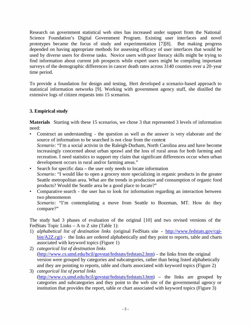
The study had 3 phases of evaluation of the original [10] and two revised versions of the FedStats Topic Links – A to Z site (Table 1): 1) alphabetical list of destination links (original FedStats site - http://www.fedstats.gov/cgi-
bin/A2Z.cgi) - the links are ordered alphabetically and they point to reports, table and charts associated with keyword topics (Figure 1)
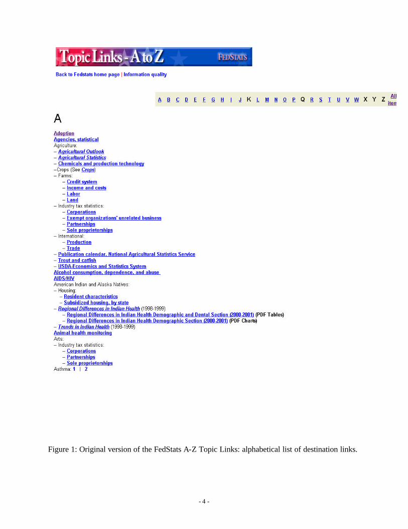
2) categorical list of destination links (http://www.cs.umd.edu/hcil/govstat/fedstats/fedstats2.htm) – the links from the original version were grouped by categories and subcategories, rather than being listed alphabetically and they are pointing to reports, table and charts associated with keyword topics (Figure 2)
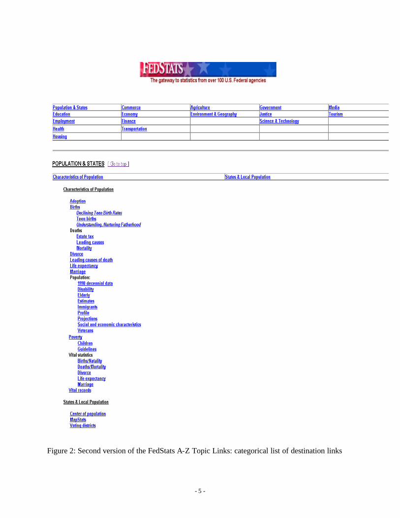
3) categorical list of portal links (http://www.cs.umd.edu/hcil/govstat/fedstats/fedstats3.htm) – the links are grouped by categories and subcategories and they point to the web site of the governmental agency or institution that provides the report, table or chart associated with keyword topics (Figure 3)
- 4 -
Figure 1: Original version of the FedStats A-Z Topic Links: alphabetical list of destination links.
- 5 -
Figure 2: Second version of the FedStats A-Z Topic Links: categorical list of destination links
- 6 -
Figure 3: Third version of the FedStats A-Z Topic Links: categorical list of portal links
- 7 -
Categories were chosen from the Statistical Abstract of the United States (a collection of statistics on social and economic conditions in the United States) and the USA Statistics in Brief (a supplement to the Statistical Abstract of the United States which presents national summary data and state population estimates). There are 31 categories in the Statistical Abstract and 18 in the supplement. We compiled these categories into a list of 16 main categories (Agriculture, Commerce, Economy, Education, Employment, Environment & Geography, Finance, Health, Housing, Justice, Government, Media, Population, Tourism, Transportation, Science & Technology) and 50 subcategories. The 2nd version of the FedStats web site grouped the links from the original web site into categories and subcategories in a first attempt to improve the navigation process and to reduce the search time. It also eliminated almost 100 redundant links found on the original version. The 3rd version maintained the grouping by categories and subcategories (with minor revisions of the subcategories) from the 2nd version but removed the original links and replaced them with links to the agency, institution or department that had information and data relevant to a specific topic. This allowed grouping of topics under one link and also indicated where topics that were not listed in the keywords could be found. A 4-step set of instructions at the beginning of the main page indicated an efficient way to use the web site to find the information. The concept was to go to the portal home page and do a keyword search on the portal web site. Procedures: We conducted a pilot test to verify the correctness and usefulness of the procedures. The pilot study helped refine the observation methodology and provided a list of most common and frequent types of frustrations the subjects might encounter during the study. The three studies were run over a 10-month period, with the same methods. All the subjects were given the three scenarios mentioned above. They were asked to find the answers to the scenarios using the FedStats web site within a 10-minute limit for each scenario. A think aloud protocol was used, in order to observe and register the subjects’ actions and comments. After each scenario, the subjects were asked to fill out a short questionnaire intended to reflect their opinions about the scenarios and the results they got, about the web site ease of use and usefulness and about the level and type of frustration they experienced during the study. Study 1 Study 2 Study 3 visualization concept alphabetical list of
destination links categorical list of destination links
categorical list of portal links
# links 645 549 215 # keywords 722 645 305 # lines 838 822 778 # categories 0 16 16 # subcategories 0 52 50 # redundant links 96 0 0 Table 1: Layout differences between the 3 versions of the FedStats Topics web site. Subjects: All three studies were each conducted with 15 subjects, males and females, with different backgrounds: Computer Science, Library and Information Sciences, Economics,
- 8 -
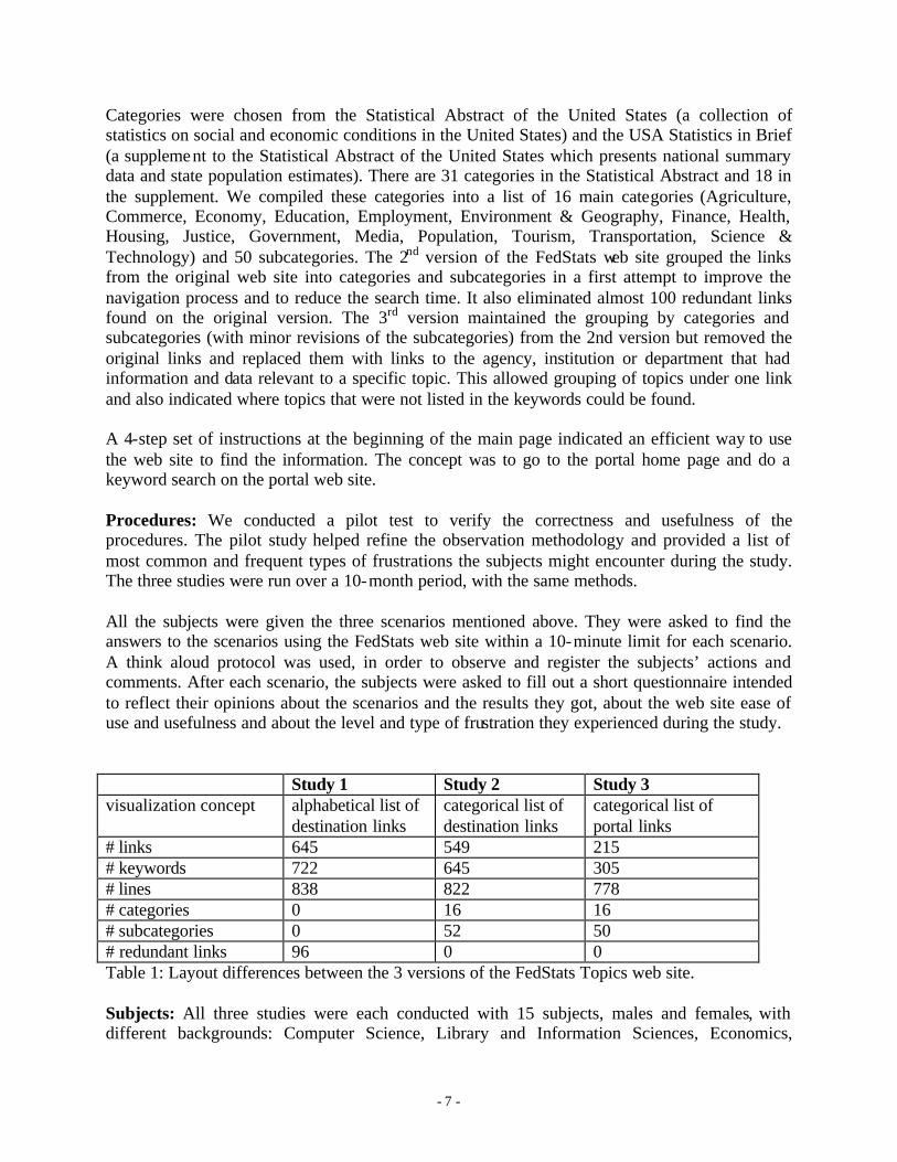
French, Sociology, Electrical Engineering, MBA and Medical Studies. A new group of 15 was recruited for each study. The first group consisted of 9 males and 6 females, the second consisted of 12 males and 3 females and the third consisted of 9 males and 6 females. All were graduate students at the University of Maryland. 4. Results The results included the number of correct answers, the post-test subjective questionnaires, and the observations made during the study. The questionnaire covered subjective satisfaction and level of frustration during the study. The number of correct answers found for all 45 tasks in each study increased from 15% in the 1st study to 24% in the 2nd to 42% in the 3rd (Figure 4).
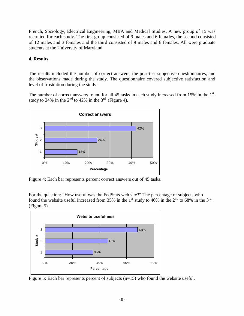
Figure 4: Each bar represents percent correct answers out of 45 tasks. For the question: “How useful was the FedStats web site?” The percentage of subjects who found the website useful increased from 35% in the 1st study to 46% in the 2nd to 68% in the 3rd (Figure 5).
Figure 5: Each bar represents percent of subjects (n=15) who found the website useful.
Correct answers
15%
24%
42%
0% 10% 20% 30% 40% 50%
1
2
3
Stu
dy
#
Percentage
Website usefulness
35%
46%
68%
0% 20% 40% 60% 80%
1
2
3
Stu
dy
#
Percentage
- 9 -
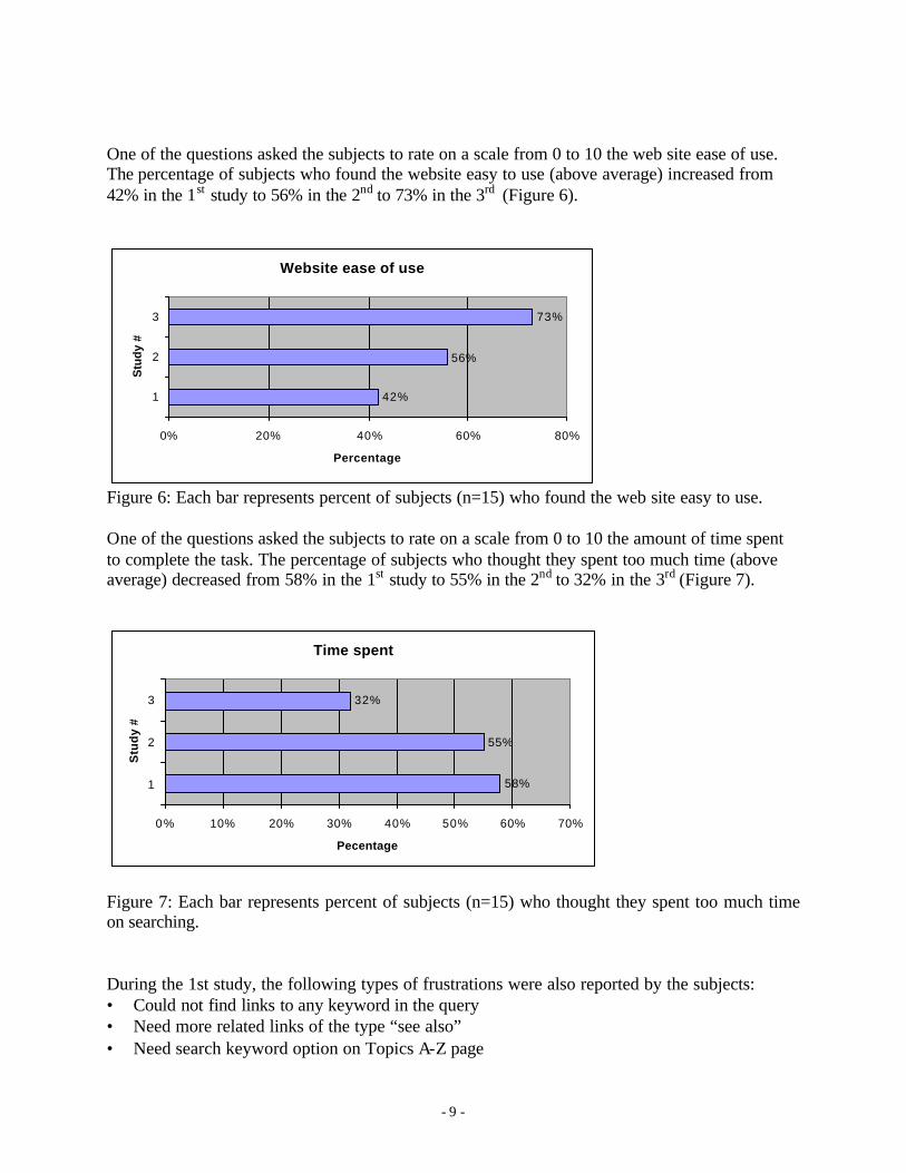
One of the questions asked the subjects to rate on a scale from 0 to 10 the web site ease of use. The percentage of subjects who found the website easy to use (above average) increased from 42% in the 1st study to 56% in the 2nd to 73% in the 3rd (Figure 6).
Figure 6: Each bar represents percent of subjects (n=15) who found the web site easy to use. One of the questions asked the subjects to rate on a scale from 0 to 10 the amount of time spent to complete the task. The percentage of subjects who thought they spent too much time (above average) decreased from 58% in the 1st study to 55% in the 2nd to 32% in the 3rd (Figure 7).
Figure 7: Each bar represents percent of subjects (n=15) who thought they spent too much time on searching. During the 1st study, the following types of frustrations were also reported by the subjects: • Could not find links to any keyword in the query • Need more related links of the type “see also” • Need search keyword option on Topics A-Z page
Website ease of use
42%
56%
73%
0% 20% 40% 60% 80%
1
2
3
Stu
dy
#
Percentage
Time spent
58%
55%
32%
0% 10% 20% 30% 40% 50% 60% 70%
1
2
3
Stu
dy
#
Pecentage
- 10 -
• Obvious keywords missing • Topics were confusing • Use easier to understand language • Need geographic granularity by cities • No “cost of living calculator” • No way to set up comparative statistics The subjects were asked to talk freely about the experience with the web site. Here are some of their comments: • Having a background or familiarity with this kind of research would probably help greatly • FedStats was close to useless • There is too much data • Can I go to Google? The second version of the web site was designed to meet the users’ requests related to easier navigation through the huge number of links and their desire for less confusing topics. We addressed these issues by grouping the links under 16 categories and 52 subcategories that would point users to scan for information in a restricted number of links. We hoped this would not only reduce the search time but would also reduce the user’s level of frustration related to not knowing how to explore a large collection of information. During the 2nd study, subjects were able to find the information they were looking for more easily and quickly, provided the information existed on the web sit e. However, since they were restricted to the reports, tables and charts to which the links pointed, they could not search past the information available directly from the links. Also, they reported the following frustrations: • Too specific links • No explanation of links and weird choice of wording for the links • The name of the link suggests the possibility of finding relevant information, but the link
turns out to be useless • The amount of information is overwhelming and specific data is hard to locate • The web site seems to be built not for the general public • No “cost of living calculator” The third version of the web site was designed to address the users’ complaints about the huge number of too specific links that proved to be misleading in most cases. The solution adopted was to change the links from destination links to portal links. This reduced the number of links from 549 to 215, since more than one topic could be found on the same portal web site. Also, the name of the links and the keywords that preceded the links guided the user and facilitated the navigation process. For example, instead of separate links to specific tables of data, the terms Births, Deaths, Divorce Life Expectancy, Marriage, and Poverty were grouped and then links to two agencies were listed. During the 3rd study, the users were more at ease with the web site and were able to navigate easily and locate the information they were looking for. Still, the following frustrations were reported: • Lack of a centralized search function
- 11 -
• Too much information on one page • Not sure how to handle multiple criteria queries • Category headings could be improved 5. Discussion This study was intended to discover the advantages and the shortcomings of a web site that provides access to statistical information. We chose the FedStats web site, since it is the major portal to governmental statistics on the Internet. While our usability study had a reduced scope, it provided sufficient insight and experience with this type of analysis to lead to a future study with larger coverage and initiate recommendations. Future studies should include more diverse subjects and a wider range of scenarios. In addition, studies of users who come with their own tasks will help determine the efficacy of the new design. Based on these three empirical studies, we believe that the designers and administrators of the FedStats web site should pursue the improvements brought by the third version (category links to portal sites). A revised site could have a higher rate of successful users, since it is easier to navigate and less frustrating. To summarize, accessibility and universal usability should be two of the primary concerns of the governmental agencies when it comes to citizen services provided through the agencies’ web sites. Dissemination of statistical information should be governed by the following design principles: 1. Universal usability - The interface should accommodate the diversity of users: not only
expert users, but also first-time and one-time users should be able to easily access and find the desired information. In the case of FedStats original version, we found that most of the subjects were confused by the design of the web site, and even after the second task, they did not “learn” the interface. The 2nd and 3rd version both made the user feel more comfortable with the web site and more confident that the information needed could be found through the web site. Usability with slow modems, small screens, voice browsers, and other universal usability tools should be tested [11].
2. Easy navigation - The information available should be presented in a structured way. In the 1st study, all subjects indicated that a home page containing categories by topics, categories by agencies and a search function would best serve their needs. An alphabetical list of topics slows down the search process, especially when it cannot ever be complete from the user’s point of view. In the case of FedStats, subjects indicated frustration when searching the A-Z topics without finding keywords they were expecting to find. The 2nd and 3rd studies tried to accommodate the users’ needs for more organized information. The presence of categories and subcategories helped the user navigate through the overwhelming amount of information. The 3rd version of the web site, with portal links and keyword suggesting what kind of information can be found through those links, reduced the time spent on irrelevant links and allowed the user to quickly decide what path to follow.
3. Common language - The terminology used to present the information available should be easy to understand. Except for the expert users, all others most likely do not have enough knowledge to look for the “scientific” term, and instead use everyday language words. Also,
- 12 -
the agencies should not expect the users to know the structure, the exact role of each agency, or the interactions between agencies. All these should be transparent in the search process. In the case of the original and the 2nd version of FedStats, many users complained about the keywords used on the web site (e.g. the common keyword “cities” is hidden under the not so common phrase “metropolitan areas”). In the 3rd version the keyword preceding the portal links clearly indicated the topics that could be found under each link. However, users complained about the wording of some categories that did not fully reflect the topics related to them.
4. Comparative search & Data tools - The web site should allow comparative search and other common-use ways of viewing and analyzing statistical data. General public, statisticians and researchers need to be able to quickly perform analysis of data by certain well-established criteria. In the case of FedStats, the third scenario proved to be more difficult and more time consuming than it should have been because the subjects had no way to perform a comparative search or use a cost of living calculator. The 3rd version added a link to a cost of living calculator, to verify its usefulness. Although the queries answered using this feature were not reported in the final results, most of the users found the link and wanted to use it in order to answer the 3rd scenario.
5. Advanced search - The search feature should have full functionality. It should support a comprehensive search through the huge amount of data available, support logical operators and provide relevant output. In the case of the original version of FedStats, although the search box was the most commonly used method to find the answer to the scenarios, in most cases it provided useless output, and sometimes misled the subject by not correctly implementing the use of logical operators. For the 2nd and 3rd studies, users complained about the lack of a centralized search function that would allow them to search all the web sites that had links on the front page.
6. Data granularity - Allow users to choose the granularity of the information searched in terms of geography and time. In the case of FedStats, subjects were often not able to find the information at the city level, being offered data only at the state or county level. Additionally, subjects expressed the desire to be able to choose the time interval for which they want to search for data.
In summary, users were more successful in finding answers for our tree scenarios when the web site was organized by meaningful categories, rather than an alphabetical listing. Secondly, users were more successful when the links led them to agencies portals, rather than specific tables. This strategy encouraged successful exploration and led to higher levels of subjective satisfaction. Acknowledgements: We appreciate partial support from National Science Foundation grant for Information Technology Research (#0086143) Understanding the Social Impact of the Internet: A Multifaceted Multidisciplinary Approach.
- 13 -
References 1. Spool, Jared M., Scanlon, Tara, Schroeder, Will, Snyder, Carolyn & DeAngelo, Terri, Web
Site Usability: A Designer’s Guide, Morgan Kaufmann Publishers, San Francisco (1999). 2. Forsythe, C., Ring, L., Grose, E., Bederson, B., Hollan, J., Perlin, K., & Meyer, J., Human
Factors Research and Development for the Internal Web at Sandia National Laboratories: A Review and Update, Proceedings 2nd Conference on Human Factors and the Web (1996). http://www.microsoft.com/usability/webconf/forsythe.rtf
3. Georgia Tech Research Corporation, GVU's WWW User Surveys (1994-1998), Accessed
May 2003, http://www.gvu.gatech.edu/user_surveys/ 4. Barnard, P.J., Morton, J., Long, J., & Ottley, E.A., Planning menus for display: Some effects
of their structure on user performance, Proc. International Conference on Displays for Man.Machine Systems, IEEE Publication 150. (1977), 130-133.
5. McDonald, J. E., Stone, J. D., & Liebelt, L. S., Searching for items in menus: The effects of
organization and type of target, Proc. 27th Annual Meeting of the Human Factors Society, Santa Monica, CA (1983), 834-837.
6. Bernard, M. L., & Chaparro, B. S., Searching within websites: A comparison of three types of
sitemap menu structures. Proc. Human Factors and Ergonomics Society 44th Annual Meeting, Santa Monica, CA (2000), 441-444.
7. Marchionini, G., Hert, C., Liddy, E., and Shneiderman, B., Extending understanding of
Federal statistics in tables. ACM Conference on Universal Usability, ACM, New York (2000), 132-138.
8. Hert, C. A., Liddy, E. D., Shneiderman, B., Marchionini, G., Supporting statistical electronic
table usage by citizens, Communications of the ACM 46, 1 (January 2003), 52-54. 9. Hert, C., Developing and Evaluating Scenarios for Use in Designing the National Statistical
Knowledge Network (2002), Available at: http://ils.unc.edu/govstat/papers/scenario_paper_nov_14_2002.doc
10. Ceaparu, I., Finding Governmental Statistical Data on the Web: A Case Study of FedStats, IT
& Society 1, 3 (Winter 2003), 1-17. Available at http://itandsociety.org 11. Shneiderman, B., Universal Usability: Pushing human-computer interaction research to
empower every citizen, Communications of the ACM 43, 5 (May 2000), 84-91.