Embed Size (px)
Citation preview
fau ne
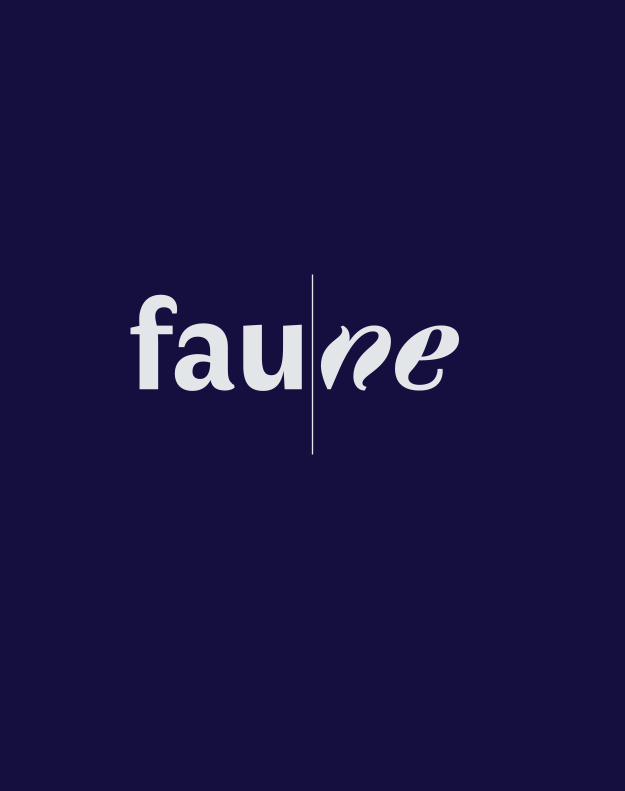
And
the
scre
am o
f the
coc
ks c
allin
g fr
om a
far
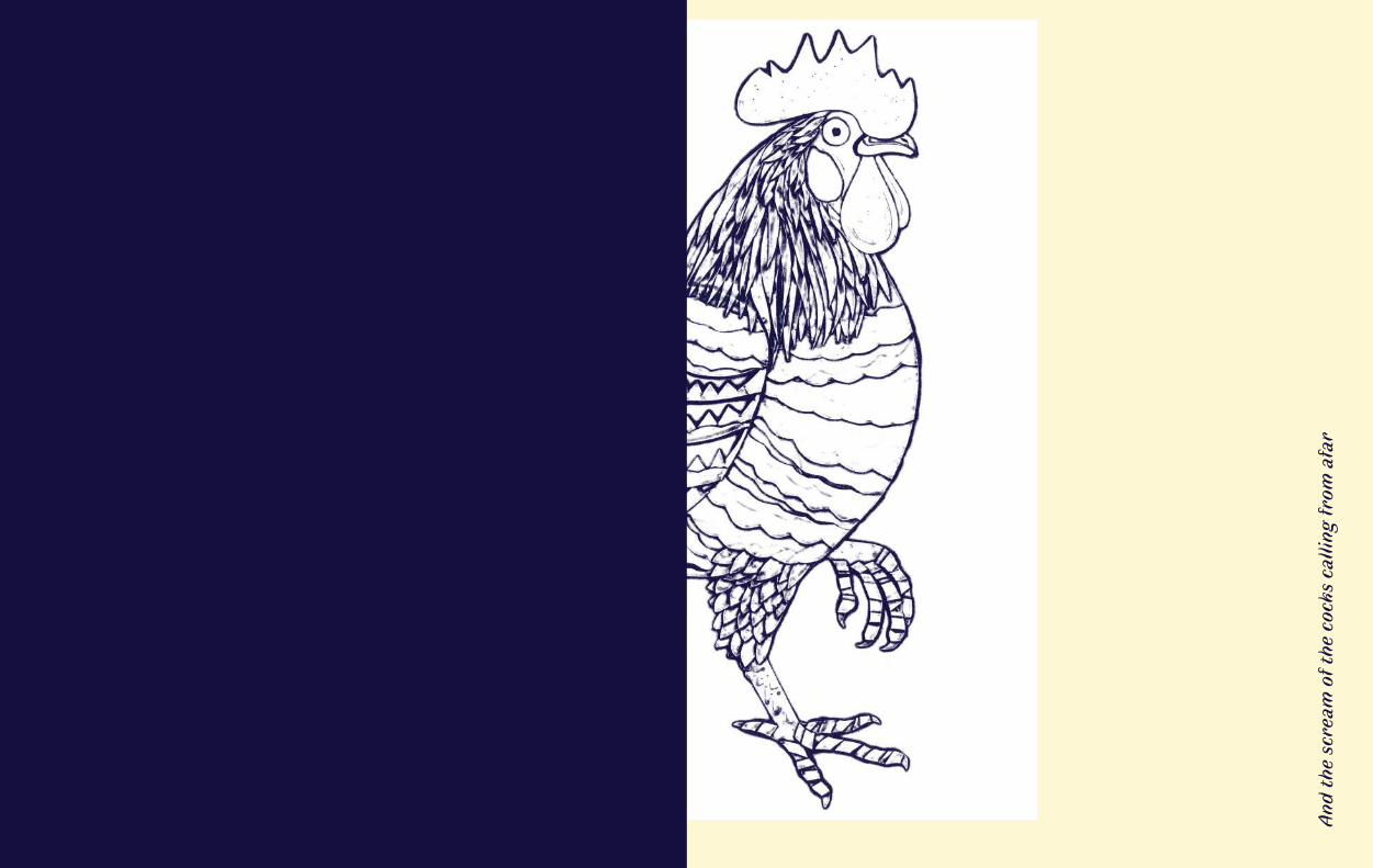
Wit
h w
hite
feat
hers
, wit
h go
lden
cla
ws
Always to see this gilded viper
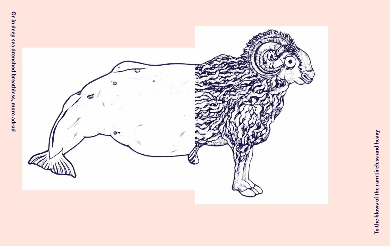
To th
e bl
ows
of th
e ra
m ti
rele
ss a
nd h
eavy
Or in deep sea drenched breathless, m
ore adrad
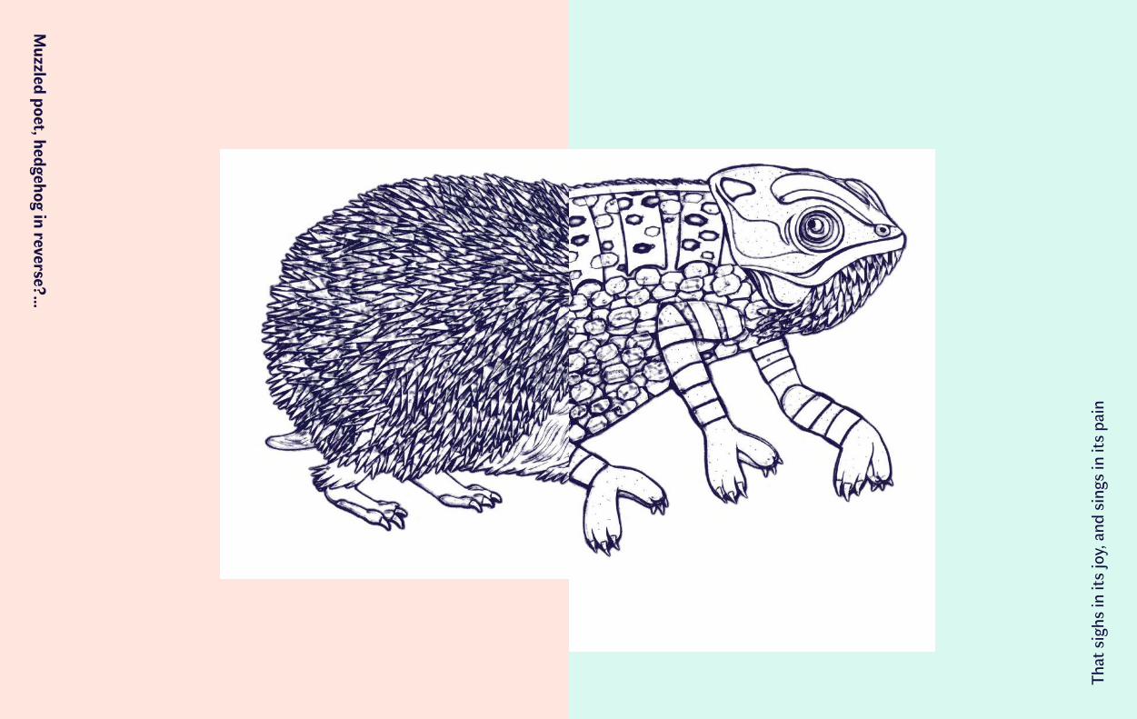
That
sig
hs in
its
joy,
and
sin
gs in
its
pain
Muzzled poet, hedgehog in reverse?…
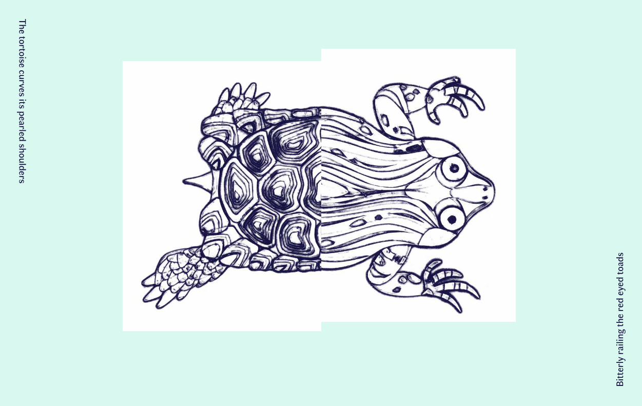
Bitt
erly
rai
ling
the
red
eyed
toad
sThe tortoise curves its pearled shoulders
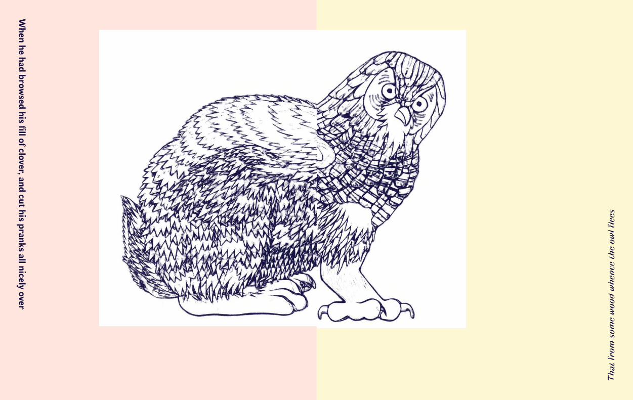
That
from
som
e w
ood
whe
nce
the
owl fl
ees
When he had brow
sed his fill of clover, and cut his pranks all nicely over
faunene
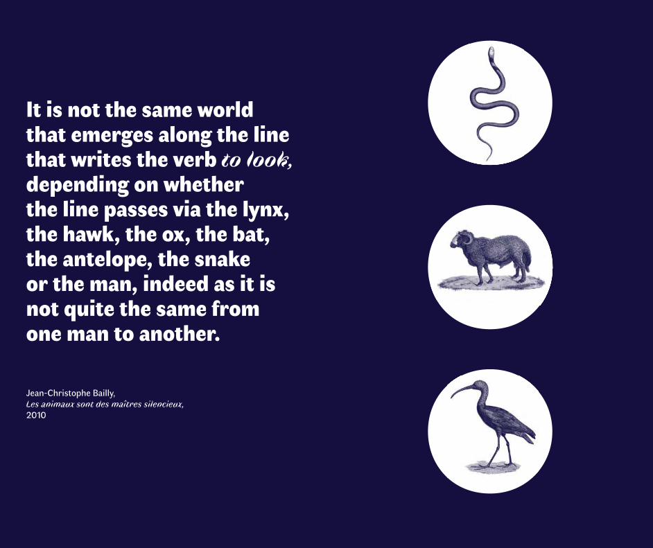
It is not the same world that emerges along the line that writes the verb to look, depending on whether the line passes via the lynx, the hawk, the ox, the bat, the antelope, the snake or the man, indeed as it is not quite the same from one man to another. Jean-Christophe Bailly, Les animaux sont des maîtres silencieux, 2010
The typeface Faune has been designed and developed in unexpected and subtle forms, and calls upon the most contemporary of digital technologies.
Typeface design is a dynamic and inventive domain and Alice Savoie’s proposition is a brilliant example of this. Let us hope that Faune participates in bringing the work of typeface designers to light and confirming their importance in the construction of everyday life.
Faune, together with its design sketches and documents, is part of the collection of the Centre National des Arts Plastiques. Our two establishments, together, have in this way contributed to writing a new page in the great book of typography.
For this new commission of a typeface family by the Centre National des Arts Plastiques, we wished to associate the skills and domains of activity of our two institutions with the aim of accompanying a new creation.
The Centre National des Arts Plastiques supports and valorizes graphic design and typography, through its collection, its publications and the events that it hosts. The Imprimerie Nationale is endowed with an exceptional patrimony. The know-how that it fosters and puts into practice is soundly based in History while firmly looking towards the future.
We wanted to bring these complementary values and energies together in order to implement this project, for which Alice Savoie has been selected by a panel of experts that was assembled for the occa-sion. Her approach combines patrimony and current events, rigor and poetry and all of this with intelligence and creativity.
Yves Robert Director of the Centre National des Arts Plastiques
Didier Trutt Chief Executive Officer of the Groupe Imprimerie Nationale
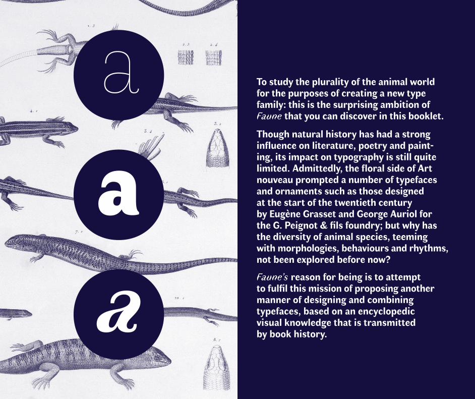
To study the plurality of the animal world for the purposes of creating a new type family: this is the surprising ambition of Faune that you can discover in this booklet.
Though natural history has had a strong influence on literature, poetry and paint-ing, its impact on typography is still quite limited. Admittedly, the floral side of Art nouveau prompted a number of typefaces and ornaments such as those designed at the start of the twentieth century by Eugène Grasset and George Auriol for the G. Peignot & fils foundry; but why has the diversity of animal species, teeming with morphologies, behaviours and rhythms, not been explored before now?
Faune’s reason for being is to attempt to fulfil this mission of proposing another manner of designing and combining typefaces, based on an encyclopedic visual knowledge that is transmitted by book history.
Reinventing the notion of a typeface family
At the origin of this second typographic commission initi-ated by the Centre National des Arts Plastiques, this time in partnership with the Imprimerie Nationale, is a question: what would a contemporary and forward looking vision of the type family look like?
For over five centuries, the typographic palette available to us has been constantly expanding: blackletter and roman typefaces, then italic and bold variants, with or without serifs, multi-scripts, for continuous reading or titling… This variety demonstrates our ability to ceaselessly reinvent our relationship with the letterforms, and with the text. More than a testament to creativity, this phenomenon also reveals an increasing desire for rationalization: type designers have made numerous attempts to name and classify this aesthetic diversity, and to have some control over the possible combinations that can be made between different type styles; they have also repeatedly criticized the hybridizations to which typefaces have been subjected.
The paradigm shift that is currently occurring, fostered by (among other factors) the diversification of mediums that enable us to read and write, has forced type designers to come up with a typographic palette that is adapted to this diverse and constantly changing environment. The most frequent response that is provided today is the development of vast homogeneous sets of typefaces, with multiple grada-tions of weights, of widths, of optical sizes, etc., that users are invited to draw from to meet their needs.
Going against this process of expansion, Faune wishes to chal-lenge this evolution by proposing an approach that is invested with formal diversity and unexpected crossovers.
faune→ n. f. (latin scientific fauna, derived from Faunus, proper noun) 1. All of the animal life living in a geo-graphical space or a given habitat. 2. A descriptive work that contains the list and description of these species along with charts and tables that allow them to be determined. 3. Pejorative (French). A group of a particular type of people who socialize in a place: The fauna of St Tropez → n. m. (latin faunus) An ancient Roman deity of pastures and forests, usually represented with horns, goat’s feet and pointed ears. Definition translated from the Larousse 2017 dictionary
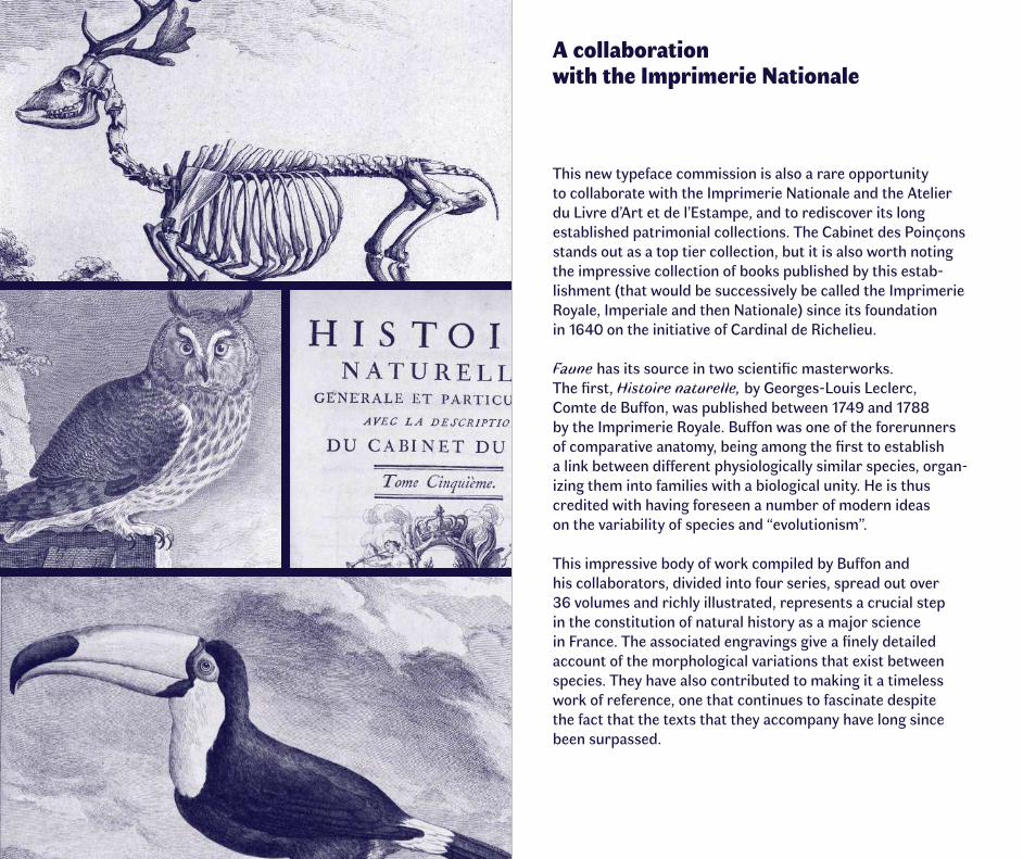
A collaboration with the Imprimerie Nationale
This new typeface commission is also a rare opportunity to collaborate with the Imprimerie Nationale and the Atelier du Livre d’Art et de l’Estampe, and to rediscover its long established patrimonial collections. The Cabinet des Poinçons stands out as a top tier collection, but it is also worth noting the impressive collection of books published by this estab-lishment (that would be successively be called the Imprimerie Royale, Imperiale and then Nationale) since its foundation in 1640 on the initiative of Cardinal de Richelieu.
Faune has its source in two scientific masterworks. The first, Histoire naturelle, by Georges-Louis Leclerc, Comte de Buffon, was published between 1749 and 1788 by the Imprimerie Royale. Buffon was one of the forerunners of comparative anatomy, being among the first to establish a link between different physiologically similar species, organ-izing them into families with a biological unity. He is thus credited with having foreseen a number of modern ideas on the variability of species and “evolutionism”.
This impressive body of work compiled by Buffon and his collaborators, divided into four series, spread out over 36 volumes and richly illustrated, represents a crucial step in the constitution of natural history as a major science in France. The associated engravings give a finely detailed account of the morphological variations that exist between species. They have also contributed to making it a timeless work of reference, one that continues to fascinate despite the fact that the texts that they accompany have long since been surpassed.
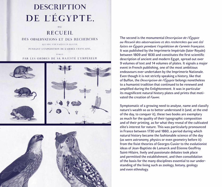
The second is the monumental Description de l’Égypte ou Recueil des observations et des recherches qui ont été faites en Égypte pendant l’expédition de l’armée française. It was published by the Imprimerie Impériale (later Royale) between 1809 and 1830 and constitutes the first scientific description of ancient and modern Egypt, spread out over 9 volumes of text and 14 volumes of plates. It signals a major event in French publishing, one of the most ambitious endeavours ever undertaken by the Imprimerie Nationale. Even though it is not strictly speaking a history, like that of Buffon, the Description de l’Égypte belongs nonetheless to a humanist tradition that continued to be renewed and amplified during the Enlightenment. It was in particular its magnificent natural history plates and prints that moti-vated the creation of Faune.
Symptomatic of a growing need to analyse, name and classify nature’s wealth so as to better understand it (and, at the end of the day, to conquer it), these two books are exemplary as much for the quality of their typographic composition and of their printing, as for what they reveal of the cultivated elite’s interest for nature. This was particularly pronounced in France between 1730 and 1860, a period during which natural history became the fashionable science of the day (as were astronomy, physics or even geometry before it): from the fixist theories of Georges Cuvier to the evolutionist ideas of Jean-Baptiste de Lamarck and Étienne Geoffroy Saint-Hilaire, lively and passionate debates took place and permitted the establishment, and then consolidation of the basis for the many disciplines essential to our under-standing of the living such as zoology, botany, geology and even ethnology.
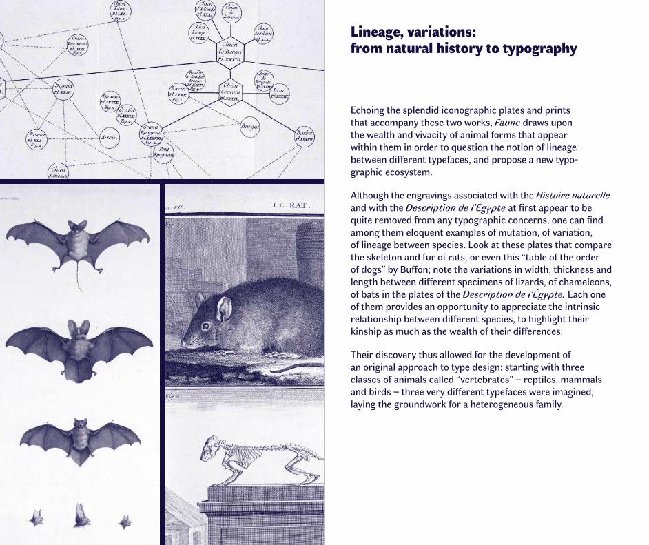
Lineage, variations: from natural history to typography
Echoing the splendid iconographic plates and prints that accompany these two works, Faune draws upon the wealth and vivacity of animal forms that appear within them in order to question the notion of lineage between different typefaces, and propose a new typo- graphic ecosystem.
Although the engravings associated with the Histoire naturelle and with the Description de l’Égypte at first appear to be quite removed from any typographic concerns, one can find among them eloquent examples of mutation, of variation, of lineage between species. Look at these plates that compare the skeleton and fur of rats, or even this “table of the order of dogs” by Buffon; note the variations in width, thickness and length between different specimens of lizards, of chameleons, of bats in the plates of the Description de l’Égypte. Each one of them provides an opportunity to appreciate the intrinsic relationship between different species, to highlight their kinship as much as the wealth of their differences.
Their discovery thus allowed for the development of an original approach to type design: starting with three classes of animals called “vertebrates” – reptiles, mammals and birds – three very different typefaces were imagined, laying the groundwork for a heterogeneous family.
L’HISTOIRE Naturelle prise dans toute son étendue, est une Histoire immense, elle embrasse tous les ob-jets que nous présente l’Univers. Cette multitude prodigieuse de Quadru-pèdes, d’Oiseaux, de Pois-
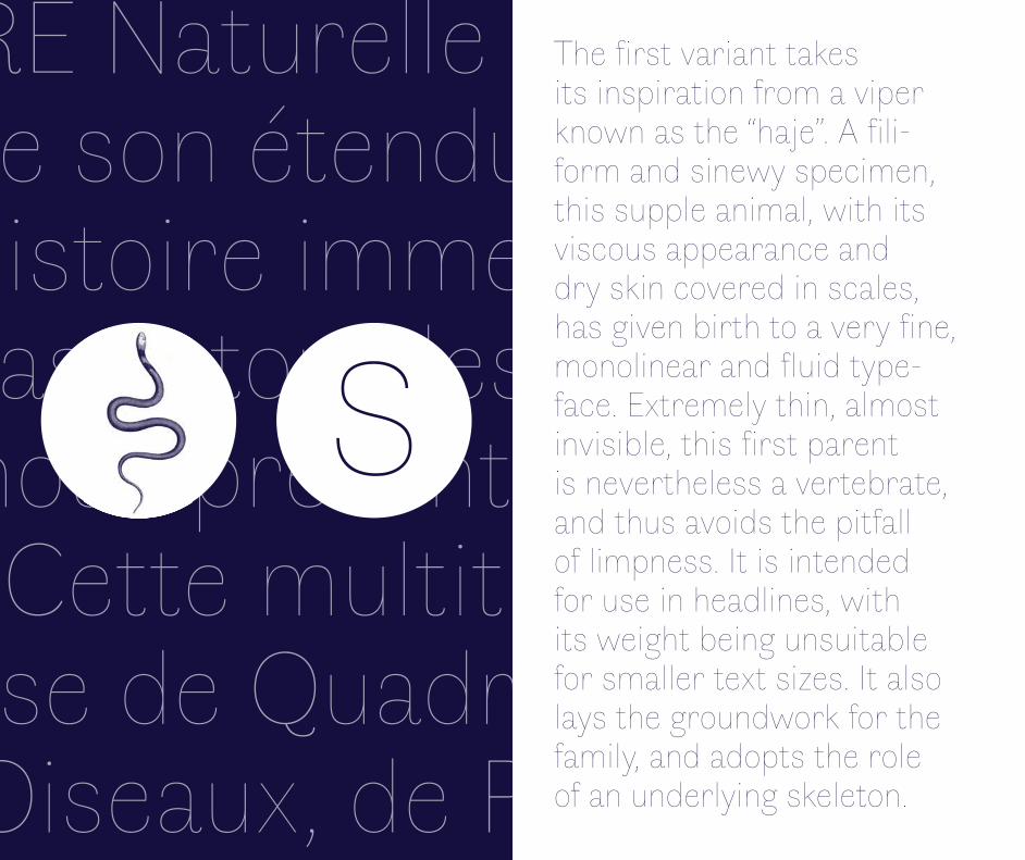
The first variant takes its inspiration from a viper known as the “haje”. A fili-form and sinewy specimen, this supple animal, with its viscous appearance and dry skin covered in scales, has given birth to a very fine, monolinear and fluid type-face. Extremely thin, almost invisible, this first parent is nevertheless a vertebrate, and thus avoids the pitfall of limpness. It is intended for use in headlines, with its weight being unsuitable for smaller text sizes. It also lays the groundwork for the family, and adopts the role of an underlying skeleton.
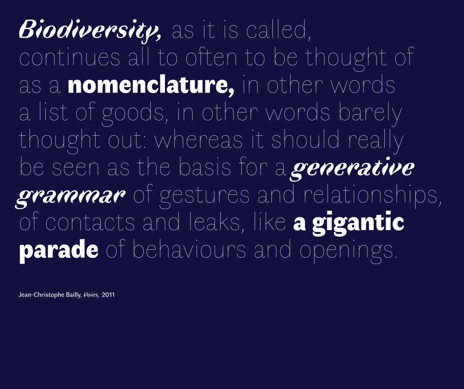
Biodiversity, as it is called, continues all to often to be thought of as a nomenclature, in other words a list of goods, in other words barely thought out: whereas it should really be seen as the basis for a generative grammar of gestures and relationships, of contacts and leaks, like a gigantic parade of behaviours and openings. Jean-Christophe Bailly, Voies, 2011
Le premier obstacle qui se présente dans l’étude de l’Histoire Naturelle, vient de cette grande multitude d’objets ; mais la variété de ces mêmes objets, & la difficulté de rassembler les produc-
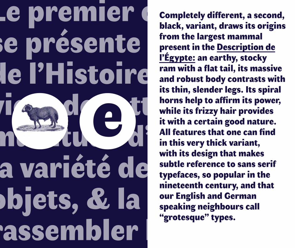
Completely different, a second, black, variant, draws its origins from the largest mammal present in the Description de l’Égypte: an earthy, stocky ram with a flat tail, its massive and robust body contrasts with its thin, slender legs. Its spiral horns help to affirm its power, while its frizzy hair provides it with a certain good nature. All features that one can find in this very thick variant, with its design that makes subtle reference to sans serif typefaces, so popular in the nineteenth century, and that our English and German speaking neighbours call “grotesque” types.
On ne s’imagine pas qu’on puisse avec le temps parvenir au point de reconnoî-tre tous ces différens objets,qu’on puisse parvenir non seule-ment à les reconnoî-
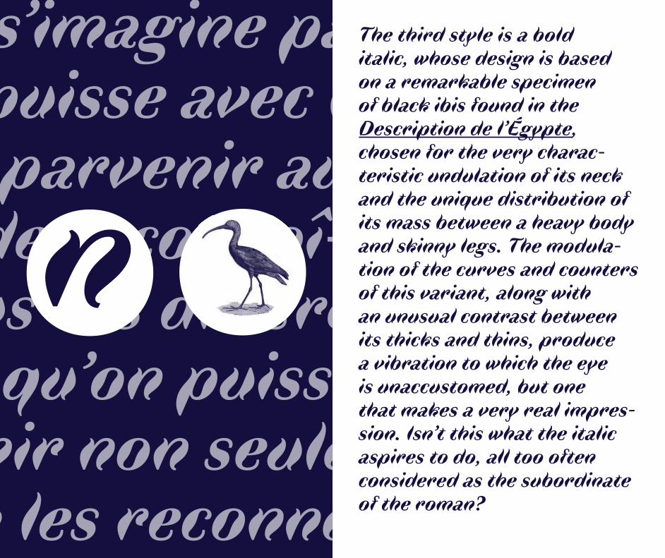
The third style is a bold italic, whose design is based on a remarkable specimen of black ibis found in the Description de l’Égypte, chosen for the very charac-teristic undulation of its neck and the unique distribution of its mass between a heavy body and skinny legs. The modula-tion of the curves and counters of this variant, along with an unusual contrast between its thicks and thins, produce a vibration to which the eye is unaccustomed, but one that makes a very real impres-sion. Isn’t this what the italic aspires to do, all too often considered as the subordinate of the roman?
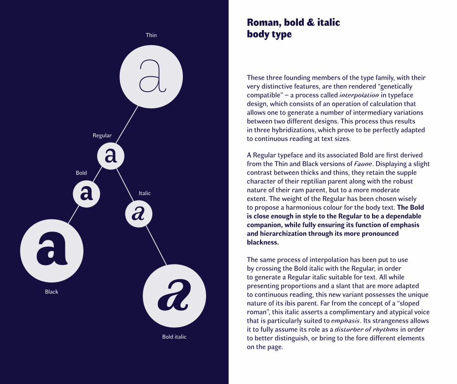
Roman, bold & italic body type
These three founding members of the type family, with their very distinctive features, are then rendered “genetically compatible” – a process called interpolation in typeface design, which consists of an operation of calculation that allows one to generate a number of intermediary variations between two different designs. This process thus results in three hybridizations, which prove to be perfectly adapted to continuous reading at text sizes.
A Regular typeface and its associated Bold are first derived from the Thin and Black versions of Faune. Displaying a slight contrast between thicks and thins, they retain the supple character of their reptilian parent along with the robust nature of their ram parent, but to a more moderate extent. The weight of the Regular has been chosen wisely to propose a harmonious colour for the body text. The Bold is close enough in style to the Regular to be a dependable companion, while fully ensuring its function of emphasis and hierarchization through its more pronounced blackness.
The same process of interpolation has been put to use by crossing the Bold italic with the Regular, in order to generate a Regular italic suitable for text. All while presenting proportions and a slant that are more adapted to continuous reading, this new variant possesses the unique nature of its ibis parent. Far from the concept of a “sloped roman”, this italic asserts a complimentary and atypical voice that is particularly suited to emphasis. Its strangeness allows it to fully assume its role as a disturber of rhythms in order to better distinguish, or bring to the fore different elements on the page.
Regular
Bold
Italic
Black
Thin
Bold italic
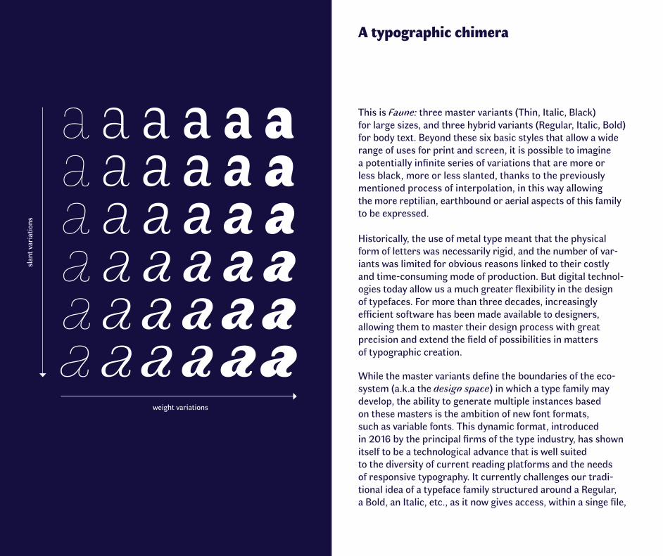
A typographic chimera
This is Faune: three master variants (Thin, Italic, Black) for large sizes, and three hybrid variants (Regular, Italic, Bold) for body text. Beyond these six basic styles that allow a wide range of uses for print and screen, it is possible to imagine a potentially infinite series of variations that are more or less black, more or less slanted, thanks to the previously mentioned process of interpolation, in this way allowing the more reptilian, earthbound or aerial aspects of this family to be expressed.
Historically, the use of metal type meant that the physical form of letters was necessarily rigid, and the number of var-iants was limited for obvious reasons linked to their costly and time-consuming mode of production. But digital technol-ogies today allow us a much greater flexibility in the design of typefaces. For more than three decades, increasingly efficient software has been made available to designers, allowing them to master their design process with great precision and extend the field of possibilities in matters of typographic creation.
While the master variants define the boundaries of the eco-system (a.k.a the design space) in which a type family may develop, the ability to generate multiple instances based on these masters is the ambition of new font formats, such as variable fonts. This dynamic format, introduced in 2016 by the principal firms of the type industry, has shown itself to be a technological advance that is well suited to the diversity of current reading platforms and the needs of responsive typography. It currently challenges our tradi-tional idea of a typeface family structured around a Regular, a Bold, an Italic, etc., as it now gives access, within a singe file,
weight variations
slan
t var
iatio
ns
to a multitude of variations that have been subtly mastered beforehand: variations of weights, of widths, of vertical or horizontal proportions... thus opening up the range of possibilities.
Faced with this ongoing upheaval, Faune is an invitation to rethink our idea of what a type family is, while at the same time returning the wealth and diversity of forms to the heart of the creative process. It is also an opportunity to envisage a dynamic relationship between the variations that make it up, opening ourselves up to tomorrow’s typography: alive, mutant, and in perpetual evolution.
In the study of natural history there are two equally dangerous pitfalls to be avoided: the first is to have no methodology; and the second is to wish to make everything part of a particular system. Georges-Louis Leclerc, Comte de Buffon, Premier discours : de la manière d’étudier et de traiter l’Histoire naturelle, 1749
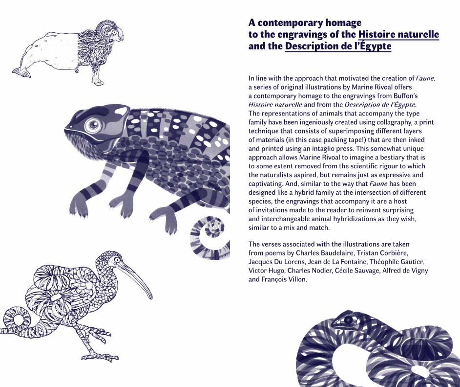
A contemporary homage to the engravings of the Histoire naturelle and the Description de l’Égypte
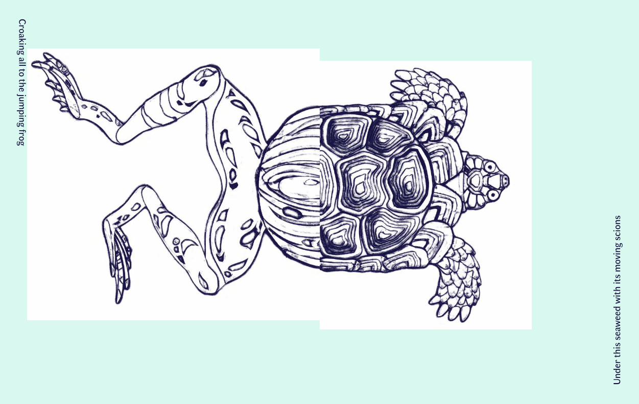
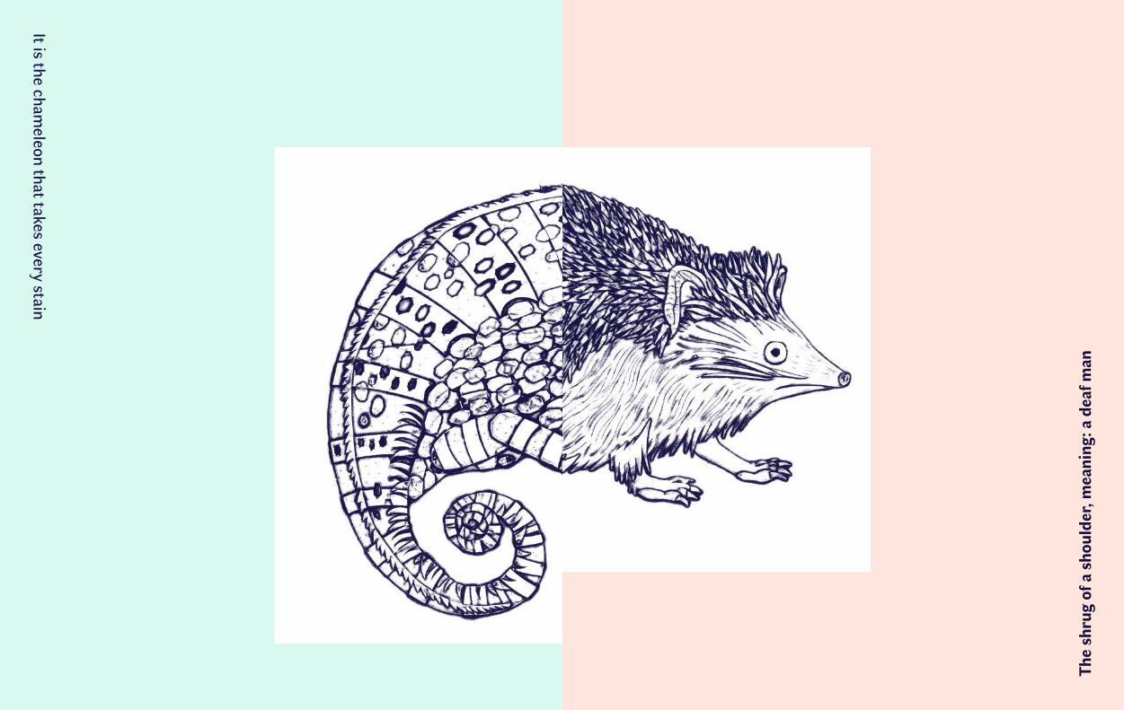
In line with the approach that motivated the creation of Faune, a series of original illustrations by Marine Rivoal offers a contemporary homage to the engravings from Buffon’s Histoire naturelle and from the Description de l’Égypte. The representations of animals that accompany the type family have been ingeniously created using collagraphy, a print technique that consists of superimposing different layers of materials (in this case packing tape!) that are then inked and printed using an intaglio press. This somewhat unique approach allows Marine Rivoal to imagine a bestiary that is to some extent removed from the scientific rigour to which the naturalists aspired, but remains just as expressive and captivating. And, similar to the way that Faune has been designed like a hybrid family at the intersection of different species, the engravings that accompany it are a host of invitations made to the reader to reinvent surprising and interchangeable animal hybridizations as they wish, similar to a mix and match.
The verses associated with the illustrations are taken from poems by Charles Baudelaire, Tristan Corbière, Jacques Du Lorens, Jean de La Fontaine, Théophile Gautier, Victor Hugo, Charles Nodier, Cécile Sauvage, Alfred de Vigny and François Villon.
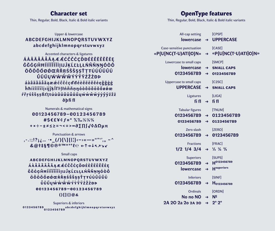
Character setThin, Regular, Bold, Black, Italic & Bold italic variants
OpenType featuresThin, Regular, Bold, Black, Italic & Bold italic variants
Upper & lowercase
ABCDEFGHIJKLMNOPQRSTUV W XYZabcdefghijklmnopqrstuv w xyz
Accented characters & ligatures
Á À Â Ä Ã Ā Å Ă Ą Æ ǼĆĈČĊÇĎĐÉÈÊËĒĚĔĖĘĜĞĠĢĤĦÍÌÎ Ï Ĩ Ī Ĭ İ ĮIJĴĶĹĽĿĻŁŃÑŇŅŊÓÒÔÖÕŌŎŐØǾŒŔŘŖŚŜŠŞȘŤ Ţ ŦÚÙÛÜŨŪ
ŮŬŰŲẂ Ẁ Ŵ Ẅ Ý Ỳ Ŷ ŸŹŽŻÐÞáàâäãāåăąæǽćĉčċçďđéèêëēěĕėęĝğġģĥħíì î ï ĩ ī ĭ į ıijĵķĺľŀ ļ łńñňņŋóòôöõōŏőøǿœ
ŕřŗśŝšşșßťţŧúùûüũūůŭűųẃ ẁ ŵ ẅýỳŷÿźžżðþfi fl
Numerals & mathematical signs
�0123456789–�����������#$€£¥¢ƒ¤° %‰½¼¾
+×÷−±≠≤≥≈¬<=>∞∂∑∏∫√◊ΔΩμπ
Punctuation & arrows
, - . : ; !? ¡¿… ∙ •_(/)[\]{ | ¦} ‹–›«—»“”‘ ’‚„ ~^&@†‡§¶©℗®™*ªº�℮ ←↑→↓↖↗↘↙
Small caps
��������������������������ÁÀÂÄÃĀÅĂĄÆǼĆĈČĊÇĎĐÉÈÊËĒĚĔĖĘĜĞĠĢĤĦÍÌ Î Ï Ĩ Ī Ĭ İ ĮIJĴĶĹĽĿĻŁŃÑŇŅŊÓÒÔÖÕŌŎŐØǾŒŔŘŖŚŜŠŞȘŤŢŦÚÙÛÜŨŪ
ŮŬŰŲẂẀŴẄÝỲŶŸŹŽŻÐÞ�����������–�����������
��������
Superiors & inferiors
0 ¹²³⁴⁵⁶⁷⁸⁹0 123456789ab cd e f g h i j k lmnopq r s t u vwx y z
lowercase
«P{U[NC(T-U)ATI]O}N»
lowercase0123456789
UPPERCASE
fi fl
0123456789 ����������
0123456789
1/2 1/4 3/4
0123456789 lowercase
0123456789
No no NO2A 2O 2a 2o �� ��
→ UPPERCASE
→ «P{U[NC(T-U)ATI]O}N»
→ ����� ����→ ����������
→ ����� ����
→ fi fl
→ ���������� → ����������
→ �123456789
→ ½ ¼ ¾
→ H0¹²³⁴⁵⁶⁷⁸⁹ → Hsuperiors
→ H0123456789
→ No→ 2ª 2º
[CPSP]
[CASE]
[SMCP]
[C2SC]
[LIGA]
[TNUM]
[ZERO]
[FRAC]
[SUPS]
[SINF]
[ORDN]
All-cap setting
Case-sensitive punctuation
Lowercase to small caps
Uppercase to small caps
Ligatures
Tabular figures
Zero slash
Fractions
Superiors
Inferiors
Ordinals
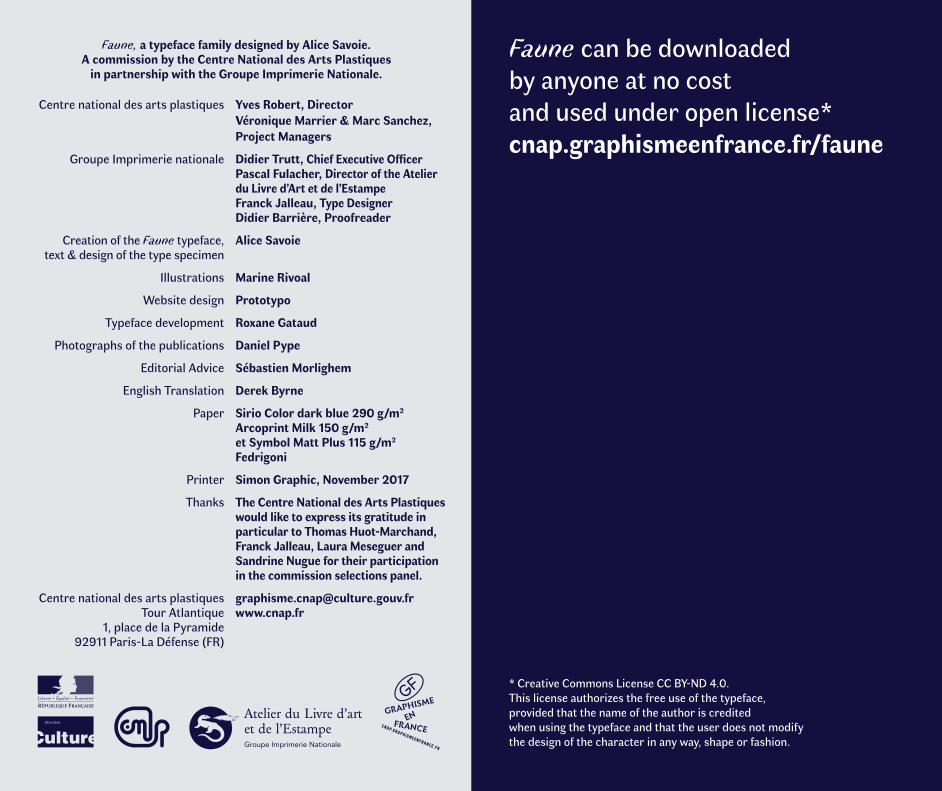
Faune can be downloaded by anyone at no cost and used under open license* cnap.graphismeenfrance.fr/faune
* Creative Commons License CC BY-ND 4.0. This license authorizes the free use of the typeface, provided that the name of the author is credited when using the typeface and that the user does not modify the design of the character in any way, shape or fashion.
Centre national des arts plastiques
Groupe Imprimerie nationale
Creation of the Faune typeface, text & design of the type specimen
Illustrations
Website design
Typeface development
Photographs of the publications
Editorial Advice
English Translation
Paper
Printer
Thanks
Centre national des arts plastiques Tour Atlantique
1, place de la Pyramide 92911 Paris-La Défense (FR)
Yves Robert, Director Véronique Marrier & Marc Sanchez, Project Managers
Didier Trutt, Chief Executive Officer Pascal Fulacher, Director of the Atelier du Livre d’Art et de l’Estampe Franck Jalleau, Type Designer Didier Barrière, Proofreader
Alice Savoie
Marine Rivoal
Prototypo
Roxane Gataud
Daniel Pype
Sébastien Morlighem
Derek Byrne
Sirio Color dark blue 290 g/m2 Arcoprint Milk 150 g/m2 et Symbol Matt Plus 115 g/m2
Fedrigoni
Simon Graphic, November 2017
The Centre National des Arts Plastiques would like to express its gratitude in particular to Thomas Huot-Marchand, Franck Jalleau, Laura Meseguer and Sandrine Nugue for their participation in the commission selections panel.
[email protected] www.cnap.fr
Faune, a typeface family designed by Alice Savoie. A commission by the Centre National des Arts Plastiques
in partnership with the Groupe Imprimerie Nationale.
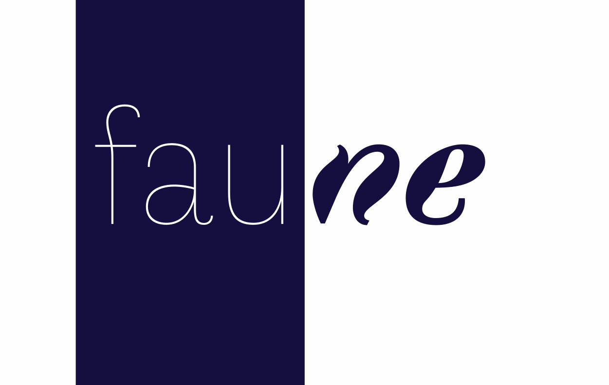
faunefau
Hom
e Jo
hnny
cam
e to
take
his
dro
wse
, all
snug
with
in h
is c
ella
r-ho
use
That they have canons surprises the silhouette
Und
er th
is s
eaw
eed
with
its
mov
ing
scio
nsCroaking all to the jum
ping frog
The
shru
g of
a s
houl
der,
mea
ning
: a d
eaf m
anIt is the cham
eleon that takes every stain
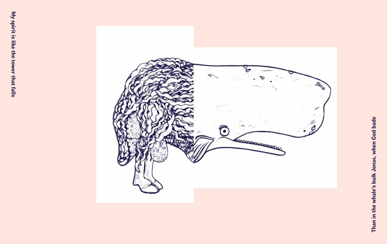
Than
in th
e w
hale’s
bulk
Jon
as, w
hen
God
bad
eM
y spirit is like the tower that falls
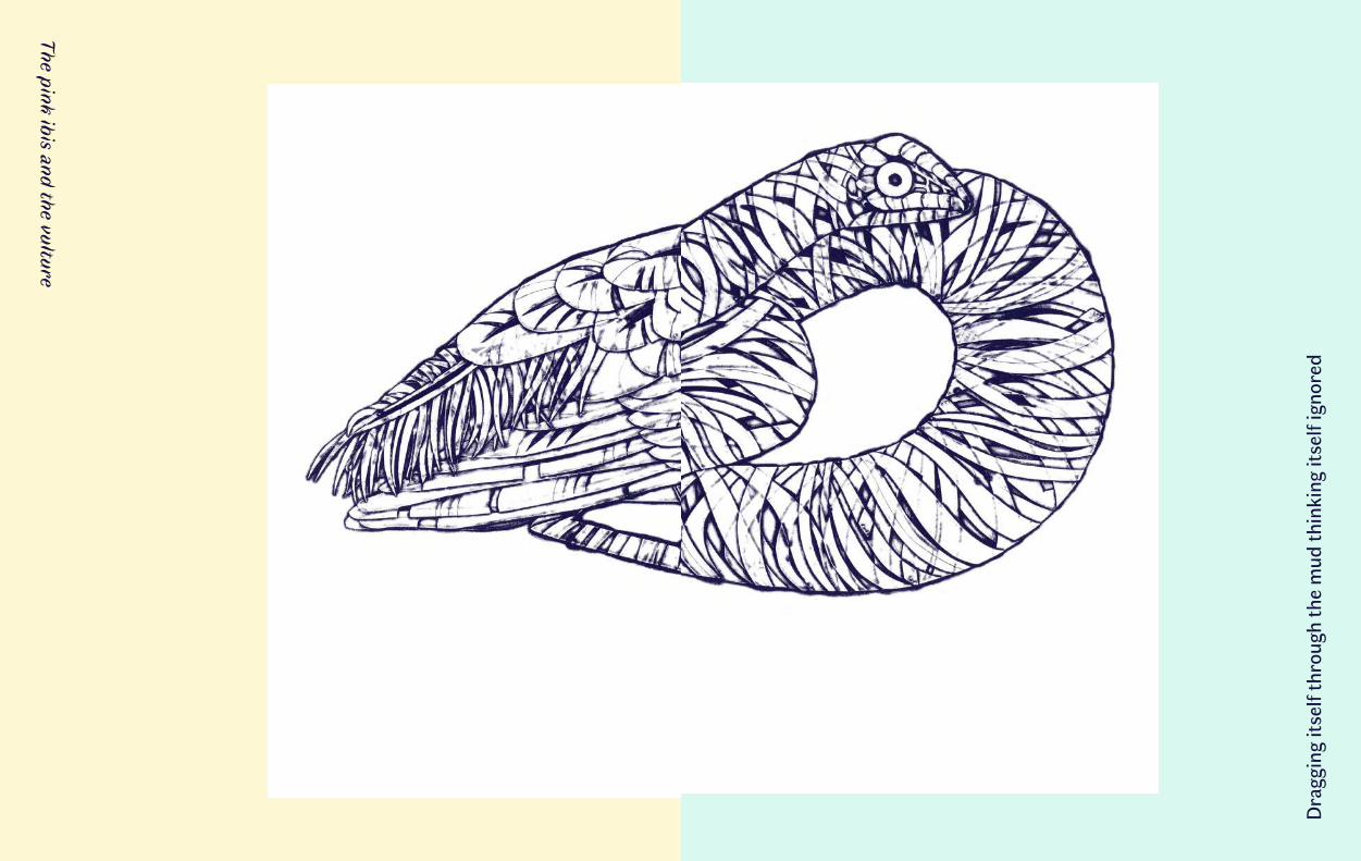
Dra
ggin
g its
elf t
hrou
gh th
e m
ud th
inki
ng it
self
igno
red
The pink ibis and the vulture
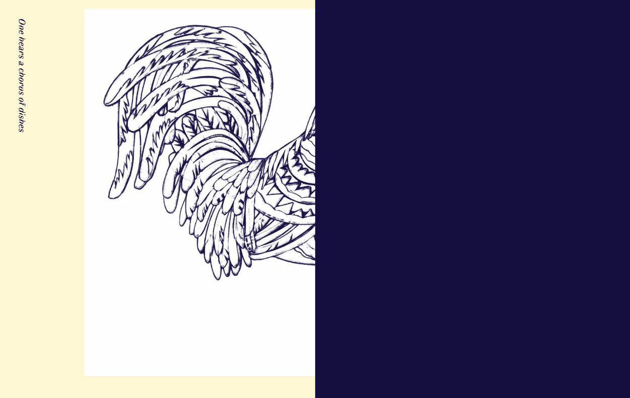
One hears a chorus of dishes
Faune is a new and original type family designed by Alice Savoie.
Faune is the result of a commission by the Centre National des Arts Plastiques in partnership with the Groupe Imprimerie Nationale.
Faune is accompanied by a series of original illustrations by Marine Rivoal.