Embed Size (px)
Citation preview
FACTOR ANALYSIS AND YIELD OPTIMIZATION OF A BILLET MANUFACTURING
PROCESS: A CASE STUDY
__________________________
A Thesis
Presented to
the Faculty of the College of Business and Technology
Morehead State University
_________________________
In Partial Fulfillment
of the Requirements for the Degree
Master of Science
_________________________
by
Fatemeh Davoudi Kakhki
April 22, 2016

All rights reserved
INFORMATION TO ALL USERSThe quality of this reproduction is dependent upon the quality of the copy submitted.
In the unlikely event that the author did not send a complete manuscriptand there are missing pages, these will be noted. Also, if material had to be removed,
a note will indicate the deletion.
All rights reserved.
This work is protected against unauthorized copying under Title 17, United States CodeMicroform Edition © ProQuest LLC.
ProQuest LLC.789 East Eisenhower Parkway
P.O. Box 1346Ann Arbor, MI 48106 - 1346
ProQuest 10107573
Published by ProQuest LLC (2016). Copyright of the Dissertation is held by the Author.
ProQuest Number: 10107573

Accepted by the faculty of the College of Business and Technology, Morehead State University,
in partial fulfillment of the requirements for the Master of Science degree.
____________________________
Dr. Nilesh Joshi
Director of Thesis
Master’s Committee: ________________________________, Chair
Dr. Nilesh Joshi
_________________________________
Dr. Ahmad Zargari
_________________________________
Dr. Hans Chapman
________________________
Date:
FACTOR ANALYSIS AND YIELD OPTIMIZATION OF A BILLET MANUFACTURING
PROCESS: A CASE STUDY
Fatemeh Davoudi Kakhki
Morehead State University, 2016
Director of Thesis: __________________________________________________
Dr. Nilesh Joshi
There is a growing demand for iron and steel productions due to their fundamental role in
various sectors of industry. Thus, iron and steel manufacturing plants thrive to increase the
efficiency of their productions and increase the yield. One of the main challenges facing billet
manufacturers is providing raw materials especially since iron ore is not accessible to many. Thus,
various types of iron scrap are utilized as the raw material. Also, specific Ferro-alloys are added
to the molten iron scrap in the induction furnace in order to increase the quality of the final yield.
Although there are many variables affecting the final yield in a continuous casting process, such
as facility layout, thermal conditions of melting iron, casting machine, cooling and cutting
procedure, this study is focused on how composition of materials can affect the tonnage of final
yield.
This research focuses on investigating two major points. Firstly, the researcher investigates
any possible correlation between various types of iron scrap and the percentage of final yield.
Secondly, the researcher studies if there is any relationship between various levels of Ferro-alloys
and the final yield percentage. Raw material profile measurements were gained over one year in
the billet manufacturing factory under study, including a detailed list of all Ferro- alloys added to
various types of iron scrap in induction furnace as well as the various types of iron scrap utilized
with their percentage in the total used raw materials.
The researcher applied statistical analysis via multivariate regression analysis considering
various types of iron scrap as multiple variables for conducting regression in the first part of the
methodology and various levels of Ferro- alloys as multiple variables for doing regression analysis
in the second part. In both, final yield percentage is considered as the response (dependent)
variable. Statistical analysis was used to investigate, theoretically, the effect of various variables
on the product pattern including yield. In addition, process analysis was done in order to figure out
various statistical features of the process. The final results show that certain composition and
percentage of certain iron scrap types utilized as raw materials have a significant effect on the
process yield. However, the results show that the Ferro- alloys levels are not significant predictors
in explaining the variations in the yield percentage.
Accepted by: ______________________________, Chair
Dr. Nilesh Joshi
______________________________
Dr. Ahmad Zargari
______________________________
Dr. Hans Chapman

Acknowledgement
I would like to express my sincere appreciations to Dr. Nilesh Joshi, my thesis director, for
his continuous training and support throughout the process of this work.
I would also like to appreciate Dr. Ahmad Zargari, and Dr. Hans Chapman for their support
during my graduate studies at Morehead State University.
Table of Contents
1 Introduction and Literature review .......................................................................................... 1
1.1 Scope of thesis .................................................................................................................. 1
1.2 History .............................................................................................................................. 1
1.3 Continuous Casting .......................................................................................................... 4
1.3.1 Continuous Casting Process ...................................................................................... 5
1.3.2 Liquid Steel Transfer ................................................................................................ 6
1.3.3 Advantages of Continuous Casting Process ............................................................. 7
1.4 Literature Review ............................................................................................................. 7
1.5 Organization of Thesis ................................................................................................... 10
2 Data Collection and Process Capability Study ...................................................................... 10
2.1 Process Description ........................................................................................................ 11
2.2 Data Collection ............................................................................................................... 18
2.3 Production Process Analysis .......................................................................................... 19
2.3.1 Descriptive Statistics ............................................................................................... 19
2.3.2 Process Capability Analysis .................................................................................... 22
2.3.3 Tolerance Interval Analysis for Yield ..................................................................... 27
3 Factor Analysis and Findings ................................................................................................ 31
3.1 Factor Analysis Study .................................................................................................... 31
3.2 Question One: The relationship between the composition of iron scrap and the final
yield percentage......................................................................................................................... 31
3.2.1 Multivariate Regression Analysis ........................................................................... 33
3.2.2 Regression Analysis Dropping Statistically Unimportant Factor ........................... 43
3.3 Question Two: The relationship between the levels of Ferro-alloys added to molten
steel and the quality of final yield ............................................................................................. 48
3.3.1 Multivariate Regression Analysis ........................................................................... 51
3.3.2 Regression Equation: The analysis of coefficients in the regression model ........... 53
3.3.3 Model Summary: Analysis of R-sq, adjusted R-sq, predicted R-sq ....................... 54
4 Conclusion and Recommendations ....................................................................................... 62
5 References ............................................................................................................................. 65

List of Figures/ Tables
Figure 1-1: World Crude Steel Production 1950 to 2014 (World Steel Association, 2015) .......... 3
Table 1-1: World Crude Steel Production from 2000 to 2014(Million Ton) ................................. 4
Figure 1-2: Various Continuous Casting Configurations (SteelWorks, n.d.) ................................ 5
Figure 2-1: Operation Process Chart (OPC) ................................................................................. 13
Figure 2-2: Curve Type Continuous Caster .................................................................................. 14
Figure 2-3: Tundish....................................................................................................................... 14
Figure 2-4: Pouring Molten Steel form Ladle to Tundish ............................................................ 15
Figure 2-5: Pouring Molten Steel form Ladle to Tundish ............................................................ 16
Figure 2-6: Pouring Molten Steel form Tundish to Mold ............................................................. 16
Figure 2-7: Molten Steel in Mold ................................................................................................. 17
Figure 2-8: Billet, Cooled, Cut, Stored ......................................................................................... 17
Table 2-1: Yield Percentage (%) Over Nine Months.................................................................... 20
Figure 2-9: Run Chart for Yield over 9 Months of Production .................................................... 20
Figure 2-10: I-MR Chart of Yield over 9 Months of Production ................................................. 22
Figure 2-11: Process Capability of Yield (Using 95% Confidence)............................................. 24
Figure 2-12: Various Nonparametric Distribution for Data over 9 Months of Production .......... 25
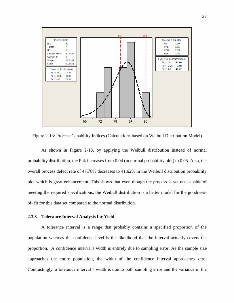
Figure 2-13: Process Capability Indices (Calculations based on Weibull Distribution Model) ... 27
Figure 2-14: Tolerance Interval Plot for Yield (At Least 95% of Population Covered; 95%
Tolerance Interval) ........................................................................................................................ 29
Figure 3-1: Percentage of Iron Scrap Types over 9 Months of Production .................................. 32
Table 3-1: Percentage (%) of Yield over One-Year Period .......................................................... 32
Figure 3-2: Percentage Yield over 9 Months of Production ......................................................... 33
Table 3-2: Independent Variables ................................................................................................. 34
Table 3-3: Dependent (Response) Variable .................................................................................. 34
Table 3-4: Analysis of Variance ................................................................................................... 34
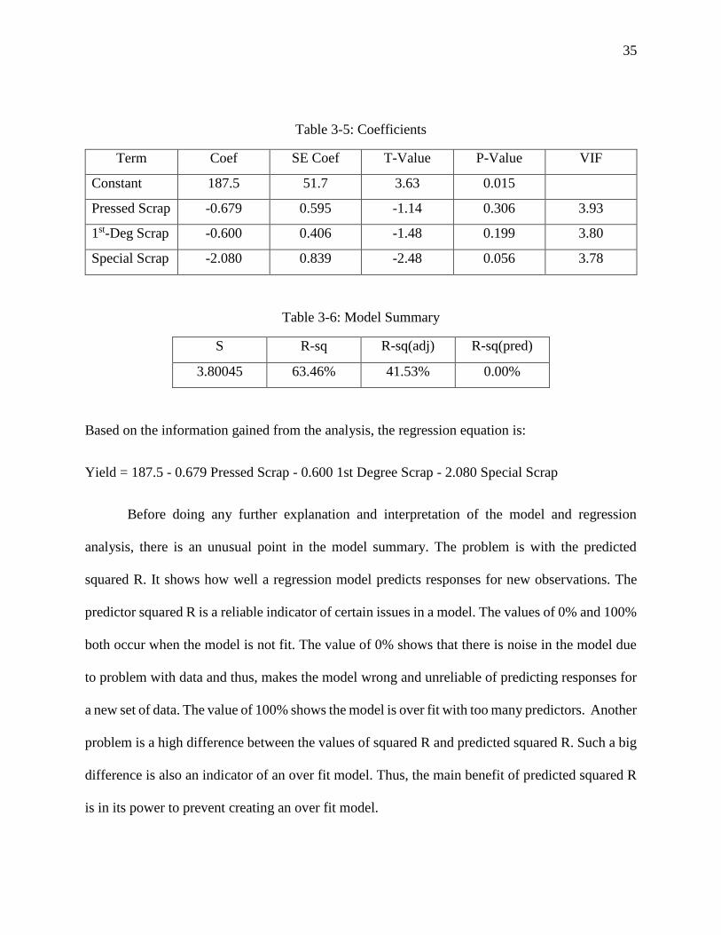
Table 3-5: Coefficients ................................................................................................................. 35
Table 3-6: Model Summary .......................................................................................................... 35
Table 3-7: Analysis of Variance (omitting the unusual observation) ........................................... 36
Table 3-8: Coefficients ................................................................................................................. 37
Table 3-9: Model Summary .......................................................................................................... 37
Figure 3-3: Residual Plots for Yield ............................................................................................. 43
Figure 3-4: Residual Plots for Yield ............................................................................................. 44
Figure 3-5: Contour Plot of Yield vs Special, 1st Degree ............................................................ 45
Figure 3-6: Surface Plot of Yield .................................................................................................. 46
Figure 3-7: Main Effect Plot for Yield ......................................................................................... 47
Figure 3-8: Interaction Effect Plot for Yield ................................................................................. 48
Table 3-10: Volume of Ferroalloys (KG per Ton)........................................................................ 50
Figure 3-9: Amounts of ferroalloys (Kg per Ton) utilized and the percentage of final yield over
12 months of production ............................................................................................................... 51
Table 3-11: Independent Variables ............................................................................................... 51
Table 3-12: Dependent (Response) Variable ................................................................................ 51
Table 3-13: Analysis of Variance ................................................................................................. 52
Table 3-14: Coefficients ............................................................................................................... 53
Table 3-15: Model Summary ........................................................................................................ 54
Figure 3-10: Residual Plot for Yield ............................................................................................. 57

Figure 3-11: Main Effect Plot ....................................................................................................... 58
Figure 3-12: Interaction Effect Plot .............................................................................................. 59
Figure 3-13: 3D Surface Plots....................................................................................................... 60
Figure 3-14: Contour Plot ............................................................................................................. 61
1
1 Introduction and Literature review
1.1 Scope of thesis
The quantitative behavior of the composition of raw materials in continuous casting
process with induction furnace has not been studied extensively. The analysis of various materials
affecting the final yield in continuous casting process would allow us to predict an optimal raw
materials composition model in order to reduce wastes, increase production, and save energy and
resources.
The main issue of this research is to study the effects of various minerals, alloys, and
compositions of iron scrap on the tonnage of final yield in induction furnace experimentally and
analytically. The experimental investigation involves performing design of experiment to find out
the regression equation which includes all the factors affecting yield. By repeating the same
procedure, insignificant factors are removed step by step from the analysis so that only the
significant ones are included in the final model. The regression equation is then validated through
linear model, and linear model with interactions. The analytical study entails developing a
mathematical model that would allow us to predict an optimum condition for the raw material
composition melting in induction furnace. In an attempt to achieve the optimum model, response
surface analysis is used.
1.2 History
Steel industry is fundamental to all forms of manufacturing. Steel has a wide range of
applications since it is a material that best addresses society’s needs for industrial performances
which are fuel- efficient both safe and affordable. Steel is the best choice in construction due to its
special characteristics. Also, the environmentally friendly profile of steel, adds to its desirability.
2
Steel plays an essential role in transportation systems, energy, green economy, as well as national
and economic security. In addition, the manufacture of steel and steel products provides for a large
number of good-paying jobs in the entire supply chain, thereby improving the quality of life for
many (American Iron and Steel Institute, 2013). Steel industry employs more than two million
people directly worldwide, plus two million contractors and four million in supporting industries.
Considering other industries such as construction, transportation and energy, steel industry is the
source of employment for more than fifty million people in the world (American Iron and Steel
Institute, 2013).
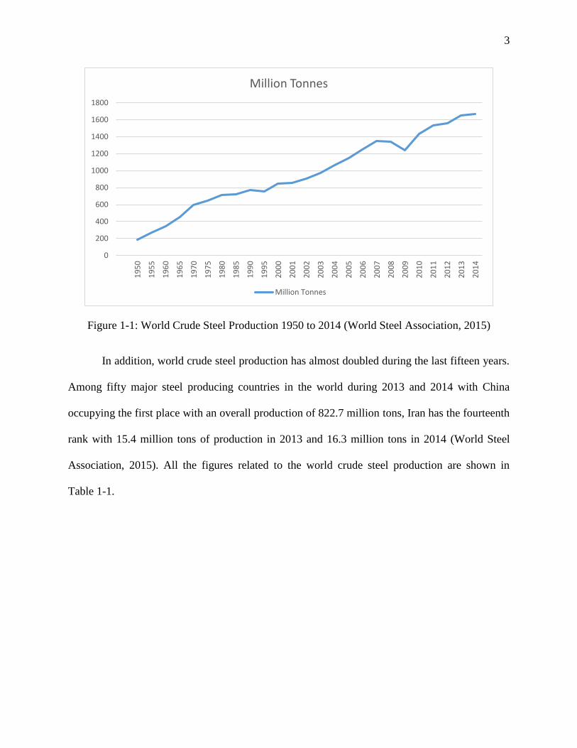
Steel industry, after oil and gas industry, is the second big industry in the world with global
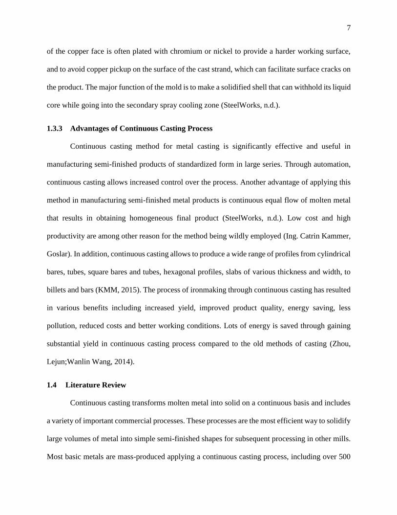
turnover of 900 billion USD (World Steel Association, 2015). According to Figure 1-1, it is
predicted that by 2050, the use of steel will increase 1.5 times higher than the present level to meet
the demands of the growing population in various fields of energy, automotive manufacturing,
construction, transportation, and renewable energy (World Steel Association, 2015).
One of the main challenges in the field of steel production is reacting quickly and flexibly
to the growing demands of the market. This increased demand must be met in the billet casting
branch with an expansion of capacity, an increase in casting speeds and a general increase in plant
productivity. Mainly the heavily populated Asian countries are driving the global market.
Continuous growth requires continuous optimization of the casting process to ensure global
competitiveness (Siemens-vai).
For globalization and the associated catching-up process in emerging market economies,
steel has experienced a worldwide boom. World crude steel production has increased form 189
million tons in 1950, to 1,665 million tons in 2014 (World Steel Association, 2015).
3
Figure 1-1: World Crude Steel Production 1950 to 2014 (World Steel Association, 2015)
In addition, world crude steel production has almost doubled during the last fifteen years.
Among fifty major steel producing countries in the world during 2013 and 2014 with China
occupying the first place with an overall production of 822.7 million tons, Iran has the fourteenth
rank with 15.4 million tons of production in 2013 and 16.3 million tons in 2014 (World Steel
Association, 2015). All the figures related to the world crude steel production are shown in
Table 1-1.
0
200
400
600
800
1000
1200
1400
1600
1800
19
50
19
55
19
60
19
65
19
70
19
75
19
80
19
85
19
90
19
95
20
00
20
01
20
02
20
03
20
04
20
05
20
06
20
07
20
08
20
09
20
10
20
11
20
12
20
13
20
14
Million Tonnes
Million Tonnes
4
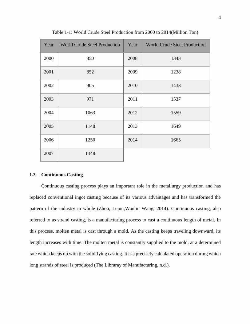
Table 1-1: World Crude Steel Production from 2000 to 2014(Million Ton)
1.3 Continuous Casting
Continuous casting process plays an important role in the metallurgy production and has
replaced conventional ingot casting because of its various advantages and has transformed the
pattern of the industry in whole (Zhou, Lejun;Wanlin Wang, 2014). Continuous casting, also
referred to as strand casting, is a manufacturing process to cast a continuous length of metal. In
this process, molten metal is cast through a mold. As the casting keeps traveling downward, its
length increases with time. The molten metal is constantly supplied to the mold, at a determined
rate which keeps up with the solidifying casting. It is a precisely calculated operation during which
long strands of steel is produced (The Libraray of Manufacturing, n.d.).
Year World Crude Steel Production Year World Crude Steel Production
2000 850 2008 1343
2001 852 2009 1238
2002 905 2010 1433
2003 971 2011 1537
2004 1063 2012 1559
2005 1148 2013 1649
2006 1250 2014 1665
2007 1348
5
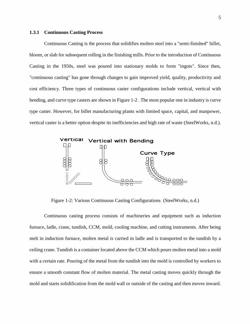
1.3.1 Continuous Casting Process
Continuous Casting is the process that solidifies molten steel into a "semi-finished" billet,
bloom, or slab for subsequent rolling in the finishing mills. Prior to the introduction of Continuous
Casting in the 1950s, steel was poured into stationary molds to form "ingots". Since then,
"continuous casting" has gone through changes to gain improved yield, quality, productivity and
cost efficiency. Three types of continuous caster configurations include vertical, vertical with
bending, and curve type casters are shown in Figure 1-2 . The most popular one in industry is curve
type caster. However, for billet manufacturing plants with limited space, capital, and manpower,
vertical caster is a better option despite its inefficiencies and high rate of waste (SteelWorks, n.d.).
Figure 1-2: Various Continuous Casting Configurations (SteelWorks, n.d.)
Continuous casting process consists of machineries and equipment such as induction
furnace, ladle, crane, tundish, CCM, mold, cooling machine, and cutting instruments. After being
melt in induction furnace, molten metal is carried in ladle and is transported to the tundish by a
ceiling crane. Tundish is a container located above the CCM which pours molten metal into a mold
with a certain rate. Pouring of the metal from the tundish into the mold is controlled by workers to
ensure a smooth constant flow of molten material. The metal casting moves quickly through the
mold and starts solidification from the mold wall or outside of the casting and then moves inward.
6
To accelerate the solidification process, the mold is water cooled to form adequate solidified
thickness on the outside (SteelWorks, n.d.). In other words, the casting process has various section
which starts with pouring liquid steel to the mold from tundish at a regular rate. The molten steel
from the tundish, placed in the mold, goes through a primary cooling zone and is water cooled to
produce a solidified outer shell to maintain the shape of the billet throughout the next step in
secondary cooling. The purpose of secondary cooling is to further solidify the strand by spraying
water which is then transferred into the refractory pool to be refined and reused. The billet, almost
solidified now, goes through the unbending and straightening section and then is cut via the cutting
machine and is taken out of the line for storage. This last step is omitted if vertical continuous
caster is used since there is no need for straightening the billet.
1.3.2 Liquid Steel Transfer
Transferring liquid steel from the ladle to the molds consists of two major steps. In the first
step, molten steel should be transferred from the ladle to the tundish. In the second step, liquid
steel is poured from tundish to the mold at a regular rate that is controlled through orifice devices
of various designs including slide gates, stopper rods, or metering nozzles, the latter controlled by
tundish steel level adjustment.
Tundish has common shapes of rectangular, delta and “T”. There are nozzles at the bottom
of the tundish that distributes liquid steel to the molds. Tundish is also important in enhancing
oxide inclusion separation and providing a constant flow of molten steel to the mold. This, in
return, keeps the casting process at a constant speed and provides a more stable pattern to the
molds.
The mold is an open-ended box structure with a water-cooled inner lining made from a
high purity copper alloy. Mold water transfers heat from the solidifying shell. The working surface
7
of the copper face is often plated with chromium or nickel to provide a harder working surface,
and to avoid copper pickup on the surface of the cast strand, which can facilitate surface cracks on
the product. The major function of the mold is to make a solidified shell that can withhold its liquid
core while going into the secondary spray cooling zone (SteelWorks, n.d.).
1.3.3 Advantages of Continuous Casting Process
Continuous casting method for metal casting is significantly effective and useful in
manufacturing semi-finished products of standardized form in large series. Through automation,
continuous casting allows increased control over the process. Another advantage of applying this
method in manufacturing semi-finished metal products is continuous equal flow of molten metal
that results in obtaining homogeneous final product (SteelWorks, n.d.). Low cost and high
productivity are among other reason for the method being wildly employed (Ing. Catrin Kammer,
Goslar). In addition, continuous casting allows to produce a wide range of profiles from cylindrical
bares, tubes, square bares and tubes, hexagonal profiles, slabs of various thickness and width, to
billets and bars (KMM, 2015). The process of ironmaking through continuous casting has resulted
in various benefits including increased yield, improved product quality, energy saving, less
pollution, reduced costs and better working conditions. Lots of energy is saved through gaining
substantial yield in continuous casting process compared to the old methods of casting (Zhou,
Lejun;Wanlin Wang, 2014).
1.4 Literature Review
Continuous casting transforms molten metal into solid on a continuous basis and includes
a variety of important commercial processes. These processes are the most efficient way to solidify
large volumes of metal into simple semi-finished shapes for subsequent processing in other mills.
Most basic metals are mass-produced applying a continuous casting process, including over 500
8
million tons of steel, 20 million tons of aluminum, and 1 million tons of copper, nickel, and other
metals in the world each year (Thomas, 2001).
The importance of continuous casting process in making iron and steel is mainly lied in the
substantial amount of final production. To meet the growing demands for iron and steel products
in various field of construction, transportation, energy, and food, any improvement in the process
of continuous casting that leads to reducing production costs, improving quality, saving energy
and minimizing production time are highly significant. Although the continuous casting process
started almost sixty years ago, there are still serious defects in the final structure such as cracks in
the solidifying slabs mainly caused by variable thermal conditions and mechanical stresses (Tomas
Mauder, Josef Stetina, 2014). Hence, many researches have been done on optimizing the process
considering its time, and mechanical and chemical properties. The iron industry is one of the
biggest energy consuming industries because of the huge amount of energy required for the
operation of ironmaking (Zhou, Lejun;Wanlin Wang, 2014). According to Zhou and Wang, the
future development of steelmaking industry is crucially related to efforts in saving energy and
reducing greenhouse emissions in continuous casting process. The optimization of continuous
casting process has been studied mainly through the following methods:
Improving the quality of billets through studying the mechanical properties of the mold
and solidification process of molten steel in the mold
Improving the quality of billet via studying the inclusion of certain chemicals affecting the
ductility of final billets
Reducing energy used in the continuous casting process via simulating the function of
separate elements involved in the process such as the function of induction furnace,
continuous casting machine, and cooling process
9
Optimizing production process through simulating the production line behavior,
considering the location of various machinery and equipment
Research done by Zhou and Wang shows that controlling the initial solidification of shell
in the mold would improve the quality of casting products. Also, this leads to saving energy and
reducing extra labor (Zhou, Lejun;Wanlin Wang, 2014).
Zhang and Thomas did studies on the defects in continuous casting products including
flange cracked cans, slag spots, and line defects on the surface of rolled sheets. They did some
work on the operating practices to improve steel cleanliness at the tundish and continuous caster
(L. Zhang; BG Thomas, 2003).
Mauder, Sandera and et.al worked on increasing both the productivity and product quality
in the continuous casting process through mathematical approaches. They considered such
improvement via the influence of controlled factors such as the casting speed and cooling rates.
Their paper describes an algorithm for obtaining a black-box-type solution to maintain a high
production rate and the high quality of the products. Their mathematical model contains Fourier-
Kirchhoff equation and includes boundary conditions. They performed simulation-optimization
method to improve the material properties of the final slab and increase the production rate (Tomas
Mauder, Cenek Sandera, Josef Stetina, Milos Seda, 2011).
It is well known that the secondary cooling zone has an important effect in the internal and
surface quality of slab. Mauder and Stetina applied a fuzzy-optimization algorithm and a numerical
model of the temperature field to provide instructions for how to control the secondary cooling
and access high quality of steel. Their result shows that the proper setting of secondary cooling
cannot be done without considering all the main casting factors. They found out that the cooling
10
behavior of different slab cross-sections is different and casting speed is not the only indicator to
be considered (Tomas Mauder, Josef Stetina, 2014). Zheng proposed a hybrid evolutionary-based
method that combined particle swarm algorithm and chaotic search to optimize the secondary
cooling process. Their method was employed to explore the space parameter setting to minimize
a cost function related to the quality of cast billet and the product feasibility (Peng Zhenc, Juan
Guo, Xiao-Jing Hao, 2004).
Bellabdaoui and Teghem state that one of the most useful tools for improving productivity
of a large number of manufacturing companies is the optimization models for planning and
scheduling. They consider process scheduling is characterized by constraints of job grouping,
technological interdependence, no dead time inside the same group of jobs and dynamic processing
time of jobs (A. Bellabdaoui, J. Teghem, 2006).
1.5 Organization of Thesis
Visited the factory and collected the raw data over the period of one year.
Formulated the appropriate statistical model.
Conducted Analysis of Variance and Post-ANOVA comparison of means.
Results, conclusions and discussion
2 Data Collection and Process Capability Study
The data for this study were gathered over one year from the billet manufacturing company
located in the industrial town in Mashhad, Iran. Having employed around 100 workers in various
11
sections, the factory is considered a medium-size plant utilizing two induction furnaces with the
capacity of 8 tons, and a continuous casting machine (CCM) of one strand with the potential of
being extended to three strands in future. Although the manufacturing process can meet some parts
of the expectations of the management, there is still a high rate of waste due to the low quality of
the semi-finished billets as yield which can be used in other milling plants for further process to
be turned into steel bars, steel sheet or other iron and steel product. In order to determine the
variations in the process, the causes of variations(either natural or special), and also to study
whether the process is in control, and check the process capability in meeting the production
requirement and management expectations, an explanation about all such features of the process
is presented below.
2.1 Process Description
The billet manufacturing plant under study is located in the industrial town in Mashhad, Iran.
It is a medium-size site with two induction furnaces with capacity of melting eight tons of iron
scrap. Due to the lack of iron ore in that area, and the easier availability of various forms of iron
scrap, this manufacturing plant uses iron scraps that are categorized as light, medium, heavy,
special, and oil scraps based on the source they are gathered from. In the next step, scraps are
processed, cut, cleaned and prepared to be used in the induction furnace along with some specific
level of Ferro alloys that play an essential role in the chemical analysis of the final product and its
ductility. Ferroalloys are added to steel during the manufacturing process to achieve the desired
degree of corrosion resistance, heat resistance, tensile strength, yield strength and other qualities
(Transparency Marketr Research- Global Ferroalloy Market, 2014). Ferro-alloys are an integral
ingredient of the steelmaking process and are added to develop certain property in the finished
product. Ferro-alloys are normally added through a hopper fitted with a vibro-feeder and conveyer
12
system. The size requirements of Ferro-alloys vary from plant to plant depending on the opening
of vibro-feeder and system design. In order to meet stringent size requirement of customers, the
Ferro-alloy producer converts larger size lumps to specific sizes either manually or using
mechanical crushers. During the process of sizing, a large quantity of fines (below 12mm) is
generated which is difficult to use in the steelmaking vessel or the ladle in secondary refining units
due to their low recovery of alloy and the tendency to choke the suction duct ( KK Keshari,
Somnath Kumar, Snehangshu Roy, YK Khanna, 2012).
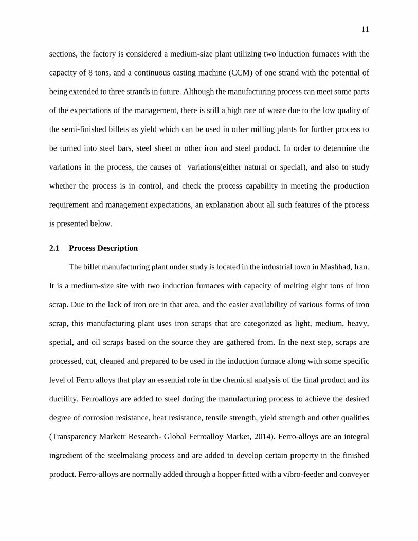
The operation process chart (OPC) as depicted in Figure 2-1, shows various steps in this
particular billet manufacturing plant. As Figure 2-1 shows, the iron scrap patches are scaled upon
entering the ware-house. Then, they are evaluated to check if they are useful for being processed
and used in the induction furnace. If not useful, the patches are sent back to the ware-house for
being reevaluated, reused, or even thrown out. The patches that passed the evaluations are sent to
the processing stations to be cut, pressed, cleaned, and sorted. The next step includes preparing the
induction furnace by doing its sintering. The sintering is enough for having quality product for 25
rows of melting and the induction furnace needs to be sintered again after each 25 times of usage.
Upon finishing the melting process, molten steel is carried in ladle by ceiling crane to the tundish
to be poured into the mold in the CCM machine. The hot billets are then cooled off by water
spraying on them, go through secondary cooling and finally get cut off and stored. The final stage
is having the billet patches pass quality analysis tests to check whether they contain certain
composition of chemicals or not. The ones passing the tests are sent to the ware house for shipping
to customers while the ones failing the tests are returned to the ware-house for future reuse.
13
Figure 2-1: Operation Process Chart (OPC)
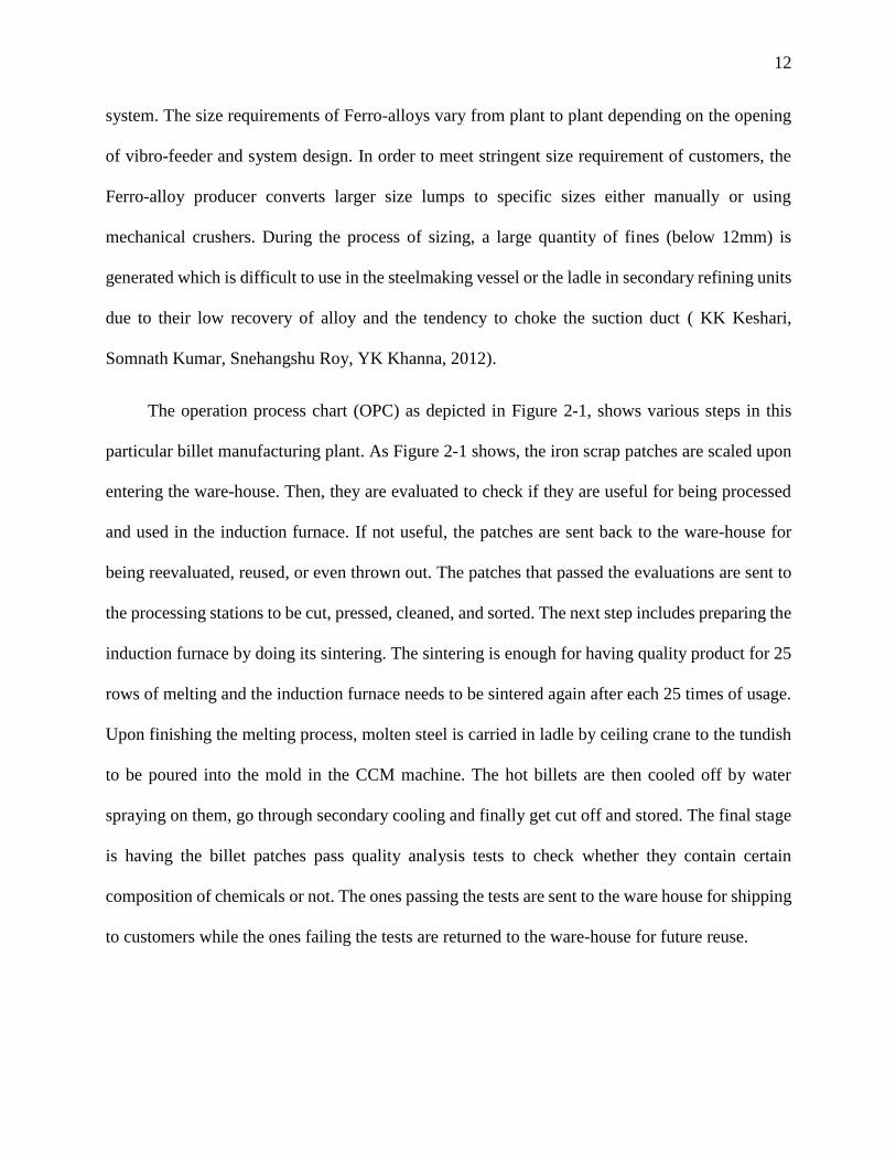
Figure 2-2 to Figure 2-8 shows the photos of process under study. Figure 2-2 shows the
continuous caster configuration of curved type that is used in this manufacturing plant. It is a
continuous casting machine with only one strand and the potential to extend to three for future
development. The dummy bar, in which the molten steel from tundish is poured, is visible in
Figure 2-2.
14
Figure 2-2: Curve Type Continuous Caster
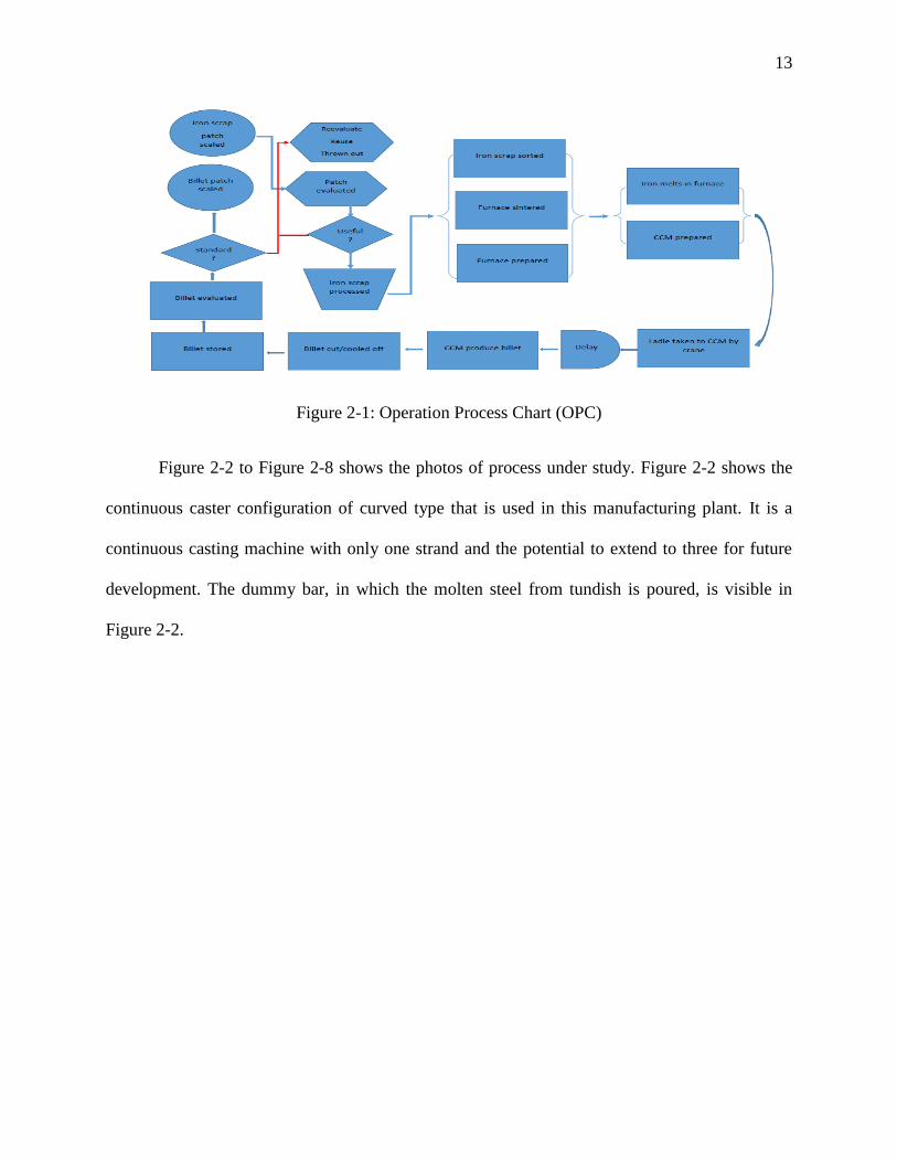
Figure 2-3 shows the tundish which plays the important role of controlling a smooth flow
of molten steel into the mold to better control the casting rate.
Figure 2-3: Tundish
15
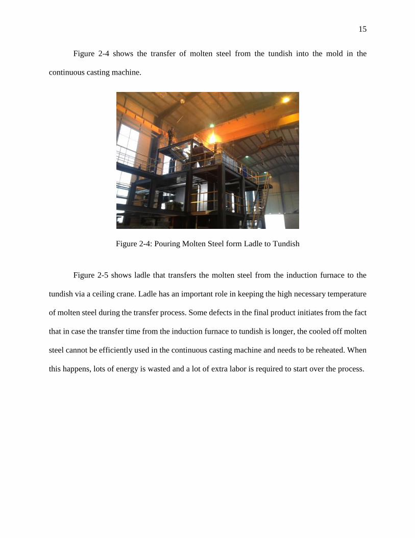
Figure 2-4 shows the transfer of molten steel from the tundish into the mold in the
continuous casting machine.
Figure 2-4: Pouring Molten Steel form Ladle to Tundish
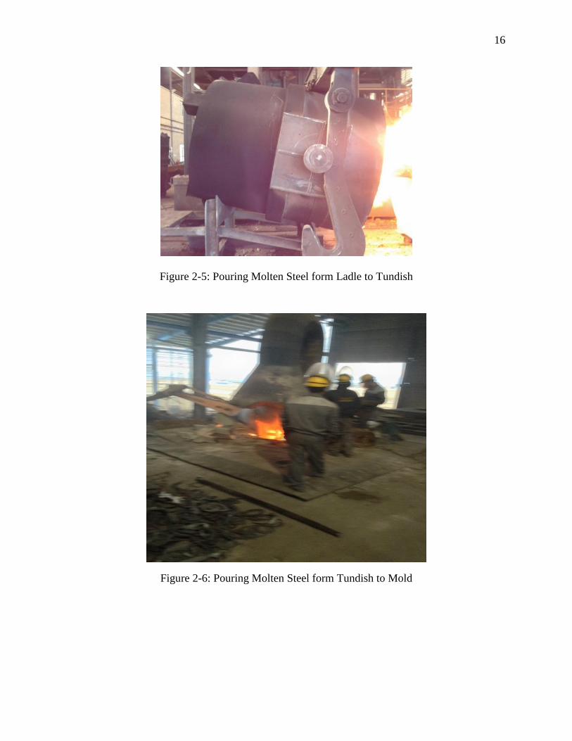
Figure 2-5 shows ladle that transfers the molten steel from the induction furnace to the
tundish via a ceiling crane. Ladle has an important role in keeping the high necessary temperature
of molten steel during the transfer process. Some defects in the final product initiates from the fact
that in case the transfer time from the induction furnace to tundish is longer, the cooled off molten
steel cannot be efficiently used in the continuous casting machine and needs to be reheated. When
this happens, lots of energy is wasted and a lot of extra labor is required to start over the process.
16
Figure 2-5: Pouring Molten Steel form Ladle to Tundish
Figure 2-6: Pouring Molten Steel form Tundish to Mold
17
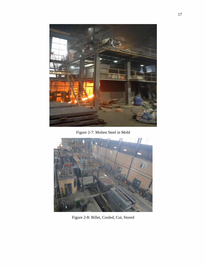
Figure 2-7: Molten Steel in Mold
Figure 2-8: Billet, Cooled, Cut, Stored
18
2.2 Data Collection
The raw data was collected over one year from the factory billet production line. The raw
data collected from the factory is categorized in several groups. In the process of manufacturing
billet, the main raw material used in the under-study site is iron scrap. Iron scraps that are necessary
for the production varies in forms and materials since they are gathered from different resources
from junk cars to food cans, metals from old buildings, iron wastes from other production lines,
construction wastes and so on. Thus, based on the resources, they are categorized as pressed iron,
1st degree iron, 2nd degree iron, 3rd degree iron, special iron, oil scraps, and sponge scraps.
However, the most parts of used iron scraps consist of mainly three types; pressed iron, 1st degree
iron and special iron based on the factory annual data. In addition to the iron scrap, specific Ferro-
alloys are added to the furnace at the beginning of the melting process. The role of Ferro-alloys in
the molten steel is vital since the final productions- billets- pass certain quality tests. The aim of
such quality tests is to make sure that the billets are strong enough not to break during later process.
As mentioned before, billets are considered as semi-finished iron products and will be later
processed in other iron and steel workshops to produce finished products such as steel sheets, bars,
etc.
The importance of adding Ferro-alloys to molten steel lies in the quality of final semi-
finished products. Failing the quality tests, the billet products are returned to furnace in addition
to other iron scraps and alloys to melt again as iron scraps. This, in return, imposes all the extra
production costs including the costs for energy, labor, raw material, and time.
In this research, the author tries to answer the following questions:
Is there any relationship between the composition of the iron scrap used as raw material
and the percentage of final yield? In other words, according to the factory data, the
19
percentage of each type of iron scraps over the year varies. Thus, it seems logical to
investigate if there exists such a correlation. The answer to this question can clarify the
most efficient composition of raw materials in order to boost production yield and
minimize extra costs. By finding the optimum composition of raw materials, the company
can spend more on the appropriate raw materials in order to increase the final production.
Comparing the price of raw material with the production cost, it is economically worthy
for the company to provide better raw material in order to save later on production cost.
Due to the low price of iron scraps in the company region, and high costs of electricity and
labor force, the answer to this research question is of high financial importance to the
company.
What is the effect of various levels of Ferro-alloys on the final production quality? In other
words, since the company has used various levels of each type of Ferro- alloy over the last
12 months, the author can apply an experimental design method to investigate if there is a
pattern of interaction between various alloys levels. That way, an optimum level of each
will be found that can determine the best composition in order to improve the quality of
molten steel so that the final semi-finished billets can pass the desired standard quality tests
in the chemical composition analysis.
2.3 Production Process Analysis
2.3.1 Descriptive Statistics
In order to answer the research questions, it is logical to have a grasp of the whole process
first. To do so, the general descriptive statistics are calculated for the yield over the nine month of
production. Table 2-1 shows the percentage yield (%) over the nine months of production in the
factory.
20
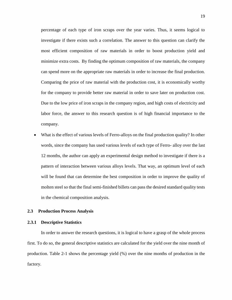
Table 2-1: Yield Percentage (%) Over Nine Months
Yield 83.39 80.86 81.21 82.77 76.2 83.43 89.21 72.62 76.18
As the calculations show, the production has a maximum yield of 89.21% and a minimum
yield of 72.62%. Using that, the range is 16.59% with a mean of 80.072% and a standard deviation
of 4.531%. Figure 2-9 (the run chart) shows the distribution of the yield percentage over the nine
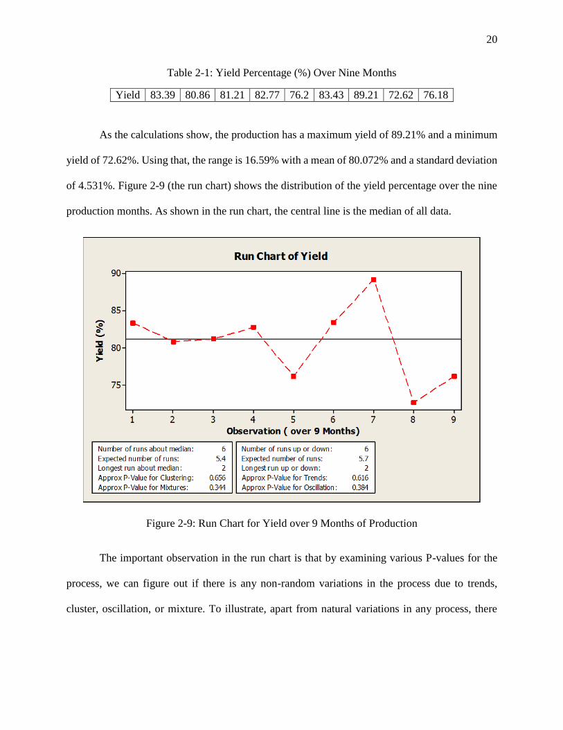
production months. As shown in the run chart, the central line is the median of all data.
Figure 2-9: Run Chart for Yield over 9 Months of Production
The important observation in the run chart is that by examining various P-values for the
process, we can figure out if there is any non-random variations in the process due to trends,
cluster, oscillation, or mixture. To illustrate, apart from natural variations in any process, there
21
might be some special variations that are caused as a result of wrong measurements, tools, or even
choice of operators.
The P- value less than 0.05 for cluster indicates that there are special causes for the
variation in the process due to measurement problems, set up variability, or sampling from defect
parts group. The P-value less than 0.05 for mixture shows that maybe the data is gained from a
different process rather than the process under study. The P-value less than 0.05 for oscillation is
an indicator of up or down fluctuations in the process which make the process unsteady. And
finally, the P-value of less than 0.05 for trends reveals either up or down drift in data. In case there
are trends in the process, it is a warning sight that the process may soon go out of control. Factors
affecting such event include wrong tool, periodic rotation of operators or the possibility that a
machine will not hold a setting.
In the run chart shown above, the P- values for clustering, mixtures, trends, and oscillation
are respectively 0.656, 0.344, 0.616, and 0.384. All of the gained P-values are bigger than 0.05.
This is a good sign for the production line as it indicates no visible special cause for variation of
the process data. Based on these figures, we can conclude that the variations in the billet production
operation under study are all natural.
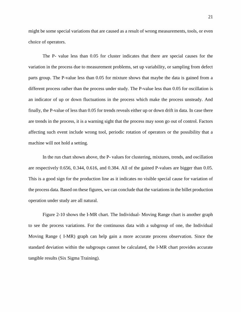
Figure 2-10 shows the I-MR chart. The Individual- Moving Range chart is another graph
to see the process variations. For the continuous data with a subgroup of one, the Individual
Moving Range ( I-MR) graph can help gain a more accurate process observation. Since the
standard deviation within the subgroups cannot be calculated, the I-MR chart provides accurate
tangible results (Six Sigma Training).
22
The individual chart plots each measurement as a data point which stands as its own since
the subgroup size is 1. It also shows that the process has an upper control limit (UCL) of 95.34 and
lower control limit (LCL) of 65.97 with a mean of 80.65. This shows that the process has been in
control over the given operation months.
Figure 2-10: I-MR Chart of Yield over 9 Months of Production
2.3.2 Process Capability Analysis
According to the factory under study, considering all aspects of financial, technical, labor
and energy, the favorable outcome for the management would be the minimum yield of 80% and
the maximum yield of 90%. Although the higher outcome would be greatly favorable, it is not
realistic considering the production failures, and potential risks inherent in the operation field for
billet and steel manufacturing. Having considered the real data gained over the nine months of
production, as well as setting the Upper Specification Limit (USL) of 90% and Lower
23
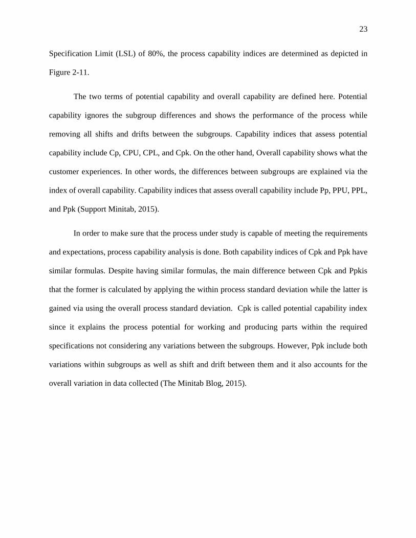
Specification Limit (LSL) of 80%, the process capability indices are determined as depicted in
Figure 2-11.
The two terms of potential capability and overall capability are defined here. Potential
capability ignores the subgroup differences and shows the performance of the process while
removing all shifts and drifts between the subgroups. Capability indices that assess potential
capability include Cp, CPU, CPL, and Cpk. On the other hand, Overall capability shows what the
customer experiences. In other words, the differences between subgroups are explained via the
index of overall capability. Capability indices that assess overall capability include Pp, PPU, PPL,
and Ppk (Support Minitab, 2015).
In order to make sure that the process under study is capable of meeting the requirements
and expectations, process capability analysis is done. Both capability indices of Cpk and Ppk have
similar formulas. Despite having similar formulas, the main difference between Cpk and Ppkis
that the former is calculated by applying the within process standard deviation while the latter is
gained via using the overall process standard deviation. Cpk is called potential capability index
since it explains the process potential for working and producing parts within the required
specifications not considering any variations between the subgroups. However, Ppk include both
variations within subgroups as well as shift and drift between them and it also accounts for the
overall variation in data collected (The Minitab Blog, 2015).
24
Figure 2-11: Process Capability of Yield (Using 95% Confidence)
In Figure 2-11, the dotted black line represents the normal distribution of the data using the
overall standard deviation of 4.97024, while the red line represents the normal distribution of the
data using the within standard deviation of 4.89473. Having the subgroup size of one in our data
set, all indices for both the potential capability and the overall capability are the same. The only
difference is the percentage of defects that changes from 47.51% in the within process performance
to 47.78% in the overall performance. It other words, using the within process standard deviation
of 4.89473 instead of the overall standard deviation of 4.97024, the rate of defects would improve
from 47.78% to 47.51% which is a 0.27% improvement in the defect rate. This would be noticeable
considering the high tonnage of production. In addition, the Cp and Pp of 0.04 which is smaller
than the standard of 1.33 shows that the process is not capable of meeting the requirement that are
expected by management in this case. In general, any Cp or Pp less than 1 is considered as an
indicator of a process incapable of meeting the required/ expected requirements of the process.
25
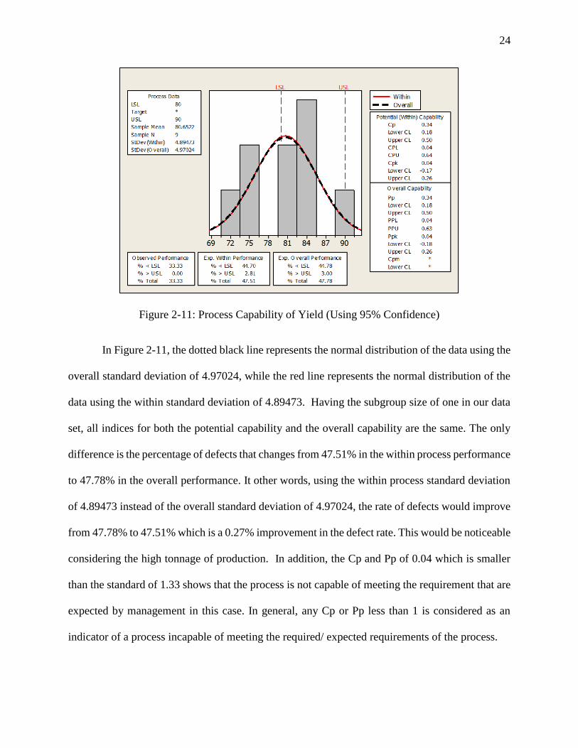
Having said that, however, Figure 2-11 (normal probability plot) clearly shows that the
data distribution is not normal. This shows that the data is not modelled well. In order to have a
more reliable interpretation of the data distribution, we need the process capability analysis for
non-normal distribution, here Weibull probability plot.
Figure 2-12: Various Nonparametric Distribution for Data over 9 Months of Production
In Weibull distribution, any P-value less than 0.05 indicates that the distribution is not a
good fit for the data. As Figure 2-12 shows, the Weibull distribution P-value for this data set and
the plot related to Weibull distribution goodness-of-fit test show that it is a good fit for this data.
Another index shown next to each type of distribution including exponential, 2 parameter
exponential, Weibull, 3 parameter Weibull is the Anderson-Darling (AD) statistic. To illustrate on
26
the concept of AD, we can consider it as a statistic to determine whether data meets the assumption
of normality for a t-test.
The hypotheses for the Anderson-Darling test are:
Null Hypothesis: The data follow a specified distribution
Alternative Hypothesis: The data do not follow a specified distribution
If the p-value is smaller than a chosen alpha (usually 0.05 or 0.10), then reject the null hypothesis
that the data come from that distribution. The Anderson-Darling statistic can be also used to
compare the fit of several distributions to determine which one is the best. However, in order to
conclude one distribution is the best, its Anderson-Darling statistic must be substantially lower
than the others. When the statistics are close together, one needs to use additional criteria, such as
probability plots, to choose between them.
The AD measures how well the set of data follows a particular distribution. The better the
distribution fits the data set, the smaller the statistic of AD is. So, the favorable model is the one
with a smaller AD index. Among various types of distributions shown in Figure 2-12, the index of
AD measure is 3.686 for the exponential distribution which is too big to make it a good fit for the
data. As it is seen from the calculations on the right side of the plots in Figure 2-12, the Weibull
distribution has the lowest AD of 0.34 that means this distribution can best fit the data set we have.
27
Figure 2-13: Process Capability Indices (Calculations based on Weibull Distribution Model)
As shown in Figure 2-13, by applying the Weibull distribution instead of normal
probability distribution, the Ppk increases from 0.04 (in normal probability plot) to 0.05. Also, the
overall process defect rate of 47.78% decreases to 41.62% in the Weibull distribution probability
plot which is great enhancement. This shows that even though the process is yet not capable of
meeting the required specifications, the Weibull distribution is a better model for the goodness-
of- fit for this data set compared to the normal distribution.
2.3.3 Tolerance Interval Analysis for Yield
A tolerance interval is a range that probably contains a specified proportion of the
population whereas the confidence level is the likelihood that the interval actually covers the
proportion. A confidence interval's width is entirely due to sampling error. As the sample size
approaches the entire population, the width of the confidence interval approaches zero.
Contrastingly, a tolerance interval’s width is due to both sampling error and the variance in the
28
population. As the sample size approaches the entire population, the sampling error diminishes
and the estimated percentiles approach the true population percentiles. (Support Minitab, 2015).
In other words, tolerance intervals are used to predict a likely range of outcomes based on the
sample data gained from the process. Tolerance interval is important in quality improvement.
Comparing the tolerance intervals with the process requirement (from customer’s viewpoint), if
the tolerance interval is bigger, it can be interpreted that there might be too much product
variations.
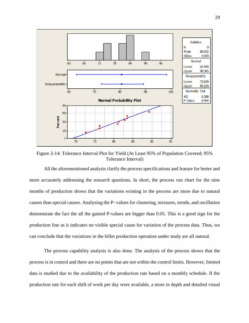
For the process under study, two-sided tolerance interval with a confidence level of 95%
and 95% of population in interval is shown in Figure 2-14. For the total of 9 observations, the
process yield mean is 80.652 and the standard deviation is 4.97.
Applying the normal probability method, the tolerance interval is (62.940, 98.365).
Considering the calculations, we can see that the upper interval of 98.365 is not realistic in the
billet manufacturing process considering the inherent parameters in the manufacturing process that
makes such a yield actually not possible in real world observation. Thus, we perform the tolerance
interval analysis again applying the nonparametric method.
Applying the nonparametric method, the tolerance interval changes to (72.620, 89.210).
This also confirms the previous points that a non-normal distribution can be a better fit for the data
set in this study in comparison to the normal distribution.
29
Figure 2-14: Tolerance Interval Plot for Yield (At Least 95% of Population Covered; 95%
Tolerance Interval)
All the aforementioned analysis clarify the process specifications and feature for better and
more accurately addressing the research questions. In short, the process run chart for the nine
months of production shows that the variations existing in the process are more due to natural
causes than special causes. Analyzing the P- values for clustering, mixtures, trends, and oscillation
demonstrate the fact the all the gained P-values are bigger than 0.05. This is a good sign for the
production line as it indicates no visible special cause for variation of the process data. Thus, we
can conclude that the variations in the billet production operation under study are all natural.
The process capability analysis is also done. The analysis of the process shows that the
process is in control and there are no points that are not within the control limits. However, limited
data is studied due to the availability of the production rate based on a monthly schedule. If the
production rate for each shift of work per day were available, a more in depth and detailed visual
30
and statistical analysis would be accessed. Moreover, the process capability was analyzed using
various statistic indices for the within process capability versus the potential process capability.
Both analysis show that the process cannot meet the required specifications that are set by the
factory management with regards to financial, technical, energy, and labor considerations. In this
section, both normal and non-normal distributions were used to see which distribution best fits the
set of our data. The results, based on the AD statistic and its P-value shows that applying non-
normal Weibull distribution provides a better fit to the data set.
The analysis of the tolerance interval with a 95% confidence (at α=0.05) shows that we can
claim that we can claim that 95% of the time, the yield (%) will fall in the numbers between 62.94%
and 98.365% using the normal distribution. Due to the unrealistic upper interval in the case of
billet manufacturing process, we perform the tolerance interval analysis again applying the
nonparametric method. The results from using the nonparametric method show that the tolerance
interval changes to 72.620% from 62.94% for the lower interval and to 89.210% from 98.365%
for the upper interval.
31
3 Factor Analysis and Findings
3.1 Factor Analysis Study
Having completed process capability study in Chapter 2, we can now start addressing the
research questions to check the possible impacts of the raw materials, their compositions, and
ferroalloys on the final yield percentage.
3.2 Question One: The relationship between the composition of iron scrap and the final
yield percentage
The data gathered over one year from the factory shows that more than 73.4% of the iron
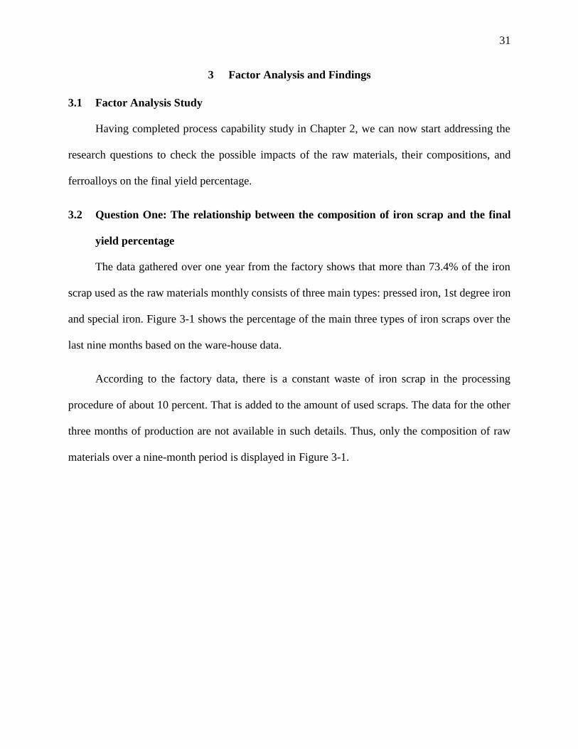
scrap used as the raw materials monthly consists of three main types: pressed iron, 1st degree iron
and special iron. Figure 3-1 shows the percentage of the main three types of iron scraps over the
last nine months based on the ware-house data.
According to the factory data, there is a constant waste of iron scrap in the processing
procedure of about 10 percent. That is added to the amount of used scraps. The data for the other
three months of production are not available in such details. Thus, only the composition of raw
materials over a nine-month period is displayed in Figure 3-1.
32
Figure 3-1: Percentage of Iron Scrap Types over 9 Months of Production
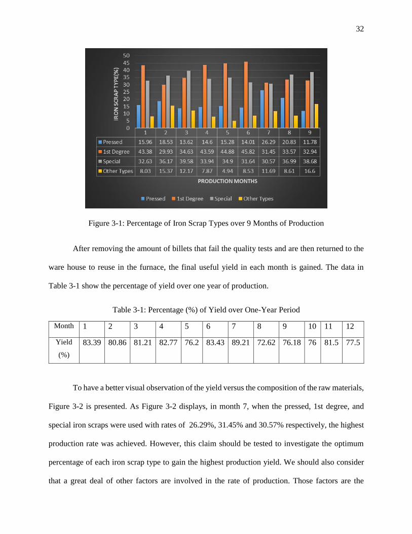
After removing the amount of billets that fail the quality tests and are then returned to the
ware house to reuse in the furnace, the final useful yield in each month is gained. The data in
Table 3-1 show the percentage of yield over one year of production.
Table 3-1: Percentage (%) of Yield over One-Year Period
Month 1 2 3 4 5 6 7 8 9 10 11 12
Yield
(%)
83.39 80.86 81.21 82.77 76.2 83.43 89.21 72.62 76.18 76 81.5 77.5
To have a better visual observation of the yield versus the composition of the raw materials,
Figure 3-2 is presented. As Figure 3-2 displays, in month 7, when the pressed, 1st degree, and
special iron scraps were used with rates of 26.29%, 31.45% and 30.57% respectively, the highest
production rate was achieved. However, this claim should be tested to investigate the optimum
percentage of each iron scrap type to gain the highest production yield. We should also consider
that a great deal of other factors are involved in the rate of production. Those factors are the
33
minerals added to the molten steel, the temperature of molten steel while poured into the billet
casts molds, and the cooling process that is one of the common causes of cracks in the billets. So,
it is not easy to consider only the composition of raw materials as the main factor affecting the
yield although it may play a role.
Figure 3-2: Percentage Yield over 9 Months of Production
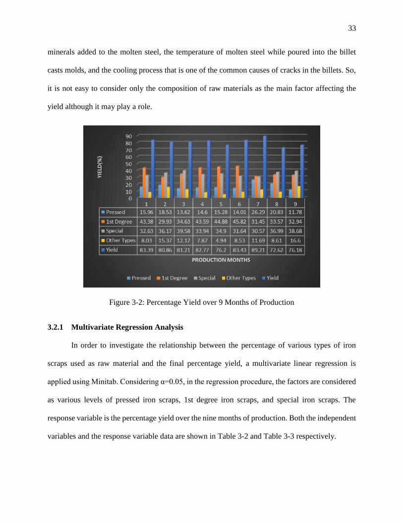
3.2.1 Multivariate Regression Analysis
In order to investigate the relationship between the percentage of various types of iron
scraps used as raw material and the final percentage yield, a multivariate linear regression is
applied using Minitab. Considering α=0.05, in the regression procedure, the factors are considered
as various levels of pressed iron scraps, 1st degree iron scraps, and special iron scraps. The
response variable is the percentage yield over the nine months of production. Both the independent
variables and the response variable data are shown in Table 3-2 and Table 3-3 respectively.
34
Table 3-2: Independent Variables
In.V 1
Pressed
15.96%
18.53%
13.62%
14.60%
15.28%
14.01%
26.29%
20.83%
11.78%
In.V 2
1st-Deg
43.38%
29.93%
34.63%
43.59%
44.88%
45.82%
31.45%
33.57%
32.94%
In.V 3
Special
32.63%
36.17%
39.58%
33.94%
34.90%
31.64%
30.57%
36.99%
38.68%
Table 3-3: Dependent (Response) Variable
Re.V
Yield
83.39%
80.86%
81.21%
82.77%
76.2%
83.43%
89.21%
72.62%
76.18%
For the response variable, Y, and factor variables of X1, X2, to Xn, the multiple regression
equation is simply defined as: Y= a+b1X1 + b2X2+ b3X3+ b4X4+…..+ bnXn
So, our regression equation is:
Y= a+b1*(Pressed) + b2*(1st-Deg) + b3*(Special)
The results from the regression analysis of Yield versus Pressed Scrap, 1st Degree Scrap, and
Special Scrap reveals the following information as shown in Table 3-4, Table 3-5, and Table 3-6.
Table 3-4: Analysis of Variance
Source DF Adj SS Adj MS F-Value P-Value
Regression 3 125.41 41.80 2.89 0.141
Pressed Scrap 1 18.79 18.79 1.30 0.306
1st-Deg Scrap 1 31.55 31.55 2.18 0.199
Special Scrap 1 88.77 88.77 6.15 0.056
Error 5 72.22 14.44
Total 8 197.63
35
Table 3-5: Coefficients
Term Coef SE Coef T-Value P-Value VIF
Constant 187.5 51.7 3.63 0.015
Pressed Scrap -0.679 0.595 -1.14 0.306 3.93
1st-Deg Scrap -0.600 0.406 -1.48 0.199 3.80
Special Scrap -2.080 0.839 -2.48 0.056 3.78
Table 3-6: Model Summary
S R-sq R-sq(adj) R-sq(pred)
3.80045 63.46% 41.53% 0.00%
Based on the information gained from the analysis, the regression equation is:
Yield = 187.5 - 0.679 Pressed Scrap - 0.600 1st Degree Scrap - 2.080 Special Scrap
Before doing any further explanation and interpretation of the model and regression
analysis, there is an unusual point in the model summary. The problem is with the predicted
squared R. It shows how well a regression model predicts responses for new observations. The
predictor squared R is a reliable indicator of certain issues in a model. The values of 0% and 100%
both occur when the model is not fit. The value of 0% shows that there is noise in the model due
to problem with data and thus, makes the model wrong and unreliable of predicting responses for
a new set of data. The value of 100% shows the model is over fit with too many predictors. Another
problem is a high difference between the values of squared R and predicted squared R. Such a big
difference is also an indicator of an over fit model. Thus, the main benefit of predicted squared R
is in its power to prevent creating an over fit model.
36
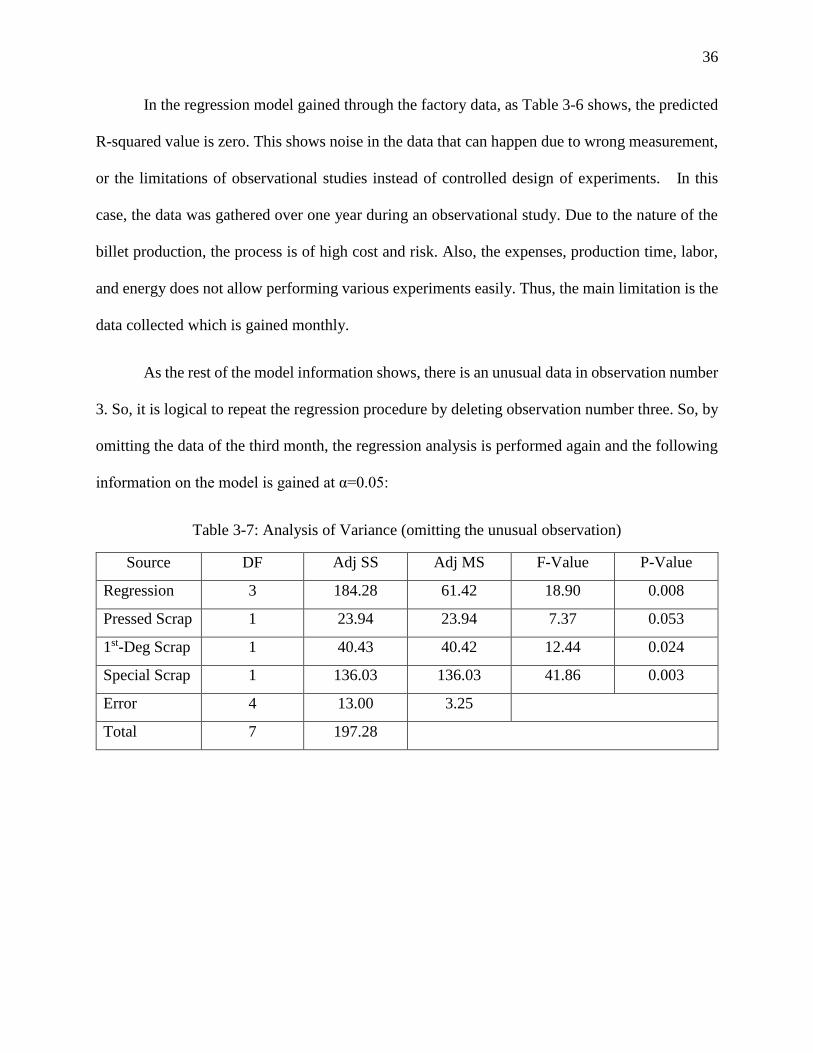
In the regression model gained through the factory data, as Table 3-6 shows, the predicted
R-squared value is zero. This shows noise in the data that can happen due to wrong measurement,
or the limitations of observational studies instead of controlled design of experiments. In this
case, the data was gathered over one year during an observational study. Due to the nature of the
billet production, the process is of high cost and risk. Also, the expenses, production time, labor,
and energy does not allow performing various experiments easily. Thus, the main limitation is the
data collected which is gained monthly.
As the rest of the model information shows, there is an unusual data in observation number
3. So, it is logical to repeat the regression procedure by deleting observation number three. So, by
omitting the data of the third month, the regression analysis is performed again and the following
information on the model is gained at α=0.05:
Table 3-7: Analysis of Variance (omitting the unusual observation)
Source DF Adj SS Adj MS F-Value P-Value
Regression 3 184.28 61.42 18.90 0.008
Pressed Scrap 1 23.94 23.94 7.37 0.053
1st-Deg Scrap 1 40.43 40.42 12.44 0.024
Special Scrap 1 136.03 136.03 41.86 0.003
Error 4 13.00 3.25
Total 7 197.28
37
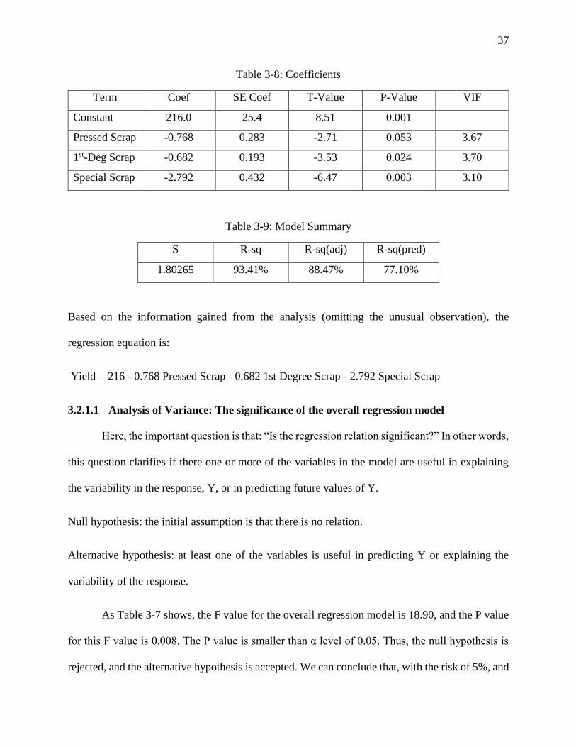
Table 3-8: Coefficients
Term Coef SE Coef T-Value P-Value VIF
Constant 216.0 25.4 8.51 0.001
Pressed Scrap -0.768 0.283 -2.71 0.053 3.67
1st-Deg Scrap -0.682 0.193 -3.53 0.024 3.70
Special Scrap -2.792 0.432 -6.47 0.003 3.10
Table 3-9: Model Summary
S R-sq R-sq(adj) R-sq(pred)
1.80265 93.41% 88.47% 77.10%
Based on the information gained from the analysis (omitting the unusual observation), the
regression equation is:
Yield = 216 - 0.768 Pressed Scrap - 0.682 1st Degree Scrap - 2.792 Special Scrap
3.2.1.1 Analysis of Variance: The significance of the overall regression model
Here, the important question is that: “Is the regression relation significant?” In other words,
this question clarifies if there one or more of the variables in the model are useful in explaining
the variability in the response, Y, or in predicting future values of Y.
Null hypothesis: the initial assumption is that there is no relation.
Alternative hypothesis: at least one of the variables is useful in predicting Y or explaining the
variability of the response.
As Table 3-7 shows, the F value for the overall regression model is 18.90, and the P value
for this F value is 0.008. The P value is smaller than α level of 0.05. Thus, the null hypothesis is
rejected, and the alternative hypothesis is accepted. We can conclude that, with the risk of 5%, and
38
certainty of 95%, that one or more of the variables are useful in explaining the variability of the
response. Considering the P value of 0.008, we can conclude that there is only 0.8% chance that
the results of the model are obtained purely by chance.
3.2.1.2 Analysis of Variance: The significance of independent variables in the regression
model
Here, the question is that: “Is any of the independent variables of X1, X2, or X3 useful in
predicting or explaining Y?
Null hypothesis: the initial assumption is that none of the independent variables can contribute to
the explanation or prediction of the response.
Alternative hypothesis: at least one of the variables is useful in predicting Y or explaining the
variability of the response.
As Table 3-7 displays, the F value for the Pressed Scrap is 7.37, with a P value of 0.053
which is bigger than α level of 0.05. The P-value bigger than α shows that the Pressed Scrap
variable is not statistically important, and thus, does not explain the variations in the response and
has no prediction power in the regression model. The F value and P value for 1st-Deg Scrap is
12.44 and 0.024 respectively. And Special Scrap has an F value of 41.86 with a P value of 0.003.
The P- values for both the 1st-Deg Scrap and Special Scrap shows that there is 2.4% and 0.3%,
respectively, chance that the variability in the response variable is caused purely by chance.
Considering the fact that all the P values are equal or less than the alpha level for all the
variables in the model, they all should be included in the model and only the Pressed Scarp should
drop. So, two of the independent variables are statistically significant in predicting the response.
Now that we know the relationship between the selected factors as variables and the response, we
39
can go further and find the interaction of the various factors. That way, we can find out if there is
any relationship between the interactions of the factors.
3.2.1.3 Model Summary: The analysis of R-squared, adjusted R-squared, predicted R-
squared
R-squared is a statistical measure that indicates how close the data are to the fitted
regression line. R-squared is also called the coefficient of determination, or the coefficient of
multiple determination for multiple regression. R-squared actually shows what percentage of the
variations in the response variable is explained by the linear model. In other words, it is the ration
of the explained variation over the total variations which has a value between 0% to 100%. The
value of 0% indicates that the model does not explain any of the variability of the response data
around its mean, while the value of 100% states that all the variability of the response data is
explained through the model. So, the higher the R-squared value, the better the model fits the data.
However, the model can be over fit sometimes for various reasons. There are two main limitations
with r-squared. First, it cannot determine whether the coefficients estimates and predictions are
biased or not. Second, R-squared does not show whether a regression model is adequate or not. It
is possible to obtain a low R-squared value for a good model, or a high R-squared value for a
model that does not fit the data. Third, in a model with too many predictors and higher order
polynomials, it starts to model the random noise in the data. In this condition, the model is over fit
and it produces a high values of squared-R that is misleading and decreases the ability to predict
correctly (The Minitab Blog, 2015). Due to this limitation, the residual plots must be assessed to
check the biasness of both factors and response variables. To have the most precise interpretation
of the model, R-squared by itself, cannot tell the whole story. We need to analyze that besides
residual plots, model statistics and more importantly, the F-test of overall significance of the

40
model. The R-squared provides an estimate of the strength of the relationship between the model
and the response variable. However, it is not the indicator of a formal hypothesis test for such
relationship. Thus, even if the R-squared value is low, the F-test of overall significance of the
model is the most reliable factor in analysis.
The adjusted R-squared compares the explanatory power of regression models that contain
different numbers of predictors. The adjusted R-squared is a modified version of R-squared that is
adjusted for the number of predictors in the model. It increases only if the new term improves the
model more than would be expected by chance. It decreases when a predictor improves the model
by less than expected by chance (The Minitab Blog, 2015). In other words, if you add more useless
data point to the model, the adjusted R-squared decreases, but if you add more useful data points,
it increases. The adjusted R-squared can be negative, but it is usually not. It is always lower than
the R-squared.
Although both the R square and the adjusted R square shows how many data points fall
within the regression equation line, they have a main difference. The main difference between
squared-R and adjusted squared-R is that R square assumes that every single variable explains the
variations in the response variable while the adjusted R square shows what percentage of variation
is explained by only the independent factor variables that actually affect the response variable.
Another statistical measure in the model summary is the predicted R square. It addresses
issues such as overfitting the model data and also shows the prediction power of the model for
future observations. Both negative and zero values for the predicted R square are indicators of
some kinds of noise in the model or show that the model is overfitting. Also, if the predicted R
square starts to drop by adding predictor variables, it is a sign of overfitting model. So, the main
41
benefit of the predicted R square is that it shows if the model is overfitting, or too complex and
also it indicates how well the model predicts new future observations.
In our regression model, the R square has a value of 93.41%. It states that such percentage
of variations in the data points can be explained through the model. The adjusted r square value of
88.47% shows that of such variations in the response variable is explained by the effect of actual
independent factors. The predicted R square value of 77.10% is also an indicator that the model
has such percentage of prediction power for future observations. These numbers in addition to the
f-test value of 18.90 with its P value of 0.008 all confirm that the model is statistically reliable and
has the power to explain the variations in the response variable based on the data points used as
factor variables.
3.2.1.4 Regression Equation: The analysis of coefficients in the regression model
In the multivariate linear regression, the size of the effect that each variable has on the
response variable is shown by the size of the coefficient, and the positive or negative sign on the
coefficients reveals the direction of the effect. In regression with multiple independent variables,
the coefficient displays how much the dependent variable is expected to increase (when the
coefficient sign is positive) or decrease (when the coefficient sign is negative) when that
independent variable increases or decreases by one, holding all the other independent variables
constant (Princeton University Library- Data and Statistical Services, n.d.).
Before analyzing the coefficients in the regression equation, we may have a look at the
constant value of 216 in the equation. In a multiple regression model, the constant indicates the
value that would be predicted for the dependent variable if all the independent variables were
simultaneously equal to zero. This situation may not be physically or economically meaningful. If
there is no particular interest in what would happen if all the independent variables were
42
simultaneously zero, then we can leave the constant in the model regardless of its statistical
significance. As well as ensuring that the in-sample errors are unbiased, the presence of the
constant allows the regression line to "seek its own level" and provide the best fit to data which
may only be locally linear (Duke Education- Statistical Forecasting, n.d.).
In other words, the constant value is important when predicting the future values of a
response variables in researches such as marketing. It is, by nature, the intercept of the regression
equation line, and thus can help predicting future outcomes. To do so, the researcher can consider
x value of zero for all the X1, X2, and Xn factors. On the other hand, when it comes to scientific
researches, there are conditions in which Xi variables are never zero. You cannot assign them zero
since the research is done on an industrial or economical topic. Thus, the constant value has no
intrinsic meaning. So, if never Xi=0, the intercept has no intrinsic meaning. In scientific research,
the purpose of a regression model is to figure out the relationship between predictors and the
response. If so, and if Xi never = 0, there is no interest in the intercept. The intercept does not tell
you anything about the relationship between Xi `s and Y (The Analysis Factor, n.d.).
As the regression equation for our model indicates, the independent variables all have
coefficients with negative signs. Thus, a one-unit increase in each causes a decrease of -0.76-0.68-
2.79 in the yield percentage. The residual plots for yield are depicted in Figure 3-3.
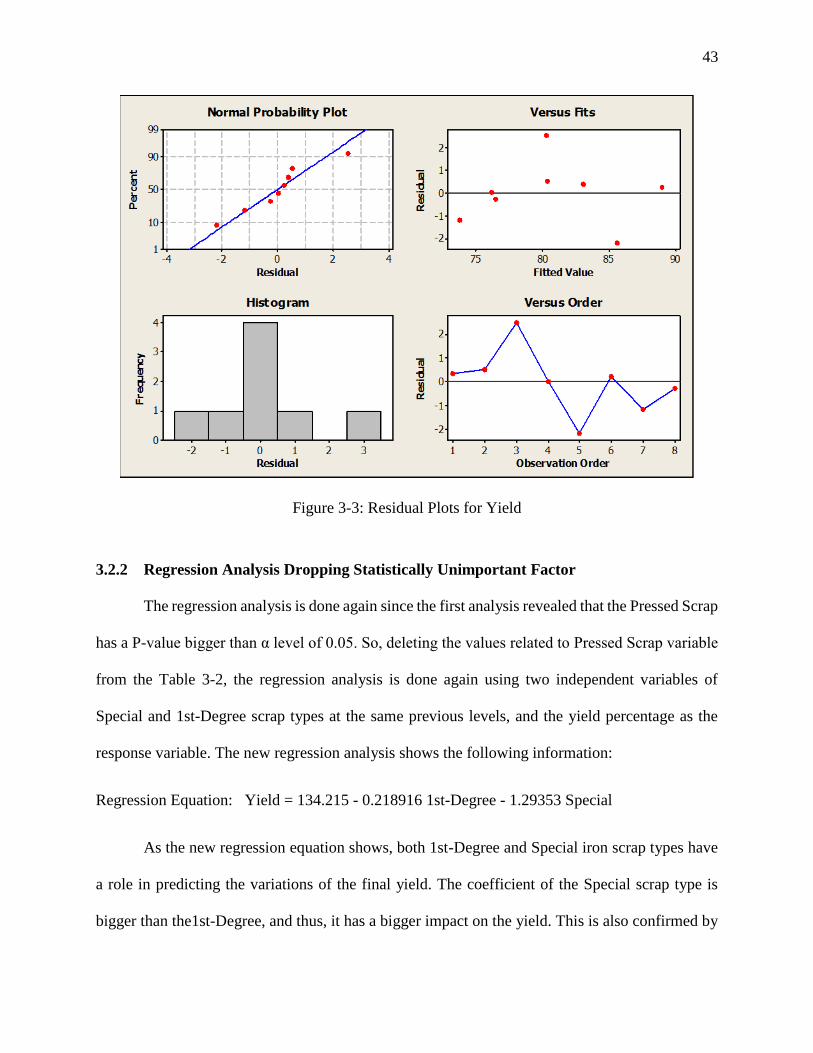
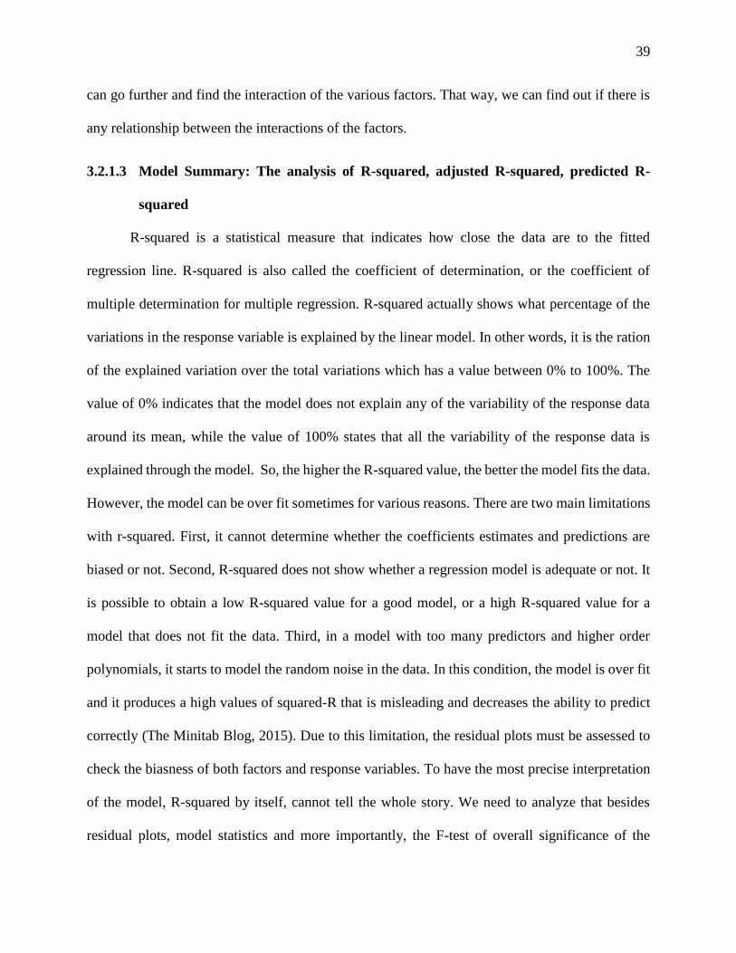
43
Figure 3-3: Residual Plots for Yield
3.2.2 Regression Analysis Dropping Statistically Unimportant Factor
The regression analysis is done again since the first analysis revealed that the Pressed Scrap
has a P-value bigger than α level of 0.05. So, deleting the values related to Pressed Scrap variable
from the Table 3-2, the regression analysis is done again using two independent variables of
Special and 1st-Degree scrap types at the same previous levels, and the yield percentage as the
response variable. The new regression analysis shows the following information:
Regression Equation: Yield = 134.215 - 0.218916 1st-Degree - 1.29353 Special
As the new regression equation shows, both 1st-Degree and Special iron scrap types have
a role in predicting the variations of the final yield. The coefficient of the Special scrap type is
bigger than the1st-Degree, and thus, it has a bigger impact on the yield. This is also confirmed by
44
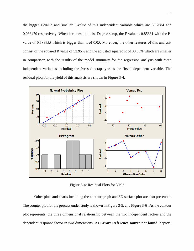
the bigger F-value and smaller P-value of this independent variable which are 6.97684 and
0.038470 respectively. When it comes to the1st-Degree scrap, the F-value is 0.85831 with the P-
value of 0.389955 which is bigger than α of 0.05. Moreover, the other features of this analysis
consist of the squared R value of 53.95% and the adjusted squared R of 38.60% which are smaller
in comparison with the results of the model summary for the regression analysis with three
independent variables including the Pressed scrap type as the first independent variable. The
residual plots for the yield of this analysis are shown in Figure 3-4.
Figure 3-4: Residual Plots for Yield
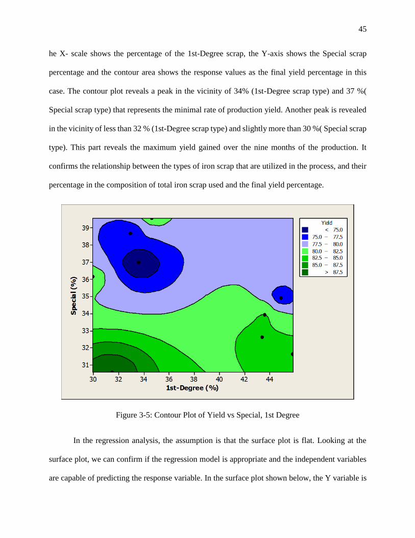
Other plots and charts including the contour graph and 3D surface plot are also presented.
The counter plot for the process under study is shown in Figure 3-5, and Figure 3-6 . As the contour
plot represents, the three dimensional relationship between the two independent factors and the
dependent response factor in two dimensions. As Error! Reference source not found. depicts,
45
he X- scale shows the percentage of the 1st-Degree scrap, the Y-axis shows the Special scrap
percentage and the contour area shows the response values as the final yield percentage in this
case. The contour plot reveals a peak in the vicinity of 34% (1st-Degree scrap type) and 37 %(
Special scrap type) that represents the minimal rate of production yield. Another peak is revealed
in the vicinity of less than 32 % (1st-Degree scrap type) and slightly more than 30 %( Special scrap
type). This part reveals the maximum yield gained over the nine months of the production. It
confirms the relationship between the types of iron scrap that are utilized in the process, and their
percentage in the composition of total iron scrap used and the final yield percentage.
Figure 3-5: Contour Plot of Yield vs Special, 1st Degree
In the regression analysis, the assumption is that the surface plot is flat. Looking at the
surface plot, we can confirm if the regression model is appropriate and the independent variables
are capable of predicting the response variable. In the surface plot shown below, the Y variable is
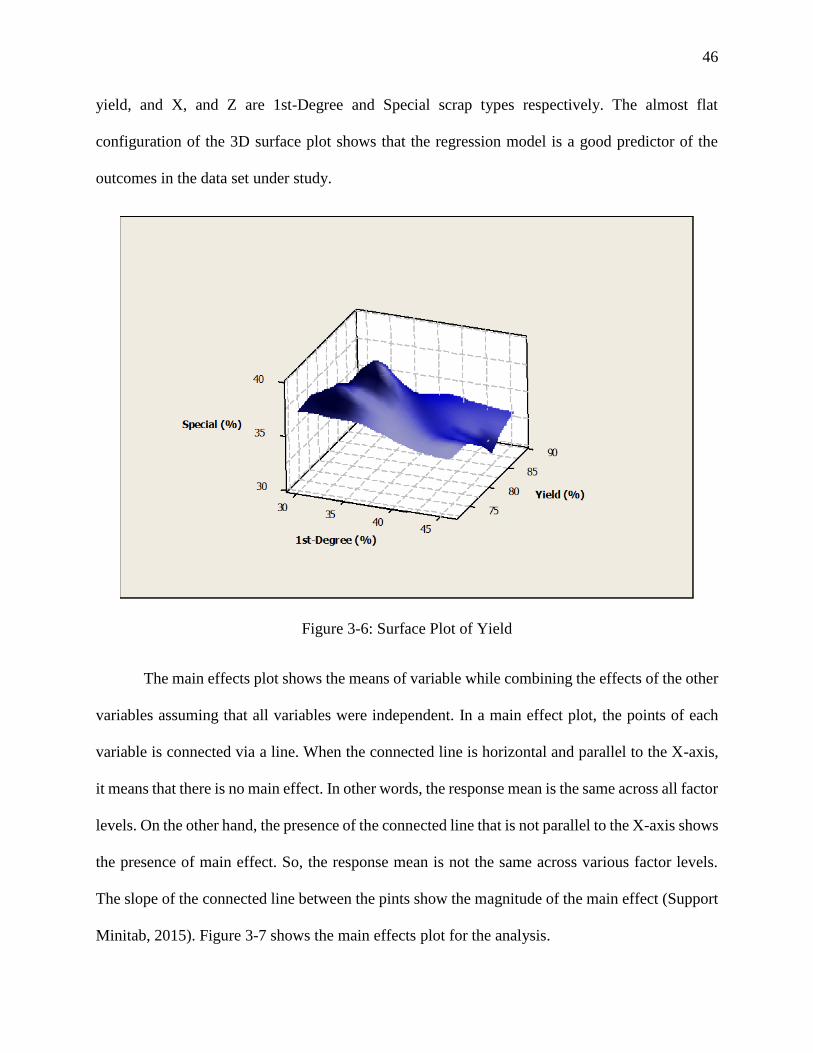
46
yield, and X, and Z are 1st-Degree and Special scrap types respectively. The almost flat
configuration of the 3D surface plot shows that the regression model is a good predictor of the
outcomes in the data set under study.
Figure 3-6: Surface Plot of Yield
The main effects plot shows the means of variable while combining the effects of the other
variables assuming that all variables were independent. In a main effect plot, the points of each
variable is connected via a line. When the connected line is horizontal and parallel to the X-axis,
it means that there is no main effect. In other words, the response mean is the same across all factor
levels. On the other hand, the presence of the connected line that is not parallel to the X-axis shows
the presence of main effect. So, the response mean is not the same across various factor levels.
The slope of the connected line between the pints show the magnitude of the main effect (Support
Minitab, 2015). Figure 3-7 shows the main effects plot for the analysis.
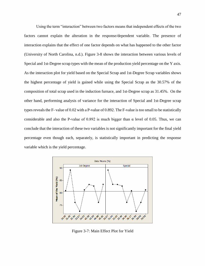
47
Using the term “interaction” between two factors means that independent effects of the two
factors cannot explain the alteration in the response/dependent variable. The presence of
interaction explains that the effect of one factor depends on what has happened to the other factor
(University of North Carolina, n.d.). Figure 3-8 shows the interaction between various levels of
Special and 1st-Degree scrap types with the mean of the production yield percentage on the Y axis.
As the interaction plot for yield based on the Special Scrap and 1st-Degree Scrap variables shows
the highest percentage of yield is gained while using the Special Scrap as the 30.57% of the
composition of total scrap used in the induction furnace, and 1st-Degree scrap as 31.45%. On the
other hand, performing analysis of variance for the interaction of Special and 1st-Degree scrap
types reveals the F- value of 0.02 with a P-value of 0.892. The F-value is too small to be statistically
considerable and also the P-value of 0.892 is much bigger than α level of 0.05. Thus, we can
conclude that the interaction of these two variables is not significantly important for the final yield
percentage even though each, separately, is statistically important in predicting the response
variable which is the yield percentage.
Figure 3-7: Main Effect Plot for Yield
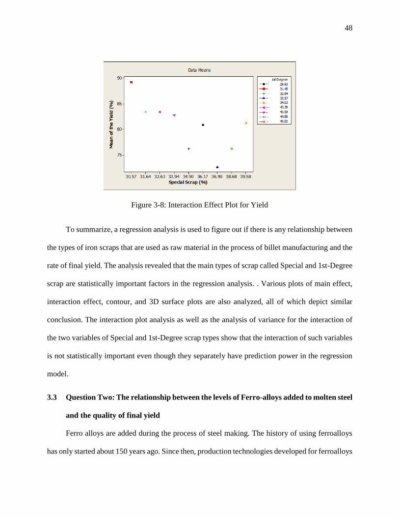
48
Figure 3-8: Interaction Effect Plot for Yield
To summarize, a regression analysis is used to figure out if there is any relationship between
the types of iron scraps that are used as raw material in the process of billet manufacturing and the
rate of final yield. The analysis revealed that the main types of scrap called Special and 1st-Degree
scrap are statistically important factors in the regression analysis. . Various plots of main effect,
interaction effect, contour, and 3D surface plots are also analyzed, all of which depict similar
conclusion. The interaction plot analysis as well as the analysis of variance for the interaction of
the two variables of Special and 1st-Degree scrap types show that the interaction of such variables
is not statistically important even though they separately have prediction power in the regression
model.
3.3 Question Two: The relationship between the levels of Ferro-alloys added to molten steel
and the quality of final yield
Ferro alloys are added during the process of steel making. The history of using ferroalloys
has only started about 150 years ago. Since then, production technologies developed for ferroalloys
49
has made a wide range of ferroalloys available that are specifically produced for various types and
grads of steel. The role of Ferroalloys added to molten steel is to enhance properties such as
tensile, strength, ductility, fatigue strength, and corrosion resistance of the final steel product.
Various types of ferroalloys are utilized in the steel making operations now based on what final
products the factory is aimed at. Thus, ferroalloys utilization varies from FeMn, FeSi, FeCr, SiMn
to Mn, Cr, Ni, Si, and so one (Lauri Holappa, Seppo Louhenkilpi, 2013). However, the chemical
effect analysis of those ferroalloys is not in the scope of this study. In this research, a data analysis
has been done in order to find the effect of some specific ferroalloys that have been utilized in the
billet production factory that is under the study over the first year of production. The utilized
ferroalloys include FeSi, SiMn, and Geranol. The data from the production line shows the amount
of ferroalloys used per ton in the production of billets. The ferroalloys are added to the induction
furnace molten steel. The purpose of the utilization of the ferroalloys is to improve the final product
chemical properties so that they can meet the requirements of the quality tests and chemical
analysis that are performed after production. There are specific ranges of each ferroalloy that
should exist in the billet as the final product. The billets that lack such specific level are sent back
to the warehouse to be used as raw material with iron scraps for later production. Thus, these
returned billets failing the quality tests are considered waste in the operation line and impose high
costs of reproduction on the factory.
In the analysis done in this study, the regression analysis is performed to investigate if there
is any relationship between such various levels of ferroalloys and the quality of final yield based
on the data gathered over one year of production form the factory under study. In addition to
investigate any possible relationship between the levels of ferroalloys and the final yield
percentage, an optimum level of each will be found that can determine the best composition in
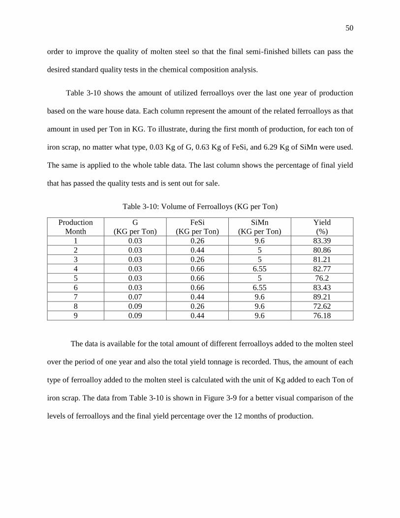
50
order to improve the quality of molten steel so that the final semi-finished billets can pass the
desired standard quality tests in the chemical composition analysis.
Table 3-10 shows the amount of utilized ferroalloys over the last one year of production
based on the ware house data. Each column represent the amount of the related ferroalloys as that
amount in used per Ton in KG. To illustrate, during the first month of production, for each ton of
iron scrap, no matter what type, 0.03 Kg of G, 0.63 Kg of FeSi, and 6.29 Kg of SiMn were used.
The same is applied to the whole table data. The last column shows the percentage of final yield
that has passed the quality tests and is sent out for sale.
Table 3-10: Volume of Ferroalloys (KG per Ton)
Production
Month
G
(KG per Ton)
FeSi
(KG per Ton)
SiMn
(KG per Ton)
Yield
(%)
1 0.03 0.26 9.6 83.39
2 0.03 0.44 5 80.86
3 0.03 0.26 5 81.21
4 0.03 0.66 6.55 82.77
5 0.03 0.66 5 76.2
6 0.03 0.66 6.55 83.43
7 0.07 0.44 9.6 89.21
8 0.09 0.26 9.6 72.62
9 0.09 0.44 9.6 76.18
The data is available for the total amount of different ferroalloys added to the molten steel
over the period of one year and also the total yield tonnage is recorded. Thus, the amount of each
type of ferroalloy added to the molten steel is calculated with the unit of Kg added to each Ton of
iron scrap. The data from Table 3-10 is shown in Figure 3-9 for a better visual comparison of the
levels of ferroalloys and the final yield percentage over the 12 months of production.
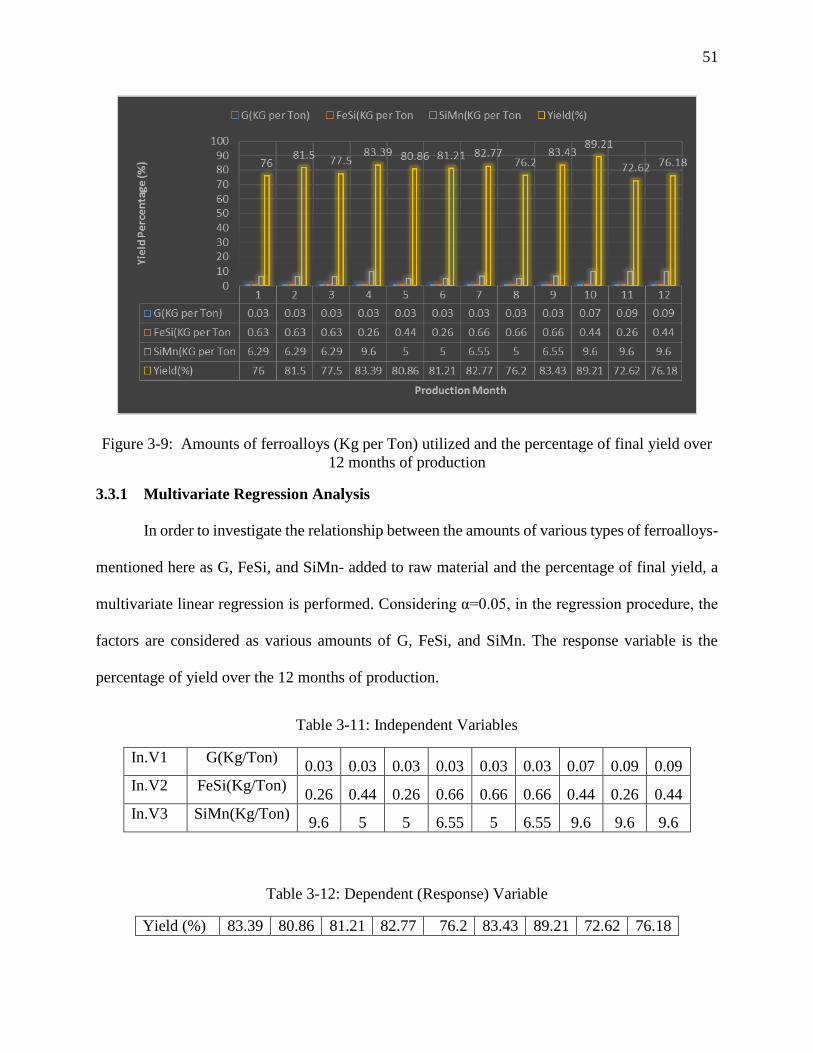
51
Figure 3-9: Amounts of ferroalloys (Kg per Ton) utilized and the percentage of final yield over
12 months of production
3.3.1 Multivariate Regression Analysis
In order to investigate the relationship between the amounts of various types of ferroalloys-
mentioned here as G, FeSi, and SiMn- added to raw material and the percentage of final yield, a
multivariate linear regression is performed. Considering α=0.05, in the regression procedure, the
factors are considered as various amounts of G, FeSi, and SiMn. The response variable is the
percentage of yield over the 12 months of production.
Table 3-11: Independent Variables
In.V1 G(Kg/Ton) 0.03 0.03 0.03 0.03 0.03 0.03 0.07 0.09 0.09
In.V2 FeSi(Kg/Ton) 0.26 0.44 0.26 0.66 0.66 0.66 0.44 0.26 0.44
In.V3 SiMn(Kg/Ton) 9.6 5 5 6.55 5 6.55 9.6 9.6 9.6
Table 3-12: Dependent (Response) Variable
Yield (%) 83.39 80.86 81.21 82.77 76.2 83.43 89.21 72.62 76.18
52
For the response variable, Y, and factor variables of X1, X2, to Xn, the multiple regression
equation is simply defined as: Y= a+b1X1 + b2X2+ b3X3+ b4X4+…..+ bnXn
So, our regression equation is: Y= a+b1*G + b2*FeSi + b3*SiMn The results from the regression
analysis of Yield versus G, FeSi, and SiMn reveals the following information.
Table 3-13: Analysis of Variance
Source DF Adj SS Adj MS F-Value P-Value
Regression 3 71.751 23.9171 0.950 0.483359
G 1 66.445 66.445 2.639 0.165175
FeSi 1 3.402 3.4019 0.135 0.728217
SiMn 1 43.878 43.878 1.739 0.244398
Error 5 125.875 251749
Total 8 197.626
Here, the question is that: “Is any of the independent variables of X1, X2, or X3 useful in predicting
or explaining Y?
Null hypothesis: the initial assumption is that none of the independent variables can contribute to
the explanation or prediction of the response.
Alternative hypothesis: at least one of the variables is useful in predicting Y or explaining the
variability of the response.
As Table 3-13 displays, the F value for G is 0.950, with a P value of 0.483359 which is
bigger than α level of 0.05. The F value and P value for FeSi is 2.639 and 0.165175 respectively.
And SiMn has an F value of 1.739 with a P value of 0.244398. The P- values for all the variables
of G, FeSi, and SiMn are bigger than α level of 0.05. Thus, we cannot reject the null hypothesis.
So, the P-values all indicate that not of the independent variables can be used as predictors for the
53
variability of the response variable which is the percentage of yield as they are not statistically
significant. Then, we accept the initial assumption stating that is that none of the independent
variables can contribute to the explanation or prediction of the response.
3.3.2 Regression Equation: The analysis of coefficients in the regression model
Table 3-14: Coefficients
Term Coef SE Coef T-Value P-Value
Constant 74.074 10.1531 7.29567 0.001
G -158.000 97.2542 -1.62461 0.165
FeSi 4.140 11.2614 0.36760 0.728
SiMn 1.658 1.2572 1.31883 0.244
Considering the initial formula for the linear general regression, and the coefficients gained
in the regression analysis, the regression equation is as follows:
Regression Equation: Yield = 74.0737 - 158 G + 4.13973 FeSi + 1.65799 SiMn
Since the P-value of the regression constant is less than α level of 0.05, we can conclude
that the regression model is statistically significant overall. However, consider the P-values of
other constants, the initial assumption in ANOVA testing that the model variables are not able to
make contributions to predicting the variations in the response variable should be accepted. Thus,
even having the big constant for the G, no matter what sign, cannot be interpreted as that specific
factor has any prediction power for the model.
54
3.3.3 Model Summary: Analysis of R-sq, adjusted R-sq, predicted R-sq
Table 3-15: Model Summary
S R-sq R-sq(adj) R-sq(pred)
5.01746 36.31% -1.91% -380.00%
As previously mentioned, R-squared is a statistical measure that indicates how close the
data are to the fitted regression line. R-squared is also called the coefficient of determination, or
the coefficient of multiple determination for multiple regression. R-squared actually shows what
percentage of the variations in the response variable is explained by the linear model. In other
words, it is the ration of the explained variation over the total variations which has a value between
0% to 100%. The value of 0% indicates that the model does not explain any of the variability of
the response data around its mean, while the value of 100% states that all the variability of the
response data is explained through the model. So, the higher the R-squared value, the better the
model fits the data. However, the model can be over fit sometimes for various reasons. There are
two main limitations with r-squared. First, it cannot determine whether the coefficients estimates
and predictions are biased or not. Second, R-squared does not indicate whether a regression model
is adequate. It is possible to gain a low R-squared value for a good model, or a high R-squared
value for a model that does not fit the data. Third, in a model with too many predictors and higher
order polynomials, it begins to model the random noise in the data. In this condition, the model is
over fit and it produces a misleadingly high values of squared-R that decreases the ability to make
correct predictions (The Minitab Blog, 2015). Due to this limitation, the residual plots must be
assessed to check the biasness of both factors and response variables. In order to have the most
precise interpretation of the model, R-squared by itself, cannot tell the whole story. We need to
55
analyze that besides residual plots, model statistics and more importantly, the F-test of overall
significance of the model. While the R-squared provides an estimate of the strength of the
relationship between the model and the response variable, it is not the indicator of a formal
hypothesis test for such relationship. Thus, even if the R-squared value is low, the F-test of overall
significance of the model is the most reliable factor in analysis.
The adjusted R-squared compares the explanatory power of regression models that contain
different numbers of predictors. The adjusted R-squared is a modified version of R-squared that is
adjusted for the number of predictors in the model. It increases only if the new term improves the
model more than would be expected by chance. It decreases when a predictor improves the model
by less than expected by chance (The Minitab Blog, 2015). In other words, if you add more useless
data point to the model, the adjusted R-squared decreases, but if you add more useful data points,
it increases. The adjusted R-squared can be negative, but it is usually not. It is always lower than
the R-squared.
Although both the R square and the adjusted R square shows how many data points fall
within the regression equation line, they have a main difference. The main difference between
squared-R and adjusted squared-R is that R square assumes that every single variable explains the
variations in the response variable while the adjusted R square shows what percentage of variation
is explained by only the independent factor variables that actually affect the response variable.
Another statistical measure in the model summary is the predicted R square. It addresses
issues such as overfitting the model data and also shows the prediction power of the model for
future observations. Both negative and zero values for the predicted R square are indicators of
some kinds of noise in the model or show that the model is overfitting. Also, if the predicted R
square starts to drop by adding predictor variables, it is a sign of overfitting model. So, the main
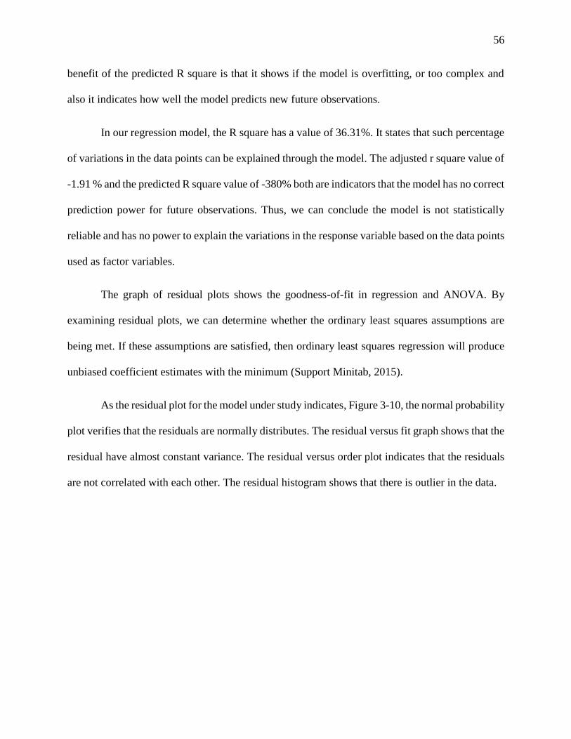
56
benefit of the predicted R square is that it shows if the model is overfitting, or too complex and
also it indicates how well the model predicts new future observations.
In our regression model, the R square has a value of 36.31%. It states that such percentage
of variations in the data points can be explained through the model. The adjusted r square value of
-1.91 % and the predicted R square value of -380% both are indicators that the model has no correct
prediction power for future observations. Thus, we can conclude the model is not statistically
reliable and has no power to explain the variations in the response variable based on the data points
used as factor variables.
The graph of residual plots shows the goodness-of-fit in regression and ANOVA. By
examining residual plots, we can determine whether the ordinary least squares assumptions are
being met. If these assumptions are satisfied, then ordinary least squares regression will produce
unbiased coefficient estimates with the minimum (Support Minitab, 2015).
As the residual plot for the model under study indicates, Figure 3-10, the normal probability
plot verifies that the residuals are normally distributes. The residual versus fit graph shows that the
residual have almost constant variance. The residual versus order plot indicates that the residuals
are not correlated with each other. The residual histogram shows that there is outlier in the data.
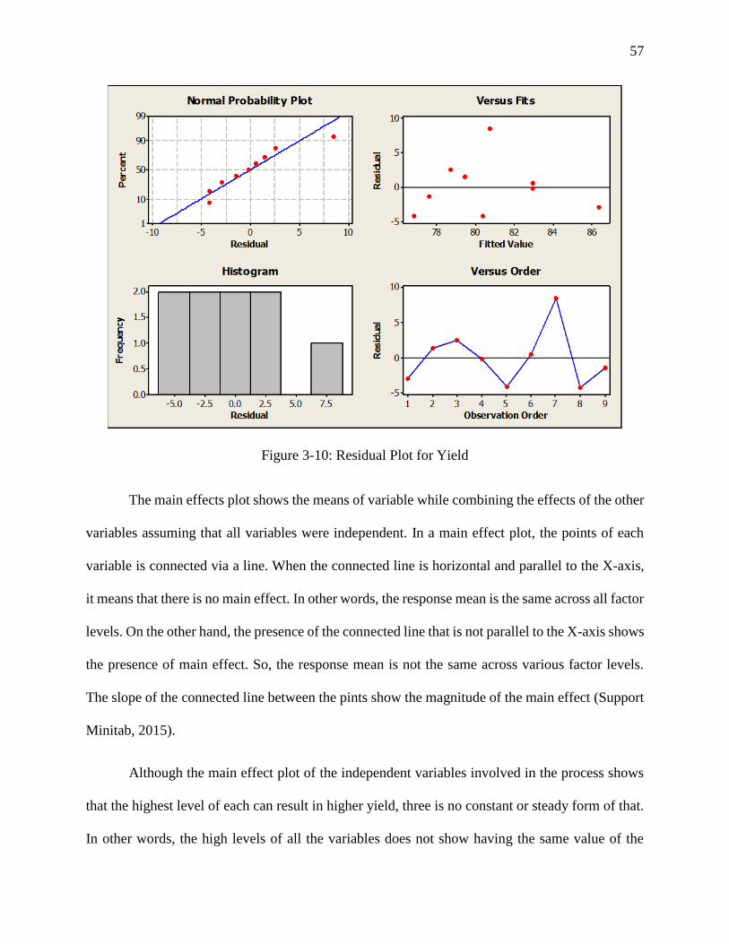
57
Figure 3-10: Residual Plot for Yield
The main effects plot shows the means of variable while combining the effects of the other
variables assuming that all variables were independent. In a main effect plot, the points of each
variable is connected via a line. When the connected line is horizontal and parallel to the X-axis,
it means that there is no main effect. In other words, the response mean is the same across all factor
levels. On the other hand, the presence of the connected line that is not parallel to the X-axis shows
the presence of main effect. So, the response mean is not the same across various factor levels.
The slope of the connected line between the pints show the magnitude of the main effect (Support
Minitab, 2015).
Although the main effect plot of the independent variables involved in the process shows
that the highest level of each can result in higher yield, three is no constant or steady form of that.
In other words, the high levels of all the variables does not show having the same value of the
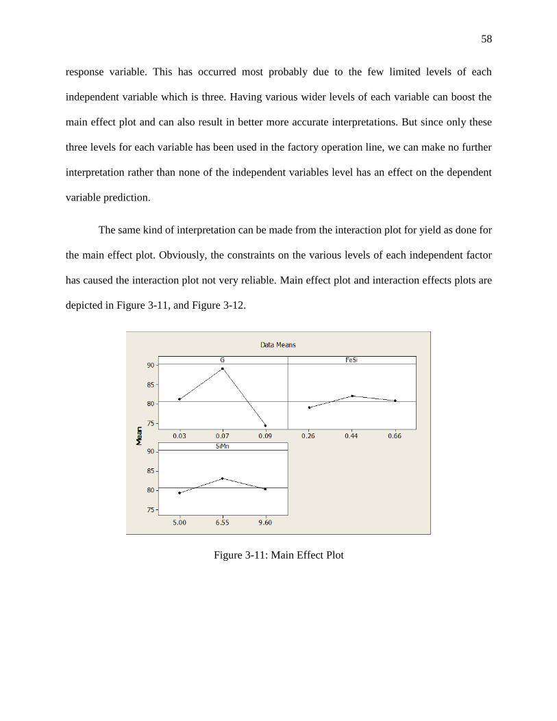
58
response variable. This has occurred most probably due to the few limited levels of each
independent variable which is three. Having various wider levels of each variable can boost the
main effect plot and can also result in better more accurate interpretations. But since only these
three levels for each variable has been used in the factory operation line, we can make no further
interpretation rather than none of the independent variables level has an effect on the dependent
variable prediction.
The same kind of interpretation can be made from the interaction plot for yield as done for
the main effect plot. Obviously, the constraints on the various levels of each independent factor
has caused the interaction plot not very reliable. Main effect plot and interaction effects plots are
depicted in Figure 3-11, and Figure 3-12.
Figure 3-11: Main Effect Plot
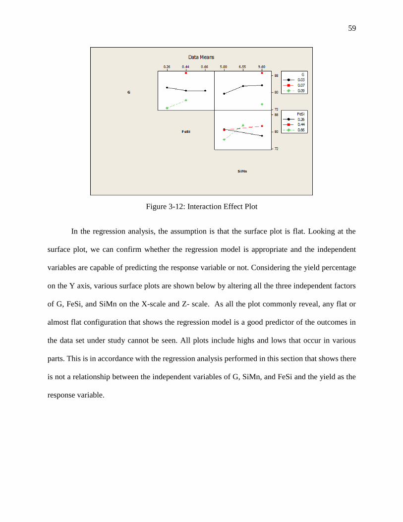
59
Figure 3-12: Interaction Effect Plot
In the regression analysis, the assumption is that the surface plot is flat. Looking at the
surface plot, we can confirm whether the regression model is appropriate and the independent
variables are capable of predicting the response variable or not. Considering the yield percentage
on the Y axis, various surface plots are shown below by altering all the three independent factors
of G, FeSi, and SiMn on the X-scale and Z- scale. As all the plot commonly reveal, any flat or
almost flat configuration that shows the regression model is a good predictor of the outcomes in
the data set under study cannot be seen. All plots include highs and lows that occur in various
parts. This is in accordance with the regression analysis performed in this section that shows there
is not a relationship between the independent variables of G, SiMn, and FeSi and the yield as the
response variable.
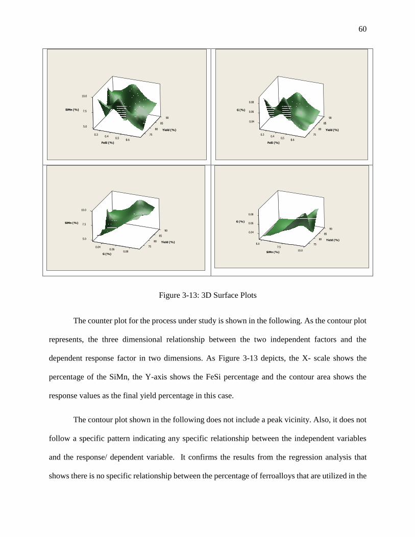
60
Figure 3-13: 3D Surface Plots
The counter plot for the process under study is shown in the following. As the contour plot
represents, the three dimensional relationship between the two independent factors and the
dependent response factor in two dimensions. As Figure 3-13 depicts, the X- scale shows the
percentage of the SiMn, the Y-axis shows the FeSi percentage and the contour area shows the
response values as the final yield percentage in this case.
The contour plot shown in the following does not include a peak vicinity. Also, it does not
follow a specific pattern indicating any specific relationship between the independent variables
and the response/ dependent variable. It confirms the results from the regression analysis that
shows there is no specific relationship between the percentage of ferroalloys that are utilized in the
5.0
7.5
10.0
0.30.40.4
0.50.50.6
75
0.6
85
80
90
85
SiMn (%)
Yield (%)
FeSi (%)
0.04
0.06
0.08
0.30.40.4
0.50.50.6
75
0.6
85
80
90
85
G (%)
Yield (%)
FeSi (%)
5.0
7.5
0.040.06
0.08
10.0
90
85
80
75
0.08
SiMn (%)
Yield (%)
G (%)
0.04
0.06
5.05.07.5
0.08
75
10.0
85
80
90
85
G (%)
Yield (%)
SiMn (%)

61
process and the final yield percentage. The reason why G is dropped in Figure 3-14 is that its P-
value is bigger compared to the others and it has a very big negative (-158) coefficient.
Figure 3-14: Contour Plot
62
4 Conclusion and Recommendations
In this study based on a visit to a billet manufacturing plant and gathering the production data
over a one year period, the production process is analyzed. In short, the process run chart for the
nine months of production shows that the variations existing in the process are more due to natural
causes than special causes. Analyzing the P- values for clustering, mixtures, trends, and oscillation
demonstrate the fact the all the gained P-values are bigger than 0.05. This is a good sign for the
production line as it indicates no visible special cause for variation of the process data. Thus, we
can conclude that the variations in the billet production operation under study are all natural.
The process capability analysis is also done. The analysis of the process shows that the process
is in control and there are no points that are not within the control limits. However, limited data is
studied due to the availability of the production rate based on a monthly schedule. If the production
rate for each shift of work per day were available, a more in depth and detailed visual and statistical
analysis would be accessed. Moreover, the process capability was analyzed using various statistic
indices for the within process capability versus the potential process capability. Both analysis show
that the process cannot meet the required specifications that are set by the factory management
with regards to financial, technical, energy, and labor considerations. In this section, both normal
and non-normal distributions were performed to see which distribution best fits the set of our data.
The results, based on the AD statistic and its P-value shows that applying non-normal Weibull
distribution provides a better fit to the data set.
The analysis of the tolerance interval with a 95% confidence (at α=0.05) shows that we can
claim that we can claim that 95% of the times, the yield will fall in the numbers between 62.94%
and 98.365% using the normal distribution. Due to the unrealistic upper interval in the case of
63
billet manufacturing process, we perform the tolerance interval analysis again applying the
nonparametric method. The results from using the nonparametric method show that the tolerance
interval changes to 72.620% from 62.94% for the lower interval and to 89.210% from 98.365%
for the upper interval.
The multivariate regression analysis is performed in two various parts. The first part focuses
on the general regression model that shows the independent variables of the types and percentage
of the iron scrap used as the raw material in the billet production process are correlated with the
dependent variable of the rate of final yield. The second part of the analysis is aimed at finding a
relationship between the different ferroalloys used as addition to the raw materials in order to
enhance the quality of the final product and consequently reduce the waste and increase the yield
rate. However, the regression model shows that such variables are not statistically significant in
predicting the variations in the final yield percentage. This can be due to the limited number of
runs and few data set available. Since the billet manufacturing process is of significantly high
costs, designing any experiment altering the levels of ferroalloys is not possible in the plant under
study. . Thus, the only way to do such analysis is to trust the observation study of the production
based on the available data.
In the future work scope, this analysis can be repeated based on more data. This can be done
in future by having access to the rate of production based on each shift of production, or each day.
This makes the analysis of the whole process more detailed and can help gain more accurate data
distribution model that fit the data without bias. Future works can focus on the interaction between
the types of iron scraps utilized and the Ferro-alloys. Also, mathematical modeling with Matlab
can be performed as the future work. Applying mathematical modeling with Matlab, various
regression analysis model including quadratic model and pure quadratic model can be done that

64
can reveal more in-depth analysis and results. However, performing such analysis will require to
perform the experiments at specific levels of each independent variable in the process.
65
5 References
KK Keshari, Somnath Kumar, Snehangshu Roy, YK Khanna. (2012). The recovery of ferro-
alloy fines by melting in an induction furnace. Steel Times International.
A mixed-integer linear programming model for the continuous casting planning. (2006). Int. J.
Production Economics, 260-270.
A. Bellabdaoui, J. Teghem. (2006). A mixed-integer linear programming model for the
continuous casting planning. Int. J. Production Economics, 260-270.
American Iron and Steel Institute. (2013). Retrieved from American Iron and Steel Institute:
https://www.steel.org/~/media/Files/AISI/Reports/2012-13%20Profile.pdf
Duke Education- Statistical Forecasting. (n.d.). Retrieved from Duke Education- Statistical
Forecasting: http://people.duke.edu/~rnau/regnotes.htm
Ing. Catrin Kammer, Goslar. (n.d.). afcma.org. Retrieved from afcma.org:
http://www.afcma.org/uploads/downloads/casting_of_aluminum.pdf
KMM. (2015). Retrieved from KMM:
http://www.kmmmetals.com/eng/kmm/nepartraukta_liesana2/
L. Zhang; BG Thomas. (2003). INCLUSIONS IN CONTINUOUS CASTING OF STEEL. XXIV
National Steelmaking Symposium, (pp. 138-183). Morelia, Mich,Mexico.
Lauri Holappa, Seppo Louhenkilpi. (2013). pyrometallurgy.co. Retrieved from
pyrometallurgy.co: http://www.pyrometallurgy.co.za/InfaconXIII/1083-Holappa.pdf
Peng Zhenc, Juan Guo, Xiao-Jing Hao. (2004). Hybrid Strategies for Optimizing Continuous
Casting Process of Steel. IEEE, 1156-1161.
66
Princeton University Library- Data and Statistical Services. (n.d.). Retrieved from Princeton
University Library- Data and Statistical Services:
http://dss.princeton.edu/online_help/analysis/interpreting_regression.htm
Siemens-vai. (n.d.). Retrieved from Siemens-vai:
https://w3.siemens.com.br/datapool/industry/industrysolutions/metals/simetal/en/billet-
casting-solutions-en.pdf
Six Sigma Training. (n.d.). Retrieved from Six Sigma Training:
http://sixsigmatraining.com/downloads/imr-and-xbar-charts.pdf
SteelWorks. (n.d.). Retrieved from SteelWorks: http://www.steel.org/making-steel/how-its-
made/processes/processes-info/continuous-casting-of-steel---basic-principles.aspx
Support Minitab. (2015). Retrieved from Support Minitab: http://support.minitab.com/en-
us/minitab/17/topic-library/quality-tools/capability-analyses/capability-metrics/potential-
and-overall-capability/
The Analysis Factor. (n.d.). Retrieved from The Analysis Factor:
http://www.theanalysisfactor.com/interpreting-the-intercept-in-a-regression-model/
The Libraray of Manufacturing. (n.d.). Retrieved from The Libraray of Manufacturing:
http://thelibraryofmanufacturing.com/continuous_casting.html
The Minitab Blog. (2015). Retrieved from The Minitab Blog:
http://blog.minitab.com/blog/michelle-paret/process-capability-statistics-cpk-vs-ppk
Thomas, B. (2001). Continuous Casting. Encyclopedia of Materials: Science and Technology,
1595-1598.
67
Tomas Mauder, Cenek Sandera, Josef Stetina, Milos Seda. (2011). OPTIMIZATION OF THE
QUALITY OF CONTINUOUSLY CAST STEEL SLABS USING THE FIREFLY
ALGORITHM. Materials and technology, 347–350.
Tomas Mauder, Josef Stetina. (2014). OPTIMIZATION OF THE SECONDARY COOLING IN
A CONTINUOUS CASTING PROCESS WITH DIFFERENT SLAB CROSS-
SECTIONS. Materials and technology, 521–524.
Transparency Marketr Research- Global Ferroalloy Market. (2014). Retrieved from
Transparency Marketr Research- Global Ferroalloy Market:
http://www.transparencymarketresearch.com/ferroalloy-market.html
University of North Carolina Website. (n.d.). Retrieved from unc.edu:
https://www.unc.edu/courses/2008spring/psyc/270/001/interact.html
World Steel Association. (2015). Retrieved from World Steel Association:
http://www.worldsteel.org/Steel-facts.html
Zhou, Lejun;Wanlin Wang. (2014). Energy Saving Through the Control of Initial Solidification.
JOM, Vol. 66, No. 9, 2014, 1596-1602.


![Motivation Upsilon yield - ccsem.infn.it · R. V. [STAR collaboration], Nucl.Part.Phys.Proc. 276, 269 (2016) • Nuclear modification factor (RAA) compares the corrected yield in](https://img.pdfslide.us/doc/110x75/5ff0cff8f5e842161a1ab419/motivation-upsilon-yield-ccseminfnit-r-v-star-collaboration-nuclpartphysproc.jpg)