Embed Size (px)
Citation preview
January 31, 2012, Vol. 8 No. 2Redefining Research
J F M A M J J A O N D J F M A M J J A S O NS
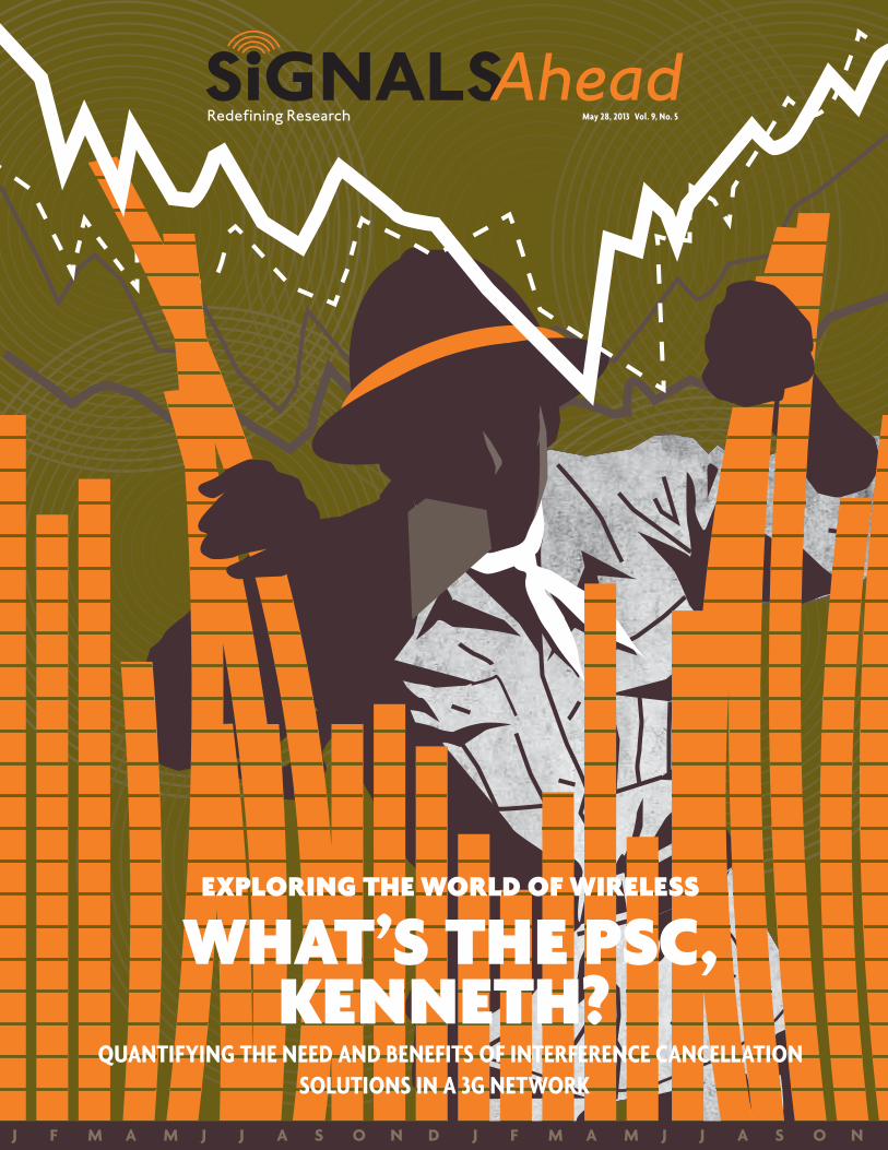
May 28, 2013 Vol. 9, No. 5
Exploring thE world of wirElEss
what’s thE psC, KEnnEth?
QuaNtifyiNg the Need aNd beNefits of iNterfereNce caNcellatioN solutioNs iN a 3g Network
You are receiving this report through a special licensing arrangement with accuver. Their license allows full access to our subscription-based product across your entire organization. You may not share the report externally, either in whole or in part. If you appreciate the value of this report then we encourage you to consider a subscription to our research services so that you can benefit from the other reports that we publish. Please visit our website or contact us directly using the information contained within this report if you would like to subscribe or to learn more about the services that we offer.
YoUr attEntion plEasE
3 May 28, 2013 | Signals Ahead, Vol. 9, Number 5
1.0 executive summary
Interference is the bugaboo of all wireless technologies. In its absence, Shannon’s Theorem becomes a beautiful thing. In its presence, the “N” dominates the “S” and all things go to heck in a handbasket. In CDMA-based networks, such as HSPA+, interference exists within the cell (intra-cell interference) due to the presence of other mobile devices and it occurs near the edge of the cell due to interference from adjacent cells (inter-cell interference). The latter occurs because the same carrier frequency is used in all cells – a so-called N=1 network.
Inter-cell interference is most likely to occur at the edge of the cell when the radio signal strengths from all of the adjacent cells are roughly equivalent and there isn’t a dominant serving cell, or what is better referred to as a Primary Scrambling Code (PSC). Where it exists, the signal quality is degraded since the mobile device can have a hard time filtering out the signals from interfering PSCs and only retaining the data transmissions coming from the desired PSC signal.
As a consequence, the user experience suffers due to low data rates, and the network becomes less efficient at transmitting data to the mobile devices in the network. In effect, everyone suffers either directly or indirectly. In these interference prone regions the mobile device establishes an active set, consisting of a list of nearby cells with somewhat comparable signal levels. The network and the mobile device maintain this list so that the mobile device can more quickly handover to a new cell when the quality of the signal from the serving cell drops below that of another cell for an established period of time. During a mobile data session, the mobile device is only using a single cell at any given moment to receive data. With a 3G voice call, the mobile device can maintain concurrent connectivity with multiple cells using a principle called soft handover. Soft handovers are good in the sense that they result in a better quality voice call but they are bad in the sense that they result in inefficient use of network resources – multiple cells serving the same mobile device. Bottom line – with a data call there isn’t anything good to be had when it comes to interference.
In order to deal with this unavoidable interference, chipset manufacturers use advanced receivers/equalizers to cancel the interfering signals, thereby increasing the quality of the desired signal. Infrastructure vendors do something comparable in the NodeB to address interference in the uplink In the 3GPP vernacular these advanced chipset solutions, which also include the use of receive diversity, are called Type 3i receivers, but since the performance requirements of a Type 3i receiver are fairly easy to achieve, most chipset companies avoid using the term. For the record, we tried to test Type 3i receivers several years ago in our Chips and Salsa benchmark tests that we do with Spirent Communications, but unfortunately we couldn’t get any of the participants to agree to a common set of test conditions.
In this issue of Signals Ahead, we provide insight into the amount of interference that exists in a 3G network, its potential impact on data rates and network efficiency, and how an advanced equalizer can be used to maximize performance when these challenging conditions exist. For purposes of this report, we used AT&T’s HSPA+ network in San Francisco and the surrounding vicinity. We once again leveraged the powerful capabilities of the Accuver XCAL drive test tool and XCAP
chipset manufacturers use advanced receivers/equalizers to cancel the
interfering signals.
we once again leveraged the powerful capabilities
of the accuver Xcal drive test tool and Xcap post-
processing software
4 May 28, 2013 | Signals Ahead, Vol. 9, Number 5
post-processing software to capture and analyze the data. Although we originally intended to test solutions from a least a couple of different chipset suppliers, we were only able to obtain testable devices from Qualcomm in time to include the results in this report. Nonetheless, we can use a single chipset supplier’s solution to capture the potential benefits of an advanced receiver with equalizer capabilities versus a plain vanilla 3G chipset platform. To the best of our knowledge, all 3G chipset suppliers support some form of advanced receiver, but we are not currently qualified to discuss how their performance compares with the results that we present in this report.
Cutting to the chase, we observed the presence of inter-cell interference 65-70% of the time while drive testing in and around San Francisco. To be specific, there were at least two cells in the active set for 65-70% of the time at both 850 MHz and 1900 MHz. Within this range, there were three cells in the active set for nearly 20% of the time and there were four or more cells in the active set more than 10% of the time. Not surprisingly, the percentages were higher in the dense urban areas and lower in other areas. This finding provides clear evidence that there is a compelling need for downlink interference-reducing mechanisms in both the devices/chipsets and in the networks. The network-based approach can best be addressed by SON, as we discussed in our last Signals Ahead report. However, even the best SON algorithms in the world can’t eliminate interference at the edge of the cell.
The other important attribute when it comes to interference is the magnitude of the interference, or the relative differences in power levels (RSCP) between the serving cell and the interfering cells. By and large, we observed that when the active set was comprised of three or more cells, the magnitude of the interference also increased. In many of the log files that we analyzed, when the active set was comprised of three or more cells the differences in the power levels between the serving cell and the strongest interfering cell was less than 1 dB for more than 30% of the time. Even when there were only two cells in the active set, the percentage was frequently higher than 20%.
Fortunately, from what we observed the interference cancellation solutions work as advertised. It is difficult to summarize the exact benefits since the results varied considerably due to innu-merable factors, including network loading, levels of interference, etc. However, we found that the mobile device that supported interference cancellation frequently requested at least 25-50% higher throughput (Physical Layer Requested Throughput KPI) in interference prone areas of the network, and in some cases the gains were considerably higher. The ability of the device to support higher throughput resulted in comparable gains in network efficiency, based on the Physical Layer Scheduled Throughput KPI. Increased network efficiency means more bandwidth becomes available for other mobile data devices.
The actual throughput (MAC-HS Layer) measured on the mobile device with interference cancel-lation was considerably higher, and in many cases it was more than twice as high as the throughput measured on the mobile device without interference cancellation. We attribute this somewhat unexpected result to the network scheduler which consistently favored the mobile device that reported the better channel conditions. In other words, the network assigned the better performing device sub-frames/TTIs far more frequently than the under-performing device. The combination of sending the mobile device more data in a given sub-frame and assigning the mobile device a much higher percentage of sub-frames resulted in the larger than expected differences in throughput that we observed. With interference cancellation disabled in both devices, the network scheduled resources fairly equally between both devices and both devices reported similar channel conditions.
Chapter 2 contains the Key Findings from our study. Chapter 3 provides some background and a technology primer. Chapter 4 provides results from several drive test scenarios, including results which demonstrate the devices that we tested performed equally when they were configured the same way (e.g., IC turned off in both devices). Chapter 5 contains our test methodology and Chapter 6 provides some short closing remarks. In the Appendix we include summary tables which provide high-level results from all of the testing that we did. The Appendix also includes additional figures which we elected to not include in the main body of the report.
we observed the presence of inter-cell interference 65-70% of the time while
drive testing in and around san Francisco.
the actual throughput measured on the mobile device with interference
cancellation was frequently more than twice the
throughput of the mobile device without
interference cancellation.
5 May 28, 2013 | Signals Ahead, Vol. 9, Number 5
contents1.0 Executive summary ……………………………………………………………………………………………………………………………………… 3
2.0 Key findings ………………………………………………………………………………………………………………………………………………… 8
3.0 Background and technology primer …………………………………………………………………………………………………………… 13
4.0 detailed analysis ………………………………………………………………………………………………………………………………………… 15
4.1 san Francisco Drive test at 1952.5 mhz without ic enabled on either Device – may 10th, 1418 hours ………18
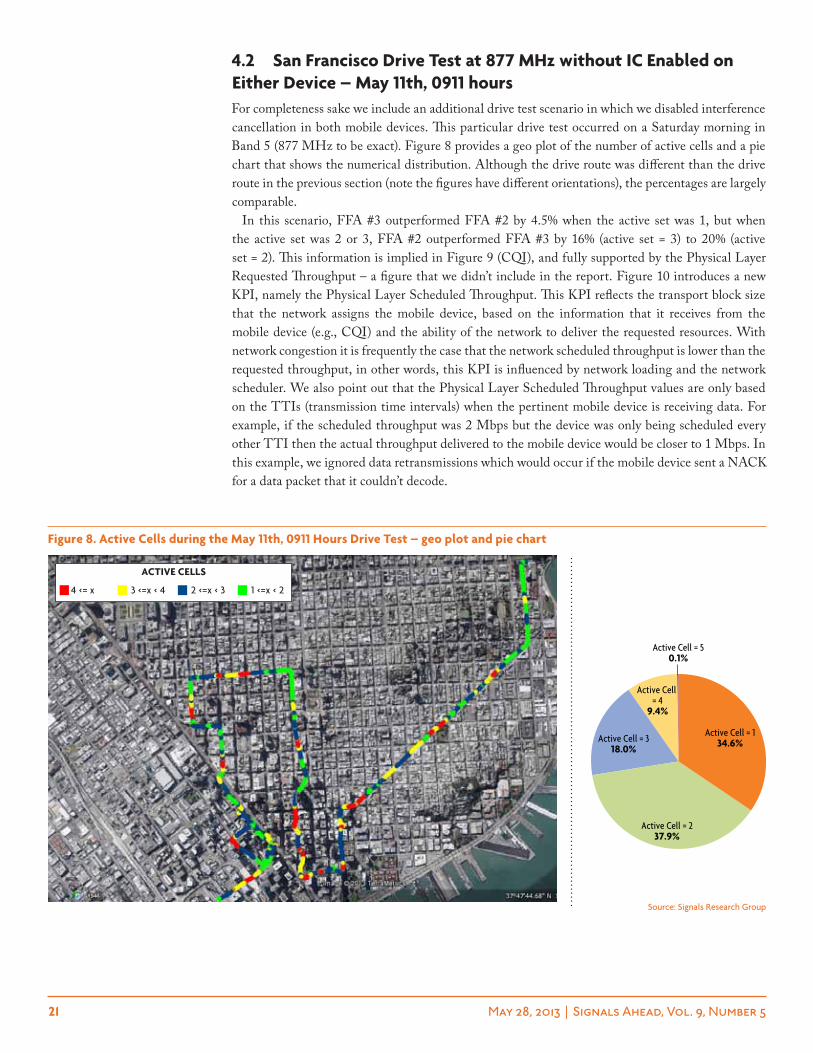
4.2 san Francisco Drive test at 877 mhz without ic enabled on either Device – may 11th, 0911 hours …………21
4.3 lightly loaded network conditions with very good signal strength (san Francisco Drive test at 1952.5 mhz with ic enabled on one Device – may 4th, 0518 hours) ………………… 24
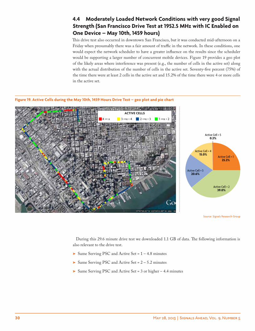
4.4 moderately loaded network conditions with very good signal strength (san Francisco Drive test at 1952.5 mhz with ic enabled on one Device – may 10th, 1459 hours) ………………… 30
4.5 moderately loaded network conditions with good to okay signal strength (hwy 101 Drive test at 1952.5 mhz with ic enabled on one Device – may 10th, 1213 hours) ………………………… 34
4.6 network performance analysis – scheduling …………………………………………………………………………………… 38
5.0 test Methodology …………………………………………………………………………………………………………………………………… 40
6.0 final thoughts ………………………………………………………………………………………………………………………………………… 43
7.0 appendix – additional results ………………………………………………………………………………………………………………… 44
index of Figures Figure 1. The Reported Number of Active Cells in Downtown San Francisco – 1900 MHz and 850 MHz ……………………… 15
Figure 2. Active Cells in Downtown San Francisco – geo plot at 1900 MHz …………………………………………………………………16
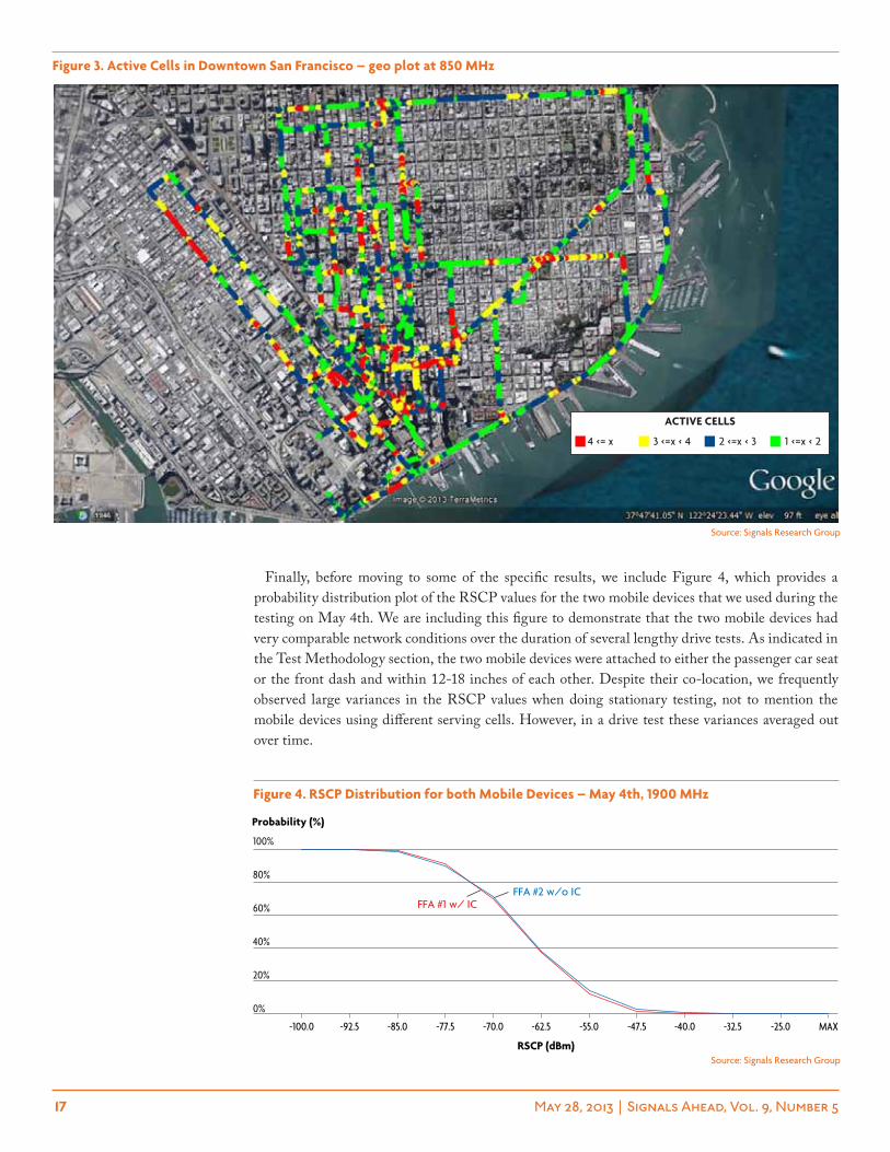
Figure 3. Active Cells in Downtown San Francisco – geo plot at 850 MHz …………………………………………………………………17
Figure 4. RSCP Distribution for both Mobile Devices – May 4th, 1900 MHz ………………………………………………………………17
Figure 5. Active Cells during May 10th, 1418 Hours Drive Test – geo plot and pie chart ………………………………………………18
Figure 6. CQI by Mobile Device during May 10th, 1418 Hours Drive Test – probability distribution plots ………………………19
Figure 7. PHY Layer Requested Throughput by Mobile Device during the May 10th, 1418 Hours Drive Test – probability distribution plots …………………………………………………………………………………………………………………………………19
Figure 8. Active Cells during the May 11th, 0911 Hours Drive Test – geo plot and pie chart …………………………………………21
Figure 9. CQI by Mobile Device during the May 11th, 0911 Hours Drive Test – probability distribution plots ……………… 22
Figure 10. PHY Layer Scheduled Throughput by Mobile Device during the May 10th, 1418 Hours Drive Test – probability distribution plots ……………………………………………………………………………………………………………………………… 22
Figure 11. Active Cells during the May 4th, 0518 Hours Drive Test – geo plot and pie chart ……………………………………… 24
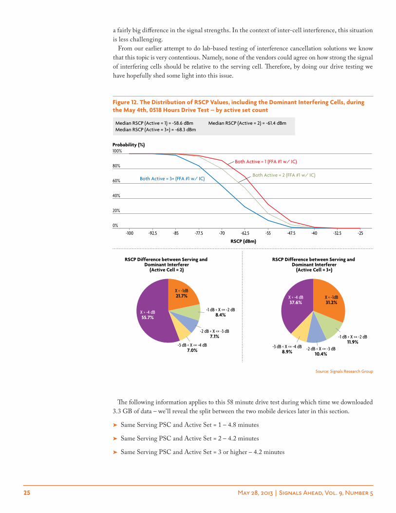
Figure 12. The Distribution of RSCP Values, including the Dominant Interfering Cells, during the May 4th, 0518 Hours Drive Test – by active set count ………………………………………………………………………………………………………… 25
Figure 13. PHY Layer Requested Throughput by Mobile Device during the May 4th, 1518 Hours Drive Test – probability distribution plots (aggregate results) …………………………………………………………………………………………………… 26
Figure 14. MAC-HS Layer Throughput by Mobile Device during the May 4th, 0518 Hours Drive Test – probability distribution plots (aggregate results) …………………………………………………………………………………………………… 26
Figure 15. PHY Layer Scheduled Throughput by Mobile Device during the May 4th, 0518 Hours Drive Test – probability distribution plots (aggregate results) …………………………………………………………………………………………………… 27
6 May 28, 2013 | Signals Ahead, Vol. 9, Number 5
index of tablestable 1. Summary of Test Results – Part 1 ……………………………………………………………………………………………………………… 46
table 2. Summary of Test Results – Part 2 …………………………………………………………………………………………………………… 47
Figure 16. PHY Layer Requested Throughput by Mobile Device during the May 4th, 1518 Hours Drive Test – probability distribution plots ……………………………………………………………………………………………………………………………… 28
Figure 17. PHY Layer Scheduled Throughput by Mobile Device during the May 4th, 0518 Hours Drive Test – probability distribution plots ……………………………………………………………………………………………………………………………… 28
Figure 18. MAC-HS Layer Throughput by Mobile Device during the May 4th, 0518 Hours Drive Test – probability distribution plots ……………………………………………………………………………………………………………………………… 29
Figure 19. Active Cells during the May 10th, 1459 Hours Drive Test – geo plot and pie chart …………………………………… 30
Figure 20. The Distribution of RSCP Values, including the Dominant Interfering Cells, during the May 10th, 1459 Hours Drive Test – by active set count ……………………………………………………………………………………………………………… 31
Figure 21. PHY Layer Requested Throughput by Mobile Device during the May 10th, 1459 Hours Drive Test – probability distribution plots …………………………………………………………………………………………………………………………………32
Figure 22. PHY Layer Scheduled Throughput by Mobile Device during the May 10th, 1459 Hours Drive Test – probability distribution plots …………………………………………………………………………………………………………………………………33
Figure 23. MAC-HS Layer Throughput by Mobile Device during the May 10th, 1459 Hours Drive Test – probability distribution plots …………………………………………………………………………………………………………………………………33
Figure 24. Active Cells during the Highway 101 Drive Test – geo plot and pie chart ………………………………………………… 34
Figure 25. The Distribution of RSCP Values, including the Dominant Interfering Cells, during the Highway 101 Drive Test – by active set count ……………………………………………………………………………………………35
Figure 26. PHY Layer Requested Throughput by Mobile Device during the Highway 101 Drive Test – probability distribution plots ……………………………………………………………………………………………………………………………… 36
Figure 27. PHY Layer Scheduled Throughput by Mobile Device during the Highway 101 Drive Test – probability distribution plots …………………………………………………………………………………………………………………………………37
Figure 28. MAC-HS Layer Throughput by Mobile Device during the Highway 101 Drive Test – probability distribution plots …………………………………………………………………………………………………………………………………37
Figure 29. HS-SCCH Scheduling Rate Differences between Two Mobile Devices – multiple test scenarios ………………… 38
Figure 30. XCAL in Action with IC Enabled in the Mobile Device …………………………………………………………………………… 40
Figure 31. XCAL in Action with IC Disabled in the Mobile Device …………………………………………………………………………… 40
Figure 32. Active Cells in Downtown Oakland – geo plot and pie chart (1900 MHz) ………………………………………………… 47
Figure 33. CQI by Mobile Device during the May 4th, 0518 Hours Drive Test – probability distribution plots …………… 47
Figure 34. Active Cells during the May 11th 0511 Drive Test – geo plot and pie chart ………………………………………………… 48
Figure 35. PHY Layer Requested Throughput by Mobile Device during the May 11th, 0511 Drive Test – probability distribution plots ……………………………………………………………………………………………………………………………… 48
Figure 36. PHY Layer Scheduled Throughput by Mobile Device during the May 11th 0511 Drive Test – probability distribution plots ……………………………………………………………………………………………………………………………… 49
Figure 37. MAC-HS Layer Scheduled Throughput by Mobile Device during the May 11th 0511 Drive Test – probability distribution plots ……………………………………………………………………………………………………………………………… 49
7 May 28, 2013 | Signals Ahead, Vol. 9, Number 5
in case You misseD it: signals aheaD Back issues
➤ 4/25/13 “Everything under the SON” We discuss the back-ground of SON, including discussions of work within NGMN, 3GPP and the SOCRATES/SEMAFOUR projects. We also cover the basics of SON including the laundry list of SON-like features, explain how they work, and what they mean for opera-tors and vendors. We then move on to discuss the present and future requirements of SON, including what may be in store with Release 12 and beyond. Finally, we discuss the motivations and challenges of SON, including multi-vendor integration, vaguely-defined use cases, OSS limitations, 3G SON, and centralized versus decentralized architectures.
➤ 3/22/13 “Rich Communication Services – reinventing voice and messaging” In this issue of Signals Ahead we provide a detailed analysis of RCS. In addition to providing the history of RCS since its introduction in 2008, we examine why operators have not yet fully adopted it, the capabilities by release, the inherent challenges that exist, the business relationships that exist or at least should exist, and the opportunities that could allow operators to beat the OTT providers at their own game.
➤ 2/25/13 “Chips and Salsa XVI: Sweet 16 and never been benchmarked” This report provides performance bench-mark analysis of 8 LTE baseband chipsets, including Altair, GCT, Intel, NVIDIA, Qualcomm, Renesas Mobile, Samsung, Sequans. This benchmark study marks the 8th time that we have collaborated with Spirent Communications to leverage its 8100 test system and engineering support. All chipsets performed well under less challenging conditions but with the more challenging conditions there was a wide variance in the results with more than a 20% difference between the top- and bottom-performing chip-sets. Three chipsets vied for top honors but ultimately we had to declare one the winner.
➤ 01/23/13 “The Mother of all Network Benchmark Tests - On the Inside Looking Out: evaluating the in-building performance capabilities of commercial LTE networks (Band 4, Band 7, Band 13, and Band 17)” With the continued support of Accuver, we leveraged its XCAL-M drive test solution and its enhanced support for in-building testing to evaluate the performance of four LTE networks at Band 4, Band 7, Band 13 and Band 17. In this report we quantify the amount of LTE network traffic that we observed in the outdoor macro network and how it compares with our in-building testing. We also demonstrate that 700 MHz isn’t a panacea for in-building coverage, that potential coverage problems are being masked by ample capacity, and that some in-building networks may not scale to support future traffic demands. Finally, we compare and contrast the performance of the VZW and AT&T LTE networks.
➤ 12/5/12 “LTE Band 7 versus LTE Band 4 – GAME ON!” With the support of Accuver, we used its XCAL-M and XCAP drive test solutions to conduct a network benchmark study of LTE Band 7 and LTE Band 4. This benchmark study leveraged the Rogers Wireless network in Vancouver, Canada where they have deployed both frequency bands in virtually every single cell site. In addition to looking at basic throughput, we include a host of other
device-reported KPIs to analyze the downlink and uplink perfor-mance characteristics of the two frequency bands under identical network conditions, including edge-of-of cell and in-building.
➤ 11/6/12 “M2M – toward the Internet of things” We analyze the M2M landscape and some of the key players involved in realizing this vision. The business models for M2M are still in flux and eventually multiple business models will have to be imple-mented. We look at the new business models being explored by mobile operators and MVNOs. The global connectivity require-ments of M2M services make it natural fit for cloud services so there will need to be new cloud platforms in both the operator networks and enterprises to support M2M services. We also analyze the requirements and vendors for such platforms. More importantly, the radio and core networks will require enhance-ments to support the deluge of new M2M connections. We discuss some of the major issues and how the 3GPP standards body and operators are planning to address these issues.
➤ 10/15/12 “Lost and Found” As a follow-on report to “Chips and Salsa XV,” we examine the real world A-GNSS performance capabilities of leading smartphones. We also evaluate the perfor-mance attributes of the most popular navigation applications, including the amount of data traffic they generate, the length of time the smartphones remain connected to the network, and the amount of signaling traffic that they generate. Ultimately, we conclude that there are fairly dramatic performance differences for both the A-GNSS platforms and the navigation applications that have user experience and network implications.
➤ 9/13/12 “Chips and Salsa XV – Disparately Seeking Satellites” In collaboration with Spirent Communications, we provide the industry’s first independent analysis of A-GNSS platforms. The study includes conducted tests of vendor supplied A-GPS and A-GNSS (A-GPS + GLONASS) solutions and over-the-air testing of several leading smartphones. We demonstrate that while the performance across the platforms is largely compa-rable, there are significant differences in the performance of the solutions once they are implemented in the smartphone.
➤ 8/20/12 “The B Side of LTE – when your ‘A Game’ just isn’t good enough” We take a look at many of the proposed features being considered for 3GPP Release 12 and beyond, including advancements in the use of small cells, higher order MIMO and modulation schemes, 3D beamforming, network optimization, machine type communication, and device to device discovery and communication.
➤ 7/2/12 “Mobile Core Network 2.0 – the new reality or a fly-by-night catch phrase?” Moving to an all-IP core network presents fresh challenges for operators. The EPC provides operators with the platform for the delivery of basic data services. However, operators need to prepare the EPC to deliver enhanced services beyond basic data services. Areas addressed include the centralized or decentralized approach, the Diameter protocol, network offload and optimization, the Content Delivery Network (CDN), and policy control.
8 May 28, 2013 | Signals Ahead, Vol. 9, Number 5
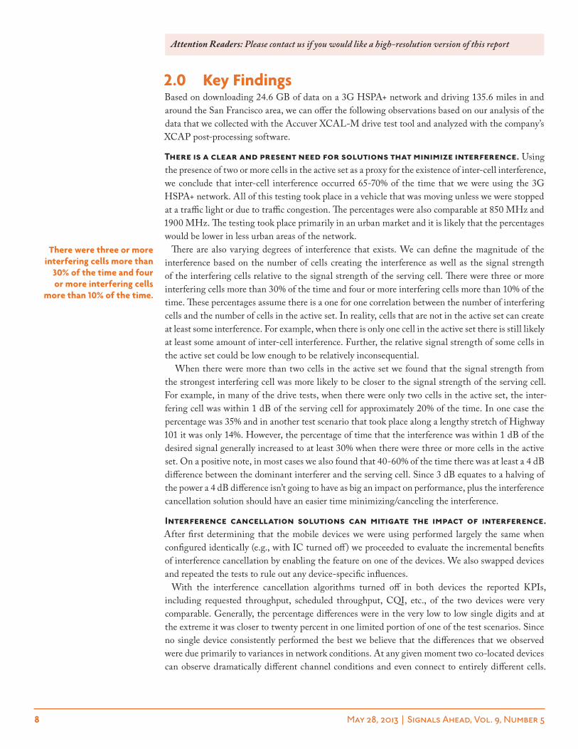
2.0 key FindingsBased on downloading 24.6 GB of data on a 3G HSPA+ network and driving 135.6 miles in and around the San Francisco area, we can offer the following observations based on our analysis of the data that we collected with the Accuver XCAL-M drive test tool and analyzed with the company’s XCAP post-processing software.
There is a clear and present need for solutions that minimize interference. Using the presence of two or more cells in the active set as a proxy for the existence of inter-cell interference, we conclude that inter-cell interference occurred 65-70% of the time that we were using the 3G HSPA+ network. All of this testing took place in a vehicle that was moving unless we were stopped at a traffic light or due to traffic congestion. The percentages were also comparable at 850 MHz and 1900 MHz. The testing took place primarily in an urban market and it is likely that the percentages would be lower in less urban areas of the network.
There are also varying degrees of interference that exists. We can define the magnitude of the interference based on the number of cells creating the interference as well as the signal strength of the interfering cells relative to the signal strength of the serving cell. There were three or more interfering cells more than 30% of the time and four or more interfering cells more than 10% of the time. These percentages assume there is a one for one correlation between the number of interfering cells and the number of cells in the active set. In reality, cells that are not in the active set can create at least some interference. For example, when there is only one cell in the active set there is still likely at least some amount of inter-cell interference. Further, the relative signal strength of some cells in the active set could be low enough to be relatively inconsequential.
When there were more than two cells in the active set we found that the signal strength from the strongest interfering cell was more likely to be closer to the signal strength of the serving cell. For example, in many of the drive tests, when there were only two cells in the active set, the inter-fering cell was within 1 dB of the serving cell for approximately 20% of the time. In one case the percentage was 35% and in another test scenario that took place along a lengthy stretch of Highway 101 it was only 14%. However, the percentage of time that the interference was within 1 dB of the desired signal generally increased to at least 30% when there were three or more cells in the active set. On a positive note, in most cases we also found that 40-60% of the time there was at least a 4 dB difference between the dominant interferer and the serving cell. Since 3 dB equates to a halving of the power a 4 dB difference isn’t going to have as big an impact on performance, plus the interference cancellation solution should have an easier time minimizing/canceling the interference.
Interference cancellation solutions can mitigate the impact of interference. After first determining that the mobile devices we were using performed largely the same when configured identically (e.g., with IC turned off) we proceeded to evaluate the incremental benefits of interference cancellation by enabling the feature on one of the devices. We also swapped devices and repeated the tests to rule out any device-specific influences.
With the interference cancellation algorithms turned off in both devices the reported KPIs, including requested throughput, scheduled throughput, CQI, etc., of the two devices were very comparable. Generally, the percentage differences were in the very low to low single digits and at the extreme it was closer to twenty percent in one limited portion of one of the test scenarios. Since no single device consistently performed the best we believe that the differences that we observed were due primarily to variances in network conditions. At any given moment two co-located devices can observe dramatically different channel conditions and even connect to entirely different cells.
there were three or more interfering cells more than
30% of the time and four or more interfering cells
more than 10% of the time.
Attention Readers: Please contact us if you would like a high-resolution version of this report
9 May 28, 2013 | Signals Ahead, Vol. 9, Number 5
We believe that readers should infer the results we present are reasonably accurate but the actual performance gains could be as much as 10-15% in either direction.
Once we enabled the interference cancellation algorithm on one of the devices we subsequently observed a very meaningful performance gain with that device. The exact performance gain is diffi-cult to summarize because several uncontrollable factors were involved. However, in many of the drive tests the mobile device with interference cancellation downloaded considerably more data throughout the entire drive test than the other device. The range was from a gain of only 25% to a high of 73% with at least 50% more data downloaded in the IC-enabled device in virtually all test scenarios – the one exception is the Highway 101 test where the IC-enabled device only downloaded 25% more data. To the end user that doesn’t understand interference or active sets, this is the KPI that really matters.
It is also valuable to analyze the benefits of an interference cancellation solution from a technical perspective. Physical Layer Requested Throughput and Reported CQI are perhaps the two best KPIs because they are not influenced by network loading and the network scheduler. When there was only a single cell in the active set the performance gains were sometimes as low as a single digit percentage but in at least two test scenarios that we analyzed the performance gains (Physical Layer Requested Throughput) were greater than 30%. We note that interference can still be present with only a single cell in the active set.
When two cells were in the active set of both devices and when both devices were using the same serving cell the gains were generally much higher. We observed a range of 35.9% to 104.9% higher Physical Layer Requested throughput from the IC-enabled device. With three or more cells in the active set and the same serving cell supporting both mobile devices the range of comparable gains were 22.5% to 56%.
By minimizing the impact of interference, operators can meaningfully increase network efficiency and the total capacity of the network. A device that requests a higher throughput doesn’t necessarily receive a higher throughput since the latter is influenced by loading and the behavior of the network scheduler. The Physical Layer Scheduled Throughput KPI provides great insight into the amount of data that the network delivers to the mobile device when it serves the device. In effect, it sheds light into how an interference cancellation solution increases network efficiency. If the network can deliver more data to the mobile device in a sub-frame then the network doesn’t have to dedicate as many sub-frames to the mobile device to deliver the requested amount of data. These sub-frames can then be allocated to support the needs of other mobile devices.
When there was only a single cell in the active set (e.g., likely minimal inter-cell interference) the network scheduling gains were generally inconsequential, or the very low single digits. However, in one case the efficiency gain was 21.2% – the Physical Layer Requested Throughput for the IC-enabled device was 30.1%. When the active set was comprised of two cells or three or more cells, the improvements in network efficiency were meaningful. In both cases the efficiency gains were generally in the range of 30% but at the extreme they were as high as 43.7% (3+ cells in the active set) and 93.4% (2 cells in the active set). The gains in network efficiency due to a mobile device making better use of its network resources can be used to provide that device with higher throughput without impacting the throughput of other mobile data users. The gains can also be used to assign more network resources to other mobile devices, thereby increasing their data rates.
The actual benefits of interference cancellation to the end user are highly dependent on the network infrastructure and how it schedules resources. The previous KPIs that we discussed in this section largely avoided the actual end user data rates. For example, the Physical Layer Scheduled Throughput KPI doesn’t include any information about how frequently the mobile device is scheduled network resources. The combination of the scheduled throughput and the frequency of how often the network schedules the mobile device determine the
the ic-enabled device almost always downloaded
50% more data than the ic-disabled device
throughout the entirety of the drive tests that
we conducted.
the network efficiency gains were generally in the range of 30% but at
the extreme they were as high as 43.7% (3+ cells in
the active set) and 93.4% (2 cells in the active set).
10 May 28, 2013 | Signals Ahead, Vol. 9, Number 5
end user data rate. The Block Error Rate (BLER), or the ability of the mobile device to decode the transmitted data without the network having to resend the data also plays a role, but since we didn’t observe any differences between devices we have elected to exclude this KPI in our analysis.
Surprising to us, the network scheduled the mobile device that requested higher throughput far more frequently than the other mobile device. In other words, a somewhat modest difference in the Physical Layer Requested Throughput between the two devices could translate into substantial differences in the end user throughput. For purposes of our analysis we used the MAC-HS Layer throughput since there was more granularity in the data than with the Application Layer throughput.
With a proportional fair scheduler, the network will always try to assign network resources such that it maximizes overall throughput while also ensuring that all mobile devices are scheduled. This philosophy results in a balancing act when it comes to mobile devices with different capabilities, such as IC versus no IC, or reported channel conditions – for example, a mobile device in the RF center of the cell versus a mobile device at the edge of the cell. If the network only scheduled the mobile devices with the best reported channel conditions it would achieve the highest throughput. However, it would come at the expense of a lot of unsatisfied users.
It is also worth noting that the operator can make its own adjustments to how the network sched-uler performs. At one extreme, it can try to provide all mobile devices with the same throughput. In our case this setting would have delivered the exact opposite results that we obtained – the poorer performing device would have been scheduled more frequently. At the other extreme, the network could try to maximize the performance of the better performing device. Our suspicion is that AT&T selected settings that lean more toward this philosophy.
When we tested two mobile devices with IC turned off the frequency of how often the network scheduled each mobile device was in many cases nearly identical. This statement is based on an analysis of the HS-SCCH scheduling rates for the two devices. To be specific the HS-SCCH sched-uling rate differences were almost always within a couple of percentage points of each other, favoring neither device, on a consistent basis. In one test scenario the percentage difference was 16.8%, but in this test scenario one of the mobile devices also reported better channel conditions. The device that reported slightly better conditions was also the device that was served more frequently.
When IC was enabled on one of the mobile devices we observed large differences between the HS-SCCH scheduling rates of the two devices with the network scheduling the IC-enabled device far more frequently. Further, the differences in the scheduling rates were related to the amount of interference in the network. When there was only one cell in the active set, the percentage differ-ences were 0% and 4% in two lengthy drive test scenarios that we analyzed, but as high as 24% in another test scenarios. Recall that interference still exists when there is only a single cell in the active set and in this particular example the device with IC enabled requested 30% higher throughput when there was only a single cell in the active set.
With two cells or more cells in the active sets of the two mobile devices the percentage differences increased. The differences in scheduling rates were almost always in the 30% range and in one drive test the difference was an astounding 68.2%. Keep in mind that with our test methodology both devices were constantly downloading data and trying to receive as much data as the network would deliver. The combination of the network scheduling a device more frequently and transmit-ting a larger data packet when it scheduled the device resulted in the IC-enabled device achieving substantially higher throughput than the other mobile device with IC turned off. At the extreme, we observed that the MAC-HS Layer throughput was 221.7% higher on the IC-enabled device than the IC-disabled device even though the difference in Physical Layer Requested throughput was 104.9%. There are numerous other examples where the IC-enabled device requested ~30% higher throughput but thanks to being scheduled far more frequently, it actually received ~60-90% higher throughput.
with ic turned off the frequency of how often the
network scheduled each mobile device was in many
cases nearly identical.
when ic was enabled on one of the mobile devices
we observed dramatic differences between
the hs-scch scheduling rates – it favored the
ic-enabled device.
11 May 28, 2013 | Signals Ahead, Vol. 9, Number 5
Under normal conditions with mobile devices trying to access the network to download relatively small amounts of data and then exit the network, the behavior that we observed wouldn’t be obvious. However, with our test methodology the behavior stood out. Bottom line, it really pays to have a top-performing device. Not only can it receive higher data in more challenging RF conditions, but the network will seemingly favor it over a poorer performing device.
Although we didn’t set out to benchmark AT&T’s HSPA+ network, we were able to shed some light into how it performs. The results that we show in this report all involve two mobile devices simultaneously accessing the network and the results were generally filtered to only show results when both devices were using the same carrier frequency and cell site. Therefore, readers should sum the two throughput values to get a sense of what a single mobile device would achieve. Using this philosophy, the median throughput on the network in vehicular mode was frequently greater than 8 Mbps with low interference, including during period of presumed high usage. In more chal-lenging RF conditions with two or more cells in the active set the median throughput was at least a few megabits-per-second and quite frequently higher than 5 Mbps. One could also infer from this information that if the operator was able to magically reduce the edge-of-cell interference in its network that all users would experience higher throughput.
One last observation is that we seldom observed the presence of 64QAM, or the higher order modulation scheme that is responsible for turning a 14.4 Mbps network into a 21 Mbps network. In almost all of the drive tests, the achieved modulations were almost always QPSK and 16 QAM with only a sprinkling of 64QAM. In many of the drive tests, including early on a Saturday morning in a relatively empty network, we didn’t observe any 64QAM. Interestingly, the one drive test where the presence of 64QAM was at a reasonable value (12.5%) took place on a Friday afternoon when we felt there was more loading in the network.
Just prior to publishing this report we think we figured out what was taking place. We examined a few log files with 64 QAM present and discovered that 64 QAM was only present in the beginning of the drive test. At some point during the test the mobile devices went through a “radio bearer reconfiguration” and from that point forward they performed as an HSDPA device instead of an HSPA+ device. The radio bearer reconfiguration in both devices occurred in conjunction with a cell handover and a change in serving RNCs. The combination of the two events, and most likely the change in serving RNCs, resulted in the change in bearer - a change that probably shouldn’t have happened. Nonetheless, because our mobile devices never went to the CELL_FACH or Idle states since they were always downloading data, they never had the opportunity to regain the HSPA+ bearer. We also started several log files without stopping the transfer of data and since we didn’t realize the problem when we were collecting data, we ended up with several log files in which both devices were always using HSDPA instead of HSPA+. Interference and 64QAM don’t go hand-in-hand, so we believe our results are still valid. If anything, our results probably understate the benefits of interference cancellation since the IC-enabled device would have used 64QAM more often.
Bottom line, it really pays to have a
top-performing device.
we seldom observed the presence of 64Qam,
or the higher order modulation scheme that
is responsible for turning a 14.4 mbps network into
a 21 mbps network.
12 May 28, 2013 | Signals Ahead, Vol. 9, Number 5
➤ Same subscription rates – group, global and platinum
➤ One detailed Signals Ahead report per month
➤ Supplemented by Signals Flash! mini-reports on current events
➤ More predictable renewal times
➤ Allows SRG the ability to provide more thorough research and analysis
➤ New packages take effect July 1, 2013 – phase-in period in the interim
attention reaDers anD SIGNALS AHEAD account holDers!
nEw sUBsCription paCKagEsEffective July 1, 2013
12 Signals Ahead
reports
4–6 Signals Flash!
reports
www.signalsresearch.com
For more information, call 510.273.2439 or visit www.signalsresearch.com
13 May 28, 2013 | Signals Ahead, Vol. 9, Number 5
3.0 Background and technology primerLong, long ago, in a galaxy relatively close by, we attempted to include Type 3i receiver performance in our Chips and Salsa benchmark study. Although we had the desire and Spirent had the means to conduct the tests, we couldn’t get the participating companies to agree to the test methodology. No one could agree to the channel fading models, the number of interfering cells, and the relative power levels between the serving cell and the dominant interfering cells. After weeks of performing the role of a UN diplomat, we threw in the towel and moved on to bigger and better things.
A Type 3i receiver is basically a 3G receiver that supports receive diversity and an advanced equalizer. A Type 3i receiver is used to minimize interference in a 3G network that is caused by adjacent cell sites. HSPA/HSPA+ uses an N=1 frequency reuse, meaning that the same frequency is used in all cells throughout the network. Further, with a CDMA-based system the signal is spread across the entire channel bandwidth, meaning that it becomes far more difficult to isolate individual transmissions. Conversely, LTE, or any OFDMA-based system, essentially dedicates portions of the spectrum to individual transmissions. The partitioning of transmissions occurs in both the frequency and the time domain.
Although SON (Self-Optimizing Networks) can be used to minimize interference and achieve other objectives, such as load balancing, minimize cell handovers, etc., its implementation isn’t enough, especially in a 3G network. Therefore, the Type 3i receivers provide an additional, and much needed layer of support. By minimizing the impact of the interference, the mobile device can support a higher data rate and this leads to a better user experience and increased network efficiency. We note that the interference still exists, but the Type 3i receiver is able to block out its effects. The term Type 3i receiver is also fairly generic and as we know from our attempted testing campaign, the hurdle is relatively low for classifying a chipset as being a Type 3i receiver. For that reason, most chipset companies shy away from using the term outside of the 3GPP standards body.
Inter-cell interference is most likely to occur at the edge of the cell when the mobile device is relatively equidistant between two or more cell sites. In these situations, the mobile device begins looking for other cells to use in the event that the serving cell no longer provides the best signal. Surprisingly, this scenario exists more often than not, especially in an urban and dense urban envi-ronment where the cell site density is the highest and where operators struggle to deploy cells in the ideal locations. The list of potential cells that can be assigned to the mobile device are referred to as the Active Set, and by having an active set, the mobile device can quickly handover to another cell in the list. The RSCP (Received Signal Code Power) signal strength is used to determine whether or not the cell should be in the active set. If the RSCP of a non-serving cell is within a certain threshold of the serving cell then the non-serving cell is added to the active list. The vendor/operator determines the threshold that it wants to use, meaning that the number of cells in the active set is independent of the chipset.
With Release ’99 voice calls the cells in the active set can create a form a diversity – called soft handover – and their presence is actually a “good thing” since the mobile device uses multiple cells simultaneously to obtain an optimal signal. There is still some inefficiency since multiple cells must provide network resources to support the same mobile device. With HSPA+ data sessions, the mobile device is only using one cell at any given time in the downlink so this potential benefit doesn’t exist.
Once we determined that we wouldn’t be able to convince the chipset companies to support a lab-based benchmark study, we started exploring the possibility of doing testing in the field. Although the study is definitely doable, it would be very time consuming to test a large number of chipsets and reach definitive conclusions. For this report, we reached out to a couple of chipset companies to gauge their interest and to get them to participate. Ultimately, Qualcomm was the only company that submitted devices that we could test so we tested its Q-ICE (Qualcomm Interference Cancellation and Equalization) receiver in some devices that it supplied to us. As the results in this report indicate, the benefits of an advanced equalizer are quite compelling relative to a solution that doesn’t support
a type 3i receiver is basically a 3g receiver that supports receive diversity
and an advanced equalizer.
a chipset without advanced equalizer
capabilities wouldn’t be worth its weight in sand.
14 May 28, 2013 | Signals Ahead, Vol. 9, Number 5
the feature. Although we are not in a position to state whether or not the performance gains that we observed are better than or on par with the advanced equalizers from other chipset companies, we can conclude a chipset without advanced equalizer capabilities wouldn’t be worth its weight in sand.
Now that we have gone through the exercise of field testing a solution that supports interference cancellation, we feel that we are fully prepared to expand the study to a larger set of companies, although at a certain point the effort could become monumental. If nothing else, we’ve collected enough information about likely network conditions that we should be able to establish a test meth-odology that everyone should support.
15 May 28, 2013 | Signals Ahead, Vol. 9, Number 5
4.0 Detailed analysisIn this chapter we present results from our drive test of the AT&T HSPA+ network in the Bay Area, primarily targeting San Francisco, but also including Oakland and a long stretch of freeway along Highway 101. Additional results, including test scenarios at 850 MHz, are included in the Appendix.
Our objectives were three-fold.
➤ Determine the amount of inter-cell interference in the 3G network;
➤ Quantify the potential benefits of interference cancellation from both the end user and network perspectives; and
➤ Evaluate the overall behavior of the 3G network and how it assigns resources to mobile devices.
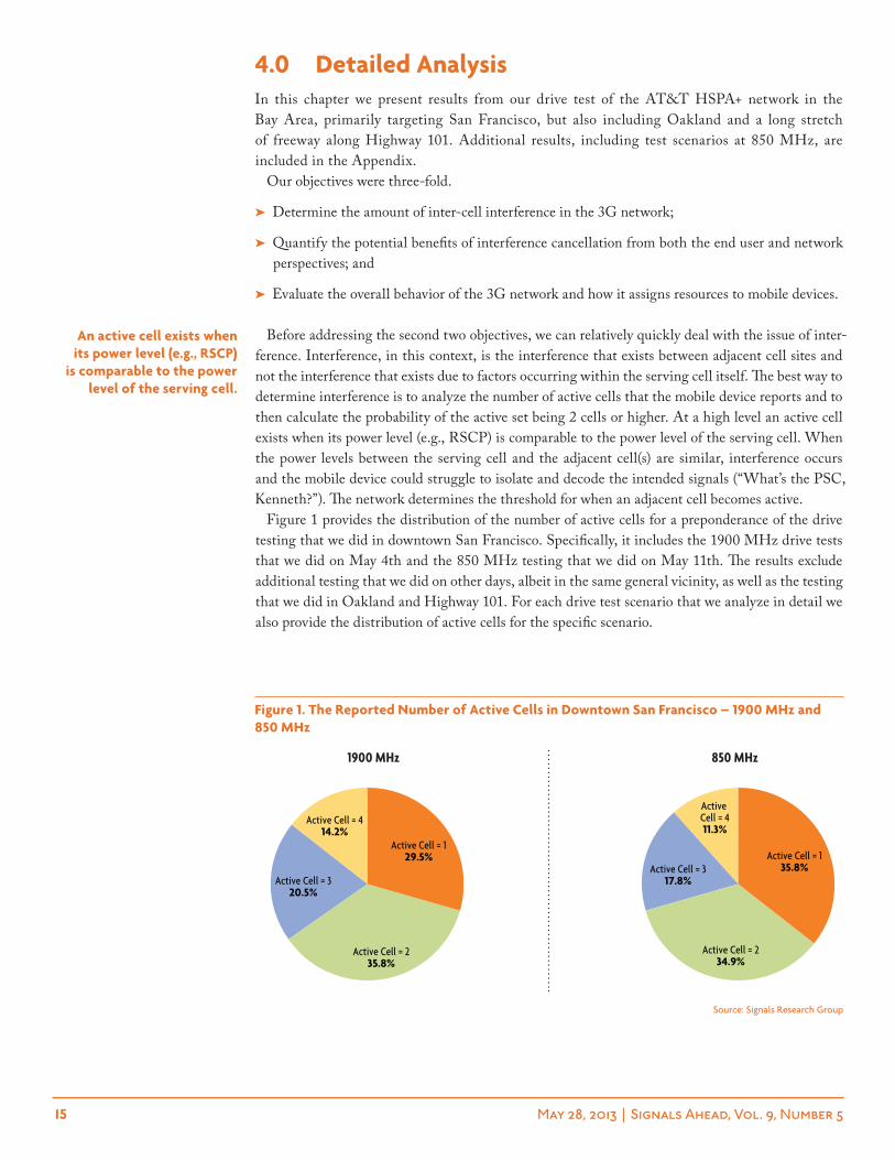
Before addressing the second two objectives, we can relatively quickly deal with the issue of inter-ference. Interference, in this context, is the interference that exists between adjacent cell sites and not the interference that exists due to factors occurring within the serving cell itself. The best way to determine interference is to analyze the number of active cells that the mobile device reports and to then calculate the probability of the active set being 2 cells or higher. At a high level an active cell exists when its power level (e.g., RSCP) is comparable to the power level of the serving cell. When the power levels between the serving cell and the adjacent cell(s) are similar, interference occurs and the mobile device could struggle to isolate and decode the intended signals (“What’s the PSC, Kenneth?”). The network determines the threshold for when an adjacent cell becomes active.
Figure 1 provides the distribution of the number of active cells for a preponderance of the drive testing that we did in downtown San Francisco. Specifically, it includes the 1900 MHz drive tests that we did on May 4th and the 850 MHz testing that we did on May 11th. The results exclude additional testing that we did on other days, albeit in the same general vicinity, as well as the testing that we did in Oakland and Highway 101. For each drive test scenario that we analyze in detail we also provide the distribution of active cells for the specific scenario.
an active cell exists when its power level (e.g., rscp)
is comparable to the power level of the serving cell.
Source: Signals Research Group
Active Cell = 414.2%
Active Cell = 320.5%
Active Cell = 235.8%
Active Cell = 129.5%
Active Cell = 411.3%
Active Cell = 317.8%
Active Cell = 234.9%
Active Cell = 135.8%
1900 Mhz 850 Mhz
Figure 1. the reported number of active cells in Downtown san Francisco – 1900 mhz and 850 mhz
16 May 28, 2013 | Signals Ahead, Vol. 9, Number 5
The information in the two pie charts indicates that for roughly 65-70% of the time the mobile device had at least two active cells and that for approximately 30% of the time the mobile device was reporting 3 or more active cells. This information provides a great proxy for the probability of inter-cell interference occurring, but it can also exist when there is only a single cell in the active set.
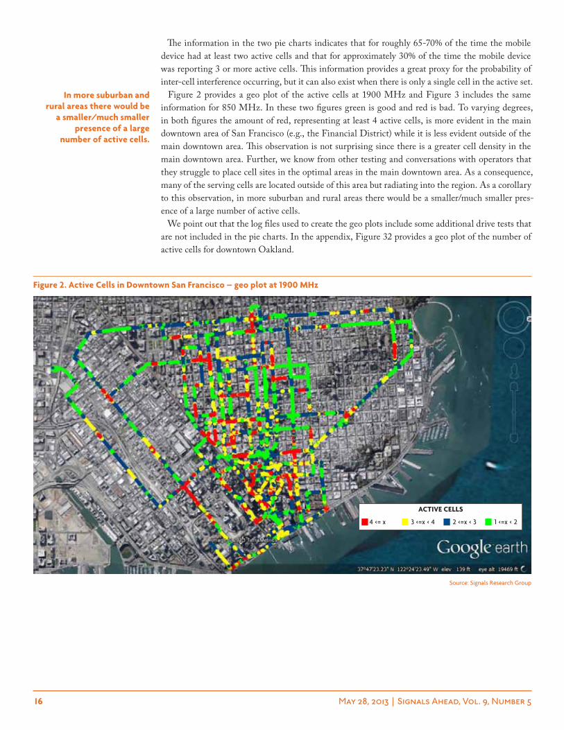
Figure 2 provides a geo plot of the active cells at 1900 MHz and Figure 3 includes the same information for 850 MHz. In these two figures green is good and red is bad. To varying degrees, in both figures the amount of red, representing at least 4 active cells, is more evident in the main downtown area of San Francisco (e.g., the Financial District) while it is less evident outside of the main downtown area. This observation is not surprising since there is a greater cell density in the main downtown area. Further, we know from other testing and conversations with operators that they struggle to place cell sites in the optimal areas in the main downtown area. As a consequence, many of the serving cells are located outside of this area but radiating into the region. As a corollary to this observation, in more suburban and rural areas there would be a smaller/much smaller pres-ence of a large number of active cells.
We point out that the log files used to create the geo plots include some additional drive tests that are not included in the pie charts. In the appendix, Figure 32 provides a geo plot of the number of active cells for downtown Oakland.
in more suburban and rural areas there would be
a smaller/much smaller presence of a large
number of active cells.
Source: Signals Research Group
Figure 2. active cells in Downtown san Francisco – geo plot at 1900 mhz
4 <= x 3 <=x < 4 2 <=x < 3 1 <=x < 2
active cells
17 May 28, 2013 | Signals Ahead, Vol. 9, Number 5
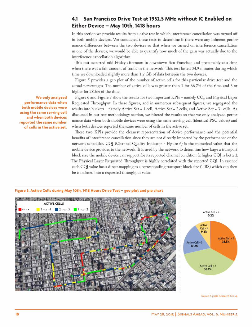
Finally, before moving to some of the specific results, we include Figure 4, which provides a probability distribution plot of the RSCP values for the two mobile devices that we used during the testing on May 4th. We are including this figure to demonstrate that the two mobile devices had very comparable network conditions over the duration of several lengthy drive tests. As indicated in the Test Methodology section, the two mobile devices were attached to either the passenger car seat or the front dash and within 12-18 inches of each other. Despite their co-location, we frequently observed large variances in the RSCP values when doing stationary testing, not to mention the mobile devices using different serving cells. However, in a drive test these variances averaged out over time.
Figure 3. active cells in Downtown san Francisco – geo plot at 850 mhz
Source: Signals Research Group
Source: Signals Research Group
FFA #2 w/o ICFFA #1 w/ IC
MAX-25.0-32.5-40.0-47.5-55.0-62.5-70.0-77.5-85.0-92.5-100.0
0%
20%
40%
60%
80%
100%
RSCP (dBm)
Probability (%)
Figure 4. rscp Distribution for both mobile Devices – may 4th, 1900 mhz
4 <= x 3 <=x < 4 2 <=x < 3 1 <=x < 2
active cells
18 May 28, 2013 | Signals Ahead, Vol. 9, Number 5
4.1 san Francisco Drive test at 1952.5 mhz without ic enabled on either Device – may 10th, 1418 hoursIn this section we provide results from a drive test in which interference cancellation was turned off in both mobile devices. We conducted these tests to determine if there were any inherent perfor-mance differences between the two devices so that when we turned on interference cancellation in one of the devices, we would be able to quantify how much of the gain was actually due to the interference cancellation algorithm.
This test occurred mid Friday afternoon in downtown San Francisco and presumably at a time when there was a fair amount of traffic in the network. This test lasted 34.9 minutes during which time we downloaded slightly more than 1.2 GB of data between the two devices.
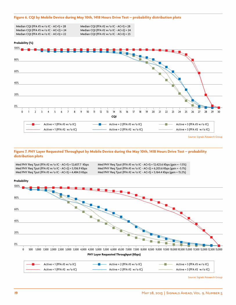
Figure 5 provides a geo plot of the number of active cells for this particular drive test and the actual percentages. The number of active cells was greater than 1 for 66.7% of the time and 3 or higher for 28.6% of the time.
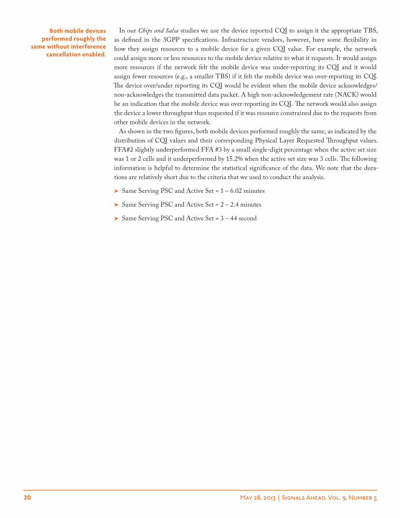
Figure 6 and Figure 7 show the results for two important KPIs – namely CQI and Physical Layer Requested Throughput. In these figures, and in numerous subsequent figures, we segregated the results into buckets – namely Active Set = 1 cell, Active Set = 2 cells, and Active Set = 3+ cells. As discussed in our test methodology section, we filtered the results so that we only analyzed perfor-mance data when both mobile devices were using the same serving cell (identical PSC values) and when both devices reported the same number of cells in the active set.
These two KPIs provide the cleanest representation of device performance and the potential benefits of interference cancellation since they are not directly impacted by the performance of the network scheduler. CQI (Channel Quality Indicator - Figure 6) is the numerical value that the mobile device provides to the network. It is used by the network to determine how large a transport block size the mobile device can support for its reported channel condition (a higher CQI is better). The Physical Layer Requested Throughput is highly correlated with the reported CQI. In essence each CQI value has a direct mapping to a corresponding transport block size (TBS) which can then be translated into a requested throughput value.
we only analyzed performance data when
both mobile devices were using the same serving cell
and when both devices reported the same number
of cells in the active set.
Active Cell = 50.2%
Active Cell = 49.2%
Active Cell = 319.2%
Active Cell = 238.1%
Active Cell = 133.3%
Figure 5. active cells during may 10th, 1418 hours Drive test – geo plot and pie chart
Source: Signals Research Group
4 <= x 3 <=x < 4 2 <=x < 3 1 <=x < 2
active cells
19 May 28, 2013 | Signals Ahead, Vol. 9, Number 5
0%
20%
40%
60%
80%
100%
3029282726252423222120191817161514131211109876543210
Active = 3 (FFA #2 w/o IC)Active = 2 (FFA #2 w/o IC)Active = 1 (FFA #2 w/o IC)
Active = 3 (FFA #3 w/o IC)Active = 2 (FFA #3 w/o IC)Active = 1 (FFA #3 w/o IC)
Median CQI (FFA #3 w/o IC - AC=1) = 28 Median CQI (FFA #2 w/o IC - AC=1) = 28 Median CQI (FFA #3 w/o IC - AC=2) = 24 Median CQI (FFA #2 w/o IC - AC=2) = 24 Median CQI (FFA #3 w/o IC - AC=3) = 22 Median CQI (FFA #2 w/o IC - AC=3) = 23
CQI
Probability (%)
Figure 6. cQi by mobile Device during may 10th, 1418 hours Drive test – probability distribution plots
Source: Signals Research Group
0%
20%
40%
60%
80%
100%
13,00012,50012,00011,50011,00010,50010,0009,5009,0008,5008,0007,5007,00065,006,0005,5005,0004,5004,0003,5003,0002,5002,0001,5001,0005000
Active = 3 (FFA #2 w/o IC)Active = 2 (FFA #2 w/o IC)Active = 1 (FFA #2 w/o IC)
Active = 3 (FFA #3 w/o IC)Active = 2 (FFA #3 w/o IC)Active = 1 (FFA #3 w/o IC)
Med PHY Req Tput (FFA #2 w/o IC - AC=1) = 12,607.7 Kbps Med PHY Req Tput (FFA #3 w/o IC - AC=1) = 12,423.6 Kbps (gain = -1.5%) Med PHY Req Tput (FFA #2 w/o IC - AC=2) = 5,106.9 Kbps Med PHY Req Tput (FFA #3 w/o IC - AC=2) = 6,203.6 Kbps (gain = -5.1%) Med PHY Req Tput (FFA #3 w/o IC - AC=3) = 4,484.0 Kbps Med PHY Req Tput (FFA #2 w/o IC - AC=3) = 5,164.4 Kbps (gain = 15.2%)
PHY Layer Requested Throughput (Kbps)
Probability
Figure 7. phY layer requested throughput by mobile Device during the may 10th, 1418 hours Drive test – probability distribution plots
Source: Signals Research Group
20 May 28, 2013 | Signals Ahead, Vol. 9, Number 5
In our Chips and Salsa studies we use the device reported CQI to assign it the appropriate TBS, as defined in the 3GPP specifications. Infrastructure vendors, however, have some flexibility in how they assign resources to a mobile device for a given CQI value. For example, the network could assign more or less resources to the mobile device relative to what it requests. It would assign more resources if the network felt the mobile device was under-reporting its CQI and it would assign fewer resources (e.g., a smaller TBS) if it felt the mobile device was over-reporting its CQI. The device over/under reporting its CQI would be evident when the mobile device acknowledges/non-acknowledges the transmitted data packet. A high non-acknowledgement rate (NACK) would be an indication that the mobile device was over-reporting its CQI. The network would also assign the device a lower throughput than requested if it was resource constrained due to the requests from other mobile devices in the network.
As shown in the two figures, both mobile devices performed roughly the same, as indicated by the distribution of CQI values and their corresponding Physical Layer Requested Throughput values. FFA#2 slightly underperformed FFA #3 by a small single-digit percentage when the active set size was 1 or 2 cells and it underperformed by 15.2% when the active set size was 3 cells. The following information is helpful to determine the statistical significance of the data. We note that the dura-tions are relatively short due to the criteria that we used to conduct the analysis.
➤ Same Serving PSC and Active Set = 1 – 6.02 minutes
➤ Same Serving PSC and Active Set = 2 – 2.4 minutes
➤ Same Serving PSC and Active Set = 3 – 44 second
Both mobile devices performed roughly the
same without interference cancellation enabled.
21 May 28, 2013 | Signals Ahead, Vol. 9, Number 5
4.2 san Francisco Drive test at 877 mhz without ic enabled on either Device – may 11th, 0911 hoursFor completeness sake we include an additional drive test scenario in which we disabled interference cancellation in both mobile devices. This particular drive test occurred on a Saturday morning in Band 5 (877 MHz to be exact). Figure 8 provides a geo plot of the number of active cells and a pie chart that shows the numerical distribution. Although the drive route was different than the drive route in the previous section (note the figures have different orientations), the percentages are largely comparable.
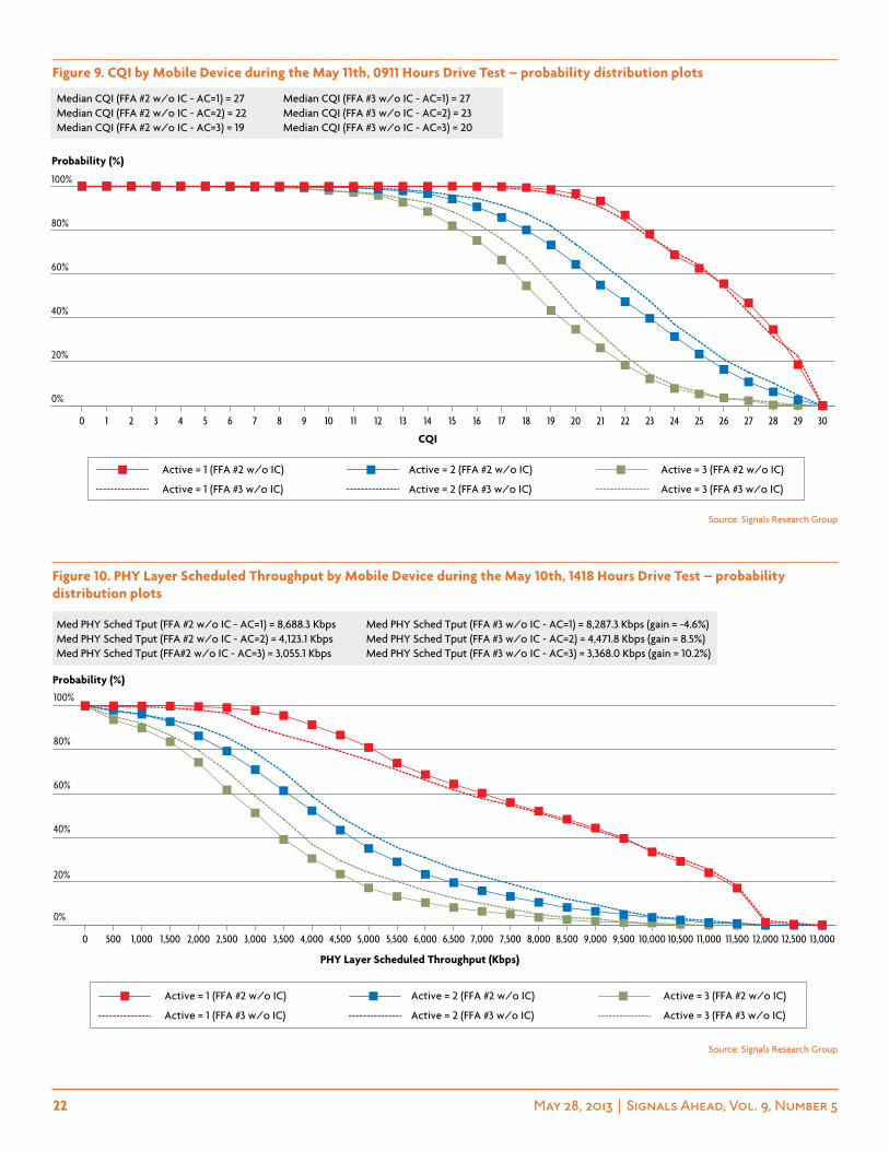
In this scenario, FFA #3 outperformed FFA #2 by 4.5% when the active set was 1, but when the active set was 2 or 3, FFA #2 outperformed FFA #3 by 16% (active set = 3) to 20% (active set = 2). This information is implied in Figure 9 (CQI), and fully supported by the Physical Layer Requested Throughput – a figure that we didn’t include in the report. Figure 10 introduces a new KPI, namely the Physical Layer Scheduled Throughput. This KPI reflects the transport block size that the network assigns the mobile device, based on the information that it receives from the mobile device (e.g., CQI) and the ability of the network to deliver the requested resources. With network congestion it is frequently the case that the network scheduled throughput is lower than the requested throughput, in other words, this KPI is influenced by network loading and the network scheduler. We also point out that the Physical Layer Scheduled Throughput values are only based on the TTIs (transmission time intervals) when the pertinent mobile device is receiving data. For example, if the scheduled throughput was 2 Mbps but the device was only being scheduled every other TTI then the actual throughput delivered to the mobile device would be closer to 1 Mbps. In this example, we ignored data retransmissions which would occur if the mobile device sent a NACK for a data packet that it couldn’t decode.
Active Cell = 50.1%
Active Cell = 4
9.4%
Active Cell = 318.0%
Active Cell = 237.9%
Active Cell = 134.6%
Figure 8. active cells during the may 11th, 0911 hours Drive test – geo plot and pie chart
Source: Signals Research Group
4 <= x 3 <=x < 4 2 <=x < 3 1 <=x < 2
active cells
22 May 28, 2013 | Signals Ahead, Vol. 9, Number 5
0%
20%
40%
60%
80%
100%
3029282726252423222120191817161514131211109876543210
Active = 3 (FFA #3 w/o IC)Active = 2 (FFA #3 w/o IC)Active = 1 (FFA #3 w/o IC)
Active = 3 (FFA #2 w/o IC)Active = 2 (FFA #2 w/o IC)Active = 1 (FFA #2 w/o IC)
Median CQI (FFA #2 w/o IC - AC=1) = 27 Median CQI (FFA #3 w/o IC - AC=1) = 27 Median CQI (FFA #2 w/o IC - AC=2) = 22 Median CQI (FFA #3 w/o IC - AC=2) = 23Median CQI (FFA #2 w/o IC - AC=3) = 19 Median CQI (FFA #3 w/o IC - AC=3) = 20
CQI
Probability (%)
0%
40%
20%
60%
80%
100%
13,00012,50012,00011,50011,00010,50010,0009,5009,0008,5008,0007,5007,0006,5006,0005,5005,0004,5004,0003,5003,0002,5002,0001,5001,0005000
Active = 3 (FFA #3 w/o IC)Active = 2 (FFA #3 w/o IC)Active = 1 (FFA #3 w/o IC)
Active = 3 (FFA #2 w/o IC)Active = 2 (FFA #2 w/o IC)Active = 1 (FFA #2 w/o IC)
Med PHY Sched Tput (FFA #2 w/o IC - AC=1) = 8,688.3 Kbps Med PHY Sched Tput (FFA #3 w/o IC - AC=1) = 8,287.3 Kbps (gain = -4.6%) Med PHY Sched Tput (FFA #2 w/o IC - AC=2) = 4,123.1 Kbps Med PHY Sched Tput (FFA #3 w/o IC - AC=2) = 4,471.8 Kbps (gain = 8.5%)Med PHY Sched Tput (FFA#2 w/o IC - AC=3) = 3,055.1 Kbps Med PHY Sched Tput (FFA #3 w/o IC - AC=3) = 3,368.0 Kbps (gain = 10.2%)
PHY Layer Scheduled Throughput (Kbps)
Probability (%)
Figure 9. cQi by mobile Device during the may 11th, 0911 hours Drive test – probability distribution plots
Figure 10. phY layer scheduled throughput by mobile Device during the may 10th, 1418 hours Drive test – probability distribution plots
Source: Signals Research Group
Source: Signals Research Group
23 May 28, 2013 | Signals Ahead, Vol. 9, Number 5
The following information applies to this 31.4 minute drive test during which time we downloaded 1.1 GB of data, split almost identically between the two mobile devices.
➤ Same Serving PSC and Active Set = 1 – 9.5 minutes
➤ Same Serving PSC and Active Set = 2 – 5.3 minutes
➤ Same Serving PSC and Active Set = 3 – 110 seconds
Based on the results from this test scenario and the previous test scenario, neither device showed any inherent performance advantages and there is a degree of variability in the results that is likely less than 20%. This variability is most likely due to different network conditions that the two devices experienced.
24 May 28, 2013 | Signals Ahead, Vol. 9, Number 5
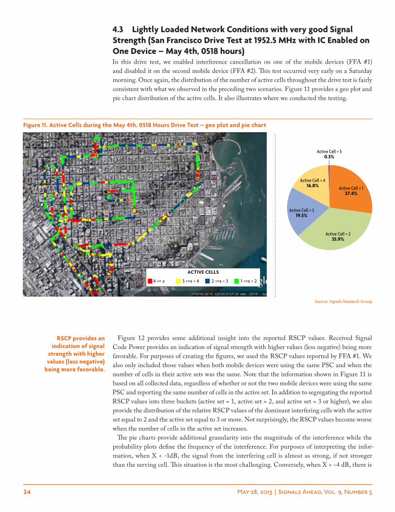
4.3 lightly loaded network conditions with very good signal strength (san Francisco Drive test at 1952.5 mhz with ic enabled on one Device – may 4th, 0518 hours)In this drive test, we enabled interference cancellation on one of the mobile devices (FFA #1) and disabled it on the second mobile device (FFA #2). This test occurred very early on a Saturday morning. Once again, the distribution of the number of active cells throughout the drive test is fairly consistent with what we observed in the preceding two scenarios. Figure 11 provides a geo plot and pie chart distribution of the active cells. It also illustrates where we conducted the testing.
Figure 12 provides some additional insight into the reported RSCP values. Received Signal Code Power provides an indication of signal strength with higher values (less negative) being more favorable. For purposes of creating the figures, we used the RSCP values reported by FFA #1. We also only included those values when both mobile devices were using the same PSC and when the number of cells in their active sets was the same. Note that the information shown in Figure 11 is based on all collected data, regardless of whether or not the two mobile devices were using the same PSC and reporting the same number of cells in the active set. In addition to segregating the reported RSCP values into three buckets (active set = 1, active set = 2, and active set = 3 or higher), we also provide the distribution of the relative RSCP values of the dominant interfering cells with the active set equal to 2 and the active set equal to 3 or more. Not surprisingly, the RSCP values become worse when the number of cells in the active set increases.
The pie charts provide additional granularity into the magnitude of the interference while the probability plots define the frequency of the interference. For purposes of interpreting the infor-mation, when X < -1dB, the signal from the interfering cell is almost as strong, if not stronger than the serving cell. This situation is the most challenging. Conversely, when X > -4 dB, there is
rscp provides an indication of signal
strength with higher values (less negative)
being more favorable.
Active Cell = 50.3%
Active Cell = 416.8%
Active Cell = 319.5%
Active Cell = 235.9%
Active Cell = 127.4%
Figure 11. active cells during the may 4th, 0518 hours Drive test – geo plot and pie chart
Source: Signals Research Group
4 <= x 3 <=x < 4 2 <=x < 3 1 <=x < 2
active cells
25 May 28, 2013 | Signals Ahead, Vol. 9, Number 5
a fairly big difference in the signal strengths. In the context of inter-cell interference, this situation is less challenging.
From our earlier attempt to do lab-based testing of interference cancellation solutions we know that this topic is very contentious. Namely, none of the vendors could agree on how strong the signal of interfering cells should be relative to the serving cell. Therefore, by doing our drive testing we have hopefully shed some light into this issue.
The following information applies to this 58 minute drive test during which time we downloaded 3.3 GB of data – we’ll reveal the split between the two mobile devices later in this section.
➤ Same Serving PSC and Active Set = 1 – 4.8 minutes
➤ Same Serving PSC and Active Set = 2 – 4.2 minutes
➤ Same Serving PSC and Active Set = 3 or higher – 4.2 minutes
0%
20%
40%
60%
80%
100%
Both Active = 3+ (FFA #1 w/ IC)Both Active = 2 (FFA #1 w/ IC)
Both Active = 1 (FFA #1 w/ IC)
-25-32.5-40-47.5-55-62.5-70-77.5-85-92.5-100
Median RSCP (Active = 1) = -58.6 dBm Median RSCP (Active = 2) = -61.4 dBm Median RSCP (Active = 3+) = -68.3 dBm
RSCP (dBm)
Probability (%)
X > -4 dB55.7%
-3 dB < X <= -4 dB7.0%
-2 dB < X <= -3 dB7.1%
-1 dB < X <= -2 dB8.4%
X < -1dB21.7% X > -4 dB
37.6%
-3 dB < X <= -4 dB8.9% -2 dB < X <= -3 dB
10.4%
-1 dB < X <= -2 dB11.9%
X < -1dB31.2%
RSCP Difference between Serving and Dominant Interferer
(Active Cell = 2)
RSCP Difference between Serving and Dominant Interferer
(Active Cell = 3+)
Figure 12. the Distribution of rscp values, including the Dominant interfering cells, during the may 4th, 0518 hours Drive test – by active set count
Source: Signals Research Group
26 May 28, 2013 | Signals Ahead, Vol. 9, Number 5
FFA #1 w/IC
FFA #2 w/o IC
0%
20%
40%
60%
80%
100%
13,00012,00011,00010,0009,0008,0007,0006,0005,0004,0003,0002,0001,000
Median PHY Req w/o IC = 7,406.4 Kbps Median PHY Req w/ IC = 10,103.8 Kbps (36.4% gain) Average Phy Req w/o IC = 7,388.9 Kbps Average PHY Req w/ IC = 8,706.7 Kbps (17.8% gain)
Probability (%)
PHY Layer - Requested (Kbps)
10,0007,5005,0004,0003,0002,0001,000
FFA #1 w/IC
FFA #2 w/o IC
0%
20%
40%
60%
80%
100%
Median MAC-HS w/o IC = 2,891.4 Kbps Median MAC-HS w/ IC = 4,869.3 Kbps (68.4% gain) Average MAC-HS w/o IC = 3,225.1 Kbps Average MAC-HS w/ IC = 4,587.7 Kbps (42.2% gain)
Probability (%)
MAC-HS Throughput (Kbps)
Figure 13. phY layer requested throughput by mobile Device during the may 4th, 1518 hours Drive test – probability distribution plots (aggregate results)
Figure 14. mac-hs layer throughput by mobile Device during the may 4th, 0518 hours Drive test – probability distribution plots (aggregate results)
Source: Signals Research Group
Source: Signals Research Group
27 May 28, 2013 | Signals Ahead, Vol. 9, Number 5
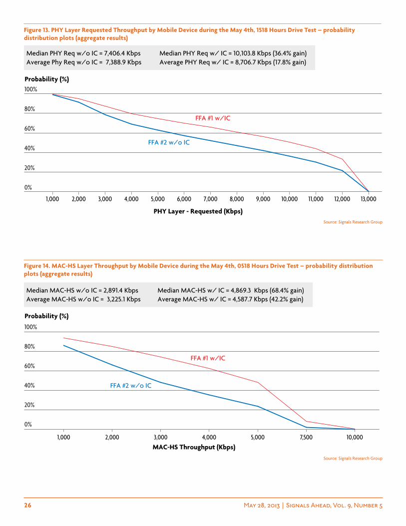
Figure 13 provides information about the Physical Layer Requested Throughput from both mobile devices. Figure 14 provides comparable information for the MAC-HS Layer Throughput. As discussed in the Test Methodology section, MAC-HS throughput is very comparable to the actual throughput that the mobile device obtained and what the user experienced. We used MAC-HS throughput instead of Application Layer throughput because the chipset reported the MAC-HS far more frequently than it reported the Application Layer throughput. We have classified the informa-tion provided in these figures as “aggregate results” because we did not filter the data to ensure that both devices were using the same serving cell and that they were both reporting the same number of cells in the active set. We are showing this information because it reflects what the typical user, who knows absolutely nothing about PSCs and active sets, would have experienced if they were using one of the devices.
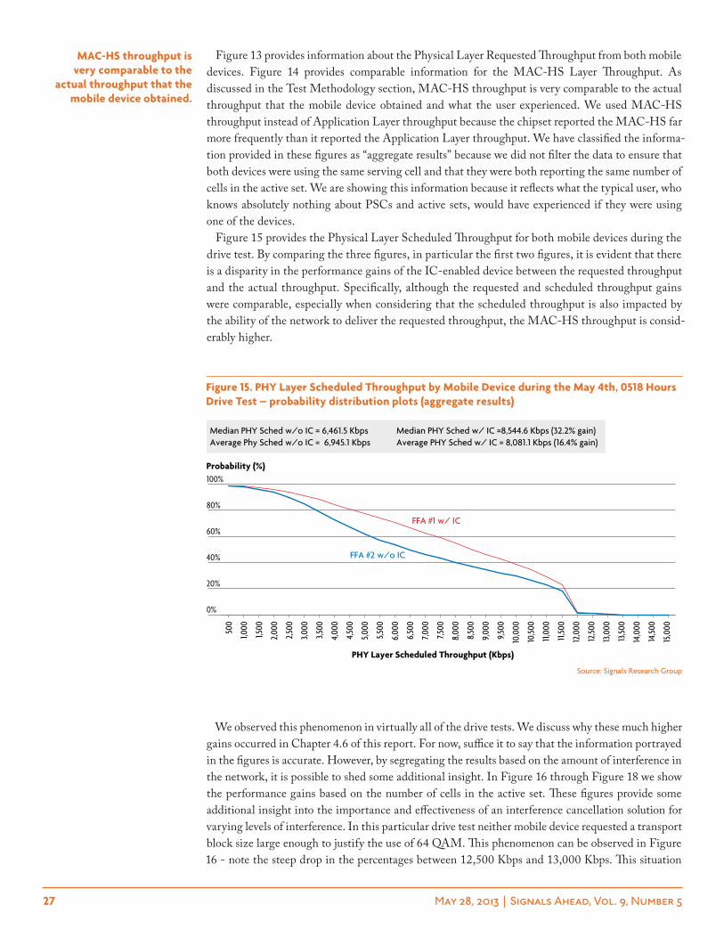
Figure 15 provides the Physical Layer Scheduled Throughput for both mobile devices during the drive test. By comparing the three figures, in particular the first two figures, it is evident that there is a disparity in the performance gains of the IC-enabled device between the requested throughput and the actual throughput. Specifically, although the requested and scheduled throughput gains were comparable, especially when considering that the scheduled throughput is also impacted by the ability of the network to deliver the requested throughput, the MAC-HS throughput is consid-erably higher.
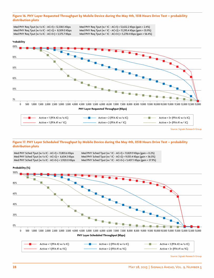
We observed this phenomenon in virtually all of the drive tests. We discuss why these much higher gains occurred in Chapter 4.6 of this report. For now, suffice it to say that the information portrayed in the figures is accurate. However, by segregating the results based on the amount of interference in the network, it is possible to shed some additional insight. In Figure 16 through Figure 18 we show the performance gains based on the number of cells in the active set. These figures provide some additional insight into the importance and effectiveness of an interference cancellation solution for varying levels of interference. In this particular drive test neither mobile device requested a transport block size large enough to justify the use of 64 QAM. This phenomenon can be observed in Figure 16 - note the steep drop in the percentages between 12,500 Kbps and 13,000 Kbps. This situation
mac-hs throughput is very comparable to the
actual throughput that the mobile device obtained.
Source: Signals Research Group
FFA #1 w/ IC
FFA #2 w/o IC
Median PHY Sched w/o IC = 6,461.5 Kbps Median PHY Sched w/ IC =8,544.6 Kbps (32.2% gain)Average Phy Sched w/o IC = 6,945.1 Kbps Average PHY Sched w/ IC = 8,081.1 Kbps (16.4% gain)
PHY Layer Scheduled Throughput (Kbps)
0%
20%
40%
60%
80%
100%Probability (%)
500
1,000
1,500
2,00
0
2,50
0
3,000
3,500
4,00
0
4,50
0
5,000
5,500
6,00
0
6,50
0
7,000
7,500
8,00
0
8,50
0
9,00
0
9,50
0
10,0
00
10,50
0
11,00
0
11,50
0
12,0
00
12,50
0
13,0
00
13,50
0
14,0
00
14,50
0
15,0
00
Figure 15. phY layer scheduled throughput by mobile Device during the may 4th, 0518 hours Drive test – probability distribution plots (aggregate results)
28 May 28, 2013 | Signals Ahead, Vol. 9, Number 5
0%
20%
40%
60%
80%
100%
13,00012,50012,00011,50011,00010,50010,0009,5009,0008,5008,0007,5007,00065,006,0005,5005,0004,5004,0003,5003,0002,5002,0001,5001,0005000
Active = 3+ (FFA #1 w/ IC)Active = 2 (FFA #1 w/ IC)Active = 1 (FFA #1 w/ IC)
Active = 3+ (FFA #2 w/o IC)Active = 2 (FFA #2 w/o IC)Active = 1 (FFA #2 w/o IC)
Med PHY Req Tput (w/o IC - AC=1) = 12,338.5 Kbps Med PHY Req Tput (w/ IC - AC=1) = 12,632.2 Kbps (gain = 2.4%) Med PHY Req Tput (w/o IC - AC=2) = 8,309.0 Kbps Med PHY Req Tput (w/ IC - AC=2) = 11,295.4 Kbps (gain = 35.9%) Med PHY Req Tput (w/o IC - AC=3+) = 3,375.7 Kbps Med PHY Req Tput (w/ IC - AC=3+) = 5,278.4 Kbps (gain = 56.4%)
PHY Layer Requested Throughput (Kbps)
Probability
13,00012,50012,00011,50011,00010,50010,0009,5009,0008,5008,0007,5007,0006,5006,0005,5005,0004,5004,0003,5003,0002,5002,0001,5001,0005000
0%
20%
40%
60%
80%
100%
Active = 3+ (FFA #1 w/IC)Active = 2 (FFA #1 w/IC)Active = 1 (FFA #1 w/IC)
Active = 3 (FFA #2 w/o IC)Active = 2 (FFA #2 w/o IC)Active = 1 (FFA #2 w/o IC)
Med PHY Sched Tput (w/o IC - AC=1) = 11,803.6 Kbps Med PHY Sched Tput (w/ IC - AC=1) = 11,829.9 Kbps (gain = 0.2%) Med PHY Sched Tput (w/o IC - AC=2) = 6,654.3 Kbps Med PHY Sched Tput (w/ IC - AC=2) = 9,051.4 Kbps (gain = 36.0%) Med PHY Sched Tput (w/o IC - AC=3+) = 3,920.0 Kbps Med PHY Sched Tput (w/ IC - AC=3+) = 5,407.1 Kbps (gain = 37.9%)
PHY Layer Scheduled Throughput (Kbps)
Probability (%)
Figure 16. phY layer requested throughput by mobile Device during the may 4th, 1518 hours Drive test – probability distribution plots
Figure 17. phY layer scheduled throughput by mobile Device during the may 4th, 0518 hours Drive test – probability distribution plots
Source: Signals Research Group
Source: Signals Research Group
29 May 28, 2013 | Signals Ahead, Vol. 9, Number 5
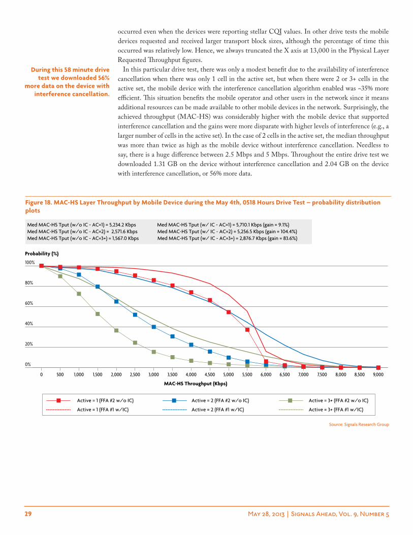
occurred even when the devices were reporting stellar CQI values. In other drive tests the mobile devices requested and received larger transport block sizes, although the percentage of time this occurred was relatively low. Hence, we always truncated the X axis at 13,000 in the Physical Layer Requested Throughput figures.
In this particular drive test, there was only a modest benefit due to the availability of interference cancellation when there was only 1 cell in the active set, but when there were 2 or 3+ cells in the active set, the mobile device with the interference cancellation algorithm enabled was ~35% more efficient. This situation benefits the mobile operator and other users in the network since it means additional resources can be made available to other mobile devices in the network. Surprisingly, the achieved throughput (MAC-HS) was considerably higher with the mobile device that supported interference cancellation and the gains were more disparate with higher levels of interference (e.g., a larger number of cells in the active set). In the case of 2 cells in the active set, the median throughput was more than twice as high as the mobile device without interference cancellation. Needless to say, there is a huge difference between 2.5 Mbps and 5 Mbps. Throughout the entire drive test we downloaded 1.31 GB on the device without interference cancellation and 2.04 GB on the device with interference cancellation, or 56% more data.
During this 58 minute drive test we downloaded 56%
more data on the device with interference cancellation.
Figure 18. mac-hs layer throughput by mobile Device during the may 4th, 0518 hours Drive test – probability distribution plots
Source: Signals Research Group
9,0008,5008,0007,5007,0006,5006,0005,5005,0004,5004,0003,5003,0002,5002,0001,5001,0005000
0%
20%
40%
60%
80%
100%
Active = 3+ (FFA #1 w/IC)Active = 2 (FFA #1 w/IC)Active = 1 (FFA #1 w/IC)
Active = 3+ (FFA #2 w/o IC)Active = 2 (FFA #2 w/o IC)Active = 1 (FFA #2 w/o IC)
Med MAC-HS Tput (w/o IC - AC=1) = 5,234.2 Kbps Med MAC-HS Tput (w/ IC - AC=1) = 5,710.1 Kbps (gain = 9.1%) Med MAC-HS Tput (w/o IC - AC=2) = 2,571.6 Kbps Med MAC-HS Tput (w/ IC - AC=2) = 5,256.5 Kbps (gain = 104.4%) Med MAC-HS Tput (w/o IC - AC=3+) = 1,567.0 Kbps Med MAC-HS Tput (w/ IC - AC=3+) = 2,876.7 Kbps (gain = 83.6%)
MAC-HS Throughput (Kbps)
Probability (%)
30 May 28, 2013 | Signals Ahead, Vol. 9, Number 5
4.4 moderately loaded network conditions with very good signal strength (san Francisco Drive test at 1952.5 mhz with ic enabled on one Device – may 10th, 1459 hours)This drive test also occurred in downtown San Francisco, but it was conducted mid-afternoon on a Friday when presumably there was a fair amount of traffic in the network. In these conditions, one would expect the network scheduler to have a greater influence on the results since the scheduler would be supporting a larger number of concurrent mobile devices. Figure 19 provides a geo plot of the likely areas where interference was present (e.g., the number of cells in the active set) along with the actual distribution of the number of cells in the active set. Seventy-five percent (75%) of the time there were at least 2 cells in the active set and 15.2% of the time there were 4 or more cells in the active set.
During this 29.6 minute drive test we downloaded 1.1 GB of data. The following information is also relevant to the drive test.
➤ Same Serving PSC and Active Set = 1 – 4.8 minutes
➤ Same Serving PSC and Active Set = 2 – 5.2 minutes
➤ Same Serving PSC and Active Set = 3 or higher – 4.4 minutes
Figure 19. active cells during the may 10th, 1459 hours Drive test – geo plot and pie chart
Active Cell = 50.2%
Active Cell = 415.0%
Active Cell = 320.6%
Active Cell = 239.0%
Active Cell = 125.2%
Source: Signals Research Group
4 <= x 3 <=x < 4 2 <=x < 3 1 <=x < 2
active cells
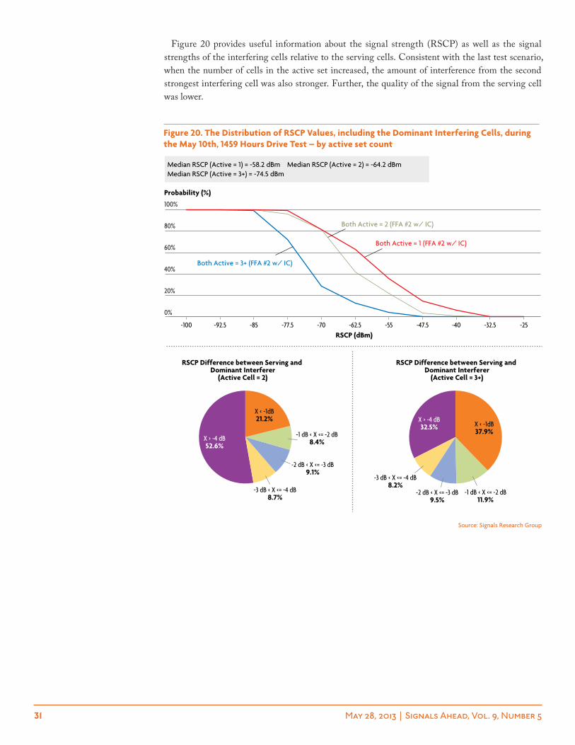
31 May 28, 2013 | Signals Ahead, Vol. 9, Number 5
Figure 20 provides useful information about the signal strength (RSCP) as well as the signal strengths of the interfering cells relative to the serving cells. Consistent with the last test scenario, when the number of cells in the active set increased, the amount of interference from the second strongest interfering cell was also stronger. Further, the quality of the signal from the serving cell was lower.
Figure 20. the Distribution of rscp values, including the Dominant interfering cells, during the may 10th, 1459 hours Drive test – by active set count
Both Active = 3+ (FFA #2 w/ IC)
Both Active = 2 (FFA #2 w/ IC)
Both Active = 1 (FFA #2 w/ IC)
-25-32.5-40-47.5-55-62.5-70-77.5-85-92.5-100
0%
20%
40%
60%
80%
100%
Median RSCP (Active = 1) = -58.2 dBm Median RSCP (Active = 2) = -64.2 dBm Median RSCP (Active = 3+) = -74.5 dBm
RSCP (dBm)
Probability (%)
X > -4 dB52.6%
-3 dB < X <= -4 dB8.7%
-2 dB < X <= -3 dB9.1%
-1 dB < X <= -2 dB8.4%
X < -1dB21.2% X > -4 dB
32.5%
-3 dB < X <= -4 dB8.2%
-2 dB < X <= -3 dB9.5%
-1 dB < X <= -2 dB11.9%
X < -1dB37.9%
RSCP Difference between Serving and Dominant Interferer
(Active Cell = 2)
RSCP Difference between Serving and Dominant Interferer
(Active Cell = 3+)
Source: Signals Research Group
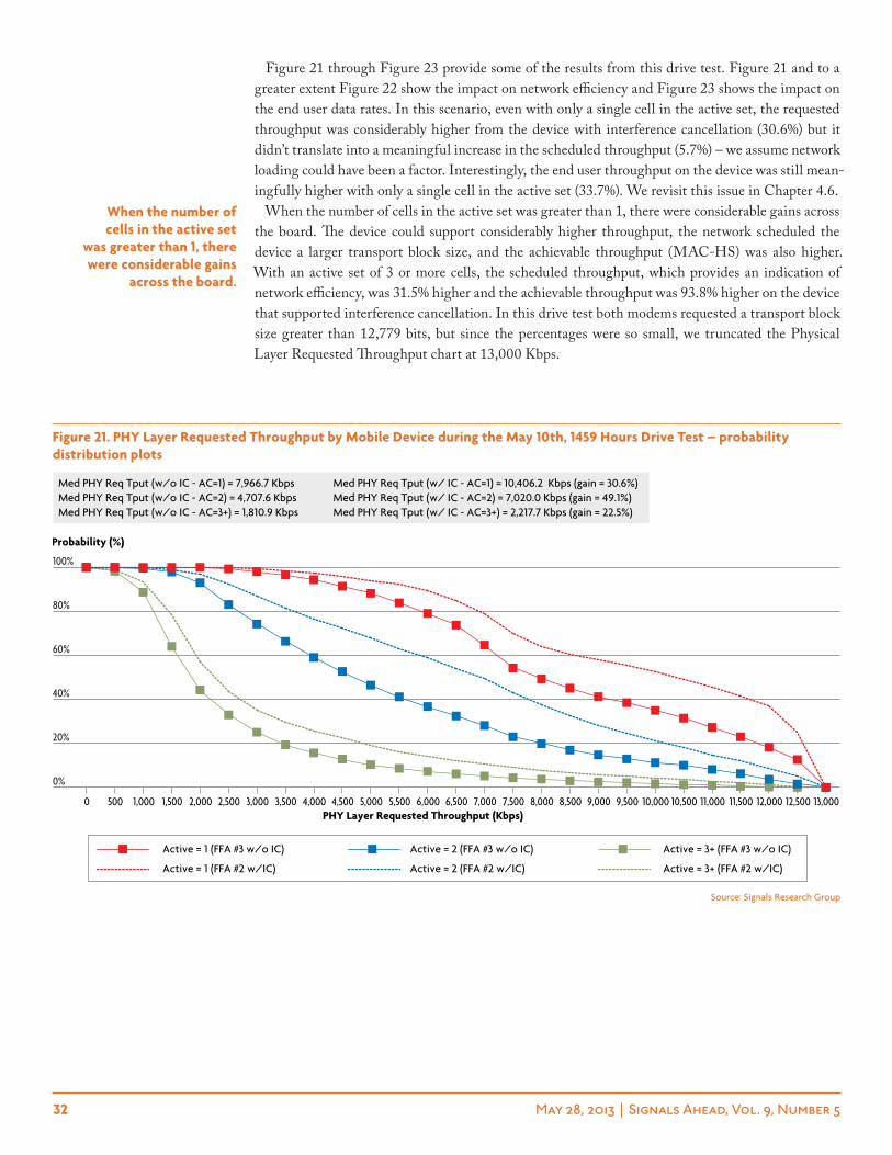
32 May 28, 2013 | Signals Ahead, Vol. 9, Number 5
Figure 21. phY layer requested throughput by mobile Device during the may 10th, 1459 hours Drive test – probability distribution plots
0%
20%
40%
60%
80%
100%
13,00012,50012,00011,50011,00010,50010,0009,5009,0008,5008,0007,5007,0006,5006,0005,5005,0004,5004,0003,5003,0002,5002,0001,5001,0005000
Med PHY Req Tput (w/o IC - AC=1) = 7,966.7 Kbps Med PHY Req Tput (w/ IC - AC=1) = 10,406.2 Kbps (gain = 30.6%) Med PHY Req Tput (w/o IC - AC=2) = 4,707.6 Kbps Med PHY Req Tput (w/ IC - AC=2) = 7,020.0 Kbps (gain = 49.1%) Med PHY Req Tput (w/o IC - AC=3+) = 1,810.9 Kbps Med PHY Req Tput (w/ IC - AC=3+) = 2,217.7 Kbps (gain = 22.5%)
Probability (%)
Active = 3+ (FFA #2 w/IC)Active = 2 (FFA #2 w/IC)Active = 1 (FFA #2 w/IC)
Active = 3+ (FFA #3 w/o IC)Active = 2 (FFA #3 w/o IC)Active = 1 (FFA #3 w/o IC)
PHY Layer Requested Throughput (Kbps)
Source: Signals Research Group
Figure 21 through Figure 23 provide some of the results from this drive test. Figure 21 and to a greater extent Figure 22 show the impact on network efficiency and Figure 23 shows the impact on the end user data rates. In this scenario, even with only a single cell in the active set, the requested throughput was considerably higher from the device with interference cancellation (30.6%) but it didn’t translate into a meaningful increase in the scheduled throughput (5.7%) – we assume network loading could have been a factor. Interestingly, the end user throughput on the device was still mean-ingfully higher with only a single cell in the active set (33.7%). We revisit this issue in Chapter 4.6.
When the number of cells in the active set was greater than 1, there were considerable gains across the board. The device could support considerably higher throughput, the network scheduled the device a larger transport block size, and the achievable throughput (MAC-HS) was also higher. With an active set of 3 or more cells, the scheduled throughput, which provides an indication of network efficiency, was 31.5% higher and the achievable throughput was 93.8% higher on the device that supported interference cancellation. In this drive test both modems requested a transport block size greater than 12,779 bits, but since the percentages were so small, we truncated the Physical Layer Requested Throughput chart at 13,000 Kbps.
when the number of cells in the active set
was greater than 1, there were considerable gains
across the board.
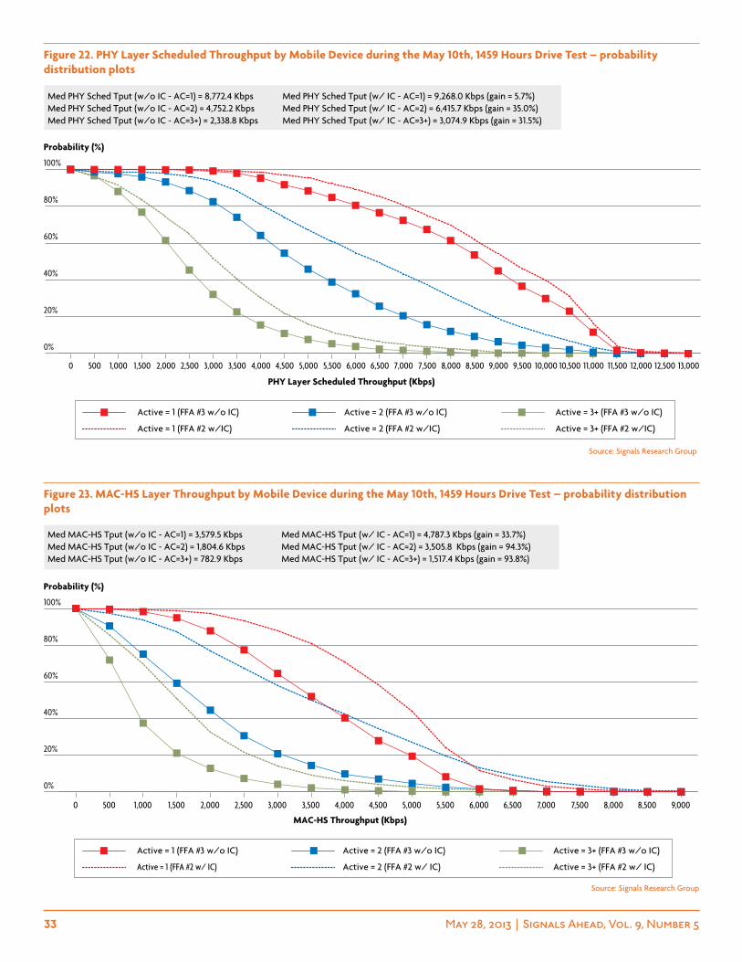
33 May 28, 2013 | Signals Ahead, Vol. 9, Number 5
Figure 22. phY layer scheduled throughput by mobile Device during the may 10th, 1459 hours Drive test – probability distribution plots
13,00012,50012,00011,50011,00010,50010,0009,5009,0008,5008,0007,5007,0006,5006,0005,5005,0004,5004,0003,5003,0002,5002,0001,5001,0005000
0%
20%
40%
60%
80%
100%
Active = 3+ (FFA #2 w/IC)Active = 2 (FFA #2 w/IC)Active = 1 (FFA #2 w/IC)
Active = 3+ (FFA #3 w/o IC)Active = 2 (FFA #3 w/o IC)Active = 1 (FFA #3 w/o IC)
Med PHY Sched Tput (w/o IC - AC=1) = 8,772.4 Kbps Med PHY Sched Tput (w/ IC - AC=1) = 9,268.0 Kbps (gain = 5.7%) Med PHY Sched Tput (w/o IC - AC=2) = 4,752.2 Kbps Med PHY Sched Tput (w/ IC - AC=2) = 6,415.7 Kbps (gain = 35.0%) Med PHY Sched Tput (w/o IC - AC=3+) = 2,338.8 Kbps Med PHY Sched Tput (w/ IC - AC=3+) = 3,074.9 Kbps (gain = 31.5%)
PHY Layer Scheduled Throughput (Kbps)
Probability (%)
Source: Signals Research Group
Figure 23. mac-hs layer throughput by mobile Device during the may 10th, 1459 hours Drive test – probability distribution plots
Source: Signals Research Group
9,0008,5008,0007,5007,0006,5006,0005,5005,0004,5004,0003,5003,0002,5002,0001,5001,0005000
0%
20%
40%
60%
80%
100%
Active = 3+ (FFA #2 w/ IC)Active = 2 (FFA #2 w/ IC)Active = 1 (FFA #2 w/ IC)
Active = 3+ (FFA #3 w/o IC)Active = 2 (FFA #3 w/o IC)Active = 1 (FFA #3 w/o IC)
Med MAC-HS Tput (w/o IC - AC=1) = 3,579.5 Kbps Med MAC-HS Tput (w/ IC - AC=1) = 4,787.3 Kbps (gain = 33.7%) Med MAC-HS Tput (w/o IC - AC=2) = 1,804.6 Kbps Med MAC-HS Tput (w/ IC - AC=2) = 3,505.8 Kbps (gain = 94.3%) Med MAC-HS Tput (w/o IC - AC=3+) = 782.9 Kbps Med MAC-HS Tput (w/ IC - AC=3+) = 1,517.4 Kbps (gain = 93.8%)
MAC-HS Throughput (Kbps)
Probability (%)
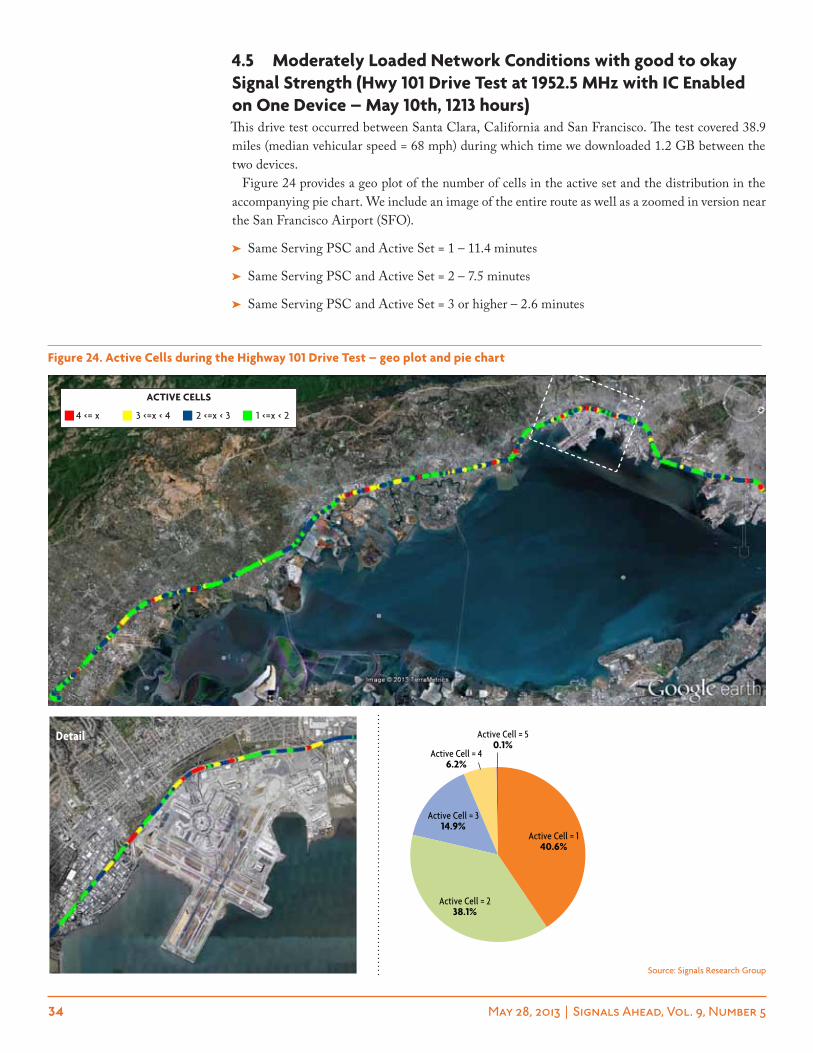
34 May 28, 2013 | Signals Ahead, Vol. 9, Number 5
4.5 moderately loaded network conditions with good to okay signal strength (hwy 101 Drive test at 1952.5 mhz with ic enabled on one Device – may 10th, 1213 hours)This drive test occurred between Santa Clara, California and San Francisco. The test covered 38.9 miles (median vehicular speed = 68 mph) during which time we downloaded 1.2 GB between the two devices.
Figure 24 provides a geo plot of the number of cells in the active set and the distribution in the accompanying pie chart. We include an image of the entire route as well as a zoomed in version near the San Francisco Airport (SFO).
➤ Same Serving PSC and Active Set = 1 – 11.4 minutes
➤ Same Serving PSC and Active Set = 2 – 7.5 minutes
➤ Same Serving PSC and Active Set = 3 or higher – 2.6 minutes
Figure 24. active cells during the highway 101 Drive test – geo plot and pie chart
Active Cell = 50.1%
Active Cell = 46.2%
Active Cell = 314.9%
Active Cell = 238.1%
Active Cell = 140.6%
Source: Signals Research Group
4 <= x 3 <=x < 4 2 <=x < 3 1 <=x < 2
active cells
detail
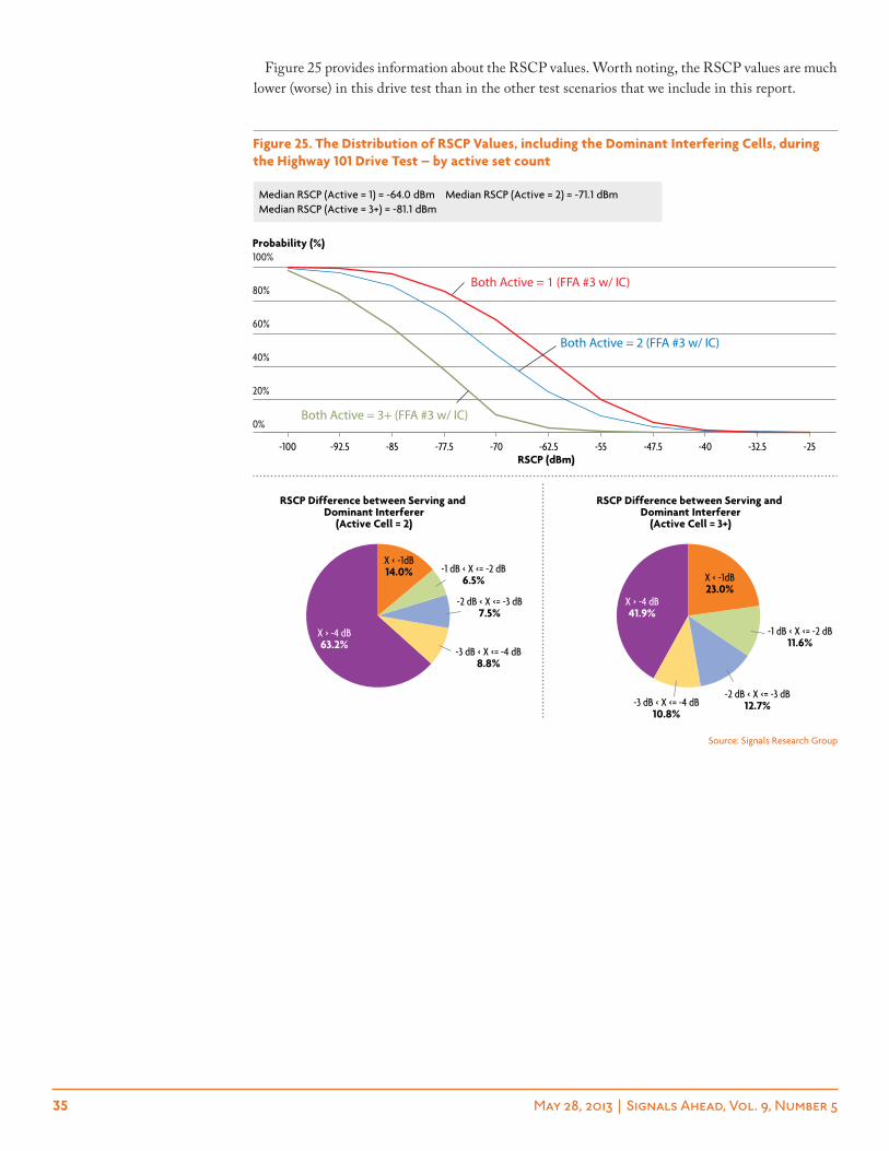
35 May 28, 2013 | Signals Ahead, Vol. 9, Number 5
Figure 25 provides information about the RSCP values. Worth noting, the RSCP values are much lower (worse) in this drive test than in the other test scenarios that we include in this report.
Source: Signals Research Group
Figure 25. the Distribution of rscp values, including the Dominant interfering cells, during the highway 101 Drive test – by active set count
Both Active = 3+ (FFA #3 w/ IC)
Both Active = 2 (FFA #3 w/ IC)
Both Active = 1 (FFA #3 w/ IC)
-25-32.5-40-47.5-55-62.5-70-77.5-85-92.5-100
0%
20%
40%
60%
80%
100%
Median RSCP (Active = 1) = -64.0 dBm Median RSCP (Active = 2) = -71.1 dBm Median RSCP (Active = 3+) = -81.1 dBm
RSCP (dBm)
Probability (%)
X > -4 dB63.2%
-3 dB < X <= -4 dB8.8%
-2 dB < X <= -3 dB7.5%
-1 dB < X <= -2 dB6.5%
X < -1dB14.0%
X > -4 dB41.9%
-3 dB < X <= -4 dB10.8%
-2 dB < X <= -3 dB12.7%
-1 dB < X <= -2 dB11.6%
X < -1dB23.0%
RSCP Difference between Serving and Dominant Interferer
(Active Cell = 2)
RSCP Difference between Serving and Dominant Interferer
(Active Cell = 3+)
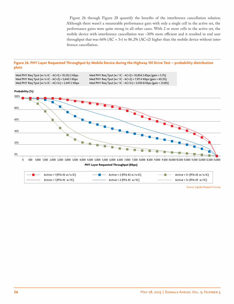
36 May 28, 2013 | Signals Ahead, Vol. 9, Number 5
Figure 26 through Figure 28 quantify the benefits of the interference cancellation solution. Although there wasn’t a measurable performance gain with only a single cell in the active set, the performance gains were quite strong in all other cases. With 2 or more cells in the active set, the mobile device with interference cancellation was ~30% more efficient and it resulted in end user throughput that was 66% (AC = 3+) to 86.2% (AC=2) higher than the mobile device without inter-ference cancellation.
Figure 26. phY layer requested throughput by mobile Device during the highway 101 Drive test – probability distribution plots
13,00012,50012,00011,50011,00010,50010,0009,5009,0008,5008,0007,5007,0006,5006,0005,5005,0004,5004,0003,5003,0002,5002,0001,5001,0005000
0%
20%
40%
60%
80%
100%
Active = 3+ (FFA #3 w/IC)Active = 2 (FFA #3 w/IC)Active = 1 (FFA #3 w/IC)
Active = 3+ (FFA #2 w/o IC)Active = 2 (FFA #2 w/o IC)Active = 1 (FFA #2 w/o IC)
Med PHY Req Tput (w/o IC - AC=1) = 10,332.2 Kbps Med PHY Req Tput (w/ IC - AC=1) = 10,854.3 Kbps (gain = 5.1%) Med PHY Req Tput (w/o IC - AC=2) = 5,640.1 Kbps Med PHY Req Tput (w/ IC - AC=2) = 7,911.4 Kbps (gain = 40.3%) Med PHY Req Tput (w/o IC - AC=3+) = 2,447.2 Kbps Med PHY Req Tput (w/ IC - AC=3+) = 3,030.8 Kbps (gain = 23.8%)
PHY Layer Requested Throughput (Kbps)
Probability (%)
Source: Signals Research Group
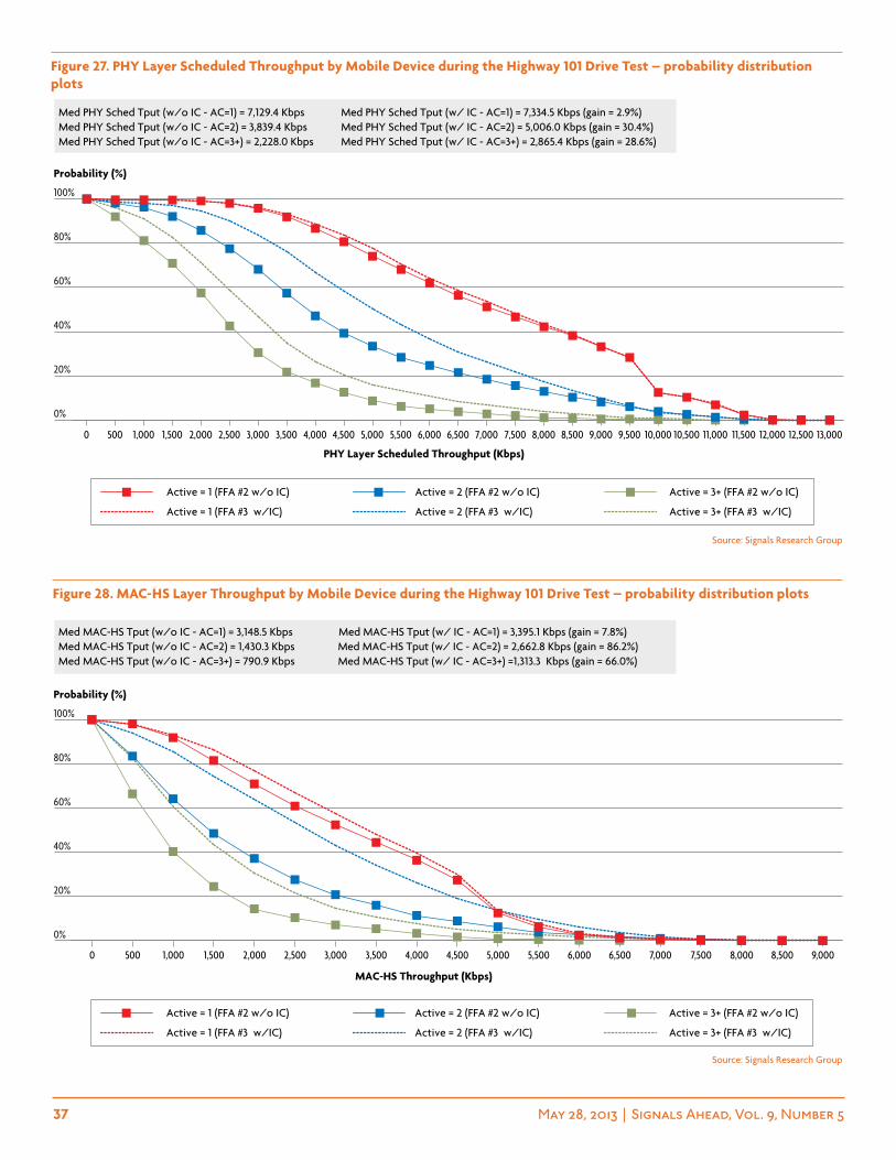
37 May 28, 2013 | Signals Ahead, Vol. 9, Number 5
Figure 27. phY layer scheduled throughput by mobile Device during the highway 101 Drive test – probability distribution plots
Figure 28. mac-hs layer throughput by mobile Device during the highway 101 Drive test – probability distribution plots
13,00012,50012,00011,50011,00010,50010,0009,5009,0008,5008,0007,5007,0006,5006,0005,5005,0004,5004,0003,5003,0002,5002,0001,5001,0005000
0%
20%
40%
60%
80%
100%
Active = 3+ (FFA #3 w/IC)Active = 2 (FFA #3 w/IC)Active = 1 (FFA #3 w/IC)
Active = 3+ (FFA #2 w/o IC)Active = 2 (FFA #2 w/o IC)Active = 1 (FFA #2 w/o IC)
Med PHY Sched Tput (w/o IC - AC=1) = 7,129.4 Kbps Med PHY Sched Tput (w/ IC - AC=1) = 7,334.5 Kbps (gain = 2.9%) Med PHY Sched Tput (w/o IC - AC=2) = 3,839.4 Kbps Med PHY Sched Tput (w/ IC - AC=2) = 5,006.0 Kbps (gain = 30.4%) Med PHY Sched Tput (w/o IC - AC=3+) = 2,228.0 Kbps Med PHY Sched Tput (w/ IC - AC=3+) = 2,865.4 Kbps (gain = 28.6%)
PHY Layer Scheduled Throughput (Kbps)
Probability (%)
9,0008,5008,0007,5007,0006,5006,0005,5005,0004,5004,0003,5003,0002,5002,0001,5001,0005000
0%
20%
40%
60%
80%
100%
Active = 3+ (FFA #3 w/IC)Active = 2 (FFA #3 w/IC)Active = 1 (FFA #3 w/IC)
Active = 3+ (FFA #2 w/o IC)Active = 2 (FFA #2 w/o IC)Active = 1 (FFA #2 w/o IC)
Med MAC-HS Tput (w/o IC - AC=1) = 3,148.5 Kbps Med MAC-HS Tput (w/ IC - AC=1) = 3,395.1 Kbps (gain = 7.8%) Med MAC-HS Tput (w/o IC - AC=2) = 1,430.3 Kbps Med MAC-HS Tput (w/ IC - AC=2) = 2,662.8 Kbps (gain = 86.2%) Med MAC-HS Tput (w/o IC - AC=3+) = 790.9 Kbps Med MAC-HS Tput (w/ IC - AC=3+) =1,313.3 Kbps (gain = 66.0%)
MAC-HS Throughput (Kbps)
Probability (%)
Source: Signals Research Group
Source: Signals Research Group
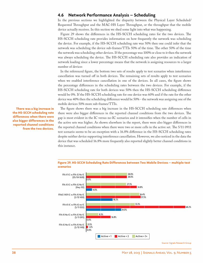
38 May 28, 2013 | Signals Ahead, Vol. 9, Number 5
4.6 network performance analysis – scheduling In the previous sections we highlighted the disparity between the Physical Layer Scheduled/Requested Throughput and the MAC-HS Layer Throughput, or the throughput that the mobile device actually receives. In this section we shed some light into what was happening.
Figure 29 shows the differences in the HS-SCCH scheduling rates for the two devices. The HS-SCCH scheduling rate provides information on how frequently the network was scheduling the device. For example, if the HS-SCCH scheduling rate was 50% then one could infer that the network was scheduling the device sub-frames/TTIs 50% of the time. The other 50% of the time the network was scheduling other devices. If the percentage was 100% or close to it then the network was always scheduling the device. The HS-SCCH scheduling rate also provides an indication of network loading since a lower percentage means that the network is assigning resources to a larger number of devices
In the referenced figure, the bottom two sets of results apply to test scenarios when interference cancellation was turned off in both devices. The remaining sets of results apply to test scenarios when we enabled interference cancellation in one of the devices. In all cases, the figure shows the percentage differences in the scheduling rates between the two devices. For example, if the HS-SCCH scheduling rate for both devices was 50% then the HS-SCCH scheduling difference would be 0%. If the HS-SCCH scheduling rate for one device was 60% and if the rate for the other device was 40% then the scheduling difference would be 50% - the network was assigning one of the mobile devices 50% more sub-frames/TTIs.
The figure shows there was a big increase in the HS-SCCH scheduling rate differences when there were also bigger differences in the reported channel conditions from the two devices. The gap is most evident in the IC versus no-IC scenarios and it intensifies when the number of cells in the active sets was higher. As shown elsewhere in the report, there were also bigger differences in the reported channel conditions when there were two or more cells in the active set. The 5/11 0911 test scenario seems to be an exception with a 16.8% difference in the HS-SCCH scheduling rates despite neither device supporting interference cancellation. However, we also noticed in the data the device that was scheduled 16.8% more frequently also reported slightly better channel conditions in this instance.
there was a big increase in the hs-scch scheduling rate differences when there were also bigger differences in the reported channel conditions
from the two devices.
Figure 29. hs-scch scheduling rate Differences between two mobile Devices – multiple test scenarios
FFA #2 No IC vs FFA #3 No IC(5/10 1418)
FFA #3 No IC vs FFA #2 No IC(5/11 0911)
FFA #3 IC vs FFA #2 no IC(5/11 0531)
FFA#2 1459 IC vs FFA #3 No IC(5/10 1459)
FFA #3 IC vs FFA #2 No IC(Hwy 101)
FFA #1 IC vs FFA #2 No IC(05/04 0618)
28.0% 28.0%
0.0%
27.3% 34.8%
4.0%
36.4% 37.5%
18.2%
33.3% 68.2%
24.0%
8.3% 16.8%
0.0%
0.5% 1.2%
0.0%
Active = 1 Active = 2 Active = 3+
Source: Signals Research Group
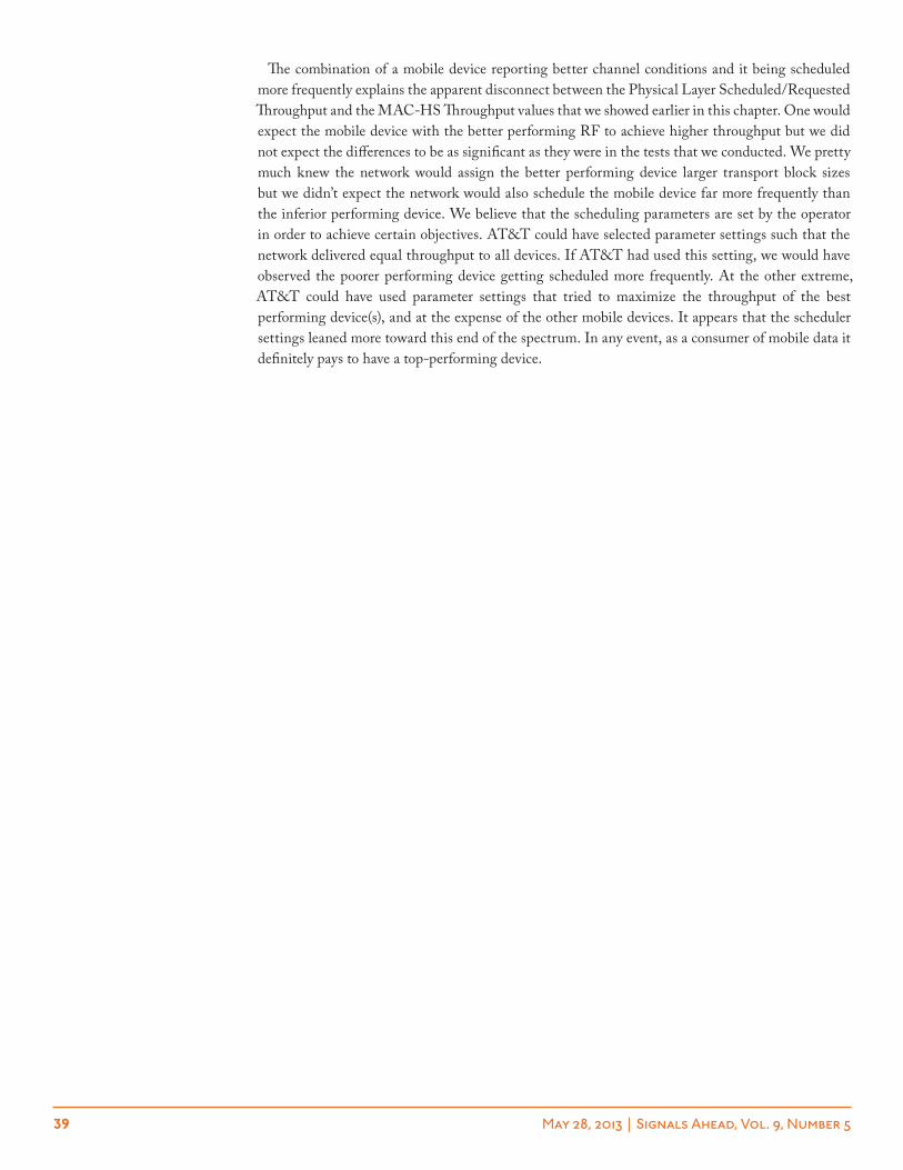
39 May 28, 2013 | Signals Ahead, Vol. 9, Number 5
The combination of a mobile device reporting better channel conditions and it being scheduled more frequently explains the apparent disconnect between the Physical Layer Scheduled/Requested Throughput and the MAC-HS Throughput values that we showed earlier in this chapter. One would expect the mobile device with the better performing RF to achieve higher throughput but we did not expect the differences to be as significant as they were in the tests that we conducted. We pretty much knew the network would assign the better performing device larger transport block sizes but we didn’t expect the network would also schedule the mobile device far more frequently than the inferior performing device. We believe that the scheduling parameters are set by the operator in order to achieve certain objectives. AT&T could have selected parameter settings such that the network delivered equal throughput to all devices. If AT&T had used this setting, we would have observed the poorer performing device getting scheduled more frequently. At the other extreme, AT&T could have used parameter settings that tried to maximize the throughput of the best performing device(s), and at the expense of the other mobile devices. It appears that the scheduler settings leaned more toward this end of the spectrum. In any event, as a consumer of mobile data it definitely pays to have a top-performing device.
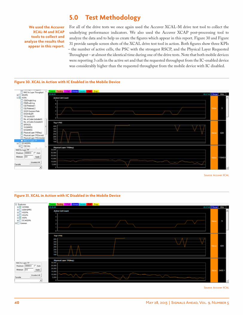
40 May 28, 2013 | Signals Ahead, Vol. 9, Number 5
5.0 test methodologyFor all of the drive tests we once again used the Accuver XCAL-M drive test tool to collect the underlying performance indicators. We also used the Accuver XCAP post-processing tool to analyze the data and to help us create the figures which appear in this report. Figure 30 and Figure 31 provide sample screen shots of the XCAL drive test tool in action. Both figures show three KPIs
– the number of active cells, the PSC with the strongest RSCP, and the Physical Layer Requested Throughput – at almost the identical time during one of the drive tests. Note that both mobile devices were reporting 3 cells in the active set and that the requested throughput from the IC-enabled device was considerably higher than the requested throughput from the mobile device with IC disabled.
we used the accuver Xcal-m and Xcap
tools to collect and analyze the results that
appear in this report.
Figure 30. Xcal in action with ic enabled in the mobile Device
Source: Accuver XCAL
Figure 31. Xcal in action with ic Disabled in the mobile Device
Source: Accuver XCAL
41 May 28, 2013 | Signals Ahead, Vol. 9, Number 5
Due to the amount of effort required to test each combination of devices, we only invited a couple of chipset companies to participate in the study. Ultimately, only Qualcomm was able to participate. Qualcomm provided us with three FFAs (form factor correct mobile Android smartphones) and instructions on how to turn on/off their interference cancellation algorithm (called Q-ICE), as well as how to lock the mobile devices to a frequency band and AFRCN. By locking the devices to the same AFRCN we greatly increased the probability that both mobile devices would be using the same combination of serving cell + AFRCN.
We used one of our personal SIM cards and a loaner SIM card that we received from AT&T several months ago. As a courtesy to AT&T, Ericsson and Qualcomm, we gave them the opportu-nity to see some of the results immediately before publishing the report. Consistent with all of our Signals Ahead reports, this entire effort was self-funded other than the use of the loaner FFAs and SIM card. Needless to say, we still burned through close to 20 GB on our personal account and we have a $300+ AT&T phone bill to prove it.
During the drive testing we used Velcro to fix the mobile devices to our vehicle. We used both the passenger seat and the front dashboard. The two mobile devices were oriented the same direction and separated by about 12-18 inches. For completeness sake, we switched the locations of the mobile devices. In the case of the stationary testing we conducted two tests from each location, switching the locations of mobile devices before conducting the second test. Ultimately, in many cases there was a large variance in the signal strength between the two devices and in a few cases the mobile devices were using different PSCs for the preponderance of the tests. During the drive tests the randomness of the RF energy due to the vehicle moving in and around the cellular network pretty much eliminated any short-term advantage that a mobile device in one location within the vehicle might have over a mobile device in another location within the vehicle. We verified this hypothesis and it is also illustrated in Figure 4.
The mobile devices were tethered to our Samsung Windows 7 notebook computers. We used the FileZilla FTP Client and a neutral host FTP server to generate the mobile data traffic. In order to eliminate the potential impact of TCP ACK/NACK delays, we used 5 simultaneous FTP threads on both PCs.
The data analysis was a bit tricky since we wanted to ensure that everything was apples versus apples with the exception of the use/nonuse of interference cancellation. Before analyzing the data and creating the figures that appear in this report we did the following:
➤ Merge the log files together and synch them according to the GPS time stamp.
➤ Filter the results so that we were only analyzing data when both mobile devices were using the same cell (PSC).
➤ Filter the results once again to ensure that both mobile devices were reporting the same number of cells in the active set. We used an active set of 1, 2, and 3+. We didn’t care whether or not the mobile devices were reporting the same cells in the active set, only that the size of the active set was the same.
Ultimately, due to these filtering criteria and the challenges associated with getting similar RF conditions with two stationary mobile devices, we elected to not include results and analysis from any of the stationary test scenarios in this report. For completeness sake, we do show the stationary test results in the test summary table, but we discourage readers from trying to reach any conclu-sions based solely on the summary information since it is “unfiltered data.” Even in the lengthy drive tests, the amount of “usable data” was sometimes relatively small compared with the time interval of the test.
CQI. The CQI (Channel Quality Indicator) is a dimensionless parameter that the mobile device reports to the network. It provides an indication of the mobile device’s channel condition and it is
we locked the mobile devices to the same carrier
frequency and aFrcn.
this entire effort was self-funded.
we filtered the data based on a few criteria in order to
ensure an “apples to apples” comparison of the data.
For analysis purposes, we focused on five kpis.
42 May 28, 2013 | Signals Ahead, Vol. 9, Number 5
used by the network to determine the maximum transport block size that the mobile device can support. The CQI range is 0 to 30 with the best possible conditions being 30. In theory, with inter-ference cancellation the reported CQI should be higher for identical network conditions since with interference cancellation the mobile device is able to filter out the interference from adjacent cells.
Physical Layer Requested Throughput. The Physical Layer Requested Throughput is closely related to the CQI. Although the 3GPP specifications define the mapping of CQI to this KPI, infrastructure vendors have great leeway in how to interpret the reported CQI values. The network scheduler could, for example, assign a higher/lower throughput than the requested value, as inferred from the reported CQI. This situation could happen if not enough network resources were avail-able – a very likely scenario – or in the event that the network felt the mobile device was under/over-reporting its channel conditions.
Physical Layer Scheduled Throughput. This KPI provides the throughput that the network delivers to the mobile device. There are two extremely important clarifications. First, this KPI does not take into consideration whether or not the mobile device successfully received the data. Second, the throughput is calculated based only on the active TTIs that were assigned to the mobile device. For example, if a device reported a Physical Layer Scheduled Throughput of 3 Mbps, but it was only assigned every other sub-frame/TTI then its actual throughput would be closer to 1.5 Mbps. This KPI is useful when analyzing the efficiency gains of the network due to the use of interference cancellation. By itself, it is a bit difficult to infer the actual end user data rate that the mobile device reported.
MAC-HS Throughput. The MAC-HS throughput is the data rate that the mobile device actu-ally obtains. We elected to use MAC-HS instead of Application Layer throughput because the granularity of the reported data was higher with MAC-HS (tens of milliseconds) than it was with Application Layer throughput (once per second). MAC-HS is very comparable to the Physical Layer throughput with the primary differences in the two values being the exclusion of some headers and HARQ re-transmissions. We note that MAC-HS is a function of the Physical Layer Scheduled Throughput and the HS-SCCH scheduling rate. For example, if both devices reported the same Physical Layer Scheduled Throughput but one device reported a much higher HS-SCCH Scheduling Rate, it would obtain a higher MAC-HS throughput.
HS-SCCH Scheduling Rate. This KPI provides the percentage of sub-frames/TTIs that are assigned to the mobile device. A scheduling rate of 100% means that the mobile device was assigned all sub-frames/TTIs during the time interval. In theory, it is possible to support multiple devices (e.g., voice + data) in a single sub-frame. Still, this KPI provides great insight into how frequently the network is scheduling resources for the mobile device. As an example, if the Physical Layer Scheduled Throughput was 2 Mbps but the HS-SCCH Scheduling Rate was only 25%, the MAC-HS throughput would be well below 1 Mbps.
43 May 28, 2013 | Signals Ahead, Vol. 9, Number 5
6.0 Final thoughtsAlthough we weren’t able to conduct a real benchmark study of various interference cancellation algorithms, we did collect some useful information that we can apply if we ever do lab-based testing. Plus, in the event that chipset vendors are interested in doing something in the field, we feel pretty comfortable that we would be able to pull it off. Until next time, be on the lookout for the next Signals Ahead…
michael thelanderMichael Thelander is the CEO and Founder of Signals Research Group. In his current endeavor he leads a team of industry experts providing technical and operator economics analysis for clients on a global basis. Mr. Thelander is also responsible for the consultancy’s Signals Ahead research product, including its widely acclaimed “Chips and Salsa” series of reports that focus on the wireless IC industry. Previously, Mr. Thelander was an analyst with Deutsche Bank Equity Research. Prior to joining Deutsche Bank, Mr. Thelander was a consultant with KPMG (now known as BearingPoint) and a communications officer with the United States Army. Mr. Thelander has also published numerous articles for leading trade publications and engineering journals throughout his career. He has been an invited speaker at industry conferences around the world and he is frequently quoted by major news sources and industry newsletters, including The Economist, The Wall Street Journal, Investors Business Daily, Reuters, Bloomberg News, and The China Daily. Mr. Thelander earned a Masters of Science in Solid State Physics from North Carolina State University and a Masters of Business Administration from the University of Chicago, Graduate School of Business.
44 May 28, 2013 | Signals Ahead, Vol. 9, Number 5
7.0 appendix – additional resultsIn the appendix, we include the summary table of results plus several figures that didn’t make it into the main report. We provide this information without commentary. However, we do reiterate that readers should not try to reach any conclusions from the information appearing in the summary tables since this information is based on “unfiltered data.”
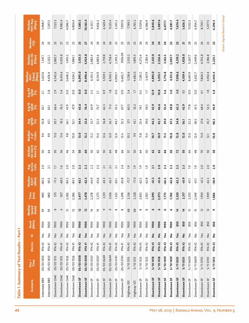
45 May 28, 2013 | Signals Ahead, Vol. 9, Number 5
tabl
e 1.
sum
mar
y of
tes
t re
sult
s –
par
t 1
scen
ario
Day
/
tim
eD
evic
eic
Band
(m
hz)
med
ian
spee
d (m
ph)
tim
e (s
ec)
med
ian
rsc
p (d
Bm)
avg
a
ctiv
e c
ells
med
ian
hs-
ssc
h
rat
e (%
)
med
ian
# of
c
odes
avg
Q
psk
(%)
avg
16
Qa
m
(%)
avg
64
Qa
m
(%)
med
ian
phY-
sche
d (k
bps)
med
ian
ma
c-h
s (k
bps)
med
ian
cQ
i
med
ian
phY-
req
(k
bps)
Inte
rsta
te 8
8005
/03
1430
FFA
#2
No
1900
5948
0-8
0.5
2.0
509.
455
.842
.12.
13,
627.
61,
341.1
245,
968.
7
Inte
rsta
te 8
8005
/03
1430
FFA
#1
Yes
1900
5948
0-8
1.52.
164
9.9
47.1
50.1
2.8
4,47
6.4
2,25
2.1
257,
297.
5
Dow
ntow
n O
AK
05/
03 15
15FF
A #
2N
o19
008
575
-71.
31.7
5011
.030
.766
.42.
96,
542.
62,
882.
725
7,52
3.5
Dow
ntow
n O
AK
05/
03 15
15FF
A #
1Ye
s19
006
507
-68.
51.6
5611
.618
.276
.55.
48,
433.
64,
505.
827
9,98
2.4
Dow
ntow
n O
AK
05/
03 15
26FF
A #
2N
o19
0012
2,38
2-8
4.3
2.0
469.
856
.143
.90.
03,
648.
21,4
10.2
224,
086.
7
Dow
ntow
n O
AK
05/
03 15
26FF
A #
1Ye
s19
0012
2,38
6-8
4.3
2.0
5410
.052
.147
.90.
04,
024.
21,8
84.1
234,
804.
4
Dow
ntow
n sF
05/
03 0
518
FFa
#2
no
190
012
3,47
7-6
3.1
2.3
5013
.034
.465
.60.
06,
895.
03,
155.
525
7,38
5.5
Dow
ntow
n sF
05/
03 0
518
FFa
#1
Yes
190
012
3,47
8-6
2.5
2.2
6013
.323
.676
.40.
08,
496.
64,
924.
827
10,16
5.4
Dow
ntow
n SF
05/
03 0
537
FFA
#2
No
1900
142,
278
-64.
02.
250
13.2
33.7
63.9
2.5
6,55
1.22,
882.
424
6,35
1.1
Dow
ntow
n SF
05/
03 0
537
FFA
#1
Yes
1900
142,
273
-63.
62.
262
13.4
22.2
75.7
2.1
8,31
4.9
4,88
3.6
269,
456.
2
Dow
ntow
n SF
05/
03 0
649
FFA
#2
No
1900
93,
101
-65.
52.
150
12.6
36.8
62.3
0.9
5,92
9.3
2,75
9.8
246,
569.
4
Dow
ntow
n SF
05/
03 0
649
FFA
#1
Yes
1900
93,
106
-65.
72.
164
12.9
26.7
71.5
1.88,
100.
34,
758.
426
9,32
5.4
Dow
ntow
n SF
05/
03 0
741
FFA
#2
No
1900
81,2
52-6
5.1
2.1
4812
.044
.755
.30.
04,
900.
72,
393.
223
5,30
1.2
Dow
ntow
n SF
05/
03 0
741
FFA
#1
Yes
1900
81,2
98-6
5.8
2.4
6612
.432
.367
.70.
06,
662.
739
36.0
925
7,90
7.0
Hig
hway
101
5/10
1213
FFA
#3
Yes
1900
682,
336
-71.7
1.957
10.2
37.1
60.5
2.4
5,12
8.6
2,53
5.2
257,
769.
2
Hig
hway
101
5/10
1213
FFA
#2
No
1900
682,
328
-71.0
1.950
9.9
43.1
55.2
1.74,
482.
01,8
95.5
256,
765.
2
Dow
ntow
n SF
5/10
1323
FFA
#3
Yes
1900
82,
853
-62.
51.9
6411
.825
.474
.10.
57,
281.2
4,27
2.4
269,
329.
6
Dow
ntow
n SF
5/10
1323
FFA
#2
No
1900
82,
851
-62.
81.9
5011
.439
.059
.31.7
5,16
7.9
2,18
5.4
246,
386.
9
Dow
ntow
n sF
5/10
1418
FFa
#3
no
190
06
2,09
5-6
1.3
2.1
6210
.744
.242
.912
.94,
895.
02,
421.
024
5,84
0.6
Dow
ntow
n sF
5/10
1418
FFa
#2
no
190
06
2,07
2-6
1.6
2.0
6210
.942
.746
.610
.85,
015.
12,
526.
624
5,88
7.6
Dow
ntow
n sF
5/10
1459
FFa
#2
Yes
190
06
1,77
3-6
6.5
2.3
6611
.339
.055
.45.
65,
715.
83,
163.
524
6,07
7.1
Dow
ntow
n sF
5/10
1459
FFa
#3
no
190
06
1,78
2-6
5.8
2.3
5010
.847
.249
.83.
04,
511.
62,
007
.722
4,08
1.7
Dow
ntow
n sF
5/11
053
1FF
a #
3Ye
s85
014
2,33
0-6
2.3
2.3
7212
.834
.862
.23.
07,
018.
64,
319.
225
7,67
4.4
Dow
ntow
n sF
5/11
053
1FF
a #
2n
o85
014
2,31
7-6
1.92.
350
12.0
56.1
42.9
1.1
4,10
9.4
1,82
8.0
213,
626.
3
Dow
ntow
n SF
5/11
060
9FF
A #
3Ye
s85
015
2,55
5-6
1.11.9
6613
.022
.277
.80.
08,
691.9
5,26
7.7
2811
,152.
5
Dow
ntow
n SF
5/11
060
9FF
A #
2N
o85
015
2,54
9-6
1.11.9
4812
.438
.561
.50.
05,
632.
72,
449.
625
6,95
4.7
Dow
ntow
n SF
5/11
070
1FF
A #
3Ye
s85
012
1,950
-61.2
2.0
7013
.027
.668
.44.
17,
806.
54,
702.
826
8,73
0.1
Dow
ntow
n SF
5/11
070
1FF
A #
2N
o85
012
1,949
-62.
32.
050
12.1
45.7
52.5
1.84,
932.
42,
186.
823
5,07
7.5
Dow
ntow
n sF
5/11
101
2FF
a #
2n
o85
09
1,88
6-5
8.9
2.0
5810
.848
.345
.95.
84,
444.
42,
225.
122
4,29
6.5
Sour
ce: S
igna
ls R
esea
rch
Gro
up
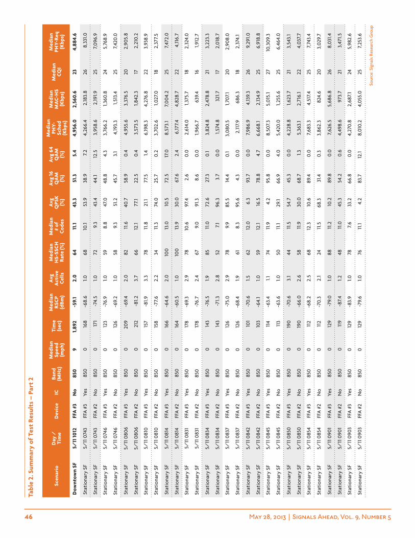
46 May 28, 2013 | Signals Ahead, Vol. 9, Number 5
scen
ario
Day
/
tim
eD
evic
eic
Band
(m
hz)
med
ian
spee
d (m
ph)
tim
e (s
ec)
med
ian
rsc
p (d
Bm)
avg
a
ctiv
e c
ells
med
ian
hs-
ssc
h
rat
e (%
)
med
ian
# of
c
odes
avg
Q
psk
(%)
avg
16
Qa
m
(%)
avg
64
Qa
m
(%)
med
ian
phY-
sche
d (k
bps)
med
ian
ma
c-h
s (k
bps)
med
ian
cQ
i
med
ian
phY-
req
(k
bps)
Dow
ntow
n sF
5/11
101
2FF
a #
3n
o85
09
1,89
2-5
9.1
2.0
6411
.143
.351
.35.
44,
956.
02,
560.
623
4,88
4.6
Stat
iona
ry S
F5/
11 0
743
FFA
#3
Yes
850
016
8-6
8.6
1.068
10.1
53.9
38.9
7.2
4,26
6.4
2,18
3.8
268,
331.0
Stat
iona
ry S
F5/
11 0
743
FFA
#2
No
850
017
1-7
4.5
1.072
9.3
43.4
44.1
12.5
3,95
8.6
2,19
1.925
7,09
6.9
Stat
iona
ry S
F5/
11 0
746
FFA
#3
Yes
850
012
3-7
6.9
1.059
8.8
47.0
48.8
4.3
3,76
6.2
1,36
0.8
245,
768.
9
Stat
iona
ry S
F5/
11 0
746
FFA
#2
No
850
012
6-6
9.2
1.058
9.3
51.2
45.7
3.1
4,19
3.3
1,513
.425
7,42
0.0
Stat
iona
ry S
F5/
11 0
806
FFA
#3
Yes
850
020
9-6
9.4
2.0
8211
.640
.758
.90.
44,
955.
63,
376.
520
2,90
5.8
Stat
iona
ry S
F5/
11 0
806
FFA
#2
No
850
021
2-8
1.23.
766
12.1
77.1
22.5
0.4
3,57
3.5
1,842
.317
2,21
0.2
Stat
iona
ry S
F5/
11 0
810
FFA
#3
Yes
850
015
7-8
1.93.
378
11.8
21.1
77.5
1.46,
198.
34,
276.
822
3,93
8.9
Stat
iona
ry S
F5/
11 0
810
FFA
#2
No
850
015
8-7
7.6
2.2
3411
.374
.025
.70.
23,
702.
61,0
27.0
182,
377.
5
Stat
iona
ry S
F5/
11 0
814
FFA
#3
Yes
850
016
6-6
4.6
2.0
100
13.0
10.5
72.5
17.0
8,57
3.1
7,00
4.2
257,
472.
0
Stat
iona
ry S
F5/
11 0
814
FFA
#2
No
850
016
4-6
0.5
1.010
013
.930
.067
.62.
46,
177.
44,
828.
722
4,11
6.7
Stat
iona
ry S
F5/
11 0
831
FFA
#3
Yes
850
017
8-6
9.3
2.9
7810
.697
.42.
60.
02,
614.
01,
375.
718
2,32
4.0
Stat
iona
ry S
F5/
11 0
831
FFA
#2
No
850
017
8-7
6.7
2.4
679.
091
.38.
60.
01,9
66.7
639.
416
1,912
.7
Stat
iona
ry S
F5/
11 0
834
FFA
#3
Yes
850
014
3-7
6.5
1.985
11.0
72.6
27.3
0.1
3,82
4.8
2,47
8.8
213,
223.
3
Stat
iona
ry S
F5/
11 0
834
FFA
#2
No
850
014
3-7
1.3
2.8
527.
196
.33.
70.
01,5
74.8
321.7
172,
018.
7
Stat
iona
ry S
F5/
11 0
837
FFA
#3
Yes
850
012
6-7
5.0
2.9
789.
985
.514
.40.
13,
080.
51,7
07.1
202,
908.
0
Stat
iona
ry S
F5/
11 0
837
FFA
#2
No
850
012
6-6
8.4
1.961
8.3
95.6
4.3
0.0
2,11
7.9
686.
318
2,37
4.1
Stat
iona
ry S
F5/
11 0
842
FFA
#3
Yes
850
010
1-7
0.6
1.562
12.0
6.3
93.7
0.0
7,98
6.9
4,13
9.3
269,
291.0
Stat
iona
ry S
F5/
11 0
842
FFA
#2
No
850
010
3-6
4.1
1.059
12.1
16.5
78.8
4.7
6,66
8.1
2,13
4.9
256,
918.
8
Stat
iona
ry S
F5/
11 0
845
FFA
#3
Yes
850
011
4-6
3.4
1.174
11.9
4.2
95.8
0.0
8,50
7.3
5,01
5.1
2710
,309
.3
Stat
iona
ry S
F5/
11 0
845
FFA
#2
No
850
011
3-6
3.6
1.050
11.1
29.1
66.9
4.0
5,42
0.0
1,255
.625
6,46
4.0
Stat
iona
ry S
F5/
11 0
850
FFA
#3
Yes
850
019
0-7
0.6
3.1
4411
.554
.745
.30.
04,
228.
81,6
23.7
213,
543.
1
Stat
iona
ry S
F5/
11 0
850
FFA
#2
No
850
019
0-6
6.0
2.6
5811
.930
.068
.71.
35,
363.
12,
716.
122
4,03
7.7
Stat
iona
ry S
F5/
11 0
854
FFA
#3
Yes
850
011
2-6
8.2
2.5
6812
.310
.689
.40.
07,
683.
34,
517.
425
7,74
3.4
Stat
iona
ry S
F5/
11 0
854
FFA
#2
No
850
011
2-7
0.3
2.1
2411
.568
.331
.40.
33,
862.
382
4.6
203,
029.
7
Stat
iona
ry S
F5/
11 0
901
FFA
#3
Yes
850
012
9-7
9.0
1.088
11.2
10.2
89.8
0.0
7,62
6.5
5,68
6.8
268,
031.4
Stat
iona
ry S
F5/
11 0
901
FFA
#2
No
850
011
9-8
7.4
1.248
11.0
45.3
54.2
0.6
4,49
8.6
973.
721
3,47
1.5
Stat
iona
ry S
F5/
11 0
903
FFA
#3
Yes
850
012
9-8
3.9
1.078
7.6
33.2
66.8
0.0
4,27
0.8
2,68
7.1
245,
982.
6
Stat
iona
ry S
F5/
11 0
903
FFA
#2
No
850
012
9-7
9.6
1.076
11.1
4.2
83.7
12.1
8,01
0.2
4,05
5.0
257,
253.
6
tabl
e 2.
sum
mar
y of
tes
t re
sult
s –
par
t 2
Sour
ce: S
igna
ls R
esea
rch
Gro
up
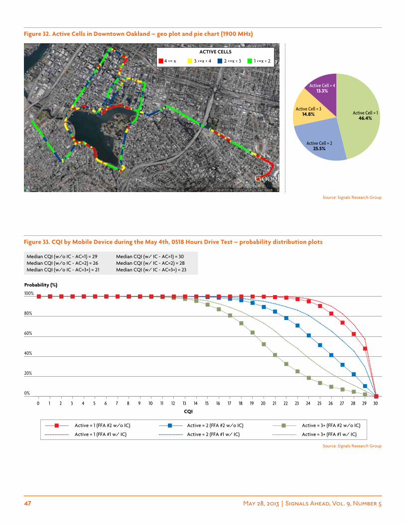
47 May 28, 2013 | Signals Ahead, Vol. 9, Number 5
Figure 32. active cells in Downtown oakland – geo plot and pie chart (1900 mhz)
Active Cell = 413.3%
Active Cell = 314.8%
Active Cell = 225.5%
Active Cell = 146.4%
Source: Signals Research Group
Source: Signals Research Group
Figure 33. cQi by mobile Device during the may 4th, 0518 hours Drive test – probability distribution plots
0%
20%
40%
60%
80%
100%
3029282726252423222120191817161514131211109876543210
Active = 3+ (FFA #1 w/ IC)Active = 2 (FFA #1 w/ IC)Active = 1 (FFA #1 w/ IC)
Active = 3+ (FFA #2 w/o IC)Active = 2 (FFA #2 w/o IC)Active = 1 (FFA #2 w/o IC)
Median CQI (w/o IC - AC=1) = 29 Median CQI (w/ IC - AC=1) = 30 Median CQI (w/o IC - AC=2) = 26 Median CQI (w/ IC - AC=2) = 28 Median CQI (w/o IC - AC=3+) = 21 Median CQI (w/ IC - AC=3+) = 23
CQI
Probability (%)
4 <= x 3 <=x < 4 2 <=x < 3 1 <=x < 2
active cells
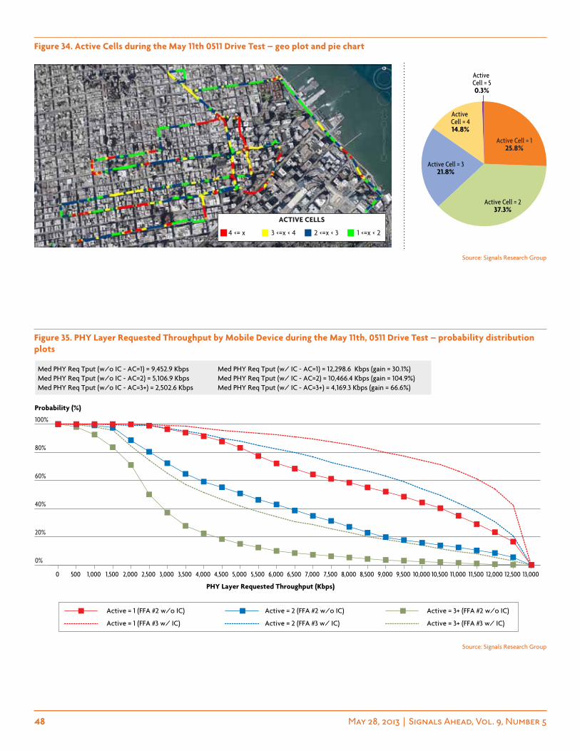
48 May 28, 2013 | Signals Ahead, Vol. 9, Number 5
Figure 34. active cells during the may 11th 0511 Drive test – geo plot and pie chart
Active Cell = 414.8%
Active Cell = 50.3%
Active Cell = 321.8%
Active Cell = 237.3%
Active Cell = 125.8%
Figure 35. phY layer requested throughput by mobile Device during the may 11th, 0511 Drive test – probability distribution plots
13,00012,50012,00011,50011,00010,50010,0009,5009,0008,5008,0007,5007,0006,5006,0005,5005,0004,5004,0003,5003,0002,5002,0001,5001,0005000
0%
20%
40%
60%
80%
100%
Active = 3+ (FFA #3 w/ IC)Active = 2 (FFA #3 w/ IC)Active = 1 (FFA #3 w/ IC)
Active = 3+ (FFA #2 w/o IC)Active = 2 (FFA #2 w/o IC)Active = 1 (FFA #2 w/o IC)
Med PHY Req Tput (w/o IC - AC=1) = 9,452.9 Kbps Med PHY Req Tput (w/ IC - AC=1) = 12,298.6 Kbps (gain = 30.1%) Med PHY Req Tput (w/o IC - AC=2) = 5,106.9 Kbps Med PHY Req Tput (w/ IC - AC=2) = 10,466.4 Kbps (gain = 104.9%) Med PHY Req Tput (w/o IC - AC=3+) = 2,502.6 Kbps Med PHY Req Tput (w/ IC - AC=3+) = 4,169.3 Kbps (gain = 66.6%)
PHY Layer Requested Throughput (Kbps)
Probability (%)
Source: Signals Research Group
Source: Signals Research Group
4 <= x 3 <=x < 4 2 <=x < 3 1 <=x < 2
active cells
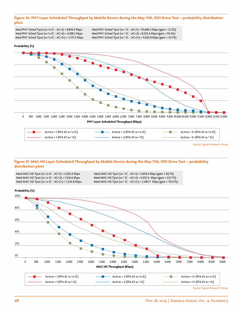
49 May 28, 2013 | Signals Ahead, Vol. 9, Number 5
Source: Signals Research Group
Source: Signals Research Group
Figure 36. phY layer scheduled throughput by mobile Device during the may 11th, 0511 Drive test – probability distribution plots
Figure 37. mac-hs layer scheduled throughput by mobile Device during the may 11th, 0511 Drive test – probability distribution plots
13,00012,50012,00011,50011,00010,50010,0009,5009,0008,5008,0007,5007,0006,5006,0005,5005,0004,5004,0003,5003,0002,5002,0001,5001,0005000
Active = 3+ (FFA #3 w/ IC)Active = 2 (FFA #3 w/ IC)Active = 1 (FFA #3 w/ IC)
Active = 3+ (FFA #2 w/o IC)Active = 2 (FFA #2 w/o IC)Active = 1 (FFA #2 w/o IC)
Med PHY Sched Tput (w/o IC - AC=1) = 8,816.9 Kbps Med PHY Sched Tput (w/ IC - AC=1) = 10,684.2 Kbps (gain = 21.2%) Med PHY Sched Tput (w/o IC - AC=2) = 4,188.5 Kbps Med PHY Sched Tput (w/ IC - AC=2) = 8,102.4 Kbps (gain = 93.4%) Med PHY Sched Tput (w/o IC - AC=3+) = 3,175.5 Kbps Med PHY Sched Tput (w/ IC - AC=3+) = 4,563.8 Kbps (gain = 43.7%)
PHY Layer Scheduled Throughput (Kbps)
Probability (%)
9,0008,5008,0007,5007,0006,5006,0005,5005,0004,5004,0003,5003,0002,5002,0001,5001,0005000
0%
20%
40%
60%
80%
100%
Med MAC-HS Tput (w/o IC - AC=1) = 3,202.4 Kbps Med MAC-HS Tput (w/ IC - AC=1) = 5,830.5 Kbps (gain = 82.1%) Med MAC-HS Tput (w/o IC - AC=2) = 1,534.6 Kbps Med MAC-HS Tput (w/ IC - AC=2) = 4,937.6 Kbps (gain = 221.7%) Med MAC-HS Tput (w/o IC - AC=3+) = 1,226.8 Kbps Med MAC-HS Tput (w/ IC - AC=3+) = 2,484.7 Kbps (gain = 102.5%)
MAC-HS Throughput (Kbps)
Probability (%)
Active = 3+ (FFA #3 w/ IC)Active = 2 (FFA #3 w/ IC)Active = 1 (FFA #3 w/ IC)
Active = 3+ (FFA #2 w/o IC)Active = 2 (FFA #2 w/o IC)Active = 1 (FFA #2 w/o IC)
50 May 28, 2013 | Signals Ahead, Vol. 9, Number 5
Signals Ahead Subscription The Signals Ahead newsletter is available on a subscription basis. We offer four distinct packages that have been tailored to address the needs of our corporate users. The Group License includes up to five users from the same company. The Global License is the most attractive package for companies that have several read-ers since it is offered to an unlimited number of employees from the same organization. Finally, the Platinum package includes the Global License, plus up to five hours of analyst time. Other packages are available.
Corporate Rates (12 issues)❒Group License ($3,995) ❒Global License ($7,995) ❒Platinum ($9,495) Payment Terms❒American Express ❒Visa ❒MasterCard Credit Card # Exp Date / / ❒Check Check Number ❒Purchase Order PO Number
Name: Title:
Affiliation: Phone: ( )
Mailing Address:
Mailing AddressSignals Research Group – ATTN: Sales10 Ormindale CourtOakland, CA 94611
Our fax number is (510) 338-1284.
Alternatively, you may contact us at (510) 273-2439 or at [email protected] and we will contact you for your billing information. We will not process your payment until after the trial subscription period is completed.
Terms and Conditions: Any copying, redistributing, or republishing of this material, including unauthorized sharing of user accounts, is strictly prohibited without the written consent of SRG.
please note disclaimer: The views expressed in this newsletter reflect those of Signals Research Group and are based on our understanding of past and current events shaping the wireless industry. This report is provided for informational purposes only and on the condition that it will not form a basis for any investment decision. The information has been obtained from sources believed to be reliable, but Signals Research Group makes no representation as to the accuracy or completeness of such information. Opinions, estimates, projections or forecasts in this report constitute the current judgment of the author(s) as of the date of this report. Signals Research Group has no obligation to update, modify or amend this report or to otherwise notify a reader thereof in the event that any matter stated herein, or any opinion, projection, forecast or estimate set forth herein, changes or subsequently becomes inaccurate. If you feel our opinions, analysis or interpretations of events are inaccurate, please fell free to contact Signals Research Group. We are always seeking a more accurate understanding of the topics that influence the wireless industry. Reference in the newsletter to a company that is publicly traded is not a recommendation to buy or sell the shares of such company. Signals Research Group and/or its affiliates/investors may hold securities positions in the companies discussed in this report and may frequently trade in such positions. Such investment activity may be inconsistent with the analysis provided in this report. Signals Research Group seeks to do business and may currently be doing business with companies discussed in this report. Readers should be aware that Signals Research Group might have a conflict of interest that could affect the objectivity of this report. Additional information and disclosures can be found at our website at www.signalsresearch.com. This report may not be reproduced, copied, distributed or published without the prior written authorization of Signals Research Group (copyright ©2012, all rights reserved by Signals Research Group).