Embed Size (px)
Citation preview

Experimental Evidence on the Demand for and Costs of Rural Electrification*
Kenneth Lee, University of California, Berkeley
Edward Miguel, University of California, Berkeley and NBER
Catherine Wolfram, University of California, Berkeley and NBER
19 April 2016
ABSTRACT
We present results from an experiment that randomized the expansion of electrical grid
infrastructure in rural Kenya. Electricity distribution is the canonical example of a natural
monopoly. Randomized price offers show that demand for electricity connections falls sharply
with price. Experimental variation in the number of connections combined with administrative
cost data reveals considerable scale economies, as hypothesized. Consumer surplus, however, is
less than total costs at all price levels, suggesting that household electrification may reduce social
welfare. We discuss how leakage, reduced demand (due to red tape, low reliability, and credit
constraints), and possible spillovers may impact this conclusion.
Acknowledgements: This research was supported by the Development Impact Lab (USAID Cooperative Agreements AID-OAA-A-13-00002 and AIDOAA-A-12-00011, part of the USAID Higher Education Solutions Network), the Berkeley Energy and Climate Institute, the Blum Center for Developing Economies, the UC Center for Energy and Environmental Economics, the Center for Effective Global Action, the Weiss Family Program Fund for Research in Development Economics, the World Bank, and an anonymous donor. We thank Francis Meyo, Victor Bwire, Susanna Berkouwer, Elisa Cascardi, Corinne Cooper, Eric Hsu, Radhika Kannan, Anna Kasimatis, and Tomas Monárrez for excellent research assistance, as well as colleagues at Innovations for Poverty Action Kenya. This research would not have been possible without the support and cooperation of partners at the Rural Electrification Authority and Kenya Power. Hunt Allcott, David Atkin, Carson Christiano, Maureen Cropper, Aluma Dembo, Esther Duflo, Kelsey Jack, Marc Jeuland, Asim Khwaja, Samson Ondiek, Billy Pizer, Matthew Podolsky, Javier Rosa, Manisha Shah, Jay Taneja, Duncan Thomas, Chris Timmins, Liam Wren-Lewis, and many seminar participants have provided helpful comments. All errors remain our own.

1
I. INTRODUCTION
Investments in infrastructure, including transportation, water and sanitation,
telecommunications, and electricity systems, are primary targets for international development
assistance. In 2015, for example, the World Bank directed a third of its global lending portfolio
towards infrastructure.1 The basic economics of these types of investments—which tend to
involve high fixed costs, relatively low marginal costs, and long investment horizons—can
justify government investment, ownership, and subsequent regulation. While development
economists have recently begun to measure the economic impacts of various types of
infrastructure, including transportation (Donaldson 2013; Faber 2014), water and sanitation
(Devoto et al. 2012; Patil et al. 2014), telecommunications (Jensen 2007; Aker 2010), and
electricity systems (Dinkelman 2011; Lipscomb, Mobarak, and Barham 2013; Barron and Torero
2015; Burlig and Preonas 2016; Chakravorty, Emerick, and Ravago 2016), there remains limited
empirical evidence that links the demand-side and supply-side economics of infrastructure
investments, in part due to methodological challenges. For instance, in many settings it is not
only challenging to identify exogenous sources of variation in the presence of infrastructure, but
also difficult to access reliable records tracking related government and household expenditures.
In this paper, we analyze the economics of rural electrification. We present experimental
evidence on both the demand-side and supply-side of rural electrification, and more specifically,
household connections to the electrical grid. Our study setting is 150 rural communities in
Kenya, a country where grid coverage is rapidly expanding. In partnership with Kenya’s Rural
Electrification Authority (REA), we provided randomly selected clusters of households with an
opportunity to connect to the grid at a range of subsidized prices. The intervention generated
exogenous variation both in the price of a grid connection, and in the scale of each local
construction project. As a result, we are able to estimate both the demand curve for grid
connections among households and, in a methodological innovation of the current study, the
average and marginal cost curves associated with household grid connection projects of varying
sizes. We then compare the demand and cost curves to begin to assess the welfare implications
of mass rural electrification.
1 Based on The World Bank Annual Report 2015, available at: http://www.worldbank.org/en/about/annual-report. During the 2015 fiscal year, the World Bank allocated $14.4 billion (34 percent of total lending) towards its Energy and Mining, Transportation, and Water, Sanitation, and Flood Protection sectors. During the 2014 fiscal year, the comparable figure was even higher, at 44 percent.

2
We find that household demand for grid connections in our data is lower than predicted,
even at high subsidy rates. For example, lowering the connection price by 57 percent (relative to
the prevailing national price) increases demand by less than 25 percentage points. The cost of
supplying these connections, however, is very high, even at universal community coverage when
the benefits of the economies of scale are attained. As a result, the estimated consumer surplus
from grid connections is substantially less than the total connection cost at all coverage levels,
amounting to less than one quarter of total costs. These findings point to a perhaps unexpected
conclusion, namely, that household electrification may reduce welfare in our setting.
We then consider a variety of explanations for this finding, and present empirical
evidence from this setting on the important role of excess costs from leakage during the
construction process, and reduced demand due to bureaucratic red tape, low grid reliability, and
credit constraints, and more speculatively, any unaccounted for positive spillovers.
In Sub-Saharan Africa, over 600 million people currently live without electricity (IEA
2014). In recent years, achieving universal access to modern energy has become a primary goal
for policymakers, non-governmental organizations, and international donors. In 2013, for
example, U.S. President Barack Obama launched his signature multi-billion dollar foreign aid
initiative, Power Africa, announcing the goal of adding 60 million new connections throughout
Sub-Saharan Africa. In Kenya, the government has recently invested heavily in expanding the
electrical grid to rural areas, and even though the rural household electrification rate remains low
(at roughly 5 percent), the majority of households are now “under grid,” or within connecting
distance of a low-voltage line (Lee et al. 2016).2 As a result, “last-mile” grid connectivity has
recently emerged as a political priority in Kenya.
At the macroeconomic level, the correlation between energy consumption and economic
development is strong, and it is widely agreed that access to a well-functioning energy sector is
critical for sustained economic growth. The vast majority of growth in world energy demand in
the coming years is expected to come from the developing world (Wolfram, Shelef, and Gertler
2012), and since energy-related emissions of greenhouse gases account for over three-quarters of
worldwide emissions, understanding the pace of growth in energy demand in countries like
Kenya will inform efforts to mitigate climate change.
2 According to the 2009 Kenya Population and Housing Census, available at http://www.knbs.or.ke, 5.1 percent of rural households in Kenya used electricity as the main type of lighting.

3
There is little evidence, however, on how energy drives economic development, and, for
example, how investments in industrial energy access compare to the economic impacts of
electrifying rural households. For rural communities, there are also active debates about whether
increases in energy access should be driven mainly by connections to the grid, or via distributed
solutions, such as solar lanterns and solar home systems.3 In this paper, we present some of the
first empirical evidence on the economics of, and implementation challenges surrounding,
electrical grid investments in low-income regions.
Electricity systems serve as canonical examples of natural monopolies in
microeconomics textbooks. Empirical estimates in the literature date back to Christensen and
Greene (1976), who examine economies of scale in electricity generation.4 In recent decades,
initiatives to restructure electricity markets around the world have been motivated by the view
that while economies of scale are limited in generation, the transmission and distribution of
electricity continue to exhibit standard characteristics of natural monopolies (see Joskow 2000).
We differentiate between two separate components of electricity distribution. First, there
is an access component, which consists of physically extending and connecting households to the
grid and is the subject of this paper. Second, there is a service component, which consists of the
provision of ongoing electricity services. There is some evidence of economies of scale in both
of these areas. Engineering studies, for example, show how the costs of grid extension may vary
depending on settlement patterns (Zvoleff et al. 2009) or can be reduced through the application
of spatial electricity planning models (Parshall et al. 2009). With regards to electricity services,
data from municipal utilities has been used to demonstrate increasing returns to scale,
particularly in administrative functions such as maintenance and billing (Yatchew 2000). While
recent papers have examined the demand for rural electrification using both survey (Abdullah
and Jeanty 2011) and experimental variation (Bernard and Torero 2013; Barron and Torero
3 Deichmann et al. (2010), for example, utilize a spatial planning model to suggest that for the majority of households in Sub-Saharan Africa, decentralized solutions are unlikely to be cheaper than the grid. Writing at the Breakthrough Institute, Caine et al. (2014) point out that, “whatever the short-term benefit, a narrow focus on household energy and the advocacy of small-scale energy sources like solar home systems can, in fact, make it more difficult to meet the soaring increase in energy demand associated with moving out of extreme poverty.” In contrast, Craine, Mills, and Guay (2014) at the Sierra Club argue that off-grid systems are an important first step up the “energy ladder” and that basic energy services (such as lighting and mobile phone charging) must first be available before households further expand their energy consumption; see Lee, Miguel, and Wolfram (2016) for a discussion. 4 Christensen and Greene (1976) use cross-sectional data and find that while substantial economies of scale in production existed in 1955, by 1970 the bulk of U.S. electricity generation occurred in the “flat” region of the average total cost curve.

4
2015), our study is the first to our knowledge to combine experimental estimates on both the
demand for and costs of grid extensions. By combining these elements, we are able to begin to
assess the social welfare implications of a mass electricity connection program and contribute to
ongoing debates regarding the economics of rural electrification.
The remainder of this paper is organized as follows. Section II identifies the various
natural monopoly scenarios that are empirically tested in our study; Section III describes rural
electrification in Kenya; Section IV describes the experimental design; Section V presents the
main empirical results; Section VI discusses the institutional and implementation challenges to
rural electrification, and their implications; and the final section concludes.
II. THEORETICAL FRAMEWORK
In the classic definition, an industry is a natural monopoly if the production of a
particular good or service by a single firm minimizes cost (see Viscusi, Vernon, and Harrington
2005). More advanced treatments elaborate on the concept of subadditive costs, which extend the
definition to multiproduct firms (Baumol 1977). Some textbook treatments point out that real
world examples involve physical distribution networks, and specifically cite industries like
water, telecommunications and electric power (Samuelson and Nordhaus 1998; Carlton and
Perloff 2005; Mankiw 2011).
A. Standard model
In the standard model, illustrated in Figure 1, Panel A, the electricity distribution utility is
a natural monopoly facing high fixed costs, constant or declining marginal costs, and a
downward-sloping average total cost curve. We consider the case of an electric utility that
provides communities of households with connections to the grid. Household demand for a grid
connection reflects expectations about the difference between the consumer surplus from
electricity consumption and the price of monthly electricity service. In order to supply these
connections, the utility incurs a fixed cost to build a low-voltage (LV) trunk network of poles
and wires within each community. As community coverage increases, the marginal cost of
connecting an additional household should decrease as the distance to the network declines. At

5
high coverage levels, the marginal cost is essentially the cost of a drop-down service cable that
connects each household to the LV network.5
The social planner’s solution is to set the connection price equal to the level where the
demand curve intersects the marginal cost curve (p′). Due to the natural monopoly characteristics
of the industry, the utility is unable to cover its costs at this price, and the social planner must
subsidize the electrical utility to make up the difference. In Panel A, total social surplus from the
electricity distribution system is positive at price p′ since the area under the demand curve is
greater than the total cost, represented by rectangle with height c′ and width d′.
B. Alternative scenarios and potential externalities from grid connections
We illustrate an alternative scenario in Figure 1, Panel B. Here, the natural monopolist
faces high costs relative to demand. The marginal cost curve does not intersect the demand curve
and a subsidized mass electrification program reduces social welfare. In this case, mass
electrification appears unlikely to be an attractive policy.
In Panel C, we maintain the same demand and cost curves as in Panel B, but illustrate a
case in which the social demand curve (D′) lies above the demand curve (D). There may be
positive externalities or spillovers from private grid connections, especially in communities with
strong social ties, where connected households share the benefits of power with their neighbors.
In rural Kenya, for instance, it is common for people to spend some time in the homes of their
neighbors who have electricity, watching television, charging mobile phones, and enjoying better
quality lighting in the evening. Another factor that could contribute to the gap between D and D′
is the possibility that households have higher inter-temporal discount rates than government
policymakers. For example, if electrification allows children to study more and increases their
future earnings potential, parents may discount their children’s future earnings more than a social
planner. Further, demand may be low due to market failures, such as credit constraints or a lack
of information about the long-run private benefits of a grid connection; the social demand curve
would reflect the willingness to pay for grid connections if these issues were resolved. In
general, if D′ lies above D, there may be a price at which the consumer surplus (the area
underneath D′) will exceed total costs.
Which of these cases best fits the data? In this paper, we trace out the natural monopoly
cost curves using experimental variation in the connection price and in the scale of each 5 This is particularly the case if households are sampled randomly and connected, as in the experiment we study.

6
construction project. The estimated curves correspond to the segments of Figure 1 that range
between the pre-existing rural household electrification rate level, which is roughly 5 percent at
baseline in our data, and full community coverage (d=1). This is the policy relevant range for
governments considering subsidized mass connection programs.
One type of externality that we do not consider is the negative spillover from greater
energy consumption, due to higher CO2 emissions and other forms of environmental pollution.
These would shift the total cost curve up, making mass electrification less desirable. In the next
section, we discuss aspects of electricity generation in Kenya that make these issues less of a
concern in our setting than they are often elsewhere.
III. RURAL ELECTRIFICATION IN KENYA
Kenya has a relatively “green” electricity grid, with most energy generated through
hydropower and geothermal plants, and with fossil fuels representing just one third of total
installed electricity generation capacity, which currently stands at 2,295 megawatts. Installed
capacity is projected to increase tenfold by the year 2031, with the proportion of electricity
generated using fossil fuels remaining roughly the same over time.6 Thus Kenya appears poised
to substantially raise rural energy access by relying largely on non-fossil fuel energy sources.7
In recent years, there has been a dramatic increase in the coverage of the electrical grid.
For instance, in 2003, a mere 285 public secondary schools across the country had electricity
connections, while by November 2012, Kenyan newspapers projected that 100 percent of the
country’s 8,436 secondary schools would soon be connected. The driving force behind this push
was the creation of REA, a government agency established in 2007 to accelerate the pace of rural
electrification.8 Almost immediately, REA announced a strategy to prioritize the connection of
three major types of rural public facilities, namely, market centers, secondary schools and health
clinics. Under this strategy, public facilities not only benefited from electricity but also served as
community connection points, bringing previously off-grid homes and businesses within close
6 Specifically, in 2015, total installed capacity was 2,295 MW and consisted primarily of hydro (36.0 percent), fossil fuels (35.4 percent), and geothermal (25.8 percent) sources. Based on government planning reports (also referred to as “Vision 2030”), total installed capacity is expected to reach 21,620 MW by 2031, with fossil fuels (including thermal, medium-speed diesel, and geothermal-natural gas) representing 32.4 percent of the total. 7 Many other countries in Sub-Saharan Africa generate similar shares of electricity from non-fossil fuel sources (Lee, Miguel, and Wolfram 2016). 8 Prior to the creation of REA, rural electrification was the joint responsibility of the Ministry of Energy and Petroleum and Kenya Power, the country's regulated monopoly transmission, distribution, and retail company.

7
reach of the grid. In June 2014, REA announced that 89 percent of the country’s 23,167
identified public facilities had been electrified. This expansion had come at a substantial cost to
the government, at over $100 million per year. The national household electrification rate,
however, remained relatively low at 32 percent, with far lower rates in rural areas.9 Given the
widespread grid coverage, the Ministry of Energy and Petroleum identified last-mile connections
for “under grid” households as the most promising strategy to reach universal access to power.
During the decade leading up to the period of this study, any household in Kenya within
600 meters of an electrical transformer could apply for an electricity connection at a fixed price
of $398 (35,000 KES).10 The fixed price had initially been set in 2004 and was intended to cover
the cost of building infrastructure in rural areas. As REA worked to expand grid coverage, the
connection price emerged as a major public issue in 2012, appearing with regular frequency in
national newspapers and policy discussions. The fixed price seemed “too high” for many if not
most poor, rural households to afford. However, Kenya Power, the national electricity utility,
estimated the cost of supplying a single connection in a grid-covered area to be $1,435, which
vastly exceeded the household charge. After the government rejected its proposal to increase the
price to $796 (70,000 KES) in April 2013, Kenya Power initially announced that it would no
longer supply grid connections in rural areas at all, limiting supply to households that were a
single service cable away from an LV line. As a result, the government agreed to temporarily
provide Kenya Power with subsidies to cover any excess costs incurred, allowing the expansion
of rural grid connections to continue at the same $398 price as before. In February 2014, the
government ended these subsidies to Kenya Power, and it was again reported that the price
would increase to $796. Ultimately, the $398 fixed price remained in place for households within
600 meters of a transformer throughout our study period, from late-2013 to early-2015.
The government announced in May 2015 (after the end of our primary data collection
activities) that it had secured $364 million (32 billion KES)—primarily from the African
Development Bank and the World Bank—to launch the Last Mile Connectivity Project (LMCP),
a subsidized mass electrification program that plans to eventually connect four million “under
grid” households to the grid, and that once launched, the program would lower the fixed price 9 REA provided us with estimates of the proportion of public facilities electrified (June 2014), the national electrification rate (June 2014), and overall REA investments (between 2012 and June 2015). 10 All Kenya Shilling (KES) figures are converted into U.S. dollars at the 2014 average exchange rate of 87.94 KES/USD. The fixed price of 35,000 KES was set in 2004 in order to reduce the uncertainty surrounding cost-based pricing. Anecdotally, there had been concerns that staff would lower the cost-based price in exchange for a bribe.

8
substantially to $171 (15,000 KES). This new price was based on the Ministry of Energy and
Petroleum’s internal predictions for take-up across all rural areas, and was revealed for the first
time to the public in May 2015. For households that were unable to afford this price, a financing
plan would also be put in place, allowing households to slowly pay for their connections over
time, although few details have been provided.11 Our study, which is described in the next
section, takes place during the tail end of the decade-long $398 price regime, before the
announcement of the upcoming LMCP program.
IV. EXPERIMENTAL DESIGN AND DATA
A. Sample selection
This field experiment takes place in 150 “transformer communities” in Busia and Siaya,
two counties that are broadly representative of rural Kenya in terms of electrification rates and
economic development, and where population density is fairly high. 12 Each transformer
community is defined as the group of all households located within 600 meters of a secondary
electricity distribution (low-voltage, LV) transformer, the official distance threshold that Kenya
Power established for connecting buildings to the grid at the standard price.
The list of communities was sampled in close cooperation with REA. In August 2013,
local representatives of REA provided us with the master list of all 241 unique REA projects—
centered on the electrification of a market, secondary school, or health clinic—consisting of
roughly 370 individual transformers spread across Busia and Siaya.13 Using this list, we
randomly selected 150 transformers, subject to the conditions that the distance between any two
transformers was at least 1.6 km (1 mile), and each transformer represented a unique REA
project. In our final sample, there are 85 and 65 transformers in Busia and Siaya, respectively.14
Between September and December 2013, teams of surveyors visited each of the 150
transformer communities to conduct a census of the universe of unconnected households within
600 meters of the central transformer. This database, consisting of 12,001 unconnected
11 At the time of writing this paper, the government had not yet begun any LMCP electricity connections. 12 In Appendix Table A1, we use national census data to compare Busia and Siaya to all other counties in Kenya. The sample region is more densely populated than other rural areas, but is broadly representative of—or lags just behind—other areas in terms of basic education and income indicators, and grid coverage. 13 Since REA has been the main driver of rural electrification, this master list reflects the universe of rural communities in which there is a possibility of connecting to the grid in these two counties. 14 Appendix Figure A1 maps the communities in our sample. Appendix Note A1 provides further details.

9
households in total, served as the sampling frame for our study. At the time of the census, 94.5
percent of households remained unconnected despite being “under grid” (Lee et al. 2016).
We present a map of a fairly typical (in terms of residential density) transformer
community in our sample in Figure 2, illustrating the degree to which unconnected households
are within close proximity of an LV line. Although population density in our setting is high, the
average minimum distance between structures is 52.8 meters. These distances make illegal
connections quite costly, since local pole infrastructure would need to be built in order to “tap”
into nearby lines. In practice, the number of illegal connections is negligible in our sample.
For each unconnected household, we calculated the shortest (straight-line) distance to an
LV line, approximated by either a connected structure or a transformer. In order to limit costs,
REA requested that we limit our sampling frame to the 84.9 percent of these households that
were no more than 400 meters away from a connected structure or a transformer. Applying this
threshold, we randomly selected, enrolled, and surveyed 2,289 “under grid” households, or
roughly 15 households per community.
B. Experimental design and implementation
We illustrate the experimental design in Figure 3. Between February and August 2014,
we administered our baseline survey to the 2,289 study households. In addition, we collected
baseline data for 215 already connected households—or 30.5 percent of the universe of
households observed to be connected to the grid at the time of the census—sampling up to four
connected households in each community, wherever possible. See Appendix Note A2 for details.
In April 2014, we randomly divided the sample of transformer communities into
treatment and control groups of equal size, stratifying the randomization process to ensure
balance across county, market status, and whether the transformer installation was funded early
on (namely, between 2008 and 2010). The 75 treatment communities were then randomly
assigned into one of three subsidy treatment arms of equal size.
Following baseline survey activities in each community, between May and August 2014,
each treatment household received an official letter from REA describing a time-limited
opportunity to connect to the grid at a subsidized price.15 The treatment and control groups are
characterized as follows:
15 We provide an example of this letter in Appendix Figure A2.

10
1. High subsidy arm: 380 unconnected households in 25 communities are offered a $398
(100 percent) subsidy, resulting in an effective price of $0.
2. Medium subsidy arm: 379 unconnected households in 25 communities are offered a $227
(57 percent) subsidy, resulting in an effective price of $171.
3. Low subsidy arm: 380 unconnected households in 25 communities are offered a $114 (29
percent) subsidy, resulting in an effective price of $284.
4. Control group: 1,150 unconnected households in 75 communities receive no subsidy and
face the regular connection price of $398.
Households were given eight weeks to accept the offer and deposit an amount equal to
the effective connection price (i.e., actual price less the subsidy amount) into REA’s bank
account.16 In order to prevent transfers of the offer between households, the offer was only valid
for the primary residential structure, identified by the GPS coordinates captured during the
baseline survey. All treatment households were given a reminder phone call two weeks prior to
the expiry date of the offer. At the end of the eight-week period, enumerators visited each
household to collect copies of bank receipts to verify that payments had been made.
Treatment households also received an opportunity to install a basic and certified
household wiring solution (a “ready-board”) in their homes at no additional cost. Each ready-
board—valued at roughly $34 per unit—featured a single light bulb socket, two power outlets,
and two miniature circuit breakers.17 Finally, each connected household received a prepaid
electricity meter at no additional charge from Kenya Power.
We registered a pre-analysis plan, which is attached to the Appendix and is available at
https://www.socialscienceregistry.org/trials/350, on the AEA RCT Registry in July 2014 while
most treatment offers were still pending and before analysis of any grid connection take-up data
(Casey, Glennerster, and Miguel 2012).
After verifying payments, we provided REA with a list of households that would be
connected. This initiated a lengthy process to complete the design, contracting, construction, and
metering of grid connections: the first household was metered in September 2014, the average
connection time was seven months, and the final household was metered over a year later, in
October 2015. Additional details are discussed in Section VI.B below. 16 In Kenya, one does not need a bank account in order to deposit funds into a specified bank account. 17 The ready-board was designed and produced for the project by Power Technics, an electronic supplies manufacturer in Nairobi. A diagram of the Power Technics ready-board is presented in Appendix Figure A3.

11
C. Data
The analysis combines survey, experimental, and administrative data, collected and
compiled between August 2013 and October 2015. The datasets include:
1. Community characteristics data (n=150) covering all 150 transformer communities in
our sample, including estimates of community population (i.e., within 600 meters of a
central transformer), baseline electrification rates, year of community electrification (i.e.,
transformer installation), distance to REA warehouse, and average land gradient.18
2. Household survey data (n=2,504) from the baseline survey, consisting of information on
respondent and household characteristics, living standards, time use, recent energy
consumption, and stated demand (contingent valuation) for an electricity connection.
3. Experimental demand data (n=2,289) consisting of take-up decisions for the 1,139
treatment households (collected between May and August 2014) and 1,150 control
households (collected between January and March 2015) in our sample.
4. Administrative cost data (n=77) supplied by REA including both the budgeted and
invoiced costs for each project. For each community in which the project delivered an
electricity connection (n=62), we received data on the number of poles and service lines,
length of LV lines, and design, labor and transportation costs. Using these data, we
calculate the average total cost per household for each community. In addition, REA
provided us with cost estimates for higher levels of coverage (i.e., at 60, 80, and 100
percent of the community connected) for a subset of the high subsidy arm communities
(n=15). Combining the actual sample and designed communities data (n=77) enables us
to trace out the cost curve at all coverage levels. REA followed the same costing
methodology (e.g., the same personnel visited the field sites to design the LV network
and estimate the costs) applied to the communities in which we delivered an electricity
connection, to ensure comparability between budget estimates for “sample” and
“designed” communities, as discussed further below.
18 Following Dinkelman (2011), we obtain our gradient data from the 90-meter Shuttle Radar Topography Mission (SRTM) Global Digital Elevation Model (www.landcover.org). Gradient is measured in degrees from 0 (perfectly flat) to 90 (perfectly vertical).
12
D. Baseline characteristics
Table 1 summarizes differences between unconnected and connected households at
baseline. Connected households are characterized by higher living standards across almost all
categories that are proxies for income.19 In particular, these households have higher quality walls
(made of brick, cement, or stone, rather than the typical mud walls), have higher monthly basic
energy expenditures, and own more land and more assets including livestock, household goods
(e.g., furniture), and electrical appliances.
The vast majority of unconnected households in our sample (92.4 percent) rely on
kerosene as their primary source of lighting, while only 6 and 3 percent of unconnected
households own solar lanterns and solar home systems, respectively. These figures point to an
opportunity to increase rural energy access through distributed solar systems. Based on current
technologies, however, grid connections and distributed solar are vastly different in terms of
potential applications. Grid connections allow households to use a far wider range of appliances,
and in particular, those that require more power. In Appendix Figure A6, we show that at
baseline, many unconnected households owned mobile phones and radios, the types of lower-
wattage appliances that could be powered using standard solar home systems. In contrast,
connected households were the primary owners of higher-wattage appliances, such as televisions
and irons, which are also some of the most desired appliances but which home solar systems
typically cannot support (Lee, Miguel, and Wolfram 2016).
In Appendix Table A2, we report baseline statistics for the control group. On average, 63
percent of respondents are female, just 14 percent have attended secondary school, 66 percent are
married, and, in terms of occupation, 77 percent are primarily farmers. Households have 5.3
members on average, of which 3.0 are ages 18 and under. These are overwhelmingly poor
19 These patterns are consistent with the stated reasons for why households remain unconnected to electricity. In Appendix Figure A4, we show that, at baseline, 95.5 percent of households cited the high connection price as the primary barrier to connectivity. The second and third most cited reasons—which were the high cost of internal wiring (10.2 percent) and the high monthly cost (3.6 percent)—are also related to costs and income levels. Note that no households said they were unconnected because they were waiting for a lower connection price, or a government-subsidized rural electrification program. In fact, prior to our intervention, there were concerns that the price would increase. In Appendix Figure A5, we present a timeline of project milestones and connection price-related news reports over the period of the study. Furthermore, during our intervention, 397 households provided a reason for why they had declined a subsidized offer and no household cited the possibility of a lower price. Taken together, these factors alleviate concerns that households were anticipating a mass electrification program.

13
households, as evidenced by the fact that only 15 percent have high-quality walls. Households
spend $5 to $6 per month on (non-charcoal) energy sources, primarily consisting of kerosene.20
We test for balance across our treatment arms by regressing a set of household and
community characteristics on an indicator for each of the three subsidy levels, and also conduct
F-tests that all treatment coefficients are equal to zero. For the 20 household-level variables and
two community-level variables analyzed, we find F-statistics that are significant at the 5 percent
level for only two variables—a binary variable indicating whether the respondent was able to
correctly identify the presidents of Tanzania, Uganda, and the United States (a measure of basic
political awareness) and monthly (non-charcoal) energy spending, indicating that the
randomization created largely comparable groups.
V. RESULTS
A. Estimating the demand for electricity connections
In Figure 4, we plot the experimental results on the demand for grid connections. We find
that take-up of a free grid connection offer is nearly universal, but demand falls sharply with
price, and is close to zero among the low subsidy treatment group, as well as in the control
group, which did not receive any subsidies. In Panel A, we present the experimental results and
also compare them to two distinct “priors” on demand. The first curve (long-dashed line, black
squares) plots our research team’s internal predictions for take-up. These predictions were
recorded in our 2014 pre-analysis plan and reflect our “best guess” of the demand curve; they
were generated in part due to our need to make realistic project budget predictions (since project
grants financed the subsidies that households received). The second curve (long-dashed line,
grey squares) plots the Ministry of Energy and Petroleum’s internal predictions for take-up in
rural Kenya. The government demand curve—which we learned of in early-2015 via a
government report—was developed independently of our project and served as the justification
for the LMCP fixed price of $171 (15,000 KES). A key finding is that even at generous subsidy
levels, actual take-up in the study communities is significantly lower than predicted by the
20 In June 2014, the standard electricity tariff for small households was roughly 2.8 cents per kWh. Taking into consideration fixed charges and other adjustments, $5.55 per month translates into roughly 30 kWh of electricity consumption, which is enough to power basic lighting, television, and fan appliances, each day of the month.

14
government, or by our team.21 In Panel B, we show that households with high-quality walls had
substantially higher take-up rates in the medium and low subsidy arms, suggesting that demand
increases with rising rural incomes.
In Table 2, we report the results of estimating the following regression equation:
𝑦!" = 𝛼 + 𝛽!𝑇!! + 𝛽!𝑇!! + 𝛽!𝑇!! + 𝑋′!𝛾 + 𝑋′!"𝜆 + 𝜖!" (1)
where 𝑦!" is an indicator variable reflecting the take-up decision for household i in transformer
community c. The binary variables 𝑇!!, 𝑇!!, and 𝑇!! indicate whether community c was randomly
assigned into the low, medium, or high subsidy arm, respectively, and the coefficients 𝛽!, 𝛽!,
and 𝛽! capture the subsidy impacts on take-up.22 Following Bruhn and McKenzie (2009), we
include a vector of community-level characteristics, 𝑋! , containing variables used for
stratification during randomization (see Section IV.B). In addition, we include a vector of
baseline household-level characteristics, 𝑋!", containing standard covariates (specified in our pre-
analysis plan) that may also predict take-up, including household size, the number of chickens
owned, respondent age, high-quality walls, and whether the respondent attended secondary
school, is not a farmer, uses a bank account, engages in business or self-employment, and is a
senior citizen. Standard errors are clustered by community, the unit of randomization.
We report the results of estimating equation 1 in Table 2, column 1. All three subsidy
levels lead to statistically significant increases in take-up. The 100 percent subsidy increases the
likelihood of take-up by roughly 95 percentage points, but the effects of the partial 57 and 29
percent subsidies are much smaller, at 23 and 6 percentage points, respectively. In columns 2 to
4, we include interactions between the treatment indicators and various correlates of household
economic status, including whether the household has high-quality walls, whether the respondent
attended secondary school, and whether the respondent is not a farmer. Take-up in treatment
communities is differentially higher in the low and medium subsidy arms for households with
more educated and wealthier respondents.23
21 The government report projected take-up in rural areas nationally, rather than in our study region alone, and this is one possible source of the discrepancy, i.e., take-up might be higher (or lower) in other Kenyan regions. 22 We use this non-parametric specification after rejecting the null hypothesis that the treatment coefficients are linear in the subsidy amount (F-statistic = 23.03), as specified in our pre-analysis plan. 23 In Appendix Table A3, we compare the characteristics of households choosing to take-up electricity across treatment arms. Households that paid more for an electricity connection (i.e., the low subsidy arm households) are relatively wealthier on average than those who paid nothing (i.e., the high subsidy arm). They have respondents who are better educated, are more likely to have bank accounts, and live in larger households with high-quality walls,

15
Based on the findings in Bernard and Torero (2013), one might expect take-up to be
higher in areas where electricity is already more prevalent if, as they argue, exposure to
community members with an electricity connection leads individuals to better understand its
benefits and value it more. Yet when we include an interaction with the baseline community
electrification rate in column 5, or an interaction with the proportion of neighboring households
connected to electricity at baseline in column 6, we find no meaningful interaction effects.24
B. Estimating the economies of scale in electricity grid extension
One immediate consequence of the downward-sloping demand curve estimated above is
that randomized price offers generate exogenous variation in the proportion of households in a
community that are connected at the same time as part of the same construction project. This
novel design feature allows us to experimentally measure the degree of economies of scale in
electricity grid extension. In Table 3, we report the results of estimating the impact of the number
of connections, 𝑀!, and a second order polynomial, 𝑀!!, on the average total cost per connection
(“ATC”), 𝛤!. Specifically, we estimate the regression equation:
𝛤! = 𝜋! + 𝜋!𝑀! + 𝜋!𝑀!! + 𝑉!!𝜇 + 𝜂! (2)
In the pre-analysis plan, we hypothesized that the ATC would fall with more connections (i.e.
𝜋! < 0), but at a diminishing rate (i.e. 𝜋! > 0), and we test this for two samples. The first
sample (columns 1 to 3) consists of the 62 treatment communities in which we observed non-
zero demand. The second sample (columns 4 to 7) also includes the additional 15 sites that were
designed and budgeted for us by REA at even higher coverage levels (up to 100 percent). In
columns 2, 3, 6, and 7, we also include a vector of community-level characteristics, Vc, which
contains the community-level variables in Xc described above, as well as the round-trip distance
between community c and the regional REA warehouse in Kisumu town (a determinant of
project transport costs for materials and personnel), and the average land gradient for each 600-
meter radius transformer community. In column 3, we report the results of an instrumental
spend more on energy, and have more assets. In Appendix Tables A4A and A4B, we also report the results of all of the regressions specified in our pre-analysis plan, for completeness. 24 Of course, this does not rule out the possibility of a differential effect at higher levels of electrification, since baseline household electrification rates are generally low in our sample of communities (the interquartile range is 1.8 to 7.8 percent). Also, since community-level characteristics, such as income, are likely positively correlated across households, the lack of statistically significant coefficients may reflect the joint impacts of negative take-up spillovers and positively correlated take-up decisions; future research could usefully explore these issues.

16
variables specification in which the experimental subsidy terms, 𝑇!! and 𝑇!! serve as instruments
for the number of connections (𝑀! and 𝑀!!).25
The mean cost per connection in the data is $1,813.26 The coefficients on 𝑀! and 𝑀!! are
both statistically significant and large with the hypothesized signs, and are stable across the OLS
and IV specifications. Within the domain of the first sample (which ranges from 1 to 16
connections per community), increasing project scale by a single household decreases the ATC
by roughly $500, and costs reach a minimum at approximately 11 households. Within the second
sample including the designed communities (which ranges from 1 to 85 connections), the
estimated 𝜋! drops to roughly $80 and costs reach a minimum at approximately 55 households.
In column 5, we estimate the ATC as a quadratic function of community coverage, 𝑄!,
which we define as the proportion of unconnected households in the community that are
connected. We carry out this transformation (focusing on 𝑄! instead of 𝑀!) because estimating
the ATC in terms of community coverage will allow us to directly compare the demand curve to
the cost curves in Section V.C below. In Figure 5, Panel A we plot the fitted curve from this
regression on a scatterplot of ATC and community coverage. The quadratic function does not
appear to provide a good fit to the data visually: it appears to predict considerably lower costs at
intermediate coverage levels while it overstates them at nearly universal coverage, in large part
because the functional form we specified in our pre-analysis plan failed to include a fixed cost at
the community level. We therefore estimate an alternative functional form for ATC featuring a
fixed community cost and linear marginal costs:
𝛤! =!!!!+ 𝑏! + 𝑏!𝑄! (3)
The nonlinear estimation of equation 3 yields coefficient estimates (and standard errors)
of 𝑏!= 2291.1 (s.e. 322.2) for the fixed cost, 𝑏!= 1242.0 (s.e. 158.4), and 𝑏!= -6.0 (s.e. 3.4). We
plot the predicted values from this nonlinear estimation in Figure 5, Panel B, and then take the
derivative of the total cost function (which is obtained by first multiplying equation 3 by 𝑄!) to
estimate the linear marginal cost function:
25 In our pre-analysis plan, we specified an IV regression that included three instrumented variables, 𝑀!, 𝑀!
!, and 𝑀!!. We dropped the third term because we were unable to acquire cost estimates for the control communities, which
limited our sample to the treatment communities, and effectively limited our set of instruments to 𝑇!! and 𝑇!!. 26 While this may initially seem extremely high, recall that it is closely in line with Kenya Power’s estimate of $1,435 per rural connection, as well as an internal estimate of $1,602 per rural connection provided to us by the Ministry of Energy and Petroleum.

17
𝑀𝐶! = 𝑏! + 2𝑏!𝑄! (4)
While this choice of functional form is somewhat arbitrary, we believe that imposing
linear marginal costs is both economically intuitive (e.g., as coverage increases, the marginal
cost of connecting an additional household decreases) and also closely matches the observed
data.27 Regardless of the exact functional form, though, average costs decline in the number of
households connected, as in the textbook natural monopoly case. While there are strong initial
economies of scale, we also document that the incremental cost savings appear to decline at
higher levels of community coverage, and the estimates imply an average cost of approximately
$600 to $700 per connection at levels near universal coverage (𝑄! = 100).
In communities with larger populations, the higher density of households may potentially
translate into a larger impact of scale on ATC. In Table 3, column 7, we include interactions
between scale and community population. While there are no statistically significant effects in
the limited range of densities observed in our sample, it seems plausible that per household
connection costs could be higher in other parts of rural Kenya with far lower rates of residential
density (as shown in Appendix Table A1). We also find no evidence that higher average land
gradient is associated with higher ATC.28
C. Social welfare calculations
In Figure 6, we compare the experimental demand curve with the average and marginal
cost curves (Panel A), and then estimate total cost and consumer surplus at full coverage (Panel
B) and at partial coverage using the estimated demand at the planned government LMCP fixed
price (Panel C). We first focus on the revealed preference demand estimates, and discuss issues
of credit constraints and informational asymmetries below in Section VI.B.
The main observation is that the estimated demand curve for an electricity connection
does not intersect the estimated marginal cost curve. To illustrate, at 100 percent coverage, we
estimate the total cost of connecting a community to be $58,487 based on the mean community 27 In Appendix Figure A8, we compare alternative functional forms, and the same conclusions hold across all cases. 28 Based on Dinkelman (2011), we expect land gradient to be positively correlated with ATC. In our setting, the correlation is negative. In Appendix Table A5, we expand the reported results for columns 4 and 6 in Table 3, and report the results of a specification including interactions between scale and average land gradient. While the results are counterintuitive, note that there is little variation in average land gradient in our sample, which ranges from 0.79 to 7.76 degrees. Land gradient may be an important predictor of the costs associated with extending high-voltage lines to new areas in KwaZulu-Natal, South Africa, as in the Dinkelman (2011) case. Our data suggest that it is less important in predicting the costs of grid extensions across smaller areas. In Appendix Figure A7, we compare ATC curves for low and high gradient communities and again find no visual evidence of a meaningful difference.

18
density of 84.7 households. In contrast, consumer surplus at this coverage level is estimated
based on the demand curve to be far less, at only $12,421, or less than one quarter the costs. The
consumer surplus is substantially smaller than total connection costs at all quantity levels, in fact,
suggesting that rural electrification may reduce household welfare.
Specifically, our calculations suggest that a mass electrification program would result in a
welfare loss of $46,066 per community.29 In order to justify such a program, discounted future
social welfare gains of $544 would be required for each household in the community, above and
beyond any economic or other benefits already considered by households in their own private
take-up decisions. These welfare gains could take a number of possible forms, including
consumption spillovers (e.g., impacts of grid connections on unconnected neighboring
households who get partial access to the service, for instance, watching TV or charging a mobile
phone), or broader economic production spillovers.
Credit constraints, or imperfect household information about the long-run benefits of
electrification, may also contribute to lower demand, issues we turn to in the next section, while
negative pollution externalities could raise the social costs of grid connections.
In an alternative scenario (Panel C), we estimate the demand for and costs of a program
structured like the LMCP, which plans to offer households a fixed price of $171. In this case,
only 23.7 percent of households would accept the price based on our experimental estimates, and
thus unless the government is willing to provide additional subsidies or possibly additional
financing, the resulting electrification level would be low. At 23.7 percent coverage, there is an
analogous welfare loss of $22,083 per community, or $1,100 per connected household.
VI. INSTITUTIONAL AND IMPLEMENTATION CHALLENGES
The results in the previous section—suggesting that rural electrification may reduce
social welfare—are perhaps surprising. Previous analyses have found substantial benefits from
electrification (see Dinkelman 2011, Lipscomb, Mobarak, and Barham 2013), though they have
not compared benefits to costs. In the Philippines, Chakravorty, Emerick, and Ravago (2016)
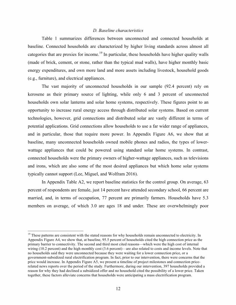
29 In order to calculate consumer surplus, we estimate the area under the unobserved [0, 1.3] domain by projecting the slope of the demand curve in the range [1.3, 7.1] through the intercept. The 1.3 percent figure is the proportion of the control group that chose to connect to the grid during the study period. In Appendix Figure A9, we estimate the welfare loss associated with rural electrification under various alternative demand curve assumptions. In Panel C, the most conservative case, demand is a step function and intersects the vertical axis at $3,000. The welfare loss is still $35,291 per community in this case.

19
find that the physical cost of grid expansion is recovered after just a single year of realized
expenditure gains. In a World Bank report, household willingness to pay for electricity—which
is calculated indirectly based on kerosene lighting expenditures—is found to be well above the
average supply cost in multiple developing countries across South Asia (World Bank 2008). The
majority of these studies, however, use non-experimental variation or indirect measures of costs
and benefits, and it is possible that they do not account for unobservables correlated with both
electrification propensity and improved economic outcomes.
In this section, we consider factors that could drive down costs or drive up demand in our
setting. Specifically, we present evidence on the role of excess construction costs from leakage,
and reduced demand due to bureaucratic red tape, low grid reliability, credit constraints, and
possibly unaccounted for spillovers in driving the social welfare results in the previous section.
A. Excess costs from leakage
In Table 4, we report the breakdown of budgeted versus invoiced electrification costs per
community. The budgeted (ex-ante) costs for each project are based on LV network drawings
prepared by a team of REA engineers.30 The invoiced (ex-post) costs are based on actual final
invoices submitted by local contractors, detailing the contractor components of the labor,
transport, and materials that were required to complete each project. In total, it cost $585,999 to
build 101.6 kilometers of LV lines to connect 478 households through the project.
We separate costs into three categories: (1) Local network costs, which consist of low-
and high-voltage cables, wooden poles and the various components required to attach cables to
poles, (2) Labor and transport costs, which include the cost of network design, installation, and
transportation, and (3) Service lines, which are the drop-down cables connecting the homes.31
Overall, budgeted and invoiced costs per connection were nearly identical, amounting to $1,201
and $1,226, respectively. In other words, contractors submitted invoices that were only 1.7
percent higher than the budgeted amount on average. The similarity between planned and actual
costs provides further confidence that the connection costs for the designed communities at high
coverage levels are likely to be reasonably accurate.
30 An example of an LV network drawing is provided in Appendix Figure A10. 31 In Table 4, we exclude the costs of metering (incurred by Kenya Power) and ready-boards. Including them would not alter the main conclusions since they are the same for all connected households and a small share of total costs.

20
These actual cost figures reflect the reality of grid extension in the rural Kenyan context,
but it is possible that they are higher than would ideally be the case due to leakage and other
inefficiencies. Of course, leakage is common in the public sector in low income countries:
Reinikka and Svenson (2004), for example, find that Ugandan schools received only 13 percent
of a central government spending program. In our context, it is possible that leakage occurred
during the contracting work, in the form of over-reporting labor and transport, which may be
hard to verify, and sub-standard construction quality (e.g., using fewer materials than required).
There is strong evidence of reallocations across the three sub-categories in Table 4, despite the
similarities between ex ante and ex post totals. Invoiced labor and transport costs, for example,
were 12.7 percent higher in fact than expected in the plans, while invoiced local network costs
were 6.5 percent lower than expected.
We sent teams of enumerators to each treatment community to count the number of
electricity poles that were actually installed, and then compare the actual number of poles to the
poles included in the project designs in order to gain additional insight on leakage.32 We find
strong evidence of leakage in the form of missing electrical poles. In Figure 7, we plot the
discrepancies between costs and poles by contractor, where each circle represents one of the 14
contractors participating in the project, and the size of each circle is proportional to the number
of household connections supplied by that contractor. While there is minimal variation between
overall ex-ante and ex-post total costs, as depicted on the horizontal axis, most contractors’
projects showed large differences in the number of observed versus budgeted poles, as depicted
on the vertical axis, with nearly all using fewer poles than budgeted. The number of observed
poles was 21.3 percent less than the number of budgeted poles, a substantial discrepancy.
In addition to being associated with wastage of public resources, if the planned number of
poles reflects accepted engineering standards (i.e., poles are roughly 50 meters apart, etc.), using
fewer poles might lead to substandard service quality and even safety risks. For instance, local
households may face greater injury risk due to sagging power lines between poles that are spaced
too far apart, and the poles could be at greater risk of falling over. It is possible, however, that
REA’s designs included extra poles, perhaps anticipating that contractors would not use them all.
Leakage may also be reflected in the project’s labor and transport costs. Labor is
typically invoiced depending on the number of declared poles, and the evidence above thus
32 Olken (2007) utilizes a similar audit to measure “missing” expenditures in Indonesian road projects.

21
suggests that labor costs are likely to be inflated as well. Similarly, transport is invoiced based on
the declared mileage of vehicles carrying construction materials. In Appendix Table A6, we
analyze three highly detailed contractor invoices (for nine communities) that were made
available to us. Based on this partial data, we find evidence of over-reported labor costs
associated with the electricity poles, at 11.0 percent higher costs than expected, and massively
over-reported transport costs: based on a comparison between the reported mileage and the travel
routes between the REA warehouse and project sites suggested by Google Maps, invoiced travel
costs were 32.9 percent higher than expected.
Taken together, these findings suggest that electric grid construction costs may be
substantially inflated due to mismanagement and corruption in Kenya, pointing to the possibility
that improved monitoring and enforcement of contractors could reduce costs and possibly
improve project quality and safety.33 On the other hand, note that even with a 20 to 30 percent
reduction in construction costs, mass rural electrification would still lead to a reduction in overall
social welfare based on the demand and cost estimates in Figure 6.
B. Factors contributing to lower demand for electricity connections
We next discuss several factors that potentially contribute to lower levels of observed
household demand for electricity connections, including bureaucratic red tape, low grid
reliability, credit constraints, and unaccounted for positive spillovers.
Long delays in the delivery of electricity services are common in rural Kenya, and low
levels of demand may be attributable, in part, to the lengthy and bureaucratic process of
obtaining a connection. In our sample, it took a staggering 212 days on average to complete each
community project. The World Bank similarly estimates that in practice it takes roughly 110
days to connect new business customers to the electricity grid in Kenya (World Bank 2016).
Figure 8 summarizes the time required to complete each major phase associated with
obtaining a rural household grid connection in Kenya. The timeline is presented in two panels;
Panel A reflects the experience of households, and Panel B reflects supplier performance.34 From
the household’s perspective, we identified three phases in the connection process: Payment (A1),
Wiring (which also includes submitting a metering application to Kenya Power) (A2), and
33 To the extent costs are high because contractors are over-billing the government, leakage may simply result in a transfer across Kenyan citizens and not a social welfare loss. The social welfare implications would depend on the relative weight the social planner places on contractors, taxpayers, and rural households. 34 In Appendix Table A7, we document the full list of reasons for the delays encountered during each phase.

22
Waiting (A3). Unexpected delays occurred during the wiring phase, which on average took 24
days, due to complications created by requirements for households to register for Kenya Revenue
Authority identification certificates, spelling mistakes on wiring certificates, and communication
breakdowns between REA and Kenya Power.35 On average, households needed to wait for 188
days, after submitting all of their paperwork, before they began receiving electricity.
From the supplier’s perspective, we identified four phases: Design (B1), Contracting
(B2), Construction (B3), and Metering (B4). REA completed the design and contracting work,
independent contractors (hired by REA) completed the physical construction, and Kenya Power
educated households on issues relating to safety, and installed and activated the prepaid meters.
The longest delays occurred during the design phase, which took an average of 57 days, and the
metering phase, which took 68 days on average. The design phase was adversely affected by
competing priorities at REA.36 We encountered severe delays during the metering phase due to
unexpected issues at Kenya Power, such as insufficient materials (i.e., reported shortages in
prepaid meters), lost meter applications, and competing priorities for Kenya Power
representatives. Additional problems slowed the process as well. For several months, there was a
general shortage of construction materials and metering hardware at REA storehouses. In the
more remote communities, heavy rains created impassable roads. Difficulties in obtaining
wayleaves (i.e., permission to pass electricity lines through other private properties) required
redrawing network designs, additional trips to the storehouse, and further negotiations with
contractors. In some cases, households that had initially declined a “ready board” changed their
minds; in an unfortunate case lightning struck, damaging a household’s electrical equipment; and
so on. While these problems increased completion times, their negative effects were almost
35 Kenya Revenue Authority (KRA) identification certificates: Households applying to Kenya Power are required to have (1) a National Identity Card (NIC), (2) a KRA Personal Identification Number (PIN) certificate, and (3) a completed Kenya Power application form. 42.0 percent of household heads requesting a connection did not already have a KRA PIN certificate, which could only be generated on the KRA website. Since most rural households do not regularly access the Internet, project enumerators provided registration assistance for 96.6 percent of the households lacking KRA PINs. At the time of the experiment, KRA PIN registration services were typically offered at local Internet cafes at a cost of $5.69 (500 KES). Spelling mistakes on wiring certificates: Households connecting to the grid are required to have certificates that the wiring is safe. The ready-board manufacturer provided wiring certificates that needed to be signed by contractors after installation. We encountered delays when the spelling of the name on the certificate did not precisely match its spelling on the NIC or KRA PIN certificate. 36 In June 2014, the government announced a program to provide free laptops for all Primary Standard 1 students nationwide. Since roughly half of Kenya’s primary schools were unelectrified at the time of the announcement, there was political pressure on REA to prioritize connecting the remaining unelectrified primary schools during the 2014-15 fiscal year. As a result, fewer REA designers were available to focus on other projects, including ours.

23
certainly offset (at least partially) by the weekly and persistent reminders sent to REA and Kenya
Power by our project staff, meaning the situation for other rural Kenyans could be even worse.37
This experience highlights some common issues and the bureaucratic red tape that can
delay the provision of electricity services in rural Kenya. The bottom line is that low observed
demand for electricity connections may be due in part to households’ expectations that they
would encounter these sorts of lengthy delays.
Another major concern is the reliability of power. Electricity shortages and other forms of
low grid reliability are well documented in many less developed countries (Allcott, Collard-
Wexler, and O’Connell 2015). In rural Kenya, households experience both short-term blackouts,
which last for a few minutes up to several hours, and long-term blackouts, which can last for
months and typically stem from technical problems with local transformers. During the 14-
month period between September 2014 and October 2015 when households were being
connected to the grid, we documented the frequency, duration, and primary reason for the long-
term blackouts impacting our sample of transformer communities. In total, 29 out of 150
transformers (19 percent) experienced at least one long-term blackout. On average, these
blackouts lasted four months, with the longest blackout lasting an entire year. During these
periods, households and businesses did not receive any grid electricity. The most common
reasons included transformer burnouts, technical failures, theft, and replaced equipment.38 It
seems obvious that the value a household places on a grid connection could be substantially
lower when service is this unreliable. As a point of comparison, only 0.2 percent of transformers
in California failed over the past five years, with the average blackout lasting a mere five hours.39
That said, we do not find strong statistical evidence that a history of recent blackouts affects
demand in our data. In Table 2, column 7, we include interactions between the treatment subsidy
indicators and an indicator for whether any household in the community reported a recent
blackout (i.e., over the past three days) at baseline, but find no statistically significant effects.
Low demand may also be driven in part by household credit constraints, which are well
documented in developing countries (see De Mel, McKenzie, and Woodruff 2009; Karlan et al.
2014). In Figure 9, we compare the experimental results to two sets of stated willingness to pay
37 At various points in the overall connection process, field enumerators reported that the connection work may have been delayed due to expectations that bribes would be paid. 38 In Appendix Table A8, we provide a full list of all of the communities that experienced long-term blackouts. 39 Based on personal communications with Pacific Gas and Electric Company (PG&E) in December 2015.

24
results obtained in the baseline survey in order to shed some light on this issue. Stated
willingness to pay might better capture household demand in the absence of credit constraints,
although this is certainly debatable, since they might also overstate actual demand due to wishful
thinking or social desirability bias (Hausman 2012).
Respondents were first asked whether they would accept a randomly assigned,
hypothetical price—ranging from $0 to $853—for a grid connection.40 Households were then
asked whether they would accept the hypothetical offer if required to complete the payment in
six weeks, a period chosen to be similar to the eight week payment period in the experiment. In
Panel A, the first curve (long-dashed line, black squares) plots the results of the initial question.
The second curve (long-dashed line, grey squares) plots the results of the follow-up question.
Stated demand is generally high. However, the demand curve falls dramatically when
households are faced with a hypothetical time constraint, suggesting that households are unable
to pay (or borrow) the required funds on relatively short notice, a strong indication that credit
constraints are often binding, although an alternative interpretation is that the hypothetical
question without time constraints generates exaggerated demand figures. 41 At a price of $171,
for example, stated demand is initially 57.6 percent but it drops to 27.2 percent with the time
constraint. Although the experimental demand curve is substantially lower than the stated
demand without time limits, it tracks the constrained stated demand quite closely: at $171, the
actual take-up in the experiment is 23.7 percent. The difference between the two contingent
valuation results is consistent with the well-documented evidence on hypothetical bias (see
Murphy et al. 2005; Hausman 2012). However, the similarity between the constrained stated
demand and experimental results suggest that augmenting standard stated preference survey
questions to incorporate realistic timeframes and other contextual factors could help to elicit
responses that more closely resemble revealed preference behavior.
We also regressed a binary variable indicating whether a household first accepted the
hypothetical offer without the time constraint, but then declined the offer with the time
constraint. Households with low-quality walls and respondents with no bank accounts are the
40 Each of $114, $171, $227, $284, and $398 had a 16.7 percent chance of being drawn. Each of $0 and $853 had an 8.3 percent chance of being drawn. Nine households are excluded due to errors in administering the question. 41 In Appendix Table A9A, we estimate the impact of the hypothetical offers on take-up. In Appendix Table A9B, we include interactions between the hypothetical offer indicators and key household covariates. In Appendix Figure A11, we plot hypothetical demand curves for households with and without bank accounts and high-quality walls.

25
most likely to switch their stated demand decision when faced with a pressing time constraint,
consistent with the likely importance of credit constraints for these groups.42
In Section V.C above, we combined the experimental demand and cost curves and show
that rural electrification may reduce social welfare. The stated preference results indicate that this
outcome is likely to hold even if credit constraints were eased. For example, if we combine the
cost curve with the stated demand for grid connections without time constraints, then all of the
households in the unobserved [0, 16.7] domain of the stated demand curve (i.e., those willing to
pay at least $853) must be willing to pay on average $3,117 in order for consumer surplus to be
larger than total construction costs. While we cannot rule out that this is true, it appears unlikely
in a rural setting where annual per capita income is below $1,000 for most households.
One way to address credit constraints is to offer financing plans for grid connections. In a
second set of baseline stated willingness to pay questions, each household was randomly
assigned a hypothetical credit offer consisting of an upfront payment (ranging from $39.80 to
$127.93), a monthly payment (ranging from $11.84 to $17.22), and a contract length (either 24
or 36 months). We provide details of each credit offer in Appendix Table A10. Households were
first asked whether they would accept the offer (short-dashed line, black circles), and then
whether they would accept the offer if required to complete the upfront payment in six weeks
(short-dashed line, grey circles). In Figure 9, Panel B, we plot take-up against the net present
value of the credit offers based on an arbitrary, annualized discount rate of 15 percent.43
When households are offered financing, stated demand is not only high but also appears
likely to be exaggerated, particularly when there are no time constraints to complete the upfront
payments. For example, 52.7 percent of households accepted the $915.48 net present value offer,
a package that consists of an upfront payment of $127.93 and monthly payments of $26.94 for 36
months (see Appendix Table A10). Eight weeks after accepting such an offer, a borrower will
have paid $181, with an additional $915.92 due in the future. Yet stated demand for this option is
twice as high as what we actually observe for the $171 time-limited, all-in price offered to
medium subsidy arm households in the experiment.
In Panel C, we combine the four stated demand curves with the experimental demand and
average total cost curves. Visually, the only demand curves that appear to yield consumer
42 We report the results of this regression in Appendix Table A9C. As specified in our pre-analysis plan, we include a formal comparison of the stated willingness to pay and experimental curves in Appendix Table A9D. 43 A range of discount rates and net present values is provided in Appendix Table A10, with largely similar results.

26
surpluses that are potentially larger than total construction costs are the stated demand curves for
grid connections with credit offers, which as we point out above, could be overstated. While not
definitive, these patterns do not appear to overturn the basic observations above.
Finally, low demand may indicate that even with subsidies, grid connections are simply
too expensive for many of the poor, rural households in our setting. After the experiment, we
asked households that were connected in the low and medium subsidy arms to name any
sacrifices that were made in order to complete their payments: 28.9 percent of households stated
that they had forgone purchases of basic household consumption goods; 19.3 percent of
households stated that they had not paid outstanding school fees. It seems likely that many of the
households that declined the subsidized offer did so due to binding budget constraints.
C. Is rural electrification a socially desirable policy?
The leading interpretation of our main empirical findings is that mass rural household
electrification is not an investment that improves social welfare in Kenya, according to standard
criteria. The cost of electrifying households appears to be at least four times higher than what
households are willing and able to pay for these connections, and consumer surplus appears to
remain less than total costs even with demand estimates that attempt to address credit constraints.
While per household costs fall sharply at high coverage levels, reflecting the large economies of
scale in the creation of local grid infrastructure, they remain far higher than demand, implying
that social welfare falls with each additional subsidized connection.
However, there may be additional benefits that are not captured by household willingness
to pay. First, as outlined in Section II.B, there may be spillovers from private grid connections.
An example of these spillovers includes the benefits that unconnected households experience
from being in close proximity to connected households. If these spillovers are positive and
sufficiently large, take-up rates may be lower in communities with relatively high electrification
rates at baseline, if households prefer to free-ride on their neighbors’ power. Yet in Section V.A
above, we find no meaningful evidence of an interaction between the treatment indicators and
either the overall baseline community electrification rate, or the proportion of neighboring
households (within 200 meters) connected to electricity at baseline. This evidence is at best
suggestive, however, since we cannot rule out the possibility that any negative effect of these
spillovers on take-up is offset by a competing positive “keeping up with the neighbors”
mechanism, such as the one documented in Bernard and Torero (2013), or that greater learning

27
about the private benefits of electricity and/or correlated household characteristics are present in
addition to negative spillovers. Future research that directly measures the magnitude of
household electrification spillovers, in terms of both usage and impacts on life outcomes, would
be useful in disentangling these factors.
Second, households may have limited information about the future income or broader
welfare benefits of electrification, leading them to under-invest. Furthermore, there may be
imperfect within-household altruism with respect to the benefits of electricity. Perhaps children
stand to gain the most from indoor lighting in the evening, as it allows them to study and learn
more, boosting their future earnings potential, but their parents do not fully understand these
gains or incorporate them into their decision-making. Grid connections are long-lived, but their
long-term benefits may not be fully reflected in willingness to pay if households are liquidity
constrained, poorly informed, or face internal agency problems.
However, several other factors that we have not addressed may push up costs, making
rural electrification appear less attractive. For example, access to modern energy will generate a
number of additional environmental externalities. The impact on social welfare will therefore
depend on the extent to which greater energy consumption results in greater CO2 emissions and
other forms of pollution. Moreover, we have considered neither the costs nor economic impact of
the initial investment to extend the high-voltage lines and install transformers in each
community. Each transformer in our sample was set up to provide electricity to a critical public
facility, such as a market, secondary school, or health clinic. Each installation required a large
investment—the median cost of each deployed transformer is $21,820 (Lee et al. 2016)—and the
welfare gains from powering such facilities, while potentially quite large, have not been
precisely measured. Our analysis treats these costs as sunk and focuses solely on the economics
of electrifying “under grid” households, conditional on existing infrastructure. Given the
growing support for large-scale policies to boost energy access, such as Kenya’s planned LMCP,
this is the policy-relevant question in our setting, but the broader costs of transformer
installations would need to be considered in many other African and South Asian contexts.
VII. CONCLUSION
Over the past century, rural electrification has served as a key benchmark for economic
development and social progress. The United States began its mass rural electrification program

28
in the late-1930s, though it required two decades to reach 90 percent of households (Kitchens
and Fishback 2013), China did so in the 1950’s, and South Africa launched its initiative in the
1990s, eventually reaching 49 percent.44 Today, access to affordable and reliable energy has
emerged as a major political issue across many countries in Sub-Saharan Africa and South Asia,
as they aim to repeat the successes of earlier mass electrification programs.
However, the extent to which increases in energy access should be driven by investments
in large-scale infrastructure, such as grid connections, or small-scale decentralized solutions,
such as solar lanterns and solar home systems, remains contested. Does Africa’s energy future
even lie with the grid? Although our empirical findings suggest that household electrification
may reduce social welfare, they do not necessarily imply that distributed solar systems are any
more attractive than the grid, or that the patterns we identify are universal across time and space.
In fact, the evidence that we present—on inflated construction costs from leakage, and the
pervasiveness of bureaucratic red tape, low grid reliability, and household credit constraints, all
of which would suppress demand—suggests that the social welfare consequences of rural
electrification are closely tied to local organizational performance as well as economic and
political institutions. Settings with better institutional performance by the electricity utility—with
fewer losses due to leakage and service that is more responsive to customers—may see shifts in
both the cost curve and the demand side, and in such a setting mass rural electrification may
indeed be the socially optimal policy.
Decisions to invest in large-scale energy infrastructure programs are associated with
major opportunity costs and long-run consequences for future economic development and
climate change, especially in Sub-Saharan Africa, where access to electricity lags the rest of the
world. Our findings indicate that investing in connecting rural households is not necessarily an
economically productive and high return activity in the world’s poorest countries. The social
returns to investments in transportation, education, health or other sectors—indeed possibly
including the electrification of industrial sites or urban areas—need to be compared to
investments in rural electricity grid expansion to determine appropriate public policy choices.
Given the high stakes around these policy decisions, and the limited evidence base, there is a
need for further research in a number of areas, including estimating the economic and broader
44 In Appendix Table A11, we summarize historical rural electrification initiatives in China, South Africa, Tunisia, Vietnam, and the United States.

29
social impacts of electrical grid connections (as well as any community and regional spillovers),
identifying the patterns and drivers of subsequent consumption demand, including for energy-
efficient appliances, and determining routes to improved grid reliability and electrical utility
organizational performance.
REFERENCES
Abdullah, Sabah, and P. Wilner Jeanty. 2011. “Willingness to Pay for Renewable Energy: Evidence from a Contingent Valuation Survey in Kenya." Renewable and Sustainable Energy Reviews 15(6): 2974-2983
Allcott, Hunt, Allan Collard-Wexler, and Stephen D. O'Connell. 2015. “How Do Electricity Shortages Affect Industry? Evidence from India.” American Economic Review, forthcoming.
Aker, Jenny C. 2010. “Information from Markets Near and Far: Mobile Phones and Agricultural Markets in Niger.” American Economic Journal: Applied Economics 2: 46-59.
Baumol, William J. 1977. “On the Proper Cost Tests for Natural Monopoly in a Multiproduct Industry." American Economic Review 67(5): 809-822.
Barron, Manuel, and Maximo Torero. 2015. “Household Electrification and Indoor Air Pollution.”
Bernard, Tanguy and Maximo Torero. 2013. “Bandwagon Effects in Poor Communities Experimental Evidence from a Rural Electrification Program in Ethiopia.”
Bruhn, Miriam and David McKenzie. 2009. “In Pursuit of Balance: Randomization in Practice in Development Field Experiments.” American Economic Journal: Applied Economics 1(4): 200-232.
Burlig, Fiona and Louis Preonas. 2016. “Out of the Darkness and Into the Light? Development Effects of Electrification in India.”
Caine, Mark, Jason Lloyd, Max Luke, Lisa Margonelli, Todd Moss, Ted Nordhaus, Roger Pielke Jr., Mikael Roman, Joyashree Roy, Daniel Sarewitz, Michael Shellenberger, Kartikeya Singh, and Alex Trembath. 2014. “Our High-Energy Planet: A Climate Pragmatism Project.” The Breakthrough Institute. http://thebreakthrough.org/images/pdfs/Our-High-Energy-Planet.pdf.
Carlton, Dennis W., and Jeffrey M. Perloff. 2005. Modern Industrial Organization. Boston: Pearson/Addison Wesley.
Casey, Katherine, Rachel Glennerster, and Edward Miguel. 2012. “Reshaping Institutions: Evidence on Aid Impacts Using a Preanalysis Plan.” Quarterly Journal of Economics 127(4): 1755-1812.
Chakravorty, Ujjayant, Kyle Emerick, and Majah-Leah Ravago. 2016. “Lighting Up the Last Mile: The Benefits and Costs of Extending Electricity to the Rural Poor.”
Christensen, Laurits R., and William H. Greene. 1976. “Economies of Scale in U.S. Electric

30
Power Generation.” The Journal of Political Economy 84(4): 655-676.
Craine, Stewart, Evan Mills, and Justin Guay. 2014. “Clean Energy Services for All: Financing Universal Electrification.” The Sierra Club. https://www.sierraclub.org/sites/www.sierra-club.org/files/0747_Clean_Energy_Services_Report_03_web.pdf
de Mel, Suresh, David McKenzie, and Christopher Woodruff. 2009. “Are Women More Credit Constrained? Experimental Evidence on Gender and Microenterprise Returns.” American Economic Journal: Applied Economics 1(3): 1-32.
Devoto, Florencia, Esther Duflo, Pascaline Dupas, William Parente, and Vincent Pons. 2012. “Happiness on Tap: Piped Water Adoption in Urban Morocco.” American Economic Journal: Economic Policy 4(4): 68-99.
Deichmann, Uwe, Craig Meisner, Siobhan Murray, and David Wheeler. 2010. “The Economics of Renewable Energy Expansion in Rural Sub-Saharan Africa.” Energy Policy 39(1): 215-227.
Dinkelman, Taryn. 2011. “The Effects of Rural Electrification on Employment: New Evidence from South Africa.” American Economic Review 101(7): 3078–3108.
Donaldson, Dave. 2013. “Railroads of the Raj: Estimating the Impact of Transportation Infrastructure.” American Economic Review, forthcoming.
Faber, Benjamin. 2014. “Trade Integration, Market Size, and Industrialization: Evidence from China’s National Trunk Highway System.” Review of Economic Studies, forthcoming.
Hausman, Jerry. 2012. “Contingent Valuation: From Dubious to Hopeless.” Journal of Economic Perspectives 26(4): 43-56.
Kitchens, Carl, and Price Fishback. 2013. “Flip the Switch: The Spatial Impact of the Rural Electrification Administration 1935-1940.” NBER Working Paper 19743.
IEA (International Energy Agency). 2014. Africa Energy Outlook. https://www.iea.org/-publications/freepublications/publication/africa-energy-outlook.html.
Jensen, Robert. 2007. “The Digital Provide: Information (Technology), Market Performance, and Welfare in the South Indian Fisheries Sector.” The Quarterly Journal of Economics 122(3): 879-924.
Joskow, Paul. 2000. “Deregulation and Regulatory Reform in the U.S. Electric Power Sector,” in Deregulation of Network Industries: What’s Next? Sam Peltzman and Clifford Winston, eds. Washington, D.C.: AEI-Brookings Joint Center for Regulatory Studies, pp. 113-54.
Karlan, Dean, Robert Osei, Isaac Osei-Akoto, and Christopher Udry. 2014. “Agricultural Decisions After Relaxing Credit and Risk Constraints.” The Quarterly Journal of Economics 129(2): 597-652.
Lipscomb, Molly, Mobarak, Ahmed Mushfiq, and Tania Barham. 2013. “Development Effects of Electrification: Evidence from the Topographic Placement of Hydropower Plants in Brazil.” American Economic Journal: Applied Economics 5(2): 200-231.

31
Lee, Kenneth, Eric Brewer, Carson Christiano, Francis Meyo, Edward Miguel, Matthew Podolsky, Javier Rosa, and Catherine Wolfram. 2016. “Electrification for “Under Grid” Households in Rural Kenya.” Development Engineering 1: 26-35..
Lee, Kenneth, Edward Miguel, and Catherine Wolfram. 2016. “Appliance Ownership and Aspirations among Electric Grid and Home Solar Households in Rural Kenya.” NBER Working Paper 21949.
Mankiw, N. Gregory. 2011. Principles of Economics, 5th Edition. Mason, Ohio: Cengage Learning.
Murphy, James J., P. Geoffrey Allen, Thomas H. Stevens, and Darryl Weatherhead. 2005. “A Meta-Analysis of Hypothetical Bias in Stated Preference Valuation.” Environmental and Resource Economics 30(3): 313-325.
Olken, Benjamin A. “Monitoring Corruption: Evidence from a Field Experiment in Indonesia.” Journal of Political Economy 115(2): 200-249.
Samuelson, Paul A., and William D. Nordhaus. 1998. Economics. Boston, Mass: Irwin/McGraw-Hill.
Parshall, Lily, Dana Pillai, Shashank Mohan, Aly Sanoh, and Vijay Modi. 2009. “National Electricity Planning in Settings with Low Pre-Existing Grid Coverage: Development of a Spatial Model and Case Study of Kenya.” Energy Policy 37(6): 2395-2410.
Patil, Sumeet R., Benjamin F. Arnold, Alicia L. Salvatore, Bertha Briceno, Sandipan Ganguly, John M. Colford Jr., and Paul J. Gertler. 2014. “The Effect of India’s Total Sanitation Campaign on Defecation Behaviors and Child Health in Rural Madhya Pradesh: A Cluster Randomized Controlled Trial” PLoS Medicine 11(8): e1001709.
Reinikka, Ritva, and Jakob Svensson. 2004. “Local Capture: Evidence from a Central Government Transfer Program in Uganda.” Quarterly Journal of Economics 119(2): 679-705.
Viscusi, W. Kip, John M. Vernon, and Joseph Emmett Harrington. 2005. Economics of Regulation and Antitrust. Cambridge, Mass: MIT Press.
Wolfram, Catherine, Orie Shelef, and Paul Gertler. 2012. “How Will Energy Demand Develop in the Developing World?” Journal of Economic Perspectives 26(1): 119-138.
World Bank. 2008. “The Welfare Impact of Rural Electrification: A Reassessment of the Costs and Benefits. An IEG Impact Evaluation.” Washington, DC: World Bank Group. DOI: 10.1596/978-0-8213-7367-5.
World Bank. 2016. “Doing Business 2016: Measuring Regulatory Quality and Efficiency.” Washington, DC: World Bank Group. DOI: 10.1596/978-1-4648-0667-4.
Yatchew, Adonis. 2000. “Scale Economies in Electricity Distribution: A Semiparametric Analysis.” Journal of Applied Econometrics 15: 187-210.
Zvoleff, Alex, Ayse Selin Kocaman, Woonghee Tim Huh, and Vijay Modi. 2009. “The Impact of Geography on Energy Infrastructure Costs.” Energy Policy 37 (10): 4066-4078.

Figure 1—The electric utility as a natural monopoly
Panel A Panel B Panel C
Notes: In Panel A, the electric utility is a natural monopoly facing high fixed costs, decreasing marginal costs (MCA), and decreasing average totalcosts (ATCA). In this case, MCA intersects demand at d′ and a government-subsidized mass electrification program can increase social welfare.Panel B illustrates an alternative case in which DB does not intersect MCB. In this case, a mass electrification program would not increase welfareunless there are, for example, positive externalities from private electricity connections. Panel C illustrates this scenario in which social demand (D′)intersects MCB at d′′.

Figure 2—Example of a “transformer community” of typical density
Notes: The white circle labeled T in the center identifies the location of the REAtransformer. The larger white outline demarcates the 600-meter radius boundary.Green circles represent unconnected households; purple squares represent un-connected businesses; and blue triangles represent unconnected public facilities.Yellow circles, squares, and triangles indicate households, businesses, and pub-lic facilities with visible electricity connections, respectively. Household markersare scaled by household size, with the largest indicating households with morethan ten members, and the smallest indicating single-member households. Ineach community, roughly 15 households were randomly sampled and enrolledinto the study. The average density of a transformer community is 84.7 house-holds per community and the average minimum distance between buildings (i.e.,households, businesses, or public facilities) is 52.8 meters. In the illustrated com-munity, there are 85 households.

Figure 3—Experimental design
Notes: The 150 transformer communities in our sample covered 62.2% of the universe of REAprojects in Busia and Siaya counties in August 2013. See Appendix for details on the communityselection procedure. Each transformer community is defined as the group of all households lo-cated within 600 meters of a central electricity distribution transformer. All households within600 meters of a transformer are eligible to apply for an electricity connection. In each of the 150communities, roughly 15 unconnected households were randomly sampled (using a computerrandom number generator) and enrolled into our study. Census data on the universe of uncon-nected households were used as a sampling frame. Baseline surveys were also administered to arandom sample of 215 households already connected at baseline. Communities were randomlyassigned into three treatment arms and a control group. Treatment offers were distributed in twowaves, between May and August 2014, and were valid for eight weeks.

Figure 4—Experimental evidence on the demand for rural electrification
Panel A
050
100
150
200
250
300
350
400
Co
nn
ectio
n p
rice
(U
SD
)
0 20 40 60 80 100
Take−up (%)
Experiment
Pre−analysis plan
Kenyan gov’t report
Panel B
050
100
150
200
250
300
350
400
Co
nn
ectio
n p
rice
(U
SD
)0 20 40 60 80 100
Take−up (%)
Experiment, full sample
Low−quality walls subsample
High−quality walls subsample
Notes: Panel A compares the experimental results with two sets of initial assumptions based on (i)our pre-analysis plan (see Appendix), and (ii) an internal government report shared with our teamin early-2015. Panel B plots the results separately for households with low- and high-quality walls.
Figure 5—Experimental evidence on the costs of rural electrification
Panel A
01000
2000
3000
4000
5000
6000
AT
C p
er
co
nn
ectio
n (
US
D)
0 20 40 60 80 100
Community coverage (%)
ATC curve (OLS − Predicted)
Sample communities
Designed communities
Panel B
01000
2000
3000
4000
5000
6000
AT
C p
er
co
nn
ectio
n (
US
D)
0 20 40 60 80 100
Community coverage (%)
ATC curve (NL − Predicted)
Sample communities
Designed communities
Notes: The above figures plot budgeted estimates of the average total cost (ATC) per connection atvarious levels of community coverage (i.e., electrification) for both sample and designed communi-ties. Panel A displays the fitted curve from the regression reported in Table 3, column 5. Panel Bdisplays predicted vaues from the nonlinear estimation of ATC = b0/Q + b1 + b2Q.

Figure 6—Experimental estimates of the welfare implications of rural electrification
Panel A Panel B Panel C
Notes: Panel A combines the experimental demand curve from Figure 4 with the experimental average total cost (ATC) curve from Figure 5, PanelB. The marginal cost (MC) curve is generated by taking the derivative of the estimated total cost function. Panel B estimates the total cost of fullysaturating a community at the cheapest ATC to be $58,487, based on average community density of 84.7 households. Similarly, we estimate thearea under the demand curve to be $12,421. The area under the unobserved [0, 1.3] domain is estimated by projecting the [1.3, 7.1] demand curvethrough the intercept. Results are robust to alternative assumptions regarding demand in the unobserved [0, 1.3] domain (see Appendix FigureA8). Calculations suggest that a mass electrification program would result in a welfare loss of $46,066 per community. In order to justify such aprogram, discounted average future welfare gains of $544 in social and economic impacts would be required per household. Panel C presents theestimated demand for and costs of a program structured like the planned Last Mile Connectivity Project, which offers households a fixed price of $171.In this case, only 23.7% of households would accept the price, and unless the government is willing to provide additional subsidies, the resultingelectrification level would be low and there would be a welfare loss of $22,083 per community. Discounted average future welfare gains of $1,100would be required per household.

Figure 7—Discrepancies in project costs and electrical poles, by contractor
Averagediscrepancyin poles: −21.3%
Averagediscrepancyin costs: +1.7%
−5
0−
40
−3
0−
20
−1
00
10
20
Diffe
ren
ce
be
twe
en
actu
al a
nd
bu
dg
ete
d p
ole
s (
%)
−50 −40 −30 −20 −10 0 10 20
Difference between invoiced and budgeted costs (%)
Notes: Each circle represents one of the 14 contractors that participated inthe overall project. The size of each circle is proportional to the number ofhousehold connections supplied by the contractor (mean=34). The horizon-tal axis represents the percentage difference between the total invoiced andbudgeted cost for each contractor. The vertical axis represents the percent-age difference between the actual and designed poles (i.e. materials) foreach contractor. The average discrepancies in poles and costs are weightedby the number of connections per contractor and correspond to the valuesin Table 4.

Figure 8—Timeline of the rural electrification process
Notes: Panel A summarizes the rural electrification process from the standpoint of the household, divided into three keyphases. Panel B summarizes the process from the standpoint of the supplier, divided into four key phases. The numbersto the right of each bar report the average number of days required to complete each phase (standard deviations inparantheses). Households were first given 56 days (8 weeks) to complete their payments. Afterwards, it took on average212 days (7 months) for households to be metered and electricity to flow to the household. Appendix Table A7 listsspecific issues that created delays during each phase of the process.

Figure 9—Stated willingness to pay for an electricity connection, with and without time constraints and credit offers
Panel A Panel B Panel C
Notes: Panel A combines the experimental demand results (solid black line) with responses to a set of contingent valuation questions included in thebaseline survey. Households were first asked whether they would accept a hypothetical offer (i.e., at a randomly assigned price) to connect to the grid(long-dashed line, black squares). Households were then asked whether they would accept the same hypothetical price offer if required to completethe payment in six weeks (long-dashed line, grey squares). Panel B combines the experimental demand results with responses to an alternative setof contingent valuation questions. Each household was randomly assigned a hypothetical credit offer consisting of an upfront payment (rangingfrom $39.80 to $79.60), a monthly payment (ranging from $11.84 to $17.22), and a contract length (either 24 or 36 months). Applying a discount rateof 15%, we plot the net present value of the credit offers and the take-up results, with and without time constraints. Additional details on the creditoffers are provided in Appendix Table A10. Panel C combines the stated and revealed demand curves with the experimental average total cost (ATC)curve from Figure 5, Panel B.

Table 1—Differences between electricity grid unconnected vs. grid connected householdsat baseline
Unconnected Connected p-value of diff.
(1) (2) (3)
Panel A: Household head (respondent) characteristics
Female (%) 62.9 58.6 0.22
Age (years) 52.3 55.8 < 0.01
Attended secondary school (%) 13.3 45.1 < 0.01
Married (%) 66.0 76.7 < 0.01
Not a farmer (%) 22.5 39.5 < 0.01
Basic political awareness (%) 11.4 36.7 < 0.01
Has bank account (%) 18.3 60.9 < 0.01
Panel B: Household characteristics
Number of members 5.2 5.3 0.76
Youth members (age ≤ 18) 3.0 2.6 0.01
High-quality walls (%) 16.0 80.0 < 0.01
Land (acres) 1.9 3.7 < 0.01
Distance to transformer (m) 356.5 350.9 0.58
Monthly (non-charcoal) energy (USD) 5.5 15.4 < 0.01
Panel C: Household assets
Bednets 2.3 3.4 < 0.01
Sofa pieces 6.0 12.5 < 0.01
Chickens 7.0 14.3 < 0.01
Radios 0.35 0.62 < 0.01
Televisions 0.15 0.81 < 0.01
Sample size 2,289 215
Notes: Columns 1 and 2 report sample means for households that were unconnected andconnected at the time of the baseline survey. Column 3 reports p-value of the differencebetween the means. Basic political awareness indicator captures whether the householdhead was able to correctly identify the presidents of Tanzania, Uganda, and the UnitedStates. In the 2013 census of all unconnected households, just 5% of rural households wereconnected to the grid. In our sample of respondents, we oversampled the number of con-nected households.

Table 2—Impact of grid connection subsidy on take-up of electricity connections
Interacted variable
High-qualitywalls
Attendedsecondary
schoolNot a
farmer
Baselineelectrifica-
tionrate
Baselineneighborsconnected
Report ofblackoutin past 3
days
(1) (2) (3) (4) (5) (6) (7)
T1: Low subsidy—29% discount 5.94∗∗∗ 3.57∗∗ 4.55∗∗∗ 5.36∗∗∗ 5.56∗∗ 4.80∗∗ 6.11∗∗
(1.50) (1.46) (1.38) (1.59) (2.20) (1.90) (2.61)
T2: Medium subsidy—57% discount 22.88∗∗∗ 21.30∗∗∗ 19.79∗∗∗ 20.10∗∗∗ 21.36∗∗∗ 21.38∗∗∗ 18.66∗∗∗
(4.02) (4.41) (3.80) (4.59) (6.18) (3.51) (5.11)
T3: High subsidy—100% discount 94.97∗∗∗ 95.61∗∗∗ 95.18∗∗∗ 94.88∗∗∗ 97.51∗∗∗ 96.11∗∗∗ 95.11∗∗∗
(1.27) (1.17) (1.32) (1.38) (1.75) (1.31) (2.43)
Interacted variable 0.26 -1.00 -0.75 0.14 0.05 -0.94
(1.35) (1.45) (0.91) (0.11) (0.05) (1.31)
T1 × interacted variable 12.26∗∗ 10.22 2.37 0.05 0.19 -0.18
(6.15) (7.00) (3.61) (0.18) (0.19) (3.13)
T2 × interacted variable 8.85 19.54∗∗∗ 13.46∗ 0.29 0.31 7.58
(7.77) (4.62) (7.71) (1.21) (0.23) (7.80)
T3 × interacted variable -5.50 -4.28 0.31 -0.49∗ -0.21 -0.22
(3.91) (4.92) (2.40) (0.30) (0.14) (2.78)
Take-up in control group 1.30 1.30 1.30 1.30 1.30 1.30 1.30
Observations 2176 2176 2176 2176 2176 2176 2176
R-squared 0.69 0.69 0.70 0.69 0.69 0.69 0.69
Notes: The dependent variable is an indicator variable (multiplied by 100) for household take-up. The mean of the dependent variable is21.6. Robust standard errors clustered at the community level in parentheses. All specfications include the household and communitycovariates specified in the pre-analysis plan. Household covariates include the age of the household head, indicators for whether thehousehold respondent attended secondary school, is a senior citizen, is not primarily a farmer, is employed, and has a bank account, anindicator for whether the household has high-quality walls, and the number of chickens (a measure of assets) owned by the household.Community covariates include indicators for the county, market status, whether the transformer was funded and installed early on(between 2008 and 2010), baseline electrification rate, and community population. Column 6 includes interactions with the proportionof neighbors (i.e., within 200 meters) connected to electricity at baseline. Column 7 includes interactions with an indicator for whetherany household in the community reported a recent blackout (i.e., in the past three days) at baseline. Asterisks indicate coefficientstatistical significance level (2-tailed): * P < 0.10; ** P < 0.05; *** P < 0.01. The number of observations in the above regressionsis somewhat smaller than the total number of households in our sample (2,289) due to missing data. The coefficients do not changeappreciably when the households with missing data are included in the regression with no covariates (as in column 1).

Table 3—Impact of scale on average total cost (ATC) per household connection
Sample—OLS & IV
OLS IV Sample & Designed—OLS
(1) (2) (3) (4) (5) (6) (7)
Number of connections (M) -472.43∗∗∗ -510.07∗∗∗ -492.53∗∗ -87.77∗∗∗ -81.11∗∗∗ -96.68∗∗∗
(88.60) (88.01) (198.98) (15.11) (16.45) (17.99)
M2 20.40∗∗∗ 23.17∗∗∗ 22.05∗ 0.83∗∗∗ 0.76∗∗∗ 1.05∗∗∗
(5.28) (5.27) (11.66) (0.18) (0.20) (0.24)
Community coverage (Q) -80.28∗∗∗
(12.11)
Q2 0.70∗∗∗
(0.12)
Population -0.46
(0.97)
Population × M 0.02
(0.08)
Population × M2 / 100 -0.10
(0.09)
Community controls No Yes Yes No No Yes Yes
Mean of dep. variable (USD) 1813 1813 1813 1633 1633 1633 1633
S.D. of dep. variable 1113 1113 1113 1065 1065 1065 1065
Observations 62 62 62 77 77 77 77
R2 0.63 0.71 – 0.43 0.46 0.48 0.52
Notes: The dependent variable is the budgeted average total cost (ATC) per connection in USD. Since there was no takeup in 13communities, the sample size is reduced to 62 observations. In column 3, polynomials for the number of grouped connections,M and M2, are instrumented with TM and TH , binary variables indicating whether the community was randomly assignedinto the medium and high subsidy treatment arms, respectively. Columns 4 to 7 expand the sample to include the 15 addi-tional designed communities. In these regressions, robust standard errors are clustered at the community level. Communitycoverage (Q) is defined as the proportion of households that are ultimately connected (multiplied by 100). Community covari-ates (specified in the pre-analysis plan) include indicators for the county, market status, whether the transformer was fundedand installed early on (between 2008 and 2010), baseline electrification rate, round-trip distance (to the REA warehouse inKisumu), (demeaned) community population, and (demeaned) average land gradient. Asterisks indicate coefficient statisticalsignificance level (2-tailed): * P < 0.10; ** P < 0.05; *** P < 0.01.

Table 4—Costs of infrastructure construction associated with electricity connection projects
Budgeted Invoiced Difference
Total Per HH Total Per HH Allocation Amount %
Panel A: Project costs (reported)
Local network 383,207 798 358,235 749 61.1% -24,972 - 6.5%
Labor and transport 177,457 370 200,080 419 34.1% 22,623 12.7%
Service lines 15,812 33 27,684 58 4.7% 11,873 75.1%
Total cost 576,476 1,201 585,999 1,226 100.0% 9,523 1.7%
Panel B: Project materials (reported and observed) Observed
Electricity poles 1,449 3.0 1,141 2.4 – -308 -21.3%
Notes: In Panel A, project costs are reported in USD and consist of administrative budgeted estimates and finalinvoiced amounts. “Local network” consists of high- and low-voltage electricity poles and cables. “Labor andtransport” also includes design work and small contingency items. “Service lines” are typically single “drop-down”cables that connect households to an electricity line. Kenya Power metering costs and houshold wiring costs are notincluded in this summary. In total, the project involved roughly 101.6 km of new low-voltage lines. In Panel B, wecompare the budgeted number of electricity poles to the actual number of poles that were observed to have beeninstalled.

Supplementary Appendix for Online Publication
“Experimental Evidence on the Demand for and Costs of RuralElectrification”
Kenneth Lee, Edward Miguel, and Catherine Wolfram
April 2016

Figure A1—150 sample communities in Busia and Siaya counties in Kenya
Notes: The final sample of 150 communities includes 85 and 65 transformers in Busiaand Siaya counties, respectively.
A-2

Figure A2—Example of REA offer letter for a subsidized household electricity connection
Notes: Each offer letter was signed and guaranteed by REA management. Project field staff membersvisited each treatment community and explained the details of the offer to a representative from eachhousehold in a community meeting. The meeting was held to give community members a chance toask questions.
A-3

Figure A3—Umeme Rahisi “ready-board” designed by Power Technics
Notes: Treatment households received an opportunity to install a certified householdwiring solution in their homes at no additional cost. 88.5 percent of the householdsconnected in the experiment accepted this offer, while 11.5 percent provided their ownwiring. Each ready-board, valued at roughly $34 per unit, featured a single light bulbsocket, two power outlets, and two miniature circuit breakers. The unit is first mountedonto a wall and the electricity service line is directly connected to the back. The hard-ware was designed and produced by Power Technics, an electronic supplies manufac-turer in Nairobi.
A-4

Figure A4—Stated reasons why households remain unconnected to electricity at baseline
Notes: Based on the responses of 2,289 unconnected households during the baseline sur-vey round.
A-5

Figure A5—Timeline of project milestones and connection price-related news reports over the period of study
Notes: Sources for news reports related to the grid connection price include Daily Nation, Kenya’s leading national newspaper, and Business Daily.

Figure A6—Electrical appliances owned by unconnected and connected households at baseline
Notes: Based on the responses of 2,289 unconnected households and 215 connected households during thebaseline survey round. See Lee, Miguel, and Wolfram (2016) for a discussion.
A-7

Figure A7—Average total cost (ATC) per connection by land gradient
Panel A Panel B
Notes: In the sample of communities, average land gradient ranges from 0.79 to 7.76 degrees witha mean of 2.15 degrees. We divide the sample into communities with “low” average land gradient(i.e., below median) gradient and communities with “high” average land gradient (i.e., above me-dian). In Panels A and B, we plot fitted lines from nonlinear estimations of ATC = b0/x + b1 + b2xfor the low and high gradient subsamples, respectively (they lie nearly on top of each other so wepresent them here in separate panels for clarity).
A-8

Figure A8—Experimental estimates of a natural monopoly: Alternative functional forms
Panel A Panel B Panel C
Notes: Panel A reproduces Figure 6, Panel A. In Panel B, we estimate an average total cost curve with constant variable costs. In Panel C, we estimatean exponential function to derive a marginal cost curve.
A-9
Figure A9—Welfare loss associated with rural electrification under various demand curve assumptions
Panel A Panel B Panel C
Notes: Panel A reproduces Figure 6, Panel B. In this scenario, the welfare loss associated with a mass electrification program is $46,066 per community.In Panel B, we estimate the area under the unobserved [0, 1.3] domain by assuming that the demand curve intercepts the vertical axis at $3,000,rather than $424 (as in Panel A). In this more conservative case, the welfare loss is $44,386 per community. In order to overturn this result (i.e. costsexceeding the consumer surplus), the intercept would need to be an astronomical $34,427. In Panel C, the most conservative case, we assume thatdemand is a step function and calculate the welfare loss to be $35,291 per community. The required discounted future welfare gains needed forconsumer surplus to exceed total costs across the three scenarios range from $417 (in Panel C) to $544 (in Panel A) per household.
A-10

Figure A10—Example of a REA design drawing in a high subsidy treatment community
Notes: After receiving payment, REA designers visited each treatment community to design the local low-voltage network. The designs werethen used to estimate the required materials and determine a budgeted estimates of the total construction cost. Materials (e.g. poles, electricityline, service cables) represented 65.9 percent of total installation costs. The community in this example is the same as that shown in Figure 2.
A-11

Figure A11—Stated willingness to pay with and without time constraints, by wall quality and bankaccounts
Panel A Panel B
Notes: We plot the experimental results (solid black line) against the responses to a set of contingentvaluation questions included in the baseline survey. Households were first asked whether theywould accept a hypothetical offer (i.e., randomly assigned price) to connect to the grid (dashed line,black squares). Households were then asked whether they would accept the same hypotheticaloffer if required to complete the payment in six weeks (dashed line, grey squares). In Panel A, thesample contains all households with low-quality walls and no bank account (n=1,647). In Panel B,the sample contains all households with high-quality walls and a bank account (n=236).
A-12

Table A1—Comparison of social and economic indicators for study region and nationwide counties
Nationwide county percentiles
Study region 25th 50th 75th
Total population 665,190 516,212 724,186 968,909
per square kilometer 363.0 39.5 183.7 368.4
% rural 85.7 68.2 79.5 83.3
% at school 44.7 34.8 40.7 45.2
% with secondary education 13.1 9.8 15.2 19.5
Total households 151,228 103,114 154,073 205,704
per square kilometer 82.5 7.9 46.1 89.5
% with high quality roof 59.7 49.2 79.0 91.5
% with high quality floor 26.9 19.8 28.9 40.6
% with high quality walls 16.7 14.4 17.6 35.1
% with piped water 6.3 6.9 14.4 36.7
Total public facilities 644 356 521 813
per capita (000s) 0.81 0.59 0.75 0.98
Electrification rates
Rural (%) 2.3 1.5 3.3 5.3
Urban (%) 21.8 20.2 27.5 46.2
Public facilities (%) 84.1 79.9 88.1 92.6
Notes: The study region column presents weighted-average and average (where applicable) statistics forBusia and Siaya counties. Specifically, total population, total households, and total public facilities rep-resent averages for Busia and Siaya. Demographic data is obtained from the 2009 Kenya Population andHousing Census (KPHC). Public facility electrification data is obtained from the Rural Electrification Au-thority (REA). High quality roof indicates roofs made of concrete, tiles, or corrugated iron sheets. Highquality floor indicates floors made of cement. High quality walls indicates walls made of stone or brick.Rural and urban electrification rates represent the proportion of households that stated that electricity wastheir main source of lighting during the 2009 census. Based on the 2009 census data, the mean (county-level) electrification rates in rural and urban areas were 4.6 and 32.8 percent, respectively. Nationally, therural and urban electrification rates were 5.1 and 50.4 percent, respectively, and 22.7 percent overall.
A-13

Table A2—Baseline summary statistics and randomization balance check
Regression coefficients on
subsidy treatment indicators
Control Low Medium Highp-valueof F-test
(1) (2) (3) (4) (5)
Panel A: Household head (respondent)
Female=1 0.630 0.021 -0.026 -0.015 0.624
[0.480] (0.031) (0.029) (0.032)
Age (years) 52.040 -1.098 1.029 1.701 0.287
[16.290] (1.242) (1.064) (1.388)
Attended secondary school=1 0.140 -0.012 0.025 -0.033 0.297
[0.340] (0.024) (0.027) (0.025)
Married=1 0.660 -0.005 0.013 -0.024 0.856
[0.470] (0.033) (0.033) (0.033)
Not a farmer=1 0.230 0.002 -0.029 -0.004 0.793
[0.420] (0.036) (0.031) (0.026)
Basic political awareness=1 0.130 -0.051∗∗∗ -0.009 -0.026 0.039
[0.330] (0.018) (0.020) (0.016)
Has bank account=1 0.190 -0.032 0.003 -0.022 0.452
[0.390] (0.022) (0.028) (0.025)
Panel B: Household characteristics
Number of members 5.300 -0.265∗ 0.100 -0.294∗ 0.071
[2.710] (0.145) (0.160) (0.177)
Youth members (age 5 18) 3.030 -0.101 0.075 -0.214 0.247
[2.170] (0.122) (0.120) (0.144)
High-quality walls=1 0.150 0.051∗∗ 0.039 -0.014 0.092
[0.360] (0.025) (0.030) (0.026)
Land (acres) 1.850 0.299 0.229 0.054 0.414
[2.140] (0.201) (0.214) (0.149)
Distance to transformer (m) 348.61 14.85 9.50 22.10∗∗ 0.173
[140.00] (9.85) (12.15) (10.64)
Monthly (non-charcoal) energy (USD) 5.550 -0.234 0.495∗ -0.432 0.026
[5.200] (0.266) (0.267) (0.283)
(Table continued on next page)
A-14

(Table continued from previous page)
Regression coefficients on
subsidy treatment indicators
Control Low Medium Highp-valueof F-test
(1) (2) (3) (4) (5)
Panel C: Household assets
Bednets 2.270 -0.032 0.056 0.000 0.887
[1.500] (0.091) (0.092) (0.096)
Bicycles 0.660 -0.027 0.076 0.016 0.353
[0.740] (0.042) (0.052) (0.052)
Sofa pieces 5.920 -0.039 0.477 -0.008 0.660
[5.210] (0.366) (0.399) (0.403)
Chickens 7.030 0.420 -0.421 -0.218 0.739
[8.740] (0.690) (0.616) (0.680)
Cattle 1.740 0.069 0.190 0.232 0.514
[2.320] (0.151) (0.192) (0.185)
Radios 0.340 -0.015 0.047 -0.002 0.410
[0.480] (0.028) (0.033) (0.040)
Televisions 0.160 0.001 -0.003 -0.054∗∗ 0.132
[0.370] (0.022) (0.025) (0.024)
Panel D: Community characteristics
Electrification rate (%) 5.25 1.57 -0.03 -0.08 0.674
[4.61] (1.34) (0.99) (0.86)
Community population 534.69 42.10 26.37 9.85 0.793
[219.02] (45.01) (41.70) (39.13)
Notes: Column 1 reports mean values for the control group, with standard deviations in brackets. Columns2 to 4 report the coefficients from separate regressions in which a dependent variable is regressed on thefull set of treatment indicators and stratification variables (including county, market status, and whether thetransformer was funded and installed early on, between 2008 and 2010). Standard errors are in parantheses.Column 5 reports the p-values of F-tests of whether the treatment coefficients are jointly equal to zero. Ro-bust standard errors clustered at the community level. Asterisks indicate coefficient statistical significancelevel (2-tailed): * P < 0.10; ** P < 0.05; *** P < 0.01. Sample sizes range from 2,279 to 2,289 dependingon missing values except in the specification with Age as the dependent variable where the sample size is2,205. The variables selected for the randomization check were not specified in the pre-analysis plan.
A-15

Table A3—Characteristics of households taking-up electricity by treatment arm
High subsidy Medium subsidy Low subsidy Control
Price: $0 Price: $171 Price: $284 Price: $398
(1) (2) (3) (4)
Panel A: Respondent characteristics
Female (%) 61.71 58.89 59.26 60.00
Age (years) 53.69 52.82 50.56 51.62
Attended secondary school (%) 9.92 27.78∗∗∗ 33.33∗∗∗ 26.67∗∗
Married (%) 64.19 74.44∗ 70.37 66.67
Not a farmer (%) 22.31 28.89 29.63 28.57
Basic political awareness (%) 9.64 16.67∗ 14.81 6.67
Has bank account (%) 17.13 31.11∗∗∗ 40.74∗∗∗ 35.71∗
Panel B: Household characteristics
Number of members 5.02 6.19∗∗∗ 6.22∗∗ 5.80
Youth members 2.81 3.52∗∗∗ 3.89∗∗ 3.29
High-quality walls (%) 12.95 25.56∗∗∗ 51.85∗∗∗ 33.33∗∗
Land (acres) 1.93 2.20 2.56 2.14
Distance to transformer (m) 369.74 357.41 369.06 360.67
Monthly (non-charcoal) energy (USD) 5.16 7.62∗∗∗ 8.24∗∗∗ 5.88
Panel C: Household assets
Bednets 2.29 2.77∗∗∗ 3.44∗∗∗ 2.53
Sofa pieces 5.88 8.96∗∗∗ 9.44∗∗∗ 8.87∗∗
Chickens 6.90 9.07∗∗ 10.31∗ 6.43
Radios 0.34 0.48∗∗ 0.48 0.53
Televisions 0.11 0.28∗∗∗ 0.48∗∗∗ 0.40∗∗∗
Take-up of electricity connections 363 90 27 15
Notes: Columns 1, 2, and 3 report sample means for unconnected households that chose to take-up a sub-sidized electricity connection. Column 4 reports sample means for control group households that chose toconnect on their own. Basic political awareness indicator captures whether the household head was able tocorrectly identify the heads of state of Tanzania, Uganda, and the United States. The asterisks in columns2, 3, and 4 indicate statistically significant differences compared to column 1: * P < 0.10; ** P < 0.05; ***P < 0.01.
A-16

Table A4A—Impact of connection subsidy on take-up: Interactions with community-level variables
Interacted variable
Busiacounty
Transformerfundedearly on
Marketcenter
Baselinepopula-
tion
(1) (2) (3) (4) (5)
T1: Low subsidy—29% discount 5.94∗∗∗ 2.65 4.97∗∗∗ 6.34∗∗∗ 2.29
(1.50) (1.71) (1.89) (1.71) (3.97)
T2: Medium subsidy—57% discount 22.88∗∗∗ 20.93∗∗∗ 26.81∗∗∗ 23.54∗∗∗ 18.48∗
(4.02) (5.78) (6.23) (4.80) (10.27)
T3: High subsidy—100% discount 94.97∗∗∗ 95.19∗∗∗ 93.74∗∗∗ 94.92∗∗∗ 100.05∗∗∗
(1.27) (1.69) (1.73) (1.64) (4.49)
Interacted variable 0.20 0.24 0.88 -0.00
(0.85) (0.81) (1.01) (0.00)
T1 × interacted variable 5.59∗∗ 2.06 -1.64 0.01
(2.65) (3.06) (3.32) (0.01)
T2 × interacted variable 3.48 -8.19 -2.71 0.01
(8.01) (7.90) (8.98) (0.02)
T3 × interacted variable -0.42 2.67 0.15 -0.01
(2.59) (2.52) (2.43) (0.01)
Take-up in control group 1.30 1.30 1.30 1.30 1.30
Observations 2176 2176 2176 2176 2176
R-squared 0.69 0.69 0.69 0.69 0.69
Notes: The dependent variable is an indicator variable (multiplied by 100) for household take-up. Themean of the dependent variable is 21.6. Robust standard errors clustered at the community level in paren-theses. All specfications include the household and community covariates specified in the pre-analysisplan. Household covariates include the age of the household head, indicators for whether the householdrespondent attended secondary school, is a senior citizen, is not primarily a farmer, is employed, and has abank account, an indicator for whether the household has high-quality walls, and the number of chickens (ameasure of assets) owned by the household. Community covariates include indicators for the county, mar-ket status, whether the transformer was funded and installed early on (between 2008 and 2010), baselineelectrification rate, and community population. Asterisks indicate coefficient statistical significance level(2-tailed): * P < 0.10; ** P < 0.05; *** P < 0.01. The number of observations in the above regressions issomewhat smaller than the total number of households in our sample (2,289) due to missing data. The co-efficients do not change appreciably when the households with missing data are included in the regressionwith no covariates (as in column 1).
A-17

Table A4B—Impact of connection subsidy on take-up: Interactions with household-level variables
Interacted variable
Householdsize
Age ofhousehold
head
Seniorhousehold
head
Numberof
chickensHas bankaccount
(1) (2) (3) (4) (5)
T1: Low subsidy—29% discount 0.61 5.49 5.55∗∗∗ 4.68∗∗∗ 4.50∗∗∗
(2.67) (4.96) (1.71) (1.42) (1.38)
T2: Medium subsidy—57% discount 9.81∗ 26.19∗∗∗ 23.66∗∗∗ 17.21∗∗∗ 20.30∗∗∗
(5.71) (7.06) (4.17) (3.78) (4.10)
T3: High subsidy—100% discount 94.16∗∗∗ 95.22∗∗∗ 95.50∗∗∗ 93.79∗∗∗ 94.91∗∗∗
(2.75) (3.52) (1.24) (1.83) (1.43)
Interacted variable 0.00 0.04 1.19 -0.07∗ 1.07
(0.16) (0.04) (1.31) (0.04) (1.24)
T1 × interacted variable 1.01∗ 0.01 1.70 0.18 8.43
(0.53) (0.09) (4.25) (0.12) (5.87)
T2 × interacted variable 2.41∗∗∗ -0.06 -3.05 0.84∗∗∗ 13.54∗
(0.88) (0.11) (3.56) (0.27) (7.25)
T3 × interacted variable 0.13 -0.01 -2.01 0.16 -0.04
(0.44) (0.07) (2.28) (0.11) (2.55)
Take-up in control group 1.30 1.30 1.30 1.30 1.30
Observations 2176 2176 2176 2176 2176
R-squared 0.69 0.69 0.69 0.70 0.69
Notes: The dependent variable is an indicator variable (multiplied by 100) for household take-up. Themean of the dependent variable is 21.6. Robust standard errors clustered at the community level in paren-theses. All specfications include the household and community covariates specified in the pre-analysisplan. Household covariates include the age of the household head, indicators for whether the householdrespondent attended secondary school, is a senior citizen, is not primarily a farmer, is employed, and has abank account, an indicator for whether the household has high-quality walls, and the number of chickens (ameasure of assets) owned by the household. Community covariates include indicators for the county, mar-ket status, whether the transformer was funded and installed early on (between 2008 and 2010), baselineelectrification rate, and community population. Asterisks indicate coefficient statistical significance level(2-tailed): * P < 0.10; ** P < 0.05; *** P < 0.01. The number of observations in the above regressions issomewhat smaller than the total number of households in our sample (2,289) due to missing data. The co-efficients do not change appreciably when the households with missing data are included in the regressionwith no covariates (as in column 1).
A-18

Table A5—Impact of scale on average total cost (ATC) per connection
Sample & Designed—OLS
(1) (2) (3) (4)
Number of connections (M) -87.77∗∗∗ -81.11∗∗∗ -83.42∗∗∗ -114.05∗∗∗
(15.11) (16.45) (17.01) (18.84)
M2 0.83∗∗∗ 0.76∗∗∗ 0.79∗∗∗ 1.31∗∗∗
(0.18) (0.20) (0.21) (0.25)
Land gradient -173.90∗∗∗ -599.29∗∗∗
(58.05) (164.10)
Land gradient ×M 36.68∗∗∗
(13.86)
Land gradient ×M2 -0.33∗
(0.17)
Households -6.07
(11.49)
Households ×M 0.17
(0.47)
Households ×M2 / 100 -0.91∗
(0.53)
Busia=1 247.69 461.80 304.85
(388.75) (391.79) (448.41)
Market transformer=1 -148.84 -32.07 -170.02
(195.41) (185.58) (177.70)
Transformer funded early on=1 109.29 128.41 41.56
(218.63) (216.06) (205.59)
Community electrification rate 15.89 15.16 9.18
(15.41) (14.09) (13.90)
Community population -0.66 -0.90 0.48
(0.66) (0.68) (1.92)
Round-trip distance to REA (km) 1.60 -2.45 -0.08
(3.61) (3.66) (3.80)
Community controls No Yes Yes Yes
Observations 77 77 77 77
R2 0.43 0.48 0.54 0.52
Notes: The dependent variable is the budgeted average total cost (ATC) per connection inUSD. The sample is expanded to include the 15 additional designed communities. Robuststandard errors are clustered at the community level. Community covariates were specified inthe pre-analysis plan. Columns 1 and 2 report the same results as the regression specificationsin columns 4 and 6 in Table 3, respectively. Average land gradient ranges from 0.79 to 7.76degrees with a mean of 2.15 degrees. Column 4 includes interaction terms with an additionalvariable—the (demeaned) number of households (i.e., residential compounds) in each com-munity. Asterisks indicate coefficient significance level (2-tailed): * P < 0.10; ** P < 0.05; ***P < 0.01.
A-19

Table A6—Breakdown of labor and transport costs for nine projects (three contracts)
Contract #1 Contract #2 Contract #3
Panel A: Labor costs (e.g., digging holes, installation, clearing bush, dropping service lines, etc.)
Budgeted LV poles 40 107 62
Invoiced LV poles 38 98 76
Actual (counted) LV poles 39 92 60
Difference (Actual - Invoiced) +1 -6 -16
Avg. labor cost per LV pole 27.59 27.59 27.59
Total LV poles labor 1,048 2,704 1,655
Budgeted stays – – 35
Invoiced stays 32 68 43
Avg. labor cost per stay 19.22 19.22 19.22
Total stays labor 615 1,308 827
Budgeted HV poles – – 6
Invoiced HV poles 12 5 6
Avg. labor cost per HV pole 35.59 35.59 35.59
Total HV poles labor 427 178 214
Additional labor 832 1,552 2,199
Total labor 2,922 5,742 4,895
Panel B: Transport costs (e.g., wood pole and other materials)
Large lorries 2 4 4
Invoiced round-trip distance (km) 320 300 300
Google round-trip distance (km) 218 256 218
Difference (Actual - Invoiced) -102 -44 -82
Avg. cost per km 3.75 3.75 3.75
Total large lorry transport 2,402 4,503 4,503
Small lorries 1 3 2
Invoiced round-trip distance (km) 250 250 250
Avg. cost per km 2.98 2.98 2.98
Total small lorry transport 745 2,234 1,490
Total transport 3,146 6,738 5,993
Budgeted labor and transport costs 6,126 12,708 8,956
Invoiced labor and transport costs 7,040 14,477 12,516
Difference (Invoiced - Budgeted) 14.9% 13.9% 39.8%
Projects 3 3 3
Households connected 18 38 22
Construction days 36 31 35
Notes: Based on the detailed invoice submitted to REA. “LV” denotes low-voltage and “HV” denotes high-voltage. Additional labor includes costs of bush clearing, tree cutting, signage, dropping service cables,and other expenses. Each large lorry is capable of transporting 30 poles. Each small lorry is capable oftransporting 2.3 km of line materials.
A-20

Table A7—Reasons for unexpected delays in household electrification
Phase Description Reasons for unexpected delays
A2 Wiring • In order to begin using electricity, households are required to have a validmeter and a certificate of wiring safety. A large proportion of householdswere not able to register for a meter because they lacked a PIN (PersonalIdentification Number) certificate from the Kenya Revenue Authority. In oursample, 42 percent of households applying for electricity needed assistancein applying for a PIN certificate.
B1 Design • Competing priorities at REA due to the 2014/15 nationwide initiative toconnect primary schools to the national grid. This resulted in a persistentshortage of REA designers and planners.
• Low motivation to perform design duties. In addition, since REA designerswere required to physically visit each community, there were numerouschallenges in scheduling field visits.
B2 Contracting • Competing priorities (described above) delayed the bureaucratic paper-work required to prepare contracts.
• REA staff members had strong preferences to assign certain projects to spe-cific contractors. This resulted in delays because REA wanted to wait untilspecific contractors were free to take on new projects.
B3 Construction • Insufficient materials (e.g., poles, cables) requiring site revisits.
• Poor weather (i.e., rainy conditions) made roads impassable and diggingholes (for electricity poles) impossible.
• Issues in securing wayleaves (i.e., right of ways) to pass through neighbor-ing properties.
• Low-quality construction work that needed to be fixed.
• Missing materials.
• Faulty transformers requiring contractors to revisit sites to complete thefinal step of the process (e.g., connecting the new low-voltage network tothe existing line).
• Incorrect households were connected to the network, requiring site revisits.
• Contractor issues installing “ready-boards” due to lack of experience.
B4 Metering • Insufficient materials (e.g., prepaid meters, cables) contributed to lengthydelays at Kenya Power.
• Lost meter application forms at local Kenya Power offices.
• Changes in internal Kenya Power processes requiring applications to beapproved in Nairobi as well as local offices in Siaya, Kisumu, and Busia.
• Unexpected requests by local Kenya Power representatives for additionaldocuments (e.g., photocopies of payment receipts).
• Local Kenya Power representatives unable to perform metering duties dueto competing priorities.
• Scheduling difficulties due to the necessity for Kenya Power to make mul-tiple trips to remote village sites, which increased the costs (metering costsare not documented in our cost estimates).
Notes: Each phase of the construction process corresponds to the timeline bar illustrated in Figure 8.
A-21

Table A8—Transformer problems in study communities during the 14-month study period (between September 2014 and October 2015)
Row Site ID Group Wave Treated HHs Connected Metered Blackout Primary issue
1 1204 Treatment 2 15 Feb-15 May-15 4 months Burnt out
2 1403 Treatment 1 15 Mar-15 Jul-15 1 month Commissioning
3 1505 Treatment 2 1 Mar-15 May-15 1 month Commissioning
4 2101 Treatment 1 0 n/a n/a 8 months Burnt out
5 2103 Treatment 1 0 n/a n/a 4 months Technical failure
6 2106 Treatment 1 15 Nov-14 Nov-14 8 months Commissioning
7 2114 Treatment 1 8 Dec-14 Dec-14 12 months Relocated by Kenya Power
8 2116 Treatment 1 14 Sep-14 May-15 2 months Technical failure
9 2202 Treatment 1 1 Sep-14 Oct-14 1 month Technical failure
10 2217 Treatment 1 13 Oct-14 Dec-14 1 month Technical failure
11 2222 Treatment 1 3 Oct-14 Dec-14 4 months Leaking oil
12 2303 Treatment 2 7 May-15 Jun-15 4 months Technical failure
13 2406 Treatment 2 15 Apr-15 Jun-15 1 month Burnt out
14 2503 Treatment 1 1 Oct-14 Oct-14 6 months Burnt out
15 2506 Treatment 1 15 Dec-14 Feb-15 9 months Commissioning
16 1103 Control n/a 0 n/a n/a 2 months Technical failure
17 1109 Control n/a 0 n/a n/a 6 months Burnt out
18 1203 Control n/a 0 n/a n/a 1 month Technical failure
19 1205 Control n/a 0 n/a n/a 1 month Technical failure
20 1405 Control n/a 0 n/a n/a 6 months Burnt out
21 1410 Control n/a 0 n/a n/a 2 months Relocated by Kenya Power
22 2103 Control n/a 0 n/a n/a 4 months Burnt out
23 2115 Control n/a 0 n/a n/a 2 months Technical failure
24 2212 Control n/a 0 n/a n/a 5 months Burnt out
25 2220 Control n/a 0 n/a n/a 8 months Burnt out
26 2304 Control n/a 0 n/a n/a 3 months Stolen
27 2315 Control n/a 0 n/a n/a 3 months Burnt out
28 2504 Control n/a 0 n/a n/a 4 months Technical failure
29 2515 Control n/a 0 n/a n/a 4 months Damaged by weather
Note: “Commissioning” refers to a situation in which the transformer (and related equipment) is installed but electricity is not being delivered.
A-22

Table A9A—Impact of randomized offers on take-up
WTP 1 WTP 2 Experiment
(1) (2) (3)
$853 offer -19.74∗∗∗ -8.21∗∗∗
(3.68) (2.11)
$284 offer / T1: Low subsidy—29% discount 16.26∗∗∗ 6.02∗∗ 5.94∗∗∗
(3.39) (2.50) (1.50)
$227 offer 14.25∗∗∗ 7.33∗∗∗
(3.56) (2.74)
$171 offer / T2: Medium subsidy—57% discount 24.08∗∗∗ 18.50∗∗∗ 22.88∗∗∗
(3.37) (2.66) (4.02)
$114 offer 25.20∗∗∗ 19.71∗∗∗
(3.51) (2.88)
Free offer / T3: High subsidy—100% discount 62.04∗∗∗ 87.47∗∗∗ 94.97∗∗∗
(2.90) (2.20) (1.27)
Number of household members 1.26∗∗∗ 0.43 0.62∗∗∗
(0.39) (0.33) (0.21)
High-quality walls=1 9.07∗∗∗ 11.63∗∗∗ 3.53
(2.66) (2.34) (2.14)
Number of chickens=1 0.70∗∗∗ 0.40∗∗∗ 0.12∗∗
(0.12) (0.11) (0.06)
Age (years) -0.39∗∗∗ -0.18∗∗ 0.03
(0.09) (0.07) (0.04)
Attended secondary school=1 15.61∗∗∗ 5.41∗∗ 3.77∗∗
(2.69) (2.36) (1.71)
Over 65 years old=1 0.90 1.30 0.53
(3.48) (3.04) (1.40)
Not a farmer=1 0.37 0.10 1.86
(2.40) (1.94) (1.63)
Has bank account=1 11.13∗∗∗ 11.03∗∗∗ 2.57
(2.51) (2.49) (1.70)
Employed=1 2.27 1.18 1.06
(2.17) (1.88) (1.27)
Take-up in status quo (i.e., $398) group 36.24 9.81 1.30
Mean of dependent variable 53.73 25.54 21.60
Observations 2,157 2,157 2,176
R2 0.23 0.35 0.69
Notes: In column 1, the dependent variable is an indicator for whether the household accepted the hypo-thetical offer (i.e. randomly assigned price) to connect to the grid. In column 2, the dependent variable isan indicator for whether the household accepted the hypothetical offer if required to complete the paymentin six weeks. In column 3, the dependent variable is an indicator for experimental take-up. All dependentvariables are multplied by 100. Robust standard errors clustered at the community level in parentheses. Allspecfications include the community covariates specified in the pre-analysis plan. Community covariatesinclude indicators for the county, market status, whether the transformer was funded and installed earlyon (between 2008 and 2010), baseline electrification rate, and community population. Asterisks indicatecoefficient statistical significance level (2-tailed): * P < 0.10; ** P < 0.05; *** P < 0.01.

Table A9B—Impact of WTP offer on stated take-up of electricity connections
Interacted variable
Baseline
High-qualitywalls
Has bankaccount
Attendedsecondaryschooling
(1) (2) (3) (4)
$853 offer -8.21∗∗∗ -6.00∗∗∗ -7.95∗∗∗ -5.40∗∗
(2.11) (2.24) (1.92) (2.17)
$284 offer / T1: Low subsidy—29% discount 6.02∗∗ 5.02∗∗ 4.86∗ 6.01∗∗
(2.50) (2.42) (2.57) (2.40)
$227 offer 7.33∗∗∗ 6.59∗∗ 7.15∗∗ 7.73∗∗∗
(2.74) (2.82) (2.80) (2.72)
$171 offer / T2: Medium subsidy—57% discount 18.50∗∗∗ 15.96∗∗∗ 16.59∗∗∗ 17.14∗∗∗
(2.66) (2.69) (2.85) (2.69)
$114 offer 19.71∗∗∗ 18.40∗∗∗ 15.03∗∗∗ 20.02∗∗∗
(2.88) (3.21) (2.94) (2.91)
Free offer / T3: High subsidy—100% discount 87.47∗∗∗ 89.64∗∗∗ 89.58∗∗∗ 89.32∗∗∗
(2.20) (2.27) (2.08) (2.15)
Interacted variable 7.95 5.63 7.23
(5.26) (4.76) (5.94)
$853 offer × interacted variable -8.95 -4.06 -17.96∗∗∗
(6.43) (7.56) (6.14)
$284 offer × interacted variable 6.40 5.47 0.02
(8.51) (7.28) (8.82)
$227 offer × interacted variable 4.62 0.60 -2.70
(8.51) (7.39) (8.54)
$171 offer × interacted variable 15.71∗ 9.90 11.38
(8.29) (7.79) (9.88)
$114 offer × interacted variable 8.50 25.10∗∗∗ -2.09
(8.55) (8.38) (9.16)
Free offer × interacted variable -11.53∗ -15.06∗∗ -17.21∗∗
(5.92) (5.91) (6.62)
Take-up in status quo (i.e., $398) group 9.81 9.81 9.81 9.81
Mean of dependent variable 25.54 25.54 25.54 25.54
Observations 2,157 2,157 2,157 2,157
R2 0.35 0.36 0.36 0.35
Notes: The dependent variable is an indicator (multiplied by 100) for whether the household accepted thehypothetical offer if required to complete the payment in six weeks. All specfications include the house-hold and community covariates specified in the pre-analysis plan. Household covariates include the ageof the household head, indicators for whether the household respondent attended secondary school, is asenior citizen, is not primarily a farmer, is employed, and has a bank account, an indicator for whether thehousehold has high-quality walls, and the number of chickens (a measure of assets) owned by the house-hold. Community covariates include indicators for the county, market status, whether the transformer wasfunded and installed early on (between 2008 and 2010), baseline electrification rate, and community pop-ulation. Asterisks indicate coefficient statistical significance level (2-tailed): * P < 0.10; ** P < 0.05; ***P < 0.01.

Table A9C—Predictors of financial constraints in WTP questions
(1) (2)
$853 offer 90.32∗∗∗ 91.37∗∗∗
(5.24) (5.53)
$398 offer / Existing fixed price 72.93∗∗∗ 75.86∗∗∗
(4.10) (4.05)
$284 offer / T1: Low subsidy—29% discount 70.30∗∗∗ 72.20∗∗∗
(3.33) (3.44)
$227 offer 65.92∗∗∗ 68.21∗∗∗
(3.72) (3.80)
$171 offer / T2: Medium subsidy—57% discount 52.73∗∗∗ 55.05∗∗∗
(3.30) (3.39)
$114 offer 52.89∗∗∗ 54.20∗∗∗
(3.35) (3.40)
Number of household members -0.05
(0.53)
High-quality walls=1 -12.51∗∗∗
(3.27)
Number of chickens=1 -0.23∗
(0.14)
Age (years) 0.14
(0.12)
Attended secondary school=1 0.09
(3.07)
Over 65 years old=1 -3.53
(5.18)
Not a farmer=1 0.27
(3.16)
Has bank account=1 -10.74∗∗∗
(3.21)
Employed=1 0.37
(2.91)
Mean of dependent variable 52.36 52.46
Observations 1,184 1,159
R2 0.25 0.27
Notes: In both columns, the dependent variable is an indicator (multiplied by 100) forwhether the household first accepted the hypothetical offer (i.e. randomly assignedprice) to connect to the grid, and then declined the hypothetical offer if required tocomplete the payment in six weeks. Robust standard errors clustered at the commu-nity level in parentheses. Asterisks indicate coefficient statistical significance level(2-tailed): * P < 0.10; ** P < 0.05; *** P < 0.01.
A-25

Table A9D—Comparison of stated willingness to pay and experimental curves
WTP1 WTP2
(1) (2)
$284 offer / T1: Low subsidy—29% discount 5.80∗∗∗ 5.80∗∗∗
(1.37) (1.37)
$171 offer / T2: Medium subsidy—57% discount 22.44∗∗∗ 22.44∗∗∗
(4.01) (4.01)
Free offer / T3: High subsidy—100% discount 94.22∗∗∗ 94.22∗∗∗
(1.17) (1.17)
WTP indicator 34.94∗∗∗ 8.50∗∗∗
(2.73) (1.71)
$284 ×WTP indicator 9.10∗∗ -0.42
(3.69) (2.83)
$171 ×WTP indicator -1.09 -5.03
(5.28) (4.69)
Free offer ×WTP indicator -34.42∗∗∗ -7.99∗∗∗
(3.31) (2.48)
Mean of dependent variable 34.22 24.46
Observations 3,635 3,635
R2 0.50 0.57
F-statistic (test for equality between WTP and experimental results) 103.22 10.54
Notes: The dependent variable is an indicator (multiplied by 100) for whether the household acceptedthe hypothetical (i.e., willingness to pay) or experimental offer. Columns 1 and 2 pool the results ofthe first hypothetical offer (i.e., without time constraints) with the experimental results, and the sec-ond hypothetical offer (i.e., with time constraints) with the experimental results, respectively. WTPindicates whether the observation is generated by the stated willingness to pay portion of the exper-iment. Robust standard errors clustered at the community level in parentheses. Asterisks indicatecoefficient statistical significance level (2-tailed): * P < 0.10; ** P < 0.05; *** P < 0.01. F-statisticscorrespond to the test that βWTP = βWTP + β284×WTP = βWTP + β171×WTP = βWTP + βFree×WTP = 0.
A-26
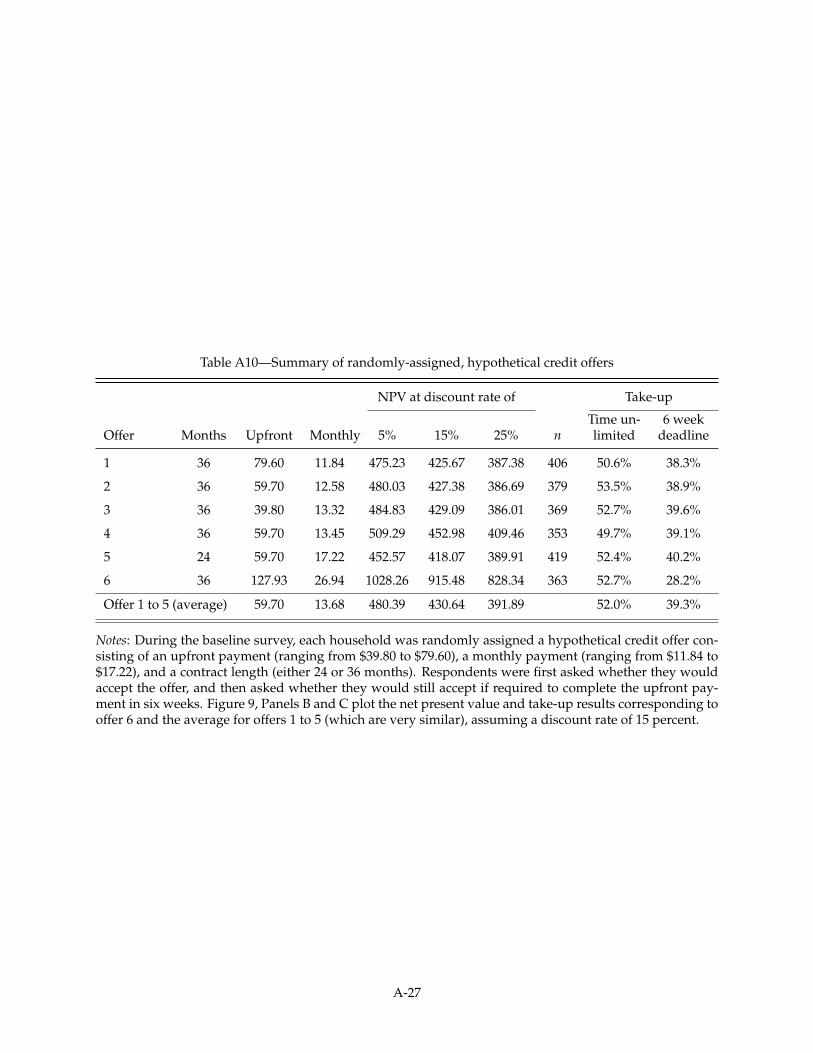
Table A10—Summary of randomly-assigned, hypothetical credit offers
NPV at discount rate of Take-up
Offer Months Upfront Monthly 5% 15% 25% nTime un-limited
6 weekdeadline
1 36 79.60 11.84 475.23 425.67 387.38 406 50.6% 38.3%
2 36 59.70 12.58 480.03 427.38 386.69 379 53.5% 38.9%
3 36 39.80 13.32 484.83 429.09 386.01 369 52.7% 39.6%
4 36 59.70 13.45 509.29 452.98 409.46 353 49.7% 39.1%
5 24 59.70 17.22 452.57 418.07 389.91 419 52.4% 40.2%
6 36 127.93 26.94 1028.26 915.48 828.34 363 52.7% 28.2%
Offer 1 to 5 (average) 59.70 13.68 480.39 430.64 391.89 52.0% 39.3%
Notes: During the baseline survey, each household was randomly assigned a hypothetical credit offer con-sisting of an upfront payment (ranging from $39.80 to $79.60), a monthly payment (ranging from $11.84 to$17.22), and a contract length (either 24 or 36 months). Respondents were first asked whether they wouldaccept the offer, and then asked whether they would still accept if required to complete the upfront pay-ment in six weeks. Figure 9, Panels B and C plot the net present value and take-up results corresponding tooffer 6 and the average for offers 1 to 5 (which are very similar), assuming a discount rate of 15 percent.
A-27

Table A11—Summary of selected historical national rural electrification initiatives
Electrification rate
National Rural GDP per capita
Country Period Government authority Start End Start End Start End
Kenya 2008 - present Rural ElectrificationAuthority
<20% <5% 939
China (I) 1949 - 1978 Maoist era of centralplanning
n/a 63% n/a 53% n/a 292
China (II) 1978 - 1998 Ministry of Water andPower, Rural ElectricityDepartment
63% 98% 53% 97% 292 1,512
Vietnam 1975 - 2009 Vietnam Electricity (EVN) 10% 96% 3% 95% 376 1,235
Tunisia 1972 - 2001 National Rural ElectrificationCommission (CNER)
37% 95% 6% 88% 1,524 3,092
SouthAfrica
1995 - 2001 SA National ElectrificationProgramme (NEP)
30% 66% 21% 49% 5,321 5,811
USA (I) 1935 - 1940 Rural ElectrificationAdministration
68% 79% 13% 33% 9,102 11,847
USA (II) 1940- 1955 Rural ElectrificationAdministration
79% 98% 33% 94% 11,847 19,974
Notes: There is very little reliable data available from China in 1949. At that point, rural electrification rateswere likely to be < 1 percent.
A-28

Note A1—Community selection process
In August 2013, local representatives of REA provided us with a master list of 241 uniqueREA projects, consisting of roughly 370 individual transformers spread across the ten con-stituencies of Busia and Siaya. Each project featured the electrification of a major publicfacility (market, secondary school, or health clinic), and involved a different combinationof high and low voltage lines and transformers. Projects that were either too recent, orclassified as not commissioned, were not included in this master list. Since the primaryobjective was to estimate local electrification rates, projects that were funded after Febru-ary 2013 were excluded to ensure that households in sample communities had had ampleopportunity to connect to the grid.
In September 2013, we randomly selected 150 transformers using the following proce-dure: 1) in each constituency, individual transformers were listed in a random order,2) the transformer with the highest ranking in each constituency was then selected intothe study, and 3) any remaining transformers located less than 1.6 km (or 1 mile) from,or belonging to the same REA project, as one of the selected transformers, were thendropped from the remaining list. We repeated this procedure, cycling through all tenconstituencies, until we were left with a sample of 150 transformers for which: 1) thedistance between any two transformers was at least 1.6 km, and 2) each transformer rep-resented a unique REA project. In the final sample, there are 85 and 65 transformers inBusia and Siaya counties, respectively, with the number of transformers in each of the tenconstituencies ranging from 8 to 23. This variation can be attributed to differences acrossconstituencies in the number of eligible projects. In Budalangi constituency, for example,all of the 8 eligible projects were included in the sample. As a result of this communityselection procedure, the sample is broadly representative of the types of rural communi-ties targeted by REA in rural Western Kenya.
A-29

Note A2—Experimental design notes
Sampling—Households were identified at the level of the residential compound, which isa unit known locally as a boma. In Western Kenya, it is common for related families tolive in different households within the same compound.
Surveying—The majority of the baseline surveys were conducted between February andMay 2014. However, 3.1 percent of surveys were administered between June and August2014 due to scheduling conflicts and delays.
Sample of connected households—Since electrification rates were so low, the sample of con-nected households covers only 102 transformer communities; 17 communities did nothave any connected households at the time of census, and we were unable to enroll anyconnected households in the remaining 31 communities, for instance, if there was a sin-gle connected compound in a village and the residents were not present on the day of thebaseline survey.
Randomization—For the stratification variable market status, we used a binary variableindicating whether the total number of businesses in the community was strictly greaterthan the community-level mean across the entire sample.
A-30


![Impact Evaluation of Rural Electrification in Bhutan · Rural Electrification Project (Loan 1375-BHU[SF]) in 1995. Three subsequent loans have been approved—Sustainable Rural Electrification](https://img.pdfslide.us/doc/110x75/5f8533816c5e7a009f1ea6ab/impact-evaluation-of-rural-electrification-in-bhutan-rural-electrification-project.jpg)