Embed Size (px)
Citation preview
Our reference: SAFETY 2639 P-authorquery-v11
AUTHOR QUERY FORM
Journal: SAFETY
Article Number: 2639
Please e-mail or fax your responses and any corrections to:
E-mail: [email protected]
Fax: +31 2048 52799
Dear Author,
Please check your proof carefully and mark all corrections at the appropriate place in the proof (e.g., by using on-screen annotation in the PDF
file) or compile them in a separate list. Note: if you opt to annotate the file with software other than Adobe Reader then please also highlight the appropriate place in the PDF file. To ensure fast publication of your paper please return your corrections within 48 hours.For correction or revision of any artwork, please consult http://www.elsevier.com/artworkinstructions.
Any queries or remarks that have arisen during the processing of your manuscript are listed below and highlighted by flags in the proof. Clickon the ‘Q’ link to go to the location in the proof.
Location inarticle
Query / Remark: click on the Q link to goPlease insert your reply or correction at the corresponding line in the proof
Q1 Please confirm that given names and surnames have been identified correctly.
Q2 Please check whether the insertion of country name in affiliation is okay as typeset, and correct ifnecessary.
Q3 Highlights are 3–5 bullet points, no more than 85 characters per bullet point. Please provide it in correctformat. For more information, see www.elsevier.com/highlights.
Q4 The reference ‘Leonard et al. (2006)’ is cited in the text but not listed. Please check, and correct ifnecessary.
Q5 The references ‘Changizi et al. (2006) and Wogalter and Mayhorn (2005)’ has been changed to ‘Changiziet al. (2006a,b) and Wogalter and Mayhorn (2006)’ in the text as per list. Please check, and correct ifnecessary.
Q6 This section comprises references that occur in the reference list but not in the body of the text. Pleaseposition each reference in the text or, alternatively, delete it. Any reference not dealt with will be retainedin this section.
Thank you for your assistance.
Please check this box if you have nocorrections to make to the PDF file

Highlights
Q3
SAFETY 2639 No. of Pages 1, Model 5G
8 August 2013
� The primary intent of this article is to draw greater attention to ecological and evolutionary approaches to vision, with the hope that a betterunderstanding the fundamental evolutionary underpinnings of visual stimuli may lead to the incorporation of these principles into warningdesign, so that warnings more effectively communicate safety information and elicit appropriate behavioral responses.� The human visual sys-tem has evolved over hundreds of millions of years and is finely honed for processing natural scenes. It is reasonable to expect that warningsigns whose features mimic ancestrally alerting stimuli (or ‘‘supernormal” versions of such stimuli) in nature may be among the most effectiveat attracting people’s attention.� This research investigates warning symbols from an ecological standpoint, specifically in light of recent re-search in three areas of vision: color perception, the evolution of writing and typography, and visual illusions.�We discuss how the cogeometry of an angry face, for example, may underlie the superiority of red color and V shapes in warnings. We also describe simple hecologybased rules for the design of text in warning signs� Finally, we consider how radial line stimuli and the illusory effects they indu
moving cl
be harnessed for capturing the attention of observers, orienting them toward a warning symbol, and deterring them from1
lor andeuristic
ce canoser.

1
3
4
5
6 , K7 nite
89
1 1
1213
141516171819202122
2 324volv t-25ble g26al’’ n27ate t28of v al29w t -30V sh r31nin y32for -33rom34d.
35
3637
38 f39 l-40 ls41 -42 ,43 g44 is45 -46 h47 y48 ,49 n50 e51 -52 -53 g54 -55 s56 s57 d58
59
60 g61 -
62e63r)64s65d66s67s68).69o70s71e72-73n74-75-76l77l78-79e80t-81-82s83
84-85r,86e87l88f89
90o91;92g
Q
Q
Safety Science xxx (2013) xxx–xxx
ail
y
ww
SAFETY 2639 No. of Pages 8, Model 5G
8 August 2013
Ecological warnings
Mark A. Changizi ⇑, Matt Brucksch, Ritesh KotechaDepartment of Cognitive Science, Rensselaer Polytechnic Institute, Troy, NY 12180, U
a r t i c l e i n f o
Article history:Available online xxxx
Keywords:Natural sceneColorSkinFacial expressionEmotionLettersVisual signs
a b s t r a c t
Our visual system has eural scenes. It is reasonastimuli (or ‘‘supernormtoday. Here we investigresearch in three areasillusions. We discuss horiority of red color andthe design of text in warinduce can be harnessedbol, and deterring him f
1. Introduction
A hundred years of visual psychophysics has led to troves ofacts about perception, much of it unassimilated. For example, coor perception is filled with thousands of pages of arcane detaiabout what we see as a function of a million experimental modulations. And visual illusions are collected like butterflies—namedpinned and filed away into hundreds of museum drawers. Makinsense of these piles of facts requires understanding what visionfor, and this necessitates addressing the intimate relationship between an animal and the environment in which it evolved. Sucan ethological or naturalistic approach to visual perception manot only give us a better grasp of the design and function of visionbut also lead to better designs for visual displays for humaobservers, warning displays in particular. Here we describe somimplications for the design of warning signs from three such naturalistic research directions by the first author: color (and face) perception (Section 2), the evolution and perception of writin(Section 3), and visual illusions (Section 4). In some cases the research we describe helps to explain why safety science researcherhave found certain stimuli to be more effective, and in other casethe research may motivate new kinds of stimuli for safety-relatesymbols.
2. Faces: color and shape
At first glance, pictograms would appear to be a promisinmeans by which to convey warning messages in a language
0925-7535/$ - see front matter � 2013 Published by Elsevier Ltd.http://dx.doi.org/10.1016/j.ssci.2013.07.012
⇑ Corresponding author.E-mail address: [email protected] (M.A. Changizi).URL: http://www.changizi.com (M.A. Changizi).
1
2
Contents lists av
Safet
journal homepage: w
Please cite this article in press as: Changizi, M.A., et al. Ecological warnings
yle McDonald, Kevin Riod States
ed over hundreds of millions of years, and is finely honed for processing nato expect that warning signs that can more closely mimic ancestrally alertin
versions of such stimuli) in nature would be among the most effective evewarning symbols from an ecological standpoint, specifically in light of recenision: color perception, the evolution of writing and typography, and visuhe color and geometry of an angry face, for example, may underly the supeapes in warnings. We also describe simple heuristic ecology-based rules fo
g signs. Finally, we take up how radial line stimuli and the illusory effects thecapturing the attention of an observer, orienting him toward a warning symmoving closer.
� 2013 Published by Elsevier Lt
able at ScienceDirect
Science
.e lsevier .com/locate /ssc i
independent manner. However, anyone who has played the gamPictionary (basically, a game of charades via doodles on papeknows how poor we are at inferring meanings from pictogram(Davies et al., 1998). . .even when we share the same culture (anhousehold!). When we are from different cultures the difficultiefor pictograms are compounded; e.g., a skull and crossbones doenot universally evoke caution (Casey, 1993; Wogalter et al., 2006
Pictograms are likely to be most effective when they tap intevolutionarily ancient mechanisms we are all born with. Imageof skulls and crossbones probably played little or no role in thselection pressures shaping us, but a face with an expression of disgust like the green cartoon face of ‘‘Mr. Yuk’’ certainly did (albeit aexaggerated stimulus, see also Leonard et al., 1999). Facial expressions are universal across humans (Darwin, 1899; Ekman and Friesen, 2003), and symbols tapping into the key visual features of faciaexpressions will acquire a universal meaning. Furthermore, faciaexpressions have the advantage of having meanings that are emotional, and the advantage that facial expressions are highly effectivat eliciting emotions in the observer. In addition, a face tends to atract an observer’s gaze, enhancing the probability that the observer will see the warning in the first place. It is for these reasonthat Mr. Yuk is such an effective warning symbol for poisons.
In particular, Mr. Yuk possesses two modalities of visual information that help it convey its message, one via its green coloand the other via the geometrical shape of its facial features. Morgenerally, facial expressions often have a color and geometricashape, and it may be that the fundamental evolutionary source othe emotional associations of colors and shapes is the face.
Our faces, and those of primates, have long been observed tundergo color modulations (Darwin, 1899; Hingston, 1933Wickler, 1967), including blushing with embarrassment, reddenin
. Safety Sci. (2013), http://dx.doi.org/10.1016/j.ssci.2013.07.012
93 with anger, blanching with fear, and becoming sickly green. In fact,94 recent research has provided evidence that our trichromatic color95 vision (shared by many other primates) evolved in order to sense96 these and other skin color signals (Changizi et al., 2006a; Changizi,97 2009). First, the research has shown that our cone sensitivities are98 in fact optimal for sensing oxygenation modulations of hemoglo-99 bin, which is the mechanism underlying our skin’s ability to red-
100 den. Dichromat mammals cannot see these oxygenation-related101 red/green-axis color signals, nor can other vertebrates with color102 vision such as fish, birds and reptiles (which have four cones, but103 without the wavelength sensitivities needed to sense oxygenation104 modulations). Second, the new research demonstrated that the pri-105 mates with color vision are exactly the ones with bare faces (and106 often other bare spots like the rump)—even among the prosimians107 which are usually furry-faced and lack color vision, the two species108 that do have color vision also stand out in having bare faces.109 Color vision, then, appears to be an intrinsically socio-emotional110 perception, which helps to explain why colors have such strong111 emotional associations (e.g., Osgood, 1960; D’Andrade and Egan,112 1974), and why colors are used as they are among human visual113 signs. Colors are often liberally employed in cartoons, such as in114 Disney cartoons where even the furry animals can blush. Colors115 are also used on cartoon faces called ‘‘smileys,’’ used for helping116 to express emotions on the web. Fig. 1a shows the color of these117 ‘‘smileys’’ when sad, sick and angry, and one can see that, relative118 to the distribution of colors for happy faces, sad faces tend to be119 blue, sick faces tend to be green, and red faces tend to be angry.120 Colors have also long been found to be useful for enhancing visual121 displays (Christ, 1975). Red, in particular, has long been known to122 have associations with strength, anger and aggression (Osgood,123 1960), and has been identified to be the most alerting color for124 warning signs (Wogalter et al., 1998, Leonard et al., 2006). This125 makes good sense given that angry faces in fact do tend to be126 red, and an angry person looking at you is an evolutionarily an-127 cient—and contemporary—cause for alarm. In light of the color-vi-128 sion-is-for-seeing-skin hypothesis, red’s association with strength129 is connected to the fact that red cannot be signaled without suffi-130 ciently oxygenated blood in the capillaries in the skin. A person131 who is weak and whose arterial oxygenation is low will be unable132 to fake a red signal, and so red skin signals are honest signals of133 strength. This may underly why atheletes wearing red have been134 found to have a statistical advantage against opponents (Hill and135 Barton, 2005; Attrill et al., 2008). (‘‘No matter how much I try,136 my opponent appears unfazed!’’).137 Although red is the most alerting color, yellow is the next most138 (Chapanis, 1994; Braun and Silver, 1995; Wogalter et al., 1998),139 and perhaps it is the color expression of fear that underlies this.140 Whereas hemoglobin oxygenation modulations underly red/green141 color changes, it is the volume of hemoglobin in the skin that mod-142 ulates skin color along a blue/yellow axis, with more blood being143 bluer (and darker), and less blood in the skin being yellower (and144 lighter). Fear, and terror, causes the blood to be kept away from145 the extremities, and blood volume consequently lowers in the cap-146 illaries of skin, and so skin appears yellow and light. Although a147 fea148 yo149 we150 co151 les152 an153 sic154 th155
156 co157 ist158 wr
159illustrates, angry faces are not just red, but, even more obviously,160possess certain signature geometrical features such as angular eye-161brows making a ‘‘V’’ (e.g., Ekman et al., 2002; Lee et al., 2006), or162the shape of an ‘‘upside-down’’ triangle as shown. Aronoff et al.163(1988) found that angry masks from many different cultures164(e.g., America, Ceylon, China, Dan-Guere, Japan, Java, Kwakiutl165and Senoufo) possess such ‘‘V’’ features, and it has even been166shown that ‘‘V’’ shapes by themselves (i.e., not on a face) generally167are deemed more threatening by observers (Aronoff et al., 1988;168Aronoff, 2006) and are more effective at capturing attention (Lar-169son et al., 2007). Safety science researchers had noticed this before170these latter studies, at least as far back as Riley et al. (1982) who171showed that an inverted triangle shape was preferred most highly172as a warning symbol. For the purposes of this paper we (in a Cog-173nitive Science of Art course led by the first author) collected sym-174bol data from Liungman (2004). Our data indicate that ‘‘V’’ shaped175symbols tend to be more ‘‘cautionary’’ than non-‘‘V’’ shaped sym-176bols, and that inverted-‘‘V’’ shaped symbols come in between, as177shown in Fig. 1c.178The intrinsic warning advantages to red colors and V shapes179may, then, ultimately have their foundation in our evolutionary180ecology, and the face in particular. Angry faces display more oxy-181genated blood in the skin, and our primate color vision has evolved182to be able to sense this spectral change, and to perceive it as red.183And angry faces have eyebrows that become ‘‘V’’-like in shape, pro-184viding a strong geometrical cue to anger. These fundamental eco-185logical meanings appear to have found their way into the design186of safety symbols, and into the visual signs of culture more gener-187ally, where red colors and ‘‘V’’-shapes are often employed for sym-188bols with aggressive or cautionary connotations.
1893. Natural scenes and good typography
190After a warning symbol has attracted an observer’s attention—191e.g., by its color or shape—it is often helpful to have brief text192describing the nature of the danger or the recommended behavior.193The choice of typography of warning displays is thus potentially194important for ensuring easy readability. There has accordingly195been efforts to gauge which fonts are most effective (e.g., Frascara,1962006). Our eyes and visual systems evolved to be competent at197processing objects in natural scenes, and one might a priori expect198that fonts and letters will be easier to see to the extent that they199are more similar to the kinds of contour combinations found in200natural scenes. One might even wonder whether culture could201have, over time, selected for letter shapes that matched those in202nature—typography matched to the topography. Recent evidence203by the first author has provided evidence that this is indeed the204case (Changizi and Shimojo, 2005; Changizi et al., 2006b; Changizi,2052009), and by comprehending nature’s shapes one can better206appreciate the shapes our visual systems ‘‘like,’’ and potentially207be better guided in the design of warning symbols.208Because the geometrical shapes of letters vary considerably209across fonts (and across individuals), but do not typically much210ch211is212ge213ch214sh215sh216L,217ha218an219th220ot221an
Q4
2 M.A. Changizi et al. / Safety Science xxx (2013) xxx–xxx
SAFETY 2639 No. of Pages 8, Model 5G
8 August 2013
Pl
rful person is less dangerous than an angry person gazing atu, the cause of fear in another may signal a danger for you asll, and that is why seeing expressions of fear—or just its
lor—can elicit caution in an observer. Green may be intrinsicallys alerting that red because, whereas a red face likely signalsger and imminent danger, a green face may instead signalkliness and physical disgust in the expressor—not a physicalreat.Facial expressions are not achieved just by color modulations, of
urse, but by muscular changes on the face, leading to character-ic geometrical shape changes in the mouth, eyes, eyebrows, andinkles (Ekman and Friesen, 2003). As the cartoon face in Fig. 1b
ease cite this article in press as: Changizi, M.A., et al. Ecological warnings. Safet
ange in their topology (see Fig. 2a), a topological notion of shapethe apt one for studying letter shape. It is also apt because theometrical shape of a conglomeration of contours in a sceneanges with the observer’s viewpoint whereas the topologicalape will be highly robust to viewpoint modulations. Fig. 2bows three simple kinds of topological shape, or configuration:T and X. Each stands for an infinite class of geometrical shapesving the same topology. Two smoothly curved contours makeL if they meet at their tips, a T if one’s tip meets anywhere along
e other (except at the tip), and an X if both contours cross eachher. Whereas Ls and Ts commonly occur in the world—as cornersd at partial occlusion boundaries as displayed in Fig. 2b—Xs do
y Sci. (2013), http://dx.doi.org/10.1016/j.ssci.2013.07.012
222 -223 s224 n225 d226 e227 t-228 d229 t-230 is231 g232 ).
233t234f235r236e.237l-238
239g,240e241y,242s243-
transmission of radiation
desires peace
Sagittarius
new life
iron
mirage
gimlet (a cocktail)
small, weak
alkali salts
melting
guidance
zinc oxide
home of authority official
record with reduced intensity
Gemini
waterproof
Venus goddess
bronze flower
antimony cinnabar
tent camp
keep inside
first day of winter
opposition
go on
rice paddy
lead
sun
fixed star
limestone
increase/decrease control
oil
electrical ground
warning
microwave radiation
hail storm
man in house armed
men fighting
mean distance
ammunition needed
take-off will be attempted
empty class
proceed in this direction
quality (astrology)
silver
king
modem
air (astrology)
fire (astrology)
eject
mixture
Holy Trinity
phlogiston
woman with children
sulphur
confused state
leaves of gold foil
best
magnetic iron
nitrogen dioxidetemperamental
victory
vicious dog
hot water
negative, threat
eye of the dragon
stop
snow showers, squalls
rain showers
alcohol
king’s water
Earth
salt water
clay
gold from mines
elixer
part of the spirit
zinc carbonate
women live here
purification
goat
growth
vulva
nitric acid
“V” symbols
Cautionary Non-cautionary Cautionary Non-cautionary Cautionary Non-cautionary
Inverted “V” symbols Non- “V” symbols
Dis
tribu
tion
of c
olor
s fo
r em
otio
nal
emot
icon
s, re
lativ
e to
the
“hap
py” b
asel
ine(a) (b)
(c)
100 sadsickangry
10
1
0.1blue green yellow red
ive t eocc k
ad, sick and angry) emoticons (or ‘‘smileys’’) on the web (used in forums), relative to theirthe plot is near 10, which means that sad faces are 10 times more likely to be blue than areere d
ces, lyract elor e
rono as198 nsha eiate mve m inand of
rsion
M.A. Changizi et al. / Safety Science xxx (2013) xxx–xxx 3
SAFETY 2639 No. of Pages 8, Model 5G
8 August 2013
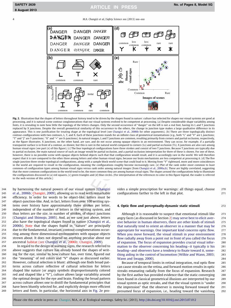
not. And, indeed, Ls and Ts are common, but Xs rare, over the history of human visual signs and nearly a hundred writing system(see the red squares in Fig. 2e). Fig. 2c shows four configuratiotypes that are similar in that they each have three contours antwo T junctions. Despite these similarities, they are not all thsame when it comes to how commonly they can be found in naure. While three of them can be caused by partial occlusions anare thus fairly common, one of them cannot, and is thus rare in naure. Their commonness over the history of writing also shares thasymmetry, the rare-in-nature configuration also rarely occurrinamong human visual signs (see the green diamonds in Fig. 2e
Fig. 1. Evidence that color and shape features on human facial expressions may dreffectiveness of red and ‘‘V’’ shapes for warnings may be due to the fact that thesefaces greener, and angry faces redder. Distribution of colors used in emotional (sdistribution across happy smileys. For example, the data point for blue-and-sad inhappy faces. Data are from two companies: allemoticons.com (the face colors wsmileycentral.com (the face colors were measured from 42 happy faces, 22 sad faredundant because the face (both the color and expression) says it all. Two chaeyebrows, summarized here as the red circle and the ‘‘V’’-like triangle. Just as cofound that a ‘‘V’’ shape (or the ‘‘upside-down’’ triangle) is associated with anger (Along been noticed to be the most effective simple shape for warning (Riley et al.,selected for ‘‘V’’-like shapes. In comparison to random visual signs without a ‘‘V’’way (left side of plot). Visual signs with an upside-down ‘‘V’’ shape are intermedLiungman (2004), and short meanings of the symbols are given (although many hathat citation having these overall shapes; the non-‘‘V’’ category utilized the ‘‘get rthe references to color in this figure legend, the reader is referred to the web ve
Please cite this article in press as: Changizi, M.A., et al. Ecological warnings
he cultural evolution of the features used in emotional visual symbols. In particular, thur on angry faces. (a) Evidence that cartoon drawings of sad faces tend to be bluer, sic
Finally, Fig. 2d shows five configurations having three strokes thaall meet at a single point, or junction, and one can see that some othese require greater coincidental alignments in the world fothem to occur, and are accordingly expected to be rarer in naturAnd measurements show that writing over history mimics this reative frequency distribution (see the blue circles in Fig. 2e).
Commonness in the world drives commonness in writinsomething that can be seen more generally by the entirety of thdata plotted in Fig. 2e (from Changizi et al., 2006b). More generallculture appears to have over centuries selected for written wordthat look object-like (Changizi et al., 2006b; Changizi, 2009), there
obtained from 90 happy faces, 83 sad faces, 85 angry faces, and 29 sick faces) an25 angry faces, and no sick faces). (b) The word ‘‘danger’’ on this warning sign is cleareristic features of a real angry face are its reddish color and its ‘‘V’’ shape due to thhas long been know to have aggressive associations (Osgood, 1960), researchers havff et al., 1988, 1992; Aronoff, 2006; Larson et al., 2007; see also Lee et al., 2006), and h2). (c) Evidence that human visual symbols with cautionary meanings may have bee
pe (right side), visual signs with a ‘‘V’’ shape have a tendency to be cautionary in som, although not significantly lower than for ‘‘V’’ shapes. The data here are acquired fro
ultiple meanings). The ‘‘V’’ and inverted-‘‘V’’ cases have accumulated all the symbolsom symbol’’ feature at the book’s web site ‘‘www.symbols.com’’. (For interpretation
of this article.)
. Safety Sci. (2013), http://dx.doi.org/10.1016/j.ssci.2013.07.012
244 by245 et246 effi247 ob248 te249 in250 th251 (C252 als253 20254 du255 rin256 str257 an258
259 ab260 in261 th262 Ho263 te264 sh265 re266 th267 ac268 ha269 let
c
d)
e)
a
Fig shappro lvedfon ondrep o thap angcon r an‘‘T’ ionsas ongtrahutohoexpsinincomthatheto
4 M.A. Changizi et al. / Safety Science xxx (2013) xxx–xxx
SAFETY 2639 No. of Pages 8, Model 5G
8 August 2013
Pl
(b)
common common rare
none
common common common rare
Occ
lusi
onin
terp
reta
tion(c)
(
(
(a)
. 2. Illustration that the shapes of letters throughout history tend to be driven by thecessing, and it is natural scene contour conglomerations that our visual systems evots, it is revealing to note how little the topology of the letters changes. Only the seclaced by X junctions. Despite the overall geometrical similarity of this occurrence t
pearance. This is one justification for treating shape at the topological level (see Chtour-configurations with two contours, L, T, and X. Each of these junctions stands fo
’ and ‘‘J’’ are T-junctions; ‘‘X’’ and ‘‘+’’ are X-junctions). In natural images, L and T junctthe figure illustrates. X junctions, on the other hand, are rare, and do not occur am
harnessing the natural powers of our visual system (Changizial., 2006b; Changizi, 2009), allowing us to read with remarkableciency. In order for words to be object-like, letters must be
ject-junction-like. And, in fact, letters from over 100 writing sys-ms over history have approximately three strokes per letter,dependent of the number of letters in the writing system, andus letters are the size, in number of strokes, of object junctionshangizi and Shimojo, 2005). And, as we saw just above, letterso have the topological shapes found in nature (Changizi et al.,06b). Note that the shapes found in ‘‘nature’’ are principallye to the fundamental, invariant, contour-conglomerations occur-g among three dimensional environments with opaque objectsewn about. It does not depend on anything peculiar about ourcestral habitat (see Changizi et al., 2006b; Changizi, 2009).In regard to the design of warning signs, the research referred to
ove suggests that culture has already honed the shapes of writ-g for the eye, similar to how culture has, over time, figured oute ‘‘meaning’’ of red colors and ‘‘V’’ shapes as discussed earlier.wever, cultural selection is blunt: although one finds broad pat-
rns across culture reflective of cultural selection for lettersaped like nature (or angry symbols disproportionately coloredd and shaped like a ‘‘V’’), culture allows large variability arounde optimal design for the eye and brain. Finding the broad patternross culture allows one to distill the fundamental principles thatve been bluntly selected for, and explicitly design more efficientters and fonts. In particular, the horizontal axis in Fig. 2e pro-
vidco
4.
ansivthapWfloofmhethW
castrbylinvisthpr
nsparent surface is in front of a contour, as shown; but this is rare in the natural world coman visual signs (see part (e) of this figure). (c) The four topological configurations have tpartial occlusion, the main natural source of such an image would be partial occlusion, anwever, there is no possible scene with opaque objects behind objects such that that confiect that it is rare compared to the other three among letters and other human visual sign
gle junction three-stroke topological configurations, along with a sample block world scenthe world are required to result in the configuration, meaning the configurations rough
mon–of configuration types among human visual signs versus rank order among naturat the more common configurations in the world tend to be, the more common they are amconfigurations discussed in (a) red squares, (c) green triangles and (d) blue circles. (For in
the web version of this article.)
ease cite this article in press as: Changizi, M.A., et al. Ecological warnings. Safet
ommon rare rarelesscommon
lesscommon
Images of scenes
Hum
anvi
sual
sig
ns
Common
Rare
Common Rare
bc
es found in nature: culture has selected for shapes our visual systems are good atto be competent at processing. (a) Despite considerable shape variability amongoccurrence of ‘‘danger’’ on the left is not a real font, having its L and T junctionse others, the change in junction type makes a large qualitative difference in itsizi et al., 2006b for other arguments). (b) There are three topologically distinctinfinite class of geometrical instantiations (e.g., both ‘‘L’’ and ‘‘V’’ are L junctions;are common, resulting primarily from corners and partial occlusion, respectively,opaque objects in an environment. They can occur, for example, if a partially
270es a simple prescription for warnings: all things equal, choose271nfigurations farther to the left in that plot.
272Optic flow and perceptually-dynamic static stimuli
273Although it is reasonable to suspect that emotional stimuli like274gry faces (as discussed in Section 2) may serve best to elicit aver-275e behavior in human observers, there are other kinds of stimuli276at naturally tend to orient an observer in a manner that may be277propriate for warnings. One important kind concerns optic flow.278hen you move forward, the visual stimuli in your environment279w radially away from a point out in front of you called the focus280expansion. The focus of expansion provides crucial visual infor-281ation to the observer concerning his heading—it typically is his282ading—and observers have a tendency to fixate toward it, some-283ing aiding in the control of locomotion (Wilkie and Wann, 2003;284ann and Swapp, 2000).285Because of temporal limits in retinal integration, real optic flow286n cause streaks on the retina, and forward motion results in optic287eaks emanating radially from the focus of expansion. Research288the first author has provided evidence that the static converging289es found in classical geometrical illusions are interpreted by our290ual system as optic streaks, and that the visual system is ‘‘under291e impression’’ that the observer is moving forward toward the292esumed focus of expansion, i.e., heading toward the vanishing
mpared to corners (Ls) and partial occlusion (Ts). X junctions are also rare amonghree strokes and consist of two T junctions. Because T junctions are typically dued a partial occlusion interpretation for three of these is shown. For one of these,guration would result, and it is accordingly rare in the world. We will therefores, because our brain mechanisms are less competent at processing it. (d) The fivee that could lead to it. Moving from ‘‘Y’’ rightward, more and more coincidencesly become increasingly rare. (e) Plot of the rank order–most common to leastl images (from Changizi et al., 2006a,b). These are highly correlated, suggestingong human visual signs. The shapes around the configurations help to illuminateterpretation of the references to color in this figure legend, the reader is referred
y Sci. (2013), http://dx.doi.org/10.1016/j.ssci.2013.07.012
293 zi294 -295 s296 a297 -298 t299
300
301
302
303
304
305
306
307
308
309
310
311
312
313
314
315
316
317
318
319
320
321
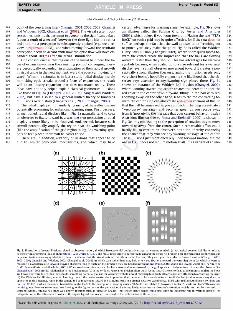
322certain advantages for warning signs. For example, Fig. 3b shows323an illusion called the Bulging Grid by Foster and Altschuler324(2001), which bulges if you loom toward it. Placing the text ‘‘STAY325BACK’’ on such a grid may be quite effective, for if the text does not326suffice, perhaps the fact that the wall appears to be ‘‘reaching out327to punch you’’ may make the point. Fig. 3c is called the Widders
M.A. Changizi et al. / Safety Science xxx (2013) xxx–xxx 5
SAFETY 2639 No. of Pages 8, Model 5G
8 August 2013
point of the converging lines (Changizi, 2001, 2003, 2009; Changiand Widders, 2002; Changizi et al., 2008). The visual system possesses mechanisms that attempt to overcome the significant delay(about a tenth of a second) between the time light hits the retinand the time a perception is subsequently elicited (e.g., see a review in Nijhawan (2008)), and when moving forward the resultan
perception needs to accord with how the optic flow will have ex--
h-yltess,s
ee,xl
ht-
ee
328Fuzzy Balls Illusion (Changizi, 2009), where short quick looms to-329ward the center create the impression that the balls are flowing330outward faster than they should. This has advantages for warning331symbols because, when scaled up to a size relevant for a warning332display, even a small observer movement toward it creates a per-333ceptually strong illusion (because, again, the illusion needs only334very short looms), hopefully enhancing the likelihood that the ob-335server pays attention to any warning sign placed there. Fig. 3d336shows an instance of the Widders Ball Illusion (Changizi, 2009),337where looming toward the center creates the perception that the338red color in the center flows outward, filling up the ball with red.339Looming away, on the other hand, leads to the red contracting to-340ward the center. One can also create red–green versions of this, so341that the ball becomes red as you approach it (helping accentuate a342‘‘keep away’’ message), and becomes green as you recede away343from it (now giving the message that your current behavior is safe).344A striking illusion due to Pinna and Brelstaff (2000) is shown in345e346d347g348r.349e350-
(c)
pote des s ntrea 1,
adia gion g
er sq ezzy sing e.
pres eulu d
rota ottion akes’’ ored t
panded about 100 ms after the retinal stimulation.One consequence is that regions of the visual field near the fo
cus of expansion—or near the vanishing point of converging lines—are perceptually expanded (in anticipation of their actual growtin visual angle in the next moment, were the observer moving forward). When the stimulus is in fact a static radial display merelmimicking optic streaks around a focus of expansion, the resuwill be an illusory expansion that does not match reality. Thesideas have not only helped explain classical geometrical illusionlike those in Fig. 3a (Changizi, 2001, 2003; Changizi and Widder2002), but have also led to a general unified theory of hundredof illusions over history (Changizi et al., 2008; Changizi, 2009).
The radial display stimuli underlying many of these illusions arpotentially promising for enhancing warning signs. First, becausas mentioned, radial displays like in Fig. 3a naturally tend to coaan observer to fixate toward it, a warning sign possessing a radiadisplay is more likely to be observed. And, second, because sucstimuli perceptually amplify the region near the vanishing poin(like the amplification of the grid region in Fig. 3a), warning symbols or text placed there will be easier to see.
There are, in addition, a variety of illusions that appear to bdue to similar perceptual mechanisms, and which may hav
(a) (b)
(d) (e)
Fig. 3. Illustration of several illusions related to observer motion, all which haveto the Hering/Ehrenstein illusion (Ehrenstein, 1925; Orbison, 1939). The radial linhelp accentuate a warning symbol. Also, there is evidence that the visual system2003, 2009; Changizi and Widders, 2002; Changizi et al., 2008), in which case rmessage is placed) because forward-moving observers tend to fixate on the directGrid’’ illusion (Foster and Altschuler, 2001). When an observer fixates on a checkChangizi et al. (2008) for its relationship to the illusion in (a). (c) In the Widders Fuare flowing outward faster than they should, something potentially of use for warn(d) The Widders Ball Illusion, wherein looming toward the center creates the imopposite). In this instance, red is in the center, and so movement toward the stimBrelstaff (2000) in which movement toward the center leads to the perception ofrequiring any observer movement. Just looking at the figure creates the percepwarning symbol. Kitaoka has other well-known illusions such as ‘‘Rotation Snainterpretation of the references to color in this figure legend, the reader is referr
Please cite this article in press as: Changizi, M.A., et al. Ecological warnings
Fig. 3e, this one leading to the perception of rotation as you movtoward or away from the center. Such a remarkable effect coulhardly fail to capture an observer’s attention, thereby enhancinthe chance that they will see any warning message at the centeThese illusions just mentioned rely upon forward motion, but thone in Fig. 3f does not require motion at all. It is a variant of an illu
(f)
ntial design advantages as warning symbols. (a) A classical geometrical illusion relateerve to perceptually expand the visual field region near the vanishing point, which cats these radial lines as if they are optic smear due to forward motion (Changizi, 200l lines may help orient eye fixations toward the vanishing point (at which a warninthey are headed in (Wilkie and Wann, 2003; Wann and Swapp, 2000). (b) The ‘‘Bulginuare and looms toward it, the grid appears to bulge outward toward the observer. SeBlob Illusion, short quick looms toward the center lead to the impression that the blobsymbols since it may help to initially attract a person’s attention to a warning messagsion that the inner color spreads outward to fill the ball (and looming away does ths leads to a greater negative warning (i.e., filled with red). (e) An illusion by Pinna anting circles. (f) An illusion related to Akiyoshi Kitaoka’s ‘‘Hearts and tears,’’ this one nof motion, likely attracting an observer’s attention, which can then be directed to(not shown here), which could also serve an important role in warning design. (F
o the web version of this article.)
. Safety Sci. (2013), http://dx.doi.org/10.1016/j.ssci.2013.07.012
351 sio352 tio353 wa354 cre355 or356 no
357 5.
358
359 (w360 ap361 th362 pi363 m364 ap365 dr366 –367 hy368 tic369 hu370 ab371 ha372 th373 m374 (se375 sp376
377 an378 tio379 di380 po381 –382 pr383 (W384 re385 (1386 ve387 su388 clo389 ch390 or391 tia392 th393 th394 de395 th396
397 we398 as399 in400 sh401 te402 m403 co404 na405 up406 in407 (b408 sh409 th410 tio411 vis412
413 vic
414to415ar416m417sig
Figcov(wintto
Q5
6 M.A. Changizi et al. / Safety Science xxx (2013) xxx–xxx
SAFETY 2639 No. of Pages 8, Model 5G
8 August 2013
Pl
n invented by Akiyoshi Kitaoka, and one perceives vertical mo-n (center column moving downward, side columns moving up-rd), as if the tear drops or blurs are moving on the page. Such aepy perceptual ‘‘crawling’’ of the surface is potentially strongly
ienting for observers, at least encouraging them to stop and taketice.
Discussion
Our intent here has been to bring greater attention to ecologicalith a lower-case ‘e’, as opposed to Gibsonian ‘‘direct perception’’proaches) and evolutionary approaches in vision, with the hopeat by better understanding the fundamental evolutionary under-nnings of visual stimuli, one can design warning stimuli evenore effective at communicating safety information and elicitingpropriate behavioral responses in observers. The approaches ad-essed here emanate from fundamental ecological invariants, notas is often the (unfair) caricature of evolutionary psychology –pothesized peculiar features of an ancestral environment. In par-ular, the three sections here concerned visual characteristics ofman faces, natural scenes (filled with opaque objects strewnout), and optic flow during forward movement. Although weve concentrated entirely on visual stimuli, an appreciation ofe ecological and evolutionary foundation of any of our sensoryodalities will aid in the construction of more effective warningse an examination of the ecological auditory foundations of
eech in music in Changizi, 2011).The illusions we saw in Fig. 3b–f, despite being static figures
d thus candidates for a warning sign, lead to dynamical percep-ns–perceptions of movement—in many cases contingent on the
rection of motion of the observer. Such stimuli open up thessibility for warning symbols that ‘‘turn on’’ only when needede.g., a ball that turns strongly red only when an observer ap-oaches a dangerous device – without the need for any technologyogalter and Mayhorn, 2006), screen, or electricity. Although
lying on unrelated perceptual mechanisms, Schyns and Oliva999) have devised faces that only appear angry when the obser-r is at a certain distance from the image, allowing for signs thatddenly become angry and alerting when an observer gets toose. Also in the context of static stimuli which perceptually
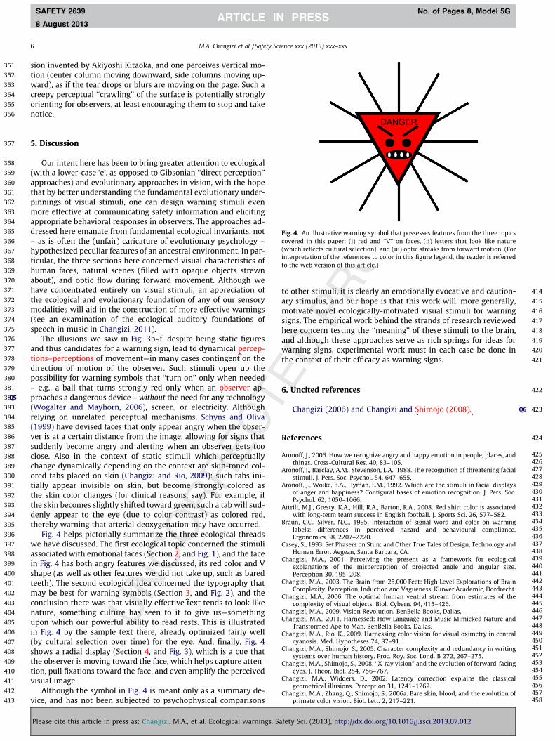
ange dynamically depending on the context are skin-toned col-ed tabs placed on skin (Changizi and Rio, 2009): such tabs ini-lly appear invisible on skin, but become strongly colored ase skin color changes (for clinical reasons, say). For example, ife skin becomes slightly shifted toward green, such a tab will sud-nly appear to the eye (due to color contrast) as colored red,ereby warning that arterial deoxygenation may have occurred.Fig. 4 helps pictorially summarize the three ecological threadshave discussed. The first ecological topic concerned the stimuli
sociated with emotional faces (Section 2, and Fig. 1), and the faceFig. 4 has both angry features we discussed, its red color and Vape (as well as other features we did not take up, such as baredeth). The second ecological idea concerned the typography thatay be best for warning symbols (Section 3, and Fig. 2), and thenclusion there was that visually effective text tends to look liketure, something culture has seen to it to give us—somethingon which our powerful ability to read rests. This is illustratedFig. 4 by the sample text there, already optimized fairly well
y cultural selection over time) for the eye. And, finally, Fig. 4ows a radial display (Section 4, and Fig. 3), which is a cue thate observer is moving toward the face, which helps capture atten-n, pull fixations toward the face, and even amplify the perceivedual image.Although the symbol in Fig. 4 is meant only as a summary de-e, and has not been subjected to psychophysical comparisons
heanwath
6.
Re
Aro
Aro
Aro
Att
Bra
Ca
Ch
Ch
Ch
ChCh
Ch
Ch
Ch
Ch
Ch
ease cite this article in press as: Changizi, M.A., et al. Ecological warnings. Safet
other stimuli, it is clearly an emotionally evocative and caution-y stimulus, and our hope is that this work will, more generally,otivate novel ecologically-motivated visual stimuli for warningns. The empirical work behind the strands of research reviewed
DANGER
. 4. An illustrative warning symbol that possesses features from the three topicsered in this paper: (i) red and ‘‘V’’ on faces, (ii) letters that look like nature
hich reflects cultural selection), and (iii) optic streaks from forward motion. (Forerpretation of the references to color in this figure legend, the reader is referredthe web version of this article.)
418re concern testing the ‘‘meaning’’ of these stimuli to the brain,419d although these approaches serve as rich springs for ideas for420rning signs, experimental work must in each case be done in421e context of their efficacy as warning signs.
422Uncited references
423Changizi (2006) and Changizi and Shimojo (2008).
424ferences
425noff, J., 2006. How we recognize angry and happy emotion in people, places, and426things. Cross-Cultural Res. 40, 83–105.427noff, J., Barclay, A.M., Stevenson, L.A., 1988. The recognition of threatening facial428stimuli. J. Pers. Soc. Psychol. 54, 647–655.429noff, J., Woike, B.A., Hyman, L.M., 1992. Which are the stimuli in facial displays430of anger and happiness? Configural bases of emotion recognition. J. Pers. Soc.431Psychol. 62, 1050–1066.432rill, M.J., Gresty, K.A., Hill, R.A., Barton, R.A., 2008. Red shirt color is associated433with long-term team success in English football. J. Sports Sci. 26, 577–582.434un, C.C., Silver, N.C., 1995. Interaction of signal word and color on warning435labels: differences in perceived hazard and behavioural compliance.436Ergonomics 38, 2207–2220.437sey, S., 1993. Set Phasers on Stun: and Other True Tales of Design, Technology and438Human Error. Aegean, Santa Barbara, CA.439angizi, M.A., 2001. Perceiving the present as a framework for ecological440explanations of the misperception of projected angle and angular size.441Perception 30, 195–208.442angizi, M.A., 2003. The Brain from 25,000 Feet: High Level Explorations of Brain443Complexity, Perception, Induction and Vagueness. Kluwer Academic, Dordrecht.444angizi, M.A., 2006. The optimal human ventral stream from estimates of the445complexity of visual objects. Biol. Cybern. 94, 415–426.446angizi, M.A., 2009. Vision Revolution. BenBella Books, Dallas.447angizi, M.A., 2011. Harnessed: How Language and Music Mimicked Nature and448Transformed Ape to Man. BenBella Books, Dallas.449angizi, M.A., Rio, K., 2009. Harnessing color vision for visual oximetry in central450cyanosis. Med. Hypotheses 74, 87–91.451angizi, M.A., Shimojo, S., 2005. Character complexity and redundancy in writing452systems over human history. Proc. Roy. Soc. Lond. B 272, 267–275.453angizi, M.A., Shimojo, S., 2008. ‘‘X-ray vision’’ and the evolution of forward-facing454eyes. J. Theor. Biol. 254, 756–767.455angizi, M.A., Widders, D., 2002. Latency correction explains the classical456geometrical illusions. Perception 31, 1241–1262.457angizi, M.A., Zhang, Q., Shimojo, S., 2006a. Bare skin, blood, and the evolution of458primate color vision. Biol. Lett. 2, 217–221.
Q6
y Sci. (2013), http://dx.doi.org/10.1016/j.ssci.2013.07.012
459 Changizi, M.A., Zhang, Q., Ye, H., Shimojo, S., 2006b. The structures of letters and460 symbols throughout human history are selected to match those found in objects461 in natural scenes. Am. Nat. 167, E117–E139.462 Changizi, M.A., Hsieh, A., Nijhawan, R., Kanai, R., Shimojo, S., 2008. Perceiving-the-463 present and a systematization of illusions. Cognitive Sci. 32, 459–503.464 Chapanis, A., 1994. Hazards associated with three signal words and four colors on465 warning signs. Ergonomics 37, 265–275.466 Christ, R.E., 1975. Review and analysis of color coding research for visual displays.467 Hum. Factors 17, 542–570.468 D’Andrade, R., Egan, M., 1974. The colors of emotion. Am. Ethnol. 1, 49–63.469 Darwin, C., 1899. The Expression of the Emotions in Man and Animals. D. Appleton470 and Company, New York and London (Reprinted by University of Chicago Press,471 Chicago, 1965).472 Davies, S., Haines, H., Norris, B., Wilson, J.R., 1998. Safety pictograms: are they473 getting the message across? Appl. Ergonomics 29, 15–23.474 Ehrenstein, W., 1925. Versuche ueber die Beziehungen zwischen Bewegungs- und475 Gestaltwahrnehmung. (Experiments on the relationships between the476 perception of motion and of gestalt). Zeitschrift fuer Psychologie 96, 305–352.477 Ekman, P., Friesen, W.V., 2003. Unmasking the Face. Malor Books, Cambridge.478 Ekman, P., Friesen, W.V., Hager, J.C., 2002. Facial Action Coding System. A Human479 Face, Salt Lake.480 Foster, C., Altschuler, E.L., 2001. The bulging grid. Perception 30, 393–395.481 Frascara, J., 2006. Typography and the Visual Design of Warnings. In: Wogalter, M.S.482 (Ed.), Handbook of Warnings. Lawrence Erlbaum Assoc., Mahwah, NJ, pp. 385–483 405.484 Hill, R.A., Barton, R.A., 2005. Red enhances human performance in contests: signals485 biologically attributed to red coloration in males may operate in the arena of486 combat sports. Nature 435, 293.487 Hingston, R.W.G., 1933. The Meaning of Animal Color and Adornment. Edward488 Arnold, London.489 Larson, L.C., Aronoff, J., Stearns, J.J., 2007. The shape of threat: simple geometrical490 forms evoke rapid and sustained capture of attention. Emotion 7, 526–534.491 Lee, H.S., Park, J.W., Chung, M.J., 2006. An Affect-Expression Space Model of the Face492 in a Mascot-Type Robot. In: Proceeding of IEEE/RAS International Conference on493 Humanoid Robots, pp. 412–417.
494Leonard, S.D., Otani, J., Wogalter, M.S., 1999. Comprehension and Memory. In:495Wogalter, M.S., DeJoy, D.M. (Eds.), Warnings and Risk Communication. Taylor &496Francis, London, pp. 149–187.497Liungman, C.G., 2004. Symbols – Encyclopedia of Western Signs and Ideograms.498HME Publishing, London.499Nijhawan, R., 2008. Visual prediction: psychophysics and neurophysiology of500compensation for time delays. Behav. Brain Sci. 31, 179–198.501Orbison, W.D., 1939. Shape as a function of the vector-field. Am. J. Psychol. 52, 31–50245.503Osgood, C.E., 1960. The cross-cultural generality of visual-verbal synesthetic504tendencies. Behav. Sci. 5, 146–169.505Pinna, B., Brelstaff, G.J., 2000. A new visual illusion of relative motion. Vision. Res.50640, 2091–2096.507Riley, M.W., Cochran, D.J., Ballard, J.L., 1982. An investigation of preferred shapes for508warning labels. Hum. Factors 24, 737–742.509Schyns, P.G., Oliva, A., 1999. Dr. Angry and Mr. Smile: when categorization flexibly510modifies the perception of faces in rapid visual presentations. Cognition 69,511243–265.512Wann, J.P., Swapp, D.K., 2000. Why you should look where you are going. Nat.513Neurosci. 3, 647–648.514Wickler, W., 1967. Socio-sexual signals and their intra-specific imitation among515primates. In: Morris, D. (Ed.), Primate Ethology. Weidenfeld and Nicolson,516London, pp. 69–147.517Wilkie, R.M., Wann, J.P., 2003. Eye-movements aid the control of locomotion. J.518Vision 3, 677–684.519Wogalter, M.S., Mayhorn, C.B., 2006. The Future of Risk Communication:520Technology-Based Warning Systems. In: Wogalter, M.S. (Ed.), Handbook of521Warnings. Lawrence Erlbaum Associates, Mahwah, NJ.522Wogalter, M.S., Kalsher, M.J., Frederick, L.J., Magurno, A.B., Brewster, B.M., 1998.523Hazard level perceptions of warning components and configurations. Int. J.524Cogn. Ergonom. 2, 123–143.525Wogalter, M.S., Silver, N.C., Leonard, S.D., Zaikina, H., 2006. Warning Symbols. In:526Wogalter, M.S. (Ed.), Handbook of Warnings. Lawrence Erlbaum Assoc.,527Mahwah, NJ, pp. 159–176.
528
M.A. Changizi et al. / Safety Science xxx (2013) xxx–xxx 7
SAFETY 2639 No. of Pages 8, Model 5G
8 August 2013
Please cite this article in press as: Changizi, M.A., et al. Ecological warnings. Safety Sci. (2013), http://dx.doi.org/10.1016/j.ssci.2013.07.012


![B737 NG - Aerocadet warnings, landing gear warnings, takeoff configuration warnings, ... Boeing B737 NG - Systems Summary [Warning Systems] Page 1. G](https://img.pdfslide.us/doc/110x75/5aac9a5a7f8b9aa9488d350f/b737-ng-warnings-landing-gear-warnings-takeoff-configuration-warnings-boeing.jpg)