Embed Size (px)
Citation preview

Ec100 Economics A
Microeconomics
Michaelmas Term 2017/18
Alan Manning
Contact details:
Lecturer, Alan Manning, [email protected]
Course Manager, Roberto Sormani, [email protected]
Although I have tried to make sure these notes are clear and without error, there is always room for
improvement. Please email corrections or suggested improvements to me or Roberto.
2
Contents Page
1. Introduction 5
1.1 use of these notes 5
1.2 what is economics? 5
1.3 Markets 7
1.4 The Hockey Stick of History 9
1.5 Specialization and Exchange 10
1.6 Innovation and Exchange 10
1.7 Distribution and inequality 12
1.8 Economics as a science 13
1.9 Controversy in economics: positive and normative questions 14
2. A Simple Model of a Market 15
2.1 Economists and Models 15
2.2 A stylized Model of a market 15
2.2.1 Demand, supply and price 15
2.2.2 The market‐clearing price 16
2.2.3 Do prices always clear markets? 19
2.3 Comparative statics 19
2.3.1 A shift in the demand curve 20
2.3.2 A shift in the supply curve 20
2.3.3 The price elasticity of demand and supply 22
2.4 Bubbles 23
3. Are Market Outcomes Good or Bad 27
3.1 The Gains from Trade, absolute and comparative advantage 27
3.2 Free trade agreements 30
3.3 Uber 31
3.4 The Case for Markets, Consumer and Producer Surplus 31
3.5 Central Planning 34
3.6 The Sources of Market Failure 39
3.6.1 Equity Considerations 39
3.6.2 Market Pathologies 40
3.7 Wider Impacts of Markets on Attitudes 42
3.8 Conclusion 43
4. Household Behaviour 44
4.1 Consumer demand 44
4.1.1 The budget constraint 44
4.1.2 Indifference curves 45
4.1.3 Combining indifference curves and the budget constraint 48
4.2 Comparative statics 49
4.2.1 A change in income: the income effect 49
4.2.2 A change in prices: the substitution effect 50
4.3 Incentives 53
4.4 Labour Supply 53
4.4.1 Preferences and budget constraint 53
4.4.2 A change in non‐labour income 55
4.4.3 A change in wages 56
4.4.4 Application: the top rate of income tax 57
4.4.5 Application: helping the poor 57
5. Firms: Production and Prices 60
5.1 What do firms do? 60
5.2 Pricing 60
5.2.1 The revenue function, average revenue and marginal revenue 60
3
5.2.2 The cost function, average cost and marginal cost 63
5.2.3 Returns to scale 64
5.2.4 Profit maximization 66
5.2.5 Comparative statics: a change in costs 68
5.2.6 Entry and exit 68
5.2.7 Comparative statics: a change in demand 69
5.2.8 The mark‐up 71
5.3 Market Structure 72
5.3.1 Factors affecting the demand curve for a firm’s products 72
5.3.2 Forms of market structure 72
5.3.3 The sources of monopoly 72
5.3.4 Oligopoly 73
5.3.5 Monopolistic competition 74
5.3.6 Perfect competition 76
5.3.7 A normative comparison of market structures 79
5.4 Price Discrimination 81
6. Firms: Costs, Factor Demands and Innovation 83
6.1 The production function 83
6.1.1 average product and marginal product 83
6.1.2 Isoquants 84
6.1.3 Substitutes and complements in production 85
6.2 Cost minimization 86
6.2.1 Iso‐cost Curves 87
6.2.2 Changing the relative price of inputs: the substitution effect 88
6.3 The scale effect 89
6.4 Combining substitution and scale effects: factor demand curves 90
6.5 Application: The Labour Market Impact of Immigration 91
6.6 Application: the Employment Effect of a Minimum Wage 92
6.7 The sources of pay differentials 92
6.8 Monopsony 94
6.9 The Gender pay gap and the Equal Pay Act 95
6.10 The impact of a minimum wage in a Monopsonistic Labour Market 96
6.11 The impact of new technology on the demand for labour 98
6.12 Innovation 101
7. Inequality and Redistribution 104
7.1 Pen’s People’s Parade 104
7.2 Measuring Inequality: Lorentz Curves and Gini Coefficients 106
7.3 Variation in Income Inequality Across Countries and Over Time 107
7.4 The sources of income inequality 111
7.5 Redistribution 112
7.5.1 Why does redistribution exist? 114
7.5.2 Designing redistribution 115
7.5.3 Average and marginal tax rates 116
7.5.4 Universal Basic Income 118
7.6 The rise in the income shares of the top 1% 120
4
8. Externalities, public goods and common resources 127
8.1 What is an externality? 127
8.2 Why externalities are a source of market failure? 127
8.3 Policies for externalities 128
8.3.1 Markets and property rights 128
8.3.2 Taxes and subsidies 129
8.3.3 Regulation 130
8.3.4 Cap‐and trade: carbon markets 131
8.4 A typology of goods 132
8.5 Public goods 133
8.6 Common pool resources 134
9. Information and Markets 137
9.1 Asymmetric Information 137
9.2 The market for Lemons 137
9.3 Adverse selection 138
9.3.1 Health insurance 139
9.3.2 Interbank markets in the financial crisis 139
9.3.3 Bank runs 140
9.4 Moral Hazard 141
9.5 Application: Illegal online drugs markets 141
10. Conclusion 144
5
1. INTRODUCTION (Acemoglu, Laibson, List, Chapters 1 and 2)
1.1 Use of These Notes
These notes are intended as ‘skeleton notes’ to explain what I say in the lectures and to follow, more
or less, the structure of the lectures.
They are intended to help students with understanding the overall structure of the course and as a
bridge between the lectures and the textbook and other books.
They are not intended as a substitute for the use of the textbook, Acemoglu, Laibson and List which
provides explanations of the concepts in greater depth than these notes.
1.2 What is Economics?
Perhaps the most famous definition of economics is due to Lionel Robbins, who was an LSE professor
and has the library building named after him. He defined economics as “the science which studies
human behaviour as a relationship between ends and scarce means which have alternative uses”.
There are several elements of this and we will discuss them in turn but let’s start with the last part.
Saying we have scarce means is saying that we don’t have unlimited resources available to us so that
we have to make choices about the way in which we use those resources. We cannot get everything
that we would like so we have to prioritise. In the words of another LSE alumnus, Mick Jagger, “you
can’t always get what you want”. This part of Robbins’ definition can be used to justify a very wide
definition of economics. You have one vote, and several political parties competing for that vote, so
you have to choose which party to vote for. In most societies you can marry just one person so you
have to make a choice about who your spouse is going to be. These topics are not the traditional
subject matter of economics. Something closer to traditional economics is the choice you make
about what to spend your limited income on. But, there are people calling themselves economists
writing about topics which seem closer to political science or sociology or some other social science.
However we will not be discussing these applications of “economics” in this course.
Choices are necessary because people have limited resources relative to their desires. The general
approach that economics takes to understanding people’s choices is that individuals weigh up the
costs and benefits of different courses of action and the choose the one that they think offers the
greatest benefits relative to costs. We will see lots of examples of this later on in the course. One
implication of this is that people are likely to respond to incentives, by which I mean that if you alter
the costs and benefits of different actions you are likely to alter people’s behaviour. If the benefit
from one course of action rises, people are more likely to take that course of action. A focus on
incentives is a key part of the way in which economists think about many issues as we will see later
on in the course.
I have emphasised how Robbins’ definition of economics can be interpreted in a very broad way to
encompass most if not all of the decisions that people have to make. But there is another sense in
which Robbins’ definition is very narrow. If you are alone on a desert island with limited resources,
you will have to make choices about what to do with those resources. Should you use the wood to
build a fire to try and attract passing ships, or should you build a shelter against the storms? But you
are just an isolated individual on your desert island and the decisions that you make affect no‐one
but yourself. But most of the decisions that we make affect others, not just ourselves. We are much
more interested in the interactions between people, something not mentioned at all in Robbins’
definition.

6
Humans are social animals and have always lived in groups, interacting with each other. One view of
society is that it just consists of people doing things for other people or doing things to other people.
A very large part of what we do (perhaps everything?) can be put in one or other of these categories.
When I say I am doing something for somebody else, that has the connotation that I am doing
something that they appreciate and value. On the other hand, if I do something to somebody that
has the connotation it is something that they don’t like. At the risk of crude generalisation, I think it
is reasonable to say that the quality of life is higher in societies that largely consist of people doing
things ‘for’ each other and lower when they do things ‘to’ each other. Though all societies, from the
most dysfunctional to the most flourishing consist of both types of behaviour in varying proportions.
As social scientists hoping to improve the quality of people’s lives, we can be thought of as trying to
increase the number of things people do ‘for’ each other and decrease the things they do ‘to’ each
other. To increase co‐operation and reduce conflict. Even where there is no actual conflict, only the
threat of conflict, people spend scarce resources on protecting themselves, when those resources
could be better used doing something of benefit to you or someone else.
Why is co‐operation desirable? There are several advantages that living in groups and co‐operating
offers humans and other social animals. First, there are what we will call later on in these notes
“economies of scale” ‐ the whole is more than the sum of the parts. Together we can bring down a
mammoth when an individual could not. Secondly, there is a gain from insurance. You may be
lucky in your hunting today and have more food than you need, I may be unlucky and at risk of
starvation. Perhaps you offer to share your food today in exchange for being given some food when
I am lucky and you unlucky in hunting. Thirdly, there is potentially a gain from specialization. I may
be good at spear‐making but rubbish at hunting, you bad at spear‐making but great at hunting.
Perhaps I should specialize in making spears, you in hunting, and I then give you some spears in
exchange for the food you hunt. And as I spend more of my time in spear‐making and you in
hunting, the differences in our abilities in these two tasks are likely to grow. But there are also
perhaps costs of living in large groups – perhaps I try to survive not by co‐operating to make sure the
tribe catches enough food but by stealing some of the food others have caught without contributing
anything in return.
As these examples have shown, the tensions between ‘doing for’ and ‘doing to’ have existed since
humans evolved. But modern societies are much more complex and the ways in which people
interact very varied.
There are times when it is very obvious that somebody is doing something for you ‐ one of your
fellow students may have held the door open for you on your way into this lecture theatre. But there
are lots of other times when the people who are doing things for you are not so obvious, and are
likely to be unknown to you. If you go into a cafe to buy a cup of coffee, there is a farmer
somewhere in the world who grew the beans for that cup of coffee. They did not know it was for
you when they did it, but that’s the way it ended up. Someone else roasted the beans, someone
transported them to the UK, someone built the cafe, someone hired the worker and that worker
made your Frappalappacino™. For you to have a simple (or not so simple) cup of coffee, a lot of
people have done something for you.
Why do people do things for each other? Sometimes you just do things for people without
expectation of any return, even now or in the future ‐ perhaps you just think it is the right thing to
do. But often we do things for each other because we expect something in return, something we call
exchange. The simplest form of exchange will be two people engaged in mutual cooperation. There
are lots of places where exchange takes place ‐ in households, in the wider community, just out in
the streets, in firms and elsewhere. Exchange is going to be the subject of this course. But we’re only
7
going to talk about one type of exchange, the type that takes place in markets. Here the nature of
exchange may not be so obvious. In exchange for a cup of coffee I give somebody some coins – in
turn, that enables them to get somebody else to do something for them when they pass those coins
on to someone else. Where did you get those coins? For a worker it’s from doing something for
somebody else – I get my bits of metal by, among other things, giving lectures.
1.3 Markets
So one can think of markets mediated by money as a way in which we get people to do things for
other people in very complicated interactions. Sometimes people talk as if markets are outside of
human society, people talk about a free market. But markets are always governed by laws and
conventions so are always social constructs. They are interesting because they might seem to be
institutions primarily of conflict between people (e.g. in the labour market employers want low
wages, workers want high wages) so it is not obvious to many how they can also be institutions to
sustain co‐operation between people (in the labour market, workers want a job, employers want the
output that workers produce).
The view that markets are one way to facilitate co‐operation between people is a controversial one
in some quarters. Some people who think that co‐operation is a good thing believe that markets get
in the way of co‐operation ‐ set workers against bosses, consumers against corporations, so are a
source of conflict not co‐operation. Some other people go to the opposite extreme and assume that
markets are always the best way to facilitate co‐operation. My personal view is that there is right
and wrong in both views ‐ markets can work well in some situations but they can also be
dysfunctional.
If markets are a place where both cooperation and conflict, that is perhaps not surprising. Other
social institutions that are used for exchange also have these features. One example would be
households – a place where people cooperate to produce both material and emotional benefits but
also an institution where there can also be conflict.
In this course I’m going to focus almost entirely on exchange which is mediated by markets to
explain when and how they can work well but also the sources of what economists call “market
failure”, and how, in these circumstances we might be able to improve things through well‐chosen
policies. The sort of economics that I am going to discuss is really an alternative definition of
economics from Alfred Marshall (writing about 1900) who defined economics as “the study of
mankind in the ordinary business of life” (a bit of sexism in the use of the term mankind but it was
1900).
One can tell a parable about how markets emerged in human society. A tribe one day bumps into
another tribe and likes the look of some stuff the other tribe have. They might – and this almost
certainly happened a lot of time in human history – simply tries to take it by force, giving nothing in
exchange. That might be a good strategy for a one‐off interaction but is not so good if you would
like what they have on a continuing basis. They might try to avoid meeting you, or, if they cannot
avoid that, take to arming themselves with weapons to defend themselves or even to attack you.
Because of this possibility you have to divert resources to arming your own tribe. But exchange and
a market offers a different way. In exchange for what they have that you want, you offer them
sufficient other stuff that they voluntarily exchange what you want for what you offer. Now they
positively want to meet you, to do the same again and, after a while, there may even be an
agreement to meet at a certain time or place for the purpose of exchange and both tribes come
equipped with stuff for that purpose. A market has been born, albeit one based on bilateral
8
exchange of one good for another, without the modern invention of an explicit price in terms of
something called ‘money’.
Markets have come a long way since this ‘founding myth’. In a prototypical modern market, we can
identify a buyer, a seller and a price that at which they exchange some good or service. But it is
important to remember that there are many other social institutions apart from markets through
which exchange is conducted. And this recognition leads one to recognize that there are some
situations where we have to decide whether markets are the best way to organize exchange. There
are some areas where we actively forbid markets ‐ until 250 years ago slavery was very common in
many human societies but is now forbidden everywhere – you are not allowed to buy and sell
people. But what about bits of people? ‐ you are not allowed to buy and sell blood or organs in
most countries although Australia and Singapore legalized compensation for living organ donors in
2013. And the sale of blood plasma is legal in more jurisdictions.
But there are other areas where we deliberately create markets where they didn’t spontaneously
exist ‐ a good example of that would be carbon trading markets designed to limit global warming.
We will discuss this market more later on in the course.
There are other areas where markets are simply tolerated and arise spontaneously. A famous
example is the markets, using cigarettes as currency, that sprang up in German prisoner‐of‐war
camps in the second world war and described in a famous article by R.A. Radford (you can find it
here if you are interested in reading the original http://icm.clsbe.lisboa.ucp.pt/docentes/url/jcn/ie2/0POWCamp.pdf ).
One of the reasons it is interesting is that many of the controversies around markets played out in a
small scale within the POW camps e.g. about whether the market was fair, whether certain types of
behaviour was moral.
Later, this course discusses online markets in illegal drugs. This is criminal activity, so it’s not that
society encourages a market for these goods. But there are people who want to buy illegal drugs
and people who are happy to sell illegal drugs to them and online markets have sprung up as a way
of connecting these two groups of people. Similarly, there are those who would like to migrate from
parts of Africa and Asia to Europe but have no legal means to do so – a market in people trafficking
then emerges to meet this frustrated demand. These markets are an important part of the current
asylum and refugee crisis.
These questions about where the limits of markets should be drawn are very interesting but, again,
we are not going to cover them in this course.
How important are markets in facilitating exchange relative to other institutions? That’s a very hard
question to answer but it’s probably the case that most exchanges between people (and perhaps the
most important exchanges) are not in markets but within households, maybe within firms, maybe
just in the community among friends. These are exchanges between people which don’t have a
price mediating that transaction. A Nobel Prize winner in economics, Herbert Simon, estimated that
20% of exchanges in human societies as a whole were done through markets – don’t ask me too
many questions about how he arrived at that figure.
In determining the quality of life it is often the quality of people’s relationships with other people
that is found to be more important than people’s income. The OECD has constructed a ‘better life
index’ (which can be found here http://www.oecdbetterlifeindex.org/#/11111111111) in which they
put together a variety number of measures to try and construct a measure of the overall quality of
life. This index uses a number of factors ‐ material living conditions (housing, income, jobs) and
9
quality of life (community, education, environment, governance, health, life satisfaction, safety and
work‐life balance).
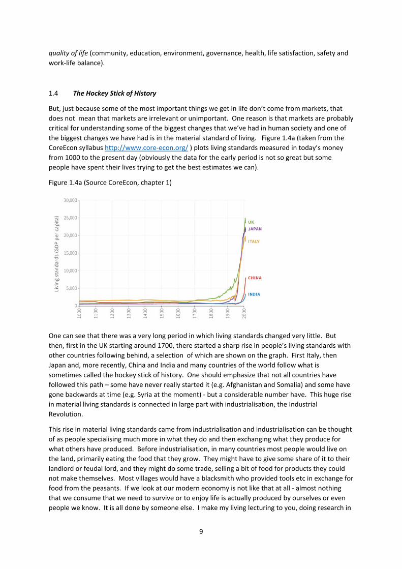
1.4 The Hockey Stick of History
But, just because some of the most important things we get in life don’t come from markets, that
does not mean that markets are irrelevant or unimportant. One reason is that markets are probably
critical for understanding some of the biggest changes that we’ve had in human society and one of
the biggest changes we have had is in the material standard of living. Figure 1.4a (taken from the
CoreEcon syllabus http://www.core‐econ.org/ ) plots living standards measured in today’s money
from 1000 to the present day (obviously the data for the early period is not so great but some
people have spent their lives trying to get the best estimates we can).
Figure 1.4a (Source CoreEcon, chapter 1)
One can see that there was a very long period in which living standards changed very little. But
then, first in the UK starting around 1700, there started a sharp rise in people’s living standards with
other countries following behind, a selection of which are shown on the graph. First Italy, then
Japan and, more recently, China and India and many countries of the world follow what is
sometimes called the hockey stick of history. One should emphasize that not all countries have
followed this path – some have never really started it (e.g. Afghanistan and Somalia) and some have
gone backwards at time (e.g. Syria at the moment) ‐ but a considerable number have. This huge rise
in material living standards is connected in large part with industrialisation, the Industrial
Revolution.
This rise in material living standards came from industrialisation and industrialisation can be thought
of as people specialising much more in what they do and then exchanging what they produce for
what others have produced. Before industrialisation, in many countries most people would live on
the land, primarily eating the food that they grow. They might have to give some share of it to their
landlord or feudal lord, and they might do some trade, selling a bit of food for products they could
not make themselves. Most villages would have a blacksmith who provided tools etc in exchange for
food from the peasants. If we look at our modern economy is not like that at all ‐ almost nothing
that we consume that we need to survive or to enjoy life is actually produced by ourselves or even
people we know. It is all done by someone else. I make my living lecturing to you, doing research in
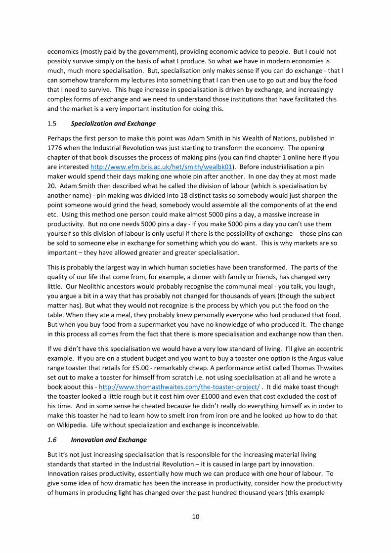
10
economics (mostly paid by the government), providing economic advice to people. But I could not
possibly survive simply on the basis of what I produce. So what we have in modern economies is
much, much more specialisation. But, specialisation only makes sense if you can do exchange ‐ that I
can somehow transform my lectures into something that I can then use to go out and buy the food
that I need to survive. This huge increase in specialisation is driven by exchange, and increasingly
complex forms of exchange and we need to understand those institutions that have facilitated this
and the market is a very important institution for doing this.
1.5 Specialization and Exchange
Perhaps the first person to make this point was Adam Smith in his Wealth of Nations, published in
1776 when the Industrial Revolution was just starting to transform the economy. The opening
chapter of that book discusses the process of making pins (you can find chapter 1 online here if you
are interested http://www.efm.bris.ac.uk/het/smith/wealbk01). Before industrialisation a pin
maker would spend their days making one whole pin after another. In one day they at most made
20. Adam Smith then described what he called the division of labour (which is specialisation by
another name) ‐ pin making was divided into 18 distinct tasks so somebody would just sharpen the
point someone would grind the head, somebody would assemble all the components of at the end
etc. Using this method one person could make almost 5000 pins a day, a massive increase in
productivity. But no one needs 5000 pins a day ‐ if you make 5000 pins a day you can’t use them
yourself so this division of labour is only useful if there is the possibility of exchange ‐ those pins can
be sold to someone else in exchange for something which you do want. This is why markets are so
important – they have allowed greater and greater specialisation.
This is probably the largest way in which human societies have been transformed. The parts of the
quality of our life that come from, for example, a dinner with family or friends, has changed very
little. Our Neolithic ancestors would probably recognise the communal meal ‐ you talk, you laugh,
you argue a bit in a way that has probably not changed for thousands of years (though the subject
matter has). But what they would not recognize is the process by which you put the food on the
table. When they ate a meal, they probably knew personally everyone who had produced that food.
But when you buy food from a supermarket you have no knowledge of who produced it. The change
in this process all comes from the fact that there is more specialisation and exchange now than then.
If we didn’t have this specialisation we would have a very low standard of living. I’ll give an eccentric
example. If you are on a student budget and you want to buy a toaster one option is the Argus value
range toaster that retails for £5.00 ‐ remarkably cheap. A performance artist called Thomas Thwaites
set out to make a toaster for himself from scratch i.e. not using specialisation at all and he wrote a
book about this ‐ http://www.thomasthwaites.com/the‐toaster‐project/ . It did make toast though
the toaster looked a little rough but it cost him over £1000 and even that cost excluded the cost of
his time. And in some sense he cheated because he didn’t really do everything himself as in order to
make this toaster he had to learn how to smelt iron from iron ore and he looked up how to do that
on Wikipedia. Life without specialization and exchange is inconceivable.
1.6 Innovation and Exchange
But it’s not just increasing specialisation that is responsible for the increasing material living
standards that started in the Industrial Revolution – it is caused in large part by innovation.
Innovation raises productivity, essentially how much we can produce with one hour of labour. To
give some idea of how dramatic has been the increase in productivity, consider how the productivity
of humans in producing light has changed over the past hundred thousand years (this example
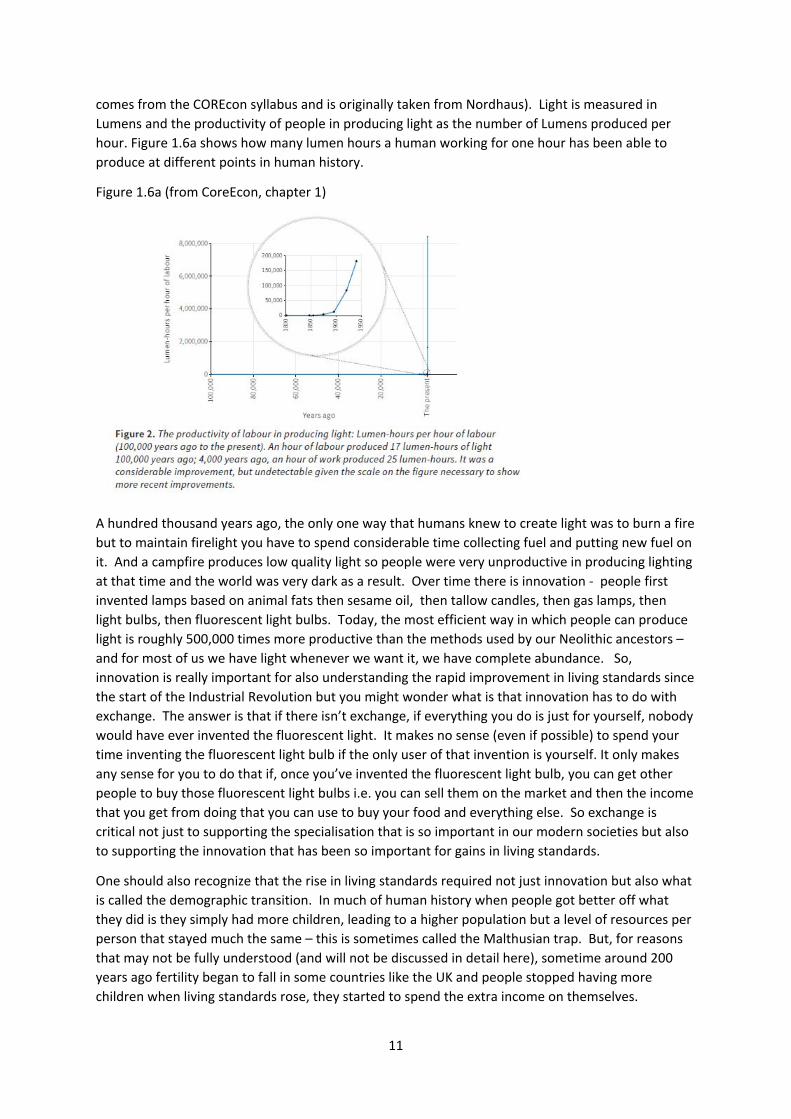
11
comes from the COREcon syllabus and is originally taken from Nordhaus). Light is measured in
Lumens and the productivity of people in producing light as the number of Lumens produced per
hour. Figure 1.6a shows how many lumen hours a human working for one hour has been able to
produce at different points in human history.
Figure 1.6a (from CoreEcon, chapter 1)
A hundred thousand years ago, the only one way that humans knew to create light was to burn a fire
but to maintain firelight you have to spend considerable time collecting fuel and putting new fuel on
it. And a campfire produces low quality light so people were very unproductive in producing lighting
at that time and the world was very dark as a result. Over time there is innovation ‐ people first
invented lamps based on animal fats then sesame oil, then tallow candles, then gas lamps, then
light bulbs, then fluorescent light bulbs. Today, the most efficient way in which people can produce
light is roughly 500,000 times more productive than the methods used by our Neolithic ancestors –
and for most of us we have light whenever we want it, we have complete abundance. So,
innovation is really important for also understanding the rapid improvement in living standards since
the start of the Industrial Revolution but you might wonder what is that innovation has to do with
exchange. The answer is that if there isn’t exchange, if everything you do is just for yourself, nobody
would have ever invented the fluorescent light. It makes no sense (even if possible) to spend your
time inventing the fluorescent light bulb if the only user of that invention is yourself. It only makes
any sense for you to do that if, once you’ve invented the fluorescent light bulb, you can get other
people to buy those fluorescent light bulbs i.e. you can sell them on the market and then the income
that you get from doing that you can use to buy your food and everything else. So exchange is
critical not just to supporting the specialisation that is so important in our modern societies but also
to supporting the innovation that has been so important for gains in living standards.
One should also recognize that the rise in living standards required not just innovation but also what
is called the demographic transition. In much of human history when people got better off what
they did is they simply had more children, leading to a higher population but a level of resources per
person that stayed much the same – this is sometimes called the Malthusian trap. But, for reasons
that may not be fully understood (and will not be discussed in detail here), sometime around 200
years ago fertility began to fall in some countries like the UK and people stopped having more
children when living standards rose, they started to spend the extra income on themselves.
12
You might also think well there may be other ways in which we could generate innovation apart
from and through exchange ‐ later on in the course we will have a more detailed section that is
about innovation. The bottom line is that although market economies have been associated with
innovation, there is no particular reason to think they have the right level of innovation. For reasons
explained later, we almost certainly cannot rely on markets alone to deliver the right level of
innovation but, equally, it is hard to imagine a high level of innovation in society without the
complex exchange patterns facilitated by markets.
1.7 Distribution and Inequality
Markets facilitate exchange but they also determine who gets what, the distribution of resources.
One way of thinking about someone who is very rich is that they are somebody for whom other
people are doing an awful lot for them. This is very obvious if you are the Lord in Downton Abbey
and you have all the servants working for you but it is also true if you go out and spend a lot of
money. When you as a consumer spend lots of money you have to think that behind each of those
goods or services you are buying there was somebody doing something and they have ended up
doing something for you. One of the characteristics of markets is that they tend to produce a lot of
inequality, and this is one of the main criticisms many people have of markets and the way in which
they operate.
Economists have something of a reputation as cheerleaders for markets, saying how wonderful they
are and so on and being indifferent to any inequality that results. You may come across mention of
an ideology of ‘neo‐liberalism’, a view that markets (involving profit‐seeking firms) as lightly
regulated as possible by the state are the best way to organize all activity, and an indifference
to(perhaps even a celebration of) any inequality that results from this system because it is seen as
‘fair’. And orthodox economics (of which this course is an example) is said to promote this ideology.
I think this is a caricature of modern orthodox economics. Caricatures tend to have elements of
truth in them but they also have elements of distortion. It is probably true that economists tend to
think that many people don’t realize quite how markets are remarkable, probably because we take
them for granted in so much of our lives. You can walk into a cafe and buy a coffee and not think
twice about this. It is not so obvious why this is possible in a system that is not overseen by anyone
making sure you get a coffee when you want it. This course will try to explain to you why markets
work at all, why they arise spontaneously in in many cases as a way of organising exchange between
people.
But at the same time, the distortion in the ‘neo‐liberal’ caricature of economists, is that most
economists don’t think that markets are perfect or that market outcomes are ‘fair’, there is a well‐
developed theory of what we would call market failure which is an analysis of when markets work
well and when they don’t. And when they don’t work well, economists often have views about what
can be done about it. Most practising economists, myself included, spend most of their professional
lives thinking about the way in which you would change the world to try make it better in in some
way. This involves thinking about market failure and thinking about how we might manage to
address and correct those market failures. These are also central issues in this course. Overall the
aim is to get you to understand how markets work, what their strengths are, what their weaknesses
are (and they do have both strengths and weaknesses) and how we might set about trying to
emphasise the strengths and minimise the weaknesses.
One of the big weaknesses of market economies is that they do tend to produce a high level of
inequality and I think that if they produced a very equal distribution of resources, people would

13
probably not be so critical of markets. So we will discuss inequality and redistribution, the process
by which we modify the market outcomes to deliver a different distribution of incomes. I don’t think
there are any economists who think of inequality as a good thing but there are those who argue it is
– to some degree ‐ a necessary evil, necessary for society as a whole to reap the benefits that
markets can offer. This will also be discussed later in the course.
1.8 Economics as a Science
One other part of Robbin’s definition of economics said that economics is a science. I tend to think
about this more as an aspiration than a reality. The aspiration should be that we try to develop
theories as a means to the end of understanding the world and we try to test those theories against
empirical evidence ‐ you’ll see examples of this throughout the course. But it has to be
acknowledged that the process is actually much more difficult than it is in some of the harder
sciences, because very often the empirical evidence does not speak so clearly as to leave no room
for disagreement even among reasonable people let alone unreasonable people (who do exist). The
main way in which we test theories in harder sciences is to do experiments ‐ you hold everything
constant except the one thing you are interested in, you vary that one thing and you see how that
changes the outcome. By doing lots of experiments you work out what causes something ‐ that’s
very hard to do in economic and social sciences generally though increasingly actually people are
using experiments (if you are interested in this, a good accessible introduction is Duflo and
Banerjee’s ‘Poor Economics: A Radical Rethinking of the Way to Fight Global Poverty’
http://www.pooreconomics.com/about‐book).
The second problem is that the economy is a very complex system so it is very hard, probably
impossible, to understand all its constituent parts. Another complex system is the climate. Models
of weather forecasting are much better these days than they used to be and are quite accurate at
forecasting what the weather is going to be tomorrow. But if you ask for a weather forecast a year
from today, the best one would be able to do would be to say it’s going to be the average weather
for this time of year, perhaps with some adjustment for the expected effect of El Nino. An economy
is similar to the climate in that it is a complex system with so many forces going in different
directions that it is impossible to understand or model them all.
The final reason why economics as a science is more an aspiration than a reality as a science is that it
is about the behaviour of people, who do not follow fixed laws of nature in the way that atoms do.
Different people do different things in a way that different hydrogen atoms don’t. And behaviour
changes over time in a way that the behaviour of atoms doesn’t so social scientists are always trying
to understand something which is itself changing and as fast as you accumulate knowledge things
change and you need to move on. But it is very important to have the aspiration to be a science, to
be an evidence‐based subject, but be suspicious of anyone who tells you that ‘economics tell us X’.
There are economists who claim that they know lots of things with certainty and they often attract a
lot of attention because they seek out publicity for their views. But what we need to know is not
just what we know but the limits of what we know and so we should be a little bit more humble in
what we think we know. But while you should be suspicious of certainty, don’t go to the other
extreme. Just because we don’t understand everything doesn’t mean that we understand nothing
and I believe there is some body of useful knowledge in economics that will enable you to
understand the world and hopefully make it a better place.
14
1.9 Controversy in Economics: Positive and Normative Questions
Economics is full of controversy. To just give one current example from the UK, consider the recent
debate about Brexit. Prior to the referendum there was a very active debate (involving economists
about the likely economic impact of a ‘Leave’ vote). Most economists were for ‘Remain’ but not all.
Part of these disagreements are what economists call positive questions. If you ask the question
what will the effects of Brexit be (putting aside the problem that we don’t currently know what
Brexit means apart from ‘Brexit means Brexit’), you are asking what economists say is a positive
question because there is an answer (though it may be difficult to know what the right answer is)
and the answer to that question shouldn’t really depend on your views on whether Brexit is a good
or a bad idea. But there are also normative issues, disagreements about whether Brexit is a good or
a bad idea. Answers to normative questions are often more judgments than facts. It is important to
keep the distinction between positive and normative questions clear.
Key Concepts for Chapter 1
The Importance of Specialisation and Exchange
The importance of Innovation and Exchange
Markets as one way of organizing transactions complex societies
Markets as a source of inequality
Positive and Normative Questions
15
2. A SIMPLE MODEL OF A MARKET (Acemoglu, Laibson, List, Chapter 4)
2.1 Economists and Models
Economists love models, probably more than other social scientists. Economics is full of models and
economists use them to help us understand the economy. Economists think they are useful as a
good way of keeping track of all the interactions between people in what is a very complex system,
and because they are a check on the logical consistency of our reasoning. But one should never lose
sight of the fact that they are a means to an end, with the end being answering a question about the
real world. Models are normally very stylised, making lots of simplifying assumptions in order to
focus on what is essential to answer the question being asked. But it’s important to realise that the
model will only be as good as those assumptions so if you use an economic model to answer a
question and the model you use is based on a critical assumption that is false, your conclusions are
also likely to be false. The principle in choosing a model is a quote attributed to Albert Einstein –
“make things as simple as possible but no simpler”. What he meant by that is if you make things as
simple as possible then you get to understand the essence of something but if you make things too
simple then you miss out something that is very important. One way of thinking about models is
that they are like maps of the economy. We know that maps can be useful but they can also be
quite misleading, and that a map useful for one purpose might not be useful for another. The
familiar map of the London Underground is designed to be useful for navigating the tube network
but it is not drawn to scale i.e. the same distance on the map is not the same distance on the
ground. If you try to use the tube map for some other purposes it may not be fit for purpose ‐ if you
were thinking of going from St Paul’s tube station to Barbican tube station and you try to use the
tube map, you would make two changes but actually it’s only a 5 minute walk. And the distance
between these two tube stations looks on the tube map to be less than the distance between Epping
and Theydon Bois stations at the end of Central Line but that distance on the ground between those
stations is 2.4 miles. So the tube map is wrong but it is still useful. Economic models are always
wrong but they can still be useful.
2.2 A Stylized Model of a Market
We will start with a very stylised model of the market designed to capture something about the way
in which markets operate. Assume it is a market for a single good, that all the goods being sold in
the market are identical. There are lots of buyers in the market who decide how much they want to
buy based on the price of the good, and there are lots of sellers in the market that decide how much
to sell based on the price. In a consumer market the buyers will be households and the sellers will
be firms but in a labour market the buyers would be firms and the sellers are households (and the
‘price’ in this case can be thought of as the wage).
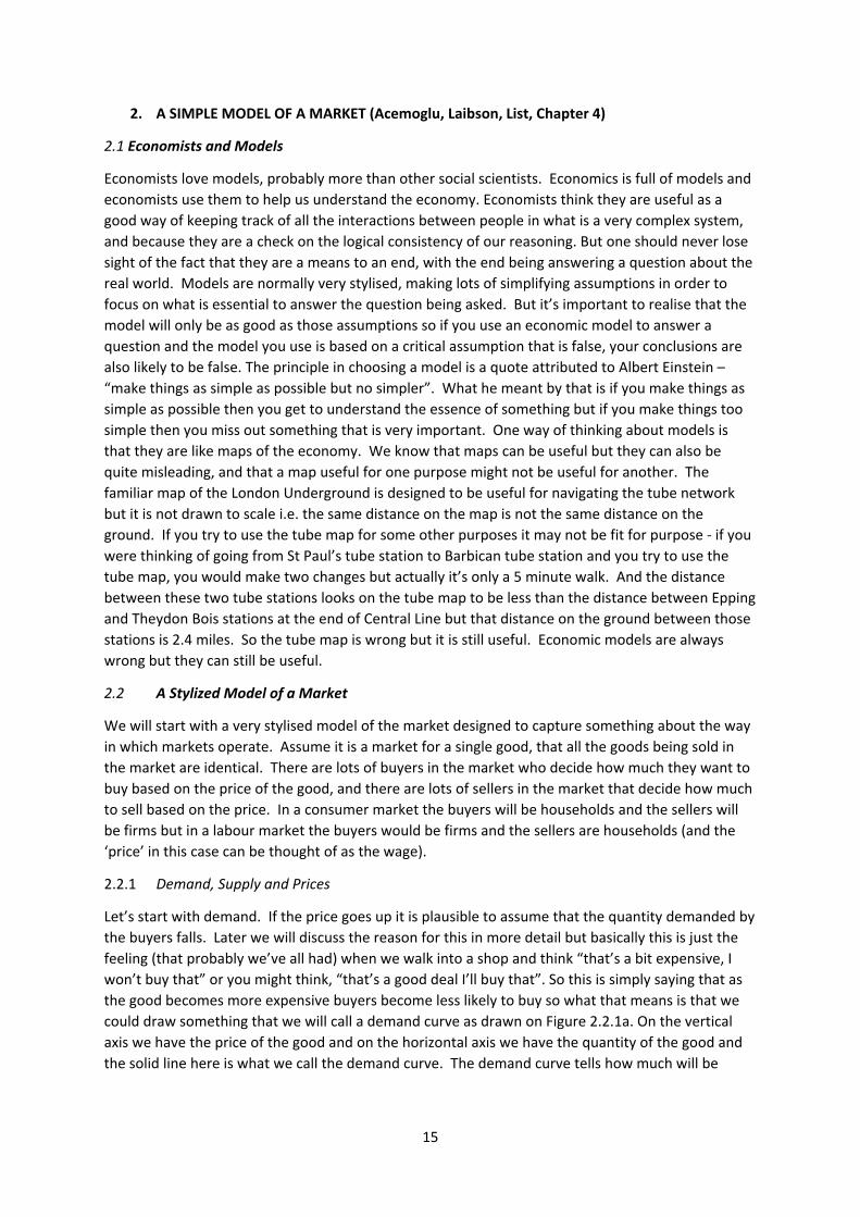
2.2.1 Demand, Supply and Prices
Let’s start with demand. If the price goes up it is plausible to assume that the quantity demanded by
the buyers falls. Later we will discuss the reason for this in more detail but basically this is just the
feeling (that probably we’ve all had) when we walk into a shop and think “that’s a bit expensive, I
won’t buy that” or you might think, “that’s a good deal I’ll buy that”. So this is simply saying that as
the good becomes more expensive buyers become less likely to buy so what that means is that we
could draw something that we will call a demand curve as drawn on Figure 2.2.1a. On the vertical
axis we have the price of the good and on the horizontal axis we have the quantity of the good and
the solid line here is what we call the demand curve. The demand curve tells how much will be
16
demanded by the buyers for every price. If the price is P1 the amount demanded will be Q1, if the
price is P2 the amount demanded will be Q2, etc.
Figure 2.2.1a
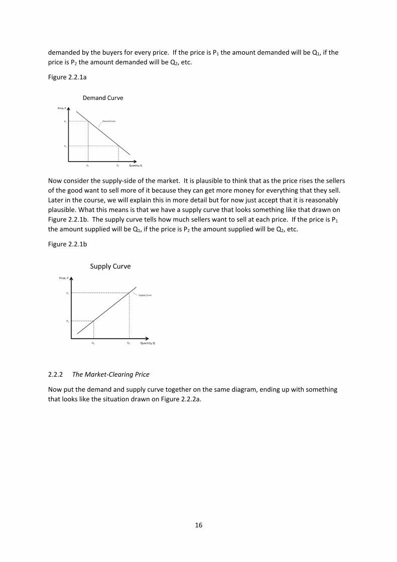
Now consider the supply‐side of the market. It is plausible to think that as the price rises the sellers
of the good want to sell more of it because they can get more money for everything that they sell.
Later in the course, we will explain this in more detail but for now just accept that it is reasonably
plausible. What this means is that we have a supply curve that looks something like that drawn on
Figure 2.2.1b. The supply curve tells how much sellers want to sell at each price. If the price is P1
the amount supplied will be Q1, if the price is P2 the amount supplied will be Q2, etc.
Figure 2.2.1b
2.2.2 The Market‐Clearing Price
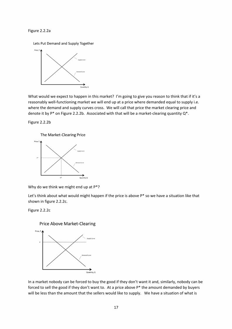
Now put the demand and supply curve together on the same diagram, ending up with something
that looks like the situation drawn on Figure 2.2.2a.
17
Figure 2.2.2a
What would we expect to happen in this market? I’m going to give you reason to think that if it’s a
reasonably well‐functioning market we will end up at a price where demanded equal to supply i.e.
where the demand and supply curves cross. We will call that price the market clearing price and
denote it by P* on Figure 2.2.2b. Associated with that will be a market‐clearing quantity Q*.
Figure 2.2.2b
Why do we think we might end up at P*?
Let’s think about what would might happen if the price is above P* so we have a situation like that
shown in figure 2.2.2c.
Figure 2.2.2c
In a market nobody can be forced to buy the good if they don’t want it and, similarly, nobody can be
forced to sell the good if they don’t want to. At a price above P* the amount demanded by buyers
will be less than the amount that the sellers would like to supply. We have a situation of what is
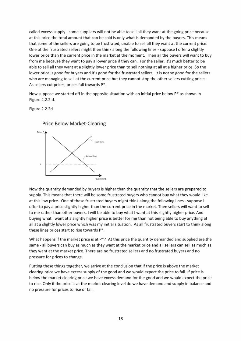
18
called excess supply ‐ some suppliers will not be able to sell all they want at the going price because
at this price the total amount that can be sold is only what is demanded by the buyers. This means
that some of the sellers are going to be frustrated, unable to sell all they want at the current price.
One of the frustrated sellers might then think along the following lines ‐ suppose I offer a slightly
lower price than the current price in the market at the moment. Then all the buyers will want to buy
from me because they want to pay a lower price if they can. For the seller, it’s much better to be
able to sell all they want at a slightly lower price than to sell nothing at all at a higher price. So the
lower price is good for buyers and it’s good for the frustrated sellers. It is not so good for the sellers
who are managing to sell at the current price but they cannot stop the other sellers cutting prices.
As sellers cut prices, prices fall towards P*.
Now suppose we started off in the opposite situation with an initial price below P* as shown in
Figure 2.2.2.d.
Figure 2.2.2d
Now the quantity demanded by buyers is higher than the quantity that the sellers are prepared to
supply. This means that there will be some frustrated buyers who cannot buy what they would like
at this low price. One of these frustrated buyers might think along the following lines ‐ suppose I
offer to pay a price slightly higher than the current price in the market. Then sellers will want to sell
to me rather than other buyers. I will be able to buy what I want at this slightly higher price. And
buying what I want at a slightly higher price is better for me than not being able to buy anything at
all at a slightly lower price which was my initial situation. As all frustrated buyers start to think along
these lines prices start to rise towards P*.
What happens if the market price is at P*? At this price the quantity demanded and supplied are the
same ‐ all buyers can buy as much as they want at the market price and all sellers can sell as much as
they want at the market price. There are no frustrated sellers and no frustrated buyers and no
pressure for prices to change.
Putting these things together, we arrive at the conclusion that if the price is above the market
clearing price we have excess supply of the good and we would expect the price to fall. If price is
below the market clearing price we have excess demand for the good and we would expect the price
to rise. Only if the price is at the market clearing level do we have demand and supply in balance and
no pressure for prices to rise or fall.
19
2.2.3 Do Prices Always Clear Markets?
This means that we might expect prices to tend towards the market clearing level. However, you
should not interpret this to mean that prices in all markets will always be at market clearing levels.
You should probably interpret it as a tendency within markets, a tendency that will be stronger in
some markets than others, and at some times than others. In many real‐world markets there are
factors other than demand and supply that are important in determining the price. There are some
markets in which we tolerate a lot of variation in prices from one minute to another e.g. the stock
market or the market for gold or foreign exchange markets. But there are other markets which
don’t function in quite the same way. For example, consider the prices for London taxis. The price is
higher at weekends, on public holidays, and at night. This price variation crudely reflects supply and
demand factors because drivers don’t like working at nights and on weekends. But, the price does
not respond to short run variations in demand and supply ‐ what this means is that there are times
when you can’t get a taxi however much you are prepared to pay (you are a frustrated buyer at this
point) and other times when taxi drivers cannot find customers (so are frustrated sellers at that
point). The process I described earlier for why prices would rise if there is excess demand does not
work perfectly in this market. Suppose you can’t get a taxi, but you see an occupied taxi stopped at a
traffic light. You go up to the driver and offer them a higher fare than the current customers, hoping
they will kick them out of the cab and allow you in. Please don’t try this, it really doesn’t work.
But there is a taxi‐like company whose fares do vary almost from minute to minute in an attempt to
balance demand and supply. That company is Uber. It uses an algorithm to vary prices in line with
supply and demand. That can lead to large variations in price, for example sometimes the price can
be over eight times the normal level at times of peak demand. There are some cities where Uber
operates that accept this surge pricing (as it is called). But there are other cities where it has been
very controversial and limits placed on the company’s ability to use surge pricing. This is an
example where factors other than simple demand and supply determine prices. It may be right or
wrong but there are consequences. If Uber prices are capped, there may be times in which you
cannot get a ride no matter how much you are prepared to pay. On the other hand you, as poor
students, may prefer that situation because if prices were at market clearing levels you could not
afford to pay the very high fares at times of peak demand if there was no price cap and there is
some chance of you getting a cab at the lower capped price.
Another market which is very important and where the simple model of demand and supply does
not seem to work very well is the labour market. Most people depend on selling their labour for
their livelihood so the labour market is very important for most people. One problem that afflicts
labour markets is unemployment, the existence of people who would like to work but cannot find a
job. The level of unemployment varies from country to country and over time but it is always with us
‐ it is a more or less permanent feature of economies and doesn’t seem to disappear. One might
interpret the existence of people who want to sell their labour but cannot find an employer to buy
their labour as an indication that there is excess supply in the labour market. One might expect then
that wages would fall and one of the questions is why this mechanism does not seem to work in
labour markets. Or perhaps the simple model of demand and supply is wrong when applied to the
labour market.
2.3 Comparative Statics
Now we will use our simple model of a market to make predictions about what will happen if
demand and/or supply changes ‐ this is an example of what economists call a comparative statics
exercise. We start from one situation in which the market is in equilibrium with the price at the
20
market clearing level. Then we change something about the market and ask what we would expect
to happen in the market, to the price and the quantity traded.
2.3.1 A Shift in the Demand Curve
First consider a shift in the demand curve so that, at every price, demand is now higher than before.
We represent this change in Figure 2.3.1a.
Figure 2.3.1a
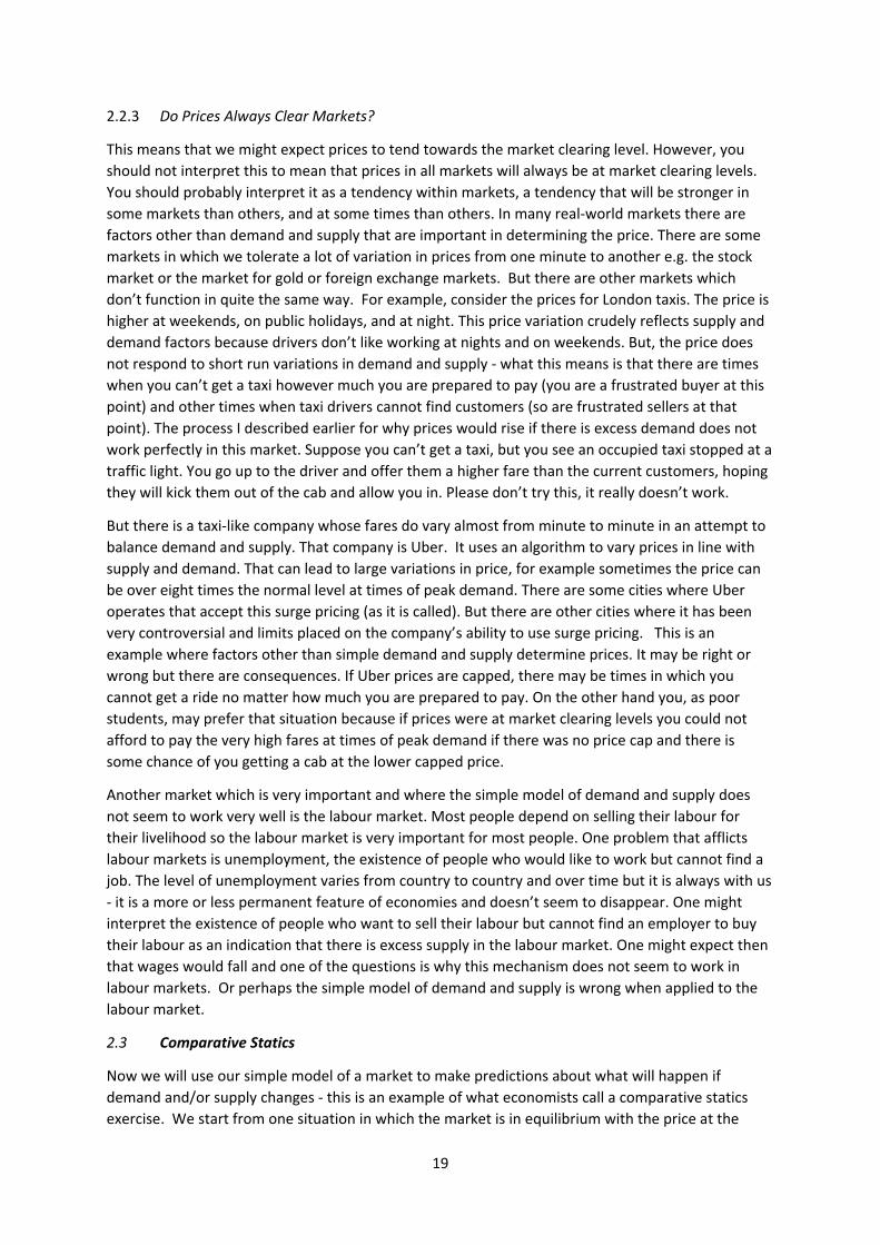
The initial price is where the old demand curve and the supply curve cross. The price is P*1 and the
quantity traded is Q*1. Now consider what happens when we have the new demand curve. The
equilibrium shifts to where the new demand curve and supply curve cross, with price P*2 and
quantity traded Q*2. One can see that the price is higher than before and the quantity is higher than
before so we get the prediction that the increase in demand will lead to a rise in price and a rise in
quantity. One can tell a story about a process by which this might come about. We start at the initial
market clearing price but now demand is higher so at the old market‐clearing price demand is higher
than supply i.e. we have excess demand. There are some frustrated buyers who can’t buy what they
want at this old price and those frustrated buyers start to tell sellers they are prepared to pay a
higher price if they will sell to them. Or some smart sellers work out that they can actually charge a
slightly higher price and get the buyers to buy things. So, from the initial situation of excess demand
we get upward pressure on prices and that upward pressure remains until we arrive at the new
market‐clearing price.
In doing this type of exercize, one common mistake made by those doing economics for the first
time is that we are shifting the demand curve but moving along a supply curve. The supply curve is
not shifting but the point we are on the supply curve is changing. This difference between “shifts of a
curve” (like we have of the demand curve here) and “shifts along a curve” (like we have for the
supply curve here) is an important distinction to keep in mind when you answer questions. If you get
it wrong you are likely to make a mess of the answer.
2.3.2 A Shift in the Supply Curve
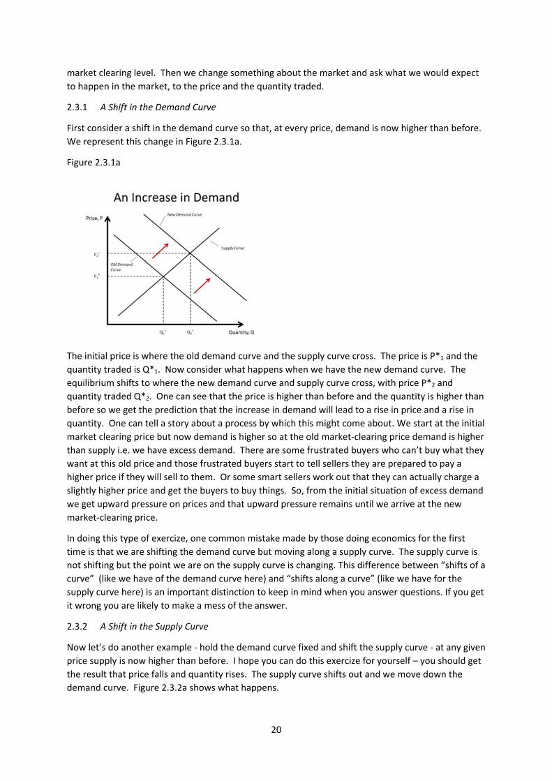
Now let’s do another example ‐ hold the demand curve fixed and shift the supply curve ‐ at any given
price supply is now higher than before. I hope you can do this exercize for yourself – you should get
the result that price falls and quantity rises. The supply curve shifts out and we move down the
demand curve. Figure 2.3.2a shows what happens.
21
Figure 2.3.2a
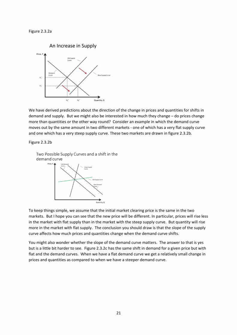
We have derived predictions about the direction of the change in prices and quantities for shifts in
demand and supply. But we might also be interested in how much they change – do prices change
more than quantities or the other way round? Consider an example in which the demand curve
moves out by the same amount in two different markets ‐ one of which has a very flat supply curve
and one which has a very steep supply curve. These two markets are drawn in figure 2.3.2b.
Figure 2.3.2b
To keep things simple, we assume that the initial market clearing price is the same in the two
markets. But I hope you can see that the new price will be different. In particular, prices will rise less
in the market with flat supply than in the market with the steep supply curve. But quantity will rise
more in the market with flat supply. The conclusion you should draw is that the slope of the supply
curve affects how much prices and quantities change when the demand curve shifts.
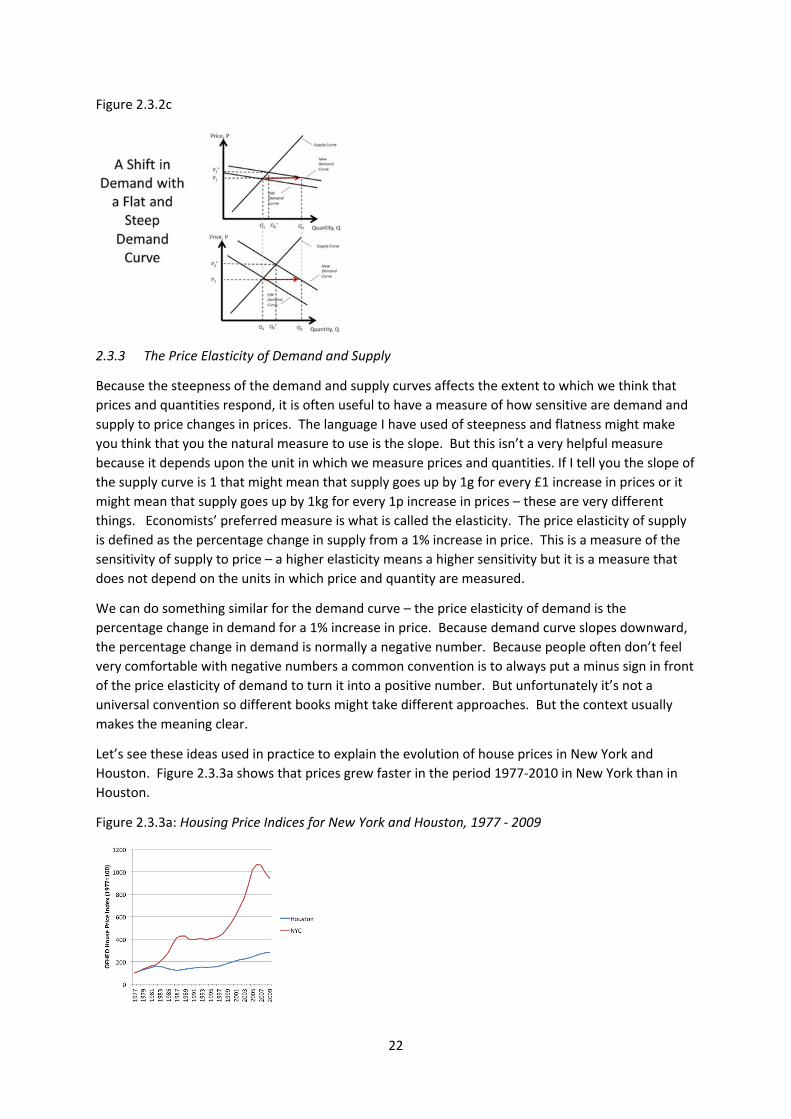
You might also wonder whether the slope of the demand curve matters. The answer to that is yes
but is a little bit harder to see. Figure 2.3.2c has the same shift in demand for a given price but with
flat and the demand curves. When we have a flat demand curve we get a relatively small change in
prices and quantities as compared to when we have a steeper demand curve.
22
Figure 2.3.2c
2.3.3 The Price Elasticity of Demand and Supply
Because the steepness of the demand and supply curves affects the extent to which we think that
prices and quantities respond, it is often useful to have a measure of how sensitive are demand and
supply to price changes in prices. The language I have used of steepness and flatness might make
you think that you the natural measure to use is the slope. But this isn’t a very helpful measure
because it depends upon the unit in which we measure prices and quantities. If I tell you the slope of
the supply curve is 1 that might mean that supply goes up by 1g for every £1 increase in prices or it
might mean that supply goes up by 1kg for every 1p increase in prices – these are very different
things. Economists’ preferred measure is what is called the elasticity. The price elasticity of supply
is defined as the percentage change in supply from a 1% increase in price. This is a measure of the
sensitivity of supply to price – a higher elasticity means a higher sensitivity but it is a measure that
does not depend on the units in which price and quantity are measured.
We can do something similar for the demand curve – the price elasticity of demand is the
percentage change in demand for a 1% increase in price. Because demand curve slopes downward,
the percentage change in demand is normally a negative number. Because people often don’t feel
very comfortable with negative numbers a common convention is to always put a minus sign in front
of the price elasticity of demand to turn it into a positive number. But unfortunately it’s not a
universal convention so different books might take different approaches. But the context usually
makes the meaning clear.
Let’s see these ideas used in practice to explain the evolution of house prices in New York and
Houston. Figure 2.3.3a shows that prices grew faster in the period 1977‐2010 in New York than in
Houston.
Figure 2.3.3a: Housing Price Indices for New York and Houston, 1977 ‐ 2009
23
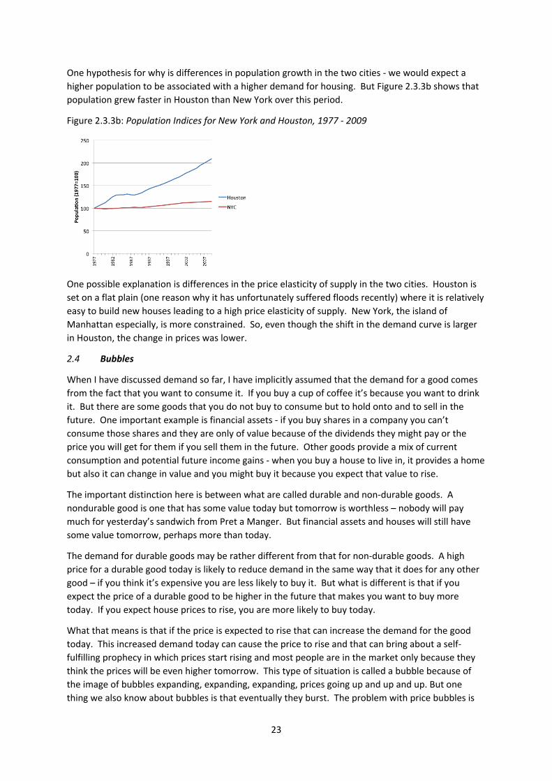
One hypothesis for why is differences in population growth in the two cities ‐ we would expect a
higher population to be associated with a higher demand for housing. But Figure 2.3.3b shows that
population grew faster in Houston than New York over this period.
Figure 2.3.3b: Population Indices for New York and Houston, 1977 ‐ 2009
One possible explanation is differences in the price elasticity of supply in the two cities. Houston is
set on a flat plain (one reason why it has unfortunately suffered floods recently) where it is relatively
easy to build new houses leading to a high price elasticity of supply. New York, the island of
Manhattan especially, is more constrained. So, even though the shift in the demand curve is larger
in Houston, the change in prices was lower.
2.4 Bubbles
When I have discussed demand so far, I have implicitly assumed that the demand for a good comes
from the fact that you want to consume it. If you buy a cup of coffee it’s because you want to drink
it. But there are some goods that you do not buy to consume but to hold onto and to sell in the
future. One important example is financial assets ‐ if you buy shares in a company you can’t
consume those shares and they are only of value because of the dividends they might pay or the
price you will get for them if you sell them in the future. Other goods provide a mix of current
consumption and potential future income gains ‐ when you buy a house to live in, it provides a home
but also it can change in value and you might buy it because you expect that value to rise.
The important distinction here is between what are called durable and non‐durable goods. A
nondurable good is one that has some value today but tomorrow is worthless – nobody will pay
much for yesterday’s sandwich from Pret a Manger. But financial assets and houses will still have
some value tomorrow, perhaps more than today.
The demand for durable goods may be rather different from that for non‐durable goods. A high
price for a durable good today is likely to reduce demand in the same way that it does for any other
good – if you think it’s expensive you are less likely to buy it. But what is different is that if you
expect the price of a durable good to be higher in the future that makes you want to buy more
today. If you expect house prices to rise, you are more likely to buy today.
What that means is that if the price is expected to rise that can increase the demand for the good
today. This increased demand today can cause the price to rise and that can bring about a self‐
fulfilling prophecy in which prices start rising and most people are in the market only because they
think the prices will be even higher tomorrow. This type of situation is called a bubble because of
the image of bubbles expanding, expanding, expanding, prices going up and up and up. But one
thing we also know about bubbles is that eventually they burst. The problem with price bubbles is
24
that the high level of demand which sustains high prices can only exist because of the expectation of
ever higher prices in the future. But prices cannot rise forever, there has to be a point at which
confidence in future price rises disappears, demand then collapses, the bubble bursts and then
prices fall, often catastrophically, as the whole process goes into reverse ‐ as prices are expected to
fall everyone wants to sell today and that drives down prices.
As we learned in the most recent financial crisis, this scenario is possible. I’ll give two examples, one
old, one modern, one a definite bubble, one subject to more disagreement. The old example is Tulip
bulbs in 17th‐century Holland, probably the first documented price bubble. Holland was probably
the richest country in the world at the time and the Dutch loved tulips. The bulbs of particularly
beautiful tulips were valuable and, unlike the flowers themselves, are durable – they can be used to
grow flowers for more than one year. In 1636 to 1637 a bubble took hold and there was an
extraordinary rise in and then fall in the price of bulbs. One particular variety of Tulip bulb came to
be worth something like 10 times the yearly earnings of a skilled craftsman ‐ today a skilled
craftsman in the UK probably earns about £30,000 a year so this implies that somebody was
prepared to pay £300,000 for the bulb of this Tulip. You might think that’s insane ‐ why would
anyone do that however beautiful the flower is? The only reason people paid those prices is
because they thought the bulb was going to be worth more the next year so they were going to turn
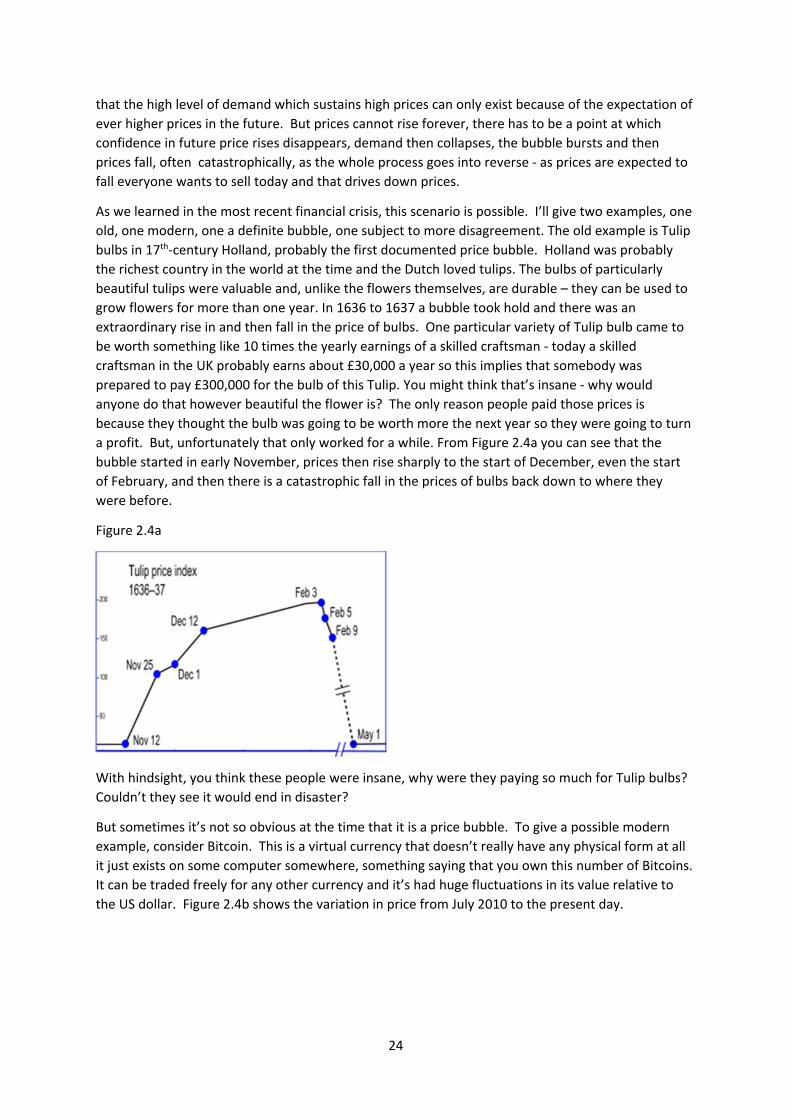
a profit. But, unfortunately that only worked for a while. From Figure 2.4a you can see that the
bubble started in early November, prices then rise sharply to the start of December, even the start
of February, and then there is a catastrophic fall in the prices of bulbs back down to where they
were before.
Figure 2.4a
With hindsight, you think these people were insane, why were they paying so much for Tulip bulbs?
Couldn’t they see it would end in disaster?
But sometimes it’s not so obvious at the time that it is a price bubble. To give a possible modern
example, consider Bitcoin. This is a virtual currency that doesn’t really have any physical form at all
it just exists on some computer somewhere, something saying that you own this number of Bitcoins.
It can be traded freely for any other currency and it’s had huge fluctuations in its value relative to
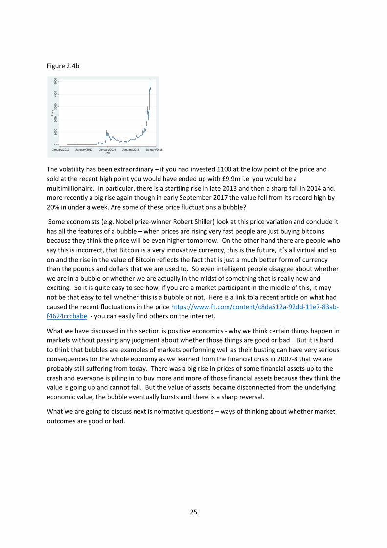
the US dollar. Figure 2.4b shows the variation in price from July 2010 to the present day.
25
Figure 2.4b
The volatility has been extraordinary – if you had invested £100 at the low point of the price and
sold at the recent high point you would have ended up with £9.9m i.e. you would be a
multimillionaire. In particular, there is a startling rise in late 2013 and then a sharp fall in 2014 and,
more recently a big rise again though in early September 2017 the value fell from its record high by
20% in under a week. Are some of these price fluctuations a bubble?
Some economists (e.g. Nobel prize‐winner Robert Shiller) look at this price variation and conclude it
has all the features of a bubble – when prices are rising very fast people are just buying bitcoins
because they think the price will be even higher tomorrow. On the other hand there are people who
say this is incorrect, that Bitcoin is a very innovative currency, this is the future, it’s all virtual and so
on and the rise in the value of Bitcoin reflects the fact that is just a much better form of currency
than the pounds and dollars that we are used to. So even intelligent people disagree about whether
we are in a bubble or whether we are actually in the midst of something that is really new and
exciting. So it is quite easy to see how, if you are a market participant in the middle of this, it may
not be that easy to tell whether this is a bubble or not. Here is a link to a recent article on what had
caused the recent fluctuations in the price https://www.ft.com/content/c8da512a‐92dd‐11e7‐83ab‐
f4624cccbabe ‐ you can easily find others on the internet.
What we have discussed in this section is positive economics ‐ why we think certain things happen in
markets without passing any judgment about whether those things are good or bad. But it is hard
to think that bubbles are examples of markets performing well as their busting can have very serious
consequences for the whole economy as we learned from the financial crisis in 2007‐8 that we are
probably still suffering from today. There was a big rise in prices of some financial assets up to the
crash and everyone is piling in to buy more and more of those financial assets because they think the
value is going up and cannot fall. But the value of assets became disconnected from the underlying
economic value, the bubble eventually bursts and there is a sharp reversal.
What we are going to discuss next is normative questions – ways of thinking about whether market
outcomes are good or bad.
01
000
200
03
000
400
05
000
Pri
ce
January/2010 January/2012 January/2014 January/2016 January/2018date

26
Key Concepts for Chapter 3
Demand and Supply Curves
Market‐Clearing Price
Why prices might tend to the market‐clearing price
Comparative statics
Shifts in demand/supply curves vs. shifts along demand/supply curves.
Effects of shifts in demand and supply on market‐clearing prices and quantities
Price elasticity of demand and supply
The origin of bubbles
27
3. ARE MARKET OUTCOMES GOOD OR BAD? (Acemoglu, Laibson, List, Chapters 7 and 8)
Markets often attract strong feelings often associated with political views. On the political right,
markets are often praised for allowing large numbers of people to cooperate to produce goods and
services that are the basis for the quality of our lives. On the political left, markets are often
criticised as a source of conflict and exploitation. The truth is probably somewhere in between and
markets have their successes and failures. Understanding success and failure, and how to correct
failure, is the main subject of this term’s course.
3.1 The Gains from Trade, absolute and comparative advantage
First, we will consider the gains from trade or exchange as we termed it in the introduction. If
individuals produce different things but need some of everything, then the gains from trade are very
obvious. But trade can produce gains even if one person is better at producing everything. To show
this, we use an example from the textbook taken from chapter 8, page 214. This example shows
how specialisation and trade can make everyone better off.
There are two people: me and you. We have one hour to produce sets of locks and keys. Table 3.1a
shows how much we produce of each if we spend all our time in one activity or the other.
Table 3.1a (source: Acemoglu, Laibson and List, ch 8 p214)
Keys Locks
Me 8 6
You 6 2
For example, I can produce 8 keys or 6 locks, while you can produce 6 keys or 2 locks.
Note that I am more productive than you in the production of both locks and keys – in the jargon, I
have an absolute advantage in the production of both goods.
To keep things simple assume that we both produce half the amount given in Table 3.1a in a half
hour, a quarter in 15 minutes etc.
Start from a situation where we are isolated individuals who must choose what fraction of their time
to spend producing locks and keys – in the jargon this is known as autarky. Assume that only
complete sets of one lock and one key are worth anything – though nothing in this example depends
on it being only sets that have value.
In this situation I will spend 30 minutes producing 4 keys and 30 minutes producing 3 locks, for 3 sets
in total. I cannot produce more sets – I would need 10 more minutes on lock production to make an
extra lock but then I would produce only 3 keys. You will also spend half your time on key
production and half on lock production for a total output of only 1 set. The outcome without any
trade is shown in rows 4 and 5 of Table 3.1B.

28
Table 3.1b
Me You
Keys Locks Keys Locks
Without Trade
1 Production 4 3 3 1
2 Sets produced 3 3 1 1
With Trade
3 Production 0 6 6 0
4 Trade +4 ‐2 ‐4 +2
5 Holdings 4 4 2 2
6 Sets 4 4 2 2
7 Change in sets
produced
+1 +1
Now suppose trade is possible and I suggest to you the following deal:
‐ Spend all your time producing keys
‐ I will spend all my time producing locks
‐ Then I will give you 2 locks in exchange for 4 keys.
What happens if this deal is accepted? Production is as shown in row 3 of Table 3.1B. I produce 6
locks, you produce 6 keys. I give you 2 of my locks in exchange for 4 keys – this leaves me with 4
sets, one more than I had in autarky. You end up with 2 locks and 2 keys for 2 sets, also one more
than in autarky.
Both of us have gained from trade. Note that we have both specialized relative to the situation of
autarky (I produce locks, you keys) and exchanged. You specialize in key production because that is
your comparative advantage.
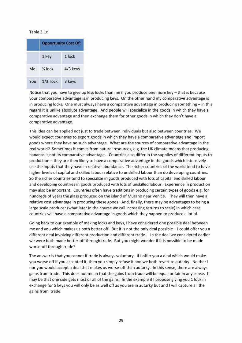
How do we decide who has a comparative advantage in which product? Table 3.1c is a modified
form of Table 3.1a where the entries in the second column tells us how many fewer locks I and you
produce if I or you produce one more key.
For me this is ¾ lock, for you 1/3 lock. Similarly the third column tells us how many fewer keys I
and you produce if I or you produce one more lock. These numbers are the reciprocal of those in the
second column. For me this is ¾ lock, for you 1/3 lock.
29
Table 3.1c
Opportunity Cost Of:
1 key 1 lock
Me ¾ lock 4/3 keys
You 1/3 lock 3 keys
Notice that you have to give up less locks than me if you produce one more key – that is because
your comparative advantage is in producing keys. On the other hand my comparative advantage is
in producing locks. One must always have a comparative advantage in producing something – in this
regard it is unlike absolute advantage. And people will specialize in the goods in which they have a
comparative advantage and then exchange them for other goods in which they don’t have a
comparative advantage.
This idea can be applied not just to trade between individuals but also between countries. We
would expect countries to export goods in which they have a comparative advantage and import
goods where they have no such advantage. What are the sources of comparative advantage in the
real world? Sometimes it comes from natural resources, e.g. the UK climate means that producing
bananas is not its comparative advantage. Countries also differ in the supplies of different inputs to
production – they are then likely to have a comparative advantage in the goods which intensively
use the inputs that they have in relative abundance. The richer countries of the world tend to have
higher levels of capital and skilled labour relative to unskilled labour than do developing countries.
So the richer countries tend to specialize in goods produced with lots of capital and skilled labour
and developing countries in goods produced with lots of unskilled labour. Experience in production
may also be important. Countries often have traditions in producing certain types of goods e.g. for
hundreds of years the glass produced on the island of Murano near Venice. They will then have a
relative cost advantage in producing these goods. And, finally, there may be advantages to being a
large scale producer (what later in the course we call increasing returns to scale) in which case
countries will have a comparative advantage in goods which they happen to produce a lot of.
Going back to our example of making locks and keys, I have considered one possible deal between
me and you which makes us both better off. But it is not the only deal possible – I could offer you a
different deal involving different production and different trade. In the deal we considered earlier
we were both made better‐off through trade. But you might wonder if it is possible to be made
worse‐off through trade?
The answer is that you cannot if trade is always voluntary. If I offer you a deal which would make
you worse off if you accepted it, then you simply refuse it and we both revert to autarky. Neither I
nor you would accept a deal that makes us worse‐off than autarky. In this sense, there are always
gains from trade. This does not mean that the gains from trade will be equal or fair in any sense. It
may be that one side gets most or all of the gains. In the example if I propose giving you 1 lock in
exchange for 5 keys you will only be as well off as you are in autarky but and I will capture all the
gains from trade.
30
3.2 Free trade agreements
In a more complicated form, the argument from the example is often used by economists to argue
that free trade is good, that obstacles placed in the way of trade like tariffs or non‐tariff trade
barriers make people worse off. This is then used to argue that freer trade should be encouraged,
and free trade agreements should generally be supported.
But there are right and wrong ways to interpret this argument for the gains from trade. First, if
trade is voluntary it is the case that everyone will be better off trading than in autarky. But autarky
is a terrible outcome for most of us in a modern society as specialization has proceeded so far that
we produce almost none of what we need to live. So this result is of limited value. And this does
not mean that freer trade must necessarily make everyone better off.
But even if there are winners and losers from freer trade, it may be that the size of the gains from
the winners may be larger than the losses of the losers so there is a hypothetical way for the winners
to compensate the losers and everyone is better‐off.
For example, consider quinoa. This is a grain traditionally grown and consumed in the Andes,
notably Bolivia and Peru. In the 2000s it acquired a reputation in the West as a super‐food so export
demand for quinoa increased and prices increased also. This can be thought of as a greater
opportunity for Andeans to trade quinoa with the rest of the world. If you are an Andean producer
of quinoa you will be a winner from the increase in the price. But if you are an Andean consumer
you will be a loser as quinoa is now more expensive. It is likely that the Andeans as a whole are
better‐off as they could simply not export quinoa as they did before anyone in the West was
interested in it and in this case they would be as well‐off as before. The opportunity to export it is
an opportunity that does not have to be taken up. But just because it is possible for all Andeans to
gain does not mean they will do so – that depends on redistribution which is discussed later in the
course.
Real world free trade agreements are very complicated and controversial. Increasingly there is
opposition to free trade agreements on the grounds that it harms some groups. One of Donald
Trump’s first actions was to full out of the proposed Pacific area free trade deal, the Trans‐Pacific
Partnership (TPP), he wants to renegotiate the North American Free Trade Area Agreement (NAFTA)
and has repeatedly argued that freer trade with China has harmed American workers. There is some
evidence that this may be the case in the industries that compete directly with China as wages (and
hence costs) are much higher in the US than China. But because Chinese wages are lower and the
prices of the goods they produce are lower, there have also been benefits to American consumers in
the form of lower prices. And this extra spending power of American consumers is then spent on all
sorts of other goods, making the workers who produce those goods better‐off.
And even where it is argued that there are gains from trade for most people, it may be that the
distribution of these gains is very unequal, and that they are seen as ‘unfair’.
You will probably come across assertions that freer trade has benefitted everyone or, at the
opposite extreme that it has benefitted only the 1% and has made the poorest worse off. These
assertions often do not stand up to close scrutiny. It has It is perhaps not as clear as often assumed
both by proponents and opponents of free trade deals who is better off and who worse off and
whether the overall gains are larger than the overall losses or vice versa.
The current attempts to have a trade agreement between the US and the EU (popularly known as
TTIP) and among Pacific Rim Countries (TPP) are also mired in controversy partly on the grounds of
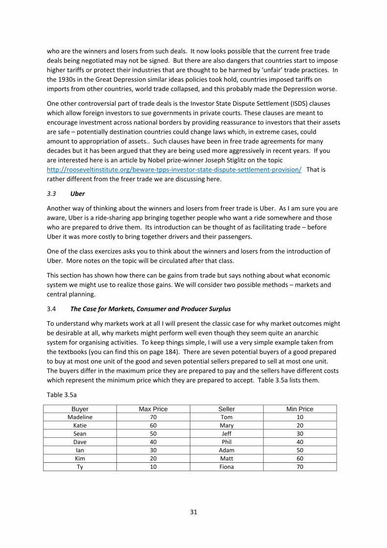
31
who are the winners and losers from such deals. It now looks possible that the current free trade
deals being negotiated may not be signed. But there are also dangers that countries start to impose
higher tariffs or protect their industries that are thought to be harmed by ‘unfair’ trade practices. In
the 1930s in the Great Depression similar ideas policies took hold, countries imposed tariffs on
imports from other countries, world trade collapsed, and this probably made the Depression worse.
One other controversial part of trade deals is the Investor State Dispute Settlement (ISDS) clauses
which allow foreign investors to sue governments in private courts. These clauses are meant to
encourage investment across national borders by providing reassurance to investors that their assets
are safe – potentially destination countries could change laws which, in extreme cases, could
amount to appropriation of assets.. Such clauses have been in free trade agreements for many
decades but it has been argued that they are being used more aggressively in recent years. If you
are interested here is an article by Nobel prize‐winner Joseph Stiglitz on the topic
http://rooseveltinstitute.org/beware‐tpps‐investor‐state‐dispute‐settlement‐provision/ That is
rather different from the freer trade we are discussing here.
3.3 Uber
Another way of thinking about the winners and losers from freer trade is Uber. As I am sure you are
aware, Uber is a ride‐sharing app bringing together people who want a ride somewhere and those
who are prepared to drive them. Its introduction can be thought of as facilitating trade – before
Uber it was more costly to bring together drivers and their passengers.
One of the class exercizes asks you to think about the winners and losers from the introduction of
Uber. More notes on the topic will be circulated after that class.
This section has shown how there can be gains from trade but says nothing about what economic
system we might use to realize those gains. We will consider two possible methods – markets and
central planning.
3.4 The Case for Markets, Consumer and Producer Surplus
To understand why markets work at all I will present the classic case for why market outcomes might
be desirable at all, why markets might perform well even though they seem quite an anarchic
system for organising activities. To keep things simple, I will use a very simple example taken from
the textbooks (you can find this on page 184). There are seven potential buyers of a good prepared
to buy at most one unit of the good and seven potential sellers prepared to sell at most one unit.
The buyers differ in the maximum price they are prepared to pay and the sellers have different costs
which represent the minimum price which they are prepared to accept. Table 3.5a lists them.
Table 3.5a
Buyer Max Price Seller Min Price Madeline 70 Tom 10 Katie 60 Mary 20 Sean 50 Jeff 30 Dave 40 Phil 40 Ian 30 Adam 50 Kim 20 Matt 60 Ty 10 Fiona 70
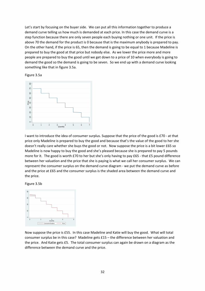
32
Let’s start by focusing on the buyer side. We can put all this information together to produce a
demand curve telling us how much is demanded at each price. In this case the demand curve is a
step function because there are only seven people each buying nothing or one unit. If the price is
above 70 the demand for the product is 0 because that is the maximum anybody is prepared to pay.
On the other hand, if the price is 65, then the demand is going to be equal to 1 because Madeline is
prepared to buy the good at that price but nobody else. As we lower the price more and more
people are prepared to buy the good until we get down to a price of 10 when everybody is going to
demand the good so the demand is going to be seven. So we end up with a demand curve looking
something like that in figure 3.5a.
Figure 3.5a
I want to introduce the idea of consumer surplus. Suppose that the price of the good is £70 ‐ at that
price only Madeline is prepared to buy the good and because that’s the value of the good to her she
doesn’t really care whether she buys the good or not. Now suppose the price is a bit lower £65 so
Madeline is now happy to buy the good and she’s pleased because she is prepared to pay 5 pounds
more for it. The good is worth £70 to her but she’s only having to pay £65 ‐ that £5 pound difference
between her valuation and the price that she is paying is what we call her consumer surplus. We can
represent the consumer surplus on the demand curve diagram ‐ we put the demand curve as before
and the price at £65 and the consumer surplus is the shaded area between the demand curve and
the price.
Figure 3.5b
Now suppose the price is £55. In this case Madeline and Katie will buy the good. What will total
consumer surplus be in this case? Madeline gets £15 – the difference between her valuation and
the price. And Katie gets £5. The total consumer surplus can again be drawn on a diagram as the
difference between the demand curve and the price.
01
02
03
04
05
06
07
08
0P
rice
0 1 2 3 4 5 6 7Quantity
02
04
06
08
0
0 2 4 6 8Quantity
Consumer/Surplus Price
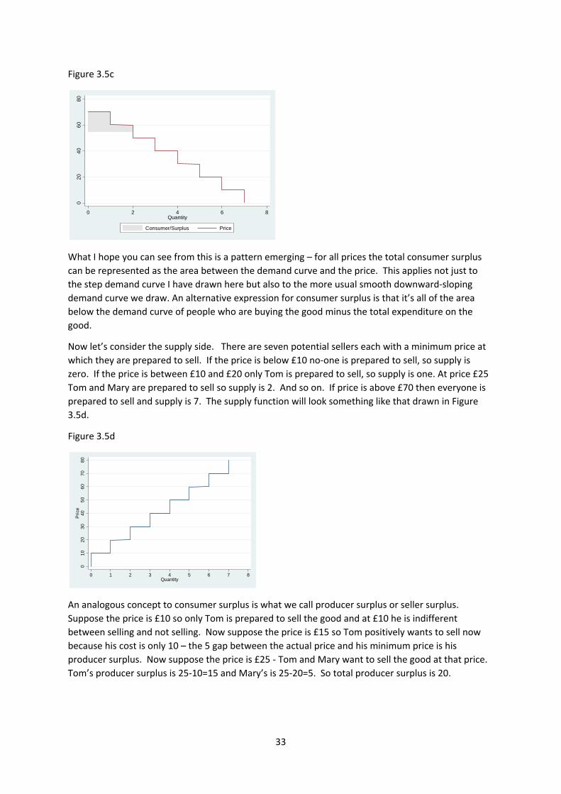
33
Figure 3.5c
What I hope you can see from this is a pattern emerging – for all prices the total consumer surplus
can be represented as the area between the demand curve and the price. This applies not just to
the step demand curve I have drawn here but also to the more usual smooth downward‐sloping
demand curve we draw. An alternative expression for consumer surplus is that it’s all of the area
below the demand curve of people who are buying the good minus the total expenditure on the
good.
Now let’s consider the supply side. There are seven potential sellers each with a minimum price at
which they are prepared to sell. If the price is below £10 no‐one is prepared to sell, so supply is
zero. If the price is between £10 and £20 only Tom is prepared to sell, so supply is one. At price £25
Tom and Mary are prepared to sell so supply is 2. And so on. If price is above £70 then everyone is
prepared to sell and supply is 7. The supply function will look something like that drawn in Figure
3.5d.
Figure 3.5d
An analogous concept to consumer surplus is what we call producer surplus or seller surplus.
Suppose the price is £10 so only Tom is prepared to sell the good and at £10 he is indifferent
between selling and not selling. Now suppose the price is £15 so Tom positively wants to sell now
because his cost is only 10 – the 5 gap between the actual price and his minimum price is his
producer surplus. Now suppose the price is £25 ‐ Tom and Mary want to sell the good at that price.
Tom’s producer surplus is 25‐10=15 and Mary’s is 25‐20=5. So total producer surplus is 20.
02
04
06
08
0
0 2 4 6 8Quantity
Consumer/Surplus Price
01
02
03
04
05
06
07
08
0P
rice
0 1 2 3 4 5 6 7 8Quantity
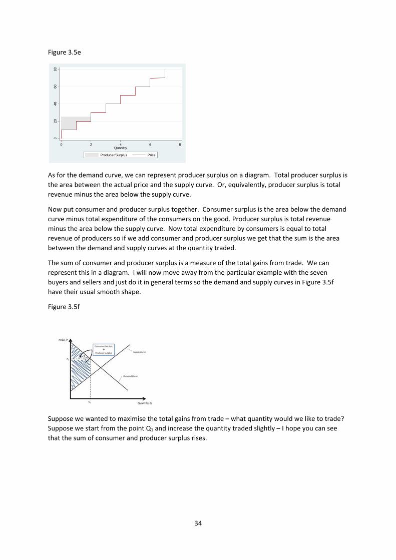
34
Figure 3.5e
As for the demand curve, we can represent producer surplus on a diagram. Total producer surplus is
the area between the actual price and the supply curve. Or, equivalently, producer surplus is total
revenue minus the area below the supply curve.
Now put consumer and producer surplus together. Consumer surplus is the area below the demand
curve minus total expenditure of the consumers on the good. Producer surplus is total revenue
minus the area below the supply curve. Now total expenditure by consumers is equal to total
revenue of producers so if we add consumer and producer surplus we get that the sum is the area
between the demand and supply curves at the quantity traded.
The sum of consumer and producer surplus is a measure of the total gains from trade. We can
represent this in a diagram. I will now move away from the particular example with the seven
buyers and sellers and just do it in general terms so the demand and supply curves in Figure 3.5f
have their usual smooth shape.
Figure 3.5f
Suppose we wanted to maximise the total gains from trade – what quantity would we like to trade?
Suppose we start from the point Q1 and increase the quantity traded slightly – I hope you can see
that the sum of consumer and producer surplus rises.
02
04
06
08
0
0 2 4 6 8Quantity
Producer/Surplus Price
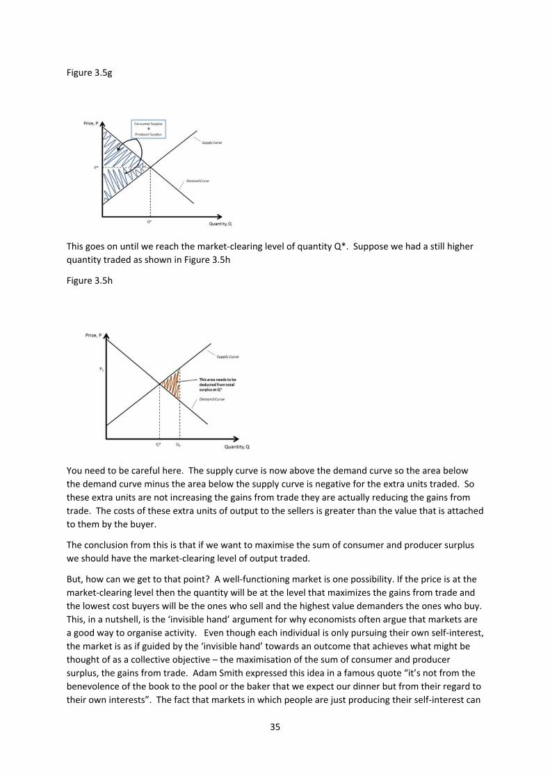
35
Figure 3.5g
This goes on until we reach the market‐clearing level of quantity Q*. Suppose we had a still higher
quantity traded as shown in Figure 3.5h
Figure 3.5h
You need to be careful here. The supply curve is now above the demand curve so the area below
the demand curve minus the area below the supply curve is negative for the extra units traded. So
these extra units are not increasing the gains from trade they are actually reducing the gains from
trade. The costs of these extra units of output to the sellers is greater than the value that is attached
to them by the buyer.
The conclusion from this is that if we want to maximise the sum of consumer and producer surplus
we should have the market‐clearing level of output traded.
But, how can we get to that point? A well‐functioning market is one possibility. If the price is at the
market‐clearing level then the quantity will be at the level that maximizes the gains from trade and
the lowest cost buyers will be the ones who sell and the highest value demanders the ones who buy.
This, in a nutshell, is the ‘invisible hand’ argument for why economists often argue that markets are
a good way to organise activity. Even though each individual is only pursuing their own self‐interest,
the market is as if guided by the ‘invisible hand’ towards an outcome that achieves what might be
thought of as a collective objective – the maximisation of the sum of consumer and producer
surplus, the gains from trade. Adam Smith expressed this idea in a famous quote “it’s not from the
benevolence of the book to the pool or the baker that we expect our dinner but from their regard to
their own interests”. The fact that markets in which people are just producing their self‐interest can
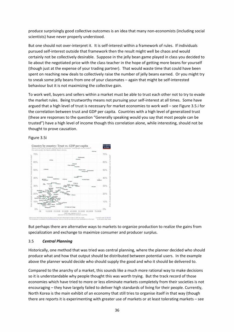
36
produce surprisingly good collective outcomes is an idea that many non‐economists (including social
scientists) have never properly understood.
But one should not over‐interpret it. It is self‐interest within a framework of rules. If individuals
pursued self‐interest outside that framework then the result might well be chaos and would
certainly not be collectively desirable. Suppose in the jelly bean game played in class you decided to
lie about the negotiated price with the class teacher in the hope of getting more beans for yourself
(though just at the expense of your trading partner). That would waste time that could have been
spent on reaching new deals to collectively raise the number of jelly beans earned. Or you might try
to sneak some jelly beans from one of your classmates – again that might be self‐interested
behaviour but it is not maximizing the collective gain.
To work well, buyers and sellers within a market must be able to trust each other not to try to evade
the market rules. Being trustworthy means not pursuing your self‐interest at all times. Some have
argued that a high level of trust is necessary for market economies to work well – see Figure 3.5.i for
the correlation between trust and GDP per capita. Countries with a high level of generalized trust
(these are responses to the question “Generally speaking would you say that most people can be
trusted”) have a high level of income though this correlation alone, while interesting, should not be
thought to prove causation.
Figure 3.5i
But perhaps there are alternative ways to markets to organize production to realize the gains from
specialization and exchange to maximize consumer and producer surplus.
3.5 Central Planning
Historically, one method that was tried was central planning, where the planner decided who should
produce what and how that output should be distributed between potential users. In the example
above the planner would decide who should supply the good and who it should be delivered to.
Compared to the anarchy of a market, this sounds like a much more rational way to make decisions
so it is understandable why people thought this was worth trying. But the track record of those
economies which have tried to more or less eliminate markets completely from their societies is not
encouraging – they have largely failed to deliver high standards of living for their people. Currently,
North Korea is the main exhibit of an economy that still tries to organise itself in that way (though
there are reports it is experimenting with greater use of markets or at least tolerating markets – see
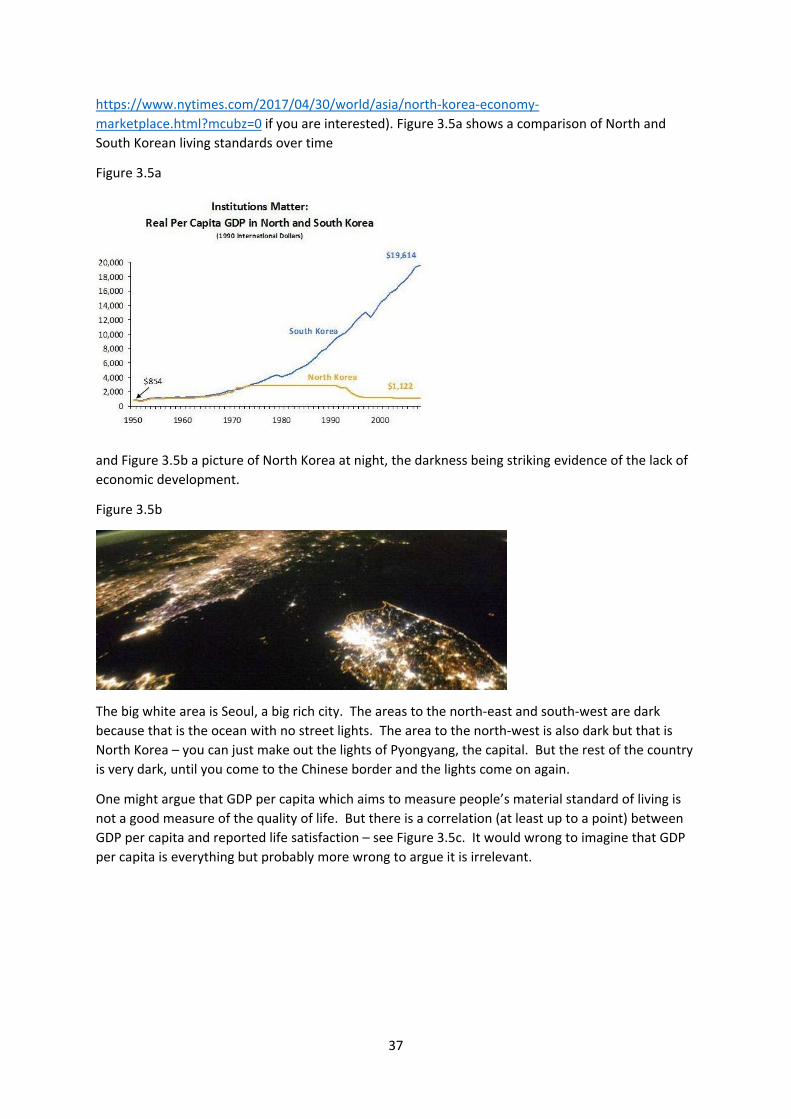
37
https://www.nytimes.com/2017/04/30/world/asia/north‐korea‐economy‐
marketplace.html?mcubz=0 if you are interested). Figure 3.5a shows a comparison of North and
South Korean living standards over time
Figure 3.5a
and Figure 3.5b a picture of North Korea at night, the darkness being striking evidence of the lack of
economic development.
Figure 3.5b
The big white area is Seoul, a big rich city. The areas to the north‐east and south‐west are dark
because that is the ocean with no street lights. The area to the north‐west is also dark but that is
North Korea – you can just make out the lights of Pyongyang, the capital. But the rest of the country
is very dark, until you come to the Chinese border and the lights come on again.
One might argue that GDP per capita which aims to measure people’s material standard of living is
not a good measure of the quality of life. But there is a correlation (at least up to a point) between
GDP per capita and reported life satisfaction – see Figure 3.5c. It would wrong to imagine that GDP
per capita is everything but probably more wrong to argue it is irrelevant.
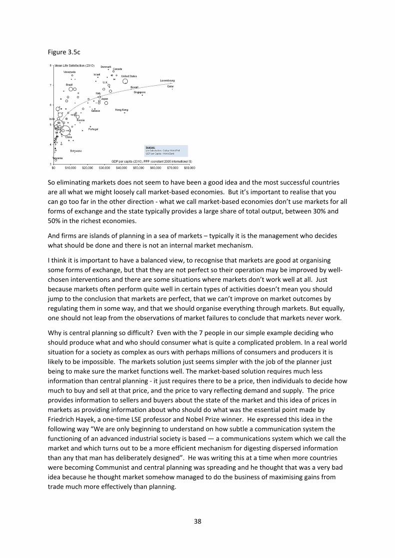
38
Figure 3.5c
So eliminating markets does not seem to have been a good idea and the most successful countries
are all what we might loosely call market‐based economies. But it’s important to realise that you
can go too far in the other direction ‐ what we call market‐based economies don’t use markets for all
forms of exchange and the state typically provides a large share of total output, between 30% and
50% in the richest economies.
And firms are islands of planning in a sea of markets – typically it is the management who decides
what should be done and there is not an internal market mechanism.
I think it is important to have a balanced view, to recognise that markets are good at organising
some forms of exchange, but that they are not perfect so their operation may be improved by well‐
chosen interventions and there are some situations where markets don’t work well at all. Just
because markets often perform quite well in certain types of activities doesn’t mean you should
jump to the conclusion that markets are perfect, that we can’t improve on market outcomes by
regulating them in some way, and that we should organise everything through markets. But equally,
one should not leap from the observations of market failures to conclude that markets never work.
Why is central planning so difficult? Even with the 7 people in our simple example deciding who
should produce what and who should consumer what is quite a complicated problem. In a real world
situation for a society as complex as ours with perhaps millions of consumers and producers it is
likely to be impossible. The markets solution just seems simpler with the job of the planner just
being to make sure the market functions well. The market‐based solution requires much less
information than central planning ‐ it just requires there to be a price, then individuals to decide how
much to buy and sell at that price, and the price to vary reflecting demand and supply. The price
provides information to sellers and buyers about the state of the market and this idea of prices in
markets as providing information about who should do what was the essential point made by
Friedrich Hayek, a one‐time LSE professor and Nobel Prize winner. He expressed this idea in the
following way “We are only beginning to understand on how subtle a communication system the
functioning of an advanced industrial society is based — a communications system which we call the
market and which turns out to be a more efficient mechanism for digesting dispersed information
than any that man has deliberately designed”. He was writing this at a time when more countries
were becoming Communist and central planning was spreading and he thought that was a very bad
idea because he thought market somehow managed to do the business of maximising gains from
trade much more effectively than planning.
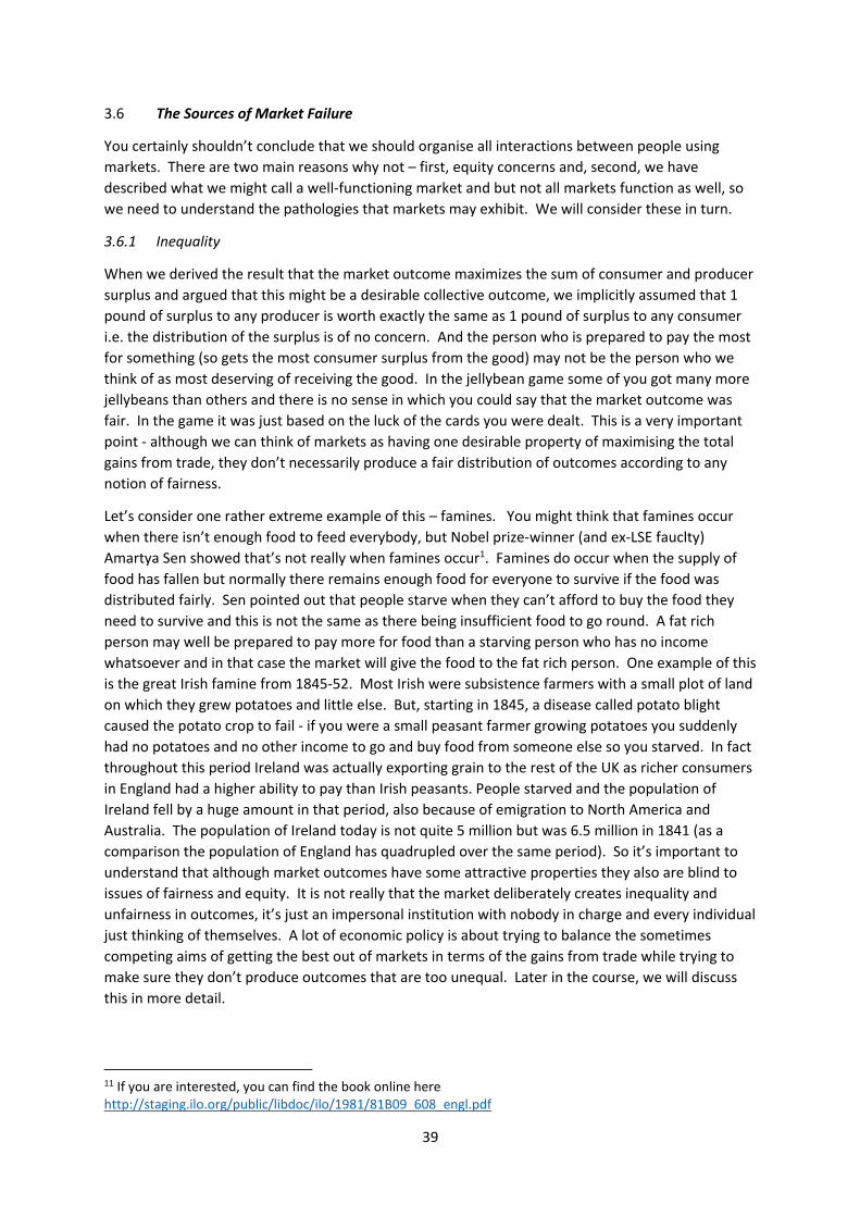
39
3.6 The Sources of Market Failure
You certainly shouldn’t conclude that we should organise all interactions between people using
markets. There are two main reasons why not – first, equity concerns and, second, we have
described what we might call a well‐functioning market and but not all markets function as well, so
we need to understand the pathologies that markets may exhibit. We will consider these in turn.
3.6.1 Inequality
When we derived the result that the market outcome maximizes the sum of consumer and producer
surplus and argued that this might be a desirable collective outcome, we implicitly assumed that 1
pound of surplus to any producer is worth exactly the same as 1 pound of surplus to any consumer
i.e. the distribution of the surplus is of no concern. And the person who is prepared to pay the most
for something (so gets the most consumer surplus from the good) may not be the person who we
think of as most deserving of receiving the good. In the jellybean game some of you got many more
jellybeans than others and there is no sense in which you could say that the market outcome was
fair. In the game it was just based on the luck of the cards you were dealt. This is a very important
point ‐ although we can think of markets as having one desirable property of maximising the total
gains from trade, they don’t necessarily produce a fair distribution of outcomes according to any
notion of fairness.
Let’s consider one rather extreme example of this – famines. You might think that famines occur
when there isn’t enough food to feed everybody, but Nobel prize‐winner (and ex‐LSE fauclty)
Amartya Sen showed that’s not really when famines occur1. Famines do occur when the supply of
food has fallen but normally there remains enough food for everyone to survive if the food was
distributed fairly. Sen pointed out that people starve when they can’t afford to buy the food they
need to survive and this is not the same as there being insufficient food to go round. A fat rich
person may well be prepared to pay more for food than a starving person who has no income
whatsoever and in that case the market will give the food to the fat rich person. One example of this
is the great Irish famine from 1845‐52. Most Irish were subsistence farmers with a small plot of land
on which they grew potatoes and little else. But, starting in 1845, a disease called potato blight
caused the potato crop to fail ‐ if you were a small peasant farmer growing potatoes you suddenly
had no potatoes and no other income to go and buy food from someone else so you starved. In fact
throughout this period Ireland was actually exporting grain to the rest of the UK as richer consumers
in England had a higher ability to pay than Irish peasants. People starved and the population of
Ireland fell by a huge amount in that period, also because of emigration to North America and
Australia. The population of Ireland today is not quite 5 million but was 6.5 million in 1841 (as a
comparison the population of England has quadrupled over the same period). So it’s important to
understand that although market outcomes have some attractive properties they also are blind to
issues of fairness and equity. It is not really that the market deliberately creates inequality and
unfairness in outcomes, it’s just an impersonal institution with nobody in charge and every individual
just thinking of themselves. A lot of economic policy is about trying to balance the sometimes
competing aims of getting the best out of markets in terms of the gains from trade while trying to
make sure they don’t produce outcomes that are too unequal. Later in the course, we will discuss
this in more detail.
11 If you are interested, you can find the book online here http://staging.ilo.org/public/libdoc/ilo/1981/81B09_608_engl.pdf
40
3.6.2 Market Pathologies
The result that the market outcome maximizes the gains from trade depends on the market being
“well‐functioning”. But there are some important assumptions for this to be the case:
‐ people are the best judge of what is good for them
‐ no individual on demand or supply side is large enough to influence the market price
‐ there are no externalities
‐ both buyers and sellers have perfect information about products and prices
We will explain briefly why these assumptions are important.
People are the best judge of what is good for them
In the example, we assumed Madeline was prepared to pay £70 for the good and used this valuation
to compute her consumer surplus. In doing so, we assumed that was her true valuation. There are
situations in which that may be a good assumption and but there are situations in which we might
worry about whether people really do know what is good for them in all situations. If children were
given a free choice over what to eat they might answer ‘ice cream’ all the time and many parents
would assume that is not in their own best interest. But, if a child is allowed an ice cream, the
parents may be happy to allow the child to choose the flavour.
But even when we think people might not be the best judge of their own welfare, the alternative is
telling other people what is good for them and that is often no more attractive. This is a very tricky
area as it is clear that in many parts of life we do allow people to make their own decisions and it is
reasonable to assume that, when someone chooses one option over another option, that the option
they choose is the one they genuinely thought was better. But, equally, it’s not hard to come up with
situations in which we have some doubts about that and so it is really a judgement call whether in
particular situations you think you can rely on people to make decisions on their own. This area of
research has grown a lot in recent years and is called behavioural economics. The basic idea is that
people make systematic mistakes in evaluating outcomes. The most accessible version of these
ideas can be found in Nobel Prize winner Daniel Kahneman’s book ‘Thinking Fast and Slow’ – These
ideas are beginning to be used in in policy, e.g. David Cameron when prime minister set up the
Behavioural Insights Team (popularly known as the ‘nudge unit’) which is designed to exploit the
quirks in people’s decision‐making in order to help people make better decisions (if you are
interested, you can read about their work here http://www.behaviouralinsights.co.uk/).
One example is organ donation. Some countries have an opt‐in system where a person’s organs are
used for transplants only if the donor has expressed an explicit wish for this to be the case. Other
countries have an opt‐out system in which a person’s organs are used for transplants unless the
potential donor has expressed an explicit wish for this not to be the case. In both systems the
options to donate or not‐donate are both available and it is a simple administrative matter to
express a choice. But Figure 3.6.2a shows that organ donation rates differ markedly according to
which system is used. It seems likely that the differences across countries do not reflect differences
in preferences towards organ donation but more a tendency to choose default options.
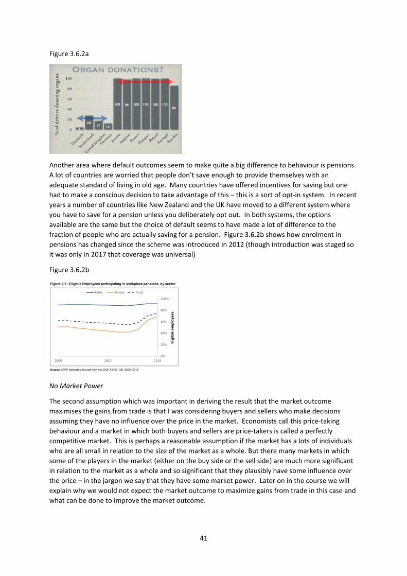
41
Figure 3.6.2a
Another area where default outcomes seem to make quite a big difference to behaviour is pensions.
A lot of countries are worried that people don’t save enough to provide themselves with an
adequate standard of living in old age. Many countries have offered incentives for saving but one
had to make a conscious decision to take advantage of this – this is a sort of opt‐in system. In recent
years a number of countries like New Zealand and the UK have moved to a different system where
you have to save for a pension unless you deliberately opt out. In both systems, the options
available are the same but the choice of default seems to have made a lot of difference to the
fraction of people who are actually saving for a pension. Figure 3.6.2b shows how enrolment in
pensions has changed since the scheme was introduced in 2012 (though introduction was staged so
it was only in 2017 that coverage was universal)
Figure 3.6.2b
No Market Power
The second assumption which was important in deriving the result that the market outcome
maximises the gains from trade is that I was considering buyers and sellers who make decisions
assuming they have no influence over the price in the market. Economists call this price‐taking
behaviour and a market in which both buyers and sellers are price‐takers is called a perfectly
competitive market. This is perhaps a reasonable assumption if the market has a lots of individuals
who are all small in relation to the size of the market as a whole. But there many markets in which
some of the players in the market (either on the buy side or the sell side) are much more significant
in relation to the market as a whole and so significant that they plausibly have some influence over
the price – in the jargon we say that they have some market power. Later on in the course we will
explain why we would not expect the market outcome to maximize gains from trade in this case and
what can be done to improve the market outcome.
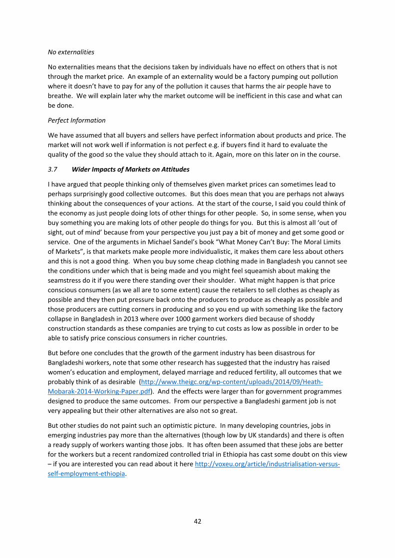
42
No externalities
No externalities means that the decisions taken by individuals have no effect on others that is not
through the market price. An example of an externality would be a factory pumping out pollution
where it doesn’t have to pay for any of the pollution it causes that harms the air people have to
breathe. We will explain later why the market outcome will be inefficient in this case and what can
be done.
Perfect Information
We have assumed that all buyers and sellers have perfect information about products and price. The
market will not work well if information is not perfect e.g. if buyers find it hard to evaluate the
quality of the good so the value they should attach to it. Again, more on this later on in the course.
3.7 Wider Impacts of Markets on Attitudes
I have argued that people thinking only of themselves given market prices can sometimes lead to
perhaps surprisingly good collective outcomes. But this does mean that you are perhaps not always
thinking about the consequences of your actions. At the start of the course, I said you could think of
the economy as just people doing lots of other things for other people. So, in some sense, when you
buy something you are making lots of other people do things for you. But this is almost all ‘out of
sight, out of mind’ because from your perspective you just pay a bit of money and get some good or
service. One of the arguments in Michael Sandel’s book “What Money Can’t Buy: The Moral Limits
of Markets”, is that markets make people more individualistic, it makes them care less about others
and this is not a good thing. When you buy some cheap clothing made in Bangladesh you cannot see
the conditions under which that is being made and you might feel squeamish about making the
seamstress do it if you were there standing over their shoulder. What might happen is that price
conscious consumers (as we all are to some extent) cause the retailers to sell clothes as cheaply as
possible and they then put pressure back onto the producers to produce as cheaply as possible and
those producers are cutting corners in producing and so you end up with something like the factory
collapse in Bangladesh in 2013 where over 1000 garment workers died because of shoddy
construction standards as these companies are trying to cut costs as low as possible in order to be
able to satisfy price conscious consumers in richer countries.
But before one concludes that the growth of the garment industry has been disastrous for
Bangladeshi workers, note that some other research has suggested that the industry has raised
women’s education and employment, delayed marriage and reduced fertility, all outcomes that we
probably think of as desirable (http://www.theigc.org/wp‐content/uploads/2014/09/Heath‐
Mobarak‐2014‐Working‐Paper.pdf). And the effects were larger than for government programmes
designed to produce the same outcomes. From our perspective a Bangladeshi garment job is not
very appealing but their other alternatives are also not so great.
But other studies do not paint such an optimistic picture. In many developing countries, jobs in
emerging industries pay more than the alternatives (though low by UK standards) and there is often
a ready supply of workers wanting those jobs. It has often been assumed that these jobs are better
for the workers but a recent randomized controlled trial in Ethiopia has cast some doubt on this view
– if you are interested you can read about it here http://voxeu.org/article/industrialisation‐versus‐
self‐employment‐ethiopia.
43
3.8 Conclusion
I have shown that the market outcome has, under some assumptions, some desirable properties in
the sense that it maximises the gains from trade. In reality no markets are actually perfect in this
way and we know that markets can fail as the financial markets did in 2008. This might make one
think that the model is useless. But just because the model presented never exists doesn’t make the
model useless because it encourages us to think about the way in which an actual market differs
from perfectly competitive ideal and that then may give us some ideas about how to improve things.
Economists have a theory of why markets can work well but they also have a theory of market
failure and theories about how we can correct market failure.
Key Concepts from Chapter 3
Gains from Trade
Absolute and comparative advantage
Consumer and producer surplus
Market‐clearing quantity maximizes sum of consumer and producer surplus
Markets and planning as alternative ways to maximize gains from trade
Types of market failure
‐ possibly high levels of inequality
‐ people not the best judge of their own welfare
‐ market power
‐ externalities
‐ informational problems
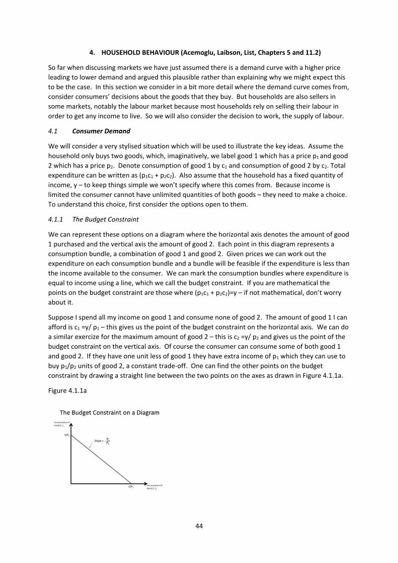
44
4. HOUSEHOLD BEHAVIOUR (Acemoglu, Laibson, List, Chapters 5 and 11.2)
So far when discussing markets we have just assumed there is a demand curve with a higher price
leading to lower demand and argued this plausible rather than explaining why we might expect this
to be the case. In this section we consider in a bit more detail where the demand curve comes from,
consider consumers’ decisions about the goods that they buy. But households are also sellers in
some markets, notably the labour market because most households rely on selling their labour in
order to get any income to live. So we will also consider the decision to work, the supply of labour.
4.1 Consumer Demand
We will consider a very stylised situation which will be used to illustrate the key ideas. Assume the
household only buys two goods, which, imaginatively, we label good 1 which has a price p1 and good
2 which has a price p2. Denote consumption of good 1 by c1 and consumption of good 2 by c2. Total
expenditure can be written as (p1c1 + p2c2). Also assume that the household has a fixed quantity of
income, y – to keep things simple we won’t specify where this comes from. Because income is
limited the consumer cannot have unlimited quantities of both goods – they need to make a choice.
To understand this choice, first consider the options open to them.
4.1.1 The Budget Constraint
We can represent these options on a diagram where the horizontal axis denotes the amount of good
1 purchased and the vertical axis the amount of good 2. Each point in this diagram represents a
consumption bundle, a combination of good 1 and good 2. Given prices we can work out the
expenditure on each consumption bundle and a bundle will be feasible if the expenditure is less than
the income available to the consumer. We can mark the consumption bundles where expenditure is
equal to income using a line, which we call the budget constraint. If you are mathematical the
points on the budget constraint are those where (p1c1 + p2c2)=y – if not mathematical, don’t worry
about it.
Suppose I spend all my income on good 1 and consume none of good 2. The amount of good 1 I can
afford is c1 =y/ p1 – this gives us the point of the budget constraint on the horizontal axis. We can do
a similar exercize for the maximum amount of good 2 – this is c2 =y/ p2 and gives us the point of the
budget constraint on the vertical axis. Of course the consumer can consume some of both good 1
and good 2. If they have one unit less of good 1 they have extra income of p1 which they can use to
buy p1/p2 units of good 2, a constant trade‐off. One can find the other points on the budget
constraint by drawing a straight line between the two points on the axes as drawn in Figure 4.1.1a.
Figure 4.1.1a
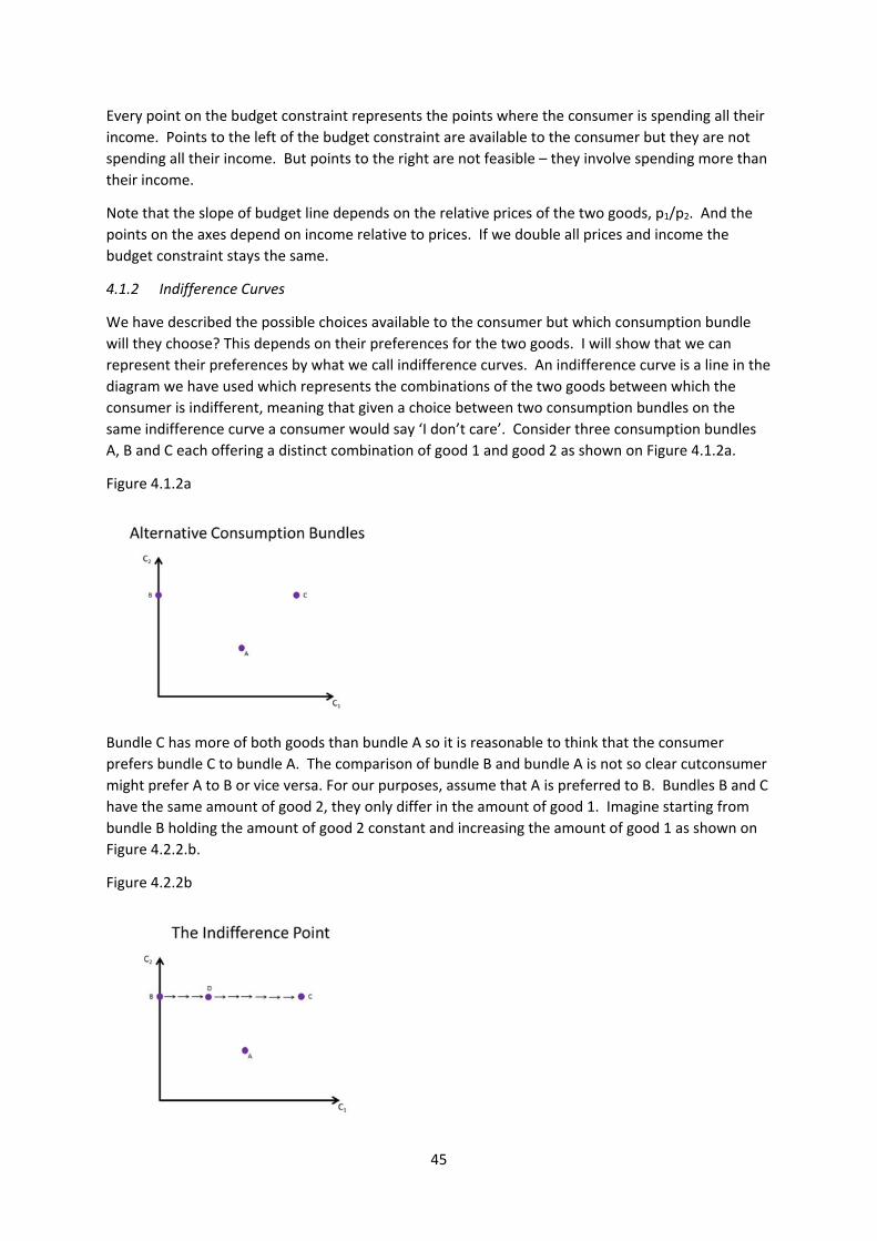
45
Every point on the budget constraint represents the points where the consumer is spending all their
income. Points to the left of the budget constraint are available to the consumer but they are not
spending all their income. But points to the right are not feasible – they involve spending more than
their income.
Note that the slope of budget line depends on the relative prices of the two goods, p1/p2. And the
points on the axes depend on income relative to prices. If we double all prices and income the
budget constraint stays the same.
4.1.2 Indifference Curves
We have described the possible choices available to the consumer but which consumption bundle
will they choose? This depends on their preferences for the two goods. I will show that we can
represent their preferences by what we call indifference curves. An indifference curve is a line in the
diagram we have used which represents the combinations of the two goods between which the
consumer is indifferent, meaning that given a choice between two consumption bundles on the
same indifference curve a consumer would say ‘I don’t care’. Consider three consumption bundles
A, B and C each offering a distinct combination of good 1 and good 2 as shown on Figure 4.1.2a.
Figure 4.1.2a
Bundle C has more of both goods than bundle A so it is reasonable to think that the consumer
prefers bundle C to bundle A. The comparison of bundle B and bundle A is not so clear cutconsumer
might prefer A to B or vice versa. For our purposes, assume that A is preferred to B. Bundles B and C
have the same amount of good 2, they only differ in the amount of good 1. Imagine starting from
bundle B holding the amount of good 2 constant and increasing the amount of good 1 as shown on
Figure 4.2.2.b.
Figure 4.2.2b
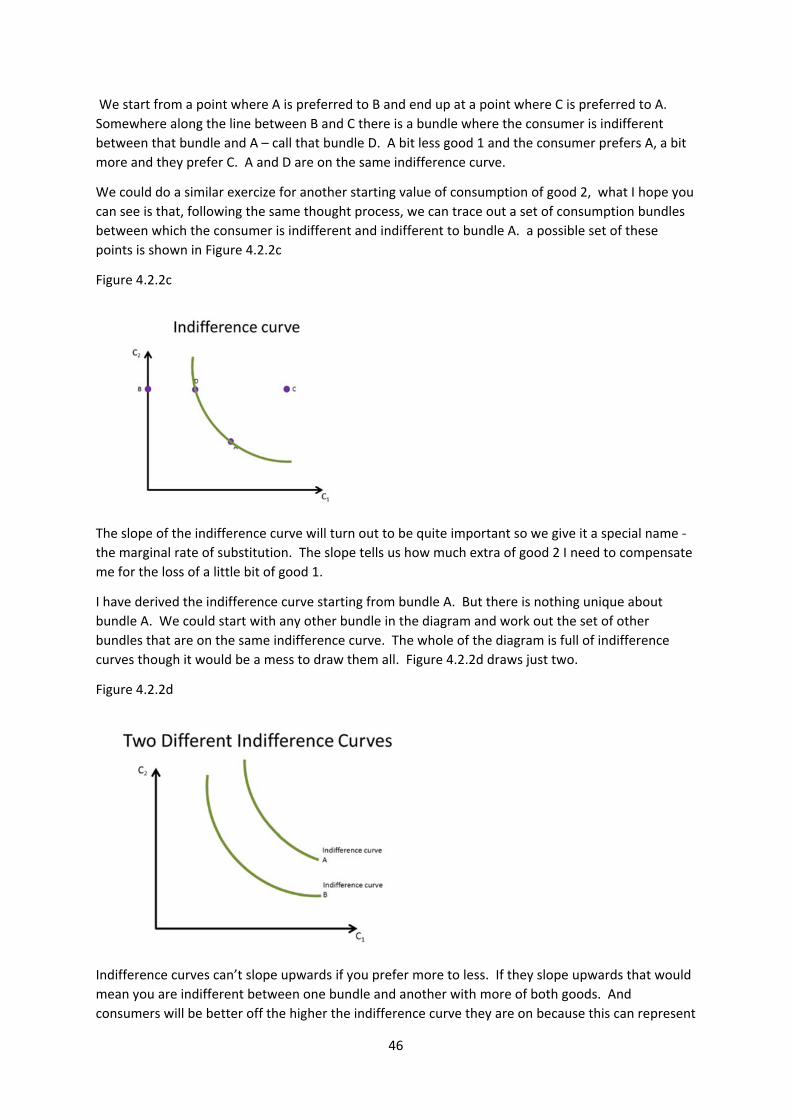
46
We start from a point where A is preferred to B and end up at a point where C is preferred to A.
Somewhere along the line between B and C there is a bundle where the consumer is indifferent
between that bundle and A – call that bundle D. A bit less good 1 and the consumer prefers A, a bit
more and they prefer C. A and D are on the same indifference curve.
We could do a similar exercize for another starting value of consumption of good 2, what I hope you
can see is that, following the same thought process, we can trace out a set of consumption bundles
between which the consumer is indifferent and indifferent to bundle A. a possible set of these
points is shown in Figure 4.2.2c
Figure 4.2.2c
The slope of the indifference curve will turn out to be quite important so we give it a special name ‐
the marginal rate of substitution. The slope tells us how much extra of good 2 I need to compensate
me for the loss of a little bit of good 1.
I have derived the indifference curve starting from bundle A. But there is nothing unique about
bundle A. We could start with any other bundle in the diagram and work out the set of other
bundles that are on the same indifference curve. The whole of the diagram is full of indifference
curves though it would be a mess to draw them all. Figure 4.2.2d draws just two.
Figure 4.2.2d
Indifference curves can’t slope upwards if you prefer more to less. If they slope upwards that would
mean you are indifferent between one bundle and another with more of both goods. And
consumers will be better off the higher the indifference curve they are on because this can represent
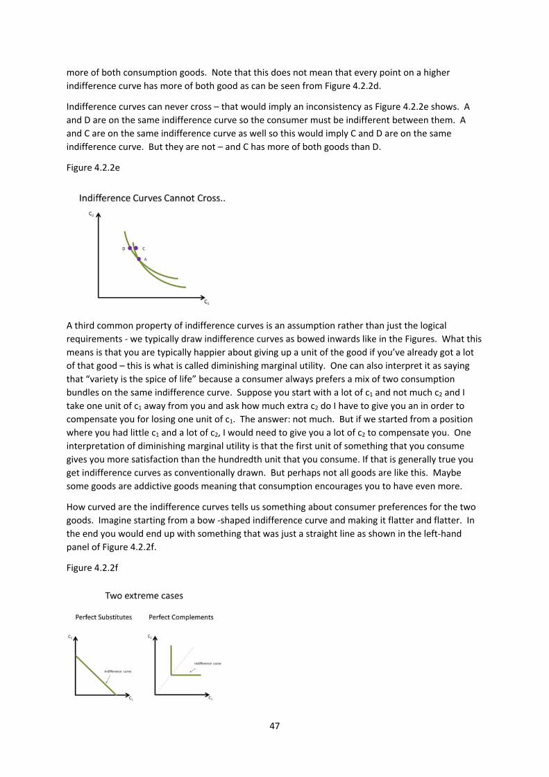
47
more of both consumption goods. Note that this does not mean that every point on a higher
indifference curve has more of both good as can be seen from Figure 4.2.2d.
Indifference curves can never cross – that would imply an inconsistency as Figure 4.2.2e shows. A
and D are on the same indifference curve so the consumer must be indifferent between them. A
and C are on the same indifference curve as well so this would imply C and D are on the same
indifference curve. But they are not – and C has more of both goods than D.
Figure 4.2.2e
A third common property of indifference curves is an assumption rather than just the logical
requirements ‐ we typically draw indifference curves as bowed inwards like in the Figures. What this
means is that you are typically happier about giving up a unit of the good if you’ve already got a lot
of that good – this is what is called diminishing marginal utility. One can also interpret it as saying
that “variety is the spice of life” because a consumer always prefers a mix of two consumption
bundles on the same indifference curve. Suppose you start with a lot of c1 and not much c2 and I
take one unit of c1 away from you and ask how much extra c2 do I have to give you an in order to
compensate you for losing one unit of c1. The answer: not much. But if we started from a position
where you had little c1 and a lot of c2, I would need to give you a lot of c2 to compensate you. One
interpretation of diminishing marginal utility is that the first unit of something that you consume
gives you more satisfaction than the hundredth unit that you consume. If that is generally true you
get indifference curves as conventionally drawn. But perhaps not all goods are like this. Maybe
some goods are addictive goods meaning that consumption encourages you to have even more.
How curved are the indifference curves tells us something about consumer preferences for the two
goods. Imagine starting from a bow ‐shaped indifference curve and making it flatter and flatter. In
the end you would end up with something that was just a straight line as shown in the left‐hand
panel of Figure 4.2.2f.
Figure 4.2.2f
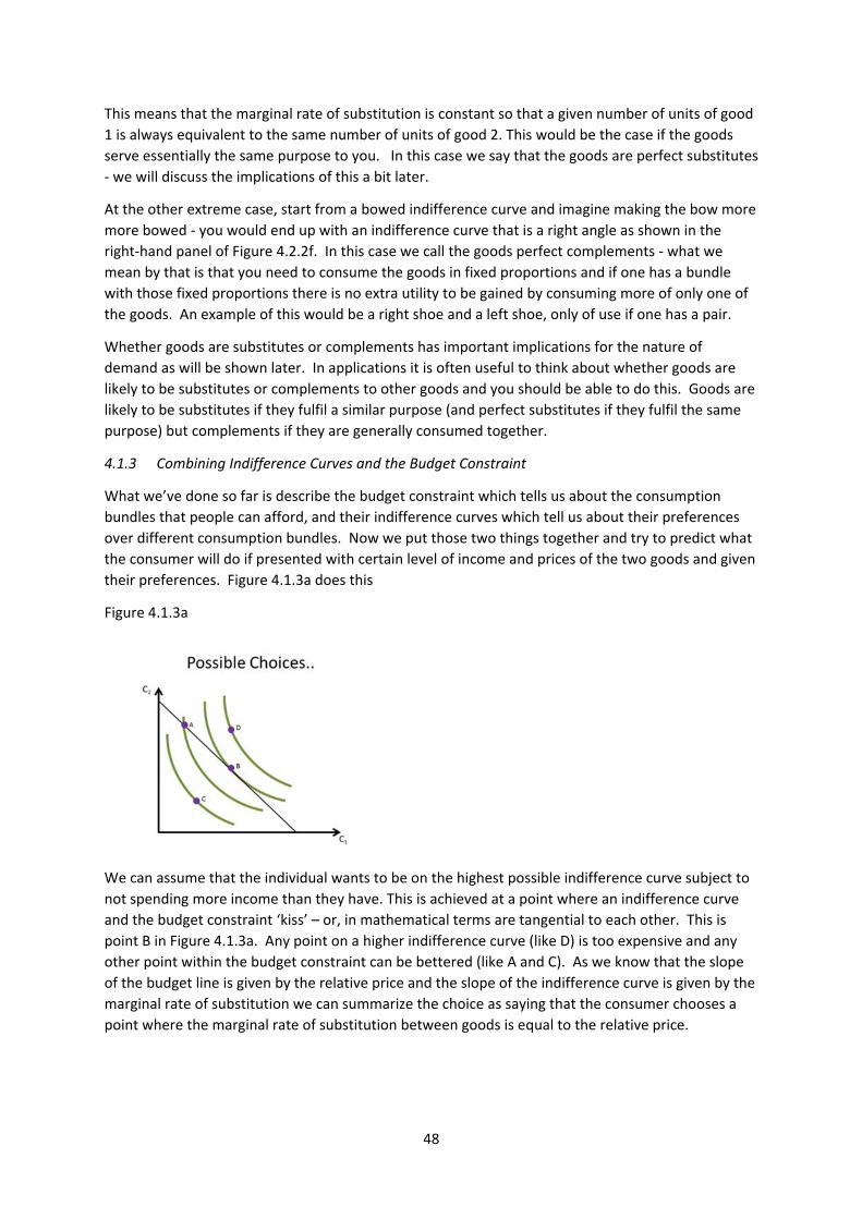
48
This means that the marginal rate of substitution is constant so that a given number of units of good
1 is always equivalent to the same number of units of good 2. This would be the case if the goods
serve essentially the same purpose to you. In this case we say that the goods are perfect substitutes
‐ we will discuss the implications of this a bit later.
At the other extreme case, start from a bowed indifference curve and imagine making the bow more
more bowed ‐ you would end up with an indifference curve that is a right angle as shown in the
right‐hand panel of Figure 4.2.2f. In this case we call the goods perfect complements ‐ what we
mean by that is that you need to consume the goods in fixed proportions and if one has a bundle
with those fixed proportions there is no extra utility to be gained by consuming more of only one of
the goods. An example of this would be a right shoe and a left shoe, only of use if one has a pair.
Whether goods are substitutes or complements has important implications for the nature of
demand as will be shown later. In applications it is often useful to think about whether goods are
likely to be substitutes or complements to other goods and you should be able to do this. Goods are
likely to be substitutes if they fulfil a similar purpose (and perfect substitutes if they fulfil the same
purpose) but complements if they are generally consumed together.
4.1.3 Combining Indifference Curves and the Budget Constraint
What we’ve done so far is describe the budget constraint which tells us about the consumption
bundles that people can afford, and their indifference curves which tell us about their preferences
over different consumption bundles. Now we put those two things together and try to predict what
the consumer will do if presented with certain level of income and prices of the two goods and given
their preferences. Figure 4.1.3a does this
Figure 4.1.3a
We can assume that the individual wants to be on the highest possible indifference curve subject to
not spending more income than they have. This is achieved at a point where an indifference curve
and the budget constraint ‘kiss’ – or, in mathematical terms are tangential to each other. This is
point B in Figure 4.1.3a. Any point on a higher indifference curve (like D) is too expensive and any
other point within the budget constraint can be bettered (like A and C). As we know that the slope
of the budget line is given by the relative price and the slope of the indifference curve is given by the
marginal rate of substitution we can summarize the choice as saying that the consumer chooses a
point where the marginal rate of substitution between goods is equal to the relative price.
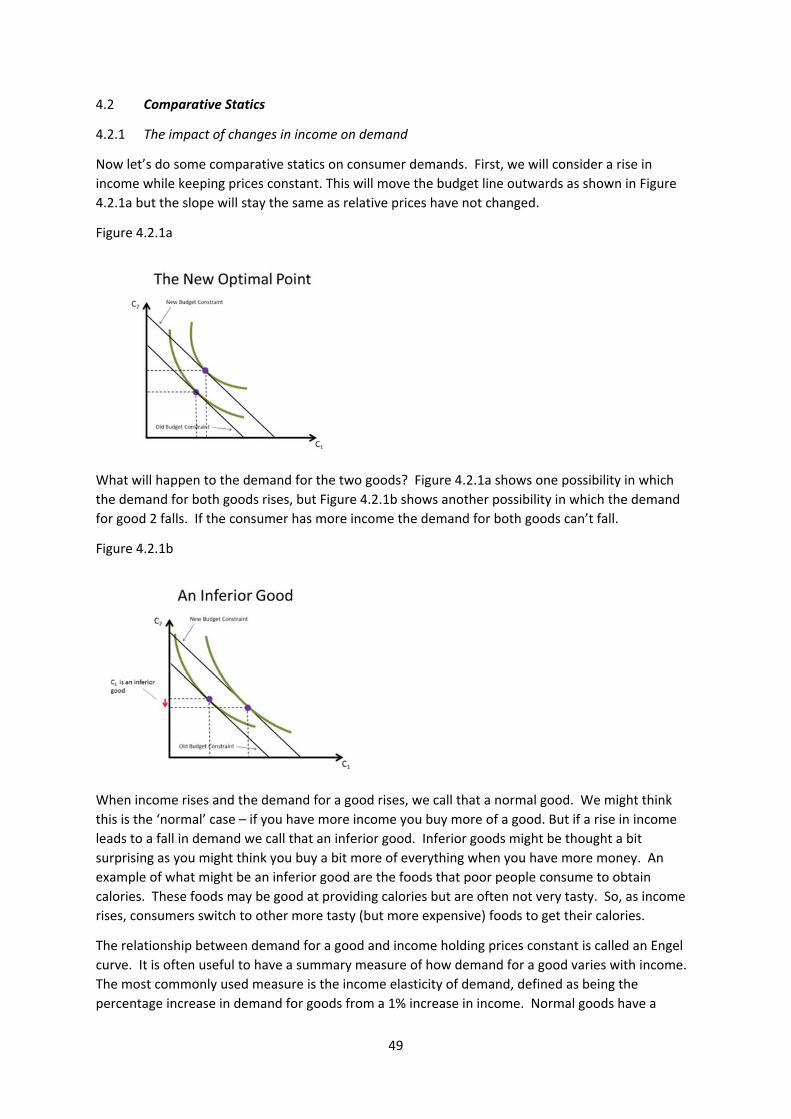
49
4.2 Comparative Statics
4.2.1 The impact of changes in income on demand
Now let’s do some comparative statics on consumer demands. First, we will consider a rise in
income while keeping prices constant. This will move the budget line outwards as shown in Figure
4.2.1a but the slope will stay the same as relative prices have not changed.
Figure 4.2.1a
What will happen to the demand for the two goods? Figure 4.2.1a shows one possibility in which
the demand for both goods rises, but Figure 4.2.1b shows another possibility in which the demand
for good 2 falls. If the consumer has more income the demand for both goods can’t fall.
Figure 4.2.1b
When income rises and the demand for a good rises, we call that a normal good. We might think
this is the ‘normal’ case – if you have more income you buy more of a good. But if a rise in income
leads to a fall in demand we call that an inferior good. Inferior goods might be thought a bit
surprising as you might think you buy a bit more of everything when you have more money. An
example of what might be an inferior good are the foods that poor people consume to obtain
calories. These foods may be good at providing calories but are often not very tasty. So, as income
rises, consumers switch to other more tasty (but more expensive) foods to get their calories.
The relationship between demand for a good and income holding prices constant is called an Engel
curve. It is often useful to have a summary measure of how demand for a good varies with income.
The most commonly used measure is the income elasticity of demand, defined as being the
percentage increase in demand for goods from a 1% increase in income. Normal goods have a
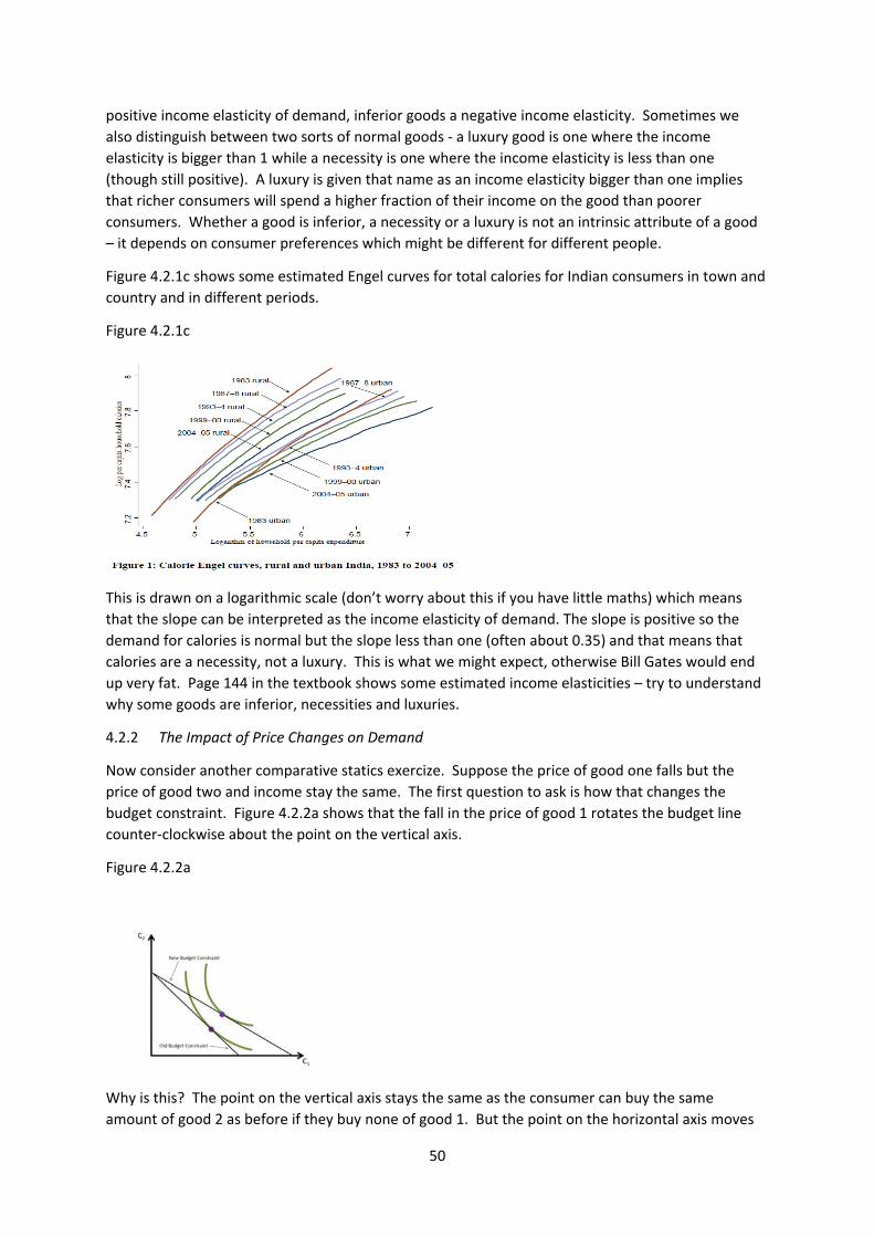
50
positive income elasticity of demand, inferior goods a negative income elasticity. Sometimes we
also distinguish between two sorts of normal goods ‐ a luxury good is one where the income
elasticity is bigger than 1 while a necessity is one where the income elasticity is less than one
(though still positive). A luxury is given that name as an income elasticity bigger than one implies
that richer consumers will spend a higher fraction of their income on the good than poorer
consumers. Whether a good is inferior, a necessity or a luxury is not an intrinsic attribute of a good
– it depends on consumer preferences which might be different for different people.
Figure 4.2.1c shows some estimated Engel curves for total calories for Indian consumers in town and
country and in different periods.
Figure 4.2.1c
This is drawn on a logarithmic scale (don’t worry about this if you have little maths) which means
that the slope can be interpreted as the income elasticity of demand. The slope is positive so the
demand for calories is normal but the slope less than one (often about 0.35) and that means that
calories are a necessity, not a luxury. This is what we might expect, otherwise Bill Gates would end
up very fat. Page 144 in the textbook shows some estimated income elasticities – try to understand
why some goods are inferior, necessities and luxuries.
4.2.2 The Impact of Price Changes on Demand
Now consider another comparative statics exercize. Suppose the price of good one falls but the
price of good two and income stay the same. The first question to ask is how that changes the
budget constraint. Figure 4.2.2a shows that the fall in the price of good 1 rotates the budget line
counter‐clockwise about the point on the vertical axis.
Figure 4.2.2a
Why is this? The point on the vertical axis stays the same as the consumer can buy the same
amount of good 2 as before if they buy none of good 1. But the point on the horizontal axis moves
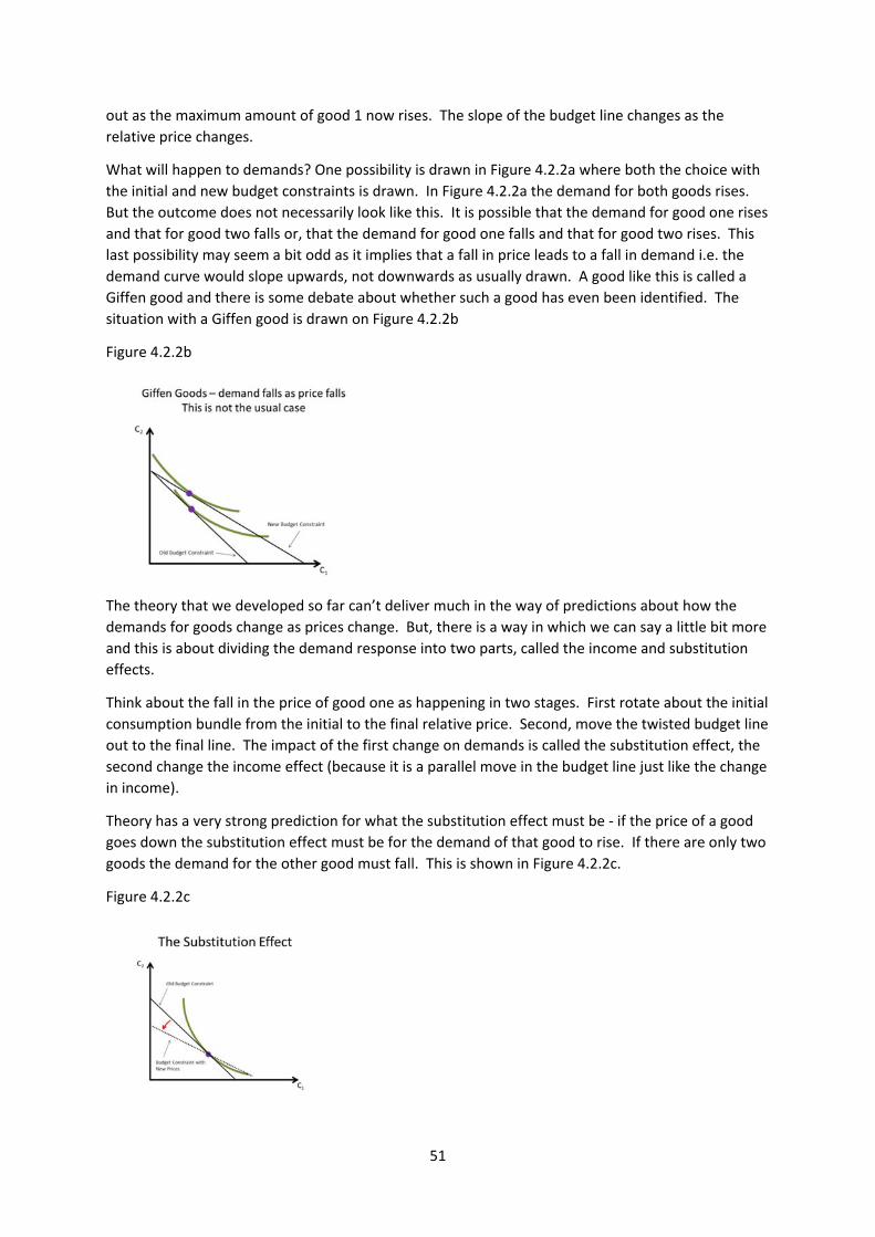
51
out as the maximum amount of good 1 now rises. The slope of the budget line changes as the
relative price changes.
What will happen to demands? One possibility is drawn in Figure 4.2.2a where both the choice with
the initial and new budget constraints is drawn. In Figure 4.2.2a the demand for both goods rises.
But the outcome does not necessarily look like this. It is possible that the demand for good one rises
and that for good two falls or, that the demand for good one falls and that for good two rises. This
last possibility may seem a bit odd as it implies that a fall in price leads to a fall in demand i.e. the
demand curve would slope upwards, not downwards as usually drawn. A good like this is called a
Giffen good and there is some debate about whether such a good has even been identified. The
situation with a Giffen good is drawn on Figure 4.2.2b
Figure 4.2.2b
The theory that we developed so far can’t deliver much in the way of predictions about how the
demands for goods change as prices change. But, there is a way in which we can say a little bit more
and this is about dividing the demand response into two parts, called the income and substitution
effects.
Think about the fall in the price of good one as happening in two stages. First rotate about the initial
consumption bundle from the initial to the final relative price. Second, move the twisted budget line
out to the final line. The impact of the first change on demands is called the substitution effect, the
second change the income effect (because it is a parallel move in the budget line just like the change
in income).
Theory has a very strong prediction for what the substitution effect must be ‐ if the price of a good
goes down the substitution effect must be for the demand of that good to rise. If there are only two
goods the demand for the other good must fall. This is shown in Figure 4.2.2c.
Figure 4.2.2c
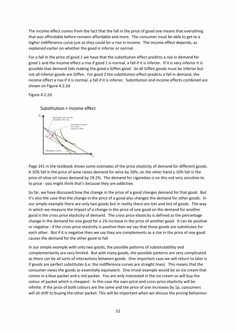
52
The income effect comes from the fact that the fall in the price of good one means that everything
that was affordable before remains affordable and more. The consumer must be able to get to a
higher indifference curve just as they could for a rise in income. The income effect depends, as
explained earlier on whether the good is inferior or normal.
For a fall in the price of good 1 we have that the substitution effect predicts a rise in demand for
good 1 and the income effect a rise if good 1 is normal, a fall if it is inferior. If it is very inferior it is
possible that demand falls making the good a Giffen good. So all Giffen goods must be inferior but
not all inferior goods are Giffen. For good 2 the substitution effect predicts a fall in demand, the
income effect a rise if it is normal, a fall if it is inferior. Substitution and income effects combined are
shown on Figure 4.2.2d
Figure 4.2.2d
Page 141 in the textbook shows some estimates of the price elasticity of demand for different goods.
A 10% fall in the price of wine raises demand for wine by 10%; on the other hand a 10% fall in the
price of olive oil raises demand by 19.2%. The demand for cigarettes is on this not very sensitive to
to price ‐ you might think that’s because they are addictive.
So far, we have discussed how the change in the price of a good changes demand for that good. But
it’s also the case that the change in the price of a good also changes the demand for other goods. In
our simple example there are only two goods but in reality there are lots and lots of goods. The way
in which we measure the impact of a change in the price of one good on the demand for another
good is the cross price elasticity of demand. The cross price elasticity is defined as the percentage
change in the demand for one good for a 1% increase in the price of another good. It can be positive
or negative ‐ if the cross price elasticity is positive then we say that those goods are substitutes for
each other. But if it is negative then we say they are complements as a rise in the price of one good
causes the demand for the other good to fall.
In our simple example with only two goods, the possible patterns of substitutability and
complementarity are very limited. But with many goods, the possible patterns are very complicated
as there can be all sorts of interactions between goods. One important case we will return to later is
if goods are perfect substitutes (i.e. the indifference curves are straight lines). This means that the
consumer views the goods as essentially equivalent. One trivial example would be an ice cream that
comes in a blue packet and a red packet. You are only interested in the ice cream so will buy the
colour of packet which is cheapest. In this case the own‐price and cross‐price elasticity will be
infinite. If the price of both colours are the same and the price of one increases by 1p, consumers
will all shift to buying the other packet. This will be important when we discuss the pricing behaviour
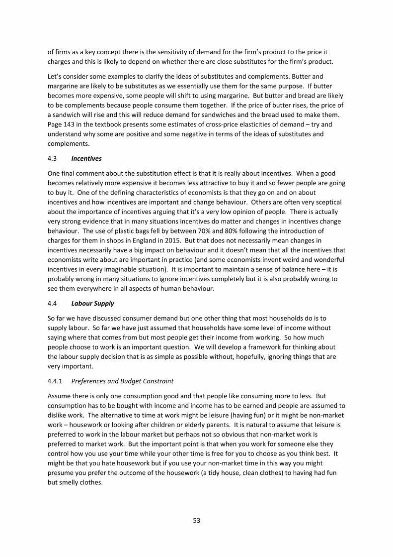
53
of firms as a key concept there is the sensitivity of demand for the firm’s product to the price it
charges and this is likely to depend on whether there are close substitutes for the firm’s product.
Let’s consider some examples to clarify the ideas of substitutes and complements. Butter and
margarine are likely to be substitutes as we essentially use them for the same purpose. If butter
becomes more expensive, some people will shift to using margarine. But butter and bread are likely
to be complements because people consume them together. If the price of butter rises, the price of
a sandwich will rise and this will reduce demand for sandwiches and the bread used to make them.
Page 143 in the textbook presents some estimates of cross‐price elasticities of demand – try and
understand why some are positive and some negative in terms of the ideas of substitutes and
complements.
4.3 Incentives
One final comment about the substitution effect is that it is really about incentives. When a good
becomes relatively more expensive it becomes less attractive to buy it and so fewer people are going
to buy it. One of the defining characteristics of economists is that they go on and on about
incentives and how incentives are important and change behaviour. Others are often very sceptical
about the importance of incentives arguing that it’s a very low opinion of people. There is actually
very strong evidence that in many situations incentives do matter and changes in incentives change
behaviour. The use of plastic bags fell by between 70% and 80% following the introduction of
charges for them in shops in England in 2015. But that does not necessarily mean changes in
incentives necessarily have a big impact on behaviour and it doesn’t mean that all the incentives that
economists write about are important in practice (and some economists invent weird and wonderful
incentives in every imaginable situation). It is important to maintain a sense of balance here – it is
probably wrong in many situations to ignore incentives completely but it is also probably wrong to
see them everywhere in all aspects of human behaviour.
4.4 Labour Supply
So far we have discussed consumer demand but one other thing that most households do is to
supply labour. So far we have just assumed that households have some level of income without
saying where that comes from but most people get their income from working. So how much
people choose to work is an important question. We will develop a framework for thinking about
the labour supply decision that is as simple as possible without, hopefully, ignoring things that are
very important.
4.4.1 Preferences and Budget Constraint
Assume there is only one consumption good and that people like consuming more to less. But
consumption has to be bought with income and income has to be earned and people are assumed to
dislike work. The alternative to time at work might be leisure (having fun) or it might be non‐market
work – housework or looking after children or elderly parents. It is natural to assume that leisure is
preferred to work in the labour market but perhaps not so obvious that non‐market work is
preferred to market work. But the important point is that when you work for someone else they
control how you use your time while your other time is free for you to choose as you think best. It
might be that you hate housework but if you use your non‐market time in this way you might
presume you prefer the outcome of the housework (a tidy house, clean clothes) to having had fun
but smelly clothes.
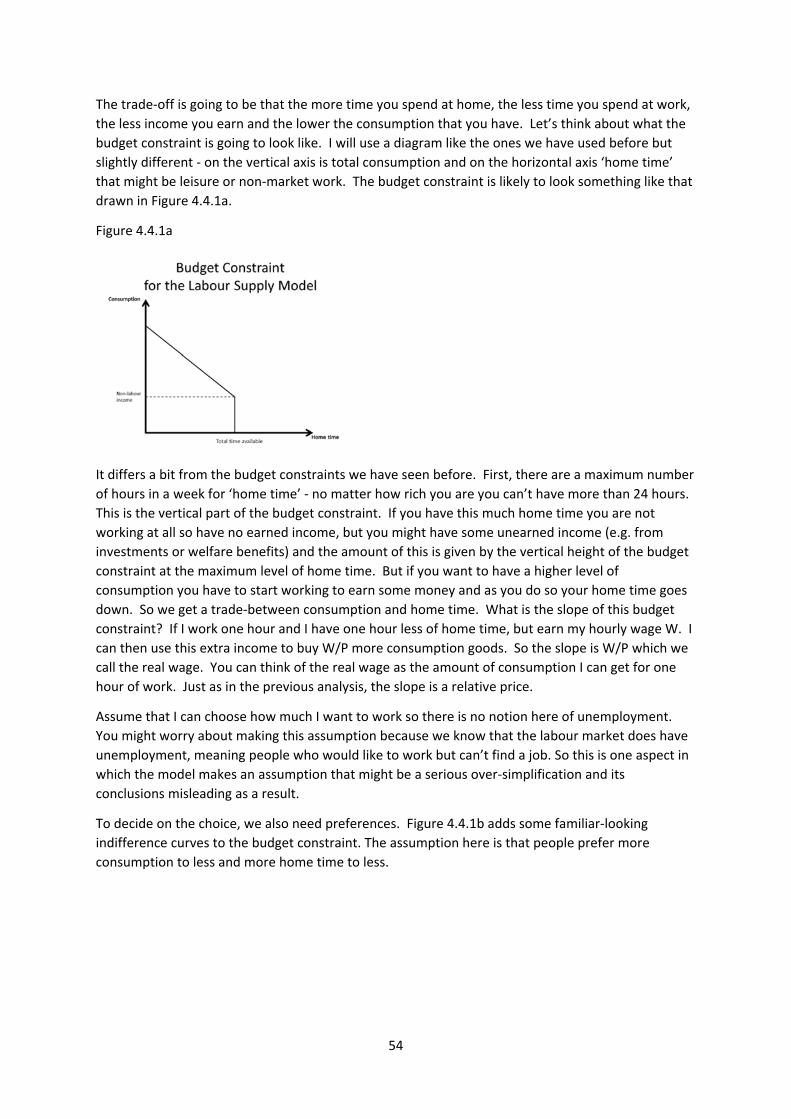
54
The trade‐off is going to be that the more time you spend at home, the less time you spend at work,
the less income you earn and the lower the consumption that you have. Let’s think about what the
budget constraint is going to look like. I will use a diagram like the ones we have used before but
slightly different ‐ on the vertical axis is total consumption and on the horizontal axis ‘home time’
that might be leisure or non‐market work. The budget constraint is likely to look something like that
drawn in Figure 4.4.1a.
Figure 4.4.1a
It differs a bit from the budget constraints we have seen before. First, there are a maximum number
of hours in a week for ‘home time’ ‐ no matter how rich you are you can’t have more than 24 hours.
This is the vertical part of the budget constraint. If you have this much home time you are not
working at all so have no earned income, but you might have some unearned income (e.g. from
investments or welfare benefits) and the amount of this is given by the vertical height of the budget
constraint at the maximum level of home time. But if you want to have a higher level of
consumption you have to start working to earn some money and as you do so your home time goes
down. So we get a trade‐between consumption and home time. What is the slope of this budget
constraint? If I work one hour and I have one hour less of home time, but earn my hourly wage W. I
can then use this extra income to buy W/P more consumption goods. So the slope is W/P which we
call the real wage. You can think of the real wage as the amount of consumption I can get for one
hour of work. Just as in the previous analysis, the slope is a relative price.
Assume that I can choose how much I want to work so there is no notion here of unemployment.
You might worry about making this assumption because we know that the labour market does have
unemployment, meaning people who would like to work but can’t find a job. So this is one aspect in
which the model makes an assumption that might be a serious over‐simplification and its
conclusions misleading as a result.
To decide on the choice, we also need preferences. Figure 4.4.1b adds some familiar‐looking
indifference curves to the budget constraint. The assumption here is that people prefer more
consumption to less and more home time to less.
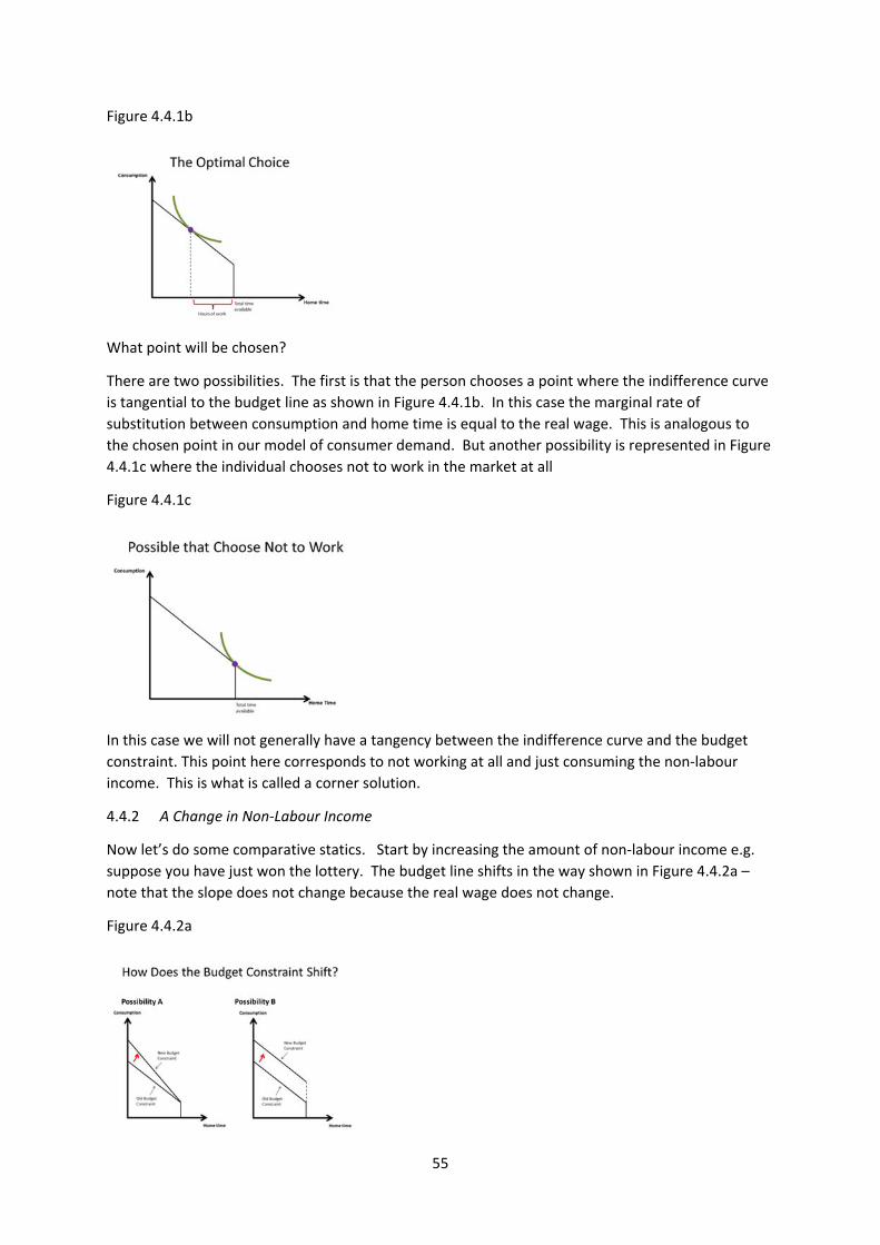
55
Figure 4.4.1b
What point will be chosen?
There are two possibilities. The first is that the person chooses a point where the indifference curve
is tangential to the budget line as shown in Figure 4.4.1b. In this case the marginal rate of
substitution between consumption and home time is equal to the real wage. This is analogous to
the chosen point in our model of consumer demand. But another possibility is represented in Figure
4.4.1c where the individual chooses not to work in the market at all
Figure 4.4.1c
In this case we will not generally have a tangency between the indifference curve and the budget
constraint. This point here corresponds to not working at all and just consuming the non‐labour
income. This is what is called a corner solution.
4.4.2 A Change in Non‐Labour Income
Now let’s do some comparative statics. Start by increasing the amount of non‐labour income e.g.
suppose you have just won the lottery. The budget line shifts in the way shown in Figure 4.4.2a –
note that the slope does not change because the real wage does not change.
Figure 4.4.2a
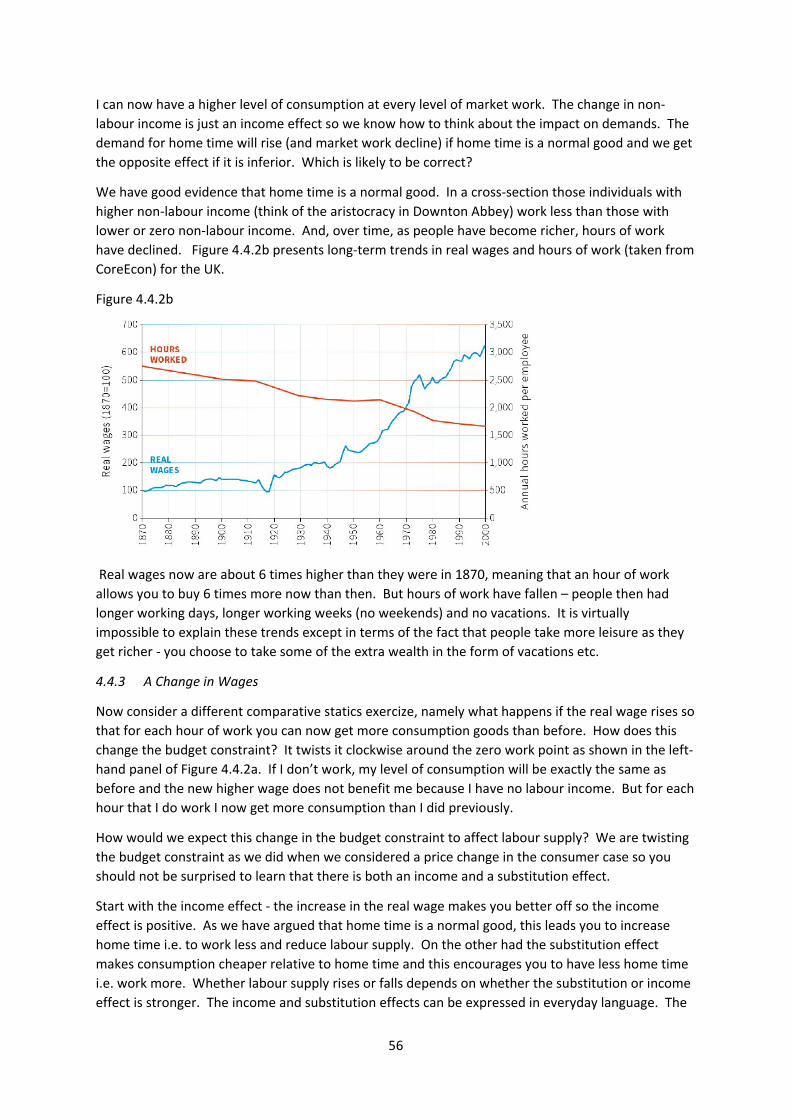
56
I can now have a higher level of consumption at every level of market work. The change in non‐
labour income is just an income effect so we know how to think about the impact on demands. The
demand for home time will rise (and market work decline) if home time is a normal good and we get
the opposite effect if it is inferior. Which is likely to be correct?
We have good evidence that home time is a normal good. In a cross‐section those individuals with
higher non‐labour income (think of the aristocracy in Downton Abbey) work less than those with
lower or zero non‐labour income. And, over time, as people have become richer, hours of work
have declined. Figure 4.4.2b presents long‐term trends in real wages and hours of work (taken from
CoreEcon) for the UK.
Figure 4.4.2b
Real wages now are about 6 times higher than they were in 1870, meaning that an hour of work
allows you to buy 6 times more now than then. But hours of work have fallen – people then had
longer working days, longer working weeks (no weekends) and no vacations. It is virtually
impossible to explain these trends except in terms of the fact that people take more leisure as they
get richer ‐ you choose to take some of the extra wealth in the form of vacations etc.
4.4.3 A Change in Wages
Now consider a different comparative statics exercize, namely what happens if the real wage rises so
that for each hour of work you can now get more consumption goods than before. How does this
change the budget constraint? It twists it clockwise around the zero work point as shown in the left‐
hand panel of Figure 4.4.2a. If I don’t work, my level of consumption will be exactly the same as
before and the new higher wage does not benefit me because I have no labour income. But for each
hour that I do work I now get more consumption than I did previously.
How would we expect this change in the budget constraint to affect labour supply? We are twisting
the budget constraint as we did when we considered a price change in the consumer case so you
should not be surprised to learn that there is both an income and a substitution effect.
Start with the income effect ‐ the increase in the real wage makes you better off so the income
effect is positive. As we have argued that home time is a normal good, this leads you to increase
home time i.e. to work less and reduce labour supply. On the other had the substitution effect
makes consumption cheaper relative to home time and this encourages you to have less home time
i.e. work more. Whether labour supply rises or falls depends on whether the substitution or income
effect is stronger. The income and substitution effects can be expressed in everyday language. The

57
substitution effect says that when the real wage goes up you now get more consumption goods for
each hour of work so this encourages work. The income effect is that when the real wage rises, you
can have the same level of consumption for fewer hours at work.
If an individual is not working at all i.e. is at the corner solution then hours of work can only rise for
the obvious reason that they cannot fall but also because there is no income effect.
One similar application is to think about the effect of taxation on how much people work, a topic
often subject to heated political debates. Suppose the government now takes 40% of every pound
you earn when previously there was no ‐ from your perspective this is equivalent to a fall in your
hourly wage. If you previously earned £10 per hour, now you will only have £6 after tax. Whether
this reduces of increases labour supply depends on the whether the substitution is stronger than the
income effect.
4.4.4 Application: The Top Rate of Income Tax
In recent years there has been a lot of discussion about the appropriate rate of tax on the highest
earners, the 1%. Figure 4.4.4a (from the Piketty book) shows the highest rate of income tax in
different countries in different periods.
Figure 4.4.4a
40 years ago the highest rate in the UK (on non‐labour income alone) was 98%. Margaret Thatcher
reduced this rate to 40% in the 1980s arguing that high tax rates were a disincentive to work ‐ it
remained there for 20 years. But after the financial crisis, the government finances really worsened
and it was raised to 50% by the last Labour government.
The coalition government who, when they took office in 2010, cut the top rate of tax from 50% to
45% arguing that this might actually raise revenue. This remains the highest rate and you pay it if
you earn more than £150,000 a year. It remains a topic of political salience – the Labour party
would like to raise the rate to 50% or higher, the Conservative government would like to reduce it
when the public finances are in a healthier state.
One of the class discussion exercizes ask you to think about the likely impact of changing the top rate
of income tax, the effect on work incentives and government tax revenue. More notes on this topic
will be circulated after the class.
4.4.5 Application: Helping the Poor
Suppose you decided you wanted to help someone and you have set aside some money to use for
that purpose. You consider two possible ways to help.
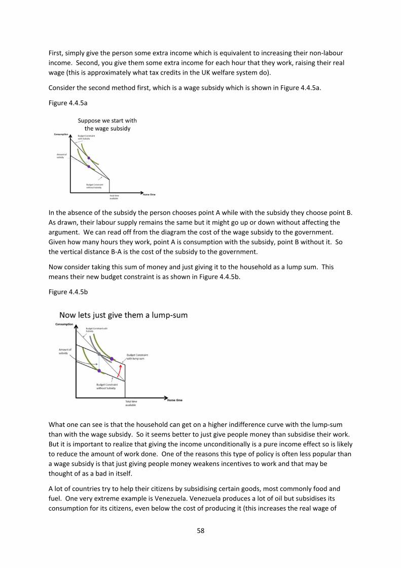
58
First, simply give the person some extra income which is equivalent to increasing their non‐labour
income. Second, you give them some extra income for each hour that they work, raising their real
wage (this is approximately what tax credits in the UK welfare system do).
Consider the second method first, which is a wage subsidy which is shown in Figure 4.4.5a.
Figure 4.4.5a
In the absence of the subsidy the person chooses point A while with the subsidy they choose point B.
As drawn, their labour supply remains the same but it might go up or down without affecting the
argument. We can read off from the diagram the cost of the wage subsidy to the government.
Given how many hours they work, point A is consumption with the subsidy, point B without it. So
the vertical distance B‐A is the cost of the subsidy to the government.
Now consider taking this sum of money and just giving it to the household as a lump sum. This
means their new budget constraint is as shown in Figure 4.4.5b.
Figure 4.4.5b
What one can see is that the household can get on a higher indifference curve with the lump‐sum
than with the wage subsidy. So it seems better to just give people money than subsidise their work.
But it is important to realize that giving the income unconditionally is a pure income effect so is likely
to reduce the amount of work done. One of the reasons this type of policy is often less popular than
a wage subsidy is that just giving people money weakens incentives to work and that may be
thought of as a bad in itself.
A lot of countries try to help their citizens by subsidising certain goods, most commonly food and
fuel. One very extreme example is Venezuela. Venezuela produces a lot of oil but subsidises its
consumption for its citizens, even below the cost of producing it (this increases the real wage of
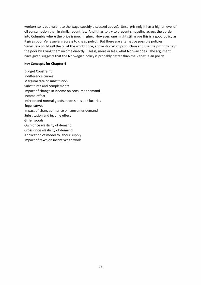
59
workers so is equivalent to the wage subsidy discussed above). Unsurprisingly it has a higher level of
oil consumption than in similar countries. And it has to try to prevent smuggling across the border
into Columbia where the price is much higher. However, one might still argue this is a good policy as
it gives poor Venezuelans access to cheap petrol. But there are alternative possible policies.
Venezuela could sell the oil at the world price, above its cost of production and use the profit to help
the poor by giving them income directly. This is, more or less, what Norway does. The argument I
have given suggests that the Norwegian policy is probably better than the Venezuelan policy.
Key Concepts for Chapter 4
Budget Constraint
Indifference curves
Marginal rate of substitution
Substitutes and complements
Impact of change in income on consumer demand
Income effect
Inferior and normal goods, necessities and luxuries
Engel curves
Impact of changes in price on consumer demand
Substitution and income effect
Giffen goods
Own‐price elasticity of demand
Cross‐price elasticity of demand
Application of model to labour supply
Impact of taxes on incentives to work
60
5. FIRMS: PRODUCTION AND PRICING (Acemoglu, Laibson, List, Chapters 6, 12 and 14)
5.1 What do firms do?
At a very general level firms take labour, energy, raw material, land ‐ in the jargon we call these
factors of production or inputs – and convert them into outputs, perhaps physical goods, perhaps
intangible services that they sell in markets (we will not consider the output of the public sector that
is not sold). What are firms trying to achieve? I am going to focus here on a simple model of firm
behaviour in which they want to maximise their profit, to deliver as much income as possible for
their owners. There is a positive question here – is this really what firms do (perhaps they are
controlled by their managers rather than their owners?) and a normative question – is this what
firms should do? But in a short course we do not have enough time to go into these issues in any
detail. It is a simplification but the search for profit undoubtedly plays a role in the activities of many
firms so our conclusions based on this assumption are likely to be capturing some aspects of firm
behaviour but perhaps not all.
5.2 Pricing
Assume that the firm chooses the price at which to sell its output to maximize its profit. The
assumption of firms setting prices may be appropriate in some markets but inappropriate in others.
Go into a supermarket, get your basket of shopping and the cashier tells you how much it costs at
prices set by the store. I doubt you would have much success if you tried to negotiate the price. But
there are other markets where prices aren’t fixed in quite the same way ‐ negotiating is allowed,
even expected, in traditional bazaars, and the price of cars and houses is typically negotiated. There
is a whole spectrum of pricing behaviour in the world and it is impossible to write down a single
model which captures everything. But in many markets, consumers do experience prices as set by
firms and the consumer’s choice is to take it or leave it.
I will also assume that the same price is charged to every buyer. That is true for goods in some shops
but sometimes there are discounts for students or retired people and airlines and trains charge
people very different prices for the same seat. Charging different prices to different consumers is
called price discrimination (because the firm is discriminating in the price it charges to different
people) and a literature does consider this though we do not have the time to discuss this in any
detail.
5.2.1 The revenue function, average revenue and marginal revenue
A profit‐maximizing firm likes to get a higher price for its output. But, as it pushes the price up it is
likely that the demand for the product falls. Consumers, faced with the price set by the firm, have to
take it or leave it but a higher price means more will leave it.
The possible combinations of price and quantity that the firm can sell are represented by the
demand curve for its product, drawn in Figure 5.2.1a.
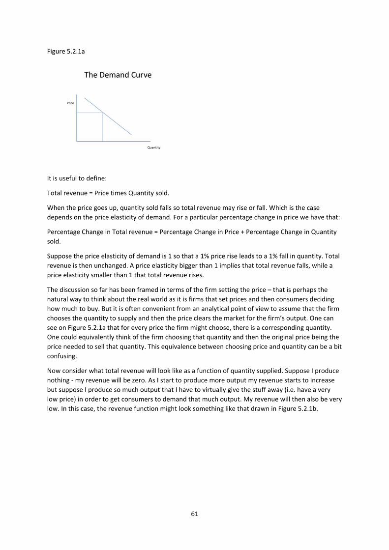
61
Figure 5.2.1a
It is useful to define:
Total revenue = Price times Quantity sold.
When the price goes up, quantity sold falls so total revenue may rise or fall. Which is the case
depends on the price elasticity of demand. For a particular percentage change in price we have that:
Percentage Change in Total revenue = Percentage Change in Price + Percentage Change in Quantity
sold.
Suppose the price elasticity of demand is 1 so that a 1% price rise leads to a 1% fall in quantity. Total
revenue is then unchanged. A price elasticity bigger than 1 implies that total revenue falls, while a
price elasticity smaller than 1 that total revenue rises.
The discussion so far has been framed in terms of the firm setting the price – that is perhaps the
natural way to think about the real world as it is firms that set prices and then consumers deciding
how much to buy. But it is often convenient from an analytical point of view to assume that the firm
chooses the quantity to supply and then the price clears the market for the firm’s output. One can
see on Figure 5.2.1a that for every price the firm might choose, there is a corresponding quantity.
One could equivalently think of the firm choosing that quantity and then the original price being the
price needed to sell that quantity. This equivalence between choosing price and quantity can be a bit
confusing.
Now consider what total revenue will look like as a function of quantity supplied. Suppose I produce
nothing ‐ my revenue will be zero. As I start to produce more output my revenue starts to increase
but suppose I produce so much output that I have to virtually give the stuff away (i.e. have a very
low price) in order to get consumers to demand that much output. My revenue will then also be very
low. In this case, the revenue function might look something like that drawn in Figure 5.2.1b.
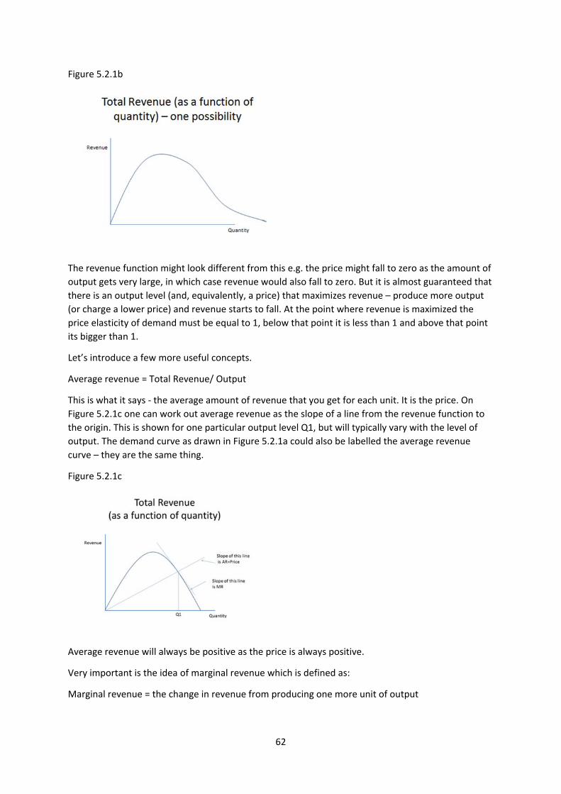
62
Figure 5.2.1b
The revenue function might look different from this e.g. the price might fall to zero as the amount of
output gets very large, in which case revenue would also fall to zero. But it is almost guaranteed that
there is an output level (and, equivalently, a price) that maximizes revenue – produce more output
(or charge a lower price) and revenue starts to fall. At the point where revenue is maximized the
price elasticity of demand must be equal to 1, below that point it is less than 1 and above that point
its bigger than 1.
Let’s introduce a few more useful concepts.
Average revenue = Total Revenue/ Output
This is what it says ‐ the average amount of revenue that you get for each unit. It is the price. On
Figure 5.2.1c one can work out average revenue as the slope of a line from the revenue function to
the origin. This is shown for one particular output level Q1, but will typically vary with the level of
output. The demand curve as drawn in Figure 5.2.1a could also be labelled the average revenue
curve – they are the same thing.
Figure 5.2.1c
Average revenue will always be positive as the price is always positive.
Very important is the idea of marginal revenue which is defined as:
Marginal revenue = the change in revenue from producing one more unit of output
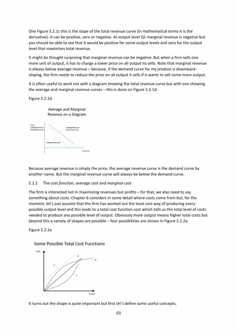
63
One Figure 5.2.1c this is the slope of the total revenue curve (in mathematical terms it is the
derivative)‐ it can be positive, zero or negative. At output level Q1 marginal revenue is negative but
you should be able to see that it would be positive for some output levels and zero for the output
level that maximizes total revenue.
It might be thought surprising that marginal revenue can be negative. But when a firm sells one
more unit of output, it has to charge a lower price on all output its sells. Note that marginal revenue
is always below average revenue – because, if the demand curve for my product is downward‐
sloping, the firm needs to reduce the price on all output it sells if it wants to sell some more output.
It is often useful to work not with a diagram showing the total revenue curve but with one showing
the average and marginal revenue curves – this is done on Figure 5.2.1d.
Figure 5.2.1d
Because average revenue is simply the price, the average revenue curve is the demand curve by
another name. But the marginal revenue curve will always be below the demand curve.
5.2.2 The cost function, average cost and marginal cost
The firm is interested not in maximizing revenues but profits – for that, we also need to say
something about costs. Chapter 6 considers in some detail where costs come from but, for the
moment, let’s just assume that the firm has worked out the least cost way of producing every
possible output level and this leads to a total cost function cost which tells us the total level of costs
needed to produce any possible level of output. Obviously more output means higher total costs but
beyond this a variety of shapes are possible – four possibilities are shown in Figure 5.2.2a.
Figure 5.2.2a
It turns out the shape is quite important but first let’s define some useful concepts.
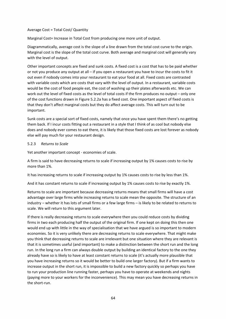
64
Average Cost = Total Cost/ Quantity
Marginal Cost= Increase in Total Cost from producing one more unit of output.
Diagrammatically, average cost is the slope of a line drawn from the total cost curve to the origin.
Marginal cost is the slope of the total cost curve. Both average and marginal cost will generally vary
with the level of output.
Other important concepts are fixed and sunk costs. A fixed cost is a cost that has to be paid whether
or not you produce any output at all – if you open a restaurant you have to incur the costs to fit it
out even if nobody comes into your restaurant to eat your food at all. Fixed costs are contrasted
with variable costs which are costs that vary with the level of output. In a restaurant, variable costs
would be the cost of food people eat, the cost of washing up their plates afterwards etc. We can
work out the level of fixed costs as the level of total costs if the firm produces no output – only one
of the cost functions drawn in Figure 5.2.2a has a fixed cost. One important aspect of fixed costs is
that they don’t affect marginal costs but they do affect average costs. This will turn out to be
important.
Sunk costs are a special sort of fixed costs, namely that once you have spent them there’s no getting
them back. If I incur costs fitting out a restaurant in a style that I think of as cool but nobody else
does and nobody ever comes to eat there, it is likely that those fixed costs are lost forever as nobody
else will pay much for your restaurant design.
5.2.3 Returns to Scale
Yet another important concept ‐ economies of scale.
A firm is said to have decreasing returns to scale if increasing output by 1% causes costs to rise by
more than 1%.
It has increasing returns to scale if increasing output by 1% causes costs to rise by less than 1%.
And it has constant returns to scale if increasing output by 1% causes costs to rise by exactly 1%.
Returns to scale are important because decreasing returns means that small firms will have a cost
advantage over large firms while increasing returns to scale mean the opposite. The structure of an
industry – whether it has lots of small firms or a few large firms – is likely to be related to returns to
scale. We will return to this argument later.
If there is really decreasing returns to scale everywhere then you could reduce costs by dividing
firms in two each producing half the output of the original firm. If one kept on doing this then one
would end up with little in the way of specialisation that we have argued is so important to modern
economies. So it is very unlikely there are decreasing returns to scale everywhere. That might make
you think that decreasing returns to scale are irrelevant but one situation where they are relevant is
that it is sometimes useful (and important) to make a distinction between the short run and the long
run. In the long run a firm can always double output by building an identical factory to the one they
already have so is likely to have at least constant returns to scale (it’s actually more plausible that
you have increasing returns so it would be better to build one larger factory). But if a firm wants to
increase output in the short run, it is impossible to build a new factory quickly so perhaps you have
to run your production line running faster, perhaps you have to operate at weekends and nights
(paying more to your workers for the inconvenience). This may mean you have decreasing returns in
the short‐run.
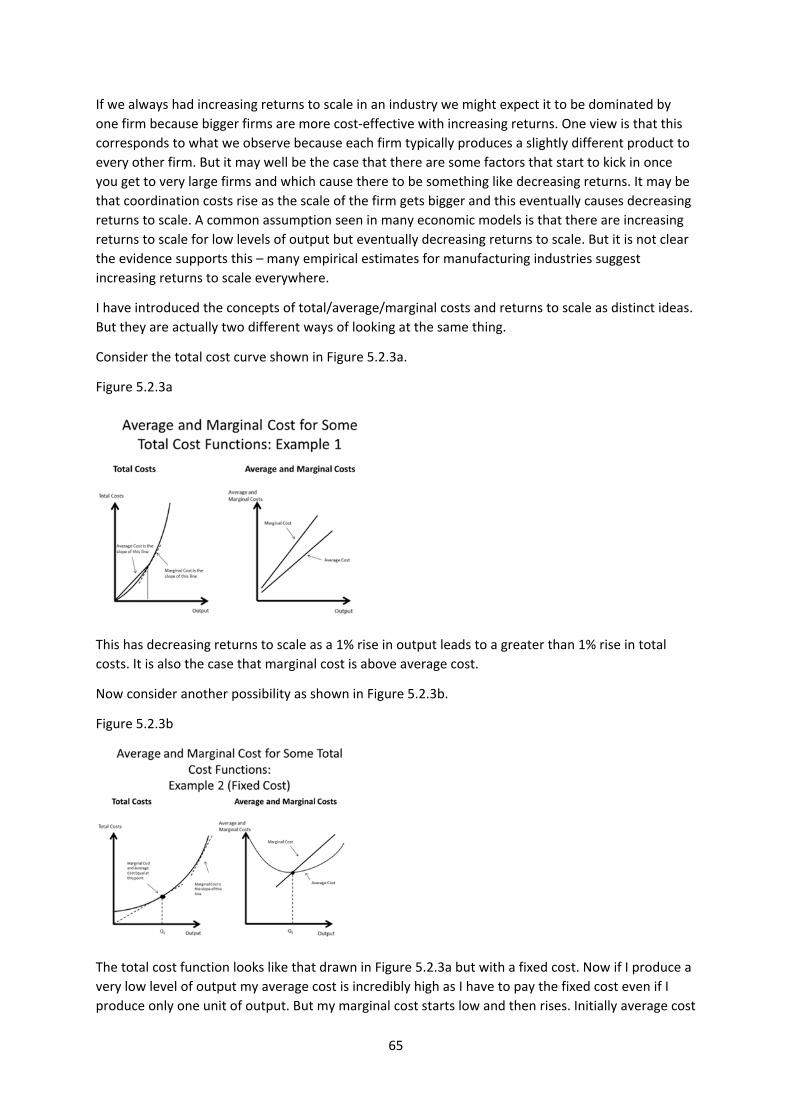
65
If we always had increasing returns to scale in an industry we might expect it to be dominated by
one firm because bigger firms are more cost‐effective with increasing returns. One view is that this
corresponds to what we observe because each firm typically produces a slightly different product to
every other firm. But it may well be the case that there are some factors that start to kick in once
you get to very large firms and which cause there to be something like decreasing returns. It may be
that coordination costs rise as the scale of the firm gets bigger and this eventually causes decreasing
returns to scale. A common assumption seen in many economic models is that there are increasing
returns to scale for low levels of output but eventually decreasing returns to scale. But it is not clear
the evidence supports this – many empirical estimates for manufacturing industries suggest
increasing returns to scale everywhere.
I have introduced the concepts of total/average/marginal costs and returns to scale as distinct ideas.
But they are actually two different ways of looking at the same thing.
Consider the total cost curve shown in Figure 5.2.3a.
Figure 5.2.3a
This has decreasing returns to scale as a 1% rise in output leads to a greater than 1% rise in total
costs. It is also the case that marginal cost is above average cost.
Now consider another possibility as shown in Figure 5.2.3b.
Figure 5.2.3b
The total cost function looks like that drawn in Figure 5.2.3a but with a fixed cost. Now if I produce a
very low level of output my average cost is incredibly high as I have to pay the fixed cost even if I
produce only one unit of output. But my marginal cost starts low and then rises. Initially average cost
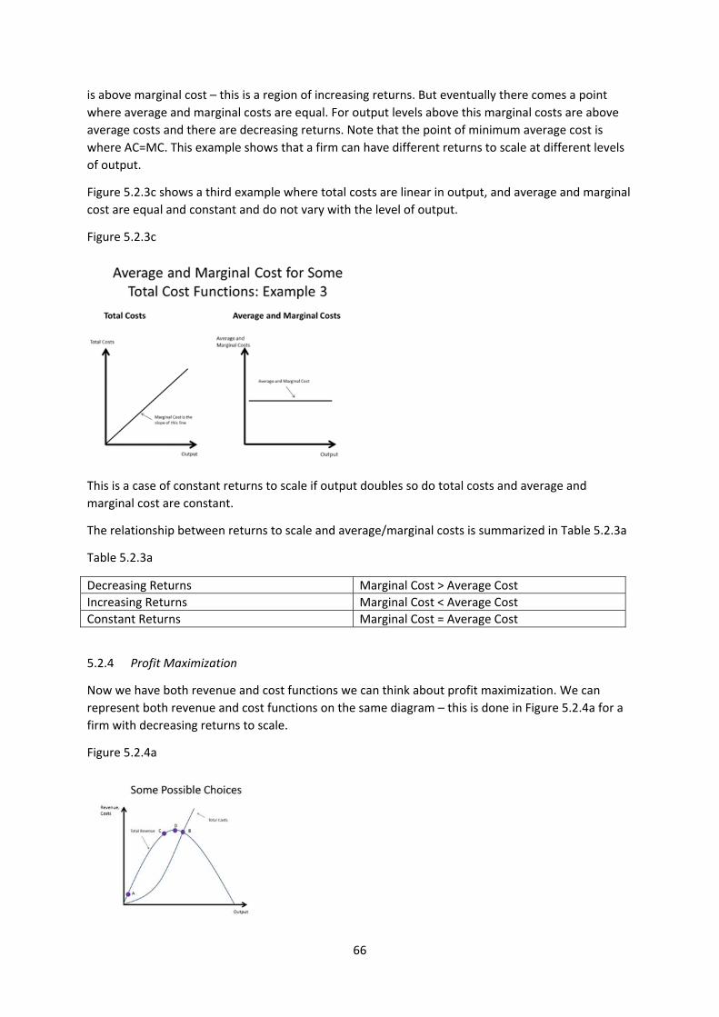
66
is above marginal cost – this is a region of increasing returns. But eventually there comes a point
where average and marginal costs are equal. For output levels above this marginal costs are above
average costs and there are decreasing returns. Note that the point of minimum average cost is
where AC=MC. This example shows that a firm can have different returns to scale at different levels
of output.
Figure 5.2.3c shows a third example where total costs are linear in output, and average and marginal
cost are equal and constant and do not vary with the level of output.
Figure 5.2.3c
This is a case of constant returns to scale if output doubles so do total costs and average and
marginal cost are constant.
The relationship between returns to scale and average/marginal costs is summarized in Table 5.2.3a
Table 5.2.3a
Decreasing Returns Marginal Cost > Average Cost
Increasing Returns Marginal Cost < Average Cost
Constant Returns Marginal Cost = Average Cost
5.2.4 Profit Maximization
Now we have both revenue and cost functions we can think about profit maximization. We can
represent both revenue and cost functions on the same diagram – this is done in Figure 5.2.4a for a
firm with decreasing returns to scale.
Figure 5.2.4a
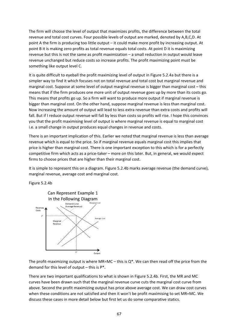
67
The firm will choose the level of output that maximizes profits, the difference between the total
revenue and total cost curves. Four possible levels of output are marked, denoted by A,B,C,D. At
point A the firm is producing too little output – it could make more profit by increasing output. At
point B it is making zero profits as total revenue equals total costs. At point D it is maximizing
revenue but this is not the same as profit maximization – a small reduction in output would leave
revenue unchanged but reduce costs so increase profits. The profit maximizing point must be
something like output level C.
It is quite difficult to eyeball the profit maximizing level of output in Figure 5.2.4a but there is a
simpler way to find it which focuses not on total revenue and total cost but marginal revenue and
marginal cost. Suppose at some level of output marginal revenue is bigger than marginal cost – this
means that if the firm produces one more unit of output revenue goes up by more than its costs go.
This means that profits go up. So a firm will want to produce more output if marginal revenue is
bigger than marginal cost. On the other hand, suppose marginal revenue is less than marginal cost.
Now increasing the amount of output will lead to less extra revenue than extra costs and profits will
fall. But if I reduce output revenue will fall by less than costs so profits will rise. I hope this convinces
you that the profit maximising level of output is where marginal revenue is equal to marginal cost
i.e. a small change in output produces equal changes in revenue and costs.
There is an important implication of this. Earlier we noted that marginal revenue is less than average
revenue which is equal to the price. So if marginal revenue equals marginal cost this implies that
price is higher than marginal cost. There is one important exception to this which is for a perfectly
competitive firm which acts as a price‐taker – more on this later. But, in general, we would expect
firms to choose prices that are higher than their marginal cost.
It is simple to represent this on a diagram. Figure 5.2.4b marks average revenue (the demand curve),
marginal revenue, average cost and marginal cost.
Figure 5.2.4b
The profit‐maximizing output is where MR=MC – this is Q*. We can then read off the price from the
demand for this level of output – this is P*.
There are two important qualifications to what is shown in Figure 5.2.4b. First, the MR and MC
curves have been drawn such that the marginal revenue curve cuts the marginal cost curve from
above. Second the profit maximizing output has price above average cost. We can draw cost curves
when these conditions are not satisfied and then it won’t be profit maximising to set MR=MC. We
discuss these cases in more detail below but first let us do some comparative statics.
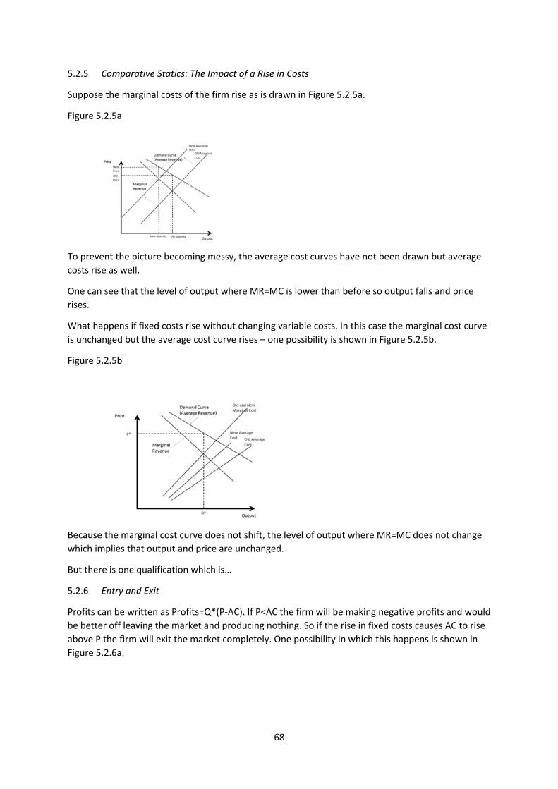
68
5.2.5 Comparative Statics: The Impact of a Rise in Costs
Suppose the marginal costs of the firm rise as is drawn in Figure 5.2.5a.
Figure 5.2.5a
To prevent the picture becoming messy, the average cost curves have not been drawn but average
costs rise as well.
One can see that the level of output where MR=MC is lower than before so output falls and price
rises.
What happens if fixed costs rise without changing variable costs. In this case the marginal cost curve
is unchanged but the average cost curve rises – one possibility is shown in Figure 5.2.5b.
Figure 5.2.5b
Because the marginal cost curve does not shift, the level of output where MR=MC does not change
which implies that output and price are unchanged.
But there is one qualification which is…
5.2.6 Entry and Exit
Profits can be written as Profits=Q*(P‐AC). If P<AC the firm will be making negative profits and would
be better off leaving the market and producing nothing. So if the rise in fixed costs causes AC to rise
above P the firm will exit the market completely. One possibility in which this happens is shown in
Figure 5.2.6a.
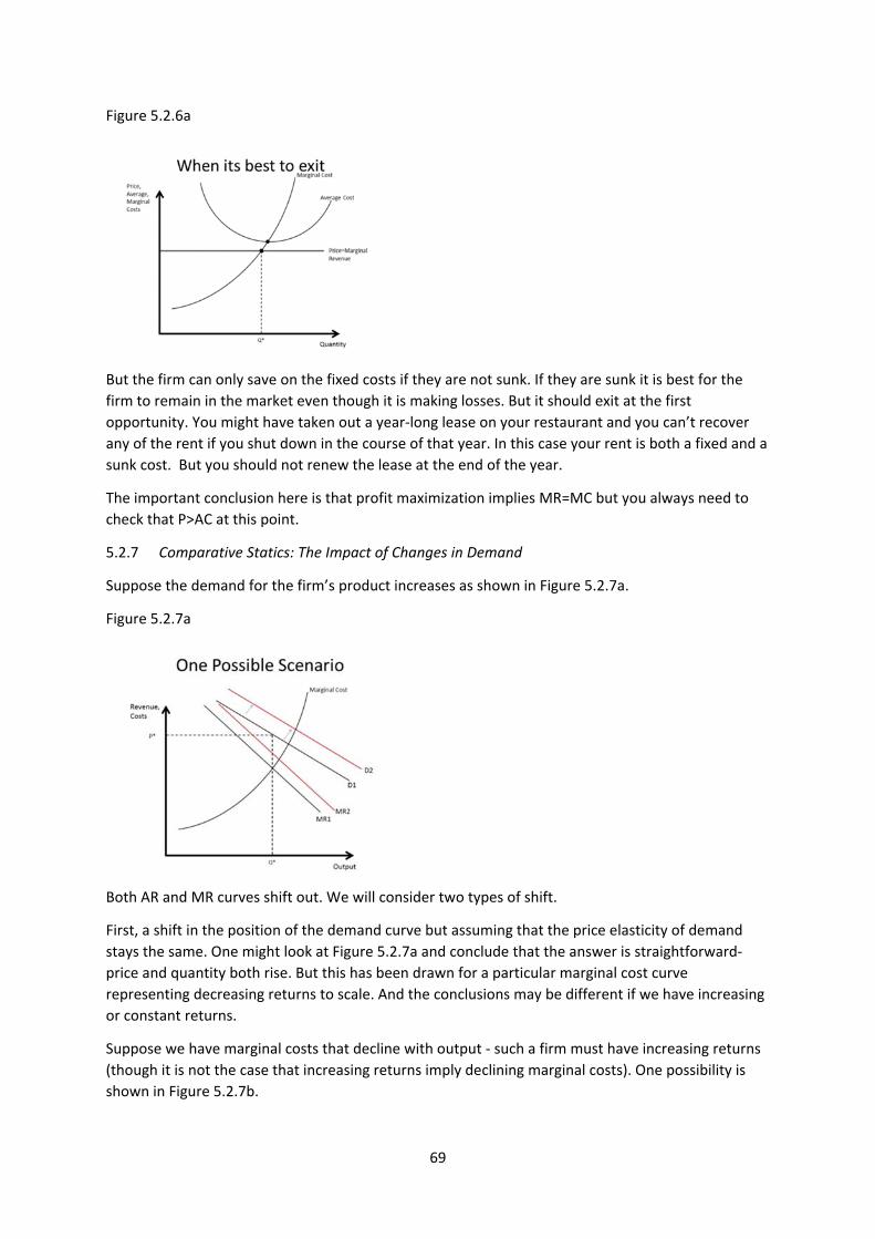
69
Figure 5.2.6a
But the firm can only save on the fixed costs if they are not sunk. If they are sunk it is best for the
firm to remain in the market even though it is making losses. But it should exit at the first
opportunity. You might have taken out a year‐long lease on your restaurant and you can’t recover
any of the rent if you shut down in the course of that year. In this case your rent is both a fixed and a
sunk cost. But you should not renew the lease at the end of the year.
The important conclusion here is that profit maximization implies MR=MC but you always need to
check that P>AC at this point.
5.2.7 Comparative Statics: The Impact of Changes in Demand
Suppose the demand for the firm’s product increases as shown in Figure 5.2.7a.
Figure 5.2.7a
Both AR and MR curves shift out. We will consider two types of shift.
First, a shift in the position of the demand curve but assuming that the price elasticity of demand
stays the same. One might look at Figure 5.2.7a and conclude that the answer is straightforward‐
price and quantity both rise. But this has been drawn for a particular marginal cost curve
representing decreasing returns to scale. And the conclusions may be different if we have increasing
or constant returns.
Suppose we have marginal costs that decline with output ‐ such a firm must have increasing returns
(though it is not the case that increasing returns imply declining marginal costs). One possibility is
shown in Figure 5.2.7b.
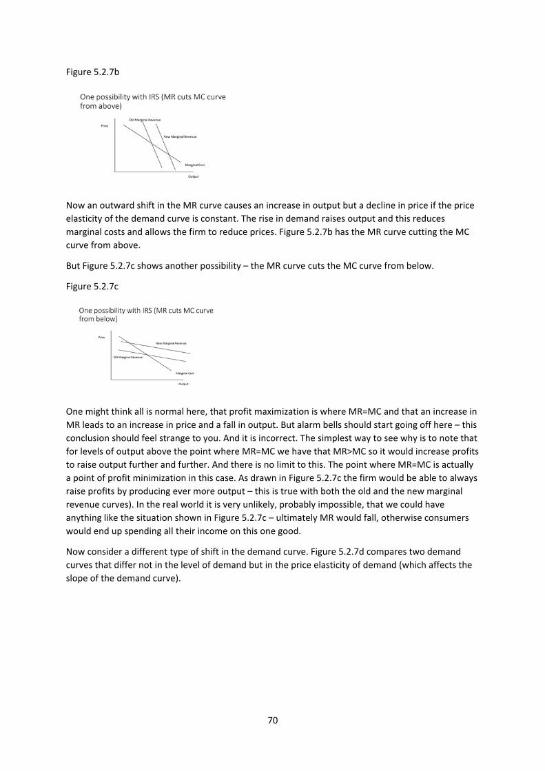
70
Figure 5.2.7b
Now an outward shift in the MR curve causes an increase in output but a decline in price if the price
elasticity of the demand curve is constant. The rise in demand raises output and this reduces
marginal costs and allows the firm to reduce prices. Figure 5.2.7b has the MR curve cutting the MC
curve from above.
But Figure 5.2.7c shows another possibility – the MR curve cuts the MC curve from below.
Figure 5.2.7c
One might think all is normal here, that profit maximization is where MR=MC and that an increase in
MR leads to an increase in price and a fall in output. But alarm bells should start going off here – this
conclusion should feel strange to you. And it is incorrect. The simplest way to see why is to note that
for levels of output above the point where MR=MC we have that MR>MC so it would increase profits
to raise output further and further. And there is no limit to this. The point where MR=MC is actually
a point of profit minimization in this case. As drawn in Figure 5.2.7c the firm would be able to always
raise profits by producing ever more output – this is true with both the old and the new marginal
revenue curves). In the real world it is very unlikely, probably impossible, that we could have
anything like the situation shown in Figure 5.2.7c – ultimately MR would fall, otherwise consumers
would end up spending all their income on this one good.
Now consider a different type of shift in the demand curve. Figure 5.2.7d compares two demand
curves that differ not in the level of demand but in the price elasticity of demand (which affects the
slope of the demand curve).
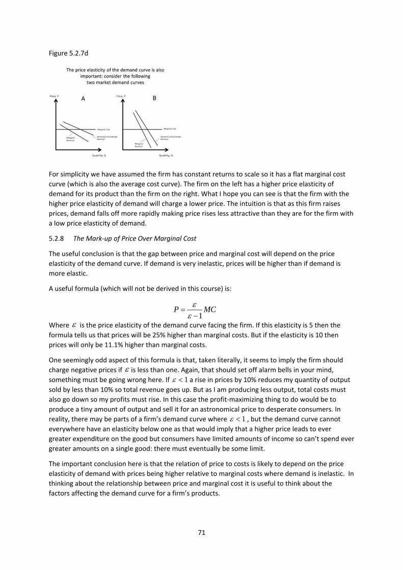
71
Figure 5.2.7d
For simplicity we have assumed the firm has constant returns to scale so it has a flat marginal cost
curve (which is also the average cost curve). The firm on the left has a higher price elasticity of
demand for its product than the firm on the right. What I hope you can see is that the firm with the
higher price elasticity of demand will charge a lower price. The intuition is that as this firm raises
prices, demand falls off more rapidly making price rises less attractive than they are for the firm with
a low price elasticity of demand.
5.2.8 The Mark‐up of Price Over Marginal Cost
The useful conclusion is that the gap between price and marginal cost will depend on the price
elasticity of the demand curve. If demand is very inelastic, prices will be higher than if demand is
more elastic.
A useful formula (which will not be derived in this course) is:
Where is the price elasticity of the demand curve facing the firm. If this elasticity is 5 then the
formula tells us that prices will be 25% higher than marginal costs. But if the elasticity is 10 then
prices will only be 11.1% higher than marginal costs.
One seemingly odd aspect of this formula is that, taken literally, it seems to imply the firm should
charge negative prices if is less than one. Again, that should set off alarm bells in your mind,
something must be going wrong here. If a rise in prices by 10% reduces my quantity of output
sold by less than 10% so total revenue goes up. But as I am producing less output, total costs must
also go down so my profits must rise. In this case the profit‐maximizing thing to do would be to
produce a tiny amount of output and sell it for an astronomical price to desperate consumers. In
reality, there may be parts of a firm’s demand curve where , but the demand curve cannot
everywhere have an elasticity below one as that would imply that a higher price leads to ever
greater expenditure on the good but consumers have limited amounts of income so can’t spend ever
greater amounts on a single good: there must eventually be some limit.
The important conclusion here is that the relation of price to costs is likely to depend on the price
elasticity of demand with prices being higher relative to marginal costs where demand is inelastic. In
thinking about the relationship between price and marginal cost it is useful to think about the
factors affecting the demand curve for a firm’s products.
1P MC
1
1
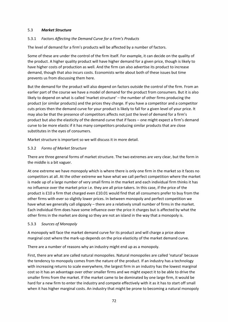
72
5.3 Market Structure
5.3.1 Factors Affecting the Demand Curve for a Firm’s Products
The level of demand for a firm’s products will be affected by a number of factors.
Some of these are under the control of the firm itself. For example, it can decide on the quality of
the product. A higher quality product will have higher demand for a given price, though is likely to
have higher costs of production as well. And the firm can also advertise its product to increase
demand, though that also incurs costs. Economists write about both of these issues but time
prevents us from discussing them here.
But the demand for the product will also depend on factors outside the control of the firm. From an
earlier part of the course we have a model of demand for the product from consumers. But it is also
likely to depend on what is called ‘market structure’ – the number of other firms producing the
product (or similar products) and the prices they charge. If you have a competitor and a competitor
cuts prices then the demand curve for your product is likely to fall for a given level of your price. It
may also be that the presence of competitors affects not just the level of demand for a firm’s
product but also the elasticity of the demand curve that if faces – one might expect a firm’s demand
curve to be more elastic if it has many competitors producing similar products that are close
substitutes in the eyes of consumers.
Market structure is important so we will discuss it in more detail.
5.3.2 Forms of Market Structure
There are three general forms of market structure. The two extremes are very clear, but the form in
the middle is a bit vaguer.
At one extreme we have monopoly which is where there is only one firm in the market so it faces no
competitors at all. At the other extreme we have what we call perfect competition where the market
is made up of a large number of very small firms in the market and each individual firm thinks it has
no influence over the market price i.e. they are all price‐takers. In this case, if the price of the
product is £10 a firm that charged even £10.01 would find that all consumers prefer to buy from the
other firms with ever so slightly lower prices. In between monopoly and perfect competition we
have what we generally call oligopoly – there are a relatively small number of firms in the market.
Each individual firm does have some influence over the price it charges but is affected by what the
other firms in the market are doing so they are not an island in the way that a monopoly is.
5.3.3 Sources of Monopoly
A monopoly will face the market demand curve for its product and will charge a price above
marginal cost where the mark‐up depends on the price elasticity of the market demand curve.
There are a number of reasons why an industry might end up as a monopoly.
First, there are what are called natural monopolies. Natural monopolies are called ‘natural’ because
the tendency to monopoly comes from the nature of the product. If an industry has a technology
with increasing returns to scale everywhere, the largest firm in an industry has the lowest marginal
cost so it has an advantage over other smaller firms and we might expect it to be able to drive the
smaller firms from the market. If the market came to be dominated by one large firm, it would be
hard for a new firm to enter the industry and compete effectively with it as it has to start off small
when it has higher marginal costs. An industry that might be prone to becoming a natural monopoly
73
would be the distribution of water. If there is a single water company in an area, it would be hard for
a new company to enter as it would have to build a duplicate infrastructure to deliver water to
households, a huge fixed cost. But marginal costs of delivering water are quite small. So industries
with big fixed costs and low marginal costs are prone to being natural monopolies.
One topical discussion is whether the tech giants (e.g. Microsoft, Google, Amazon) have effectively
become natural monopolies. For example the more people use Google the more effective its search
engine is, making still more people use it over, say, Bing (this is an example of what is called network
externalities). Perhaps Google is close to a natural monopoly in search engines. Similarly Microsoft
has a very large market share in operating systems. Again, the more people use Windows the more
attractive is it for others to do so as well.
But monopolies may also occur where it is not ‘natural’. Firms would like to be monopolies because
they can make more money if they have no competitors. One way firms can do this is to ‘corner a
market’ which means controlling all or a very large part of the market for a product. From time to
time some firms have attempted to own a very large share of the world’s supply of scarce raw
materials e.g. a company called Armajaro purchased a sizeable share of world cocoa production in
2010. Another way to try to monopolise a market is to buy up rival competitors who produce a
similar product to you. As we will explain a bit later, this is not likely to lead to a good outcome for
consumers so governments often step in to stop mergers and acquisitions that they think are anti‐
competitive. Most countries have competition or anti‐trust authorities to examine mergers to see
whether they think they are justified or whether the only motive is to acquire more monopoly power
in an industry.
But just as governments sometimes step in to stop monopolies from being created, they also
sometimes create them. Sometimes the government gives exclusive rights to one firm to sell a
particular product. In history and in many developing countries today this is a common strategy for
raising revenue or giving money to one’s cronies. For example in the UK until 2005 it was only the
Royal Mail that was allowed to deliver mail to people’s houses (though it did not charge profit‐
maximizing prices). Many economists think this is not such a great way of running things as it
artificially limits competition. But one area where the government does still actively create
monopolies is through patents. Patent law says that a firm with a new invention or product can be
the only firm who is allowed to use that invention or sell the product for the period of time that the
patent is in force (though they can also sell the permission to use the invention to other firms). That
might seem odd given that the government is hostile to monopoly in other areas but, as we will
explain later in the course, it is to give some incentive for innovation. If all innovation or new
products can be copied immediately then it is likely there will be little or no profit for the inventor,
so innovation would be discouraged.
5.3.4 Oligopoly
An oligopoly is a market with more than one firm (so there is not a monopoly) but all the firms face
downward‐sloping demand curves for their product. The important point is that an oligopolist has to
share the market with some competitors. There is only one economic model of monopoly and, a bit
later, you will see only one economic model of perfect competition. But there are lots of models of
oligopoly because there are lots of ways in which firms might interact with each other. This can be
quite confusing. In this course I will discuss only one model of oligopoly, called monopolistic
competition. In monopolistic competition, firms choose prices and then consumers choose whether
to buy one firm’s product or some other firm’s product. A monopolist has 100% of the market but an
oligopoly with two firms would have each of them having 50% of the market. So we would expect
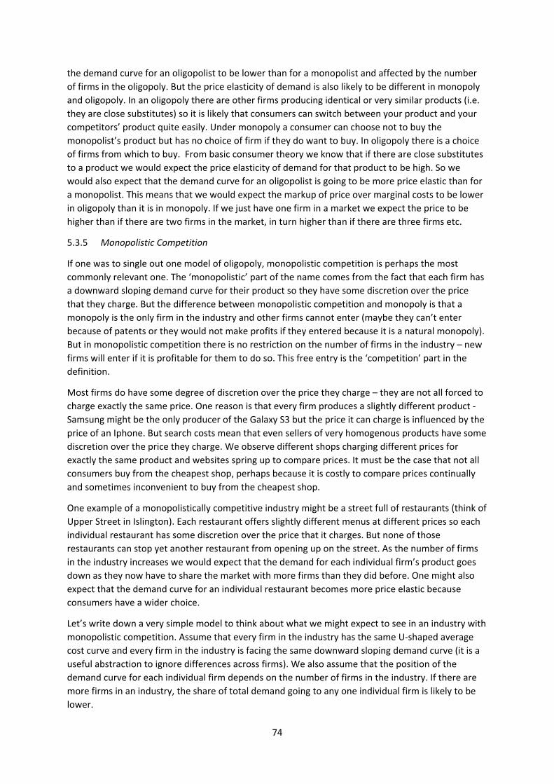
74
the demand curve for an oligopolist to be lower than for a monopolist and affected by the number
of firms in the oligopoly. But the price elasticity of demand is also likely to be different in monopoly
and oligopoly. In an oligopoly there are other firms producing identical or very similar products (i.e.
they are close substitutes) so it is likely that consumers can switch between your product and your
competitors’ product quite easily. Under monopoly a consumer can choose not to buy the
monopolist’s product but has no choice of firm if they do want to buy. In oligopoly there is a choice
of firms from which to buy. From basic consumer theory we know that if there are close substitutes
to a product we would expect the price elasticity of demand for that product to be high. So we
would also expect that the demand curve for an oligopolist is going to be more price elastic than for
a monopolist. This means that we would expect the markup of price over marginal costs to be lower
in oligopoly than it is in monopoly. If we just have one firm in a market we expect the price to be
higher than if there are two firms in the market, in turn higher than if there are three firms etc.
5.3.5 Monopolistic Competition
If one was to single out one model of oligopoly, monopolistic competition is perhaps the most
commonly relevant one. The ‘monopolistic’ part of the name comes from the fact that each firm has
a downward sloping demand curve for their product so they have some discretion over the price
that they charge. But the difference between monopolistic competition and monopoly is that a
monopoly is the only firm in the industry and other firms cannot enter (maybe they can’t enter
because of patents or they would not make profits if they entered because it is a natural monopoly).
But in monopolistic competition there is no restriction on the number of firms in the industry – new
firms will enter if it is profitable for them to do so. This free entry is the ‘competition’ part in the
definition.
Most firms do have some degree of discretion over the price they charge – they are not all forced to
charge exactly the same price. One reason is that every firm produces a slightly different product ‐
Samsung might be the only producer of the Galaxy S3 but the price it can charge is influenced by the
price of an Iphone. But search costs mean that even sellers of very homogenous products have some
discretion over the price they charge. We observe different shops charging different prices for
exactly the same product and websites spring up to compare prices. It must be the case that not all
consumers buy from the cheapest shop, perhaps because it is costly to compare prices continually
and sometimes inconvenient to buy from the cheapest shop.
One example of a monopolistically competitive industry might be a street full of restaurants (think of
Upper Street in Islington). Each restaurant offers slightly different menus at different prices so each
individual restaurant has some discretion over the price that it charges. But none of those
restaurants can stop yet another restaurant from opening up on the street. As the number of firms
in the industry increases we would expect that the demand for each individual firm’s product goes
down as they now have to share the market with more firms than they did before. One might also
expect that the demand curve for an individual restaurant becomes more price elastic because
consumers have a wider choice.
Let’s write down a very simple model to think about what we might expect to see in an industry with
monopolistic competition. Assume that every firm in the industry has the same U‐shaped average
cost curve and every firm in the industry is facing the same downward sloping demand curve (it is a
useful abstraction to ignore differences across firms). We also assume that the position of the
demand curve for each individual firm depends on the number of firms in the industry. If there are
more firms in an industry, the share of total demand going to any one individual firm is likely to be
lower.
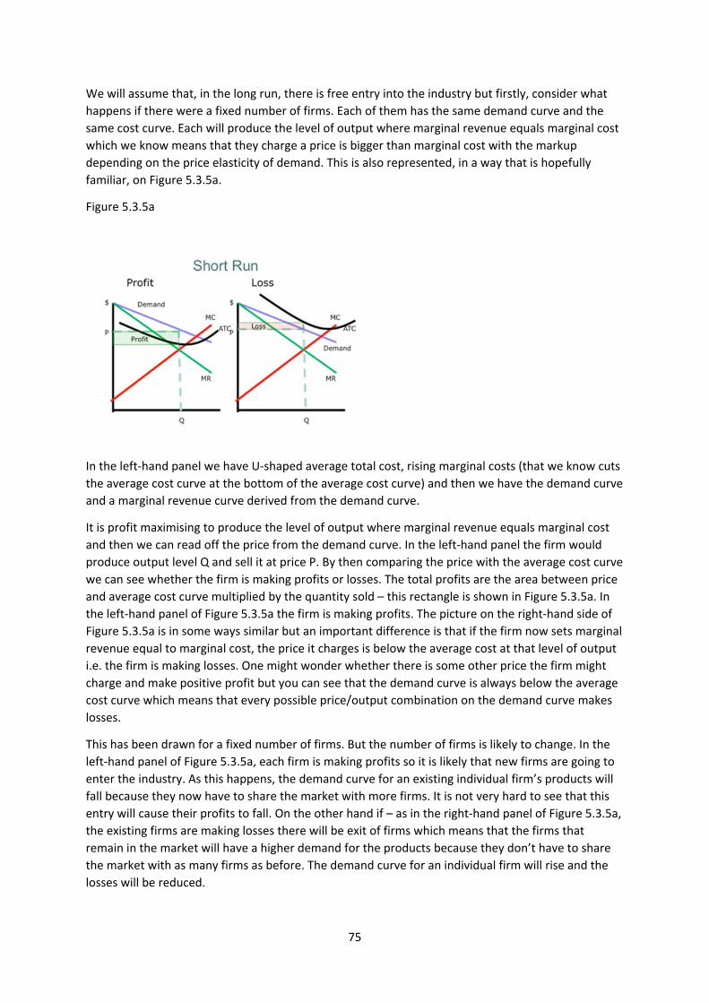
75
We will assume that, in the long run, there is free entry into the industry but firstly, consider what
happens if there were a fixed number of firms. Each of them has the same demand curve and the
same cost curve. Each will produce the level of output where marginal revenue equals marginal cost
which we know means that they charge a price is bigger than marginal cost with the markup
depending on the price elasticity of demand. This is also represented, in a way that is hopefully
familiar, on Figure 5.3.5a.
Figure 5.3.5a
In the left‐hand panel we have U‐shaped average total cost, rising marginal costs (that we know cuts
the average cost curve at the bottom of the average cost curve) and then we have the demand curve
and a marginal revenue curve derived from the demand curve.
It is profit maximising to produce the level of output where marginal revenue equals marginal cost
and then we can read off the price from the demand curve. In the left‐hand panel the firm would
produce output level Q and sell it at price P. By then comparing the price with the average cost curve
we can see whether the firm is making profits or losses. The total profits are the area between price
and average cost curve multiplied by the quantity sold – this rectangle is shown in Figure 5.3.5a. In
the left‐hand panel of Figure 5.3.5a the firm is making profits. The picture on the right‐hand side of
Figure 5.3.5a is in some ways similar but an important difference is that if the firm now sets marginal
revenue equal to marginal cost, the price it charges is below the average cost at that level of output
i.e. the firm is making losses. One might wonder whether there is some other price the firm might
charge and make positive profit but you can see that the demand curve is always below the average
cost curve which means that every possible price/output combination on the demand curve makes
losses.
This has been drawn for a fixed number of firms. But the number of firms is likely to change. In the
left‐hand panel of Figure 5.3.5a, each firm is making profits so it is likely that new firms are going to
enter the industry. As this happens, the demand curve for an existing individual firm’s products will
fall because they now have to share the market with more firms. It is not very hard to see that this
entry will cause their profits to fall. On the other hand if – as in the right‐hand panel of Figure 5.3.5a,
the existing firms are making losses there will be exit of firms which means that the firms that
remain in the market will have a higher demand for the products because they don’t have to share
the market with as many firms as before. The demand curve for an individual firm will rise and the
losses will be reduced.
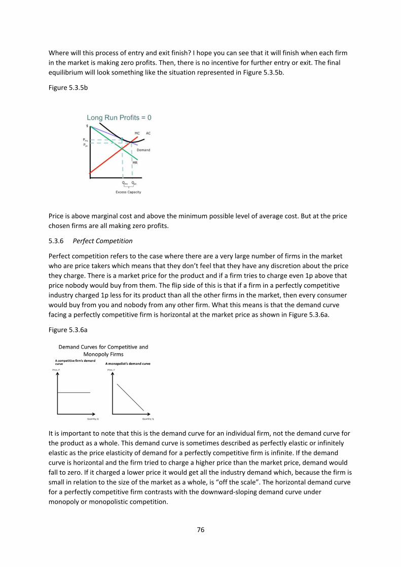
76
Where will this process of entry and exit finish? I hope you can see that it will finish when each firm
in the market is making zero profits. Then, there is no incentive for further entry or exit. The final
equilibrium will look something like the situation represented in Figure 5.3.5b.
Figure 5.3.5b
Price is above marginal cost and above the minimum possible level of average cost. But at the price
chosen firms are all making zero profits.
5.3.6 Perfect Competition
Perfect competition refers to the case where there are a very large number of firms in the market
who are price takers which means that they don’t feel that they have any discretion about the price
they charge. There is a market price for the product and if a firm tries to charge even 1p above that
price nobody would buy from them. The flip side of this is that if a firm in a perfectly competitive
industry charged 1p less for its product than all the other firms in the market, then every consumer
would buy from you and nobody from any other firm. What this means is that the demand curve
facing a perfectly competitive firm is horizontal at the market price as shown in Figure 5.3.6a.
Figure 5.3.6a
It is important to note that this is the demand curve for an individual firm, not the demand curve for
the product as a whole. This demand curve is sometimes described as perfectly elastic or infinitely
elastic as the price elasticity of demand for a perfectly competitive firm is infinite. If the demand
curve is horizontal and the firm tried to charge a higher price than the market price, demand would
fall to zero. If it charged a lower price it would get all the industry demand which, because the firm is
small in relation to the size of the market as a whole, is “off the scale”. The horizontal demand curve
for a perfectly competitive firm contrasts with the downward‐sloping demand curve under
monopoly or monopolistic competition.
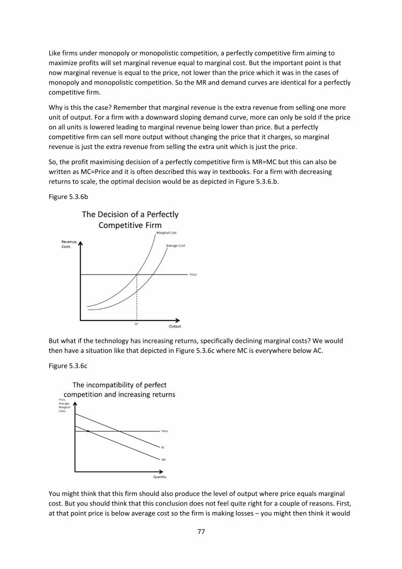
77
Like firms under monopoly or monopolistic competition, a perfectly competitive firm aiming to
maximize profits will set marginal revenue equal to marginal cost. But the important point is that
now marginal revenue is equal to the price, not lower than the price which it was in the cases of
monopoly and monopolistic competition. So the MR and demand curves are identical for a perfectly
competitive firm.
Why is this the case? Remember that marginal revenue is the extra revenue from selling one more
unit of output. For a firm with a downward sloping demand curve, more can only be sold if the price
on all units is lowered leading to marginal revenue being lower than price. But a perfectly
competitive firm can sell more output without changing the price that it charges, so marginal
revenue is just the extra revenue from selling the extra unit which is just the price.
So, the profit maximising decision of a perfectly competitive firm is MR=MC but this can also be
written as MC=Price and it is often described this way in textbooks. For a firm with decreasing
returns to scale, the optimal decision would be as depicted in Figure 5.3.6.b.
Figure 5.3.6b
But what if the technology has increasing returns, specifically declining marginal costs? We would
then have a situation like that depicted in Figure 5.3.6c where MC is everywhere below AC.
Figure 5.3.6c
You might think that this firm should also produce the level of output where price equals marginal
cost. But you should think that this conclusion does not feel quite right for a couple of reasons. First,
at that point price is below average cost so the firm is making losses – you might then think it would
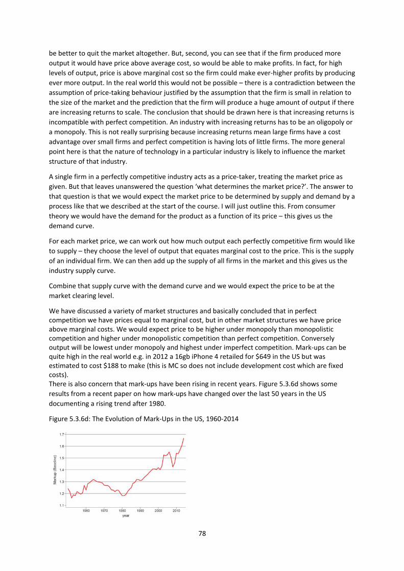
78
be better to quit the market altogether. But, second, you can see that if the firm produced more
output it would have price above average cost, so would be able to make profits. In fact, for high
levels of output, price is above marginal cost so the firm could make ever‐higher profits by producing
ever more output. In the real world this would not be possible – there is a contradiction between the
assumption of price‐taking behaviour justified by the assumption that the firm is small in relation to
the size of the market and the prediction that the firm will produce a huge amount of output if there
are increasing returns to scale. The conclusion that should be drawn here is that increasing returns is
incompatible with perfect competition. An industry with increasing returns has to be an oligopoly or
a monopoly. This is not really surprising because increasing returns mean large firms have a cost
advantage over small firms and perfect competition is having lots of little firms. The more general
point here is that the nature of technology in a particular industry is likely to influence the market
structure of that industry.
A single firm in a perfectly competitive industry acts as a price‐taker, treating the market price as
given. But that leaves unanswered the question ‘what determines the market price?’. The answer to
that question is that we would expect the market price to be determined by supply and demand by a
process like that we described at the start of the course. I will just outline this. From consumer
theory we would have the demand for the product as a function of its price – this gives us the
demand curve.
For each market price, we can work out how much output each perfectly competitive firm would like
to supply – they choose the level of output that equates marginal cost to the price. This is the supply
of an individual firm. We can then add up the supply of all firms in the market and this gives us the
industry supply curve.
Combine that supply curve with the demand curve and we would expect the price to be at the
market clearing level.
We have discussed a variety of market structures and basically concluded that in perfect competition we have prices equal to marginal cost, but in other market structures we have price above marginal costs. We would expect price to be higher under monopoly than monopolistic competition and higher under monopolistic competition than perfect competition. Conversely output will be lowest under monopoly and highest under imperfect competition. Mark‐ups can be quite high in the real world e.g. in 2012 a 16gb iPhone 4 retailed for $649 in the US but was estimated to cost $188 to make (this is MC so does not include development cost which are fixed costs). There is also concern that mark‐ups have been rising in recent years. Figure 5.3.6d shows some
results from a recent paper on how mark‐ups have changed over the last 50 years in the US
documenting a rising trend after 1980.
Figure 5.3.6d: The Evolution of Mark‐Ups in the US, 1960‐2014
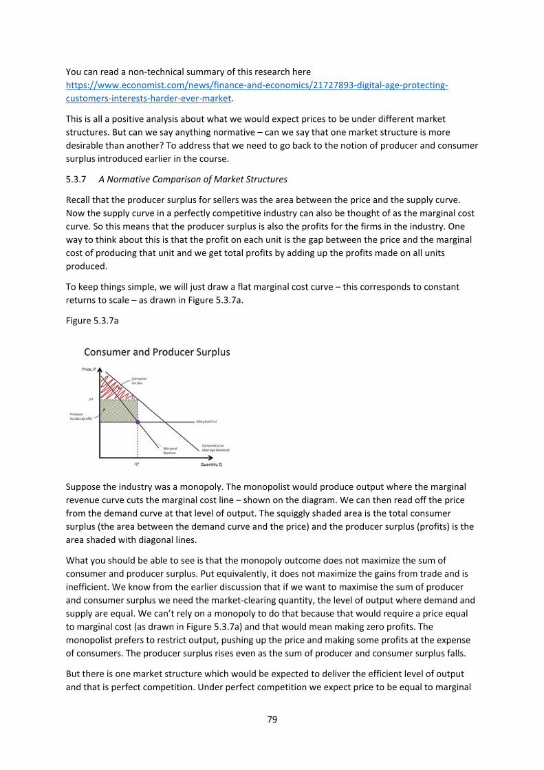
79
You can read a non‐technical summary of this research here
https://www.economist.com/news/finance‐and‐economics/21727893‐digital‐age‐protecting‐
customers‐interests‐harder‐ever‐market.
This is all a positive analysis about what we would expect prices to be under different market
structures. But can we say anything normative – can we say that one market structure is more
desirable than another? To address that we need to go back to the notion of producer and consumer
surplus introduced earlier in the course.
5.3.7 A Normative Comparison of Market Structures
Recall that the producer surplus for sellers was the area between the price and the supply curve.
Now the supply curve in a perfectly competitive industry can also be thought of as the marginal cost
curve. So this means that the producer surplus is also the profits for the firms in the industry. One
way to think about this is that the profit on each unit is the gap between the price and the marginal
cost of producing that unit and we get total profits by adding up the profits made on all units
produced.
To keep things simple, we will just draw a flat marginal cost curve – this corresponds to constant
returns to scale – as drawn in Figure 5.3.7a.
Figure 5.3.7a
Suppose the industry was a monopoly. The monopolist would produce output where the marginal
revenue curve cuts the marginal cost line – shown on the diagram. We can then read off the price
from the demand curve at that level of output. The squiggly shaded area is the total consumer
surplus (the area between the demand curve and the price) and the producer surplus (profits) is the
area shaded with diagonal lines.
What you should be able to see is that the monopoly outcome does not maximize the sum of
consumer and producer surplus. Put equivalently, it does not maximize the gains from trade and is
inefficient. We know from the earlier discussion that if we want to maximise the sum of producer
and consumer surplus we need the market‐clearing quantity, the level of output where demand and
supply are equal. We can’t rely on a monopoly to do that because that would require a price equal
to marginal cost (as drawn in Figure 5.3.7a) and that would mean making zero profits. The
monopolist prefers to restrict output, pushing up the price and making some profits at the expense
of consumers. The producer surplus rises even as the sum of producer and consumer surplus falls.
But there is one market structure which would be expected to deliver the efficient level of output
and that is perfect competition. Under perfect competition we expect price to be equal to marginal
80
cost and at the level that equates demand and supply. That leads to the prediction that if an industry
is perfectly competitive (or a reasonable approximation to it) we might expect that industry to be
maximising the sum of producer and consumer surplus.
What about oligopoly or monopolistic competition? Both price and output in this case will be
between the levels with perfect competition and monopoly. So it is not as good as perfect
competition but not as bad as monopoly. There is some inefficiency i.e. the sum of consumer and
producer surplus is lower than it could be.
The conclusion is that some market structures are more desirable than others and in particular that
perfect competition is more desirable than oligopoly which in turn is better than monopoly. The
outcome under both monopoly and monopolistic competition is inefficient in the sense that it does
not maximize the gains from trade.
This argument is behind government policy when they try to limit the market power of oligopolies
and monopolies. There are a number of ways in which they do this.
There may be industries where the nature of the technology means that there are powerful forces
creating market power – what we earlier called natural monopolies. Industries prone to being
natural monopolies tend to have quite a lot of government involvement in them.
First, there is public ownership. In the past, natural monopolies were often in public ownership and
not run on profit maximising principles. They can be run on the basis of some wider greater social
good, maybe the sum of producer and consumer surplus. The trade‐offs in the choice between
public and private ownership are the following. The disadvantage of private ownership is that one
has to provide some incentive through profit for a private company to run the business and there is
a danger that a private sector company will try to increase its profits by not doing exactly what the
public sector would like them to do. On the other hand, a firm interested in profits has an incentive
to run its operation as efficiently as possible so may have a higher level of productivity than a public
owned firm perhaps with unclear objectives and perhaps at risk of being run in the interests of
special interest groups rather than the public at large.
Over the last 30 years it has been fashionable to think that publicly‐run firms can be quite inefficient
so many natural monopolies have been privatised. But, more recently, discussions about taking
some industries into public ownership has become more active again e.g. the railways in the UK or
debates about the role of the private sector in the NHS.
Although governments may allow the private sector to run natural monopolies they typically
regulate them, imposing limits on the prices firms are allowed to charge: regulation is the second
type of public policy towards monopoly. The government imposes a price that is below the
monopoly price. The UK does this in the utility industries – telecommunications, water, electricity,
gas – which could be argued to have a tendency towards natural monopoly. For example, in the UK
Ofwat regulates the water companies limiting the prices they can charge.
Thirdly, governments can actively try to make monopolized industries more competitive. For
example, the UK government has been concerned for a long time about the small number of retail
banks on the High Street. In 2013 it took advantage of the fact that, post‐financial crisis, a number of
those banks have effectively been taken into public ownership and they broke up one of those
banks. The single bank Lloyds‐TSB became Lloyds and TSB. They did that because they thought that
more banks would lead to more competition and drive down prices closer to marginal costs,
benefitting not just consumers but society as a whole because the sum of producer and consumers
81
surplus would go up. There are lots of examples of governments breaking up firms that they think
have become too powerful or preventing mergers that will create too much market power. In the
early 1980s the US government broke up telecoms firm AT&T which it felt had too much market
power. The current big debate is whether, at some stage, that should happen to the tech giants like
Google and Amazon.
In considering different forms of regulation, one has to recognize that while they may work perfectly
in theory, they don’t necessarily work quite so well in practice. On a diagram it is simple to work out
what the price should be; more difficult in the real world. It may be that the proposed cure itself
causes problems; it may be that some degree of monopoly is inevitable and policy should be about
mitigating the bad effects rather than complete elimination. For example it has been argued that
one problem with publicly owned enterprises that are not run on a profit‐maximizing basis is that
they have little incentive to hold down costs so end up very inefficient in their methods of
production. That argument led many countries to privatise many industries in the 1980s.
5.4 Price Discrimination
I have assumed that the firm charges the same price to all buyers of its products. But the firm would
like to do something rather different ‐ it probably has some customers who are prepared to pay high
prices and other customers that are prepared to pay lower prices. The firm would make more profits
if it could charge different prices to different consumers, a practice known as price discrimination.
There are many examples e.g. student discounts in the cinema. The cinema owners reckon students
have less money than lecturers and, as a result, the price that students are prepared to pay for a
cinema ticket is lower than lecturers and they make more money by exploiting this. But while firms
are likely to always want to price discriminate it may not always be feasible. The main problem (from
a firm perspective) is resale. One can price discriminate for cinema tickets or airline tickets or train
tickets because the consumer has to physically go into the cinema etc. But if a supermarket started
giving students 25% discounts on groceries, enterprising students might set up shop buying the
goods from Tesco at a 25% discount and then selling them to lecturers at a 10% discount. The
student entrepreneur turns a profit and the lecturer gets their groceries cheaper than if they went
directly to Tesco so the students and lecturers are both happy. Though some UK supermarkets are
indeed discussing the introduction of student discounts.
82
Key Concepts for Chapter 5
Revenue function
Average revenue and marginal revenue
Cost function
Average cost and marginal cost
Fixed and sunk costs
Returns to scale: increasing, decreasing and constant returns.
Relationship between returns to scale and average and marginal costs
Profit maximizing level of output has marginal revenue = marginal cost
Comparative statics of change in costs on prices and output
Entry and exit
Comparative statics of change in demand curve on prices and output
The mark‐up equation
Monopoly
Sources of monopoly
Oligopoly and Monopolistic Competition
Perfect competition
The inefficiency of monopoly and oligopoly and the efficiency of perfect competition
Policies to address monopoly power
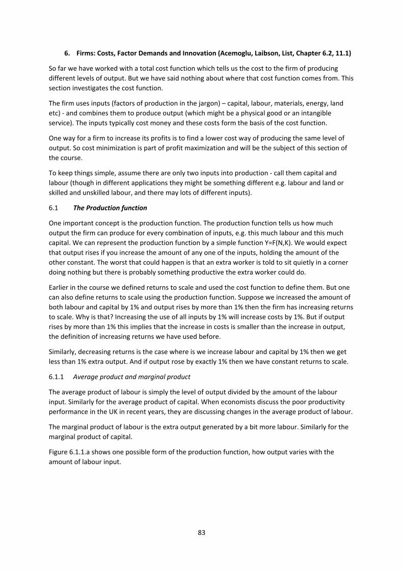
83
6. Firms: Costs, Factor Demands and Innovation (Acemoglu, Laibson, List, Chapter 6.2, 11.1)
So far we have worked with a total cost function which tells us the cost to the firm of producing
different levels of output. But we have said nothing about where that cost function comes from. This
section investigates the cost function.
The firm uses inputs (factors of production in the jargon) – capital, labour, materials, energy, land
etc) ‐ and combines them to produce output (which might be a physical good or an intangible
service). The inputs typically cost money and these costs form the basis of the cost function.
One way for a firm to increase its profits is to find a lower cost way of producing the same level of
output. So cost minimization is part of profit maximization and will be the subject of this section of
the course.
To keep things simple, assume there are only two inputs into production ‐ call them capital and
labour (though in different applications they might be something different e.g. labour and land or
skilled and unskilled labour, and there may lots of different inputs).
6.1 The Production function
One important concept is the production function. The production function tells us how much
output the firm can produce for every combination of inputs, e.g. this much labour and this much
capital. We can represent the production function by a simple function Y=F(N,K). We would expect
that output rises if you increase the amount of any one of the inputs, holding the amount of the
other constant. The worst that could happen is that an extra worker is told to sit quietly in a corner
doing nothing but there is probably something productive the extra worker could do.
Earlier in the course we defined returns to scale and used the cost function to define them. But one
can also define returns to scale using the production function. Suppose we increased the amount of
both labour and capital by 1% and output rises by more than 1% then the firm has increasing returns
to scale. Why is that? Increasing the use of all inputs by 1% will increase costs by 1%. But if output
rises by more than 1% this implies that the increase in costs is smaller than the increase in output,
the definition of increasing returns we have used before.
Similarly, decreasing returns is the case where is we increase labour and capital by 1% then we get
less than 1% extra output. And if output rose by exactly 1% then we have constant returns to scale.
6.1.1 Average product and marginal product
The average product of labour is simply the level of output divided by the amount of the labour
input. Similarly for the average product of capital. When economists discuss the poor productivity
performance in the UK in recent years, they are discussing changes in the average product of labour.
The marginal product of labour is the extra output generated by a bit more labour. Similarly for the
marginal product of capital.
Figure 6.1.1.a shows one possible form of the production function, how output varies with the
amount of labour input.
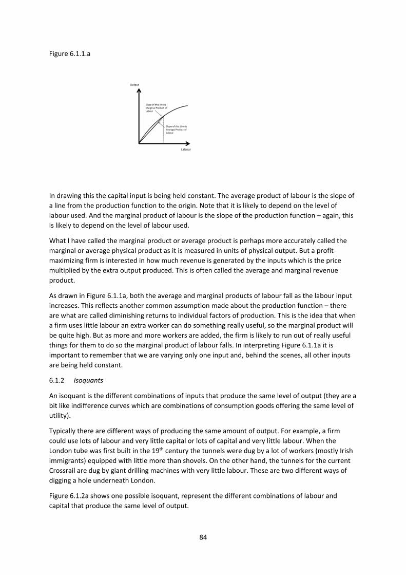
84
Figure 6.1.1.a
In drawing this the capital input is being held constant. The average product of labour is the slope of
a line from the production function to the origin. Note that it is likely to depend on the level of
labour used. And the marginal product of labour is the slope of the production function – again, this
is likely to depend on the level of labour used.
What I have called the marginal product or average product is perhaps more accurately called the
marginal or average physical product as it is measured in units of physical output. But a profit‐
maximizing firm is interested in how much revenue is generated by the inputs which is the price
multiplied by the extra output produced. This is often called the average and marginal revenue
product.
As drawn in Figure 6.1.1a, both the average and marginal products of labour fall as the labour input
increases. This reflects another common assumption made about the production function – there
are what are called diminishing returns to individual factors of production. This is the idea that when
a firm uses little labour an extra worker can do something really useful, so the marginal product will
be quite high. But as more and more workers are added, the firm is likely to run out of really useful
things for them to do so the marginal product of labour falls. In interpreting Figure 6.1.1a it is
important to remember that we are varying only one input and, behind the scenes, all other inputs
are being held constant.
6.1.2 Isoquants
An isoquant is the different combinations of inputs that produce the same level of output (they are a
bit like indifference curves which are combinations of consumption goods offering the same level of
utility).
Typically there are different ways of producing the same amount of output. For example, a firm
could use lots of labour and very little capital or lots of capital and very little labour. When the
London tube was first built in the 19th century the tunnels were dug by a lot of workers (mostly Irish
immigrants) equipped with little more than shovels. On the other hand, the tunnels for the current
Crossrail are dug by giant drilling machines with very little labour. These are two different ways of
digging a hole underneath London.
Figure 6.1.2a shows one possible isoquant, represent the different combinations of labour and
capital that produce the same level of output.
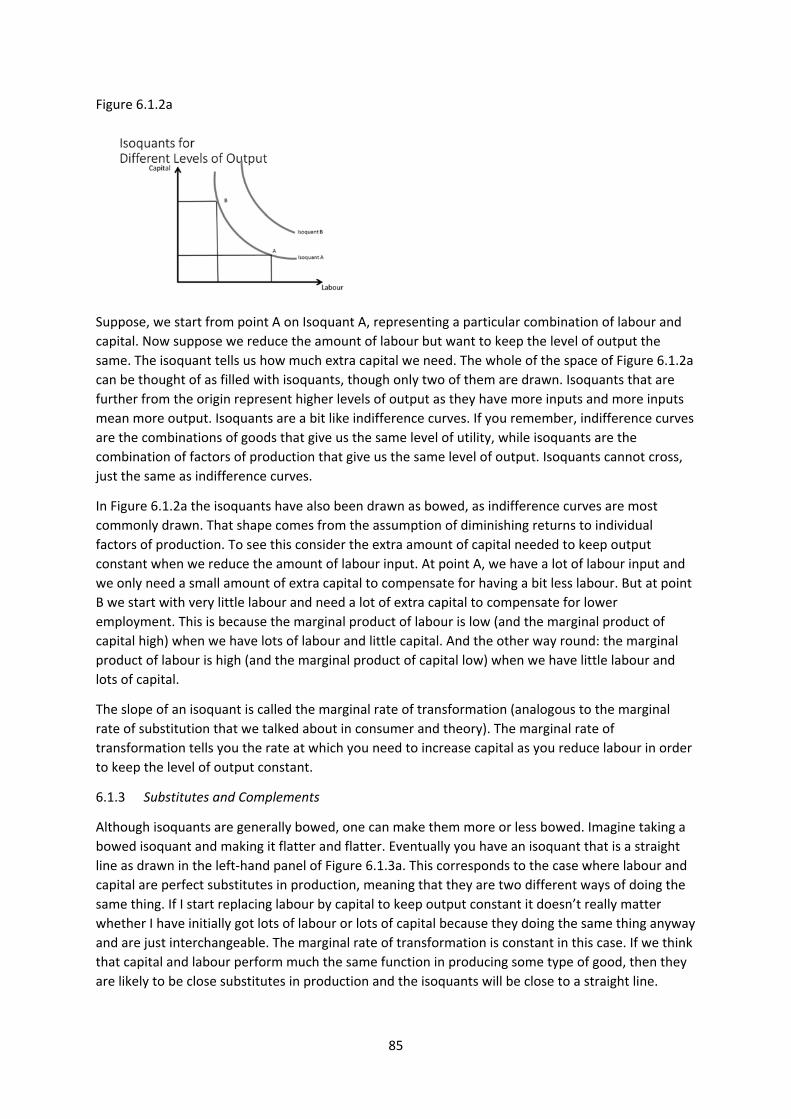
85
Figure 6.1.2a
Suppose, we start from point A on Isoquant A, representing a particular combination of labour and
capital. Now suppose we reduce the amount of labour but want to keep the level of output the
same. The isoquant tells us how much extra capital we need. The whole of the space of Figure 6.1.2a
can be thought of as filled with isoquants, though only two of them are drawn. Isoquants that are
further from the origin represent higher levels of output as they have more inputs and more inputs
mean more output. Isoquants are a bit like indifference curves. If you remember, indifference curves
are the combinations of goods that give us the same level of utility, while isoquants are the
combination of factors of production that give us the same level of output. Isoquants cannot cross,
just the same as indifference curves.
In Figure 6.1.2a the isoquants have also been drawn as bowed, as indifference curves are most
commonly drawn. That shape comes from the assumption of diminishing returns to individual
factors of production. To see this consider the extra amount of capital needed to keep output
constant when we reduce the amount of labour input. At point A, we have a lot of labour input and
we only need a small amount of extra capital to compensate for having a bit less labour. But at point
B we start with very little labour and need a lot of extra capital to compensate for lower
employment. This is because the marginal product of labour is low (and the marginal product of
capital high) when we have lots of labour and little capital. And the other way round: the marginal
product of labour is high (and the marginal product of capital low) when we have little labour and
lots of capital.
The slope of an isoquant is called the marginal rate of transformation (analogous to the marginal
rate of substitution that we talked about in consumer and theory). The marginal rate of
transformation tells you the rate at which you need to increase capital as you reduce labour in order
to keep the level of output constant.
6.1.3 Substitutes and Complements
Although isoquants are generally bowed, one can make them more or less bowed. Imagine taking a
bowed isoquant and making it flatter and flatter. Eventually you have an isoquant that is a straight
line as drawn in the left‐hand panel of Figure 6.1.3a. This corresponds to the case where labour and
capital are perfect substitutes in production, meaning that they are two different ways of doing the
same thing. If I start replacing labour by capital to keep output constant it doesn’t really matter
whether I have initially got lots of labour or lots of capital because they doing the same thing anyway
and are just interchangeable. The marginal rate of transformation is constant in this case. If we think
that capital and labour perform much the same function in producing some type of good, then they
are likely to be close substitutes in production and the isoquants will be close to a straight line.
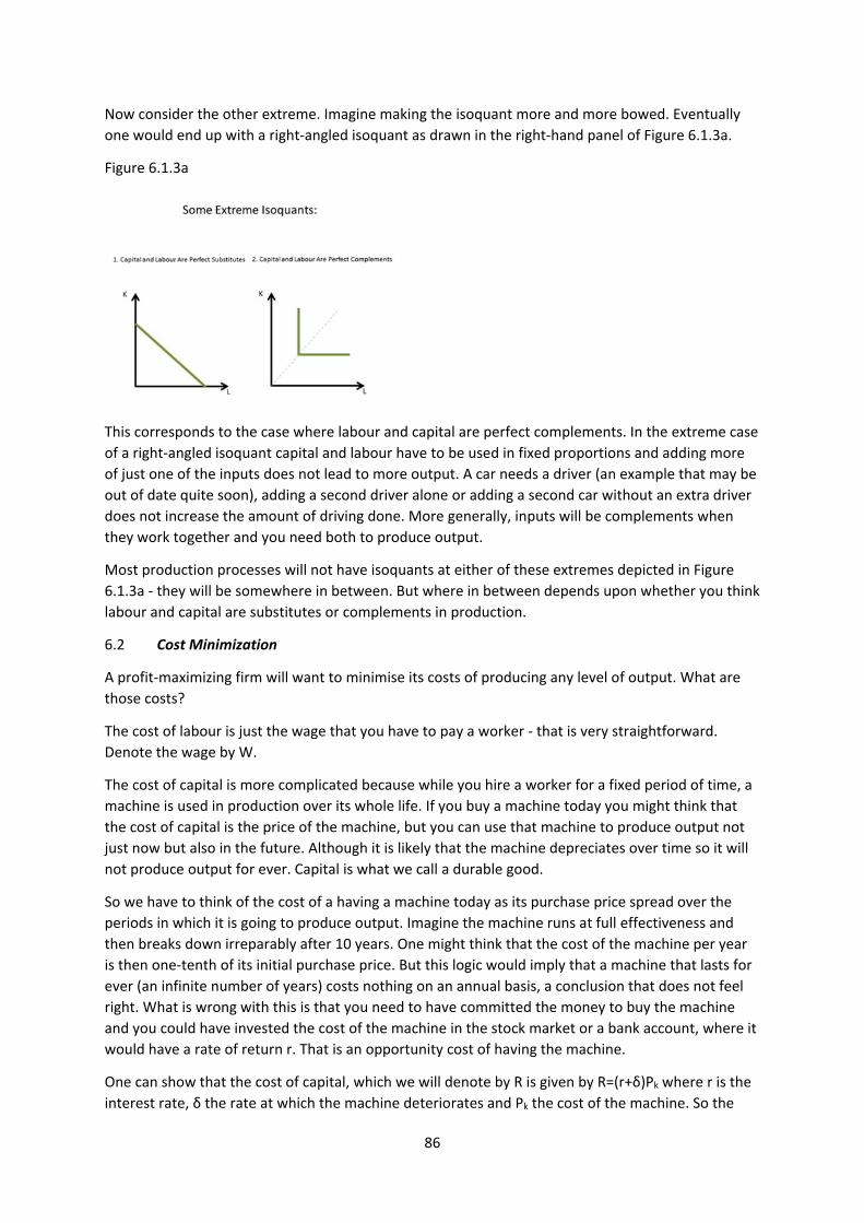
86
Now consider the other extreme. Imagine making the isoquant more and more bowed. Eventually
one would end up with a right‐angled isoquant as drawn in the right‐hand panel of Figure 6.1.3a.
Figure 6.1.3a
This corresponds to the case where labour and capital are perfect complements. In the extreme case
of a right‐angled isoquant capital and labour have to be used in fixed proportions and adding more
of just one of the inputs does not lead to more output. A car needs a driver (an example that may be
out of date quite soon), adding a second driver alone or adding a second car without an extra driver
does not increase the amount of driving done. More generally, inputs will be complements when
they work together and you need both to produce output.
Most production processes will not have isoquants at either of these extremes depicted in Figure
6.1.3a ‐ they will be somewhere in between. But where in between depends upon whether you think
labour and capital are substitutes or complements in production.
6.2 Cost Minimization
A profit‐maximizing firm will want to minimise its costs of producing any level of output. What are
those costs?
The cost of labour is just the wage that you have to pay a worker ‐ that is very straightforward.
Denote the wage by W.
The cost of capital is more complicated because while you hire a worker for a fixed period of time, a
machine is used in production over its whole life. If you buy a machine today you might think that
the cost of capital is the price of the machine, but you can use that machine to produce output not
just now but also in the future. Although it is likely that the machine depreciates over time so it will
not produce output for ever. Capital is what we call a durable good.
So we have to think of the cost of a having a machine today as its purchase price spread over the
periods in which it is going to produce output. Imagine the machine runs at full effectiveness and
then breaks down irreparably after 10 years. One might think that the cost of the machine per year
is then one‐tenth of its initial purchase price. But this logic would imply that a machine that lasts for
ever (an infinite number of years) costs nothing on an annual basis, a conclusion that does not feel
right. What is wrong with this is that you need to have committed the money to buy the machine
and you could have invested the cost of the machine in the stock market or a bank account, where it
would have a rate of return r. That is an opportunity cost of having the machine.
One can show that the cost of capital, which we will denote by R is given by R=(r+δ)Pk where r is the
interest rate, δ the rate at which the machine deteriorates and Pk the cost of the machine. So the
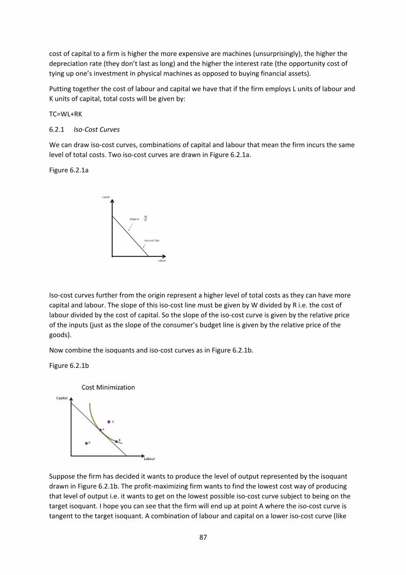
87
cost of capital to a firm is higher the more expensive are machines (unsurprisingly), the higher the
depreciation rate (they don’t last as long) and the higher the interest rate (the opportunity cost of
tying up one’s investment in physical machines as opposed to buying financial assets).
Putting together the cost of labour and capital we have that if the firm employs L units of labour and
K units of capital, total costs will be given by:
TC=WL+RK
6.2.1 Iso‐Cost Curves
We can draw iso‐cost curves, combinations of capital and labour that mean the firm incurs the same
level of total costs. Two iso‐cost curves are drawn in Figure 6.2.1a.
Figure 6.2.1a
Iso‐cost curves further from the origin represent a higher level of total costs as they can have more
capital and labour. The slope of this iso‐cost line must be given by W divided by R i.e. the cost of
labour divided by the cost of capital. So the slope of the iso‐cost curve is given by the relative price
of the inputs (just as the slope of the consumer’s budget line is given by the relative price of the
goods).
Now combine the isoquants and iso‐cost curves as in Figure 6.2.1b.
Figure 6.2.1b
Suppose the firm has decided it wants to produce the level of output represented by the isoquant
drawn in Figure 6.2.1b. The profit‐maximizing firm wants to find the lowest cost way of producing
that level of output i.e. it wants to get on the lowest possible iso‐cost curve subject to being on the
target isoquant. I hope you can see that the firm will end up at point A where the iso‐cost curve is
tangent to the target isoquant. A combination of labour and capital on a lower iso‐cost curve (like
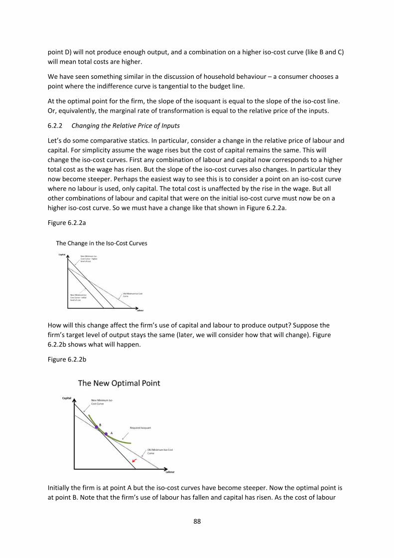
88
point D) will not produce enough output, and a combination on a higher iso‐cost curve (like B and C)
will mean total costs are higher.
We have seen something similar in the discussion of household behaviour – a consumer chooses a
point where the indifference curve is tangential to the budget line.
At the optimal point for the firm, the slope of the isoquant is equal to the slope of the iso‐cost line.
Or, equivalently, the marginal rate of transformation is equal to the relative price of the inputs.
6.2.2 Changing the Relative Price of Inputs
Let’s do some comparative statics. In particular, consider a change in the relative price of labour and
capital. For simplicity assume the wage rises but the cost of capital remains the same. This will
change the iso‐cost curves. First any combination of labour and capital now corresponds to a higher
total cost as the wage has risen. But the slope of the iso‐cost curves also changes. In particular they
now become steeper. Perhaps the easiest way to see this is to consider a point on an iso‐cost curve
where no labour is used, only capital. The total cost is unaffected by the rise in the wage. But all
other combinations of labour and capital that were on the initial iso‐cost curve must now be on a
higher iso‐cost curve. So we must have a change like that shown in Figure 6.2.2a.
Figure 6.2.2a
How will this change affect the firm’s use of capital and labour to produce output? Suppose the
firm’s target level of output stays the same (later, we will consider how that will change). Figure
6.2.2b shows what will happen.
Figure 6.2.2b
Initially the firm is at point A but the iso‐cost curves have become steeper. Now the optimal point is
at point B. Note that the firm’s use of labour has fallen and capital has risen. As the cost of labour
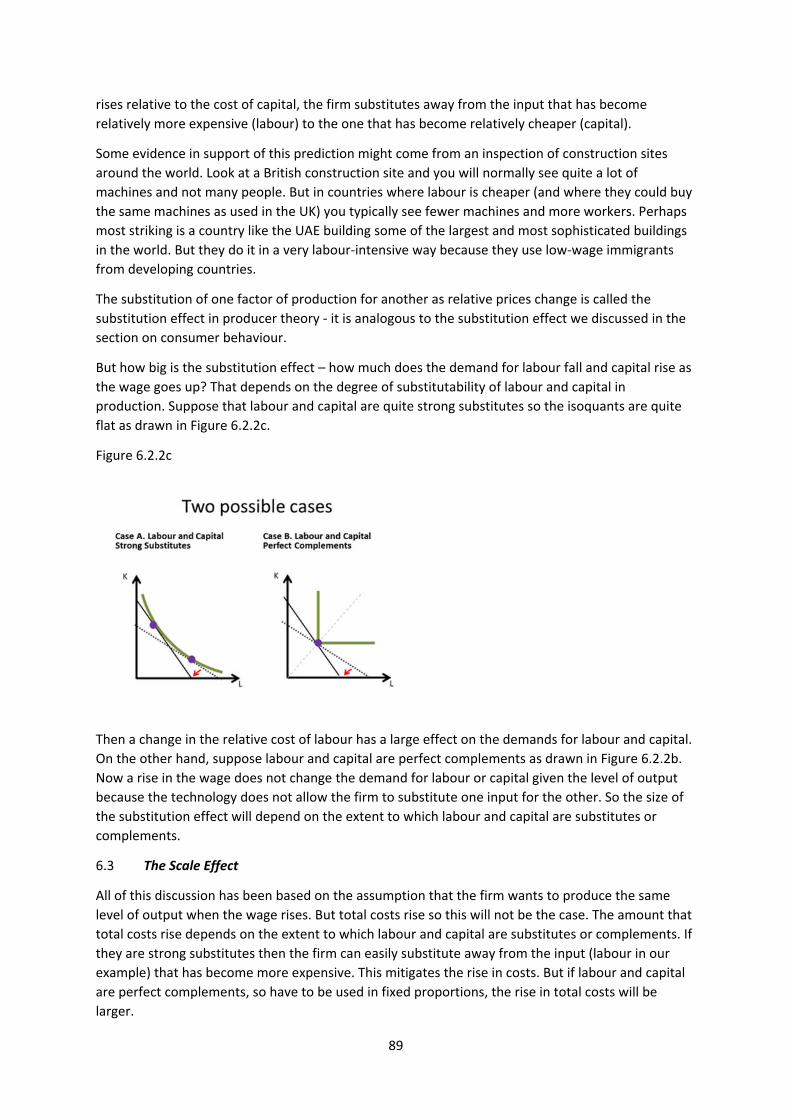
89
rises relative to the cost of capital, the firm substitutes away from the input that has become
relatively more expensive (labour) to the one that has become relatively cheaper (capital).
Some evidence in support of this prediction might come from an inspection of construction sites
around the world. Look at a British construction site and you will normally see quite a lot of
machines and not many people. But in countries where labour is cheaper (and where they could buy
the same machines as used in the UK) you typically see fewer machines and more workers. Perhaps
most striking is a country like the UAE building some of the largest and most sophisticated buildings
in the world. But they do it in a very labour‐intensive way because they use low‐wage immigrants
from developing countries.
The substitution of one factor of production for another as relative prices change is called the
substitution effect in producer theory ‐ it is analogous to the substitution effect we discussed in the
section on consumer behaviour.
But how big is the substitution effect – how much does the demand for labour fall and capital rise as
the wage goes up? That depends on the degree of substitutability of labour and capital in
production. Suppose that labour and capital are quite strong substitutes so the isoquants are quite
flat as drawn in Figure 6.2.2c.
Figure 6.2.2c
Then a change in the relative cost of labour has a large effect on the demands for labour and capital.
On the other hand, suppose labour and capital are perfect complements as drawn in Figure 6.2.2b.
Now a rise in the wage does not change the demand for labour or capital given the level of output
because the technology does not allow the firm to substitute one input for the other. So the size of
the substitution effect will depend on the extent to which labour and capital are substitutes or
complements.
6.3 The Scale Effect
All of this discussion has been based on the assumption that the firm wants to produce the same
level of output when the wage rises. But total costs rise so this will not be the case. The amount that
total costs rise depends on the extent to which labour and capital are substitutes or complements. If
they are strong substitutes then the firm can easily substitute away from the input (labour in our
example) that has become more expensive. This mitigates the rise in costs. But if labour and capital
are perfect complements, so have to be used in fixed proportions, the rise in total costs will be
larger.
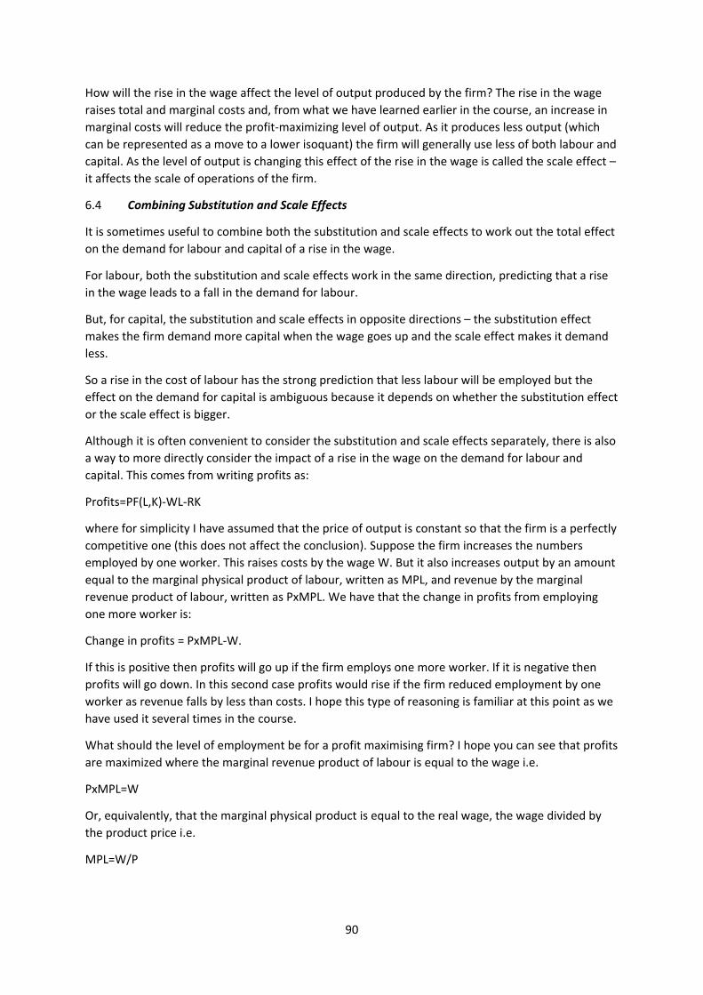
90
How will the rise in the wage affect the level of output produced by the firm? The rise in the wage
raises total and marginal costs and, from what we have learned earlier in the course, an increase in
marginal costs will reduce the profit‐maximizing level of output. As it produces less output (which
can be represented as a move to a lower isoquant) the firm will generally use less of both labour and
capital. As the level of output is changing this effect of the rise in the wage is called the scale effect –
it affects the scale of operations of the firm.
6.4 Combining Substitution and Scale Effects
It is sometimes useful to combine both the substitution and scale effects to work out the total effect
on the demand for labour and capital of a rise in the wage.
For labour, both the substitution and scale effects work in the same direction, predicting that a rise
in the wage leads to a fall in the demand for labour.
But, for capital, the substitution and scale effects in opposite directions – the substitution effect
makes the firm demand more capital when the wage goes up and the scale effect makes it demand
less.
So a rise in the cost of labour has the strong prediction that less labour will be employed but the
effect on the demand for capital is ambiguous because it depends on whether the substitution effect
or the scale effect is bigger.
Although it is often convenient to consider the substitution and scale effects separately, there is also
a way to more directly consider the impact of a rise in the wage on the demand for labour and
capital. This comes from writing profits as:
Profits=PF(L,K)‐WL‐RK
where for simplicity I have assumed that the price of output is constant so that the firm is a perfectly
competitive one (this does not affect the conclusion). Suppose the firm increases the numbers
employed by one worker. This raises costs by the wage W. But it also increases output by an amount
equal to the marginal physical product of labour, written as MPL, and revenue by the marginal
revenue product of labour, written as PxMPL. We have that the change in profits from employing
one more worker is:
Change in profits = PxMPL‐W.
If this is positive then profits will go up if the firm employs one more worker. If it is negative then
profits will go down. In this second case profits would rise if the firm reduced employment by one
worker as revenue falls by less than costs. I hope this type of reasoning is familiar at this point as we
have used it several times in the course.
What should the level of employment be for a profit maximising firm? I hope you can see that profits
are maximized where the marginal revenue product of labour is equal to the wage i.e.
PxMPL=W
Or, equivalently, that the marginal physical product is equal to the real wage, the wage divided by
the product price i.e.
MPL=W/P
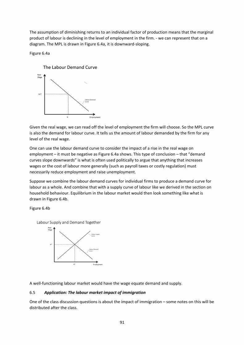
91
The assumption of diminishing returns to an individual factor of production means that the marginal
product of labour is declining in the level of employment in the firm. ‐ we can represent that on a
diagram. The MPL is drawn in Figure 6.4a, it is downward‐sloping.
Figure 6.4a
Given the real wage, we can read off the level of employment the firm will choose. So the MPL curve
is also the demand for labour curve. It tells us the amount of labour demanded by the firm for any
level of the real wage.
One can use the labour demand curve to consider the impact of a rise in the real wage on
employment – it must be negative as Figure 6.4a shows. This type of conclusion – that “demand
curves slope downwards” is what is often used politically to argue that anything that increases
wages or the cost of labour more generally (such as payroll taxes or costly regulation) must
necessarily reduce employment and raise unemployment.
Suppose we combine the labour demand curves for individual firms to produce a demand curve for
labour as a whole. And combine that with a supply curve of labour like we derived in the section on
household behaviour. Equilibrium in the labour market would then look something like what is
drawn in Figure 6.4b.
Figure 6.4b
A well‐functioning labour market would have the wage equate demand and supply.
6.5 Application: The labour market impact of immigration
One of the class discussion questions is about the impact of immigration – some notes on this will be
distributed after the class.
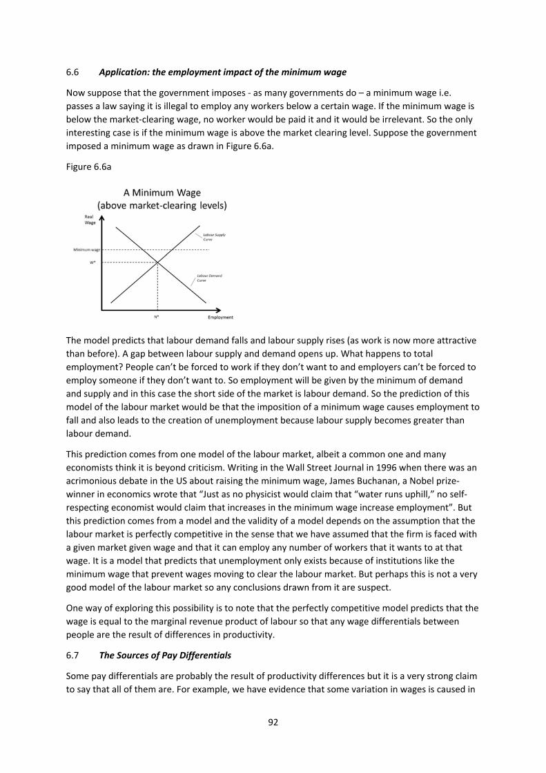
92
6.6 Application: the employment impact of the minimum wage
Now suppose that the government imposes ‐ as many governments do – a minimum wage i.e.
passes a law saying it is illegal to employ any workers below a certain wage. If the minimum wage is
below the market‐clearing wage, no worker would be paid it and it would be irrelevant. So the only
interesting case is if the minimum wage is above the market clearing level. Suppose the government
imposed a minimum wage as drawn in Figure 6.6a.
Figure 6.6a
The model predicts that labour demand falls and labour supply rises (as work is now more attractive
than before). A gap between labour supply and demand opens up. What happens to total
employment? People can’t be forced to work if they don’t want to and employers can’t be forced to
employ someone if they don’t want to. So employment will be given by the minimum of demand
and supply and in this case the short side of the market is labour demand. So the prediction of this
model of the labour market would be that the imposition of a minimum wage causes employment to
fall and also leads to the creation of unemployment because labour supply becomes greater than
labour demand.
This prediction comes from one model of the labour market, albeit a common one and many
economists think it is beyond criticism. Writing in the Wall Street Journal in 1996 when there was an
acrimonious debate in the US about raising the minimum wage, James Buchanan, a Nobel prize‐
winner in economics wrote that “Just as no physicist would claim that “water runs uphill,” no self‐
respecting economist would claim that increases in the minimum wage increase employment”. But
this prediction comes from a model and the validity of a model depends on the assumption that the
labour market is perfectly competitive in the sense that we have assumed that the firm is faced with
a given market given wage and that it can employ any number of workers that it wants to at that
wage. It is a model that predicts that unemployment only exists because of institutions like the
minimum wage that prevent wages moving to clear the labour market. But perhaps this is not a very
good model of the labour market so any conclusions drawn from it are suspect.
One way of exploring this possibility is to note that the perfectly competitive model predicts that the
wage is equal to the marginal revenue product of labour so that any wage differentials between
people are the result of differences in productivity.
6.7 The Sources of Pay Differentials
Some pay differentials are probably the result of productivity differences but it is a very strong claim
to say that all of them are. For example, we have evidence that some variation in wages is caused in
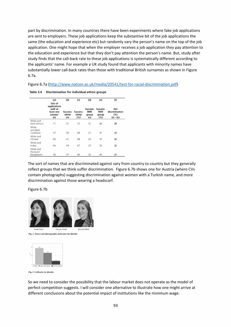
93
part by discrimination. In many countries there have been experiments where fake job applications
are sent to employers. These job applications keep the substantive bit of the job applications the
same (the education and experience etc) but randomly vary the person’s name on the top of the job
application. One might hope that when the employer receives a job application they pay attention to
the education and experience but that they don’t pay attention the person’s name. But, study after
study finds that the call‐back rate to these job applications is systematically different according to
the applicants’ name. For example a UK study found that applicants with minority names have
substantially lower call‐back rates than those with traditional British surnames as shown in Figure
6.7a.
Figure 6.7a (http://www.natcen.ac.uk/media/20541/test‐for‐racial‐discrimination.pdf)
The sort of names that are discriminated against vary from country to country but they generally
reflect groups that we think suffer discrimination. Figure 6.7b shows one for Austria (where CVs
contain photographs) suggesting discrimination against women with a Turkish name, and more
discrimination against those wearing a headscarf.
Figure 6.7b
So we need to consider the possibility that the labour market does not operate as the model of
perfect competition suggests. I will consider one alternative to illustrate how one might arrive at
different conclusions about the potential impact of institutions like the minimum wage.
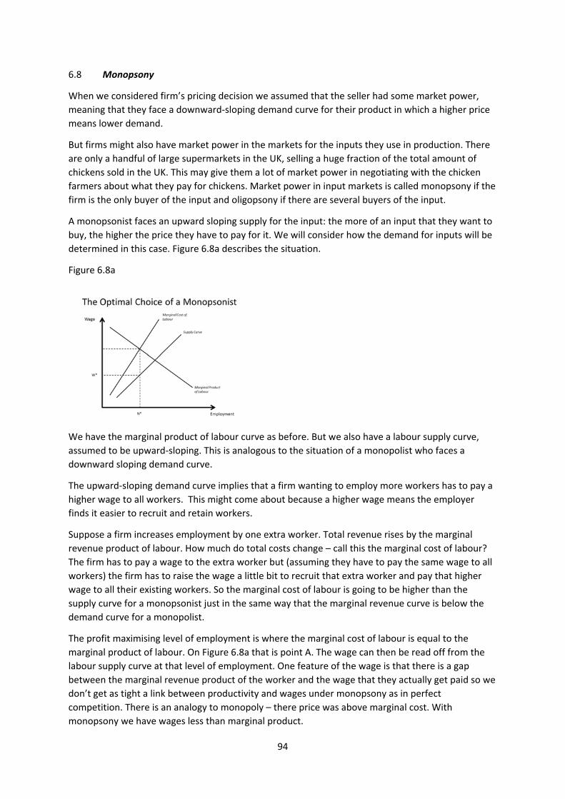
94
6.8 Monopsony
When we considered firm’s pricing decision we assumed that the seller had some market power,
meaning that they face a downward‐sloping demand curve for their product in which a higher price
means lower demand.
But firms might also have market power in the markets for the inputs they use in production. There
are only a handful of large supermarkets in the UK, selling a huge fraction of the total amount of
chickens sold in the UK. This may give them a lot of market power in negotiating with the chicken
farmers about what they pay for chickens. Market power in input markets is called monopsony if the
firm is the only buyer of the input and oligopsony if there are several buyers of the input.
A monopsonist faces an upward sloping supply for the input: the more of an input that they want to
buy, the higher the price they have to pay for it. We will consider how the demand for inputs will be
determined in this case. Figure 6.8a describes the situation.
Figure 6.8a
We have the marginal product of labour curve as before. But we also have a labour supply curve,
assumed to be upward‐sloping. This is analogous to the situation of a monopolist who faces a
downward sloping demand curve.
The upward‐sloping demand curve implies that a firm wanting to employ more workers has to pay a
higher wage to all workers. This might come about because a higher wage means the employer
finds it easier to recruit and retain workers.
Suppose a firm increases employment by one extra worker. Total revenue rises by the marginal
revenue product of labour. How much do total costs change – call this the marginal cost of labour?
The firm has to pay a wage to the extra worker but (assuming they have to pay the same wage to all
workers) the firm has to raise the wage a little bit to recruit that extra worker and pay that higher
wage to all their existing workers. So the marginal cost of labour is going to be higher than the
supply curve for a monopsonist just in the same way that the marginal revenue curve is below the
demand curve for a monopolist.
The profit maximising level of employment is where the marginal cost of labour is equal to the
marginal product of labour. On Figure 6.8a that is point A. The wage can then be read off from the
labour supply curve at that level of employment. One feature of the wage is that there is a gap
between the marginal revenue product of the worker and the wage that they actually get paid so we
don’t get as tight a link between productivity and wages under monopsony as in perfect
competition. There is an analogy to monopoly – there price was above marginal cost. With
monopsony we have wages less than marginal product.
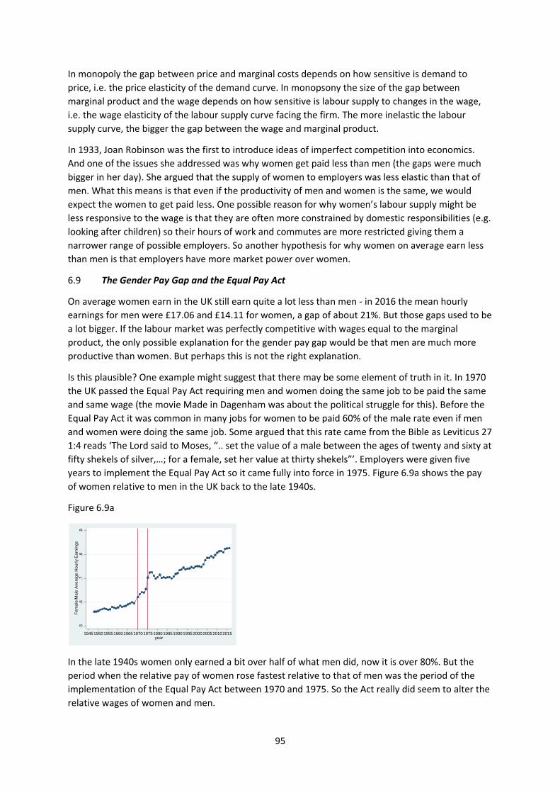
95
In monopoly the gap between price and marginal costs depends on how sensitive is demand to
price, i.e. the price elasticity of the demand curve. In monopsony the size of the gap between
marginal product and the wage depends on how sensitive is labour supply to changes in the wage,
i.e. the wage elasticity of the labour supply curve facing the firm. The more inelastic the labour
supply curve, the bigger the gap between the wage and marginal product.
In 1933, Joan Robinson was the first to introduce ideas of imperfect competition into economics.
And one of the issues she addressed was why women get paid less than men (the gaps were much
bigger in her day). She argued that the supply of women to employers was less elastic than that of
men. What this means is that even if the productivity of men and women is the same, we would
expect the women to get paid less. One possible reason for why women’s labour supply might be
less responsive to the wage is that they are often more constrained by domestic responsibilities (e.g.
looking after children) so their hours of work and commutes are more restricted giving them a
narrower range of possible employers. So another hypothesis for why women on average earn less
than men is that employers have more market power over women.
6.9 The Gender Pay Gap and the Equal Pay Act
On average women earn in the UK still earn quite a lot less than men ‐ in 2016 the mean hourly
earnings for men were £17.06 and £14.11 for women, a gap of about 21%. But those gaps used to be
a lot bigger. If the labour market was perfectly competitive with wages equal to the marginal
product, the only possible explanation for the gender pay gap would be that men are much more
productive than women. But perhaps this is not the right explanation.
Is this plausible? One example might suggest that there may be some element of truth in it. In 1970
the UK passed the Equal Pay Act requiring men and women doing the same job to be paid the same
and same wage (the movie Made in Dagenham was about the political struggle for this). Before the
Equal Pay Act it was common in many jobs for women to be paid 60% of the male rate even if men
and women were doing the same job. Some argued that this rate came from the Bible as Leviticus 27
1:4 reads ‘The Lord said to Moses, “.. set the value of a male between the ages of twenty and sixty at
fifty shekels of silver,…; for a female, set her value at thirty shekels”’. Employers were given five
years to implement the Equal Pay Act so it came fully into force in 1975. Figure 6.9a shows the pay
of women relative to men in the UK back to the late 1940s.
Figure 6.9a
In the late 1940s women only earned a bit over half of what men did, now it is over 80%. But the
period when the relative pay of women rose fastest relative to that of men was the period of the
implementation of the Equal Pay Act between 1970 and 1975. So the Act really did seem to alter the
relative wages of women and men.
.5.6
.7.8
.9F
ema
le/M
ale
Ave
rag
e H
our
ly E
arn
ings
194519501955196019651970197519801985199019952000200520102015year
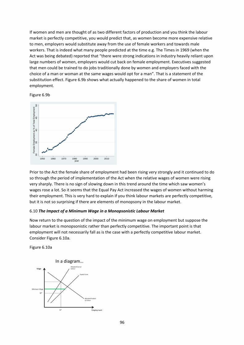
96
If women and men are thought of as two different factors of production and you think the labour
market is perfectly competitive, you would predict that, as women become more expensive relative
to men, employers would substitute away from the use of female workers and towards male
workers. That is indeed what many people predicted at the time e.g. The Times in 1969 (when the
Act was being debated) reported that “there were strong indications in industry heavily reliant upon
large numbers of women, employers would cut back on female employment. Executives suggested
that men could be trained to do jobs traditionally done by women and employers faced with the
choice of a man or woman at the same wages would opt for a man”. That is a statement of the
substitution effect. Figure 6.9b shows what actually happened to the share of women in total
employment.
Figure 6.9b
Prior to the Act the female share of employment had been rising very strongly and it continued to do
so through the period of implementation of the Act when the relative wages of women were rising
very sharply. There is no sign of slowing down in this trend around the time which saw women’s
wages rose a lot. So it seems that the Equal Pay Act increased the wages of women without harming
their employment. This is very hard to explain if you think labour markets are perfectly competitive,
but it is not so surprising if there are elements of monopsony in the labour market.
6.10 The Impact of a Minimum Wage in a Monopsonistic Labour Market
Now return to the question of the impact of the minimum wage on employment but suppose the
labour market is monopsonistic rather than perfectly competitive. The important point is that
employment will not necessarily fall as is the case with a perfectly competitive labour market.
Consider Figure 6.10a.
Figure 6.10a
30
35
40
45
50
Fem
ale
Em
plo
ymen
t as
% o
f Tot
al E
mpl
oym
ent
1950 1960 1970 1980 1990 2000 2010year
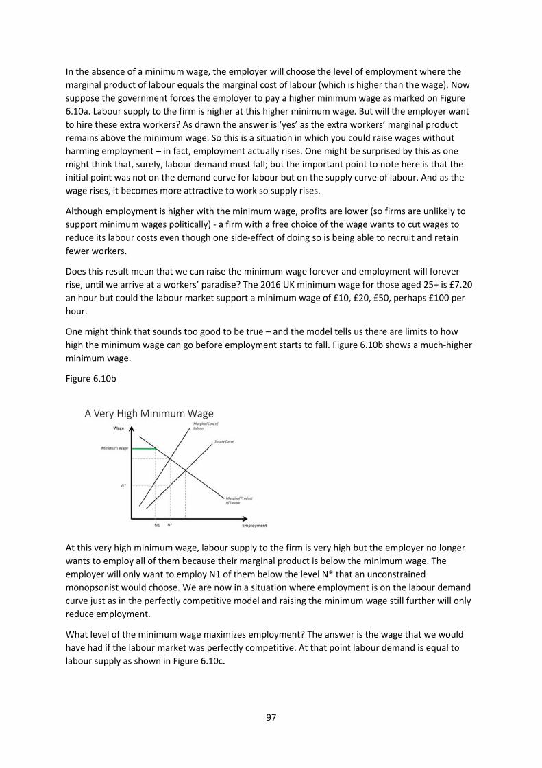
97
In the absence of a minimum wage, the employer will choose the level of employment where the
marginal product of labour equals the marginal cost of labour (which is higher than the wage). Now
suppose the government forces the employer to pay a higher minimum wage as marked on Figure
6.10a. Labour supply to the firm is higher at this higher minimum wage. But will the employer want
to hire these extra workers? As drawn the answer is ‘yes’ as the extra workers’ marginal product
remains above the minimum wage. So this is a situation in which you could raise wages without
harming employment – in fact, employment actually rises. One might be surprised by this as one
might think that, surely, labour demand must fall; but the important point to note here is that the
initial point was not on the demand curve for labour but on the supply curve of labour. And as the
wage rises, it becomes more attractive to work so supply rises.
Although employment is higher with the minimum wage, profits are lower (so firms are unlikely to
support minimum wages politically) ‐ a firm with a free choice of the wage wants to cut wages to
reduce its labour costs even though one side‐effect of doing so is being able to recruit and retain
fewer workers.
Does this result mean that we can raise the minimum wage forever and employment will forever
rise, until we arrive at a workers’ paradise? The 2016 UK minimum wage for those aged 25+ is £7.20
an hour but could the labour market support a minimum wage of £10, £20, £50, perhaps £100 per
hour.
One might think that sounds too good to be true – and the model tells us there are limits to how
high the minimum wage can go before employment starts to fall. Figure 6.10b shows a much‐higher
minimum wage.
Figure 6.10b
At this very high minimum wage, labour supply to the firm is very high but the employer no longer
wants to employ all of them because their marginal product is below the minimum wage. The
employer will only want to employ N1 of them below the level N* that an unconstrained
monopsonist would choose. We are now in a situation where employment is on the labour demand
curve just as in the perfectly competitive model and raising the minimum wage still further will only
reduce employment.
What level of the minimum wage maximizes employment? The answer is the wage that we would
have had if the labour market was perfectly competitive. At that point labour demand is equal to
labour supply as shown in Figure 6.10c.

98
Figure 6.10c
If the minimum wage rises labour demand is less than labour supply and employment lower. If the
minimum wage falls, labour supply is less than labour demand and employment again lower.
What this model suggests is that it is possible for there to be some range over which you get a win‐
win of higher wages for low‐paid workers without harming their employment prospects. But there
are limits.
We have discussed two models of the labour market with different implications about the
employment effects of minimum wages. Which is correct? This is a very active research area at the
moment because minimum wages seem to be rising in many jurisdictions. e.g. the UK government
introduced the National Living Wage in April 2016, a higher minimum wage for the over 25s,
Germany introduced a National Minimum Wage in 2015. There is the ‘living wage’ movement that
argues minimum wages should be set not based on what the labour market can bear and at the level
that delivers what is deemed an acceptable standard of living.
In the US the federal minimum has not risen for a decade (though states and increasingly cities have
raised their own minimum wages) and there is the ‘fight for $15’. Seattle was an early adopter of a
$15 minimum wage and a study of the impacts has been controversial e.g. see this
http://fortune.com/2017/06/27/seattle‐minimum‐wage‐study‐results‐impact‐15‐dollar‐uw/ for a
criticism of it and this for praise of it
https://www.washingtonpost.com/news/wonk/wp/2017/06/26/new‐study‐casts‐doubt‐on‐
whether‐a‐15‐minimum‐wage‐really‐helps‐workers/?utm_term=.234e04ec6cd5. Expect more
articles along these lines in the future.
The comparative statics done so far have been about changes to input prices. But we can also use
our framework to do comparative statics on changes in the production function, changes that affect
the MPL.
6.11 The Impact of New Technology on the Demand for Labour
Technological change and innovation increase the amount of output that can be produced from the
same amount of capital and labour so represent a change in the production function. The impact of
these changes are important to consider because technological change is the source of productivity
growth which has been a characteristic of economic development ever since the start of the
industrial revolution (recall ‘the hockey stick of history’ from the introduction).
Most economists (rightly, I believe) think that this increase in productivity is the basis for the
increase in our material living standards. But many people believe that technological change is bad

99
for workers. There is a long history of such concerns. For example, In 1589 William Lee invented the
stocking frame but Elizabeth I would not give him a patent. "Thou aimest high, Master Lee. Consider
thou what the invention could do to my poor subjects. It would assuredly bring to them ruin by
depriving them of employment, thus making them beggars."
We are living through a period when those concerns have come to the fore again, this time in the
form of concern about ‘robots’, driverless cars etc. prompted in part by stagnant, even declining
wages, in many countries. Consider this description of a book from 2014; “In ‘Rise of the Robots’,
technology expert Martin Ford systematically outlines the achievements of artificial intelligence and
uses a wealth of economic data to illustrate the terrifying societal implications.”
But, to date, while technical progress does often reduce the demand for labour for particular sorts of
workers, overall it has almost certainly raised the demand for labour as a whole.
I will try to explain this through the example of the original Luddites. Making textiles requires
spinning the thread and then weaving it into cloth. Before the Industrial Revolution, cloth was
woven on handlooms, by skilled weavers typically in their own cottage. But in 1785 Cartwright
invented the power loom, powered by steam. This raised productivity very dramatically but required
production in factories and also reduced the level of skill required. Weavers on the new power
looms could now produce much more than they did before, and one of the consequences of this was
that the price of textiles fell dramatically. This reduced the marginal revenue product of handloom
weavers and, as a result, their earnings. As a result of the invention of the power loom, the living
standards of the handloom weavers fell quite dramatically. Understandably, they were not very
happy about this and in 1811 some of them responded by smashing the power looms that they saw
(correctly) as destroying the demand for their labour – these people came to be known as Luddites
after Ned Ludd one of the earliest loom‐bashers. We still use the phrase Luddite today to refer to
someone who is hostile to new technology.
The general conclusion is that if you have a very specific skill and a new invention means that a
machine can now do that job better and more cheaply than you, then the demand for your labour
will fall and you will be likely to be worse off. These losers from technical change are often very
visible and very vocal so often focus on the impact of new technology on this group as the only
effect.
But there are also likely to be gainers – who will they be? The invention of the power loom caused
the price of cloth and clothing to fall. This makes all consumers of clothing better‐off, including
workers in other jobs whose wages do not change. But, more than this, if consumers buy the same
amount of clothing as before, they have some extra money left over. They will spend that extra
income on lots of other products, increasing the demand for workers to produce those products.
These workers are the gainers from new technologies but they are very diffused and often invisible.
It sounds absurd to claim that we have more hairdressers today as a result of the invention of the
power loom and other inventions but that is almost certainly the case.
So technological change is very likely to have both winners and losers. But are there more winners
than losers or the other way round? Think about an aggregate demand for labour as drawn in Figure
6.11a. The solid line is the old demand for labour before new technology. Now suppose there is a
new technology which shifts the demand for labour, either up or down to one of the new dotted
lines.
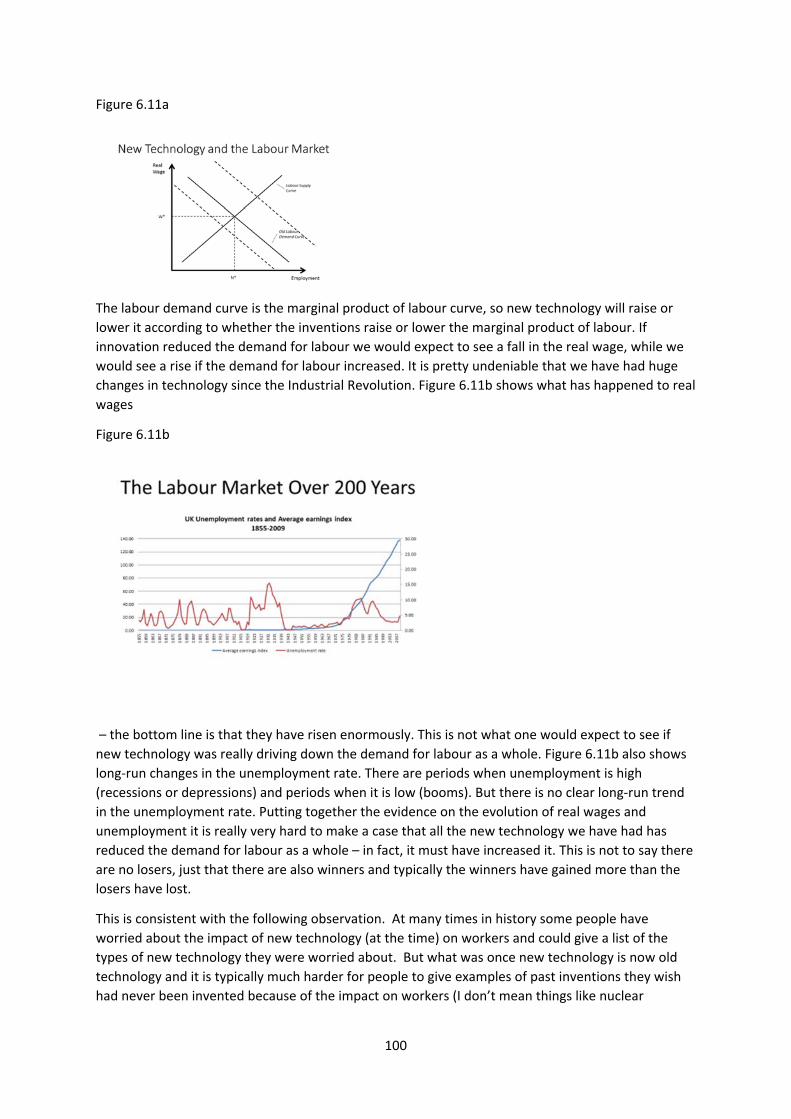
100
Figure 6.11a
The labour demand curve is the marginal product of labour curve, so new technology will raise or
lower it according to whether the inventions raise or lower the marginal product of labour. If
innovation reduced the demand for labour we would expect to see a fall in the real wage, while we
would see a rise if the demand for labour increased. It is pretty undeniable that we have had huge
changes in technology since the Industrial Revolution. Figure 6.11b shows what has happened to real
wages
Figure 6.11b
– the bottom line is that they have risen enormously. This is not what one would expect to see if
new technology was really driving down the demand for labour as a whole. Figure 6.11b also shows
long‐run changes in the unemployment rate. There are periods when unemployment is high
(recessions or depressions) and periods when it is low (booms). But there is no clear long‐run trend
in the unemployment rate. Putting together the evidence on the evolution of real wages and
unemployment it is really very hard to make a case that all the new technology we have had has
reduced the demand for labour as a whole – in fact, it must have increased it. This is not to say there
are no losers, just that there are also winners and typically the winners have gained more than the
losers have lost.
This is consistent with the following observation. At many times in history some people have
worried about the impact of new technology (at the time) on workers and could give a list of the
types of new technology they were worried about. But what was once new technology is now old
technology and it is typically much harder for people to give examples of past inventions they wish
had never been invented because of the impact on workers (I don’t mean things like nuclear
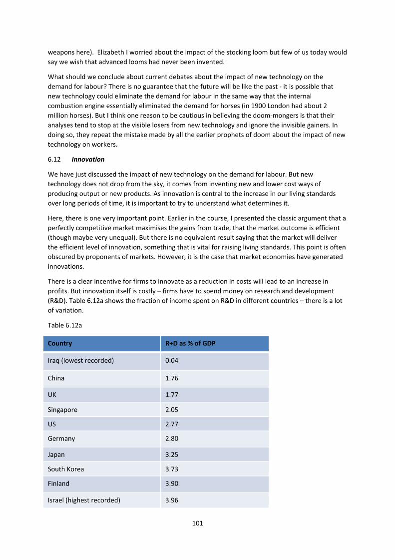
101
weapons here). Elizabeth I worried about the impact of the stocking loom but few of us today would
say we wish that advanced looms had never been invented.
What should we conclude about current debates about the impact of new technology on the
demand for labour? There is no guarantee that the future will be like the past ‐ it is possible that
new technology could eliminate the demand for labour in the same way that the internal
combustion engine essentially eliminated the demand for horses (in 1900 London had about 2
million horses). But I think one reason to be cautious in believing the doom‐mongers is that their
analyses tend to stop at the visible losers from new technology and ignore the invisible gainers. In
doing so, they repeat the mistake made by all the earlier prophets of doom about the impact of new
technology on workers.
6.12 Innovation
We have just discussed the impact of new technology on the demand for labour. But new
technology does not drop from the sky, it comes from inventing new and lower cost ways of
producing output or new products. As innovation is central to the increase in our living standards
over long periods of time, it is important to try to understand what determines it.
Here, there is one very important point. Earlier in the course, I presented the classic argument that a
perfectly competitive market maximises the gains from trade, that the market outcome is efficient
(though maybe very unequal). But there is no equivalent result saying that the market will deliver
the efficient level of innovation, something that is vital for raising living standards. This point is often
obscured by proponents of markets. However, it is the case that market economies have generated
innovations.
There is a clear incentive for firms to innovate as a reduction in costs will lead to an increase in
profits. But innovation itself is costly – firms have to spend money on research and development
(R&D). Table 6.12a shows the fraction of income spent on R&D in different countries – there is a lot
of variation.
Table 6.12a
Country R+D as % of GDP
Iraq (lowest recorded) 0.04
China 1.76
UK 1.77
Singapore 2.05
US 2.77
Germany 2.80
Japan 3.25
South Korea 3.73
Finland 3.90
Israel (highest recorded) 3.96
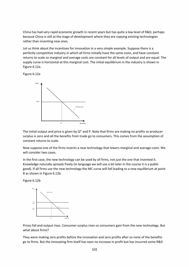
102
China has had very rapid economic growth in recent years but has quite a low level of R&D, perhaps
because China is still at the stage of development where they are copying existing technologies
rather than inventing new ones.
Let us think about the incentives for innovation in a very simple example. Suppose there is a
perfectly competitive industry in which all firms initially have the same costs, and have constant
returns to scale so marginal and average costs are constant for all levels of output and are equal. The
supply curve is horizontal at this marginal cost. The initial equilibrium in the industry is shown in
Figure 6.12a.
Figure 6.12a
The initial output and price is given by Q* and P. Note that firms are making no profits so producer
surplus is zero and all the benefits from trade go to consumers. This comes from the assumption of
constant returns to scale.
Now suppose one of the firms invents a new technology that lowers marginal and average costs. We
will consider two cases.
In the first case, the new technology can be used by all firms, not just the one that invented it.
Knowledge naturally spreads freely (in language we will use a bit later in the course it is a public
good). If all firms use the new technology the MC curve will fall leading to a new equilibrium at point
B as shown in Figure 6.12b.
Figure 6.12b
Prices fall and output rises. Consumer surplus rises so consumers gain from the new technology. But
what about firms?
They were making zero profits before the innovation and zero profits after so none of the benefits
go to firms. But the innovating firm itself has seen no increase in profit but has incurred some R&D
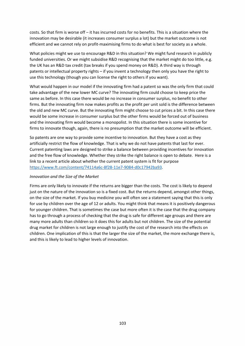
103
costs. So that firm is worse off – it has incurred costs for no benefits. This is a situation where the
innovation may be desirable (it increases consumer surplus a lot) but the market outcome is not
efficient and we cannot rely on profit‐maximising firms to do what is best for society as a whole.
What policies might we use to encourage R&D in this situation? We might fund research in publicly
funded universities. Or we might subsidise R&D recognising that the market might do too little, e.g.
the UK has an R&D tax credit (tax breaks if you spend money on R&D). A third way is through
patents or intellectual property rights – if you invent a technology then only you have the right to
use this technology (though you can license the right to others if you want).
What would happen in our model if the innovating firm had a patent so was the only firm that could
take advantage of the new lower MC curve? The innovating firm could choose to keep price the
same as before. In this case there would be no increase in consumer surplus, no benefit to other
firms. But the innovating firm now makes profits as the profit per unit sold is the difference between
the old and new MC curve. But the innovating firm might choose to cut prices a bit. In this case there
would be some increase in consumer surplus but the other firms would be forced out of business
and the innovating firm would become a monopolist. In this situation there is some incentive for
firms to innovate though, again, there is no presumption that the market outcome will be efficient.
So patents are one way to provide some incentive to innovation. But they have a cost as they
artificially restrict the flow of knowledge. That is why we do not have patents that last for ever.
Current patenting laws are designed to strike a balance between providing incentives for innovation
and the free flow of knowledge. Whether they strike the right balance is open to debate. Here is a
link to a recent article about whether the current patent system is fit for purpose
https://www.ft.com/content/74114a6c‐8f28‐11e7‐9084‐d0c17942ba93.
Innovation and the Size of the Market
Firms are only likely to innovate if the returns are bigger than the costs. The cost is likely to depend
just on the nature of the innovation so is a fixed cost. But the returns depend, amongst other things,
on the size of the market. If you buy medicine you will often see a statement saying that this is only
for use by children over the age of 12 or adults. You might think that means it is positively dangerous
for younger children. That is sometimes the case but more often it is the case that the drug company
has to go through a process of checking that the drug is safe for different age groups and there are
many more adults than children so it does this for adults but not children. The size of the potential
drug market for children is not large enough to justify the cost of the research into the effects on
children. One implication of this is that the larger the size of the market, the more exchange there is,
and this is likely to lead to higher levels of innovation.
104
Key Concepts for Chapter 6
Production function
Average product and marginal product
Marginal physical product and marginal revenue product
Cost of capital
Isoquants
Substitutes and complements
Marginal rate of transformation
Iso‐cost curves
Comparative statics: the effect of change in input prices on factor demands
Scale effect
Monopsony
Incentives for innovation
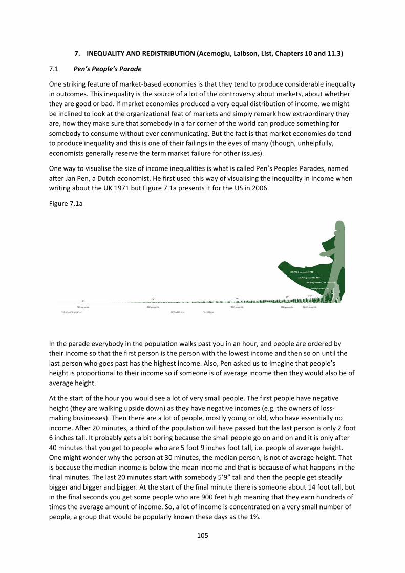
105
7. INEQUALITY AND REDISTRIBUTION (Acemoglu, Laibson, List, Chapters 10 and 11.3)
7.1 Pen’s People’s Parade
One striking feature of market‐based economies is that they tend to produce considerable inequality
in outcomes. This inequality is the source of a lot of the controversy about markets, about whether
they are good or bad. If market economies produced a very equal distribution of income, we might
be inclined to look at the organizational feat of markets and simply remark how extraordinary they
are, how they make sure that somebody in a far corner of the world can produce something for
somebody to consume without ever communicating. But the fact is that market economies do tend
to produce inequality and this is one of their failings in the eyes of many (though, unhelpfully,
economists generally reserve the term market failure for other issues).
One way to visualise the size of income inequalities is what is called Pen’s Peoples Parades, named
after Jan Pen, a Dutch economist. He first used this way of visualising the inequality in income when
writing about the UK 1971 but Figure 7.1a presents it for the US in 2006.
Figure 7.1a
In the parade everybody in the population walks past you in an hour, and people are ordered by
their income so that the first person is the person with the lowest income and then so on until the
last person who goes past has the highest income. Also, Pen asked us to imagine that people’s
height is proportional to their income so if someone is of average income then they would also be of
average height.
At the start of the hour you would see a lot of very small people. The first people have negative
height (they are walking upside down) as they have negative incomes (e.g. the owners of loss‐
making businesses). Then there are a lot of people, mostly young or old, who have essentially no
income. After 20 minutes, a third of the population will have passed but the last person is only 2 foot
6 inches tall. It probably gets a bit boring because the small people go on and on and it is only after
40 minutes that you get to people who are 5 foot 9 inches foot tall, i.e. people of average height.
One might wonder why the person at 30 minutes, the median person, is not of average height. That
is because the median income is below the mean income and that is because of what happens in the
final minutes. The last 20 minutes start with somebody 5’9” tall and then the people get steadily
bigger and bigger and bigger. At the start of the final minute there is someone about 14 foot tall, but
in the final seconds you get some people who are 900 feet high meaning that they earn hundreds of
times the average amount of income. So, a lot of income is concentrated on a very small number of
people, a group that would be popularly known these days as the 1%.
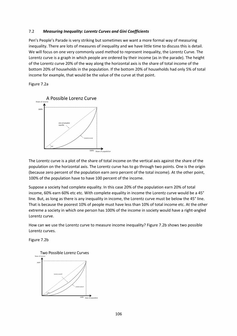
106
7.2 Measuring Inequality: Lorentz Curves and Gini Coefficients
Pen’s People’s Parade is very striking but sometimes we want a more formal way of measuring
inequality. There are lots of measures of inequality and we have little time to discuss this is detail.
We will focus on one very commonly used method to represent inequality, the Lorentz Curve. The
Lorentz curve is a graph in which people are ordered by their income (as in the parade). The height
of the Lorentz curve 20% of the way along the horizontal axis is the share of total income of the
bottom 20% of households in the population. If the bottom 20% of households had only 5% of total
income for example, that would be the value of the curve at that point.
Figure 7.2a
The Lorentz curve is a plot of the share of total income on the vertical axis against the share of the
population on the horizontal axis. The Lorentz curve has to go through two points. One is the origin
(because zero percent of the population earn zero percent of the total income). At the other point,
100% of the population have to have 100 percent of the income.
Suppose a society had complete equality. In this case 20% of the population earn 20% of total
income, 60% earn 60% etc etc. With complete equality in income the Lorentz curve would be a 45°
line. But, as long as there is any inequality in income, the Lorentz curve must be below the 45° line.
That is because the poorest 10% of people must have less than 10% of total income etc. At the other
extreme a society in which one person has 100% of the income in society would have a right‐angled
Lorentz curve.
How can we use the Lorentz curve to measure income inequality? Figure 7.2b shows two possible
Lorentz curves.
Figure 7.2b
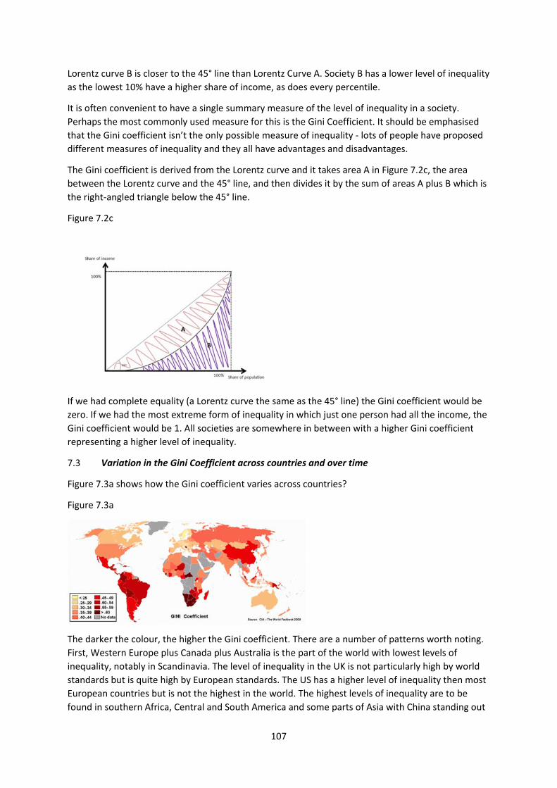
107
Lorentz curve B is closer to the 45° line than Lorentz Curve A. Society B has a lower level of inequality
as the lowest 10% have a higher share of income, as does every percentile.
It is often convenient to have a single summary measure of the level of inequality in a society.
Perhaps the most commonly used measure for this is the Gini Coefficient. It should be emphasised
that the Gini coefficient isn’t the only possible measure of inequality ‐ lots of people have proposed
different measures of inequality and they all have advantages and disadvantages.
The Gini coefficient is derived from the Lorentz curve and it takes area A in Figure 7.2c, the area
between the Lorentz curve and the 45° line, and then divides it by the sum of areas A plus B which is
the right‐angled triangle below the 45° line.
Figure 7.2c
If we had complete equality (a Lorentz curve the same as the 45° line) the Gini coefficient would be
zero. If we had the most extreme form of inequality in which just one person had all the income, the
Gini coefficient would be 1. All societies are somewhere in between with a higher Gini coefficient
representing a higher level of inequality.
7.3 Variation in the Gini Coefficient across countries and over time
Figure 7.3a shows how the Gini coefficient varies across countries?
Figure 7.3a
The darker the colour, the higher the Gini coefficient. There are a number of patterns worth noting.
First, Western Europe plus Canada plus Australia is the part of the world with lowest levels of
inequality, notably in Scandinavia. The level of inequality in the UK is not particularly high by world
standards but is quite high by European standards. The US has a higher level of inequality then most
European countries but is not the highest in the world. The highest levels of inequality are to be
found in southern Africa, Central and South America and some parts of Asia with China standing out
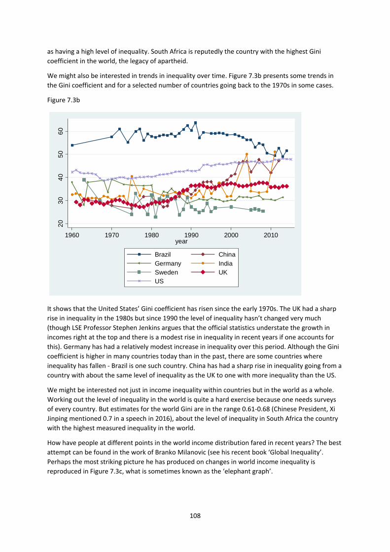
108
as having a high level of inequality. South Africa is reputedly the country with the highest Gini
coefficient in the world, the legacy of apartheid.
We might also be interested in trends in inequality over time. Figure 7.3b presents some trends in
the Gini coefficient and for a selected number of countries going back to the 1970s in some cases.
Figure 7.3b
It shows that the United States’ Gini coefficient has risen since the early 1970s. The UK had a sharp
rise in inequality in the 1980s but since 1990 the level of inequality hasn’t changed very much
(though LSE Professor Stephen Jenkins argues that the official statistics understate the growth in
incomes right at the top and there is a modest rise in inequality in recent years if one accounts for
this). Germany has had a relatively modest increase in inequality over this period. Although the Gini
coefficient is higher in many countries today than in the past, there are some countries where
inequality has fallen ‐ Brazil is one such country. China has had a sharp rise in inequality going from a
country with about the same level of inequality as the UK to one with more inequality than the US.
We might be interested not just in income inequality within countries but in the world as a whole.
Working out the level of inequality in the world is quite a hard exercise because one needs surveys
of every country. But estimates for the world Gini are in the range 0.61‐0.68 (Chinese President, Xi
Jinping mentioned 0.7 in a speech in 2016), about the level of inequality in South Africa the country
with the highest measured inequality in the world.
How have people at different points in the world income distribution fared in recent years? The best
attempt can be found in the work of Branko Milanovic (see his recent book ‘Global Inequality’.
Perhaps the most striking picture he has produced on changes in world income inequality is
reproduced in Figure 7.3c, what is sometimes known as the ‘elephant graph’.
20
30
40
50
60
1960 1970 1980 1990 2000 2010year
Brazil China
Germany IndiaSweden UKUS
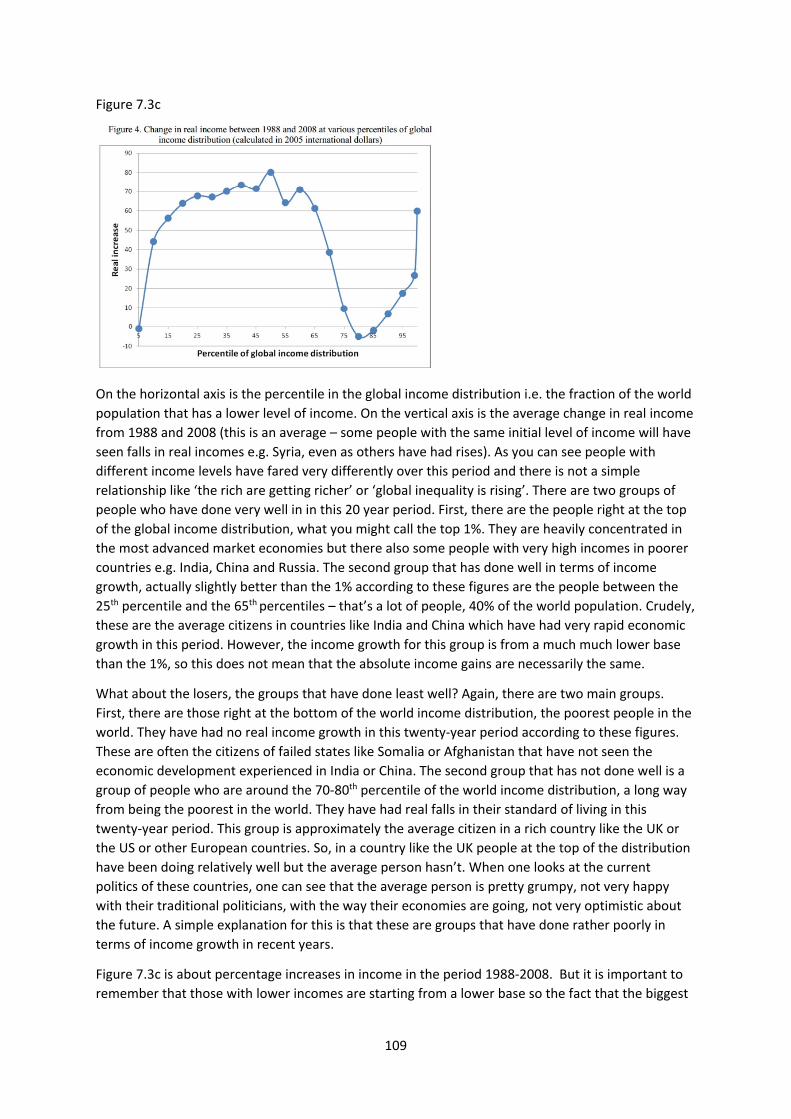
109
Figure 7.3c
On the horizontal axis is the percentile in the global income distribution i.e. the fraction of the world
population that has a lower level of income. On the vertical axis is the average change in real income
from 1988 and 2008 (this is an average – some people with the same initial level of income will have
seen falls in real incomes e.g. Syria, even as others have had rises). As you can see people with
different income levels have fared very differently over this period and there is not a simple
relationship like ‘the rich are getting richer’ or ‘global inequality is rising’. There are two groups of
people who have done very well in in this 20 year period. First, there are the people right at the top
of the global income distribution, what you might call the top 1%. They are heavily concentrated in
the most advanced market economies but there also some people with very high incomes in poorer
countries e.g. India, China and Russia. The second group that has done well in terms of income
growth, actually slightly better than the 1% according to these figures are the people between the
25th percentile and the 65th percentiles – that’s a lot of people, 40% of the world population. Crudely,
these are the average citizens in countries like India and China which have had very rapid economic
growth in this period. However, the income growth for this group is from a much much lower base
than the 1%, so this does not mean that the absolute income gains are necessarily the same.
What about the losers, the groups that have done least well? Again, there are two main groups.
First, there are those right at the bottom of the world income distribution, the poorest people in the
world. They have had no real income growth in this twenty‐year period according to these figures.
These are often the citizens of failed states like Somalia or Afghanistan that have not seen the
economic development experienced in India or China. The second group that has not done well is a
group of people who are around the 70‐80th percentile of the world income distribution, a long way
from being the poorest in the world. They have had real falls in their standard of living in this
twenty‐year period. This group is approximately the average citizen in a rich country like the UK or
the US or other European countries. So, in a country like the UK people at the top of the distribution
have been doing relatively well but the average person hasn’t. When one looks at the current
politics of these countries, one can see that the average person is pretty grumpy, not very happy
with their traditional politicians, with the way their economies are going, not very optimistic about
the future. A simple explanation for this is that these are groups that have done rather poorly in
terms of income growth in recent years.
Figure 7.3c is about percentage increases in income in the period 1988‐2008. But it is important to
remember that those with lower incomes are starting from a lower base so the fact that the biggest
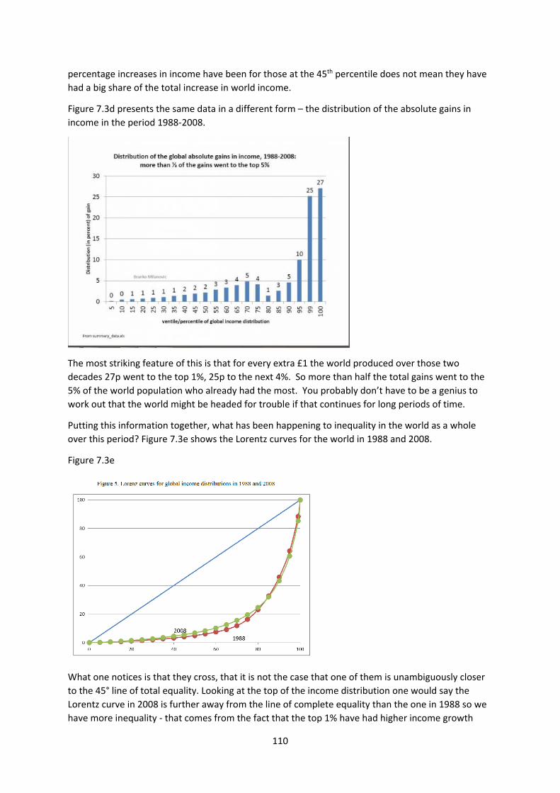
110
percentage increases in income have been for those at the 45th percentile does not mean they have
had a big share of the total increase in world income.
Figure 7.3d presents the same data in a different form – the distribution of the absolute gains in
income in the period 1988‐2008.
The most striking feature of this is that for every extra £1 the world produced over those two
decades 27p went to the top 1%, 25p to the next 4%. So more than half the total gains went to the
5% of the world population who already had the most. You probably don’t have to be a genius to
work out that the world might be headed for trouble if that continues for long periods of time.
Putting this information together, what has been happening to inequality in the world as a whole
over this period? Figure 7.3e shows the Lorentz curves for the world in 1988 and 2008.
Figure 7.3e
What one notices is that they cross, that it is not the case that one of them is unambiguously closer
to the 45° line of total equality. Looking at the top of the income distribution one would say the
Lorentz curve in 2008 is further away from the line of complete equality than the one in 1988 so we
have more inequality ‐ that comes from the fact that the top 1% have had higher income growth
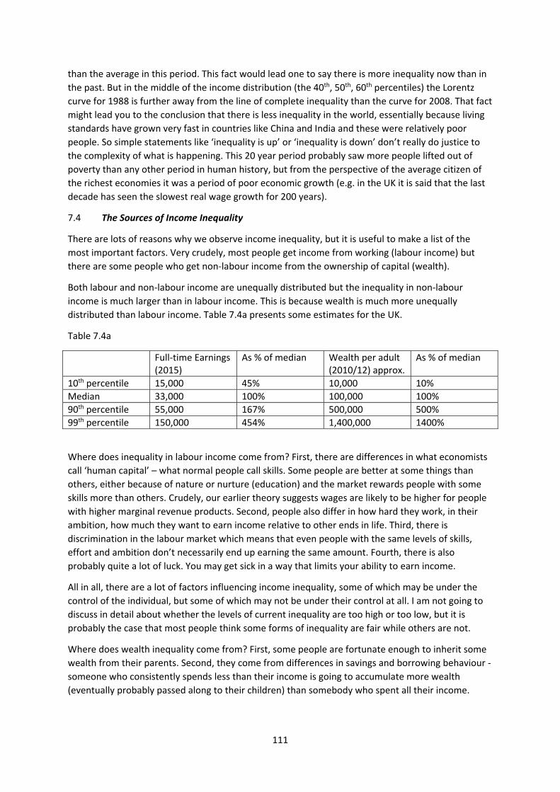
111
than the average in this period. This fact would lead one to say there is more inequality now than in
the past. But in the middle of the income distribution (the 40th, 50th, 60th percentiles) the Lorentz
curve for 1988 is further away from the line of complete inequality than the curve for 2008. That fact
might lead you to the conclusion that there is less inequality in the world, essentially because living
standards have grown very fast in countries like China and India and these were relatively poor
people. So simple statements like ‘inequality is up’ or ‘inequality is down’ don’t really do justice to
the complexity of what is happening. This 20 year period probably saw more people lifted out of
poverty than any other period in human history, but from the perspective of the average citizen of
the richest economies it was a period of poor economic growth (e.g. in the UK it is said that the last
decade has seen the slowest real wage growth for 200 years).
7.4 The Sources of Income Inequality
There are lots of reasons why we observe income inequality, but it is useful to make a list of the
most important factors. Very crudely, most people get income from working (labour income) but
there are some people who get non‐labour income from the ownership of capital (wealth).
Both labour and non‐labour income are unequally distributed but the inequality in non‐labour
income is much larger than in labour income. This is because wealth is much more unequally
distributed than labour income. Table 7.4a presents some estimates for the UK.
Table 7.4a
Full‐time Earnings (2015)
As % of median Wealth per adult (2010/12) approx.
As % of median
10th percentile 15,000 45% 10,000 10%
Median 33,000 100% 100,000 100%
90th percentile 55,000 167% 500,000 500%
99th percentile 150,000 454% 1,400,000 1400%
Where does inequality in labour income come from? First, there are differences in what economists
call ‘human capital’ – what normal people call skills. Some people are better at some things than
others, either because of nature or nurture (education) and the market rewards people with some
skills more than others. Crudely, our earlier theory suggests wages are likely to be higher for people
with higher marginal revenue products. Second, people also differ in how hard they work, in their
ambition, how much they want to earn income relative to other ends in life. Third, there is
discrimination in the labour market which means that even people with the same levels of skills,
effort and ambition don’t necessarily end up earning the same amount. Fourth, there is also
probably quite a lot of luck. You may get sick in a way that limits your ability to earn income.
All in all, there are a lot of factors influencing income inequality, some of which may be under the
control of the individual, but some of which may not be under their control at all. I am not going to
discuss in detail about whether the levels of current inequality are too high or too low, but it is
probably the case that most people think some forms of inequality are fair while others are not.
Where does wealth inequality come from? First, some people are fortunate enough to inherit some
wealth from their parents. Second, they come from differences in savings and borrowing behaviour ‐
someone who consistently spends less than their income is going to accumulate more wealth
(eventually probably passed along to their children) than somebody who spent all their income.
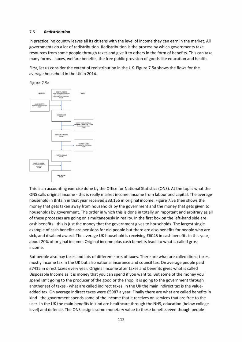
112
7.5 Redistribution
In practice, no country leaves all its citizens with the level of income they can earn in the market. All
governments do a lot of redistribution. Redistribution is the process by which governments take
resources from some people through taxes and give it to others in the form of benefits. This can take
many forms – taxes, welfare benefits, the free public provision of goods like education and health.
First, let us consider the extent of redistribution in the UK. Figure 7.5a shows the flows for the
average household in the UK in 2014.
Figure 7.5a
This is an accounting exercise done by the Office for National Statistics (ONS). At the top is what the
ONS calls original income ‐ this is really market income: income from labour and capital. The average
household in Britain in that year received £33,155 in original income. Figure 7.5a then shows the
money that gets taken away from households by the government and the money that gets given to
households by government. The order in which this is done in totally unimportant and arbitrary as all
of these processes are going on simultaneously in reality. In the first box on the left‐hand side are
cash benefits ‐ this is just the money that the government gives to households. The largest single
example of cash benefits are pensions for old people but there are also benefits for people who are
sick, and disabled award. The average UK household is receiving £6045 in cash benefits in this year,
about 20% of original income. Original income plus cash benefits leads to what is called gross
income.
But people also pay taxes and lots of different sorts of taxes. There are what are called direct taxes,
mostly income tax in the UK but also national insurance and council tax. On average people paid
£7415 in direct taxes every year. Original income after taxes and benefits gives what is called
Disposable Income as it is money that you can spend if you want to. But some of the money you
spend isn’t going to the producer of the good or the shop, it is going to the government through
another set of taxes ‐ what are called indirect taxes. In the UK the main indirect tax is the value‐
added tax. On average indirect taxes were £5987 a year. Finally there are what are called benefits in
kind ‐ the government spends some of the income that it receives on services that are free to the
user. In the UK the main benefits in kind are healthcare through the NHS, education (below college
level) and defence. The ONS assigns some monetary value to these benefits even though people
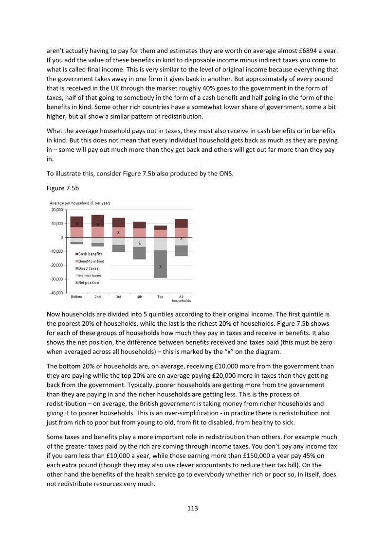
113
aren’t actually having to pay for them and estimates they are worth on average almost £6894 a year.
If you add the value of these benefits in kind to disposable income minus indirect taxes you come to
what is called final income. This is very similar to the level of original income because everything that
the government takes away in one form it gives back in another. But approximately of every pound
that is received in the UK through the market roughly 40% goes to the government in the form of
taxes, half of that going to somebody in the form of a cash benefit and half going in the form of the
benefits in kind. Some other rich countries have a somewhat lower share of government, some a bit
higher, but all show a similar pattern of redistribution.
What the average household pays out in taxes, they must also receive in cash benefits or in benefits
in kind. But this does not mean that every individual household gets back as much as they are paying
in – some will pay out much more than they get back and others will get out far more than they pay
in.
To illustrate this, consider Figure 7.5b also produced by the ONS.
Figure 7.5b
Now households are divided into 5 quintiles according to their original income. The first quintile is
the poorest 20% of households, while the last is the richest 20% of households. Figure 7.5b shows
for each of these groups of households how much they pay in taxes and receive in benefits. It also
shows the net position, the difference between benefits received and taxes paid (this must be zero
when averaged across all households) – this is marked by the “x” on the diagram.
The bottom 20% of households are, on average, receiving £10,000 more from the government than
they are paying while the top 20% are on average paying £20,000 more in taxes than they getting
back from the government. Typically, poorer households are getting more from the government
than they are paying in and the richer households are getting less. This is the process of
redistribution – on average, the British government is taking money from richer households and
giving it to poorer households. This is an over‐simplification ‐ in practice there is redistribution not
just from rich to poor but from young to old, from fit to disabled, from healthy to sick.
Some taxes and benefits play a more important role in redistribution than others. For example much
of the greater taxes paid by the rich are coming through income taxes. You don’t pay any income tax
if you earn less than £10,000 a year, while those earning more than £150,000 a year pay 45% on
each extra pound (though they may also use clever accountants to reduce their tax bill). On the
other hand the benefits of the health service go to everybody whether rich or poor so, in itself, does
not redistribute resources very much.
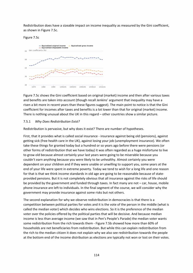
114
Redistribution does have a sizeable impact on income inequality as measured by the Gini coefficient,
as shown in Figure 7.5c.
Figure 7.5c
Figure 7.5c shows the Gini coefficient based on original (market) income and then after various taxes
and benefits are taken into account (though recall Jenkins’ argument that inequality may have a
risen a bit more in recent years than these figures suggest). The main point to notice is that the Gini
coefficient for incomes after taxes and benefits is a lot lower than that for original (market) income.
There is nothing unusual about the UK in this regard – other countries show a similar picture.
7.5.1 Why Does Redistribution Exist?
Redistribution is pervasive, but why does it exist? There are number of hypotheses.
First, that it provides what is called social insurance ‐ insurance against being old (pensions), against
getting sick (free health care in the UK), against losing your job (unemployment insurance). We often
take these things for granted today but a hundred or so years ago before there were pensions (or
other forms of redistribution that we have today) it was often regarded as a huge misfortune to live
to grow old because almost certainly your last years were going to be miserable because you
couldn’t earn anything because you were likely to be unhealthy. Almost certainly you were
dependent on your children and if they were unable or unwilling to support you, some years at the
end of your life were spent in extreme poverty. Today we tend to wish for a long life and one reason
for that is that we think income standards in old age are going to be reasonable because of state‐
provided pensions. But it is not completely obvious that all insurance against the risks of life should
be provided by the government and funded through taxes. In fact many are not – car, house, mobile
phone insurance are left to individuals. In the final segment of the course, we will consider why the
government may provide insurance against some risks but not others.
The second explanation for why we observe redistribution in democracies is that there is a
competition between political parties for votes and it is the vote of the person in the middle (what is
called the median voter) which decides who wins elections. So it is the preference of the median
voter over the policies offered by the political parties that will be decisive. And because median
income is less than average income (we saw that in Pen’s People’s Parade) the median voter wants
some redistribution from the rich towards them ‐ Figure 7.5b showed how more than 60% of
households are net beneficiaries from redistribution. But while this can explain redistribution from
the rich to the median citizen it does not explain why we also see redistribution towards the people
at the bottom end of the income distribution as elections are typically not won or lost on their votes.
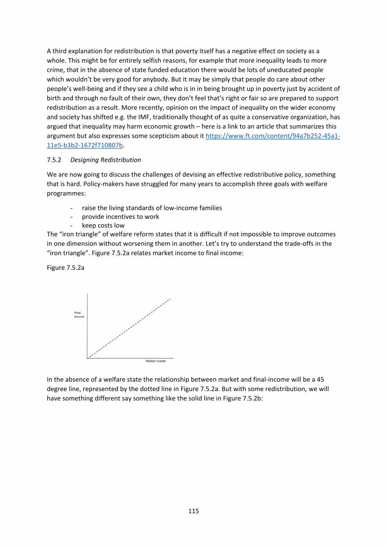
115
A third explanation for redistribution is that poverty itself has a negative effect on society as a
whole. This might be for entirely selfish reasons, for example that more inequality leads to more
crime, that in the absence of state funded education there would be lots of uneducated people
which wouldn’t be very good for anybody. But it may be simply that people do care about other
people’s well‐being and if they see a child who is in in being brought up in poverty just by accident of
birth and through no fault of their own, they don’t feel that’s right or fair so are prepared to support
redistribution as a result. More recently, opinion on the impact of inequality on the wider economy
and society has shifted e.g. the IMF, traditionally thought of as quite a conservative organization, has
argued that inequality may harm economic growth – here is a link to an article that summarizes this
argument but also expresses some scepticism about it https://www.ft.com/content/94a7b252‐45a1‐
11e5‐b3b2‐1672f710807b.
7.5.2 Designing Redistribution
We are now going to discuss the challenges of devising an effective redistributive policy, something
that is hard. Policy‐makers have struggled for many years to accomplish three goals with welfare
programmes:
- raise the living standards of low‐income families - provide incentives to work - keep costs low
The “iron triangle” of welfare reform states that it is difficult if not impossible to improve outcomes
in one dimension without worsening them in another. Let’s try to understand the trade‐offs in the
“iron triangle”. Figure 7.5.2a relates market income to final income:
Figure 7.5.2a
In the absence of a welfare state the relationship between market and final‐income will be a 45
degree line, represented by the dotted line in Figure 7.5.2a. But with some redistribution, we will
have something different say something like the solid line in Figure 7.5.2b:
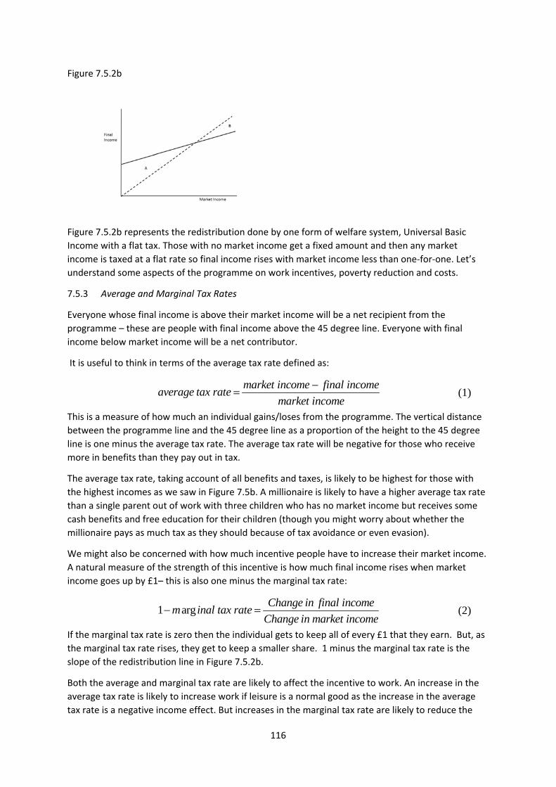
116
Figure 7.5.2b
Figure 7.5.2b represents the redistribution done by one form of welfare system, Universal Basic
Income with a flat tax. Those with no market income get a fixed amount and then any market
income is taxed at a flat rate so final income rises with market income less than one‐for‐one. Let’s
understand some aspects of the programme on work incentives, poverty reduction and costs.
7.5.3 Average and Marginal Tax Rates
Everyone whose final income is above their market income will be a net recipient from the
programme – these are people with final income above the 45 degree line. Everyone with final
income below market income will be a net contributor.
It is useful to think in terms of the average tax rate defined as:
(1)
This is a measure of how much an individual gains/loses from the programme. The vertical distance
between the programme line and the 45 degree line as a proportion of the height to the 45 degree
line is one minus the average tax rate. The average tax rate will be negative for those who receive
more in benefits than they pay out in tax.
The average tax rate, taking account of all benefits and taxes, is likely to be highest for those with
the highest incomes as we saw in Figure 7.5b. A millionaire is likely to have a higher average tax rate
than a single parent out of work with three children who has no market income but receives some
cash benefits and free education for their children (though you might worry about whether the
millionaire pays as much tax as they should because of tax avoidance or even evasion).
We might also be concerned with how much incentive people have to increase their market income.
A natural measure of the strength of this incentive is how much final income rises when market
income goes up by £1– this is also one minus the marginal tax rate:
(2)
If the marginal tax rate is zero then the individual gets to keep all of every £1 that they earn. But, as
the marginal tax rate rises, they get to keep a smaller share. 1 minus the marginal tax rate is the
slope of the redistribution line in Figure 7.5.2b.
Both the average and marginal tax rate are likely to affect the incentive to work. An increase in the
average tax rate is likely to increase work if leisure is a normal good as the increase in the average
tax rate is a negative income effect. But increases in the marginal tax rate are likely to reduce the
market income final incomeaverage tax rate
market income
1 argChange in final income
m inal tax rateChange in market income
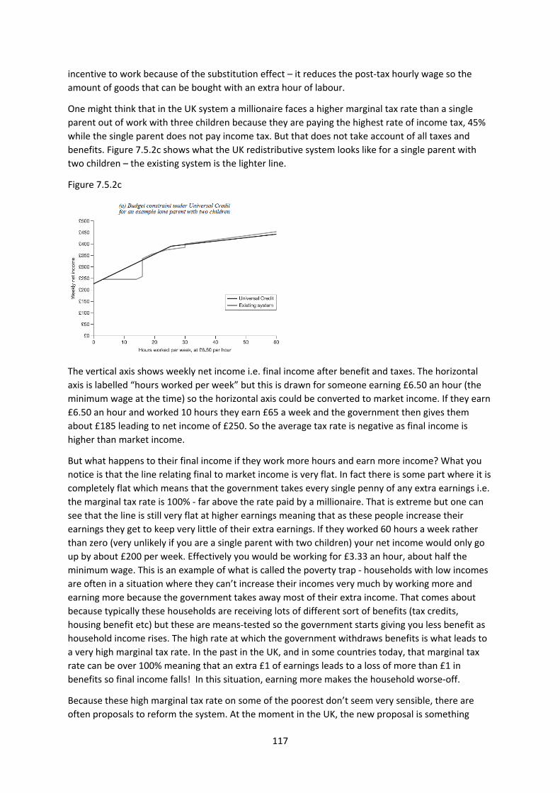
117
incentive to work because of the substitution effect – it reduces the post‐tax hourly wage so the
amount of goods that can be bought with an extra hour of labour.
One might think that in the UK system a millionaire faces a higher marginal tax rate than a single
parent out of work with three children because they are paying the highest rate of income tax, 45%
while the single parent does not pay income tax. But that does not take account of all taxes and
benefits. Figure 7.5.2c shows what the UK redistributive system looks like for a single parent with
two children – the existing system is the lighter line.
Figure 7.5.2c
The vertical axis shows weekly net income i.e. final income after benefit and taxes. The horizontal
axis is labelled “hours worked per week” but this is drawn for someone earning £6.50 an hour (the
minimum wage at the time) so the horizontal axis could be converted to market income. If they earn
£6.50 an hour and worked 10 hours they earn £65 a week and the government then gives them
about £185 leading to net income of £250. So the average tax rate is negative as final income is
higher than market income.
But what happens to their final income if they work more hours and earn more income? What you
notice is that the line relating final to market income is very flat. In fact there is some part where it is
completely flat which means that the government takes every single penny of any extra earnings i.e.
the marginal tax rate is 100% ‐ far above the rate paid by a millionaire. That is extreme but one can
see that the line is still very flat at higher earnings meaning that as these people increase their
earnings they get to keep very little of their extra earnings. If they worked 60 hours a week rather
than zero (very unlikely if you are a single parent with two children) your net income would only go
up by about £200 per week. Effectively you would be working for £3.33 an hour, about half the
minimum wage. This is an example of what is called the poverty trap ‐ households with low incomes
are often in a situation where they can’t increase their incomes very much by working more and
earning more because the government takes away most of their extra income. That comes about
because typically these households are receiving lots of different sort of benefits (tax credits,
housing benefit etc) but these are means‐tested so the government starts giving you less benefit as
household income rises. The high rate at which the government withdraws benefits is what leads to
a very high marginal tax rate. In the past in the UK, and in some countries today, that marginal tax
rate can be over 100% meaning that an extra £1 of earnings leads to a loss of more than £1 in
benefits so final income falls! In this situation, earning more makes the household worse‐off.
Because these high marginal tax rate on some of the poorest don’t seem very sensible, there are
often proposals to reform the system. At the moment in the UK, the new proposal is something
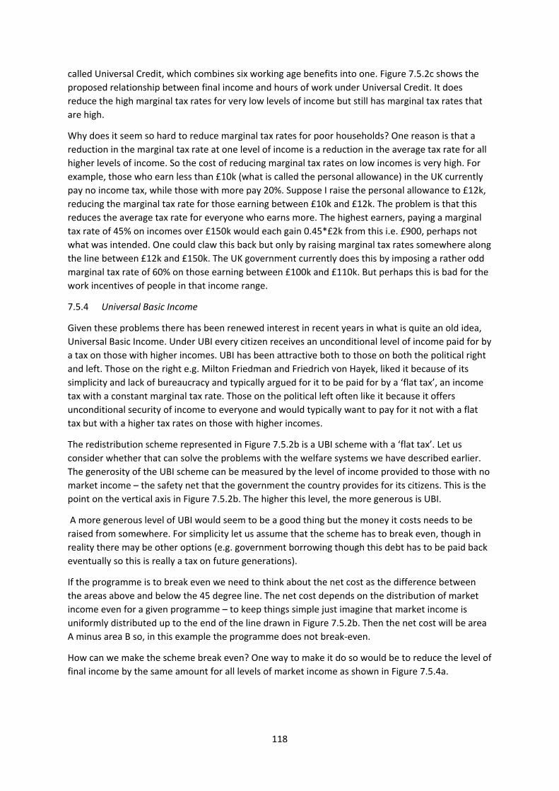
118
called Universal Credit, which combines six working age benefits into one. Figure 7.5.2c shows the
proposed relationship between final income and hours of work under Universal Credit. It does
reduce the high marginal tax rates for very low levels of income but still has marginal tax rates that
are high.
Why does it seem so hard to reduce marginal tax rates for poor households? One reason is that a
reduction in the marginal tax rate at one level of income is a reduction in the average tax rate for all
higher levels of income. So the cost of reducing marginal tax rates on low incomes is very high. For
example, those who earn less than £10k (what is called the personal allowance) in the UK currently
pay no income tax, while those with more pay 20%. Suppose I raise the personal allowance to £12k,
reducing the marginal tax rate for those earning between £10k and £12k. The problem is that this
reduces the average tax rate for everyone who earns more. The highest earners, paying a marginal
tax rate of 45% on incomes over £150k would each gain 0.45*£2k from this i.e. £900, perhaps not
what was intended. One could claw this back but only by raising marginal tax rates somewhere along
the line between £12k and £150k. The UK government currently does this by imposing a rather odd
marginal tax rate of 60% on those earning between £100k and £110k. But perhaps this is bad for the
work incentives of people in that income range.
7.5.4 Universal Basic Income
Given these problems there has been renewed interest in recent years in what is quite an old idea,
Universal Basic Income. Under UBI every citizen receives an unconditional level of income paid for by
a tax on those with higher incomes. UBI has been attractive both to those on both the political right
and left. Those on the right e.g. Milton Friedman and Friedrich von Hayek, liked it because of its
simplicity and lack of bureaucracy and typically argued for it to be paid for by a ‘flat tax’, an income
tax with a constant marginal tax rate. Those on the political left often like it because it offers
unconditional security of income to everyone and would typically want to pay for it not with a flat
tax but with a higher tax rates on those with higher incomes.
The redistribution scheme represented in Figure 7.5.2b is a UBI scheme with a ‘flat tax’. Let us
consider whether that can solve the problems with the welfare systems we have described earlier.
The generosity of the UBI scheme can be measured by the level of income provided to those with no
market income – the safety net that the government the country provides for its citizens. This is the
point on the vertical axis in Figure 7.5.2b. The higher this level, the more generous is UBI.
A more generous level of UBI would seem to be a good thing but the money it costs needs to be
raised from somewhere. For simplicity let us assume that the scheme has to break even, though in
reality there may be other options (e.g. government borrowing though this debt has to be paid back
eventually so this is really a tax on future generations).
If the programme is to break even we need to think about the net cost as the difference between
the areas above and below the 45 degree line. The net cost depends on the distribution of market
income even for a given programme – to keep things simple just imagine that market income is
uniformly distributed up to the end of the line drawn in Figure 7.5.2b. Then the net cost will be area
A minus area B so, in this example the programme does not break‐even.
How can we make the scheme break even? One way to make it do so would be to reduce the level of
final income by the same amount for all levels of market income as shown in Figure 7.5.4a.
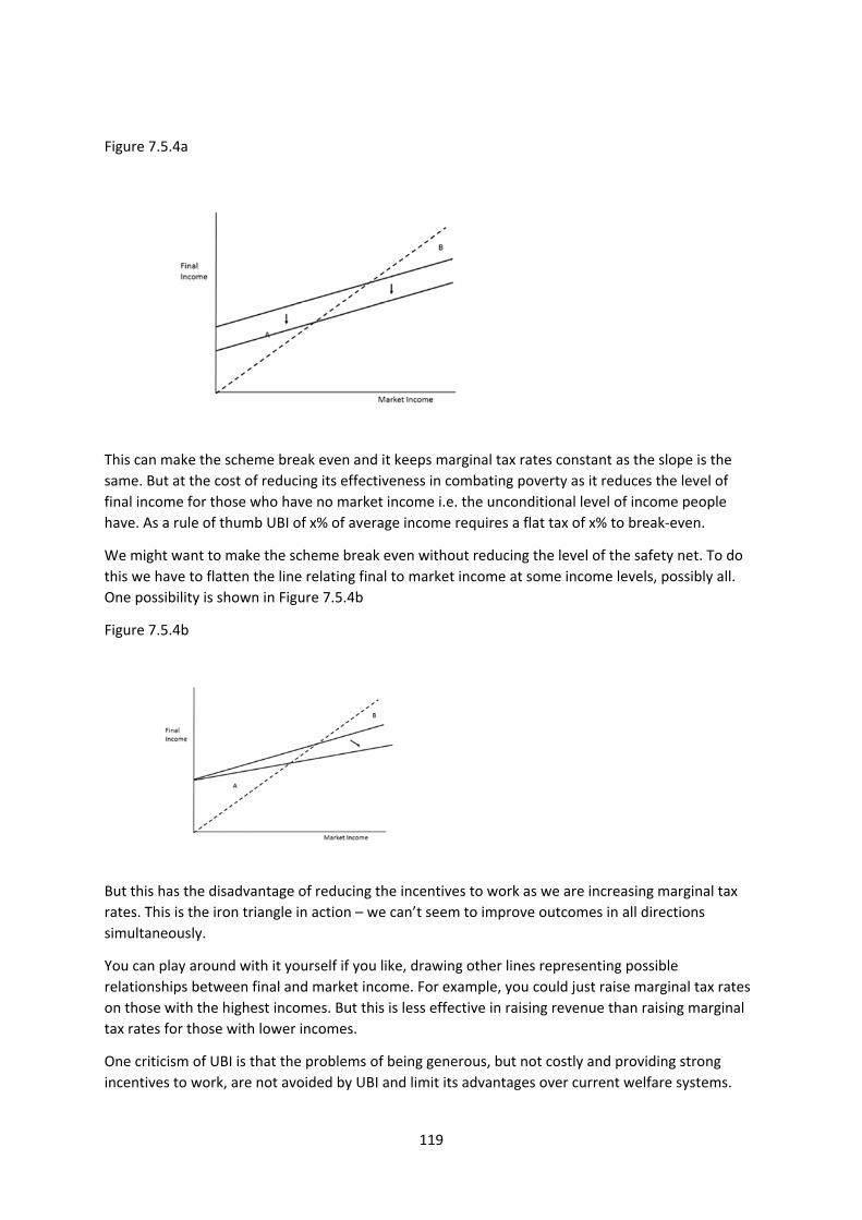
119
Figure 7.5.4a
This can make the scheme break even and it keeps marginal tax rates constant as the slope is the
same. But at the cost of reducing its effectiveness in combating poverty as it reduces the level of
final income for those who have no market income i.e. the unconditional level of income people
have. As a rule of thumb UBI of x% of average income requires a flat tax of x% to break‐even.
We might want to make the scheme break even without reducing the level of the safety net. To do
this we have to flatten the line relating final to market income at some income levels, possibly all.
One possibility is shown in Figure 7.5.4b
Figure 7.5.4b
But this has the disadvantage of reducing the incentives to work as we are increasing marginal tax
rates. This is the iron triangle in action – we can’t seem to improve outcomes in all directions
simultaneously.
You can play around with it yourself if you like, drawing other lines representing possible
relationships between final and market income. For example, you could just raise marginal tax rates
on those with the highest incomes. But this is less effective in raising revenue than raising marginal
tax rates for those with lower incomes.
One criticism of UBI is that the problems of being generous, but not costly and providing strong
incentives to work, are not avoided by UBI and limit its advantages over current welfare systems.
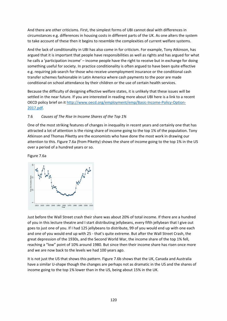
120
And there are other criticisms. First, the simplest forms of UBI cannot deal with differences in
circumstances e.g. differences in housing costs in different parts of the UK. As one alters the system
to take account of these then it begins to resemble the complexities of current welfare systems.
And the lack of conditionality in UBI has also come in for criticism. For example, Tony Atkinson, has
argued that it is important that people have responsibilities as well as rights and has argued for what
he calls a ‘participation income’ – income people have the right to receive but in exchange for doing
something useful for society. In practice conditionality is often argued to have been quite effective
e.g. requiring job search for those who receive unemployment insurance or the conditional cash
transfer schemes fashionable in Latin America where cash payments to the poor are made
conditional on school attendance by their children or the use of certain health services.
Because the difficulty of designing effective welfare states, it is unlikely that these issues will be
settled in the near future. If you are interested in reading more about UBI here is a link to a recent
OECD policy brief on it http://www.oecd.org/employment/emp/Basic‐Income‐Policy‐Option‐
2017.pdf.
7.6 Causes of The Rise In Income Shares of the Top 1%
One of the most striking features of changes in inequality in recent years and certainly one that has
attracted a lot of attention is the rising share of income going to the top 1% of the population. Tony
Atkinson and Thomas Piketty are the economists who have done the most work in drawing our
attention to this. Figure 7.6a (from Piketty) shows the share of income going to the top 1% in the US
over a period of a hundred years or so.
Figure 7.6a
Just before the Wall Street crash their share was about 20% of total income. If there are a hundred
of you in this lecture theatre and I start distributing jellybeans, every fifth jellybean that I give out
goes to just one of you. If I had 125 jellybeans to distribute, 99 of you would end up with one each
and one of you would end up with 25 ‐ that’s quite extreme. But after the Wall Street Crash, the
great depression of the 1930s, and the Second World War, the income share of the top 1% fell,
reaching a “low” point of 10% around 1980. But since then their income share has risen once more
and we are now back to the levels we had 100 years ago.
It is not just the US that shows this pattern. Figure 7.6b shows that the UK, Canada and Australia
have a similar U‐shape though the changes are perhaps not as dramatic in the US and the shares of
income going to the top 1% lower than in the US, being about 15% in the UK.
51
01
52
0T
op 1
% in
com
e s
hare
1915 1925 1935 1945 1955 1965 1975 1985 1995 2005 2015Year
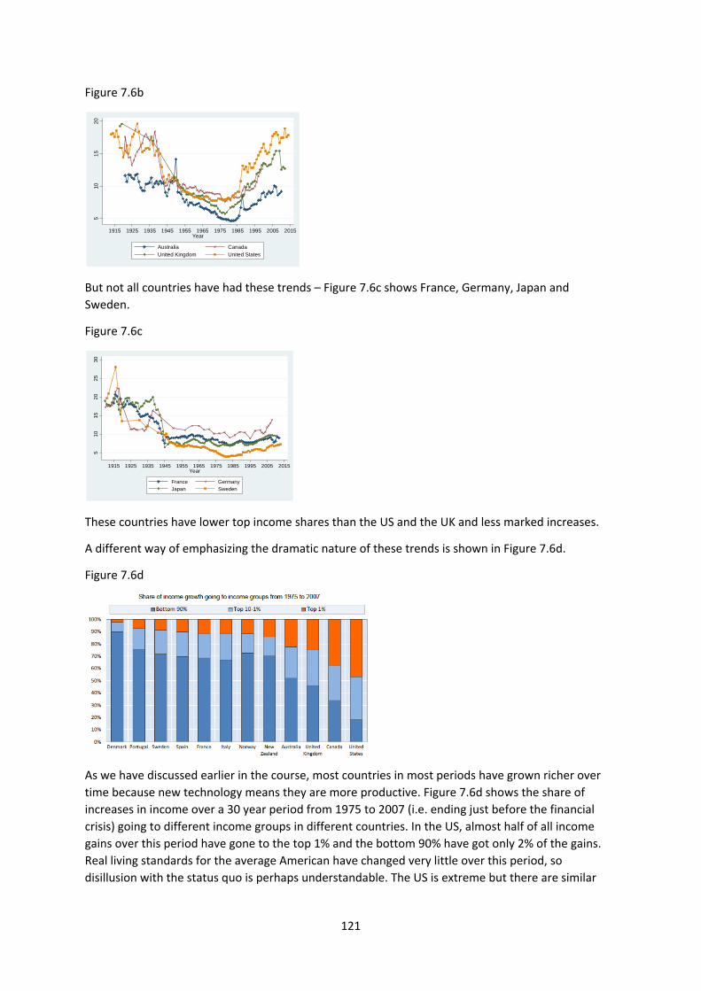
121
Figure 7.6b
But not all countries have had these trends – Figure 7.6c shows France, Germany, Japan and
Sweden.
Figure 7.6c
These countries have lower top income shares than the US and the UK and less marked increases.
A different way of emphasizing the dramatic nature of these trends is shown in Figure 7.6d.
Figure 7.6d
As we have discussed earlier in the course, most countries in most periods have grown richer over
time because new technology means they are more productive. Figure 7.6d shows the share of
increases in income over a 30 year period from 1975 to 2007 (i.e. ending just before the financial
crisis) going to different income groups in different countries. In the US, almost half of all income
gains over this period have gone to the top 1% and the bottom 90% have got only 2% of the gains.
Real living standards for the average American have changed very little over this period, so
disillusion with the status quo is perhaps understandable. The US is extreme but there are similar
51
01
52
0
1915 1925 1935 1945 1955 1965 1975 1985 1995 2005 2015Year
Australia CanadaUnited Kingdom United States
51
01
52
02
53
0
1915 1925 1935 1945 1955 1965 1975 1985 1995 2005 2015Year
France GermanyJapan Sweden
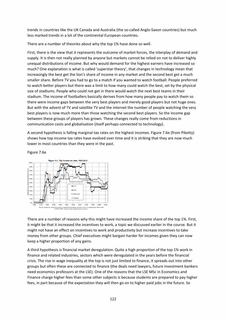
122
trends in countries like the UK Canada and Australia (the so‐called Anglo‐Saxon countries) but much
less marked trends in a lot of the continental European countries.
There are a number of theories about why the top 1% have done so well.
First, there is the view that it represents the outcome of market forces, the interplay of demand and
supply. It is then not really planned by anyone but markets cannot be relied on not to deliver highly
unequal distributions of income. But why would demand for the highest earners have increased so
much? One explanation is what is called ‘superstar theory’, that changes in technology mean that
increasingly the best get the lion’s share of income in any market and the second best get a much
smaller share. Before TV you had to go to a match if you wanted to watch football. People preferred
to watch better players but there was a limit to how many could watch the best, set by the physical
size of stadiums. People who could not get in there would watch the next best teams in their
stadium. The income of footballers basically derives from how many people pay to watch them so
there were income gaps between the very best players and merely good players but not huge ones.
But with the advent of TV and satellite TV and the internet the number of people watching the very
best players is now much more than those watching the second best players. So the income gap
between these groups of players has grown. These changes really come from reductions in
communication costs and globalisation (itself perhaps connected to technology).
A second hypothesis is falling marginal tax rates on the highest incomes. Figure 7.6e (from Piketty)
shows how top income tax rates have evolved over time and it is striking that they are now much
lower in most countries than they were in the past.
Figure 7.6e
There are a number of reasons why this might have increased the income share of the top 1%. First,
it might be that it increased the incentives to work, a topic we discussed earlier in the course. But it
might not have an effect on incentives to work and productivity but increase incentives to take
money from other groups. Chief executives might bargain harder for incomes given they can now
keep a higher proportion of any gains.
A third hypothesis is financial market deregulation. Quite a high proportion of the top 1% work in
finance and related industries, sectors which were deregulated in the years before the financial
crisis. The rise in wage inequality at the top is not just limited to finance, it spreads out into other
groups but often these are connected to finance (the deals need lawyers, future investment bankers
need economics professors at the LSE). One of the reasons that the LSE MSc in Economics and
Finance charge higher fees than some other subjects is because students are prepared to pay higher
fees, in part because of the expectation they will then go on to higher paid jobs in the future. So
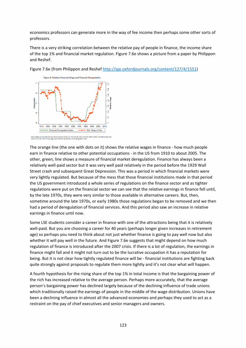
123
economics professors can generate more in the way of fee income then perhaps some other sorts of
professors.
There is a very striking correlation between the relative pay of people in finance, the income share
of the top 1% and financial market regulation. Figure 7.6e shows a picture from a paper by Philippon
and Reshef.
Figure 7.6e (from Philippon and Reshef http://qje.oxfordjournals.org/content/127/4/1551)
The orange line (the one with dots on it) shows the relative wages in finance ‐ how much people
earn in finance relative to other potential occupations ‐ in the US from 1910 to about 2005. The
other, green, line shows a measure of financial market deregulation. Finance has always been a
relatively well‐paid sector but it was very well paid relatively in the period before the 1929 Wall
Street crash and subsequent Great Depression. This was a period in which financial markets were
very lightly regulated. But because of the mess that those financial institutions made in that period
the US government introduced a whole series of regulations on the finance sector and as tighter
regulations were put on the financial sector we can see that the relative earnings in finance fell until,
by the late 1970s, they were very similar to those available in alternative careers. But, then,
sometime around the late 1970s, or early 1980s those regulations began to be removed and we then
had a period of deregulation of financial services. And this period also saw an increase in relative
earnings in finance until now.
Some LSE students consider a career in finance with one of the attractions being that it is relatively
well‐paid. But you are choosing a career for 40 years (perhaps longer given increases in retirement
age) so perhaps you need to think about not just whether finance is going to pay well now but also
whether it will pay well in the future. And Figure 7.6e suggests that might depend on how much
regulation of finance is introduced after the 2007 crisis. If there is a lot of regulation, the earnings in
finance might fall and it might not turn out to be the lucrative occupation it has a reputation for
being. But it is not clear how tightly regulated finance will be ‐ financial institutions are fighting back
quite strongly against proposals to regulate them more tightly and it’s not clear what will happen.
A fourth hypothesis for the rising share of the top 1% in total income is that the bargaining power of
the rich has increased relative to the average person. Perhaps more accurately, that the average
person’s bargaining power has declined largely because of the declining influence of trade unions
which traditionally raised the earnings of people in the middle of the wage distribution. Unions have
been a declining influence in almost all the advanced economies and perhaps they used to act as a
restraint on the pay of chief executives and senior managers and owners.
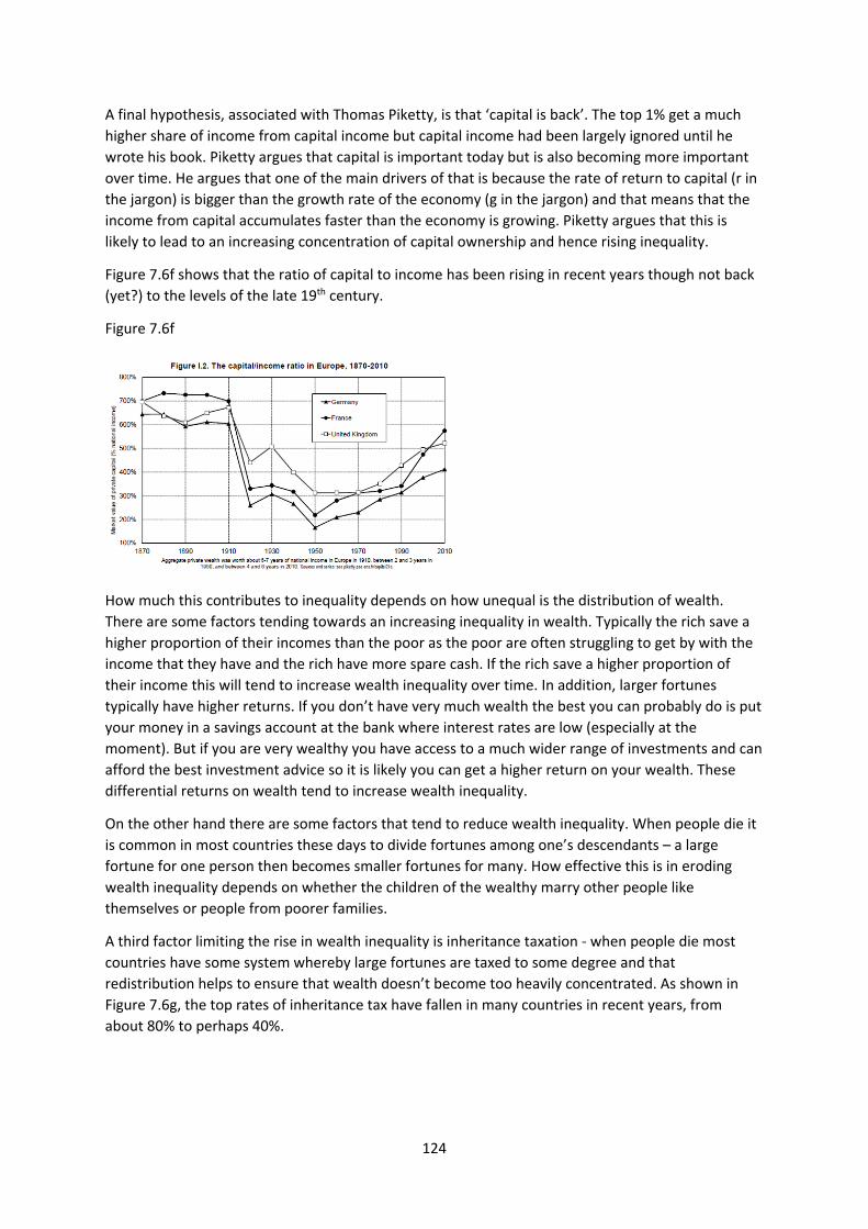
124
A final hypothesis, associated with Thomas Piketty, is that ‘capital is back’. The top 1% get a much
higher share of income from capital income but capital income had been largely ignored until he
wrote his book. Piketty argues that capital is important today but is also becoming more important
over time. He argues that one of the main drivers of that is because the rate of return to capital (r in
the jargon) is bigger than the growth rate of the economy (g in the jargon) and that means that the
income from capital accumulates faster than the economy is growing. Piketty argues that this is
likely to lead to an increasing concentration of capital ownership and hence rising inequality.
Figure 7.6f shows that the ratio of capital to income has been rising in recent years though not back
(yet?) to the levels of the late 19th century.
Figure 7.6f
How much this contributes to inequality depends on how unequal is the distribution of wealth.
There are some factors tending towards an increasing inequality in wealth. Typically the rich save a
higher proportion of their incomes than the poor as the poor are often struggling to get by with the
income that they have and the rich have more spare cash. If the rich save a higher proportion of
their income this will tend to increase wealth inequality over time. In addition, larger fortunes
typically have higher returns. If you don’t have very much wealth the best you can probably do is put
your money in a savings account at the bank where interest rates are low (especially at the
moment). But if you are very wealthy you have access to a much wider range of investments and can
afford the best investment advice so it is likely you can get a higher return on your wealth. These
differential returns on wealth tend to increase wealth inequality.
On the other hand there are some factors that tend to reduce wealth inequality. When people die it
is common in most countries these days to divide fortunes among one’s descendants – a large
fortune for one person then becomes smaller fortunes for many. How effective this is in eroding
wealth inequality depends on whether the children of the wealthy marry other people like
themselves or people from poorer families.
A third factor limiting the rise in wealth inequality is inheritance taxation ‐ when people die most
countries have some system whereby large fortunes are taxed to some degree and that
redistribution helps to ensure that wealth doesn’t become too heavily concentrated. As shown in
Figure 7.6g, the top rates of inheritance tax have fallen in many countries in recent years, from
about 80% to perhaps 40%.
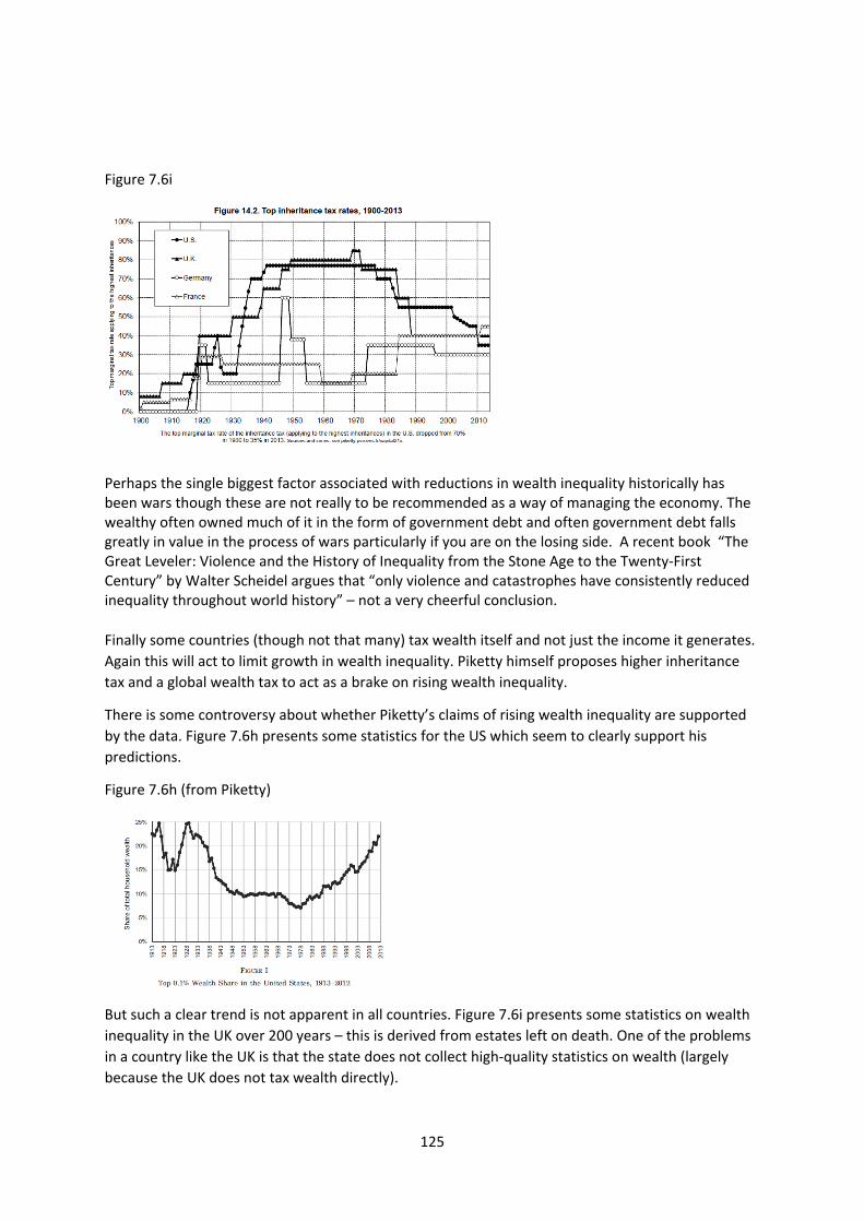
125
Figure 7.6i
Perhaps the single biggest factor associated with reductions in wealth inequality historically has been wars though these are not really to be recommended as a way of managing the economy. The wealthy often owned much of it in the form of government debt and often government debt falls greatly in value in the process of wars particularly if you are on the losing side. A recent book “The Great Leveler: Violence and the History of Inequality from the Stone Age to the Twenty‐First Century” by Walter Scheidel argues that “only violence and catastrophes have consistently reduced inequality throughout world history” – not a very cheerful conclusion.
Finally some countries (though not that many) tax wealth itself and not just the income it generates.
Again this will act to limit growth in wealth inequality. Piketty himself proposes higher inheritance
tax and a global wealth tax to act as a brake on rising wealth inequality.
There is some controversy about whether Piketty’s claims of rising wealth inequality are supported
by the data. Figure 7.6h presents some statistics for the US which seem to clearly support his
predictions.
Figure 7.6h (from Piketty)
But such a clear trend is not apparent in all countries. Figure 7.6i presents some statistics on wealth
inequality in the UK over 200 years – this is derived from estates left on death. One of the problems
in a country like the UK is that the state does not collect high‐quality statistics on wealth (largely
because the UK does not tax wealth directly).
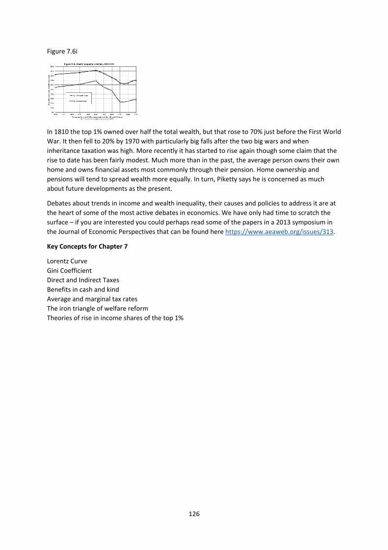
126
Figure 7.6i
In 1810 the top 1% owned over half the total wealth, but that rose to 70% just before the First World
War. It then fell to 20% by 1970 with particularly big falls after the two big wars and when
inheritance taxation was high. More recently it has started to rise again though some claim that the
rise to date has been fairly modest. Much more than in the past, the average person owns their own
home and owns financial assets most commonly through their pension. Home ownership and
pensions will tend to spread wealth more equally. In turn, Piketty says he is concerned as much
about future developments as the present.
Debates about trends in income and wealth inequality, their causes and policies to address it are at
the heart of some of the most active debates in economics. We have only had time to scratch the
surface – if you are interested you could perhaps read some of the papers in a 2013 symposium in
the Journal of Economic Perspectives that can be found here https://www.aeaweb.org/issues/313.
Key Concepts for Chapter 7
Lorentz Curve
Gini Coefficient
Direct and Indirect Taxes
Benefits in cash and kind
Average and marginal tax rates
The iron triangle of welfare reform
Theories of rise in income shares of the top 1%
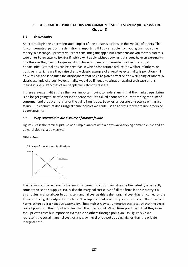
127
8. EXTERNALITIES, PUBLIC GOODS AND COMMON RESOURCES (Acemoglu, Laibson, List,
Chapter 9)
8.1 Externalities
An externality is the uncompensated impact of one person’s actions on the welfare of others. The
‘uncompensated’ part of the definition is important. If I buy an apple from you, giving you some
money in exchange, I prevent you from consuming the apple but I compensate you for this and this
would not be an externality. But if I pick a wild apple without buying it this does have an externality
on others as they can no longer eat it and have not been compensated for the loss of that
opportunity. Externalities can be negative, in which case actions reduce the welfare of others, or
positive, in which case they raise them. A classic example of a negative externality is pollution ‐ if I
drive my car and it pollutes the atmosphere that has a negative effect on the well‐being of others. A
classic example of a positive externality would be if I get a vaccination against a disease as this
means it is less likely that other people will catch the disease.
If there are externalities then the most important point to understand is that the market equilibrium
is no longer going to be efficient in the sense that I’ve talked about before ‐ maximising the sum of
consumer and producer surplus or the gains from trade. So externalities are one source of market
failure. But economics does suggest some policies we could use to address market failure produced
by externalities.
8.2 Why Externalities are a source of market failure
Figure 8.2a is the familiar picture of a simple market with a downward‐sloping demand curve and an
upward‐sloping supply curve.
Figure 8.2a
The demand curve represents the marginal benefit to consumers. Assume the industry is perfectly
competitive so the supply curve is also the marginal cost curve of all the firms in the industry. Call
this not just marginal cost but private marginal cost as this is the marginal cost that is incurred by the
firms producing the output themselves. Now suppose that producing output causes pollution which
harms others so is a negative externality. The simplest way to summarise this is to say that the social
cost of producing the output is higher than the private cost. When firms produce output they incur
their private costs but impose an extra cost on others through pollution. On Figure 8.2b we
represent the social marginal cost for any given level of output as being higher than the private
marginal cost.
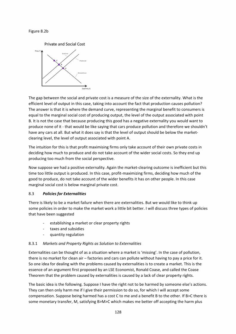
128
Figure 8.2b
The gap between the social and private cost is a measure of the size of the externality. What is the
efficient level of output in this case, taking into account the fact that production causes pollution?
The answer is that it is where the demand curve, representing the marginal benefit to consumers is
equal to the marginal social cost of producing output, the level of the output associated with point
B. It is not the case that because producing this good has a negative externality you would want to
produce none of it ‐ that would be like saying that cars produce pollution and therefore we shouldn’t
have any cars at all. But what it does say is that the level of output should be below the market‐
clearing level, the level of output associated with point A.
The intuition for this is that profit maximising firms only take account of their own private costs in
deciding how much to produce and do not take account of the wider social costs. So they end up
producing too much from the social perspective.
Now suppose we had a positive externality. Again the market‐clearing outcome is inefficient but this
time too little output is produced. In this case, profit‐maximizing firms, deciding how much of the
good to produce, do not take account of the wider benefits it has on other people. In this case
marginal social cost is below marginal private cost.
8.3 Policies for Externalities
There is likely to be a market failure when there are externalities. But we would like to think up
some policies in order to make the market work a little bit better. I will discuss three types of policies
that have been suggested
‐ establishing a market or clear property rights
‐ taxes and subsidies
‐ quantity regulation
8.3.1 Markets and Property Rights as Solution to Externalities
Externalities can be thought of as a situation where a market is ‘missing’. In the case of pollution,
there is no market for clean air – factories and cars can pollute without having to pay a price for it.
So one idea for dealing with the problems caused by externalities is to create a market. This is the
essence of an argument first proposed by an LSE Economist, Ronald Coase, and called the Coase
Theorem that the problem caused by externalities is caused by a lack of clear property rights.
The basic idea is the following. Suppose I have the right not to be harmed by someone else’s actions.
They can then only harm me if I give their permission to do so, for which I will accept some
compensation. Suppose being harmed has a cost C to me and a benefit B to the other. If B>C there is
some monetary transfer, M, satisfying B>M>C which makes me better off accepting the harm plus

129
the money (as M>C) and them better off even after paying me for the permission (as B>M). But if
B>C the benefit of the harm exceeds the cost so it is efficient to take the action. But if B<C the action
is inefficient and there is no monetary transfer that both sides would accept – the action will not be
taken. In either case the outcome is efficient. Note that this does not necessarily require a market,
the example had negotiation between individuals.
In this example I have the right not to be harmed unless I give my permission. But the example also
works the other way round. Suppose the other person has the right to take the action unless they
voluntarily choose not to. In this case I would have to pay them not to take the action. In this case if I
would need to pay them M>B for them not to take the action and I would only offer M if C>M. Again
the action will not be taken if C>B. Whether the action is taken or not does not depend on who has
the property rights but the distribution of surplus will depend on this – in general, the ownership of
property makes one better‐off.
This is very elegant in theory but there are question marks about how well it works in practice.
Consider the example of air pollution and how one might try to make these ideas work. One would
have to establish clear property rights, either the right to clean air or the right to pollute. One then
needs to negotiate deals between very large numbers of consumers and firms. And one then needs a
cheap enforcement mechanism, to be able to tell whether any contracts have been breached and by
whom. It all sounds very impractical.
And it often seems to have problems even with simple issues involving small numbers of people. A
perennial issue on flights is the reclining the seat or not reclining seats issue. On United Airlines flight
1462 from Newark to Denver in 2014 one passenger fitted a device called the knee defender to his
tray which prevents the person in front of you from reclining their seat. The passenger in front then
tried to recline the seat (it was quite a long flight) and an argument ensued. The cabin attendants
made clear that the property right is with the person who wants to recline. Now the Coase theorem
would then predict that if the person sitting in the seat behind them doesn’t want them to recline
they will start offering them some money not to recline. If the value of the person in front reclining a
seat is less than the value to the person behind of having more leg room then Coase predicts a deal
should be struck. That wasn’t what happened at all ‐ the offending passenger refused to remove the
device, the person in the seat in front threw a glass of water over them, the flight was diverted to
Chicago (ironically where Coase worked for most of his life) and they were both arrested. Probably
not an efficient outcome for either of them let alone the other passengers. This is a case where the
Coase theorem didn’t really work in practice and it is a very simple case involving just two people
and one small issue.
But the idea behind the Coase theorem, that markets might be part of the solution to externalities,
will emerge a bit later when we discuss carbon trading.
8.3.2 Taxes and Subsidies to Deal with Externalities
The second generic approach to dealing with externalities is the use of taxes and subsidies. The basic
idea is the following. If some action has a negative externality we want to discourage it and one way
to do that is to tax it. And if some action has a positive externality we want to encourage it and one
way to do that is to subsidise it.
Suppose that producing output creates air pollution. If we impose a tax on each unit of the good
produced this will increase marginal private costs. This will then shift the market‐clearing level of
output. Figure 8.3.2a shows what will happen.
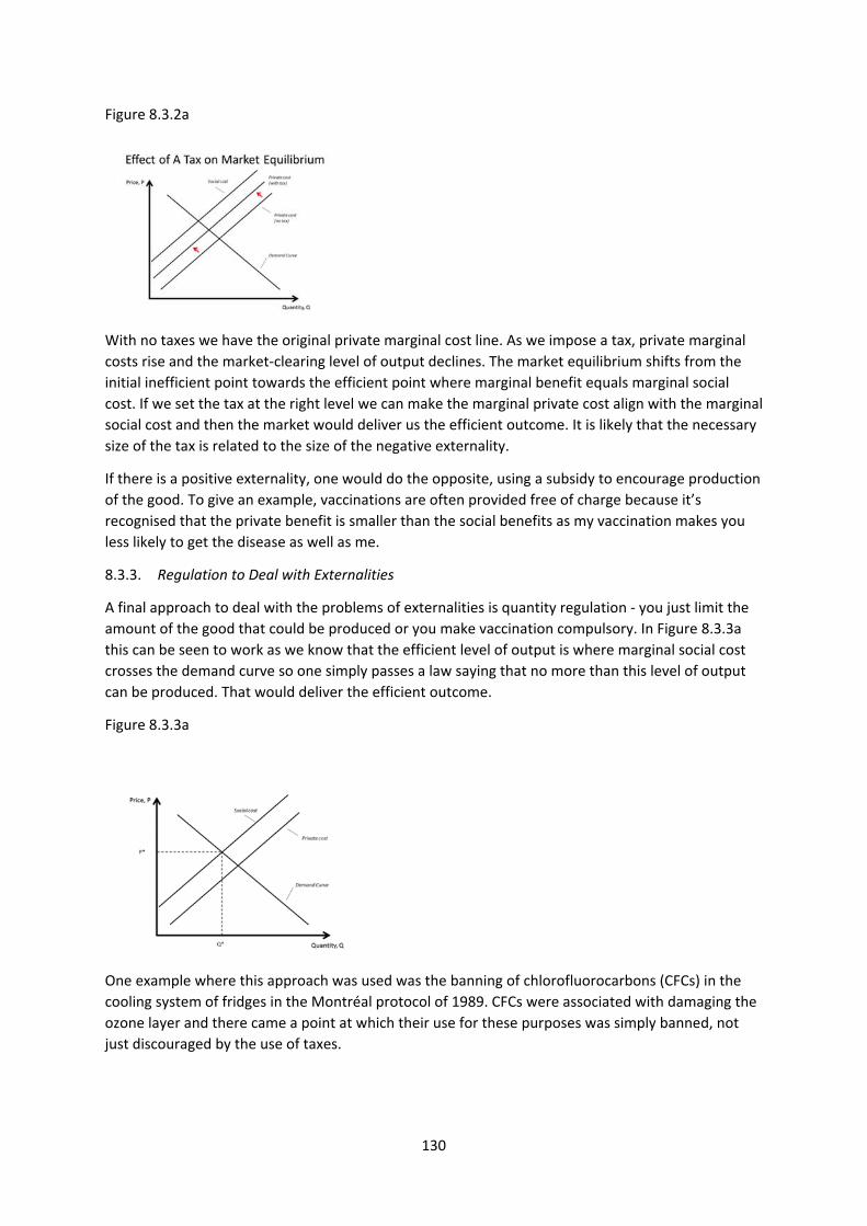
130
Figure 8.3.2a
With no taxes we have the original private marginal cost line. As we impose a tax, private marginal
costs rise and the market‐clearing level of output declines. The market equilibrium shifts from the
initial inefficient point towards the efficient point where marginal benefit equals marginal social
cost. If we set the tax at the right level we can make the marginal private cost align with the marginal
social cost and then the market would deliver us the efficient outcome. It is likely that the necessary
size of the tax is related to the size of the negative externality.
If there is a positive externality, one would do the opposite, using a subsidy to encourage production
of the good. To give an example, vaccinations are often provided free of charge because it’s
recognised that the private benefit is smaller than the social benefits as my vaccination makes you
less likely to get the disease as well as me.
8.3.3. Regulation to Deal with Externalities
A final approach to deal with the problems of externalities is quantity regulation ‐ you just limit the
amount of the good that could be produced or you make vaccination compulsory. In Figure 8.3.3a
this can be seen to work as we know that the efficient level of output is where marginal social cost
crosses the demand curve so one simply passes a law saying that no more than this level of output
can be produced. That would deliver the efficient outcome.
Figure 8.3.3a
One example where this approach was used was the banning of chlorofluorocarbons (CFCs) in the
cooling system of fridges in the Montréal protocol of 1989. CFCs were associated with damaging the
ozone layer and there came a point at which their use for these purposes was simply banned, not
just discouraged by the use of taxes.

131
In the simple diagrams of Figure 8.3.3a I hope you can see that well‐chosen taxes and regulation are
really equivalent ways of getting to the same outcome. You might wonder if there is any reason to
prefer one method to the other.
Quantity regulation has the disadvantage that if there are lots of firms in an industry one has to set
quotas for all of them, requiring a lot of information and bureaucracy. It is quite easy to imagine this
process going wrong, especially when firms start to lobby for high quotas for themselves. A single tax
might then seem relatively attractive. But regulation does have one important advantage over
taxation which is that it makes sure that you get the quantity that you want. That is much harder
with taxes – it is simple in the diagram I have drawn but in reality one does not know exactly where
marginal costs and benefits lie so it is hard to know exactly what the optimal tax is. If it is set too low
one will get more pollution than one would like and this might not be a risk you are prepared to
take. In the case of banning CFCs, people knew the quantity they wanted in domestic refrigeration
(zero) and there was little point in tinkering with taxes until people voluntarily decided they were
going to buy CFC‐free fridges.
But in the area of CO2 emissions (the Kyoto Protocol and the Paris agreement), it has proved very
difficult to agree commitments from individual countries for reductions over time.
8.3.4 Cap‐and‐Trade to deal with externalities
Cap‐and‐trade systems are real world attempts to deal with the problems caused by externalities
that seek to combine the best features of markets, taxes and quantity regulation. They are hybrid
systems.
Perhaps the best known example of a cap and trade arrangement is the EU Carbon market. CO2
emissions (from burning fossil fuels in power stations for example) are a main cause of global
warming, an important example of a negative externality. The EU decided it wanted to limit CO2
emissions by its member countries.
The EU issued permits to the big producers of CO2 based on how much CO2 they were initially
emitting. These established the maximum amount of CO2 that each producer could emit. This can be
thought of as a quota, a form of quantity regulation. But the EU established a market in these
permits i.e. they can be bought or sold at a price determined by supply and demand. If, for whatever
reason, a firm wants to pollute more than its initial allocation allows, it has to buy permits from
somebody else who would then have to pollute less than they were initially allowed. If you produce
more CO2 than you have permits for, you are very heavily fined so it is very expensive to break the
rules. On the other hand, a firm that managed to reduce its emissions below its allowance could sell
the unused permits to other firms. This provides an incentive for firms to reduce their emissions.
The price at which the permits are traded that is just determined by the market. The attractive
feature of the system is that the limited quantity of total permits is fixed so one can guarantee
meeting targets for CO2 emissions. But one does not have to micro‐manage which firms are allowed
to produce exactly how much CO2. The market provides a way of equalizing the marginal cost of
emissions across producers. One would expect trade: those producers who find it easiest to reduce
their CO2 emissions selling some permits to those who find it hardest. And the system provides
incentives for firms to reduce their CO2 emissions as they can then make money by selling unused
permits or buying fewer.
This is a hybrid system using price and quantity controls in a way many people think is a reasonable
compromise. The intention was that the number of permits is reduced over time in line with targets
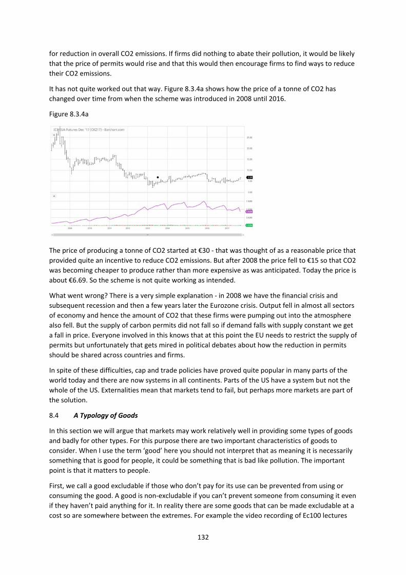
132
for reduction in overall CO2 emissions. If firms did nothing to abate their pollution, it would be likely
that the price of permits would rise and that this would then encourage firms to find ways to reduce
their CO2 emissions.
It has not quite worked out that way. Figure 8.3.4a shows how the price of a tonne of CO2 has
changed over time from when the scheme was introduced in 2008 until 2016.
Figure 8.3.4a
The price of producing a tonne of CO2 started at €30 ‐ that was thought of as a reasonable price that
provided quite an incentive to reduce CO2 emissions. But after 2008 the price fell to €15 so that CO2
was becoming cheaper to produce rather than more expensive as was anticipated. Today the price is
about €6.69. So the scheme is not quite working as intended.
What went wrong? There is a very simple explanation ‐ in 2008 we have the financial crisis and
subsequent recession and then a few years later the Eurozone crisis. Output fell in almost all sectors
of economy and hence the amount of CO2 that these firms were pumping out into the atmosphere
also fell. But the supply of carbon permits did not fall so if demand falls with supply constant we get
a fall in price. Everyone involved in this knows that at this point the EU needs to restrict the supply of
permits but unfortunately that gets mired in political debates about how the reduction in permits
should be shared across countries and firms.
In spite of these difficulties, cap and trade policies have proved quite popular in many parts of the
world today and there are now systems in all continents. Parts of the US have a system but not the
whole of the US. Externalities mean that markets tend to fail, but perhaps more markets are part of
the solution.
8.4 A Typology of Goods
In this section we will argue that markets may work relatively well in providing some types of goods
and badly for other types. For this purpose there are two important characteristics of goods to
consider. When I use the term ‘good’ here you should not interpret that as meaning it is necessarily
something that is good for people, it could be something that is bad like pollution. The important
point is that it matters to people.
First, we call a good excludable if those who don’t pay for its use can be prevented from using or
consuming the good. A good is non‐excludable if you can’t prevent someone from consuming it even
if they haven’t paid anything for it. In reality there are some goods that can be made excludable at a
cost so are somewhere between the extremes. For example the video recording of Ec100 lectures

133
put on the web could be non‐excludable but there is a technology to limit the viewing to those who
have paid fees to the LSE.
Second, we call a good rival if one person’s use of the good eliminates another person’s ability to use
the good – if I consume an apple no‐one else can. A good is non‐rival if my consumption of it does
not diminish other people’s ability to consume it – street lighting would be an example. Again, some
goods are in between – my consumption of a road by driving my car down it slows down other cars
on the road so diminishes the benefit others derive from it but does not eliminate it.
Using this two‐way categorization of goods we have four possible types of goods as represented in
Table 8.4a and given names.
Table 8.4a
Rival?
Yes No
Excludable? Yes Private Goods Natural Monopolies
No Common Pool Resources Public Goods
Goods that are both excludable and rival are private goods – these are the goods we have been
mostly discussing in this course.
Goods that are non‐rival and excludable will perhaps tend to be natural monopolies. An
uncongested toll road would be an example, radio and TV another. It is excludable as one has to pay
to use it. But non‐rival as – if there is no congestion ‐ my use of the road does not affect your ability
to use it or the benefit you derive from it. These goods tend to have a fixed cost of providing the
good but zero (or very low) marginal cost, a cost structure that implies increasing returns. Such
industries will tend to be natural monopolies as large firms will have an advantages over small firms.
Because we know the outcome of monopoly is likely to be inefficient the production of these goods
tends to be in public ownership or regulated. We have discussed these issues earlier in the course
and will not discuss them again here.
8.5 Public Goods
Goods that are non‐rival and non‐excludable are called public goods ‐ everybody gets the benefit
and you can’t exclude anyone from it. Examples might be national defence or street lighting but
some have argued that institutions like the legal system and basic research are public goods.
Knowledge could be a public good – my knowing something does not prevent you knowing it though
patent laws might prevent you using that knowledge turning a public good into a private good.
Markets are unlikely to work well in providing public goods and that is one argument for why we
often see government intervention in these markets (e.g. providing street lighting, a legal system,
funding basic research). It is important to realise that a public good is not necessarily a publicly
provided good. They may end up being publicly provided but that’s not the definition.
Why might the market not provide the right level of public goods? Suppose that public goods are
bought privately e.g. I buy a street light outside my house. I will buy the good until my marginal
benefit equals the marginal cost. But because the good is non‐excludable and non‐rival, others will
also benefit from it so the marginal social benefit is greater than my marginal private benefit. The
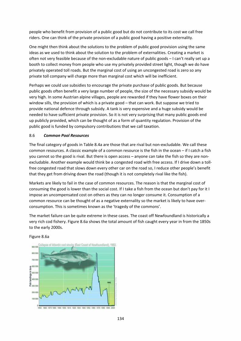
134
people who benefit from provision of a public good but do not contribute to its cost we call free
riders. One can think of the private provision of a public good having a positive externality.
One might then think about the solutions to the problem of public good provision using the same
ideas as we used to think about the solution to the problem of externalities. Creating a market is
often not very feasible because of the non‐excludable nature of public goods – I can’t really set up a
booth to collect money from people who use my privately provided street light, though we do have
privately operated toll roads. But the marginal cost of using an uncongested road is zero so any
private toll company will charge more than marginal cost which will be inefficient.
Perhaps we could use subsidies to encourage the private purchase of public goods. But because
public goods often benefit a very large number of people, the size of the necessary subsidy would be
very high. In some Austrian alpine villages, people are rewarded if they have flower boxes on their
window sills, the provision of which is a private good – that can work. But suppose we tried to
provide national defence through subsidy. A tank is very expensive and a huge subsidy would be
needed to have sufficient private provision. So it is not very surprising that many public goods end
up publicly provided, which can be thought of as a form of quantity regulation. Provision of the
public good is funded by compulsory contributions that we call taxation.
8.6 Common Pool Resources
The final category of goods in Table 8.4a are those that are rival but non‐excludable. We call these
common resources. A classic example of a common resource is the fish in the ocean – if I catch a fish
you cannot so the good is rival. But there is open access – anyone can take the fish so they are non‐
excludable. Another example would think be a congested road with free access. If I drive down a toll‐
free congested road that slows down every other car on the road so, I reduce other people’s benefit
that they get from driving down the road (though it is not completely rival like the fish).
Markets are likely to fail in the case of common resources. The reason is that the marginal cost of
consuming the good is lower than the social cost. If I take a fish from the ocean but don’t pay for it I
impose an uncompensated cost on others as they can no longer consume it. Consumption of a
common resource can be thought of as a negative externality so the market is likely to have over‐
consumption. This is sometimes known as the ‘tragedy of the commons’.
The market failure can be quite extreme in these cases. The coast off Newfoundland is historically a
very rich cod fishery. Figure 8.6a shows the total amount of fish caught every year in from the 1850s
to the early 2000s.
Figure 8.6a
135
In the nineteenth century quite a lot of fish was landed every year but the technology for fishing
wasn’t that advanced and the demand for fish wasn’t so great because the population around the
north Atlantic was much lower than it is today. Although cod fishing was a free for all in the sense
that anyone could turn up and fish, there were still enough fish left in the sea to breed and provide
more fish to be caught in subsequent years. But as the catch rose there began to be warnings about
the danger of over‐fishing. One might think that this would encourage people to reduce their catch
as there is a danger that this incredibly rich resource could be destroyed. But the opposite happened
– fearing there might be no fish in the future, people began to catch more today and the amount of
fish landed exploded around 1970. But this was not sustainable – too few fish were left to breed the
next generation, fish stocks began to fall and the catch landed inevitably began to fall as well. There
are periods when there have been some agreements to limit fishing and stocks recovered
somewhat. But they have never managed to last long and today the cod stocks have fallen to very
low levels (1% of previous levels in some areas) though there is some indication in recent years of a
very slow recovery in stocks.
Faced with this type of market failure, how might we try to improve outcomes? As a common
resource involves a negative externality, we could use the approaches we suggested earlier to try to
remedy the market failure.
For example, we could use taxes. In 2005 London introduced congestion charging, a price to drive a
car into central London in a weekday during the day. This was intended to capture the idea that if I
drive my car in central London this has a negative effect on other road users and we would like
drivers to internalise that externality. This reduced the number of cars in central London.
But charging for the use of the resource is not so easy when it comes to the fish in the ocean. An
alternative approach is to establish clear property rights i.e. ownership over the resource. The
people who own the resource will then not just let anybody take it and will have more incentive to
manage it in a sustainable manner. Perhaps looking at cows helps us to understand this.
The problem with fish stocks does not happen with cows even though some people like to eat cows
in the same way that some people like to eat fish. A cow farmer could send all their cows to market
leaving them with no cows to breed in the future so something like ‘over‐fishing’ could occur. But it
doesn’t ‐ nobody worries about the cow population becoming extinct in the same way they worry
seriously about fisheries being eliminated. And the reason is probably that people own cows and
they have a strong incentive to make sure they have cows both this year and in the future.
Establishing ownership of fish in the middle of the ocean is difficult but some people have argued
that private ownership can play an important role in the preservation of wildlife that is not currently
owned by anyone. In places like Africa elephants are mostly not owned by anyone and they are
vulnerable to poaching. As local people may get little benefit from those elephants, they have very
little incentive to protect them. But suppose you gave the local villagers ownership over the
elephants and ownership of the game parks and the ability to charge rich Western tourists to come
and look at the elephants. Then they might have an incentive to protect the elephants. This,
however, is a controversial idea as it seems to go against the idea that these are ‘wild’ animals.
But for fish this approach is not very feasible as excluding people is very costly. Access to coastal
waters is typically controlled by the nearest country and even then policing access is often
problematic. But the deeper oceans are very difficult to police.
Another approach to common pool resources is that you try to get negotiations among the
interested parties to agree on access and use arrangements. This is not using markets (as taxes do)
136
or government regulation (as laws about access do). It is a solution that comes from the affected
communities themselves. Elinor Ostrom won the Nobel Prize in Economics for arguing that,
historically, communities in lots of different places and periods have used a very wide variety of
methods to solve the problem posed by common resources. For example, she studied how in areas
where water for irrigation is in very short supply (so there may be conflict over access to water), that
a variety of local arrangements have been set up that, in some places, have lasted for centuries
without any need for government regulation or involvement. This solution is likely to work best if
there are relatively small numbers of people in stable communities and there are examples where it
has not functioned well. But her work does point out that a very wide variety of institutions might
work to solve the problems caused by common resources and that state involvement is not always
necessary.
Key concepts for Chapter 8
Externalities
Why externalities are a source of market failure
Policies to correct for externalities – property rights, taxes and subsidies, regulation, cap‐and‐trade
Typology of goods – private goods, natural monopolies, public goods, common pool resources
Public goods
Common pool resource problems and their possible solutions
137
9. INFORMATION AND MARKETS (Acemoglu, Laibson, List, Chapter 16)
9.1 Asymmetric Information
In the simple model of the market that we have used many times in this course we have assumed
(implicitly more than explicitly) that buyers and sellers have perfect information about the prices in
the market and the nature or quality of the good they are buying and selling. Our result that the
market‐clearing outcome maximises the sum of producer and consumer surplus assumed that
everybody on both sides of the market knew their valuation of the good, the benefit to the buyer
and the cost to the seller.
In many real world markets information is not perfect. Sometimes the degree of imperfection is
symmetric on both the buyer and seller side. This is a situation of uncertainty in which there is some
risk to buying or selling a product. There is a large literature on the economics of risk of uncertainty
but we do not have time to consider it in this course.
But if there is asymmetric information, where one side of a transaction is better‐informed than the
other, then this can be a source of market failure.
9.2 The Market for Lemons
Suppose you buy a new car, you drive it out of the garage, immediately park it in the street outside
and then decide you want to sell it. The car has no miles on the clock, you can prove you bought it
only a short time before, it still has the dealer’s warranty. The car is, to all intents and purposes, new
so you might think you would be able to sell it for almost exactly the price you paid for it. But
evidence suggests you won’t succeed – that the minute a car is driven off a garage forecourt it loses
something like 20% of its value. The most likely reason for that is connected with informational
problems.
If you advertise a completely new car for sale, many potential buyers will think this is a very strange
thing to do and wonder whether there is something wrong with the car which you have discovered
and caused you to want to sell it so quickly. In a world of perfect information they could readily
check there is nothing wrong with the car but in the real world that is not so easy.
A very simple abstract example of the problems this can cause markets is a very famous example
(the ‘market for lemons’) for which the person who invented it – George Akerlof (who was briefly a
member of the LSE Economics department) – won the Nobel Prize. Suppose there are two types of
used cars. One type we call ‘plums’ ‐ these are good quality used cars worth £10k to buyers and
sellers prepared to sell them for £8k. As £10k is above £8k there are potential gains from trade in
which the sellers sell the plums to the buyers for a price somewhere between £8k and £10k. If the
price was £9k both sides of the deal would walk away happy. But the market also has in it what we
will call ‘lemons’, low quality cars perhaps with a long history of mechanical problems. Assume, for
illustrative purposes, that these are worth nothing to buyers and only £1k to sellers. There is no
natural market for lemons as the value to buyers is below the value to sellers.
If there is perfect information in the used car market so that the buyers and the sellers can readily
identify any particular used car as a plum or a lemon, then there will be a market for plums but no
market for lemons.
138
But now suppose we alter the assumption of perfect information and assume that it is only the seller
who knows the quality of the car and the buyers cannot until after they have bought it when it is too
late. What will happen in the market now?
In this case plums and lemons must sell for the same price as buyers cannot tell the difference
between them. The seller of a lemon will not volunteer this fact if doing so means they get a lower
price, so all sellers will claim their car is high quality but buyers should not necessarily believe them.
The amount of money that a buyer is prepared to pay for a used car depends on how likely they
think it is to be a plum or a lemon. Suppose buyers believe 25% of used cars on the market are
lemons. Then there is a 75% chance that the car is a plum worth £10k and a 25% chance it is a lemon
worth nothing. Assume the buyers are prepared to pay the average value to them taking the risk
that they get a good deal (it is a plum) or a bad deal (it is a lemon). On average the used car is worth
£7.5k to the buyers.
But now consider what happens on the seller side. A plum is worth £8k to a seller so they will not be
prepared to sell if the price is £7.5k. The lemons are only worth £1k to the seller so they think £7.5k
is a great price and they will all be in the market trying to sell their car. The consequence of this is
that the actual fraction of lemons in the market will not be the 25% I started by assuming, but 100%.
But if the fraction of lemons is 100% the maximum price a buyer will be prepared to pay is zero. And
then no seller will want to sell at all. The market will collapse, fail to exist, there will be no trade. This
is even though there are potential gains from trade between the sellers and buyers of plums. The
potential seller of a plum cannot realize these gains from trade because they have no credible way
to convince a buyer that the car is a plum – they can say it is but the owner of a lemon will say
exactly the same. The presence of lemons in the market prevents trade in plums.
This is an extreme example of a market failure as the market itself simply fails to exist and function. I
have given a very specific numerical example but the point is of much wider significance. And
informational problems can cause problems even if the market functions in some form.
The price in the market reflects the average quality of goods on offer. But the average quality on
offer also reflects the price being paid as the owners of higher quality goods will only offer them for
sale if the price is high enough. The combination of these two facts can lead to market outcomes a
long way from being desirable.
9.3 Adverse Selection
The ‘market for lemons’ is an example of what in the jargon is called adverse selection. Adverse
selection is where, on the better‐informed side of the market (sellers in the previous example),
those with poor quality products have more incentive to be in the market. As a result, it becomes
harder for high quality products to be in the market and this problem can be so severe that the
market itself can collapse.
There are ways in which participants in markets beset by informational problems can try to mitigate
those problems. For example, those with higher quality products would like to signal credibly that
their product is high‐quality and they might do this by offering guarantees. A seller with a plum
might offer a guarantee that they will pay for repairs if the car goes wrong within six months or a
year. A seller with a lemon would be reluctant to make such a promise. So, there may be ways to
reduce the problems caused by adverse selection but it is probably very rare to think that these can
completely overcome the problems. I will give some examples from the real world where adverse
selection considerations seem to be important.
139
9.3.1 Health Insurance
Suppose there is no publicly provided health care. If individuals have better information about their
health than a potential insurance company then the buyers of health insurance are likely to be sicker
than average. The cost of health insurance, the premium, offered by insurance companies will reflect
the expected expenditure on health. If everyone in the economy signs up for health insurance then
the premium will reflect the health of the average citizen. But this will not be a good deal for the
healthiest individuals as the premium will be above their expected healthcare expenditures. So the
healthiest may stop buying health insurance. That then means that the health insurance companies
start making losses as their clients are now sicker than average. They are likely to respond by raising
insurance premiums. As a result of that, even more relatively healthy people think that health
insurance is too expensive and stop buying it. The adverse selection problem gets worse and worse
and the market ends up in a cycle where private health insurance is both very expensive and hardly
anyone buys it. The only people buying it are people who think of themselves as quite sick and the
price reflects that fact. To minimize these problems, health insurance companies try to estimate how
sick you are so typically you have to go through a medical to get private health insurance and pay a
higher premium if, for example, you are a smoker. But often the insurance company won’t have
perfect information about your health and sometimes they are not allowed to use some information
in setting premiums.
These problems in the private provision of healthcare are so serious that there is generally heavy
public involvement in the provision of healthcare. Sometimes, as in the UK, it is free at the point of
use, funded by taxation (which people have no choice about paying). Sometimes there is compulsory
health insurance ‐ the government says you have to take out health insurance. Making health
insurance compulsory is an essential component of Obamacare in the US, though many aspects of
that are controversial. Both public provision and compulsory health insurance are designed to
prevent an adverse selection problem from taking hold because the healthy people cannot opt out
of the system.
9.3.2 Interbank markets in the financial crisis
At the end of every working day some banks find themselves a bit short of cash, others with a
surplus. Those who are a bit short need to borrow short‐term and those with a surplus are happy to
lend. There are a lot of these loans on very short terms, often overnight. This is the interbank
market. In its traditional form this market smoothed out the short‐term fluctuations in cash flows for
banks and a bank that was a borrower one day might be a lender the next. The market probably
made financial markets as a whole function more efficiently. The interest rate on these short‐term
loans reflects the risk of the loans – again, traditionally this was very low because they were for such
short periods to banks that were long‐established institutions. Lloyds lending to Barclays was very
confident that Barclays will still be here tomorrow so will pay back any overnight loans.
But what happened in the run‐up to the financial crisis is that some financial institutions began to
use the interbank market in a different way. They would lend people money to buy a house, a
mortgage with a repayment period of 25 years or so. The bank got the cash for this by borrowing
overnight in the interbank market. Obviously they had to pay it back the next day but the mortgage
has not been paid back so the bank needs to roll‐over its lending borrowing again in the overnight
market. The idea was that a 25 year mortgage could be paid for by borrowing overnight every day
for 25 years! Long‐term loans were funded by long series of short‐term borrowing. In theory that
might work fine but the problem is that it does not work if the bank fails to find a lender on just one
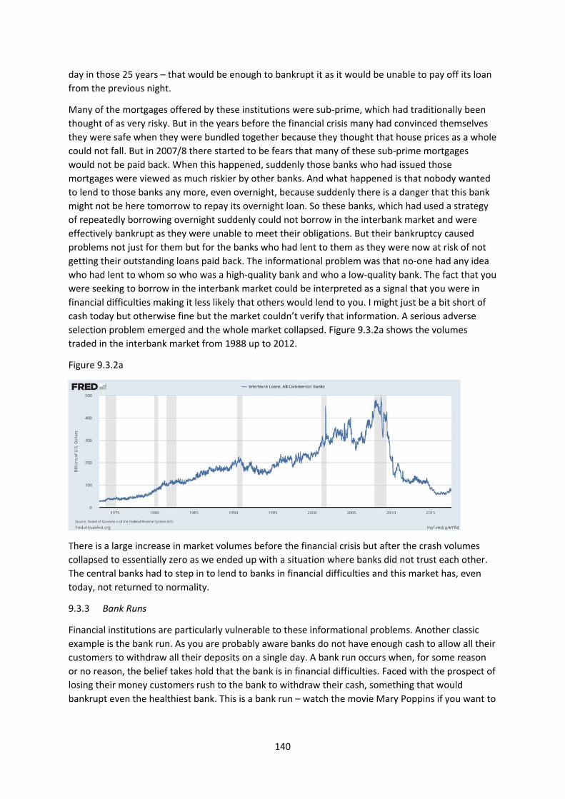
140
day in those 25 years – that would be enough to bankrupt it as it would be unable to pay off its loan
from the previous night.
Many of the mortgages offered by these institutions were sub‐prime, which had traditionally been
thought of as very risky. But in the years before the financial crisis many had convinced themselves
they were safe when they were bundled together because they thought that house prices as a whole
could not fall. But in 2007/8 there started to be fears that many of these sub‐prime mortgages
would not be paid back. When this happened, suddenly those banks who had issued those
mortgages were viewed as much riskier by other banks. And what happened is that nobody wanted
to lend to those banks any more, even overnight, because suddenly there is a danger that this bank
might not be here tomorrow to repay its overnight loan. So these banks, which had used a strategy
of repeatedly borrowing overnight suddenly could not borrow in the interbank market and were
effectively bankrupt as they were unable to meet their obligations. But their bankruptcy caused
problems not just for them but for the banks who had lent to them as they were now at risk of not
getting their outstanding loans paid back. The informational problem was that no‐one had any idea
who had lent to whom so who was a high‐quality bank and who a low‐quality bank. The fact that you
were seeking to borrow in the interbank market could be interpreted as a signal that you were in
financial difficulties making it less likely that others would lend to you. I might just be a bit short of
cash today but otherwise fine but the market couldn’t verify that information. A serious adverse
selection problem emerged and the whole market collapsed. Figure 9.3.2a shows the volumes
traded in the interbank market from 1988 up to 2012.
Figure 9.3.2a
There is a large increase in market volumes before the financial crisis but after the crash volumes
collapsed to essentially zero as we ended up with a situation where banks did not trust each other.
The central banks had to step in to lend to banks in financial difficulties and this market has, even
today, not returned to normality.
9.3.3 Bank Runs
Financial institutions are particularly vulnerable to these informational problems. Another classic
example is the bank run. As you are probably aware banks do not have enough cash to allow all their
customers to withdraw all their deposits on a single day. A bank run occurs when, for some reason
or no reason, the belief takes hold that the bank is in financial difficulties. Faced with the prospect of
losing their money customers rush to the bank to withdraw their cash, something that would
bankrupt even the healthiest bank. This is a bank run – watch the movie Mary Poppins if you want to

141
see one happen. To avoid these problems most countries offer deposit insurance up to a certain
level – even if your bank goes bust you will get your money back at least up to a certain amount.
9.4 Moral Hazard
Moral hazard is a different type of informational problem in markets. It occurs when the behaviour
of one party to a contract can’t be trusted to carry out the terms of the contract as you would like
them to do. For example, someone with car insurance may drive less carefully because they have
insurance so don’t have to pay the cost of repairs after an accident.
Moral hazard also played an important part in the financial crisis. Before 2007 (i.e. before the crisis)
many banks made very risky loans e.g. the sub‐prime mortgages mentioned earlier. For a while these
loans went well, the banks made lots of profit and the bankers were very well paid. But when those
loans turned bad and the banks had to be bailed out by the central bank (the Federal Reserve in the
US or the Bank of England), the cost was borne by the taxpayer. The bankers got the rewards in good
times but did not pay for the losses in bad times. Mervyn King, then the governor of the Bank of
England (and an LSE Professor) said that “the massive support extended to the banking sector
around the world, while necessary to avert economic disaster (aside: because they thought there
was a risk of repeating the great depression of the 1930s), has created possibly the biggest moral
hazard and in history”. He said that because if bankers know they will be bailed out if things go badly
they may be inclined to take more risk than is desirable. This is a form of moral hazard ‐ bankers are
not taking sufficient care because they don’t bear the downside consequences of their actions.
What are possible solutions to the moral hazard problem? One possibility is more regulations to limit
undesirable activities. For example, banks are now required to have higher levels of capital reserves
so that the risk of them going bankrupt is lower. There is much more monitoring of banks about the
riskiness of their lending to assess the riskiness of their loans, they are required to go through stress
tests. But banks don’t like to be regulated so push back against this and it remains unclear how much
extra regulation will be imposed on capital markets.
In other insurance contracts, one is often required to exercise due care. If your house is insured
against theft but you left your front door open the insurance company is unlikely to accept your
claim. These clauses try to limit the extent of moral hazard by putting in conditions that try and
make you behave in a desirable way but they are unlikely to work perfectly.
9.5 Illegal online drugs markets
In discussing illegal drugs markets I am not passing any judgment on whether drugs should be illegal
or legal, or whether the activities in these markets are good or bad ‐ everything discussed is illegal.
But there are people who would like to buy drugs and people who are prepared to sell them.
Markets have arisen spontaneously to bring the buyers and sellers together. Obviously, there have
been markets for illegal drugs for a very long time but in the past they were mostly traded on the
street.
But increasingly they are traded on the Internet using various platforms. The most famous platforms
were Silk Road 1.0 and 2.0 but there are a whole series of other ones that have come, and
sometimes gone. The fact that these markets are illegal means that sellers need anonymity so they
operate on the so‐called dark net where it’s very difficult to trace the origin of an online advert
offering to supply drugs. Bitcoins are used for transactions as they are difficult to trace.
This anonymity of sellers is obviously necessary because of the illegality. But one would expect the
anonymity to also cause serious informational problems. There are a number of possible concerns
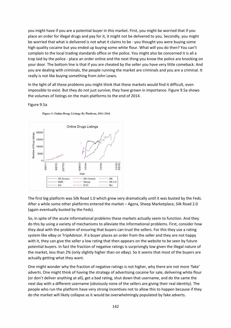
142
you might have if you are a potential buyer in this market. First, you might be worried that if you
place an order for illegal drugs and pay for it, it might not be delivered to you. Secondly, you might
be worried that what is delivered is not what it claims to be ‐ you thought you were buying some
high quality cocaine but you ended up buying some white flour. What will you do then? You can’t
complain to the local trading standards office or the police. You might also be concerned it is all a
trap laid by the police ‐ place an order online and the next thing you know the police are knocking on
your door. The bottom line is that if you are cheated by the seller you have very little comeback. And
you are dealing with criminals, the people running the market are criminals and you are a criminal. It
really is not like buying something from John Lewis.
In the light of all these problems you might think that these markets would find it difficult, even
impossible to exist. But they do not just survive; they have grown in importance. Figure 9.5a shows
the volumes of listings on the main platforms to the end of 2014.
Figure 9.5a
The first big platform was Silk Road 1.0 which grew very dramatically until it was busted by the Feds.
After a while some other platforms entered the market – Agora, Sheep Marketplace, Silk Road 2.0
(again eventually busted by the Feds).
So, in spite of the acute informational problems these markets actually seem to function. And they
do this by using a variety of mechanisms to alleviate the informational problems. First, consider how
they deal with the problem of ensuring that buyers can trust the sellers. For this they use a rating
system like eBay or TripAdvisor. If a buyer places an order from the seller and they are not happy
with it, they can give the seller a low rating that then appears on the website to be seen by future
potential buyers. In fact the fraction of negative ratings is surprisingly low given the illegal nature of
the market, less than 2% (only slightly higher than on eBay). So it seems that most of the buyers are
actually getting what they want.
One might wonder why the fraction of negative ratings is not higher, why there are not more ‘fake’
adverts. One might think of having the strategy of advertising cocaine for sale, delivering white flour
(or don’t deliver anything at all), get a bad rating, shut down that username, and do the same the
next day with a different username (obviously none of the sellers are giving their real identity). The
people who run the platform have very strong incentives not to allow this to happen because if they
do the market will likely collapse as it would be overwhelmingly populated by fake adverts.
143
To deal with this, payments from buyers to sellers don’t go immediately to the seller but are paid
into an escrow account which is controlled by the market platform itself and is only released to the
seller if there were no complaints. There is then no incentive for sellers to place fake adverts which
will produce buyer complaints. But you might think that the buyers themselves may also want to
complain because they would like to get the drugs and not pay the money – after all, they are
criminals as well. This would be an attempt of the buyer to cheat the seller. If just one buyer
complains about the seller the platform probably takes no action against the seller as they think that
just might be a buyer trying to cheat. But lots of people complaining about a seller means it is much
more likely the seller is at fault and the money would not be released from the escrow account. So
each seller can probably cheat a few buyers but it is hard to cheat a lot.
But it might still be attractive to cheat only a few buyers. The platform deals with that by requiring
new sellers to buy a bond, to pay some money to be allowed to post in this market at all. So sellers
have to put some money up front which is lost if too many buyers complain.
The bond helps to alleviate the informational problems between buyer and seller but one other side
of this coin is now that the people running the market itself end up controlling large sums of money
in these escrow accounts and in the bonds. As they hold all buyer payments for a while they will
have large numbers of bitcoins in their accounts. Remember the people running the platform are
criminals so that you might think they might be tempted to run off with all the money that they’ve
accumulated in the escrow account. How can you trust the platform itself? The answer to that
question is probably “not entirely” – there have been quite a large number of scams. One of the
platforms, “Sheep Marketplace”, was growing very rapidly after the feds shut down the first Silk
Road. Then one day they announced they had been hacked and someone had stolen all the bitcoins
in the escrow account so they could not pay the sellers who were owed money and they had to take
the loss. That’s what they said but some people think those who ran the platform just ran away with
the money in the escrow account. Unsurprisingly no‐one ever used that platform again.
Those running the platform could have a one‐off gain from stealing the money in the escrow account
but at the cost of having no future revenues. So one would expect one can trust the platform if the
continuing revenue flow that you get from hosting the platform (they take a cut of every
transaction) is greater than the one‐off gain from cheating. It would seem that most of the time
these platforms have an incentive to continue operating, stopping only when they get busted by the
police.
What illegal drugs markets illustrate is how markets often arise spontaneously and manage to create
institutions that enable them to function and grow. They probably don’t work perfectly but they do
function. This is not necessarily a good thing – if society has the view that these drugs should be
illegal then one might take the view that the world would be a better place if this particular market
did not work so well.
Key Concepts for Chapter 9
Asymmetric information
Why asymmetric information can lead to market failure
The market for lemons
Adverse selection
Moral hazard
How markets try to overcome informational problems

144
10. CONCLUSION
Most of this term’s course has been about markets.
We have discussed how markets have been central to the process of specialization, innovation and
exchange that has been the basis for the improvement in material living standards since the
Industrial Revolution.
We have discussed why it is that markets work at all. Trade offers the possibility for everyone to be
better off. The invisible hand theorem says that individuals pursuing their own self‐interest (within a
framework of rules) can achieve collective outcomes like maximising the gains from trade which
might be thought desirable. Markets can be thought of as a way for people to cooperate in very
complicated ways. But there is also conflict in markets – buyers want low prices, sellers high prices.
We have also discussed why markets are not perfect.
They can produce a high level of inequality, necessitating some form of redistribution if the gains
from trade are to be widely shared.
And markets can come to be controlled by small numbers of sellers (monopoly/oligopoly) or buyers
(monopsony) in which case some intervention in markets is warranted.
And markets cannot be relied to produce desirable outcomes if there are externalities, for public
goods or where there are common pool resources, or in situations where there is asymmetric
information. Innovation is a very important area where markets alone cannot be expected to work
well in producing new knowledge. But in all of these cases we can use the tools of economics to
analyse what goes wrong and to suggest policy interventions to make the world a better place.
Sometimes there might be fixes to help markets work better, sometimes it might be better not to
have markets at all.
We have discussed the methods of analysis that economists use to think about these problems. We
have used those tools to think about pressing contemporary issues – inequality, climate change, free
trade agreements, the impact of new technology, immigration, the impact of new types of
companies like Uber and Google, the gender pay gap, universal basic income, minimum wages. I
hope the course has given you some insight into these issues and the tools that can be used to
analyse and better understand those issues that will surely arise in the future.