Embed Size (px)
Citation preview
DUAL-METHOD USABILITY EVALUATION OF E-COMMERCE
WEBSITES: IN QUEST OF BETTER USER EXPERIENCE
by
IZABELA MARIA MOCZARNY
submitted in accordance with the requirements for
the degree of
MASTER OF TECHNOLOGIAE
in the subject
INFORMATION TECHNOLOGY
at the
UNIVERSITY OF SOUTH AFRICA
SUPERVISORS: PROF M R DE VILLIERS & PROF J.A. VAN BILJON
OCTOBER 2011
Student number: 39333833
I declare that DUAL-METHOD USABILITY EVALUATION OF E-COMMERCE
WEBSITES: IN QUEST OF BETTER USER EXPERIENCE is my own work, and that all
sources used or quoted in the study have been indicated and acknowledged by means of
complete references.
___________________________ ________________
Izabela Maria Moczarny Date
iii
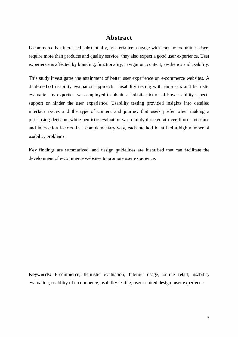
Abstract
E-commerce has increased substantially, as e-retailers engage with consumers online. Users
require more than products and quality service; they also expect a good user experience. User
experience is affected by branding, functionality, navigation, content, aesthetics and usability.
This study investigates the attainment of better user experience on e-commerce websites. A
dual-method usability evaluation approach – usability testing with end-users and heuristic
evaluation by experts – was employed to obtain a holistic picture of how usability aspects
support or hinder the user experience. Usability testing provided insights into detailed
interface issues and the type of content and journey that users prefer when making a
purchasing decision, while heuristic evaluation was mainly directed at overall user interface
and interaction factors. In a complementary way, each method identified a high number of
usability problems.
Key findings are summarized, and design guidelines are identified that can facilitate the
development of e-commerce websites to promote user experience.
Keywords: E-commerce; heuristic evaluation; Internet usage; online retail; usability
evaluation; usability of e-commerce; usability testing; user-centred design; user experience.
iv
Opsomming
E-handel het aansienlik toegeneem, soos e-kleinhandelaars by verbruikers aanlyn betrokke
raak. Gebruikers verlang meer as produkte en kwaliteit diens; hulle verwag ook 'n goeie
gebruikerservaring. Gebruikerservaring word deur ‘branding’, funksies, navigasie, inhoud,
estetika en bruikbaarheid beinvloed.
Hierdie studie ondersoek die bereiking van beter gebruikerservaring op e-handel webwerwe.
'n Dubbelemetode bruikbaarheidsevaluering benadering – bruikbaarheidstoetsing met
eindgebruikers en heuristiese evaluering deur kundiges – is gebruik om ‘n holistiese beeld te
verkry van hoe bruikbaarheidsaspekte gebruikerservaring ondersteun of verhinder.
Bruikbaarheidstoetsing lewer insigte in gedetailleerde koppelvlak kwessies en die tipe inhoud
en roete wat gebruikers verkies wanneer hulle 'n aankoop maak, terwyl heuristiese evaluering
hoofsaaklik gerig is op algehele gebruikerskoppelvlak en interaksie faktore. Op 'n
komplementêre manier, het elke metode' n groot aantal bruikbaarheidsprobleme
geïdentifiseer.
Belangrike bevindings word saamgevat, en ontwerp riglyne is voorgestel wat die
ontwikkeling van e-handel webwerwe fasiliteer wat gebruikerservaring bevorder.
Sleutelwoorde: E-handel, heuristiese evaluering; Internet gebruik, aanlyn-kleinhandel,
bruikbaarheidsevaluering; bruikbaarheid van e-handel; bruikbaarheidstoetsing, gebruikers-
gesentreerde ontwerp, gebruikerservaring.
v
Acknowledgements
I wish to express my gratitude to:
Professor Ruth de Villiers, my supervisor, for your patience, encouragement,
meticulous attention to detail,
and valuable guidance throughout this study;
there is so much that you have taught me that I will carry with me
for the rest of my life;
Professor Judy van Biljon, my co-supervisor, for all your assistance,
valuable guidance and encouragement;
Dr Filistéa Naudé, for your assistance with administration
and sourcing articles;
My family and friends, for your love and encouragement;
&
Gary, for all your patience, love and support.
vi
Table of contents
CHAPTER 1: INTRODUCTION ......................................................................................................................... 1
1.1 INTRODUCTION ......................................................................................................................................... 1 1.2 PROBLEM STATEMENT.............................................................................................................................. 2 1.3 RESEARCH QUESTION .............................................................................................................................. 5
1.3.1 Primary research question ............................................................................................................ 5 1.3.2 Subquestions .................................................................................................................................. 5
1.4 VALUE OF THE STUDY ............................................................................................................................... 5 1.5 SCOPE OF THE STUDY .............................................................................................................................. 6
1.5.1 Domain of the study ....................................................................................................................... 6 1.5.2 Target systems ............................................................................................................................... 7 1.5.3 Limitations and delimiters .............................................................................................................. 7 1.5.4 Assumptions .................................................................................................................................... 7
1.6 RESEARCH DESIGN AND METHODOLOGY ................................................................................................. 8 1.6.1 Usability testing design methodology ........................................................................................ 11 1.6.2 Heuristic evaluation methodology .............................................................................................. 12
1.7 STEPS IN DATA COLLECTION AND ANALYSIS .......................................................................................... 13 1.8 STRUCTURE OF THE STUDY ................................................................................................................... 14
CHAPTER 2: E-COMMERCE IN SOUTH AFRICA ..................................................................................... 18
2.1 INTRODUCTION ....................................................................................................................................... 18 2.2 RETAIL SECTOR IN SOUTH AFRICA ........................................................................................................ 19 2.3 E-COMMERCE DEFINED .......................................................................................................................... 20 2.4 E-COMMERCE AND ITS CHALLENGES ..................................................................................................... 21
2.4.1 Culture ............................................................................................................................................ 21 2.4.2 Trust ............................................................................................................................................... 22 2.4.3 Usability.......................................................................................................................................... 22
2.5 E-COMMERCE GUIDELINES ..................................................................................................................... 24 2.6 SUMMARY ............................................................................................................................................... 26
CHAPTER 3: E-COMMERCE USABILITY AND USER EXPERIENCE ................................................... 28
3.1 INTRODUCTION ....................................................................................................................................... 28 3.2 USER-CENTRED DESIGN ......................................................................................................................... 29 3.3 USABILITY ............................................................................................................................................... 30
3.3.1 Usability defined ........................................................................................................................... 30 3.4 USER EXPERIENCE ................................................................................................................................. 31
3.4.1 User experience defined.............................................................................................................. 34 3.5 RELATIONSHIP BETWEEN USER EXPERIENCE AND USABILITY ............................................................... 38
3.5.1 User satisfaction ........................................................................................................................... 41 3.6 METHODOLOGIES USED WHEN EVALUATING USER EXPERIENCE ........................................................... 42
3.6.1 Think-aloud method with user observation ............................................................................... 42 3.6.2 Drawing .......................................................................................................................................... 43 3.6.3 Mood board ................................................................................................................................... 43 3.6.4 Heuristics ....................................................................................................................................... 43
3.7 USER EXPERIENCE FRAMEWORKS ......................................................................................................... 47 3.8 IMPORTANCE OF VISUAL INTERFACE ASPECTS IN CREATING A GOOD USER EXPERIENCE .................... 53 3.9 IMPROVING THE USABILITY OF E-COMMERCE WEBSITES ....................................................................... 55
3.9.1 Improving usability by using usability testing ............................................................................ 55 3.9.2 Improving websites by using business processes ................................................................... 57 3.9.3 Improving websites through personalisation ............................................................................ 58 3.9.4 Improving websites through Google Analytics ......................................................................... 59
3.10 SUMMARY ........................................................................................................................................... 60
CHAPTER 4: USABILITY EVALUATION ..................................................................................................... 62
4.1 INTRODUCTION ....................................................................................................................................... 62 4.2 USABILITY EVALUATION .......................................................................................................................... 63 4.3 USABILITY EVALUATION METHODS ......................................................................................................... 64
vii
4.3.1 User-focused ................................................................................................................................. 65 4.3.2 Expert-focused .............................................................................................................................. 68
4.4 USABILITY TESTING ................................................................................................................................ 69 4.4.1 What does usability testing involve? .......................................................................................... 70 4.4.2 Steps taken in a usability test ..................................................................................................... 71 4.4.3 Advantages of usability testing ................................................................................................... 76 4.4.4 Disadvantages of usability testing .............................................................................................. 76
4.5 HEURISTIC EVALUATION ......................................................................................................................... 77 4.5.1 Heuristics ....................................................................................................................................... 77 4.5.2 What does heuristic evaluation involve? ................................................................................... 80 4.5.3 Advantages of heuristic evaluation ............................................................................................ 80 4.5.4 Disadvantages of heuristic evaluation ....................................................................................... 81
4.6 ASPECTS TO BE CONSIDERED IN EVALUATING E-COMMERCE SYSTEMS ................................................ 82 4.7 USABILITY TESTING AND HEURISTIC EVALUATION .................................................................................. 83
4.7.1 Comparison and combination of usability testing and heuristic evaluation ......................... 84 4.8 SUMMARY ............................................................................................................................................... 87
CHAPTER 5: RESEARCH DESIGN AND METHODOLOGY .................................................................... 89
5.1 INTRODUCTION ....................................................................................................................................... 89 5.2 RESEARCH QUESTIONS AND APPROACHES TO ANSWERING THEM ........................................................ 89 5.3 DESIGN OF USABILITY TESTING .............................................................................................................. 92
5.3.1 Participants .................................................................................................................................... 92 5.3.2 Target systems ............................................................................................................................. 95 5.3.3 Test structure ................................................................................................................................ 95 5.3.4 Evaluation criteria ......................................................................................................................... 96
5.4 HEURISTIC EVALUATION METHODOLOGY ............................................................................................... 98 5.4.1 Participants .................................................................................................................................... 98 5.4.2 Heuristic evaluation criteria ......................................................................................................... 98 5.4.3 Heuristic evaluation rating criteria ............................................................................................ 103 5.4.4 Capturing the results .................................................................................................................. 104
5.5 ANALYSIS OF THE DATA ........................................................................................................................ 104 5.6 SUMMARY ............................................................................................................................................. 105
CHAPTER 6: RESEARCH FINDINGS ......................................................................................................... 107
6.1 INTRODUCTION ..................................................................................................................................... 107 6.2 USABILITY TESTING (UT) FINDINGS ..................................................................................................... 108
6.2.1 Pre-test questionnaire findings ................................................................................................. 108 6.2.2 Task 1: Homepage assessment ............................................................................................... 112 6.2.3 Task 2: Find a plan ..................................................................................................................... 118 6.2.4 Task 3: Find an Internet package............................................................................................. 126
6.3 USER EXPERIENCE (UX) FINDINGS ..................................................................................................... 134 6.3.1 Positive and negative emotions ................................................................................................ 135 6.3.2 Aesthetics findings ..................................................................................................................... 138 6.3.3 Overall experience findings ....................................................................................................... 140 6.3.4 Consolidation of user experience findings .............................................................................. 143
6.4 HEURISTIC EVALUATION (HE) FINDINGS .............................................................................................. 144 6.4.1 Criterion 1: General interface design heuristics findings: ..................................................... 145 6.4.2 Criterion 2: E-commerce usability design heuristics findings; .............................................. 149 6.4.3 Criterion 3: The user experience of the heuristic evaluation: ............................................... 155
6.5 INTERPRETATIONS AND DISCUSSIONS ................................................................................................. 156 6.5.1 Strengths of usability testing and heuristic evaluation, as shown by comparing findings 156 6.5.2 Findings obtained by similar studies ........................................................................................ 157 6.5.3 Consolidation of findings from usability testing and heuristic evaluation ........................... 158
6.6 HOW CAN USABILITY IMPACT ON THE USER EXPERIENCE IN E-COMMERCE? ...................................... 165 6.7 SUMMARY ............................................................................................................................................. 168
CHAPTER 7: GUIDELINES ........................................................................................................................... 170
7.1 INTRODUCTION ..................................................................................................................................... 170 7.2 GUIDELINES THAT WILL ENHANCE THE USER JOURNEY ....................................................................... 171 7.3 USER INTERFACE GUIDELINES ............................................................................................................. 176
viii
7.4 SUMMARY ............................................................................................................................................. 180
CHAPTER 8: CONCLUSION ........................................................................................................................ 182
8.1 OVERVIEW ............................................................................................................................................ 182 8.2 ANSWERS TO THE RESEARCH QUESTIONS .......................................................................................... 183 8.3 FURTHER CONTRIBUTIONS ................................................................................................................... 186 8.4 FURTHER RESEARCH ........................................................................................................................... 186 8.5 SUMMARY ............................................................................................................................................. 186
REFERENCES ................................................................................................................................................. 188
APPENDIX A: USABILITY TESTING OF FOUR E-COMMERCE WEBSITES ..................................... 211
APPENDIX A1: INFORMAL CONSENT FORM FOR USABILITY TESTING ....................................... 211
APPENDIX A2: USER PROFILE INFORMATION OF USABILITY TESTING PARTICIPANTS ....... 212
APPENDIX A3: PRE-TEST QUESTIONNAIRE ......................................................................................... 213
APPENDIX A4: TASK 1 – HOMEPAGE ASSESSMENT ......................................................................... 214
APPENDIX A5: TASK 2 - FIND A PLAN .................................................................................................... 215
APPENDIX A6: TASK 3 - FIND AN INTERNET PACKAGE ................................................................... 217
APPENDIX A7: POST-TEST USER EXPERIENCE QUESTIONNAIRE ................................................ 219
APPENDIX B: HEURISTIC EVALUATION OF FOUR E-COMMERCE WEBSITES............................ 222
APPENDIX B1: PROCEDURE ...................................................................................................................... 222
APPENDIX B2: INFORMAL CONSENT FORM FOR HEURISTIC EVALUATION .............................. 223
APPENDIX B3: CATEGORY 1 - GENERAL INTERFACE DESIGN HEURISTICS ............................. 224
APPENDIX B4: CATEGORY 2 - E-COMMERCE USABILITY DESIGN HEURISTICS ....................... 227
APPENDIX B5: CATEGORY 3 - POST-TEST USER EXPERIENCE QUESTIONNAIRE................... 233
APPENDIX C: HEURISTIC EVALUATION DATA AND RATINGS ........................................................ 236
APPENDIX C1: CATEGORY 1 - GENERAL INTERFACE DESIGN HEURISTICS ............................. 236
APPENDIX C2: CATEGORY 2 - E-COMMERCE USABILITY DESIGN HEURISTICS ....................... 238
APPENDIX D: ETHICAL CLEARANCE ...................................................................................................... 242
DRAFT ARTICLE BASED ON THIS STUDY ............................................................................................. 243
ix
List of figures
Figure 1.1: Structure of the study 16
Figure 3.1: Four elements of user experience (Rubinoff 2004) 33
Figure 3.2: User experience methods as a broad interpretation of usability (Bevan 2009,
p. 3- 6) 33
Figure 3.3: Seven facets of user experience (Morville 2004) 37
Figure 3.4: User experience includes usability (Rubinoff 2004; Sward 2006) 38
Figure 3.5: Usability includes user experience (Bevan 2009) 38
Figure 3.6: Usability and user experience: Closely related concepts 39
Figure 3.7: Usability and user experience: Some differences 40
Figure 3.8: Common e-commerce objects (Bernard 2002) 57
Figure 3.9: User interface generation framework (Zhao, Zou, Hawkins and
Madapusi 2007, pp. 256-270) 58
Figure 6.1: Average time and clicks taken to complete tasks 119
Figure 6.2: Ease of use, content satisfaction and structure 120
Figure 6.3: Average time and clicks taken to complete task 128
Figure 6.4: Ease of use, content satisfaction and structure 129
Figure 6.5: Positive emotions (Usability testing) 135
Figure 6.6: Negative emotions (Usability testing) 137
Figure 6.7: Aesthetics ratings across the suppliers 138
Figure 6.8: Positive emotions (Heuristic evaluation) 155
Figure 6.9: Negative emotions (Heuristic evaluation) 155
List of tables
Table 2.1: Definitions of e-commerce (Lubbe and van Heerden, 2003, p. 54) 20
Table 2.2: Critical success factors (CSFs) for e-commerce (Atchariyachanvanich
and Okada 2001, pp. 1-2) 25
Table 3.1: Usability goals and associated questions (Sharp, Rogers and Preece 2007,
p. 20) 31
Table 3.2: User experience definitions (Law, Roto, Hassenzahl, Vermeeren and Kort
2008, pp. 2395-2398) 34
Table 3.3: Evaluation methods for user experience (Vermeeren, Law, Roto, Obrist,
Hoonhout, and Väänänen-Vainio-Mattila, 2010, pp. 521-530) 44
x
Table 3.4: User experience framework (Mahlke and Thüring 2007, pp. 915-918) 48
Table 3.5: A model of user experience factors in e-commerce interaction tasks
(Mahlke and Thüring 2007, pp. 915-918) 49
Table 3.6: User experience framework (Kort, Vermeeren and Fokker 2007, pp. 57-64) 50
Table 3.7: Framework of UX including influencing factors (Schulze and Krömker
2010, pp. 261-264) 52
Table 4.1: User factor table for an e-commerce system (Rubin 1994, p.120),
(applied to the South African situation by the researcher) 72
Table 4.2: Data gathering techniques (Sharp, Rogers and Preece 2007, p.297) 74
Table 4.3: Nielsen’s ten classic heuristic principles (Nielsen 1994b, p.686) 78
Table 4.4: Ten research-based heuristics (Powals, 1996, pp.189-211) 79
Table 4.5: Usability attribute that characterise websites (synthesised by the
researcher) 83
Table 5.1: Mapping of subquestions to location and methods 90
Table 5.2: User factor table 93
Table 5.3: User classification table 94
Table 5.4: Usability testing criteria 96
Table 5.5: Expert evaluator profiles 98
Table 5.6: Category 1: General interface design heuristics (Nielsen 1994b; Powals 1996) 99
Table 5.7: Category 2: E-commerce usability design heuristics 100
Table 5.8: Category 3: User experience design heuristics 102
Table 6.1: E-commerce user experience enhancement aspects 111
Table 6.2: MTN homepage positive and negative factors 113
Table 6.3: Vodacom homepage positive and negative factors 114
Table 6.4: Virgin Mobile homepage positive and negative 115
Table 6.5: Cell C homepage positive and negative factors 116
Table 6.6: Time and clicks taken to complete task 119
Table 6.7: Content satisfaction expressed in terms of positive and negative factors 122
Table 6.8: Website structure expressed in terms of positive and negative factors 123
Table 6.9: Terminology and visual appeal 124
Table 6.10: Route taken and errors made 127
Table 6.11: Time and clicks taken to complete task 128
Table 6.12: Ease of use, content satisfaction and structure expressed in terms of positive
and negative factors 131
xi
Table 6.13: Terminology and visual appeal comments 133
Table 6.14: Visibility of the system status 145
Table 6.15: Consistency and standards 146
Table 6.16: Error prevention, diagnosis and recovery 147
Table 6.17: Flexibility and efficiency of use 148
Table 6.18: Aesthetic and minimalist design 148
Table 6.19: Help and documentation 149
Table 6.20: Communication the intended message 149
Table 6.21: Page display, layout and site structure: Information architecture 150
Table 6.22: Page display, layout and site structure: Search 151
Table 6.23: Page display, layout and site structure: Site-wide navigation 151
Table 6.24: Page display, layout and site structure: Contextual navigation 152
Table 6.25: Page display, layout and site structure: Page structure and presentation of
information 152
Table 6.26: Page display, layout and site structure: Language and tone 152
Table 6.27: Value of information provided 153
Table 6.28: Culture 153
Table 6.29: Security 154
Table 6.30: Overall satisfaction 154
Table 6.31: Summary of common, unique problems and positive aspects identified by
usability testing and heuristic evaluation regarding the four e-commerce
websites of this study 159
Table 6.32: General types of problems and the positive aspects with respect to each
category of criteria that usability testing identified on its own both heuristic
evaluation & usability testing identified, and heuristic evaluation identified
on its own 162
Table 6.33: Usability aspects that impact on user experience 166
Table 7.1: Educate and inform (synthesised by the researcher) 174
Table 7.2: Sell the product (synthesised by the researcher) 175
Table 7.3: Manage the product (synthesised by the researcher) 175
Table 7.4: Entertain and entice (synthesised by the researcher) 176
xii
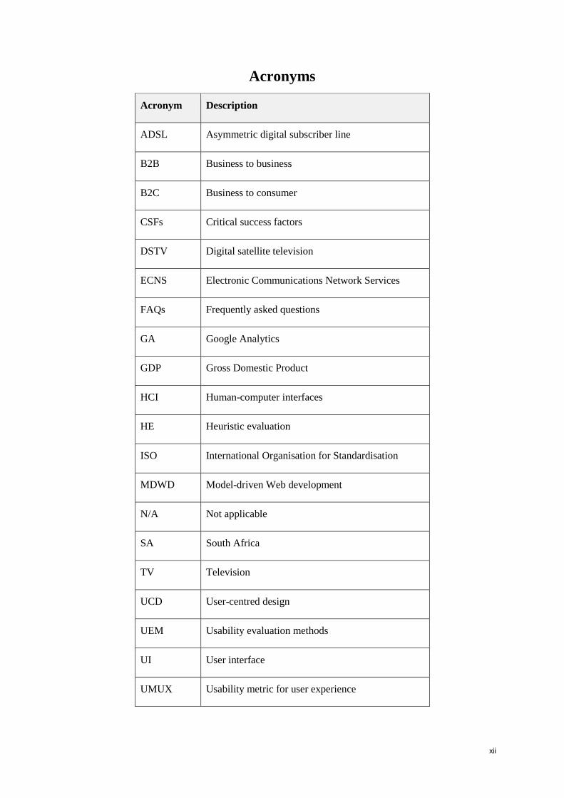
Acronyms
Acronym Description
ADSL Asymmetric digital subscriber line
B2B Business to business
B2C Business to consumer
CSFs Critical success factors
DSTV Digital satellite television
ECNS Electronic Communications Network Services
FAQs Frequently asked questions
GA Google Analytics
GDP Gross Domestic Product
HCI Human-computer interfaces
HE Heuristic evaluation
ISO International Organisation for Standardisation
MDWD Model-driven Web development
N/A Not applicable
SA South Africa
TV Television
UCD User-centred design
UEM Usability evaluation methods
UI User interface
UMUX Usability metric for user experience
xiii
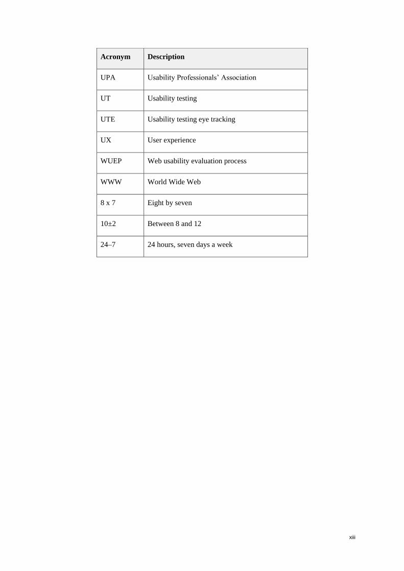
Acronym Description
UPA Usability Professionals’ Association
UT Usability testing
UTE Usability testing eye tracking
UX User experience
WUEP Web usability evaluation process
WWW World Wide Web
8 x 7 Eight by seven
10±2 Between 8 and 12
24–7 24 hours, seven days a week

1
Chapter 1: Introduction
1.1 Introduction
Companies are expanding their business offerings on the Internet. To be competitive, they
should offer more than just good presentations on their websites; they also need to provide a
good user experience (Väätäjä, Koponen and Roto 2009). Retail shops have sales consultants
who influence customer experience, but in the context of e-commerce, the sales consultant is
the website user interface, which provides information and functionality to help users achieve
their goals. The interface can either influence a customer to purchase or turn them away,
contributing to a decline in the financial performance of the e-business (Chang and Chen
2009). The success of e-commerce is thus influenced by a user’s experience in interacting
with the website and an awareness on the part of stakeholders of the phenomenon of user
experience (UX) in all areas of the business is required to ensure a positive user experience
(Martim, Herselman and van Greunen 2009).
The design of websites is becoming a fundamental issue for companies that want to maximize
profits in a competitive market (Lee and Koubek 2010). Internet statistics indicate that in
2009 the number of South African Internet users exceeded the 5 million mark, and was
expected to grow by 10% in 2010 (Goldstuck and Laschinger 2009). The American
International Telecommunication Union and American International Data Group predicted
that by 2010, Internet trade would account for 42% of global trade volume (Jing, Yu and
Jiang 2008). Therefore, the usability and user experience of e-commerce websites is
becoming a competitive requirement (Jinling and Huan 2007; Nielsen 1999).
The goal of this study is to determine means of providing better user experience on e-
commerce websites. Usability and user experience of e-commerce websites were investigated
by applying two usability evaluation methods, usability testing and heuristic evaluation, to
identify what aspects of usability support or hamper users’ performance, as well as to identify
design guidelines that could facilitate the design, development and re-engineering of e-
commerce websites. The study was conducted on South African e-commerce websites.
This chapter provides an overview of the dissertation. It begins by providing the problem
statement followed by the research questions. The justification for the study as well as the
scope, giving details of the target systems, limitation and assumptions, are discussed. The
2
research design and methodology is discussed, followed by the steps taken in data collection
and analysis. The chapter concludes by providing the structure of the study.
1.2 Problem statement
The phenomenon of user experience (UX) has created interest in academia and industry as
researchers have become aware of the limitations of the traditional usability framework,
which focuses primarily on user cognition and user performance in interactive products. In
contrast, UX shifts the focus to user emotions, sensation, and the meaning as well as value of
such interactions in everyday life (Law, Roto, Hassenzahl, Vermeeren and Kort 2009). The
focus on users’ needs and emotions while interacting with products is a key factor for product
success (Sproll, Peissner and Sturm 2010). The International Organisation for
Standardisation’s current ISO standards 9241-210 on human-centred design describes UX as:
‘all aspects of the user’s experience when interacting with the product, including all aspects
of usability and desirability of a product from the user’s perspective’ (ISO DIS 9241-210
2008). UX transfers attention from the product itself (i.e. functions, applications, interaction)
to human emotions while interacting with the product. Therefore, a good UX on a website or
computer application fulfils user needs by resulting in a positive feeling towards the
environment (Sproll, Peissner and Sturm 2010).
Good user experience incorporates all aspects of the end user’s interaction with the product or
service and the organization. These aspects would include marketing, ethnography, design,
software engineering, usability, Web analytics and business process analysis (Sward 2006).
Rubinoff (2004) defines user experience as involving four independent elements: branding,
usability, functionality and content. Furthermore, Porter and Bewer (2010) state that user
experience is comprised of all the interactions a person has with the brand, company, or
organization. This may include interactions with the software, the website, a call centre, or
advertisements. The sum total of these interactions over time culminates in the user
experience.
This study describes a comprehensive usability evaluation of e-commerce websites with a
focus on how their usability can contribute to a good or bad user experience. The
International Organisation for Standardisation (ISO) defines usability as: ‘the extent to which
a product can be used by specified users to achieve specified goals with effectiveness,
efficiency and satisfaction in a specified context’ (ISO 9241-11 1998). User experience, by
3
contrast, is defined as ‘feelings that the user has while interacting with the company, its
services, and its product’ (Nielsen Norman Group, 2008).
User experience differs from usability in that user experience aspects are more subjective
qualities and are mainly concerned with users’ emotions regarding a system. They differ from
the objective usability goals in that they are concerned with how users experience the product
from a personal perspective (Sharp, Rogers and Preece 2007). Nevertheless, viewpoints vary
on what usability and user experience respectively encompass and the relationship between
them. This is addressed further in Section 3.5.
Furthermore, Sharp et al. (2007) state that designers need to explicitly design for good user
experience. A good designer should communicate the intended message to the users in a way
that leads to a positive experience. Aspects such as the copy, tone, colours, navigation, visual
load, information hierarchy, branding, and satisfaction with content are all part of this
communication (Porter and Bewer 2010; Rubinoff 2004).
There are many usability approaches and usability evaluation methods (UEMs). These
approaches and methods have become a part of the design and development cycle that cannot
be ignored in Web design. The main differences between UEMs are based on whether users
will be involved or not, the stage of the product development life cycle, and the place where
the evaluation will take place (Ssemugabi and de Villiers 2010).
This study on the user experience provided by e-commerce websites is conducted by using
two different evaluation methods: usability testing (UT) and heuristic evaluation (HE). They
were selected as complementary approaches, since the former is a user-based method and the
latter is conducted by external expert evaluators. Usability testing is scenario-based and relies
on the interaction experiences and comments of real users. It is usually conducted in a
controlled environment, and the analysis process is complex and time consuming (Tan, Liu
and Bishu 2009). Sharp et al. (2007, p. 642) define usability testing as ‘an approach that
emphasizes to what extent a system is usable’. It involves measuring typical users’
performance on pre-defined tasks by placing the product in a usability laboratory where users
are asked to perform various tasks from a pre-defined list. The testing measures how easy and
efficient the product is to use, its visual consistency and load, and users’ overall perception of
their experience with the product.
4
The second method, heuristic evaluation, is a usability inspection technique originated by
Nielsen (1992; 1994b) whereby expert evaluators assess whether a system or website
complies with standard usability principles, also called heuristics. It is a widely used UEM
for computer system interfaces due to its low cost and fast turnaround time.
Clemmensen, Hertzum, Hornbaek, Shi and Yammiyavar (2009) state that interface heuristics
and Web standards are presented as universals and not defined per industry or target market.
However, each industry has different objectives and goals, and guidelines are required to
assist in achieving those unique goals. Furthermore, Barnard and Wesson (2004) state that
despite the existence of a large number of Web design guidelines, international research has
shown that many websites are still unusable or badly designed. There is little evidence to
indicate whether these guidelines have been used in practice (Barnard and Wesson 2004).
Väänänen-Vainio-Mattila and Wäljas (2009) mention that the majority of the interface
heuristics and standards focus on usability rather than on the more recent concept of user
experience.
In this context, the aims of this study are therefore to determine how the usability of e-
commerce websites can support the user experience of users, as well as to establish design
guidelines that can facilitate the design, development and re-engineering of e-commerce
websites with a view to promoting user experience.
Similar studies have been conducted on e-commerce in South Africa. A recent study by
Martim, Herselman and van Greunen (2009) addressed ways in which South African online
retailers can improve e-commerce usability to enhance growth. Barnard and Wesson (2003;
2004) conducted two studies on e-commerce in South Africa, the former focusing on
usability issues for e-commerce in South Africa, while the latter study proposed a trust model
for e-commerce in South Africa. The present study aims to determine factors that create a
better user experience on e-commerce websites and the role of usability in creating that user
experience.
The next section presents the main research question for this study as well as the
subquestions.
5
1.3 Research question
1.3.1 Primary research question
The main research question for this study is:
How can the findings of a dual-method usability evaluation of e-commerce websites
contribute to the attainment of better user experience?
1.3.2 Subquestions
The main research question gives rise to the following subquestions:
1. How can the usability of an e-commerce site be measured?
2. How can user experience of an e-commerce site be measured?
3. What do the findings of usability evaluation by a dual-method approach indicate
about the usability and user experience of four different websites?
4. What particular aspects of the usability of an e-commerce site support the user
experience offered by that site?
5. What design guidelines can facilitate the design, development and re-engineering
of e-commerce websites towards promoting user experience?
These questions will be addressed in the course of the study.
The following section will discuss four sets of beneficiaries that should benefit from this
study: designers, retail sector, end users and academics.
1.4 Value of the study
Primary beneficiaries of this study are the designers of e-commerce websites. Website
designers will be able to refer to the study to see which usability attributes contribute to a
better user experience, and design accordingly. For websites already developed and
operational, findings of the study could contribute to improving them.
A secondary beneficiary of this study is the retail sector, for reasons such as the following:
The emergence of e-commerce as a method of conducting business has highlighted
the need to constantly extend the set principles underlying this form of business
(Chang and Chen 2009).
As increasingly more products and services are sold over the Internet, it becomes all
the more important to build up a body of knowledge on e-commerce-specific user
interface (UI) and user experience (UX) design. Lowry, Spaulding, Wells, Moody,
6
Moffitt and Madariaga (2006) state that many e-commerce guidelines that exist today
have not been validated by empirical evidence, thus making them inapplicable in
certain contexts. In South African the majority of designers follow some of these
guidelines which do not necessarily provide appropriate levels of website usability.
Furthermore, for some designers, the goal of delivering a good user experience might
be a lower priority than meeting the website deadline and business requirements
(Zhao, Zou, Hawkins and Madapusi 2007). The usability of UIs of e-commerce
applications is crucial for the survival of a business and its success. The key to attract
users is e-commerce applications with high quality content, ease of use, quick
response and frequent updates. However, studies show that many UIs of e-commerce
applications suffer from usability problems (Zhao et al. 2007).
The role of user experience in e-commerce has not been well researched (Väänänen-
Vainio-Mattila and Wäljas 2009) and therefore this study could add valuable
information.
The third set of beneficiaries is the set of end users. End users will benefit from this study by
being able to engage with websites that are user friendly and enjoyable to use.
The fourth set of beneficiaries will be the community of academics. The guidelines for the
evaluation of e-commerce website can be added to the scientific body of knowledge.
The next section discusses the scope of the study.
1.5 Scope of the study
This section addresses the domain of the study, target systems used, limitations and
delimiters and assumptions.
1.5.1 Domain of the study
This study spans the areas of usability evaluation, user experience, and e-commerce. Existing
literature provides background information on retail, e-commerce, usability, user experience
and usability evaluation methodologies that forms the foundation of this study. Successful
user experience design for e-commerce depends on various factors. With the aim of
identifying user experience attributes that contribute to the success of an e-commerce system,
this research focuses on retail e-commerce websites that market products and services over
the Web.
7
1.5.2 Target systems
The e-commerce websites selected for this study are within the South African
telecommunication sector, namely:
MTN
Vodacom
Virgin Mobile
Cell C.
1.5.3 Limitations and delimiters
The process of testing and evaluating the e-commerce websites stops short of actual
purchases, i.e. there is no study of financial transactions. Furthermore, the inputs are purely
for academic use, and will not be used for consulting purposes. The study is not intended to
rank the sites or to recommend one above another.
When direct quotes are given from the Web, page numbers are not always provided, because
in many cases, pages of a website or a CD, are not numbered.
1.5.4 Assumptions
The study assumed, firstly, that the participants of the system had a fairly strong internet
usage background, with at least one year of experience in working with websites.
Participants with only one year of experience were considered as novice participants, and
participants with more than one year of experience were considered as experts. Secondly, it is
assumed that participants had an adequate command of English, since it is the most common
medium of instruction in the South African educational system. However, for some of the
participants, English is their second language, as their vernacular is Afrikaans or an African
Language. In South Africa with its eleven official languages, multilingualism and
multiculturalism on the Web are not yet common standards. The reason may be that the
translation of a website is expensive and time consuming (Nante and Glaser 2008). Van
Iwaarden, van der Wiele, Ball and Millen (2004) state that language, culture and religion may
be strong contributors to a user’s impression of the website. The consequence of a website
not being in a user’s official language may be a negative response towards the target system,
not because the system is badly designed but because users do not understand the
terminology. Thirdly, it is assumed that the information provided by end users (regarding age,
8
race, Internet usage, etc.) is correct and that analysis of the results will provide correct input
into the recommendations.
In this study, it is assumed that heuristic evaluation is inexpensive, easy and fast to perform
when compared to other evaluation methods, as discussed in Section 4.5. It is also
acknowledged that usability testing, on the other hand, is time-intensive and uses
sophisticated technology (see Section 4.4). The issues of cost and time expended on the
evaluations are not investigated in this study, since the purpose is to use the two UEMs to
obtain supplementary data, and not to conduct a comparative study of UEMs.
For the purpose of this study, the researcher created certain terms that relate to navigation
through e-commerce websites, such as ‘product-based’, ‘needs-based’, and ‘user journey’.
These terms are defined in Chapter 6.
The following section addresses the research design and methodology used to conduct this
study.
1.6 Research design and methodology
Disclaimer: This research study applies usability evaluation methods to four informational e-
commerce websites. The work undertaken is for academic and research purposes only, and
has no commercial or promotional intentions. The ethical clearance for this study can be
found in Appendix D.
As already stated, the International Organisation for Standardisation (ISO) defines usability
as: ‘the extent to which a product can be used by specified users to achieve specified goals
with effectiveness, efficiency and satisfaction in a specified context’ (ISO 9241-11 1998).
Two different usability evaluation methods (UEMs) were used: usability testing and heuristic
evaluation, the former being a user-based method and the latter an inspection method
conducted by experts.
Both usability testing and heuristic evaluation methods can provide valuable insights on
usability problems at the beginning, during, and at the end of the product development life
cycle.
Firstly, criteria appropriate for evaluating the usability and user experience of e-commerce
applications were established, to contribute to answering research Subquestions 1 and 2.
9
Literature study: Criteria for the usability test and heuristic evaluation were identified
by conducting a study of existing literature. This provided information on ways to
measure usability and user experience.
To answer Subquestion 3 about evaluating e-commerce sites, the material about usability
evaluation and the selected criteria were applied in two different ways.
Usability testing: Usability testing (UT) involves formal usability testing and
observation sessions in the controlled environment of a usability laboratory with a
sample of real end users. Performance measurements were taken of aspects such as
the time taken on processes, the number of steps to complete a task, and errors.
Questionnaires and interviews were used to determine the problems or preferences
identified by participants as they interacted hands-on with the target system,
performing specified tasks. UT is known to be an effective method that rapidly
identifies weaknesses and strengths, and is particularly used to improve the usability
of products (Dumas 2003; Dumas and Redish 1999; Jeffries, Miller, Wharton and
Uyeda 1991).
Heuristic evaluation: The defined criteria for usability and user experience evaluation
of e-commerce websites were used as heuristics in a heuristic evaluation (HE) of the
target websites. HE is conducted by expert evaluators, who review a system using a
set of usability principles known as heuristics, to determine whether it complies with
these heuristics, and to identify potential usability problems (Ssemugabi and de
Villiers 2010). It is the most popular usability evaluation method (UEM) for computer
system interfaces, because it is quick, inexpensive, and good at achieving broad
coverage of the entire user interface. However, it may miss some complex issues
(Barrington 2007). It is advisable to combine HE with a user-based method
(Adebesin, Kotzé and Gelderblom 2010).
The differences between UT and HE are as follows:
The goals are different: HE identifies usability problems while UT focuses on
measuring the effectiveness, efficiency and user satisfaction of an application (de
Kock, van Biljon and Pretorius 2009).
Data capturing and processing are different: In HE, the data is gathered from the
report by the heuristic evaluator (Jeffries and Desurvire 1992). In UT, the data is
captured through objective measures involving the testing the end users’ interactions
10
with the target system and also by subjective measures such as a questionnaire and
observations by the evaluator (de Kock, van Biljon and Pretorius 2009).
There is a difference in the level of information rendered: UT deals mostly with the
what and the how information, while HE focuses on a meta-level considering why and
when. This is supported by the work of Fu, Salvendy and Turley (2002), who found
that UT is more effective in finding usability problems associated with the
knowledge-based level of performance, while HE is more effective in identifying
usability problems associated with skills-based competencies.
Limitations to UT and HE are as follows:
Limitations to UT result from the fact that most tests are conducted in a specially
designed laboratory with a one-way glass room divider and sophisticated equipment
enabling facilitators to interact with the user. This is very expensive to set up, and
there can be further costs associated with recruiting users and testers (Gardner 2007).
Limitations to HE relate to the reliability of the effectiveness measure (Hertzum and
Jacobsen 2003), measure of user experience (Law and Hvannberg 2004), the
subjective interpretation of the results and the lack of theoretical underpinning
(Kasarskis, Stehwien, Hickox and Aretz 2001).
The findings of the two UEMs were combined to answer Subquestion 4, which relates to
what usability aspects of an e-commerce site support the user experience offered by that site.
Consolidation: A study was then undertaken of the correspondence between the
usability problems identified using heuristic evaluation and those identified by real
end users in usability testing. This study has both depth and breadth. Depth was
provided by using two evaluation methods. Breadth was obtained, because four e-
commerce websites were evaluated – not to conduct a comparative study of the sites,
but to identify generic issues that relate to usability and user experience as
encountered by users of e-commerce, and to explore dependencies between usability
and user experience. Related aspects of usability aspects and user experience were
tabulated against each other.
11
Finally, the findings were used to generate guidelines as an answer to Subquestion 5.
Synthesis: Following the identification of generic issues regarding usability and user
experience, a set of guidelines was generated to facilitate the design, development and
re-engineering of e-commerce sites with a view to creating good user experience.
1.6.1 Usability testing design methodology
The goal of the usability testing process is to measure the degree to which a system is
efficient, effective, and if users are satisfied with using the system.
Efficiency entails the extent of effort, for example, time and amount of errors, required
to use the system in order to achieve the stated tasks;
Effectiveness deals with the ability of a system to perform tasks comprehensively and
accurately, and its ability to support the user in successfully completing the tasks
(Genise 2002); and
Satisfaction refers to whether users have a positive response when using the system
(Bastien 2010).
Further factors that were tested include: navigation, information architecture, language,
aesthetics and visual appeal, and page structure and layout (Gardner 2007). These aspects
will be elaborated further in Chapter 5.
In this study, the evaluations were conducted on operational systems.
1.6.1.1 Participants
Twelve representative participants were recruited by the researcher; each was tested on an
individual basis. The tests took place at Aqua Online Usability Lab, Hyde Park, in a
controlled usability testing environment. Aqua Online is a leading digital agency in South
Africa that specialises in usability.
The recruitment characteristics to ensure that participants were representative, are explained
in Section 5.3.1 in the chapter on research design.
The duration of the tests was 2 hours, including short breaks between using the four systems,
but excluding the orientation, background, pre-test and post-test questionnaires and
interviews.
12
1.6.1.2 Target systems
Participants were asked to perform the same set of tasks on each website. As stated in Section
1.5.2 the target websites used for this study were the main telecommunication websites in
South Africa, namely:
MTN (www.mtn.co.za)
Vodacom (www.vodacom.co.za)
Virgin Mobile (www.virginmobile.co.za)
Cell C (www.cellc.co.za).
1.6.1.3 Tasks
The researcher selected two performance tasks that aim at covering participants’ main goals
in coming onto e-commerce websites, namely:
Find a plan that will best suit your needs;
Find an Internet package.
1.6.1.4 Test structure
The test structure consisted of orientation, background questionnaire, pre-test questionnaire,
performance tasks and a post-test user experience questionnaire. These questionnaires will be
elaborated in Chapter 5.
1.6.2 Heuristic evaluation methodology
Four expert evaluators were asked to conduct HEs on the target websites, according to the
heuristics that emerged from the literature study. Two were so-called ‘double experts’, i.e.
both a usability expert and a domain expert, where the domain in this case is e-commerce.
1.6.2.1 Heuristic evaluation criteria
Three categories of criteria were used for the heuristic evaluation:
General interface design heuristics;
E-commerce usability design heuristics; and
User experience design heuristics.
Each category is briefly described below and will be elaborated in Chapter 5.
The first category of general interface heuristics is based on Nielsen’s (1994b) and Powals’
(1996) heuristic principles. They are: visibility of system status; match between system and
the real world; user control and freedom; consistency and standards; error prevention;
13
recognition rather than recall; flexibility and efficiency of use; aesthetics and minimalism of
design; error recovery; help and documentation (Nielsen 1994b). To Nielsen’s classic
heuristics, Powals (1996) adds automation of unwanted workload and fusion data.
The criteria in the second category, namely, e-commerce usability design heuristics, were
established by the literature review conducted in Chapters 2 and 3. They are: communication
of the intended message; page display; layout and site structure; value of information
provided; utility; language and culture; trust and security; effectiveness; efficiency; safety;
learnability; memorability; and satisfaction.
The third category, user experience design heuristics were established from the literature
review conducted in Chapter 3. These heuristics were compiled to form part of a post-test
questionnaire to be completed by the expert evaluators once they have interacted with the
four systems. These heuristics are: feelings evoked by using the website; personalisation;
website quality perception; cross-platform service access; context-aware service;
contextually enriched content; general user experience-related issues; visual appeal; and
service quality.
The following section presents the steps taken to collect and analyse the data.
1.7 Steps in data collection and analysis
The following steps were taken to collect data and analyse it:
1. Establish criteria for usability evaluation and user experience evaluation of e-
commerce websites.
2. Design questionnaires for the usability testing session: pre-test, post-test and
performance test interview. Perform a pilot study with one real end user in order to
test the documentation and testing process. Carry out the full usability testing
evaluation with twelve real end user in order to identify problems and preferences in
the e-commerce websites.
3. Design a framework of heuristics for experts to use in the evaluation of e-commerce
websites.
4. Analyse the data collected so as to determine answers to another research
subquestion, in particular what usability aspects contribute to creating a good user
experience on e-commerce websites?
5. Provide design guidelines on good user experience of e-commerce websites.

14
Where possible, some of these steps were done in parallel.
The following section outlines the structure of this study.
1.8 Structure of the study
The study has three main parts, namely the theoretical part, the practical part, followed by a
final section dealing with recommendations and conclusions. They are distinguished as
follows:
Part 1: Theory
Chapters 2 to 4 entail literature studies which give background information on e-commerce,
usability, user experience and usability evaluation methodologies, with an emphasis on
usability testing and heuristic evaluation. These literature studies set the scene and provide
the frame of reference for the study. The areas of the study, e-commerce, usability and user
experience, are then integrated by the generation of criteria appropriate for evaluation of e-
commerce websites.
Part 2: Practical
Chapter 5 describes the development of the usability testing and heuristic evaluation criteria
that is used to evaluate the e-commerce websites. Chapter 6 describes the planning and
conducting of usability testing on the websites with end users, and the planning and
management of the heuristic evaluation by experts. Furthermore it comprehensively presents
the results of both studies. As previously stated, the criteria generated in Chapter 5 are used
as the basis for the evaluations. The results of both evaluations are recorded, analysed,
compared and the main findings are discussed.
Part 3: Recommendations and conclusions
Chapter 7 summarises, draws conclusions and provides guidelines that were derived from the
usability test and heuristic evaluation results. The guidelines are designed to aid in creating
good user experience for the users when they are looking for products and services on e-
commerce websites. Chapter 8 answers the research questions, and summarises the major
issues of the study.
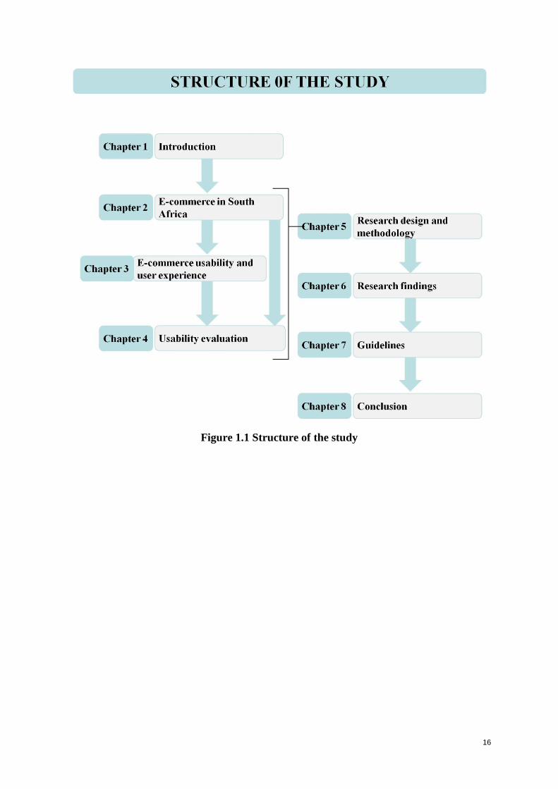
Figure 1.1 depicts the various chapters and their interrelationships. The details of these
chapters are described in the list following.
15
Chapter 1, the introduction, gives a brief overview of the content and structure of the
study. This includes the research problem, the value and scope of the study, the
research design and methodology used, and the report structure.
Chapter 2 discusses e-commerce in South Africa, as well as provides an overview of
Internet usage and the retail sector.
Chapter 3 describes the value of usability and user experience to the success of e-
commerce websites.
Chapter 4 names and explains usability evaluation methodologies (UEMs).
Based on the foundations provided by Chapters 2 to 4, Chapter 5, the research design
chapter, combines the application domain of e-commerce websites and the focus area
of usability evaluation. The research questions are set out, explaining how and where
they are addressed. Usability criteria for evaluation of e-commerce websites are
synthesised, focusing on usability issues from the human-computer interaction (HCI)
perspective, as well as UX aspects.
The guidelines and heuristics developed in Chapter 5 are used for the practical
evaluations of the websites, described in Chapter 6, where the data collected is
presented and analysed.
Chapter 7 summarises, draws conclusions and provides guidelines.
Chapter 8 answers the research questions, and summarises the major issues of the
study.
16
Figure 1.1 Structure of the study

17
18
Chapter 2: E-commerce in South Africa
2.1 Introduction
During the 1990s, the media detailed how the Internet was going to revolutionize the way
customers shopped, and how online sales would grow. In the past ten years, e-commerce has
grown significantly, and become a grounded foundation for driving real business results.
Many customers have become comfortable with online shopping, and it is rare to find a
customer who does not have access to the Internet at home or at work (McCall 2009).
E-commerce is not limited to direct sales, but extends to influencing offline store sales while
building more profitable customer relationships. McCall (2009) reported that 40–50% of all
offline retail sales are influenced by customers who research online before heading to the
store, and that 70% of online customers state that if the company website is poor, it will
negatively affects their overall impression of the brand. Therefore, the Web is a critical brand
touchpoint which simultaneously provides the opportunity for a company to engage with
consumers and immerse them in their brand.
E-commerce has grown substantially over the past years in South Africa (SA) even though it
is still behind in the developed countries (Epnet 2009; World Wide Worx 2010; Internet
World Stats 2008). Internet usage in Africa is growing faster than in any other region in the
world. In 2009 the number of South African Internet users exceeded the 5 million mark and
towards the end of 2010, it grew by 10% (World Wide Worx 2010; Internet World Stats
2008). However, e-commerce has not achieved its full potential (Martim, Herselman and van
Greunen 2009), and companies should continuously improve the usability of their e-
commerce websites in order to create a positive user experience and increase the success of
their marketing efforts.
In SA, the government realized the importance of e-commerce in shaping the performance of
domestic enterprises in the global networked economy and have developed policies and
regulations to govern e-commerce. Despite the rapid growth of e-commerce, there are
prospects and scope for improvements in SA (South Africa Department of Communication
2000).
This chapter discusses e-commerce in SA and provides an overview of Internet usage and the
retail sector. The chapter also emphasises the role of good user experience on e-commerce
19
sites, due to the large number of users researching products over the Internet. The chapter
begins by discussing the retail sector in SA in Section 2.2, followed by definitions of e-
commerce in Section 2.3. Section 2.4 discusses e-commerce today and the challenges
associated with it such as: culture, trust and usability. The chapter concludes by discussing e-
commerce guidelines in Section 2.5.
The following section discusses the retail sector in SA.
2.2 Retail sector in South Africa
Despite the recent global economic crisis; loss of jobs and change in customer spending
behaviour, the performance of SA retail sector has been exceptional over the past 10 years
(Seda 2007). The retail sector is one of the strongest sectors in the SA economy and the main
contributor to the Gross Domestic Product (GDP). E-commerce contributes 15% to the GDP
and accounts for 24% of SA employment (Seda 2007).
For e-commerce to be successful, many factors should be taken into consideration. The user
is the most important factor (Lee and Koubek 2010); designers need to study users in order to
understand how their preferences are determined. Users may base their preferences on
usability, performance, aesthetics, price, information quality and brand of the e-commerce
website (Keinonen 1997). E-commerce guidelines are discussed in Section 2.5.
The same ‘Internet Retailing in South Africa’ study (World Wide Worx 2010) predicts that
by 2014 there will be 9 million Internet users in South Africa. The Internet has been available
in South Africa for only 15 years, yet, as stated in Section 2.1, there are currently over 5
million users. Goldstuck and Laschinger (2009) state that this growth can be attributed to four
driving factors, namely:
1. The Seacom undersea cable, which increases bandwidth dramatically in Southern and
East Africa, as well as reducing the cost.
2. The decision made by the Independent Communications Authority of South Africa to
issue electronic communications network services licences (ECNS) to Internet service
providers, that allow service providers to build their own networks and use their own
infrastructure.
3. Many small and medium enterprises (SMEs) are using asymmetric digital subscriber
line (ADSL) and abandoning dial-up technology behind. These smaller companies are
20
currently the major driving force behind Internet access in South Africa. For every
SME, up to twenty individuals gain connectivity (Goldstuck and Laschinger 2009).
4. Internet access via mobile phones is growing steadily. Goldstuck and Laschinger
state that there will be improvements in both usability and the user’s ability to use
advanced features on their cell phones (Goldstuck and Laschinger 2009).
Taking the above into consideration, the future of e-commerce in South Africa looks
optimistic. To evaluate e-commerce websites, it is necessary to first look at e-commerce as
defined in the next section.
2.3 E-commerce defined
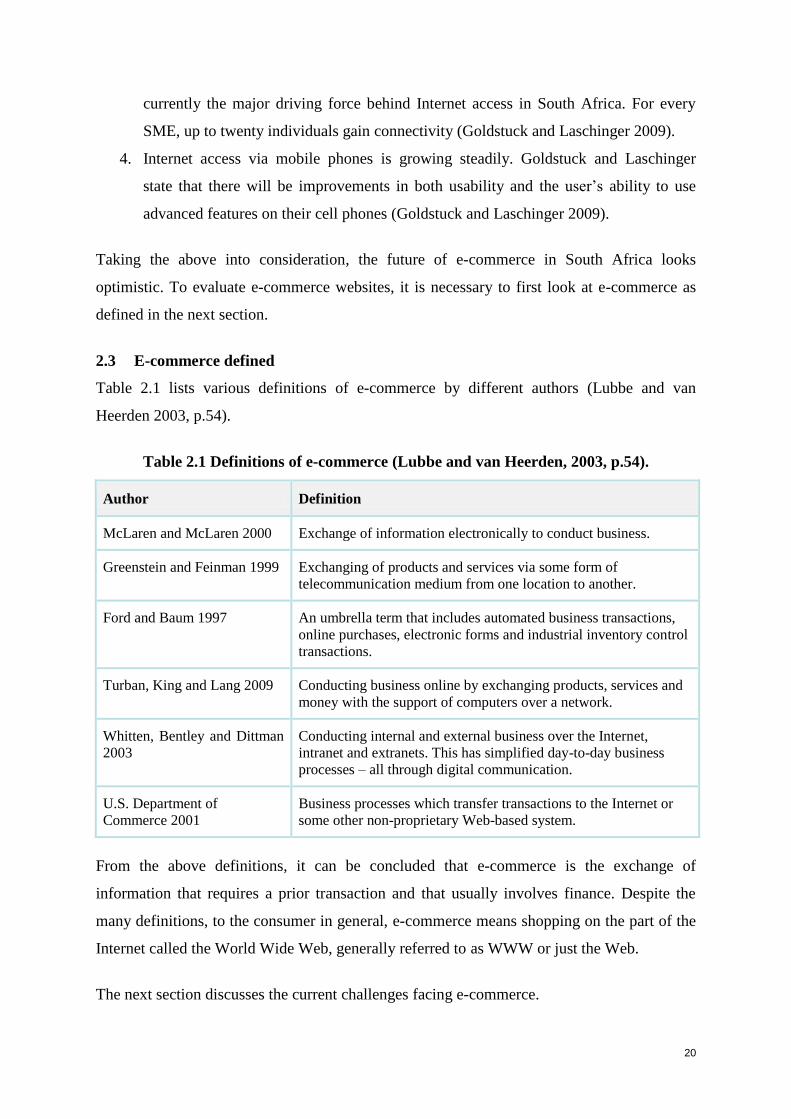
Table 2.1 lists various definitions of e-commerce by different authors (Lubbe and van
Heerden 2003, p.54).
Table 2.1 Definitions of e-commerce (Lubbe and van Heerden, 2003, p.54).
Author Definition
McLaren and McLaren 2000 Exchange of information electronically to conduct business.
Greenstein and Feinman 1999 Exchanging of products and services via some form of
telecommunication medium from one location to another.
Ford and Baum 1997 An umbrella term that includes automated business transactions,
online purchases, electronic forms and industrial inventory control
transactions.
Turban, King and Lang 2009 Conducting business online by exchanging products, services and
money with the support of computers over a network.
Whitten, Bentley and Dittman
2003
Conducting internal and external business over the Internet,
intranet and extranets. This has simplified day-to-day business
processes – all through digital communication.
U.S. Department of
Commerce 2001
Business processes which transfer transactions to the Internet or
some other non-proprietary Web-based system.
From the above definitions, it can be concluded that e-commerce is the exchange of
information that requires a prior transaction and that usually involves finance. Despite the
many definitions, to the consumer in general, e-commerce means shopping on the part of the
Internet called the World Wide Web, generally referred to as WWW or just the Web.
The next section discusses the current challenges facing e-commerce.
21
2.4 E-commerce and its challenges
In South Africa, designing an e-commerce website may be a greater challenge than in the rest
of the world, since the population varies greatly with regard to cultural background and
eleven official languages. There are many factors that contribute to the challenges of e-
commerce. Three of these factors are: culture (Martim, Dlamini, van Greunen, Eloff and
Herselman 2009; Macagnano and Greeff 2007), usability (Barnard and Wesson 2003; 2004)
and trust (Egger and Abrazhevich 2001). The following section expands on three challenges
that affect e-commerce: culture, trust and usability.
2.4.1 Culture
E-commerce owners that offer their products across national and international borders are
continually striving to enhance the usability of their websites in order to attract more visitors
(Nante and Glaser 2008). Besides trust and usability, culture is an important aspect to
consider in the design of e-commerce sites. Nante and Glaser conducted a study on the
impact of language and culture on perceived website usability and found that the perceived
usability increases when the website is designed in the native language of the user. In South
Africa with eleven official languages, multilingualism or multiculturalism on the Web are not
yet common standards. The reason may be that the translation of a website is expensive and
time consuming (Nante and Glaser 2008). Van Iwaarden et al. (2004) state that language,
culture and religion may be strong contributors to a user’s impression of the website.
Clemmensen, Hertzum, Hornbaek, Shi and Yammiyavar (2009), however, state that most
research on usability evaluation methods is unaffected by cultural issues. For example, the
cultural background of users is rarely reported, task scenarios are assumed to be culturally
unbiased, interface heuristics and Web standards are presented as universals and not defined
per industry or target market. This is surprising, because definitions of usability emphasize
the importance of concepts such as the context of use, which includes users’ cultural
background.
Besides the factors mentioned in the previous paragraph, there are two other important factors
influencing users when they are interacting on e-commerce websites, namely: trust and
usability. The former is important because the lack of secure payment methods may have a
negative influence of the user’s perception of the trustworthiness of the site and this can
result in users not purchasing anything. The latter is relevant because if the site does not meet
the user’s goals, they will tend to find another site.
22
2.4.2 Trust
Trust includes privacy, ease of use and credibility of information on the Web and is as
important to users as security (Egger and Abrazhevich 2001). The primary hindrance to
continued e-commerce growth is winning public trust (Furnell and Karweni1999; Ott 2000;
Bélanger, Hiller and Smith 2002). Hoffman, Novak and Peralta (1999) identified two
important factors that hamper the potential growth of e-commerce, namely: lack of standard
technologies for secure payments and the lack of profitable business, and state that both of
these factors influence the user’s perception of the trustworthiness of a site. The Cheskin
Research Project conducted on e-commerce trust, states that without trust, e-commerce will
not reach its full potential (Cheskin Research 1999). Egger and Abrazhevich (2001) found
that average users are probably unable to objectively assess security issues such as encryption
algorithms, but the average user is willing to trust a familiar information resource. For
example, if a website employs a well-structured marketing effort to enable users to gain trust
before transacting, then the users will regard the website as a familiar information resource,
and be more likely to purchase from it. Users are more likely to trust companies they have
heard about than companies they have not (Cheskin Research 1999; Barnard and Wesson
2003). Word-of-mouth and brand identification are the two issues that keep website vendors
going (Barnard and Wesson 2003). Users are more likely to listen to what other users are
saying about the product than they are to believe the original source. Several studies have
suggested that a large number of Internet users have serious concerns regarding privacy on
the Internet.
E-commerce transactions often consist of complex interactions between stakeholders. Trust
becomes an important factor in situations that are perceived to be risky, such as e-commerce
that exposes users to new vulnerabilities and risks (Joubert and van Belle 2009).
2.4.3 Usability
The first law of e-commerce states that, if users are looking for a product but they cannot find
it, they simply cannot buy it (Nielsen 1994a). Thus having a usable website is not a luxury;
rather it is a prerequisite for the survival of the website. Barnard and Wesson maintain that
the quality of a website is relative to the usability of the site (Barnard and Wesson 2003) and
usability can thus play a major role in the success of e-commerce. The aspects of usability are
addressed further in Chapter 3.
23
Despite the collapse of many ‘dot-coms’ in the late 1990s, Business to Consumer (B2C) e-
commerce has grown rapidly and has introduced a new shopping medium for users (Turban,
King and Lang 2009). Since 1995, there has been a rapid expansion of B2C e-commerce
activities and purchasing via the Internet is one of the most rapidly growing forms of
shopping (Levy and Weitz 2001). Companies have realised the importance of this, as well as
the benefits for their customers, for example: 24 hour, seven day (24–7) access to products
and services, latest stock information, and a variety of products and services from one point
of access (Chang and Chen 2008; Laudon and Traver 2007; Wang and Emurian 2005). In
addition, companies have noted that that they should fine-tune their operations and offer
better service to their customers (Becker 2008; Dietel, Dietel and Nieto 2001; Laudon and
Traver 2007). Jupiter Research (2003) conducted a review of 239 well-known B2C websites,
and found that one in seven B2C websites had major errors on their home pages to such an
extent that they caused visitors to abandon the website. E-commerce websites represent the
online presence of a company and, if the website reflects low usability, then users may
develop a poor image of the company, eventually working against their intention to return to
the website (Nielsen 1994a).
Following are examples of the e-commerce situation in South Africa, from a report conducted
by World Wide Worx, on ‘Internet Retailing in South Africa’ (2009):
Amazon.com no longer supplies products to South African users because they have
encountered major problems with the postal system in the country as products were
not delivered safely to the customer. E-tailors now use couriers in SA.
Lower disposable income in 2008, due to economic conditions, affected users’
spending on e-commerce. Moreover, there is a mistrust of the South African postal
system and users are concerned that they will not receive products purchased online.
Majority of the South African population falls into the lower living standards measure
(LSM) group and therefore cannot afford internet access. Therefore, the growth of e-
commerce in South Africa is limited by the number of users who have access to the
internet.
Kalahari.net is the largest e-commerce retailer in South Africa. The company held a
value share of 5% in 2008. Pick 'n Pay and Woolworths have tapped into the e-
commerce market in South Africa, but their market shares remain small in comparison
to the more established players. South Africans still prefer to go into a store to
purchase products.
24
The following section presents certain e-commerce guidelines.
2.5 E-commerce guidelines
Chang and Chen (2009) state that a good website needs to provide orderly screens, simple
search paths, fast and readable presentation of information, and simple navigation; if the
website succeeds in these aspects it will, in return, reduce users’ switching behaviour.
Although there has been little research in this area, it is likely that users keep on using
whatever website they perceive as having high interface quality.
There are a number of considerations that designers need to take into account when designing
an e-commerce website (Hernández, Jiménez and Martín 2009):
Users who have no previous experience of e-commerce and those who have
purchased before, represent two different types of user-behaviour journeys.
A design strategy should be identified to attract new e-users or retain their existing
ones.
The target market and needs should be identified, and products should be tailor-made
for the needs of each type of user, due to the different perceptions of different target
groups.
E-commerce providers cannot control the level of experience of users, but they can
develop websites that aim to create a shopping experience that is confidence-building
by making users feel efficient and capable of correctly performing all types of e-
transactions.
Camus and Evans (2009) from Forrester Research conducted a study on the complex
purchasing decision path of European shoppers, and implemented strategies to convert
visiting Web users into buying Web users. They proposed the following guidelines to
promote buying transactions:
Enable seamless channel transitions: Companies need to allow users different
purchase options in order for them to transact easily in the means of their choice, for
example, offering two purchase options: buy online or reserve the option to pick it up
in a store.
Aim at clear product visualization and information: The majority of users do most
of their product research on the Internet, thus it is important that the website offers a
detailed and comprehensive description about the product to assist users in choosing
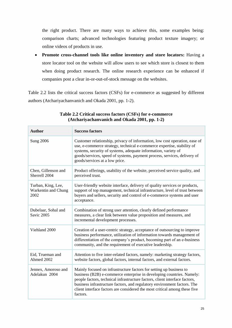
25
the right product. There are many ways to achieve this, some examples being:
comparison charts; advanced technologies featuring product texture imagery; or
online videos of products in use.
Promote cross-channel tools like online inventory and store locators: Having a
store locator tool on the website will allow users to see which store is closest to them
when doing product research. The online research experience can be enhanced if
companies post a clear in-or-out-of-stock message on the websites.
Table 2.2 lists the critical success factors (CSFs) for e-commerce as suggested by different
authors (Atchariyachanvanich and Okada 2001, pp. 1-2).
Table 2.2 Critical success factors (CSFs) for e-commerce
(Atchariyachanvanich and Okada 2001, pp. 1-2)
Author Success factors
Sung 2006 Customer relationship, privacy of information, low cost operation, ease of
use, e-commerce strategy, technical e-commerce expertise, stability of
systems, security of systems, adequate information, variety of
goods/services, speed of systems, payment process, services, delivery of
goods/services at a low price.
Chen, Gillenson and
Sherrell 2004
Product offerings, usability of the website, perceived service quality, and
perceived trust.
Turban, King, Lee,
Warkentin and Chung
2002
User-friendly website interface, delivery of quality services or products,
support of top management, technical infrastructure, level of trust between
buyers and sellers, security and control of e-commerce systems and user
acceptance.
Dubelaar, Sohal and
Savic 2005
Combination of strong user attention, clearly defined performance
measures, a clear link between value proposition and measures, and
incremental development processes.
Viehland 2000 Creation of a user-centric strategy, acceptance of outsourcing to improve
business performance, utilization of information towards management of
differentiation of the company’s product, becoming part of an e-business
community, and the requirement of executive leadership.
Eid, Trueman and
Ahmed 2002
Attention to five inter-related factors, namely: marketing strategy factors,
website factors, global factors, internal factors, and external factors.
Jennex, Amoroso and
Adelakun 2004
Mainly focused on infrastructure factors for setting up business to
business (B2B) e-commerce enterprise in developing countries. Namely:
people factors, technical infrastructure factors, client interface factors,
business infrastructure factors, and regulatory environment factors. The
client interface factors are considered the most critical among these five
factors.
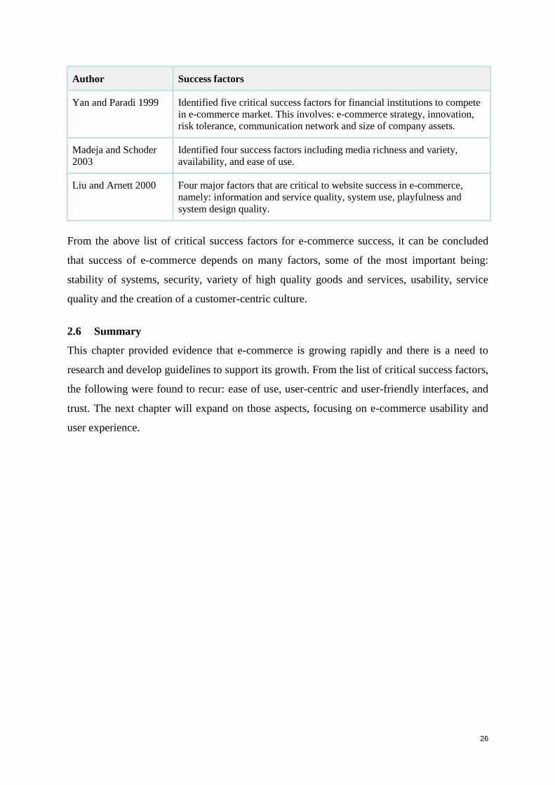
26
Author Success factors
Yan and Paradi 1999 Identified five critical success factors for financial institutions to compete
in e-commerce market. This involves: e-commerce strategy, innovation,
risk tolerance, communication network and size of company assets.
Madeja and Schoder
2003
Identified four success factors including media richness and variety,
availability, and ease of use.
Liu and Arnett 2000 Four major factors that are critical to website success in e-commerce,
namely: information and service quality, system use, playfulness and
system design quality.
From the above list of critical success factors for e-commerce success, it can be concluded
that success of e-commerce depends on many factors, some of the most important being:
stability of systems, security, variety of high quality goods and services, usability, service
quality and the creation of a customer-centric culture.
2.6 Summary
This chapter provided evidence that e-commerce is growing rapidly and there is a need to
research and develop guidelines to support its growth. From the list of critical success factors,
the following were found to recur: ease of use, user-centric and user-friendly interfaces, and
trust. The next chapter will expand on those aspects, focusing on e-commerce usability and
user experience.
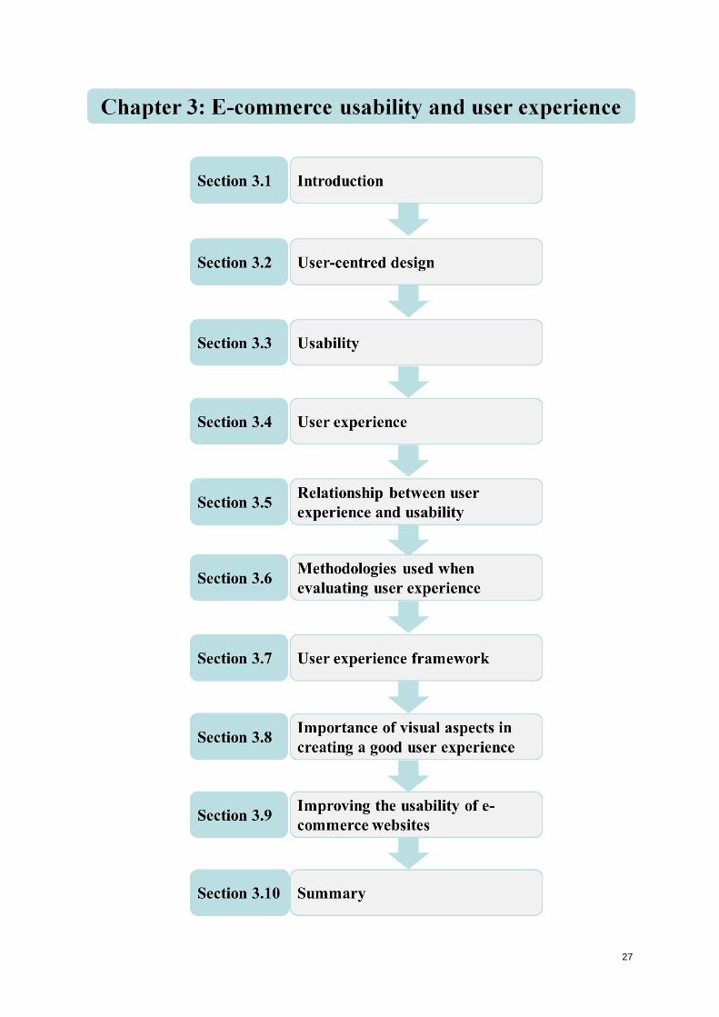
27
28
Chapter 3: E-commerce usability and user experience
3.1 Introduction
As most companies expand their business offerings on the Internet, design of the websites is
becoming a fundamental issue for companies that want to maximize profits in a competitive
market (Lee and Koubek 2010). In the context of e-commerce, the user is the most important
factor in the attainment of higher profits. Therefore, the website designer needs to connect
strongly with the users by understanding how they make their choices and the journey they
would like to take. User preference is based on the user’s individual opinion that one product
is better than another. Preference reflects a user’s feelings for the interface design of a
website, and influences his or her decision regarding their behaviour on that website (Lee and
Koubek 2010).
Problems occur in e-commerce website usability due to inadequate usability testing of the
sites (Gabriel 2007). Various procedures and guidelines exist that can be applied to e-
commerce website usability, for example: heuristic evaluation, guideline check lists, user
evaluation, and satisfaction questionnaires, among others (Sharp, Rogers and Preece 2007;
Holzinger 2005; Nielsen 1994b). Clemmensen et al. (2009) point out that interface heuristics
and Web standards are presented as universals, rather than being defined per industry or
target market. Each sector has different objective and goals and there should be guidelines to
support those unique goals. Although a large number of Web design guidelines exist,
international research has shown that many websites are still unusable or poorly designed
(Barnard and Wesson 2004). Furthermore, Lowry et al. (2006) state that many of these
guidelines have not been validated by empirical evidence, thus making them inapplicable in
some contexts. In South Africa the majority of designers follow certain guidelines, but they
do not necessarily provide appropriate levels of website usability. The usability of user
interfaces (UIs) of e-commerce applications is crucial for the survival of a business and its
success. The key to attract users is e-commerce applications with high quality content, ease of
use, quick response and frequent updates. However, studies show that the majority of the UIs
of e-commerce applications suffer from usability problems (Zhao et al. 2007).
This chapter addresses usability and user experience on e-commerce websites and the role
they play in its success or lack of success. Section 3.2 provides an overview of user-centred
design, where Section 3.3 discusses usability. In Section 3.4 an introduction is provided to
29
user experience and what it entails. Section 3.5 discusses the relationship between user
experience and usability, and Section 3.6 discusses methodologies that can be used when
evaluating user experience. User experience frameworks to uncover emotions of websites are
presented in Section 3.7. Section 3.8 lists the importance of visual aspects on a user interface
in creating a good user experience. This chapter is concluded by Section 3.9 which shows
examples of how usability can improve e-commerce websites.
3.2 User-centred design
Abels, White and Hahn (1999, pp. 35–44) define user-centred design (UCD) as ‘design that
involves the user’s input throughout the product development life cycle from the system-
information gathering, development, and evaluation, through to implementation’. The
Usability Professionals’ Association (UPA) website says: ‘User-centred design (UCD) is an
approach to design the foundation process in information about the people who will use the
product’. Users should be the driving force in the product development lifecycle. UCD
processes focus on users through the planning, design, and development of a product.
Sharp et al. (2007) investigate the artefact’s use and target domain by taking a user-centred
approach to development. They advocate seeking the user’s opinions and reactions to early
designs, and involving users appropriately in the development process itself. This means that
users’ concerns direct the development, rather than just technical concerns.
Bevan (2009) identified the following usability and user experience aspects in the context of
user-centred design:
Usability:
Designing for and evaluating the effectiveness and efficiency of the system.
Designing for and evaluating user comfort and satisfaction.
Designing for and making sure that the product is easy to use.
User experience:
Understanding and designing the user’s experience with a product; how users interact
with it over time.
Identifying and evoking associated emotional responses.
The following section defines usability and discusses its goals and associated questions.
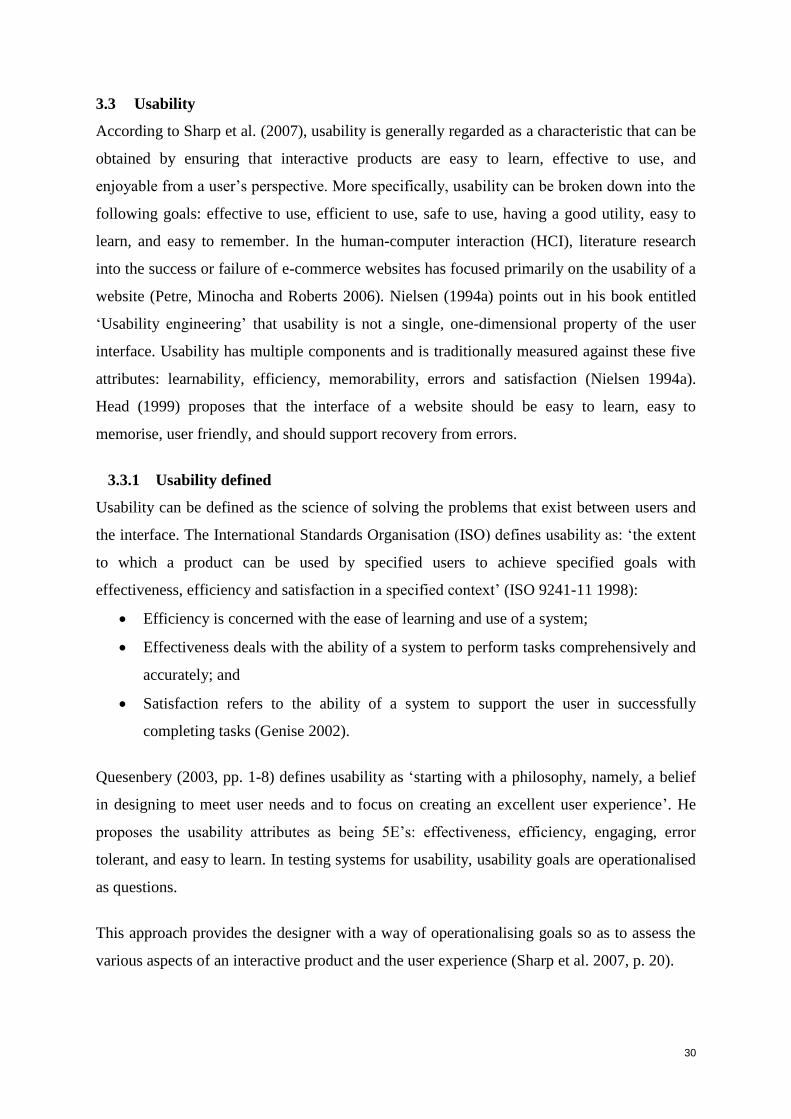
30
3.3 Usability
According to Sharp et al. (2007), usability is generally regarded as a characteristic that can be
obtained by ensuring that interactive products are easy to learn, effective to use, and
enjoyable from a user’s perspective. More specifically, usability can be broken down into the
following goals: effective to use, efficient to use, safe to use, having a good utility, easy to
learn, and easy to remember. In the human-computer interaction (HCI), literature research
into the success or failure of e-commerce websites has focused primarily on the usability of a
website (Petre, Minocha and Roberts 2006). Nielsen (1994a) points out in his book entitled
‘Usability engineering’ that usability is not a single, one-dimensional property of the user
interface. Usability has multiple components and is traditionally measured against these five
attributes: learnability, efficiency, memorability, errors and satisfaction (Nielsen 1994a).
Head (1999) proposes that the interface of a website should be easy to learn, easy to
memorise, user friendly, and should support recovery from errors.
3.3.1 Usability defined
Usability can be defined as the science of solving the problems that exist between users and
the interface. The International Standards Organisation (ISO) defines usability as: ‘the extent
to which a product can be used by specified users to achieve specified goals with
effectiveness, efficiency and satisfaction in a specified context’ (ISO 9241-11 1998):
Efficiency is concerned with the ease of learning and use of a system;
Effectiveness deals with the ability of a system to perform tasks comprehensively and
accurately; and
Satisfaction refers to the ability of a system to support the user in successfully
completing tasks (Genise 2002).
Quesenbery (2003, pp. 1-8) defines usability as ‘starting with a philosophy, namely, a belief
in designing to meet user needs and to focus on creating an excellent user experience’. He
proposes the usability attributes as being 5E’s: effectiveness, efficiency, engaging, error
tolerant, and easy to learn. In testing systems for usability, usability goals are operationalised
as questions.
This approach provides the designer with a way of operationalising goals so as to assess the
various aspects of an interactive product and the user experience (Sharp et al. 2007, p. 20).
31
Table 3.1 provides descriptions of each usability goal and questions associated with each one.
Table 3.1 Usability goals and associated questions
(Sharp, Rogers and Preece 2007, p. 20)
Usability
goal
Definition Question
Effectiveness How good a product is at doing what it
is supposed to do.
Can the product support users in learning,
in conducting their work efficiently, and
accessing the information they need, and
in purchasing the goods they want?
Efficiency The number of steps when carrying out
tasks needs to be at a minimum.
Once users have learned how to use a
product, can they sustain a high level of
productivity to carry out their tasks?
Safety Involves protecting users from
dangerous conditions and undesirable
situations, as well as providing users
with various methods for recovery,
should they make errors.
What possible errors can occur while
using the product and what methods are
there to allow users to recover easily from
them?
Utility The product’s functionality to assist
users in what they need or want to do.
Does the product provide a sufficient set
of functions that will enable users to carry
out all their tasks efficiently?
Learnability How easy a system is to learn to use. How easy is it for the user to work out
how to use the product by exploring the
interface and trying out certain actions?
Memorability Once learned, how easy is it to
remember how to use a product.
What kind of support does the interface
provide to assist users in remembering
how to carry out tasks, especially for
products and operations they use
frequently?
Satisfaction What users think of the product once
they have used it?
Did users have confidence in using the
system and did the system make users feel
efficient and capable of performing all
tasks correctly?
The next section discusses user experience.
3.4 User experience
Until recently, traditional HCI has measured the usability of a system in terms of efficiency,
utility, effectiveness, safety, learnability and memorability, while overlooking the role played
by other aspects of the user experience, such as whether it is aesthetically pleasing and
enjoyable. User experience aspects are more subjective qualities and are mainly concerned
32
with users’ emotions towards a system; they differ from the more objective usability goals, in
that they are concerned with how users experience the product from their perspective (Sharp
et al. 2007). Hassenzahl (2004) states that the UX viewpoint extends the user-centred design
approach to cover issues beyond practical functionality and usability. He mentions that UX
extends users’ motivations and emotions such as stimulation, identification and self-
expression. These may include positive or negative expressions. The former option includes
users perceiving a system or site as: satisfying, enjoyable, engaging, pleasurable, exciting,
entertaining, helpful, motivating, aesthetically pleasing, and rewarding. The latter case
includes: boring, frustrating, annoying, and cutesy (Sharp et al. 2007, p. 26).
These personal emotions will influence future interaction with the system and may be
communicated to other users with the potential of influencing their subjective experience
(Hassenzahl 2005). Creating a positive user experience (UX), is a central design aim for
products and services. Increasingly, Web services are developed for both personal computers
(PCs) and mobile terminals to support user needs for media content management and social
interaction. Even though many UX models have been developed over the last decade, the
specific characteristics affecting UX of Web services have not been studied systematically
(Väänänen-Vainio-Mattila and Wäljas 2009).
Creating a user experience on websites involves more than one single factor. There are many
considerations to which designers should pay attention when creating a user experience.
Companies may be aware of user experience (UX), however, the majority of designers do not
know how to measure it or design for it, because they do not understand it. Even in the
literature, many authors describe their studies of its effects and importance of improving the
experience, without actually defining it (Sward 2006).
Some authors suggest that it encompasses all aspects of the end user’s interaction with the
company and the merging of the contributions of multiple disciplines (Nielsen Norman
Group 2008; Kuniavsky 2007; Vredenburg 2002; Sward 2006). According to Sward (2006),
user experience incorporates all aspects of the end user’s interaction with the product or
service and the organization. User experience is the value that is derived from a user’s
interactions with a product or service and the context of use (i.e. time, location, and user
disposition). User value can be actual value (i.e. efficiency and effectiveness), perceived
value (i.e. trustworthiness, emotions, satisfaction, aesthetic, social rewards, behaviour,
entertainment), or a combination of both.
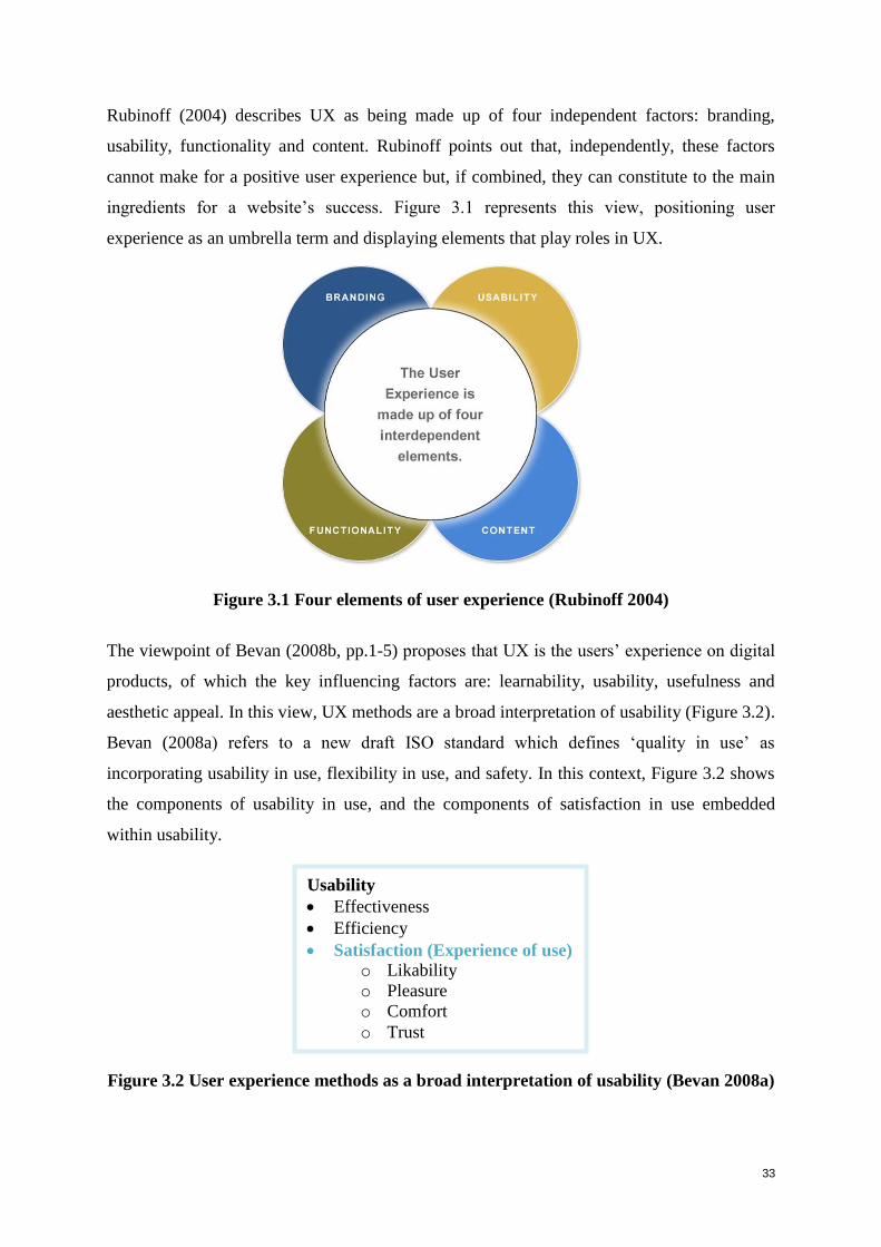
33
Rubinoff (2004) describes UX as being made up of four independent factors: branding,
usability, functionality and content. Rubinoff points out that, independently, these factors
cannot make for a positive user experience but, if combined, they can constitute to the main
ingredients for a website’s success. Figure 3.1 represents this view, positioning user
experience as an umbrella term and displaying elements that play roles in UX.
Figure 3.1 Four elements of user experience (Rubinoff 2004)
The viewpoint of Bevan (2008b, pp.1-5) proposes that UX is the users’ experience on digital
products, of which the key influencing factors are: learnability, usability, usefulness and
aesthetic appeal. In this view, UX methods are a broad interpretation of usability (Figure 3.2).
Bevan (2008a) refers to a new draft ISO standard which defines ‘quality in use’ as
incorporating usability in use, flexibility in use, and safety. In this context, Figure 3.2 shows
the components of usability in use, and the components of satisfaction in use embedded
within usability.
Figure 3.2 User experience methods as a broad interpretation of usability (Bevan 2008a)
Usability
Effectiveness
Efficiency
Satisfaction (Experience of use)
o Likability
o Pleasure
o Comfort
o Trust
34
Bevan 2009, points out the close connection between the satisfaction component of usability
and user experience: ‘A person’s perceptions and responses in the definition of user
experience are similar to the concept of satisfaction in usability. From this perspective,
measures of user experience can be encompassed within the 3-component model of usability,
particularly when the satisfaction is task-related’.
The ISO definition, given in Section 3.4.1 immediately following, suggests measures of user
experience are similar of satisfaction in usability (ISO DIS 9241-210 2008). The user’s
experience with a product or service is ideally the outcome of a user-centred design process;
not a design process in itself. Delivering a good experience requires a wide range of UX
disciplines, such as marketing, ethnography, graphics design, software engineering, hardware
engineering, interaction design, information architecture, information design, accessibility,
technical writing, usability, user research, visual design, Web analytics and business process
analysis (Sward 2006). The next section provides certain definitions of user experience.
3.4.1 User experience defined
Definitions of user experience vary. The current ISO standard 9241-210 on human-centred
design describes UX as: ‘all aspects of the user’s experience when interacting with the
product, including all aspects of usability and desirability of a product from the user’s
perspective’ (ISO DIS 9241-210 2008). As mentioned in the previous section, Rubinoff’s
(2004) broad definition suggests that user experience is includes: branding, usability,
functionality and content. He emphasises the relationship of UX to user-centred design.
In April 2008, a special interest group at the conference on human factors in computing
systems presented a paper entitled, ‘Towards a Shared Definition of User Experience’ (Law,
Roto, Hassenzahl, Vermeeren and Kort 2008, pp. 2395-2398). The authors presented a list of
various definitions of UX (Table 3.2) from various individuals and organizations in the field.
Moreover, they relate to varying contexts, not just computing systems.
Table 3.2 User experience definitions
(Law, Roto, Hassenzahl, Vermeeren and Kort 2008, pp. 2395-2398)
Author Definition
Lauralee 1996 Involves all the aspects of how users use an interactive product: the way it
feels in their hands, how well they understand how it works, how they feel
about it while they are using it, and how well it serves their purposes.
35
Author Definition
Nielsen Norman
Group 2008
User emotions derived when interacting with an institution, its services,
and its product
Hassenzahl
and Tractinsky 2006
A consequence of a user’s internal state (i.e. predispositions, expectations,
needs); the characteristics of the designed system (i.e. complexity,
purpose, usability); and the context (or the environment) within which the
interaction occurs (i.e. organizational/social setting, meaningfulness of the
activity, voluntariness of use).
Each of these definitions is notably different from the others. They vary in scope but, from
them, it can be established that UX is a sensation related primarily to the emotions a user has
while interacting with a device or system, and that the success of a system is related to a
positive user experience. User experience is primarily influenced by the user interface and a
good user interface design supports users in meeting their goals (van Greunen, van der
Merwe and Kotze 2010). In addition, user experience is an attitude towards a system and an
emotional bonding with it (Tobias and Spiegel 2009).
Law et al. (2009) state that an experience is something personal ‘within’ a person. They
mention that a group may share an experience, because although people may influence each
other’s experience before, during, and after interacting with a product, only an individual can
have actual feelings and experiences. Furthermore, they state that a group generally forms the
social context that affects user experience. This however, occurs together with other
contextual factors: physical technology and task context (ISO 13407 1999). A survey
gathered the views on UX of 275 researchers and practitioners from academia and industry,
and results indicated that the users viewed the concept of UX as dynamic, context-dependent,
and subjective (Law et al. 2009). Generally, UX was seen as something new, which must
become a part of the HCI domain and be grounded in user centred design (UCD) practices.
Law et al. (2009, pp. 719-728) identified three reasons as to why it is hard to get a universal
definition of UX:
‘UX is associated with a variety of dynamic concepts: emotional, affective,
experiential, hedonic, and aesthetic variables’.
‘The unit of analysis for UX is flexible, ranging from a single aspect of an individual
interaction with a stand–alone application to all aspects of multiple end users’
interactions with the company and its merging of services from multiple disciplines’.
36
‘The landscape of UX research is fragmented and complicated by various theoretical
models such as: emotion, experience, value, beauty and hedonic quality’.
If this issue of the scope of UX is resolved, it will resolve a number of problems pertaining to
UX. Tobias and Spiegel (2009) also state that until a clear definition of UX is agreed upon,
the effort made by designers and developers cannot be fully assessed or appreciated. HCI and
UX have traditionally been interested in users’ initial interactions with products (Karapanos,
Martens and Hassenzahl 2010). User experience is of a dynamic nature, due to the ever-
changing emotional state of a person and due to differences in the circumstances during and
after an interaction with a product (Hassenzahl 2008; Law et al. 2009). This statement
provides a clear indication that it is essential to look beyond static aspects and to investigate
the sequential aspects of UX and how it changes over time (Karapanos, Zimmerman, Forlizzi
and Martens 2009; Law et al. 2009).
Furthermore, ‘UX factors need to be mapped to the user’s context of use, which profoundly
influences the user interaction with products, resulting in a matrix of factors versus contextual
parameters’ (Obrist, Ruyter, Tscheligi and Schmidt 2010, pp. 3197-3200). Hess (2009)
provided the following descriptions of what ‘UX is not’ in order to clarify misconceptions.
UX design is not an outcome of a user interface design. The user interface is just
one piece of the total UX.
UX design is not a single step in the process. It relates to a focus on the user, allowing
him/her to be the driving force at all stages of the product/service lifecycle.
UX design is not only about technology. Users come first, the technology helps to
enable a good experience.
UX design is not just about usability, but also about the emotional aspects that arise
from usability.
UX design is not merely the role of the designer, it is the responsibility of all the
stakeholders.
UX design is not a choice. It is a vital part of the business’s survival.
It is significant to note that UX is not only an interaction with services or products but also
with the company’s brand. A company’s brand experience is a broader concept than user
experience with the company’s products and services, it includes all the information about the
company either from the company itself, media, or word of mouth. Therefore, the company’s
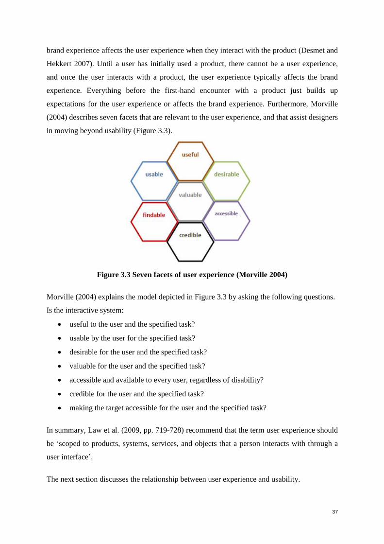
37
brand experience affects the user experience when they interact with the product (Desmet and
Hekkert 2007). Until a user has initially used a product, there cannot be a user experience,
and once the user interacts with a product, the user experience typically affects the brand
experience. Everything before the first-hand encounter with a product just builds up
expectations for the user experience or affects the brand experience. Furthermore, Morville
(2004) describes seven facets that are relevant to the user experience, and that assist designers
in moving beyond usability (Figure 3.3).
Figure 3.3 Seven facets of user experience (Morville 2004)
Morville (2004) explains the model depicted in Figure 3.3 by asking the following questions.
Is the interactive system:
useful to the user and the specified task?
usable by the user for the specified task?
desirable for the user and the specified task?
valuable for the user and the specified task?
accessible and available to every user, regardless of disability?
credible for the user and the specified task?
making the target accessible for the user and the specified task?
In summary, Law et al. (2009, pp. 719-728) recommend that the term user experience should
be ‘scoped to products, systems, services, and objects that a person interacts with through a
user interface’.
The next section discusses the relationship between user experience and usability.
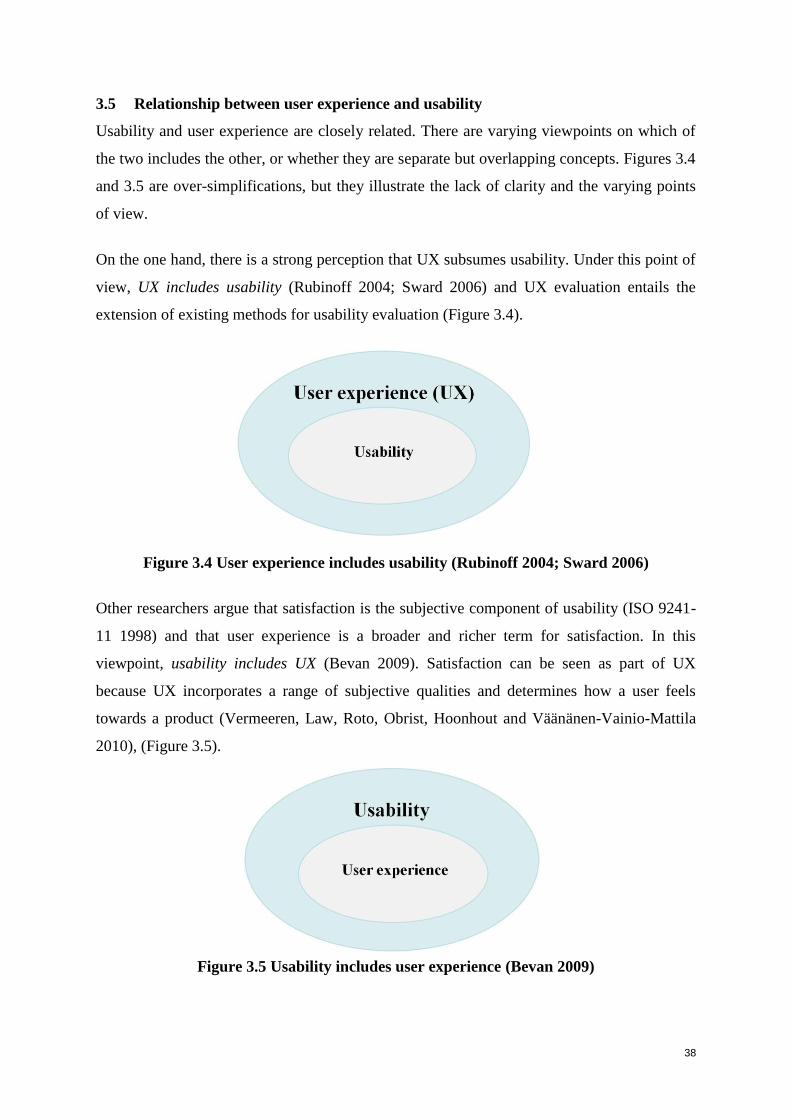
38
3.5 Relationship between user experience and usability
Usability and user experience are closely related. There are varying viewpoints on which of
the two includes the other, or whether they are separate but overlapping concepts. Figures 3.4
and 3.5 are over-simplifications, but they illustrate the lack of clarity and the varying points
of view.
On the one hand, there is a strong perception that UX subsumes usability. Under this point of
view, UX includes usability (Rubinoff 2004; Sward 2006) and UX evaluation entails the
extension of existing methods for usability evaluation (Figure 3.4).
Figure 3.4 User experience includes usability (Rubinoff 2004; Sward 2006)
Other researchers argue that satisfaction is the subjective component of usability (ISO 9241-
11 1998) and that user experience is a broader and richer term for satisfaction. In this
viewpoint, usability includes UX (Bevan 2009). Satisfaction can be seen as part of UX
because UX incorporates a range of subjective qualities and determines how a user feels
towards a product (Vermeeren, Law, Roto, Obrist, Hoonhout and Väänänen-Vainio-Mattila
2010), (Figure 3.5).
Figure 3.5 Usability includes user experience (Bevan 2009)

39
A third stance could suggest that usability and user experience are separate, but closely
related, concepts. They can be perceived as two intersecting concepts with a common area,
but outer features that are distinct to one of the two. This stance is also in harmony with the
view of Rubinoff (2004) (see Figure 3.1), who portrays usability as overlapping with user
experience, implying that certain aspects of usability lie outside of UX. This study is founded
on the above viewpoint and portrayed in Figure 3.6.
Figure 3.6 Usability and user experience: Closely related concepts
Hassenzahl (2004) distinguishes between two perceptions of quality: pragmatic and hedonic.
This distinction supports the stance of the present researcher, and is represented in Figure 3.7,
which extends Figure 3.6. Pragmatism refers to a product’s ability to support the
achievement of behavioural goals, i.e. usefulness and ease of use, which are usability goals.
Hedonism, relates to enjoyment and stimulation, i.e. the product’s ability to stimulate and
enable personal growth and identification, which are attributes of user experience.
Hassenzahl argues that the driver of UX is fulfilment of a person’s basic human needs, and
that lack of usability might block fulfilment of certain human requirements. If users
experience fulfilment through a product, they will attach hedonic attributes to it. Hedonism,
therefore, contributes directly to the core of positive experience (Hassenzahl 2008).
Sharp et al (2007) point out the subjectivity of user experience goals and their importance
from the user’s personal perspective. This is in contrast with the more objective usability
goals, by which an interactive product is assessed from its own perspective, in terms of its
usefulness and productivity. This distinction is also shown in Figure 3.7.
In a pragmatic approach, Bevan (2008a) deals with the UX and usability in an integrated
way, stating, ‘There are two types of UX/usability measures: those that measure the result of
using the whole system (usability in use) and measures of the quality of the user interface
(interface usability). Furthermore, in Bevan (2009) the varying roles of both are indicated,

40
‘Although there is no fundamental difference between measures of usability and measures of
user experience at a particular point in time, the difference in emphasis between task
performance and pleasure leads to different concerns during development’. These attributes
are also shown in Figure 3.7.
Figure 3.7 Usability and user experience: Some differences
Experts are currently attempting to integrate UX into the next revision of the respective ISO
standards (Hassenzahl 2008). (See ISO 9241-210 on human-centred design which defines
user experience). Tobias and Spiegel (2009) state that design drives UX which, in turn,
affects the user’s mental model, and the lack of design impacts the user psychologically, and
directly affects user experience in HCI.
This perspective makes design the central pivot of UX. A positive user experience on a
website is essential if users are to return. When users are satisfied with a product they are
more likely to recommend it to others, and people are more likely to make purchases from a
source that has been personally recommended. Website usability can have a key influence on
this experience. Good site usability ensures people are able to use the site and helps ensure
the site does what it is intended to do. When users they have finished using a site –
successfully or unsuccessfully – and leave it with a positive or negative emotion towards the
brand, it relates to user experience (Gray 2009).
Both UX and usability are of great value and impact synergistically on each other. Regardless
of containment or overlaps, an aim of the present study (Table 6.33 in Section 6.6) is to show
how certain recognised aspects of usability impact on recognised aspects of UX. The study
will considers how usability attributes can contribute to a good user experience or,
conversely, how the lack thereof can detract from the quality of the experience.
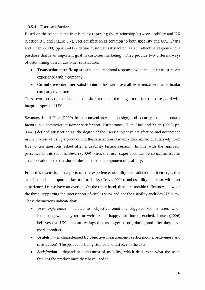
41
3.5.1 User satisfaction
Based on the stance taken in this study regarding the relationship between usability and UX
(Section 3.5 and Figure 3.7), user satisfaction is common to both usability and UX. Chang
and Chen (2009, pp.411–417) define customer satisfaction as an ‘affective response to a
purchase that is an important goal in customer marketing’. They provide two different ways
of determining overall customer satisfaction:
Transaction-specific approach - the emotional response by users to their most recent
experience with a company.
Cumulative customer satisfaction - the user’s overall experience with a particular
company over time.
These two forms of satisfaction – the short term and the longer term form – correspond with
integral aspects of UX.
Szymanski and Hise (2000) found convenience, site design, and security to be important
factors in e-commerce customer satisfaction. Furthermore, Tian, Hou and Yuan (2008, pp.
39-43) defined satisfaction as ‘the degree of the users' subjective satisfaction and acceptance
in the process of using a product, but the satisfaction is mainly determined qualitatively from
five to ten questions asked after a usability testing session’. In line with the approach
presented in this section, Bevan (2009) states that user experience can be conceptualised as
an elaboration and extension of the satisfaction component of usability.
From this discussion on aspects of user experience, usability and satisfaction, it emerges that
satisfaction is an important factor of usability (Travis 2009), and usability intersects with user
experience, i.e. we have an overlap. On the other hand, there are notable differences between
the three, supporting the intersection-of-circles view and not the usability-includes-UX view.
These distinctions indicate that:
User experience – relates to subjective emotions triggered within users when
interacting with a system or website, i.e. happy, sad, bored, excited. Jensen (2006)
believes that UX is about feelings that users get before, during and after they have
used a product.
Usability – is characterised by objective measurements (efficiency, effectiveness and
satisfaction). The product is being studied and tested, not the user.
Satisfaction – dependant component of usability, which deals with what the users
think of the product once they have used it.
42
The next section addresses methodologies to investigate user experience.
3.6 Methodologies used when evaluating user experience
The discipline of usability engineering represents user experiences primarily in cognitive or
behaviourist terms, but there is a current trend to investigate human emotional experiences by
representing users’ reactions to designs using verbal and graphic means, as well as by
applying heuristics custom-made for evaluating UX (Chang 2006). Many toolkits exist for
doing traditional usability evaluations, but user experience evaluation differs considerably
from usability evaluation. User experience cannot be evaluated with stopwatches or logging,
because UX is subjective (Law et al. 2009). Objective measures such as task execution time
and the number of clicks or errors are not reliable measures for UX, but evaluators need to
know how the user feels about the system. Users’ motivation and expectations affect the
experience more than in traditional usability (Mäkelä and Fulton 2001).
A good user experience on a company’s external website is crucial for companies to
differentiate themselves from the competition and to gain loyalty and trust from users.
Therefore, it is impossible to manage an experience on a website without sound methods of
evaluating user experience (Väätäjä, Koponen and Roto 2009). As the need for regular user
experience evaluation is high both in industry and academia, it is still unclear which are the
most appropriate methods for assessing user experience. This is partly due to the fact that
there is still not an agreed definition for user experience, although standardization work is
ongoing (Benford, Giannachi, Koleva and Rodden 2009). As has been pointed out in this
chapter, user experience is largely associated with the emotions that users have whilst
engaging with an interactive system. Emotion assessment is not the only way to evaluate user
experience; the users’ perceptions of the product and their overall evaluative judgments of it
should also be ascertained. In order to study attributes of UX, practical tools that support the
assessment of user experience are needed (Väätäjä, Koponen and Roto 2009).
The following section describes some methodologies currently used to evaluate UX.
3.6.1 Think-aloud method with user observation
The think-aloud method is discussed in more detail in Chapter 5. It is a technique applied in
usability testing when users are observed in a controlled environment. Users describe their
thinking processes out loud while they are completing various tasks on the website. The
43
advantage of thinking aloud is that testees provide valuable information, including details of
their cognitive processes and their behavioural patterns (Fang 2008).
3.6.2 Drawing
Massironi (2002) recommends drawing as a manual skill of generating signs to represent
what one sees. Drawing can also be viewed as a visual metaphor that shows a user’s
emotional state of mind much better than verbal descriptions (Diem-Wille 2001). Drawings
can be a good way for users to describe their feelings because it is not always easy to use
written language to describe an emotion (Chang 2006). Furthermore, Chang (2006) states that
drawings provide designers and usability analysts with a communicative method that works
on both conscious and unconscious levels. Drawings can depict personality, feelings and
different emotions that users have towards a Web interface, this is achieved by asking each
user to draw a picture in response to their impression of, and feeling about, their favourite
Web interfaces, instead of describing them textually (Chang 2006).
3.6.3 Mood board
A mood board is a combination of images, text, fonts, colour schemes and other graphic
elements that is used to depict the structure of the overall look and feel for a design. These
designs can be illustrated by collages that portray users’ thoughts, emotions, and creative
urges, through images (Chang 2006). A collage is an emotionally expressive and dynamic
exercise for explaining one’s personal character or way of life or illustrating feelings toward
certain subjects and events (Mattelmäki and Battarbee 2002). A collage can be used by
designers and usability analysts as an interactive tool for gathering design ideas and user
perspectives in the early stages of the design process. It can also serve as an evaluation tool to
measure the user experience through visual and emotional descriptions (Chang 2006).
3.6.4 Heuristics
Väänänen-Vainio-Mattila and Wäljas (2009) developed six heuristics for evaluating user
experience on websites:
Heuristic 1: Usage and creation of composite services. Is there functionality for
users to add new service components as they become available? This is more
applicable to sites such as social networking websites where users can join friends,
upload photographs, update their status or post messages.
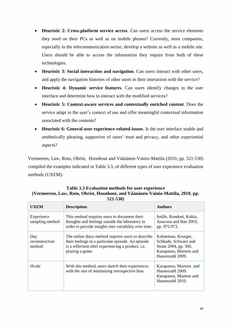
44
Heuristic 2: Cross-platform service access. Can users access the service elements
they need on their PCs as well as on mobile phones? Currently, most companies,
especially in the telecommunication sector, develop a website as well as a mobile site.
Users should be able to access the information they require from both of these
technologies.
Heuristic 3: Social interaction and navigation. Can users interact with other users,
and apply the navigation histories of other users in their interaction with the service?
Heuristic 4: Dynamic service features. Can users identify changes in the user
interface and determine how to interact with the modified services?
Heuristic 5: Context-aware services and contextually enriched content. Does the
service adapt to the user’s context of use and offer meaningful contextual information
associated with the contents?
Heuristic 6: General user experience-related issues. Is the user interface usable and
aesthetically pleasing, supportive of users’ trust and privacy, and other experiential
aspects?
Vermeeren, Law, Roto, Obrist, Hoonhout and Väänänen-Vainio-Mattila (2010, pp. 521-530)
compiled the examples indicated in Table 3.3, of different types of user experience evaluation
methods (UXEM):
Table 3.3 Evaluation methods for user experience
(Vermeeren, Law, Roto, Obrist, Hoonhout, and Väänänen-Vainio-Mattila, 2010, pp.
521-530)
UXEM Description Authors
Experience
sampling method
This method requires users to document their
thoughts and feelings outside the laboratory in
order to provide insights into variability over time.
Intille, Rondoni, Kukla,
Anacona and Bao 2003,
pp. 972-973.
Day
reconstruction
method
The online diary method requires users to describe
their feelings in a particular episode. An episode
is a reflection after experiencing a product, i.e.
playing a game.
Kahneman, Krueger,
Schkade, Schwarz and
Stone 2004, pp. 306.
Karapanos, Martens and
Hassenzahl 2009.
iScale With this method, users sketch their experiences
with the aim of minimising retrospective bias.
Karapanos, Martens and
Hassenzahl 2009.
Karapanos, Martens and
Hassenzahl 2010.
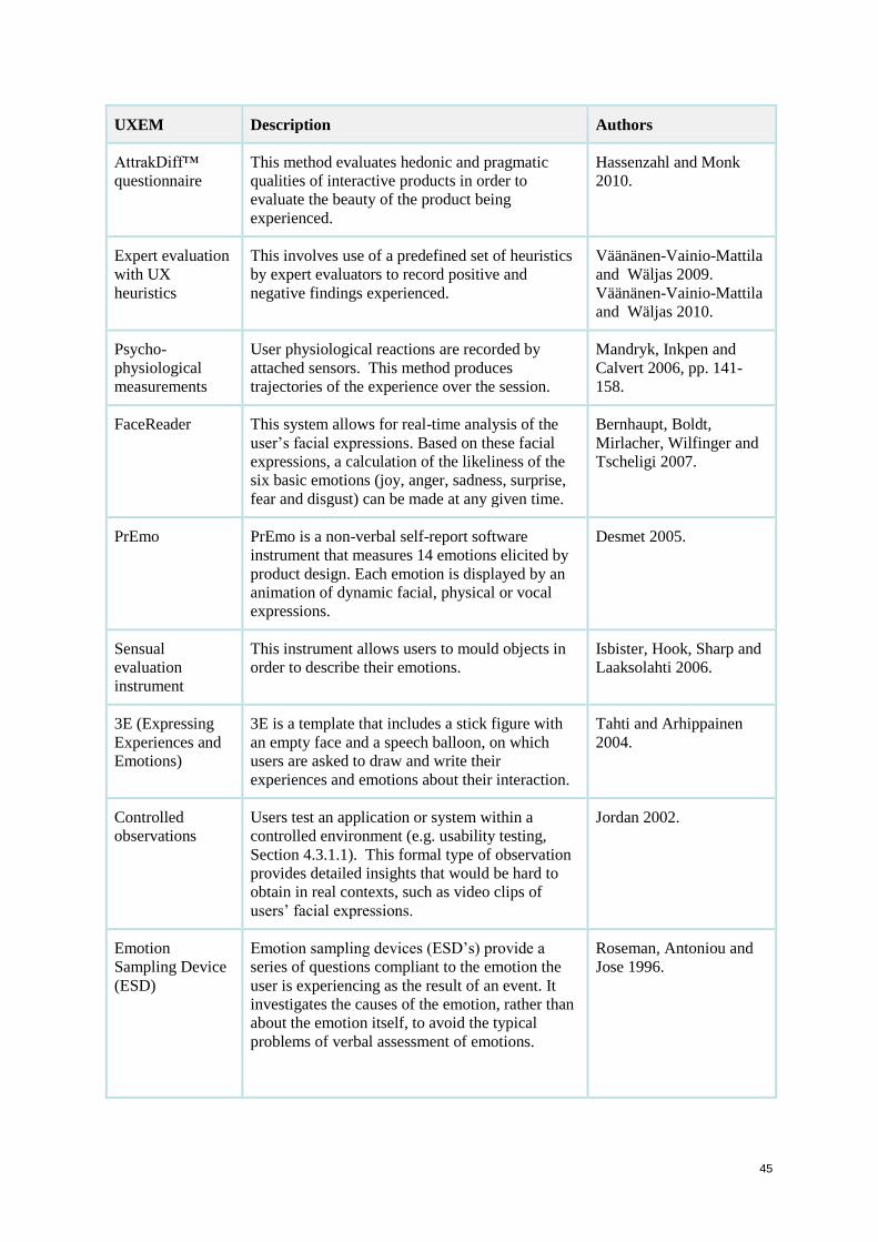
45
UXEM Description Authors
AttrakDiff™
questionnaire
This method evaluates hedonic and pragmatic
qualities of interactive products in order to
evaluate the beauty of the product being
experienced.
Hassenzahl and Monk
2010.
Expert evaluation
with UX
heuristics
This involves use of a predefined set of heuristics
by expert evaluators to record positive and
negative findings experienced.
Väänänen-Vainio-Mattila
and Wäljas 2009.
Väänänen-Vainio-Mattila
and Wäljas 2010.
Psycho-
physiological
measurements
User physiological reactions are recorded by
attached sensors. This method produces
trajectories of the experience over the session.
Mandryk, Inkpen and
Calvert 2006, pp. 141-
158.
FaceReader This system allows for real-time analysis of the
user’s facial expressions. Based on these facial
expressions, a calculation of the likeliness of the
six basic emotions (joy, anger, sadness, surprise,
fear and disgust) can be made at any given time.
Bernhaupt, Boldt,
Mirlacher, Wilfinger and
Tscheligi 2007.
PrEmo PrEmo is a non-verbal self-report software
instrument that measures 14 emotions elicited by
product design. Each emotion is displayed by an
animation of dynamic facial, physical or vocal
expressions.
Desmet 2005.
Sensual
evaluation
instrument
This instrument allows users to mould objects in
order to describe their emotions.
Isbister, Hook, Sharp and
Laaksolahti 2006.
3E (Expressing
Experiences and
Emotions)
3E is a template that includes a stick figure with
an empty face and a speech balloon, on which
users are asked to draw and write their
experiences and emotions about their interaction.
Tahti and Arhippainen
2004.
Controlled
observations
Users test an application or system within a
controlled environment (e.g. usability testing,
Section 4.3.1.1). This formal type of observation
provides detailed insights that would be hard to
obtain in real contexts, such as video clips of
users’ facial expressions.
Jordan 2002.
Emotion
Sampling Device
(ESD)
Emotion sampling devices (ESD’s) provide a
series of questions compliant to the emotion the
user is experiencing as the result of an event. It
investigates the causes of the emotion, rather than
about the emotion itself, to avoid the typical
problems of verbal assessment of emotions.
Roseman, Antoniou and
Jose 1996.

46
UXEM Description Authors
Emocards At the end of every task, users are asked to pick
one of several cartoon faces that identifies how
they are about their interaction.
Desmet, Overbeeke and
Tax 2001.
Long term diary
method
A prototype of the product is given to users for a
period of 6 months to a year. Users are required to
report their experiences and emotions at short
fixed intervals in the form of journal entries.
Bolger, Davis and Rafaeli
2003.
Reaction checklist Once the system has been evaluated by users, they
are given a list of possible reactions to it, i.e.
satisfied, frustrated or irritated.
Jordan 2002.
Vermeeren et al. (2010, pp. 521-530) propose the following methods for UX and HCI
practitioners and researchers to identify the best UX evaluation method for their specific
needs (i.e. development phase, kind of experience addressed, and location of UX evaluation):
‘Methods for the early phases of development: Establish how to evaluate UX
concept ideas and non-functional prototypes with real users early in the design
process’.
‘Validated measures for UX constructs: Improve the validity of measure-based
methods by providing validated measures for different experience such as cross-
cultural studies’.
‘Methods for social and collaborative UX evaluation: Identify methods to address
experiences of groups of individuals’.
‘Attention to practicability of methods: Address issues such as resources and ease
of data analysis, applicability of results for the development’.
‘Effective multi-method approaches: Identify which methods work well together, as
well as how to effectively collect and analyse the data from different sources’.
Creating a user experience on websites does not involve just a single aspect. There are many
considerations that designers need to reflect upon when creating a user experience. The most
important factor is the user himself or herself (Lee and Koubek 1010). Designers should
study the target users in order to understand how they make their preferences. Users may base
their preference on usability, performance, aesthetics, price, information quality or brand of
the e-commerce website (Keinonen 1997).
47
The next section discusses user experience frameworks used to uncover emotions on
websites.
3.7 User experience frameworks
Human needs and requirements are continually addressed in psychology and in the design of
interactive products (Hassenzahl, Diefenbach and Göritz 2010). Hassenzahl (2008) requested
users to mention a recent, positive and satisfactory experience with an interactive technology.
The results showed distinct experiences based on the fulfilment of users’ needs and the close
connection between needs and affect. Therefore, the fulfilment of particular psychological
needs can be understood as a cause of positive experience.
This section presents some UX frameworks for websites that contribute to creating emotional
user reactions with the aim of creating good user experiences:
1. User experience framework (Mahlke and Thüring 2007, pp. 915-918), (Table 3.4);
2. A model of user-experience factors in e-commerce interaction tasks (Mahlke and
Thüring 2007, pp. 915-918), (Table 3.5);
3. User experience framework (Kort, Vermeeren and Fokker 2007, pp. 57-64), (Table
3.6);
4. Framework of UX including influencing factors (Schulze and Krömker 2010, pp. 261-
264), (Table 3.7).
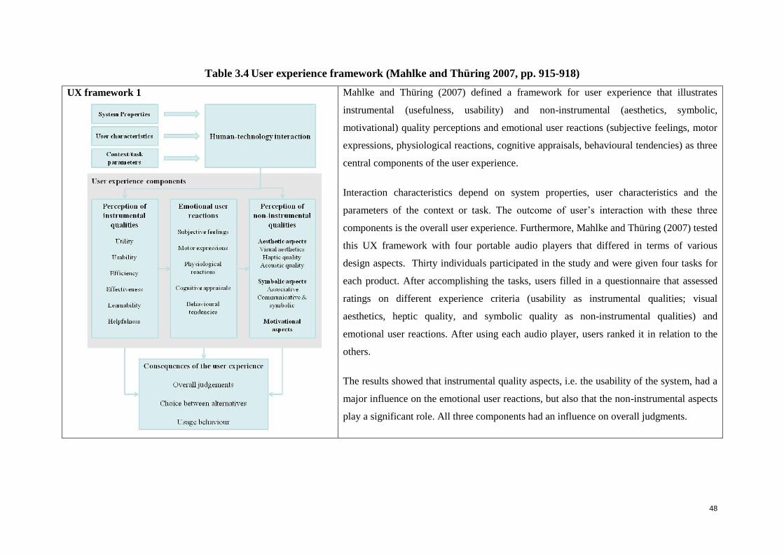
48
Table 3.4 User experience framework (Mahlke and Thüring 2007, pp. 915-918)
UX framework 1
Mahlke and Thüring (2007) defined a framework for user experience that illustrates
instrumental (usefulness, usability) and non-instrumental (aesthetics, symbolic,
motivational) quality perceptions and emotional user reactions (subjective feelings, motor
expressions, physiological reactions, cognitive appraisals, behavioural tendencies) as three
central components of the user experience.
Interaction characteristics depend on system properties, user characteristics and the
parameters of the context or task. The outcome of user’s interaction with these three
components is the overall user experience. Furthermore, Mahlke and Thüring (2007) tested
this UX framework with four portable audio players that differed in terms of various
design aspects. Thirty individuals participated in the study and were given four tasks for
each product. After accomplishing the tasks, users filled in a questionnaire that assessed
ratings on different experience criteria (usability as instrumental qualities; visual
aesthetics, heptic quality, and symbolic quality as non-instrumental qualities) and
emotional user reactions. After using each audio player, users ranked it in relation to the
others.
The results showed that instrumental quality aspects, i.e. the usability of the system, had a
major influence on the emotional user reactions, but also that the non-instrumental aspects
play a significant role. All three components had an influence on overall judgments.
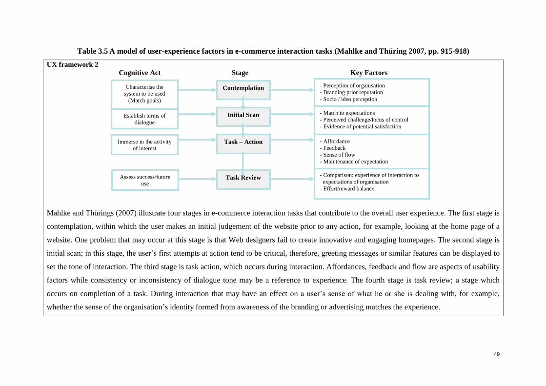
49
Table 3.5 A model of user-experience factors in e-commerce interaction tasks (Mahlke and Thüring 2007, pp. 915-918)
UX framework 2
Cognitive Act Stage Key Factors
Mahlke and Thürings (2007) illustrate four stages in e-commerce interaction tasks that contribute to the overall user experience. The first stage is
contemplation, within which the user makes an initial judgement of the website prior to any action, for example, looking at the home page of a
website. One problem that may occur at this stage is that Web designers fail to create innovative and engaging homepages. The second stage is
initial scan; in this stage, the user’s first attempts at action tend to be critical, therefore, greeting messages or similar features can be displayed to
set the tone of interaction. The third stage is task action, which occurs during interaction. Affordances, feedback and flow are aspects of usability
factors while consistency or inconsistency of dialogue tone may be a reference to experience. The fourth stage is task review; a stage which
occurs on completion of a task. During interaction that may have an effect on a user’s sense of what he or she is dealing with, for example,
whether the sense of the organisation’s identity formed from awareness of the branding or advertising matches the experience.
Contemplation
Initial Scan
Task – Action
Task Review
Characterise the
system to be used
(Match goals)
Establish terms of
dialogue
Immerse in the activity
of interest
Assess success/future
use
- Perception of organisation
- Branding prior reputation
- Socio / ideo perception
- Match to expectations
- Perceived challenge/locus of control
- Evidence of potential satisfaction
- Affordance
- Feedback
- Sense of flow
- Maintenance of expectation
- Comparison: experience of interaction to
expectations of organisation
- Effort/reward balance
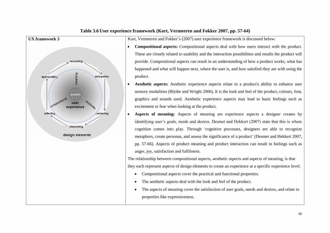
50
Table 3.6 User experience framework (Kort, Vermeeren and Fokker 2007, pp. 57-64)
UX framework 3
Kort, Vermeeren and Fokker’s (2007) user experience framework is discussed below:
Compositional aspects: Compositional aspects deal with how users interact with the product.
These are closely related to usability and the interaction possibilities and results the product will
provide. Compositional aspects can result in an understanding of how a product works, what has
happened and what will happen next, where the user is, and how satisfied they are with using the
product.
Aesthetic aspects: Aesthetic experience aspects relate to a product's ability to enhance user
sensory modalities (Blythe and Wright 2006). It is the look and feel of the product, colours, font,
graphics and sounds used. Aesthetic experience aspects may lead to basic feelings such as
excitement or fear when looking at the product.
Aspects of meaning: Aspects of meaning are experience aspects a designer creates by
identifying user’s goals, needs and desires. Desmet and Hekkert (2007) state that this is where
cognition comes into play. Through ‘cognitive processes, designers are able to recognize
metaphors, create personas, and assess the significance of a product’ (Desmet and Hekkert 2007,
pp. 57-66). Aspects of product meaning and product interaction can result in feelings such as
anger, joy, satisfaction and fulfilment.
The relationship between compositional aspects, aesthetic aspects and aspects of meaning, is that
they each represent aspects of design elements to create an experience at a specific experience level.
Compositional aspects cover the practical and functional properties.
The aesthetic aspects deal with the look and feel of the product.
The aspects of meaning cover the satisfaction of user goals, needs and desires, and relate to
properties like expressiveness.
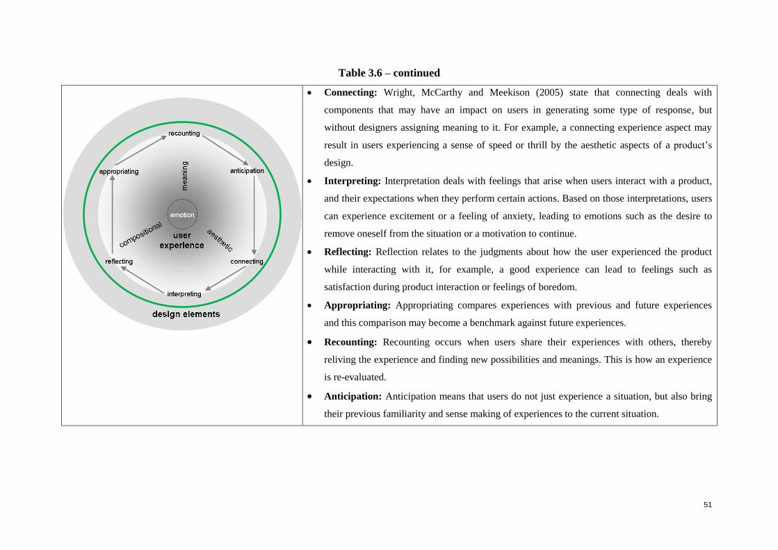
51
Table 3.6 – continued
Connecting: Wright, McCarthy and Meekison (2005) state that connecting deals with
components that may have an impact on users in generating some type of response, but
without designers assigning meaning to it. For example, a connecting experience aspect may
result in users experiencing a sense of speed or thrill by the aesthetic aspects of a product’s
design.
Interpreting: Interpretation deals with feelings that arise when users interact with a product,
and their expectations when they perform certain actions. Based on those interpretations, users
can experience excitement or a feeling of anxiety, leading to emotions such as the desire to
remove oneself from the situation or a motivation to continue.
Reflecting: Reflection relates to the judgments about how the user experienced the product
while interacting with it, for example, a good experience can lead to feelings such as
satisfaction during product interaction or feelings of boredom.
Appropriating: Appropriating compares experiences with previous and future experiences
and this comparison may become a benchmark against future experiences.
Recounting: Recounting occurs when users share their experiences with others, thereby
reliving the experience and finding new possibilities and meanings. This is how an experience
is re-evaluated.
Anticipation: Anticipation means that users do not just experience a situation, but also bring
their previous familiarity and sense making of experiences to the current situation.
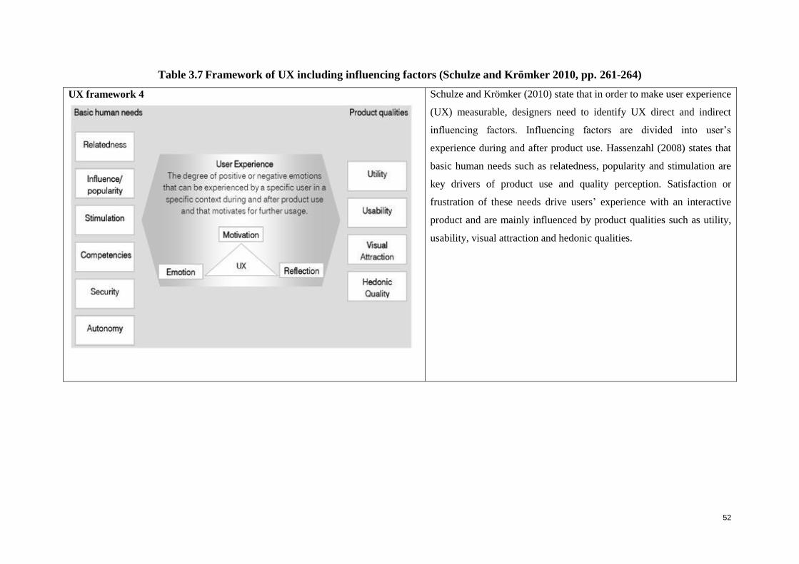
52
Table 3.7 Framework of UX including influencing factors (Schulze and Krömker 2010, pp. 261-264)
UX framework 4
Schulze and Krömker (2010) state that in order to make user experience
(UX) measurable, designers need to identify UX direct and indirect
influencing factors. Influencing factors are divided into user’s
experience during and after product use. Hassenzahl (2008) states that
basic human needs such as relatedness, popularity and stimulation are
key drivers of product use and quality perception. Satisfaction or
frustration of these needs drive users’ experience with an interactive
product and are mainly influenced by product qualities such as utility,
usability, visual attraction and hedonic qualities.
53
UX framework 5
McCarthy and Wright (2004) propose four core threads that make up a holistic experience:
The sensual thread: The sensual thread is concerned with users’ sensory engagement
and level of absorption with technology or devices. These can involve fear, happiness,
pain or comfort.
The emotional thread: Emotions can be defined as the moving and cementing force.
Examples of emotions include: joy, anger, frustration and happiness. With these
emotions, users make judgments of value on the technology or device.
Compositional thread: Compositional thread is the narrative part of an experience. It
deals with the participant’s thought during an experience, for example: What is this
about? Where am I? What has happened?
The spatio-temporal thread: Spacio-temporal thread refers to the space and time in
which users’ experiences take place and their relationship with one another.
The five UX frameworks discussed above highlight a common aspect in the creation of a
good user experience, namely, usability. If the usability is good, it will contribute to creating
a better user experience for the user. Furthermore, this emphasises the need to empirically
investigate how usability can support UX and provide specific guidelines. The visual appeal
of a website also plays an important role in creating a good user experience. The next section
will discuss the importance of visual interface aspects in creating a good user experience.
3.8 Importance of visual interface aspects in creating a good user experience
The visual impact of a user interface can have a significant influence on the user experience.
If designed poorly, it can complicate the communication that the company is trying to convey
to the users and make it less effective (Hoffman and Krauss 2004). When users are browsing
a website, they asses their experience by two aspects: the usability of the e-commerce site and
the service-quality (Petre, Minocha and Roberts 2006). The usability of an e-commerce site is
determined by its user interface, visual elements, navigation, information architecture and the
way users interact with the website. In addition to the usability of the e-commerce site, a
customer has service-quality expectations while browsing e-commerce sites, such as:
reliability, responsiveness, empathy, information-quality, fulfilment, privacy of data. The
aesthetics of the e-commerce site can also be seen as an aspect of the broader concept of user
experience (Hassenzahl and Tractinsky 2006), which can include: usability, beauty, overall
quality and hedonic, affective and experiential aspects.
54
Chang and Chen (2009, pp. 411-417) adopted four components of customer interface quality
for e-commerce websites:
Convenience – Is the website user friendly, easy to navigate and does it allow users to
get the information they want? About two-thirds of e-commerce transactions are not
completed because users cannot find the information they need to complete the
purchase quickly.
Interactivity – Does the e-commerce website facilitate a two-way communication
with the users? The user interface becomes the salesperson on websites. Therefore, if
the interface is of an interactive nature, it will have a positive effect on user response,
including a desire to return to the website.
Customisation – Does the website tailor its products and services based on user
needs? If it does, it will increase the probability that users will find the product that
they are looking for and in return it will create the perception of increased choice by
enabling users to focus on what they really want, making the site more appealing.
Character – What kind of overall image or personality does the website depict to
users through the use of graphic elements, for example: fonts, pictures and colours?
These graphic elements can serve the function of making the visual content easy to
read, can create an atmosphere that makes the shopping experience more pleasurable,
and can instill a sense of confidence in shopping with a previously unknown online
store.
Tobias and Spiegel (2009) state that design directly affects UX as well as usability. They
place a strong emphasis on design, stating that design is the major factor that drives UX. Not
only does design impact the user psychologically, but it also affects the human’s interaction
with the computer system, making design the most vital aspect of UX. By leveraging design,
an experience can become more engaging, and can influence the user’s mental model in a
positive way. A good UX design can therefore contribute to a positive attitude and can
support emotional bonding towards the product.
Another aspect that can have a major impact on the user experience is the terminology used.
Williams (2008) defines eight positive trigger words and five negative trigger words that can
influence users interacting with e-commerce websites.
55
The terms that create positive emotions are: discovery, freedom, guarantee, confidence,
novelty, simplicity and proven. Those that create negative emotions are: payment, expense,
loss, failure and complexity.
The usability, aesthetics and service-quality of the e-commerce environment together
determine the value the user perceives while browsing a e-commerce website. Perceived
value is the customer’s overall assessment of the user experience based on perceptions of
what is received and what is given (Gabbott and Hogg 1998; Shaw and Ivens 2002). For
example, Lee and Koubek (2010) attempted to understand the process of users’ preference-
making based on usability and aesthetics. The results accentuate the importance of
considering both perceived usability and perceived aesthetics. Therefore, designers need to
utilize the strong interrelationship between perceived usability and perceived aesthetics when
designing a website. For example, users may perceive a product or system to be more usable
than its actual usability if it is designed with a high aesthetic quality.
The following section discusses different approaches taken in order to improve the usability
of e-commerce websites.
3.9 Improving the usability of e-commerce websites
There are various approaches to improving e-commerce usability. Usability testing is
discussed in Section 3.9.1, business processes in Section 3.9.2, personalisation in Section
3.9.3, and Web analytics in 3.9.4.
3.9.1 Improving usability by using usability testing
Sharp et al. (2007) define usability testing as an approach that emphasizes to what extent a
system is usable. It involves measuring typical users’ performance on pre-defined tasks in a
controlled environment by placing the product in a usability laboratory where users are asked
to perform various tasks from a pre-defined list. The next section overviews three usability
studies, showing how usability testing has been used to improve the usability of e-commerce
sites.
Usability study example 1
Martim, Herselman and van Greunen (2009) conducted a study on how SA online retailers
can improve e-commerce usability to enhance growth. The study found that some SA
56
retailers were aware of the usability problems on their websites and were in the process of
improving them.
Major usability problems facing SA retailers include:
Search engines do not provide results that meet users’ expectations.
Registration processes take too long, for example: information such as gender, title,
middle name, date of birth may be irrelevant.
Navigation needs to be more efficient.
Error messages are not sufficiently useful and clear, and users struggle to read and
understand them.
Users are concerned about trust and security issues; SA retailers need to provide the
most relevant and current information on their websites.
The SA cultural background also emerged as a challenge. Results show that needs of
SA users differ from international users’ needs for example, South Africans prefer
colourful, graphic interfaces.
Usability study example 2
Barnard and Wesson (2003) conducted an empirical investigation on the usability issues
within e-commerce sites in South Africa. Four well-known sites and one international site
were evaluated, involving sixteen participants. The international site was used to determine
whether there were differences between South African sites and the international sites. The
usability results showed that:
Exclusive Books was the most efficient site for the task of finding information and
Amazon the least.
World Worth was the most efficient site in terms of purchasing.
The most effective site with regard to finding information was Amazon, although no
users selected items from the site.
The most frequent comment regarding Amazon was that there was no currency
converter, and it should be possible to determine precisely what the rand amount of
the final purchase would be.
From a satisfaction point of view, World Worth was rated the lowest, while Kalahari
was rated better than Exclusive Books.
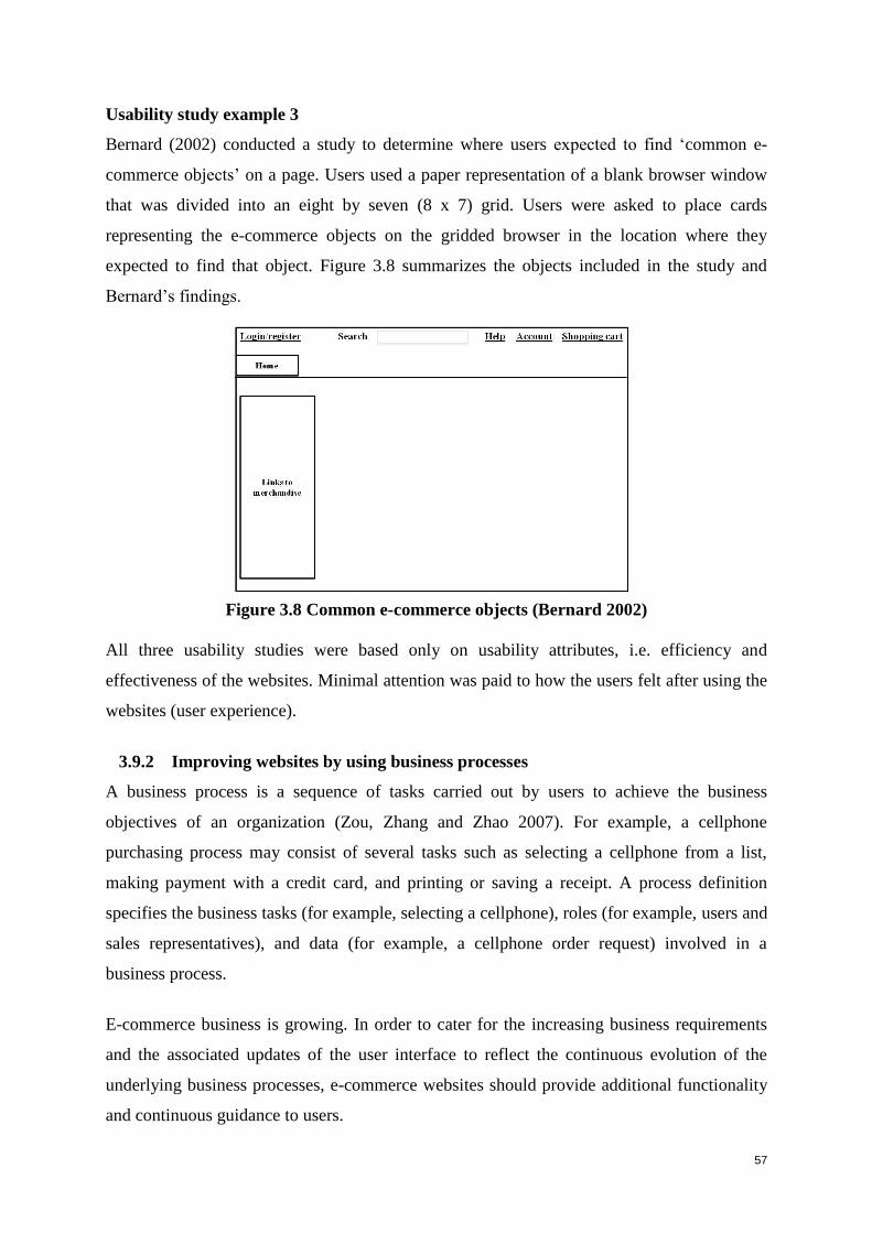
57
Usability study example 3
Bernard (2002) conducted a study to determine where users expected to find ‘common e-
commerce objects’ on a page. Users used a paper representation of a blank browser window
that was divided into an eight by seven (8 x 7) grid. Users were asked to place cards
representing the e-commerce objects on the gridded browser in the location where they
expected to find that object. Figure 3.8 summarizes the objects included in the study and
Bernard’s findings.
Figure 3.8 Common e-commerce objects (Bernard 2002)
All three usability studies were based only on usability attributes, i.e. efficiency and
effectiveness of the websites. Minimal attention was paid to how the users felt after using the
websites (user experience).
3.9.2 Improving websites by using business processes
A business process is a sequence of tasks carried out by users to achieve the business
objectives of an organization (Zou, Zhang and Zhao 2007). For example, a cellphone
purchasing process may consist of several tasks such as selecting a cellphone from a list,
making payment with a credit card, and printing or saving a receipt. A process definition
specifies the business tasks (for example, selecting a cellphone), roles (for example, users and
sales representatives), and data (for example, a cellphone order request) involved in a
business process.
E-commerce business is growing. In order to cater for the increasing business requirements
and the associated updates of the user interface to reflect the continuous evolution of the
underlying business processes, e-commerce websites should provide additional functionality
and continuous guidance to users.
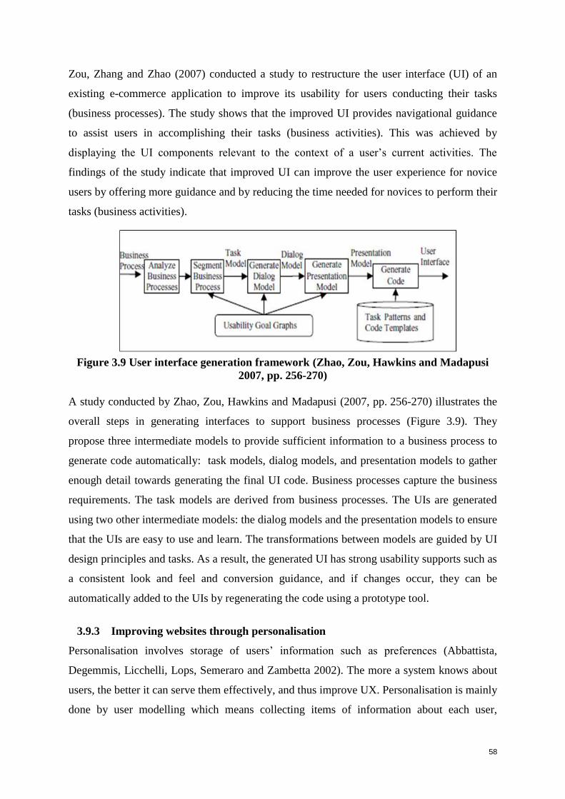
58
Zou, Zhang and Zhao (2007) conducted a study to restructure the user interface (UI) of an
existing e-commerce application to improve its usability for users conducting their tasks
(business processes). The study shows that the improved UI provides navigational guidance
to assist users in accomplishing their tasks (business activities). This was achieved by
displaying the UI components relevant to the context of a user’s current activities. The
findings of the study indicate that improved UI can improve the user experience for novice
users by offering more guidance and by reducing the time needed for novices to perform their
tasks (business activities).
Figure 3.9 User interface generation framework (Zhao, Zou, Hawkins and Madapusi
2007, pp. 256-270)
A study conducted by Zhao, Zou, Hawkins and Madapusi (2007, pp. 256-270) illustrates the
overall steps in generating interfaces to support business processes (Figure 3.9). They
propose three intermediate models to provide sufficient information to a business process to
generate code automatically: task models, dialog models, and presentation models to gather
enough detail towards generating the final UI code. Business processes capture the business
requirements. The task models are derived from business processes. The UIs are generated
using two other intermediate models: the dialog models and the presentation models to ensure
that the UIs are easy to use and learn. The transformations between models are guided by UI
design principles and tasks. As a result, the generated UI has strong usability supports such as
a consistent look and feel and conversion guidance, and if changes occur, they can be
automatically added to the UIs by regenerating the code using a prototype tool.
3.9.3 Improving websites through personalisation
Personalisation involves storage of users’ information such as preferences (Abbattista,
Degemmis, Licchelli, Lops, Semeraro and Zambetta 2002). The more a system knows about
users, the better it can serve them effectively, and thus improve UX. Personalisation is mainly
done by user modelling which means collecting items of information about each user,
59
processing that information quickly and providing the results to applications. This is
implemented in the back-end of the system. The website collects information such as needs,
wishes and interest from every user who logs onto the site.
Abbattista et al. (2002) provide three main advantages of using personalisation in e-
commerce:
Personalisation makes the site more attractive for users by noting their preferences
and habits in order to suggest products that reflect their needs on the next occasion
they visit the website.
Personalisation can obtain users’ trust and confidence by the fact that they are not
constantly requested to insert information about their preferences. In contrast they can
participate in the management and updating of their personal profile, which improves
customer loyalty.
Every time a customer interacts with the website, the personalisation mechanism
collects new data about his or her preferences, so that a more and more satisfactory
service can be offered.
3.9.4 Improving websites through Google Analytics
Despite the importance of good usability in e-commerce websites, there are not many studies
that stress the importance of this aspect (Hasan, Morris and Probets 2009). The studies that
do exist, cover mainly usability testing or heuristic evaluations in the process of identifying
usability problems. Research has shown that there is little literature on Web analytic tools.
Web analytic tools provide methods that automatically collect statistics regarding collection,
measurement, monitoring, analysis and reporting of Web usage data to understand visitors’
experiences. The advantage of this approach is that it can help to optimise websites in order
to accomplish business goals and/or assist in optimising customer satisfaction and loyalty
(Malacinski, Dominick and Hartrick 2001).
Hasan, Morris and Probets (2009) conducted a study to illustrate the value and use of Google
Analytics (GA) for evaluating the usability of e-commerce websites by employing advanced
Web-metrics. The objectives for this research were:
To investigate the potential usability problem areas identified by GA software;
To assess the main usability problem areas in three e-commerce websites using
comprehensive heuristic guidelines;
60
To compare issues raised by GA software with problems identified by the Web
experts who evaluated the sites using heuristics approaches.
The Hasan et al. (2009) study identified specific Web metrics that can provide quick, easy,
and cheap indications of general potential usability problem areas on e-commerce websites.
However, to get a more in-depth analysis of the usability problems, other usability techniques
are more valuable, for example: heuristic evaluation and usability testing. There are two
advantages that Web analytical tools can provide that heuristic evaluation cannot: they can
provide information regarding the financial performance of the site in terms of its ability to
generate revenue, and the results offer a foundation for future research. Usability evaluation
methods are further addressed in the next chapter, Chapter 4.
3.10 Summary
This chapter defined usability and descriptions were given of various factors that are
associated with measuring usability, namely: usability goals, user experience goals and user-
centred design. The majority of the UIs of e-commerce applications suffer from usability
problems (Zhao et al. 2007). Any products, including e-commerce websites, must be usable
to ensure that they meet the user’s needs, this will be determined by evaluating the website.
This chapter also defined user experience and discussed relationships between user
experience, usability and satisfaction. It presented various methodologies for the evaluation
of user experience. Frameworks for user experience were discussed. From the literature
surveyed, it can be concluded that user experience is a critical factor in customer satisfaction
and loyalty.
Designers, product developers and Web services have been researching deeply into how to
generate a positive UX (Tobias and Spiegel 2009). UX focuses on well-being, and not
performance, as an outcome of human-product interaction, and this is the common
denominator of all UX work (Hassenzahl 2008). As products and services are increasingly
sold over the Internet, it becomes all the more important to build up knowledge in e-
commerce-specific user interface (UI) and user experience (UX) design (Egger 2001).
The next chapter will discuss usability evaluation methodologies with an emphasis on
usability testing and heuristic review, as these two evaluation methods will be used to
conduct the study.
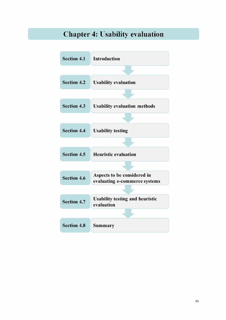
61
62
Chapter 4: Usability evaluation
4.1 Introduction
With a wide-ranging variety of products available, users have become particular in their
selections. Users want products to be easy to learn, effective, efficient, safe, and to provide a
good user experience. It is also important for the success of a product or a website, that it is
engaging, attractive, challenging, and enjoyable. In order to achieve this, the product should
be evaluated to identify its strengths and problems (Sharp, Rogers and Preece 2007).
Evaluation is a broad concept. Preece, Rogers, Sharp, Benyon, Holland and Carey (1994, p.
602) defined evaluation as ‘gathering data about the usability of a design or product by a
specific group of users for a particular activity within a specified group of uses or work
context’. In Sharp et al. (2007) this definition is extended, stating that evaluation focuses both
on the usability of the system, for, example, how easy it is to learn and to use, and on the
users’ experience when interacting with the system, for example, how satisfying, enjoyable,
or motivating the interaction is. Approaches to evaluation within the discipline of human-
computer interaction (HCI) are changing. Poppe, Rienks and van Dijk (2007) identified four
main trends in current HCI systems: new sensing possibilities such as automotive speech
recognition and video tracking; shift in initiative, users will be more pro-active rather than
responsive; diversifying physical interfaces such as billboards and mobile; and shift in
application purposes which states that new applications will be more focused on user
experience. The following section expands on these trends:
New sensing possibilities. Technology that is beyond the traditional keyboard and
mouse, for example: automatic speech recognition and video tracking that not only
implement localization of human users, but also detect their actions, identity and
facial expressions (Pantic, Pentland, Nijholt and Huang 2007).
Shift in initiative. Traditional HCI supports the concept of user-based evaluation, but
in the future of interactive systems, users will become more pro-active rather than just
responsive.
Diversifying physical interfaces. Interface designs are becoming larger, such as
interactive billboards. In contrast, other interface designs are becoming smaller, due to
the increased usage of mobile devices.
63
Shift in application purpose. Traditional systems are generally task-based, but new
applications will be more focused on user experience (UX), (Reidsma, van
Welbergen, Poppe, Bos and Nijholt 2006).
Within this context of diversification and novel interface technologies, usability evaluation is
vital. In particular, the use of evaluation methods for the assessment of the more common
interactive systems such as websites is increasingly becoming a standard and mandatory
procedure in the design process.
Following explanations of usability and user experience in the previous chapter, Chapter 4
discusses some of the techniques used most commonly in the HCI discipline for evaluating
usability. Section 4.2 provides an introduction to usability evaluation, while Section 4.3
outlines usability evaluation methods in general. The next two sections focus respectively on
particular evaluation techniques that are directly relevant to this study. Section 4.4 is an in-
depth discussion of usability testing (UT) and Section 4.5 addresses heuristic evaluation (HE)
in detail. These are the two usability evaluation methods (UEMs) that will be used to conduct
the empirical evaluation studies of this research. In Section 4.6 a set of aspects is given that
should be considered in evaluating e-commerce systems. Section 4.7 concludes the chapter
by comparing the two methodologies of HE and UT and considering their use in
combination.
4.2 Usability evaluation
Usability is defined as: ‘the extent to which a product can be used by specified users to
achieve specified goals with effectiveness, efficiency and satisfaction in a specified context’
(ISO 9241-11 1998). It is a key aspect in HCI since it contributes to the quality of the user
interface when used by the intended target group (Parlangeli, Marchingiani and Bagnara
1999). Usability evaluation is an assessment process concerned with gathering quantitative
and qualitative information about the usability or potential usability of a product in order to
either enhance its interface or eliminate problems. The standard usability issues are
investigated, namely: efficiency, effectiveness and satisfaction, as introduced in Section 3.3.
The aim of evaluation is to determine whether the product can do what it is intended to do
and to provide a means of suggesting improvements to it (Preece 1993). Determining whether
the product should do what it is supposed to do, means evaluating to check that users can use
the product, understand it, and whether they like it, especially if the design concept is new.
64
Contemporary users look for much more than merely a usable system: they require a
pleasing, easy to use, and engaging experience. In the present rapidly-changing environment,
particular industry sectors mature and, in the process, usability and technical reliability of
products improve and are taken for granted. Users then start to look for products that provide
engaging UX (Obrist, Roto and Väänänen-Vainio-Mattila 2009). This development is
motivated by the observation that usability alone does not explain users’ preferences and
overall experience with interactive products (Karapanos et al. 2009).
Christensen and Frokaer (2010) claim that usability evaluation draws heavily on inadequate
resources such as: expertise in interaction design, programming, insight into the application
being tested and the company’s objectives. They also state that usability evaluation can be
time consuming, expensive and complex to conduct. Nevertheless, evaluating a product with
users or an expert early in the design process will provide valuable feedback, so that major
problems or shortcomings can be fixed before the product becomes operational or is placed
on sale (Sharp et al. 2007).
The next section discusses usability evaluation methods.
4.3 Usability evaluation methods
There are many usability evaluation methods (UEMs) for software. These methods have
become a part of the design and development cycle that cannot be ignored in Web design.
The main differences between the various UEMs are usually based on whether users will be
involved or not, the stage of the product development life cycle, and the place where the
evaluation will take place. The methods can be divided into two main types: user-focused and
expert-focused. User-focused methods adopt techniques such as interviews, questionnaires,
observation or experiments to examine users’ reactions toward interface design to determine
problems concerning usability (Hui-Jiun, Jen and Shing-Sheng 2008). Expert-focused
approaches include heuristic evaluation done by one or more usability experts on a product
interface in order to identify possible problems and make suggestions relating to interface
design.
The next subsection overviews some of these UEMs.
65
4.3.1 User-focused
The main user-focused evaluation methods are usability testing, questionnaires, interviews,
focus groups, observations, and eye tracking.
4.3.1.1 Usability testing
Usability testing began in the early 1980s when computer software was first used by end
users (Dumas 2003). Usability is currently a key factor in the quality of an application or
website (Cockton, Lavery and Woolrych 2002). Sharp et al. (2007, p. 646) define usability
testing as ‘an approach that emphasizes to what extent a system is usable’. It entails certain
quantitative aspects with the goal of measuring the degree to which a system is effective,
efficient and satisfying. Usability testing involves an empirical study, in which results are
derived from observing end users in a controlled environment called a usability laboratory.
Data is collected using a combination of methods, for example: keystroke logging; data
recording, which includes the researcher taking notes; audio recording; taking photographs
and video recording. UT is discussed in detail in Section 4.4, and includes an elaboration of
these methods in Table 4.2. The observation of end users in usability testing exposes
problems that are difficult to anticipate (Cockton et al. 2002). Usability testing will be
discussed in detail in Section 4.4.
4.3.1.2 Questionnaires
Questionnaires are a popular way of gathering information because of the wealth of
information that can be gathered quickly. Questionnaires are effective tools for reaching a
large number of people. They can be used to gather information in the early stages of
designing and can be used to evaluate an existing website (Fang 2008). Dix, Finlay, Gregory,
Abowd and Beale (2004) provide a number of styles of questions that can be used in the
questionnaire. These include the following:
1 General: User-profile demographic questions, such as age, gender, occupation, and
location, help to establish the background of the user and his/her position within the
user population.
2 Open-ended: Users are asked to provide their own unprompted opinion to a question
such as: What do you like most about the interface?
3 Scalar: Users are asked to judge a specific statement on a numeric scale known as
Likert scaling, for example, users may be asked to rate the site based on ‘ease of use’
66
by rating it from -3 (very difficult) to 3 (very easy), or from 1 (very difficult) to 5
(very easy).
4.3.1.3 Interviews
Sharp et al. (2007, p. 298) define an interview as a ‘conversation with a purpose’. Interviews
depend on the type of method used. Interviews can be effective for high-level evaluation,
particularly in eliciting information about user preferences, impressions and attitudes (Dix et
al. 2004). There are four main types of interview: open-ended or unstructured; structured;
semi-structured; and group interviews (Fontana and Frey 1994). The first three types are
named according to how much control the interviewer imposes on the conversation by
following a predetermined set of questions. The fourth involves an interview with a small
group guided by a facilitator (Sharp et al. 2007). Semi-structured and unstructured interviews
are particularly good for obtaining unanticipated information, because the interviewer can
probe when unexpected responses are given. Interviews can include both closed and open
questions, but effort and skill are needed to ensure that questions are clearly worded and that
the data collected can be analysed efficiently (Sharp et al. 2007).
A particular form of group interview, termed a focus group interview, is discussed below.
4.3.1.4 Focus groups
In this technique, usability experts have informal discussions with a group of target users. It
is recommended to have more than one interview with several different groups, so the result
will be more representative (Fang 2008). Normally three to ten people are involved; the users
are selected to provide a representative sample of the target audience (Sharp et al. 2007). One
advantage of focus groups is that a great deal of information can be obtained, including useful
information from the type of users who are vulnerable to being neglected (Fang 2008).
Furthermore, Sharp et al. (2007) state that focus groups allow diverse or sensitive issues to be
raised that might otherwise be missed. Planning a focus group involves, firstly, an outline of
the objectives and target audience and secondly, the development of user and facilitator
documents that include the set of questions to be asked. Questions may be open or closed.
Under the former option, the user is not prompted and the goal of the question is exploratory.
A disadvantage of this type of question is that answers may be influenced by the stronger
users in the group. In the case of closed questions, a list of possible answers is required as
options; these options are based on the responses that frequently occur, so that the facilitator
knows the possible answers in advance (Sharp et al. 2007).
67
4.3.1.5 Observation
Sharp et al. (2007, p. 321) define observation as a useful data gathering technique at any
stage during product development. They also set out the benefits of using observation in the
design process. For example, if observation is used early in the design process, it assists
designers in understanding the users’ context, tasks and goals. Observations conducted later
in development may be useful in order to investigate how well the developing prototype
supports these tasks and goals. Users are observed directly by the investigator as they
perform their activities. Observations are conducted in two different ways, namely:
Field: Individuals are observed as they go about their day to day tasks in their natural
setting. This is also called naturalistic observation.
Controlled environment: Observation in a usability laboratory environment, where
individuals are observed performing specified tasks. See Section 4.4, where usability
testing is discussed in more detail, since it is one of the methods applied in this study.
4.3.1.6 Eye tracking
Pool and Ball (2006) defined eye tracking as a method to determine eye movement and eye-
fixation patterns. Eye tracking has existed as an evaluation technology for many years, but
recent improvements in hardware have made it more viable as an approach to measuring
usability. Eye tracking is associated with usability testing since it is usually conducted in a
usability laboratory. Eye movements are believed to reflect the amount of cognitive
processing that a display, or certain regions of it, require and, therefore, how easy or difficult
it is to process the information. Measuring not only where people look, but also their patterns
of eye movement, may indicate to the tester which areas of a screen users find easy or
difficult to understand (Dix et al. 2004). Various kinds of measurements are used, including
fixations and gaze that will now be discussed:
Fixations
Fixations can be interpreted quite differently depending on the situation. For example,
when the user is browsing a Web page, higher fixation frequency on a particular area
can indicate that the user is interested in that section such as news articles or
promotional banners, or it can indicate that the user is confused (Jacob and Karn
2003; Just and Carpenter 1976). However, these interpretations may be reversed in a
search task where a higher number of single fixations, or clusters of fixations, are
often an index of greater uncertainty in recognising a target item (Jacob and Karn
2003). Fixation scenarios are listed below:
68
Number of fixations: the more fixations the less efficient the search strategy.
Fixation duration: longer fixations may indicate difficulty with a display.
Scan path: indicating areas of interest, search strategy and cognitive load.
Gaze
Gaze is usually the sum of all fixation durations within a given area. It is best used to
compare attention distributed between the different areas. It can also be used as a
‘measure of anticipation in situation awareness in cases of longer gazes on an area of
interest before a possible event occurring’ (Mello-Thoms, Nodine and Kundel 2002,
pp. 111-117; Pool and Ball 2006, pp. 211-219).
In HCI, eye tracking has been used to determine the usability of websites. It provides useful
information on aspects such as navigation, information architecture and layout searching
(Jacob and Karn 2003; Aula, Majaranta and Raiha 2005). Eye tracking requires advanced
equipment that can unobtrusively measure eye movement without interfering with users’
mental processing (Pool and Ball 2006) and without requiring users to articulate their opinion
(Bednarik and Tukiainen 2006; Bojko and Stephenson 2005). Eye tracking provides insights
into what attracts the eye in website design and where problems areas occur (Dix et al. 2004).
Problems associated with the use of eye tracking are infrastructure and cost (Ssemugabi and
de Villiers 2007).
4.3.2 Expert-focused
The following two UEMs, namely: heuristic evaluation and cognitive walkthroughs, are
examples of expert-focused evaluations.
4.3.2.1 Heuristic evaluation
Heuristic evaluation (HE) is a method that involves the evaluation of an interface against
‘rules of thumb’ or heuristics. These rules, or criteria, are often derived from collections of
interface guidelines (Cockton, Lavery and Woolrych 2002). The most widely used heuristics
for evaluation are Nielsen’s (1994b) set of ten classic heuristic principles. Nielsen derived
these from a database of 249 usability problems obtained from evaluations of eleven
interactive systems. See Table 4.3 in Section 4.5 for the complete list of Nielsen’s heuristics.
Heuristic evaluation is conducted mainly during the development phase, but can also be
effective when used on operational systems (Nielsen 1992; Peng Ramaiach and Foo 2004).
69
Heuristic evaluation is discussed in more detail in Section 4.5, since it is one of the methods
used in this study.
4.3.2.2 Cognitive walkthroughs
This technique involves a team of evaluators stepping through the defined tasks of a website
to uncover the processes and workflow flaws and inconsistencies (Wei-siong, Liu and Ram
2009). Walkthroughs require a detailed review of a sequence of actions, but do not involve
interaction with an actual operational system. In a code walkthrough, the sequence represents
a segment of the computer programming code that is stepped through by the reviewers to
check certain characteristics. The evaluators then step through the associated action sequence
to check it for potential usability problems in user interactions. The main focus of the
cognitive walkthrough is usually to establish how easy a system is to learn (Dix et al. 2004).
Dix et al. (2004) state that in order to conduct a cognitive walkthrough, the evaluator needs
four items of information, namely:
1 A specification or prototype of the system.
2 A description of the task/s that users are to perform on the system.
3 A comprehensive list of the actions needed to complete the task with the proposed
system.
4 An indication of who the users are, and what kind of experience and knowledge the
evaluators can expect them to have.
The results from cognitive walkthroughs are documented and a record is kept of what is
satisfactory and what needs improvement.
The following sections discuss in detail the two evaluation methods that will be used to
conduct this study, namely, usability testing – a user-based method, and heuristic evaluation –
an expert method.
4.4 Usability testing
Usability testing (UT), which is briefly outlined in Section 4.3.1, is described in detail here as
one of the two methods applied in the research design of this study. UT is one way of making
sure that the intended product or system is appropriate for the actual users and their goals,
and that no negative outcomes result from using it (Bastien 2010). The UT approach
measures: how easy a product is to use; its visual consistency and load; and the users’ overall

70
perception of their experience with the products (ISO 9241-11 1998). Sharp et al. (2007, p.
646) define usability testing as ‘an approach that emphasizes to what extent a system is
usable’.
It entails certain quantitative aspects with the goal of measuring the degree to which a system
is effective, efficient and satisfying:
Effective: does the system do the tasks for which it was designed?
Efficient: how much effort is required to use the system in order to achieve those
tasks?
Satisfaction: do users have a positive response when using the system? (Bastien
2010).
Factors that may affect website usability include: navigation, information architecture,
language, aesthetics and visual appeal, and page structure and layout (Gardner 2007).
Furthermore, designers need to take into consideration that users are from different
disciplines and may have very different needs when it comes to the information they expect
from the website (Du Toit and Bothma 2009).
Deciding how many users to recruit as participants in a study has practical, economic, and
scientific implications. The aim of inviting users to a usability test is to find the most design
flaws on a user interface at the lowest possible cost (cost of users, cost of observers, cost of
laboratory facilities) (Lewis 2006). In the nineties, the view was held that with four or five
users, 80–85% of the usability problems of an interface could be uncovered (Nielsen and
Landauer 1993; Virzi 1990; Virzi 1992). However, a study conducted by Spool and
Schroeder (2001) on an extensive website showed that they would need considerably more
than five users to find 85% of the usability problems. Another study conducted by Hwang
and Salvendy (2010) claims that 10±2 (between 8 and 12) evaluators are needed to find
around 80% of the usability problems.
4.4.1 What does usability testing involve?
Usability testing involves measuring typical users’ performance on pre-defined tasks in a
controlled environment by placing the product in a usability laboratory where users are asked
to perform various tasks from a pre-defined list. Users’ performance while doing these tasks
are observed and measured by a researcher, but users are assured that it is the system that is
being judged, not them. A useful method that can be used when observing users in a
71
controlled environment, is the thinking-aloud method. This involves users stating their
thinking process out loud as they undertake various tasks on the system or website. The
advantage of thinking aloud is that testees may offer a lot of information, including the details
of their cognitive processes and behaviour patterns, as well as reasons why they do what they
do (Fang 2008). Data is collected using a combination of methods, for example, data
recording which includes taking notes, audio recording, taking photographs and video
recording.
4.4.2 Steps taken in a usability test
Lewis (2006) states that planning a usability test requires the following steps:
1. Define the test objectives.
2. Recruit users who represent the target market.
3. Select the tasks to be conducted.
4. Create task scenarios.
5. Decide how tasks will be measured and recorded.
6. Prepare the test plan, satisfaction questionnaire, data analysis procedure and the
usability laboratory.
7. Conduct the usability test with users from the target group.
8. Capture and analyse the results.
9. Present and communicate the test results.
This section will discuss the usability steps in more detail:
1. Define the test objectives
Usability testing is conducted by companies and other organisations for a number of
reasons such as benchmarking the performance of users on their websites, and
comparing the system to its competitors. In order to achieve these objectives, usability
engineers need to gather two types of data, quantitative and qualitative. In the former
case, the time is recorded that it takes users to complete the task, as well as aspects
such as the number of errors and the time users take to recover from errors. In the
latter case, the kinds of errors they make are noted (Rubin 1994).
Quantitative objectives
Are the users able to complete the tasks successfully?
Number of errors made during tasks.
Time taken to complete tasks.
72
Number of clicks made in order to access particular products or functionality.
How easy is it for users to find what they are looking for?
Qualitative objectives
With regards to navigating the system:
Does the navigation structure support users in finding the content they are
seeking?
Establish how users navigate in order to:
Complete tasks.
Discover the system.
Does the system provide alternative navigation options?
Is it easy for users to manoeuvre between related pages and between different
sections?
What kinds of mistakes do users make?
Are the links within the content area obvious to the user and is the colour of the
links standard throughout?
Is the language and terminology of the navigational headings easy to
understand?
2. Recruit representative users
The sample of users recruited must be a heterogeneous group, representing the user
population for which the product is targeted. They should have a range of age levels,
experience, and should come from different cultural groups (Sharp et al. 2007). Table
4.1 lists factors that distinguish the users of an e-commerce system (Rubin 1994,
p.120).
Table 4.1 User factor table for an e-commerce system (Rubin 1994, p.120),
(customised to the South African situation by the researcher)
Factor Grading and Related Characteristics
Age Group A: 16 –24
Group B: 25–34
Group C: 35 and older
73
Factor Grading and Related Characteristics
E-commerce
Experience
Low: User browses and purchases once in a while.
Medium: User browses frequently and makes purchases two or more
times annually.
High: User frequently makes purchases over the internet (weekly
shopping, presents, etc).
Internet
Experience
Novice
Makes use of the Internet less than twice a week.
Makes use of the Internet for no more than:
o browsing;
o e-mail.
Expert
Makes use of the Internet more than twice a week.
Makes use of the Internet for:
o browsing,
o e-mail,
o shopping,
o downloading and
o banking.
Language English
Afrikaans
African languages
3. Select tasks
The tasks selected need to represent the objective of the project (Rubin 1994), for
example, in order to evaluate the efficiency of an e-commerce website, tasks may
include:
Task 1: Find a product
Task 2: Compare certain products
Task 3: Purchase the product
Task 4: Investigate after-sale support
Task 5: Complete a satisfaction questionnaire.
4. Create task scenarios
Task scenarios need to represent real life scenarios and must not prompt the users or
guide him/her directly to the correct route (Rubin 1994). Following are two examples
of task scenarios:
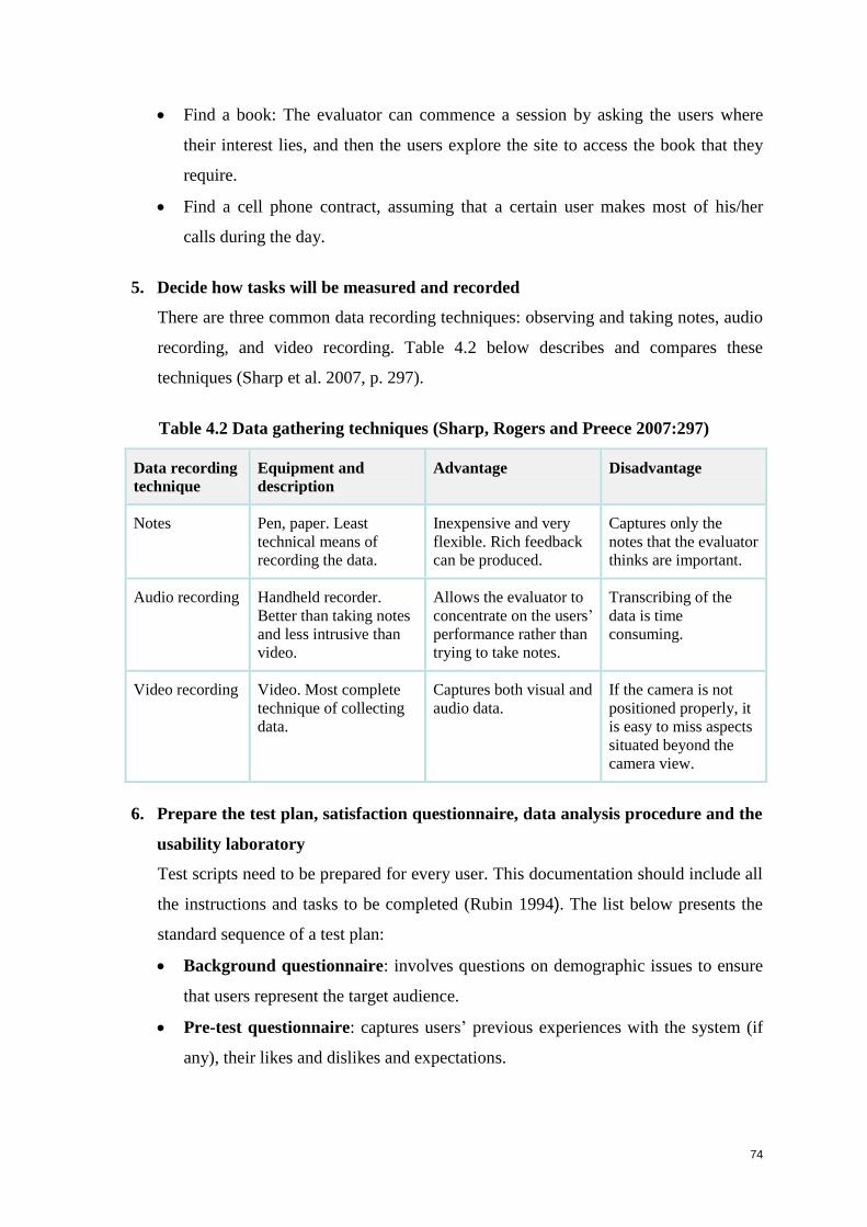
74
Find a book: The evaluator can commence a session by asking the users where
their interest lies, and then the users explore the site to access the book that they
require.
Find a cell phone contract, assuming that a certain user makes most of his/her
calls during the day.
5. Decide how tasks will be measured and recorded
There are three common data recording techniques: observing and taking notes, audio
recording, and video recording. Table 4.2 below describes and compares these
techniques (Sharp et al. 2007, p. 297).
Table 4.2 Data gathering techniques (Sharp, Rogers and Preece 2007:297)
Data recording
technique
Equipment and
description
Advantage Disadvantage
Notes
Pen, paper. Least
technical means of
recording the data.
Inexpensive and very
flexible. Rich feedback
can be produced.
Captures only the
notes that the evaluator
thinks are important.
Audio recording Handheld recorder.
Better than taking notes
and less intrusive than
video.
Allows the evaluator to
concentrate on the users’
performance rather than
trying to take notes.
Transcribing of the
data is time
consuming.
Video recording Video. Most complete
technique of collecting
data.
Captures both visual and
audio data.
If the camera is not
positioned properly, it
is easy to miss aspects
situated beyond the
camera view.
6. Prepare the test plan, satisfaction questionnaire, data analysis procedure and the
usability laboratory
Test scripts need to be prepared for every user. This documentation should include all
the instructions and tasks to be completed (Rubin 1994). The list below presents the
standard sequence of a test plan:
Background questionnaire: involves questions on demographic issues to ensure
that users represent the target audience.
Pre-test questionnaire: captures users’ previous experiences with the system (if
any), their likes and dislikes and expectations.
75
Performance tasks: in this step, users are required to undertake and complete the
tasks.
Post-test user experience questionnaire: usually involves a satisfaction
questionnaire to capture users’ overall thoughts when interacting with the system.
7. Conduct the usability test with appropriate ethical procedures
Most usability tests conducted in a laboratory have a two-hour duration. Longer tests
are not recommended, because users may get bored and tired; they may tend to say
things merely for the sake of getting the test over. Before conducting a usability test,
it is important to inform users that it is the system that is being tested and not them
personally (Rubin 1994). Furthermore, it does not matter if they make mistakes; in
fact, when users make errors, it helps the researcher in evaluating the system. Sharp et
al. (2007) provide ethical guidelines to protect users’ rights:
Users need to be told the goal of the study.
Users should be informed that their personal information is confidential and will
not be disclosed.
Users may withdraw from the session at any time.
Token incentives are often provided, such as small financial gifts or meal
vouchers or gift tokens.
Evaluators must request users’ permission to quote them, or quotations must be
anonymous to preserve privacy.
Informed consent forms should be signed by users prior to the test sessions.
8. Capture and analyse the results
As explained, two kinds of data are captured and analysed: quantitative and
qualitative data. A common capturing tool is an electronic spreadsheet, in which the
answers can be captured in rows and columns. Before capturing the data, it must be
decided how the data will be presented. The spreadsheet should consist of all the
answers, as well as the averages and percentages. There are three types of averages:
mean, median and mode. Mean refers to the commonly understood arithmetic
average; median is the middle value of the data when the numbers are ranked; and the
mode is the number that occurs the most (Sharp et al. 2007). Once all the data has
been captured, graphic representations can be created using diagrams and graphs. In
order to confirm data, the video recordings can be re-viewed.
76
9. Present and communicate the test results
Common methods of presenting results are PowerPoint presentations or reports.
PowerPoint presentations generally include a summary of the results highlighting the
key findings. The report should contain a detailed description of all the tasks.
4.4.3 Advantages of usability testing
Usability testing is good for investigating issues such as the following (Barrington 2007;
Kantner and Rosenbaum 1997):
Obtaining users’ preferences on which designs they prefer and why.
Determining what problems users encounter when performing tasks.
Identifying problems or mistakes in the system or website.
Discovering how long it takes users to complete tasks.
Comparing the performances of a user on different products.
Moreover:
By observing end users, usability testing exposes problems that are difficult to
anticipate (Cockton et al. 2002).
Usability testing can be used throughout the product development life-cycle. Of all
the evaluation methods, the findings of UT have the most credibility with developers
(Dumas 2003).
4.4.4 Disadvantages of usability testing
Usability tests are very expensive to set up because they are conducted in specialised
laboratories, using sophisticated equipment that enables facilitators to log user
activities, video-record sessions, and interact with users (Gardner 2007).
Most usability tests are conducted at the end of the product development life cycle.
Changing a website or software system based on the usability testing results, may
have an impact on the budget and timeframes of the project (Gardner 2007).
Usability testing is a lengthy procedure because of the need to recruit users with
profiles that match the target audience for the website (Kantner and Rosenbaum
1997).
Processing and analysing the data is complex and time-consuming. It is very difficult
to gain reliable data from laboratory test sessions within less than three weeks from
the date of sessions and, in fact, the time before the results of many laboratory tests
77
are available is often considerably longer than three weeks (Kantner and Rosenbaum
1997).
4.5 Heuristic evaluation
Heuristic evaluation is undertaken by expert evaluators who review a system based on a set
of usability principles or criteria known as heuristics, in order to determine whether the
system complies with those heuristics, and to identify possible usability problems in the
system (Ssemugabi and de Villiers 2007). Heuristic evaluation (HE), which is briefly outlined
in Section 4.3.2, is described in detail here as one of the two methods applied in the research
design of this study. HE is a commonly used UEM for computer system interfaces because it
is quick, inexpensive, and good at achieving broad coverage of a whole user interface,
although it may miss some complex issues (Ssemugabi and de Villiers 2007; Barrington
2007). Delice and Gungor 2009 define heuristic evaluation as a process in which a small set
of evaluators judge whether each task element in a system conforms to established usability
principles. For each evaluation, it must be decided how many evaluators to recruit. Albion
(1999) recommends the use of 3 to 5 evaluators to ensure identification of about 75% of
usability problems in a project. Nielsen and Molich (1990), found that 3 to 5 evaluators in an
aggregate would be able to detect about two third of the usability problems. Furthermore,
Nielson (1994b) recommends the use of five evaluators, but not less than three.
Heuristic evaluation is mainly conducted during the development phase, but can also be very
effective when used on real, operational systems (Nielsen 1992; Peng, Ramaiach and Foo
2004).
4.5.1 Heuristics
This section presents two examples of classic sets of heuristics. Table 4.3 provides Nielsen’s
recommended ten heuristic principles from 249 usability questions (Nielsen 1994b, p.686). In
Table 4.4, following immediately after Table 4.3, ten research-based heuristics by Powals
(1996) are given. The ten heuristic principles recommended by Nielsen are the most well-
known and frequently applied heuristics for software product evaluation. Powals’ ten
research-based heuristics are similar to those of Nielsen, but take a more holistic approach to
evaluation (Powals 1996, pp.189-211).

78
Table 4.3 Nielsen’s ten classic heuristic principles (Nielsen 1994b, p.686)
Heuristic Description Observation
1 Visibility of
system status
The system should keep users
continually informed on where they
are in the environment. In all
situations, appropriate feedback
should be provided to users within
a reasonable timeframe.
Users performing tasks should know
exactly where they are and where
they can go next.
The branding and labelling should be
obvious to indicate to users which
section they are in.
2 Match between
system and the
real world
The terms, phrases, analogies and
concepts used, should be familiar to
the user, and appear in logical
order.
In cases where English is not the first
language of many users, different
language options should be provided.
3 User control and
freedom
There should be clearly marked and
highly visible exit points, so that
users can choose to leave the
unwanted state without working
through extensive dialogue. This
should also permit early exit
without completing a task.
Exit buttons should be clear, and the
application should support user
control. There should be some
freedom, allowing users to conduct
certain activities in ways they prefer.
4 Consistency and
standards
Words, situations and action need
to be consistent throughout the
application.
Wording, navigation menus and
icons should be used consistently
throughout the site.
5 Error prevention
The design should prevent a
predicament from occurring.
In case of predicaments, the
application should prevent users from
making errors.
6 Recognition
rather than
recall
Objects, actions, options and
instructions should be visible or
easily retrievable whenever
appropriate.
Users need to recognize where they
are in the application by looking at
the current page.
7 Flexibility and
efficiency of use
The system needs to cater for both
inexperienced and experienced
users, as well as provide
functionality in order to speed up
interaction.
There should be quick links to
frequently-used information.
8 Aesthetic and
minimalist
design
Dialogues should not contain
information which is irrelevant or
rarely needed.
Irrelevant information on the
application that may distract the user,
should be avoided.
9 Help users
recognize,
diagnose, and
recover from
errors
Error messages should be expressed
in plain language (no codes),
precisely indicate the problem, and
constructively suggest a solution.
Every error message should offer a
solution that is clearly written in
language that is familiar to the user.
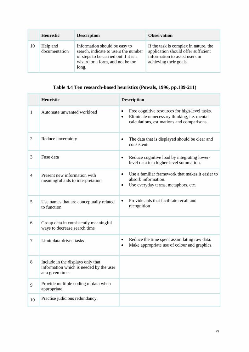
79
Heuristic Description Observation
10 Help and
documentation
Information should be easy to
search, indicate to users the number
of steps to be carried out if it is a
wizard or a form, and not be too
long.
If the task is complex in nature, the
application should offer sufficient
information to assist users in
achieving their goals.
Table 4.4 Ten research-based heuristics (Powals, 1996, pp.189-211)
Heuristic Description
1 Automate unwanted workload Free cognitive resources for high-level tasks.
Eliminate unnecessary thinking, i.e. mental
calculations, estimations and comparisons.
2 Reduce uncertainty The data that is displayed should be clear and
consistent.
3 Fuse data Reduce cognitive load by integrating lower-
level data in a higher-level summation.
4 Present new information with
meaningful aids to interpretation
Use a familiar framework that makes it easier to
absorb information.
Use everyday terms, metaphors, etc.
5 Use names that are conceptually related
to function
Provide aids that facilitate recall and
recognition
6 Group data in consistently meaningful
ways to decrease search time
7 Limit data-driven tasks Reduce the time spent assimilating raw data.
Make appropriate use of colour and graphics.
8 Include in the displays only that
information which is needed by the user
at a given time.
9 Provide multiple coding of data when
appropriate.
10 Practise judicious redundancy.
80
4.5.2 What does heuristic evaluation involve?
HE’s are generally conducted independently by the experts; each evaluator inspects the
interface and interaction alone to identify usability problems. After the evaluation session,
each evaluator can be provided with a severity rating questionnaire, on which is listed the
complete set of usability problems that were discovered. All the evaluators can then rate the
severity of each problem (Delice and Gungor 2009). In the majority of usability evaluation
projects, the budget does not always permit fixing of all the problems. Hence the concept
arose of a severity rating list for usability problems, which can help developers to determine
the major needs and to set relative priorities for problems to be fixed within a stated budget
and timeframe (Nielsen 1994b). The severity rating of a usability problem is determined by a
number of factors (Delice and Gungor 2009). Nielsen defined the severity of a usability
problem as a combination of three factors: frequency, impact and persistence (Nielsen
1994b).
Frequency with which the problem occurs: Is it common or rare?
Impact of the problem on the system if it occurs: Will it be easy or difficult for the
users to overcome?
Persistence of the problem: Is it a one-time problem that users can overcome once
they know about it or will users repeatedly be bothered by the problem?
Severity rating is not undertaken in every HE. However, when severity ratings are obtained
from all the evaluators, it increases the reliability of the results. The following 0–4 rating
scale can be used to rate the severity of usability problems (Nielsen, 1994b).
0 Not a usability problem at all;
1 Cosmetic problem only: need not be fixed unless extra time is available;
2 Minor usability problem: fixing this should be given a low priority;
3 Major usability problem: important to fix: it should be given a high priority; and
4 Usability catastrophe: imperative to fix before product can be released.
4.5.3 Advantages of heuristic evaluation
HE’s are a quick, inexpensive method and feedback can be obtained early in the
design process (Nielsen 1994b).
Expert evaluators can produce high-quality results in a fairly short time, because the
method does not involve detailed reporting or time-consuming recruitment of users
(Kantner and Rosenbaum 1997).
81
HE can enable usability improvements and enhancements before the release of a
project and can be an excellent investment of usability resources (Kantner and
Rosenbaum 1997).
Without prior heuristic evaluation, end users may spend considerable time struggling
with a usability problem while some other usability problem may be ‘masked’ by the
first problem and not found during the usability test. This can be addressed by a two-
phase approach that is consistent with current iterative software development
practices. For example, an HE can take place on an early prototype, while laboratory
testing can follow at a later stage (Kantner and Rosenbaum 1997).
4.5.4 Disadvantages of heuristic evaluation
Factors such as: evaluator training on the system, task coverage, problem extraction
and description may have an effect on the evaluation because HE relies strongly on
the skills and experience of the evaluators (Hvannberg, Law and Larusdottir 2007).
Even though the evaluators are experts they remain surrogate users and not typical
users of the website (Kantner and Rosenbaum 1997).
Real users often experience problems that are unexpected, therefore heuristic
evaluation should not replace studies involving actual users, since HE does not
necessarily indicate which problems users will encounter most frequently (Kantner
and Rosenbaum 1997).
Nielsen (1994b) states that using this type of evaluation to identify usability problems
can be difficult. Research shows that it may result in only a 50% hit rate, and a 20%
miss rate, because results are not based on observations of user behaviour. An HE can
result in the making of recommendations to the system that are not actually required.
Cockton et al. (2002) state that HE is limited in its support for analyst preparation and
recommendation generation.
Väänänen-Vainio-Mattila and Wäljas (2009) state that specific and additional heuristics
appear to be needed for the following areas of service:
Usability: service navigation and presentation.
Safety, trust and privacy.
Content creation for user’s own consumption.
Support for cost-awareness.
Unobtrusive presentation of advertisements.
82
The following section discusses aspects to be considered in evaluating e-commerce systems.
4.6 Aspects to be considered in evaluating e-commerce systems
Finstad (2010, pp. 323-327) conducted a study on what he termed the ‘usability metric for
user experience (UMUX) for the subjective assessment of an application’s perceived
usability’. Although this is a proposed way of measuring UX, the metrics were organized
around the International Organisation for Standardisation (ISO) that defines usability as: ‘the
extent to which a product can be used by specified users to achieve specified goals with
effectiveness, efficiency and satisfaction in a specified context’ (ISO 9241-11 1998).
Criteria embodied in UMUX to measure user experience include the following questions:
Do the site or system capabilities meet my goals?
Is using this site or system a frustrating experience?
Is this site or system easy to use?
Does the site or system require users to spend a lot of time completing tasks?
Results from applying UMUX indicate that this usability metric for user experience is a
reliable and valid metric, and adequate as a standalone subjective usability metric to measure
user experience effectively and efficiently (Finstad 2010, pp. 323-327). This again raises the
issue of the uncertain relationship between usability and UX as shown in Figures 3.4 and 3.5.
Nevertheless UMUX is highly relevant to the present study and is in harmony with the
researcher’s stance portrayed in Figures 3.6 and 3.7, which show usability and UX as
overlapping concepts.
Evaluations are characterised by two primary top-level attributes, namely, the evaluation
method and the evaluation criteria. The two methods selected for use in this evaluation study
have been described in Sections 4.4 and 4.5.
This section presents lists of attributes that have bearing both on the usability testing (UT)
and heuristic evaluation (HE), and can be considered when determining criteria to be used by
the experts undertaking HEs and in designing the post-test questionnaire for users in the UT.
Apart from the distinction between qualitative and quantitative aspects, there are numerous
other usability attributes that impact on websites.
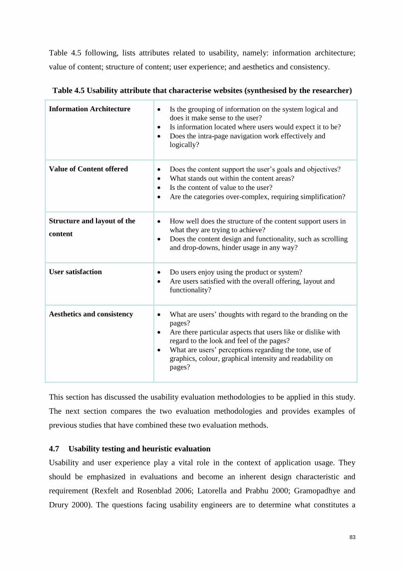
83
Table 4.5 following, lists attributes related to usability, namely: information architecture;
value of content; structure of content; user experience; and aesthetics and consistency.
Table 4.5 Usability attribute that characterise websites (synthesised by the researcher)
Information Architecture Is the grouping of information on the system logical and
does it make sense to the user?
Is information located where users would expect it to be?
Does the intra-page navigation work effectively and
logically?
Value of Content offered Does the content support the user’s goals and objectives?
What stands out within the content areas?
Is the content of value to the user?
Are the categories over-complex, requiring simplification?
Structure and layout of the
content
How well does the structure of the content support users in
what they are trying to achieve?
Does the content design and functionality, such as scrolling
and drop-downs, hinder usage in any way?
User satisfaction Do users enjoy using the product or system?
Are users satisfied with the overall offering, layout and
functionality?
Aesthetics and consistency
What are users’ thoughts with regard to the branding on the
pages?
Are there particular aspects that users like or dislike with
regard to the look and feel of the pages?
What are users’ perceptions regarding the tone, use of
graphics, colour, graphical intensity and readability on
pages?
This section has discussed the usability evaluation methodologies to be applied in this study.
The next section compares the two evaluation methodologies and provides examples of
previous studies that have combined these two evaluation methods.
4.7 Usability testing and heuristic evaluation
Usability and user experience play a vital role in the context of application usage. They
should be emphasized in evaluations and become an inherent design characteristic and
requirement (Rexfelt and Rosenblad 2006; Latorella and Prabhu 2000; Gramopadhye and
Drury 2000). The questions facing usability engineers are to determine what constitutes a
84
well-designed site, and how e-commerce sites should be evaluated. This chapter has
described various usability evaluation methods that have been developed and applied in the
design and development of computing systems and websites. Among these techniques, user
testing and heuristic analysis are two of the most common (Tan, Liu and Bishu 2009). Using
both usability testing and heuristic evaluation in tandem is an optimal cost effective and
practical approach to usability evaluation. As stated in this chapter, expert evaluation using
heuristics is quick, inexpensive, and good at achieving broad coverage of the entire user
interface, but may miss some complex issues. Usability testing is good for identifying
problems that emerge in detailed aspects of system use (Barrington 2007).
4.7.1 Comparison and combination of usability testing and heuristic evaluation
Both usability testing and heuristic evaluation methods provide valuable insight on usability
problems in the early stages, during, and at the end of the product development life cycle. UT
is scenario-based and relies on the experience and comments of real users. It is usually
conducted in a controlled environment. The analysis process is complex and time-consuming.
UT is used more to evaluate finished products than to investigate potential problematic issues
(Tan, Liu and Bishu 2009). HE, on the other hand, is a usability inspection technique
originated by Nielsen (1992; 1994b), which relies on expert evaluators to assess whether a
website complies with standard usability principles or heuristics. It is a widely used UEM for
computer system interfaces due to its low cost and fast turnaround time (Ssemugabi and de
Villiers 2007).
Several studies combine two evaluation methods, HE and a user-based method such as UT,
and compare the results. Very few studies indicate that UT should be used as the only
evaluation method. Most of the findings indicate that both UT and HE should be used in a
usability study, because they have different strengths.
This section will discuss these strengths.
UT strengths:
Usability testing involves the actual users of a system and identifies the problems they
encounter (Cockton et al. 2002).
Usability testing is appropriate as the main evaluation method for usability
evaluations, because it addresses the difficulties, or likelihood of making errors, as
aspects of overall usability (Liljegren 2006).
85
HE strengths:
Ssemugabi and de Villiers (2007) conducted a study on an educational website, which
involved four experts in a heuristic evaluation and 61 learners as end users in a
questionnaire survey. The findings indicated that the results of the experts’ evaluation
were better than the user-based survey results, although they were produced by only
four experts compared to 61 learners. In total, the experts identified 58 problems
compared to the learners’ 55. These findings indicate that heuristic evaluation, if
conducted by a competent and complementary group of experts, is an efficient, and
highly effective UEM.
Adebesin, Kotzé and Gelderblom (2010) undertook a study using the two evaluation
methods: heuristic evaluation and a field usability study among end users. The results
indicate that the heuristic evaluation exposed a large number of usability and
accessibility problems, some of which could be classified as low-severity problems.
The field study showed additional problems that affected the successful completion of
user tasks. Therefore, the heuristic evaluation method can be optimized by combining
it with another method that involves user participation.
Nielsen and Mack (1994) conducted a study to uncover usability problems in a
complex telephone company application. They combined HE with UT and the study
showed that seventeen common problems were found. HE, however, found further
twenty three unique problems while UT identified four unique problems.
De Kock, van Biljon and Pretorius (2009) investigated the application of HE and UT,
supported by eye tracking (UTE), to the website of a learning management system
with the intent of discovering the difference in the usability information yielded. HE
identified 53 problems in comparison to the 25 identified by UTE. Considering Law
and Hvannberg’s (2004) criteria of validity and thoroughness, it appeared that HE was
more thorough in terms of covering all problems at a meta-level. On the other hand,
UTE performed better on evaluating the surface level and page-level problems and in
proving validity by triangulation of the objective and subjective measures.
Findings of the two approaches do not always correspond. Thompson and Kemp (2009) used
both UT and HE to evaluate three Web 2.0 sites. The aim of their study was to determine
whether the results of the HE accurately reflected the experiences and opinions of actual end
users. The results from the HE showed that the three sites failed in some aspects. However,
the UT results indicated that users found the sites easy and logical to use and believed that
86
their needs had been taken into account during the design process. Overall, the results from
this study show that findings of heuristic evaluations do not always reflect the opinions of the
users. An explanation for this is that highly sensitive experts may notice issues that, although
they are potential problems, do not actually disturb end users, who learn to work around
them.
Fernandez, Abrahão and Insfran (2010) found that there is a lack of empirically validated
usability evaluation methods that can be utilized during the early stages of Web development
processes and have proposed a Web usability evaluation process (WUEP) which can be
integrated into model-driven Web development processes (MDWD). This was designed in
order to evaluate the effectiveness, efficiency, perceived ease of use, and satisfaction with
WUEP in comparison with the widely-used inspection method of heuristic evaluation.
Results showed that WUEP was more effective and efficient than HE in the detection of
usability problems in artefacts obtained from a model-driven Web development process.
Combined evaluation methods strengths: UT and HE:
Timing of evaluation:
Tan, Liu and Bishu (2009) compared the quantity, severity, and type of usability
problems discovered by both methods and suggest that it is appropriate to use both
user testing and heuristic analysis in a usability study, because they have different
strengths. Heuristic evaluation should be used early in the product development
process where feedback can be used to create a design standard for the rest of the
development, while UT should be conducted at a later stage to directly assess the
usability issues most relevant to users.
Combinations of UEMS:
The best evaluations of a user interface come from applying multiple evaluation
techniques (Jeffries et al. 1991; Desurvire, Kondziela and Atwood 1992). Both these
groups of researchers, 20 years ago, established that the best possible approach is to
conduct UT and HE in different stages of the user interface design process because
the two methods tend to identify very different and specific types of problems.
Martim, Herselman and van Greunen (2009) found that the expert reviews combined
with usability testing results assisted in the design of guidelines for developing usable
e-commerce websites.
87
Types of problems identified:
With the foundation of prior HEs, usability testing can focus on detecting potential
new usability problems resulting from the revised design, paying attention to basic
problems as well (Kantner and Rosenbaum 1997). Overall, the study suggests that HE
identifies more problems than UT and confirms that laboratory testing should be
preceded by heuristic evaluation. As stated previously in this section (de Kock, van
Biljon and Pretorius 2009), HE covers all problems at a meta-level, whereas UT
evaluates problems at surface level and page-level.
Scope of the evaluation:
Finally, it should be noted that HE provides the freedom to explore an entire user
interface, whereas UT is based on a well-developed but restricted test plan, and is
conducted in a controlled environment (Sharp et al. 2007).
4.8 Summary
Any computing products, including e-commerce websites, must be usable to ensure that they
meet the user’s needs. The attainment of sound usability and good user experiences can be
supported by evaluating websites and other software products. The role of evaluation is to
enhance understanding of particular needs during the development and use of the product,
where evaluation is the process of systematically collecting and analysing data to establish
the experiences and likely problems of the target users in using a product. This chapter
overviewed various usability evaluation methods, focusing in particular on those used in this
study, namely heuristic evaluation and usability testing.
In order to maximise the value of usability evaluation studies, a dual approach can be used
combining two UEMs, as was done in the present study which applied UT and HE (see
Chapters 5 and 6). The two methods are complementary in identifying different kinds of
problems. Moreover, this approach obtains the expertise of both expert evaluators and end
users. Together UT and HE can provide in-depth analysis of websites and other software
applications. UT is recommended at the end of the product development lifecycle on a fully
operational system, while HE is recommended early in the development lifecycle as well as
at the end.
The next chapter, Chapter 5, discusses the research design and methodology used for this
study.

88

89
Chapter 5: Research design and methodology
5.1 Introduction
This chapter details the research design and methodology used to conduct the present study,
which aims to determine how the usability of e-commerce websites supports the user
experience of users. To implement an evaluative study, research methods and evaluation
criteria are required. In this study the usability evaluation methods applied are usability
testing (UT) and heuristic evaluation (HE) for which ethical clearance was obtained. The
ethical clearance document is provided in Appendix D. The evaluation criteria are extracted
from literature studies in Chapters 2 and 3.
A limitation to UT is that most usability tests use sophisticated equipment in specialised labs,
which can be expensive (Gardner 2007). However in the present study such facilities were
available to the researcher at her workplace at no cost. A limitation to HE is that it relies
strongly on the skills and experience of the evaluators, who may require training (Hvannberg,
Law and Larusdottir 2007). It is important to recruit appropriate experts for the system or site
being evaluated. In this study, the researcher had appropriate contacts and experienced no
difficulty in recruiting competent expert evaluators. Both UT and HE methods can provide
valuable insight on usability problems at the beginning, during, and at the end of the product
development life cycle, but in this study, the evaluations were conducted on operational
systems.
Section 5.2 presents the research questions introduced in Section 1.3, but elaborates by
outlining how the answers will be obtained. Table 5.1 maps each research subquestion to the
chapter in which it is addressed, and explains the way in which it will be answered. Sections
5.3 and 5.4 respectively describe how UT and HE are implemented in this study. Both
sections list the evaluation criteria used and provide references to the literature sources from
which the criteria were extracted.
5.2 Research questions and approaches to answering them
The goal of this study was to determine how the usability of e-commerce websites supports
user experience of e-commerce by users, as well as what design guidelines can facilitate the
design, development and re-engineering of e-commerce websites towards promoting user
experience.
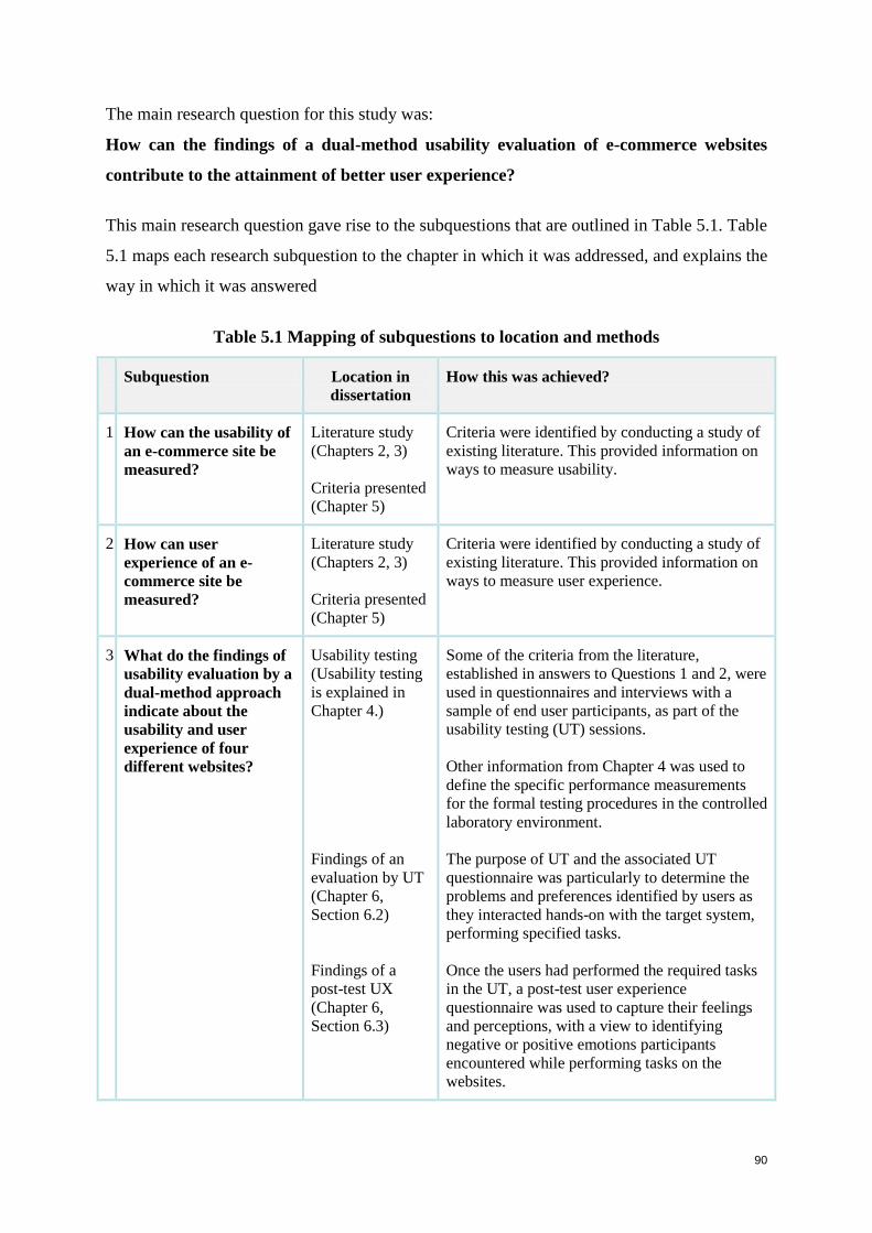
90
The main research question for this study was:
How can the findings of a dual-method usability evaluation of e-commerce websites
contribute to the attainment of better user experience?
This main research question gave rise to the subquestions that are outlined in Table 5.1. Table
5.1 maps each research subquestion to the chapter in which it was addressed, and explains the
way in which it was answered
Table 5.1 Mapping of subquestions to location and methods
Subquestion Location in
dissertation
How this was achieved?
1 How can the usability of
an e-commerce site be
measured?
Literature study
(Chapters 2, 3)
Criteria presented
(Chapter 5)
Criteria were identified by conducting a study of
existing literature. This provided information on
ways to measure usability.
2 How can user
experience of an e-
commerce site be
measured?
Literature study
(Chapters 2, 3)
Criteria presented
(Chapter 5)
Criteria were identified by conducting a study of
existing literature. This provided information on
ways to measure user experience.
3 What do the findings of
usability evaluation by a
dual-method approach
indicate about the
usability and user
experience of four
different websites?
Usability testing
(Usability testing
is explained in
Chapter 4.)
Findings of an
evaluation by UT
(Chapter 6,
Section 6.2)
Findings of a
post-test UX
(Chapter 6,
Section 6.3)
Some of the criteria from the literature,
established in answers to Questions 1 and 2, were
used in questionnaires and interviews with a
sample of end user participants, as part of the
usability testing (UT) sessions.
Other information from Chapter 4 was used to
define the specific performance measurements
for the formal testing procedures in the controlled
laboratory environment.
The purpose of UT and the associated UT
questionnaire was particularly to determine the
problems and preferences identified by users as
they interacted hands-on with the target system,
performing specified tasks.
Once the users had performed the required tasks
in the UT, a post-test user experience
questionnaire was used to capture their feelings
and perceptions, with a view to identifying
negative or positive emotions participants
encountered while performing tasks on the
websites.
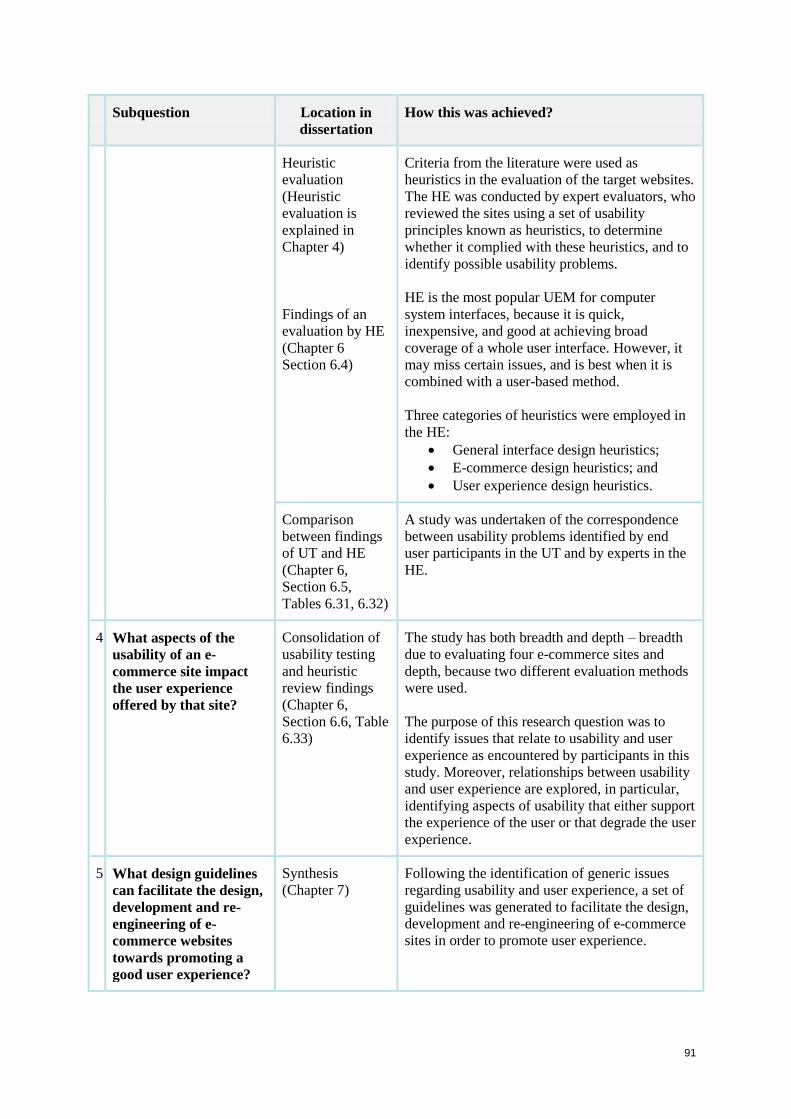
91
Subquestion Location in
dissertation
How this was achieved?
Heuristic
evaluation
(Heuristic
evaluation is
explained in
Chapter 4)
Findings of an
evaluation by HE
(Chapter 6
Section 6.4)
Criteria from the literature were used as
heuristics in the evaluation of the target websites.
The HE was conducted by expert evaluators, who
reviewed the sites using a set of usability
principles known as heuristics, to determine
whether it complied with these heuristics, and to
identify possible usability problems.
HE is the most popular UEM for computer
system interfaces, because it is quick,
inexpensive, and good at achieving broad
coverage of a whole user interface. However, it
may miss certain issues, and is best when it is
combined with a user-based method.
Three categories of heuristics were employed in
the HE:
General interface design heuristics;
E-commerce design heuristics; and
User experience design heuristics.
Comparison
between findings
of UT and HE
(Chapter 6,
Section 6.5,
Tables 6.31, 6.32)
A study was undertaken of the correspondence
between usability problems identified by end
user participants in the UT and by experts in the
HE.
4 What aspects of the
usability of an e-
commerce site impact
the user experience
offered by that site?
Consolidation of
usability testing
and heuristic
review findings
(Chapter 6,
Section 6.6, Table
6.33)
The study has both breadth and depth – breadth
due to evaluating four e-commerce sites and
depth, because two different evaluation methods
were used.
The purpose of this research question was to
identify issues that relate to usability and user
experience as encountered by participants in this
study. Moreover, relationships between usability
and user experience are explored, in particular,
identifying aspects of usability that either support
the experience of the user or that degrade the user
experience.
5 What design guidelines
can facilitate the design,
development and re-
engineering of e-
commerce websites
towards promoting a
good user experience?
Synthesis
(Chapter 7)
Following the identification of generic issues
regarding usability and user experience, a set of
guidelines was generated to facilitate the design,
development and re-engineering of e-commerce
sites in order to promote user experience.
92
5.3 Design of usability testing
Usability testing was described in detail in Chapter 4. This section explains how it is applied
in this study. Dumas (2003) defines six characteristics of usability tests as listed below, while
the seventh and eighth are obtained from Dumas and Redish (1999):
1. The focus is usability.
2. Participants are end users or potential end users.
3. There is an artifact to evaluate, which may be a product design, a system or prototype.
4. The participants think aloud as they progress through tasks.
5. Data is recorded and analysed.
6. The results are communicated to appropriate stakeholders.
7. Testing should cover the main features of the product.
8. Each participant should spend approximately two hours doing the given tasks.
The methodology and test plan were based on general methodologies for formal usability
testing (Pretorius, Calitz and van Greunen 2005; Rubin 1994; van Greunen and Wesson
2002). The broad methodology involves the following steps:
Set up objectives in line with research questions.
Determine the aspects to be measured and the criteria.
Formulate documents.
5.3.1 Participants
Twelve representative participants were recruited by the researcher. Each was tested on an
individual basis in the usability laboratory at Aqua Online Usability Lab, Hyde Park, in a
controlled environment. Aqua Online is a leading digital agency in South Africa that
specialises in usability.
The participants were selected so as to be a representative sample of the target users in terms
of the following characteristics:
Gender: 50% split across the sample;
Language: 33% split across the sample - English, Afrikaans and African
Language;
User type: equal split across pre-paid, contract and small and medium enterprises
(SME);
Network: equal split across MTN, Vodacom, Virgin Mobile, and Cell C; and
Internet experience: both novice and expert participants were recruited.
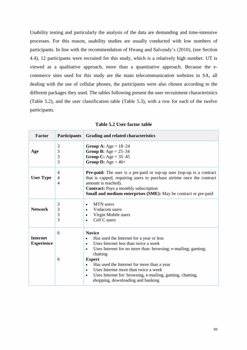
93
Usability testing and particularly the analysis of the data are demanding and time-intensive
processes. For this reason, usability studies are usually conducted with low numbers of
participants. In line with the recommendation of Hwang and Salvendy’s (2010), (see Section
4.4), 12 participants were recruited for this study, which is a relatively high number. UT is
viewed as a qualitative approach, more than a quantitative approach. Because the e-
commerce sites used for this study are the main telecommunication websites in SA, all
dealing with the use of cellular phones, the participants were also chosen according to the
different packages they used. The tables following present the user recruitment characteristics
(Table 5.2), and the user classification table (Table 5.3), with a row for each of the twelve
participants.
Table 5.2 User factor table
Factor Participants Grading and related characteristics
Age 3
3
3
3
Group A: Age = 18–24
Group B: Age = 25–34
Group C: Age = 35–45
Group D: Age = 46+
User Type 4
4
4
Pre-paid: The user is a pre-paid or top-up user (top-up is a contract
that is capped, requiring users to purchase airtime once the contract
amount is reached).
Contract: Pays a monthly subscription
Small and medium enterprises (SME): May be contract or pre-paid
Network 3
3
3
3
MTN users
Vodacom users
Virgin Mobile users
Cell C users
Internet
Experience
6
6
Novice
Has used the Internet for a year or less
Uses Internet less than twice a week
Uses Internet for no more than: browsing; e-mailing; gaming;
chatting
Expert
Has used the Internet for more than a year
Uses Internet more than twice a week
Uses Internet for: browsing, e-mailing, gaming, chatting,
shopping, downloading and banking
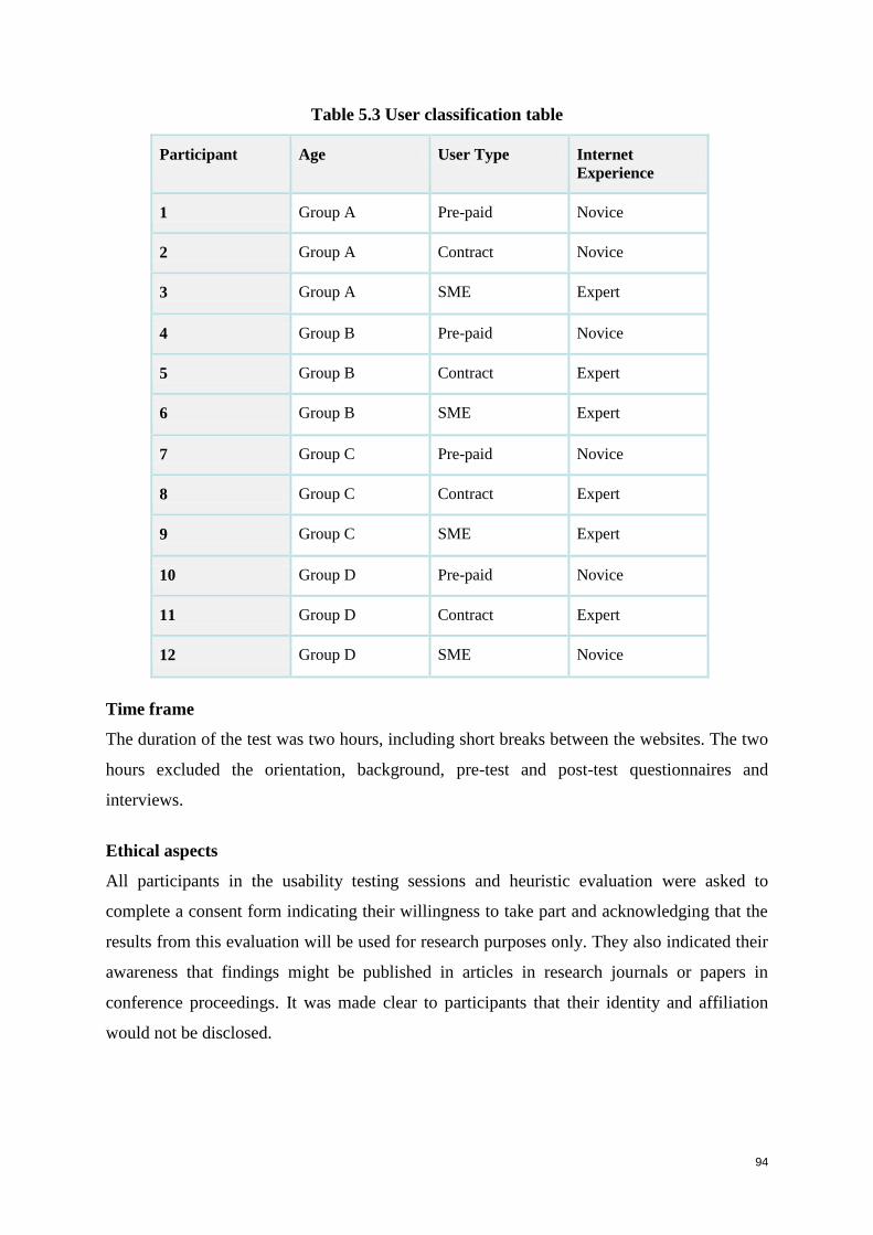
94
Table 5.3 User classification table
Participant Age User Type Internet
Experience
1 Group A Pre-paid Novice
2 Group A Contract Novice
3 Group A SME Expert
4 Group B Pre-paid Novice
5 Group B Contract Expert
6 Group B SME Expert
7 Group C Pre-paid Novice
8 Group C Contract Expert
9 Group C SME Expert
10 Group D Pre-paid Novice
11 Group D Contract Expert
12 Group D SME Novice
Time frame
The duration of the test was two hours, including short breaks between the websites. The two
hours excluded the orientation, background, pre-test and post-test questionnaires and
interviews.
Ethical aspects
All participants in the usability testing sessions and heuristic evaluation were asked to
complete a consent form indicating their willingness to take part and acknowledging that the
results from this evaluation will be used for research purposes only. They also indicated their
awareness that findings might be published in articles in research journals or papers in
conference proceedings. It was made clear to participants that their identity and affiliation
would not be disclosed.
95
5.3.2 Target systems
Participants were asked to perform the same set of tasks on each website. As stated in
Chapter 1, the target websites used for this study were the main telecommunication websites
in South Africa, namely:
MTN (www.mtn.co.za)
Vodacom (www.vodacom.co.za)
Virgin Mobile (www.virginmobile.co.za)
Cell C (www.cellc.co.za).
5.3.3 Test structure
The test structure consisted of the following main sessions:
Orientation
Participants were familiarised with the test structure and the environment in which
they were tested. The purpose of orientation was to help participants relax and to
prepare them for the test session.
Background questionnaire
Participants were required to fill in personal information, to ensure that they meet
the criteria of their testing category. This ensures that the results are based on the
correct characteristics for each user group (Table 5.2 User factor table).
Pre-test questionnaire
Before participants were exposed to concepts within the test, their initial
impressions and expectations of various concepts were assessed. This captured
their uninfluenced benchmark impressions of the websites and companies,
allowing for a measurement of changing impression.
Task 1: Homepage assessment
Performance tasks
These tasks served as the core area of testing. Within this phase, participants were
required to complete several tasks, involving the navigation, information
architecture, structure and layout, content and overall interaction and perception of
the site. User experience (UX) was measured by observing participants’
performance, comments and facial expression, in order to identify any positive or
negative emotions that they may have experienced while performing the required
tasks, and what aspects of the website contributed to participants feeling those
96
emotions. Contributing factors to participants’ performance may be good
navigation, page layout, interactivity or supporting content.
The specified tasks aimed to cover participants’ main goals in coming onto an e-
commerce website, namely:
Task 2: Find a plan that will best suit your needs;
Task 3: Find an Internet package.
Post-test user experience questionnaire
After participants completed the tasks: ‘Find a plan’ and ‘Find an Internet
package’, they were asked to complete a user experience questionnaire that
captured their overall perceptions. Participants were asked to select and list the
positive and negative emotions they had experienced while using each of the
target systems. This recorded the participants’ subjective feelings, and serves as a
benchmark of impression (user experience questionnaire and interview). After
completing the UX questionnaire, each participant was informally interviewed by
the researcher regarding the reasons for the emotions that they had selected.
The relevant documentation for the data collection methods can be found in Appendix A and
Appendix B.
5.3.4 Evaluation criteria
Participants’ performances on the specified tasks were measured against the following
aspects of usability (Table 5.4):
Table 5.4 Usability testing criteria
Criteria References
1 Navigation
Investigate users’ interaction with the navigation structures. (Efficiency)
Establish whether it is convenient for users to manoeuvre among related
pages, and between different sections? (Efficiency)
How quickly do users find what they are seeking? (Efficiency)
Test whether users can find the content that they are looking for.
(Effectiveness)
Investigate the language and terminology of the navigational headings.
(Efficiency)
Are the links within the content area obvious to the user and is the colour
of the links standard throughout? (Efficiency)
Test the alternate navigation, finding out if users can navigate to the
correct area if they get lost. (Efficiency)
Are hyperlinks clear or misleading? (Effectiveness)
ISO 9241-11
1998;
Sharp, Rogers
and Preece 2007;
Nielsen 1994a;
Chang and Chen
2009; Gardner
2007;
Hassenzahl and
Tractinsky 2006
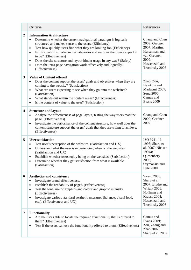
97
Criteria References
2 Information Architecture
Determine whether the current navigational paradigm is logically
structured and makes sense to the users. (Efficiency)
Test how quickly users find what they are looking for. (Efficiency)
Is information situated in the categories and sections that users expect it
to be? (Effectiveness)
Does the site structure and layout hinder usage in any way? (Safety)
Does the intra-page navigation work effectively and logically?
(Effectiveness)
Chang and Chen
2009; Gardner
2007; Martim,
Herselman and
van Greunen
2009;
Hassenzahl and
Tractinsky 2006
3 Value of Content offered
Does the content support the users’ goals and objectives when they are
coming to the website? (Satisfaction)
What are users expecting to see when they go onto the websites?
(Satisfaction)
What stands out within the content areas? (Effectiveness)
Is the content of value to the user? (Satisfaction)
Zhao, Zou,
Hawkins and
Madapusi 2007;
Sung 2006;
Camus and
Evans 2009
4 Structure and layout
Analyse the effectiveness of page layout, testing the way users read the
page. (Effectiveness)
Investigate the performance of the content structure, how well does the
content structure support the users’ goals that they are trying to achieve.
(Effectiveness)
Chang and Chen
2009; Gardner
2007
5 User satisfaction
Test user’s perception of the websites. (Satisfaction and UX)
Understand what the user is experiencing when on the websites.
(Satisfaction and UX)
Establish whether users enjoy being on the websites. (Satisfaction)
Determine whether they get satisfaction from what is available.
(Satisfaction)
ISO 9241-11
1998; Sharp et
al. 2007; Nielsen
1994a;
Quesenbery
2003;
Szymanski and
Hise 2000
6 Aesthetics and consistency
Investigate brand effectiveness.
Establish the readability of pages. (Effectiveness)
Test the tone, use of graphics and colour and graphic intensity.
(Effectiveness)
Investigate various standard aesthetic measures (balance, visual load,
etc.). (Effectiveness and UX)
Sward 2006;
Sharp et al.
2007; Blythe and
Wright 2006;
Hoffman and
Krauss 2004;
Hassenzahl and
Tractinsky 2006
7 Functionality
Are the users able to locate the required functionality that is offered to
them? (Effectiveness)
Test if the users can use the functionality offered to them. (Effectiveness)
Camus and
Evans 2009;
Zou, Zhang and
Zhao 2007;
Sharp et al. 2007
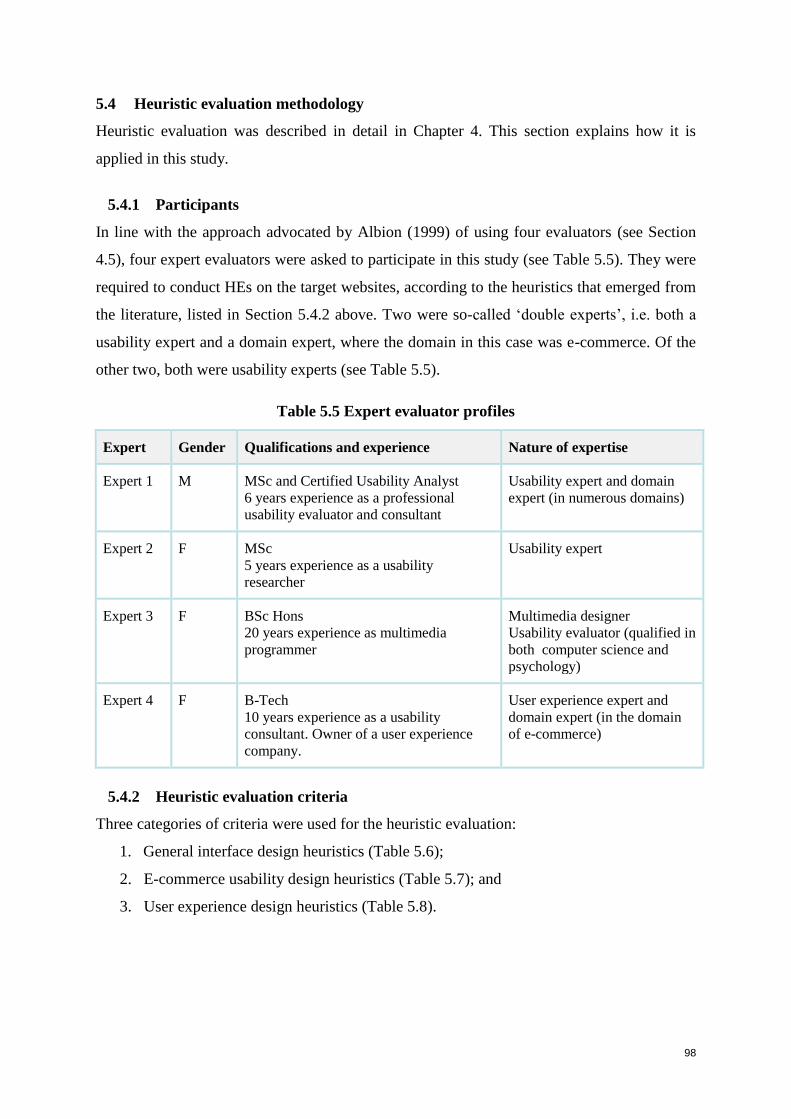
98
5.4 Heuristic evaluation methodology
Heuristic evaluation was described in detail in Chapter 4. This section explains how it is
applied in this study.
5.4.1 Participants
In line with the approach advocated by Albion (1999) of using four evaluators (see Section
4.5), four expert evaluators were asked to participate in this study (see Table 5.5). They were
required to conduct HEs on the target websites, according to the heuristics that emerged from
the literature, listed in Section 5.4.2 above. Two were so-called ‘double experts’, i.e. both a
usability expert and a domain expert, where the domain in this case was e-commerce. Of the
other two, both were usability experts (see Table 5.5).
Table 5.5 Expert evaluator profiles
Expert Gender Qualifications and experience Nature of expertise
Expert 1 M MSc and Certified Usability Analyst
6 years experience as a professional
usability evaluator and consultant
Usability expert and domain
expert (in numerous domains)
Expert 2 F MSc
5 years experience as a usability
researcher
Usability expert
Expert 3 F BSc Hons
20 years experience as multimedia
programmer
Multimedia designer
Usability evaluator (qualified in
both computer science and
psychology)
Expert 4 F B-Tech
10 years experience as a usability
consultant. Owner of a user experience
company.
User experience expert and
domain expert (in the domain
of e-commerce)
5.4.2 Heuristic evaluation criteria
Three categories of criteria were used for the heuristic evaluation:
1. General interface design heuristics (Table 5.6);
2. E-commerce usability design heuristics (Table 5.7); and
3. User experience design heuristics (Table 5.8).
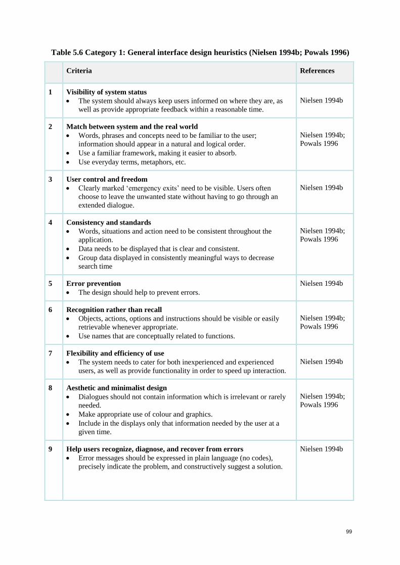
99
Table 5.6 Category 1: General interface design heuristics (Nielsen 1994b; Powals 1996)
Criteria References
1 Visibility of system status
The system should always keep users informed on where they are, as
well as provide appropriate feedback within a reasonable time.
Nielsen 1994b
2 Match between system and the real world
Words, phrases and concepts need to be familiar to the user;
information should appear in a natural and logical order.
Use a familiar framework, making it easier to absorb.
Use everyday terms, metaphors, etc.
Nielsen 1994b;
Powals 1996
3 User control and freedom
Clearly marked ‘emergency exits’ need to be visible. Users often
choose to leave the unwanted state without having to go through an
extended dialogue.
Nielsen 1994b
4 Consistency and standards
Words, situations and action need to be consistent throughout the
application.
Data needs to be displayed that is clear and consistent.
Group data displayed in consistently meaningful ways to decrease
search time
Nielsen 1994b;
Powals 1996
5 Error prevention
The design should help to prevent errors.
Nielsen 1994b
6 Recognition rather than recall
Objects, actions, options and instructions should be visible or easily
retrievable whenever appropriate.
Use names that are conceptually related to functions.
Nielsen 1994b;
Powals 1996
7 Flexibility and efficiency of use
The system needs to cater for both inexperienced and experienced
users, as well as provide functionality in order to speed up interaction.
Nielsen 1994b
8 Aesthetic and minimalist design
Dialogues should not contain information which is irrelevant or rarely
needed.
Make appropriate use of colour and graphics.
Include in the displays only that information needed by the user at a
given time.
Nielsen 1994b;
Powals 1996
9 Help users recognize, diagnose, and recover from errors
Error messages should be expressed in plain language (no codes),
precisely indicate the problem, and constructively suggest a solution.
Nielsen 1994b
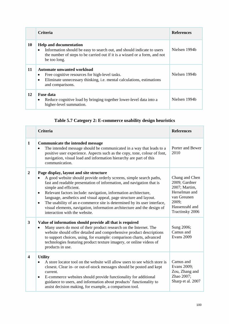
100
Criteria References
10 Help and documentation
Information should be easy to search out, and should indicate to users
the number of steps to be carried out if it is a wizard or a form, and not
be too long.
Nielsen 1994b
11 Automate unwanted workload
Free cognitive resources for high-level tasks.
Eliminate unnecessary thinking, i.e. mental calculations, estimations
and comparisons.
Nielsen 1994b
12 Fuse data
Reduce cognitive load by bringing together lower-level data into a
higher-level summation.
Nielsen 1994b
Table 5.7 Category 2: E-commerce usability design heuristics
Criteria References
1 Communicate the intended message
The intended message should be communicated in a way that leads to a
positive user experience. Aspects such as the copy, tone, colour of font,
navigation, visual load and information hierarchy are part of this
communication.
Porter and Bewer
2010
2 Page display, layout and site structure
A good website should provide orderly screens, simple search paths,
fast and readable presentation of information, and navigation that is
simple and efficient.
Relevant factors include: navigation, information architecture,
language, aesthetics and visual appeal, page structure and layout.
The usability of an e-commerce site is determined by its user interface,
visual elements, navigation, information architecture and the design of
interaction with the website.
Chang and Chen
2009; Gardner
2007; Martim,
Herselman and
van Greunen
2009;
Hassenzahl and
Tractinsky 2006
3 Value of information should provide all that is required
Many users do most of their product research on the Internet. The
website should offer detailed and comprehensive product descriptions
to support choices, using, for example: comparison charts, advanced
technologies featuring product texture imagery, or online videos of
products in use.
Sung 2006;
Camus and
Evans 2009
4 Utility
A store locator tool on the website will allow users to see which store is
closest. Clear in- or out-of-stock messages should be posted and kept
current.
E-commerce websites should provide functionality for additional
guidance to users, and information about products’ functionality to
assist decision making, for example, a comparison tool.
Camus and
Evans 2009;
Zou, Zhang and
Zhao 2007;
Sharp et al. 2007
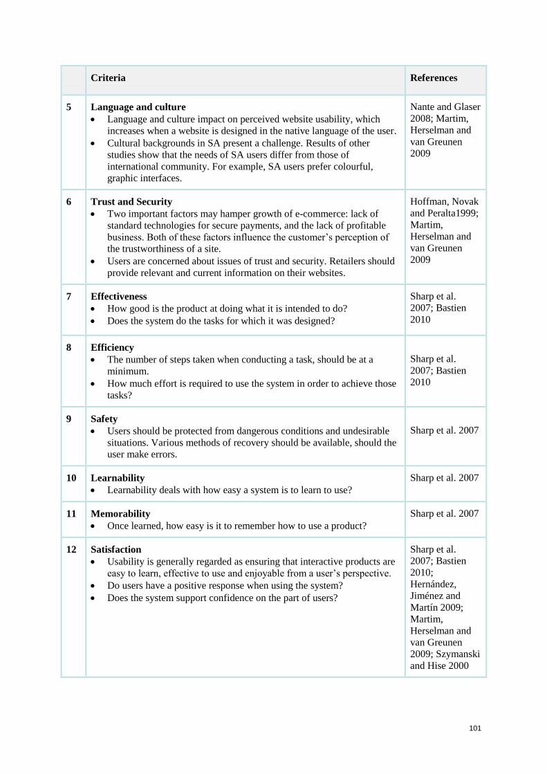
101
Criteria References
5 Language and culture
Language and culture impact on perceived website usability, which
increases when a website is designed in the native language of the user.
Cultural backgrounds in SA present a challenge. Results of other
studies show that the needs of SA users differ from those of
international community. For example, SA users prefer colourful,
graphic interfaces.
Nante and Glaser
2008; Martim,
Herselman and
van Greunen
2009
6 Trust and Security
Two important factors may hamper growth of e-commerce: lack of
standard technologies for secure payments, and the lack of profitable
business. Both of these factors influence the customer’s perception of
the trustworthiness of a site.
Users are concerned about issues of trust and security. Retailers should
provide relevant and current information on their websites.
Hoffman, Novak
and Peralta1999;
Martim,
Herselman and
van Greunen
2009
7 Effectiveness
How good is the product at doing what it is intended to do?
Does the system do the tasks for which it was designed?
Sharp et al.
2007; Bastien
2010
8 Efficiency
The number of steps taken when conducting a task, should be at a
minimum.
How much effort is required to use the system in order to achieve those
tasks?
Sharp et al.
2007; Bastien
2010
9 Safety
Users should be protected from dangerous conditions and undesirable
situations. Various methods of recovery should be available, should the
user make errors.
Sharp et al. 2007
10 Learnability
Learnability deals with how easy a system is to learn to use?
Sharp et al. 2007
11 Memorability
Once learned, how easy is it to remember how to use a product?
Sharp et al. 2007
12 Satisfaction
Usability is generally regarded as ensuring that interactive products are
easy to learn, effective to use and enjoyable from a user’s perspective.
Do users have a positive response when using the system?
Does the system support confidence on the part of users?
Sharp et al.
2007; Bastien
2010;
Hernández,
Jiménez and
Martín 2009;
Martim,
Herselman and
van Greunen
2009; Szymanski
and Hise 2000
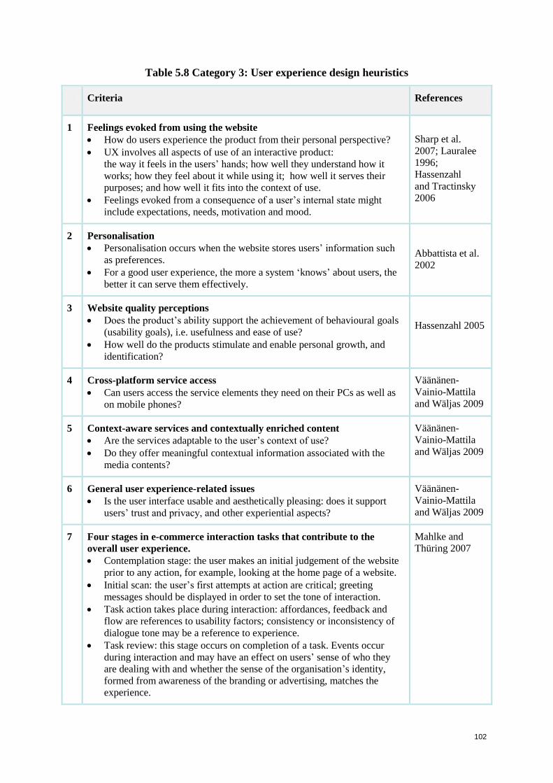
102
Table 5.8 Category 3: User experience design heuristics
Criteria References
1 Feelings evoked from using the website
How do users experience the product from their personal perspective?
UX involves all aspects of use of an interactive product:
the way it feels in the users’ hands; how well they understand how it
works; how they feel about it while using it; how well it serves their
purposes; and how well it fits into the context of use.
Feelings evoked from a consequence of a user’s internal state might
include expectations, needs, motivation and mood.
Sharp et al.
2007; Lauralee
1996;
Hassenzahl
and Tractinsky
2006
2 Personalisation
Personalisation occurs when the website stores users’ information such
as preferences.
For a good user experience, the more a system ‘knows’ about users, the
better it can serve them effectively.
Abbattista et al.
2002
3 Website quality perceptions
Does the product’s ability support the achievement of behavioural goals
(usability goals), i.e. usefulness and ease of use?
How well do the products stimulate and enable personal growth, and
identification?
Hassenzahl 2005
4 Cross-platform service access
Can users access the service elements they need on their PCs as well as
on mobile phones?
Väänänen-
Vainio-Mattila
and Wäljas 2009
5 Context-aware services and contextually enriched content
Are the services adaptable to the user’s context of use?
Do they offer meaningful contextual information associated with the
media contents?
Väänänen-
Vainio-Mattila
and Wäljas 2009
6 General user experience-related issues
Is the user interface usable and aesthetically pleasing: does it support
users’ trust and privacy, and other experiential aspects?
Väänänen-
Vainio-Mattila
and Wäljas 2009
7 Four stages in e-commerce interaction tasks that contribute to the
overall user experience.
Contemplation stage: the user makes an initial judgement of the website
prior to any action, for example, looking at the home page of a website.
Initial scan: the user’s first attempts at action are critical; greeting
messages should be displayed in order to set the tone of interaction.
Task action takes place during interaction: affordances, feedback and
flow are references to usability factors; consistency or inconsistency of
dialogue tone may be a reference to experience.
Task review: this stage occurs on completion of a task. Events occur
during interaction and may have an effect on users’ sense of who they
are dealing with and whether the sense of the organisation’s identity,
formed from awareness of the branding or advertising, matches the
experience.
Mahlke and
Thüring 2007
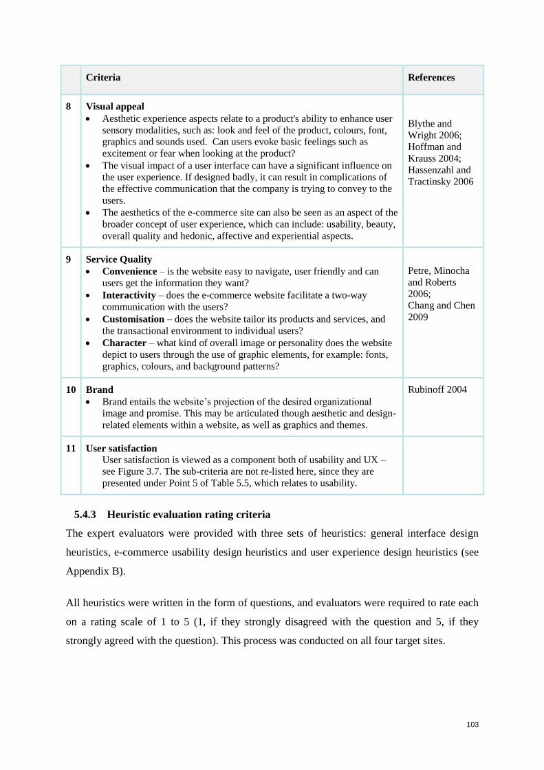
103
Criteria References
8 Visual appeal
Aesthetic experience aspects relate to a product's ability to enhance user
sensory modalities, such as: look and feel of the product, colours, font,
graphics and sounds used. Can users evoke basic feelings such as
excitement or fear when looking at the product?
The visual impact of a user interface can have a significant influence on
the user experience. If designed badly, it can result in complications of
the effective communication that the company is trying to convey to the
users.
The aesthetics of the e-commerce site can also be seen as an aspect of the
broader concept of user experience, which can include: usability, beauty,
overall quality and hedonic, affective and experiential aspects.
Blythe and
Wright 2006;
Hoffman and
Krauss 2004;
Hassenzahl and
Tractinsky 2006
9 Service Quality
Convenience – is the website easy to navigate, user friendly and can
users get the information they want?
Interactivity – does the e-commerce website facilitate a two-way
communication with the users?
Customisation – does the website tailor its products and services, and
the transactional environment to individual users?
Character – what kind of overall image or personality does the website
depict to users through the use of graphic elements, for example: fonts,
graphics, colours, and background patterns?
Petre, Minocha
and Roberts
2006;
Chang and Chen
2009
10 Brand
Brand entails the website’s projection of the desired organizational
image and promise. This may be articulated though aesthetic and design-
related elements within a website, as well as graphics and themes.
Rubinoff 2004
11 User satisfaction
User satisfaction is viewed as a component both of usability and UX –
see Figure 3.7. The sub-criteria are not re-listed here, since they are
presented under Point 5 of Table 5.5, which relates to usability.
5.4.3 Heuristic evaluation rating criteria
The expert evaluators were provided with three sets of heuristics: general interface design
heuristics, e-commerce usability design heuristics and user experience design heuristics (see
Appendix B).
All heuristics were written in the form of questions, and evaluators were required to rate each
on a rating scale of 1 to 5 (1, if they strongly disagreed with the question and 5, if they
strongly agreed with the question). This process was conducted on all four target sites.
104
5.4.4 Capturing the results
The results were captured using Microsoft Excel and appropriate formulas in order to cross-
correlate. The results were captured according to tasks: background questionnaire, pre-test
questionnaire, performance tasks, user experience and post-test questionnaire. Different
question types were captured, consisting of single-select questions, open-ended questions and
ratings. Once the results were captured, graphs were generated to highlight and summarise
key findings. These graphs are presented in the findings chapter (see Chapter 6).
5.5 Analysis of the data
Steps taken to analyse the usability test (UT) results:
As stated in Section 5.3.1, for each of the twelve users, their comments and
performance per task were captured in an electronic spreadsheet.
Results were electronically analysed, tallying numbers of each type of response.
All results were viewed, key findings were extracted.
Summaries of findings were compiled and relevant graphs were created.
Steps taken to analyse the heuristic evaluation (HE) results:
As stated in Section 5.4.1, the ratings of the four experts and their comments per task
were captured in an electronic spreadsheet.
The HE results were reviewed to identify violations that led to usability problems.
Key findings were extracted.
A summary of findings was completed and relevant graphs were created
Triangulation of findings:
Cohen, Manion and Morrison (2005) define triangulation as using two or more different data
collection methods when studying matters related to human behaviour. In the present study,
the results from evaluation by UT and HE were summarized and compared. Similarities and
differences were identified.
The data is triangulated by presenting the problems and positive aspects in each of the four
websites as identified by both UT and HE (i.e. common problems and positive aspects) and
matters identified by one of the two methods on its own (i.e. UT-specific and HE-specific
problems and positive aspects).
105
Moreover, the general types of problems and the positive aspects are presented with respect
to each category of criteria that UT identified on its own, both HE & UT identified, and HE
identified on its own.
Strengths of using both HE and UT evaluation methods are also discussed
5.6 Summary
This chapter explained the research design of the study, namely, application of two different
usability evaluation methods (UEMs), usability testing and heuristic evaluation. The research
questions introduced in Chapter 1, were tabulated against the chapters where they were
addressed, along with explanations of the ways in which they were answered. The categories
and criteria that were used to conduct this study, were set out. Some of the criteria identified
were used with the end user participants in the usability testing sessions, and others were
considered by the experts conducting heuristic evaluations of the four target systems.
Chapter 5 has explained the evaluation methods and the evaluation criteria used in this
research. It lays the foundation for Chapter 6 which describes their implementation and the
findings.
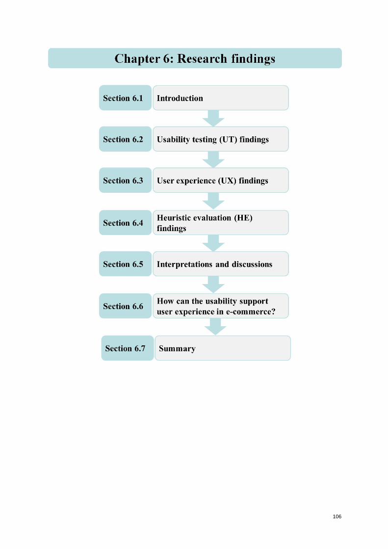
106
107
Chapter 6: Research findings
6.1 Introduction
This study aims to determine how the usability of e-commerce websites supports the user
experience of users. The International Organisation for Standardisation (ISO) defines
usability as: ‘the extent to which a product can be used by specified users to achieve specified
goals with effectiveness, efficiency and satisfaction in a specified context’ (ISO 9241-11
1998). User experience (UX) on the other hand incorporates all aspects of the end user’s
interaction with the product or service and the organization (Sward 2006).
Two different usability evaluation methods (UEMs) were used: usability testing (UT) and
heuristic evaluation (HE). HE is an inspection method conducted by experts. It is a popular
UEM for computer system interfaces because it is quick, inexpensive, and good at achieving
broad coverage of a whole user interface, although it may miss some complex issues
(Ssemugabi and de Villiers 2007; Barrington 2007). UT is a user-based method and is useful
for establishing detailed issues, such as: preferences, what problems participants encounter,
and how long it takes to complete tasks (Barrington 2007; Kantner and Rosenbaum 1997).
Evaluation criteria were extracted from the literature studies. Some of the criteria identified
were used with the end user participants in the usability testing sessions, while others were
considered by the experts conducting heuristic evaluations of the four target systems, and
some were used with both groups.
Twelve representative participants were recruited by the researcher for the UT on the target
websites: MTN, Vodacom, Virgin Mobile and Cell C. Due its time-intensive nature, UT is
characterised by low number of participants. The 12 used in this study is a relatively high
number. Each participant was tested on an individual basis. Participants’ performances on the
specified tasks were measured against the identified criteria for UT (see Chapter 5: Section
5.3.4). Four expert evaluators were asked to conduct HEs on the target websites, according to
the heuristics that emerged in the study (see Chapter 5: Section 5.4.2).
In order to investigate a possible relationship between usability and UX, the usability of the
target websites was first established, followed by investigation of user experience. This
chapter discusses the research findings from usability testing, as well as from the heuristic
evaluation. Section 6.2 presents the findings of usability testing, while Section 6.3 discusses
the user experience findings among the same participants. For heuristic evaluation, the
108
usability study and the user experience study are described in the same section, namely
Section 6.4. In Section 6.5, the findings of the studies are discussed and compared with
similar studies. Furthermore, the problems identified, are tabulated to indicate whether they
were identified by UT, HE or by both.
Disclaimer: This research study applies usability evaluation methods to four informational e-
commerce websites. The work undertaken is for academic and research purposes only, and
has no commercial or promotional intentions.
6.2 Usability testing (UT) findings
Twelve participants, representative of the user population were recruited to participate in the
usability test (UT), each was tested on an individual basis. Participants’ performances was
measured against the framework of criteria defined in Section 5.3.4, presented in Table 5.4.
Before undergoing the UT session, participants were familiarised with the test structure, and
the environment in which they would be tested. This was to help them relax and prepare them
for the test session. Furthermore, participants were required to fill in personal information, to
ensure that they met the requirements of their testing category.
This ensures that the results are based on the correct characteristics for each user group
(Section 5.3.1: Table 5.2). Participants were required to sign a consent form acknowledging
that their inputs are purely for academic use, and would not be used for consulting purposes
(see Appendix A1). They understood that participant names and affiliations would not be
published or disclosed.
After signing the consent form, participants completed a background questionnaire to
establish their profile (Appendix A2), and then a pre-test questionnaire (Appendix A3). Next
they investigated the home page (Appendix A4). Their interactions with the tasks ‘Find a
plan’ and ‘Find an Internet package’ were then studied with the usability technology in the
laboratory (Appendix A5 and A6). Findings from the pre-test questionnaire follow.
6.2.1 Pre-test questionnaire findings
Prior to the formal UT sessions, participants completed a questionnaire (Appendix A5) to
establish their initial perceptions of e-commerce in general and the user experience it
generated. In this pre-test questionnaire, they were asked if they had used e-commerce
websites before and, if so, for how long.
109
Considering the 12 participants, it turned out that 11 (92%) were users, seven of whom (58%)
had used e-commerce sites for more than two years, three (25%) for between one and two
years, and only one (8%) for less than a year.
When asked about the features and functionality they used most, it was found that the
Compare feature was the most popular for eight (67%) and Product reviews for seven (58%).
Social networking (33%) and Sharing content (25%) had about the same popularity, followed
by the Help me choose facility and other features such as Podcasts, Videos and Picture
uploads.
Given the focus in this study on user experience (UX), participants were asked what aspects
were important in order to create UX on e-commerce websites. This open-ended question
generated responses that the researcher classified under the following categories:
User interface: interface aspects that contribute to the mood and experience of the
website.
Functionality: tools and applications that assist them in completing their tasks.
Content: the type of content that mostly engaged them.
The structure of the sites and responses in this section (as well as subsequent sections)
indicated the existence of two diverse approaches to the presentation of product offerings.
These approaches can be categorised as ‘product-based’, and ‘needs-based’.
The concept of ‘product-based’ refers to presenting product offerings in a catalogue
according to the way the business defines it.
Whereas a ‘needs-based’ paradigm, is when the organisation firstly defines the needs
of their users and matches the associated product to those needs. This paradigm
allows the business to design products around the needs of the user rather than the
business.
Table 6.1 following, elaborates and discusses the e-commerce user experience enhancement
aspects that were generated from the three categories above, based on the pre-test
questionnaire (Appendix A3). Overall, participants mentioned that the majority of current
websites are static, text-heavy and provide little value. Two of the sites most preferred by
participants in terms of good user experience are Google and Amazon. Key contributing
factors may be the simplicity and efficiency of completing tasks on those websites.
110
The results gave insights into participants’ initial feelings and perceptions with regard to e-
commerce user experience. The findings indicate that participants are looking for content that
is specific to their needs; adequate tools and functionality to assist them in choosing the right
product; simple and efficient response time; and innovative designs that are engaging and
appealing.
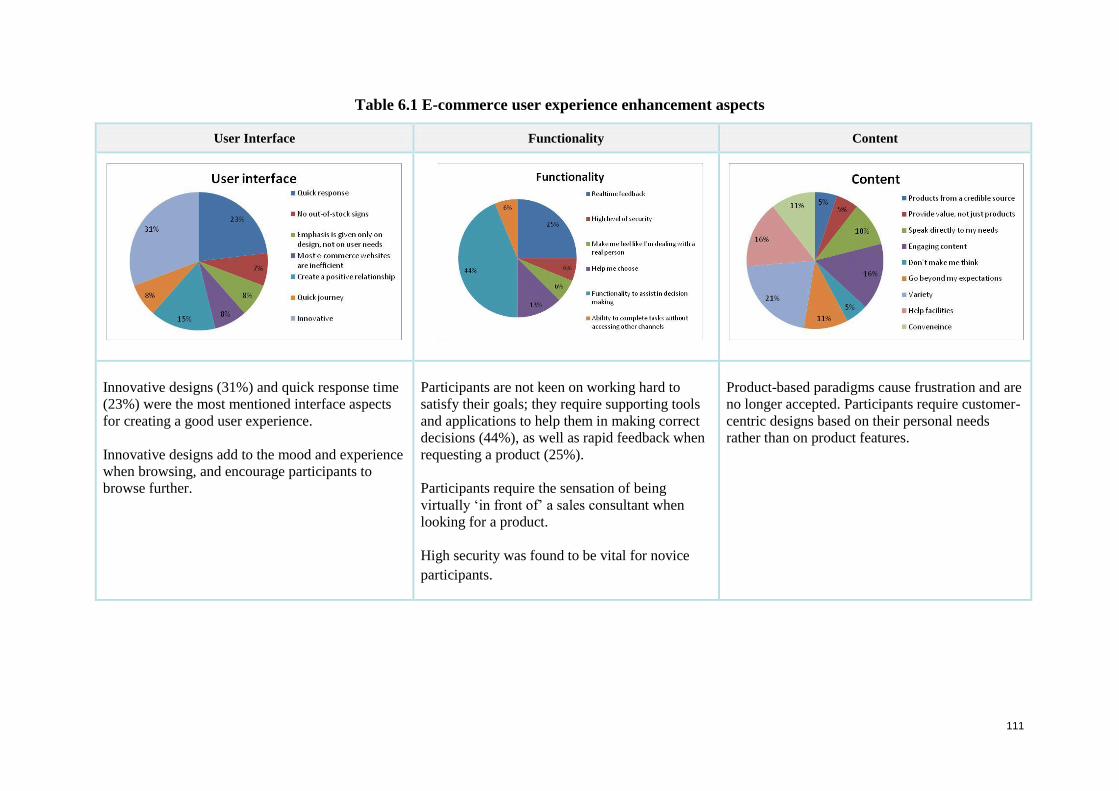
111
Table 6.1 E-commerce user experience enhancement aspects
User Interface Functionality Content
Innovative designs (31%) and quick response time
(23%) were the most mentioned interface aspects
for creating a good user experience.
Innovative designs add to the mood and experience
when browsing, and encourage participants to
browse further.
Participants are not keen on working hard to
satisfy their goals; they require supporting tools
and applications to help them in making correct
decisions (44%), as well as rapid feedback when
requesting a product (25%).
Participants require the sensation of being
virtually ‘in front of’ a sales consultant when
looking for a product.
High security was found to be vital for novice
participants.
Product-based paradigms cause frustration and are
no longer accepted. Participants require customer-
centric designs based on their personal needs
rather than on product features.

112
Results follow of participants’ initial impressions on the four homepages: MTN, Vodacom,
Virgin Mobile and Cell C.
6.2.2 Task 1: Homepage assessment
Participants were asked questions (see Appendix A4) to establish their initial perceptions of
the four homepages: MTN, Vodacom, Cell C and Virgin Mobile.
In the discussions of the homepage assessment, positive comments are presented before
negative. Both positive and negative aspects are subdivided into comments regarding
structure and comments regarding content offered. The results are presented in the tables that
follow. The tables relate respectively to the homepages of MTN, Vodacom, Virgin Mobile
and Cell C:
1. MTN homepage positive and negative factors (Table 6.2);
2. Vodacom homepage positive and negative factors (Table 6.3);
3. Virgin Mobile homepage positive and negative factors (Table 6.4); and
4. Cell C homepage positive and negative factors (Table 6.5).
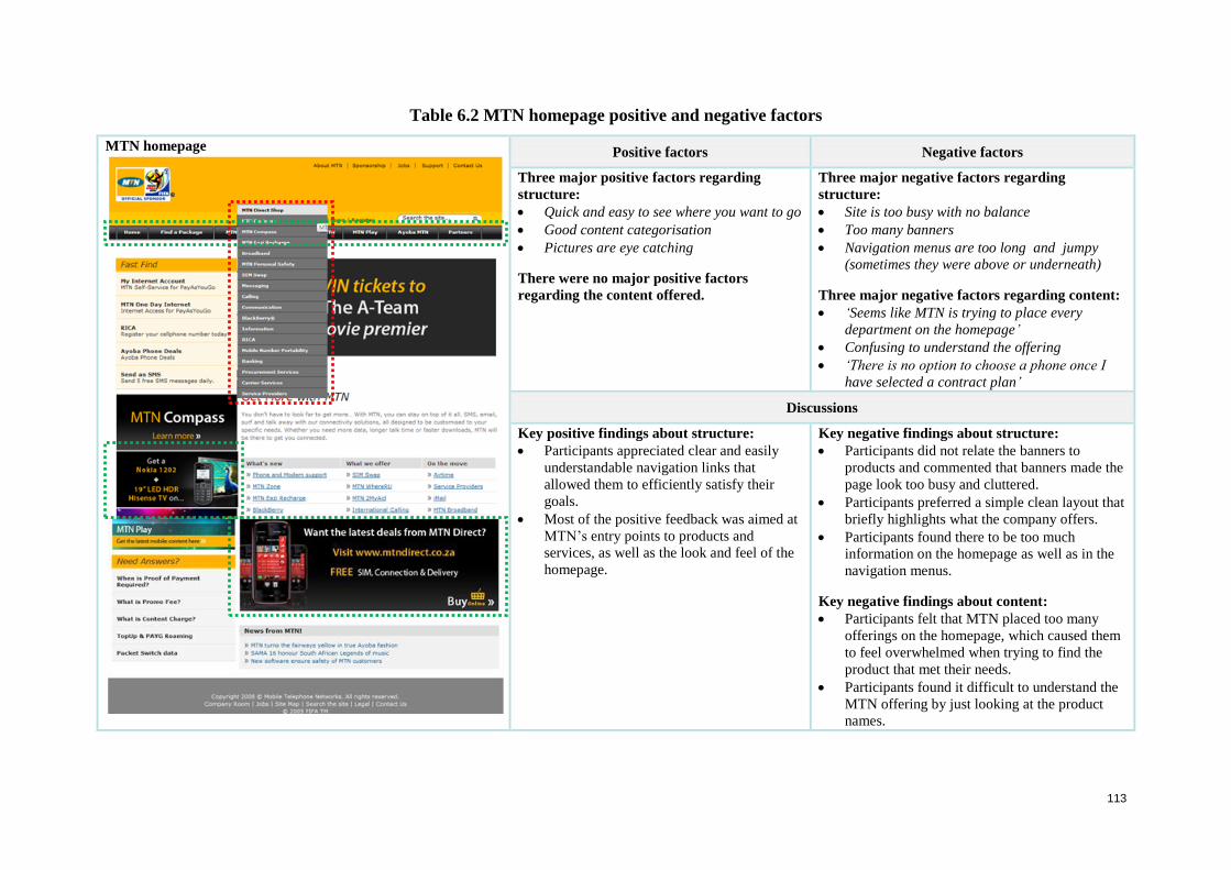
113
Table 6.2 MTN homepage positive and negative factors
MTN homepage
Positive factors Negative factors
Three major positive factors regarding
structure:
Quick and easy to see where you want to go
Good content categorisation
Pictures are eye catching
There were no major positive factors
regarding the content offered.
Three major negative factors regarding
structure:
Site is too busy with no balance
Too many banners
Navigation menus are too long and jumpy
(sometimes they were above or underneath)
Three major negative factors regarding content:
‘Seems like MTN is trying to place every
department on the homepage’
Confusing to understand the offering
‘There is no option to choose a phone once I
have selected a contract plan’
Discussions
Key positive findings about structure:
Participants appreciated clear and easily
understandable navigation links that
allowed them to efficiently satisfy their
goals.
Most of the positive feedback was aimed at
MTN’s entry points to products and
services, as well as the look and feel of the
homepage.
Key negative findings about structure:
Participants did not relate the banners to
products and commented that banners made the
page look too busy and cluttered.
Participants preferred a simple clean layout that
briefly highlights what the company offers.
Participants found there to be too much
information on the homepage as well as in the
navigation menus.
Key negative findings about content:
Participants felt that MTN placed too many
offerings on the homepage, which caused them
to feel overwhelmed when trying to find the
product that met their needs.
Participants found it difficult to understand the
MTN offering by just looking at the product
names.
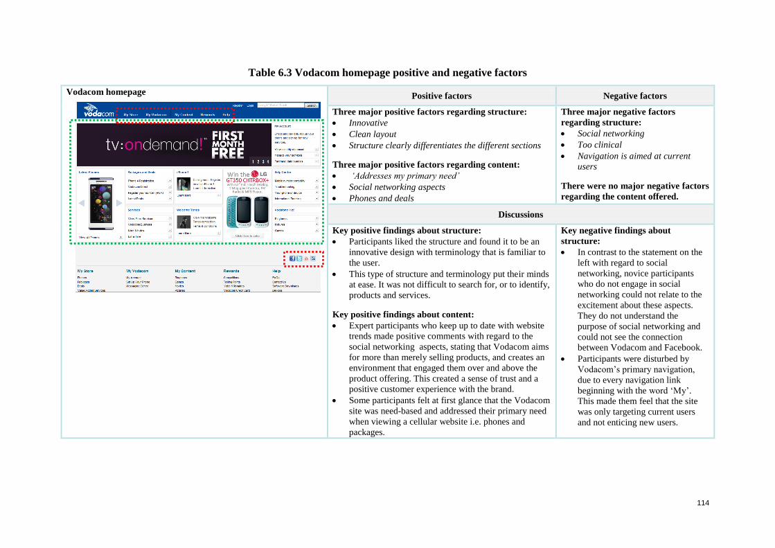
114
Table 6.3 Vodacom homepage positive and negative factors
Vodacom homepage
Positive factors Negative factors
Three major positive factors regarding structure:
Innovative
Clean layout
Structure clearly differentiates the different sections
Three major positive factors regarding content:
‘Addresses my primary need’
Social networking aspects
Phones and deals
Three major negative factors
regarding structure:
Social networking
Too clinical
Navigation is aimed at current
users
There were no major negative factors
regarding the content offered.
Discussions
Key positive findings about structure:
Participants liked the structure and found it to be an
innovative design with terminology that is familiar to
the user.
This type of structure and terminology put their minds
at ease. It was not difficult to search for, or to identify,
products and services.
Key positive findings about content:
Expert participants who keep up to date with website
trends made positive comments with regard to the
social networking aspects, stating that Vodacom aims
for more than merely selling products, and creates an
environment that engaged them over and above the
product offering. This created a sense of trust and a
positive customer experience with the brand.
Some participants felt at first glance that the Vodacom
site was need-based and addressed their primary need
when viewing a cellular website i.e. phones and
packages.
Key negative findings about
structure:
In contrast to the statement on the
left with regard to social
networking, novice participants
who do not engage in social
networking could not relate to the
excitement about these aspects.
They do not understand the
purpose of social networking and
could not see the connection
between Vodacom and Facebook.
Participants were disturbed by
Vodacom’s primary navigation,
due to every navigation link
beginning with the word ‘My’.
This made them feel that the site
was only targeting current users
and not enticing new users.
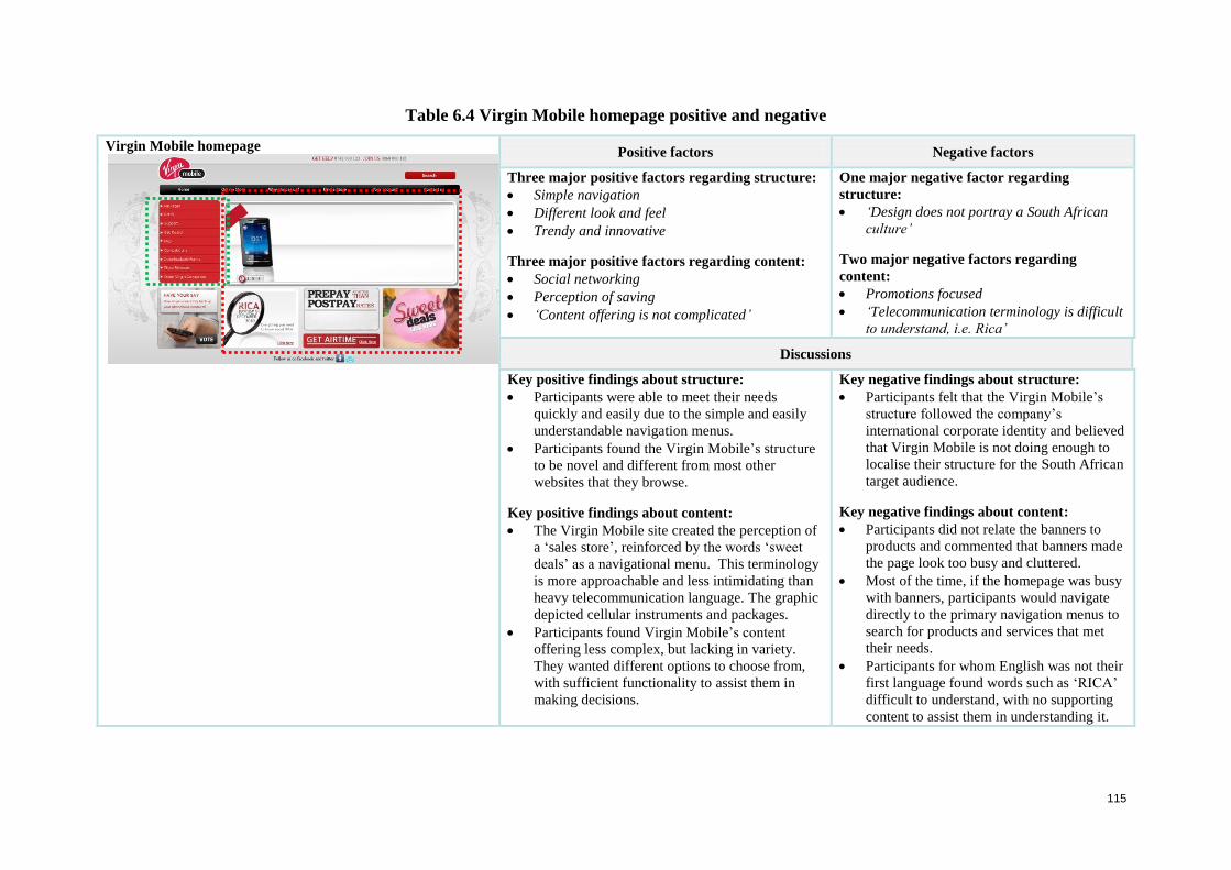
115
Table 6.4 Virgin Mobile homepage positive and negative
Virgin Mobile homepage
Positive factors Negative factors
Three major positive factors regarding structure:
Simple navigation
Different look and feel
Trendy and innovative
Three major positive factors regarding content:
Social networking
Perception of saving
‘Content offering is not complicated’
One major negative factor regarding
structure:
‘Design does not portray a South African
culture’
Two major negative factors regarding
content:
Promotions focused
‘Telecommunication terminology is difficult
to understand, i.e. Rica’
Discussions
Key positive findings about structure:
Participants were able to meet their needs
quickly and easily due to the simple and easily
understandable navigation menus.
Participants found the Virgin Mobile’s structure
to be novel and different from most other
websites that they browse.
Key positive findings about content:
The Virgin Mobile site created the perception of
a ‘sales store’, reinforced by the words ‘sweet
deals’ as a navigational menu. This terminology
is more approachable and less intimidating than
heavy telecommunication language. The graphic
depicted cellular instruments and packages.
Participants found Virgin Mobile’s content
offering less complex, but lacking in variety.
They wanted different options to choose from,
with sufficient functionality to assist them in
making decisions.
Key negative findings about structure:
Participants felt that the Virgin Mobile’s
structure followed the company’s
international corporate identity and believed
that Virgin Mobile is not doing enough to
localise their structure for the South African
target audience.
Key negative findings about content:
Participants did not relate the banners to
products and commented that banners made
the page look too busy and cluttered.
Most of the time, if the homepage was busy
with banners, participants would navigate
directly to the primary navigation menus to
search for products and services that met
their needs.
Participants for whom English was not their
first language found words such as ‘RICA’
difficult to understand, with no supporting
content to assist them in understanding it.
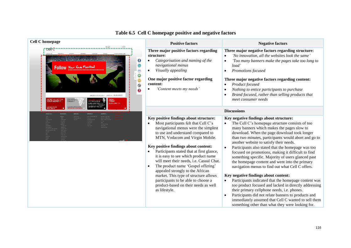
116
Table 6.5 Cell C homepage positive and negative factors
Cell C homepage
Positive factors Negative factors
Three major positive factors regarding
structure:
Categorisation and naming of the
navigational menus
Visually appealing
One major positive factor regarding
content:
‘Content meets my needs’
Three major negative factors regarding structure:
‘No innovation, all the websites look the same’
‘Too many banners make the pages take too long to
load’
Promotions focused
Three major negative factors regarding content:
Product focused
Nothing to entice participants to purchase
Brand focused, rather than selling products that
meet consumer needs
Discussions
Key positive findings about structure:
Most participants felt that Cell C’s
navigational menus were the simplest
to use and understand compared to
MTN, Vodacom and Virgin Mobile.
Key positive findings about content:
Participants stated that at first glance,
it is easy to see which product name
will meet their needs, i.e. Casual Chat.
The product name ‘Gospel offering’
appealed strongly to the African
market. This type of structure allows
participants to be able to choose a
product-based on their needs as well
as lifestyle.
Key negative findings about structure:
The Cell C’s homepage structure consists of too
many banners which makes the pages slow to
download. When the page download took longer
than two minutes, participants would abort and go to
another website to satisfy their needs.
Participants also stated that the homepage was too
focused on promotions, making it difficult to find
something specific. Majority of users glanced past
the homepage content and went into the primary
navigation menus to find out what Cell C offers.
Key negative findings about content:
Participants indicated that the homepage content was
too product focused and lacked in directly addressing
their primary cellphone needs, i.e. phones.
Participants did not relate banners to products and
immediately assumed that Cell C wanted to sell them
something other than what they were looking for.
117
6.2.2.1 Consolidation of homepage assessment
The findings from the homepage analysis indicate that participants are attracted to a
homepage structure that looks different, and is simple and clean with product offerings that
are easy to identify at first glance. Participants’ appreciated the nature of Vodacom’s
homepage structure, which they found to be an innovative design with familiar terminology.
This type of structure and terminology put their minds at ease and did not require much effort
when looking for products and services.
Terminology should be selected to support comprehension. If the terms are selected to
resonate with a theme, this should not be at the expense of clarity. For example, in
Vodacom’s primary navigation, every navigation link commences with ‘My’. This gave
participants the impression that it targeted only current users who are accustomed to it, and it
did not aim to entice new users to browse the categories. They found clean, simple homepage
layouts attractive, such as those of Virgin Mobile and Cell C. Minimalist screen layouts are
less intimidating when one is looking for products and services. A major contributing factor
was the choice of intuitive and easily understandable product names. An example is ‘Casual
Chat’ on the Cell C site; this type of terminology allows participants to know at first glance
what the plan is about, just by looking at the product name. Regarding Virgin Mobile,
participants found the product structure to be simple, i.e. four plan options, but some stated
that it lacked variety for a user looking for a specific plan such as a business package.
Participants became frustrated when a website contained too many banners, stating that it
makes the pages slow to download. If it took longer than two minutes, they would abort and
go to another website to satisfy their needs. This finding was similar across all the suppliers.
Participants also found it overwhelming when the homepage and navigation menus were
overloaded with information. An example of this type of structure was the MTN website.
From the above task results, it can be deduced that the primary reason why participants come
onto cellular websites is to find plans, deals and phones. Participants felt that the Vodacom
website was the only website that catered for users’ primary needs on the homepage. With
regard to the social networking aspects, the more experienced internet participants were
positive, stating that cellular companies are not in business merely to sell products but
particularly to create an engagement with participants outside of the product offering. This
can create a feeling of trust and a positive customer experience with the brand. In contrast,
novice participants did not understand the purpose of having social network icons on a
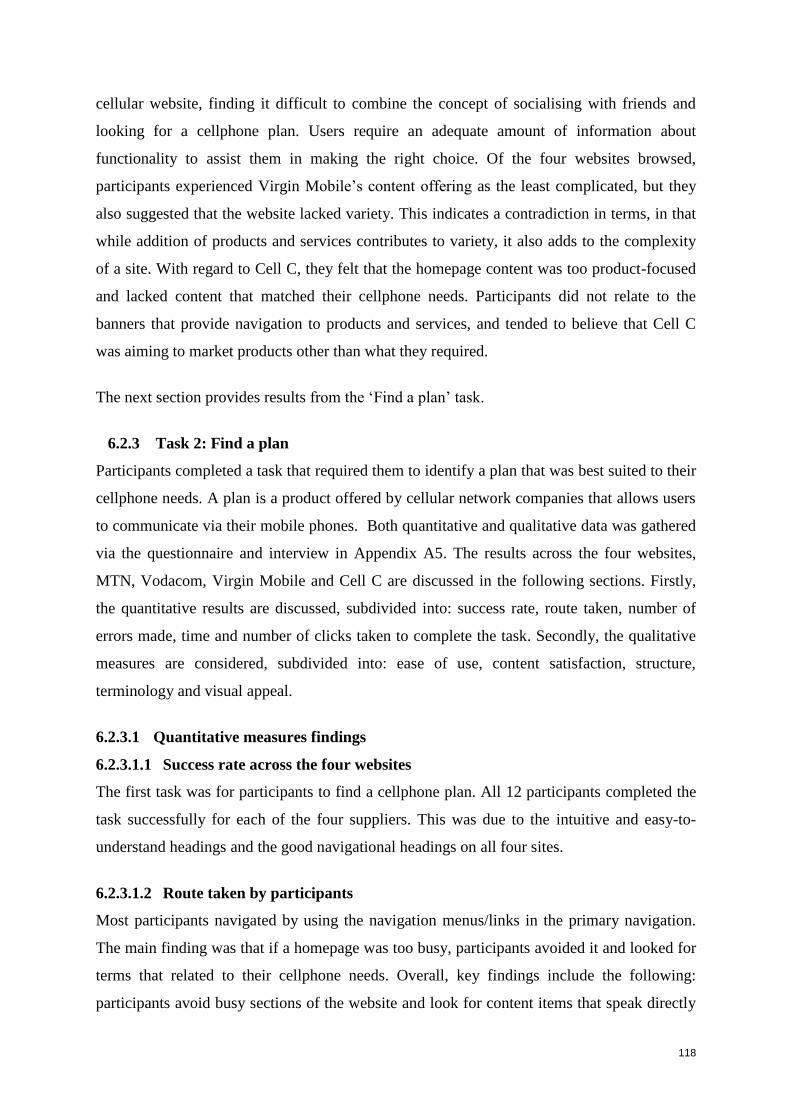
118
cellular website, finding it difficult to combine the concept of socialising with friends and
looking for a cellphone plan. Users require an adequate amount of information about
functionality to assist them in making the right choice. Of the four websites browsed,
participants experienced Virgin Mobile’s content offering as the least complicated, but they
also suggested that the website lacked variety. This indicates a contradiction in terms, in that
while addition of products and services contributes to variety, it also adds to the complexity
of a site. With regard to Cell C, they felt that the homepage content was too product-focused
and lacked content that matched their cellphone needs. Participants did not relate to the
banners that provide navigation to products and services, and tended to believe that Cell C
was aiming to market products other than what they required.
The next section provides results from the ‘Find a plan’ task.
6.2.3 Task 2: Find a plan
Participants completed a task that required them to identify a plan that was best suited to their
cellphone needs. A plan is a product offered by cellular network companies that allows users
to communicate via their mobile phones. Both quantitative and qualitative data was gathered
via the questionnaire and interview in Appendix A5. The results across the four websites,
MTN, Vodacom, Virgin Mobile and Cell C are discussed in the following sections. Firstly,
the quantitative results are discussed, subdivided into: success rate, route taken, number of
errors made, time and number of clicks taken to complete the task. Secondly, the qualitative
measures are considered, subdivided into: ease of use, content satisfaction, structure,
terminology and visual appeal.
6.2.3.1 Quantitative measures findings
6.2.3.1.1 Success rate across the four websites
The first task was for participants to find a cellphone plan. All 12 participants completed the
task successfully for each of the four suppliers. This was due to the intuitive and easy-to-
understand headings and the good navigational headings on all four sites.
6.2.3.1.2 Route taken by participants
Most participants navigated by using the navigation menus/links in the primary navigation.
The main finding was that if a homepage was too busy, participants avoided it and looked for
terms that related to their cellphone needs. Overall, key findings include the following:
participants avoid busy sections of the website and look for content items that speak directly
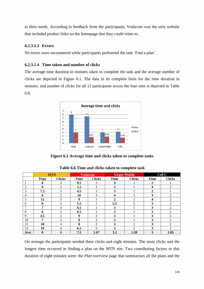
119
to their needs. According to feedback from the participants, Vodacom was the only website
that included product links on the homepage that they could relate to.
6.2.3.1.3 Errors
No errors were encountered while participants performed the task ‘Find a plan’.
6.2.3.1.4 Time taken and number of clicks
The average time duration in minutes taken to complete the task and the average number of
clicks are depicted in Figure 6.1. The data in its complete form for the time duration in
minutes, and number of clicks for all 12 participants across the four sites is depicted in Table
6.6.
Figure 6.1 Average time and clicks taken to complete tasks
Table 6.6 Time and clicks taken to complete task
MTN Vodacom Virgin Mobile Cell C
Time Clicks Time Clicks Time Clicks Time Clicks
1 8 3 9.5 3 3 2 2 1
2 9 3 5.5 1 3 1 4 2
3 7.5 3 4.5 1 3 1 2 1
4 6 2 10 3 4 3 3 2
5 12 3 9 1 2 1 4 2
6 9 3 5.5 1 5.5 5 3 2
7 7 3 6.5 1 3 1 3 2
8 6 3 6.5 1 3 1 3 2
9 4.5 2 9 2 3 1 3 2
10 7 3 9 2 3 1 3 2
11 10 4 8 2 3 1 3 2
12 10 4 6.5 2 3 1 3 2
Ave: 8 3 7.5 1.67 3.2 1.58 3 1.83
On average the participants needed three clicks and eight minutes. The most clicks and the
longest time occurred in finding a plan on the MTN site. Two contributing factors to this
duration of eight minutes were: the Plan overview page that summarises all the plans and the
120
level of product detail provided. With regard to Vodacom, even though the average number
of clicks is low (1.67 clicks), participants needed considerable time (average 7.5 minutes) to
discover how to use the functionality of the Deals/Package section. The participants needed
an average of 1.83 clicks on the Virgin Mobile and 1.58 clicks to find a plan on the Cell C
site and websites and no major performance-hampering aspects were identified.
6.2.3.2 Qualitative measures findings
The qualitative measures were ease of use, content satisfaction, structure, terminology and
visual appeal. The results for ease of use, content satisfaction and structure are depicted in
Figure 6.2. Following, Table 6.7 lists the major positive and negative factors with regard to
content satisfaction across the four websites. Table 6.8 lists the major positive and negative
factors with regard to the structure of the four websites, and Table 6.9 lists participants’
ratings and comments about how easy they found the terminology to understand.
Figure 6.2 Ease of use, content satisfaction and structure
6.2.3.2.1 Ease of use
The ease of use results indicate that participants could complete the task efficiently due to
clear and intuitive navigational headings. Good examples were the Cell C and Virgin Mobile
sites, which participants found the easiest and quickest to navigate because of the intuitive
naming of the navigational headings. Other findings were that participants became frustrated
and despondent if they had to click a great deal to satisfy their goals. This occurred when they
used a structure that was not aligned with their intended purchase flow. Users intended
purchase flow was to first find a plan, secondly, discover what phones are associated with
that plan, thirdly, users wanted to see if the phone and plan offers services such as email or
Internet connection, and finally a clear call to action, for example, purchase online, or the
nearest store locator).
121
An example of this type of structure was the MTN site. Twelve participants found that
navigating the site involved too many clicks and too much reading with a content structure
that did not follow the intended purchase flow (choose your airtime, phone and service).
Users are able to make better decisions if the product names are associated with the different
cellular requirements they may have, i.e. a user who only wishes to make calls after hours,
would like a header or link entitled Only make calls at night. This would result in a clear and
intuitive path for what to do next. An example of this was the Vodacom website, where
participants found it quick and easy to get to the plans from the homepage, but once on the
Plan page, it was difficult to determine what to do next. Another key insight regarding
Vodacom was that its navigation is based on a product-paradigm (Talk 100) and not needs-
based, making it difficult to choose products.
6.2.3.2.2 Content satisfaction
Participants were most satisfied with product names that are easy to interpret without clicking
into the product name, and they also appreciated a comprehensive product description that
does not force them to consult other channels in order to satisfy their goals. According to the
feedback from 10 participants, the MTN site was a good example with regard to a
comprehensive product description and the Cell C site a good example for product names to
which they could easily relate. Regarding Virgin Mobile, all 12 participants found that it
lacked product variety on the website and they would have to consult other suppliers in order
to satisfy goals. Table 6.7 lists the major positive and negative factors with regard to content
satisfaction across the four websites
6.2.3.2.3 Structure
It was clear that all participants appreciated simplicity in navigational headings and
minimalism in the amount of information provided on product pages. A good example was
the Cell C site. Table 6.8 lists the major positive and negative factors with regard to the
structure of the four websites. It became increasingly clear that the participants preferred a
needs-based approach rather than a product-based structure. A style that addresses needs on a
high level, can facilitate searches by presenting offerings in a way that focuses on users’
context of use. No site achieved this effectively.
6.2.3.2.4 Terminology and visual appeal
Table 6.9 lists participants’ ratings and comments about understanding the terminology used.
The table also addresses the look and feel of the four websites.
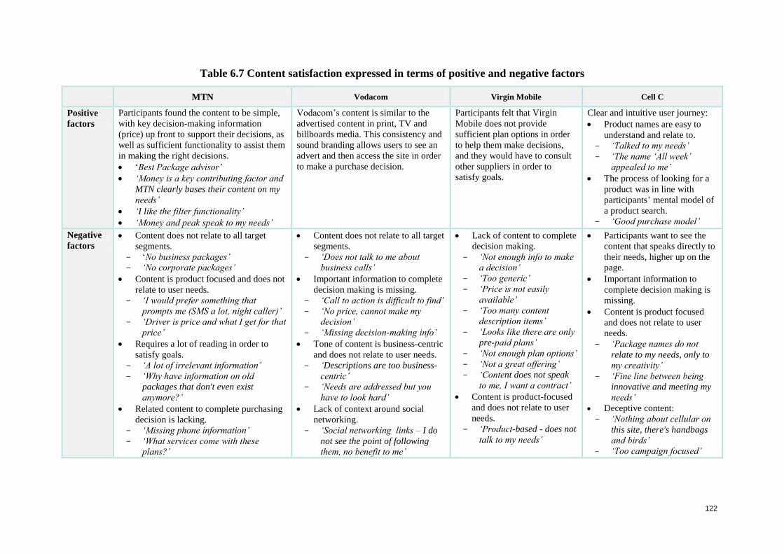
122
Table 6.7 Content satisfaction expressed in terms of positive and negative factors
MTN Vodacom Virgin Mobile Cell C
Positive
factors
Participants found the content to be simple,
with key decision-making information
(price) up front to support their decisions, as
well as sufficient functionality to assist them
in making the right decisions.
‘Best Package advisor’
‘Money is a key contributing factor and
MTN clearly bases their content on my
needs’
‘I like the filter functionality’
‘Money and peak speak to my needs’
Vodacom’s content is similar to the
advertised content in print, TV and
billboards media. This consistency and
sound branding allows users to see an
advert and then access the site in order
to make a purchase decision.
Participants felt that Virgin
Mobile does not provide
sufficient plan options in order
to help them make decisions,
and they would have to consult
other suppliers in order to
satisfy goals.
Clear and intuitive user journey:
Product names are easy to
understand and relate to.
‘Talked to my needs’
‘The name ‘All week’
appealed to me’
The process of looking for a
product was in line with
participants’ mental model of
a product search.
‘Good purchase model’
Negative
factors Content does not relate to all target
segments.
‘No business packages’
‘No corporate packages’
Content is product focused and does not
relate to user needs.
‘I would prefer something that
prompts me (SMS a lot, night caller)’
‘Driver is price and what I get for that
price’
Requires a lot of reading in order to
satisfy goals.
‘A lot of irrelevant information’
‘Why have information on old
packages that don't even exist
anymore?’
Related content to complete purchasing
decision is lacking.
‘Missing phone information’
‘What services come with these
plans?’
Content does not relate to all target
segments.
‘Does not talk to me about
business calls’
Important information to complete
decision making is missing.
‘Call to action is difficult to find’
‘No price, cannot make my
decision’
‘Missing decision-making info’
Tone of content is business-centric
and does not relate to user needs.
‘Descriptions are too business-
centric’
‘Needs are addressed but you
have to look hard’
Lack of context around social
networking.
‘Social networking links – I do
not see the point of following
them, no benefit to me’
Lack of content to complete
decision making.
‘Not enough info to make
a decision’
‘Too generic’
‘Price is not easily
available’
‘Too many content
description items’
‘Looks like there are only
pre-paid plans’
‘Not enough plan options’
‘Not a great offering’
‘Content does not speak
to me, I want a contract’
Content is product-focused
and does not relate to user
needs.
‘Product-based - does not
talk to my needs’
Participants want to see the
content that speaks directly to
their needs, higher up on the
page.
Important information to
complete decision making is
missing.
Content is product focused
and does not relate to user
needs.
‘Package names do not
relate to my needs, only to
my creativity’
‘Fine line between being
innovative and meeting my
needs’
Deceptive content:
‘Nothing about cellular on
this site, there's handbags
and birds’
‘Too campaign focused’
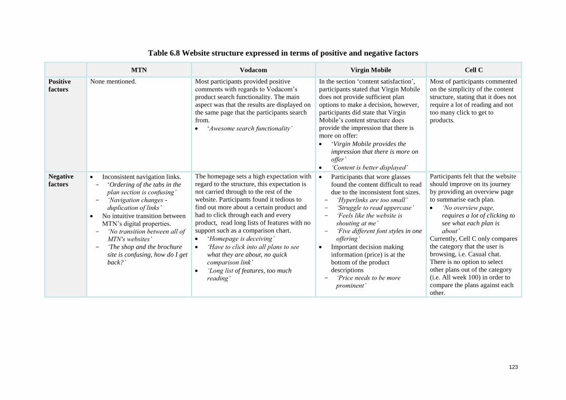
123
Table 6.8 Website structure expressed in terms of positive and negative factors
MTN Vodacom Virgin Mobile Cell C
Positive
factors
None mentioned. Most participants provided positive
comments with regards to Vodacom’s
product search functionality. The main
aspect was that the results are displayed on
the same page that the participants search
from.
‘Awesome search functionality’
In the section ‘content satisfaction’,
participants stated that Virgin Mobile
does not provide sufficient plan
options to make a decision, however,
participants did state that Virgin
Mobile’s content structure does
provide the impression that there is
more on offer:
‘Virgin Mobile provides the
impression that there is more on
offer’
‘Content is better displayed’
Most of participants commented
on the simplicity of the content
structure, stating that it does not
require a lot of reading and not
too many click to get to
products.
Negative
factors Inconsistent navigation links.
‘Ordering of the tabs in the
plan section is confusing’
‘Navigation changes -
duplication of links’
No intuitive transition between
MTN’s digital properties.
‘No transition between all of
MTN's websites’
‘The shop and the brochure
site is confusing, how do I get
back?’
The homepage sets a high expectation with
regard to the structure, this expectation is
not carried through to the rest of the
website. Participants found it tedious to
find out more about a certain product and
had to click through each and every
product, read long lists of features with no
support such as a comparison chart.
‘Homepage is deceiving’
‘Have to click into all plans to see
what they are about, no quick
comparison link’
‘Long list of features, too much
reading’
Participants that wore glasses
found the content difficult to read
due to the inconsistent font sizes.
‘Hyperlinks are too small’
‘Struggle to read uppercase’
‘Feels like the website is
shouting at me’
‘Five different font styles in one
offering’
Important decision making
information (price) is at the
bottom of the product
descriptions
‘Price needs to be more
prominent’
Participants felt that the website
should improve on its journey
by providing an overview page
to summarise each plan.
‘No overview page,
requires a lot of clicking to
see what each plan is
about’
Currently, Cell C only compares
the category that the user is
browsing, i.e. Casual chat.
There is no option to select
other plans out of the category
(i.e. All week 100) in order to
compare the plans against each
other.
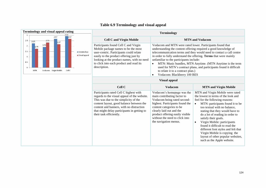
124
Table 6.9 Terminology and visual appeal
Terminology and visual appeal rating
Terminology
Cell C and Virgin Mobile MTN and Vodacom
Participants found Cell C and Virgin
Mobile package names to be the most
user-centric. Participants could relate
easily to the product offering just by
looking at the product names, with no need
to click into each product and read its
description.
Vodacom and MTN were rated lower. Participants found that
understanding the content offering required a good knowledge of
telecommunication terms and they would need to contact a call centre
in order to fully understand the offering. Terms that were mainly
unfamiliar to the participants include:
MTN: Music bundles, MTN Anytime. (MTN Anytime is the term
used for MTN’s contract plans, and participants found it difficult
to relate it to a contract plan.)
Vodacom: Blackberry 100 BES
Visual appeal
Cell C Vodacom MTN and Virgin Mobile
Participants rated Cell C highest with
regards to the visual appeal of the website.
This was due to the simplicity of the
content layout, good balance between the
content and banners, with no distraction
that might delay participants in getting to
their task efficiently.
Vodacom’s homepage was the
main contributing factor to
Vodacom being rated second-
highest. Participants found the
content categories to be
clearly laid out and the
product offering easily visible
without the need to click into
the navigation menus.
MTN and Virgin Mobile were rated
the lowest in terms of the look and
feel for the following reasons:
MTN: participants found it to be
too textual with no balance,
stating that they would have to
do a lot of reading in order to
satisfy their goals.
Virgin Mobile: participants
found it difficult to read the
different font styles and felt that
Virgin Mobile is copying the
layout of other popular websites,
such as the Apple website.
125
6.2.3.3 Consolidation of the ‘Find a plan’ task
Overall, the websites performed within acceptable limits. The following are the key factors
identified as hampering participants while performing the ‘Find a plan’ task:
Participants’ mental models:
There are three major steps in the purchasing process of a typical participant:
1. Participants want to see the price and a product description that is easy to understand;
2. They would like to see phones and additional services that come with the plan; and
3. Participants want to be able to purchase online.
No supplier site allowed participants to follow their intended purchase flow through to
completion. There was no continued user journey (plan, phone, service and call to action)
once the user had found a plan.
Lack of attention to needs-based paradigm
Most navigation structures follow a product-based paradigm. On the other hand, participants
may have a specific need such as: I SMS a lot or only make calls at night. No supplier
structure provided alternative search options for participants to seek out such products.
Requirements regarding banners
Banners need to be more representative, rather than just displaying pictures or graphics. In
general, participants ignore banners and do not relate them to products and services. They
tend to view banners as objects that contribute to the look and feel of the website and
advertisements that they generally ignore. No user clicked on any of the banners across the
suppliers.
Lack of eye-catching objects
The content across all the suppliers was not sufficiently focused or eye-catching to direct
participants on what to do next. There was content overload and a lack of focus points to
attract the participants.
Telecommunication terminology that was difficult to understand
In many cases, participants did not understand the terminology in the content and navigation
area. The Cell C and Virgin Mobile sites are good examples of appropriate choices of terms.
The MTN and Vodacom sites, on the other hand, illustrate less effective use of terminology.
126
Content structure does not assist participants in finding the right plan
No supplier site provided supportive product-summary pages. Participants were forced to
read the details of each product and, even though introductory paragraphs may give good
descriptions, by the time participants have read the details of a third product, they had
forgotten the facts about the first two.
Following are the results from the ‘Find an Internet package’ task.
6.2.4 Task 3: Find an Internet package
Participants completed a task that required them to identify the Internet package that was best
suited to their needs. An Internet package allows participants to be able to browse the Internet
on their phone or laptop wirelessly. Both quantitative and qualitative data was gathered via
the questionnaire and interview in Appendix A6. The results across the four websites, MTN,
Vodacom, Virgin Mobile and Cell C, are discussed in the following sections. Firstly, the
quantitative results are discussed. The quantitative measures are subdivided into: success rate,
route taken, number of errors made, time taken and number of clicks to complete the task.
Secondly, the qualitative measures are discussed. The qualitative measures are subdivided
into: ease of use, content satisfaction, structure, terminology and visual appeal.
The findings only represent three of the cellular websites: MTN, Vodacom and Cell C, since
Virgin Mobile does not offer Internet packages.
6.2.4.1 Quantitative measures findings
6.2.4.1.1 Success rate across the three websites
The third task was for participants to ‘Find an Internet package’. Participants did not perform
as well as in the ‘Find a plan’ task due to a disconnect in terminology. Cellular companies
refer to internet packages as ‘data’, and users do not relate to the term data when looking for
an Internet plan for their laptop or phone. Participants’ understanding of data is a collection
of facts, such as information, values or measurements. Cellular companies define data as a
concept including plans that allow participants to browse the internet on their phones or
laptops. From the representation of information on the websites, all participants were unsure
which data product would be suitable for them and would need to speak to someone
personally for more information. In this respect, the Vodacom and MTN sites performed less
well. Eleven participants stated that searching for an Internet plan on the Vodacom and MTN
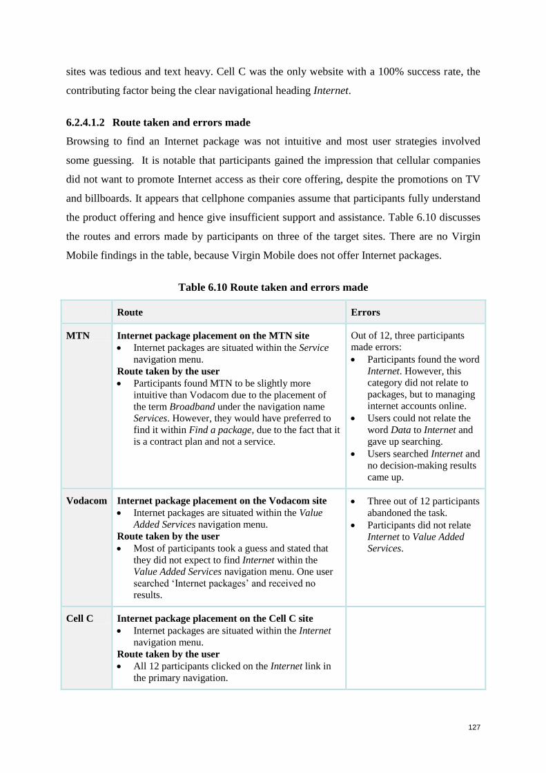
127
sites was tedious and text heavy. Cell C was the only website with a 100% success rate, the
contributing factor being the clear navigational heading Internet.
6.2.4.1.2 Route taken and errors made
Browsing to find an Internet package was not intuitive and most user strategies involved
some guessing. It is notable that participants gained the impression that cellular companies
did not want to promote Internet access as their core offering, despite the promotions on TV
and billboards. It appears that cellphone companies assume that participants fully understand
the product offering and hence give insufficient support and assistance. Table 6.10 discusses
the routes and errors made by participants on three of the target sites. There are no Virgin
Mobile findings in the table, because Virgin Mobile does not offer Internet packages.
Table 6.10 Route taken and errors made
Route Errors
MTN Internet package placement on the MTN site
Internet packages are situated within the Service
navigation menu.
Route taken by the user
Participants found MTN to be slightly more
intuitive than Vodacom due to the placement of
the term Broadband under the navigation name
Services. However, they would have preferred to
find it within Find a package, due to the fact that it
is a contract plan and not a service.
Out of 12, three participants
made errors:
Participants found the word
Internet. However, this
category did not relate to
packages, but to managing
internet accounts online.
Users could not relate the
word Data to Internet and
gave up searching.
Users searched Internet and
no decision-making results
came up.
Vodacom Internet package placement on the Vodacom site
Internet packages are situated within the Value
Added Services navigation menu.
Route taken by the user
Most of participants took a guess and stated that
they did not expect to find Internet within the
Value Added Services navigation menu. One user
searched ‘Internet packages’ and received no
results.
Three out of 12 participants
abandoned the task.
Participants did not relate
Internet to Value Added
Services.
Cell C Internet package placement on the Cell C site
Internet packages are situated within the Internet
navigation menu.
Route taken by the user
All 12 participants clicked on the Internet link in
the primary navigation.
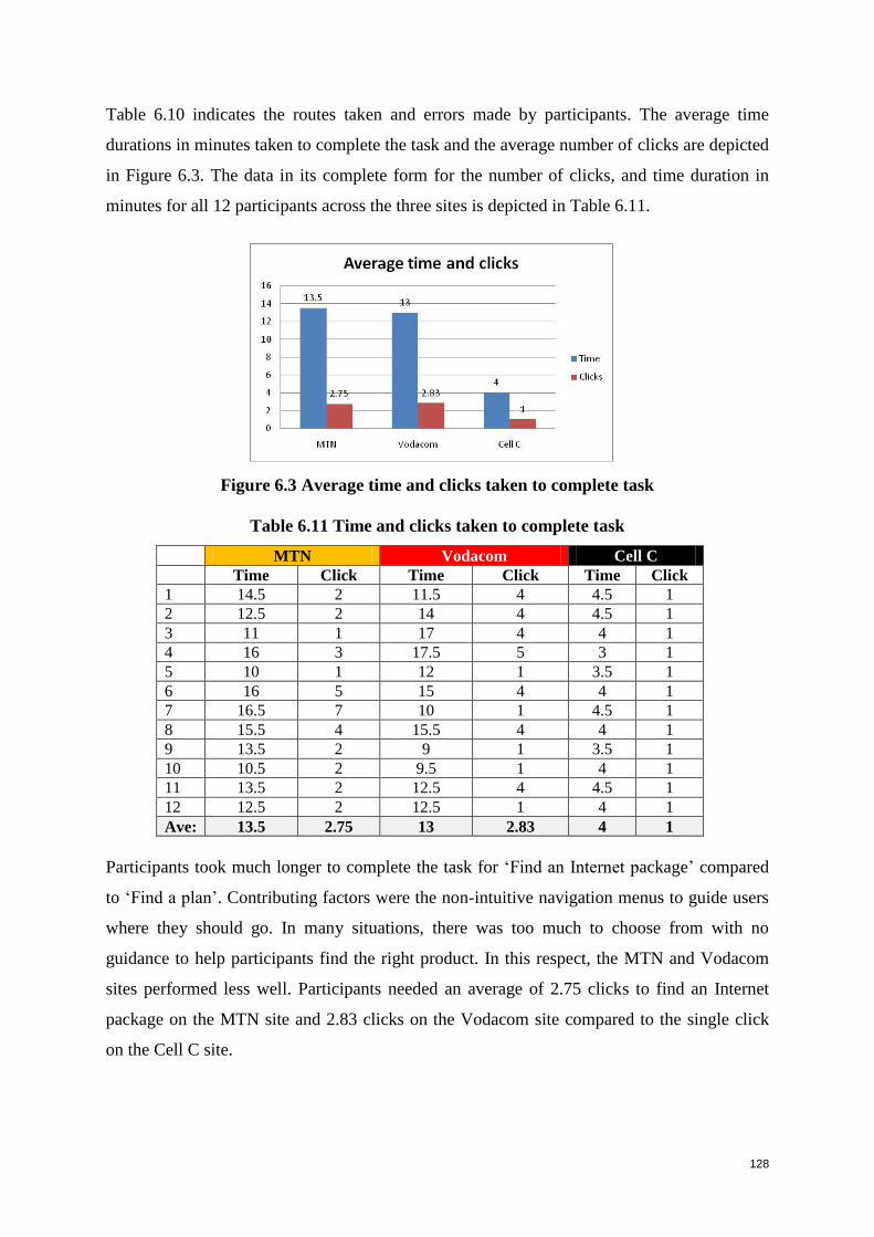
128
Table 6.10 indicates the routes taken and errors made by participants. The average time
durations in minutes taken to complete the task and the average number of clicks are depicted
in Figure 6.3. The data in its complete form for the number of clicks, and time duration in
minutes for all 12 participants across the three sites is depicted in Table 6.11.
Figure 6.3 Average time and clicks taken to complete task
Table 6.11 Time and clicks taken to complete task
MTN Vodacom Cell C
Time Click Time Click Time Click
1 14.5 2 11.5 4 4.5 1
2 12.5 2 14 4 4.5 1
3 11 1 17 4 4 1
4 16 3 17.5 5 3 1
5 10 1 12 1 3.5 1
6 16 5 15 4 4 1
7 16.5 7 10 1 4.5 1
8 15.5 4 15.5 4 4 1
9 13.5 2 9 1 3.5 1
10 10.5 2 9.5 1 4 1
11 13.5 2 12.5 4 4.5 1
12 12.5 2 12.5 1 4 1
Ave: 13.5 2.75 13 2.83 4 1
Participants took much longer to complete the task for ‘Find an Internet package’ compared
to ‘Find a plan’. Contributing factors were the non-intuitive navigation menus to guide users
where they should go. In many situations, there was too much to choose from with no
guidance to help participants find the right product. In this respect, the MTN and Vodacom
sites performed less well. Participants needed an average of 2.75 clicks to find an Internet
package on the MTN site and 2.83 clicks on the Vodacom site compared to the single click
on the Cell C site.
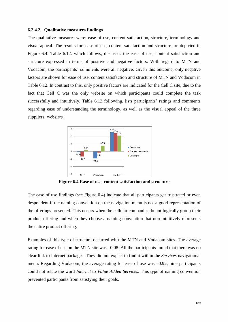
129
6.2.4.2 Qualitative measures findings
The qualitative measures were: ease of use, content satisfaction, structure, terminology and
visual appeal. The results for: ease of use, content satisfaction and structure are depicted in
Figure 6.4. Table 6.12. which follows, discusses the ease of use, content satisfaction and
structure expressed in terms of positive and negative factors. With regard to MTN and
Vodacom, the participants’ comments were all negative. Given this outcome, only negative
factors are shown for ease of use, content satisfaction and structure of MTN and Vodacom in
Table 6.12. In contrast to this, only positive factors are indicated for the Cell C site, due to the
fact that Cell C was the only website on which participants could complete the task
successfully and intuitively. Table 6.13 following, lists participants’ ratings and comments
regarding ease of understanding the terminology, as well as the visual appeal of the three
suppliers’ websites.
Figure 6.4 Ease of use, content satisfaction and structure
The ease of use findings (see Figure 6.4) indicate that all participants get frustrated or even
despondent if the naming convention on the navigation menu is not a good representation of
the offerings presented. This occurs when the cellular companies do not logically group their
product offering and when they choose a naming convention that non-intuitively represents
the entire product offering.
Examples of this type of structure occurred with the MTN and Vodacom sites. The average
rating for ease of use on the MTN site was –0.08. All the participants found that there was no
clear link to Internet packages. They did not expect to find it within the Services navigational
menu. Regarding Vodacom, the average rating for ease of use was –0.92; nine participants
could not relate the word Internet to Value Added Services. This type of naming convention
prevented participants from satisfying their goals.
MTN Vodacom Cell C
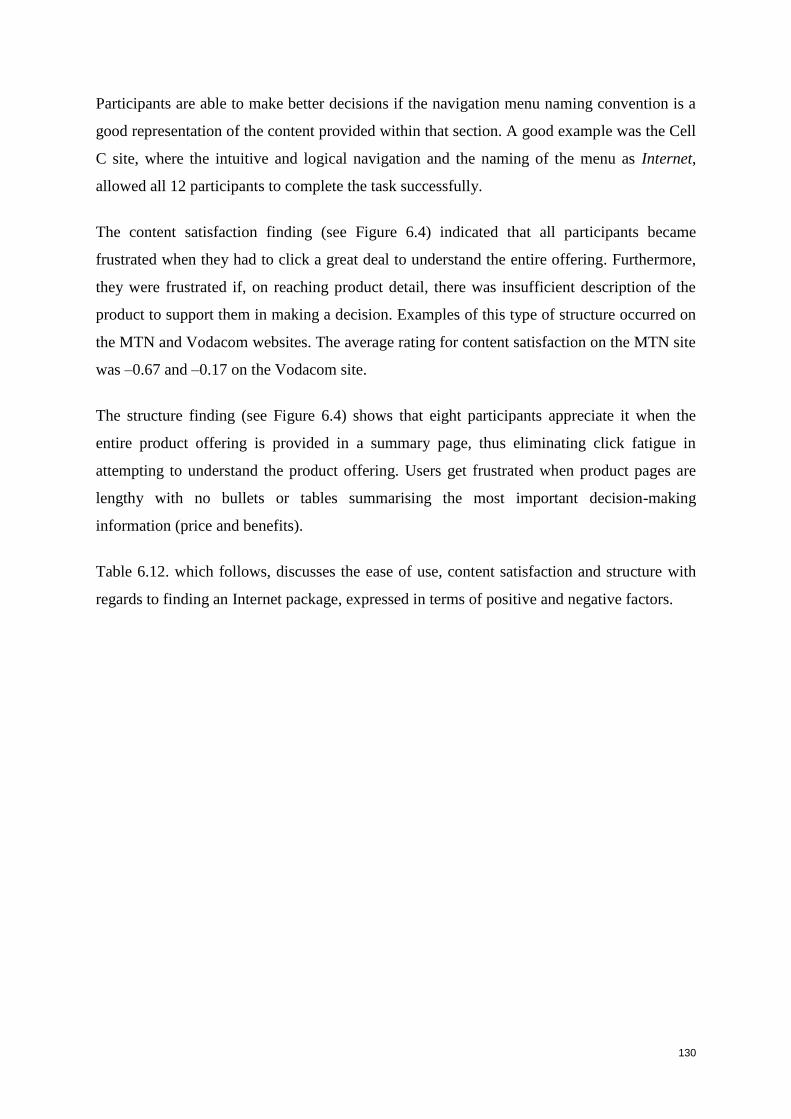
130
Participants are able to make better decisions if the navigation menu naming convention is a
good representation of the content provided within that section. A good example was the Cell
C site, where the intuitive and logical navigation and the naming of the menu as Internet,
allowed all 12 participants to complete the task successfully.
The content satisfaction finding (see Figure 6.4) indicated that all participants became
frustrated when they had to click a great deal to understand the entire offering. Furthermore,
they were frustrated if, on reaching product detail, there was insufficient description of the
product to support them in making a decision. Examples of this type of structure occurred on
the MTN and Vodacom websites. The average rating for content satisfaction on the MTN site
was –0.67 and –0.17 on the Vodacom site.
The structure finding (see Figure 6.4) shows that eight participants appreciate it when the
entire product offering is provided in a summary page, thus eliminating click fatigue in
attempting to understand the product offering. Users get frustrated when product pages are
lengthy with no bullets or tables summarising the most important decision-making
information (price and benefits).
Table 6.12. which follows, discusses the ease of use, content satisfaction and structure with
regards to finding an Internet package, expressed in terms of positive and negative factors.
131
Table 6.12 Ease of use, content satisfaction and structure expressed in terms of positive and negative factors
Ease of use Content satisfaction Structure
Cell C
positive
factors
Participants found the Cell C website the easiest
to use for the task ‘Find an Internet package’. The
main contributing factor was the intuitive term
Internet.
Cell C provides the right type of information and
functionality in order to make a decision, such as
brief product description, cost and call to action. This
type of information allowed participants to complete
the task efficiently without experiencing any
frustration. A typical comment with regard to the
content satisfaction was:
‘Provides all the information that I need’
Does not require a lot of reading. The most
important information is situated at the top of the
page:
‘Structure of the page is easy to read’
‘Clearly see what the content includes’
‘Too textual at the bottom of the page’
MTN
negative
factors
No clear links to the Internet packages;
participants did not expect to find it under the
Services navigational heading.
Navigating and finding an ‘Internet plan’
requires a good knowledge of cellular terms.
There is no clear indication on what the
difference is between Broadband and SMS &
Data on the MTN website. Both these
sections provide information on Internet
connectivity. Participants were confused by
the entire offering and would have to consult
other channels for more information.
MTN received the lowest rating due to the long and
difficult-to-relate-to product descriptions. Participants
felt they had to click into up to twenty links to
understand the entire offering. Overall, they realised
they would need to visit a physical store or phone the
call centre for more assistance.
‘I do not understand the product offering’
‘No summary on what I can do with it’
‘No clear call to action’
‘Readability is terrible’
‘Disconnect in the user journey - a lot of
irrelevant info’
No summary of the most important content,
forcing participants to click through each and
every link to find out the purpose of each product:
‘Need to click through all the products to try
and understand them’
‘No structure or engagement, very static’
‘Too much reading’
‘Content is not summarised/graphic in terms
of tables/pictures’
‘Does not highlight specific important
information’
Vodacom
negative
factors
Grouping of content in the navigational
headings is not intuitive and participants
believed that Vodacom bundles irrelevant
information together.
Navigating to the Internet packages is not
obvious; the participants did not expect to
find it within Value Added Services.
Participants felt that there was not enough
information around the Internet product offering in
order to make a decision. This was due to the fact that
participants thought that Vodacom only offered one
Internet plan.
‘No help me choose functionality’
‘Not enough detail around the contract’
‘No call to action’
‘Not intuitive’
‘Not for a novice user’
‘Only one package available, not as advertised’
‘Obviously, broadband is not a key offering’
Participants indicated that they had to work much
harder to achieve their goals on the Vodacom site
due to the pages being lengthy.
‘Too much scrolling’
‘Too much reading’
‘Readability is terrible’
‘Wizard, very lengthy’
132
6.2.4.2.1 Terminology and visual appeal
Table 6.13 following, lists participants’ ratings and comments regarding ease of
understanding the terminology, as well as the visual appeal of the three suppliers’ websites in
the process of searching for an Internet package.
The terminology findings indicate that all the participants appreciate it if suppliers do not
assume that users understand the product offering as well as they do. A good example of this
type of structure was the Cell C site. Cell C provided rich product descriptions that explained
what the offering Internet is and named the entire product offering Internet.
The visual appeal findings indicate that all participants are attracted to a layout that includes a
good balance between text, tables and pictures, as well as a layout that provides clear and
easy product pathways to enable participants to satisfy their goals. Good examples of this
type of structure were the Vodacom homepage and the entire Cell C site.
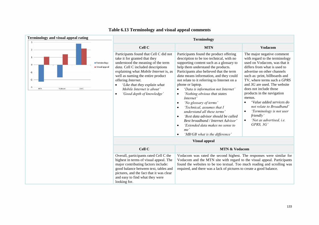
133
Table 6.13 Terminology and visual appeal comments
Terminology and visual appeal rating
Terminology
Cell C MTN Vodacom
Participants found that Cell C did not
take it for granted that they
understood the meaning of the term
data. Cell C included descriptions
explaining what Mobile Internet is, as
well as naming the entire product
offering Internet.
‘Like that they explain what
Mobile Internet is about’
‘Good depth of knowledge’
Participants found the product offering
description to be too technical, with no
supporting content such as a glossary to
help them understand the products.
Participants also believed that the term
data means information, and they could
not relate to it referring to Internet on a
phone or laptop.
‘Data is information not Internet’
‘Nothing obvious that states
Internet’
‘No glossary of terms’
‘Technical, assumes that I
understand all these terms’
‘Best data advisor should be called
Best broadband / Internet Advisor’
‘Extended data makes no sense to
me’
‘MB/GB what is the difference’
The major negative comment
with regard to the terminology
used on Vodacom, was that it
differs from what is used to
advertise on other channels
such as: print, billboards and
TV, where terms such a GPRS
and 3G are used. The website
does not include those
products in the navigation
menus.
‘Value added services do
not relate to Broadband’
‘Terminology is not user
friendly’
‘Not as advertised, i.e.
GPRS, 3G’
Visual appeal
Cell C MTN & Vodacom
Overall, participants rated Cell C the
highest in terms of visual appeal. The
major contributing factors include:
good balance between text, tables and
pictures, and the fact that it was clear
and easy to find what they were
looking for.
Vodacom was rated the second highest. The responses were similar for
Vodacom and the MTN site with regard to the visual appeal. Participants
found the websites to be too textual. Too much reading and scrolling was
required, and there was a lack of pictures to create a good balance.
134
6.2.4.3 Consolidation of the ‘Find an Internet package’ task
In each case, participants felt that the journey was not well designed. The frustration of trying
to find an Internet package left a negative impression of the brand image. User strategies
frequently involved guesses. Three major frustrations identified were:
Participants became despondent when the navigation menu naming conventions were
not a good representation of the offerings.
The need to click a great deal to understand the entire offering, is frustrating. It is
made worse if, once they reach the product detail, there is not sufficient product
description to help them make a decision.
Due to non-intuitive terminology, such as the word Data, participants could not relate
this term to Internet access on their phone or laptop.
These frustrations reduce the likelihood of user engagement and there is no continuation or
drive for the user to continue. Potential users are forced to consider other channels (retail) or
other suppliers to satisfy their goals. Cell C was the only supplier that achieved positive
responses with regard to the above three frustrations. Following are the user experience
findings.
6.3 User Experience (UX) findings
The same 12 participants who took part in the usability testing process, were also the
participants in the user experience study. After they had completed the tasks: ‘Find a plan’
and ‘Find an Internet package’, they were asked to complete a user experience questionnaire
that captured their overall perceptions. The user experience questionnaire, which is provided
in Appendix A7, presented, as options, various possible positive and negative impressions.
Participants were asked to select and list the positive and negative emotions they had
experienced while using each of the target systems.
The user experience findings across the four websites, MTN, Vodacom, Virgin Mobile and
Cell C, are discussed as follows: firstly, the positive and negative emotions, and secondly,
comments relating to aesthetics. The list of positive emotions considered include ease of use,
enjoyable, appealing, useful, comprehensive, friendly and engaging. The negative emotions
experienced include boring, frustrating, business like, time consuming, overwhelming and
annoying. The aesthetics findings are subdivided into: use of colour, use of pictures, clear and
easy to read, visual load, text size, text colour, strength of branding, overall visual appeal and
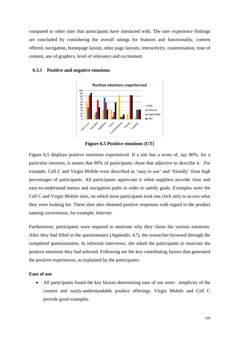
135
compared to other sites that participants have interacted with. The user experience findings
are concluded by considering the overall ratings for features and functionality, content
offered, navigation, homepage layout, other page layouts, interactivity, customisation, tone of
content, use of graphics, level of relevance and excitement.
6.3.1 Positive and negative emotions
Figure 6.5 Positive emotions (UT)
Figure 6.5 displays positive emotions experienced. If a site has a score of, say 80%, for a
particular emotion, it means that 80% of participants chose that adjective to describe it. For
example, Cell C and Virgin Mobile were described as ‘easy to use’ and ‘friendly’ from high
percentages of participants. All participants appreciate it when suppliers provide clear and
easy-to-understand menus and navigation paths in order to satisfy goals. Examples were the
Cell C and Virgin Mobile sites, on which most participants took one click only to access what
they were looking for. These sites also obtained positive responses with regard to the product
naming conventions, for example: Internet.
Furthermore, participants were required to motivate why they chose the various emotions.
After they had filled in the questionnaire (Appendix A7), the researcher browsed through the
completed questionnaires. In informal interviews, she asked the participants to motivate the
positive emotions they had selected. Following are the key contributing factors that generated
the positive experiences, as explained by the participants:
Ease of use
All participants found the key factors determining ease of use were: simplicity of the
content and easily-understandable product offerings. Virgin Mobile and Cell C
provide good examples.
136
Enjoyable
The expert internet users stated that they enjoy a website if the look and feel is
innovative and the tone of the content is easy to read. A good example was the Virgin
Mobile site. None of the participants enjoy using websites that are difficult to
understand and have a business tone, examples being MTN and Vodacom.
Appealing
All of the participants find a website to be appealing when the content offered on the
homepage speaks directly to their cellphone needs such as phones and deals. Eight
participants indicated that a site is also more attractive when the structure is
uncluttered and clearly differentiates the different product categories. The Vodacom
homepage achieved this effectively.
Useful
All participants agreed that websites offer a better experience when the product names
are easy to relate to and support them in making the right decision. The Cell C site is a
good example, as it provides intuitive navigational menus and product names.
Comprehensive
Ten participants appreciate depth of product detail, but would prefer it if the most
important decision-making aspects were summarised in tables or bullets. A good
example was the MTN website. Even though all the participants found its content to
be the most comprehensive, they also experienced it as pedestrian and laborious for a
user busy looking for a product.
Friendly
The websites should not presume that users understand the cellular business and
terminology as easily as staff working with products. All the participants were
unanimous on this point. The Virgin Mobile and Cell C sites were positive examples.
Engaging
All participants found that the information on the supplier sites was product-focused
and lacking in content such as: new product information or reviews that would entice
them to return on a regular basis. No supplier received a high rating with regard to
engagement. Participants stated that they would only return if they were looking for
information on a specific product or a service.
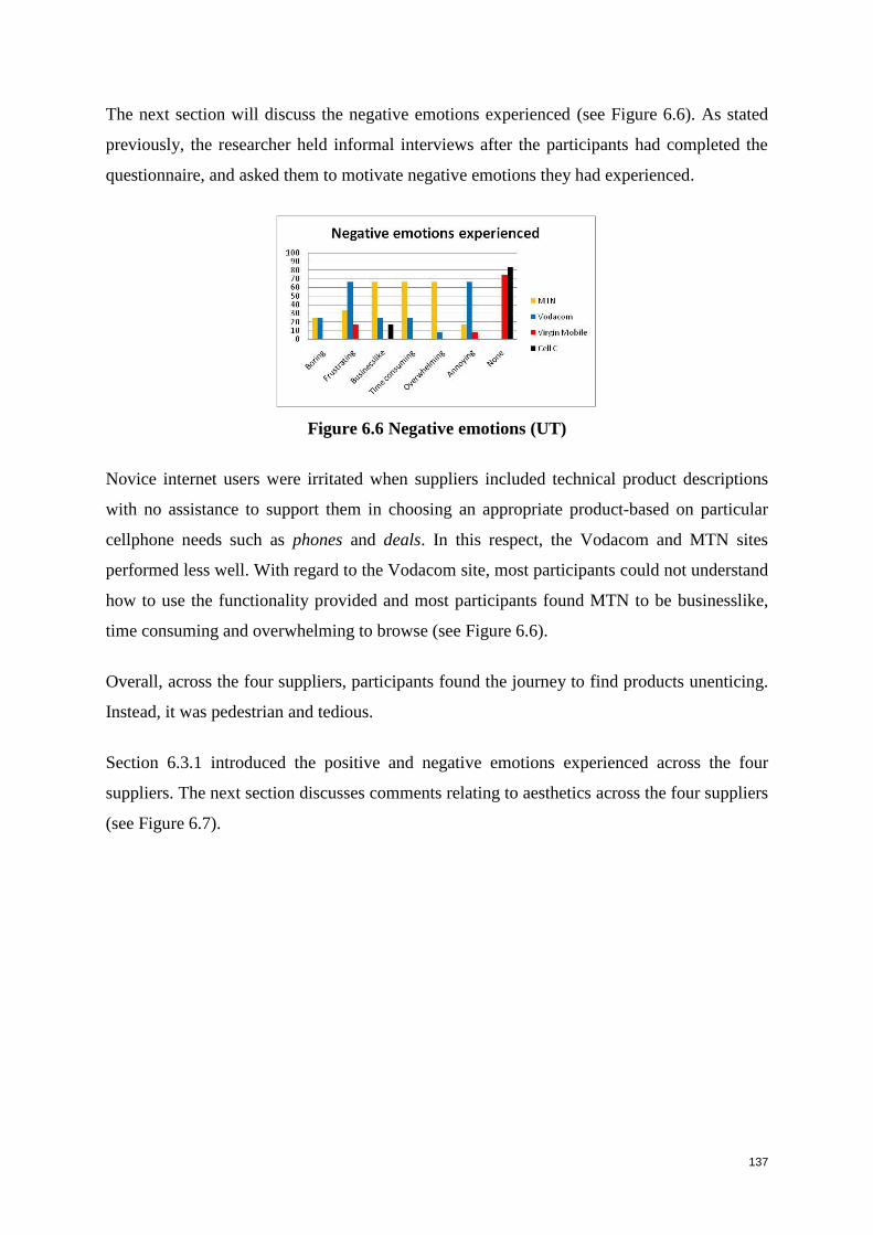
137
The next section will discuss the negative emotions experienced (see Figure 6.6). As stated
previously, the researcher held informal interviews after the participants had completed the
questionnaire, and asked them to motivate negative emotions they had experienced.
Figure 6.6 Negative emotions (UT)
Novice internet users were irritated when suppliers included technical product descriptions
with no assistance to support them in choosing an appropriate product-based on particular
cellphone needs such as phones and deals. In this respect, the Vodacom and MTN sites
performed less well. With regard to the Vodacom site, most participants could not understand
how to use the functionality provided and most participants found MTN to be businesslike,
time consuming and overwhelming to browse (see Figure 6.6).
Overall, across the four suppliers, participants found the journey to find products unenticing.
Instead, it was pedestrian and tedious.
Section 6.3.1 introduced the positive and negative emotions experienced across the four
suppliers. The next section discusses comments relating to aesthetics across the four suppliers
(see Figure 6.7).
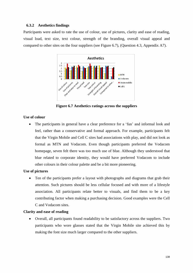
138
6.3.2 Aesthetics findings
Participants were asked to rate the use of colour, use of pictures, clarity and ease of reading,
visual load, text size, text colour, strength of the branding, overall visual appeal and
compared to other sites on the four suppliers (see Figure 6.7), (Question 4.3, Appendix A7).
Figure 6.7 Aesthetics ratings across the suppliers
Use of colour
The participants in general have a clear preference for a ‘fun’ and informal look and
feel, rather than a conservative and formal approach. For example, participants felt
that the Virgin Mobile and Cell C sites had associations with play, and did not look as
formal as MTN and Vodacom. Even though participants preferred the Vodacom
homepage, seven felt there was too much use of blue. Although they understood that
blue related to corporate identity, they would have preferred Vodacom to include
other colours in their colour palette and be a bit more pioneering.
Use of pictures
Ten of the participants prefer a layout with photographs and diagrams that grab their
attention. Such pictures should be less cellular focused and with more of a lifestyle
association. All participants relate better to visuals, and find them to be a key
contributing factor when making a purchasing decision. Good examples were the Cell
C and Vodacom sites.
Clarity and ease of reading
Overall, all participants found readability to be satisfactory across the suppliers. Two
participants who wore glasses stated that the Virgin Mobile site achieved this by
making the font size much larger compared to the other suppliers.
139
Visual load
All participants appreciate a good balance between banners and text. Vodacom was
considered best in this regard, but lacked in providing participants with sufficient
information to satisfy their goals.
Text size
Two participants who wore glasses, found it difficult to read capital and lower case at
the same time. An example of this type of structure was the Virgin Mobile site.
Overall, the text size is functionally acceptable across the suppliers.
Text colour
All participants found the links to be clear and easy to distinguish from the content.
Overall, participants provided similar ratings with regard to the text colour across all
four suppliers.
Strength of branding
Nine participants found that in some instances the corporate identity colours tended to
be overwhelming and too strong as a website colour. Two poor examples are the red
used on the Virgin Mobile site and the blue on the Vodacom site.
Overall visual appeal
All participants prefer to read through a minimal amount of information in order to
satisfy their goals, with a content structure that includes a good balance between
banners and text. Good examples were the Virgin Mobile, Cell C and Vodacom sites,
while the MTN site was a poor example.
Compared to other sites
Expert internet users preferred an innovative, distinctive website that does not look
like a brochure site. The Cell C and Virgin Mobile sites were good examples:
‘Fresh, went the extra mile’
‘They wanted to be different and they succeeded’
MTN was a poor example; participants felt that the website was too ‘brochure-like’ and
lacked visual appeal.
The next section discusses participants’ overall experience findings across the four suppliers.
140
6.3.3 Overall experience findings
Participants were asked to rate the features and functionality, content offered, navigation
structure, home page layout, other page layouts, interactivity (does the e-commerce website
facilitate a two-way communication with the users?), customisation (does the website tailor
its products and services?), tone of the content, use of graphics, level of relevance and the
level of excitement on the four suppliers (Question 4.4, Appendix A7).
Features and functionality
The participants in general were frustrated with the features and functionality offered
across the four suppliers, stating that, even though the functionality was efficient in
assisting them to find products, there was not enough product feature information to
help them make a purchasing decision.
A poor example was the MTN Best Package Advisor; participants felt that it only
assists those users that are migrating from MTN’s old packages to MTN’s new
packages and does not assist prospective users in finding a package based on their
current cellphone needs.
Content offered
The response with regard to the content offered was varied. Participants either felt that
there was too little or too much content. Cell C was a good example, due to the
simplicity of the content offered, and even though some key information such as:
price and call to action was hard to find, the simplicity of the user journey to the
product is less intimidating and more inviting. Eight participants felt that although the
Virgin Mobile site provided the impression that it offers price-saving deals, it was
disappointing to realise that it provided only one savings offer.
Products were too focused on product features, rather than on needs regarding
cellphones. All the participants were unanimous on this point and stated that this
made it difficult to find a product that spoke directly to their cellphone needs. A poor
example was the MTN site. Even though MTN provided the most comprehensive
detail about the product, all participants were frustrated by the large amount of
content they had to read to satisfy their goals.
141
Navigation
The product-naming conventions used in the navigation menus, were found by all the
participants to hamper performance. This occurred particularly in the ‘Find an Internet
package’ task. Poor examples were the MTN and Vodacom sites due to the non-
intuitive naming conventions.
Overall however, all the suppliers received good ratings with regard to the navigation
involved in finding the right product.
Homepage layout
Following are the key attributes that all participants identified as being missing from the
suppliers’ homepages:
Brand proposition: ‘Include a brand promise, what does brand stand for?’
Reason to believe: ‘Why should I choose them?’, ‘What can they do for me?’
Value proposition: ‘Give me value, not just sell products’
Engaging and compelling designs: ‘More innovations and be different’
Companies should not take for granted that participants understand the product
offering as well as they do: ‘Design novice websites’
Six participants found the Vodacom homepage to be enticing and engaging. It made them
want to look further, but they found that the homepage strategy was not carried through to the
rest of the website. For Virgin Mobile, all participants felt that the category names were up
front and obvious, and stated that it was an innovative layout, but lacked engagement. With
regard to Cell C, nine participants found it to be an admirable design that lacked substance
for decision making. Lastly, with regard to MTN, all participants felt that they needed to
work hard in order to satisfy their goals.
Other page layouts
None of the participants appreciate large amounts of content to read, extensive
scrolling, or layout designs that do not help them find the information they need
efficiently and effectively. The Cell C and Virgin Mobile sites were successful in
achieving this by the simplicity of the content offered, the user-friendly terminology,
and the overall visual appeal. Vodacom and MTN were poor examples; seven
participants found that there was too much white space on the detail pages.
142
Interactivity
In the pre-test questionnaire, participants were asked to list the most commonly used
functionality on e-commerce sites (see Section 6.2.1). They mentioned Help me
choose, Product reviews, Product tips and Recommendations. None of the four
suppliers provided any of these frequently used features named by participants,
making it difficult for the participants to choose products online.
Overall, participants in general felt that the content was static, there was too much
scrolling, and content was not engaging. Five participants found that the flash used on
the Vodacom site made the page download slowly, and if it took longer than two
minutes to download, they would abort the website and go somewhere else.
Customisation
Customisation was the weakest category; no suppliers allowed participants to
customise their own package or to add a product to a favourite/wish list.
Tone of content
All participants preferred content that is conversational with user-friendly
terminology. The Virgin Mobile and Cell C sites are good examples. With regard to
MTN and Vodacom, all participants felt that they needed a good knowledge of
cellular terms in order to understand the content offering.
Use of graphics
Generally, users do not relate banners on a website to products, but rather as
aesthetics that make the websites look more visually appealing. All the participants
were unanimous on this point. Most stated that they were satisfied with the look and
feel across the four suppliers, apart from MTN. Eight participants felt that MTN needs
to include more graphics and make the website less textual.
Level of relevance
All participants would like the option to be able to convert online. For example,
having chosen the website as a purchase channel, it should provide them with an
opportunity to be able to convert online to another method of purchase, by giving
purchase options, store locations as well as a stock list. Participants found the overall
content offering to be relevant, but they would still have to visit an actual retail store
to make the purchase.
143
Level of excitement
Across all suppliers, participants in general did not give high ratings to ‘level of
excitement’. This was due to the lack of interactivity and engagement the content
offered. African language participants stated that it would be to the suppliers’
advantage if websites included cultural aspects such as different language options in
order to help them understand complex information. Overall, participants found
Virgin Mobile and Cell C to present better experiences than MTN and Vodacom to
users looking for products and services.
6.3.4 Consolidation of user experience findings
Overall, participants found that, even though functionality may be efficient in assisting them
to find the right product, there was not enough product information to make a purchasing
decision, for example: content offered was varied; products were structured around the
business rather than user cellphone needs. Most importantly, participants require the facility
to be able to convert online, for example: they require information on purchase options, store
locations, and stock lists.
The next section will discuss the results of the heuristic evaluation conducted by expert
evaluators.
144
6.4 Heuristic evaluation (HE) findings
Four expert evaluators were asked to conduct a heuristic evaluation of the four websites:
MTN (www.mtn.co.za)
Vodacom (www.vodacom.co.za)
Virgin Mobile (www.virginmobile.co.za)
Cell C (www.cellc.co.za).
They were presented with an information document and requested to sign a consent
form, agreeing to participate and acknowledging that their inputs were purely for
academic use, and would not be used for consulting purposes. They were aware that no
evaluator names or affiliations would be published or disclosed. The information
document and the consent form are in Appendix B2.
The primary purpose of an HE is to identify problems within the interface and the
interaction sequence. To do this, the evaluators completed an evaluation form based on
the three categories of criteria identified in Section 5.4.2 and listed in Tables 5.6, 5.7
and 5.8 respectively:
General interface design heuristics (Appendix B3);
E-commerce usability design heuristics (Appendix B4); and
User experience design heuristics (Appendix B5).
The form and the data and ratings in totality are in Appendix C. Whereas the criteria in
Tables 5.6 to 5.8 were phrased in a conceptual way, the criteria in the evaluation forms,
are translated into simple and specific evaluation statements. For example, the criterion
in Table 5.6 under ‘Visibility of system status’, namely: ‘The system should always
keep users informed on where they are, as well as provide appropriate feedback within a
reasonable time’ is reformulated in Appendix C1 as four single-issue statements, 1.1 to
1.4. The criterion for Table 5.7 and 5.8 are formulated in Appendix C2. Of the experts,
two were so-called ‘double experts’ with expertise in both e-commerce and usability,
while two were usability experts.
The findings within the three categories are given in Sections 6.4.1, 6.4.2, and 6.4.3
respectively. Discussions per criteria are given in Tables 6.14 through to 6.30. The
findings are presented in such a way that problems identified by the experts in the HE,
are immediately compared with problems identified by user participants in the UT. In
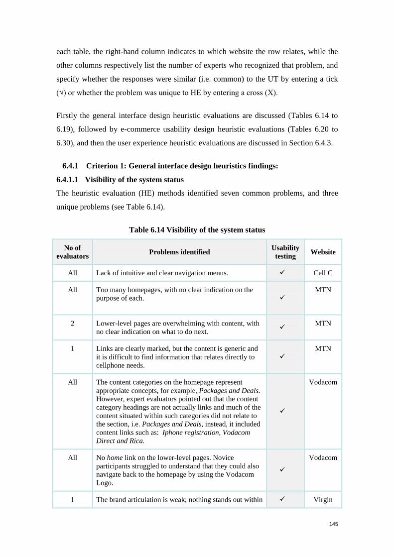
145
each table, the right-hand column indicates to which website the row relates, while the
other columns respectively list the number of experts who recognized that problem, and
specify whether the responses were similar (i.e. common) to the UT by entering a tick
(√) or whether the problem was unique to HE by entering a cross (X).
Firstly the general interface design heuristic evaluations are discussed (Tables 6.14 to
6.19), followed by e-commerce usability design heuristic evaluations (Tables 6.20 to
6.30), and then the user experience heuristic evaluations are discussed in Section 6.4.3.
6.4.1 Criterion 1: General interface design heuristics findings:
6.4.1.1 Visibility of the system status
The heuristic evaluation (HE) methods identified seven common problems, and three
unique problems (see Table 6.14).
Table 6.14 Visibility of the system status
No of
evaluators Problems identified
Usability
testing Website
All Lack of intuitive and clear navigation menus. Cell C
All Too many homepages, with no clear indication on the
purpose of each.
MTN
2 Lower-level pages are overwhelming with content, with
no clear indication on what to do next.
MTN
1 Links are clearly marked, but the content is generic and
it is difficult to find information that relates directly to
cellphone needs.
MTN
All The content categories on the homepage represent
appropriate concepts, for example, Packages and Deals.
However, expert evaluators pointed out that the content
category headings are not actually links and much of the
content situated within such categories did not relate to
the section, i.e. Packages and Deals, instead, it included
content links such as: Iphone registration, Vodacom
Direct and Rica.
Vodacom
All No home link on the lower-level pages. Novice
participants struggled to understand that they could also
navigate back to the homepage by using the Vodacom
Logo.
Vodacom
1 The brand articulation is weak; nothing stands out within Virgin
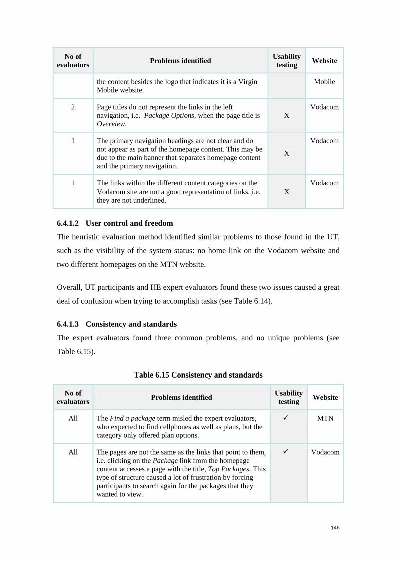
146
No of
evaluators Problems identified
Usability
testing Website
the content besides the logo that indicates it is a Virgin
Mobile website.
Mobile
2 Page titles do not represent the links in the left
navigation, i.e. Package Options, when the page title is
Overview.
X
Vodacom
1 The primary navigation headings are not clear and do
not appear as part of the homepage content. This may be
due to the main banner that separates homepage content
and the primary navigation.
X
Vodacom
1 The links within the different content categories on the
Vodacom site are not a good representation of links, i.e.
they are not underlined.
X
Vodacom
6.4.1.2 User control and freedom
The heuristic evaluation method identified similar problems to those found in the UT,
such as the visibility of the system status: no home link on the Vodacom website and
two different homepages on the MTN website.
Overall, UT participants and HE expert evaluators found these two issues caused a great
deal of confusion when trying to accomplish tasks (see Table 6.14).
6.4.1.3 Consistency and standards
The expert evaluators found three common problems, and no unique problems (see
Table 6.15).
Table 6.15 Consistency and standards
No of
evaluators Problems identified
Usability
testing Website
All The Find a package term misled the expert evaluators,
who expected to find cellphones as well as plans, but the
category only offered plan options.
MTN
All The pages are not the same as the links that point to them,
i.e. clicking on the Package link from the homepage
content accesses a page with the title, Top Packages. This
type of structure caused a lot of frustration by forcing
participants to search again for the packages that they
wanted to view.
Vodacom
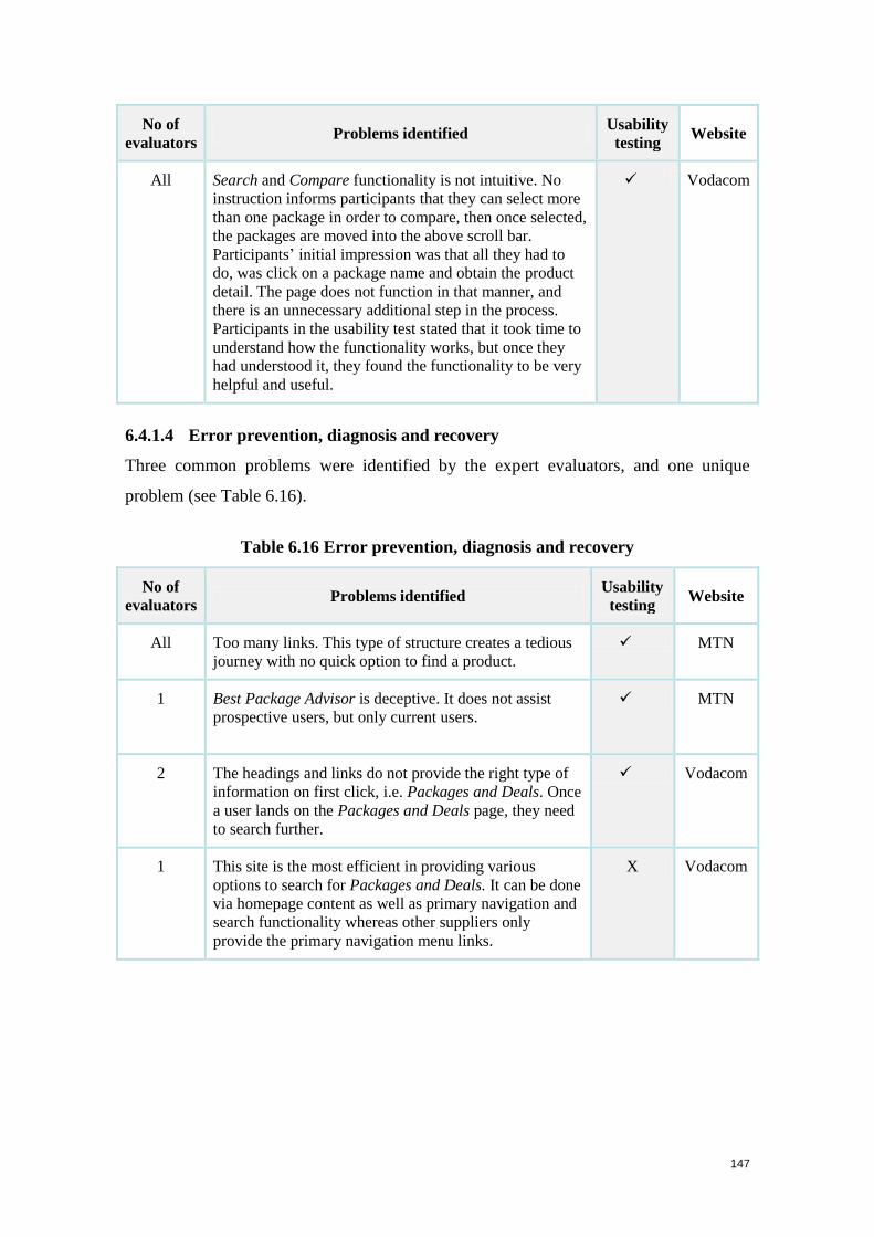
147
No of
evaluators Problems identified
Usability
testing Website
All Search and Compare functionality is not intuitive. No
instruction informs participants that they can select more
than one package in order to compare, then once selected,
the packages are moved into the above scroll bar.
Participants’ initial impression was that all they had to
do, was click on a package name and obtain the product
detail. The page does not function in that manner, and
there is an unnecessary additional step in the process.
Participants in the usability test stated that it took time to
understand how the functionality works, but once they
had understood it, they found the functionality to be very
helpful and useful.
Vodacom
6.4.1.4 Error prevention, diagnosis and recovery
Three common problems were identified by the expert evaluators, and one unique
problem (see Table 6.16).
Table 6.16 Error prevention, diagnosis and recovery
No of
evaluators Problems identified
Usability
testing Website
All Too many links. This type of structure creates a tedious
journey with no quick option to find a product.
MTN
1 Best Package Advisor is deceptive. It does not assist
prospective users, but only current users.
MTN
2 The headings and links do not provide the right type of
information on first click, i.e. Packages and Deals. Once
a user lands on the Packages and Deals page, they need
to search further.
Vodacom
1 This site is the most efficient in providing various
options to search for Packages and Deals. It can be done
via homepage content as well as primary navigation and
search functionality whereas other suppliers only
provide the primary navigation menu links.
X Vodacom
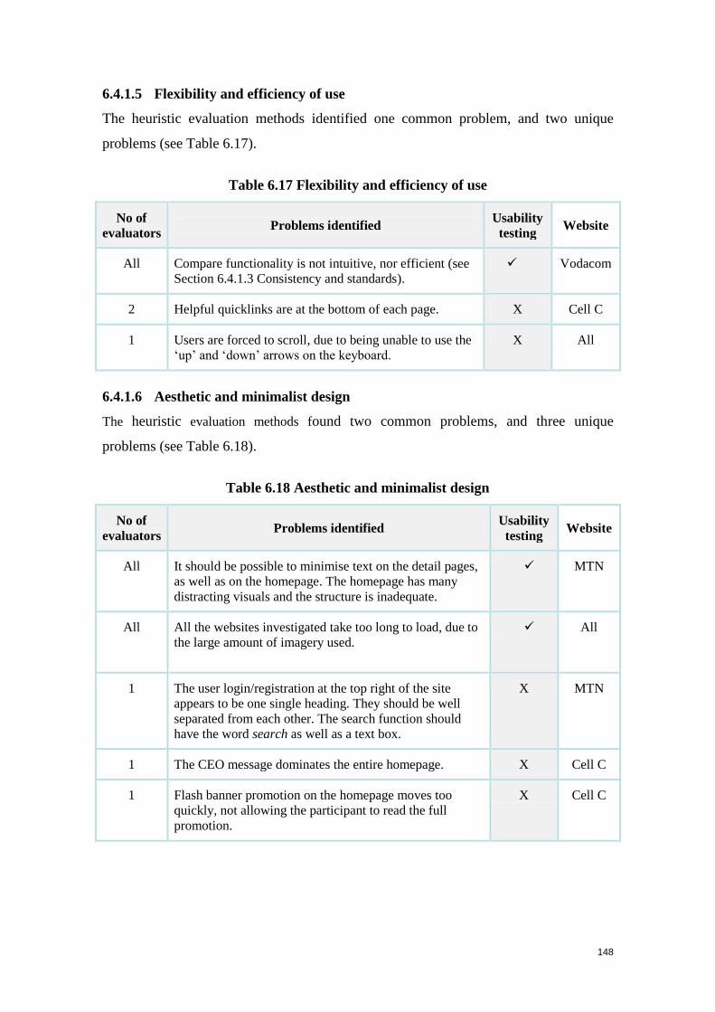
148
6.4.1.5 Flexibility and efficiency of use
The heuristic evaluation methods identified one common problem, and two unique
problems (see Table 6.17).
Table 6.17 Flexibility and efficiency of use
No of
evaluators Problems identified
Usability
testing Website
All Compare functionality is not intuitive, nor efficient (see
Section 6.4.1.3 Consistency and standards).
Vodacom
2 Helpful quicklinks are at the bottom of each page. X Cell C
1 Users are forced to scroll, due to being unable to use the
‘up’ and ‘down’ arrows on the keyboard.
X All
6.4.1.6 Aesthetic and minimalist design
The heuristic evaluation methods found two common problems, and three unique
problems (see Table 6.18).
Table 6.18 Aesthetic and minimalist design
No of
evaluators Problems identified
Usability
testing Website
All It should be possible to minimise text on the detail pages,
as well as on the homepage. The homepage has many
distracting visuals and the structure is inadequate.
MTN
All All the websites investigated take too long to load, due to
the large amount of imagery used.
All
1 The user login/registration at the top right of the site
appears to be one single heading. They should be well
separated from each other. The search function should
have the word search as well as a text box.
X MTN
1 The CEO message dominates the entire homepage. X Cell C
1 Flash banner promotion on the homepage moves too
quickly, not allowing the participant to read the full
promotion.
X Cell C
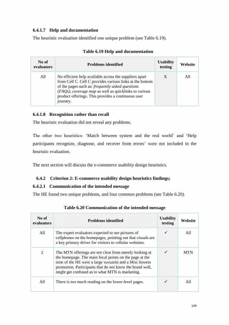
149
6.4.1.7 Help and documentation
The heuristic evaluation identified one unique problem (see Table 6.19).
Table 6.19 Help and documentation
No of
evaluators Problems identified
Usability
testing Website
All No efficient help available across the suppliers apart
from Cell C. Cell C provides various links at the bottom
of the pages such as: frequently asked questions
(FAQs), coverage map as well as quicklinks to various
product offerings. This provides a continuous user
journey.
X All
6.4.1.8 Recognition rather than recall
The heuristic evaluation did not reveal any problems.
The other two heuristics: ‘Match between system and the real world’ and ‘Help
participants recognize, diagnose, and recover from errors’ were not included in the
heuristic evaluation.
The next section will discuss the e-commerce usability design heuristics.
6.4.2 Criterion 2: E-commerce usability design heuristics findings;
6.4.2.1 Communication of the intended message
The HE found two unique problems, and four common problems (see Table 6.20).
Table 6.20 Communication of the intended message
No of
evaluators Problems identified
Usability
testing Website
All The expert evaluators expected to see pictures of
cellphones on the homepages, pointing out that visuals are
a key primary driver for visitors to cellular websites.
All
2 The MTN offerings are not clear from merely looking at
the homepage. The main focal points on the page at the
time of the HE were a large vuvuzela and a Miss Soweto
promotion. Participants that do not know the brand well,
might get confused as to what MTN is marketing.
MTN
All There is too much reading on the lower-level pages.
All
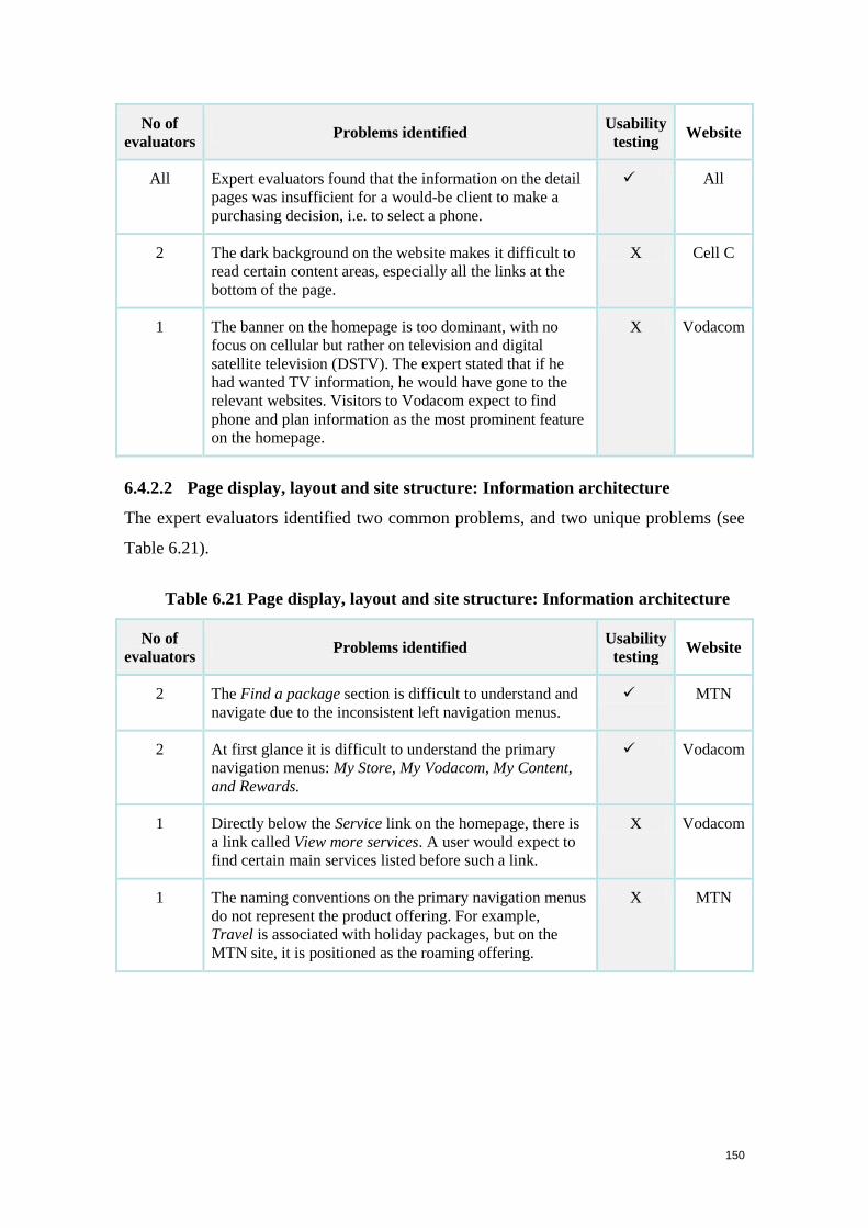
150
No of
evaluators Problems identified
Usability
testing Website
All Expert evaluators found that the information on the detail
pages was insufficient for a would-be client to make a
purchasing decision, i.e. to select a phone.
All
2 The dark background on the website makes it difficult to
read certain content areas, especially all the links at the
bottom of the page.
X Cell C
1 The banner on the homepage is too dominant, with no
focus on cellular but rather on television and digital
satellite television (DSTV). The expert stated that if he
had wanted TV information, he would have gone to the
relevant websites. Visitors to Vodacom expect to find
phone and plan information as the most prominent feature
on the homepage.
X Vodacom
6.4.2.2 Page display, layout and site structure: Information architecture
The expert evaluators identified two common problems, and two unique problems (see
Table 6.21).
Table 6.21 Page display, layout and site structure: Information architecture
No of
evaluators Problems identified
Usability
testing Website
2 The Find a package section is difficult to understand and
navigate due to the inconsistent left navigation menus.
MTN
2 At first glance it is difficult to understand the primary
navigation menus: My Store, My Vodacom, My Content,
and Rewards.
Vodacom
1 Directly below the Service link on the homepage, there is
a link called View more services. A user would expect to
find certain main services listed before such a link.
X Vodacom
1 The naming conventions on the primary navigation menus
do not represent the product offering. For example,
Travel is associated with holiday packages, but on the
MTN site, it is positioned as the roaming offering.
X MTN
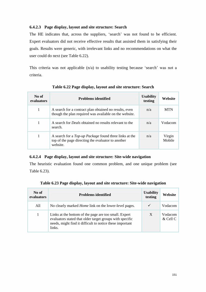
151
6.4.2.3 Page display, layout and site structure: Search
The HE indicates that, across the suppliers, ‘search’ was not found to be efficient.
Expert evaluators did not receive effective results that assisted them in satisfying their
goals. Results were generic, with irrelevant links and no recommendations on what the
user could do next (see Table 6.22).
This criteria was not applicable (n/a) to usability testing because ‘search’ was not a
criteria.
Table 6.22 Page display, layout and site structure: Search
No of
evaluators Problems identified
Usability
testing Website
1 A search for a contract plan obtained no results, even
though the plan required was available on the website.
n/a MTN
1 A search for Deals obtained no results relevant to the
search.
n/a Vodacom
1 A search for a Top-up Package found three links at the
top of the page directing the evaluator to another
website.
n/a Virgin
Mobile
6.4.2.4 Page display, layout and site structure: Site-wide navigation
The heuristic evaluation found one common problem, and one unique problem (see
Table 6.23).
Table 6.23 Page display, layout and site structure: Site-wide navigation
No of
evaluators Problems identified
Usability
testing Website
All No clearly marked Home link on the lower-level pages. Vodacom
1 Links at the bottom of the page are too small. Expert
evaluators stated that older target groups with specific
needs, might find it difficult to notice these important
links.
X Vodacom
& Cell C

152
6.4.2.5 Page display, layout and site structure: Contextual navigation
The experts identified one common problem, and one unique problem (see Table 6.24).
Table 6.24 Page display, layout and site structure: Contextual navigation
No of
evaluators Problems identified
Usability
testing Website
All There are currently seven levels of navigation, and page
titles do not match the links in the left navigation menus.
The deeper the participant navigates into the website, the
more confusing and frustrating it becomes to identify
orientation within the site.
X MTN
1 The Package page provides various related links
suggesting actions, but these links do not access relevant
sections.
Virgin
Mobile
6.4.2.6 Page display, layout and site structure: Page structure and presentation of
information
HE methods found one common problem and no unique problems (see Table 6.25).
Table 6.25 Page display, layout and site structure: Page structure and presentation
of information
No of
evaluators Problems identified
Usability
testing Website
All Journey not intuitive; pages are too long; too much reading
and scrolling without tables / bullets for easier readability.
MTN
6.4.2.7 Page display, layout and site structure: Language and tone
The HE identified three common problems, and no unique problems (see Table 6.26).
Table 6.26 Page display, layout and site structure: Language and tone
No of
evaluators Problems identified
Usability
testing Website
2 My MTN and Ayoba are difficult to understand MTN
3 The cellular terms Mobile number portability and Rica are
difficult to understand, confirming the point made by
participants in the UT, that foreign users living in South
Africa would not understand such terminology.
Vodacom
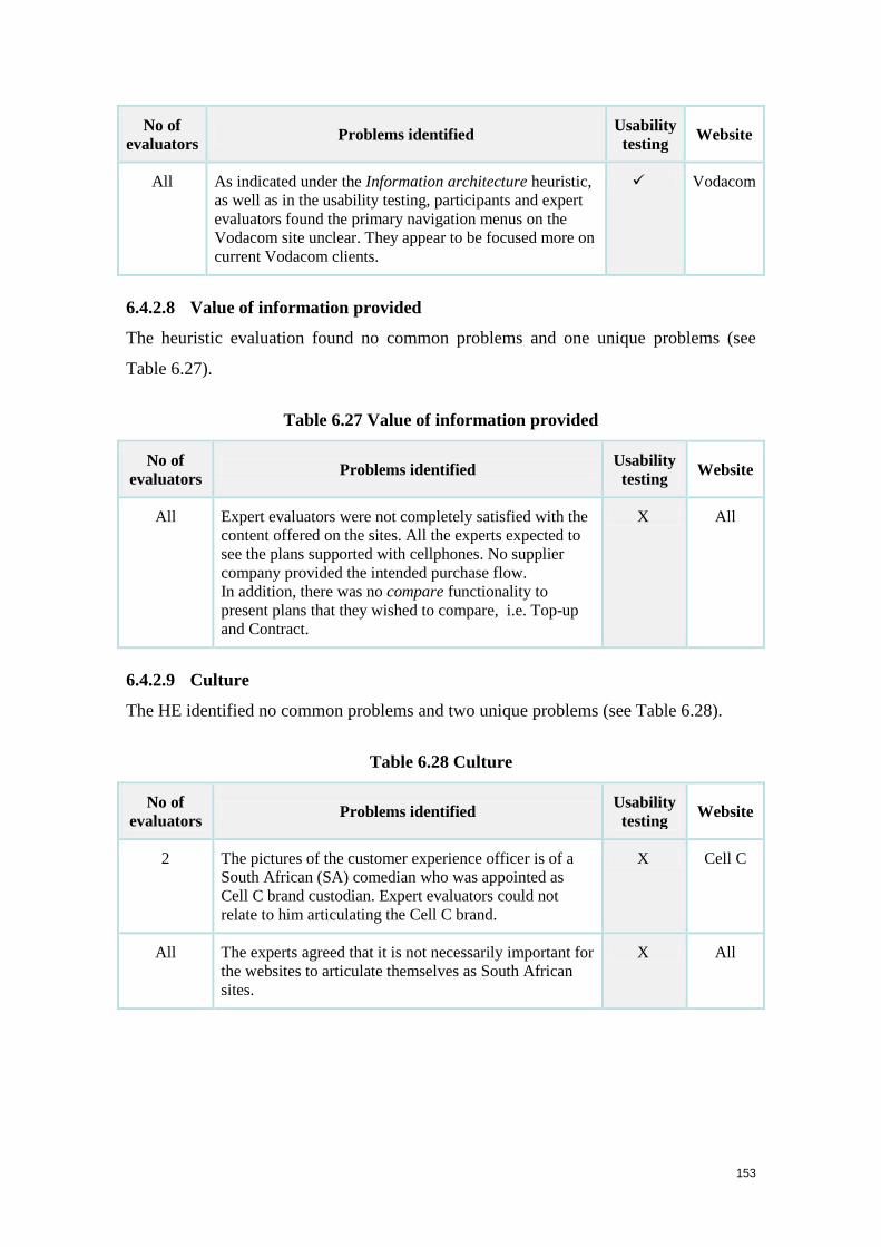
153
No of
evaluators Problems identified
Usability
testing Website
All As indicated under the Information architecture heuristic,
as well as in the usability testing, participants and expert
evaluators found the primary navigation menus on the
Vodacom site unclear. They appear to be focused more on
current Vodacom clients.
Vodacom
6.4.2.8 Value of information provided
The heuristic evaluation found no common problems and one unique problems (see
Table 6.27).
Table 6.27 Value of information provided
No of
evaluators Problems identified
Usability
testing Website
All Expert evaluators were not completely satisfied with the
content offered on the sites. All the experts expected to
see the plans supported with cellphones. No supplier
company provided the intended purchase flow.
In addition, there was no compare functionality to
present plans that they wished to compare, i.e. Top-up
and Contract.
X All
6.4.2.9 Culture
The HE identified no common problems and two unique problems (see Table 6.28).
Table 6.28 Culture
No of
evaluators Problems identified
Usability
testing Website
2 The pictures of the customer experience officer is of a
South African (SA) comedian who was appointed as
Cell C brand custodian. Expert evaluators could not
relate to him articulating the Cell C brand.
X Cell C
All The experts agreed that it is not necessarily important for
the websites to articulate themselves as South African
sites.
X All
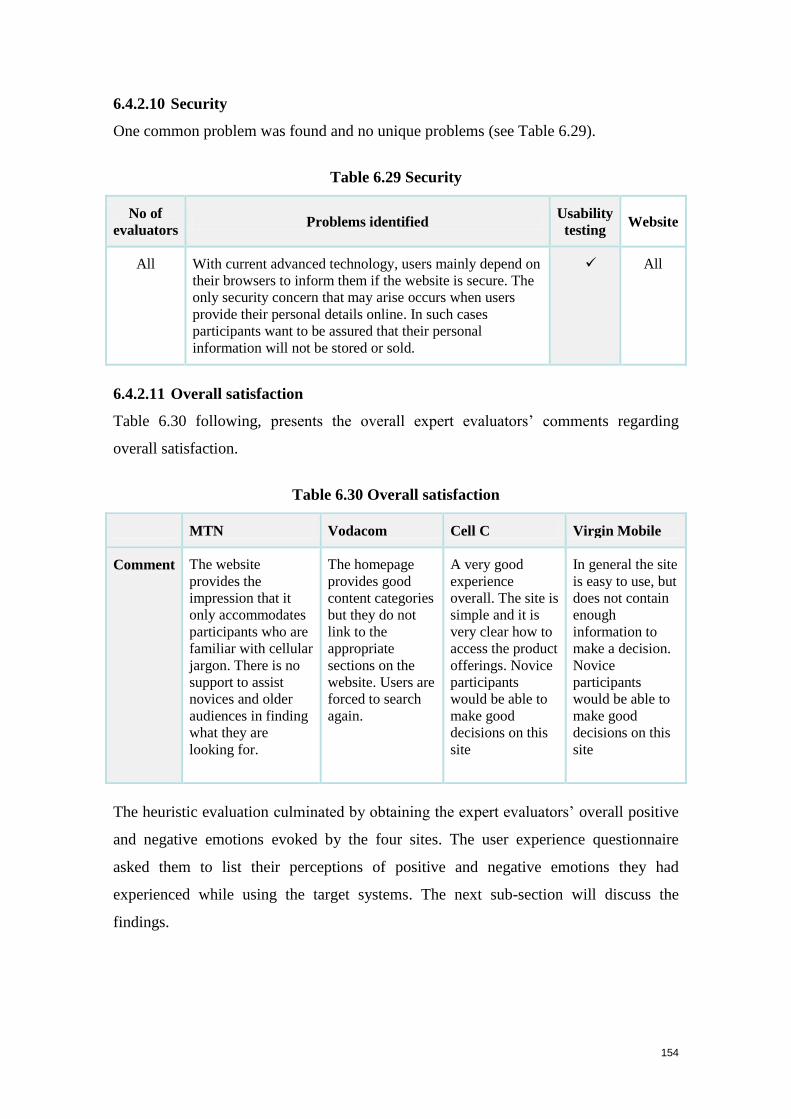
154
6.4.2.10 Security
One common problem was found and no unique problems (see Table 6.29).
Table 6.29 Security
No of
evaluators Problems identified
Usability
testing Website
All With current advanced technology, users mainly depend on
their browsers to inform them if the website is secure. The
only security concern that may arise occurs when users
provide their personal details online. In such cases
participants want to be assured that their personal
information will not be stored or sold.
All
6.4.2.11 Overall satisfaction
Table 6.30 following, presents the overall expert evaluators’ comments regarding
overall satisfaction.
Table 6.30 Overall satisfaction
MTN Vodacom Cell C Virgin Mobile
Comment The website
provides the
impression that it
only accommodates
participants who are
familiar with cellular
jargon. There is no
support to assist
novices and older
audiences in finding
what they are
looking for.
The homepage
provides good
content categories
but they do not
link to the
appropriate
sections on the
website. Users are
forced to search
again.
A very good
experience
overall. The site is
simple and it is
very clear how to
access the product
offerings. Novice
participants
would be able to
make good
decisions on this
site
In general the site
is easy to use, but
does not contain
enough
information to
make a decision.
Novice
participants
would be able to
make good
decisions on this
site
The heuristic evaluation culminated by obtaining the expert evaluators’ overall positive
and negative emotions evoked by the four sites. The user experience questionnaire
asked them to list their perceptions of positive and negative emotions they had
experienced while using the target systems. The next sub-section will discuss the
findings.
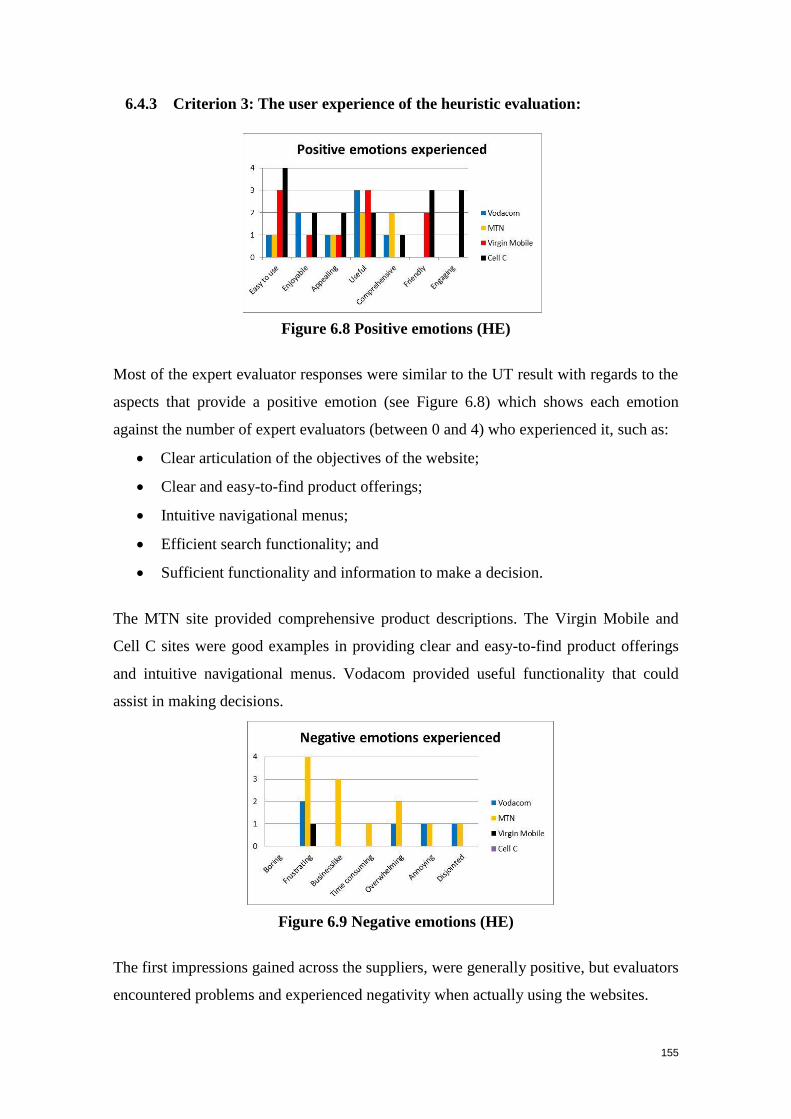
155
6.4.3 Criterion 3: The user experience of the heuristic evaluation:
Figure 6.8 Positive emotions (HE)
Most of the expert evaluator responses were similar to the UT result with regards to the
aspects that provide a positive emotion (see Figure 6.8) which shows each emotion
against the number of expert evaluators (between 0 and 4) who experienced it, such as:
Clear articulation of the objectives of the website;
Clear and easy-to-find product offerings;
Intuitive navigational menus;
Efficient search functionality; and
Sufficient functionality and information to make a decision.
The MTN site provided comprehensive product descriptions. The Virgin Mobile and
Cell C sites were good examples in providing clear and easy-to-find product offerings
and intuitive navigational menus. Vodacom provided useful functionality that could
assist in making decisions.
Figure 6.9 Negative emotions (HE)
The first impressions gained across the suppliers, were generally positive, but evaluators
encountered problems and experienced negativity when actually using the websites.
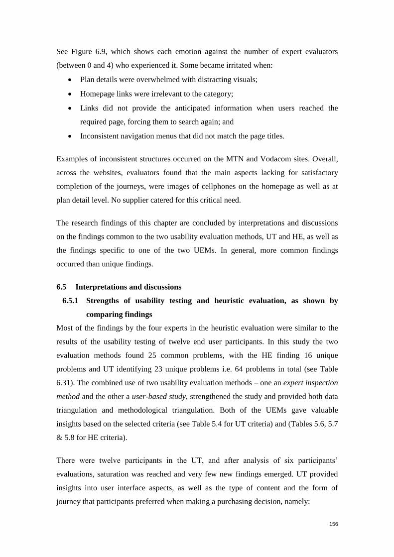
156
See Figure 6.9, which shows each emotion against the number of expert evaluators
(between 0 and 4) who experienced it. Some became irritated when:
Plan details were overwhelmed with distracting visuals;
Homepage links were irrelevant to the category;
Links did not provide the anticipated information when users reached the
required page, forcing them to search again; and
Inconsistent navigation menus that did not match the page titles.
Examples of inconsistent structures occurred on the MTN and Vodacom sites. Overall,
across the websites, evaluators found that the main aspects lacking for satisfactory
completion of the journeys, were images of cellphones on the homepage as well as at
plan detail level. No supplier catered for this critical need.
The research findings of this chapter are concluded by interpretations and discussions
on the findings common to the two usability evaluation methods, UT and HE, as well as
the findings specific to one of the two UEMs. In general, more common findings
occurred than unique findings.
6.5 Interpretations and discussions
6.5.1 Strengths of usability testing and heuristic evaluation, as shown by
comparing findings
Most of the findings by the four experts in the heuristic evaluation were similar to the
results of the usability testing of twelve end user participants. In this study the two
evaluation methods found 25 common problems, with the HE finding 16 unique
problems and UT identifying 23 unique problems i.e. 64 problems in total (see Table
6.31). The combined use of two usability evaluation methods – one an expert inspection
method and the other a user-based study, strengthened the study and provided both data
triangulation and methodological triangulation. Both of the UEMs gave valuable
insights based on the selected criteria (see Table 5.4 for UT criteria) and (Tables 5.6, 5.7
& 5.8 for HE criteria).
There were twelve participants in the UT, and after analysis of six participants’
evaluations, saturation was reached and very few new findings emerged. UT provided
insights into user interface aspects, as well as the type of content and the form of
journey that participants preferred when making a purchasing decision, namely:
157
Product-based navigation that supports users’ different cellular needs;
Content description to speak directly to user needs with terminology that is user
friendly; and
Most important, the requirement that the key content areas relevant to decision-
making be higher up in hierarchy (i.e. price).
The UT results indicate that participants are very task-specific and seek out content that
speaks directly to their needs, while user interface aspects are secondary. Problems
identified in the HE were mainly directed at user interface aspects such as:
Navigation and orientation; and
Relationship between names of links and page titles (which often did not
correspond).
The results from this study indicate that HE findings do not always reflect the opinions
of end users. The literature study noted a disadvantage of HE (see Section 4.5.4)
mentioned by Nielsen (1994b), whose study showed that heuristic evaluation resulted in
a 50% hit rate, and a 20% miss rate, because results are not based on observations of
user behaviour.
The present study confirmed this finding in that the UT results identified problems
beyond those in the user interface. Furthermore, the number of unique problems (23)
that emerged from the UT was greater than the number of unique problems (16) that
emerged from the HE. Therefore, UT is the better method to use in order to uncover
problems that hamper end users’ performance when completing tasks, while HE can be
used to complement and justify the findings of the UT. Both evaluation methods are
valuable because they provide different sets of findings, namely:
Requirements of participants in order to complete tasks (UT).
Best practice user interface guidelines (HE).
6.5.2 Findings obtained by similar studies
New and previous studies conducted indicate similar results (see Section 4.7.1):
Liljegren (2006) investigated four evaluation methods: hierarchical task
analysis, cognitive walkthrough, heuristic evaluation and usability testing. He
measured these usability evaluation methods against the criteria of
thoroughness, validity, reliability, cost effectiveness and clarity. The study found
158
that usability testing is appropriate as the main UEM, because it complies with
all the above-mentioned criteria and addresses the ‘difficulty-to-make-errors’
aspect of overall usability.
Tan, Liu and Bishu (2009) found that it is appropriate to use both user testing
and heuristic analysis in a usability study, because they have different strengths.
A study by Martim, Herselman and van Greunen (2009) on how SA online
retailers can improve e-commerce usability to enhance growth, showed that
expert reviews combined with usability testing assisted in the design of
guidelines for developing usable e-commerce websites.
Ssemugabi and de Villiers (2010) describe a study to establish how effective is
heuristic evaluation by experts in identifying usability and learning-related
problems in a Web-based learning application. The study, which involved four
experts and 61 students (who were end users of an educational website) found
that the results of the experts’ evaluation were better than the survey results,
although they were produced by only four experts compared to 61 students. The
experts identified a total of 58 problems, while the students found 55. Of these,
38 problems were common to the HE and the survey. These findings indicate
that heuristic evaluation, if conducted by a competent and complementary group
of experts, is an efficient and highly effective UEM.
6.5.3 Consolidation of findings from usability testing and heuristic evaluation
Table 6.31 triangulates the data by presenting the problems and positive aspects in each
of the four websites as identified by both UT and HE (i.e. common problems and
positive aspects) and matters identified by on-e of the two methods on its own (i.e. UT-
specific and HE-specific problems and positive aspects).
Moreover, Table 6.32 sets out the general types of problems and the positive aspects
with respect to each category of criteria that UT identified on its own, both HE & UT
identified, and HE identified on its own.
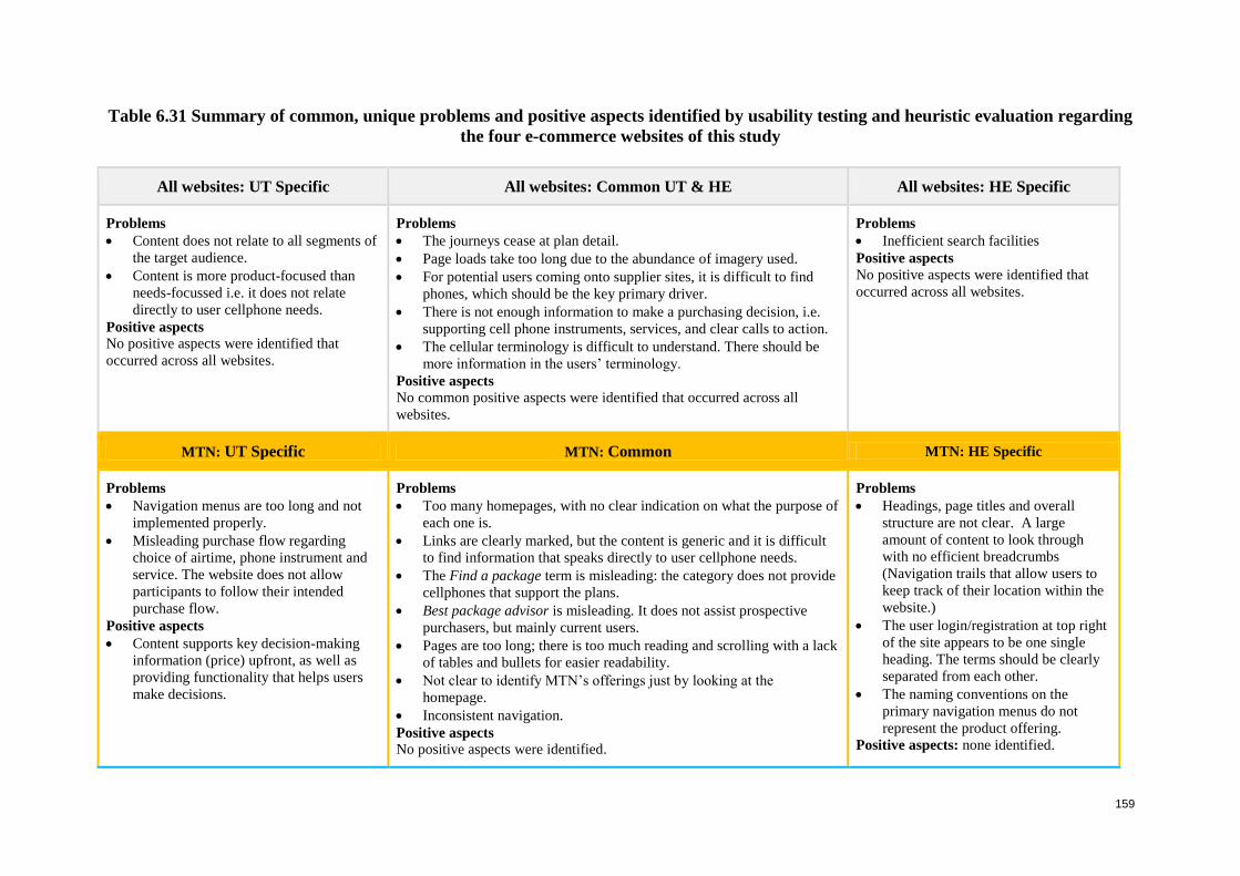
159
Table 6.31 Summary of common, unique problems and positive aspects identified by usability testing and heuristic evaluation regarding
the four e-commerce websites of this study
All websites: UT Specific All websites: Common UT & HE All websites: HE Specific
Problems
Content does not relate to all segments of
the target audience.
Content is more product-focused than
needs-focussed i.e. it does not relate
directly to user cellphone needs.
Positive aspects
No positive aspects were identified that
occurred across all websites.
Problems
The journeys cease at plan detail.
Page loads take too long due to the abundance of imagery used.
For potential users coming onto supplier sites, it is difficult to find
phones, which should be the key primary driver.
There is not enough information to make a purchasing decision, i.e.
supporting cell phone instruments, services, and clear calls to action.
The cellular terminology is difficult to understand. There should be
more information in the users’ terminology.
Positive aspects
No common positive aspects were identified that occurred across all
websites.
Problems
Inefficient search facilities
Positive aspects
No positive aspects were identified that
occurred across all websites.
MTN: UT Specific MTN: Common MTN: HE Specific
Problems
Navigation menus are too long and not
implemented properly.
Misleading purchase flow regarding
choice of airtime, phone instrument and
service. The website does not allow
participants to follow their intended
purchase flow.
Positive aspects
Content supports key decision-making
information (price) upfront, as well as
providing functionality that helps users
make decisions.
Problems
Too many homepages, with no clear indication on what the purpose of
each one is.
Links are clearly marked, but the content is generic and it is difficult
to find information that speaks directly to user cellphone needs.
The Find a package term is misleading: the category does not provide
cellphones that support the plans.
Best package advisor is misleading. It does not assist prospective
purchasers, but mainly current users.
Pages are too long; there is too much reading and scrolling with a lack
of tables and bullets for easier readability.
Not clear to identify MTN’s offerings just by looking at the
homepage.
Inconsistent navigation.
Positive aspects
No positive aspects were identified.
Problems
Headings, page titles and overall
structure are not clear. A large
amount of content to look through
with no efficient breadcrumbs
(Navigation trails that allow users to
keep track of their location within the
website.)
The user login/registration at top right
of the site appears to be one single
heading. The terms should be clearly
separated from each other.
The naming conventions on the
primary navigation menus do not
represent the product offering.
Positive aspects: none identified.
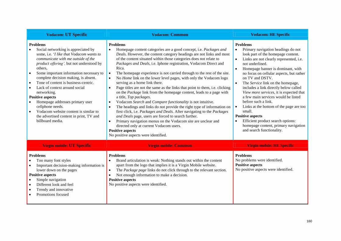
160
Vodacom: UT Specific Vodacom: Common Vodacom: HE Specific
Problems
Social networking is appreciated by
some, i.e. ‘I like that Vodacom wants to
communicate with me outside of the
product offering’, but not understood by
others,
Some important information necessary to
complete decision making, is absent.
Tone of content is business-centric.
Lack of context around social
networking.
Positive aspects
Homepage addresses primary user
cellphone needs.
Vodacom website content is similar to
the advertised content in print, TV and
billboard media.
Problems
Homepage content categories are a good concept, i.e. Packages and
Deals. However, the content category headings are not links and most
of the content situated within those categories does not relate to
Packages and Deals, i.e. Iphone registration, Vodacom Direct and
Rica.
The homepage experience is not carried through to the rest of the site.
No Home link on the lower level pages, with only the Vodacom logo
serving as a home link there.
Page titles are not the same as the links that point to them, i.e. clicking
on the Package link from the homepage content, leads to a page with
a title, Top packages.
Vodacom Search and Compare functionality is not intuitive.
The headings and links do not provide the right type of information on
first click, i.e. Packages and Deals. After navigating to the Packages
and Deals page, users are forced to search further.
Primary navigation menus on the Vodacom site are unclear and
directed only at current Vodacom users.
Positive aspects
No positive aspects were identified.
Problems
Primary navigation headings do not
look part of the homepage content.
Links are not clearly represented, i.e.
not underlined.
Homepage banner is dominant, with
no focus on cellular aspects, but rather
on TV and DSTV.
The Service link on the homepage,
includes a link directly below called
View more services, it is expected that
a few main services would be listed
before such a link.
Links at the bottom of the page are too
small.
Positive aspects
Efficient product search options:
homepage content, primary navigation
and search functionality.
Virgin mobile: UT Specific Virgin mobile: Common Virgin mobile: HE Specific
Problems
Too many font styles
Important decision-making information is
lower down on the pages
Positive aspects
Simple navigation
Different look and feel
Trendy and innovative
Promotions focused
Problems
Brand articulation is weak: Nothing stands out within the content
apart from the logo that implies it is a Virgin Mobile website.
The Package page links do not click through to the relevant section.
Not enough information to make a decision.
Positive aspects
No positive aspects were identified.
Problems
No problems were identified.
Positive aspects
No positive aspects were identified.
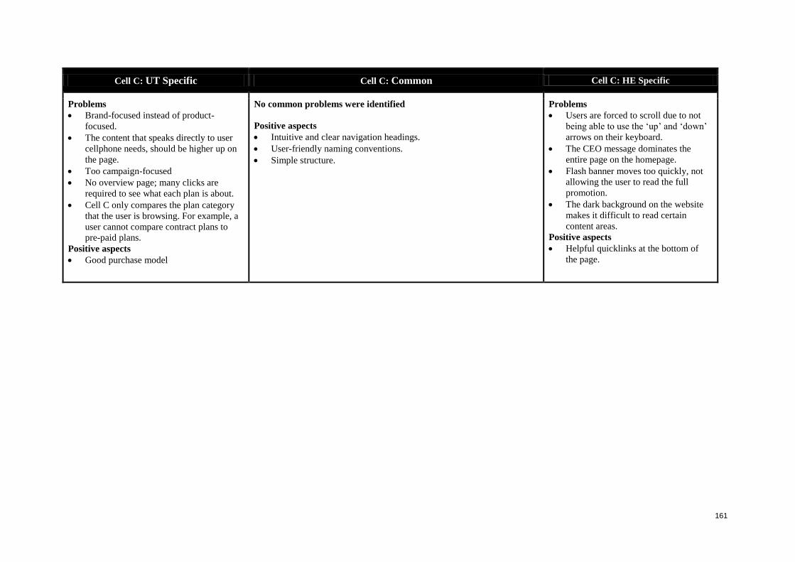
161
Cell C: UT Specific Cell C: Common Cell C: HE Specific
Problems
Brand-focused instead of product-
focused.
The content that speaks directly to user
cellphone needs, should be higher up on
the page.
Too campaign-focused
No overview page; many clicks are
required to see what each plan is about.
Cell C only compares the plan category
that the user is browsing. For example, a
user cannot compare contract plans to
pre-paid plans.
Positive aspects
Good purchase model
No common problems were identified
Positive aspects
Intuitive and clear navigation headings.
User-friendly naming conventions.
Simple structure.
Problems
Users are forced to scroll due to not
being able to use the ‘up’ and ‘down’
arrows on their keyboard.
The CEO message dominates the
entire page on the homepage.
Flash banner moves too quickly, not
allowing the user to read the full
promotion.
The dark background on the website
makes it difficult to read certain
content areas.
Positive aspects
Helpful quicklinks at the bottom of
the page.
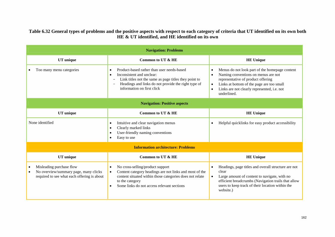
162
Table 6.32 General types of problems and the positive aspects with respect to each category of criteria that UT identified on its own both
HE & UT identified, and HE identified on its own
Navigation: Problems
UT unique Common to UT & HE HE Unique
Too many menu categories
Product-based rather than user needs-based
Inconsistent and unclear:
Link titles not the same as page titles they point to
Headings and links do not provide the right type of
information on first click
Menus do not look part of the homepage content
Naming conventions on menus are not
representative of product offering
Links at bottom of the page are too small
Links are not clearly represented, i.e. not
underlined.
Navigation: Positive aspects
UT unique Common to UT & HE HE Unique
None identified Intuitive and clear navigation menus
Clearly marked links
User-friendly naming conventions
Easy to use
Helpful quicklinks for easy product accessibility
Information architecture: Problems
UT unique Common to UT & HE HE Unique
Misleading purchase flow
No overview/summary page, many clicks
required to see what each offering is about
No cross-selling/product support
Content category headings are not links and most of the
content situated within those categories does not relate
to the category
Some links do not access relevant sections
Headings, page titles and overall structure are not
clear
Large amount of content to navigate, with no
efficient breadcrumbs (Navigation trails that allow
users to keep track of their location within the
website.)
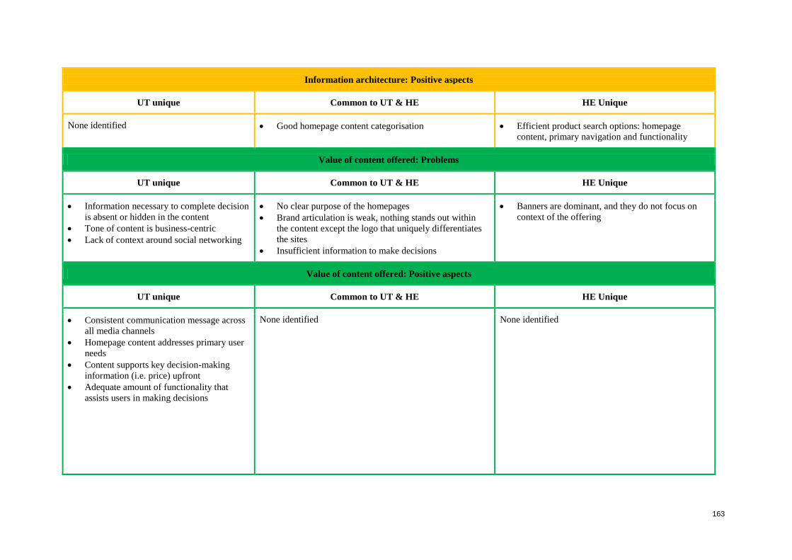
163
Information architecture: Positive aspects
UT unique Common to UT & HE HE Unique
None identified Good homepage content categorisation Efficient product search options: homepage
content, primary navigation and functionality
Value of content offered: Problems
UT unique Common to UT & HE HE Unique
Information necessary to complete decision
is absent or hidden in the content
Tone of content is business-centric
Lack of context around social networking
No clear purpose of the homepages
Brand articulation is weak, nothing stands out within
the content except the logo that uniquely differentiates
the sites
Insufficient information to make decisions
Banners are dominant, and they do not focus on
context of the offering
Value of content offered: Positive aspects
UT unique Common to UT & HE HE Unique
Consistent communication message across
all media channels
Homepage content addresses primary user
needs
Content supports key decision-making
information (i.e. price) upfront
Adequate amount of functionality that
assists users in making decisions
None identified None identified
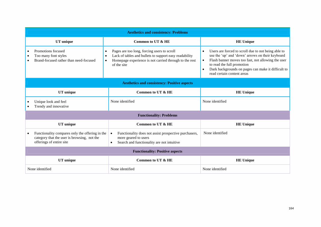
164
Aesthetics and consistency: Problems
UT unique Common to UT & HE HE Unique
Promotions focused
Too many font styles
Brand-focused rather than need-focused
Pages are too long, forcing users to scroll
Lack of tables and bullets to support easy readability
Homepage experience is not carried through to the rest
of the site
Users are forced to scroll due to not being able to
use the ‘up’ and ‘down’ arrows on their keyboard
Flash banner moves too fast, not allowing the user
to read the full promotion
Dark backgrounds on pages can make it difficult to
read certain content areas
Aesthetics and consistency: Positive aspects
UT unique Common to UT & HE HE Unique
Unique look and feel
Trendy and innovative
None identified None identified
Functionality: Problems
UT unique Common to UT & HE HE Unique
Functionality compares only the offering in the
category that the user is browsing, not the
offerings of entire site
Functionality does not assist prospective purchasers,
more geared to users
Search and functionality are not intuitive
None identified
Functionality: Positive aspects
UT unique Common to UT & HE HE Unique
None identified None identified None identified
165
6.6 How can usability impact on the user experience in e-commerce?
This final section in Chapter 6 relates to how usability can support or hamper the user
experience in e-commerce. Good customer experience does not happen incidentally, but
through careful investigation of users’ interactions with the site, as done in this study which
applied two UEMs, UT & HE, to evaluate four e-commerce websites. Progress can be made
in identifying what will support users in their every-day use of such sites and create an
improved customer experience in the process of online-purchasing.
The usability of an e-commerce site is determined by its user interface, visual elements,
navigation, information architecture and the way participants interact with the website. More
specifically, usability aims to achieve the following objective goals: effective use, efficient
use, safe use, sound utility, ease of learning, and ease of remembering.
User experience of an e-commerce site on the other hand, is a sensation primarily related to
the subjective impressions and emotions a user has while interacting with a device or system,
and the success of a system is determined by a positive user experience. According to van
Greunen, van der Merwe and Kotze (2010), user experience is primarily influenced by the
user interface, therefore a good user interface design generally allows users to satisfy their
goals.
This study views usability and user experience as overlapping concepts that are closely
related – see Figures 3.6 and 3.7.
Table 6.33 following, maps key usability aspects to user experience aspects, as identified in
this study. The table provides brief motivations as to why these aspects are important in
creating good user experience.
The following will be discussed: navigation, information architecture (IA), value of content,
structure and layout, satisfaction, aesthetics and consistency, and functionality.
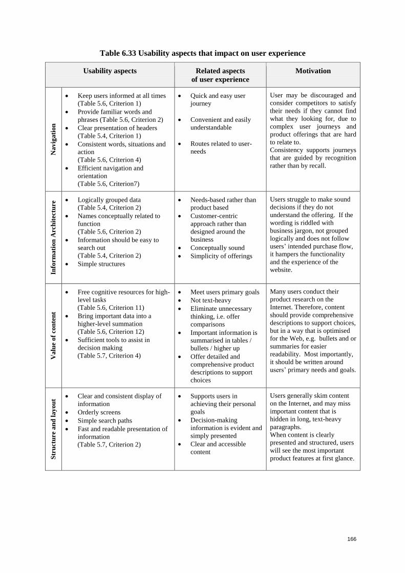
166
Table 6.33 Usability aspects that impact on user experience
Usability aspects Related aspects
of user experience
Motivation
Na
vig
ati
on
Keep users informed at all times
(Table 5.6, Criterion 1)
Provide familiar words and
phrases (Table 5.6, Criterion 2)
Clear presentation of headers
(Table 5.4, Criterion 1)
Consistent words, situations and
action
(Table 5.6, Criterion 4)
Efficient navigation and
orientation
(Table 5.6, Criterion7)
Quick and easy user
journey
Convenient and easily
understandable
Routes related to user-
needs
User may be discouraged and
consider competitors to satisfy
their needs if they cannot find
what they looking for, due to
complex user journeys and
product offerings that are hard
to relate to.
Consistency supports journeys
that are guided by recognition
rather than by recall.
Info
rma
tio
n A
rch
itec
ture
Logically grouped data
(Table 5.4, Criterion 2)
Names conceptually related to
function
(Table 5.6, Criterion 2)
Information should be easy to
search out
(Table 5.4, Criterion 2)
Simple structures
Needs-based rather than
product based
Customer-centric
approach rather than
designed around the
business
Conceptually sound
Simplicity of offerings
Users struggle to make sound
decisions if they do not
understand the offering. If the
wording is riddled with
business jargon, not grouped
logically and does not follow
users’ intended purchase flow,
it hampers the functionality
and the experience of the
website.
Va
lue
of
con
ten
t
Free cognitive resources for high-
level tasks
(Table 5.6, Criterion 11)
Bring important data into a
higher-level summation
(Table 5.6, Criterion 12)
Sufficient tools to assist in
decision making
(Table 5.7, Criterion 4)
Meet users primary goals
Not text-heavy
Eliminate unnecessary
thinking, i.e. offer
comparisons
Important information is
summarised in tables /
bullets / higher up
Offer detailed and
comprehensive product
descriptions to support
choices
Many users conduct their
product research on the
Internet. Therefore, content
should provide comprehensive
descriptions to support choices,
but in a way that is optimised
for the Web, e.g. bullets and or
summaries for easier
readability. Most importantly,
it should be written around
users’ primary needs and goals.
Str
uct
ure
an
d l
ay
ou
t Clear and consistent display of
information
Orderly screens
Simple search paths
Fast and readable presentation of
information
(Table 5.7, Criterion 2)
Supports users in
achieving their personal
goals
Decision-making
information is evident and
simply presented
Clear and accessible
content
Users generally skim content
on the Internet, and may miss
important content that is
hidden in long, text-heavy
paragraphs.
When content is clearly
presented and structured, users
will see the most important
product features at first glance.
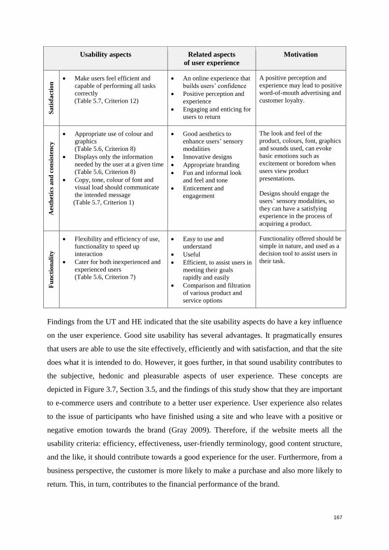
167
Usability aspects Related aspects
of user experience
Motivation S
ati
sfa
ctio
n Make users feel efficient and
capable of performing all tasks
correctly
(Table 5.7, Criterion 12)
An online experience that
builds users’ confidence
Positive perception and
experience
Engaging and enticing for
users to return
A positive perception and
experience may lead to positive
word-of-mouth advertising and
customer loyalty.
Aes
thet
ics
an
d c
on
sist
ency
Appropriate use of colour and
graphics
(Table 5.6, Criterion 8)
Displays only the information
needed by the user at a given time
(Table 5.6, Criterion 8)
Copy, tone, colour of font and
visual load should communicate
the intended message
(Table 5.7, Criterion 1)
Good aesthetics to
enhance users’ sensory
modalities
Innovative designs
Appropriate branding
Fun and informal look
and feel and tone
Enticement and
engagement
The look and feel of the
product, colours, font, graphics
and sounds used, can evoke
basic emotions such as
excitement or boredom when
users view product
presentations.
Designs should engage the
users’ sensory modalities, so
they can have a satisfying
experience in the process of
acquiring a product.
Fu
nct
ion
ali
ty
Flexibility and efficiency of use,
functionality to speed up
interaction
Cater for both inexperienced and
experienced users
(Table 5.6, Criterion 7)
Easy to use and
understand
Useful
Efficient, to assist users in
meeting their goals
rapidly and easily
Comparison and filtration
of various product and
service options
Functionality offered should be
simple in nature, and used as a
decision tool to assist users in
their task.
Findings from the UT and HE indicated that the site usability aspects do have a key influence
on the user experience. Good site usability has several advantages. It pragmatically ensures
that users are able to use the site effectively, efficiently and with satisfaction, and that the site
does what it is intended to do. However, it goes further, in that sound usability contributes to
the subjective, hedonic and pleasurable aspects of user experience. These concepts are
depicted in Figure 3.7, Section 3.5, and the findings of this study show that they are important
to e-commerce users and contribute to a better user experience. User experience also relates
to the issue of participants who have finished using a site and who leave with a positive or
negative emotion towards the brand (Gray 2009). Therefore, if the website meets all the
usability criteria: efficiency, effectiveness, user-friendly terminology, good content structure,
and the like, it should contribute towards a good experience for the user. Furthermore, from a
business perspective, the customer is more likely to make a purchase and also more likely to
return. This, in turn, contributes to the financial performance of the brand.
168
6.7 Summary
The two UEMs, usability testing and heuristic evaluation, and the criteria extracted from the
literature, provided valuable insight on usability problems in the four target systems and on
the type of user experience offered by the websites.
Twelve participants in the usability-testing study is not a large number but it is relatively high
for UT. However, the use of an expert evaluation as well provides data triangulation and
reliability to the study. The findings cannot be generalised to the entire population of e-
commerce users, but represent a valuable contribution to the body of knowledge on
evaluation of e-commerce websites.
This study has indicated that website aspects that are characterised by poor usability, do
indeed hamper users’ overall experience. When inconsistent navigation structures, product-
based navigation menus, hard-to-understand functionality, and poor presentation of content
offerings were encountered, the majority of UT participants felt that they would need to
consult other channels in order to satisfy their goals. In contrast, good usability enhanced the
quality of the overall user experience
This study and previous research indicate that the most comprehensive evaluations arise from
applying more than one evaluation technique (Jeffries et al. 1991; Desurvire et al. 1992). The
combined results from the UT and HE in this study can contribute to creating good user
experience guidelines for e-commerce sites. Chapter 7 following will discuss the proposed
guidelines that were derived from the usability test and heuristic evaluation results.

169
170
Chapter 7: Guidelines
7.1 Introduction
Users have high expectations in terms of the experience that they expect online. In the pre-
test questionnaire, several participants mentioned that one of their favourite websites is
Google. Google has probably set these high expectations in users’ minds regarding how a
website should function, and they have become accustomed to Google efficiency. Due to this
and other similar encounters, current users are more demanding and less forgiving if websites
are inefficient, slow, and do not effectively execute what they are intended to do.
With strong competition in the marketplace, companies need to invest in all their channels,
especially online, in order to attract and retain clients. User experience is not just a single
aspect, but rather an incorporation of all aspects: brand, product and service offered across all
forms, media and business channels. Given what cellular suppliers provide on their websites,
it would appear that cellular suppliers have not taken the time to study user needs. Most of
the content is business-centric, presented with technical terms that describe product features,
instead of highlighting potential benefits to users. No cellular supplier has taken the time to
embark on a segmentation strategy and tie it with distinct product offerings.
Users are attracted to brands that encompass quality, innovation and the ability of the brand
to target and engage users throughout the entire customer experience. All four websites failed
to innovate and position themselves differently; overall the user journeys were pedestrian,
laborious and required considerable reading to satisfy goals. On many occasions, users would
need to contact a company representative for more information.
Many current website guidelines are generic and merely deal with user interface aspects such
as text size, colour, and balance. The guidelines identified in this study, however, go beyond
user interface aspects, as the researcher attempted to uncover aspects of a website that lead to
poor user experiences. The proposed guidelines are not a repetition of, but a refinement to,
existing guidelines. The guidelines can be applied to any websites that market products and
services, in order to create a good holistic user experience, incorporating every aspect of the
user’s interaction.
171
This chapter will discuss proposed guidelines that were derived from the usability testing and
heuristic evaluation results. These guidelines are designed to aid in creating good user
experience for users seeking products and services on a website.
Three principles underlie the guidelines and should be considered throughout the design
process, so as to contribute to creating a good user experience:
Firstly, users should to be viewed as a top priority; users and their needs should be the
driving force in the entire design process;
Secondly, companies should target users with the most needs and significant growth
potential; and
Thirdly, designs need to be innovative in delivering key content, key services and key
products to users.
The proposed guidelines are divided into two categories:
Guidelines to enhance the user journey towards identification of an appropriate
product (Section 7.2);
Guidelines that are specific to the user interface of a website (Section 7.3).
Each guideline is followed by a brief explanation of how its application enhances the user
experience.
7.2 Guidelines that will enhance the user journey
Based on the findings, three guidelines have been identified to enhance the user journey on
websites that present and market products and services. The guidelines are listed, and then
each one is explained in more detail.
1. Present strong brand articulation
2. Provide two types of navigation options: product-based and needs-based
3. Take customers through a user journey and help them understand the different
products:
Educate and inform
Sell the product
Allow the user to manage it
Entertain and entice.
172
Guideline 1: Present strong brand articulation
None of the cellular websites investigated in this research articulated their brand strongly.
Most pages are text- heavy, with little engagement. Users have to work hard in order to
understand the offerings. Users would appreciate a ‘strap line’ to encapsulate what the
website is about. Examples of ‘strap lines’ include: ‘Come to shop, return to learn’ (Apple
store); ‘The fresh new way to manage your money (Mint). Such messages allow the user to
get a good impression of the purpose of the website. Following are key considerations for
creating a strong brand presence on a website, as well as online personality. These slogans
are associated with marketing terminology, but customised here for e-commerce websites.
Brand proposition: Include a strap line to articulate the purpose of the website.
Reason to believe: Why should I choose you? Identify key tangible differentiators.
Value proposition: Give me value; do not just sell products.
Brand needs to echo intelligence: Innovations in the design; future tailored
solutions.
Application of the guideline to enhance user experience
Delivery of the brand promise is the greatest builder of a good experience.
Guideline 2: Provide two types of navigation options: product-based and needs-based
The study established that users find it difficult to choose the right product by searching via
product name. With the exception of one site, participants could not relate the product name
to their needs. The proposed approach is to provide various navigation options to access
products and services. An advantage of having more than one navigation option is that it
meets the needs of different kinds of users. Following are two proposed navigation options,
both of which should be used, but in appropriate context:
Product-based
Product names are not to be eliminated, but need to effectively convey a user-
centric approach, with content incorporating terminology that is easy for users to
relate to.
Needs-based
All products should be supported by a needs-based navigation option, i.e.
quicklinks on the product pages as well as on the homepage. Examples of needs-
based navigation options include:
173
Usage needs: make most of my calls at night; SMS a lot; business use; monitor
my spending; etc.
Life stage needs: business user; youth; family plan.
Application of the guideline to enhance user experience
Systematic users appreciate a categorised listing of products or services on offer. On the other
hand, other users prefer a presentation that allows them to go directly to products and service
that are in line with their specific needs and requirements.
Guideline 3: Take customers through a user journey and help them understand the
different products
No two users are the same; individuals search for products differently. In the example of
cellular needs: some participants searched first for a phone when looking for a plan, then
expected to find all the plans that come with the phone, others started with plan. Design
teams should map out different user mental models on how users will search for products and
services, and then create corresponding user journeys on the site. Associated content should
not be distributed over non- related pages. Instead, it should be located within the anticipated
journey.
Overall, the users’ primary focus when coming onto a website is to buy/investigate products
and services. Therefore, the following four aspects should be considered in order to create a
good user experience within each user mental model:
1. Educate and inform: Allow users to learn about the product.
2. Sell the product: Allow users to purchase the product online.
3. Allow the user to manage it: Allow users to manage their accounts online.
4. Entertain and entice: Present enticing and updated content that would attract users
to return to the website.
Application of the guideline to enhance user experience
A well signposted user journey attracts customers, promotes positive word-of-mouth
advertising, and can result in loyalty to the brand.
The following subsections expand on the four aspects above to create a good user experience.
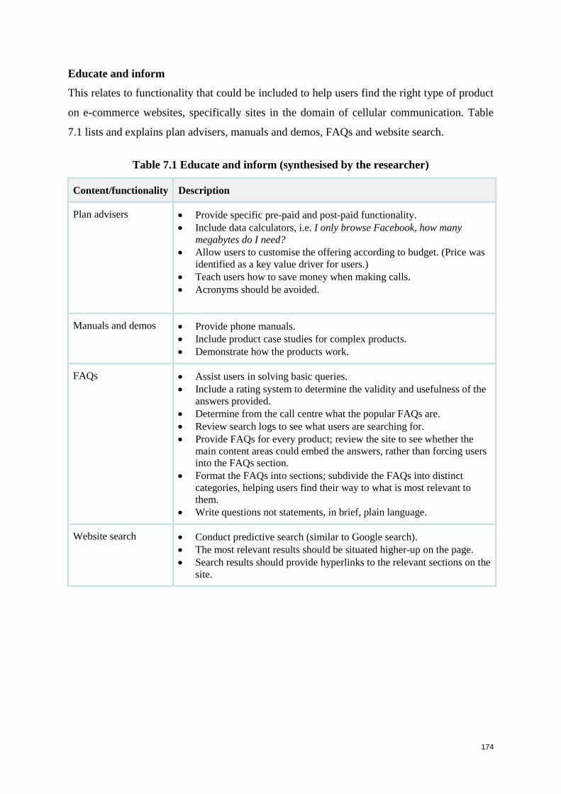
174
Educate and inform
This relates to functionality that could be included to help users find the right type of product
on e-commerce websites, specifically sites in the domain of cellular communication. Table
7.1 lists and explains plan advisers, manuals and demos, FAQs and website search.
Table 7.1 Educate and inform (synthesised by the researcher)
Content/functionality Description
Plan advisers Provide specific pre-paid and post-paid functionality.
Include data calculators, i.e. I only browse Facebook, how many
megabytes do I need?
Allow users to customise the offering according to budget. (Price was
identified as a key value driver for users.)
Teach users how to save money when making calls.
Acronyms should be avoided.
Manuals and demos Provide phone manuals.
Include product case studies for complex products.
Demonstrate how the products work.
FAQs Assist users in solving basic queries.
Include a rating system to determine the validity and usefulness of the
answers provided.
Determine from the call centre what the popular FAQs are.
Review search logs to see what users are searching for.
Provide FAQs for every product; review the site to see whether the
main content areas could embed the answers, rather than forcing users
into the FAQs section.
Format the FAQs into sections; subdivide the FAQs into distinct
categories, helping users find their way to what is most relevant to
them.
Write questions not statements, in brief, plain language.
Website search Conduct predictive search (similar to Google search).
The most relevant results should be situated higher-up on the page.
Search results should provide hyperlinks to the relevant sections on the
site.
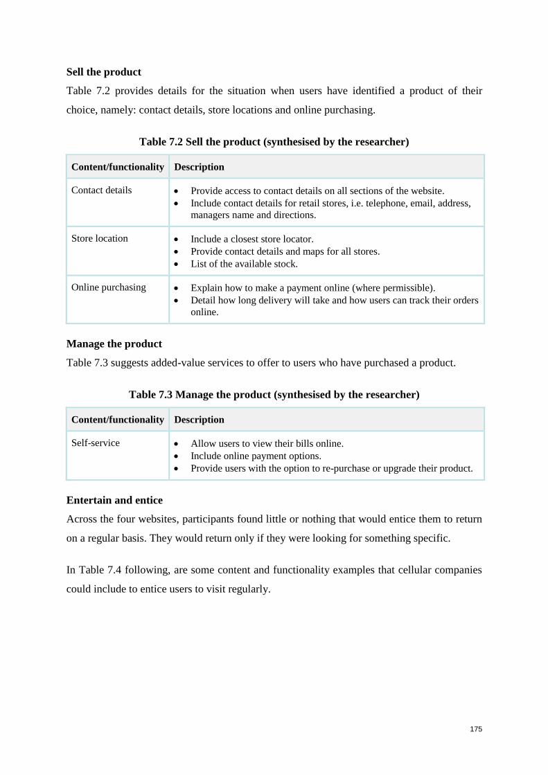
175
Sell the product
Table 7.2 provides details for the situation when users have identified a product of their
choice, namely: contact details, store locations and online purchasing.
Table 7.2 Sell the product (synthesised by the researcher)
Content/functionality Description
Contact details Provide access to contact details on all sections of the website.
Include contact details for retail stores, i.e. telephone, email, address,
managers name and directions.
Store location Include a closest store locator.
Provide contact details and maps for all stores.
List of the available stock.
Online purchasing Explain how to make a payment online (where permissible).
Detail how long delivery will take and how users can track their orders
online.
Manage the product
Table 7.3 suggests added-value services to offer to users who have purchased a product.
Table 7.3 Manage the product (synthesised by the researcher)
Content/functionality Description
Self-service Allow users to view their bills online.
Include online payment options.
Provide users with the option to re-purchase or upgrade their product.
Entertain and entice
Across the four websites, participants found little or nothing that would entice them to return
on a regular basis. They would return only if they were looking for something specific.
In Table 7.4 following, are some content and functionality examples that cellular companies
could include to entice users to visit regularly.
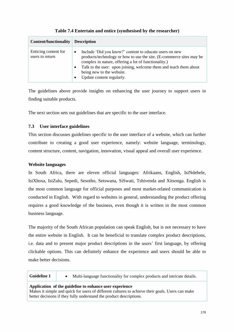
176
Table 7.4 Entertain and entice (synthesised by the researcher)
Content/functionality Description
Enticing content for
users to return Include ‘Did you know?’ content to educate users on new
products/technology or how to use the site. (E-commerce sites may be
complex in nature, offering a lot of functionality.)
Talk to the user: upon joining, welcome them and teach them about
being new to the website.
Update content regularly.
The guidelines above provide insights on enhancing the user journey to support users in
finding suitable products.
The next section sets out guidelines that are specific to the user interface.
7.3 User interface guidelines
This section discusses guidelines specific to the user interface of a website, which can further
contribute to creating a good user experience, namely: website language, terminology,
content structure, content, navigation, innovation, visual appeal and overall user experience.
Website languages
In South Africa, there are eleven official languages: Afrikaans, English, IsiNdebele,
IsiXhosa, IsiZulu, Sepedi, Sesotho, Setswana, SiSwati, Tshivenda and Xitsonga. English is
the most common language for official purposes and most market-related communication is
conducted in English. With regard to websites in general, understanding the product offering
requires a good knowledge of the business, even though it is written in the most common
business language.
The majority of the South African population can speak English, but is not necessary to have
the entire website in English. It can be beneficial to translate complex product descriptions,
i.e. data and to present major product descriptions in the users’ first language, by offering
clickable options. This can definitely enhance the experience and users should be able to
make better decisions.
Guideline 1 Multi-language functionality for complex products and intricate details.
Application of the guideline to enhance user experience
Makes it simple and quick for users of different cultures to achieve their goals. Users can make
better decisions if they fully understand the product descriptions.
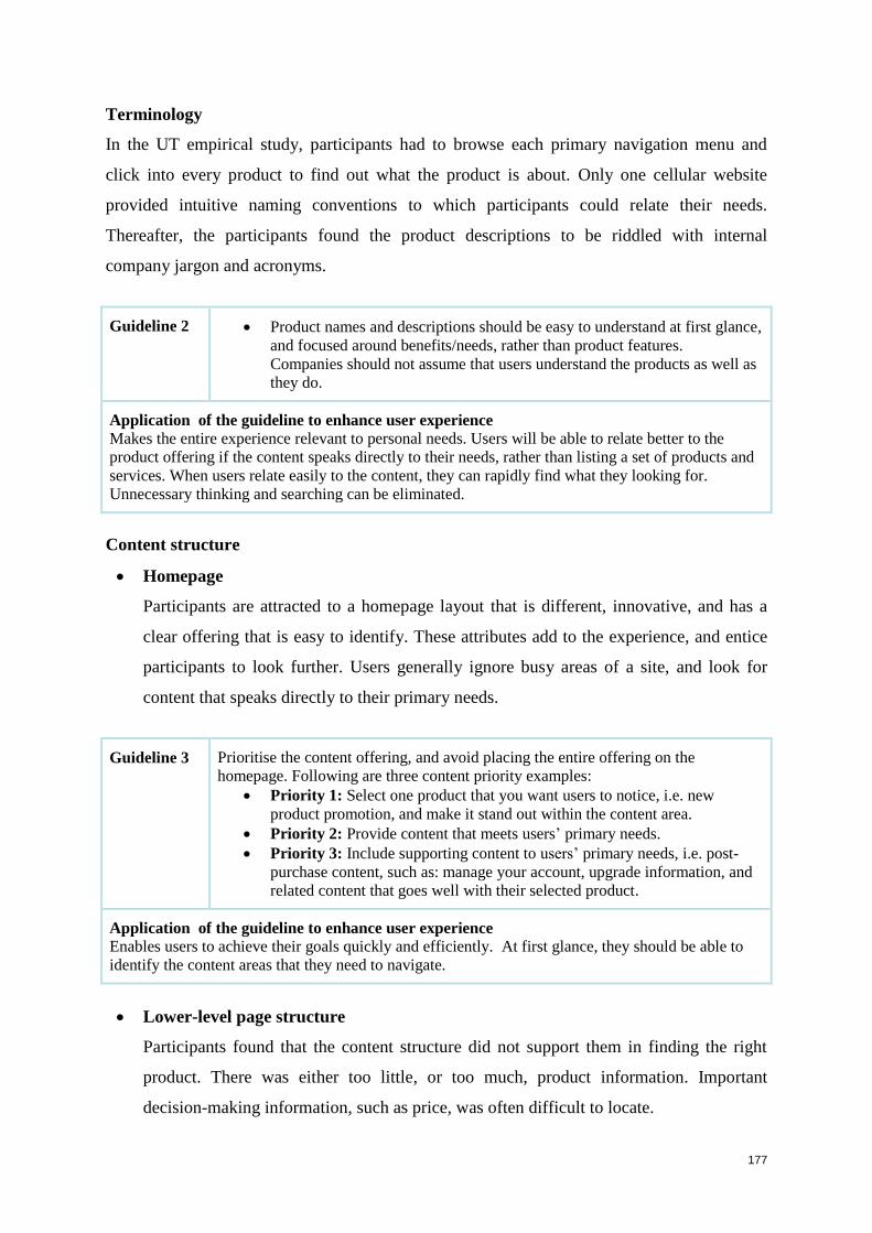
177
Terminology
In the UT empirical study, participants had to browse each primary navigation menu and
click into every product to find out what the product is about. Only one cellular website
provided intuitive naming conventions to which participants could relate their needs.
Thereafter, the participants found the product descriptions to be riddled with internal
company jargon and acronyms.
Guideline 2
Product names and descriptions should be easy to understand at first glance,
and focused around benefits/needs, rather than product features.
Companies should not assume that users understand the products as well as
they do.
Application of the guideline to enhance user experience
Makes the entire experience relevant to personal needs. Users will be able to relate better to the
product offering if the content speaks directly to their needs, rather than listing a set of products and
services. When users relate easily to the content, they can rapidly find what they looking for.
Unnecessary thinking and searching can be eliminated.
Content structure
Homepage
Participants are attracted to a homepage layout that is different, innovative, and has a
clear offering that is easy to identify. These attributes add to the experience, and entice
participants to look further. Users generally ignore busy areas of a site, and look for
content that speaks directly to their primary needs.
Guideline 3
Prioritise the content offering, and avoid placing the entire offering on the
homepage. Following are three content priority examples:
Priority 1: Select one product that you want users to notice, i.e. new
product promotion, and make it stand out within the content area.
Priority 2: Provide content that meets users’ primary needs.
Priority 3: Include supporting content to users’ primary needs, i.e. post-
purchase content, such as: manage your account, upgrade information, and
related content that goes well with their selected product.
Application of the guideline to enhance user experience
Enables users to achieve their goals quickly and efficiently. At first glance, they should be able to
identify the content areas that they need to navigate.
Lower-level page structure
Participants found that the content structure did not support them in finding the right
product. There was either too little, or too much, product information. Important
decision-making information, such as price, was often difficult to locate.
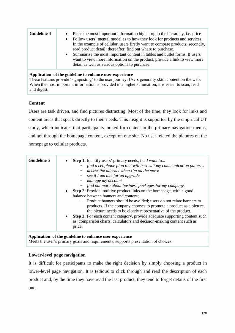
178
Guideline 4
Place the most important information higher up in the hierarchy, i.e. price
Follow users’ mental model as to how they look for products and services.
In the example of cellular, users firstly want to compare products; secondly,
read product detail; thereafter, find out where to purchase.
Summarise the most important content in tables and bullet forms. If users
want to view more information on the product, provide a link to view more
detail as well as various options to purchase.
Application of the guideline to enhance user experience
These features provide ‘signposting’ to the user journey. Users generally skim content on the web.
When the most important information is provided in a higher summation, it is easier to scan, read
and digest.
Content
Users are task driven, and find pictures distracting. Most of the time, they look for links and
content areas that speak directly to their needs. This insight is supported by the empirical UT
study, which indicates that participants looked for content in the primary navigation menus,
and not through the homepage content, except on one site. No user related the pictures on the
homepage to cellular products.
Guideline 5
Step 1: Identify users’ primary needs, i.e. I want to...
find a cellphone plan that will best suit my communication patterns
access the internet when I’m on the move
see if I am due for an upgrade
manage my account
find out more about business packages for my company.
Step 2: Provide intuitive product links on the homepage, with a good
balance between banners and content;
Product banners should be avoided; users do not relate banners to
products. If the company chooses to promote a product as a picture,
the picture needs to be clearly representative of the product.
Step 3: For each content category, provide adequate supporting content such
as: comparison charts, calculators and decision-making content such as
price.
Application of the guideline to enhance user experience
Meets the user’s primary goals and requirements; supports presentation of choices.
Lower-level page navigation
It is difficult for participants to make the right decision by simply choosing a product in
lower-level page navigation. It is tedious to click through and read the description of each
product and, by the time they have read the last product, they tend to forget details of the first
one.

179
Guideline 6
Placing long lists of product names in the left navigation should be
avoided. The proposed structure could provide an overview page that
summarises the most important information of each product, thus
eliminating click fatigue.
Include a home page link. Linking the logo of a website to the homepage
has become common practice and is now second nature for most, but not
novice, users. If the target market includes novice users, the company
needs to cater for them.
Give users a visual clue as to which links have already been clicked.
Application of the guideline to enhance user experience
Eliminates click fatigue; simplifies thinking and reasoning; speeds up interaction for decision making.
Innovations
Innovative technology available to the market in products such as I-phones, cellphones,
gadgets, and applications, have set high expectations in terms of the user experience that
users are anticipating. Users have also become less patient and forgiving when a website
downloads slowly and does not assist them in finding an appropriate product.
Guideline 7
Create innovative designs that will enhance the users’ moods, and entice them to
look further. Aspects that can add to the mood and experience include:
Designs that look different from other websites
Material that is engaging and interactive
Information personalized to users’ interest
Applications that users can download
Fast, simple and efficient websites/applications.
If the website meets the above, it will distinguish itself from others.
Application of the guideline to enhance user experience
Creates excitement, lifts the users’ moods, and entices them to look further and deeper.
Visual appeal
Overall, users appreciate simple and clean designs. Users avoid busy areas of a website and
look for content that speaks directly to their needs.
Guideline 8
Avoid white text on a black backgrounds, it is straining on the eyes and the
page becomes unreadable.
Limit long textual pages; break up the content with images, headings and
clear sections to make it easier to scan, read and digest.
Avoid different font sizes.
Application of the guideline to enhance user experience
Guides the eye to key areas, does not strain the eyes and creates a pleasant experience.
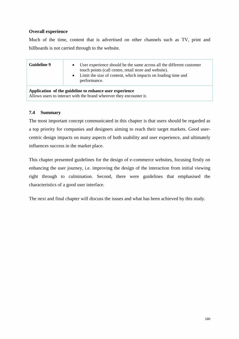
180
Overall experience
Much of the time, content that is advertised on other channels such as TV, print and
billboards is not carried through to the website.
Guideline 9
User experience should be the same across all the different customer
touch points (call centre, retail store and website).
Limit the size of content, which impacts on loading time and
performance.
Application of the guideline to enhance user experience
Allows users to interact with the brand wherever they encounter it.
7.4 Summary
The most important concept communicated in this chapter is that users should be regarded as
a top priority for companies and designers aiming to reach their target markets. Good user-
centric design impacts on many aspects of both usability and user experience, and ultimately
influences success in the market place.
This chapter presented guidelines for the design of e-commerce websites, focusing firstly on
enhancing the user journey, i.e. improving the design of the interaction from initial viewing
right through to culmination. Second, there were guidelines that emphasised the
characteristics of a good user interface.
The next and final chapter will discuss the issues and what has been achieved by this study.
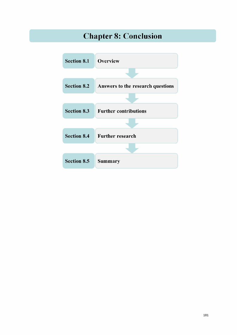
181
182
Chapter 8: Conclusion
8.1 Overview
This study describes a dual-method evaluation of e-commerce websites with a view to
determining how usability aspects can contribute to the user experience encountered on the
sites. In addition, two sets of guidelines were developed for the design and development of e-
commerce websites. Usability testing (UT) and heuristic evaluation (HE) methods provide
valuable insight into the usability and user experience of a website, including the
identification of problems. The study set out to determine the usability issues that cause
participants to have positive or poor user experience on e-commerce. The investigation was
conducted by designing and conducting both a UT with real users and HE by experts. UT is
used more to evaluate finished products than to investigate potential problematic issues (Tan,
Liu and Bishu 2009). HE is a usability inspection technique originated by Nielsen (1992;
1994b), which relies on expert evaluators to assess whether a website complies with standard
usability principles or heuristics. The results of the two evaluations were then integrated and
compared. Furthermore, the research aimed to identify relationships between aspects of
usability and user experience.
As a basis for this study, current literature was reviewed in the fields of e-commerce usability
and user experience, as well as literature on usability evaluation. Chapter 2 provides an
overview of e-commerce, such as the state of Internet retail in South Africa, its growth,
critical success factors, challenges and guidelines. The content of Chapter 2 builds up to
Chapter 3 where the importance of usability, e-commerce usability and user experience are
discussed. Usability evaluation methods are addressed in Chapter 4, where human-computer
interaction (HCI) models of interaction as well as usability principles and design, are
overviewed. The main focus of Chapter 4 is to identify, discuss and compare the main
usability evaluation methods (UEMs), particularly focusing on the two UEMs used in this
research.
A set of evaluation criteria suitable for evaluating e-commerce sites is generated in Chapter 5
(see Sections 5.4, 5.6, 5.7 & 5.8). Most of the criteria were derived from Chapters 2 and 3.
These synthesised criteria are used in the actual evaluation of e-commerce sites, described in
Chapter 6. Usability testing among real users and heuristic evaluation by experts were
183
performed, and the results compared. The results of the two evaluations and the analysis were
used towards answering the research questions.
In this chapter, the major issues of the study are summarised. Section 8.2 revisits the research
questions, together with summaries of how they were addressed and the main findings in
answer to each question. In Section 8.3, directions for further research are suggested.
8.2 Answers to the research questions
The primary research question for this study, posed in Section 1.3.1, is:
‘How can the findings of a dual-method usability evaluation of e-commerce websites
contribute to the attainment of better user experience?’
In order to answer this question, the first two subquestions were posed in Section 1.3.2:
Subquestion 1: ‘How can the usability of an e-commerce site be measured?’
Subquestion 2: ‘How can user experience of an e-commerce site be measured?’
The secondary data used to answer these, was obtained from literature studies in Chapters 2
and 3. Chapter 5 defined sets of criteria/heuristics that support e-commerce, usability and
user experience. The answers to research Subquestion 1 were consolidated in Table 5.4,
which sets out the criteria for UT and lays the ground work for the empirical UT study.
Similarly the answers to research Subquestion 2 were consolidated in Tables 5.6, 5.7 & 5.8,
which set out the criteria for HE and lay the foundation for the empirical HE study.
These criteria and their associated sub-criteria were used by both the user-participants and by
the expert evaluators to evaluate four e-commerce sites. The criteria identified can serve a
further valuable purpose, namely, in their application as design principles and guidelines in
the development and evaluation of new websites as given in Chapter 7.
Subquestion 3: ‘What do the findings of usability evaluation by a dual-method approach
indicate about the usability and user experience of four different websites?’
The usability evaluation methods, UT and HE, which were used in this study, are explained
in Chapter 4. Chapter 6 presents extensive findings of the evaluations of the four websites by
these two methods, i.e. the findings from a triangulated approach (Cohen, Manion and
Morrison 2005). As part of the answer to Subquestion 3, Table 6.31 provides a summary of
184
common and unique problems as well as positive aspects in each of the four websites, as
identified by UT alone, by both HE & UT, and by HE alone. Table 6.32 sets out the general
types of problems and the positive aspects with respect to each category of criteria that UT
identified on its own, that both HE & UT identified, and that HE identified on its own.
As a user-based approach, UT specifically provided insights into detailed user interface
aspects, as well as the type of content and user journey that participants prefer when making a
purchasing decision, such as:
Product-based navigation and minimal number of steps to access information;
Content description to speak directly to user-needs;
Terminology that is user-friendly; and
The issue that key content areas relevant to decision-making should be higher up in
hierarchy (e.g. price).
Problems identified specifically in the HE were mainly directed at overall user interface
aspects such as:
Principles of navigation and orientation (information architecture).
The type of key common findings identified by both UT & HE include:
Journeys that cease at plan detail;
Page loads that take too long, due to the large amounts of imagery;
Difficulties experienced by potential purchasers in finding cell phones on supplier
sites, which should be the key primary driver; and
Insufficient information to make a purchasing decision, e.g. information supporting
cell phone instruments, services, and clear calls to action is inadequate; and the
cellular terminology is difficult to understand.
Both UT and HE were found to be appropriate, effective and sufficient usability methods for
the evaluation of e-commerce sites. Both UEMs identified a high percentage of usability
problems (see Table 6.31 and Table 6.32), and they have different sets of strengths:
Requirements of participants in order to complete tasks (UT).
Best practice user interface guidelines (HE).
Therefore, the answer to Subquestion 3 indicates that UT and HE can reliably be used
together in identifying problems on e-commerce sites. This dual-method triangulated
185
approach proved to be effective in identifying different types of problems as well as affirming
the major issues. Both evaluation methods are valuable because both UT and HE played
confirming and complementary roles. They served a confirmatory role when similar findings
emerged, and a complementary role when the particular features of one method obtained data
not possible with the other method. Both UT and HE identified problems that were severe
enough to cause users either to fail in completing task or to commit errors in completing it.
Heuristic evaluation identified key usability problems as well as potential usability
problems, and whether the websites complied with standard usability principles.
Usability testing provided primary data for making design decisions on how users
want to look for products and services on the Web.
Subquestion 4: ‘What particular aspects of the usability of an e-commerce site support the
user experience offered by that site?’
This subquestion was answered in Table 6.33, which tabulates aspects of usability against
related aspects of user experience, along with motivations. The findings indicated that site
usability aspects do have a key impact on the user experience. Good site usability such as:
simple navigation, easily-understandable information architecture, logical structure and
layout, meaningful grouping of content, and aesthetic designs, etc. can help users to meet
their goals effectively, efficiently and with satisfaction. This should result in the website
meeting the criteria defined in Tables 5.4, 5.6, 5.7 and 5.8 and should, in turn, contribute to a
good experience for the user.
Subquestion 5: ’What design guidelines can facilitate the design, development and re-
engineering of e-commerce websites towards promoting user experience?’
This subquestion was answered in Chapter 7. Guidelines emerged from the findings of the
study and were synthesized by the researcher into two categories:
1. Guidelines that enhance the user journey towards finding an appropriate product, and
2. Guidelines that are specific to the user interface of an e-commerce website.
The category on navigating the journey in quest of a product incorporates three guidelines,
while the second category, with guidelines for e-commerce interfaces, includes nine
guidelines
Application of these focused guidelines will contribute to creating a good user experience.
186
To conclude, the main research question is: ‘How can the findings of a dual-method
usability evaluation of e-commerce websites contribute to the attainment of better user
experience?’
The answer to this composite question is the sum of the findings of the sub-questions.
8.3 Further contributions
Further contributions of this study are as follows:
The synthesis of e-commerce usability design heuristics (Table 5.7)
The synthesis of user experience design heuristics (Table 5.8).
8.4 Further research
Recommendations for further research include the following:
Use of the criteria applied in this study to evaluate other e-commerce websites.
Use of the guidelines identified in this study in the design and development of new
websites.
Investigation of how effectively developers apply the identified guidelines in the
development of new websites, by evaluating sites designed in accordance with the
guidelines.
Further studies of the interrelationships between usability and user experience.
Research on the roles of user demographics, Internet/technology experience, and context
of use, in the usage of e-commerce.
8.5 Summary
The quest of this study was to attain a better user experience on e-commerce websites. To this
end, research was undertaken to evaluate the usability and user experience of four websites in
the telecommunications sector, so as to determine how the usability of such sites can support
the user experience and to generate design guidelines that promote good user experience.
This dissertation explained the concepts of usability and user experience, and discussed the
usability evaluation methods (UEMs) that can be used to evaluate usability and user
experience of e-commerce websites. The study employed a dual-method research
methodology, involving usability testing and heuristic evaluation. Both were found to be
appropriate, effective and satisfactory usability methods for the evaluation of e-commerce
sites. They served in synergistic way, playing both complementary and confirming roles. It is
recommended that a dual-method approach of both UT & HE be used for evaluation of e-

187
commerce sites. The findings indicated that site usability aspects have a key influence on the
user experience.
The findings from the UT and HE contributed towards creating guidelines for good user
experience on e-commerce sites. The main findings indicate that designers and developers
should take a holistic approach, and have a clear understanding of user interface best
practices, e-commerce attributes, and most importantly, user needs. Once the user needs are
understood, website designers should apply the following design principles:
The user journey should be mapped, based on the user’s intended purchasing process;
Content should be written and structured around user needs, with careful attention
paid to the presentation, i.e. decision-making information should be prominent within
the architecture; and
The design should be innovative and engaging, so as to entice users to return.
Finally, it is concluded that users’ needs should be the driving force behind design and
development of e-commerce sites.
188
References
Abbattista, F., Degemmis, M., Licchelli, O., Lops, P., Semeraro, G. & Zambetta, F. 2002.
‘Improving the Usability of an E-commerce Website Through Personalisation’. In: Ricci, F.
& Smyth, B. (eds). Proceedings of the Workshop on Recommendation and Personalization in
Electronic Commerce, International Conference on Adaptive Hypermedia and Adaptive Web
Based Systems. Malaga, Spain, May 29–31, pp. 20–29.
Adebesin, F., Kotzé, P. & Gelderblom, H. 2010. ‘The Complementary Role of Two
Evaluation Methods in the Usability and Accessibility Evaluation of a Non-Standard
System’. Fountain of Computing Research, Proceedings of SAICSIT 2010, Annual Research
Conference of the South African Institute of Computer Scientists and Information
Technologists. Bela Bela, South Africa, October 11–13.
Abels, E., White, M.D. & Hahn, K. 1999. ‘A User-Based Design Process for Websites’.
Online Computer Library Catalogue (OCLC) Systems and Services, 15(1), pp. 35–44.
Albion, P.R. 1999. ‘Heuristic Evaluation of Multimedia: From Theory to Practice’. Available
at: http://www.usq.edu.au/users/albion/papers/ascilite99.html. [Accessed August 2011].
Atchariyachanvanich, K. & Okada, H. 2001. ‘Critical Success Factors of E-commerce:
External Factors Beyond the Context of Corporate’. National Institute of Informatics 2–1–2.
Tokyo, Japan, pp.1–2.
Aula, A., Majaranta, P. & Raiha, K. J. 2005. ‘Eye-Tracking Reveals the Personal Styles for
Search Result Evaluation’. Human-Computer Interaction - INTERACT 2005, pp. 1058–1061.
Barnard, L. & Wesson, J. 2003. ‘Usability Issues for E-commerce in South Africa: An
empirical Investigation’. Proceedings of SAICSIT 2003, Annual Research Conference of the
South African Institute of Computer Scientists and Information Technologists (Enablement
Through Technology). Stellenbosch, Western Cape, South Africa, September 17–19, vol. 47,
pp. 258–267.
189
Barnard, L. & Wesson, J. 2004. ‘A Trust Model for E-commerce in South Africa’.
Proceedings of SAICSIT 2004, Annual Research Conference of the South African Institute of
Computer Scientists and Information Technologists (IT Research in Developing Countries).
Stellenbosch, Western Cape, South Africa, October 4–6, vol.75, pp. 23–32.
Barrington, S. 2007. ‘Usability in the Lab: Techniques for Creating Usable Products’.
Journal of the Association for Laboratory Automation, 12(1), pp. 6–11.
Bastien, J.M.C. 2010. ‘Usability Testing: A Review of Some Methodological and Technical
Aspects of the Method’. International Journal of Medical Informatics, 79(4), pp. 18–23.
Becker, A. 2008. ‘Electronic Commerce: Concepts, Methodologies, Tools and Applications’.
Information Science Reference. United States; IGI Publishing, 1, pp. 221–231.
Bednarik, R. & Tukiainen, M. 2006. ‘An Eye-Tracking Methodology for Characterizing
Program Comprehension Processes’. Proceeding of ETRA 2006, Symposium of Eye Tracking
Research & Application. San Diego, California, USA, pp. 125–132.
Bélanger, F., Hiller, J.S. & Smith, W.J. 2002. ‘Trustworthiness in Electronic Commerce: The
Role of Privacy, Security, and Site Attributes’. Journal of Strategic Information Systems,
11(3–4), pp. 245–270.
Benford, S., Giannachi, G., Koleva, B. & Rodden, T. 2009. ‘From Interaction to Trajectories:
Designing Coherent Journeys Through User Experiences’. Proceedings of CHI 2009, The
27th
International Conference on Human Factors in Computing Systems. Boston, MA, USA,
April 4–9, pp. 709–718.
Bernard, M. 2002. ‘Examining User Expectations for the Location of Common E-commerce
Web Objects’. The Software Usability Research Laboratory (SURL), 4(1). Available at:
http://www.surl.org/usabilitynews/41/web_object-ecom.asp [Accessed August 2011].
Bernhaupt, R., Boldt, A., Mirlacher, T., Wilfinger, D. & Tscheligi, M. 2007. ‘Using Emotion
in Games, Emotional Flowers’. Proceedings of ACE 2007, The International Conference on
Advances in Computer Entertainment Technology. Salzburg, Austria, June 13–15, vol. 203,
pp. 41–48.
190
Bevan, N. 2008a. ‘Classifying and Selecting UX and Usability Measures’. In: Law, E. L.C.,
Bevan, N., Christou, G., Springett, M. & Lárusdóttir, M. (eds). Proceedings of the
International Workshop on Meaningful Measures: Valid Useful User Experience
Measurement (VUUM2008). Reykjavik, Iceland.
Bevan, N. 2008b. ‘UX, Usability and ISO Standards’. The 26th Annual CHI Conference on
Human Factors in Computing Systems. Florence, Italy, April 5–10. ACM, pp. 1-5.
Bevan, N. 2009. ‘What is the Difference Between the Purpose of Usability and User
Experience Evaluation Methods?’ Proceedings of the Workshop UXEM 2009 - INTERACT
2009, ACM Press, Uppsala.
Blythe, M. & Wright, P. 2006. ‘Pastiche Scenarios: Fiction as a Resource for User-Centred
Design’. Interacting with Computers, 18(5), pp. 1139–1164.
Bojko, A. & Stephenson, A. 2005. ‘It's All in the Eye of the User: How Eye Tracking Can
Help Answer Usability Questions’. Proceedings of HCII 2005, 11th
International Conference
in Human- Computer Interaction. Las Vegas, Nevada, USA, July 22–27, vol. 4, no. 1.
Bolger, N., Davis, A., & Rafaeli, E. 2003. ‘Diary Methods: Capturing Life as it is Lived.
Annual Review of Psychology, vol. 54, p. 579.
Camus, L. & Evans, P.F. 2009. ‘Depicting European Shoppers' Complex Purchasing
Decision Path’. The European Technographics Benchmark Survey, Q2 2009. Forrester
Research.
Chang, H.H. & Chen, S.W. 2008. ‘The Impact of Customer Interface Quality, Satisfaction
and Switching Costs on E-loyalty: Internet Experience as a Moderator’. Computers in Human
Behaviour, 24(6), pp. 2927–2944.
Chang, H.H. & Chen, S.W. 2009. ‘Consumer Perception of Interface Quality, Security, and
Loyalty in Electronic Commerce’. Information and Management, 46(7), pp. 411–417.
Chang, T.Y. 2006. ‘Emotional Probes as a User-Centred Methodology for Designing
Emotionally-Engaged Web Interactions’. Doctoral dissertation, Department of creative
design, National Yunlin. University of Science & Technology, Taiwan, pp. 1–30.
191
Chen, L., Gillenson, M.L. & Sherrell, D.L. 2004. ‘Consumer Acceptance of Virtual Stores: A
Theoretical Model and Critical Success Factors for Virtual Stores’. ACM SIGMIS Database,
35(2), pp. 8–31.
Cheskin Research, 1999. ‘E-commerce Trust Study’. Available at:
http://www.cheskin.com/cms/files/i/articles//17__report-eComm%20Trust1999.pdf
[Accessed August 2011].
Christensen, L. & Frokaer, E. 2010. ‘Distributed Usability Evaluation: Enabling Large-Scale
Usability Evaluation with User-Controlled Instrumentation’. Proceedings of NordiCHI 2010,
6th
Nordic Conference on Human-Computer Interaction: Extending Boundaries. Reykjavik,
Iceland, October 16–20, pp. 118–127.
Clemmensen, T., Hertzum, M., Hornbaek, K., Shi, Q. & Yammiyavar, P. 2009. ‘Cultural
Cognition in Usability Evaluation’. Interacting with Computers, 21(3), pp. 212–220.
Cockton, G., Lavery, D. & Woolrych, A. 2002. Inspection-Based Evaluation: The Human-
Computer Interaction Handbook. New Jersey, USA; Lawrence Erlbaum Associates.
Cohen, L., Manion, L. & Morrison, K. 2005. Research Methods in Education (5th
ed.).
London: Routledge Falmer.
de Kock, E., van Biljon, J. & Pretorius, M. 2009. ‘Usability Evaluation Methods: Mind the
Gaps’. Proceedings of SAICSIT 2009, Annual Research Conference of the South African
Institute of Computer Scientists and Information Technologists. Vaal River, Gauteng, South
Africa, October, pp. 122–131.
Delice, E.K. & Gungor, Z. 2009. ‘The Usability Analysis with Heuristic Evaluation and
Analytic Hierarchy Process’. International Journal of Industrial Ergonomics, 39(6), pp. 934–
939.
Desmet, P. 2005. ‘Measuring Emotion, Development and Application of an Instrument to
Measure Emotional Responses to Products’. Human-Computer Interaction, vol. 3, pp.111–
123.
Desmet, P. & Hekkert, P. 2007. ‘Framework of Product Experience’. International Journal
of Design, 1(1), pp. 57–66.
192
Desmet, P., Overbeeke, C.J. & Tax, S. J. E. T. 2001. ‘Designing Products with Added
Emotional Value; Development and Application of an Approach for Research through
Design. The Design Journal, 4(1), pp. 32-47.
Desurvire, H.W., Kondziela, J.M. & Atwood, M.E. 1992. ‘What is Gained and Lost When
Using Evaluation Methods Other Than Empirical Testing’. Posters and Short Talks of
SIGCHI 1992, Conference on Human Factors in Computing Systems. Monterey, CA, May 7,
pp. 125–126.
Diem-Wille, G. 2001. ‘A Therapeutic Perspective: The Use of Drawings in Child
Psychoanalysis and Social Science’. In: Leeuwen, T.V. & Jewitt, C. (eds), Handbook of
Visual Analysis. London; Sage, pp. 119–133.
Dietel, H. M., Dietel, P.J. & Nieto, T.R. 2001. E-Business and E-commerce: How to
Programme (2nd
ed.). New Jersey, USA; Prentice Hall.
Dix, A., Finlay, J., Gregory, D., Abowd. & Beale, R. 2004. Human-Computer Interaction (3rd
ed.). New Jersey, USA; Prentice Hall.
Dubelaar, C., Sohal, A. & Savic, V. 2005. ‘Benefits, Impediments and Critical Success
Factors in B2C E-business Adoption’. Technovation, 25(11), pp. 1251–1262.
Dumas, J.S. 2003.‘User-Based Evaluations’. In: Jacko, J.A & Sears, A. (eds). The Human-
Computer Interaction Handbook. New Jersey, USA; Lawrence Erlbaum Associates.
Dumas, J.S. & Redish, J.C. 1999. A Practical Guide to Usability Testing (1st ed.). Westport,
CT, USA; Greenwood Publishing Group Inc.
Du Toit, M. & Bothma, C. 2009. ‘Evaluating the Usability of an Academic Marketing
Department's Website from a Marketing Student's Perspective’. International Retail and
Marketing Review, 5(1), pp. 25–37.
Egger, F.N. 2001. ‘Affective Design of E-commerce User Interfaces: How to Maximise
Perceived Trustworthiness’. In: Helander, M., Khalid, H.M. & Tham (eds.). Proceedings of
CAHD2001, International Conference on Affective Human Factors Design. Singapore, pp.
317–324.
193
Egger, F.N. & Abrazhevich, D. 2001. ‘Security & Trust: Taking Care of the Human Factor’.
Electronic Payment Systems Observatory Newsletter, Joint Research Centre of the European
Commission. Seville, Spain. Available at: http://www.telono.com/articles/epso.htm [Accessed
August 2011].
Eid, R., Trueman, M. & Ahmed, A.M. 2002. ‘A Cross-Industry Review of B2B Critical
Success Factors’. Internet Research: Electronic Networking Applications and Policy, 12(2),
pp. 110–123.
Epnet, 2009. ‘Internet Usage and Population Statistics South Africa’. Available at:
http://www.epnetwork.co.za/za-internet-usage-africa.asp [Accessed August 2011].
Fang, L. 2008. ‘Usability Evaluation on Websites’. Master’s thesis, School of Art & Design.
Wuhan University of Technology, Wuhan, China.
Fernandez, A., Abrahão, S. & Insfran, E. 2010. ‘Towards to the Validation of a Usability
Evaluation Method for Model-Driven Web Development’. Proceedings of ESEM 2010,
International Symposium on Empirical Software Engineering and Measurement. Bolzano,
Italy, September 16–17.
Finstad, K. 2010. ‘The Usability Metric for User Experience’. Interacting with Computers,
22(5), pp. 323–327.
Fontana, A. & Frey, J.H. 1994. ‘Interviewing: The Art of Science’. In: Denzin, N.K; Lincoln,
Y.S. (eds). Handbook of qualitative research. California, US; Sage Publications, pp. 361–
376.
Ford, W. & Baum, M. 1997. Secure Electronic Commerce: Building the Infrastructure for
Digital Signatures and Encryption (2nd
ed.). New Jersey, USA; Prentice Hall.
Furnell, S. & Karweni, T. 1999. ‘Security Implications of Electronic Commerce: A Survey of
Consumers and Businesses’. Internet Research: Electronic Networking Applications and
Policy, 9(5), pp. 372–382.
Fu, L., Salvendy, G. & Turley, L. 2002. ‘Effectiveness of User Testing and Heuristic
Evaluation as a Function of Performance Classifications’. Behaviour and Information
Technology, 2(21), pp. 137–143.
194
Gabbott, M. & Hogg, G. 1998. Users and Services. Chichester, UK; John Wiley & Sons.
Gabriel, L. 2007. ‘Usability Metrics for Measuring Usability of Business-to-Consumer (B2C)
E-commerce Sites’. Proceedings ISONE 2007, 6th
Annual World Conference. Las Vegas,
NV, April 11–13.
Gardner, J. 2007. ‘Remote Website Usability Testing - Benefits Over Traditional Methods’.
International Journal of Public Information Systems, 2, pp. 63–72.
Genise, P. 2002. ‘Usability Evaluation: Methods and Techniques’. Version 2. Technical
Paper. University of Texas.
Goldstuck, A. & Laschinger, K. 2009. ‘SA Web Participants to Double by 2014’. Available
at:http://www.mediaclubsouthafrica.co.za/index.php?option=com_content&view=article&id
=1048:web-participants-to-double-270309&catid=49:medianews&Itemid=113 [ Accessed
August 2011].
Gramopadhye, A.K. & Drury, C.G. 2000. ‘Human Factors in Aviation Maintenance: How
We Got to Where We Are’. International Journal of Industrial Ergonomics, 26(2), pp.
125–131.
Gray, A. 2009. ‘User Experience Over Usability’. Available at:
http://www.webcredible.co.uk/user-friendly-resources/web-usability/usability-ux.shtml
[Accessed August 2011].
Greenstein, M. & Feinman, T.M. 1999. Electronic Commerce: Security, Risk Management
and Control. New York, USA; Mcgraw-Hill College.
Hasan, L., Morris, A. & Probets, S. 2009. ‘Using Google Analytics to Evaluate the Usability
of E-commerce Sites’. Human Centred Design, 5619(2009), pp. 697–706.
Hassenzahl, M. 2004. ‘The Interplay of Beauty, Goodness, and Usability in Interactive
Products’. Human-Computer Interaction, 19(4), pp. 319–349.
Hassenzahl, M. 2005. ‘The Thing and I: Understanding the Relationship Between Users and
Product’. Human Computer Interaction, 3, pp. 31–42.
195
Hassenzahl, M. 2008. ‘User Experience (UX): Towards an Experiential Perspective on
Product Quality’. Proceedings of IHM 2008, 20th
International Conference of the Association
Francophone d'Interaction Homme-Machine Metz. France, September 2–5, vol. 339, pp. 11–
15.
Hassenzahl, M., Diefenbach, S. & Göritz, A. 2010. ‘Needs, Affect, and Interactive Products:
Facets of User Experience’. Interacting with Computers, 22(5), pp. 353–362.
Hassenzahl, M. & Monk, A. 2010. ‘The Inference of Perceived Usability from Beauty’.
Human Computer Interaction, 25(3), pp. 235–260.
Hassenzahl, M. & Tractinsky, N. 2006. ‘User Experience - A Research Agenda’. Behaviour
and Information Technology, 25(2), pp. 91–97.
Head, A. J. 1999. Design Wise: A Guide for Evaluating the Interface Design of Information
Resources. New York, USA; Cyberage books.
Hernández, B., Jiménez, J. & Martín, M.J. 2009. ‘Customer Behaviour in Electronic
Commerce: The Moderating Effect of E-purchasing Experience’. Journal of Business
Research, 63(9-10), pp. 964–971.
Hertzum, M. & Jacobsen, N.E. 2003. ‘The Evaluator Effect: A Chilling Fact About Usability
Evaluation Methods’. International Journal of Human-Computer Interaction, 15(1), pp. 183–
204.
Hess, W. 2009. ‘10 Most Common Misconceptions About User Experience Design’.
Available at: http://mashable.com/2009/01/09/user-experience-design/ [Accessed August
2011].
Hoffman, D.L., Novak, T.P. & Peralta, M. 1999. ‘Building Consumer Trust Online’.
Communications of the ACM, 42(4), pp. 80–85.
Hoffman, R. & Krauss, K. 2004. ‘A Critical Evaluation of Literature on Visual Aesthetics for
the Web’. Proceedings of SAICSIT 2004, Annual Research Conference of the South African
Institute of Computer Scientists and Information Technologies (IT research in developing
countries). Stellenbosch, Western Cape, South Africa, October 4–6, pp. 205-209.
196
Holzinger, A. 2005. ‘Usability Engineering Methods for Software Developers’.
Communications of the ACM, Interaction Design and Children, 48(1), pp. 71–74.
Hui-Jiun, H., Jen, Y. & Shing-Sheng, G. 2008. ‘A Study on the Interface Usability of B2C
Hypermarket E-commerce Websites’. Proceedings of APSCC 2008, The IEEE Asia-Pacific
Services Computing Conference. Yilan, Taiwan, December 9–12, pp. 1202–1207.
Hvannberg, E.T., Law, E.L.C. & Larusdottir, M.K. 2007. ‘Heuristic Evaluation: Comparing
Ways of Finding and Reporting Usability Problems’. Interacting with Computers, 19, pp.
225–240.
Hwang, W. & Salvendy, G. 2010. ‘Number of People Required for Usability Evaluation: The
10±2 Rule’. Communications of the ACM, 53(5), pp. 130–133.
International Organisation for Standardization, ISO 9241-11. 1998. Ergonomic Requirements
for Office Work with Visual Display Terminals (VDTs) - Part 11: Guidance on Usability.
Geneva, Switzerland.
International Organisation for Standardisation, ISO 13407. 1999. Human-Centred Design
Processes for Interactive Systems. Geneva, Switzerland.
International Organisation for Standardisation, ISO DIS 9241-210. 2008. Ergonomics of
Human System Interaction - Part 210: Human-Centred Design for Interactive Systems
(Formerly known as 13407). Geneva, Switzerland.
Internet World Stats, 2008. ‘South Africa Internet Usage and Marketing Report’. Available
at: http://www.Internetworldstats.com/af/za.htm [Accessed August 2011].
Intille, S.S., Rondoni, J., Kukla, C., Anacona, I. & Bao, I. 2003. ‘A Context-Aware
Experience Sampling Tool’. Proceedings of CHI EA 2003, International Conference on
Extended Abstract on Human Factors in Computing Systems. Fort Lauderdale, Florida, USA,
April 5–10, pp. 972–973.
Isbister, K., Hook, K., Sharp, M. & Laaksolahti, J. 2006. ‘The Sensual Evaluation Instrument:
Developing an Affective Evaluation Tool’. Proceedings of SIGCHI 2006, Conference on
Human Computer Systems. Montréal, Canada, April 22–27, pp. 1163–1172.
197
Jacob, R. J. K. & Karn, K. S. 2003. ‘Eye Tracking in Human-Computer Interaction and
Usability Research: Ready to Deliver the Promises’. In: Hyönä, Radach & Deubel (eds). The
Mind’s Eye: Cognitive and Applied Aspects of Eye Movement Research. Oxford, England;
Elsevier Science BV.
Jeffries, R.J., Miller, J.R., Wharton, C. & Uyeda, K.M. 1991. ‘User Interface Evaluation in
the Real World: A Comparison of Four Techniques’. Proceedings of SIGCHI 1991,
Conference on Human Factors in Computing Systems (Reaching Though Technology). New
Orleans, LA, April, pp. 119–124.
Jeffries, R.J. & Desurvire, H.W. 1992. ‘Usability Testing vs. Heuristic Evaluation: Was
There a Contest?’ SIGCHI Bulletin, 24(4), pp. 39–41.
Jennex, M.E., Amoroso, D. & Adelakun, O. 2004. ‘E-commerce Infrastructure Success
Factors for Small Companies in Developing Economics’. Electronic Commerce Research,
4(3), pp. 263–286.
Jensen, J.R. 2006. ‘Definition of User Experience Revisited’. Available at:
http://justaddwater.dk/2006/06/21/user-experience-revisited/ [Accessed August 2011].
Jing, R., Yu, J. & Jiang, Z. 2008. ‘Exploring Influencing Factors in E-commerce Transaction
Behaviours’. International Symposium on Electronic Commerce and Security, pp. 603–607.
Jinling, C. & Huan, G. 2007. ‘Measuring Website Usability of Chinese Enterprise with
Heuristic Procedure’. Paper Presented at the IEEE International Conference on E-business
Engineering, pp. 396–399.
Jordan, P. 2002. Designing Pleasurable Products: An Introduction to the New Human
Factors (1st ed.). CRC Press.
Joubert, J. & van Belle, J.P. 2009. ‘The Importance of Trust and Risk in m-commerce: A
South African Perspective’. Proceedings of PACIS 2009, Pacific Asia Conference on
Information Systems, India. July 10–12, p. 96.
Jupiter Research 2003. ‘Managing Website Quality: Stanching Customer Defection’.
Available at: http://www.webmediabrands.com/corporate/releases/03.12.17-
newjupresearch.html [Accessed August 2011].
198
Just, M. A. & Carpenter, P. A. 1976. ‘Eye Fixations and Cognitive Processes’. Cognitive
Psychology, 8(4), pp. 441–480.
Kahneman, D., Krueger, A.B., Schkade, D.A., Schwarz, N. & Stone, A.A. 2004. ‘A Survey
Method for Characterising Daily Life Experience: The Day Reconstruction Method’. Science
Magazine, 306(5702), pp. 1776–1780.
Kantner, L. & Rosenbaum, S. 1997. ‘Usability Studies of WWW Sites: Heuristic Evaluation
vs. Laboratory Testing’. Proceedings of SIGDOC 1997, 15th
Annual International
Conference on Computer Documentation. Salt Lake City, UT, October 19–22.
Karapanos, E., Martens, J.B, & Hassenzahl, M. 2009. ‘Reconstructing Experience Through
Sketching’. Human Computer Interaction, vol. 1.
Karapanos, E., Martens, J.B. & Hassenzahl, M, 2010. ‘On the Retrospective Assessment of
Users’ Experiences Over Time: Memory or Actuality?’ Proceedings of CHI EA 2010, 28th
International Conference on Extended Abstracts on Human Factors in Computing Systems.
Atlanta, Georgia, USA, April 10–15, pp. 4075–4080.
Karapanos, E., Zimmerman, J., Forlizzi, J. & Martens, J. 2009. ‘User Experience Over Time:
An Initial Framework’. Proceedings of CHI 2009, 27th
International Conference on Human
Factors in Computing Systems. Boston, MA, USA, April 7, pp. 729–738.
Kasarskis, P., Stehwien, J., Hickox, J. & Aretz, A. 2001. ‘Comparison of Expert and Novice
Scan Behaviours During VFR Flight’. 11th International Symposium on Aviation Psychology.
Columbus OH; The Ohio State University.
Keinonen, T. 1997. ‘Expected Usability and Product Preference’. Proceedings of DIS 1997,
2nd
Conference on Designing Interactive Systems (Processes, Practices, Methods, and
Techniques). Amsterdam, The Netherlands, August 18–20, pp. 197–204.
Kort, J., Vermeeren, A. & Fokker, J.E. 2007. ‘Conceptualizing and Measuring User
Experience’. In: Law, E., Vermeeren, A., Hassenzahl, M., Blythe M. (eds.). Towards a UX
Manifesto, COST294-MAUSE Affiliated Workshop, pp. 57–64.
Kuniavsky, M. 2007. ‘User Experience and HCI’. Available at:
http://www.orangecone.com/hci_UX_chapter_0.7a.pdf [Accessed August 2011].
199
Latorella, K.A. & Prabhu, P.V. 2000. ‘A Review of Human Error in Aviation Maintenance
and Inspection’. International Journal of Industrial Ergonomics, 26(2), pp. 133–161.
Laudon, K. & Traver, C. 2007. E-commerce: Business, Technology, Society (3rd
ed.). New
Jersey, USA; Prentice Hall.
Lauralee, A. 1996. ‘Quality of Experience: Defining the Criteria for Effective Interaction
Design’. The 1st Annual ACM Interactions Design Awards Criteria, 3(3), pp. 11–15.
Law, E. & Hvannberg, E.T. 2004. ‘Analysis of Strategies for Improving and Estimating the
Effectiveness of Heuristic Evaluation’. Proceedings of Nordi CHI 2004, 3rd
Nordic
Conference on Human Computer Interaction. Tampere, Finland, October 23–27, pp. 241–
250.
Law, E., Roto, V., Hassenzahl, M., Vermeeren, A. & Kort, J. 2008. ‘Towards a Shared
Definition of User Experience’. Proceedings of CHI EA 2008, International Conference on
Extended Abstracts on Human Factors in Computing Systems. Florence, Italy, October 25–
29, pp. 2395–2398.
Law, E., Roto, V., Hassenzahl, M., Vermeeren, A. & Kort, J. 2009. ‘Understanding, Scoping
and Defining User Experience: A Survey Approach’. Proceedings of CHI 2009, 27th
International Conference on Human Factors in Computing Systems. Boston, MA, USA,
April 4–9, pp. 719–728.
Lee, S. & Koubek, R.J. 2010. ‘The Effects of Usability and Web Design Attributes on User
Preference for E-commerce Websites’. Computers in Industry, 61(4), pp. 329–341.
Levy, M. & Weitz, B.A. 2001. Retailing Management (4th
ed.). New York; USA; McGraw-
Hill.
Lewis, J.R. 2006. ‘Sample Sizes for Usability Tests: Mostly Math, Not Magic’. Interactions,
Waits & Measures, 13(13), pp. 29–33.
Liljegren, E. 2006. ‘Usability in a Medical Technology Context Assessment of Methods for
Usability Evaluation of Medical Equipment’. International Journal of Industrial Ergonomics,
36(4), pp. 345–352.
200
Liu, C. & Arnett, K.P. 2000. ‘Exploring the Factors Associated with Website Success in the
Context of Electronic Commerce’. Information and Management, 38(1), pp. 23–33.
Lowry, P. B., Spaulding, T., Wells, T. M., Moody, G., Moffitt, K. & Madariaga, S. 2006. ‘A
Theoretical Model and Empirical Results Linking Website Interactivity and Usability
Satisfaction’. Proceedings of HICSS 2006, 39th
Annual Hawaii International Conference on
System Sciences (Internet and Digital Economy Track). Kauai:Hawaii, January 4–7, p.123.
Lubbe, S. &van Heerden, J.M. 2003. The Economic and Social Impacts of E-commerce.
Hershey, Pennsylvania, USA; Idea Group Publishing.
Macagnano, E. V. & Greeff, M. 2007. ‘Universal Design for HCI in a Developmental
Context: Myth or reality? The South African Example’. HCI International 2007, 12th
International Conference on Human-Computer Interaction. Beijing, China, July 22–27, p. 6.
Madeja, N. & Schoder, D. 2003. ‘Designed for Success - Empirical Evidence on Features of
Corporate Web Pages’. Proceeding of HICSS 2003, 36th
Annual Hawaii International
Conference on System Sciences. Big Island, Hawaii, USA, January 6–9, vol. 7, p. 188.
Mahlke, S. & Thüring, M. 2007. ‘Studying Antecedents of Emotional Experiences in
Interactive Contexts’. Proceedings of CHI 2007, Conference on Human Factors in
Computing Systems. San Jose, California, USA, April 28-May 3, vol. 1, pp. 915–918.
Mäkelä, A. & Fulton, S.J. 2001. ‘Supporting Users’ Creativity: Design to Induce Pleasurable
Experiences’. In: Helander, Khalid & Tham (eds). Proceedings of the International
Conference on Affective Human Factors Design. London, Asean Academic Press. Singapore,
pp. 387–394.
Malacinski, A., Dominick, S. & Hartrick, T. 2001. ‘Measuring Web Traffic, Part 1’.
Available at: http://www.ibm.com/developerworks/web/library/wa-mwt1/ [Accessed August
2011].
Mandryk, R.L., Inkpen, K. & Calvert, T.W. 2006. ‘Using Psycho-Physiological Techniques
to Measure User Experience with Entertainment Technologies’. Behavioural and Information
Technology, 25(2), pp. 141–158.
201
Martim, E.C., Dlamini, M., van Greunen, D., Eloff, J. & Herselman, M. 2009. ‘Is Buying and
Transacting Online Easier and Safer than Down Town? An Emerging Economy Perspective’.
4th
International Conference on Information Warfare and Security. Cape Town, South Africa,
March 26–27, pp. 1–9.
Martim, E.C., Herselman, M. & van Greunen, D. 2009. ‘E-commerce: The Challenge of
Succeeding in the Emerging Economies’. Proceedings of the 11th Annual Conference on
World Wide Web Applications. Port Elizabeth, South Africa, September 2–4.
Massironi, M. 2002. ‘The Psychology of Graphic Images: Seeing, Drawing,
Communicating’, (Translated by Bruno, N). New Jersey, USA; Lawrence Erlbaum
Associates, pp. 2757–2766.
Mattelmäki, T. & Battarbee, K. 2002. ‘Empathy Probes’. Paper Presented at the
Participatory Design Conference (PDC). Malmo, Sweden, June 23–25, pp. 3–4.
McCall, J. 2009. ‘Online Moves to the Centre’, Available at:
http://www.gsicommerce.com/core/perspectives/online_moves_to_the_center/ [Accessed
August 2011].
McCarthy, J. & Wright, P. 2004. Technology as Experience. Cambridge, Massachusetts,
USA; MIT Press, vol. 11(5).
McLaren, C. H. & McLaren, B. J. 2000. E-commerce, Business on the Internet (1st ed.).
Cincinnati Ohio, USA; South-Western Educational Publishing.
Mello-Thoms, C., Nodine, C. F. & Kundel, H. L. 2002. ‘What Attracts the Eye to the
Location of Missed and Reported Breast Cancers?’ Proceedings of ETRA 2002, Symposium
on Eye Tracking Research and Applications. New Orleans, Louisiana, March 25–27, pp.
111–117.
Morville, P. 2004. ‘Facets of the User Experience’. Available at:
http://semanticstudios.com/publications/semantics/000029.php [Accessed August 2011].
Nante, J. & Glaser, E. 2008. ‘The Impact of Language and Culture on Perceived Website
Usability’. Journal of Engineering and Technology Management, 25(1–2), pp. 112–122.
202
Nielsen, J. 1992. ‘Finding Usability Problems through Heuristic Evaluation’. Proceedings of
SIGCHI 1992, Conference on Human Factors in Computing Systems. Monterey, CA, USA,
May 3–7, pp. 373–380.
Nielsen, J. 1994a. Usability Engineering. San Francisco, USA; Morgan Kaufmann.
Nielsen, J. 1994b. ‘Heuristic Evaluations’. In: Nielsen, J. & Mack, R.L.. (eds). Usability
Inspection Methods. New York, USA; John Wiley & Sons.
Nielsen, J. 1999. Designing Web Usability: The Practice of Simplicity. Indianapolis, Indiana,
USA; New Riders Publishing.
Nielsen, J. & Landauer, T.K. 1993.‘A Mathematical Model of the Finding of Usability
Problems’.Proceedings of INTERACT and CHI 1993, Conference on Human Factors in
Computing Systems.Amsterdam, The Netherlands, April 24–29, pp. 206–213.
Nielsen, J. & Mack, R.L. 1994. Usability Inspection Methods. New York, USA; John Wiley
& Sons.
Nielsen, J. & Molich, R. 1990. ‘Heuristic Evaluation of User Interfaces’. Proceedings of
ACM CHI 1990, Conference on Human Factors in Computing Systems. Seattle, Washington,
USA, April1-5, pp. 249-256.
Nielsen Norman Group, 2008. ‘User Experience - Our Definition’. Available at:
http://www.nngroup.com/about/userexperience.html [Accessed August 2011].
Obrist, M., Roto, V. & Väänänen-Vainio-Mattila, K. 2009. ‘User Experience Evaluation - Do
You Know Which Method To Use?’ Proceedings of CHI EA 2009, 27th
International
Conference on Extended Abstracts on Human Factors in Computing Systems. Boston, MA,
USA, April 4–9, pp. 2763–2766.
Obrist, M., Ruyter, B., Tscheligi, M. & Schmidt, A. 2010. ‘Contextual User Experience: How
to Reflect it in Interaction Designs?’ Proceedings of CHI EA 2010, 28th
International
Conference on Extended Abstracts on Human Factors in Computing Systems. Atlanta,
Georgia, USA, April 10–15, pp. 3197–3200.
Ott, R. 2000. ‘Building Trust Online’. Computer Fraud & Security, no. 2, pp. 10–12.
203
Pantic, M., Pentland, A., Nijholt, A. & Huang, T.S. 2007. ‘Human Computing and Machine
Understanding of Human Behaviour: A Survey’. Proceedings of ICMI 2006 and IJCAI 2007,
International Conference on Artificial Intelligence for Human Computing. Hyderabad, India,
January 6–12, vol. 4451, pp. 47–71.
Parlangeli, O., Marchingiani, E. & Bagnara, S. 1999. ‘Multimedia in Distance Education:
Effects of Usability on Learning’. Interacting with Computers, 12(1), pp. 37–49.
Peng, L.K., Ramaiach, C.K. & Foo, S. 2004. ‘Heuristic-Based User Interface Evaluation at
Nanyang Technological University in Singapore’. Electronic Library and Information
Systems, 38(1), pp. 42–59.
Petre, M., Minocha, S. & Roberts, D. 2006. ‘Usability Beyond the Website: An Empirically-
Grounded E-commerce Evaluation Instrument for the Total Customer Experience’.
Behaviour and Information Technology, 25(2), pp. 189–203.
Pool, A. & Ball, L.J. 2006, ‘Eye Tracking in Human-Computer Interaction and Usability
Research: Current Status and Future Prospects’. In: Ghaoui, C. (ed). Encyclopaedia of
Human-Computer Interaction. Idea Group, Inc. Pennsylvania, pp. 211–219.
Poppe, R., Rienks, R. & van Dijk, B. 2007. ‘Evaluating the Future of HCI: Challenges for
the Evaluation of Emerging Applications’. Artificial Intelligence for Human Computing, vol.
4451, pp. 234–250.
Porter, J. & Bewer, J. 2010. ‘52 Weeks of UX’. Available at: http://52weeksofux.com/
[Accessed August 2011].
Powals, J.G. 1996. ‘Cognitive Engineering Principles for Enhancing Human-Computer
Performance’. International Journal of Human-Computer Interaction, 8(2), pp. 189–211.
Preece, J. 1993. A Guide to Usability: Human Factors in Computing. Essex, England;
Addison-Wesley Longman Limited.
Preece, J., Rogers, Y., Sharp, H., Benyon, D., Holland, T.C. & Carey, T.1994. Human-
Computer Interaction (1st ed.). Essex, England; Addison-Wesley Longman Limited.
204
Pretorius, M.C., Calitz, A.P. & van Greunen, D. 2005. ‘The Added Value of Eye Tracking in
the Usability Evaluation of a Network Management Tool’. Proceedings of SAICSIT 2005,
Annual Research Conference of the South African Institute of Computer Scientists and
Information Technologists (IT Research in Developing Countries). White River, South
Africa, September 20–22, pp. 1–10.
Quesenbery, W. 2003. ‘The Five Dimensions of Usability: Defining the Conversation,
Driving the Process’. Proceedings of the Usability Professionals’ Association (UPA) 2003
Conference. Portland, Oregon. June 23–27, pp. 1–8.
Reidsma, D., van Welbergen, H., Poppe, R., Bos, P. & Nijholt, A. 2006. ‘Towards Bi-
directional Dancing Interaction’. Entertainment Computing ICEC 2006, International
Conference of Entertainment Computing, vol. 4161, pp. 1–12.
Rexfelt, O. & Rosenblad, E. 2006. ‘The Progress of User Requirements Through a Software
Development Project’. International Journal of Industrial Ergonomics, 36(1), pp. 73–81.
Roseman, I.J., Antoniou, A.A. & Jose, P.E. 1996. ‘Appraisal Determinants of Emotions:
Constructing a more Accurate and Comprehensive Theory. Cognition and Emotion, 10(3),
pp. 241-277.
Rubin, J. 1994. Handbook of Usability Testing: How to Plan, Design and Conduct Effective
Test. New York, USA; John Wiley & Sons.
Rubinoff, R. 2004. ‘Quantify User Experience’ Available at:
http://www.sitepoint.com/quantify-user-experience/ [Accessed August 2011].
Schulze, K. & Krömker, H. 2010. ‘A Framework to Measure User Experience of Interactive
Online Products’. In: Spink, A.J., Grieco, F., Krips, O.E., Loijens, L.W.S., Noldus, L.P.J.J. &
Zimmerman, P.H. (eds). Proceedings of Measuring Behaviour 2010. Eindhoven, The
Netherlands, August 24-27, pp. 261-264.
Seda 2007, ‘Review of the South African Wholesale and Retail Sector and its Small
Enterprises in 2007’. Available at:
http://www.seda.org.za/siteimgs/Brochures/Retail%20Report.pdf [Accessed August 2011].
205
Sharp, H., Rogers, Y. & Preece, J. 2007. Interaction Design: Beyond Human‐Computer
Interaction (2nd
ed.). New York, USA; John Wiley & Sons, Inc.
Shaw, C. & Ivens, J. 2002. Building Great Customer Experiences. New York, USA; Palgrave
Macmillan.
South Africa Department of Communication 2000. ‘Green Paper on E-commerce for South
Africa’, Available at:
http://www.polity.org.za/polity/govdocs/green_papers/greenpaper/execsum.PDF [Accessed
August 2011].
Spool, J. & Schroeder, W. 2001. ‘Testing Websites: Five Participants is Nowhere Near
Enough’. Proceedings of CHI EA 2001, International Conference on Extended Abstracts on
Human Factors in Computing Systems. Seattle, WA, USA, March 31 - April 5, pp. 285–286.
Sproll, S., Peissner, M. & Sturm, C. 2010. ‘From Product Concept to User Experience:
Exploring UX Potentials at Early Product Stages’. Proceedings of NordiCHI 2010, 6th
Nordic
Conference on Human-Computer Interaction: Extending Boundaries. Reykjavik, Iceland,
October 16–20, pp. 473–482.
Ssemugabi, S. & de Villiers, M. R. 2007. ‘A Comparative Study of Two Usability Evaluation
Methods Using a Web-based E-learning Application’. Proceedings of SAICSIT 2007, Annual
Research Conference of the South African Institute of Computer Scientists and Information
Technologists (IT Research in Developing Countries). Fish River Sun, Sunshine Coast, South
Africa, October 2–3, vol. 226, pp. 132–142.
Ssemugabi, S. & de Villiers, M.R. 2010. ‘Effectiveness of Heuristic Evaluation in Usability
Evaluation of E-learning Applications’. South African Computer Journal, vol. 45, pp. 26–39.
Stewart, T. 2008. ‘Usability or User Experience - What's the Difference?’ Available at:
http://econsultancy.com/blog/2321-usability-or-user-experience-what-s-the-difference
[Accessed August 2011].
Sung, T.K. 2006. ‘E-commerce Critical Success Factors: East vs. West’. Technological
Forecasting and Social Changes, 73(9), pp. 1161–1177.
206
Sward, D. 2006. ‘User Experience Design a Strategy for Competitive Advantage’. Available
at: http://value-of-hci.org/images/6/6b/Amcis-395-2007.pdf [Accessed August 2011].
Szymanski, D.M. & Hise, R.T. 2000. ‘E-satisfaction: An Initial Examination’. Journal of
Retailing, 76(3), pp. 309–322.
Tahti, M. & Arhippainen, L. 2004. ‘A Proposal of Collecting Emotions and Experiences’.
Interactive Experiences in HCI, vol. 2, p. 195.
Tan, W., Liu, D. & Bishu, R. 2009. ‘Web Evaluation: Heuristic Evaluation vs. User Testing’.
International Journal of Industrial Ergonomics, 39(4), pp. 621–627.
Thompson, A.J. & Kemp, E.A. 2009. ‘Web 2.0: Extending the Framework for Heuristic
Evaluation’. Proceedings of CHINZ 2009, 10th
International Conference New Zealand
Chapter of the ACM's Special Interest Group on Human-Computer Interaction. Aukland,
New Zealand, July 6–7, pp. 29–36.
Tian, X., Hou, W. & Yuan, K. 2008. ‘A Study on the Method of Satisfaction Measurement
Based on Emotion Space’. Proceedings of CAID/CD 2008, 9th International Conference on
Computer-Aided Industrial Design and Conceptual Design. Kunming, China, November 22–
25, pp. 39–43.
Tobias, P. & Spiegel, D.S. 2009. ‘Is Design the Preeminent Protagonist in User Experience?’
Available at: http://www.acm.org/ubiquity/volume_10/v10i6_tobias.html [Accessed August
2011].
Travis, D. 2009. ‘Measuring Satisfaction: Beyond the Usability Questionnaire’. Available at:
http://www.userfocus.co.uk/articles/satisfaction.html [Accessed August 2011].
Turban, E., King, D. & Lang, J. 2009. Introduction to Electronic Commerce (2nd
ed.). New
Jersey, USA; Prentice Hall.
Turban, E., King, D., Lee, J., Warkentin, M. & Chung, H.M. 2002. Electronic Commerce: A
Managerial Perspective. New Jersey, USA; Prentice Hall, vol. 4, pp. 689–690,718.
207
Usability Professionals’ Association (UPA). ‘What is user-centred design?’ Available at:
http://www.usabilityprofessionals.org/usability_resources/about_usability/what_is_ucd.html
[Accessed August 2011].
U.S Department of Commerce, 2001. ‘E-Stats’. Available at: http://www.census.gov/estats
[Accessed August 2011].
Väänänen-Vainio-Mattila, K. & Wäljas, M. 2009. ‘Development of Evaluation Heuristics for
Web Service User Experience’. Proceedings of CHI EA 2009, 27th
International Conference
on Extended Abstracts on Human Factors in Computing Systems. Boston, MA, USA, April
4–9, pp. 3679–3684.
Väänänen-Vainio-Mattila, K. & Wäljas, M. 2010. ‘Evaluating User Experience of Cross-
Platform Web Services with Heuristic Evaluation Method’. International Journal of Art and
Technology, 3(4), pp. 402–421.
Väätäjä, H., Koponen, T. & Roto, V. 2009. ‘Developing Practical Tools for User Experience
Evaluation: A Case from Mobile News Journalism’. Proceedings of ECCE 2009, European
Conference on Cognitive Ergonomics: Designing Beyond Product - Understanding Activity
and Use Experience in Ubiquitous Environments. Helsinki, Finland, September 30 - October
2, pp. 978–951.
van Greunen, D. & Wesson, J. L. 2002. ‘Formal Usability Testing of Interactive Educational
Software: A Case Study’. In: Hammond, J., Gross, T. Wesson, J. (eds). Usability: Gaining a
Competitive Edge IFIP World Computer Congress. Kluwer Academic Publishers © IFIP, p.
163.
van Greunen, D., van der Merwe, A. & Kotze, P, 2010. ‘Factors Influencing BPM Tools: The
Influence on User Experience and User Interface’. Information Journal of Computing and
ICT Research, Special Issue, 4(1), pp. 47–57.
van Iwaarden, J., van der Wiele, T., Ball, L. & Millen, R. 2004. ‘Perceptions About the
Quality of Websites: A Survey Amongst Students at North Eastern University and Erasmus
University’. Information and Management, 41(8), pp. 947–959.
208
Vermeeren, A.P.O.S., Law, E., Roto, V., Obrist, M., Hoonhout, J. & Väänänen-Vainio-
Mattila, K. 2010. ‘User Experience Evaluation Methods: Current State and Development
Needs’. Proceedings of NordiCHI 2010, 6th
Nordic Conference on Human-Computer
Interaction: Extending Boundaries. Reykjavik, Iceland, October 16–20, pp. 521–530.
Viehland, D.W. 2000. ‘Critical Success Factors for Developing an E-business Strategy’.
Proceedings of AMCIS 2000, Americas Conference in Information Systems. vol. 105, pp.
911–915.
Virzi, R.A. 1990. ‘Streamlining the Design Process: Running Fewer Subjects’. Proceedings
of the Human Factors Society, 34th
Annual Meeting (Human Factors and Ergonomics
Society). Orlando Resort, Orlando, Florida, October 8–12, pp. 291–294.
Virzi, R.A. 1992. ‘Refining the Test Phase of Usability Evaluation: How Many Subjects is
Enough?’ Human Factors: The Journal of the Human Factors and Ergonomics Society,
34(12), pp. 457–468.
Vredenburg, K. 2002. ‘Designing the Total User Experience at IBM: An Examination of
Case Studies, Research Findings, and Advanced Methods’. International Journal of Human-
Computer Interaction, 14(3–4), pp. 275–278.
Wang, Y.D. & Emurian, H.H. 2005. ‘An Overview of Online Trust, Concepts, Elements, and
Implications’. Computers in Human Behaviour, 21(1), pp. 105–125.
Wei-siong, T., Liu, D. & Ram, B. 2009. ‘Web Evaluation: Heuristic Evaluation vs. User
Testing’. International Journal of Industrial Ergonomics, 39(4), pp. 621–627.
Whitten, J.L., Bentley, L.D., & Dittman, K.C. 2003. Systems Analysis and Design Methods
(6th
ed.). New York, USA; McGraw-Hill.
Williams, D. 2008. ‘Importance of Trigger Words in Business Web Design’. Available at:
http://www.webdesignseo.com/internet-marketing/importance-of-trigger-words-in-business-
web-design.php [Accessed August 2011].
World Wide Worx, 2010. ‘Internet Retailing in South Africa 2009’. Euromonitor Report.
Available at: http://www.zaw3.co.za/index.php/ZA-WWW/2010/paper/viewFile/210/103
[Accessed August 2011].
209
Wright, P., McCarthy, J. & Meekison, L. 2005. ‘Making Sense of Experience’. Human-
Computer Interaction, 3(1), pp. 43–53.
Yan, G. & Paradi, J.C. 1999. ‘Success Criteria for Financial Institutions in Electronic
Commerce’, Proceedings of HICSS 1999, 32nd
Annual Hawaii International Conference on
System Sciences. Maui, Hawaii, USA, January 4–7, vol. 5, p. 8.
Zhao, X., Zou, Y., Hawkins, J. & Madapusi, B. 2007. ‘A Business-Process-Driven Approach
for Generating E-commerce User Interfaces’. Model Driven Engineering Languages and
Systems, vol. 4735, pp. 256–270.
Zou, Y., Zhang, Q. & Zhao, X. 2007. ‘Improving the Usability of E-commerce Applications
using Business Processes’. IEEE Transactions on Software Engineering, 33(12), pp. 837–
855.
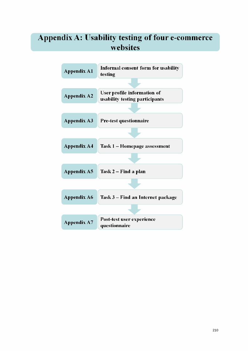
210
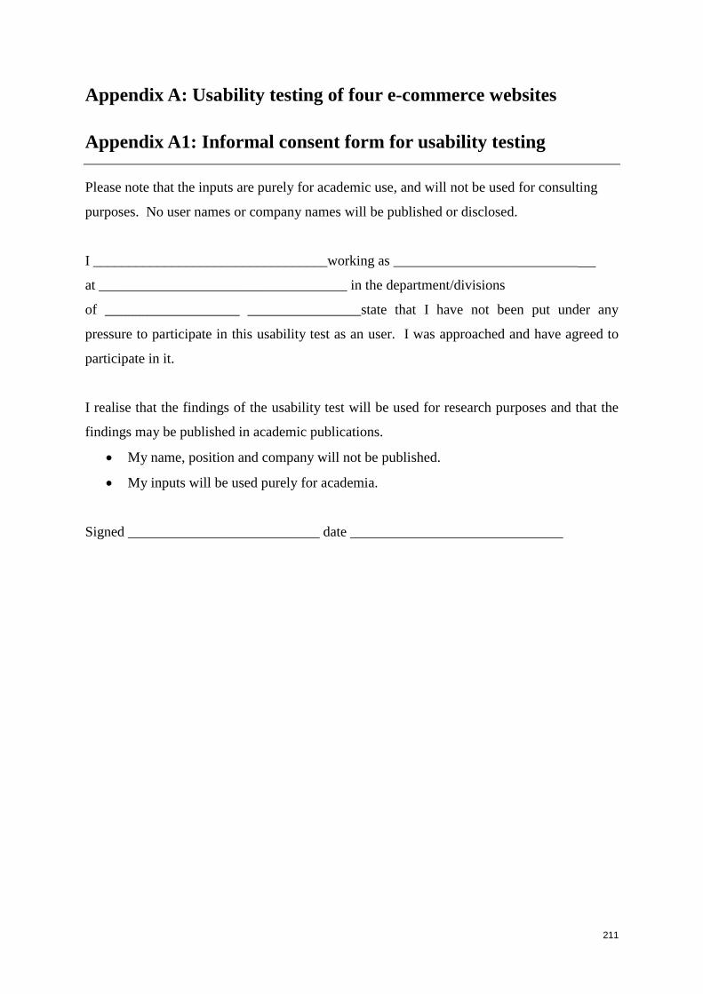
211
Appendix A: Usability testing of four e-commerce websites
Appendix A1: Informal consent form for usability testing
Please note that the inputs are purely for academic use, and will not be used for consulting
purposes. No user names or company names will be published or disclosed.
I _________________________________working as __________________________
at ___________________________________ in the department/divisions
of ___________________ ________________state that I have not been put under any
pressure to participate in this usability test as an user. I was approached and have agreed to
participate in it.
I realise that the findings of the usability test will be used for research purposes and that the
findings may be published in academic publications.
My name, position and company will not be published.
My inputs will be used purely for academia.
Signed ___________________________ date ______________________________
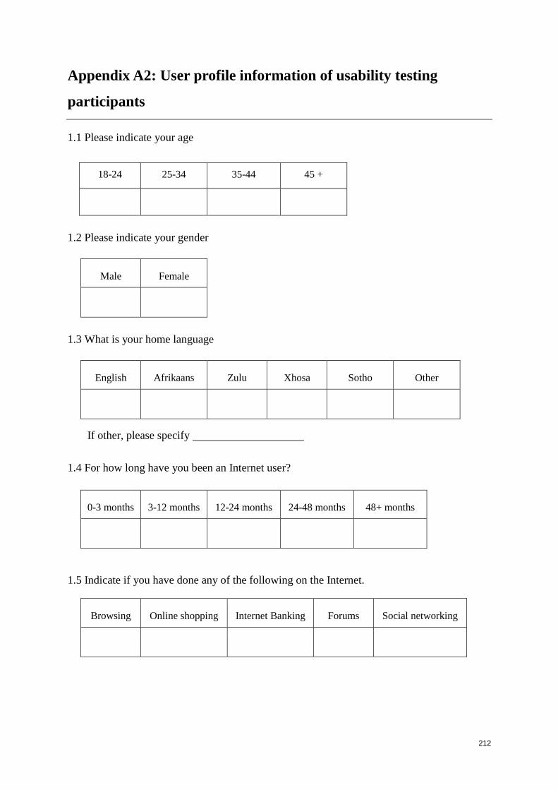
212
Appendix A2: User profile information of usability testing
participants
1.1 Please indicate your age
18-24 25-34 35-44 45 +
1.2 Please indicate your gender
Male Female
1.3 What is your home language
English Afrikaans Zulu Xhosa Sotho Other
If other, please specify
1.4 For how long have you been an Internet user?
0-3 months 3-12 months 12-24 months 24-48 months 48+ months
1.5 Indicate if you have done any of the following on the Internet.
Browsing Online shopping Internet Banking Forums Social networking
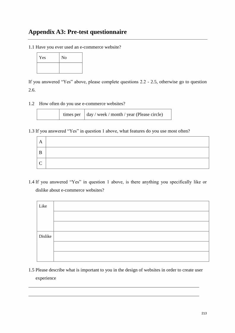
213
Appendix A3: Pre-test questionnaire
1.1 Have you ever used an e-commerce website?
Yes No
If you answered “Yes” above, please complete questions 2.2 - 2.5, otherwise go to question
2.6.
1.2 How often do you use e-commerce websites?
times per day / week / month / year (Please circle)
1.3 If you answered “Yes” in question 1 above, what features do you use most often?
A
B
C
1.4 If you answered “Yes” in question 1 above, is there anything you specifically like or
dislike about e-commerce websites?
Like
Dislike
1.5 Please describe what is important to you in the design of websites in order to create user
experience
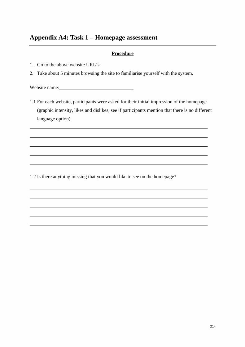
214
Appendix A4: Task 1 – Homepage assessment
Procedure
1. Go to the above website URL’s.
2. Take about 5 minutes browsing the site to familiarise yourself with the system.
Website name:
1.1 For each website, participants were asked for their initial impression of the homepage
(graphic intensity, likes and dislikes, see if participants mention that there is no different
language option)
1.2 Is there anything missing that you would like to see on the homepage?
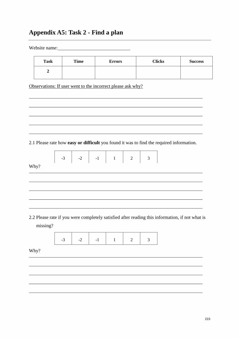
215
Appendix A5: Task 2 - Find a plan
Website name:
Task Time Errors Clicks Success
2
Observations: If user went to the incorrect please ask why?
2.1 Please rate how easy or difficult you found it was to find the required information.
Why?
2.2 Please rate if you were completely satisfied after reading this information, if not what is
missing?
Why?
-3 -2 -1 1 2 3
-3 -2 -1 1 2 3

216
2.3 Is there anything about the website’s structure that you feel hampered your performance
in finding the required information?
2.4 Rate the tone and terminology used?
Why?
2.5 Rate the screen on structure and layout
Why?
2.6 Rate the screen on visual appeal
Why?
-3 -2 -1 1 2 3
-3 -2 -1 1 2 3
-3 -2 -1 1 2 3
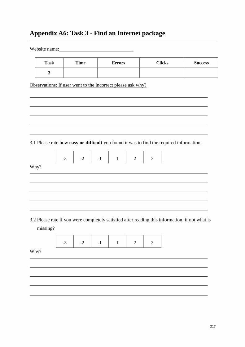
217
Appendix A6: Task 3 - Find an Internet package
Website name:
Task Time Errors Clicks Success
3
Observations: If user went to the incorrect please ask why?
3.1 Please rate how easy or difficult you found it was to find the required information.
Why?
3.2 Please rate if you were completely satisfied after reading this information, if not what is
missing?
Why?
-3 -2 -1 1 2 3
-3 -2 -1 1 2 3
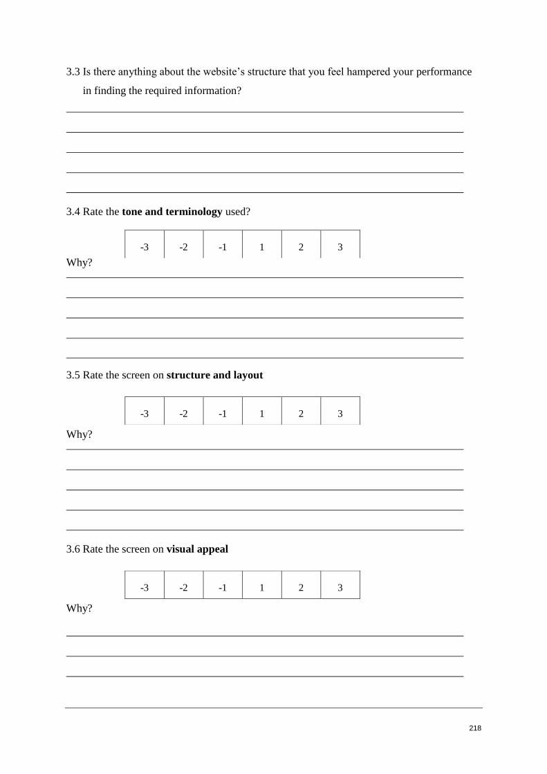
218
3.3 Is there anything about the website’s structure that you feel hampered your performance
in finding the required information?
3.4 Rate the tone and terminology used?
Why?
3.5 Rate the screen on structure and layout
Why?
3.6 Rate the screen on visual appeal
Why?
-3 -2 -1 1 2 3
-3 -2 -1 1 2 3
-3 -2 -1 1 2 3
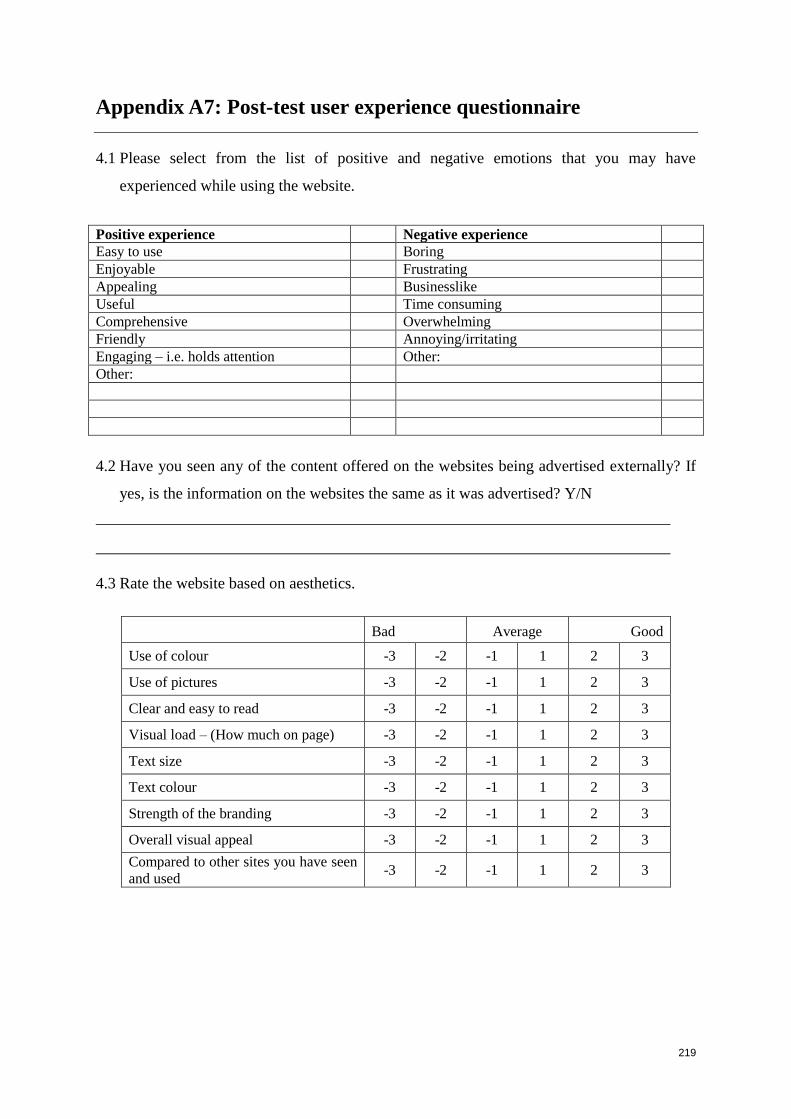
219
Appendix A7: Post-test user experience questionnaire
4.1 Please select from the list of positive and negative emotions that you may have
experienced while using the website.
Positive experience Negative experience
Easy to use Boring
Enjoyable Frustrating
Appealing Businesslike
Useful Time consuming
Comprehensive Overwhelming
Friendly Annoying/irritating
Engaging – i.e. holds attention Other:
Other:
4.2 Have you seen any of the content offered on the websites being advertised externally? If
yes, is the information on the websites the same as it was advertised? Y/N
4.3 Rate the website based on aesthetics.
Bad Average Good
Use of colour -3 -2 -1 1 2 3
Use of pictures -3 -2 -1 1 2 3
Clear and easy to read -3 -2 -1 1 2 3
Visual load – (How much on page) -3 -2 -1 1 2 3
Text size -3 -2 -1 1 2 3
Text colour -3 -2 -1 1 2 3
Strength of the branding -3 -2 -1 1 2 3
Overall visual appeal -3 -2 -1 1 2 3
Compared to other sites you have seen
and used -3 -2 -1 1 2 3
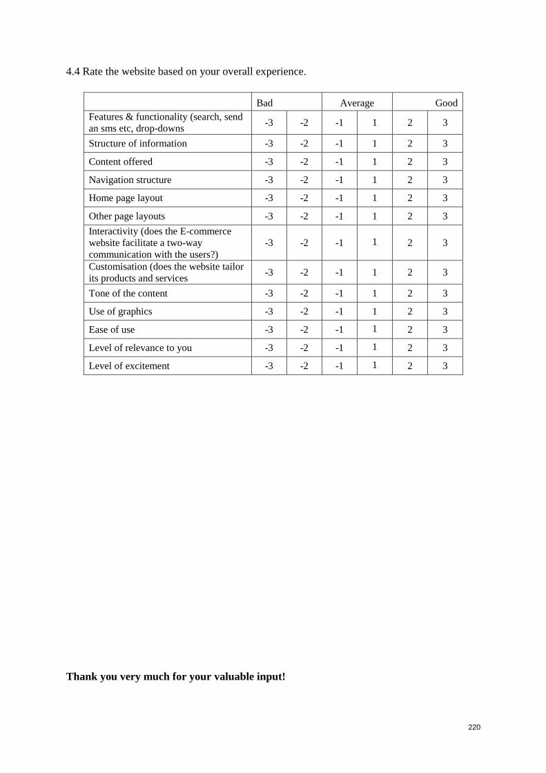
220
4.4 Rate the website based on your overall experience.
Bad Average Good
Features & functionality (search, send
an sms etc, drop-downs -3 -2 -1 1 2 3
Structure of information -3 -2 -1 1 2 3
Content offered -3 -2 -1 1 2 3
Navigation structure -3 -2 -1 1 2 3
Home page layout -3 -2 -1 1 2 3
Other page layouts -3 -2 -1 1 2 3
Interactivity (does the E-commerce
website facilitate a two-way
communication with the users?)
-3 -2 -1 1 2 3
Customisation (does the website tailor
its products and services -3 -2 -1 1 2 3
Tone of the content -3 -2 -1 1 2 3
Use of graphics -3 -2 -1 1 2 3
Ease of use -3 -2 -1 1 2 3
Level of relevance to you -3 -2 -1 1 2 3
Level of excitement -3 -2 -1 1 2 3
Thank you very much for your valuable input!
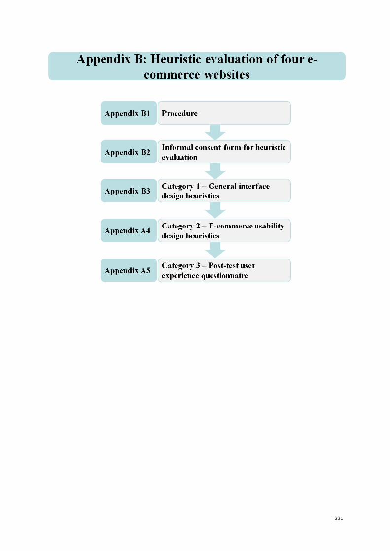
221
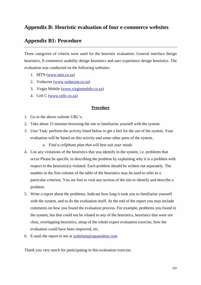
222
Appendix B: Heuristic evaluation of four e-commerce websites
Appendix B1: Procedure
Three categories of criteria were used for the heuristic evaluation: General interface design
heuristics, E-commerce usability design heuristics and user experience design heuristics. The
evaluation was conducted on the following websites:
1. MTN (www.mtn.co.za)
2. Vodacom (www.vodacom.co.za)
3. Virgin Mobile (www.virginmobile.co.za)
4. Cell C (www.cellc.co.za)
Procedure
1. Go to the above website URL’s.
2. Take about 15 minutes browsing the site to familiarise yourself with the system.
3. User Task: perform the activity listed below to get a feel for the use of the system. Your
evaluation will be based on this activity and some other parts of the system.
a. Find a cellphone plan that will best suit your needs.
4. List any violations of the heuristics that you identify in the system, i.e. problems that
occur Please be specific in describing the problem by explaining why it is a problem with
respect to the heuristic(s) violated. Each problem should be written out separately. The
number in the first column of the table of the heuristics may be used to refer to a
particular criterion. You are free to visit any section of the site to identify and describe a
problem.
5. Write a report about the problems. Indicate how long it took you to familiarise yourself
with the system, and to do the evaluation itself. At the end of the report you may include
comments on how you found the evaluation process. For example, problems you found in
the system, but that could not be related to any of the heuristics, heuristics that were not
clear, overlapping heuristics, setup of the whole expert evaluation exercise, how the
evaluation could have been improved, etc.
6. E-mail the report to me at [email protected]
Thank you very much for participating in this evaluation exercise.
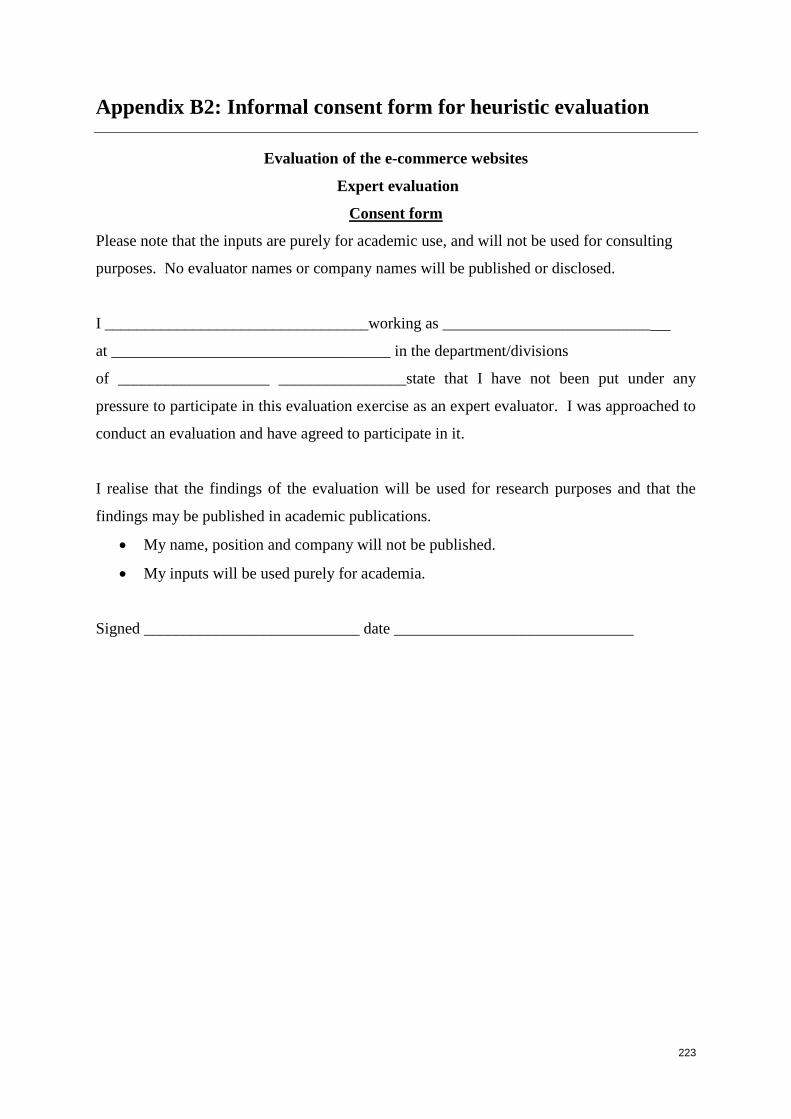
223
Appendix B2: Informal consent form for heuristic evaluation
Evaluation of the e-commerce websites
Expert evaluation
Consent form
Please note that the inputs are purely for academic use, and will not be used for consulting
purposes. No evaluator names or company names will be published or disclosed.
I _________________________________working as __________________________
at ___________________________________ in the department/divisions
of ___________________ ________________state that I have not been put under any
pressure to participate in this evaluation exercise as an expert evaluator. I was approached to
conduct an evaluation and have agreed to participate in it.
I realise that the findings of the evaluation will be used for research purposes and that the
findings may be published in academic publications.
My name, position and company will not be published.
My inputs will be used purely for academia.
Signed ___________________________ date ______________________________
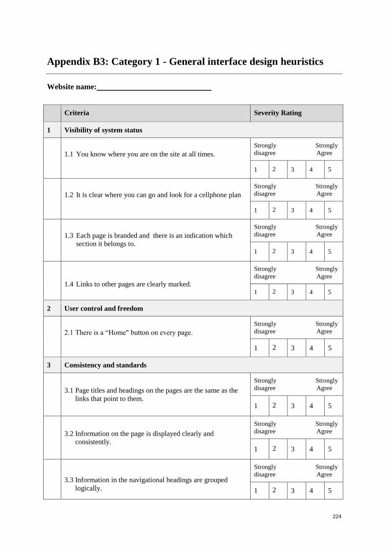
224
Appendix B3: Category 1 - General interface design heuristics
Website name:
Criteria Severity Rating
1 Visibility of system status
1.1 You know where you are on the site at all times.
Strongly Strongly
disagree Agree
1 2 3 4 5
1.2 It is clear where you can go and look for a cellphone plan
Strongly Strongly
disagree Agree
1 2 3 4 5
1.3 Each page is branded and there is an indication which
section it belongs to.
Strongly Strongly
disagree Agree
1 2 3 4 5
1.4 Links to other pages are clearly marked.
Strongly Strongly
disagree Agree
1 2 3 4 5
2 User control and freedom
2.1 There is a “Home" button on every page.
Strongly Strongly
disagree Agree
1 2 3 4 5
3 Consistency and standards
3.1 Page titles and headings on the pages are the same as the
links that point to them.
Strongly Strongly
disagree Agree
1 2 3 4 5
3.2 Information on the page is displayed clearly and
consistently.
Strongly Strongly
disagree Agree
1 2 3 4 5
3.3 Information in the navigational headings are grouped
logically.
Strongly Strongly
disagree Agree
1 2 3 4 5
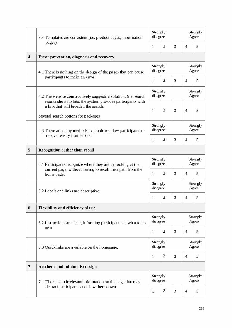
225
3.4 Templates are consistent (i.e. product pages, information
pages).
Strongly Strongly
disagree Agree
1 2 3 4 5
4 Error prevention, diagnosis and recovery
4.1 There is nothing on the design of the pages that can cause
participants to make an error.
Strongly Strongly
disagree Agree
1 2 3 4 5
4.2 The website constructively suggests a solution. (i.e. search
results show no hits, the system provides participants with
a link that will broaden the search.
Several search options for packages
Strongly Strongly
disagree Agree
1 2 3 4 5
4.3 There are many methods available to allow participants to
recover easily from errors.
Strongly Strongly
disagree Agree
1 2 3 4 5
5 Recognition rather than recall
5.1 Participants recognize where they are by looking at the
current page, without having to recall their path from the
home page.
Strongly Strongly
disagree Agree
1 2 3 4 5
5.2 Labels and links are descriptive.
Strongly Strongly
disagree Agree
1 2 3 4 5
6 Flexibility and efficiency of use
6.2 Instructions are clear, informing participants on what to do
next.
Strongly Strongly
disagree Agree
1 2 3 4 5
6.3 Quicklinks are available on the homepage.
Strongly Strongly
disagree Agree
1 2 3 4 5
7 Aesthetic and minimalist design
7.1 There is no irrelevant information on the page that may
distract participants and slow them down.
Strongly Strongly
disagree Agree
1 2 3 4 5
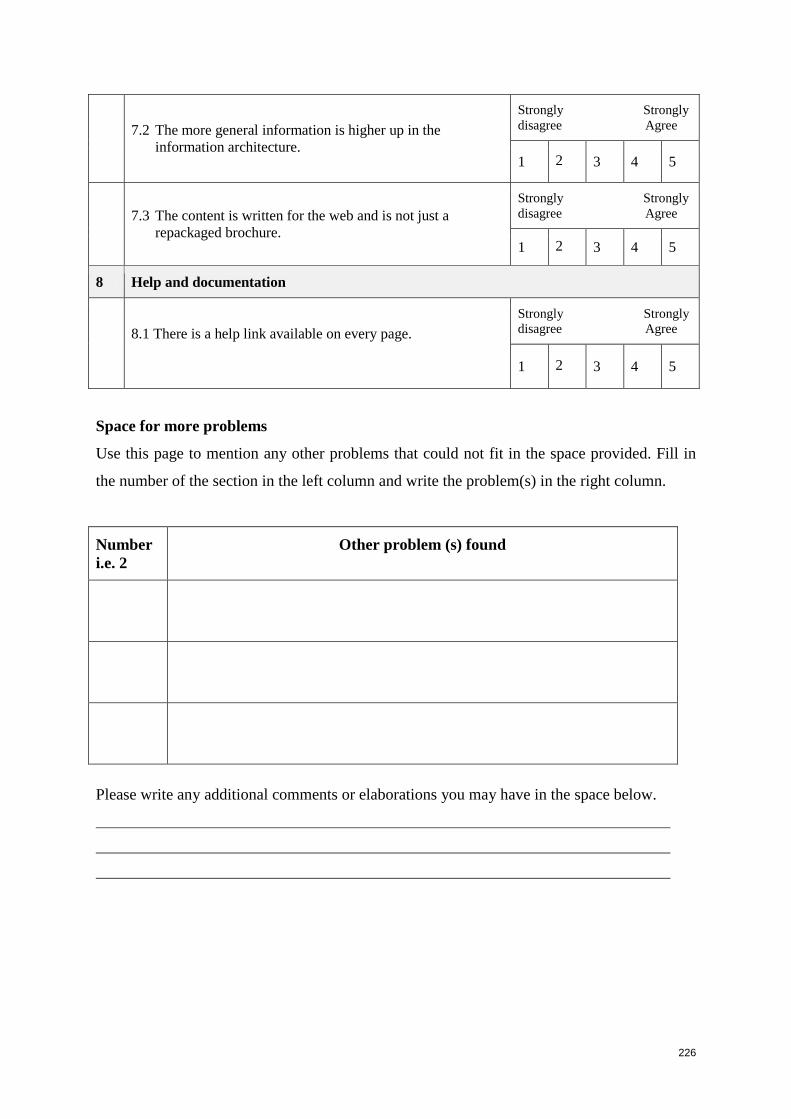
226
7.2 The more general information is higher up in the
information architecture.
Strongly Strongly
disagree Agree
1 2 3 4 5
7.3 The content is written for the web and is not just a
repackaged brochure.
Strongly Strongly
disagree Agree
1 2 3 4 5
8 Help and documentation
8.1 There is a help link available on every page.
Strongly Strongly
disagree Agree
1 2 3 4 5
Space for more problems
Use this page to mention any other problems that could not fit in the space provided. Fill in
the number of the section in the left column and write the problem(s) in the right column.
Number
i.e. 2
Other problem (s) found
Please write any additional comments or elaborations you may have in the space below.
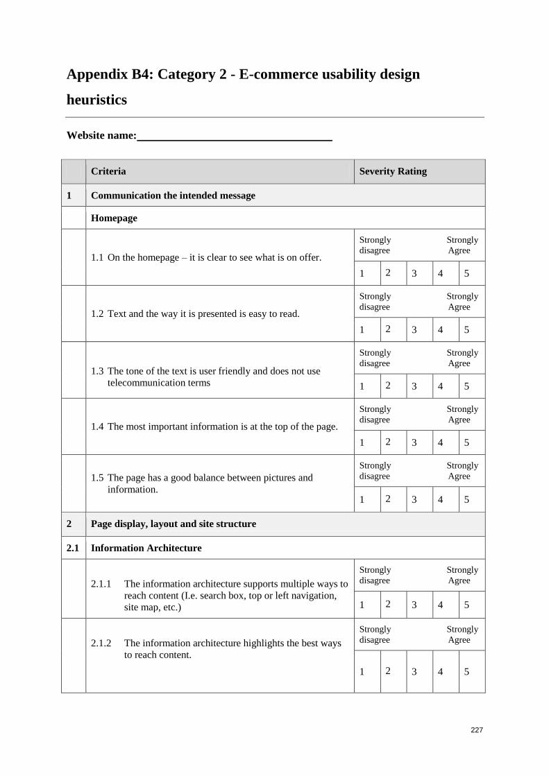
227
Appendix B4: Category 2 - E-commerce usability design
heuristics
Website name:
Criteria Severity Rating
1 Communication the intended message
Homepage
1.1 On the homepage – it is clear to see what is on offer.
Strongly Strongly
disagree Agree
1 2 3 4 5
1.2 Text and the way it is presented is easy to read.
Strongly Strongly
disagree Agree
1 2 3 4 5
1.3 The tone of the text is user friendly and does not use
telecommunication terms
Strongly Strongly
disagree Agree
1 2 3 4 5
1.4 The most important information is at the top of the page.
Strongly Strongly
disagree Agree
1 2 3 4 5
1.5 The page has a good balance between pictures and
information.
Strongly Strongly
disagree Agree
1 2 3 4 5
2 Page display, layout and site structure
2.1 Information Architecture
2.1.1 The information architecture supports multiple ways to
reach content (I.e. search box, top or left navigation,
site map, etc.)
Strongly Strongly
disagree Agree
1 2 3 4 5
2.1.2 The information architecture highlights the best ways
to reach content.
Strongly Strongly
disagree Agree
1 2 3 4 5
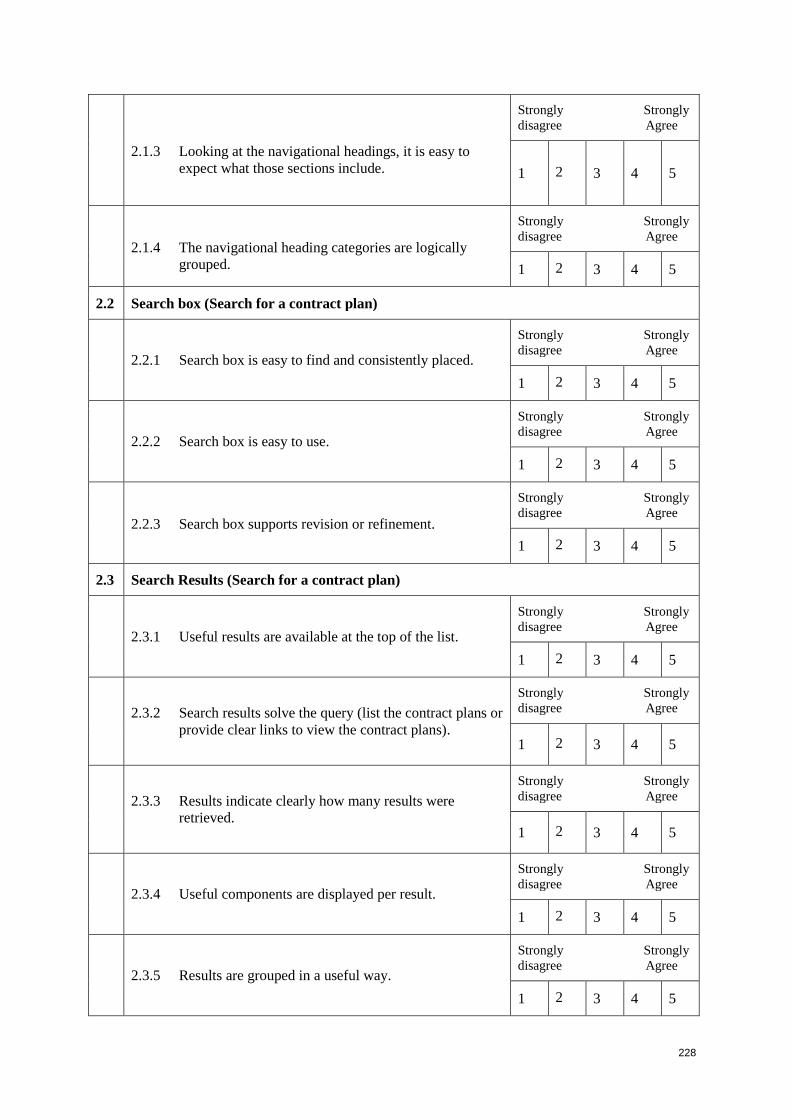
228
2.1.3 Looking at the navigational headings, it is easy to
expect what those sections include.
Strongly Strongly
disagree Agree
1 2 3 4 5
2.1.4 The navigational heading categories are logically
grouped.
Strongly Strongly
disagree Agree
1 2 3 4 5
2.2 Search box (Search for a contract plan)
2.2.1 Search box is easy to find and consistently placed.
Strongly Strongly
disagree Agree
1 2 3 4 5
2.2.2 Search box is easy to use.
Strongly Strongly
disagree Agree
1 2 3 4 5
2.2.3 Search box supports revision or refinement.
Strongly Strongly
disagree Agree
1 2 3 4 5
2.3 Search Results (Search for a contract plan)
2.3.1 Useful results are available at the top of the list.
Strongly Strongly
disagree Agree
1 2 3 4 5
2.3.2 Search results solve the query (list the contract plans or
provide clear links to view the contract plans).
Strongly Strongly
disagree Agree
1 2 3 4 5
2.3.3 Results indicate clearly how many results were
retrieved.
Strongly Strongly
disagree Agree
1 2 3 4 5
2.3.4 Useful components are displayed per result.
Strongly Strongly
disagree Agree
1 2 3 4 5
2.3.5 Results are grouped in a useful way.
Strongly Strongly
disagree Agree
1 2 3 4 5
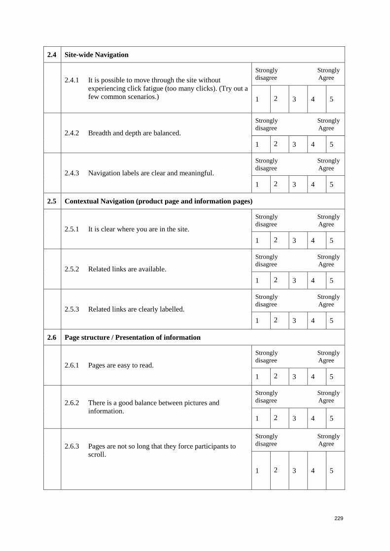
229
2.4 Site-wide Navigation
2.4.1 It is possible to move through the site without
experiencing click fatigue (too many clicks). (Try out a
few common scenarios.)
Strongly Strongly
disagree Agree
1 2 3 4 5
2.4.2 Breadth and depth are balanced.
Strongly Strongly
disagree Agree
1 2 3 4 5
2.4.3 Navigation labels are clear and meaningful.
Strongly Strongly
disagree Agree
1 2 3 4 5
2.5 Contextual Navigation (product page and information pages)
2.5.1 It is clear where you are in the site.
Strongly Strongly
disagree Agree
1 2 3 4 5
2.5.2 Related links are available.
Strongly Strongly
disagree Agree
1 2 3 4 5
2.5.3 Related links are clearly labelled.
Strongly Strongly
disagree Agree
1 2 3 4 5
2.6 Page structure / Presentation of information
2.6.1 Pages are easy to read.
Strongly Strongly
disagree Agree
1 2 3 4 5
2.6.2 There is a good balance between pictures and
information.
Strongly Strongly
disagree Agree
1 2 3 4 5
2.6.3 Pages are not so long that they force participants to
scroll.
Strongly Strongly
disagree Agree
1 2 3 4 5
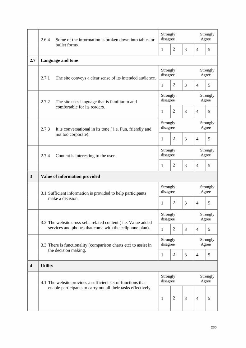
230
2.6.4 Some of the information is broken down into tables or
bullet forms.
Strongly Strongly
disagree Agree
1 2 3 4 5
2.7 Language and tone
2.7.1 The site conveys a clear sense of its intended audience.
Strongly Strongly
disagree Agree
1 2 3 4 5
2.7.2 The site uses language that is familiar to and
comfortable for its readers.
Strongly Strongly
disagree Agree
1 2 3 4 5
2.7.3 It is conversational in its tone.( i.e. Fun, friendly and
not too corporate).
Strongly Strongly
disagree Agree
1 2 3 4 5
2.7.4 Content is interesting to the user.
Strongly Strongly
disagree Agree
1 2 3 4 5
3 Value of information provided
3.1 Sufficient information is provided to help participants
make a decision.
Strongly Strongly
disagree Agree
1 2 3 4 5
3.2 The website cross-sells related content.( i.e. Value added
services and phones that come with the cellphone plan).
Strongly Strongly
disagree Agree
1 2 3 4 5
3.3 There is functionality (comparison charts etc) to assist in
the decision making.
Strongly Strongly
disagree Agree
1 2 3 4 5
4 Utility
4.1 The website provides a sufficient set of functions that
enable participants to carry out all their tasks effectively.
Strongly Strongly
disagree Agree
1 2 3 4 5
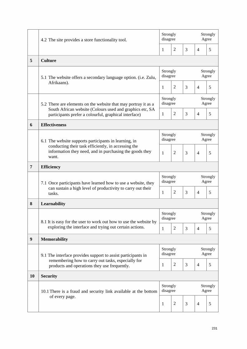
231
4.2 The site provides a store functionality tool.
Strongly Strongly
disagree Agree
1 2 3 4 5
5 Culture
5.1 The website offers a secondary language option. (i.e. Zulu,
Afrikaans).
Strongly Strongly
disagree Agree
1 2 3 4 5
5.2 There are elements on the website that may portray it as a
South African website (Colours used and graphics etc, SA
participants prefer a colourful, graphical interface)
Strongly Strongly
disagree Agree
1 2 3 4 5
6 Effectiveness
6.1 The website supports participants in learning, in
conducting their task efficiently, in accessing the
information they need, and in purchasing the goods they
want.
Strongly Strongly
disagree Agree
1 2 3 4 5
7 Efficiency
7.1 Once participants have learned how to use a website, they
can sustain a high level of productivity to carry out their
tasks.
Strongly Strongly
disagree Agree
1 2 3 4 5
8 Learnability
8.1 It is easy for the user to work out how to use the website by
exploring the interface and trying out certain actions.
Strongly Strongly
disagree Agree
1 2 3 4 5
9 Memorability
9.1 The interface provides support to assist participants in
remembering how to carry out tasks, especially for
products and operations they use frequently.
Strongly Strongly
disagree Agree
1 2 3 4 5
10 Security
10.1 There is a fraud and security link available at the bottom
of every page.
Strongly Strongly
disagree Agree
1 2 3 4 5
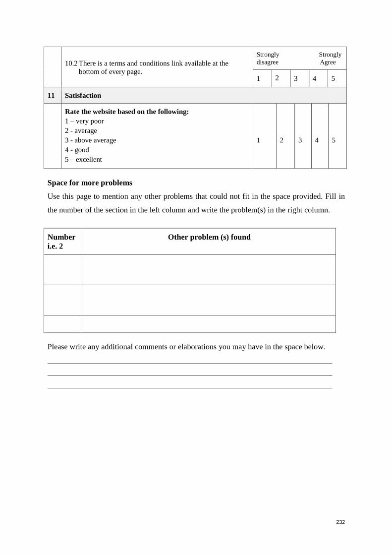
232
10.2 There is a terms and conditions link available at the
bottom of every page.
Strongly Strongly
disagree Agree
1 2 3 4 5
11 Satisfaction
Rate the website based on the following:
1 – very poor
2 - average
3 - above average
4 - good
5 – excellent
1
2
3
4
5
Space for more problems
Use this page to mention any other problems that could not fit in the space provided. Fill in
the number of the section in the left column and write the problem(s) in the right column.
Number
i.e. 2
Other problem (s) found
Please write any additional comments or elaborations you may have in the space below.
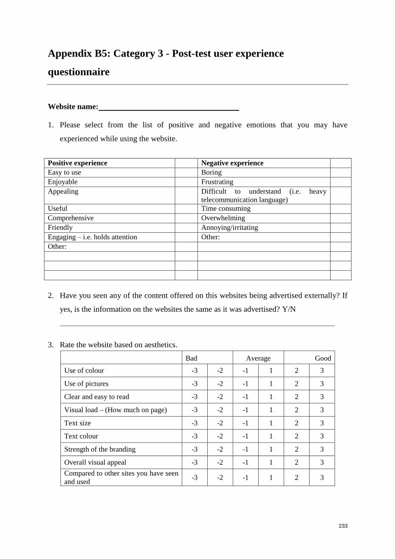
233
Appendix B5: Category 3 - Post-test user experience
questionnaire
Website name:
1. Please select from the list of positive and negative emotions that you may have
experienced while using the website.
Positive experience Negative experience Easy to use Boring Enjoyable Frustrating Appealing Difficult to understand (i.e. heavy
telecommunication language)
Useful Time consuming Comprehensive Overwhelming Friendly Annoying/irritating Engaging – i.e. holds attention Other: Other:
2. Have you seen any of the content offered on this websites being advertised externally? If
yes, is the information on the websites the same as it was advertised? Y/N
3. Rate the website based on aesthetics.
Bad Average Good
Use of colour -3 -2 -1 1 2 3
Use of pictures -3 -2 -1 1 2 3
Clear and easy to read -3 -2 -1 1 2 3
Visual load – (How much on page) -3 -2 -1 1 2 3
Text size -3 -2 -1 1 2 3
Text colour -3 -2 -1 1 2 3
Strength of the branding -3 -2 -1 1 2 3
Overall visual appeal -3 -2 -1 1 2 3
Compared to other sites you have seen
and used -3 -2 -1 1 2 3
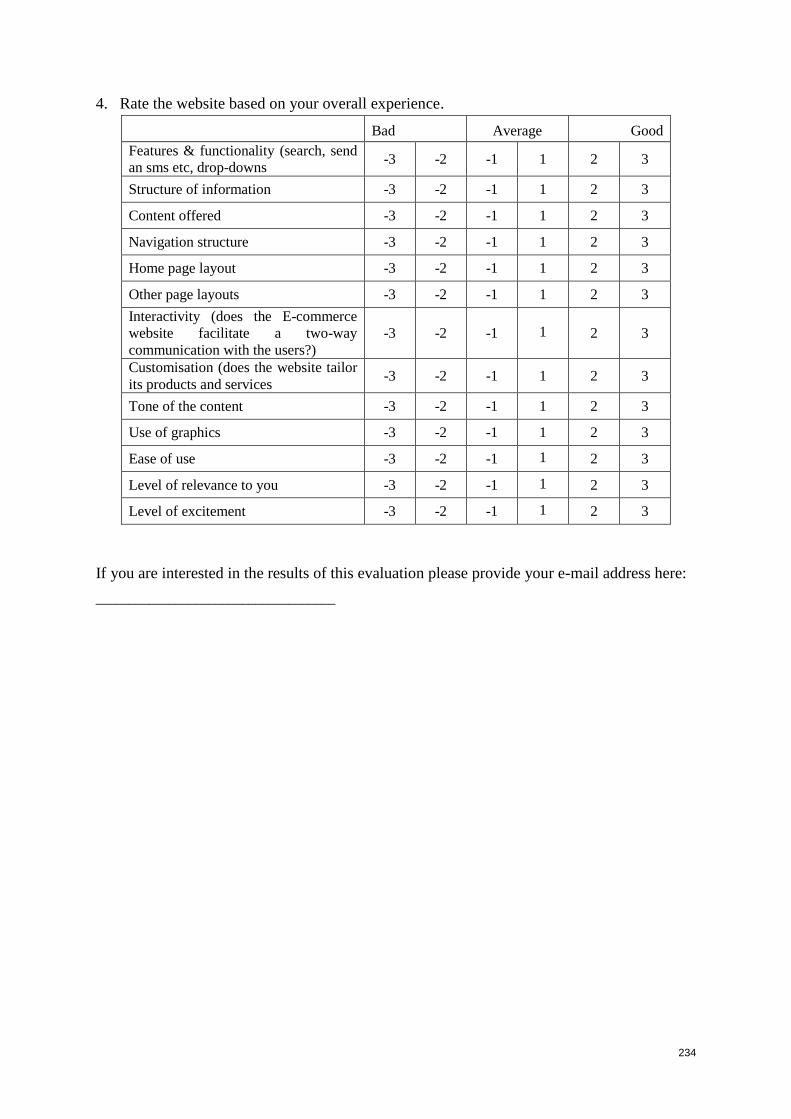
234
4. Rate the website based on your overall experience.
Bad Average Good
Features & functionality (search, send
an sms etc, drop-downs -3 -2 -1 1 2 3
Structure of information -3 -2 -1 1 2 3
Content offered -3 -2 -1 1 2 3
Navigation structure -3 -2 -1 1 2 3
Home page layout -3 -2 -1 1 2 3
Other page layouts -3 -2 -1 1 2 3
Interactivity (does the E-commerce
website facilitate a two-way
communication with the users?)
-3 -2 -1 1 2 3
Customisation (does the website tailor
its products and services -3 -2 -1 1 2 3
Tone of the content -3 -2 -1 1 2 3
Use of graphics -3 -2 -1 1 2 3
Ease of use -3 -2 -1 1 2 3
Level of relevance to you -3 -2 -1 1 2 3
Level of excitement -3 -2 -1 1 2 3
If you are interested in the results of this evaluation please provide your e-mail address here:
____________________________________
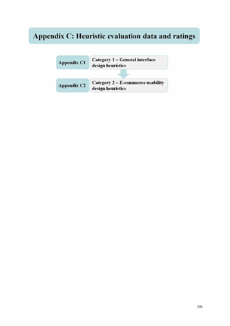
235
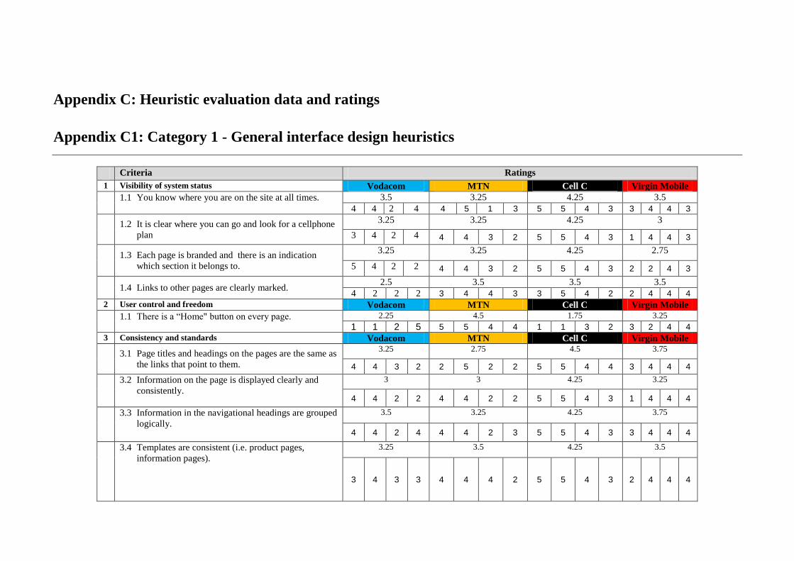
Appendix C: Heuristic evaluation data and ratings
Appendix C1: Category 1 - General interface design heuristics
Criteria Ratings
1 Visibility of system status Vodacom MTN Cell C Virgin Mobile
1.1 You know where you are on the site at all times.
3.5 3.25 4.25 3.5
4 4 2 4 4 5 1 3 5 5 4 3 3 4 4 3
1.2 It is clear where you can go and look for a cellphone
plan
3.25 3.25 4.25 3
3 4 2 4 4 4 3 2 5 5 4 3 1 4 4 3
1.3 Each page is branded and there is an indication
which section it belongs to.
3.25 3.25 4.25 2.75
5 4 2 2 4 4 3 2 5 5 4 3 2 2 4 3
1.4 Links to other pages are clearly marked. 2.5 3.5 3.5 3.5
4 2 2 2 3 4 4 3 3 5 4 2 2 4 4 4
2 User control and freedom Vodacom MTN Cell C Virgin Mobile
1.1 There is a “Home" button on every page.
2.25 4.5 1.75 3.25
1 1 2 5 5 5 4 4 1 1 3 2 3 2 4 4
3 Consistency and standards Vodacom MTN Cell C Virgin Mobile
3.1 Page titles and headings on the pages are the same as
the links that point to them.
3.25 2.75 4.5 3.75
4 4 3 2 2 5 2 2 5 5 4 4 3 4 4 4
3.2 Information on the page is displayed clearly and
consistently.
3 3 4.25 3.25
4 4 2 2 4 4 2 2 5 5 4 3 1 4 4 4
3.3 Information in the navigational headings are grouped
logically.
3.5 3.25 4.25 3.75
4 4 2 4 4 4 2 3 5 5 4 3 3 4 4 4
3.4 Templates are consistent (i.e. product pages,
information pages).
3.25 3.5 4.25 3.5
3 4 3 3 4 4 4 2 5 5 4 3 2 4 4 4
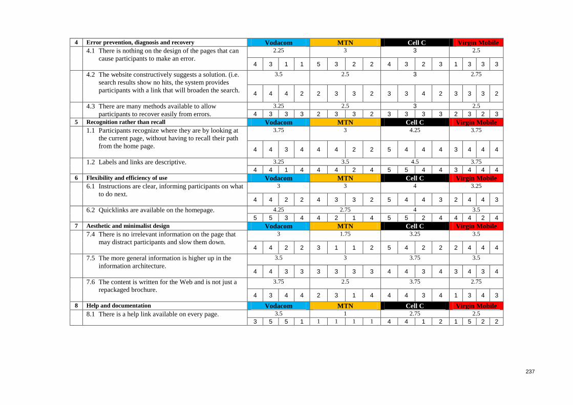
237
4 Error prevention, diagnosis and recovery Vodacom MTN Cell C Virgin Mobile
4.1 There is nothing on the design of the pages that can
cause participants to make an error.
2.25 3 3 2.5
4 3 1 1 5 3 2 2 4 3 2 3 1 3 3 3
4.2 The website constructively suggests a solution. (i.e.
search results show no hits, the system provides
participants with a link that will broaden the search.
3.5 2.5 3 2.75
4 4 4 2 2 3 3 2 3 3 4 2 3 3 3 2
4.3 There are many methods available to allow
participants to recover easily from errors.
3.25 2.5 3 2.5
4 3 3 3 2 3 3 2 3 3 3 3 2 3 2 3
5 Recognition rather than recall Vodacom MTN Cell C Virgin Mobile
1.1 Participants recognize where they are by looking at
the current page, without having to recall their path
from the home page.
3.75 3 4.25 3.75
4 4 3 4 4 4 2 2 5 4 4 4 3 4 4 4
1.2 Labels and links are descriptive.
3.25 3.5 4.5 3.75
4 4 1 4 4 4 2 4 5 5 4 4 3 4 4 4
6 Flexibility and efficiency of use Vodacom MTN Cell C Virgin Mobile
6.1 Instructions are clear, informing participants on what
to do next.
3 3 4 3.25
4 4 2 2 4 3 3 2 5 4 4 3 2 4 4 3
6.2 Quicklinks are available on the homepage.
4.25 2.75 4 3.5
5 5 3 4 4 2 1 4 5 5 2 4 4 4 2 4
7 Aesthetic and minimalist design Vodacom MTN Cell C Virgin Mobile
7.4 There is no irrelevant information on the page that
may distract participants and slow them down.
3 1.75 3.25 3.5
4 4 2 2 3 1 1 2 5 4 2 2 2 4 4 4
7.5 The more general information is higher up in the
information architecture.
3.5 3 3.75 3.5
4 4 3 3 3 3 3 3 4 4 3 4 3 4 3 4
7.6 The content is written for the Web and is not just a
repackaged brochure.
3.75 2.5 3.75 2.75
4 3 4 4 2 3 1 4 4 4 3 4 1 3 4 3
8 Help and documentation Vodacom MTN Cell C Virgin Mobile
8.1 There is a help link available on every page.
3.5 1 2.75 2.5
3 5 5 1 1 1 1 1 4 4 1 2 1 5 2 2
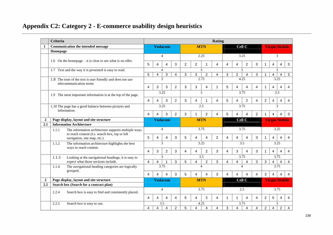
238
Appendix C2: Category 2 - E-commerce usability design heuristics
Criteria Rating
1 Communication the intended message Vodacom MTN Cell C Virgin Mobile
Homepage
1.6 On the homepage – it is clear to see what is on offer.
4 2.25 3.25 3
5 4 4 3 2 2 1 4 4 4 2 3 1 4 4 3
1.7 Text and the way it is presented is easy to read.
4 3 3 3
5 4 3 4 3 3 2 4 3 2 4 3 1 4 4 3
1.8 The tone of the text is user friendly and does not use
telecommunication terms
3 2.75 4.25 3.25
4 3 3 2 3 3 4 1 5 4 4 4 1 4 4 4
1.9 The most important information is at the top of the page.
3.25 3 3.75 3.5
4 4 3 2 3 4 1 4 5 4 2 4 2 4 4 4
1.10 The page has a good balance between pictures and
information.
3.25 2.5 3.75 3
4 4 3 2 3 1 2 4 5 4 4 2 1 4 4 3
2 Page display, layout and site structure Vodacom MTN Cell C Virgin Mobile
2.1 Information Architecture
1.1.1 The information architecture supports multiple ways
to reach content (I.e. search box, top or left
navigation, site map, etc.)
4 3.75 3.75 3.25
5 4 4 3 5 4 4 2 4 4 4 3 1 4 4 4
1.1.2 The information architecture highlights the best
ways to reach content.
3 3.25 3.5 3.25
4 3 2 3 4 4 2 3 4 3 4 3 1 4 4 4
1.1.3 Looking at the navigational headings, it is easy to
expect what those sections include.
3 3.5 3.75 3.75
4 4 1 3 5 4 2 3 4 4 4 3 3 4 4 4
1.1.4 The navigational heading categories are logically
grouped.
3.75 4 4 3.75
4 4 4 3 5 4 4 3 4 4 4 4 3 4 4 4
2 Page display, layout and site structure Vodacom MTN Cell C Virgin Mobile
2.2 Search box (Search for a contract plan)
2.2.4 Search box is easy to find and consistently placed.
4 3.75 2.5 3.75
4 4 4 4 5 4 2 4 1 1 4 4 2 5 4 4
2.2.5 Search box is easy to use.
3.5 4.25 3.75 3
4 4 4 2 5 4 4 4 3 4 4 4 2 4 2 4
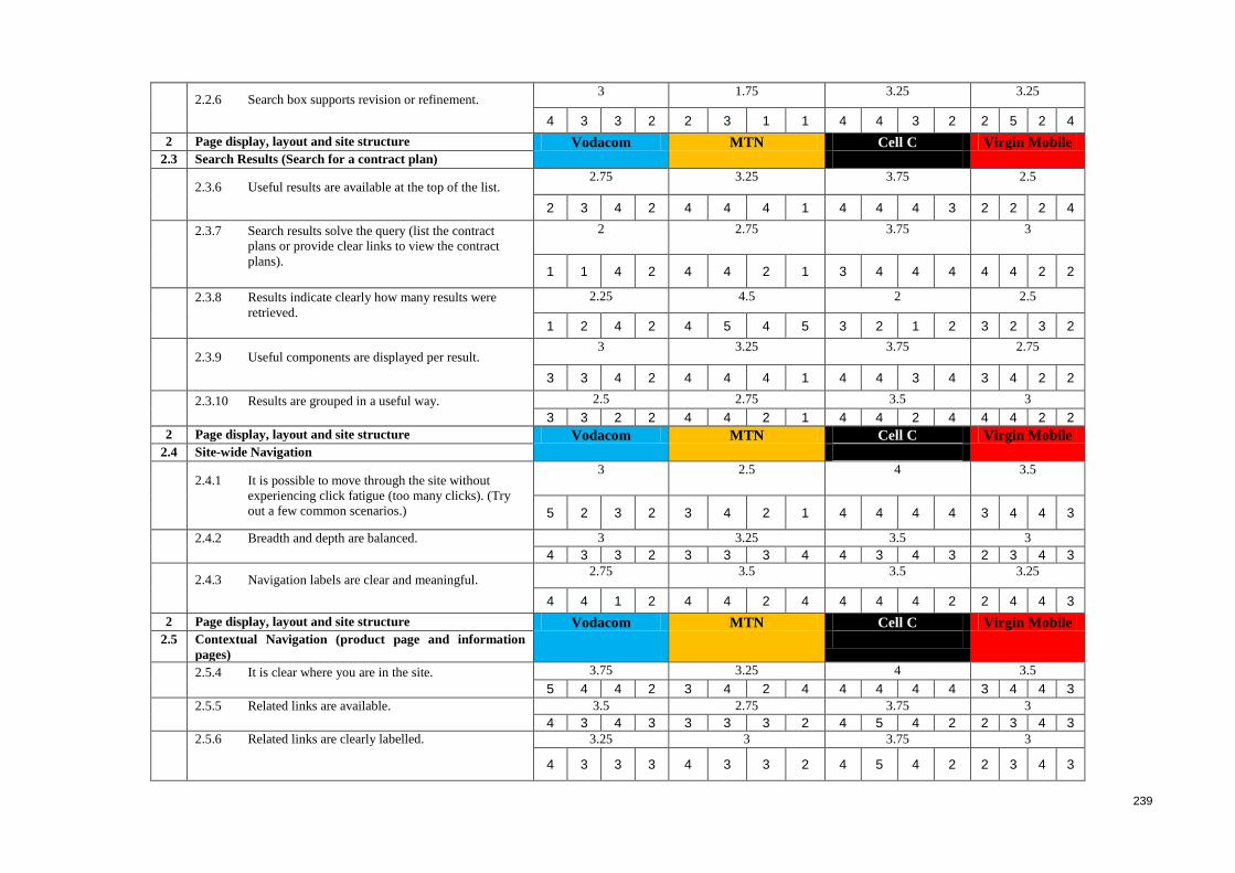
239
2.2.6 Search box supports revision or refinement.
3 1.75 3.25 3.25
4 3 3 2 2 3 1 1 4 4 3 2 2 5 2 4
2 Page display, layout and site structure Vodacom MTN Cell C Virgin Mobile
2.3 Search Results (Search for a contract plan)
2.3.6 Useful results are available at the top of the list.
2.75 3.25 3.75 2.5
2 3 4 2 4 4 4 1 4 4 4 3 2 2 2 4
2.3.7 Search results solve the query (list the contract
plans or provide clear links to view the contract
plans).
2 2.75 3.75 3
1 1 4 2 4 4 2 1 3 4 4 4 4 4 2 2
2.3.8 Results indicate clearly how many results were
retrieved.
2.25 4.5 2 2.5
1 2 4 2 4 5 4 5 3 2 1 2 3 2 3 2
2.3.9 Useful components are displayed per result.
3 3.25 3.75 2.75
3 3 4 2 4 4 4 1 4 4 3 4 3 4 2 2
2.3.10 Results are grouped in a useful way.
2.5 2.75 3.5 3
3 3 2 2 4 4 2 1 4 4 2 4 4 4 2 2
2 Page display, layout and site structure Vodacom MTN Cell C Virgin Mobile
2.4 Site-wide Navigation
2.4.1 It is possible to move through the site without
experiencing click fatigue (too many clicks). (Try
out a few common scenarios.)
3 2.5 4 3.5
5 2 3 2 3 4 2 1 4 4 4 4 3 4 4 3
2.4.2 Breadth and depth are balanced.
3 3.25 3.5 3
4 3 3 2 3 3 3 4 4 3 4 3 2 3 4 3
2.4.3 Navigation labels are clear and meaningful.
2.75 3.5 3.5 3.25
4 4 1 2 4 4 2 4 4 4 4 2 2 4 4 3
2 Page display, layout and site structure Vodacom MTN Cell C Virgin Mobile
2.5 Contextual Navigation (product page and information
pages)
2.5.4 It is clear where you are in the site.
3.75 3.25 4 3.5
5 4 4 2 3 4 2 4 4 4 4 4 3 4 4 3
2.5.5 Related links are available.
3.5 2.75 3.75 3
4 3 4 3 3 3 3 2 4 5 4 2 2 3 4 3
2.5.6 Related links are clearly labelled.
3.25 3 3.75 3
4 3 3 3 4 3 3 2 4 5 4 2 2 3 4 3
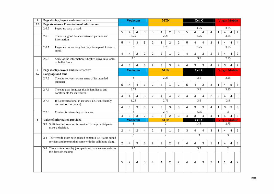
240
2 Page display, layout and site structure Vodacom MTN Cell C Virgin Mobile
2.6 Page structure / Presentation of information
2.6.5 Pages are easy to read.
4 3 4.25 3.25
5 4 4 3 3 4 2 3 5 4 4 4 1 4 4 4
2.6.6 There is a good balance between pictures and
information.
3.75 2.25 3.75 3.25
5 4 3 3 2 3 2 2 5 4 4 2 1 4 4 4
2.6.7 Pages are not so long that they force participants to
scroll.
3 1.75 2.75 3.25
4 4 2 2 2 2 1 2 4 3 2 2 3 4 4 2
2.6.8 Some of the information is broken down into tables
or bullet forms.
3.5 3 3.5 2.75
4 3 4 3 2 3 3 4 4 3 3 4 2 3 4 2
2 Page display, layout and site structure Vodacom MTN Cell C Virgin Mobile
2.7 Language and tone
2.7.5 The site conveys a clear sense of its intended
audience.
4 2.25 3.5 3.25
5 4 4 3 2 4 1 2 5 4 2 3 1 4 5 3
2.7.6 The site uses language that is familiar to and
comfortable for its readers.
3.75 3 3.5 3.25
4 4 4 3 2 4 4 2 4 4 4 2 2 4 4 3
2.7.7 It is conversational in its tone.( i.e. Fun, friendly
and not too corporate).
3.25 2.75 3.5 2.5
4 3 3 3 2 3 3 3 4 3 3 4 1 3 3 3
2.7.8 Content is interesting to the user.
3 2.75 3.75 3
4 3 3 2 3 3 2 3 4 3 4 4 1 4 4 3
3 Value of information provided Vodacom MTN Cell C Virgin Mobile
3.3 Sufficient information is provided to help participants
make a decision.
3 2 3.5 2.75
2 4 2 4 2 2 1 3 3 4 4 3 1 4 4 2
3.4 The website cross-sells related content.( i.e. Value added
services and phones that come with the cellphone plan).
3 2 3 3
2 4 3 3 2 2 2 2 4 4 3 1 1 4 4 3
3.4 There is functionality (comparison charts etc) to assist in
the decision making.
3.5 3 3.5 2
5 2 4 3 4 4 2 2 4 4 3 3 1 1 4 2
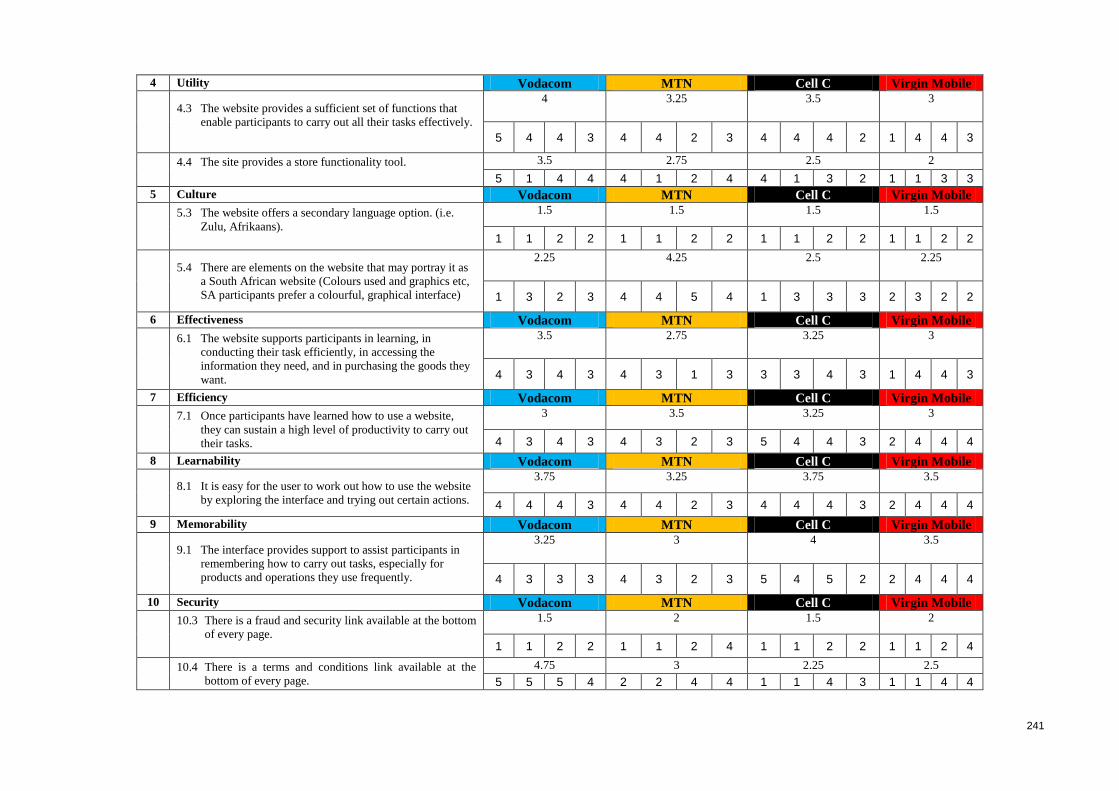
241
4 Utility Vodacom MTN Cell C Virgin Mobile
4.3 The website provides a sufficient set of functions that
enable participants to carry out all their tasks effectively.
4 3.25 3.5 3
5 4 4 3 4 4 2 3 4 4 4 2 1 4 4 3
4.4 The site provides a store functionality tool.
3.5 2.75 2.5 2
5 1 4 4 4 1 2 4 4 1 3 2 1 1 3 3
5 Culture Vodacom MTN Cell C Virgin Mobile
5.3 The website offers a secondary language option. (i.e.
Zulu, Afrikaans).
1.5 1.5 1.5 1.5
1 1 2 2 1 1 2 2 1 1 2 2 1 1 2 2
5.4 There are elements on the website that may portray it as
a South African website (Colours used and graphics etc,
SA participants prefer a colourful, graphical interface)
2.25 4.25 2.5 2.25
1 3 2 3 4 4 5 4 1 3 3 3 2 3 2 2
6 Effectiveness Vodacom MTN Cell C Virgin Mobile
6.1 The website supports participants in learning, in
conducting their task efficiently, in accessing the
information they need, and in purchasing the goods they
want.
3.5 2.75 3.25 3
4 3 4 3 4 3 1 3 3 3 4 3 1 4 4 3
7 Efficiency Vodacom MTN Cell C Virgin Mobile
7.1 Once participants have learned how to use a website,
they can sustain a high level of productivity to carry out
their tasks.
3 3.5 3.25 3
4 3 4 3 4 3 2 3 5 4 4 3 2 4 4 4
8 Learnability Vodacom MTN Cell C Virgin Mobile
8.1 It is easy for the user to work out how to use the website
by exploring the interface and trying out certain actions.
3.75 3.25 3.75 3.5
4 4 4 3 4 4 2 3 4 4 4 3 2 4 4 4
9 Memorability Vodacom MTN Cell C Virgin Mobile
9.1 The interface provides support to assist participants in
remembering how to carry out tasks, especially for
products and operations they use frequently.
3.25 3 4 3.5
4 3 3 3 4 3 2 3 5 4 5 2 2 4 4 4
10 Security Vodacom MTN Cell C Virgin Mobile
10.3 There is a fraud and security link available at the bottom
of every page.
1.5 2 1.5 2
1 1 2 2 1 1 2 4 1 1 2 2 1 1 2 4
10.4 There is a terms and conditions link available at the
bottom of every page.
4.75 3 2.25 2.5
5 5 5 4 2 2 4 4 1 1 4 3 1 1 4 4
Appendix D: Ethical clearance
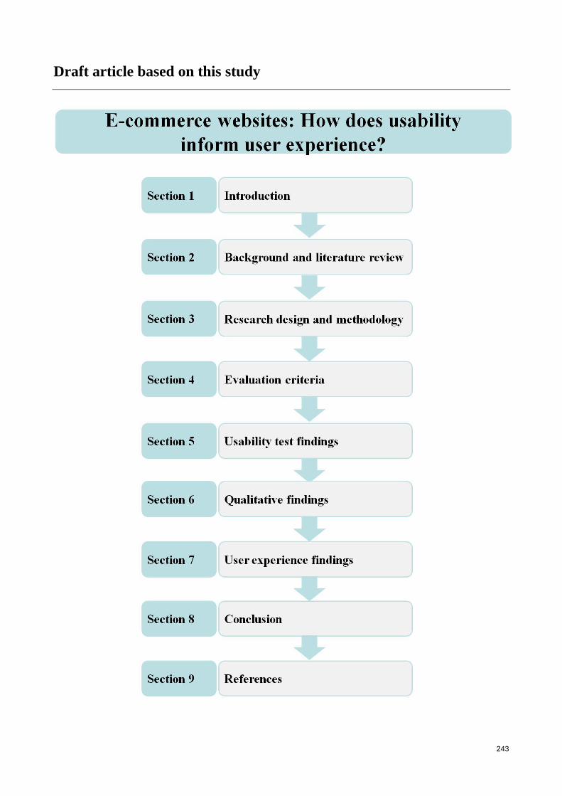
243
Draft article based on this study


![Usability w e-commerce – Tomasz Karwatka [Uniwersytet Konwersji Ceneo]](https://img.pdfslide.us/doc/110x75/547da2acb37959652b8b52d7/usability-w-e-commerce-tomasz-karwatka-uniwersytet-konwersji-ceneo.jpg)