Embed Size (px)
Citation preview

DROUGHT MAPPING OF THE PEDERNALES WATERSHED
ANIMATION ANALYSIS By: Heather M. Davis
Prepared for Professor David Maidment
CE 394K – GIS in Water Resources Engineering
Table of Contents
Introduction ...................................................................................................................................................... 3
Project Objective & Area of Study ...................................................................................................................... 3
Data Collection .................................................................................................................................................. 4
Methodology ..................................................................................................................................................... 5
Results & Discussion ........................................................................................................................................ 10
Conclusions ..................................................................................................................................................... 14
References ...................................................................................................................................................... 16

Introduction “Extreme climatic conditions and events are known to have affected population patterns in a variety of regions
in the past, and a number of authors have expressed concerns that future impacts of climate change will lead
to population displacements at unprecedented scales.” 1
Drought is one such extreme climatic condition. As the availability of usable water becomes scarce,
competition for water among agricultural, industrial, commercial, and residential sectors starts to propagate.
The additive pressure of a drought-prone region increases the need for predictive climatic model
development. GIS-based analyses in combination with numerical modeling are improving our understanding of
landscape evolution and pave the way for new quantitative examinations of temporal and spatial patterns in
an organized manner and at an unprecedented scale. This has stemmed conceptual developments, the
formation of which would be unlikely seen using traditional methods alone.
Project Objective & Area of Study This assessment was conducted as the term project for Professor Maidment’s GIS in Water Resources course
for the fall semester of 2011. The analysis presented herein describes the methodology used to develop a
time-series animation of the Palmer Drought Severity Index (PDSI) within the Pedernales Watershed, located in
central Texas. The process for organizing the available data in a systematic way is the first step toward the end
goal of model development, which is outside the scope of this project due to time limitations. The major
objective of this analysis is to utilize the tools within ArcGIS to investigate the assimilation of shape and layer
files over time within a specified area to visualize change over time.
Central Texas was chosen as the focus for this study because it has experienced exceptional drought
throughout most of the current year. The Pedernales Watershed is centrally located within the Texas hill
country and contains the Pedernales River which flows eastward through the watershed, discharging into Lake
Travis. The Texas Water Development Board (TWDB) splits Texas into 10 climatic regions; the Pedernales
Watershed is located in Region 6. The United States Geological Survey (USGS) cataloging unit for the
Pedernales Watershed is 12090206. The watershed itself encompasses approximately 815,000 acres (1,273
square miles) and is comprised of 8 counties: Blanco, Burnet, Gillespie, Hays, Kendall, Kerr, Kimble and Travis.
The Pedernales River watershed has a subtropical climate, with typically dry winters and hot humid summers.
The rainfall distribution in the watershed has two peaks. Spring is typically the wettest season, with a peak
occurring in May. The second peak is usually in September, coinciding with the tropical cyclone season in the
late summer/early Fall.2
Data Collection The Palmer Drought Severity Index (PDSI) will be the main focus for this project. The PDSI is most effective in
determining long term drought. It uses a 0 as normal, and drought is shown in terms of minus numbers; for
example, minus 2 is moderate drought, minus 3 is severe drought, and minus 4 is extreme drought.
Conversely, positive numbers would reflect rainfall, or an abundance of available water. The advantage of the
Palmer Index is that it is standardized to local climate, so it can be applied to any part of the country to
demonstrate relative drought or rainfall conditions. The negative is that it is not as good for short term
forecasts, and is not particularly useful in calculating supplies of water locked up in snow.
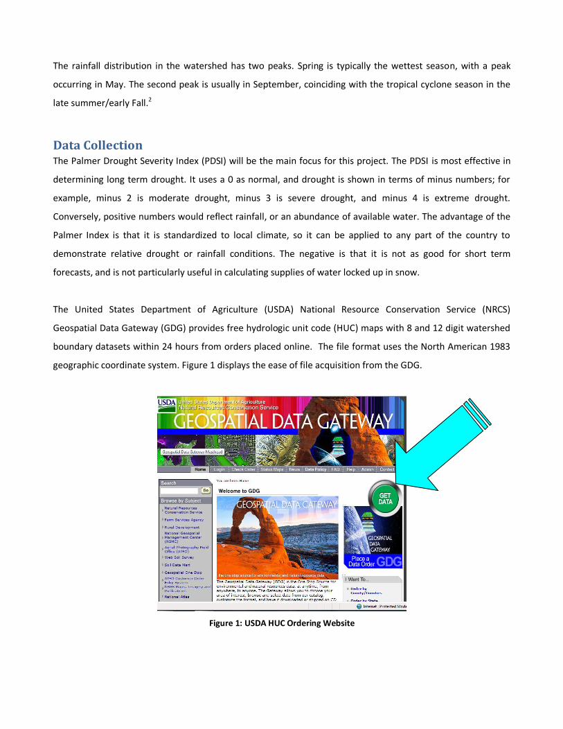
The United States Department of Agriculture (USDA) National Resource Conservation Service (NRCS)
Geospatial Data Gateway (GDG) provides free hydrologic unit code (HUC) maps with 8 and 12 digit watershed
boundary datasets within 24 hours from orders placed online. The file format uses the North American 1983
geographic coordinate system. Figure 1 displays the ease of file acquisition from the GDG.
Figure 1: USDA HUC Ordering Website

The TWDB, in conjunction with the National Oceanic & Atmospheric Association (NOAA), contains historical
drought data for the state of Texas from 1895 to present. Several different average monthly drought indices
are tabulated within FTP sites by regional codes. Navigation to the FTP sites and interpretation of the data was
accomplished with the assistance of a hydrologist in the Water Availability Modeling department of the TWDB
Surface Water Resources Division.
The National Drought Mitigation Center within the School of Natural Resources at the University of Nebraska-
Lincoln (UNL) has shape files containing weekly averaged PDSI data throughout the United States from 2001 to
present. The shape files are formatted to the USA Contiguous Albers Equal Are Conic projection with the North
American 1983 geographic coordinate system. UNL also provides a Drought Monitor Layer file to associate the
PDSI value of the polygons within each shape file with its representative drought monitor number and related
color code.
Methodology The HUC 8-digit shape file received from GDG provided the boundary for the Pedernales Watershed. Using the
Select Feature tool the selected shape can then be converted to a polygon with the Feature to Polygon tool.
Figure 2 shows the process to convert from the Pedernales 12090206 feature to Basin polygon.
Figure 2: Isolation of Pedernales Watershed “Basin”
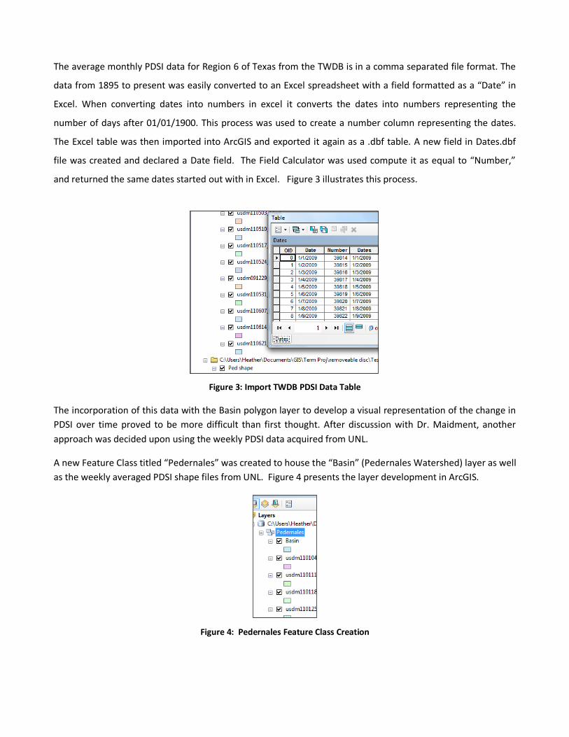
The average monthly PDSI data for Region 6 of Texas from the TWDB is in a comma separated file format. The
data from 1895 to present was easily converted to an Excel spreadsheet with a field formatted as a “Date” in
Excel. When converting dates into numbers in excel it converts the dates into numbers representing the
number of days after 01/01/1900. This process was used to create a number column representing the dates.
The Excel table was then imported into ArcGIS and exported it again as a .dbf table. A new field in Dates.dbf
file was created and declared a Date field. The Field Calculator was used compute it as equal to “Number,”
and returned the same dates started out with in Excel. Figure 3 illustrates this process.
Figure 3: Import TWDB PDSI Data Table
The incorporation of this data with the Basin polygon layer to develop a visual representation of the change in
PDSI over time proved to be more difficult than first thought. After discussion with Dr. Maidment, another
approach was decided upon using the weekly PDSI data acquired from UNL.
A new Feature Class titled “Pedernales” was created to house the “Basin” (Pedernales Watershed) layer as well
as the weekly averaged PDSI shape files from UNL. Figure 4 presents the layer development in ArcGIS.
Figure 4: Pedernales Feature Class Creation

Each individual weekly PDSI polygon shape file from 2001 to present was then manually amended to import
the Drought Monitor (DM) Layer file from UNL into the Symbology tab within the Layer Properties.
Determining how to write a code to import the DM layer file into the Symbology tab would prove very useful
since manually importing the DM layer for over 500 individual weekly layers was extremely time consuming.
Figure 5 demonstrates the process described above.
Figure 5: Importing the Drought Monitor Layer
The average weekly PDSI polygon shape files had to be time indexed in order for the animation to run. The first
step was to add a Date field to the attribute table for each of the weekly layers. Once the new field was
created in the attribute table, the Field Calculator tool was executed to output the corresponding date for each
specific weekly polygon.
ArcGIS stores dates in a format not easily rendered as standard dates. Some research using the ArcGIS Help
tool as well as some trial and error was necessary to ascertain how to use the Field Calculator to output the
desired date. The default zero date value in ArcGIS is December 30, 1899. When calculating a date field,
positive numbers reflect days after December 30, 1899. Simply inputting the date “10/25/2011” into the Field
Calculator, for example, returns the time of 12:25AM on the date of 12/30/1899. Several attempts at inserting
dates in any sort of traditional format into Field Calculator returned like results. Reading through the ArcGIS
Help tool unearthed the concept to use programming language to extract the desired date. In order to return
a date of 10/25/2011, insert the text “dateserial(2011,10,25)” into the workspace provided within the Field
Calculator dialogue box; however, depending upon the global date/time settings of the computer in which you

are working, the format within the parentheses may vary. The Regional and Language tab within the Control
Panel of the computer should verify the date settings on the machine. Once the appropriate date has been
exported to each weekly PDSI polygon layer, the layer itself must be manually time indexed. This is
accomplished by selecting the Time tab within the Properties dialogue box for the layer of interest and
checking the box to enable time on that layer. Subsequently, the Calculate button needs to be clicked to join
the index the desired date to the layer, otherwise the time will be set to the default date of 12/30/1899. Figure
6 exhibits a suitable approach to obtain the desired date for a computer with “Shortdate” settings.
Figure 6: Field Calculator Input for Date Extraction
The weekly PDSI polygon layer files for 10 years of data consume a lot of memory to run. For this reason, and
to concentrate on the DM changes within the Pedernales Watershed over time, each weekly shape file was
“clipped” to the Basin layer using the Clip tool. The Clip function extracts input features that overlay the
clipped feature. In this case, the weekly PDSI polygons were clipped to display only the area within the Basin
boundaries. Figure 7 illustrates this process.

Figure 7: 10/14/2011 PSDI Polygon Clipped to Basin
After the tedious legwork to individually layer, time index and clip the weekly PDSI polygons, the animation
process seemed almost too easy. To enable the animation toolbar, go to the Customize tab at the top of
screen within the ArcGIS program and ensure that Animation is selected under Toolbars. Next, select Create
Time Animation from the Animation drop down list, and times-series animation is accomplished. A Time Slider
should appear on the screen to allow you to scroll through time as shown in Figure 8.
Figure 8: PDSI Time Series Animation for the Pedernales Watershed

Results & Discussion Graphic representations of the change in PDSI over time were developed in Excel using the monthly averaged
PDSI data received from the TWDB. The illustration of the average monthly PDSI value for Region 6 of Texas
from 1895 to present provides evidence of the cyclical nature of dry and wet periods through time. Figure 9
shows the devastating drought of 1955, as well as the extremely wet summer of 2007.
Figure 9: Monthly PDSI Averages for TX Region 6 1895-Present
Figure 10 focuses in on the monthly averaged PDSIs from 2001 to present to reveal the variation of PDSI value
in more detail. From the graph it can be inferred that on average, the annual PDSI value tends to stay within a
range of +/-4. Following the line for 2010, shows that the year started with a positive soil moisture measure,
but as the year progressed, the PDSI value continued to fall. This decline in PDSI remains through to November
2011, exhibiting a drought that may be akin to that of 1955 if it persists.
-6
-4
-2
0
2
4
6
8
1895 1915 1935 1955 1975 1995 2015
Year
PD
SI
Valu
e
January
February
March
April
May
June
July
August
September
October
November
December

Figure 10: Monthly PDSI Averages for TX Region 6 2001-Present
Unfortunately, due to time constraints, the animation of data from 2001 to present was not accomplished. It
was far too time consuming for the scope of this project to manually import the DM layer, add date fields,
calculate date fields, time index and clip each weekly PSDI polygon layer. Animating the data from 2001 may
have been achieved if less time had been spent working with the TWDB monthly data, which was then
determined to be of less use to the project than the UNL data.
The monthly averaged PDSI values for Texas Region 6 from the TWDB and the weekly averaged PDSI values
within the Pedernales Watershed corroborate the accuracy of one another. The weekly averaged data does
not distinguish below values of -4 or above values of 0, but for the times when the PDSI is between 0 and -4,
the weekly and monthly averaged PDSI values are within close, if not the same, range as each other.
The beginning of the year for 2010 was relatively moist according to the monthly averaged PDSI values from
the TWDB, as previously discussed, which is mirrored by the lack of attributed polygonal area for the clipped
UNL weekly shape files between the months of January to June of 2010. The steady decline in PDSI seen from
the TWDB monthly data in 2011 is matched by the UNL weekly data. Screen captures of the animation
showing change in PDSI over time at various points from January 2010 to October 2011 are displayed in Figure
11.
-6
-4
-2
0
2
4
6
8
1 3 5 7 9 11
Month of the Year
PD
SI
Va
lue
2001
2002
2003
2004
2005
2006
2007
2008
2009
2010
2011
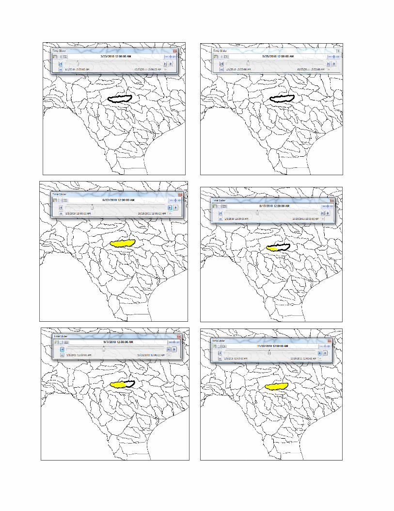


Figure 11: Screen Captures - Change in PDSI from 01/2010 to 10/2011
Conclusions The development of this particular animation brought to light some areas in ArcGIS that can be improved.
Probably the most important thing to take away from this work is that for projects such as this, with multiple
layers of the same type, the development of some new ArcGIS tools would exponentially increase the
efficiency of similar projects. For example, it would be very beneficial to have some sort of extraction tool to
place the same input, such as the DM layer, into multiple layers of the same type. Another tool to have
multiple feature inputs for tools like the Clip tool would increase efficiency as well. A further time saving
technique would be to have the option to automatically time index the specified date field once the layer is
clicked to be time enabled. If any of these tools exists, they were not found during the research put into this
project and Dr. Maidment is unaware of them.
The drought mapping process itself provides a unique tool to use in conjunction with mathematical model
development in hopes to gain more accuracy for future drought predictions. With better predictive climatic
models, the evolution of what could have been a desolate landscape can possibly be engineered for
sustainability.


References 1 Robert McLeman, Sam Herold, Zoran Reljic, Mike Sawada and Daniel McKenney. (2010). “GIS-based modeling
of drought and historical population change on the Canadian Prairies,” Journal of Historical
Geography, 36. 43-56.
2 Lower Colorado River Authority (LCRA). (2000). “Pedernales River Watershed – Brush Control Assessment and
Feasibility Study.”
United States Department of Agriculture, National Resource Conservation Service Geospatial Data Gateway.
(Accessed 10/15/2011). Hydrologic Unit Maps: http://datagateway.nrcs.usda.gov/
Very special thanks to:
Dr. David Maidment, Hussein M. Alharthy Centennial Chair in Civil Engineering and Director of the Center for
Research in Water Resources at University of Texas at Austin, without whom this work would not have been
possible.
Acknowledgements to:
Brian A. Fuchs, a Climatologist with the National Drought Mitigation Center, School of Natural Resources at the
University of Nebraska-Lincoln for his assistance in obtaining weekly drought monitor shape files available for
the public at: http://droughtmonitor.unl.edu/dmshps_archive.htm
Dr. John Zhu, a Hydrologist in the Water Availability Modeling department of the Texas Water Development
Board Surface Water Resources Division, for his aid in accessing and interpreting monthly PDSI data from
ftp://ftp.ncdc.noaa.gov/pub/data/cirs/drd964x.pdsi.txt