Embed Size (px)
Citation preview

80
Tow
ard
s a N
ew
Ag
e G
rap
hic
Desi
gn
PRINCIPLES of layoutdesign07
ChAPTER
www.stud
iestod
ay.co
m
Downloaded from www.studiestoday.com
Downloaded from www.studiestoday.com

Pri
nci
ple
s of
Layo
ut
Desi
gn
81While making a design, certain things need to be taken care off, so that the design fulfils the need for effective
communication besides being attractive and beautiful. While embarking on the making of the layout, one needs to understand the message and for whom it is intended. So the following aspects become the points of study to facilitate the job of making a layout. For an advertisement design is more important to be successful than just beautiful. The design must have balance, rhythm, emphasis, unity, simplicity, preparation, harmony, line, shape and movement. Good layouts never just happen, they have to be deliberately and carefully planned and worked out. Some of the things that help or direct the design of the layout must be kept in mind and considered serious:• Thenatureofthemessage.• Kindofpictureorimagethatwillbeused.• Theprocessandpaperonwhichitwillbereproduced.• Theamountoftextanditssize.• Whetherthelayoutwillstandalonelikeaposteror
compete with others in surrounding environment like in a newspaper.
Theme and ConTenTThe subject, theme or content dominate the idea of a layout — which then gives an idea about the target audience and how they need to be approached to get a favourable result. Something that is meant to shock, alarm or awaken the masses like an epidemic or terrorism need to have a bold and hard hitting approach, where as a film with a love story can have a softer and sensitive approach. The requirement of the subject leads to the “style” of the layout. Our communication should be made only after understanding how the receiver will look at it, not just how it was perceived by the creator, the receiver may just fail
www.stud
iestod
ay.co
m
Downloaded from www.studiestoday.com
Downloaded from www.studiestoday.com
82
Tow
ard
s a N
ew
Ag
e G
rap
hic
Desi
gn
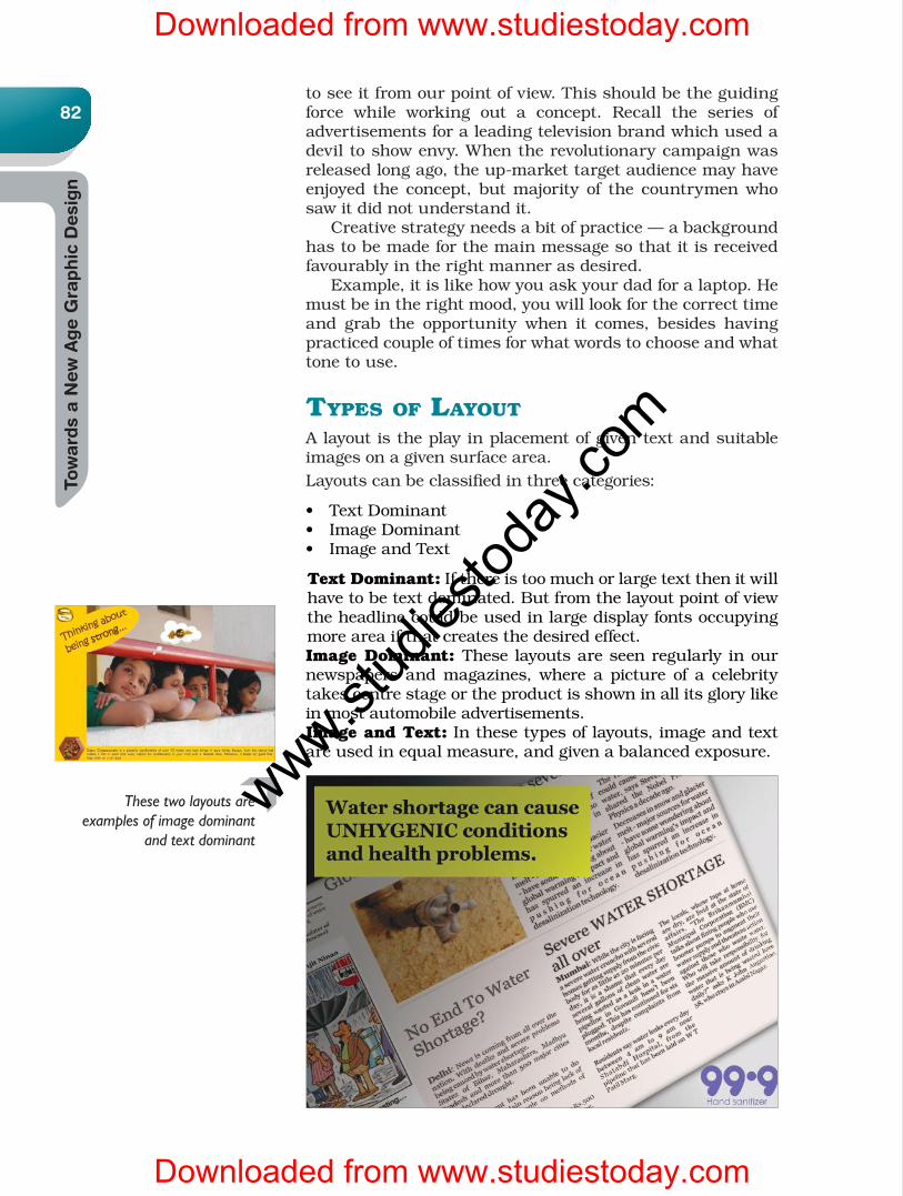
These two layouts are examples of image dominant
and text dominant
to see it from our point of view. This should be the guiding force while working out a concept. Recall the series of advertisements for a leading television brand which used a devil to show envy. When the revolutionary campaign was released long ago, the up-market target audience may have enjoyed the concept, but majority of the countrymen who saw it did not understand it. Creative strategy needs a bit of practice — a background has to be made for the main message so that it is received favourably in the right manner as desired. Example,itislikehowyouaskyourdadforalaptop.Hemust be in the right mood, you will look for the correct time and grab the opportunity when it comes, besides having practiced couple of times for what words to choose and what tone to use.
Types of LayouTAlayoutistheplayinplacementofgiventextandsuitableimages on a given surface area.Layouts can be classified in three categories:
• TextDominant• ImageDominant• ImageandText
Text Dominant:Ifthereistoomuchorlargetextthenitwillhavetobetextdominated.Butfromthelayoutpointofviewthe headline could be used in large display fonts occupying more area if that creates the desired effect.Image Dominant: These layouts are seen regularly in our newspapers andmagazines,where apicture of a celebrity takes centre stage or the product is shown in all its glory like in most automobile advertisements.Image and Text:Inthesetypesoflayouts,imageandtextareusedinequalmeasure,andgivenabalancedexposure.
www.stud
iestod
ay.co
m
Downloaded from www.studiestoday.com
Downloaded from www.studiestoday.com

Pri
nci
ple
s of
Layo
ut
Desi
gn
83Orientation of the LayoutThe paper or surface we use for artworks usually is rectangular inshape.Howyouplaceitwhenyoustartworkingonit,tallerside i.e.-verticalorwiderside i.e.horizontal iswhat is calledorientation of layout. Those of you who are familiar with working on a computer may know that if you open ‘page layout’ in the menuyougettwooptions–thehorizontalformatwhichiscalledlandscape and vertical known as portrait. When one starts to work on a design, its important to decide which option we want to use or better, which one willbemoresuitabletothejobweareabouttoexecute.Forexample if it’s a letter, it is always in a vertical format asthe line length in ahorizontal orientationwill become toolong to read and comprehend. (You have learnt in the chapter on typography about the ideal number of characters easily readableinaline.)Besidesbusinessletters,certificatesandother such official documents are normally stored in files, so the vertical or portrait style is preferred. The choice of format has to be made only on some occasions ascertainthingsalreadyhaveafixedformatlike:Vertical:Newspapers,Magazines,MostBooks,JournalsHorizontal:Hoardings,BannersandSignBoards,Vehiclegraphics. However when we have to decide about particularadvertisements in newspapers or designing posters, the designercanexercisehisdiscretion.Eventhoughmostbooksarevertical,somecoffeetablebooksaremadeinhorizontaland even in square format, if that is what is suitable or adds to the aesthetic of the subject. Butwhodecideswhatissuitable?Itisthedesigner.Thereforeit is important for a designer to work towards understanding what is suitable. Practice, no doubt makes one perfect, so keep working.Inthebeginning,itmaybeeasiertofirstmakeyourdesign, after putting together all the necessary elements and thenarrangingtheminbothformats.Experiencewillhoweverteach you that if the predominant element is of a vertical orientation (like a picture of Eiffel Tower or Mount Everest, or tall pine trees) a portrait format will most likely be more suitable, and if it’s a picturesque and panoramic seascape ormountainscape,ahorizontalorientationwilldefinitelybemore suitable, this however is not the only rule, other elements also have to be considered.
Layout CompositionThe visual aspects of the message to be conveyed have to be considered to make the layout aesthetic and communicate effectively. Then it also depends on what the layout is being made for since the requirements for different media differ. If you look at newspapers, magazines, books, stationary,posters, hoardings, book covers etc., you will notice that the layoutisdifferent.Theselayoutsarebasedonafixedformatcalled Grid. There can be layout compositions which are not
www.stud
iestod
ay.co
m
Downloaded from www.studiestoday.com
Downloaded from www.studiestoday.com

84
Tow
ard
s a N
ew
Ag
e G
rap
hic
Desi
gn
formatted or conform to any specification, they are called free or informal compositions, and they may be illustrative. BalanceinCompositionsisusuallyclassifiedas:• Symmetrical •Asymmetrical• Mechanical • Visual The layout composition is easy to make if it is based on a grid. A grid helps divided and use the given space in an organised manner. A grid is made after centre of interest is decided depending on the requirement, for text if it isprimaryinthecaseofbooks,inabookcovertextcouldbesecondaryandincaseofamagazinecover,apartfromthetitle,therestofthetextcouldbetertiary in importance. A gridhelpsdefinethetextbox,theimageboxandthegutter(spacebetweentextandimageboxes.)Letustakeacloserlook at how a grid is made and how it works.
The Grid System The grid method encourages the designer to view the entire pagesurfaceasatotalunit,breakingtheareaintosub-zonesin which the elements are placed – rather than letting the layoutdevelopfromcopyinafreeflowinghaphazardmanner.Each element of the total presentation like copy, picture, logo etc. isplaced intooneormoreof thesesections. It is thenvery easy to move each of these units around until the most suitableandpleasingarrangementisdetermined.Textandvisuals can be distributed leaving white spaces as required and suitable. Let us go step by step.• The Grid system first divides the page into vertical and
horizontalsectionsofequalsize.• Now margins are added around each unit. The margins
indicate breaks between columns of copy and or breaks which would keep blocks of elements from coming too close to each other.
• Thedivisionscannowbeusedasrequiredtoplacetextand visuals.
Copy, headline, logo, visual and other such elements like these determine the grid format, the grid in turn, determines theprecisesizeandspace.AnotherexampleisofanIrregularGrid. This when used gives a more refined look. This is called
www.stud
iestod
ay.co
m
Downloaded from www.studiestoday.com
Downloaded from www.studiestoday.com
Pri
nci
ple
s of
Layo
ut
Desi
gn
85dropping units.Inthiscasethematerialtobeusedcandefinethe design of the grid. There is no rule which says you have to fill all the available space. The graphic rule is that you must use all the space and achieve a visual balance. Remember there is a big difference between using the space and simply filling it. Adjusting to Mechanical limitations: The grid should be planned within whatever limitations imposed by a printing method,forexamplewhiledesigningforabook,onehastokeepallowance for binding of the volume. Or a centre-spread—one can disregard normal inside margins and create a two page grid.
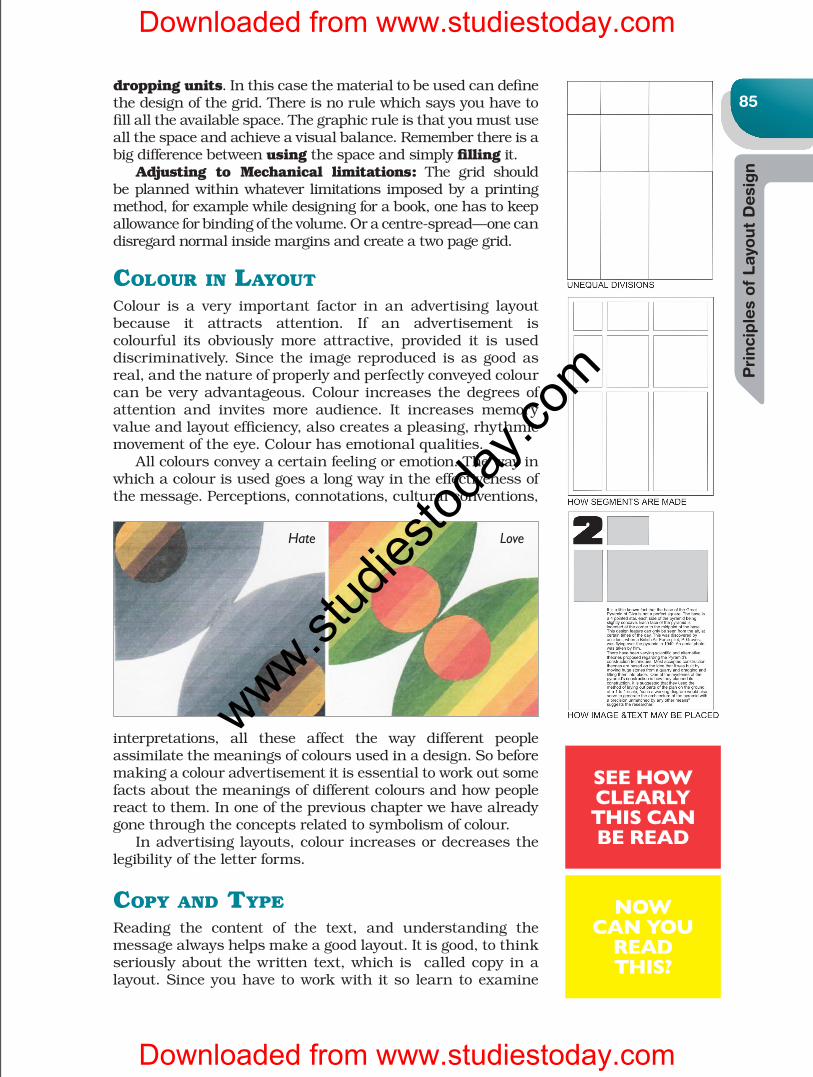
CoLour in LayouTColour is a very important factor in an advertising layout because it attracts attention. If an advertisement iscolourful its obviously more attractive, provided it is used discriminatively. Since the image reproduced is as good as real, and the nature of properly and perfectly conveyed colour can be very advantageous. Colour increases the degrees of attention and invites more audience. It increases memoryvalue and layout efficiency, also creates a pleasing, rhythmic movement of the eye. Colour has emotional qualities. All colours convey a certain feeling or emotion. The way in which a colour is used goes a long way in the effectiveness of the message. Perceptions, connotations, cultural conventions,
interpretations, all these affect the way different people assimilate the meanings of colours used in a design. So before making a colour advertisement it is essential to work out some facts about the meanings of different colours and how people reacttothem.Inoneofthepreviouschapterwehavealreadygone through the concepts related to symbolism of colour. Inadvertisinglayouts,colourincreasesordecreasesthelegibility of the letter forms.
Copy and TypeReading the content of the text, and understanding themessagealwayshelpsmakeagoodlayout.Itisgood,tothinkseriouslyaboutthewrittentext,whichis calledcopyinalayout.Sinceyouhavetoworkwithitso learntoexamine
Hate Love
See how clearly thiS can be read
now can you
read thiS?
www.stud
iestod
ay.co
m
Downloaded from www.studiestoday.com
Downloaded from www.studiestoday.com
Tow
ard
s a N
ew
Ag
e G
rap
hic
Desi
gn
Gra
phic
Desi
gn
86the words themselves in order to find some key that will be a guide. Reading or studying the copy will help plan the layout. Choosing the column width and typeface may be influenced bythekindoftextyouhavetodealwith,soyoucanworkbackwards. Knowalltheelementstobeincluded:headlines,subhead,text, illustrations, logotypes, testimonials, order formsandtherest.Havetheillustrativematterbeforehandandknowtheactualworkingofheadlines.Donotcompromiseoneffort;care taken at this stage will ward off problems at the later stage.Typearrangementhastobeworkedat–togettheexactlook and feel of balance and harmony. Itisnotalwaysthesizeofthefontthatfacilitatesreadability,it’s more often the space between words and lines that makes formoreeffectiveandeasierreading.Seethesetwoexamples.
design for pubLiCaTionWhen we begin to design it is important to know how and where it is going to be printed. These days the design could be applicable to various media, not just one, so one must try toknowtheexpectedusages.Whiledesigningfortheprintmediathesizeandotherthingshavetobekeptinmind. After all a good design has to look good after it is printed in amagazine,newspaper,posterorbook,whereveritismeant
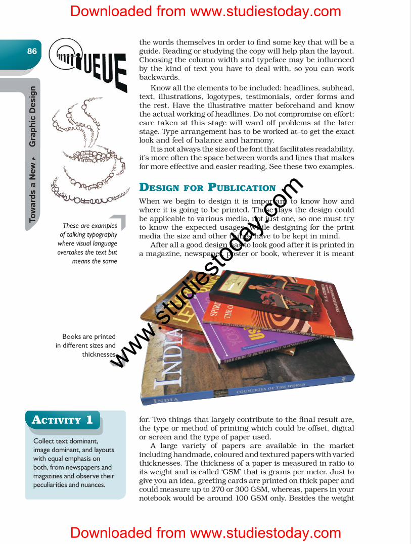
for. Two things that largely contribute to the final result are, the type or method of printing which could be offset, digital or screen and the type of paper used. A large variety of papers are available in the market includinghandmade,colouredandtexturedpaperswithvariedthicknesses. The thickness of a paper is measured in ratio to itsweightandiscalled‘GSM’thatisgramspermeter.Justtogive you an idea, greeting cards are printed on thick paper and could measure up to 270 or 300 GSM, whereas, papers in your notebookwouldbearound100GSMonly.Besidestheweight
Books are printed in different sizes and
thicknesses
These are examples of talking typography
where visual language overtakes the text but
means the same
aCTiviTy 1
Collect text dominant, image dominant, and layouts with equal emphasis on both, from newspapers and magazines and observe their peculiarities and nuances.
www.stud
iestod
ay.co
m
Downloaded from www.studiestoday.com
Downloaded from www.studiestoday.com
Pri
nci
ple
s of
Layo
ut
Desi
gn
87the smoothness of the paper also plays a role in the printed results. Apart from its thickness and smoothness, all papers are not suitable for all types of printing. Since the intense andpersonaliseduse of computers and theadvent ofDeskTop Publishing (DTP), paper sizes have been standardisedinternationally to fit printers in every office and home to the A1, A2, A3, A4 and letter series you may already be familiar withandthesearethepapersizesusedfordigitalprinting. However, papers for printing large quantities andmassproduction come indifferent sizesand types.For instanceyou may have noticed the daily newspapers are printed on apaperwhichisdifferentfromotherpaperqualitysize,itiscalled newsprint. Some other types of paper are ivory card, maplitho, executive bond, alabaster, cartridge etc. Thesenames either come from their usage or place of origin. What matters to us at this juncture is that all these papers come in different size and have some technical orother limitations, so at the time of making a layout a graphic designer needs to be aware of, and learn to adjust to the technical or mechanical limitations
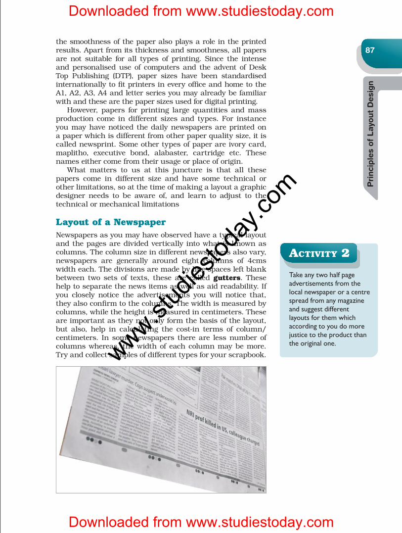
Layout of a NewspaperNewspapers as you may have observed have a typical layout and the pages are divided vertically into what is known as columns.Thecolumnsizeindifferentnewspapersalsovary,newspapers are generally around eight columns of 4cms width each. The divisions are made by line spaces left blank between two sets of texts, these are calledgutters. These helptoseparatethenewsitemsaswellasaidreadability.Ifyou closely notice the advertisements you will notice that, they also confirm to the columns. The width is measured by columns, while the height is measured in centimeters. These are important as they not only form the basis of the layout, but also, help in calculating the cost-in terms of column/centimeters. Insomenewspapers thereare lessnumberofcolumns whereas, the width of each column may be more. Try and collect samples of different types for your scrapbook.
aCTiviTy 2
Take any two half page advertisements from the local newspaper or a centre spread from any magazine and suggest different layouts for them which according to you do more justice to the product than the original one.
www.stud
iestod
ay.co
m
Downloaded from www.studiestoday.com
Downloaded from www.studiestoday.com

88
Tow
ard
s a N
ew
Ag
e G
rap
hic
Desi
gn
Layout for a MagazineLikenewspapers,magazinesalsohave their specifications.Thepagesizesaredefinedandtheprintarea isalsofixedand artwork or layout must adhere to that. Notice that in all newspapersandmostmagazines,akindofborderormarginis left outside of the area of artwork, the matter or textarea is known as the print area.Printingoftextisseldomdonetilltheedgeofthepaper.Onthecoversofmagazinesand on some pages inside you may observe the picture or background colour printed up to the edge of the paper, this is called the bleed.Ifyourdesign,callsforableed,thenthesizeofactualartworkwillhavetobe larger thanthepagesizeofthemagazine.Usuallyreadingmatterofarticlesandstories inmagazines is set in columnsbutadvertisementsdo not confine themselves to these divisions. Advertisements in popularmagazinesmostly come in full page, half pageor double page. A recent trend even includes series and sometimes pages cut in half or cutouts to attract attention.
exerCises
1. Explain with some examples how selection of fonts affects the layout?
2. Observe and collect samples of different types of magazines, note sizes. Also collect samples of different papers choose 1 or 2 layouts that you like and give reasons why you like them.
3. Explain what would happen if newspapers are not divided into columns.
4. What are the considerations while designing an advertisement layout for a magazine?
Magazines mostly have a 3-column format, but
have lot of freedom within the print area.
www.stud
iestod
ay.co
m
Downloaded from www.studiestoday.com
Downloaded from www.studiestoday.com