Embed Size (px)
DESCRIPTION
Digital Art 1. A Review of the Elements of Art. The 7 Elements of Art:. Line Shape Space Form Color Value Texture. LINE. A one-dimensional , identifiable path created by a point moving in space - PowerPoint PPT Presentation
Citation preview
Digital Art 1
A Review of the Elements of Art
The 7 Elements of Art:
• Line• Shape• Space• Form• Color• Value • Texture
LINE
• A one-dimensional , identifiable path created by a point moving in space
• Can vary in width (thick or thin), direction(horizontal, vertical or diagonal), and length (long or short)
• Lines often define the edges of a form. • 5 Main Types of Line are: horizontal, vertical,
diagonal, curved and zigzag.

Lines lead your eye around the composition and can communicate information through their character and direction.
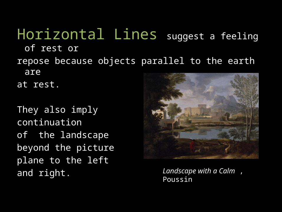
Horizontal Lines suggest a feeling of rest or
repose because objects parallel to the earth are at rest.
They also imply continuation of the landscape beyond the picture plane to the left and right.
Landscape with a Calm , Poussin
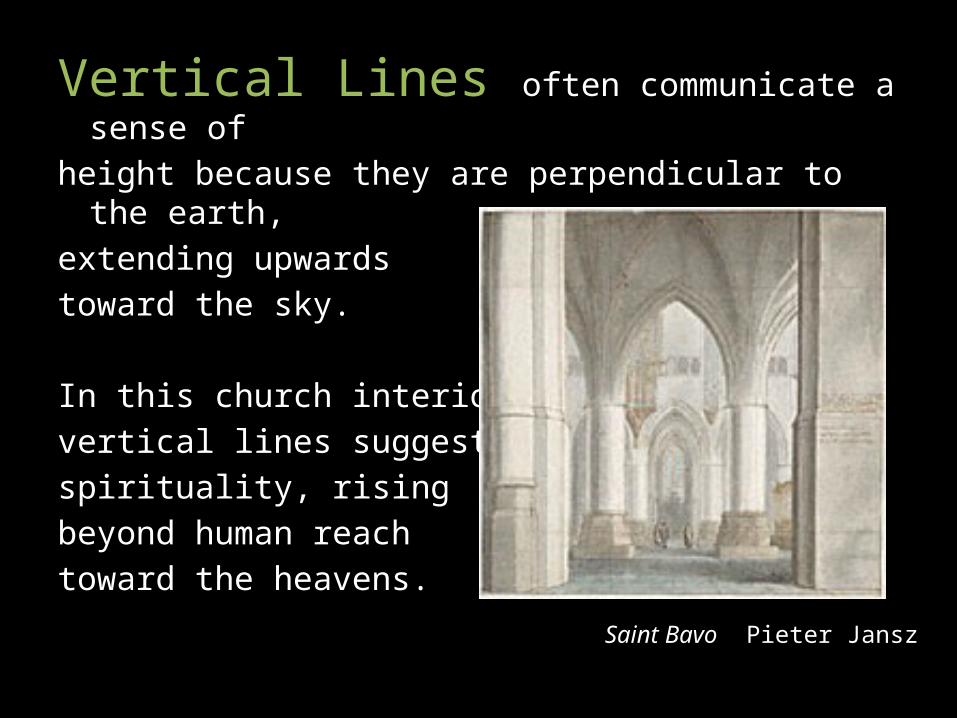
Vertical Lines often communicate a sense ofheight because they are perpendicular to the earth,extending upwards toward the sky.
In this church interior, vertical lines suggest spirituality, rising beyond human reach toward the heavens.
Saint Bavo Pieter Jansz
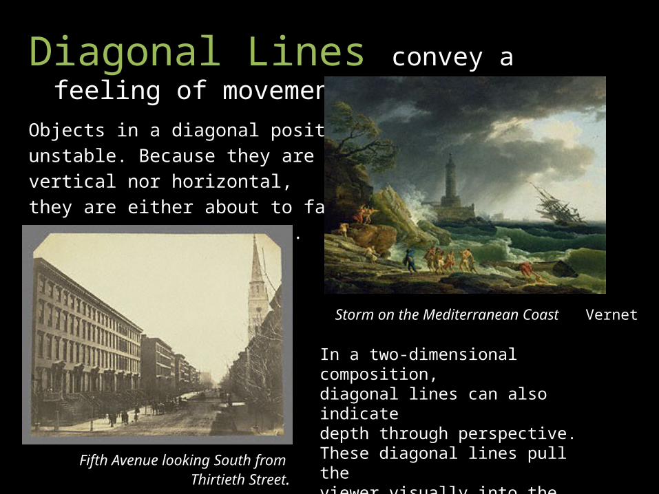
Diagonal Lines convey a feeling of movement.
Objects in a diagonal position areunstable. Because they are neither vertical nor horizontal, they are either about to fall or are already in motion.
Storm on the Mediterranean Coast Vernet
In a two-dimensional composition, diagonal lines can also indicate depth through perspective. These diagonal lines pull the viewer visually into the image.
Fifth Avenue looking South from Thirtieth Street.
The curve of a line can convey energy. Soft, shallow curves often have a pleasing,
sensual quality and a softening effect on the composition.
The edge of the pool in this photograph gently leads
the eye to the sculptures on the horizon.
Pool, Saint Cloud, 1915
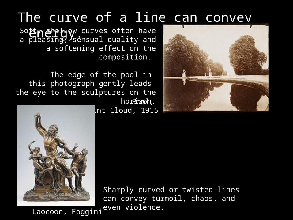
Sharply curved or twisted lines can convey turmoil, chaos, and even violence.
Laocoon, Foggini
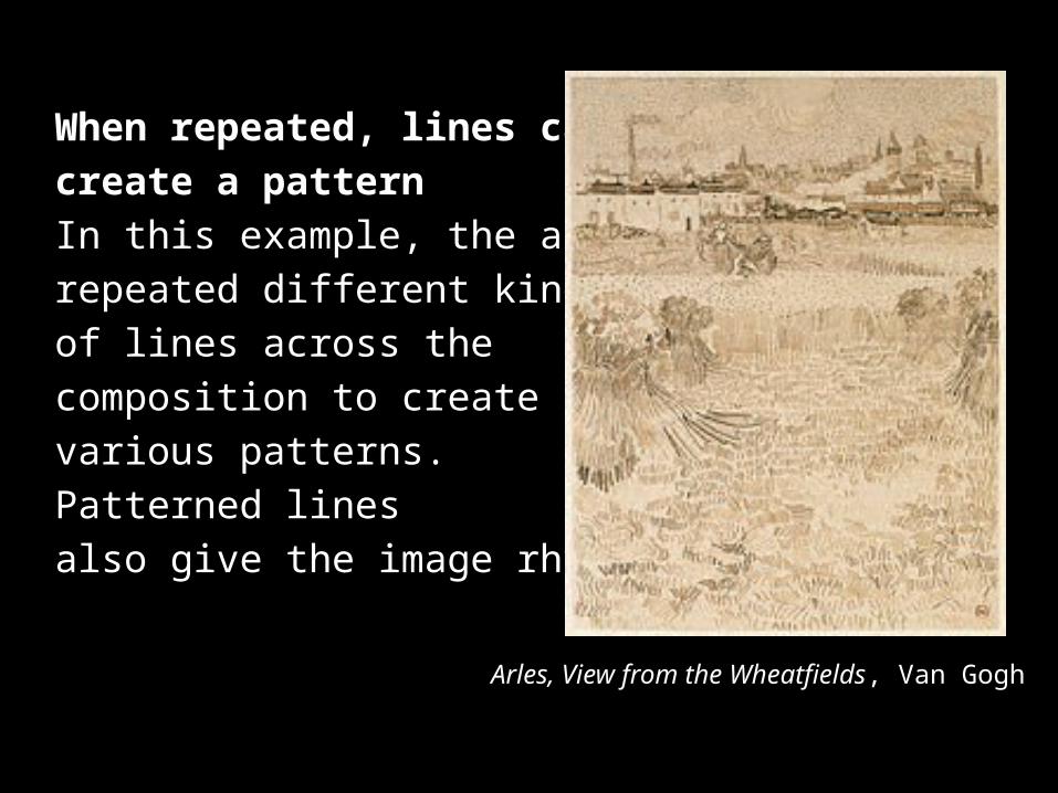
When repeated, lines can create a patternIn this example, the artist repeated different kinds of lines across the composition to create various patterns. Patterned lines also give the image rhythm.
Arles, View from the Wheatfields, Van Gogh
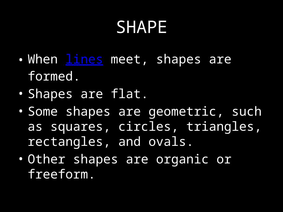
SHAPE
• When lines meet, shapes are formed. • Shapes are flat. • Some shapes are geometric, such as squares,
circles, triangles, rectangles, and ovals. • Other shapes are organic or freeform.
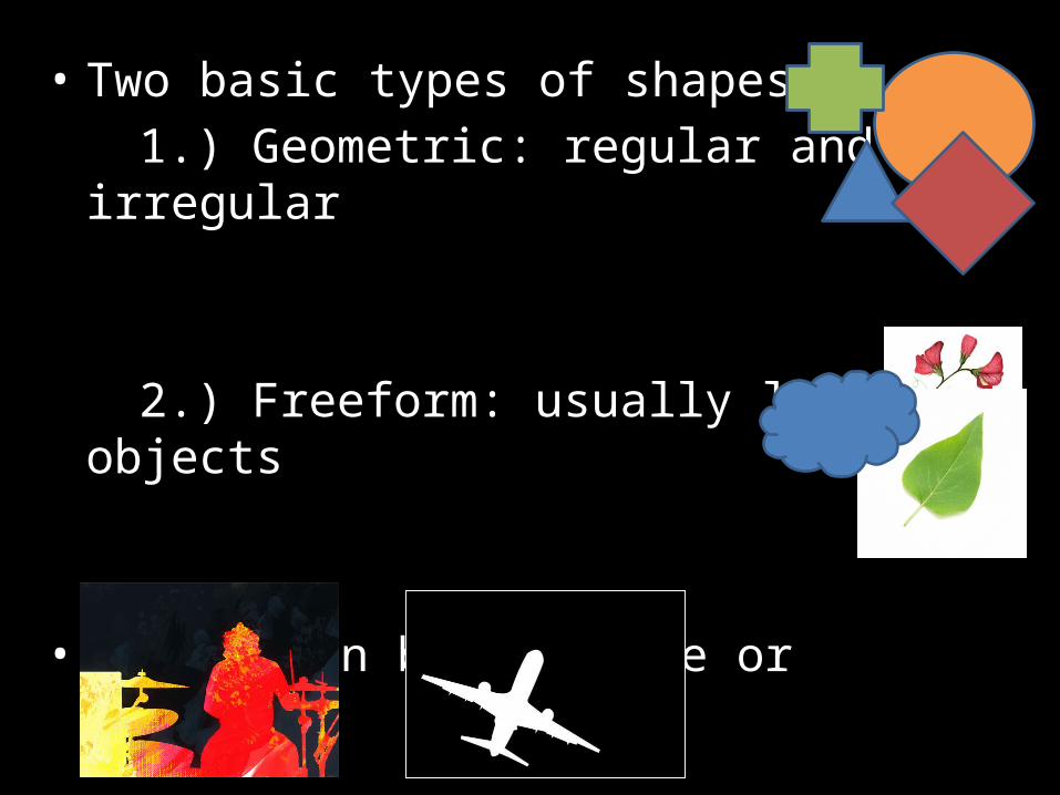
• Two basic types of shapes:1.) Geometric: regular and irregular
2.) Freeform: usually living objects
• Shapes can be positive or negative.
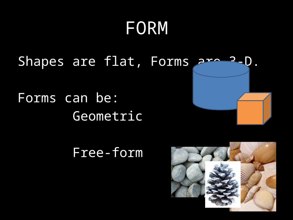
FORM
Shapes are flat, Forms are 3-D.
Forms can be:Geometric
Free-form
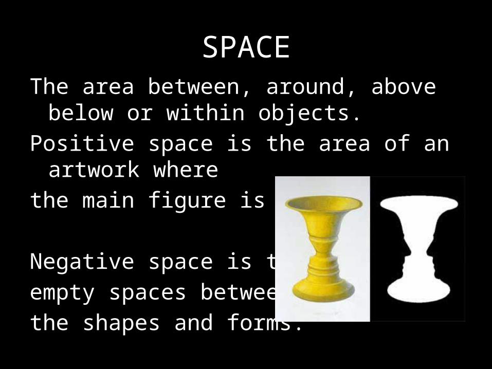
SPACEThe area between, around, above below or
within objects.Positive space is the area of an artwork wherethe main figure is located.
Negative space is the empty spaces between the shapes and forms.
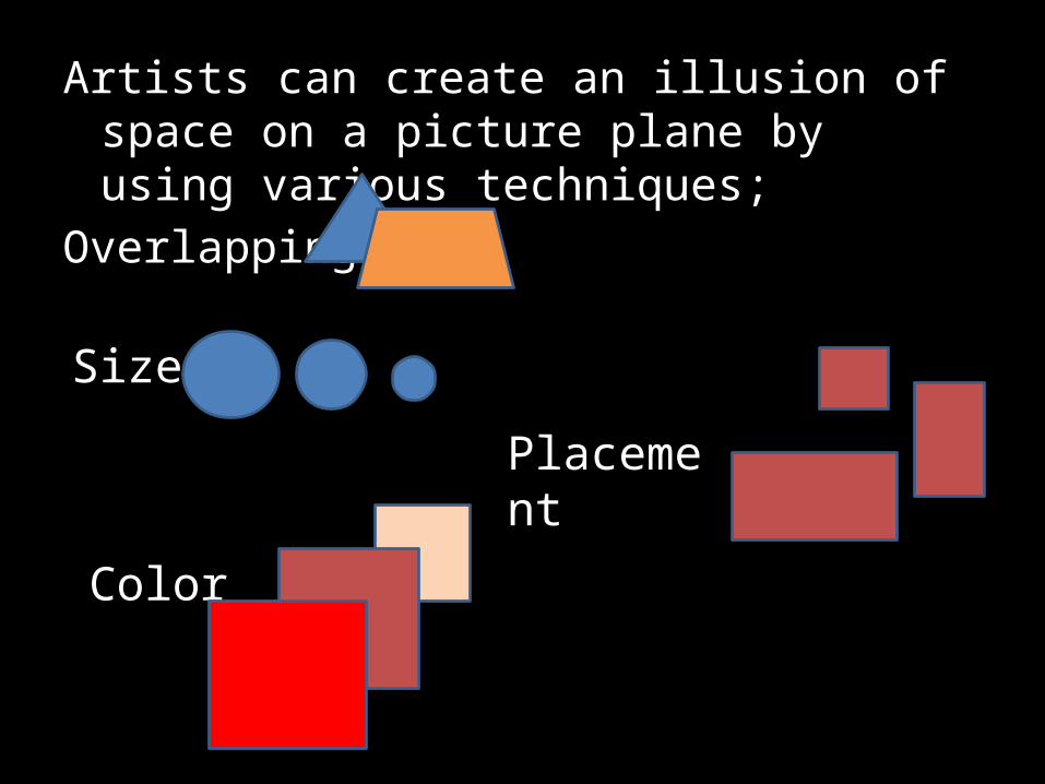
Artists can create an illusion of space on a picture plane by using various techniques;
Overlapping-
Size-
Placement
Color
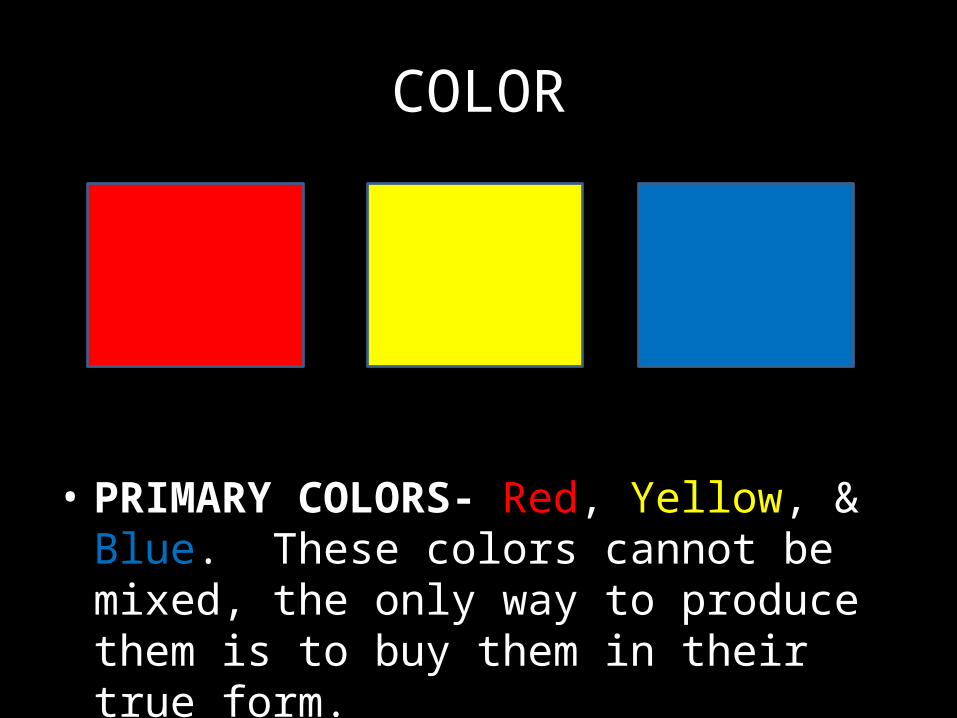
COLOR
• PRIMARY COLORS- Red, Yellow, & Blue. These colors cannot be mixed, the only way to produce them is to buy them in their true form.
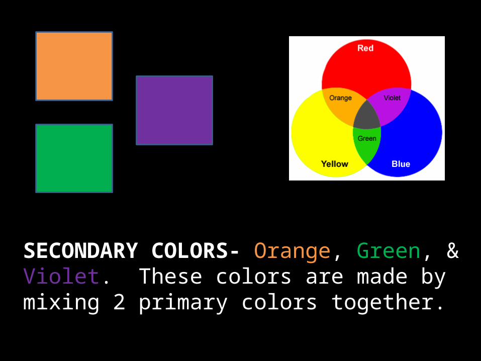
SECONDARY COLORS- Orange, Green, & Violet. These colors are made by mixing 2 primary colors together.
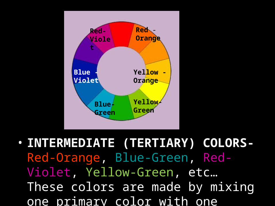
• INTERMEDIATE (TERTIARY) COLORS- Red-Orange, Blue-Green, Red-Violet, Yellow-Green, etc… These colors are made by mixing one primary color with one secondary color.
Red -Orange
Yellow -Orange
Yellow-Green
Blue- Green
Blue -Violet
Red- Violet
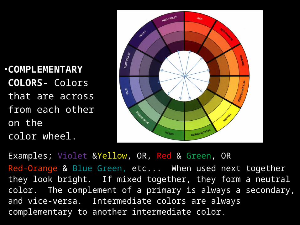
• COMPLEMENTARY COLORS- Colors that are across from each other on the color wheel.
Examples; Violet &Yellow, OR, Red & Green, ORRed-Orange & Blue Green, etc... When used next together they look bright. If mixed together, they form a neutral color. The complement of a primary is always a secondary, and vice-versa. Intermediate colors are always complementary to another intermediate color.
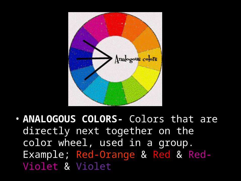
• ANALOGOUS COLORS- Colors that are directly next together on the color wheel, used in a group. Example; Red-Orange & Red & Red-Violet & Violet
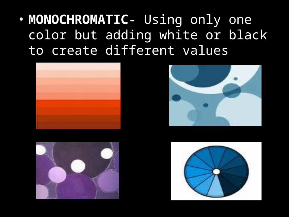
• MONOCHROMATIC- Using only one color but adding white or black to create different values
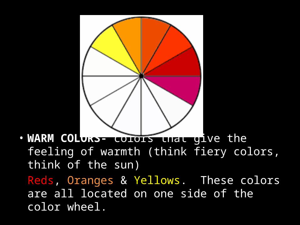
• WARM COLORS- colors that give the feeling of warmth (think fiery colors, think of the sun)Reds, Oranges & Yellows. These colors are all located on one side of the color wheel.
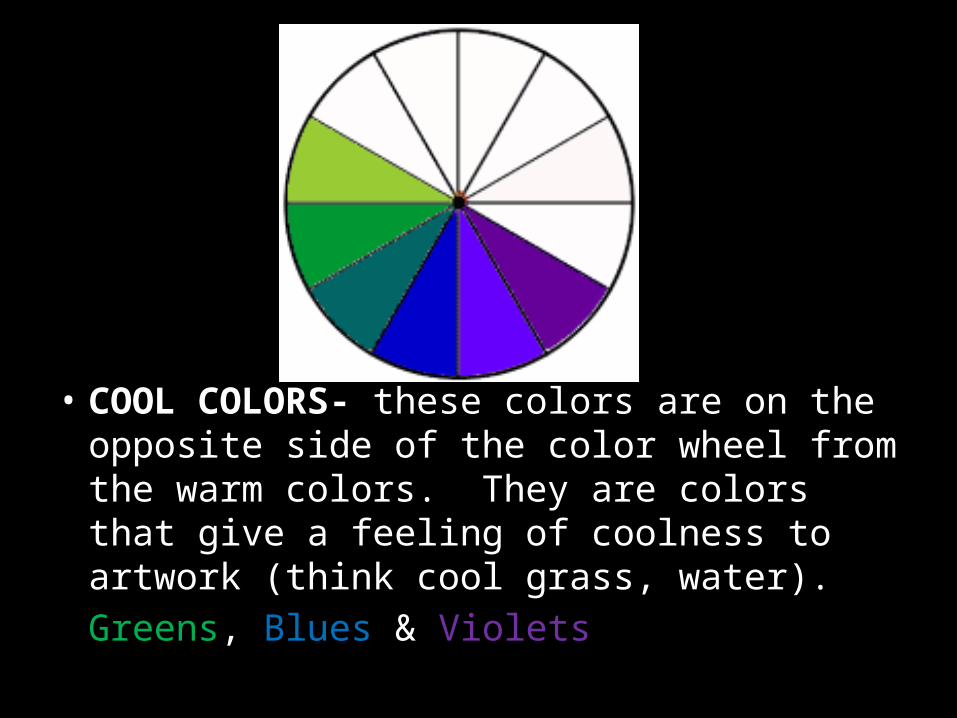
• COOL COLORS- these colors are on the opposite side of the color wheel from the warm colors. They are colors that give a feeling of coolness to artwork (think cool grass, water).Greens, Blues & Violets
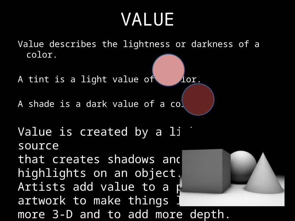
VALUEValue describes the lightness or darkness of a color.
A tint is a light value of a color.
A shade is a dark value of a color.
Value is created by a light sourcethat creates shadows and highlights on an object. Artists add value to a piece of artwork to make things look more 3-D and to add more depth.
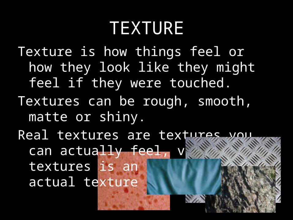
TEXTURETexture is how things feel or how they look like
they might feel if they were touched.Textures can be rough, smooth, matte or shiny.Real textures are textures you can actually feel,
visual textures is an illusion of an actual texture in an artwork.