Embed Size (px)
Citation preview
Development Diary
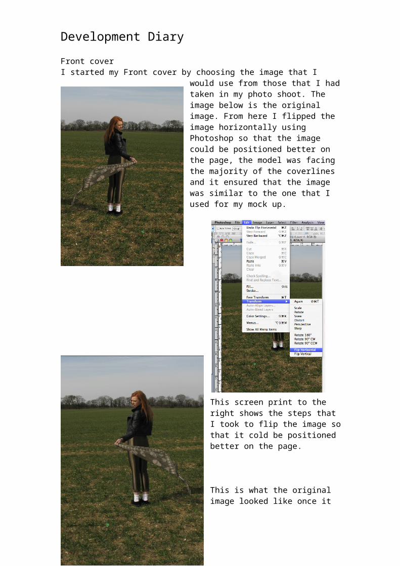
Front coverI started my Front cover by choosing the image that I would use from those that I had taken in my photo shoot. The image below is the
original image. From here I flipped the image horizontally using Photoshop so that the image could be positioned better on the page, the model was facing the majority of the coverlines and it ensured that the image was similar to the one that I used for my mock up.
This screen print to the right shows the steps that I took to flip the image so that it cold be positioned better on the page.
This is what the original image looked like once it had been flipped horizontally. I had also edited this image so that it was a bit brighter than the original as I felt that it shows some of the detail of the image more clearly. To do this, I adjusted the brightness using Photoshop.
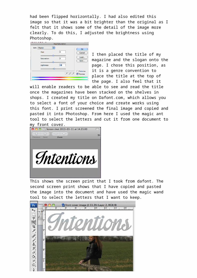
I then placed the title of my magazine and the slogan onto the page. I chose this position, as it is a genre convention to place the title at the top of the page. I also feel that it will enable readers to be able to see and read the title once the magazines have been stacked on the shelves in shops. I created my title on Dafont.com, which allows you to select a font of your choice and create works using this font. I print screened the final image and copied and pasted it into Photoshop. From here I used the magic ant tool to select the letters and cut it from one document to my front cover.
This shows the screen print that I took from dafont. The second screen print shows that I have copied and pasted the image into the document and have used the magic wand tool to select the letters that I want to keep.
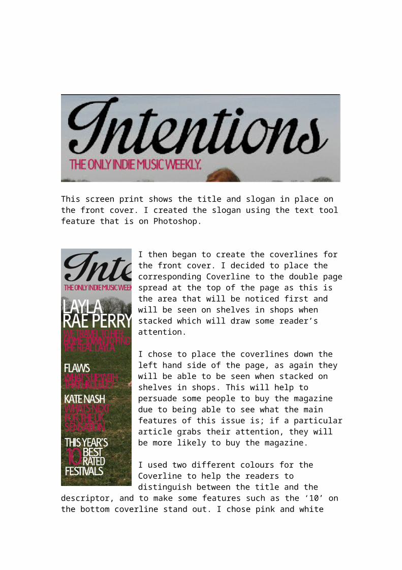
This screen print shows the title and slogan in place on the front cover. I created the slogan using the text tool feature that is on Photoshop.
I then began to create the coverlines for the front cover. I decided to place the corresponding Coverline to the double page spread at the top of the page as this is the area that will be noticed first and will be seen on shelves in shops when stacked which will draw some reader’s attention.
I chose to place the coverlines down the left hand side of the page, as again they will be able to be seen when stacked on shelves in shops. This will help to persuade some people to buy the magazine due to being able to see what the main features of this issue is; if a particular article grabs their attention, they will be more likely to buy the magazine.
I used two different colours for the Coverline to help the readers to distinguish between the title and the descriptor, and to make some features such as the ‘10’ on the bottom coverline stand out. I chose pink and white give the feminine touch to the magazine that I was trying to achieve as I have a higher ratio of women as my target audience. I also feel they work well as they provide contrast to the background.
I then placed the barcode, price, issue date and strapline at the bottom of the page.I chose to position
the strapline at the bottom of the page instead of the top as I wanted the title and slogan to be the main focus for the top of the page. I also believe that due to having extra coverlines in my strapline, they may be seen as less important than the other coverlines therefore by placing them at the bottom, they will not be noticed until the potential reader picks up the magazine. I chose to place the barcode in the bottom right hand corner along with the price and the issue number and date as this is a convention of magazines. I also believe that by placing it in a corner, it will allow readers to be able to quickly find the price.
Finally I placed the insert for my magazine along the right hand side of the page as I felt that I
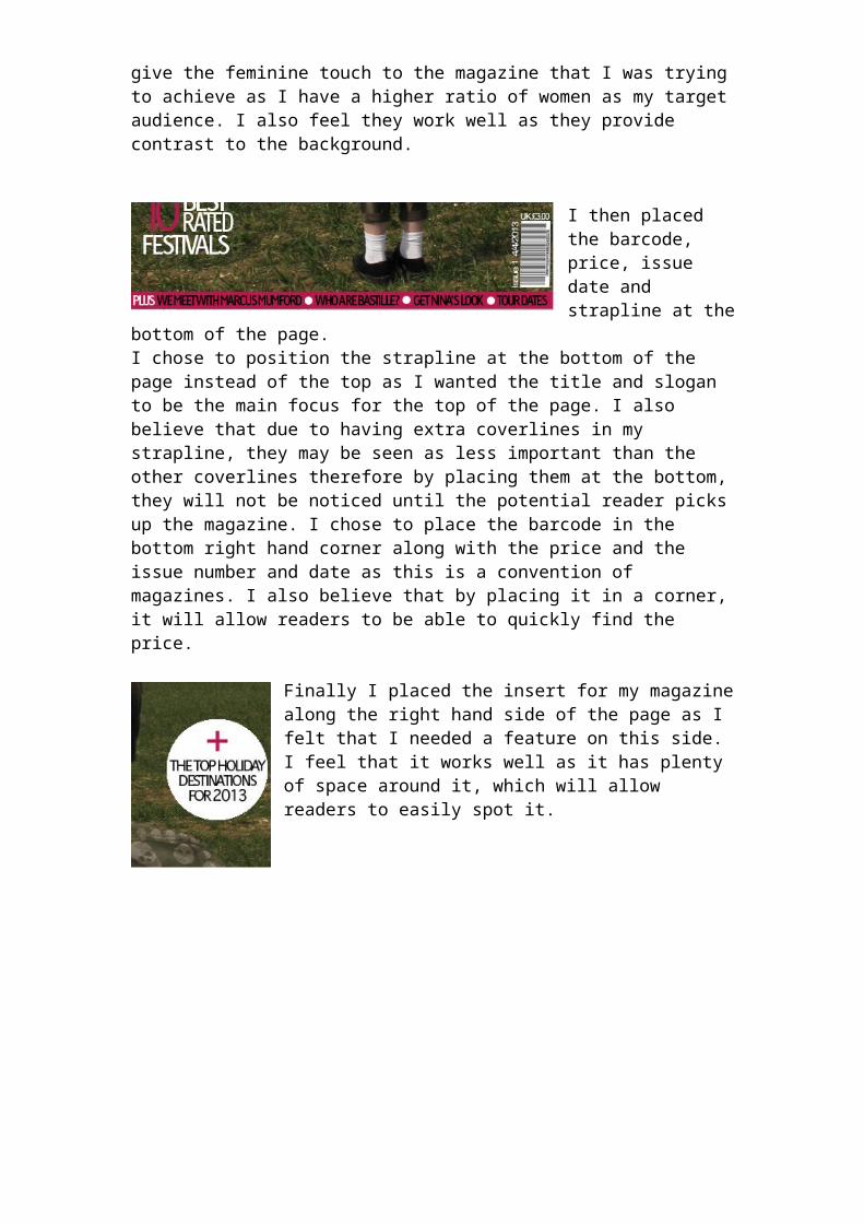
needed a feature on this side. I feel that it works well as it has plenty of space around it, which will allow readers to easily spot it.
This is my final front cover for my magazine. I feel that the main image works well with the cover lines as she is facing them, however, she is in a position where adequate space around them has been provided, as well as allowing the image to have ‘breathing space’. I feel that the pink and white stand out on the green background due to the high contrast between them. This ensures that the cover lines can be read from a distance which is applicable and necessary when
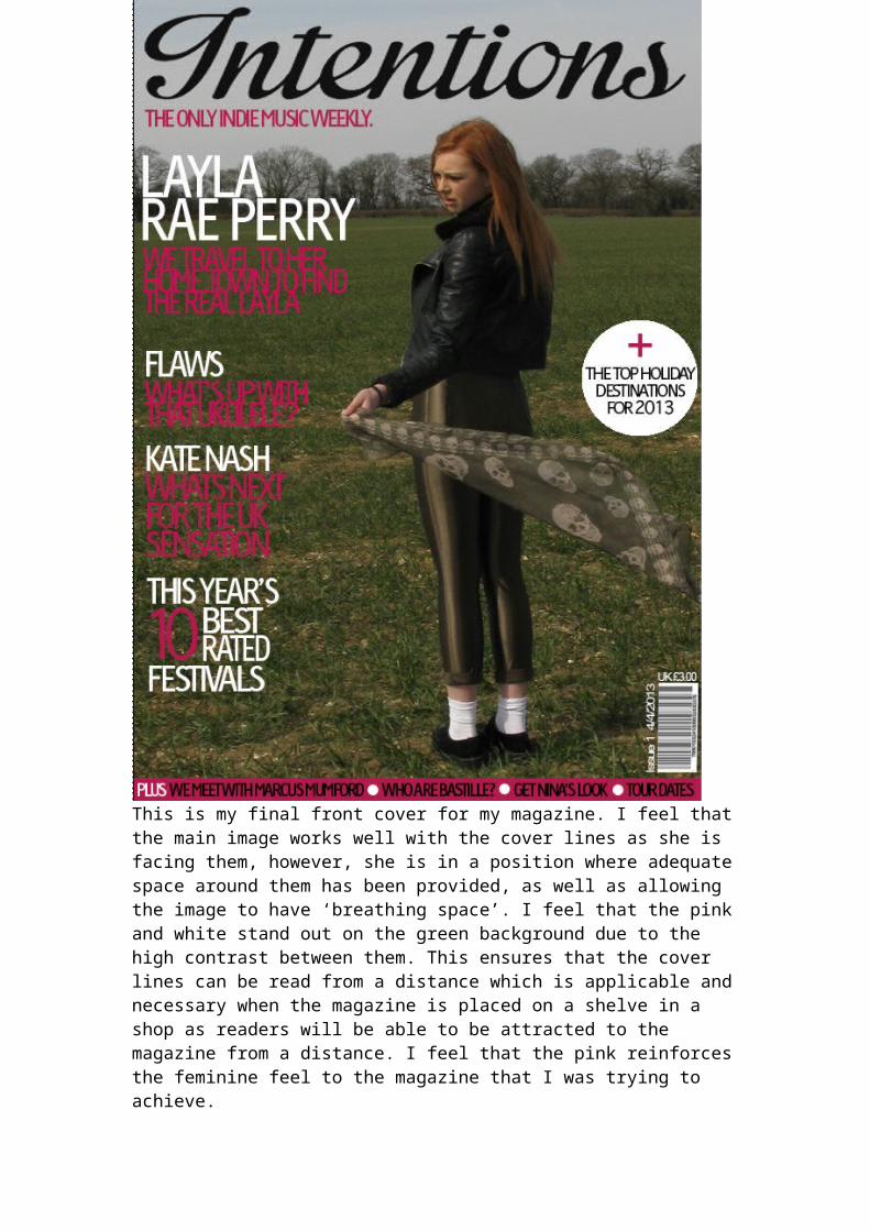
the magazine is placed on a shelve in a shop as readers will be able to be attracted to the magazine from a distance. I feel that the pink reinforces the feminine feel to the magazine that I was trying to achieve.
Contents PageI started my contents page by firstly creating the ‘I’ for the logo of the magazine, which appears in the top left hand corner. I created
the title of my magazine on Dafont.co.uk which is a website that allows you to type words in a font of your choice. I chose ‘Inpregnable’ as my typography as I felt that it suited
the target audience and genre of my magazine. I then cropped the image above so that it contained only the ‘I’ which I needed for the logo that I placed at the top of my contents page as readers tend to notice features on the top half of the page and the corners of the page.
I then inserted the rest of the text for the title of the page as well as inserting
the date and an issue number to allow the readers to know the date and number of the current issue that they’re reading.
I decided to make the font for the names of the 5 listing at the top of the page bigger as well as including an image as these articles will link to the coverlines on the front cover, which will be what attract
the audience, as well as convincing them to buy the magazine meaning that readers will want to quickly locate where about in the magazine these articles are; therefore I have placed these at the top of the page with an image to attract the readers
attention. Due to not yet having taken the photos for my contents page, I inserted boxes in the size and position of the images that I will insert after. However, I also included the page number, a place for the name of the article and room for the descriptors of these articles to ensure that I had left enough space on the page for them as well as ensuring they would be in proportion with the rest of the features included on the page. I feel that by having large and bold
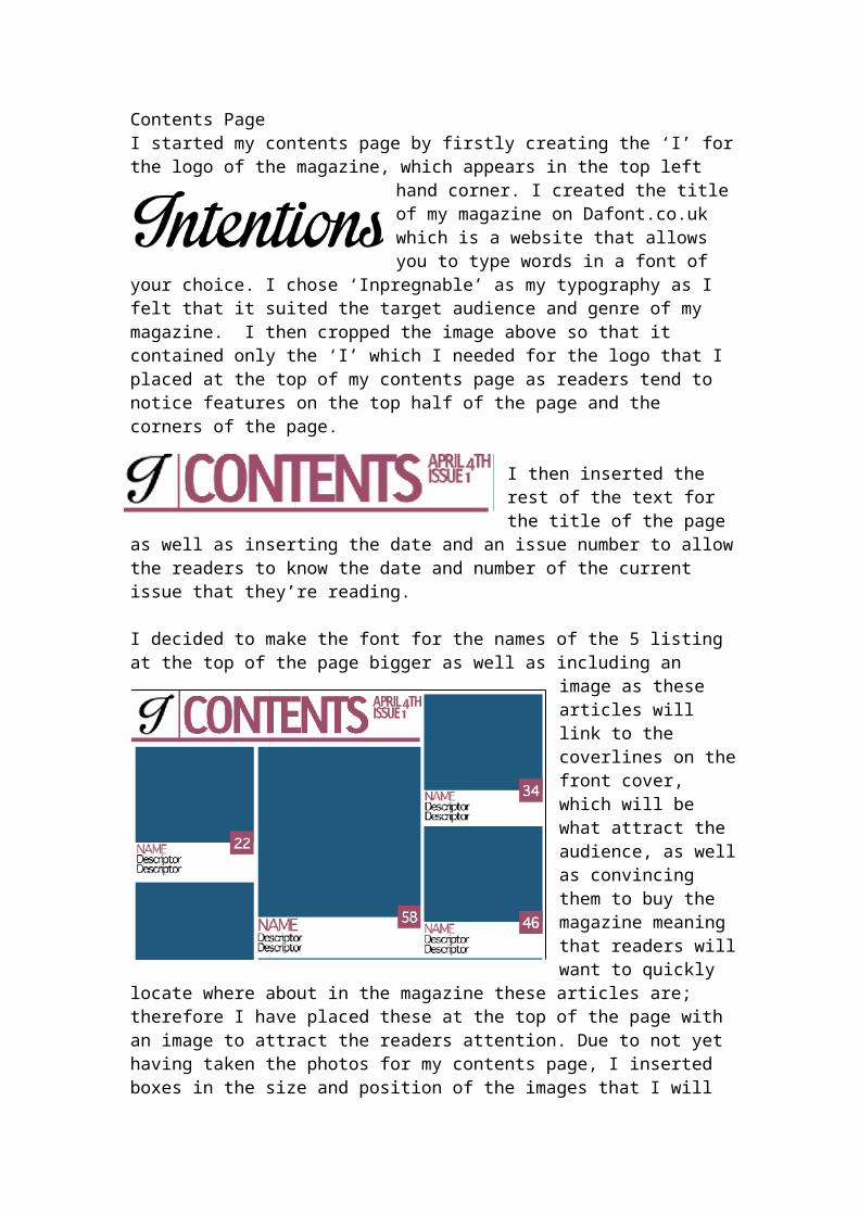
page numbers for the top 5 articles, it makes them stand out to the reader so that they take notice of them.
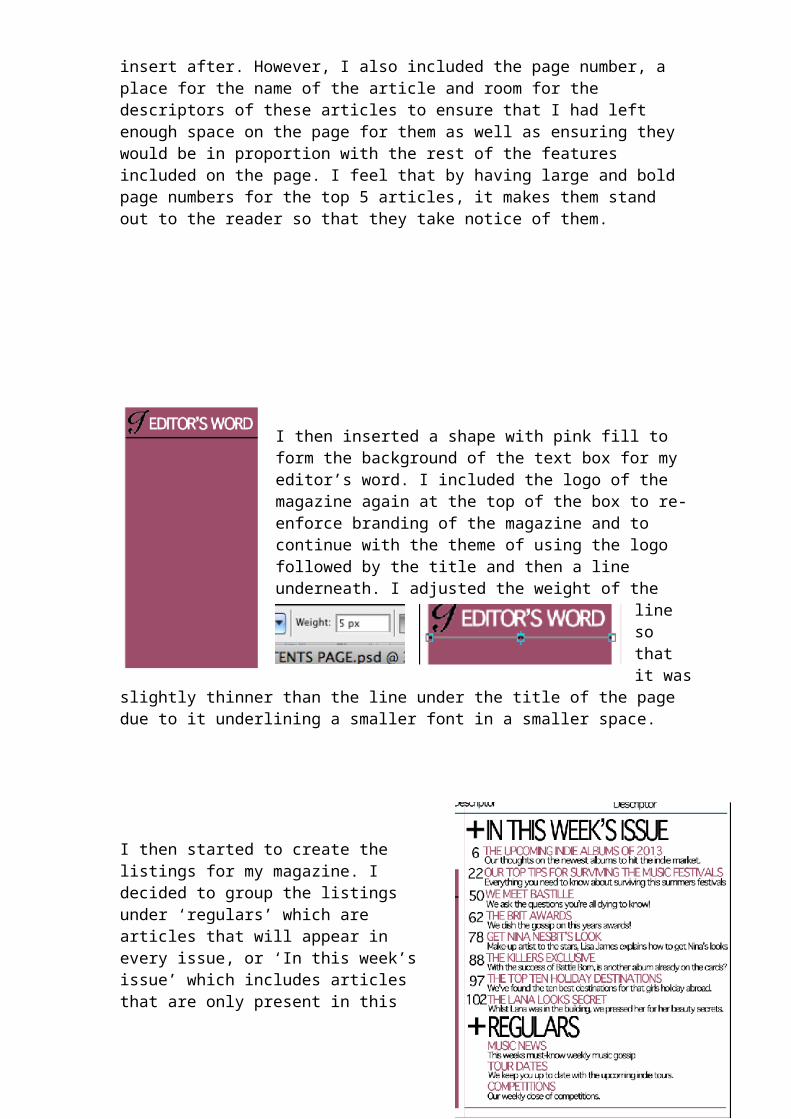
I then inserted a shape with pink fill to form the background of the text box for my editor’s word. I included the logo of the magazine again at the top of the box to re-enforce branding of the magazine and to continue with the theme of using the logo followed by the title and then a line underneath. I adjusted the weight of the line so that it was slightly thinner than the line under the title of the page due to it underlining a smaller font in a
smaller space.
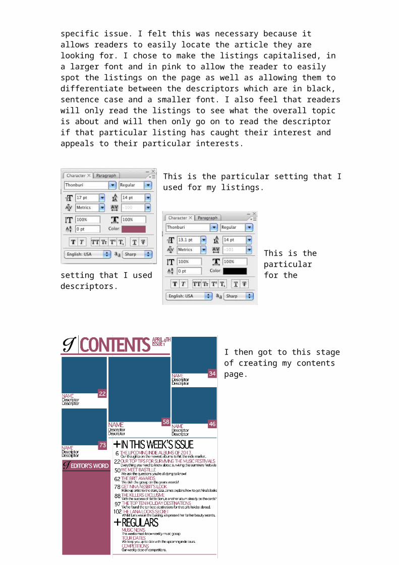
I then started to create the listings for my magazine. I decided to group the listings under ‘regulars’ which are articles that will appear in every issue, or ‘In this week’s issue’ which includes articles that are only present in this specific issue. I felt this was necessary because it allows readers to easily locate the article they are looking for. I chose to make the listings capitalised, in a larger font and in pink to allow the reader to easily spot the listings on the page as well as allowing them to differentiate between the descriptors which are in black, sentence case and a smaller font. I also feel that readers will only read the listings to see what the overall topic is about and will then only go on to read the descriptor if that particular listing has caught their interest and appeals to their particular interests.
This is the particular setting that I used for my listings.
This is the particular setting that I used for the descriptors.
I then got to this stage of creating my contents page.
Once I had taken the photos for my magazine, I edited them and placed them into position on my contents page. I chose to have quite highly contrasted images as this was the chosen style from my questionnaire. I feel that this style also allows for the image to stand out more and for the detail in them to be seen more clearly.
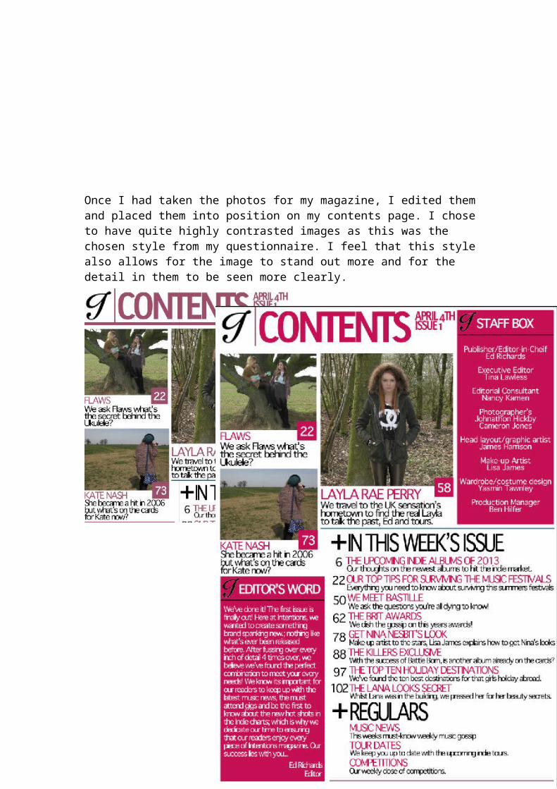
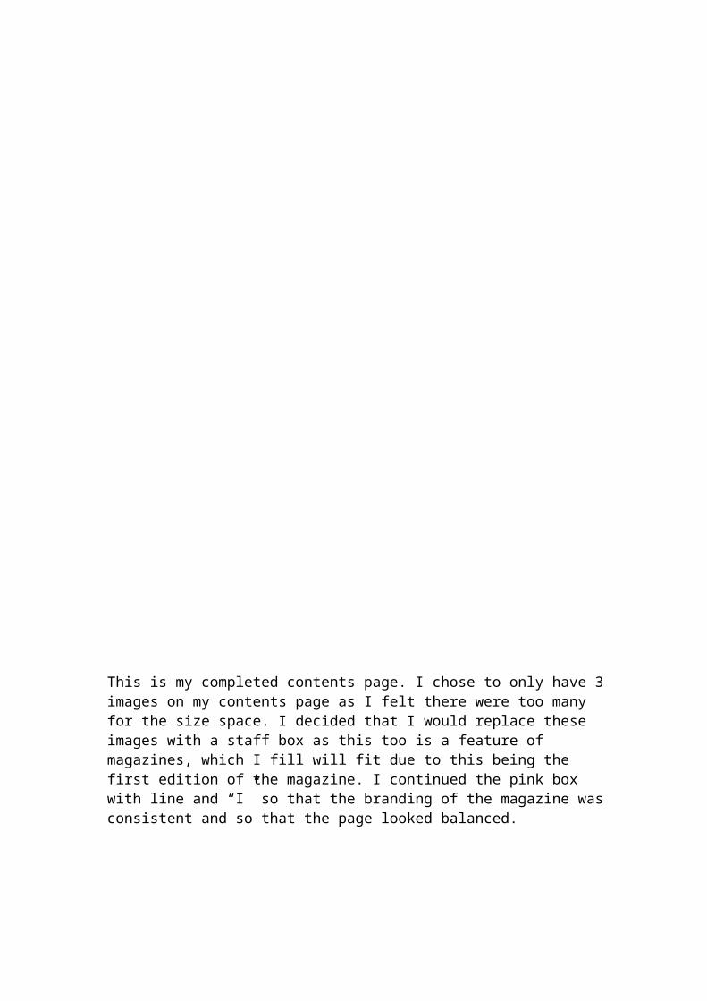
This is my completed contents page. I chose to only have 3 images on my contents page as I felt there were too many for the size space. I decided that I would replace these images with a staff box as this too is a feature of magazines, which I fill will fit due to this being the first edition of the magazine. I continued the pink box with line and “I” so that the branding of the magazine was consistent and so that the page looked balanced.
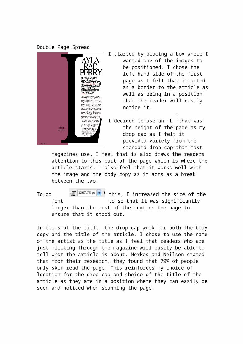
Double Page SpreadI started by placing a box where I
wanted one of the images to be positioned. I chose the left hand side of the first page as I felt that it acted as a border to the article as well as being in a position that the reader will easily notice it.
I decided to use an “L” that was the height of the page as my drop cap as I felt it provided variety from the standard drop cap that most magazines use. I feel that is also draws the readers attention to this part of the page which is where the article starts. I also feel that it works well with the image and the
body copy as it acts as a break between the two.
To do this, I increased the size of the font to so that it was significantly larger than the rest of the text on the page to ensure that it stood out.
In terms of the title, the drop cap work for both the body copy and the title of the article. I chose to use the name of the artist as the title as I feel that readers who are just flicking through the magazine will easily be able to tell whom the article is about. Morkes and Neilson stated that from their research, they found that 79% of people only skim read the page. This reinforces my choice of location for the drop cap and choice of the title of the article as they are in a
position where they can easily be seen and noticed when scanning the page.
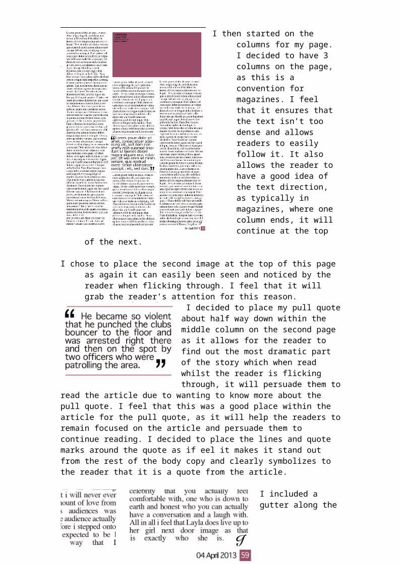
I then started on the columns for my page. I decided to have 3 columns on the page, as this is a convention for magazines. I feel that it ensures that the text isn’t too dense and allows readers to easily follow it. It also allows the reader to have a good idea of the text direction, as typically in magazines, where one column ends, it will continue at the top of the next.
I chose to place the second image at the top of this page as again it can easily been seen and noticed by the reader
when flicking through. I feel that it will grab the reader’s attention for this reason.
I decided to place my pull quote about half way down within the middle column on the second page as it allows for the reader to find out the most dramatic part of the story which when read whilst the reader is flicking through, it will persuade them to read the article due to wanting to know more about the pull quote. I feel that
this was a good place within the article for the pull quote, as it will help the readers to remain focused on the article and persuade them to continue reading. I decided to place the lines and quote marks around the quote as if eel it makes it stand out from the rest of the body copy and clearly symbolizes to the reader that it is a quote from the article.
I included a gutter along the bottom of my page to allow space for the page number and the date of the issue. I felt that this contextualizes the
piece by giving it a date stamp so that the reader knows what date of issue they are reading, or when the magazine was released if they were to read it back at a later date. I feel that the bottom of the page was the best position for this as it can clearly be seen and due to it being in one of the corners, it is the typical place for people to look for page numbers etc as this is a genre convention for magazines.
I also included an end blob at the bottom right hand corner to symbolize that it is the end of the article so that the reader doesn’t turn over the page expecting there to be more on this article. I chose to use the ‘I’ from the magazines logo as again it continues with the branding of the magazine as well as sticking with conventions as I have used this ‘I” elsewhere through the magazine, for example, on the editors word box and the staff box.
In terms of my stand first, I felt that by including a rhetorical question, it would persuade the reader to read the article to fin out the answer. I decided to make the font different and larger for this so that it stood pout from the rest of the page. By using different colours for her name, it makes it easy for the reader to spot her
name, which will give the reader some indication as to who the article is about. I also placed the Byline underneath this as it instantly tells the reader who has written the article before they have started reading it. I feel this I s a better place than at the end of the article as by then, the reader may have had enough of reading and not read the byline. By making ‘words’ in pink, it again draws the reader’s attention to this area, which increases chances of this being read.
This is my completed double page spread. I decided to make the text in the columns justified as I feel that it makes the overall appearance
of the page tidier and makes the guttering in-between each column clearer. This is also a genre convention of magazines so I chose to adopt this format.
To do this, I used the paragraph format tools on Photoshop.
I included captions on the images to tell the audience whom they were taken by, and give a brief description of what is happening in the photo. By giving the name of the photographer, it allows them to be given credit for their work.