Embed Size (px)
Citation preview

Mobile Devices: Significance
Mobile devices are nearly ubiquitous. For a significant number of people, mobile devices provide their only way to access digital content.
Any organization that seeks to promote access to digital health information in the developing world can not afford to ignore mobile platforms.
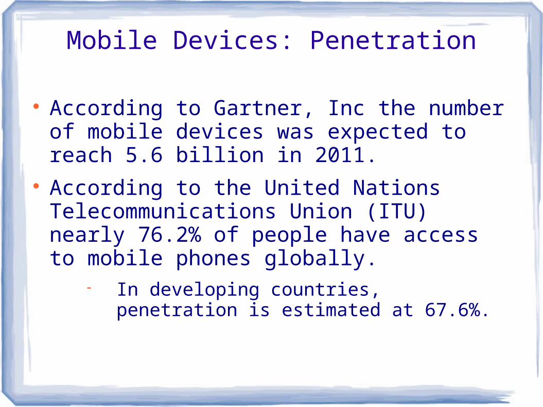
Mobile Devices: Penetration
According to Gartner, Inc the number of mobile devices was expected to reach 5.6 billion in 2011.
According to the United Nations Telecommunications Union (ITU) nearly 76.2% of people have access to mobile phones globally.
In developing countries, penetration is estimated at 67.6%.
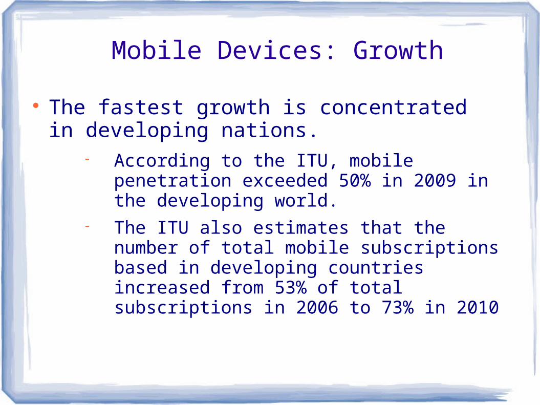
Mobile Devices: Growth
The fastest growth is concentrated in developing nations.
According to the ITU, mobile penetration exceeded 50% in 2009 in the developing world.
The ITU also estimates that the number of total mobile subscriptions based in developing countries increased from 53% of total subscriptions in 2006 to 73% in 2010
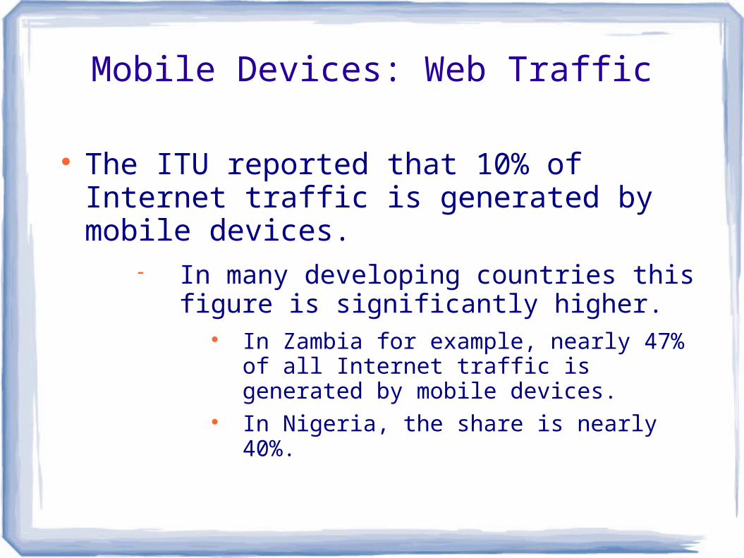
Mobile Devices: Web Traffic
The ITU reported that 10% of Internet traffic is generated by mobile devices.
In many developing countries this figure is significantly higher.
In Zambia for example, nearly 47% of all Internet traffic is generated by mobile devices.
In Nigeria, the share is nearly 40%.

Developing Content for Mobile Devices: Challenges
While the proliferation of mobile devices has created a range of new opportunities for expanding access to digital health information the devices themselves present a number of unique challenges for those trying to develop content for them.

Mobile Devices: Constraints
Mobile devices introduce a number of key constraints.
Small screen sizes. Screen sizes vary from 240 x 320 on
blackberry devices to 640 x 960 on newer IPhones
Limited bandwidth. Limited coverage. Limited computing power.
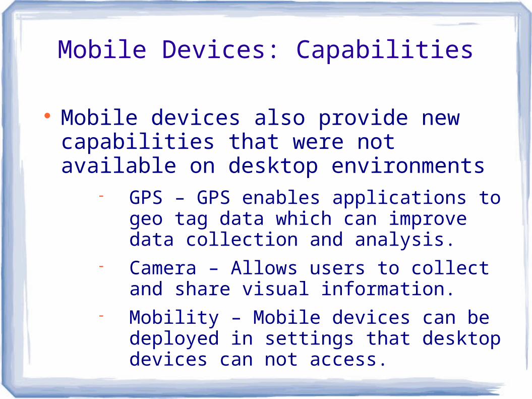
Mobile Devices: Capabilities
Mobile devices also provide new capabilities that were not available on desktop environments
GPS – GPS enables applications to geo tag data which can improve data collection and analysis.
Camera – Allows users to collect and share visual information.
Mobility – Mobile devices can be deployed in settings that desktop devices can not access.
Content: General Considerations
To be effective, content must be adapted to the constraints imposed by mobile devices.
There are two dimensions along which content can be adapted:
Presentation – Information delivered to mobile devices must adapt to smaller screen sizes.
Content – Information presented to mobile devices must be adapted to the bandwidth constraints imposed by mobile devices. It must also recognize that people tend to use mobile devices differently than desktops.
Content: Presentation
In web development, we usually distinguish between presentation and content. We use technologies such as Cascading Stylesheets (CSS) to specify how content is presented and use HTML (or XML) to define, and structure, content.
CSS is an evolving technology. The W3C, which is responsible for developing the CSS standard, has added features that make it easier to adapt content to mobile devices.
CSS3 is the most recent implementation of the CSS standard. It adds several important features for Responsive design.
Responsive Design
Responsive Design is the practice of developing content that adapts (responds) to the device that its being rendered on.
The phrase was coined by Ethan Marcotte in his article by the same name in “A List Apart”:
http://www.alistapart.com/articles/responsive-web-design/
Screen sizes range from 240 x 320 px (for blackberry devices) to 1024 x 1280 px (for standard desktop screens)
Its important that the layout used to present content adjusts based on the size of the screen used to present it.
Mobile devices usually have lower bandwidth than traditional desktop devices. So its important that we avoid unnecessary data transfers for them.
Responsive Design: Media Queries
When serving web content to mobile devices, CSS3 offers a number of tools that we can use to make content responsive.
Media Queries are used to define conditions that must be satisfied before certain styles are applied.
@media screen and (min-width: 600px) and (max-width: 900px)
The following website uses media queries to adapt its layout:
http://colly.com/ Flexible images are images that scale dynamically to
fit within screen constraints.
Responsive Design: Conditional Loading
HTML5 supports syntax that can be used to load stylesheets based on the results from media queries.
Example: <link rel="stylesheet" type="text/css" href="style.css" media="screen, handheld" />
Javascript can be used to load content based on the features offered by the display device.
Example: http://modernizr.com/
Mobile First Design
Mobile First Design refers to the practice of designing websites for mobile devices first and then extending those designs to support the capabilities of other devices.
Prioritizing the mobile experience leads teams to focus their designs; establishes a baseline experience across devices; and simplifies the development process.
Delivering Content to Mobile Apps
There are several protocols that can be used to distribute content to native mobile apps.
XMLRPC XML RPC uses HTTP Post requests to
exchange XML documents that represent procedure calls and results.
REST Uses standard HTTP requests to retrieve,
update, and delete web content.
Platforms: Drupal
The use of Content Management Systems such as Drupal simplifies the development of web content for mobile devices.
Drupal naturally separates content and presentation. The presentation of content in Drupal relies on Themes,
which are collections of HTML templates and CSS stylesheets.
In Drupal, it is possible to take a base theme that supports media queries, conditional loading, etc, and adapt it to fit an organization's needs.
Example: The Omega and Zen Drupal themes.
K4Health
K4Health's mission is to expand access to high quality health information.
K4Health has experience developing web content for mobile devices.
Examples: www.k4health.org and www.popline.org
We also have experience developing native apps for Android devices.
Example: ACE
K4Health and Drupal
K4Health uses Drupal to deliver web content. We chose Drupal because it provides a
powerful framework for creating websites that encourages code re-use and sharing.
Drupal has allowed us to develop websites that adapt seamlessly to mobile devices.
K4Health.org
K4Health.org was built using the Drupal CMS. Its theme is highly responsive - altering its
layout based on the dimensions of its display area.
K4health also uses conditional loading – removing visual elements when presented on mobile devices.
To develop K4Health.org's theme, we extended a base theme that was freely available within the Drupal community.
Photoshare.org
Photoshare.org was created to promote public health through the distribution of images related to public health.
The site was recently rebuilt on the Drupal platform.
The new design also uses responsive design principles to improve the user experience on mobile devices.
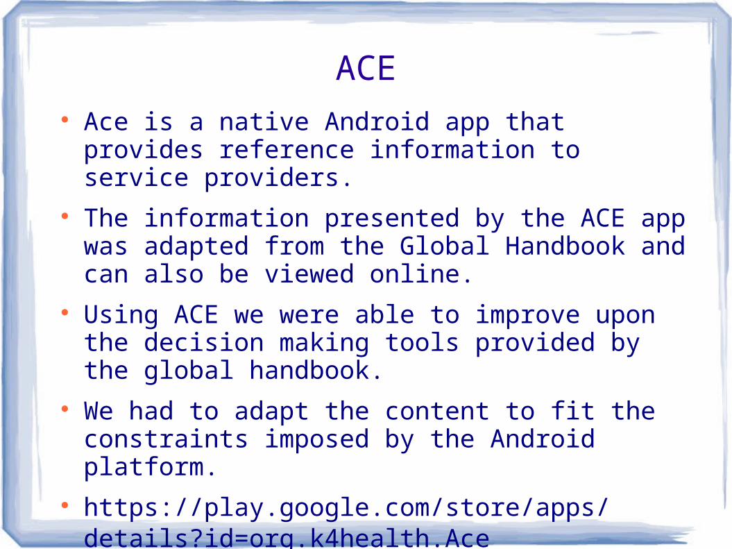
ACE Ace is a native Android app that provides reference
information to service providers. The information presented by the ACE app was
adapted from the Global Handbook and can also be viewed online.
Using ACE we were able to improve upon the decision making tools provided by the global handbook.
We had to adapt the content to fit the constraints imposed by the Android platform.
https://play.google.com/store/apps/details?id=org.k4health.Ace


