Embed Size (px)
Citation preview
Design Principles and Usability Heuristics 1
Saul Greenberg
Design Principles and Usability Heuristics
You can avoid common design pitfalls by following 9 design principles
You can inspect an interface for usability problems with these principles
Saul Greenberg
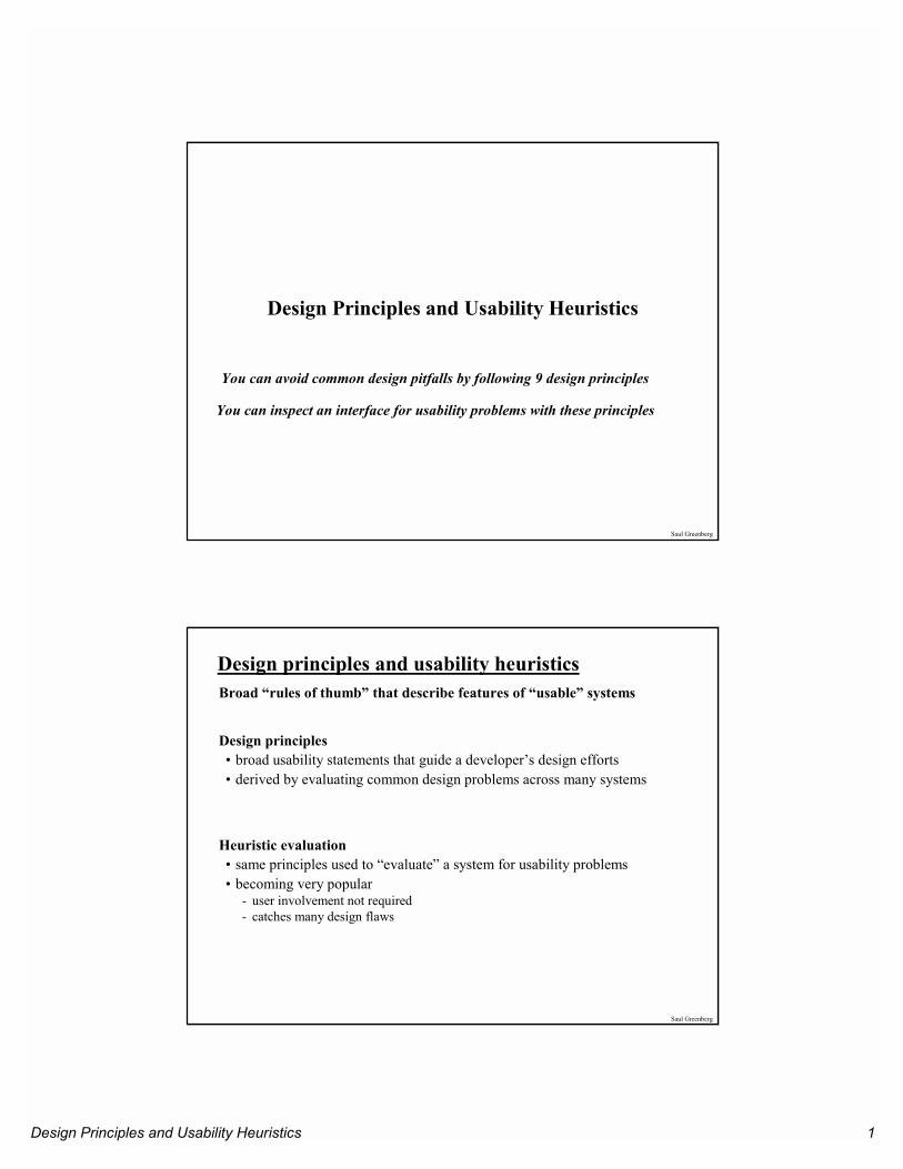
Design principles and usability heuristicsBroad “rules of thumb” that describe features of “usable” systems
Design principles• broad usability statements that guide a developer’s design efforts• derived by evaluating common design problems across many systems
Heuristic evaluation• same principles used to “evaluate” a system for usability problems• becoming very popular
- user involvement not required- catches many design flaws
Design Principles and Usability Heuristics 2
Saul Greenberg
Design principles and usability heuristicsAdvantages• the “minimalist” approach
- a few general guidelines can correct for the majority of usability problems- easily remembered, easily applied with modest effort
• discount usability engineering- cheap and fast way to inspect a system- can be done by usability experts, double experts, and end users
Problems:• principles are more or less at the motherhood level
- can’t be treated as a simple checklist- subtleties involved in their use
Saul Greenberg
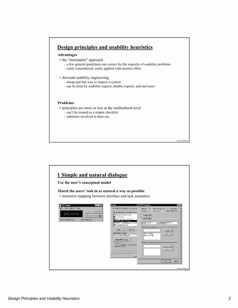
1 Simple and natural dialogueUse the user’s conceptual model
Match the users’ task in as natural a way as possible• minimize mapping between interface and task semantics
Design Principles and Usability Heuristics 3
Saul Greenberg
1 Simple and natural dialoguePresent exactly the information the user needs• less is more
- less to learn, to get wrong, to distract...
• information should appear in natural order- related information is graphically clustered- order of accessing information matches user’s expectations
• remove or hide irrelevant or rarely needed information- competes with important information on screen
• use windows frugally- don’t make navigation and window management excessively complex
Saul Greenberg
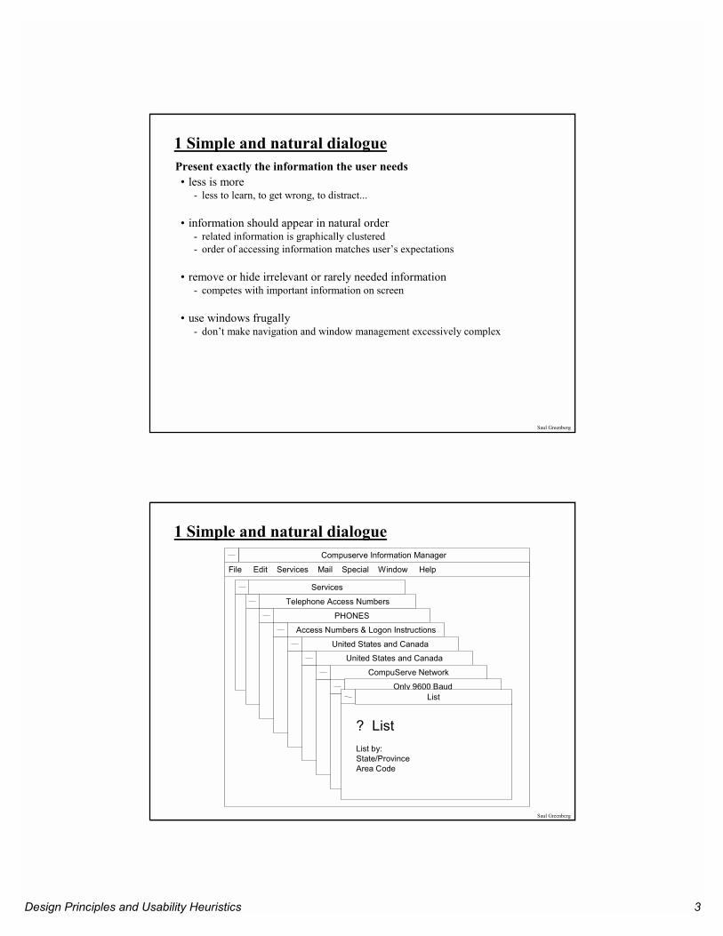
Compuserve Information Manager
Services
Telephone Access Numbers
PHONES
Access Numbers & Logon Instructions
United States and Canada
United States and Canada
CompuServe Network
Only 9600 BaudList
? ListList by:State/ProvinceArea Code
File Edit Services Mail Special Window Help
1 Simple and natural dialogue
Design Principles and Usability Heuristics 4
Saul Greenberg
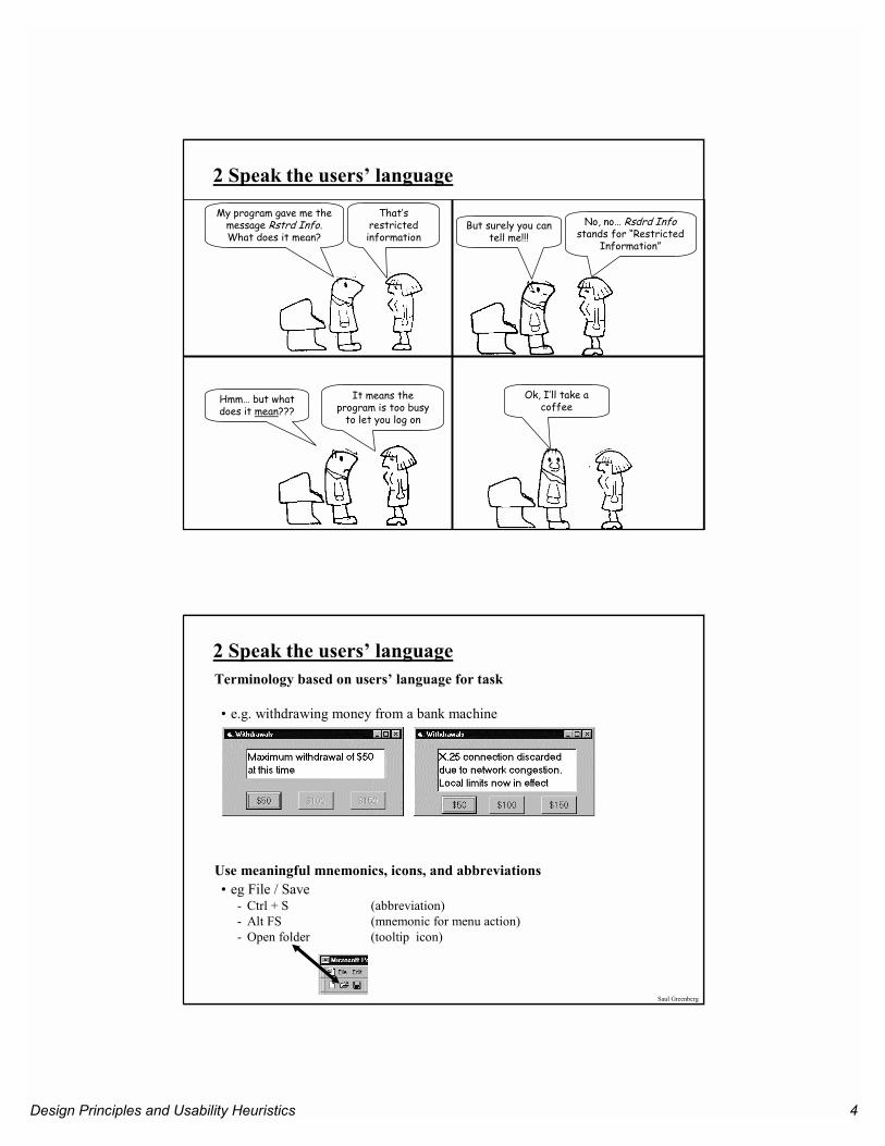
My program gave me the message Rstrd Info.What does it mean?
That’s restricted information
But surely you can tell me!!!
No, no… Rsdrd Infostands for “Restricted
Information”
Hmm… but what does it mean???
It means the program is too busy
to let you log on
Ok, I’ll take a coffee
2 Speak the users’ language
Saul Greenberg
2 Speak the users’ languageTerminology based on users’ language for task
• e.g. withdrawing money from a bank machine
Use meaningful mnemonics, icons, and abbreviations• eg File / Save
- Ctrl + S (abbreviation)- Alt FS (mnemonic for menu action)- Open folder (tooltip icon)
Design Principles and Usability Heuristics 5
Saul Greenberg
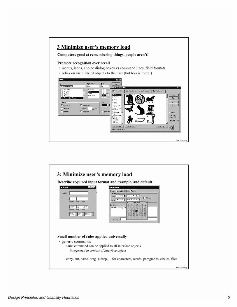
3 Minimize user’s memory loadComputers good at remembering things, people aren’t!
Promote recognition over recall• menus, icons, choice dialog boxes vs command lines, field formats• relies on visibility of objects to the user (but less is more!)
Saul Greenberg
3: Minimize user’s memory loadDescribe required input format and example, and default
Small number of rules applied universally• generic commands
- same command can be applied to all interface objectsinterpreted in context of interface object
- copy, cut, paste, drag ’n drop, ... for characters, words, paragraphs, circles, files
Design Principles and Usability Heuristics 6
Saul Greenberg
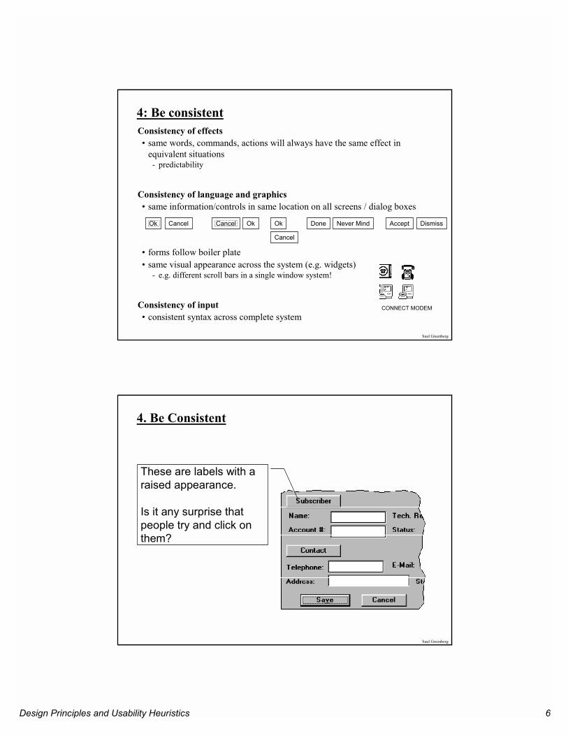
4: Be consistentConsistency of effects• same words, commands, actions will always have the same effect in
equivalent situations- predictability
Consistency of language and graphics• same information/controls in same location on all screens / dialog boxes
• forms follow boiler plate• same visual appearance across the system (e.g. widgets)
- e.g. different scroll bars in a single window system!
Consistency of input• consistent syntax across complete system
CONNECT MODEM
Ok Cancel OkCancel Done Never Mind Accept Dismiss
Cancel
Ok
Saul Greenberg
4. Be Consistent
These are labels with a raised appearance.
Is it any surprise that people try and click on them?
Design Principles and Usability Heuristics 7
Saul Greenberg
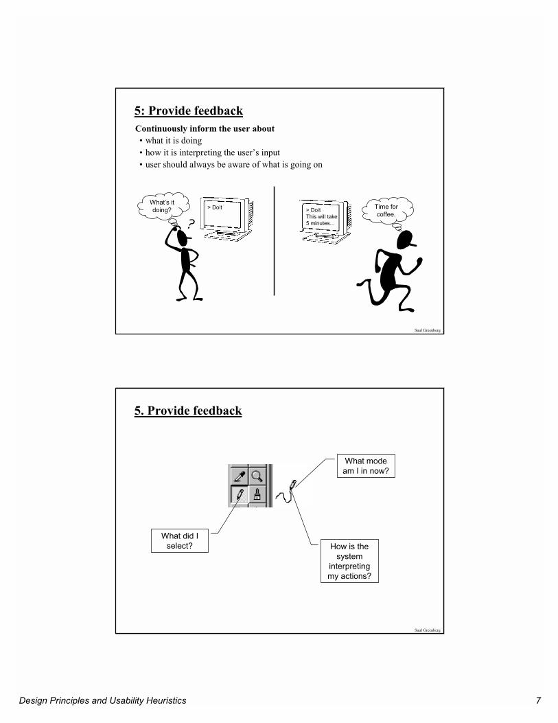
5: Provide feedbackContinuously inform the user about • what it is doing• how it is interpreting the user’s input• user should always be aware of what is going on
> DoitWhat’s it doing? > Doit
This will take5 minutes...
Time for coffee.
Saul Greenberg
5. Provide feedback
What did I select?
What mode am I in now?
How is the system
interpreting my actions?
Design Principles and Usability Heuristics 8
Saul Greenberg
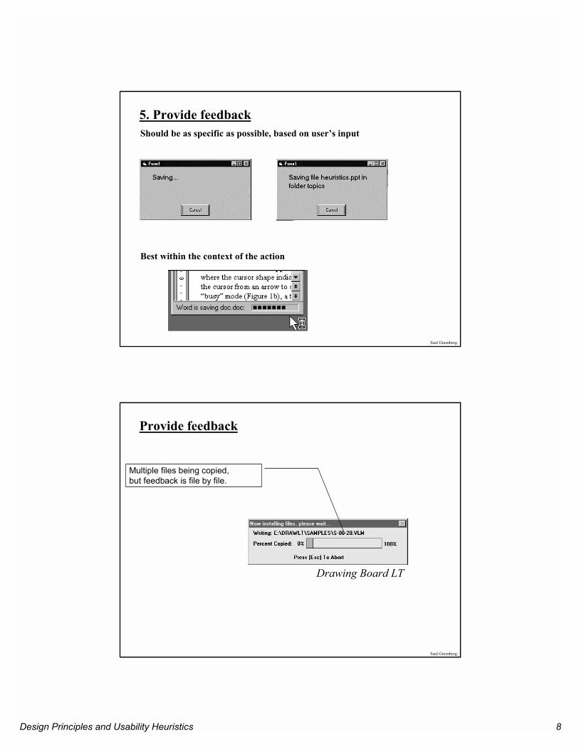
5. Provide feedbackShould be as specific as possible, based on user’s input
Best within the context of the action
Saul Greenberg
Provide feedback
Drawing Board LT
Multiple files being copied, but feedback is file by file.
Design Principles and Usability Heuristics 9
Saul Greenberg
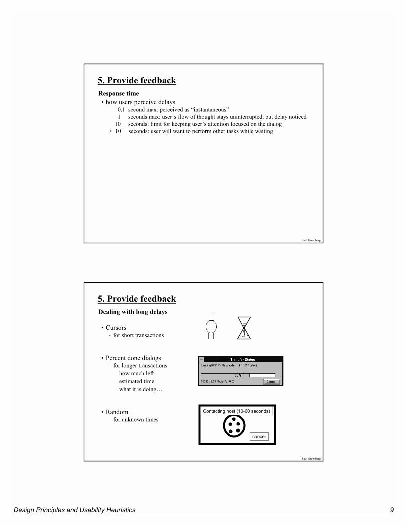
5. Provide feedbackResponse time• how users perceive delays
0.1 second max: perceived as “instantaneous”1 seconds max: user’s flow of thought stays uninterrupted, but delay noticed
10 seconds: limit for keeping user’s attention focused on the dialog> 10 seconds: user will want to perform other tasks while waiting
Saul Greenberg
5. Provide feedbackDealing with long delays
• Cursors- for short transactions
• Percent done dialogs- for longer transactions
how much leftestimated timewhat it is doing…
• Random- for unknown times
cancel
Contacting host (10-60 seconds)
Design Principles and Usability Heuristics 10
Saul Greenberg
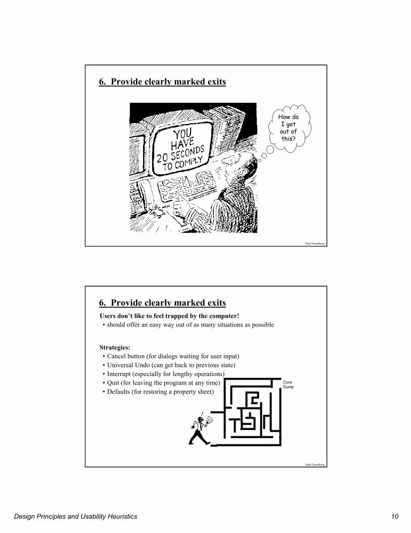
How do I get out of this?
6. Provide clearly marked exits
Saul Greenberg
6. Provide clearly marked exitsUsers don’t like to feel trapped by the computer!• should offer an easy way out of as many situations as possible
Strategies:• Cancel button (for dialogs waiting for user input)• Universal Undo (can get back to previous state)• Interrupt (especially for lengthy operations)• Quit (for leaving the program at any time) • Defaults (for restoring a property sheet)
CoreDump
Design Principles and Usability Heuristics 11
Saul Greenberg
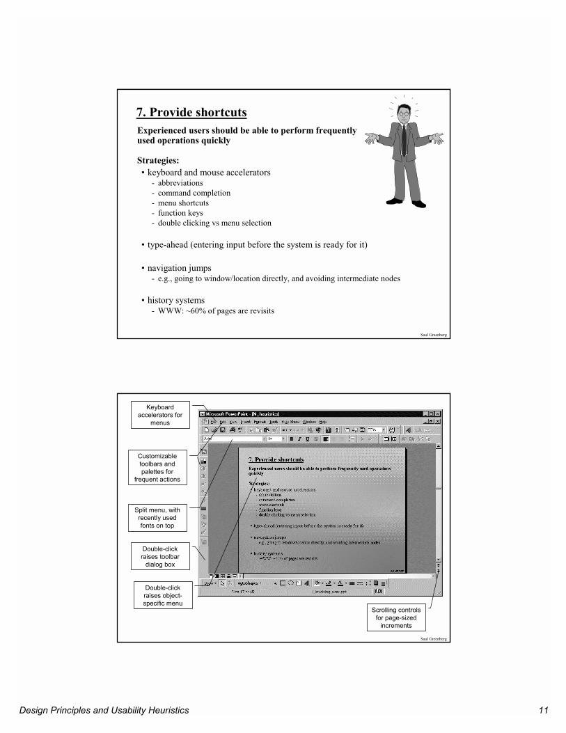
7. Provide shortcutsExperienced users should be able to perform frequently used operations quickly
Strategies:• keyboard and mouse accelerators
- abbreviations- command completion- menu shortcuts- function keys- double clicking vs menu selection
• type-ahead (entering input before the system is ready for it)
• navigation jumps - e.g., going to window/location directly, and avoiding intermediate nodes
• history systems - WWW: ~60% of pages are revisits
Saul Greenberg
Keyboard accelerators for
menus
Customizable toolbars andpalettes for
frequent actions
Split menu, with recently used fonts on top
Scrolling controls for page-sized
increments
Double-click raises object-specific menu
Double-click raises toolbar
dialog box
Design Principles and Usability Heuristics 12
Saul Greenberg
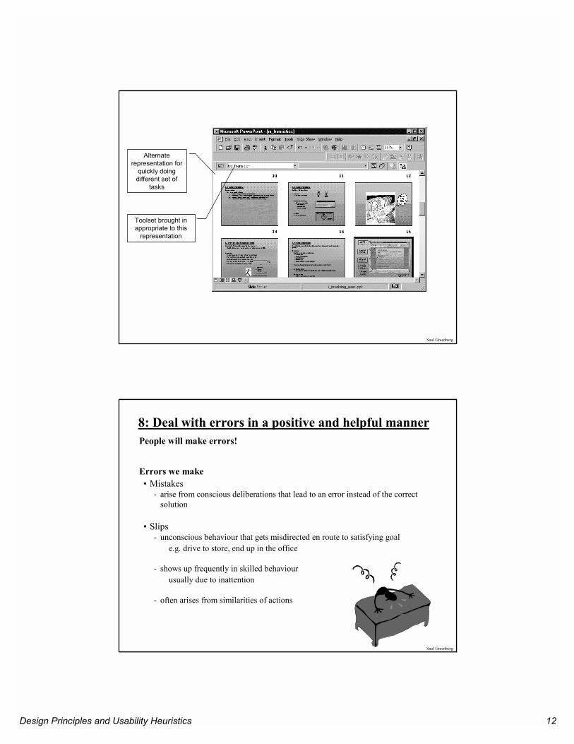
Alternate representation for
quickly doing different set of
tasks
Toolset brought in appropriate to this
representation
Saul Greenberg
8: Deal with errors in a positive and helpful mannerPeople will make errors!
Errors we make• Mistakes
- arise from conscious deliberations that lead to an error instead of the correct solution
• Slips- unconscious behaviour that gets misdirected en route to satisfying goal
e.g. drive to store, end up in the office
- shows up frequently in skilled behaviourusually due to inattention
- often arises from similarities of actions
Design Principles and Usability Heuristics 13
Saul Greenberg
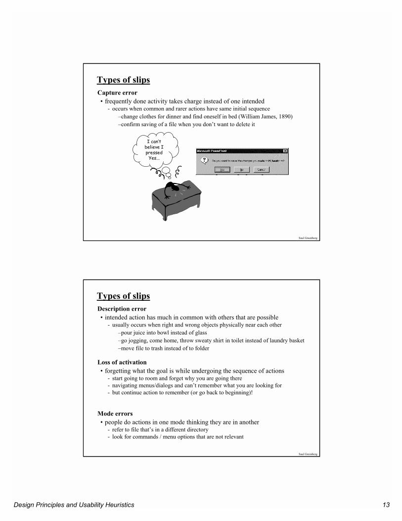
Types of slipsCapture error• frequently done activity takes charge instead of one intended
- occurs when common and rarer actions have same initial sequence–change clothes for dinner and find oneself in bed (William James, 1890)–confirm saving of a file when you don’t want to delete it
I can’t believe I pressed
Yes...
Saul Greenberg
Types of slipsDescription error• intended action has much in common with others that are possible
- usually occurs when right and wrong objects physically near each other–pour juice into bowl instead of glass –go jogging, come home, throw sweaty shirt in toilet instead of laundry basket–move file to trash instead of to folder
Loss of activation• forgetting what the goal is while undergoing the sequence of actions
- start going to room and forget why you are going there- navigating menus/dialogs and can’t remember what you are looking for- but continue action to remember (or go back to beginning)!
Mode errors• people do actions in one mode thinking they are in another
- refer to file that’s in a different directory- look for commands / menu options that are not relevant
Design Principles and Usability Heuristics 14
Saul Greenberg
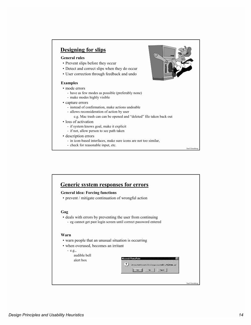
Designing for slipsGeneral rules• Prevent slips before they occur• Detect and correct slips when they do occur• User correction through feedback and undo
Examples• mode errors
- have as few modes as possible (preferably none)- make modes highly visible
• capture errors- instead of confirmation, make actions undoable- allows reconsideration of action by user
e.g. Mac trash can can be opened and “deleted” file taken back out• loss of activation
- if system knows goal, make it explicit- if not, allow person to see path taken
• description errors- in icon-based interfaces, make sure icons are not too similar, - check for reasonable input, etc.
Saul Greenberg
Generic system responses for errorsGeneral idea: Forcing functions• prevent / mitigate continuation of wrongful action
Gag• deals with errors by preventing the user from continuing
- eg cannot get past login screen until correct password entered
Warn• warn people that an unusual situation is occurring• when overused, becomes an irritant
- e.g., audible bell alert box
Design Principles and Usability Heuristics 15
Saul Greenberg
Generic system responses for errors continued...Do nothing• illegal action just doesn’t do anything• user must infer what happened
- enter letter into a numeric-only field (key clicks ignored)- put a file icon on top of another file icon (returns it to original position)
Self-correct• system guesses legal action and does it instead• but leads to a problem of trust
- spelling corrector
Lets talk about it• system initiates dialog with user to come up with solution to the problem
- compile error brings up offending line in source code
Teach me• system asks user what the action was supposed to have meant• action then becomes a legal one
Saul Greenberg
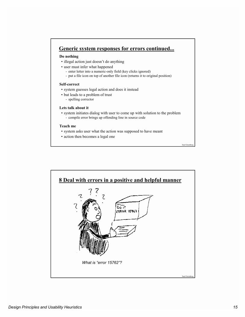
What is “error 15762”?
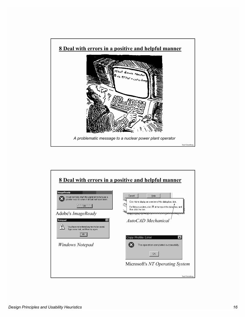
8 Deal with errors in a positive and helpful manner
Design Principles and Usability Heuristics 16
Saul Greenberg
A problematic message to a nuclear power plant operator
8 Deal with errors in a positive and helpful manner
Saul Greenberg
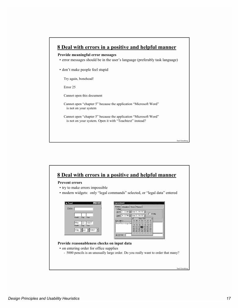
8 Deal with errors in a positive and helpful manner
Adobe's ImageReadyAutoCAD Mechanical
Windows Notepad
Microsoft's NT Operating System
Design Principles and Usability Heuristics 17
Saul Greenberg
8 Deal with errors in a positive and helpful mannerProvide meaningful error messages• error messages should be in the user’s language (preferably task language)
• don’t make people feel stupid
Try again, bonehead!
Error 25
Cannot open this document
Cannot open “chapter 5” because the application “Microsoft Word”is not on your system
Cannot open “chapter 5” because the application “Microsoft Word”is not on your system. Open it with “Teachtext” instead?
Saul Greenberg
8 Deal with errors in a positive and helpful mannerPrevent errors• try to make errors impossible• modern widgets: only “legal commands” selected, or “legal data” entered
Provide reasonableness checks on input data• on entering order for office supplies
- 5000 pencils is an unusually large order. Do you really want to order that many?
Design Principles and Usability Heuristics 18
Saul Greenberg
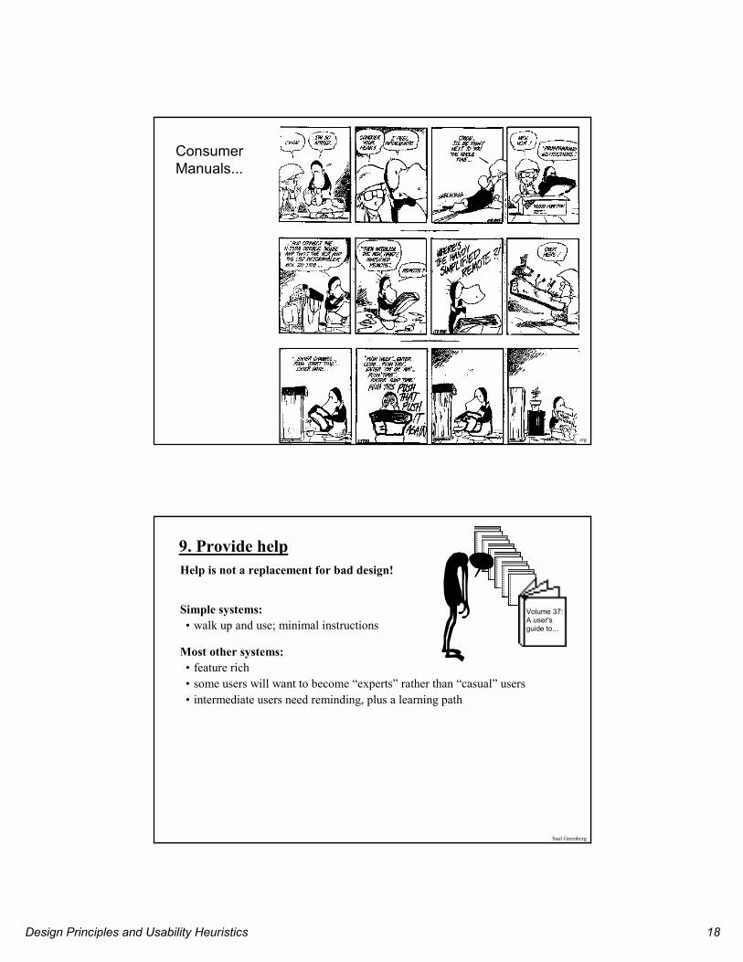
Consumer Manuals...
Saul Greenberg
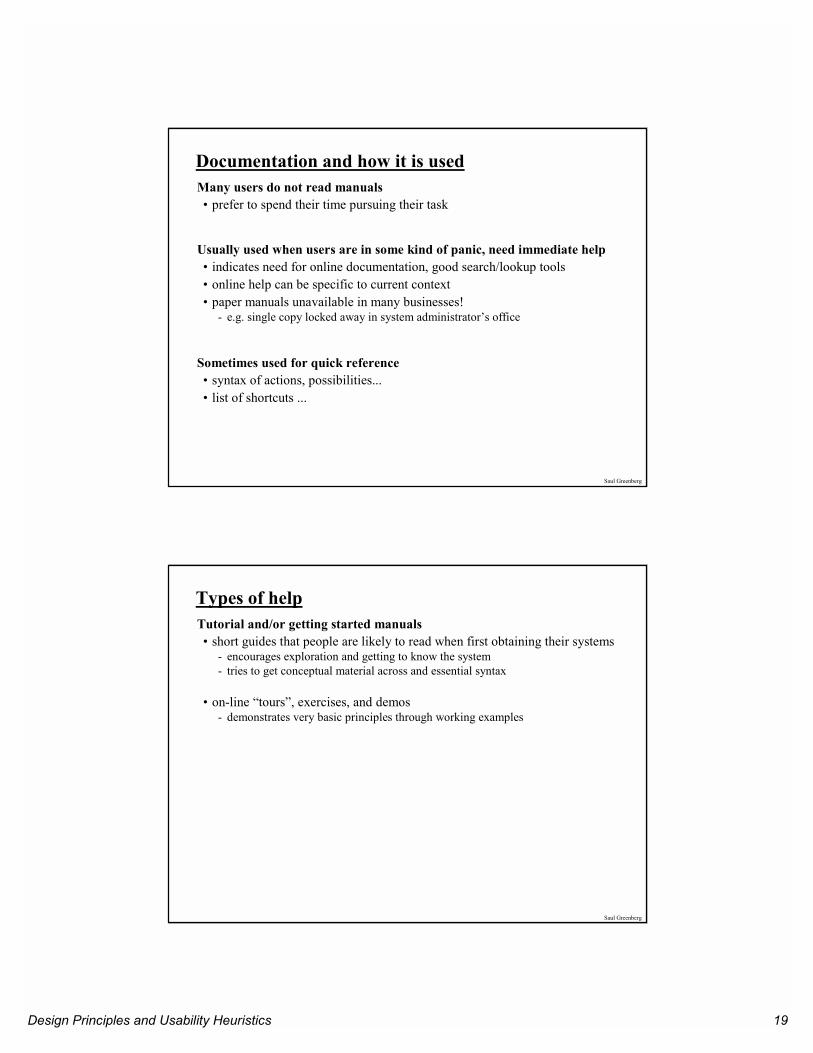
9. Provide helpHelp is not a replacement for bad design!
Simple systems:• walk up and use; minimal instructions
Most other systems:• feature rich• some users will want to become “experts” rather than “casual” users• intermediate users need reminding, plus a learning path
Volume 37:A user'sguide to...
Design Principles and Usability Heuristics 19
Saul Greenberg
Documentation and how it is usedMany users do not read manuals• prefer to spend their time pursuing their task
Usually used when users are in some kind of panic, need immediate help• indicates need for online documentation, good search/lookup tools• online help can be specific to current context• paper manuals unavailable in many businesses!
- e.g. single copy locked away in system administrator’s office
Sometimes used for quick reference• syntax of actions, possibilities...• list of shortcuts ...
Saul Greenberg
Types of helpTutorial and/or getting started manuals• short guides that people are likely to read when first obtaining their systems
- encourages exploration and getting to know the system- tries to get conceptual material across and essential syntax
• on-line “tours”, exercises, and demos- demonstrates very basic principles through working examples
Design Principles and Usability Heuristics 20
Saul Greenberg
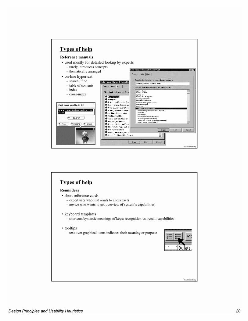
Types of helpReference manuals• used mostly for detailed lookup by experts
- rarely introduces concepts- thematically arranged
• on-line hypertext- search / find- table of contents- index- cross-index
Saul Greenberg
Types of helpReminders• short reference cards
- expert user who just wants to check facts- novice who wants to get overview of system’s capabilities
• keyboard templates- shortcuts/syntactic meanings of keys; recognition vs. recall; capabilities
• tooltips- text over graphical items indicates their meaning or purpose
Design Principles and Usability Heuristics 21
Saul Greenberg
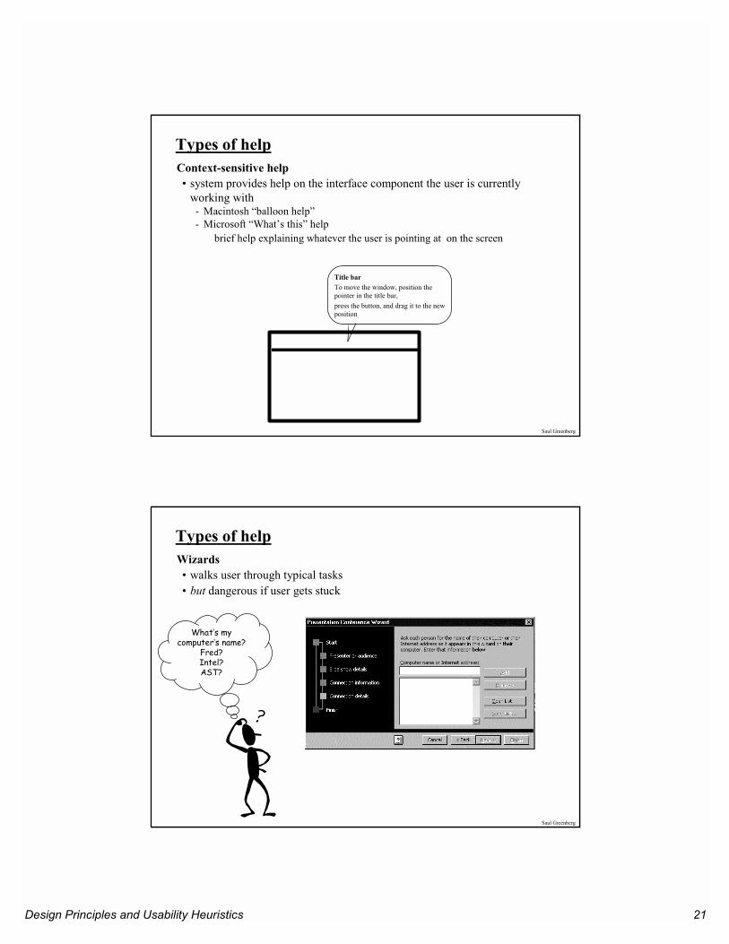
Types of helpContext-sensitive help• system provides help on the interface component the user is currently
working with- Macintosh “balloon help”- Microsoft “What’s this” help
brief help explaining whatever the user is pointing at on the screen
Title bar To move the window, position the pointer in the title bar, press the button, and drag it to the new position
Saul Greenberg
Types of helpWizards• walks user through typical tasks• but dangerous if user gets stuck
What’s my computer’s name?
Fred? Intel? AST?
Design Principles and Usability Heuristics 22
Saul Greenberg
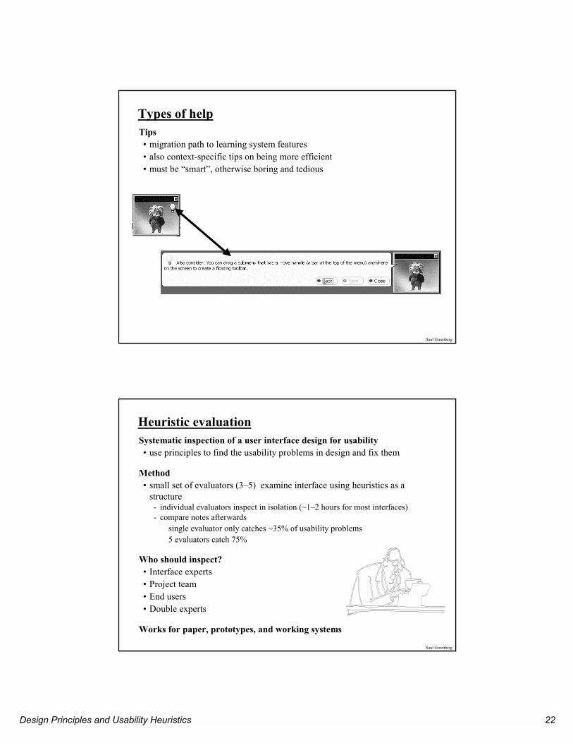
Types of helpTips• migration path to learning system features• also context-specific tips on being more efficient• must be “smart”, otherwise boring and tedious
Saul Greenberg
Heuristic evaluationSystematic inspection of a user interface design for usability• use principles to find the usability problems in design and fix them
Method• small set of evaluators (3–5) examine interface using heuristics as a
structure- individual evaluators inspect in isolation (~1–2 hours for most interfaces)- compare notes afterwards
single evaluator only catches ~35% of usability problems5 evaluators catch 75%
Who should inspect?• Interface experts• Project team• End users• Double experts
Works for paper, prototypes, and working systems
Design Principles and Usability Heuristics 23
Saul Greenberg
Other Guidelines: Style guidesGuidelines published by producers of graphical user interfaces (GUIs)• examples:
- Open Software Foundation MOTIF- Open Look- MS Windows- Apple
Describes the “look and feel” of the GUI• e.g. Open Look
- grouping items in the same menu:
Use white space between long groups of controls on menus or in short groups when screen real estate is not an issue
Good, but hard too follow• GUI and widget specific• vast number of guidelines• may miss fundamental design principles
Saul Greenberg
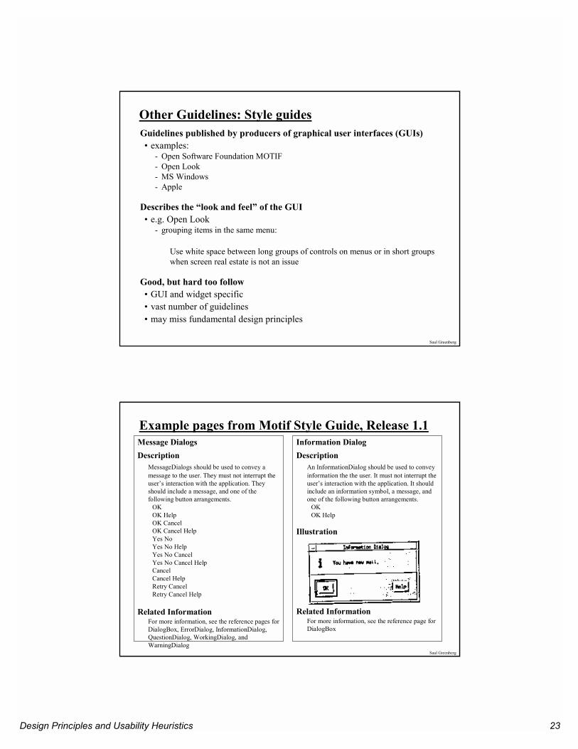
Example pages from Motif Style Guide, Release 1.1Message DialogsDescription
MessageDialogs should be used to convey a message to the user. They must not interrupt the user’s interaction with the application. They should include a message, and one of the following button arrangements.
OKOK HelpOK CancelOK Cancel HelpYes NoYes No HelpYes No CancelYes No Cancel HelpCancelCancel HelpRetry CancelRetry Cancel Help
Related InformationFor more information, see the reference pages for DialogBox, ErrorDialog, InformationDialog, QuestionDialog, WorkingDialog, and WarningDialog
Information DialogDescription
An InformationDialog should be used to convey information the the user. It must not interrupt the user’s interaction with the application. It should include an information symbol, a message, and one of the following button arrangements.
OKOK Help
Illustration
Related InformationFor more information, see the reference page for DialogBox
Design Principles and Usability Heuristics 24
Saul Greenberg
Other Guidelines: Widget-level “guides”Toolkit “hard-wires” guidelines• repertoire of widgets• look & feel of particular widgets• grouping behaviour of widgets
Outside of “normal” programmer’s control• easier to use defaults then to re-invent the wheel!
Some toolkits• look & feel is programmer-settable or platform-dependent
Advantages:• easy to be consistent• widgets developed by experts (graphical designers, etc.)
Disadvantages• can be hacked around• interfaces “assembled” by non-interface designers can still be terrible
Saul Greenberg
You know nowNine principles of design• Simple and natural dialog• Speak the user’s language• Minimize user’s memory load• Be consistent• Provide feedback• Provide clearly marked exits• Provide shortcuts• Deal with errors in a positive manner• Provide help
Heuristic evaluation• Principles can be used to systematically inspect the interface for usability
problems
Style guides are mostly platform-dependant design principles
Widget-level guidelines are built into the widgets themselves