Embed Size (px)
Citation preview
Descriptive Statistics Student Saturday Session
Submitted by Gloria Barrett and Daren Starnes, Virginia Advanced Study Strategies December, 2009 National Math and Science
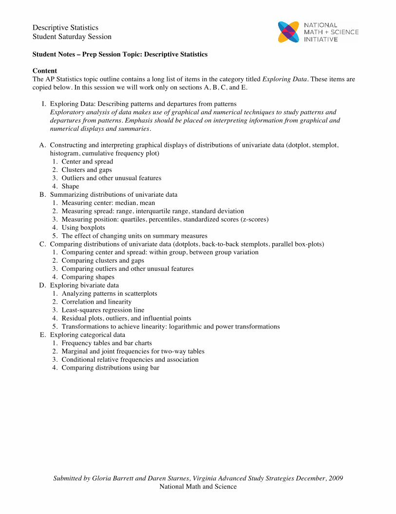
Student Notes – Prep Session Topic: Descriptive Statistics Content The AP Statistics topic outline contains a long list of items in the category titled Exploring Data. These items are copied below. In this session we will work only on sections A, B, C, and E. I. Exploring Data: Describing patterns and departures from patterns
Exploratory analysis of data makes use of graphical and numerical techniques to study patterns and departures from patterns. Emphasis should be placed on interpreting information from graphical and numerical displays and summaries.
A. Constructing and interpreting graphical displays of distributions of univariate data (dotplot, stemplot,
histogram, cumulative frequency plot) 1. Center and spread 2. Clusters and gaps 3. Outliers and other unusual features 4. Shape B. Summarizing distributions of univariate data 1. Measuring center: median, mean 2. Measuring spread: range, interquartile range, standard deviation 3. Measuring position: quartiles, percentiles, standardized scores (z-scores) 4. Using boxplots 5. The effect of changing units on summary measures C. Comparing distributions of univariate data (dotplots, back-to-back stemplots, parallel box-plots) 1. Comparing center and spread: within group, between group variation 2. Comparing clusters and gaps 3. Comparing outliers and other unusual features 4. Comparing shapes D. Exploring bivariate data 1. Analyzing patterns in scatterplots 2. Correlation and linearity 3. Least-squares regression line 4. Residual plots, outliers, and influential points 5. Transformations to achieve linearity: logarithmic and power transformations E. Exploring categorical data 1. Frequency tables and bar charts 2. Marginal and joint frequencies for two-way tables 3. Conditional relative frequencies and association 4. Comparing distributions using bar
Descriptive Statistics Student Saturday Session
Submitted by Gloria Barrett and Daren Starnes, Virginia Advanced Study Strategies December, 2009 National Math and Science
Formulas Provided There are two formulas related to Topic I, Sections A, B, C, and E that are provided on the formula sheet:
x = 1n
xi! and s = 1n !1
(xi" ! x)2
Calculator Use To save time on the exam, you may want to use your calculator to compute summary statistics. Specifically, you will want to know how to enter data in lists and calculate 1-Var Stats. Note: When you use your calculator for computations on Free Response questions, it will be very important to provide proper communication and support for your work. AP Exam readers are instructed not to consider calculator syntax as sufficient support for answers. Reminders about concepts and communication ---
• If you are asked to make a graph, be sure to include a title, labels on the horizontal and vertical axes, and scales on both axes (if appropriate). Also, if the graph includes multiple data sets (for example parallel boxplots), be sure to label each plot.
• Be careful when you describe the shape of a mound-shaped, approximately symmetric distribution. The distribution may or may not be normal. Graders will accept the description as approximately normal, but they will not accept that the distribution is normal based only on a mound-shaped, symmetric graph.
• Be careful to use the correct term when you describe the shape of a uniform distribution. • If you are asked to provide information about a distribution based on a graph, you should always comment on
center, shape, and spread. If there are unusual features, for example outliers, clusters, or gaps, you should also comment on those. All discussion should be in context.
• If you are asked to compare two distributions based on graphs, be sure to compare and describe the center, shape, and spread. Simply listing these features for both samples without a direct comparison has earned students no credit in the past. Also, saying that shapes are similar without describing the shape will not receive full credit. You must use comparative language such as larger, higher, less variable.
• Right skewed is the same as skewed toward large values; left skewed is the same as skewed toward small values.
• If a distribution is approximately symmetric, the mean and median will be close in value. If a distribution is skewed, the mean will generally be pulled away from the median in the direction of the tail. So generally it will be correct to say “since the distribution is skewed to the right, we expect the mean to be greater than the median.”
• Knowing that the mean and median are unequal does not guarantee that the shape of the distribution is skewed. So it is risky (and generally not correct) to say something like “since the mean is greater than the median, the distribution is skewed to the right.”
Descriptive Statistics Student Saturday Session
Submitted by Gloria Barrett and Daren Starnes, Virginia Advanced Study Strategies December, 2009 National Math and Science
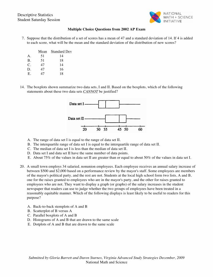
Multiple Choice Questions from 2002 AP Exam 7. Suppose that the distribution of a set of scores has a mean of 47 and a standard deviation of 14. If 4 is added
to each score, what will be the mean and the standard deviation of the distribution of new scores? Mean Standard Dev A. 51 14 B. 51 18 C. 47 14 D. 47 16 E. 47 18 14. The boxplots shown summarize two data sets, I and II. Based on the boxplots, which of the following
statements about these two data sets CANNOT be justified?
A. The range of data set I is equal to the range of data set II. B. The interquartile range of data set I is equal to the interquartile range of data set II. C. The median of data set I is less than the median of data set II. D. Data set I and data set II have the same number of data points. E. About 75% of the values in data set II are greater than or equal to about 50% of the values in data set I. 20. A small town employs 34 salaried, nonunion employees. Each employee receives an annual salary increase of
between $500 and $2,000 based on a performance review by the mayor's staff. Some employees are members of the mayor's political party, and the rest are not. Students at the local high school form two lists, A and B, one for the raises granted to employees who are in the mayor's party, and the other for raises granted to employees who are not. They want to display a graph (or graphs) of the salary increases in the student newspaper that readers can use to judge whether the two groups of employees have been treated in a reasonably equitable manner. Which of the following displays is least likely to be useful to readers for this purpose?
A. Back-to-back stemplots of A and B B. Scatterplot of B versus A C. Parallel boxplots of A and B D. Histograms of A and B that are drawn to the same scale E. Dotplots of A and B that are drawn to the same scale
Descriptive Statistics Student Saturday Session
Submitted by Gloria Barrett and Daren Starnes, Virginia Advanced Study Strategies December, 2009 National Math and Science
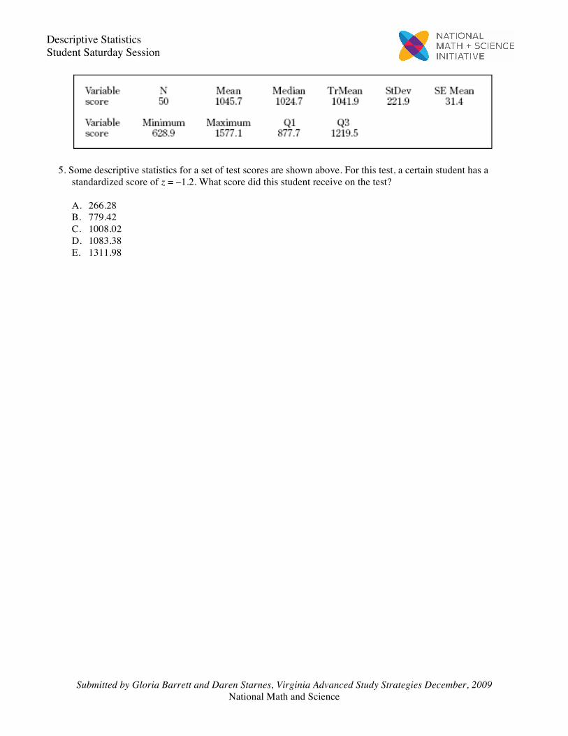
5. Some descriptive statistics for a set of test scores are shown above. For this test, a certain student has a
standardized score of z = –1.2. What score did this student receive on the test? A. 266.28 B. 779.42 C. 1008.02 D. 1083.38 E. 1311.98
Descriptive Statistics Student Saturday Session
Submitted by Gloria Barrett and Daren Starnes, Virginia Advanced Study Strategies December, 2009 National Math and Science
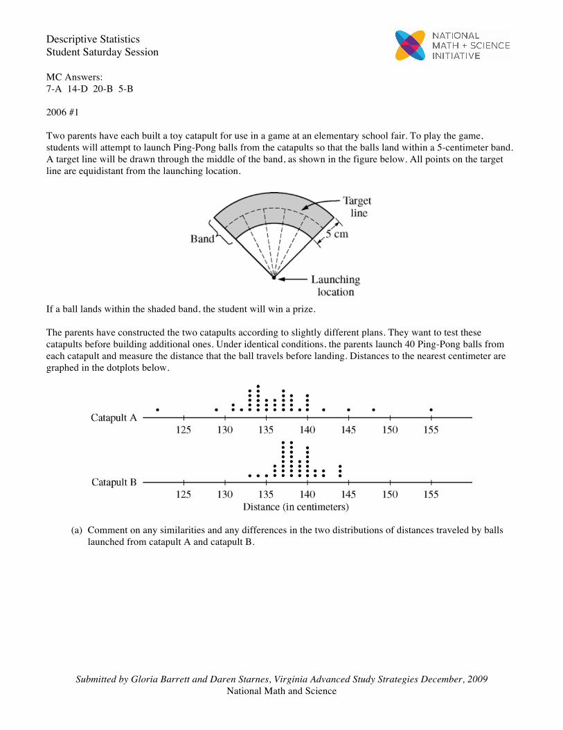
MC Answers: 7-A 14-D 20-B 5-B 2006 #1 Two parents have each built a toy catapult for use in a game at an elementary school fair. To play the game, students will attempt to launch Ping-Pong balls from the catapults so that the balls land within a 5-centimeter band. A target line will be drawn through the middle of the band, as shown in the figure below. All points on the target line are equidistant from the launching location.
If a ball lands within the shaded band, the student will win a prize. The parents have constructed the two catapults according to slightly different plans. They want to test these catapults before building additional ones. Under identical conditions, the parents launch 40 Ping-Pong balls from each catapult and measure the distance that the ball travels before landing. Distances to the nearest centimeter are graphed in the dotplots below.
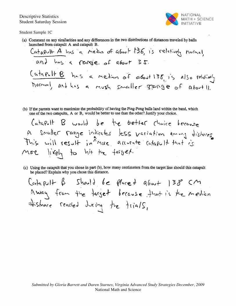
(a) Comment on any similarities and any differences in the two distributions of distances traveled by ballslaunched from catapult A and catapult B.
Descriptive Statistics Student Saturday Session
Submitted by Gloria Barrett and Daren Starnes, Virginia Advanced Study Strategies December, 2009 National Math and Science
(b) If the parents want to maximize the probability of having the Ping-Pong balls land within the band, which one of the two catapults, A or B, would be better to use than the other? Justify your choice.
(c) Using the catapult that you chose in part (b), how many centimeters from the target line should this
catapult be placed? Explain why you chose this distance.
Descriptive Statistics Student Saturday Session
Submitted by Gloria Barrett and Daren Starnes, Virginia Advanced Study Strategies December, 2009 National Math and Science
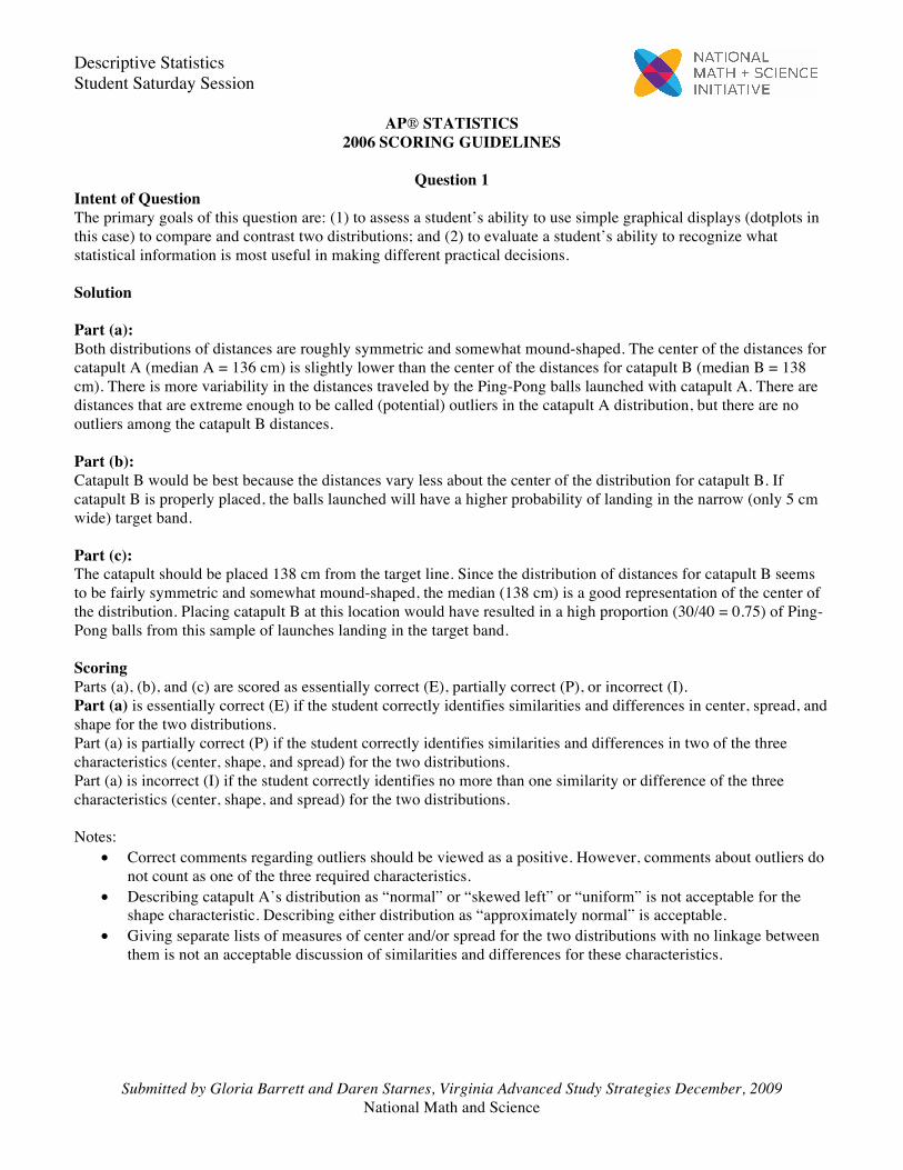
AP® STATISTICS 2006 SCORING GUIDELINES
Question 1
Intent of Question The primary goals of this question are: (1) to assess a student’s ability to use simple graphical displays (dotplots in this case) to compare and contrast two distributions; and (2) to evaluate a student’s ability to recognize what statistical information is most useful in making different practical decisions. Solution Part (a): Both distributions of distances are roughly symmetric and somewhat mound-shaped. The center of the distances for catapult A (median A = 136 cm) is slightly lower than the center of the distances for catapult B (median B = 138 cm). There is more variability in the distances traveled by the Ping-Pong balls launched with catapult A. There are distances that are extreme enough to be called (potential) outliers in the catapult A distribution, but there are no outliers among the catapult B distances. Part (b): Catapult B would be best because the distances vary less about the center of the distribution for catapult B. If catapult B is properly placed, the balls launched will have a higher probability of landing in the narrow (only 5 cm wide) target band. Part (c): The catapult should be placed 138 cm from the target line. Since the distribution of distances for catapult B seems to be fairly symmetric and somewhat mound-shaped, the median (138 cm) is a good representation of the center of the distribution. Placing catapult B at this location would have resulted in a high proportion (30/40 = 0.75) of Ping-Pong balls from this sample of launches landing in the target band. Scoring Parts (a), (b), and (c) are scored as essentially correct (E), partially correct (P), or incorrect (I). Part (a) is essentially correct (E) if the student correctly identifies similarities and differences in center, spread, and shape for the two distributions. Part (a) is partially correct (P) if the student correctly identifies similarities and differences in two of the three characteristics (center, shape, and spread) for the two distributions. Part (a) is incorrect (I) if the student correctly identifies no more than one similarity or difference of the three characteristics (center, shape, and spread) for the two distributions. Notes:
• Correct comments regarding outliers should be viewed as a positive. However, comments about outliers do not count as one of the three required characteristics.
• Describing catapult A’s distribution as “normal” or “skewed left” or “uniform” is not acceptable for the shape characteristic. Describing either distribution as “approximately normal” is acceptable.
• Giving separate lists of measures of center and/or spread for the two distributions with no linkage between them is not an acceptable discussion of similarities and differences for these characteristics.
Descriptive Statistics Student Saturday Session
Submitted by Gloria Barrett and Daren Starnes, Virginia Advanced Study Strategies December, 2009 National Math and Science
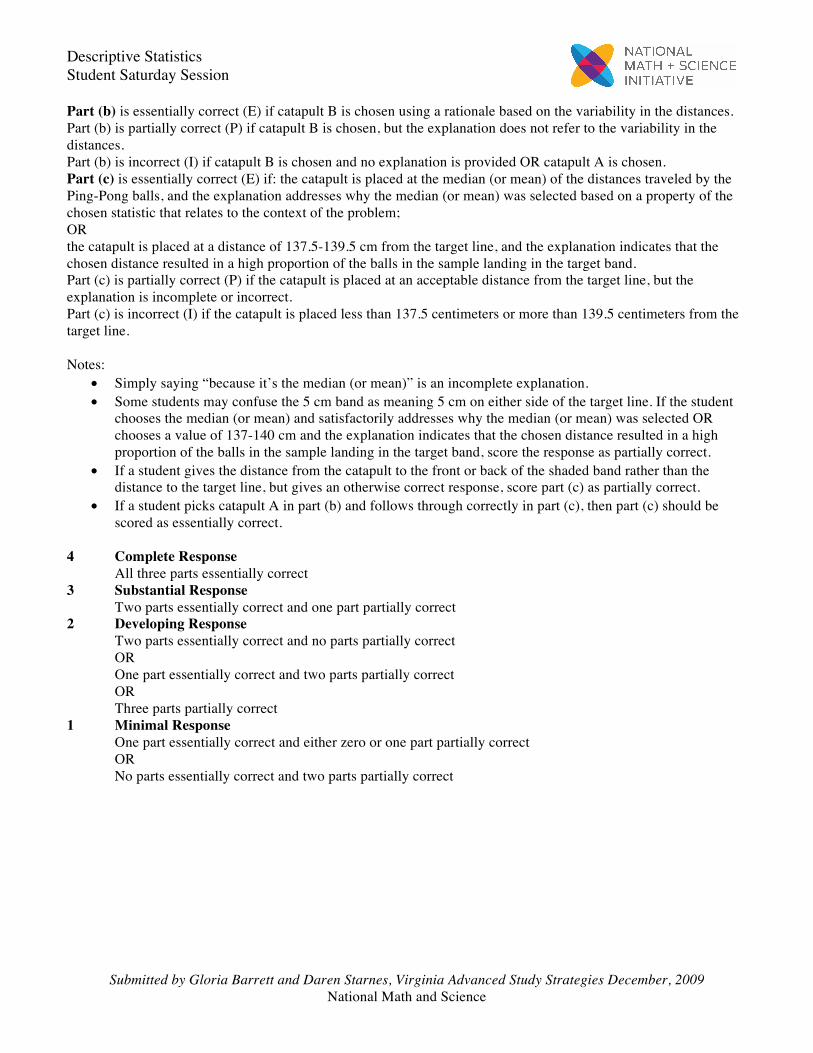
Part (b) is essentially correct (E) if catapult B is chosen using a rationale based on the variability in the distances. Part (b) is partially correct (P) if catapult B is chosen, but the explanation does not refer to the variability in the distances. Part (b) is incorrect (I) if catapult B is chosen and no explanation is provided OR catapult A is chosen. Part (c) is essentially correct (E) if: the catapult is placed at the median (or mean) of the distances traveled by the Ping-Pong balls, and the explanation addresses why the median (or mean) was selected based on a property of the chosen statistic that relates to the context of the problem; OR the catapult is placed at a distance of 137.5-139.5 cm from the target line, and the explanation indicates that the chosen distance resulted in a high proportion of the balls in the sample landing in the target band. Part (c) is partially correct (P) if the catapult is placed at an acceptable distance from the target line, but the explanation is incomplete or incorrect. Part (c) is incorrect (I) if the catapult is placed less than 137.5 centimeters or more than 139.5 centimeters from the target line. Notes:
• Simply saying “because it’s the median (or mean)” is an incomplete explanation. • Some students may confuse the 5 cm band as meaning 5 cm on either side of the target line. If the student
chooses the median (or mean) and satisfactorily addresses why the median (or mean) was selected OR chooses a value of 137-140 cm and the explanation indicates that the chosen distance resulted in a high proportion of the balls in the sample landing in the target band, score the response as partially correct.
• If a student gives the distance from the catapult to the front or back of the shaded band rather than the distance to the target line, but gives an otherwise correct response, score part (c) as partially correct.
• If a student picks catapult A in part (b) and follows through correctly in part (c), then part (c) should be scored as essentially correct.
4 Complete Response
All three parts essentially correct 3 Substantial Response
Two parts essentially correct and one part partially correct 2 Developing Response
Two parts essentially correct and no parts partially correct OR One part essentially correct and two parts partially correct OR Three parts partially correct
1 Minimal Response One part essentially correct and either zero or one part partially correct OR No parts essentially correct and two parts partially correct
Descriptive Statistics Student Saturday Session
Submitted by Gloria Barrett and Daren Starnes, Virginia Advanced Study Strategies December, 2009 National Math and Science
Student Sample 1C
Descriptive Statistics Student Saturday Session
Submitted by Gloria Barrett and Daren Starnes, Virginia Advanced Study Strategies December, 2009 National Math and Science
Overview The primary goals of this question were to: (1) assess a student’s ability to use simple graphical displays (dotplots in this case) to compare and contrast two distributions; and (2) evaluate a student’s ability to recognize what statistical information is most useful in making different practical decisions. Sample: 1C Score: 2 At first glance, it appears that only a listing of characteristics is given—shape, center, and spread—for the two distributions. Upon further inspection, however, linkage is provided for spread in the description of catapult B’s distribution—“a much smaller range of about 11.” There is no linkage for center. In part (b) catapult B is chosen due to the smaller variability in its distribution of distances. The median distance that the 40 balls traveled when launched with catapult B is used to position the catapult. This is an acceptable location for the catapult relative to the target line. However, a justification is not provided for using the median distance other than “because that is the median distance.” This essay earned a score of 2.
Descriptive Statistics Student Saturday Session
Submitted by Gloria Barrett and Daren Starnes, Virginia Advanced Study Strategies December, 2009 National Math and Science
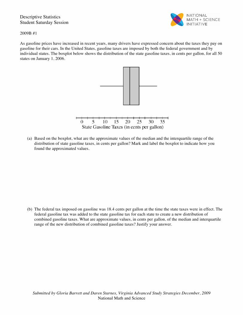
2009B #1 As gasoline prices have increased in recent years, many drivers have expressed concern about the taxes they pay on gasoline for their cars. In the United States, gasoline taxes are imposed by both the federal government and by individual states. The boxplot below shows the distribution of the state gasoline taxes, in cents per gallon, for all 50 states on January 1, 2006.
(a) Based on the boxplot, what are the approximate values of the median and the interquartile range of the
distribution of state gasoline taxes, in cents per gallon? Mark and label the boxplot to indicate how you found the approximated values.
(b) The federal tax imposed on gasoline was 18.4 cents per gallon at the time the state taxes were in effect. The
federal gasoline tax was added to the state gasoline tax for each state to create a new distribution of combined gasoline taxes. What are approximate values, in cents per gallon, of the median and interquartile range of the new distribution of combined gasoline taxes? Justify your answer.
Descriptive Statistics Student Saturday Session
Submitted by Gloria Barrett and Daren Starnes, Virginia Advanced Study Strategies December, 2009 National Math and Science
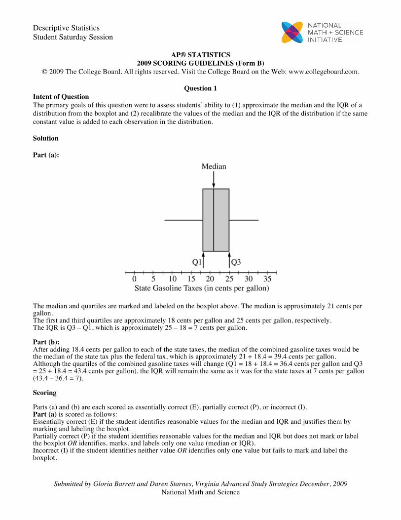
AP® STATISTICS 2009 SCORING GUIDELINES (Form B)
© 2009 The College Board. All rights reserved. Visit the College Board on the Web: www.collegeboard.com.
Question 1 Intent of Question The primary goals of this question were to assess students’ ability to (1) approximate the median and the IQR of a distribution from the boxplot and (2) recalibrate the values of the median and the IQR of the distribution if the same constant value is added to each observation in the distribution. Solution Part (a):
The median and quartiles are marked and labeled on the boxplot above. The median is approximately 21 cents per gallon. The first and third quartiles are approximately 18 cents per gallon and 25 cents per gallon, respectively. The IQR is Q3 – Q1, which is approximately 25 – 18 = 7 cents per gallon. Part (b): After adding 18.4 cents per gallon to each of the state taxes, the median of the combined gasoline taxes would be the median of the state tax plus the federal tax, which is approximately 21 + 18.4 = 39.4 cents per gallon. Although the quartiles of the combined gasoline taxes will change (Q1 = 18 + 18.4 = 36.4 cents per gallon and Q3 = 25 + 18.4 = 43.4 cents per gallon), the IQR will remain the same as it was for the state taxes at 7 cents per gallon (43.4 – 36.4 = 7). Scoring Parts (a) and (b) are each scored as essentially correct (E), partially correct (P), or incorrect (I). Part (a) is scored as follows: Essentially correct (E) if the student identifies reasonable values for the median and IQR and justifies them by marking and labeling the boxplot. Partially correct (P) if the student identifies reasonable values for the median and IQR but does not mark or label the boxplot OR identifies, marks, and labels only one value (median or IQR). Incorrect (I) if the student identifies neither value OR identifies only one value but fails to mark and label the boxplot.
Descriptive Statistics Student Saturday Session
Submitted by Gloria Barrett and Daren Starnes, Virginia Advanced Study Strategies December, 2009 National Math and Science
Part (b) is scored as follows: Essentially correct (E) if the student gives a median that is 18.4 cents per gallon larger than the median identified in part (a), gives an IQR that is the same single number found in part (a), AND provides a reasonable justification for at least one of these values. Partially correct (P) if the student provides only one correct value (either the median or the IQR) AND provides a justification. Incorrect (I) if the student gives incorrect values for the median and IQR OR provides only one correct value with no justification. 4 Complete Response
Both parts essentially correct 3 Substantial Response
One part essentially correct and one part partially correct 2 Developing Response
One part essentially correct and one part incorrect OR Both parts partially correct
1 Minimal Response One part partially correct and one part incorrect
Descriptive Statistics Student Saturday Session
Submitted by Gloria Barrett and Daren Starnes, Virginia Advanced Study Strategies December, 2009 National Math and Science
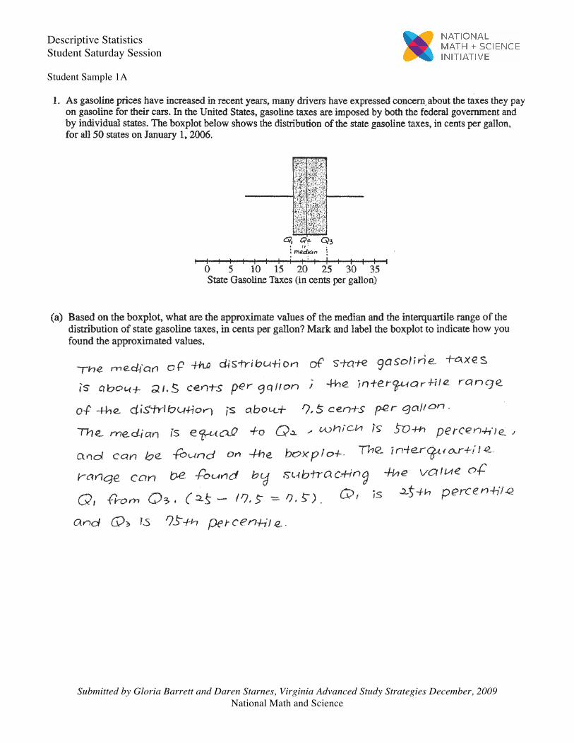
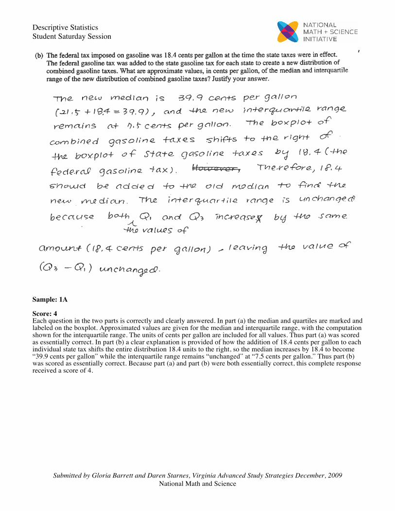
Student Sample 1A
Descriptive Statistics Student Saturday Session
Submitted by Gloria Barrett and Daren Starnes, Virginia Advanced Study Strategies December, 2009 National Math and Science
Sample: 1A Score: 4 Each question in the two parts is correctly and clearly answered. In part (a) the median and quartiles are marked and labeled on the boxplot. Approximated values are given for the median and interquartile range, with the computation shown for the interquartile range. The units of cents per gallon are included for all values. Thus part (a) was scored as essentially correct. In part (b) a clear explanation is provided of how the addition of 18.4 cents per gallon to each individual state tax shifts the entire distribution 18.4 units to the right, so the median increases by 18.4 to become “39.9 cents per gallon” while the interquartile range remains “unchanged” at “7.5 cents per gallon.” Thus part (b) was scored as essentially correct. Because part (a) and part (b) were both essentially correct, this complete response received a score of 4.