Embed Size (px)
Citation preview

Basic data analysis
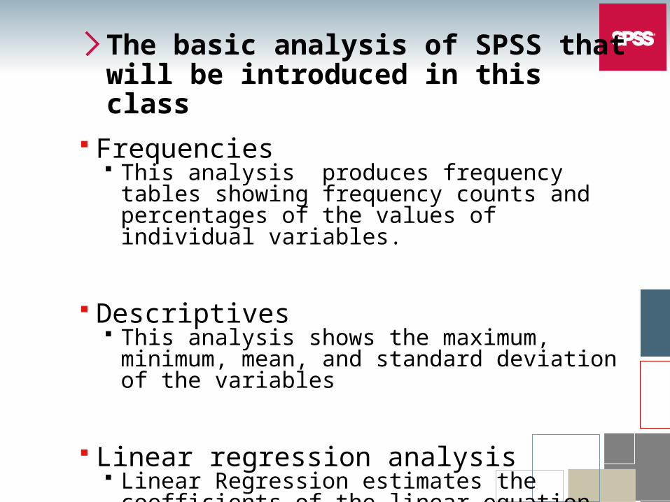
The basic analysis of SPSS that will be introduced in this class
Frequencies This analysis produces frequency tables showing
frequency counts and percentages of the values of individual variables.
Descriptives This analysis shows the maximum, minimum,
mean, and standard deviation of the variables
Linear regression analysis Linear Regression estimates the coefficients of the
linear equation
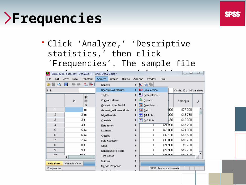
Frequencies
Click ‘Analyze,’ ‘Descriptive statistics,’ then click ‘Frequencies’. The sample file employee.sav is used in this demonstration
Frequencies
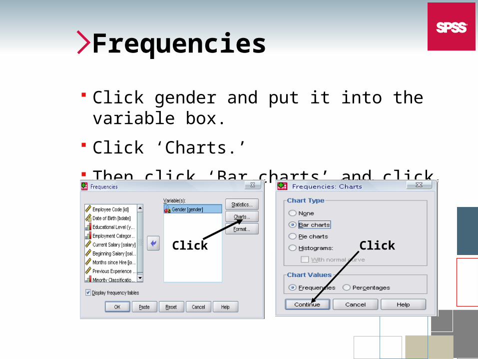
Click gender and put it into the variable box.
Click ‘Charts.’
Then click ‘Bar charts’ and click ‘Continue.’
Click Click
Frequencies
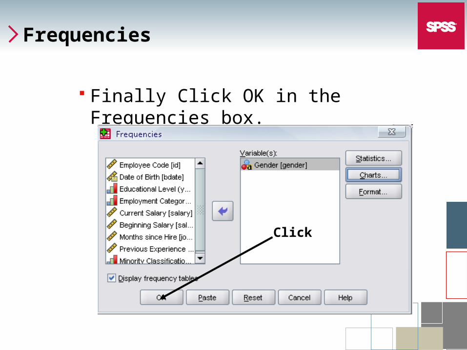
Finally Click OK in the Frequencies box.
Click
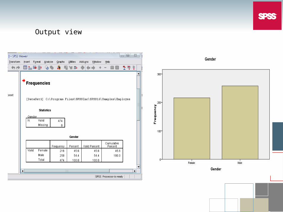
Output view
Descriptives
Click ‘Analyze,’ ‘Descriptive statistics,’ then click ‘Descriptives…’
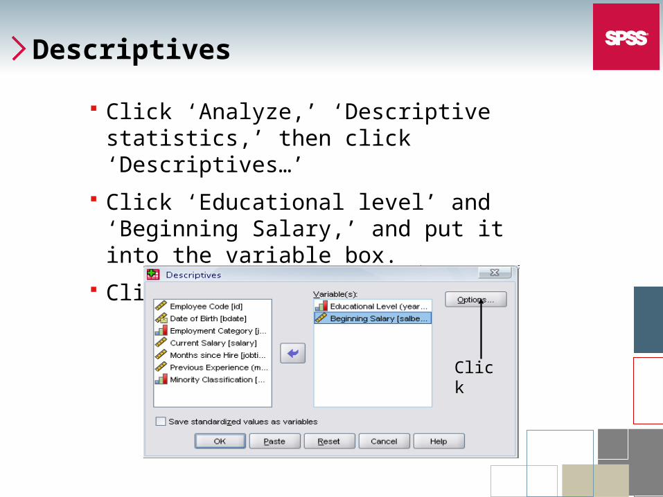
Click ‘Educational level’ and ‘Beginning Salary,’ and put it into the variable box.
Click Options
Click
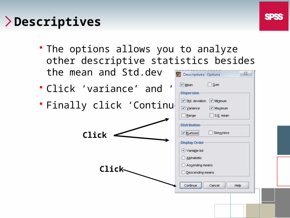
Descriptives
The options allows you to analyze other descriptive statistics besides the mean and Std.dev
Click ‘variance’ and ‘kurtosis’
Finally click ‘Continue’
Click
Click
Descriptives
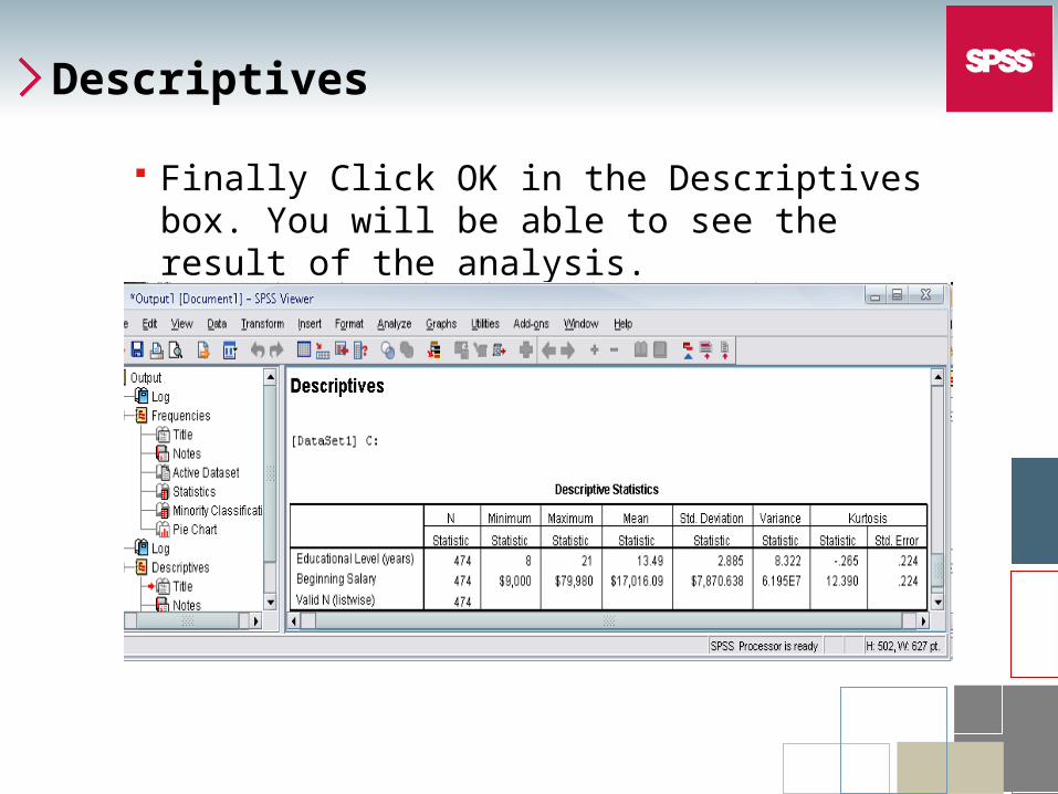
Finally Click OK in the Descriptives box. You will be able to see the result of the analysis.

Practice 4
Do a frequency analysis on the variable “minority”
Create pie charts for it
Descriptives
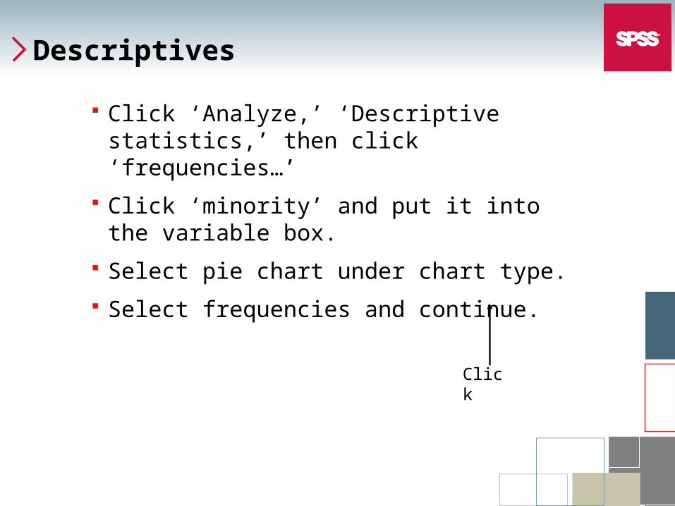
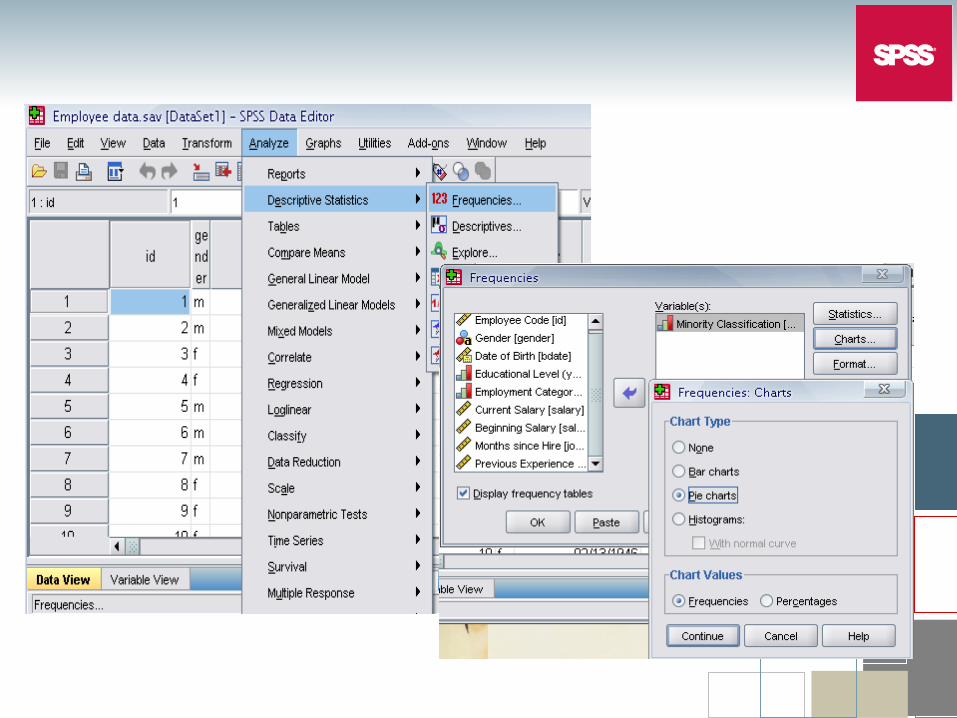
Click ‘Analyze,’ ‘Descriptive statistics,’ then click ‘frequencies…’
Click ‘minority’ and put it into the variable box.
Select pie chart under chart type.
Select frequencies and continue.
Click
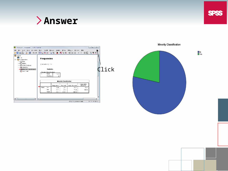
Answer
Click
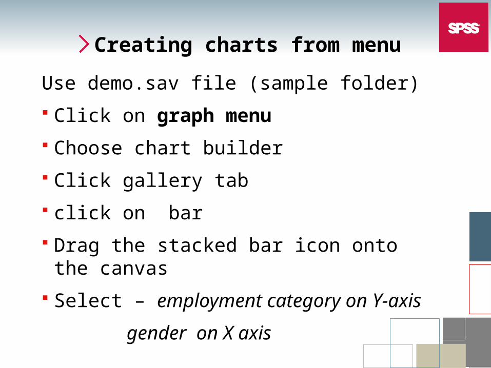
Creating charts from menu
Use demo.sav file (sample folder)
Click on graph menu
Choose chart builder
Click gallery tab
click on bar
Drag the stacked bar icon onto the canvas
Select – employment category on Y-axis
gender on X axis
Creating charts from menu
Use demo.sav file (from sample folder)
Click on graph menu
Choose chart builder
Click gallery tab
click on bar
Drag the stacked bar icon onto the canvas
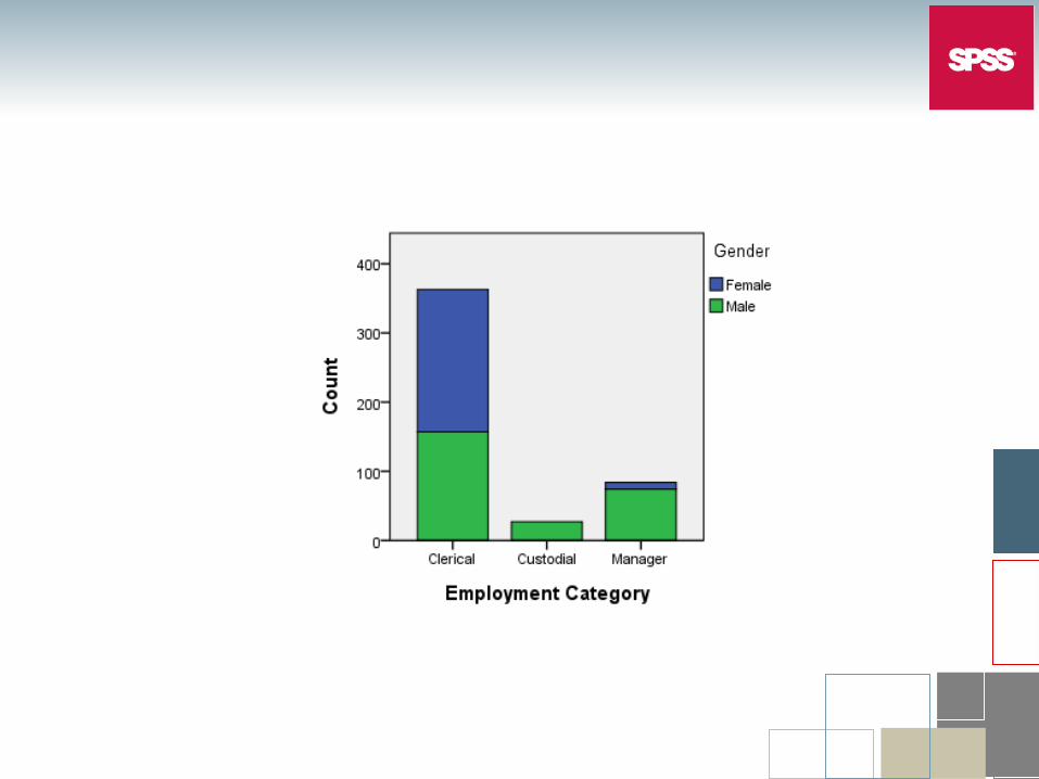
Select variables– employment category Y-
gender X axis
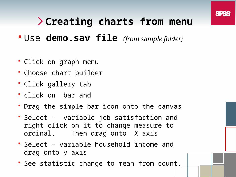
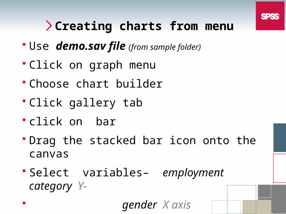
Creating charts from menu
Use demo.sav file (from sample folder)
Click on graph menu
Choose chart builder
Click gallery tab
click on bar and
Drag the simple bar icon onto the canvas
Select – variable job satisfaction and right click on it to change measure to ordinal. Then drag onto X axis
Select – variable household income and drag onto y axis
See statistic change to mean from count.
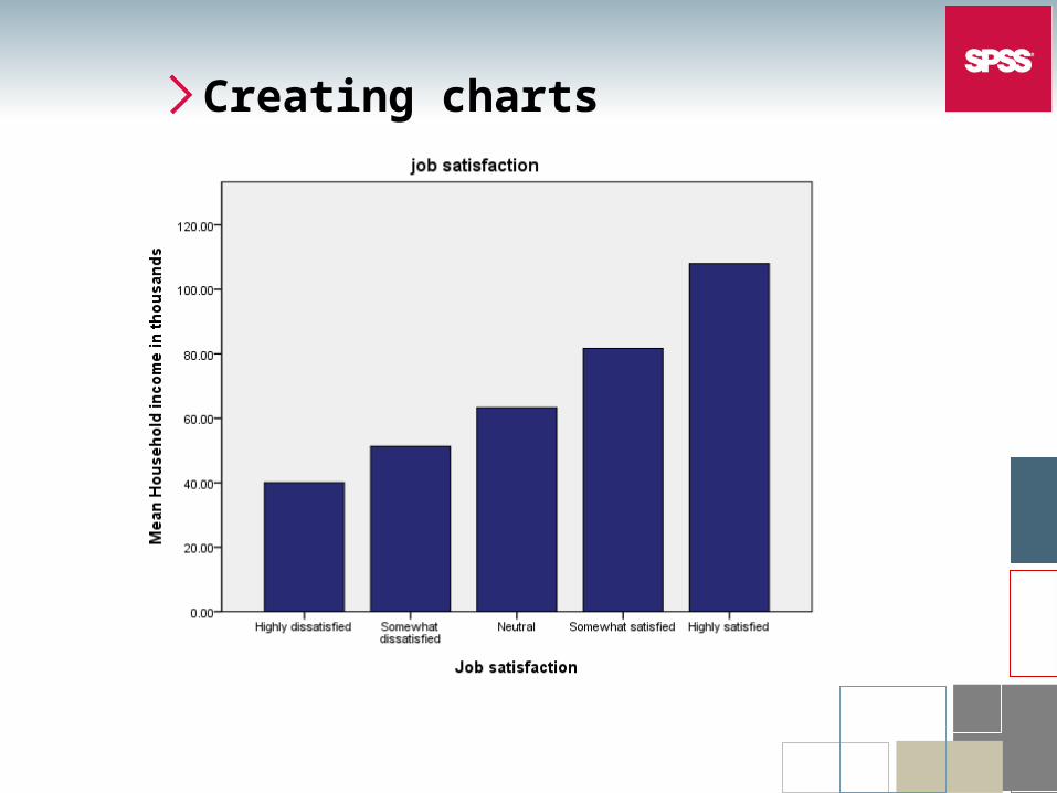
Creating charts
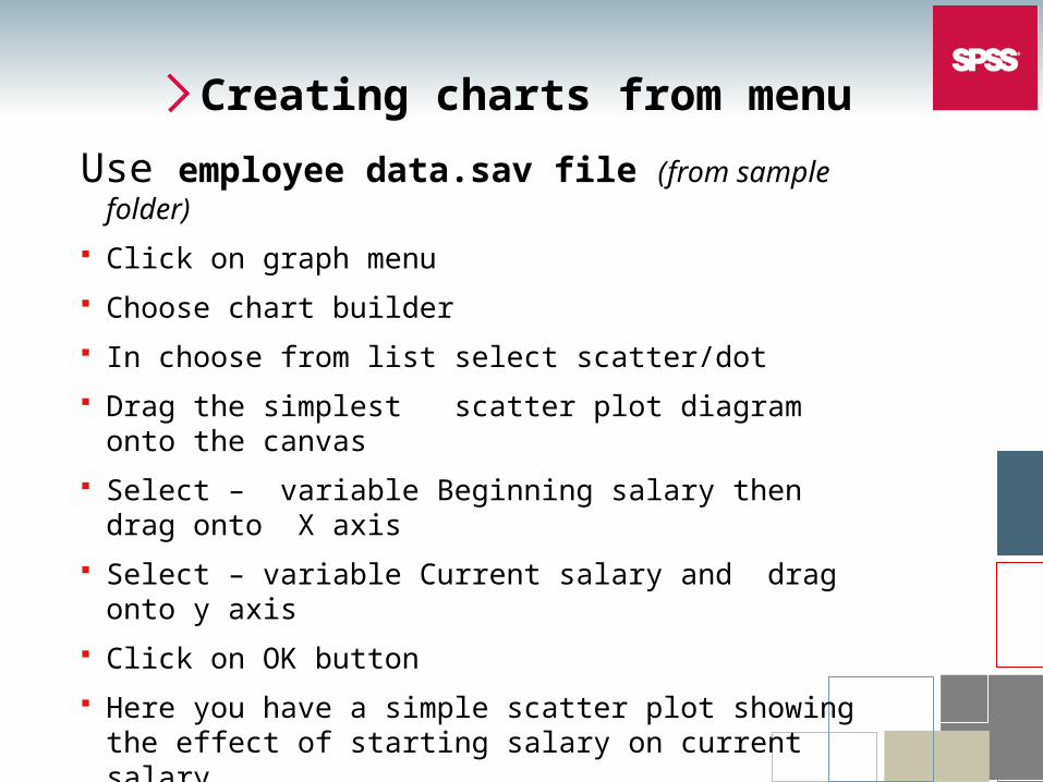
Creating charts from menu
Use employee data.sav file (from sample folder)
Click on graph menu
Choose chart builder
In choose from list select scatter/dot
Drag the simplest scatter plot diagram onto the canvas
Select – variable Beginning salary then drag onto X axis
Select – variable Current salary and drag onto y axis
Click on OK button
Here you have a simple scatter plot showing the effect of starting salary on current salary.