Embed Size (px)
Citation preview
Describing Data:Frequency Tables, FrequencyDistributions, and Graphic Presentation
Chapter 02
Copyright © 2013 by The McGraw-Hill Companies, Inc. All rights reserved.McGraw-Hill/Irwin
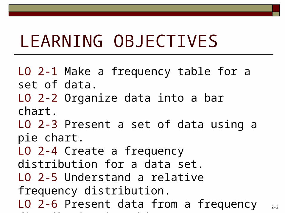
LEARNING OBJECTIVES
LO 2-1 Make a frequency table for a set of data.LO 2-2 Organize data into a bar chart.LO 2-3 Present a set of data using a pie chart.LO 2-4 Create a frequency distribution for a data set.LO 2-5 Understand a relative frequency distribution.LO 2-6 Present data from a frequency distribution in a histogram or frequency polygon.LO 2-7 Construct and interpret a cumulative frequency distribution.
2-2
Frequency Table and Frequency Distribution
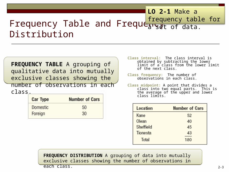
Class interval: The class interval is obtained by subtracting the lower limit of a class from the lower limit of the next class.
Class frequency: The number of observations in each class.
Class midpoint: A point that divides a class into two equal parts. This is the average of the upper and lower class limits.
FREQUENCY TABLE A grouping of qualitative data into mutually exclusive classes showing the number of observations in each class.
FREQUENCY DISTRIBUTION A grouping of data into mutually exclusive classes showing the number of observations in each class.
LO 2-1 Make a frequency table for a set of data.
2-3
Bar Charts
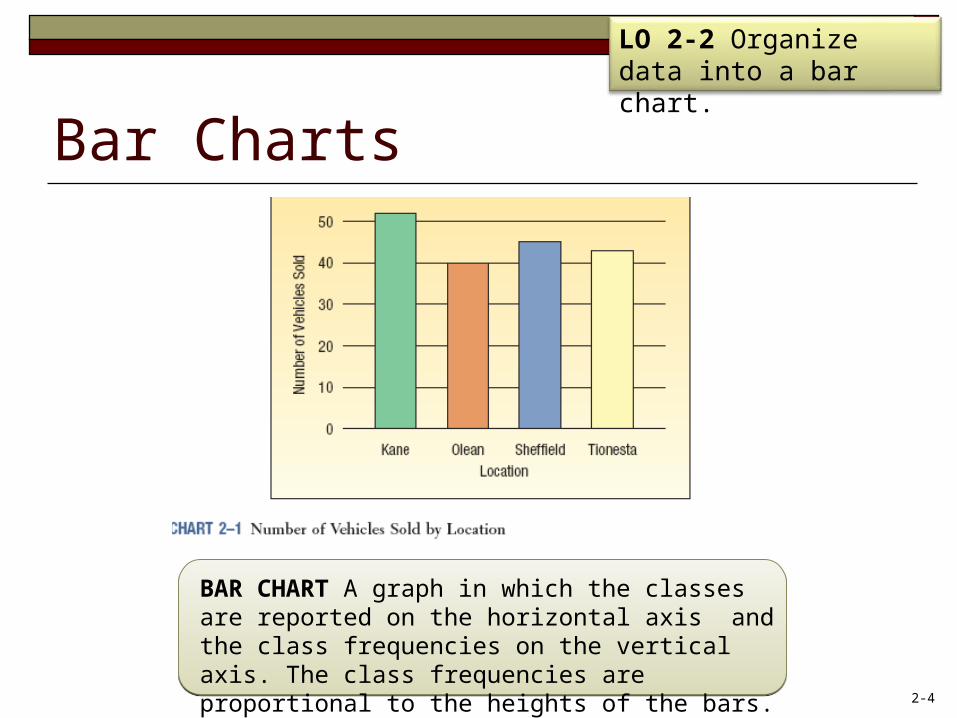
BAR CHART A graph in which the classes are reported on the horizontal axis and the class frequencies on the vertical axis. The class frequencies are proportional to the heights of the bars.
LO 2-2 Organize data into a bar chart.
2-4
Pie Charts
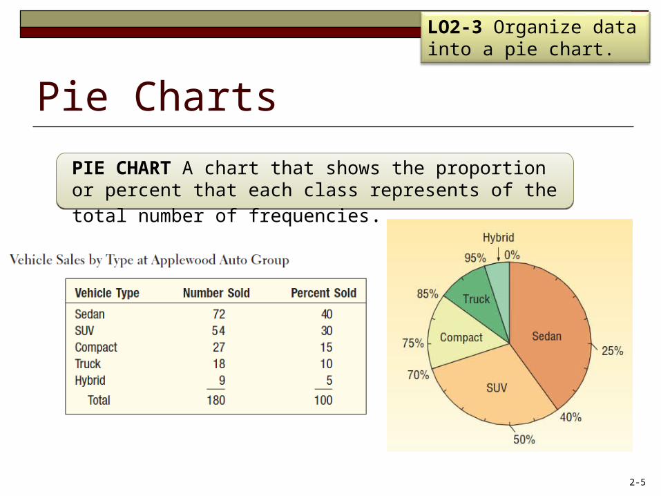
PIE CHART A chart that shows the proportion or percent that each class represents of the total number of frequencies.
LO2-3 Organize data into a pie chart.
2-5
EXAMPLE – Creating a Frequency Distribution Table
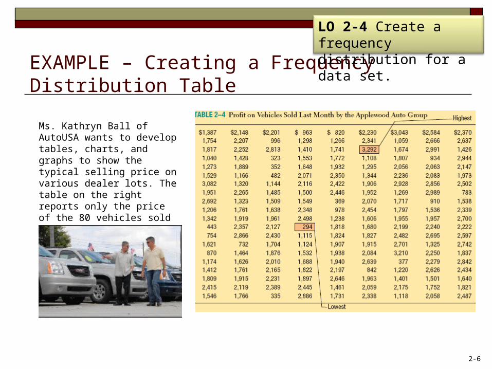
Ms. Kathryn Ball of AutoUSA wants to develop tables, charts, and graphs to show the typical selling price on various dealer lots. The table on the right reports only the price of the 80 vehicles sold last month at Whitner Autoplex.
LO 2-4 Create a frequency distribution for a data set.
2-6
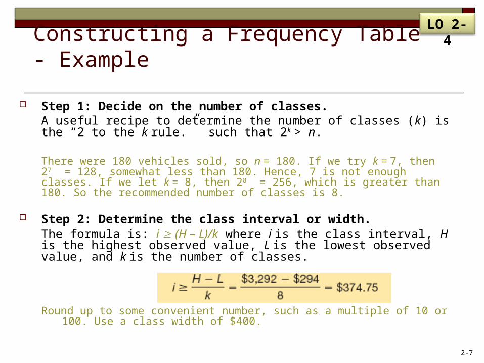
Constructing a Frequency Table - Example
Step 1: Decide on the number of classes. A useful recipe to determine the number of classes (k) is the “2 to the k rule.” such that 2k > n.
There were 180 vehicles sold, so n = 180. If we try k = 7, then 27 = 128, somewhat less than 180. Hence, 7 is not enough classes. If we let k = 8, then 28 = 256, which is greater than 180. So the recommended number of classes is 8.
Step 2: Determine the class interval or width. The formula is: i (H – L)/k where i is the class interval, H is the highest observed value, L is the lowest observed value, and k is the number of classes.
Round up to some convenient number, such as a multiple of 10 or 100. Use a class width of $400.
LO 2-4
2-7
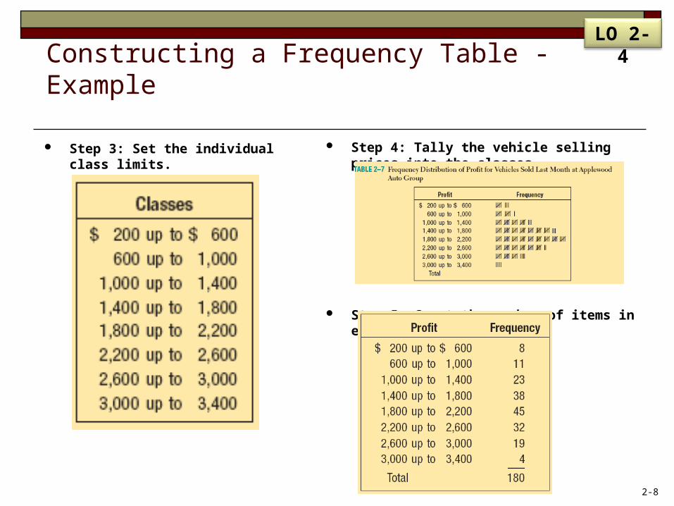
Step 4: Tally the vehicle selling prices into the classes.
Step 5: Count the number of items in each class.
Step 3: Set the individual class limits.
Constructing a Frequency Table - Example
LO 2-4
2-8
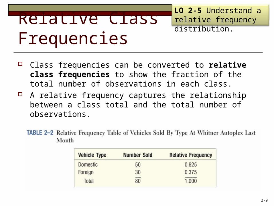
Relative Class Frequencies Class frequencies can be converted to relative class
frequencies to show the fraction of the total number of observations in each class.
A relative frequency captures the relationship between a class total and the total number of observations.
LO4LO 2-5 Understand a relative frequency distribution.
2-9
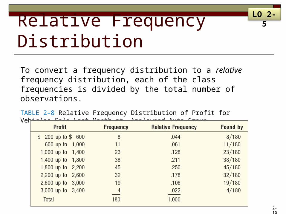
Relative Frequency DistributionTo convert a frequency distribution to a relative frequency distribution, each of the class frequencies is divided by the total number of observations.
TABLE 2–8 Relative Frequency Distribution of Profit for Vehicles Sold Last Month at Applewood Auto Group
LO 2-5
2-10
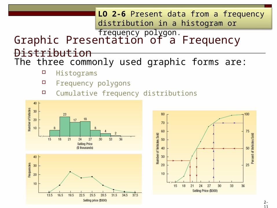
Graphic Presentation of a Frequency DistributionThe three commonly used graphic forms are:
Histograms Frequency polygons Cumulative frequency distributions
LO 2-6 Present data from a frequency distribution in a histogram or frequency polygon.
2-11
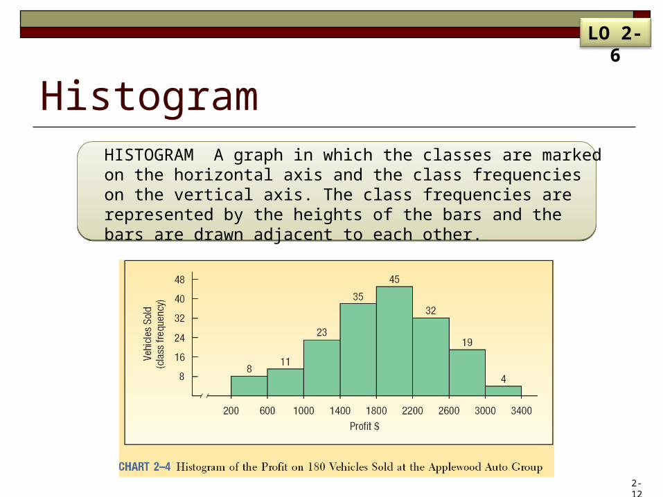
HistogramHISTOGRAM A graph in which the classes are marked on the horizontal axis and the class frequencies on the vertical axis. The class frequencies are represented by the heights of the bars and the bars are drawn adjacent to each other.
LO 2-6
2-12
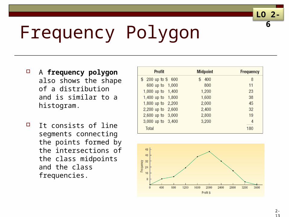
Frequency Polygon
A frequency polygon also shows the shape of a distribution and is similar to a histogram.
It consists of line segments connecting the points formed by the intersections of the class midpoints and the class frequencies.
LO 2-6
2-13
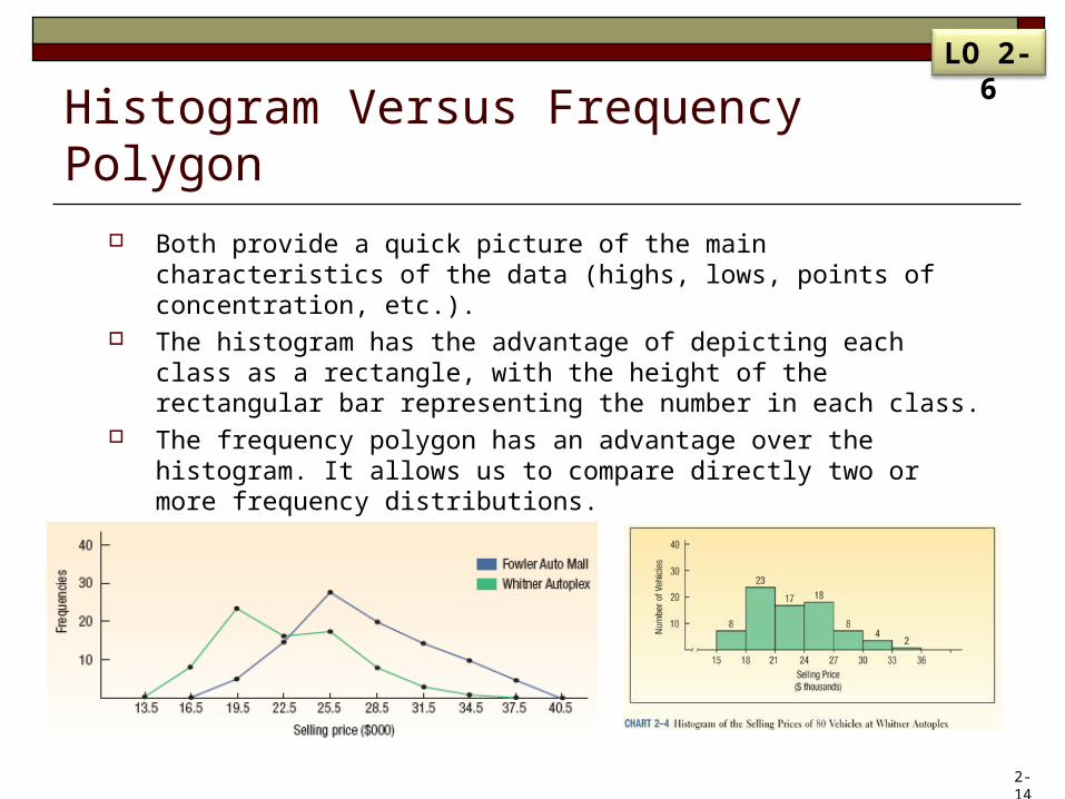
Histogram Versus Frequency Polygon Both provide a quick picture of the main characteristics of the data
(highs, lows, points of concentration, etc.). The histogram has the advantage of depicting each class as a
rectangle, with the height of the rectangular bar representing the number in each class.
The frequency polygon has an advantage over the histogram. It allows us to compare directly two or more frequency distributions.
LO 2-6
2-14
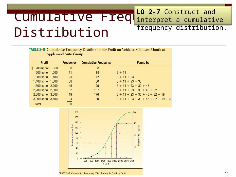
Cumulative Frequency Distribution
LO 2-7 Construct and interpret a cumulative frequency distribution.
2-15