Embed Size (px)
Citation preview
from the presidentB y the time you receive this issue, the Washington Calligraphers Guild Board will have met, the plans for the first program meeting will have been finalized and the event posted to our website, workshop registrants will continue to sign up for slots remaining in the September, October and November workshops and renewing memberships will be received, processed and documented using pen, paper and snail mail or our weblink and PayPal. Whether you attend our kickoff program meeting, attend a demonstration of traditional Arabic calligraphy co-hosted with Scripts ‘n’ Scribes, participate in our last workshops for 2017, or renew your membership by PayPal or not, WCG member volunteers like you are hard at work behind the scenes. Thanks to all for your investment in calligraphy and in the WCG. I look forward to an exciting year and to meeting you at one of our events. If you ever want to be part of the action going on behind the scenes, email me at [email protected], or speak with any of your Board members.
Best, Derrick
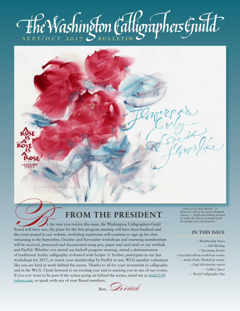
— artwork by Judy Melvin “A demo for one of my many Neuland classes — chalk oval stamps twisted to make the flower, pointed brush, broadedge pen and gouache.”
IN THIS ISSUE
– Membership News
– Fall Meeting
– Upcoming Events
– Luca Barcellona workshop review
– Amity Parks Workshop review
– Zapf Scholarship report
– Gallery Space
– World Calligraphy Day
s e p t / o c t 2017 b u l l e t i n
washington calligraphers guild— board of directors —
– officers –president: Derrick C. Tabor
[email protected] | 301-706-1123
vice president: Amy [email protected] | 202-905-8605
treasurer: Barbara [email protected] | 703-255-4678
secretary: Gilda [email protected] | 301-315-0330
member-at-large: Tiiu [email protected] | 301-216-4842
registered agent: Bob [email protected] | 703-569-4331
– standing committees –audit: John Stackpole
[email protected] | 301-292-9479
budget & finance: Barbara [email protected] | 703-255-4678
bulletin liaison: Pamn [email protected] | 301-654-6049
education: Monica [email protected] | 301-926-6385
exhibits: Maureen [email protected]
fundraising | calligrafest co-chairs: can you help?
librarian | archivist: Lucinda Fitch [email protected]
mailings: can you help?
membership: can you help?
nominating: appointed in January
programs: Monica [email protected] | 301-926-6385
publicity: Felecia [email protected] | 703-892-6262
scholarship: Marta [email protected] | 301-493-8907
scripsit liaison: Gretchen [email protected] | 703-591-5482
website: Lorraine [email protected] | 202-723-4635
workshops: Christine [email protected] | 301-745-4633
A very warm welcome to our newest members. We’re so very glad to have you!
Tim Brown – Alexandria, Virginia Christina Bledsoe – Upper Marlboro, Maryland Ann Brock – Memphis, Tennessee Notta Brown – Dahlgren, Virginia Lian Canty – Crested Butte, Colorado Edgardo Castro – Bayamon, Puerto Rico Maxine Composto – Dunn Loring, Virginia Hank Field – Hermosa Beach, California Virginia Gorman – Alexandria, Virginia Eileen Gustafson – Chicago, Illinois Stephanie Halcrow – Alexandria, Virginia Jill Helson – Ojai, California Kathryn Jacobson – Reisterstown, Maryland Jasmin Khangura – Centreville, Virginia Laura Kraft – Brentwood, Tennessee Marianne Linn – Gaithersburg, Maryland Liz Madden – Silver Spring, Maryland Gale McKiddy – St. Charles, Missouri Jean Melvin-Martin – Burke, Virginia Phil Muller – Mountain View, California Rebecca Newton – Hyattsville, Maryland Mary Otto – Washington, DC Joan Puma – Davie, Florida Janet Rehak – Freeport, Pennsylvania Debbie Ruggles – Sykesville, Maryland Sharon Schroer – Lothian, Maryland Alexandra Sterling – Silver Spring, Maryland Katherine Stevens – Tigard, Oregon Pat Swanson – Clifton, Virginia Nahid Tootoonchi – Towson, Maryland Allison Tyous – Alexandria, Virginia Alison Vaden – Vienna, Virginia Kathy Wallace – New York, New York Joanne C. Wasserman – North Bethesda, Maryland Jenny Werth – Grand Ledge, Michigan Alesia Zorn – Portland, Oregon
membership news
— artwork by Virginia Lockhart
- 2 -
The Bulletin of the Washington Calligraphers Guild is published four times per year from September - May with a special workshops issue in January.
The deadline for submissions for the November/December issue isOctober 15, 2017. We welcome your contributions. Please send high quality digital files for text,
photos and artwork (reflecting all levels, from beginner to advanced) to [email protected]. Your submissions will be interpreted as permission to use in the Bulletin, unless otherwise specified. We
will use your submissions on a space-available basis and may reduce your artwork to accommodate available space. Mention in the Bulletin does not constitute endorsement by the
Washington Calligraphers Guild.
The Washington Calligraphers Guild, Inc., is a Virginia non-profit corporation, with an IRS tax designation of 501(c)(3). The guild’s mailing address is P.O. Box 3688, Merrifield, VA 22116-3688.
Visit our website at www.calligraphersguild.org.
fall kick-off programMembers will share what they learned at LetterWorks
- the 2017 International Lettering Conference held in Utah from June 24- July 1. Come see the art that was produced and try your
hand at new techniques.
wednesday, sept. 27, 20177:00 - 9:00 p.m.
concord - st. andrews united methodist church5910 goldsboro roadbethesda, maryland
Upcoming events— an evening of calligraphy —
thursday, oct. 12, 20177:00 - 8:30 p.m.
Khalid Casado will showcase traditional Arabic calligraphy - come hear of its history in Ottoman Turkey and see a demo.
the universities at shady grove9636 gudelsky driverockville, maryland
building 2, room #1042
Register for this free event at:https://www.scriptsnscribes.com/register-1/free-arabic-calligraphy-demo-md
or athttps://eventbrite.com/e/an-evening-of-calligraphy-free-demo-
session-tickets-37625621246
— WCG is co-hosting this program with Scripts’n’Scribes —
— field trip to the national library of medicine —
Stephen J. Greenberg, MSLS, PhDSection Head, Rare Books
& Early ManuscriptsHistory of Medicine Division
will share with us books from the Middle Ages
friday, november 17, 20171:30 - 3:30
national library of medicine8600 rockville pikebethesda, maryland
Be sure to take advantage of this wealth of calligraphic opportunity
!
membership newscont'd...
Our sincere thanks to the following members whohave renewed at the Sustaining, Patron and Supporting Levels. We truly appreciate your generosity.
SUSTAINING
Eddie Jackson – Villa Park, Illinois Jill Norvell – Reston, Virginia
PATRON
Terry Coffey – Charlottesville, Virginia Audrey M. Gangwer – Seattle, Washington Jerry Jacobson – Asheville, North Carolina Elinor K. Kikugawa – Moraga, California Susan H. Robeson – Cochiti Lake, New Mexico Debbie Ryon – Onencock, Virginia
SUPPORTING
Ninfa A. Abad – New York, New York Christina Bledsoe – Upper Marlboro, Maryland Elizabeth Blinn-Howay – Baltimore, Maryland David Brookes – Richmond, California Isabel Lynne Carnes – Tucson, Arizona Phillip Ciske – Marshall, Virginia Melissa Clarke – Chestertown, Maryland Issac W. Cole – Columbia, Maryland Elizabeth Curwen – Washington, DC Carol Durr – Pasadena, Maryland Bonnie Kunenetz Duke – Severna Park, Maryland Mauri Earl – Arlington, Virginia Susan R. Easton – Silver Spring, Maryland Kathryn Gallanis – Fairfax, Virginia Claire Ingley – Gaithersburg, Maryland Elizabeth Porcher Jones – Charleston, South Carolina Barb Kornprobst – Somerset, Pennsylvania Tom Landon – Oneonta, New York Patti Shaivitz Leve – Baltimore, Maryland Jill Lichty – Mechanicsburg, Pennsylvania Marianne Linn – Gaithersburg, Maryland Ethelmary Maddox– Arlington, Virginia Trish Malin – Alexandria, Virginia Judy Melvin – Oakmont, Pennsylvania Amy J. Plotnick – Silver Spring, Maryland Mary Ellen Robinson – Hagerstown, Maryland Sandy Schaadt – Westerville, Ohio Sarah Spengler – Vienna, Virginia Janet Lynne Surrency – Alexandria, Virginia Heather Wiley – Brookline, Massachusetts Gerald Williamson – San Antonio, Texas
— artwork by Virginia Lockhart
— artwork by Deanna Jay Chu Nim
- 3 -
BLACKLETTER: A JOURNEY THROUGH GOTHIC LETTERFORMS
A Four-Day Workshop with Luca Barcellona
From April 28 to May 1, 2017, the Washington Calligraphers Guild was pleased to present Blackletter: A Journey through Gothic Letterforms, a four-day workshop with Italian calligrapher and lettering artist Luca Barcellona. The workshop was held at the Claggett Center in Adamstown, Maryland, marking the Guild’s first usage of that facility. Luca delivered an inspiring class that gave students not just a solid understanding of Blackletter forms but also insight into this impressive artist’s background, influences, and creative process.
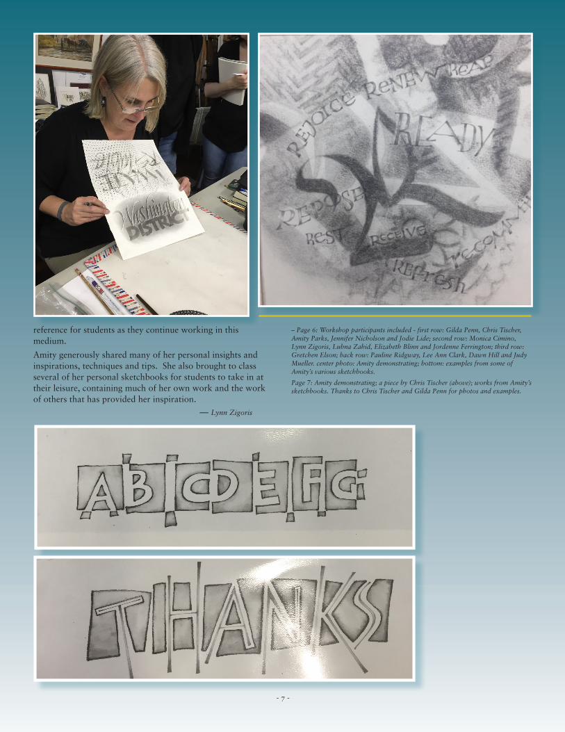
Most attendees arrived at the center on Thursday evening, hailing from Virginia, Pennsylvania, New York, Ohio, Texas and Maryland. We found our accommodations quite comfortable. Both the living and learning quarters were located in Doll Cottage, which was about a four minute walk from the dining hall, and the cottage’s back deck overlooked acres of rolling hills and farmland. Each night, students gathered on the deck to talk and enjoy the view.
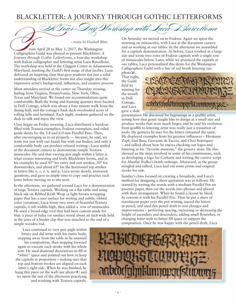
Class began on Friday morning. Luca distributed a handout filled with Textura exemplars, Fraktur exemplars, and ruled guide sheets for the 3.8 and 6.0 mm Parallel Pens. Then, after encouraging us to sit properly — because, he said, we write not just with our hands but with our bodies, and only a comfortable body can produce relaxed writing—Luca settled at the document camera to demonstrate simple Textura miniscules. He said that varying pen angle within a letter is what creates interesting and lively Blackletter forms, and in his examples he used 45° for entry and exit strokes, 30° for downstrokes, and about 65° for the horizontal top strokes in letters like o, c, e, n, and p. Luca wrote slowly, answered questions, and gave us ample time to copy and practice each letter before moving on to the next.
In the afternoon, we gathered around Luca for a demonstration of large Textura capitals. Working on a flat table and using black ink on Ribbed Kraft Wrap (a light-brown wrapping paper that has a nice surface for writing and subtle, ribbed color variation), Luca wrote two rows of beautiful Textura capitals, 6 nib widths high, then added a row of minuscules. He used a broad-edge tool that had been custom-made for him: a piece of balsa (or similar) wood about an inch wide held in the jaws of a binder clip that was attached to the end of a simple wooden rod.
Luca continued to vary pen angle within letters and did write with his entire body,
stepping away from the table as he assessed his composition, then stepping forward
again to execute each stroke with his whole arm. He used diamond decorations to fill in “white” space and pointed out how to keep
the capitals in proportion – making sure that top and bottom strokes are aligned on each letter’s right side. When he was finished, he
hung this piece on the wall (see photoà) and we spent the rest of the afternoon practicing
and working with Textura capitals.
On Saturday we moved on to Fraktur. Again we spent the morning on minuscules, with Luca at the document camera and us working at our tables. In the afternoon we assembled for a capitals demonstration. As before, Luca worked at a large size and wrote two rows of Fraktur capitals with a single row of minuscules below. Later, while we practiced the capitals at our tables, Luca personalized this demo for the Washington Calligraphers Guild with a line of red brush lettering (see photoæ). That night, the Guild held its meeting for the month in Doll Cottage, and Luca gave a slide presentation. He discussed his beginnings as a graffiti artist, noting how that genre taught him to design at a small size and produce works that were much larger, and he said his evolution from graffiti to lettering artist was really just a transition of tools: the gestures he uses for the letters remained the same. He displayed examples from his greatest influences – Hermann Zapf, Saul Bass, Giovanni de Faccio, and Chaz Bojorquez – and talked about how he enjoys checking out logos and lettering in his “favorite museum,” the grocery store. He also showed us the steps involved in some of his commissions, such as developing a logo for Carhartt and writing the cursive script for Absolut Vodka’s bottle redesign. Afterward, as the group mingled and talked, Luca laid out some prints and original works for sale.
Sunday’s class focused on creating a broadside, and Luca’s method for designing a short quotation was as follows. He started by writing the words with a medium Parallel Pen on practice paper, then cut the words into phrases and played with their arrangement. When he found a layout he liked, he rewrote it with his Parallel Pen. Then he put a sheet of translucent paper over the pen writing, traced the letters in pencil, and used this pencil draft to test changes and improvements – perfecting spacing, increasing or decreasing the height of ascenders and descenders, adding small flourishes, or changing letter style to better fill space or support thecomposition. Once he was happy with the pencil draft, Luca
– review by Elizabeth Blinn
- 4 -
covered it with another piece of translucent paper and copied the revised design in pen. He continued this process – writing in pen, tracing and modifying in pencil, then copying
the updated design in pen again – until he was satisfied with his layout.
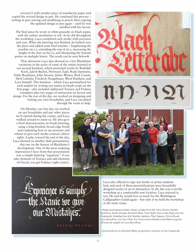
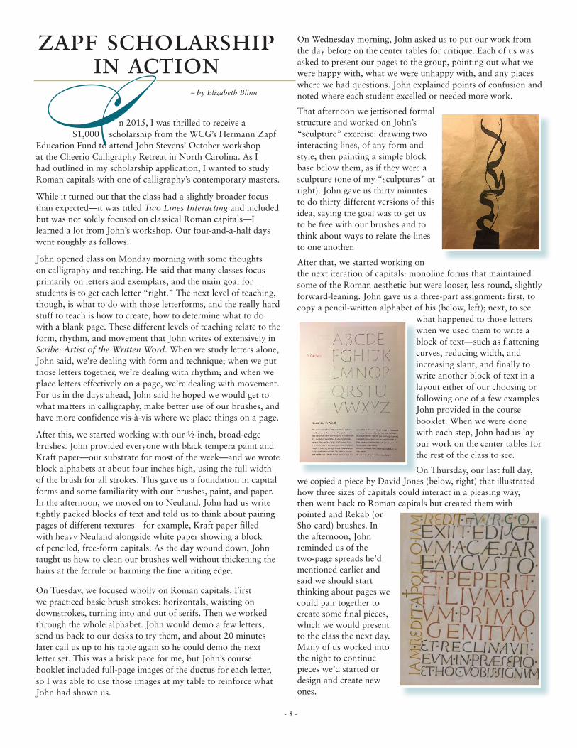
The final piece he wrote in white gouache on black paper, with the author attribution in red. As he did throughout
the workshop, Luca completed each stroke with precision and care. When the lettering was finished, he looked over the piece and added some final touches – lengthening the crossbar on a t, extending the top of an s, increasing the height of the dots on his i’s, and sharpening the bottom
points on multiple letters. The result can be seen belowâ .
That afternoon Luca also showed us a few Blackletter variations in the styles of some of the artists featured in
our second handout, which presented works by Rudolph Koch, Jakob Büchel, Hermann Zapf, Rudo Spemann,
Erkki Ruuhinen, John Stevens, Julian Waters, Rick Cusick, Herb Lubalin, Friedrich Neugebauer, Ward Dunham, and
Luca himself. This handout – which Luca personalized for each student by writing our names in brush script on the first page – also included additional Textura and Fraktur
exemplars plus two pages of instruction on layout and design. For the rest of the day, we worked on designing and
writing our own broadsides, and Luca circulated through the room to help.
On Monday, our last day, we worked on our broadsides and any other pieces
we’d started during the course, and Luca walked around to assist us. He also gave a brief demonstration on brush lettering,
using a long-bristled, broad-edge brush and explaining how to use pressure and
release to give each stroke contrast (above right). Lastly, toward the end of the day,
Luca showed us another slide presentation, this one on the history of Blackletter’s
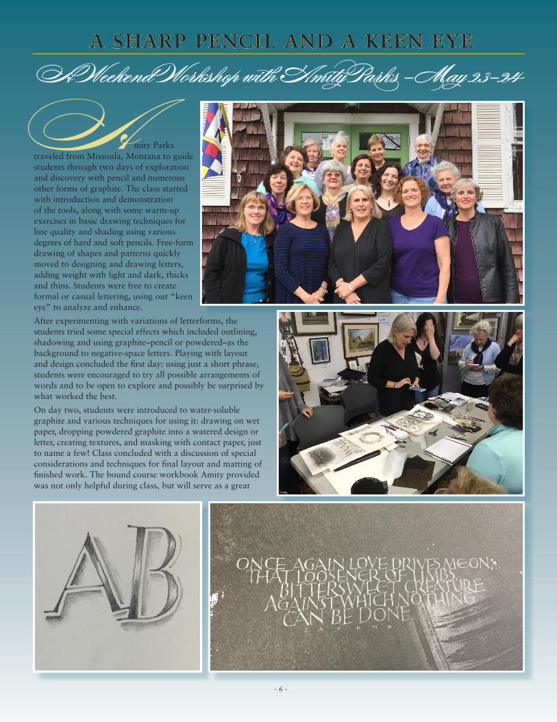
development. One of the most enduring impressions I have from that presentation was a simple lettering “equation:” if you
take elements of Textura and add elements of Uncial, you get Fraktur (right center).
Luca also offered to sign any books or prints students had, and each of these personalizations were beautifully designed works of art in themselves. In all, this was a terrific workshop at a comfortable new location. Luca enjoyed it, too. He said he would love to teach for the Washington Calligraphers Guild again – but only if we held the workshop at the same venue.
– artwork photos by Elizabeth Blinn, group photo courtesty of Ann Czapiewski
– Happy participants include: sitting on ledge from left: Chris Tischer, Jennifer Nicholson, Sandy Schaadt, Elizabeth Blinn, Trish Malin, Kacie-Linn Engle and Ann Czapiewski. Standing from left: Marilyn Aquilina, Phan Nguyen, Gloria Rosati, Luca Barcellona, Lee Ann Clark, Eric Doerr, Karen Brelsford and Marta Legeckis.All artwork samples by Luca Barcellona.
- 5 -
Amity Parks traveled from Missoula, Montana to guide students through two days of exploration and discovery with pencil and numerous other forms of graphite. The class started with introduction and demonstration of the tools, along with some warm-up exercises in basic drawing techniques for line quality and shading using various degrees of hard and soft pencils. Free-form drawing of shapes and patterns quickly moved to designing and drawing letters, adding weight with light and dark, thicks and thins. Students were free to create formal or casual lettering, using our “keen eye” to analyze and enhance.
After experimenting with variations of letterforms, the students tried some special effects which included outlining, shadowing and using graphite–pencil or powdered–as the background to negative-space letters. Playing with layout and design concluded the first day: using just a short phrase, students were encouraged to try all possible arrangements of words and to be open to explore and possibly be surprised by what worked the best.
On day two, students were introduced to water-soluble graphite and various techniques for using it: drawing on wet paper, dropping powdered graphite into a watered design or letter, creating textures, and masking with contact paper, just to name a few! Class concluded with a discussion of special considerations and techniques for final layout and matting of finished work. The bound course workbook Amity provided was not only helpful during class, but will serve as a great
a sharp pencil and a keen eyeA Weekend Workshop with Amity Parks - May 23-24
- 6 -
reference for students as they continue working in this medium.
Amity generously shared many of her personal insights and inspirations, techniques and tips. She also brought to class several of her personal sketchbooks for students to take in at their leisure, containing much of her own work and the work of others that has provided her inspiration.
— Lynn Zigoris
– Page 6: Workshop participants included - first row: Gilda Penn, Chris Tischer, Amity Parks, Jennifer Nicholson and Jodie Lide; second row: Monica Cimino, Lynn Zigoris, Lubna Zahid, Elizabeth Blinn and Jordenne Ferrington; third row: Gretchen Elson; back row: Pauline Ridgway, Lee Ann Clark, Dawn Hill and Judy Mueller. center photo: Amity demonstrating; bottom: examples from some of Amity’s various sketchbooks.
Page 7: Amity demonstrating; a piece by Chris Tischer (above); works from Amity’ssketchbooks. Thanks to Chris Tischer and Gilda Penn for photos and examples.
- 5 -- 7 -
On Wednesday morning, John asked us to put our work from the day before on the center tables for critique. Each of us was asked to present our pages to the group, pointing out what we were happy with, what we were unhappy with, and any places where we had questions. John explained points of confusion and noted where each student excelled or needed more work.
That afternoon we jettisoned formal structure and worked on John’s “sculpture” exercise: drawing two interacting lines, of any form and style, then painting a simple block base below them, as if they were a sculpture (one of my “sculptures” at right). John gave us thirty minutes to do thirty different versions of this idea, saying the goal was to get us to be free with our brushes and to think about ways to relate the lines to one another.
After that, we started working on the next iteration of capitals: monoline forms that maintained some of the Roman aesthetic but were looser, less round, slightly forward-leaning. John gave us a three-part assignment: first, to copy a pencil-written alphabet of his (below, left); next, to see
what happened to those letters when we used them to write a block of text—such as flattening curves, reducing width, and increasing slant; and finally to write another block of text in a layout either of our choosing or following one of a few examples John provided in the course booklet. When we were done with each step, John had us lay our work on the center tables for the rest of the class to see.
On Thursday, our last full day, we copied a piece by David Jones (below, right) that illustrated how three sizes of capitals could interact in a pleasing way, then went back to Roman capitals but created them with pointed and Rekab (or Sho-card) brushes. In the afternoon, John reminded us of the two-page spreads he’d mentioned earlier and said we should start thinking about pages we could pair together to create some final pieces, which we would present to the class the next day. Many of us worked into the night to continue pieces we’d started or design and create new ones.
– by Elizabeth Blinn In 2015, I was thrilled to receive a $1,000 scholarship from the WCG’s Hermann Zapf Education Fund to attend John Stevens’ October workshop at the Cheerio Calligraphy Retreat in North Carolina. As I had outlined in my scholarship application, I wanted to study Roman capitals with one of calligraphy’s contemporary masters.
While it turned out that the class had a slightly broader focus than expected—it was titled Two Lines Interacting and included but was not solely focused on classical Roman capitals—I learned a lot from John’s workshop. Our four-and-a-half days went roughly as follows.
John opened class on Monday morning with some thoughts on calligraphy and teaching. He said that many classes focus primarily on letters and exemplars, and the main goal for students is to get each letter “right.” The next level of teaching, though, is what to do with those letterforms, and the really hard stuff to teach is how to create, how to determine what to do with a blank page. These different levels of teaching relate to the form, rhythm, and movement that John writes of extensively in Scribe: Artist of the Written Word. When we study letters alone, John said, we’re dealing with form and technique; when we put those letters together, we’re dealing with rhythm; and when we place letters effectively on a page, we’re dealing with movement. For us in the days ahead, John said he hoped we would get to what matters in calligraphy, make better use of our brushes, and have more confidence vis-à-vis where we place things on a page.
After this, we started working with our ½-inch, broad-edge brushes. John provided everyone with black tempera paint and Kraft paper—our substrate for most of the week—and we wrote block alphabets at about four inches high, using the full width of the brush for all strokes. This gave us a foundation in capital forms and some familiarity with our brushes, paint, and paper. In the afternoon, we moved on to Neuland. John had us write tightly packed blocks of text and told us to think about pairing pages of different textures—for example, Kraft paper filled with heavy Neuland alongside white paper showing a block of penciled, free-form capitals. As the day wound down, John taught us how to clean our brushes well without thickening the hairs at the ferrule or harming the fine writing edge.
On Tuesday, we focused wholly on Roman capitals. First we practiced basic brush strokes: horizontals, waisting on downstrokes, turning into and out of serifs. Then we worked through the whole alphabet. John would demo a few letters, send us back to our desks to try them, and about 20 minutes later call us up to his table again so he could demo the next letter set. This was a brisk pace for me, but John’s course booklet included full-page images of the ductus for each letter, so I was able to use those images at my table to reinforce what John had shown us.
zapf scholarship in action
- 8 -
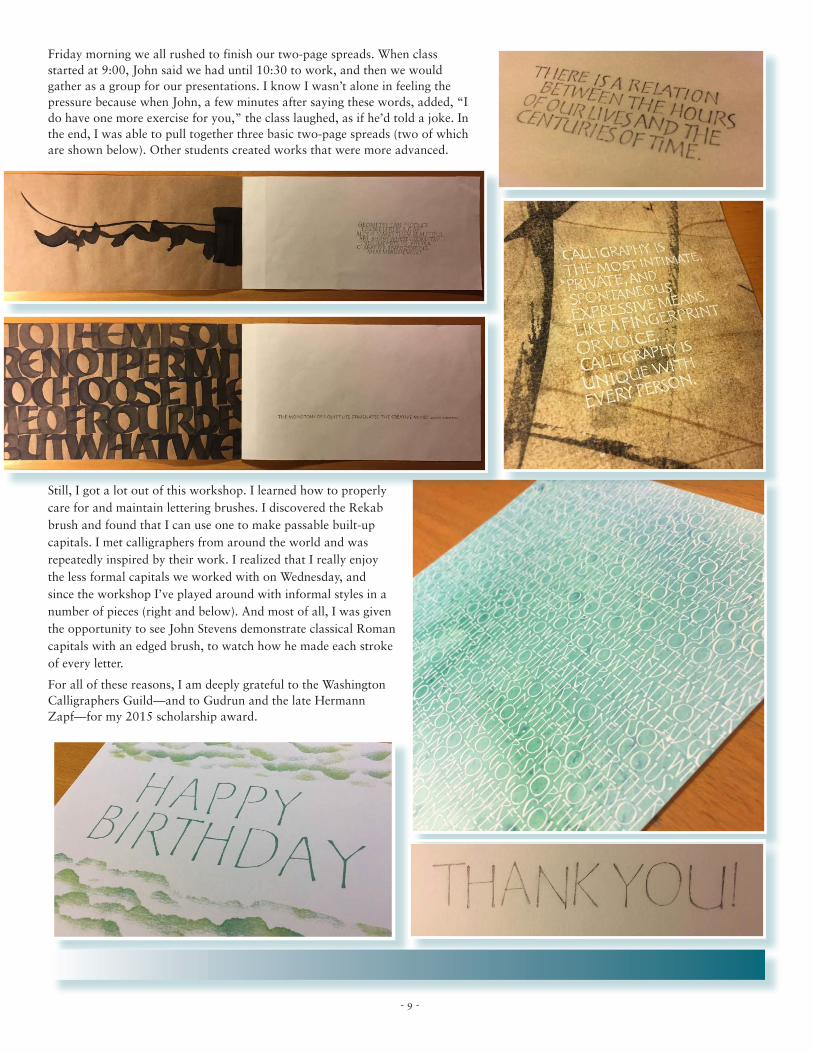
Friday morning we all rushed to finish our two-page spreads. When class started at 9:00, John said we had until 10:30 to work, and then we would gather as a group for our presentations. I know I wasn’t alone in feeling the pressure because when John, a few minutes after saying these words, added, “I do have one more exercise for you,” the class laughed, as if he’d told a joke. In the end, I was able to pull together three basic two-page spreads (two of which are shown below). Other students created works that were more advanced.
Still, I got a lot out of this workshop. I learned how to properly care for and maintain lettering brushes. I discovered the Rekab brush and found that I can use one to make passable built-up capitals. I met calligraphers from around the world and was repeatedly inspired by their work. I realized that I really enjoy the less formal capitals we worked with on Wednesday, and since the workshop I’ve played around with informal styles in a number of pieces (right and below). And most of all, I was given the opportunity to see John Stevens demonstrate classical Roman capitals with an edged brush, to watch how he made each stroke of every letter.
For all of these reasons, I am deeply grateful to the Washington Calligraphers Guild—and to Gudrun and the late Hermann Zapf—for my 2015 scholarship award.
- 9 -
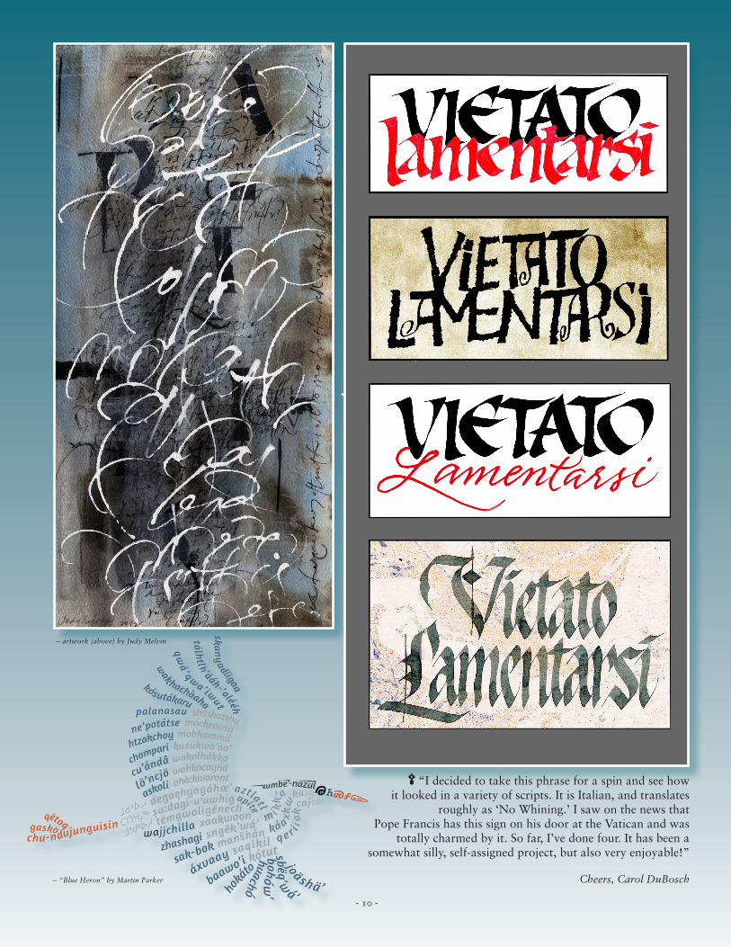
“I decided to take this phrase for a spin and see howit looked in a variety of scripts. It is Italian, and translates
roughly as ‘No Whining.’ I saw on the news that Pope Francis has this sign on his door at the Vatican and was
totally charmed by it. So far, I’ve done four. It has been a somewhat silly, self-assigned project, but also very enjoyable!”
Cheers, Carol DuBosch
— artwork (above) by Judy Melvin
— “Blue Heron” by Martin Parker
✒
- 10 -
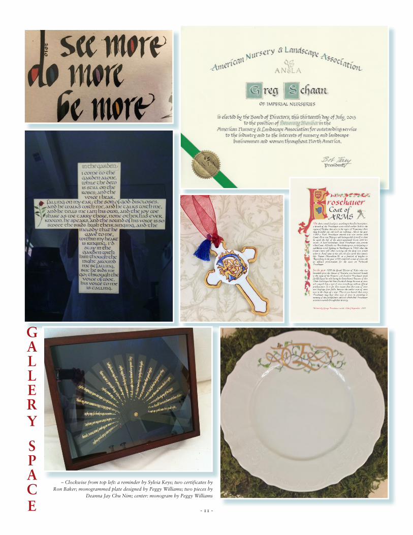
– Clockwise from top left: a reminder by Sylvia Keys; two certificates by Ron Baker; monogrammed plate designed by Peggy Williams; two pieces by
Deanna Jay Chu Nim; center: monogram by Peggy Williams
gallery
space - 11 -
nonprofit org.u.s. postage
paidmerrifield vapermit no. 742
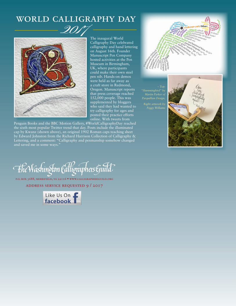
The inaugural World Calligraphy Day celebrated calligraphy and hand lettering on August 16th. Founder Manuscript Pen Company hosted activities at the Pen Museum in Birmingham, UK, where participants could make their own steel pen nib. Hands-on demos were held as far away as a craft store in Redmond, Oregon. Manuscript reports that press coverage reached 152,000 people. This was supplemented by bloggers who said they had wanted to try calligraphy for ages and posted their practice efforts online. With tweets from
Penguin Books and the BBC Motion Gallery, #WorldCalligraphyDay reached the sixth most popular Twitter trend that day. Posts include the illuminated cap by Kwanz (shown above), an original 1902 Roman caps teaching sheet by Edward Johnston from the Richard Harrison Collection of Calligraphy & Lettering, and a comment: “Calligraphy and penmanship somehow changed and saved me in some ways.”
ta³nuh³nĩ ¹lhxu²
njoˀ
o
<tŝabaayo-yałtsˀ õõsa>
tȕcu
lóna
keje
taw
ánop
mim
irii
jiako
isi
lelɛm
pəlis
mom
oxka
peté
-két
onts
uˀun
uˀun
huitzil
tukuxi
colibri
žaˀa³⁵
maˀ kaataevéˀ késo
pími
trumpa
pishlo
cuˀ ³cu²
pˀ uspat
ti¹nti¹
ɕˀ utik
tzˀ ununtozcatl
šu:ˀ kš
chunuˀ u
biulú
chug
píno
gwigwiˀ nhoguhũ
giyáⁿ-wazhíⁿga
kolʔa-telʔelew
semalulukut
akúnəkə
cú
ntuch
minm
ín
tlˀal
hcho
ozgu
ainu
mbi
wim
i
ēˀtsən
tsən χæ
:nox
cuad
idi
stbembmseˀmóci
epoteedi
jekil
tówa
hu:m
iya
yjor
ananokasyuʔ
maznumy
simuchí təčtčniikyrikchi³quiuh³
gitúpeterošəˀ
firijémpesen
mainumbyfahtííhtyodahiitįhiitanagila
bihwisi
him
eres
e vipisimal
piˀ imi qˀ
entełanɕ ini
kindi
eˀts
cue
pinz
asip
i
wainomytuscura
kulubh ityot
sope
rdup
hiph
i
wipismal
lulifi
zido
e:mu
ži-činčeˀ
sũhuĩt
trošeˀ
chomquiji
ˀummunpitído
túčil
suˀksuˀ
ziziˀ bárɨtomim
iyo
t sˀuñ
un
tʌ:tzicaˀ i
Ꮐ
ᎴᎷ
– Top:“Hummingbird” by
Martin Parker of Parquillian Design,
Right: artwork by Peggy Williams
world calligraphy day2017
p.o. box 3688, merrifield, va 22116 • www.calligraphersguild.org
address service requested 9 / 2017