Embed Size (px)
Citation preview

December 15, 2011 – Report to Kuali Rice Leads
Candace Soderston, Kuali Rice Project, UWHans Hillen, The Paciello Group (TPG)
Architecting for Accessibility: A Beginning at Best Practice

2
“The power of the Web is in its universality. Access by everyone regardless of disability is an
essential aspect.”
Tim Berners-Lee,
W3C Director and inventor of the World Wide Web
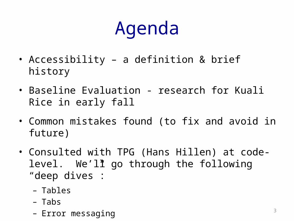
Agenda
• Accessibility – a definition & brief history
• Baseline Evaluation - research for Kuali Rice in early fall
• Common mistakes found (to fix and avoid in future)
• Consulted with TPG (Hans Hillen) at code-level. We’ll go through the following “deep dives”:– Tables– Tabs– Error messaging
3
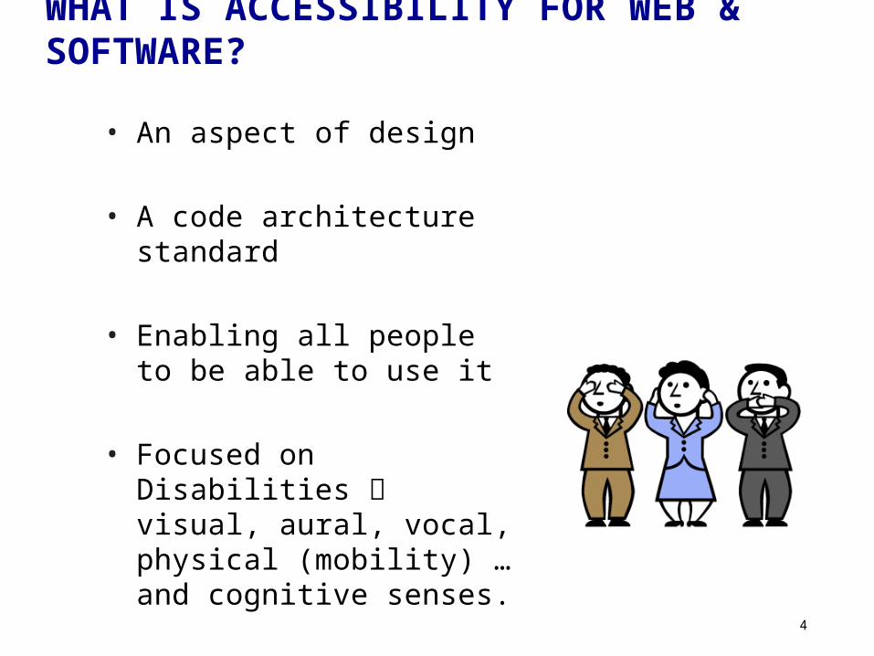
WHAT IS ACCESSIBILITY FOR WEB & SOFTWARE?
• An aspect of design
• A code architecture standard
• Enabling all people to be able to use it
• Focused on Disabilities visual, aural, vocal, physical (mobility) … and cognitive senses.
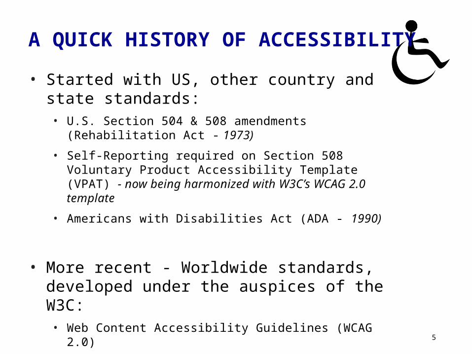
A QUICK HISTORY OF ACCESSIBILITY
• Started with US, other country and state standards:• U.S. Section 504 & 508 amendments (Rehabilitation Act - 1973)
• Self-Reporting required on Section 508 Voluntary Product Accessibility Template (VPAT) - now being harmonized with W3C’s WCAG 2.0 template
• Americans with Disabilities Act (ADA - 1990)
• More recent - Worldwide standards, developed under the auspices of the W3C:• Web Content Accessibility Guidelines (WCAG 2.0)
• Web Accessibility Initiative - Accessible Rich Internet Applications (WAI-ARIA) and HTML5
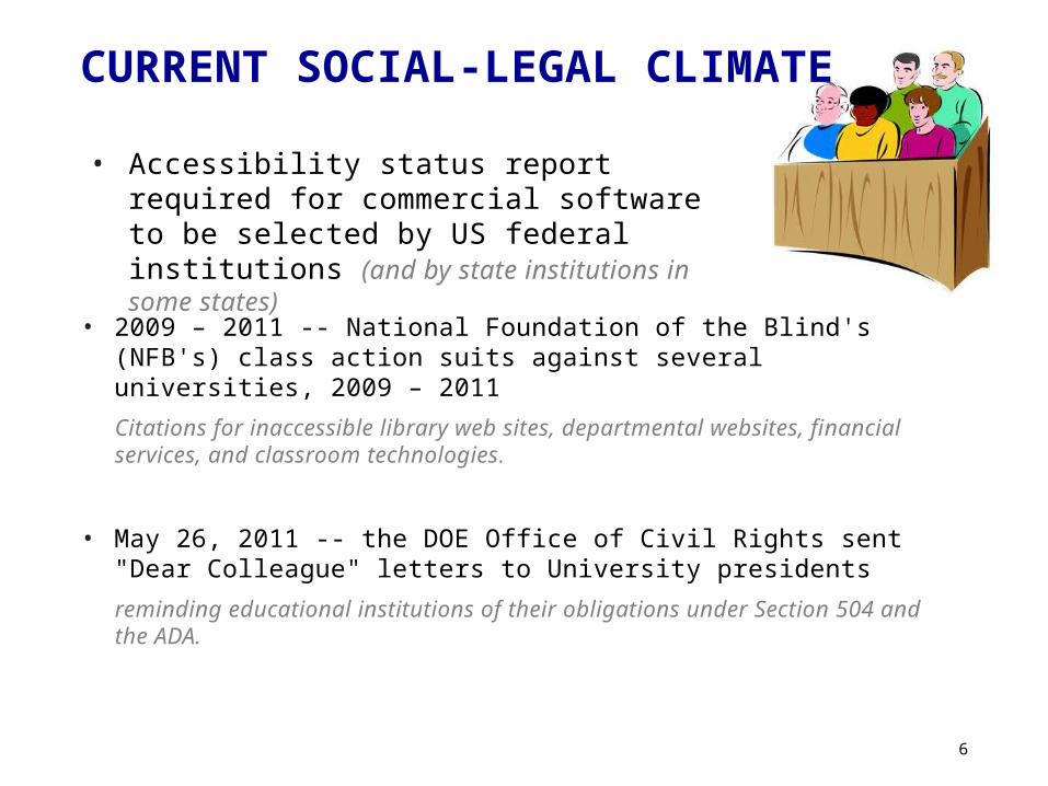
CURRENT SOCIAL-LEGAL CLIMATE
• Accessibility status report required for commercial software to be selected by US federal institutions (and by state institutions in some states)
• 2009 – 2011 -- National Foundation of the Blind's (NFB's) class action suits against several universities, 2009 – 2011
Citations for inaccessible library web sites, departmental websites, financial services, and classroom technologies.
• May 26, 2011 -- the DOE Office of Civil Rights sent "Dear Colleague" letters to University presidents
reminding educational institutions of their obligations under Section 504 and the ADA.
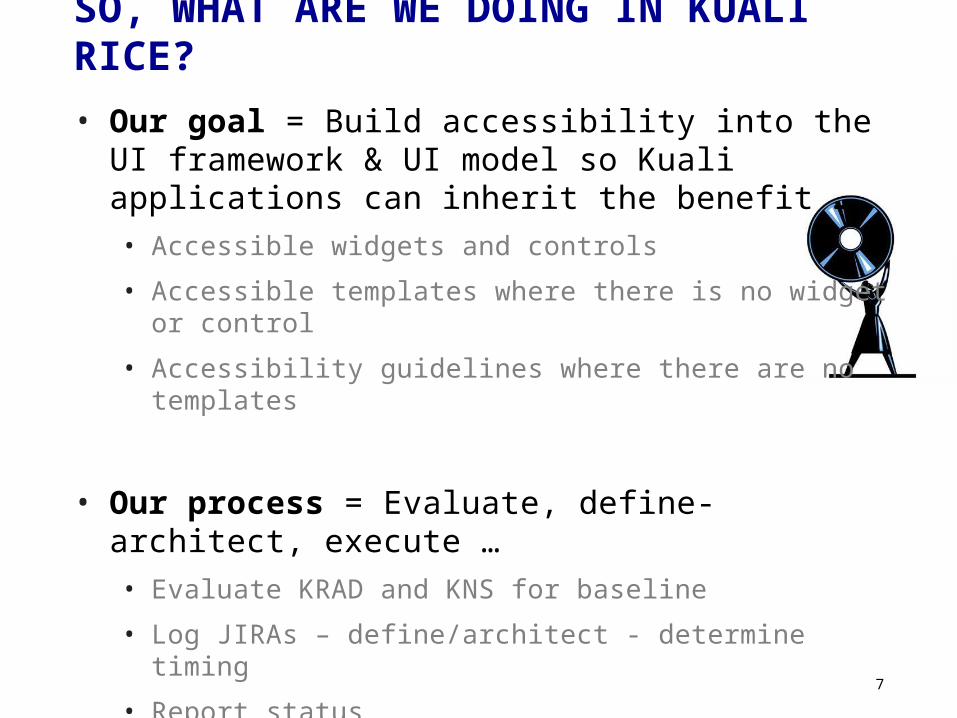
SO, WHAT ARE WE DOING IN KUALI RICE?• Our goal = Build accessibility into the UI framework & UI
model so Kuali applications can inherit the benefit …• Accessible widgets and controls
• Accessible templates where there is no widget or control
• Accessibility guidelines where there are no templates
• Our process = Evaluate, define-architect, execute … • Evaluate KRAD and KNS for baseline
• Log JIRAs – define/architect - determine timing
• Report status
• Set future target
8
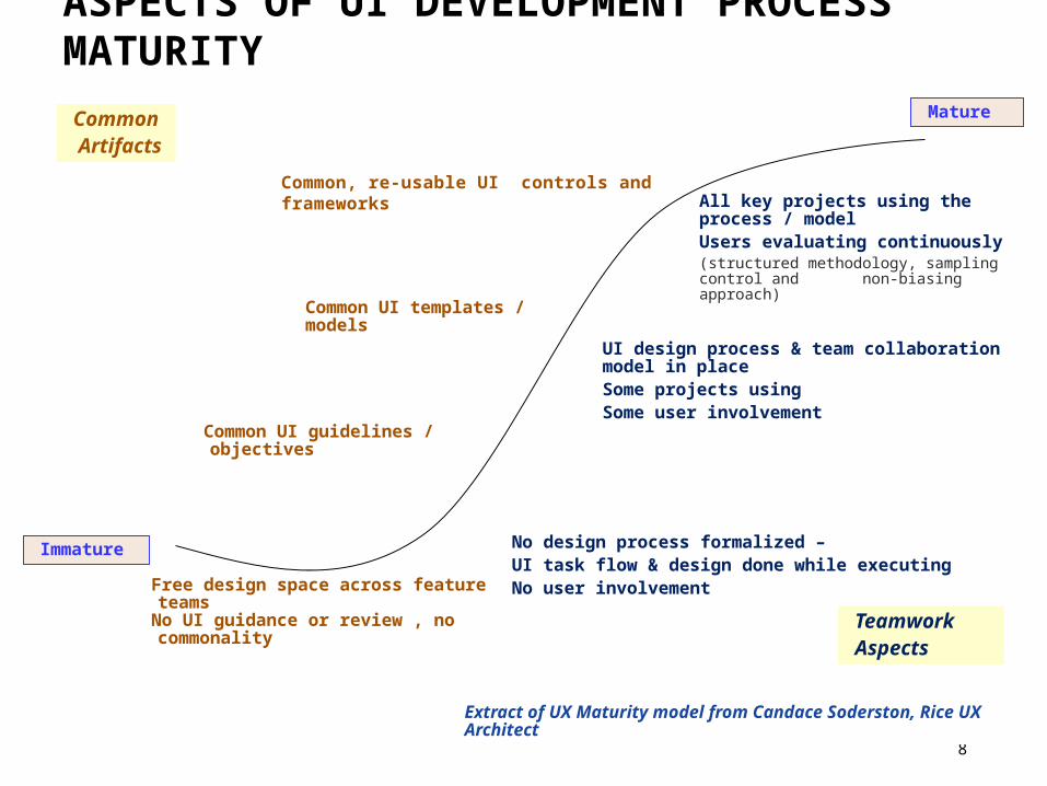
Common, re-usable UI controls and frameworks
ASPECTS OF UI DEVELOPMENT PROCESS MATURITY
Free design space across feature teamsNo UI guidance or review , no commonality
Common UI templates / models
Common UI guidelines / objectives
UI design process & team collaboration model in placeSome projects usingSome user involvement
Mature
Immature
Common Artifacts
TeamworkAspects
No design process formalized – UI task flow & design done while executingNo user involvement
All key projects using the process / model Users evaluating continuously(structured methodology, sampling control and non-biasing approach)
Extract of UX Maturity model from Candace Soderston, Rice UX Architect
No UI commonality
Common UI templates / models
Common UI guidelines / objectives
UI design process in placeSome user involvement
Mature
Immature
CommonArtifacts
Teamwork Aspects
No design process formalized No user involvement
UI design process in all projectsUsers evaluating continuously
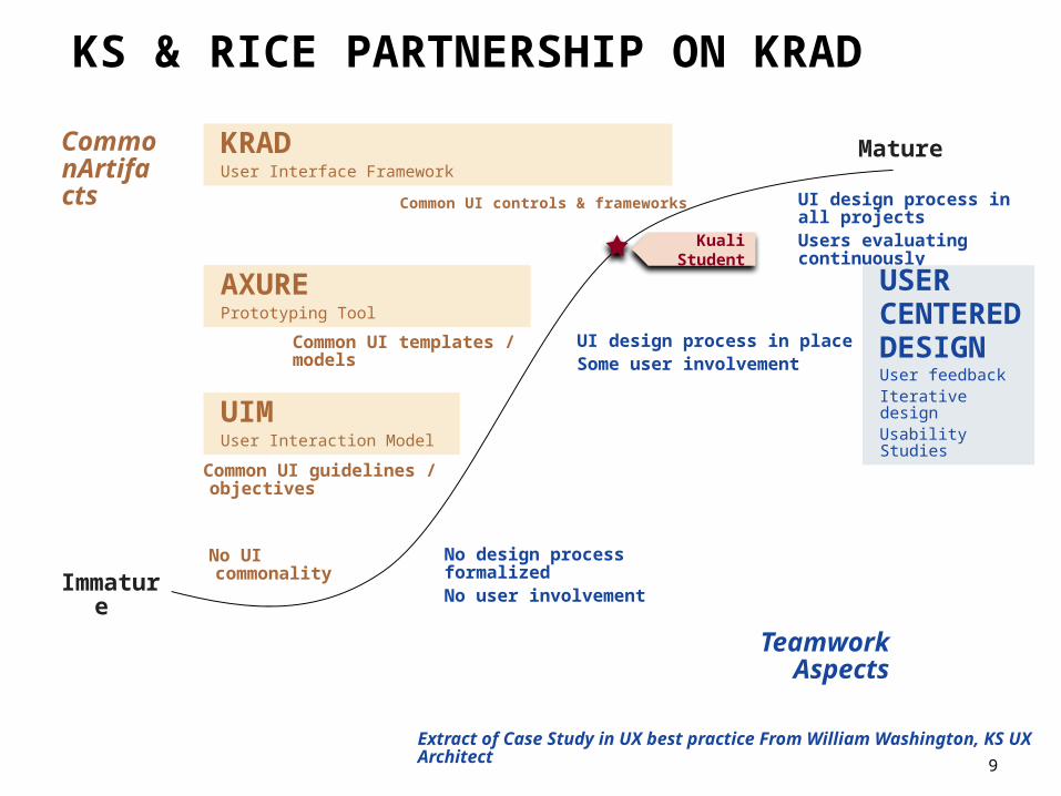
KS & RICE PARTNERSHIP ON KRAD
Kuali Student
KRADUser Interface Framework
AXUREPrototyping Tool
UIMUser Interaction Model
Common UI controls & frameworks
USER CENTERED DESIGNUser feedbackIterative designUsability Studies
Extract of Case Study in UX best practice From William Washington, KS UX Architect
9
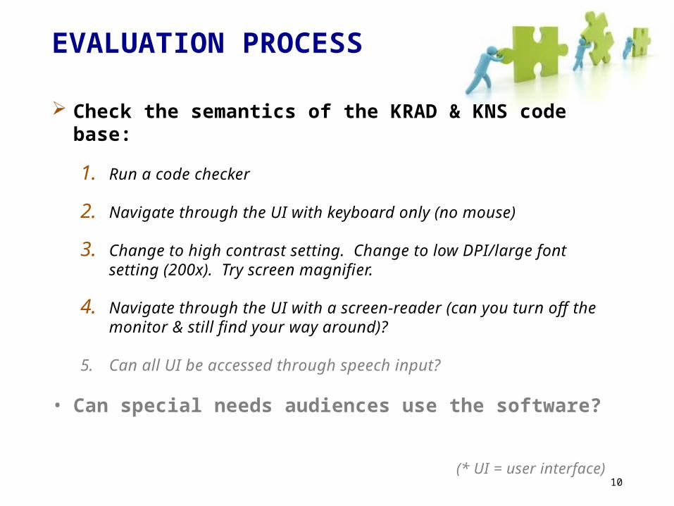
EVALUATION PROCESS
Check the semantics of the KRAD & KNS code base:
1. Run a code checker
2. Navigate through the UI with keyboard only (no mouse)
3. Change to high contrast setting. Change to low DPI/large font setting (200x). Try screen magnifier.
4. Navigate through the UI with a screen-reader (can you turn off the monitor & still find your way around)?
5. Can all UI be accessed through speech input?
• Can special needs audiences use the software? (* UI = user interface)
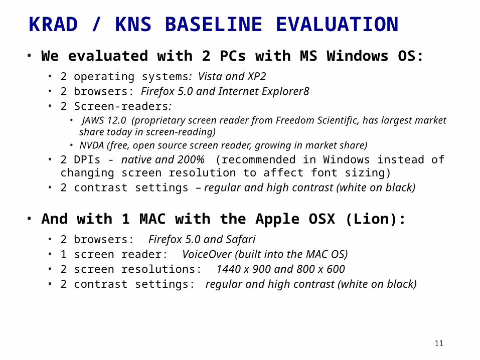
KRAD / KNS BASELINE EVALUATION• We evaluated with 2 PCs with MS Windows OS:
• 2 operating systems: Vista and XP2• 2 browsers: Firefox 5.0 and Internet Explorer8• 2 Screen-readers:
• JAWS 12.0 (proprietary screen reader from Freedom Scientific, has largest market share today in screen-reading)
• NVDA (free, open source screen reader, growing in market share)• 2 DPIs - native and 200% (recommended in Windows instead of changing
screen resolution to affect font sizing)• 2 contrast settings – regular and high contrast (white on black)
• And with 1 MAC with the Apple OSX (Lion): • 2 browsers: Firefox 5.0 and Safari• 1 screen reader: VoiceOver (built into the MAC OS)• 2 screen resolutions: 1440 x 900 and 800 x 600• 2 contrast settings: regular and high contrast (white on black)
OK – NOW, THE COMMON MISTAKES FOUND (TO AVOID)
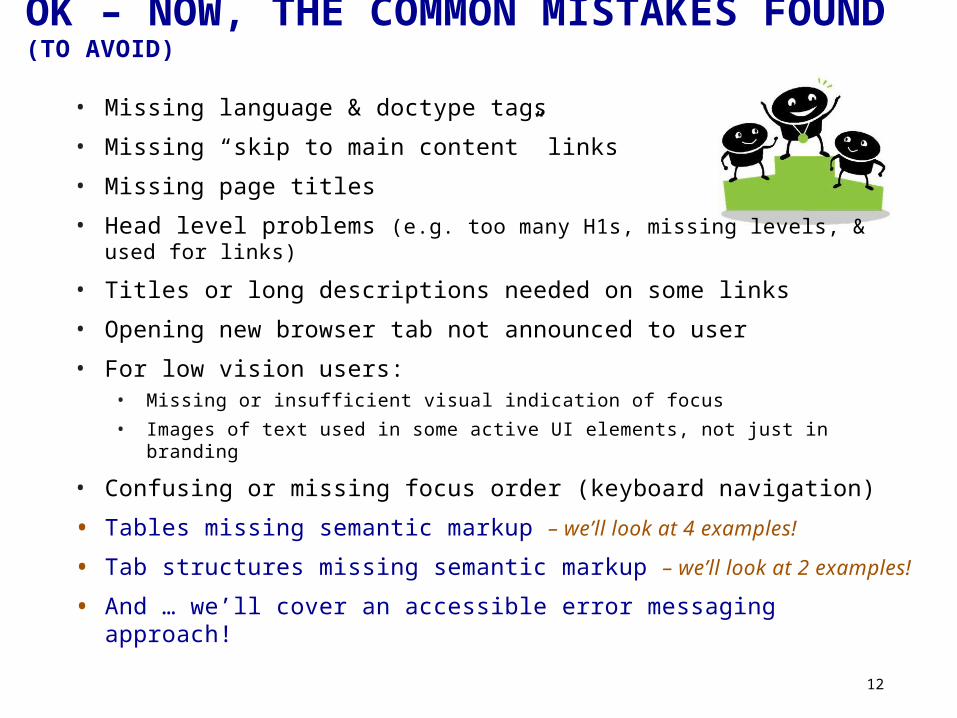
• Missing language & doctype tags
• Missing “skip to main content” links
• Missing page titles
• Head level problems (e.g. too many H1s, missing levels, & used for links)
• Titles or long descriptions needed on some links
• Opening new browser tab not announced to user
• For low vision users:• Missing or insufficient visual indication of focus• Images of text used in some active UI elements, not just in branding
• Confusing or missing focus order (keyboard navigation)
• Tables missing semantic markup – we’ll look at 4 examples!
• Tab structures missing semantic markup – we’ll look at 2 examples!
• And … we’ll cover an accessible error messaging approach!
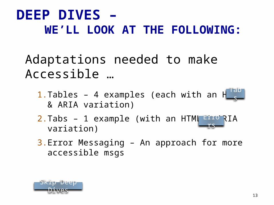
DEEP DIVES – WE’LL LOOK AT THE FOLLOWING:
Adaptations needed to make Accessible …
1. Tables – 4 examples (each with an HTML & ARIA variation)
2. Tabs – 1 example (with an HTML & ARIA variation)
3. Error Messaging – An approach for more accessible msgs
13
Tabs
Errors
Skip Deep Dives
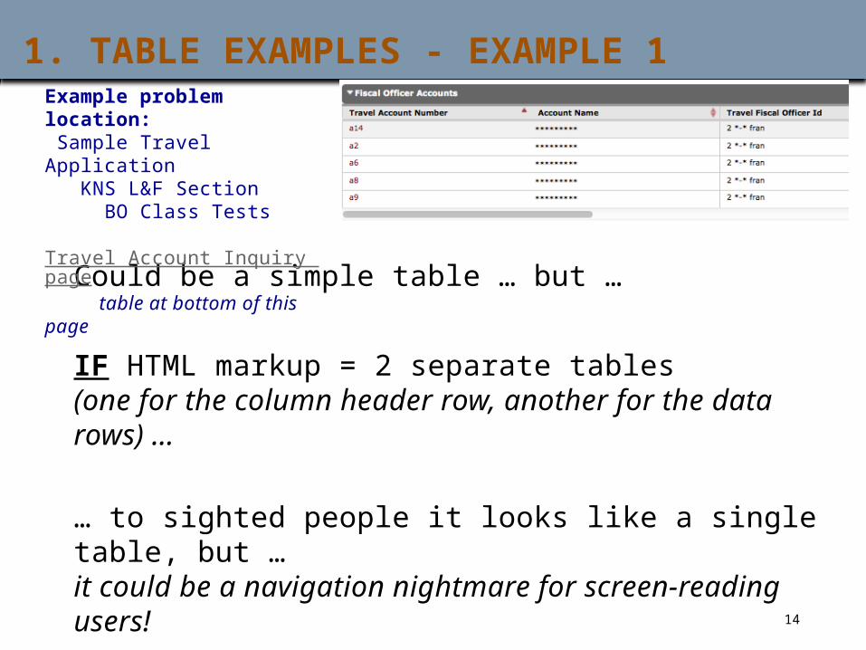
1. TABLE EXAMPLES - EXAMPLE 1
Could be a simple table … but …
IF HTML markup = 2 separate tables (one for the column header row, another for the data rows) … … to sighted people it looks like a single table, but …it could be a navigation nightmare for screen-reading users!
Example problem location: Sample Travel Application KNS L&F Section BO Class Tests Travel Account Inquiry page table at bottom of this page
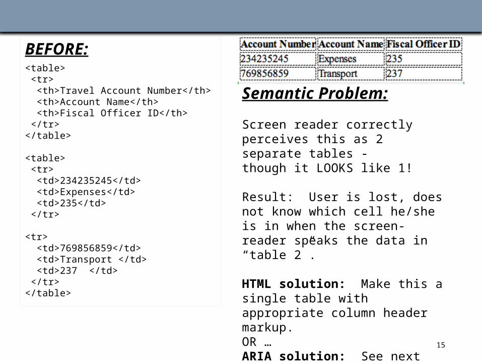
TABLE MARKUP EXAMPLE 1 A
BEFORE:<table> <tr> <th>Travel Account Number</th> <th>Account Name</th> <th>Fiscal Officer ID</th> </tr></table>
<table> <tr> <td>234235245</td> <td>Expenses</td> <td>235</td> </tr> <tr> <td>769856859</td> <td>Transport </td> <td>237 </td> </tr></table>
Semantic Problem:
Screen reader correctly perceives this as 2 separate tables - though it LOOKS like 1!
Result: User is lost, does not know which cell he/she is in when the screen-reader speaks the data in “table 2”.
HTML solution: Make this a single table with appropriate column header markup. OR …ARIA solution: See next page!
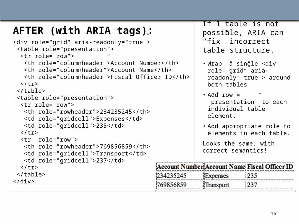
TABLE MARKUP EXAMPLE 1 B
AFTER (with ARIA tags):<div role="grid" aria-readonly="true”> <table role="presentation"> <tr role="row"> <th role="columnheader”>Account Number</th> <th role="columnheader">Account Name</th> <th role="columnheader”>Fiscal Officer ID</th> </tr> </table> <table role="presentation"> <tr role="row"> <th role="rowheader">234235245</th> <td role="gridcell">Expenses</td> <td role="gridcell">235</td> </tr> <tr role="row"> <th role="rowheader">769856859</th> <td role="gridcell">Transport</td> <td role="gridcell">237</td> </tr> </table></div>
If Widget = 2 tables:
If 1 table is not possible, ARIA can “fix” incorrect table structure.
• Wrap a single <div role=”grid” aria-readonly=”true”> around both tables.
• Add row = ”presentation” to each individual table element.
• Add appropriate role to elements in each table.
Looks the same, with correct semantics!
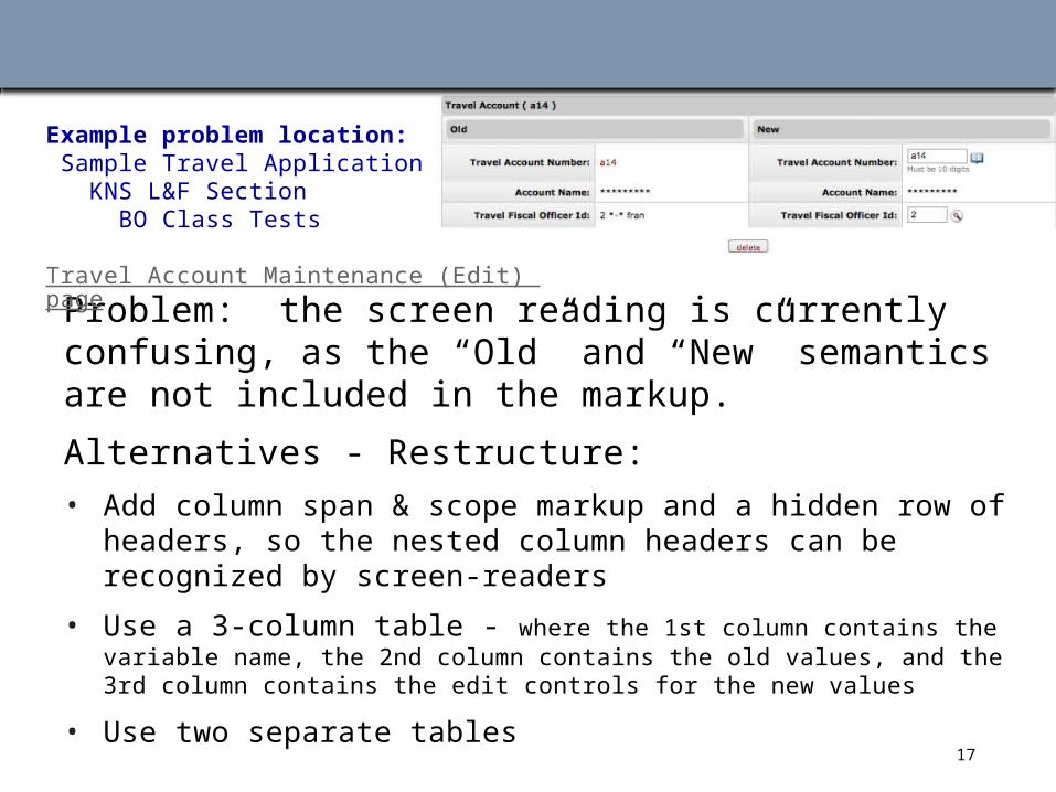
TABLE EXAMPLE 2
Problem: the screen reading is currently confusing, as the “Old” and “New” semantics are not included in the markup.
Alternatives - Restructure:• Add column span & scope markup and a hidden row of headers, so the
nested column headers can be recognized by screen-readers
• Use a 3-column table - where the 1st column contains the variable name, the 2nd column contains the old values, and the 3rd column contains the edit controls for the new values
• Use two separate tables
MULTIPLE COLUMN- PAIR TABLES
Example problem location: Sample Travel Application KNS L&F Section BO Class Tests Travel Account Maintenance (Edit) page
18
TABLE MARKUP EXAMPLE 2 A
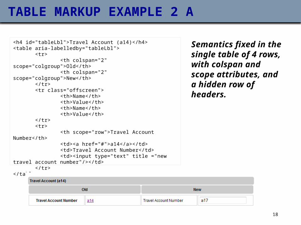
Semantics fixed in the single table of 4 rows, with colspan and scope attributes, and a hidden row of headers.
<h4 id="tableLbl">Travel Account (a14)</h4><table aria-labelledby="tableLbl"> <tr> <th colspan="2" scope="colgroup">Old</th> <th colspan="2" scope="colgroup">New</th> </tr> <tr class="offscreen"> <th>Name</th> <th>Value</th> <th>Name</th> <th>Value</th> </tr> <tr> <th scope="row">Travel Account Number</th> <td><a href="#">a14</a></td> <td>Travel Account Number</td> <td><input type="text" title ="new travel account number"/></td> </tr></table>
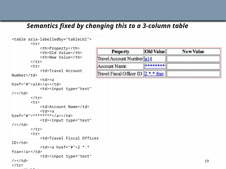
TABLE MARKUP EXAMPLE 2 B
Semantics fixed by changing this to a 3-column table
<table aria-labelledby="tableLbl"> <tr> <th>Property</th> <th>Old Value</th> <th>New Value</th> </tr> <tr> <td>Travel Account Number</td> <td><a href="#">a14</a></td> <td><input type="text" /></td> </tr> <tr> <td>Account Name</td> <td><a href="#">********</a></td> <td><input type="text" /></td> </tr> <tr> <td>Travel Fiscal Officer ID</td> <td><a href="#">2 *.* fran</a></td> <td><input type="text" /></td> </tr> </table>
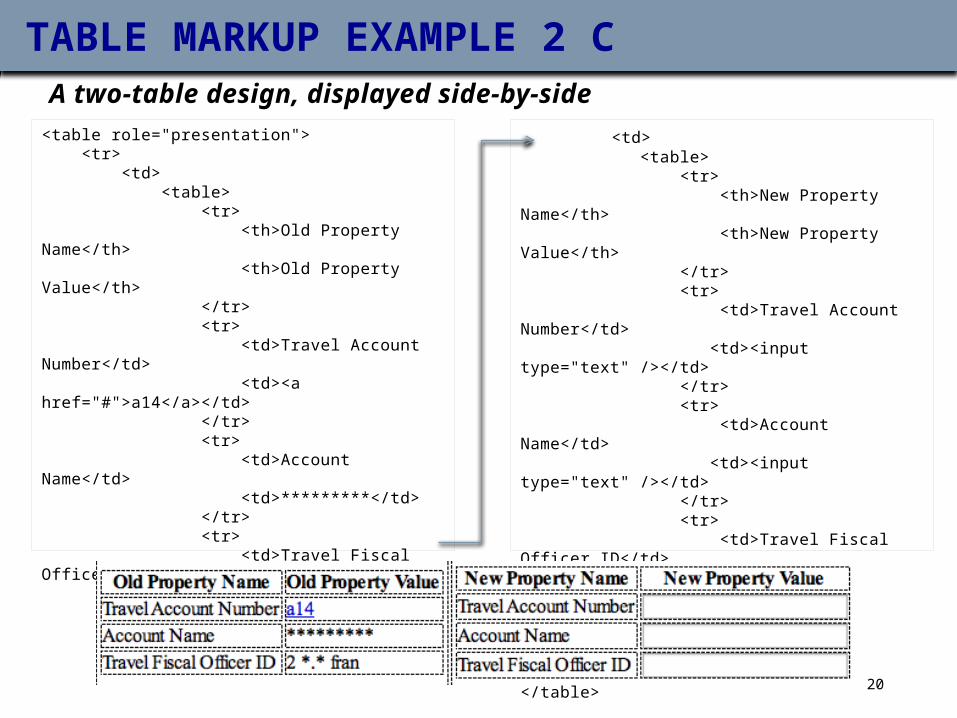
TABLE MARKUP EXAMPLE 2 CA two-table design, displayed side-by-side
<table role="presentation"> <tr> <td> <table> <tr> <th>Old Property Name</th> <th>Old Property Value</th> </tr> <tr> <td>Travel Account Number</td> <td><a href="#">a14</a></td> </tr> <tr> <td>Account Name</td> <td>*********</td> </tr> <tr> <td>Travel Fiscal Officer ID</td> <td>2 *.* fran</td> </tr> </table> </td>
<td> <table> <tr> <th>New Property Name</th> <th>New Property Value</th> </tr> <tr> <td>Travel Account Number</td> <td><input type="text" /></td> </tr> <tr> <td>Account Name</td> <td><input type="text" /></td> </tr> <tr> <td>Travel Fiscal Officer ID</td> <td><input type="text" /></td> </tr> </table> </td> </tr></table>
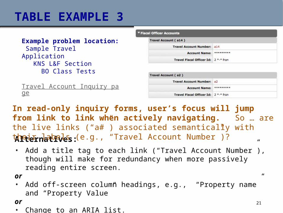
TABLE EXAMPLE 3
Alternatives:• Add a title tag to each link (“Travel Account Number”), though will make for
redundancy when more passively reading entire screen.or• Add off-screen column headings, e.g., “Property name” and “Property Value”or• Change to an ARIA list.
In read-only inquiry forms, user’s focus will jump from link to link when actively navigating. So … are the live links (“a#”) associated semantically with their labels (e.g., “Travel Account Number”)?
Example problem location: Sample Travel Application KNS L&F Section BO Class Tests Travel Account Inquiry page
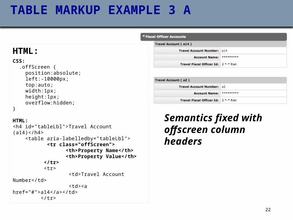
TABLE MARKUP EXAMPLE 3 A
HTML:CSS: .offScreen {
position:absolute;left:-10000px;top:auto;width:1px;height:1px;overflow:hidden;
} HTML:<h4 id="tableLbl">Travel Account (a14)</h4> <table aria-labelledby="tableLbl"> <tr class="offScreen"> <th>Property Name</th> <th>Property Value</th> </tr> <tr> <td>Travel Account Number</td> <td><a href="#">a14</a></td> </tr>
Semantics fixed with offscreen column headers
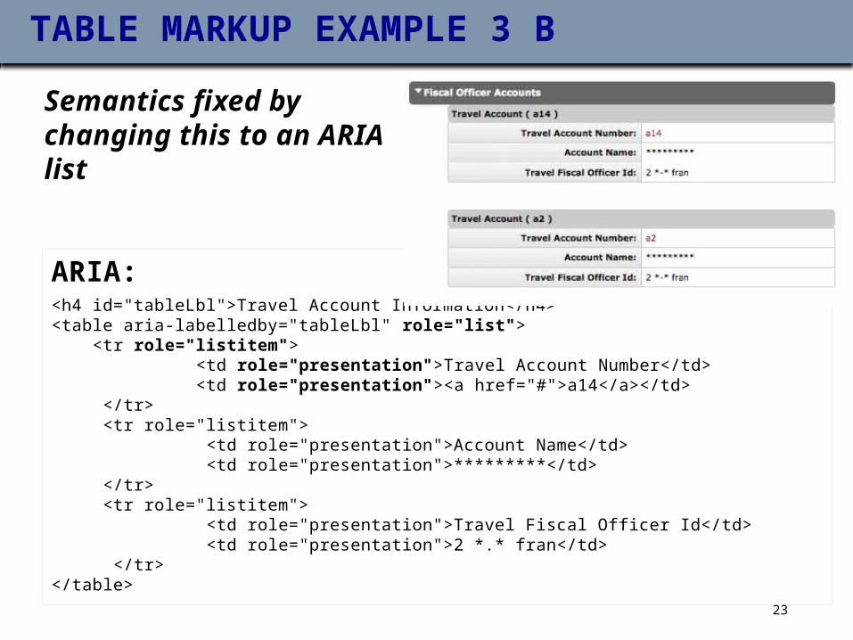
TABLE MARKUP EXAMPLE 3 B
ARIA:<h4 id="tableLbl">Travel Account Information</h4><table aria-labelledby="tableLbl" role="list"> <tr role="listitem"> <td role="presentation">Travel Account Number</td> <td role="presentation"><a href="#">a14</a></td> </tr> <tr role="listitem"> <td role="presentation">Account Name</td> <td role="presentation">*********</td> </tr> <tr role="listitem"> <td role="presentation">Travel Fiscal Officer Id</td> <td role="presentation">2 *.* fran</td> </tr></table>
Semantics fixed by changing this to an ARIA list
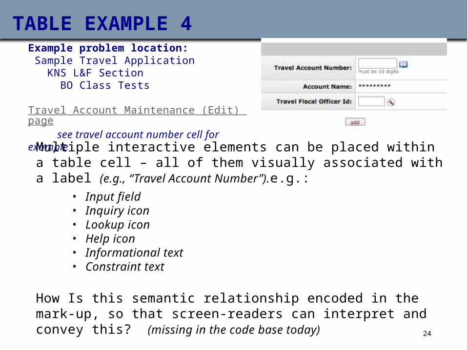
TABLE EXAMPLE 4
Multiple interactive elements can be placed within a table cell – all of them visually associated with a label (e.g., “Travel Account Number”).e.g.:
• Input field• Inquiry icon• Lookup icon• Help icon• Informational text• Constraint text
How Is this semantic relationship encoded in the mark-up, so that screen-readers can interpret and convey this? (missing in the code base today)
Example problem location: Sample Travel Application KNS L&F Section BO Class Tests Travel Account Maintenance (Edit) page see travel account number cell for example
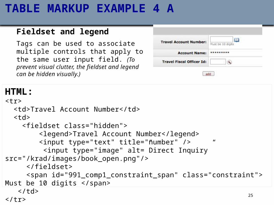
TABLE MARKUP EXAMPLE 4 A
Fieldset and legend Tags can be used to associate multiple controls that apply to the same user input field. (To prevent visual clutter, the fieldset and legend can be hidden visually.)
HTML:<tr> <td>Travel Account Number</td> <td> <fieldset class="hidden"> <legend>Travel Account Number</legend> <input type="text" title="number" /> <input type="image" alt=”Direct Inquiry” src="/krad/images/book_open.png"/> </fieldset> <span id="991_comp1_constraint_span" class="constraint"> Must be 10 digits </span> </td></tr>
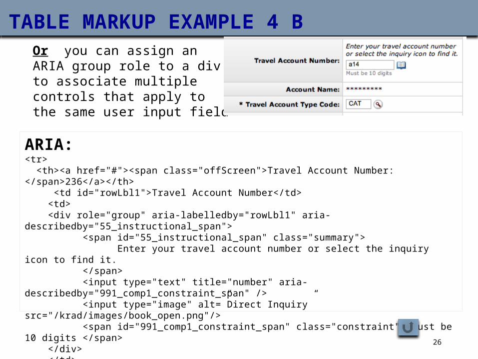
TABLE MARKUP EXAMPLE 4 BOr you can assign an ARIA group role to a div to associate multiple controls that apply to the same user input field
ARIA:<tr> <th><a href="#"><span class="offScreen">Travel Account Number: </span>236</a></th> <td id="rowLbl1">Travel Account Number</td> <td> <div role="group" aria-labelledby="rowLbl1" aria-describedby="55_instructional_span"> <span id="55_instructional_span" class="summary"> Enter your travel account number or select the inquiry icon to find it. </span> <input type="text" title="number" aria-describedby="991_comp1_constraint_span" /> <input type="image" alt=”Direct Inquiry” src="/krad/images/book_open.png"/> <span id="991_comp1_constraint_span" class="constraint"> Must be 10 digits </span> </div> </td></tr>
2. ACCESSIBLE TAB STRUCTURES
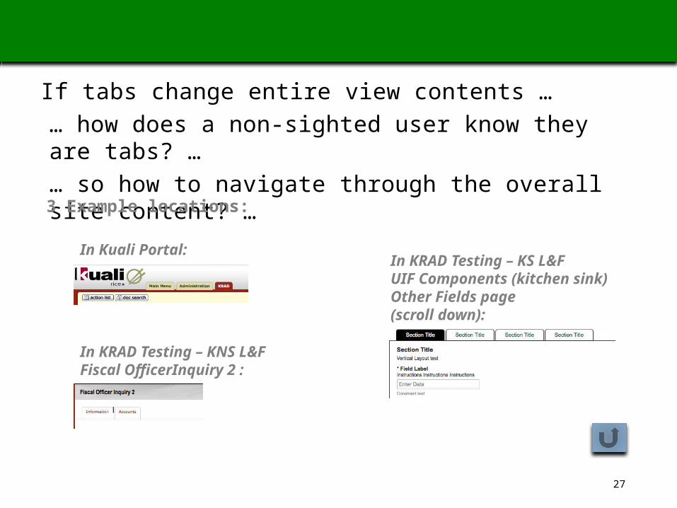
If tabs change entire view contents … … how does a non-sighted user know they are tabs? … … so how to navigate through the overall site content? …
In Kuali Portal:
In KRAD Testing – KNS L&FFiscal OfficerInquiry 2 :
In KRAD Testing – KS L&FUIF Components (kitchen sink)Other Fields page(scroll down):
3 Example locations:
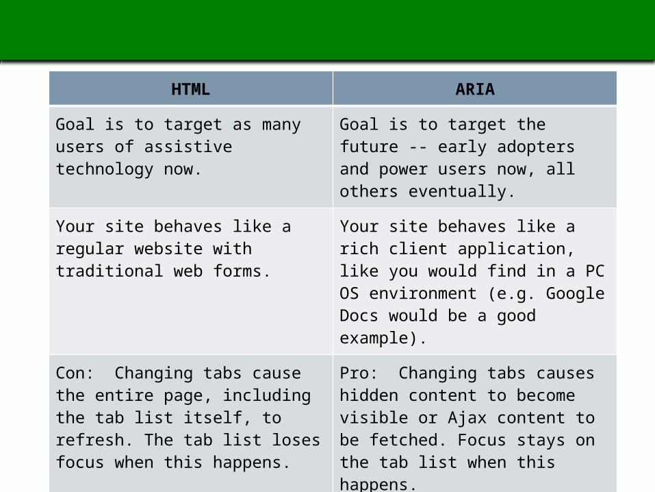
PROS / CONS OF HTML VS ARIA TAB MARKUP
HTML ARIA
Goal is to target as many users of assistive technology now.
Goal is to target the future -- early adopters and power users now, all others eventually.
Your site behaves like a regular website with traditional web forms.
Your site behaves like a rich client application, like you would find in a PC OS environment (e.g. Google Docs would be a good example).
Con: Changing tabs cause the entire page, including the tab list itself, to refresh. The tab list loses focus when this happens.
Pro: Changing tabs causes hidden content to become visible or Ajax content to be fetched. Focus stays on the tab list when this happens.
Pro: Tabs will work in both virtual mode and forms mode for screen reader users.
Con: Tabs will only work in (auto) forms mode.
RECOMMENDATIONS FOR KRAD
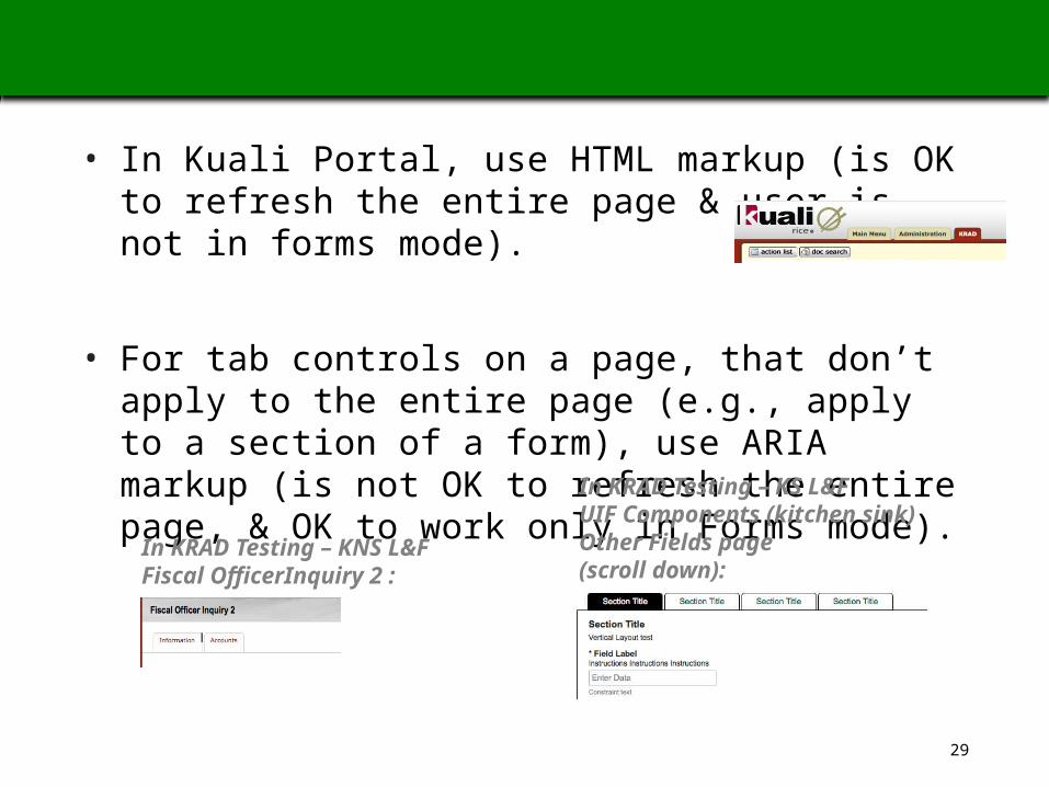
• In Kuali Portal, use HTML markup (is OK to refresh the entire page & user is not in forms mode).
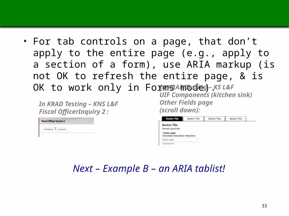
• For tab controls on a page, that don’t apply to the entire page (e.g., apply to a section of a form), use ARIA markup (is not OK to refresh the entire page, & OK to work only in Forms mode).
In KRAD Testing – KNS L&FFiscal OfficerInquiry 2 :
In KRAD Testing – KS L&FUIF Components (kitchen sink)Other Fields page(scroll down):
TAB EXAMPLE A: START WITH A TRADITIONAL HTML TABLIST (KUALI PORTAL TABS)
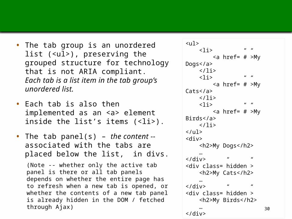
• The tab group is an unordered list (<ul>), preserving the grouped structure for technology that is not ARIA compliant. Each tab is a list item in the tab group’s unordered list.
• Each tab is also then implemented as an <a> element inside the list’s items (<li>).
• The tab panel(s) – the content -- associated with the tabs are placed below the list, in divs. (Note -- whether only the active tab panel is there or all tab panels depends on whether the entire page has to refresh when a new tab is opened, or whether the contents of a new tab panel is already hidden in the DOM / fetched through Ajax)
<ul> <li> <a href=”#”>My Dogs</a> </li> <li> <a href=”#”>My Cats</a> </li> <li> <a href=”#”>My Birds</a> </li></ul><div> <h2>My Dogs</h2> …</div><div class=”hidden”> <h2>My Cats</h2> …</div><div class=”hidden”> <h2>My Birds</h2> …</div>
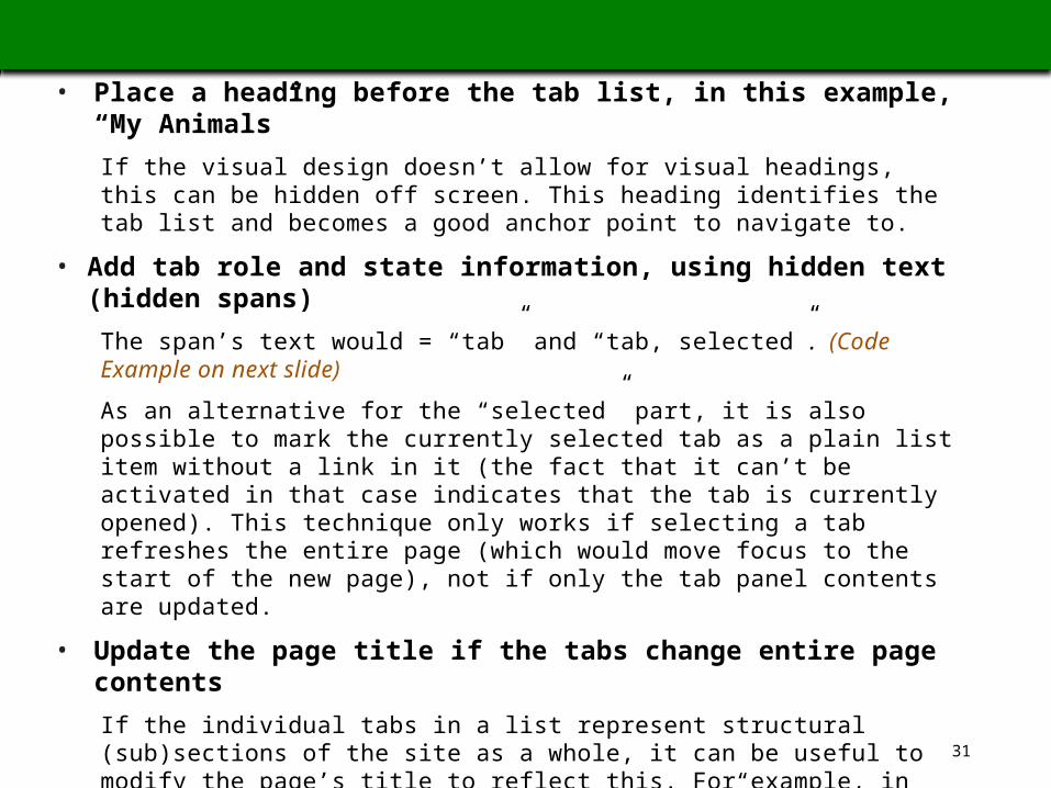
• Place a heading before the tab list, in this example, “My Animals”
If the visual design doesn’t allow for visual headings, this can be hidden off screen. This heading identifies the tab list and becomes a good anchor point to navigate to.
• Add tab role and state information, using hidden text (hidden spans)
The span’s text would = “tab” and “tab, selected” . (Code Example on next slide)
As an alternative for the “selected” part, it is also possible to mark the currently selected tab as a plain list item without a link in it (the fact that it can’t be activated in that case indicates that the tab is currently opened). This technique only works if selecting a tab refreshes the entire page (which would move focus to the start of the new page), not if only the tab panel contents are updated.
• Update the page title if the tabs change entire page contents
If the individual tabs in a list represent structural (sub)sections of the site as a whole, it can be useful to modify the page’s title to reflect this. For example, in the portal, opening the “Administration Tab” could cause the outer page’s title to change to “Administration page - Kuali Portal”. This can be achieved through a simple javascript call like: document.title=”My New Title”.
• Add a skip link (positioned offscreen) after the heading and before the tab list, if there are many tabs (eg, if 8 or more)
Allows users to move focus past the list rather than to have to tab through each item
TAB EXAMPLE A, CONT: ADDITIONAL HTML MARKUP
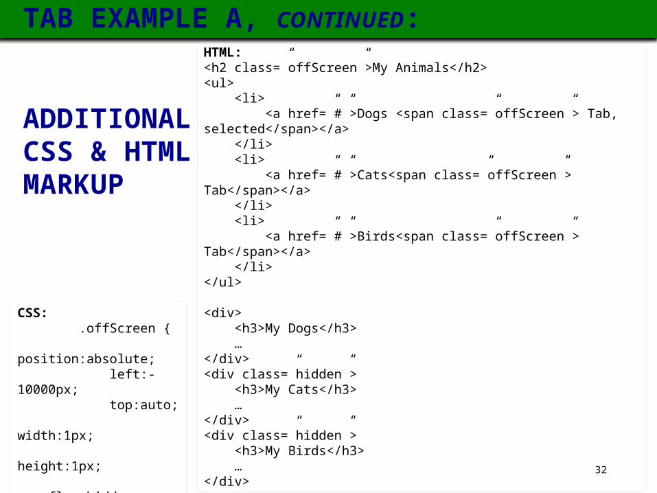
HTML:<h2 class=”offScreen”>My Animals</h2><ul> <li> <a href=”#”>Dogs <span class=”offScreen”> Tab, selected</span></a> </li> <li> <a href=”#”>Cats<span class=”offScreen”> Tab</span></a> </li> <li> <a href=”#”>Birds<span class=”offScreen”> Tab</span></a> </li></ul>
<div> <h3>My Dogs</h3> …</div><div class=”hidden”> <h3>My Cats</h3> …</div><div class=”hidden”> <h3>My Birds</h3> …</div>
CSS: .offScreen { position:absolute; left:-10000px; top:auto; width:1px; height:1px; overflow:hidden; }
ADDITIONAL CSS & HTML MARKUP
TAB EXAMPLE A, CONTINUED:
33
RECOMMENDATIONS FOR KRAD, CONTINUED
• For tab controls on a page, that don’t apply to the entire page (e.g., apply to a section of a form), use ARIA markup (is not OK to refresh the entire page, & is OK to work only in Forms mode).
In KRAD Testing – KNS L&FFiscal OfficerInquiry 2 :
In KRAD Testing – KS L&FUIF Components (kitchen sink)Other Fields page(scroll down):
Next – Example B – an ARIA tablist!
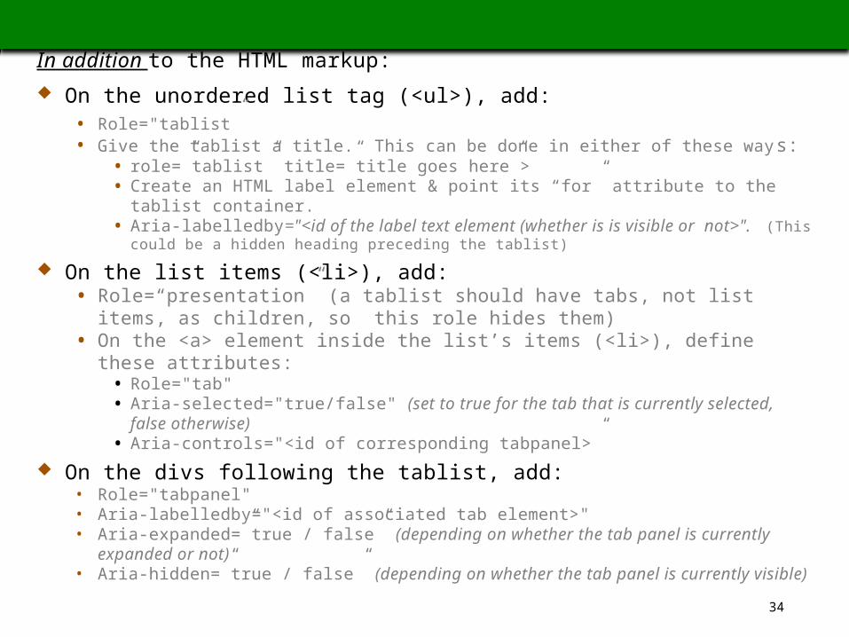
TAB EXAMPLE B: AN ARIA TABLISTIn addition to the HTML markup: On the unordered list tag (<ul>), add:
• Role="tablist”• Give the tablist a title. This can be done in either of these ways:
• role=”tablist” title=”title goes here”>• Create an HTML label element & point its “for” attribute to the tablist container.• Aria-labelledby="<id of the label text element (whether is is visible or not>". (This
could be a hidden heading preceding the tablist)
On the list items (<li>), add:• Role=“presentation” (a tablist should have tabs, not list items, as children, so
this role hides them)• On the <a> element inside the list’s items (<li>), define these attributes:
• Role="tab"• Aria-selected="true/false" (set to true for the tab that is currently selected, false
otherwise)• Aria-controls="<id of corresponding tabpanel>”
On the divs following the tablist, add:• Role="tabpanel"• Aria-labelledby="<id of associated tab element>"• Aria-expanded=”true / false” (depending on whether the tab panel is currently expanded
or not)• Aria-hidden=”true / false” (depending on whether the tab panel is currently visible)
BUT WITH ARIA MARKUP, WE’RE NOT DONE YET!
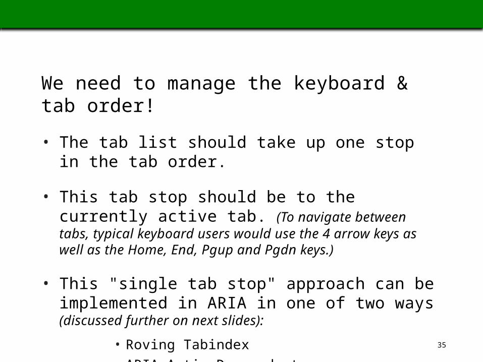
We need to manage the keyboard & tab order!
• The tab list should take up one stop in the tab order.
• This tab stop should be to the currently active tab. (To navigate between tabs, typical keyboard users would use the 4 arrow keys as well as the Home, End, Pgup and Pgdn keys.)
• This "single tab stop" approach can be implemented in ARIA in one of two ways (discussed further on next slides):
• Roving Tabindex• ARIA-ActiveDescendant
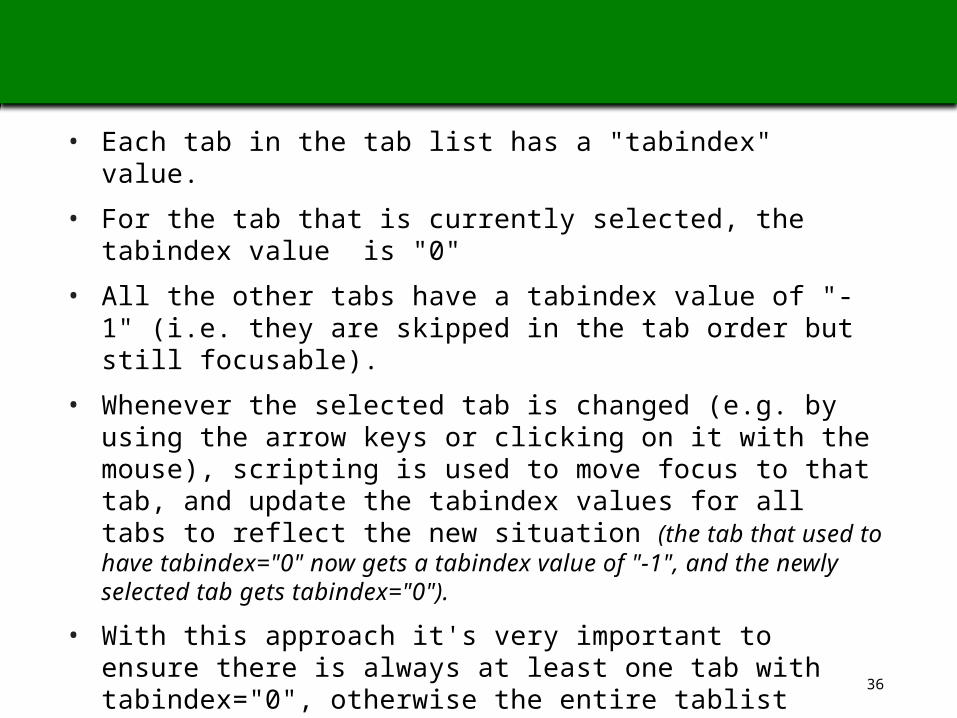
TAB EXAMPLE B1: MANAGING ARIA TAB ORDER WITH ROVING TABINDEX:
• Each tab in the tab list has a "tabindex" value.
• For the tab that is currently selected, the tabindex value is "0"
• All the other tabs have a tabindex value of "-1" (i.e. they are skipped in the tab order but still focusable).
• Whenever the selected tab is changed (e.g. by using the arrow keys or clicking on it with the mouse), scripting is used to move focus to that tab, and update the tabindex values for all tabs to reflect the new situation (the tab that used to have tabindex="0" now gets a tabindex value of "-1", and the newly selected tab gets tabindex="0").
• With this approach it's very important to ensure there is always at least one tab with tabindex="0", otherwise the entire tablist would become unreachable by keyboard.
In addition to managing the tab order, there are two ways to activate the selected tab & those will be discussed after option 2.
TAB EXAMPLE B2: MANAGING ARIA TAB ORDER WITH ARIA-ACTIVEDESCENDANT:
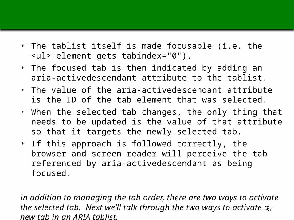
• The tablist itself is made focusable (i.e. the <ul> element gets tabindex="0").
• The focused tab is then indicated by adding an aria-activedescendant attribute to the tablist.
• The value of the aria-activedescendant attribute is the ID of the tab element that was selected.
• When the selected tab changes, the only thing that needs to be updated is the value of that attribute so that it targets the newly selected tab.
• If this approach is followed correctly, the browser and screen reader will perceive the tab referenced by aria-activedescendant as being focused.
In addition to managing the tab order, there are two ways to activate the selected tab. Next we’ll talk through the two ways to activate a new tab in an ARIA tablist.
AND – THERE ARE 2 WAYS TO ACTIVATE AN ARIA TAB:
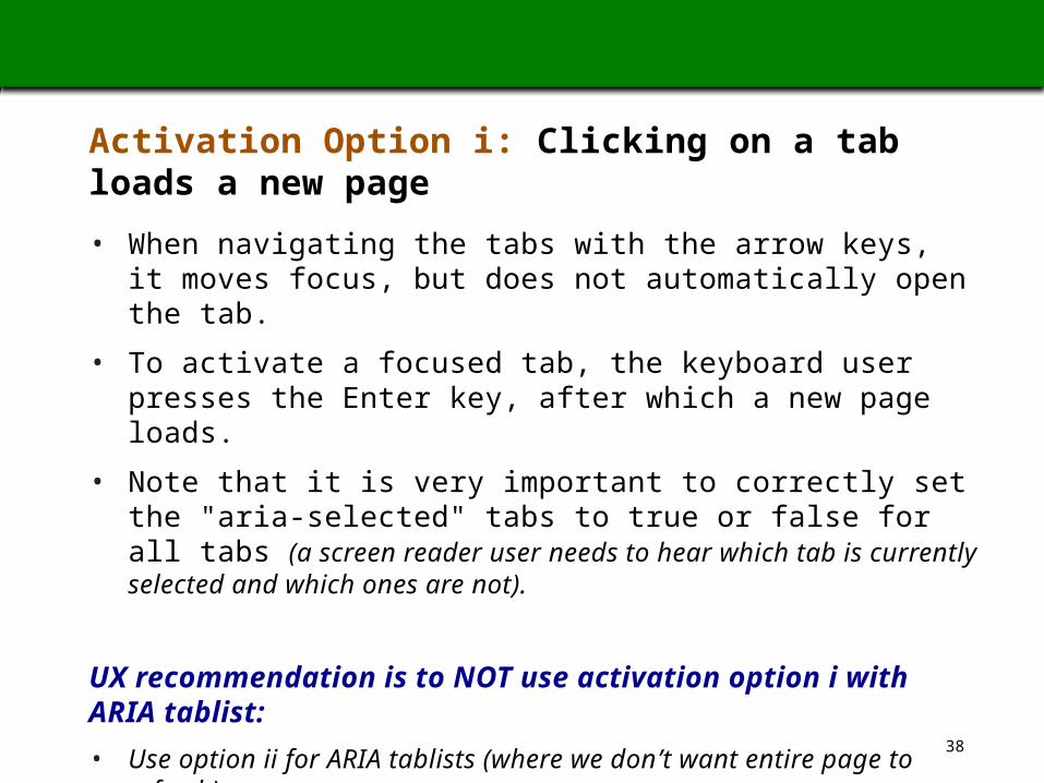
Activation Option i: Clicking on a tab loads a new page
• When navigating the tabs with the arrow keys, it moves focus, but does not automatically open the tab.
• To activate a focused tab, the keyboard user presses the Enter key, after which a new page loads.
• Note that it is very important to correctly set the "aria-selected" tabs to true or false for all tabs (a screen reader user needs to hear which tab is currently selected and which ones are not).
UX recommendation is to NOT use activation option i with ARIA tablist:
• Use option ii for ARIA tablists (where we don’t want entire page to refresh).
• Use traditional HTML tablists where entire page will refresh, so tablist will work outside of forms mode (see earlier slide with the current pros/cons of HTML and ARIA tablists).
2 WAYS TO ACTIVATE A NEW TAB, CONTINUED
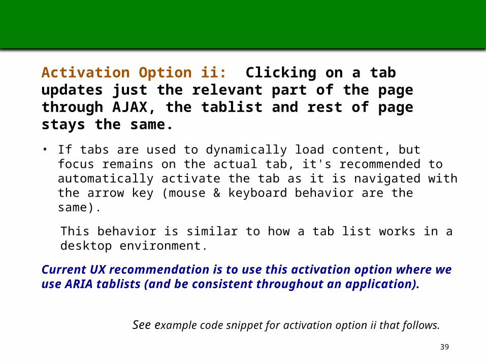
Activation Option ii: Clicking on a tab updates just the relevant part of the page through AJAX, the tablist and rest of page stays the same.
• If tabs are used to dynamically load content, but focus remains on the actual tab, it's recommended to automatically activate the tab as it is navigated with the arrow key (mouse & keyboard behavior are the same).
This behavior is similar to how a tab list works in a desktop environment.
Current UX recommendation is to use this activation option where we use ARIA tablists (and be consistent throughout an application).
See example code snippet for activation option ii that follows.
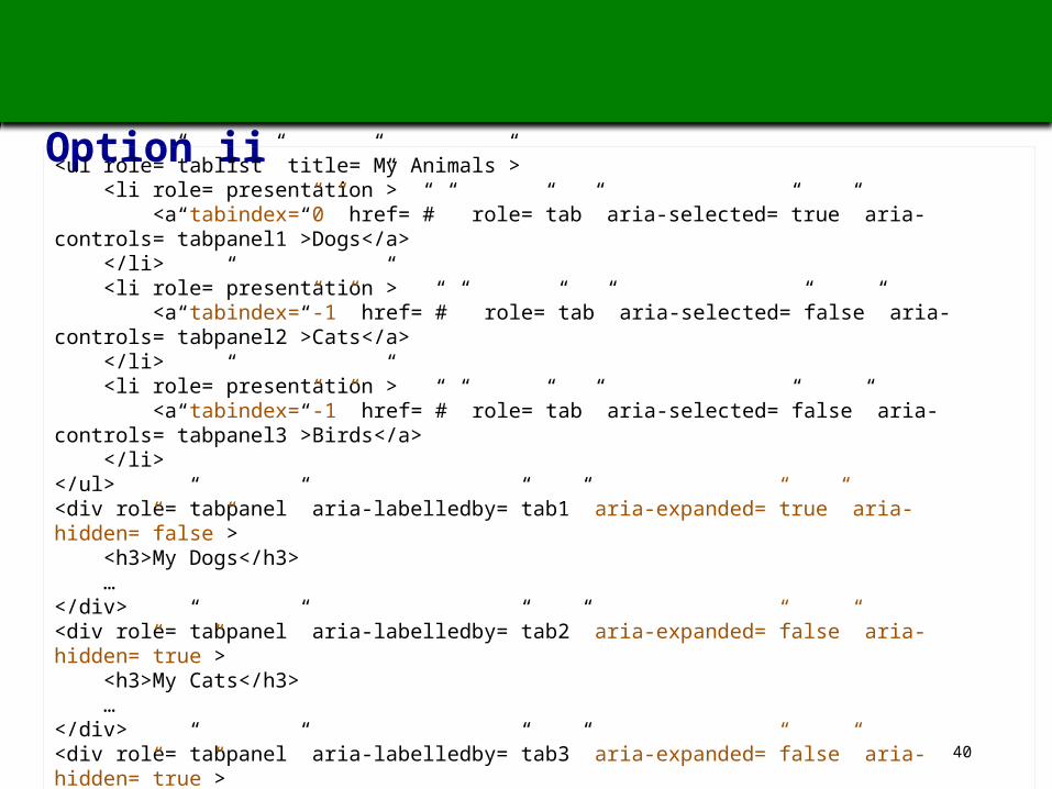
Tab example B1: ARIA Tablist with a Roving Tabindex and with Activation Option ii
<ul role=”tablist” title=”My Animals”> <li role=”presentation”> <a tabindex=”0” href=”#” role=”tab” aria-selected=”true” aria-controls=”tabpanel1”>Dogs</a> </li> <li role=”presentation”> <a tabindex=”-1” href=”#” role=”tab” aria-selected=”false” aria-controls=”tabpanel2”>Cats</a> </li> <li role=”presentation”> <a tabindex=”-1” href=”#” role=”tab” aria-selected=”false” aria-controls=”tabpanel3”>Birds</a> </li></ul><div role=”tabpanel” aria-labelledby=”tab1” aria-expanded=”true” aria-hidden=”false”> <h3>My Dogs</h3> …</div><div role=”tabpanel” aria-labelledby=”tab2” aria-expanded=”false” aria-hidden=”true”> <h3>My Cats</h3> …</div><div role=”tabpanel” aria-labelledby=”tab3” aria-expanded=”false” aria-hidden=”true”> <h3>My Birds</h3> …</div>
41
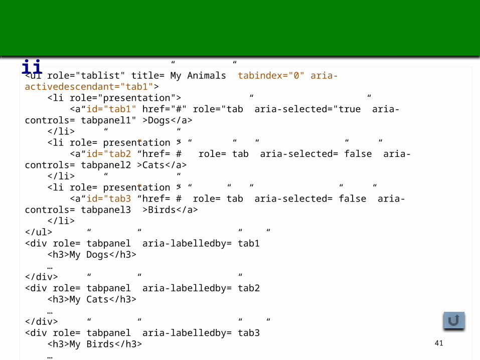
Tab example B2: ARIA Tablist with Aria-Activedescendant and Activation Option ii
<ul role="tablist" title=”My Animals” tabindex="0" aria-activedescendant="tab1"> <li role="presentation"> <a id="tab1" href="#" role="tab” aria-selected="true” aria-controls=”tabpanel1" >Dogs</a> </li> <li role=”presentation”> <a id="tab2” href=”#” role=”tab” aria-selected=”false” aria-controls=”tabpanel2”>Cats</a> </li> <li role=”presentation”> <a id="tab3” href=”#” role=”tab” aria-selected=”false” aria-controls=”tabpanel3” >Birds</a> </li></ul><div role=”tabpanel” aria-labelledby=”tab1” <h3>My Dogs</h3> …</div><div role=”tabpanel” aria-labelledby=”tab2 <h3>My Cats</h3> …</div><div role=”tabpanel” aria-labelledby=”tab3” <h3>My Birds</h3> …</div>
42
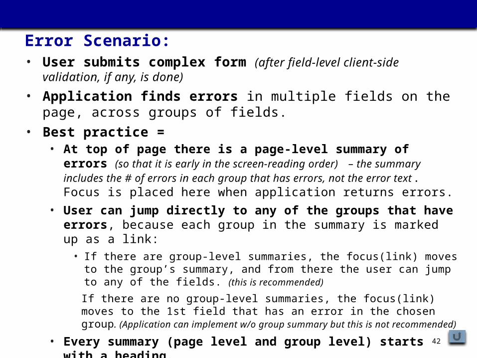
3. ACCESSIBLE ERROR MESSAGINGError Scenario: • User submits complex form (after field-level client-side validation, if any, is
done)
• Application finds errors in multiple fields on the page, across groups of fields.
• Best practice = • At top of page there is a page-level summary of errors (so that it is early in the
screen-reading order) – the summary includes the # of errors in each group that has errors, not the error text. Focus is placed here when application returns errors.
• User can jump directly to any of the groups that have errors , because each group in the summary is marked up as a link:
• If there are group-level summaries, the focus(link) moves to the group’s summary, and from there the user can jump to any of the fields. (this is recommended)
If there are no group-level summaries, the focus(link) moves to the 1st field that has an error in the chosen group. (Application can implement w/o group summary but this is not recommended)
• Every summary (page level and group level) starts with a heading.• The user can get back to the page-level summary using standard shortcuts
for moving to top of page, or we can create a custom global shortcut.
43
ACCESSIBLE ERROR MESSAGING, CONTINUED
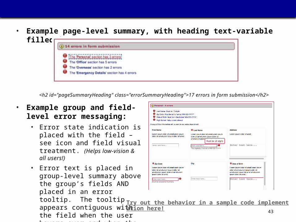
• Example page-level summary, with heading text-variable filled in:
<h2 id="pageSummaryHeading" class="errorSummaryHeading">17 errors in form submission</h2>
• Example group and field-level error messaging:
• Error state indication is placed with the field – see icon and field visual treatment. (Helps low-vision & all users!)
• Error text is placed in group-level summary above the group’s fields AND placed in an error tooltip. The tooltip appears contiguous with the field when the user hovers over and when the field is selected. Try out the behavior in a sample code implementation here!
44
ACCESSIBLE ERROR MESSAGING, CONTINUED
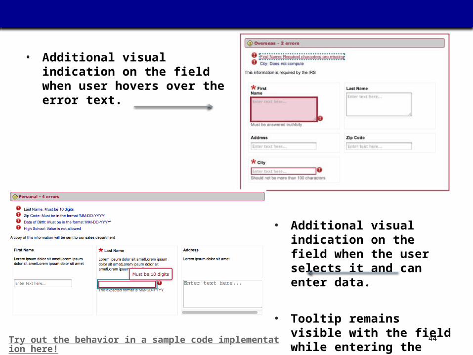
• Additional visual indication on the field when user hovers over the error text.
• Additional visual indication on the field when the user selects it and can enter data.
• Tooltip remains visible with the field while entering the data.
Try out the behavior in a sample code implementation here!
45
ACCESSIBLE ERROR MESSAGING, CONTINUED
• This strategy solves the formatting problems we otherwise create when we place error message text within each field (whether immediately below or to the right), requiring other space to be pushed aside or down:
• We don’t know how wide or deep the other aspects associated with the fields and groups will be, how adding the error text will affect the relationship/layout with other field groups on the page.
• Placing content inside a form field’s label means that all this content will be announced by a screen reader as the field’s accessible name, rather than as the field’s accessible description or state information. This is too verbose.
• This strategy addresses the need to place the error indication and text as close to the field as possible -- helpful for all users and also needed particularly for low-vision users.
Try out the behavior in a sample code implementation here!
FINALLY – SOME CAVEATS
• This is a deep area –requires study and expertise – is not yet automatable
• There are tools and resources to help.
• Aspirational target = live partnering with and evaluation by special needs audiences
Back to Deep Dives
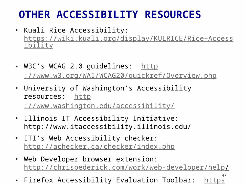
OTHER ACCESSIBILITY RESOURCES• Kuali Rice Accessibility:
https://wiki.kuali.org/display/KULRICE/Rice+Accessibility
• W3C’s WCAG 2.0 guidelines: http://www.w3.org/WAI/WCAG20/quickref/Overview.php
• University of Washington’s Accessibility resources: http://www.washington.edu/accessibility/
• Illinois IT Accessibility Initiative: http://www.itaccessibility.illinois.edu/
• ITI’s Web Accessibility checker: http://achecker.ca/checker/index.php
• Web Developer browser extension: http://chrispederick.com/work/web-developer/help/
• Firefox Accessibility Evaluation Toolbar: https://addons.mozilla.org/en-US/firefox/addon/accessibility-evaluation-toolb/
• … and many others …
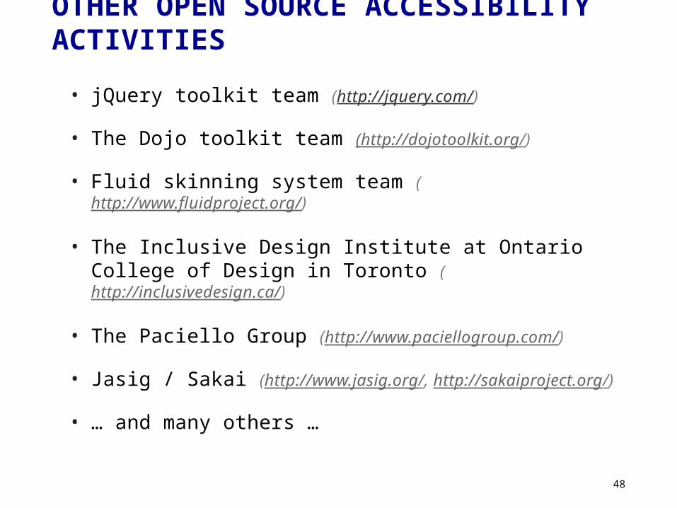
OTHER OPEN SOURCE ACCESSIBILITY ACTIVITIES
• jQuery toolkit team (http://jquery.com/)
• The Dojo toolkit team (http://dojotoolkit.org/)
• Fluid skinning system team (http://www.fluidproject.org/)
• The Inclusive Design Institute at Ontario College of Design in Toronto (http://inclusivedesign.ca/)
• The Paciello Group (http://www.paciellogroup.com/)
• Jasig / Sakai (http://www.jasig.org/, http://sakaiproject.org/)
• … and many others …
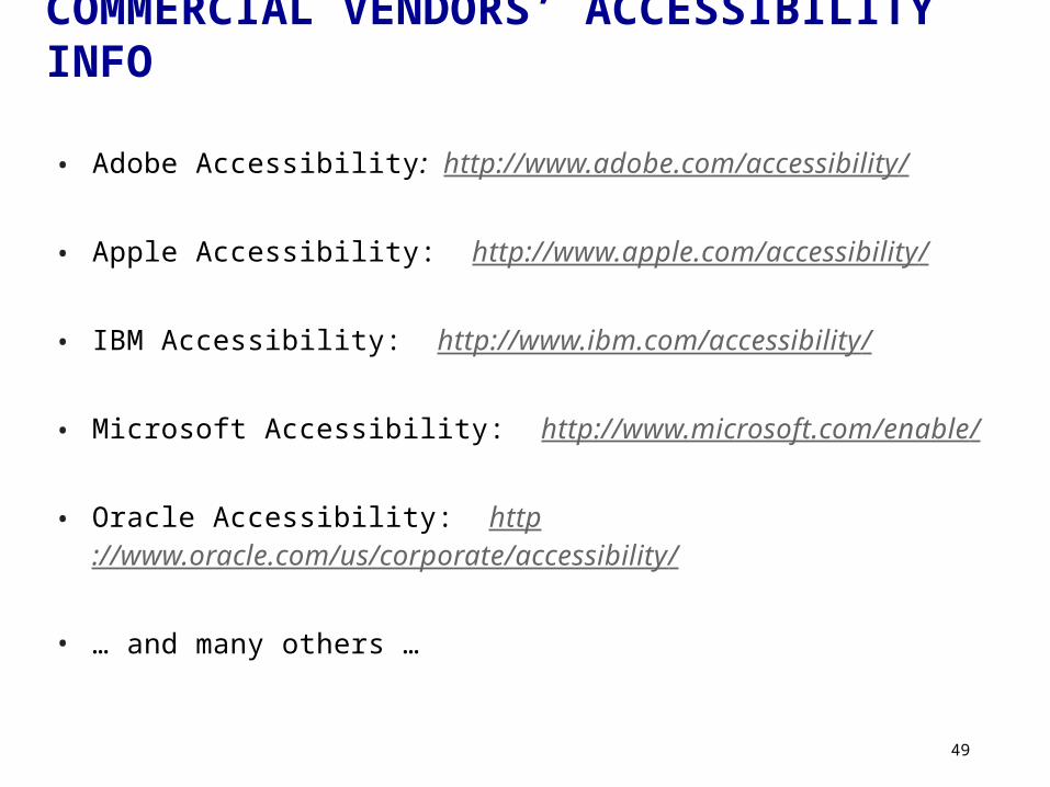
COMMERCIAL VENDORS’ ACCESSIBILITY INFO
• Adobe Accessibility: http://www.adobe.com/accessibility/
• Apple Accessibility: http://www.apple.com/accessibility/
• IBM Accessibility: http://www.ibm.com/accessibility/
• Microsoft Accessibility: http://www.microsoft.com/enable/
• Oracle Accessibility: http://www.oracle.com/us/corporate/accessibility/
• … and many others …

Q & A