Embed Size (px)
Citation preview
MultiD Analyses AB GenEx Users Manual February 2006
GenEx Page 2 MultiD
Table of Contents 1.0 Introduction 3
1.1 Installation 4
2.0 GenEx Interface 5
2.1 Getting Started 6
2.2 Data Preprocessing 7
3.0 Control Panel 17
3.1 Data Manager 22
3.2 Plotting Data 27
4.0 Data Analysis 28
4.1 GeNorm 29
4.2 Scatter Plot 31
4.3 Principal Component Analysis 34
4.4 Potential Curves 43
4.5 Hierarchical Clustering 45
4.6 Self Organizing Map 52
4.7 3-Way Analysis 57
5 Upgrades and support 60
6 Acknowledgement 61
7 References 62
GenEx Page 3 MultiD
1. Introduction
Optimal use of real-time PCR measurements requires proper analysis of real-
time PCR data. DATAN framework GenEx package provides the appropriate
tools to analyze real-time PCR gene expression data and to extract valuable
information from the measurements. Behind a user friendly interface DATAN
makes available:
• Handling missing data
• Scaling and normalization options for gene expression data
• Advance plot functions including 3D plots and scatter plots
• Pearson to calculate correlations between genes
• Grouping of data
• GeNorm to find most stably expressed house keeping genes
• Hierarchical Clustering to find associations between data
• Kohonen Neural Networks to classify data
• Principal Component Analysis to find hidden structures in data
• Potential curves to classify test samples based on training set
• Trilinear decomposition to analyze series of expression profiles
For more information about these methods and references visit the MultiD
website: www.multid.se.

GenEx Page 4 MultiD
1.1. Installation
Genex should be run on a PC computer with a Pentium processor of at least
200 MHz (500 MHz or better recommended) and 64 MB (128 MB
recommended) RAM. Recommended screen resolution is 1024 x 768 or
higher.
Install GenEx by running GenEx.exe. This starts an installation program that
takes you through the installation process and installs all files, examples, and
documentation required to run GenEx. If you have an unregistered copy a
register screen appears that indicates how much is left of your evaluation
period.
When you have registered your copy the register screen will no longer appear.
GenEx Page 5 MultiD
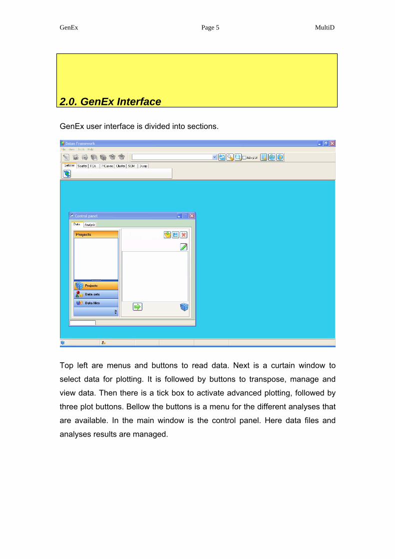
2.0. GenEx Interface
GenEx user interface is divided into sections.
Top left are menus and buttons to read data. Next is a curtain window to
select data for plotting. It is followed by buttons to transpose, manage and
view data. Then there is a tick box to activate advanced plotting, followed by
three plot buttons. Bellow the buttons is a menu for the different analyses that
are available. In the main window is the control panel. Here data files and
analyses results are managed.
GenEx Page 6 MultiD
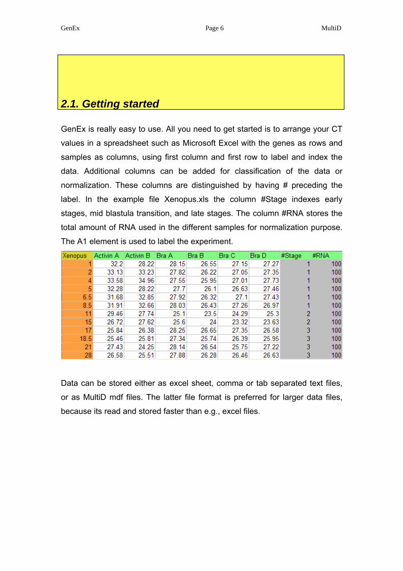
2.1. Getting started
GenEx is really easy to use. All you need to get started is to arrange your CT
values in a spreadsheet such as Microsoft Excel with the genes as rows and
samples as columns, using first column and first row to label and index the
data. Additional columns can be added for classification of the data or
normalization. These columns are distinguished by having # preceding the
label. In the example file Xenopus.xls the column #Stage indexes early
stages, mid blastula transition, and late stages. The column #RNA stores the
total amount of RNA used in the different samples for normalization purpose.
The A1 element is used to label the experiment.
Data can be stored either as excel sheet, comma or tab separated text files,
or as MultiD mdf files. The latter file format is preferred for larger data files,
because its read and stored faster than e.g., excel files.
GenEx Page 7 MultiD
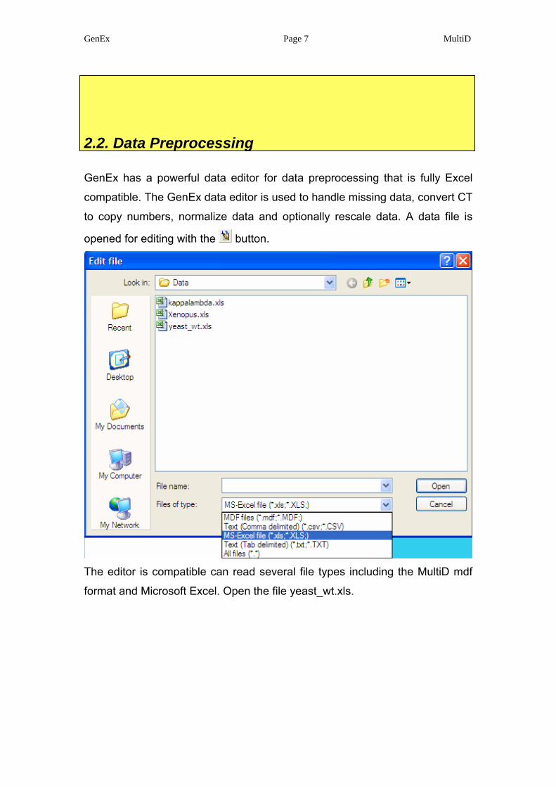
2.2. Data Preprocessing
GenEx has a powerful data editor for data preprocessing that is fully Excel
compatible. The GenEx data editor is used to handle missing data, convert CT
to copy numbers, normalize data and optionally rescale data. A data file is
opened for editing with the button.
The editor is compatible can read several file types including the MultiD mdf
format and Microsoft Excel. Open the file yeast_wt.xls.
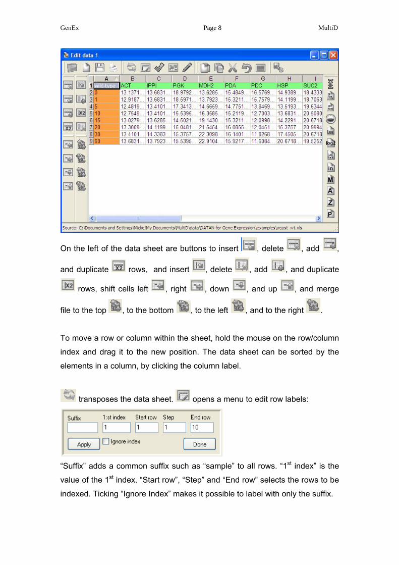
GenEx Page 8 MultiD
On the left of the data sheet are buttons to insert , delete , add ,
and duplicate rows, and insert , delete , add , and duplicate
rows, shift cells left , right , down , and up , and merge
file to the top , to the bottom , to the left , and to the right .
To move a row or column within the sheet, hold the mouse on the row/column
index and drag it to the new position. The data sheet can be sorted by the
elements in a column, by clicking the column label.
transposes the data sheet. opens a menu to edit row labels:
“Suffix” adds a common suffix such as “sample” to all rows. “1st index” is the
value of the 1st index. “Start row”, “Step” and “End row” selects the rows to be
indexed. Ticking “Ignore Index” makes it possible to label with only the suffix.
GenEx Page 9 MultiD
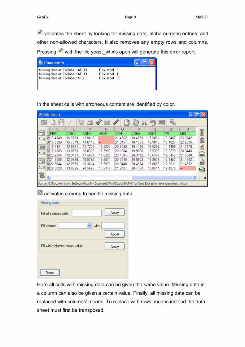
validates the sheet by looking for missing data, alpha numeric entries, and
other non-allowed characters. It also removes any empty rows and columns.
Pressing with the file yeast_wt.xls open will generate this error report:
In the sheet cells with erroneous content are identified by color.
activates a menu to handle missing data.
Here all cells with missing data can be given the same value. Missing data in
a column can also be given a certain value. Finally, all missing data can be
replaced with columns’ means. To replace with rows’ means instead the data
sheet must first be transposed.
GenEx Page 10 MultiD
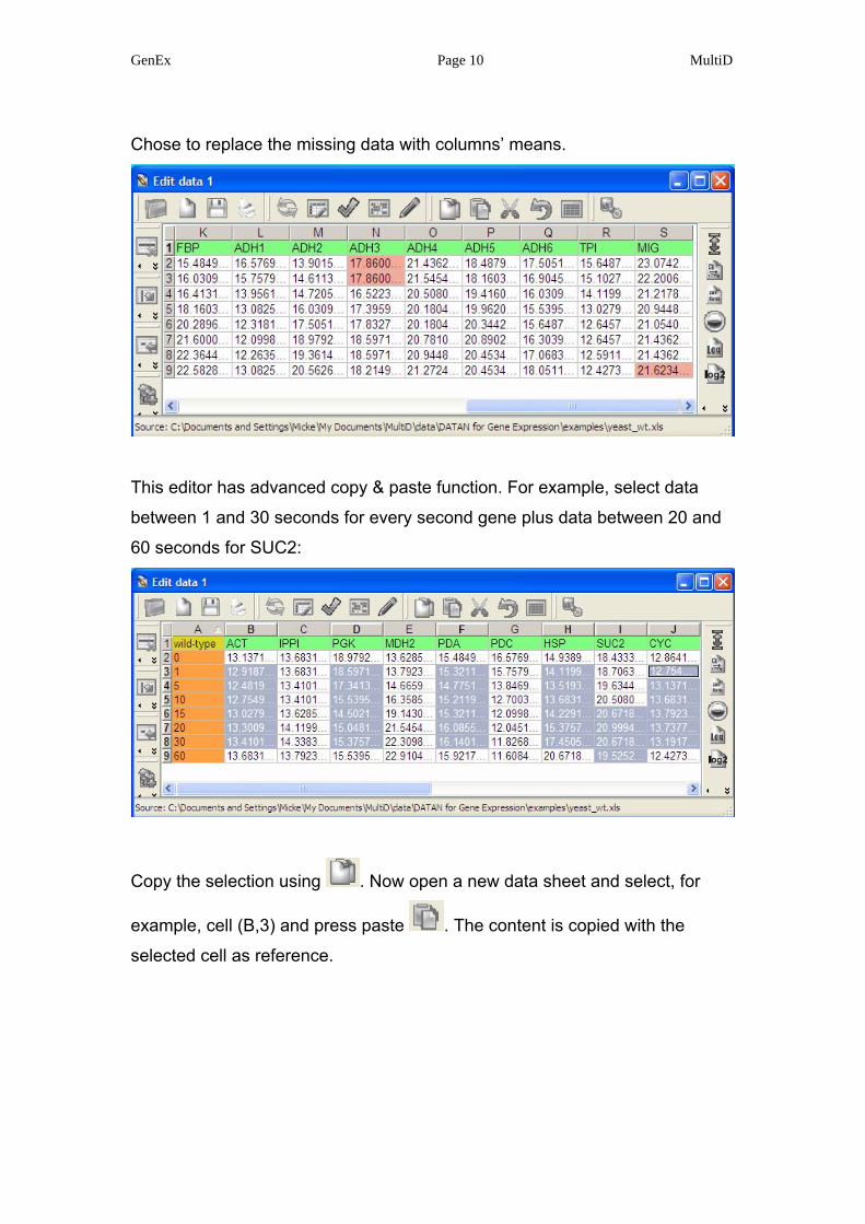
Chose to replace the missing data with columns’ means.
This editor has advanced copy & paste function. For example, select data
between 1 and 30 seconds for every second gene plus data between 20 and
60 seconds for SUC2:
Copy the selection using . Now open a new data sheet and select, for
example, cell (B,3) and press paste . The content is copied with the
selected cell as reference.
GenEx Page 11 MultiD
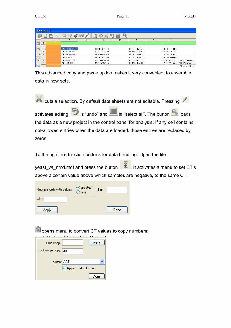
This advanced copy and paste option makes it very convenient to assemble
data in new sets.
cuts a selection. By default data sheets are not editable. Pressing
activates editing. is “undo” and is “select all”. The button loads
the data as a new project in the control panel for analysis. If any cell contains
not-allowed entries when the data are loaded, those entries are replaced by
zeros.
To the right are function buttons for data handling. Open the file
yeast_wt_nmd.mdf and press the button . It activates a menu to set CT’s
above a certain value above which samples are negative, to the same CT:
opens menu to convert CT values to copy numbers:
GenEx Page 12 MultiD
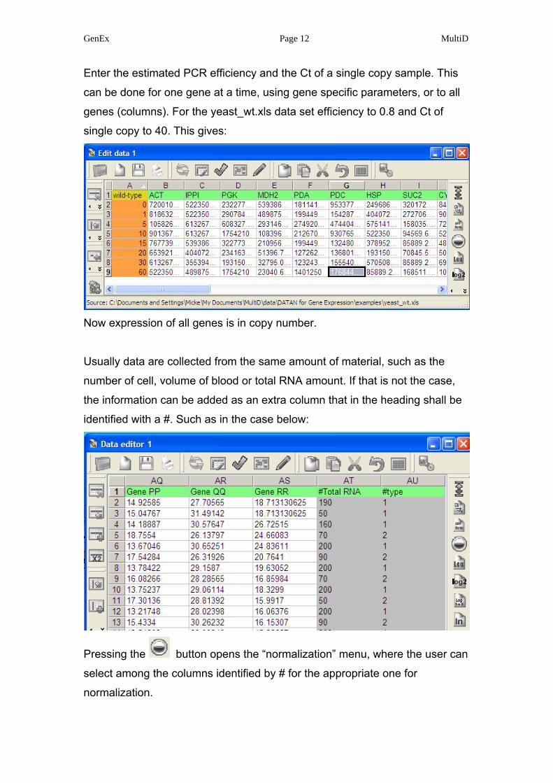
Enter the estimated PCR efficiency and the Ct of a single copy sample. This
can be done for one gene at a time, using gene specific parameters, or to all
genes (columns). For the yeast_wt.xls data set efficiency to 0.8 and Ct of
single copy to 40. This gives:
Now expression of all genes is in copy number.
Usually data are collected from the same amount of material, such as the
number of cell, volume of blood or total RNA amount. If that is not the case,
the information can be added as an extra column that in the heading shall be
identified with a #. Such as in the case below:
Pressing the button opens the “normalization” menu, where the user can
select among the columns identified by # for the appropriate one for
normalization.
GenEx Page 13 MultiD
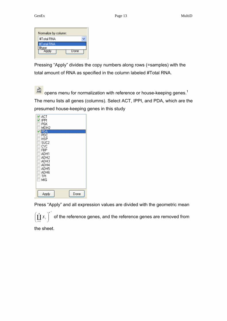
Pressing “Apply” divides the copy numbers along rows (=samples) with the
total amount of RNA as specified in the column labeled #Total RNA.
opens menu for normalization with reference or house-keeping genes.1
The menu lists all genes (columns). Select ACT, IPPI, and PDA, which are the
presumed house-keeping genes in this study
.
Press “Apply” and all expression values are divided with the geometric mean 1
1
−
⎟⎟⎠
⎞⎜⎜⎝
⎛
=
nn
iiXC of the reference genes, and the reference genes are removed from
the sheet.
GenEx Page 14 MultiD
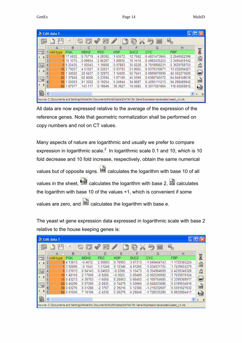
All data are now expressed relative to the average of the expression of the
reference genes. Note that geometric normalization shall be performed on
copy numbers and not on CT values.
Many aspects of nature are logarithmic and usually we prefer to compare
expression in logarithmic scale.2 In logarithmic scale 0.1 and 10, which is 10
fold decrease and 10 fold increase, respectively, obtain the same numerical
values but of opposite signs. calculates the logarithm with base 10 of all
values in the sheet, calculates the logarithm with base 2, calculates
the logarithm with base 10 of the values +1, which is convenient if some
values are zero, and calculates the logarithm with base e.
The yeast wt gene expression data expressed in logarithmic scale with base 2
relative to the house keeping genes is:
GenEx Page 15 MultiD
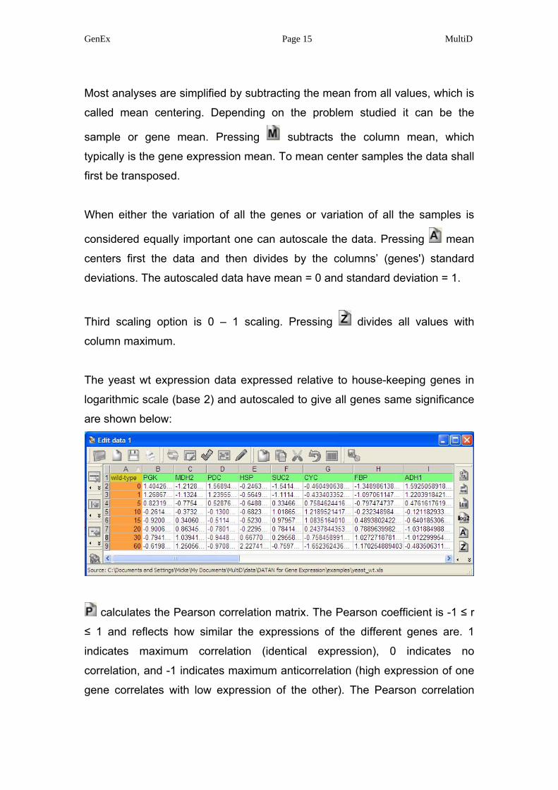
Most analyses are simplified by subtracting the mean from all values, which is
called mean centering. Depending on the problem studied it can be the
sample or gene mean. Pressing subtracts the column mean, which
typically is the gene expression mean. To mean center samples the data shall
first be transposed.
When either the variation of all the genes or variation of all the samples is
considered equally important one can autoscale the data. Pressing mean
centers first the data and then divides by the columns’ (genes') standard
deviations. The autoscaled data have mean = 0 and standard deviation = 1.
Third scaling option is 0 – 1 scaling. Pressing divides all values with
column maximum.
The yeast wt expression data expressed relative to house-keeping genes in
logarithmic scale (base 2) and autoscaled to give all genes same significance
are shown below:
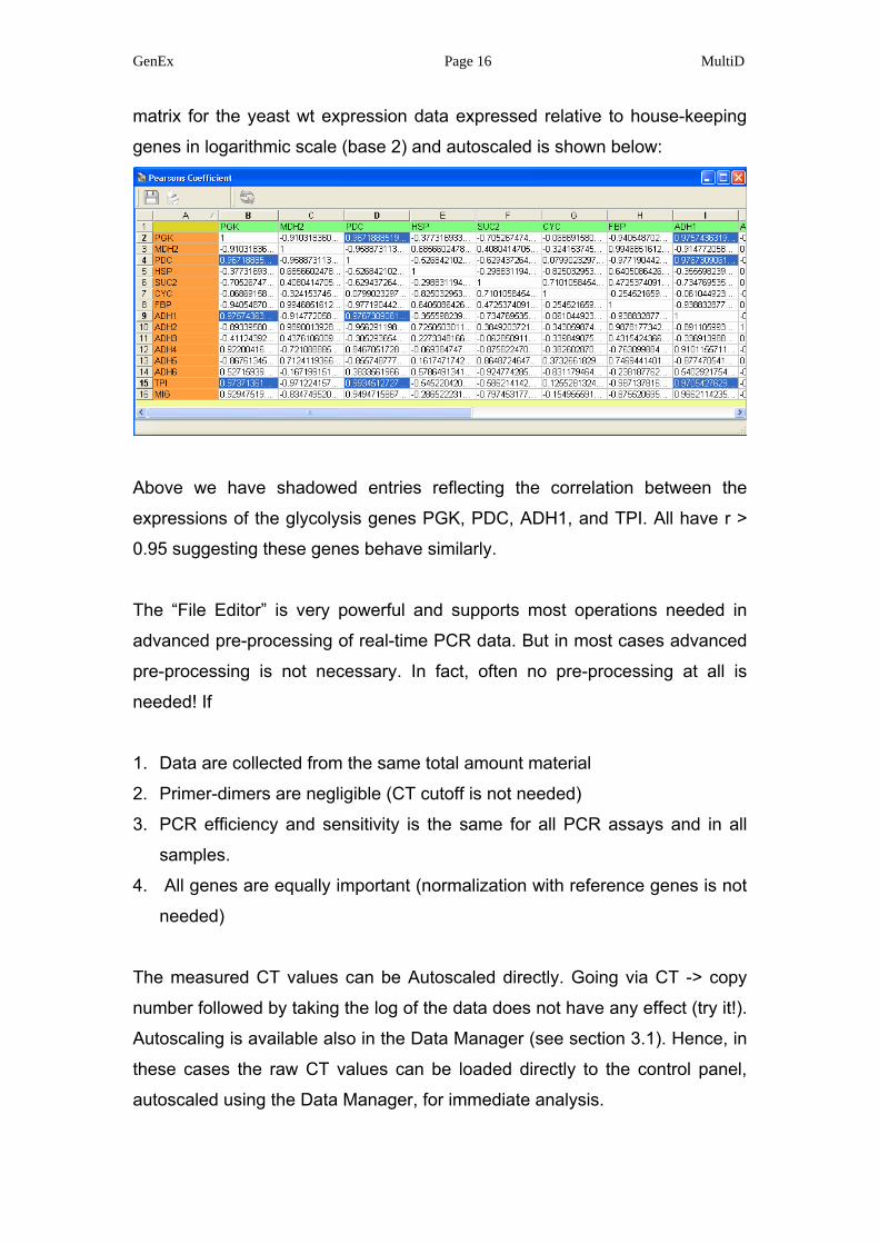
calculates the Pearson correlation matrix. The Pearson coefficient is -1 ≤ r
≤ 1 and reflects how similar the expressions of the different genes are. 1
indicates maximum correlation (identical expression), 0 indicates no
correlation, and -1 indicates maximum anticorrelation (high expression of one
gene correlates with low expression of the other). The Pearson correlation
GenEx Page 16 MultiD
matrix for the yeast wt expression data expressed relative to house-keeping
genes in logarithmic scale (base 2) and autoscaled is shown below:
Above we have shadowed entries reflecting the correlation between the
expressions of the glycolysis genes PGK, PDC, ADH1, and TPI. All have r >
0.95 suggesting these genes behave similarly.
The “File Editor” is very powerful and supports most operations needed in
advanced pre-processing of real-time PCR data. But in most cases advanced
pre-processing is not necessary. In fact, often no pre-processing at all is
needed! If
1. Data are collected from the same total amount material
2. Primer-dimers are negligible (CT cutoff is not needed)
3. PCR efficiency and sensitivity is the same for all PCR assays and in all
samples.
4. All genes are equally important (normalization with reference genes is not
needed)
The measured CT values can be Autoscaled directly. Going via CT -> copy
number followed by taking the log of the data does not have any effect (try it!).
Autoscaling is available also in the Data Manager (see section 3.1). Hence, in
these cases the raw CT values can be loaded directly to the control panel,
autoscaled using the Data Manager, for immediate analysis.

GenEx Page 17 MultiD
3.0. Control Panel
The control panel is used to handle data. Data are handled in three levels:
projects, data sets, and data files. A data file is a set of data that can be edited
by the data editor. A data set is a collection of data files including settings
such as labels, colors, groups, classification etc. A project is a collection of
data sets.
Use to open the files wt.mdf, hxt.mdf, Null.mdf, and Tm6.mdf, containing
expression data for four yeast strains.
A project can be exported or saved , which also gives option to name
it. A saved project (*.dpr) stores all settings and the path to the data files,
while an exported project (*.dpx) also stores the data. Pressing opens an
editor to write comments to the project. The editor has cut (Ctrl x), copy (Ctrl
c), and paste (Ctrl v) functions compatible with Windows. deletes a
project from the Control Panel (but not from disc, if it has been stored)..
Below we commented the project and named it “yeast” by saving it on file.
GenEx Page 18 MultiD
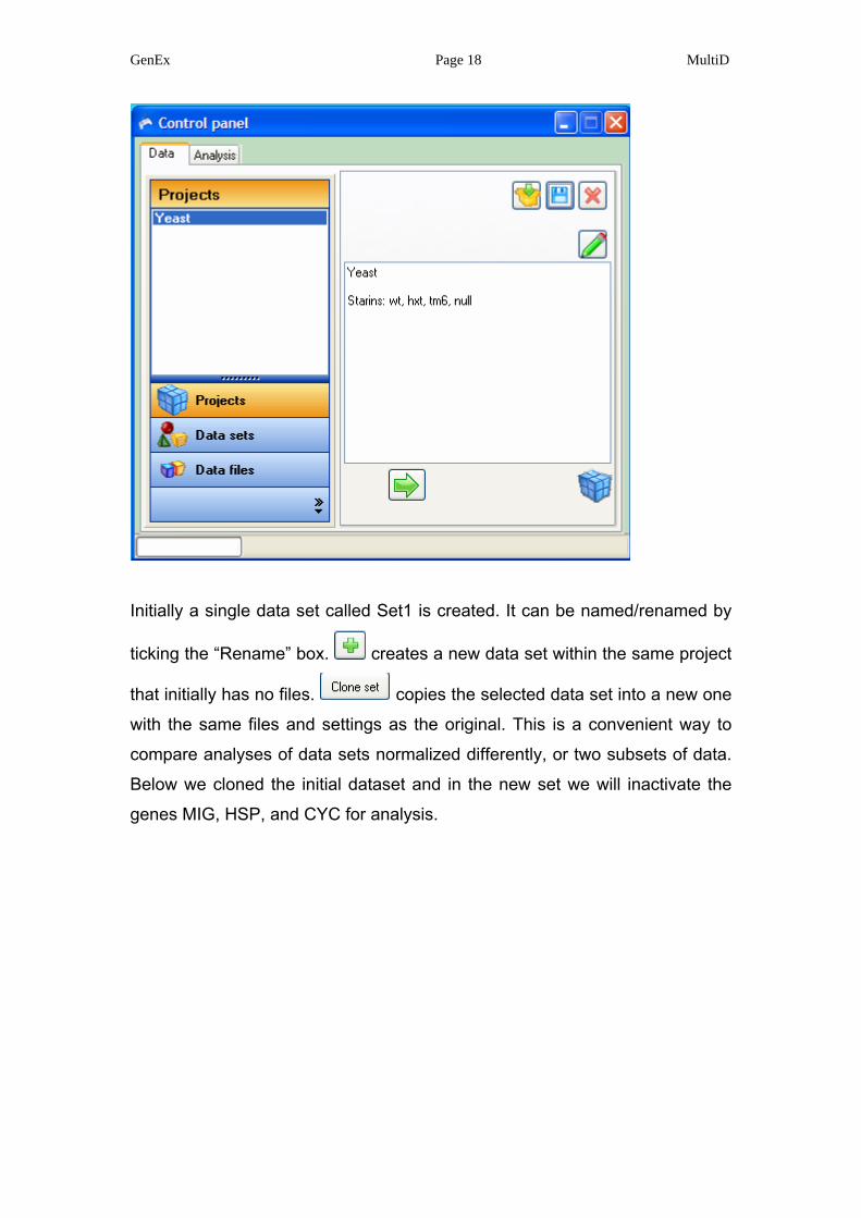
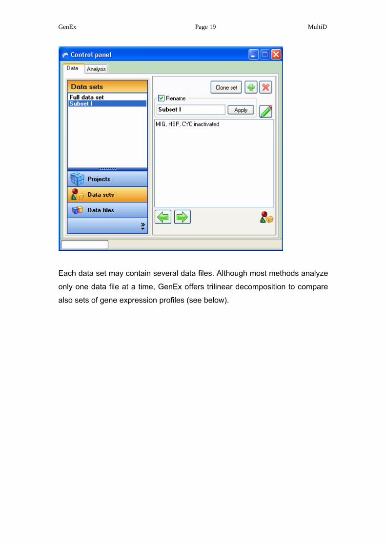
Initially a single data set called Set1 is created. It can be named/renamed by
ticking the “Rename” box. creates a new data set within the same project
that initially has no files. copies the selected data set into a new one
with the same files and settings as the original. This is a convenient way to
compare analyses of data sets normalized differently, or two subsets of data.
Below we cloned the initial dataset and in the new set we will inactivate the
genes MIG, HSP, and CYC for analysis.
GenEx Page 19 MultiD
Each data set may contain several data files. Although most methods analyze
only one data file at a time, GenEx offers trilinear decomposition to compare
also sets of gene expression profiles (see below).
GenEx Page 20 MultiD
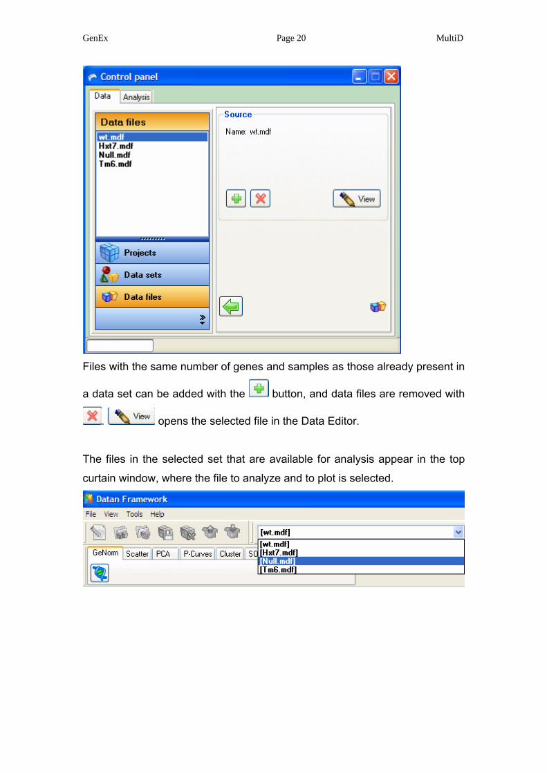
Files with the same number of genes and samples as those already present in
a data set can be added with the button, and data files are removed with
. opens the selected file in the Data Editor.
The files in the selected set that are available for analysis appear in the top
curtain window, where the file to analyze and to plot is selected.
GenEx Page 21 MultiD
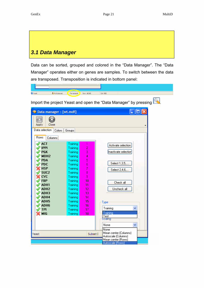
3.1 Data Manager
Data can be sorted, grouped and colored in the “Data Manager”. The “Data
Manager” operates either on genes are samples. To switch between the data
are transposed. Transposition is indicated in bottom panel:
Import the project Yeast and open the “Data Manager” by pressing .
GenEx Page 22 MultiD
Select the rows panel, which in transposed form are the genes. Recall, a data
set could be cloned to convert all information and settings. In the cloned set,
some genes or samples can be inactivated for analysis for simple comparison.
Samples can also be classified as test and training samples. This is of interest
when analyzing the data with predictive methods such as self organizing
maps (SOM), potential curves and partial least squares (PLS). There is also
option to scale data. Note, this option to scale data is reversible and does not
affect the data stored on disk. In contrast, scaling using the Data Editor in pre-
processing of data is irreversible once the data are stored to disc.
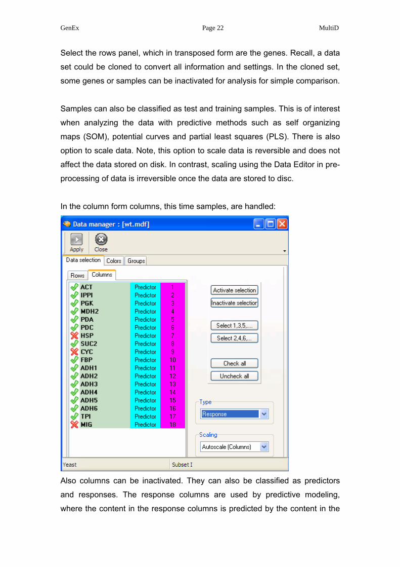
In the column form columns, this time samples, are handled:
Also columns can be inactivated. They can also be classified as predictors
and responses. The response columns are used by predictive modeling,
where the content in the response columns is predicted by the content in the
GenEx Page 23 MultiD
predictor columns. By default expression data are predictors and classification
columns (identified by #) are responses.
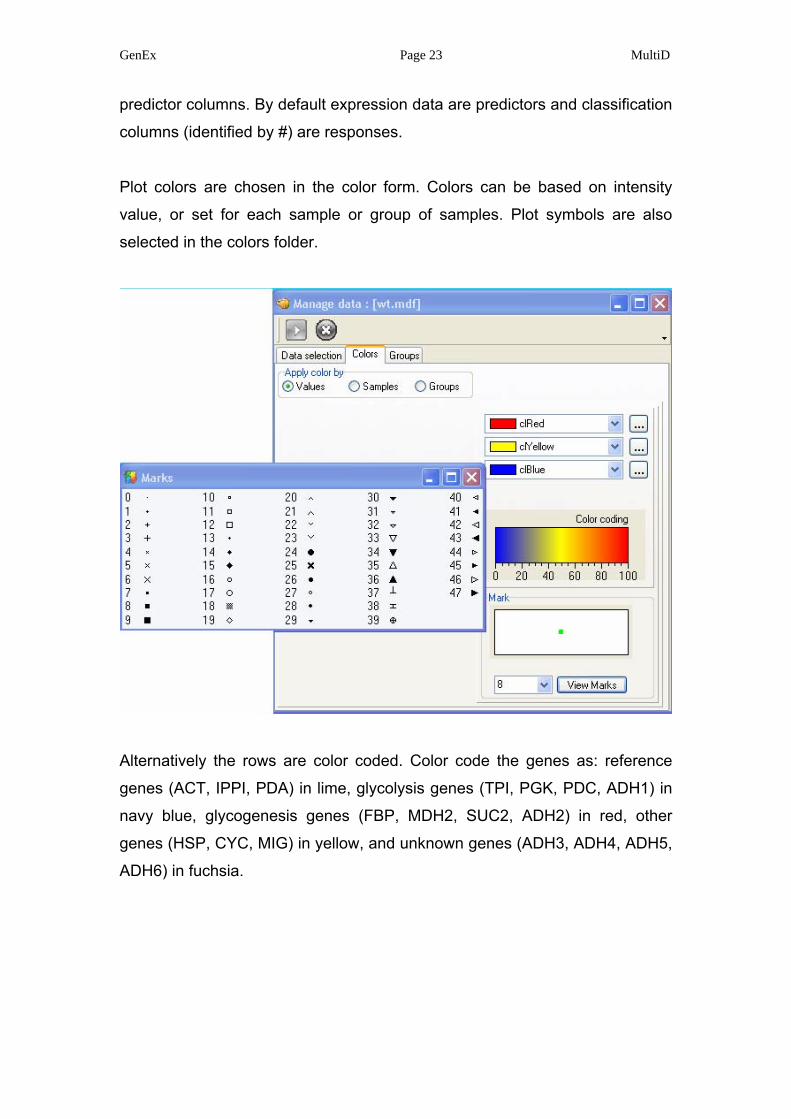
Plot colors are chosen in the color form. Colors can be based on intensity
value, or set for each sample or group of samples. Plot symbols are also
selected in the colors folder.
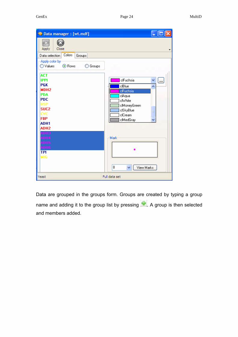
Alternatively the rows are color coded. Color code the genes as: reference
genes (ACT, IPPI, PDA) in lime, glycolysis genes (TPI, PGK, PDC, ADH1) in
navy blue, glycogenesis genes (FBP, MDH2, SUC2, ADH2) in red, other
genes (HSP, CYC, MIG) in yellow, and unknown genes (ADH3, ADH4, ADH5,
ADH6) in fuchsia.
GenEx Page 24 MultiD
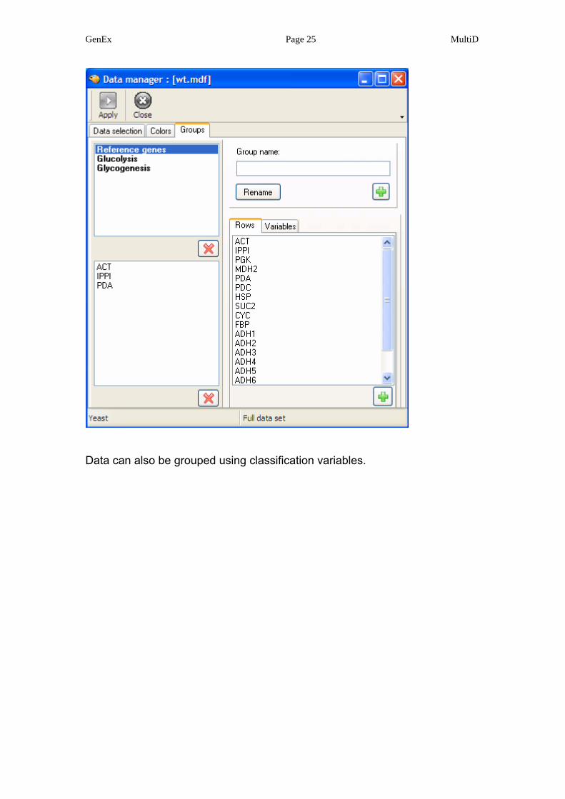
Data are grouped in the groups form. Groups are created by typing a group
name and adding it to the group list by pressing . A group is then selected
and members added.
GenEx Page 25 MultiD
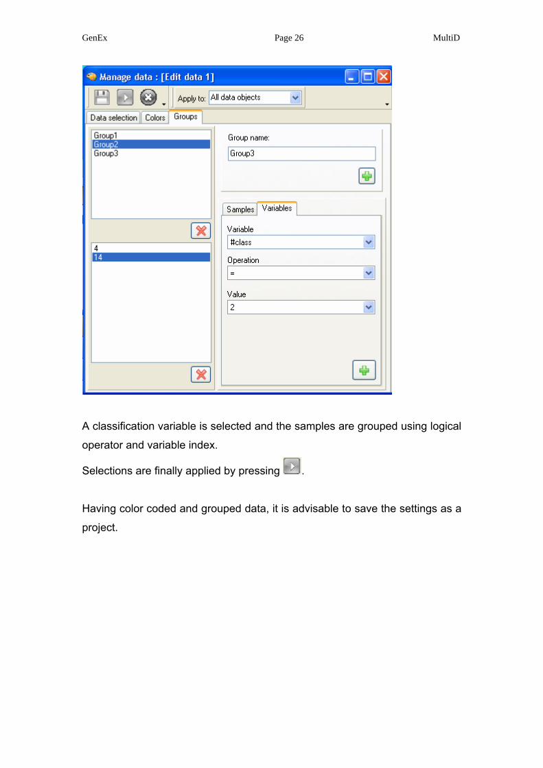
Data can also be grouped using classification variables.
GenEx Page 26 MultiD
A classification variable is selected and the samples are grouped using logical
operator and variable index.
Selections are finally applied by pressing .
Having color coded and grouped data, it is advisable to save the settings as a
project.
GenEx Page 27 MultiD
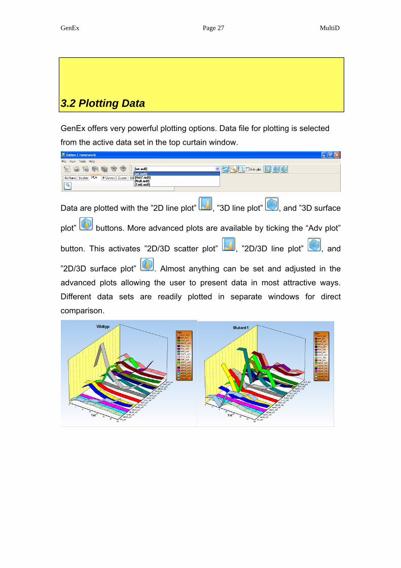
3.2 Plotting Data
GenEx offers very powerful plotting options. Data file for plotting is selected
from the active data set in the top curtain window.
Data are plotted with the ”2D line plot” , ”3D line plot” , and ”3D surface
plot” buttons. More advanced plots are available by ticking the “Adv plot”
button. This activates ”2D/3D scatter plot” , ”2D/3D line plot” , and
”2D/3D surface plot” . Almost anything can be set and adjusted in the
advanced plots allowing the user to present data in most attractive ways.
Different data sets are readily plotted in separate windows for direct
comparison.
GenEx Page 28 MultiD
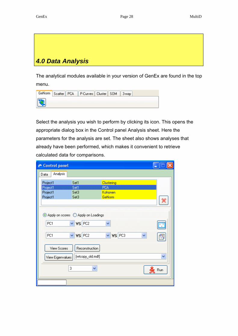
4.0 Data Analysis
The analytical modules available in your version of GenEx are found in the top
menu.
Select the analysis you wish to perform by clicking its icon. This opens the
appropriate dialog box in the Control panel Analysis sheet. Here the
parameters for the analysis are set. The sheet also shows analyses that
already have been performed, which makes it convenient to retrieve
calculated data for comparisons.
GenEx Page 29 MultiD
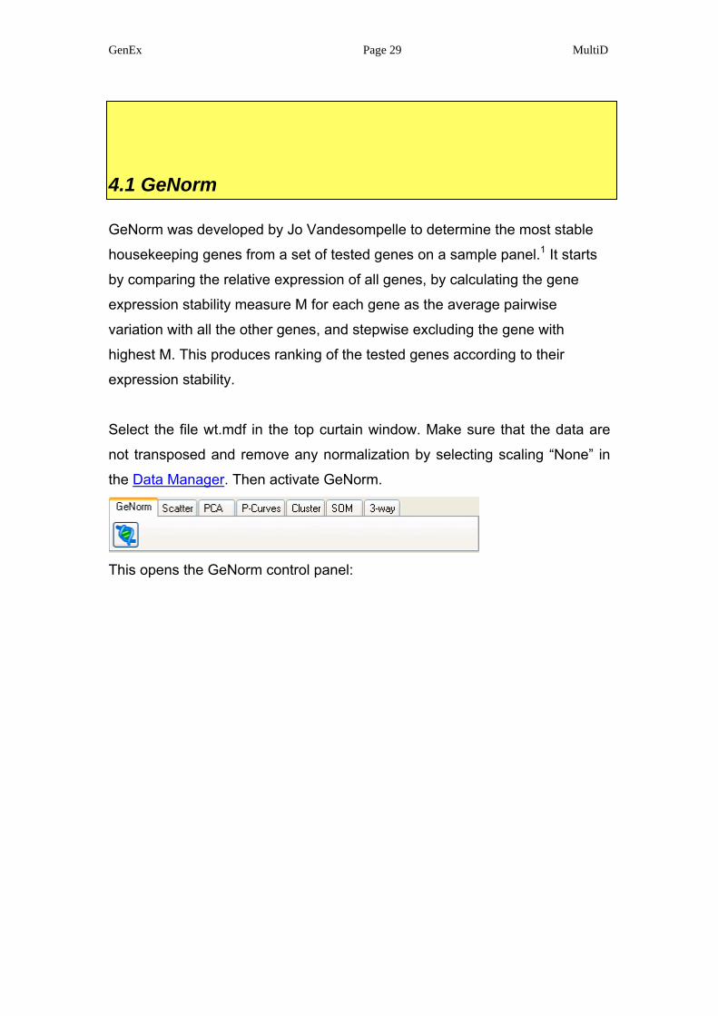
4.1 GeNorm
GeNorm was developed by Jo Vandesompelle to determine the most stable
housekeeping genes from a set of tested genes on a sample panel.1 It starts
by comparing the relative expression of all genes, by calculating the gene
expression stability measure M for each gene as the average pairwise
variation with all the other genes, and stepwise excluding the gene with
highest M. This produces ranking of the tested genes according to their
expression stability.
Select the file wt.mdf in the top curtain window. Make sure that the data are
not transposed and remove any normalization by selecting scaling “None” in
the Data Manager. Then activate GeNorm.
This opens the GeNorm control panel:
GenEx Page 30 MultiD
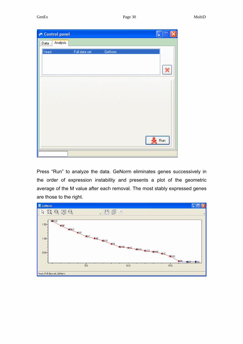
Press “Run” to analyze the data. GeNorm eliminates genes successively in
the order of expression instability and presents a plot of the geometric
average of the M value after each removal. The most stably expressed genes
are those to the right.
GenEx Page 31 MultiD
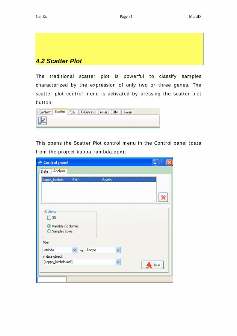
4.2 Scatter Plot
The traditional scatter plot is powerful to classify samples
characterized by the expression of only two or three genes. The
scatter plot control menu is activated by pressing the scatter plot
button:
This opens the Scatter Plot control menu in the Control panel (data
from the project kappa_lambda.dpx):
GenEx Page 32 MultiD
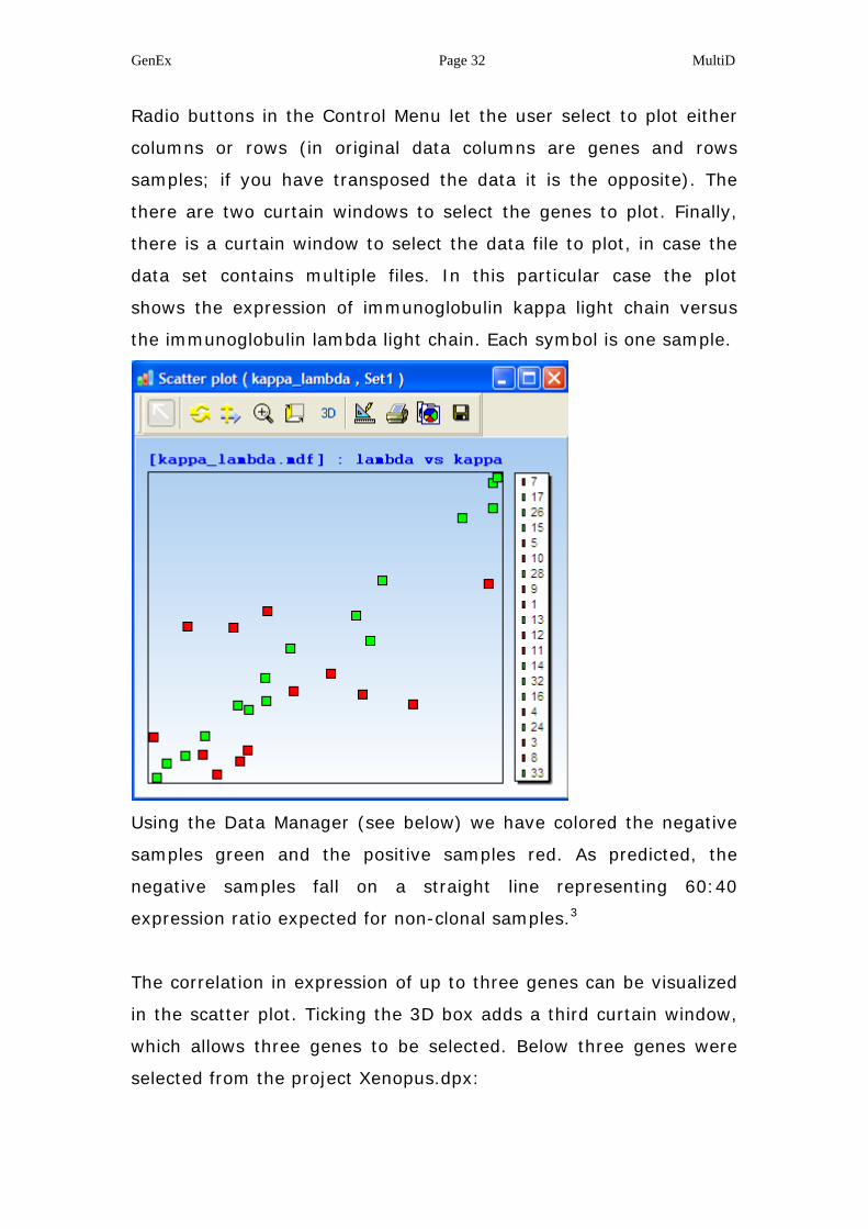
Radio buttons in the Control Menu let the user select to plot either
columns or rows (in original data columns are genes and rows
samples; if you have transposed the data it is the opposite). The
there are two curtain windows to select the genes to plot. Finally,
there is a curtain window to select the data file to plot, in case the
data set contains multiple files. In this particular case the plot
shows the expression of immunoglobulin kappa light chain versus
the immunoglobulin lambda light chain. Each symbol is one sample.
Using the Data Manager (see below) we have colored the negative
samples green and the positive samples red. As predicted, the
negative samples fall on a straight line representing 60:40
expression ratio expected for non-clonal samples.3
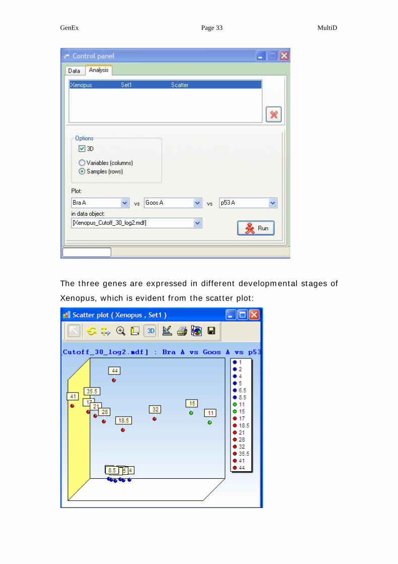
The correlation in expression of up to three genes can be visualized
in the scatter plot. Ticking the 3D box adds a third curtain window,
which allows three genes to be selected. Below three genes were
selected from the project Xenopus.dpx:
GenEx Page 33 MultiD
The three genes are expressed in different developmental stages of
Xenopus, which is evident from the scatter plot:
GenEx Page 34 MultiD
4.3 Principal Component Analysis
We cannot plot more than three genes in a tradition scatter plot,
because we have no way to visualize four dimensions. For studies
based on more than three genes, we must, if we want to account
for all of them in the analysis, use methods to collect the
multidimensional information in a lower dimensional space, such as
two and 3 dimensions. The most powerful way to do this is by
means of principal components (PC).
Think of the genes as axes making up a multidimensional space.
Each sample can now be represented in this space by the
coordinates (g1, g2, g3….), where g1, g2, g3 etc., is the expression
of gene 1, gene 2, gene 3 etc., in the sample. Samples that are
close in the space will be similar, while samples far apart will be
different. The disadvantage with this representation is that it’s hard
to visualize when the number of genes exceeds three. For this
purpose principal components are useful. The principal components
are axes in the multidimensional space such that maximum
variation is explained on the first axis; second most variation is
represented on the second axis and so on. This way most of the
information in the multidimensional space can be represented in a
graph of few dimensions.
In PCA the measured data are decomposed into a product of a
target matrix and a projection matrix with orthogonal columns and
orthonormal rows:
GenEx Page 35 MultiD
''q
1iTPptA ii =≈ ∑
=
(Eq. 1)
A is the data matrix. ti and pi’ are the scores and loadings, which
jointly are referred to as the principal components. q is the number
of projection vectors used to reproduce data. Typically 2-3 are used
because such space can be visualized in conventional plots.
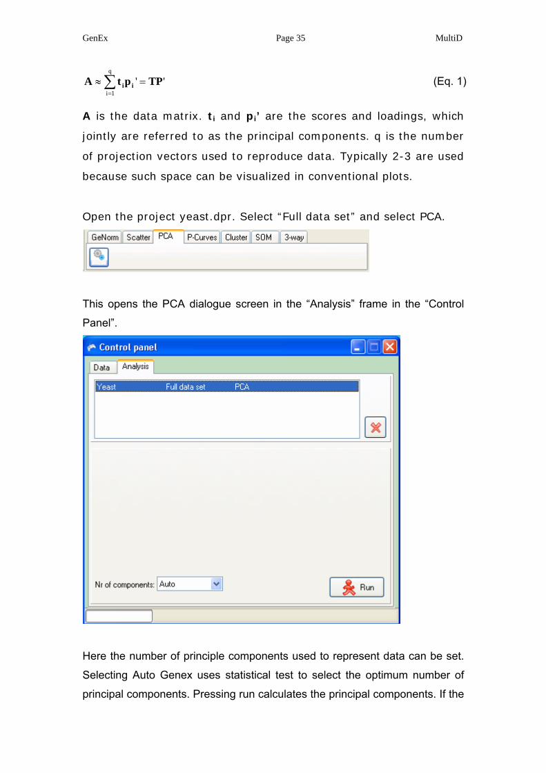
Open the project yeast.dpr. Select “Full data set” and select PCA.
This opens the PCA dialogue screen in the “Analysis” frame in the “Control
Panel”.
Here the number of principle components used to represent data can be set.
Selecting Auto Genex uses statistical test to select the optimum number of
principal components. Pressing run calculates the principal components. If the
GenEx Page 36 MultiD
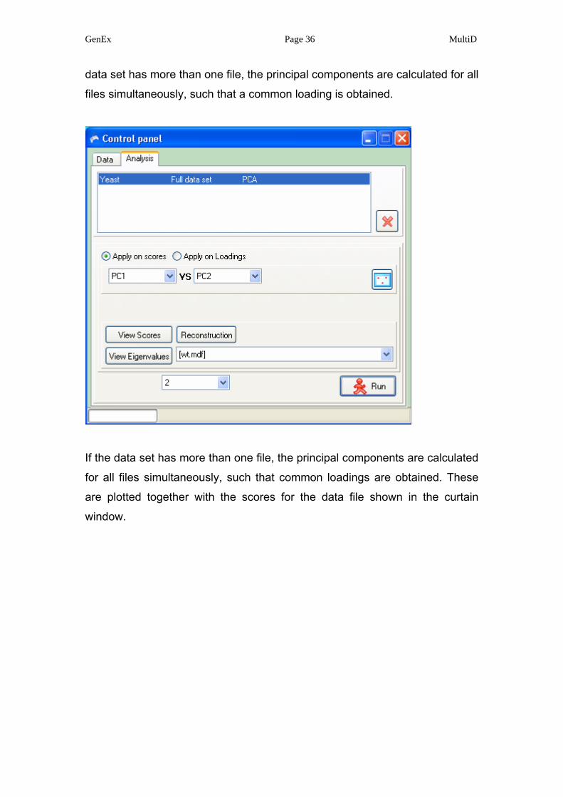
data set has more than one file, the principal components are calculated for all
files simultaneously, such that a common loading is obtained.
If the data set has more than one file, the principal components are calculated
for all files simultaneously, such that common loadings are obtained. These
are plotted together with the scores for the data file shown in the curtain
window.
GenEx Page 37 MultiD
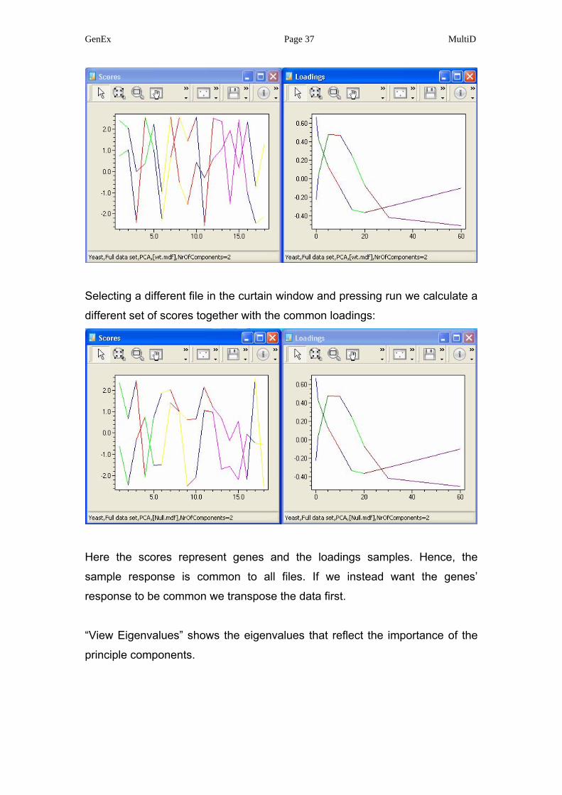
Selecting a different file in the curtain window and pressing run we calculate a
different set of scores together with the common loadings:
Here the scores represent genes and the loadings samples. Hence, the
sample response is common to all files. If we instead want the genes’
response to be common we transpose the data first.
“View Eigenvalues” shows the eigenvalues that reflect the importance of the
principle components.
GenEx Page 38 MultiD
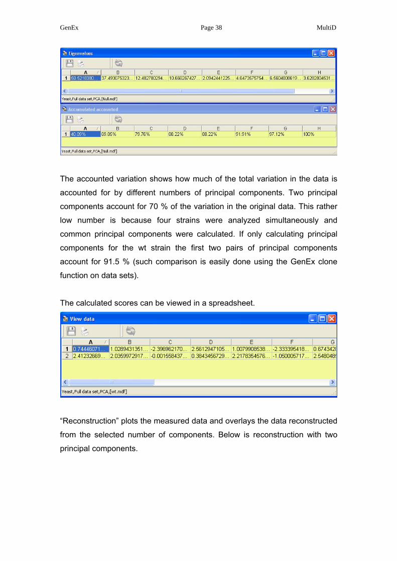
The accounted variation shows how much of the total variation in the data is
accounted for by different numbers of principal components. Two principal
components account for 70 % of the variation in the original data. This rather
low number is because four strains were analyzed simultaneously and
common principal components were calculated. If only calculating principal
components for the wt strain the first two pairs of principal components
account for 91.5 % (such comparison is easily done using the GenEx clone
function on data sets).
The calculated scores can be viewed in a spreadsheet.
“Reconstruction” plots the measured data and overlays the data reconstructed
from the selected number of components. Below is reconstruction with two
principal components.
GenEx Page 39 MultiD
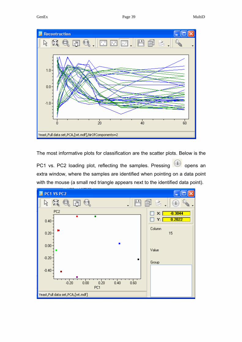
The most informative plots for classification are the scatter plots. Below is the
PC1 vs. PC2 loading plot, reflecting the samples. Pressing opens an
extra window, where the samples are identified when pointing on a data point
with the mouse (a small red triangle appears next to the identified data point).
GenEx Page 40 MultiD
The scattered points follow a curved path, which is expected for a continuous
process such as a time study. In such plot the time point when a test sample
was taken could readily be determined by interpolation.
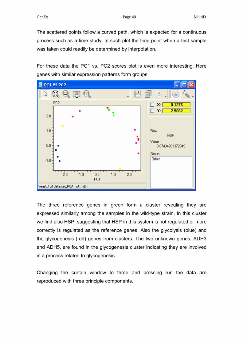
For these data the PC1 vs. PC2 scores plot is even more interesting. Here
genes with similar expression patterns form groups.
The three reference genes in green form a cluster revealing they are
expressed similarly among the samples in the wild-type strain. In this cluster
we find also HSP, suggesting that HSP in this system is not regulated or more
correctly is regulated as the reference genes. Also the glycolysis (blue) and
the glycogenesis (red) genes from clusters. The two unknown genes, ADH3
and ADH5, are found in the glycogenesis cluster indicating they are involved
in a process related to glycogenesis.
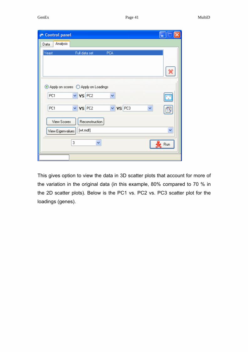
Changing the curtain window to three and pressing run the data are
reproduced with three principle components.
GenEx Page 41 MultiD
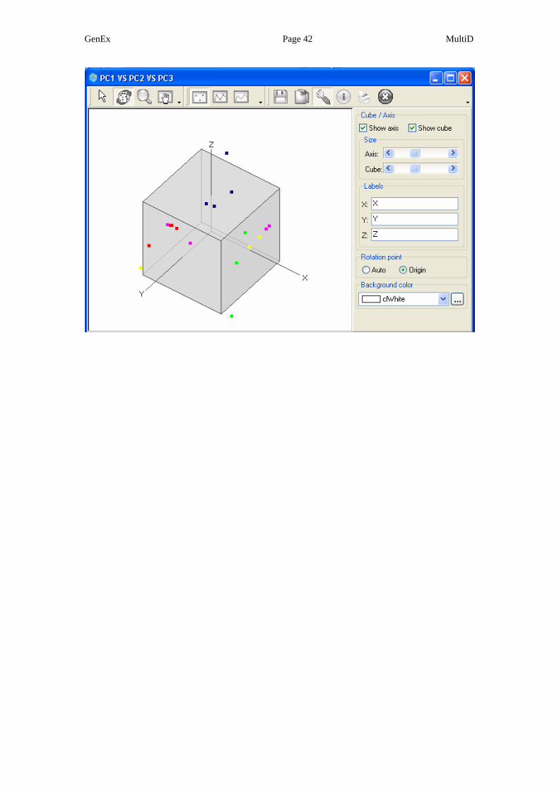
This gives option to view the data in 3D scatter plots that account for more of
the variation in the original data (in this example, 80% compared to 70 % in
the 2D scatter plots). Below is the PC1 vs. PC2 vs. PC3 scatter plot for the
loadings (genes).
GenEx Page 42 MultiD
GenEx Page 43 MultiD
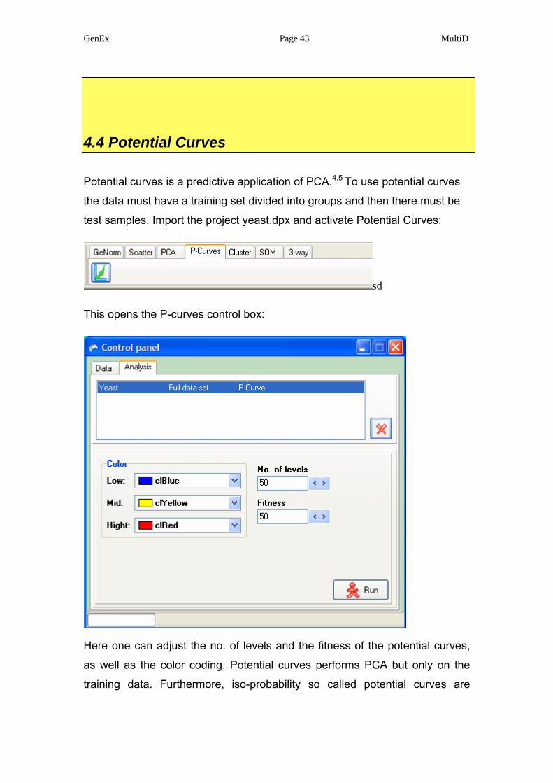
4.4 Potential Curves
Potential curves is a predictive application of PCA.4,5 To use potential curves
the data must have a training set divided into groups and then there must be
test samples. Import the project yeast.dpx and activate Potential Curves:
sd
This opens the P-curves control box:
Here one can adjust the no. of levels and the fitness of the potential curves,
as well as the color coding. Potential curves performs PCA but only on the
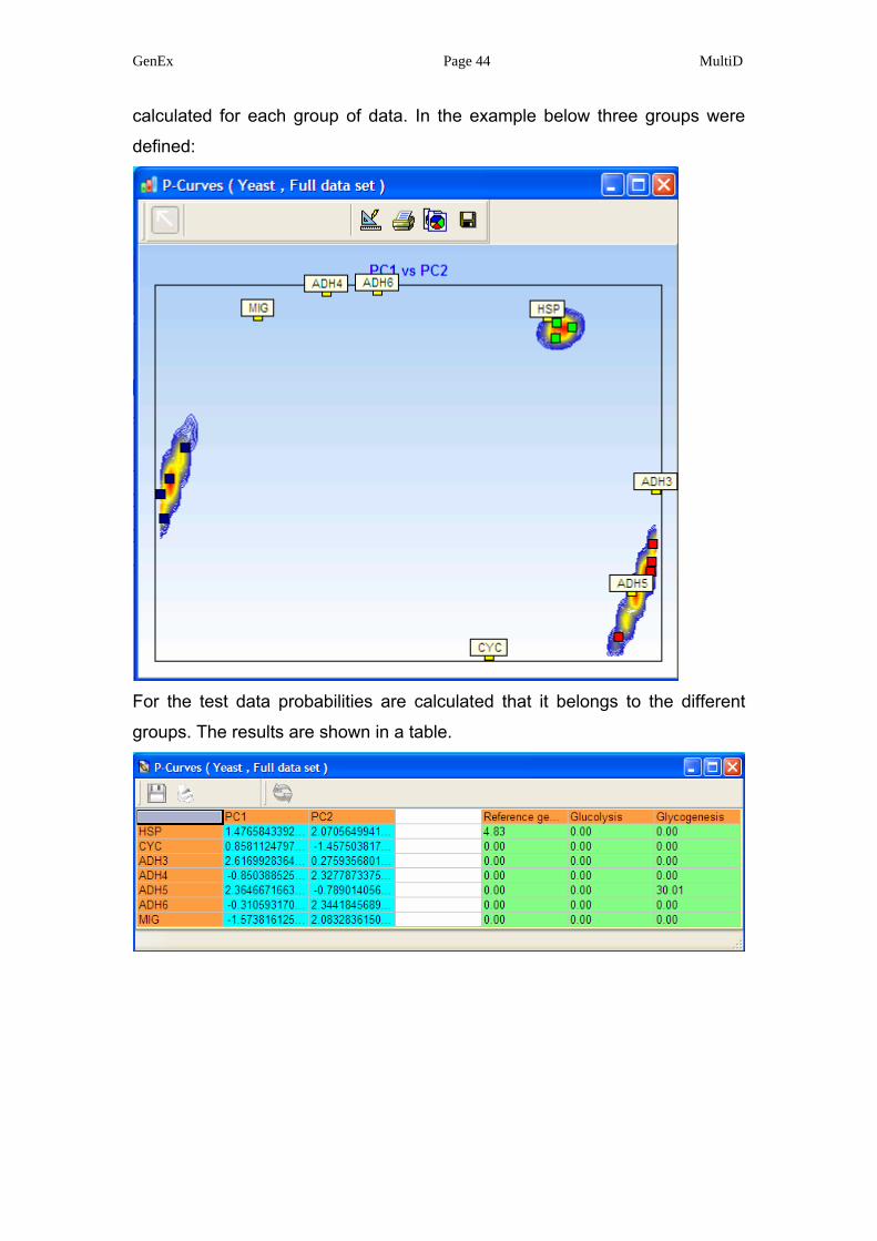
training data. Furthermore, iso-probability so called potential curves are
GenEx Page 44 MultiD
calculated for each group of data. In the example below three groups were
defined:
For the test data probabilities are calculated that it belongs to the different
groups. The results are shown in a table.
GenEx Page 45 MultiD
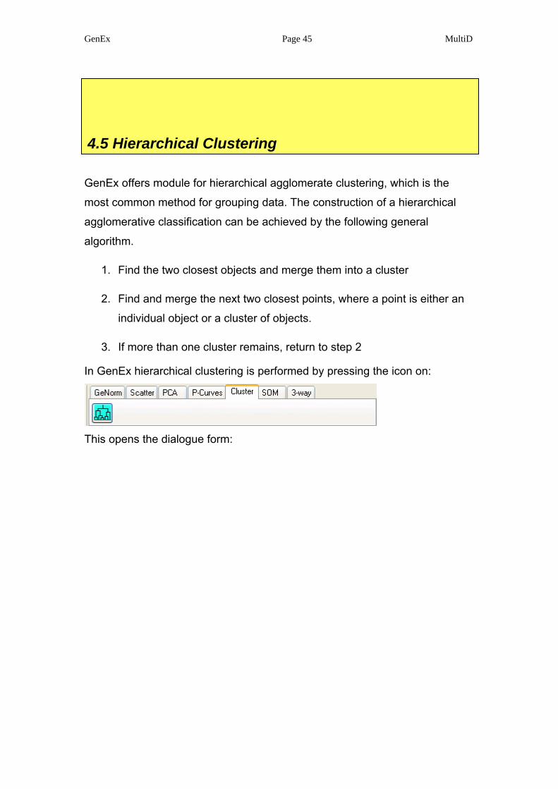
4.5 Hierarchical Clustering
GenEx offers module for hierarchical agglomerate clustering, which is the
most common method for grouping data. The construction of a hierarchical
agglomerative classification can be achieved by the following general
algorithm.
1. Find the two closest objects and merge them into a cluster
2. Find and merge the next two closest points, where a point is either an
individual object or a cluster of objects.
3. If more than one cluster remains, return to step 2
In GenEx hierarchical clustering is performed by pressing the icon on:
This opens the dialogue form:
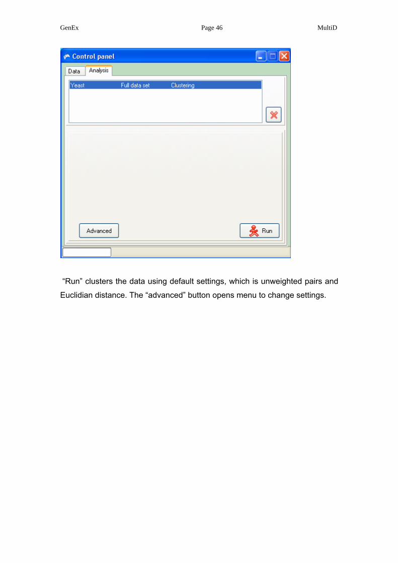
GenEx Page 46 MultiD
“Run” clusters the data using default settings, which is unweighted pairs and
Euclidian distance. The “advanced” button opens menu to change settings.
GenEx Page 47 MultiD
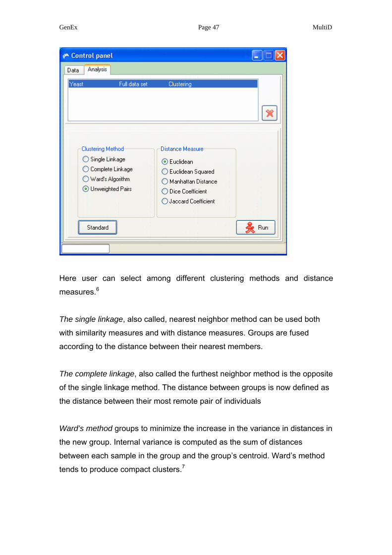
Here user can select among different clustering methods and distance
measures.6
The single linkage, also called, nearest neighbor method can be used both
with similarity measures and with distance measures. Groups are fused
according to the distance between their nearest members.
The complete linkage, also called the furthest neighbor method is the opposite
of the single linkage method. The distance between groups is now defined as
the distance between their most remote pair of individuals
Ward’s method groups to minimize the increase in the variance in distances in
the new group. Internal variance is computed as the sum of distances
between each sample in the group and the group’s centroid. Ward’s method
tends to produce compact clusters.7
GenEx Page 48 MultiD
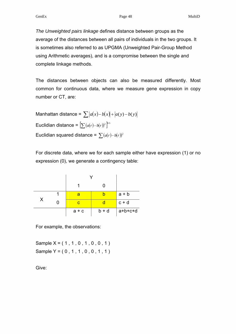
The Unweighted pairs linkage defines distance between groups as the
average of the distances between all pairs of individuals in the two groups. It
is sometimes also referred to as UPGMA (Unweighted Pair-Group Method
using Arithmetic averages), and is a compromise between the single and
complete linkage methods.
The distances between objects can also be measured differently. Most
common for continuous data, where we measure gene expression in copy
number or CT, are:
Manhattan distance = ( ) ( ) )()( ybyaxbxa −+−∑
Euclidian distance = ( ) ( )( )[ ] 5.02∑ − rbra
Euclidian squared distance = ( ) ( )( )∑ − 2rbra
For discrete data, where we for each sample either have expression (1) or no
expression (0), we generate a contingency table:
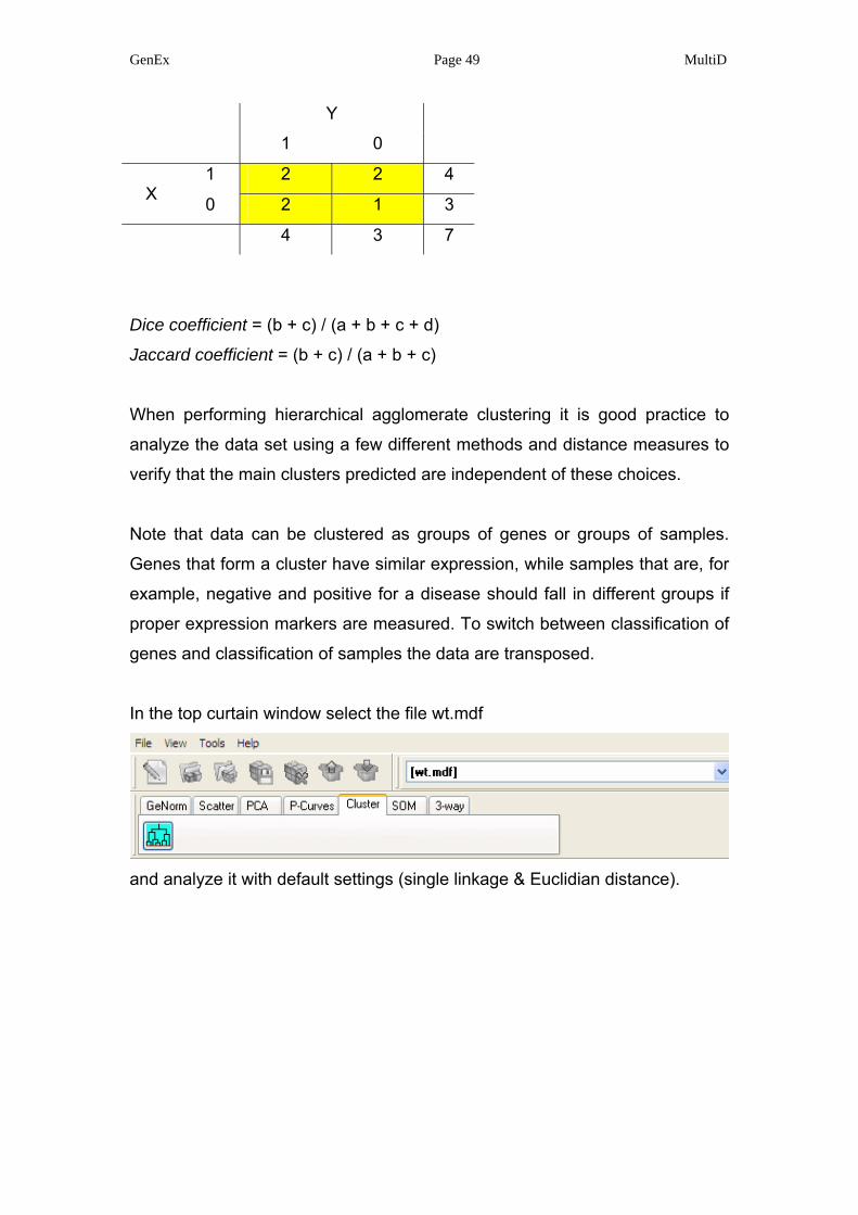
For example, the observations:
Sample X = ( 1 , 1 , 0 , 1 , 0 , 0 , 1 )
Sample Y = ( 0 , 1 , 1 , 0 , 0 , 1 , 1 )
Give:
Y
1 0
1 a b a + b
X 0 c d c + d
a + c b + d a+b+c+d
GenEx Page 49 MultiD
Dice coefficient = (b + c) / (a + b + c + d)
Jaccard coefficient = (b + c) / (a + b + c)
When performing hierarchical agglomerate clustering it is good practice to
analyze the data set using a few different methods and distance measures to
verify that the main clusters predicted are independent of these choices.
Note that data can be clustered as groups of genes or groups of samples.
Genes that form a cluster have similar expression, while samples that are, for
example, negative and positive for a disease should fall in different groups if
proper expression markers are measured. To switch between classification of
genes and classification of samples the data are transposed.
In the top curtain window select the file wt.mdf
and analyze it with default settings (single linkage & Euclidian distance).
Y
1 0
1 2 2 4
X 0 2 1 3
4 3 7
GenEx Page 50 MultiD
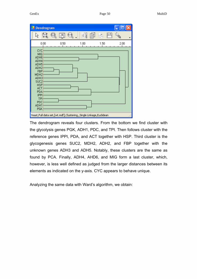
The dendrogram reveals four clusters. From the bottom we find cluster with
the glycolysis genes PGK, ADH1, PDC, and TPI. Then follows cluster with the
reference genes IPPI, PDA, and ACT together with HSP. Third cluster is the
glycogenesis genes SUC2, MDH2, ADH2, and FBP together with the
unknown genes ADH3 and ADH5. Notably, these clusters are the same as
found by PCA. Finally, ADH4, AHD6, and MIG form a last cluster, which,
however, is less well defined as judged from the larger distances between its
elements as indicated on the y-axis. CYC appears to behave unique.
Analyzing the same data with Ward’s algorithm, we obtain:
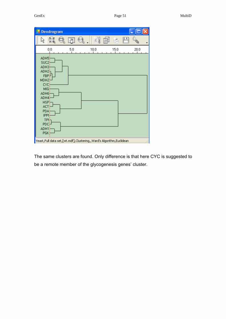
GenEx Page 51 MultiD
The same clusters are found. Only difference is that here CYC is suggested to
be a remote member of the glycogenesis genes’ cluster.
GenEx Page 52 MultiD
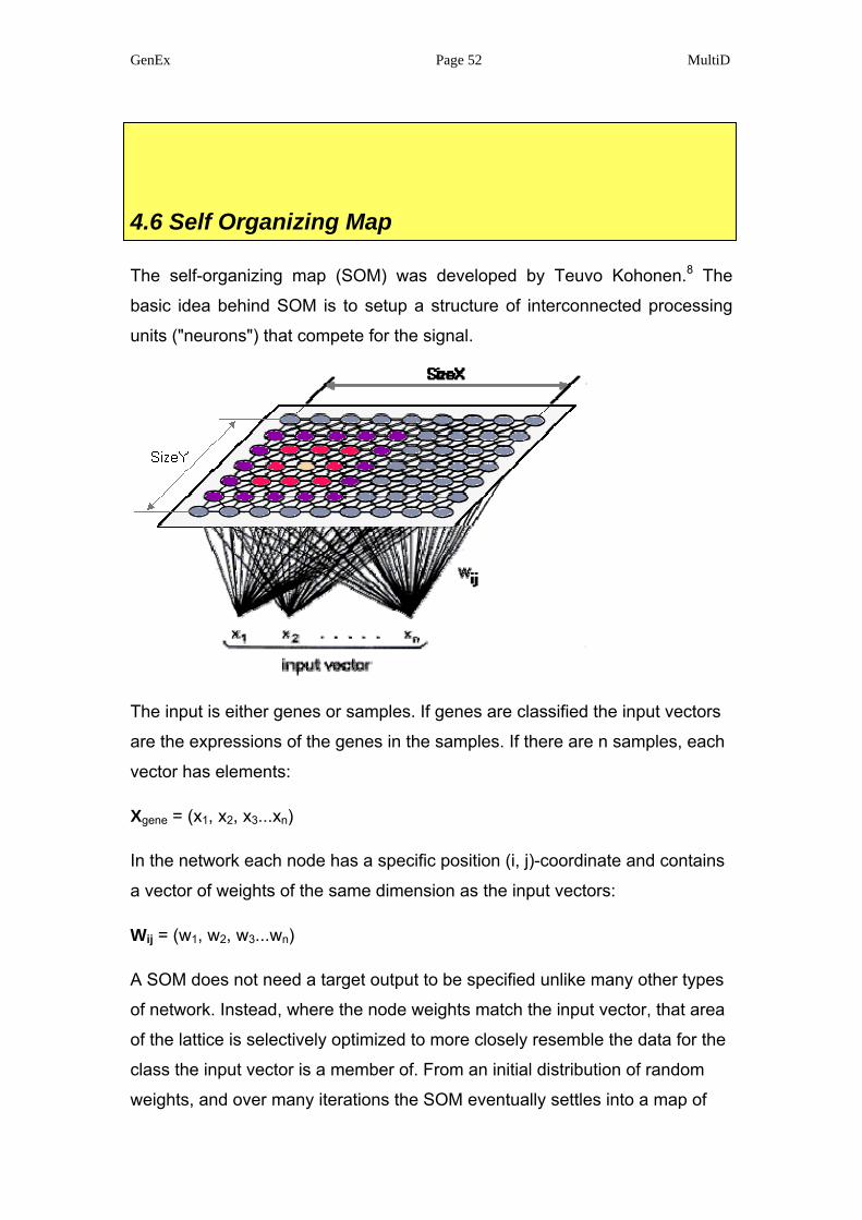
4.6 Self Organizing Map
The self-organizing map (SOM) was developed by Teuvo Kohonen.8 The
basic idea behind SOM is to setup a structure of interconnected processing
units ("neurons") that compete for the signal.
The input is either genes or samples. If genes are classified the input vectors
are the expressions of the genes in the samples. If there are n samples, each
vector has elements:
Xgene = (x1, x2, x3...xn)
In the network each node has a specific position (i, j)-coordinate and contains
a vector of weights of the same dimension as the input vectors:
Wij = (w1, w2, w3...wn)
A SOM does not need a target output to be specified unlike many other types
of network. Instead, where the node weights match the input vector, that area
of the lattice is selectively optimized to more closely resemble the data for the
class the input vector is a member of. From an initial distribution of random
weights, and over many iterations the SOM eventually settles into a map of

GenEx Page 53 MultiD
stable zones. The zones are effectively feature classifiers. Any new,
previously unseen input vectors presented to the network will stimulate nodes
in the zone with similar weight vectors.
Training occurs in several steps and over many iterations:
1. Each node's weights are initialized.
2. A vector is chosen at random from the set of training data and
presented to the lattice.
3. Every node is examined to calculate which one's weights are most like
the input vector. The winning node is commonly known as the Best
Matching Unit (BMU).
4. The neighbors to BMU are now identified. This is a value that starts
large, typically set to the 'radius' of the lattice, but diminishes each
time-step.
5. Each neighboring node's weights are adjusted to make them more like
the input vector. The closer a node is to the BMU the more its weights
get altered.
6. Repeat from step 2 a fixed number of iterations.
The range of the neighborhood (step 4) as well as the amount of adjustment
(step 5) decreases during the training from initial values set by the user. This
ensures that there are coarse adjustments in the first phase of the training,
while fine tuning occurs during the end of the training.
A special feature of this particular implementation of SOM is the availability of
cyclic maps. This means that the neighborhood is extended beyond the map
borders and wrapped to the opposite boundary. In this case a rectangular
map becomes a torus and a linear map will be a circle.
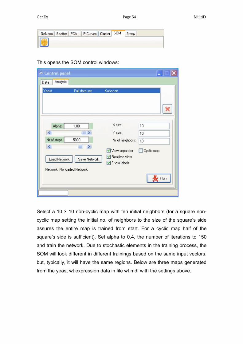
Select the file wt.mdf in the top curtain window and activate Kohonen neural
network by pressing the Kohonen icon.
GenEx Page 54 MultiD
This opens the SOM control windows:
Select a 10 × 10 non-cyclic map with ten initial neighbors (for a square non-
cyclic map setting the initial no. of neighbors to the size of the square’s side
assures the entire map is trained from start. For a cyclic map half of the
square’s side is sufficient). Set alpha to 0.4, the number of iterations to 150
and train the network. Due to stochastic elements in the training process, the
SOM will look different in different trainings based on the same input vectors,
but, typically, it will have the same regions. Below are three maps generated
from the yeast wt expression data in file wt.mdf with the settings above.
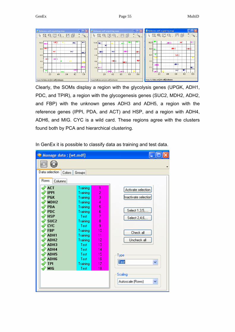
GenEx Page 55 MultiD
Clearly, the SOMs display a region with the glycolysis genes (UPGK, ADH1,
PDC, and TPIR), a region with the glycogenesis genes (SUC2, MDH2, ADH2,
and FBP) with the unknown genes ADH3 and ADH5, a region with the
reference genes (IPPI, PDA, and ACT) and HSP, and a region with ADH4,
ADH6, and MIG. CYC is a wild card. These regions agree with the clusters
found both by PCA and hierarchical clustering.
In GenEx it is possible to classify data as training and test data.
GenEx Page 56 MultiD
Only the training data are used to train the SOM. This is very useful when
there is a subset of highly reliable and extensively tested data, based on
which a SOM shall be created, for classification of more uncertain data. If we
activate all data in the wt.mdf the SOM may then look something like:
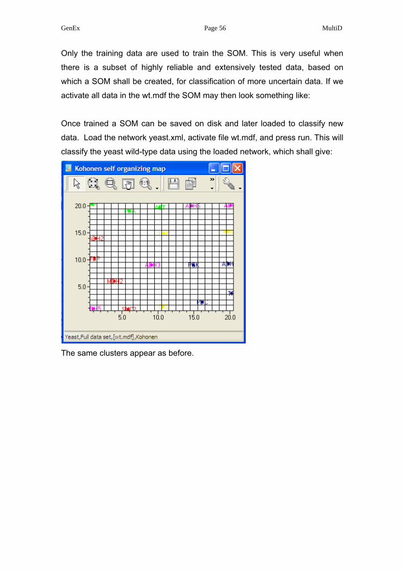
Once trained a SOM can be saved on disk and later loaded to classify new
data. Load the network yeast.xml, activate file wt.mdf, and press run. This will
classify the yeast wild-type data using the loaded network, which shall give:
The same clusters appear as before.
GenEx Page 57 MultiD
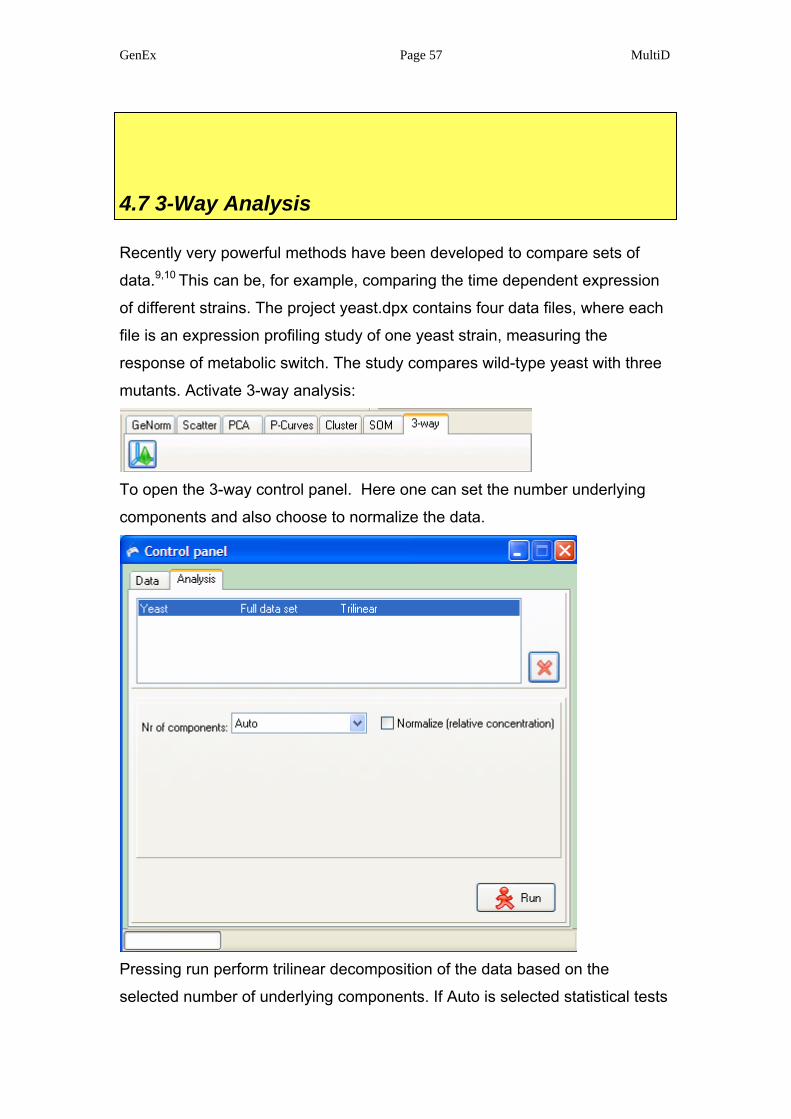
4.7 3-Way Analysis
Recently very powerful methods have been developed to compare sets of
data.9,10 This can be, for example, comparing the time dependent expression
of different strains. The project yeast.dpx contains four data files, where each
file is an expression profiling study of one yeast strain, measuring the
response of metabolic switch. The study compares wild-type yeast with three
mutants. Activate 3-way analysis:
To open the 3-way control panel. Here one can set the number underlying
components and also choose to normalize the data.
Pressing run perform trilinear decomposition of the data based on the
selected number of underlying components. If Auto is selected statistical tests
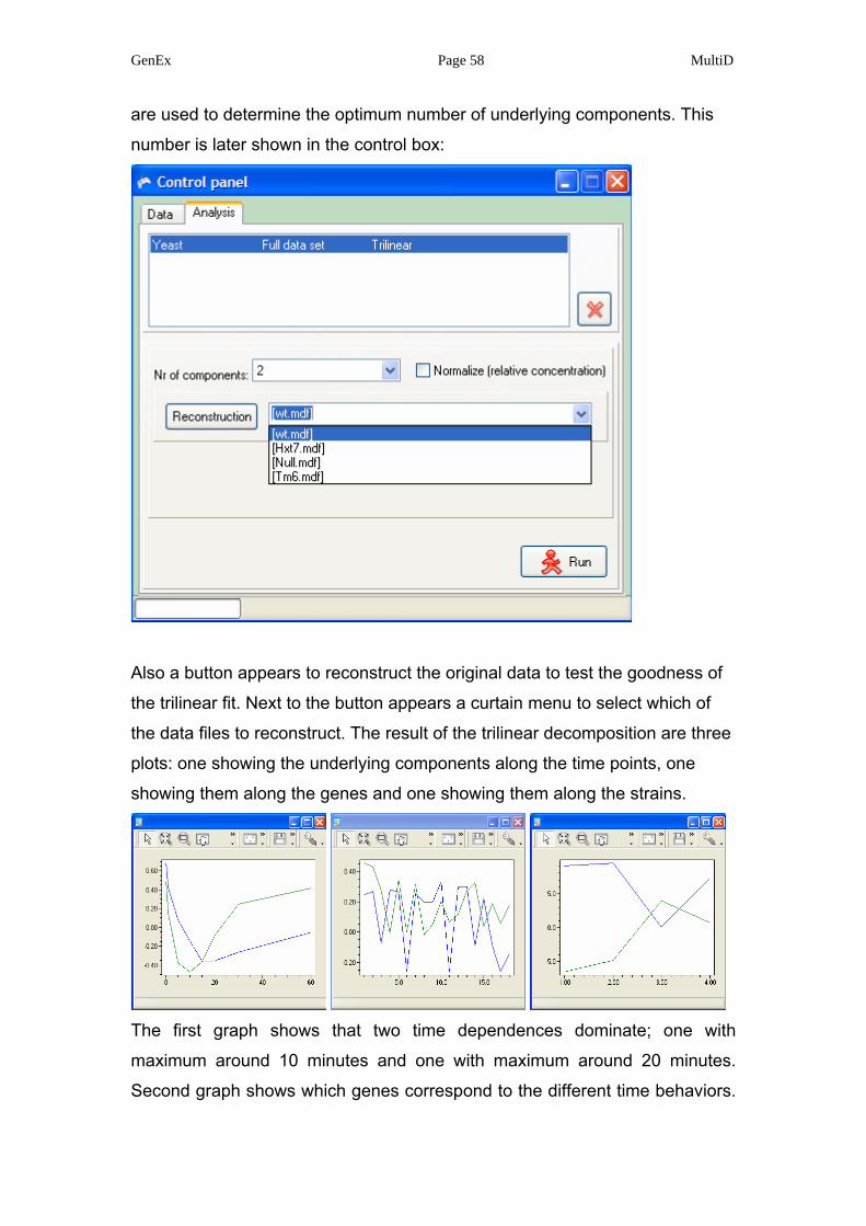
GenEx Page 58 MultiD
are used to determine the optimum number of underlying components. This
number is later shown in the control box:
Also a button appears to reconstruct the original data to test the goodness of
the trilinear fit. Next to the button appears a curtain menu to select which of
the data files to reconstruct. The result of the trilinear decomposition are three
plots: one showing the underlying components along the time points, one
showing them along the genes and one showing them along the strains.
The first graph shows that two time dependences dominate; one with
maximum around 10 minutes and one with maximum around 20 minutes.
Second graph shows which genes correspond to the different time behaviors.

GenEx Page 59 MultiD
The responses are color coded such that each underlying component is
shown with the same color in all three graphs. Hence, a gene that has a large
signal in one underlying component has important contribution to the time
behavior of this component. The third graph compares the strains. Also here
the color codes show which underlying component is important in which
strain. Furthermore, the different strains are compared. Here, for example, we
see that both underlying components show the trend: strain 1, strain 2, strain
4 and strain 3, suggesting that Hxt7 (= strain 2) is most similar to wt, than
comes Tm6 (= strain 4), and the most deviant strain is null (= strain 3).

GenEx Page 60 MultiD
5. Upgrades and support
Upgrades and corrections of GenEx are available on the Internet on
http://www.multid.se. On the MultiD website you also find additional
information about GenEx, Procrustes rotation, trilinear decomposition and
other methods to analyze multidimensional data. Registered customers can
obtain support at their local MultiD representative or at the MultiD Analyses
AB main office.
MultiD Analyses AB
Lotsgatan 5A
414 58 Gothenburg
SWEDEN
E-mail: [email protected]

GenEx Page 61 MultiD
6. Acknowledgements
Example real-time PCR data were kindly provided by Anders Stålberg, Karin
Elbing, Radek Sindelka, Jiri Jonák and Mikael Kubista from the TATAA
Biocenter. Dr José Manuel Andrade Garda from University A Coruña has
provided most valuable feedback on early versions and beta releases.
GenEx Page 62 MultiD
7. References
1 J. Vandesompele, K. De Preter, F. Pattyn, B. Poppe, N. Van Roy, A.
De Paepe and F. Speleman. Accurate normalization of real-time quantitative RT-PCR data by geometric averaging of multiple internal control genes. Genome Biology, 3:research0034.1-0034.11 (2002)
2 M. Bengtsson, A. Ståhlberg, P. Rorsman, and M. Kubista, Gene
expression profiling in single cells from the pancreatic islets of Langerhans reveals lognormal distribution of mRNA levels. Genome Research 15, 1388-1392 (2005).
Research Highlights in Nature Review Genetics 6, 1758 (2005).
3 A. Ståhlberg, P. Åman, B. Ridell, P. Mostad & M. Kubista. Quantitative Real-Time PCR Method for Detection of B-Lymphocyte Monoclonality by Comparison of k and l Immunoglobulin Light Chain Expression. Clin. Chem. 49, 51-59 (2003).
4 M. Forina, C. Armanino, R. Leardi and G. Drava, J. Chemom., 1991, 5,
435–453. 5 X. Tomas and J. M. Andrade, Quim. Anal., 1999, 18, 225–231. 6 G.H. Lance, W.T. Williams A general theory of classificatory sorting
strategies. I. Hierarchical Systems. Comp. J. 9 (1966) 373-380. 7 J. H. Ward. Hierarchical grouping to optimize an objective function,
Journal of Amer. Statist. Assoc. 58: 236-244 (1963). 8 T. Kohonen: Self-Organizing Maps. Springer-Verlag, Heidelberg 1995. 9 A. Smilde, R. Bro & P. Geladi. MultiWay Analysis. John Wiley & Sons
Ltd. ISBN: 0-471-98691-7 (2004). 10 J. M. Andrade, M, P. Gómez-Carracedo, W. Krzanowski & M. Kubista.
Procrustes rotation in analytical chemistry, a tutorial. Chemometrics and Intelligent Laboratory Systems 72 123 (2004).


![Multid Presentation 2016[1]](https://img.pdfslide.us/doc/110x75/589aa6321a28abfc1a8b63cd/multid-presentation-20161.jpg)