Embed Size (px)
Citation preview

Perceptual Edge 7/20/2007
Copyright © 2007 Stephen Few 1
Data visualization for enlightening communication.
Stephen Few, Principal, Perceptual Edge
(510) 558-7400

Perceptual Edge 7/20/2007
Copyright © 2004 Stephen Few 2
The amount of information that is available to businesses has increased dramatically in the last
few years, but the ability to make use of it has increased little, if any.
Our networks are awash in data. A little of it is information. A smidgen of this shows up as
knowledge. Combined with ideas, some of that is actually useful. Mix in experience,
context, compassion, discipline, humor, tolerance, and humility, and perhaps knowledge
becomes wisdom.
(Turning Numbers into Knowledge, Jonathan G. Koomey, 2001, Analytics Press:
Oakland, CA page 5, quoting Clifford Stoll)
Most of us who are responsible for analyzing and communicating data have never been trained to
do this. Knowing how to use Excel or some other is not the same as knowing how to make sense
of and present data effectively.

Perceptual Edge 7/20/2007
Copyright © 2007 Stephen Few 3

Perceptual Edge 7/20/2007
Copyright © 2007 Stephen Few 4

Perceptual Edge 7/20/2007
Copyright © 2007 Stephen Few 5
Perceptual Edge 7/20/2007
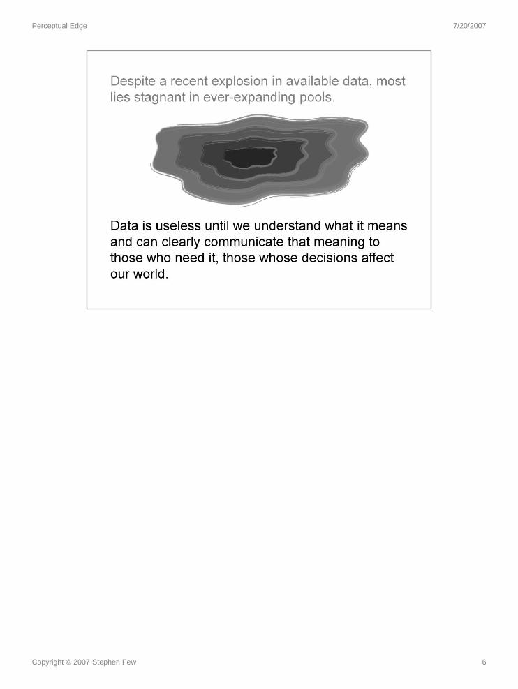
Copyright © 2007 Stephen Few 6

Perceptual Edge 7/20/2007
Copyright © 2007 Stephen Few 7
You’ve been invited to another of the many meetings that you’re required to
attend. You’re one of many managers in the Information Technology
department. Like most meetings, this one begins with the light of a projector
suddenly illuminating a screen.

Perceptual Edge 7/20/2007
Copyright © 2007 Stephen Few 8
Bursting with excitement, the speaker announces that you and everyone else
in the room will now receive a daily report that will inform you how the network
is being utilized, and then this graph appears. You stare at it very intently, trying
your best to keep any hint of confusion from crossing your face. From your
peripheral vision you can see that the CIO (Chief Information Officer) is smiling
broadly and nodding with obvious understanding. You and everyone else in the
room begins to nod enthusiastically as well. You feel very dumb. What you
don’t realize is that you are not alone.

Perceptual Edge 7/20/2007
Copyright © 2007 Stephen Few 9
I wrote the book, Show Me the Numbers: Designing Tables and Graphs
to Enlighten, published by Analytics Press in 2004, to help business people
like you respond to the challenges that you face every day when presenting
quantitative information.

Perceptual Edge 7/20/2007
Copyright © 2007 Stephen Few 10
We live in the so-called “information age.” So much information is available,
without proper care and skill we can easily drown in it.
The phrase, “Just show me the numbers,” is especially popular among those
responsible for sales organizations who are often frantic to know how sales are
going. They can’t afford to wade through lengthy reports and unnecessary
detail; they just want to see the important numbers right now!

Perceptual Edge 7/20/2007
Copyright © 2007 Stephen Few 11
Wrong! We’re getting worse. Despite great progress in our ability to gather and
warehouse data, we’re still missing the boat if we don’t communicate the
numbers effectively. Contrary to popular wisdom, information cannot always
speak for itself.

Perceptual Edge 7/20/2007
Copyright © 2007 Stephen Few 12
Why? Few people are trained.
Why? Few people recognize the need.
Why? Few examples of good design exist to expose the problem.
“Poor documents are so commonplace that deciphering bad writing and bad
visual design have become part of the coping skills needed to navigate in the
so-called information age.” Karen A. Schriver, Dynamics in Document Design,
John Wiley & Sons, Inc., 1997.
“The public is more familiar with bad design than good design. It is, in effect,
conditioned to prefer bad design, because that is what it lives with. The new
becomes threatening, the old reassuring.” (Kevin Mullet and Darrel Sano,
Designing Visual Interfaces, Sun Microsystems, Inc., 1995 – quoting Paul
Rand, Design, Form, and Chaos)
Effective communication is not always intuitive – it must be learned.
Perceptual Edge 7/20/2007
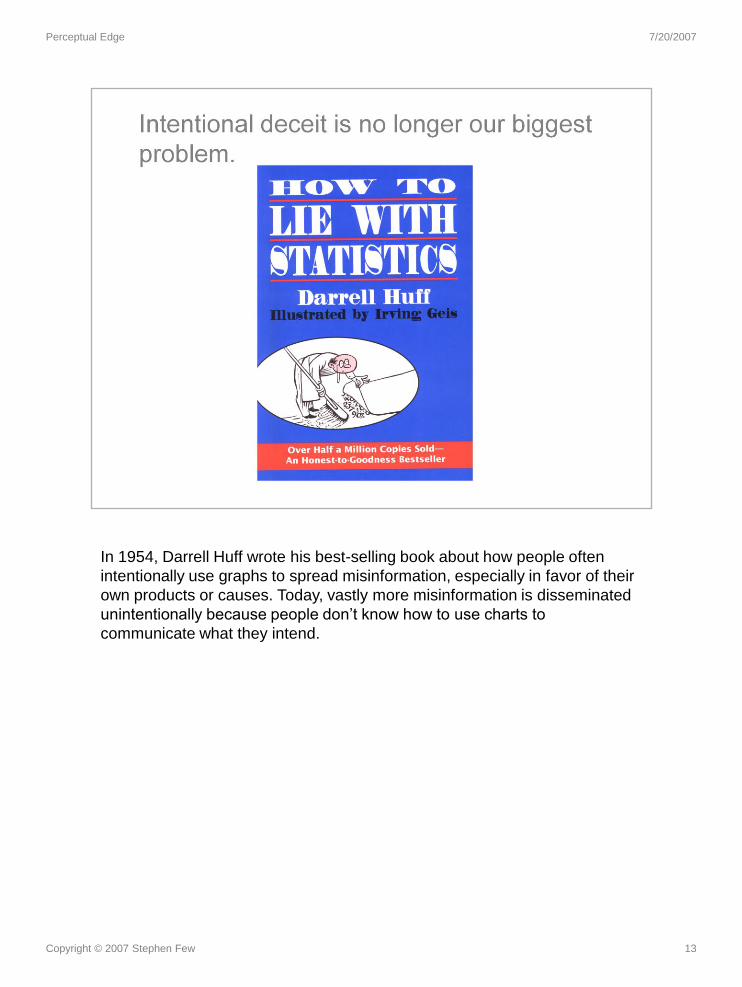
Copyright © 2007 Stephen Few 13
In 1954, Darrell Huff wrote his best-selling book about how people often
intentionally use graphs to spread misinformation, especially in favor of their
own products or causes. Today, vastly more misinformation is disseminated
unintentionally because people don’t know how to use charts to
communicate what they intend.

Perceptual Edge 7/20/2007
Copyright © 2007 Stephen Few 14
When the PC was introduced, software soon made the arduous task of table
and graph creation as easy as 1-2-3 (literally “Lotus 1-2-3”, the software that
was the first to legitimize the PC as a viable tool for business). Unfortunately,
this improvement in ease and efficiency was not accompanied by instruction
in visual design for communication. People today think that if they know how
to click with the mouse to create a table or graph, they know how to present
data effectively.
“In the two centuries since [the invention of the first graphs], …charts have
become commonplace. With the advent of modern computer tools, creating
graphs from data involves trivial effort. In fact, it has probably become too
easy. Graphs are often produced without thought for their main purpose: to
enlighten and inform the reader.” Jonathan G. Koomey, Turning Numbers
into Knowledge, Analytics Press, 2001
I can talk about this all day, but the best way to make my point convincingly
is to show you.

Perceptual Edge 7/20/2007
Copyright © 2007 Stephen Few 15
What does this graph tell you? Is the resulting information worth the effort?

Perceptual Edge 7/20/2007
Copyright © 2007 Stephen Few 16
This table presents the same information that appears in the graph and
more, but it does so clearly and simply. One common problem in the display
of quantitative information is that people often choose the wrong medium of
display – a graph when a table would work better and vice versa. Too
seldom do report developers consider their message and carefully design its
presentation to communicate that message effectively.

Perceptual Edge 7/20/2007
Copyright © 2007 Stephen Few 17
I found this table on the Web site for Bill Moyers’ public television show
“Now”. I felt that it provided important information that deserved a better form
of presentation. In this case the story could be told much better in visual
form.

Perceptual Edge 7/20/2007
Copyright © 2007 Stephen Few 18
This series of related graphs tells the story in vivid terms and brings facts to
light that might not ever be noticed in the table.

Perceptual Edge 7/20/2007
Copyright © 2007 Stephen Few 19
The purpose of this graph is to display how Company G is doing in relation to
its competitors. Is its message clear?
Often, when someone creates a graph that appears inadequate somehow, they
try to fix it with sizzle, as in the next slide.

Perceptual Edge 7/20/2007
Copyright © 2007 Stephen Few 20
Does the addition of 3D improve this pie chart? Definitely not. In fact, it actually
makes it harder to read.

Perceptual Edge 7/20/2007
Copyright © 2007 Stephen Few 21
Though it lacks flash and dazzle, this simple bar graph tells the story
elegantly.

Perceptual Edge 7/20/2007
Copyright © 2007 Stephen Few 22
Without the title, could you determine the purpose of this graph? The design
of a graph should clearly suggest its purpose.
In the general field of design, we speak of things having “affordances.”
These are characteristics of something’s design that declare its use; a teapot
has a handle and a door has a push-plate. Graphs should also be designed
in a manner that clearly suggests their use.
Besides the lack of affordances, what else about this graph undermines it
ability to communicate?
Perceptual Edge 7/20/2007
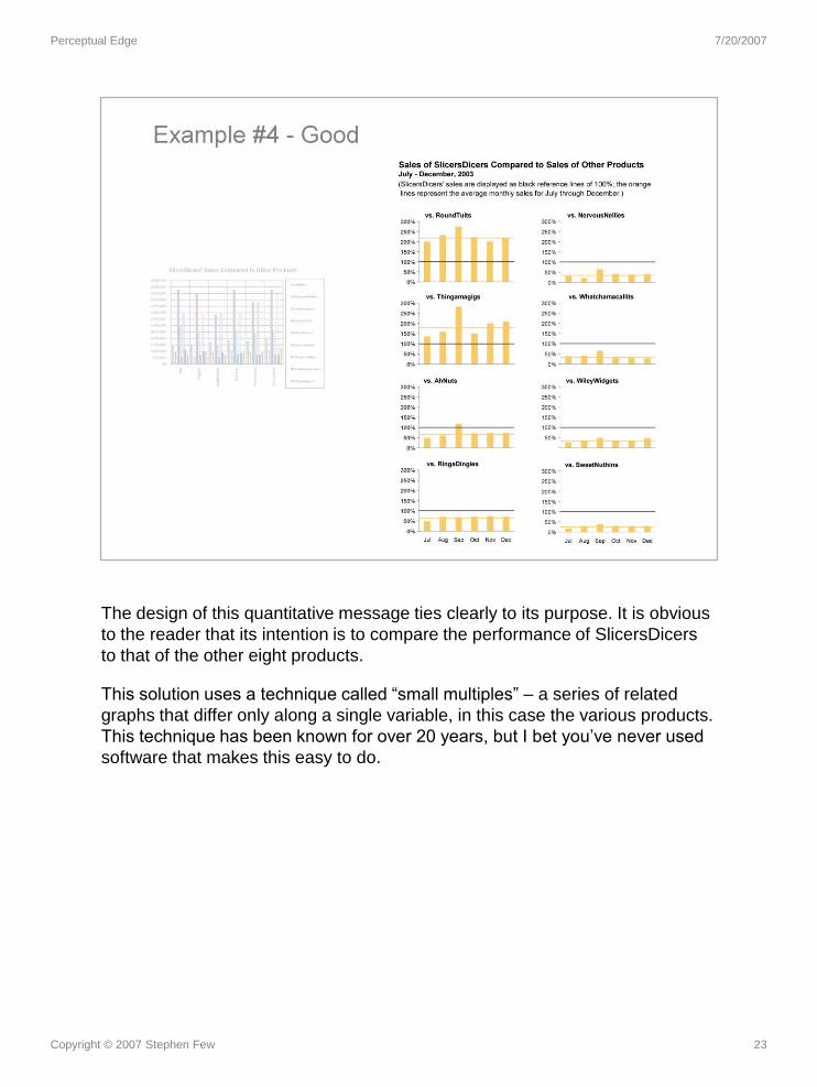
Copyright © 2007 Stephen Few 23
The design of this quantitative message ties clearly to its purpose. It is obvious
to the reader that its intention is to compare the performance of SlicersDicers
to that of the other eight products.
This solution uses a technique called “small multiples” – a series of related
graphs that differ only along a single variable, in this case the various products.
This technique has been known for over 20 years, but I bet you’ve never used
software that makes this easy to do.

Perceptual Edge 7/20/2007
Copyright © 2007 Stephen Few 24
They encourage poor design by:
• providing useless features and gizmos
• providing formatting defaults that undermine a clear display of the data
• producing documentation that demonstrates poor design
• marketing flash and dazzle, rather than good design
As an independent analyst and educator who focuses on uses of data
visualization for business, it is my role to be the voice of reason, constantly
asking the question: “But does it work?” No matter how cool it looks or how
much it dazzles the eyes, does it help you discover, make sense of, or
communicate what’s meaningful in the data? A great deal of what is being
marketed by software vendors and even what appeals to buyers simply doesn’t
work. This is especially true of the big software companies, with few
exceptions. The best data visualization products by and large are being offered
today by relatively small software companies that have close ties to the
academic research community.
Let’s take a quick tour of several graph examples from the user documentation
and Web sites of several software vendors to illustrate my point.

Perceptual Edge 7/20/2007
Copyright © 2007 Stephen Few 25
This graph gets extra points for the creative use of color – a bit too creative,
don’t you think? What do the different colors mean?
(Source: Website of Corda Technologies, Incorporated.)

Perceptual Edge 7/20/2007
Copyright © 2007 Stephen Few 26
I guess the round object in the background is a medal. Even if it looked more
like a medal, it would still do nothing but distract from the data itself. Can you
make sense of the quantitative scale along the vertical axis?
(Source: Website of SAS Institute Inc.)

Perceptual Edge 7/20/2007
Copyright © 2007 Stephen Few 27
Notice the effort that is involved in shifting your focus back and forth between
the pie chart and the legend to determine what each slice represents,
especially given the fact that the order of the items in the legend does not
match the order in the pie. Also notice how slices that are different in value
often appear to be the same size.
(Source: Website of Siebel Systems, which has since been acquired by Oracle
Corporation.)

Perceptual Edge 7/20/2007
Copyright © 2007 Stephen Few 28
Even turning a pie into a donut doesn’t make it any more palatable. A donut
chart is just a pie with a hole in it.
(Source: User documentation of Business Objects.)

Perceptual Edge 7/20/2007
Copyright © 2007 Stephen Few 29
When you design a graph that is almost unreadable, you can always add 3D
and hope your audience is too impressed to care. (You know I’m kidding –
right?)
(Source: Website of Brio Software, prior to its acquisition by Hyperion Solutions
Corporation, and Hyperion’s subsequent acquisition by Oracle Corporation.)

Perceptual Edge 7/20/2007
Copyright © 2007 Stephen Few 30
2-D lines are so much more interesting than the regular ones. Don’t you
agree? (By now, I’m sure my sarcasm is evident.)
(Source: User documentation of Business Objects.)

Perceptual Edge 7/20/2007
Copyright © 2007 Stephen Few 31
No matter how bright the bars, you can’t see them if they’re hidden behind
others. Can you determine fax revenue for Q3 or direct sales revenue for Q4?
This problem, when something is hidden behind something else, is called
occlusion.
(Source: Website of Cognos Incorporated.)

Perceptual Edge 7/20/2007
Copyright © 2007 Stephen Few 32
Most of the bars in this graph are so short, they’re barely visible, and
impossible to interpret. Notice that this graph contains four quarters worth of
data, but the sole label of “Q1” suggests otherwise. And what do you think of
the dark grid lines? They make this graph look a little like a prison cell from
which the numbers will never escape!
(Source: User documentation of Business Objects.)

Perceptual Edge 7/20/2007
Copyright © 2007 Stephen Few 33
Good thing the quarters are labeled so largely in the legend, otherwise I’d
never be able to make sense of this radar graph.
(Source: User documentation of Business Objects.)

Perceptual Edge 7/20/2007
Copyright © 2007 Stephen Few 34
Circles within and behind circles. Pretty! Pretty silly that is.
(Source: Website of Visual Mining, Inc.)

Perceptual Edge 7/20/2007
Copyright © 2007 Stephen Few 35
Pies in 3-D space. Awesome!
(Source: Website of Visualize, Inc.)

Perceptual Edge 7/20/2007
Copyright © 2004 Stephen Few 36
You might argue that the poor example set by the vendors doesn’t really
influence people in the real world. Unfortunately, that’s not the case. Take a
look at a few examples of data presentations that were submitted by graphing
specialists to a competition sponsored by DM Review magazine.

Perceptual Edge 7/20/2007
Copyright © 2004 Stephen Few 37
Every charting software vendor out there, with almost no exceptions, feature 3-
D graphs. They look so impressive, but do they work? Users fall prey to the
notion that 2-D displays are old-school, and that they must advance to displays
like the one shown above to be taken seriously. The problem with 3-D displays
of abstract business data, however, is that they are almost impossible to read.

Perceptual Edge 7/20/2007
Copyright © 2004 Stephen Few 38
Vendors introduce display methods that are absurd, that show a complete
ignorance of visual perception. Trends cannot be discerned by examining a
series of pie charts and quantitative values cannot be effectively encoded as
differing hues.

Perceptual Edge 7/20/2007
Copyright © 2004 Stephen Few 39
Based on the example set by the vendors, users attempt to dazzle their
audience with bright colors and pretty pictures, often resulting in displays like
this that completely obscure a relatively simple message. I challenge you to
make sense of this graph.

Perceptual Edge 7/20/2007
Copyright © 2004 Stephen Few 40
This example features software that uses a visual object called a glyph, which
is meant to simultaneously encode multiple variables about an entity. In this
case a set of nine small rectangles represents a company’s expenses for a
given month, and each of the individual small rectangles encodes the
expenses in dollars of a single department for a given month. Glyphs are
meant to do something quite different from this example. They are not meant
and are not able to effectively encode departmental expenses as they vary
through time. Why has this user applied this software so absurdly? Because
the vendor itself promotes such use.

Perceptual Edge 7/20/2007
Copyright © 2004 Stephen Few 41
Finally, we see a visual display that works. Departmental expenses are
encoded as simple line graphs, which beautifully present the overall trend and
individual ups and downs of the values through time. This arrangement of eight
graphs within eye span, one per department, sorted from the greatest to least
expenses, tells the data’s story clearly. Here’s a rare case where a vendor’s
expert design and thoughtful examples encouraged users to communicate
effectively.

Perceptual Edge 7/20/2007
Copyright © 2004 Stephen Few 42

Perceptual Edge 7/20/2007
Copyright © 2004 Stephen Few 43

Perceptual Edge 7/20/2007
Copyright © 2007 Stephen Few 44
This Edward R. Tufte quote is from his milestone work, The Visual Display of
Quantitative Information, published by Graphics Press in 1983.
In tables and graphs:
• The message is in the data.
• The medium of communication, especially for graphs, is visual.
• To communicate the data effectively, you must understand visual
perception – what works, what doesn’t, and why.

Perceptual Edge 7/20/2007
Copyright © 2004 Stephen Few 45
My friend Howard Spielman argues that there are three basic competencies
that are needed in business:
• Literacy: the ability to think and communicate in words, both spoken
and written
• Numeracy: the ability to think and communicate in numbers
• Graphicacy: the ability to think and communicate in images
I believe that businesses in America are failing in all three areas today,
especially in graphicacy, which involves a set of skills that very few people
have ever learned, but rely on every day.

Perceptual Edge 7/20/2007
Copyright © 2007 Stephen Few 46
Paul Grice was a 20th century philosopher whose work ventured into the
realm of linguistics. He is well known for his conversational maxims, which
attempt the describe the characteristics of polite conversation.
Every one of these maxims of conversation apply equally well to the
communication of quantitative information in the workplace. We’ll strive in
this workshop to translate these maxims into effective and polite
communication via tables and graphs.

Perceptual Edge 7/20/2007
Copyright © 2007 Stephen Few 47

Perceptual Edge 7/20/2007
Copyright © 2007 Stephen Few 48

Perceptual Edge 7/20/2007
Copyright © 2007 Stephen Few 49

Perceptual Edge 7/20/2007
Copyright © 2007 Stephen Few 50

Perceptual Edge 7/20/2007
Copyright © 2007 Stephen Few 51
1. You begin by determining the best medium for your data and the
message you wish to emphasize. Does it require a table or a graph?
Which kind of table or graph?
2. Once you’ve decided, you must then design the individual
components of that display to present the data and your message as
clearly and efficiently as possible.
The solutions to both of these challenges are rooted in an understanding of
visual perception.

Perceptual Edge 7/20/2007
Copyright © 2007 Stephen Few 52
If you were the person responsible for creating a means to display the
relative merits of candidates for employment, you would have to choose the
best visual means to communicate this information. You shouldn’t just
choose any old method, and especially not a particular one because it looks
the snazziest. A graph isn’t always the best way to get your message across.
In this case a simple table would do the job better.
(Source: the radar graph on the left was found on the Website of Visual
Mining, Inc.)

Perceptual Edge 7/20/2007
Copyright © Stephen Few 2007 53
The presentation of data as text, such as you see in this table, is perfect when you need
precise values or when the purpose is to look up or compare individual values, but not when
you wish to see patterns, trends, and exceptions, or to make comparisons. When this is your
goal, visualizations work best.
When data is presented visually, it is given shape, and from its shape we can easily glean
insights that would take a long time to piece together from the same data presented
textually, if ever. This graph of the same data that appears in the table makes brings to light
several of the stories contained in the data that weren’t obvious before, and it did so
instantly.
When] we visualize the data effectively and suddenly, there is what Joseph Berkson
called ‘interocular traumatic impact’: a conclusion that hits us between the eyes.
(Visualizing Data, William S. Cleveland, Hobart Press, 1993, page 12 )
Modern data graphics can do much more than simply substitute for small statistical
tables. At their best, graphics are instruments for reasoning about quantitative
information. Often the most effective way to describe, explore, and summarize a set of
numbers – even a very large set – is to look at pictures of those numbers. Furthermore,
of all methods for analyzing and communicating statistical information, well-designed
data graphics are usually the simplest and at the same time the most powerful.
(The Visual Display of Quantitative Information, Edward R. Tufte, Graphics Press:
Cheshire, CT 1983, Introduction)

Perceptual Edge 7/20/2007
Copyright © Stephen Few 2007 54
Human perception is amazing. I cherish all five of the senses that connect us to the world, that allow us to experience beauty and an inexhaustible and diverse wealth of sensation. But of all the senses, one stands out dramatically as our primary and most powerful channel of input from the world around us, and that is vision. Approximately 70% of the body’s sense receptors reside in the eye.
Perhaps the world’s top expert in visual perception and how its power can be harnessed for the effective display of information is Colin Ware, who has convincingly described the importance of data visualization. He asks:
Why should we be interested in visualization? Because the human visual system is a pattern seeker of enormous power and subtlety. The eye and the visual cortex of the brain form a massively parallel processor that provides the highest-bandwidth channel into human cognitive centers. At higher levels of processing, perception and cognition are closely interrelated, which is the reason why the words ‘understanding’ and ‘seeing’ are synonymous. However, the visual system has its own rules. We can easily see patterns presented in certain ways, but if they are presented in other ways, they become invisible…The more general point is that when data is presented in certain ways, the patterns can be readily perceived. If we can understand how perception works, our knowledge can be translated into rules for displaying information. Following perception-based rules, we can present our data in such a way that the important and informative patterns stand out. If we disobey the rules, our data will be incomprehensible or misleading.
(Information Visualization, Second Edition, Colin Ware, Morgan Kaufmann Publishers, 2004, page xxi)
Perhaps the best known expert in data visualization, Edward Tufte, says: “Clear and precise seeing becomes as one with clear and precise thinking.” (Visual Explanations, Edward R. Tufte, Graphics Press: Cheshire, CT.1997 page 53)

Perceptual Edge 7/20/2007
Copyright © 2007 Stephen Few 55
The fact that job satisfaction for employees without a college degree decreases
significantly in their later years doesn’t jump out at you when you examine the
table, but it is immediately obvious when you examine the graph.

Perceptual Edge 7/20/2007
Copyright © 2007 Stephen Few 56
The type of graph that is selected and the way it’s designed also have great
impact on the message that is communicated. By simply switching from a line
graph to a bar graph, the decrease in job satisfaction among those without
college degrees in their later years is no longer as obvious.

Perceptual Edge 7/20/2007
Copyright © 2007 Stephen Few 57
Each of these graphs illustrates a different type of quantitative relationship.
Just as in life in general, the interesting and important content of a graph
always involves relationships.

Perceptual Edge 7/20/2007
Copyright © 2007 Stephen Few 58
A time-series graph has a categorical scale that represents time, subdivided
into a particular unit of time, such as years, quarters, months, days, or even
hours. These graphs provide a powerful means to see patterns in the values
as they march through time.

Perceptual Edge 7/20/2007
Copyright © 2007 Stephen Few 59
Ranking graphs show the sequence of a series of categorical subdivisions,
based on the measures associated with them.

Perceptual Edge 7/20/2007
Copyright © 2007 Stephen Few 60
A part-to-whole graph shows how the measures associated with the
individual categorical subdivisions of a full set relate to the whole and to one
another.

Perceptual Edge 7/20/2007
Copyright © 2007 Stephen Few 61
A deviation graph shows how one or more sets of values differ from a
reference set of values.

Perceptual Edge 7/20/2007
Copyright © 2007 Stephen Few 62
This type of distribution graph, called a frequency distribution, shows the
number of times something occurs across consecutive intervals of a larger
quantitative range. In a frequency distribution, a quantitative scale (in this
case the range of dollar values of orders) is converted to a categorical scale
by subdividing the range and giving each of the subdivisions a categorical
label (“< $10”, and so on).

Perceptual Edge 7/20/2007
Copyright © 2007 Stephen Few 63
A correlation graph shows whether two paired sets of measures vary in
relation to one another, and if so, in which direction (positive or negative)
and to what degree (strong or weak). If the trend line moves upwards, the
correlation is positive; if it moves downwards, it is negative. A positive
correlation indicates that as the values in one data set increase, so do the
values in the other data set. A negative correlation indicates that as the
values in one data set increase, the values in the other data set decrease. In
a scatter plot like this, the more tightly the data points are grouped around
the trend line, the stronger the correlation.

Perceptual Edge 7/20/2007
Copyright © 2007 Stephen Few 64
The term nominal means “in name only.” When items relate to one another
nominally, they have no particular order. Whenever you find yourself creating
a graph with only a nominal relationship, ask yourself if you could improve it
by showing another relationship as well, such as a ranking or a part-to-
whole.
Perceptual Edge 7/20/2007
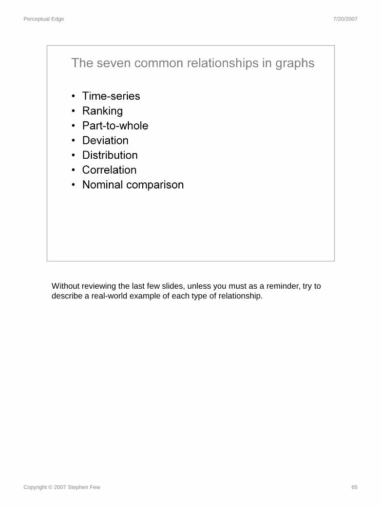
Copyright © 2007 Stephen Few 65
Without reviewing the last few slides, unless you must as a reminder, try to
describe a real-world example of each type of relationship.

Perceptual Edge 7/20/2007
Copyright © Stephen Few 2007 66
Despite the fact that software that is used for visual data analysis usually includes a broad
assortment of graph types, only a few work well for the analysis of typical quantitative
business data. All the useful graphs are of the 2-D xy type and use either the 2-D position of
a data object (data points, data points along a line, and the endpoints of bars) or line length
(length of bars) in relation to the quantitative access to encode quantitative values.

Perceptual Edge 7/20/2007
Copyright © 2007 Stephen Few 67
Our visual perception of 2-D area is poor. It is difficult for us to accurately
compare the sizes of 2-D areas.

Perceptual Edge 7/20/2007
Copyright © 2007 Stephen Few 68
Pie charts use 2-D areas and the angles formed by slices to encode
quantitative values. Unfortunately, our perception of 2-D areas and angles as
measures of quantity is poor.
Since all graphs have one or more axes with scales, there must be one on a
pie chart, but where is it? The circumference of the circle is where its
quantitative scale would appear, but it is rarely shown.
Try using either one of the pie graphs to put the slices in order by size. Can’t
do it, can you? Now see how easy this is to do when the same data is encoded
in a bar graph.
Coda Hale once expressed his opinion of pie charts quite colorfully:
Pie charts are the information visualization equivalent of a roofing
hammer to the frontal lobe…[Piecharts] have no place in the world of
grownups, and occupy the same semiotic space as short pants, a runny
nose, and chocolate smeared on one’s face. They are as professional
as a pair of assless chaps. Anyone who suggests their use should be
instinctively slapped.

Perceptual Edge 7/20/2007
Copyright © 2007 Stephen Few 69
A 3rd dimension without a corresponding variable is meaningless.

Perceptual Edge 7/20/2007
Copyright © 2007 Stephen Few 70
Can you determine which of the lines in the graph on the right represents the
East region? Are you sure?
A 3rd dimension with a corresponding variable is too hard to read.

Perceptual Edge 7/20/2007
Copyright © 2004 Stephen Few 71
Perceptual Edge 7/20/2007
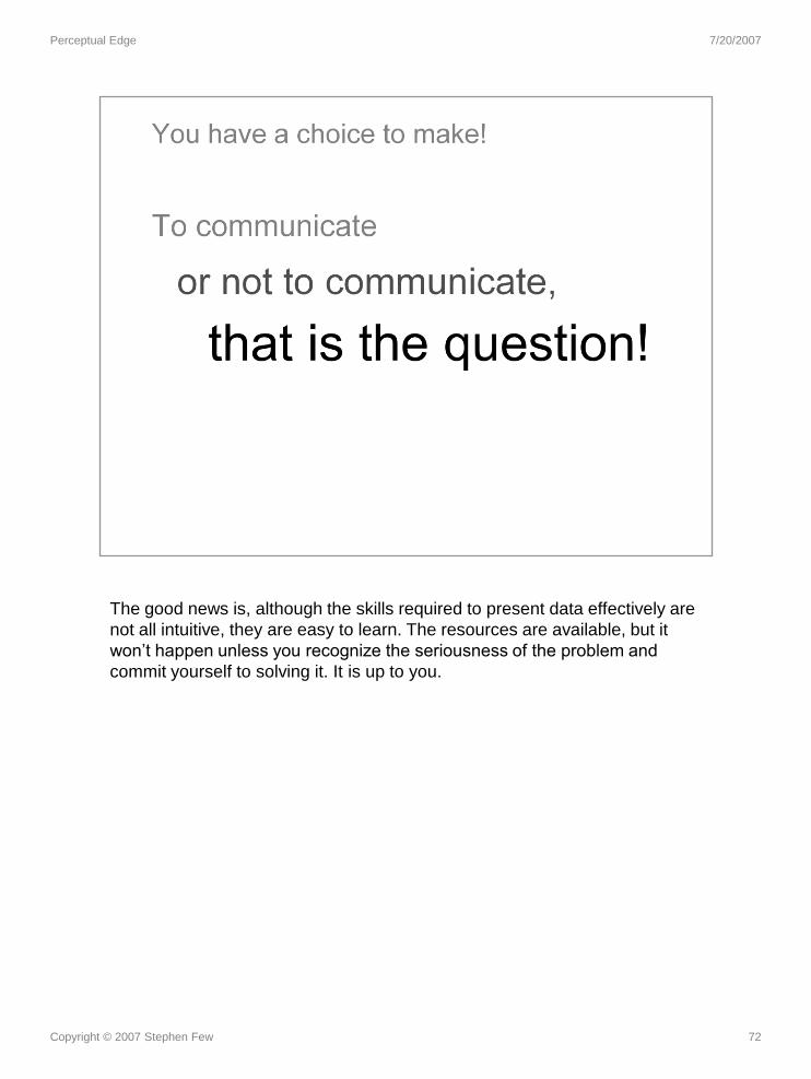
Copyright © 2007 Stephen Few 72
The good news is, although the skills required to present data effectively are
not all intuitive, they are easy to learn. The resources are available, but it
won’t happen unless you recognize the seriousness of the problem and
commit yourself to solving it. It is up to you.