Embed Size (px)
Citation preview
©Cynthia Krebs, ISYS 3270©Cynthia Krebs, ISYS 3270
Understanding
Charts and
Graphs
Understanding
Charts and
Graphs
“Empowered as the new gods of cyberspace, we have been granted the ability to devour megabytes of data at a single gulp, digest it in mere microseconds and spew it forth without further thought as visually stunning color imagery. Gerald E. Jones, How to Lie with Charts
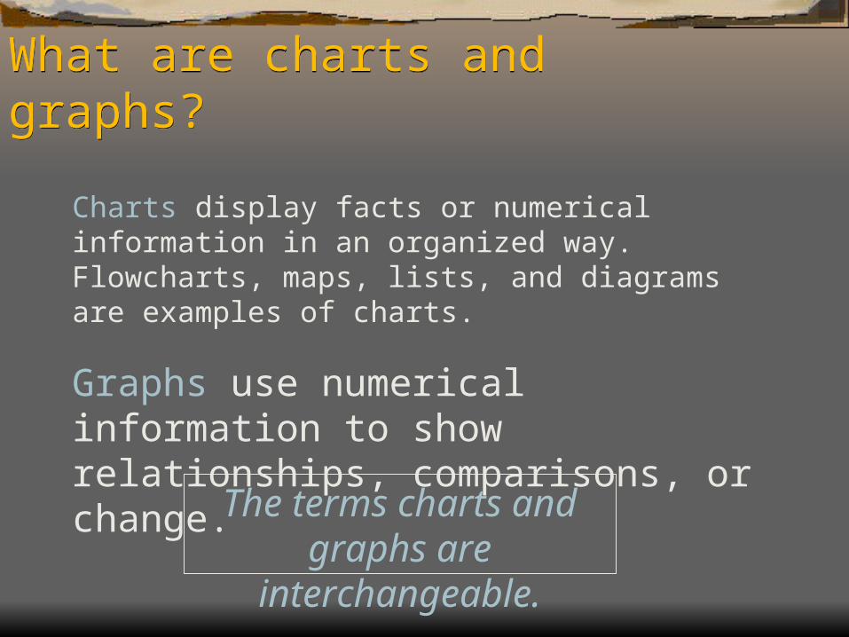
Charts display facts or numerical information in an organized way. Flowcharts, maps, lists, and diagrams are examples of charts.
Graphs use numerical information to show relationships, comparisons, or change.
The terms charts and graphs are interchangeable.
What are charts and graphs?What are charts and graphs?
Benefits of Charts and GraphsBenefits of Charts and Graphs
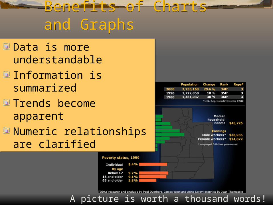
Data is more understandableInformation is summarized Trends become apparentNumeric relationships are clarified
Data is more understandableInformation is summarized Trends become apparentNumeric relationships are clarified
A picture is worth a thousand words!
Creating a Chart Involves:Creating a Chart Involves:
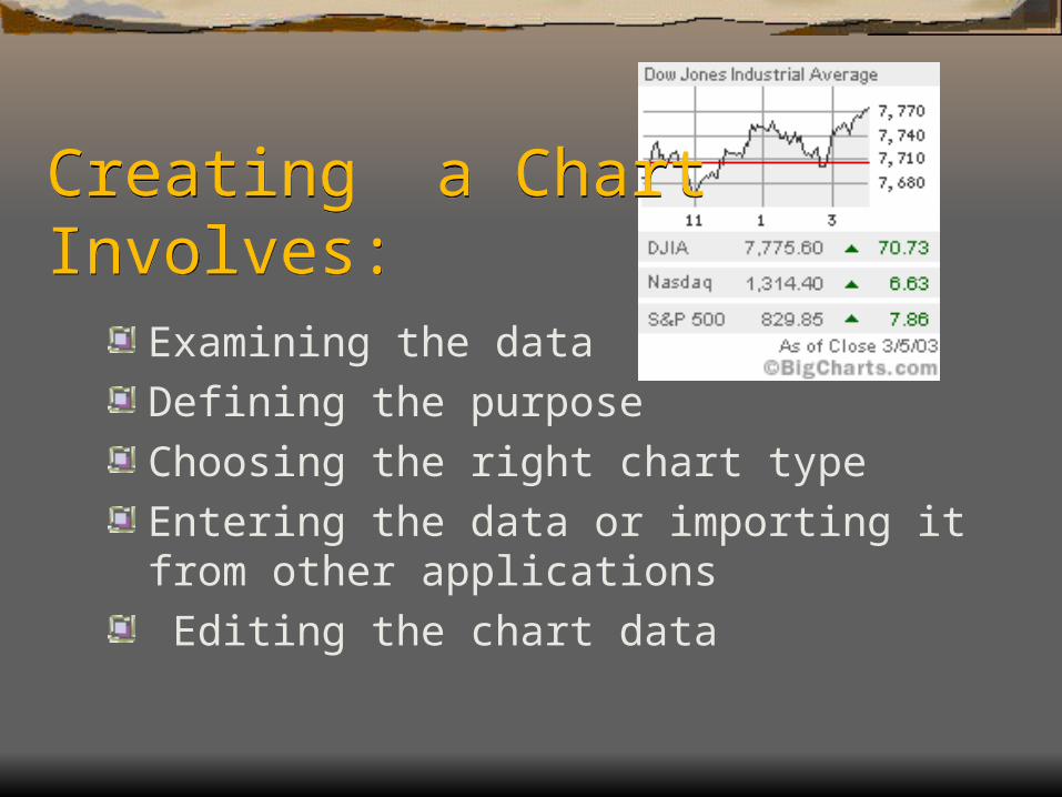
Examining the dataDefining the purposeChoosing the right chart typeEntering the data or importing it from other applications Editing the chart data
Examining the DataExamining the Data
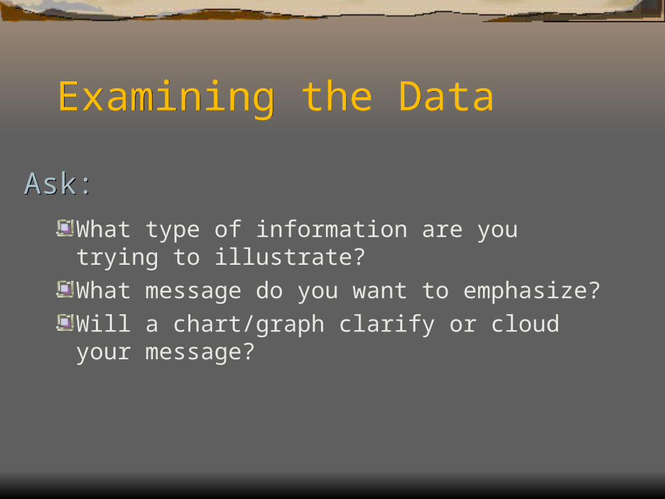
What type of information are you trying to illustrate?What message do you want to emphasize?Will a chart/graph clarify or cloud your message?
Ask:Ask:
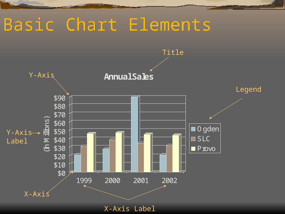
Basic Chart ElementsBasic Chart Elements
$0$10$20$30$40$50$60$70$80$90
(In
Mill
ions
)
1999 2000 2001 2002
Annual Sales
OgdenSLCProvo
Title
X-Axis Label
X-Axis
Y-Axis
Y-AxisLabel
Legend
20
31
46
27
3947
90
35
45
20
32
44
$0
$20
$40
$60
$80
$100
(In
Mill
ions
)
1999 2000 2001 2002
Annual Sales
Ogden
SLC
Provo
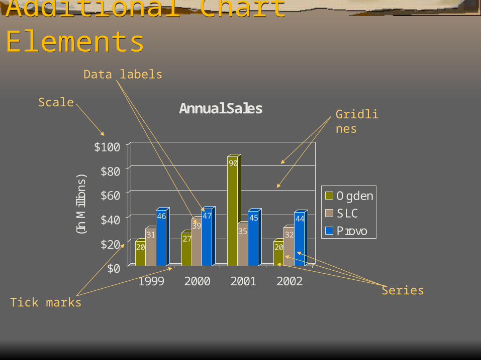
Additional Chart ElementsAdditional Chart Elements
Scale
Tick marks
Gridlines
Data labels
Series
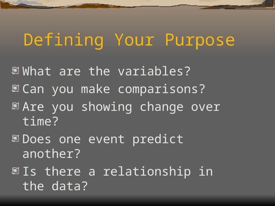
Defining Your PurposeDefining Your Purpose
What are the variables?Can you make comparisons?Are you showing change over time?Does one event predict another?Is there a relationship in the data?
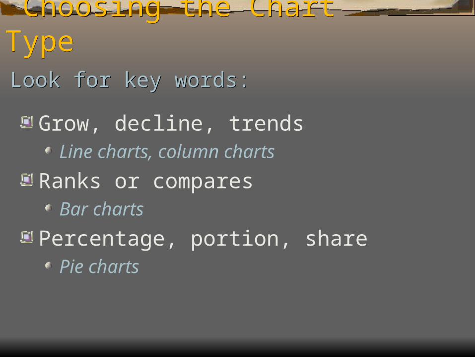
Choosing the Chart Type Choosing the Chart Type
Grow, decline, trendsLine charts, column charts
Ranks or comparesBar charts
Percentage, portion, sharePie charts
Look for key words:Look for key words:
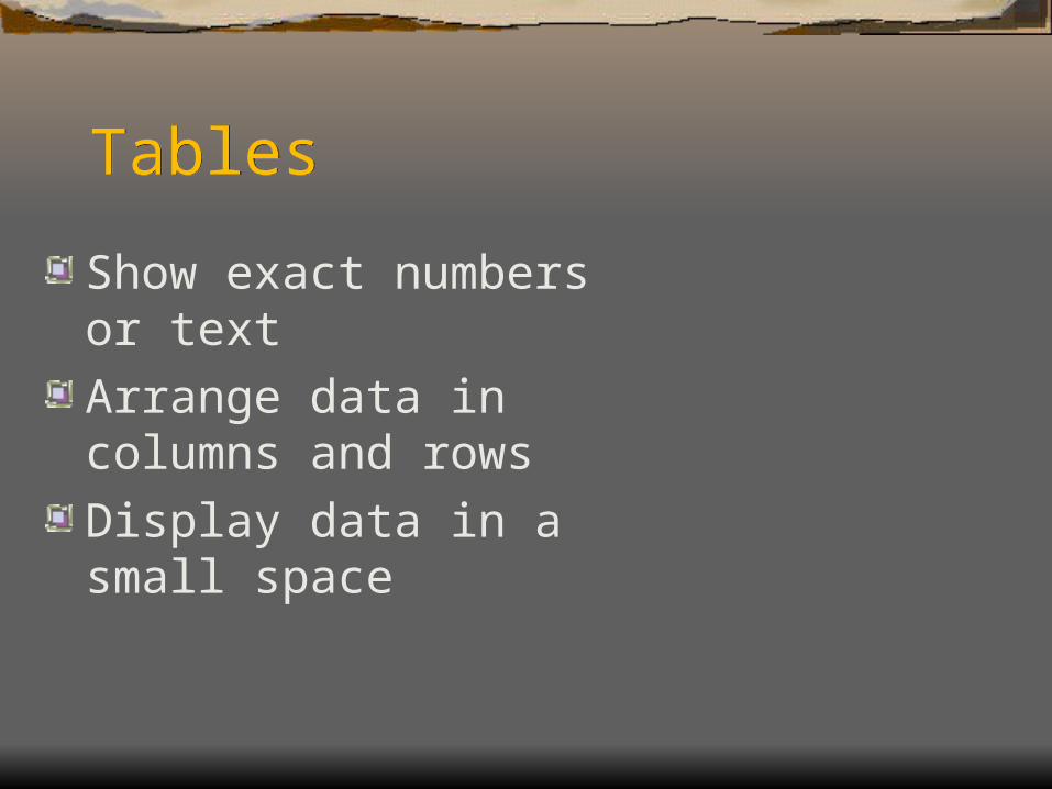
TablesTables
Show exact numbers or textArrange data in columns and rowsDisplay data in a small space
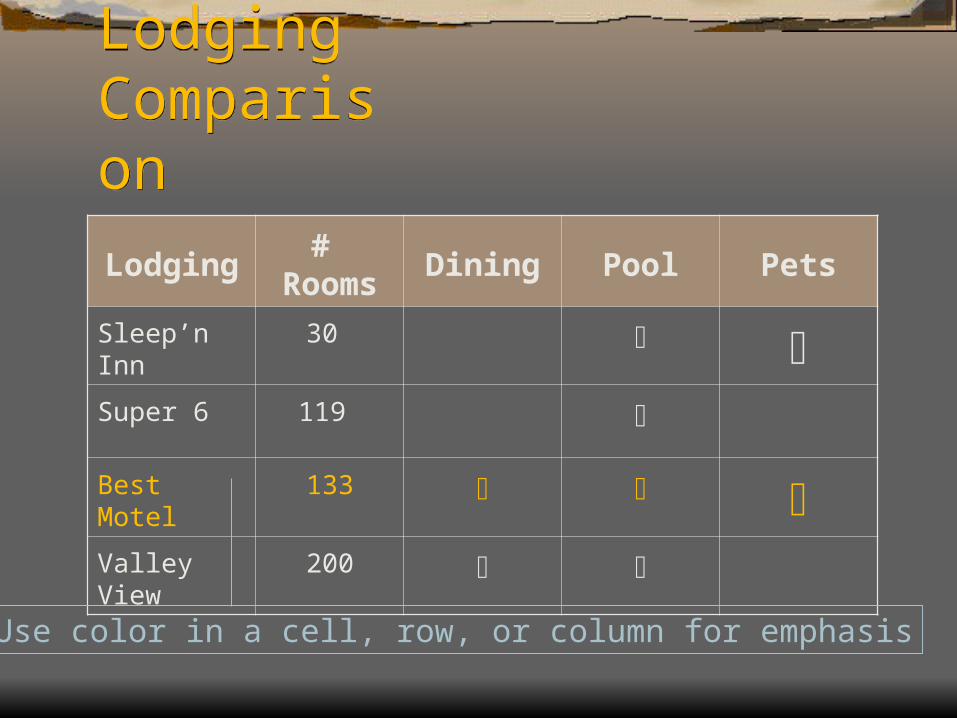
LodgingComparison
LodgingComparison
Lodging # Rooms Dining Pool Pets
Sleep’n Inn 30 Super 6 119
Best Motel 133 Valley View 200
Use color in a cell, row, or column for emphasis
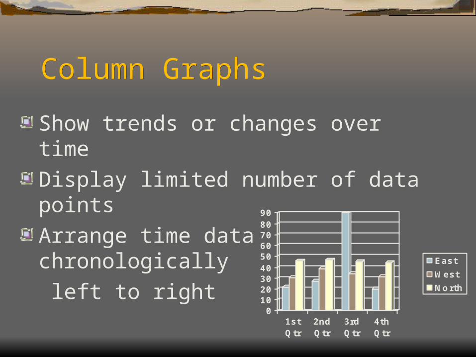
Column GraphsColumn Graphs
Show trends or changes over timeDisplay limited number of data points Arrange time data chronologically left to right
0102030405060708090
1stQtr
2ndQtr
3rdQtr
4thQtr
East
West
North
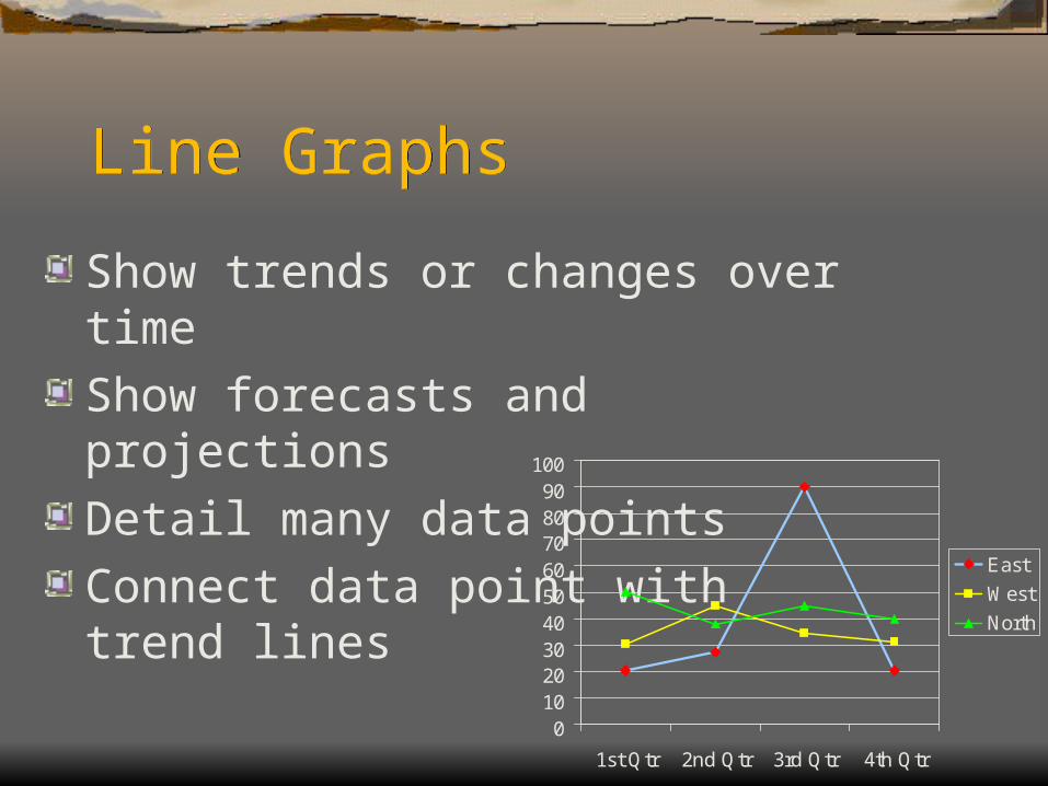
Line GraphsLine Graphs
Show trends or changes over timeShow forecasts and projectionsDetail many data pointsConnect data point with trend lines
0102030405060708090
100
1st Qtr 2nd Qtr 3rd Qtr 4th Qtr
East
West
North
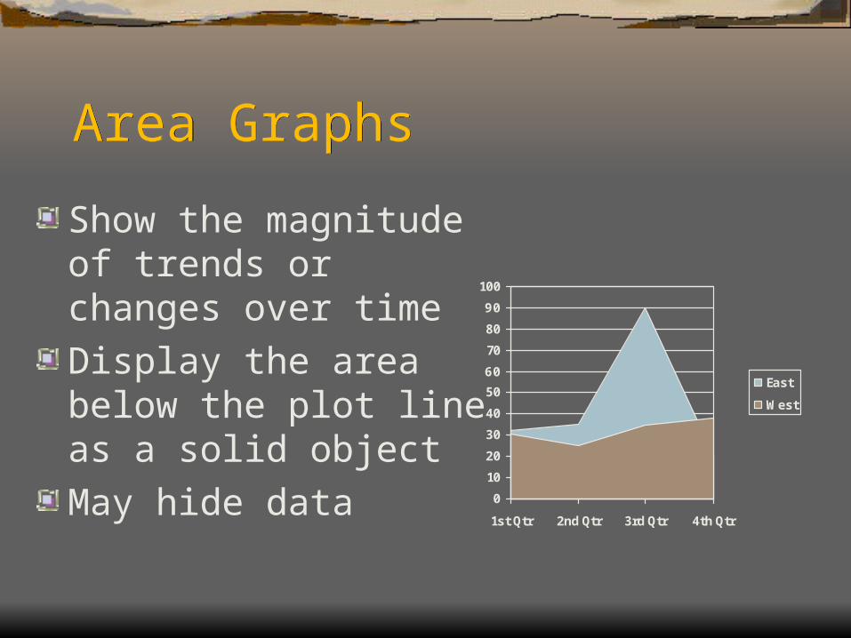
Area GraphsArea Graphs
Show the magnitude of trends or changes over timeDisplay the area below the plot line as a solid objectMay hide data
0
10
20
30
40
50
60
70
80
90
100
1st Qtr 2nd Qtr 3rd Qtr 4th Qtr
East
West
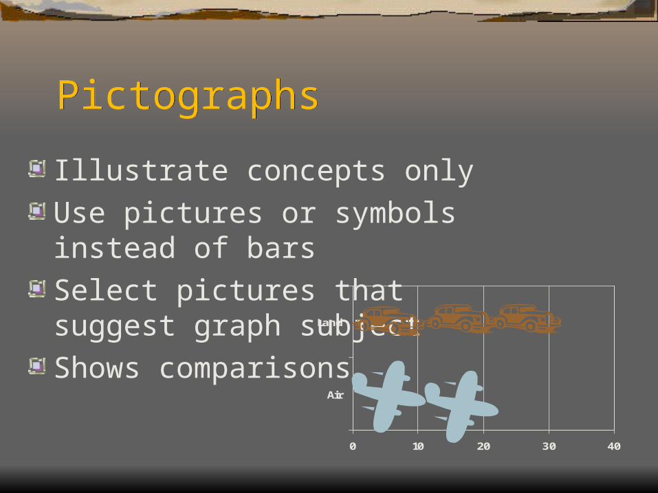
PictographsPictographs
Illustrate concepts onlyUse pictures or symbols instead of barsSelect pictures that suggest graph subjectShows comparisons
0 10 20 30 40
Air
Land
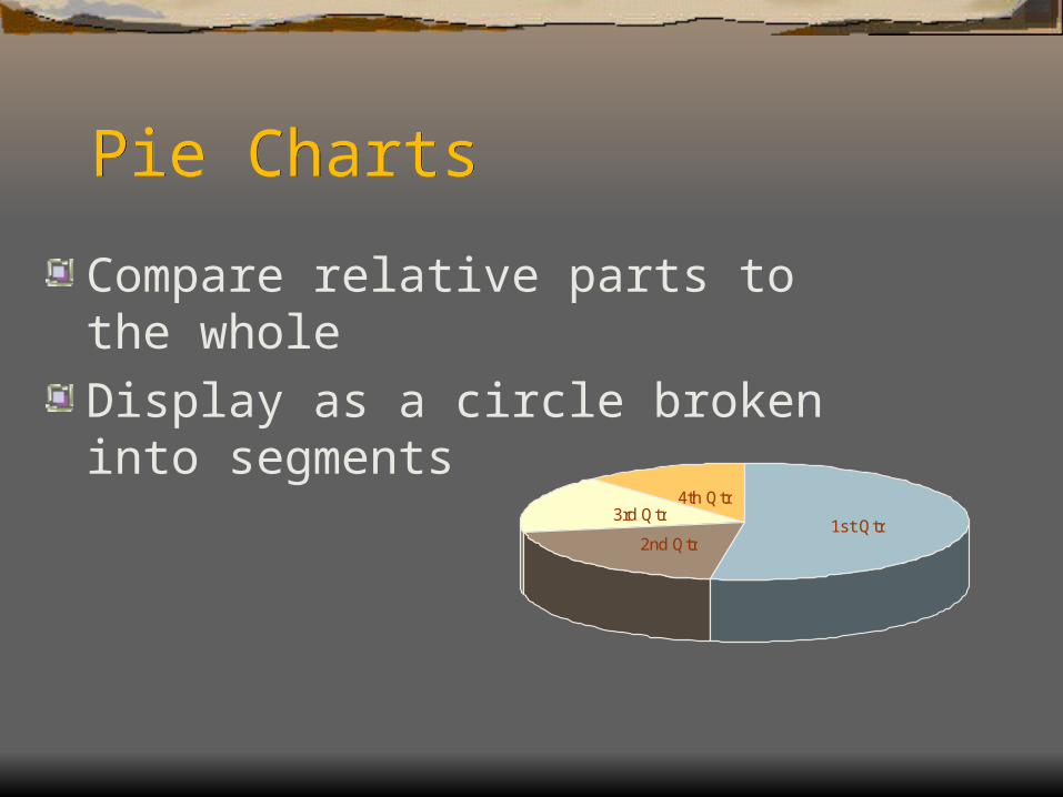
Pie ChartsPie Charts
Compare relative parts to the wholeDisplay as a circle broken into segments
1st Qtr2nd Qtr
3rd Qtr4th Qtr
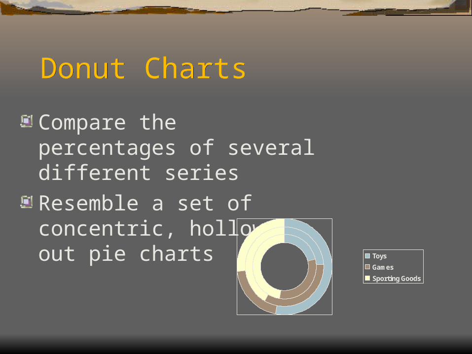
Donut ChartsDonut Charts
Compare the percentages of several different seriesResemble a set of concentric, hollowed-out pie charts
Toys
Games
Sporting Goods
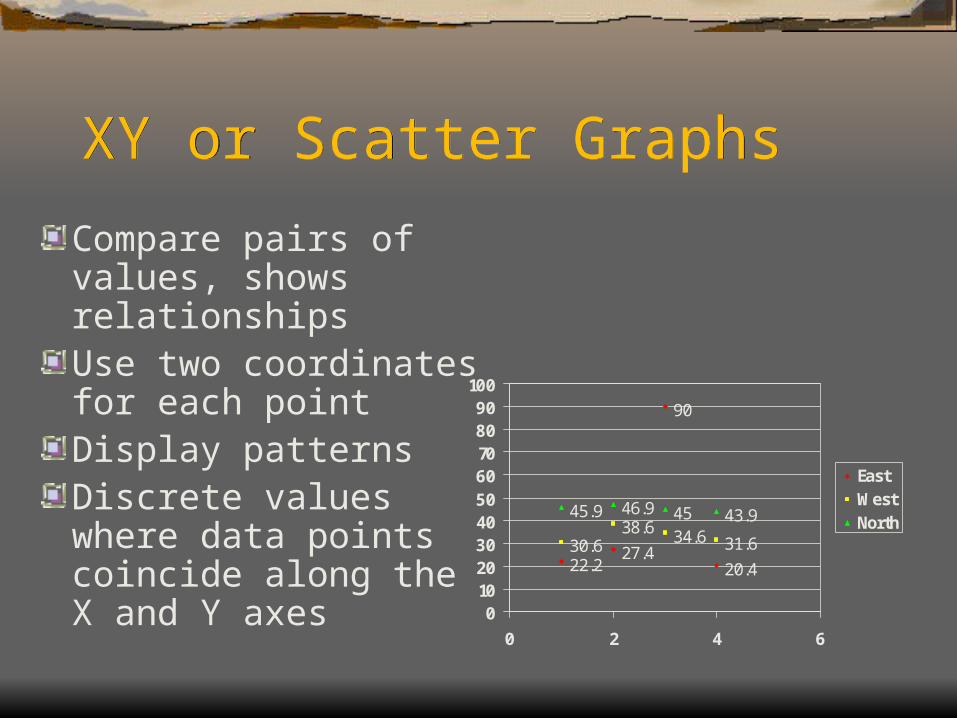
XY or Scatter GraphsXY or Scatter Graphs
Compare pairs of values, shows relationshipsUse two coordinates for each pointDisplay patternsDiscrete values where data points coincide along the X and Y axes
22.227.4
90
20.430.6
38.6 34.6 31.6
45.9 46.9 45 43.9
0102030405060708090
100
0 2 4 6
EastWestNorth
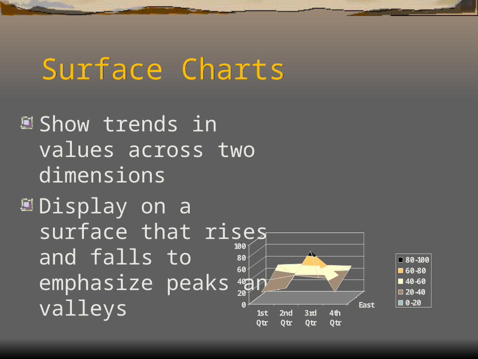
Surface ChartsSurface Charts
Show trends in values across two dimensionsDisplay on a surface that rises and falls to emphasize peaks and valleys
0
20
40
60
80
100
1stQtr
2ndQtr
3rdQtr
4thQtr
East
80-10060-8040-6020-400-20
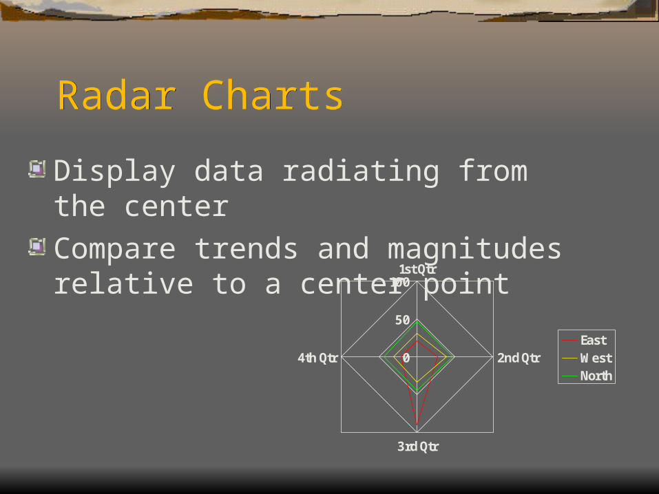
Radar ChartsRadar Charts
Display data radiating from the center Compare trends and magnitudes relative to a center point
0
50
1001st Qtr
2nd Qtr
3rd Qtr
4th QtrEastWestNorth
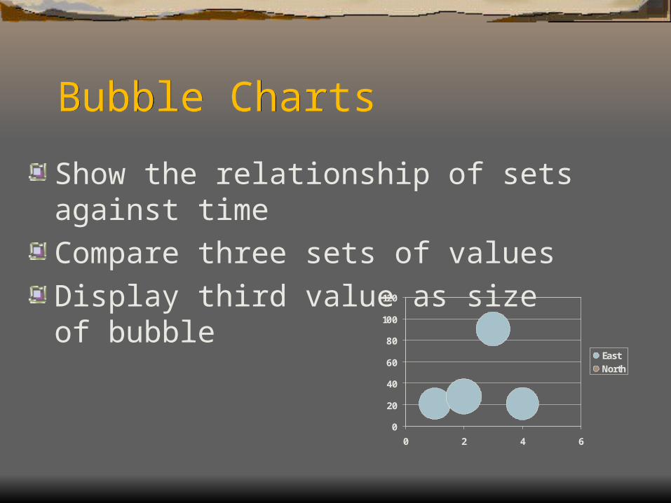
Bubble ChartsBubble Charts
Show the relationship of sets against timeCompare three sets of valuesDisplay third value as size of bubble
0
20
40
60
80
100
120
0 2 4 6
EastNorth
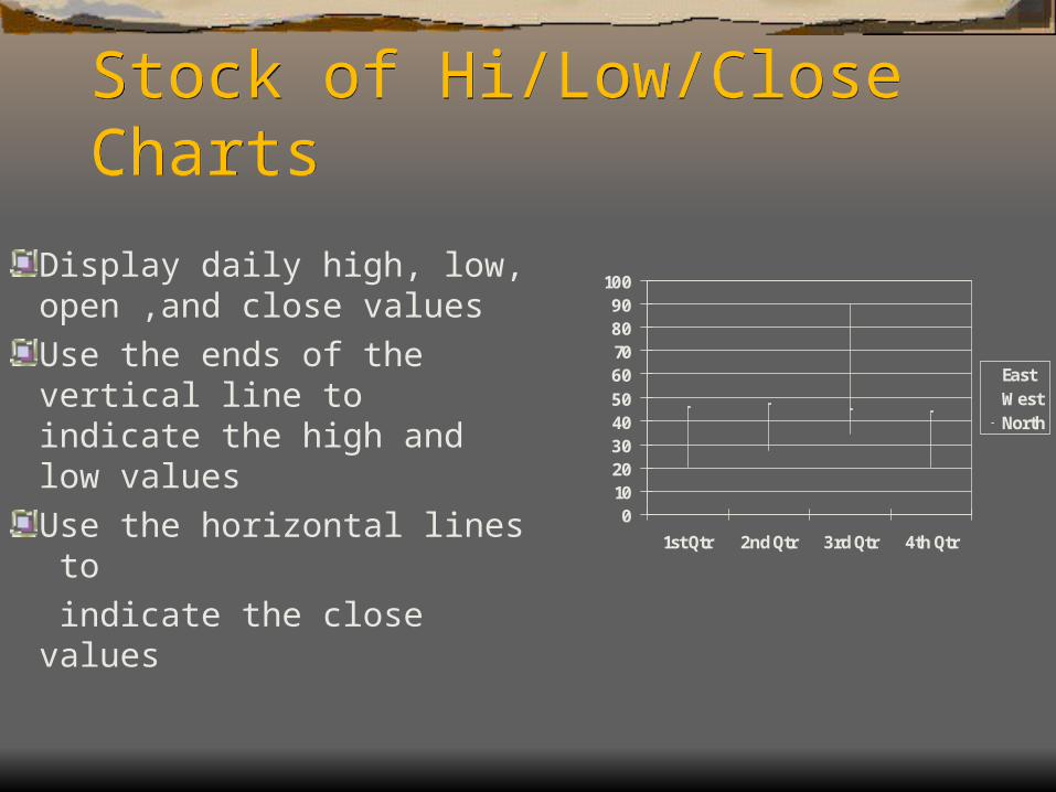
Stock of Hi/Low/Close ChartsStock of Hi/Low/Close Charts
Display daily high, low, open ,and close valuesUse the ends of the vertical line to indicate the high and low valuesUse the horizontal lines to indicate the close values
0102030405060708090
100
1st Qtr 2nd Qtr 3rd Qtr 4th Qtr
EastWestNorth
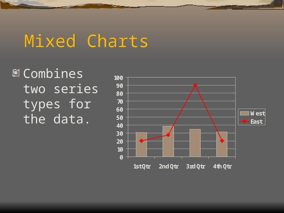
Mixed ChartsMixed Charts
Combines two series types for the data.
0102030405060708090
100
1st Qtr 2nd Qtr 3rd Qtr 4th Qtr
WestEast
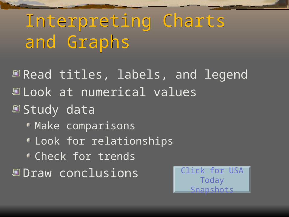
Interpreting Charts and GraphsInterpreting Charts and Graphs
Read titles, labels, and legendLook at numerical valuesStudy data
Make comparisonsLook for relationshipsCheck for trends
Draw conclusions Click for USA Today Snapshots
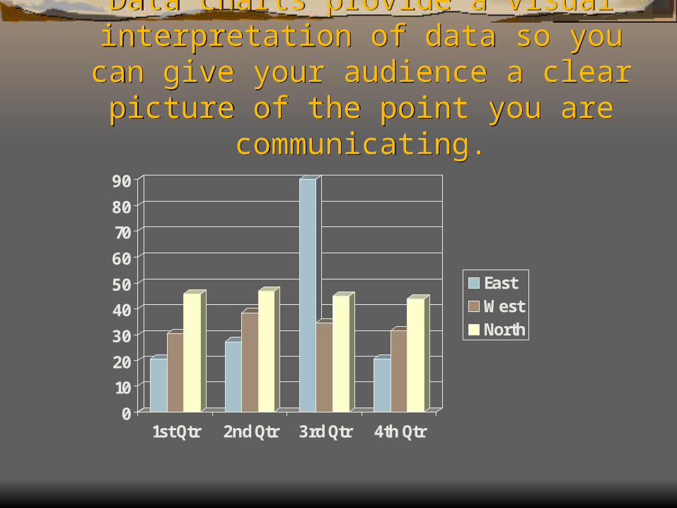
Data charts provide a visual interpretation of data so you can
give your audience a clear picture of the point you are communicating.
Data charts provide a visual interpretation of data so you can
give your audience a clear picture of the point you are communicating.
0
10
20
30
40
50
60
70
80
90
1st Qtr 2nd Qtr 3rd Qtr 4th Qtr
EastWestNorth