Embed Size (px)
Citation preview
1
Paper 236-2010
Customize Your SAS® Enterprise Guide® Graphs for a More Professional Look
Martha S. Hays, SAS Institute Inc., Cary, NC
ABSTRACT
Go beyond the basics and create customized graphs for your business reports and presentations. Producing better graphs is only a couple of clicks away. This paper explores some tips and techniques that use the detailed capabilities in SAS Enterprise Guide to customize your graphs. With the ability to adjust the axes, labels, colors, and other details, the resulting graphs depict your organization’s choices and business standards for a more effective report. Once created, a task template can be saved to simplify using these personalized options in other graph tasks.
INTRODUCTION
The capabilities that are introduced here assume a basic knowledge of SAS Enterprise Guide or the completion of the introductory course, SAS Enterprise Guide 1: Query and Reporting. We explore several variations of charts and plots, and many customization techniques for axes, labels, and colors for both charts and plots. For each type of graph, we present a recommended format but show variations to exploit the detail capabilities of the tasks. Although this paper was written using SAS 9.2 and SAS Enterprise Guide 4.2, many of the task choices for graph customizations are the same as in earlier versions of the software. A new function of creating a task template for a graph task is explained. Once stored, these task templates are used like any other task to create a new graph from the same or similar data.
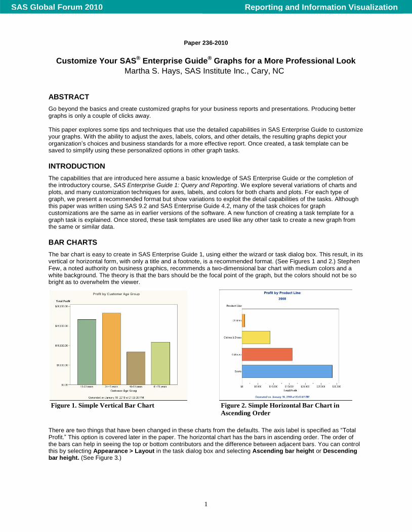
BAR CHARTS
The bar chart is easy to create in SAS Enterprise Guide 1, using either the wizard or task dialog box. This result, in its vertical or horizontal form, with only a title and a footnote, is a recommended format. (See Figures 1 and 2.) Stephen Few, a noted authority on business graphics, recommends a two-dimensional bar chart with medium colors and a white background. The theory is that the bars should be the focal point of the graph, but the colors should not be so bright as to overwhelm the viewer.
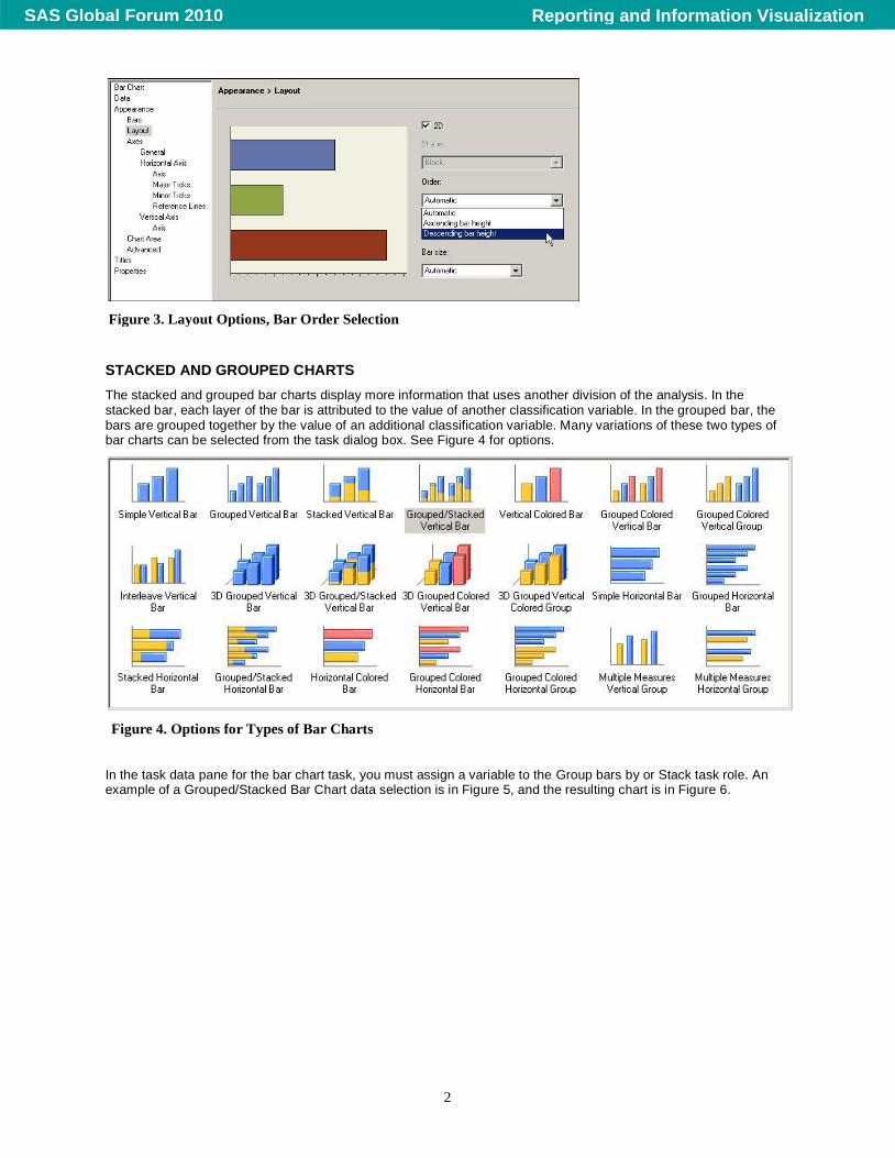
There are two things that have been changed in these charts from the defaults. The axis label is specified as “Total Profit.” This option is covered later in the paper. The horizontal chart has the bars in ascending order. The order of the bars can help in seeing the top or bottom contributors and the difference between adjacent bars. You can control this by selecting Appearance > Layout in the task dialog box and selecting Ascending bar height or Descending bar height. (See Figure 3.)
Figure 1. Simple Vertical Bar Chart Figure 2. Simple Horizontal Bar Chart in
Ascending Order
Reporting and Information VisualizationSAS Global Forum 2010
2
STACKED AND GROUPED CHARTS
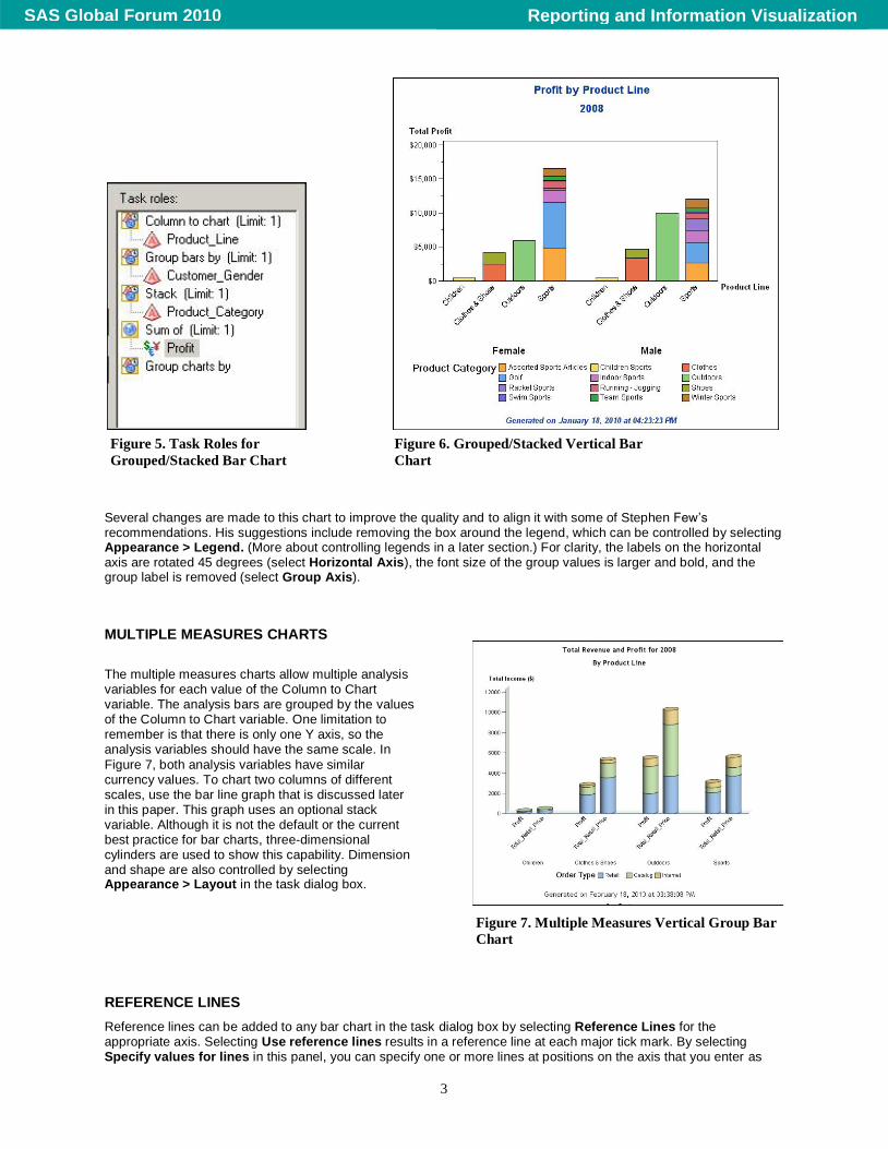
The stacked and grouped bar charts display more information that uses another division of the analysis. In the stacked bar, each layer of the bar is attributed to the value of another classification variable. In the grouped bar, the bars are grouped together by the value of an additional classification variable. Many variations of these two types of bar charts can be selected from the task dialog box. See Figure 4 for options.
In the task data pane for the bar chart task, you must assign a variable to the Group bars by or Stack task role. An example of a Grouped/Stacked Bar Chart data selection is in Figure 5, and the resulting chart is in Figure 6.
Figure 4. Options for Types of Bar Charts
Figure 3. Layout Options, Bar Order Selection
Reporting and Information VisualizationSAS Global Forum 2010
3
Several changes are made to this chart to improve the quality and to align it with some of Stephen Few’s recommendations. His suggestions include removing the box around the legend, which can be controlled by selecting Appearance > Legend. (More about controlling legends in a later section.) For clarity, the labels on the horizontal axis are rotated 45 degrees (select Horizontal Axis), the font size of the group values is larger and bold, and the group label is removed (select Group Axis).
MULTIPLE MEASURES CHARTS
The multiple measures charts allow multiple analysis variables for each value of the Column to Chart variable. The analysis bars are grouped by the values of the Column to Chart variable. One limitation to remember is that there is only one Y axis, so the analysis variables should have the same scale. In
Figure 7, both analysis variables have similar currency values. To chart two columns of different scales, use the bar line graph that is discussed later in this paper. This graph uses an optional stack variable. Although it is not the default or the current best practice for bar charts, three-dimensional cylinders are used to show this capability. Dimension and shape are also controlled by selecting Appearance > Layout in the task dialog box.
REFERENCE LINES
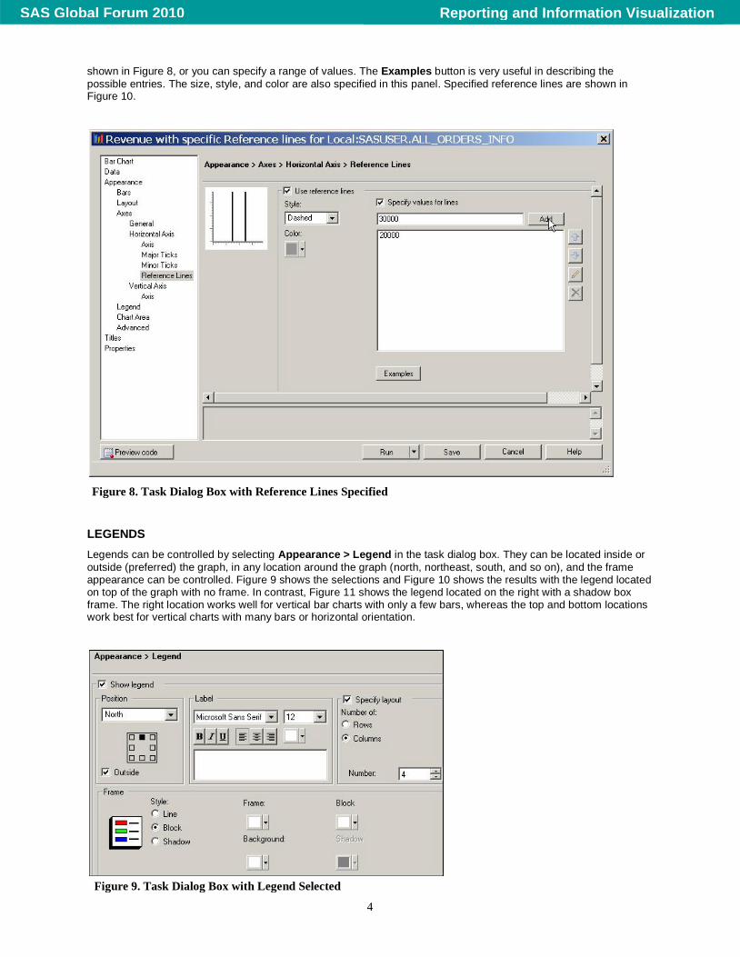
Reference lines can be added to any bar chart in the task dialog box by selecting Reference Lines for the appropriate axis. Selecting Use reference lines results in a reference line at each major tick mark. By selecting Specify values for lines in this panel, you can specify one or more lines at positions on the axis that you enter as
Figure 5. Task Roles for
Grouped/Stacked Bar Chart
Figure 6. Grouped/Stacked Vertical Bar
Chart
Figure 7. Multiple Measures Vertical Group Bar
Chart
Reporting and Information VisualizationSAS Global Forum 2010
4
shown in Figure 8, or you can specify a range of values. The Examples button is very useful in describing the
possible entries. The size, style, and color are also specified in this panel. Specified reference lines are shown in Figure 10.
LEGENDS
Legends can be controlled by selecting Appearance > Legend in the task dialog box. They can be located inside or
outside (preferred) the graph, in any location around the graph (north, northeast, south, and so on), and the frame appearance can be controlled. Figure 9 shows the selections and Figure 10 shows the results with the legend located on top of the graph with no frame. In contrast, Figure 11 shows the legend located on the right with a shadow box frame. The right location works well for vertical bar charts with only a few bars, whereas the top and bottom locations work best for vertical charts with many bars or horizontal orientation.
Figure 8. Task Dialog Box with Reference Lines Specified
Figure 9. Task Dialog Box with Legend Selected
Reporting and Information VisualizationSAS Global Forum 2010
5
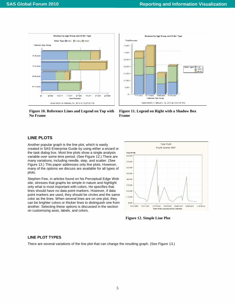
LINE PLOTS
Another popular graph is the line plot, which is easily created in SAS Enterprise Guide by using either a wizard or the task dialog box. Most line plots show a single analysis variable over some time period. (See Figure 12.) There are many variations, including needle, step, and scatter. (See Figure 13.) This paper addresses only line plots. However, many of the options we discuss are available for all types of plots.
Stephen Few, in articles found on his Perceptual Edge Web site, stresses that graphs be simple in nature and highlight only what is most important with colors. He specifies that lines should have no data point markers. However, if data point markers are used, they should be circles and the same color as the lines. When several lines are on one plot, they can be brighter colors or thicker lines to distinguish one from another. Selecting these options is discussed in the section on customizing axes, labels, and colors.
LINE PLOT TYPES
There are several variations of the line plot that can change the resulting graph. (See Figure 13.)
Figure 10. Reference Lines and Legend on Top with
No Frame
Figure 11. Legend on Right with a Shadow Box
Frame
Figure 12. Simple Line Plot
Reporting and Information VisualizationSAS Global Forum 2010
6
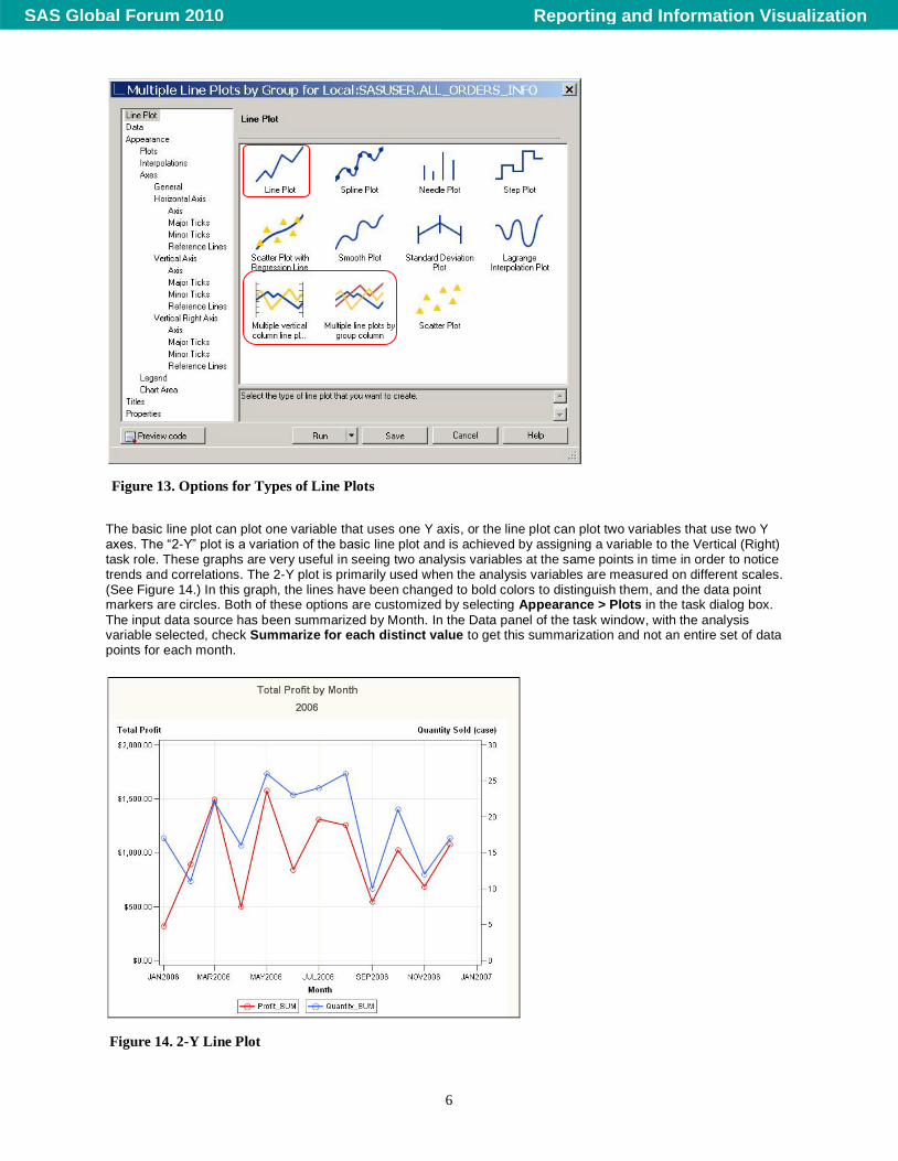
The basic line plot can plot one variable that uses one Y axis, or the line plot can plot two variables that use two Y axes. The “2-Y” plot is a variation of the basic line plot and is achieved by assigning a variable to the Vertical (Right) task role. These graphs are very useful in seeing two analysis variables at the same points in time in order to notice trends and correlations. The 2-Y plot is primarily used when the analysis variables are measured on different scales. (See Figure 14.) In this graph, the lines have been changed to bold colors to distinguish them, and the data point markers are circles. Both of these options are customized by selecting Appearance > Plots in the task dialog box.
The input data source has been summarized by Month. In the Data panel of the task window, with the analysis variable selected, check Summarize for each distinct value to get this summarization and not an entire set of data points for each month.
Figure 13. Options for Types of Line Plots
Figure 14. 2-Y Line Plot
Reporting and Information VisualizationSAS Global Forum 2010
7
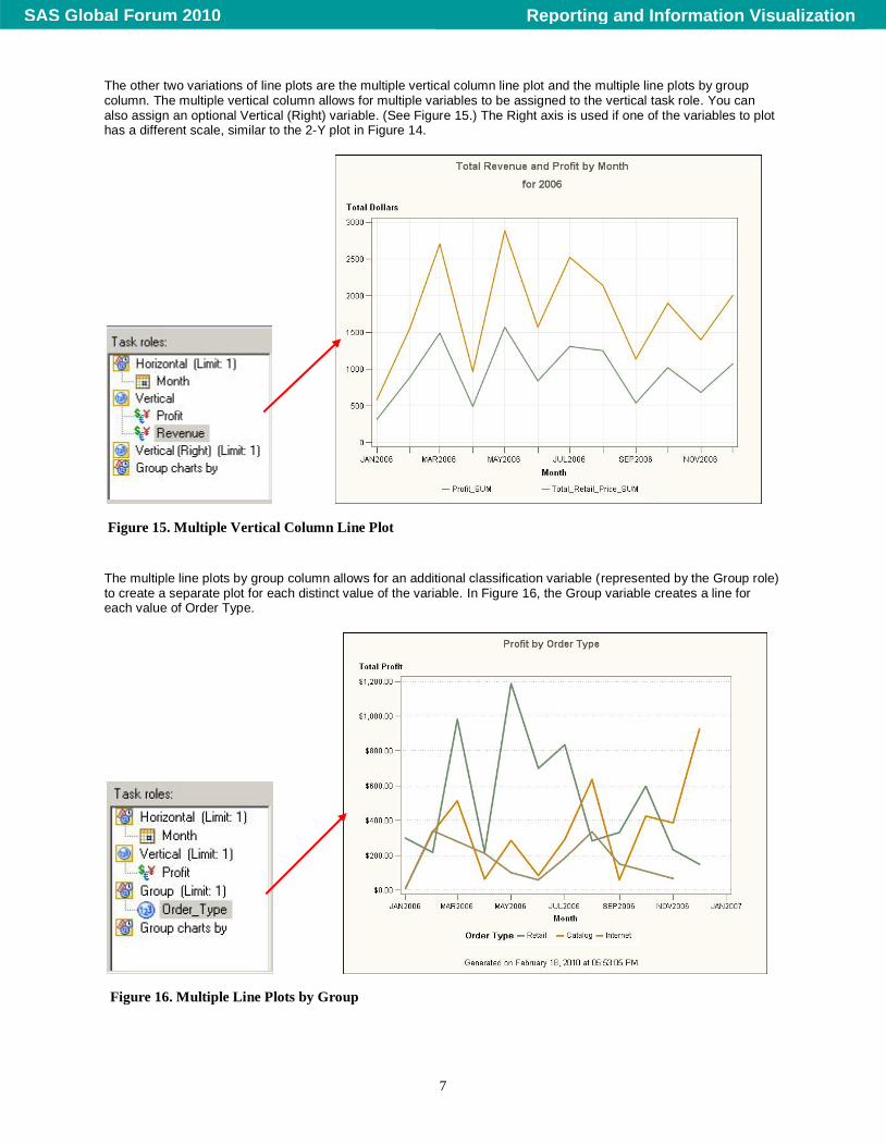
The other two variations of line plots are the multiple vertical column line plot and the multiple line plots by group column. The multiple vertical column allows for multiple variables to be assigned to the vertical task role. You can also assign an optional Vertical (Right) variable. (See Figure 15.) The Right axis is used if one of the variables to plot has a different scale, similar to the 2-Y plot in Figure 14.
The multiple line plots by group column allows for an additional classification variable (represented by the Group role) to create a separate plot for each distinct value of the variable. In Figure 16, the Group variable creates a line for each value of Order Type.
Figure 15. Multiple Vertical Column Line Plot
Figure 16. Multiple Line Plots by Group
Reporting and Information VisualizationSAS Global Forum 2010
8
CUSTOMIZING AXES, LABELS, AND COLORS
In many of the graphs that we have seen so far, there have been a few customizations made to conform to best practices or to show possibilities. In this section, we explore some options that you might want to use for your own purposes. Even though some of these options might not be considered best practices, we will see how to control and accomplish them. In SAS Enterprise Guide education courses, the creation and use of styles is explored, so these options are not covered here.
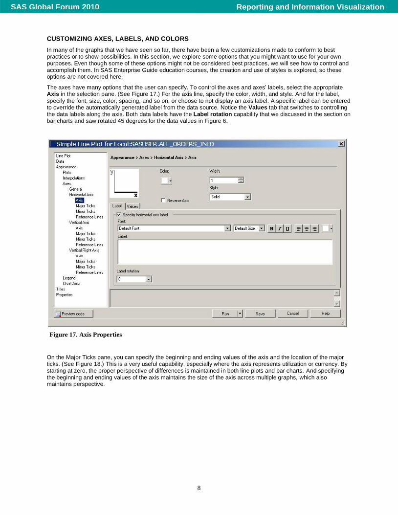
The axes have many options that the user can specify. To control the axes and axes’ labels, select the appropriate Axis in the selection pane. (See Figure 17.) For the axis line, specify the color, width, and style. And for the label,
specify the font, size, color, spacing, and so on, or choose to not display an axis label. A specific label can be entered to override the automatically generated label from the data source. Notice the Values tab that switches to controlling the data labels along the axis. Both data labels have the Label rotation capability that we discussed in the section on bar charts and saw rotated 45 degrees for the data values in Figure 6.
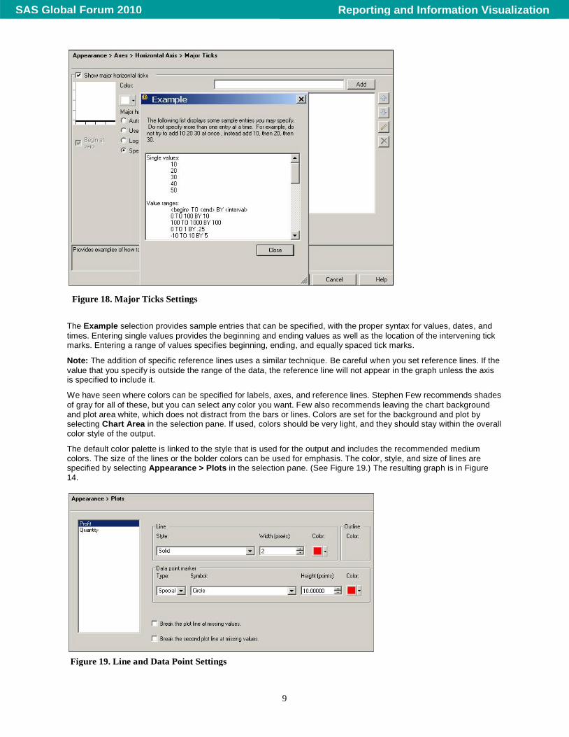
On the Major Ticks pane, you can specify the beginning and ending values of the axis and the location of the major ticks. (See Figure 18.) This is a very useful capability, especially where the axis represents utilization or currency. By starting at zero, the proper perspective of differences is maintained in both line plots and bar charts. And specifying the beginning and ending values of the axis maintains the size of the axis across multiple graphs, which also maintains perspective.
Figure 17. Axis Properties
Reporting and Information VisualizationSAS Global Forum 2010
9
The Example selection provides sample entries that can be specified, with the proper syntax for values, dates, and
times. Entering single values provides the beginning and ending values as well as the location of the intervening tick marks. Entering a range of values specifies beginning, ending, and equally spaced tick marks.
Note: The addition of specific reference lines uses a similar technique. Be careful when you set reference lines. If the
value that you specify is outside the range of the data, the reference line will not appear in the graph unless the axis is specified to include it.
We have seen where colors can be specified for labels, axes, and reference lines. Stephen Few recommends shades
of gray for all of these, but you can select any color you want. Few also recommends leaving the chart background and plot area white, which does not distract from the bars or lines. Colors are set for the background and plot by selecting Chart Area in the selection pane. If used, colors should be very light, and they should stay within the overall color style of the output.
The default color palette is linked to the style that is used for the output and includes the recommended medium colors. The size of the lines or the bolder colors can be used for emphasis. The color, style, and size of lines are specified by selecting Appearance > Plots in the selection pane. (See Figure 19.) The resulting graph is in Figure 14.
Figure 18. Major Ticks Settings
Figure 19. Line and Data Point Settings
Reporting and Information VisualizationSAS Global Forum 2010
10
A similar capability exists for bar charts, where the entire palette can be specified; or as Few recommends, for most bar charts, a single color. For either type of graph, the specific color palette can be specified in the style that is used.
BAR LINE CHARTS
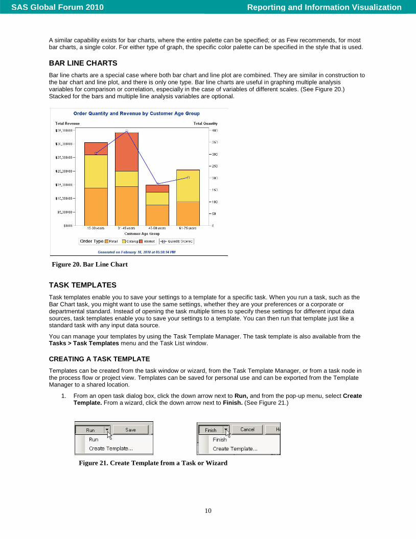
Bar line charts are a special case where both bar chart and line plot are combined. They are similar in construction to the bar chart and line plot, and there is only one type. Bar line charts are useful in graphing multiple analysis variables for comparison or correlation, especially in the case of variables of different scales. (See Figure 20.) Stacked for the bars and multiple line analysis variables are optional.
TASK TEMPLATES
Task templates enable you to save your settings to a template for a specific task. When you run a task, such as the Bar Chart task, you might want to use the same settings, whether they are your preferences or a corporate or departmental standard. Instead of opening the task multiple times to specify these settings for different input data sources, task templates enable you to save your settings to a template. You can then run that template just like a standard task with any input data source.
You can manage your templates by using the Task Template Manager. The task template is also available from the Tasks > Task Templates menu and the Task List window.
CREATING A TASK TEMPLATE
Templates can be created from the task window or wizard, from the Task Template Manager, or from a task node in the process flow or project view. Templates can be saved for personal use and can be exported from the Template Manager to a shared location.
1. From an open task dialog box, click the down arrow next to Run, and from the pop-up menu, select Create Template. From a wizard, click the down arrow next to Finish. (See Figure 21.)
Figure 20. Bar Line Chart
Figure 21. Create Template from a Task or Wizard
Reporting and Information VisualizationSAS Global Forum 2010
11
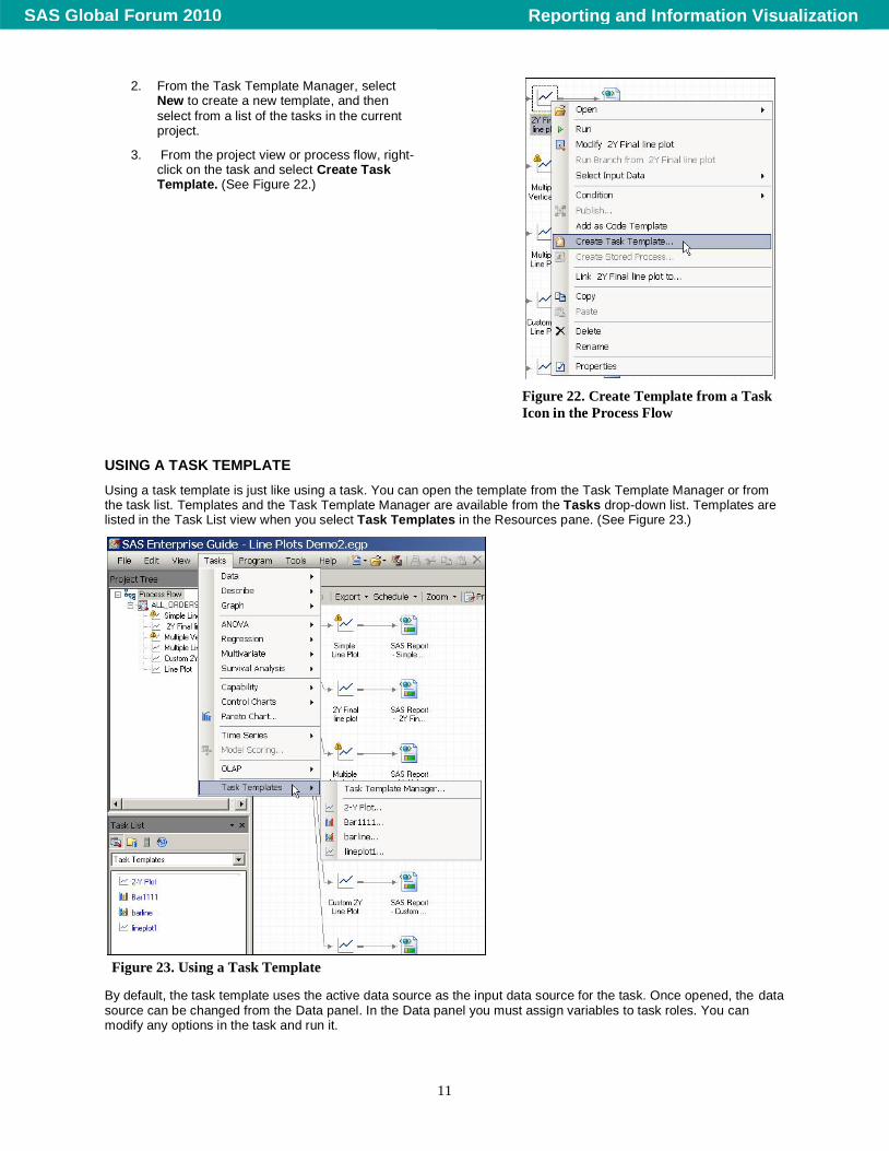
2. From the Task Template Manager, select New to create a new template, and then
select from a list of the tasks in the current project.
3. From the project view or process flow, right-click on the task and select Create Task Template. (See Figure 22.)
USING A TASK TEMPLATE
Using a task template is just like using a task. You can open the template from the Task Template Manager or from the task list. Templates and the Task Template Manager are available from the Tasks drop-down list. Templates are listed in the Task List view when you select Task Templates in the Resources pane. (See Figure 23.)
By default, the task template uses the active data source as the input data source for the task. Once opened, the data source can be changed from the Data panel. In the Data panel you must assign variables to task roles. You can modify any options in the task and run it.
Figure 22. Create Template from a Task
Icon in the Process Flow
Figure 23. Using a Task Template
Reporting and Information VisualizationSAS Global Forum 2010
12
CONCLUSION
SAS Enterprise Guide is a robust, full-function application, with a subset of tasks for developing graphs. The graph types, options, and customizations discussed in this paper merely scratch the surface of the capabilities of this user interface to SAS, but I hope they will lead you to explore further. Several best practices have been noted, but the design of graphs is both a personal preference and a corporate standard. Using style sheets and task templates, it is easy to maintain a set of standards and preferences to use for all of your business graphs.
REFERENCES
Few, Stephen. “The Role of Software and the Importance of Thoughtful Defaults.” Visual Business Intelligence Newsletter, 2007. Available at http://www.perceptualedge.com/articles/visual_business_intelligence/thoughtful_defaults.pdf.
RECOMMENDED READING
Hemedinger, Chris, and Stephen McDaniel. 2010. SAS for Dummies, Second Edition. New York: Wiley.
Slaughter, Susan J. and Delwiche, Lora D. 2010. The Little SAS Book for Enterprise Guide 4.2. SAS Press.
CONTACT INFORMATION
Your comments and questions are valued and encouraged. Contact the author:
Martha S. Hays SAS Campus Drive SAS Institute Inc. E-mail: [email protected]
SAS and all other SAS Institute Inc. product or service names are registered trademarks or trademarks of SAS Institute Inc. in the USA and other countries. ® indicates USA registration.
Other brand and product names are trademarks of their respective companies.
Reporting and Information VisualizationSAS Global Forum 2010