Embed Size (px)
Citation preview

309 Weitkunat, R. (ed.) Digital Biosignal Processing © 1991 Elsevier Science Publishers B. V.
CHAPTER 13
Curvefitting
A.T. JOHNSON
University of Maryland, College Park, MD, USA Mathematical equations contain information in densely packed form. That is the single most important reason why data is often subjected to the process of curvefitting. Imagine having to describe the results of an experiment by publishing pages after pages of raw and derived data. Not only would careful study of the data be tedious and unlikely by any but the most dedicated, but data trends would be most difficult to discern. It may not be sufficient to know that as the data for the controlled variable increases, so does data for the output variable. How much of an increase is important? What is the shape of the increase? A mathematical expression can tell this at a glance.
Mathematical equations remove undesired variations from data. Sources of these variations (often called ‘noise’ or ‘artifacts’) can range from strictly random thermodynamic events to systematic effects of electrical power-line magnetic and electrical fields. Everywhere in the building where I work, signals from a strong local radio station appear on sensitive electronic equipment. This adds considerably to the noise seen on our results, and strengthens the advantages of curvefitting.
Mathematical equations can be used to derive theoretical implications concerning the underlying principles relating variables to one another. Biologists often express these relationships in exponential terms. Sometimes they use hyperbolas. Each of these carries with it a fundamental notion concerning the connection between one variable and another. There.is confidence that the relationship means more than just a blind attempt at describing data, and that interpolated or extrapolated values can be obtained without the expectation of too much error.
This brings us to two very important uses of the fitted curve. Interpolation is the process of obtaining a result which would likely have been obtained if the input variable would have been held at some particular value. For instance, the famous DuBois formula for estimating body surface area from body weight is (Kleiber, 1975): A=71.84 H0.725 W0.425 (1) Where A =area, cm2
H=height, cm W= weight (actually mass), kg
Presumably, when the data for this formula was obtained, a large number of subjects were measured. It is unlikely, however, that a subject with exactly my height (185.4 cm) and weight (96.6 kg) was used in the study. Equation (1) can be used to estimate my body surface area as 2.2 m2. Even if I were one of the subjects, random measurement error may have caused my surface area reading to be 2.22 m2 (0.9% error: not too bad). The noise removal process of curvefitting could then be used to estimate my true body surface area as 2.2 m2.
In both of these instances, the DuBois formula was used to interpolate between points used in the original data set. The process of extrapolation is different in that the mathematical expression is used to determine a figure outside the range of the original data. I recently read in the papers about a 380 kg man who couldn't leave his room because he couldn't fit through the door. Almost certainly, not one of the original subjects in the determination of the DuBois formula was that large. Yet, if the subject had a height of 178 cm, the formula can be used to obtain a predicted value of 3.84 m2 surface area. This value may or may not be close to the

310 actual value. When extrapolating, extreme caution must be exercised when expressing confidence in the results.
Sometimes rate of change information is of utmost importance, but the actual data cannot be easily obtained. Respiratory pneumotachograph data gives airflow rate information, which must be differentiated to give rate of change of airflow, or which must be integrated to give lung volume. Similarly, biomechanical measurements made with an accelerometer are often integrated once to give velocities and integrated twice to give displacements. Electromyographical voltage measurements are often integrated to give the area under the curve.
With the proper mathematical expression representing the data, differentiation or integration can be accomplished quite easily. For example, if I lost weight at a rate of 4.5 kg/week, I could differentiate eqn. (1) to give:
ferentiate to determine rates is a strong reason to fit the data with a curve.

311
Curvefitting differs from the statistical process of regression in that the latter is often the most rational way of achieving the former. In curvefitting, a greater emphasis is placed on the form of the curve which is to be used to match the data, whereas regression often is applied without much thought given to curve selection. In some respects, then, both processes are complementary.
Thus, in this chapter, I wish to present curvefitting as an overall process for which statistical procedures can sometimes be helpful. Often these procedures are blindly used without thorough investigation of the data, experimental procedures used, and inferences to be drawn. When this happens, statistical procedures can actually lead to misleading results. So, I intend to present some things I had to learn the hard way, mixed with a healthy skepticism of the use of statistical methods. At the end, I will describe a computer program which can be used to perform most of the hard work associated with curvefitting.

312
Examination of the data I cannot overstress the importance of plotting the data before proceeding. One must see what the data look like before a decision is made to treat the data one way or another. Anscombe (1973) presented a great example of the pitfalls which can occur if data is not graphed before regression techniques are applied. Four fictitious data sets, each consisting of eleven (x,y) pairs, were prepared. The x-values for the first three data sets are the same and are listed only once in Table 1.
Blind application of linear regression would show these data to be identical. Many pertinent statistics for these data are the same. Yet, when graphed, the error of this conclusion is apparent. Data set one (Fig. 1) consists of widely scattered points with a mild linear trend. Data set two (Fig. 2) forms a part of a downward-curved parabola. The third data set (Fig. 3) are all from a single straight line with one outlier. Removal of the outlier from the regression brings the correlation coefficient (r) to 1.0. The last data set (Fig. 4) shows no relation between x and y at all, but one outlying point contributes to the slope determination. Clearly, this example should show the necessity of seeing the data before trying to fit it. (Parenthetically, I once gave my students a midterm examination question with data configured as in the third data set and asked for the equation of the best fit straight line. Even after having seen this material several weeks before, no student eliminated the outlier point from his data set before applying linear regression.)

313
TABLE I Four sets of data with identical statistics (used with permission from Anscombe, 1973)
Data set: Variable:
1-3 x
1 y
2 y
3 y
4 x
4 y
Values: 10.0 8.0
13.0 9.0
11.0 14.0
6.0 4.0
12.0 7.0 5.0
8.04 6.95 7.58 8.81 8.33 9.96 7.24 4.26
10.84 4.82 5.68
9.14 8.14 8.74 8.77 9.26 8.10 6.13 3.10 9.13 7.26 4.74
7.46 6.77
12.74 7.11 7.81 8.84 6.08 5.39 8.15 6.42 5.73
8.0 8.0 8.0 8.0 8.0 8.0 8.0
19.0 8.0 8.0 8.0
6.59 5.75 7.71 8.84 8.47 7.04 5.25 12.50 5.56 7.91 6.89
Number of observations = 11 Mean of x value ( x ) = 9.0 Mean of y value ( y ) = 7.5 Equation of regression line y=3+0.5x Sum of squares (x– x )=110.0 Regression sum of squares = 27.50 (1 df) Residual sum of squares of y = 13.75 (9 df) Estimated standard error of regression slope = 0.118 Multiple correlation coefficient (r) = 0.817

314
Fig. 1. Plot of data set 1, showing points scattered about the line. In this case, the line is probably the best type of curve to fit the data (redrawn with permission from Anscombe, 1973). Fig. 2. Plot of data set 2, showing points forming part of a downward-curved parabola. In this case, the straight line is not the best type of curve to fit the data (redrawn with permission from Anscombe, 1973).
Examination of theory There are often compelling theoretical reasons for choosing one type of curve over another to fit the data. Competing curve forms should be selected which give a most likely chance that they will describe the fundamental shape of the data. For example, when investigating the relationship between electrode current
Fig. 3. Plot of data set 3, showing points lying in a straight line with one outlying point. Without the outlier the remainder of the points would exactly form a straight line with lesser slope (redrawn with permission from Anscombe, 1973). Fig. 4. Plot of data set 4, showing all but one point uncorrelated with the independent variable. If not for the one point, a linear best-fit curve would have no meaning (redrawn with permission from Anscombe, 1973).
315
and voltage we are bound to consider Ohm's Law, which states that current and voltage are related through the electrode resistance:
I = E/R
Where I =current, amps
E =voltage, volts R =resistance, ohms
According to Ohm's Law, there can be no current without a voltage. If Ohm's Law is thought to hold, then the curve chosen to match the data must pass through the origin. There can be no y-axis intercept, and the inclusion of the possibility of one would be erroneous.
Extremes of the curve and data should be investigated for aberrant behavior. Does the particular curve predict an infinite value at some point where one cannot possibly exist? Or, does the curve predict a zero value where one does not exist?
Another important consideration is simplicity. Most biological models perform admirably with the most simple forms of relationships between variables. If the curve form which you have chosen to fit the data must be severely modified with extra terms, or if the data must be separated into several ranges before the curve can be fit and if there is not a fundamental reason to suspect that different mechanisms cause the data to be inhomogeneous, then the curve of choice is too complex. According to the principle of parsimony, when several competing models or explanations of scientific results are considered, the simplest should be chosen until otherwise disproved.
To polynomial or not to polynomial
When considering the type of curve to fit to the data, a polynomial often comes to mind. A polynomial equation is one which includes a sum of variables taken to various integer powers, such as:
y=ao+alx+a2x2+a3x3+ ... (4)
There are some advantages to using a polynomial, but also some disadvantages which are often overlooked. So, at this point I will advocate the alternatives.
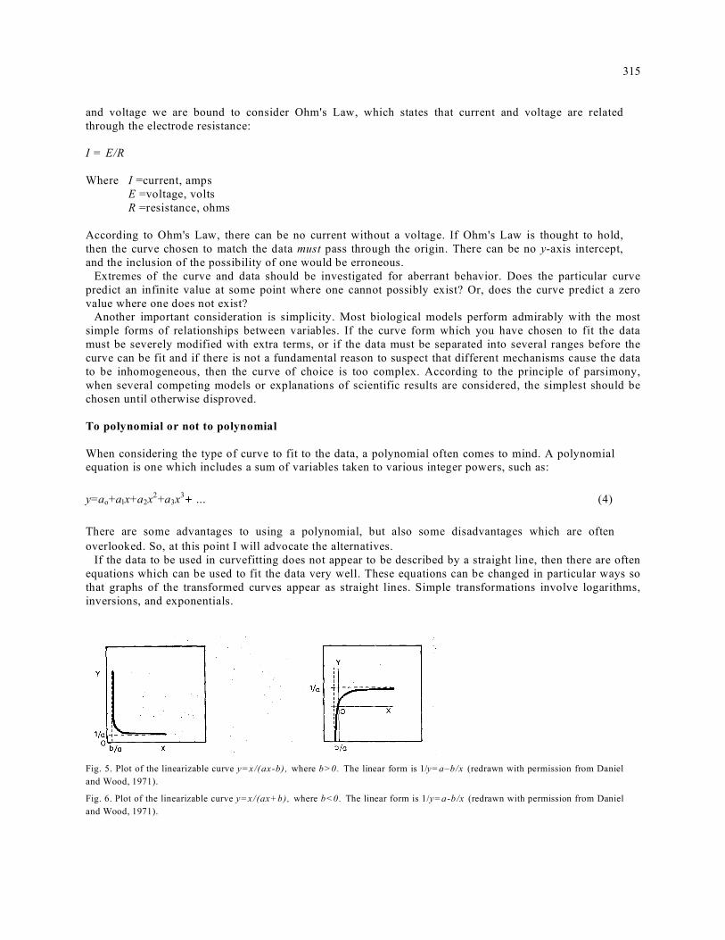
If the data to be used in curvefitting does not appear to be described by a straight line, then there are often equations which can be used to fit the data very well. These equations can be changed in particular ways so that graphs of the transformed curves appear as straight lines. Simple transformations involve logarithms, inversions, and exponentials.
Fig. 5. Plot of the linearizable curve y=x/(ax-b), where b>0. The linear form is 1/y=a–b/x (redrawn with permission from Daniel and Wood, 1971).
Fig. 6. Plot of the linearizable curve y=x/(ax+b), where b<0. The linear form is 1/y=a-b/x (redrawn with permission from Daniel and Wood, 1971).
316
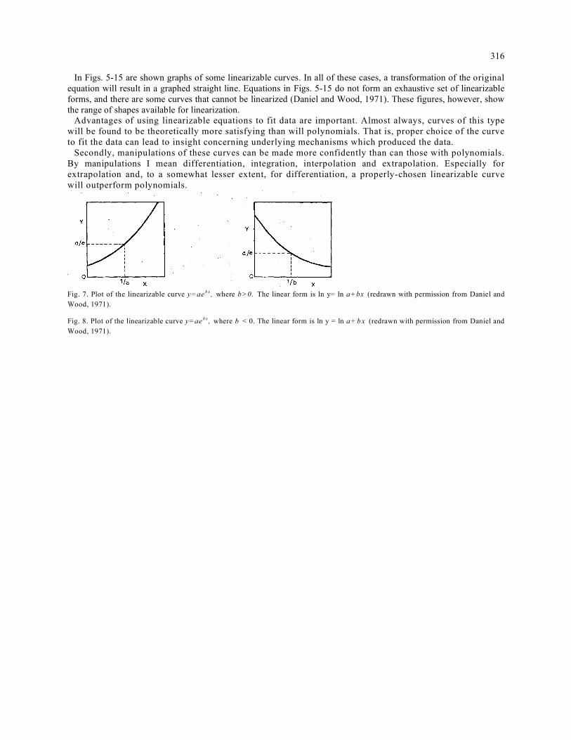
In Figs. 5-15 are shown graphs of some linearizable curves. In all of these cases, a transformation of the original equation will result in a graphed straight line. Equations in Figs. 5-15 do not form an exhaustive set of linearizable forms, and there are some curves that cannot be linearized (Daniel and Wood, 1971). These figures, however, show the range of shapes available for linearization.
Advantages of using linearizable equations to fit data are important. Almost always, curves of this type will be found to be theoretically more satisfying than will polynomials. That is, proper choice of the curve to fit the data can lead to insight concerning underlying mechanisms which produced the data.
Secondly, manipulations of these curves can be made more confidently than can those with polynomials. By manipulations I mean differentiation, integration, interpolation and extrapolation. Especially for extrapolation and, to a somewhat lesser extent, for differentiation, a properly-chosen linearizable curve will outperform polynomials.
Fig. 7. Plot of the linearizable curve y=ae b x , where b>0. The linear form is ln y= ln a+bx (redrawn with permission from Daniel and Wood, 1971).
Fig. 8. Plot of the linearizable curve y=ae b x , where b < 0. The linear form is ln y = ln a +b x (redrawn with permission from Daniel and Wood, 1971).
317
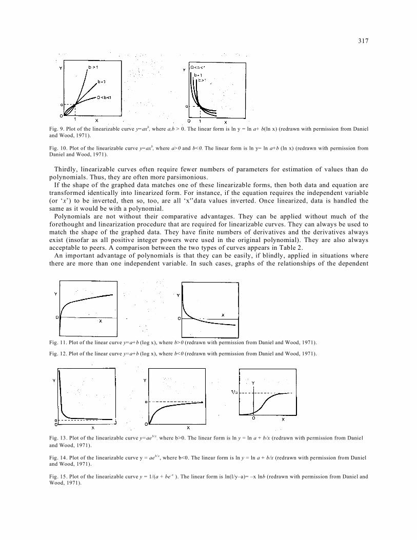
Fig. 9. Plot of the linearizable curve y=axb, where a,b > 0. The linear form is ln y = ln a+ b(ln x) (redrawn with permission from Daniel and Wood, 1971). Fig. 10. Plot of the linearizable curve y=axb, where a>0 and b<0. The linear form is ln y= ln a+b (ln x) (redrawn with permission from Daniel and Wood, 1971).
Thirdly, linearizable curves often require fewer numbers of parameters for estimation of values than do
polynomials. Thus, they are often more parsimonious. If the shape of the graphed data matches one of these linearizable forms, then both data and equation are
transformed identically into linearized form. For instance, if the equation requires the independent variable (or ‘x’) to be inverted, then so, too, are all ‘x'’data values inverted. Once linearized, data is handled the same as it would be with a polynomial.
Polynomials are not without their comparative advantages. They can be applied without much of the forethought and linearization procedure that are required for linearizable curves. They can always be used to match the shape of the graphed data. They have finite numbers of derivatives and the derivatives always exist (insofar as all positive integer powers were used in the original polynomial). They are also always acceptable to peers. A comparison between the two types of curves appears in Table 2.
An important advantage of polynomials is that they can be easily, if blindly, applied in situations where there are more than one independent variable. In such cases, graphs of the relationships of the dependent
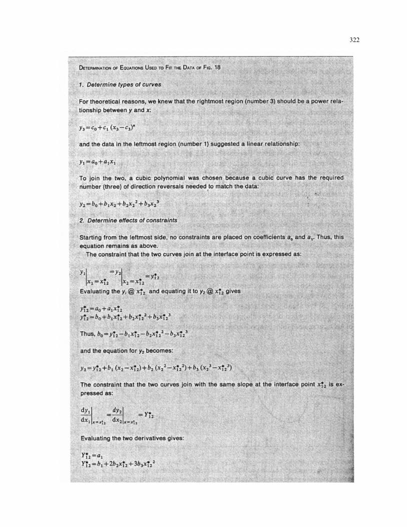
Fig. 11. Plot of the linear curve y=a+b (log x), where b>0 (redrawn with permission from Daniel and Wood, 1971).
Fig. 12. Plot of the linear curve y=a+b (log x), where b<0 (redrawn with permission from Daniel and Wood, 1971).
Fig. 13. Plot of the linearizable curve y=aeb/x
, where b>0. The linear form is ln y = ln a + b/x (redrawn with permission from Daniel and Wood, 1971). Fig. 14. Plot of the linearizable curve y = aeb/x, where b<0. The linear form is ln y = ln a + b/x (redrawn with permission from Daniel and Wood, 1971). Fig. 15. Plot of the linearizable curve y = 1/(a + be-x ). The linear form is ln(l/y–a)= –x lnb (redrawn with permission from Daniel and Wood, 1971).

318 variable to each independent variable, one at a time (with the other independent variables held constant), would be required to determine the form of the linearizable curve to be used with each independent variable. Frequently, data cannot be taken this way; also frequently, only one independent variable is considered during any particular experiment.
How large a polynomial should be chosen to fit the data? Here is where polynomial curve fitting requires thought. The order of the polynomial (the highest power on ‘x’ in eqn. (4)) determines the number of parameter values to be estimated from the data. For all polynomials beginning with a constant and including all integer powers up to the maximum power n, there are (n+ 1) parameter values to be estimated. At least (n+1) pieces of information (data points) are needed to estimate unknown values. Choosing a ninth order
Fig. 16. Plot of ten data points approximated by a third-degree polynomial (heavy line) and by a ninthdegree polynomial (light line). The ninth-degree curve hits every point, but is not useful for extracting the general trend of the data (redrawn with permission from Hood, 1987).
polynomial to fit 10 data points forces the curve through every point (Fig. 16). However, by doing this you have decided that no random variation exists in any data point. Interpolation, extrapolation, and differentiation of the resulting equation is extremely unreliable. Better that a lower order polynomial should be chosen to fit the general tendency of the data (Hood, 1987).
Polynomials can possess one less peak and valley than their orders. A polynomial of order two (last term involves x2) has one peak or valley. Order three polynomials can have one peak and one valley. Order four polynomials (last term involves x4) can have either two peaks and one valley or one peak and two valleys. Thus the shape of the graphed data can help to determine the order of the polynomial used.
Sometimes a polynomial is used to fit a certain portion of the data and other polynomials are used to fit other portions. This process is called ‘splining’, and has grown to be a popular method (Lancaster and

319
TABLE 2. Comparison between polynomials and linearizable curves to describe data
Polynomials Linearizable curves Often have no theoretical meaning. Form of the curve aids in theoretical underpinnings of
the data.
May give highly erroneous extrapolation or differentiation especially for higher-order polynomials.
Often better for extrapolation and differentiation.
Sometimes have many unknown parameters. Often have fewer unknown parameters.
Differentiation is simple; derivatives always exist for positive integer exponents; the number of derivatives which can be obtained is limited by the order of the original equation.
Differentiation may be involved; derivatives may not always exist; the number of derivatives which may be obtained is not normally limited.
Parameter values can be obtained almost automatically, and without much thought.
Parameter values are obtained after the process of deciding on a curve form and linearization.
Handling more than one independent variable is a simple extension of procedures used with one independent variable.
Handling more than one independent variable can be tedious and may not be practical.
Parameter values are chosen to minimize the sums of squares of the polynomial without much thought given to their meanings.
Parameter values which give the minimum sums of squares for the linearized equation do not give minimum sums of squares for the unlinearized, or original form of the equation.
Polynomials can always be found to match the shape of the data.
A linearizable curve cannot always be found to match the shape of the data.

320
Šalkauskas, 1986). A spline is usually used where a series of data points are to be described in mathematical form for further manipulation. I have fitted splines to respiratory airflow data in order to interpolate between the points. Resting respiratory airflow is not very repeatable from breath to breath. Further, each little peak or valley in the data may have some meaning. Thus, splines are used because they can be made to fit through each point.
Often, a series of cubic splines, using polynomials of order 3, are used to cover the entire range of data. A minimum of four data points is required to determine parameter values of a cubic spline. The four data points 1–4 are used in Fig. 17 to determine parameter values for a cubic spline for the region between points 2 and 3. Points 2–5 would be used to determine the spline for the region between points 3 and 4.
Splines are not usually used where data must be filtered to remove noise or artifacts, leaving just the general trend of the data. A somewhat similar technique called a ‘moving polynomial’ may be used in this case. As an example, consider determining the amount of vagal tone from respiratory sinus arrhythmia. The more variable the heartrate, the greater is the vagal tone.
Plotting heartrate against time gives a general trend with much short-term scatter. A third or fourth order polynomial may be used to fit the first twenty or so points. The first data point is then discarded and the next data point is picked up. The same order polynomial is then fitted through those twenty points. The final result is a series of polynomials which describe the general trends of the data. Unlike the splining technique,
Fig. 17. A cubic spline is used to connect data points 3 and 4. Data points 2, 3, 4 and 5 are used to determine parameter values for the spline. Data points 3, 4, 5 and 6 will be used for the spline to connect points 4 and 5.
each data point does not lie on the resulting curve. Because this is a noise-reduction technique, the data is said to be ‘filtered’.
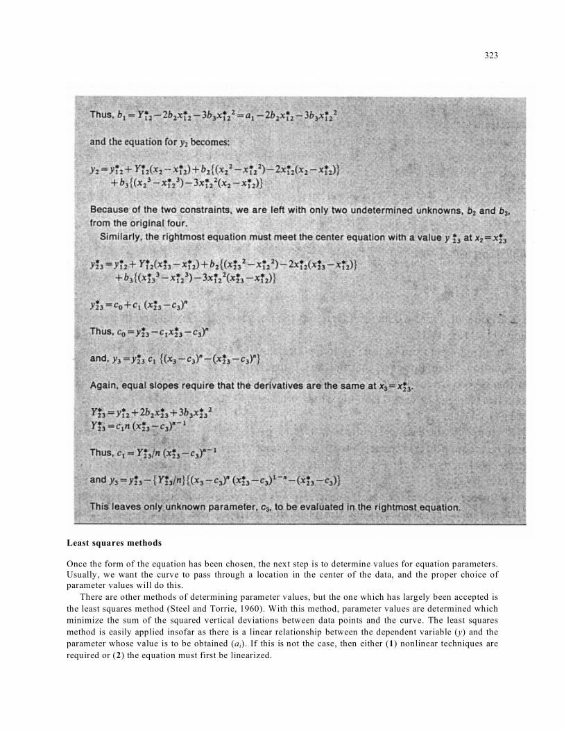
There are data sets which require more sophisticated approaches. For instance, data may show a clear linear trend in one region, an exponential trend in another region, or a curve in yet another region (Fig. 18). Matching a single curve to that data is nearly impossible, but a variation of the splining technique discussed earlier can be used to match a limited number of curves to the data in question (McCuen and Snyder, 1986). Such a technique is called ‘composite fitting’.
Using composite fitting, a decision is made regarding the regions of data to be fit by particular types of curves. For the data of Fig. 18, three regions were chosen, and these were to be fitted with a linear equation (leftmost region), a polynomial equation (central region), and a power equation (rightmost region). The

321 points where the regions join can be left undetermined, but it is easiest to decide where the junctions are to be located. This can be done by careful scrutiny of the graphed data.
At this point, there is now an additional constraint on the choice of parameter values for each regional equation, because each equation must join its neighbor at the junction point. In addition, the appearance of a change in slope of the line at the junction point is not pleasing, so we often require the curves to have slopes equal to their neighbors at the junction point. This places an additional constraint on each curve. The result of these two additional constraints is that instead of (n + 1) parameter values which may be estimated from (n + 1) data points, (n+3) parameter values may be estimated. Put another way, the choice of two parameter values is restricted and depends on other parameter values obtained from the data.
We have used composite curvefitting to determine equations to fit data illustrated in Fig. 18. We found it best to start at one side or other of the data and work toward the other side when determining parameter values. In this way, slopes and heights of each curve need only be specified at one end rather than at two.
Fig. 18. This example of composite curvefitting uses three regions: a linear line on the left, a cubic curve in the middle and a power curve on the right. Curves were joined with equal slopes (Tang et al., 1991).
322
323
Least squares methods Once the form of the equation has been chosen, the next step is to determine values for equation parameters. Usually, we want the curve to pass through a location in the center of the data, and the proper choice of parameter values will do this.
There are other methods of determining parameter values, but the one which has largely been accepted is the least squares method (Steel and Torrie, 1960). With this method, parameter values are determined which minimize the sum of the squared vertical deviations between data points and the curve. The least squares method is easily applied insofar as there is a linear relationship between the dependent variable (y) and the parameter whose value is to be obtained (ai). If this is not the case, then either (1) nonlinear techniques are required or (2) the equation must first be linearized.

324
In the event that a linearized equation is used, that is, if portions of the equation were transformed, then the parameter values obtained from the linear least squares technique will result in a best-fit equation for the transformed, or linearized, data. These parameter values will not yield the best-fit curve through the original data when the equation is unlinearized. As an example of this, suppose the data appears to match an equation of the form:
y=axn (5) which can be linearized to: log y=log a+n log x (6) Logarithms of x and y data are taken and the new data set is composed of pairs of (log y) and (log x) data.
Linear regression can be used to find values of n and log a which produce the best-fit equation. Note, however, that the deviations of points from the curve considered in this procedure involve (log yi) instead of (yi), and the horizontal spacing of the data has changed as well. Thus, the whole problem has been changed by the process of linearization.
Fortunately, the case where the best-fit linearized equation yields an unacceptable nonlinear equation is extremely rare to nonexistent. The unlinearized equation needs to be checked against the original data, but expect the nonlinear equation to fit the data very well.
The procedure described in the least squares box yields parameter values which force the linear equation through the mean value of the x and y data points. If the curve is to be forced through some other point, for example through the origin, that point must be fixed before the other parameter values are obtained.
There are a number of ways to look at this type of problem and, as our example, we consider that the curve we will use is a polynomial and that it must go through the origin. Replacing all x values in eqn. (4) with zeros and the y value with zero requires that ao =0. Thus, our new polynomial equation becomes:
y = alx +a2x2 + a3x3+ ... (7)
Least squares equations can be determined as before, but with one less parameter to be estimated. Fixing the curve at the origin has removed the need for one data point.
The new least squares equations become: Σyi xi = a1Σxi
2 + a2 Σ xi
3 +… Σyi xi
2 = a1 Σ xi
3 + a2 Σ xi
4 (8)

325

326
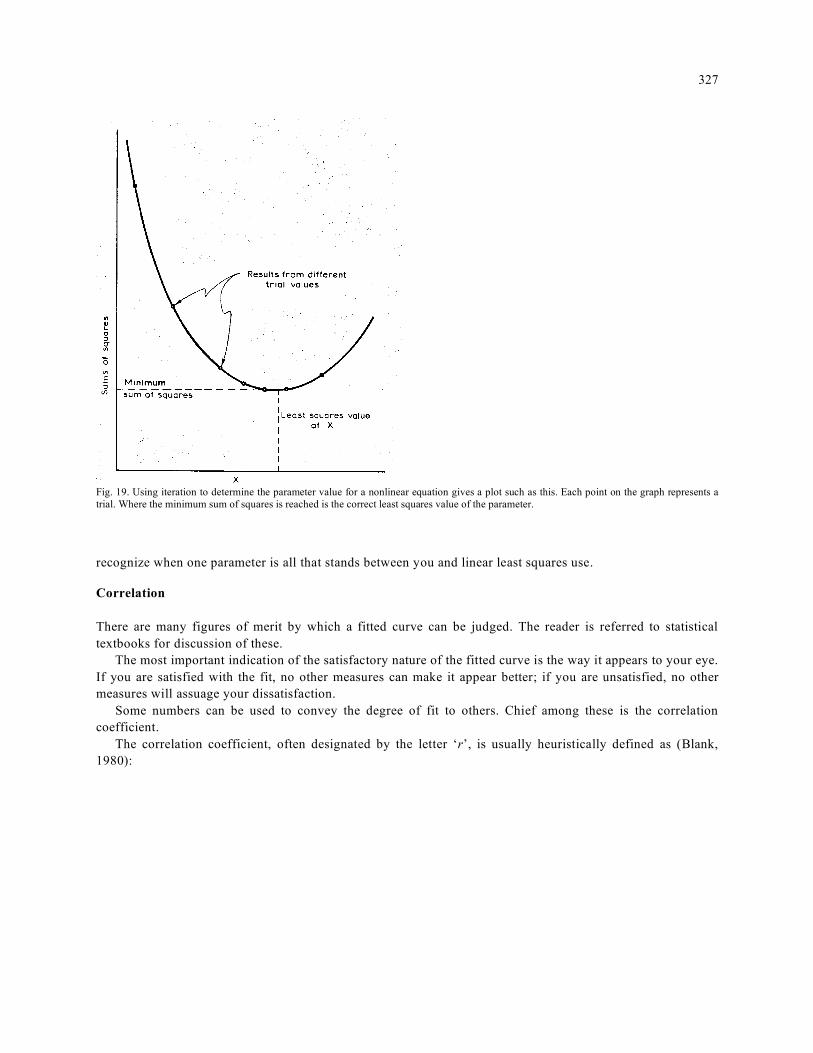
An extension of least squares for nonlinear equations Sometimes when equations are so nonlinear that they cannot be transformed to become linear, linear least squares techniques are not sufficient. Sometimes, also, the equations could be linearized except for one parameter. There is a simple extension of linear least squares techniques which is reasonably easy to implement. In its simplest form it involves trial-and-error. Iteration or other techniques can be used if you wish.
As an example, consider the nonlinear exponential equation:
y = ae–x/τ (9)
which is sufficiently common in biological models. The variable ‘x’ usually stands for time in this equation. Sudden changes in work rate give rise to a more gradual change in heartrate, ratings of perceived exertion, and other psychophysical measures. These gradual changes are usually described by an exponential equation. This equation can be linearized to: ln y=ln a – x/τ (10) and linear least-squares methods used to find the values of a and τ. However, we may try another approach:
ôxa
y/ln !="
#
$%&
' (11)
If the value of a were known, then the value of τ can be easily found by means of linear least squares.
Therefore, assume a value for a, determine the value for τ, and then calculate the sum of 2)iyi(y
)! where
iy) ; is the value of y obtained from the equation when it is evaluated at xi.
When another value of a is assumed, another value of τ will be obtained, and another sum of
2)iyi(y
)! calculated. The correct value of a will be that which yields the lowest calculated sum of squares.
This procedure is illustrated graphically in Fig. 19. While this example is really quite simple, the technique is good to know. The trick is knowing when to
327
Fig. 19. Using iteration to determine the parameter value for a nonlinear equation gives a plot such as this. Each point on the graph represents a trial. Where the minimum sum of squares is reached is the correct least squares value of the parameter.
recognize when one parameter is all that stands between you and linear least squares use. Correlation There are many figures of merit by which a fitted curve can be judged. The reader is referred to statistical textbooks for discussion of these.
The most important indication of the satisfactory nature of the fitted curve is the way it appears to your eye. If you are satisfied with the fit, no other measures can make it appear better; if you are unsatisfied, no other measures will assuage your dissatisfaction.
Some numbers can be used to convey the degree of fit to others. Chief among these is the correlation coefficient.
The correlation coefficient, often designated by the letter ‘r’, is usually heuristically defined as (Blank, 1980):

328
What is meant by this is that all error involved in the data is assumed to be random, and the variation referred to is the vertical deviations of the data points from one another. Explained variation is the differences in heights of the data points if they lie exactly on the best-fit line, and total variation is the explained variation plus the random deviations of the points from the line.
There is a difficulty with this simple definition in that it ignores the means by which the data was obtained. Actual data includes both random and systematic error. Systematic error is the kind usually minimized by:
(1) calibration (2) periodically checking known values (3) using different observers (4) using different instruments (5) randomizing the order of taking data
Sometimes, however, either because the possibility of systematic error is ignored or because of some unlikely set of circumstances, systematic contributions to error are not small. Such error may or may not be included in the eqn. (12) category of ‘explained variation’, depending on the type of systematic error. Scientists should always be aware of error in the data which invalidates the use of the best-fit curve as a predictive vehicle.
If the data is totally scattered, the correlation coefficient will be close to zero. If all the points lie on the line, the correlation coefficient will be close to 1 (ignoring the possibility of negative correlation values). The closer the correlation coefficient is to 1, the more highly regarded is the fitted equation. One way to almost always increase the value of the correlation coefficient is to increase the order of a polynomial used to fit the data.
The correlation coefficient can always be computed from (Blank, 1980):

329
which has the advantage over eqn. (13) in that the mean of the equation for the best-fit curve need not be known before r is calculated. Thus, eqn. (13) requires at least two passes through the data, but eqn. (14) requires only one.
For the linearized equations mentioned previously, correlation coefficients calculated conveniently using eqn. (14) are applicable only to the linearized equation used with linearized data. The correlation coefficient for the nonlinear curve used with the original data would have a different value. Other applicable measures
There are other measures used by sophisticated curve-fitters to assist in the judgement of degree of satisfaction with a particular curve. These are not necessary for most of those who fit curves to data as long as the curves fit the data well enough to be satisfactory.
Because the data is assumed to be randomly scattered around the curve, other sets of data are likely to result in other values of the parameters used to characterize the curve. For the exponential curve of eqn. (9), each data set will result in a value for a and a value for τ, and these values will almost always differ with different data. Parameter values themselves can therefore be statistically characterized with a mean and standard deviation. The reader is referred to statistical texts (Steel and Torrie, 1960; Blank, 1980) for further information.
One consequence of the variation in parameter values is the degree of uncertainty of the curve. For a linear equation:
y = ao+alx (15)
variation in ao will cause the plot of the curve to move vertically (jumping) and variation in al will cause the curve to become more or less steep (rocking). The combination of jumping and rocking will cause the curve to lie in a curvilinear zone for a certain large percentage of the potential data sets to be obtained (Fig. 20).
Most statistical texts define this curvilinear zone based upon the variation in the data set used to obtain the curve parameter values. However, wider zones would be obtained if one wishes to include curves based on inclusion of certain percentages of the population from which the data sample was drawn, or if one wishes to include possible future data samples (stemming from differences in the confidence interval, tolerance interval, and prediction interval).
The curve may rock about the mean of the data (the curvilinear zone is narrowest in the center) if the curve is chosen to pass through the data mean. If the curve has been constrained to pass through another point (such as the origin), the zone is narrowest at that point.
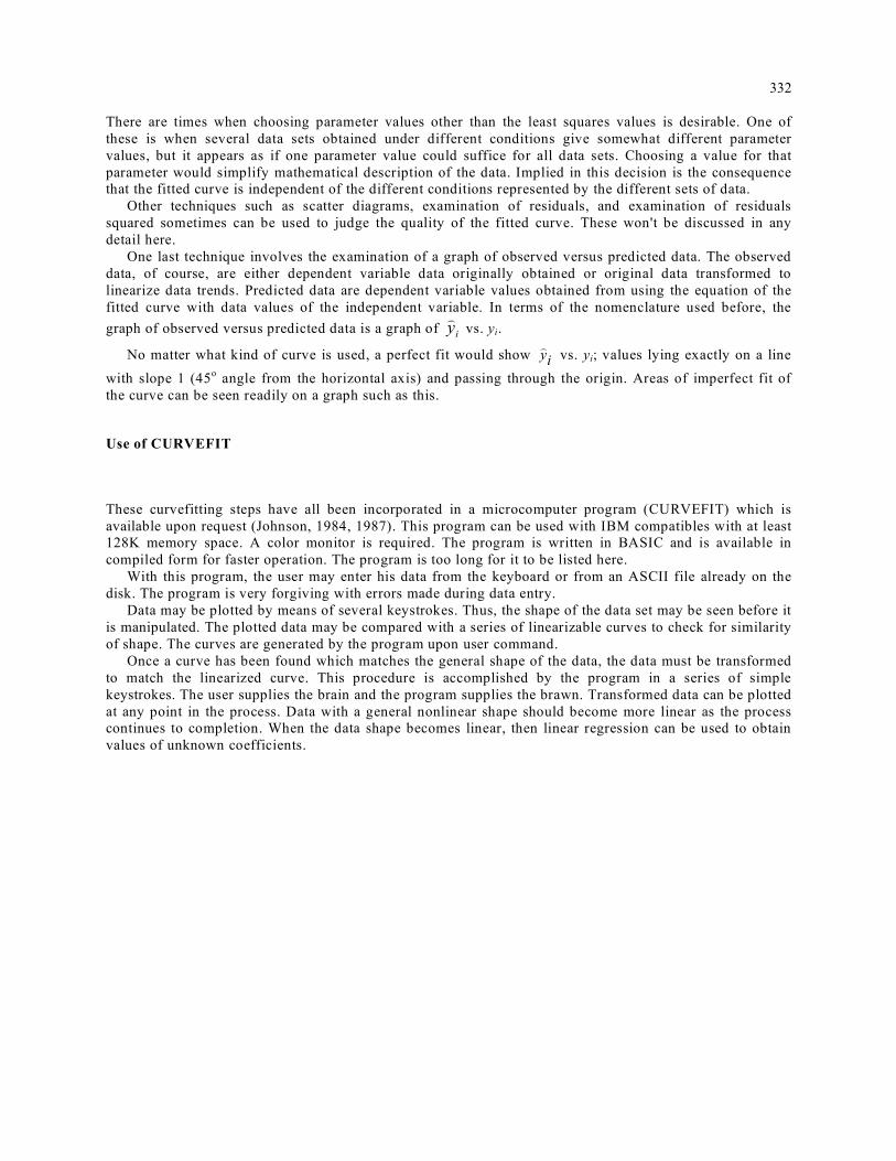
Sometimes sensitivity analysis is used to determine the certitude of a particular parameter value. In
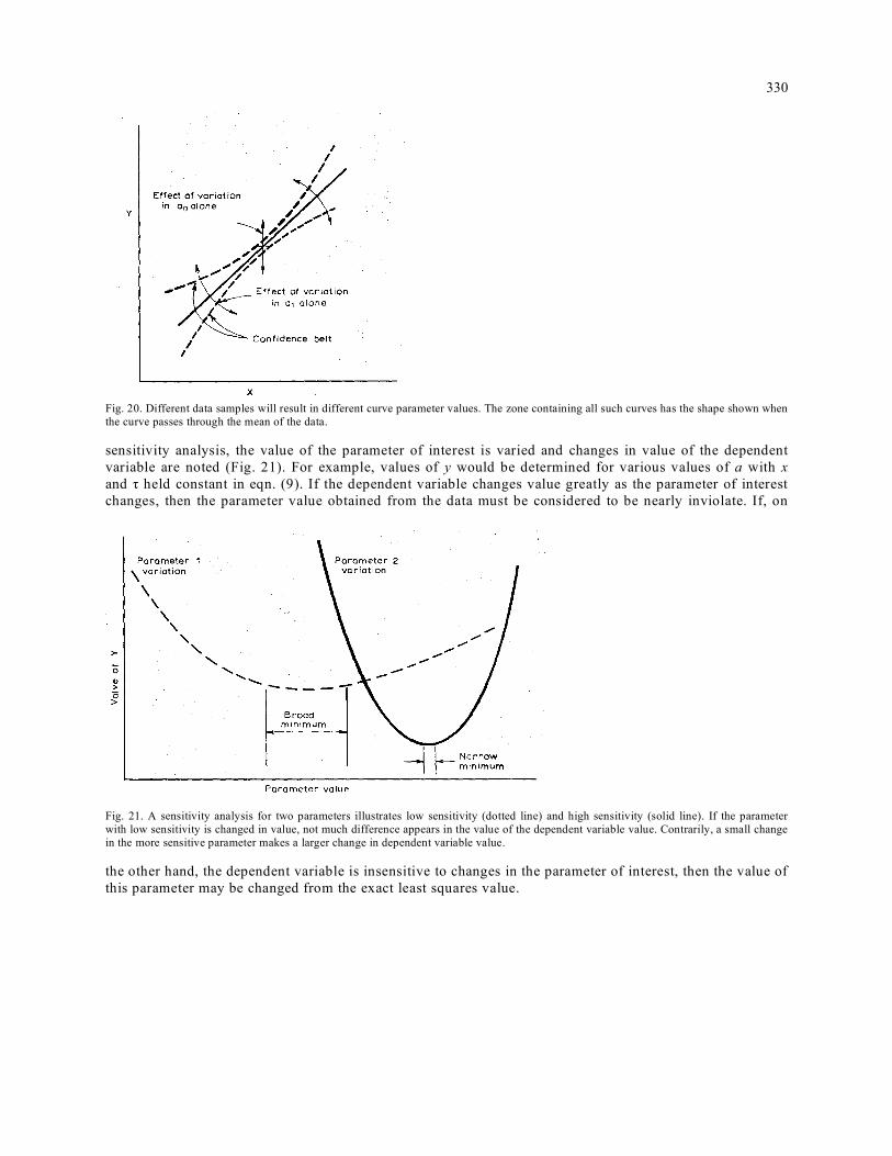
330
Fig. 20. Different data samples will result in different curve parameter values. The zone containing all such curves has the shape shown when the curve passes through the mean of the data. sensitivity analysis, the value of the parameter of interest is varied and changes in value of the dependent variable are noted (Fig. 21). For example, values of y would be determined for various values of a with x and τ held constant in eqn. (9). If the dependent variable changes value greatly as the parameter of interest changes, then the parameter value obtained from the data must be considered to be nearly inviolate. If, on
Fig. 21. A sensitivity analysis for two parameters illustrates low sensitivity (dotted line) and high sensitivity (solid line). If the parameter with low sensitivity is changed in value, not much difference appears in the value of the dependent variable value. Contrarily, a small change in the more sensitive parameter makes a larger change in dependent variable value.
the other hand, the dependent variable is insensitive to changes in the parameter of interest, then the value of this parameter may be changed from the exact least squares value.

331
There are times when choosing parameter values other than the least squares values is desirable. One of
332 There are times when choosing parameter values other than the least squares values is desirable. One of these is when several data sets obtained under different conditions give somewhat different parameter values, but it appears as if one parameter value could suffice for all data sets. Choosing a value for that parameter would simplify mathematical description of the data. Implied in this decision is the consequence that the fitted curve is independent of the different conditions represented by the different sets of data.
Other techniques such as scatter diagrams, examination of residuals, and examination of residuals squared sometimes can be used to judge the quality of the fitted curve. These won't be discussed in any detail here.
One last technique involves the examination of a graph of observed versus predicted data. The observed data, of course, are either dependent variable data originally obtained or original data transformed to linearize data trends. Predicted data are dependent variable values obtained from using the equation of the fitted curve with data values of the independent variable. In terms of the nomenclature used before, the graph of observed versus predicted data is a graph of i
y)
vs. yi.
No matter what kind of curve is used, a perfect fit would show iy) vs. yi; values lying exactly on a line
with slope 1 (45o angle from the horizontal axis) and passing through the origin. Areas of imperfect fit of the curve can be seen readily on a graph such as this.
Use of CURVEFIT
These curvefitting steps have all been incorporated in a microcomputer program (CURVEFIT) which is available upon request (Johnson, 1984, 1987). This program can be used with IBM compatibles with at least 128K memory space. A color monitor is required. The program is written in BASIC and is available in compiled form for faster operation. The program is too long for it to be listed here.
With this program, the user may enter his data from the keyboard or from an ASCII file already on the disk. The program is very forgiving with errors made during data entry.
Data may be plotted by means of several keystrokes. Thus, the shape of the data set may be seen before it is manipulated. The plotted data may be compared with a series of linearizable curves to check for similarity of shape. The curves are generated by the program upon user command.
Once a curve has been found which matches the general shape of the data, the data must be transformed to match the linearized curve. This procedure is accomplished by the program in a series of simple keystrokes. The user supplies the brain and the program supplies the brawn. Transformed data can be plotted at any point in the process. Data with a general nonlinear shape should become more linear as the process continues to completion. When the data shape becomes linear, then linear regression can be used to obtain values of unknown coefficients.

333
Polynomials can also be generated by the program. CURVEFIT allows new variables to be created which
are derived from original variables. If the original independent variable is designated by the letter x, the x2, x3,... xn can be generated by a simple set of keystrokes. New data is automatically created from the old data. If there is a reason to remove one of these, for example x3, this can be done easily using CURVEFIT.
After solving for values of unknown coefficients, the fit of the curve to the data may be checked in several ways. First, the program allows an easy check of observed yi against predicted iy
) where yi is the dependent variable data. This checks the fit of linearized equation to the linearized data. A perfect fit is seen when predicted and observed values lie on a straight line passing through the origin with a slope of 1.
The program also remembers the set of keystrokes required to linearize the data and algebraically reverses their effect to check the original data against the nonlinear original form of the equation. This checks to be sure that the linearization process has not caused severe errors in the original equation.
As an example of this process, consider the data of Fig. 22. Thirty-nine pressure-volume data points from the lungs plus chest wall have a pronounced ‘S’ shape not easily recognized as linearizable. Using the CURVEFIT equation directory, it can be seen that the shape of the linearizable curve most similar to the plot of the data has the form:
Fig. 22. Plot of lung volume-intrapleural pressure data showing the nonlinear relationship between the two (Johnson, 1984).

334 which can be linearized to:
log (1/y–a) = cx (17)
After transforming the data by first inverting y data, subtracting a constant, then taking the logarithm, we see that
log (–1 +1/y) = 1.01 – 0.177x (18)’
matches the data with r2 = 0.995. Here y = lung volume as a fraction of vital capacity (V/VC) and x =pressure (p).
A plot of transformed observed against predicted y data appears in Fig. 23. A good fit is obtained for all but the two end values.
A plot of untransformed (original) data and the original nonlinear form eqn. (16) (Fig. 24) shows that the data and curve are matched very well despite the fact that unknown coefficients were estimated based on the linearized curve.
The slope of the curve (V/p) is the respiratory compliance. With eqn. (18), we can confidently determine the slope (derivative) to be:
Fig. 23. Plot of transformed observed dependent variable data and predicted data from eqn. (18). Values fall upon the line of identity except for the extreme ends (Johnson, 1984).

335
Fig. 24. Plot of untransformed eqn. (18) with original data. Although not a perfect least squares equation, the unlinearized equation matches the data well.
p =intrapleural pressure, cmH2 O C =compliance, 1/cmH2O
There may also be some indication of fundamental respiratory processes indicated by eqns. (16) and (19), but we have yet to determine what it is. Epilog I have tried to present the case that curvefitting is somewhat distinct from statistical regression. Curvefitting benefits from knowledgeable oversight and informed choices. With proper judgement, these techniques can be applied to a full range of biological data, from evoked potentials (O'Conner et al., 1983) to enzyme activity (Ainsworth et al., 1987) to respiratory mechanics (Johnson, 1986). Using the program CURVEFIT has been found by many around the world to facilitate the process of curvefitting and to produce satisfactory curves without having to remember all the details. Copies of CURVEFIT may be obtained from: Wisc-Ware, Academic Computing Center, University of Wisconsin, 1210 West Dayton Street, Madison, W153706, USA.

336
References Ainsworth, S., Kinderlerer, J. and Rhodes, N. (1987) Exponential model for a regulatory enzyme. Computer program for the determination of
the model constants from initial velocity data. Int. J. Biomed. Comput., 20, 163-173. Anscombe, F.J. (1973) Graphs in statistical analysis. Am. Statistician, 27, 17-21. Berger, J.O. and Berry, D.A. (1988) Statistical analysis and the illusion of objectivity. Am. Sci., 76(2), 159-165. Blank, L. (1980) Statistical Procedures for Engineering, Management and Science. McGraw-Hill, New York, pp. 518-526. Daniel, C. and Wood, F.S. (1971) Fitting Equations to Data. Wiley, New York. Hahn, G. (1970) Understanding statistical intervals. Industr. Engin., 2, 45-48. Hood, W.G. (1987) Polynomial curve fitter. Byte June, 155-160. Johnson, A.T. (1984) Multidimensional curve fitting program for biological data. Comput. Progr. Biomed., 18, 259-264. Johnson, A.T. (1986) Conversion between plethysmograph and perturbational airways resistance measurements. IEEE Trans. Biomed.
Engin., 33, 803-806. Johnson, A.T. (1987) Microcomputer programs for instrumentation and data analysis. Int. J. Appl. Engin. Educ., 3, 149-151. Kleiber, M. (1975) The Fire of Life. Krieger, Huntington, NY, p. 168. Lancaster, P. and alkauskasS
), K. (1986) Curve and Surface Fitting, Academic Press, San Diego, CA.
McCuen, R.H. and Snyder, W.M. (1986) Hydrologic Modeling: Statistical Methods and Applications. Prentice Hall, Englewood Cliffs, NJ, pp. 83–93.
O'Connor, S.J., Tasman, A., Simon, R.H. and Hale, S. (1983) A model referenced method for the identification of evoked potential component waveforms. Electroencephalogr. Clin. Neurophysiol., 55, 233237.
Steel, R.G.D. and Torrie, J.H. (1960) Principles and Procedures of Statistics, McGraw-Hill, New York. Tang, L., Johnson, A.T. and McCuen, R.H. (1991) Empirical study of mixed convection about a sphere. Int. J. Agr. Engr. Res.