Embed Size (px)
Citation preview
Typography Day 2021 1
Hope and Typography http://www.typoday.in
Curating “Kuppai”: Research and Explorations with Found Type from Ancestral Attics
Jayasri Sridhar, National Institute of Design, Ahmedabad, [email protected]
Abstract: What happens when you sift through piles of old ‘kuppai’ (Tamil for ‘trash’) and find a
treasure of handwritten, printed and stamped type on papers of all colours and textures?
When Amma and Uncle bring home bags-full of documents, stashed away amidst countless bills and
tickets in my grandfather’s desk, and shred everything they deem unimportant, I sit with them and
retrieve as much as I can. This marked the beginning of a collaborative curatorial project with my
cousin, documenting and investigating these torn scraps as artefacts accrued by my grandparents:
fading memoirs of family history, with both emotional and discursive value.
This paper reflects upon my journey of discovering stories amidst the type, scrawls and graphic
design within ‘rubbish,’ the relics of a lived lifetime. It also discusses how these scraps have
inspired my own design practice and typographic explorations, by placing them against research,
personal-historical and typographic-creative contexts.
Key words: Found-type, Trash, Culture, Native (Indigenous) Scripts, Local Languages, Research, Family History, Experimentation, Typographic Exploration
1. Introduction
I sit on the floor, surrounded by massive piles of torn scraps. My mother and maternal uncle,
back from their one-day trip to Tiruvannamalai, have been sorting through the papers they
brought back from within thatha’s desk. Their trip had a purpose: to retrieve important
documents, which regrettably (and to my delight, as I was to discover) lay amidst hoards of
old bills, wedding invitations and envelopes. As they shred everything they deem
unimportant, grumpily wondering why their presently injured and bedridden father had
safely stashed away junk like grocery lists from 1973, train tickets and hand-drawn
Typography Day 2021 2
astrological notes on prospective grooms, I begin to amass a pile of my own: I salvage what I
can of the ancient scraps, while sharp intermittent sounds of tearing and exasperated
mutters cursing the “kuppai'' fill the air.
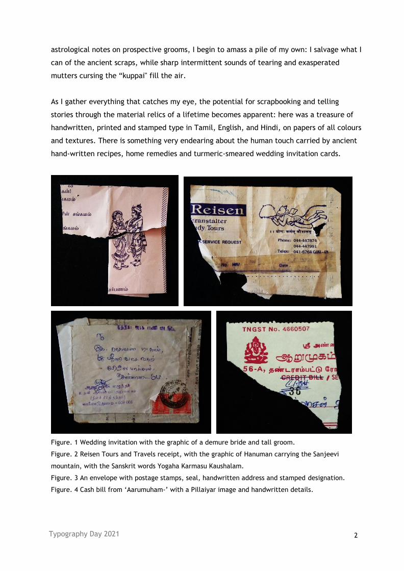
As I gather everything that catches my eye, the potential for scrapbooking and telling
stories through the material relics of a lifetime becomes apparent: here was a treasure of
handwritten, printed and stamped type in Tamil, English, and Hindi, on papers of all colours
and textures. There is something very endearing about the human touch carried by ancient
hand-written recipes, home remedies and turmeric-smeared wedding invitation cards.
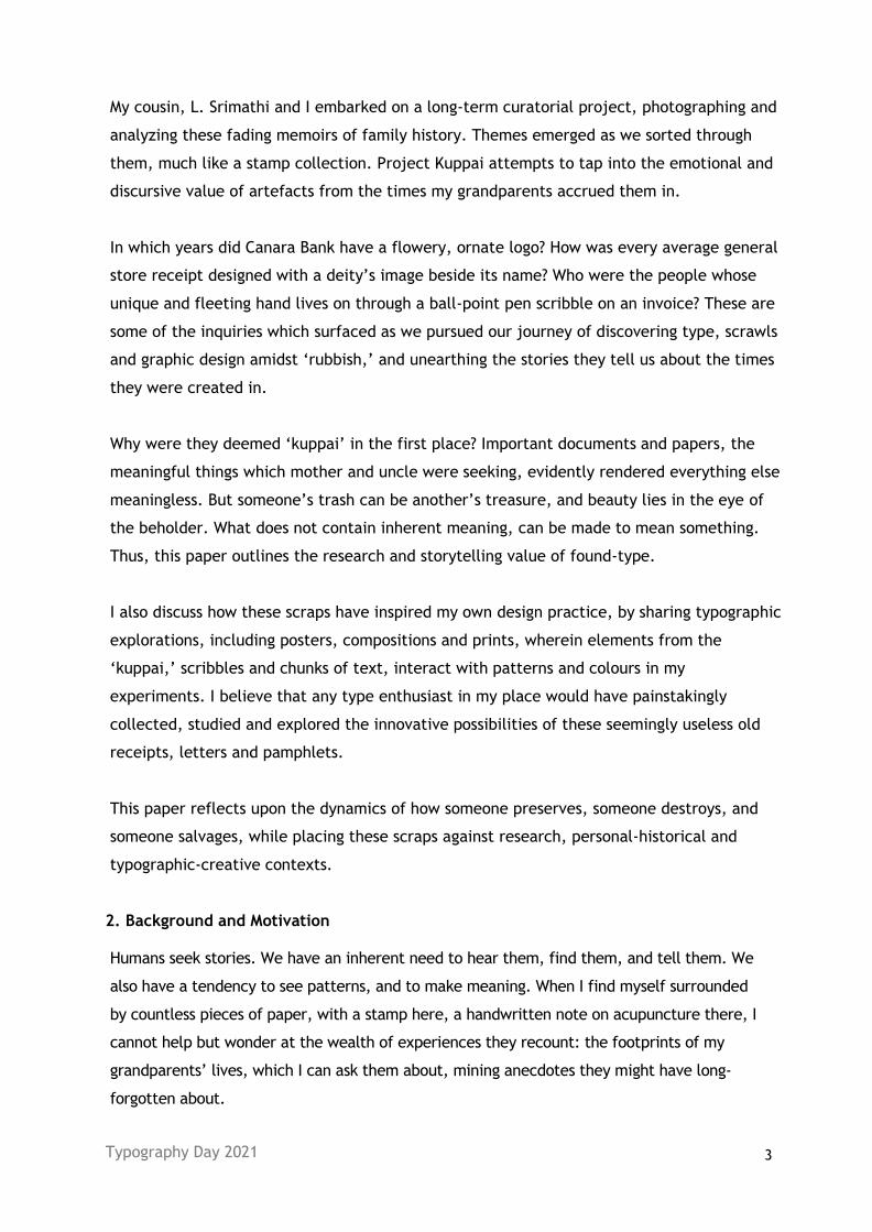
Figure. 1 Wedding invitation with the graphic of a demure bride and tall groom.
Figure. 2 Reisen Tours and Travels receipt, with the graphic of Hanuman carrying the Sanjeevi
mountain, with the Sanskrit words Yogaha Karmasu Kaushalam.
Figure. 3 An envelope with postage stamps, seal, handwritten address and stamped designation.
Figure. 4 Cash bill from ‘Aarumuham-’ with a Pillaiyar image and handwritten details.
Typography Day 2021 3
My cousin, L. Srimathi and I embarked on a long-term curatorial project, photographing and
analyzing these fading memoirs of family history. Themes emerged as we sorted through
them, much like a stamp collection. Project Kuppai attempts to tap into the emotional and
discursive value of artefacts from the times my grandparents accrued them in.
In which years did Canara Bank have a flowery, ornate logo? How was every average general
store receipt designed with a deity’s image beside its name? Who were the people whose
unique and fleeting hand lives on through a ball-point pen scribble on an invoice? These are
some of the inquiries which surfaced as we pursued our journey of discovering type, scrawls
and graphic design amidst ‘rubbish,’ and unearthing the stories they tell us about the times
they were created in.
Why were they deemed ‘kuppai’ in the first place? Important documents and papers, the
meaningful things which mother and uncle were seeking, evidently rendered everything else
meaningless. But someone’s trash can be another’s treasure, and beauty lies in the eye of
the beholder. What does not contain inherent meaning, can be made to mean something.
Thus, this paper outlines the research and storytelling value of found-type.
I also discuss how these scraps have inspired my own design practice, by sharing typographic
explorations, including posters, compositions and prints, wherein elements from the
‘kuppai,’ scribbles and chunks of text, interact with patterns and colours in my
experiments. I believe that any type enthusiast in my place would have painstakingly
collected, studied and explored the innovative possibilities of these seemingly useless old
receipts, letters and pamphlets.
This paper reflects upon the dynamics of how someone preserves, someone destroys, and
someone salvages, while placing these scraps against research, personal-historical and
typographic-creative contexts.
2. Background and Motivation
Humans seek stories. We have an inherent need to hear them, find them, and tell them. We
also have a tendency to see patterns, and to make meaning. When I find myself surrounded
by countless pieces of paper, with a stamp here, a handwritten note on acupuncture there, I
cannot help but wonder at the wealth of experiences they recount: the footprints of my
grandparents’ lives, which I can ask them about, mining anecdotes they might have long-
forgotten about.
Typography Day 2021 4
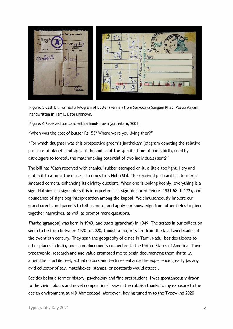
Figure. 5 Cash bill for half a kilogram of butter (vennai) from Sarvodaya Sangam Khadi Vastraalayam,
handwritten in Tamil. Date unknown.
Figure. 6 Received postcard with a hand-drawn jaathakam, 2001.
“When was the cost of butter Rs. 55? Where were you living then?”
“For which daughter was this prospective groom’s jaathakam (diagram denoting the relative
positions of planets and signs of the zodiac at the specific time of one’s birth, used by
astrologers to foretell the matchmaking potential of two individuals) sent?”
The bill has ‘Cash received with thanks.’ rubber-stamped on it, a little too light. I try and
match it to a font: the closest it comes to is Hobo Std. The received postcard has turmeric-
smeared corners, enhancing its divinity quotient. When one is looking keenly, everything is a
sign. Nothing is a sign unless it is interpreted as a sign, declared Peirce (1931-58, II.172), and
abundance of signs beg interpretation among the kuppai. We simultaneously implore our
grandparents and parents to tell us more, and apply our knowledge from other fields to piece
together narratives, as well as prompt more questions.
Thatha (grandpa) was born in 1940, and paati (grandma) in 1949. The scraps in our collection
seem to be from between 1970 to 2020, though a majority are from the last two decades of
the twentieth century. They span the geography of cities in Tamil Nadu, besides tickets to
other places in India, and some documents connected to the United States of America. Their
typographic, research and age value prompted me to begin documenting them digitally,
albeit their tactile feel, actual colours and textures enhance the experience greatly (as any
avid collector of say, matchboxes, stamps, or postcards would attest).
Besides being a former history, psychology and fine arts student, I was spontaneously drawn
to the vivid colours and novel compositions I saw in the rubbish thanks to my exposure to the
design environment at NID Ahmedabad. Moreover, having tuned in to the Typewknd 2020
Typography Day 2021 5
talks by Todd Gilens, Chaiti Nath, Thomas Phinney, Olivia Kane and Umang Baheti, seeing an
assorted pile of type-rich rubbish sets off the excitement of possibly generating something new
from the old, the hope of doing something worthwhile, perhaps by connecting with others who
might find value in this.
3. Literature Context
“Constructing family history as the rediscovery of ordinary lives universalizes and
provides relevance for the pursuit,” notes Wendy Bottero (2015). “The practice of family
history requires an active process of interpretation, reflected not only in family
historians’ storying of accounts, but also in their explicit presentation of such narratives
as interpretations of research.” Our project is a similar attempt to reconstruct stories
from our family’s past, through intuition and interpretation. “The framing of accounts of
ancestors’ lives, then, serves to reflect the value added by the work undertaken,
providing proof of expertise in stories of the successful transformation of knowledge (in
themes of recovering the forgotten, uncovering secrets, discovering surprising new facts)
that careful research in archives has achieved. However, such narratives are not just a
means of displaying or accounting for family history. They also perform work within the
practice of family history itself: operating as an organising device helping to connect and
interpret disparate and incomplete information, whilst retaining the inherently
ambiguous nature of that information and so continuing to display the family historian’s
exercise of judgement.” (Bottero, W. 2015)
Lambert discusses how ‘The process of “discovering” a family’s past includes a significant
degree of invention’, so that ‘confronted with a few “facts”, respondents were invited to
“complete” the stories in their imagination’ (Lambert, 1996, 138; 2002: 123).
The invitation to “complete” is particularly poignant: the tornness of the scraps is a paean
to how fragmented our knowledge of the past will remain, gleaning from what little we
have, however, reassuring us that there is beauty in incompletenesses. We retrieved so
many torn addresses of homes once lived in: handwritten reminders that we will cease to
occupy the spaces we do now, that we always have. How, then, “do we respond to the
pendulum swing of hope and melancholy; naïveté and knowingness; empathy and apathy;
unity and plurality; totality and fragmentation; purity and ambiguity?” (Ambrose, G. and
Salter, B., 2019)
In her talk, ‘The Mysteries of History: Uncovering Obscure Type & Design History Has
Changed My Path as a Designer,’ Olivia Kane (2020) addresses how “as type users and
designers, we are responsible for how we reuse aesthetic motifs from the past. It is time
Typography Day 2021 6
to reshape our design history education to include stories from a more global perspective
and to stop discounting these lesser known (but equally important) anecdotes.” She
shares her experience, hoping to “spark curiosity in others and inspire her audience to
consider how we pass on our knowledge to the next generation of creators.”
Kuppai has found its way into my own typographic explorations, with elements, scribbles
and chunks of text from the scraps interacting with patterns and colors in my experiments.
“A design experiment that is rooted in anti-conventionalism can only exist against the
background of other — conventional — solutions. An experimental technique which is
frequently used [as is the case with my Kuppai explorations] is to bring together various
working methods which are recognized separately but rarely combined. For example,
language is studied systematically by linguists, who are chiefly interested in spoken
languages and in the problems of analyzing them as they operate at a given point in time.
Linguists rarely, however, venture into the visible representation of language, because
they consider it artificial and thus secondary to spoken language. Typographers on the
other hand are concerned with the appearance of type in print and other reproduction
technologies; they often have substantial knowledge of composition, color theories,
proportions, paper, etc., yet often lack knowledge of the language which they represent.”
(Bil’ak, P. 2005)
“Through writing, something as fluid as speech becomes durable, sometimes for millennia.
My ambitions aren't so grand but I do wish to be part of the art of writing and language,
exploring ways to make and to place texts so that new relationships emerge in the
reading.” (Gilens, T. 2016)
Among the other sources of inspiration and knowledge were S. Girikumar’s presentation,
“Preserving Memories” at the International Archives Week Milli Sessions 2021; Chaiti Nath’s
talk, “Dissecting Indian Matchbox Label Type” at Typewknd 2020; and Kristina Bedford’s
website Ancestral Deeds.
Having established the contexts of researching family history and experimentation, I
discuss some specimens in the following sections.
4. Curating Kuppai
What does one see when one sees Kuppai? Some of the patterns which emerged as we sorted
them illustrated that there were many ways to categorize and compile the scraps, much like
in philately, wherein collectors may opt to organize them according to chronology,
geography or themes.
Typography Day 2021 7
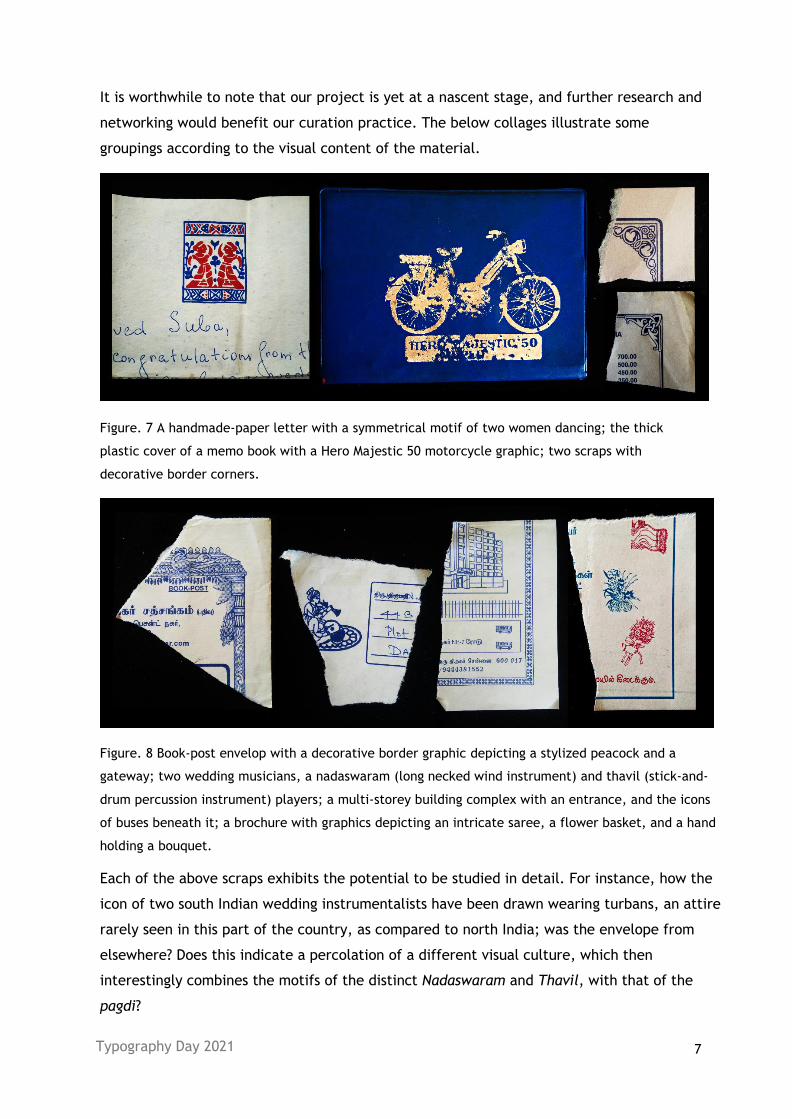
It is worthwhile to note that our project is yet at a nascent stage, and further research and
networking would benefit our curation practice. The below collages illustrate some
groupings according to the visual content of the material.
Figure. 7 A handmade-paper letter with a symmetrical motif of two women dancing; the thick
plastic cover of a memo book with a Hero Majestic 50 motorcycle graphic; two scraps with
decorative border corners.
Figure. 8 Book-post envelop with a decorative border graphic depicting a stylized peacock and a
gateway; two wedding musicians, a nadaswaram (long necked wind instrument) and thavil (stick-and-
drum percussion instrument) players; a multi-storey building complex with an entrance, and the icons
of buses beneath it; a brochure with graphics depicting an intricate saree, a flower basket, and a hand
holding a bouquet.
Each of the above scraps exhibits the potential to be studied in detail. For instance, how the
icon of two south Indian wedding instrumentalists have been drawn wearing turbans, an attire
rarely seen in this part of the country, as compared to north India; was the envelope from
elsewhere? Does this indicate a percolation of a different visual culture, which then
interestingly combines the motifs of the distinct Nadaswaram and Thavil, with that of the
pagdi?
Typography Day 2021 8
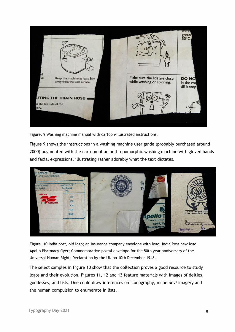
Figure. 9 Washing machine manual with cartoon-illustrated instructions.
Figure 9 shows the instructions in a washing machine user guide (probably purchased around
2000) augmented with the cartoon of an anthropomorphic washing machine with gloved hands
and facial expressions, illustrating rather adorably what the text dictates.
Figure. 10 India post, old logo; an insurance company envelope with logo; India Post new logo;
Apollo Pharmacy flyer; Commemorative postal envelope for the 50th year anniversary of the
Universal Human Rights Declaration by the UN on 10th December 1948.
The select samples in Figure 10 show that the collection proves a good resource to study
logos and their evolution. Figures 11, 12 and 13 feature materials with images of deities,
goddesses, and lists. One could draw inferences on iconography, niche devi imagery and
the human compulsion to enumerate in lists.
Typography Day 2021 9
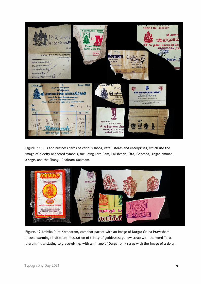
Figure. 11 Bills and business cards of various shops, retail stores and enterprises, which use the
image of a deity or sacred symbols, including Lord Ram, Lakshman, Sita, Ganesha, Angaalamman,
a sage, and the Shangu-Chakram-Naamam.
Figure. 12 Ambika Pure Karpooram, camphor packet with an image of Durga; Gruha Pravesham
(house-warming) invitation; illustration of trinity of goddesses; yellow scrap with the word “arul
tharum,” translating to grace-giving, with an image of Durga; pink scrap with the image of a deity.
Typography Day 2021 10
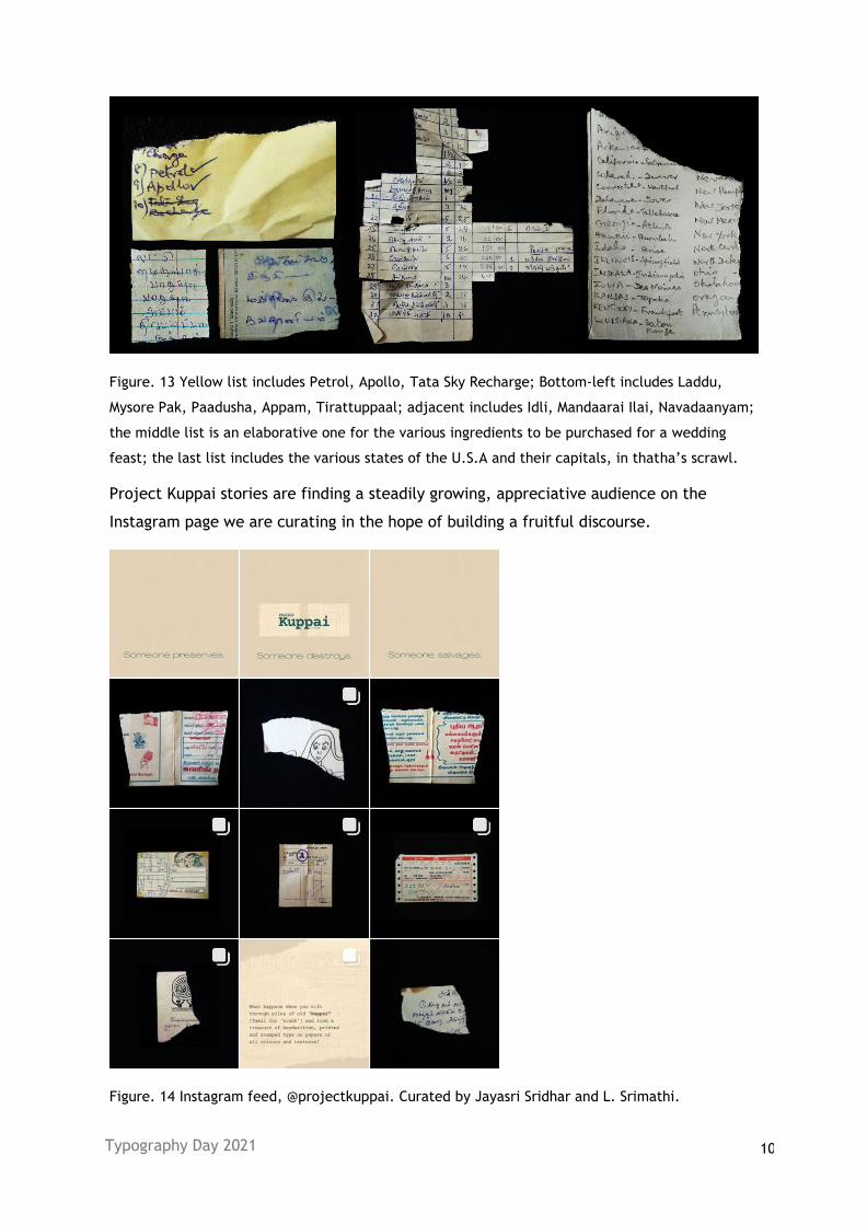
Figure. 13 Yellow list includes Petrol, Apollo, Tata Sky Recharge; Bottom-left includes Laddu,
Mysore Pak, Paadusha, Appam, Tirattuppaal; adjacent includes Idli, Mandaarai Ilai, Navadaanyam;
the middle list is an elaborative one for the various ingredients to be purchased for a wedding
feast; the last list includes the various states of the U.S.A and their capitals, in thatha’s scrawl.
Project Kuppai stories are finding a steadily growing, appreciative audience on the
Instagram page we are curating in the hope of building a fruitful discourse.
Figure. 14 Instagram feed, @projectkuppai. Curated by Jayasri Sridhar and L. Srimathi.
Typography Day 2021 11
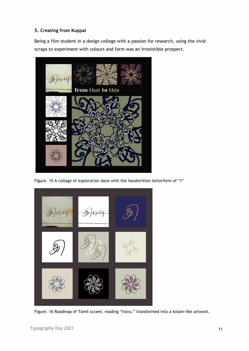
5. Creating from Kuppai
Being a film student in a design college with a passion for research, using the vivid
scraps to experiment with colours and form was an irresistible prospect.
Figure. 15 A collage of exploration done with the handwritten letterform of “i”
Figure. 16 Roadmap of Tamil scrawl, reading “Iravu,” transformed into a kolam-like artwork.
Typography Day 2021 12
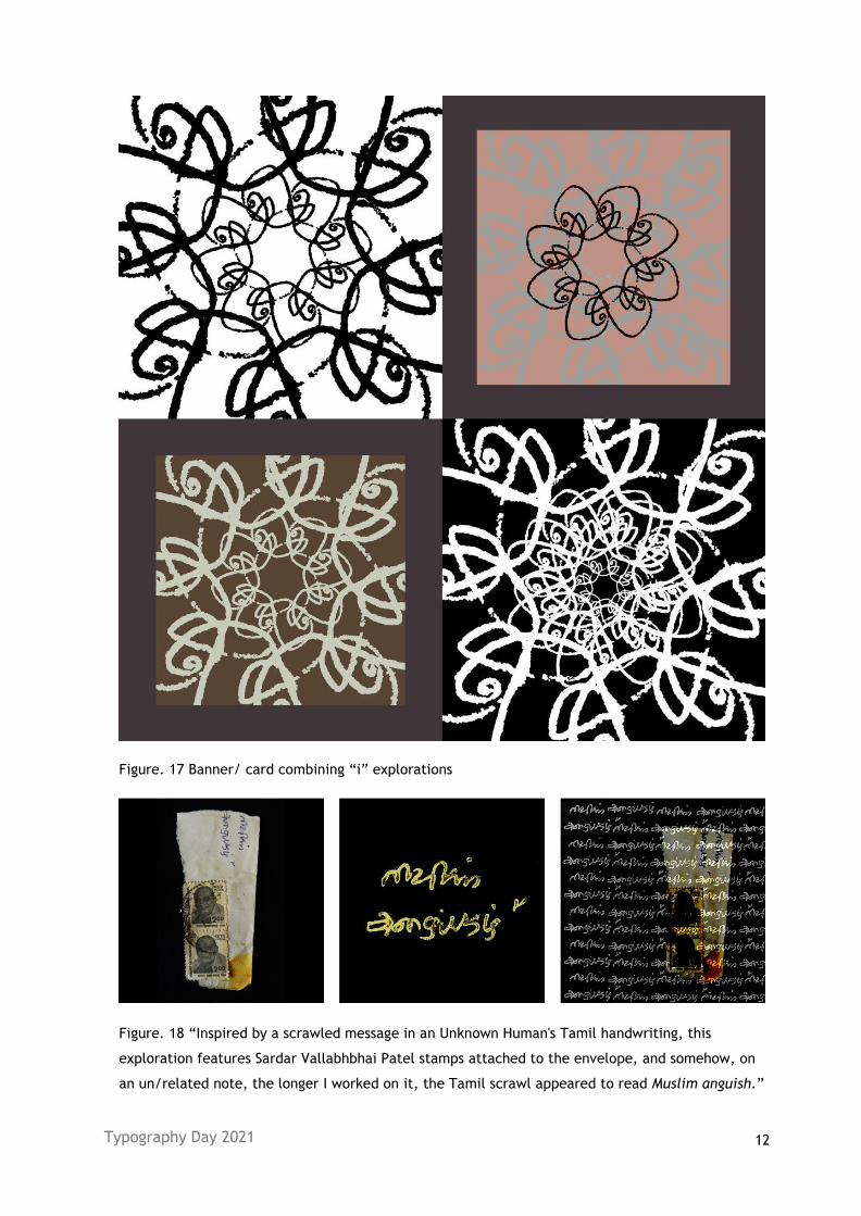
Figure. 17 Banner/ card combining “i” explorations
Figure. 18 “Inspired by a scrawled message in an Unknown Human's Tamil handwriting, this
exploration features Sardar Vallabhbhai Patel stamps attached to the envelope, and somehow, on
an un/related note, the longer I worked on it, the Tamil scrawl appeared to read Muslim anguish.”
Typography Day 2021 13
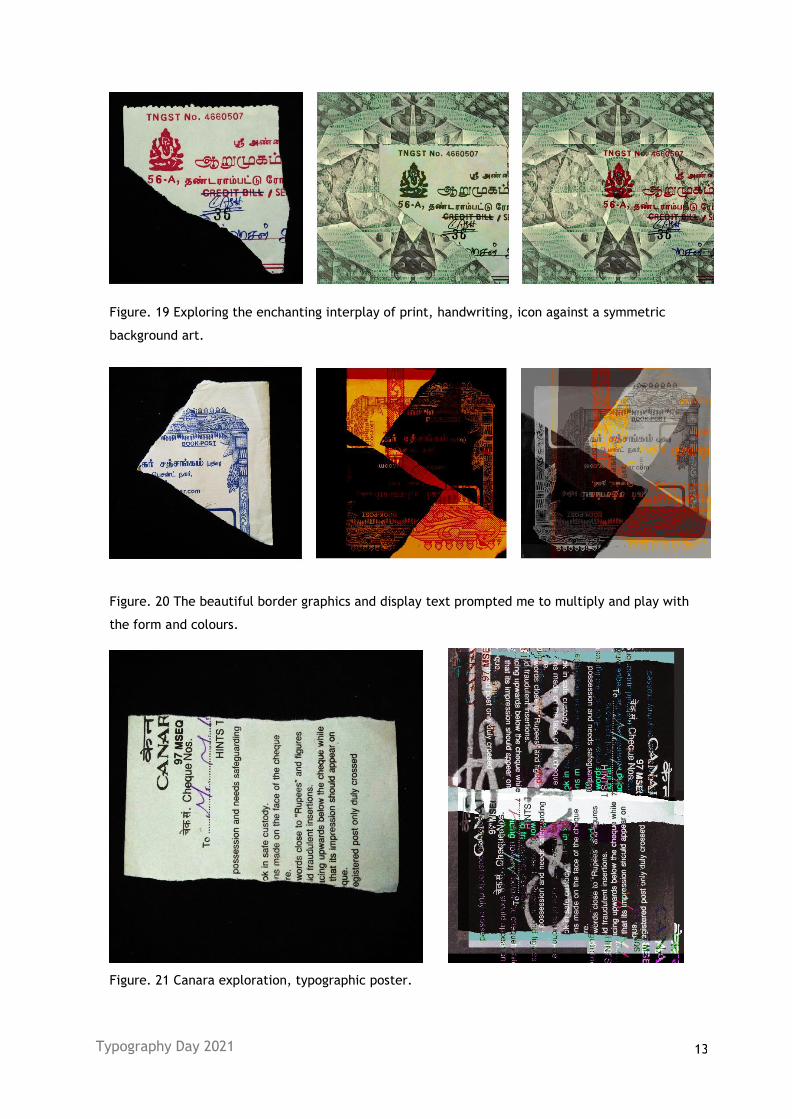
Figure. 19 Exploring the enchanting interplay of print, handwriting, icon against a symmetric
background art.
Figure. 20 The beautiful border graphics and display text prompted me to multiply and play with
the form and colours.
Figure. 21 Canara exploration, typographic poster.
Typography Day 2021 14
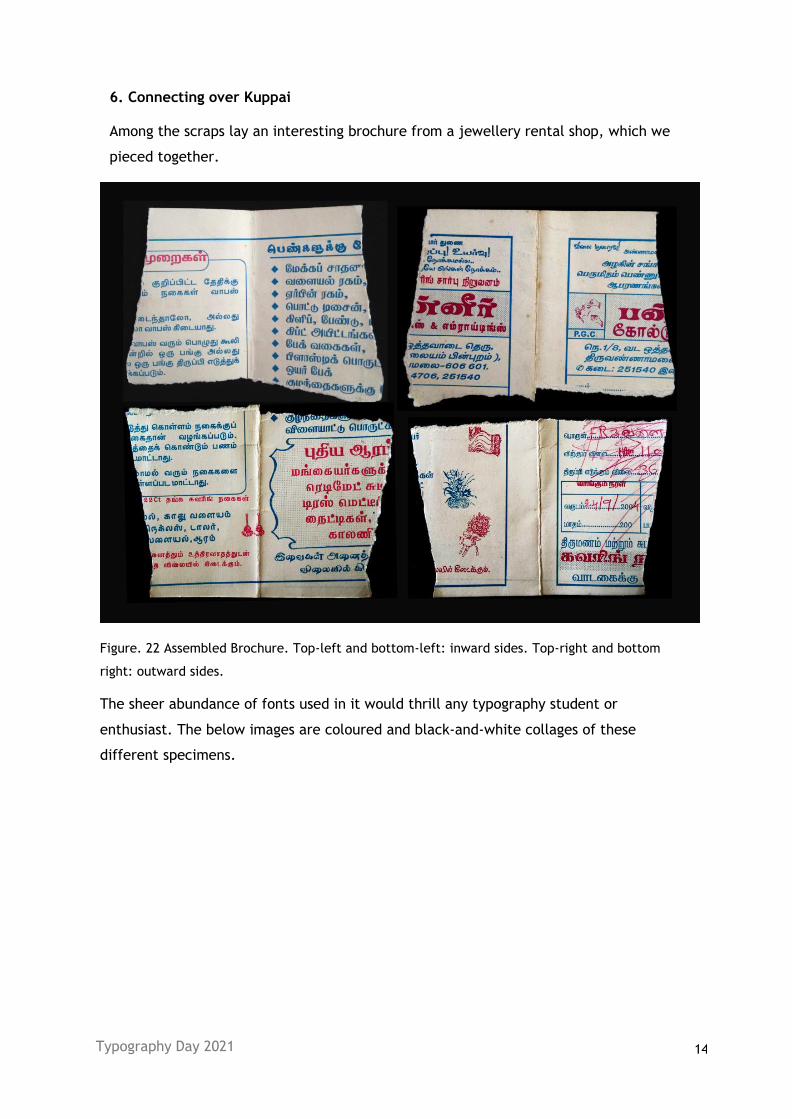
6. Connecting over Kuppai
Among the scraps lay an interesting brochure from a jewellery rental shop, which we
pieced together.
Figure. 22 Assembled Brochure. Top-left and bottom-left: inward sides. Top-right and bottom
right: outward sides.
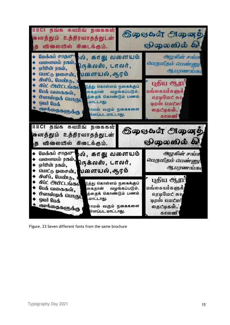
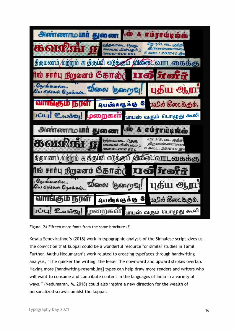
The sheer abundance of fonts used in it would thrill any typography student or
enthusiast. The below images are coloured and black-and-white collages of these
different specimens.
Typography Day 2021 15
Figure. 23 Seven different fonts from the same brochure
Typography Day 2021 16
Figure. 24 Fifteen more fonts from the same brochure (!)
Kosala Senevirathne’s (2018) work in typographic analysis of the Sinhalese script gives us
the conviction that kuppai could be a wonderful resource for similar studies in Tamil.
Further, Muthu Nedumaran’s work related to creating typefaces through handwriting
analysis, “The quicker the writing, the lesser the downward and upward strokes overlap.
Having more [handwriting-resembling] types can help draw more readers and writers who
will want to consume and contribute content in the languages of India in a variety of
ways,” (Nedumaran, M. 2018) could also inspire a new direction for the wealth of
personalized scrawls amidst the kuppai.
Typography Day 2021 17
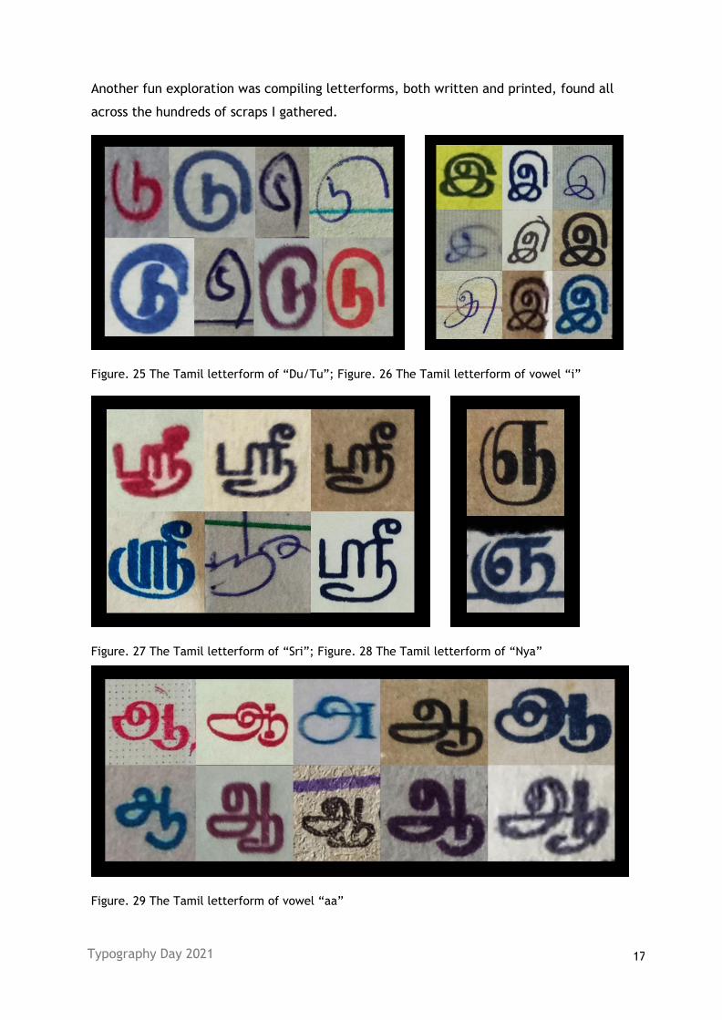
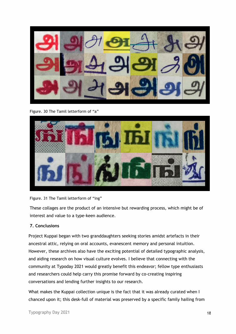
Another fun exploration was compiling letterforms, both written and printed, found all
across the hundreds of scraps I gathered.
Figure. 25 The Tamil letterform of “Du/Tu”; Figure. 26 The Tamil letterform of vowel “i”
Figure. 27 The Tamil letterform of “Sri”; Figure. 28 The Tamil letterform of “Nya”
Figure. 29 The Tamil letterform of vowel “aa”
Typography Day 2021 18
Figure. 30 The Tamil letterform of “a”
Figure. 31 The Tamil letterform of “ing”
These collages are the product of an intensive but rewarding process, which might be of
interest and value to a type-keen audience.
7. Conclusions
Project Kuppai began with two granddaughters seeking stories amidst artefacts in their
ancestral attic, relying on oral accounts, evanescent memory and personal intuition.
However, these archives also have the exciting potential of detailed typographic analysis,
and aiding research on how visual culture evolves. I believe that connecting with the
community at Typoday 2021 would greatly benefit this endeavor; fellow type enthusiasts
and researchers could help carry this promise forward by co-creating inspiring
conversations and lending further insights to our research.
What makes the Kuppai collection unique is the fact that it was already curated when I
chanced upon it; this desk-full of material was preserved by a specific family hailing from
Typography Day 2021 19
a specific cultural context, during a specific time period, though the reasons are largely
obscure. It contributes to the larger historical, political and cultural discourse around
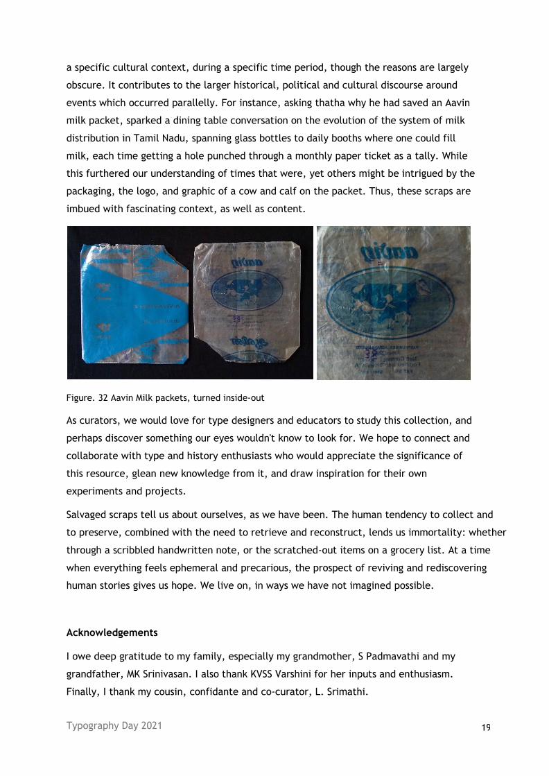
events which occurred parallelly. For instance, asking thatha why he had saved an Aavin
milk packet, sparked a dining table conversation on the evolution of the system of milk
distribution in Tamil Nadu, spanning glass bottles to daily booths where one could fill
milk, each time getting a hole punched through a monthly paper ticket as a tally. While
this furthered our understanding of times that were, yet others might be intrigued by the
packaging, the logo, and graphic of a cow and calf on the packet. Thus, these scraps are
imbued with fascinating context, as well as content.
Figure. 32 Aavin Milk packets, turned inside-out
As curators, we would love for type designers and educators to study this collection, and
perhaps discover something our eyes wouldn't know to look for. We hope to connect and
collaborate with type and history enthusiasts who would appreciate the significance of
this resource, glean new knowledge from it, and draw inspiration for their own
experiments and projects.
Salvaged scraps tell us about ourselves, as we have been. The human tendency to collect and
to preserve, combined with the need to retrieve and reconstruct, lends us immortality: whether
through a scribbled handwritten note, or the scratched-out items on a grocery list. At a time
when everything feels ephemeral and precarious, the prospect of reviving and rediscovering
human stories gives us hope. We live on, in ways we have not imagined possible.
Acknowledgements
I owe deep gratitude to my family, especially my grandmother, S Padmavathi and my
grandfather, MK Srinivasan. I also thank KVSS Varshini for her inputs and enthusiasm.
Finally, I thank my cousin, confidante and co-curator, L. Srimathi.
Typography Day 2021 20
References
1. Peirce, Charles Sanders (1931-58): Collected Writings (8 Vols.). (Ed. Charles Hartshorne, Paul
Weiss & Arthur W Burks). Cambridge, MA: Harvard University Press
2. Gilens, T. (2020). “My Wish to Write in Someone Else's Hand”. YouTube. Uploaded by Typewknd,
May 25, 2021. https://www.youtube.com/watch?v=EfnfY_RlVJI
3. Nath, C. (2020). “Dissecting Indian Matchbox Label Type”. YouTube. Uploaded by Typewknd, Jun
1, 2021. https://www.youtube.com/watch?v=QOpM8QAt8s0
4. Phinney, T. (2020). “The Font Detective & the Reprehensible Rabbi”. YouTube. Uploaded by
Typewknd, Feb 16, 2021. https://www.youtube.com/watch?v=vYYwsd_JrOU&t=17s
5. Kane, O. (2020). “The Mysteries of History: Uncovering Obscure Type & Design History Has
Changed My Path as a Designer”. YouTube. Uploaded by Typewknd, Jun 18, 2021
https://www.youtube.com/watch?v=RrVKtrqdcxU
6. Baheti, U. (2020). “Exploring Hand-Painted and Hand-Written Type”. YouTube. Uploaded by
Typewknd, Apr 2, 2021 https://www.youtube.com/watch?v=w-xp8qnryvg&t=36s
7. Bottero, W. (2015). Identity and the practice of family history (CRESC Working Paper 121).
10.13140/RG.2.1.3801.3606.
8. Lambert, R. (2002) ‘Reclaiming the ancestral past: narrative, rhetoric and the “convict stain”’,
Journal of Sociology, 38(2)111-27
9. Ambrose, G. and Salter, B. (2019) The dichotomic tension of experimental typography. Paper
presented at Typography Day 2019, IDC IIT Bombay. Retrieved from
https://www.typoday.in/2019/spk_papers/gavin%20Ambrose&beth_salter_typoday_2019.pdf
10. Bil'ak, P. (2005). Experimental typography. Whatever that means. Items, No.1. Accessed from
https://www.typotheque.com/articles/experimental_typography_whatever_that_means
11. Gilens, T. (2016, September). Confluence news: physical ideas. Confluence. Retrieved August 07,
2021, from https://us10.campaign-archive.com/?u=5dc81d3f666dc90b742614bc5&id=4739dfead3
12. Girikumar, S. (2021). “Preserving Memories”. YouTube. Uploaded by Milli Network, Jun 7, 2021.
https://www.youtube.com/watch?v=lzaQc6Y2ifs&list=PLWOwOeaqNcNC-
BQM9ps2x0LPnU7kzIPTM&index=4
13. Bedford, K. (n.d.). Ancestral Deeds. Retrieved August 07, 2021, from
https://ancestraldeeds.co.uk/samples/
14. Senevirathne, K. (2018) Exploring typography of Sinhala numerals. Paper presented at Typography
Day 2018, University of Mumbai. Retrieved from
https://www.typoday.in/2018/spk_papers/kosala-senevirathne-typoday-2018.pdf
15. Nedumaran, M. (2018) Exploring A Cursive Design for a Mixed Script Typeface. Paper presented at
Typography Day 2018, University of Mumbai. Retrieved from
https://www.typoday.in/2018/spk_papers/muthu-nedumaran-typoday-2018.pdf