Embed Size (px)
Citation preview
Credit Growth and the Financial Crisis:A New Narrative∗
Stefania Albanesi, University of Pittsburgh, NBER and CEPRGiacomo DeGiorgi, GSEM-University of Geneva, ICREA/MOVE, BGSE, CEPR
Jaromir Nosal, Boston College
August 21, 2017
Abstract
A broadly accepted view contends that the 2007-09 financial crisis in the U.S. wascaused by an expansion in the supply of credit to subprime borrowers during the 2001-2006 credit boom, leading to the spike in defaults and foreclosures that sparked thecrisis. We use a large administrative panel of credit file data to examine the evolutionof household debt and defaults between 1999 and 2013. Our findings suggest an alter-native narrative that challenges the large role of subprime credit in the crisis. We showthat credit growth between 2001 and 2007 was concentrated in the prime segment,and debt to high risk borrowers was virtually constant for all debt categories duringthis period. The rise in mortgage defaults during the crisis was concentrated in themiddle of the credit score distribution, and mostly attributable to real estate investors.We argue that previous analyses confounded life cycle debt demand of borrowers whowere young at the start of the boom with an expansion in credit supply over that pe-riod. Moreover, a positive correlation between the concentration of subprime borrowersand the severity of the 2007-09 recession found in previous research may be driven byhigh prevalence of young, low education, minority individuals in zip codes with largesubprime population.
∗We are grateful to Christopher Carroll, Gauti Eggertsson, Nicola Gennaioli, Marianna Kudlyak, VirgiliuMidrigan, Giuseppe Moscarini, Joe Tracy, Eric Swanson, Paul Willen and many seminar and conferenceparticipants for useful comments and suggestions. We also thank Matt Ploenzke, Harry Wheeler and RichardSvoboda for excellent research assistance. Correspondence to: [email protected].
1 Introduction
The broadly accepted narrative about the financial crisis is based on the findings in Mian
and Sufi (2009) suggesting that most of the growth in credit during the 2001-2006 boom was
concentrated in the subprime segment, despite the fact that income did not rise over the
same period for this group of borrowers. The expansion of subprime credit then led to a rise
in mortgage delinquencies and foreclosures, which caused the housing crisis and subsequent
the 2007-2009 recession (see Mian and Sufi (2010), Mian and Sufi (2011), Mian, Rao, and
Sufi (2013) and Mian, Sufi, and Trebbi (2015)).
This paper studies the evolution of household borrowing and default between 1999 and
2013, leading up and following the 2007-09 great recession. Our analysis is based on the
Federal Reserve Bank of New York Consumer Credit Panel/Equifax data, a large adminis-
trative panel of anonymous credit files from the Equifax credit reporting bureau. The data
contains information on individual debt holdings, delinquencies, public records and credit
scores. We examine the evolution of mortgage debt and defaults during the credit boom and
throughout the financial crisis and its aftermath. Our findings suggest an alternative narra-
tive that challenges the view that the expansion of the supply of mortgage credit to subprime
borrowers played a large role in the credit boom in 2001-2007 and the subsequent financial
crisis. Specifically, we show that credit growth between 2001 and 2007 is concentrated in
the middle and and at the top of the credit score distribution. Borrowing by individuals
with low credit score is virtually constant during the boom. We also find that the rise in
defaults during the financial crisis is concentrated in the middle of the credit score distribu-
tion. While low credit score individuals typically have higher default rates than individuals
with higher credit scores, during the financial crisis the fraction of mortgage delinquencies
to the lowest quartile of of the credit score distribution dropped from 40% to 30%, and the
fraction of foreclosures from 70% to 35%.
Mian and Sufi (2009) and Mian and Sufi (2016) identify subprime individuals based
on their credit score in 1996 and 1997, respectively. We show that, since low credit score
individuals at any time are disproportionally young, this approach confounds an expansion
of the supply of credit with the life cycle demand for credit of borrowers who were young at
the start of the boom. To avoid this pitfall, our approach is based on ranking individuals
by a recent lagged credit score, following industry practices. This prevents joint endogeneity
of credit scores with borrowing and delinquency behavior but ensures that the ranking best
reflects the borrower’s likely ability to repay debt at the time of borrowing. Our analysis
shows that income growth and debt growth are positively related during the credit boom
1

for individual borrowers. Using payroll data for 2009, we show that the cross sectional
dispersion of credit scores is mostly explained by the cross sectional dispersion of labor
income, conditional on age. Moreover, the lifecycle pattern of borrowing and credit scores is
tightly related to the lifecycle evolution of income.
Our finding that borrowers in middle and at the top of the credit score distribution
disproportionally default during the crisis is puzzling, as these borrowers historically exhibit
very low default rates on any type of debt, as well as very low foreclosure rates. To gain
insight on what may have driven defaults by borrowers with relatively high credit scores, we
explore the role of real estate investors. Using our data, we can identify real estate investors
as borrowers who hold 2 or more first mortgages, following Haughwout et al. (2011). There
are four main reasons that may lead real estate investors to display higher default rates than
other borrowers with similar credit scores. First, only mortgages contracted for a borrower’s
primary residence are eligible for GSE insurance. Thus, real estate investors would need
to contract non-standard mortgages, such as Alt-A, Adjustable Rate Mortgages (ARMs),
which charge higher interest rates and are intrinsically more risky.1 Second, if investors are
motivated by the prospect of capital gains,2 they have an incentive to maximize leverage,
as this strategy increases the potential gains from holding a property, while the potential
losses are limited, especially in states in which foreclosure is non recourse.3 Third, only
the primary residence is protected in personal bankruptcy, via the homestead exemption
(see Li (2009)). Thus, a financially distressed borrower could potentially file for Chapter 7
bankruptcy and discharge unsecured debt using non exempt assets to avoid missing payments
on the mortgage for their primary residence.4 Finally, the financial and psychological costs of
default for mortgage borrowers who reside in the home are typically quite substantial, as the
resulting relocation would generate moving and storage costs, and possibly cause difficulties
for household members in reaching their workplace or their school.
We find that real estate investors play a critical role in the rise in mortgage debt only for
the middle and the top of the credit score distribution. The share of mortgage balances of
real estate investors rose from 20% to 35% between 2004 and 2007 for quartiles 2 and 3 of the
1 Agarwal et al. (2016) document clear patterns of product steering by mortgage brokers, who directedborrowers eligible for conventional fixed interest rate mortgages to riskier products with higher margins,increasing default risk for standard borrowers.
2This is highly likely given the decline in the rent to price ratio for residential housing over this timeperiod, as discussed in Kaplan, Mitman, and Violante (2017).
3Ghent and Kudlyak (2011) show that foreclosure rates are 30% higher in non-recourse state during thecrisis.
4 Albanesi and Nosal (2015) provide empirical evidence on the relation between consumer bankruptcy,delinquency and foreclosure, while Mitman (2016) develops a quantitative model of bankruptcy where defaulton unsecured debt prioritized over mortgage default.
2
credit score distribution. Most importantly, we find that the rise in mortgage delinquencies
is virtually exclusively accounted for by real estate investors. The fraction of borrowers
with delinquent mortgage balances grew by 30 percentage points between 2005 and 2008
for the lowest three quartiles of the credit score distribution, and by 10 percentage points
for borrowers in the top quartile, while it was virtually constant for borrowers with only
one first mortgage. This striking result provides guidance to policy makers interested in
understanding the cause of the housing crisis and designing interventions to mitigate and
prevent future such episodes.5
We also explore the broader macroeconomic implications of our findings, linking them to
the theoretical literature that emphasizes the role of the collateral channel in the transmis-
sion of financial shocks to real economic activity, and more directly, to the sizable empirical
literature that uses geographical variation in mortgage borrowing to relate mortgage debt
growth to the severity of the recession at a regional level. There is a large theoretical litera-
ture on the role of collateral constraints in causing or amplifying swings in economic activity,
following the pioneering work of Kiyotaki and Moore (1997). This literature proliferated in
response to the financial crisis, leading to numerous theoretical and quantitative contribu-
tions.6 Following the 2007-2009 recession, a large empirical literature also developed, linking
the size of the credit boom and the depth of the recession in different geographical areas.7
We examine the behavior of debt and defaults at the zip code level, using the Federal
Reserve Bank of New York Equifax Data/Consumer Credit Panel. Because we also have
access to individual data, our analysis can provide important insights into the relation be-
tween individual and geographically aggregated outcomes, shedding light on the mechanism
through which credit growth affects other economic variables.8
Following Mian and Sufi (2009), we rank zip codes by the fraction of subprime borrowers
in 1999, the first available year in our data.9 Based on our data, zip codes in the top quartile
of the distribution of the fraction of subprime borrowers exhibit larger growth in per capita
mortgage balances (but not in total debt balances), confirming previous findings. However,
5 One implication of our findings is that many renters were displaced as their landlords defaulted on theirmortgages, leading to foreclosure of the home. See Bazikyan (2009) for a discussion.
6 Some recent contributions include Iacoviello (2004), Guerrieri and Lorenzoni (2011), Berger et al. (2015),Corbae and Quintin (2015), Mitman (2016), Justiniano, Primiceri, and Tambalotti (2016), Kaplan, Mitman,and Violante (2017).
7Some examples include Mian and Sufi (2011), Mian, Sufi, and Trebbi (2015), Mian, Rao, and Sufi (2013),Mian and Sufi (2010), Midrigan and Philippon (2011), Kehoe, Pastorino, and Midrigan (2016), Keys et al.(2014).
8 Most existing analyses have access to either geographically aggregated data or individual data.9 Subprime borrowers have credit scores below 660, as captured by the Equifax Risk Score. See Section
8 for more detail.
3

in all quartiles prime borrowers are responsible for most of the credit growth. The growth
in mortgage debt by subprime borrowers during the boom is modest in terms of balances,
and even weaker in terms of number of mortgages and originations. We also show that
irrespective of the fraction of subprime borrowers, the rise in defaults during the crises is
mostly driven by prime borrowers.
Based on our findings with individual level data, we examine the role of the age distribu-
tion in different quartiles of the fraction of subprime borrowers. The median age declines by
quartile of the fraction of subprime, while the proportion of borrowers younger than 35 rises.
This is not surprising, given that low credit score borrowers are disproportionately young.
We conduct counterfactuals to quantify the role of the age distribution, and find that 83%
of the difference in credit growth between the top and bottom quartile of the fraction of
subprime is accounted for by differences in the age distribution of borrowers in these zip
codes. These findings confirm our findings at the individual level on the effect of life cycle
demand for credit on the observed borrowing behavior during the boom.
The empirical papers that exploit geographical variation to link the size of mortgage
debt growth during the credit boom to the depth of the recession (measured in terms of
consumption drop or unemployment rate increase) attribute this correlation to the tight-
ening of collateral constraints during the crisis, resulting from mortgage defaults by high
risk/low income borrowers. Our findings are not consistent with this causal mechanism. We
therefore explore additional characteristics of these geographical areas that may explain this
correlation. We show that several indicators that are critical to business cycle sensitivity are
systematically related to the fraction of subprime borrowers. Zip codes with higher fraction
of subprime borrowers are younger, as previously noted, have lower levels of educational
attainment and have a disproportionately large minority and African American share in the
population. It is well known that younger, less educated, minority workers suffer larger and
more persistent employment loss during recessions ( see Mincer (1991) and Shimer (1998)).
Zip codes with a large fraction of subprime borrowers also have higher population density
and exhibit more income inequality. It follows that the aggregation bias that is generated
by the fact that, within zip code, prime borrowers experience larger credit growth than
subprime borrowers is accentuated.10
10The distribution of the fraction of subprime borrowers is quite stable at the zip code level, and thisis also true for other characteristics salient to business cycle sensitivity, as shown in Section 8. Therefore,the timing of the ranking by fraction of subprime does not change zip code level patterns. However, someaggregate trends, such as the historical decline in wages, labor force participation and employment rates forunskilled, young and minority workers, and the rise in income inequality may influence economic outcomesat the zip code level over time.
4
Taken together, our findings suggest that using geographically aggregated data does not
provide an accurate account of the patterns of borrowing at the individual level. Moreover,
the positive correlation between credit growth during the boom and the depth of the recession
may be due to other geographical characteristics, such as the prevalence of young, minority
or low education workers.
Our findings confirm and expand those in Adelino, Schoar, and Severino (2015) and
Adelino, Schoar, and Severino (2017), who show that the growth in mortgage balances
during the boom and the new defaults during the financial crisis are concentrated in the
middle of the income distribution. We show that the large contribution of middle and upper
credit score (and income) households to credit growth during the 2001-2007 boom and the
stark rise in defaults and foreclosures for these households is primarily driven by real estate
investor activity. Moreover, we explain the role of the positive relation between credit score
and age in generating the discrepancy in distribution of debt based on initial and recent
credit scores. Our results are also consistent with Foote, Loewenstein, and Willen (2016),
who find that the geographical relation of mortgage debt growth and income does not change
relative to previous periods during the 2001-2006 credit boom, and there is no relative growth
in debt for low income households. Our analysis also reconciles the pattern of borrowing
at the individual level and at the zip code level, showing that though mortgage balances
grows more in areas with a larger fraction of subprime borrowers, within those areas, debt
growth is driven by high credit score borrowers. The fact that zip codes with high fraction
of subprime borrowers are associated with low income levels and growth during the boom is
explained by demographics, specifically the high fraction of young, low education minority
borrowers. High population density and very extreme levels of income inequality in these
zip codes exacerbates the aggregation bias associated with using geographically aggregated
data.
The rest of the paper is organized as follows. Section 2 describes the data used in this
analysis. Section 3 reports the existing evidence on credit growth and default behavior by
credit score. Section 4 examines the role of life cycle factors for credit demand and credit
scores. Section 5 explores the relation between credit score and income. Section 6 examines
the behavior of debt and defaults by recent credit score and Section 7 discusses the role of
investors. Section 8 presents the zip code level analysis and Section 9 concludes.
5
2 Data
We use the Federal Reserve Bank of New York’s Consumer Credit Panel/Equifax Data
(CCP), which is an anonymous longitudinal panel of individuals, comprising a 5% random
sample of all individuals who have a credit report with Equifax. Our quarterly sample starts
in 1999:Q1 and ends in 2013:Q3. The data is described in detail in Lee and van der Klaauw
(2010). We use a 1% sample for the individual analysis, which includes information for
approximately 2.5 million individuals in each quarter. We use the 5% sample for the zip
code level analysis.
The data contains over 600 variables, allowing us to track all aspects of individuals’
financial liabilities, including bankruptcy and foreclosure, mortgage status, detailed delin-
quencies, various types of debt, with number of accounts and balances. Apart from the
financial information, the data contains individual descriptors such as age, ZIP code and
credit score. The variables included in our analysis are described in detail in Appendix A.
3 Existing Evidence
The credit score is a summary indicator intended to predict the risk of default by the borrower
and it is widely used by the financial industry. For most unsecured debt, lenders typically
verify a perspective borrower’s credit score at the time of application and sometimes a short
recent sample of their credit history. For larger unsecured debts, lenders also typically require
some form of income verification, as they do for secured debts, such as mortgages and auto
loans. Still, the credit score is often a key determinant of crucial terms of the borrowing
contract, such as the interest rate, the downpayment or the credit limit.
The most widely known credit score is the FICO score, a measure generated by the
Fair Isaac Corporation, which has been in existence in its current form since 1989. Each
of the three major credit reporting bureaus– Equifax, Experian and TransUnion– also have
their own proprietary credit scores. Credit scoring models are not public, though they are
restricted by the law, mainly the Fair Credit Reporting Act of 1970 and the Consumer Credit
Reporting Reform Act of 1996. The legislation mandates that consumers be made aware of
the 4 main factors that may affect their credit score adversely. Based on available descriptive
materials from FICO and the credit bureaus, these are payment history and outstanding
debt, which account for more than 60% of the variation in credit scores, followed by credit
history, or the age of existing accounts, which accounts for 15-20% of the variation, followed
by new accounts and types of credit used (10-5%) and new ”hard” inquiries, that is credit
6

report inquiries coming from perspective lenders after a borrower initiated credit application.
U.S. law prohibits credit scoring models from considering a borrower’s race, color, reli-
gion, national origin, sex and marital status, age, address, as well as any receipt of public
assistance, or the exercise of any consumer right under the Consumer Credit Protection Act.
The credit score cannot be based on information not found in a borrower’s credit report,
such as salary, occupation, title, employer, date employed or employment history, or interest
rates being charged on particular accounts. Finally, any items in the credit report reported
as child/family support obligations are not permitted, as well as ”soft” inquiries11 and any
information that is not proven to be predictive of future credit performance.
We have access to the Equifax Risk Score, which is a proprietary measure designed to
capture the likelihood of a consumer becoming 90+ days delinquent within the subsequent 24
months. The measure has a numerical range of 280 to 850, where higher scores indicate lower
default risk. It can be accessed by lenders together with the borrower’s credit report. Mian
and Sufi (2009) rank MSA zip codes by the fraction of residents with Equifax Risk Score
below 660 in 1996, and Mian and Sufi (2016) rank individuals by their 1997 Vantage Score,
the credit score produced by the Experian credit bureau. Based on this approach, they show
that zip codes and individuals with lower credit scores exhibit stronger credit growth during
the credit boom. We will show that this result is a consequence of the fact that low credit
score individuals are disproportionately young and zip codes with a high share of subprime
borrowers have a younger population. Individuals who are young exhibit subsequent life cycle
growth in income, debt and credit scores. Hence, the growth in borrowing by individuals
who have low credit score at some initial date does not necessarily reflect an expansion in
the supply of credit, but simply the typical life cycle demand for borrowing.
To illustrate the results associated with ranking borrowers by their initial credit score, we
consider data at the individual and at the zip code level and, following Mian and Sufi (2016)
and Mian and Sufi (2009), we rank them by the earliest available date. For individuals,
we consider quartiles of the Equifax Risk Score distribution in 1999. For the zip code level
analysis, we rank zip codes by the fraction of individuals with Equifax Risk Score lower than
660. The 660 cutoff is a standard characterization for subprime individuals, and mirrors
the approach in Mian and Sufi (2009). In order to avoid small sample problems associated
with missing initial credit scores for zip codes with very small population, we use 2001 credit
scores for this ranking.
11These include ”consumer-initiated” inquiries, such as requests to view one’s own credit report, ”promo-tional inquiries,” requests made by lenders in order to make pre-approved credit offers, or ”administrativeinquiries,” requests made by lenders to review open accounts. Requests that are marked as coming fromemployers are also not counted.
7
Figure 1 displays the growth of per capita mortgage debt balances relative to 2001Q3,
which is the last quarter of the 2001 recession, according to the NBER business cycle dates.
The left panel displays the individual data, where borrowers are ranked based on their average
credit score in 1999. The first quartile contains the individuals with the lowest credit score.12
The right panel presents zip code level evidence. Here, quartile 1 corresponds to the zip
codes with the lowest fraction of subprime borrowers in 2001, where subprime borrowers are
identified as having an Equifax Risk Score lower than 660. The median fraction of subprime
borrowers in 2001 is 19% in quartile 1, 32% in quartile 2, 44% in quartile 3 and 60% in
quartile 4.13 All statistics are computed for the population of 20-85 year old individuals.
0.8
1.2
1.6
2
2.4
2.8
3.2
3.6
2001 2002 2003 2004 2005 2006 2007 2008 2009 2010 2011 2012 2013
Quartile1 Quartile2 Quartile3 Quartile4
(a) Individuals: Ranked by 1999 Equifax Risk Score
0.8
1.2
1.6
2
2.4
2001 2002 2003 2004 2005 2006 2007 2008 2009 2010 2011 2012 2013
Quartile1 Quartile2 Quartile3 Quartile4
(b) Zip Codes: Ranked by Fraction of Subprime in 2001
Figure 1: Per capita real mortgage balances, ratio to 2001Q3. Deflated by CPI-U. Source:Authors’ calculation based on Federal Reserve Bank of New York’s Consumer CreditPanel/Equifax Data.
For the individual data, the growth in per capita mortgage balances between 2001Q3 and
2007Q4 is 146% for quartile 1, 121% for quartile 2, 74% for quartile 3, and 20% for quartile
4 of the 1999 credit score distribution. The expansion of mortgage balances continues well
into and past the recession, reaching a peak of 255% for quartile 1, 188% for quartile 2,
111% for quartile 3, and 38% for quartile 4 in 2010Q2. The drop in mortgage balances in
the aftermath of the crisis is very dramatic for quartiles 1 and 2, approximately one third
from the peak, whereas it is considerably smaller for quartiles 3 and 4, approximately 10%
and 5% from the peak.
12The cut-off for the individual ranking are 615 for quartile 1, 710 for quartile 2, 778 for quartile 4, and836 for quartile 4. The cut-off used to identify subprime borrowers with the Equifax Risk Score is 660,therefore, quartile 1 comprises only subprime borrowers, while quartile 2 contains mainly prime individualsand a small subset of subprime.
13Section 8 presents more detailed summary statistics at the zip code level.
8
At the zip code level, the growth of per capita mortgage balances by the fraction of
subprime borrowers during the expansion is 58% for quartile 1 (lowest fraction), 64% for
quartile 2, 70% for quartile 3, and 77% for quartile 4 (highest fraction). For quartile 4,
mortgage balances grow by an additional 5 percentage points during the recession, while
they are approximately stable for the other quartiles. Between 2009Q2 and the end of the
sample, mortgage balances drop from 19% for quartile 1 to 24% for quartile 4. While at the
individual level there is much more dispersion across quartiles in mortgage debt growth, both
the individual and the zip code level data suggest a stronger growth in mortgage balances
for individuals with low credit score in 1999 and zip codes with a large share of subprime
borrowers in 2001.14
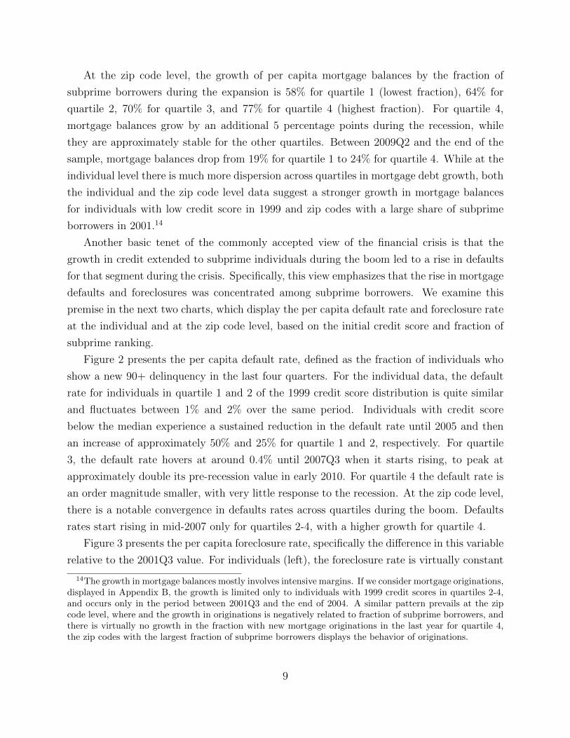
Another basic tenet of the commonly accepted view of the financial crisis is that the
growth in credit extended to subprime individuals during the boom led to a rise in defaults
for that segment during the crisis. Specifically, this view emphasizes that the rise in mortgage
defaults and foreclosures was concentrated among subprime borrowers. We examine this
premise in the next two charts, which display the per capita default rate and foreclosure rate
at the individual and at the zip code level, based on the initial credit score and fraction of
subprime ranking.
Figure 2 presents the per capita default rate, defined as the fraction of individuals who
show a new 90+ delinquency in the last four quarters. For the individual data, the default
rate for individuals in quartile 1 and 2 of the 1999 credit score distribution is quite similar
and fluctuates between 1% and 2% over the same period. Individuals with credit score
below the median experience a sustained reduction in the default rate until 2005 and then
an increase of approximately 50% and 25% for quartile 1 and 2, respectively. For quartile
3, the default rate hovers at around 0.4% until 2007Q3 when it starts rising, to peak at
approximately double its pre-recession value in early 2010. For quartile 4 the default rate is
an order magnitude smaller, with very little response to the recession. At the zip code level,
there is a notable convergence in defaults rates across quartiles during the boom. Defaults
rates start rising in mid-2007 only for quartiles 2-4, with a higher growth for quartile 4.
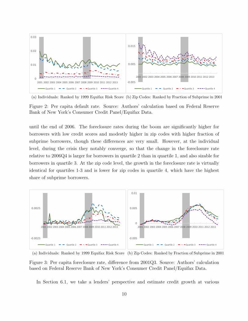
Figure 3 presents the per capita foreclosure rate, specifically the difference in this variable
relative to the 2001Q3 value. For individuals (left), the foreclosure rate is virtually constant
14The growth in mortgage balances mostly involves intensive margins. If we consider mortgage originations,displayed in Appendix B, the growth is limited only to individuals with 1999 credit scores in quartiles 2-4,and occurs only in the period between 2001Q3 and the end of 2004. A similar pattern prevails at the zipcode level, where and the growth in originations is negatively related to fraction of subprime borrowers, andthere is virtually no growth in the fraction with new mortgage originations in the last year for quartile 4,the zip codes with the largest fraction of subprime borrowers displays the behavior of originations.
9
0
0.01
0.02
0.03
2001 2002 2003 2004 2005 2006 2007 2008 2009 2010 2011 2012 2013
Quartile1 Quartile2 Quartile3 Quartile4
(a) Individuals: Ranked by 1999 Equifax Risk Score
-0.005
0.005
0.015
2001 2002 2003 2004 2005 2006 2007 2008 2009 2010 2011 2012 2013
Quartile1 Quartile2 Quartile3 Quartile4
(b) Zip Codes: Ranked by Fraction of Subprime in 2001
Figure 2: Per capita default rate. Source: Authors’ calculation based on Federal ReserveBank of New York’s Consumer Credit Panel/Equifax Data.
until the end of 2006. The foreclosure rates during the boom are significantly higher for
borrowers with low credit scores and modestly higher in zip codes with higher fraction of
subprime borrowers, though these differences are very small. However, at the individual
level, during the crisis they notably converge, so that the change in the foreclosure rate
relative to 2006Q4 is larger for borrowers in quartile 2 than in quartile 1, and also sizable for
borrowers in quartile 3. At the zip code level, the growth in the foreclosure rate is virtually
identical for quartiles 1-3 and is lower for zip codes in quartile 4, which have the highest
share of subprime borrowers.
-0.0025
0.0025
2001 2002 2003 2004 2005 2006 2007 2008 2009 2010 2011 2012 2013
Quartile1 Quartile2 Quartile3 Quartile4
(a) Individuals: Ranked by 1999 Equifax Risk Score
-0.005
0
0.005
0.01
2001 2002 2003 2004 2005 2006 2007 2008 2009 2010 2011 2012 2013
Quartile1 Quartile2 Quartile3 Quartile4
(b) Zip Codes: Ranked by Fraction of Subprime in 2001
Figure 3: Per capita foreclosure rate, difference from 2001Q3. Source: Authors’ calculationbased on Federal Reserve Bank of New York’s Consumer Credit Panel/Equifax Data.
In Section 6.1, we take a lenders’ perspective and estimate credit growth at various
10

horizons based on a recent lagged credit score. This approach prevents joint endogeneity
between credit score and borrowing behavior, and at the same time provides a more accurate
description of borrowers creditworthiness as perceived by lenders at the time in which the
loans are extended. The use of a recent credit score to rank individuals, in addition to
being closer to industry practices, also better reflects the probability of default at the time
of borrowing. In the next section, we examine in detail the link between age, debt and
credit scores. This analysis illustrates the flaws associated to using initial credit scores to
rank individuals and rationalizes the use of recent credit scores by showing that the most
important determinant of credit score variation, in addition to age, is income, which is closely
related to a borrower’s ability to remain current on debt payments.
4 The Role of Age
We now explain why ranking individuals by their credit score 15 years prior, as in Mian and
Sufi (2016) and Mian and Sufi (2009) magnifies credit growth for low credit score individuals.
Specifically, we will show that low credit score individuals are disproportionately young, and
they experience future credit growth, as well as income and credit score growth, due to life
cycle factors. As a consequence, their credit score at the time of borrowing is considerably
higher than when young. On this basis, we will argue that using a recent lagged credit score
provides a better assessment of a borrower’s default risk. We will also show that a recent
lagged credit score is closely related to income at time of borrowing.
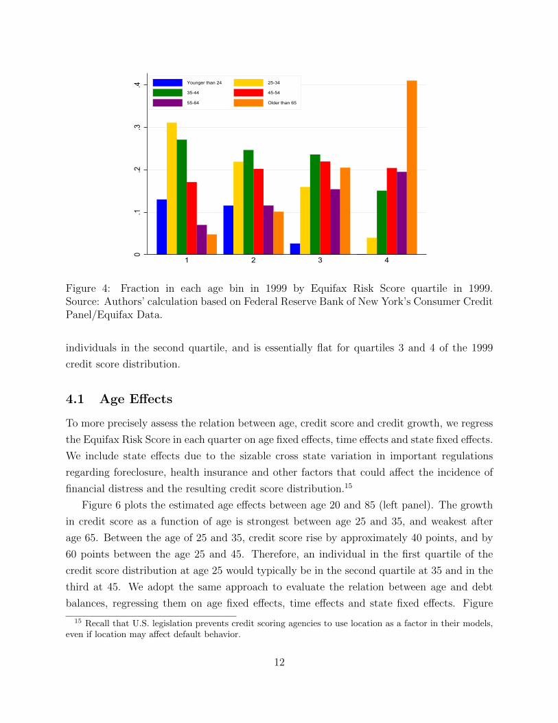
We begin by showing that low credit score individuals are disproportionately young.
Figure 5 displays the fraction of borrowers in each 1999 credit score quartile by age. We
consider 5 age groups. For the youngest groups, up to age 34, the fraction is the first quartile
is 44%, the fraction in the second quartile is 33%, the fraction in the third quartile is 19%,
and the fraction in the fourth quartile is 5%. The weight for older age groups increases
gradually by quartiles. For 45-54 year olds, the fraction in quartiles 1-4 is approximately
20%. For the oldest age group, 65 and older, the fraction in quartile 1 is 4%, while the
fraction in quartile 4 is 44%. This distribution is extremely stable over time, and a similar
chart for a later quarter would look virtually identical to the one for 1999 presented here.
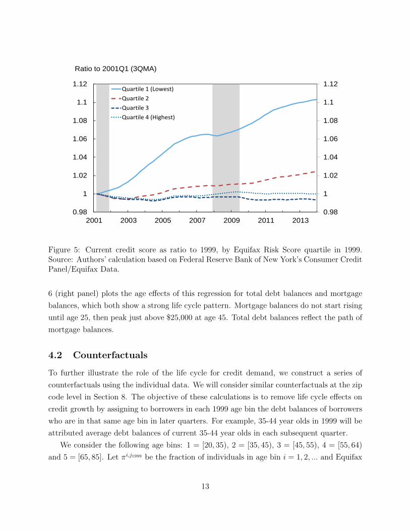
Given their relatively young age, and correspondingly short credit history, low credit
score individuals in 1999 exhibit credit score growth over time. This is illustrated in figure 5,
which plots the current/1999 credit score ratio over the sample period by 1999 credit score
quartile. For individuals in the first credit score quartile in 1999, the credit scores grows by
more than 10% between 2001 and the end of 2013. The credit score grows by about 2% for
11
0.1
.2.3
.4
1 2 3 4
Younger than 24 25-34
35-44 45-54
55-64 Older than 65
Figure 4: Fraction in each age bin in 1999 by Equifax Risk Score quartile in 1999.Source: Authors’ calculation based on Federal Reserve Bank of New York’s Consumer CreditPanel/Equifax Data.
individuals in the second quartile, and is essentially flat for quartiles 3 and 4 of the 1999
credit score distribution.
4.1 Age Effects
To more precisely assess the relation between age, credit score and credit growth, we regress
the Equifax Risk Score in each quarter on age fixed effects, time effects and state fixed effects.
We include state effects due to the sizable cross state variation in important regulations
regarding foreclosure, health insurance and other factors that could affect the incidence of
financial distress and the resulting credit score distribution.15
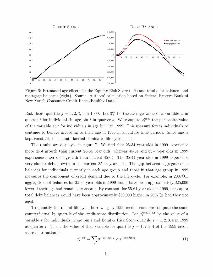
Figure 6 plots the estimated age effects between age 20 and 85 (left panel). The growth
in credit score as a function of age is strongest between age 25 and 35, and weakest after
age 65. Between the age of 25 and 35, credit score rise by approximately 40 points, and by
60 points between the age 25 and 45. Therefore, an individual in the first quartile of the
credit score distribution at age 25 would typically be in the second quartile at 35 and in the
third at 45. We adopt the same approach to evaluate the relation between age and debt
balances, regressing them on age fixed effects, time effects and state fixed effects. Figure
15 Recall that U.S. legislation prevents credit scoring agencies to use location as a factor in their models,even if location may affect default behavior.
12
0.98
1
1.02
1.04
1.06
1.08
1.1
1.12
0.98
1
1.02
1.04
1.06
1.08
1.1
1.12
2001 2003 2005 2007 2009 2011 2013
Quartile 1 (Lowest)Quartile 2Quartile 3Quartile 4 (Highest)
Ratio to 2001Q1 (3QMA)
Figure 5: Current credit score as ratio to 1999, by Equifax Risk Score quartile in 1999.Source: Authors’ calculation based on Federal Reserve Bank of New York’s Consumer CreditPanel/Equifax Data.
6 (right panel) plots the age effects of this regression for total debt balances and mortgage
balances, which both show a strong life cycle pattern. Mortgage balances do not start rising
until age 25, then peak just above $25,000 at age 45. Total debt balances reflect the path of
mortgage balances.
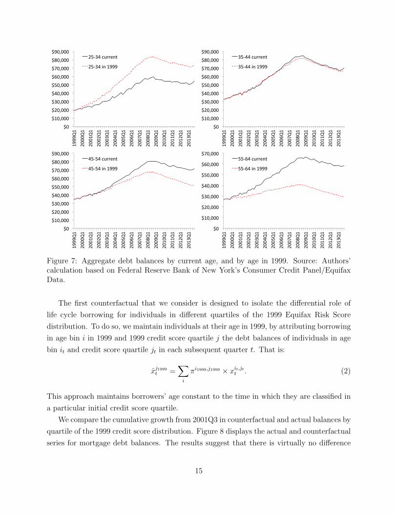
4.2 Counterfactuals
To further illustrate the role of the life cycle for credit demand, we construct a series of
counterfactuals using the individual data. We will consider similar counterfactuals at the zip
code level in Section 8. The objective of these calculations is to remove life cycle effects on
credit growth by assigning to borrowers in each 1999 age bin the debt balances of borrowers
who are in that same age bin in later quarters. For example, 35-44 year olds in 1999 will be
attributed average debt balances of current 35-44 year olds in each subsequent quarter.
We consider the following age bins: 1 = [20, 35), 2 = [35, 45), 3 = [45, 55), 4 = [55, 64)
and 5 = [65, 85]. Let πi,j1999 be the fraction of individuals in age bin i = 1, 2, ... and Equifax
13
Credit Score Debt Balances
-20
0
20
40
60
80
100
120
140
160
21 26 31 36 41 46 51 56 61 66 71 76 81
-$50,000
-$40,000
-$30,000
-$20,000
-$10,000
$0
$10,000
$20,000
$30,000
$40,000
21 26 31 36 41 46 51 56 61 66 71 76 81
TotalDebtBalances
MortgageBalances
Figure 6: Estimated age effects for the Equifax Risk Score (left) and total debt balances andmortgage balances (right). Source: Authors’ calculation based on Federal Reserve Bank ofNew York’s Consumer Credit Panel/Equifax Data.
Risk Score quartile j = 1, 2, 3, 4 in 1999. Let xist be the average value of a variable x in
quarter t for individuals in age bin i in quarter s. We compute xi1999t the per capita value
of the variable at t for individuals in age bin i in 1999. This measure forces individuals to
continue to behave according to their age in 1999 in all future time periods. Since age is
kept constant, this counterfactual eliminates life cycle effects.
The results are displayed in figure 7. We find that 25-34 year olds in 1999 experience
more debt growth than current 25-34 year olds, whereas 45-54 and 65+ year olds in 1999
experience lower debt growth than current 45-64. The 35-44 year olds in 1999 experience
very similar debt growth to the current 35-44 year olds. The gap between aggregate debt
balances for individuals currently in each age group and those in that age group in 1999
measures the component of credit demand due to the life cycle. For example, in 2007Q1,
aggregate debt balances for 25-34 year olds in 1999 would have been approximately $25,000
lower if their age had remained constant. By contrast, for 55-64 year olds in 1999, per capita
total debt balances would have been approximately $30,000 higher in 2007Q1 had they not
aged.
To quantify the role of life cycle borrowing by 1999 credit score, we compute the same
counterfactual by quartile of the credit score distribution. Let xi1999,j1999t be the value of a
variable x for individuals in age bin i and Equifax Risk Score quartile j = 1, 2, 3, 4 in 1999
at quarter t. Then, the value of that variable for quartile j = 1, 2, 3, 4 of the 1999 credit
score distribution is:
xj1999t =∑i
πi1999,j1999 × xi1999,j1999t . (1)
14
$0$10,000$20,000$30,000$40,000$50,000$60,000$70,000$80,000$90,000
1999Q1
2000Q1
2001Q1
2002Q1
2003Q1
2004Q1
2005Q1
2006Q1
2007Q1
2008Q1
2009Q1
2010Q1
2011Q1
2012Q1
2013Q1
25-34current
25-34in1999
$0$10,000$20,000$30,000$40,000$50,000$60,000$70,000$80,000$90,000
1999Q1
2000Q1
2001Q1
2002Q1
2003Q1
2004Q1
2005Q1
2006Q1
2007Q1
2008Q1
2009Q1
2010Q1
2011Q1
2012Q1
2013Q1
35-44current
35-44in1999
$0$10,000$20,000$30,000$40,000$50,000$60,000$70,000$80,000$90,000
1999Q1
2000Q1
2001Q1
2002Q1
2003Q1
2004Q1
2005Q1
2006Q1
2007Q1
2008Q1
2009Q1
2010Q1
2011Q1
2012Q1
2013Q1
45-54current
45-54in1999
$0
$10,000
$20,000
$30,000
$40,000
$50,000
$60,000
$70,000
1999Q1
2000Q1
2001Q1
2002Q1
2003Q1
2004Q1
2005Q1
2006Q1
2007Q1
2008Q1
2009Q1
2010Q1
2011Q1
2012Q1
2013Q1
55-64current
55-64in1999
Figure 7: Aggregate debt balances by current age, and by age in 1999. Source: Authors’calculation based on Federal Reserve Bank of New York’s Consumer Credit Panel/EquifaxData.
The first counterfactual that we consider is designed to isolate the differential role of
life cycle borrowing for individuals in different quartiles of the 1999 Equifax Risk Score
distribution. To do so, we maintain individuals at their age in 1999, by attributing borrowing
in age bin i in 1999 and 1999 credit score quartile j the debt balances of individuals in age
bin it and credit score quartile jt in each subsequent quarter t. That is:
x̂j1999t =∑i
πi1999,j1999 × xit,jtt . (2)
This approach maintains borrowers’ age constant to the time in which they are classified in
a particular initial credit score quartile.
We compare the cumulative growth from 2001Q3 in counterfactual and actual balances by
quartile of the 1999 credit score distribution. Figure 8 displays the actual and counterfactual
series for mortgage debt balances. The results suggest that there is virtually no difference
15
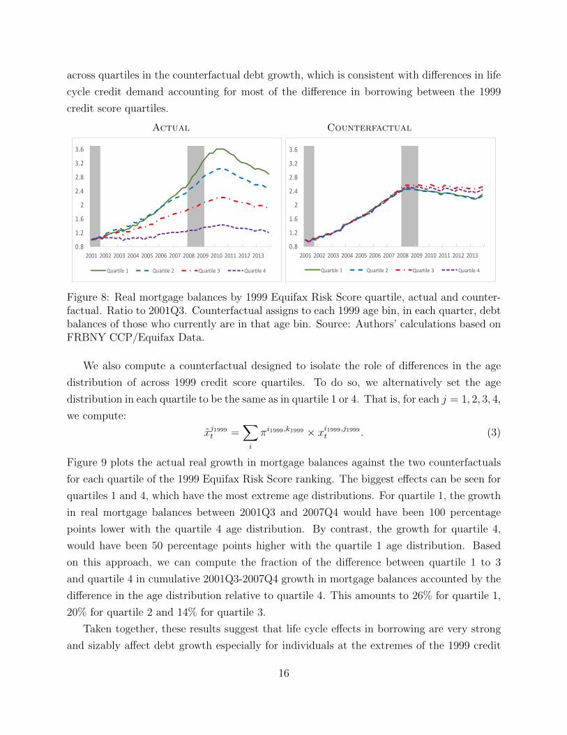
across quartiles in the counterfactual debt growth, which is consistent with differences in life
cycle credit demand accounting for most of the difference in borrowing between the 1999
credit score quartiles.
Actual Counterfactual
0.8
1.2
1.6
2
2.4
2.8
3.2
3.6
2001 2002 2003 2004 2005 2006 2007 2008 2009 2010 2011 2012 2013
Quartile1 Quartile2 Quartile3 Quartile4
0.8
1.2
1.6
2
2.4
2.8
3.2
3.6
2001 2002 2003 2004 2005 2006 2007 2008 2009 2010 2011 2012 2013
Quartile1 Quartile2 Quartile3 Quartile4
Figure 8: Real mortgage balances by 1999 Equifax Risk Score quartile, actual and counter-factual. Ratio to 2001Q3. Counterfactual assigns to each 1999 age bin, in each quarter, debtbalances of those who currently are in that age bin. Source: Authors’ calculations based onFRBNY CCP/Equifax Data.
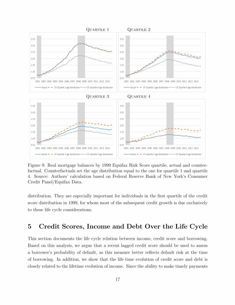
We also compute a counterfactual designed to isolate the role of differences in the age
distribution of across 1999 credit score quartiles. To do so, we alternatively set the age
distribution in each quartile to be the same as in quartile 1 or 4. That is, for each j = 1, 2, 3, 4,
we compute:
x̃j1999t =∑i
πi1999,k1999 × xi1999,j1999t . (3)
Figure 9 plots the actual real growth in mortgage balances against the two counterfactuals
for each quartile of the 1999 Equifax Risk Score ranking. The biggest effects can be seen for
quartiles 1 and 4, which have the most extreme age distributions. For quartile 1, the growth
in real mortgage balances between 2001Q3 and 2007Q4 would have been 100 percentage
points lower with the quartile 4 age distribution. By contrast, the growth for quartile 4,
would have been 50 percentage points higher with the quartile 1 age distribution. Based
on this approach, we can compute the fraction of the difference between quartile 1 to 3
and quartile 4 in cumulative 2001Q3-2007Q4 growth in mortgage balances accounted by the
difference in the age distribution relative to quartile 4. This amounts to 26% for quartile 1,
20% for quartile 2 and 14% for quartile 3.
Taken together, these results suggest that life cycle effects in borrowing are very strong
and sizably affect debt growth especially for individuals at the extremes of the 1999 credit
16
Quartile 1 Quartile 2
0.75
1.25
1.75
2.25
2.75
3.25
3.75
2001 2002 2003 2004 2005 2006 2007 2008 2009 2010 2011 2012 2013
Actual CF:Quartile1agedistribution CF:Quartile4agedistribution
0.75
1.25
1.75
2.25
2.75
3.25
3.75
2001 2002 2003 2004 2005 2006 2007 2008 2009 2010 2011 2012 2013
Actual CF:Quartile1agedistribution CF:Quartile4agedistribution
Quartile 3 Quartile 4
0.75
1.25
1.75
2.25
2.75
3.25
3.75
2001 2002 2003 2004 2005 2006 2007 2008 2009 2010 2011 2012 2013
Actual CF:Quartile1agedistribution CF:Quartile4agedistribution
0.75
1.25
1.75
2.25
2.75
3.25
3.75
2001 2002 2003 2004 2005 2006 2007 2008 2009 2010 2011 2012 2013
Actual CF:Quartile1agedistribution CF:Quartile4agedistribution
Figure 9: Real mortgage balances by 1999 Equifax Risk Score quartile, actual and counter-factual. Counterfactuals set the age distribution equal to the one for quartile 1 and quartile4. Source: Authors’ calculation based on Federal Reserve Bank of New York’s ConsumerCredit Panel/Equifax Data.
distribution. They are especially important for individuals in the first quartile of the credit
score distribution in 1999, for whom most of the subsequent credit growth is due exclusively
to these life cycle considerations.
5 Credit Scores, Income and Debt Over the Life Cycle
This section documents the life cycle relation between income, credit score and borrowing.
Based on this analysis, we argue that a recent lagged credit score should be used to assess
a borrower’s probability of default, as this measure better reflects default risk at the time
of borrowing. In addition, we show that the life time evolution of credit score and debt is
closely related to the lifetime evolution of income. Since the ability to make timely payments
17

on outstanding debt critically depends on income at the time of borrowing and throughout
the life of the loan, the tight relation between a recent credit score and contemporaneous
income conditional on age supports the notion that it should be used as an indicator of
default risk.
To estimate the relation between credit scores and income, we use payroll information- so
called Worknumber data- for 2009 from a large income verification firm, which is linked to the
Equifax credit files. The income data is available for a nationally representative subsample
of over 11,000 individuals in the credit panel. We construct a total labor income measure
using information on pay rate and pay frequency. Appendix C reports detailed information
on the construction of this income measure, and shows that the distribution of our income
measure is comparable by age and location to that of similar measures obtained from the
CPS and the ACS.
5.1 Cross-Sectional Relation
We first examine the cross-sectional relation between credit scores and income, conditional
on age. We will show that recent credit scores are strongly positively related to income, given
age, and that the slope of the relation between recent credit scores and income declines with
age.
To evaluate the relation between income and credit score, we regress the 8 quarter lagged
credit score on income, income square, age, age square, and interactions between age, income
and state fixed effects.16 Specifically, we estimated the following:
CSi2009−h = α + β1y
i2009 + β2
(yi2009
)2+ γ1agei2009 + γ2
(agei2009
)2+ interactions + εi2009 (4)
where i denoted individual borrowers, CSi2009−h = is a borrower’s credit score in quar-
ter 2009 − h, and h denotes the leads/lags in the credit score relative to income, with
h ∈ {−8Q,−4Q, 0, 4Q, 8Q}. The coefficient α corresponds to the constant and yi2009 is a
borrower’s total labor income in 2009.
Figure 10 displays the in sample projected relation between the 8 quarter lagged credit
score and income for different age levels. The range of income levels varies by age as they
do in our sample. Clearly, credit scores are strongly positively related to income given age,
and the slope of this relation declines with age. We estimate the same specification for the
16Since the credit score is bounded above, we use a truncated regression approach. Standard errors areclustered at the state level.
18
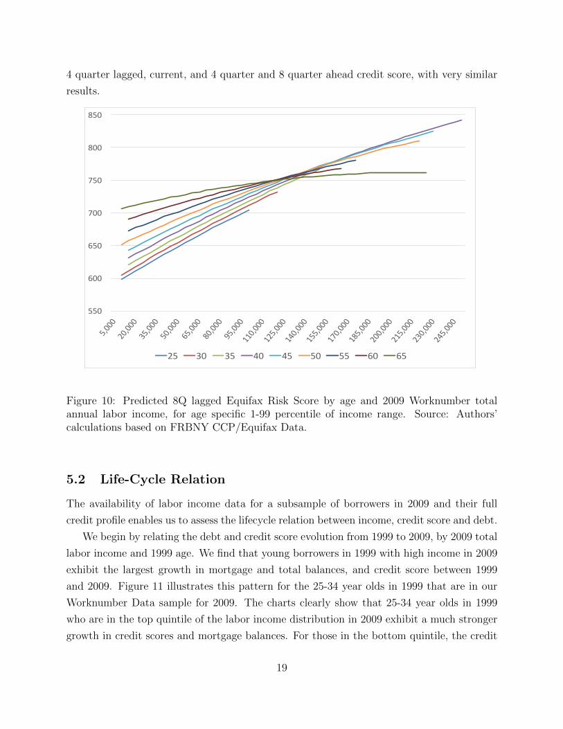
4 quarter lagged, current, and 4 quarter and 8 quarter ahead credit score, with very similar
results.
550
600
650
700
750
800
850
25 30 35 40 45 50 55 60 65
Figure 10: Predicted 8Q lagged Equifax Risk Score by age and 2009 Worknumber totalannual labor income, for age specific 1-99 percentile of income range. Source: Authors’calculations based on FRBNY CCP/Equifax Data.
5.2 Life-Cycle Relation
The availability of labor income data for a subsample of borrowers in 2009 and their full
credit profile enables us to assess the lifecycle relation between income, credit score and debt.
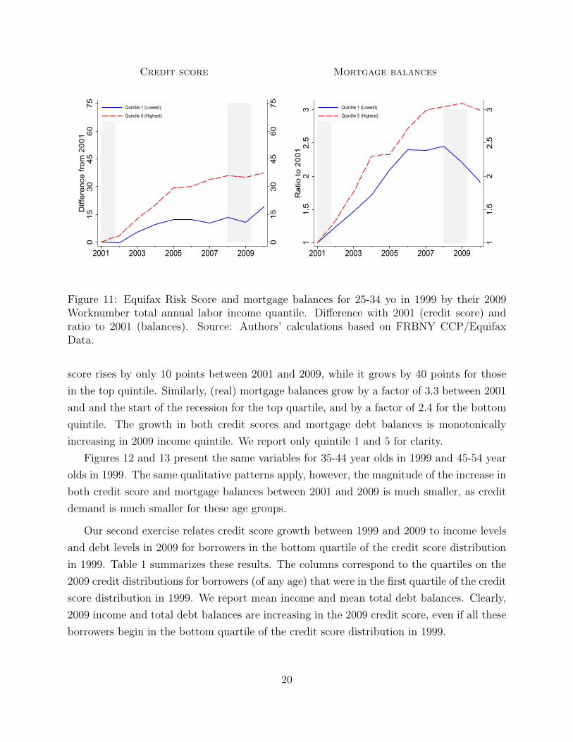
We begin by relating the debt and credit score evolution from 1999 to 2009, by 2009 total
labor income and 1999 age. We find that young borrowers in 1999 with high income in 2009
exhibit the largest growth in mortgage and total balances, and credit score between 1999
and 2009. Figure 11 illustrates this pattern for the 25-34 year olds in 1999 that are in our
Worknumber Data sample for 2009. The charts clearly show that 25-34 year olds in 1999
who are in the top quintile of the labor income distribution in 2009 exhibit a much stronger
growth in credit scores and mortgage balances. For those in the bottom quintile, the credit
19
Credit score Mortgage balances
015
3045
6075
015
3045
6075
Diff
eren
ce fr
om 2
001
2001 2003 2005 2007 2009
Quintile 1 (Lowest)
Quintile 5 (Highest)
11.
52
2.5
3
11.
52
2.5
3R
atio
to 2
001
2001 2003 2005 2007 2009
Quintile 1 (Lowest)
Quintile 5 (Highest)
Figure 11: Equifax Risk Score and mortgage balances for 25-34 yo in 1999 by their 2009Worknumber total annual labor income quantile. Difference with 2001 (credit score) andratio to 2001 (balances). Source: Authors’ calculations based on FRBNY CCP/EquifaxData.
score rises by only 10 points between 2001 and 2009, while it grows by 40 points for those
in the top quintile. Similarly, (real) mortgage balances grow by a factor of 3.3 between 2001
and and the start of the recession for the top quartile, and by a factor of 2.4 for the bottom
quintile. The growth in both credit scores and mortgage debt balances is monotonically
increasing in 2009 income quintile. We report only quintile 1 and 5 for clarity.
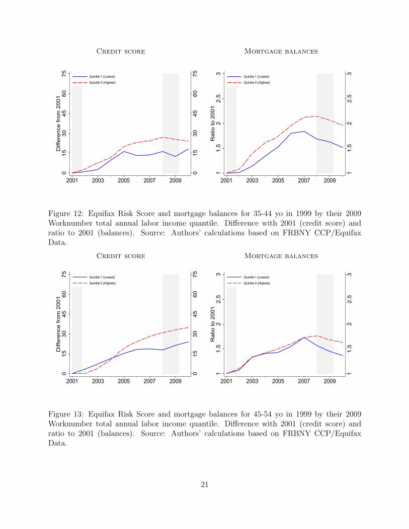
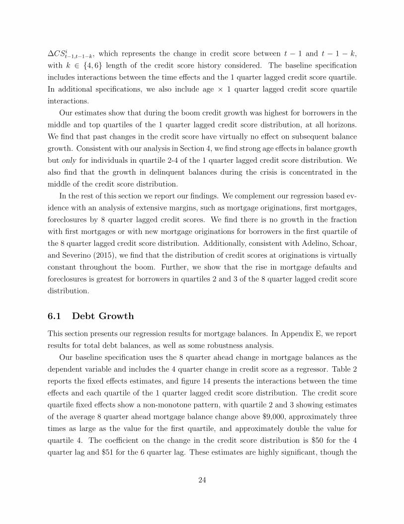
Figures 12 and 13 present the same variables for 35-44 year olds in 1999 and 45-54 year
olds in 1999. The same qualitative patterns apply, however, the magnitude of the increase in
both credit score and mortgage balances between 2001 and 2009 is much smaller, as credit
demand is much smaller for these age groups.
Our second exercise relates credit score growth between 1999 and 2009 to income levels
and debt levels in 2009 for borrowers in the bottom quartile of the credit score distribution
in 1999. Table 1 summarizes these results. The columns correspond to the quartiles on the
2009 credit distributions for borrowers (of any age) that were in the first quartile of the credit
score distribution in 1999. We report mean income and mean total debt balances. Clearly,
2009 income and total debt balances are increasing in the 2009 credit score, even if all these
borrowers begin in the bottom quartile of the credit score distribution in 1999.
20
Credit score Mortgage balances
015
3045
6075
015
3045
6075
Diff
eren
ce fr
om 2
001
2001 2003 2005 2007 2009
Quintile 1 (Lowest)
Quintile 5 (Highest)
11.
52
2.5
3
11.
52
2.5
3R
atio
to 2
001
2001 2003 2005 2007 2009
Quintile 1 (Lowest)
Quintile 5 (Highest)
Figure 12: Equifax Risk Score and mortgage balances for 35-44 yo in 1999 by their 2009Worknumber total annual labor income quantile. Difference with 2001 (credit score) andratio to 2001 (balances). Source: Authors’ calculations based on FRBNY CCP/EquifaxData.
Credit score Mortgage balances
015
3045
6075
015
3045
6075
Diff
eren
ce fr
om 2
001
2001 2003 2005 2007 2009
Quintile 1 (Lowest)
Quintile 5 (Highest)
11.
52
2.5
3
11.
52
2.5
3R
atio
to 2
001
2001 2003 2005 2007 2009
Quintile 1 (Lowest)
Quintile 5 (Highest)
Figure 13: Equifax Risk Score and mortgage balances for 45-54 yo in 1999 by their 2009Worknumber total annual labor income quantile. Difference with 2001 (credit score) andratio to 2001 (balances). Source: Authors’ calculations based on FRBNY CCP/EquifaxData.
21

Table 1: Relation between Credit Score, Income and Debt Balances
2009 credit score Quartile 1 Quartile 2 Quartile 3 Quartile 4
Debt balances $38k $74k $126k $213kIncome $39k $47k $57k $62k
Mean income and total debt balances by 2009 Equifax Risk Score quartile for individuals in the first quartile ofthe 1999 Equifax Risk Score distribution. Worknumber total annual labor income for restricted Worknumbersample. Source: Authors’ calculations based on FRBNY CCP/Equifax Data.
This evidence speaks directly to the relation between income and debt during the credit
boom. Using zip code level data, Mian and Sufi (2009) show that during the period between
2001 and 2006, the zip codes that exhibited the largest growth in debt were those who
experiences the smallest growth in income. They argue that the negative relation between
debt growth and income growth at the zip code level over that period is consistent with a
growth in the supply of credit to high risk borrowers. We show that this negative relation
does not hold for individual data. The differences in credit growth between 2001 and 2009 are
positively related to life cycle growth in income and credit scores. Moreover, debt growth for
young/low credit score borrowers at the start of the boom occurs primarily for individuals
who have high income by 2009, and the growth in income is associated in a growth in
credit score. Older individuals in 1999 exhibit much lower subsequent debt and credit score
growth, still positively related to their income in 2009. The strong correlation between recent
credit scores and income suggests recent credit scores are better indicator of default risk.
Appendix D reports estimates of the relation between the growth in total debt balances and
total income using the PSID over the 1999-2007 period. The PSID analysis confirms the
positive relation between income growth and growth in debt balances in 2001-2006.
The positive relation between income growth and debt growth during the credit boom
casts doubt on the notion that there was an increase in the supply of credit, especially to
high risk borrowers. Instead, it is more likely that the rise in house prices caused an increase
in mortgage balances. This is confirmed by the fact that the fraction of borrowers with
mortgages did not rise for any quartile of the credit score distribution, as we show in Section
6.1.1 below.
22

6 Debt and Defaults by Recent Credit Score
We now present our approach to characterizing the distribution of debt growth during the
boom and defaults during the crisis based on recent credit scores. We adopt a lender’s
perspective, and relate future credit growth at various horizons to a recent lagged credit
score to capture the credit score at the time of borrowing. This strategy is based on the
observed patterns of credit extension in the U.S. An increase in debt balances between two
time periods, say one year, would arise due to either a new loan or credit line, or to an
increase in the maximum balance on an outstanding loan or credit line. In most cases, the
borrower would have applied for the loan or the balance increase, leading the lender to check
the borrower’s credit score. Given that our data is quarterly and for most types of debt such
requests are processed in a matter of days, the credit score in the quarter before the increase
in debt balances is the best proxy of the one that would be available to the lender at the
time of application.
Lenders often may also check some other variables in an applicant’s credit history, such
as the number of missed payments or credit utilization in the last 1-2 years. These factors
would be reflected in changes in the credit score in the corresponding period. Changes in the
credit score before the application date may also be motivated by the intention to borrow.
For example, individuals intending to finance a car purchase may be motivated to improve
their credit score in the period leading up to their purchase or to delay the purchase until
their credit score has improved- for example by paying down credit card balances- in order
to secure better terms. For these reasons, we also include the change in the credit score as an
explanatory variable. For most unsecured debt and auto loans, lenders would not typically
verify a borrower’s income. For mortgage loans, lenders typically also verify a lender’s recent
income history. We do not have access to income, therefore, we only use the credit score
in the last quarter and the change in the score between the last quarter and some previous
dates as our main explanatory variables. As we have shown, income and recent credit score
are positively related, conditional on age.
Our baseline specification is:
∆Bit,t+h =
∑j=1,2,3,4
α(j−1) + η∆CSit−1,t−1−k + time fe + age fe + interactions + εit, (5)
where i denotes and individual, t denotes a quarter, ∆Bit,t+h is the change in balances between
quarters t and t+ h, and h ∈ {4, 8, 12} is the horizon. The explanatory variables are α(j−1)
which is a fixed effect for the 1 quarter lagged quartile of the credit score distribution and
23
∆CSit−1,t−1−k, which represents the change in credit score between t − 1 and t − 1 − k,
with k ∈ {4, 6} length of the credit score history considered. The baseline specification
includes interactions between the time effects and the 1 quarter lagged credit score quartile.
In additional specifications, we also include age × 1 quarter lagged credit score quartile
interactions.
Our estimates show that during the boom credit growth was highest for borrowers in the
middle and top quartiles of the 1 quarter lagged credit score distribution, at all horizons.
We find that past changes in the credit score have virtually no effect on subsequent balance
growth. Consistent with our analysis in Section 4, we find strong age effects in balance growth
but only for individuals in quartile 2-4 of the 1 quarter lagged credit score distribution. We
also find that the growth in delinquent balances during the crisis is concentrated in the
middle of the credit score distribution.
In the rest of this section we report our findings. We complement our regression based ev-
idence with an analysis of extensive margins, such as mortgage originations, first mortgages,
foreclosures by 8 quarter lagged credit scores. We find there is no growth in the fraction
with first mortgages or with new mortgage originations for borrowers in the first quartile of
the 8 quarter lagged credit score distribution. Additionally, consistent with Adelino, Schoar,
and Severino (2015), we find that the distribution of credit scores at originations is virtually
constant throughout the boom. Further, we show that the rise in mortgage defaults and
foreclosures is greatest for borrowers in quartiles 2 and 3 of the 8 quarter lagged credit score
distribution.
6.1 Debt Growth
This section presents our regression results for mortgage balances. In Appendix E, we report
results for total debt balances, as well as some robustness analysis.
Our baseline specification uses the 8 quarter ahead change in mortgage balances as the
dependent variable and includes the 4 quarter change in credit score as a regressor. Table 2
reports the fixed effects estimates, and figure 14 presents the interactions between the time
effects and each quartile of the 1 quarter lagged credit score distribution. The credit score
quartile fixed effects show a non-monotone pattern, with quartile 2 and 3 showing estimates
of the average 8 quarter ahead mortgage balance change above $9,000, approximately three
times as large as the value for the first quartile, and approximately double the value for
quartile 4. The coefficient on the change in the credit score distribution is $50 for the 4
quarter lag and $51 for the 6 quarter lag. These estimates are highly significant, though the
24
economic impact of the past change in credit score on future debt growth seems negligible,
both in terms of the size of the effect and for its small impact on the estimated average
changes.
Table 2: Mortgage Balance Growth
Dependent Variable: 8Q Ahead Mortgage Balance Change
1Q lagged CS Quartile Effects Credit Score Change
1 2 3 4 4Q 6Q
3,182 9,559 9,291 4,803 50
4,129 10,164 9,787 5,173 51
Estimated 1Q lagged Equifax Risk Score quartile effects and coefficients for 4Q, 6Q past change from 1Q
lagged score in balance change regressions, in USD. Baseline specification. All estimates significant at 1%
level. Sample period 2001Q1-2011Q4. Number of obs. 64,588,488. Source: Authors’ calculations based on
FRBNY CCP/Equifax Data.
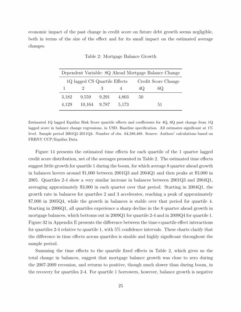
Figure 14 presents the estimated time effects for each quartile of the 1 quarter lagged
credit score distribution, net of the averages presented in Table 2. The estimated time effects
suggest little growth for quartile 1 during the boom, for which average 8 quarter ahead growth
in balances hovers around $1,000 between 2001Q3 and 2004Q1 and then peaks at $3,000 in
2005. Quartiles 2-4 show a very similar increase in balances between 2001Q3 and 2004Q1,
averaging approximately $3,000 in each quarter over that period. Starting in 2004Q1, the
growth rate in balances for quartiles 2 and 3 accelerates, reaching a peak of approximately
$7,000 in 2005Q4, while the growth in balances is stable over that period for quartile 4.
Starting in 2006Q1, all quartiles experience a sharp decline in the 8 quarter ahead growth in
mortgage balances, which bottoms out in 2009Q1 for quartile 2-4 and in 2009Q4 for quartile 1.
Figure 32 in Appendix E presents the difference between the time×quartile effect interactions
for quartiles 2-4 relative to quartile 1, with 5% confidence intervals. These charts clarify that
the difference in time effects across quartiles is sizable and highly significant throughout the
sample period.
Summing the time effects to the quartile fixed effects in Table 2, which gives us the
total change in balances, suggest that mortgage balance growth was close to zero during
the 2007-2009 recession, and returns to positive, though much slower than during boom, in
the recovery for quartiles 2-4. For quartile 1 borrowers, however, balance growth is negative
25
during the crisis, ranging between -$3,000 and -$6,000 in each quarter, and remains around
these values throughout the sample period. This finding is particularly striking, since quartile
1 borrowers experienced very modest mortgage balance growth during the boom, suggesting
the the costs in terms of credit contraction were mainly borne by borrowers who reaped little
benefit from the previous boom. Part of the decline in mortgage balances for quartile 1 may
also be driven by charge offs by borrowers who had higher credit scores during the boom
and drop into quartile 1 during and after the housing crisis as a consequence of mortgage
defaults.17
-11,000
-9,000
-7,000
-5,000
-3,000
-1,000
1,000
3,000
5,000
7,000
9,000
2001 2002 2003 2004 2005 2006 2007 2008 2009 2010 2011
Quartile1 Quartile2 Quartile3 Quartile4
Figure 14: Estimated time effects by 1Q lagged Equifax Risk Score quartile from balancechange regressions. Baseline specification. Dependent variable is the 8Q ahead change in percapita mortgage balances in USD. Sample period 2001Q1-2011Q4. Number of obs. (baseline)64,588,488. Source: Authors’ calculations based on FRBNY CCP/Equifax Data.
The findings are very similar using the 4 quarter ahead and 12 ahead change in mortgage
balances, including additional robustness results for the 8 quarter ahead change in mortgage
balances. Table 11 in Appendix E summarizes the implied cumulated mortgage debt balance
change for 2002-2006 and 2007-2010 by sub period using the 4, 8 and 12 quarter ahead
mortgage balance change regressions.
17This is consistent with the behavior of delinquent balances, described in Section 6.2.1.
26
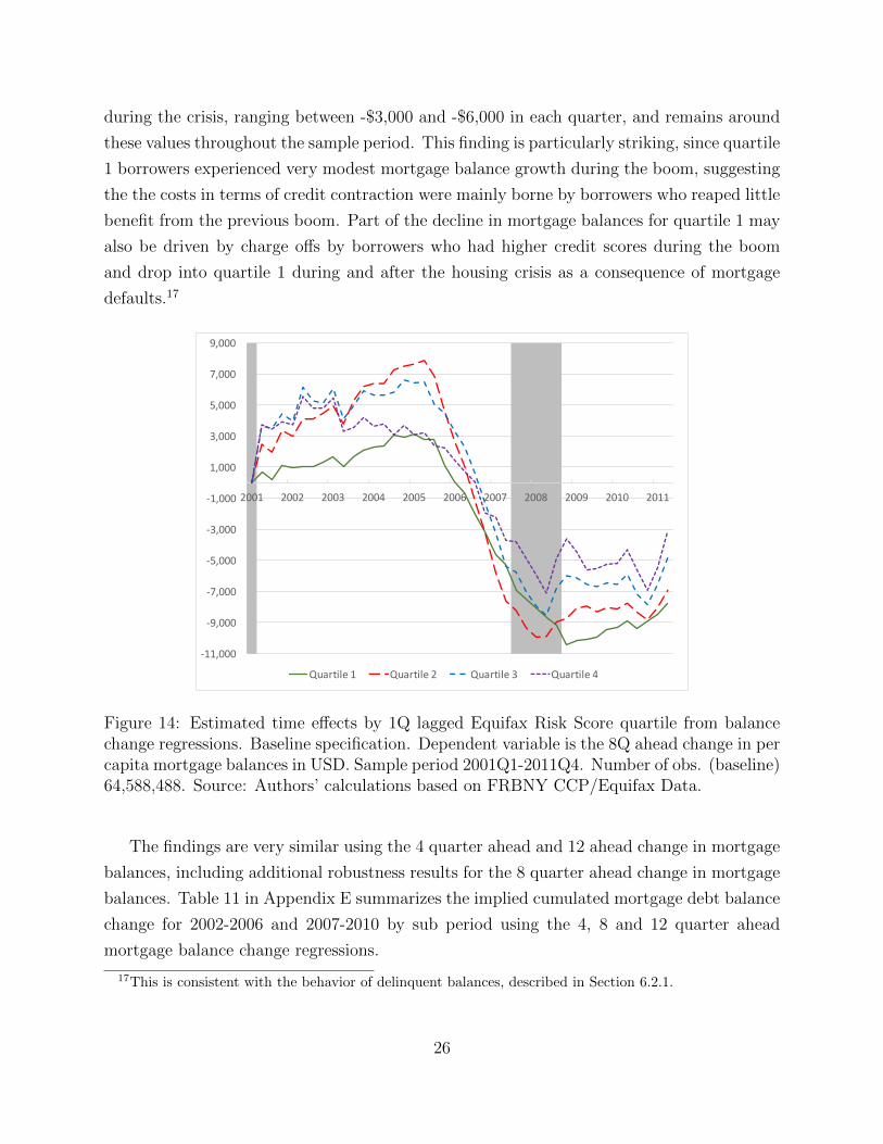
Role of Age Figure 15 presents the estimated age effects for the baseline specification
(left panel) and for the version in which the age effects are interacted with the quartile fixed
effects (right panel).18 The common age effect estimated in the left panel is consistent with
our estimates in Section 4.1, since the cumulated growth in mortgage debt balances between
age 20 and age 30, which corresponds to peak growth over the life cycle, based on the 8
quarter ahead change is approximately $35,000.19 However, the interactions between the
quartile and age effects suggest that only borrowers in quartiles 2-4 of the 1 quarter lagged
credit score distribution experience a life cycle growth in mortgage balances, and the size of
this growth is increasing with the credit score quartile. This result is consistent with our
findings in Section 5, where we show that the life cycle growth in mortgage balances is closely
related by the life cycle growth in income and credit scores.
Age Effects Age Effects by Quartile
-6,000
-4,000
-2,000
0
2,000
4,000
6,000
8,000
10,000
-5,000
0
5,000
10,000
15,000
20,000
25,000
Quartile1 Quartile2 Quartile3 Quartile4
Figure 15: Estimated age effects from balance change regressions. Baseline specification (left)and specification with age×credit score quartile interactions (right). Dependent variable isthe 8Q ahead change in per capita mortgage balances in USD. Sample period 2001Q3-2011Q4. Number of obs. (baseline) 64,588,488. Source: Authors’ calculations based onFRBNY CCP/Equifax Data.
6.1.1 Homeownership and Originations
To corroborate the regression analysis on mortgage balances, we also examine borrowing
behavior by recent credit score on the extensive margin. Consistent with our baseline regres-
sion specification, we rank borrowers by their 8 quarter lagged credit score. Our findings are
robust to alternative recent rankings, such as 4 quarter lagged credit score.
18The estimated quartile effects and quartile time effects differ very little across these two specifications.19This estimate is obtained by averaging out the quartile fixed effects and adding them to the age effects.
27
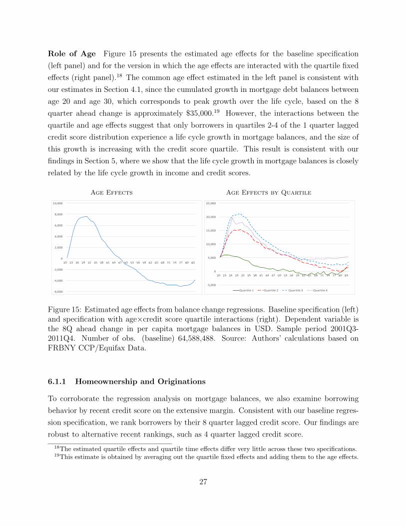
Figure 16 presents the fraction with first mortgages, which can be taken to correspond
to the home ownership rate in these data, and the fraction with new originations by 8
quarter lagged credit score. Both the fraction with first mortgages and the fraction with new
mortgage originations are virtually constant for quartile 1 during the boom. The fraction
with first mortgages grows by approximately 10 percentage points between 2001Q3 and
2007Q4 for quartiles 2 and 3, and by about 6 percentage points for quartile 4. Quartiles
2-4 experience a boom in new originations between 2001 and 2004Q1. The fraction with
new mortgage originations rises from just below 20% in 2001Q1 to 23% and 27% at the
peak for quartiles 2 and 3, respectively. For quartile 4, it rises from 12% in 2001 to 22% in
2004Q1. The sizable rise in mortgage originations for prime borrowers early in the boom
combined with the modest rise in the fraction of borrowers with first mortgages for that
period suggests that most of the originations reflect refinancing activity20 or real estate
investing, as we document in Section 7.1 below. The fraction with new mortgage originations
drops thereafter for quartiles 2-4, reaching lows of 6-8% in 2009Q2, when it starts to slowly
recover. For quartile 1, the fraction of borrowers with new originations declines between
2001 and 2006, reaching 8% in 2006, and then stabilizes between 2006Q1 and 2007Q1. It
then decline to close to zero by the end of 2009.
Fraction with First Mortgages Fraction with New Originations
0
0.2
0.4
0.6
0.8
1
0
0.2
0.4
0.6
0.8
1
2001 2003 2005 2007 2009 2011 2013
Quartile 2
Quartile 3
Quartile 4
Quartile 1
.05
.1.1
5.2
.25
.05
.1.1
5.2
.25
Fra
ctio
n (3
QM
A)
2001 2003 2005 2007 2009
Quartile 1 (Lowest)
Quartile 2
Quartile 3
Quartile 4 (Highest)
Figure 16: Fraction with first mortgages and fraction with new mortgage originations by 8Qlagged Equifax Risk Score quartile . Quartile cutoffs: 615, 720, 791, 840.Source: Authors’ calculations based on FRBNY CCP/Equifax Data.
Figure 17 presents the distribution of credit scores at originations for each quarter of
20Chen, Michaux, and Roussanov (2013) and Bhutta and Keys (2016) document the rise of refinancingactivity during the credit boom and argue that in 2001-2004 it was mainly driven by lower mortgage rates.
28
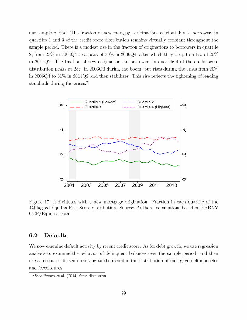
our sample period. The fraction of new mortgage originations attributable to borrowers in
quartiles 1 and 3 of the credit score distribution remains virtually constant throughout the
sample period. There is a modest rise in the fraction of originations to borrowers in quartile
2, from 23% in 2003Q4 to a peak of 30% in 2006Q4, after which they drop to a low of 20%
in 2011Q2. The fraction of new originations to borrowers in quartile 4 of the credit score
distribution peaks at 28% in 2003Q3 during the boom, but rises during the crisis from 20%
in 2006Q4 to 31% in 2011Q2 and then stabilizes. This rise reflects the tightening of lending
standards during the crises.21
0.2
.4.6
0.2
.4.6
2001 2003 2005 2007 2009 2011 2013
Quartile 1 (Lowest) Quartile 2Quartile 3 Quartile 4 (Highest)
Figure 17: Individuals with a new mortgage origination. Fraction in each quartile of the4Q lagged Equifax Risk Score distribution. Source: Authors’ calculations based on FRBNYCCP/Equifax Data.
6.2 Defaults
We now examine default activity by recent credit score. As for debt growth, we use regression
analysis to examine the behavior of delinquent balances over the sample period, and then
use a recent credit score ranking to the examine the distribution of mortgage delinquencies
and foreclosures.
21See Brown et al. (2014) for a discussion.
29
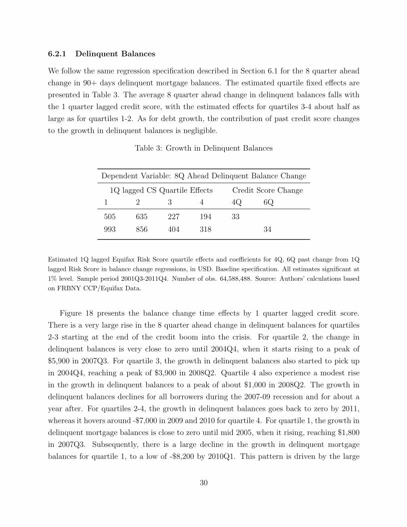
6.2.1 Delinquent Balances
We follow the same regression specification described in Section 6.1 for the 8 quarter ahead
change in 90+ days delinquent mortgage balances. The estimated quartile fixed effects are
presented in Table 3. The average 8 quarter ahead change in delinquent balances falls with
the 1 quarter lagged credit score, with the estimated effects for quartiles 3-4 about half as
large as for quartiles 1-2. As for debt growth, the contribution of past credit score changes
to the growth in delinquent balances is negligible.
Table 3: Growth in Delinquent Balances
Dependent Variable: 8Q Ahead Delinquent Balance Change
1Q lagged CS Quartile Effects Credit Score Change
1 2 3 4 4Q 6Q
505 635 227 194 33
993 856 404 318 34
Estimated 1Q lagged Equifax Risk Score quartile effects and coefficients for 4Q, 6Q past change from 1Q
lagged Risk Score in balance change regressions, in USD. Baseline specification. All estimates significant at
1% level. Sample period 2001Q3-2011Q4. Number of obs. 64,588,488. Source: Authors’ calculations based
on FRBNY CCP/Equifax Data.
Figure 18 presents the balance change time effects by 1 quarter lagged credit score.
There is a very large rise in the 8 quarter ahead change in delinquent balances for quartiles
2-3 starting at the end of the credit boom into the crisis. For quartile 2, the change in
delinquent balances is very close to zero until 2004Q4, when it starts rising to a peak of
$5,900 in 2007Q3. For quartile 3, the growth in delinquent balances also started to pick up
in 2004Q4, reaching a peak of $3,900 in 2008Q2. Quartile 4 also experience a modest rise
in the growth in delinquent balances to a peak of about $1,000 in 2008Q2. The growth in
delinquent balances declines for all borrowers during the 2007-09 recession and for about a
year after. For quartiles 2-4, the growth in delinquent balances goes back to zero by 2011,
whereas it hovers around -$7,000 in 2009 and 2010 for quartile 4. For quartile 1, the growth in
delinquent mortgage balances is close to zero until mid 2005, when it rising, reaching $1,800
in 2007Q3. Subsequently, there is a large decline in the growth in delinquent mortgage
balances for quartile 1, to a low of -$8,200 by 2010Q1. This pattern is driven by the large
30
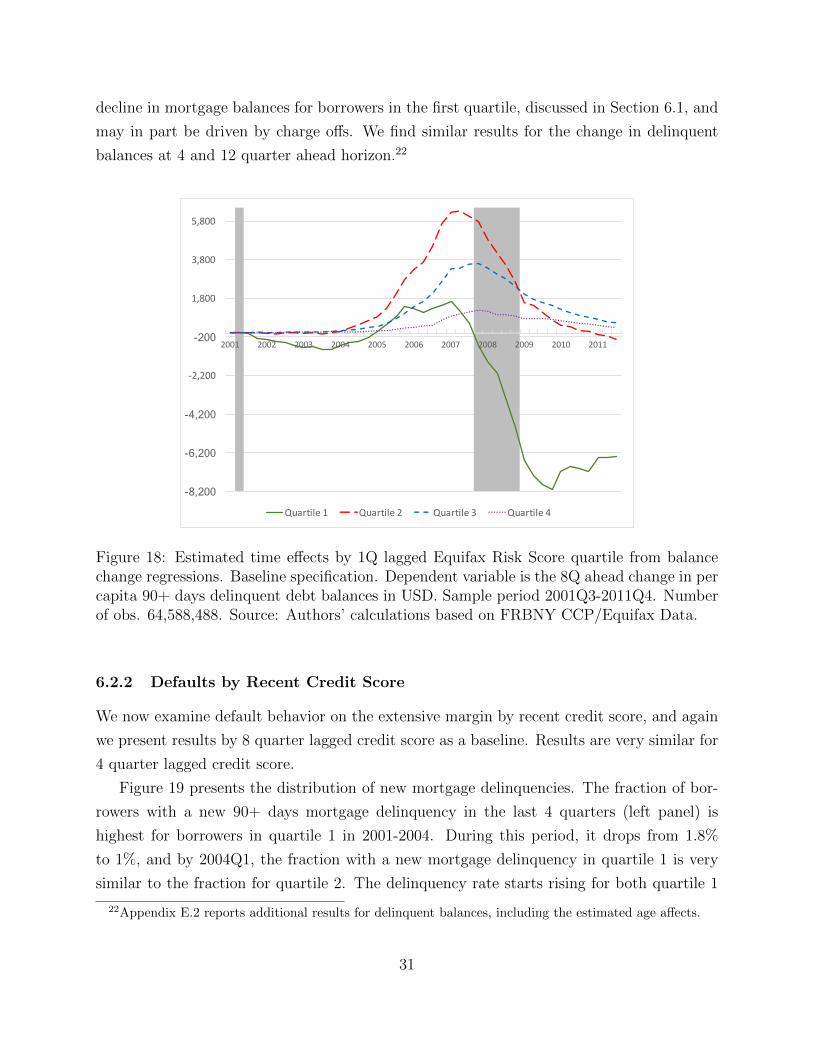
decline in mortgage balances for borrowers in the first quartile, discussed in Section 6.1, and
may in part be driven by charge offs. We find similar results for the change in delinquent
balances at 4 and 12 quarter ahead horizon.22
-8,200
-6,200
-4,200
-2,200
-200
1,800
3,800
5,800
2001 2002 2003 2004 2005 2006 2007 2008 2009 2010 2011
Quartile1 Quartile2 Quartile3 Quartile4
Figure 18: Estimated time effects by 1Q lagged Equifax Risk Score quartile from balancechange regressions. Baseline specification. Dependent variable is the 8Q ahead change in percapita 90+ days delinquent debt balances in USD. Sample period 2001Q3-2011Q4. Numberof obs. 64,588,488. Source: Authors’ calculations based on FRBNY CCP/Equifax Data.
6.2.2 Defaults by Recent Credit Score
We now examine default behavior on the extensive margin by recent credit score, and again
we present results by 8 quarter lagged credit score as a baseline. Results are very similar for
4 quarter lagged credit score.
Figure 19 presents the distribution of new mortgage delinquencies. The fraction of bor-
rowers with a new 90+ days mortgage delinquency in the last 4 quarters (left panel) is
highest for borrowers in quartile 1 in 2001-2004. During this period, it drops from 1.8%
to 1%, and by 2004Q1, the fraction with a new mortgage delinquency in quartile 1 is very
similar to the fraction for quartile 2. The delinquency rate starts rising for both quartile 1
22Appendix E.2 reports additional results for delinquent balances, including the estimated age affects.
31
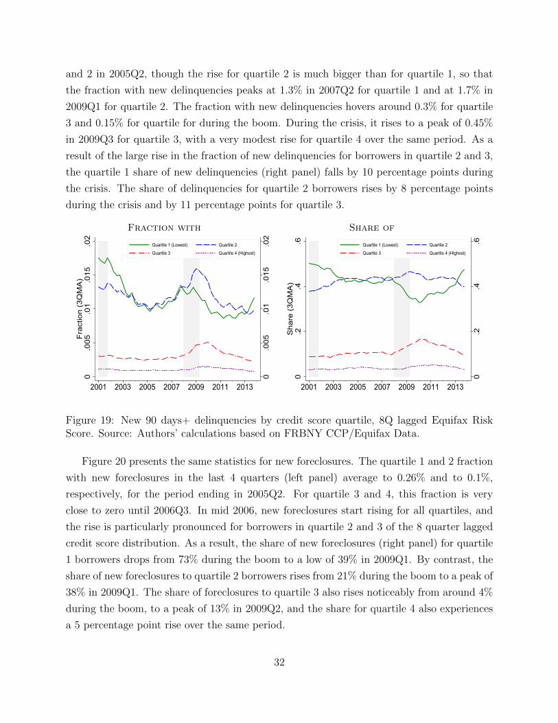
and 2 in 2005Q2, though the rise for quartile 2 is much bigger than for quartile 1, so that
the fraction with new delinquencies peaks at 1.3% in 2007Q2 for quartile 1 and at 1.7% in
2009Q1 for quartile 2. The fraction with new delinquencies hovers around 0.3% for quartile
3 and 0.15% for quartile for during the boom. During the crisis, it rises to a peak of 0.45%
in 2009Q3 for quartile 3, with a very modest rise for quartile 4 over the same period. As a
result of the large rise in the fraction of new delinquencies for borrowers in quartile 2 and 3,
the quartile 1 share of new delinquencies (right panel) falls by 10 percentage points during
the crisis. The share of delinquencies for quartile 2 borrowers rises by 8 percentage points
during the crisis and by 11 percentage points for quartile 3.
Fraction with Share of
0.0
05.0
1.0
15.0
2
0.0
05.0
1.0
15.0
2F
ract
ion
(3Q
MA
)
2001 2003 2005 2007 2009 2011 2013
Quartile 1 (Lowest) Quartile 2
Quartile 3 Quartile 4 (Highest)
0.2
.4.6
0.2
.4.6
Sha
re (
3QM
A)
2001 2003 2005 2007 2009 2011 2013
Quartile 1 (Lowest) Quartile 2
Quartile 3 Quartile 4 (Highest)
Figure 19: New 90 days+ delinquencies by credit score quartile, 8Q lagged Equifax RiskScore. Source: Authors’ calculations based on FRBNY CCP/Equifax Data.
Figure 20 presents the same statistics for new foreclosures. The quartile 1 and 2 fraction
with new foreclosures in the last 4 quarters (left panel) average to 0.26% and to 0.1%,
respectively, for the period ending in 2005Q2. For quartile 3 and 4, this fraction is very
close to zero until 2006Q3. In mid 2006, new foreclosures start rising for all quartiles, and
the rise is particularly pronounced for borrowers in quartile 2 and 3 of the 8 quarter lagged
credit score distribution. As a result, the share of new foreclosures (right panel) for quartile
1 borrowers drops from 73% during the boom to a low of 39% in 2009Q1. By contrast, the
share of new foreclosures to quartile 2 borrowers rises from 21% during the boom to a peak of
38% in 2009Q1. The share of foreclosures to quartile 3 also rises noticeably from around 4%
during the boom, to a peak of 13% in 2009Q2, and the share for quartile 4 also experiences
a 5 percentage point rise over the same period.
32
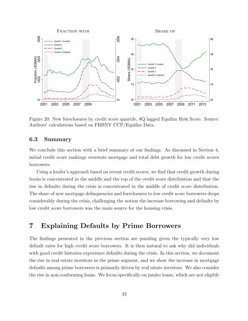
Fraction with Share of
0.0
02.0
04.0
06
0.0
02.0
04.0
06F
ract
ion
(3Q
MA
)
2001 2003 2005 2007 2009
Quartile 1 (Lowest)
Quartile 2
Quartile 3
Quartile 4 (Highest)
0.2
.4.6
.8
0.2
.4.6
.8S
hare
(3Q
MA
)
2001 2003 2005 2007 2009 2011 2013
Quartile 1 (Lowest)
Quartile 2
Quartile 3
Quartile 4 (Highest)
Figure 20: New foreclosures by credit score quartile, 8Q lagged Equifax Risk Score. Source:Authors’ calculations based on FRBNY CCP/Equifax Data.
6.3 Summary
We conclude this section with a brief summary of our findings. As discussed in Section 4,
initial credit score rankings overstate mortgage and total debt growth for low credit scores
borrowers.
Using a lender’s approach based on recent credit scores, we find that credit growth during
boom is concentrated in the middle and the top of the credit score distribution and that the
rise in defaults during the crisis is concentrated in the middle of credit score distribution.
The share of new mortgage delinquencies and foreclosures to low credit score borrowers drops
considerably during the crisis, challenging the notion the increase borrowing and defaults by
low credit score borrowers was the main source for the housing crisis.
7 Explaining Defaults by Prime Borrowers
The findings presented in the previous section are puzzling given the typically very low
default rates for high credit score borrowers. It is then natural to ask why did individuals
with good credit histories experience defaults during the crisis. In this section, we document
the rise in real estate investors in the prime segment, and we show the increase in mortgage
defaults among prime borrowers is primarily driven by real estate investors. We also consider
the rise in non-conforming loans. We focus specifically on jumbo loans, which are not eligible
33
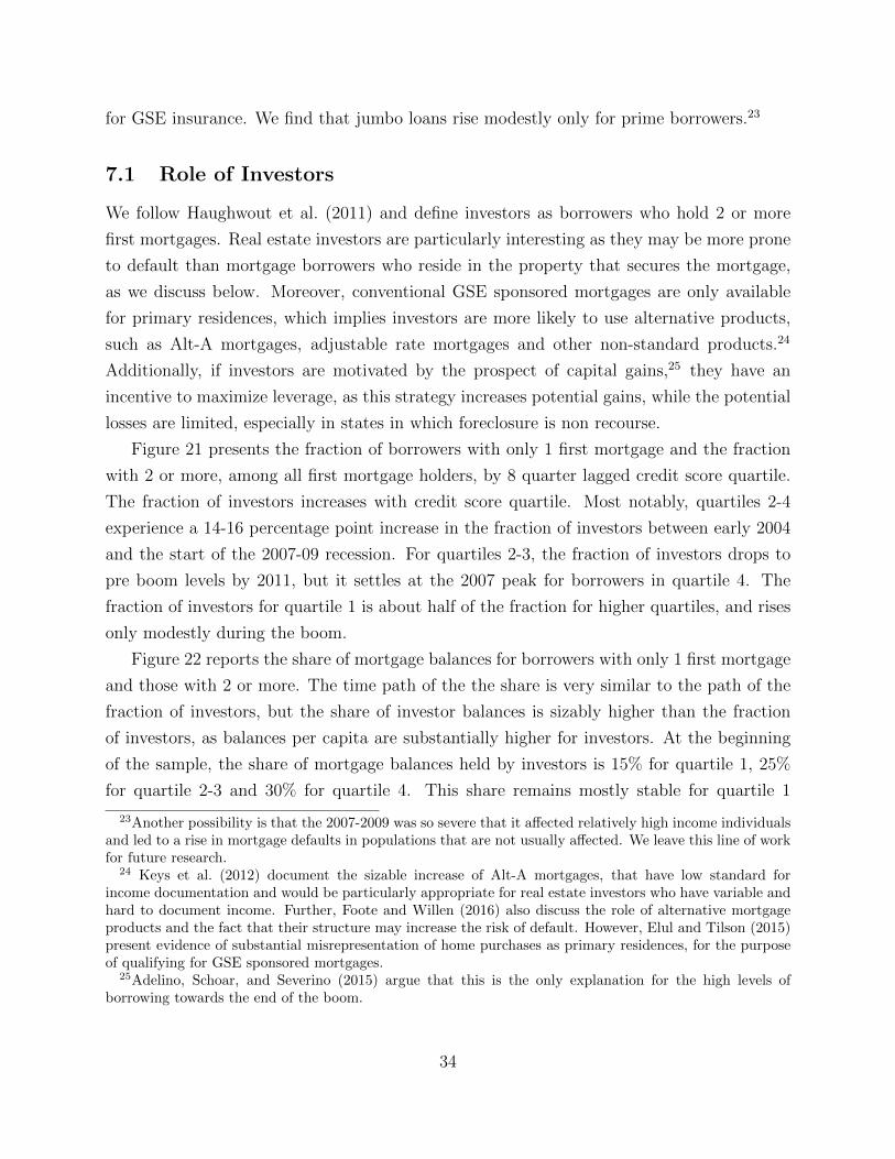
for GSE insurance. We find that jumbo loans rise modestly only for prime borrowers.23
7.1 Role of Investors
We follow Haughwout et al. (2011) and define investors as borrowers who hold 2 or more
first mortgages. Real estate investors are particularly interesting as they may be more prone
to default than mortgage borrowers who reside in the property that secures the mortgage,
as we discuss below. Moreover, conventional GSE sponsored mortgages are only available
for primary residences, which implies investors are more likely to use alternative products,
such as Alt-A mortgages, adjustable rate mortgages and other non-standard products.24
Additionally, if investors are motivated by the prospect of capital gains,25 they have an
incentive to maximize leverage, as this strategy increases potential gains, while the potential
losses are limited, especially in states in which foreclosure is non recourse.
Figure 21 presents the fraction of borrowers with only 1 first mortgage and the fraction
with 2 or more, among all first mortgage holders, by 8 quarter lagged credit score quartile.
The fraction of investors increases with credit score quartile. Most notably, quartiles 2-4
experience a 14-16 percentage point increase in the fraction of investors between early 2004
and the start of the 2007-09 recession. For quartiles 2-3, the fraction of investors drops to
pre boom levels by 2011, but it settles at the 2007 peak for borrowers in quartile 4. The
fraction of investors for quartile 1 is about half of the fraction for higher quartiles, and rises
only modestly during the boom.
Figure 22 reports the share of mortgage balances for borrowers with only 1 first mortgage
and those with 2 or more. The time path of the the share is very similar to the path of the
fraction of investors, but the share of investor balances is sizably higher than the fraction
of investors, as balances per capita are substantially higher for investors. At the beginning
of the sample, the share of mortgage balances held by investors is 15% for quartile 1, 25%
for quartile 2-3 and 30% for quartile 4. This share remains mostly stable for quartile 1
23Another possibility is that the 2007-2009 was so severe that it affected relatively high income individualsand led to a rise in mortgage defaults in populations that are not usually affected. We leave this line of workfor future research.
24 Keys et al. (2012) document the sizable increase of Alt-A mortgages, that have low standard forincome documentation and would be particularly appropriate for real estate investors who have variable andhard to document income. Further, Foote and Willen (2016) also discuss the role of alternative mortgageproducts and the fact that their structure may increase the risk of default. However, Elul and Tilson (2015)present evidence of substantial misrepresentation of home purchases as primary residences, for the purposeof qualifying for GSE sponsored mortgages.
25Adelino, Schoar, and Severino (2015) argue that this is the only explanation for the high levels ofborrowing towards the end of the boom.
34
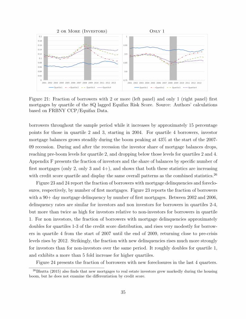
2 or More (Investors) Only 1
0
0.02
0.04
0.06
0.08
0.1
0.12
0.14
0.16
0.18
0.2
2001 2002 2003 2004 2005 2006 2007 2008 2009 2010 2011 2012 2013
Quartile1 Quartile2 Quartile3 Quartile4
0.75
0.8
0.85
0.9
0.95
1
2001 2002 2003 2004 2005 2006 2007 2008 2009 2010 2011 2012 2013
Quartile1 Quartile2 Quartile3 Quartile4
Figure 21: Fraction of borrowers with 2 or more (left panel) and only 1 (right panel) firstmortgages by quartile of the 8Q lagged Equifax Risk Score. Source: Authors’ calculationsbased on FRBNY CCP/Equifax Data.
borrowers throughout the sample period while it increases by approximately 15 percentage
points for those in quartile 2 and 3, starting in 2004. For quartile 4 borrowers, investor
mortgage balances grows steadily during the boom peaking at 43% at the start of the 2007-
09 recession. During and after the recession the investor share of mortgage balances drops,
reaching pre-boom levels for quartile 2, and dropping below those levels for quartiles 2 and 4.
Appendix F presents the fraction of investors and the share of balances by specific number of
first mortgages (only 2, only 3 and 4+), and shows that both these statistics are increasing
with credit score quartile and display the same overall patterns as the combined statistics.26
Figure 23 and 24 report the fraction of borrowers with mortgage delinquencies and foreclo-
sures, respectively, by number of first mortgages. Figure 23 reports the fraction of borrowers
with a 90+ day mortgage delinquency by number of first mortgages. Between 2002 and 2006,
delinquency rates are similar for investors and non investors for borrowers in quartiles 2-4,
but more than twice as high for investors relative to non-investors for borrowers in quartile
1. For non investors, the fraction of borrowers with mortgage delinquencies approximately
doubles for quartiles 1-3 of the credit score distribution, and rises very modestly for borrow-
ers in quartile 4 from the start of 2007 until the end of 2009, returning close to pre-crisis
levels rises by 2012. Strikingly, the fraction with new delinquencies rises much more strongly
for investors than for non-investors over the same period. It roughly doubles for quartile 1,
and exhibits a more than 5 fold increase for higher quartiles.
Figure 24 presents the fraction of borrowers with new foreclosures in the last 4 quarters.
26Bhutta (2015) also finds that new mortgages to real estate investors grew markedly during the housingboom, but he does not examine the differentiation by credit score.
35
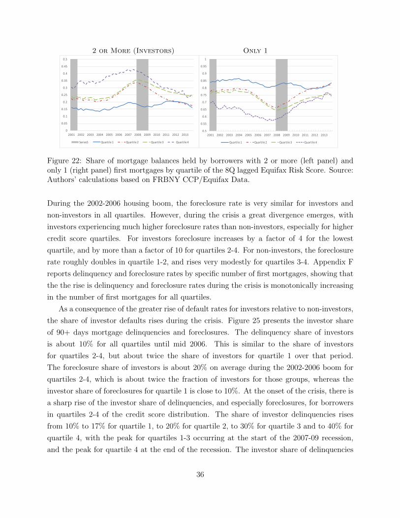
2 or More (Investors) Only 1
0
0.05
0.1
0.15
0.2
0.25
0.3
0.35
0.4
0.45
0.5
2001 2002 2003 2004 2005 2006 2007 2008 2009 2010 2011 2012 2013
Series5 Quartile1 Quartile2 Quartile3 Quartile4
0.5
0.55
0.6
0.65
0.7
0.75
0.8
0.85
0.9
0.95
1
2001 2002 2003 2004 2005 2006 2007 2008 2009 2010 2011 2012 2013
Quartile1 Quartile2 Quartile3 Quartile4
Figure 22: Share of mortgage balances held by borrowers with 2 or more (left panel) andonly 1 (right panel) first mortgages by quartile of the 8Q lagged Equifax Risk Score. Source:Authors’ calculations based on FRBNY CCP/Equifax Data.
During the 2002-2006 housing boom, the foreclosure rate is very similar for investors and
non-investors in all quartiles. However, during the crisis a great divergence emerges, with
investors experiencing much higher foreclosure rates than non-investors, especially for higher
credit score quartiles. For investors foreclosure increases by a factor of 4 for the lowest
quartile, and by more than a factor of 10 for quartiles 2-4. For non-investors, the foreclosure
rate roughly doubles in quartile 1-2, and rises very modestly for quartiles 3-4. Appendix F
reports delinquency and foreclosure rates by specific number of first mortgages, showing that
the the rise is delinquency and foreclosure rates during the crisis is monotonically increasing
in the number of first mortgages for all quartiles.
As a consequence of the greater rise of default rates for investors relative to non-investors,
the share of investor defaults rises during the crisis. Figure 25 presents the investor share
of 90+ days mortgage delinquencies and foreclosures. The delinquency share of investors
is about 10% for all quartiles until mid 2006. This is similar to the share of investors
for quartiles 2-4, but about twice the share of investors for quartile 1 over that period.
The foreclosure share of investors is about 20% on average during the 2002-2006 boom for
quartiles 2-4, which is about twice the fraction of investors for those groups, whereas the
investor share of foreclosures for quartile 1 is close to 10%. At the onset of the crisis, there is
a sharp rise of the investor share of delinquencies, and especially foreclosures, for borrowers
in quartiles 2-4 of the credit score distribution. The share of investor delinquencies rises
from 10% to 17% for quartile 1, to 20% for quartile 2, to 30% for quartile 3 and to 40% for
quartile 4, with the peak for quartiles 1-3 occurring at the start of the 2007-09 recession,
and the peak for quartile 4 at the end of the recession. The investor share of delinquencies
36
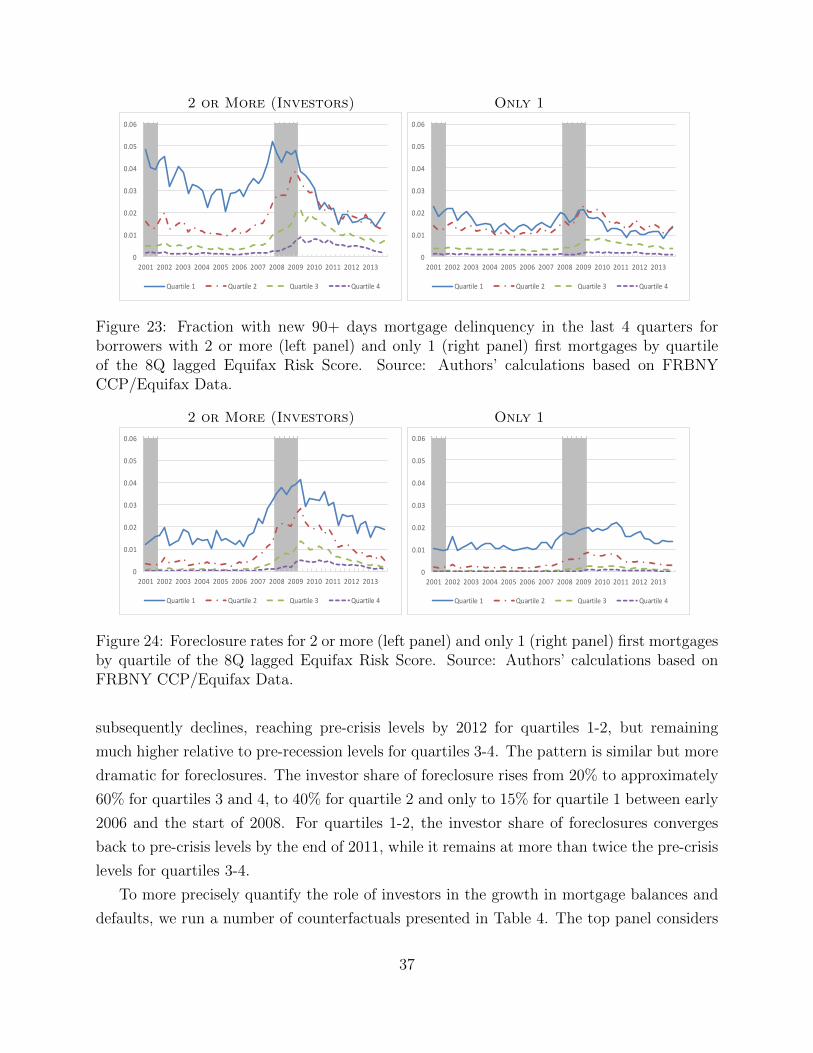
2 or More (Investors) Only 1
0
0.01
0.02
0.03
0.04
0.05
0.06
2001 2002 2003 2004 2005 2006 2007 2008 2009 2010 2011 2012 2013
Quartile1 Quartile2 Quartile3 Quartile4
0
0.01
0.02
0.03
0.04
0.05
0.06
2001 2002 2003 2004 2005 2006 2007 2008 2009 2010 2011 2012 2013
Quartile1 Quartile2 Quartile3 Quartile4
Figure 23: Fraction with new 90+ days mortgage delinquency in the last 4 quarters forborrowers with 2 or more (left panel) and only 1 (right panel) first mortgages by quartileof the 8Q lagged Equifax Risk Score. Source: Authors’ calculations based on FRBNYCCP/Equifax Data.
2 or More (Investors) Only 1
0
0.01
0.02
0.03
0.04
0.05
0.06
2001 2002 2003 2004 2005 2006 2007 2008 2009 2010 2011 2012 2013
Quartile1 Quartile2 Quartile3 Quartile4
0
0.01
0.02
0.03
0.04
0.05
0.06
2001 2002 2003 2004 2005 2006 2007 2008 2009 2010 2011 2012 2013
Quartile1 Quartile2 Quartile3 Quartile4
Figure 24: Foreclosure rates for 2 or more (left panel) and only 1 (right panel) first mortgagesby quartile of the 8Q lagged Equifax Risk Score. Source: Authors’ calculations based onFRBNY CCP/Equifax Data.
subsequently declines, reaching pre-crisis levels by 2012 for quartiles 1-2, but remaining
much higher relative to pre-recession levels for quartiles 3-4. The pattern is similar but more
dramatic for foreclosures. The investor share of foreclosure rises from 20% to approximately
60% for quartiles 3 and 4, to 40% for quartile 2 and only to 15% for quartile 1 between early
2006 and the start of 2008. For quartiles 1-2, the investor share of foreclosures converges
back to pre-crisis levels by the end of 2011, while it remains at more than twice the pre-crisis
levels for quartiles 3-4.
To more precisely quantify the role of investors in the growth in mortgage balances and
defaults, we run a number of counterfactuals presented in Table 4. The top panel considers
37
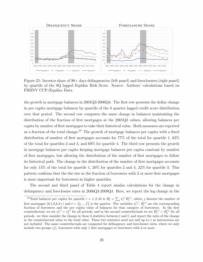
Delinquency Share Foreclosure Share
0
0.1
0.2
0.3
0.4
0.5
0.6
0.7
0.8
0.9
1
2001 2002 2003 2004 2005 2006 2007 2008 2009 2010 2011 2012 2013
Quartile1 Quartile2 Quartile3 Quartile4
0
0.1
0.2
0.3
0.4
0.5
0.6
0.7
0.8
0.9
1
2001 2002 2003 2004 2005 2006 2007 2008 2009 2010 2011 2012 2013
Quartile1 Quartile2 Quartile3 Quartile4
Figure 25: Investor share of 90+ days delinquencies (left panel) and foreclosures (right panel)by quartile of the 8Q lagged Equifax Risk Score. Source: Authors’ calculations based onFRBNY CCP/Equifax Data.
the growth in mortgage balances in 2001Q3-2006Q4. The first row presents the dollar change
in per capita mortgage balances by quartile of the 8 quarter lagged credit score distribution
over that period. The second row computes the same change in balances maintaining the
distribution of the fraction of first mortgages at the 2001Q3 values, allowing balances per
capita by number of first mortgages to take their historical value. Both measures are reported
as a fraction of the total change.27 The growth of mortgage balances per capita with a fixed
distribution of number of first mortgages accounts for 77% of the total for quartile 1, 62%
of the total for quartiles 2 and 3, and 69% for quartile 4. The third row presents the growth
in mortgage balances per capita keeping mortgage balances per capita constant by number
of first mortgages, but allowing the distribution of the number of first mortgages to follow
its historical path. The change in the distribution of the number of first mortgages accounts
for only 13% of the total for quartile 1, 20% for quartiles 2 and 4, 22% for quartile 3. This
pattern confirms that the the rise in the fraction of borrowers with 2 or more first mortgages
is more important for borrowers in higher quartiles.
The second and third panel of Table 4 report similar calculations for the change in
delinquency and foreclosure rates in 2006Q3-2009Q4. Here, we report the log change in the
27Total balances per capita for quartile i = 1, 2, 34 is Bit =
∑j π
i,jt Bi,j
t , where j denotes the number of
first mortgages (0,1,2,3,4+) and t ={t, ..., t
}is the quarter. The variables πi,j
t , Bi,jt are the corresponding
fraction of borrowers and the per capita value of balances for that category of borrowers. In the firstcounterfactual, we set πi,j
t = πi,jt for all periods, and in the second counterfactuals we set Bi,j
t = Bi,jt for all
periods. we then consider the change in these 3 statistics between t and t, and report the ratio of the changein the counterfactual value to the total value. These two statistics need not add up to 1 as interactions arenot included. The same counterfactuals are computed for delinquency and foreclosure rates, where we onlyinclude two groups (j), borrowers with only 1 first mortgages or borrowers with 2 or more.
38
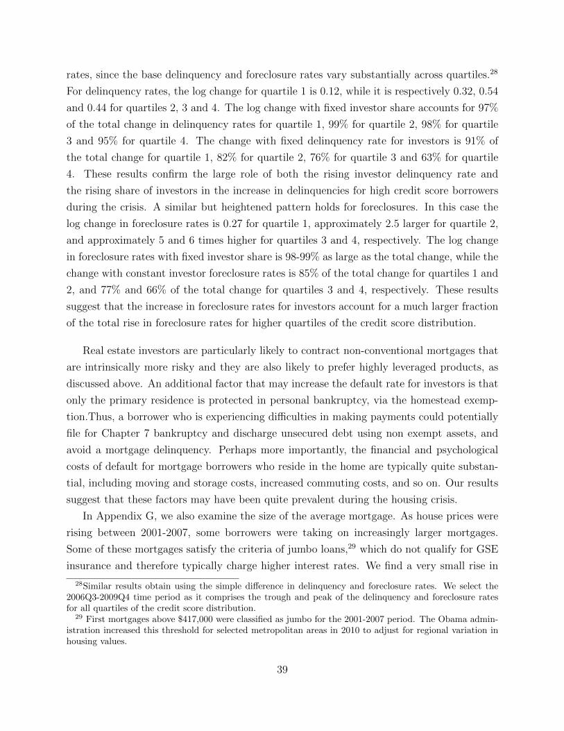
rates, since the base delinquency and foreclosure rates vary substantially across quartiles.28
For delinquency rates, the log change for quartile 1 is 0.12, while it is respectively 0.32, 0.54
and 0.44 for quartiles 2, 3 and 4. The log change with fixed investor share accounts for 97%
of the total change in delinquency rates for quartile 1, 99% for quartile 2, 98% for quartile
3 and 95% for quartile 4. The change with fixed delinquency rate for investors is 91% of
the total change for quartile 1, 82% for quartile 2, 76% for quartile 3 and 63% for quartile
4. These results confirm the large role of both the rising investor delinquency rate and
the rising share of investors in the increase in delinquencies for high credit score borrowers
during the crisis. A similar but heightened pattern holds for foreclosures. In this case the
log change in foreclosure rates is 0.27 for quartile 1, approximately 2.5 larger for quartile 2,
and approximately 5 and 6 times higher for quartiles 3 and 4, respectively. The log change
in foreclosure rates with fixed investor share is 98-99% as large as the total change, while the
change with constant investor foreclosure rates is 85% of the total change for quartiles 1 and
2, and 77% and 66% of the total change for quartiles 3 and 4, respectively. These results
suggest that the increase in foreclosure rates for investors account for a much larger fraction
of the total rise in foreclosure rates for higher quartiles of the credit score distribution.
Real estate investors are particularly likely to contract non-conventional mortgages that
are intrinsically more risky and they are also likely to prefer highly leveraged products, as
discussed above. An additional factor that may increase the default rate for investors is that
only the primary residence is protected in personal bankruptcy, via the homestead exemp-
tion.Thus, a borrower who is experiencing difficulties in making payments could potentially
file for Chapter 7 bankruptcy and discharge unsecured debt using non exempt assets, and
avoid a mortgage delinquency. Perhaps more importantly, the financial and psychological
costs of default for mortgage borrowers who reside in the home are typically quite substan-
tial, including moving and storage costs, increased commuting costs, and so on. Our results
suggest that these factors may have been quite prevalent during the housing crisis.
In Appendix G, we also examine the size of the average mortgage. As house prices were
rising between 2001-2007, some borrowers were taking on increasingly larger mortgages.
Some of these mortgages satisfy the criteria of jumbo loans,29 which do not qualify for GSE
insurance and therefore typically charge higher interest rates. We find a very small rise in
28Similar results obtain using the simple difference in delinquency and foreclosure rates. We select the2006Q3-2009Q4 time period as it comprises the trough and peak of the delinquency and foreclosure ratesfor all quartiles of the credit score distribution.
29 First mortgages above $417,000 were classified as jumbo for the 2001-2007 period. The Obama admin-istration increased this threshold for selected metropolitan areas in 2010 to adjust for regional variation inhousing values.
39
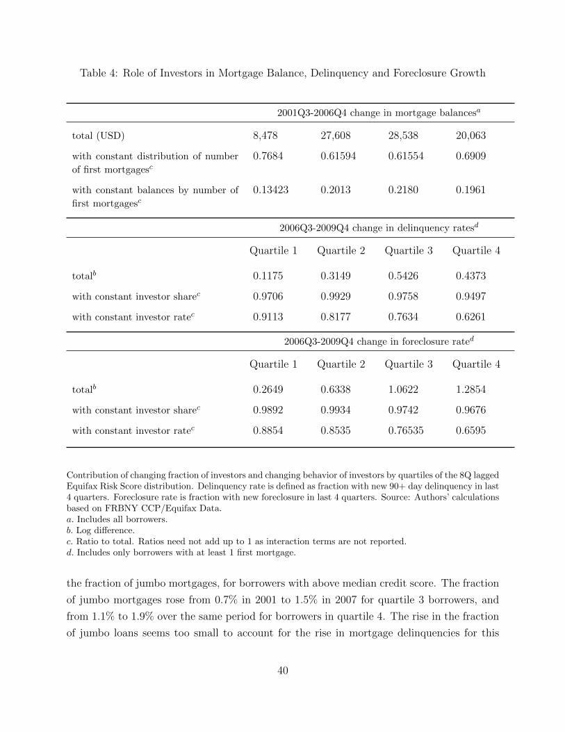
Table 4: Role of Investors in Mortgage Balance, Delinquency and Foreclosure Growth
2001Q3-2006Q4 change in mortgage balancesa
total (USD) 8,478 27,608 28,538 20,063
with constant distribution of number
of first mortgagesc0.7684 0.61594 0.61554 0.6909
with constant balances by number of
first mortgagesc0.13423 0.2013 0.2180 0.1961
2006Q3-2009Q4 change in delinquency ratesd
Quartile 1 Quartile 2 Quartile 3 Quartile 4
totalb 0.1175 0.3149 0.5426 0.4373
with constant investor sharec 0.9706 0.9929 0.9758 0.9497
with constant investor ratec 0.9113 0.8177 0.7634 0.6261
2006Q3-2009Q4 change in foreclosure rated
Quartile 1 Quartile 2 Quartile 3 Quartile 4
totalb 0.2649 0.6338 1.0622 1.2854
with constant investor sharec 0.9892 0.9934 0.9742 0.9676
with constant investor ratec 0.8854 0.8535 0.76535 0.6595
Contribution of changing fraction of investors and changing behavior of investors by quartiles of the 8Q laggedEquifax Risk Score distribution. Delinquency rate is defined as fraction with new 90+ day delinquency in last4 quarters. Foreclosure rate is fraction with new foreclosure in last 4 quarters. Source: Authors’ calculationsbased on FRBNY CCP/Equifax Data.a. Includes all borrowers.b. Log difference.c. Ratio to total. Ratios need not add up to 1 as interaction terms are not reported.d. Includes only borrowers with at least 1 first mortgage.
the fraction of jumbo mortgages, for borrowers with above median credit score. The fraction
of jumbo mortgages rose from 0.7% in 2001 to 1.5% in 2007 for quartile 3 borrowers, and
from 1.1% to 1.9% over the same period for borrowers in quartile 4. The rise in the fraction
of jumbo loans seems too small to account for the rise in mortgage delinquencies for this
40
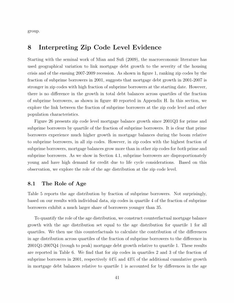
group.
8 Interpreting Zip Code Level Evidence
Starting with the seminal work of Mian and Sufi (2009), the macroeconomic literature has
used geographical variation to link mortgage debt growth to the severity of the housing
crisis and of the ensuing 2007-2009 recession. As shown in figure 1, ranking zip codes by the
fraction of subprime borrowers in 2001, suggests that mortgage debt growth in 2001-2007 is
stronger in zip codes with high fraction of subprime borrowers at the starting date. However,
there is no difference in the growth in total debt balances across quartiles of the fraction
of subprime borrowers, as shown in figure 40 reported in Appendix H. In this section, we
explore the link between the fraction of subprime borrowers at the zip code level and other
population characteristics.
Figure 26 presents zip code level mortgage balance growth since 2001Q3 for prime and
subprime borrowers by quartile of the fraction of subprime borrowers. It is clear that prime
borrowers experience much higher growth in mortgage balances during the boom relative
to subprime borrowers, in all zip codes. However, in zip codes with the highest fraction of
subprime borrowers, mortgage balances grow more than in other zip codes for both prime and
subprime borrowers. As we show in Section 4.1, subprime borrowers are disproportionately
young and have high demand for credit due to life cycle considerations. Based on this
observation, we explore the role of the age distribution at the zip code level.
8.1 The Role of Age
Table 5 reports the age distribution by fraction of subprime borrowers. Not surprisingly,
based on our results with individual data, zip codes in quartile 4 of the fraction of subprime
borrowers exhibit a much larger share of borrowers younger than 35.
To quantify the role of the age distribution, we construct counterfactual mortgage balance
growth with the age distribution set equal to the age distribution for quartile 1 for all
quartiles. We then use this counterfactuals to calculate the contribution of the differences
in age distribution across quartiles of the fraction of subprime borrowers to the difference in
2001Q1-2007Q4 (trough to peak) mortgage debt growth relative to quartile 1. These results
are reported in Table 6. We find that for zip codes in quartiles 2 and 3 of the fraction of
subprime borrowers in 2001, respectively 44% and 43% of the additional cumulative growth
in mortgage debt balances relative to quartile 1 is accounted for by differences in the age
41
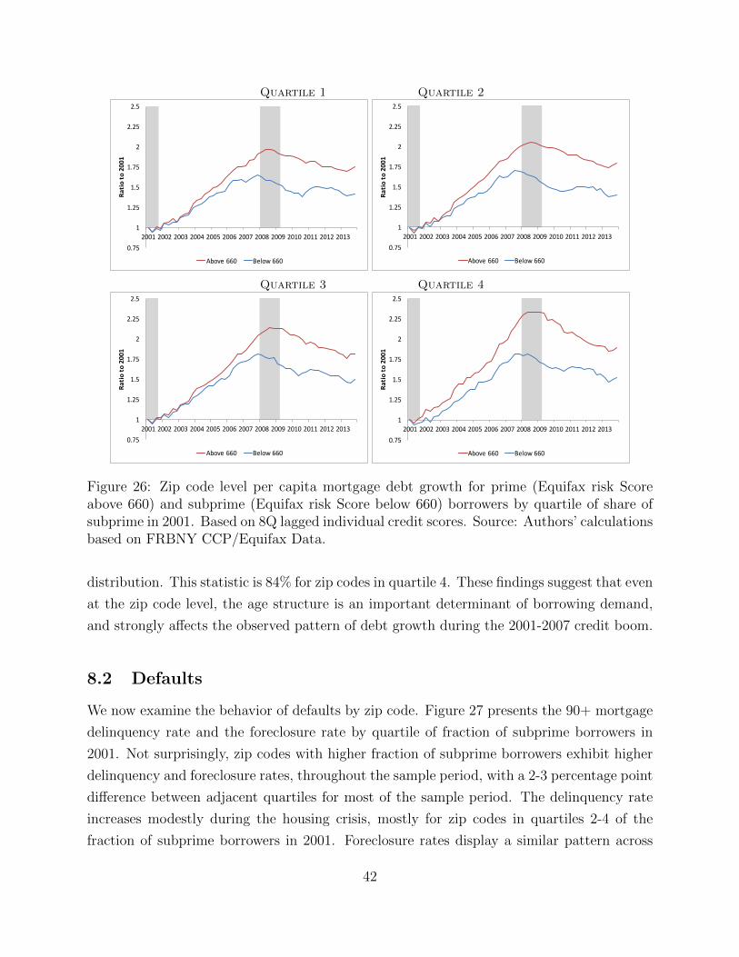
Quartile 1 Quartile 2
0.75
1
1.25
1.5
1.75
2
2.25
2.5
2001 2002 2003 2004 2005 2006 2007 2008 2009 2010 2011 2012 2013
Ratioto2001
Above660 Below660
0.75
1
1.25
1.5
1.75
2
2.25
2.5
2001 2002 2003 2004 2005 2006 2007 2008 2009 2010 2011 2012 2013
Ratioto2001
Above660 Below660
Quartile 3 Quartile 4
0.75
1
1.25
1.5
1.75
2
2.25
2.5
2001 2002 2003 2004 2005 2006 2007 2008 2009 2010 2011 2012 2013
Ratioto2001
Above660 Below660
0.75
1
1.25
1.5
1.75
2
2.25
2.5
2001 2002 2003 2004 2005 2006 2007 2008 2009 2010 2011 2012 2013
Ratioto2001
Above660 Below660
Figure 26: Zip code level per capita mortgage debt growth for prime (Equifax risk Scoreabove 660) and subprime (Equifax risk Score below 660) borrowers by quartile of share ofsubprime in 2001. Based on 8Q lagged individual credit scores. Source: Authors’ calculationsbased on FRBNY CCP/Equifax Data.
distribution. This statistic is 84% for zip codes in quartile 4. These findings suggest that even
at the zip code level, the age structure is an important determinant of borrowing demand,
and strongly affects the observed pattern of debt growth during the 2001-2007 credit boom.
8.2 Defaults
We now examine the behavior of defaults by zip code. Figure 27 presents the 90+ mortgage
delinquency rate and the foreclosure rate by quartile of fraction of subprime borrowers in
2001. Not surprisingly, zip codes with higher fraction of subprime borrowers exhibit higher
delinquency and foreclosure rates, throughout the sample period, with a 2-3 percentage point
difference between adjacent quartiles for most of the sample period. The delinquency rate
increases modestly during the housing crisis, mostly for zip codes in quartiles 2-4 of the
fraction of subprime borrowers in 2001. Foreclosure rates display a similar pattern across
42
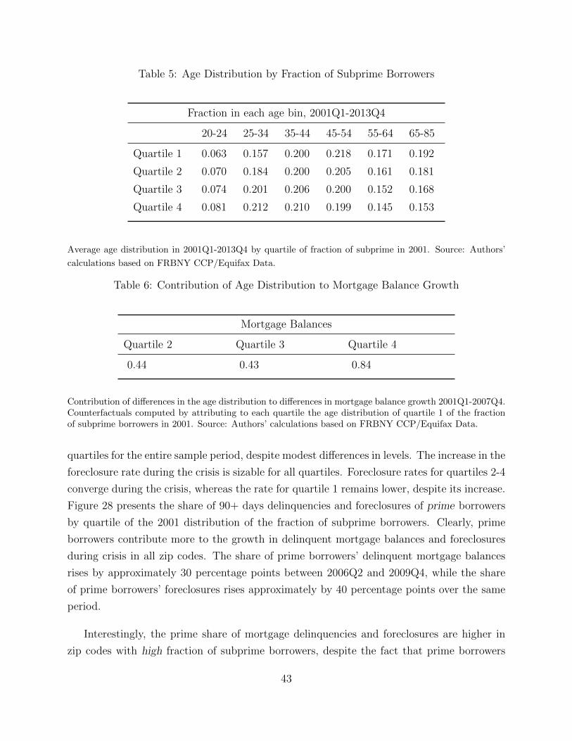
Table 5: Age Distribution by Fraction of Subprime Borrowers
Fraction in each age bin, 2001Q1-2013Q4
20-24 25-34 35-44 45-54 55-64 65-85
Quartile 1 0.063 0.157 0.200 0.218 0.171 0.192
Quartile 2 0.070 0.184 0.200 0.205 0.161 0.181
Quartile 3 0.074 0.201 0.206 0.200 0.152 0.168
Quartile 4 0.081 0.212 0.210 0.199 0.145 0.153
Average age distribution in 2001Q1-2013Q4 by quartile of fraction of subprime in 2001. Source: Authors’
calculations based on FRBNY CCP/Equifax Data.
Table 6: Contribution of Age Distribution to Mortgage Balance Growth
Mortgage Balances
Quartile 2 Quartile 3 Quartile 4
0.44 0.43 0.84
Contribution of differences in the age distribution to differences in mortgage balance growth 2001Q1-2007Q4.Counterfactuals computed by attributing to each quartile the age distribution of quartile 1 of the fractionof subprime borrowers in 2001. Source: Authors’ calculations based on FRBNY CCP/Equifax Data.
quartiles for the entire sample period, despite modest differences in levels. The increase in the
foreclosure rate during the crisis is sizable for all quartiles. Foreclosure rates for quartiles 2-4
converge during the crisis, whereas the rate for quartile 1 remains lower, despite its increase.
Figure 28 presents the share of 90+ days delinquencies and foreclosures of prime borrowers
by quartile of the 2001 distribution of the fraction of subprime borrowers. Clearly, prime
borrowers contribute more to the growth in delinquent mortgage balances and foreclosures
during crisis in all zip codes. The share of prime borrowers’ delinquent mortgage balances
rises by approximately 30 percentage points between 2006Q2 and 2009Q4, while the share
of prime borrowers’ foreclosures rises approximately by 40 percentage points over the same
period.
Interestingly, the prime share of mortgage delinquencies and foreclosures are higher in
zip codes with high fraction of subprime borrowers, despite the fact that prime borrowers
43
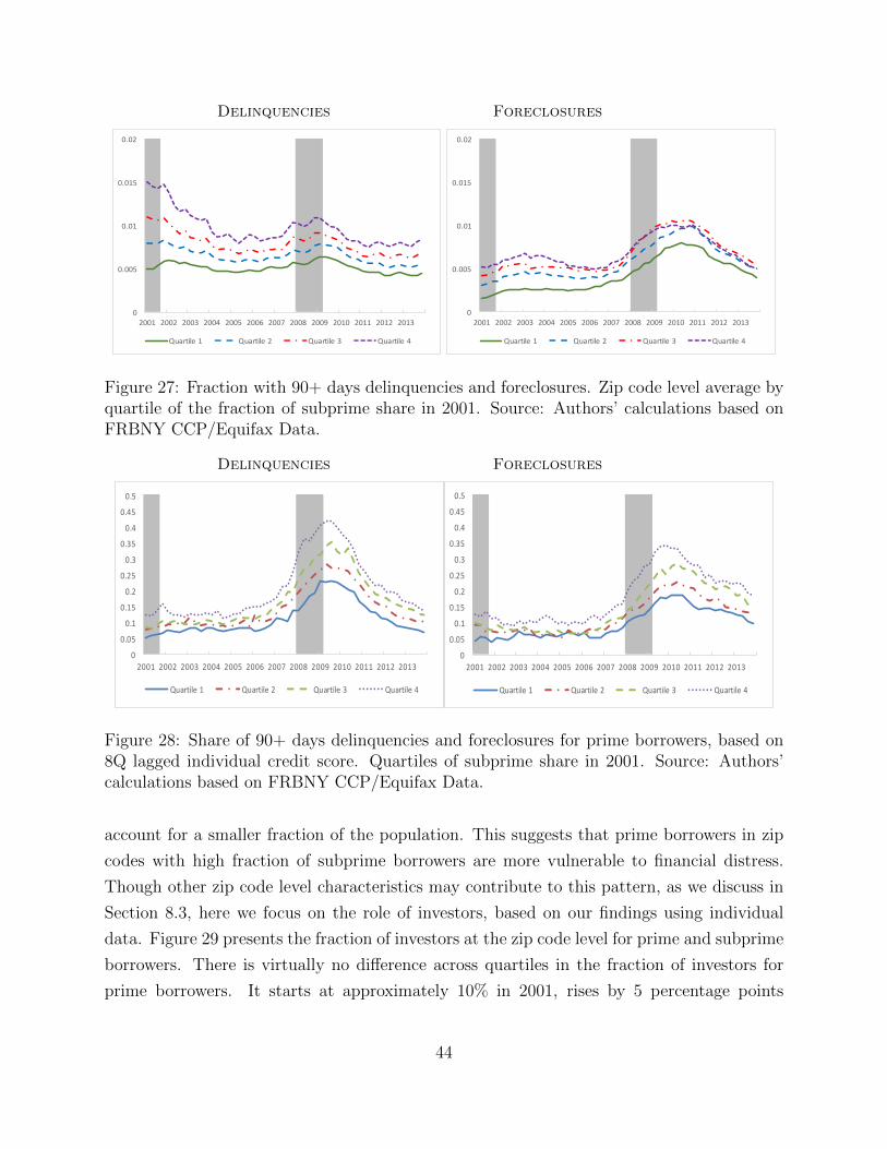
Delinquencies Foreclosures
0
0.005
0.01
0.015
0.02
2001 2002 2003 2004 2005 2006 2007 2008 2009 2010 2011 2012 2013
Quartile1 Quartile2 Quartile3 Quartile4
0
0.005
0.01
0.015
0.02
2001 2002 2003 2004 2005 2006 2007 2008 2009 2010 2011 2012 2013
Quartile1 Quartile2 Quartile3 Quartile4
Figure 27: Fraction with 90+ days delinquencies and foreclosures. Zip code level average byquartile of the fraction of subprime share in 2001. Source: Authors’ calculations based onFRBNY CCP/Equifax Data.
Delinquencies Foreclosures
0
0.05
0.1
0.15
0.2
0.25
0.3
0.35
0.4
0.45
0.5
2001 2002 2003 2004 2005 2006 2007 2008 2009 2010 2011 2012 2013
Quartile1 Quartile2 Quartile3 Quartile4
0
0.05
0.1
0.15
0.2
0.25
0.3
0.35
0.4
0.45
0.5
2001 2002 2003 2004 2005 2006 2007 2008 2009 2010 2011 2012 2013
Quartile1 Quartile2 Quartile3 Quartile4
Figure 28: Share of 90+ days delinquencies and foreclosures for prime borrowers, based on8Q lagged individual credit score. Quartiles of subprime share in 2001. Source: Authors’calculations based on FRBNY CCP/Equifax Data.
account for a smaller fraction of the population. This suggests that prime borrowers in zip
codes with high fraction of subprime borrowers are more vulnerable to financial distress.
Though other zip code level characteristics may contribute to this pattern, as we discuss in
Section 8.3, here we focus on the role of investors, based on our findings using individual
data. Figure 29 presents the fraction of investors at the zip code level for prime and subprime
borrowers. There is virtually no difference across quartiles in the fraction of investors for
prime borrowers. It starts at approximately 10% in 2001, rises by 5 percentage points
44
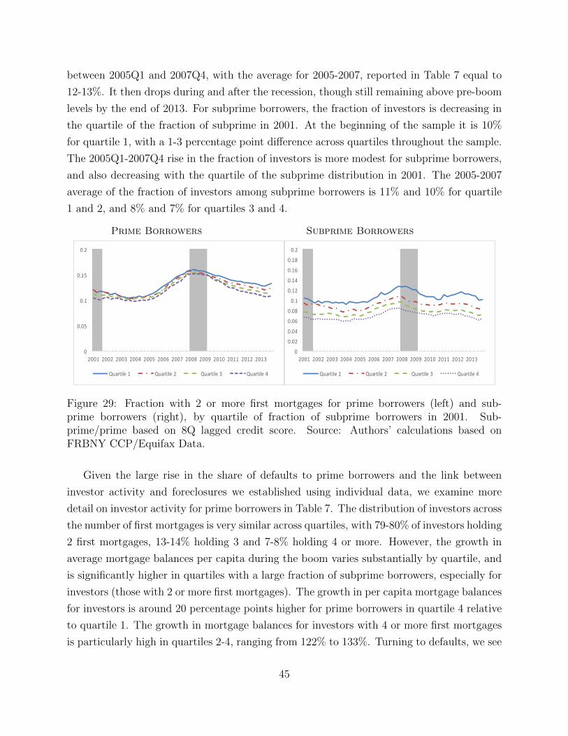
between 2005Q1 and 2007Q4, with the average for 2005-2007, reported in Table 7 equal to
12-13%. It then drops during and after the recession, though still remaining above pre-boom
levels by the end of 2013. For subprime borrowers, the fraction of investors is decreasing in
the quartile of the fraction of subprime in 2001. At the beginning of the sample it is 10%
for quartile 1, with a 1-3 percentage point difference across quartiles throughout the sample.
The 2005Q1-2007Q4 rise in the fraction of investors is more modest for subprime borrowers,
and also decreasing with the quartile of the subprime distribution in 2001. The 2005-2007
average of the fraction of investors among subprime borrowers is 11% and 10% for quartile
1 and 2, and 8% and 7% for quartiles 3 and 4.
Prime Borrowers Subprime Borrowers
0
0.05
0.1
0.15
0.2
2001 2002 2003 2004 2005 2006 2007 2008 2009 2010 2011 2012 2013
Quartile1 Quartile2 Quartile3 Quartile4
0
0.02
0.04
0.06
0.08
0.1
0.12
0.14
0.16
0.18
0.2
2001 2002 2003 2004 2005 2006 2007 2008 2009 2010 2011 2012 2013
Quartile1 Quartile2 Quartile3 Quartile4
Figure 29: Fraction with 2 or more first mortgages for prime borrowers (left) and sub-prime borrowers (right), by quartile of fraction of subprime borrowers in 2001. Sub-prime/prime based on 8Q lagged credit score. Source: Authors’ calculations based onFRBNY CCP/Equifax Data.
Given the large rise in the share of defaults to prime borrowers and the link between
investor activity and foreclosures we established using individual data, we examine more
detail on investor activity for prime borrowers in Table 7. The distribution of investors across
the number of first mortgages is very similar across quartiles, with 79-80% of investors holding
2 first mortgages, 13-14% holding 3 and 7-8% holding 4 or more. However, the growth in
average mortgage balances per capita during the boom varies substantially by quartile, and
is significantly higher in quartiles with a large fraction of subprime borrowers, especially for
investors (those with 2 or more first mortgages). The growth in per capita mortgage balances
for investors is around 20 percentage points higher for prime borrowers in quartile 4 relative
to quartile 1. The growth in mortgage balances for investors with 4 or more first mortgages
is particularly high in quartiles 2-4, ranging from 122% to 133%. Turning to defaults, we see
45
that foreclosure rates are sizably higher for investors relative to non-investors, as we found
in the individual data. This difference is increasing in the fraction of subprime borrowers.
The rise in the foreclosure rate during the crisis for investors in quartiles 3-4 is nearly double
the rise in quartiles 1-2, reaching a high of 15% for investors with 4 or more first mortgages
in quartile 4.
This pattern in investor borrowing and default behavior may explain why despite large
regional variation in predictable default risk, GSE mortgage rates for otherwise identical
loans do not vary spatially, while the private market does set interest rates that vary with
local risk, as shown in Hurst et al. (2016). GSE mortgages are only available for the primary
residence and default rates among borrowers with only one first mortgage are low in all zip
codes. By contrast, default rates on private market products would reflect the geographical
variation in investor activity, and corresponding default propensity.
Summarizing, though the fraction of investors with prime credit score is very similar
across quartiles, in quartiles with high share of subprime, investors exhibit larger increases
in mortgage balances during the boom and a more severe increase in foreclosures during the
crisis. This difference in behavior for prime investors may be driven by the behavior of real
estate values. As reported in Table 8, the average growth house price index in 2001-2007
varies from 29% in quartile 1 to 47% in quartile 4. The total decline in housing values in
2007-2010 is also increasing in the fraction of subprime, ranging from 21% in quartile 1 to
36% in quartile 4. This suggests that investor activity by prime borrowers is associated with
a more pronounced house price boom and bust and a more severe foreclosure crisis.
8.3 Zip Code Characteristics
Several studies find a positive relation between the size of the increase in mortgage debt
growth or house price debt growth during the 2001-2006 credit boom, often instrumented
with Saiz (2010) house price elasticities, and the severity of the 2007-2009 recession.30 These
studies attribute this correlation to the tightening of collateral constraints during the crisis,
30For example, Mian, Sufi, and Trebbi (2015) find that states with higher foreclosure rates experienced alarger decline in consumption, while Mian and Sufi (2014) use county level data and show that a larger declinein household net worth during the crisis experience a more pronounced decline in non-tradable employment.Mian, Rao, and Sufi (2013) exploit geographic variation in house price declines over the period 2006-2009and household balance sheets in 2006, to estimate the elasticity of consumption expenditures to changes inthe housing share of household net worth, and find a positive and sizable elasticity. Kaplan, Mitman, andViolante (2016) refine this analysis and find that, once the direct effect of the fall in local house prices hasbeen controlled for, household balance sheets do not have an effect on durable consumption.
46
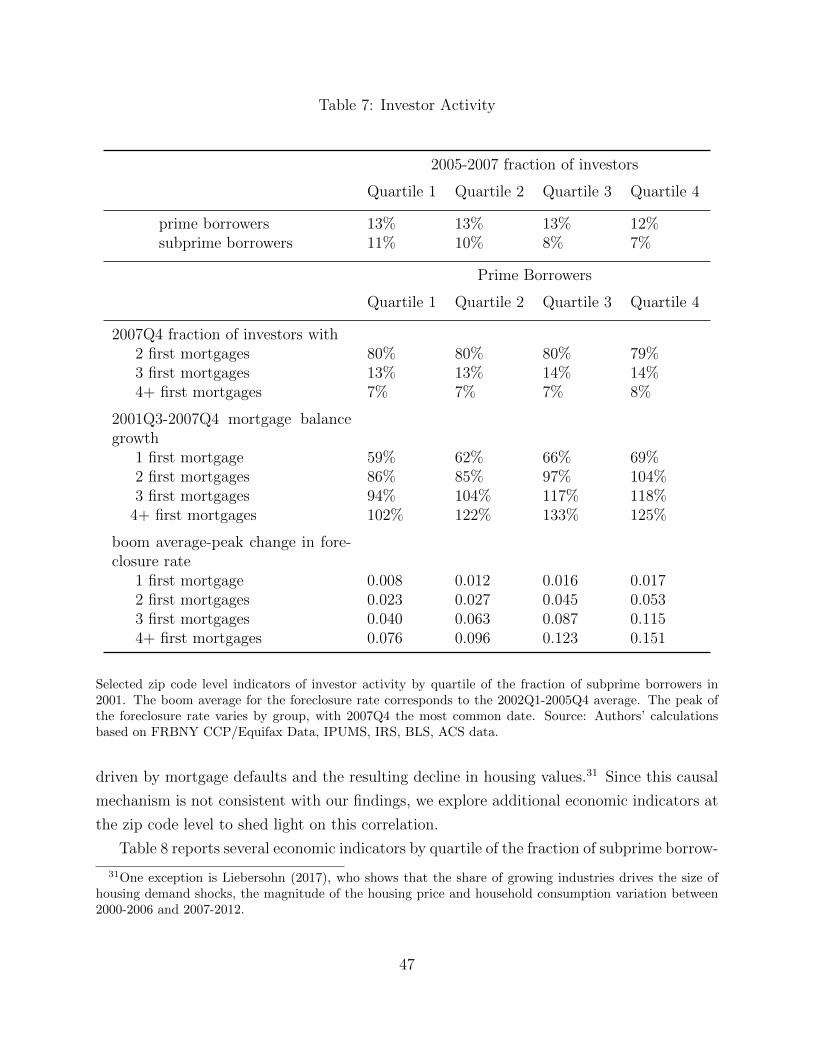
Table 7: Investor Activity
2005-2007 fraction of investors
Quartile 1 Quartile 2 Quartile 3 Quartile 4
prime borrowers 13% 13% 13% 12%subprime borrowers 11% 10% 8% 7%
Prime Borrowers
Quartile 1 Quartile 2 Quartile 3 Quartile 4
2007Q4 fraction of investors with2 first mortgages 80% 80% 80% 79%3 first mortgages 13% 13% 14% 14%4+ first mortgages 7% 7% 7% 8%
2001Q3-2007Q4 mortgage balancegrowth
1 first mortgage 59% 62% 66% 69%2 first mortgages 86% 85% 97% 104%3 first mortgages 94% 104% 117% 118%
4+ first mortgages 102% 122% 133% 125%
boom average-peak change in fore-closure rate
1 first mortgage 0.008 0.012 0.016 0.0172 first mortgages 0.023 0.027 0.045 0.0533 first mortgages 0.040 0.063 0.087 0.1154+ first mortgages 0.076 0.096 0.123 0.151
Selected zip code level indicators of investor activity by quartile of the fraction of subprime borrowers in2001. The boom average for the foreclosure rate corresponds to the 2002Q1-2005Q4 average. The peak ofthe foreclosure rate varies by group, with 2007Q4 the most common date. Source: Authors’ calculationsbased on FRBNY CCP/Equifax Data, IPUMS, IRS, BLS, ACS data.
driven by mortgage defaults and the resulting decline in housing values.31 Since this causal
mechanism is not consistent with our findings, we explore additional economic indicators at
the zip code level to shed light on this correlation.
Table 8 reports several economic indicators by quartile of the fraction of subprime borrow-
31One exception is Liebersohn (2017), who shows that the share of growing industries drives the size ofhousing demand shocks, the magnitude of the housing price and household consumption variation between2000-2006 and 2007-2012.
47
ers in 2001. Several indicators that are critical to business cycle sensitivity are systematically
related to the fraction of subprime borrowers. Zip codes with higher fraction of subprime
borrowers are younger, as previously noted, have lower levels of educational attainment and
have a disproportionately large minority and African American share in the population. It
is well known that younger, less educated, minority workers suffer larger employment loss
during recessions.
Zip codes with a large fraction of subprime borrowers also exhibit lower per capita income
levels in both the boom and the recession. In 2001-2007, the average real per capita income
was $41,045 in quartile 1 and only $21,019 in quartile 4, whereas in 2007-2010 it was $46,341
for quartile 1 and $21,898 for quartile 4. Consistent with Mian and Sufi (2009), income
growth during the boom was lower in zip codes with higher fraction of subprime. Average
per capita income grew by 35% between 2001 and 2007 for quartile 1 and only 4% for
quartile 4. Similarly, zip codes with large subprime population have higher unemployment
rates both during the boom and during the crisis. The average unemployment rate for
2001-2007 was 4.94% in quartile 1 and 5.72% in quartile 4. In 2007-2010, the average
unemployment rate rose to 6.93% in quartile 1 and 7.81% in quartile 4. Zip codes with a
large subprime population also exhibit higher income inequality. We measure this with the
ratio of average income for individuals with incomes above $200,000 over average income for
the entire population, based on IRS data. Higher inequality implies that the aggregation bias
generated by the fact within each zip code prime borrowers experience more credit growth
than subprime borrowers is accentuated.
Zip codes with high fraction of subprime borrowers experience higher house price growth
in 2001-2007, as previously noted. This may be related to the their higher population
density, suggesting the prevalence of urban areas for this group. Endogenous gentrification,
as described in Guerrieri, Hartley, and Hurst (2013), exerted particularly high pressure on
housing values in urban areas over this period, and may have encouraged real estate investor
activity.32 The distribution of zip codes with low housing supply elasticity, as captured by
the Saiz (2010) index, is fairly even across quartiles. However, 16% of zip codes in quartiles
3 and 4 are in sand states33, whereas only 11% and 13% of zip codes in quartiles 1 and 2 are
in those states.
32The more sizable housing boom in a zip codes with large subprime population may have masked negativeemployment growth over this period, as shown by Hurst et al. (2016), and increased income and reduced un-employment rates in those areas above what would have been consistent with their industry and demographiccomposition.
33These are Arizona, California, Colorado, Florida, and Nevada. These states exhibit the largest swingsin housing values during the housing boom and the subsequent foreclosure crisis.
48
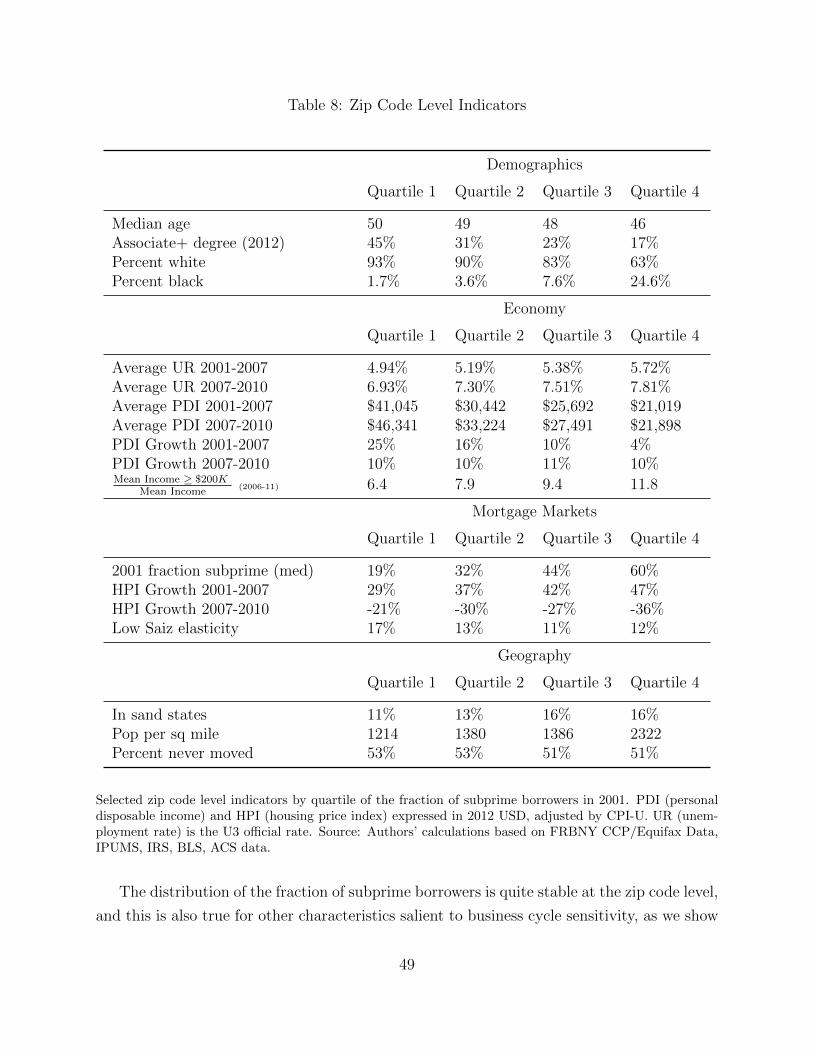
Table 8: Zip Code Level Indicators
Demographics
Quartile 1 Quartile 2 Quartile 3 Quartile 4
Median age 50 49 48 46Associate+ degree (2012) 45% 31% 23% 17%Percent white 93% 90% 83% 63%Percent black 1.7% 3.6% 7.6% 24.6%
Economy
Quartile 1 Quartile 2 Quartile 3 Quartile 4
Average UR 2001-2007 4.94% 5.19% 5.38% 5.72%Average UR 2007-2010 6.93% 7.30% 7.51% 7.81%Average PDI 2001-2007 $41,045 $30,442 $25,692 $21,019Average PDI 2007-2010 $46,341 $33,224 $27,491 $21,898PDI Growth 2001-2007 25% 16% 10% 4%PDI Growth 2007-2010 10% 10% 11% 10%Mean Income ≥ $200K
Mean Income(2006-11) 6.4 7.9 9.4 11.8
Mortgage Markets
Quartile 1 Quartile 2 Quartile 3 Quartile 4
2001 fraction subprime (med) 19% 32% 44% 60%HPI Growth 2001-2007 29% 37% 42% 47%HPI Growth 2007-2010 -21% -30% -27% -36%Low Saiz elasticity 17% 13% 11% 12%
Geography
Quartile 1 Quartile 2 Quartile 3 Quartile 4
In sand states 11% 13% 16% 16%Pop per sq mile 1214 1380 1386 2322Percent never moved 53% 53% 51% 51%
Selected zip code level indicators by quartile of the fraction of subprime borrowers in 2001. PDI (personaldisposable income) and HPI (housing price index) expressed in 2012 USD, adjusted by CPI-U. UR (unem-ployment rate) is the U3 official rate. Source: Authors’ calculations based on FRBNY CCP/Equifax Data,IPUMS, IRS, BLS, ACS data.
The distribution of the fraction of subprime borrowers is quite stable at the zip code level,
and this is also true for other characteristics salient to business cycle sensitivity, as we show
49

in Appendix H. Therefore, the timing of the ranking by fraction of subprime does not change
the patterns at the zip code level. However, some aggregate trends, such as the historical
decline in wages, labor force participation and employment rates for unskilled, young and
minority workers, and the rise in income inequality may influence economic outcomes at the
zip code level over time. One motivation for considering zip code level evidence is the scarcity
of information on individual borrowers in credit file data. Geographical aggregation provides
access to a number of additional indicators, such as income, housing values and so on. Very
often, geographical patterns are interpreted as reflecting individual behavior. For example,
differences in debt growth across two zip codes with different fraction of subprime borrowers
are assumed to be similar to differences in debt growth across individuals with different credit
scores. Our findings suggest that using geographically aggregated data does not provide an
accurate account of the patterns of borrowing at the individual level. Moreover, the positive
correlation between credit growth during the boom and the depth of the recession may be
due to other characteristics at the zip code level, such as the prevalence of young, minority
or low education workers.
9 Conclusion
Our analysis suggests a reassessment of the role of growth in the supply of subprime credit in
the 2001-2006 housing boom and in the 2007-2009 financial crisis. We find that most of the
increase in mortgage debt during the boom and of mortgage delinquencies during the crisis is
driven by mid to high credit score borrowers, and it is these borrowers who disproportionately
default on their mortgages during the crisis. The growth in defaults is mostly accounted for
by real estate investors. Moreover, we show that at the zip code level, prime borrowers
experience a larger rise in debt and defaults than subprime borrowers, irrespective of the
size of the subprime population in the zip code. Zip codes with a large share of subprime
borrowers have a young, low education, high minority population that may be particularly
sensitive to business cycle shocks. These new findings should inform discussions of the causes
and consequences of the 2007-2009 financial crisis and of the appropriate policy responses.
50

References
Adelino, Manuel, Antoinette Schoar, and Felipe Severino. 2015. “Loan Originations and
Defaults in the Mortgage Crisis: The Role of the Middle Class.” Working paper 20848,
National Bureau of Economic Research.
. 2017. “Dynamics of Housing Debt in the Recent Boom and Great Recession.”
Working paper 23502, National Bureau of Economic Research.
Agarwal, Sumit, Gene Amromin, Itzhak Ben-David, and Douglas D. Evanoff. 2016, Septem-
ber. “Loan Product Steering in Mortgage Markets.” Working paper 22696, National
Bureau of Economic Research.
Albanesi, Stefania, and Jaromir Nosal. 2015. “Insolvency After the 2005 Bankruptcy
Reform.” Cepr discussion papers 10533, CEPR Discussion Papers.
Bazikyan, Armine. 2009. “Renters: The Innocent Victims of the Foreclosure Mortgage
Crisis.” Sw. L. Rev. 39:339.
Berger, David, Veronica Guerrieri, Guido Lorenzoni, and Joseph Vavra. 2015, October.
“House Prices and Consumer Spending.” Working paper 21667, National Bureau of
Economic Research.
Bhutta, Neil. 2015. “The ins and outs of mortgage debt during the housing boom and
bust.” Journal of Monetary Economics 76:284 – 298.
Bhutta, Neil, and Benjamin J Keys. 2016. “Interest rates and equity extraction during the
housing boom.” The American Economic Review 106 (7): 1742–1774.
Brown, Meta, Andrew Haughwout, Donghoon Lee, and Wilbert van der Klaauw. 2014.
“The Financial Crisis at the Kitchen Table: Trends in Household Debt and Credit.”
Current Issues in Economics and Finance 19, no. 2.
Chen, Hui, Michael Michaux, and Nikolai Roussanov. 2013, September. “Houses as ATMs?
Mortgage Refinancing and Macroeconomic Uncertainty.” Working paper 19421, Na-
tional Bureau of Economic Research.
Corbae, Dean, and Erwan Quintin. 2015. “Leverage and the Foreclosure Crisis.” Journal
of Political Economy 123 (1): 1–65.
Elul, Ronel, and Sebastian G Tilson. 2015. “Owner occupancy fraud and mortgage perfor-
mance.”
51

Foote, Christopher L., Lara Loewenstein, and Paul S. Willen. 2016. “Cross-sectional pat-
terns of mortgage debt during the housing boom: evidence and implications.” Technical
Report 22985, National Bureau of Economic Research.
Foote, Christopher L., and Paul S. Willen. 2016. “The Subprime Mortgage Crisis.” In
Banking Crises, 324–336. Springer.
Ghent, Andra C, and Marianna Kudlyak. 2011. “Recourse and residential mortgage default:
evidence from US states.” Review of Financial Studies, p. hhr055.
Guerrieri, Veronica, Daniel Hartley, and Erik Hurst. 2013. “Endogenous gentrification and
housing price dynamics.” Journal of Public Economics 100:45–60.
Guerrieri, Veronica, and Guido Lorenzoni. 2011. “Credit crises, precautionary savings, and
the liquidity trap.” Technical Report 17583, National Bureau of Economic Research.
Haughwout, Andrew, Donghoon Lee, Joseph S Tracy, and Wilbert Van der Klaauw. 2011.
“Real estate investors, the leverage cycle, and the housing market crisis.” Federal Re-
serve Bank of New York Staff Reports, no. 514.
Hurst, Erik, Benjamin J. Keys, Amit Seru, and Joseph Vavra. 2016. “Regional Redis-
tribution through the US Mortgage Market.” American Economic Review 106 (10):
2982–3028 (October).
Iacoviello, Matteo. 2004. “Consumption, house prices, and collateral constraints: a struc-
tural econometric analysis.” Journal of Housing Economics 13 (4): 304–320.
Justiniano, Alejandro, Giorgio E Primiceri, and Andrea Tambalotti. 2016. “Quantitative
Modeling of the Financial Crisis A Simple Model of Subprime Borrowers and Credit
Growth.” The American Economic Review 106 (5): 543–547.
Kaplan, Greg, Kurt Mitman, and Giovanni L. Violante. 2016, May. “Non-durable Consump-
tion and Housing Net Worth in the Great Recession: Evidence from Easily Accessible
Data.” Working paper 22232, National Bureau of Economic Research.
. 2017, August. “The Housing Boom and Bust: Model Meets Evidence.” Working
paper 23694, National Bureau of Economic Research.
Kehoe, Patrick, Elena Pastorino, and Virgiliu Midrigan. 2016. “Debt constraints and
employment.” Technical Report, National Bureau of Economic Research.
Keys, Benjamin J, Tomasz Piskorski, Amit Seru, and Vikrant Vig. 2012. “Mortgage
financing in the housing boom and bust.” In Housing and the Financial Crisis, 143–
204. University of Chicago Press.
52
Keys, Benjamin J, Tomasz Piskorski, Amit Seru, and Vincent Yao. 2014. “Mortgage rates,
household balance sheets, and the real economy.” Technical Report, National Bureau
of Economic Research.
Kiyotaki, Nobuhiro, and John Moore. 1997. “Credit Cycles.” Journal of Political Economy,
no. 2:211–248.
Lee, Donghoon, and Wilbert van der Klaauw. 2010. “An Introduction to the FRBNY
Consumer Credit Panel.” FRBNY Staff Report 479.
Li, Wenli. 2009. “Residential housing and personal bankruptcy.” Business Review 2:19–29.
Liebersohn, Jack. 2017. “Housing Demand, Regional House Prices and Consumption.”
Manuscript, MIT.
Mian, Atif, Kamalesh Rao, and Amir Sufi. 2013. “Household Balance Sheets, Consumption,
and the Economic Slump.” The Quarterly Journal of Economics 128 (4): 1687–1726.
Mian, Atif, and Amir Sufi. 2009. “The Consequences of Mortgage Credit Expansion:
Evidence from the U.S. Mortgage Default Crisis.” The Quarterly Journal of Economics
124 (4): 1449–1496.
. 2010. “The Great Recession: Lessons from Microeconomic Data.” The American
Economic Review 100 (2): 51–56.
. 2011. “House Prices, Home Equity–Based Borrowing, and the US Household
Leverage Crisis.” The American Economic Review 101 (5): 2132–2156.
. 2014. “What explains the 2007–2009 drop in employment?” Econometrica 82 (6):
2197–2223.
Mian, Atif, Amir Sufi, and Francesco Trebbi. 2015. “Foreclosures, house prices, and the
real economy.” The Journal of Finance 70 (6): 2587–2634.
Mian, Atif R, and Amir Sufi. 2016. “Household debt and defaults from 2000 to 2010: The
credit supply view.” Manuscript.
Midrigan, Virgiliu, and Thomas Philippon. 2011. “Household Leverage and the Recession.”
NBER Working Paper 16965.
Mincer, Jacob. 1991. “Education and unemployment.” Technical Report, National Bureau
of Economic Research.
Mitman, Kurt. 2016. “Macroeconomic effects of bankruptcy and foreclosure policies.” The
American Economic Review 106 (8): 2219–2255.
53

Saiz, Albert. 2010. “The geographic determinants of housing supply.” The Quarterly
Journal of Economics 125 (3): 1253–1296.
Shimer, Robert. 1998. “Why is the US unemployment rate so much lower?” NBER
Macroeconomics Annual 13:11–61.
54
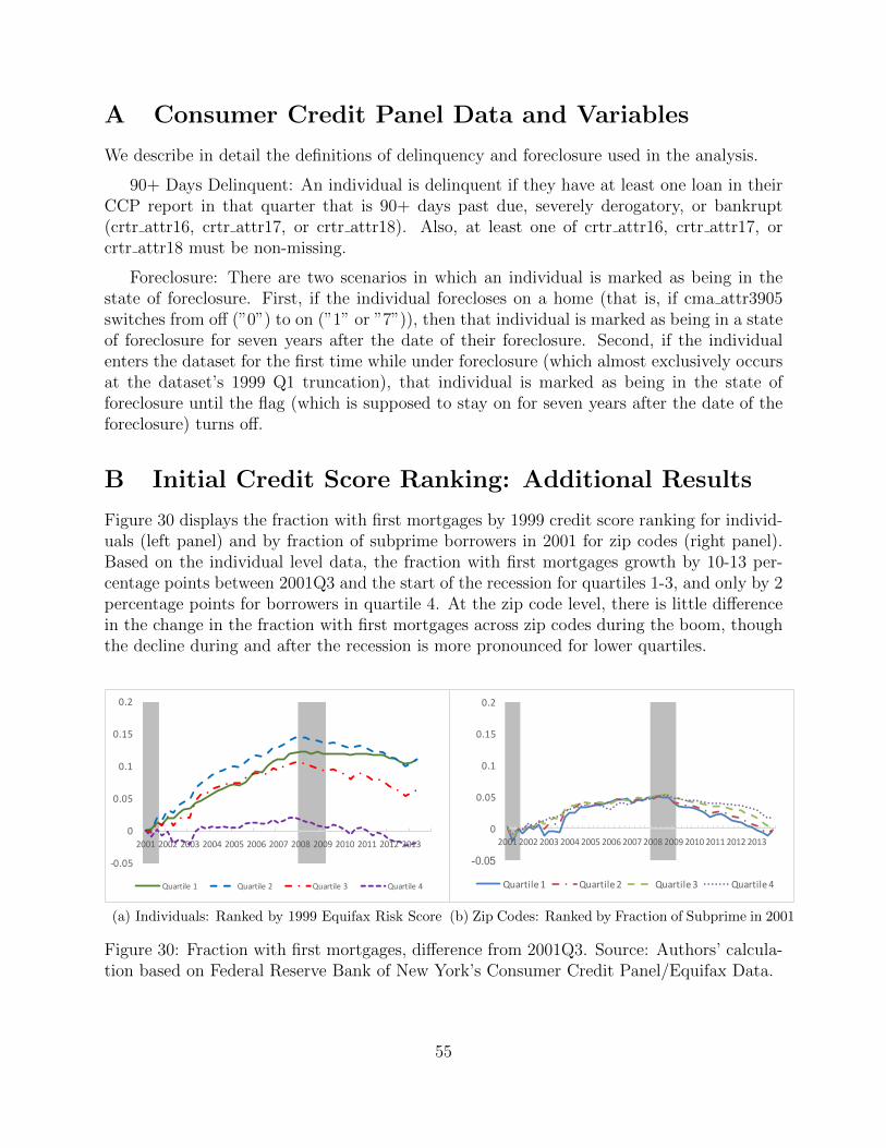
A Consumer Credit Panel Data and Variables
We describe in detail the definitions of delinquency and foreclosure used in the analysis.
90+ Days Delinquent: An individual is delinquent if they have at least one loan in theirCCP report in that quarter that is 90+ days past due, severely derogatory, or bankrupt(crtr attr16, crtr attr17, or crtr attr18). Also, at least one of crtr attr16, crtr attr17, orcrtr attr18 must be non-missing.
Foreclosure: There are two scenarios in which an individual is marked as being in thestate of foreclosure. First, if the individual forecloses on a home (that is, if cma attr3905switches from off (”0”) to on (”1” or ”7”)), then that individual is marked as being in a stateof foreclosure for seven years after the date of their foreclosure. Second, if the individualenters the dataset for the first time while under foreclosure (which almost exclusively occursat the dataset’s 1999 Q1 truncation), that individual is marked as being in the state offoreclosure until the flag (which is supposed to stay on for seven years after the date of theforeclosure) turns off.
B Initial Credit Score Ranking: Additional Results
Figure 30 displays the fraction with first mortgages by 1999 credit score ranking for individ-uals (left panel) and by fraction of subprime borrowers in 2001 for zip codes (right panel).Based on the individual level data, the fraction with first mortgages growth by 10-13 per-centage points between 2001Q3 and the start of the recession for quartiles 1-3, and only by 2percentage points for borrowers in quartile 4. At the zip code level, there is little differencein the change in the fraction with first mortgages across zip codes during the boom, thoughthe decline during and after the recession is more pronounced for lower quartiles.
-0.05
0
0.05
0.1
0.15
0.2
2001 2002 2003 2004 2005 2006 2007 2008 2009 2010 2011 2012 2013
Quartile1 Quartile2 Quartile3 Quartile4
(a) Individuals: Ranked by 1999 Equifax Risk Score
-0.05
0
0.05
0.1
0.15
0.2
2001 2002 2003 2004 2005 2006 2007 2008 2009 2010 2011 2012 2013
Quartile1 Quartile2 Quartile3 Quartile4
(b) Zip Codes: Ranked by Fraction of Subprime in 2001
Figure 30: Fraction with first mortgages, difference from 2001Q3. Source: Authors’ calcula-tion based on Federal Reserve Bank of New York’s Consumer Credit Panel/Equifax Data.
55
Figure 31 displays the fraction with new mortgage originations. Even with the 1999 quar-tile ranking, borrowers in quartile 1 do not exhibit any growth in new mortgage originationsduring the boom, and most of the growth in new mortgage originations occurs between 2001and 2004 for borrowers in quartiles 2-4 (left panel). At the zip code level (right panel), zipcodes with the lowest fraction of subprime borrowers exhibit stronger growth in mortgageoriginations between 2001 and 2004, and this fraction declines for all quartiles after 2004.
-0.15-0.125
-0.1-0.075-0.05
-0.0250
0.0250.05
0.0750.1
2001 2002 2003 2004 2005 2006 2007 2008 2009 2010 2011 2012 2013
Quartile1 Quartile2 Quartile3 Quartile4
(a) Individuals: Ranked by 1999 Equifax Risk Score
-0.15
-0.1
-0.05
0
0.05
0.1
0.15
2001 2002 2003 2004 2005 2006 2007 2008 2009 2010 2011 2012 2013
Quartile1 Quartile2 Quartile3 Quartile4
(b) Zip Codes: Ranked by Fraction of Subprime in 2001
Figure 31: Fraction with new mortgage originations in the last 4 quarters, difference from2001Q3. Source: Authors’ calculation based on Federal Reserve Bank of New York’s Con-sumer Credit Panel/Equifax Data.
C Income Data
In this section, we describe the supplementary payroll data used for the income imputationprocedure. This data is merged with our credit panel data, allowing us to map individuals’incomes for 2009 to their credit files.
The Equifax Workforce Solutions data provided by Equifax is a nationally-representativerandom sample of individuals containing employment and payroll verification informationprovided directly from the employers. The information provided for each employee includesthe last three years of total income, the date of first hire, tenure, and for the current yearstatus (part time/full time), weekly hours, pay rate and pay frequency.
Income Measure Description There are various income measures provided in theWorknumber dataset. For each year of data available variables are given for the total 12-month base, bonus, overtime, and commission compensation in year t, t− 1, and t− 2. Thisinformation however is only available for a little over 1
3of the sample. The other measure
of income, which is widely available across the sample, is rate of pay and pay frequency.We therefore impute total income using a simple rate × frequency approach to account for
56
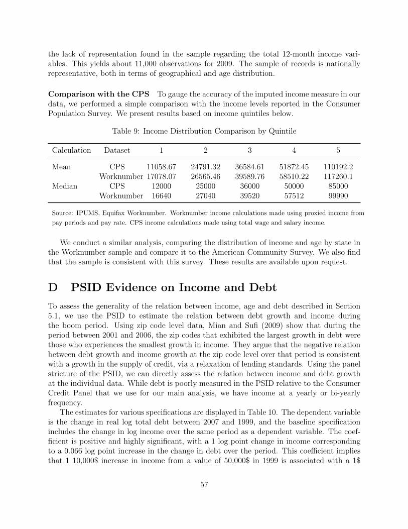
the lack of representation found in the sample regarding the total 12-month income vari-ables. This yields about 11,000 observations for 2009. The sample of records is nationallyrepresentative, both in terms of geographical and age distribution.
Comparison with the CPS To gauge the accuracy of the imputed income measure in ourdata, we performed a simple comparison with the income levels reported in the ConsumerPopulation Survey. We present results based on income quintiles below.
Table 9: Income Distribution Comparison by Quintile
Calculation Dataset 1 2 3 4 5
Mean CPS 11058.67 24791.32 36584.61 51872.45 110192.2Worknumber 17078.07 26565.46 39589.76 58510.22 117260.1
Median CPS 12000 25000 36000 50000 85000Worknumber 16640 27040 39520 57512 99990
Source: IPUMS, Equifax Worknumber. Worknumber income calculations made using proxied income from
pay periods and pay rate. CPS income calculations made using total wage and salary income.
We conduct a similar analysis, comparing the distribution of income and age by state inthe Worknumber sample and compare it to the American Community Survey. We also findthat the sample is consistent with this survey. These results are available upon request.
D PSID Evidence on Income and Debt
To assess the generality of the relation between income, age and debt described in Section5.1, we use the PSID to estimate the relation between debt growth and income duringthe boom period. Using zip code level data, Mian and Sufi (2009) show that during theperiod between 2001 and 2006, the zip codes that exhibited the largest growth in debt werethose who experiences the smallest growth in income. They argue that the negative relationbetween debt growth and income growth at the zip code level over that period is consistentwith a growth in the supply of credit, via a relaxation of lending standards. Using the panelstricture of the PSID, we can directly assess the relation between income and debt growthat the individual data. While debt is poorly measured in the PSID relative to the ConsumerCredit Panel that we use for our main analysis, we have income at a yearly or bi-yearlyfrequency.
The estimates for various specifications are displayed in Table 10. The dependent variableis the change in real log total debt between 2007 and 1999, and the baseline specificationincludes the change in log income over the same period as a dependent variable. The coef-ficient is positive and highly significant, with a 1 log point change in income correspondingto a 0.066 log point increase in the change in debt over the period. This coefficient impliesthat 1 10,000$ increase in income from a value of 50,000$ in 1999 is associated with a 1$
57
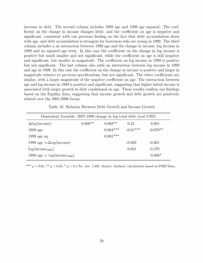
increase in debt. The second column includes 1999 age and 1999 age squared. The coef-ficient on the change in income changes little, and the coefficient on age is negative andsignificant, consistent with our previous finding on the fact that debt accumulation slowswith age, and debt accumulation is strongest for borrowers who are young in 1999. The thirdcolumn includes a an interaction between 1999 age and the change in income, log income in1999 and no squared age term. In this case the coefficient on the change in log income ispositive but much smaller and not significant, while the coefficient on age is still negativeand significant, but smaller in magnitude. The coefficient on log income in 1999 is positivebut not significant. The last column also adds an interaction between log income in 1999and age in 1999. In this case the coefficient on the change in income is positive and larger inmagnitude relative to previous specifications, but not significant. The other coefficients aresimilar, with a larger magnitude of the negative coefficient on age. The interaction betweenage and log income in 1999 is positive and significant, suggesting that higher initial income isassociated with larger growth in debt conditional on age. These results confirm our findingsbased on the Equifax data, suggesting that income growth and debt growth are positivelyrelated over the 2001-2006 boom.
Table 10: Relation Between Debt Growth and Income Growth
Dependent Variable: 2007-1999 change in log total debt (real USD)
∆log(income) 0.066** 0.068** 0.21 0.081
1999 age -0.064*** -0.01*** -0.070**
1999 age sq 0.001***
1999 age ×∆log(income) -0.003 -0.001
log(income1999) 0.001 -0.270
1999 age × log(income1999) 0.006*
*** p < 0.01, ** p < 0.05, * p < 0.1 No. obs. 1,395. Source: Authors’ calculations based on PSID Data.
58
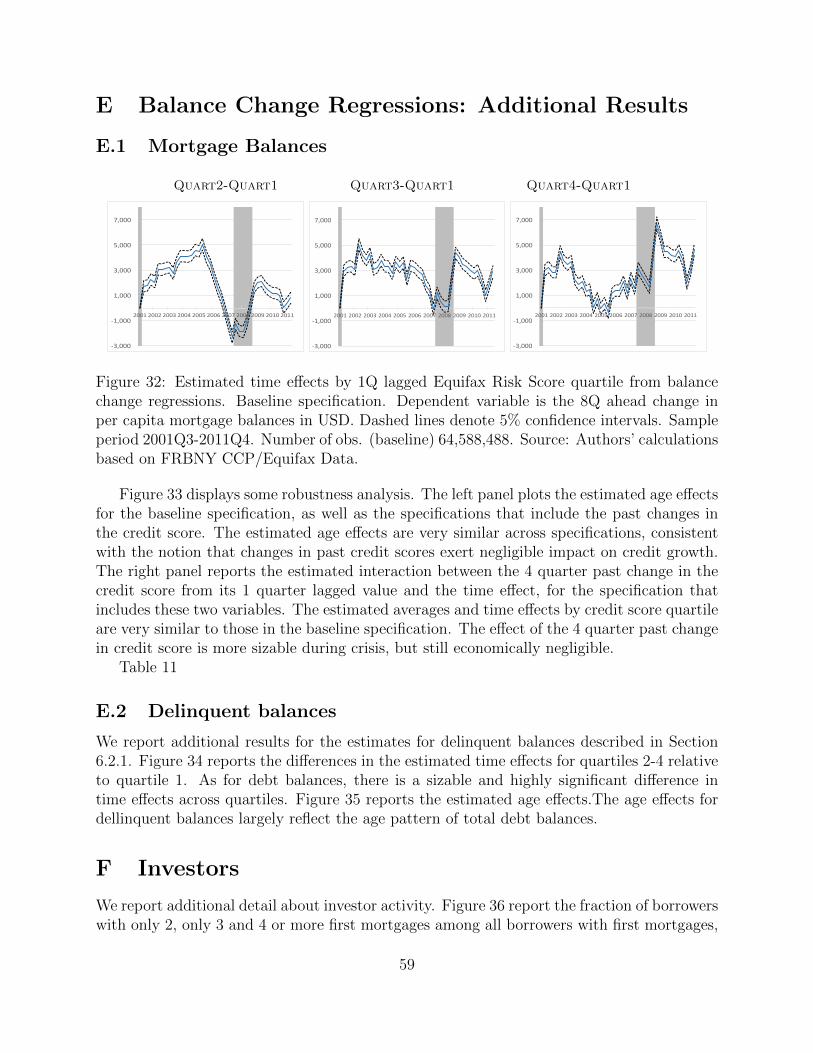
E Balance Change Regressions: Additional Results
E.1 Mortgage Balances
Quart2-Quart1 Quart3-Quart1 Quart4-Quart1
-3,000
-1,000
1,000
3,000
5,000
7,000
2001 2002 2003 2004 2005 2006 2007 2008 2009 2010 2011
-3,000
-1,000
1,000
3,000
5,000
7,000
2001 2002 2003 2004 2005 2006 2007 2008 2009 2010 2011
-3,000
-1,000
1,000
3,000
5,000
7,000
2001 2002 2003 2004 2005 2006 2007 2008 2009 2010 2011
Figure 32: Estimated time effects by 1Q lagged Equifax Risk Score quartile from balancechange regressions. Baseline specification. Dependent variable is the 8Q ahead change inper capita mortgage balances in USD. Dashed lines denote 5% confidence intervals. Sampleperiod 2001Q3-2011Q4. Number of obs. (baseline) 64,588,488. Source: Authors’ calculationsbased on FRBNY CCP/Equifax Data.
Figure 33 displays some robustness analysis. The left panel plots the estimated age effectsfor the baseline specification, as well as the specifications that include the past changes inthe credit score. The estimated age effects are very similar across specifications, consistentwith the notion that changes in past credit scores exert negligible impact on credit growth.The right panel reports the estimated interaction between the 4 quarter past change in thecredit score from its 1 quarter lagged value and the time effect, for the specification thatincludes these two variables. The estimated averages and time effects by credit score quartileare very similar to those in the baseline specification. The effect of the 4 quarter past changein credit score is more sizable during crisis, but still economically negligible.
Table 11
E.2 Delinquent balances
We report additional results for the estimates for delinquent balances described in Section6.2.1. Figure 34 reports the differences in the estimated time effects for quartiles 2-4 relativeto quartile 1. As for debt balances, there is a sizable and highly significant difference intime effects across quartiles. Figure 35 reports the estimated age effects.The age effects fordellinquent balances largely reflect the age pattern of total debt balances.
F Investors
We report additional detail about investor activity. Figure 36 report the fraction of borrowerswith only 2, only 3 and 4 or more first mortgages among all borrowers with first mortgages,
59
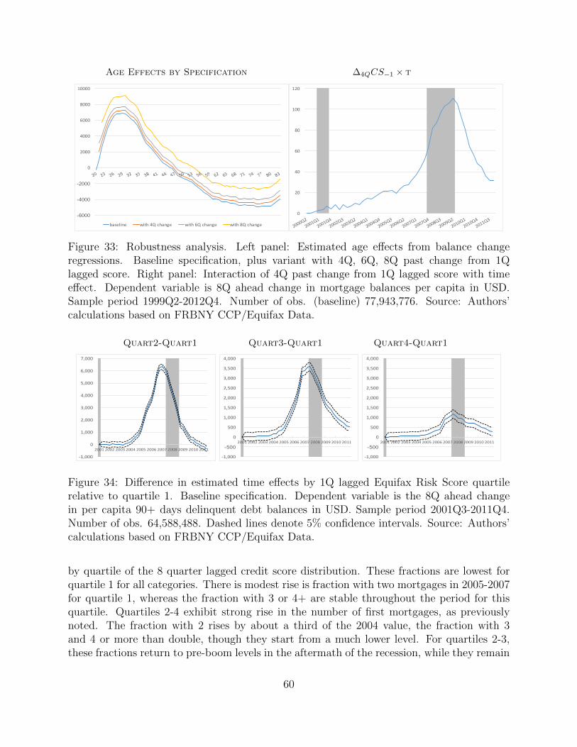
Age Effects by Specification ∆4QCS−1 × t
-6000
-4000
-2000
0
2000
4000
6000
8000
10000
baseline with4Qchange with6Qchange with8Qchange
0
20
40
60
80
100
120
Figure 33: Robustness analysis. Left panel: Estimated age effects from balance changeregressions. Baseline specification, plus variant with 4Q, 6Q, 8Q past change from 1Qlagged score. Right panel: Interaction of 4Q past change from 1Q lagged score with timeeffect. Dependent variable is 8Q ahead change in mortgage balances per capita in USD.Sample period 1999Q2-2012Q4. Number of obs. (baseline) 77,943,776. Source: Authors’calculations based on FRBNY CCP/Equifax Data.
Quart2-Quart1 Quart3-Quart1 Quart4-Quart1
-1,000
0
1,000
2,000
3,000
4,000
5,000
6,000
7,000
2001 2002 2003 2004 2005 2006 2007 2008 2009 2010 2011
-1,000
-500
0
500
1,000
1,500
2,000
2,500
3,000
3,500
4,000
2001 2002 2003 2004 2005 2006 2007 2008 2009 2010 2011
-1,000
-500
0
500
1,000
1,500
2,000
2,500
3,000
3,500
4,000
2001 2002 2003 2004 2005 2006 2007 2008 2009 2010 2011
Figure 34: Difference in estimated time effects by 1Q lagged Equifax Risk Score quartilerelative to quartile 1. Baseline specification. Dependent variable is the 8Q ahead changein per capita 90+ days delinquent debt balances in USD. Sample period 2001Q3-2011Q4.Number of obs. 64,588,488. Dashed lines denote 5% confidence intervals. Source: Authors’calculations based on FRBNY CCP/Equifax Data.
by quartile of the 8 quarter lagged credit score distribution. These fractions are lowest forquartile 1 for all categories. There is modest rise is fraction with two mortgages in 2005-2007for quartile 1, whereas the fraction with 3 or 4+ are stable throughout the period for thisquartile. Quartiles 2-4 exhibit strong rise in the number of first mortgages, as previouslynoted. The fraction with 2 rises by about a third of the 2004 value, the fraction with 3and 4 or more than double, though they start from a much lower level. For quartiles 2-3,these fractions return to pre-boom levels in the aftermath of the recession, while they remain
60
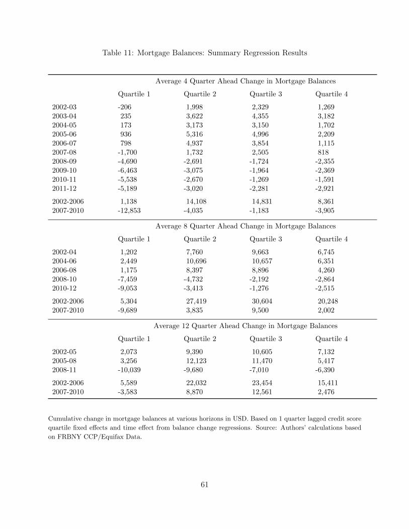
Table 11: Mortgage Balances: Summary Regression Results
Average 4 Quarter Ahead Change in Mortgage Balances
Quartile 1 Quartile 2 Quartile 3 Quartile 4
2002-03 -206 1,998 2,329 1,2692003-04 235 3,622 4,355 3,1822004-05 173 3,173 3,150 1,7022005-06 936 5,316 4,996 2,2092006-07 798 4,937 3,854 1,1152007-08 -1,700 1,732 2,505 8182008-09 -4,690 -2,691 -1,724 -2,3552009-10 -6,463 -3,075 -1,964 -2,3692010-11 -5,538 -2,670 -1,269 -1,5912011-12 -5,189 -3,020 -2,281 -2,921
2002-2006 1,138 14,108 14,831 8,3612007-2010 -12,853 -4,035 -1,183 -3,905
Average 8 Quarter Ahead Change in Mortgage Balances
Quartile 1 Quartile 2 Quartile 3 Quartile 4
2002-04 1,202 7,760 9,663 6,7452004-06 2,449 10,696 10,657 6,3512006-08 1,175 8,397 8,896 4,2602008-10 -7,459 -4,732 -2,192 -2,8642010-12 -9,053 -3,413 -1,276 -2,515
2002-2006 5,304 27,419 30,604 20,2482007-2010 -9,689 3,835 9,500 2,002
Average 12 Quarter Ahead Change in Mortgage Balances
Quartile 1 Quartile 2 Quartile 3 Quartile 4
2002-05 2,073 9,390 10,605 7,1322005-08 3,256 12,123 11,470 5,4172008-11 -10,039 -9,680 -7,010 -6,390
2002-2006 5,589 22,032 23,454 15,4112007-2010 -3,583 8,870 12,561 2,476
Cumulative change in mortgage balances at various horizons in USD. Based on 1 quarter lagged credit score
quartile fixed effects and time effect from balance change regressions. Source: Authors’ calculations based
on FRBNY CCP/Equifax Data.
61
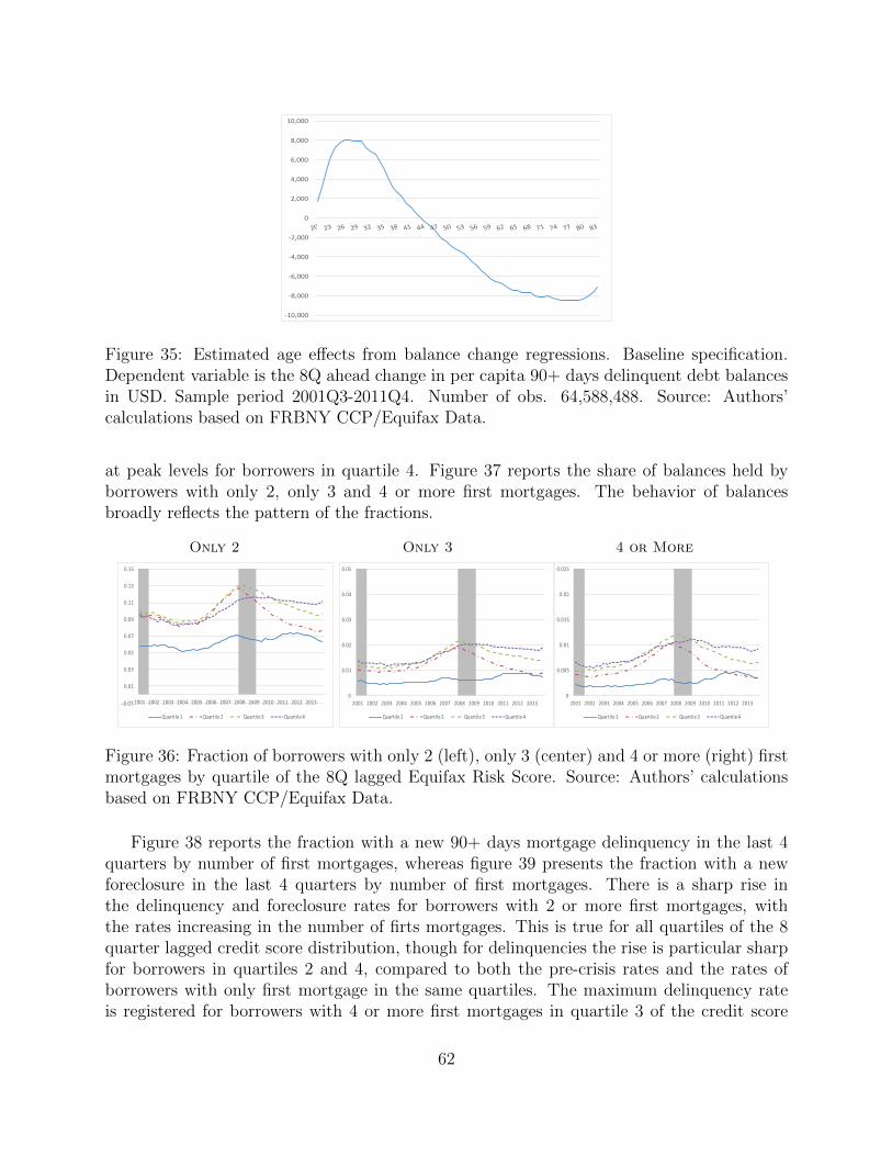
-10,000
-8,000
-6,000
-4,000
-2,000
0
2,000
4,000
6,000
8,000
10,000
Figure 35: Estimated age effects from balance change regressions. Baseline specification.Dependent variable is the 8Q ahead change in per capita 90+ days delinquent debt balancesin USD. Sample period 2001Q3-2011Q4. Number of obs. 64,588,488. Source: Authors’calculations based on FRBNY CCP/Equifax Data.
at peak levels for borrowers in quartile 4. Figure 37 reports the share of balances held byborrowers with only 2, only 3 and 4 or more first mortgages. The behavior of balancesbroadly reflects the pattern of the fractions.
Only 2 Only 3 4 or More
-0.01
0.01
0.03
0.05
0.07
0.09
0.11
0.13
0.15
2001 2002 2003 2004 2005 2006 2007 2008 2009 2010 2011 2012 2013
Quartile1 Quartile2 Quartile3 Quartile4
0
0.01
0.02
0.03
0.04
0.05
2001 2002 2003 2004 2005 2006 2007 2008 2009 2010 2011 2012 2013
Quartile1 Quartile2 Quartile3 Quartile4
0
0.005
0.01
0.015
0.02
0.025
2001 2002 2003 2004 2005 2006 2007 2008 2009 2010 2011 2012 2013
Quartile1 Quartile2 Quartile3 Quartile4
Figure 36: Fraction of borrowers with only 2 (left), only 3 (center) and 4 or more (right) firstmortgages by quartile of the 8Q lagged Equifax Risk Score. Source: Authors’ calculationsbased on FRBNY CCP/Equifax Data.
Figure 38 reports the fraction with a new 90+ days mortgage delinquency in the last 4quarters by number of first mortgages, whereas figure 39 presents the fraction with a newforeclosure in the last 4 quarters by number of first mortgages. There is a sharp rise inthe delinquency and foreclosure rates for borrowers with 2 or more first mortgages, withthe rates increasing in the number of firts mortgages. This is true for all quartiles of the 8quarter lagged credit score distribution, though for delinquencies the rise is particular sharpfor borrowers in quartiles 2 and 4, compared to both the pre-crisis rates and the rates ofborrowers with only first mortgage in the same quartiles. The maximum delinquency rateis registered for borrowers with 4 or more first mortgages in quartile 3 of the credit score
62
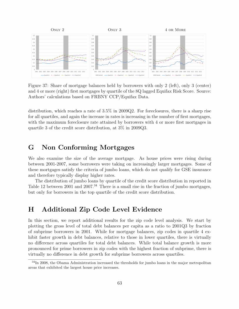
Only 2 Only 3 4 or More
0
0.05
0.1
0.15
0.2
0.25
0.3
0.35
0.4
0.45
0.5
2001 2002 2003 2004 2005 2006 2007 2008 2009 2010 2011 2012 2013
Quartile1 Quartile2 Quartile3 Quartile4
0
0.01
0.02
0.03
0.04
0.05
0.06
0.07
0.08
0.09
0.1
2001 2002 2003 2004 2005 2006 2007 2008 2009 2010 2011 2012 2013
Series5 Quartile1 Quartile2 Quartile3 Quartile4
0
0.01
0.02
0.03
0.04
0.05
0.06
0.07
0.08
0.09
0.1
2001 2002 2003 2004 2005 2006 2007 2008 2009 2010 2011 2012 2013
Series5 Quartile1 Quartile2 Quartile3 Quartile4
Figure 37: Share of mortgage balances held by borrowers with only 2 (left), only 3 (center)and 4 or more (right) first mortgages by quartile of the 8Q lagged Equifax Risk Score. Source:Authors’ calculations based on FRBNY CCP/Equifax Data.
distribution, which reaches a rate of 3.5% in 2009Q2. For foreclosures, there is a sharp risefor all quartiles, and again the increase in rates is increasing in the number of first mortgages,with the maximum foreclosure rate attained by borrowers with 4 or more first mortgages inquartile 3 of the credit score distribution, at 3% in 2009Q3.
G Non Conforming Mortgages
We also examine the size of the average mortgage. As house prices were rising duringbetween 2001-2007, some borrowers were taking on increasingly larger mortgages. Some ofthese mortgages satisfy the criteria of jumbo loans, which do not qualify for GSE insuranceand therefore typically display higher rates.
The distribution of jumbo loans by quartile of the credit score distribution in reported inTable 12 between 2001 and 2007.34 There is a small rise in the fraction of jumbo mortgages,but only for borrowers in the top quartile of the credit score distribution.
H Additional Zip Code Level Evidence
In this section, we report additional results for the zip code level analysis. We start byplotting the gross level of total debt balances per capita as a ratio to 2001Q3 by fractionof subprime borrowers in 2001. While for mortgage balances, zip codes in quartile 4 ex-hibit faster growth in debt balances, relative to those in lower quartiles, there is virtuallyno difference across quartiles for total debt balances. While total balance growth is morepronounced for prime borrowers in zip codes with the highest fraction of subprime, there isvirtually no difference in debt growth for subprime borrowers across quartiles.
34In 2008, the Obama Administration increased the thresholds for jumbo loans in the major metropolitanareas that exhibited the largest house price increases.
63
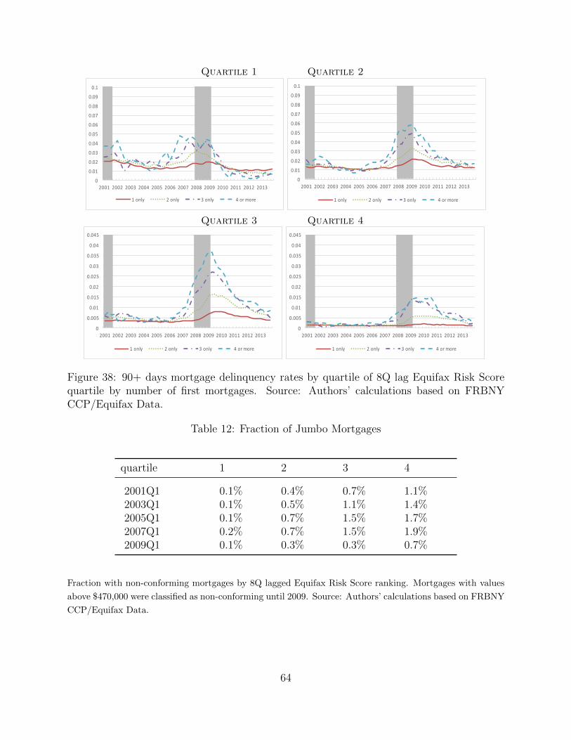
Quartile 1 Quartile 2
0
0.01
0.02
0.03
0.04
0.05
0.06
0.07
0.08
0.09
0.1
2001 2002 2003 2004 2005 2006 2007 2008 2009 2010 2011 2012 2013
1only 2only 3only 4ormore
0
0.01
0.02
0.03
0.04
0.05
0.06
0.07
0.08
0.09
0.1
2001 2002 2003 2004 2005 2006 2007 2008 2009 2010 2011 2012 2013
1only 2only 3only 4ormore
Quartile 3 Quartile 4
0
0.005
0.01
0.015
0.02
0.025
0.03
0.035
0.04
0.045
2001 2002 2003 2004 2005 2006 2007 2008 2009 2010 2011 2012 2013
1only 2only 3only 4ormore
0
0.005
0.01
0.015
0.02
0.025
0.03
0.035
0.04
0.045
2001 2002 2003 2004 2005 2006 2007 2008 2009 2010 2011 2012 2013
1only 2only 3only 4ormore
Figure 38: 90+ days mortgage delinquency rates by quartile of 8Q lag Equifax Risk Scorequartile by number of first mortgages. Source: Authors’ calculations based on FRBNYCCP/Equifax Data.
Table 12: Fraction of Jumbo Mortgages
quartile 1 2 3 4
2001Q1 0.1% 0.4% 0.7% 1.1%2003Q1 0.1% 0.5% 1.1% 1.4%2005Q1 0.1% 0.7% 1.5% 1.7%2007Q1 0.2% 0.7% 1.5% 1.9%2009Q1 0.1% 0.3% 0.3% 0.7%
Fraction with non-conforming mortgages by 8Q lagged Equifax Risk Score ranking. Mortgages with values
above $470,000 were classified as non-conforming until 2009. Source: Authors’ calculations based on FRBNY
CCP/Equifax Data.
64
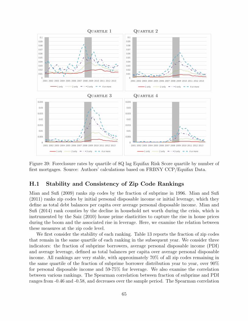
Quartile 1 Quartile 2
0
0.01
0.02
0.03
0.04
0.05
0.06
0.07
0.08
0.09
0.1
2001 2002 2003 2004 2005 2006 2007 2008 2009 2010 2011 2012 2013
1only 2only 3only 4ormore
0
0.01
0.02
0.03
0.04
0.05
0.06
0.07
0.08
0.09
0.1
2001 2002 2003 2004 2005 2006 2007 2008 2009 2010 2011 2012 2013
1only 2only 3only 4ormore
Quartile 3 Quartile 4
0
0.005
0.01
0.015
0.02
0.025
0.03
0.035
2001 2002 2003 2004 2005 2006 2007 2008 2009 2010 2011 2012 2013
1only 2only 3only 4ormore
0
0.005
0.01
0.015
0.02
0.025
0.03
0.035
2001 2002 2003 2004 2005 2006 2007 2008 2009 2010 2011 2012 2013
1only 2only 3only 4ormore
Figure 39: Foreclosure rates by quartile of 8Q lag Equifax Risk Score quartile by number offirst mortgages. Source: Authors’ calculations based on FRBNY CCP/Equifax Data.
H.1 Stability and Consistency of Zip Code Rankings
Mian and Sufi (2009) ranks zip codes by the fraction of subprime in 1996. Mian and Sufi(2011) ranks zip codes by initial personal disposable income or initial leverage, which theydefine as total debt balances per capita over average personal disposable income. Mian andSufi (2014) rank counties by the decline in household net worth during the crisis, which isinstrumented by the Saiz (2010) house prime elasticities to capture the rise in house pricesduring the boom and the associated rise in leverage. Here, we examine the relation betweenthese measures at the zip code level.
We first consider the stability of each ranking. Table 13 reports the fraction of zip codesthat remain in the same quartile of each ranking in the subsequent year. We consider threeindicators: the fraction of subprime borrowers, average personal disposable income (PDI)and average leverage, defined as total balances per capita over average personal disposableincome. All rankings are very stable, with approximately 70% of all zip codes remaining inthe same quartile of the fraction of subprime borrower distribution year to year, over 90%for personal disposable income and 59-75% for leverage. We also examine the correlationbetween various rankings. The Spearman correlation between fraction of subprime and PDIranges from -0.46 and -0.58, and decreases over the sample period. The Spearman correlation
65
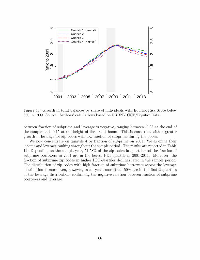
.51
1.5
22.
53
.51
1.5
22.
53
Rat
io to
200
1
2001 2003 2005 2007 2009 2011 2013
Quartile 1 (Lowest)Quartile 2Quartile 3Quartile 4 (Highest)
Figure 40: Growth in total balances by share of individuals with Equifax Risk Score below660 in 1999. Source: Authors’ calculations based on FRBNY CCP/Equifax Data.
between fraction of subprime and leverage is negative, ranging between -0.03 at the end ofthe sample and -0.15 at the height of the credit boom. This is consistent with a greatergrowth in leverage for zip codes with low fraction of subprime during the boom.
We now concentrate on quartile 4 by fraction of subprime on 2001. We examine theirincome and leverage ranking throughout the sample period. The results are reported in Table14. Depending on the sample year, 51-58% of the zip codes in quartile 4 of the fraction ofsubprime borrowers in 2001 are in the lowest PDI quartile in 2001-2011. Moreover, thefraction of subprime zip codes in higher PDI quartiles declines later in the sample period.The distribution of zip codes with high fraction of subprime borrowers across the leveragedistribution is more even, however, in all years more than 50% are in the first 2 quartilesof the leverage distribution, confirming the negative relation between fraction of subprimeborrowers and leverage.
66
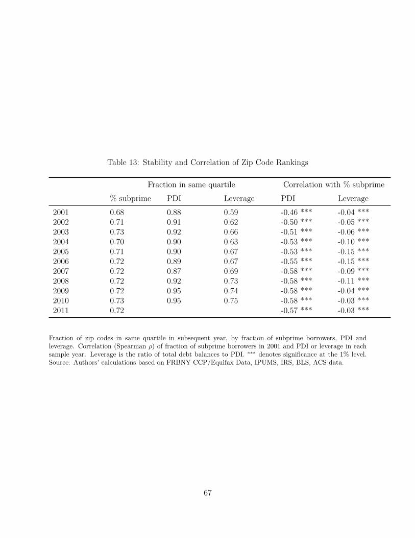
Table 13: Stability and Correlation of Zip Code Rankings
Fraction in same quartile Correlation with % subprime
% subprime PDI Leverage PDI Leverage
2001 0.68 0.88 0.59 -0.46 *** -0.04 ***2002 0.71 0.91 0.62 -0.50 *** -0.05 ***2003 0.73 0.92 0.66 -0.51 *** -0.06 ***2004 0.70 0.90 0.63 -0.53 *** -0.10 ***2005 0.71 0.90 0.67 -0.53 *** -0.15 ***2006 0.72 0.89 0.67 -0.55 *** -0.15 ***2007 0.72 0.87 0.69 -0.58 *** -0.09 ***2008 0.72 0.92 0.73 -0.58 *** -0.11 ***2009 0.72 0.95 0.74 -0.58 *** -0.04 ***2010 0.73 0.95 0.75 -0.58 *** -0.03 ***2011 0.72 -0.57 *** -0.03 ***
Fraction of zip codes in same quartile in subsequent year, by fraction of subprime borrowers, PDI andleverage. Correlation (Spearman ρ) of fraction of subprime borrowers in 2001 and PDI or leverage in eachsample year. Leverage is the ratio of total debt balances to PDI. ∗∗∗ denotes significance at the 1% level.Source: Authors’ calculations based on FRBNY CCP/Equifax Data, IPUMS, IRS, BLS, ACS data.
67
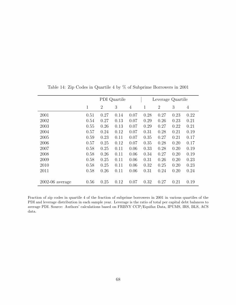
Table 14: Zip Codes in Quartile 4 by % of Subprime Borrowers in 2001
PDI Quartile Leverage Quartile
1 2 3 4 1 2 3 4
2001 0.51 0.27 0.14 0.07 0.28 0.27 0.23 0.222002 0.54 0.27 0.13 0.07 0.29 0.26 0.23 0.212003 0.55 0.26 0.13 0.07 0.29 0.27 0.22 0.212004 0.57 0.24 0.12 0.07 0.31 0.28 0.21 0.192005 0.59 0.23 0.11 0.07 0.35 0.27 0.21 0.172006 0.57 0.25 0.12 0.07 0.35 0.28 0.20 0.172007 0.58 0.25 0.11 0.06 0.33 0.28 0.20 0.192008 0.58 0.26 0.11 0.06 0.34 0.27 0.20 0.192009 0.58 0.25 0.11 0.06 0.31 0.26 0.20 0.232010 0.58 0.25 0.11 0.06 0.32 0.25 0.20 0.232011 0.58 0.26 0.11 0.06 0.31 0.24 0.20 0.24
2002-06 average 0.56 0.25 0.12 0.07 0.32 0.27 0.21 0.19
Fraction of zip codes in quartile 4 of the fraction of subprime borrowers in 2001 in various quartiles of thePDI and leverage distribution in each sample year. Leverage is the ratio of total per capital debt balances toaverage PDI. Source: Authors’ calculations based on FRBNY CCP/Equifax Data, IPUMS, IRS, BLS, ACSdata.
68