Embed Size (px)
DESCRIPTION
Photoshop
Citation preview
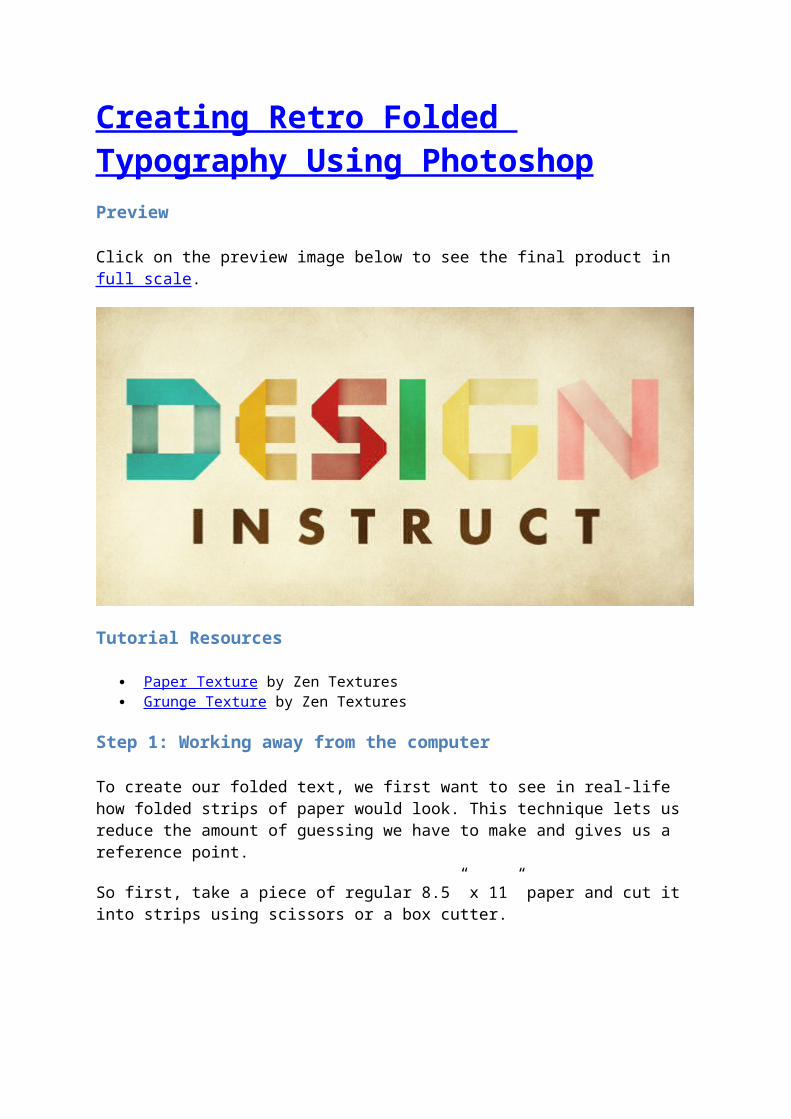
Creating Retro Folded Typography Using PhotoshopPreview
Click on the preview image below to see the final product in full scale.
Tutorial Resources
Paper Texture by Zen Textures Grunge Texture by Zen Textures
Step 1: Working away from the computer
To create our folded text, we first want to see in real-life how folded strips of paper would look. This technique lets us reduce the amount of guessing we have to make and gives us a reference point.
So first, take a piece of regular 8.5” x 11” paper and cut it into strips using scissors or a box cutter.
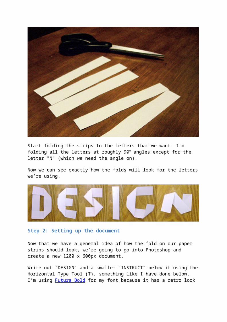
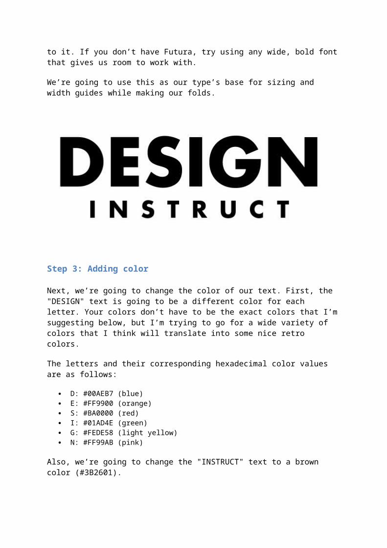
Start folding the strips to the letters that we want. I’m folding all the letters at roughly 90o angles except for the letter "N" (which we need the angle on).
Now we can see exactly how the folds will look for the letters we’re using.
Step 2: Setting up the document
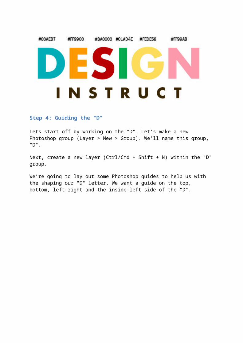
Now that we have a general idea of how the fold on our paper strips should look, we’re going to go into Photoshop and create a new 1200 x 600px document.
Write out "DESIGN" and a smaller "INSTRUCT" below it using the Horizontal Type Tool (T), something like I have done below. I’m using Futura Bold for my font because it has a retro look to it. If you don’t have Futura, try using any wide, bold font that gives us room to work with.
We’re going to use this as our type’s base for sizing and width guides while making our folds.
Step 3: Adding color
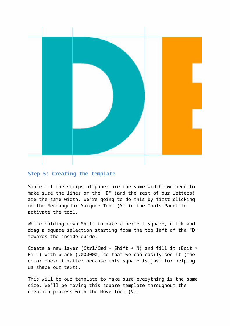
Next, we’re going to change the color of our text. First, the "DESIGN" text is going to be a different color for each letter. Your colors don’t have to be the exact colors that I’m suggesting below, but I’m trying to go for a wide variety of colors that I think will translate into some nice retro colors.
The letters and their corresponding hexadecimal color values are as follows:
D: #00AEB7 (blue) E: #FF9900 (orange) S: #BA0000 (red) I: #01AD4E (green) G: #FEDE58 (light yellow) N: #FF99AB (pink)
Also, we’re going to change the "INSTRUCT" text to a brown color (#3B2601).
Step 4: Guiding the "D"
Lets start off by working on the "D". Let’s make a new Photoshop group (Layer > New > Group). We’ll name this group, "D".
Next, create a new layer (Ctrl/Cmd + Shift + N) within the "D" group.
We’re going to lay out some Photoshop guides to help us with the shaping our "D" letter. We want a guide on the top, bottom, left-right and the inside-left side of the "D".
Step 5: Creating the template
Since all the strips of paper are the same width, we need to make sure the lines of the "D" (and the rest of our letters) are the same width. We’re going to do this by first clicking on the Rectangular Marquee Tool (M) in the Tools Panel to activate the tool.
While holding down Shift to make a perfect square, click and drag a square selection starting from the top left of the "D" towards the inside guide.
Create a new layer (Ctrl/Cmd + Shift + N) and fill it (Edit > Fill) with black (#000000) so that we can easily see it (the color doesn’t matter because this square is just for helping us shape our text).
This will be our template to make sure everything is the same size. We’ll be moving this square template throughout the creation process with the Move Tool (V).
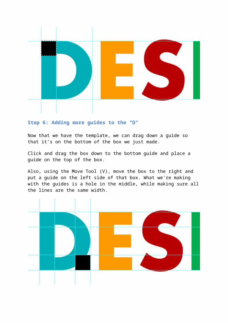
Step 6: Adding more guides to the "D"
Now that we have the template, we can drag down a guide so that it’s on the bottom of the box we just made.
Click and drag the box down to the bottom guide and place a guide on the top of the box.
Also, using the Move Tool (V), move the box to the right and put a guide on the left side of that box. What we’re making with the guides is a hole in the middle, while making sure all the lines are the same width.
Step 7: Subtracting from the "D"
Now that we have our first letter all mapped out, we can start editing it. In the Layers Panel, click on the "D" layer we made in Step 4 to make it our active layer. Using the Rectangular Marquee Tool (M), make a box around the outer guides so it covers the letter. Afterwards, fill it with the same blue as our "D" (#00AEB7).
Before we subtract the middle part, we want to right-click on the "DESIGN" text and choose Layer > Rasterize > Type. This will make it so we can delete areas from the original text—we can’t do this if it’s still a text layer.
Create a selection using the inner guides, click on the "D" layer in the Layers Panel, and then press the Delete key to remove the area beneath the selection.
We can also completely delete the "D" from the original base text layer because we don’t need it anymore.
Now you should have a box with a white hole in the middle.
Step 8: Shaping the "D"
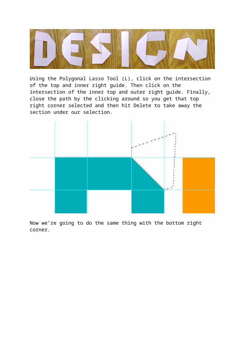
Now we’re going to chop off the corners on the right side to start to give us a "D" shape, similar to how our real-life reference looks.

Using the Polygonal Lasso Tool (L), click on the intersection of the top and inner right guide. Then click on the intersection of the inner top and outer right guide. Finally, close the path by the clicking around so you get that top right corner selected and then hit Delete to take away the section under our selection.
Now we’re going to do the same thing with the bottom right corner.
Step 9: Adding imperfections
Since these letters have a folded look, we’re going to give them some slight imperfections by making the ends of the folded strip of paper overlap past the letter.
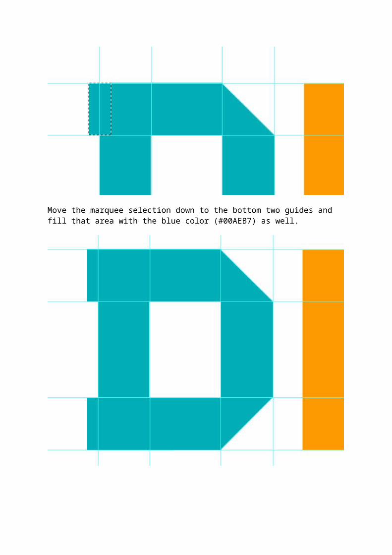
Using the Rectangular Marquee Tool (M), make a square within the top two guides and out past the left side of the "D". Fill the selection (Edit > Fill) with the blue color (#00AEB7).
Move the marquee selection down to the bottom two guides and fill that area with the blue color (#00AEB7) as well.

Step 10: Adding guides to the "E"
We’re going to work on the shadows and finishing elements later on, so lets move on to the other letters next. Create a new group (Layer > New > Group), call it "E" and create a new layer (Ctrl/Cmd + Shift + N) within that group.
Now we’re going to use the square template that we created for the "D" to make sure our letter has a consistent width.
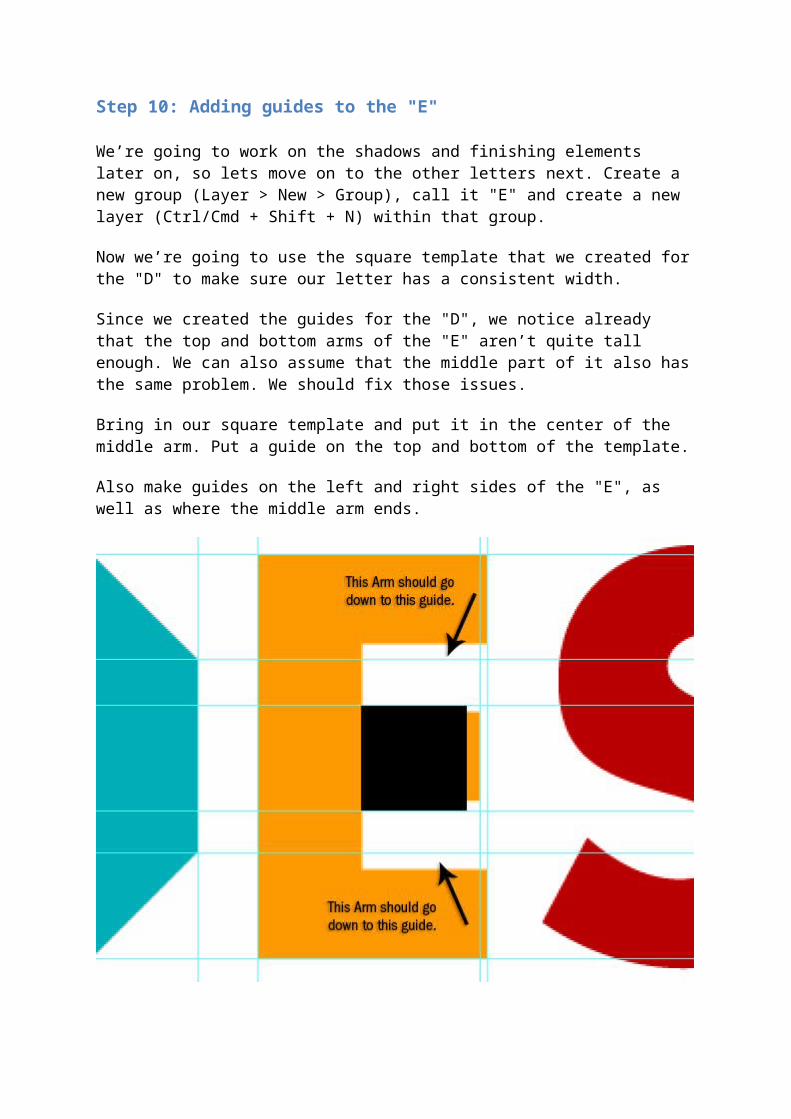
Since we created the guides for the "D", we notice already that the top and bottom arms of the "E" aren’t quite tall enough. We can also assume that the middle part of it also has the same problem. We should fix those issues.
Bring in our square template and put it in the center of the middle arm. Put a guide on the top and bottom of the template.
Also make guides on the left and right sides of the "E", as well as where the middle arm ends.
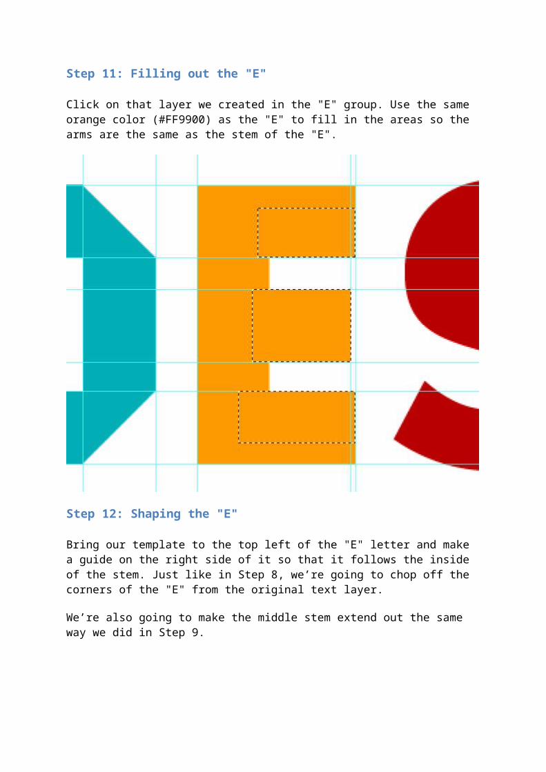
Step 11: Filling out the "E"
Click on that layer we created in the "E" group. Use the same orange color (#FF9900) as the "E" to fill in the areas so the arms are the same as the stem of the "E".
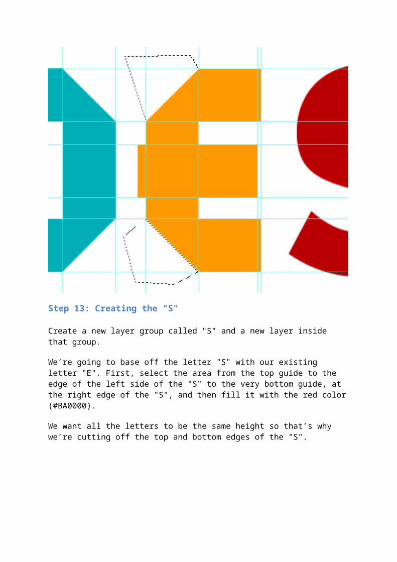
Step 12: Shaping the "E"
Bring our template to the top left of the "E" letter and make a guide on the right side of it so that it follows the inside of the stem. Just like in Step 8, we’re going to chop off the corners of the "E" from the original text layer.
We’re also going to make the middle stem extend out the same way we did in Step 9.
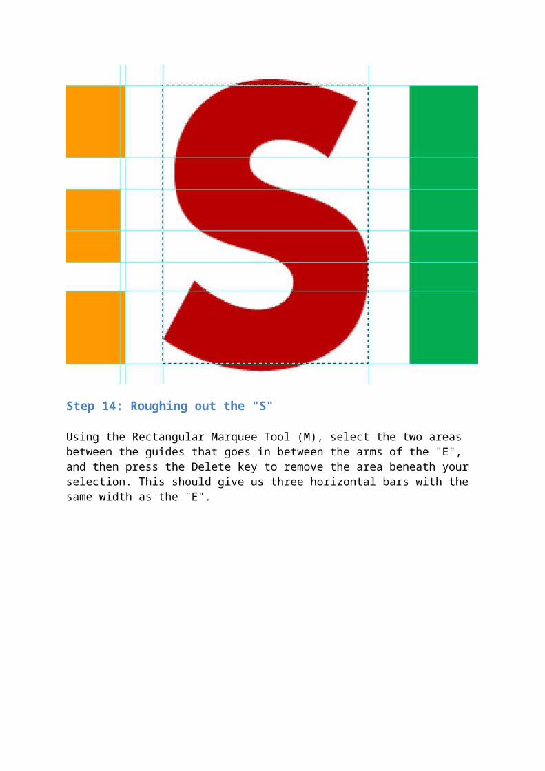
Step 13: Creating the "S"
Create a new layer group called "S" and a new layer inside that group.
We’re going to base off the letter "S" with our existing letter "E". First, select the area from the top guide to the edge of the left side of the "S" to the very bottom guide, at the right edge of the "S", and then fill it with the red color (#BA0000).
We want all the letters to be the same height so that’s why we’re cutting off the top and bottom edges of the "S".
Step 14: Roughing out the "S"
Using the Rectangular Marquee Tool (M), select the two areas between the guides that goes in between the arms of the "E", and then press the Delete key to remove the area beneath your selection. This should give us three horizontal bars with the same width as the "E".
Step 15: Shaping the "S"
Put the template on the top left corner of the "S" shape and then place a guide on its right side. Move the black square template to the bottom right and put a guide on its left.
Now using the Rectangular Marquee Tool (M) to select the area, fill the empty area on the top left and the bottom right with red (#BA0000).

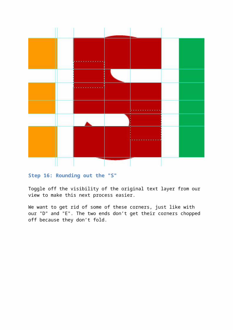
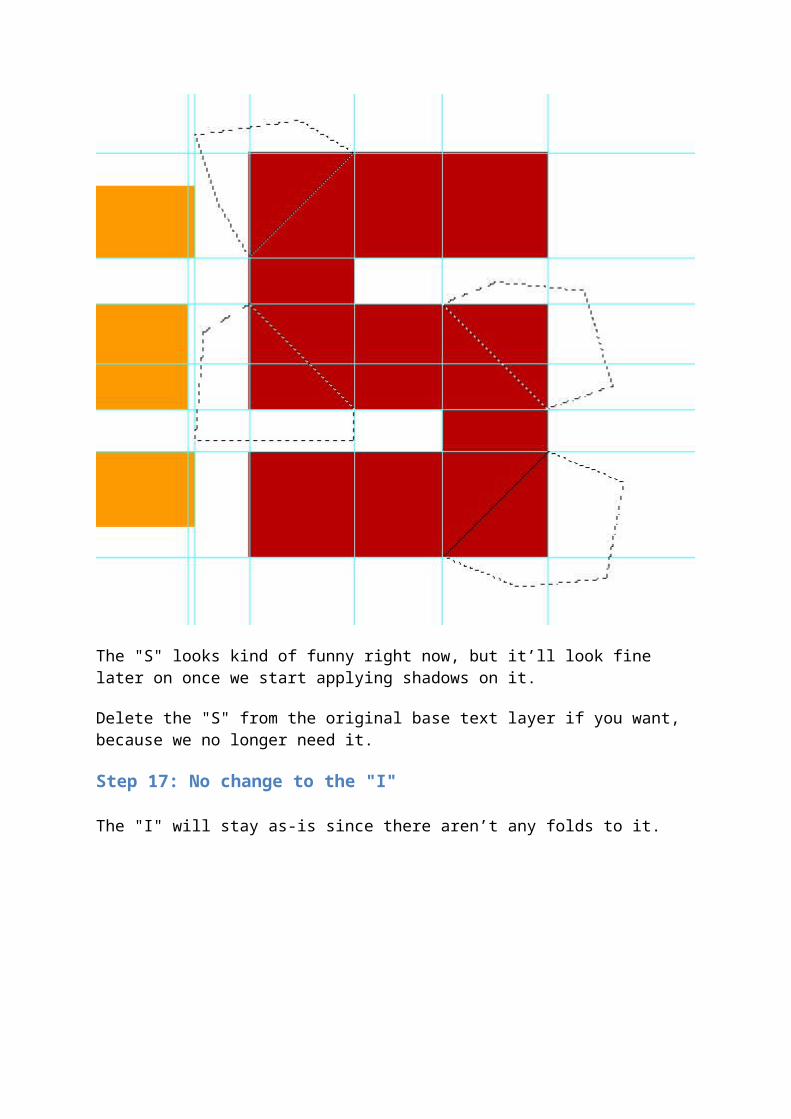
Step 16: Rounding out the "S"
Toggle off the visibility of the original text layer from our view to make this next process easier.
We want to get rid of some of these corners, just like with our "D" and "E". The two ends don’t get their corners chopped off because they don’t fold.
The "S" looks kind of funny right now, but it’ll look fine later on once we start applying shadows on it.
Delete the "S" from the original base text layer if you want, because we no longer need it.
Step 17: No change to the "I"
The "I" will stay as-is since there aren’t any folds to it.
Step 18: Creating the basic shape of the "G"
Make a new group for "G", and—you know the drill by now—a new layer (Ctrl/Cmd + Shift + N) inside it. Just like with the "S", we’re going to select the area from the top to bottom guides and the left to right edges of the "G".
Once selected, fill it with our yellow color (#FEDE58).
Now, let’s put a guide on the left and right sides of the box.

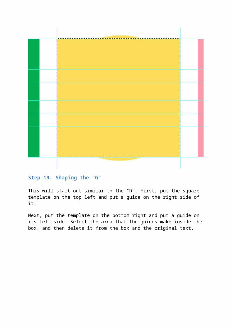
Step 19: Shaping the "G"
This will start out similar to the "D". First, put the square template on the top left and put a guide on the right side of it.
Next, put the template on the bottom right and put a guide on its left side. Select the area that the guides make inside the box, and then delete it from the box and the original text.
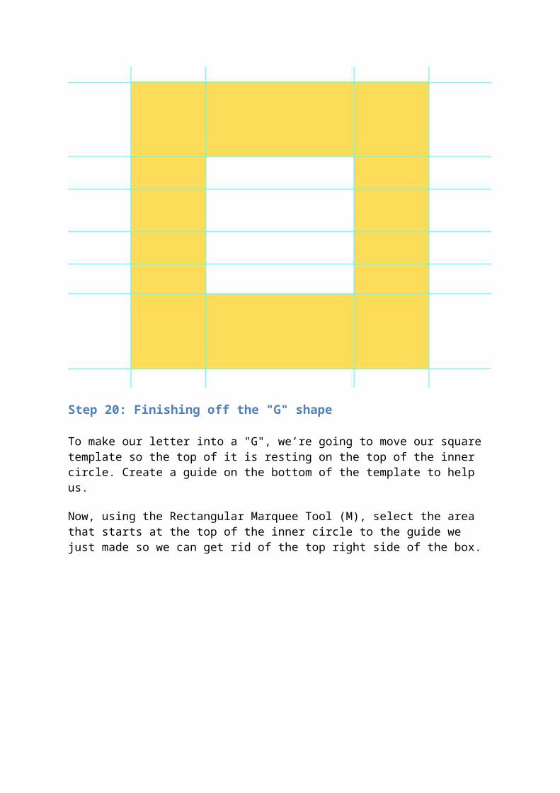
Step 20: Finishing off the "G" shape
To make our letter into a "G", we’re going to move our square template so the top of it is resting on the top of the inner circle. Create a guide on the bottom of the template to help us.
Now, using the Rectangular Marquee Tool (M), select the area that starts at the top of the inner circle to the guide we just made so we can get rid of the top right side of the box.
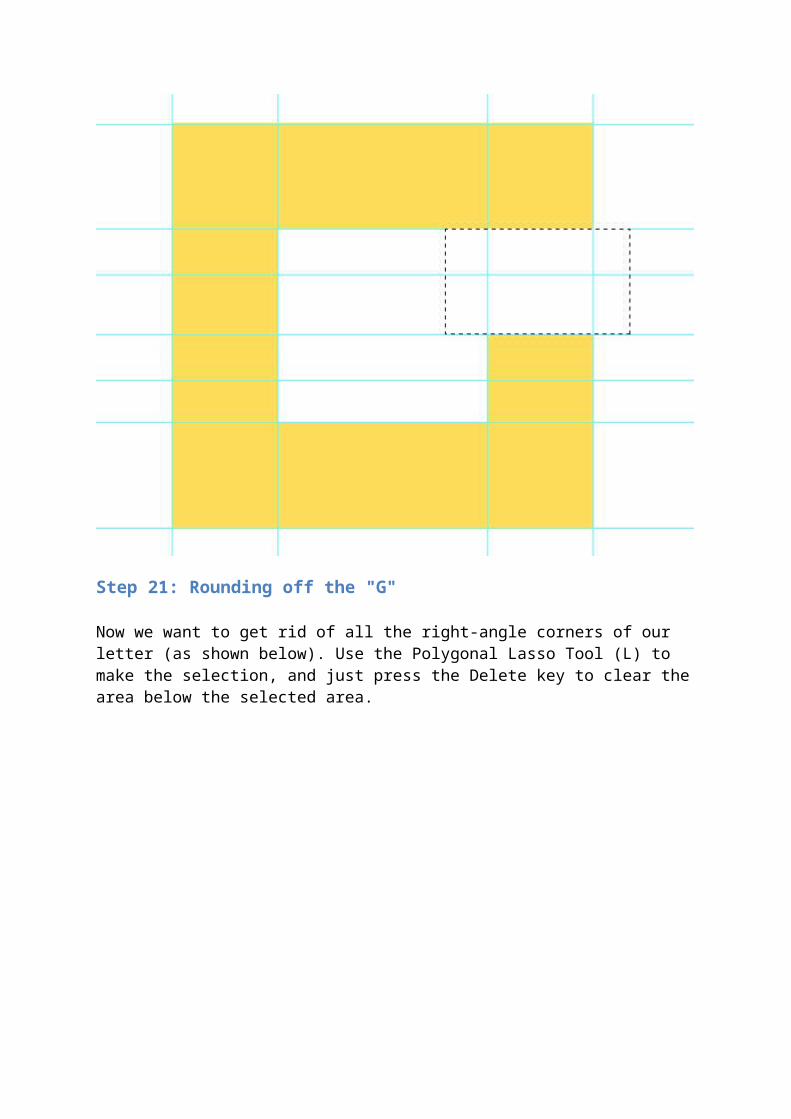
Step 21: Rounding off the "G"
Now we want to get rid of all the right-angle corners of our letter (as shown below). Use the Polygonal Lasso Tool (L) to make the selection, and just press the Delete key to clear the area below the selected area.
Step 22: Reduce the width of "G"
Our "G" is a little too wide for our design. To fix that, get the Rectangular Marquee Tool (M) and select the right half of our letter.
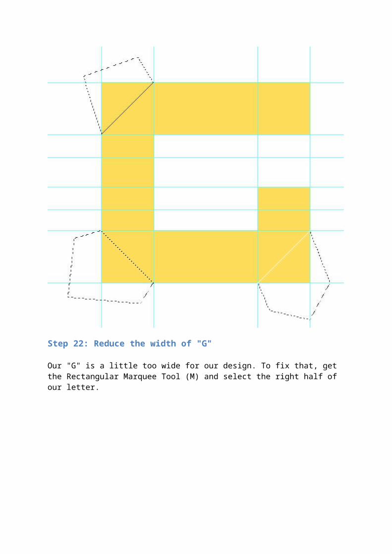
With the appropriate area selected, click on the Move Tool (V) on the Tools Panel, hold down Shift, and move the selected area to the left.

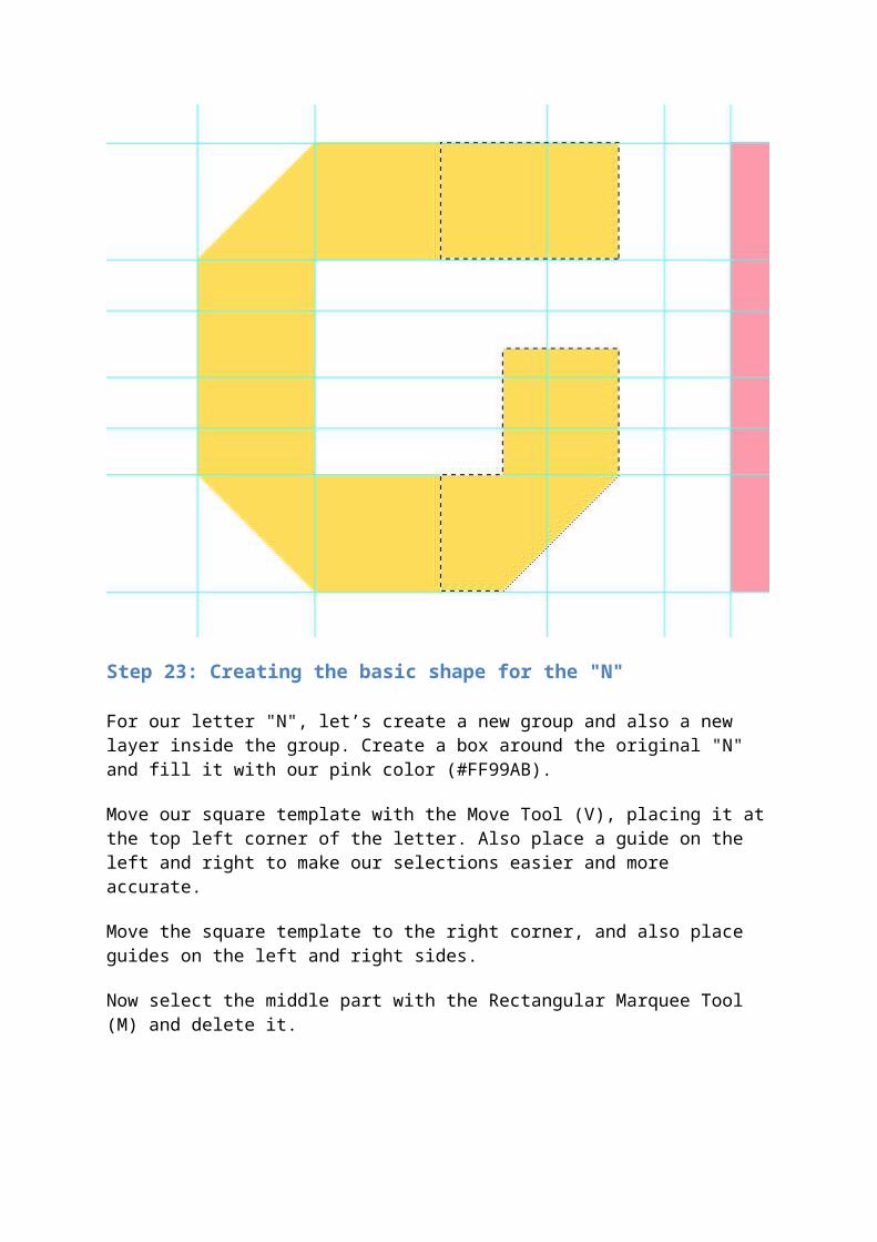
Step 23: Creating the basic shape for the "N"
For our letter "N", let’s create a new group and also a new layer inside the group. Create a box around the original "N" and fill it with our pink color (#FF99AB).
Move our square template with the Move Tool (V), placing it at the top left corner of the letter. Also place a guide on the left and right to make our selections easier and more accurate.
Move the square template to the right corner, and also place guides on the left and right sides.
Now select the middle part with the Rectangular Marquee Tool (M) and delete it.
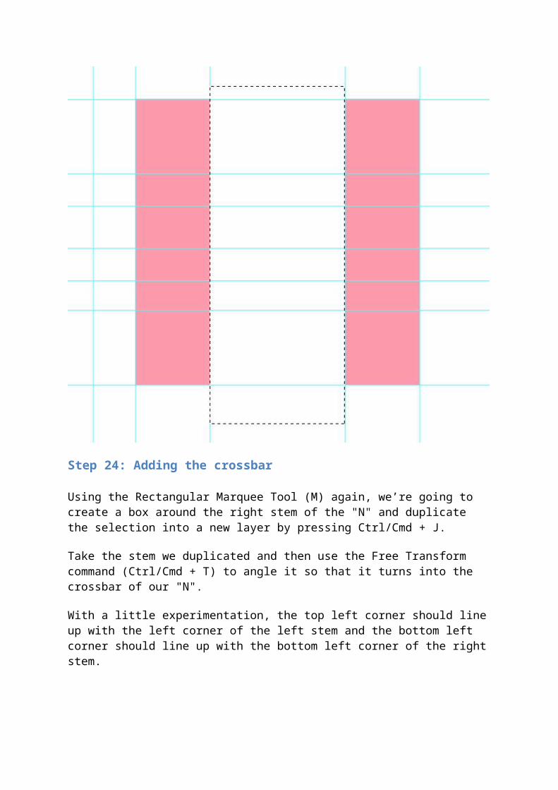
Step 24: Adding the crossbar
Using the Rectangular Marquee Tool (M) again, we’re going to create a box around the right stem of the "N" and duplicate the selection into a new layer by pressing Ctrl/Cmd + J.
Take the stem we duplicated and then use the Free Transform command (Ctrl/Cmd + T) to angle it so that it turns into the crossbar of our "N".
With a little experimentation, the top left corner should line up with the left corner of the left stem and the bottom left corner should line up with the bottom left corner of the right stem.
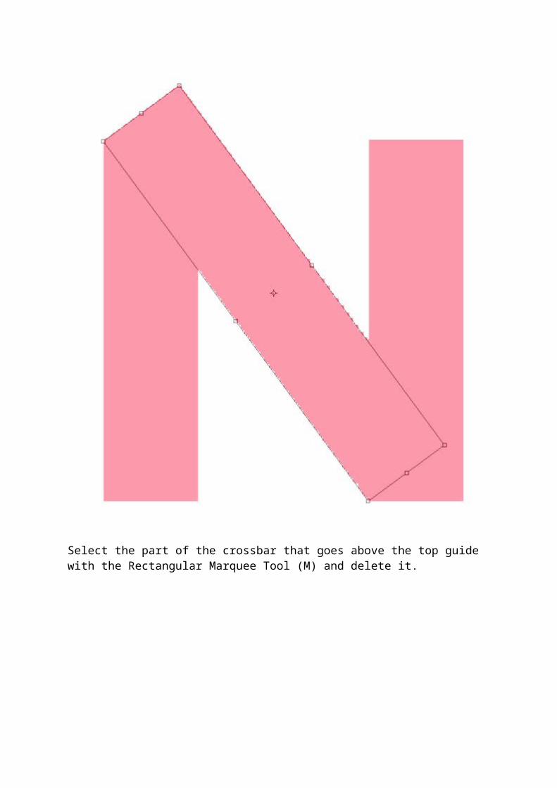
Select the part of the crossbar that goes above the top guide with the Rectangular Marquee Tool (M) and delete it.
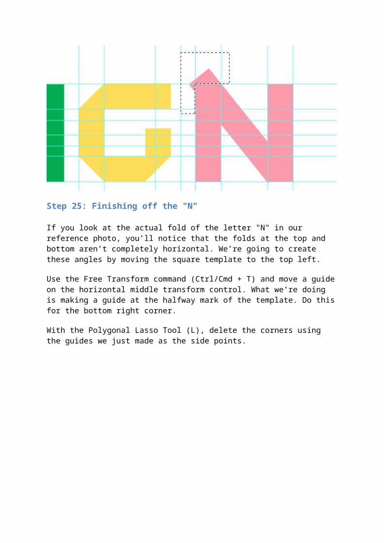
Step 25: Finishing off the "N"
If you look at the actual fold of the letter "N" in our reference photo, you’ll notice that the folds at the top and bottom aren’t completely horizontal. We’re going to create these angles by moving the square template to the top left.
Use the Free Transform command (Ctrl/Cmd + T) and move a guide on the horizontal middle transform control. What we’re doing is making a guide at the halfway mark of the template. Do this for the bottom right corner.
With the Polygonal Lasso Tool (L), delete the corners using the guides we just made as the side points.
Step 26: Cleaning up the text
Right now, you should probably have something that looks pretty messy. Let’s clean up the type by deleting the extra elements we don’t need in the original text.
We also want to get the letter "E" on one layer. Click on the original text layer in the Layers Panel while holding down Ctrl/Cmd. Then with the Rectangular Marquee Tool (M), hold down Alt/Option to create a square selection around the "I" to subtract it from the current selection.
Now hold down Shift + Ctrl/Cmd and click on the rest of the "E" in the "E" group. Click on the "E" layer in the "E" group and fill the selected area with our orange color (#FF9900).
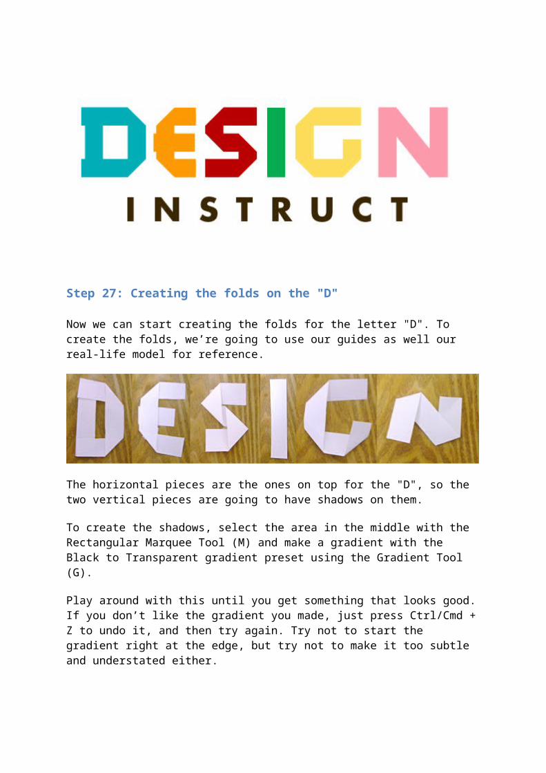
Step 27: Creating the folds on the "D"
Now we can start creating the folds for the letter "D". To create the folds, we’re going to use our guides as well our real-life model for reference.
The horizontal pieces are the ones on top for the "D", so the two vertical pieces are going to have shadows on them.
To create the shadows, select the area in the middle with the Rectangular Marquee Tool (M) and make a gradient with the Black to Transparent gradient preset using the Gradient Tool (G).

Play around with this until you get something that looks good. If you don’t like the gradient you made, just press Ctrl/Cmd + Z to undo it, and then try again. Try not to start the gradient right at the edge, but try not to make it too subtle and understated either.
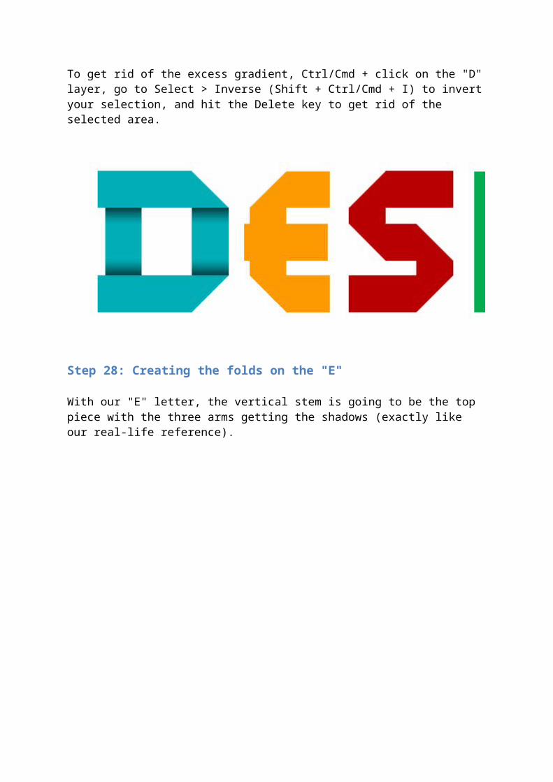
To get rid of the excess gradient, Ctrl/Cmd + click on the "D" layer, go to Select > Inverse (Shift + Ctrl/Cmd + I) to invert your selection, and hit the Delete key to get rid of the selected area.
Step 28: Creating the folds on the "E"
With our "E" letter, the vertical stem is going to be the top piece with the three arms getting the shadows (exactly like our real-life reference).
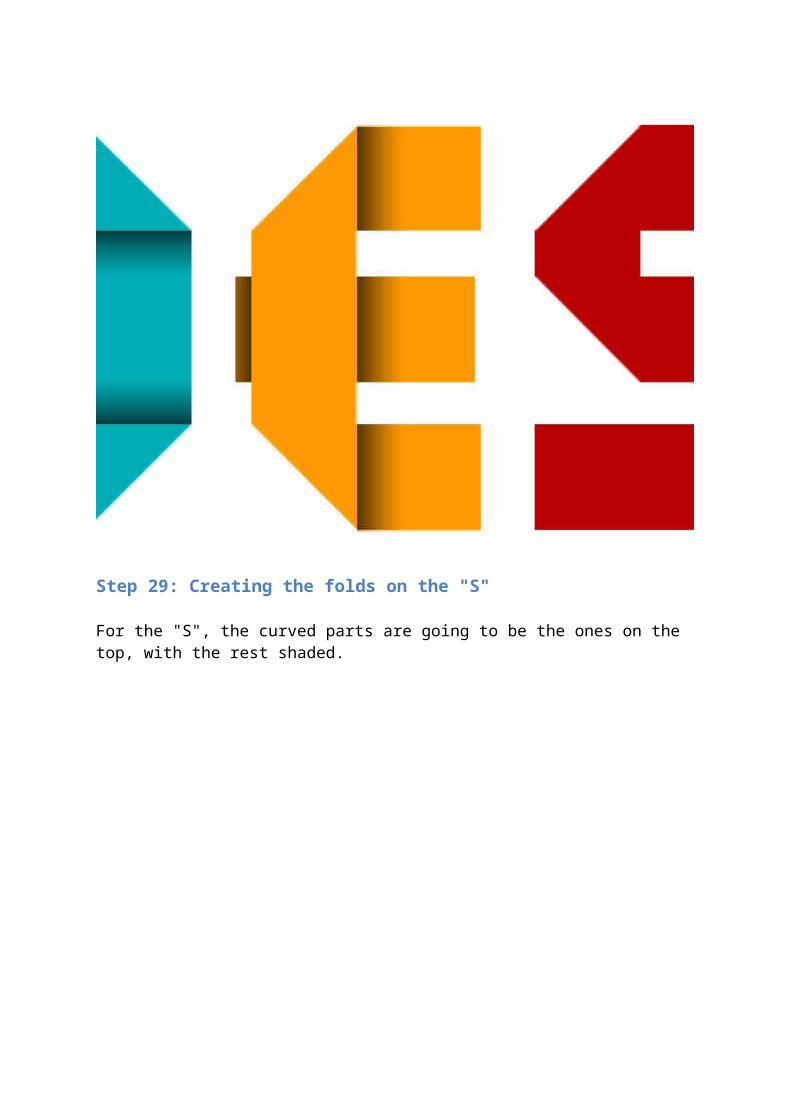
Step 29: Creating the folds on the "S"
For the "S", the curved parts are going to be the ones on the top, with the rest shaded.
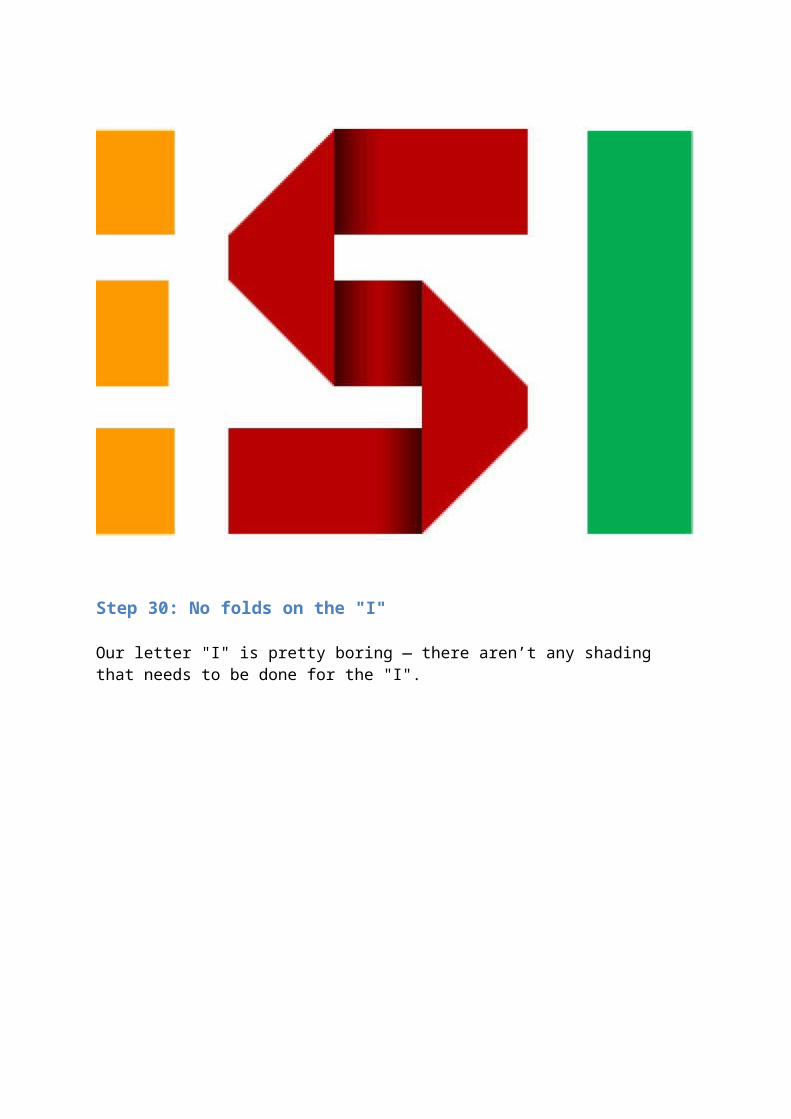
Step 30: No folds on the "I"
Our letter "I" is pretty boring — there aren’t any shading that needs to be done for the "I".
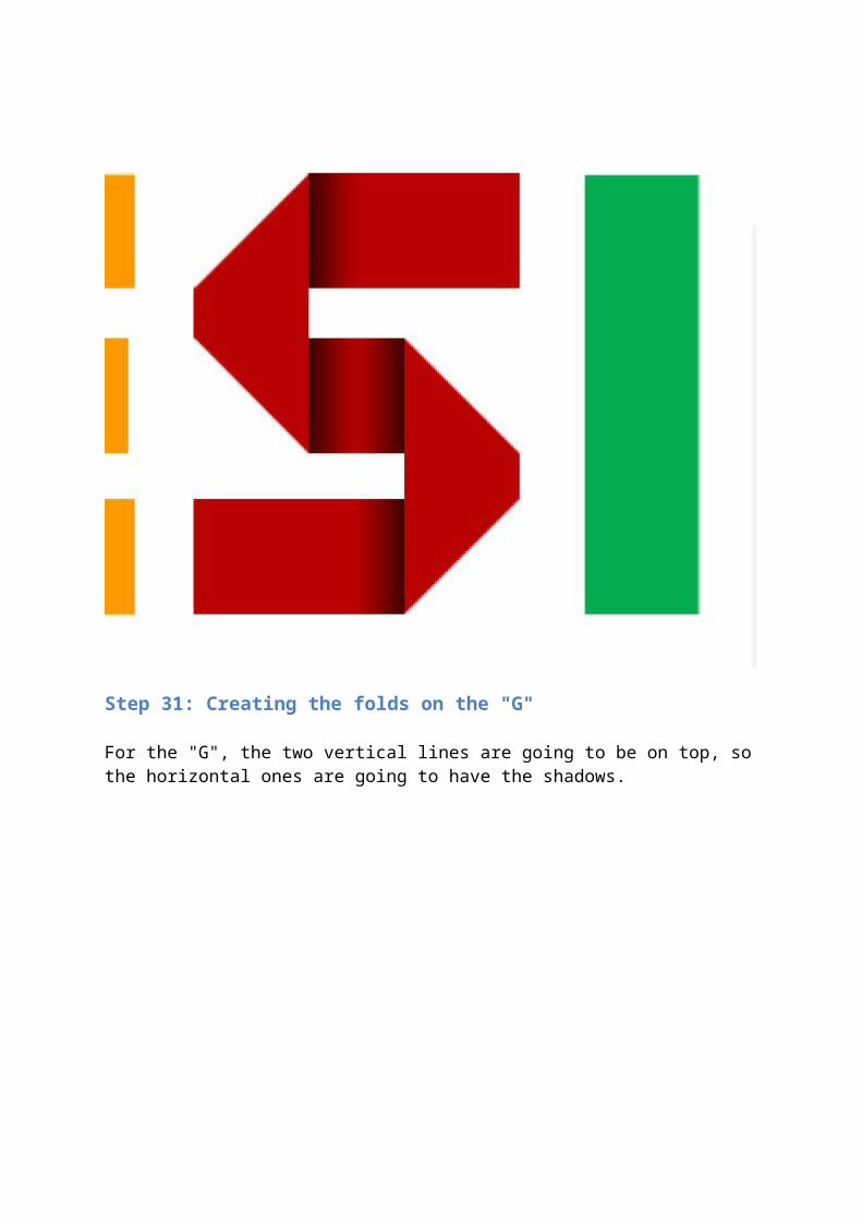
Step 31: Creating the folds on the "G"
For the "G", the two vertical lines are going to be on top, so the horizontal ones are going to have the shadows.
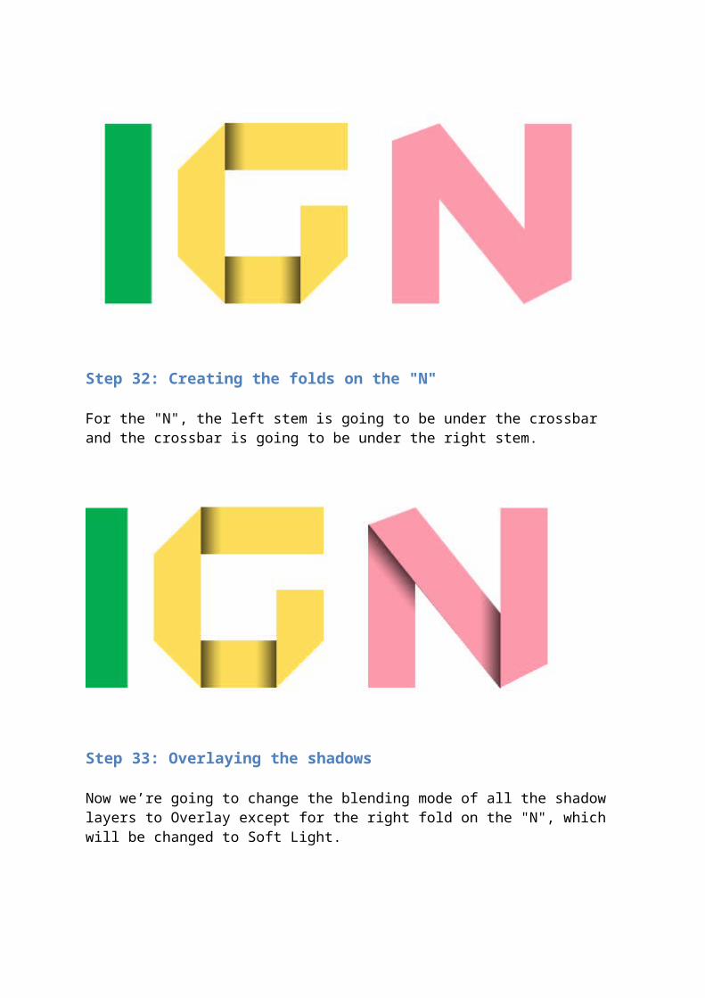
Step 32: Creating the folds on the "N"
For the "N", the left stem is going to be under the crossbar and the crossbar is going to be under the right stem.
Step 33: Overlaying the shadows
Now we’re going to change the blending mode of all the shadow layers to Overlay except for the right fold on the "N", which will be changed to Soft Light.
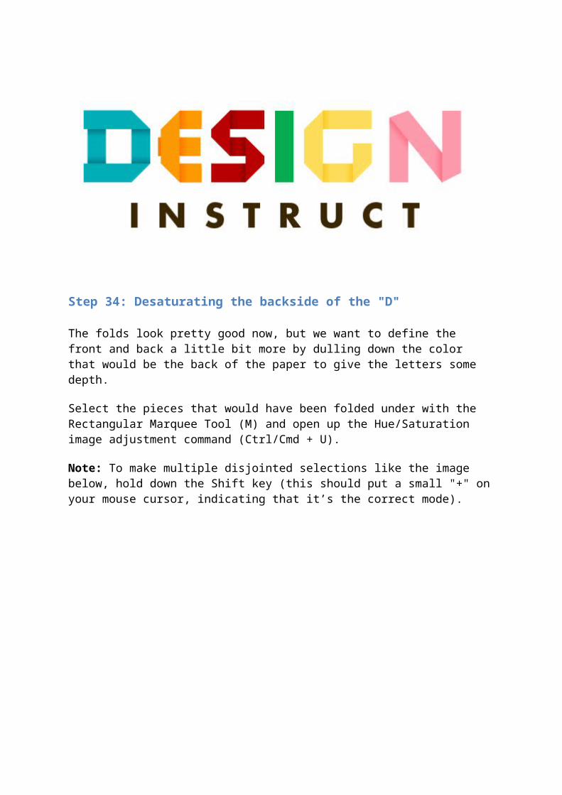
Step 34: Desaturating the backside of the "D"
The folds look pretty good now, but we want to define the front and back a little bit more by dulling down the color that would be the back of the paper to give the letters some depth.
Select the pieces that would have been folded under with the Rectangular Marquee Tool (M) and open up the Hue/Saturation image adjustment command (Ctrl/Cmd + U).
Note: To make multiple disjointed selections like the image below, hold down the Shift key (this should put a small "+" on your mouse cursor, indicating that it’s the correct mode).
Change the Saturation to -40 and the Lightness to +20. We’re using the Lightness option in the Hue/Saturation because it washes out the colors, which is what we want.
Step 35: Desaturate the rest of the letters
Apply the Hue/Saturation from Step 34 to the rest of the letters.
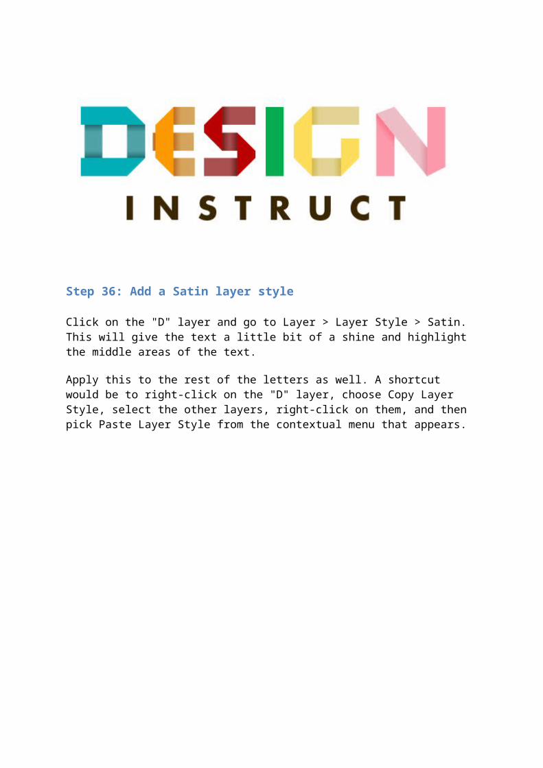
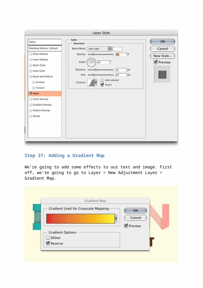
Step 36: Add a Satin layer style
Click on the "D" layer and go to Layer > Layer Style > Satin. This will give the text a little bit of a shine and highlight the middle areas of the text.
Apply this to the rest of the letters as well. A shortcut would be to right-click on the "D" layer, choose Copy Layer Style, select the other layers, right-click on them, and then pick Paste Layer Style from the contextual menu that appears.
Step 37: Adding a Gradient Map
We’re going to add some effects to our text and image. First off, we’re going to go to Layer > New Adjustment Layer > Gradient Map.

Click on the yellow to red gradient preset and also choose the Reverse option.
Drop the opacity of the Gradient Map adjustment layer down to about 15%. This should be your topmost layer. This will give our entire piece a yellowish, aged look.
Step 38: Adding a Hue/Saturation adjustment layer
We’re also going to drop the brightness of our work. Go to Layer > New Adjustment Layer > Hue/Saturation.
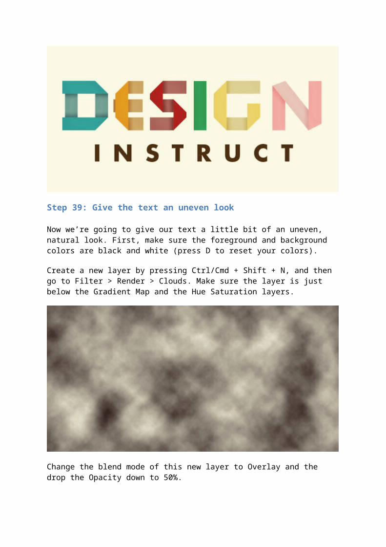
Step 39: Give the text an uneven look
Now we’re going to give our text a little bit of an uneven, natural look. First, make sure the foreground and background colors are black and white (press D to reset your colors).
Create a new layer by pressing Ctrl/Cmd + Shift + N, and then go to Filter > Render > Clouds. Make sure the layer is just below the Gradient Map and the Hue Saturation layers.
Change the blend mode of this new layer to Overlay and the drop the Opacity down to 50%.
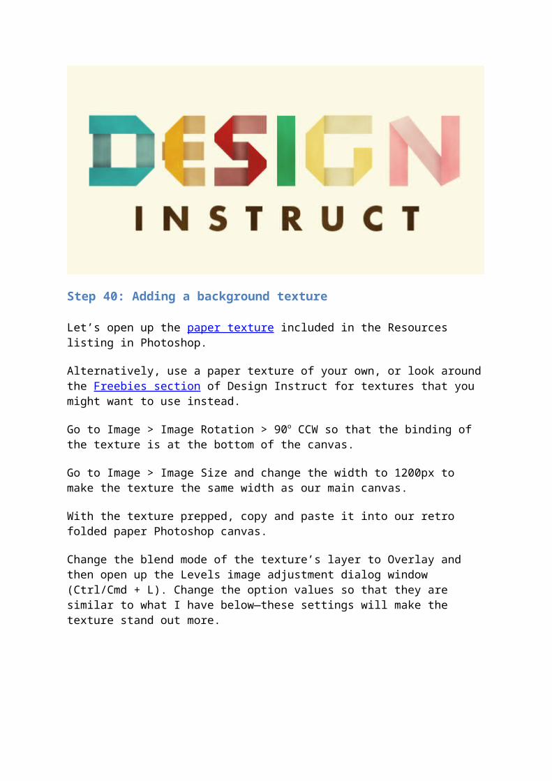
Step 40: Adding a background texture
Let’s open up the paper texture included in the Resources listing in Photoshop.
Alternatively, use a paper texture of your own, or look around the Freebies section of Design Instruct for textures that you might want to use instead.
Go to Image > Image Rotation > 90o CCW so that the binding of the texture is at the bottom of the canvas.
Go to Image > Image Size and change the width to 1200px to make the texture the same width as our main canvas.
With the texture prepped, copy and paste it into our retro folded paper Photoshop canvas.
Change the blend mode of the texture’s layer to Overlay and then open up the Levels image adjustment dialog window (Ctrl/Cmd + L). Change the option values so that they are similar to what I have below—these settings will make the texture stand out more.

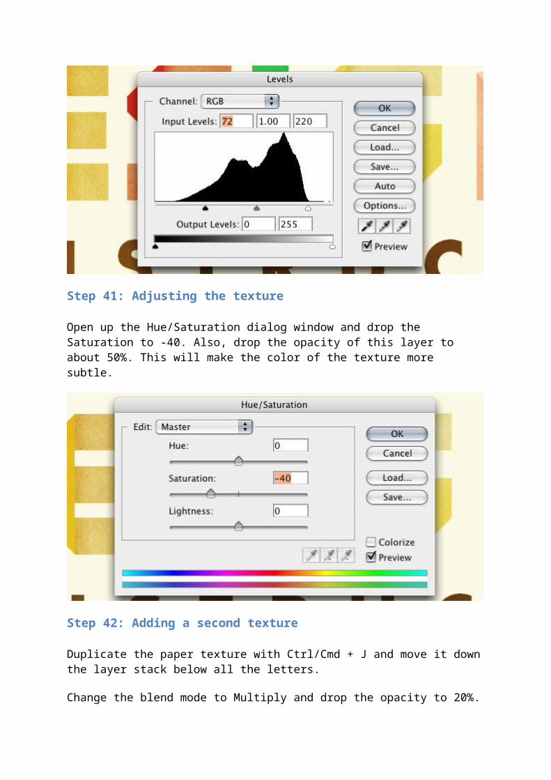
Step 41: Adjusting the texture
Open up the Hue/Saturation dialog window and drop the Saturation to -40. Also, drop the opacity of this layer to about 50%. This will make the color of the texture more subtle.
Step 42: Adding a second texture
Duplicate the paper texture with Ctrl/Cmd + J and move it down the layer stack below all the letters.
Change the blend mode to Multiply and drop the opacity to 20%.
Step 43: Adding a vignette
For artistic effect and to draw the eyes of the viewer towards the center of our piece, we’re going to darken the edges of the canvas, creating a faux vignette. Click on the Rectangular Marquee Tool (M) on the Tools Panel, and in the options bar, change the Feather to 50px. Click and drag a box around the entire canvas (or press Ctrl/Cmd + A).
Go to Select > Inverse and fill the inverted selection with black (#000000). This should fill just the edges.
Change the blending mode of the vignette layer to Overlay.
Step 44: Alternate texture
You can also play around with additional textures. I’m going to keep the background with the same paper texture. I’m going to hide the paper texture that was above the text.
Next, I’m going to bring in this other texture (also included in the Resources listing above) to give the image a dirtier, grungier look. Play around with different textures to create something that’s all your own.
Step 45: Final adjustment
I moved the letters around a little bit to get the kerning to be a little more even. You can do this more accurately with Photoshop’s Ruler Tool (I), but eyeballing it is fine—perfect spacing isn’t important because we want the text to have an imperfect, hand-made feel to it.
Tutorial Summary
In this Photoshop tutorial, I showed you how to create an interesting folded paper typography. First, we created a real-life model of our text, which I hope shows you the value of having a reference before firing up your favorite graphics editor and creating artwork digitally.
We used simple Photoshop techniques such as selecting areas manually using the Photoshop’s Lasso and Marquee tools. To make our selections more accurate and our letters more uniform, we created a square template and used a copious amount of Photoshop guides. To finish up the piece, we applied some basic adjustment layers to give our product a retro, faded look.
I hope you enjoyed this tutorial and I look forward to seeing your own versions in the Design Instruct Flickr group pool.