Embed Size (px)
Citation preview

131
7COMPUTING
CORRELATION COEFFICIENTS
Ice Cream and Crime
Difficulty Scale (moderately hard)
WHAT YOU WILL LEARN IN THIS CHAPTER
✦ Understanding what correlations are and how they work
✦ Computing a simple correlation coefficient
✦ Interpreting the value of the correlation coefficient
✦ Understanding what other types of correlations exist and when they should be used
✦ Computing a partial correlation
✦ Interpreting the value of a partial correlation
WHAT ARE CORRELATIONS ALL ABOUT?Measures of central tendency and measures of variability are not the only descriptive statistics that we are interested in using to get a picture of what a set of scores looks like. You have already learned that knowing the values of the one most representative score (central tendency) and a measure of spread or dispersion (variability) is critical for describing the characteristics of a distribution.
Copyright ©2020 by SAGE Publications, Inc. This work may not be reproduced or distributed in any form or by any means without express written permission of the publisher.
Do n
ot co
py, p
ost, o
r dist
ribute

132 Part III ■ Σigma Freud and Descriptive Statistics
However, sometimes we are as interested in the relationship between variables—or, to be more precise, how the value of one variable changes when the value of another variable changes. The way we express this interest is through the computation of a simple correlation coefficient. For example, what’s the relationship between age and strength? Income and education? Memory skills and drug use? Voting preferences and attitude toward regulations?
A correlation coefficient is a numerical index that reflects the relationship between two variables. The value of this descriptive statistic ranges between −1.00 and +1.00. A correlation between two variables is sometimes referred to as a bivariate (for two variables) correlation. Even more specifically, the type of correlation that we will talk about in the majority of this chapter is called the Pearson product-moment correla-tion, named for its inventor, Karl Pearson.
The Pearson correlation coefficient is a statistic that quantifies the relation-ship between two variables, and both of those variables should be continuous in nature. In other words, they are variables that can assume any value along some underlying continuum; examples include height (you really can be 5 feet and 6.1938574673 inches tall), age, test score, and income. But a host of other variables are not continuous. They’re called discrete or categorical variables, and examples are race (such as black and white); social class (such as high and low); and political affiliation (such as Democrat, Republican, and Independent). You need to use other correlational techniques, such as the point-biserial cor-relation, in these cases. These topics are for a more advanced course, but you should know they are acceptable and very useful techniques. We mention them briefly later on in this chapter.
Other types of correlation coefficients measure the relationship between more than two variables, and we’ll leave those for the next statistics course (which you are look-ing forward to already, right?).
Types of Correlation Coefficients: Flavor 1 and Flavor 2
A correlation reflects the dynamic quality of the relationship between variables. In doing so, it allows us to understand whether variables tend to move in the same or opposite directions when they change. If variables change in the same direction, the correlation is called a direct correlation or a positive correlation. If variables change in opposite directions, the correlation is called an indirect correlation or a negative correlation. Table 7.1 shows a summary of these relationships.
Now, keep in mind that the examples in the table reflect generalities, for example, regarding time to complete a test and the number of correct items on that test. In general, the less time that is taken on a test, the lower the score. Such a conclusion is not rocket science, because the faster one goes, the more likely one is to make careless mistakes such as not reading instructions correctly. But of course, some people can go very fast and do very well. And other people go very slowly and don’t do well at all. The point is that we are talking about the performance of a group of people on two different variables. We are computing the correlation between the two variables for the group, not for any one particular person.
Copyright ©2020 by SAGE Publications, Inc. This work may not be reproduced or distributed in any form or by any means without express written permission of the publisher.
Do n
ot co
py, p
ost, o
r dist
ribute

Chapter 7 ■ Computing Correlation Coefficients 133
TABLE 7.1 Types of Correlations.
What Happens to Variable X
What Happens to Variable Y
Type of Correlation Value Example
X increases in value.
Y increases in value.
Direct or positive
Positive, ranging from .01 to +1.00
The more time you spend studying, the higher your test score will be.
X decreases in value.
Y decreases in value.
Direct or positive
Positive, ranging from .01 to +1.00
The less money you put in the bank, the less interest you will earn.
X increases in value.
Y decreases in value.
Indirect or negative
Negative, ranging from −1.00 to −.01
The more you exercise, the less you will weigh.
X decreases in value.
Y increases in value.
Indirect or negative
Negative, ranging from −1.00 to −.01
The less time you take to complete a test, the more items you will get wrong.
There are several easy (but important) things to remember about the correlation coefficient:
• A correlation can range in value from −1.00 to +1.00.
• A correlation equal to 0 means there is no relationship between the two variables.
• The absolute value of the coefficient reflects the strength of the correlation. So, a correlation of −.70 is stronger than a correlation of +.50. One frequently made mistake regarding correlation coefficients occurs when students assume that a direct or positive correlation is always stronger (i.e., “better”) than an indirect or negative correlation because of the sign and nothing else.
• A correlation always reflects a situation in which there are at least two data points (or variables) per case.
• Another easy mistake is to assign a value judgment to the sign of the correlation. Many students assume that a negative relationship is not good and a positive one is good. That’s why, instead of using the terms negative and positive, we may prefer to use the terms indirect and direct to communicate meaning more clearly.
• The Pearson product-moment correlation coefficient is represented by the small letter r with a subscript representing the variables that are being correlated. For example,� rXY is the correlation between variable X and variable Y.� rweight-height is the correlation between weight and height.� rSAT.GPA is the correlation between SAT scores and grade point average
(GPA).
Copyright ©2020 by SAGE Publications, Inc. This work may not be reproduced or distributed in any form or by any means without express written permission of the publisher.
Do n
ot co
py, p
ost, o
r dist
ribute

134 Part III ■ Σigma Freud and Descriptive Statistics
The correlation coefficient reflects the amount of variability that is shared between two variables and what they have in common. For example, you can expect an individual’s height to be correlated with an individual’s weight because these two variables share many of the same characteristics, such as the indi-vidual’s nutritional and medical history, general health, and genetics. However, if one variable does not change in value and therefore has nothing to share, then the correlation between it and another variable is zero. For example, if you com-puted the correlation between age and number of years of school completed, and everyone was 25 years old, there would be no correlation between the two vari-ables because there’s literally nothing (no variability) in age available to share.
Likewise, if you constrain or restrict the range of one variable, the correlation between that variable and another variable will be less than if the range is not constrained. For example, if you correlate reading comprehension and grades in school for very high-achieving children, you’ll find the correlation to be lower than if you computed the same correlation for children in general. That’s because the reading comprehension score of very high-achieving students is quite high and much less variable than it would be for all children. The les-son? When you are interested in the relationship between two variables, try to collect sufficiently diverse data—that way, you’ll get the truest representative result. And how do you do that? Measure a variable as precisely as possible.
COMPUTING A SIMPLE CORRELATION COEFFICIENTThe computational formula for the simple Pearson product-moment correlation coef-ficient between a variable labeled X and a variable labeled Y is shown in Formula 7.1.
r
n XY X Y
n X n Y YXY �
�
� � ����
���
� � ����
���
� � �� � � �X 2 2 2 2
,
(7.1)
where
• rXY is the correlation coefficient between X and Y;
• n is the size of the sample;
• X is the individual’s score on the X variable;
• Y is the individual’s score on the Y variable;
• XY is the product of each X score times its corresponding Y score;
• X2 is the individual’s X score, squared; and
• Y2 is the individual’s Y score, squared.
Here are the steps to get the numbers needed to calculate the correlation coefficient:
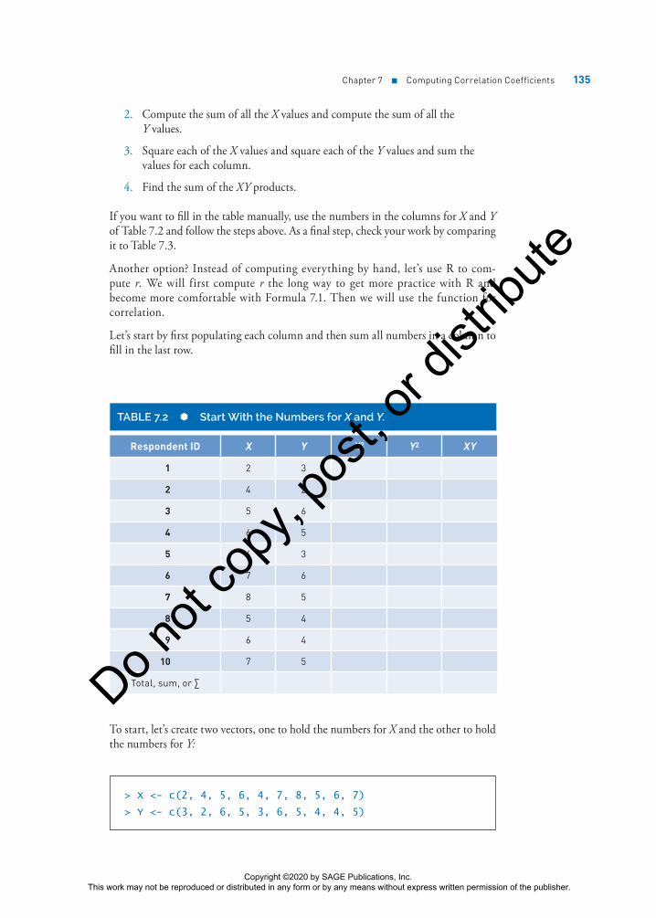
1. List the two values for each participant like in Table 7.2. You should do this in a column format so as not to get confused. Use graph paper if working manually.
Visit edge.sagepub .com/salkindshaw to watch an R tutorial video on this topic.
Copyright ©2020 by SAGE Publications, Inc. This work may not be reproduced or distributed in any form or by any means without express written permission of the publisher.
Do n
ot co
py, p
ost, o
r dist
ribute
Chapter 7 ■ Computing Correlation Coefficients 135
2. Compute the sum of all the X values and compute the sum of all the Y values.
3. Square each of the X values and square each of the Y values and sum the values for each column.
4. Find the sum of the XY products.
If you want to fill in the table manually, use the numbers in the columns for X and Y of Table 7.2 and follow the steps above. As a final step, check your work by comparing it to Table 7.3.
Another option? Instead of computing everything by hand, let’s use R to com-pute r. We will first compute r the long way to get more practice with R and become more comfortable with Formula 7.1. Then we will use the function for correlation.
Let’s start by first populating each column and then sum all numbers in a column to fill in the last row.
TABLE 7.2 Start With the Numbers for X and Y.
Respondent ID X Y X2 Y2 XY
1 2 3
2 4 2
3 5 6
4 6 5
5 4 3
6 7 6
7 8 5
8 5 4
9 6 4
10 7 5
Total, sum, or ∑
To start, let’s create two vectors, one to hold the numbers for X and the other to hold the numbers for Y:
> X <- c(2, 4, 5, 6, 4, 7, 8, 5, 6, 7)
> Y <- c(3, 2, 6, 5, 3, 6, 5, 4, 4, 5)
Copyright ©2020 by SAGE Publications, Inc. This work may not be reproduced or distributed in any form or by any means without express written permission of the publisher.
Do n
ot co
py, p
ost, o
r dist
ribute
136 Part III ■ Σigma Freud and Descriptive Statistics
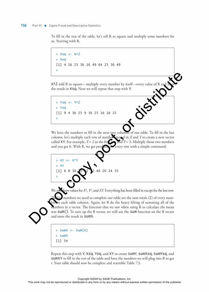
To fill in the rest of the table, let’s tell R to square and multiply some numbers for us. Starting with X,
> Xsq <- X^2
> Xsq
[1] 4 16 25 36 16 49 64 25 36 49
>
X^2 told R to square—multiply every number by itself—every value of X and store the result in Xsq. Now we will repeat that step with Y.
> Ysq <- Y^2
> Ysq
[1] 9 4 36 25 9 36 25 16 16 25
>
We have the numbers to fill in the next two columns of our table. To fill in the last column, let’s multiply each row of numbers stored in X and Y to create a new vector called XY. For example, X = 2 in the first row and Y = 3. Multiply those two numbers and you get 6. With R, we get products for every row with a simple command:
> XY <- X*Y
> XY
[1] 6 8 30 30 12 42 40 20 24 35
>
We now have values for X2, Y2, and XY. Everything has been filled in except for the last row.
The last numbers we need to complete our table are the sum totals (Σ) of every num-ber in each table column. Again, let R do the heavy lifting of summing all of the numbers in a vector. The function that we saw when using R to calculate the mean was sum(). To sum up the X vector, we will use the sum function on the X vector and store the result in sumX.
> sumX <- sum(X)
> sumX
[1] 54
Repeat this step with Y, Xsq, Ysq, and XY to create sumY, sumXsq, sumYsq, and sumXY to fill in the rest of the table and have the numbers we will plug into R to get r. Your table should now be complete and resemble Table 7.3.
Copyright ©2020 by SAGE Publications, Inc. This work may not be reproduced or distributed in any form or by any means without express written permission of the publisher.
Do n
ot co
py, p
ost, o
r dist
ribute
Chapter 7 ■ Computing Correlation Coefficients 137
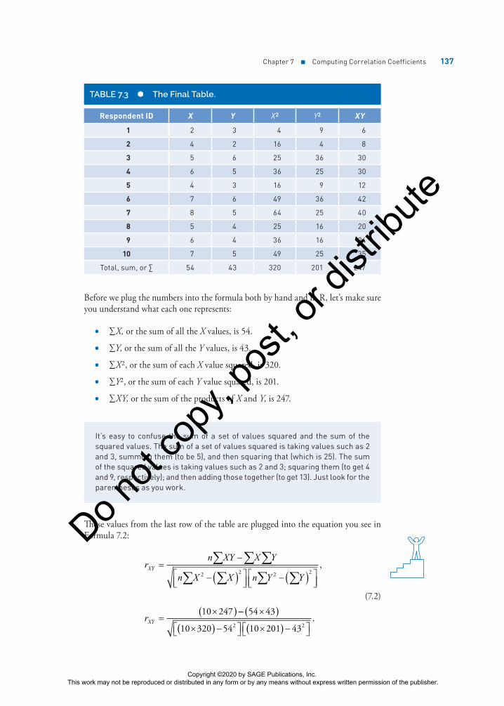
TABLE 7.3 The Final Table.
Respondent ID X Y X2 Y2 XY
1 2 3 4 9 6
2 4 2 16 4 8
3 5 6 25 36 30
4 6 5 36 25 30
5 4 3 16 9 12
6 7 6 49 36 42
7 8 5 64 25 40
8 5 4 25 16 20
9 6 4 36 16 24
10 7 5 49 25 35
Total, sum, or ∑ 54 43 320 201 247
Before we plug the numbers into the formula both by hand and in R, let’s make sure you understand what each one represents:
• ∑X, or the sum of all the X values, is 54.
• ∑Y, or the sum of all the Y values, is 43.
• ∑X2, or the sum of each X value squared, is 320.
• ∑Y2, or the sum of each Y value squared, is 201.
• ∑XY, or the sum of the products of X and Y, is 247.
It’s easy to confuse the sum of a set of values squared and the sum of the squared values. The sum of a set of values squared is taking values such as 2 and 3, summing them (to be 5), and then squaring that (which is 25). The sum of the squared values is taking values such as 2 and 3; squaring them (to get 4 and 9, respectively); and then adding those together (to get 13). Just look for the parentheses as you work.
These values from the last row of the table are plugged into the equation you see in Formula 7.2:
rn XY Y
n X X n Y Y
r
XY
XY
��
� � ����
���
� � ����
���
��� �
� � �� � � �
X
2 2 2 2
10 247
,
�� �� ��� � ��� �� �� � ��� ��
54 43
10 320 54 10 201 432 2.
(7.2)
Copyright ©2020 by SAGE Publications, Inc. This work may not be reproduced or distributed in any form or by any means without express written permission of the publisher.
Do n
ot co
py, p
ost, o
r dist
ribute
138 Part III ■ Σigma Freud and Descriptive Statistics
Ta-da! And you can see the answer in Formula 7.3:
rXY = =148
213 83692
.. . (7.3)
Instead of pulling out a calculator, let’s enter the equation in R, using the R objects we created. We will create one more object to hold the size of our sample. Then we will re-create the formula.
> n <- 10
> rByHand <- ((n * sumXY) - (sumX * sumY))/
+ sqrt((((n * sumXsq) - (sumX^2)) * ((n * sumYsq) -
(sumY^2))))
> rByHand
[1] 0.6921331
What’s really interesting about correlations is that they measure the amount of distance that one variable covaries in relation to another. So, if both variables are highly variable (have lots of wide-ranging values), the correlation between them is more likely to be high than if not. Now, that’s not to say that lots of variability guarantees a higher correlation, because the scores have to vary in a systematic way. But if the variance is constrained in one variable, then no matter how much the other variable changes, the correlation will be lower. For example, let’s say you are examining the correlation between academic achievement in high school and first-year grades in college and you only look at the top 10% of the class. Well, that top 10% is likely to have very similar grades, introducing no variability and no room for the one variable to vary as a function of the other. Guess what you get when you correlate one variable with another variable that does not change (that is, has no variability)? rXY = 0, that’s what. The lesson here? Variability works, and you should not artificially limit it.
A Visual Picture of a Correlation: The Scatterplot
There’s a very simple way to visually represent a correlation: Create what is called a scatterplot, or scattergram. A scatterplot is simply a plot of each set of scores on separate axes.
Here are the steps to complete a scatterplot like the one you see in Figure 7.1, which plots the 10 sets of scores for which we computed the sample correlation earlier.
1. Draw the x-axis and the y-axis. Usually, the X variable goes on the horizontal axis and the Y variable goes on the vertical axis.
2. Mark both axes with the range of values that you know to be the case for the data. For example, the value of the X variable in our example ranges from 2 to 8, so we marked the x-axis from 0 to 9. There’s no harm in marking
Copyright ©2020 by SAGE Publications, Inc. This work may not be reproduced or distributed in any form or by any means without express written permission of the publisher.
Do n
ot co
py, p
ost, o
r dist
ribute

Chapter 7 ■ Computing Correlation Coefficients 139
the axes a bit low or high—just as long as you allow room for the values to appear. The value of the Y variable ranges from 2 to 6, and we marked that axis from 0 to 9. Having similarly labeled (and scaled) axes can sometimes make the finished scatterplot easier to understand.
3. Finally, for each pair of scores (such as 2 and 3, as shown in Figure 7.1), we entered a dot on the chart by marking the place where 2 falls on the x-axis and 3 falls on the y-axis. The dot represents a data point, which is the intersection of the two values.
When all the data points are plotted, what does such an illustration tell us about the relationship between the variables? To begin with, the general shape of the collection of data points indicates whether the correlation is direct (positive) or indirect (negative).
A positive correlation occurs when the data points group themselves in a cluster from the lower left-hand corner on the x- and y-axes through the upper right-hand corner. A negative correlation occurs when the data points group themselves in a cluster from the upper left-hand corner on the x- and y-axes through the lower right-hand corner.
We can easily create a scatterplot with R. Try this command:
FIGURE 7.1 A simple scatterplot.
9
8
7
6
5
4
3
2
1
09876543210
Y
X
Data point (2,3)
> plot(Y ~ X)
• plot is the name of the function.
• Y listed first tells R what variable we want represented with the vertical axis.
• ~ is a symbol that roughly means related.
• X is listed second and will be displayed on the horizontal axis.
Copyright ©2020 by SAGE Publications, Inc. This work may not be reproduced or distributed in any form or by any means without express written permission of the publisher.
Do n
ot co
py, p
ost, o
r dist
ribute

140 Part III ■ Σigma Freud and Descriptive Statistics
Here are some scatterplots showing very different correlations where you can see how the grouping of the data points reflects the sign and strength of the correlation coefficient.
Figure 7.2 shows a perfect direct correlation where rXY = 1.00 and all the data points are aligned along a straight line with a positive correlation.
FIGURE 7.2 A perfect positive correlation.
2 4 6 8 10
2
4
6
8
10
X
Y
If the correlation were perfectly indirect, the value of the correlation coefficient would be −1.00, and the data points would align themselves in a straight line as well but from the upper left-hand corner of the chart to the lower right. In other words, the line that connects the data points would have a negative correlation.
Don’t ever expect to find a perfect correlation between any two variables in the behavioral or social sciences. Such a correlation would say that two variables are so perfectly related, they share everything in common. In other words, knowing one is like knowing the other. Just think about your classmates. Do you think they all share any one thing in common that is perfectly related to another of their characteristics across all those different people? Probably not. In fact, r values approaching .7 and .8 are just about the highest you’ll see.
In Figure 7.3, you can see the scatterplot for a strong (but not perfect) direct relation-ship where rXY = .70. Notice that the data points align themselves along a positive line, although not perfectly. If you were to draw a circle around the data points, it would look like an ellipse.
Now, we’ll show you a strong indirect, or negative, relationship in Figure 7.4, where rXY = −.82. Notice that the data points align themselves on a negative line from the upper left-hand corner of the chart to the lower right-hand corner. Again, a circle drawn around the data points will look like an ellipse.
Copyright ©2020 by SAGE Publications, Inc. This work may not be reproduced or distributed in any form or by any means without express written permission of the publisher.
Do n
ot co
py, p
ost, o
r dist
ribute

Chapter 7 ■ Computing Correlation Coefficients 141
FIGURE 7.3 A strong, but not perfect, direct relationship.
2 4 6 8 10
2
4
6
8
10
X
Y
FIGURE 7.4 A strong, but not perfect, indirect relationship.
2 4 6 8 10
2
4
6
8
10
X
Y
That’s what different types of correlations look like, and you can really tell the gen-eral strength and direction by examining the way the points are grouped.
Not all correlations are reflected by a straight line showing the X and the Y val-ues in a relationship called a linear correlation (see Chapter 17 for tons of fun stuff about this). The relationship may not be linear and may not be reflected by a straight line. Let’s take the correlation between age and memory. For the early years, the correlation is probably highly positive—the older children get, the better their memories. Then, into young and middle adulthood, there isn’t much of a change or much of a correlation, because most young and middle adults maintain a good (but not necessarily increasingly variable) memory. But with old age, memory begins to suffer, and there is an indirect relation-ship between memory and aging in the later years. If you take these together and look at the relationship over the life span, you find that the correlation between memory and age tends to look something like a curve where memory increases, levels off, and then decreases. It’s a curvilinear relationship, and sometimes, the best description of a relationship is that it is curvilinear.
Copyright ©2020 by SAGE Publications, Inc. This work may not be reproduced or distributed in any form or by any means without express written permission of the publisher.
Do n
ot co
py, p
ost, o
r dist
ribute
142 Part III ■ Σigma Freud and Descriptive Statistics
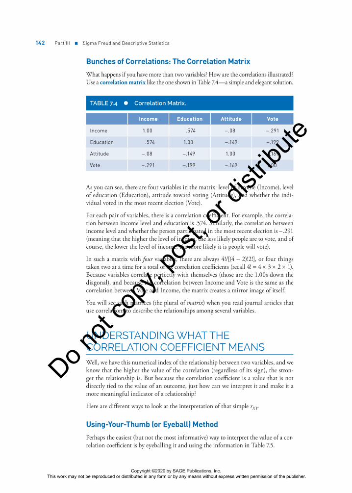
Bunches of Correlations: The Correlation Matrix
What happens if you have more than two variables? How are the correlations illustrated? Use a correlation matrix like the one shown in Table 7.4—a simple and elegant solution.
TABLE 7.4 Correlation Matrix.
Income Education Attitude Vote
Income 1.00 .574 −.08 −.291
Education .574 1.00 −.149 −.199
Attitude −.08 −.149 1.00 −.169
Vote −.291 −.199 −.169 1.00
As you can see, there are four variables in the matrix: level of income (Income), level of education (Education), attitude toward voting (Attitude), and whether the indi-vidual voted in the most recent election (Vote).
For each pair of variables, there is a correlation coefficient. For example, the correla-tion between income level and education is .574. Similarly, the correlation between income level and whether the person participated in the most recent election is −.291 (meaning that the higher the level of income, the less likely people are to vote, and of course, the lower the level of income, the more likely it is people will vote).
In such a matrix with four variables, there are always 4!/[(4 − 2)!2!], or four things taken two at a time for a total of six correlation coefficients (recall 4! = 4 × 3 × 2 × 1). Because variables correlate perfectly with themselves (those are the 1.00s down the diagonal), and because the correlation between Income and Vote is the same as the correlation between Vote and Income, the matrix creates a mirror image of itself.
You will see such matrices (the plural of matrix) when you read journal articles that use correlations to describe the relationships among several variables.
UNDERSTANDING WHAT THE CORRELATION COEFFICIENT MEANSWell, we have this numerical index of the relationship between two variables, and we know that the higher the value of the correlation (regardless of its sign), the stron-ger the relationship is. But because the correlation coefficient is a value that is not directly tied to the value of an outcome, just how can we interpret it and make it a more meaningful indicator of a relationship?
Here are different ways to look at the interpretation of that simple rXY.
Using-Your-Thumb (or Eyeball) Method
Perhaps the easiest (but not the most informative) way to interpret the value of a cor-relation coefficient is by eyeballing it and using the information in Table 7.5.
Copyright ©2020 by SAGE Publications, Inc. This work may not be reproduced or distributed in any form or by any means without express written permission of the publisher.
Do n
ot co
py, p
ost, o
r dist
ribute

Chapter 7 ■ Computing Correlation Coefficients 143
TABLE 7.5 Interpreting a Correlation Coefficient.
Size of the Correlation Coefficient General Interpretation
.8 to 1.0 Very strong relationship
.6 to .8 Strong relationship
.4 to .6 Moderate relationship
.2 to .4 Weak relationship
.0 to .2 Weak or no relationship
So, if the correlation between two variables is .5, you could safely conclude that the relationship is a moderate one—not strong, but certainly not weak enough to say that the variables in question don’t share anything in common.
This eyeball method is perfectly acceptable for a quick assessment of the strength of the relationship between variables, such as when you briefly evaluate data presented visually. But because this rule of thumb depends on a subjective judgment (of what’s “strong” or “weak”), we would like a more precise method. That’s what we’ll look at now.
These cutoff points may differ from cutoffs other researchers use. The exact cutoffs and what is considered strong versus weak depend on the field of research. Ask your professor what standards they use.
A DETERMINED EFFORT: SQUARING THE CORRELATION COEFFICIENTHere’s the much more precise way to interpret the correlation coefficient: computing the coefficient of determination. The coefficient of determination is the percentage of variance in one variable that is accounted for by the variance in the other variable. Quite a mouthful, huh? A simpler way would be to say the coefficient of determina-tion is the amount of variance the two variables share.
Earlier in this chapter, we pointed out how variables that share something in com-mon tend to be correlated with one another. If we correlated math and English grades for 100 fifth-grade students, we would find the correlation to be moderately strong, because many of the reasons why children do well (or poorly) in math tend to be the same reasons why they do well (or poorly) in English. The number of hours they study, how bright they are, how interested their parents are in their schoolwork, the number of books they have at home, and more are all related to both math and English performance and account for differences between children (and that’s where the variability comes in).
The more these two variables share in common, the more they will be related. These two variables share variability—or the reason why children differ from one another. And on the whole, the brighter child who studies more will do better.
Copyright ©2020 by SAGE Publications, Inc. This work may not be reproduced or distributed in any form or by any means without express written permission of the publisher.
Do n
ot co
py, p
ost, o
r dist
ribute

144 Part III ■ Σigma Freud and Descriptive Statistics
To determine exactly how much of the variance in one variable can be accounted for by the variance in another variable, the coefficient of determination is computed by squaring the correlation coefficient.
For example, if the correlation between GPA and number of hours of study time is .70 (or rGPA.time = .70), then the coefficient of determination, represented by rGPA.time
2 , is .702, or .49. This means that 49% of the variance in GPA can be explained by the variance in studying time. And the stronger the correlation, the more variance can be explained (which only makes good sense). The more two variables share in common (such as good study habits, knowledge of what’s expected in class, and lack of fatigue), the more information about performance on one score can be explained (and, as you will learn in Chapter 18, predicted) by the other score.
However, if 49% of the variance can be explained, this means that 51% cannot—so even for a strong correlation of .70, many of the reasons why scores on these variables tend to be different from one another go unexplained. This amount of unexplained variance is called the coefficient of alienation (also called the coefficient of non-determination). Don’t worry. No aliens here. This isn’t Avatar, Signs, or District 9 stuff—it’s just the amount of variance in Y not explained by X (and, of course, vice versa since the relationship goes both ways).
How about a visual presentation of this sharing variance idea? Okay. In Figure 7.5, you’ll find a correlation coefficient, the corresponding coefficient of determination, and a diagram that represents how much variance is shared between the two vari-ables. The larger the shaded area in each diagram (and the more variance the two variables share), the more highly the variables are correlated.
• The first diagram in Figure 7.5 shows two circles that do not touch. They don’t touch because they do not share anything in common. The correlation is zero.
• The second diagram shows two circles that overlap. With a correlation of .5 (and rXY
2 25= . ), they share about 25% of the variance between them.
• Finally, the third diagram shows two circles placed almost on top of each other. With an almost perfect correlation of rXY = .90 ( rXY
2 = .81), they share about 81% of the variance between them.
FIGURE 7.5 Correlations and the resulting amount of variance shared.
Variable X Variable Y
0% shared
25% shared
81% shared
Correlation
rXY = .5
rXY = .9
rXY = 0
Coefficient ofDetermination
r 2 = .81 or 81%XY
r 2
= .25 or 25%XY
r 2
= 0XY
Copyright ©2020 by SAGE Publications, Inc. This work may not be reproduced or distributed in any form or by any means without express written permission of the publisher.
Do n
ot co
py, p
ost, o
r dist
ribute

Chapter 7 ■ Computing Correlation Coefficients 145
As More Ice Cream Is Eaten . . . the Crime Rate Goes Up (or Association vs. Causality)
Now here’s the really important thing to be aware of, and very careful about, when computing, reading about, or interpreting correlation coefficients.
Imagine this. In a small Midwestern town, a phenomenon occurred that defied any logic. The local police chief observed that as ice cream consumption increased, crime rates tended to increase as well. Quite simply, if you measured both, you would find the relationship was direct, meaning that as people eat more ice cream, the crime rate increases. And as you might expect, as they eat less ice cream, the crime rate goes down. The police chief was baffled until he recalled the Stats 1 class he took in college and still fondly remembered.
He wondered how this could be turned into an aha! “Very easily,” he thought. The two variables must share something or have something in common with one another. Remember that it must be something that relates to both level of ice cream consump-tion and level of crime rate. Can you guess what that is?
The outside temperature is what they both have in common. When it gets warm out-side, such as in the summertime, more crimes are committed (it stays light longer, people leave the windows open, bad guys and girls are out more, etc.). And because it is warmer, people enjoy the ancient treat and art of eating ice cream. Conversely, during the long and dark winter months, less ice cream is consumed and fewer crimes are committed as well.
Joe, recently elected as a city commissioner, learns about these findings and has a great idea, or at least one that he thinks his constituents will love. (Keep in mind, he skipped the statistics offering in college.) Why not just limit the consumption of ice cream in the summer months to reduce the crime rate? Sounds good, right? Well, on closer inspection, it really makes no sense at all.
That’s because of the simple principle that correlations express the association that exists between two or more variables; they have nothing to do with causality. In other words, just because level of ice cream consumption and crime rate increase together (and decrease together as well) does not mean that a change in one results in a change in the other.
For example, if we took all the ice cream out of all the stores in town and no more was available, do you think the crime rate would decrease? Of course not, and it’s preposterous to think so. But strangely enough, that’s often how associations are interpreted—as being causal in nature—and complex issues in the social and behav-ioral sciences are reduced to trivialities because of this misunderstanding. Did long hair and hippiedom have anything to do with the Vietnam conflict? Of course not. Does the rise in the number of crimes committed have anything to do with more efficient and safer cars? Of course not. But they all happen at the same time, creating the illusion of being associated.
Using RStudio to Compute the Correlation Coefficient
Let’s use RStudio to compute the correlation coefficient. The data set we are using is Chapter 7 Data Set 1 (ch7ds1.csv).
Copyright ©2020 by SAGE Publications, Inc. This work may not be reproduced or distributed in any form or by any means without express written permission of the publisher.
Do n
ot co
py, p
ost, o
r dist
ribute

146 Part III ■ Σigma Freud and Descriptive Statistics
There are two variables in this data set:
Variable Definition
Income Annual income in thousands of dollars
Education Level of education measured in years
COMPUTING THE CORRELATION COEFFICIENT BY ENTERING DATATo compute the Pearson correlation coefficient, follow these steps:
1. Enter the data from ch7ds1 by hand for Income and Education. We’re using the c function to concatenate or combine the data that follow.
> Income <- c(36577, 54365, 33542, 65654, 45765, 24354,
43233, 44321, 23216, 43454, 64543, 43433, 34644, 33213,
55654, 76545, 21324, 17645, 23432, 44543)
> Education <- c(11, 12, 10, 12, 11, 7, 12, 13, 9, 12,
12, 14, 12, 10, 15, 14, 11, 12, 11, 15)
>
When you enter a command into R and don’t complete it (you might have forgot a parenthesis, for example, like this . . .)
x <- c(3, 5
RStudio will let you know that you have more to enter by placing an empty line rather than the usual RStudio > prompt. RStudio is telling you that it needs more to complete the operation.
2. Calculate the correlation coefficient using the cor function.
> cor(Income, Education)
>
3. Press the Enter key.
Copyright ©2020 by SAGE Publications, Inc. This work may not be reproduced or distributed in any form or by any means without express written permission of the publisher.
Do n
ot co
py, p
ost, o
r dist
ribute
Chapter 7 ■ Computing Correlation Coefficients 147
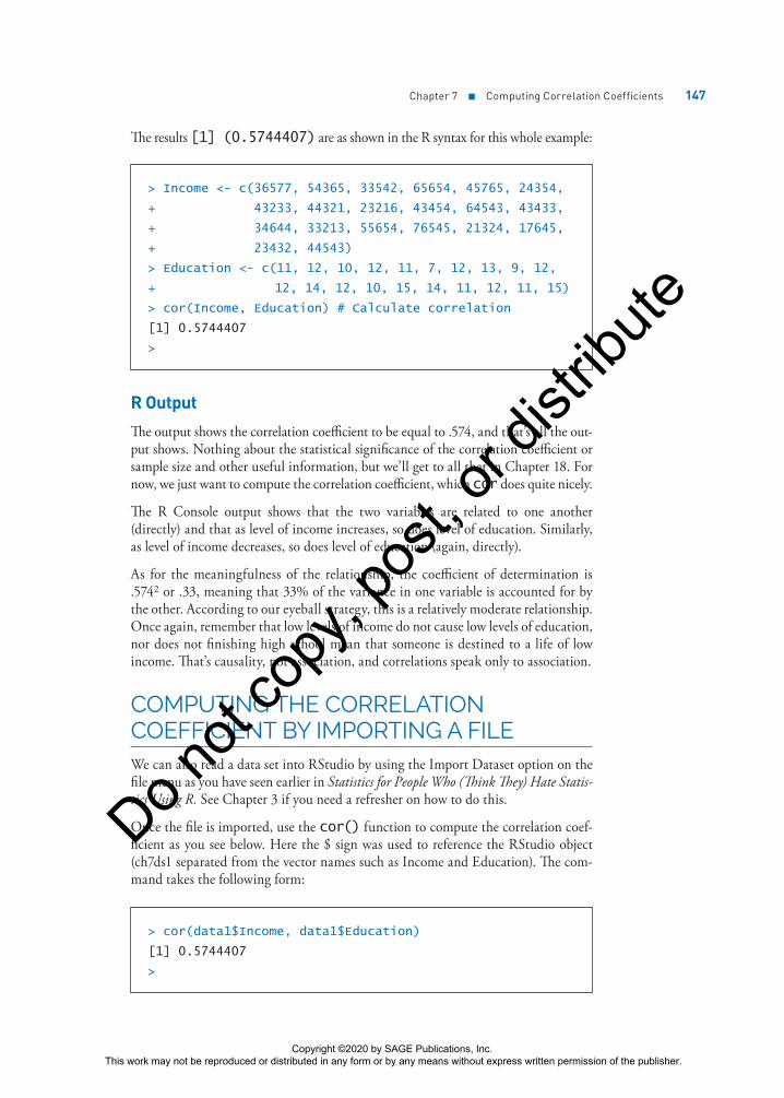
The results [1] (0.5744407) are as shown in the R syntax for this whole example:
> Income <- c(36577, 54365, 33542, 65654, 45765, 24354,
+ 43233, 44321, 23216, 43454, 64543, 43433,
+ 34644, 33213, 55654, 76545, 21324, 17645,
+ 23432, 44543)
> Education <- c(11, 12, 10, 12, 11, 7, 12, 13, 9, 12,
+ 12, 14, 12, 10, 15, 14, 11, 12, 11, 15)
> cor(Income, Education) # Calculate correlation
[1] 0.5744407
>
R Output
The output shows the correlation coefficient to be equal to .574, and that’s all the out-put shows. Nothing about the statistical significance of the correlation coefficient or sample size and other useful information, but we’ll get to all that in Chapter 18. For now, we just want to compute the correlation coefficient, which cor does quite nicely.
The R Console output shows that the two variables are related to one another (directly) and that as level of income increases, so does level of education. Similarly, as level of income decreases, so does level of education (again, directly).
As for the meaningfulness of the relationship, the coefficient of determination is .5742 or .33, meaning that 33% of the variance in one variable is accounted for by the other. According to our eyeball strategy, this is a relatively moderate relationship. Once again, remember that low levels of income do not cause low levels of education, nor does not finishing high school mean that someone is destined to a life of low income. That’s causality, not association, and correlations speak only to association.
COMPUTING THE CORRELATION COEFFICIENT BY IMPORTING A FILEWe can also read a data set into RStudio by using the Import Dataset option on the file menu as you have seen earlier in Statistics for People Who (Think They) Hate Statis-tics Using R. See Chapter 3 if you need a refresher on how to do this.
Once the file is imported, use the cor() function to compute the correlation coef-ficient as you see below. Here the $ sign was used to reference the RStudio object (ch7ds1 separated from the vector names such as Income and Education). The com-mand takes the following form:
> cor(data1$Income, data1$Education)
[1] 0.5744407
>
Copyright ©2020 by SAGE Publications, Inc. This work may not be reproduced or distributed in any form or by any means without express written permission of the publisher.
Do n
ot co
py, p
ost, o
r dist
ribute
148 Part III ■ Σigma Freud and Descriptive Statistics
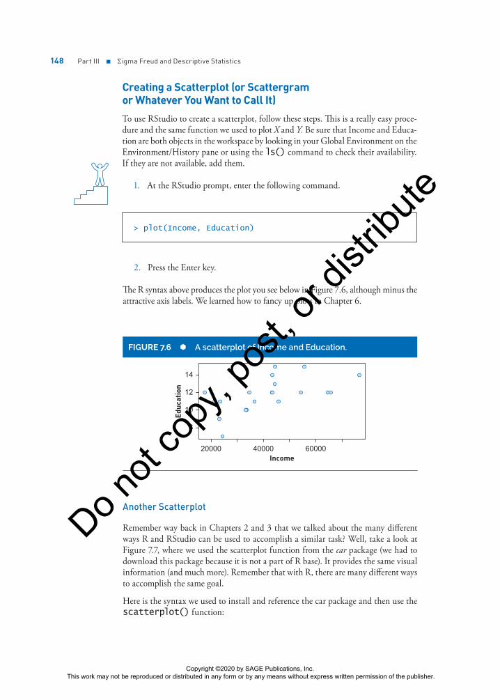
Creating a Scatterplot (or Scattergram or Whatever You Want to Call It)
To use RStudio to create a scatterplot, follow these steps. This is a really easy proce-dure and the same function we used to plot X and Y. Be sure that Income and Educa-tion are both objects in the workspace by looking in your Global Environment on the Environment/History pane or using the ls() command to check their availability. If they are not available, add them.
1. At the RStudio prompt, enter the following command.
> plot(Income, Education)
2. Press the Enter key.
The R syntax above produces the plot you see below in Figure 7.6, although minus the attractive axis labels. We learned how to fancy up plots in Chapter 6.
FIGURE 7.6 A scatterplot of Income and Education.
20000 40000 60000
8
14
12
10
Income
Educ
atio
n
Another Scatterplot
Remember way back in Chapters 2 and 3 that we talked about the many different ways R and RStudio can be used to accomplish a similar task? Well, take a look at Figure 7.7, where we used the scatterplot function from the car package (we had to download this package because it is not a part of R base). It provides the same visual information (and much more). Remember that with R, there are many different ways to accomplish the same goal.
Here is the syntax we used to install and reference the car package and then use the scatterplot() function:
Copyright ©2020 by SAGE Publications, Inc. This work may not be reproduced or distributed in any form or by any means without express written permission of the publisher.
Do n
ot co
py, p
ost, o
r dist
ribute

Chapter 7 ■ Computing Correlation Coefficients 149
> install.packages(“car”)
> library(car)
> scatterplot(Income, Education)
>
20000 30000 40000 50000 60000 70000
8
14
12
10
Income
Educ
atio
n
FIGURE 7.7 A scatterplot using the scatterplot function from the car package.
In addition to the data points, the line representing the correlation is the solid line running from the bottom left to the top right. We will talk about the dotted and dashed lines in the next paragraph. What is really different is the rectangular boxes on the x-axis and y-axis. They are boxplots with the middle line at the median.
Things Don’t Have to Be Linear Part 2
Above, we mentioned that the relationship between two variables is not always linear. One way to investigate how linear the relationship is? Use the scatterplot function to get a line that follows the data, called a lowess line. Lowess stands for Locally Weighted Scatterplot Smoothing. In this case, for income below 30,000, the relationship appears negative and weak. For income from 30,000 to 50,000, the relationship appears positive and strong. For income above 50,000, the relationship appears positive and weak. The dashed lines above and below represent a confidence interval allowing us to show how uncertain we are about the lowess line. Meaning, if we collected another sample of 20 observations and created a scatterplot, its lowess line is probably (95% of the time) somewhere between the two dashed lines.
OTHER COOL CORRELATIONSThere are different ways in which variables can be assessed. For example, nominal-level variables are categorical in nature; examples are race (Black or White) and political
Copyright ©2020 by SAGE Publications, Inc. This work may not be reproduced or distributed in any form or by any means without express written permission of the publisher.
Do n
ot co
py, p
ost, o
r dist
ribute
150 Part III ■ Σigma Freud and Descriptive Statistics
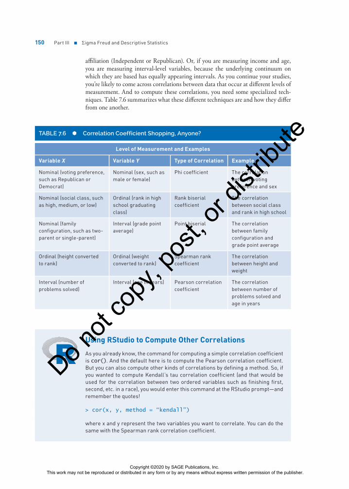
affiliation (Independent or Republican). Or, if you are measuring income and age, you are measuring interval-level variables, because the underlying continuum on which they are based has equally appearing intervals. As you continue your studies, you’re likely to come across correlations between data that occur at different levels of measurement. And to compute these correlations, you need some specialized tech-niques. Table 7.6 summarizes what these different techniques are and how they differ from one another.
TABLE 7.6 Correlation Coefficient Shopping, Anyone?
Level of Measurement and Examples
Variable X Variable Y Type of Correlation Example
Nominal (voting preference, such as Republican or Democrat)
Nominal (sex, such as male or female)
Phi coefficient The correlation between voting preference and sex
Nominal (social class, such as high, medium, or low)
Ordinal (rank in high school graduating class)
Rank biserial coefficient
The correlation between social class and rank in high school
Nominal (family configuration, such as two-parent or single-parent)
Interval (grade point average)
Point biserial The correlation between family configuration and grade point average
Ordinal (height converted to rank)
Ordinal (weight converted to rank)
Spearman rank coefficient
The correlation between height and weight
Interval (number of problems solved)
Interval (age in years) Pearson correlation coefficient
The correlation between number of problems solved and age in years
Using RStudio to Compute Other Correlations
As you already know, the command for computing a simple correlation coefficient is cor(). And the default here is to compute the Pearson correlation coefficient. But you can also compute other kinds of correlations by defining a method. So, if you wanted to compute Kendall’s tau correlation coefficient (and that would be used for the correlation between two ordered variables such as finishing first, second, etc. in a race), you would enter this command at the RStudio prompt—and remember the quotes!
> cor(x, y, method = “kendall”)
where x and y represent the two variables you want to correlate. You can do the same with the Spearman rank correlation coefficient.
Copyright ©2020 by SAGE Publications, Inc. This work may not be reproduced or distributed in any form or by any means without express written permission of the publisher.
Do n
ot co
py, p
ost, o
r dist
ribute

Chapter 7 ■ Computing Correlation Coefficients 151
PARTING WAYS: A BIT ABOUT PARTIAL CORRELATIONOkay, now you have the basics about simple correlation, but there are many other correlational techniques that are specialized tools to use when exploring relationships between variables.
A common “extra” tool is called partial correlation, where the relationship between two variables is explored, but the impact of a third variable is removed from the relation-ship between the two. Sometimes that third variable is called a confounding variable.
For example, let’s say that we are exploring the relationship between level of depres-sion and incidence of chronic disease and we find that, on the whole, the relationship is positive. In other words, the more chronic disease is evident, the higher the likeli-hood that depression is present as well (and of course vice versa).
Now remember, one variable does not “cause” the other, and the presence of one vari-able does not mean that the other will be present as well. The positive correlation is just an assessment of the relationship between these two variables, the key idea being that they share some variance in common.
And that’s exactly the point—it’s what they share in common that we want to control and, in some cases, remove from the relationship.
For example, how about level of family support? Nutritional habits? Severity or length of illness? These and many more variables can all be responsible for the relationship between these two variables, or they may at least account for some of the variance.
And think back a bit. That’s exactly the same argument we made when focusing on the relationship between consumption of ice cream and level of crime. Once outside temperature (the mediating or confounding variable) is removed from the equation . . . boom! The relationship between consumption of ice cream and crime level plum-mets. Let’s take a look.
USING R TO COMPUTE PARTIAL CORRELATIONSLet’s use some data and R to illustrate the computation of a partial correlation. Here are the raw data we mentioned earlier about ice cream and crime.
CityIce Cream
Consumption Crime RateAverage Outside
Temperature
1 3.4 62 88
2 5.4 98 89
3 6.7 76 65
4 2.3 45 44
(Continued)
Copyright ©2020 by SAGE Publications, Inc. This work may not be reproduced or distributed in any form or by any means without express written permission of the publisher.
Do n
ot co
py, p
ost, o
r dist
ribute

152 Part III ■ Σigma Freud and Descriptive Statistics
CityIce Cream
Consumption Crime RateAverage Outside
Temperature
5 5.3 94 89
6 4.4 88 62
7 5.1 90 91
8 2.1 68 33
9 3.2 76 46
10 2.2 35 41
Here are the steps in computing a partial correlation coefficient using R.
1. Create three vectors using the data in the above table as shown here.
> IceCreamConsumption <- c(3.4, 5.4, 6.7, 2.3, 5.3, 4.4,
5.1, 2.1, 3.2, 2.2)
> CrimeRate <- c(62, 98, 76, 45, 94, 88, 90, 68, 76, 35)
> AverageTemperature <- c(88, 89, 65, 44, 89, 62, 91,
33, 46, 41)
One was named IceCreamConsumption, the second was named CrimeRate, and the third was named AverageTemperature. You can, of course, name them what you want, and these are a bit long, but we wanted to use highly descriptive names to make this exercise easy to follow.
2. Create a data frame (named IceCream) that combines these three vectors or variables into a data frame.
> IceCream <- data.frame(IceCreamConsumption, CrimeRate,
AverageTemperature)
>
3. Using the cor() function, enter the following command to compute the simple correlation on the whole data frame to get a correlation matrix on the three variables.
> cor(IceCream)
IceCreamConsumption CrimeRate AverageTemperature
IceCreamConsumption 1.0000000 0.7429317 0.7038434
CrimeRate 0.7429317 1.0000000 0.6552779
AverageTemperature 0.7038434 0.6552779 1.0000000
>
(Continued)
Copyright ©2020 by SAGE Publications, Inc. This work may not be reproduced or distributed in any form or by any means without express written permission of the publisher.
Do n
ot co
py, p
ost, o
r dist
ribute

Chapter 7 ■ Computing Correlation Coefficients 153
Computing the Correlation Between Three Variables
As you can see by these values, there’s a pretty healthy relationship between ice cream consumption and outside temperature (.703) and between crime rate and out-side temperature (.655). We’re interested in the question, “What’s the correlation between ice cream consumption and crime rate with the effects of outside tempera-ture removed or partialed out?”
That’s what partial correlation does. It looks at the relationship between two variables (in this case, consumption of ice cream and crime rate) as it removes the influence of a third (in this case, outside temperature). And, the all-important relationship between consumption of ice cream and crime rate is .7429. This too (remember, at this point, it is a simple correlation coefficient) is a pretty healthy relationship, accounting for more than 50% of the variance between the two variables (.74292 = .5519 or 55%). Pretty respectable (but not to be trusted!—read on).
4. If you have not already, install the package named ppcor using the Install tab on the Files, Plots . . . pane in RStudio. If you have questions about how to install packages, see the section on Installing Packages in Chapter 2.
Making Packages Work
Remember that when you install a package, the functions in that package do not become active and available until you enter the following command library(package name), such as
> library(ppcor)
>
Otherwise, RStudio will not be able to find and execute any of the functions.
5. Enter the following command at the RStudio prompt to compute the partial correlations for all three variables.
> pcor(IceCream)
You will see the results of the partial correlation analysis as shown below. The vari-able that is partialed out is AverageTemperature (the farthest column to the right), so the first two columns and rows represent the correlation without the influence of AverageTemperature.
> pcor(IceCream)
$estimate
IceCreamConsumption CrimeRate AverageTemperature
IceCreamConsumption 1.0000000 0.5250130 0.4291989
CrimeRate 0.5250130 1.0000000 0.2783881
AverageTemperature 0.4291989 0.2783881 1.0000000
Copyright ©2020 by SAGE Publications, Inc. This work may not be reproduced or distributed in any form or by any means without express written permission of the publisher.
Do n
ot co
py, p
ost, o
r dist
ribute

154 Part III ■ Σigma Freud and Descriptive Statistics
Understanding the R Output for Partial Correlation
As you can see in the R output, the correlation of IceCreamConsumption and CrimeRate with AverageTemperature removed or controlled is .5250. If you look back at the results of the simple correlation obtained from the cor() function, you can see that the removal of that one variable (AverageTemperature) reduced the cor-relation from .74 to .53. In terms of the way we interpret correlations (remember the coefficient of determination), the amount of variance accounted for goes from 54% (that’s .742) to 27% (that’s .522)—it’s quite a difference in explanatory power.
Our conclusion? With the removal of the confounding variable of outside tempera-ture, the relationship decreases and much less variance is accounted for. In fact, removing the variable of AverageTemperature decreases the amount of explained variance by 100% (it’s just about reduced by half). Yikes—that’s a big difference.
And, the most important implication of this analysis is that we don’t need to stop selling ice cream to try to reduce crime. Breathe easy.
Other Ways to Compute the Correlation Coefficient
Package Function What It Tells You
Hmisc rcorr The correlation between x and y, the number of pairs of data, and the statistical significance of r.
> rcorr(X, Y)
x y
x 1.00 0.69
y 0.69 1.00
n = 10
P
x y
x 0.0266
y 0.0266
REAL-WORLD STATSNicholas Derzis and his colleagues examined the relationship between career thoughts and career interests in a group of incarcerated males as part of a reentry program for prisoners in their last 90 days in a medium-security prison.
Negative career thoughts were assessed on three subscales, decision-making confu-sion, external conflict, and commitment anxiety, that make up the Career Thoughts Inventory. Career interests were assessed by the Self-Directed Search, which gauges likes and dislikes in six career domains: realistic, investigative, conventional, artistic, enterprising, and social.
Career Thoughts Inventory scores were converted to T scores (something you will learn about in Chapter 10), and means on the subscales and overall ranged from
Copyright ©2020 by SAGE Publications, Inc. This work may not be reproduced or distributed in any form or by any means without express written permission of the publisher.
Do n
ot co
py, p
ost, o
r dist
ribute
Chapter 7 ■ Computing Correlation Coefficients 155
54.20 to 57.19. Self-Directed Search results indicated that the most popular jobs were those in which people prefer to work with things rather than other people (realistic).
The researchers used Kendall’s tau to examine the relationship between normal scores on the Career Thoughts Inventory and categories on the Self-Directed Search. Looking at Table 7.5, all correlations would be rated as weak or no relationship with values that ranged from .08 to .18.
Want to know more? Go online or to the library and find . . .
Derzis, N. C., Meyer, J., Curtis, R. S., & Shippen, M. E. (2017). An analysis of career thinking and career interests of incarcerated males. Journal of Correctional Education, 68(1), 52–70.
Summary
The idea of showing how things are related to one another and what they have in common is a very powerful one, and the correlation coefficient is a very useful descriptive statistic (one used in inference as well, as we will show you later). Keep in mind that correlations express a relationship that is only associative and not causal, and you’ll be able to understand how this statistic gives us valuable information about relationships between variables and how variables change or remain the same in concert with others. Now it’s time to change speeds just a bit and wrap up Part III with a focus on reliability and validity. You need to know about these ideas because you’ll be learning about how to determine what differences in outcomes, such as scores and other variables, represent.
Time to Practice
1. Use these data to answer Questions 1a and 1b. These data are saved in Chapter 7 Data Set 2 (ch7ds2.csv).
a. Compute the Pearson product-moment correlation coefficient by hand and show all your work.
b. Construct a scatterplot for the following 10 pairs of values by hand. Based on the scatterplot, would you predict the correlation to be direct or indirect? Why?
Number Correct (out of a possible 20) Attitude (out of a possible 100)
17 94
13 73
12 59
(Continued)
Copyright ©2020 by SAGE Publications, Inc. This work may not be reproduced or distributed in any form or by any means without express written permission of the publisher.
Do n
ot co
py, p
ost, o
r dist
ribute

156 Part III ■ Σigma Freud and Descriptive Statistics
Number Correct (out of a possible 20) Attitude (out of a possible 100)
15 80
16 93
14 85
16 66
16 79
18 77
19 91
2. Use Chapter 7 Data Set 3 (ch7ds3.csv) to answer Questions 2a and 2b.
a. Using either a calculator or a computer, compute the Pearson correlation coefficient.
b. Interpret these data using the general range of very weak to very strong. Also compute the coefficient of determination. How does the subjective analysis compare with the value of r2?
Speed (to complete a 50-yard swim) Strength (number of pounds bench-pressed)
21.6 135
23.4 213
26.5 243
25.5 167
20.8 120
19.5 134
20.9 209
18.7 176
29.8 156
28.7 177
3. Rank the following correlation coefficients on strength of their relationship (list the weakest first).
.71
+.36
−.45
.47
−.62
(Continued)
Copyright ©2020 by SAGE Publications, Inc. This work may not be reproduced or distributed in any form or by any means without express written permission of the publisher.
Do n
ot co
py, p
ost, o
r dist
ribute
Chapter 7 ■ Computing Correlation Coefficients 157
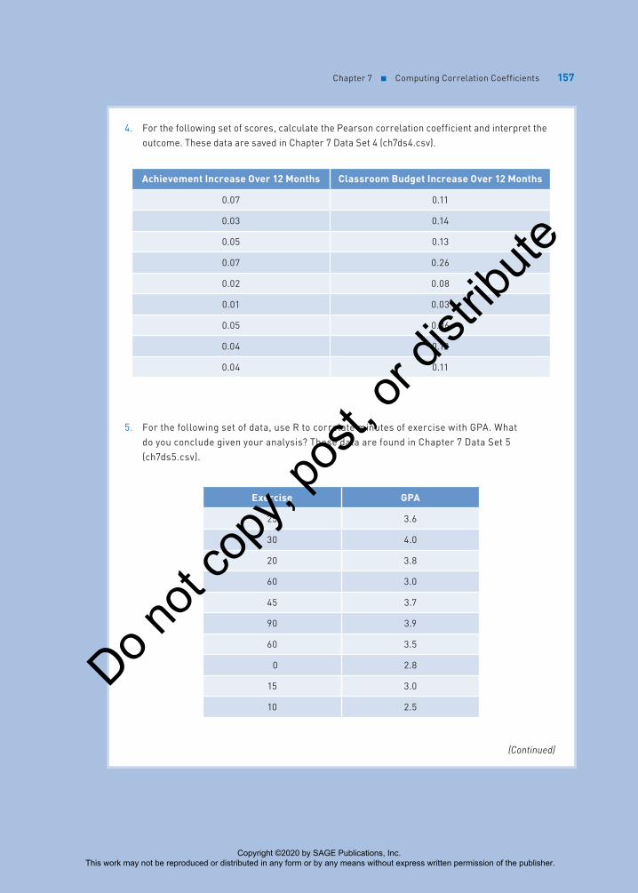
4. For the following set of scores, calculate the Pearson correlation coefficient and interpret the outcome. These data are saved in Chapter 7 Data Set 4 (ch7ds4.csv).
Achievement Increase Over 12 Months Classroom Budget Increase Over 12 Months
0.07 0.11
0.03 0.14
0.05 0.13
0.07 0.26
0.02 0.08
0.01 0.03
0.05 0.06
0.04 0.12
0.04 0.11
5. For the following set of data, use R to correlate minutes of exercise with GPA. What do you conclude given your analysis? These data are found in Chapter 7 Data Set 5 (ch7ds5.csv).
Exercise GPA
25 3.6
30 4.0
20 3.8
60 3.0
45 3.7
90 3.9
60 3.5
0 2.8
15 3.0
10 2.5
(Continued)
Copyright ©2020 by SAGE Publications, Inc. This work may not be reproduced or distributed in any form or by any means without express written permission of the publisher.
Do n
ot co
py, p
ost, o
r dist
ribute

158 Part III ■ Σigma Freud and Descriptive Statistics
6. Calculate the correlation between hours of studying and grade point average for these honor students. Why is the correlation so low?
Hours of Studying GPA
23 3.95
12 3.90
15 4.00
14 3.76
16 3.97
21 3.89
14 3.66
11 3.91
18 3.80
9 3.89
7. The coefficient of determination between two variables is .64. Answer the following questions:
a. What is the Pearson correlation coefficient?
b. How strong is the relationship?
c. How much of the variance in the relationship between these two variables is unaccounted for?
8. Here is a set of three variables for each of 20 participants in a study on recovery from a head injury. Create a data frame (and name it what you want) and create the correlation matrix for each pair of variables. These data are found in Chapter 7 Data Set 6 (ch7ds6.csv).
Age at Injury Level of Treatment 12-Month Treatment Score
25 1 78
16 2 66
8 2 78
23 3 89
31 4 87
19 4 90
15 4 98
31 5 76
21 1 56
(Continued)
Copyright ©2020 by SAGE Publications, Inc. This work may not be reproduced or distributed in any form or by any means without express written permission of the publisher.
Do n
ot co
py, p
ost, o
r dist
ribute

Chapter 7 ■ Computing Correlation Coefficients 159
Age at Injury Level of Treatment 12-Month Treatment Score
26 1 72
24 5 84
25 5 87
36 4 69
45 4 87
16 4 88
23 1 92
31 2 97
53 2 69
11 3 79
33 2 69
9. Look at Table 7.4. What type of correlation coefficient would you use to examine the relationship between sex (defined as male or female) and political affiliation? How about family configuration (two-parent or single-parent) and high school GPA? Explain why you selected the answers you did.
10. When two variables are correlated (such as strength and running speed), they are associated with one another. But if they are associated with one another, then why doesn’t one cause the other?
11. Provide three examples of an association between two variables where a causal relationship makes perfect sense conceptually but, since correlations do not imply causality, makes little sense statistically until further examination.
12. Why can’t correlations be used as a tool to prove a causal relationship between variables, rather than just an association?
13. When would you use partial correlation?
Student Study Site
Get the tools you need to sharpen your study skills! Visit edge.sagepub.com/salkindshaw to access practice quizzes and eFlashcards, watch R tutorial videos, and download data sets!
Copyright ©2020 by SAGE Publications, Inc. This work may not be reproduced or distributed in any form or by any means without express written permission of the publisher.
Do n
ot co
py, p
ost, o
r dist
ribute