Embed Size (px)
Citation preview

1
DIMENSION REDUCTION AND
CLUSTER ANALYSIS
EECS 833, 6 March 2006
Geoff Bohling Assistant Scientist
Kansas Geological Survey [email protected]
864-2093
Overheads and resources available at
http://people.ku.edu/~gbohling/EECS833

2
Finding (or Assessing) Groups in Data Last week we talked about supervised classification problems, where we have a training dataset with known class membership from which to develop a model for predicting class membership for other data points. Today we will talk about techniques for finding groups in data based on their attributes, rather than pre-existing class assignments, or for assessing whether different classes are actually reasonably well separated in the attribute space. First I will present two dimension-reduction techniques, which help us visualize the variability in a multidimensional dataset, and then I will talk about two clustering methods, which try to find natural groupings of the data. I will continue using the Jones well data for examples. Principal Component Analysis Multivariate datasets generally do not fill all of the variable space uniformly, but are instead stretched out along certain directions in that variable space due to correlations among the variables. These correlations might arise, for example, because several different measured attributes respond in similar ways to some common underlying factor, so that there is some degree of redundancy among the variables. The covariance (or correlation) matrix of the data gives a rough estimate of the overall orientation of the data cloud in multivariate space. Principal component analysis uses an eigen decomposition of the covariance matrix to construct a rotated set of orthogonal axes in the variable space such that the first axis – or principal component – is oriented in the direction of greatest variability in the data, the second principal component (P.C.) shows the highest variability for all directions orthogonal to the first P.C., and so forth. Cross-plotting the data along the P.C. axes tends to reveal more about the variability of the data than plots in the original variable space.

3
Principal component analysis is implemented by the Matlab function princomp, in the Statistics toolbox. The documentation for that function is recommended reading. It is typical to standardize all the variables to zero mean and unit standard deviation prior to performing PCA, to eliminate the influence of different measurement scales and give the variables roughly equal weighting. This is equivalent to performing a PCA on the basis of the correlation matrix of the original data, rather than the covariance matrix. We can standardize the Umaa-Rhomaa data using Matlab’s zscore function: >> URStd = zscore(URData); % scale cols to mean=0, s.d.=1 and then compute the global covariance matrix of the standardized data, which is also the correlation matrix: >> sigma = cov(URStd) sigma = 1.0000 0.7579 0.7579 1.0000 This correlation matrix describes the overall orientation of the data cloud (both groups taken together). Specifically, it describes the orientation of the multivariate normal density function that would be fit to the data, as illustrated in the following plot.

4
% plot m.v.n. density with mu=[0 0], cov=sigma ezcontour(@(x1,x2)mvnpdf([x1 x2],[0 0],sigma)) hold on % add marine data points plot(URStd(URFacies==1,1),URStd(URFacies==1,2),'r+') % add paralic data points plot(URStd(URFacies==2,1),URStd(URFacies==2,2),'bo')
PCA will end up finding the two principal component axes (PC1 and PC2) shown in the figure – the directions of maximum and minimum variation for 2D data.

5
An eigenanalysis of the correlation matrix gives >> [U,V] = eig(sigma) U = -0.7071 0.7071 0.7071 0.7071 V = 0.2421 0 0 1.7579 The larger eigenvalue, 1.76, is associated with the first principal component axis, v = (0.71,0.71) -- the 45° line. The smaller eigenvalue, 0.24, is associated with the second PC axis, v = (-0.71,0.71) – the 135° line. For 2D standardized data like this, these will always be the PC directions. If the two variables are positively correlated, the first PC will be along the 45° line, if they are negatively correlated it will be along the 135° line. As the magnitude of the correlation increases, the data will be spread out more and more along the first PC and the contrast between the eigenvalues of the correlation matrix will increase.

6
The eigenvalue decomposition breaks down the variance of the data into orthogonal components. The total variance of the data is given by the sum of the eigenvalues of the covariance matrix and the proportion of variance explained by each principal component is given by the corresponding eigenvalue divided by the sum of eigenvalues. In this case, the sum of the eigenvalues is 2 (for standardized data, the total variance is the number of variables), so that the first principal component explains 1.76/2.00 = 88% of the variation and the second explains the remaining 12% of the variation. The total variation explained by the first n components is simply given by the sum of the first n eigenvalues over the total. In higher-dimensional problems, the first few components will generally capture a substantial proportion of the variation, so that examination of crossplots on the first few PC axes will tell you most of what is going on in the data – the basic idea of dimension reduction. To generate these crossplots, we need to project the data points to the PC axes. The components of each eigenvector are the coefficients we need to project a data vector onto the corresponding PC axis – these components are called the “loadings” on the variables and the projected coordinates for each data point are called the “scores”. So, to get the score of a data vector, x, on the first eigenvector, u1, we take the inner product to get the score 11 ux′=s and so forth for the other scores.

7
The first Umaa-Rhomaa data point has coordinates (Umaa,Rhomaa) = (1.1231, 0.0956) in the standardized data space, so its score on the first principal component is
[ ] 8618.07071.07071.0
0956.01231.111 =
=′= uxs
and its score on the second principal component is
[ ] -0.72667071.07071.0
0956.01231.122 =
−=′= uxs
So, the first data point maps to (s1, s2) = (0.86,-0.73) in the principal component space Note that the columns of the eigenvector matrix, U, that we computed above are actually in the wrong order, since Matlab returned the eigenvalues in increasing order rather than decreasing order. After putting the columns in the “right” order, we could compute the scores for all the data points using: >> score = URStd*U; >> score(1:5,:) % scores for first 5 data points 0.8618 -0.7266 0.6936 -1.0072 0.4150 -1.2842 1.1429 -2.0110 1.1039 -1.8285

8
But the princomp function does all this work for us: >> [coef,score,ev] = princomp(URStd); >> >> coef % eigenvectors (in the right order) -0.7071 -0.7071 -0.7071 0.7071 >> ev % eigenvalues 1.7579 0.2421 >> score(1:5,:) % scores for first 5 data points -0.8618 -0.7266 -0.6936 -1.0072 -0.4150 -1.2842 -1.1429 -2.0110 -1.1039 -1.8285 Note that signs on the eigenvector and resulting scores are a little arbitrary; they can be swapped without changing the basic results. Plotting the data in PC space >> % marine data on PC's >> plot(score(URFacies==1,1),score(URFacies==1,2),'r+') >> hold on >> % paralic data on PC's >> plot(score(URFacies==2,1),score(URFacies==2,2),'bo') We get . . .

9
So, now the data are nicely lined up along the direction of primary variation. The two groups happen to separate nicely along this line because the most fundamental source of variation here is in fact that between the two groups. This is what you want to see if your goal is to separate the groups based on the variables. However, we don’t need PCA to show us the separation between groups in this 2D example. Things get more interesting in the six-dimensional space of the full dataset.

10
>> % standardize the data >> JonesStd = zscore(JonesVar); >> % do the PCA >> [coef,score,ev] = princomp(JonesStd); >> >> % coeffiecients/eigenvectors >> coef 0.4035 -0.3483 0.5058 -0.4958 -0.3582 0.2931 0.3919 0.4397 0.6285 0.2434 0.2817 -0.3456 0.4168 -0.3246 -0.2772 -0.2737 0.7541 -0.0224 0.4393 -0.3154 -0.2919 0.2177 -0.4255 -0.6276 0.4473 0.0115 -0.1527 0.6136 -0.0570 0.6298 0.3418 0.6931 -0.4047 -0.4428 -0.1983 0.0600 >> ev' % eigenvalues 3.9260 0.7809 0.4626 0.3985 0.2993 0.1328 >> % percent variation explained by each component >> 100*ev'/sum(ev) 65.4331 13.0155 7.7092 6.6413 4.9880 2.2129 >> % cumulative percent explained >> 100*cumsum(ev')/sum(ev) 65.4331 78.4486 86.1578 92.7991 97.7871 100.0000 So, the first two principal components together account for 78% of the total variation and the first three account for 86% of the variation. Plotting the data on the first two PC’s, identified by facies, we get . . .
11
In general, an investigator would be interested in examining several of these crossplots and also plots of the coefficients of the first few eigenvectors – the loadings – to see what linear combination of variables is contributing to each component. A biplot shows both the data scatter and the loadings of the variablies on the principal components simultaneously. We can use the biplot function in Matlab to produce a biplot of the first two PCs . . . biplot(coef(:,1:2),'scores',score(:,1:2),'varlabels',Logs)

12

13
Canonical Variate Analysis Canonical variate analysis is the dimension reduction technique that goes naturally with linear discriminant analysis. Whereas principal component analysis finds linear combinations of variables that show maximum overall variation, canonical variate analysis finds linear combinations that show the maximum ratio of between-group to within-group variation. PCA uses an eigen decomposition of the global covariance matrix, treating all the data as one group. PCA may help to reveal clusters in the data, but does so by happenstance – if the groups are reasonably well separated, then the differences between them will be a significant component of the overall variation and PCA will pick up on this. CVA explicitly looks for linear combinations that reveal differences among groups. It does so by solving a generalized eigen decomposition, looking for the eigenvalues and vectors of the between-groups covariance matrix “in the metric of” the within-groups covariance matrix.
14
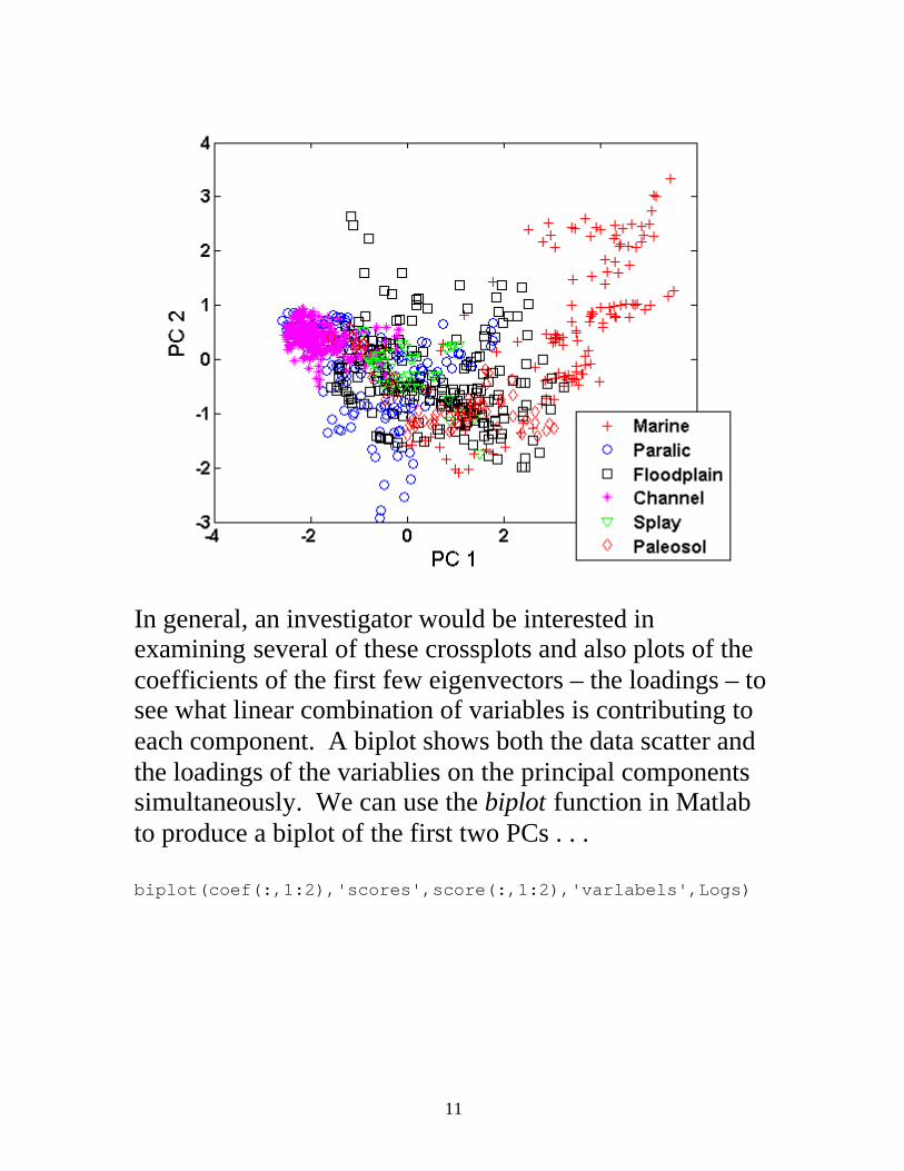
The within-groups covariance matrix is just the pooled covariance matrix, S, that we discussed in the context of linear discriminant analysis, describing the average variation of each group about its respective group mean. The between-groups covariance matrix describes the variation of the group means about the global mean. The sample version of it is given by
( ) ( )( )∑′−−
−=
=
K
kkkkn
KnK
11xxxxB
where K is the number of groups, nk is the number of data in group k, n is the total number of data, kx is the mean vector for group k, and x is the global mean vector. If 1u is the first eigenvector (associated with the largest eigenvalue) of BS 1− , then the first canonical variate,
xuv ′= 11 , is the linear combination of variables that shows the maximum ratio of between-groups to within-groups variation. From there, results can be interpreted pretty much the same way as PCA, with “ratio of between- to within-groups” variation substituted for “total variation”.

15
I have written a function to perform CVA in Matlab (http://people.ku.edu/~gbohling/EECS833/canonize.m). We can apply it to the standardized Jones data using the grouping (facies) vector JonesFac: >> [coef,score,ev] = canonize(JonesStd,JonesFac); >> 100*cumsum(ev')/sum(ev) 71.2403 92.3269 96.7598 99.9331 100.0000 100.0000 The first three canonical variates explain 97% of the variation, so the following plot shows about all the separation among groups that any linear method could find:
The CV1-CV2 crossplot is not vastly different from the PC1-PC2 crossplot in this case, since the variation between groups is in fact a large part of the global variation the PCA identifies. However, the CV2-CV3 crossplot does a better job separating groups than does the PC1-PC2 crossplot.
16
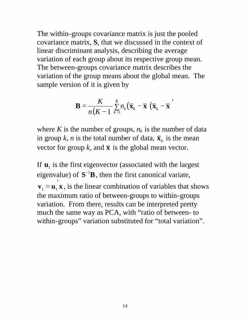
Two Other Dimension-Reduction Techniques Multidimensional scaling: A dimension-reduction technique that aims at projecting the data into a lower dimensional space in a way that preserves the neighborhood or adjacency structure of the original data. Produces results much like PCA if a Euclidean distance metric is used, but allows other distance metrics to be employed. Implemented in the functions cmdscale and mdscale in Matlab’s Statistics toolbox. Locally Linear Embedding: Like multidimensional scaling, but uses a more localized (rather than global) representation of neighborhood structure, allowing for more flexible representation of high-dimensional data. LLE is especially well suited for very high dimensional data sets such as images, spectra, and signals. A paper on LLE is available at http://jmlr.csail.mit.edu/papers/volume4/saul03a/saul03a.pdf with Matlab code at http://www.cis.upenn.edu/~lsaul/matlab/manifolds.tar.gz (There may be updated code somewhere.)

17
Hierarchical Cluster Analysis Cluster analysis tries to find natural groupings in data by grouping together objects with similar attribute data. Hierarchical cluster analysis works by successively joining similar data points or objects, starting with each data point as a separate “group”, until all the data points are joined in a single group. Each merger creates a new group, which is added to the list of candidate objects (data points or groups) to be joined. A bewildering array of possible clustering methods can be devised based on how similarity or dissimilarity between objects is measured, how the rules for linking objects are formulated, and how the resulting clustering tree (dendrogram) is cut to reveal groupings of interest. One of the many possible approaches is Ward’s algorithm, which attempts to produce the smallest possible increase in within-groups variance at each step of the process – keeping the groups as homogeneous as possible in the least-squares sense. You can consult the Matlab Statistics Toolbox documentation on cluster analysis (under multivariate statistics) for more details.

18
We can compute the Euclidean distances between all possible pairs of the 882 Jones well data points (with variables scaled to zero mean, unit s.d.) using: >> JonesDist = pdist(JonesStd,'euclidean'); >> size(JonesDist) 1 388521 There are 388,521 pairwise distances between the 882 data points. (Note that I am only using the data points with core facies assigned, just to simplify comparison. I could just as easily cluster all 924 of the logged depth points.) The linkage function successively joins the data points/groups based on the distance data, returning the information in a data structure representing the clustering tree. We’ll group the data using Ward’s method and display a dendrogram for the top 30 cluster divisions (the default number in the dendrogram function): >> JonesTree = linkage(JonesDist,'ward'); >> dendrogram(JonesTree);
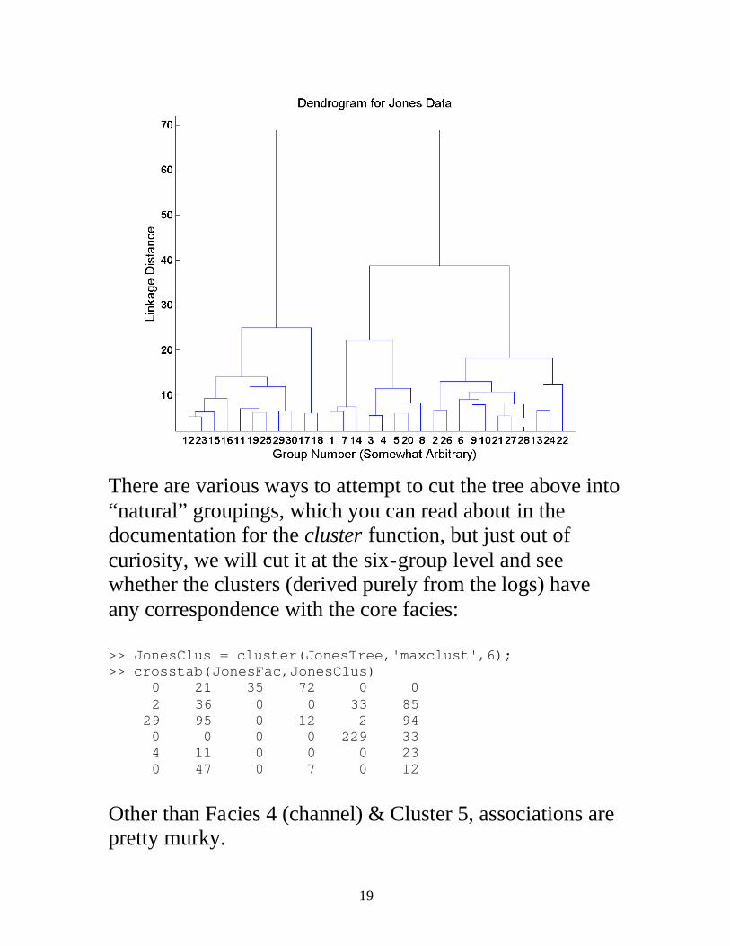
19
There are various ways to attempt to cut the tree above into “natural” groupings, which you can read about in the documentation for the cluster function, but just out of curiosity, we will cut it at the six-group level and see whether the clusters (derived purely from the logs) have any correspondence with the core facies: >> JonesClus = cluster(JonesTree,'maxclust',6); >> crosstab(JonesFac,JonesClus) 0 21 35 72 0 0 2 36 0 0 33 85 29 95 0 12 2 94 0 0 0 0 229 33 4 11 0 0 0 23 0 47 0 7 0 12 Other than Facies 4 (channel) & Cluster 5, associations are pretty murky.

20
Showing the clusters on the crossplot of the first two principal components shows much cleaner divisions than for the core facies. This is not surprising, since we have defined the clusters based on the log values themselves.

21
Non-hierarchical (k-means) cluster analysis In non-hierarchical cluster analysis, you decide the number of clusters in advance and make some initial guess regarding the group memberships of the data or the properties of each group and then let the algorithm iteratively reallocate data points to groups, based on some distance or similarity metric, until the group definitions stabilize. The most commonly used method is k-means cluster analysis, which is implemented in the Matlab function kmeans. This function can use various distance metrics; not surprisingly, the default is squared Euclidean distances, meaning the allocation tries to produce groups with minimum variance in the least-squares sense. Here, we will use k-means cluster analysis to partition the standardize Jones data into 6 groups starting with a set of groups defined by the variable means for each core facies, in the matrix FaciesMeans: >> kmClust = kmeans(JonesStd,6,'start',FaciesMeans); >> crosstab(JonesFac,kmClust) 99 6 3 0 0 20 0 68 6 50 25 7 1 45 76 3 76 31 0 0 0 244 18 0 0 10 11 0 17 0 0 11 3 0 12 40 This shows that facies 1 (marine) and 4 (channel) retain their identities pretty well after reallocation based on a least-squares measure. Other facies don’t fare as well.
22
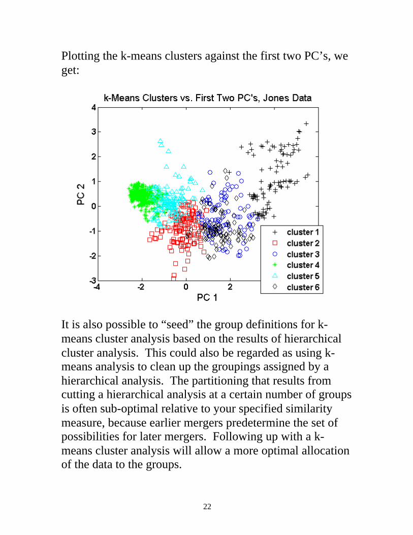
Plotting the k-means clusters against the first two PC’s, we get:
It is also possible to “seed” the group definitions for k-means cluster analysis based on the results of hierarchical cluster analysis. This could also be regarded as using k-means analysis to clean up the groupings assigned by a hierarchical analysis. The partitioning that results from cutting a hierarchical analysis at a certain number of groups is often sub-optimal relative to your specified similarity measure, because earlier mergers predetermine the set of possibilities for later mergers. Following up with a k-means cluster analysis will allow a more optimal allocation of the data to the groups.


![· to begin a new course of study […] and resume working overseas. ... • Mr Brad Pearce, Victorian Alcohol and Drug Association (VAADA) • Mr Robert Stirling, Network of](https://img.pdfslide.us/doc/110x75/5f14e2f8a0e6787ca11a35a7/-to-begin-a-new-course-of-study-and-resume-working-overseas-a-mr-brad.jpg)