Embed Size (px)
Citation preview
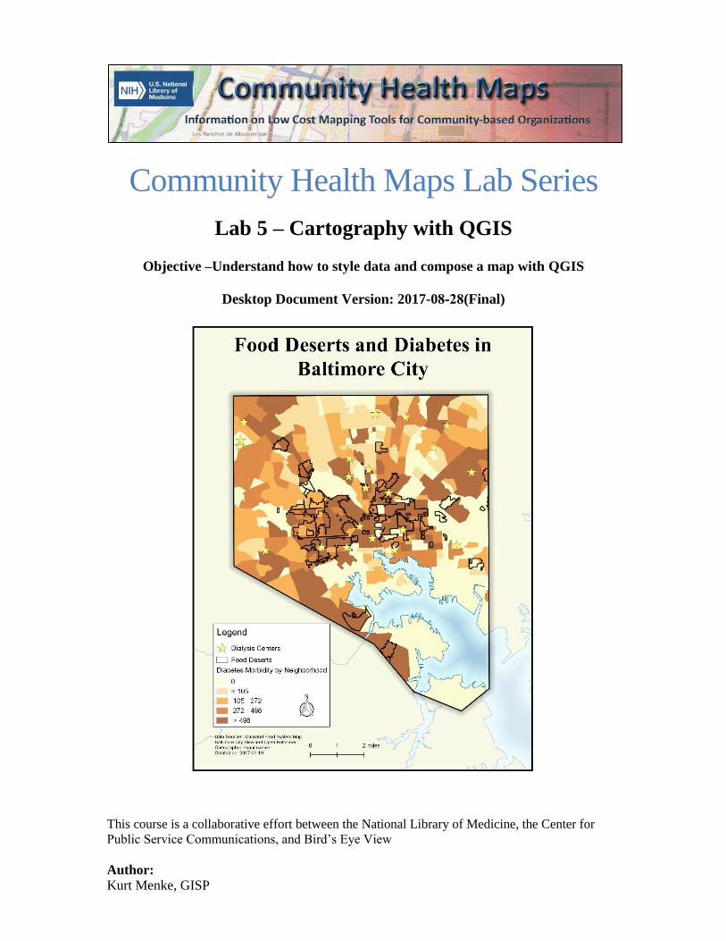
Community Health Maps Lab Series
Lab 5 – Cartography with QGIS
Objective –Understand how to style data and compose a map with QGIS
Desktop Document Version: 2017-08-28(Final)
This course is a collaborative effort between the National Library of Medicine, the Center for
Public Service Communications, and Bird’s Eye View
Author: Kurt Menke, GISP
Community Health Mapping Lab Series - Lab 5 – Cartography with QGIS
3/31/2017 Page 1 of 25
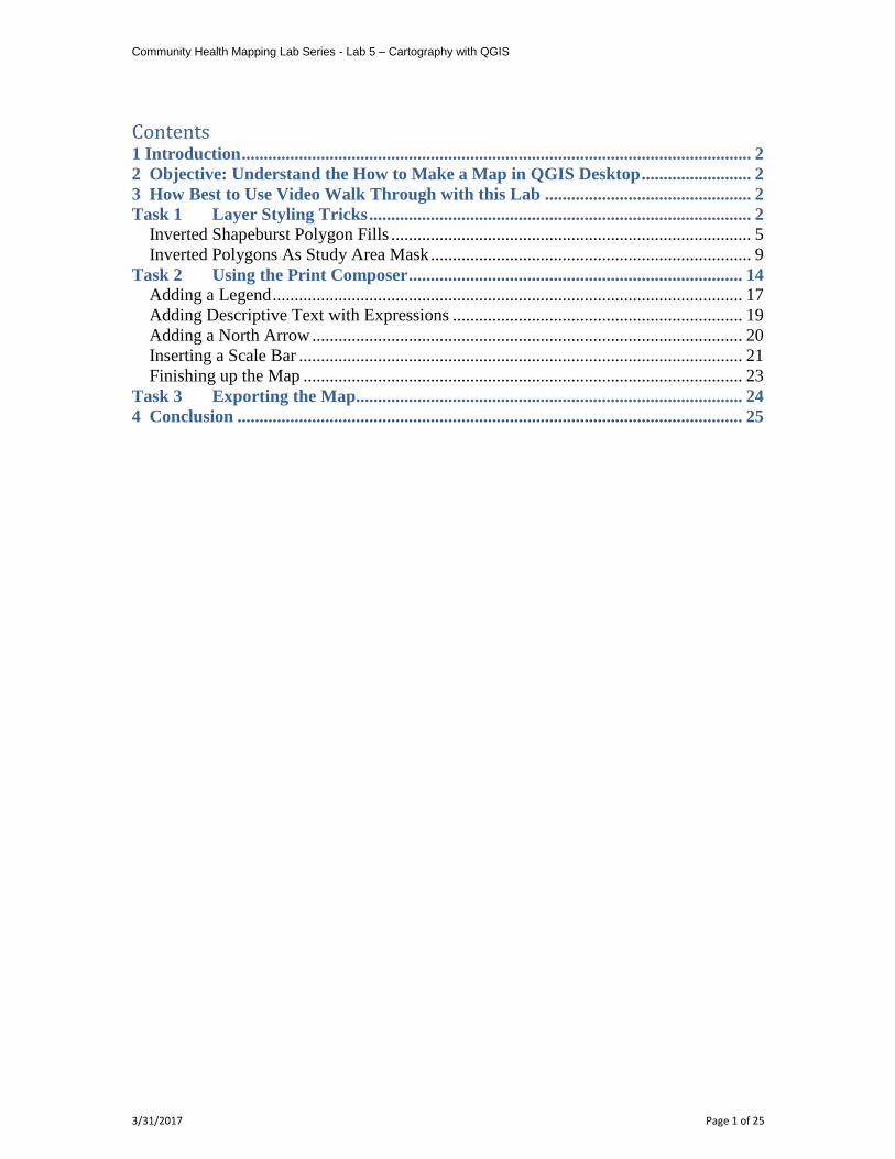
Contents 1 Introduction .................................................................................................................... 2
2 Objective: Understand the How to Make a Map in QGIS Desktop ......................... 2 3 How Best to Use Video Walk Through with this Lab ............................................... 2 Task 1 Layer Styling Tricks ....................................................................................... 2
Inverted Shapeburst Polygon Fills .................................................................................. 5 Inverted Polygons As Study Area Mask ......................................................................... 9
Task 2 Using the Print Composer ............................................................................ 14 Adding a Legend ........................................................................................................... 17
Adding Descriptive Text with Expressions .................................................................. 19
Adding a North Arrow .................................................................................................. 20 Inserting a Scale Bar ..................................................................................................... 21 Finishing up the Map .................................................................................................... 23
Task 3 Exporting the Map........................................................................................ 24
4 Conclusion ................................................................................................................... 25
Community Health Mapping Lab Series - Lab 5 – Cartography with QGIS
3/31/2017 Page 2 of 25
1 Introduction You have now learned the basics of how to style data layers in QGIS Desktop. You have
also learned several techniques for conducting spatial analyses and generating
information. In this lab, you will learn how to produce a publication quality map. When
producing a map it is important to think about both the intended map reading audience
and the message you would like to convey. You will be using some of the data you have
produced, to create a map that tells part of the story of diabetes in Baltimore City.
2 Objective: Understand the How to Make a Map in QGIS Desktop
In this lab exercise, you will explore the QGIS Print Composer. This opens as a separate
window and allows you to create a publication quality map of any size. You can export
the completed map into several formats including an image file, a graphics file or a PDF.
You can then disseminate the exported map or include it in a report or presentation. The
data for this lab covers Baltimore City. You will create a map highlighting the diabetes
by neighborhood totals and food deserts.
Task 1 – Layer Styling Tricks
Task 2 – Using the Print Composer
Task 3 – Exporting the Map
3 How Best to Use Video Walk Through with this Lab To aid in your completion of this lab, each lab task has an associated video that
demonstrates how to complete the task. The intent of these videos is to help you move
forward if you become stuck on a step in a task, or if you wish to see every step required
to complete the tasks.
We recommend that you do not watch the videos before you attempt the tasks. The
reasoning for this is that while you are learning the software and searching for buttons,
menus, and other feature, you will better remember where these items are and, perhaps,
discover other features along the way if you discover them on your own. With that being
said, please use the videos in the way that will best facilitate your learning and successful
completion of this lab.
Task 1 Layer Styling Tricks
Task 1 Video Walkthrough
In this task, you will add some data representing food deserts and will earn how to do
some more sophisticated layer styling. After completing this task, you will be able to
impress your colleagues with inverted polygon shapeburst fills!
1) Open QGIS Desktop and open the Lab5.qgs project file
2) This map has only three layers, and the labels for the Dialysis centers have been
turned off.
3) Use the Add vector layer button to add the FACCESS_BaltCity_FoodDesert.shp
and MD_County_boundaries.shp layers to the map canvas.
Community Health Mapping Lab Series - Lab 5 – Cartography with QGIS
3/31/2017 Page 3 of 25
Food deserts are defined as: An area where the distance to a supermarket is more than ¼ mile, the
median household income is at or below 185% of the Federal Poverty
Level, over 40% of households have no vehicle available, and the average
Healthy Food Availability Index score for supermarkets, convenience and
corner stores is low (measured using the Nutrition Environment
Measurement Survey).
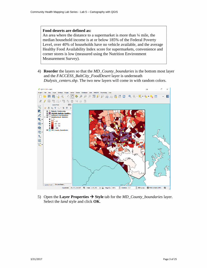
4) Reorder the layers so that the MD_County_boundaries is the bottom most layer
and the FACCESS_BaltCity_FoodDesert layer is underneath
Dialysis_centers.shp. The two new layers will come in with random colors.
5) Open the Layer Properties Style tab for the MD_County_boundaries layer.
Select the land style and click OK.
Community Health Mapping Lab Series - Lab 5 – Cartography with QGIS
3/31/2017 Page 4 of 25
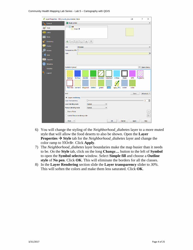
6) You will change the styling of the Neighborhood_diabetes layer to a more muted
style that will allow the food deserts to also be shown. Open the Layer
Properties Style tab for the Neighborhood_diabetes layer and change the
color ramp to YlOrBr. Click Apply.
7) The Neighborhood_diabetes layer boundaries make the map busier than it needs
to be. On the Style tab, click on the long Change… button to the left of Symbol
to open the Symbol selector window. Select Simple fill and choose a Outline
style of No pen. Click OK. This will eliminate the borders for all the classes.
8) In the Layer Rendering section slide the Layer transparency slider to 30%.
This will soften the colors and make them less saturated. Click OK.
Community Health Mapping Lab Series - Lab 5 – Cartography with QGIS
3/31/2017 Page 5 of 25
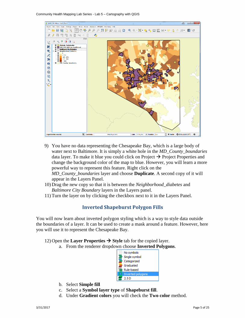
9) You have no data representing the Chesapeake Bay, which is a large body of
water next to Baltimore. It is simply a white hole in the MD_County_boundaries
data layer. To make it blue you could click on Project Project Properties and
change the background color of the map to blue. However, you will learn a more
powerful way to represent this feature. Right click on the
MD_County_boundaries layer and choose Duplicate. A second copy of it will
appear in the Layers Panel.
10) Drag the new copy so that it is between the Neighborhood_diabetes and
Baltimore City Boundary layers in the Layers panel.
11) Turn the layer on by clicking the checkbox next to it in the Layers Panel.
Inverted Shapeburst Polygon Fills
You will now learn about inverted polygon styling which is a way to style data outside
the boundaries of a layer. It can be used to create a mask around a feature. However, here
you will use it to represent the Chesapeake Bay.
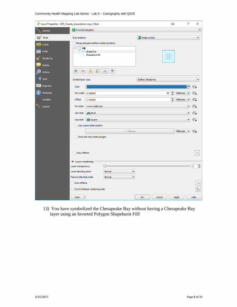
12) Open the Layer Properties Style tab for the copied layer.
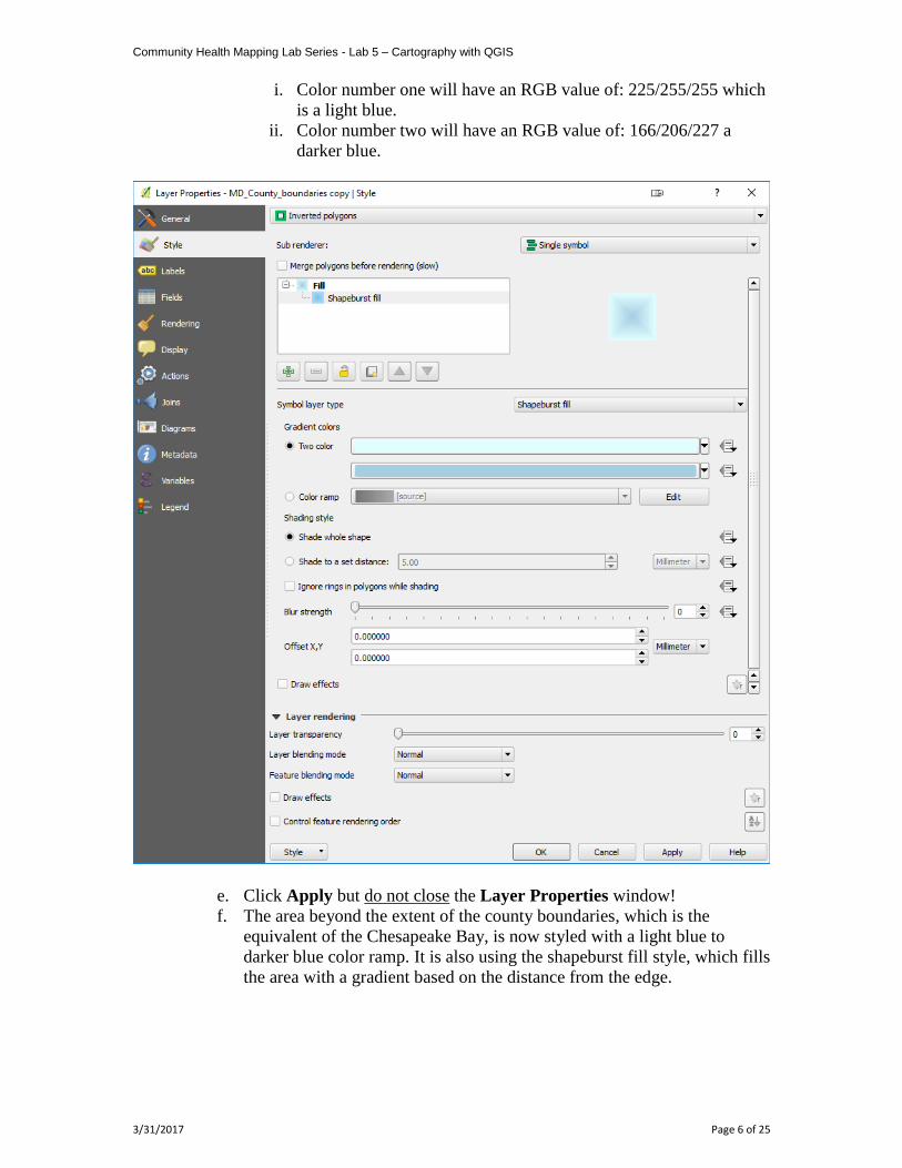
a. From the renderer dropdown choose Inverted Polygons.
b. Select Simple fill
c. Select a Symbol layer type of Shapeburst fill.
d. Under Gradient colors you will check the Two color method.
Community Health Mapping Lab Series - Lab 5 – Cartography with QGIS
3/31/2017 Page 6 of 25
i. Color number one will have an RGB value of: 225/255/255 which
is a light blue.
ii. Color number two will have an RGB value of: 166/206/227 a
darker blue.
e. Click Apply but do not close the Layer Properties window!
f. The area beyond the extent of the county boundaries, which is the
equivalent of the Chesapeake Bay, is now styled with a light blue to
darker blue color ramp. It is also using the shapeburst fill style, which fills
the area with a gradient based on the distance from the edge.
Community Health Mapping Lab Series - Lab 5 – Cartography with QGIS
3/31/2017 Page 7 of 25
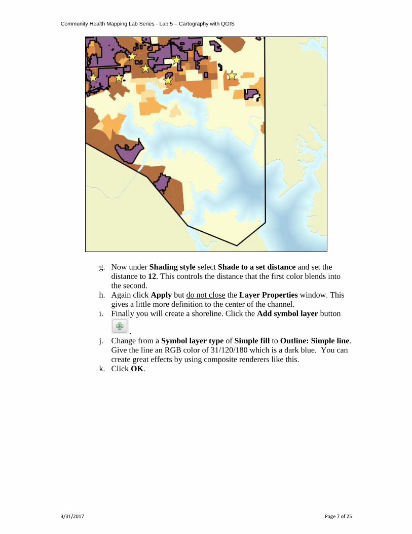
g. Now under Shading style select Shade to a set distance and set the
distance to 12. This controls the distance that the first color blends into
the second.
h. Again click Apply but do not close the Layer Properties window. This
gives a little more definition to the center of the channel.
i. Finally you will create a shoreline. Click the Add symbol layer button
.
j. Change from a Symbol layer type of Simple fill to Outline: Simple line.
Give the line an RGB color of 31/120/180 which is a dark blue. You can
create great effects by using composite renderers like this.
k. Click OK.
Community Health Mapping Lab Series - Lab 5 – Cartography with QGIS
3/31/2017 Page 8 of 25
13) You have symbolized the Chesapeake Bay without having a Chesapeake Bay
layer using an Inverted Polygon Shapeburst Fill!
Community Health Mapping Lab Series - Lab 5 – Cartography with QGIS
3/31/2017 Page 9 of 25
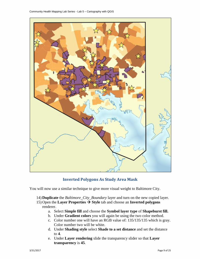
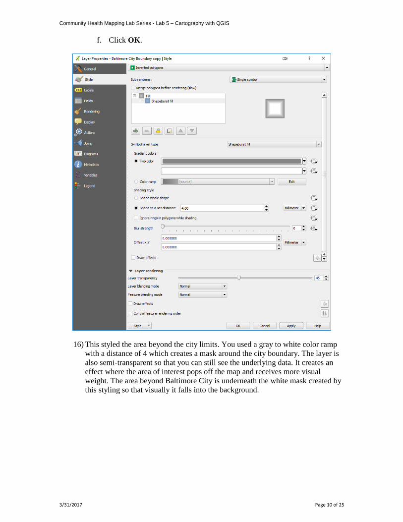
Inverted Polygons As Study Area Mask
You will now use a similar technique to give more visual weight to Baltimore City.
14) Duplicate the Baltimore_City_Boundary layer and turn on the new copied layer.
15) Open the Layer Properties Style tab and choose an Inverted polygons
renderer.
a. Select Simple fill and choose the Symbol layer type of Shapeburst fill.
b. Under Gradient colors you will again be using the two color method.
c. Color number one will have an RGB value of: 135/135/135 which is gray.
Color number two will be white.
d. Under Shading style select Shade to a set distance and set the distance
to 4.
e. Under Layer rendering slide the transparency slider so that Layer
transparency is 45.
Community Health Mapping Lab Series - Lab 5 – Cartography with QGIS
3/31/2017 Page 10 of 25
f. Click OK.
16) This styled the area beyond the city limits. You used a gray to white color ramp
with a distance of 4 which creates a mask around the city boundary. The layer is
also semi-transparent so that you can still see the underlying data. It creates an
effect where the area of interest pops off the map and receives more visual
weight. The area beyond Baltimore City is underneath the white mask created by
this styling so that visually it falls into the background.
Community Health Mapping Lab Series - Lab 5 – Cartography with QGIS
3/31/2017 Page 11 of 25
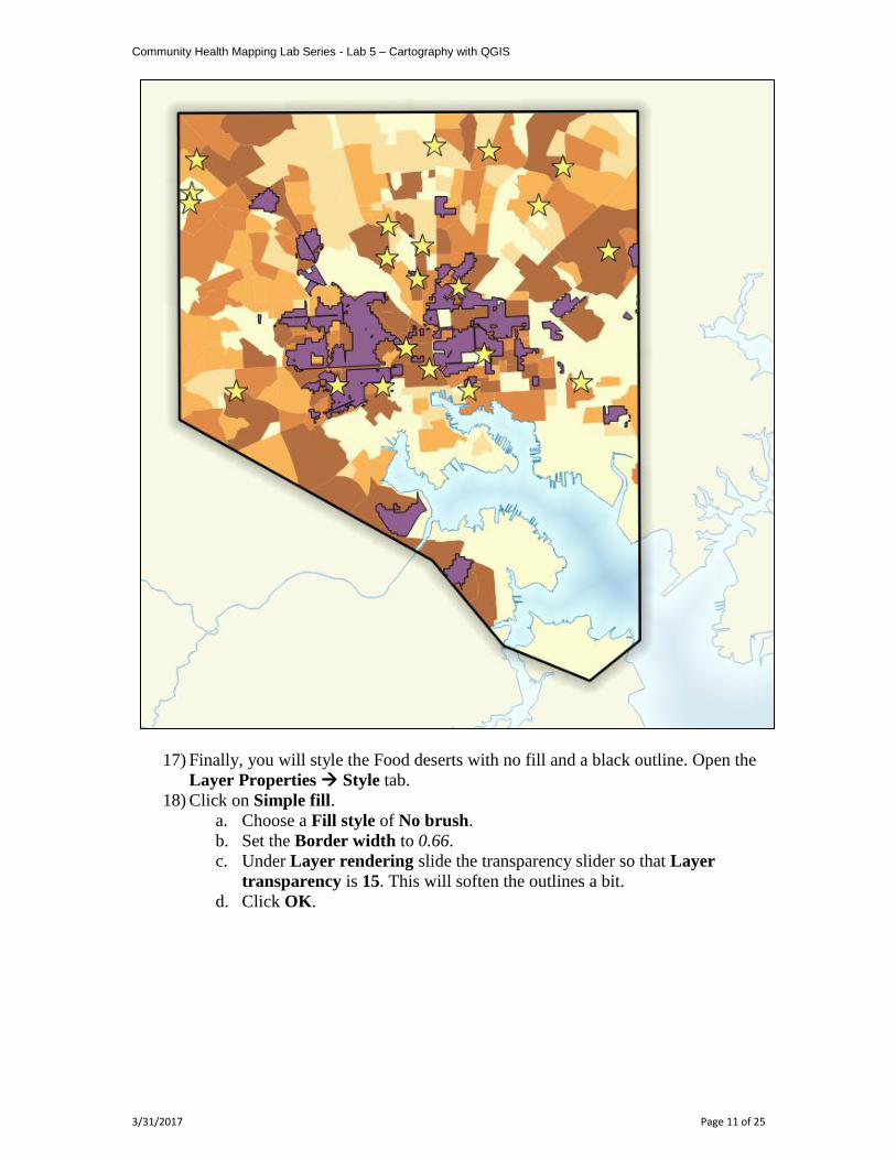
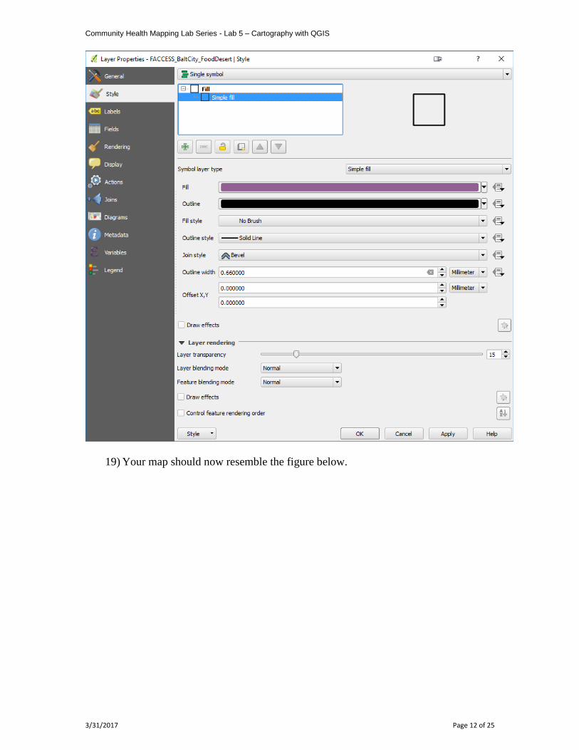
17) Finally, you will style the Food deserts with no fill and a black outline. Open the
Layer Properties Style tab.
18) Click on Simple fill.
a. Choose a Fill style of No brush.
b. Set the Border width to 0.66.
c. Under Layer rendering slide the transparency slider so that Layer
transparency is 15. This will soften the outlines a bit.
d. Click OK.
Community Health Mapping Lab Series - Lab 5 – Cartography with QGIS
3/31/2017 Page 12 of 25
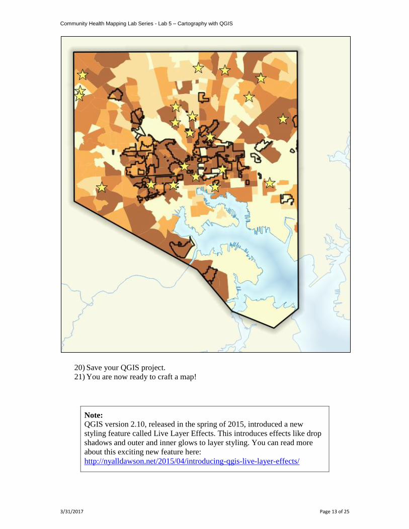
19) Your map should now resemble the figure below.
Community Health Mapping Lab Series - Lab 5 – Cartography with QGIS
3/31/2017 Page 13 of 25
20) Save your QGIS project.
21) You are now ready to craft a map!
Note: QGIS version 2.10, released in the spring of 2015, introduced a new
styling feature called Live Layer Effects. This introduces effects like drop
shadows and outer and inner glows to layer styling. You can read more
about this exciting new feature here:
http://nyalldawson.net/2015/04/introducing-qgis-live-layer-effects/
Community Health Mapping Lab Series - Lab 5 – Cartography with QGIS
3/31/2017 Page 14 of 25
Task 2 Using the Print Composer
Task 2 Video Walkthrough
Now that all the data is well styled you can compose the map deliverable.
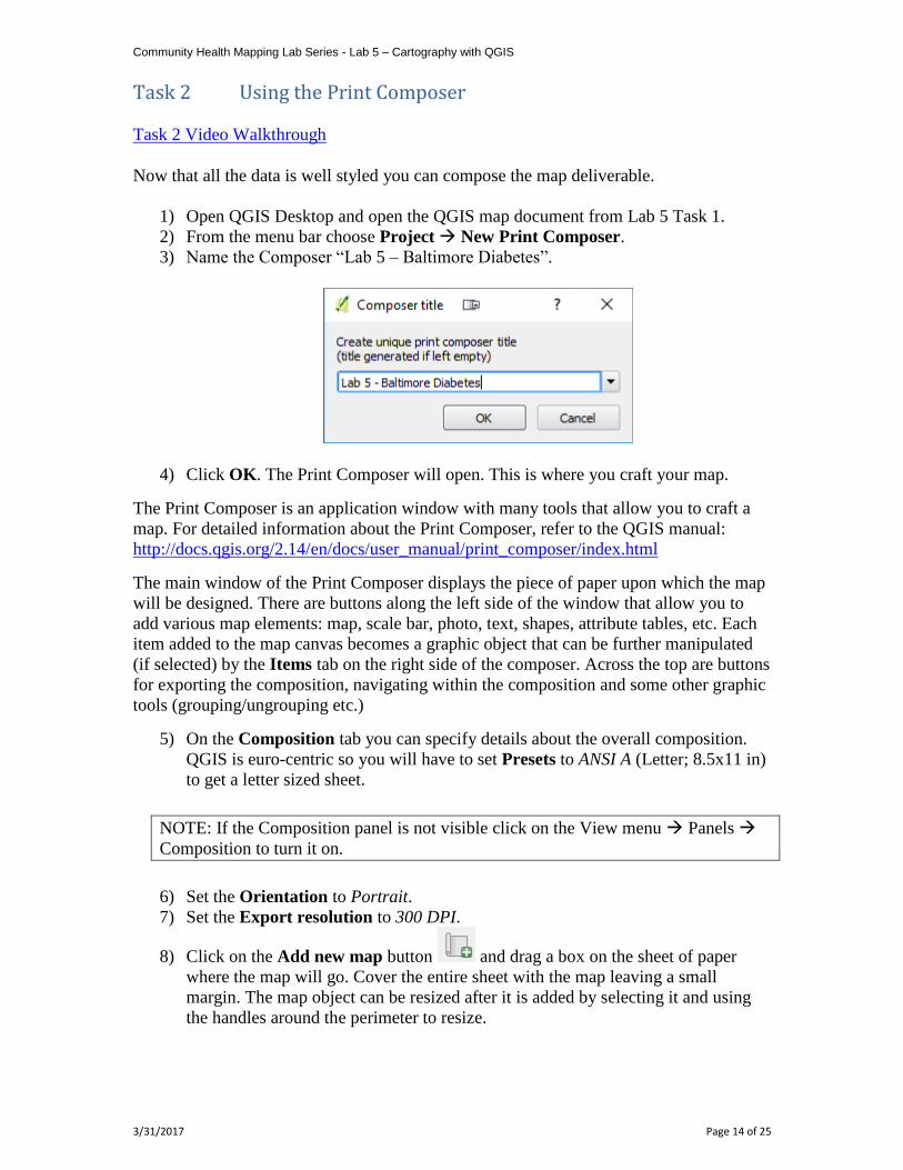
1) Open QGIS Desktop and open the QGIS map document from Lab 5 Task 1.
2) From the menu bar choose Project New Print Composer.
3) Name the Composer “Lab 5 – Baltimore Diabetes”.
4) Click OK. The Print Composer will open. This is where you craft your map.
The Print Composer is an application window with many tools that allow you to craft a
map. For detailed information about the Print Composer, refer to the QGIS manual:
http://docs.qgis.org/2.14/en/docs/user_manual/print_composer/index.html
The main window of the Print Composer displays the piece of paper upon which the map
will be designed. There are buttons along the left side of the window that allow you to
add various map elements: map, scale bar, photo, text, shapes, attribute tables, etc. Each
item added to the map canvas becomes a graphic object that can be further manipulated
(if selected) by the Items tab on the right side of the composer. Across the top are buttons
for exporting the composition, navigating within the composition and some other graphic
tools (grouping/ungrouping etc.)
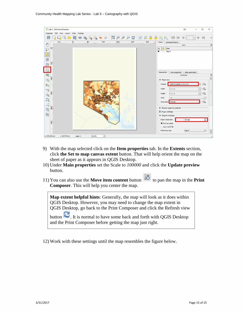
5) On the Composition tab you can specify details about the overall composition.
QGIS is euro-centric so you will have to set Presets to ANSI A (Letter; 8.5x11 in)
to get a letter sized sheet.
NOTE: If the Composition panel is not visible click on the View menu Panels
Composition to turn it on.
6) Set the Orientation to Portrait.
7) Set the Export resolution to 300 DPI.
8) Click on the Add new map button and drag a box on the sheet of paper
where the map will go. Cover the entire sheet with the map leaving a small
margin. The map object can be resized after it is added by selecting it and using
the handles around the perimeter to resize.
Community Health Mapping Lab Series - Lab 5 – Cartography with QGIS
3/31/2017 Page 15 of 25
9) With the map selected click on the Item properties tab. In the Extents section,
click the Set to map canvas extent button. That will help orient the map on the
sheet of paper as it appears in QGIS Desktop.
10) Under Main properties set the Scale to 100000 and click the Update preview
button.
11) You can also use the Move item content button to pan the map in the Print
Composer. This will help you center the map.
Map extent helpful hints: Generally, the map will look as it does within
QGIS Desktop. However, you may need to change the map extent in
QGIS Desktop, go back to the Print Composer and click the Refresh view
button . It is normal to have some back and forth with QGIS Desktop
and the Print Composer before getting the map just right.
12) Work with these settings until the map resembles the figure below.
Community Health Mapping Lab Series - Lab 5 – Cartography with QGIS
3/31/2017 Page 16 of 25
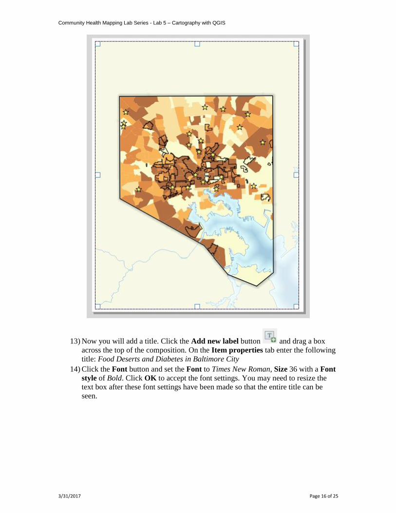
13) Now you will add a title. Click the Add new label button and drag a box
across the top of the composition. On the Item properties tab enter the following
title: Food Deserts and Diabetes in Baltimore City
14) Click the Font button and set the Font to Times New Roman, Size 36 with a Font
style of Bold. Click OK to accept the font settings. You may need to resize the
text box after these font settings have been made so that the entire title can be
seen.
Community Health Mapping Lab Series - Lab 5 – Cartography with QGIS
3/31/2017 Page 17 of 25
15) Under Appearance, select a Horizontal alignment of Center.
Adding a Legend
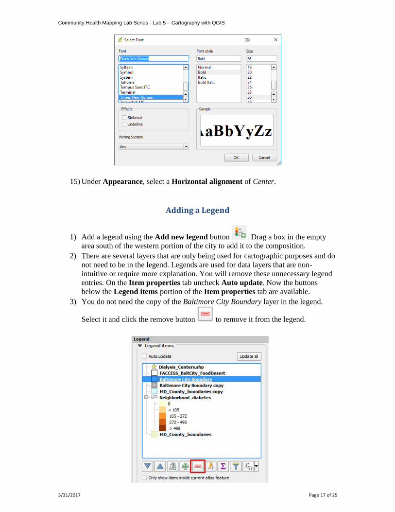
1) Add a legend using the Add new legend button . Drag a box in the empty
area south of the western portion of the city to add it to the composition.
2) There are several layers that are only being used for cartographic purposes and do
not need to be in the legend. Legends are used for data layers that are non-
intuitive or require more explanation. You will remove these unnecessary legend
entries. On the Item properties tab uncheck Auto update. Now the buttons
below the Legend items portion of the Item properties tab are available.
3) You do not need the copy of the Baltimore City Boundary layer in the legend.
Select it and click the remove button to remove it from the legend.
Community Health Mapping Lab Series - Lab 5 – Cartography with QGIS
3/31/2017 Page 18 of 25
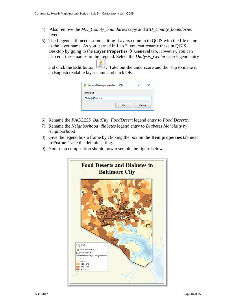
4) Also remove the MD_County_boundaries copy and MD_County_boundaries
layers.
5) The Legend still needs some editing. Layers come in to QGIS with the file name
as the layer name. As you learned in Lab 2, you can rename these in QGIS
Desktop by going to the Layer Properties General tab. However, you can
also edit these names in the Legend. Select the Dialysis_Centers.shp legend entry
and click the Edit button . Take out the underscore and the .shp to make it
an English readable layer name and click OK.
6) Rename the FACCESS_BaltCity_FoodDesert legend entry to Food Deserts.
7) Rename the Neighborhood_diabetes legend entry to Diabetes Morbidity by
Neighborhood
8) Give the legend box a frame by clicking the box on the Item properties tab next
to Frame. Take the default setting.
9) Your map composition should now resemble the figure below.
Community Health Mapping Lab Series - Lab 5 – Cartography with QGIS
3/31/2017 Page 19 of 25
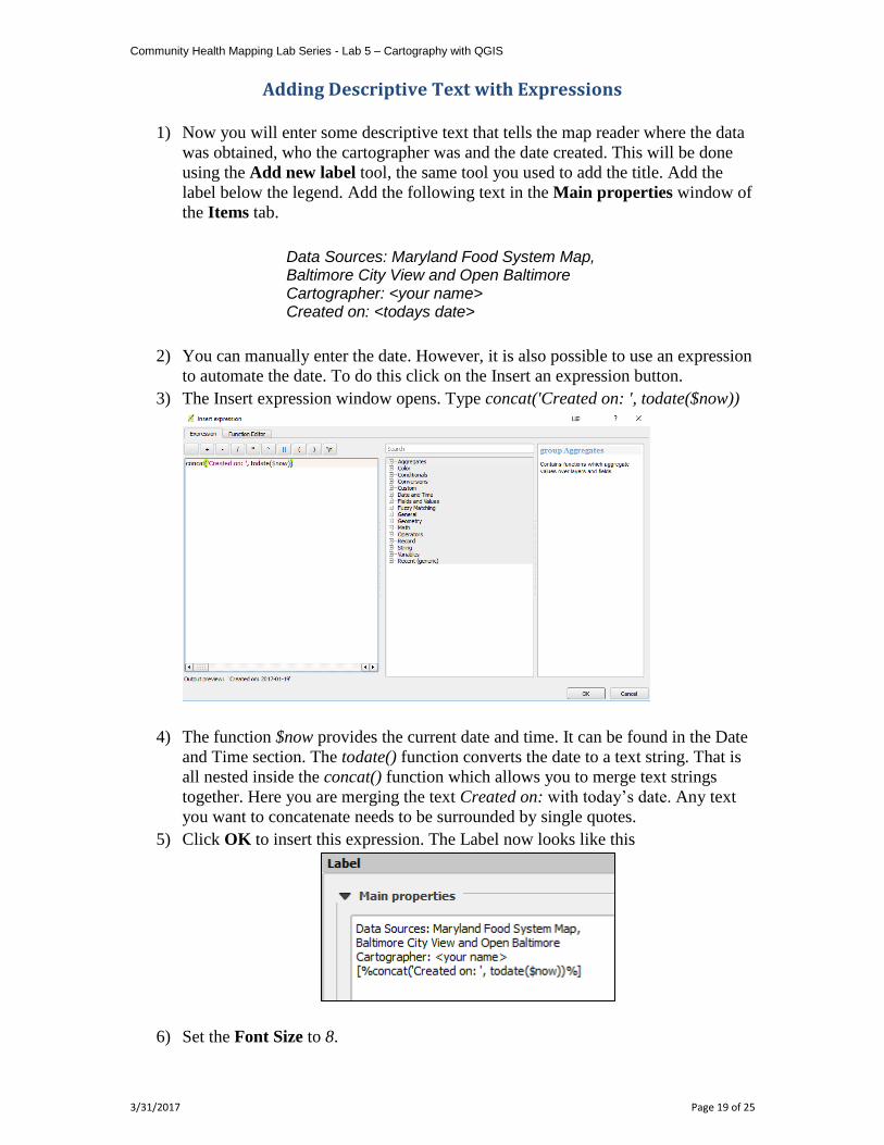
Adding Descriptive Text with Expressions
1) Now you will enter some descriptive text that tells the map reader where the data
was obtained, who the cartographer was and the date created. This will be done
using the Add new label tool, the same tool you used to add the title. Add the
label below the legend. Add the following text in the Main properties window of
the Items tab.
Data Sources: Maryland Food System Map, Baltimore City View and Open Baltimore Cartographer: <your name> Created on: <todays date>
2) You can manually enter the date. However, it is also possible to use an expression
to automate the date. To do this click on the Insert an expression button.
3) The Insert expression window opens. Type concat('Created on: ', todate($now))
4) The function $now provides the current date and time. It can be found in the Date
and Time section. The todate() function converts the date to a text string. That is
all nested inside the concat() function which allows you to merge text strings
together. Here you are merging the text Created on: with today’s date. Any text
you want to concatenate needs to be surrounded by single quotes.
5) Click OK to insert this expression. The Label now looks like this
6) Set the Font Size to 8.
Community Health Mapping Lab Series - Lab 5 – Cartography with QGIS
3/31/2017 Page 20 of 25
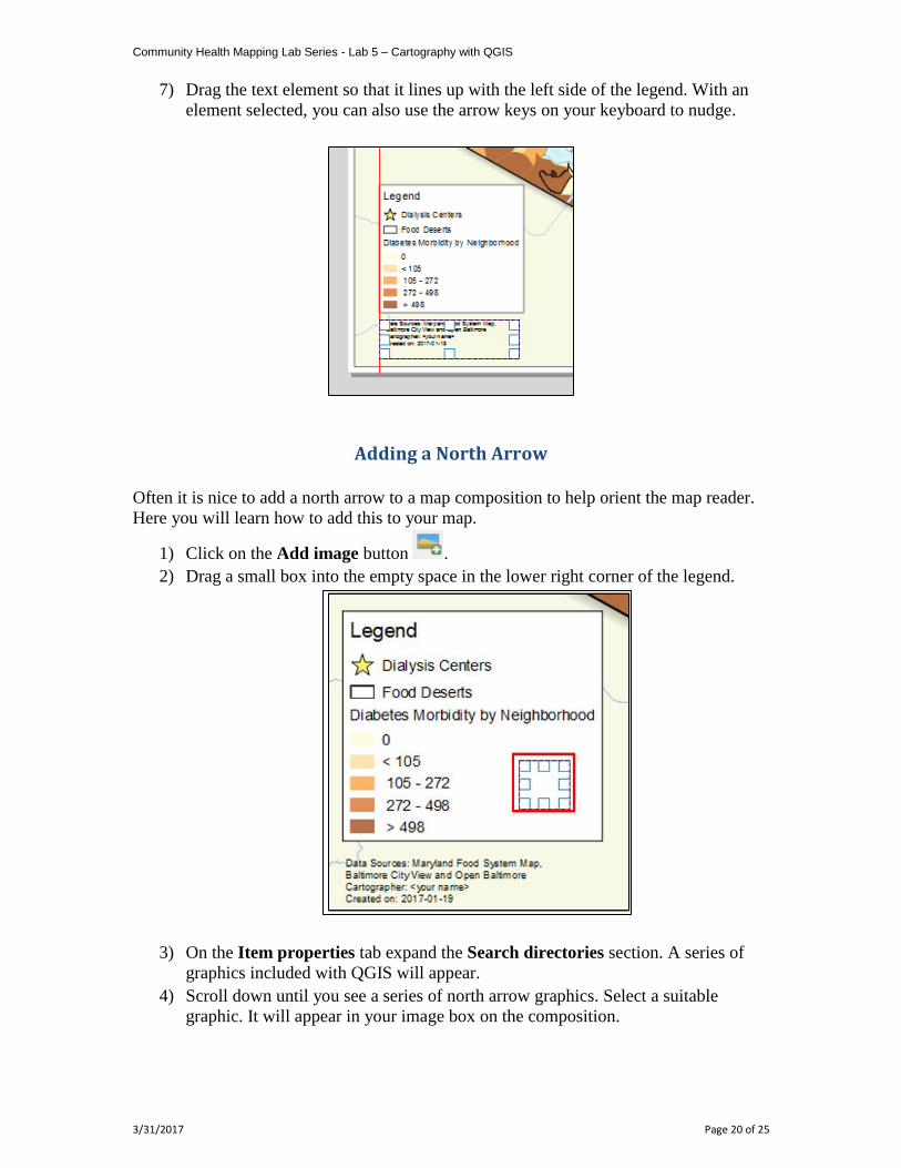
7) Drag the text element so that it lines up with the left side of the legend. With an
element selected, you can also use the arrow keys on your keyboard to nudge.
Adding a North Arrow
Often it is nice to add a north arrow to a map composition to help orient the map reader.
Here you will learn how to add this to your map.
1) Click on the Add image button .
2) Drag a small box into the empty space in the lower right corner of the legend.
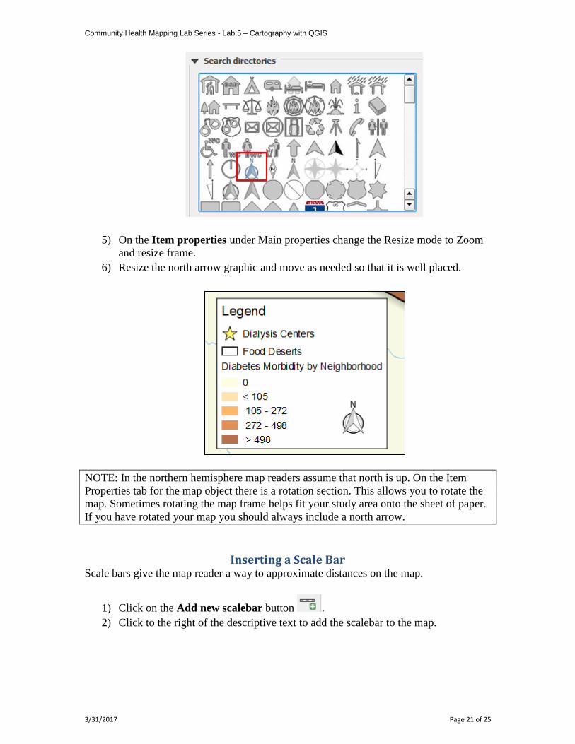
3) On the Item properties tab expand the Search directories section. A series of
graphics included with QGIS will appear.
4) Scroll down until you see a series of north arrow graphics. Select a suitable
graphic. It will appear in your image box on the composition.
Community Health Mapping Lab Series - Lab 5 – Cartography with QGIS
3/31/2017 Page 21 of 25
5) On the Item properties under Main properties change the Resize mode to Zoom
and resize frame.
6) Resize the north arrow graphic and move as needed so that it is well placed.
NOTE: In the northern hemisphere map readers assume that north is up. On the Item
Properties tab for the map object there is a rotation section. This allows you to rotate the
map. Sometimes rotating the map frame helps fit your study area onto the sheet of paper.
If you have rotated your map you should always include a north arrow.
Inserting a Scale Bar Scale bars give the map reader a way to approximate distances on the map.
1) Click on the Add new scalebar button .
2) Click to the right of the descriptive text to add the scalebar to the map.
Community Health Mapping Lab Series - Lab 5 – Cartography with QGIS
3/31/2017 Page 22 of 25
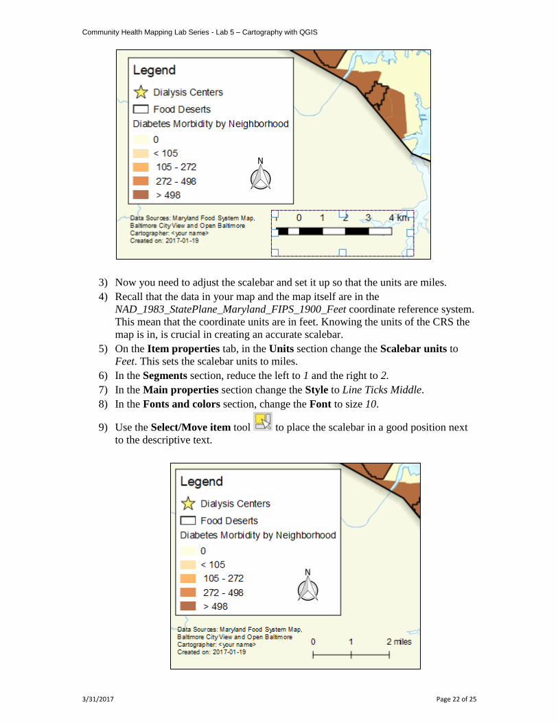
3) Now you need to adjust the scalebar and set it up so that the units are miles.
4) Recall that the data in your map and the map itself are in the
NAD_1983_StatePlane_Maryland_FIPS_1900_Feet coordinate reference system.
This mean that the coordinate units are in feet. Knowing the units of the CRS the
map is in, is crucial in creating an accurate scalebar.
5) On the Item properties tab, in the Units section change the Scalebar units to
Feet. This sets the scalebar units to miles.
6) In the Segments section, reduce the left to 1 and the right to 2.
7) In the Main properties section change the Style to Line Ticks Middle.
8) In the Fonts and colors section, change the Font to size 10.
9) Use the Select/Move item tool to place the scalebar in a good position next
to the descriptive text.
Community Health Mapping Lab Series - Lab 5 – Cartography with QGIS
3/31/2017 Page 23 of 25
NOTE: You can find more documentation on working with scalebars in the QGIS online
documentation
https://docs.qgis.org/2.14/en/docs/user_manual/print_composer/composer_items/compos
er_scale_bar.html
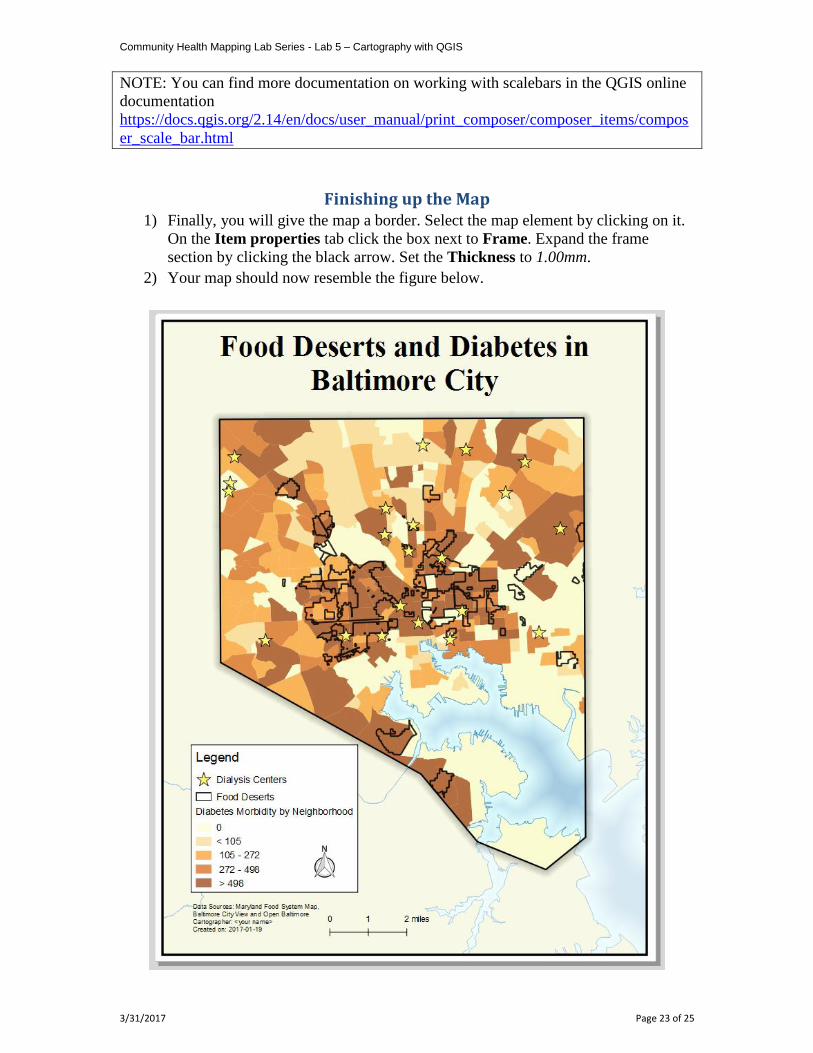
Finishing up the Map 1) Finally, you will give the map a border. Select the map element by clicking on it.
On the Item properties tab click the box next to Frame. Expand the frame
section by clicking the black arrow. Set the Thickness to 1.00mm.
2) Your map should now resemble the figure below.
Community Health Mapping Lab Series - Lab 5 – Cartography with QGIS
3/31/2017 Page 24 of 25
3) Click the Save project button .
Task 3 Exporting the Map
Task 3 Video Walkthrough
Now that you have created the map you will export it.
1) Open QGIS Desktop and open the QGIS map document from Lab 5 Task 2 if it is
not already open.
2) From the menu bar choose Project Composer Manager. Select “Lab 5 –
Baltimore Diabetes” and click Show.
3) The buttons below the Settings menu allow you to print the composition and
export it into a variety of formats. These same options are available under the
Composer menu.
4) Click the Export as image button . This will allow you to save the map out
to an image file.
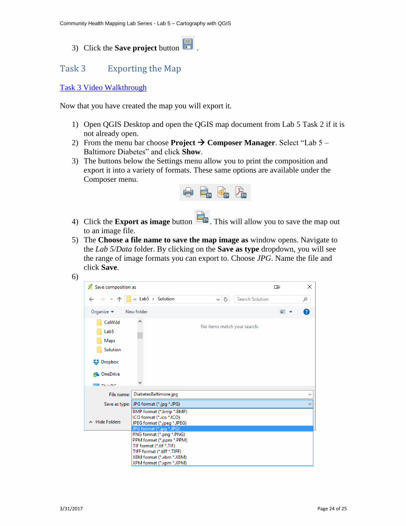
5) The Choose a file name to save the map image as window opens. Navigate to
the Lab 5/Data folder. By clicking on the Save as type dropdown, you will see
the range of image formats you can export to. Choose JPG. Name the file and
click Save.
6)
Community Health Mapping Lab Series - Lab 5 – Cartography with QGIS
3/31/2017 Page 25 of 25
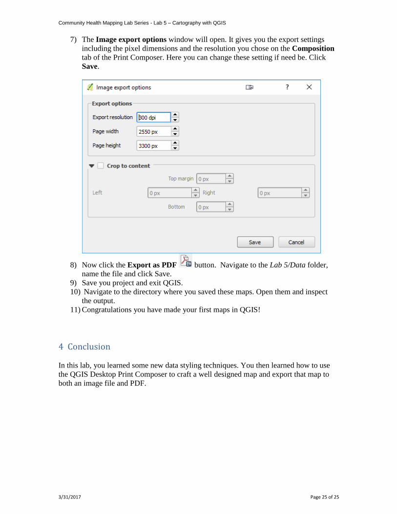
7) The Image export options window will open. It gives you the export settings
including the pixel dimensions and the resolution you chose on the Composition
tab of the Print Composer. Here you can change these setting if need be. Click
Save.
8) Now click the Export as PDF button. Navigate to the Lab 5/Data folder,
name the file and click Save.
9) Save you project and exit QGIS.
10) Navigate to the directory where you saved these maps. Open them and inspect
the output.
11) Congratulations you have made your first maps in QGIS!
4 Conclusion
In this lab, you learned some new data styling techniques. You then learned how to use
the QGIS Desktop Print Composer to craft a well designed map and export that map to
both an image file and PDF.