Embed Size (px)
Citation preview
CHAPTER 5 – COMMUNION TO THE TREES
5.1 - The Process towards the Book
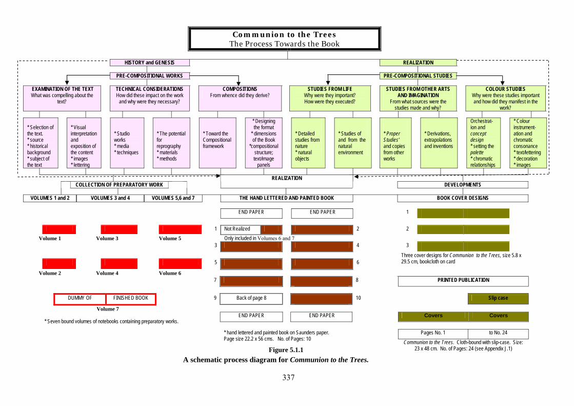
Figure 5.1.1, provides an overview of the history, genesis and realization of the
Artist’s ‘Unique’ Book, Communion to the Trees. Not only does it attempt to
illustrate the individual components contributing to the making of the entire book,
but also documents the planned sequence of the work from its inception to final
realization.
The pre-compositional works are located in the shaded pink boxes and the pre-
compositional studies in the boxes shaded pale green. Differently tinted boxes have
been employed in order to make clear the distinction between the categories of
studies and preparatory compositional works, whilst at the same time relating them
through colour to the bindings of the notebooks. The pre-compositional works and
pre-compositional studies will be briefly described and appropriate references to the
notebooks and sketchbooks made in the sections, which follow. Further, the pre-
compositional works and studies have been deliberately separated, although some
overlaps may be observed. These coalesce into the process of producing the seven
volumes of the collection of preparatory work underpinning the Book; delineated in
red, they fall under the general heading of History and Genesis: Pre-compositional
works and appear in the lower left-hand side of Figure 5.1.1 Indeed it is these seven
volumes which provide the entire basis for the final version of the Artist’s Book. The
planned layout of the individual pages for the final version of the Book is to be found
in the centre framed with brown. The subsequent developments are charted in the
right - hand section of the figure. The pre-compositional works (shaded in pale pink)
336
Communion to the Trees The Process Towards the Book
HISTORY and GENESIS REALIZATION PRE-COMPOSITIONAL WORKS PRE-COMPOSITIONAL STUDIES
EXAMINATION OF THE TEXT What was compelling about the
text?
TECHNICAL CONSIDERATIONS How did these impact on the work
and why were they necessary?
COMPOSITIONS From whence did they derive?
STUDIES FROM LIFE Why were they important? How were they executed?
STUDIES FROM OTHER ARTS AND IMAGINATION
From what sources were the studies made and why?
COLOUR STUDIES Why were these studies important and how did they manifest in the
work? * Selection of the text. * source * historical background * subject of the text
* Visual interpretation and exposition of the content * images * lettering
* Studio works * media * techniques
* The potential for reprography * materials * methods
* Toward the Compositional framework
* Designing the format
* dimensions of the Book
*compositional structure; text/image
panels
* Detailed studies from nature * natural objects
* Studies of and from the natural environment
* Proper Studies’ and copies from other works
* Derivations, extrapolations and inventions
Orchestrat-ion and concept design * setting the palette * chromatic relationships
* Colour instrument-ation and chromatic consonance * text/lettering * decoration * images
COLLECTION OF PREPARATORY WORK REALIZATION
DEVELOPMENTS
VOLUMES 1 and 2 VOLUMES 3 and 4 VOLUMES 5,6 and 7 THE HAND LETTERED AND PAINTED BOOK BOOK COVER DESIGNS END PAPER END PAPER 1
1 Not Realized
2 2
Volume 1 Volume 3 Volume 5 Only included in Volumes 6 and 7 3 3
4
Three cover designs for Communion to the Trees, size 5.8 x 29.5 cm, bookcloth on card
Volume 2 Volume 4 Volume 6
5
6
7 8 PRINTED PUBLICATION
DUMMY OF FINISHED BOOK 9 Back of page 8 10 Slip case
END PAPER END PAPER Covers Covers
Volume 7
* Seven bound volumes of notebooks containing preparatory works.
Pages No. 1 to No. 24
* hand lettered and painted book on Saunders paper. Page size 22.2 x 56 cms. No. of Pages: 10
Figure 5.1.1 Communion to the Trees. Cloth-bound with slip-case. Size:
23 x 48 cm. No. of Pages: 24 (see Appendix J.1) A schematic process diagram for Communion to the Trees.
337
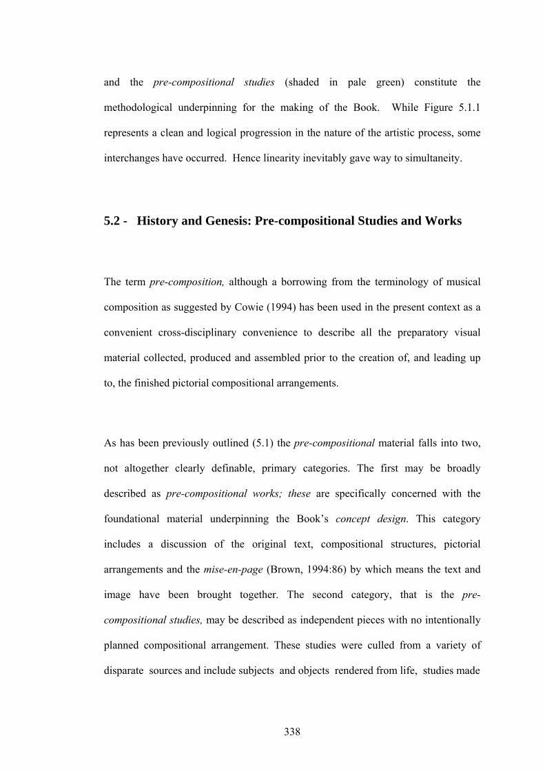
and the pre-compositional studies (shaded in pale green) constitute the
methodological underpinning for the making of the Book. While Figure 5.1.1
represents a clean and logical progression in the nature of the artistic process, some
interchanges have occurred. Hence linearity inevitably gave way to simultaneity.
5.2 - History and Genesis: Pre-compositional Studies and Works
The term pre-composition, although a borrowing from the terminology of musical
composition as suggested by Cowie (1994) has been used in the present context as a
convenient cross-disciplinary convenience to describe all the preparatory visual
material collected, produced and assembled prior to the creation of, and leading up
to, the finished pictorial compositional arrangements.
As has been previously outlined (5.1) the pre-compositional material falls into two,
not altogether clearly definable, primary categories. The first may be broadly
described as pre-compositional works; these are specifically concerned with the
foundational material underpinning the Book’s concept design. This category
includes a discussion of the original text, compositional structures, pictorial
arrangements and the mise-en-page (Brown, 1994:86) by which means the text and
image have been brought together. The second category, that is the pre-
compositional studies, may be described as independent pieces with no intentionally
planned compositional arrangement. These studies were culled from a variety of
disparate sources and include subjects and objects rendered from life, studies made
338

from other art forms, and images drawn from fantasy and imagination as contributing
elements to the final pictorial compositional schemas. In fact the most significant
aesthetic and technical problem was the attempt made to create a coherent
compositional and stylistic synthesis, not only between many apparently unrelated
visual forms, but also between the various pictorial and non-pictorial (textual) visual
elements generally. As mentioned previously, both categories of work coalesce in the
final finished compositions.
5.2.1 – Examination of the Text
Having provided an explanation for the terms pre-compositional works and pre-
compositional studies, (5.2) and whatever the constellation of aesthetic and technical
issues orbiting the realization of Communion to the Trees may be, the text itself
certainly represented the initial spark, which ignited and gave impetus to the entire
project.
From the outset the artist’s intention was not to provide illustrations as explanatory
pictorial devices designed to accompany an existing text, but to create a scheme of
images, decorations and lettering which complemented, informed and extended it to
encompass the personal. In fact the text not only presented an opportunity to make
the Book, but its subject matter offered an appropriate vehicle for the synthesis and
expression of a multiplicity of ideas, pre-existing knowledge, thoughts and feelings.
339

5.2.1.1 – Selection of the Text
Although the notion of creating handcrafted books has, among other things, long
been a passion, in this regard, the artist’s past is littered with the detritus of false
starts, desiccated visions and projects not completed. Over time it has become
increasingly clear that many previous attempts had foundered simply, though not
entirely, for want of an appropriate text. Another major setback to the successful
realization of many previous book projects, other than the selection of a satisfactory
text, has always been the problem of transposition e.g., of developing an appropriate
form of lettering in which to interpret it; (see 5.2.1.7). It was not, however, until the
inchoate feelings of inadequacy (those that apparently marred the content and/or
style of previously selected pieces of writing) had taken on a tangible form and been
identified, that a satisfactory choice could, in fact, be made.
Pinpointing the criteria for selecting a text was not in itself a difficult task, but it did
raise the question – why had the idea of developing such criteria not been thought of
before? Nevertheless a recurring pattern of interests was subsequently identified; the
first being that, however captivating the text, it should not be written in continuous
prose but possess either scriptural or lyrical poetic qualities, combined with the
structural appearance of chant, ballad or psalmody. The second was that the subject
matter should embrace the notions of visionary, revelatory, spiritual, altered-state,
mythical and shamanic experiences, together with a sense of interplay between
ordinary and non-ordinary reality. In addition, the content of the text should also
possess a high degree of detailed visual description, however surreal or disjunctive it
might appear to be. In terms of narrative focus, it should be endowed at least with
340

most of the following attributes: a profound understanding of the pressing need for,
and development of, a deeper synergistic relationship of humanity with the natural
environment; an awareness of the “…co-creative process” (Wesselman, 1996:194),
and metaphysical aspects of levels of being. Finally, but of no lesser importance, the
relationship of measure to human and environmental temporal rhythms, including of
course the influence and immensity of the great cycles of time “…within the
phenomenal universe of extant forms.” (Wesselman, 1996:194) was critical.
5.2.1.2 - The Source of the Text
The criteria were first applied to Dr. Edmond Bordeaux Szekely’s interpretive
translations, of what he describes in his manual The Essene Way: Biogenic Living, as
‘The Essene Communions’ (Szekely, 1978:38). This text met all the above criteria
perfectly, thus obviating the need for any further search. The text for this particular
communion has not only been given several titles by the translator e.g., “Trees of the
Earthly Mother” (The Essene Way: Biogenic Living, (Szekely, 1978:18-19) and
“Trees” (The Gospel of the Essenes, Book Three: The Lost Scrolls of the Essene
Brotherhood, Szekely, 1954:193-195), but the text itself has also been given varying
lengths, the shortest being the former and the longest (most complete form) being the
latter: to compare both versions of the text see Appendix E.2.
In terms of choosing a title for the book, the prime source was that taken from a
combination of titles provided by Dr Szekely himself. The title for Communion to
the Trees is the artist’s own. Although longer than that to be found in The Essene
Way (1978), it is shorter than that of The Lost Scrolls (1984) but it was the latter, in
fact, which provided the original source (see Appendix E.2). The premises on which
341
the length of the text was based were quite straightforward, the first being that the
artist did not find the last part of the text as engaging as the first two thirds: indeed it
failed to inspire the same desire to create meaningful images. The second, which
came as a result of the first, was that the amount of time required to complete the
long version of the text, without the benefit of such inspiration was something which
could not really be justified.
5.2.1.3 – Historical Background
The artist’s intention in selecting the text has been that of finding material which
satisfied the criteria (see 5.2.1.2) at the same time presenting an appropriate
springboard for the creation of an illuminated book. Hence it is not the purpose in
this context to discuss the text against the background of diverse opinions and
scholarly debate upheld by scrolls cognoscenti. What is known of the Essenes, their
communities, (particularly Qumran and its near neighbours situated along the North
western shores of the Dead Sea), socio-historical identity, philosophy and traditions
are the subjects of “… Tens of thousands of learned articles and hundreds of books
[which] have been published [about them] since [their discovery] in 1947…”
(Thiede, 2000:7). It is noteworthy that Dr. Szekely’s pioneering interests in
Essenism, stand in marked contrast to those of orthodox scrolls scholars; his own
preoccupations being focused on the spiritual rather than the archaeological. He is
also at pains to point out, (in relation to “… the purpose and meaning” of the
Communions that “… several chapters of this book [From Enoch to the Dead
Scrolls] are compiled from material antedating the finding of the Dead Sea Scrolls in
1947” (Szekely, 1981:7).
342
However Dr. Szekely’s translations (1928-79) of what he identifies as Essene
writings were the first with which the artist engaged. Indeed it was this encounter
that opened the door to greater interest in Essene traditions and the reading of more
recent scholarly literature concerning them. Dr. Szekely discusses, albeit rather
loosely, both the points of origin, and the ancient languages from which his
translations were made. In the Preface to his book From Enoch to the Dead Sea
Scrolls (Szekely, 1957:7) in which he explains, among other things, the purpose and
meaning of the Communions, he writes that
During the … years 1927 to 1947, I wrote and published a number of books on
the Essenes based on certain historical sources …on manuscripts in the Vatican,
and the Library of the Habsburgs in Vienna and the Library of the British
museum. In these books I concentrated on the Essene traditions, which I
consider of great practical value to modern man.
(Szekely, 1957:7).
He affirms that his translations – of which the Communions forms a significant part
– were made from “… The Original Hebrew and Aramaic Texts [which were]
translated and edited by [him].” (Szekely, 1984:3) and predate the Qumran finds. For
a more recent rendering in Hebrew see Appendix E.1. Dr. Szekely also identifies the
early authors from whence his information concerning Essene traditions, teaching
and practices derived. He writes that
343

Their teachings and way of life were recorded by contemporary writers,
including Josephus Flavius, the Romano [Jewish] historian and statesman, Philo
the Alexandrian philosopher, and Plinius the Elder, the great naturalist.
(Szekely, 1981:7).
and further informs us that the “… Essene Brotherhoods of the first century are
particularly notable for the simplicity and harmony of their life.” (Szekely, 1981:7).
Indeed, in many ways, they appear to prefigure the later early Christian cenobitic
communities, which exercised such a universal and pervasive influence from the
early fourth to the late sixth century, vestiges of which remain to this day. In this
regard, it is significant that the Essenes were not, in fact, isolated in Qumran on the
Khirbet plateau, “… but lived in towns and settlements all over the country;”
(Thiede, 2000:24) and were “… admired for their lifestyle by other Jews and even
non-Jews.” (Thiede, 2000:25). Further evidence of the widespread distribution of the
Essene movement is suggested by the link between the Qumran community and
those living further afield, “… a movement [based at Lake Mereotis] called the
‘Therapeutae’, active mainly in Egypt, is also linked to the Essenes…” (Thiede,
2000:23).
The Essene ethos does not appear to be strictly tied to any particular time or place.
Dr. Szekely (1981) asserts that
… their teachings are universal in their application and ageless in their
wisdom. Traces of the Essene traditions appear in almost every
country and religion of antiquity.
(Szekely, 1981:7).
344
He further suggests that they were regarded by their contemporaries as “… heirs to
Chaldean and Egyptian astronomy… and healing” (Szekely, 1981:24) and relates
that the Alexandrian Philosopher Philo, (First Century CE) in his “… (Quod Omnis
Probus Liber, xii-xiii) compares the Essenes with the Persian Medjai and the Indian
Yogis.” (Szekely, 1981:26).
Having learned of these associations, the artist’s interest was greatly aroused
inasmuch as they engendered many other cross-connections regarding the
possibilities for visual interpretations of the original text. He also makes reference to
the fact that Josephus (First Century CE) claims that their life ways were followed by
the Pythagoreans and that, according to Pliny the Elder (First Century CE), they were
“… a race by themselves, more remarkable than any other in this wide world.”
(Szekely, 1981:22) It was this sense of universality, their harmonious relationship
with the environment, their humility, love of and quest for learning and the high
regard in which they were held by their contemporaries, which the artist found so
compelling.
5.2.1.4 - The subject of the Text
Having briefly discussed the source (see 5.2.1.2) and background of the text (see
5.2.1.3), the subject matter now remains to be reviewed. That the artist’s intention
was to attempt in some way to extend the text rather than to provide illustrations for
it, has already been established (see 5.2.1). It may be reaffirmed that illustration per
se was not the intention and hence no brief, other than the artist’s own, was the
345

motivational force underlying the Book’s creation, the subject and compositional
style of the text nevertheless represented the initial inspiration.
What, in essence, was the subject of the text and why was it so appealing? Prior to
discussion of the body of the text, however, attention should be drawn to the fact that
the final title arrived at for the Book was both problematic and a long time in the
making. The titles given in Dr. Szekely’s translations seemed to be rather bald and,
while specific, lacked an essential element of description as was the case with that of
the text from which the artist originally worked (e.g., “Trees” [Szekely, 1984:193-
195]); or were descriptive in a way which neither adequately expressed the
sentiments nor the purpose of the original body of writing.
Having considered a number of titles for, and descriptions of the Communions, a title
for the Book should represent a synthesis of both. As a description for the Monday
morning Communion for “The Angel of Life” (Szekely, 1978:40) of which “Trees”
forms a part, Dr. Szekely begins, “…This communion was dedicated to the life,
health and vitality of the human organism…” (Szekely, 1978:40) and it was from the
first words of this sentence, together with the heading from the original text, that the
title for the book was composed e.g., Communion (dedicated) to the Trees. As
previously mentioned the text for ‘Trees’ (Szekely, 1978:193-195), as it is used in
the Artist’s Book, is reproduced in Appendix E.2. and a transcription of the same
text into contemporary Hebrew is given in Appendix E.1. The prose-poem format of
the text has tentacular roots to other documents as, for example, the Psalms of David
from the Old Testament, The Book of Hymns (Szekely, 1981:15) and The
Thanksgiving Psalms (Szekely, 1981:40) – the two later works having their origins in
346
material associated with the Dead Sea Scrolls – in addition to other ancient
literatures.
5.2.1.5 – Visual Interpretation and Exposition of the Content
Making visual interpretations of the text remained consistent with the artist’s’ style
and manner of visual representation. Some minor modifications, however, were
necessary in terms of, for example, executing the human figures; such changes were
associated with technical considerations rather than historical detail. Nevertheless
no attempt was made to render either the Essenes, their apparel or their immediate
environment according to contemporary or archaeological descriptions.
The artist’s considerations in developing a personally satisfying set of images were
prompted by a multifarious blend of interests and concerns. In an attempt to identify
the most obvious of these, the following typological categories, suggested by Patrice
Bouchardon (1999) whose work is specifically concerned with the energies inherent
in the natural world and particularly trees, were found to be especially valuable.
Although many others could be added, he proposes the following categories:
Type of Attitude to Nature Attitude to Trees
Farmer Resources to be exploited Biologist [Botanist] Objects to investigate Romantic Beings that mirror our own suffering Shaman A source of power Ecologist Living beings Mystic
Part of the cosmic whole
(Bouchardon, 1999:37)
Bouchardon (1990) further suggests that these are not to be understood as rigid, but
may vary depending upon one’s point of view at any given time. Each category,
moreover, is possessed of two poles - one representing a low level of awareness, the
347
other a higher level. The application of Bouchardon’s (1999) typology made it
possible for the artist to determine attitudes and identify areas of interest, particularly
those which may be understood to fall within the categories of the Romantic,
Shamanic, Mystic and the Ecological. Elements from each of these categories to
which may be added that of the History of Art (including those aspects embracing
the findings of archaeology and cultural-anthropology) have provided a variety of
influences, which have impacted on the fabrication of the images.
Notwithstanding the narrative sequence of the text, the artist focused attention upon
generating a series of variations on a single theme, the subject of which was provided
by the opening passages. These describe an Arcadian or Edenic earthly paradise
inhabited by giant trees, which, we are told, provided both nourishment and
sanctuary for our ancient forebears. It recounts that, at its centre, stood “the Tree of
Life” as a symbol of immortality and wisdom which, at that time, was not “…hidden
from the eyes of men,…” (Szekely, 1984:193). Through the trees ran “the Eternal
River,” the prima materia “…symbol of time and impermanence, yet also of
[cleansing and] constant renewal”. (Becker, 1994:249). The source of “the Eternal
River” was “the Unknown Spring” which is understood in this context, to represent
the hidden origins of the wellspring or “…fountain of life, the womb of creation.”
(Cooper, 1982:188). Through a combination of negligence and disregard (for their
gifts), humanity lost its divine sanctuary, thus falling into a state of misery and
hardship.
The Essene mission represented an attempt to restore the divine sanctuary and,
through their manner of living and being, return themselves to a state of universal
harmony. The daily contemplation of the Communions (of which “Trees” forms a
348
part) represents one example of the way in which the Essenes believed that such a
restoration could be achieved. The correspondences between the text of “Trees”,
and the Biblical story of the Creation in the Book of Genesis and similar literatures
have already been noted e.g., the creation amongst other things, of the first man and
woman by an omnipotent divine presence. It should, however, be understood that
the significance of this observation lies in the fact that the artist deliberately
transported the Genesis template of a primal pair directly into the images designed to
accompany the “Trees” text. The intention underlying this strategy was to endow the
images not only with a broader frame of reference than that furnished by the original
text, but also to invest them with a distinctly iconic quality (see Plate 5.2.1). With
regard to the exposition of the text it should be restated that there was no attempt to
create a faithful visual rendition. The original in fact represented an opportunity for
the creation of an Artist’s Book through a combination of text, image and decoration.
349
Image removed for copyright restrictions
Plate 5.2.1 French School, Adam and Eve with Tree of Life, (15th century), detail of a manuscript on parchment.
350

5.2.1.6 – Images
In the interests of clarity, deliberations regarding the images are presented in Table
5.2.1 which details, for each image, the subject matter, individual visual elements,
the sources from which those elements have been derived, in addition to relevant
comments on their intended contextual symbolic references. As the images have
neither individual titles nor numbers, page numbers from the original painted version
of the book have been provided for identification (see The Hand Lettered and Painted
Book in Figure 5.1.1).
The media in which the images were executed have been excluded from Table 5.2.1
as they do not differ significantly from one to another. However, a brief description
is presented below with a more detailed account being provided under the heading of
Technical Considerations (see 5.2.2). The media employed in making the painted
images, together with the decorative borders, were essentially water-based, these
being watercolour, tempera, dry ground pigments and gouache (the last two being the
most used). Although not deployed in large quantities, gilding in various forms also
played a significant role in creating the images, as did the use of shell-gold. Gilding
was, however, utilized extensively in other parts of the work. Other than the pre-
compositional works, the only exception to paint and gilding media was the use of
collage as a medium for the preparatory design of the frontispiece in a small -
unrealized work (see Plate 7.2.11). While the subject of colour will be discussed
separately under the heading of Colour Studies (5.3.3) it is, however, important to
351

Table 5.2.1
Generating Images and Borders for the Book
Number/description
Size Function Focal Elements Contextual Symbolic Referents
Page 1 Decorative Initial Panel Image 1
3.5 x 5 cm 13 x 3.5 cm 14.5 x 9 cm
Frontispiece (ultimately not used)
Stylized forms referencing Nature as context for serpentine figure and human formling.
Zoomorphic letter form fusing image and letter with foliate extender from letter form. Primordial prefiguring of the primal pair.
Page 2 Partial Border x 2
1.8 x 20 cm 2.0 x 12.7 cm
Title Page and Introduction
Inhabited Nature as context for female serpentine figure and human formling.
Reiteration of reference to the primal pair.
Page 3 Partial Border x 2 Image 2
1.8 x 22.5 cm 2.0 x 15 cm 11.3 x 16 cm
Text Page 1 Repeated inhabited border with imitations of central images including fragments of pictorial elements. Tree as an overarching context for human figures.
See Appendix A: Concordance. Tree of life in male aspect; Lunar pahses see Appendix A: Concordance.
Page 5 Partial Border x 2 Image 4
1.8 x 23.5 cm 2.0 x 14.0 cm 11.3 x 12.5 (overlaid with panel of text) 7.6 x 12.5
Text Page 3 Indeterminate juvenile male and serpentine female figures embedded in pictorial elements. Interrupted Tree with textual overlay.
See Appendix A: Concordance. Tree of life in pristine riverine environment.
Page 6 Partial Border x 2 Image 5
1.8 x 23.5 cm 2.0 x 14.0 cm 11.3 x 12.5 cm bisected with panel of text 7.6 x 12.5 cm
Text Page 4 Indeterminate juvenile female and male serpentine figures embedded in pictorial elements. Interrupted Tree with textual overlay
See Appendix A: Concordance. Tree of life in dry environment.
352
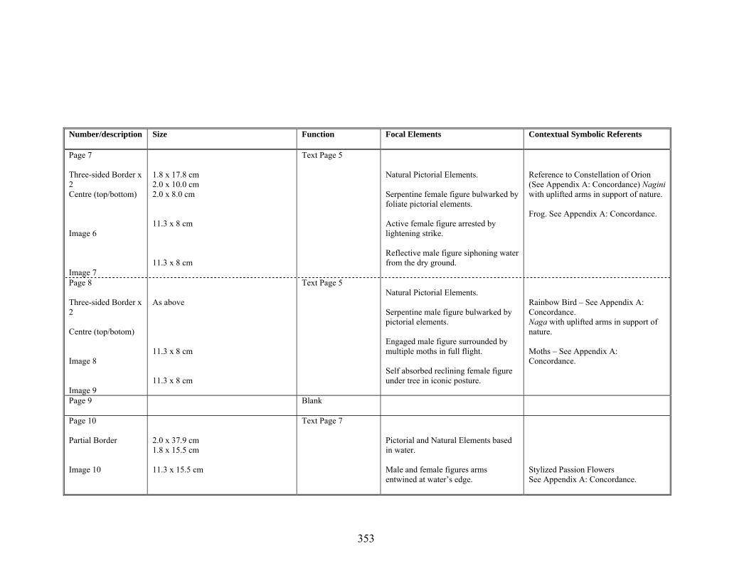
Number/description Size Function Focal Elements Contextual Symbolic Referents
Page 7 Three-sided Border x 2 Centre (top/bottom) Image 6 Image 7
1.8 x 17.8 cm 2.0 x 10.0 cm 2.0 x 8.0 cm 11.3 x 8 cm 11.3 x 8 cm
Text Page 5 Natural Pictorial Elements. Serpentine female figure bulwarked by foliate pictorial elements. Active female figure arrested by lightening strike. Reflective male figure siphoning water from the dry ground.
Reference to Constellation of Orion (See Appendix A: Concordance) Nagini with uplifted arms in support of nature. Frog. See Appendix A: Concordance.
Page 8 Three-sided Border x 2 Centre (top/botom) Image 8 Image 9
As above 11.3 x 8 cm 11.3 x 8 cm
Text Page 5 Natural Pictorial Elements. Serpentine male figure bulwarked by pictorial elements. Engaged male figure surrounded by multiple moths in full flight. Self absorbed reclining female figure under tree in iconic posture.
Rainbow Bird – See Appendix A: Concordance. Naga with uplifted arms in support of nature. Moths – See Appendix A: Concordance.
Page 9 Blank
Page 10 Partial Border Image 10
2.0 x 37.9 cm 1.8 x 15.5 cm 11.3 x 15.5 cm
Text Page 7 Pictorial and Natural Elements based in water. Male and female figures arms entwined at water’s edge.
Stylized Passion Flowers See Appendix A: Concordance.
353

note that the overall orchestration of the colour has been consistent throughout the
work. A major factor influencing the choice of colour and general tonality of all the
images in the Book has been the artist’s desire to render that subtle, fleeting moment
in time between dusk and nightfall (see 5.3.2.3).
Apart from the final page, all pages have been designed to work in pairs e.g., male-
female, wet-dry etc. Where the pages should be read as a pair, a broken rather than a
solid line has been used to indicate the pairing (see Plate 7.2.17).
5.2.1.7 – The Lettering: Research underpinning Box-Letter-Forms
for the Book
A range of sources was consulted as a basis for creating the Box-letter-forms to be
used in the Book these have been summarized in chronological order in Table 5.2.2,
which follows. All examples are illustrated in the Collection of Preparatory work,
Volume 4 (see Figure 5.1.1 and examples provided in Plates 7.2.10–7.2.14).
5.2.2 – Technical Considerations A matter of primary concern in developing strategies for creating the Book has been
to focus attention upon the uses of the various tools and materials and the methods to
be employed in its making. This section and the sub-sections, which follow, not only
treat those technical issues cited above, but also highlight the necessity for the
cultivation and awareness, appreciation and understanding of the inherent qualities of
the media to be used.
354

Table 5.2.2 Research Sources underpinning Box-Letter Forms for the Book
Source Date Focus
Early Hebrew Scrolls and Manuscripts (Square Hebrew)
C1st – 2nd
Alphabet of the original text for the Book. Use of Box-letters with strong horizontal emphasis and bilineal structure.
Coptic Manuscripts C5th – C12th
Not Box-letter-forms but the formatting of particular letters, letter spacing and overall appearance of lines of lettering, was of interest.
Insular Gospel Books C7th – 9th
Straight-line or Box-letter-forms. Ambiguous interspacing of decorative title page lettering (including nested letterforms) and resultant pattern.
Eastern Indian and Nepalese Sanskrit Manuscripts (Raňjanā and siddhamātrka script)
C10th – 12th
Use of highly condensed - rectangular, bilineal letter-forms – their resultant pattern and texture.
Qurãnic Maunscripts (khufic script) C11th – 16th
Angular letters (pen and brush-built) within decorative surah headings – emphasis on aesthetic qualities (in contrast to legibility) and use of ornament.
Tibetan Manuscripts (lan-tsha script)
C17th – 20th
Vertical Box-letter-forms with strong horizontal emphasis – resulting pattern and texture.
Armenian Manuscripts C13th – 14th
Angularity of alphabetic forms, texture and pattern created within or beneath khorans.
Early Gothic Manuscripts (Textura script - The Luttrell Psalter)
1335 – 1340 Ambiguous interspaces between letters; compressed, rectangular strongly vertical letter-forms: most formal letters possess evenly spaced verticals, as a result they may be adapted to form almost any letter by means of oblique joining strokes.
Ethiopic (Amharic) C15th – 17th
Structural formation of individual letter-forms.
355

Greek and Russian Icons (Vyaz and Ustav scripts)
C15th – 19th
Use of ornamented condensed (elongated) semi Box-letter-forms with nested letters (entirely brush-built), resultant pattern and texture.
Edward Johnston (English: pioneer in the field of fine lettering and illumination)
1872 – 1944
Methods outlined for adapting letter shapes (in his manual Writing, Illuminating and Lettering. (Johnston, 1906:233-300)
Ivan Bilibin (Russian: Illustrator, set designer and letterer)
1876 – 1942
Straight-line bilineal and Box-lettering using areas of background colour – resultant spatial movement, pattern, texture and space.
Franz Delavilla (Austrian: Illustrator, letterer, set designer)
1884 – 1964
Bilineal compressed capitals used for text – resulting in a rich pattern and texture.
Tom Phillips (English : Painter, draughtsman, book artist, film maker and composer)
1937 - Language and music drawings and paintings (1970 – 1990) – carefully crafted pseudo -pictographic letter forms as drawing.
Leonid Propenko (Russian : Letterer and calligrapher)
1939 - Bileneal Box-letter-forms resultant patterns and texture.
Contemporary lettering design C20th
Search for styles and forms compatible with proposed lettering in the Book.
356

Inevitably all media are possessed of certain limitations, and the more contradictory
the roles imposed upon them, the clearer those limitations often become. Such
limitations are examined in relation to the tasks to be imposed upon them from the
points of view of both practicability and the desired aesthetic outcome.
In his discussion of the traditional gilding and painting techniques, particularly those
employed in western illuminated manuscripts, and Indian and Persian books, Peter
Owen (1973), whilst acknowledging the stylistic differences between them, notes
that “…the painting technique, however, is similar…” (Owen, 1973:166). The
reason for drawing attention to this observation, other than to cite a link in the long
chain of apparent similarities in cross-cultural praxes (which, given the origins of the
text [see 5.2.1.3] and the Book’s overall design [see 5.2.2.4] was deemed significant)
has been a need to emphasize the relationship between the (paint) media and their
methods of application, regardless of stylistic mores, temporal or geographical
remove, and the numinous qualities which are so universally present in the best work
of the genre. Owen (1973) submits that,
To enjoy the surface richness of these gleaming…pages, we should examine
them as closely as we would if we were reading the …script that is woven
into their design.
(Owen, 1973:161).
With regard to the issues of the dynamic interplay of burnished gold and painted
colour, he observes that
357

It is [then] possible to see that the vibrating patterns on the vellum [or paper]
are often created by the play of burnished gold leaf against areas of dry,
opaque egg-tempera [or gouache]…enriched with minute stippling.
(Owen, 1973:161).
Owen’s (1973) observations and enthusiasm for the beauty and craftsmanship to be
found in many illuminated books, together with their universal appeal, not only
reflected but strongly resonated with the artist’s own aesthetic sensibilities.
5.2.2.1 – Studio Works
Given the ideas underlying this particular Artist’s Book, careful consideration needed
to be exercised with regard to the choice of the paper and its significance in relation
to a successful outcome. An appropriate paper had to meet the following criteria and
needed to-
• be a warm white, good quality machine or mould made, acid free with neutral Ph,
• not be heavier than 200 gsm;
• be at least 560 mm x 760 mm (22 in x 30 in) in size in order to obtain three pages
of 252 mm x 560 mm (10 in x 22 in) from each sheet;
• remain flexible as a page when cut to required size e.g., 252 mm x 560 mm (10 in
x 22 in);
• be possessed of a fine-grained, resilient surface, which does not deteriorate after
wetting;
358

• be compatible with a range of water-based paint media, gilding media (and
burnishing), accept a steel calligraphy pen without the marks bleeding or surface
abraiding;
• be readily available.
Vellum was considered, but did not present a viable option; as to obtain sufficient
pieces with a consistent surface over a length of material 560 mm is both difficult,
and extremely expensive. Although more affordable, the same problems apply to
commercially produced papyrus, the use of which was also contemplated. Thus
Table 5.2.3 indicates the performance of a range of papers against these criteria –
also paper based. Under heading eleven, where a star rating system is used, five stars
represent the maximum positive rating.
The abbreviations H.P. and ‘NOT’ have been used under heading six in keeping with
the three standardized types of paper available e.g., Hot pressed or H.P. (which has a
hard smooth to relatively smooth surface), Cold pressed or “Not” (meaning not hot
pressed and possessed of a slightly rough-grained surface) and Rough (which has a
pronounced tooth or distinctly coarse texture. (Hayes, 1986:120). From all those
listed, paper D performed better than any other against all criteria.
359

Table 5.2.3
Selecting a suitable paper for the Book
Appraisal of Possible Paper Types
Criteria A B C D E
1 Brand of paper Kent Hollingworth Fabriano Artistico Arches Aquarelle T H Saunders Waterford
Royal Watercolour –Society Inveresk
2 Size 560 mm x 760 mm 560 mm x 760 mm 560 mm x 760 mm 560 mm x 760 mm 560 mm x 760 mm
3 Weight 160 gsm 200 gsm 185 gsm 190 gsm 300 gsm
4 Felxibility Reasonably flexible Highly flexible Reasonably flexible Reasonably flexible Reasonably flexible
5 Acid free a a a a a
6 Surface H.P; very fine grained
“Not”; fine grained H.P; smooth surface “Not”; medium grained “Not”; medium grained
7 Productionmethod
Machine made Mould made Mould made Mould made Mould made
8 Composition 100 % Cotton Linter
100 % Cotton Linter 100 % Cotton Linter 100 % Cotton Linter Cotton Linter and Linen mix
Colour Warm white
White/Wove Natural warmwhite/Wove
Natural warm white Natural warm white
Sizing
Internally sized Internally sized Gelatine sized Gelatine sized Gelatine sized
Compatibilitywith paint and other media - comments
Performed well;
Performed moderately well; but paper too white unsuitable surface for steel pen
Performed well; paper surface too smooth; marks had a tendency to bleed under steel pen
Performed well; surface highly suitable
Did not perform well abraided under a steel pen; paper surface too rough
Availability Availability Available Available Available Available
9
10
11
12
unreliable at required size in Australia360

5.2.2.2 – Media
The principal criterion in choosing the media for the Book was that, whatever the
media used, it should be compatible with both the function, structure and format of a
book bound between boards. Initial exploration was therefore designed to identify
media, which, by their material composition, would not transfer from one surface to
another (when the book was closed), or to determine what modifications were
necessary to prevent such transference.
Having selected the paper type according to the criteria (see Table 5.2.3), it was then
essential to carry out tests. These were designed to determine the compatibility of
both media and paper and the proposed methods of application with a view to
achieving a satisfactory outcome for the Book. (see Plate 5.2.2) Several informal but
invaluable tests were designed, whereby patches of the range of basic colours to be
used were painted onto the surface of the selected paper.
The paint was applied in a similar consistency to that which was proposed for the
finished work. It was also applied with the same instruments e.g., sable brushes and
(steel) calligraphy pens. The patches of colour, when dry, were overlaid with a
facing sheet of the same type of paper forming a sandwich. Both pressure and
deliberate scuffing were applied to the paper sandwich over several months. During
the testing period it is of some importance to note that the humidity was relatively
high, at which time water based pigments are inclined to become less stable and, as a
result, detach themselves more easily from one surface to another. The success or
failure of particular pigments or colours have been marked with an (x), for those
361

Plate 5.2.2 Pressure test of proposed Palette for the Artist’s Book, selection of proposed pigments Left: vestigial marks resulting from pressure. Notebook VI
362

results which were unsuccessful and a ( ) for those which appeared to have been
successful (see Plate 5.2.1).
5.2.2.3 – Techniques The technical underpinning of the work for the Book – other than the reprographic
methods outlined in 5.2.2.4 - was carried out (as far as possible) within the traditions
and to a large extent, the conventions of illuminated and hand-made book painting;
the general procedure for working in this way is outlined below.
Pre-designed drawings were transferred to the prepared (paper) surface. The
drawings were then refined and adjustments made. The first layers of paint were
applied to the background in thin washes, using tempera, which not only assisted in
sealing the surface of the image (and decorative border areas where necessary) but
also allowed for further adjustments and refinements of the subject to be made. The
tempera foundation acted as a reliable paint substrate (in the case of paper) for
subsequent painted layers to be applied. The tonal modulation of forms was carried
out using hatching and stippling techniques with a traditional verdaccio mixture
(Cennini, circa 1390s) of yellow ochre, black, lime white or, in the case of flesh for
human figures a mixture of black, terra verde and white (Thompson, 1984:45-47),
worked over with sinoper [and] cinabrese – mixed with lime white (Cole, 1993: 17).
5.2.2.4 – The Potential for Reprography
Given the location and date of the text, the initial ideas for the structure of the Book
363

were centered principally upon those emanating from western Asian ancient Asia-
Minor and Indian Asia rather than European traditions. During the historical period
and geographical location of the original text, book rolls (or scrolls) rather than
codices were the primary vehicle for both preserving and disseminating important
literary documents and sacred texts (Diringer, 1982:175). The disposition of the text
on book rolls, according to Diringer (1982), was arranged “…longitudinally,
horizontally in continuous lines, or in page form with columns...(Latin paginae
hence, the word “page”)…” (Diringer, 1982:135) of equal width separated by
vertical spaces, a characteristic also to be found in Indian Asian palm-leaf
manuscripts. (see Plates 5.2.3 and 7.2.12).
Before discussing ideas associated with the further development of the Book, it
should be noted that, as an essential part of the initial vision, it would be reproduced
autographically in a limited multiple edition. It was at first proposed that various
reprographic forms, including printmaking processes, might enable the successful
realization of this particular aspect of the Book’s production: (see Table 5.2.4) in
keeping with the conventions of multiple editions of Artists’ Books (other
than…Unique Books”. [Phillpot 1982:27])
The relationship between the Book’s structural arrangement and the elongated multi-
columnar formats of book rolls and some early codices (for example, the fourth
century [now incomplete] Greek Bible the Codex Sinaitacus (Plate 5.2.4)) was an
important one. In addition to reprographic considerations a factor implicit in the
(generally) sequential form of book rolls, (scrolls) and books of all types is that of
temporality, about which there can be little dissent (Klima, 1998:25). From its
inception, the notion of temporality always played an important part in the Book’s
364

Image removed for copyright restrictions
Plate 5.2.3 Ashtăsăhasrika Prajňăparămită (1097CE), illustrated leaf from a Buddhist palm- leaf manuscript, Bihar, India.
Image removed for copyright restrictions
Plate 5.2.4 Codex Sinaiticus (c. 300s CE), Gospel of St Luke XIX. 13-XX. 34.
365

Version of the Book
Size
Medium
Number of
Pages
Number of
copies in edition
Proposed structure
Decision
No 1
700 mm x 267 mm
Etched and engraved copper plates: direct to plate
12 – 16
20
Separate covers and printed leaves
No
No 2
100 mm x 345 mm
Wood engraved images with sans serif type: direct to block
12 16
20 – 30
Separate covers and printed leaves, or sewn binding.
No
No 3
130 mm x 775 mm
Wood engraved images with sans serif type: direct to block
12 – 16
20 – 30
Separate covers and printed leaves
No
No 4
225 mm x 560 mm
Iris process scanned (potentially through LyreBird Press) from unique hand lettered and illuminated original book
10 – 12
50
Conventional (western) binding with gold blocked cloth covered boards and side stitched leaves
No/Yes
No 5
230 mm x 480 mm
Reduced in size, commercially printed from unique hand lettered and illuminated book (225 mm x 560 mm)
24
200
Commercially bound in gold blocked, cloth covered boards and gold blocked slip-case
Yes
Table 5.2.4 Proposals for the Reproduction of Multiple Editions of the Book
366
conceptual underpinning - from its physical structure, mise-en-page, disposition of
text-blocks and images, the design of letter-forms (and their organization) to
identifiable pictorial signs in the images themselves.
With regard to the columnar (paginae) text-blocks, (which have the effect of narrow
pages on a leaf) the speed and progress of reading may, to some extent, be
temporally directed. Thus the relative width of columns, their associated height, and
the number of columns on a page all contribute to regulating and creating variation in
the amount of time taken by a reader to examine or scan the text. This, of course, is
in addition to any commonly used authorial (compositional) literary devices, where
forms of duration may be employed as a means of expressing the notion of time e.g.,
by means of extension or compression (Cowie:1995).
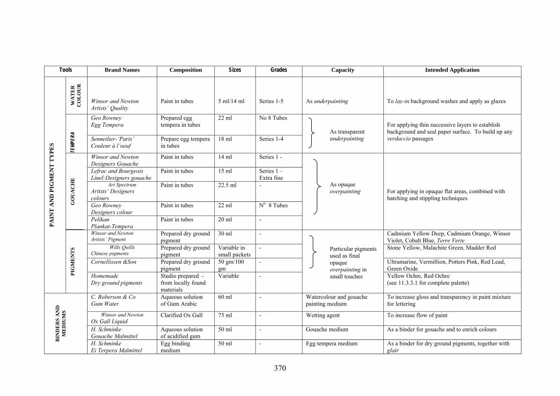
5.2.2.5 - Materials
As a result of the decision making process relating to the selection of paper for the
book as set out in Table 5.2.3, the Book was to be created on a high quality paper
e.g., Saunders Waterford; this fulfilled all the criteria for an ideal working surface in
every way (see 5.2.2.1). The proposed materials for the work (a unique – illuminated
book on paper leaves) - are both diverse and complex in their interrelationship.
These materials are listed in Table 5.2.5; while the definitive selection of pigments
and palette arrangements is discussed under the heading of Colour Studies (see
5.3.3.2). The specialized nature of some of the equipment used has to be recognized
(for example special brushes, gilding materials etc), a selection of which are
illustrated in Plate 5.2.5
367

5.2.2.6- Methods
Having provided an inventory of all the most significant tools and materials used in
the creation of the Book (see Table 5.2.5), it still remains to discuss the working
methods with which they were associated. It should be noted that the trials in which
wood engraving and wood-cutting were proposed did not progress beyond the design
stage and hence no attempts were made to realize them in the media at first
envisioned. The trials carried out before arriving at a satisfactory working method
consisted of little more than two separate leaves (pages). Examples of all the trials
are preserved in Volumes 2 and 3 of the Collection of Preparatory Work (see Figure
5.1.1, Plate 7.2.8 and 7.2.9)
Three preliminary trials were carried out prior to a final decision being made. These
trials together with explanatory notes have been set out in Table 5.2.6. The two
concluding trials referred to in Table 5.2.4 are related to post-examination
productions of the Book.
368

Table 5.2.5 Proposed Materials for the Production of the Book
Tools Brand Names Composition Sizes Grades Capacity Intended Application
Derwent Graphic Bonded lead - F, HB Layout and lettering To rule up pages and draw letters Schwann Stabilo 8000 Bonded lead - B, 2B, 3B General drawing To draw up designs on paper Faber-Castell 9000 Bonded lead - 2H, H, HB Tracing down For transferring finished design to paper Faber-Castell Graphit
Pure graphite - 3B Transfer drawings To rub onto back of tracing paper PE
NC
ILS
AN
D
CR
AY
ON
S
Conté a Paris Stick form, compressed pigment (sanguine)
Standard square
2B Transfer lettering and drawing As an occasional substitute for graphite used on back of tracing paper
Kern ruling pen Steel Regular - Ruling lines To be filled with paint to rule straight edges Baignol and Farjon penholder
Wooden handle with steel holder
- - With Mitchell nibs For penholder to hold Mitchell calligraphy nibs
Perry and Co Mapping penholder
Wooden handle with steel holder
- - Lettering For holding small sized Gillott drawing nibs
William Mitchell Steel nib Nos 2,3 Square-cut Lettering For calligraphic work Gillott – Artists Pen Steel nib Nos 1950 Pointed Lettering For decorative additions
P
E
NS
Gillott – Crowquill Steel nib Nos 659 Pointed Lettering For finials Faber-Castell Typing rubber - Hard Cleaning up To remove obstinate marks from paper Faber-Castell Vinyl - Soft Correcting drawings For general use Winsor and Newton Kneaded eraser - Putty Reduce strength of drawing To alter the tone of drawing
ER
ASE
RS
Rotring rapid T20 - Medium Correcting and cleaning For removing pencil and conté crayon from tracing paper
Winsor and Newton Series 3A Designs
Pure Sable Nos 5,3,2 Nos 1,0,00
- Painting washesHatching and drawing
For setting down foundational layers For fine modelling and finishing edges
Winsor and Newton Series 13 Miniature
Red Sable Nos 1,0,00 - Stippling To create areas of tone and broken colour
Cornellissen & Son Series 80A
Kolinsky red Sable Nos 2, 1, 00, 000
Hand made Hatching and lettering For fine hatched work and decorations
ProArte Renaissance Sable No 2 Conservator Painting letter-forms For brush-ruling larger letters Winsor and Newton Series 14B
Squirrel hair Small Extra fine Gilding and dusting For brushing away loose gold particles
Gilders tip Squirrel hair 3 inch - Gilding and dusting To pick up loose gold leaf Francheville Fan-blender Soft hog bristle Nos 12, 8, 6 - Gilding and dusting For removing obstinate gold particles and crumbs from
erasers
B
RU
SHE
S
Eterna Chinese pure bristle Nos 2,1,0 - Mixing paint For mixing all types of paint to correct consistency
369
Tools Brand Names Composition Sizes Grades Capacity Intended ApplicationW
AT
ER
C
OL
OU
R
Winsor and Newton Artists’ Quality
Paint in tubes
5 ml/14 ml
Series 1-5
As underpainting
To lay-in background washes and apply as glazes
Geo Rowney Egg Tempera
Prepared egg tempera in tubes
22 ml No 8 Tubes
TEMP
ERA
Senneilier-‘Paris’ Couleur à l’oeuf
Prepare egg tempera in tubes
18 ml Series 1-4
As transparent underpainting
For applying thin successive layers to establish background and seal paper surface. To build up any verdaccio passages
Winsor and Newton Designers Gouache
Paint in tubes 14 ml Series 1 -
Lefrac and Bourgeois Linel:Designers gouache
Paint in tubes 15 ml
Series 1 – Extra fine
Art Spectrum Artists’ Designers colours
Paint in tubes 22.5 ml
-
Geo Rowney Designers colour
Paint in tubes 22 ml
No 8 Tubes GO
UA
CH
E
Pelikan Plankat-Tempera
Paint in tubes 20 ml -
As opaque overpainting
For applying in opaque flat areas, combined with hatching and stippling techniques
Winsor and Newton Artists’ Pigment
Prepared dry ground pigment
30 ml - Cadmium Yellow Deep, Cadmium Orange, Winsor Violet, Cobalt Blue, Terre Verte
Wills Quills Chinese pigments
Prepared dry ground pigment
Variable in small packets
- Stone Yellow, Malachite Green, Madder Red
Cornellissen &Son Prepared dry ground pigment
50 gm/100 gm
- Ultramarine, Vermillion, Potters Pink, Red Lead, Green Oxide
PAIN
T A
ND
PIG
ME
NT
TY
PES
PIG
ME
NT
S
Homemade Dry ground pigments
Studio prepared -from locally found materials
Variable -
Particular pigments used as final opaque overpainting in small touches Yellow Ochre, Red Ochre
(see 11.3.3.1 for complete palette)
C. Roberson & Co Gum Water
Aqueous solution of Gum Arabic
60 ml - Watercolour and gouache painting medium
To increase gloss and transparency in paint mixture for lettering
Winsor and Newton Ox Gall Liquid
Clarified Ox Gall 75 ml - Wetting agent
To increase flow of paint
H. Schminke Gouache Malmittel
Aqueous solution of acidified gum
50 ml - Gouache medium As a binder for gouache and to enrich colours
B
IND
ER
S A
ND
M
ED
IUM
S
H. Schminke Ei Terpera Malmittel
Egg binding medium
50 ml - Egg tempera medium As a binder for dry ground pigments, together with glair
370

Tools Brand Names Composition Sizes Grades Capacity Intended Application
Dutchy Gilding Co. Hoof- burnisher
Psilomelanite Short - For all purpose work
Dogstooth Agate Small 32 - For small lines and dots
Pencil Agate Small 13 - For indenting and burnishing edges of shapes
BU
RN
ISH
ER
S
Paddle Agate Wide 30 -
Burnishing gold leaf
For finishing larger flat areas of gilding Lefranc and Bourgeois Aremenian Bole Extra fine rouge To colour and give warmth to mixture Wills Quills Slaked plaster 20 gm Fine dental As a base to raise shapes to be gilded Cornellisen & Son White lead 20gm Fine As paste Seccotine Fish Glue 120 ml Liquid form As a binder Dutchy Gilding Co. Oil of Cloves 30 ml -
Basic gesso ingredients
To remove the bubbles and slow drying time Archival PVA Neutral Ph 120 ml Conservator As Gesso ingredient To mix with bole and whiting to form a gesso Universal Penman Gum ammoniacum 30 ml Liquid form Lettering For flat gilding Dutchy Gilding Co. Formula 1 Small cake Normal burnish Lettering, painting For small details
Dutchy Gilding Co. Formula 2 Small cake Bright burnish Lettering For overlaying mistakesGE
SSO
AN
D IN
GR
ED
IEN
TS
Wills Quills Dry weather Small cake Normal burnish Lettering, painting For working in dry climatic conditions Dutchy Gilding Co.
25 Double Illuminating
3 ¾ in square 23 ½ carat Lettering, painting As a final layer of leaf on larger gilded areas
Dutchy Gilding Co.
25 Single Illuminating
3 ¾ in square 23 ½ carat Text decorations, lettering For gilding on painted areas
Gold Leaf Factory 25 Single Transfer 80 mm square
23 carat Text/image frames For use in first layer of gilding
GO
LD
LE
AF
Dutchy Gilding Co. Shell gold: gold 5 mm x 15 mm
23 ½ carat Text decorations For painting details in gold and faulting
Dutchy Gilding Co. Muller
Moulded glass Small - Grinding gesso and pigment To grind on a plate glass slab
Dutchy Gilding Co. Pestola
Wooden handle with glass head
- - Grinding gesso and paint To grind in a dish or china well-palette
G
ILD
ING
EQ
UIP
ME
NT
Grinding slab Plate glass 8 in x 10 in Ground surface Grinding pigments As a base on which material is ground
371

Tools Brand Names Composition Sizes Grades Capacity Intended Application
George Whiley Ltd. Gilders knife
Demagnetized steel, wood handle
- - Cutting loose gold leaf To reduce sheets of leaf to an appropriate size
George Whiley Ltd. Guilders cushion
Calfskin cushion parchment screen
- - Cutting loose gold leaf As a non-slip, draft-proof cushion on which loose leaf is cut
Chinese Paper cut Scissors
Steel 50 cm blade Medium Cutting transfer leaves As preferred scissors for cutting transfer leaf
Breathing tube Bamboo 190mm with 5 mm diameter
- Breathing on gesso To create a stream of warm moist air to reactivate glue in gesso, thus allowing gold to stick to gesso
Schoellers hammer Crystal Parchment
Non-stick transparent paper
29 ½ x 20 in - Laying gold leaf To place over gilded areas in early stages of burnishing
AC
CESS
ORIE
S
Micador – Schoellers hammer Tracing paper
Transparent paper 10 in x 15 in Thin Tracing and masking For tracing down shapes and to protect painted areas during burnishing
Winsor and Newton Slant Well Tile
Porcelain Three, wells three slants
105 mm x 62 mm
Small No 16
Mixing paint and gesso For use with pestola to prepare dry-ground pigments and gesso ingredients
Winsor and Newton Slant well tile
Porcelain five wells, five slants
190 mm x 100 mm
Large No 33
Mixing paint For mixing and saving gouache
Winsor and Newton Tinting saucer
Porcelain four divisions
83 mm diameter
No 30A Mixing paint As a containers for watercolour and diluted tempera
Winsor and Newton Cabinet saucers
Porcelain, nest of five plus a lid
67 mm diameter
No 2 Mixing and storing paint For larger quantities of gouache and tempera
PA
LE
TT
ES
Custom-made Storage dishes
Porcelain, set of fourteen with lids
2.5 x 2.5 diameter
- Storing gesso, pigment and paint
To prolong the working life of gilding gesso and tempera
Winsor and Newton Straight blade
Flexible steel with wood handle
127 mm long No 540 Paint preparation To mix pigment with binding medium and cleaning palette
Nouvel-E Cranked shank
Flexible steel with wood handle
70 mm long No 1 Paint preparation For transferring mixed pigment to palette or container
Nouvel-E Cranked shank
Flexible steel with wood handle
25 mm long No 5 Gesso preparation For spooning out gesso mixture into dish
Master Art Cranked shank
Flexible steel with wood handle
60 mm long No 295 Gesso and paint preparation To shave and mix with Bole
Swann Morton Scapel handle
Steel 160 mm No 3 long
PA
LE
TT
E K
NIV
ES
Swann Morton Scapel blades
Surgical Steel
- No 11 straight
Cleaning up gesso
To shave and scrape gessoed surfaces prior to gilding
372

T.N. Lawrence & Sons Drypoint graver
Steel 132 mm Straight heavy Engraving/dry point For direct drawing on to copper plates
T.N. Lawrence & Sons Etching needle
Steel with wooden handle
160 mm Regular Drawing on plate To draw design onto a plate covered with a ground
T.N. Lawrence & Sons Burnisher/scraper
Steel 210 mm Curved Scraping and burnishing For correcting drawing and resurfacing the plate
Melbourne Etching Supplies Etching plate
Copper 600 mm x 900 mm
16 guage Plate support for etching For incising drawing and making prints
Melbourne Etching Supplies Hard ground
Wax-composition 20 gm Cake form Engraving prepare plate for drawing
For application with roller to receive drawing and resist acid
Ferric Chloride Charbonnel: RSR
1 part normal Ferric Chloride to 10 parts water
200 ml
-
Mordant for etching To reinforce drawing and biting marks deeper into plate
I
GL
IO E
QU
NT
AIP
ME
TN
Heidelberg Inc. Etching ink
- 200 ml 55985 Inking plate To transfer image to paper be means of a press
INT
AG
LIO
AC
CSO
RIE
S E
S
373

Plate 5.2.5 Selection of tools and materials used for creating the Artist’s Book.
374
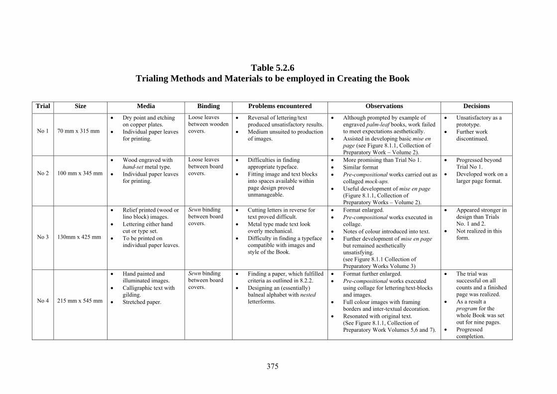
Table 5.2.6 Trialing Methods and Materials to be employed in Creating the Book
Trial Size Media Binding Problems encountered Observations Decisions
No 1
70 mm x 315 mm
• Dry point and etching on copper plates.
• Individual paper leaves for printing.
Loose leaves between wooden covers.
• Reversal of lettering/text produced unsatisfactory results.
• Medium unsuited to production of images.
• Although prompted by example of engraved palm-leaf books, work failed to meet expectations aesthetically.
• Assisted in developing basic mise en page (see Figure 8.1.1, Collection of Preparatory Work – Volume 2).
• Unsatisfactory as a prototype.
• Further work discontinued.
No 2
100 mm x 345 mm
• Wood engraved with hand-set metal type.
• Individual paper leaves for printing.
Loose leaves between board covers.
• Difficulties in finding appropriate typeface.
• Fitting image and text blocks into spaces available within page design proved unmanageable.
• More promising than Trial No 1. • Similar format • Pre-compositional works carried out as
collaged mock-ups. • Useful development of mise en page
(Figure 8.1.1, Collection of Preparatory Works – Volume 2).
• Progressed beyond Trial No 1.
• Developed work on a larger page format.
No 3
130mm x 425 mm
• Relief printed (wood or lino block) images.
• Lettering either hand cut or type set.
• To be printed on individual paper leaves.
Sewn binding between board covers.
• Cutting letters in reverse for text proved difficult.
• Metal type made text look overly mechanical.
• Difficulty in finding a typeface compatible with images and style of the Book.
• Format enlarged. • Pre-compositional works executed in
collage. • Notes of colour introduced into text. • Further development of mise en page
but remained aesthetically unsatisfying. (see Figure 8.1.1 Collection of Preparatory Works Volume 3)
• Appeared stronger in design than Trials No. 1 and 2.
• Not realized in this form.
No 4
215 mm x 545 mm
• Hand painted and illuminated images.
• Calligraphic text with gilding.
• Stretched paper.
Sewn binding between board covers.
• Finding a paper, which fulfilled criteria as outlined in 8.2.2.
• Designing an (essentially) balneal alphabet with nested letterforms.
• Format further enlarged. • Pre-compositional works executed
using collage for lettering/text-blocks and images.
• Full colour images with framing borders and inter-textual decoration.
• Resonated with original text. (See Figure 8.1.1, Collection of Preparatory Work Volumes 5,6 and 7).
• The trial was successful on all counts and a finished page was realized.
• As a result a program for the whole Book was set out for nine pages.
• Progressed completion.
375

5.2.3 – Composition
Composition in the present context may be understood as the process through and by
which disparate visual elements are arranged and the organizing principles on which
that process has been founded. As has been mentioned (see 4.3.1) the compositional
process is generally considered to be the most important in solving problems of a
visual nature; moreover, as Dondis (1989) maintains, there are no absolute structural
systems, which guarantee a successful outcome. In many ways it would appear that
almost the entire history of the visual arts, at least in this respect, could be regarded
as an ongoing continuum of action and reaction; in relation to the creation of
apparently (absolute) systemic structures and their progressive reframing,
displacement and subsequent re-emergence in co-mixed and neo-variant forms.
Attention is again directed toward the fact that
Unlike the linguistic signs of speech or music which are deployed through
time… all the elements of a visual package are encountered at ‘one hit’.
(Carter, 1993: 155).
Other than the fact that a traditional book’s inherent structure, as Klima (1998) points
out, manifests a “… drawn-out extension in time and physical space.” (Klima, 1998:
25), a book by its very nature disallows a ‘one hit’ encounter. The format and
compositional structure proposed for the Book (including the disposition of the text,
its configuration and forward movement) was designed to in-build and magnify this
notion of temporality as an essential attribute.
376
5.2.3.1 – Towards a compositional framework
The spheres of influence, which have impacted on the Book’s development, include
a diversity of literatures, disciplines, cultural and archaeological sites, other art
forms, and collections from both museums and galleries. These spheres of influence
were mapped in detail in Chapter 4 in Figures 4.3.1, 4.3.2 and 4.3.3 and demonstrate
the multi-layered genesis of the Book’s compositional frame. Already mentioned
has been the notion of spatio-temporal extension as an integral part of the structural
organization of a (traditional western) book and its progressive forward movement
(see 5.2.3) e.g., from left to right and from front to back. As these have been
previously acknowledged as an inherent part of the Book’s structure, ideas for the
format and an organizing principle for the content required some deliberation.
Unlike the continuous uninterrupted compositions of a painting, the leaves of the
Book would require an intermixture of both text and image, the arrangement of
which would, in large measure, be guided by the content of the text. As the text is
overtly rhythmic and psalmodic in feeling, and the subject matter alludes to the
passage of time and the associated phenomena of cause and effect, a structure was
proposed which would indeed foreground the notion of a rhythmic counterpoint
between the text and images. In his discussion of mediaeval illuminated books,
Owen (1973), in fact draws particular attention to just such a dynamic interplay of
text and image (see 5.2.3). The conceptual background underlying the development
of the Book’s format and its multi-columnar arrangement and the ideas associated
with enhancing the general effect of temporal extension have also been discussed
(see 5.2.2.4). As an extension of the possibilities engendered by static frieze-like
377
works and their potential for inviting a species of rhythmic musicality, (as advanced
by Bouleau (1980) and already discussed in 4.3.), the concept of a visual time
signature suggested itself; it was this idea which determined the sequential
arrangement of text and images.
5.2.3.2 – Designing the format
Attention has already been drawn to the overall format, origins and antecedents of
the Book in 5.2.1.6, 5.2.1.7 and 5.2.2.4. It was explained that, in terms of significant
influences regarding its shape (other than the early roll-books), the long narrow
rectangular format characteristic of palm leaf manuscripts and early hand painted
paper books from Indian Asia was of singular importance, together with the
columnar disposition of the text and its relationship to the positioning of the images
(see 5.2.2.4). What now remains to be discussed however, are those factors which
underlay the evolutionary development of the proportions of the rectangular field
(the page), and the positioning and proportions of the areas occupied by text and
images. In addition to the determinants underpinning the placing and proportions of
image/text panels, are the questions of their proposed sub-division and the nature of
the inter-relationship of images with the text.
5.2.3.3 – The Dimensions of The Book
As has been noted in Table 5.2.4, the dimensions – the physical size of the Book – in
terms of its height and width (or more accurately its length) was a matter of some
concern. Having arrived at a specific format, how then could the size be determined,
given the narrow frieze-like format? Although similar in proportion to earlier works
378

executed by the artist (see Plates 7.1.10, 7.1.16 and 7.1.19), the fact remained that the
work in hand was not a painting but a book, and also that both the lettering (the text)
and images would be contained within framed panels on each page. Rather than
arbitrarily pre-determining the outer limits of the page, the framed text/image panels
should be first examined. Given the historical context and content of the original text
with its distinctly anthropocosmic tenor and the ancient systems of measurement
current at the time, proportions based on parts of the human body were proposed as
units of measure. As the Book would be handcrafted, a hands breadth was proposed
as an appropriate unit of measure for the height of the text/image panels. As an
extension of this idea, the length of the panel could correspond to the length of the
artist’s forearm, from the point of the elbow to the fingertips of the outstretched
hand. Indeed Professor O.A.W Dilke (1987), the distinguished classical scholar,
affirms that
All ancient civilizations used parts of the human body for many of their shorter
measurements… Thus fingers, palms, feet and forearms came to be standardized
for the shorter units.
(Dilke, 1987:23).
However one of the most commonly employed devices for laying out a page is
founded upon the projection of diagonals: one diagonal being drawn on each
individual page of a double-page spread meeting at the top edge and a further two
across both pages intersecting at that point in the centre where the sheet will fold (see
Figures 5.2.1 and 5.2.2).
379
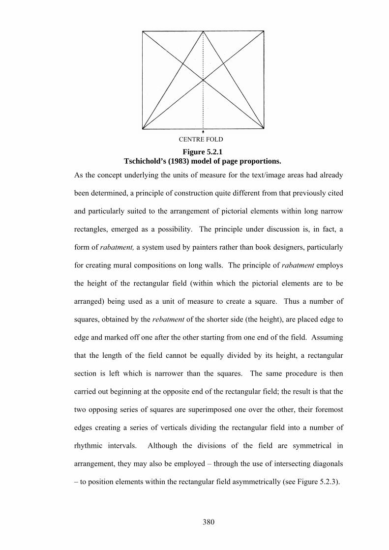
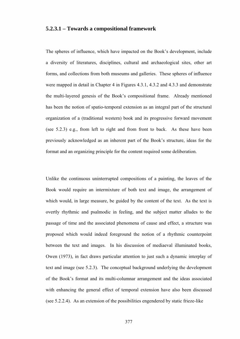
CENTRE FOLD
Figure 5.2.1 Tschichold’s (1983) model of page proportions.
As the concept underlying the units of measure for the text/image areas had already
been determined, a principle of construction quite different from that previously cited
and particularly suited to the arrangement of pictorial elements within long narrow
rectangles, emerged as a possibility. The principle under discussion is, in fact, a
form of rabatment, a system used by painters rather than book designers, particularly
for creating mural compositions on long walls. The principle of rabatment employs
the height of the rectangular field (within which the pictorial elements are to be
arranged) being used as a unit of measure to create a square. Thus a number of
squares, obtained by the rebatment of the shorter side (the height), are placed edge to
edge and marked off one after the other starting from one end of the field. Assuming
that the length of the field cannot be equally divided by its height, a rectangular
section is left which is narrower than the squares. The same procedure is then
carried out beginning at the opposite end of the rectangular field; the result is that the
two opposing series of squares are superimposed one over the other, their foremost
edges creating a series of verticals dividing the rectangular field into a number of
rhythmic intervals. Although the divisions of the field are symmetrical in
arrangement, they may also be employed – through the use of intersecting diagonals
– to position elements within the rectangular field asymmetrically (see Figure 5.2.3).
380
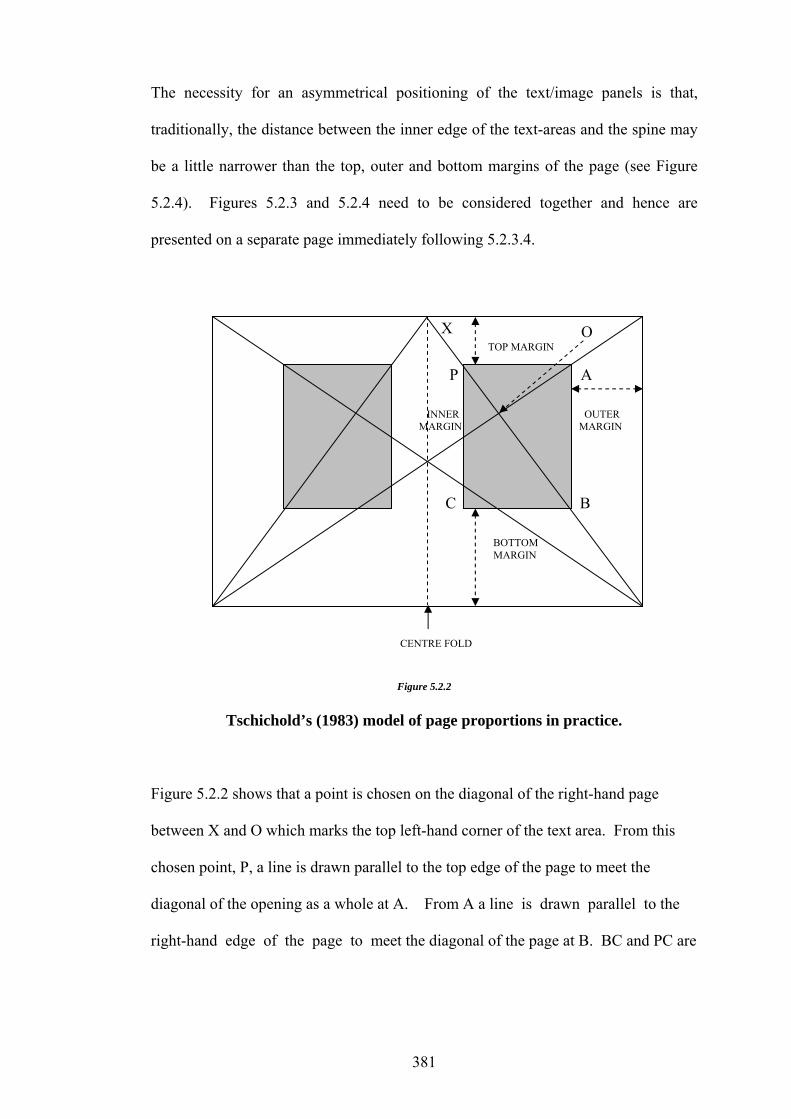
The necessity for an asymmetrical positioning of the text/image panels is that,
traditionally, the distance between the inner edge of the text-areas and the spine may
be a little narrower than the top, outer and bottom margins of the page (see Figure
5.2.4). Figures 5.2.3 and 5.2.4 need to be considered together and hence are
presented on a separate page immediately following 5.2.3.4.
O TOP MARGIN
P A INNER OUTER MARGIN MARGIN C B BOTTOM MARGIN
X
CENTRE FOLD
Figure 5.2.2
Tschichold’s (1983) model of page proportions in practice.
Figure 5.2.2 shows that a point is chosen on the diagonal of the right-hand page
between X and O which marks the top left-hand corner of the text area. From this
chosen point, P, a line is drawn parallel to the top edge of the page to meet the
diagonal of the opening as a whole at A. From A a line is drawn parallel to the
right-hand edge of the page to meet the diagonal of the page at B. BC and PC are
381

then drawn to complete the rectangle PABC which defines the text area - shaded in
grey. (Tschichold, 1983).
5.2.3.4 – Compositional structure within text/image panels
With a unit of measure determined for the text/image panels (see 5.2.3.2) and the
principle of rebatment advanced to locate them within the confines of the pages, it
then became necessary to develop a coherent, flexible method of arrangement for
organizing, blocks of text and accompanying images within them. Again the
principle of rabatment was proposed as a workable compositional method, given its
suitability to the organization of pictorial elements within extended rectangular
formats (see 5.2.3.3). The principle of rabatment suggested the possibility of being
able to alloy western compositional structures with the format of traditional eastern
books of the type discussed in 5.2.3.3. As with the arrangement of columns of text in
roll-books and early oriental codices (see 5.2.2.4), the artist was drawn to the often
exquisite rhythmic spatio-temporal organization of text-blocks and image
arrangements to be found in the palm leaf and early paper books of Indian Asia, (see
Plate 5.2.3), the page arrangements of which have very little if anything in common
with those produced in western scriptoria. However, in his discussion of the wide
variety of possibilities for planning a manuscript book, the calligrapher/book
designer John Woodcock (1986) concludes that
When designing a manuscript book or any piece of calligraphy, the most
useful aid is… a critical eye. It is unlikely that any rule or system for layout
could be devised which would give a satisfactory solution in all cases.
(Woodcock, 1986:131).
382

2 1
M
INNER OUTERMARGIN
TEXT AND IMAGE PANEL
BOTTOM MARGINS
PAGE MARGINS
1 2 Figure 5.2.3
The application of the principle of rabatment to a single page (the field) as a method of locating the text areas and image panels
1 2 1 2 2 1 2 1
TEXT IMAGE TEXT TEXT IMAGE TEXT
CENTRE FOLD
Figure 5.2.4
Application of the principle of rabatment to a double page opening
383

Figure 5.2.4 illustrates the principle of rabatment as it could be applied to a double-
page spread in the Book, indicating the page margins and one possible arrangement
for text blocks and images within the text/image areas.
5.3 – Realization: Pre-compositional Studies
The term pre-composition and its application as a primary descriptive appellation for
the two principal categories of work e.g., pre-compositional works and pre-
compositional studies, has (in the interests of clarity) been discussed previously (see
5.1 and 5.2). A general explanation has also been provided to highlight the
differences between them and their individual directional focus (see 5.2). Further, a
direct reference has been made with regard to the sub-categories constituting the pre-
compositional studies and their significance as a part of the methodological
underpinning for the making of the Book. (see 5.1 and 5.2).
It should be reiterated, however, that the pre-compositional studies are, almost
without exception, independent works with (apart from any elements which may be
implicit in the studies themselves) no contrived or preconceived compositional plan.
The works in this category have been executed either directly into sketchbooks or on
separate sheets infixed in the appropriate places. The sketchbooks constituted the
principal means by which collection and storage of these studies has been
accomplished, notably in Sketchbooks No. I and No. III. (see Figure 4.1.2). With the
exception of Plate 5.3.6, a representative selection of sketchbook material illustrating
specific subjects (and approaches) related directly to various aspects of the Book’s
384
creation has been provided in Plates 5.3.1 to 5.3.13. The material in these plates has
been selected to augment the information presented and contained within the sub-
sections, which follow (see 5.3.1 and 5.3.2).
5.3.1 - Studies from life
The studies from life may be best described as works, which have been rendered
from and have their origins in the natural world. They have been divided into two
categories, the first of which is principally concerned with natural forms both
animate and inanimate and the second with natural environmental phenomena, but
exclude those which are visual representations derived from artefacts or other works
of art and are therefore, the product of human hands.
5.3.1.1 - Detailed Studies from Nature
These studies represent the strongest and most direct objective link between the
finished work and the world of nature – the phenomenal world (see Plate 5.3.1). In
some instances the subject or objects under investigation may have undergone very
little alteration in their translation from the original sketch-book sheets whilst, in
others, varying degrees of modification have been developed; these variations may,
in fact, be great or very slight (see Plate 5.3.2 – Sketchbook III). It should be noted
that although the human form, apart from several isolated instances, has not been the
subject of detailed observations from life, it does in the context of the Book images,
represent the principal subject matter.
385
Plate 5.3.1 Study of a Hawk Moth, watercolour, pastel and conté crayon on paper, 14.5 x 20cm.
386

Plate 5.3.2 Study for Moths, watercolour and pencil on paper, 21 x14.5cm: Sketchbook No. III.
387

Drawing the human form from life has, however, always been a mainstay to the
artist’s past and present practice although, as previously stated, it does not in this
case represent, a primary source of visual information. The sources of reference
visited for developing the stylized representations of the human figures in
Communion to the Trees, are discussed further on.
5.3.1.2 – Studies from Natural Objects
Studies made from natural objects have also played a significant role in the artist’s
practice. Traditionally they represent a well-spring of visual material which often
finds a place, or forms a basis for particular elements in finished studio works.
Studies of this kind have, for numerous artists achieved a status, which is, in many
respects, complementary to their more formal finished works. More importantly they
highlight individual artists’ particular concerns and interests in terms of technical
treatment, aesthetic choice, expressive means and conceptual direction.
The studies from natural objects include a wide variety of material e.g., rocks, shells,
butterflies, moths, amphibians, birds and plant forms etc., (Plate 5.3.3 – Sketchbook
II). In each study particular attention has been focused upon the investigation of
shape and form, an exploration of surface patterns and careful analyses of colour
(Plate 5.3.4 – Sketchbook II). The underlying purpose for allowing the presence of
these objects to appear so frequently in the painted images and decorations has been
an attempt to endow the work with a sense of symbolic reference and visual
continuity.
388

Plate 5.3.3 Study of a Volute Shell, watercolour and pencil on paper, 12.7 x 14.5cm.
389

Plate 5.3.4 Studies of patterns from Cone Shells, watercolour and pencil on paper, 21 x 14.5cm: Sketchbook No. II.
390
5.3.1.3 – Studies of and from the Natural Environment
Studies in this category are, in the first instance, concerned with those contributing to
an aspect of the finished works which may be described as a record of visual
responses to the natural habitat or natural environment. It may be asked why these
works have not been classified as landscape studies. However works of this type
have a tendency to imply “…an extensive area of scenery as viewed [predominantly]
from a single aspect.” (Collins English Dictionary, 1983: 826). In this sense the
studies do not really comply with this definition as, strictly speaking, they are
not concerned with the perceptual investigation of “extensive areas of scenery”.
They do, in fact, depict carefully selected and observed vignettes, the subject matter
of which focuses upon specific natural forms, patterns and rhythmic structures
which, although extracted from the natural environment, retain something of their
immediate topographic or vegetal settings e.g., a single tree, a palm, a patch of
undisturbed ground at the foot of a tree, short stretches of riverbank with
accompanying reflections (Plate 5.3.5 – Sketchbook III).
In the second place, and certainly of no lesser importance, are the site locations for
the studies, which have been, confined to the immediate area in which the artist lives
and works e.g., the dry tropics of coastal north Queensland (Figure 5.3.1). Of equal
significance in recording aspects of the natural environment has been the
phenomenon of temporal movement, not only through the subtle progression of
seasonal changes but also, and in concert with them, the celestial movement of
conspicuous star groups visible to the naked eye e.g., Orion (Plate 5.3.6 – Notebook I
and Appendix A: Concordand Appendix A: Concordance).
391
Plate 5.3.5 Study of a Small Palm, watercolour and pencil on paper, size 21 x 14.5 cm: Sketchbook No. III.
392

10
TOWNSVILLE
Figure 5.3.1 North Queensland Coast. (2001) Hema Regional Map. Queensland Government, Department of National Resources and Mines. Most frequently visited sites are indicated by name.
393
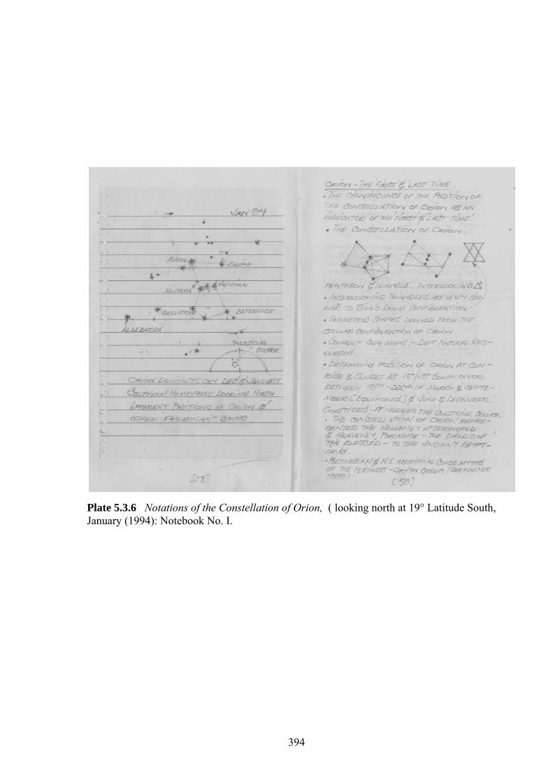
Plate 5.3.6 Notations of the Constellation of Orion, ( looking north at 19° Latitude South, January (1994): Notebook No. I.
394

5.3.2 – Studies from Other Arts and Imagination
Studies from other arts have been placed in two categories, the first being copies of
details made from extant works e.g., studies made in galleries and museums, from
photographs and a variety of other reprographic sources.
The second derives and extrapolates from studies whose origin lies in extant works.
These studies are most often completely integrated and subsumed, within the
broader context of pictorial environmental settings derived exclusively from
imaginative visualizations.
5.3.2.1 - ‘Proper Studies’ and Copies from Other Works
Proper studies have been referred to in 4.2.2.1, in this regard however; some
additional issues need to be addressed. It was stated earlier that the making of
studies and copies from the work of others has played an essential role in artistic
practice since ancient times and that although the subject of much contention, as
mentioned by Hockney (1981), making studies from other works of art, has arguably
been and remains, a legitimate and essential part of the professional activity of many
contemporary artists. It was also previously stated (4.2.2.1) that studies made from
other arts include artefacts and images from ancient pottery, as well as painting and
engraving on rock surfaces and carved and sculpted objects from ancient,
contemporary and near contemporary hunter-gatherer and early agrarian cultures. All
have served in one-way or another as highly significant sources of visual inquiry and
contributed greatly to the artist’s practice (see Plate 5.3.7 -Sketchbook I).
395

Plate 5.3.7 Rock Painting Study: Reclining Woman with Moufflon, Tassili, Ti-n-Tazarit, Sahara, watercolour and pencil on paper, 21 x 14.5 cm: Notebook No. I.
396

It was mentioned earlier (4.2.2.1) that although the sources for making these studies
are extremely diverse, whatever the time spent, the technique or media used, the
intention or underlying theme had always been clear. It was also stated that the theme
has been associated either with some aspect of the planning stages of a work, or with
recording visual opportunities in order to provide material for future compositional
works (Plates 5.3.8, 5.3.9, 5.3.10, 5.3.11, 5.3.12).
Before leaving this category of studies, it should be mentioned that imitation has
rarely been a primary concern, and then only in as much as it has been able to
provide sufficient detailed visual material from which to inform or develop more
finished work.
5.3.2.2 – Derivations, Extrapolations, and Inventions
The studies grouped under this heading include those sketchbook sheets in which the
role of the original artwork represents, in many cases, though certainly not all, a
touchstone for further developments. In some cases careful copies of original works
were made but extemporizations and developments have been worked on at the time,
often on the same sheet, in order to keep the reference direct and meaningful. With
regard to working in this manner a good example, provided by Jeffrey Camp (1981),
has been cited earlier in section 4.2.2.2.
Whilst addressing the issue of subject matter in these sheets, it should be mentioned
that, although studies of the human figure certainly predominate, other significant
397
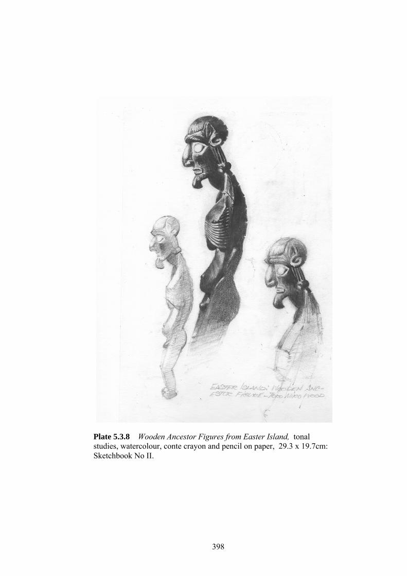
Plate 5.3.8 Wooden Ancestor Figures from Easter Island, tonal studies, watercolour, conte crayon and pencil on paper, 29.3 x 19.7cm: Sketchbook No II.
398

Plate 5.3.9 Studies from Indian Temple Sculpture: Figure, and Asoka Tree, watercolour and pencil on paper, 29.3 x 19.7cm: Sketchbook No. III.
399

Plate 5.3.10 Bat’s wing Coral Trees, watercolour and pencil on paper, 29.3 x 19.7cm: Sketchbook No. III.
400

objects of interest also occur e.g., representations of trees (Plate 5.3.10 – Sketchbook
III), plant life, cloud forms, insects of various kinds, amphibious and reptilian
creatures and birds. Although representations of the human figure have been derived
from a wide spectrum of stylistic, historical, and cultural sources notably William
Blake’s (1757 - 1827) Notebook emblems ( Erdman, 1973 [N15]-[110]), Edward
Calvert (1799 - 1883), the Découpages of Henri Matisse (1869 - 1954), the works of
Paul Klee (1879 - 1940), the earliest and most geographically remote depictions of
human forms e.g., those engraved or painted in rock shelters, have served as the most
constant and direct source of inspiration (see Tables 1.7.1 and 1.7.3). A common
theme underlying all these studies has been twofold, in the first instance to select
subjects from the earliest visual representations made of the human form and, in the
second, those of more contemporary origin created by peoples whose life-ways have
remained unchanged for millennia and who have already either vanished, or are
gradually disappearing from their traditional homelands (Plate 5.3.11 and 5.3.12 –
Sketchbook III).
401
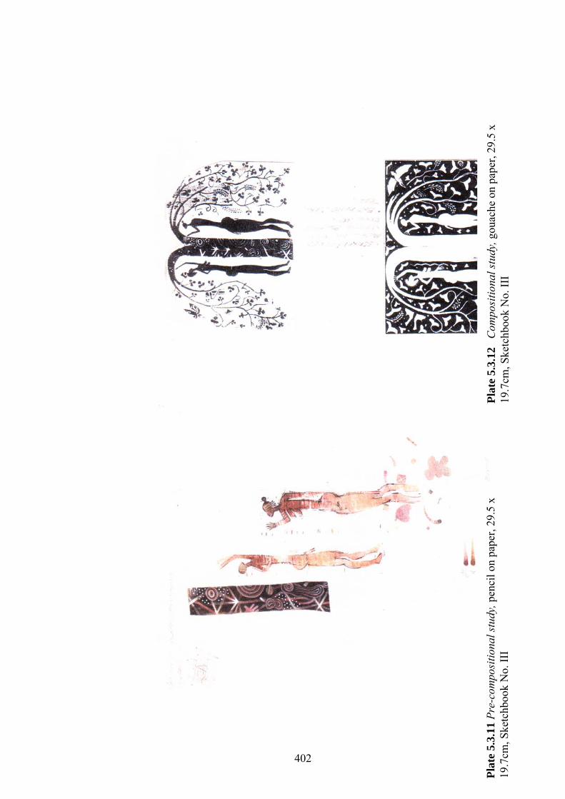
402
Plat
e 5.
3.12
C
ompo
sitio
nal s
tudy
, gou
ache
on
pape
r, 29
.5 x
19
.7cm
, Ske
tchb
ook
No.
III
Plat
e 5.
3.11
Pre
-com
posi
tiona
l stu
dy, p
enci
l on
pape
r, 29
.5 x
19
.7cm
, Ske
tchb
ook
No.
III
5.3.3. Colour Studies
The following section and sub-sections adumbrate those facets of the making of the
Book concerned principally with the conceptual underpinning, orchestration and
instrumentation of colour. The deliberations outlined below do not include those
earlier trials in the making of the Book in which a variety of printmaking methods
were at first proposed (see Table 5.2.6). The explanation for this omission lies in the
fact that the earlier attempts were conceived of as being monochromatic, e.g., in
‘black and white; thus, apart from a few incidental notes of colour inserted into the
text as decorative line-fillers, no serious consideration was given to the orchestration
of a fully chromatic scheme at that juncture. The following remarks therefore,
address those aspects of the work pertaining to Trial No. 4 and subsequent realization
of the Book in its final painted form (see Table 5.2.6). The primary significance of
the colour-studies has been to address the following issues from a largely practical
viewpoint. The elements comprising those aspects of the Book associated with its
chromatic orchestration (including the use of gilding), will be considered within the
list of groupings set out below:
• the concept design and motivational factors underlying the development of a
chromatic schema for the Book;
• setting up the basic palette to expedite the schema; and
• an exploration of functional chromatic relationships extending from the
palette and associated ideas.
With regard to those aspects of the work which have a bearing more specifically on
the instrumentation of the colour, the following two groupings apply:
403

• the practical means by which the above procedural determinants might be
implemented; and
• the challenges presented by consonance, in attempting to forge the disparate
parts e.g., text, lettering, decorations and images, into an integrated and
unified chromatic whole.
Despite the formulation of these groupings, it becomes evident that the boundaries
separating them are probably unavoidably permeable.
5.3.3.1 – Orchestration and Concept Design
The general concepts underpinning the format of the book, its program and the mise-
en-page have already been examined both in terms of the overall plan and the
disposition of its individual elements e.g., text/lettering, decorations and images (see
5.2.3). It remains however, to discuss the chromatic organization, arrangement and
character of the colour, together with the ideas unifying them.
Establishing a comprehensive chromatic schema for the Book was a priori, though
the diversity of positions from which it has been derived, are far from homogeneous
as will become clear. Direct references to colour in the original text are scarce;
indeed, within the ninety lines, green is the only colour mentioned and then but
twice. In describing foliage in line forty-four “…and spread their wings of green…”
(Szekely, 1984:194) and further on “…the carpet of green leaves under my bare
feet…” (Szekely, 1984:194) in line fifty-five (see Appendix E.2). Notions of colour
are therefore implied in the varied descriptions of the subject matter as opposed to
404
being cited directly. As the artist’s approach to the text has, in every other respect,
been distinctly eisegetical, the intention with regard to the use of colour has not been
an exception, with no attempt having been made at literal interpretive illustration.
Rather, the overarching chromatic schema has been prompted by drawing parallels to
the text which may best be described as having evolved from an ensemble of
emotion driven responses, to the subject, impelled by the personal, e.g., the artist’s
perceptual experiences of his immediate (natural) environment, mediated by previous
artistic practice.
Mention has already been made of the artist’s interest in establishing a visual setting
at a particular time of day, that mysterious point in time between dusk and nightfall
(see 5.2). A small cluster of analogous ideas, one of which derived from the text
itself, occasioned this. This tells of a vanished, shadowy, dimly remembered past on
which the sun, it could be said, had set long ago “…when the Creation was young,
the earth was filled with giant trees, And in them dwelled our Ancient Fathers…”
(Szekely, 1984:193)
Another was prompted by what is known of first century Essene spiritual
observances. In discussing what he considered to be the primordial universal beliefs
of early humankind cognate with ideas concerning the reckoning of time, a lunar
oriented Earthly Mother and a Heavenly Father with solar associations (both of
whom are mentioned in the text), Neumann (1974) suggests that
It was only with the dominance of the patriarchal, solar world that the
morning achieved its importance as the time of the sun’s birth. Yet even
then, it is interesting to note time was not reckoned from sunrise but…from then, it is interesting to note time was not reckoned from sunrise but …. from
405

midnight. In the matriarchal sphere, i.e., wherever luna mythology
predominated the reckoning of time begins and ends with nightfall. Even in
Egypt [home to the Therapeutae who were directly linked to the Essenes] the
evening is the time of birth, because for early man the appearance of the stars
and the moon is the visible birth; and the morning when the luminous world
of the stars vanishes, is a time of death, in which the daytime sky devours the
children of the night.
(Neumann, 1974:223).
He further proposes that “… the correlation of the starry firmament with the feminine
determines the whole early view of the world” (Neumann, 1974:224).
Abundant evidence exists to confirm the fact that the Essene Communities were
distinctly patriarchal in almost every respect. (Vermes, 1987:2). Despite this, it
appears that remnants of much earlier matriarchal concepts of time were nevertheless
embedded in the observance of their Sabbath and the beginning of each new week.
In his description of Essene teachings and observances, Dr Szekely (1981) asserts
that “Evening was the beginning of their day and their Sabbath or holy day began on
Friday evening the first day of the [Essene] week …” (Szekely, 1981: 13).
It does not seem necessary within the present context (although much is known of it
from contemporary sources) to provide a detailed account of the Essene’s concepts
of and attitudes towards time. Suffice it to say, however, that “…the time element
both calendrical and horary was crucial…” (Vermes, 1987: 46). In terms of their
liturgical observances ( noteworthy with respect to the Communions), an injunction
406

was in force specifying that “…two moments of prayer [were required] in the
Temple at sunrise and sunset.” (Vermes, 1987: 46). With respect to this regimen, it
is of some interest to note that, from the standpoint of traditional symbolism, dusk or
twilight (two-lights) implies “…uncertainty…a threshold,…the end [or beginning] of
one cycle and the beginning [or end] of another…” (Cooper, 1982:182) or the point
(as is the case with dawn) during which there occurs a coincidence of opposites, of
light and darkness: coincidentia oppositorum.
A further consideration in relation to the matter of temporal placement and chromatic
interpretation has been that of visual transcription. A group of artists particularly
concerned with the effect of temporal placement in their work and the way in which
it enabled them to conjure up moments of idyllic Arcadian, - or more accurately
Edenic – rapture was spearheaded by Samuel Palmer (1805-81) and his brotherhood
of “The Ancients” (circa 1820s). The work of the great English visionary
artist/poet, William Blake (1757 -1827) and the oneiric pastoral evocations of those
to whom he was both spiritual guide and artistic mentor, pre-eminently the
artist/musician Samuel Palmer (1805-81) and the printmaker Edward Calvert (1799 -
1883) have already been noted (see Table 1.7.1). The artist was also drawn to them
as, apart from their spiritual concerns, they were devotees of the Italian Primitives
(13th century), Medieval art and enchanted by the miraculous qualities of illuminated
books.
Although the work of all three artists was important in the development of many
aspects of the Book (see 5.2.3 and 5.3.2.5), in the matter of evoking an overall
chromatic schema, that of Samuel Palmer would certainly have been the most
407

influential, particularly through the descriptions of Raymond Lister (1985). For
example Lister (1985), in his explanation of Palmer’s painting The Sleeping
Shepherd (1833 - 84), writes that
It is a perfect nocturne, an evocation of the fleeting light between sundown
and dusk. To parallel this atmosphere in the arts it would be necessary to turn
to music – to nocturnes by Chopin or John Field…
(Lister, 1985:32).
Among other, less specifically identifiable though certainly no less important,
western artistic influences (relating to the schema) have been works which, though
dissimilar in style and treatment, possess a similar (colour) ambience. Notable
among these have been the chromatic tenor of Greek and Russian Icons and
individual works by Paul Klee e.g., Botanical Theatre (1934) and Mati Klarwein,
the landscape background of Genesis (1966 - 70) – one of the seventy eight paintings
in the Aleph Sanctuary cycle (Linstrőm and Holmlund, 2003:2). Three further
influences of great significance, although Eastern in origin have been the richly
coloured Indian Pahāri, Tantric and Răgmălă miniatures (circe 1600 – 1800), “…
where seasons, hours, emotions and music became fused as painting” (Chakravarti,
1978:328), (Plate 5.3.13), together with the sonorous colour-tones and stylized
naturalism of the more contemporary Balinese Batuan School of miniature painting
which emerged in the 1930s.
408

Image removed for copyright restrictions
Plate 5.3.13 Bhairavi Ragini (1625), from a Ragamala, gouache on paper, 203 x 11.4 cm, Bundi School, Rajasthan.
409

5.3.3.2 – Setting the Palette
Having considered those principal ideas and images, which assisted in developing
the Book’s schema, e.g., its overall chromatic ambiance, it is now possible to
examine the character and selection of the palette. The idée fixe common to the
concepts and visual images (including the decorations and text, discussed earlier in
(see 5.3.3.1) is that the overall organization of the colour (in keeping with the spirit
of the text) should be one of chromatic accord. For example the lettering, at least
from the point of view of its colouring and tonality, be consonant with that of the
images and decorative elements. A common feature demonstrated by those works
discussed in 5.3.3.1 (except for a number of Tantric and Răgămăla miniatures) is
that they portray, almost without exception, extensive passages of imaginary
landscape, or scenes from the world of nature, as it might have been envisioned,
perhaps through the veil of memory e.g., at dusk or nightfall, in warm dark red and
olive-browns, which concurred with and (in some sense although hard-to-define)
supported the artist’s first-hand observations of the natural world. Albeit
indefinable these focus on that point in time when the heat of a tropical summer day
has subsided, and the light begins to fade against a background of trees and ranges of
distant hills. Individual forms lose their separate identities, become dark and
indistinct, merging one with another, whilst, with the rising of the moon, a subtle
otherworldly light begins to illuminate and transform all that was once familiar.
Early Indian disquisitions on the theory and practice of painting had much to say
with respect to the subject of lightness and darkness in visual images and their effects
regarding the perception of colour particularly in relation to the phenomenon of
410

fading light. T.P. Chakravarti (1976) in his interpretations of early Hindu texts
regarding this matter explains that “… light is also a revealer of darkness and it gives
us our ideas and objective experiences of the different colours which we see around
us.” (Chakravarti, 1976:433). He then goes on to point out that the author
Prakāśātmayati, mentions this in his work Paňcapādikavivaranam that
Just as we speak of the intensity of light in a place, we are similarly apt to use
expressions like Cimmerian darkness…hazy twilight (Isadandakārah) that we
see at dusk (dhāsandhyā),…to denote the nature and intensity of darkness in a
place.
(Chakravarti, 1976:439).
He further discloses that
Darkness, in whatever form it may reveal itself, as an umbra or as a
penumbra, as dark spots [against] the shining disc of the moon, as the
haziness of dusk,…or as darkness in colours like chocolate, dark-red, dark
blue, lead-grey, dark-grey, dark-green, etc., thus offers to our eyes exper-
iences of a positive kind which cannot be regarded as negative indicating
absence of light.
(Chakravarti, 1976:437).
The remainder of the proposed palette is that which the artist normally employs for
work of this kind and involves an extensive range of pigments, a number of which
are duplicated in different paint media. e.g., ultramarine in water-colour, gouache
and dry ground pigment, the underlying purpose being to take full advantage of the
411
unique qualities inherent in each of the various (though compatible) paint media
employed. Table 5.3.7 lists the basic palette without intermixtures anticipating the
varieties of paint to be used and the aforementioned duplications noting their
individual qualities.
5.3.3.3 – Chromatic Relationships
The general conception and identification of a particular moment in time as the
raison d’être for the proposed development of a limited range of colour (dark reddish
and olive-browns) within an equally restricted range of tone for the backgrounds of
images, title lettering and decorative surrounds enframing the text were considered
in 5.3.3.2. while the method of applying the dark toned background colours and their
technical application was discussed in 5.2.2.3.
The following remarks pertain to preparatory work designed to explore a limited
range of possibilities inherent in a sequence of particular colour intermixtures and to
a lesser extent, those colours generally referred to as induced. The models for
exploring the colour mixtures took the form of scales; these were adapted from the
tint and shade scales provided by the miniaturist, book artist and calligrapher Marie
Angel (1985), which she presented as exemplars in her unique and detailed survey
Painting for Calligraphers (1985). To develop a series of scalar colour studies from
those provided by an artist whose principal interest has been in the investigation and
practice of painting techniques associated with the creation of hand made books (and
related work), seemed to be entirely appropriate.
412

413

414 414

415 415
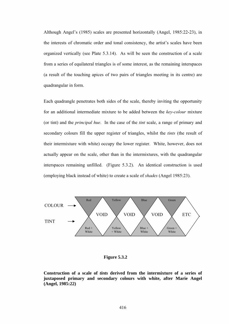
Although Angel’s (1985) scales are presented horizontally (Angel, 1985:22-23), in
the interests of chromatic order and tonal consistency, the artist’s scales have been
organized vertically (see Plate 5.3.14). As will be seen the construction of a scale
from a series of equilateral triangles is of some interest, as the remaining interspaces
(a result of the touching apices of two pairs of triangles meeting in its centre) are
quadrangular in form.
Each quadrangle penetrates both sides of the scale, thereby inviting the opportunity
for an additional intermediate mixture to be added between the key-colour mixture
(or tint) and the principal hue. In the case of the tint scale, a range of primary and
secondary colours fill the upper register of triangles, whilst the tints (the result of
their intermixture with white) occupy the lower register. White, however, does not
actually appear on the scale, other than in the intermixtures, with the quadrangular
interspaces remaining unfilled. (Figure 5.3.2). An identical construction is used
(employing black instead of white) to create a scale of shades (Angel 1985:23).
VOID VOID VOID ETC
Red + White
Yellow + White
Blue + White
Green + White
Green Blue Yellow
Red
COLOUR TINT
Figure 5.3.2 Construction of a scale of tints derived from the intermixture of a series of juxtaposed primary and secondary colours with white, after Marie Angel (Angel, 1985:22)
416

The artist’s minor adaptation of Angel’s (1985) tint and shade scales was twofold.
The first (Plate 5.3.14, No 1,) was to replace the white (or black) with a key-colour
(Terre verte) and the spectral hues with a range of earth colours arranged in a
naturally descending order of tonal values with the lightest (Yellow Ochre) at the top
and the darkest (Venetian Red) at the base. The key-colour, although analogous to
those pigments at the top of the scale, takes up an increasingly complementary role
as it moves toward the base. The scale of intermixtures however, produced a colour
sequence of great subtlety, from a neutral yellow-green at the top to a purple-grey at
the base. The red-browns, particularly Red Ochre and Venetian Red, were included
in the proposed palette, as it was thought that they would make a valuable
contribution in the development of the warm, tonally dark range of colours planned
to fill the backgrounds (Table 5.3.7). It should also be noted that, in this scale, the
quadrangular interspaces remained untouched, as the tonal value of the intermixtures
between the key-colour and the earth colours was already close.
The second adaptation (Plate 5.3.14, No 2) also involved replacing the original white
(or black) with a key-colour (Naples Yellow) and the primary and secondary colours
with a sequence of closely related hues, in this instance (following their clockwise
placement on a colour sphere [Saxon, 2003:134], beginning with yellow, followed by
orange red, purple, blue etc.) with purple at the top descending through violet and
blue to turquoise at the base. The quadrangular voids running through the centre of
the scale were, in this case, filled with an intermediate mixture (as was previously
suggested) which was equidistant between the key-colour tint and the juxtaposed hue
with which it was mixed. Again, the result of these studies was the discovery of an
array of subtle intermixtures ranging from dusty purples through grey-blues to muted
417

Plate 5.3.14 Chromatic Progressions, gouache on paper, 21 x 28cm: Notebook No. VI.
418

greens, all of which presented a wide range of useful chromatic possibilities. It
should be noted that in both scales shown in Plate 5.3.14, the key-colours (as with
their source) have been cited but not illustrated. It should also be recognized that the
key-colour mixtures are, to some extent, complementary to the sequence of principal
hues.
5.3.3.4 – Colour Instrumentation and Chromatic Consonance
Although the question of orchestration was discussed in 5.3.3.1, it should be noted
that this section deals with instrumentation at the level of dictionary definitions,
where these two words in terms of their independent meanings, may be interpreted as
having a high level of overlap. In the sense in which instrumentation is used in this
section, however, a clear demarcation has been made for the purposes of this study,
in terms of a syntax of colour in relation to matters of composition. In the present
context syntax pertains to those working procedures, which have contributed to the
arrangement of colour in the work under discussion, but not as a universal set of
rules designed to govern its structural organization. Indeed, instrumentation within
this frame of reference is primarily concerned with the proposed agencies, by and
through which the colour of the Book’s component parts might be implemented.
Chromatic consonance, on the other hand, addresses those aspects of colour
concerned with consistency, or more accurately, colour accord. To whatever extent
the categories of orchestration, instrumentation and consonance may be discussed in
isolation in terms of reification, there exists between them a high level of
419

interdependence. In practical terms, the interaction of all three often takes place in
an almost uninterrupted sequence of synchronous procedures.
5.3.3.5 – Text and Lettering
In terms of those aspects of the Book outlined above, both the text and lettering had,
from their inception, been considered in concert and it was understood that one
should, in some way, reflect aspects of the other. A further consideration was that
the title page should give prominence to a panel of (relatively) large scale decorative
lettering whose underlying structure and colouring would be stylistically related to
the lettering comprising the main body of the text. Yet another proposal was that
either the letters themselves or the field within which they were to be delineated
would be gilded, not only to make an initial visual statement about the nature and
substance of the Book as a richly decorated artifact (given its historical antecedents),
but also to create an opportunity to compose larger decorative letter forms en masse.
The materials assembled in order to carry out any work employing gold leaf have
been listed in Table 5.2.5. Despite the intention to introduce larger decorated letters
into the work, it became evident that to insert these as initials into the body of the
text would disrupt both the integrity of the design and general colour consonance.
(Plate 5.3.15), The ductus and form of the lettering in the text blocks has been
discussed (5.2.2) and the tools and materials to be used are documented in Table
5.2.5 It was determined however, that the colour of the lettering in the text blocks
would, in the interests of chromatic consonance, be consistent with the images and
the partial borders enframing them.
420
Consideration was also given to the distribution of colour within each pen stroke,
with a view to providing visual evidence of the ductus or direction and sequence of
strokes made within the individual letter forms. It was envisioned that each vertical
stroke should darken in tone toward its foot, anchoring the letters to the base line (as
is the case with some examples of fatigued Gothic Textura Prescisus Vel Sine
Pedibus (Harris, 1991:119)), thereby endowing them with a less uniform tone and a
more rhythmic overall texture. If necessary this variation in tone could be regulated
(employing a small sable brush) during the course of inspissation.
5.3.3.6 – Decoration
Five types of decoration were planned, one in the form of a continuous gilded frame
enclosing the entire panel of text lettering, borders and image; the second finer, and
also gilded, enframing or partially enframing the text blocks. The third was intended
to extend the visual ideas from the images into painted partial surrounds (borders)
enframing only the outer edges of the text blocks. The fourth and fifth were
elements to be incorporated into the body of the text working in concert with the
lettering. It is felt, however, that in the interests of clarity, the last two require a
more detailed explanation.
The immediate identification of words (in terms of their legibility) was never of
primary importance (see 5.2.1.7) and, other than demarcating the ends of sentences
as with full stops, it was anticipated that, given the style of lettering proposed, no
other punctuation should be used. Unlike many ancient and medieval handwritten
texts, however, it was felt that the integrity of the interspaces between individual
421

words should be maintained and it is this which represents the fourth type of
proposed decorative treatment.
Apart from the function of physically separating one word from another, it was
thought that these interspaces could become the object of both chromatic and
decorative treatment. With regard to the interspaces, it was further proposed that a
repetitive curvilinear motif might be used, not only to create a sub-pattern within the
body of the text but also to act as a foil to the formality of the text lettering, and
present an opportunity for either coloured or gilded embellishment. (see Plate
5.3.15).
The fifth decorative element (planned from The Book’s inception) comprised small
minim sized rectangles which, it was originally thought, would serve both as line-
fillers and additionally as a form of justification for the lines of lettering in the text
blocks. It was envisaged that these small rectangles would also be infilled with
colour and burnished gold. However, given the need for marking the end of
sentences, a far less prosaic role emerged for them, which would not only fully
integrate the rectangles with the text, but further augment their potential for
embellishment. In his examination of textual decoration and punctuation in the Book
of Kells from the early ninth century, Sir Edward Sullivan’s (1920), discussion of the
development of the full stop from a dot to a square suggests that
They [the dots] are in reality only ornaments; and the dots are in every case
round in form, whereas the true punctuation marks are always rectangular.
(Sullivan, 1920:xiii).
422

Plate 5.3.15 Studies for Lettering and Sentence Endings, watercolour, gouache, pencil and ink: 29.3 x 19.7cm: Sketchbook No. III.
423
Of particular relevance, however, in the present context, is that Sullivan (1920),
having established the fact that rectangular stops were firmly established at the time
the manuscript was written, further submits that
…the scribe occasionally illuminates the [rectangular] stops, enlarging them
into decorative forms to harmonize with the general embellishment of the
page. [The Kells text Folio 9.V] contains striking examples of this curious
innovation.
(Sullivan, 1920:xiv).
As a direct result of the practice described by Sullivan (1920), the entire raison
d’être for the proposed rectangular line-fillers was modified. In terms of the new
meaning with which they had been endowed, the placing of the rectangles within the
text would not only become more puissant but be further suffused with a symbolic
function, e.g., of pointing out “…aspects of the intonation and meaning [of the text]
not otherwise conveyed by the writing” (Collins English Dictionary, 1984:1184).
Prompted by the examples of embellishment described by Sullivan (1920), it was
further envisioned that these coloured decorative elements, apparently of little
moment, should be infilled with designs of single unit knot designs and key patterns
(in the manner of many Insular Gospel Books, Coptic, Ethiopic and Quranic
manuscripts), The fact that these patterns are so ubiquitous and ancient - with dates
extending as far back as “… 20,000 - 15,000 BC.” (Bain, 1975:171) - and that their
aesthetic legacy has persisted to the present day is, in itself, remarkable. What the
artist has found so compelling, however, is the fact that they found their way into
such a wide variety of illuminated books, with apparent disregard for the frontiers of
religion, culture or geography. Despite the vagaries of cultural traffic and commercial
424

exchange, it is not difficult to appreciate how this could have occurred, particularly if
prevailing opinions regarding the interpretation of these intricate pattern-types are
examined. For example, Carl Nordenfalk (1977), in his consideration of this matter,
observes that
…the difficult question as to whether certain ornament may have had a more
than decorative value [is raised]. It is quite possible that magical
connotations from the pagan past could have been preserved when they were
adapted to Christian use. In some instances, a symbolic meaning has been
thought to be concealed within a design which, at first glance, would seem to
be purely ornamental.
(Nordenfalk, 1977:19).
The possibility of magical connotations is taken up by Nigel Pennick (2001) in his
discussion of binding patterns, knots and their relationship to ancient arcane
knowledge. He is of the opinion that
The empowerment of knots in binding magic comes through human activity.
It is our will and skill that gives them their intention. Similarly when we
draw or carve knots and binding patterns, we empower them. Natural magic
has many traditional patterns…to protect places, objects and people from
psychic harm. They are forms of drawn knots. Binding-knots are a miniature
magical enclosure that brings harmful influences to a full stop.
(Pennick, 2001:113).
425
It should be added that, apart from their intended utilization as the deflectors of
harmful influences, it was also envisaged that such designs (beneficently coloured)
would assist in binding and protecting the contents of the text. The key patterns (and
their progenitors), it would appear, were also endowed with similar properties, that
is, to confound and immobilize potentially harmful influences. In his references to
this aspect of the patterns, Nordenfalk (1977) is inclined to think that “…it is no
matter of chance that the key and fret patterns are directly based on the maze”
(Nordenfalk, 1977:17) – structures designed specifically to ensnare and confuse,
thereby protecting the spiritual treasures lying at their heart from the gaze of the
uninitiated, whilst at the same time enchanting them.
5.3.3.7 – Images
The principal ideas underpinning the proposed organization of colour for the planned
images for the Book were, in almost every respect apart from that of scale in concert
with those advanced for the earlier painted works (see Plate 5.3.16 ). In terms of the
juxtaposition of figure and ground, the ground (as with the previous works) would
be designed to foreground the positive forms, projecting them into relief through the
application of darker (in this instance warmly coloured) and stronger tones to the
background areas (see Plate 5.3.16 ). Indeed the only specific aspects regarding the
colours which could to some extent be predetermined, were those which influenced
their initial selection, (Table 5.3.7), chromatic consonance (see 5.3.3.4), their fitness
vis à vis the background and the intended correspondence of the background colours
to a specific moment in time (see 5.3.3.2). Also, in keeping with previous practice, it
was determined that the purpose underlying the amalgamation of small trompe l’oeil
elements with the larger (more stylized) forms would remain the same, (see Plate
5.3.16 ). This applied equally to the strategies engaged in the development of the
426
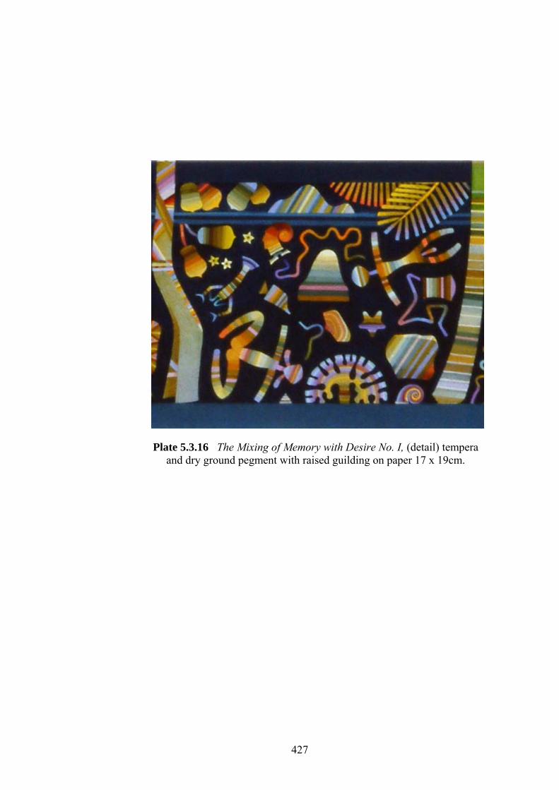
Plate 5.3.16 The Mixing of Memory with Desire No. I, (detail) tempera
and dry ground pegment with raised guilding on paper 17 x 19cm.
427
banded chords of colour which, it was anticipated, would be created to infill the
forms e.g., human figures, formlings and other pictorial elements constituting the
subject matter (see Plate 5.3.16) and destined to inhabit the planned rectangular
image areas (see 5.2.3.4 and Figure 5.2.4).
Not to be overlooked was the anticipated application of gilding to specific pictorial
elements. The gilding was to be implemented in two forms, the first being shell gold
(applied like paint and burnished) which would be used sparingly within the colour
chords designed to infill the positive forms. The second would be raised gilding, that
is to say, the use of gold leaf applied to individually shaped, relief gesso grounds:
and this would be reserved exclusively for representations of the heavenly bodies-
e.g., the phases of the moon and to highlight particular groups of stars. Traditionally
both types of gilding form essential elements in the painting of miniatures in hand
made books from Europe, the Middle East and Indian Asia (see 5.3.3.1). Apart from
the more obvious affinities between the luminous qualities of burnished gold with
those of the heavenly bodies and their pictorial antecedents, however, there were
more substantial reasons for its proposed use in the Book images. Alison Cole
(1993), in her historical visual guide to the art of colour, observes that
Gold…has been used by artists and craftsmen around the world to symbolize
the glory of the heavens. Its colour – whether warmed by the underlayer of
red clay or tinged with green from natural impurities – gave an other worldly
quality to the…image.
(Cole, 1993:10).
428

In her discussion of its use during the Byzatine and Medieaval periods, Cole (1993)
further explains that
…the splendour of …gleaming, burnished [gold] leaf represented two
different levels of reality: the mystical realm of the heavenly sphere and the
pictorial world, created through suggestions of light and shade.
(Cole, 1993:10).
The descriptions of the physical, metaphysical and symbolic attributes ascribed to the
function of gold in pictorial images (as well as other artefacts) were, at least until the
fourteenth century, associated with the broader debate focused upon the problem of
what the art historian John Gage (1995) refers to as “…the secularization of, light”.
(Gage, 1995:76). Aside, however, from the issues attendant upon the progress of
ideas through the course of history, the artist’s initial interest was impelled by the
notion of Cole’s (1993) representation of “…two different levels of reality” (Cole,
1993:10) in concert with the concept of a mutable exchange of functions between the
symbolic ‘realm’ and that of an image mediated by “…the suggestions of light and
shade.” (Cole, 1993:10). It would be difficult to find a more able writer to express
the feelings underlying such a chain of associations than the historian, literary critic
and philosopher Umberto Eco (1985). In reflecting upon his passion for the
mediaeval period and the writing of his first novel The Name of the Rose (1983), he
relates that
When we used to light bonfires on the grass in the country, my wife would
accuse me of never looking at the sparks that flew up among the trees and
glided along the electricity wires. Then when she read the chapter on the fire,
429

[The seventh Day: Night] she said, “So you were looking at the sparks!” and I
answered, “No, but I know how a mediaeval monk would have seen them.”
(Eco, 1958:17-18).
5.4 - Collection of Preparatory Work The preparatory material directly related to the Book’s fabrication, from its inception
to its final realization, has been collected and assembled in chronological order and
bound into seven volumes. The dimensions and shape of each volume are
commensurate with those of the original designs, as they were envisioned at each
significant stage of the book’s development. Table 5.4.1 enlarges on the enumerated
material provided in Figure 5.1.1.
5.5 – Realization: The Hand-Lettered and Painted Book As a part of the mapping process for the creation of the Book, a sequential
schematized plan for its completed pages has been furnished in Figure 5.1.1 under
the heading provided above. This plan, in rudimentary form, is documented in
Volume 1 of The Collection of Preparatory Work (see 5.4, Table 5.4.1). The central
position allocated to the pages in Figure 5.1.1 represents an endeavour not only to
locate them within the overarching framework of the Book’s genesis and realization,
but also to highlight their significance. The individual completed pages are
illustrated in Plates 7.2.18 - 7.2.33.
430

Table 5.4.1 Overview of volumes one to seven of the collection of Prepartory work.
Number Size Number of leaves
Binding Brief outline and description of Contents
Volume 1 1994 – 2000
100 mm x 350 mm 36 Light red buckram
• Notes on “ Trees” text. Qumran Community and foundation of the IBS International.
• Two typographic versions of the text cut into rectangular panels Trees of the Earthly Mother (Szekely; 1978:18) and (Communion to the) “Trees” (Szekely; 1984:193) the right hand leaves of which are in Hebrew.
• The Essene Communions and their Purpose. • Description of the Essene Tree of Life program for the Book in
thumbnail sketches. • Working roughs for fitting letters and words of text together. • Exact text layout in type with photocopied inserts of images.
Volume 2 1992 – 1998
100 mm x 380 mm 36 Light red buckram
• Brief description and thumbnail sketches for binding the seven volumes of notebooks.
• Cover designs for first version of the Book. • Description of the principle of rabatment applied to page design and
disposition of elements to the page. • Collaged double-page spread of first version of the Book - (wood
engraved with type) • Collaged double-page-spread of second version of the Book - (wood
engraved with type) Volume 3
1992 – 2000 130 mm x 445 mm 25 Light red
buckram • Early examples of lettering styles and horizontal multi-block text
arrangements. • Trial for combining text with decorative framing borders. • Double page spread for a third version of the Book - (wood/lino cut with
431
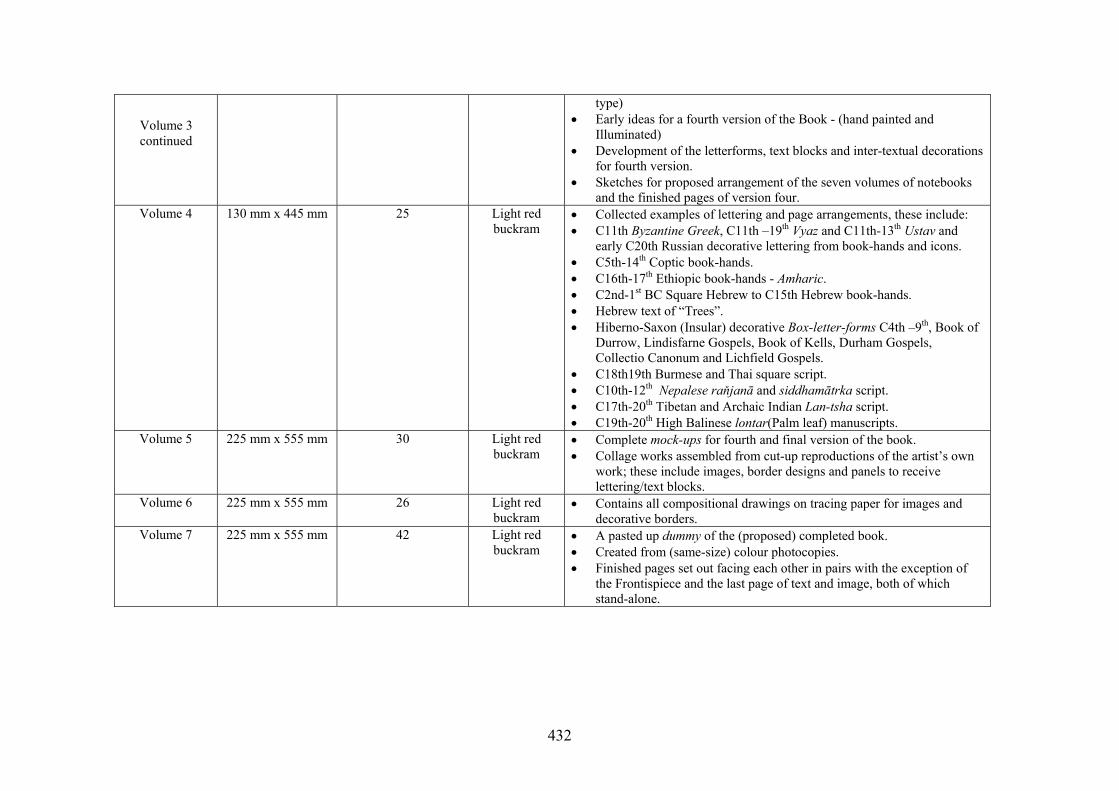
type) • Early ideas for a fourth version of the Book - (hand painted and
Illuminated) • Development of the letterforms, text blocks and inter-textual decorations
for fourth version. • Sketches for proposed arrangement of the seven volumes of notebooks
and the finished pages of version four. Volume 4 130 mm x 445 mm 25 Light red
buckram • Collected examples of lettering and page arrangements, these include: • C11th Byzantine Greek, C11th –19th Vyaz and C11th-13th Ustav and
early C20th Russian decorative lettering from book-hands and icons. • C5th-14th Coptic book-hands. • C16th-17th Ethiopic book-hands - Amharic. • C2nd-1st BC Square Hebrew to C15th Hebrew book-hands. • Hebrew text of “Trees”. • Hiberno-Saxon (Insular) decorative Box-letter-forms C4th –9th, Book of
Durrow, Lindisfarne Gospels, Book of Kells, Durham Gospels, Collectio Canonum and Lichfield Gospels.
• C18th19th Burmese and Thai square script. • C10th-12th Nepalese raňjanā and siddhamātrka script. • C17th-20th Tibetan and Archaic Indian Lan-tsha script. • C19th-20th High Balinese lontar(Palm leaf) manuscripts.
Volume 5 225 mm x 555 mm 30 Light red buckram
• Complete mock-ups for fourth and final version of the book. • Collage works assembled from cut-up reproductions of the artist’s own
work; these include images, border designs and panels to receive lettering/text blocks.
Volume 6 225 mm x 555 mm 26 Light red buckram
• Contains all compositional drawings on tracing paper for images and decorative borders.
Volume 7 225 mm x 555 mm 42 Light red buckram
• A pasted up dummy of the (proposed) completed book. • Created from (same-size) colour photocopies. • Finished pages set out facing each other in pairs with the exception of
the Frontispiece and the last page of text and image, both of which stand-alone.
Volume 3 continued
432
5.6 - Developments The developments were twofold: the first was concerned with generating a binding
style for the Book whilst the second involved a printed publication. These
developments are located on the lower right hand side of Figure 5.1.1.
5.6.1 - The Book covers A small number of ideas were proposed with respect to the Book’s permanent
binding; these included considerations of colour, cover material and gold blocked
designs. Three were fabricated at the level of small maquettes, but none were
realized in a completed form. The maquettes are illustrated in Plate 7.2.34.
5.6.2 – The Publication Outcome
The publication of Communion to the Trees in December 2002 was a post exhibition
outcome, evidence of which is contained in Appendix J.1.
433