Embed Size (px)
Citation preview

Color
in Fashion


color• Color is the first Element of Design that
people notice in a garment or outfit.
• Color can be used to make us appear,
Happy, Sad, Older, and Younger.
• Color can be used to create the illusion of being larger or smaller.
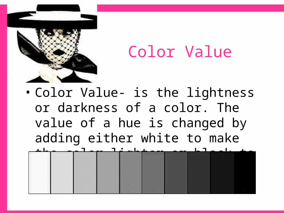
• Color Value- is the lightness or darkness of a color. The value of a hue is changed by adding either white to make the color lighter or black to make the color darker.
Color Value

Value Scale

Color Schemes
• Color Schemes are the recipes for putting together colors.– Fabric Design– Garment Design– Home Decor

Monochromatic
• Mono means “one”, refers to the tints tones and shades of one color
• Possible color combinations are limitless!– Mint green and forest green
• Generally calming, however it depends on the hue

• Monochromatic- This
dress has Tints and
Tones of the color
orange in the print.

Analogous
• Often referred to as adjacent. Two, three, or four hues that lie next to one another on the color wheel. All hues have one hue in common.
• Possible colors (Can include tints, tones & shades)– Yellow-green, yellow, yellow-orange, orange
• Feeling created: can be calming or exciting depending on whether they come from the cool or warm side of the color wheel.– This color scheme is most effective if one of the hues repeats some
aspect of your personal coloring… eyes, hair…

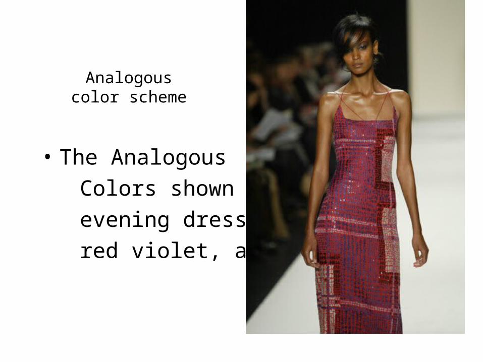
Analogouscolor scheme
• The Analogous
Colors shown in this
evening dress are red,
red violet, and violet

Complementary
• Combine two colors from the opposite side of the color wheel.
• Possible colors: red & green, blue & orange• Feeling associated: stimulating due to opposite
visual characteristics. By dulling the intensity or value, calming effect may be achieved.– Can be very flattering to personal coloring, and
versatile


Triad
• Three colors equally spaced on the color wheel
• Possible colors: tints, tones and shades of primary or secondary colors
• Very exciting and stimulating if used in full strength.

Triad
Split Complementary
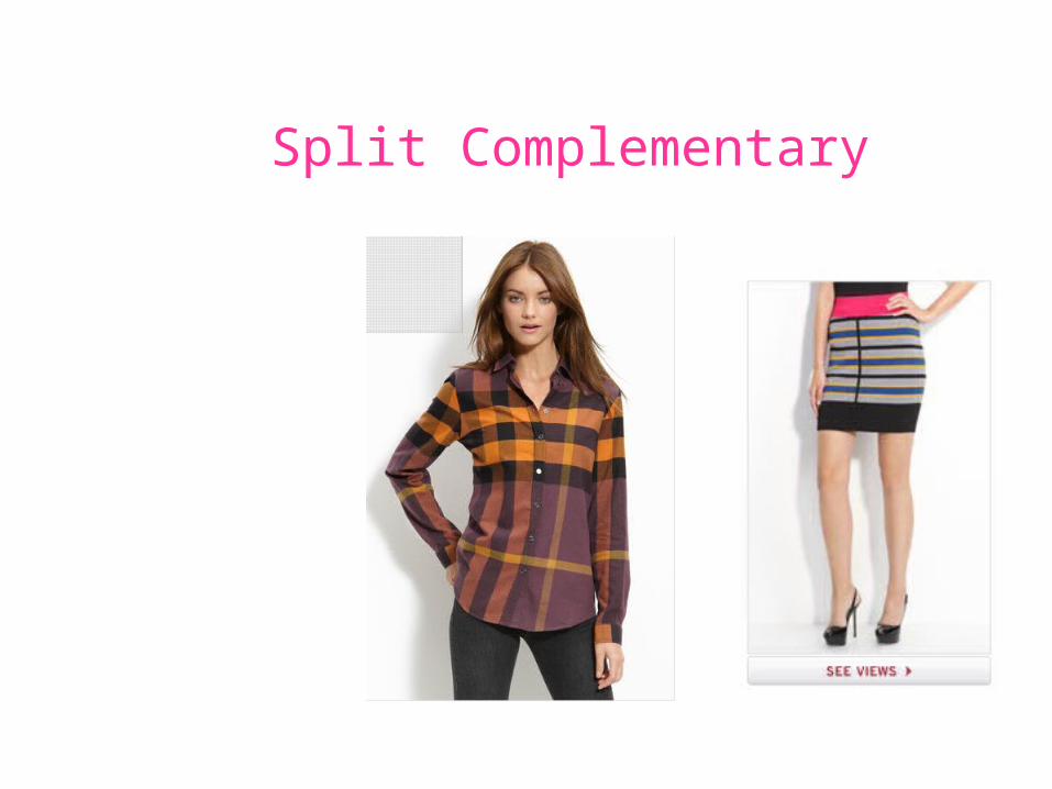
• Uses three hue families.
• Begin by selecting one hue; the other two hues will be those that lie on either side of the first colors complement.
• Can be very dynamic. Works best if one color is dominant and the other two colors are shown in smaller amounts.
Split Complementary
Neutral
• One, two, or three achromatic neutrals, may or may not vary in the degree of warmness or coolness, lightness or darkness, brightness or dullness
• Possible colors: black and white, combination of browns• Effect: vary in mood depending on the degree of light and
dark value contrast– Are most effective if the degree of lightness or darkness in your
hair and/or skin coloring is repeated in the lightness or darkness of the clothing

Accented neutral
• One color added to other neutrals to form a scheme.
• Possible colors: black, white & red, browns with light blue
• Effect: draws attention to the one added hue

color• To increase attention and apparent size, to appear
shorter and heavier– Warmer hues
– Lighter values
– Brighter intensities
– Strong contrasts• Examples: shocking pink, pumpkin, tangerine, raspberry

COLOR• To maintain or decrease attention and
apparent size, to appear taller and slimmer– Cooler hues– Darker values– Duller intensities– Close contrasts
• Examples: navy, khaki, grape, charcoal, mauve
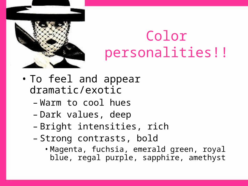
Color personalities!!
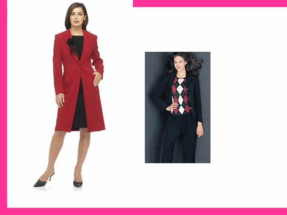
• To feel and appear dramatic/exotic– Warm to cool hues– Dark values, deep– Bright intensities, rich– Strong contrasts, bold
• Magenta, fuchsia, emerald green, royal blue, regal purple, sapphire, amethyst
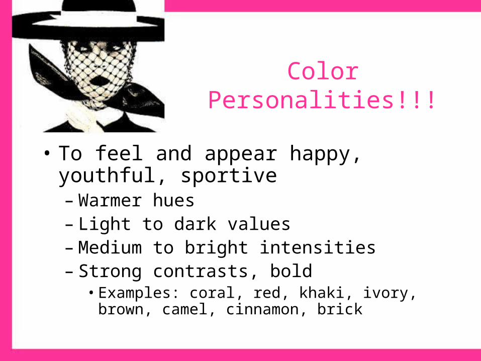
• To feel and appear happy, youthful, sportive– Warmer hues– Light to dark values– Medium to bright intensities– Strong contrasts, bold
• Examples: coral, red, khaki, ivory, brown, camel, cinnamon, brick
Color Personalities!!!

Color personalities!!
• To appear refined, romantic– Warm to cool hues– Lighter values– Dull, muted to medium intensities including
pastels– Close contrasts, subtle
• Examples: shell pink, lavender, misty rose, orchid, blue, peach, all pastels

Color personalities!!!
• To appear mature, serious, somber, classic– Cool hues– Dark values– Dull intensities
• Examples: navy blue, taupe, charcoal, maroon, gray, black

Color Schemes
Portfolio Pages

Color Schemes Portfolio Pages
• Two pictures of any two color schemes.– Explain which colors are in the design, and
where the colors are. Tell what color scheme is created by the colors.
– Explain the effect of the colors on the body.– Describe the effect of the color scheme, does it
draw attention, or is it calming?

Color Schemes
Portfolio Pages