Embed Size (px)
Citation preview
Color Harmonies
A Collaboration of Design Ideas from my Trip to England
Rebecca Slater
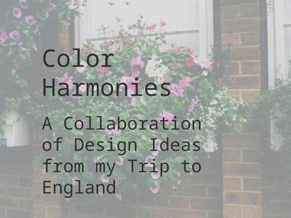
SLIDE 1
This is part of the window box and hanging basket
display the Royal Horticultural Society put on at the 1998 Chelsea
Flower Show. Note the four colors are all shades of
pink, yet anything but monotonous. This
combination seems vibrant and soothing at the same
time.
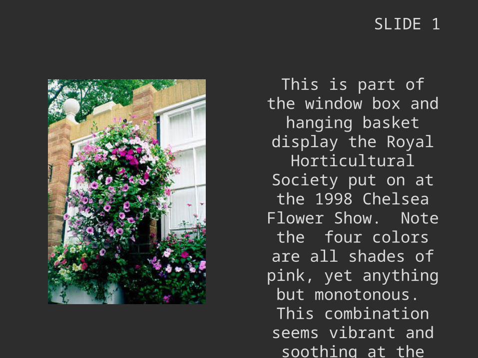
SLIDE 2
My favorite rhododendron at Exbury.
As with the last photo, the flower is many shades of
pink.The amount of darker
shades in proportion to medium and lighter shades
seems perfect.Sometimes nature makes
the most beautiful combinations!
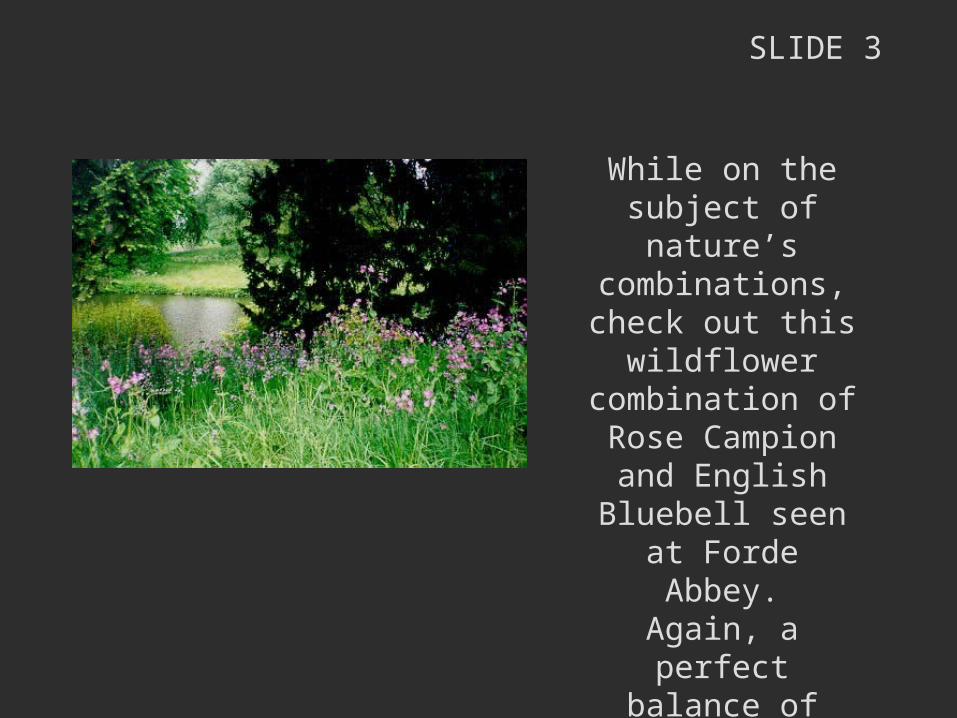
SLIDE 3
While on the subject of nature’s
combinations, check out this wildflower
combination of Rose Campion and
English Bluebell seen at Forde Abbey.
Again, a perfect balance of color and
texture.
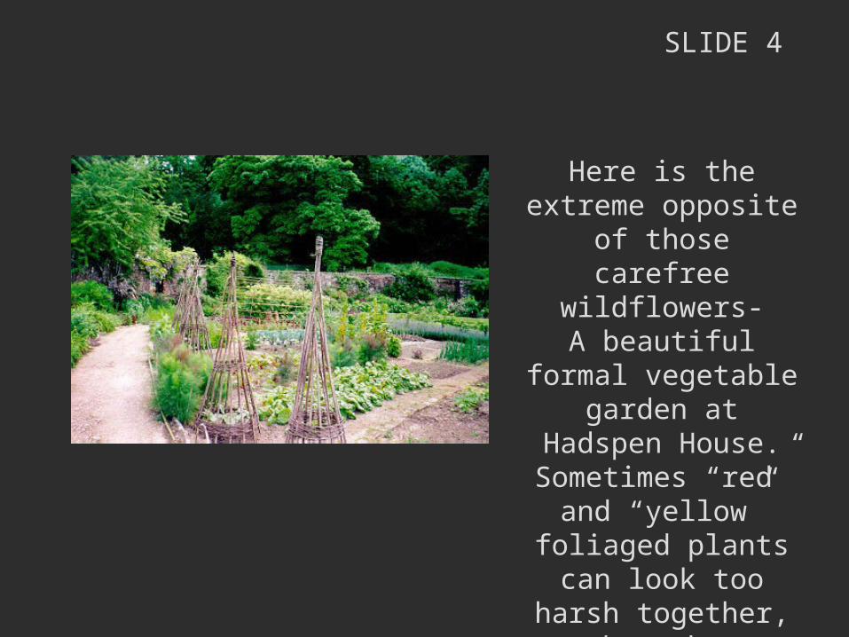
SLIDE 4
Here is the extreme opposite of those
carefree wildflowers-A beautiful formal vegetable garden at
Hadspen House.Sometimes “red” and
“yellow” foliaged plants can look too
harsh together, but the vegetables and herbs in
this garden strike a perfect color balance.
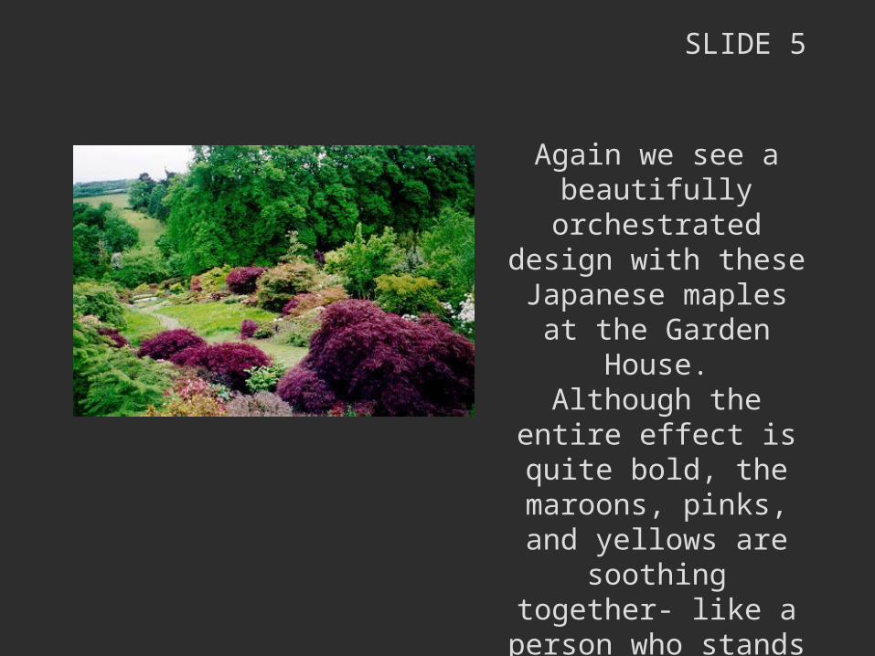
SLIDE 5
Again we see a beautifully orchestrated
design with these Japanese maples at the
Garden House.Although the entire effect
is quite bold, the maroons, pinks, and yellows are soothing
together- like a person who stands out from the crowd in their dress, but
individually looks beautifully put together.
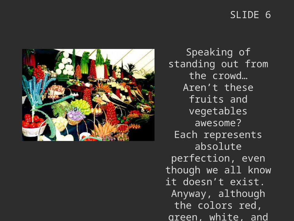
SLIDE 6
Speaking of standing out from the crowd…
Aren’t these fruits and vegetables awesome?
Each represents absolute perfection, even though we all know it doesn’t
exist. Anyway, although the
colors red, green, white, and orange would not seem harmonious in a
planting, they really pull it off here- in an ultra
artificial setting.
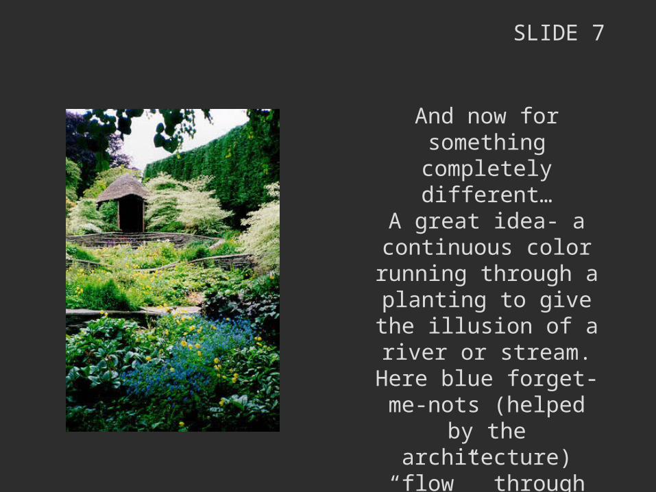
SLIDE 7
And now for something completely different…
A great idea- a continuous color running through a planting to give the illusion of a river or
stream.Here blue forget-me-nots
(helped by the architecture) “flow”
through this three tiered planting at the Garden
House.
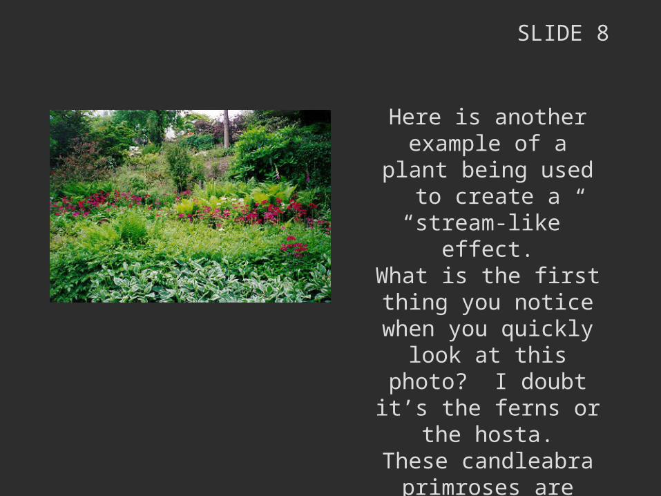
SLIDE 8
Here is another example of a plant being used to create a “stream-like”
effect.What is the first thing you notice when you quickly
look at this photo? I doubt it’s the ferns or the
hosta.These candleabra
primroses are magnificent anyway, and even more so in their spotlight position
here at Hillier’s.
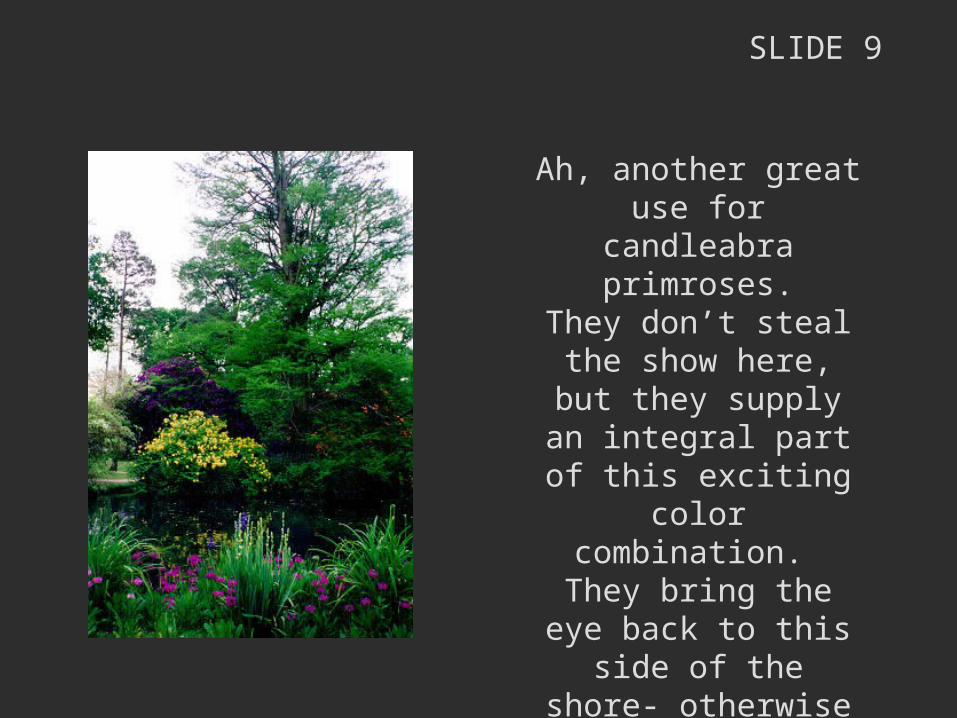
SLIDE 9
Ah, another great use for candleabra primroses.
They don’t steal the show here, but they supply an
integral part of this exciting color
combination. They bring the eye back to this side of the shore- otherwise
the line would just disappear & the view would be much less
enticing.
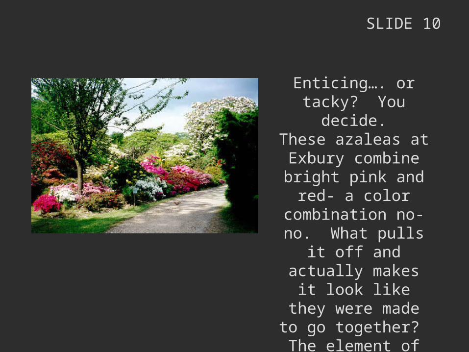
SLIDE 10
Enticing…. or tacky? You decide.
These azaleas at Exbury combine bright pink and red- a color combination no-no. What pulls it off and
actually makes it look like they were made to
go together? The element of white,
which acts as a divider for colors.
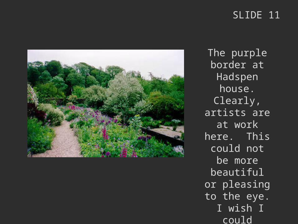
SLIDE 11
The purple border at
Hadspen house. Clearly, artists
are at work here. This could not be more beautiful or
pleasing to the eye. I wish I
could design like this- it’s
absolutely stunning.
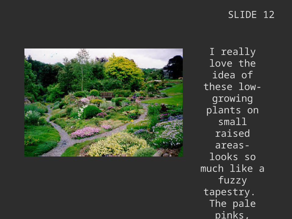
SLIDE 12
I really love the idea of these low-growing
plants on small raised areas-
looks so much like a fuzzy
tapestry. The pale pinks,
yellows, and greens combine in a lovely way.
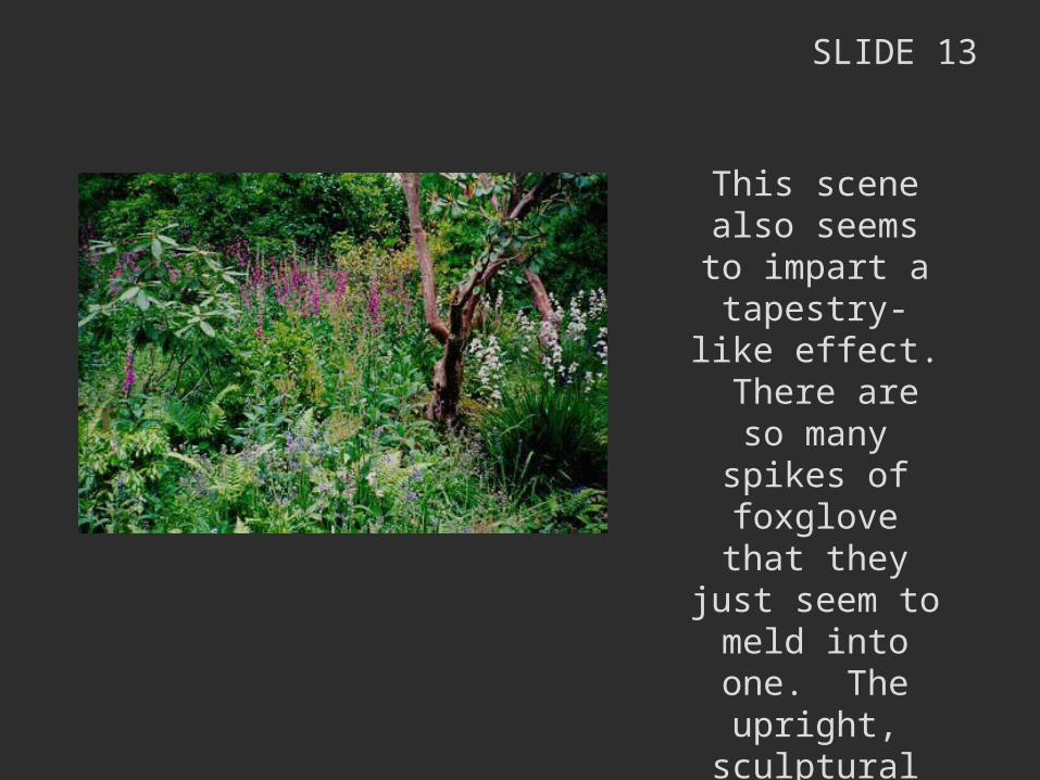
SLIDE 13
This scene also seems to impart a
tapestry-like effect. There are so many spikes of foxglove that they just seem to meld
into one. The upright, sculptural quality of the tree prevents the eye from becoming disinterested.
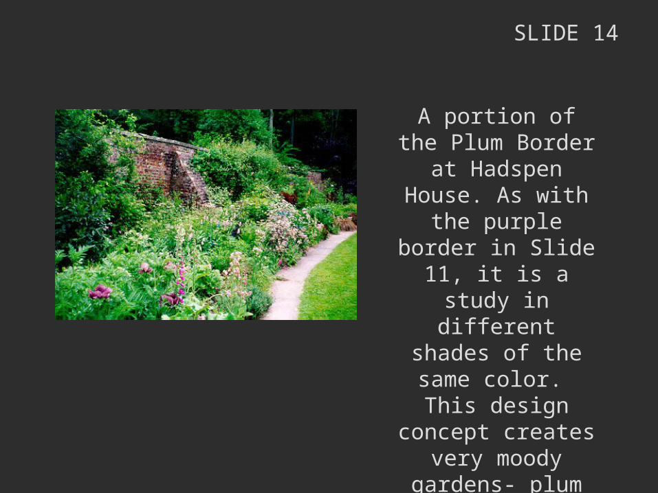
SLIDE 14
A portion of the Plum Border at Hadspen House. As with the
purple border in Slide 11, it is a study in
different shades of the same color. This
design concept creates very moody gardens- plum seems deep and passionate, whereas another color may seem upbeat and
springy.
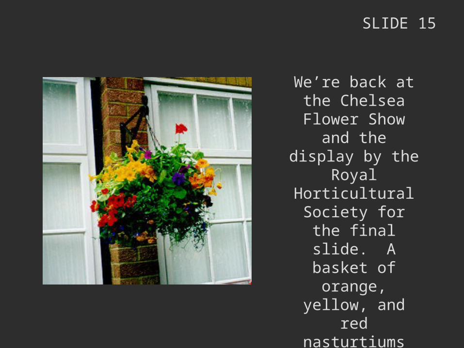
SLIDE 15
We’re back at the Chelsea Flower
Show and the display by the Royal
Horticultural Society for the final slide. A
basket of orange, yellow, and red
nasturtiums combine with some purple petunias and blue
lobelia for a cheerful ball of color.