Embed Size (px)
Citation preview

TRANSPORTATION RESEARCH RECORD 1247 23
Color Appearance of Traffic Control Devices Under Different Illuminants
BELINDA L. COLLINS
Color has traditionally been used to code safety information because of its ability to attract attention and evoke a rapid response. Research on color coding, highway safety color codes, conspicuity, illuminant color shifts, and retroreflective materials has been reviewed to evaluate the effectiveness of the current chromaticity specifications for highway signs and markings. These current specifications require colors of medium lightness and saturation (except yellow), and sometimes can appear quite dark. Data from a previous study were analyzed to compare color appearance data (color name, lightness, and saturation) under seven different illuminants for a set of American National Standards Institute (ANSI) and highway colors. This analysis demonstrated that the ANSI colors, particularly safety yellow, were identified more accurately in terms of color name, lightness, saturation, and primary hue than was the corresponding highway color. A shift toward ANSI safety yellow from highway yellow is suggested.
Color has traditionally been used to code safety information, organize complex displays, and create moods (1). The typical highway application is to color code safety information and directions to allow a motorist to see and recognize a colored sign and respond immediately with the desired action. Thus, on U.S. highways, red is used for stop signs, yellow for caution signs, and blue for directional signs.
The current specifications for highway colors are for 12 highly saturated colors of medium to low lightness (2 ,3). The color specifications are different from those in other U.S. standards ( 4) as well as from those given by international standards (5 ,6). The colors indicated for use on U.S. highways are somewhat darker, particularly yellow, blue, and green, and may not be recognized as accurately as the colors specified in other standards. In addition, current specifications for highway yellow are very close to orange and red, leading to confusion between yellow and orange.
BACKGROUND
Existing Codes and Standards
Use of color coding for highway traffic signs evolved slowly into the modern code now recommended in the Manual on Uniform Traffic Control Devices (MUTCD). Thus, the first highway color code, developed in 1927, recommended only four colors: white, black, yellow, and green (for rest stations) (7). Red, orange, and blue were added in various revisions up to 1961, although they were not used consistently.
National Engineering Laboratory, National Institute of Standards and Technology, U.S. Department of Commerce, Gaithersburg, Md. 20899.
The process of adding colors to the highway color code did not always run smoothly. In 1957, the noted colorist Faber Birren commented that color coding should be used so that motorists do not have to think continuously while seeing (8). This practice is used in industry where bright colors mark dangerous spots. Birren claimed that the "visual reaction to color is involuntary, while words require deliberation" (8, p. 569). He objected to a proposal to use black as a background color for directional or guide signs, because black, although affording high contrast with white lettering, does not have the visual or psychological interest that green has.
In 1967, extensive revisions were proposed for the highway code by the National Joint Committee on Uniform Traffic Control Devices. This committee developed the following criteria for a highway color code:
• The code should contain no more than 10 to 15 colors; • Present highway colors should continue to be used; • The separation between colors should maximize discrim
ination by color-normal viewers; and • The separation between colors for color-defective observ
ers should be no worse than the worst pair in use, red and green (7).
Using these criteria, the committee selected the following set of 12 colors:
• Red-stop or.prohibition, • Yellow-general hazards, • Blue-information, • White-regulation, • Purple-unassigned, • Coral-unassigned, • Orange-construction or maintenance, • Green-permitted movement; directions, • Brown-recreational and cultural, • Black-regulation, • Light blue-unassigned, and • Strong yellow-green-unassigned.
Introductory Information on Color Research
Perception of an object's color is the result of the interaction of the visual sensitivity of the observer when the object is viewed, the spectral reflectance distribution of the object being viewed, and the type of illumination (spectral power distribution) under which the object is viewed. For example, a red object cannot preferentially reflect red (longwave) radiation

24
if the light source does not contain long wavelength radiation. Commercially available sources vary widely in their spectral power distribution, with some sources such as low-pressure sodium (LPS), containing light concentrated at about 589 nm with virtually no energy at other wavelengths, and others, such as tungsten, having a continuous spectral power distribution. The CIE uses the term "color rendering" for specifying the ability of a light source to reveal the colors of objects.
The color-rendering index, however, does not provide any information about what color a color is; that it, is the red seen a cherry red, burgundy red, brick red, magenta, or is it really pink? A number of color specification systems, such as the Munsell and CIE systems, have been developed so that one person can understand what another person means by a term such as "red" (9). The CIE chromaticity system provides a way of specifying a color in mathematical terms for any light source whose spectral power distribution is known. This approach allowed the development of a two-dimensional chromaticity diagram in which the color of an object is specified mathematically in terms of x and y. Because the CIE 1931 chromaticity diagram does not represent a uniform chromaticity space, the CIELAB OR CIE L*a*b* system was developed. In this system, the CIE system was transformed mathematically to a uniform color space so that the human visual response could be approximated more closely (10). The CIELAB space is widely used for industrial applications, such as textiles and surface colors.
Color Codes
There are three major types of colors used for safety alerting: ordinary surface, fluorescent, and retroreflective (as well as combinations of the latter). Ordinary surface colors are neither fluorescent nor retroreflective but rather diffuse (glossy) opaque surfaces. Retroreflective materials reflect light back in the direction from which it came by the use of optical devices such as spherical lenses and prismatic (cube corner) materials. Fluorescent colors, in addition to reflecting light, also absorb light of some wavelengths and reemit the energy at longer wavelengths.
In a set of recommendations for surface colors, the CIE (5) suggested that limiting the number of colors in a color-coding scheme would be effective, and stated that the colors most accurately recognized are red, yellow, green, blue, black, and white, with orange, purple, gray, and brown as additional colors. The CIE also recommended that the interrelation among the individual colors of the code, and among the background colors, be considered both in terms of luminance and chromaticity. A comparison of the U.S. and international codes reveals that the largest specification differences occur in the green region of the spectrum. The green specified by the U.S. standards occupies a much smaller region, shifting from yellow toward blue. This was done to minimize red-green confusions by color-defective observers. In addition, several international standards, including ISO, do not provide specifications for orange, whereas in others the yellow is shifted away from red toward green. The FHWA (AASHTO) specifications are probably less similar to those used in international practice. On the other hand, the ANSI specifications are the same as those specified by the U.S. Department of Transportation Office of Hazardous Materials Transport and
TRANSPORTA TJON RESEARCH RECORD 1247
are referenced by the Occupational Safety and Health Administration (OSHA) for use in all industrial work sites.
BACKGROUND INFORMATION ON COLOR VISION
Normal Color Vision
Current research in color vision has confirmed that there are two types of photoreceptors in the human eye: the rods, responsible for reception of low levels of light, and the cones, responsible for reception of higher levels of light and color perception. The rods contain one type of photopigment, maximally sensitive at a wavelength of about 505 nm, whereas it is now believed that the cone photopigments peak at about 419, 531, and 559 nm (11). The three types of color receptors in the eye are linked into an opponent color system with two separate color channels: one red and green, and the other blue and yellow (with the yellow response being created by the interaction of red and green photopigments); and one achromatic channel.
Although there is good agreement that there are three types of color receptors in the normal human eye, the · ability to discriminate color varies through the visible spectrum. Wyszecki and Stiles (10) reported that two relative maxima of LlA (the wavelength discrimination threshold) are observed, one at approximately 460 nm in the blue, and the other in the green at about 530 nm, and three relative minima occur at approximately 440, 490, and 590 nm. Wavelength discrimination also depends on luminance level, field size, surround luminance, retinal area studied, and observation technique. Generally, decreasing field size will decrease discriminability.
One way of determining accurate color recognition has been the color-naming approach used by Boynton and his colleagues. They explored the location of "basic" colors in the Optical Society of America (OSA) set of uniform colors using three response measures: consistency of color naming, consensus on names among subjects, and reaction times. Boynton and Olson (12) determined that the 424 color samples of the OSA set could be described by a lexicon of 11 basic color terms. These terms include white, black, red, green, yellow, blue, brown, gray, orange, purple, and pink. They found a consistent use of these 11 terms for about 70 percent of the color judgements, and a similar consistency for 5 percent of the nonbasic terms, with response time being shortest for the basic terms. In addition, although observers agreed on color names for the samples, the centroid color for a given color name tended to be close but not the same between observers. Uchikawa and Boynton (13) determined that native Japanese observers also divided the color space into 11 categories of colors, very similar to those used by English-speaking observers. They interpreted these results as implying that there is a strong physiological basis for color sensation that is not influenced by genetic or cultural differences between Americans and Japanese. The 11 basic color names that Boynton and his colleagues identified are similar to the safety color codes currently used. Pink is the only "basic" color not in use, although FHW A does provide for a coral. The data strongly suggest that these color codes tap basic color sensations that observers agree on and recognize readily.

Collins
Use of Color Coding to Convey Information
Data from 42 experimental studies published between 1952 and 1973 were reviewed and analyzed for the effectiveness of color coding for visual displays (14). It was found that when specific color codes were used for a target, performance was superior for color displays relative to black and white displays. Furthermore, the increase in identification and searching performance could be as great as 200 percent. It was reported that if a subject's task was to identify some feature of a target, color was identified more accurately than size, brightness, and shape, but less accurately than alphanumeric symbols. Nevertheless, color can interfere with the accuracy of identifying achromatic feature attributes, particularly if observers do not know the target color (15). Yet, when color is used as a redundant variable (e.g., a particular shape is always associated with a particular color), the accuracy of identifying or locating simple targets is greater than when size or brightness is used. Researchers noted that road traffic signs, which use redundant color coding, are more likely to be located accurately and attract the motorist's attention than achromatic signs (J). Studies have also determined that color coding facilitated detection of warning messages that appeared unexpectedly and infrequently (such as traffic signs) (16).
These studies reiterate the effectiveness and desirability of color coding for conveying simple, yet critically important information quickly and accurately, particularly under stressful conditions .' This is likely to be one of the most effective ways to ensure that motorists receive important, easily recognized information. They must, however, be familiar with the color code for maximum effectiveness.
There have been many attempts to develop color codes that are maximally discriminable from each other, and are immediately recognizable. Most of the research has been done with colored lights rather that surface colors, perhaps because of the need to signal information over long distances for naval and air applications. To this end, Halsey determined that reducing illuminance noticeably decreased the accuracy of identifying colored signal lights, particularly for desaturated blues, purples, and greens (17). Because violet was frequently identified as blue, she suggested that these two colors not be used in the same signaling system. In a second experiment, Halsey found that blue lights were identified with much greater accuracy when purple was not a choice (18).
Problems Associated with Defective Color Vision
Determining which colors are appropriate for safety color coding is complicated by the fact that some 8 to 10 percent of the U.S. male population is color-defective from birth. There are three major classes of inherited color defects: anomaly, involving the alteration of a photopigment; dichromatism, involving the loss of one photopigment; and monochromatism (very rare), involving the loss of all color photopigments. According to traditional classifications, protan defects include protanopia and protanomaly (loss or alteration of the long wavelength pigment), deutan defects include deuteranopia and deuteranomaly (loss or alteration of the mid-wavelength pigment), and tritan defects include tritanopia and tritanomaly (loss or alteration of the short wavelength pigment). Hurvich reported that about 6.5 percent of the Caucasian population has deutan-type defects, about 2 percent has pro-
25
tan-type defects, and about 0.001 percent has tritan-type defects (19). The majority of males (4.9 percent) with defective color vision are deuteranomalous, as are the few females with defective color vision. Protan observers frequently have a deficit in long-wave luminosity not found in deutan or tritan observers (19). This deficit has important implications for the development of an effective safety color code because protan observers tend to see reds (if at all) as very dark.
The variations in color discrimination capabilities make diagnosing color defects difficult and predicting color vision almost impossible. Lantern, wool sorting, color chip sorting, and color plate (pseudoisochromatic) tests have been developed to detect color defects, but each seems to test different aspects of the deficiency so that a person (with a mild defect) can ·'pass" one test and "fail" another. Most of these tests will diagnose dichromatic individuals, although they may not distinguish between protan and deutan defects (20). Diagnosing tritan-type defects is complicated because changes in macular pigment and yellowing of the lens (typical of normal aging and acquired color defects) also result in losses in sensitivity to short-wavelength pigments.
The practical implications of color deficiency are that reds and greens tend to be confused. In addition, protan-type observers tend to have reduced sensitivity to reds, so that they appear very dark. Jameson and Hurvich found that protanopes appear to use lightness differences as cues for colors (21). Their color-naming behavior suggests that they follow the rule that if a color is dark, then it should be called "red".
Various color-coding schemes have been proposed to improve the ability of color-defective observers to detect colors. Thus, Sloan and Habel designed two experiments to determine the minimum angular subtense and luminance for a three signal color code that would be distinguishable by both normal and dichromatic observers (22 ,23). Their results indicated that normal observers, and about 74 percent of color-defective observers, could recognize the three colors tested for 1° fields that were 0.7 mL or more in luminance. The chromaticity of the green had to be shifted toward blue rather than yellow to be effective, however. Because the only observers who failed to recognize the colors (and to use color names accurately) were protanopes, Sloan and Habel suggested that protanopes should perhaps be excluded from occupations requiring rapid, accurate recognition of colors. They noted, nonetheless, that the use of the three color code would make it possible to qualify about 75 percent of those with deficient color vision. The color specifications currently used by the CIE and ANSI were chosen to be recognizable by color-defective observers. Thus, the purple boundary for the red chromaticity region was chosen partly to compensate for the reduced sensitivity to the extreme red end of the visible spectrum typical of the protanopic and protanomalous observer. The green was shifted toward blue, away from yellow, to avoid red-green confusions.
Color Deficiency in the Transport Industry
Cole and Vingrys found that evidence from laboratory experiments concluded that color-defective observers (particularly pro tan opes) make more errors and have slower reaction times recognizing colored signal lights than do normal observers (1). Errors occurred most frequently for orange-red, red, yellow, green, and white colors. In addition, protan observers

26
often failed to see reds. The authors suggested that the orangered currently recommended for signal red by the CIE is too yellow and is not ac~urately recognized by color-normal and color-defective observers as red. Yellow is frequently confused with white (of a low color temperature) by normal and color-defective observers, whereas error rates for dichromats can be as high as 30 percent for yellow. If the color code is restricted to three colors (red, green, and blue), color defectives have little difficulty with green, but if more colors are present in the code, then error rates may run as high as 40 to 50 percent. Problems arise in accurate recognition by colordefective observers of colors of highway signs and markings as well as of lights, with protans frequently failing to recognize red signals.
Cole and Vingrys pointed out that, although the la~ oratory data predict that color-defective observers should encounter problems with codes using three or more colors, this prediction is not always validated in field experiments. They did note six field studies that found that color defectives made more errors identifying colored signal lights than did normal observers. Their analysis indicated further that increasing viewing distance also decreased the accuracy of color naming for the color-defective observers. It was noted that, although anecdotal accounts attributed several railway accidents in the late 1800s to defective color vision and subsequent failure to recognize colored signal lights, there was, unfortunately, no definitive evidence of the kind of color defect present or its role, if any, in these accidents. An examination of six studies of highway accidents also indicated confusion about the type and degree of defect and its contribution to the accident. Cole and Vingrys concluded from one study that protans had almost double the number of rear-end collisions, whereas deutans had twice as many accidents at traffic-light controlled intersections. Although two studies attributed an increase of accidents in general aviation to color deficiency, there was some question about whether the number of flights was equal for both normal- and color-defective pilots. Cole and Vingrys concluded, however, that defective color vision can be a significant risk factor in aviation and road use, and recommended the retention of color vision standards in the transport industry.
STUDIES OF HIGHWAY SIGN COLORS
MacNeil evaluated the impact of different color combinations on observers' ability to detect caution and warning signs at three light levels (24). He determined that black on yellow and white on black were significantly more legible than such combinations as white on red, red on black, or black on red. In addition, white on orange and white on red were completely illegible under low red illumination, whereas red and black were illegible under low white illumination. As a result, MacNeil recommended using black on yellow for caution signs for maximum legibility.
Olson and Bernstein evaluated the nighttime legibility of highway signs and found systematic differences in the luminances required for recognition accuracy with various background colors (25). Thus, white, orange, and yellow (in that order) required the lowest luminances for a given level of performance. Increasing the luminance of the surround increased the legibility distance by about 5 to 10 percent and
TRANSPOfU'A'J'lON RESEARCH RECORD 1247
reduced the impact of high luminance for the legend, particularly for low backgrou!"ld luminances. Subjects with less contrast acuity required greater luminance contrast-sometimes as much as ten times-as the normal group. Older subjects, regardless of luminance contrast, also had higher error rates.
In a study of the conspicuity of sign materials, Olson (26) found that sign color identification distance for retroreflective materials viewed under nighttime conditions varied as a function of SIA (specific intensity per unit area or coefficient of retroreflection) and surround complexity, with distance decreasing with complexity but increasing with SIA, at least for yellow signs. Using more highly reflective materials decreased the effect of complexity, however. Older subjects required signs with an SIA about three times greater. Olson found that red, orange, green, and blue signs had greater sign identification distances than yellow signs with about the same SIA-a very unexpected result that indicated that conspicuity may depend on sign color as well as SIA. Olson attributed this difference to the same phenomenon that underlies heterochromatic brightness matching, in which colored lights equivalent in luminance to white lights are seen as brighter. Results from these studies reinforce the importance of colors in the overall conspicuity of highway traffic control devices.
Measurement of Retroreflective Materials
Lozano pointed out that it is not likely that the color of retroreflective signs will be the same under both daytime diffuse viewing conditions and nighttime directional viewing conditions (27). The results obtained for safety color appearance under different illuminants indicate that the problem of accurate color identification is likely to be even greater when high intensity discharge (HID) illuminants are used (28). Eckerle noted that the chromaticity boundary specifications for retroreflectors must take into consideration the fact that the color of a retroreflector will vary with geometry from daytime to nighttime conditions (29). One of the few systematic assessments of the color of retroreflective materials was performed by Rennilson, who made detailed chromaticity measures for three types of retroreflective materials, with a spectroradiometer for Illuminant A (2856 K) using different nighttime geometries (30). Rennilson reported that a matrix containing observation angles (a) of 0.2, 0.5, 1.0, and 2.0° and entrance angles (13 1 ) of -4, 15, 30, and 50° was a good way to describe the changes in chromaticity with changing measurement geometry. Data given by Rennilson for blue, green, orange, and red retroreflective samples indicated relatively little change in normalized spectral reflectance factor as a function of changing observation angle, particularly for those angles below 1.0°. Nonetheless, the studies of the chromaticity of retroreflective materials reinforce the idea that their color will vary as a function of both the illuminant and viewing geometry.
PROBLEMS ASSOCIATED WITH THE ILLUMINANT AND OBJECT COLOR
Safety Colors
Although the ability to detect safety colors of any type is influenced by the size of the sign, the overall illuminance and luminance, and the background characteristics and clutter,

Collins
the largest impact may be that of the illuminant. The switch to HID sources with higher energy efficiencies but poor colorrendering capabilities has created major difficulties in the accurate recognition of highway and other types of safety signs.
Thus, a study reported on the identifiability of the ANSI safety colors under different light sources (28). The ANSI safety colors include red, orange, yellow, green, blue, purple, black, gray, and white. Six light sources were used-daylight fluorescent, incandescent, metal halide, deluxe mercury, clear mercury, and high-pressure sodium-under low levels of illuminance (5 .3 Ix) . Although major confusions between colors for the HID sources were found, the data for fluorescent, clear mercury, and high-pressure sodium (HPS) are of particular interest for highway applications. Under fluorescent light, the major confusion was that 15 percent of the observers saw black as blue. Under clear mercury, orange, red, and yellow were confused, as were yellow and white, green and blue, and blue and black. Under HPS, red and orange, yellow and orange, green and blue, and black and blue were confused. In fact, red and orange were confused under all light sources except fluorescent, as were blue and green. Jerome concluded that colors must be separated by at least 40 units in color space to be discriminable from one another, and noted that the separation in color space will be differentially affected by the light source.
Thornton pointed out that there are two solutions to the problem of identifying colors under HID illuminants: one, to change the light source, and the other, to change the color (31). He addressed the latter approach by noting that the chromaticity of red, orange, and yellow shift toward each other under HPS and that their dominant wavelengths move int.a the region typically termed orange yellow. Similarly, under clear mercury, the dominant wavelength of ANSI red shifts to orange and the saturation to low. Thornton suggested redesigning the spectral reflectance of the safety colors by suppressing the amount of blue-green and yellow reflectance in each color. This approach is effective for those illuminants that have spectral power distributions across the visible spectrum. However, illuminants such as low-pressure sodium, clear mercury, and, to a lesser extent, high-pressure sodium have little or no energy in the red portion of the spectrum, meaning that they cannot render red (and orange) colors accurately. For these cases, Thornton demonstrated theoretically that the addition of fluorescence to red, orange, and yellow would improve their dominant wavelength under high-pressure sodium (HPS) , low-pressure sodium (LPS), and clear mercury. The improvement was less marked for blue and green, particularly under the sodium sources. Although Thornton's approach did not use human observers in a strict experimental protocol, it reinforced the idea that safety colors are unlikely to be identified accurately under many common sources, including those used in highway applications, because of shifts in chromaticity and luminance.
Two studies at the National Bureau of Standards (NBS) (32,33) explored the interaction between illuminant and object color. The identifiability of different types of colors (ordinary, fluorescent, and retroreflective) was evaluated under several light sources. Glass et al. (32) concentrated on color-naming data for red and orange samples in a pilot laboratory experiment, using seven observers and five light sources including tungsten, metal halide, fluorescent, HPS, and LPS. Their
27
results indicated that ANSI blue, green, and purple were generally identified correctly under all sources except LPS (although green was frequently termed blue under HPS). Yellow was correctly identified under all sources, but serious confusions were seen for orange and red except under tungsten and fluorescent. Nominally, red samples were frequently termed red, orange, or yellow depending on the illuminant. Two fluorescent samples were identified as effective reds with few confusions with orange or yellow, even under LPS. Two ordinary samples, blue and green, were also more accurately identified under all light sources than the corresponding ANSI color. The green fluorescent samples were effective, except under LPS where they were termed yellow, a potentially serious confusion. Glass et al. concluded that there is a set of colors (including red, orange, yellow, green, and blue) that are more likely to be accurately identified than the ANSI set and that should be researched further.
In the second study, Collins et al. (33) evaluated the appearance of 58 color samples including 11 red, 10 orange, 8 yellow, 10 green, 6 blue, 5 purple/magenta, 2 brown, 4 white, 1 gray, and 1 black. The 10 ANSI samples were included as well as the "best" blue, green, orange, and red samples from the study by Glass et al. A total of 16 ordinary, 17 retroreflective, 17 fluorescent, and 8 retroreflective, and fluorescent samples were used. In 11 cases, a particular sample was available in both a retroreflective and nonretroreflective version. Each sample was studied under seven illuminants: tungsten (TUN), cool white, fluorescent (CW), metal halide (MH), clear mercury (MER), HPS, LPS, and an equal mixture (in illuminance) of metal halide and HPS (MIX). In addition, the spectral reflectance distribution of all samples was measured with a spectroradiometer for an incandescent source. The spectral reflectance distribution for the non-fluorescent samples was then calculated for the seven illuminants, and each fluorescent sample was directly measured under each illuminant.
Ten color-normal observers viewed each sample twice under all sources. They reported the dominant color name, primary hue, secondary hue, and percentage of secondary hue (if any), as well as lightness and saturation for each sample (in terms of high, medium, and low). The results agreed with previous experiments indicating serious confusion between ANSI red, orange, and yellow for LPS, HPS, and mercury; confusion of green with blue-green under HPS, and nonrecognition of green under LPS. There was no improvement for retroreflective materials compared with nonretroreflective versions of the same color sample. Collins et al. also determined that there was a set of "best" colors which were identified more accurately under the seven light sources than the ANSI colors. This set included the fluorescent red identified by Glass et al., a new fluorescent orange, and three ordinary colors for blue, green, and yellow. The ANSI samples for purple, brown, and white performed better than the comparison samples. Collins et al. converted the spectroradiometric measurements for each sample into chromaticity and luminance data in both CIE x,y, and CIELAB coordinates. The data for both the ANSI and "best" samples were plotted in CIELAB a*b* space to examine the gamut of coloration under each light source. This analysis demonstrated that the range for the "best" colors was larger for all light sources than for the ANSI colors, thereby supporting the contention that the "best" colors were seen with higher saturations and were therefore more likely to be correctly identified in safety applications.
28
Appearance of Highway Colors
Although the research by Collins et al. focused on the ANSI safety colors and attempts to improve their recognizability, their data represent one of the few evaluations that also contained colors similar to the current highway colors. For this paper, the chromaticity data from their study were reanalyzed to determine which colors were similar to the current Federal Highway Administration (FHWA) colors. Performance for these colors was then compared with the ANSI safety colors for each of the seven illuminants. It should be noted that the data were obtained by viewing color samples positioned vertically under diffuse (overhead) illumination conditions so that the experimental conditions simulated signs illuminated by overhead roadway illumination or daylight. They did not simulate nighttime highway conditions in which signs are illuminated directionally by car headlamps.
Similarity between the FHW A and the experimental colors was determined by comparing each of the 58 samples visually with the appropriate set of colors in the Highway Color Tolerance Charts and then graphing those colors that were a reasonable visual match in CIELAB space. Examination of the CIE and CIELAB specifications indicated that several colors used in the study, specifically red No. 11, orange No. 35, yellow No. 21, green No. 25, and blue No. 27, were very similar to those specified by FHW A for highway use. In subsequent paragraphs, these samples will be referred to as "highway" colors because they are close to, but not identical with, the FHWA centroid color specifications.
For the present analysis, the psychophysical results for dominant color name, primary hue, secondary hue, lightness, and saturation were examined for both the ANSI standard color and the color most similar to the current highway specifications for red, orange, yellow, green, and blue. A color sample was considered to be a good example if it had a high percentage of that color name as the dominant color name, medium lightness (except for yellow, which should have high lightness), high saturation, and a high percentage (above 90 percent) of the desired color as the primary hue.
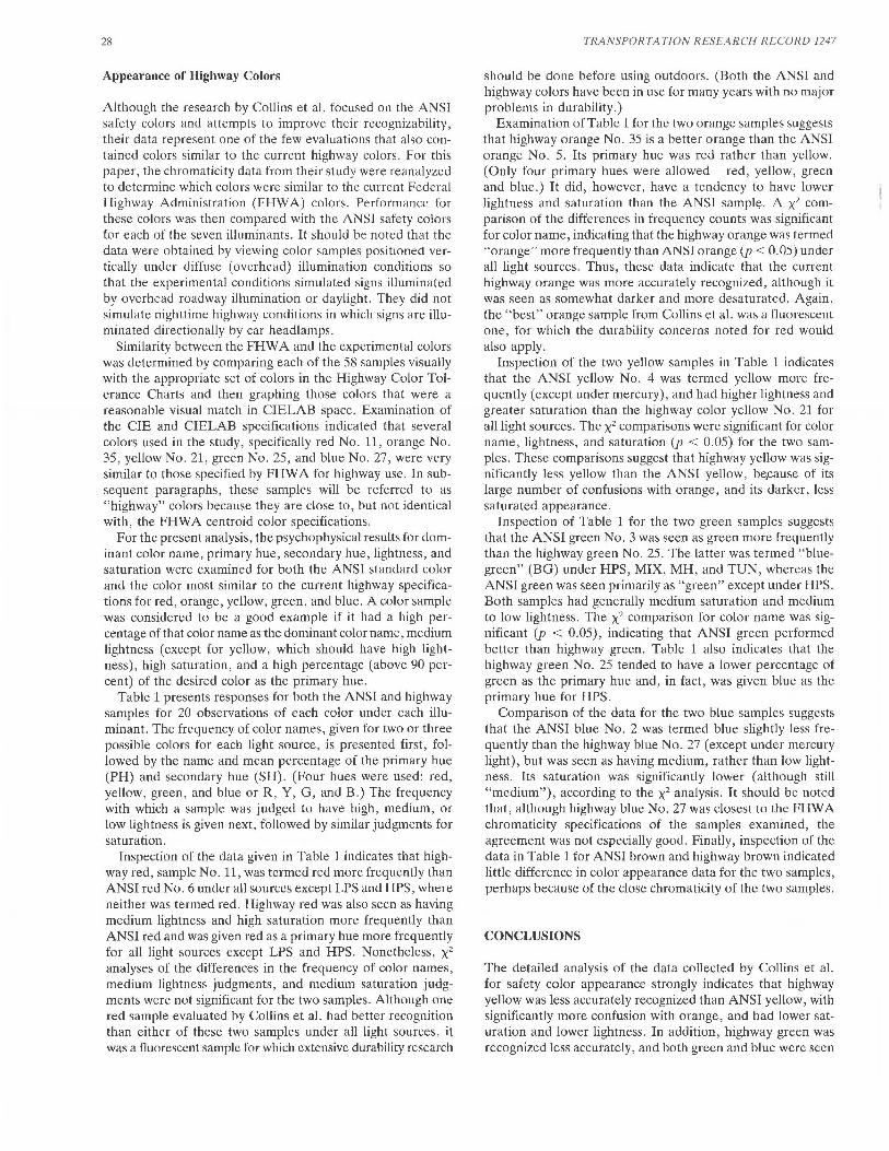
Table 1 presents responses for both the ANSI and highway samples for 20 observations of each color under each illuminant. The frequency of color names, given for two or three possible colors for each light source, is presented first, followed by the name and mean percentage of the primary hue (PH) and secondary hue (SH). (Four hues were used: red, yellow, green, and blue or R, Y, G, and B.) The frequency with which a sample was judged to have high, medium, or low lightness is given next, followed by similar judgments for saturation.
Inspection of the data given in Table 1 indicates that highway red, sample No. 11, was termed red more frequently than ANSI red No. 6 under all sources excepl LPS and HPS, where neither was termed red. Highway red was also seen as having medium lightness and high saturation more frequently than ANSI red and was given red as a primary hue more frequently for all light sources except LPS and HPS. Nonetheless, x2
analyses of the differences in the frequency of color names, medium lightness judgments, and medium saturation judgments were not significant for the two samples. Although one red sample evaluated by Collins et al. had better recognition than either of these two samples under all light sources, it was a fluorescent sample for which extensive durability research
TRANSPORTATION RESEARCH RECORD 1247
should be done before using outdoors. (Both the ANSI and highway colors have been in use for many years with no major problems in durability.)
Examination of Table 1 for the two orange samples suggests that highway orange No. 35 is a better orange than the ANSI orange No. 5. Its primary hue was red rather than yellow. (Only four primary hues were allowed-red, yellow, green and blue.) It did, however, have a tendency to have lower lightness and saturation than the ANSI samplt<. A x2 comparison of the differences in frequency counts was significant for color name, indicating that the highway orange was termed "orange" more frequently than ANSI orange (p < 0.05) under all light sources. Thus, these data indicate that the current highway orange was more accurately recognized, although it was seen as somewhat darker and more desaturated. Again, the "best" orange sample from Collins et al. was a fluorescent one, for which the durability concerns noted for red would also apply.
Inspection of the two yellow samples in Table 1 indicates that the ANSI yellow No. 4 was termed yellow more frequently (except under mercury), and had higher lightness and greater saturation than the highway color yellow No. 21 for all light sources. The x2 comparisons were significant for color name, lightness, and saturation (p < 0.05) for the two samples. These comparisons suggest that highway yellow was significantly less yellow than the ANSI yellow, be.cause of its large number of confusions with orange, and its darker, less saturated appearance.
Inspection of Table 1 for the two green samples suggests that the ANSI green No. 3 was seen as green more frequently than the highway green No. 25. The latter was termed "bluegreen" (BG) under HPS, MIX, MH, and TUN, whereas the ANSI green was seen primarily as "green" except under HPS. Both samples had generally medium saturation and medium to low lightness. The x2 comparison for color name was significant (p < 0.05), indicating that ANSI green performed better than highway green. Table 1 also indicates that the highway green No. 25 tended to have a lower percentage of green as the primary hue and, in fact, was given blue as the primary hue for HPS.
Comparison of the data for the two blue samples suggests that the ANSI blue No. 2 was termed blue slightly less frequently than the highway blue No. 27 (except under mercury light), but was seen as having medium, rather than low lightness. Its saturation was significantly lower (although still "medium"), according to the x2 analysis. It should be noted that, although highway blue No. 27 was closest to the FHW A chromaticity specifications of the samples examined, the agreement was not especially good. Finally, inspection of the data in Table 1 for ANSI brown and highway brown indicated little difference in color appearance data for the two samples, perhaps because of the dose chromaticity of the two samples.
CONCLUSIONS
The detailed analysis of the data collected by Collins et al. for safety color appearance strongly indicates that highway yellow was less accurately recognized than ANSI yellow, with significantly more confusion with orange, and had lower saturation and lower lightness. In addition, highway green was recognized less accurately, and both green and blue were seen

TABLE 1 PSYCHOPHYSICAL COMPARISONS FOR ANSI AND HIGHWAY COLOR SAMPLES
~Q,!or Name Counts Hue J..i.ghmess ::!2rnut!on
ANSI Red #6 (N=20)
Source Red Orange Brown PH% SH% High Med Low High Med Low cw 11 5 1 Rl 85 y 18 0 14 6 5 11 4
HPS 0 15 2 R 69 y 31 1 10 9 4 13 3 MIX 2 9 3 R 74 y 26 0 14 6 5 10 5 LPS 0 0 0 y 77 G 24 2 15 3 1 6 13 MER 0 0 20 R 82 y 20 0 3 17 0 9 11
MH 6 4 1 R 79 y 24 0 14 6 3 14 3 TUN 12 3 0 R 85 y 17 0 18 2 11 6 3
Highway Red #ll
Source Red Orange Brown PH% SH% High Med Low High Med Low cw 14 2 0 R 86 y 17 0 17 3 10 10 0
HPS 0 14 1 R 64 y 36 0 15 5 6 12 2 MIX 4 8 2 R 77 y 24 0 16 4 6 12 2 LPS 0 0 1 y 79 G 22 3 14 3 0 5 14 MER 6 0 13 R 87 y 16 0 1 19 0 14 6
MH 12 3 2 R 82 y 18 0 19 5 8 9 3 TUN 13 2 0 R 87 y 16 0 15 1 13 7 0
ANSI Orange #5
Source Orange Yellow PH% SH% High Med Low High Med Low cw 13 0 y 72 R 25 2 18 0 1 19 0
HPS 5 13 y 88 R 28 6 13 1 10 10 0 MIX 10 2 y 82 R 22 1 19 0 5 13 2 LPS 0 20 y 96 R 7 9 11 0 10 6 4 MER 0 12 y 93 R 13 1 17 2 1 12 7
MH 11 1 y 74 R 30 2 17 1 3 13 4 TUN 17 1 y 76 R 31 3 16 1 3 15 2
Highway Orange #35
Source Orange Yellow Olive PH% SH% High Med Low High Med Low cw 13 1 0 y 70 R 31 2 16 2 4 16 4
HPS 16 0 0 y 69 R 31 3 17 0 1 15 1 MIX 12 1 0 y 78 R 22 1 16 3 0 13 4 LPS 0 19 1 y 96 G 11 7 12 1 7 7 6 MER 1 6 7 y 84 G 18 0 15 5 3 7 13
MH 16 1 0 y 78 R 24 1 16 3 4 14 5 TUN 19 0 0 R 61 y 39 1 17 2 0 12 4
ANSI Yellow #4
Color Name Counts ~ Lightness Saturation
Source Yellow YG2 PH% SH% High Med Low High Med Low cw 15 4 y 90 G 13 12 8 0 6 14 0
HPS 19 1 y 93 G 12 14 6 0 11 7 2 MIX 17 2 y 94 G 12 12 8 0 6 14 0 LPS 20 0 y 99 G 7 14 6 0 18 2 0 MER 8 10 y 85 G 18 11 9 0 10 9 1
MH 16 4 y 95 G 12 11 9 0 12 8 0 TUN 17 2 y 94 G 8 9 11 0 5 14 1
Highway Yellow #21
Source Yellow Gold Orange PH% SH% High Med Low High Med Low cw 11 3 3 y 94 R 8 4 16 0 3 14 3
HPS 18 0 1 y 95 G 12 7 13 0 8 10 2 MIX 10 2 5 y 88 R 17 5 15 0 6 13 1 LPS 19 1 0 y 97 G 9 8 12 0 9 9 2 MER 13 3 0 y 96 G 8 1 19 0 2 16 2
MH 5 6 7 y 85 R 22 4 14 2 2 14 4 TUN 6 6 6 y 85 R 20 5 14 1 3 13 4
TABLE 1 (continued on next page)

TABLE 1 (continued)
ANSI Green #3
Source Green BG Gray PH% SH% High Med Low High Med Low cw 11 9 0 G 84 B 20 0 12 8 1 16 3
HPS 8 10 0 G 81 B 26 0 7 13 1 13 6 MIX 10 9 0 G 84 B 22 0 13 7 0 17 3 LPS 1 0 13 G/R y 18 0 2 18 0 3 1 MER 17 2 0 G 89 B19 0 10 10 0 7 13
MH 12 8 0 G 87 B 17 0 16 4 1 15 4 TUN 13 7 0 G 96 B 14 0 17 3 4 14 2
Highway Green #25
Source Green BG Black PH% SH% High Med Low High Med Low cw 11 8 0 G 85 B 20 1 13 6 1 17 2
HPS 1 17 0 B 67 G 33 0 5 15 4 12 4 MIX 4 15 0 G 77 B 27 0 13 7 5 14 1 LPS 0 0 14 0 0 0 0 20 0 0 1 MER 17 1 0 G 92 B 12 0 9 11 1 13 6
MH 8 12 0 G 79 B 28 1 15 4 3 16 1 TUN 7 13 0 G 74 B 28 0 16 4 8 12 0
ANSI Blue #2
Color Name Counts Hue Li. ghtness Saturation
Source Blue Purple Gray PH% SH% High Med Low High Med Low cw 20 0 0 B 99 R 0 14 6 6 12 2
HPS 20 0 0 B 98 R/G 0 7 13 4 12 4 MIX 20 0 0 B 9 R 0 13 7 5 13 2 LPS 0 0 12 R 80 y 16 0 0 20 0 0 5 MER 12 8 0 B 85 R 19 8 10 10 3 12 5
MH 20 0 0 B 98 R 0 17 3 4 12 4 TUN 20 0 0 B 97 G 0 15 5 5 13 2
Highway Blue #27
Source Blue Black PH% SH% High Med Low High Med Low cw 20 0 B 99 R 5 0 11 9 12 8 0
HPS 20 0 B 98 R/G 0 3 17 12 8 o· MIX 20 0 B 99 R/G 0 13 7 12 7 1 LPS 5 15 B 100 0 0 0 20 1 2 8 MER 19 0 B 96 R 0 1 19 8 12 0
MH 20 0 B 98 R/G 0 15 5 11 9 0 TUN 20 0 B 98 R/G 1 13 6 12 8 0
ANSI Brown #7
Source Brown Tan Olive PH% SH% High Med Low High Med Low cw 20 0 0 R 75 y 24 0 3 17 0 13 7
HPS 11 1 7 R 79 y 25 0 7 13 0 10 10 MIX 15 3 2 R 79 y 21 0 5 15 1 10 9 LPS 2 6 6 G 87 y 14 3 11 6 0 5 13 MER 11 1 7 G 86 y 10 0 7 13 0 6 14
MH 18 2 0 R 76 y 26 0 4 16 1 9 10 TUN 19 0 0 R 79 y 20 0 3 17 0 9 11
Highway Brown #38
Source Brown Tan Olive PH% SH% High Med Low High Med Low cw 20 0 0 R 79 R/Y 0 4 16 1 11 8
HPS 13 1 6 R 80 y 23 1 7 12 0 10 10 MIX 18 0 2 R/Y R 34 1 5 14 0 10 10 LPS 2 4 8 G 88 y 17 1 12 7 0 3 14 MER 14 0 5 G 84 y 9 0 3 17 1 8 11
MH 16 1 1 R 78 y 20 0 4 16 1 12 7 TUN 20 0 0 R 78 y 21 0 6 14 1 9 10
lR=Red, Y=Yellow, G=Green and B=Blue, 2YG=Yellow Green; BG= Blue Green

Collins
as darker than the comparable ANSI color . On the other hand, highway orange was more accurately recognized than ANSI orange, although both its lightness and saturation were lower. Differences between highway and ANSI red were not significant. The poor performance for both under LPS and HPS is of concern, however. The widespread use of HPS as a roadway illuminant and the importance of red in signalling prohibited actions such as "do not enter," "no right/left turn," and "stop" suggests the potential for serious confusion for red, and the need to develop durable fluorescent colors. The generally better performance for the ANSI colors, particularly yellow, green, and blue, compared with the highway colors, suggests that serious consideration should be given to altering the specifications for highway colors to meet the ANSI specifications. Such a move should increase the general recognizability of traffic sign colors, and increase the unity among standards for safety colors in the United States.
Before specifications for highway materials are changed dramatically, though, there is a need for further research on the recognizability of retroreflective colors viewed in a retroreflective mode. The data collected by Collins et al. were only for color samples viewed by diffuse illumination. Although this represents a major portion of highway viewing, it does not deal with the nighttime situation of signs illuminated by a mixture of headlights and HID (or fluorescent) lamps. The colors identified as more effective should be evaluated as retro reflective materials under both daytime (diffuse) and nighttime (directional) viewing conditions. In addition, the chromaticity of retroreflective colors should be evaluated to determine the extent of shifts as the illuminant is changed from A to D 65 , and to HID sources. Because preliminary indications are that major shifts occur, there is a need to document these changes and develop a field procedure to determine when a sign's chromaticity has shifted beyond tolerance and must be replaced. Finally, because they can be recognized more accurately under HID sources, the durability of fluorescent red and orange pigments under Jong-term, outdoor use should be assessed.
REFERENCES
1. B . L. Cole and A. J. Vingrys . Are Standards of Colour Vision in the Transport Industries Justified? Report to the Australian Department of Aviation, July 1985.
2. Standard Specification for Retroreflective Sheeting for Traffic Control. M268-84, AASHTO, 1984.
3. Manual on Uniform Control Devices . Rev . 4, AASHTO, March 1986.
4. Safety Color Code for Marking Physical Hazards. ANSI Z53-1979, American National Standards Institute (ANSI), 1979.
5 . Recommendations for Surface Colours for Visual Signalling. Publication CIE No. 39-2 (TC-1.6), Commission Internationale de l'Eclairage (CIE), 1983.
6. Safety Colors and Safety Signs. ISO 3864, International Organization for Standardization (ISO), 1984-03-01, 1984.
7. C. G. Robinson . Color in Traffic Control. Traffic Engineering, May 1967, pp. 25-29.
8. F . Birren. Safety on the Highway .. . A Problem of Vision, Visibility , and Color. American Journal of Ophthalmology, Vol. 43 , 1957, pp. 265-270.
31
9. F. Billmeyer. Survey of Color Order Systems. Color Research and Application, Vol. 12, 1987, p. 173-186.
10. G. Wyszecki and W. S. Stiles. Color Science: Concepts and Methods, Quantitative Data and Formulae . Wiley & Sons, Inc., New York, 1982.
11. R. M. Boynton. Color Vision. Annual Review of Psychology, Vol. 39, 1988.
12. R. M. Boynton and C. X. Olson. Locating Basic Colors in the OSA Space. Color Research and Application, Vol. 12, 1987, pp. 95-105.
13. K. Uchikawa and R. M. Boynton. Categorical Color Perception of Japanese Observers: Comparison With That of Americans . Vision Research, Vol. 27, 1987, pp. 1825-1833.
14. R. E . Christ. Review and Analysis of Color Coding Research for Visual Displays. Human Factors , Vol. 17, 1975, pp. 542-570.
15. B. F. Green and L. K. Anderson. Color Coding in a Visual Search Task. Journal of Experimental Psychology, Vol. 51, 1956, p. 19-24.
16. W. A. MacDonald and B. L. Cole. Evaluating the Role of Color in a Flight Information Cockpit Display. Ergonomics, Vol. 31, 1988, pp. 13-37.
17. R. M. Halsey. Identification of Signal Lights, I. Blue, Green, White, and Purple. Journal of the Optical Society of America, Vol. 49, 1959a, p. 45-55.
18. R . M. Halsey. Identification of Signal Lights, II. Elimination of the Purple Category. Journal of the Optical Society of America, Vol. 49, 1959b, p. 167-169.
19. L. M. Hurvich. Color Vision . Sinauer Association, Sunderland, Mass., 1981.
20. B. L. Cole and A. J. Vingrys. A Survey and Evaluation of Lantern Tests of Color Vision. American Journal of Optometry and Physiological Optics, Vol. 59, 1982, pp. 346-374.
21. D. Jameson and L. M. Hurvich. Dichromatic Color Language: "Reds" and "Greens" Don't Look Alike but Their Colors Do. Sensory Processes, Vol. 2, 1978, pp. 146-155.
22. L. L. Sloan and A. Habel. Color Signal Systems for the RedGreen Color Blind. An Experimental Test of the Three-Color System Proposed by Judd. Journal of the Optical Society of America, Vol. 45, 1955a, pp. 592-598.
23. L. L. Sloan and A. Habel. Recognition of Red and Green Point Sources by Color-Deficient Observers . Journal of the Optical Society of America, Vol. 45, 1955b, pp. 599-601.
24 . R. F. MacNeil. Colors and Legibility: Caution and Warning DataPlates. U.S. Army Technical Note 3-65. Human Engineering Laboratories, Aberdeen Proving Ground, Md., Nov. 1965.
25 . P. L. Olson and A. Bernstein. The Nighttime Legibility of Highway Signs as a Function of Their Luminance Characteristics. Human Factors, Vol. 21, 1979, pp . 145-160.
26 . P. L. Olson. Minimum Requirements for Adequate Nighttime Conspicuity of Highway Signs . UMTRI-88-8, University of Michigan, Ann Arbor, 1988.
27. R . D. Lozano. The Visibility, Color and Measuring Requirements of Road Signs. Lighting Research and Technology, Vol. 12, 1980, pp. 206-212.
28. C. W. Jerome. The Rendering of ANSI Safety Colors. Journal of the Illuminating Engineering Society , April 1977, p. 180-183.
29 . K. L. Eckerle. Photometry and Colorimetry of Retroreflection: State-of-Measurement-Accuracy Report. NBS Technical Note 1125, National Bureau of Standards, Gaithersburg, Md., July, 1980.
30. J. J. Rennilson. Chromaticity Measurements of Retroreflective Material Under Nighttime Geometry . Applied Optics, Vol. 19, 1980, pp. 1260-1267.
31. W. A. Thornton. The Design of Safety-Colors. Journal of the Illuminating Engineering Society, Vol. 6, 1977, pp. 92-99.
32. R . A. Glass, G. L. Howett, K. Lister, and B. L. Collins. Some Criteria for Colors and Signs in Workplaces, NBSIR 83-2694. National Bureau of Standards, Washington, D.C., April 1983.
33 . B. L. Collins, B. Y. Kuo, S. E. Mayerson, J . A. Worthey, and G. L. Howett. Safety Color Appearance Under Selected Light Sources. NBSIR 86-3493, National Bureau of Standards, Gaithersburg, Md., Dec. 1986.