Embed Size (px)
Citation preview
Chapter 1
General Tone and Color Correction
When making image corrections of any kind, you’ll tend to make broad, global corrections
first before moving on to tackle isolated problems. If you have no plan of attack and try
to correct an image by just going at it willy-nilly, chances are you’ll end up with random
results—sometimes good, and other times not. Starting with a basic plan of attack can
help you get better results consistently.
The first thing you’ll want to do when approaching any image is to evaluate and then
adjust the general tone or color. A good general correction of your image balances the
color and lighting and assures that the image you are starting with is the best and most
dynamic it can be. These corrections should become automatic, but not automated.
Before making any corrections, you’ll need to know what you are looking at on screen
and understand some key concepts so your results and the process make sense.
Looking at what you see on the screen
What makes an image
Dynamic tone and color with levels
Snapping image tone and color with curves
Curves for color correction
4255c01.qxd 1/22/04 7:18 PM Page 3
COPYRIG
HTED M
ATERIAL
Looking at What You See on the ScreenWith digital images, what you see on screen is only an approximation of the digital
information that is stored—and is only a best guess as to what you will see when the
image is used. There are a number of reasons for this, aside from the fact that your eyes
will play tricks on you by adjusting to the lighting in the room or the monitor, or that
you might have varying levels of colorblindness. You’ll get the best images by intelli-
gently hedging your bets using smart correction techniques and trusting only part of
what you see.
Even people who know better often take for granted that what you see on screen is a
good general representation: a representation of the digital information and of what
your result will be in print—or even what you will see on other monitors. Making the
image look on screen like it will in all these cases is actually a tall order, and sometimes
more like a dice roll, depending on how you handle it. If you haven’t made some effort
to understand color theory and work within the limitations, your expectations may be a
little unrealistic.
Monitor Color and Print ColorThe biggest hurdle for many people is that color on a monitor doesn’t translate one-to-
one into the same color in print. That’s because the two media use entirely different meth-
ods of producing the color we see.
When looking at a computer monitor, you see RGB color in action: color essentially cre-
ated with red, green, and blue lights projected on the monitor screen. Projected light is an
additive color scheme: Colors are created by combining various levels of those three primary
colors. The more color, the brighter the result. Full strength of all RGB colors adds up to
white. A lack of any color becomes black (or as near to black as your monitor screen will get).
When looking at a printed page, you see reflected color: Color is created by combining
different amounts of ink or pigment to absorb and reflect light. Usually these inks or pig-
ments are cyan, magenta, yellow, and black (described by the acronym CMYK), but some-
what different color models can be used. The light that is left over (not absorbed) reflects
from the page and results in the color you see. This is a subtractive color scheme; the more
color added to the printed image as a combination of the inks, the more light is absorbed,
and the darker the overall result. With less ink, the color is lighter until reduced to the
color of the page—assumed to be white.
Note: If you are printing on a nonwhite object (e.g., black paper), you may need to add white
as a spot color to get images to print correctly.
4 ■ chapter 1: General Tone and Color Correction
4255c01.qxd 1/22/04 7:18 PM Page 4
In both cases, your eyes receive light, either as projected or from the reflection. The
color schemes are actually very much related: CMY (without the K) and RGB are comple-
mentary, cyan being the opposite of red, magenta the opposite of green, and yellow the
opposite of blue on the color wheel (see the ColorWheel.psd file on the CD). Red, green,
and blue channels can be separated and stacked in layers to mimic the additive light result.
To do this, you would split out the color information for each of the color components
(we will step through this process in Chapter 2), then specify Screen mode so that the
component acts as projected light (using Screen mode). If you invert the colors that the
layers represent (each RGB color for the CMY complement), invert the mode (Multiply for
Screen), and invert the background (white for black), these same component layers can
represent the subtractive color scheme. In theory, the same tone can be used in opposite
schemes to represent the equivalent RGB and CMY result. You can see this in Figure 1.1,
and in RGBlayers.psd and CMYlayers.psd on the CD.
RGB in layers using Screen mode CMY in layers using Multiply mode
Blue channel in RGB, yellow in CMY Green channel in RGB, magenta in CMY Red channel in RGB, cyan in CMY
Figure 1.1
Information for thecolor components in a CMY and RGBimage can be identical.
looking at what you see on the screen ■ 5
4255c01.qxd 1/22/04 7:18 PM Page 5
While there is a theoretical relationship between CMY and RGB color, in practice other
issues muck up that relationship. The foremost of these issues is that the reflected light
scheme is not as efficient as the projected light scheme. Other issues have to do with media
being inefficient; the reflectivity and color of the paper; and the reflectivity and color of the
ink. In other words, in a perfect world CMY could be interchanged with RGB and you
wouldn’t need any K, but because of inefficiencies the result degrades. Black ink is added to
the CMY scheme to compensate for the deficiency in practice. But while it helps, the con-
version from RGB to CMYK will still not produce a perfect representation of every color.
Every conversion that isn’t perfectly efficient causes a change in the image whether it is a
digital conversion (for example, converting RGB to CMYK) or a physical one (for example,
projected light reflecting from ink). Previews attempt to compensate and make the conver-
sions appear correctly on screen, but they can’t account for every variable with complete
accuracy. Considering what the odds are, Photoshop previews do a fair job. However, this
all adds up to the fact that you can’t trust what you see 100 percent.
Other Problems at the Capture StageAssuming that what we see on screen is the right thing is not all we may take for granted. It
is easy to assume that the image was captured accurately. This suggests faith in the equip-
ment and lighting. Any number of issues—from the quality of light (for example, lighting
color), to distortion by the lens or scanner, to errors in processing, to incorrect monitor
settings—can impart their personality on the result. For instance, when an image (taken
with poorly color-balanced light and scanned from time-yellowed photographic paper
using an uncalibrated scanner) appears on your monitor (which your child not-so-secretly
adjusted so that the standard program palette grays are a more exciting purple), the images
you painstakingly adjust to perfection on screen project an affinity for Martian culture by
the green tint that appears in the skin tone of the prints. When you print out to laser
paper—not meant for your photo-quality printer—even that green fades to a duller cast.
As odd as that might be, the result is actually mostly predictable, but it will sure look
like an accident. If you fall into the category of having purple-y grays, and have never vis-
ited the Color Settings dialog box, you should have a look at setup instructions for Photo-
shop and several areas of the Appendix to this book, including information on calibration
and handling profiles. However, these deviations may not be so broad as the scenario
described here: You may have a slight tint to your shadows or a hue in highlights that can
cause you to consistently over- or under-adjust areas of your image if all you do is look at
the screen. You want to have the greatest chance of seeing the right thing on screen, not
just something that will get you by. Calibrating your monitor can help reduce the appear-
ance of deviations on most monitors, and will help you achieve more consistent results. If
you haven’t calibrated, do it now. Refer to the Appendix for more information.
6 ■ chapter 1: General Tone and Color Correction
4255c01.qxd 1/22/04 7:18 PM Page 6
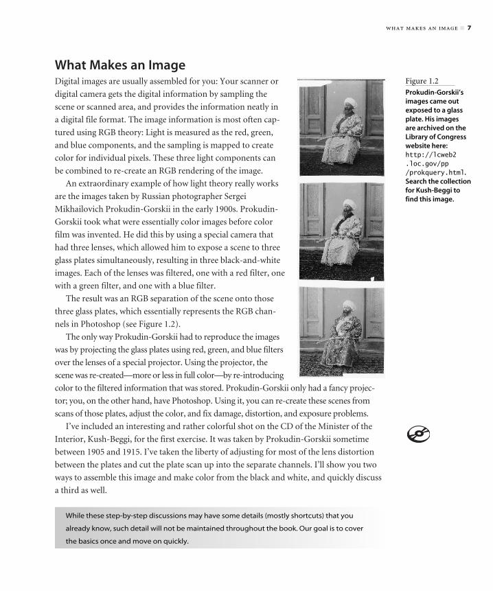
What Makes an ImageDigital images are usually assembled for you: Your scanner or
digital camera gets the digital information by sampling the
scene or scanned area, and provides the information neatly in
a digital file format. The image information is most often cap-
tured using RGB theory: Light is measured as the red, green,
and blue components, and the sampling is mapped to create
color for individual pixels. These three light components can
be combined to re-create an RGB rendering of the image.
An extraordinary example of how light theory really works
are the images taken by Russian photographer Sergei
Mikhailovich Prokudin-Gorskii in the early 1900s. Prokudin-
Gorskii took what were essentially color images before color
film was invented. He did this by using a special camera that
had three lenses, which allowed him to expose a scene to three
glass plates simultaneously, resulting in three black-and-white
images. Each of the lenses was filtered, one with a red filter, one
with a green filter, and one with a blue filter.
The result was an RGB separation of the scene onto those
three glass plates, which essentially represents the RGB chan-
nels in Photoshop (see Figure 1.2).
The only way Prokudin-Gorskii had to reproduce the images
was by projecting the glass plates using red, green, and blue filters
over the lenses of a special projector. Using the projector, the
scene was re-created—more or less in full color—by re-introducing
color to the filtered information that was stored. Prokudin-Gorskii only had a fancy projec-
tor; you, on the other hand, have Photoshop. Using it, you can re-create these scenes from
scans of those plates, adjust the color, and fix damage, distortion, and exposure problems.
I’ve included an interesting and rather colorful shot on the CD of the Minister of the
Interior, Kush-Beggi, for the first exercise. It was taken by Prokudin-Gorskii sometime
between 1905 and 1915. I’ve taken the liberty of adjusting for most of the lens distortion
between the plates and cut the plate scan up into the separate channels. I’ll show you two
ways to assemble this image and make color from the black and white, and quickly discuss
a third as well.
While these step-by-step discussions may have some details (mostly shortcuts) that you
already know, such detail will not be maintained throughout the book. Our goal is to cover
the basics once and move on quickly.
what makes an image ■ 7
Figure 1.2
Prokudin-Gorskii’simages came outexposed to a glassplate. His images are archived on theLibrary of Congresswebsite here:http://lcweb2.loc.gov/pp/prokquery.html.Search the collectionfor Kush-Beggi tofind this image.
4255c01.qxd 1/22/04 7:18 PM Page 7
Re-creating Color from a Separation (the Quick Way)For this exercise, you’ll need to get some images off the CD, so if you haven’t taken the
CD out yet, do it now. The three images are kb-red.psd, kb-green.psd, and kb-blue.psd.
Don’t have other images open when attempting this exercise to avoid confusion.
1. Open kb-red.psd, kb-green.psd, and kb-blue.psd in Photoshop using File ➔ Open (or
F/Ctrl+O). You will be able to select multiple files in the Open dialog box by holding
down the F/Ctrl key.
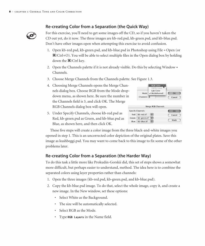
2. Open the Channels palette if it is not already visible. Do this by selecting Window ➔
Channels.
3. Choose Merge Channels from the Channels palette. See Figure 1.3.
4. Choosing Merge Channels opens the Merge Chan-
nels dialog box. Choose RGB from the Mode drop-
down menu, as shown here. Be sure the number in
the Channels field is 3, and click OK. The Merge
RGB Channels dialog box will open.
5. Under Specify Channels, choose kb-red.psd as
Red, kb-green.psd as Green, and kb-blue.psd as
Blue, as shown here, and then click OK.
These five steps will create a color image from the three black-and-white images you
opened in step 1. This is an uncorrected color depiction of the original plates. Save this
image as kushbeggi.psd. You may want to come back to this image to fix some of the other
problems later.
Re-creating Color from a Separation (the Harder Way)To do this task a little more like Prokudin-Gorskii did, this set of steps shows a somewhat
more difficult, but perhaps easier to understand, method. The idea here is to combine the
separated colors using layer properties rather than channels:
1. Open the three images (kb-red.psd, kb-green.psd, and kb-blue.psd).
2. Copy the kb-blue.psd image. To do that, select the whole image, copy it, and create a
new image. In the New window, set these options:
• Select White as the Background.
• The size will be automatically selected.
• Select RGB as the Mode.
• Type RGB Layers in the Name field.
8 ■ chapter 1: General Tone and Color Correction
4255c01.qxd 1/22/04 7:18 PM Page 8
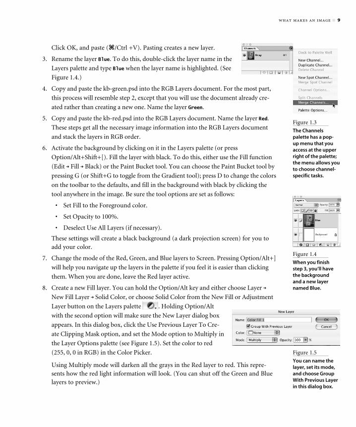
Click OK, and paste (F/Ctrl +V). Pasting creates a new layer.
3. Rename the layer Blue. To do this, double-click the layer name in the
Layers palette and type Blue when the layer name is highlighted. (See
Figure 1.4.)
4. Copy and paste the kb-green.psd into the RGB Layers document. For the most part,
this process will resemble step 2, except that you will use the document already cre-
ated rather than creating a new one. Name the layer Green.
5. Copy and paste the kb-red.psd into the RGB Layers document. Name the layer Red.
These steps get all the necessary image information into the RGB Layers document
and stack the layers in RGB order.
6. Activate the background by clicking on it in the Layers palette (or press
Option/Alt+Shift+[). Fill the layer with black. To do this, either use the Fill function
(Edit ➔ Fill ➔ Black) or the Paint Bucket tool. You can choose the Paint Bucket tool by
pressing G (or Shift+G to toggle from the Gradient tool); press D to change the colors
on the toolbar to the defaults, and fill in the background with black by clicking the
tool anywhere in the image. Be sure the tool options are set as follows:
• Set Fill to the Foreground color.
• Set Opacity to 100%.
• Deselect Use All Layers (if necessary).
These settings will create a black background (a dark projection screen) for you toadd your color.
7. Change the mode of the Red, Green, and Blue layers to Screen. Pressing Option/Alt+]
will help you navigate up the layers in the palette if you feel it is easier than clicking
them. When you are done, leave the Red layer active.
8. Create a new Fill layer. You can hold the Option/Alt key and either choose Layer ➔
New Fill Layer ➔ Solid Color, or choose Solid Color from the New Fill or Adjustment
Layer button on the Layers palette . Holding Option/Alt
with the second option will make sure the New Layer dialog box
appears. In this dialog box, click the Use Previous Layer To Cre-
ate Clipping Mask option, and set the Mode option to Multiply in
the Layer Options palette (see Figure 1.5). Set the color to red
(255, 0, 0 in RGB) in the Color Picker.
Using Multiply mode will darken all the grays in the Red layer to red. This repre-sents how the red light information will look. (You can shut off the Green and Bluelayers to preview.)
what makes an image ■ 9
Figure 1.3
The Channelspalette has a pop-up menu that youaccess at the upperright of the palette;the menu allows youto choose channel-specific tasks.
Figure 1.4
When you finishstep 3, you’ll havethe background and a new layernamed Blue.
Figure 1.5
You can name thelayer, set its mode,and choose GroupWith Previous Layerin this dialog box.
4255c01.qxd 1/22/04 7:18 PM Page 9
9. Create a Fill layer for the Green layer. Activate the Green layer, and then create the fill
layer as you did in step 8, using green (0, 255, 0 in RGB).
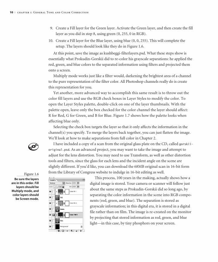
10. Create a Fill layer for the Blue layer, using blue (0, 0, 255). This will complete the
setup. The layers should look like they do in Figure 1.6.
At this point, save the image as kushbeggi-filterlayers.psd. What these steps show is
essentially what Prokudin-Gorskii did to re-color his grayscale separations: he applied the
red, green, and blue colors to the separated information using filters and projected them
onto a screen.
Multiply mode works just like a filter would, darkening the brightest area of a channel
to the pure representation of the filter color. All Photoshop channels really do is create
this representation for you.
Yet another, more advanced way to accomplish this same result is to throw out the
color fill layers and use the RGB check boxes in Layer Styles to modify the color. To
open the Layer Styles palette, double-click on one of the layer thumbnails. With the
palette open, leave only the box checked for the color channel the layer should affect:
R for Red, G for Green, and B for Blue. Figure 1.7 shows how the palette looks when
affecting blue only.
Selecting the check box targets the layer so that it only affects the information in the
channel(s) you specify. To merge the layers back together, you can just flatten the image.
We’ll look at how to make separations from full color in Chapter 2.
I have included a copy of a scan from the original glass plate on the CD, called gorskii-
original.psd. As an advanced project, you may want to take the image and attempt to
adjust for the lens distortion. You may need to use Transform, as well as other distortion
tools and filters, since the glass for each lens and the incident angle on the scene are
slightly different. If you’d like, you can download the 68MB original scan in 16-bit form
from the Library of Congress website to indulge in 16-bit editing as well.
This process, 100 years in the making, actually shows how a
digital image is stored. Your camera or scanner will follow just
about the same steps as Prokudin-Gorskii did so long ago, by
separating the color information in the scene into RGB compo-
nents (red, green, and blue). The separation is stored as
grayscale information; in this digital era, it is stored in a digital
file rather than on film. The image is re-created on the monitor
by projecting that stored information as red, green, and blue
light—in this case, by tiny phosphors on your screen.
10 ■ chapter 1: General Tone and Color Correction
Figure 1.6
Be sure the layersare in this order. Fill
layers should beMultiply mode, andcolor layers should
be Screen mode.
4255c01.qxd 1/22/04 7:18 PM Page 10
In a certain sense, the color is always affected by
limitations in color sensing and the ability to store
information. 8-bit-per-channel images can store
“only” about 16 million colors; 16-bit per channel
images can store more than 30 trillion colors. The
latter is arguably only a very good approximation of
actual tone and color.
The quality of what you see on screen depends on
the quality of what is captured, but it also depends
on limitations in the display. If the filter colors (or
light color) are wrong when input or when dis-
played, the image will appear “out of color” as
opposed to out of focus. We can make the best of
what we have captured by making intelligent color corrections. We’ll look at color correc-
tions in the next few sections. Now that we have the Prokudin-Gorskii image back together,
we can use that image and make general corrections and work more in-depth with the hid-
den power of tone in your color images.
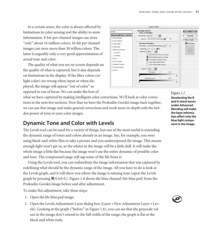
Dynamic Tone and Color with LevelsThe Levels tool can be used for a variety of things, but one of the most useful is extending
the dynamic range of tones and colors already in an image. Say, for example, you were
using black-and-white film to take a picture and you underexposed the image. This means
enough light won’t get in, so the whites in the image will be a little dull. It will make the
whole image a little flat because the image won’t use the entire dynamic of possible color
and tone. The compressed range will sap some of the life from it.
Using the Levels tool, you can redistribute the image information that was captured by
redefining what should be the dynamic range of the image. All you have to do is look at
the Levels graph, and it will show you where the image is missing tone (open the Levels
graph by pressing F/Ctrl+L). Figure 1.8 shows the blue channel (kb-blue.psd) from the
Prokudin-Gorskii image before and after adjustment.
To make this adjustment, take these steps:
1. Open the kb-blue.psd image.
2. Open the Levels Adjustment Layer dialog box (Layer ➔ New Adjustment Layer ➔ Lev-
els). Looking at the graph (“before” in Figure 1.8), you can see that the grayscale val-
ues in the image don’t extend to the full width of the range; the graph is flat at the
black and white ends.
dynamic tone and color with levels ■ 11
Figure 1.7
Deselecting the Rand G check boxesunder AdvancedBlending will makethe layer informa-tion affect only theblue light compo-nent in the image.
4255c01.qxd 1/22/04 7:18 PM Page 11
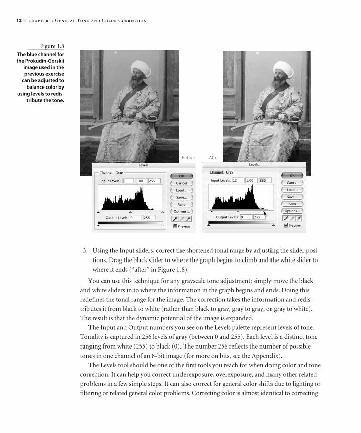
3. Using the Input sliders, correct the shortened tonal range by adjusting the slider posi-
tions. Drag the black slider to where the graph begins to climb and the white slider to
where it ends (“after” in Figure 1.8).
You can use this technique for any grayscale tone adjustment; simply move the black
and white sliders in to where the information in the graph begins and ends. Doing this
redefines the tonal range for the image. The correction takes the information and redis-
tributes it from black to white (rather than black to gray, gray to gray, or gray to white).
The result is that the dynamic potential of the image is expanded.
The Input and Output numbers you see on the Levels palette represent levels of tone.
Tonality is captured in 256 levels of gray (between 0 and 255). Each level is a distinct tone
ranging from white (255) to black (0). The number 256 reflects the number of possible
tones in one channel of an 8-bit image (for more on bits, see the Appendix).
The Levels tool should be one of the first tools you reach for when doing color and tone
correction. It can help you correct underexposure, overexposure, and many other related
problems in a few simple steps. It can also correct for general color shifts due to lighting or
filtering or related general color problems. Correcting color is almost identical to correcting
AfterBefore
Figure 1.8
The blue channel forthe Prokudin-Gorskii
image used in theprevious exercise
can be adjusted tobalance color by
using levels to redis-tribute the tone.
12 ■ chapter 1: General Tone and Color Correction
4255c01.qxd 1/22/04 7:18 PM Page 12
tone. The only difference is that you want to correct the tone in each of the color channels
for a color image, rather than just the composite.
To correct the color using Levels:
1. Open kushbeggi.psd. This image is on the CD, but you can use the one you saved ear-
lier when you compiled the RGB channels.
2. Create a new Levels adjustment layer.
3. Select Red from the Channels drop-down list.
4. Adjust the tonal range for the red channel by moving in the black and white sliders
directly below the graph where it just begins to climb to redistribute the tone.
5. Repeat steps 3 and 4 for the green and blue channels.
6. Switch to RGB and move the center (gray) slider to adjust image brightness.
The result after these changes should be a brighter, more dynamic image for our example.
The same technique will work on many images to improve them—especially faded images
and those lit by a single light source, or those that have a predictable, linear shift. For more
complicated shifts, this type of correction may need to be used in conjunction with a curve
(or other) correction to better control the result.
Save your image as kushbeggi-L.psd. You can compare the before and after by clicking
Open on the History palette and then clicking the final step.
Using the Levels tool in this way is based on solid science and works as a general correc-
tion technique for almost any image. The reason has to do with visible light and the way
we perceive light. A scene will usually appear to your eye to have a full dynamic range in
tone from white and black. If the scene is lit with pure white light, it also has the potential
for every color in between, because white light contains the full potential of the red, green,
and blue light components. The light interacts with the scene and is reflected, then cap-
tured on film or digitally. What is captured should reflect the potential of what should be
in the scene. In other words, a perfect world will reflect the full potential of the light in it,
and some of each component will be captured.
For the image to properly reflect full potential dynamic for color and tone, each chan-
nel has to have a full range. Making the levels change corrects for aberrations in capture.
There are often differences because the science of capture is less forgiving than our
perception. While our eye might adjust to a scene automatically, digital and film capture
will not adjust—they just grab what’s there. A scene lit with impure or colored lighting
or captured with poor exposure reflects what the camera sees—which is not necessarily
the potential of the scene. Levels give us the opportunity to easily see what failed to be
recorded and restore the potential and dynamic range. The upshot is color and tone bal-
anced for white light.
dynamic tone and color with levels ■ 13
4255c01.qxd 1/22/04 7:18 PM Page 13
If individual color channels don’t have full dynamic range, it cuts down not only on the
potential tones (black to white), but the potential colors. For example, if the green channel
has a graph that shows only 50 percent of the potential range, the image can’t have the
color created by mixing with that range of green. In fact, each level missing from the range
cuts down the potential colors by more than 65,000 possibilities. Restoring the range
restores the potential and is effectively a safe (rather than destructive) color correction.
If any Levels graph shows a shortened range, it suggests one of the following:
• The light source was not pure.
• The capture wasn’t balanced.
• Filtering was used.
• Exposure was not optimal.
• The light in the scene was otherwise influenced.
Extending the dynamic range in the color channels helps correct for and restore the
color imbalance by reestablishing a balanced source based on white light and the potential
for all colors.
The only instances where the levels correction of this sort fails or does not improve an
image are cases where a color shift is desired or where there is a nonlinear influence. The
desired color shift can be exemplified by a scene where you used a color filter on purpose,
or if a scene has an intentional or inherent light cast (as in a sunset), or where the color and
tonality in the scene is very limited. (Correcting to create the full range of color levels could
have a bad influence on the image.) Nonlinear influence might be exemplified by an incan-
descent light in a blue room: The color might shift red in highlights due to the reddish
color of the direct source, but blue in shadows because of reflected light from the walls.
Of course, Levels is not your only tool for image color correction, but it does offer a
good starting point. You will need to learn to understand histograms and work with
curves for more versatile corrections.
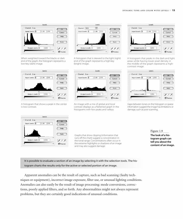
Understanding and Reading HistogramsHistograms appear in several different places in Photoshop, including the Histogram
palette and the Levels dialog box. The width of the histogram graph represents the range
of potential tonal values. The height of a given line in the graph represents the number of
pixels in the image with a particular tone. Aberrations in the graph, such as steep peaks
and valleys, gaps in information, and/or clipping (spikes in information that run off the
chart), may represent some form of image damage, limitation, or loss of image informa-
tion. The graph can also describe high-key, low-key, high-contrast, and low-contrast
images. Evaluating a histogram is as easy as looking at it and understanding a few basic
properties. Figure 1.9 shows examples of how histograms look with different image types.
14 ■ chapter 1: General Tone and Color Correction
4255c01.qxd 1/22/04 7:18 PM Page 14
Apparent anomalies can be the result of capture, such as bad scanning (faulty tech-
niques or equipment), incorrect image exposure, filter use, or unusual lighting conditions.
Anomalies can also easily be the result of image processing: mode conversions, correc-
tions, poorly applied filters, and so forth. Any abnormalities might not always represent
problems, but they are certainly good indications of unusual conditions.
It is possible to evaluate a section of an image by selecting it with the selection tools. The his-
togram charts the results only for the active or selected portion of an image.
When weighted toward the blacks or dark end of the graph, the histogram represents a low-key (dark) image.
A histogram that is skewed to the light (right) end of the graph represents a high-key (bright) image.
A histogram that peaks in the dark and light areas while having lower pixel density in the middle of the graph represents a high-contrast image.
A histogram that shows a peak in the center is low-contrast.
An image with a mix of global and local contrast displays as a flattened graph in the histograms with few peaks and valleys.
Gaps between tones on the histogram or sparse information suggest the image has limitations or damage, such as poor scanning.
Graphs that show clipping (information that runs off the chart) suggest a concentration in the tonal range. Concentrations often occur in the extreme highlights or shadows of an image and may also suggest damage.
dynamic tone and color with levels ■ 15
Figure 1.9
The look of a his-togram graph cantell you about thecontent of an image.
4255c01.qxd 1/22/04 7:18 PM Page 15
Sometimes shifting the range using levels—even radically removing information in the
image—can work to the benefit of the image by improving contrast and dynamic range.
When the histogram presents a “tail” toward the shadows or highlights (see Figure 1.10),
it can often be clipped in part or whole. Tails on the histogram often represent highlight
or shadow noise, rather than actual image detail. Snipping the informa-
tion turns it to absolute white for a highlight (or absolute black for a
shadow).
It is sometimes desirable to eliminate none, some, or all of a tail,
depending on the image and the length of the tail. As a general rule, the
longer the tail, the less—proportionally—you should cut off. For example,
you may completely remove a tail that covers 15 levels, you might trim
half or less of a tail that covers 50 levels, or 33 percent of one that covers
100 levels. This will help retain image integrity and character.
Images that appear too dark or light can be corrected by using the middle slider in the
Levels tool. Moving the slider to the left lightens midtones, whereas moving it to the right
darkens them. This may seem slightly counterintuitive; however, it makes a lot of sense.
The idea is that you are moving the median so that more levels of tone fall within the
lighter or darker half of the tonal range.
As a general guide, try not to move the midtone slider more than 25 levels (10 percent
of the image tonality) in any direction when making corrections with the middle slider.
This keeps the redistribution small and more forgiving. You can always come back and
lighten or darken an image later in additional steps and adjustment layers, or adjust using
other tools like curves, which we’ll look at in the next section.
Snapping Image Tone and Color with CurvesCurves are the ideal tool to help fine-tune and reshape the tone of an image. Whereas lev-
els have only three control points that you can change, curves can have many (up to 16),
and this can help you work in different tonal ranges with targeted results. Curves are both
Don’t feel that you have to crop a tail in the image just because it’s there. If the results seem
too drastic after cutting a tail, they are. Put simply: Crop a tail if doing so improves the image;
don’t crop a tail if it compromises the image.
Do not be overzealous in accepting the appearance of the histogram as an absolute judge of
the image; be sure to make the visual assessment as well and use the two assessments in tan-
dem. Your visual assessment should override the digital one, especially if you get good
results in tests and have reason to trust the view of your monitor. Your primary goal should
be a good image, not a good histogram.
16 ■ chapter 1: General Tone and Color Correction
Tail
Figure 1.10
A “tail” in a his-togram usually rep-
resents nothingmore than image
noise.
4255c01.qxd 1/22/04 7:18 PM Page 16
a more versatile correction tool and a more volatile one than levels because of their power.
You’ll find that using curves for corrections can reduce the steps involved because you can
apply one curve and make numerous corrections to various parts of image—often without
selection. While levels are a good tool for evaluating and adjusting dynamic range in an
image, curves are a good tool for adjusting image contrast and dynamic range in small
chunks of the tonal range.
Because curves are powerful, applying them requires a little more savvy than applying levels.
Before we begin, let’s take a brief look at the interface and how to manipulate the curve.
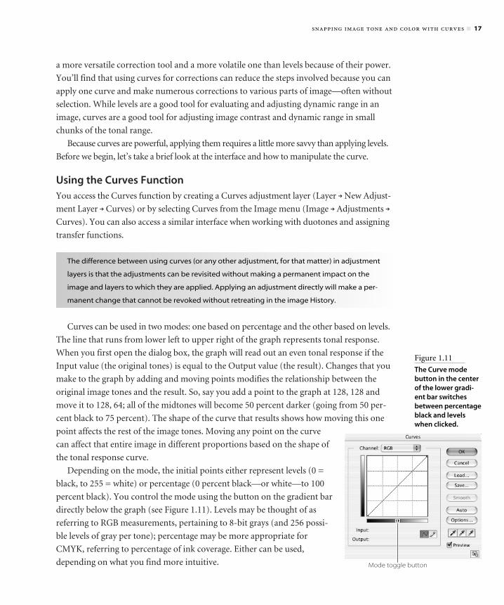
Using the Curves FunctionYou access the Curves function by creating a Curves adjustment layer (Layer ➔ New Adjust-
ment Layer ➔ Curves) or by selecting Curves from the Image menu (Image ➔ Adjustments ➔
Curves). You can also access a similar interface when working with duotones and assigning
transfer functions.
Curves can be used in two modes: one based on percentage and the other based on levels.
The line that runs from lower left to upper right of the graph represents tonal response.
When you first open the dialog box, the graph will read out an even tonal response if the
Input value (the original tones) is equal to the Output value (the result). Changes that you
make to the graph by adding and moving points modifies the relationship between the
original image tones and the result. So, say you add a point to the graph at 128, 128 and
move it to 128, 64; all of the midtones will become 50 percent darker (going from 50 per-
cent black to 75 percent). The shape of the curve that results shows how moving this one
point affects the rest of the image tones. Moving any point on the curve
can affect that entire image in different proportions based on the shape of
the tonal response curve.
Depending on the mode, the initial points either represent levels (0 =
black, to 255 = white) or percentage (0 percent black—or white—to 100
percent black). You control the mode using the button on the gradient bar
directly below the graph (see Figure 1.11). Levels may be thought of as
referring to RGB measurements, pertaining to 8-bit grays (and 256 possi-
ble levels of gray per tone); percentage may be more appropriate for
CMYK, referring to percentage of ink coverage. Either can be used,
depending on what you find more intuitive.
The difference between using curves (or any other adjustment, for that matter) in adjustment
layers is that the adjustments can be revisited without making a permanent impact on the
image and layers to which they are applied. Applying an adjustment directly will make a per-
manent change that cannot be revoked without retreating in the image History.
snapping image tone and color with curves ■ 17
Mode toggle button
Figure 1.11
The Curve modebutton in the centerof the lower gradi-ent bar switchesbetween percentageblack and levelswhen clicked.
4255c01.qxd 1/22/04 7:18 PM Page 17
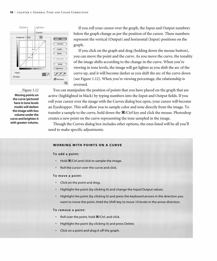
If you roll your cursor over the graph, the Input and Output numbers
below the graph change as per the position of the cursor. These numbers
represent the vertical (Output) and horizontal (Input) positions on the
graph.
If you click on the graph and drag (holding down the mouse button),
you can move the point and the curve. As you move the curve, the tonality
of the image shifts according to the change in the curve. When you’re
viewing in tone levels, the image will get lighter as you shift the arc of the
curve up, and it will become darker as you shift the arc of the curve down
(see Figure 1.12). When you’re viewing percentage, the relationship is
reversed.
You can manipulate the position of points that you have placed on the graph that are
active (highlighted in black) by typing numbers into the Input and Output fields. If you
roll your cursor over the image with the Curves dialog box open, your cursor will become
an Eyedropper. This will allow you to sample color and tone directly from the image. To
transfer a sample to the curve, hold down the F/Ctrl key and click the mouse. Photoshop
creates a new point on the curve representing the tone sampled in the image.
Though the Curves dialog box includes other options, the ones listed will be all you’ll
need to make specific adjustments.
W O R K I N G W I T H P O I N T S O N A C U R V E
T o a d d a p o i n t :
• Hold F/Ctrl and click to sample the image.
• Roll the cursor over the curve and click.
T o m o v e a p o i n t :
• Click on the point and drag.
• Highlight the point (by clicking it) and change the Input/Output values.
• Highlight the point (by clicking it) and press the keyboard arrows in the direction you
want to move the point. Hold the Shift key to move 10 levels in the arrow direction.
T o r e m o v e a p o i n t :
• Roll over the point, hold F/Ctrl, and click.
• Highlight the point (by clicking it) and press Delete.
• Click on a point and drag it off the graph.
18 ■ chapter 1: General Tone and Color Correction
Figure 1.12
Moving points onthe curve (picturedhere in tone levelsmode) will darken
the image with lessvolume under the
curve and brighten itwith greater volume.
Darken Lighten
4255c01.qxd 1/22/04 7:18 PM Page 18
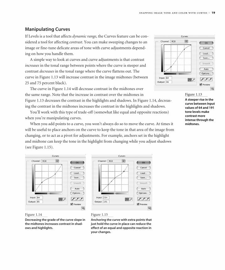
Manipulating CurvesIf Levels is a tool that affects dynamic range, the Curves feature can be con-
sidered a tool for affecting contrast. You can make sweeping changes to an
image or fine-tune delicate areas of tone with curve adjustments depend-
ing on how you handle them.
A simple way to look at curves and curve adjustments is that contrast
increases in the tonal range between points where the curve is steeper and
contrast decreases in the tonal range where the curve flattens out. The
curve in Figure 1.13 will increase contrast in the image midtones (between
25 and 75 percent black).
The curve in Figure 1.14 will decrease contrast in the midtones over
the same range. Note that the increase in contrast over the midtones in
Figure 1.13 decreases the contrast in the highlights and shadows. In Figure 1.14, decreas-
ing the contrast in the midtones increases the contrast in the highlights and shadows.
You’ll work with this type of trade-off (somewhat like equal and opposite reactions)
when you’re manipulating curves.
When you add points to a curve, you won’t always do so to move the curve. At times it
will be useful to place anchors on the curve to keep the tone in that area of the image from
changing, or to act as a pivot for adjustments. For example, anchors set in the highlight
and midtone can keep the tone in the highlight from changing while you adjust shadows
(see Figure 1.15).
Figure 1.15
Anchoring the curve with extra points thatjust hold the curve in place can reduce theeffect of an equal and opposite reaction inyour changes.
Figure 1.14
Decreasing the grade of the curve slope inthe midtones increases contrast in shad-ows and highlights.
snapping image tone and color with curves ■ 19
Figure 1.13
A steeper rise in thecurve between Inputvalues of 64 and 191tone levels makecontrast moreintense through themidtones.
4255c01.qxd 1/22/04 7:18 PM Page 19
The Eyedropper can help you measure the actual range you want to affect. The Eye-
dropper appears as you drag your cursor over your image when the Curves dialog box is
open. In Figure 1.16, the original image was taken in direct sunlight, resulting in a high-
contrast exposure. Curves can help reduce the quick transition from highlight to shadow.
In this image (included as contrast.psd on the CD), measure the brightest and darkest
areas of the tonal range you want to include. To do this, drag the Eyedropper on the image
and F/Ctrl+click to make sample points. You can also note the sample value and enter it
in the input field manually.
To make an image correction using Curves:
1. Open the image you want to correct (contrast.psd is included on the CD).
2. Set the options for the Eyedropper and Info palette. For the example, we chose a
sample of 3 by 3 for the Eyedropper and changed one of the Info palette colors to K
(Grayscale).
3. Open the Curves dialog box by choosing Curves from the New Adjustment Layer
submenu (Layer ➔ New Adjustment Layer ➔ Curves).
4. Sample the bright end of the range you want to correct (see Figure 1.17) and create a
curve point.
Figure 1.17
The highlight area of the cheek is the lightest por-tion of the area that will be changed.
Figure 1.16
This image was taken in direct sunlight and showsharsh shadows.
20 ■ chapter 1: General Tone and Color Correction
4255c01.qxd 1/22/04 7:18 PM Page 20

E V A L U A T I N G C O L O R A N D T O N E W I T H E Y E D R O P P E R S
The Eyedropper samples image information and displays the result on the Info palette. All
you have to do is put the cursor over the image area you want to measure, and the Eyedrop-
per will sample the composite of the visible layers. It can be helpful in evaluating an image
throughout the correction process. For example, comparing grayscale values for sample and
target areas before cloning can tell you whether those areas are a good match before you
make the clone.
The Sample Size setting for the Eyedropper tool affects the result of samples used with
curves. Tool options include only Point Sample (samples the pixel at the tip of the tool icon),
3 By 3 Average, and 5 By 5 Average. The Average options look at a square of pixels (the tip of
the tool icon as the center pixel) using the selected dimensions and average those to deter-
mine the result. In certain cases where tone is noisy, such as skin tones, you should use a
broader sample size to get a better average reading of the tones you want to measure. Using
too small a sample size might only make confusing samples; values between one pixel and the
next might change too rapidly to make sense. Control+clicking/right-clicking brings up the
Sample Size menu when you’re using the Curves dialog box.
To use the Eyedropper, follow this general procedure:
1. Select the Eyedropper tool (press I).
2. Choose the radius for the sampling area on the options bar.
3. Bring the Info palette to the front by selecting it from the Window menu, or by clicking
the tab in the palette well.
4. Spot-check with the Eyedropper by passing the cursor over various areas of the image
that you want to check while noting the values in the Info palette.
Samplers can also be placed (using the Sampler mode for the Eyedropper Tool) in the
image to provide a constant readout of a particular spot in an image. You can place them
with the Sampler tool , which you access by scrolling the Eyedropper tool (press Shift+I
to scroll the tool), or by holding the Shift key with the Eyedropper tool selected. Up to four
samplers can be placed in each image. These samplers will not move until they are removed
from the image (press Option/Alt with the Sampler tool active, roll the cursor directly over
the sampler to be removed, and then click). Each sampler will have its own readout in the
Info palette.
snapping image tone and color with curves ■ 21
4255c01.qxd 1/22/04 7:19 PM Page 21
5. Sample the dark end of the range you want to correct (see
Figure 1.18) and create a curve point.
6. Use the input fields to adjust the position of the curve points to
effect the desired change. In Figure 1.19, the 51 percent (134 lev-
els) point was changed to an output of 33 percent (171 levels).
7. Continue adding points and adjusting for other tonal relation-
ships by repeating steps 5 through 8.
8. Accept the changes in the curve by clicking OK.
It is possible in some cases that you will want to include addi-
tional curves using steps 3 through 8 to make further modifications
to the tone. See Figure 1.20, for example. Such modifications may
be the exception rather than the rule in fine-tuning delicate areas.
Keeping a curve smooth rather than choppy or abrupt is more likely to render good
results. Jagged curves tend to be unpredictable and will more likely produce special effects
than corrections. If changes seem extreme or become difficult, make them over the course
of several applications of curves rather than just in one shot. This approach will allow you
to compare adjustments by toggling layer views, as well as allowing you to fine-tune.
Controlling color with curves works somewhat in the same way as making contrast
adjustments. Results can actually be calculated to make exacting corrections that would
otherwise be impossible.
Figure 1.20
The result of several curve applications has improved thetonality of the image by lessening the harsh contrastbetween light and dark while enhancing contrast inselected areas.
Figure 1.19
The changes in the curve lighten the image and reduce contrastin the midtones while improving contrast in the highlight andshadow detail.
22 ■ chapter 1: General Tone and Color Correction
Figure 1.18
The image movespretty abruptly from
light to dark. Thesecond sample
should be some-where in the areawhere the image
tone makes the tran-sition to shadow.
4255c01.qxd 1/22/04 7:19 PM Page 22
Curves for Color CorrectionColor casts in images can result in flatness and unnatural or plain old bad color. Basic color
correction with levels often eliminates most of this problem, but color casts and shifts
between the lightest and darkest parts of an image are often a little more complex than
looking at a histogram or doing a general color correction in levels. If a color shift is in
only one portion of the color range (shadows, midtones, or highlights), levels may not
do enough to make the correction. Curves are a more sophisticated means of fine-tuning
color—either to make it exacting or simply more dynamic in a specific range. This is a
correction you will make after, and in addition to, a levels correction.
The problem is knowing exactly what to do with your curves. It is difficult to just look
at an image and envision how a curve should look to make the desired correction. While it
may be easy to determine what looks wrong, correcting it can remain a puzzle. Just fiddling
with curves and hoping for a result will usually be a frustrating exercise—and if you do hit
on a correction, it’ll be an accident.
Say you are looking at an image and the color of the subject’s skin just looks wrong.
Skin color is something we are all familiar with, so most people can tell when it just doesn’t
look right. If the skin tone looks wrong, the image will look wrong. In fact, if you can cor-
rect for the skin tone, it is likely that everything else in your image will fall into place.
However, a problem arises when you try to correct for skin tone: The difference in
skin tones is vast. Skin tone has many colors and shades, so no value can be an accurate
reference—unless you measure it from the original subject, and there isn’t much chance
you’ll be doing that. Certainly there are approximations, but you can just as well make
approximations if you can trust your eyes (and monitor).
Paradoxically, the best reference are areas that should be grays. Grays can act as a refer-
ence because they are easy to measure: They should have even amounts of red, green, and
blue. When you measure with the Eyedropper, the R, G, and B values displayed in the Info
palette should all be the same—or very nearly so. Looking for areas that should be gray
can give you a definitive value to adjust for.
In a perfect world, you could find areas of your image that should be grays of 75 percent
(64, 64, 64), 50 percent (128, 128, 128), and 25 percent (192, 192, 192) black as reference
in your images; you could then set accurate white and black points, and your images
Those newer to “color correction” are probably sometimes misled by the term, which sug-
gests there is a “correct” color to shoot for. Color correction remains more an art than a sci-
ence, and corrections may reflect color that is more interesting, bolder, and more dynamic,
rather than just “correct.”
curves for color correction ■ 23
4255c01.qxd 1/22/04 7:19 PM Page 23
would balance nicely. It usually isn’t too easy to find these references unless you place
them right in your image. While you can do this using a reference card, it is not something
that everyone will take the time to do. An example gray card can be as simple as printing
shades of gray on a white sheet and getting that reference in the image.
A reasonable substitute for a gray card are grays that already exist in the image. If you
look closely, you may find something that should be a flat shade of gray, such as a steel
flagpole, chrome on a car, asphalt, ice skate blades, certain types of tree bark… Anything
that should be flat gray, paradoxically, becomes very useful for color evaluation. While
black and gray objects can vary in color to some degree, they will be easier to judge and
correct for than something like skin (where there is no absolute reference). Making cor-
rections for grays should become one of the more useful staples of your efforts in curve
“corrections.”
You’ll try an example of this method next.
Correcting Color Using Gray PointsOnce you determine your reference objects, curves can help you easily adjust image color.
All you have to do is measure the tone and color of the gray object, and then adjust the
curves to make those objects gray, while ignoring everything else in the image.
To determine the values for a gray object to use in correction, take the following steps:
1. Locate an object in your image that should be closest to gray.
2. Be sure the Info palette is visible and that one of the sample types is set to RGB
Color (RGB).
3. Select the Eyedropper from the Tool palette. Be sure that the sample option is set to
3 or 5 pixels. The wider range is effective on images with greater resolution.
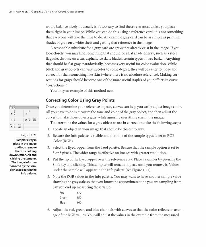
4. Put the tip of the Eyedropper over the reference area. Place a sampler by pressing the
Shift key and clicking. This sampler will remain in place until you remove it. Values
under the sample will appear in the Info palette (see Figure 1.21).
5. Note the RGB values in the Info palette. You may want to have another sample value
showing the grayscale so that you know the approximate tone you are sampling from.
Say you end up measuring these values:
Red 170
Green 150
Blue 160
6. Adjust the red, green, and blue channels with curves so that the color reflects an aver-
age of the RGB values. You will adjust the values in the example from the measured
24 ■ chapter 1: General Tone and Color Correction
Figure 1.21
Samplers stay inplace in the image
until you removethem by holding
down Option/Alt andclicking the sampler.The image informa-
tion read by the sam-pler(s) appears in the
Info palette.
4255c01.qxd 1/22/04 7:19 PM Page 24
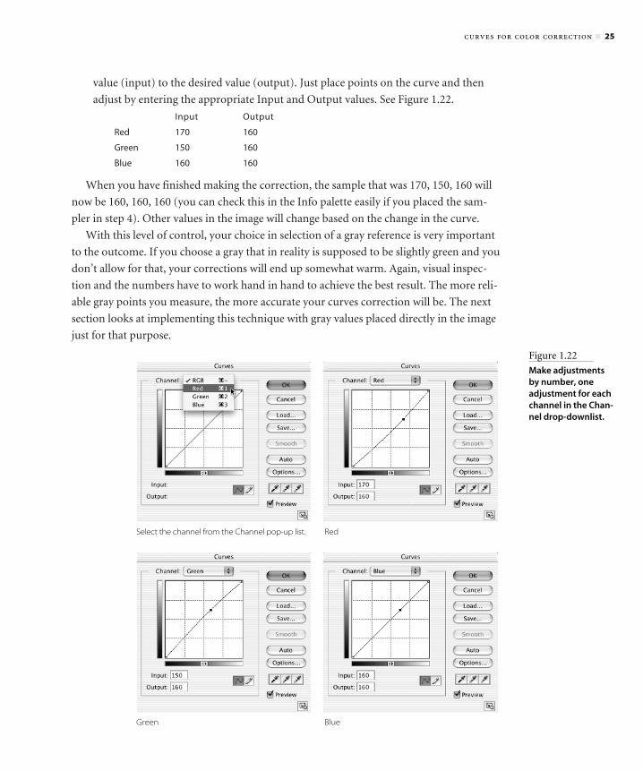
value (input) to the desired value (output). Just place points on the curve and then
adjust by entering the appropriate Input and Output values. See Figure 1.22.
Input Output
Red 170 160
Green 150 160
Blue 160 160
When you have finished making the correction, the sample that was 170, 150, 160 will
now be 160, 160, 160 (you can check this in the Info palette easily if you placed the sam-
pler in step 4). Other values in the image will change based on the change in the curve.
With this level of control, your choice in selection of a gray reference is very important
to the outcome. If you choose a gray that in reality is supposed to be slightly green and you
don’t allow for that, your corrections will end up somewhat warm. Again, visual inspec-
tion and the numbers have to work hand in hand to achieve the best result. The more reli-
able gray points you measure, the more accurate your curves correction will be. The next
section looks at implementing this technique with gray values placed directly in the image
just for that purpose.
Select the channel from the Channel pop-up list. Red
Green Blue
Figure 1.22
Make adjustmentsby number, oneadjustment for eachchannel in the Chan-nel drop-downlist.
curves for color correction ■ 25
4255c01.qxd 1/22/04 7:19 PM Page 25
Tempering Curve CorrectionsWhen using an object that you are not sure is gray (e.g., tree bark) as the reference, you
may only want to make a percentage adjustment, rather than just assuming you want a
completely flat gray. That is, you may want to give some credence to the existing values.
This is similar in concept to not cropping off the entire tail in levels, since you will be
looking to make only part of the correction as a compromise. Instead of making a drastic
change, you make only part of it.
For example, if the difference in the colors is broad, or skewed to one of the channels,
it may be preferable to average 50 or 75 percent of the difference. The more positive you
are that the value you are measuring should be gray, the stronger the percentage you
should apply; the less sure you are that it should absolutely be gray, the less percentage
you should apply.
To change by a percentage, you would take the difference between the measured and
average value, multiply by the percentage you choose, and add it to the measured value:
Target value = measured value + {[(average value) - (measured value)] x percentage}.
Using the numbers from the last example, your calculation for the red channel will look
like this:
Target value = 170 + ([160 - 170] x .75)
Target value = 170 – 7.5
Target value = 163
The following list shows how the table would look if making only 75 percent of
the change:
Input Output
Red 170 163
Green 150 158
Blue 160 160
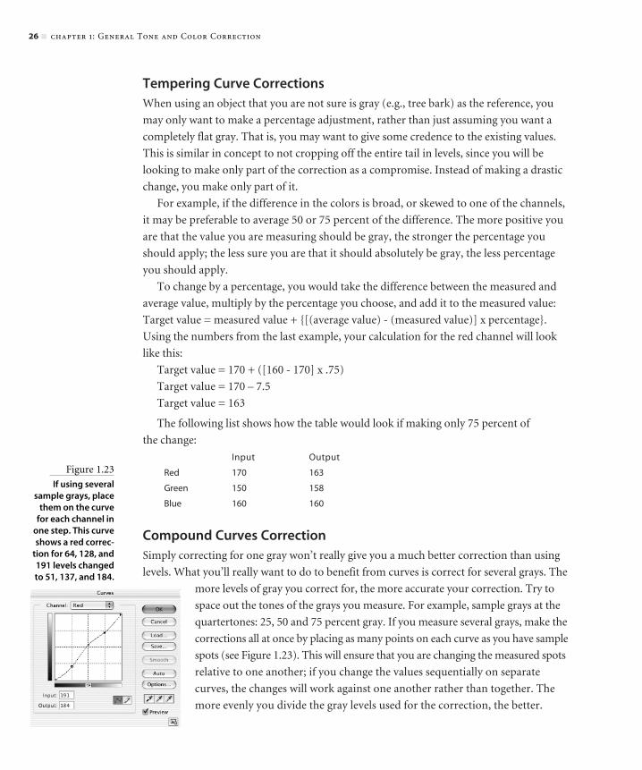
Compound Curves CorrectionSimply correcting for one gray won’t really give you a much better correction than using
levels. What you’ll really want to do to benefit from curves is correct for several grays. The
more levels of gray you correct for, the more accurate your correction. Try to
space out the tones of the grays you measure. For example, sample grays at the
quartertones: 25, 50 and 75 percent gray. If you measure several grays, make the
corrections all at once by placing as many points on each curve as you have sample
spots (see Figure 1.23). This will ensure that you are changing the measured spots
relative to one another; if you change the values sequentially on separate
curves, the changes will work against one another rather than together. The
more evenly you divide the gray levels used for the correction, the better.
26 ■ chapter 1: General Tone and Color Correction
Figure 1.23
If using several sample grays, place
them on the curvefor each channel in
one step. This curveshows a red correc-
tion for 64, 128, and191 levels changedto 51, 137, and 184.
4255c01.qxd 1/22/04 7:19 PM Page 26
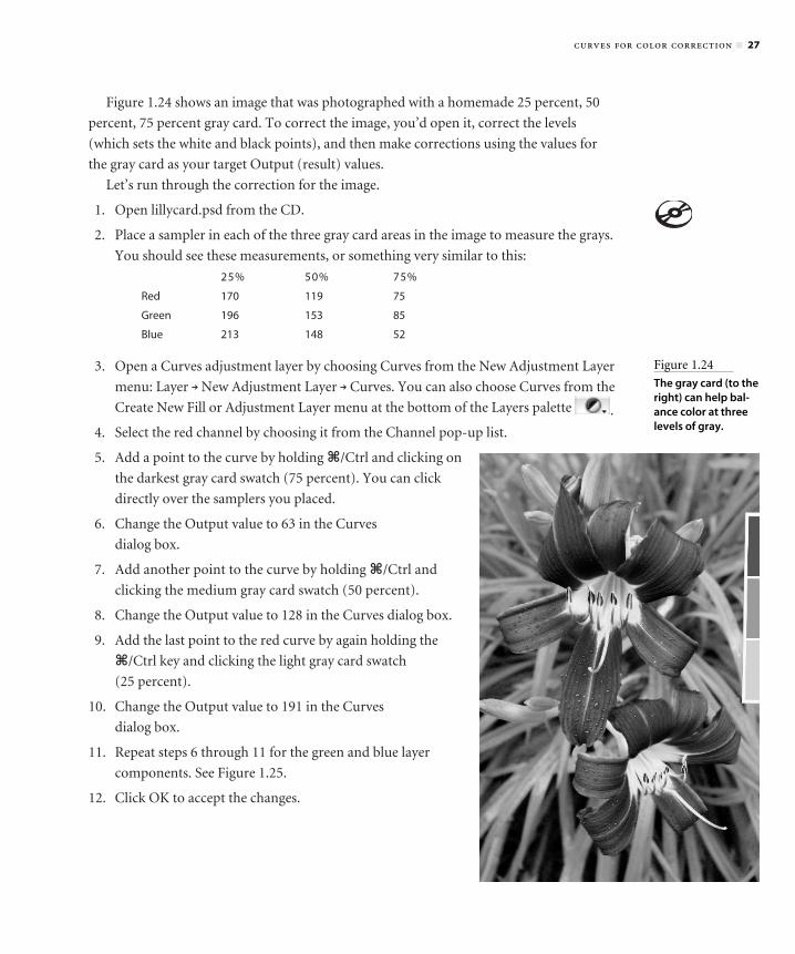
Figure 1.24 shows an image that was photographed with a homemade 25 percent, 50
percent, 75 percent gray card. To correct the image, you’d open it, correct the levels
(which sets the white and black points), and then make corrections using the values for
the gray card as your target Output (result) values.
Let’s run through the correction for the image.
1. Open lillycard.psd from the CD.
2. Place a sampler in each of the three gray card areas in the image to measure the grays.
You should see these measurements, or something very similar to this:
25% 50% 75%
Red 170 119 75
Green 196 153 85
Blue 213 148 52
3. Open a Curves adjustment layer by choosing Curves from the New Adjustment Layer
menu: Layer ➔ New Adjustment Layer ➔ Curves. You can also choose Curves from the
Create New Fill or Adjustment Layer menu at the bottom of the Layers palette .
4. Select the red channel by choosing it from the Channel pop-up list.
5. Add a point to the curve by holding F/Ctrl and clicking on
the darkest gray card swatch (75 percent). You can click
directly over the samplers you placed.
6. Change the Output value to 63 in the Curves
dialog box.
7. Add another point to the curve by holding F/Ctrl and
clicking the medium gray card swatch (50 percent).
8. Change the Output value to 128 in the Curves dialog box.
9. Add the last point to the red curve by again holding the
F/Ctrl key and clicking the light gray card swatch
(25 percent).
10. Change the Output value to 191 in the Curves
dialog box.
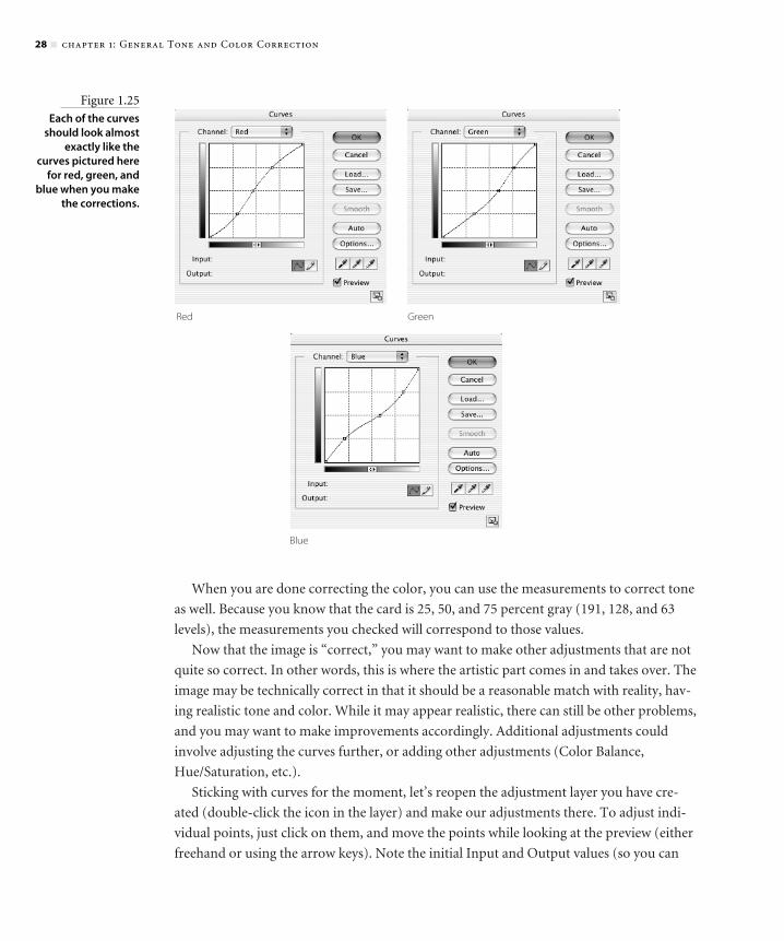
11. Repeat steps 6 through 11 for the green and blue layer
components. See Figure 1.25.
12. Click OK to accept the changes.
curves for color correction ■ 27
Figure 1.24
The gray card (to theright) can help bal-ance color at threelevels of gray.
4255c01.qxd 1/22/04 7:19 PM Page 27
When you are done correcting the color, you can use the measurements to correct tone
as well. Because you know that the card is 25, 50, and 75 percent gray (191, 128, and 63
levels), the measurements you checked will correspond to those values.
Now that the image is “correct,” you may want to make other adjustments that are not
quite so correct. In other words, this is where the artistic part comes in and takes over. The
image may be technically correct in that it should be a reasonable match with reality, hav-
ing realistic tone and color. While it may appear realistic, there can still be other problems,
and you may want to make improvements accordingly. Additional adjustments could
involve adjusting the curves further, or adding other adjustments (Color Balance,
Hue/Saturation, etc.).
Sticking with curves for the moment, let’s reopen the adjustment layer you have cre-
ated (double-click the icon in the layer) and make our adjustments there. To adjust indi-
vidual points, just click on them, and move the points while looking at the preview (either
freehand or using the arrow keys). Note the initial Input and Output values (so you can
Red Green
Blue
Figure 1.25
Each of the curvesshould look almost
exactly like thecurves pictured here
for red, green, andblue when you make
the corrections.
28 ■ chapter 1: General Tone and Color Correction
4255c01.qxd 1/22/04 7:19 PM Page 28
curves for color correction ■ 29
return to those settings if desired); you may want to just duplicate the curve layer and play
with duplicate, so you don’t have to write down or remember the original values. If using
a duplicate, shut off the original.
While it is possible that you can stumble into a correction for the color that looks bet-
ter, it is more likely that you will get the result you want by observing and making targeted
changes. For example, if you have a red that you think needs to be redder, you can set a
sampler on it and increase the red, reduce the green and blue to darken (to purify), or add
green and blue to lighten (to desaturate). Having a goal in your curve corrections rather
than going at it at random will have you spending less time fiddling to get results. There
are better tools to fiddle with (like Color Balance, as we’ll see in a moment).
At the point where you have made the curve adjustment according to gray targets, the
image is balanced. It is more likely that you will get pleasing results with curves when
experimenting by applying them to image tone or color separately rather than to the RGB.
Applying a curve to image color can help you work with image saturation (adjust the RGB
curve) or in making specific increases/reductions in one of the component colors overall.
Applying a curve to image luminosity can help you adjust tonality and contrast. The next
chapter looks at many possibilities for isolating color and tone. You may actually get better
color by making additional corrections and/or selectively replacing colors and tones, making
corrections not so strictly tied to measurements, and in some cases by altering color com-
pletely. Making targeted and selective tone and color changes can help. Selective changes
are covered in more depth in Chapter 3.
You can make other corrections using curves to adjust the image color and dynamic,
but corrections without using targeted measures are less precision corrections than artistic
decisions. Because they will also be based on the image preview, you will have to trust your
perception (and your monitor) to go this route.
C O R R E C T I N G S P E C I F I C C O L O R S
Color correcting doesn’t just work for grays. You can correct for known color values as well. In
instances where you know any specific color in the image, you can use curves to make your
correction but just target the color. Say, for example, you take a picture of a business and
know that the logo color on the building is an official color. You can target the change in
color according to that measurement. Just take a measurement of the color in the image
(after a levels correction), and use the RGB value for the target color as the output values. If
you don’t have a gray card and want to use paint swatches (gray or otherwise) from a local
paint store, as long as you know the color values, you can make the adjustment for that color.
Other adjustments may be necessary to other levels of the image (just as when you use mul-
tiple gray sources) to adjust the image over the entire range from highlight to shadow.
4255c01.qxd 1/22/04 7:19 PM Page 29
30 ■ chapter 1: General Tone and Color Correction
The Art of Color BalanceWhile levels and curves corrections are excellent tools for normalizing color, you might
note one problem with making corrections by the numbers: This approach may make for
pretty accurate correction, but it may not always produce the most pleasing color. If you
don’t know where to start your correction, the techniques we’ve looked at so far are defi-
nitely a fine start and will get you moving in the right direction. A final tweak of color bal-
ance may do quite a lot to enhance your image’s color.
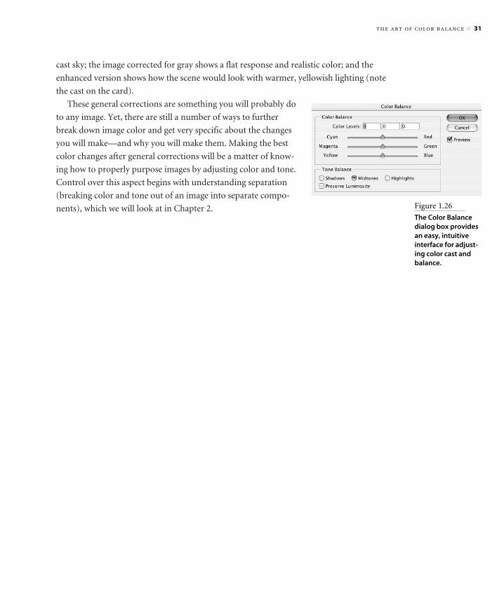
The idea of the Color Balance function (see Figure 1.26) is to allow you to shift the bal-
ance between opposing colors. Cyan balances against red, green against magenta, and blue
against yellow, with separate adjustments for highlights, midtones, and shadows. While
you could make similar changes with curves, the Color Balance dialog box is a friendlier
and easier way to make these changes. The result is usually a fine-tuning to help bring out
the interesting and inherent character of an image.
Rather than trying to calculate a result, you’ll find it easier to work with color balance
interactively. The goal is really to achieve more vibrant color:
1. Continue working with the lillycard.psd you have open (corrected in the previous
section).
2. Open Color Balance by pressing F/Ctrl+B.
3. Start with the Midtones (under the Tone Balance panel), and slide the Cyan/Red
slider between –50 and +50, watching the effect on the image. Narrow down the
range that looks best by swinging the slider in smaller ranges until the best position
is achieved based on the screen preview.
4. Repeat step 3 for the Magenta/Green slider.
5. Repeat step 3 for the Yellow/Blue slider.
6. Repeat steps 3 through 5 for Highlights.
7. Repeat steps 3 through 5 for Shadows.
8. Repeat steps 3 through 7.
While the steps here might seem an oversimplification, this is really all you have to
do. Your result can be a dramatic change in the image, even with small movements of the
sliders, and changes will influence color, saturation, and dynamics.
The color result of a correction on the lillycard.psd appears in the color section, show-
ing the original image, the image corrected for grays, and then the image color balanced
with curve saturation and tone enhancements. The original looks bluish due to the over-
4255c01.qxd 1/22/04 7:19 PM Page 30
cast sky; the image corrected for gray shows a flat response and realistic color; and the
enhanced version shows how the scene would look with warmer, yellowish lighting (note
the cast on the card).
These general corrections are something you will probably do
to any image. Yet, there are still a number of ways to further
break down image color and get very specific about the changes
you will make—and why you will make them. Making the best
color changes after general corrections will be a matter of know-
ing how to properly purpose images by adjusting color and tone.
Control over this aspect begins with understanding separation
(breaking color and tone out of an image into separate compo-
nents), which we will look at in Chapter 2.
the art of color balance ■ 31
Figure 1.26
The Color Balancedialog box providesan easy, intuitiveinterface for adjust-ing color cast andbalance.
4255c01.qxd 1/22/04 7:19 PM Page 31

4255c01.qxd 1/22/04 7:19 PM Page 32