Embed Size (px)
Citation preview

Chapter 2Framework
“The time has come,’ the Walrus said,“To talk of many things:Of shoes — and ships — and sealing-wax —Of cabbages — and kings —And why the sea is boiling hot —And whether pigs have wings.”
— Lewis Carroll, Through the Looking-Glass andWhat Alice Found There (1872)
2.1 How to Speak Visualization
In the Survey of English Dialects,1 Dieth and Orton [84] explored how differentwords were used for the same objects in various areas of England.The variety ofwords is substantial; the place where a farmer might keep his cows is called a byre,a shippon, a mistall, a cow-stable, a cow-house, a cow-shed, a neat-house, or abeast-house. Perhaps, then, it is not so surprising that we see the same situationin visualization, where a 2-D chart with data displayed as a collection of points,using one variable for the horizontal axis and one for the vertical, is variouslycalled a scatterplot, a scatter diagram, a scatter graph, a 2-D dotplot, or a starfield. As visualizations become more complex, the problem becomes worse, withno accepted standard names. In fact, the tendency has been in the field to come upwith rather idiosyncratic names – perhaps so that trademarking them is easier. This,however, puts a large burden on newcomers to the field and does not help in under-standing the differences and similarities between a variety of methods of displayingdata.
1Results from this survey have been published in a number articles and several books, of which thereference cited above is only one of many interesting articles.
G. Wills, Visualizing Time: Designing Graphical Representations for Statistical Data,Statistics and Computing, DOI 10.1007/978-0-387-77907-2 2,© Springer Science+Business Media, LLC 2012
21
22 2 Framework
There have been a number of attempts to form taxonomies, or categorizations,of visualizations. Most software packages for creating graphics, such as MicrosoftExcelTM, focus on the type of graphical element used to display the data andthen subclassify from that. This has one immediate problem in that plots withmultiple elements are hard to classify (should we classify a chart with a bar andpoints as a bar chart with point additions, or instead classify it as a point chartwith bars added?). Other authors such as Shneiderman [98] have started with thedimensionality of the data (1-D, 2-D, etc.) and used that as a basic classificationcriterion. Recognizing the weakness of this method for complex data, Shneidermanaugments the categorization with structural categorizations such as being treelikeor a network.This lack of orthogonality makes it hard to categorize a 2-D networkor a 3-D tree – which one is the base classification? Again we are stuck in a falsedichotomy – a 3-D network view is both 3-D and network, so such a classificationsystem fails for that example.
Visualizations are too numerous, too diverse, and too exciting to fit neatly withina taxonomy that divides and subdivides. In contrast to the evolution of animals andplants, which did occur essentially in a treelike manner, with branches splitting andsubsplitting, information visualization techniques have been invented more by acompositional approach. We take a polar coordinate system, combine it with bars,and achieve a Rose diagram [82]. We put a network in 3-D, or apply a projectionto an N-dimensional point cloud to render it in two dimensions. We add color,shape, and size mappings to all the above. This is why a traditional taxonomy ofinformation visualization is doomed to be unsatisfying. It is based on a false analogywith biology and denies the basic process by which visualizations have been created:composition.
For this reason this book will follow a different approach. We will considerinformation visualization as a language in which we compose “parts of speech” intosentences of a language. This is the approach taken by Wilkinson in The Grammarof Graphics [134]. Wilkinson’s approach can most clearly be seen by analogy tonatural language grammars. A sentence is defined by a number of elements thatare connected together using simple rules. A well-formed sentence has a certainstructure, but within that structure, you are free to use a wide variety of nouns,verbs, adjectives, and the like. In the same way, a visualization can be definedby a collection of “parts of graphical speech,” so a well-formed visualization willhave a structure, but within that structure you are free to substitute a variety ofdifferent items for each part of speech. In a language, we can make nonsensicalsentences that are well formed, like “The tasty age whistles a pink.” In the sameway, under graphical grammar, we can define visualizations that are well formedbut also nonsensical. With great power comes great responsibility.2
2One reason not to ban such seeming nonsense is that you never know how language is going tochange to make something meaningful. A chart that a designer might see no use for today becomesvaluable in a unique situation, or for some particular data. “The tasty age whistles a pink” mightbe meaningless, but “the sweet young thing sings the blues” is a useful statement.

2.2 Elements 23
In this book, we will not cover grammar fully. The reader is referred to [134] forfull details. Instead we will simply use grammar to let us talk more clearly aboutvisualizations. In general, we will use the same terms as those used in grammar,with the same meaning, but we will omit much of the detail given in Wilkin-son’s work. Here we will consider a visualization as consisting of the followingparts:
Data The data columns/fields/variables that are to be usedCoordinates The frame into which data will be displayed, together with any
transformations of the coordinate systemsElements The graphic objects used to represent data; points, line, areas, etc.Statistics Mathematical and statistical functions used to modify the data as they
are drawn into the coordinate frameAesthetics Mappings from data to graphical attributes like color, shape, size, etc.Faceting Dividing up a graphic into multiple smaller graphics, also known as
paneling, trellis, etc.Guides Axes, legends, and other items that annotate the main graphicInteractivity Methods for allowing users to interact with the graphics; drill-down,
zooming, tooltips, etc.Styles Decorations for the graphic that do not affect its basic structure but modify
the final appearance; fonts, default colors, padding and margins, etc.
In this language, a scatterplot consists of two variables placed in a 2-D rectangu-lar coordinate system with axes as guides and represented by a point element. A barchart of counts consists of a single variable representing categories, placed in a 2-Drectangular coordinate system with axes as guides and represented by an intervalelement with a count statistic.
Because the grammar allows us to compose parts in a mostly orthogonal manner,one important way we can make a modification to a visualization is by modifyingone of the parts of the grammar and seeing how it changes the presentation of thedata. In the remainder of this chapter, we will show how the different parts can beused for different purposes, and so introduce the terms we will use throughout thebook by example while providing a brief guide to their use.
2.2 Elements
In a traditional taxonomy as presented by most computer packages, the elementis the first choice. Although we do not consider it as quite that preeminent, itmakes a good place to start with our exploration of how varying the parts of avisualization can change the information it provides and thus make it easier or harderto understand and act on different patterns within the data.

24 2 Framework
17:1517:0016:4516:3016:1516:0015:45
61
60
59
58
57
Fig. 2.1 Stock trades: price by time. A scatterplot: two variables in a 2-D coordinate system withaxes; each row of the data is represented by a point The data form a subset of trade data for a singlestock, with each point representing the time of a trade and the price at which it was traded
2.2.1 Point
The point element is the most basic of elements. A single, usually simple, markrepresents a single item. In the earliest writings, tallies were used for counting,with a one-to-one mapping between items and graphical representation. This basicrepresentation is still a valuable one. Figure 2.1 shows a scatterplot depicting stocktrades. Each point indicates a trade, with the x dimension giving the time of the saleand the y dimension the price at which the stock was traded. Some things to noticeabout this figure:
• Using points, all the trades are individually drawn. This has the advantage thatyou can see every item. This means that the times where there are many tradesare easily visible. However, it has the disadvantage that quite a few points aredrawn on top of each other, making a dense region where it is hard to see what isgoing on. This is often called the occlusion problem.
• The symbol used to draw the point makes quite a difference.Here we have usedan unfilled circle. This is generally a good choice, especially for dense plotslike this one. Overlapping circles are much easier to distinguish than symbolswith straight edges – the eye can easily distinguish two, three, or even fouroverlapping circles. However, the same number of overlapping squares or crossesis confusing:
2.2 Elements 25
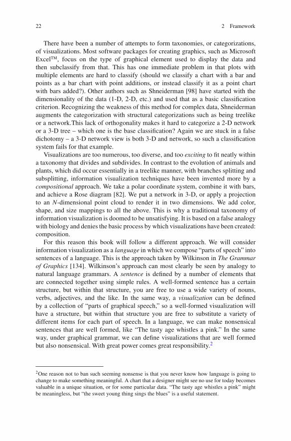
• The size of the points makes a difference. A good guideline is that the size ofthe points should be about 2 or 3% of the width of the frame in which the dataare being drawn, but if that makes the points too small, it may be necessary toincrease that size somewhat. If there are few points to be drawn, a larger size canbe used if desired.
2.2.2 Line
Lines are a fundamentally different form of graphical element from points. Whenwe use a point element, each case or row of data is represented by a single, discretegraphical item. For a line element, we have a single graphical element that representsmany different rows of data. From a theoretical point of view, a line represents afunction: y = f (x). In other words, each value of x can have only a single value of y.This has several important ramifications:
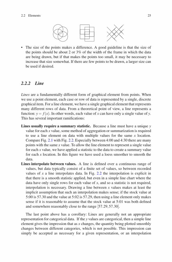
Lines usually require a summary statistic. Because a line must have a unique yvalue for each x value, some method of aggregation or summarization is requiredto use a line element on data with multiple values for the same x location.Compare Fig. 2.1 with Fig. 2.2. Especially between 4:00 and 4:30 there are manypoints with the same x value. To allow the line element to represent a single valuefor each x value, we have applied a statistic to the data to create a summary valuefor each x location. In this figure we have used a loess smoother to smooth thedata.
Lines interpolate between values. A line is defined over a continuous range ofvalues, but data typically consist of a finite set of values, so between recordedvalues of x a line interpolates data. In Fig. 2.2 the interpolation is explicit inthat there is a smooth statistic applied, but even in a simple line chart where thedata have only single rows for each value of x, and so a statistic is not required,interpolation is necessary. Drawing a line between x values makes at least theimplicit assumption that such an interpolation makes sense; if the stock value at5:00 is 57.30 and the value at 5:02 is 57.29, then using a line element only makessense if it is reasonable to assume that the stock value at 5:01 was both definedand somewhere reasonably close to the range [57.29,57.30].
The last point above has a corollary: Lines are generally not an appropriaterepresentation for categorical data. If the y values are categorical, then a simple lineelement gives the impression that as x changes, the quantity being plotted smoothlychanges between different categories, which is not possible. This impression cansimply be accepted as necessary for a given representation, or an interpolation
26 2 Framework
17:1517:0016:4516:3016:1516:0015:45
57.37
57.36
57.35
57.34
57.33
57.32
57.31
57.30
57.29
Fig. 2.2 Stock trades: price by time. Line chart: two variables in a 2-D coordinate system withaxes; a single line represents all the data. A smooth statistic (Sect. 2.3) has been applied to thedata. The data are the same trade data of the previous figure
method can be used that shows abrupt changes, such as a “step” style drawing,as given in Fig. 2.3.
If the x values are categorical, the situation is worse. By its nature the line elementmust interpolate along the x dimension, so the chart will be intrinsically misleading.It is important to note that in many cases data that may appear categorical are basedon an underlying dimension that is continuous. Values of time, for example, mightbe recorded as a set
{Monday,Tuesday,Wednesday,Thursday,Friday,Saturday},
which are categories. These categories, though, represent ranges of time – anunderlying dimension that is continuous. Therefore, a line element using thevalues given above on the x dimension is a reasonable chart. It is only whenthe underlying dimension cannot be thought of as continuous that the result losesmeaning.
2.2.3 Area
An area element is most simply defined as filling the area between a line andthe horizontal axes. The simplest area element is indeed just the area under a lineelement, and if we replaced the line element in Fig. 2.2 with an area element, the

2.2 Elements 27
17:1517:0016:4516:3016:1516:0015:45
59.0
58.5
58.0
57.5
57.0
Fig. 2.3 Stock trades: price by time. Step representation of a line chart. This is the same chart asin Fig. 2.2, except that we have used a step function on the data so it does not interpolate smoothlybetween values, but instead steps abruptly
chart would be essentially the same as if we filled in below the curve using a painttool in a graphic editing program.
Given their similarity, the question needs to be asked: Is there any real differencebetween the two elements, or can we treat them the same? When there is a single lineor area in a chart, there is indeed little reason to prefer one over the other, but whenthere are multiple lines or areas – for example, when an aesthetic (which we willlook at in Sect. 2.4) splits the single line or area into several – there is a difference,as follows.
• Areas are more suitable than lines when the y value can be summed, forexample, when the y values represent sums, counts, percentages, fractions,density estimates, or the like. In these situations, areas can be stacked, as inFig. 2.4. This representation works well when the overall value is as importantas, or more important than, the relative frequencies of the y values over time. Ifthe relative frequencies are of greater interest, instead of showing a summationof y values, we can show relative proportions as in Fig. 2.5.
• Lines are more suitable for areas when the y values should not be summed, orwhen there is a need to compare the values for different lines to each other, or tocompare their shapes. Areas that are not stacked tend to obscure each other andso are unsuitable for such uses.
• Areas can be defined with both lower and upper bounds, rather than havingthe lower bound be the axis. This representation is particularly suitable forrepresenting ranges that vary along the x dimension, such as is often the case for

28 2 Framework
17:1517:0016:4516:3016:1516:0015:45
1.2
1.0
0.8
0.6
0.4
0.2
0.0
XSB
Fig. 2.4 Stock trades: volume by time. An area chart: two variables in a 2-D coordinate systemwith axes; an area element is displayed for each group in the data. The groups are defined by theTradeType variable, which indicates whether the trade was a buy, sell, or cross-trade. For eachgroup, an area element represents the relative density of trades over time. The areas are stackedon top of each other, so the top of the stacked areas gives the overall density of trades over time,while the bands give the relative numbers by type. Note that in this chart it is relatively easy tovisually estimate the total height of the stacked element, and also to see the shape of the lowestband, because it is anchored to the line. It is the other categories, buy and sell, that are hard to judgeas their baselines are stacked on other areas
quality control charts, and for representing statistical ranges such as deviationsabout a model fit line.
• Consideration should also be paid to the variable being plotted on the x and yaxes. The “area” of the area element should have some sort of meaning. In otherwords, consider the units of the 2-D area. If it has some reasonable meaning,then an area element makes sense. Otherwise, it might be best not to use an areaelement.For example, if the x dimension is time, and velocity is on the y axis,then the area of an area element has a direct interpretation as velocity × time,which is distance traveled, making the chart reasonable. On the other hand, anarea chart of startingtime × endingtime would be a bad choice as the area ismeaningless.
• If the concern is to see how a value is changing over time, then using a line isoften a better choice, as the slope of the line is the rate of change of the y variablewith respect to the x variable. If acceleration is of greater interest than distancetraveled, then a line element is a better choice than an area element in the samesituation as discussed just above, where x = time and y = velocity.

2.2 Elements 29
6:30:00 PM6:00:00 PM5:30:00 PM5:00:00 PM4:30:00 PM4:00:00 PM
100%
80%
60%
40%
20%
0%
XSB
TradeType
Fig. 2.5 Stock trades: ratios of types by time. A modified version of Fig. 2.4 in which thedensity statistic has been replaced by a statistic that first bins the data using the horizontal (time)dimensions and then calculates the percentage of each group within each bin. The result shows thechanging proportions of trades that were buys, sells, or cross-trades
2.2.4 Interval
Intervals are typically termed bars when in a rectangular coordinate system and canbe used in a variety of ways. They can be used, like points, with one bar to everyrow in the data set, but that use is relatively rare. Often they are used to providea conditional aggregation where we aggregate a set of rows that share the same xdimension. The canonical example of this use of an interval is the “bar chart,” wherea categorical variable is used on the x axis, and where the y values for each distinctx axis category are summed, or, if there is no y value, the count of rows in eachcategory is used.
One special case of the “bar chart” is when we have a continuous variable on thex dimension and wish to show a visualization of how concentrated the occurrencesare at different locations along that dimension. We bin the x values and then countthe number of values in each bin to form a y dimension. The common name for thischart is a histogram, as shown in Fig. 2.6.
Compare Figs. 2.6 and 2.4. Their overall shape is similar – we could easily adda color aesthetic to the histogram to obtain a plot that has the same basic look asthe density area chart. This illustrates not only the fact that the histogram is a form

30 2 Framework
17:1517:0016:4516:3016:1516:0015:45
125
100
75
50
25
0
Fig. 2.6 Histogram of trade times: one data variable in a 2-D coordinate system. The seconddimension is generated from the first by a pair of statistics. The first statistic bins the x values intodisjoint bins, and the second statistic counts the number of rows that fall in each bin. This gives ahistogram representation of when trades occurred The data form a subset of trade data for a singlestock, with each point representing the time of a trade and the price at which it was traded
of density statistic but also the similarities between the area and bar elements. Inmany respects, a bar can be considered as half-way between a point and an areaelement, sharing the abilities of both. Perhaps this is why it is the most commonlyused element in published charts.The main reason to prefer an area element overan interval element is for accentuating the continuous nature of the x dimension.The interval element breaks up a continuous x dimension into chunks, ruthlesslysplitting the data into (often arbitrary) categories, whereas the area element rendersa single, smoothly evolving value. On the other hand, if you want to show additionalinformation on the chart, the bars are more versatile and will allow you to make morecomplex visualizations.
Figure 2.7 takes the basic histogram and adds some more information. We haveused a color aesthetic and used color to show the volume of trades in each binnedtime interval. In this visualization we show the count of trades as the main focusand relegate the trade volume to secondary status as an aesthetic. In practice theconverse is likely to be a better idea.3
Many published books (e.g., [38]) and, increasingly, Web articles will tell theirreaders to always show the zero value on the y-dimension axis when drawing
3In Sect. 2.3 we will explain a little more about statistics. In particular we will deal with the use ofweight variables, the use of which is the best way to describe this data set for most purposes.

2.2 Elements 31
17:1517:0016:4516:3016:1516:0015:45
125
100
75
50
25
0
0100,000200,000300,000400,000500,000600,000
Fig. 2.7 Histogram of trade times. This figure is similar to Fig. 2.6, but we have colored each barby the sum of trade volumes in each bar. We can see in this figure that, although most trades tookplace between 4:10 p.m. and 4:15 p.m. (local time) the time period just after this period saw moretotal trade volume
a bar chart. While the advice is not bad advice when stated as a general guideline,be aware that it is not a universal rule – there are important exceptions. The ruleis based on the principle that the length of the bar should be proportional to thequantity it measures, and so an axis value that is not at zero misleads by showingonly parts of those bars, exaggerating differences. Instead, consider if zero really ismeaningful for your data and if it is important to be able to compare lengths. In mostcases, the answer is yes and the advice is good, but, like all advice, do not follow itslavishly.
Zero may not be a good baseline. Consider a chart where x represents buildingsin Chicago and y the altitude of their roofs as measured above sea level (a subjectof some interest to the author as he types this on a windy day in the Sears Tower).A more natural baseline than zero would be the average altitude of the city itself,so the heights of the bars would more closely approximate the heights of thebuildings themselves. Other examples of y dimensions for which zero is notnecessarily a natural base point are temperatures (in Celsius and Fahrenheit),clothing sizes, and distances from an arbitrary point. Often falling into this caseare charts where the y dimension has been transformed. For a traditional logscale, for example, it is impossible to show zero, and showing the transformedvalue zero (the original value “1”) is as arbitrary a baseline choice as showingsome other location and might be completely inappropriate if you have datavalues below one.

32 2 Framework
17:3017:1517:0016:4516:3016:1516:0015:45
61
60
59
58
57
Fig. 2.8 Range plot of trade times: two variables in a 2-D coordinate system with two chainedstatistics. The first statistic bins the x values into disjoint bins and the second statistic calculatesthe range of y values in each bin. This gives a representation of the range of trade prices over timeThe data form a subset of trade data for a single stock, with each point representing the time of atrade and the price at which it was traded
Differences are more important than absolute quantities. If you are preparing avisualization in which your goal is to highlight differences, and the absolutevalues of the quantity are of little interest, then it makes sense to focus on therange of differences rather than showing a set of bars all of which appear to beabout the same size. If you are tracking a machine that is expected to makebetween 980 and 1020 items per minute, a bar chart with a zero on the y axiswould make a much weaker tool for quality control than one that shows a rangeof [950,1050].
The intervals represent a range, not a quantity. Many statistics produce an in-terval that is not fixed at zero. Examples are ranges, deviations, and error bars.Because these intervals represent a spread around a mean or, more generally,around a central point of the y data for a given x value, they should be thoughtof more as a collection of those central points, and zero is unlikely to be animportant part of their range.
Figure 2.8 illustrates the last two points. The bars represent a range of y values,rather than a single quantity, so we should consider the underlying quantity – thetrade price itself. Now zero is indeed a natural baseline for prices, so it would bedefensible to use it as the y-axis minimum value. However, in stock trading (at leastfor intraday trading) differences are much more important than absolute values, so arange that shows the differences is preferable to a range that hides them by showingthe absolute values. For these data and this statistic, zero is a poor choice.
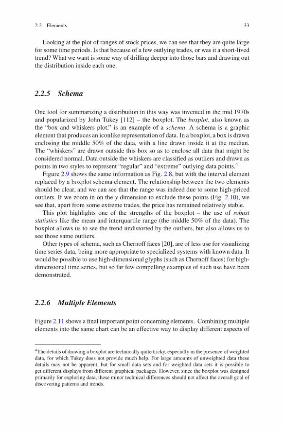
2.2 Elements 33
Looking at the plot of ranges of stock prices, we can see that they are quite largefor some time periods. Is that because of a few outlying trades, or was it a short-livedtrend? What we want is some way of drilling deeper into those bars and drawing outthe distribution inside each one.
2.2.5 Schema
One tool for summarizing a distribution in this way was invented in the mid 1970sand popularized by John Tukey [112] – the boxplot. The boxplot, also known asthe “box and whiskers plot,” is an example of a schema. A schema is a graphicelement that produces an iconlike representation of data. In a boxplot, a box is drawnenclosing the middle 50% of the data, with a line drawn inside it at the median.The “whiskers” are drawn outside this box so as to enclose all data that might beconsidered normal. Data outside the whiskers are classified as outliers and drawn aspoints in two styles to represent “regular” and “extreme” outlying data points.4
Figure 2.9 shows the same information as Fig. 2.8, but with the interval elementreplaced by a boxplot schema element. The relationship between the two elementsshould be clear, and we can see that the range was indeed due to some high-pricedoutliers. If we zoom in on the y dimension to exclude these points (Fig. 2.10), wesee that, apart from some extreme trades, the price has remained relatively stable.
This plot highlights one of the strengths of the boxplot – the use of robuststatistics like the mean and interquartile range (the middle 50% of the data). Theboxplot allows us to see the trend undistorted by the outliers, but also allows us tosee those same outliers.
Other types of schema, such as Chernoff faces [20], are of less use for visualizingtime series data, being more appropriate to specialized systems with known data. Itwould be possible to use high-dimensional glyphs (such as Chernoff faces) for high-dimensional time series, but so far few compelling examples of such use have beendemonstrated.
2.2.6 Multiple Elements
Figure 2.11 shows a final important point concerning elements. Combining multipleelements into the same chart can be an effective way to display different aspects of
4The details of drawing a boxplot are technically quite tricky, especially in the presence of weighteddata, for which Tukey does not provide much help. For large amounts of unweighted data thesedetails may not be apparent, but for small data sets and for weighted data sets it is possible toget different displays from different graphical packages. However, since the boxplot was designedprimarily for exploring data, these minor technical differences should not affect the overall goal ofdiscovering patterns and trends.

34 2 Framework
17:3017:1517:0016:4516:3016:1516:0015:45
61
60
59
58
57
Fig. 2.9 Stock trades: price by time. Boxplot: two variables in a 2-D coordinate system with twochained statistics. The first statistic bins the x values into disjoint bins and the second statisticcalculates the Tukey statistics of y values in each bin The data form a subset of trade data for asingle stock, with each point representing the time of a trade and the price at which it was traded
17:3017:1517:0016:4516:3016:1516:0015:45
58.0
57.8
57.6
57.4
57.2
Fig. 2.10 Boxplot: the same graph as in Fig. 2.9, but restricting the y dimension to show a smallerrange

2.3 Statistics 35
17:1517:0016:4516:3016:1516:00
60
59
58
57
56
XSB
Fig. 2.11 Combination of three elements displaying trade price by time in two dimensions.A point element showing individual sales, an interval element showing, for binned values, the95% confidence interval for those values, and a line element showing the median values in thesame bins
data simultaneously. With three different elements, Fig. 2.11 requires some studybut does provide a view of the central trend of the price, as well as estimates ofvariability and the finest level of detail possible; points show the individual trades.
Combinations of elements is usually permitted to some extent with traditional,chart-type-based graphing packages, but it is restricted to the most commonexamples, such as bar/line, bar/points, and point/line. Allowing a freer mixtureof elements allows increased creativity and permits visualizations more easilytailored to the goals of the data, but even with a limited set of choices elementcombination allows multiple properties of data to be shown within a singlechart. By carefully allocating variables to elements, and by choosing suitablestatistics for those elements, compelling and informative visualizations can beproduced.
2.3 Statistics
In Sect. 2.2 we saw the use of statistics in the context of choice of element. Wedefine a statistic for a visualization very generally as any transformation or chainof transformations that take data and produce new forms of it. In Fig. 2.12 we seea simple example; we took a data set consisting of wind speed measurements over18 years, divided it into months, and then calculated a 95% confidence interval for

36 2 Framework
1/1/781/1/761/1/741/1/721/1/701/1/681/1/661/1/641/1/621/1/60
30
20
10
0
Fig. 2.12 Wind speeds measured daily in Dublin, Ireland for the years 1961–1978. On top of theraw data is superimposed an area element showing a 95% confidence interval for the mean windspeed in each month
the mean of the data for each month. The resulting statistics are shown using anarea element to highlight the continuously changing nature of the statistic beingcalculated.
This is a fairly traditional usage of statistics;the statistic summarizes the data ina given group by a pair of values (indicating the range). We are summarizing the28 to 31 points in each month by a single range. This is how statistics are normallythought of – as a means of summarizing information. However, in this book we alsoconsider more general uses, as discussed in the subsections below.
2.3.1 Local Smooths
A common way of summarizing a set of (x,y) data where we expect y to depend onx is to fit a line to the relationship. The traditional family of prediction lines to fitare polynomial least-squares-fit lines. These summarize the relationship betweenthe variables using a polynomial of low degree. However, for time data in particularthis form of smooth5 is unlikely to be useful. When x represents time, it is notcommon to have a function linearly increasing or decreasing over time. Using a
5In this context, the terms smooth and predictor are being used interchangeably. To be more formal,we would say that a smoothing statistic can be used as a predictor, rather than using the two termsinterchangeably.

2.3 Statistics 37
1/1/781/1/761/1/741/1/721/1/701/1/681/1/661/1/641/1/621/1/60
30
20
10
0
Fig. 2.13 Wind speeds measured daily in Dublin, Ireland for the years 1961–1978. The figureshows both the raw data and a loess smooth of the data. The loess smooth uses a window size of1 year and an Epanechnikov kernel
higher-degree polynomial does not improve the situation much. Often a fit will beneeded for a seasonal variance or other nonlinear structures. But even these modelswill fail if the data have change points (where the relationship changes abruptly)and the calculation of seasonal models is itself a challenge. Often what is neededis a way of smoothing the data that can be used to take an exploratory look at theseries. A desirable feature of such smooths is that they adapt to different conditionsin different time periods, unlike polynomial fits, which expect the same conditionsto hold across the entire range of time. Local smooths are statistics that only use dataclose to the x value where the smooth is being evaluated to calculate the smoothed yvalue. One very simple smooth is a moving average. For each x value we produce ay value by averaging the y values of data lying within a given distance of the x valueon the x dimension.
Figure 2.13 shows a loess smooth applied to data. Loess [26] adapts basicregression by calculating a new regression fit for each value of x by fitting aregression line only to the data within a given distance of that value, and withdecreasing weights the further away we get from that central location. For thisexample, the distance used is fixed at 1 year, so when we predict a value at 1972, weonly calculate the fit for data within 1 year of that date, and we weight values closerto 1972 higher than values further away. We see the seasonal variation clearly in thisfigure; a loess smooth is a good tool for exploratory views of time series, althoughthe results are heavily dependent on the choice of the given distance. There are manyoptions for choosing this “given distance,” usually termed a window, including:

38 2 Framework
Fixed- or variable-sized window: The simplest window is of fixed size; we canstate that the window should be 1 month long, 1 week long, or some fractionof the data range. Alternatively we could ask for a variable or adaptive window.One way of doing that is by defining a nearest-neighbor window in which wedefine the local width at a point on the x dimension as the distance necessary toenclose a fixed number of neighbors. If the data are irregularly spaced on the xdimension, this allows the window to adapt to the relative density, so that sharpchanges are possible in high-density regions, but low-density regions, for whichless information is available, do not exhibit such variability.
Window centered or not: Generally, if we want to predict at a given location, wechoose a window of values centered on the value we want to predict. For timedata, however, this makes less sense as it is trying to predict a value based onvalues that are “in the future.” A more advisable plan is to use a window thatonly calculates values to the left of the location where we want to predict. Thisrepresents reality better, and that is the basic goal of modeling.
Choice of kernel function: The kernel function is a function that gives moreweight to observations close to the location and less to ones far away. The sim-plest kernel function is a uniform kernel, which gives equal weight throughout thewindow. A triangle kernel function that decreases linearly to zero as observationsget further away from the current location is another simple one. In general, thechoice of kernel function is not as important, especially for exploratory use, asother choices, so pick a reasonable choice and then forget about it. In this bookwe use the Epanechnikov kernel throughout.6
Without doubt, the most important choice to be made when using a kernel smoothis the window size. In Fig. 2.13, we can see seasonal trends; the window size of1 year allows us to see fluctuations at this level of detail. In contrast, Fig. 2.14 hasa larger window width and the seasonal details are hidden, showing only a simplermessage of “little long-term trend change.” Both messages are valuable; decidingwhich to display is a matter of choosing the one that highlights the feature you areinterested in conveying.
There is a large body of literature on how to choose window widths, paralleledby a similarly large body of literature on how to set binning sizes for histograms,which is a related topic. Although the initial choice of parameter is important in aproduction setting where you have set values and is very important when you wantto compare different data sets or make inferences, in a more exploratory setting the
6The formula for an Epanechnikov kernel is defined as 0 outside the window and
34
(1− ( x
h
)2)
when −h < x < h for a window width of h. This kernel minimizes the asymptotic mean integratedsquared error and can therefore be thought of as optimal in a statistical sense.

2.3 Statistics 39
1/1/781/1/761/1/741/1/721/1/701/1/681/1/661/1/641/1/621/1/60
30
20
10
0
Fig. 2.14 Wind speeds measured daily in Dublin, Ireland for the years 1961–1978. The figure isthe same as Fig. 2.13, except that the loess smooth uses a window size of 3 years, which smoothsout the seasonal trends
best solution is to start with a good value and then play around with the value to seewhat effect it has. A system that allows direct interaction with the window widthparameter, as we will see in Chap. 9, is ideal for such exploration.
In the context of the grammar, we want our choice of statistic to be orthogonalto our other choices; in particular, this means we would like to be able to useour statistic in any dimensional space. Our conditional summary statistics shouldbe conditioned on all the independent dimensions, and if we have a smoothingstatistic, we should ensure it works in several dimensions. Figure 2.15 showsour loess smooth in three dimensions. By taking our 2-D date × value chartand splitting the dates into two components, one for months and one for years,we highlight the seasonality. We will give more examples of this techniquein Chap. 5.
2.3.2 Complex Statistics
I do not want to give the impression that all statistics are simple summaries orsmooths and predictions that essentially enhance the raw data. In this book statisticsare considered to be far more general objects that can make radical changes tothe structure and appearance of graphics. In some systems, such statistics are notavailable inside the graphical framework and are performed before any other part of

40 2 Framework
Year
80
75
70
65
60
DUB
13
12
11
10
9
8
7
6
Month
12
10
86
42
0
Fig. 2.15 Wind speeds measured daily in Dublin, Ireland, by year and month. The date variablehas been split into two dimensions, one for year and one for month. A surface for the loess smoothhas been plotted
the process, but the principle is still applicable. Figure 2.16 shows an example of amore complex statistic, the self-organizing map (SOM) invented by Teuvo Kohonen.The SOM is described in detail in his book [68], with what follows being a briefintroductory description only.
A SOM first must be trained on data. This is a process that creates a grid ofvectors that represent clusters for the data. The training algorithm for a simple SOMimplementation on k-dimensional data table is as follows:
1. Create a grid of k-dimensional vectors and initialize their values randomly.2. For each row in the data set, find the grid vector that is closest to that row where
the distance is measured in the k-dimensional space of the columns of the table.3. Modify the grid vector and any other grid vectors nearby by making their values
more similar to the input row vector. Grid vectors closer to the target grid vectorare changed more than ones further away.
The update steps 2 and 3 are repeated a number of times, each time with adecreasing weighting value so that the grid changes less. The end result is to create asemantic map in which the initially random vectors have been “trained” to be similarto the data vectors, and the vectors have simultaneously been laid out so that similarpatterns tend to be close to each other. The resulting map can be used in many ways.

2.4 Aesthetics 41
Fig. 2.16 A self-organizing map of wind data using wind speed data for six cities as the sixvariables used to create the plot. The size of the point at a grid coordinate indicates how manyrows are mapped to that location; the color represents the average wind speed for that grid location
In Fig. 2.16 we have taken the map and made one final pass on the data, assigningeach data row to its closest grid location. Thus we have used the map to project ourdata from six dimensions down to a 2-D grid. Each grid point represents a numberof days where the wind speeds measured at six cities in Ireland were similar. Wesummarize the data at each grid point with two values. The count of the number ofdays mapped to that grid point is shown as the size of the point; the average windspeed is shown by color, with red indicating high speeds, blue low speeds, and greenintermediate.
The resulting plot shows three main groups – semantic clusters. There is arelatively small group of days where there are high winds, but at least two groupswhere the average speeds are low. This gives some evidence that there might be asingle weather pattern that leads to high winds, but multiple weather patterns ondays when wind speeds are low. The SOM is not an exact tool; it is an exploratorytool that can be used to motivate more detailed study. It is also valuable in beingable to reduce data dimensions and show a different aspect of time data, a subjectwe will return to in Chap. 8.
2.4 Aesthetics
In the last figure of the previous section, we used color to show average windspeed and size to show the number of days represented by each grid vector. Theseare examples of aesthetics – mappings from data to visual characteristics of thegraphical elements.

42 2 Framework
Year201020001990198019701960195019401930192019101900189018801870
League
UA
PL
NL
NA
FL
AL
AA
0.000.020.040.060.080.10
Mean(HomeRuns)
Fig. 2.17 Baseball players’ average number of home runs per game, binned into decades and splitvertically by league. The color of the points encodes the average number of home runs per playerper game
Year201020001990198019701960195019401930192019101900189018801870
League
UA
PL
NL
NA
FL
AL
AA
0.000.050.100.150.200.25
Mean(StolenBases)
Fig. 2.18 Baseball players’ average number of stolen bases per game, binned into decades andsplit vertically by league. The color of the points encodes the average number of bases stolen perplayer per game
Color is one of the most commonly used aesthetics; because visualizations aredisplayed visually (by definition!), it is always possible to color elements basedon characteristics of the data. Color is not as dependent on the positions of theelements as other aesthetics such as shape, size, and rotation. Indeed, some elements(e.g., area) have much of their value destroyed when aesthetics such as rotation areapplied, whereas color can be applied with ease.
In Figs. 2.17 and 2.18 we show color applied to baseball data. This data setconsists of statistics on baseball players’ ability to hit the ball. The data are yearlysums of various measures of hitting ability, and we have restricted the data only toinclude players who played at least 50 games in a given season. This figure breaks
2.4 Aesthetics 43
down players by decade and league, showing a point for each league/decadecombination. The total number of player seasons for that league/decade combinationis indicated by the size of the point.
We can see a flurry of smaller early leagues, settling down later into the twoleagues now in existence; the American League and the National League. Thefirst figure uses color to show the average number of Home Runs hit per game fora given league in a given decade. The second figure uses color to show averagestolen bases.7 We can see how home runs, rare initially, have become relativelymore common in modern times, and we see a big increase in their occurrence since2000 in the American League. Stolen bases, on the other hand, were much morecommon earlier, reached their nadir around 1950–1960, and since then have seen aslight, but clear, increase.
One feature of interest is the gray symbol for stolen bases in the National Leaguein the 1870s. This is because there are no stolen base data for this element. Itis important to make sure that people viewing a chart can clearly see missingdata; we would not want to show this symbol using a color that might be confusedwith known data. When using a color aesthetic, achromatic colors (black, gray,white) are a good choice for missing values as they are easily distinguished andunlikely to give a misleading impression – unless you print the chart in black andwhite!
Much has been written about the uses of color in visualizations. Good startingpoints for deep investigation are [72] and [14]. The latter reference describes anexcellent online tool for generating color scale, ColorBrewer, which can be foundat colorbrewer.org. What follows are simple guidelines to keep in mind.
Color is a composite. A color can be thought of as being a mixture of red, green,and blue; cyan, magenta, yellow, and black; or as a point in more technical colorspaces. It is tempting to think that we can use different components for differentmappings. This can be done effectively, but it is tricky, as our visual tendency is tosee colors as a single entity. Perhaps the most useful separation is to parameterizecolor by hue, saturation, and lightness (or a similar system with better perceptualproperties, such as the CIE L*U*V* space, also known as CIELUV), and usejust a couple of the components. In Sect. 2.4.2 we show another example of acomposite aesthetic.
Color is nonlinear. Mapping a variable to any simple path through color space willgive a mapping where perceived differences in color are poorly related to actualdifferences in data. This makes it hard to make quantitative judgements aboutdifferences in values based on the displayed colors.
My color is different from your color. Not only might we have different abilitiesto perceive color differences (color-blindness in one form or another is an
7Home runs are big hits that in today are virtually always hit out of the field of play. Stolenbases, in contrast, are when the runner advances to the next base without making a hit at all. In asense, they are opposite types of play that advance the bases for the batting team.

44 2 Framework
1/1/001/1/751/1/501/1/251/1/001/1/751/1/50
0.4
0.3
0.2
0.1
0.0
UAPLNLNAFLALAA
League
Fig. 2.19 Baseball players’ average number of stolen bases per game. This figure shows the sameinformation as Fig. 2.18, namely, how many bases are stolen per player per game, aggregated intodecades and split by league using a pattern aesthetic. The points have been jittered to reduce theeffect of overlap
example of this), but my computer might have a different gamma from yours,my projector might show blues badly, and your printer might be greenerthan expected. Color calibration is big business and important for graphicsprofessionals, but depending on accurate color for visualization results is a riskyproposition. Err on the side of caution and do not expect your viewers to makeinferences based on subtle shadings.
2.4.1 Categorical and Continuous Aesthetics
Figures 2.17 and 2.18 show a continuous value being mapped to color. In otherfigures, for example Fig. 2.5, we map data consisting of categories to color.In Chap. 4 we will consider the differences between displaying categorical andcontinuous values more thoroughly, but the difference between aesthetics forcategories and aesthetics for continuous values is fundamental to the design of goodvisualizations and needs to be understood when talking about aesthetics.
Some aesthetics are naturally suited to categorical data. Pattern, also knownas texture, is an examples of this. In Fig. 2.19 we have taken the same data asin Fig. 2.18 and moved variables to different roles. We have left time on the x

2.4 Aesthetics 45
Year201020001990198019701960195019401930192019101900189018801870
League
UA
PL
NL
NA
FL
AL
AA
0.000.020.040.060.080.10
Mean(HomeRuns)
Fig. 2.20 Baseball players’ average number of home runs per game, binned into decades and splitvertically by league. The angle of the arrows encodes the average number of home runs per playerper game
dimension but have moved Stolen Bases from being an aesthetic to being they dimension. League, which was on the y dimension, has been moved to be anaesthetic – pattern. Patterns do not have any strong natural order or metric, and soare most suitably used for a variable that itself has no natural order. League is anexample of such a variable, and so using pattern for it is sensible.
It is much easier to judge the relative proportions of stolen bases using the ydimension rather than color,and, conversely, it is harder to see the spans of existenceof the various leagues in Fig. 2.19. This is an important general rule; the positionaldimensions are the easiest to interpret and are visually dominant. In most cases, themost important variables should be used for position; aesthetics should be used forvariables of secondary importance.
Other aesthetics are better suited for continuous data. In Fig. 2.20 we showthe rotation aesthetic in action. Arrows pointing to the left show low home runaverages, whereas arrows to the right show high home run averages. Comparethis figure with Fig. 2.17 – they are identical except for the aesthetic. Althoughcolor is more appealing, it is easier to judge relative angle and to work out whichdecades are above and which are below the “average” average home run rate.Color is more useful but does not allow as fine discrimination. Some authorsrecommend against the use of color for continuous data for this reason – orat least recommend the use of a perceptually even color scale instead of therainbow scale used in Fig. 2.17, but as long as the viewer is not expected to judgerelative values, any color scale that is familiar or legended well can be used toroughly indicate continuous values. I would argue (in the language of Chap. 4)that color is best used for ordinal data and effectively discretizes a continuousvariable into bands of colors. If this is consistent with the goals of the visualization,then it can be used as such. If not, then better color scales should be stronglyconsidered.
46 2 Framework
Year201020001990198019701960195019401930192019101900189018801870
League
UA
PL
NL
NA
FL
AL
AA
Fig. 2.21 Baseball players’ performance by decade by league. The width of the squares encodesthe square root of the average number of runs scored per player per game, and the height of thesquares encodes the square root of the average number of home runs scored per player per game
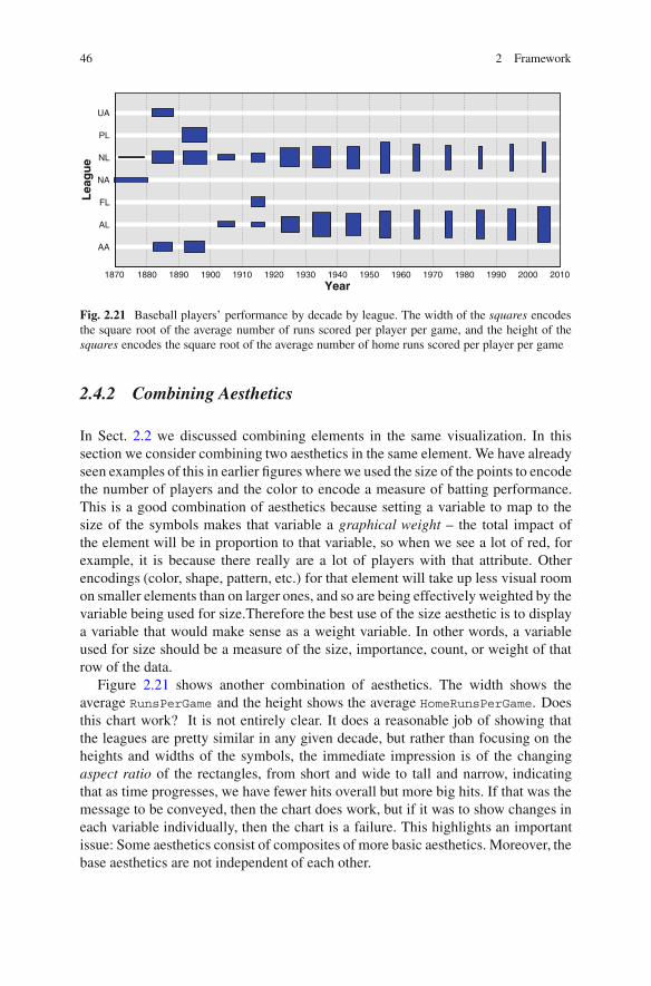
2.4.2 Combining Aesthetics
In Sect. 2.2 we discussed combining elements in the same visualization. In thissection we consider combining two aesthetics in the same element. We have alreadyseen examples of this in earlier figures where we used the size of the points to encodethe number of players and the color to encode a measure of batting performance.This is a good combination of aesthetics because setting a variable to map to thesize of the symbols makes that variable a graphical weight – the total impact ofthe element will be in proportion to that variable, so when we see a lot of red, forexample, it is because there really are a lot of players with that attribute. Otherencodings (color, shape, pattern, etc.) for that element will take up less visual roomon smaller elements than on larger ones, and so are being effectively weighted by thevariable being used for size.Therefore the best use of the size aesthetic is to displaya variable that would make sense as a weight variable. In other words, a variableused for size should be a measure of the size, importance, count, or weight of thatrow of the data.
Figure 2.21 shows another combination of aesthetics. The width shows theaverage RunsPerGame and the height shows the average HomeRunsPerGame. Doesthis chart work? It is not entirely clear. It does a reasonable job of showing thatthe leagues are pretty similar in any given decade, but rather than focusing on theheights and widths of the symbols, the immediate impression is of the changingaspect ratio of the rectangles, from short and wide to tall and narrow, indicatingthat as time progresses, we have fewer hits overall but more big hits. If that was themessage to be conveyed, then the chart does work, but if it was to show changes ineach variable individually, then the chart is a failure. This highlights an importantissue: Some aesthetics consist of composites of more basic aesthetics. Moreover, thebase aesthetics are not independent of each other.
2.4 Aesthetics 47
Year
Hits
/ G
ame
Year
Hits
/ G
ame
Fig. 2.22 Separate aesthetics used on a simple scatterplot of hits/game against year. The data arestatistics on average player performance aggregated by league and by year. On the left we highlightcases where players average more than one home run every ten games using a color aesthetic wherered indicates a high home run rate. On the right we highlight cases in which players averaged morethan 0.5 runs per game using shape. Seasons generating lots of runs are shown as circles, the othersas crosses
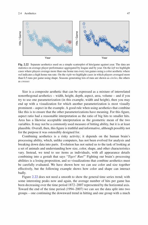
Size is a composite aesthetic that can be expressed as a mixture of interrelatednonorthogonal aesthetics – width, height, depth, aspect, area, volume – and if youtry to use one parameterization (in this example, width and height), then you mayend up with a visualization for which another parameterization is most visuallyprominent – aspect in the example. A good rule when using aesthetics that combinelike this is to ensure that the other parameterizations have meaning. For this figure,aspect ratio had a reasonable interpretation as the ratio of big hits to smaller hits.Area has a likewise acceptable interpretation as the geometric mean of the twovariables. It may not be a commonly used measure of hitting ability, but it is at leastplausible. Overall, then, this figure is truthful and informative, although possibly notfor the purpose it was ostensibly designed for.
Combining aesthetics is a risky activity; it depends on the human brain’sprocessing ability, which, unlike computers, has not been evolved for analysis andbreaking down data into parts. Evolution has not suited us to the task of looking ata set of animals and understanding how size, color, shape, and other characteristicsvary. Instead, we tend to see items as individuals, with all appearance detailscombining into a gestalt that says “Tiger! Run!” Fighting our brain’s processingabilities is a losing proposition, and so visualizations that combine aesthetics mustbe carefully evaluated. We have shown how we can use color and size togethereffectively, but the following example shows how color and shape can interactbadly.
Figure 2.22 does not need a smooth to show the general time series trend; withsome interesting peaks now and again, the average number of hits per game hasbeen decreasing over the time period 1872–2007 represented by the horizontal axis.Toward the end of the time period (1994–2007) we can see the data split into twogroups – one continuing the downward trend in hitting and one group with a much
48 2 Framework
YearH
its /
Gam
e
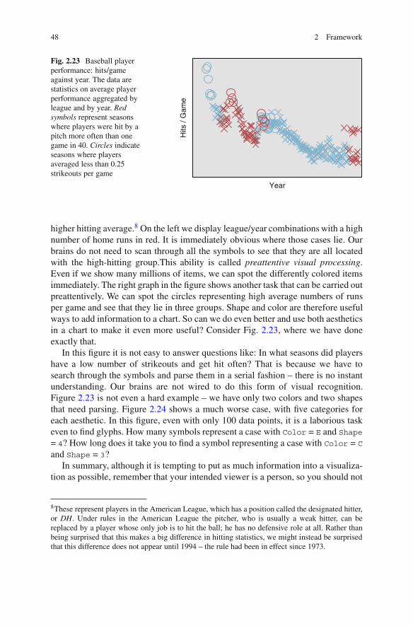
Fig. 2.23 Baseball playerperformance: hits/gameagainst year. The data arestatistics on average playerperformance aggregated byleague and by year. Redsymbols represent seasonswhere players were hit by apitch more often than onegame in 40. Circles indicateseasons where playersaveraged less than 0.25strikeouts per game
higher hitting average.8 On the left we display league/year combinations with a highnumber of home runs in red. It is immediately obvious where those cases lie. Ourbrains do not need to scan through all the symbols to see that they are all locatedwith the high-hitting group.This ability is called preattentive visual processing.Even if we show many millions of items, we can spot the differently colored itemsimmediately. The right graph in the figure shows another task that can be carried outpreattentively. We can spot the circles representing high average numbers of runsper game and see that they lie in three groups. Shape and color are therefore usefulways to add information to a chart. So can we do even better and use both aestheticsin a chart to make it even more useful? Consider Fig. 2.23, where we have doneexactly that.
In this figure it is not easy to answer questions like: In what seasons did playershave a low number of strikeouts and get hit often? That is because we have tosearch through the symbols and parse them in a serial fashion – there is no instantunderstanding. Our brains are not wired to do this form of visual recognition.Figure 2.23 is not even a hard example – we have only two colors and two shapesthat need parsing. Figure 2.24 shows a much worse case, with five categories foreach aesthetic. In this figure, even with only 100 data points, it is a laborious taskeven to find glyphs. How many symbols represent a case with Color = E and Shape
= 4? How long does it take you to find a symbol representing a case with Color = C
and Shape = 3?In summary, although it is tempting to put as much information into a visualiza-
tion as possible, remember that your intended viewer is a person, so you should not
8These represent players in the American League, which has a position called the designated hitter,or DH. Under rules in the American League the pitcher, who is usually a weak hitter, can bereplaced by a player whose only job is to hit the ball; he has no defensive role at all. Rather thanbeing surprised that this makes a big difference in hitting statistics, we might instead be surprisedthat this difference does not appear until 1994 – the rule had been in effect since 1973.

2.5 Coordinates and Faceting 49
EDCBA
Color
54321
Shape
Fig. 2.24 Synthetic data set of 100 points with color and shape aesthetics randomly assigned
Year
Hits
/ G
ame
Fig. 2.25 A reworking ofFig. 2.23. Instead of twoaesthetics for two variables,we have used color to indicatethe four combinations of thevariables HBP(HitByPitch) and SO(Strikeouts):◦ HBP rarely, SO rarely◦ HBP rarely, SO often◦ HBP often, SO rarely◦ HBP often, SO often
overencode your data. If you must put two variables into your chart as aesthetics,instead consider if you could use one aesthetic that encodes both variables, as inFig. 2.25.
2.5 Coordinates and Faceting
Although these two topics can be discussed separately, we will deal with eachof them in more detail in Chap. 5 and so will only introduce them briefly here.

50 2 Framework
Coordinates of a graph tell us how positional variables are to be used in the chart.Faceting, also called paneling, produces “tables of charts” that can be used tocompare multidimensional data without needing more complex base graphs.
2.5.1 Coordinates
Examples of simple basic coordinate systems for charts include the following ones.
Rectangular coordinates form the default coordinate system, the familiarcartesian coordinates system where dimensions are orthogonal to each other. Inthis system axes are drawn as straight lines. The majority of charts shown inthis section use simple cartesian coordinates. Typically rectangular coordinatesystems are termed 1-D, 2-D, or 3-D, where the number indicates the number ofdimensions they display. On computer screens and paper – 2-D mediums – weembed 1-D coordinate systems within the 2-D screen, and project 3-D coordinatesystems, showing a view of them from one direction. Interactive techniques(Chap. 9) can enhance the projection to make it more natural. After all, we areused to seeing a 3-D world, so it shouldn’t be too hard to understand a 3-D graph.Beyond 3-D it gets progressively harder to navigate and gain an intuitive feel forthe coordinate space, and interactive techniques become necessary, not simplydesirable.Polar coordinates consist of a mapping that takes one dimension and wraps itaround in a circle. A familiar example is the pie chart, which takes a set of extentsin one dimension and stacks them on top of each other, wrapping the result in acircle. In two dimensions, we use the second dimension as a radius. In threeor more dimensions we can extend polar coordinates to spherical coordinates,in which we use the third dimension as an angle projection into 3-D, or wemight simply use the third dimension as a straight axis, orthogonal to the others,giving us cylindrical coordinates. Mathematically, we can define these variationsas transformations, where specifying a location in polar coordinates places themin cartesian coordinates at locations given by the following formulae:
(φ)→ (cosφ ,sin φ) Polar 1D
(φ ,r)→ (r cosφ ,r sin φ) Polar
(φ ,r,θ )→ (r sin θ cosφ ,r sin θ sinφ ,r cosθ ) Spherical
(φ ,r,z)→ (r cosφ ,r sin φ ,z) Cylindrical
Polar coordinate systems have a particular value in the display of data that weexpect to have a cyclical nature, as we can map time around the angle (φ ) axis sothat one cycle represents 360deg around the circle.Parallel coordinates form a counterpoint to cartesian coordinates in which axesare placed parallel to each other and spaced apart. A point in N-dimensional

2.5 Coordinates and Faceting 51
20
15
10
5
0
40
30
20
10
0
300
250
200
150
100
50
0
2,000
1,500
1,000
500
0
4,000
3,000
2,000
1,000
0
1,000
800
600
400
200
0
500
400
300
200
100
0
Fig. 2.26 A parallel axis plot showing crime statistics for US states. The variables being plottedon each axis represent rates of occurrence of several categories of crime. left to right:
Murder,Rape,Assault,Burglary,Larceny,AutoThe f t,Robbery
space is therefore shown as a set of points, one on each axis, and these pointsare traditionally shown by linking them with a line, as in Fig. 2.26. In thisfigure, each state is shown with a line of a different color,9 and this linelinks values of crime rates on each of the parallel axes. Parallel coordinateswere popularized for visualization by Inselberg[61] with interactive techniquesexplored by Wegman[129] among others since.
However, to suggest that the coordinate system is a fundamental or “atomic” partof a visualization and that we can divide visualizations into useful groups based ontheir coordinate systems is misguided. Should we consider a 3-D view of a networkas a 3-D chart or as a network chart? What dimensionality is a 2-D time series chartwith 3-D minicharts placed at critical points of the time series? Is a plot of eventlocations to be considered a temporal chart or a 1-D chart? More fundamentally, isthinking of the dimensionality of a coordinate system as being of prime importancea good idea at all? Should the 1-D dotplot, the 2-D scatterplot, and the 3-D rotatingscatterplot really be far apart in any taxonomy?
9Figure 2.26 shows a limitation on the use of color to denote groups. With 50 different lines, it ishard to perceive differences between all pairs of colors clearly. In this figure, the fact that each lineforms its own group is the strong grouping construct – the color is added only to help the viewerseparate the lines when they cross or intersect each other.

52 2 Framework
My viewpoint is that any taxonomy of visualizations is unlikely to be usefulfor a visualization designer. Visualization is much more akin to a language, anddividing up visualizations based on components of that language is akin to dividingup sentences based on looking at how many verbs or what types of nouns are init. It can be a useful exercise in certain respects – for example in working out if asentence is a question, a command, or a statement – but generally it won’t help youunderstand what the language is really all about.
For coordinates, this is especially true. The coordinate systems described aboveare mathematically well defined as transformations, as was shown in detail forpolar transformations. A general system for thinking of coordinates is, rather thanthinking of a chart as being of a fixed type, instead to consider it as containinga chain of coordinate transformations. Starting with the input variables, we applysuccessive transformations until we finish with a 2-D output. This allows us muchmore freedom to apply transformations and thus produce a more powerful system.Under this formulation, we take a number of input dimensions that are taken to be inrectangular coordinates. We can then apply a chain of coordinate transformations,and the result is mapped onto the screen. Some of the more useful families oftransformations are as follows.
• Affine, including reflection, rotation, scale, and inset;• Polar, including spherical and cylindrical;• 3-D and higher projections, including rectangular and oblique projections, also
with parallax;• Map projections such as Mercator, Robinson, Peters, Orthographic, Winkel
Tripel, Lambert, and a host more;• Focus+context (fisheye) transformations; these transformations emphasize des-
ignated local areas of the space and de-emphasize the rest. They are discussed inChap. 9;
• Parallel axes.
One feature of a language is that it is quite possible to make nonsensicalstatements. It is even possible to get them published (if you are Edward Lear orLewis Carroll). The same is true of visualizations, although it is more lamentablewhen the purpose is allegedly to inform, not amuse. The inappropriate use of 3-Dtransformations, polarizing charts when a simple bar chart is preferable – even usinga Mercator projection is a poor choice when it distorts the message. The advicegiven in Robbins [92] is a good statement of the general advice: Since the easiestgeometric comparisons for viewers to make are of lengths (preferably with all thelengths starting at the same baseline), don’t make it harder on the user unless thereis a good reason to. Use a simple 2-D coordinate system unless you have a goodreason to do otherwise.
In the Edward Lear vein, Fig. 2.27 shows a set of three charts, each of which isbest displayed as a simple bar chart. The first is an example of pointlessness – wehave added in some affine transformations that do nothing to aid clarity but at leastdo not distort the relationship between data counts and apparent area. This is thegraphical equivalent of an overly florid statement. The second chart, however, veers

2.5 Coordinates and Faceting 53
SouthPlains Pacific
Mid
Atlantic
8
6
4
2
0
SoutheastSouthMountainPlainsNew EnglandPacificGreat LakesMid AtlanticRegion
Southeast
South
Plains
Pacific
New England
Mountain
Mid Atlantic
Great Lakes
Fig. 2.27 Three syntactically correct, but not terribly useful, coordinate chains. The first consistsof a rotation transform followed by a nonproportional scaling of both dimensions. The second takesa simple bar chart and, instead of simply applying a polar transform (which would produce an atleast potentially useful radial bar chart), transposes the coordinate system so that the bar countsbecome angles, massively distorting the relationship between count and area. The third one is a piechart where we have chained a second polar transform immediately after the usual one
closer to evil as it distorts the data significantly. The polar transform, not appropriatefor these data anyway, becomes actively bad when we transpose the chart so that theresponse variables (the counts) are represented by angles and the radial direction isused to show the categories. Our basically good idea of sorting the categories bycount now contributes to the disaster, as the bars for the smallest counts are closestto the center and so appear smaller, whereas the bars with the largest counts are onthe outside and so get a huge boost to their areas.
The final chart has an interesting history. This chart was accidentally producedby an early development version of SPSS, much to the amusement of the rest ofthe team. Initially we had thought of directly representing polar coordinates by aspecification declaring them as φ and r and then having the system notice that theywere not simply defined as x and y and adding the polar transformation automati-cally. When we realized the value of chaining, we told the main development teamexplicitly to add a polar transformation when they wanted one but forgot to tellthem to swap back to using x and y in all cases. The result was that we had allpie charts in SPSS specified as φ and r, with a polar transformation also defined,leading to a chain of two polar coordinates and the third chart of Fig. 2.27. Sinceour general view of pie charts as a low-utility chart was well known (and is sharedby Robbins [92] and Tufte [111] among many others), the initial suspicion was thatwe had done this on purpose; after all, was this chart really any worse than a real piechart?
Figure 2.28 shows a better use for a polar transformation. Here the data havea natural cyclic component (the year), so mapping time around the polar angledimension makes sense. December does follow January; there is an order. This dataset consists of measurements taken from a series of buoys positioned throughout theequatorial Pacific. It is publicly available online courtesy of the UCI KDD archive[29]. Although the main interest is in studying the spatial component in conjunctionwith the temporal, for this figure we just consider air and ocean temperatures bymonth to look at seasonal patterns. As well as the obvious polar transformation,there is a less obvious one – the temperature scale, which has been mapped to radius
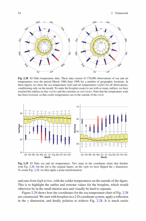
54 2 Framework
Dec
Nov
Oct
Sep
Aug
Jul Jun
May
Apr
Mar
Feb
Jan
30
25
20
15 Dec
Nov
Oct
Sep
Aug
Jul Jun
May
Apr
Mar
Feb
Jan
30
25
20
15
Fig. 2.28 El Nino temperature data. These data consist of 178,080 observations of sea and airtemperatures over the period March 1980–June 1998 for a number of geographic locations. Inthese figures we show the sea temperature (left) and air temperatures (right) for all observations,conditioning only on the month. To make the boxplots easier to see with so many outliers, we haverestyled the outliers as blue circles and the extremes as red circles. Note that the temperature scalehas been reversed, so that cooler temperatures are to the outside of the circle
MonthDecNovOctSepAugJulJunMayAprMarFebJan
SeaTemp
30
25
20
15
MonthDecNovOctSepAugJulJunMayAprMarFebJan
SeaTemp
30
25
20
15
Fig. 2.29 El Nino sea and air temperatures. Two steps in the coordinate chain that finisheswith Fig. 2.28. On the left is the original figure; on the right we have flipped the y dimension.To create Fig. 2.28, we then apply a polar transformation
and runs from high to low, with the colder temperatures on the outside of the figure.This is to highlight the outlier and extreme values for the boxplots, which wouldotherwise lie in the small interior area and visually be hard to separate.
Figure 2.29 shows how the coordinates for the sea temperature chart of Fig. 2.28are constructed. We start with boxplots in a 2-D coordinate system, apply a reflectionin the y dimension, and finally polarize to achieve Fig. 2.28. It is much easier
2.5 Coordinates and Faceting 55
SeaTemp
302826242220
302826242220
302826242220
302826242220
Year959085
302826242220
959085 959085 959085 959085 959085 959085
Fig. 2.30 El Nino: spatial and temporal data. The faceting dimensions show the spatial locationsof the buoys that collect the data. Within each facet cell is a line chart showing mean seatemperature by year. The color of the cell indicates how many observations were recorded inthat cell
to compare the absolute values of medians, extents, and outliers in rectangularcoordinates, but it does not give as good a picture of the seasonality. In both figures,we have changed the styles of the outlier and extreme representations to make thefigure clearer. In Sect. 2.6 we talk more about the use and misuse of styles.
2.5.2 Faceting
Faceting is the term used in this book to describe visualizations consisting ofrepetitions of the same basic chart using different subsets of data for each chart.The goal of faceting is to be able to compare multiples to each other and understandwhat is different between them. Figure 2.28 shows two facets of the El Nino data,allowing us to compare sea and air temperatures. Faceting is also called panelingor small multiples and is a generalization of techniques like shingling and trellisdisplays. (See [5]; Theus [109] provides an interesting comparison between trellisdisplays and interactive graphics.)
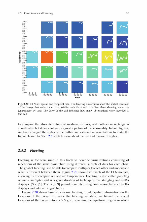
Figure 2.30 shows how we can use faceting to add spatial information on thelocations of the buoys. To create the faceting variables, we binned the spatiallocations of the buoys into a 7 × 5 grid, spanning the equatorial region in which
56 2 Framework
the buoys were observed. Within each facet, we show a time series for the averagetemperature per year. The background of the cell indicates which facet cells havefew observations (blue) and which have many (red).
This figure demonstrates the key feature of faceting: When you facet a chart, youadd dimensionality to the information you are displaying without making the basedisplay more complex. If we added the spatial information as, say, a color aesthetic,then we would need multiple lines superimposed, one for each color.
Instead, faceting retains the simplicity and interpretability of a line chart, but withthe added advantage of allowing us to compare different time series conditional ontheir locations.
Conditionality is another important feature of faceting. Faceting is strongestwhen the goal is to help the viewer compare distributions under different conditions.In this example, we can see the higher values of temperature in the “western” facetsand the trend of increasing temperatures in the “eastern” facets. In general it isimportant to arrange the cells in the facets in a sensible order. For this spatiotemporalexample, we have a clearly defined order based on spatial locations, but when wefacet by variables that do not have a natural order, the results can look quite differentdepending on the order chosen.
Faceting is often useful for time-based data. We can divide up the time dimensioninto logical chunks and use them as a 1-D facet. This is a simple but effectiveway of investigating changes in variable distributions and dependencies overtime. Figure 2.31 demonstrates this simple usage, where we take the El Ninotemperature data and facet by year. Each year is displayed as a minichart, and wecan compare the minicharts to see the differences in the relationship between seaand air temperature over the 19 years in the study.
2.6 Additional Features: Guides, Interactivity, Styles
This section is somewhat of a “catch-all” section. In the language of visualization,this section contains the adjectives, adverbs, and other flourishes that are notnecessary but add grace and beauty to a view of data.
2.6.1 Guides
A person who is a guide is someone who shows you the way, one who indicatesinteresting sights and explains details about things that might not be clear. Ingraphics a guide is part of a graph that points the viewer toward interesting aspects ofthe data and provides details on information that might not be obvious. A good guideis not a focus of attention; rather it illuminates another aspect of a visualization.Guides include:

2.6 Additional Features: Guides, Interactivity, Styles 57
3025
2030
2520
3025
20
302520
302520
3025
20
302520 302520 302520
98979695
94
93929190
8988878685
8483828180
Fig. 2.31 El Nino data. A line chart showing a cubic smooth on the relationship between AirTempand SeaTemp, faceted by year. Clear differences in the relationships can be seen. For reference,strong El Nino effects were observed in 1982–1983 and 1997–1998
Axes: These are guides that inform us about a dimension, showing the viewer howthe data are mapped to physical locations. Advice and comments on good axesfor time-based data will be given in a later chapter.
Legends: Axes inform about positional dimensions; legends inform about themapping from data to aesthetics. Many of the same rules that apply to axes alsoapply to legends. Legends, however, can be freely moved around a chart, whereasaxes are more constrained.
Reference lines/areas/points: These are often also termed annotations; they pro-vide references and notes that inform about part of a chart’s data range. Anexample might be a reference line on a time axis indicating when an importantevent occurred; we will see examples of that throughout this book.
58 2 Framework
Gridlines: Gridlines consist of a set of reference lines, but positioned at locationsalong a dimension denoted by tick marks for an axis on that dimension. As suchthey share characteristics of both of the other types of guide.
In general, we will discuss guides in the context of whatever it is they areproviding a guide for. The basic rule should be clear – a guide illuminates its target,so it should be as simple and self-effacing as possible to achieve that end. If theabsolute data values are not of interest, then do not show tick marks. If it would behard to tell which were reference points and which data points, do not add them.And gridlines should never be visually dominating. Follow the dictum of Mies vander Rohe: Less is more.
2.6.2 Interactivity
Interactivity is a key component of modern visualization systems. It is a raregraphical application that doesn’t feature pop-up tooltips, clicking on graphicalentities to see details, panning and zooming, or linked views of data. The leadersin interactive graphics are game manufacturers; the landmark game SimCity [142],shown in Fig. 2.32, featured all of these interactive features, and the series has goneon to improve and develop them. For comparison, one of the seminal collectionson interactive graphics in the data analytic world, Dynamic Graphics for Statistics[23], was published in the same year. Fortunately for the dignity of statisticians,John Tukey had a head start on the subject, publishing on interactive graphics withPRIM-9 in 1975 [40] and reprinted in [27] as [39].
Interaction is a sufficiently important subject to merit its own chapter. We willstudy interactivity for time-based data in Chap. 9.
2.6.3 Styles
The use of styles for graphical displays of data is an issue that brings out strongemotions in people. Tufte [111] argues that we should attempt to maximize the ratioof data ink (ink used to represent the data) to nondata ink (the redundant ink usedto elaborate or decorate the graph). While the spirit of the goal is laudable, as ameasurable criterion it is not terribly useful. A time series line chart uses a verysmall amount of ink to draw the line as compared to the amount of ink needed togive it a good title. Is it therefore intrinsically a far worse plot than a geographicplot, since maps need a lot of ink to display their data?
Rather than focus on measures that can have little value, it is better to ask thesimple question of every component of a visualization – does it help the viewerunderstand the data and achieve the goal of the chart? If the answer is no, then nextconsider if it hinders the task. If it does, then it must be removed. If it neither helps

2.6 Additional Features: Guides, Interactivity, Styles 59
Fig. 2.32 SimCity [142] is the name of a series of city-building simulation games, first releasedby Maxis in 1988 and later by Electronic Arts. It was a revolutionary concept in computer gaming– a data-heavy simulation that did not have fixed winning conditions. As part of its user interfaceit featured a wide range of interactive features for exploring data associated with a simulated city,including bird’s-eye overview maps, pop-up details on demand, and click to drill down. Animatedtime series graphs showed key indicators of the city’s progress (crime rate, pollution rate, etc.) andwere linked to the main displays
nor hinders, then it becomes simply an issue of whether or not it makes the chartmore pleasing to view.
Consider the style changes for the boxplot outliers in Fig. 2.28. They make theextremes more differentiable from the outliers, and that focuses attention on them.Since the outliers and extremes are of interest in fulfilling the goal of the chart –to understand seasonal temperature differences – the styles help the chart and aregood.
Figure 2.33 shows two different scatterplot matrices. These are a faceting ofscatterplots where each facet shows a different combination of variables. They allowyou to see all relationships between pairs of variables, at the expense of requiringquite a bit of screen real estate. On the left are charts with the default styles usedin this book. On the right we have overridden these default styles with some newones, as defined by the following style sheet definition (using a definition languagesimilar to that used by cascading style sheets – a ubiquitous HTML system fordefining styles):
interval {color:#400; color2:transparent}point {symbol:circle; size:10\%; color:#4004;
color2:transparent}

60 2 Framework
Fig. 2.33 Crime statistics for US states displayed as a scatterplot matrix or SPLOM. The plots onthe left use the default styles employed in this book; those on the right use more ornate styles
facet majorTicks {padding:5px; font-size: 9pt;color:navy}
graph cell {color:#aaf; gradient-color:white;gradient-angle:45}
The system used in this book defines styles using a syntax similar to thatused in cascading style sheets [73] on Web pages. The syntax for each entry istag { key=value; ...}, where the tag refers to the target item in the graphic(so “facet majorTicks” means the tick marks for an axis on the faceting, andthe styles to apply are simply key-value pairs. Note that colors can be defined usingCSS names, or as hex values, with a color of “#4004” denoting a color with a redvalue of 25% and no blue or green components, and with an opacity also of 25%.
I imagine that there will be a wide range of opinions when looking at Fig. 2.33.The simpler form is cleaner and potentially clearer. However, some may prefer themore decorated style on the right. Personally, I like aspects of both of them muchin the same way I can enjoy both punk rock and opera. Contrasting the two chartsin the figure, we observe the following features:
• Font differences. Sometimes an axis title can be relatively unimportant; if we havea series of figures with the same dimensions, or if the figure caption describes theaxes, then we need not take too much space with a title. In the scatterplot matrix,the labeling for each panel is of critical importance as the order of the panels isnot known a priori to the viewer. Thus, in the more ornate chart, we have madethe font size larger and made them stand further out from the axis they label,increasing their visual impact.
• Color changes. In the left figure, the data was shown in blue and the guides inblack. When displayed against a light background (the white page), this meansthere is a stronger contrast between the guides and the background than there is

2.7 Summary 61
between the data and the background. Since this is a fairly complex figure, withintermingling of guides and data, it makes sense to use a darker color to showthe data and reduce this disparity. Note that we ensure that both data elements(points and bars) use the same color. This reinforces the central concept of thescatterplot matrix – that it is the same data in each panel, just different facets ofthe data set.
• More prominent facet cells. In a chart with any form of complex faceting, it isimportant to make the groupings into facets clear. The traditional SPLOM, whichdoes not have any gaps between cells and which only separates the cells by athin line, confuses the viewer by making it easy to see groups or clusters acrosscells, instead of within cells. Separating the cells helps, and using styles to adda light background helps more. The gentle gradient color on the cells is purelydecorative. If you or your audience prefers a more austere look, leave it out.
• Opacity. Also known by its inverse, transparency,10 this is being used as analternative to the intersecting open circles to solve the problem of occludingcircles. Overlapping shapes can clearly be seen, and as more objects are drawnon a given location, that location becomes darker, effectively giving us a “poorman’s density estimate.”
There is no overall right or wrong in adding styles to charts. If in doubt, it isprobably safer to do less rather than more, and so the general rule would be toprefer simpler charts. Sometimes style additions can enhance the utility of a chart.If so, the additions should be made. If, however, they are merely for decorative ends,it becomes a question of the desires and preferences of your intended viewers. Likemusic or painting, there are many rules and guidelines that might be made, but inthe end, the proof is in the finished product.
2.7 Summary
This chapter has been an introduction to the language used in this book to describevisualizations. It has also provided a framework for how visualizations are puttogether, using the metaphor of a language rather than a taxonomy of choices. Usingexamples, it has introduced some general concepts and offered advice applicable toa variety of data types and situations. Although the uses for time-based data havebeen noted, the main focus of this chapter has been on the overall framework andgeneral application of visualization. In the following chapters we will delve moredeeply into visualization specifically for time-based data. We will start by talkingabout the data.
10A 100% opaque object is 0% transparent and vice versa. Using opacity is preferable as the moreopaque something is, the more visually prominent, and so opacity can usefully be used as anaesthetic when mapped to counts, weights, sums, and the like, since larger values of these statisticsshould be shown more prominently.
62 2 Framework
2.8 Further Exploration
Wilkinson’s The Grammar of Graphics [135] is the fundamental book on thisframework, but several other frameworks have built on Wilkinson’s ideas, includingggplot (described most fully in [131] with an earlier reference in [130]), which isan R implementation of many of the ideas in the grammar. Tableau Software [104]is a successful commercial visualization company that has focused on the facetingaspects of the grammar.
For each individual topic in this chapter there are many examples and avenuesof exploration, which are detailed in the subsequent chapters. There are alsomany descriptive frameworks that classify visualizations using various splits (bydimensionality, base data type, or interactivity, for example) but little else thatdescribes a generative framework that can be used to construct as well as merelydescribe charts. Some charting systems have provided some composability features.The Web graphics framework Dojo, for example, has an extension, dojox.charting,that provides composability and uses many of the same basic chart components. Itis best explored via the Web, but the latest version of standard references ([93], forexample) should be updated to contain sections on the charting capability.

http://www.springer.com/978-0-387-77906-5