Embed Size (px)
Citation preview

Chapter 2 Descriptive Statistics: Tabular and Graphical Displays Link full download: https://www.testbankfire.com/download/solution-manual-for-essentials-of-statistics-for-business-and-economics-7th-edition-by-anderson-sweeney-williams-camm-cochran/
Learning Objectives
1. Learn how to construct and interpret summarization procedures for qualitative data
such as: frequency and relative frequency distributions, bar graphs and pie charts.
2. Learn how to construct and interpret tabular summarization procedures for quantitative data such as: frequency and relative frequency distributions, cumulative frequency and cumulative relative frequency distributions.
3. Learn how to construct a dot plot and a histogram as graphical summaries of quantitative data.
4. Learn how the shape of a data distribution is revealed by a histogram. Learn how to recognize
when a data distribution is negatively skewed, symmetric, and positively skewed.
5. Be able to use and interpret the exploratory data analysis technique of a stem-and-leaf display.
6. Learn how to construct and interpret cross tabulations, scatter diagrams, side-by-side and stacked bar charts.
7. Learn best practices for creating effective graphical displays and for choosing the
appropriate type of display.
2 - 1
© 2014 Cengage Learning. All Rights Reserved. May not be scanned, copied or duplicated, or posted to a publicly accessible website, in whole or in part.

Chapter 2
Solutions:
1.
Class Frequency Relative Frequency
A 60 60/120 = 0.50
B 24 24/120 = 0.20 C 36 36/120 = 0.30
120 1.00
2. a. 1 – (.22 + .18 + .40) = .20
b. .20(200) = 40
c/d. Class Frequency Percent Frequency
A .22(200) = 44 22
B .18(200) = 36 18
C .40(200) = 80 40 D .20(200) = 40 20
Total 200 100
3. a. 360° x 58/120 = 174°
b. 360° x 42/120 = 126°
c.
No Opinion
16.7% No 35.0%
Yes 48.3%
2 - 2 © 2014 Cengage Learning. All Rights Reserved.
May not be scanned, copied or duplicated, or posted to a publicly accessible website, in whole or in part.

d.
Descriptive Statistics: Tabular and Graphical Displays
70 60 50 40 30 20 10 0
Yes No No Opinion
Response
4. a. These data are categorical.
b. Relative
Show Frequency % Frequency
Jep 10 20
JJ 8 16
OWS 7 14
THM 12 24
WoF 13 26
Total 50 100
c.
14
12
Fre
qu
ency
10
8
6
4
2
0 Jep JJ OWS THM WoF
Syndicated Television Show
2 - 3 © 2014 Cengage Learning. All Rights Reserved.
May not be scanned, copied or duplicated, or posted to a publicly accessible website, in whole or in part.

Chapter 2
Syndicated Television Shows
Jep
WoF 20% 26%
THM 24%
JJ
16%
OWS 14%
d. The largest viewing audience is for Wheel of Fortune and the second largest is for Two and a Half
Men.
5. a.
Relative Percent
Name Frequency Frequency Frequency
Brown 7 0.14 14%
Johnson 10 0.20 20%
Jones 7 0.14 14%
Miller 6 0.12 12%
Smith 12 0.24 24%
Williams 8 0.16 16%
Total: 50 1 100%
b.
Common U.S. Last Names
14 12 10 8
6
4
2
0
Brown Johnson Jones Miller Smith Williams
Name
2 - 4 © 2014 Cengage Learning. All Rights Reserved.
May not be scanned, copied or duplicated, or posted to a publicly accessible website, in whole or in part.

Descriptive Statistics: Tabular and Graphical Displays
c.
Common U.S. Last Names
Williams Brown 16% 14%
Johnson 20%
Smith 24%
Jones
Miller 14% 12%
d. The three most common last names are Smith (24%), Johnson (20%), and Williams (16%)
6. a.
Relative
Network Frequency % Frequency
ABC 6 24
CBS 9 36
FOX 1 4
NBC 9 36
Total: 25 100
10 9 8 7 6 5 4 3 2 1 0
ABC CBS FOX NBC
Network
b. For these data, NBC and CBS tie for the number of top-rated shows. Each has 9 (36%) of the top 25. ABC is third with 6 (24%) and the much younger FOX network has 1(4%).
2 - 5 © 2014 Cengage Learning. All Rights Reserved.
May not be scanned, copied or duplicated, or posted to a publicly accessible website, in whole or in part.

Chapter 2
7. a.
Rating Frequency Percent Frequency
Excellent 20 40
Very Good 23 46
Good 4 8
Fair 1 2 Poor 2 4
50 100
50 45 40 35 30 25 20 15 10 5
0
Poor Fair Good Very Good Excellent
Customer Rating
Management should be very pleased with the survey results. 40% + 46% = 86% of the ratings are
very good to excellent. 94% of the ratings are good or better. This does not look to be a Delta flight
where significant changes are needed to improve the overall customer satisfaction ratings.
b. While the overall ratings look fine, note that one customer (2%) rated the overall experience with the
flight as Fair and two customers (4%) rated the overall experience with the flight as Poor. It might be
insightful for the manager to review explanations from these customers as to how the flight failed to
meet expectations. Perhaps, it was an experience with other passengers that Delta could do little to
correct or perhaps it was an isolated incident that Delta could take steps to correct in the future.
8. a. Position Frequency Relative Frequency
Pitcher 17 0.309 Catcher 4 0.073
1st Base 5 0.091
2nd Base 4 0.073
3rd Base 2 0.036
Shortstop 5 0.091
Left Field 6 0.109
Center Field 5 0.091 Right Field 7 0.127
55 1.000
b. Pitchers (Almost 31%)
c. 3rd Base (3 – 4%)
2 - 6 © 2014 Cengage Learning. All Rights Reserved.
May not be scanned, copied or duplicated, or posted to a publicly accessible website, in whole or in part.
Descriptive Statistics: Tabular and Graphical Displays
d. Right Field (Almost 13%)
e. Infielders (16 or 29.1%) to Outfielders (18 or 32.7%)
9. a.Living Area Live Now Ideal Community
City 32% 24%
Suburb 26% 25%
Small Town 26% 30%
Rural Area 16% 21%
Total 100% 100%
b. Where do you live now?
35%
30%
25%
Per
cen
t 20%
15%
10%
5%
0% City Suburb Small Town Rural Area
Living Area
What do you consider the ideal community?
35%
30%
25%
Per
cen
t 20%
15%
10%
5%
0% City Suburb Small Town Rural Area
Ideal Community
2 - 7 © 2014 Cengage Learning. All Rights Reserved.
May not be scanned, copied or duplicated, or posted to a publicly accessible website, in whole or in part.

Chapter 2
c. Most adults are now living in a city (32%).
d. Most adults consider the ideal community a small town (30%).
e. Percent changes by living area: City –8%, Suburb –1%, Small Town +4%, and Rural Area +5%.
Suburb living is steady, but the trend would be that living in the city would decline while living
in small towns and rural areas would increase.
10. a.
b.
c.
Rating Frequency
Excellent 187
Very Good 252
Average 107
Poor 62
Terrible 41
Total 649
Percent
Rating Frequency
Excellent 28.8
Very Good 38.8
Average 16.5
Poor 9.6
Terrible 6.3
Total 100.0
45 40 35 30 25 20 15 10 5
0
Excellent Very Good Average Poor Terrible
Rating
d. 28.8% + 38.8 = 67.6% of the guests at the Sheraton Anaheim Hotel rated the hotel as Excellent or Very Good. But, 9.6% + 6.3% = 15.9% of the guests rated the hotel as poor or terrible.
2 - 8 © 2014 Cengage Learning. All Rights Reserved.
May not be scanned, copied or duplicated, or posted to a publicly accessible website, in whole or in part.

Descriptive Statistics: Tabular and Graphical Displays
e. The percent frequency distribution for Disney’s Grand Californian follows:
Percent
Rating Frequency
Excellent 48.1
Very Good 31.0
Average 11.9
Poor 6.4
Terrible 2.6
Total 100.0
48.1% + 31.0% = 79.1% of the guests at the Sheraton Anaheim Hotel rated the hotel as Excellent or Very Good. And, 6.4% + 2.6% = 9.0% of the guests rated the hotel as poor or terrible.
Compared to ratings of other hotels in the same region, both of these hotels received very favorable
ratings. But, in comparing the two hotels, guests at Disney’s Grand Californian provided somewhat better ratings than guests at the Sheraton Anaheim Hotel.
11.
Class Frequency Relative Frequency Percent Frequency
12–14 2 0.050 5.0 15–17 8 0.200 20.0 18–20 11 0.275 27.5 21–23 10 0.250 25.0 24–26 9 0.225 22.5
Total 40 1.000 100.0
12.
Class Cumulative Frequency Cumulative Relative Frequency
less than or equal to 19 10 .20 less than or equal to 29 24 .48
less than or equal to 39 41 .82
less than or equal to 49 48 .96
less than or equal to 59 50 1.00
2 - 9 © 2014 Cengage Learning. All Rights Reserved.
May not be scanned, copied or duplicated, or posted to a publicly accessible website, in whole or in part.

Chapter 2
13.
18
16
14
Fre
qu
ency
12
10
8
6
4
2
0
10-19 20-29 30-39 40-49 50-59
14. a.
b/c. Class Frequency Percent Frequency
6.0 – 7.9 4 20 8.0 – 9.9 2 10
10.0 – 11.9 8 40
12.0 – 13.9 3 15 14.0 – 15.9 3 15
20 100
15. Leaf Unit = .1
6 3
7 5 5 7
8 1 3 4 8
9 3 6
10 0 4 5
11 3
2 - 10 © 2014 Cengage Learning. All Rights Reserved.
May not be scanned, copied or duplicated, or posted to a publicly accessible website, in whole or in part.

Descriptive Statistics: Tabular and Graphical Displays
16. Leaf Unit = 10
11
6
12 0 2
13 0 6 7
14 2 2 7
15 5
16 0 2 8
17 0 2 3
17. a/b.
Waiting Time Frequency Relative Frequency
0 – 4 4 0.20 5 – 9 8 0.40
10 – 14 5 0.25
15 – 19 2 0.10 20 – 24 1 0.05
Totals 20 1.00
c/d.
Waiting Time Cumulative Frequency Cumulative Relative Frequency
Less than or equal to 4 4 0.20
Less than or equal to 9 12 0.60
Less than or equal to 14 17 0.85
Less than or equal to 19 19 0.95
Less than or equal to 24 20 1.00
e. 12/20 = 0.60
18. a., b, c
Cumulative
Relative Percent
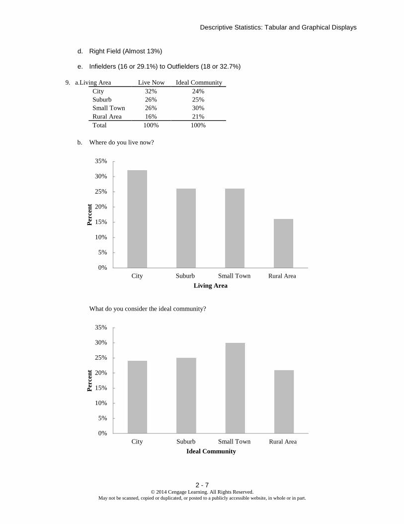
PPG Frequency Frequency Frequency
10-11.9 1 .02 2
12-13.9 3 .06 8
14-15.9 7 .14 22
16-17.9 19 .38 60
18-19.9 9 .18 78
20-21.9 4 .08 86
22-23.9 2 .04 90
24-25.9 0 .00 90
26-27.9 3 .06 96
28-29.9 2 .04 100
Total 50
2 - 11 © 2014 Cengage Learning. All Rights Reserved.
May not be scanned, copied or duplicated, or posted to a publicly accessible website, in whole or in part.
Chapter 2
d.
20 18 16 14 12 10 8
6
4
2
0
10-11.9 12-13.9 14-15.9 16-17.9 18-19.9 20-21.9 22-23.9 24-25.9 26-27.9 28-30
PPG
e. There is skewness to the right.
f. (11/50)(100) = 22%
19. a. The largest number of tons is 236.3 million (South Louisiana). The smallest number of tons is 30.2
million (Port Arthur).
b.
Millions Of Tons Frequency
25-50 11
50-75 9
75-100 2
100-125 0
125-150 1
150-175 0
175-200 0
200-225 0
225-250 2
2 - 12 © 2014 Cengage Learning. All Rights Reserved.
May not be scanned, copied or duplicated, or posted to a publicly accessible website, in whole or in part.

c.
Descriptive Statistics: Tabular and Graphical Displays
Histogram for 25 Busiest U.S Ports 12
10
8
6
4
2
0 25-49.9 50-74.9 75-99.9 100-124.9 125-149.9 150-174.9 175-199.9 200-224.9 225-249.9
Millions of Tons Handled
Most of the top 25 ports handle less than 75 million tons. Only five of the 25 ports handle above 75 million tons.
20. a. Lowest = 12, Highest = 23
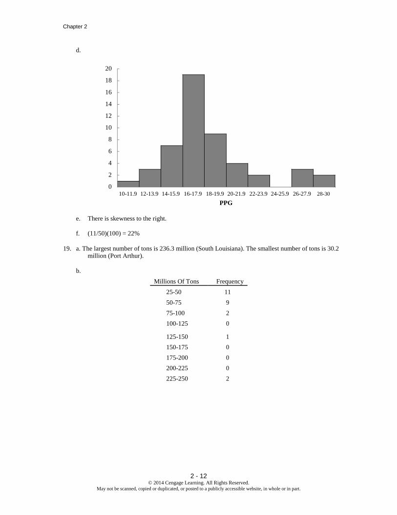
b. Hours in Percent
Meetings per Week Frequency Frequency
11-12 1 4%
13-14 2 8%
15-16 6 24%
17-18 3 12%
19-20 5 20%
21-22 4 16%
23-24 4 16%
25 100%
2 - 13 © 2014 Cengage Learning. All Rights Reserved.
May not be scanned, copied or duplicated, or posted to a publicly accessible website, in whole or in part.
Chapter 2
c.
7 6 5 4 3 2 1 0
11-12 13-14 15-16 17-18 19-20 21-22 23-24
Hours per Week in Meetings
The distribution is slightly skewed to the left.
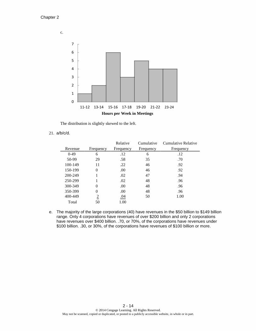
21. a/b/c/d.
Relative Cumulative Cumulative Relative
Revenue Frequency Frequency Frequency Frequency
0-49 6 .12 6 .12
50-99 29 .58 35 .70
100-149 11 .22 46 .92
150-199 0 .00 46 .92
200-249 1 .02 47 .94
250-299 1 .02 48 .96
300-349 0 .00 48 .96
350-399 0 .00 48 .96
400-449 2 .04 50 1.00
Total 50 1.00
e. The majority of the large corporations (40) have revenues in the $50 billion to $149 billion range. Only 4 corporations have revenues of over $200 billion and only 2 corporations have revenues over $400 billion. .70, or 70%, of the corporations have revenues under $100 billion. .30, or 30%, of the corporations have revenues of $100 billion or more.
2 - 14 © 2014 Cengage Learning. All Rights Reserved.
May not be scanned, copied or duplicated, or posted to a publicly accessible website, in whole or in part.

f.
Descriptive Statistics: Tabular and Graphical Displays
35
30
25
20
15
10
5
0 0-49 50-99 100-149 150-199 200-249 250-299 300-349 350-399 400-449
Revenue (Billion $)
The histogram shows the distribution is skewed to the right with four corporations in the $200 to $449 billion range.
g. Exxon-Mobil is America’s largest corporation with an annual revenue of $443 billion. Wal-Mart is the second largest corporation with annual revenue of $406 billion. All other corporations have annual revenues less than $300 billion. Most (92%) have annual revenues less than $150 billion.
22. a.
# U.S. Percent
Locations Frequency Frequency
0-4999 10 50
5000-9999 3 15
10000-14999 2 10
15000-19999 1 5
20000-24999 0 0
25000-29999 1 5
30000-34999 2 10
35000-39999 1 5
Total: 20 100
2 - 15 © 2014 Cengage Learning. All Rights Reserved.
May not be scanned, copied or duplicated, or posted to a publicly accessible website, in whole or in part.

Chapter 2
b.
12 10 8
6
4
2
0
Number of U.S. Locations
c. The distribution is skewed to the right. The majority of the franchises in this list have fewer than 20,000 locations (50% + 15% + 15% = 80%). McDonald's, Subway and 7-Eleven have the highest number of locations.
23. a/b.
c.
Computer Relative
Usage (Hours) Frequency Frequency
0.0 – 2.9 5 0.10 3.0 – 5.9 28 0.56 6.0 – 8.9 8 0.16 9.0 – 11.9 6 0.12
12.0 – 14.9 3 0.06
Total 50 1.00
30 25 20 15 10 5
0
0-2.9 3-5.9 6-8.9 9-
11.9 12-14.9
Computer Usage (Hours)
d. The majority of the computer users are in the 3 to 6 hour range. Usage is somewhat skewed toward the right with 3 users in the 12 to 14.9 hour range.
2 - 16 © 2014 Cengage Learning. All Rights Reserved.
May not be scanned, copied or duplicated, or posted to a publicly accessible website, in whole or in part.

Descriptive Statistics: Tabular and Graphical Displays
24. Median Pay
6 6 7 7
7 2 4 6 7 7 8 9
8 0 0 1 3 7
9 9
10 0 6
11 0
12 1
The median pay for these careers is generally in the $70 and $80 thousands. Only four careers have a median pay of $100 thousand or more. The highest median pay is $121 thousand for a finance director.
Top Pay
10 0 6 9
11 1 6 9
12 2 5 6
13 0 5 8 8
14 0 6
15 2 5 7 16 17 18 19 20
21 4
22 1
The most frequent top pay is in the $130 thousand range. However, the top pay is rather evenly distributed between $100 and $160 thousand. Two unusually high top pay values occur at $214 thousand for a finance director and $221 thousand for an investment banker. Also, note that the top pay has more variability than the median pay.
2 - 17 © 2014 Cengage Learning. All Rights Reserved.
May not be scanned, copied or duplicated, or posted to a publicly accessible website, in whole or in part.

Chapter 2
25. 9 8 9
10 2 4 6 6
11 4 5 7 8 8 9
12 2 4 5 7
13 1 2
14 4
15 1
26. a.
2 1 4
2 6 7
3 0 1 1 1 2 3
3 5 6 7 7
4 0 0 3 3 3 3 3 4 4
4 6 6 7 9
5 0 0 0 2 2
5 5 6 7 9
6 1 4 6 6
7 2
b. Most frequent age group: 40-44 with 9 runners
c. 43 was the most frequent age with 5 runners
27. a. y
2 Total 1
A 5 0 5
x B 11 2 13
C 2 10 12
Total 18 12 30
2 - 18 © 2014 Cengage Learning. All Rights Reserved.
May not be scanned, copied or duplicated, or posted to a publicly accessible website, in whole or in part.

Descriptive Statistics: Tabular and Graphical Displays
b. y
2 Total 1
A 100.0 0.0 100.0
x B 84.6 15.4 100.0
C 16.7 83.3 100.0
c.
y
2
1
A 27.8 0.0
x B 61.1 16.7
C 11.1 83.3
Total 100.0 100.0
d. Category A values for x are always associated with category 1 values for y. Category B
values for x are usually associated with category 1 values for y. Category C values for x are usually associated with category 2 values for y.
28. a.
y
20-39 40-59 60-79 80-100 Grand Total
10-29 1 4 5
x 30-49 2 4 6
50-69 1 3 1 5
70-90 4 4
Grand Total 7 3 6 4 20
b. y
20-39 40-59 60-79 80-100 Grand Total
10-29 20.0 80.0 100
x 30-49 33.3 66.7 100
50-69 20.0 60.0 20.0 100
70-90 100.0 100
2 - 19 © 2014 Cengage Learning. All Rights Reserved.
May not be scanned, copied or duplicated, or posted to a publicly accessible website, in whole or in part.

Chapter 2
c. y
20-39 40-59 60-79 80-100
10-29 0.0 0.0 16.7 100.0
x 30-49 28.6 0.0 66.7 0.0
50-69 14.3 100.0 16.7 0.0
70-90 57.1 0.0 0.0 0.0
Grand Total 100 100 100 100
d. Higher values of x are associated with lower values of y and vice versa
29. a.
Average Miles per Hour
Make 130-139.9 140-149.9 150-159.9 160-169.9 170-179.9 Total
Buick 100.00 0.00 0.00 0.00 0.00 100.00
Chevrolet 18.75 31.25 25.00 18.75 6.25 100.00
Dodge 0.00 100.00 0.00 0.00 0.00 100.00
Ford 33.33 16.67 33.33 16.67 0.00 100.00
b. 25.00 + 18.75 + 6.25 = 50 percent
c.
Average Miles per Hour
Make 130-139.9 140-149.9 150-159.9 160-169.9 170-179.9
Buick 16.67 0.00 0.00 0.00 0.00
Chevrolet 50.00 62.50 66.67 75.00 100.00
Dodge 0.00 25.00 0.00 0.00 0.00
Ford 33.33 12.50 33.33 25.00 0.00
Total 100.00 100.00 100.00 100.00 100.00
d. 75%
30. a.
Year
Average Speed 1988-1992 1993-1997 1998-2002 2003-2007 2008-2012 Total
130-139.9 16.7 0.0 0.0 33.3 50.0 100
140-149.9 25.0 25.0 12.5 25.0 12.5 100
150-159.9 0.0 50.0 16.7 16.7 16.7 100
160-169.9 50.0 0.0 50.0 0.0 0.0 100
170-179.9 0.0 0.0 100.0 0.0 0.0 100
b. It appears that most of the faster average winning times occur before 2003. This could be due to new
regulations that take into account driver safety, fan safety, the environmental impact, and fuel consumption during races.
2 - 20 © 2014 Cengage Learning. All Rights Reserved.
May not be scanned, copied or duplicated, or posted to a publicly accessible website, in whole or in part.

Descriptive Statistics: Tabular and Graphical Displays
31. a. The crosstabulation of condition of the greens by gender is
below. Green Condition
Gender Too Fast Fine Total
Male 35 65 100 Female 40 60 100
Total 75 125 200
The female golfers have the highest percentage saying the greens are too fast: 40/100 = 40%. Male golfers have 35/100 = 35% saying the greens are too fast.
b. Among low handicap golfers, 1/10 = 10% of the women think the greens are too fast and 10/50 = 20% of the men think the greens are too fast. So, for the low handicappers, the men show a higher percentage who think the greens are too fast.
c. Among the higher handicap golfers, 39/51 = 43% of the woman think the greens are too
fast and 25/50 = 50% of the men think the greens are too fast. So, for the higher handicap golfers, the men show a higher percentage who think the greens are too fast.
d. This is an example of Simpson's Paradox. At each handicap level a smaller percentage of the
women think the greens are too fast. But, when the crosstabulations are aggregated, the result
is reversed and we find a higher percentage of women who think the greens are too fast.
The hidden variable explaining the reversal is handicap level. Fewer people with low handicaps
think the greens are too fast, and there are more men with low handicaps than women.
32. a.
. 5 Year Average Return
Fund Type 0-9.99 10-19.99 20-29.99 30-39.99 40-49.99 50-59.99 Total
DE 1 25 1 0 0 0 27
FI 9 1 0 0 0 0 10
IE 0 2 3 2 0 1 8
Total 10 28 4 2 0 1 45
b. 5 Year Average Return Frequency 0-9.99 10
10-19.99 28
20-29.99 4
30-39.99 2
40-49.99 0
c. 50-59.99 1
Total 45
Fund Type Frequency
DE 27
FI 10 IE 8
Total 45
d. The right margin shows the frequency distribution for the fund type variable and the bottom margin shows the frequency distribution for the 5 year average return variable.
2 - 21 © 2014 Cengage Learning. All Rights Reserved.
May not be scanned, copied or duplicated, or posted to a publicly accessible website, in whole or in part.

Chapter 2
e. Higher returns are associated with International Equity funds and lower returns are associated with Fixed Income funds.
33. a.
Expense Ratio (%)
Fund Type 0-0.24 0.25-0.49 0.50-0.74 0.75-0.99 1.00-1.24 1.25-1.49 Total
DE 1 1 3 5 10 7 27
FI 2 4 3 0 0 1 10
IE 0 0 1 2 4 1 8
Total 3 5 7 7 14 9 45
b.
Expense Ratio (%) Frequency Percent
0-0.24 3 6.7 0.25-0.49 5 11.1
0.50-0.74 7 15.6
0.75-0.99 7 15.6
1.00-1.24 14 31.0 1.25-1.49 9 20.0
Total 45 100
c. Higher expense ratios are associated with Domestic Equity funds and lower expense ratios are
associated with Fixed Income fund
2 - 22 © 2014 Cengage Learning. All Rights Reserved.
May not be scanned, copied or duplicated, or posted to a publicly accessible website, in whole or in part.

Descriptive Statistics: Tabular and Graphical Displays
34. a.
b. The top three states for bankruptcies over this time period are Georgia (86), Florida (69) and Illinois (58).
c. The frequency distribution over time appears below. Bank failures surged in 2009 and 2010 and
then began decreasing in 2011 and 2012.
2 - 23 © 2014 Cengage Learning. All Rights Reserved.
May not be scanned, copied or duplicated, or posted to a publicly accessible website, in whole or in part.

Chapter 2
Number of
Year Bank Failures
2000 2
2001 4
2002 11
2003 3
2004 4
2005 0
2006 0
2007 3
2008 25
2009 140
2010 157
2011 92
2012 51
35. a. Hwy MPG
Size 15-19 20-24 25-29 30-34 35-39 40-44 Total
Compact 3 4 17 22 5 5 56
Large 2 10 7 3 2 24
Midsize 3 4 30 20 9 3 69
Total 8 18 54 45 16 8 149
b. Midsize and Compact seem to be more fuel efficient than Large.
c. City MPG
Drive 10-14 15-19 20-24 25-29 30-34 40-44 Total
A 7 18 3 28
F 17 49 19 2 3 90
R 10 20 1 31
Total 17 55 52 20 2 3 149
d. Higher fuel efficiencies are associated with front wheel drive cars.
e.
City MPG
Fuel Type 15-19 20-24 25-29 30-34 35-39 40-44 Total
P 8 16 20 12 56
R 2 34 33 16 8 93
Total 8 18 54 45 16 8 149
f. Higher fuel efficiencies are associated with cars that use regular gas.
2 - 24 © 2014 Cengage Learning. All Rights Reserved.
May not be scanned, copied or duplicated, or posted to a publicly accessible website, in whole or in part.

36. a.
Descriptive Statistics: Tabular and Graphical Displays
56
40
24
8
-8
-24
-40 -40 -30 -20 -10 0 10 20 30 40
x
b. There is a negative relationship between x and y; y decreases as x increases.
37. a.
900 800
700
600
500
400
300
200
100
0
A B C D
I
II
b. As X goes from A to D the frequency for I increases and the frequency of II decreases.
38. a.
y
Yes No
Low 66.667 33.333 100
x Medium 30.000 70.000 100
High 80.000 20.000 100
2 - 25 © 2014 Cengage Learning. All Rights Reserved.
May not be scanned, copied or duplicated, or posted to a publicly accessible website, in whole or in part.

Chapter 2
b.
39. a.
100%
90%
80%
70%
60%
50%
No
40%
Yes 30%
20%
10%
0%
Low
Medium High x
40 35 30 25 20 15 10 5
0
0 10 20 30 40 50 60 70
Driving Speed (MPH)
b. For midsized cars, lower driving speeds seem to yield higher miles per gallon.
2 - 26 © 2014 Cengage Learning. All Rights Reserved.
May not be scanned, copied or duplicated, or posted to a publicly accessible website, in whole or in part.

40. a.
Descriptive Statistics: Tabular and Graphical Displays 120
100
80
60
40
20
0 30 40 50 60 70 80
Avg. Low Temp
b. Colder average low temperature seems to lead to higher amounts of snowfall.
c. Two cities have an average snowfall of nearly 100 inches of snowfall: Buffalo, N.Y and Rochester, NY. Both are located near large lakes in New York.
41. a.
80.00%
Hyp
erte
nsio
n
70.00%
60.00%
50.00%
40.00%
wit
h
30.00%
20.00%
%
10.00%
0.00% 20-34 35-44 45-54 55-64 65-74 75+
Age
b. The percentage of people with hypertension increases with age.
Male
Female
c. For ages earlier than 65, the percentage of males with hypertension is higher than that for
females. After age 65, the percentage of females with hypertension is higher than that for males.
2 - 27 © 2014 Cengage Learning. All Rights Reserved.
May not be scanned, copied or duplicated, or posted to a publicly accessible website, in whole or in part.

Chapter 2
42. a.
100%
90%
80%
70%
60%
No Cell Phone
50%
40%
Other Cell Phone
30%
Smartphone
20%
10%
0%
18-24 25-34 35-44 45-54 55-64 65+ Age
b. After an increase in age 25-34, smartphone ownership decreases as age increases. The percentage of
people with no cell phone increases with age. There is less variation across age groups in the percentage who own other cell phones.
c. Unless a newer device replaces the smartphone, we would expect smartphone ownership would become less sensitive to age. This would be true because current users will become older and because the device will become to be seen more as a necessity than a luxury.
43. a.
100%
90%
80%
70%
Idle
60%
50%
Customers
40%
Reports
30%
Meetings
20%
10%
0%
Bend
Portland
Seattle
2 - 28 © 2014 Cengage Learning. All Rights Reserved.
May not be scanned, copied or duplicated, or posted to a publicly accessible website, in whole or in part.

Descriptive Statistics: Tabular and Graphical Displays
b.
0.6
0.5
0.4
Meetings
0.3
Reports
0.2
Customers
Idle
0.1
0
Bend
Portland
Seattle
c. The stacked bar chart seems simpler than the side-by-side bar chart and more easily conveys the differences in store managers’ use of time.
44. a.
Class Frequency
800-999 1
1000-1199 3
1200-1399 6
1400-1599 10
1600-1799 7
1800-1999 2
2000-2199 1
Total 30 12 10
8
6
4
2
0 800-999 1000-1199 1200-1399 1400-1599 1600-1799 1800-1999 2000-2199
SAT Score
b. The distribution if nearly symmetrical. It could be approximated by a bell-shaped curve.
2 - 29 © 2014 Cengage Learning. All Rights Reserved.
May not be scanned, copied or duplicated, or posted to a publicly accessible website, in whole or in part.

Chapter 2
c. 10 of 30 or 33% of the scores are between 1400 and 1599. The average SAT score looks to be a little over 1500. Scores below 800 or above 2200 are unusual.
45. a.
State Frequency Arizona 2 California 11 Florida 15 Georgia 2 Louisiana 8 Michigan 2 Minnesota 1 Texas 2 Total 43
16
14
12
Fre
qu
enc
y
10
8
6
4
2
0
AZ CA FL GA LA MN MN TX
State
b. Florida has had the most Super Bowl with 15, or 15/43(100) = 35%. Florida and California have
been the states with the most Super Bowls. A total of 15 + 11 = 26, or 26/43(100) = 60%. Only 3 Super Bowls, or 3/43(100) = 7%, have been played in the cold weather states of Michigan and
Minnesota.
c.
0
1 3 3 3 3 3 4 4 4 4
0 5 7 7 7 9
1 0 0 0 1 2 2 3 4
1 5 6 7 7 7 7 8 9 9 9
2 1 2 3
2 5 7 7
3 2
3 5 6
4
4 5
2 - 30 © 2014 Cengage Learning. All Rights Reserved.
May not be scanned, copied or duplicated, or posted to a publicly accessible website, in whole or in part.

Descriptive Statistics: Tabular and Graphical Displays
d. The most frequent winning points have been 0 to 4 points and 15 to 19 points. Both occurred in 10 Super Bowls. There were 10 close games with a margin of victory less than 5 points, 10/43(100) =
23% of the Super Bowls. There have also been 10 games, 23%, with a margin of victory more than
20 points.
e. The closest games was the 25th
Super Bowl with a 1 point margin. It was played in Florida. The
largest margin of victory occurred one year earlier in the 24th
Super Bowl. It had a 45 point margin and was played in Louisiana. More detailed information not available from the text information.
25th
Super Bowl: 1991 New York Giants 20 Buffalo Bills 19, Tampa Stadium, Tampa, FL
24th
Super Bowl: 1990 San Francisco 49ers 55 Denver Broncos 10, Superdome, New Orleans, LA
Note: The data set SuperBowl contains a list of the teams and the final scores of the 43 Super
Bowls. This data set can be used in Chapter 2 and Chapter 3 to provide interesting data summaries about the points scored by the winning team and the points scored by the losing team in the Super Bowl. For example, using the median scores, the median Super Bowl score was 28 to 13.
2 - 31 © 2014 Cengage Learning. All Rights Reserved.
May not be scanned, copied or duplicated, or posted to a publicly accessible website, in whole or in part.

Chapter 2
46. a.
Population in Millions Frequency % Frequency
0.0 - 2.4 15 30.0%
2.5-4.9 13 26.0%
5.0-7.4 10 20.0%
7.5-9.9 5 10.0%
10.0-12.4 1 2.0%
12.5-14.9 2 4.0%
15.0-17.4 0 0.0%
17.5-19.9 2 4.0%
20.0-22.4 0 0.0%
22.5-24.9 0 0.0%
25.0-27.4 1 2.0%
27.5-29.9 0 0.0%
30.0-32.4 0 0.0%
32.5-34.9 0 0.0%
35.0-37.4 1 2.0%
37.5-39.9 0 0.0%
More 0 0.0%
16
14
12
Fre
quen
c
y
10 6
8
4
2
0
Population Millions
b. The distribution is skewed to the right.
c. 15 states (30%) have a population less than 2.5 million. Over half of the states have population less
than 5 million (28 states – 56%). Only seven states have a population greater than 10 million (California, Florida, Illinois, New York, Ohio, Pennsylvania and Texas). The largest state is California (37.3 million) and the smallest states are Vermont and Wyoming (600 thousand).
2 - 32 © 2014 Cengage Learning. All Rights Reserved.
May not be scanned, copied or duplicated, or posted to a publicly accessible website, in whole or in part.

Descriptive Statistics: Tabular and Graphical Displays
47. a.
b. The majority of the start-up companies in this set have less than $90 million in venture capital. Only 6 of the 50 (12%) have more than $150 million.
48. a.
Industry Frequency % Frequency
Bank 26 13%
Cable 44 22%
Car 42 21%
Cell 60 30%
Collection 28 14%
Total 200 100%
2 - 33 © 2014 Cengage Learning. All Rights Reserved.
May not be scanned, copied or duplicated, or posted to a publicly accessible website, in whole or in part.

Chapter 2
b.
35% 30% 25% 20% 15% 10% 5%
0%
Bank Cable Car Cell Collection
Industry
c. The cellular phone providers had the highest number of complaints.
d. The percentage frequency distribution shows that the two financial industries (banks and collection
agencies) had about the same number of complaints. Also, new car dealers and cable and satellite
television companies also had about the same number of complaints.
49. a.
Yield% Frequency Percent Frequency
0.0-0.9 4 13.3 1.0-1.9 2 6.7
2.0-2.9 6 20.0
3.0-3.9 10 33.3
4.0-4.9 3 10.0
5.0-5.9 2 6.7
6.0-6.9 2 6.7
7.0-7.9 0 0.0
8.0-8.9 0 0.0 9.0-9.9 1 3.3
Total 30 100.0
2 - 34 © 2014 Cengage Learning. All Rights Reserved.
May not be scanned, copied or duplicated, or posted to a publicly accessible website, in whole or in part.

b.
Descriptive Statistics: Tabular and Graphical Displays 12
10
8
6
4
2
0 0.0-0.9 1.0-1.9 2.0-2.9 3.0-3.9 4.0-4.9 5.0-5.9 6.0-6.9 7.0-7.9 8.0-8.9 9.0-9.9
Dividend Yields
c. The distribution is skewed to the right.
d. Dividend yield ranges from 0% to over 9%. The most frequent range is 3.0% to 3.9%. Average
dividend yields looks to be between 3% and 4%. Over 50% of the companies (16) pay from 2.0 % to 3.9%. Five companies (AT&T, DuPont, General Electric, Merck, and Verizon) pay 5.0% or more.
Four companies (Bank of America, Cisco Systems, Hewlett-Packard, and J.P. Morgan Chase) pay
less than 1%.
e. General Electric had an unusually high dividend yield of 9.2%. 500 shares at $14 per share is an
investment of 500($14) = $7,000. A 9.2% dividend yield provides .092(7,000) = $644 of dividend income per year.
50. a.
Below High High School Some College Associate's Bachelor's Advanced Age School Graduate No Degree Degree Degree Degree Total
25-34 11.6 27.2 18.9 9.5 24.0 8.9 100
35-44 11.7 28.6 16.3 10.3 21.9 11.2 100
45-54 10.4 32.8 16.7 10.6 19.0 10.4 100
55-64 10.4 31.3 17.3 9.2 18.6 13.1 100
65-74 17.0 35.4 15.7 6.6 14.1 11.1 100
75 & older 24.6 37.6 14.0 4.6 11.9 7.3 100
2 - 35 © 2014 Cengage Learning. All Rights Reserved.
May not be scanned, copied or duplicated, or posted to a publicly accessible website, in whole or in part.

Chapter 2
b.
Below High High School Some College Associate's Bachelor's Advanced
Age School Graduate No Degree Degree Degree Degree
25-34 18.5 17.9 23.1 21.4 25.4 17.4
35-44 18.4 18.5 19.6 22.9 22.8 21.5
45-54 18.0 23.3 22.0 25.8 21.7 21.9
55-64 14.3 17.7 18.2 17.9 17.0 22.0
65-74 13.9 11.9 9.8 7.6 7.6 11.0
75 & older 16.9 10.6 7.3 4.5 5.4 6.1
Total 100.0 100.0 100.0 100.0 100.0 100.0
Comparing the percent frequency distributions of the Bachelor’s Degree versus Advanced Degree, we see that the percentage of advanced degree holders who are older exceeds those holding a bachelor’s degree who are older.
51. a. The batting averages for the junior and senior years for each player are as follows:
Junior year:
Allison Fealey 15/40 = .375
Emily Janson 70/200 = .350
Senior year: Allison Fealey 75/250 = .300
Emily Janson 35/120 = .292
Because Allison Fealey had the higher batting average in both her junior year and senior year, Allison Fealey should receive the scholarship offer.
b. The combined or aggregated two-year crosstabulation is as follows:
Combined 2-Year Batting
Outcome A. Fealey E. Jansen
Hit 90 105
No Hit 200 215
Total At Bats 290 320
Based on this crosstabulation, the batting average for each player is as follows:
Combined Junior/Senior Years
Allison Fealey 90/290 = .310
Emily Janson 105/320 = .328
Because Emily Janson has the higher batting average over the combined junior and senior years, Emily Janson should receive the scholarship offer.
c. The recommendations in parts (a) and (b) are not consistent. This is an example of Simpson’s Paradox. It shows that in interpreting the results based upon separate or un-aggregated
crosstabulations, the conclusion can be reversed when the crosstabulations are grouped or
2 - 36 © 2014 Cengage Learning. All Rights Reserved.
May not be scanned, copied or duplicated, or posted to a publicly accessible website, in whole or in part.

Descriptive Statistics: Tabular and Graphical Displays
aggregated. When Simpson’s Paradox is present, the decision maker will have to decide whether the
un-aggregated or the aggregated form of the crosstabulation is the most helpful in identifying the
desired conclusion. Note: The authors prefer the recommendation to offer the scholarship to Emily
Janson because it is based upon the aggregated performance for both players over a larger number of
at-bats. But this is a judgment or personal preference decision. Others may prefer the conclusion
based on using the un-aggregated approach in part (a).
52. a.
Size of Company
Job Growth (%)
Small Midsized Large
Total
-10- (-1) 4 6 2 12
0-9 18 13 29 60
10-19 7 2 4 13
20-29 3 3 2 8
30-39 0 3 1 4
40 or more 0 1 0 1
Total 32 28 38 98
b. Frequency distribution for growth rate.
Job Growth (%) Total
-10- (-1) 12
0-9 60
10-19 13
20-29 8
30-39 4
40 or more 1
Total 98
Frequency distribution for size of company.
Size Total Small 32
Medium 28
Large 38
Total 98
2 - 37 © 2014 Cengage Learning. All Rights Reserved.
May not be scanned, copied or duplicated, or posted to a publicly accessible website, in whole or in part.

Chapter 2
c. Crosstabulation showing column percentages.
Size of Company
Job Growth (%)
Small Midsized Large
-10- (-1) 13 21 5
0-9 56 46 76
10-19 22 7 11
20-29 9 11 5
30-39 0 11 3
40 or more 0 4 0
Total 100 100 100
d. Crosstabulation showing row percentages.
Size of Company
Job Growth (%)
Small Midsized Large
Total
-10- (-1) 33 50 17 100
0-9 30 22 48 100
10-19 54 15 31 100
20-29 38 38 25 100
30-39 0 75 25 100
40 or more 0 4 0 100
e. 12 companies had negative job growth: 33% of these were small companies; 50% were midsized
companies; and 17% were large companies. So, in terms of avoiding negative job growth, large
companies performed better than small and midsized companies. But, although 95% of the large
companies had a positive job growth, the growth rate was between 0 and 9% for 76% of these
companies. In terms of better job growth rates, midsized companies performed better than either
small or large companies. For instance, 26% of the midsized companies had a job growth of at
least 20% compared to 9% for small companies and 8% for large companies.
53. a. Tution &
Fees ($) Year 1- 10001- 15001- 20001- 25001- 30001- 35001- 40001-
Founded 5000 15000 20000 25000 30000 35000 40000 45000 Total
1600-1649 1 1
1700-1749 2 1 3
1750-1799 4 4
1800-1849 1 3 3 6 8 21
1850-1899 1 2 2 13 14 13 4 49
1900-1949 1 2 3 4 8 18
1950-2000 2 4 1 7
Total 1 1 4 9 19 22 30 17 103
2 - 38 © 2014 Cengage Learning. All Rights Reserved.
May not be scanned, copied or duplicated, or posted to a publicly accessible website, in whole or in part.

Descriptive Statistics: Tabular and Graphical Displays
b. Tuition &
Fees ($)
Year 1- 10001- 15001- 20001- 25001- 30001- 35001- 40001- Grand
Founded 5000 15000 20000 25000 30000 35000 40000 45000 Total
1600-1649 100.00 100
1700-1749 66.67 33.33 100
1750-1799 100.00 100
1800-1849 4.76 14.29 14.29 28.57 38.10 100
1850-1899 2.04 4.08 4.08 26.53 28.57 26.53 8.16 100
1900-1949 5.56 11.11 16.67 22.22 44.44 100
1950-2000 28.57 57.14 14.29 100
c. Colleges in this sample founded before 1800 tend to be expensive in terms of tuition.
54. a.
% Graduate
Year 35- 40- 45- 50- 55- 60- 65- 70- 75- 80- 85- 90- 95- Grand
Founded 40 45 50 55 60 65 70 75 80 85 90 95 100 Total
1600-1649 1 1
1700-1749 3 3
1750-1799 1 3 4
1800-1849 1 2 4 2 3 4 3 2 21
1850-1899 1 2 4 3 11 5 9 6 3 4 1 49
1900-1949 1 1 1 1 3 3 2 4 1 1 18
1950-2000 1 1 3 2 7
Grand
Total 2 1 3 5 5 7 15 12 13 13 8 9 10 103
b.
c. Older colleges and universities tend to have higher graduation rates.
2 - 39 © 2014 Cengage Learning. All Rights Reserved.
May not be scanned, copied or duplicated, or posted to a publicly accessible website, in whole or in part.

Chapter 2
55. a.
50,000
45,000
40,000
35,000
30,000
25,000
20,000
15,000
10,000
5,000
0 1600 1650 1700 1750 1800 1850 1900 1950 2000
Year Founded
b. Older colleges and universities tend to be more expensive.
56. a.
120.00
100.00
%G
rad
uate
80.00
60.00
40.00
20.00
0.00 0 10,000 20,000 30,000 40,000 50,000
Tuition & Fees ($)
b. There appears to be a strong positive relationship between Tuition & Fees and % Graduation.
2 - 40 © 2014 Cengage Learning. All Rights Reserved.
May not be scanned, copied or duplicated, or posted to a publicly accessible website, in whole or in part.

57. a.
140.0 $
Mil
lio
ns
120.0
100.0
Sp
end
80.0
60.0
Adv
ertis
ing
40.0
20.0
0.0
b.
Descriptive Statistics: Tabular and Graphical Displays
Internet Newspaper etc. Television
2008 Year 2011
2008 2011
Internet 86.7% 57.8%
Newspaper etc. 13.3% 9.7%
Television 0.0% 32.5%
Total 100.0% 100.0%
100%
90%
80%
70%
60%
Television
50%
40% Newspaper etc.
30% Internet
20%
10%
0%
2008 2011 Year
c. The graph is part a is more insightful because is shows the allocation of the budget across media, but also dramatic increase in the size of the budget.
2 - 41 © 2014 Cengage Learning. All Rights Reserved.
May not be scanned, copied or duplicated, or posted to a publicly accessible website, in whole or in part.

Chapter 2
58. a.
355000 350000 345000 340000 335000 330000 325000 320000
2008 2009 2010 2011
Year
Zoo attendance appears to be dropping over time.
b.
180,000
160,000
140,000
Att
enda
nc
e
120,000
100,000
80,000
60,000
40,000
20,000
0 2008 2009 2010 2011
Year
General
Member
School
c. General attendance is increasing, but not enough to offset the decrease in member attendance. School membership appears fairly stable.
2 - 42 © 2014 Cengage Learning. All Rights Reserved.
May not be scanned, copied or duplicated, or posted to a publicly accessible website, in whole or in part.