Embed Size (px)
Citation preview

Chapman & Hall/CRC
Computer Science and Data Analysis Series
The interface between the computer and statistical sciences is increasing,as each discipline seeks to harness the power and resources of the other.This series aims to foster the integration between the computer sciencesand statistical, numerical, and probabilistic methods by publishing a broadrange of reference works, textbooks, and handbooks.
SERIES EDITORSJohn Lafferty, Carnegie Mellon UniversityDavid Madigan, Rutgers UniversityFionn Murtagh, Royal Holloway, University of LondonPadhraic Smyth, University of California, Irvine
Proposals for the series should be sent directly to one of the series editorsabove, or submitted to:
Chapman & Hall/CRC23-25 Blades CourtLondon SW15 2NUUK
Published Titles
Bayesian Artificial IntelligenceKevin B. Korb and Ann E. Nicholson
Pattern Recognition Algorithms for Data MiningSankar K. Pal and Pabitra Mitra
Exploratory Data Analysis with MATLAB®
Wendy L. Martinez and Angel R. Martinez
Clustering for Data Mining: A Data Recovery ApproachBoris Mirkin
Correspondence Analysis and Data Coding with Java and RFionn Murtagh
R GraphicsPaul Murrell

Computer Science and Data Analysis Series
Boca Raton London New York Singapore
Paul Murrell
R Graphics
The University of AucklandNew Zealand

Published in 2006 byChapman & Hall/CRC Taylor & Francis Group 6000 Broken Sound Parkway NW, Suite 300Boca Raton, FL 33487-2742
© 2006 by Taylor & Francis Group, LLCChapman & Hall/CRC is an imprint of Taylor & Francis Group
No claim to original U.S. Government worksPrinted in the United States of America on acid-free paper10 9 8 7 6 5 4 3 2 1
International Standard Book Number-10: 1-58488-486-X (Hardcover) International Standard Book Number-13: 978-1-58488-486-6 (Hardcover) Library of Congress Card Number 2005046278
This book contains information obtained from authentic and highly regarded sources. Reprinted material isquoted with permission, and sources are indicated. A wide variety of references are listed. Reasonable effortshave been made to publish reliable data and information, but the author and the publisher cannot assumeresponsibility for the validity of all materials or for the consequences of their use.
No part of this book may be reprinted, reproduced, transmitted, or utilized in any form by any electronic,mechanical, or other means, now known or hereafter invented, including photocopying, microfilming, andrecording, or in any information storage or retrieval system, without written permission from the publishers.
For permission to photocopy or use material electronically from this work, please access www.copyright.com(http://www.copyright.com/) or contact the Copyright Clearance Center, Inc. (CCC) 222 Rosewood Drive,Danvers, MA 01923, 978-750-8400. CCC is a not-for-profit organization that provides licenses and registrationfor a variety of users. For organizations that have been granted a photocopy license by the CCC, a separatesystem of payment has been arranged.
Trademark Notice: Product or corporate names may be trademarks or registered trademarks, and are used onlyfor identification and explanation without intent to infringe.
Library of Congress Cataloging-in-Publication Data
Murrell, Paul.R graphics / Paul Murrell.
p. cm.Includes bibliographical references and index.ISBN 1-58488-486-X1. Computer graphics. 2. R (Computer program language) I. Title.
T385.M9 2005006.6—dc22 2005046278
Visit the Taylor & Francis Web site at http://www.taylorandfrancis.com
and the CRC Press Web site at http://www.crcpress.com
Taylor & Francis Group is the Academic Division of T&F Informa plc.
C486X_Discl.fm Page 1 Wednesday, June 22, 2005 8:12 AM
Preface
R is a popular open source software tool for statistical analysis and graphics.This book focuses on the very powerful graphics facilities that R provides forthe production of publication-quality diagrams and plots.
What this book is about
This book describes the graphics system in R. The first chapter provides anoverview of the R graphics facilities. There are many pictures that demon-strate the variety and complexity of plots and diagrams that can be producedusing R. There is a description of the different output formats that R graphicscan produce and there is a description of the overall organization of the Rgraphics facilities, so that the user has some idea of where to find a functionfor a particular purpose.
The most important feature of the R graphics setup is the existence of twodistinct graphics systems within R: the traditional graphics system and thegrid graphics system. Section 1.2.2 offers some advice on which system to use.Part I of this book is concerned with the traditional graphics system, whichimplements many of the“traditional”graphics facilities of the S language[11][5](originally developed at Bell Laboratories and available in a commercial im-plementation as S-PLUS). The majority of R graphics functions available atthe time of writing are based upon this system. The chapters in this part ofthe book describe how to work with the traditional graphics functions, witha particular emphasis on how to modify or add output to a plot to produceexactly the right final output. Chapter 2 describes the functions that are avail-able to produce complete plots and Chapter 3 focuses on how to customizethe details of plots, combine multiple plots, and add further output to plots.
Part II describes the grid graphics system, which is unique to R and is muchmore powerful than the traditional system. At the time of writing, thereare fewer functions based on grid for producing complete plots, but there ismore power to produce a wider range of final results. Most of the functionsthat produce complete plots using grid come from Deepayan Sarkar’s latticepackage, which implements Bill Cleveland’s Trellis graphics system. Thisis described in Chapter 4. The remaining chapters describe how the gridsystem can be used to produce graphical scenes starting from a blank page.In particular, there is a discussion of how to develop new graphical functions
that are easy for other people to use and build on.
Appendix A provides a very brief introduction to the R system in general andAppendix B discusses ways in which the traditional and grid graphics systemscan be combined.
The main part of the book assumes a basic familiarity with the R languageand environment. For more detailed information, the reader is directed tothe home page of the R Project (the URL is given below), which has links toon-line documents and references to printed material.
There are a number of projects working on graphical user interfaces to R,but the common underlying method of interaction is via a command line.This book focuses on the production of graphical output by entering R codeinteractively at the command-line interface to R and writing code in scriptsto load into R or to run as a batch job.
What this book is not about
This book does not contain discussions about which sort of plot is most appro-priate for a particular sort of data, nor does it contain guidelines for correctgraphical presentation. In fact, instructions are provided for producing sometypes of plots and graphical elements that are generally disapproved of, suchas pie charts and cross-hatched fill patterns.
The information in this book is meant to be used to produce a plot once theformat of the plot has been decided upon and to experiment with differentways of presenting a set of data. No plot types are deliberately excluded,partly because no plot type is all bad (e.g., a pie chart can be a very effec-tive way to present a simple proportion) and partly because some graphicalelements, such as cross-hatching, are sometimes required by a particular pub-lisher.
The flexibility of R graphics encourages the user not to be constrained tothinking in terms of just the traditional types of plots. The aim of this bookis to provide lots of useful tools and to describe how to use them. There aremany other sources of information on graphical guidelines and recommendedplot types, some of which are mentioned below.
Most introductory statistics text books will contain basic guidelines for se-lecting an appropriate type of plot. Examples of books that deal specif-ically with the construction of effective plots and are aimed at a generalaudience are “Creating More Effective Graphs” by Naomi Robbins[51] andEdward Tufte’s “Visual Display of Quantitative Information”[60] and “Envi-sioning Information”[61]. For more technical discussions of these issues, see“Visualizing Data”and“Elements of Graphing Data”by Bill Cleveland[12][13],and “The Grammar of Graphics” by Leland Wilkinson[67].
For ideas on appropriate graphical displays for particular types of analysis orparticular types of data, some starting points are “Data analysis and graph-ics using R” by John Maindonald and John Braun[37], “An R and S-PlusCompanion to Applied Regression”by John Fox[20], “Statistical Analysis andData Display” by Richard Heiberger and Burt Holland[29], and “VisualizingCategorical Data” by Michael Friendly[25].
This book is also not a complete reference to the R system. Appendix Aprovides a very brief introduction to R, but there are many freely-availabledocuments that provide both introductory and in-depth explanations of the Rsystem. The best place to start is the “Documentation” section on the homepage of the R project web site (see “On the web”on page ix). Two examples ofintroductory texts are “Introductory Statistics with R” by Peter Dalgaard[18]and “Using R for Introductory Statistics” by John Verzani[65]; the standardadvanced text is “Modern Applied Statistics with S” by Bill Venables andBrian Ripley[64].
Finally, this book does not describe in any detail the many graphics functionsthat are available in add-on packages for R that are not part of the stan-dard R installation. This book only focuses on the graphics facilities that aredistributed with R by default — in particular, functions in the grDevices,graphics, grid, and lattice packages. No attempt is made to enumerateall existing graphics functions for R or even to list all add-on packages thatcontain graphics functions; the list is very long and growing all the time. Ex-cept where specified, all add-on packages mentioned in this book are availablefrom CRAN∗, the main download site for R.
Differences with S-PLUS
The traditional graphics system in R is a reimplementation of the traditionalgraphics system in the original S language. This means that much of whatis said about the traditional system in Part I of this book is also true forthe traditional graphics in the commercial distribution of S, S-PLUS. How-ever, there are some important differences between traditional R graphics andtraditional S graphics, such as the specification of colors and line types bycharacter strings, the concept of layouts for arranging plots, and the availabil-ity of mathematical annotation in text. These differences mean that graphicscode written for R is not guaranteed to produce the same result (or even run)in S-PLUS. Furthermore, the grid graphics system described in Part II is notavailable in S-PLUS (just as the S-PLUS editable graphics are not available inR).
This book focuses on the graphics systems available in R so specific differences
∗The Comprehensive R Archive Network; http://cran.r-project.org

with S-PLUS are not highlighted in the main text. However, much of what issaid in Part I will also apply to traditional graphics in S-PLUS.
Who should read this book
This book should be of interest to a variety of R users. For people who arenew to R, this book provides an overview of the graphics system, which isuseful for understanding what to expect from R’s graphics functions and howto modify or add to the output they produce. For this purpose, Chapter 1 andChapter 2 are a good starting point from which to begin producing standardplots, but you will soon need to start dipping into Chapter 3 in order to finetune your plots. It would also be worthwhile to take a look at Chapter 4 tosee what Trellis plots can do.
For intermediate-level R users, this book provides all of the information neces-sary to perform sophisticated customizations of plots produced in R. As withmany software applications, it is possible to work with R for years and remainunaware of important and useful features. This book will be useful in makingusers aware of the full scope of R graphics, and in providing a description ofthe correct model for working with R graphics. Sections 1.2, 1.3, and Chapters3 and 4 should be read first. Chapters 5, 6, and 7 should be read by usersinterested in experimenting with novel graphical displays.
For advanced R users, this book contains vital information for producing co-herent, reusable, and extensible graphics functions. Advanced users shouldpay particular attention to Part II.
Conventions used in this book
This book describes a large number of R functions and there are many codeexamples. Samples of code that could be entered interactively at the R com-mand line are formatted as follows:
> 1:10
where the > denotes the R command-line prompt and everything else is whatthe user should enter. When an expression is longer than a single line it willlook like this:
> plot(1:10, 1:10, col="blue", lty="dashed",axes=FALSE, type="l")
with the additional lines indented appropriately.
Often, the functions described in this book are used for the side-effect ofproducing graphical output, so the result of running a function is represented

by a figure. In cases where the result of a function is a value that we mightbe interested in, the result will be shown below the code that produced it andwill be formatted as follows:
[1] 1 2 3 4 5 6 7 8 9 10
In some places, an entirely new R function is defined. Such code would nor-mally be entered into a script file and loaded into R in one step (rather thanbeing entered at the command line), so the code for new R functions will bepresented in a figure and formatted as follows:
1 myfun <- function(x, y) {2 plot(x ,y)3 }
with line numbers provided for easy reference to particular parts of the codefrom the main text.
When referring to a function within the main text, it will be formatted ina typewriter font and will have parentheses after the function name, e.g.,plot().
When referring to the arguments to a function or the values specified for thearguments, they will also be formatted in a typewriter font, but they willnot have any parentheses at the end, e.g., x, y, or col="red".
When referring to an S3 class, statements will be of the form: “the"classname" class,” using a typewriter font with the class name in double-quotes. However, when referring to an object that is an instance of a class,statements will be of the form: “the classname object,” using a typewriterfont, but without the double-quotes around the class name.
On the web
There is a web site (URL below) with errata and links to pages of PNGversions of all figures from the book and the R code used to produce them.
http://www.stat.auckland.ac.nz/~paul/RGraphics/rgraphics.html
There is also an RGraphics package containing functions to produce the figuresin this book and all functions, classes, and methods defined in the book (seeespecially Chapter 7). This package is available from CRAN (see the footnoteon page vii).
Version information
Software development is an ongoing process and this book can only providea snapshot of R’s graphics facilities. The descriptions and code samples inthis book are accurate for R version 2.1.0 and above. Apart from a coupleof places, mostly in Chapter 7, code examples are also accurate for R version2.0.1. In each of these cases, there is a footnote to highlight the differenceand, if possible, to provide information about how to modify the code so thatit will work in R version 2.0.1. Much of the content of Part I is also accuratefor earlier versions of R, but specific areas of incompatibility are not indicatedin the text.
A new “minor” version of R is released approximately every six months. Themost up-to-date information on the most recent versions of R and grid areavailable in the on-line help pages and at the home pages for the R Projectand the grid package:
http://www.R-project.org/http://www.stat.auckland.ac.nz/~paul/grid/grid.html
Acknowledgements
R graphics could not exist without R itself, so the first thanks go to Ross Ihakaand Robert Gentleman for starting the whole thing. Thanks to the R CoreTeam in general for making R such a reliable, high-quality piece of software,and to the wider R community for making working with R so rewarding andenjoyable.
The traditional R graphics system owes most of its success and popularity tothe excellence of the design of the original S graphics system. Most credit forthe R-specific extensions to the traditional system is due to Ross Ihaka. Forthe grid system, I am almost entirely to blame.
With regard to this book in particular, I would like to thank John Cham-bers, Ross Ihaka, Duncan Murdoch, Stefano Iacus, Deepayan Sarkar, and theanonymous reviewers for valuable feedback on the manuscript.∗
Last, and most, thank you Ju.
Auckland, Paul MurrellNew Zealand,May 2005
∗This manuscript was generated on a Fedora Core 1 Linux system using the LATEX doc-ument preparation system, Friedrich Leisch’s Sweave package, several of the GNU softwaretools, and of course R.
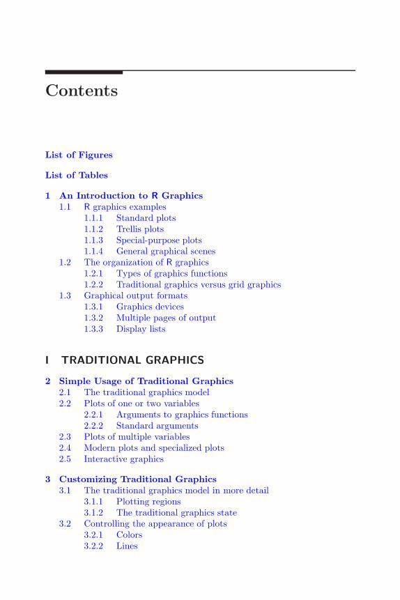
Contents
List of Figures
List of Tables
1 An Introduction to R Graphics1.1 R graphics examples
1.1.1 Standard plots1.1.2 Trellis plots1.1.3 Special-purpose plots1.1.4 General graphical scenes
1.2 The organization of R graphics1.2.1 Types of graphics functions1.2.2 Traditional graphics versus grid graphics
1.3 Graphical output formats1.3.1 Graphics devices1.3.2 Multiple pages of output1.3.3 Display lists
I TRADITIONAL GRAPHICS
2 Simple Usage of Traditional Graphics2.1 The traditional graphics model2.2 Plots of one or two variables
2.2.1 Arguments to graphics functions2.2.2 Standard arguments
2.3 Plots of multiple variables2.4 Modern plots and specialized plots2.5 Interactive graphics
3 Customizing Traditional Graphics3.1 The traditional graphics model in more detail
3.1.1 Plotting regions3.1.2 The traditional graphics state
3.2 Controlling the appearance of plots3.2.1 Colors3.2.2 Lines
3.2.3 Text3.2.4 Data symbols3.2.5 Axes3.2.6 Plotting regions3.2.7 Clipping3.2.8 Moving to a new plot
3.3 Arranging multiple plots3.3.1 Using the traditional graphics state3.3.2 Layouts3.3.3 The split-screen approach
3.4 Annotating plots3.4.1 Annotating the plot region3.4.2 Missing values and non-finite values3.4.3 Annotating the margins3.4.4 Legends3.4.5 Axes3.4.6 Mathematical formulae3.4.7 Coordinate systems3.4.8 Bitmap images3.4.9 Special cases
3.5 Creating new plots3.5.1 A simple plot from scratch3.5.2 A more complex plot from scratch3.5.3 Writing traditional graphics functions
II GRID GRAPHICS
4 Trellis Graphics: the Lattice Package4.1 The lattice graphics model
4.1.1 Lattice devices4.2 Lattice plot types
4.2.1 The formula argument and multipanel conditioning4.2.2 A nontrivial example
4.3 Controlling the appearance of lattice plots4.4 Arranging lattice plots4.5 Annotating lattice plots
4.5.1 Panel functions and strip functions4.5.2 Adding output to a lattice plot
4.6 Creating new lattice plots
5 The Grid Graphics Model5.1 A brief overview of grid graphics
5.1.1 A simple example5.2 Graphical primitives

5.2.1 Standard arguments5.3 Coordinate systems
5.3.1 Conversion functions5.3.2 Complex units
5.4 Controlling the appearance of output5.4.1 Specifying graphical parameter settings5.4.2 Vectorized graphical parameter settings
5.5 Viewports5.5.1 Pushing, popping, and navigating between viewports5.5.2 Clipping to viewports5.5.3 Viewport lists, stacks, and trees5.5.4 Viewports as arguments to graphical primitives5.5.5 Graphical parameter settings in viewports5.5.6 Layouts
5.6 Missing values and non-finite values5.7 Interactive graphics5.8 Customizing lattice plots
5.8.1 Adding grid output to lattice output5.8.2 Adding lattice output to grid output
6 The Grid Graphics Object Model6.1 Working with graphical output
6.1.1 Standard functions and arguments6.2 Grob lists, trees, and paths
6.2.1 Graphical parameter settings in gTrees6.2.2 Viewports as components of gTrees6.2.3 Searching for grobs
6.3 Working with graphical objects off-screen6.3.1 Capturing output
6.4 Placing and packing grobs in frames6.4.1 Placing and packing off-screen
6.5 Other details about grobs6.5.1 Calculating the sizes of grobs6.5.2 Editing graphical context
6.6 Saving and loading grid graphics6.7 Working with lattice grobs
7 Developing New Graphics Functions and Objects7.1 An example
7.1.1 Modularity7.2 Simple graphics functions
7.2.1 Embedding graphical output7.2.2 Facilitating annotation7.2.3 Editing output7.2.4 Absolute versus relative sizes

7.3 Graphical objects7.3.1 Overview of creating a new graphical class7.3.2 Defining a new graphical class7.3.3 Validating grobs7.3.4 Drawing grobs7.3.5 Editing grobs7.3.6 Sizing grobs7.3.7 Pre-drawing and post-drawing7.3.8 Completing the example7.3.9 Reusing graphical elements7.3.10 Other details
7.4 Querying grid
A A Brief Introduction to RA.1 Obtaining and installing RA.2 An environment for statistical computing and graphics
A.2.1 Batch processingA.2.2 Data typesA.2.3 VariablesA.2.4 IndexingA.2.5 Data structuresA.2.6 FormulaeA.2.7 ExpressionsA.2.8 PackagesA.2.9 Accessing data setsA.2.10 Getting help
A.3 A programming languageA.3.1 Debugging
A.4 An object-oriented language
B Combining Traditional Graphics and Grid GraphicsB.1 The gridBase package
B.1.1 Annotating base graphics using gridB.1.2 Embedding base graphics plots in grid viewportsB.1.3 Problems and limitations
Bibliography

List of Figures
1.1 A simple scatterplot1.2 Some standard plots1.3 A customized scatterplot1.4 A Trellis dotplot1.5 A map of New Zealand produced using R1.6 Some polar-coordinate plots1.7 A novel decision tree plot1.8 A table-like plot1.9 Didactic diagrams1.10 A music score1.11 A piece of clip art1.12 The structure of the R graphics system
2.1 Four variations on a scatterplot2.2 Plotting an lm object2.3 Plotting an agnes object2.4 Modifying default barplot() and boxplot() output2.5 Standard arguments for high-level functions2.6 Plotting three variables2.7 Plotting multivariate data2.8 Some modern and specialized plots
3.1 The plot regions in traditional graphics3.2 Multiple figure regions in traditional graphics3.3 The user coordinate system in the plot region3.4 Figure margin coordinate systems3.5 Outer margin coordinate systems3.6 Predefined and custom line types3.7 Line join and line ending styles3.8 Alignment of text in the plot region3.9 Font families and font faces3.10 Data symbols available in R3.11 Basic plot types3.12 Different axis styles3.13 Graphics state settings controlling plot regions3.14 Some basic layouts
3.15 Some complex layouts3.16 Annotating the plot region3.17 More examples of annotating the plot region3.18 Drawing polygons3.19 Annotating the margins3.20 Some simple legends3.21 Customizing axes3.22 Mathematical formulae in plots3.23 Custom coordinate systems3.24 Overlaying plots3.25 Overlaying output3.26 Adding a bitmap to a plot3.27 Special-case annotations3.28 A panel function example3.29 Annotating a 3D surface3.30 A back-to-back barplot3.31 A graphics function template
4.1 A scatterplot using lattice4.2 The result of modifying a lattice object4.3 Plot types available in lattice4.4 A lattice multipanel conditioning plot4.5 A complex lattice plot4.6 Some default lattice settings4.7 Controlling the layout of lattice panels4.8 Arranging multiple lattice plots4.9 Annotating a lattice plot
5.1 A simple scatterplot using grid5.2 Primitive grid output5.3 Drawing arrows5.4 Drawing polygons5.5 A demonstration of grid units5.6 Graphical parameters for graphical primitives5.7 Recycling graphical parameters5.8 Recycling graphical parameters for polygons5.9 A diagram of a simple viewport5.10 Pushing a viewport5.11 Pushing several viewports5.12 Popping a viewport5.13 Navigating between viewports5.14 Clipping output in viewports5.15 The inheritance of viewport graphical parameters5.16 Layouts and viewports5.17 Layouts and units

5.18 Nested layouts5.19 Non-finite values for line-tos, polygons, and arrows5.20 Controlling the size of lattice panels5.21 Adding grid output to a lattice plot5.22 Embedding a lattice plot within grid output
6.1 Modifying a circle grob6.2 Editing grobs6.3 The structure of a gTree6.4 Editing a gTree6.5 Using a gTree to group grobs6.6 Packing grobs by hand6.7 Calculating the size of a grob6.8 Grob dimensions by reference6.9 Editing the graphical context6.10 Editing the grobs in a lattice plot
7.1 A plot of oceanographic data7.2 A grid.imageFun() function7.3 Output from the grid.imageFun() function7.4 A grid.ozFun() function7.5 Example output from grid.ozFun()7.6 Annotating grid.ozFun() output7.7 Editing grid.ozFun() output7.8 An "imageGrob" class7.9 Some validDetails() methods7.10 An "ozGrob" class7.11 An "ozImage" class7.12 Some editDetails() methods7.13 Editing an imageGrob7.14 Low-level editing of an imageGrob7.15 Helper functions for a "ribbonLegend" class7.16 A "ribbonLegend" class7.17 An "ozKey" class7.18 A plot of temperature data7.19 A splitString() function7.20 Performing calculations before drawing7.21 A "splitText" class7.22 Drawing faces7.23 Some face functions7.24 Some face objects
B.1 Annotating a traditional plot with gridB.2 Embedding a traditional plot within lattice output
List of Tables
1.1 Graphical output formats
3.1 High-level traditional graphics state settings3.2 Low-level traditional graphics state settings3.3 Read-only traditional graphics state settings3.4 Functions to generate color sets3.5 Font faces3.6 Font families
4.1 Plotting functions in lattice
5.1 Graphical primitives in grid5.2 Coordinate systems in grid5.3 Graphical parameters in grid5.4 Grid font faces
6.1 Functions for working with grobs

1
An Introduction to R Graphics
Chapter preview
This chapter provides the most basic information to get started pro-ducing plots in R. First of all, there is a three-line code example thatdemonstrates the fundamental steps involved in producing a plot. Thisis followed by a series of figures to demonstrate the range of imagesthat R can produce. There is also a section on the organization of Rgraphics giving information on where to look for a particular function.The final section describes the different graphical output formats thatR can produce and how to obtain a particular output format.
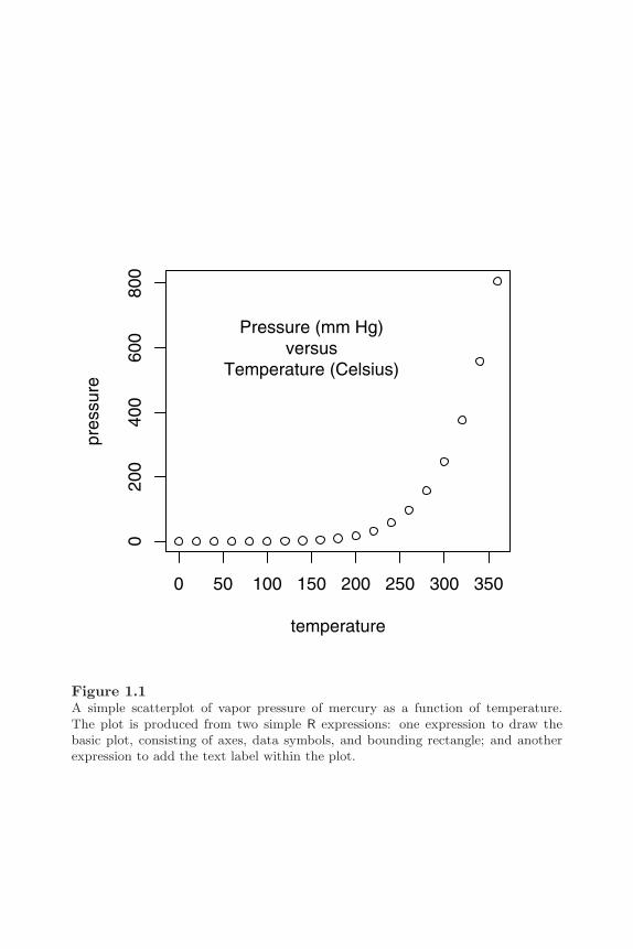
The following code provides a simple example of how to produce a plot usingR (see Figure 1.1).
> plot(pressure)> text(150, 600,
"Pressure (mm Hg)\nversus\nTemperature (Celsius)")
The expression plot(pressure) produces a scatterplot of pressure versustemperature, including axes, labels, and a bounding rectangle.∗ The call tothe text() function adds the label at the data location (150, 600) withinthe plot.
∗The pressure data set, available in the datasets package, contains 19 recordings ofthe relationship between vapor pressure (in millimeters of mercury) and temperature (indegrees Celsius).
2 R Graphics
0 50 100 150 200 250 300 350
020
040
060
080
0
temperature
pres
sure
Pressure (mm Hg)versus
Temperature (Celsius)
Figure 1.1A simple scatterplot of vapor pressure of mercury as a function of temperature.The plot is produced from two simple R expressions: one expression to draw thebasic plot, consisting of axes, data symbols, and bounding rectangle; and anotherexpression to add the text label within the plot.

An Introduction to R Graphics 3
This example is basic R graphics in a nutshell. In order to produce graphicaloutput, the user calls a series of graphics functions, each of which produceseither a complete plot, or adds some output to an existing plot. R graphicsfollows a “painters model,” which means that graphics output occurs in steps,with later output obscuring any previous output that it overlaps.
There are very many graphical functions provided by R and the add-on pack-ages for R, so before describing individual functions, Section 1.1 demonstratesthe variety of results that can be achieved using R graphics. This should pro-vide some idea of what users can expect to be able to achieve with R graphics.
Section 1.2 gives an overview of how the graphics functions in R are organized.This should provide users with some basic ideas of where to look for a functionto do a specific task. Section 1.3 describes the set of functions involved withthe selection of a particular graphical output format. By the end of thischapter, the reader will be in a position to start understanding in more detailthe core R functions that produce graphical output.
1.1 R graphics examples
This section provides an introduction to R graphics by way of a series ofexamples. None of the code used to produce these images is shown, but itis available from the web site for this book. The aim for now is simply toprovide an overall impression of the range of graphical images that can beproduced using R. The figures are described over the next few pages and theimages themselves are all collected together on pages 7 to 15.
1.1.1 Standard plots
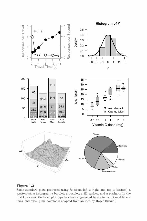
R provides the usual range of standard statistical plots, including scatterplots,boxplots, histograms, barplots, piecharts, and basic 3D plots. Figure 1.2 showssome examples.∗
In R, these basic plot types can be produced by a single function call (e.g.,
∗The barplot makes use of data on death rates in the state of Virginia for different agegroups and population groups, available as the VADeaths data set in the datasets package.The boxplot example makes use of data on the effect of vitamin C on tooth growth in guineapigs, available as the ToothGrowth data set, also from the datasets package. These andmany other data sets distributed with R were obtained from “Interactive Data Analysis” byDon McNeil[40] rather than directly from the original source.

4 R Graphics
pie(pie.sales) will produce a piechart), but plots can also be consideredmerely as starting points for producing more complex images. For example, inthe scatterplot in Figure 1.2, a text label has been added within the body of theplot (in this case to show a subject identification number) and a secondaryy-axis has been added on the right-hand side of the plot. Similarly, in thehistogram, lines have been added to show a theoretical normal distributionfor comparison with the observed data. In the barplot, labels have been addedto the elements of the bars to quantify the contribution of each element to thetotal bar and, in the boxplot, a legend has been added to distinguish betweenthe two data sets that have been plotted.
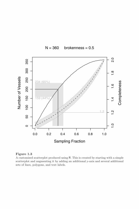
This ability to add several graphical elements together to create the finalresult is a fundamental feature of R graphics. The flexibility that this allowsis demonstrated in Figure 1.3, which illustrates the estimation of the originalnumber of vessels based on broken fragments gathered at an archaeologicalsite: a measure of “completeness” is obtained from the fragments at the site;a theoretical relationship is used to produce an estimated range of “samplingfraction”from the observed completeness; and another theoretical relationshipdictates the original number of vessels from a sampling fraction[19]. This plotis based on a simple scatterplot, but requires the addition of many extra lines,polygons, and pieces of text, and the use of multiple overlapping coordinatesystems to produce the final result.
For more information on the R functions that produce these standard plots,see Chapter 2. Chapter 3 describes the various ways that further output canbe added to a plot.
1.1.2 Trellis plots
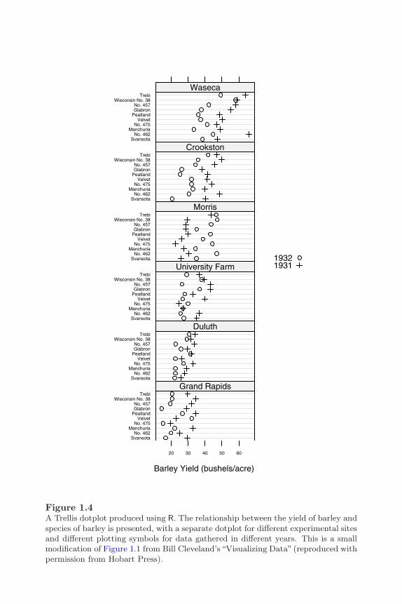
In addition to the traditional statistical plots, R provides an implementation ofTrellis plots[6] via the package lattice[54] by Deepayan Sarkar. Trellis plotsembody a number of design principles proposed by Bill Cleveland[12][13] thatare aimed at ensuring accurate and faithful communication of information viastatistical plots. These principles are evident in a number of new plot typesin Trellis and in the default choice of colors, symbol shapes, and line stylesprovided by Trellis plots. Furthermore, Trellis plots provide a feature knownas “multi-panel conditioning,” which creates multiple plots by splitting thedata being plotted according to the levels of other variables.
Figure 1.4 shows an example of a Trellis plot. The data are yields of severaldifferent varieties of barley at six sites, over two years. The plot consists ofsix “panels,” one for each site. Each panel consists of a dotplot showing yieldfor each site with different symbols used to distinguish different years, and a“strip” showing the name of the site.

An Introduction to R Graphics 5
For more information on the Trellis system and how to produce Trellis plotsusing the lattice package, see Chapter 4.
1.1.3 Special-purpose plots
As well as providing a wide variety of functions that produce complete plots,R provides a set of functions for producing graphical output primitives, suchas lines, text, rectangles, and polygons. This makes it possible for users towrite their own functions to create plots that occur in more specialized areas.There are many examples of special-purpose plots in add-on packages for R.For example, Figure 1.5 shows a map of New Zealand produced using R andthe add-on packages maps[7] and mapproj[39].
R graphics works mostly in rectangular Cartesian coordinates, but functionshave been written to display data in other coordinate systems. Figure 1.6shows three plots based on polar coordinates. The top-left image was pro-duced using the stars() function. Such star plots are useful for representingdata where many variables have been measured on a relatively small number ofsubjects. The top-right image was produced using customized code by KarstenBjerre and the bottom-left image was produced using the rose.diag() func-tion from the CircStats package[36]. Plots such as these are useful for pre-senting geographic, or compass-based data. The bottom-right image in Figure1.6 is a ternary plot producing using ternaryplot() from the vcd package[41].A ternary plot can be used to plot categorical data where there are exactlythree levels.
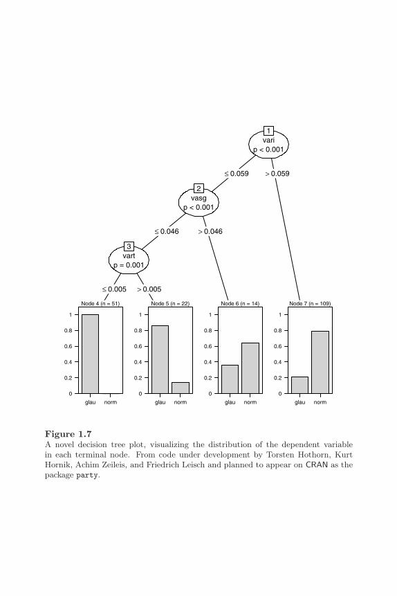
In some cases, researchers are inspired to produce a totally new type of plotfor their data. R is not only a good platform for experimenting with novelplots, but it is also a good way to deliver new plotting techniques to otherresearchers. Figure 1.7 shows a novel display for decision trees, visualizing thedistribution of the dependent variable in each terminal node[30].
For more information on how to generate a plot starting from an empty pagewith traditional graphics functions, see Chapter 3. The grid package provideseven more power and flexibility for producing customized graphical output(see Chapters 5 and 6), especially for the purpose of producing functions forothers to use (see Chapter 7).
1.1.4 General graphical scenes
The generality and flexibility of R graphics makes it possible to produce graph-ical images that go beyond what is normally considered to be statistical graph-ics, although the information presented can usually be thought of as data of

6 R Graphics
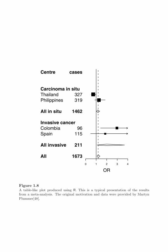
some kind. A good mainstream example is the ability to embed tabular ar-rangements of text as graphical elements within a plot as in Figure 1.8. Thisis a standard way of presenting the results of a meta-analysis. Figure 1.12and Figure 3.6 provide other examples of tabular graphical output producedby R.∗
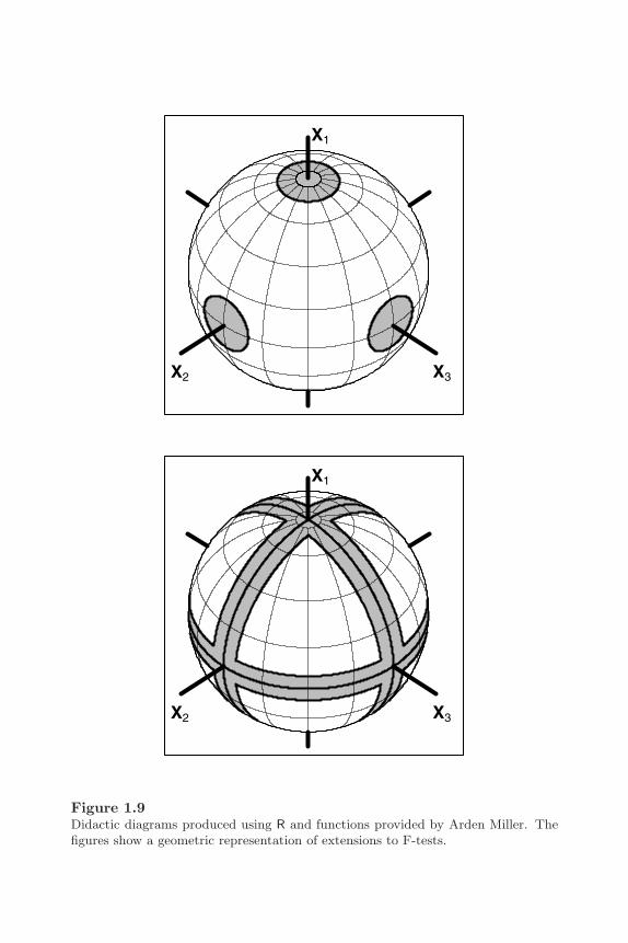
R has also been used to produce figures that help to visualize important con-cepts or teaching points. Figure 1.9 shows two examples that provide a geo-metric representation of extensions to F-tests (provided by Arden Miller[42]).A more unusual example of a general diagram is provided by the musical scorein Figure 1.10 (provided by Steven Miller). R graphics can even be used likea general-purpose painting program to produce “clip art” as shown by Figure1.11. These examples tend to require more effort to achieve the final result asthey cannot be produced from a single function call. However, R’s graphicsfacilities, especially those provided by the grid system (Chapters 5 and 6),provide a great deal of support for composing arbitrary images like these.
These examples present only a tiny taste of what R graphics (and clever andenthusiastic users) can do. They highlight the usefulness of R graphics notonly for producing what are considered to be standard plot types (for littleeffort), but also for providing tools to produce final images that are wellbeyond the standard plot types (including going beyond the boundaries ofwhat is normally considered statistical graphics).
∗All of the figures in this book, apart from the figures in Chapter 7 that only contain Rcode, were produced using R.
An Introduction to R Graphics 7
0 4 8 12 16
0
2
4
6
0
2
4
6
Travel Time (s)
Res
pons
es p
er T
rave
l
Res
pons
es p
er S
econ
d
Bird 131
Histogram of Y
Y
Den
sity
−3 −2 −1 0 1 2 3
0.0
0.1
0.2
0.3
0.4
0.5
0
50
100
150
200
RuralMale
RuralFemale
UrbanMale
UrbanFemale
11.718.1
26.9
41
66
8.711.720.3
30.9
54.3
15.424.3
37
54.6
71.1
8.413.619.3
35.1
50
0.5 1 2
0
5
10
15
20
25
30
35
toot
h le
ngth
Vitamin C dose (mg)0.5 1 2
0
5
10
15
20
25
30
35
Ascorbic acidOrange juice
x
y
z
Blueberry
Cherry
Apple
Boston Cream
Other
Vanilla
Figure 1.2Some standard plots produced using R: (from left-to-right and top-to-bottom) ascatterplot, a histogram, a barplot, a boxplot, a 3D surface, and a piechart. In thefirst four cases, the basic plot type has been augmented by adding additional labels,lines, and axes. (The boxplot is adapted from an idea by Roger Bivand.)
8 R Graphics
0.0 0.2 0.4 0.6 0.8 1.0
050
100
150
200
250
300
350
234 (65%)
159 (44%)
1.2
Num
ber
of V
esse
ls
Sampling Fraction
Com
plet
enes
s
1.0
1.2
1.4
1.6
1.8
2.0
N = 360 brokenness = 0.5
Figure 1.3A customized scatterplot produced using R. This is created by starting with a simplescatterplot and augmenting it by adding an additional y-axis and several additionalsets of lines, polygons, and text labels.
An Introduction to R Graphics 9
Barley Yield (bushels/acre)
20 30 40 50 60
SvansotaNo. 462
ManchuriaNo. 475
VelvetPeatlandGlabronNo. 457
Wisconsin No. 38Trebi
Grand RapidsSvansota
No. 462Manchuria
No. 475Velvet
PeatlandGlabronNo. 457
Wisconsin No. 38Trebi
DuluthSvansota
No. 462Manchuria
No. 475Velvet
PeatlandGlabronNo. 457
Wisconsin No. 38Trebi
University FarmSvansota
No. 462Manchuria
No. 475Velvet
PeatlandGlabronNo. 457
Wisconsin No. 38Trebi
MorrisSvansota
No. 462Manchuria
No. 475Velvet
PeatlandGlabronNo. 457
Wisconsin No. 38Trebi
CrookstonSvansota
No. 462Manchuria
No. 475Velvet
PeatlandGlabronNo. 457
Wisconsin No. 38Trebi
Waseca
19321931
Figure 1.4A Trellis dotplot produced using R. The relationship between the yield of barley andspecies of barley is presented, with a separate dotplot for different experimental sitesand different plotting symbols for data gathered in different years. This is a smallmodification of Figure 1.1 from Bill Cleveland’s “Visualizing Data” (reproduced withpermission from Hobart Press).

10 R Graphics
Auckland
Figure 1.5A map of New Zealand produced using R, Ray Brownrigg’s maps package, andThomas Minka’s mapproj package. The map (of New Zealand) is drawn as a se-ries of polygons, and then text, an arrow, and a data point have been added toindicate the location of Auckland, the birthplace of R. A separate world map hasbeen drawn in the bottom-right corner, with a circle to help people locate NewZealand.

An Introduction to R Graphics 11
Motor Trend Cars
mpg
cyl
disp
hp
drat
wt
qsec
1020304050N
E
S
W
90
270
180 0
None Some
Marked
0.2
0.8
0.2
0.4
0.6
0.4
0.6
0.4
0.6
0.8
0.2
0.8
Figure 1.6Some polar-coordinate plots produced using R (top-left), the CircStats package byUlric Lund and Claudio Agostinelli (top-right), and code submitted to the R-help
mailing list by Karsten Bjerre (bottom-left). The plot at bottom-right is a ternaryplot produced using the vcd package (by David Meyer, Achim Zeileis, AlexandrosKaratzoglou, and Kurt Hornik)
12 R Graphics
varip < 0.001
1
≤ 0.059 > 0.059
vasgp < 0.001
2
≤ 0.046 > 0.046
vartp = 0.001
3
≤ 0.005 > 0.005
Node 4 (n = 51)
glau norm
0
0.2
0.4
0.6
0.8
1
Node 5 (n = 22)
glau norm
0
0.2
0.4
0.6
0.8
1
Node 6 (n = 14)
glau norm
0
0.2
0.4
0.6
0.8
1
Node 7 (n = 109)
glau norm
0
0.2
0.4
0.6
0.8
1
Figure 1.7A novel decision tree plot, visualizing the distribution of the dependent variablein each terminal node. From code under development by Torsten Hothorn, KurtHornik, Achim Zeileis, and Friedrich Leisch and planned to appear on CRAN as thepackage party.
An Introduction to R Graphics 13
Centre
ThailandPhilippines
All in situ
ColombiaSpain
All invasive
All
Carcinoma in situ
Invasive cancer
cases
327319
1462
96115
211
1673
0 1 2 3 4
OR
Figure 1.8A table-like plot produced using R. This is a typical presentation of the resultsfrom a meta-analysis. The original motivation and data were provided by MartynPlummer[48].
14 R Graphics
X1
X2 X3
X2 X3
X1
Figure 1.9Didactic diagrams produced using R and functions provided by Arden Miller. Thefigures show a geometric representation of extensions to F-tests.

An Introduction to R Graphics 15
A Little Culture
44
Ma− ry had a lit− tle lamb
Figure 1.10A music score produced using R (code by Steven Miller).
Once upon a time ...
Figure 1.11A piece of clip art produced using R.

16 R Graphics
1.2 The organization of R graphics
This section briefly describes how R’s graphics functions are organized so thatthe user knows where to start looking for a particular function.
The R graphics system can be broken into four distinct levels: graphics pack-ages; graphics systems; a graphics engine, including standard graphics devices;and graphics device packages (see Figure 1.12).
GraphicsPackages
lattice ...maps ...
GraphicsSystems
graphics grid
GraphicsEngine
&Devices
grDevices
GraphicsDevice
PackagesgtkDevice ...
Figure 1.12The structure of the R graphics system showing the main packages that providegraphics functions in R. Arrows indicate where one package builds on the functionsin another package. The packages described in this book are highlighted with thickerborders and grey backgrounds.

An Introduction to R Graphics 17
The core R graphics functionality described in this book is provided by thegraphics engine and the two graphics systems, traditional graphics and grid.The graphics engine consists of functions in the grDevices package and pro-vides fundamental support for handling such things as colors and fonts (seeSection 3.2), and graphics devices for producing output in different graphicsformats (see Section 1.3).
The traditional graphics system consists of functions in the graphics packageand is described in Part I. The grid graphics system consists of functions inthe grid package and is described in Part II.
There are many other graphics functions provided in add-on graphics pack-ages, which build on the functions in the graphics systems. Only one suchpackage, the lattice package, is described in any detail in this book. Thelattice package builds on the grid system to provide Trellis plots (see Chap-ter 4).
There are also add-on graphics device packages that provide additional graph-ical output formats.
1.2.1 Types of graphics functions
Functions in the graphics systems and graphics packages can be broken downinto three main types: high-level functions that produce complete plots; low-level functions that add further output to an existing plot; and functions forworking interactively with graphical output.
The traditional system, or graphics packages built on top of it, provide themajority of the high-level functions currently available in R. The most signifi-cant exception is the lattice package (see Chapter 4), which provides completeplots based on the grid system.
Both the traditional and grid systems provide many low-level graphics func-tions, and grid also provides functions for interacting with graphical output(editing, extracting, deleting parts of an image).
Most functions in graphics packages produce complete plots and typically offerspecialized plots for a specific sort of analysis or a specific field of study. Forexample: the hexbin package[10] from the BioConductor project has functionsfor producing hexagonal binning plots for visualizing large amounts of data;the maps package[7] provides functions for visualizing geographic data (see, forexample, Figure 1.5); and the package scatterplot3d[35] produces a varietyof 3-dimensional plots. If there is a need for a particular sort of plot, thereis a reasonable chance that someone has already written a function to do it.For example, a common request on the R-help mailing list is for a way toadd error bars to scatterplots or barplots and this can be achieved via the
18 R Graphics
functions plotCI() from the gplots package in the gregmisc bundle or theerrbar() function from the Hmisc package. There are some search facilitieslinked off the main R home page web site to help to find a particular functionfor a particular purpose (also see Section A.2.10).
While there is no detailed discussion of the high-level graphics functions ingraphics packages other than lattice, the general comments in Chapter 2 con-cerning the behavior of high-level functions in the traditional graphics systemwill often apply as well to high-level graphics functions in graphics packagesbuilt on the traditional system.
1.2.2 Traditional graphics versus grid graphics
The existence of two distinct graphics systems in R raises the issue of whento use each system.
For the purpose of producing complete plots from a single function call, whichgraphics system to use will largely depend on what type of plot is required.The choice of graphics system is largely irrelevant if no further output needsto be added to the plot.
If it is necessary to add further output to a plot, the most important thing toknow is which graphics system was used to produce the original plot. In gen-eral, the same graphics system should be used to add further output (thoughsee Appendix B for ways around this).
In some cases, the same sort of plot can be produced by both lattice andtraditional functions. The lattice versions offer more flexibility for addingfurther output and for interacting with the plot, plus Trellis plots have abetter design in terms of visually decoding the information in the plot.
For producing graphical scenes starting from a blank page, the grid systemoffers the benefit of a much wider range of possibilities, at the cost of a havingto learn a few additional concepts.
For the purpose of writing new graphical functions for others to use, gridagain provides better support for producing more general output that can becombined with other output more easily. Grid also provides more possibilitiesfor interaction.

An Introduction to R Graphics 19
1.3 Graphical output formats
At the start of this chapter (page 1), there is a simple example of the sort of Rexpressions that are required to produce a plot. When using R interactively,the result is a plot drawn on screen. However, it is also possible to producea file that contains the plot, for example, as a PostScript document. Thissection describes how to control the format in which a plot is produced.
R graphics output can be produced in a wide variety of graphical formats.In R’s terminology, output is directed to a particular output device and thatdictates the output format that will be produced. A device must be created or“opened” in order to receive graphical output and, for devices that create a fileon disk, the device must also be closed in order to complete the output. Forexample, for producing PostScript output, R has a function postscript()that opens a file to receive PostScript commands. Graphical output sent tothis device is recorded by writing PostScript commands into the file. Thefunction dev.off() closes a device.
The following code shows how to produce a simple scatterplot in PostScriptformat. The output is stored in a file called myplot.ps:
> postscript(file="myplot.ps")> plot(pressure)> dev.off()
To produce the same output in PNG format (in a file called myplot.png), thecode simply becomes:
> png(file="myplot.png")> plot(pressure)> dev.off()
When working in an interactive session, output is often produced, at leastinitially, on the screen. When R is installed, an appropriate screen format isselected as the default device and this default device is opened automaticallythe first time that any graphical output occurs. For example, on the variousUnix systems, the default device is an X11 window so the first time a graphicsfunction gets called, a window is created to draw the output on screen. Theuser can control the format of the default device using the options() function.
20 R Graphics
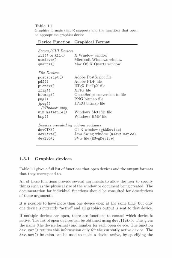
Table 1.1Graphics formats that R supports and the functions that openan appropriate graphics device
Device Function Graphical Format
Screen/GUI Devicesx11() or X11() X Window windowwindows() Microsoft Windows windowquartz() Mac OS X Quartz window
File Devicespostscript() Adobe PostScript filepdf() Adobe PDF filepictex() LATEX PicTEX filexfig() XFIG filebitmap() GhostScript conversion to filepng() PNG bitmap filejpeg() JPEG bitmap file
(Windows only)win.metafile() Windows Metafile filebmp() Windows BMP file
Devices provided by add-on packagesdevGTK() GTK window (gtkDevice)devJava() Java Swing window (RJavaDevice)devSVG() SVG file (RSvgDevice)
1.3.1 Graphics devices
Table 1.1 gives a full list of functions that open devices and the output formatsthat they correspond to.
All of these functions provide several arguments to allow the user to specifythings such as the physical size of the window or document being created. Thedocumentation for individual functions should be consulted for descriptionsof these arguments.
It is possible to have more than one device open at the same time, but onlyone device is currently “active” and all graphics output is sent to that device.
If multiple devices are open, there are functions to control which device isactive. The list of open devices can be obtained using dev.list(). This givesthe name (the device format) and number for each open device. The functiondev.cur() returns this information only for the currently active device. Thedev.set() function can be used to make a device active, by specifying the
An Introduction to R Graphics 21
appropriate device number and the functions dev.next() and dev.prev()can be used to make the next/previous device on the device list the activedevice.
All open devices can be closed at once using the function graphics.off().When an R session ends, all open devices are closed automatically.
1.3.2 Multiple pages of output
For a screen device, starting a new page involves clearing the window beforeproducing more output. On Windows there is a facility for returning to pre-vious screens of output (see the “History” menu, which is available when agraphics window has focus), but on most screen devices, the output of previ-ous pages is lost.
For file devices, the output format dictates whether multiple pages are sup-ported. For example, PostScript and PDF allow multiple pages, but PNG doesnot. It is usually possible, especially for devices that do not support multiplepages of output, to specify that each page of output produces a separate file.This is achieved by specifying the argument onefile=FALSE when openinga device and specifying a pattern for the file name like file="myplot%03d"so that the %03d is replaced by a three-digit number (padded with zeroes)indicating the “page number” for each file that is created.
1.3.3 Display lists
R maintains a display list for each open device, which is a record of the outputon the current page of a device. This is used to redraw the output whena device is resized and can also be used to copy output from one device toanother.
The function dev.copy() copies all output from the active device to anotherdevice. The copy may be distorted if the aspect ratio of the destination device— the ratio of the physical height and width of the device — is not the same asthe aspect ratio of the active device. The function dev.copy2eps() is similarto dev.copy(), but it preserves the aspect ratio of the copy and creates a filein EPS (Encapsulated PostScript) format that is ideal for embedding in otherdocuments (e.g., a LATEX document). The dev2bitmap() function is similarin that it also tries to preserve the aspect ratio of the image, but it producesone of the output formats available via the bitmap() device.
The function dev.print() attempts to print the output on the active device.By default, this involves making a PostScript copy and then invoking the printcommand given by options("printcmd").

22 R Graphics
The display list can consume a reasonable amount of memory if a plot is par-ticularly complex or if there are very many devices open at the same time.For this reason it is possible to disable the display list, by typing the expres-sion dev.control(displaylist="inhibit"). If the display list is disabled,output will not be redrawn when a device is resized, and output cannot becopied between devices.
Chapter summary
R graphics can produce a wide variety of graphical output, including(but not limited to) many different kinds of statistical plots, and theoutput can be produced in a wide variety of formats. Graphical outputis produced by calling functions that either draw a complete plot oradd further output to an existing plot.
There are two main graphics systems in R: a traditional system similarto the original S graphics system and a newer grid system that isunique to R. Additional graphics functionality is provided by a largenumber of add-on packages that build on these graphics systems.
2
Simple Usage of Traditional Graphics
Chapter preview
This chapter introduces the main high-level plotting functions in thetraditional graphics system. These are the functions used to producecomplete plots such as scatterplots, histograms, and boxplots. Thischapter describes the names of the standard plotting functions, thestandard ways to call these functions, and some of the standard argu-ments that can be used to vary the appearance of the plots. Some ofthis information is also applicable to high-level plotting functions inother add-on packages.
The aim of this chapter is to provide an idea of the range of functions thatare available in the traditional graphics system, to point the user toward themost important ones, and introduce the standard approach to using them.
The graphics functions that make up the traditional graphics system are pro-vided in an add-on package called graphics, which is automatically loaded ina standard installation of R. In a non-standard installation, it may be neces-sary to make the following call in order to access traditional graphics functions(if the graphics package is already loaded, this will not do any harm).
> library(graphics)
This chapter mentions all of the high-level graphics functions in the graphicspackage, but does not describe all possible uses of these functions. For detailedinformation on the behavior of individual functions the user should consultthe individual help pages using the help() function (or help.start() for a

26 R Graphics
web-browser interface). For example, the following code shows the help pagefor the barplot() function.
> help(barplot)
Another useful way of learning about a graphics function is to use theexample() function. This runs the code in the “Examples” section of the helppage for a function. The following code runs the examples for barplot().
> par(ask=TRUE)> example(barplot)
The par(ask=TRUE) is important to ensure that the user is prompted beforeeach new page; without it the examples tend to flash by too fast for them tobe viewed properly.
2.1 The traditional graphics model
As described at the start of Chapter 1, a plot is created in traditional graphicsby first calling a high-level function that creates a complete plot, then callinglow-level functions to add more output if necessary.
Traditional graphics functions always produce output on the current device(see Section 1.3.1 for information on devices and selecting a current devicewhen more than one device is open). There is also the concept of a “currentplot,” and all low-level functions add output to the current plot. If there isonly one plot per page, then a high-level function starts a new plot on a newpage. There may be multiple plots on a page (see Section 3.3), and in thiscase a high-level function starts the next plot on the same page, only startinga new page when the number of plots per page is exceeded.
The main persistent record of graphical output is the device output — awindow on screen or a file on disk. The only way to edit graphical output isto modify and rerun the original R code, or to produce output in a formatthat can be edited using third-party software (e.g., the output from an xfig()device can be edited using the xfig program; on Windows, the metafile formatcan be edited by a number of different programs).
Simple Usage of Traditional Graphics 27
2.2 Plots of one or two variables
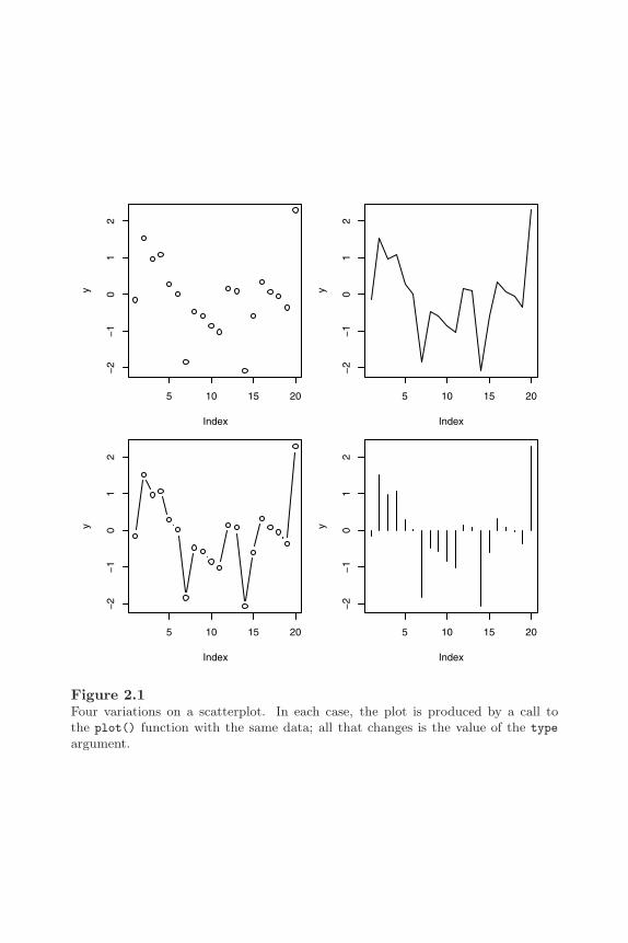
The traditional graphics system provides a standard set of basic plot types.The plot() function produces scatterplots, the barplot() function producesbarplots, hist() produces histograms, boxplot() produces boxplots, andpie() produces piecharts (see Figure 1.2 for example output).
R does not make a major distinction between, for example, scatterplots thatonly plot data symbols at each (x, y) location and scatterplots that drawstraight lines connecting the (x, y) locations (line plots). These are justvariations on the basic scatterplot, controlled by a type argument. This isdemonstrated by the following code, which produces four different plots byvarying the value of the type argument (see Figure 2.1).
> y <- rnorm(20)> plot(y, type="p")> plot(y, type="l")> plot(y, type="b")> plot(y, type="h")
R also does not make a distinction between a plot of a single set of data anda plot containing multiple series of data. Additional data series can be addedto a plot using low-level functions such as points() and lines() (see Section3.4.1; also see the function matplot() below).
The first argument to these high-level functions is the data to plot, but thereis a reasonable amount of flexibility in the way that the data can be specified.For example, each of the following calls to plot() can be used to produce thescatterplot in Figure 1.1 (with small variations in the axis labels). In the firstcase, all of the data to plot are specified in a single data frame. In the secondcase, separate x and y variables are specified. In the third case, the data toplot are specified as a formula.
> plot(pressure)> plot(pressure$temperature, pressure$pressure)> plot(pressure ~ temperature, data=pressure)
All of the basic plotting functions in the traditional graphics system are generic(see Section A.4). One consequence of this has just been described — thereare several ways to specify the data to plot — but this also means that in somecases the plot that the functions produce depends on the type of arguments
28 R Graphics
5 10 15 20
−2
−1
01
2
Index
y
5 10 15 20
−2
−1
01
2
Index
y
5 10 15 20
−2
−1
01
2
Index
y
5 10 15 20
−2
−1
01
2
Index
y
Figure 2.1Four variations on a scatterplot. In each case, the plot is produced by a call tothe plot() function with the same data; all that changes is the value of the type
argument.

Simple Usage of Traditional Graphics 29
passed to the functions. This is most relevant to the plot() function, which,for example, will produce boxplots if the x variable is a factor. Anotherexample is shown in the code below. Here an lm object is created from a callto the lm() function. When this object is passed to the plot() function, thespecial plot method for lm objects produces several regression diagnostic plots(see Figure 2.2).∗
> lm.SR <- lm(sr ~ pop15 + pop75 + dpi + ddpi,data = LifeCycleSavings)
> plot(lm.SR)
In many cases, add-on graphics packages provide new plots by defining a newmethod for the plot() function. For example, the cluster package[52] pro-vides a plot() method for plotting the result of an agglomerative hierarchicalclustering procedure[32][53][56] (an agnes object). This method produces aspecial “bannerplot” and a dendrogram from the data (see the following codeand Figure 2.3).† The first five expressions are just setting up the data; thelast two expressions create an agnes object and then plot it.
> subset <- sample(1:150, 20)> cS <- as.character(Sp <- iris$Species[subset])> cS[Sp == "setosa"] <- "S"> cS[Sp == "versicolor"] <- "V"> cS[Sp == "virginica"] <- "g"> ai <- agnes(iris[subset, 1:4])> plot(ai, labels = cS)
The matplot() function is not a plot() method, but it is specifically designedto work like plot()with x or y given as matrices. This function is a convenientway to plot multiple data series on a single scatterplot. Different data seriesare automatically distinguished by using different data symbols and colors.
In addition to the very traditional set of plots, there is a function for producingscatterplots of a single variable, stripchart(), a function for drawing curvesrepresenting a mathematical function, curve(), and a function for producinga character-based stem-and-leaf plot, stem().
∗The data used in this example are measures relating to the savings ratio (aggregatepersonal saving divided by disposable income) averaged over the period 1960-1970 for 50countries, available as the data set LifeCycleSavings in the datasets package.
†The data used in this example are the famous iris data data set giving measurementsof physical dimensions of three species of iris, available as the iris data set in the datasets
package.

30 R Graphics
6 8 10 12 14 16
−10
−5
05
10
Fitted values
Res
idua
ls
Residuals vs Fitted
Zambia
−2 −1 0 1 2
−2
−1
01
23
Theoretical Quantiles
Sta
ndar
dize
d re
sidu
als
Normal Q−Q plot
Zambia
6 8 10 12 14 16
0.0
0.5
1.0
1.5
Fitted values
Sta
ndar
dize
d re
sidu
als
Scale−Location plotZambia
0 10 20 30 40 50
0.00
0.05
0.10
0.15
0.20
0.25
Obs. number
Coo
k’s
dist
ance
Cook’s distance plotLibya
Figure 2.2Plotting an lm object. There is a special plot() method for lm objects that producesfour diagnostic plots from the results of a linear model analysis.

Simple Usage of Traditional Graphics 31
Height
Banner of agnes(x = iris[subset, 1:4])
Agglomerative Coefficient = 0.86
0 0.5 1 1.5 2 2.5 3 3.5 4
gggVVSgSgVgggVSVgggg
gg g
gg g
gV V
V gg
g gg
V V S SS
01
23
4
Dendrogram of agnes(x = iris[subset, 1:4])
Agglomerative Coefficient = 0.86iris[subset, 1:4]
Hei
ght
Figure 2.3Plotting an agnes object. There is a special plot() method for agnes objects thatproduces plots relevant to the results of an agglomerative hierarchical clusteringanalysis.
32 R Graphics
Some add-on graphics packages provide useful extensions on the standard plottypes. For example, the Hmisc package[26] provides the labcurve() functionfor drawing a plot with lines through multiple data series and text labelsattached to each line.
2.2.1 Arguments to graphics functions
It is often the case, especially when producing graphics for publication, thatthe output produced by a single call to a high-level graphics function is notexactly right. There are many ways in which the output of graphics functionsmay be modified and Chapter 3 addresses this topic in full detail. This sectionwill only consider the possibility of specifying arguments to high-level graphicsfunctions in order to modify their output.
Many of these arguments are specific to a particular function. For example,the boxplot() function has width and boxwex arguments (among others) forcontrolling the width of the boxes in the plot, and the barplot() function hasa horiz argument for controlling whether bars are drawn horizontally ratherthan vertically.
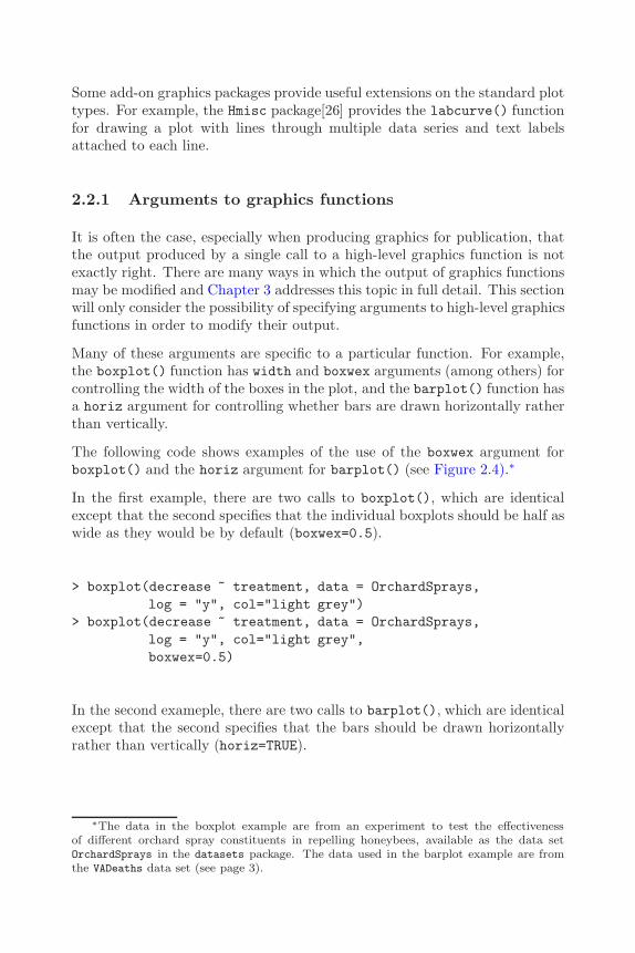
The following code shows examples of the use of the boxwex argument forboxplot() and the horiz argument for barplot() (see Figure 2.4).∗
In the first example, there are two calls to boxplot(), which are identicalexcept that the second specifies that the individual boxplots should be half aswide as they would be by default (boxwex=0.5).
> boxplot(decrease ~ treatment, data = OrchardSprays,log = "y", col="light grey")
> boxplot(decrease ~ treatment, data = OrchardSprays,log = "y", col="light grey",boxwex=0.5)
In the second exameple, there are two calls to barplot(), which are identicalexcept that the second specifies that the bars should be drawn horizontallyrather than vertically (horiz=TRUE).
∗The data in the boxplot example are from an experiment to test the effectivenessof different orchard spray constituents in repelling honeybees, available as the data setOrchardSprays in the datasets package. The data used in the barplot example are fromthe VADeaths data set (see page 3).
Simple Usage of Traditional Graphics 33
A B C D E F G H
25
1020
5010
0
A B C D E F G H
25
1020
5010
0
RM RF
UM UF
0
10
20
30
RM
RF
UM
UF
0 10 20 30
Figure 2.4Modifying default barplot() and boxplot() output. The top two plots are producedby calls to the boxplot() function with the same data, but with different values ofthe boxwex argument. The bottom two plots are both produced by calls to thebarplot() function with the same data, but with different values of the horiz
argument.
34 R Graphics
> barplot(VADeaths[1:2,], angle = c(45, 135),density = 20, col = "grey",names=c("RM", "RF", "UM", "UF"))
> barplot(VADeaths[1:2,], angle = c(45, 135),density = 20, col = "grey",names=c("RM", "RF", "UM", "UF"),horiz=TRUE)
In general, the user should consult the documentation for the specific functionto determine which arguments are available and what effect they have.
2.2.2 Standard arguments
Despite the existence of many arguments that are specific only to a singlegraphics function, there are several arguments that are“standard”in the sensethat many high-level functions will accept them.
Most high-level functions will accept graphical parameters controlling suchthings as color (col), line type (lty), and text font. Section 3.2 provides afull list of these arguments and describes their effects. In many cases, thesearguments are not given as explicitly named arguments to the high-level func-tion, but are accepted via the ellipsis argument (...).
Unfortunately, because the interpretation of these standard arguments mayvary in some cases, some care is necessary. For example, if the col argumentis specified for a standard scatterplot, this only affects the color of the datasymbols in the plot (it does not affect the color of the axes, or the axis labels),but for the barplot() function, col specifies the color for the fill or patternused within the bars.
In addition to the standard graphical parameters, there are standard argu-ments to control the appearance of axes and labels on plots. It is usuallypossible to modify the range of the axis scales on a plot by specifying xlimor ylim arguments in the call to the high-level function, and often there is aset of arguments for specifying the labels on a plot: main for a title, sub fora sub-title, xlab for an x-axis label and ylab for a y-axis label.
Although there is no guarantee that these standard arguments will be acceptedby high-level functions in add-on graphics packages, in many cases they willbe accepted, and they will have the expected effect.
The following code shows examples of setting some of these standard argu-ments for the plot() function (see Figure 2.5). All of the calls to plot()draw a scatterplot with lines connecting the data values: the first call uses awider line (lwd=3), the second call draws the line a grey color (col="grey"),

Simple Usage of Traditional Graphics 35
the third call draws a dashed line (lty="dashed"), and the fourth call uses amuch wider range of values on the y-scale (ylim=c(-4, 4)).
> y <- rnorm(20)> plot(y, type="l", lwd=3)> plot(y, type="l", col="grey")> plot(y, type="l", lty="dashed")> plot(y, type="l", ylim=c(-4, 4))
In cases where the default output from a high-level function cannot be mod-ified to produce the desired result by specifying arguments to the high-levelfunction, possible options are to add further annotation (see Section 3.4), orto generate the entire plot from scratch (see Section 3.5).
Some high-level functions provide an argument to inhibit some of the defaultoutput in order to assist in the customization of a plot. For example, thedefault plot() function has an axes argument to allow the user to inhibit thedrawing of axes and the user can then produce customized output to representthe axis (see Section 3.4.5).
2.3 Plots of multiple variables
The traditional graphics system provides a number of functions for visualizinghigh-dimensional data. For plots of three variables there are: the persp()function for producing 3D surfaces; contour() and filled.contour() forproducing contours to represent the values of the third variable; image(),which produces a grid of rectangles and uses color to represent the value of thethird variable; and symbols(), which uses a symbol (e.g., a circle of varyingradius) to represent the third variable. Figure 2.6 shows some examples ofthe output from these functions.∗
For the special case of two dichotomous variables grouped by a third variable(data from a 2 by 2 by k contingency table), there is the fourfoldplot()function, which creates a “fourfold display”[23].
∗The data used to produce the 3-D surface, contour, and image plots are topographicmeasurements of Maunga Whau (Mt. Eden), a dormant volcano in Auckland, New Zealand,available as the data set volcano in the datasets package. The data were digitally capturedfrom a topographic map by Ross Ihaka. The data used for the symbols() plot are physicalmeasurements of black cherry trees, available as the trees data set in the datasets package.

36 R Graphics
5 10 15 20
−0.
50.
00.
51.
0
5 10 15 20
−0.
50.
00.
51.
0
5 10 15 20
−0.
50.
00.
51.
0
5 10 15 20
−4
−2
02
4
Figure 2.5Standard arguments for high-level functions. All four plots are produced by calls tothe plot() function with the same data, but with different standard plot functionarguments specified: the top-left plot makes use of the lwd argument to control linethickness; the top-right plot uses the col argument to control line color; the bottom-left plot makes use of the lty argument to control line type; and the bottom-rightplot uses the ylim argument to control the scale on the y-axis.

Simple Usage of Traditional Graphics 37
persp()
60 70 80 90
2040
6080
symbols()
contour() image()
Figure 2.6Plotting three variables. Clockwise from top-left: a 3D surface, a plot where a thirdvariable is represented by the size of the plotting symbols, an image plot where athird variable is represented using color, and a contour plot.

38 R Graphics
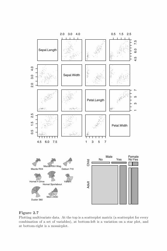
For data sets containing more than three variables, there is the pairs() func-tion for producing a matrix of scatterplots (plotting each variable against allother variables), the function stars() for producing “star” plots of contin-uous variables, and the mosaicplot() function for producing a mosaicplotof categorical data[28][24]. Figure 2.7 shows examples of the output of thesefunctions.∗
Some important add-on graphics packages provide more extensive facilities forproducing representations of multi-dimensional data. For 3D plots, there isthe scatterplot3d package[35] and the rgl package[2]. The latter providessome access to the visualization capabilities of OpenGL so there are advancedvisualization features like the ability to interactively rotate plots and speciallighting and surface effects. The Rggobi package[33] provides an interfacebetween R and the ggobi program[57], which offers a number of techniquesfor visualizing many variables, including the grand tour[17].
The standard arguments described in the previous section for standard plotsof one or two variables are less well supported for plotting three or morevariables.
2.4 Modern plots and specialized plots
The traditional graphics system, and add-on graphics packages that have builton it, contain a number of functions to produce plots that are relatively mod-ern (i.e., not provided by all statistical software packages), or that are suitedto a particular type of data or analysis technique, or that are specific to aparticular area of research.
The traditional system has functions that implement several of the plots de-veloped by Bill Cleveland based on principles of human perception. Thedotchart() function creates a dotplot (see the top-left plot in Figure 2.8†)and the coplot() function creates a conditioning plot (an example is shownin Figure 3.28). For a much wider range of plots of this kind, see Chapter 4,which describes Trellis plots.
∗The data used for the scatterplot matrix are the iris data (see page 29). The data usedin the stars() plot are measures of fuel consumption and automobile design, available asthe mtcars data set in the datasets package. The data used for the mosaicplot are recordsof survival rates and demographic measures for passengers on the Titanic, available as theTitanic data set in the datasets package.
†The data set used in this example are from the VADeaths data set (see page 3).
Simple Usage of Traditional Graphics 39
Sepal.Length
2.0 3.0 4.0 0.5 1.5 2.5
4.5
6.0
7.5
2.0
3.0
4.0
Sepal.Width
Petal.Length
13
57
4.5 6.0 7.5
0.5
1.5
2.5
1 3 5 7
Petal.Width
Mazda RX4Mazda RX4 Wag
Datsun 710
Hornet 4 DriveHornet Sportabout
Valiant
Duster 360Merc 240D
Male Female
Chi
ldA
dult
No Yes NoYes
Figure 2.7Plotting multivariate data. At the top is a scatterplot matrix (a scatterplot for everycombination of a set of variables), at bottom-left is a variation on a star plot, andat bottom-right is a mosaicplot.

40 R Graphics
RMRFUMUF
RMRFUMUF
RMRFUMUF
50−54
55−59
60−64
0 10 20 30 40−3 0 3
−3
03
WashingtonOregonWyomingOklahomaVirginiaRhode IslandMassachusettsNew JerseyMissouriArkansasTennesseeGeorgiaColoradoTexas
Cal
iforn
iaM
aryl
and
Ariz
ona
New
Mex
ico
Del
awar
eA
laba
ma
Loui
sian
aIll
inoi
sN
ew Y
ork
Mic
higa
nN
evad
aA
lask
aM
issi
ssip
piS
outh
Car
olin
a
Figure 2.8Some modern and specialized plots. Clockwise from top-left are: a (Cleveland)dotplot, a sunflower plot, and two variations on a dendrogram.

Simple Usage of Traditional Graphics 41
There are several functions for helping to plot data when data symbols over-lap in a standard scatterplot. The sunflowerplot() function can be usefulwhen identical data values repeat a small number of times. In these plots, a“flower”is produced at each location with a“petal”for each replication (see thetop-right plot in Figure 2.8). When the data are voluminous, the hexbin()function from the hexbin package is useful for plotting regions representingdata density rather than plotting individual data points. A similar approachis to bin the data and use one of contour() or image(). It is also worth men-tioning the jitter() function, which does no drawing, but adds a very smallrandom amount to data values in order to separate values that are originallyidentical.
There are functions that are particularly aimed at representing categori-cal data or the results of analyzing categorical data. For example, theassocplot() function produces Cohen-Friendly association plots[16][22]. Amuch wider range of such functions is provided by the vcd package, whichimplements plots from Michael Friendly’s book “Visualizing CategoricalData”[25].
The plot() method for dendrogram objects is provided for drawing hierar-chical or tree-like structures, such as the results from clustering or a recursivepartitioning regression tree. The packages rpart[59] and maptree[66] providemore functions related to this area. The bottom two plots in Figure 2.8 showexamples of output from the plot() method for dendrogram objects.∗
2.5 Interactive graphics
The strength of the traditional graphics system lies in the production of staticgraphics. There are only limited facilities for interacting with graphical out-put.
The locator() function allows the user to click within a plot and returns thecoordinates where the mouse click occurred. It will also optionally draw datasymbols at the clicked locations or draw lines between the clicked locations.
The identify() function can be used to add labels to data symbols on a plot.The data point closest to the mouse click gets labelled.
In R version 2.1.0, there is a getGraphicsEvent() function that provides
∗The data used in these examples are measures of crime rates in various US states in1973, available as the data set USArrests in the datasets package.

42 R Graphics
a more flexible basis for developing interactive plots (currently only for theWindows graphics device). This function captures key stroke events as wellas mouse events and allows more general event handlers to be written as Rfunctions.
Several add-on graphics packages provide additional interactive capabilities.The tcltk package provides a general facility for building GUI componentsand this can be used to create interactive graphics. Some of the tcltk de-mos and the dynamicGraph package[4] provide examples of this approach.The Rggobi package[33] and the iPlots package[62] provide an alternativeapproach by linking R to other graphics software applications that have so-phisticated interactive features, such as brushing and linking plots[14][58].
Chapter summary
The traditional graphics system has functions to produce the stan-dard statistical plots such as histograms, scatterplots, barplots, andpiecharts. There are also functions for producing higher-dimensionalplots such as 3D surfaces and contour plots and more specialized ormodern plots such as dotplots, dendrograms, and mosaicplots. In mostcases, the functions provide a number of arguments to allow the userto control the details of the plot, such as the widths of the boxes ina boxplot. There are a standard set of arguments for controlling theappearance of the plot (colors, fonts, line types, etc.) and the labelsand axes on a plot, but these are not all available for all types of plots.

3
Customizing Traditional Graphics
Chapter preview
It is very often the case that a high-level plotting function does notproduce exactly the final result that is desired. This chapter describeslow-level traditional functions that are useful for controlling the finedetails of a plot and for adding further output to a plot (e.g., addingdescriptive labels).
In order to utilise these low-level functions effectively, this chapter alsoincludes a description of the regions and coordinate systems that areused to locate the output from low-level functions. For example, thereis a description of which function to use to draw text in the margins ofa plot as opposed to drawing text in the data region (where the datasymbols are plotted). There is also a discussion of ways to arrangeseveral plots together on a single page.
Sometimes it is not possible to achieve a final result by modifying anexisting high-level plot. In such cases, the user might need to create aplot using only low-level functions. This case is also addressed in thischapter together with some discussion of how to write a new graphicsfunction for other people to use.
It is often the case that the default or standard output from a high-levelfunction is not exactly what the user requires, particularly when producinggraphics for publication. Various aspects of the output often need to be mod-ified or completely replaced. This chapter describes the various ways in whichthe output from a traditional graphics high-level function can be customizedand extended.

44 R Graphics
The real power of the traditional graphics system lies in the ability to controlmany aspects of the appearance of a plot, to add extra output to a plot, andeven to build a plot from scratch in order to produce precisely the right finaloutput.
Section 3.1 introduces important concepts of drawing regions, coordinate sys-tems, and graphics state that are required for properly working with tradi-tional graphics at a lower level. Section 3.2 describes how to control aspectsof output such as colors, fonts, line styles, and plotting symbols, and Section3.3 addresses the problem of placing several plots on the same page. Section3.4 describes how to customize a plot by adding extra output and Section 3.5looks at ways to produce entirely new types of plots.
3.1 The traditional graphics model in more detail
In order to explain some of the facilities for customizing plots, it is necessaryto describe more about the model underlying traditional graphics plots.
3.1.1 Plotting regions
In the base graphics system, every page is split up into three main regions: theouter margins, the current figure region, and the current plot region. Figure3.1 shows these regions when there is only one figure on the page and Figure3.2 shows the regions when there are multiple figures on the page.
The region obtained by removing the outer margins from the device is calledthe inner region. When there is only one figure, this usually corresponds to thefigure region, but when there are multiple figures the inner region correspondsto the union of all figure regions.
The area outside the plot region, but inside the figure region is referred toas the figure margins. A typical high-level function draws data symbols andlines within the plot region and axes and labels in the figure margins or outermargins (see Section 3.4 for information on the functions used to draw outputin the different regions).
The size and location of the different regions is controlled either via the par()function, or using special functions for arranging plots (see Section 3.3). Spec-ifying an arrangement of the regions does not usually affect the current plotas the settings only come into effect when the next plot is started.

Customizing Traditional Graphics 45
Plot Region
Figure Region
Outer margin 1
Out
er m
argi
n 2
Outer margin 3
Out
er m
argi
n 4
Figure 3.1The plot regions in traditional graphics. The outer margins, figure region, and plotregion, when there is a single plot on the page.
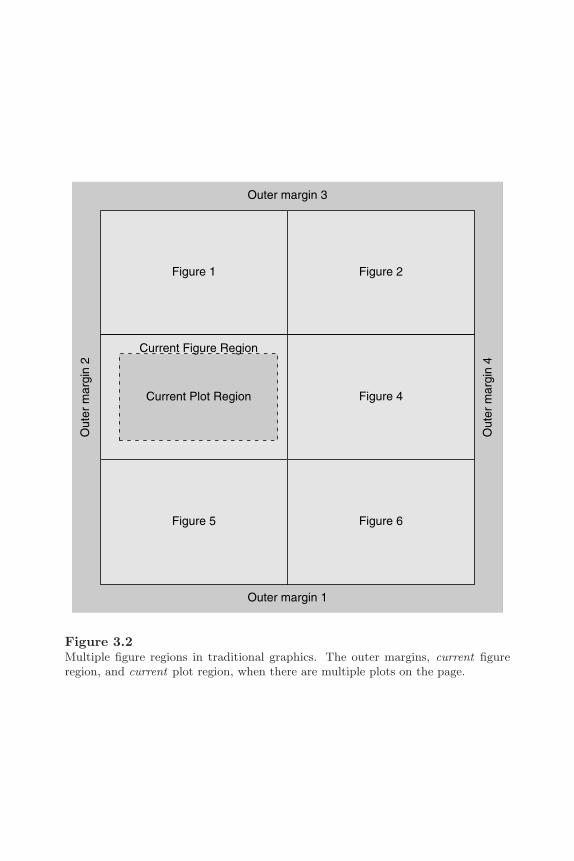
46 R Graphics
Figure 1 Figure 2
Current Plot Region
Current Figure Region
Figure 4
Figure 5 Figure 6
Outer margin 1
Out
er m
argi
n 2
Outer margin 3
Out
er m
argi
n 4
Figure 3.2Multiple figure regions in traditional graphics. The outer margins, current figureregion, and current plot region, when there are multiple plots on the page.
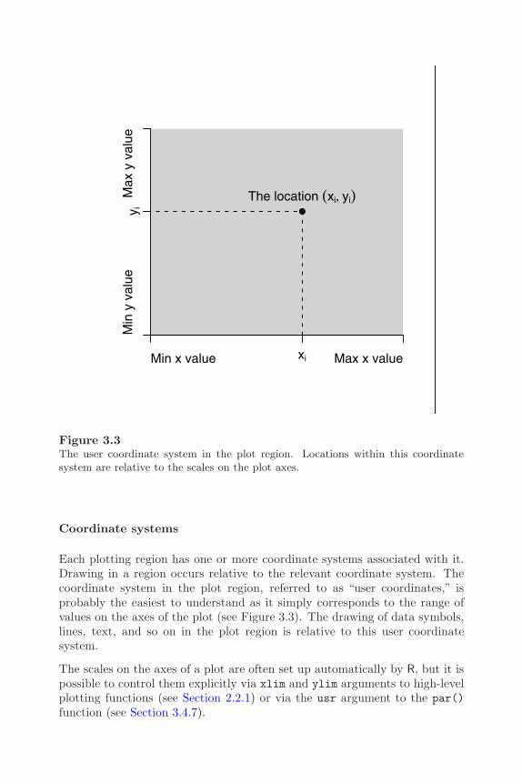
Customizing Traditional Graphics 47
Min x value Max x value
Min
y v
alue
Max
y v
alue
The location (xi, yi)
xi
y i
Figure 3.3The user coordinate system in the plot region. Locations within this coordinatesystem are relative to the scales on the plot axes.
Coordinate systems
Each plotting region has one or more coordinate systems associated with it.Drawing in a region occurs relative to the relevant coordinate system. Thecoordinate system in the plot region, referred to as “user coordinates,” isprobably the easiest to understand as it simply corresponds to the range ofvalues on the axes of the plot (see Figure 3.3). The drawing of data symbols,lines, text, and so on in the plot region is relative to this user coordinatesystem.
The scales on the axes of a plot are often set up automatically by R, but it ispossible to control them explicitly via xlim and ylim arguments to high-levelplotting functions (see Section 2.2.1) or via the usr argument to the par()function (see Section 3.4.7).

48 R Graphics
The figure margins contain the next most commonly-used coordinate systems.The coordinate systems in these margins are a combination of x- or y-ranges(like user coordinates) and lines of text away from the boundary of the plotregion. Figure 3.4 shows two of the four figure margin coordinate systems.Axes are drawn in the figure margins using these coordinate systems.
There is a further set of “normalized” coordinate systems available for thefigure margins in which the x- and y-ranges are replaced with a range from 0to 1. In other words, it is possible to specify locations along the axes as a pro-portion of the total axis length. Axis labels and plot titles are drawn relativeto this coordinate system. All of these figure margin coordinate systems arecreated implicitly from the arrangement of the figure margins and the settingof the user coordinate system.
The outer margins have similar sets of coordinate systems, but locations alongthe boundary of the inner region can only be specified in normalized coordi-nates (always relative to the extent of the complete outer margin). Figure 3.5shows two of the four outer margin coordinate systems.
Sections 3.4.3 and 3.4.5 describe functions that produce output relative tothese margin coordinate systems.
3.1.2 The traditional graphics state
The traditional graphics system maintains a graphics“state” for each graphicsdevice. Whenever output is drawn, the graphics state is consulted to deter-mine where it should be drawn, what color it should be, what fonts to use fortext, and so on.
The graphics state consists of a large number of settings. Some of thesesettings describe the size and placement of the plot regions and coordinatesystems described above. Some settings describe the general appearance ofgraphical output (the colors and line types that are used to draw lines, thefonts that are used to draw text, etc). Some settings describe aspects of theoutput device (e.g., the physical size of the device and the current clippingregion).
Tables 3.1 to 3.3 together provide a list of all of the graphics state settings anda very brief indication of their meaning. Most of the settings are described indetail in Sections 3.2 and 3.3.
The main function used to access the graphics state is the par() function.Simply typing par() will result in a complete listing of the current graphicsstate. A specific state setting can be queried by supplying specific settingnames as arguments to par(). The following code (page 52) queries thecurrent state of the col and lty settings.

Customizing Traditional Graphics 49
Current Plot
FigureMargin
1
xmin xmax
0 lines
3 lines
Current PlotFigureMargin
2
ymin
ymax
0 lines3 lines
Figure 3.4Figure margin coordinate systems. The typical coordinate systems for figure margin1 (top plot) and figure margin 2 (bottom plot). Locations within these coordinatesystems are a combination of position along the axis scale and distance away fromthe axis in multiples of lines of text.
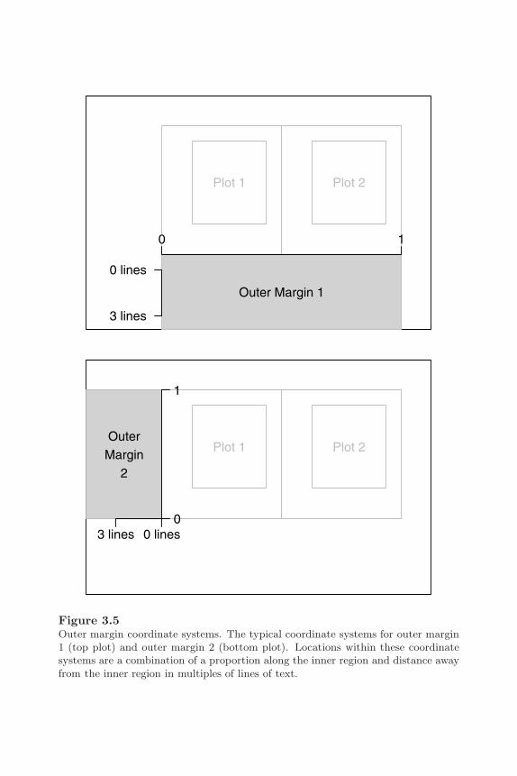
50 R Graphics
Plot 1 Plot 2OuterMargin
2
0
1
0 lines3 lines
Plot 1 Plot 2
Outer Margin 1
0 1
0 lines
3 lines
Figure 3.5Outer margin coordinate systems. The typical coordinate systems for outer margin1 (top plot) and outer margin 2 (bottom plot). Locations within these coordinatesystems are a combination of a proportion along the inner region and distance awayfrom the inner region in multiples of lines of text.

Customizing Traditional Graphics 51
Table 3.1High-level traditional graphics state settings. This set of graphics statesettings can be queried and set via the par() function and can be usedas arguments to other graphics functions (e.g., plot() or lines()). Eachsetting is described in more detail in the relevant Section.
Setting Description Section
adj justification of text 3.2.3ann draw plot labels and titles? 3.2.3bg “background” color 3.2.1bty type of box drawn by box() 3.2.5cex size of text (multiplier) 3.2.3cex.axis size of axis tick labels 3.2.3cex.lab size of axis labels 3.2.3cex.main size of plot title 3.2.3cex.sub size of plot sub-title 3.2.3col color of lines and data symbols 3.2.1col.axis color of axis tick labels 3.2.1col.lab color of axis labels 3.2.1col.main color of plot title 3.2.1col.sub color of plot sub-title 3.2.1fg “foreground” color 3.2.1font font face (bold, italic) for text 3.2.3font.axis font face for axis tick labels 3.2.3font.lab font face for axis labels 3.2.3font.main font face for plot title 3.2.3font.sub font face for plot sub-title 3.2.3gamma gamma correction for colors 3.2.1lab number of ticks on axes 3.2.5las rotation of text in margins 3.2.3lty line type (solid, dashed) 3.2.2lwd line width 3.2.2mgp placement of axis ticks and tick labels 3.2.5pch data symbol type 3.2.4srt rotation of text in plot region 3.2.3tck length of axis ticks (relative to plot size) 3.2.5tcl length of axis ticks (relative to text size) 3.2.5tmag size of plot title (relative to other labels) 3.2.3type type of plot (points, lines, both) 3.2.4xaxp number of ticks on x-axis 3.2.5xaxs calculation of scale range on x-axis 3.2.5xaxt x-axis style (standard, none) 3.2.5xpd clipping region 3.2.7yaxp number of ticks on y-axis 3.2.5yaxs calculation of scale range on y-axis 3.2.5yaxt y-axis style (standard, none) 3.2.5

52 R Graphics
> par(c("col", "lty"))
$col
[1] "black"
$lty
[1] "solid"
The par() function can be used to modify traditional graphics state settingsby specifying a value via an argument with the appropriate setting name. Thefollowing code sets new values for the col and lty settings.
> par(col="red", lty="dashed")
Modifying traditional graphics state settings via par() has a persistent effect.Settings specified in this way will hold until a different setting is specified.Settings may also be temporarily modified by specifying a new value in acall to a graphics function such as plot() or lines(). The following codedemonstrates this idea. First of all, the line type is permanently set usingpar(), then a plot is drawn and the lines drawn between data points in thisplot are dashed. Next, a plot is drawn with a temporary line type settingof lty="solid" and the lines in this plot are solid. When the third plot isdrawn, the permanent line type setting of lty="dashed" is back in effect sothe lines are again dashed.
> y <- rnorm(20)> par(lty="dashed")> plot(y, type="l") # line is dashed> plot(y, type="l", lty="solid") # line is solid> plot(y, type="l") # line is dashed
Only some of the graphics state settings can be set temporarily in calls tographics functions. For example, the mfrow setting may not be set in this wayand can only be set using par(). These “low level” settings are listed in Table3.2.
A small set of graphics state settings cannot be set at all and can only bequeried using par(). For example, there is no function to allow the user tomodify the size of the current device (after the device has been created), butits size (in inches) may be obtained using par("din"). These “read only”settings are listed in Table 3.3.
Changes to the traditional graphics state only affect the current graphicsdevice.
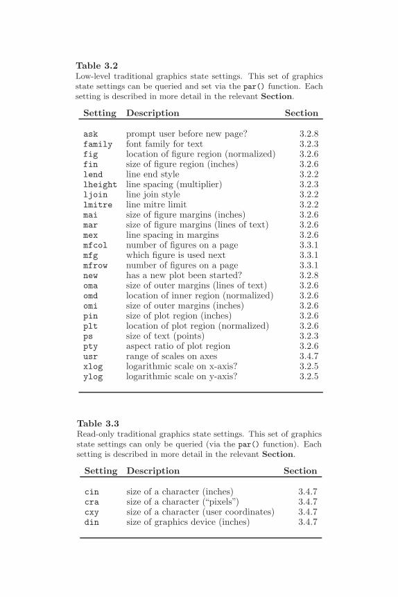
Customizing Traditional Graphics 53
Table 3.2Low-level traditional graphics state settings. This set of graphicsstate settings can be queried and set via the par() function. Eachsetting is described in more detail in the relevant Section.
Setting Description Section
ask prompt user before new page? 3.2.8family font family for text 3.2.3fig location of figure region (normalized) 3.2.6fin size of figure region (inches) 3.2.6lend line end style 3.2.2lheight line spacing (multiplier) 3.2.3ljoin line join style 3.2.2lmitre line mitre limit 3.2.2mai size of figure margins (inches) 3.2.6mar size of figure margins (lines of text) 3.2.6mex line spacing in margins 3.2.6mfcol number of figures on a page 3.3.1mfg which figure is used next 3.3.1mfrow number of figures on a page 3.3.1new has a new plot been started? 3.2.8oma size of outer margins (lines of text) 3.2.6omd location of inner region (normalized) 3.2.6omi size of outer margins (inches) 3.2.6pin size of plot region (inches) 3.2.6plt location of plot region (normalized) 3.2.6ps size of text (points) 3.2.3pty aspect ratio of plot region 3.2.6usr range of scales on axes 3.4.7xlog logarithmic scale on x-axis? 3.2.5ylog logarithmic scale on y-axis? 3.2.5
Table 3.3Read-only traditional graphics state settings. This set of graphicsstate settings can only be queried (via the par() function). Eachsetting is described in more detail in the relevant Section.
Setting Description Section
cin size of a character (inches) 3.4.7cra size of a character (“pixels”) 3.4.7cxy size of a character (user coordinates) 3.4.7din size of graphics device (inches) 3.4.7

54 R Graphics
3.2 Controlling the appearance of plots
This section is concerned with the appearance of plots, which means the colors,line types, fonts and so on that are used to draw a plot. As described in Section3.1.2, these features are controlled via traditional graphics state settings andvalues are specified for the settings either with a call to the par() functionor as arguments to a specific graphics function such as plot(). For example,there is a setting called col to control the color of output (see the next section).This can be set permanently using par() with an expression of the form
par(col="red")
which will affect all subsequent graphical output. Alternatively, the settingcan be specified as an argument to a high-level function using an expressionlike
plot(..., col="red")
which means that the setting will affect the output just for that plot. Finally,the setting can be used as an argument to a low-level function, as in theexpression
lines(..., col="red")
which shows that the setting can be used to control the appearance of a singlepiece of graphical output.
There are many individual settings that affect the appearance of a plot, butthey can be grouped in terms of what aspects of a plot the settings affect.Each of the following sections details a particular group of settings, includinga description of the role of individual settings and descriptions of what con-stitutes valid values for each setting. There are sections on: specifying colors;how to control the appearance of lines, text, data symbols, and axes; how tocontrol the size and location of the various plotting regions; clipping (onlydrawing output on certain parts of the page); and specifying what shouldhappen when a high-level function is called to start a new plot.
The appearance of plots is also affected by the location and size of the plottingregions, but this is dealt with separately in Section 3.3.
This section is not meant to be read from start to end as it is very detailed.This section should be used as a reference tool to access the relevant subsec-

Customizing Traditional Graphics 55
tions as they are required to learn about controlling a particular aspect of aplot.
3.2.1 Colors
There are three main color settings in the traditional graphics state: col, fg,and bg.
The col setting is the most commonly used. The primary use is to specifythe color of data symbols, lines, text, and so on that are drawn in the plotregion. Unfortunately, when specified via a graphics function, the effect canvary. For example, a standard scatterplot produced by the plot() functionwill use col for coloring data symbols and lines, but the barplot() functionwill use col for filling the contents of its bars. In the rect() function, thecol argument provides the color to fill the rectangle and there is a borderargument specific to rect() that gives the color to draw the border of therectangle. The effect of col on graphical output drawn in the margins alsovaries. It does not affect the color of axes and axis labels, but it does affectthe output from the mtext() function. There are specific settings for affectingaxes, labels, titles, and sub-titles called col.axis, col.lab, col.main, andcol.sub.
The fg setting is primarily intended for specifying the color of axes and borderson plots. There is some overlap between this and the specific col.axis,col.main, etc. settings described above.
The bg setting is primarily intended to specify the color of the backgroundfor base graphics output. This color is used to fill the entire page. As withthe col setting, when bg is specified in a graphics function it can have a quitedifferent meaning. For example, the plot() and points() function use bg tospecify the color for the interior of the data symbols, which can have differentcolors on the border (pch values 21 to 25; see Section 3.2.4).
There is also a gamma setting that controls the gamma correction for a device.On most devices this can only be set once when the device is first opened.
Specifying colors
The easiest way to specify a color in R is simply to use the color’s name. Forexample, "red" can be used to specify that graphical output should be (avery bright) red. R understands a fairly large set of color names (657 to beexact); type colors() (or colours()) to see a full list of known names.
It is also possible to specify colors using one of the standard color-space de-scriptions. For example, the rgb() function allows a color to be specified as
56 R Graphics
a Red-Green-Blue (RGB) triplet of intensities. Using this function, the colorred is specified as rgb(1, 0, 0) (i.e., as much red as possible, no blue, andno green). The function col2rgb() can be used to see the RGB values for aparticular color name.
An alternative way to provide an RGB color specification is to provide astring of the form "#RRGGBB", where each of the pairs RR, GG, BB consist oftwo hexadecimal digits giving a value in the range zero (00) to 255 (FF). Inthis specification, the color red is given as "#FF0000".
There is also an hsv() function for specifying a color as a Hue-Saturation-Value (HSV) triplet. The terminology of color spaces is fraught, but roughlyspeaking: hue corresponds to a position on the rainbow, from red (0),through orange, yellow, green, blue, indigo, to violet (1); saturation deter-mines whether the color is dull or bright; and value determines whether thecolor is light or dark. The HSV specification for the (very bright) color red ishsv(0, 1, 1). The function rgb2hsv() converts a color specification fromRGB to HSV.
There is also a convertColor() function for converting colors between dif-ferent color spaces, including the CIELAB and CIELUV color spaces[46], inwhich a unit distance represents a perceptually constant change in color. Thehcl() function allows colors to be specified directly as polar coordinates withinCIELUV (as a hue, chroma, and luminance triplet). This is like a perceptuallyuniform version of HSV.∗ Ross Ihaka’s colorspace package[31] provides analternative set of functions for generating, converting, and combining colorsin a sophisticated manner in a wide variety of color spaces.
One final way to specify a color is simply as an integer index into a predefinedset of colors. The predefined set of colors can be viewed and modified usingthe palette() function. In the default palette, red is specified as the integer2.
Semitransparent colors
All R colors are stored with an alpha transparency channel. An alpha value of0 means fully transparent and an alpha value of 1† means fully opaque. Whenan alpha value is not specified, the color is opaque.
The function rgb() can be used to specify a color with an alpha transparency
∗The hcl() function is only available from R version 2.1.0.†The maximum alpha value depends on the method being used to specify a color. When
a color is specified via rgb(), the user can decide what the maximal value should be (itdefaults to 1). When a color is specified as a string beginning with a "#", the maximumvalue is "FF".
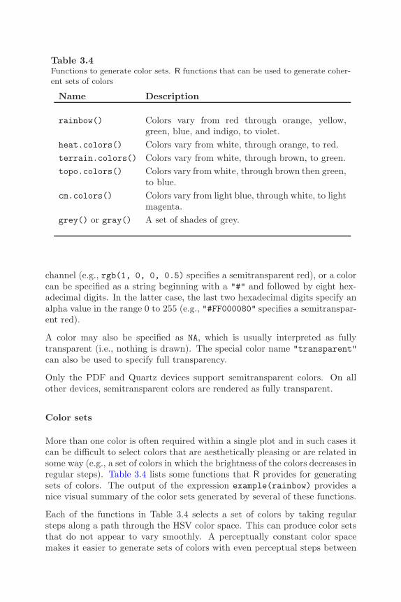
Customizing Traditional Graphics 57
Table 3.4Functions to generate color sets. R functions that can be used to generate coher-ent sets of colors
Name Description
rainbow() Colors vary from red through orange, yellow,green, blue, and indigo, to violet.
heat.colors() Colors vary from white, through orange, to red.terrain.colors() Colors vary from white, through brown, to green.topo.colors() Colors vary from white, through brown then green,
to blue.cm.colors() Colors vary from light blue, through white, to light
magenta.grey() or gray() A set of shades of grey.
channel (e.g., rgb(1, 0, 0, 0.5) specifies a semitransparent red), or a colorcan be specified as a string beginning with a "#" and followed by eight hex-adecimal digits. In the latter case, the last two hexadecimal digits specify analpha value in the range 0 to 255 (e.g., "#FF000080" specifies a semitranspar-ent red).
A color may also be specified as NA, which is usually interpreted as fullytransparent (i.e., nothing is drawn). The special color name "transparent"can also be used to specify full transparency.
Only the PDF and Quartz devices support semitransparent colors. On allother devices, semitransparent colors are rendered as fully transparent.
Color sets
More than one color is often required within a single plot and in such cases itcan be difficult to select colors that are aesthetically pleasing or are related insome way (e.g., a set of colors in which the brightness of the colors decreases inregular steps). Table 3.4 lists some functions that R provides for generatingsets of colors. The output of the expression example(rainbow) provides anice visual summary of the color sets generated by several of these functions.
Each of the functions in Table 3.4 selects a set of colors by taking regularsteps along a path through the HSV color space. This can produce color setsthat do not appear to vary smoothly. A perceptually constant color spacemakes it easier to generate sets of colors with even perceptual steps between
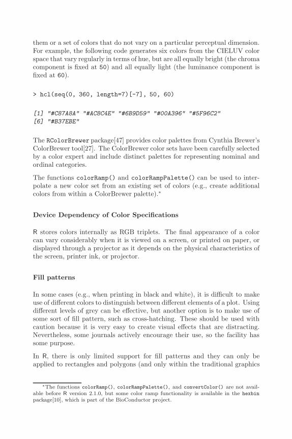
58 R Graphics
them or a set of colors that do not vary on a particular perceptual dimension.For example, the following code generates six colors from the CIELUV colorspace that vary regularly in terms of hue, but are all equally bright (the chromacomponent is fixed at 50) and all equally light (the luminance component isfixed at 60).
> hcl(seq(0, 360, length=7)[-7], 50, 60)
[1] "#C87A8A" "#AC8C4E" "#6B9D59" "#00A396" "#5F96C2"
[6] "#B37EBE"
The RColorBrewer package[47] provides color palettes from Cynthia Brewer’sColorBrewer tool[27]. The ColorBrewer color sets have been carefully selectedby a color expert and include distinct palettes for representing nominal andordinal categories.
The functions colorRamp() and colorRampPalette() can be used to inter-polate a new color set from an existing set of colors (e.g., create additionalcolors from within a ColorBrewer palette).∗
Device Dependency of Color Specifications
R stores colors internally as RGB triplets. The final appearance of a colorcan vary considerably when it is viewed on a screen, or printed on paper, ordisplayed through a projector as it depends on the physical characteristics ofthe screen, printer ink, or projector.
Fill patterns
In some cases (e.g., when printing in black and white), it is difficult to makeuse of different colors to distinguish between different elements of a plot. Usingdifferent levels of grey can be effective, but another option is to make use ofsome sort of fill pattern, such as cross-hatching. These should be used withcaution because it is very easy to create visual effects that are distracting.Nevertheless, some journals actively encourage their use, so the facility hassome purpose.
In R, there is only limited support for fill patterns and they can only beapplied to rectangles and polygons (and only within the traditional graphics
∗The functions colorRamp(), colorRampPalette(), and convertColor() are not avail-able before R version 2.1.0, but some color ramp functionality is available in the hexbin
package[10], which is part of the BioConductor project.
Customizing Traditional Graphics 59
system). It is possible to fill a rectangle or polygon with a set of lines drawnat a certain angle, with a specific separation between the lines. A densityargument controls the separation between the lines (in terms of lines per inch)and an angle argument controls the angle of the lines (in terms of degreesclockwise from 3 o’clock). Examples of the use of fill patterns are given inFigures 2.4, 3.20, and their associated code.
These settings can only be controlled via arguments to the functions rect(),polygon(), hist(), barplot(), pie(), and legend() (and not via par()).
3.2.2 Lines
There are five graphics state settings for controlling the appearance of lines.The lty setting describes the type of line to draw (solid, dashed, dotted, ...),the lwd setting describes the width of lines, and the ljoin, lend, and lmitresettings control how the ends and corners in lines are drawn (see below).
The scope of these settings again differs depending on the graphics functionbeing called. For example, for standard scatterplots, the setting only appliesto lines drawn within the plot region. In order to affect the lines drawn as partof the axes, the lty setting must be passed directly to the axis() function.
Specifying line widths
The width of lines is specified by a simple numeric value, e.g., lwd=3. Theinterpretation of this value depends on what sort of device the line is beingdrawn on. In other words, the physical width of the line may be differentwhen the line is drawn on a computer screen compared to when it is printedon a sheet of paper. On a computer screen, a line width of 1 will typicallymean one pixel. For PostScript and PDF output, a line width of 1 producesa line 0.75 points wide. The default value is 1.
Specifying line types
R graphics supports a fixed set of predefined line types, which can be specifiedby name, such as "solid" or "dashed", or as an integer index (see Figure3.6). In addition, it is possible to specify customized line types via a string ofdigits. In this case, each digit is a hexadecimal value that indicates a numberof “units” to draw either a line or a gap. Odd digits specify line lengths andeven digits specify gap lengths. For example, a dotted line is specified bylty="13", which means draw a line of length one unit then a gap of lengththree units. A unit corresponds to the current line width, so the result scaleswith line width, but is device-dependent. Up to four such line-gap pairs can
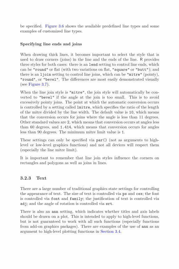
60 R Graphics
be specified. Figure 3.6 shows the available predefined line types and someexamples of customized line types.
Specifying line ends and joins
When drawing thick lines, it becomes important to select the style that isused to draw corners (joins) in the line and the ends of the line. R providesthree styles for both cases: there is an lend setting to control line ends, whichcan be "round" or flat (with two variations on flat, "square" or "butt"); andthere is an ljoin setting to control line joins, which can be "mitre" (pointy),"round", or "bevel". The differences are most easily demonstrated visually(see Figure 3.7).
When the line join style is "mitre", the join style will automatically be con-verted to "bevel" if the angle at the join is too small. This is to avoidexcessively pointy joins. The point at which the automatic conversion occursis controlled by a setting called lmitre, which specifies the ratio of the lengthof the mitre divided by the line width. The default value is 10, which meansthat the conversion occurs for joins where the angle is less than 11 degrees.Other standard values are 2, which means that conversion occurs at angles lessthan 60 degrees, and 1.414, which means that conversion occurs for anglesless than 90 degrees. The minimum mitre limit value is 1.
These settings can only be specified via par() (not as arguments to high-level or low-level graphics functions) and not all devices will respect them(especially the line mitre limit).
It is important to remember that line join styles influence the corners onrectangles and polygons as well as joins in lines.
3.2.3 Text
There are a large number of traditional graphics state settings for controllingthe appearance of text. The size of text is controlled via ps and cex; the fontis controlled via font and family; the justification of text is controlled viaadj; and the angle of rotation is controlled via srt.
There is also an ann setting, which indicates whether titles and axis labelsshould be drawn on a plot. This is intended to apply to high-level functions,but is not guaranteed to work with all such functions (especially functionsfrom add-on graphics packages). There are examples of the use of ann as anargument to high-level plotting functions in Section 3.4.

Customizing Traditional Graphics 61
Integer Sample line String
Predefined0 "blank"1 "solid"2 "dashed"3 "dotted"4 "dotdash"5 "longdash"6 "twodash"
Custom"13""F8""431313""22848222"
Figure 3.6Predefined and custom line types. Line type may be specified as a predefined integer,as a predefined string name, or as a string of hexadecimal characters specifying acustom line type.

62 R Graphics
Figure 3.7Line join and line ending styles. Three thick lines have been drawn through thesame three points (indicated by black circles), but with different line end and linejoin styles. The black line was drawn first with "square" ends and "mitre" joins;the dark grey line was drawn on top of the black line with "round" ends and "round"
joins; and the light grey line was drawn on top of that with "butt" ends and "bevel"
joins.
Justification of text
The adj setting is a value from 0 to 1 indicating the horizontal justificationof text strings (0 means left-justified, 1 means right-justified and a value of0.5 centers text).
The meaning of the adj setting depends on whether text is being drawn inthe plot region, in the figure margins, or in the outer margins. In the plotregion, the justification is relative to the (x, y) location at which the textis being drawn. In this context, it is also possible to specify two values forthe setting and the second value is taken as a vertical justification for thetext. Furthermore, non-finite values (NA, NaN, or Inf) may be specified forthe justification and this is taken to mean “exact” centering. There is onlya difference between a justification value of 0.5 and a non-finite justificationvalue for vertical justification. In this case, a setting of 0.5 means text isvertically centered based on the height of the text above the text baseline(i.e., ignoring “descenders” like the tail on a “y”). A non-finite value meansthat text is vertically centered based on the full height of the text (includingdescenders). Figure 3.8 shows how various adj settings affect the alignmentof text in the plot region.
In the figure margins and outer margins, the meaning of the adj setting
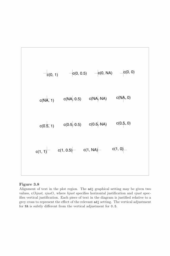
Customizing Traditional Graphics 63
c(1, 1)
c(0.5, 1)
c(NA, 1)
c(0, 1)
c(1, 0.5)
c(0.5, 0.5)
c(NA, 0.5)
c(0, 0.5)
c(1, NA)
c(0.5, NA)
c(NA, NA)
c(0, NA)
c(1, 0)
c(0.5, 0)
c(NA, 0)
c(0, 0)
Figure 3.8Alignment of text in the plot region. The adj graphical setting may be given twovalues, c(hjust, vjust), where hjust specifies horizontal justification and vjust spec-ifies vertical justification. Each piece of text in the diagram is justified relative to agrey cross to represent the effect of the relevant adj setting. The vertical adjustmentfor NA is subtly different from the vertical adjustment for 0.5.

64 R Graphics
depends on the las setting. When margin text is parallel to the axis, adjspecifies both the location and the justification of the text. For example, avalue of 0 means that the text is left-justified and that the text is located atthe left end of the margin. When text is perpendicular to the axis, the adjsetting only affects justification. Furthermore, the adj setting only affects“horizontal” justification (justification in the reading direction) for text in themargins.
Rotating text
The srt setting specifies a rotation angle clockwise from the positive x-axis,in degrees (not radians). This will only affect text drawn in the plot region(text drawn by the text() function). Text can be drawn at any angle withinthe plot region.
In the figure and outer margins, text may only be drawn at angles that aremultiples of 90◦, and this angle is controlled by the las setting. A value of0 means text is always drawn parallel to the relevant axis (i.e., horizontal inmargins 1 and 3, and vertical in margins 2 and 4). A value of 1 means text isalways horizontal, 2 means text is always perpendicular to the relevant axis,and 3 means text is always vertical. This setting interacts with or overridesthe adj and srt settings.
Text size
The size of text is ultimately a numerical value specifying the size of the fontin“points.” The font size is controlled by two settings: ps specifies an absolutefont size setting (e.g., ps=9), and cex specifies a multiplicative modifier (e.g.,cex=1.5). The final font size specification is simply fontsize * cex. Onsome devices, the font size that is specified will not be honored exactly. Forexample, when drawing in an X11 window with bitmap fonts, there are onlya finite set of font sizes available and this set will vary depending on whichfonts are installed. For the PostScript and PDF formats, font sizes should beaccurate.
As with specifying color, the scope of a cex setting can vary depending onwhere it is given. When cex is specified via par(), it affects most text.However, when cex is specified via plot(), it only affects the size of datasymbols. There are special settings for controlling the size of text that is drawnas axis tick labels (cex.axis), text that is drawn as axis labels (cex.lab),text in the title (cex.main), and text in the sub-title (cex.sub). Finally, thereis a tmag setting for controlling the amount to magnify title text relative toother plot labels.

Customizing Traditional Graphics 65
Multi-line text
It is possible to draw text that spans several lines, by inserting a new lineescape sequence, "\n", within a piece of text, as in the following example.
"first line\nsecond line"
The spacing between lines is controlled by the lheight setting, which is a mul-tiplier applied to the natural height of a line of text. For example, lheight=2specifies double-spaced text. This setting can only be specified via par().
Specifying fonts
Specifying an exact font may involve several pieces of information and is verydevice-specific. A font is usually part of a font “family” (e.g. Helvetica orCourier) and is a particular “face” within that family (e.g., bold or italic).It is also possible to specify things like the font format (e.g., TrueType orComputer Modern), the font encoding (e.g., ISO Latin 1), and even the fontfoundry or designer (e.g., Adobe or Sun Microsystems).
In R graphics, it is possible to specify the font face and a font family. Onsome devices, the latter can include extra details such as encoding.
The font face is specified via the font setting as an integer (Table 3.5 showsthe possible values). As with color and text size, the font setting applies onlyto text drawn in the plot region. There are additional settings specifically foraxes (font.axis), labels (font.lab), and titles (font.main and font.sub).
Every graphics device establishes a default font family, which is usually asans serif font such as Helvetica or Arial. A new font family is specified viathe family setting using a device-independent name. The names "sans","serif", "mono", and "symbol" are available for the most common devices∗
and provide a sans serif font, a serif font, a monospaced font, and a symbolfont respectively (see Table 3.6).
Figure 3.9 demonstrates the 16 basic font family and face combinations.†
The device-independent font name is mapped to a device-dependent font fam-ily by individual devices. These mappings can be modified and new fontnames and mappings defined using functions such as postscriptFont() andpostscriptFonts().
∗Windows, X11, Quartz, PDF, and PostScript.†The fact that there is a font specification provided for all standard devices does not
mean that a matching font will always be available. There can be significant differencesbetween operating systems and locales in terms of which fonts are installed by default.

66 R Graphics
Table 3.5Possible font face specifications in traditional graphics. The font face mustbe specified as an integer, usually between 1 and 4. The special value 5
indicates that a symbol font should be used. The range of valid font facesvaries for different Hershey fonts, but the maximum valid value is usually4 or less. When the font family is "HersheySerif", there are a number ofspecial font faces available.
Integer Description
1 Roman or upright face2 Bold face3 Slanted or italic face4 Bold and slanted face5 Symbol
For the HersheySerif font family5 Cyrillic font6 Slanted Cyrillic font7 Japanese characters
Table 3.6Device-independent and Hershey font families that are distributedwith R. A font family is specified as a string
Name Description
Device-independent fonts"serif" Serif variable-width font"sans" Sans-serif variable-width font"mono" Mono-spaced “typewriter” font"symbol" Symbol font
Hershey fonts"HersheySerif" Serif variable-width font"HersheySans" Sans-serif variable-width font"HersheyScript" Serif “handwriting” font"HersheyGothicEnglish" Gothic script font"HersheyGothicGerman" Gothic script font"HersheyGothicItalian" Gothic script font"HersheySymbol" Serif symbol font"HersheySansSymbol" Sans-serif symbol font
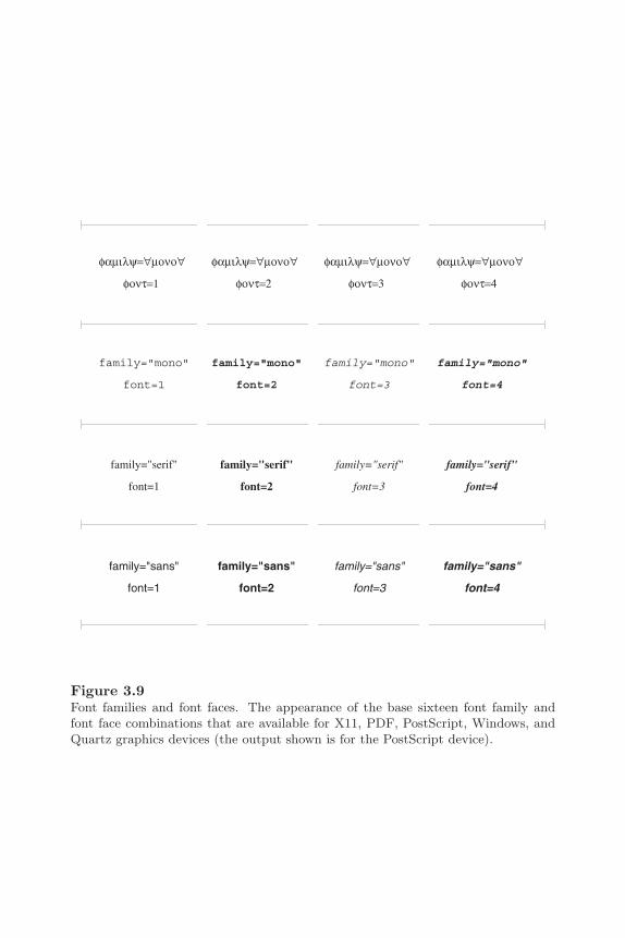
Customizing Traditional Graphics 67
Figure 3.9Font families and font faces. The appearance of the base sixteen font family andfont face combinations that are available for X11, PDF, PostScript, Windows, andQuartz graphics devices (the output shown is for the PostScript device).
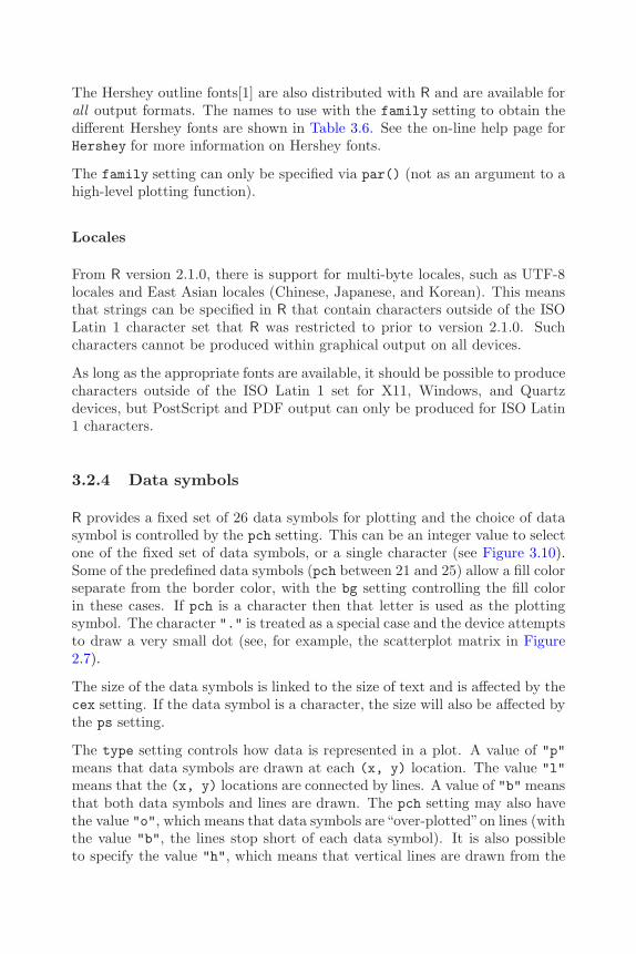
68 R Graphics
The Hershey outline fonts[1] are also distributed with R and are available forall output formats. The names to use with the family setting to obtain thedifferent Hershey fonts are shown in Table 3.6. See the on-line help page forHershey for more information on Hershey fonts.
The family setting can only be specified via par() (not as an argument to ahigh-level plotting function).
Locales
From R version 2.1.0, there is support for multi-byte locales, such as UTF-8locales and East Asian locales (Chinese, Japanese, and Korean). This meansthat strings can be specified in R that contain characters outside of the ISOLatin 1 character set that R was restricted to prior to version 2.1.0. Suchcharacters cannot be produced within graphical output on all devices.
As long as the appropriate fonts are available, it should be possible to producecharacters outside of the ISO Latin 1 set for X11, Windows, and Quartzdevices, but PostScript and PDF output can only be produced for ISO Latin1 characters.
3.2.4 Data symbols
R provides a fixed set of 26 data symbols for plotting and the choice of datasymbol is controlled by the pch setting. This can be an integer value to selectone of the fixed set of data symbols, or a single character (see Figure 3.10).Some of the predefined data symbols (pch between 21 and 25) allow a fill colorseparate from the border color, with the bg setting controlling the fill colorin these cases. If pch is a character then that letter is used as the plottingsymbol. The character "." is treated as a special case and the device attemptsto draw a very small dot (see, for example, the scatterplot matrix in Figure2.7).
The size of the data symbols is linked to the size of text and is affected by thecex setting. If the data symbol is a character, the size will also be affected bythe ps setting.
The type setting controls how data is represented in a plot. A value of "p"means that data symbols are drawn at each (x, y) location. The value "l"means that the (x, y) locations are connected by lines. A value of "b" meansthat both data symbols and lines are drawn. The pch setting may also havethe value "o", which means that data symbols are“over-plotted”on lines (withthe value "b", the lines stop short of each data symbol). It is also possibleto specify the value "h", which means that vertical lines are drawn from the

Customizing Traditional Graphics 69
0 1 2 3 4 5
6 7 8 9 10 11
12 13 14 15 16 17
18 19 20 21 22 23
24 25 AA bb . ##
Figure 3.10Data symbols available in R. A particular data symbol is selected by specifying aninteger between 0 and 25 or a single character for the pch graphical setting. In thediagram, the relevant integer or character pch value is shown in grey to the left ofthe relevant symbol.
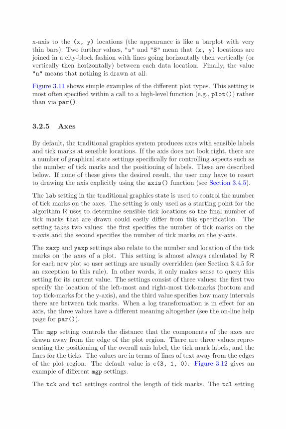
70 R Graphics
x-axis to the (x, y) locations (the appearance is like a barplot with verythin bars). Two further values, "s" and "S" mean that (x, y) locations arejoined in a city-block fashion with lines going horizontally then vertically (orvertically then horizontally) between each data location. Finally, the value"n" means that nothing is drawn at all.
Figure 3.11 shows simple examples of the different plot types. This setting ismost often specified within a call to a high-level function (e.g., plot()) ratherthan via par().
3.2.5 Axes
By default, the traditional graphics system produces axes with sensible labelsand tick marks at sensible locations. If the axis does not look right, there area number of graphical state settings specifically for controlling aspects such asthe number of tick marks and the positioning of labels. These are describedbelow. If none of these gives the desired result, the user may have to resortto drawing the axis explicitly using the axis() function (see Section 3.4.5).
The lab setting in the traditional graphics state is used to control the numberof tick marks on the axes. The setting is only used as a starting point for thealgorithm R uses to determine sensible tick locations so the final number oftick marks that are drawn could easily differ from this specification. Thesetting takes two values: the first specifies the number of tick marks on thex-axis and the second specifies the number of tick marks on the y-axis.
The xaxp and yaxp settings also relate to the number and location of the tickmarks on the axes of a plot. This setting is almost always calculated by Rfor each new plot so user settings are usually overridden (see Section 3.4.5 foran exception to this rule). In other words, it only makes sense to query thissetting for its current value. The settings consist of three values: the first twospecify the location of the left-most and right-most tick-marks (bottom andtop tick-marks for the y-axis), and the third value specifies how many intervalsthere are between tick marks. When a log transformation is in effect for anaxis, the three values have a different meaning altogether (see the on-line helppage for par()).
The mgp setting controls the distance that the components of the axes aredrawn away from the edge of the plot region. There are three values repre-senting the positioning of the overall axis label, the tick mark labels, and thelines for the ticks. The values are in terms of lines of text away from the edgesof the plot region. The default value is c(3, 1, 0). Figure 3.12 gives anexample of different mgp settings.
The tck and tcl settings control the length of tick marks. The tcl setting

Customizing Traditional Graphics 71
type="p" type="l"
type="b" type="o"
type="h" type="s"
Figure 3.11Basic plot types. Plotting the same data with different plot type settings. Ineach case, the output is produced by an expression of the form plot(x, y,
type=something), where the relevant value of type is shown above each plot.

72 R Graphics
mgp=c(3, 1, 0)
xaxs="r"
tcl=−0.5
0.0 0.5 1.0
X−axis Label
mgp=c(3, 1, 0)
xaxs="i"
tcl=−0.5
0.0 0.5 1.0
X−axis Label
mgp=c(2, 0.3, 0)
xaxs="r"
tcl=0.3
0.0 0.5 1.0
X−axis Label
Figure 3.12Different axis styles. The top-left plot demonstrates the default axis settings foran x-axis. The top-right plot shows the effect of specifying an “internal” axis rangecalculation and the bottom-left plot shows the effects of specifying different positionsfor the axis labels and different lengths for the tick marks.
Customizing Traditional Graphics 73
specifies the length of tick marks as a fraction of the height of a line of text.The sign dictates the direction of the tick marks — a negative value drawstick marks outside the plot region and a positive value draws tick marks insidethe plot region. The tck setting specifies tick mark lengths as a fraction ofthe smaller of the physical width or height of the plotting region, but it isonly used if its value is not NA (and it is NA by default). Figure 3.12 gives anexample of different tcl settings.
The xaxs and yaxs settings control the “style” of the axes of a plot. Bydefault, the setting is "r", which means that R calculates the range of valueson the axis to be wider than the range of the data being plotted (so that datasymbols do not collide with the boundaries of the plot region). It is possibleto make the range of values on the axis exactly match the range of values inthe data, by specifying the value "i". This can be useful if the range of valueson the axes are being explicitly controlled via xlim or ylim arguments to afunction. Figure 3.12 gives an example of different xaxs settings.
The xaxt and yaxt settings control the “type” of axes. The default value,"s", means that the axis is drawn. Specifying a value of "n" means that theaxis is not drawn.
The xlog and ylog settings control the transformation of values on the axes.The default value is FALSE, which means that the axes are linear and valuesare not transformed. If this value is TRUE then a logarithmic transformationis applied to any values on the relevant dimension in the plot region. Thisalso affects the calculation of tick mark locations on the axes.
When data of a special nature are being plotted (e.g., time series data), someof these settings may not apply (and may not have any sensible interpretation).
The bty setting is not strictly to do with axes, but it controls the outputof the box() function, which is most commonly used in conjunction withdrawing axes. This function draws a bounding box around the edges of theplot region (by default). The bty setting controls the type of box that thebox() function draws. The value can be "n", which means that no box isdrawn, or it can be one of "o", "l", "7", "c", "u", or "]", which means thatthe box drawn resembles the corresponding uppercase character. For example,bty="c" means that the bottom, left, and top borders will be drawn, but theright border will not be drawn.
In addition to these graphics state settings, many high-level plotting functions,e.g., plot(), provide arguments xlim and ylim to control the range of thescale on the axes. Section 2.2.2 has an example.
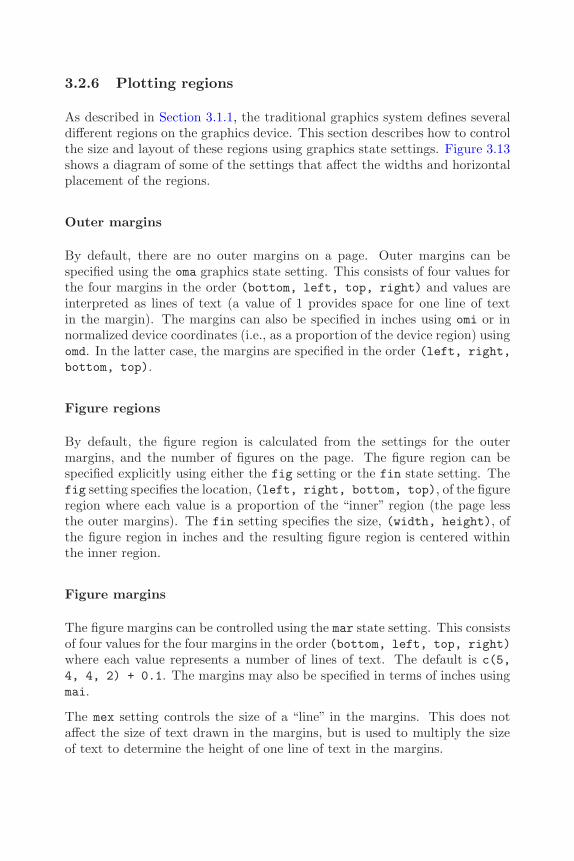
74 R Graphics
3.2.6 Plotting regions
As described in Section 3.1.1, the traditional graphics system defines severaldifferent regions on the graphics device. This section describes how to controlthe size and layout of these regions using graphics state settings. Figure 3.13shows a diagram of some of the settings that affect the widths and horizontalplacement of the regions.
Outer margins
By default, there are no outer margins on a page. Outer margins can bespecified using the oma graphics state setting. This consists of four values forthe four margins in the order (bottom, left, top, right) and values areinterpreted as lines of text (a value of 1 provides space for one line of textin the margin). The margins can also be specified in inches using omi or innormalized device coordinates (i.e., as a proportion of the device region) usingomd. In the latter case, the margins are specified in the order (left, right,bottom, top).
Figure regions
By default, the figure region is calculated from the settings for the outermargins, and the number of figures on the page. The figure region can bespecified explicitly using either the fig setting or the fin state setting. Thefig setting specifies the location, (left, right, bottom, top), of the figureregion where each value is a proportion of the “inner” region (the page lessthe outer margins). The fin setting specifies the size, (width, height), ofthe figure region in inches and the resulting figure region is centered withinthe inner region.
Figure margins
The figure margins can be controlled using the mar state setting. This consistsof four values for the four margins in the order (bottom, left, top, right)where each value represents a number of lines of text. The default is c(5,4, 4, 2) + 0.1. The margins may also be specified in terms of inches usingmai.
The mex setting controls the size of a “line” in the margins. This does notaffect the size of text drawn in the margins, but is used to multiply the sizeof text to determine the height of one line of text in the margins.
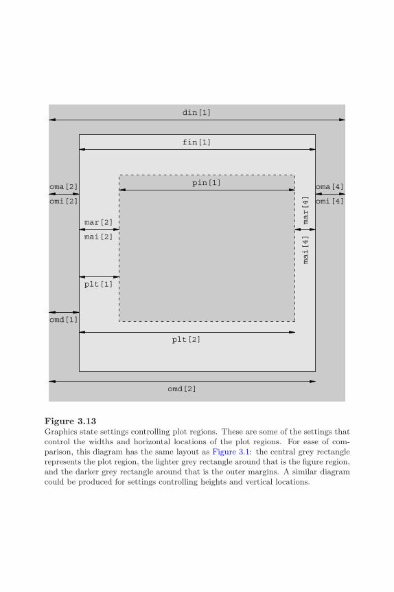
Customizing Traditional Graphics 75
din[1]
omi[2]
oma[2]
omi[4]
oma[4]
omd[1]
omd[2]
fin[1]
mai[2]
mar[2]
mai[4]
mar[4]
plt[1]
plt[2]
pin[1]
Figure 3.13Graphics state settings controlling plot regions. These are some of the settings thatcontrol the widths and horizontal locations of the plot regions. For ease of com-parison, this diagram has the same layout as Figure 3.1: the central grey rectanglerepresents the plot region, the lighter grey rectangle around that is the figure region,and the darker grey rectangle around that is the outer margins. A similar diagramcould be produced for settings controlling heights and vertical locations.

76 R Graphics
Plot regions
By default, the plot region is calculated from the figure region less the figuremargins. The location and size of the plot region may be controlled explicitlyusing the plt, pin, or pty settings. The plt setting allows the user to specifythe location of the plot region, (left, right, bottom, top), where eachvalue is a proportion of current figure region. The pin setting specifies thesize of the plot region, (width, height), in terms of inches. The pty settingcontrols how much of the available space (figure region less figure margins)that the plot region occupies. The default value is "m", which means that theplot region occupies all of the available space. A value of "s" means that theplot region will take up as much of the available space as possible, but it mustbe “square” (i.e., its physical width will be the same as its physical height).
3.2.7 Clipping
Traditional graphics output is usually clipped to the plot region. This meansthat any output that would appear outside the plot region is not drawn. Forexample, in the default behavior, data symbols for (x, y) locations whichlie outside the plot region are not drawn. Traditional graphics functions thatdraw in the margins clip output to the current figure region or to the device.Section 3.4 has information about which functions draw in which regions.
It can be useful to override the default clipping region. For example, thisis necessary to draw a legend outside the plot region using the legend()function.
The traditional clipping region is controlled via the xpd setting. Clipping canoccur either to the whole device (an xpd value of NA), to the current figureregion (a value of TRUE), or to the current plot region (a value of FALSE, whichis the default).
3.2.8 Moving to a new plot
As described in Section 2.1, high-level graphics functions usually start a newplot. There are traditional graphics state settings that control exactly whenand how this happens.
The ask setting controls whether the user is prompted before the graphicssystem starts a new page of output. It is useful for viewing multiple pages ofoutput (e.g., the output from example(boxplot)) that otherwise flick by toofast to view properly. If the ask setting is TRUE then the user is promptedbefore a new page of output is begun.
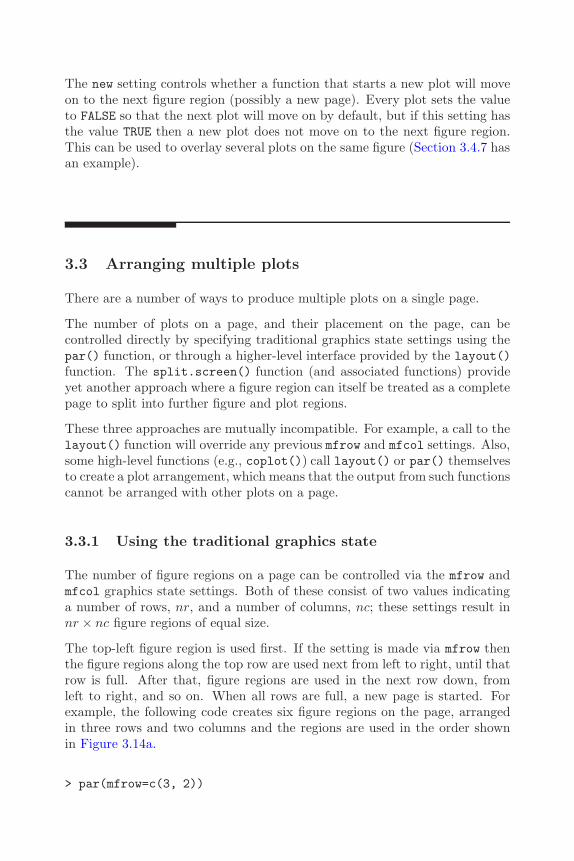
Customizing Traditional Graphics 77
The new setting controls whether a function that starts a new plot will moveon to the next figure region (possibly a new page). Every plot sets the valueto FALSE so that the next plot will move on by default, but if this setting hasthe value TRUE then a new plot does not move on to the next figure region.This can be used to overlay several plots on the same figure (Section 3.4.7 hasan example).
3.3 Arranging multiple plots
There are a number of ways to produce multiple plots on a single page.
The number of plots on a page, and their placement on the page, can becontrolled directly by specifying traditional graphics state settings using thepar() function, or through a higher-level interface provided by the layout()function. The split.screen() function (and associated functions) provideyet another approach where a figure region can itself be treated as a completepage to split into further figure and plot regions.
These three approaches are mutually incompatible. For example, a call to thelayout() function will override any previous mfrow and mfcol settings. Also,some high-level functions (e.g., coplot()) call layout() or par() themselvesto create a plot arrangement, which means that the output from such functionscannot be arranged with other plots on a page.
3.3.1 Using the traditional graphics state
The number of figure regions on a page can be controlled via the mfrow andmfcol graphics state settings. Both of these consist of two values indicatinga number of rows, nr, and a number of columns, nc; these settings result innr × nc figure regions of equal size.
The top-left figure region is used first. If the setting is made via mfrow thenthe figure regions along the top row are used next from left to right, until thatrow is full. After that, figure regions are used in the next row down, fromleft to right, and so on. When all rows are full, a new page is started. Forexample, the following code creates six figure regions on the page, arrangedin three rows and two columns and the regions are used in the order shownin Figure 3.14a.
> par(mfrow=c(3, 2))

78 R Graphics
If the setting is made via mfcol, figure regions are used by column instead ofby row.
The order in which figure regions are used can be controlled by using the mfgsetting to specify the next figure region. This setting consists of two valuesthat indicate the row and column of the next figure to use.
3.3.2 Layouts
The layout() function provides an alternative to the mfrow and mfcol set-tings. The primary difference is that the layout() function allows the creationof multiple figure regions of unequal sizes.
The simple idea underlying the layout() function is that it divides the innerregion of the page into a number of rows and columns, but the heights of rowsand the widths of columns can be independently controlled, and a figure canoccupy more than one row or more than one column.∗
The first argument (and the only required argument) to the layout() functionis a matrix. The number of rows and columns in the matrix determines thenumber of rows and columns in the layout.
The contents of the matrix are integer values that determine which rows andcolumns each figure will occupy. The following layout specification is identicalto par(mfrow=c(3, 2)).
> layout(matrix(c(1, 2, 3, 4, 5, 6), byrow=TRUE, ncol=2))
It may be easier to imagine the arrangement of figure regions if the matrixis specified using cbind() or rbind(). The code below repeats the previousexample, but uses rbind() to specify the layout matrix.
> layout(rbind(c(1, 2),c(3, 4),c(5, 6)))
The function layout.show() may be helpful for visualizing the figure regionsthat are created. The following code creates a figure visualizing the layoutcreated in the previous example (see Figure 3.14a).
> layout.show(6)
∗The underlying concept of a “layout”[43] is also implemented, in a slightly differentand more general way, in the grid graphics system (see Section 5.5.6)
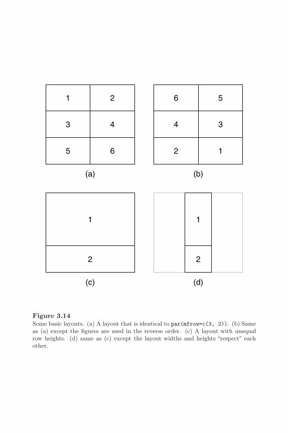
Customizing Traditional Graphics 79
1 2
3 4
5 6
(a)
6 5
4 3
2 1
(b)
1
2
(c)
1
2
(d)
Figure 3.14Some basic layouts. (a) A layout that is identical to par(mfrow=c(3, 2)). (b) Sameas (a) except the figures are used in the reverse order. (c) A layout with unequalrow heights. (d) same as (c) except the layout widths and heights “respect” eachother.

80 R Graphics
The contents of the layout matrix determine the order in which the resultingfigure regions will be used. The following code creates a layout with exactlythe same rows and columns as the previous one, but the figure regions will beused in the reverse order (see Figure 3.14b).
> layout(rbind(c(6, 5),c(4, 3),c(2, 1)))
By default, all row heights are the same and all column widths are the samesize and the available inner region is divided up equally. The heights argu-ments can be used to specify that certain rows are given a greater portionof the available height (for all of what follows, the widths argument worksanalogously for column widths). When the available height is divided up, theproportion of the available height given to each row is determined by dividingthe row heights by the sum of the row heights. For example, in the followinglayout there are two rows and one column. The top row is given two-thirdsof the available height (2/(2 + 1)) and the bottom row is given one third(1/(2 + 1)). Figure 3.14c shows the resulting layout.
> layout(matrix(c(1, 2)), heights=c(2, 1))
In the examples so far, the division of row heights has been completely in-dependent of the division of column widths. The widths and heights can beforced to correspond as well so that, for example, a height of 1 correspondsto the same physical distance as a width of 1. This allows control over theaspect ratio of the resulting figure. The respect argument is used to forcethis correspondence. The following code is the same as the previous exampleexcept that the respect argument is set to TRUE (see Figure 3.14d).
> layout(matrix(c(1, 2)), heights=c(2, 1),respect=TRUE)
It is also possible to specify heights of rows and widths of columns in absoluteterms. The lcm() function can be used to specify heights and widths for alayout in terms of centimeters. The following code is the same as the previousexample, except that a third, empty, region is created to provide a verticalgap of 0.5cm between the two figures (see Figure 3.15a). The 0 in the firstmatrix argument means that no figure will ever occupy that region.
> layout(matrix(c(1, 0, 2)),heights=c(2, lcm(0.5), 1),respect=TRUE)
Customizing Traditional Graphics 81
1
2
(a)
1
2
3
(b)
1
2
3
(c)
Figure 3.15Some more complex layouts. (a) A layout with a row height specified in centimeters.(b) A layout with a figure occupying more than one column. (c) Same as (b), butwith only column 1 and row 3 respected.
82 R Graphics
This next piece of code demonstrates that a figure may occupy more than onerow or column in the layout. This extends the previous example by adding asecond column and creating a figure region that occupies both columns of thebottom row. In the matrix argument, the value 2 appears in both columns ofrow 3 (see Figure 3.15b).
> layout(rbind(c(1, 3),c(0, 0),c(2, 2)),
heights=c(2, lcm(0.5), 1),respect=TRUE)
Finally, it is possible to specify that only certain rows and columns shouldrespect each other’s heights/widths. This is done by specifying a matrix forthe respect argument. In the following code, the previous example is modifiedby specifying that only the first column and the last row should respect eachother’s widths/heights. In this case, the effect is to ensure that the width offigure region 1 is the same as the height of figure region 2, but the width offigure region 3 is free to expand to the available width (see Figure 3.15c).
> layout(rbind(c(1, 3),c(0, 0),c(2, 2)),
heights=c(2, lcm(0.5), 1),respect=rbind(c(0, 0),
c(0, 0),c(1, 0)))
3.3.3 The split-screen approach
The split.screen() function provides yet another way to divide the pageinto a number of figure regions. The first argument, figs, is either twovalues specifying a number of rows and columns of figures (i.e., like themfrow setting), or a matrix containing a figure region location, (left, right,bottom, top), on each row (i.e., like a fig setting on each row).
Having established figure regions in this manner, a figure region is used bycalling the screen() function to select a region. This means that the orderin which figures are used is completely under the user’s control, and it ispossible to reuse a figure region, though there are dangers in doing so (theon-line help for split.screen() discusses this some more). The functionerase.screen() can be used to clear a defined screen and close.screen()can be used to remove one or more screen definitions.

Customizing Traditional Graphics 83
An even more useful feature of this approach is that each figure region canitself be divided up by a further call to split.screen(). This allows complexarrangements of plots to be created.
The downside to this approach is that it does not fit very nicely with theunderlying traditional graphics system model (see Section 3.1). The recom-mended way to achieve complex arrangements of plots is via the layout()function (see Section 3.3.2) or by using the grid graphics system (see Part II),possibly in combination with traditional high-level functions (see AppendixB).
3.4 Annotating plots
Sometimes it is not enough to be able to modify the default output fromhigh-level functions and in many situations, further graphical output must beadded to achieve the desired result (see, for example, Figure 1.3). R graphicsin general is fundamentally oriented to supporting the annotation of plots —the ability to add graphical output to an existing plot. In particular, theregions and coordinate systems used in the construction of a plot are alsoavailable for adding further output to the plot. For example, it is possible toposition a text label relative to the scales on the axes of a plot.
3.4.1 Annotating the plot region
Most graphics functions that add output to an existing plot, add the outputto the plot region, relative to the user coordinate system.
Graphical primitives
This section describes the graphics functions that provide the most basicgraphics output (lines, rectangles, text, etc).
The most common use of this facility is to plot additional sets of data withina plot. The lines() function draws lines between (x, y) locations, and thepoints() function draws data symbols at (x, y) locations. The followingcode demonstrates a common situation where three different sets of y-values,recorded at the same set of x-values, are plotted together on the same plot(see the top-left plot in Figure 3.16).

84 R Graphics
points() & lines()
bottom
left
top
right
overlay
text()
rect() & poly()
Figure 3.16Annotating the plot region of a traditional graphics plot. The top-left plot showspoints and extra lines being added to an initial line plot. The top-right plot showstext being added to an initial scatterplot. The bottom-left plot shows a dashedrectangle and a polygon being added to an initial scatterplot. Axes and labels havebeen omitted from the plots in order to avoid clutter.

Customizing Traditional Graphics 85
First some data are generated, consisting of one set of x values and three setsof y values, and the first set of y values are plotted as a grey line (type="l"and col="grey").
> x <- 1:10> y <- matrix(sort(rnorm(30)), ncol=3)> plot(x, y[,1], ylim=range(y), ann=FALSE, axes=FALSE,
type="l", col="grey")> box(col="grey")
Now a set of points are added for the first set of y values, then lines and pointsare added for the other two sets of y values.
> points(x, y[,1])> lines(x, y[,2], col="grey")> points(x, y[,2], pch=2)> lines(x, y[,3], col="grey")> points(x, y[,3], pch=3)
The lines() function typically draws a single line through many points(though NA values in the (x, y) locations will create breaks in the line). Analternative is provided by the segments() function, which will draw severaldifferent straight lines between pairs of end points.
It is also possible to draw text at (x, y) locations. This is useful for labelingdata locations, particularly using the pos argument to offset the text so thatit does not overlay any data symbols. The following code creates a diagramdemonstrating the use of text() (see the top-right plot in Figure 3.16). Again,some data are created and (grey) data symbols are plotted at the (x, y)locations.
> x <- c(4, 5, 2, 1)> y <- x> plot(x, y, ann=FALSE, axes=FALSE, col="grey", pch=16)> points(3, 3, col="grey", pch=16)> box(col="grey")
Now some text labels are added, with each one offset in a different way fromthe (x, y) location. Notice that the arguments to text() may be vectors sothat several pieces of text are drawn by the one function call.
> text(x, y, c("bottom", "left", "top", "right"), pos=1:4)> text(3, 3, "overlay")
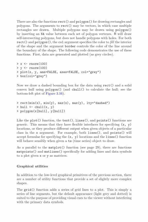
86 R Graphics
There are also the functions rect() and polygon() for drawing rectangles andpolygons. The arguments to rect() may be vectors, in which case multiplerectangles are drawn. Multiple polygons may be drawn using polygon()by inserting an NA value between each set of polygon vertexes. R will drawself-intersecting polygons, but does not handle polygons with holes. For bothrect() and polygon(), the col argument specifies the color to fill the interiorof the shape and the argument border controls the color of the line aroundthe boundary of the shape. The following code demonstrates the use of thesefunctions. First, data are generated and plotted (as grey circles).
> x <- rnorm(100)> y <- rnorm(100)> plot(x, y, ann=FALSE, axes=FALSE, col="grey")> box(col="grey")
Now we draw a dashed bounding box for the data using rect() and a solidconvex hull using polygon() (and chull() to calculate the hull; see thebottom-left plot of Figure 3.16).
> rect(min(x), min(y), max(x), max(y), lty="dashed")> hull <- chull(x, y)> polygon(x[hull], y[hull])
Like the plot() function, the text(), lines(), and points() functions aregeneric. This means that they have flexible interfaces for specifying (x, y)locations, or they produce different output when given objects of a particularclass in the x argument. For example, both lines(), and points() willaccept formulae for specifying the (x, y) locations and the lines() functionwill behave sensibly when given a ts (time series) object to draw.
As a parallel to the matplot() function (see page 29), there are functionsmatpoints() and matlines() specifically for adding lines and data symbolsto a plot given x or y as matrices.
Graphical utilities
In addition to the low-level graphical primitives of the previous section, thereare a number of utility functions that provide a set of slightly more complexshapes.
The grid() function adds a series of grid lines to a plot. This is simply aseries of line segments, but the default appearance (light grey and dotted) issuited to the purpose of providing visual cues to the viewer without interferingwith the primary data symbols.

Customizing Traditional Graphics 87
Line of best fit
abline() & arrows() rug()
Figure 3.17More examples of annotating the plot region of a traditional graphics plot. Theleft-hand plot shows a line of best fit (plus a text label and arrow) being added toan initial scatterplot. The right-hand plot shows a series of ticks being added as arug plot on an initial histogram.
The abline() function provides a number of convenient ways to add a line(or lines) to a plot. The line(s) can be specified either by a slope and y-axis intercept, or as a series of x-locations for vertical lines or y-locations forhorizontal lines. The function will also accept the coefficients from a linearregression analysis (even as an lm object), thereby providing a simple way toadd a line of best fit to a scatterplot.
The arrows() function draws line segments and augments them with simplearrowheads at either end. The following code annotates a basic scatterplotwith a line and arrows (see the left plot of Figure 3.17).
First, some data are generated and plotted.
> x <- runif(20, 1, 10)> y <- x + rnorm(20)> plot(x, y, ann=FALSE, axes=FALSE, col="grey", pch=16)> box(col="grey")
Now a line of best fit is drawn through the data using abline() and a textlabel and arrow are added using text() and arrows().

88 R Graphics
> lmfit <- lm(y ~ x)> abline(lmfit)> arrows(5, 8, 7, predict(lmfit, data.frame(x=7)),
length=0.1)> text(5, 8, "Line of best fit", pos=2)
The box() function draws a rectangle around the boundary of the plot region.The which argument makes it possible to draw the rectangle around the cur-rent figure region, inner region, or outer region instead. The box() functionhas been used in each of the examples in this section.
The rug() function produces a“rug”plot along one of the axes, which consistsof a series of tick marks representing data locations. This can be useful torepresent an additional one-dimensional plot of data (e.g., in combinationwith a density curve). The following code uses this function to annotate ahistogram (see the right plot of Figure 3.17).
> y <- rnorm(50)> hist(y, main="", xlab="", ylab="", axes=FALSE,
border="grey", col="light grey")> box(col="grey")> rug(y, ticksize=0.02)
3.4.2 Missing values and non-finite values
R has special values representing missing observations (NA) and non-finitevalues (NaN and Inf). Most traditional graphics functions allow such valueswithin (x, y) locations and handle them by not drawing the relevant location.For drawing data symbols or text, this means the relevant data symbol or pieceof text will not be drawn. For drawing lines, this means that lines to or fromthe relevant location are not drawn; a gap is created in the line. For drawingrectangles, an entire rectangle will not be drawn if any of the four boundarylocations are missing or non-finite.
Polygons are a slightly more complex case. For drawing polygons, a missingor non-finite value in x or y is interpreted as the end of one polygon and thestart of another. Figure 3.18 shows an example. On the left, a polygon isdrawn through 12 locations evenly spaced around a circle. On the right, thefirst, fifth, and ninth locations have been set to NA so the output is split intothree separate polygons.
Missing or non-finite values can also be specified for some traditional graphicsstate settings. For example, if a color setting is missing or non-finite then

Customizing Traditional Graphics 89
NA
NA
NA
Figure 3.18Drawing polygons using the polygon() function. On the left, a single polygon(dodecagon) is produced from multiple (x, y) locations. On the right, the first,fifth, and ninth values have been set to NA, which splits the output into three separatepolygons.
nothing is drawn (this is a brute-force way to specify a completely transparentcolor). Similarly, specifying a missing value or non-finite value for cex meansthat the relevant data symbol or piece of text is not drawn.
3.4.3 Annotating the margins
There are only two functions that produce output in the figure or outer mar-gins, relative to the margin coordinate systems (Section 3.1.1).
The mtext() function draws text at any location in any of the margins. Theouter argument controls whether output goes in the figure or outer margins.The side argument determines which margin to draw in: 1 means the bottommargin, 2 means the left margin, 3 means the top margin, and 4 means theright margin.
Text is drawn a number of lines of text away from the edges of the plot regionfor figure margins, or a number of lines away from the edges of the inner regionfor outer margins. In the figure margins, the location of the text along themargin can be specified relative to the user coordinates on the relevant axisusing the at argument. In some cases it is possible to specify the locationas a proportion of the length of the margin using the adj argument, but thisis dependent on the value of the las state setting. For certain las settings,the adj argument instead controls the justification of the text relative to a

90 R Graphics
position chosen by the las argument. Often, a trial-and-error approach isrequired to achieve the desired result.
The title() function is essentially a specialized version of mtext(). It ismore convenient for producing a few specific types of output, but much lessflexible than mtext(). This function can be used to produce a main title fora plot (in the top figure margin), axis labels (in the left and bottom figuremargins), and a sub-title for a plot (in the bottom margin below the x-axislabel). The output from this function is heavily influenced by various graphicsstate settings, such as cex.main and col.main (for the size and color of thetitle).
With a little extra effort, it is also possible to produce graphical output inthe figure or outer margins using the functions that normally draw in the plotregion (e.g., points() and lines()). In order to do this, the clipping region ofthe plot must first be set using the xpd state setting (see Section 3.2.7). Thisapproach is not very convenient because the functions are drawing relativeto user coordinates rather than locations relative to the margin coordinatesystems. Nevertheless, it can sometimes be useful.
The following code demonstrates the use of mtext() and a simple applicationof using lines() outside the plot region for drawing what appears to be arectangle extending across two plots (see Figure 3.19).∗
First of all, the mfrow setting is used to set up an arrangement of two figureregions, one above the other. The clipping region is set to the entire deviceusing xpd=NA.
> y1 <- rnorm(100)> y2 <- rnorm(100)
> par(mfrow=c(2, 1), xpd=NA)
The first data set is plotted as a time series on the top plot and a label isadded at the left end of figure margin 3. In addition, thick grey lines are drawnto represent the top of the rectangle that deliberately extend well below thebottom of the plot.
∗This example was motivated by a question to R-help on December 14 2004 with subject:“drawing a rectangle through multiple plots”.

Customizing Traditional Graphics 91
Left end of margin
Right end of margin
Label below x=30
Figure 3.19Annotating the margins of a traditional graphics plot. Text has been added inmargin 3 of the top plot and in margins 1 and 3 in the bottom plot. Thick greylines have been added to both plots (and overlapped so that it appears to be a singlerectangle across the plots).

92 R Graphics
> plot(y1, type="l", axes=FALSE,xlab="", ylab="", main="")
> box(col="grey")> mtext("Left end of margin", adj=0, side=3)> lines(x=c(20, 20, 40, 40), y=c(-7, max(y1), max(y1), -7),
lwd=3, col="grey")
The second data set is plotted as a time series in the bottom plot, a label isadded to this plot at the right end of figure margin 3, and another label isdrawn beneath the x-location 30 in figure margin 1. Finally, thick grey linesare drawn to represent the bottom of the rectangle that deliberately extendabove the plot. These lines overlap the lines drawn with respect to the topplot to create the impression of a single rectangle traversing both plots.
> plot(y2, type="l", axes=FALSE,xlab="", ylab="", main="")
> box(col="grey")> mtext("Right end of margin", adj=1, side=3)> mtext("Label below x=30", at=30, side=1)> lines(x=c(20, 20, 40, 40), y=c(7, min(y2), min(y2), 7),
lwd=3, col="grey")
3.4.4 Legends
The traditional graphics system provides the legend() function for adding alegend or key to a plot. The legend is usually drawn within the plot region,and is located relative to user coordinates. The function has many arguments,which allow for a great deal of flexibility in the specification of the contentsand layout of the legend. The following code demonstrates a couple of typicaluses.
The first example shows a scatterplot with a legend to relate group names todifferent symbols (see the top plot in Figure 3.20).
> with(iris,plot(Sepal.Length, Sepal.Width,
pch=as.numeric(Species), cex=1.2))> legend(6.1, 4.4, c("setosa", "versicolor", "virginica"),
cex=1.5, pch=1:3)
The next example shows a barplot with a legend to relate group names to
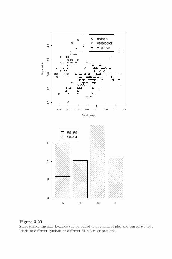
Customizing Traditional Graphics 93
4.5 5.0 5.5 6.0 6.5 7.0 7.5 8.0
2.0
2.5
3.0
3.5
4.0
Sepal.Length
Sep
al.W
idth
setosaversicolorvirginica
RM RF UM UF
010
2030
55−5950−54
Figure 3.20Some simple legends. Legends can be added to any kind of plot and can relate textlabels to different symbols or different fill colors or patterns.
94 R Graphics
different fill patterns (see the bottom plot in Figure 3.20).∗
> barplot(VADeaths[1:2,], angle=c(45, 135), density=20,col="grey", names=c("RM", "RF", "UM", "UF"))
> legend(0.4, 38, c("55-59", "50-54"), cex=1.5,angle = c(135, 45), density = 20, fill = "grey")
It should be noted that it is entirely the responsibility of the user to ensurethat the legend corresponds to the plot. There is no automatic checking thatdata symbols in the legend match those in the plot, or that the labels in thelegend have any correspondence with the data.
Some high-level functions draw their own legend specific to their purpose (e.g.,filled.contour()).
3.4.5 Axes
In most cases, the axes that are automatically generated by the traditionalgraphics system will be sufficient for a plot. This is true even when the databeing plotted on an axis are non-numeric. For example, the axes of a boxplotor barplot are labeled appropriately using group names.
Section 3.2.5 describes ways in which the default appearance of automatically-generated axes can be modified, but it is more often the case that the userneeds to inhibit the production of the automatic axis and draw a customizedaxis using the axis() function.
The first step is to inhibit the default axes. Most high-level functions shouldprovide an axes argument which, when set to FALSE, indicates that the high-level function should not draw axes. Specifying the traditional graphics settingxaxt="n" (or yaxt="n") may also do the trick.
The axis() function can draw axes on any side of a plot (chosen by theside argument), and the user can specify the location along the axis of tickmarks and the text to use for tick labels (using the at and labels argumentsrespectively). The following code demonstrates a simple example of a plotwhere the automatic axes are inhibited and custom axes are drawn, includinga “secondary” y-axis on the right side of the plot (see Figure 3.21).
First of all, some temperature data are generated and an empty plot is createdwith no data symbols and no axes.
∗The data for the scatterplot are from the iris data set (see page 29) and the data forthe histogram are from the VADeaths data set (see page 3).
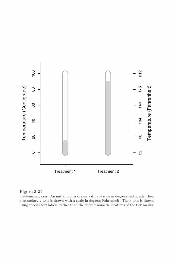
Customizing Traditional Graphics 95
020
4060
8010
0
Tem
pera
ture
(C
entig
rade
)
Treatment 1 Treatment 2
3268
104
140
176
212
Tem
pera
ture
(F
ahre
nhei
t)
Figure 3.21Customizing axes. An initial plot is drawn with a y-scale in degrees centigrade, thena secondary y-axis is drawn with a scale in degrees Fahrenheit. The x-axis is drawnusing special text labels, rather than the default numeric locations of the tick marks.

96 R Graphics
> x <- 1:2> y <- runif(2, 0, 100)> par(mar=c(4, 4, 2, 4))> plot(x, y, type="n", xlim=c(0.5, 2.5), ylim=c(-10, 110),
axes=FALSE, ann=FALSE)
Next, the main y-axis is drawn with specific tick locations to represent theCentigrade scale.
> axis(2, at=seq(0, 100, 20))> mtext("Temperature (Centigrade)", side=2, line=3)
Now the bottom axis is drawn with special labels and a secondary y-axis isdrawn to represent the Fahrenheit scale.
> axis(1, at=1:2, labels=c("Treatment 1", "Treatment 2"))> axis(4, at=seq(0, 100, 20), labels=seq(0, 100, 20)*9/5 + 32)> mtext("Temperature (Fahrenheit)", side=4, line=3)> box()
Finally, some thermometer-like symbols are drawn to represent the actualtemperatures.
> segments(x, 0, x, 100, lwd=20, col="dark grey")> segments(x, 0, x, 100, lwd=16, col="white")> segments(x, 0, x, y, lwd=16, col="light grey")
The axis() function is not generic, but there are special alternative func-tions for plotting time related data. The functions axis.Date() andaxis.POSIXct() take an object containing dates and produce an axis withappropriate labels representing times, days, months, and years (e.g., 10:15,Jan 12 or 1995).
In some cases, it may be useful to draw tick marks at the locations that thedefault axis would use, but with different labels. The axTicks() functioncan be used to calculate these default locations. This function is also usefulfor enforcing an xaxp (or yaxp) graphics state setting. If these settings arespecified via par(), they usually have no effect because the traditional graph-ics system almost always calculates the settings itself. The user can choosethese settings by passing them as arguments to axTicks(), then passing theresulting locations via the at argument to axis().

Customizing Traditional Graphics 97
3.4.6 Mathematical formulae
Any R graphics function that draws text should accept both a normal string,e.g., "some text", and an R expression, which is typically the result of a callto the expression() function. If an expression is specified as the text to draw,then it is interpreted as a mathematical formula and is formatted appropri-ately. This section provides some simple examples of what can be achieved.For a complete description of the available features, type help(plotmath) ordemo(plotmath) in an R session.∗
When an R expression is provided as text to draw in graphical output, theexpression is evaluated to produce a mathematical formula. This evaluationis very different from the normal evaluation of R expressions: certain namesare interpreted as special mathematical symbols, e.g., alpha is interpreted asthe Greek symbol α; certain mathematical operators are interpreted as literalsymbols, e.g., a + is interpreted as a plus sign symbol; and certain functions areinterpreted as mathematical operators, e.g., sum(x, i==1, n) is interpretedas
∑ni=1 x. Figure 3.22 shows some examples of expressions and the output
that they create.
In some situations, for example, when calling graphics functions from withina loop, or when calling graphics functions from within another function, theexpression representing the mathematical formula must be constructed usingvalues within variables as well as literal symbols and constants. A variablename within an expression will be treated as a literal symbol (i.e., the variablename will be drawn, not the value within the variable). The solution in suchcases is to use the substitute() function to produce an expression. Thefollowing code shows the use of substitute() to produce a label where theyear is stored in a variable.
> myfunction <- function(year) {text(0.5, 0.5, substitute(paste("Temperature (",
degree, "C) in ", year),list(year=year)))
}
The mathematical annotation feature makes use of information about thedimensions of individual characters to perform the formatting of the formula.For some output formats, such information is not available, so mathematicalformulae cannot be produced. However, mathematical formulae are supportedon the major screen devices (X11, Windows, and Quartz) and information
∗Further information can also be obtained from an article in the Journal of Computa-tional and Graphical Statistics[45].

98 R Graphics
expression(z[i] == sqrt(x[i]^2 + y[i]^2))
zi = xi2 + yi
2
expression(hat(beta) == (X^t * X)^{−1} * X^t * y)
β = (XtX)−1Xty
expression(bar(x) == sum(frac(x[i], n), i==1, n))
x = ∑i=1
n xi
n
expression(paste("Temperature (", degree, "C) in 2003"))
Temperature (°C) in 2003
Figure 3.22Mathematical formulae in plots. For each example, the output is shown in a seriffont, and below that, in a typewriter font, is the R expression required to producethe output.

Customizing Traditional Graphics 99
for the standard Adobe Type 1 fonts is distributed with R so mathematicalformulae should always be available for PostScript and PDF output.
3.4.7 Coordinate systems
The traditional graphics system provides a number of coordinate systems forconveniently locating graphical output (see Section 3.1.1). Graphical outputin the plot region is automatically positioned relative to the scales on the axesand text in the figure margins is placed in terms of a number of lines awayfrom the edge of the plot (i.e., a scale that naturally corresponds to the sizeof the text).
It is also possible to locate output according to other coordinate systemsthat are not automatically supplied, but a little more work is required by theuser. The basic principle is that the traditional graphics state can be queriedto determine features of existing coordinate systems, then new coordinatesystems can be calculated from this information.
The par function
As well as being used to enforce new graphics state settings, the functionpar() can also be used to query current graphics state settings. The mostuseful settings are: din, fin, and pin, which reflect the current size, (width,height), of the graphics device, figure region, and plot region, in inches; andusr, which reflects the current user coordinate system (i.e., the ranges on theaxes). The values of usr are in the order (xmin, xmax, ymin, ymax). Whena scale has a logarithmic transformation, the values are (10^xmin, 10^xmax,10^ymin, 10^ymax).
There are also settings that reflect the size, (width, height), of a “standard”character. The setting cin gives the size in inches, cra in “rasters” or pixels,and cxy in “user coordinates.” However, these values are not very usefulbecause they only refer to a cex value of 1 (i.e., they ignore the currentcex setting) and they only refer to the ps value when the current graphicsdevice was first opened. Of more use are the strheight() function and thestrwidth() function. These calculate the height and width of a given pieceof text in inches, or in terms of user coordinates, or as a proportion of thecurrent figure region (taking into account the current cex and ps settings).
The following code demonstrates a simple example of making use of cus-tomized coordinates where a ruler is drawn showing centimeter units (seeFigure 3.23).
A blank plot region is set up first and calculations are performed to establish
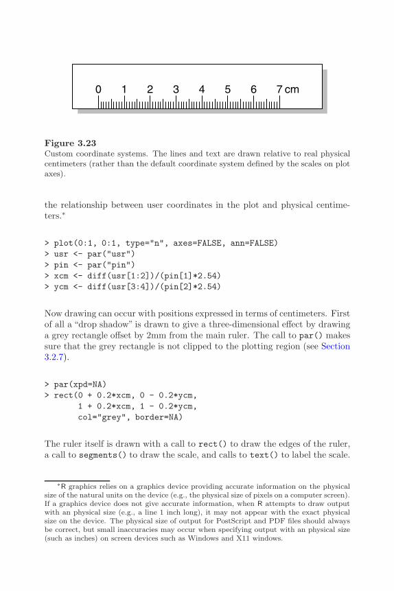
100 R Graphics
0 1 2 3 4 5 6 7 cm
Figure 3.23Custom coordinate systems. The lines and text are drawn relative to real physicalcentimeters (rather than the default coordinate system defined by the scales on plotaxes).
the relationship between user coordinates in the plot and physical centime-ters.∗
> plot(0:1, 0:1, type="n", axes=FALSE, ann=FALSE)> usr <- par("usr")> pin <- par("pin")> xcm <- diff(usr[1:2])/(pin[1]*2.54)> ycm <- diff(usr[3:4])/(pin[2]*2.54)
Now drawing can occur with positions expressed in terms of centimeters. Firstof all a “drop shadow” is drawn to give a three-dimensional effect by drawinga grey rectangle offset by 2mm from the main ruler. The call to par() makessure that the grey rectangle is not clipped to the plotting region (see Section3.2.7).
> par(xpd=NA)> rect(0 + 0.2*xcm, 0 - 0.2*ycm,
1 + 0.2*xcm, 1 - 0.2*ycm,col="grey", border=NA)
The ruler itself is drawn with a call to rect() to draw the edges of the ruler,a call to segments() to draw the scale, and calls to text() to label the scale.
∗R graphics relies on a graphics device providing accurate information on the physicalsize of the natural units on the device (e.g., the physical size of pixels on a computer screen).If a graphics device does not give accurate information, when R attempts to draw outputwith an physical size (e.g., a line 1 inch long), it may not appear with the exact physicalsize on the device. The physical size of output for PostScript and PDF files should alwaysbe correct, but small inaccuracies may occur when specifying output with an physical size(such as inches) on screen devices such as Windows and X11 windows.

Customizing Traditional Graphics 101
> rect(0, 0, 1, 1, col="white")> segments(seq(1, 8, 0.1)*xcm, 0,
seq(1, 8, 0.1)*xcm,c(rep(c(0.5, rep(0.25, 4),
0.35, rep(0.25, 4)),7), 0.5)*ycm)
> text(1:8*xcm, 0.6*ycm, 0:7, adj=c(0.5, 0))> text(8.2*xcm, 0.6*ycm, "cm", adj=c(0, 0))
There are utility functions, xinch() and yinch(), for performing the inches-to-user coordinates transformation (plus xyinch() for converting a locationin one step and cm() for converting inches to centimeters).
One problem with performing coordinate transformations like these is thatthe locations and sizes being drawn have no memory of how they were cal-culated. They are specified as locations and dimensions in user coordinates.This means that if the device is resized (so that the relationship between phys-ical dimensions and user coordinates changes), the locations and sizes will nolonger have their intended meaning. If, in the above example, the device isresized, the ruler will no longer accurately represent centimeter units. Thisproblem will also occur if output is copied from one device to another devicethat has different physical dimensions. The legend() function performs cal-culations like these when arranging the components of a legend and its outputis affected by device resizes and copying between devices.∗
Overlaying output
It is sometimes useful to plot two data sets on the same plot where the datasets share a common x-variable, but have very different y-scales. This can beachieved in at least two ways. One approach is simply to use par(new=TRUE)to overlay two distinct plots on top of each other (care must be taken to avoidconflicting axes overwriting each other). Another approach is to explicitlyreset the usr state setting before plotting a second set of data. The followingcode demonstrates both approaches to produce exactly the same result (seethe top plot of Figure 3.24).
The data are yearly numbers of drunkenness-related arrests† and mean annualtemperature in New Haven, Connecticut from 1912 to 1971. The temperature
∗It is possible to work around these problems in R version 2.1.0 and above by using therecordGraphics() function, although this function should be used with extreme care.
†These data were obtained from “Crime Statistics and Department Demographics” onthe New Haven Police Department Web Site:http://www.cityofnewhaven.com/police/html/stats/crime/yearly/1863-1920.htm
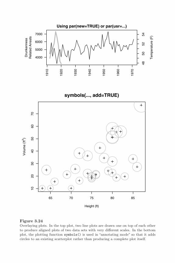
102 R Graphics
1910
1920
1930
1940
1950
1960
1970
4000
5000
6000
7000
Dru
nken
ness
Rel
ated
Arr
ests
Tem
pera
ture
(F
)
Using par(new=TRUE) or par(usr=...)
4850
5254
65 70 75 80 85
1020
3040
5060
70
Height (ft)
Vol
ume
(ft3 )
symbols(..., add=TRUE)
Figure 3.24Overlaying plots. In the top plot, two line plots are drawn one on top of each otherto produce aligned plots of two data sets with very different scales. In the bottomplot, the plotting function symbols() is used in “annotating mode” so that it addscircles to an existing scatterplot rather than producing a complete plot itself.

Customizing Traditional Graphics 103
data are available as the data set nhtemp in the datasets package. There areonly arrests data for the first 9 years.
> drunkenness <- ts(c(3875, 4846, 5128, 5773, 7327,6688, 5582, 3473, 3186,rep(NA, 51)),
start=1912, end=1971)
The first approach is to draw a plot of the drunkenness data, callpar(new=TRUE), then draw a complete second plot of the temperature data ontop of the first plot. The second plot does not draw default axes (axes=FALSE),but uses the axis() function to draw a secondary y-axis to represent the tem-perature scale.
> par(mar=c(5, 6, 2, 4))> plot(drunkenness, lwd=3, col="grey", ann=FALSE, las=2)> mtext("Drunkenness\nRelated Arrests", side=2, line=3.5)> par(new=TRUE)> plot(nhtemp, ann=FALSE, axes=FALSE)> mtext("Temperature (F)", side=4, line=3)> title("Using par(new=TRUE)")> axis(4)
The second approach draws only one plot (for the drunkenness data). Theuser coordinate system is then redefined by specifying a new usr setting andthe second “plot” is produced simply using lines(). Again, a secondary axisis drawn using the axis() function.
> par(mar=c(5, 6, 2, 4))> plot(drunkenness, lwd=3, col="grey", ann=FALSE, las=2)> mtext("Drunkenness\nRelated Arrests", side=2, line=3.5)> usr <- par("usr")> par(usr=c(usr[1:2], 47.6, 54.9))> lines(nhtemp)> mtext("Temperature (F)", side=4, line=3)> title("Using par(usr=...)")> axis(4)
Some high-level functions (e.g., symbols() and contour()) provide an argu-ment called add which, if set to TRUE, will add the function output to thecurrent plot, rather than starting a new plot. The following code shows thesymbols() function being used to annotate a basic scatterplot (see the bot-tom plot of Figure 3.24). The data used in this example are from the treesdata set (see page 35).

104 R Graphics
> with(trees,{plot(Height, Volume, pch=3,
xlab="Height (ft)",ylab=expression(paste("Volume ", (ft^3))))
symbols(Height, Volume, circles=Girth/12,fg="grey", inches=FALSE, add=TRUE)
})
Another function of this type is the bxp() function. This function is called byboxplot() to draw the individual boxplots and is specifically set up to addboxplots to an existing plot (although it can also produce a complete plot).
It is also worth remembering that R follows a painters model, with later outputobscuring earlier output. The following example makes use of this feature tofill a complex region within a plot (see Figure 3.25).
The first step is to generate some data and calculate some important featuresof the data.
> xx <- c(1:50)> yy <- rnorm(50)> n <- 50> hline <- 0
The first thing to draw is a plot with a filled polygon beneath the y-values(see the top-left plot of Figure 3.25).
> plot (yy ~ xx, type="n", axes=FALSE, ann=FALSE)> polygon(c(xx[1], xx, xx[n]), c(min(yy), yy, min(yy)),
col="grey", border=NA)
The next step is to draw a rectangle over the top of the polygon up to a fixedy-value. The expression par("usr") is used to obtain the current x-scale andy-scale ranges (see the top-right plot of Figure 3.25).
> usr <- par("usr")> rect(usr[1], usr[3], usr[2], hline, col="white", border=NA)
Now a line through the y-values is drawn over the top of the rectangle (seethe bottom-left plot of Figure 3.25).
> lines(xx, yy)
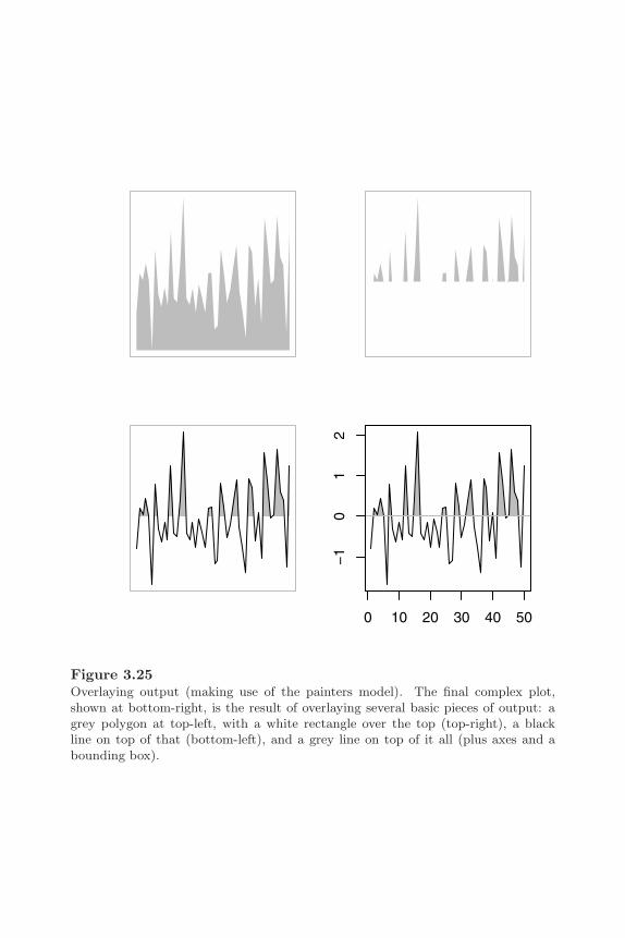
Customizing Traditional Graphics 105
0 10 20 30 40 50
−1
01
2
Figure 3.25Overlaying output (making use of the painters model). The final complex plot,shown at bottom-right, is the result of overlaying several basic pieces of output: agrey polygon at top-left, with a white rectangle over the top (top-right), a blackline on top of that (bottom-left), and a grey line on top of it all (plus axes and abounding box).
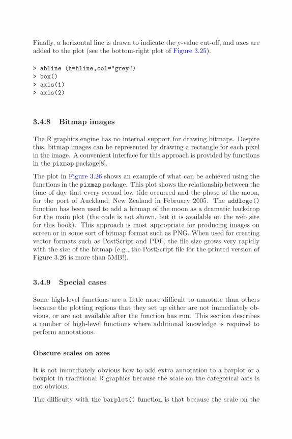
106 R Graphics
Finally, a horizontal line is drawn to indicate the y-value cut-off, and axes areadded to the plot (see the bottom-right plot of Figure 3.25).
> abline (h=hline,col="grey")> box()> axis(1)> axis(2)
3.4.8 Bitmap images
The R graphics engine has no internal support for drawing bitmaps. Despitethis, bitmap images can be represented by drawing a rectangle for each pixelin the image. A convenient interface for this approach is provided by functionsin the pixmap package[8].
The plot in Figure 3.26 shows an example of what can be achieved using thefunctions in the pixmap package. This plot shows the relationship between thetime of day that every second low tide occurred and the phase of the moon,for the port of Auckland, New Zealand in February 2005. The addlogo()function has been used to add a bitmap of the moon as a dramatic backdropfor the main plot (the code is not shown, but it is available on the web sitefor this book). This approach is most appropriate for producing images onscreen or in some sort of bitmap format such as PNG. When used for creatingvector formats such as PostScript and PDF, the file size grows very rapidlywith the size of the bitmap (e.g., the PostScript file for the printed version ofFigure 3.26 is more than 5MB!).
3.4.9 Special cases
Some high-level functions are a little more difficult to annotate than othersbecause the plotting regions that they set up either are not immediately ob-vious, or are not available after the function has run. This section describesa number of high-level functions where additional knowledge is required toperform annotations.
Obscure scales on axes
It is not immediately obvious how to add extra annotation to a barplot or aboxplot in traditional R graphics because the scale on the categorical axis isnot obvious.
The difficulty with the barplot() function is that because the scale on the
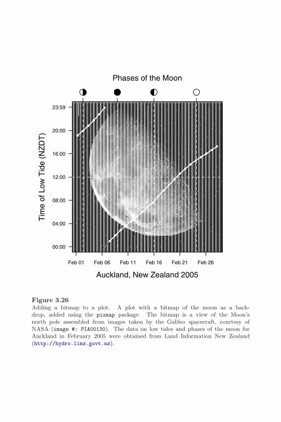
Customizing Traditional Graphics 107
Feb 01 Feb 06 Feb 11 Feb 16 Feb 21 Feb 26
00:00
04:00
08:00
12:00
16:00
20:00
23:59
Tim
e of
Low
Tid
e (N
ZD
T)
Auckland, New Zealand 2005
Phases of the Moon
Figure 3.26Adding a bitmap to a plot. A plot with a bitmap of the moon as a back-drop, added using the pixmap package. The bitmap is a view of the Moon’snorth pole assembled from images taken by the Galileo spacecraft, courtesy ofNASA (image #: PIA00130). The data on low tides and phases of the moon forAuckland in February 2005 were obtained from Land Information New Zealand(http://hydro.linz.govt.nz).

108 R Graphics
x-axis is not labelled at all by default. the numeric scale is not obvious (andcalling par("usr") is not much help because the scale that the function setsup is not intuitive either). In order to add annotations sensibly to a barplotit is necessary to capture the value returned by the function. This returnvalue gives the x-locations of the mid-points of each bar that the function hasdrawn. These midpoints can then be used to locate annotations relative tothe bars in the plot.
The code below shows an example of adding extra horizontal reference linesto the bars of a barplot. The mid-points of the bars are saved to a variablecalled midpts, then locations are calculated from those mid-points (and theoriginal counts) to draw horizontal white line segments within each bar usingthe segments() function (see the left plot of Figure 3.27).
> y <- sample(1:10)> midpts <- barplot(y, col=" light grey")> width <- diff(midpts[1:2])/4> left <- rep(midpts, y - 1) - width> right <- rep(midpts, y - 1) + width> heights <- unlist(apply(matrix(y, ncol=10),
2, seq))[-cumsum(y)]> segments(left, heights, right, heights,
col="white")
The boxplot() function is similar to the barplot() function in that the x-scale is typically labelled with category names so the numeric scale is not obvi-ous from looking at the plot. Fortunately, the scale set up by the boxplot()function is much more intuitive. The individual boxplots are drawn at x-locations 1:n, where n is the number of boxplots being drawn.
The following code provides a simple example of annotating boxplots to adda jittered dotplot of individual data points on top of the boxplots. Thisprovides a detailed view of the data as well as showing the main features viathe boxplot. It is also a useful way to show how interesting features of thedata, such as small clusters of points, can be hidden by a boxplot. In thisexample, the jittered data are centered upon the x-locations 1:2 to correspondto the centers of the relevant boxplots (see the right plot of Figure 3.27).∗
∗The data used in this example are from the ToothGrowth data set (see page 3).
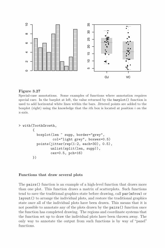
Customizing Traditional Graphics 109
02
46
810
OJ VC
510
1520
2530
35Figure 3.27Special-case annotations. Some examples of functions where annotation requiresspecial care. In the barplot at left, the value returned by the barplot() function isused to add horizontal white lines within the bars. Jittered points are added to theboxplot (right) using the knowledge that the ith box is located at position i on thex-axis.
> with(ToothGrowth,{boxplot(len ~ supp, border="grey",
col="light grey", boxwex=0.5)points(jitter(rep(1:2, each=30), 0.5),
unlist(split(len, supp)),cex=0.5, pch=16)
})
Functions that draw several plots
The pairs() function is an example of a high-level function that draws morethan one plot. This function draws a matrix of scatterplots. Such functionstend to save the traditional graphics state before drawing, call par(mfrow) orlayout() to arrange the individual plots, and restore the traditional graphicsstate once all of the individual plots have been drawn. This means that it isnot possible to annotate any of the plots drawn by the pairs() function oncethe function has completed drawing. The regions and coordinate systems thatthe function set up to draw the individual plots have been thrown away. Theonly way to annotate the output from such functions is by way of “panel”functions.
110 R Graphics
The pairs() function has a number of arguments that allow the user tospecify a function: panel, diag.panel, upper.panel, lower.panel, andtext.panel. The functions specified via these arguments are run as eachindividual plot is drawn. In this way, the panel function has access to the plotregions that are set up for each individual plot.
The filled.contour() function and the coplot() function have the sameproblem as pairs(), as the legends that they draw are actually separate plots.Again, they allow annotation via panel function arguments.
The following code demonstrates a simple use of a panel function with thecoplot() function. The main conditioning plot shows the locations of earth-quakes in the Pacific Ocean near Fiji since 1964,∗ available as the quakesdata set in the datasets package. There are multiple panels, each of whichshows the earthquakes that occurred at a particular range of depths. A panelfunction is specified via the panel argument to add maps of Fiji and NewZealand to each panel of coplot() output (see Figure 3.28).
The panel function first calls the rect() function to overlay a white back-ground and hide the default grid lines. Next, the panel function calls thepoints() function to draw the points that would normally be drawn, but usesa custom plotting symbol (a very small dot). The map() function is called todraw the maps of Fiji and the top of the North Island of New Zealand, andthe text() function is used to add country names. The map is drawn usingthe map() function from the maps package.
> library(maps)> coplot(lat ~ long | depth, data = quakes, number=4,
panel=function(x, y, ...) {usr <- par("usr")rect(usr[1], usr[3], usr[2], usr[4], col="white")map("world2", regions=c("New Zealand", "Fiji"),
add=TRUE, lwd=0.1, fill=TRUE, col="grey")text(180, -13, "Fiji", adj=1, cex=0.7)text(170, -35, "NZ", cex=0.7)points(x, y, pch=".")
})
There is a predefined panel function called panel.smooth(), which drawspoints and then adds a smoothed line through the points.
∗The data were obtained from the Harvard PRIM-H project, who obtained it from Dr.John Woodhouse, Dept. of Geophysics, Harvard University.
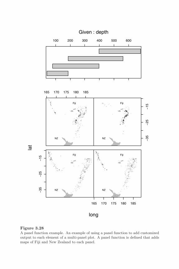
Customizing Traditional Graphics 111
Fiji
NZ−35
−25
−15
Fiji
NZ
165 170 175 180 185
Fiji
NZ
165 170 175 180 185
Fiji
NZ −35
−25
−15
long
lat
100 200 300 400 500 600
Given : depth
Figure 3.28A panel function example. An example of using a panel function to add customizedoutput to each element of a multi-panel plot. A panel function is defined that addsmaps of Fiji and New Zealand to each panel.

112 R Graphics
3D plots
It is possible to annotate a plot produced using the persp() function, but itis more difficult than for most other high-level functions. The important stepis to acquire the transformation matrix that the persp() function returns.This can be used to transform 3D locations into 2D locations that can begiven to the standard annotation functions such as lines() and text(). Thepersp() function also has an add argument, which allows multiple persp()plots to be over-plotted.
The following code demonstrates annotation of persp() output to add anindication of the summit and access roads to a plot of the Maunga Whauvolcano in Auckland New Zealand (see Figure 3.29).∗
The first step is to draw the volcano itself and record the 3D transformationmatrix in the variable trans.
> z <- 2 * volcano> x <- 10 * (1:nrow(z))> y <- 10 * (1:ncol(z))> trans <- persp(x, y, z, theta = 135, phi = 30,
scale = FALSE, ltheta = -120,# shade=0.5, border=NA,box = FALSE)
> box(col="grey", lwd=1)
Now a function is defined that uses the transformation matrix to convert 3Dlocations into 2D locations relative to the existing plot.
> trans3d <- function(x,y,z,pmat) {tmat <- cbind(x,y,z,1)%*% pmattmat[,1:2] / tmat[,4]
}
The next code makes use of the transformation function to draw a dot at thesummit of the volcano and a text label above that.
> summit <- trans3d(x[20], y[31], max(z), trans)> points(summit[1], summit[2], pch=16)> summitlabel <- trans3d(x[20], y[31], max(z) + 50, trans)> text(summitlabel[1], summitlabel[2], "Summit")
∗The data are from the volcano data set (see page 35) and from the volcano.accessRoadvolcano.upDownRoad volcano.summitRoad data sets from the RGraphics package.

Customizing Traditional Graphics 113
Summit
Figure 3.29Annotating a 3D surface created by persp(). Extra points, text, and lines are addedto the 3D plot using the transformation matrix returned by the persp() function.
114 R Graphics
Finally, the transformation function is also used to draw lines representingthe roads that provide access to the summit of the volcano.
> drawRoad <- function(x, y, z, trans) {road <- trans3d(x, y, z, trans)lines(road[,1], road[,2], lwd=5)lines(road[,1], road[,2], lwd=3, col="grey")
}> with(volcano.summitRoad,
drawRoad(srx, sry, srz, trans))> with(volcano.upDownRoad,
{clipudx <- udxclipudx[udx < 230 & udy < 300 |
udx < 150 & udy > 300] <- NAdrawRoad(clipudx, udy, udz, trans)
})> with(volcano.accessRoad,
drawRoad(arx, ary, arz, trans))
This example does demonstrate one of the limitations for annotating persp()output, namely that there is no support for automatically hiding output thatshould not be seen. For example, the drawing of the upDownRoad has beenmanually clipped (see the lines involving the variable clipudx) in order toavoid drawing the part of the road that should be obscured because it isbehind the main cone of the volcano.
3.5 Creating new plots
There are cases where no existing plot provides a sensible starting point forcreating the final plot that the user requires. This section describes how toconstruct a new plot entirely from scratch for such cases.
The plot.new() function is the most basic starting point for producing atraditional graphics plot (the frame() function is equivalent). This functionsets up the various plotting regions described in Section 3.1.1 and sets boththe x-scale and y-scale to (0, 1).∗ The regions that are set up depend on the
∗The actual scale setup depends on the current settings for xaxs and yaxs. With thedefault settings, the scales are (−0.04, 1.04).

Customizing Traditional Graphics 115
current graphics state settings.
The plot.window() function resets the scales in the user coordinate system,given x- and y-ranges via the arguments xlim and ylim, and the plot.xy()function draws data symbols and lines between locations within the plot re-gion.
3.5.1 A simple plot from scratch
In order to demonstrate the use of these functions, the following code producesthe simple scatterplot in Figure 1.1 from scratch.
> plot.new()> plot.window(range(pressure$temperature),
range(pressure$pressure))> plot.xy(pressure, type="p")> box()> axis(1)> axis(2)
The output could be produced by the simple expression plot(pressure), butit shows that the steps in building a plot are available as separate functionsas well, which allows the user to have fine control over the construction of aplot.
3.5.2 A more complex plot from scratch
This section describes a slightly more complex example of creating a plot fromscratch. The final goal is represented in Figure 3.30 and the steps involvedare described below.
This first bit of code generates some data to plot.
> groups <- c("cows", "sheep", "horses","elephants", "giraffes")
> males <- sample(1:10, 5)> females <- sample(1:10, 5)
There are several ways that the plot could be created. For this example, itwill be created as a single plot. The labels to the left of the plot will be drawnin the margins of the plot, but everything else will be drawn inside the plotregion. This next bit of code sets up the figure margins so that there is enough
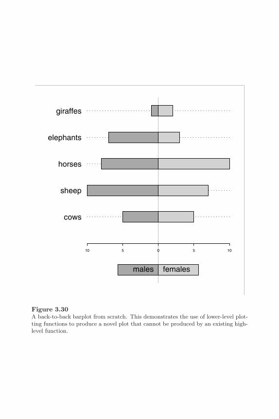
116 R Graphics
cows
sheep
horses
elephants
giraffes
10 5 0 5 10
males females
Figure 3.30A back-to-back barplot from scratch. This demonstrates the use of lower-level plot-ting functions to produce a novel plot that cannot be produced by an existing high-level function.
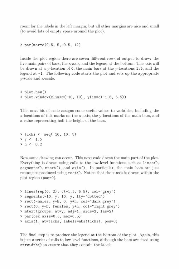
Customizing Traditional Graphics 117
room for the labels in the left margin, but all other margins are nice and small(to avoid lots of empty space around the plot).
> par(mar=c(0.5, 5, 0.5, 1))
Inside the plot region there are seven different rows of output to draw: thefive main pairs of bars, the x-axis, and the legend at the bottom. The axis willbe drawn at a y-location of 0, the main bars at the y-locations 1:5, and thelegend at -1. The following code starts the plot and sets up the appropriatey-scale and x-scale.
> plot.new()> plot.window(xlim=c(-10, 10), ylim=c(-1.5, 5.5))
This next bit of code assigns some useful values to variables, including thex-locations of tick-marks on the x-axis, the y-locations of the main bars, anda value representing half the height of the bars.
> ticks <- seq(-10, 10, 5)> y <- 1:5> h <- 0.2
Now some drawing can occur. This next code draws the main part of the plot.Everything is drawn using calls to the low-level functions such as lines(),segments(), mtext(), and axis(). In particular, the main bars are justrectangles produced using rect(). Notice that the x-axis is drawn within theplot region (pos=0).
> lines(rep(0, 2), c(-1.5, 5.5), col="grey")> segments(-10, y, 10, y, lty="dotted")> rect(-males, y-h, 0, y+h, col="dark grey")> rect(0, y-h, females, y+h, col="light grey")> mtext(groups, at=y, adj=1, side=2, las=2)> par(cex.axis=0.5, mex=0.5)> axis(1, at=ticks, labels=abs(ticks), pos=0)
The final step is to produce the legend at the bottom of the plot. Again, thisis just a series of calls to low-level functions, although the bars are sized usingstrwidth() to ensure that they contain the labels.

118 R Graphics
> tw <- 1.5*strwidth("females")> rect(-tw, -1-h, 0, -1+h, col="dark grey")> rect(0, -1-h, tw, -1+h, col="light grey")> text(0, -1, "males", pos=2)> text(0, -1, "females", pos=4)
This example is particularly customized to the data set involved. It couldbe made much more general by replacing some constants with variable values(e.g., instead of using 5 because there are five groups in the data set, the codecould have a variable numGroups). If more than one such plot needs to bemade, it makes good sense to also wrap the code within a function. That taskis discussed in the next section.
3.5.3 Writing traditional graphics functions
Having made the effort to construct a plot from scratch, it is usually worth-while encapsulating the calls within a new function and possibly even makingit available for others to use. This section briefly describes some of the thingsto consider when creating a new graphics function built on the traditionalgraphics system functions.
There are many advantages to developing new graphics functions in the gridgraphics system (see Part II) rather than using traditional graphics. Chapter7 contains a more complete discussion of the issues involved in developing newgraphics functions.
Helper functions
There are some helper functions that do no drawing, but are used by thepredefined high-level plots to do some of the work in setting up a plot.
The xy.coords() function is useful for allowing x and y arguments to yournew function to be flexibly specified (just like the plot() function where ycan be left unspecified and x can be a data.frame, and so on). This functiontakes x and y arguments and creates a standard object containing x-value,y-values, and sensible labels for the axes. There is also an xyz.coords()function.
If your plotting function generates multiple sub-plots, the n2mfrow() functionmay be helpful to generate a sensible number of rows and columns of plots,based on the total number of plots to fit on a page.
Another set of useful helper functions are those that calculate values to plotfrom the raw data (but do no actual drawing). Examples of these sorts of

Customizing Traditional Graphics 119
functions are: boxplot.stats() used by boxplot() to generate five-numbersummaries; contourLines() used by contour() to generate contour lines;nclass.Sturges(), nclass.scott(), and nclass.FD() used by hist() togenerate the number of intervals for a histogram; and co.intervals() usedby coplot() to generate ranges of values for conditioning a data set intopanels.
Some high-level functions invisibly return this sort of information too. Forexample, boxplot() returns the combined results from boxplot.stats() forall of the boxplots that it produces and hist() returns information on theintervals that it creates including the number of data values in each interval.
Argument lists
A common technique when writing a traditional graphics function is to pro-vide an ellipsis argument (...) instead of individual graphics state arguments(such as col and lty). This allows users to specify any state settings (e.g.,col="red" and lty="dashed") and the new function can pass them straighton to the traditional graphics functions that the new function calls. Thisavoids having to specify all individual state settings as arguments to the newfunction. Some care must be taken with this technique because sometimesdifferent graphics functions interpret the same graphics state setting in differ-ent ways (the col setting is a good example; see Section 3.2). In such cases,it becomes necessary to name the individual graphics state setting as an ar-gument and explicitly pass it on only to other graphics calls that will acceptit and respond to it in the desired manner.
Sometimes it is useful for a graphics function to deliberately override thecurrent graphics state settings. For example, a new plot may want to force thexpd setting to be NA in order to draw lines and text outside of the plot region.In such cases, it is polite for the graphics function to revert the graphics statesettings at the end of the function so that users do not get a nasty surprise!A standard technique is to put the following expressions at the start of thenew function to restore the graphics state to the settings that existed beforethe function was called.
opar <- par(no.readonly=TRUE)on.exit(par(opar))
Care should be taken to ensure that a new graphics function takes notice ofappropriate graphics state settings (e.g., ann). This can be a little complicatedto implement because it is necessary to be aware of the possibility that theuser might specify a setting in the call to the function and that such a settingshould override the main graphics state setting. The standard approach is
120 R Graphics
to name the state setting explicitly as an argument to the graphics functionand provide the permanent state setting as a default value. See the newgraphics function template below for an example of this technique using theann argument. An additional complication is that now there is a state settingthat will not be part of the ... argument, so the state setting must beexplicitly passed on to any other functions that might make use of it.
Another good technique is to provide arguments that users are used to seeingin other graphics functions — the main, sub, xlim, and ylim arguments aregood examples of this sort of thing — and a new graphics function shouldbe able to handle missing and non-finite values. The functions is.na(),is.finite(), and na.omit() may be useful for this purpose.
Plot methods
If a new function is for use with a particular type of data, then it is convenientfor users if the function is provided as a method for the generic plot() func-tion. This allows users to simply call the new function by calling plot(x),where x is an object of the relevant class.
A graphics function template
The code in Figure 3.31 is a simple shell that combines some of the basicguidelines from this section. This is just a simplified version of the defaultplot() method. It is far from complete and will not gracefully accept allpossible inputs (especially via the ... argument), but it could be used as thestarting template for writing a new traditional graphics function.
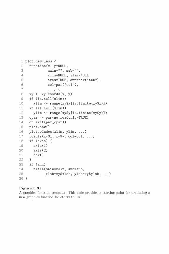
Customizing Traditional Graphics 121
1 plot.newclass <-2 function(x, y=NULL,3 main="", sub="",4 xlim=NULL, ylim=NULL,5 axes=TRUE, ann=par("ann"),6 col=par("col"),7 ...) {8 xy <- xy.coords(x, y)9 if (is.null(xlim))
10 xlim <- range(xy$x[is.finite(xy$x)])11 if (is.null(ylim))12 ylim <- range(xy$y[is.finite(xy$y)])13 opar <- par(no.readonly=TRUE)14 on.exit(par(opar))15 plot.new()16 plot.window(xlim, ylim, ...)17 points(xy$x, xy$y, col=col, ...)18 if (axes) {19 axis(1)20 axis(2)21 box()22 }23 if (ann)24 title(main=main, sub=sub,25 xlab=xy$xlab, ylab=xy$ylab, ...)26 }
Figure 3.31A graphics function template. This code provides a starting point for producing anew graphics function for others to use.
122 R Graphics
Chapter summary
High-level traditional graphics functions produce complete plots andlow-level traditional graphics functions add output to existing plots.There are low-level functions for producing simple output such as lines,rectangles, text, and polygons and also functions for producing morecomplex output such as axes and legends.
The traditional graphics system creates several regions for drawing thevarious components of a plot: a plot region for drawing data symbolsand lines, figure margins for axes and labels, and so on. Each low-levelgraphics function produces output in a particular drawing region andmost work in the plot region.
There is a traditional graphics system state that consists of settings tocontrol the appearance of output and the arrangement of the drawingregions. There are settings for controlling color, fonts, line styles, datasymbol style, and the style of axes. There are several mechanisms forarranging multiple plots on a single page.
It is straightforward to create a complete plot using only low-levelgraphics functions. This makes it possible to produce a completelynew type of plot. It is also possible for the user to define an entirelynew graphics function.

4
Trellis Graphics: the Lattice Package
Chapter preview
This chapter describes how to produce Trellis plots using R. Thereis a description of what Trellis plots are as well as a description ofthe functions used to produce them. Trellis plots are designed to beeasy to interpret and at the same time provide some modern andsophisticated plotting styles, such as multipanel conditioning.
The grid graphics system provides no high-level plotting functionsitself, so this chapter also describes the best way to produce a completeplot using the grid system. There are several advantages to producinga plot using the grid system, including greater flexibility in addingfurther output to the plot, and the ability to interactively edit theplot.
This chapter describes the lattice package, developed by Deepayan Sarkar[54].Lattice is based on the grid graphics system, but can be used as a completegraphics system in itself and a great deal can be achieved without encounteringany of the underlying grid concepts.∗ This chapter deals with lattice as aself-contained system consisting of functions for producing complete plots,functions for controlling the appearance of the plots, and functions for openingand closing devices. Section 5.8 and Section 6.7 describe some of the benefitsthat can be gained from viewing lattice plots as grid output and dealingdirectly with the grid concepts and objects that underly the lattice system.
∗To give Deepayan proper credit, lattice uses grid only to render plots. Lattice performsa lot of work itself to deconstruct formulae, rearrange the data, and manage many user-settable options.
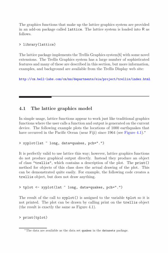
126 R Graphics
The graphics functions that make up the lattice graphics system are providedin an add-on package called lattice. The lattice system is loaded into R asfollows.
> library(lattice)
The lattice package implements the Trellis Graphics system[6] with some novelextensions. The Trellis Graphics system has a large number of sophisticatedfeatures and many of these are described in this section, but more information,examples, and background are available from the Trellis Display web site:
http://cm.bell-labs.com/cm/ms/departments/sia/project/trellis/index.html
4.1 The lattice graphics model
In simple usage, lattice functions appear to work just like traditional graphicsfunctions where the user calls a function and output is generated on the currentdevice. The following example plots the locations of 1000 earthquakes thathave occurred in the Pacific Ocean (near Fiji) since 1964 (see Figure 4.1).∗
> xyplot(lat ~ long, data=quakes, pch=".")
It is perfectly valid to use lattice this way; however, lattice graphics functionsdo not produce graphical output directly. Instead they produce an objectof class "trellis", which contains a description of the plot. The print()method for objects of this class does the actual drawing of the plot. Thiscan be demonstrated quite easily. For example, the following code creates atrellis object, but does not draw anything.
> tplot <- xyplot(lat ~ long, data=quakes, pch=".")
The result of the call to xyplot() is assigned to the variable tplot so it isnot printed. The plot can be drawn by calling print on the trellis object(the result is exactly the same as Figure 4.1).
> print(tplot)
∗The data are available as the data set quakes in the datasets package.
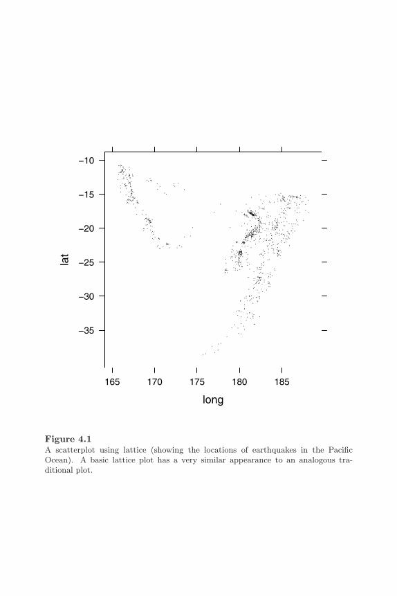
Trellis Graphics: the Lattice Package 127
long
lat
165 170 175 180 185
−35
−30
−25
−20
−15
−10
Figure 4.1A scatterplot using lattice (showing the locations of earthquakes in the PacificOcean). A basic lattice plot has a very similar appearance to an analogous tra-ditional plot.
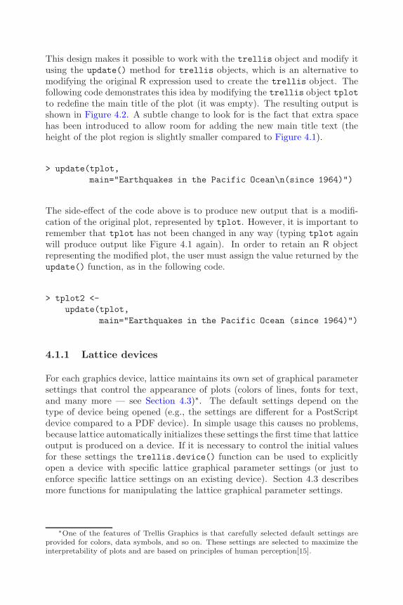
128 R Graphics
This design makes it possible to work with the trellis object and modify itusing the update() method for trellis objects, which is an alternative tomodifying the original R expression used to create the trellis object. Thefollowing code demonstrates this idea by modifying the trellis object tplotto redefine the main title of the plot (it was empty). The resulting output isshown in Figure 4.2. A subtle change to look for is the fact that extra spacehas been introduced to allow room for adding the new main title text (theheight of the plot region is slightly smaller compared to Figure 4.1).
> update(tplot,main="Earthquakes in the Pacific Ocean\n(since 1964)")
The side-effect of the code above is to produce new output that is a modifi-cation of the original plot, represented by tplot. However, it is important toremember that tplot has not been changed in any way (typing tplot againwill produce output like Figure 4.1 again). In order to retain an R objectrepresenting the modified plot, the user must assign the value returned by theupdate() function, as in the following code.
> tplot2 <-update(tplot,
main="Earthquakes in the Pacific Ocean (since 1964)")
4.1.1 Lattice devices
For each graphics device, lattice maintains its own set of graphical parametersettings that control the appearance of plots (colors of lines, fonts for text,and many more — see Section 4.3)∗. The default settings depend on thetype of device being opened (e.g., the settings are different for a PostScriptdevice compared to a PDF device). In simple usage this causes no problems,because lattice automatically initializes these settings the first time that latticeoutput is produced on a device. If it is necessary to control the initial valuesfor these settings the trellis.device() function can be used to explicitlyopen a device with specific lattice graphical parameter settings (or just toenforce specific lattice settings on an existing device). Section 4.3 describesmore functions for manipulating the lattice graphical parameter settings.
∗One of the features of Trellis Graphics is that carefully selected default settings areprovided for colors, data symbols, and so on. These settings are selected to maximize theinterpretability of plots and are based on principles of human perception[15].
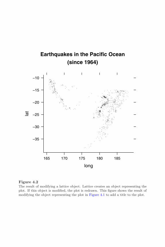
Trellis Graphics: the Lattice Package 129
Earthquakes in the Pacific Ocean(since 1964)
long
lat
165 170 175 180 185
−35
−30
−25
−20
−15
−10
Figure 4.2The result of modifying a lattice object. Lattice creates an object representing theplot. If this object is modified, the plot is redrawn. This figure shows the result ofmodifying the object representing the plot in Figure 4.1 to add a title to the plot.
130 R Graphics
4.2 Lattice plot types
Lattice provides functions to produce a number of standard plot types, plussome more modern and specialized plots. Table 4.1 describes the functionsthat are available and Figure 4.3 provides a basic idea of the sort of outputthat they produce.
There are a number of functions that produce output very similar to the out-put of functions in the traditional graphics system, but there are three possiblereasons for using lattice functions instead of the traditional counterparts:
1. The default appearance of the lattice plots is superior in some areas.For example, the default colors and the default data symbols have beendeliberately chosen to make it easy to distinguish between groups whenmore than one data series is plotted. There are also some subtle thingssuch as the fact that tick labels on the y-axes are written horizontallyby default, which makes them easier to read.
2. The lattice plot functions can be extended in several very powerful ways.For example, several data series can be plotted at once in a convenientmanner and multiple panels of plots can be produced easily (see Section4.2.1).
3. The output from lattice functions is grid output, so many powerful gridfeatures are available for annotating, editing, and saving the graphicsoutput. See Section 5.8 and Section 6.7 for examples of these features.
Most of the lattice plotting functions provide a very long list of argumentsand produce a wide range of different types of output. Many of the argu-ments are shared by different functions and the on-line help for the xyplot()function provides an explanation of these standard arguments. The follow-ing sections address some of the important shared arguments, but for a fullexplanation of all arguments, the documentation for each specific functionshould be consulted. The next section discusses two important arguments,formula and data. The use of several other arguments is demonstrated inSection 4.2.2 in the context of a more complex example. Section 4.3 mentionsthe par.settings argument and Section 4.4 describes the layout argument.Section 4.5 describes the panel and strip arguments.

Trellis Graphics: the Lattice Package 131
Table 4.1The plotting functions available in lattice
Lattice TraditionalFunction Description Analogue
barchart() Barcharts barplot()
bwplot() Boxplots boxplot()Box-and-whisker plots
densityplot() Conditional kernel density plots noneSmoothed density estimate
dotplot() Dotplots dotchart()Continuous versus categorical
histogram() Histograms hist()
qqmath() Quantile–quantile plots qqnorm()Data set versus theoretical distribution
stripplot() Stripplots stripchart()One-dimensional scatterplot
qq() Quantile–quantile plots qqplot()Data set versus data set
xyplot() Scatterplots plot()
levelplot() Level plots image()
contourplot() Contour plots contour()
cloud() 3-dimensional scatterplot nonewireframe() 3-dimensional surfaces persp()
splom() Scatterplot matrices pairs()
parallel() Parallel coordinate plots none

132 R Graphics
barchart bwplot densityplot dotplot
histogram qqmath stripplot qq
xyplot levelplot contourplot cloud
wireframe
x
y
splom parallel
Figure 4.3Plot types available in lattice. The name of the function used to produce the differentplot types is shown in the strip above each plot.
Trellis Graphics: the Lattice Package 133
4.2.1 The formula argument and multipanel conditioning
In most cases, the first argument to the lattice plotting functions is an Rformula (see Section A.2.6) that describes which variables to plot. The sim-plest case has already been demonstrated. A formula of the form y ~ xplots variable y against variable x. There are some variations for plots ofonly one variable or plots of more than two variables. For example, for thebwplot() function, the formula can be of the form ~ x and for the cloud()and wireframe() functions something of the form z ~ x * y is required tospecify the three variables to plot. Another useful variation is the ability tospecify multiple y-variables. Something of the form y1 + y2 ~ x produces aplot of both the y1 variable and the y2 variable against x. Multiple x-variablescan be specified as well.
The second argument to a lattice plotting function is typically data, whichallows the user to specify a data frame within which lattice can find thevariables specified in the formula.
One of the very powerful features of Trellis Graphics is the ability to specifyconditioning variables within the formula argument. Something of the formy ~ x | g indicates that several plots should be generated, showing the vari-able y against the variable x for each level of the variable g. In order to demon-strate this feature, the following code produces several scatterplots, with eachscatterplot showing the locations of earthquakes that occurred within a par-ticular depth range (see Figure 4.4). First of all, a new variable depthgroup isdefined, which is a binning of the original depth variable in the quakes dataset.
> depthgroup <- equal.count(quakes$depth, number=3, overlap=0)
Now this depthgroup variable can be used to produce a scatterplot for eachdepth range.
> xyplot(lat ~ long | depthgroup, data=quakes, pch=".")
In the Trellis terminology, the plot in Figure 4.4 consists of three panels. Eachpanel in this case contains a scatterplot and above each panel there is a stripthat presents the level of the conditioning variable.
There can be more than one conditioning variable in the formula argument,in which case a panel is produced for each combination of the conditioningvariables. An example of this is given in Section 4.2.2.
The most natural type of variable to use as a conditioning variable is a cat-egorical variable (factor), but there is also support for using a continuous
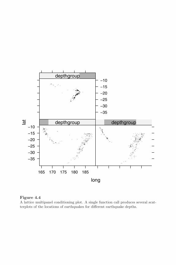
134 R Graphics
long
lat
165 170 175 180 185
−35
−30
−25
−20
−15
−10depthgroup depthgroup
−35
−30
−25
−20
−15
−10depthgroup
Figure 4.4A lattice multipanel conditioning plot. A single function call produces several scat-terplots of the locations of earthquakes for different earthquake depths.
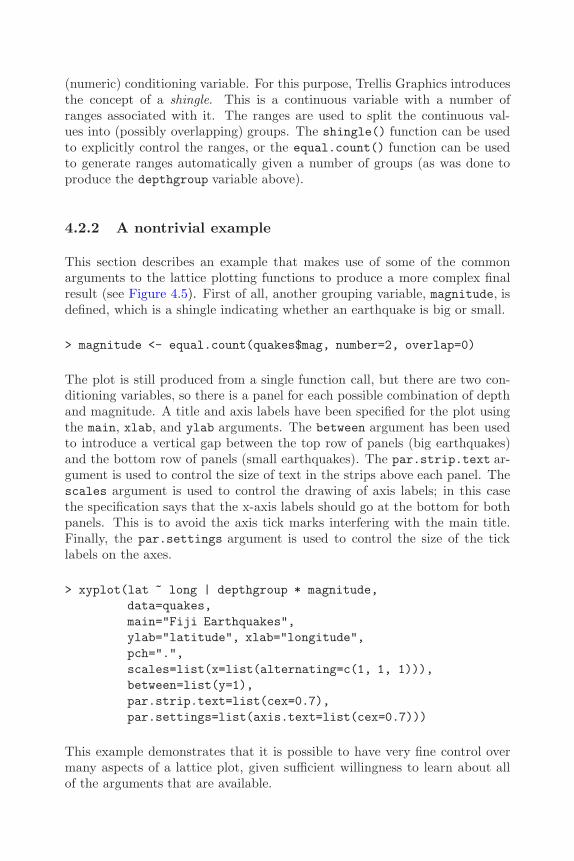
Trellis Graphics: the Lattice Package 135
(numeric) conditioning variable. For this purpose, Trellis Graphics introducesthe concept of a shingle. This is a continuous variable with a number ofranges associated with it. The ranges are used to split the continuous val-ues into (possibly overlapping) groups. The shingle() function can be usedto explicitly control the ranges, or the equal.count() function can be usedto generate ranges automatically given a number of groups (as was done toproduce the depthgroup variable above).
4.2.2 A nontrivial example
This section describes an example that makes use of some of the commonarguments to the lattice plotting functions to produce a more complex finalresult (see Figure 4.5). First of all, another grouping variable, magnitude, isdefined, which is a shingle indicating whether an earthquake is big or small.
> magnitude <- equal.count(quakes$mag, number=2, overlap=0)
The plot is still produced from a single function call, but there are two con-ditioning variables, so there is a panel for each possible combination of depthand magnitude. A title and axis labels have been specified for the plot usingthe main, xlab, and ylab arguments. The between argument has been usedto introduce a vertical gap between the top row of panels (big earthquakes)and the bottom row of panels (small earthquakes). The par.strip.text ar-gument is used to control the size of text in the strips above each panel. Thescales argument is used to control the drawing of axis labels; in this casethe specification says that the x-axis labels should go at the bottom for bothpanels. This is to avoid the axis tick marks interfering with the main title.Finally, the par.settings argument is used to control the size of the ticklabels on the axes.
> xyplot(lat ~ long | depthgroup * magnitude,data=quakes,main="Fiji Earthquakes",ylab="latitude", xlab="longitude",pch=".",scales=list(x=list(alternating=c(1, 1, 1))),between=list(y=1),par.strip.text=list(cex=0.7),par.settings=list(axis.text=list(cex=0.7)))
This example demonstrates that it is possible to have very fine control overmany aspects of a lattice plot, given sufficient willingness to learn about allof the arguments that are available.

136 R Graphics
Fiji Earthquakes
longitude
latit
ude
165 170 175 180 185
−35
−30
−25
−20
−15
−10depthgroupmagnitude
165 170 175 180 185
depthgroupmagnitude
165 170 175 180 185
depthgroupmagnitude
depthgroupmagnitude
depthgroupmagnitude
depthgroupmagnitude
Figure 4.5A complex lattice plot. There are a large number of arguments to lattice plottingfunctions to allow control over many details of a plot, such as the text to use forlabels and titles, the size and placement of axis tick labels, and the size of the gapsbetween columns and rows of panels.
Trellis Graphics: the Lattice Package 137
4.3 Controlling the appearance of lattice plots
An important feature of Trellis Graphics is the careful selection of defaultsettings that are provided for many of the features of lattice plots. For exam-ple, the default data symbols and colors used to distinguish between differentdata series have been chosen so that it is easy to visually discriminate be-tween them. Nevertheless, it is still sometimes desirable to be able to makealterations to the default settings for aspects like color and text size. It is alsouseful to be able to control the layout or arrangement of the components (pan-els and strips) of a lattice plot, but that is dealt with separately in Section4.4. This section is only concerned with graphical parameters that controlcolors, line types, fonts and the like.
The lattice graphical parameter settings consist of a large list of parametergroups and each parameter group is a list of parameter settings. For example,there is a plot.line parameter group consisting of col, lty, and lwd settingsto control the color, line type, and line width for lines drawn between datalocations. There is a separate plot.symbol group consisting of cex, col,font, and pch settings to control the size, shape, and color of data symbols.The settings in each parameter group affect some aspect of a lattice plot:some have a “global” effect; for example, the fontsize settings affect all textin a plot; some are more specific; for example, the strip.background settingaffects the background color of strips; and some only affect a certain aspectof a certain sort of plot; for example, the box.dot settings affect only the dotthat is plotted at the median value in boxplots.
A separate list of graphical parameters is maintained for each graphics device.Changes to parameter settings (see below) only affect the current device.
The function show.settings() produces a picture representing some of thecurrent graphical parameter settings. Figure 4.6 shows the settings for ablack-and-white PostScript device.
The current value of graphical parameter settings can be obtained using thetrellis.par.get() function. For a list of all current graphical parametersettings, type trellis.par.get(). If a name is specified as the argument tothis function, then only the relevant settings are returned. The following codeshows how to obtain only the fontsize group of settings (the output is onpage 139).
> trellis.par.get("fontsize")
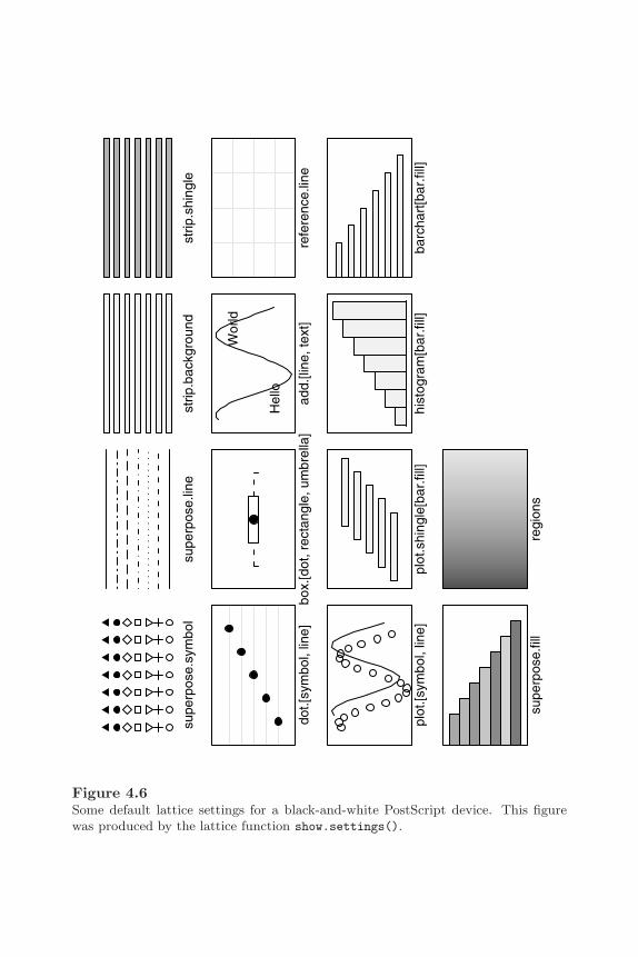
138 R Graphics
supe
rpos
e.sy
mbo
lsu
perp
ose.
line
strip
.bac
kgro
und
strip
.shi
ngle
dot.[
sym
bol,
line]
box.
[dot
, rec
tang
le, u
mbr
ella
]
Hel
lo
Wor
ld
add.
[line
, tex
t]re
fere
nce.
line
plot
.[sym
bol,
line]
plot
.shi
ngle
[bar
.fill]
hist
ogra
m[b
ar.fi
ll]ba
rcha
rt[b
ar.fi
ll]
supe
rpos
e.fil
lre
gion
s
Figure 4.6Some default lattice settings for a black-and-white PostScript device. This figurewas produced by the lattice function show.settings().

Trellis Graphics: the Lattice Package 139
$text
[1] 9
$points
[1] 8
There are two ways to set new values for graphical parameters. The valuescan be set persistently (i.e., they will affect all subsequent plots until a newsetting is specified) using the trellis.par.set() function, or they can beset temporarily for a single plot by specifying settings as an argument to aplotting function.
The trellis.par.set() function can be used in several ways. For back-compatibility with the original implementation of Trellis, it is possible toprovide a name as the first argument and a list of settings as the secondargument. This will modify the values for one parameter group.
A new approach is to provide a list of lists that can be used to modify multipleparameter groups at once. Lattice also introduces the concept of themes,which is a comprehensive and coherent set of graphical parameter values. Itis possible to specify such a theme and enforce a new “look and feel” for aplot in one function call. Lattice currently provides one such theme via thecol.whitebg() function. It is also possible to obtain the default theme for aparticular device using the canonical.theme() function.
The following code demonstrates how to use trellis.par.set() in eitherthe backwards-compatible, one-parameter-group-at-a-time way, or the newlist-of-lists way, to specify fontsize settings.
> trellis.par.set("fontsize", list(text=14, points=10))> trellis.par.set(list(fontsize=list(text=14, points=10)))
The theme approach is usually more convenient, especially when setting onlyone value within a parameter group. For example, the following code demon-strates the difference between the two approaches for modifying just the textsetting within the fontsize parameter group (old way first, new way second).
> fontsize <- trellis.par.get("fontsize")> fontsize$text <- 20> trellis.par.set("fontsize", fontsize)
> trellis.par.set(list(fontsize=list(text=20)))
The concept of themes is an example of a lattice-specific extension to theoriginal Trellis Graphics system.

140 R Graphics
The other way to modify lattice graphical parameter settings is on a per-plot basis, by specifying a par.settings argument in the call to a plottingfunction. The value for this argument should be a theme (a list of lists).Such a setting will only be enforced for the relevant plot and will not affectany subsequent plots. The following code demonstrates how to modify thefontsize settings just for a single plot.
> xyplot(lat ~ long, data=quakes,par.settings=list(fontsize=list(text=14, points=10)))
4.4 Arranging lattice plots
There are two types of arrangements to consider when dealing with latticeplots: the arrangement of panels and strips within a single lattice plot; andthe arrangement of several complete lattice plots together on a single page.
In the first case (the arrangement of panels and strips within a single plot)there are two useful arguments that can be specified in a call to a latticeplotting function: the layout argument and the aspect argument.
The layout argument consists of up to three values. The first two indicatethe number of columns and rows of panels on each page and the third valueindicates the number of pages. It is not necessary to specify all three values,as lattice provides sensible default values for any unspecified values. Thefollowing code produces a variation on Figure 4.4 by explicitly specifying thatthere should be a single column of three panels via the layout argument, andthat each panel must be “square” via the aspect argument. The index.condargument has also been used to specify that the panels should be ordered fromtop to bottom (see Figure 4.7).
> xyplot(lat ~ long | depthgroup, data=quakes, pch=".",layout=c(1, 3), aspect=1, index.cond=list(3:1))
The aspect argument specifies the aspect ratio (height divided by width) forthe panels. The default value is "fill", which means that panels expand tooccupy as much space as possible. In the example above, the panels were allforced to be square by specifying aspect=1. This argument will also acceptthe special value "xy", which means that the aspect ratio is calculated tosatisfy the “banking to 45 degrees” rule proposed by Bill Cleveland[13].

Trellis Graphics: the Lattice Package 141
long
lat
165 170 175 180 185
−35
−30
−25
−20
−15
−10depthgroup
−35
−30
−25
−20
−15
−10depthgroup
−35
−30
−25
−20
−15
−10depthgroup
Figure 4.7Controlling the layout of lattice panels. Lattice arranges panels in a sensible way bydefault, but there are several ways to force the panels to be arranged in a particularlayout. This figure shows a custom arrangement of the panels in the plot from Figure4.4.

142 R Graphics
As with the choice of colors and data symbols, a lot of work is done to selectsensible default values for the arrangement of panels, so in many cases nothingspecial needs to be specified.
Another issue in the arrangement of a single lattice plot is the placement andstructure of the key or legend. This can be controlled using the auto.key orkey argument to plotting functions, which will accept complex specificationsof the contents, layout, and positioning of the key.
The problem of arranging multiple lattice plots on a page requires a differentapproach. A trellis object must be created (but not plotted) for each latticeplot, then the print() function is called, supplying arguments to specify theposition of each plot. The following code provides a simple demonstrationusing the average yearly number of sunspots from 1749 to 1983, available asthe sunspots data set in the datasets package (see Figure 4.8). Two latticeplots are produced and then positioned one above the other on a page. Theposition argument is used to specify their location, (left, bottom, right,top), as a proportion of the total page, and the more argument is used in thefirst print() call to ensure that the second print() call draws on the samepage. The scales argument is also used to draw the x-axis at the top of thetop plot.
> spots <- by(sunspots, gl(235, 12, lab=1749:1983), mean)> plot1 <- xyplot(spots ~ 1749:1983, xlab="", type="l",
main="Average Yearly Sunspots",scales=list(x=list(alternating=2)))
> plot2 <- xyplot(spots ~ 1749:1983, xlab="Year", type="l")> print(plot1, position=c(0, 0.2, 1, 1), more=TRUE)> print(plot2, position=c(0, 0, 1, 0.33))
Section 5.8 describes additional options for controlling the arrangements ofpanels within a lattice plot, and more flexible options for arranging multiplelattice plots, using the concepts and facilities of the grid system.
4.5 Annotating lattice plots
In the original Trellis Graphics system, plots are completely self-contained.There is no real concept of adding output to a plot once the plot has beendrawn. This constraint has been lifted in lattice, though the traditional ap-proach is still supported.

Trellis Graphics: the Lattice Package 143
Average Yearly Sunspots
spot
s
1750 1800 1850 1900 1950
0
50
100
150
Year
spot
s
1750 1800 1850 1900 1950
0100
Figure 4.8Arranging multiple lattice plots. This shows two separate lattice plots arrangedtogether on a single page.
144 R Graphics
4.5.1 Panel functions and strip functions
The trellis object that is produced by a lattice plotting function is a com-plete description of a plot. The usual way to add extra output to a plot (e.g.,add text labels to data symbols), is to add extra information to the trellisobject. This is achieved by specifying a panel function via the panel argumentof lattice plotting functions.
The panel function is called for each panel in a lattice plot. All lattice plottingfunctions have a default panel function, which is usually the name of thefunction with a “panel.” prefix. For example, the default panel function forthe xyplot() function is panel.xyplot(). The default panel function drawsthe default contents for a panel so it is typical to call this default as part of acustom panel function.
The arguments available to the panel function differ depending on the plottingfunction. The documentation for individual panel functions should be con-sulted for full details, but some common arguments to expect are x and y (andpossibly z), giving locations at which to plot data symbols, and subscripts,which provides the indices used to obtain the subset of the data for each panel.
In addition to the panel function, it is possible to specify a prepanel functionfor controlling the scaling and size of panels and a strip function for controllingwhat gets drawn in the strips of a lattice plot.
The following code provides a simple demonstration of the use of panel,prepanel and strip functions. The plot is a lattice multi-panel scatterplotwith text labels added to the data points and a custom strip showing bothlevels of the conditioning variable with the relevant level bold and the otherlevel grey (see Figure 4.9).
The panel function calls the default panel.xyplot() to draw data symbols,then calls ltext() to draw the labels. Because lattice is based on grid, tra-ditional graphics functions will not work in a panel function (though see Ap-pendix B for a way around this constraint). However, there are several latticefunctions that correspond to traditional functions and can be used in muchthe same way as the corresponding traditional functions. The names of thelattice analogues are the traditional function names with an “l” prefix added.In this case, the code draws letters as the labels, using the subscripts argu-ment to select an appropriate subset. The labels are drawn slightly to the leftof and above the data symbols by subtracting 1 from the x values and adding1 to the y values.

Trellis Graphics: the Lattice Package 145
Y
X
0 5 10 15 20
0
5
10
15
20
ac
eg
ik
mo
qs
1 20
5
10
15
20
bd
fh
jl
np
rt
1 2
Figure 4.9Annotating a lattice plot using panel and strip functions. The text labels have beenadded beside the data symbols using a custom panel function and the bold and greynumerals in the strips have been produced using a custom strip function.

146 R Graphics
> myPanel <- function(x, y, subscripts, ...) {panel.xyplot(x, y, ...)ltext(x - 1, y + 1, letters[subscripts], cex=0.5)
}
The strip function also uses ltext(). Locations within the strip are based ona “normalized”coordinate system with the location (0, 0) at the bottom-leftcorner and (1, 1) at the top-right corner. The font face and color for thetext is calculated using the which.panel argument. This supplies the currentlevel for each conditioning variable in the panel.
> myStrip <- function(which.panel, ...) {font <- rep(1, 2)font[which.panel] <- 2col=rep("grey", 2)col[which.panel] <- "black"llines(c(0, 1, 1, 0, 0), c(0, 0, 1, 1, 0))ltext(c(0.33, 0.66), rep(0.5, 2), 1:2,
font=font, col=col)}
The prepanel function calculates the limits of the scales for each panel byextending the range of data by 1 unit (this allows room for the text labelsthat are added in the panel function).
> myPrePanel <- function(x, y, ...) {list(xlim=c(min(x) - 1, max(x) + 1),
ylim=c(min(y) - 1, max(y) + 1))}
We now generate some data to plot and create the plot using xyplot(), withthe special panel functions provided as arguments. The final result is shownin Figure 4.9.
> X <- 1:20> Y <- 1:20> G <- factor(rep(1:2, 10))
> xyplot(X ~ Y | G, aspect=1, layout=c(1, 2),panel=myPanel, strip=myStrip,prepanel=myPrePanel)
A great deal more can be done with panel functions using grid concepts andfunctions. See Sections 5.8 and 6.7 for some examples.

Trellis Graphics: the Lattice Package 147
4.5.2 Adding output to a lattice plot
Unlike in the original Trellis implementation, it is also possible to add outputto a complete lattice plot (i.e., without using a panel function). The func-tion trellis.focus() can be used to return to a particular panel or stripof the current lattice plot in order to add further output using, for example,llines() or lpoints(). The function trellis.panelArgs() may be usefulfor retrieving the arguments (including the data) used to originally draw thepanel. Also, the trellis.identify() function provides basic mouse inter-action for labelling data points within a panel. Again, Sections 5.8 and 6.7show how grid provides more flexibility for navigating to different parts of alattice plot and for adding further output.
4.6 Creating new lattice plots
The lattice plotting functions have many arguments and are very flexible inthe variety of output that they can produce. However, lattice is not designedto be the best environment for developing new types of graphical display. Forexample, there is no mechanism for adding new graphical parameters to thelist of values that control the appearance of plots (see Section 4.3).
Nevertheless, a lot can be done by defining a panel function that does not justadd extra output to the default output, but replaces the default output withsome sort of completely different display. For example, the lattice dotplot()function is really only a call to the bwplot() function with a different panelfunction supplied.
Users wanting to develop a new lattice plotting function along these lines areadvised to read Chapter 5 to gain an understanding of the grid system thatis used in the production of lattice output.
148 R Graphics
Chapter summary
The lattice package implements and extends the Trellis graphics sys-tem for producing complete statistical plots. This system providesmost standard plot types and a number of modern plot types withseveral important extensions. For a start, the layout and appearanceof the plots is designed to maximize readability and comprehension ofthe information represented in the plot. Also, the system provides afeature called multipanel conditioning, which produces multiple panelsof plots from a single data set, where each panel contains a differentsubset of the data. The lattice functions provide an extensive set ofarguments for customizing the detailed appearance of a plot and thereare functions that allow the user to add further output to a plot.

5
The Grid Graphics Model
Chapter preview
This chapter describes the fundamental tools that grid provides fordrawing graphical scenes (including plots). There are basic featuressuch as functions for drawing lines, rectangles, and text, together withmore sophisticated and powerful concepts such as viewports, layouts,and units, which allow basic output to be located and sized in veryflexible ways.
This chapter is useful for drawing a wide variety of pictures, includingstatistical plots from scratch, and for adding output to lattice plots.
The functions that make up the grid graphics system are provided in an add-on package called grid. The grid system is loaded into R as follows.
> library(grid)
In addition to the standard on-line documentation available via the help()function, grid provides both broader and more in-depth on-line documentationin a series of vignettes, which are available via the vignette() function.
The grid graphics system only provides low-level graphics functions. Thereare no high-level functions for producing complete plots. Section 5.1 brieflyintroduces the concepts underlying the grid system, but this only provides anindication of how to work with grid and some of the things that are possible.An effective direct use of grid functions requires a deeper understanding ofthe grid system (see later sections of this chapter and Chapter 6).

150 R Graphics
The lattice package described in Chapter 4 provides a good demonstration ofthe high-level results that can be achieved using grid. Other examples in thisbook are Figure 1.7 in Chapter 1 and Figures 7.1 and 7.18 in Chapter 7.
5.1 A brief overview of grid graphics
This chapter describes how to use grid to produce graphical output. Thereare functions to produce basic output, such as lines and rectangles and text,and there are functions to establish the context for drawing, such as specifyingwhere output should be placed and what colors and fonts to use for drawing.
Like the traditional system, all grid output occurs on the current device,∗ andlater output obscures any earlier output that it overlaps (i.e.,output followsthe “painters model”). In this way, images can be constructed incrementallyusing grid by calling functions in sequence to add more and more output.
There are grid functions to draw primitive graphical output such as lines,text, and polygons, plus some slightly higher-level graphical components suchas axes (see Section 5.2). Complex graphical output is produced by making asequence of calls to these primitive functions.
The colors, line types, fonts, and other aspects that affect the appearance ofgraphical output are controlled via a set of graphical parameters (see Section5.4).
Grid provides no predefined regions for graphical output, but there is a pow-erful facility for defining regions, based on the idea of a viewport (see Section5.5). It is quite simple to produce a set of regions that are convenient forproducing a single plot (see the example in the next section), but it is alsopossible to produce very complex sets of regions such as those used in theproduction of Trellis plots (see Chapter 4).
All viewports have a large set of coordinate systems associated with themso that it is possible to position and size output in physical terms (e.g., incentimeters) as well as relative to the scales on axes, and in a variety of otherways (see Section 5.3).
All grid output occurs relative to the current viewport (region) on a page. Inorder to start a new page of output, the user must call the grid.newpage()
∗See Section 1.3.1 for information on devices and selecting a current device when morethan one device is open.

The Grid Graphics Model 151
function. The function grid.prompt() controls whether the user is promptedwhen moving to a new page.
As well as the side effect of producing graphical output, grid graphics functionsproduce objects representing output. These objects can be saved to producea persistent record of a plot, and other grid functions exist to modify thesegraphical objects (for example, it is possible to interactively edit a plot). It isalso possible to work entirely with graphical descriptions, without producingany output. Functions for working with graphical objects are described indetail in Chapter 6.
5.1.1 A simple example
The following example demonstrates the construction of a simple scatterplotusing grid. This is more work than a single function call to produce the plot,but it shows some of the advantages that can be gained by producing the plotusing grid.
This example uses the pressure data to produce a scatterplot much like thatin Figure 1.1.
Firstly, some regions are created that will correspond to the “plot region” (thearea within which the data symbols will be drawn) and the “margins” (thearea used to draw axes and labels).
The following code creates two viewports. The first viewport is a rectangularregion that leaves space for 5 lines of text at the bottom, 4 lines of text at theleft side, 2 lines at the top, and 2 lines to the right. The second viewport isin the same location as the first, but it has x- and y-scales corresponding tothe range of the pressure data to be plotted.
> pushViewport(plotViewport(c(5, 4, 2, 2)))> pushViewport(dataViewport(pressure$temperature,
pressure$pressure,name="plotRegion"))
The following code draws the scatterplot one piece at a time. Grid outputoccurs relative to the most recent viewport, which in this case is the viewportwith the appropriate axis scales. The data symbols are drawn relative to thex- and y-scales, a rectangle is draw around the entire plot region, and x- andy-axes are drawn to represent the scales.
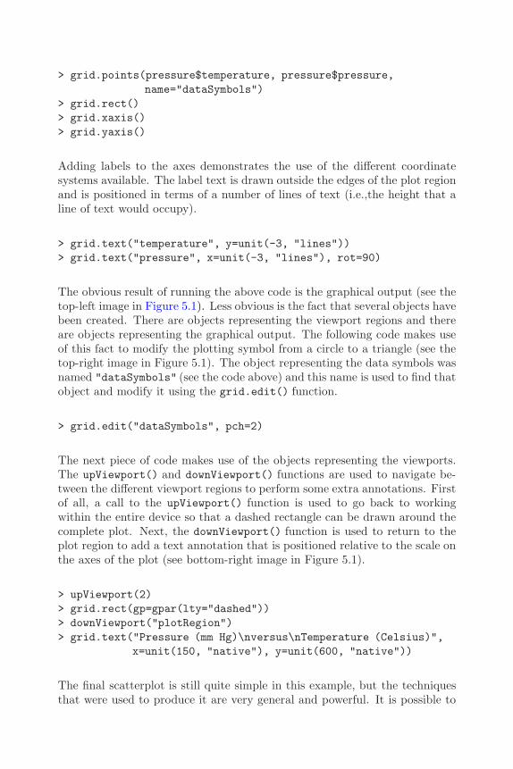
152 R Graphics
> grid.points(pressure$temperature, pressure$pressure,name="dataSymbols")
> grid.rect()> grid.xaxis()> grid.yaxis()
Adding labels to the axes demonstrates the use of the different coordinatesystems available. The label text is drawn outside the edges of the plot regionand is positioned in terms of a number of lines of text (i.e.,the height that aline of text would occupy).
> grid.text("temperature", y=unit(-3, "lines"))> grid.text("pressure", x=unit(-3, "lines"), rot=90)
The obvious result of running the above code is the graphical output (see thetop-left image in Figure 5.1). Less obvious is the fact that several objects havebeen created. There are objects representing the viewport regions and thereare objects representing the graphical output. The following code makes useof this fact to modify the plotting symbol from a circle to a triangle (see thetop-right image in Figure 5.1). The object representing the data symbols wasnamed "dataSymbols" (see the code above) and this name is used to find thatobject and modify it using the grid.edit() function.
> grid.edit("dataSymbols", pch=2)
The next piece of code makes use of the objects representing the viewports.The upViewport() and downViewport() functions are used to navigate be-tween the different viewport regions to perform some extra annotations. Firstof all, a call to the upViewport() function is used to go back to workingwithin the entire device so that a dashed rectangle can be drawn around thecomplete plot. Next, the downViewport() function is used to return to theplot region to add a text annotation that is positioned relative to the scale onthe axes of the plot (see bottom-right image in Figure 5.1).
> upViewport(2)> grid.rect(gp=gpar(lty="dashed"))> downViewport("plotRegion")> grid.text("Pressure (mm Hg)\nversus\nTemperature (Celsius)",
x=unit(150, "native"), y=unit(600, "native"))
The final scatterplot is still quite simple in this example, but the techniquesthat were used to produce it are very general and powerful. It is possible to
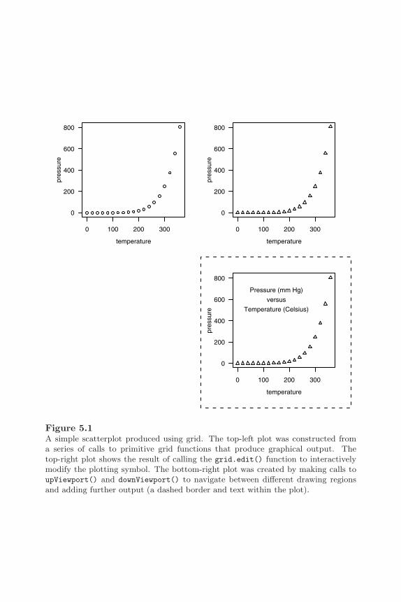
The Grid Graphics Model 153
0 100 200 300
0
200
400
600
800
temperature
pres
sure
0 100 200 300
0
200
400
600
800
temperature
pres
sure
0 100 200 300
0
200
400
600
800
temperature
pres
sure
Pressure (mm Hg)
versus
Temperature (Celsius)
Figure 5.1A simple scatterplot produced using grid. The top-left plot was constructed froma series of calls to primitive grid functions that produce graphical output. Thetop-right plot shows the result of calling the grid.edit() function to interactivelymodify the plotting symbol. The bottom-right plot was created by making calls toupViewport() and downViewport() to navigate between different drawing regionsand adding further output (a dashed border and text within the plot).
154 R Graphics
produce a very complex plot, yet still have complete access to modify and addto any part of the plot.
In the remaining sections of this chapter, and in Chapter 6, the basic gridconcepts of viewports and units are discussed in full detail. A complete un-derstanding of the grid system will be useful in two ways: it will allow theuser to produce very complex images from scratch (the issue of making themavailable to others is addressed in Chapter 7) and it will allow the user towork effectively with (e.g., modify and add to) complex grid output that isproduced by other people’s code (e.g. lattice plots).
5.2 Graphical primitives
The most simple grid functions to understand are those that draw something.There are a set of grid functions for producing basic graphical output such aslines, circles, and text.∗ Table 5.1 lists the full set of these functions.
The first arguments to most of these functions is a set of locations and di-mensions for the graphical object to draw. For example, grid.rect() hasarguments x, y, width, and height for specifying the locations and sizes ofthe rectangles to draw. An important exception is the grid.text() function,which requires the text to draw as its first argument.
In most cases, multiple locations and sizes can be specified and multiple prim-itives will be produced in response. For example, the following function callproduces 100 circles because 100 locations and radii are specified (see Figure5.2).
> grid.circle(x=seq(0.1, 0.9, length=100),y=0.5 + 0.4*sin(seq(0, 2*pi, length=100)),r=abs(0.1*cos(seq(0, 2*pi, length=100))))
The grid.move.to() and grid.line.to() functions are unusual in that theyboth only accept one location. These functions refer to and modify a “cur-rent location.” The grid.move.to() function sets the current location andgrid.line.to() draws from the current location to a new location, then sets
∗All of these functions are of the form grid.*() and, for each one, there is a correspond-ing *Grob() function that creates an object containing a description of primitive graphicaloutput, but does not draw anything. The *Grob() versions are addressed fully in Chapter6.
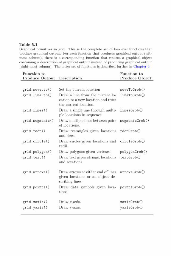
The Grid Graphics Model 155
Table 5.1Graphical primitives in grid. This is the complete set of low-level functions thatproduce graphical output. For each function that produces graphical output (left-most column), there is a corresponding function that returns a graphical objectcontaining a description of graphical output instead of producing graphical output(right-most column). The latter set of functions is described further in Chapter 6.
Function to Function toProduce Output Description Produce Object
grid.move.to() Set the current location moveToGrob()
grid.line.to() Draw a line from the current lo-cation to a new location and resetthe current location.
lineToGrob()
grid.lines() Draw a single line through multi-ple locations in sequence.
linesGrob()
grid.segments() Draw multiple lines between pairsof locations.
segmentsGrob()
grid.rect() Draw rectangles given locationsand sizes.
rectGrob()
grid.circle() Draw circles given locations andradii.
circleGrob()
grid.polygon() Draw polygons given vertexes. polygonGrob()
grid.text() Draw text given strings, locationsand rotations.
textGrob()
grid.arrows() Draw arrows at either end of linesgiven locations or an object de-scribing lines.
arrowsGrob()
grid.points() Draw data symbols given loca-tions.
pointsGrob()
grid.xaxis() Draw x-axis. xaxisGrob()
grid.yaxis() Draw y-axis. yaxisGrob()

156 R Graphics
Figure 5.2Primitive grid output. A demonstration of basic graphical output produced usinga single call to the grid.circle() function. There are 100 circles of varying sizes,each at a different (x, y) location.
the current location to be the new location. The current location is not usedby the other drawing functions∗. In most cases, grid.lines() will be moreconvenient, but grid.move.to() and grid.line.to() are useful for drawinglines across multiple viewports (an example is given in Section 5.5.1).
The grid.arrows() function is used to add arrows to lines. A single linecan be specified by x and y locations (through which a line will be drawn),or the grob argument can be used to specify an object that describes one ormore lines (produced by linesGrob(), segmentsGrob(), or lineToGrob()).In the latter case, grid.arrows() will add arrows at the ends of the line(s).The following code demonstrates the different uses (see Figure 5.3). The firstgrid.arrows() call specifies locations via the x and y arguments to producea single line, at the end of which an arrow is drawn. The second call specifiesa segments graphical object via the grob argument, which describes threelines, and an arrow is added to the end of each of these lines.
> angle <- seq(0, 2*pi, length=50)> grid.arrows(x=seq(0.1, 0.5, length=50),
y=0.5 + 0.3*sin(angle))> grid.arrows(grob=segmentsGrob(6:8/10, 0.2, 7:9/10, 0.8))
∗There is one exception: the grid.arrows() function makes use of the current locationwhen an arrow is added to a line.to graphical object produced by lineToGrob().

The Grid Graphics Model 157
Figure 5.3Drawing arrows using the grid.arrows() function. Arrows can be added to: asingle line through multiple points, as generated by grid.lines() (e.g., the sinecurve in the left half of the figure); multiple straight line segments, as generated bygrid.segments() (e.g., the three straight lines in the right half of the figure); theresult of a line-to operation, as generated by grid.line.to() (example not shownhere).
In simple usage, the grid.polygon() function draws a single polygon throughthe specified x and y locations (automatically joining the last location to thefirst to close the polygon). It is possible to produce multiple polygons from asingle call (which is much faster than making multiple calls) if the id argumentis specified. In this case, a polygon is drawn for each set of x and y locationscorresponding to a different value of id. The following code demonstratesboth usages (see Figure 5.4). The two grid.polygon() calls use the same xand y locations, but the second call splits the locations into three separatepolygons using the id argument.
> angle <- seq(0, 2*pi, length=10)[-10]> grid.polygon(x=0.25 + 0.15*cos(angle), y=0.5 + 0.3*sin(angle),
gp=gpar(fill="grey"))> grid.polygon(x=0.75 + 0.15*cos(angle), y=0.5 + 0.3*sin(angle),
id=rep(1:3, each=3),gp=gpar(fill="grey"))
The grid.xaxis() and grid.yaxis() functions are not really graphical prim-itives as they produce relatively complex output consisting of both lines andtext. They are included here because they complete the set of grid functionsthat produce graphical output. The main argument to these functions is the
158 R Graphics
Figure 5.4Drawing polygons using the grid.polygon() function. By default, a single polygonis produced from multiple (x, y) locations (the nonagon on the left), but it ispossible to associate subsets of the locations with separate polygons using the id
argument (the three triangles on the right).
at argument. This is used to specify where tick-marks should be placed. If theargument is not specified, sensible tick-marks are drawn based on the currentscales in effect (see Section 5.5 for information about viewport scales). Thevalues specified for the at argument are always relative to the current scales(see the concept of the "native" coordinate system in Section 5.3). Thesefunctions are much less flexible and general than the traditional axis() func-tion. For example, they do not provide automatic support for generatinglabels from time- or date-based at locations.
Drawing curves
There is no native curve-drawing function in grid, but an approximation to asmooth curve consisting of many straight line segments is often sufficient. Theexample on the left of Figure 5.3 demonstrates how a series of line segmentscan appear very much like a smooth curve, if enough line segments are used.
5.2.1 Standard arguments
All primitive graphics functions accept a gp argument that allows control overaspects such as the color and line type of the relevant output. For example, thefollowing code specifies that the boundary of the rectangle should be dashed
The Grid Graphics Model 159
and colored red.
> grid.rect(gp=gpar(col="red", lty="dashed"))
Section 5.4 provides more information about setting graphical parameters.
All primitive graphics functions also accept a vp argument that can be usedto specify a viewport in which to draw the relevant output. The followingcode shows a simple example of the syntax (the result is a rectangle drawn inthe left half of the page); Section 5.5 describes viewports and the use of vparguments in full detail.
> grid.rect(vp=viewport(x=0, width=0.5, just="left"))
Finally, all primitive graphics functions also accept a name argument. This canbe used to identify the graphical object produced by the function. It is usefulfor interactively editing graphical output and when working with graphicalobjects (see Chapter 6). The following code demonstrates how to associate aname with a rectangle.
> grid.rect(name="myrect")
5.3 Coordinate systems
When drawing in grid, there are always a large number of coordinate systemsavailable for specifying the locations and sizes of graphical output. For ex-ample, it is possible to specify an x location as a proportion of the width ofthe drawing region, or as a number of inches (or centimeters, or millimeters)from the left-hand edge of the drawing region, or relative to the current x-scale. The full set of coordinate systems available is shown in Table 5.2. Themeaning of some of these will only become clear with an understanding ofviewports (Section 5.5) and graphical objects (Chapter 6).∗
With so many coordinate systems available, it is necessary to specify whichcoordinate system a location or size refers to. The unit() function is used
∗Absolute units, such as inches, may not be rendered with full accuracy on screen devices(see the footnote on page 100).
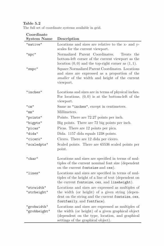
160 R Graphics
Table 5.2The full set of coordinate systems available in grid.
CoordinateSystem Name Description"native" Locations and sizes are relative to the x- and y-
scales for the current viewport."npc" Normalized Parent Coordinates. Treats the
bottom-left corner of the current viewport as thelocation (0, 0) and the top-right corner as (1, 1).
"snpc" Square Normalized Parent Coordinates. Locationsand sizes are expressed as a proportion of thesmaller of the width and height of the currentviewport.
"inches" Locations and sizes are in terms of physical inches.For locations, (0, 0) is at the bottom-left of theviewport.
"cm" Same as "inches", except in centimeters."mm" Millimeters."points" Points. There are 72.27 points per inch."bigpts" Big points. There are 72 big points per inch."picas" Picas. There are 12 points per pica."dida" Dida. 1157 dida equals 1238 points."cicero" Cicero. There are 12 dida per cicero."scaledpts" Scaled points. There are 65536 scaled points per
point.
"char" Locations and sizes are specified in terms of mul-tiples of the current nominal font size (dependenton the current fontsize and cex).
"lines" Locations and sizes are specified in terms of mul-tiples of the height of a line of text (dependent onthe current fontsize, cex, and lineheight).
"strwidth""strheight"
Locations and sizes are expressed as multiples ofthe width (or height) of a given string (depen-dent on the string and the current fontsize, cex,fontfamily, and fontface).
"grobwidth""grobheight"
Locations and sizes are expressed as multiples ofthe width (or height) of a given graphical object(dependent on the type, location, and graphicalsettings of the graphical object).
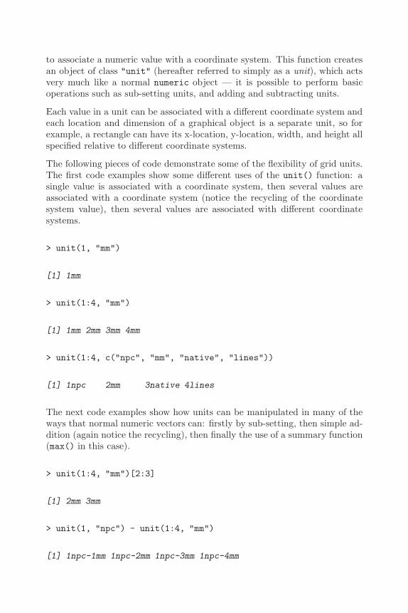
The Grid Graphics Model 161
to associate a numeric value with a coordinate system. This function createsan object of class "unit" (hereafter referred to simply as a unit), which actsvery much like a normal numeric object — it is possible to perform basicoperations such as sub-setting units, and adding and subtracting units.
Each value in a unit can be associated with a different coordinate system andeach location and dimension of a graphical object is a separate unit, so forexample, a rectangle can have its x-location, y-location, width, and height allspecified relative to different coordinate systems.
The following pieces of code demonstrate some of the flexibility of grid units.The first code examples show some different uses of the unit() function: asingle value is associated with a coordinate system, then several values areassociated with a coordinate system (notice the recycling of the coordinatesystem value), then several values are associated with different coordinatesystems.
> unit(1, "mm")
[1] 1mm
> unit(1:4, "mm")
[1] 1mm 2mm 3mm 4mm
> unit(1:4, c("npc", "mm", "native", "lines"))
[1] 1npc 2mm 3native 4lines
The next code examples show how units can be manipulated in many of theways that normal numeric vectors can: firstly by sub-setting, then simple ad-dition (again notice the recycling), then finally the use of a summary function(max() in this case).
> unit(1:4, "mm")[2:3]
[1] 2mm 3mm
> unit(1, "npc") - unit(1:4, "mm")
[1] 1npc-1mm 1npc-2mm 1npc-3mm 1npc-4mm
162 R Graphics
> max(unit(1:4, c("npc", "mm", "native", "lines")))
[1] max(1npc, 2mm, 3native, 4lines)
Some operations on units are not as straightforward as with numeric vectors,but require the use of functions written specifically for units. For exam-ple, the length of units must be obtained using the unit.length() functionrather than length(), units must be concatenated (in the sense of the c()function) using unit.c(), and there are special functions for repeating unitsand for calculating parallel maxima and minima (unit.rep(), unit.pmin(),and unit.pmax()).
The following code provides an example of using units to locate and size arectangle. The rectangle is at a location 40% of the way across the drawingregion and 1 inch from the bottom of the drawing region. It is as wide as thetext "very snug", and it is one line of text high (see Figure 5.5).
> grid.rect(x=unit(0.4, "npc"), y=unit(1, "inches"),width=stringWidth("very snug"),height=unit(1, "lines"),just=c("left", "bottom"))
5.3.1 Conversion functions
As demonstrated in the previous section, a unit is not simply a numeric value.Units only reduce to a simple numeric value (a physical location on a graphicsdevice) when drawing occurs. A consequence of this is that a unit can meanvery different things, depending on when it gets drawn (this should becomemore apparent with an understanding of graphical parameters in Section 5.4and viewports in Section 5.5).
In some cases, it can be useful to convert a unit to a simple numeric value.For example, it is sometimes necessary to know the current scale limits fornumerical calculations. There are several functions that can assist with thisproblem: convertUnit(), convertX(), convertY(), convertWidth(), andconvertHeight(). The following code demonstrates how to calculate thecurrent scale limits for the x-dimension. First of all, a scale is defined on thex-axis with the range c(-10, 50) (see Section 5.5 for more about viewports).
> pushViewport(viewport(xscale=c(-10, 50)))
The next expression performs a query to obtain the current x-axis scale. Theexpression unit(0:1, "npc") represents the left and right boundaries of the

The Grid Graphics Model 163
very snug
1 in
ch
0.4npc
Figure 5.5A demonstration of grid units. A diagram demonstrating how graphical outputcan be located and sized using grid units to associate numeric values with differentcoordinate systems. The grey border represents the current viewport. A blackrectangle has been drawn with its bottom-left corner 40% of the way across thecurrent viewport and 1 inch above the bottom of the current viewport. The rectangleis 1 line of text high and as wide as the text “very snug” (as it would be drawn inthe current font).
current drawing region and convertX() is used to convert these locations intovalues in the "native" coordinate system, which is relative to the currentscales.
> convertX(unit(0:1, "npc"), "native", valueOnly=TRUE)
[1] -10 50
WARNING: These conversion functions must be used with care. The out-put from these functions is only valid for the current device size. If, forexample, a window on screen is resized, or output is copied from one device toanother device with a different physical size, these calculations may no longerbe correct. In other words, only rely on these functions when it is knownthat the size of the graphics device will not change. See Appendix B for moreinformation on this topic and for a way to be able to use these functions ondevices that may be resized. The discussion on the use of these functionsin drawDetails() methods and the function grid.record() is also relevant(see “Calculations during drawing” in Section 7.3.10).
164 R Graphics
5.3.2 Complex units
There are two peculiarities of the "strwidth", "strheight", "grobwidth",and "grobheight" coordinate systems that require further explanation. Inall of these cases, a value is interpreted as a multiple of the size of someother object. In the former two cases, the other object is just a text string(e.g., "a label"), but in the latter two cases, the other object can be anygraphical object (see Chapter 6). It is necessary to specify the other objectwhen generating a unit for these coordinate systems and this is achieved viathe data argument. The following code shows some simple examples.
> unit(1, "strwidth", "some text")
[1] 1strwidth
> unit(1, "grobwidth", textGrob("some text"))
[1] 1grobwidth
A more convenient interface for generating units, when all values are rela-tive to a single coordinate system, is also available via the stringWidth(),stringHeight(), grobWidth(), and grobHeight() functions. The followingcode is equivalent to the previous example.
> stringWidth("some text")
[1] 1strwidth
> grobWidth(textGrob("some text"))
[1] 1grobwidth
In this particular example, the "strwidth" and "grobwidth" units will beidentical as they are based on identical pieces of text. The difference is thata graphical object can contain not only the text to draw, but other informa-tion that may affect the size of the text, such as the font family and size.In the following code, the two units are no longer identical because the textgrob represents text drawn at font size of 20, whereas the simple string rep-resents text at the default size of 10. The convertWidth() function is usedto demonstrate the difference.

The Grid Graphics Model 165
> convertWidth(stringWidth("some text"), "inches")
[1] 0.7175inches
> convertWidth(grobWidth(textGrob("some text",gp=gpar(fontsize=18))),
"inches")
[1] 1.07625inches
For units that contain multiple values, there must be an object specifiedfor every "strwidth", "strheight", "grobwidth", and "grobheight" value.Where there is a mixture of coordinate systems within a unit, a value of NULLcan be supplied for the coordinate systems that do not require data. Thefollowing code demonstrates this.
> unit(rep(1, 3), "strwidth", list("one", "two", "three"))
[1] 1strwidth 1strwidth 1strwidth
> unit(rep(1, 3),c("npc", "strwidth", "grobwidth"),list(NULL, "two", textGrob("three")))
[1] 1npc 1strwidth 1grobwidth
Again, there is a simpler interface for straightforward situations.
> stringWidth(c("one", "two", "three"))
[1] 1strwidth 1strwidth 1strwidth
For "grobwidth" and "grobheight" units, it is also possible to specify thename of a graphical object rather than the graphical object itself. This canbe useful for establishing a reference to a graphical object, so that when thenamed graphical object is modified, the unit is updated for the change. Thefollowing code demonstrates this idea. First of all, a text grob is created withthe name "tgrob".
> grid.text("some text", name="tgrob")

166 R Graphics
Next, a unit is created that is based on the width of the grob called "tgrob".
> theUnit <- grobWidth("tgrob")
The convertWidth() function can be used to show the current value of theunit.
> convertWidth(theUnit, "inches")
[1] 0.7175inches
The following code modifies the grob named "tgrob" and convertWidth()is used to show that the value of the unit reflects the new width of the textgrob.
> grid.edit("tgrob", gp=gpar(fontsize=18))> convertWidth(theUnit, "inches")
[1] 1.07625inches
5.4 Controlling the appearance of output
All graphical primitives functions (and the viewport() function — see Section5.5) — have a gp argument that can be used to provide a set of graphicalparameters to control the appearance of the graphical output. There is afixed set of graphical parameters (see Table 5.3), all of which can be specifiedfor all types of graphical output.
The value supplied for the gp argument must be an object of class "gpar",and a gpar object can be produced using the gpar() function. For example,the following code produces a gpar object containing graphical parametersettings controlling color and line type.
> gpar(col="red", lty="dashed")
$col
[1] "red"
$lty
[1] "dashed"

The Grid Graphics Model 167
Table 5.3The full set of graphical parameters available in grid. The lex parameterhas only been available since R version 2.1.0.
Parameter Description
col Color of lines, text, rectangle borders, ...fill Color for filling rectangles, circles, polygons, ...gamma Gamma correction for colorsalpha Alpha blending coefficient for transparencylwd Line widthlex Line width expansion multiplier applied to lwd to
obtain final line widthlty Line typelineend Line end style (round, butt, square)linejoin Line join style (round, mitre, bevel)linemitre Line mitre limitcex Character expansion multiplier applied to
fontsize to obtain final font sizefontsize Size of text (in points)fontface Font face (bold, italic, ...)fontfamily Font familylineheight Multiplier applied to final font size to obtain the
height of a line

168 R Graphics
The function get.gpar() can be used to obtain current graphical parametersettings. The following code shows how to query the current line type and fillcolor. When called with no arguments, the function returns a complete list ofcurrent settings.
> get.gpar(c("lty", "fill"))
$lty
[1] "solid"
$fill
[1] "transparent"
A gpar object represents an explicit graphical context — settings for a smallnumber of specific graphical parameters. The example above produces agraphical context that ensures that the color setting is "red" and the line-typesetting is "dashed". There is always an implicit graphical context consistingof default settings for all graphical parameters. The implicit graphical con-text is initialized automatically by grid for every graphics device and can bemodified by viewports (see Section 5.5.5) or by gTrees (see Section 6.2.1).∗
A graphical primitive will be drawn with graphical parameter settings takenfrom the implicit graphical context, except where there are explicit graphicalparameter settings from the graphical primitive’s gp argument. For graphicalprimitives, the explicit graphical context is only in effect for the duration of thedrawing of the graphical primitive. The following code example demonstratesthese rules.
The default initial implicit graphical context includes settings such aslty="solid" and fill="transparent". The first (right-most) rectanglehas an explicit setting fill="black" so it only uses the implicit settinglty="solid". The second (left-most) rectangle uses all of the implicit graph-ical parameter settings. In particular, it is not at all affected by the explicitsettings of the first rectangle (see Figure 5.6).
> grid.rect(x=0.66, height=0.7, width=0.2,gp=gpar(fill="black"))
> grid.rect(x=0.33, height=0.7, width=0.2)
∗The ideas of implicit and explicit graphical contexts are similar to the specification ofsettings in Cascading Style Sheets[34] and the graphics state in PostScript[3].

The Grid Graphics Model 169
grid
.rec
t()
grid
.rec
t(gp
=gp
ar(f
ill=
"bla
ck")
)
Figure 5.6Graphical parameters for graphical primitives. The grey rectangle represents thecurrent viewport. The left-hand rectangle has been drawn with no specific graphicalparameters so it inherits the defaults for the current viewport (which in this caseare a black border and no fill color). The right-hand rectangle has been drawn witha specific fill color of black (it is still drawn with the inherited black border). Thegraphical parameter settings for one rectangle have no effect on the other rectangle.
5.4.1 Specifying graphical parameter settings
The values that can be specified for colors, line types, line widths, line ends,line joins, and fonts are mostly the same as for the traditional graphics system.Sections 3.2.1, 3.2.2, and 3.2.3 contain descriptions of these specifications(for example, see the sub-section “Specifying colors”). In many cases, thegraphical parameter in grid also has the same name as the traditional graphicsstate setting (e.g., col), though several of the grid parameters are slightlymore verbose (e.g. lineend and fontfamily). Some other differences in thespecification of graphical parameter values in the grid graphics system aredescribed below.
In grid, the fontface value can be a string instead of an integer. Table 5.4shows the possible string values.
In grid, the cex value is cumulative. This means that it is multiplied by theprevious cex value to obtain a current cex value. The following code showsa simple example. A viewport is pushed with cex=0.5. This means that textwill be half size. Next, some text is drawn, also with cex=0.5. This text isdrawn quarter size because cex was already 0.5 from the viewport (0.5*0.5= 0.25).
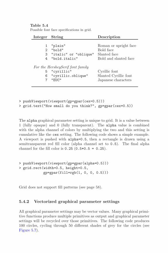
170 R Graphics
Table 5.4Possible font face specifications in grid.
Integer String Description
1 "plain" Roman or upright face2 "bold" Bold face3 "italic" or "oblique" Slanted face4 "bold.italic" Bold and slanted face
For the HersheySerif font family5 "cyrillic" Cyrillic font6 "cyrillic.oblique" Slanted Cyrillic font7 "EUC" Japanese characters
> pushViewport(viewport(gp=gpar(cex=0.5)))> grid.text("How small do you think?", gp=gpar(cex=0.5))
The alpha graphical parameter setting is unique to grid. It is a value between1 (fully opaque) and 0 (fully transparent). The alpha value is combinedwith the alpha channel of colors by multiplying the two and this setting iscumulative like the cex setting. The following code shows a simple example.A viewport is pushed with alpha=0.5, then a rectangle is drawn using asemitransparent red fill color (alpha channel set to 0.5). The final alphachannel for the fill color is 0.25 (0.5*0.5 = 0.25).
> pushViewport(viewport(gp=gpar(alpha=0.5)))> grid.rect(width=0.5, height=0.5,
gp=gpar(fill=rgb(1, 0, 0, 0.5)))
Grid does not support fill patterns (see page 58).
5.4.2 Vectorized graphical parameter settings
All graphical parameter settings may be vector values. Many graphical primi-tive functions produce multiple primitives as output and graphical parametersettings will be recycled over those primitives. The following code produces100 circles, cycling through 50 different shades of grey for the circles (seeFigure 5.7).
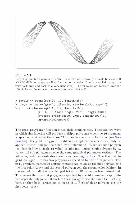
The Grid Graphics Model 171
Figure 5.7Recycling graphical parameters. The 100 circles are drawn by a single function callwith 50 different greys specified for the border color (from a very light grey to avery dark grey and back to a very light grey). The 50 colors are recycled over the100 circles so circle i gets the same color as circle i + 50.
> levels <- round(seq(90, 10, length=25))> greys <- paste("grey", c(levels, rev(levels)), sep="")> grid.circle(x=seq(0.1, 0.9, length=100),
y=0.5 + 0.4*sin(seq(0, 2*pi, length=100)),r=abs(0.1*cos(seq(0, 2*pi, length=100))),gp=gpar(col=greys))
The grid.polygon() function is a slightly complex case. There are two waysin which this function will produce multiple polygons: when the id argumentis specified and when there are NA values in the x or y locations (see Sec-tion 5.6). For grid.polygon(), a different graphical parameter will only beapplied to each polygon identified by a different id. When a single polygon(as identified by a single id value) is split into multiple sub-polygons by NAvalues, all sub-polygons receive the same graphical parameter settings. Thefollowing code demonstrates these rules (see Figure 5.8). The first call togrid.polygon() draws two polygons as specified by the id argument. Thefill graphical parameter setting contains two colors so the first polygon getsthe first color (grey) and the second polygon gets the second color (white). Inthe second call, all that has changed is that an NA value has been introduced.This means that the first polygon as specified by the id argument is split intotwo separate polygons, but both of these polygons use the same fill settingbecause they both correspond to an id of 1. Both of these polygons get thefirst color (grey).

172 R Graphics
NA
Figure 5.8Recycling graphical parameters for polygons. On the left, a single function callproduces two polygons with different fill colors by specifying an id argument andtwo fill colors. On the right, there are three polygons because an NA value has beenintroduced in the (x, y) locations for the polygon, but there are still only two colorsspecified. The colors are allocated to polygons using the id argument and ignoringany NA values.
> angle <- seq(0, 2*pi, length=11)[-11]> grid.polygon(x=0.25 + 0.15*cos(angle), y=0.5 + 0.3*sin(angle),
id=rep(1:2, c(7, 3)),gp=gpar(fill=c("grey", "white")))
> angle[4] <- NA> grid.polygon(x=0.75 + 0.15*cos(angle), y=0.5 + 0.3*sin(angle),
id=rep(1:2, c(7, 3)),gp=gpar(fill=c("grey", "white")))
All graphical primitives have a gp component, so it is possible to specify anygraphical parameter setting for any graphical primitive. This may seem inef-ficient, and indeed in some cases the values are completely ignored (e.g., textdrawing ignores the lty setting), but in many cases the values are potentiallyuseful. For example, even when there is no text being drawn, the settings forfontsize, cex, and lineheight are always used to calculate the meaning of"lines" and "char" coordinates.
The Grid Graphics Model 173
5.5 Viewports
A viewport is a rectangular region that provides a context for drawing.
A viewport provides a drawing context consisting of both a geometric contextand a graphical context. A geometric context consists of a set of coordinate sys-tems for locating and sizing output and all of the coordinate systems describedin Section 5.3 are available within every viewport.∗ A graphical context con-sists of explicit graphical parameter settings for controlling the appearance ofoutput. This is specified as a gpar object via the gp argument.
By default, grid creates a viewport that corresponds to the entire graphicsdevice and, until another viewport is created, drawing occurs within the fullextent of the device and using the default graphical parameter settings.
A new viewport is created using the viewport() function. A viewport hasa location (given by x and y), a size (given by width and height), and it isjustified relative to its location (according to the value of the just argument).The location and size of a viewport are specified in units, so a viewport canbe positioned and sized within another viewport in a very flexible manner.The following code creates a viewport that is left-justified at an x location0.4 of the way across the drawing region, and bottom-justified 1 centimeterfrom the bottom of the drawing region. It is as wide as the text "very verysnug indeed", and it is six lines of text high. Figure 5.9 shows a diagramrepresenting this viewport.
> viewport(x=unit(0.4, "npc"), y=unit(1, "cm"),width=stringWidth("very very snug indeed"),height=unit(6, "lines"),just=c("left", "bottom"))
viewport[GRID.VP.33]
An important thing to notice in the above example is that the result of theviewport() function is an object of class viewport. No region has actuallybeen created on a graphics device. In order to create regions on a graphicsdevice, a viewport object must be pushed onto the device, as described in thenext section.
∗The idea of being able to define a geometric context is similar to the concept of thecurrent transformation matrix (CTM) in PostScript[3] and the modeling transformation inOpenGL[55].
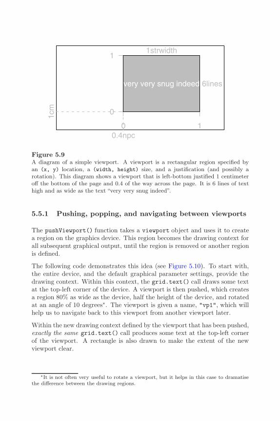
174 R Graphics
0 1
0
1 1strwidth
6lines
0.4npc
1cm
very very snug indeed
Figure 5.9A diagram of a simple viewport. A viewport is a rectangular region specified byan (x, y) location, a (width, height) size, and a justification (and possibly arotation). This diagram shows a viewport that is left-bottom justified 1 centimeteroff the bottom of the page and 0.4 of the way across the page. It is 6 lines of texthigh and as wide as the text “very very snug indeed”.
5.5.1 Pushing, popping, and navigating between viewports
The pushViewport() function takes a viewport object and uses it to createa region on the graphics device. This region becomes the drawing context forall subsequent graphical output, until the region is removed or another regionis defined.
The following code demonstrates this idea (see Figure 5.10). To start with,the entire device, and the default graphical parameter settings, provide thedrawing context. Within this context, the grid.text() call draws some textat the top-left corner of the device. A viewport is then pushed, which createsa region 80% as wide as the device, half the height of the device, and rotatedat an angle of 10 degrees∗. The viewport is given a name, "vp1", which willhelp us to navigate back to this viewport from another viewport later.
Within the new drawing context defined by the viewport that has been pushed,exactly the same grid.text() call produces some text at the top-left cornerof the viewport. A rectangle is also drawn to make the extent of the newviewport clear.
∗It is not often very useful to rotate a viewport, but it helps in this case to dramatisethe difference between the drawing regions.

The Grid Graphics Model 175
top−left corner
top−left corner
Figure 5.10Pushing a viewport. Drawing occurs relative to the entire device until a viewport ispushed. For example, some text has been drawn in the top-left corner of the device.Once a viewport has been pushed, output is drawn relative to that viewport. Theblack rectangle represents a viewport that has been pushed and text has been drawnin the top-left corner of that viewport.
> grid.text("top-left corner", x=unit(1, "mm"),y=unit(1, "npc") - unit(1, "mm"),just=c("left", "top"))
> pushViewport(viewport(width=0.8, height=0.5, angle=10,name="vp1"))
> grid.rect()> grid.text("top-left corner", x=unit(1, "mm"),
y=unit(1, "npc") - unit(1, "mm"),just=c("left", "top"))
The pushing of viewports is entirely general. A viewport is pushed relativeto the current drawing context. The following code slightly extends the pre-vious example by pushing a further viewport, exactly like the first, and againdrawing text at the top-left corner (see Figure 5.11). The location, size, androtation of this second viewport are all relative to the context provided by thefirst viewport. Viewports can be nested like this to any depth.
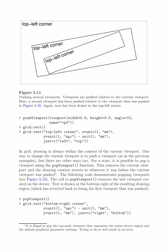
176 R Graphics
top−left corner
top−left corner
top−left corner
Figure 5.11Pushing several viewports. Viewports are pushed relative to the current viewport.Here, a second viewport has been pushed relative to the viewport that was pushedin Figure 5.10. Again, text has been drawn in the top-left corner.
> pushViewport(viewport(width=0.8, height=0.5, angle=10,name="vp2"))
> grid.rect()> grid.text("top-left corner", x=unit(1, "mm"),
y=unit(1, "npc") - unit(1, "mm"),just=c("left", "top"))
In grid, drawing is always within the context of the current viewport. Oneway to change the current viewport is to push a viewport (as in the previousexamples), but there are other ways too. For a start, it is possible to pop aviewport using the popViewport() function. This removes the current view-port and the drawing context reverts to whatever it was before the currentviewport was pushed∗. The following code demonstrates popping viewports(see Figure 5.12). The call to popViewport() removes the last viewport cre-ated on the device. Text is drawn at the bottom-right of the resulting drawingregion (which has reverted back to being the first viewport that was pushed).
> popViewport()> grid.text("bottom-right corner",
x=unit(1, "npc") - unit(1, "mm"),y=unit(1, "mm"), just=c("right", "bottom"))
∗It is illegal to pop the top-most viewport that represents the entire device region andthe default graphical parameter settings. Trying to do so will result in an error.
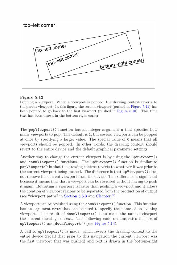
The Grid Graphics Model 177
top−left corner
top−left corner
top−left corner
bottom−right corner
Figure 5.12Popping a viewport. When a viewport is popped, the drawing context reverts tothe parent viewport. In this figure, the second viewport (pushed in Figure 5.11) hasbeen popped to go back to the first viewport (pushed in Figure 5.10). This timetext has been drawn in the bottom-right corner.
The popViewport() function has an integer argument n that specifies howmany viewports to pop. The default is 1, but several viewports can be poppedat once by specifying a larger value. The special value of 0 means that allviewports should be popped. In other words, the drawing context shouldrevert to the entire device and the default graphical parameter settings.
Another way to change the current viewport is by using the upViewport()and downViewport() functions. The upViewport() function is similar topopViewport() in that the drawing context reverts to whatever it was prior tothe current viewport being pushed. The difference is that upViewport() doesnot remove the current viewport from the device. This difference is significantbecause it means that that a viewport can be revisited without having to pushit again. Revisiting a viewport is faster than pushing a viewport and it allowsthe creation of viewport regions to be separated from the production of output(see “viewport paths” in Section 5.5.3 and Chapter 7).
A viewport can be revisited using the downViewport() function. This functionhas an argument name that can be used to specify the name of an existingviewport. The result of downViewport() is to make the named viewportthe current drawing context. The following code demonstrates the use ofupViewport() and downViewport() (see Figure 5.13).
A call to upViewport() is made, which reverts the drawing context to theentire device (recall that prior to this navigation the current viewport wasthe first viewport that was pushed) and text is drawn in the bottom-right

178 R Graphics
top−left corner
top−left corner
top−left corner
bottom−right corner
bottom−right corner
Figure 5.13Navigating between viewports. Rather than popping a viewport, it is possible tonavigate up from a viewport (and leave the viewport on the device). Here navigationhas occurred from the first viewport to revert the drawing context to the entiredevice and text has been drawn in the bottom-right corner. Next, there has beena navigation down to the first viewport again and a second border has been drawnaround the outside of the viewport.
corner. The downViewport() function is then used to navigate back down tothe viewport that was first pushed and a second border is drawn around thisviewport. The viewport to navigate down to is specified by its name, "vp1".
> upViewport()> grid.text("bottom-right corner",
x=unit(1, "npc") - unit(1, "mm"),y=unit(1, "mm"), just=c("right", "bottom"))
> downViewport("vp1")> grid.rect(width=unit(1, "npc") + unit(2, "mm"),
height=unit(1, "npc") + unit(2, "mm"))
There is also a seekViewport() function that can be used to travel acrossthe viewport tree. This can be convenient for interactive use, but the result isless predictable, so it is less suitable for use in writing grid functions for oth-ers to use. The call seekViewport("avp") is equivalent to upViewport(0);downViewport("avp").

The Grid Graphics Model 179
Drawing between viewports
Sometimes it is useful to be able to locate graphical output relative to morethan one viewport. The only way to do this in grid is via the grid.move.to()and grid.line.to() functions. It is possible to call grid.move.to() withinone viewport, change viewports, and call grid.line.to(). An example isprovided in Section 5.8.2.
5.5.2 Clipping to viewports
Drawing can be restricted to only the interior of the current viewport (clippedto the viewport) by specifying the clip argument to the viewport() function.This argument has three values: "on" indicates that output should be clippedto the current viewport; "off" indicates that output should not be clippedat all; "inherit" means that the clipping region of the previous viewportshould be used (this may not have been set by the previous viewport if thatviewport’s clip argument was also "inherit"). The following code providesa simple example (see Figure 5.14). A viewport is pushed with clipping onand a circle with a very thick black border is drawn relative to the viewport.A rectangle is also drawn to show the extent of the viewport. The circlepartially extends beyond the limits of the viewport, so only those parts of thecircle that lie within the viewport are drawn.
> pushViewport(viewport(w=.5, h=.5, clip="on"))> grid.rect()> grid.circle(r=.7, gp=gpar(lwd=20))
Next, another viewport is pushed and this viewport just inherits the clippingregion from the first viewport. Another circle is drawn, this time with a greyand slightly thinner border and again the circle is clipped to the viewport.
> pushViewport(viewport(clip="inherit"))> grid.circle(r=.7, gp=gpar(lwd=10, col="grey"))
Finally, a third viewport is pushed with clipping turned off. Now, when athird circle is drawn (with a thin, black border) all of the circle is drawn, eventhough parts of the circle extend beyond the the viewport.
> pushViewport(viewport(clip="off"))> grid.circle(r=.7)> popViewport(3)

180 R Graphics
Figure 5.14Clipping output in viewports. When a viewport is pushed, output can be clipped tothat viewport, or the clipping region can be left in its current state, or clipping canbe turned off entirely. In this figure, a viewport is pushed (the black rectangle) withclipping on. A circle is drawn with a very thick black border and it gets clipped.Next, another viewport is pushed (in the same location) with clipping left as it was.A second circle is drawn with a slightly thinner grey border and it is also clipped.Finally, a third viewport is pushed, which turns clipping off. A circle is drawn witha thin black border and this circle is not clipped.
The Grid Graphics Model 181
5.5.3 Viewport lists, stacks, and trees
It can be convenient to work with several viewports at once and there areseveral facilities for doing this in grid. The pushViewport() function willaccept multiple arguments and will push the specified viewports one afteranother. For example, the fourth expression below is a shorter equivalentversion of the first three expressions.
> pushViewport(vp1)> pushViewport(vp2)> pushViewport(vp3)
> pushViewport(vp1, vp2, vp3)
The pushViewport() function will also accept objects that contain severalviewports: viewport lists, viewport stacks, and viewport trees. The func-tion vpList() creates a list of viewports and these are pushed “in parallel.”The first viewport in the list is pushed, then grid navigates back up beforethe next viewport in the list is pushed. The vpStack() function creates astack of viewports and these are pushed “in series.” Pushing a stack of view-ports is exactly the same as specifying the viewports as multiple argumentsto pushViewport(). The vpTree() function creates a tree of viewports thatconsists of a parent viewport and any number of child viewports. The parentviewport is pushed first, then the the child viewports are pushed in parallelwithin the parent.
The current set of viewports that have been pushed on the current deviceconstitute a viewport tree and the current.vpTree() function prints out arepresentation of the current viewport tree. The following code demonstratesthe output from current.vpTree() and the difference between lists, stacks,and trees of viewports. First of all, some (trivial) viewports are created towork with.
> vp1 <- viewport(name="A")> vp2 <- viewport(name="B")> vp3 <- viewport(name="C")
The next piece of code shows these three viewports pushed as a list. Theoutput of current.vpTree() shows the root viewport (which represents theentire device) and then all three viewports as children of the root viewport.
> pushViewport(vpList(vp1, vp2, vp3))> current.vpTree()

182 R Graphics
viewport[ROOT]->(viewport[A], viewport[B], viewport[C])
This next code pushes the three viewports as a stack. The viewport vp1 isnow the only child of the root viewport with vp2 a child of vp1, and vp3 achild of vp2.
> grid.newpage()> pushViewport(vpStack(vp1, vp2, vp3))> current.vpTree()
viewport[ROOT]->(viewport[A]->(viewport[B]->(viewport[C])))
Finally, the three viewports are pushed as a tree, with vp1 as the parent andvp2 and vp3 as its children.
> grid.newpage()> pushViewport(vpTree(vp1, vpList(vp2, vp3)))> current.vpTree()
viewport[ROOT]->(viewport[A]->(viewport[B], viewport[C]))
As with single viewports, viewport lists, stacks, and trees can be provided asthe vp argument for graphical functions (see Section 5.5.4).
Viewport paths
The downViewport() function, by default, searches down the current viewporttree as far as is necessary to find a given viewport name. This is convenientfor interactive use, but can be ambiguous if there is more than one viewportwith the same name in the viewport tree.
Grid provides the concept of a viewport path to resolve such ambiguity. Aviewport path is an ordered list of viewport names, which specify a seriesof parent-child relations. A viewport path is created using the vpPath()function. For example, the following code produces a viewport path thatspecifies a viewport called "C" with a parent called "B", which in turn has aparent called "A".
> vpPath("A", "B", "C")
A::B::C

The Grid Graphics Model 183
For convenience in interactive use, a viewport path may be specified directlyas a string. For example, the previous viewport path could be specified simplyas "A::B::C". The vpPath() function should be used when writing graphicsfunctions for others to use.
The name argument to the downViewport() function will accept a viewportpath, in which case it searches for a viewport that matches the entire path.The strict argument to downViewport() ensures that a viewport will onlybe found if the full viewport path is found, starting from the current locationin the viewport tree.
5.5.4 Viewports as arguments to graphical primitives
As mentioned in Section 5.2.1, a viewport may be specified as an argument tofunctions that produce graphical output (via an argument called vp). When aviewport is specified in this way, the viewport gets pushed before the graphicaloutput is produced and popped afterwards. To make this completely clear,the following two code segments are identical. First of all, a simple viewportis defined.
> vp1 <- viewport(width=0.5, height=0.5, name="vp1")
The next code explicitly pushes the viewport, draws some text, then pops theviewport.
> pushViewport(vp1)> grid.text("Text drawn in a viewport")> popViewport()
This next piece of code does the same thing in a single call.
> grid.text("Text drawn in a viewport", vp=vp1)
It is also possible to specify the name of a viewport (or a viewport path) for avp argument. In this case, the name (or path) is used to navigate down to theviewport (via a call to downViewport()) and then back up again afterwards(via a call to upViewport()). This promotes the practice of pushing viewportsonce, then specifying where to draw different output by simply naming theappropriate viewport. The following code does the same thing as the previousexample, but leaves the viewport intact (so that it can be used for furtherdrawing).
184 R Graphics
> pushViewport(vp1)> upViewport()> grid.text("Text drawn in a viewport", vp="vp1")
This feature is also very useful when annotating a plot produced by a high-level graphics function. As long as the graphics function names the viewportsthat it creates and does not pop them, it is possible to revisit the viewportsto add further output. Examples of this are given in Section 5.8 and thisapproach to writing high-level grid functions is discussed further in Chapter7.
5.5.5 Graphical parameter settings in viewports
A viewport can have graphical parameter settings associated with it via the gpargument to viewport(). When a viewport has graphical parameter settings,those settings affect all graphical objects drawn within the viewport, and allother viewports pushed within the viewport, unless the graphical objects orthe other viewports specify their own graphical parameter setting. In otherwords, the graphical parameter settings for a viewport modify the implicitgraphical context (see page 168).
The following code demonstrates this rule. A viewport is pushed that hasa fill="grey" setting. A rectangle with no graphical parameter settings isdrawn within that viewport and this rectangle “inherits” the fill="grey"setting. Another rectangle is drawn with its own fill setting so it does notinherit the viewport setting (see Figure 5.15).
> pushViewport(viewport(gp=gpar(fill="grey")))> grid.rect(x=0.33, height=0.7, width=0.2)> grid.rect(x=0.66, height=0.7, width=0.2,
gp=gpar(fill="black"))> popViewport()
The graphical parameter settings in a viewport only affect other viewports andgraphical output within that viewport. The settings do not affect the view-port itself. For example, parameters controlling the size of text (fontsize,cex, etc.) do not affect the meaning of "lines" units when determining thelocation and size of the viewport (but they will affect the location and sizeof other viewports or graphical output within the viewport). A layout (seeSection 5.5.6) counts as being within the viewport (i.e., it is affected by thegraphical parameter settings of the viewport).
If there are multiple values for a graphical parameter setting, only the first isused when determining the location and size of a viewport.

The Grid Graphics Model 185
viewport(gp=gpar(fill="grey"))
grid
.rec
t()
grid
.rec
t(gp
=gp
ar(f
ill=
"bla
ck")
)
Figure 5.15The inheritance of viewport graphical parameters. A diagram demonstrating howviewport graphical parameter settings are inherited by graphical output within theviewport. The viewport sets the default fill color to grey. The left-hand rectanglespecifies no fill color itself so it is filled with grey. The right-hand rectangle specifiesa black fill color that overrides the viewport setting.
5.5.6 Layouts
A viewport can have a layout specified via the layout argument. A layoutin grid is similar to the same concept in traditional graphics (see Section3.3.2). It divides the viewport region into several columns and rows, whereeach column can have a different width and each row can have a differentheight. For several reasons, however, layouts are much more flexible in grid:there are many more coordinate systems for specifying the widths of columnsand the heights of rows (see Section 5.3); viewports can occupy overlappingareas within the layout; and each viewport within the viewport tree can havea layout (layouts can be nested). There is also a just argument to justify thelayout within a viewport when the layout does not occupy the entire viewportregion.
Layouts provide a convenient way to position viewports using the standardset of coordinate systems, and provide an extra coordinate system, "null",which is specific to layouts.
The basic idea is that a viewport can be created with a layout and thensubsequent viewports can be positioned relative to that layout. In simplecases, this can be just a convenient way to position viewports in a regular grid,but in more complex cases, layouts are the only way to apportion regions.There are very many ways that layouts can be used in grid; the following

186 R Graphics
sections attempt to provide a glimpse of the possibilities by demonstrating aseries of example uses.
A grid layout is created using the function grid.layout() (not the traditionalfunction layout()).
A simple layout
The following code produces a simple layout with three columns and threerows, where the central cell (row two, column two) is forced to always besquare (using the respect argument).
> vplay <- grid.layout(3, 3,respect=rbind(c(0, 0, 0),
c(0, 1, 0),c(0, 0, 0)))
The next piece of code uses this layout in a viewport. Any subsequent view-ports may make use of the layout, or they can ignore it completely.
> pushViewport(viewport(layout=vplay))
In the next piece of code, two further viewports are pushed within the viewportwith the layout. The layout.pos.col and layout.pos.row arguments areused to specify which cells within the layout each viewport should occupy. Thefirst viewport occupies all of column two and the second viewport occupies allof row 2. This demonstrates that viewports can occupy overlapping regionswithin a layout. A rectangle has been drawn within each viewport to showthe region that the viewport occupies (see Figure 5.16).
> pushViewport(viewport(layout.pos.col=2, name="col2"))> upViewport()> pushViewport(viewport(layout.pos.row=2, name="row2"))
A layout with units
This section describes a layout that makes use of grid units. In the context ofspecifying the widths of columns and the heights of rows for a layout, there isan additional unit available, the "null" unit. All other units ("cm", "npc",etc.) are allocated first within a layout, then the "null" units are used todivide the remaining space proportionally (see Section 3.3.2). The following

The Grid Graphics Model 187
col2
row2
Figure 5.16Layouts and viewports. Two viewports occupying overlapping regions within alayout. Each viewport is represented by a rectangle with the viewport name at thetop-left corner. The layout has three columns and three rows with one viewportoccupying all of row 2 and the other viewport occupying all of column 2.
code creates a layout with three columns and three rows. The left column isone inch wide and the top row is three lines of text high. The remainder ofthe current region is divided into two rows of equal height and two columnswith the right column twice as wide as the left column (see Figure 5.17).
> unitlay <-grid.layout(3, 3,
widths=unit(c(1, 1, 2),c("inches", "null", "null")),
heights=unit(c(3, 1, 1),c("lines", "null", "null")))
With the use of "strwidth" and "grobwidth" units it is possible to producecolumns that are just wide enough to fit graphical output that will be drawnin the column (and similarly for row heights — see Section 6.4).
A nested layout
This section demonstrates the nesting of layouts. The following code definesa function that includes a trivial use of a layout consisting of two equal-widthcolumns to produce grid output.

188 R Graphics
(1, 1)3lines
1inches
(1, 2)
1null
(1, 3) 3lines
2null
(2, 1)1null (2, 2) (2, 3) 1null
(3, 1)1null
1inches
(3, 2)
1null
(3, 3)
2null
1null
Figure 5.17Layouts and units. A grid layout using a variety of coordinate systems to specifythe widths of columns and the heights of rows.
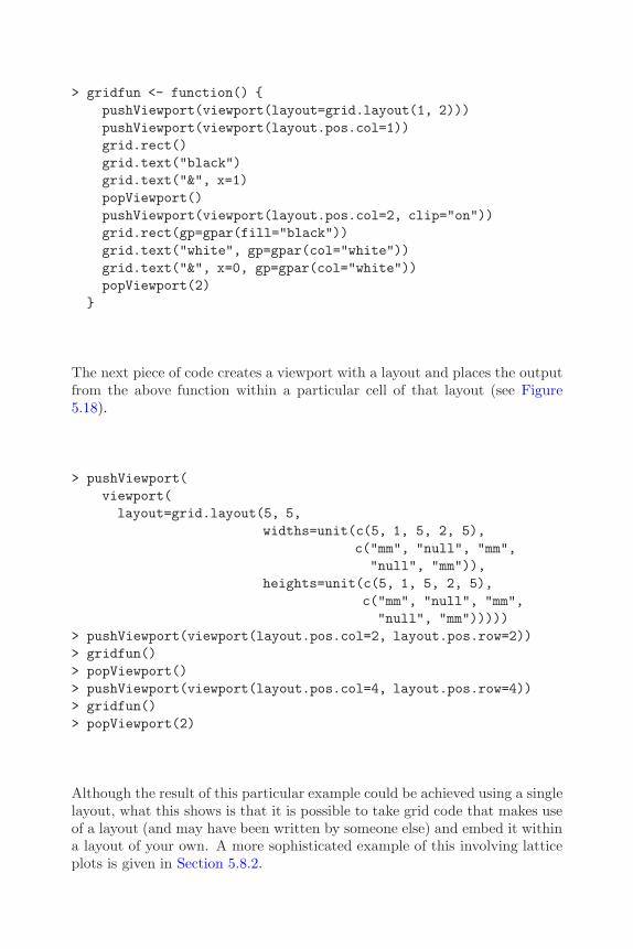
The Grid Graphics Model 189
> gridfun <- function() {pushViewport(viewport(layout=grid.layout(1, 2)))pushViewport(viewport(layout.pos.col=1))grid.rect()grid.text("black")grid.text("&", x=1)popViewport()pushViewport(viewport(layout.pos.col=2, clip="on"))grid.rect(gp=gpar(fill="black"))grid.text("white", gp=gpar(col="white"))grid.text("&", x=0, gp=gpar(col="white"))popViewport(2)
}
The next piece of code creates a viewport with a layout and places the outputfrom the above function within a particular cell of that layout (see Figure5.18).
> pushViewport(viewport(layout=grid.layout(5, 5,
widths=unit(c(5, 1, 5, 2, 5),c("mm", "null", "mm","null", "mm")),
heights=unit(c(5, 1, 5, 2, 5),c("mm", "null", "mm","null", "mm")))))
> pushViewport(viewport(layout.pos.col=2, layout.pos.row=2))> gridfun()> popViewport()> pushViewport(viewport(layout.pos.col=4, layout.pos.row=4))> gridfun()> popViewport(2)
Although the result of this particular example could be achieved using a singlelayout, what this shows is that it is possible to take grid code that makes useof a layout (and may have been written by someone else) and embed it withina layout of your own. A more sophisticated example of this involving latticeplots is given in Section 5.8.2.
190 R Graphics
black & white&
black & white&
Figure 5.18Nested layouts. An example of a layout nested within a layout. The black and whitesquares are drawn within a layout that has two equal-width columns. One instanceof the black and white squares has been embedded within cell (2, 2) of a layoutconsisting of five columns and five rows of varying widths and heights (as indicatedby the dashed lines). Another instance has been embedded within cell (4, 4).
5.6 Missing values and non-finite values
Non-finite values are not permitted in the location, size, or scales of a viewport.Viewport scales are checked when a viewport is created, but it is impossibleto be certain that locations and sizes are not non-finite when the viewportis created, so this is only checked when the viewport is pushed. Non-finitevalues result in error messages.
The locations and sizes of graphical objects can be specified as missing values(NA, "NA") or non-finite values (NaN, Inf, -Inf). For most graphical primitives,non-finite values for locations or sizes result in the corresponding primitivenot being drawn. For the grid.line.to() function, a line segment is onlydrawn if the previous location and the new location are both not non-finite.For grid.polygon(), a non-finite value breaks the polygon into two separatepolygons. This break happens within the current polygon as specified by theid argument. All polygons with the same id receive the same gp settings. Forgrid.arrows(), an arrow head is only drawn if the first or last line segmentis drawn.
Figure 5.19 shows the behavior of these primitives where x- and y-locations

The Grid Graphics Model 191
are seven equally-spaced locations around the perimeter of a circle. In thetop-left figure, all locations are not non-finite. In each of the other figures,two locations have been made non-finite (indicated in each case by grey text).
5.7 Interactive graphics
The strength of the grid system is in the production of static graphics. There isonly very basic support for user interaction, consisting of the grid.locator()function. This function returns the location of a single mouse click relative tothe current viewport. The result is a list containing an x and a y unit. Theunit argument can be used to specify the coordinate system to be used forthe result.
From R version 2.1.0, the getGraphicsEvent() function provides additionalcapability (on Windows) to respond to mouse movements, mouse ups, and keystrokes. However, with this function, mouse activity is only reported relativeto the native coordinate system of the device.
5.8 Customizing lattice plots
This section provides some demonstrations of the basic grid functions withinthe context of a complete lattice plot.
The lattice package described in Chapter 4 produces complete and very so-phisticated plots using grid. It makes use of a sometimes large number ofviewports to arrange the graphical output. A page of lattice output containsa top-level viewport with a quite complex layout that provides space for all ofthe panels and strips and margins used in the plot. Viewports are created foreach panel and for each strip (among other things), and the plot is constructedfrom a large number of rectangles, lines, text, and data points.
In many cases, it is possible to use lattice without having to know anythingabout grid. However, a knowledge of grid provides a number of more ad-vanced ways to work with lattice output (see Section 6.7). A simple ex-ample is provided by the panel.width and panel.height arguments to theprint.trellis() method. These provide an alternative to the aspect argu-ment for controlling the size of panels within a lattice plot using grid units.
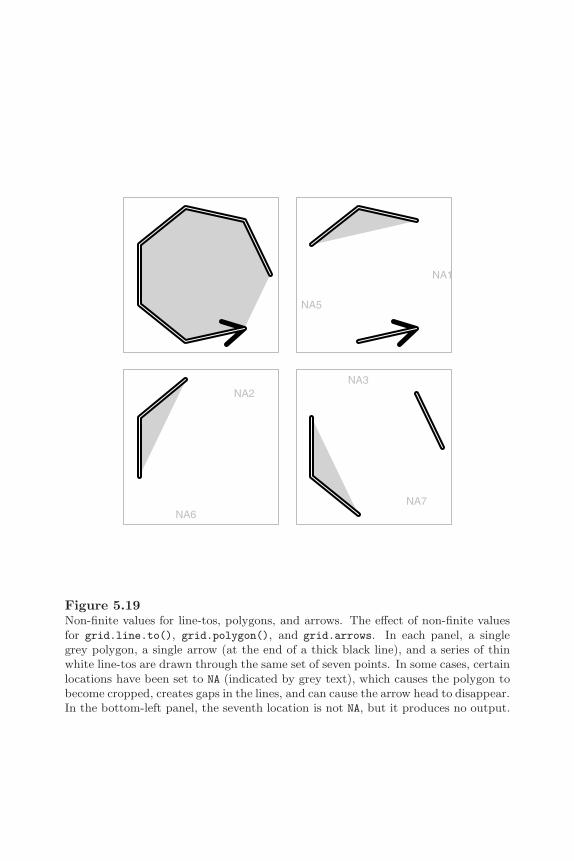
192 R Graphics
NA1
NA5
NA2
NA6
NA3
NA7
Figure 5.19Non-finite values for line-tos, polygons, and arrows. The effect of non-finite valuesfor grid.line.to(), grid.polygon(), and grid.arrows. In each panel, a singlegrey polygon, a single arrow (at the end of a thick black line), and a series of thinwhite line-tos are drawn through the same set of seven points. In some cases, certainlocations have been set to NA (indicated by grey text), which causes the polygon tobecome cropped, creates gaps in the lines, and can cause the arrow head to disappear.In the bottom-left panel, the seventh location is not NA, but it produces no output.

The Grid Graphics Model 193
long
lat
165 170 175 180 185
−35
−30
−25
−20
−15
−10depthgroup
165 170 175 180 185
depthgroup
165 170 175 180 185
depthgroup
Figure 5.20Controlling the size of lattice panels using grid units. Each panel is exactly 1.21inches wide and 1.5 inches high.
The following code produces a multipanel lattice plot of the quakes data set(see page 126) where the size of each panel is fixed at 1.21 inches wide and1.5 inches high (see Figure 5.20).∗
> temp <- xyplot(lat ~ long | depthgroup,data=quakes, pch=".",layout=c(3, 1))
> print(temp,panel.width=list(1.21, "inches"),panel.height=list(1.5, "inches"))
5.8.1 Adding grid output to lattice output
The functions that lattice provides for adding output to panels (ltext(),lpoints(), etc) are designed to make it easier to port code between R andS-PLUS. However, they are restricted because they only allow output to belocated and sized relative to the "native" coordinate system. Grid graphicalprimitives cannot be ported to S-PLUS, but they provide much more control
∗These specific sizes were chosen for this particular data set so that one unit of longitudecorresponds to the same physical size on the page as one unit of latitude.
194 R Graphics
over the location and size of additional panel output. Furthermore, it is possi-ble to create and push extra viewports within a panel if desired (although it isvery important that they are popped again or lattice will get very confused).
In a similar vein, the facilities provided by the upViewport() anddownViewport() functions in grid allow for more flexible navigation of a lat-tice plot compared to the trellis.focus() function.
The following code provides an example of using low-level grid functions to addoutput within a lattice panel function. This produces a variation on Figure4.4 with a dot and a text label added to indicate the location of Auckland,New Zealand relative to the earthquakes (see Figure 5.21).∗
> xyplot(lat ~ long | depthgroup, data=quakes, pch=".",panel=function(...) {grid.points(174.75, -36.87, pch=16,
size=unit(2, "mm"),default.units="native")
grid.text("Auckland",unit(174.75, "native") - unit(2, "mm"),unit(-36.87, "native"),just="right")
panel.xyplot(...)})
5.8.2 Adding lattice output to grid output
As well as the advantages of using grid functions to add further output tolattice plots, an understanding that lattice output is really grid output makesit possible to embed lattice output within grid output. The following codeprovides a simple example (see Figure 5.22).
First of all, two viewports are defined. The viewport tvp occupies the right-most 1 inch of the device and will be used to draw a label. The viewport lvpoccupies the rest of the device and will be used to draw a lattice plot.
> lvp <- viewport(x=0,width=unit(1, "npc") - unit(1, "inches"),just="left", name="lvp")
> tvp <- viewport(x=1, width=unit(1, "inches"),just="right", name="tvp")
∗The data are from the quakes data set (see page 126).
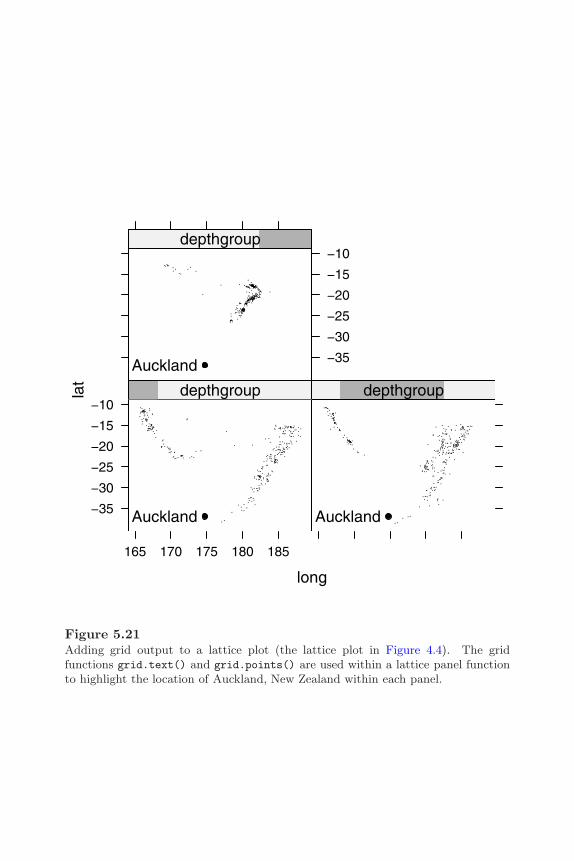
The Grid Graphics Model 195
long
lat
165 170 175 180 185
−35
−30
−25
−20
−15
−10
Auckland
depthgroup
Auckland
depthgroup
−35
−30
−25
−20
−15
−10
Auckland
depthgroup
Figure 5.21Adding grid output to a lattice plot (the lattice plot in Figure 4.4). The gridfunctions grid.text() and grid.points() are used within a lattice panel functionto highlight the location of Auckland, New Zealand within each panel.
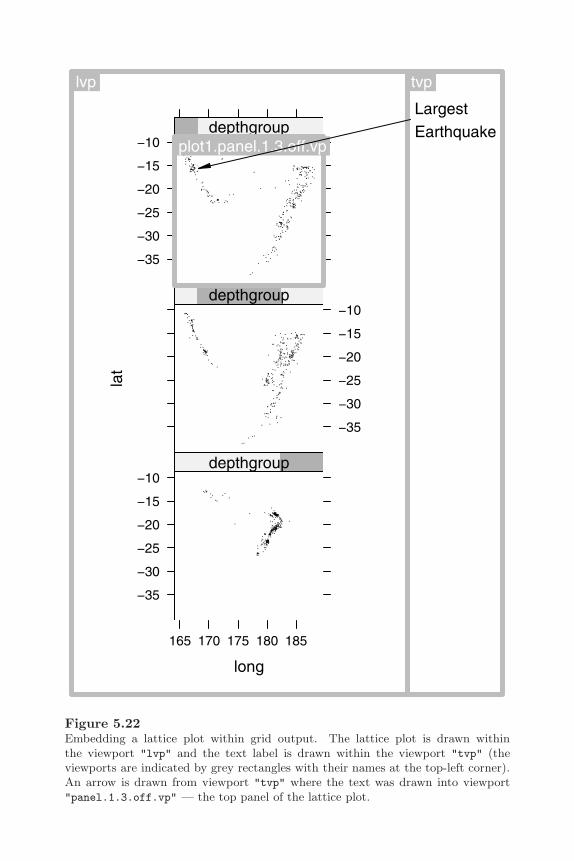
196 R Graphics
long
lat
165 170 175 180 185
−35
−30
−25
−20
−15
−10depthgroup
−35
−30
−25
−20
−15
−10depthgroup
−35
−30
−25
−20
−15
−10depthgroup
lvp
plot1.panel.1.3.off.vp
LargestEarthquake
tvp
Figure 5.22Embedding a lattice plot within grid output. The lattice plot is drawn withinthe viewport "lvp" and the text label is drawn within the viewport "tvp" (theviewports are indicated by grey rectangles with their names at the top-left corner).An arrow is drawn from viewport "tvp" where the text was drawn into viewport"panel.1.3.off.vp" — the top panel of the lattice plot.
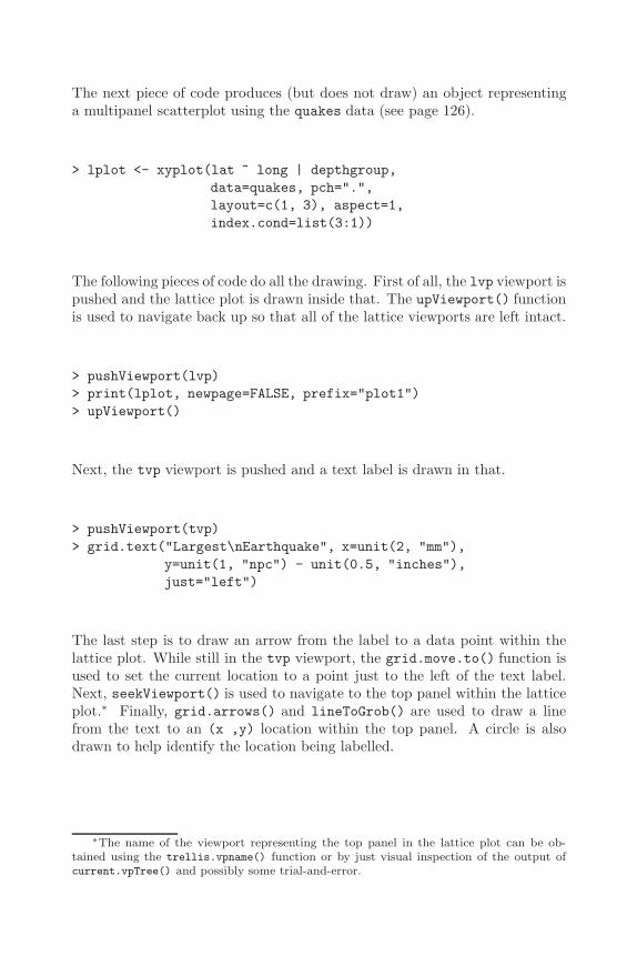
The Grid Graphics Model 197
The next piece of code produces (but does not draw) an object representinga multipanel scatterplot using the quakes data (see page 126).
> lplot <- xyplot(lat ~ long | depthgroup,data=quakes, pch=".",layout=c(1, 3), aspect=1,index.cond=list(3:1))
The following pieces of code do all the drawing. First of all, the lvp viewport ispushed and the lattice plot is drawn inside that. The upViewport() functionis used to navigate back up so that all of the lattice viewports are left intact.
> pushViewport(lvp)> print(lplot, newpage=FALSE, prefix="plot1")> upViewport()
Next, the tvp viewport is pushed and a text label is drawn in that.
> pushViewport(tvp)> grid.text("Largest\nEarthquake", x=unit(2, "mm"),
y=unit(1, "npc") - unit(0.5, "inches"),just="left")
The last step is to draw an arrow from the label to a data point within thelattice plot. While still in the tvp viewport, the grid.move.to() function isused to set the current location to a point just to the left of the text label.Next, seekViewport() is used to navigate to the top panel within the latticeplot.∗ Finally, grid.arrows() and lineToGrob() are used to draw a linefrom the text to an (x ,y) location within the top panel. A circle is alsodrawn to help identify the location being labelled.
∗The name of the viewport representing the top panel in the lattice plot can be ob-tained using the trellis.vpname() function or by just visual inspection of the output ofcurrent.vpTree() and possibly some trial-and-error.
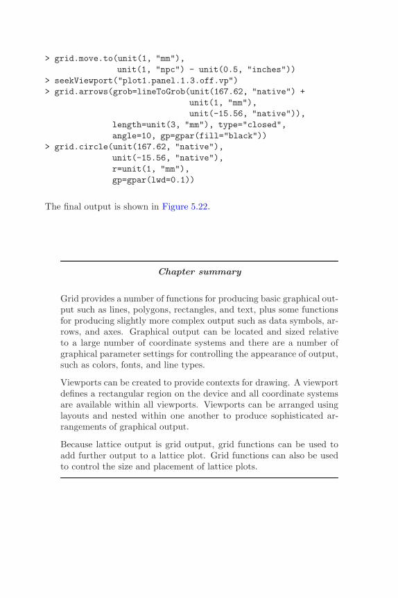
198 R Graphics
> grid.move.to(unit(1, "mm"),unit(1, "npc") - unit(0.5, "inches"))
> seekViewport("plot1.panel.1.3.off.vp")> grid.arrows(grob=lineToGrob(unit(167.62, "native") +
unit(1, "mm"),unit(-15.56, "native")),
length=unit(3, "mm"), type="closed",angle=10, gp=gpar(fill="black"))
> grid.circle(unit(167.62, "native"),unit(-15.56, "native"),r=unit(1, "mm"),gp=gpar(lwd=0.1))
The final output is shown in Figure 5.22.
Chapter summary
Grid provides a number of functions for producing basic graphical out-put such as lines, polygons, rectangles, and text, plus some functionsfor producing slightly more complex output such as data symbols, ar-rows, and axes. Graphical output can be located and sized relativeto a large number of coordinate systems and there are a number ofgraphical parameter settings for controlling the appearance of output,such as colors, fonts, and line types.
Viewports can be created to provide contexts for drawing. A viewportdefines a rectangular region on the device and all coordinate systemsare available within all viewports. Viewports can be arranged usinglayouts and nested within one another to produce sophisticated ar-rangements of graphical output.
Because lattice output is grid output, grid functions can be used toadd further output to a lattice plot. Grid functions can also be usedto control the size and placement of lattice plots.
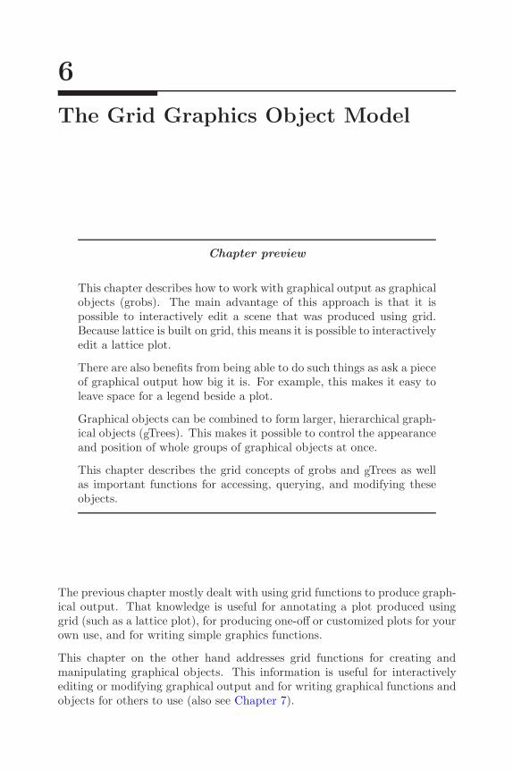
6
The Grid Graphics Object Model
Chapter preview
This chapter describes how to work with graphical output as graphicalobjects (grobs). The main advantage of this approach is that it ispossible to interactively edit a scene that was produced using grid.Because lattice is built on grid, this means it is possible to interactivelyedit a lattice plot.
There are also benefits from being able to do such things as ask a pieceof graphical output how big it is. For example, this makes it easy toleave space for a legend beside a plot.
Graphical objects can be combined to form larger, hierarchical graph-ical objects (gTrees). This makes it possible to control the appearanceand position of whole groups of graphical objects at once.
This chapter describes the grid concepts of grobs and gTrees as wellas important functions for accessing, querying, and modifying theseobjects.
The previous chapter mostly dealt with using grid functions to produce graph-ical output. That knowledge is useful for annotating a plot produced usinggrid (such as a lattice plot), for producing one-off or customized plots for yourown use, and for writing simple graphics functions.
This chapter on the other hand addresses grid functions for creating andmanipulating graphical objects. This information is useful for interactivelyediting or modifying graphical output and for writing graphical functions andobjects for others to use (also see Chapter 7).
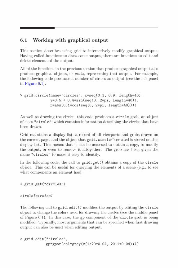
200 R Graphics
6.1 Working with graphical output
This section describes using grid to interactively modify graphical output.Having called functions to draw some output, there are functions to edit anddelete elements of the output.
All of the functions in the previous section that produce graphical output alsoproduce graphical objects, or grobs, representing that output. For example,the following code produces a number of circles as output (see the left panelin Figure 6.1).
> grid.circle(name="circles", x=seq(0.1, 0.9, length=40),y=0.5 + 0.4*sin(seq(0, 2*pi, length=40)),r=abs(0.1*cos(seq(0, 2*pi, length=40))))
As well as drawing the circles, this code produces a circle grob, an objectof class "circle", which contains information describing the circles that havebeen drawn.
Grid maintains a display list, a record of all viewports and grobs drawn onthe current page, and the object that grid.circle() created is stored on thisdisplay list. This means that it can be accessed to obtain a copy, to modifythe output, or even to remove it altogether. The grob has been given thename "circles" to make it easy to identify.
In the following code, the call to grid.get() obtains a copy of the circleobject. This can be useful for querying the elements of a scene (e.g., to seewhat components an element has).
> grid.get("circles")
circle[circles]
The following call to grid.edit() modifies the output by editing the circleobject to change the colors used for drawing the circles (see the middle panelof Figure 6.1). In this case, the gp component of the circle grob is beingmodified. Typically, most arguments that can be specified when first drawingoutput can also be used when editing output.
> grid.edit("circles",gp=gpar(col=grey(c(1:20*0.04, 20:1*0.04))))

The Grid Graphics Object Model 201
Figure 6.1Modifying a circle grob. The left panel shows the output produced by a call togrid.circle(), the middle panel shows the result of using grid.edit() to modifythe colors of the circles, and the right panel shows the result of using grid.remove()
to delete the circles.
The next call below, to the grid.remove() function, deletes the output byremoving the circle object from the display list (see the right panel of Figure6.1).
> grid.remove("circles")
In each of these examples, the grob has been specified by giving its name("circles"). Other standard arguments to these functions are discussed inthe next section.
Any output produced by grid functions can be interacted with in this way,∗
including output from lattice functions (see Section 6.7).
6.1.1 Standard functions and arguments
The complete set of functions that provide the ability to interact with grobsis given in Table 6.1.
All of the functions for working with graphical output require a grob name asthe first argument, to identify which grob to work with. This name will betreated as a regular expression if the grep argument is TRUE.
If the global argument is TRUE then all matching grobs on the display list(not just the first) will be accessed or modified.
The following code provides a simple example. Eight concentric circle grobsare drawn, with the first, third, fifth, and seventh circles named "circle.odd"
∗It is possible to disable the grid display list, in which case no grobs are stored so thesesorts of manipulations are no longer possible.

202 R Graphics
Table 6.1Functions for working with grobs. Functions of the form grid.*() access anddestructively modify grobs on the grid display list and affect graphical output.Functions of the form *Grob() work with user-level grobs and return grobs astheir values (they have no effect on graphical output).
Function to work Function to workwith output Description with grobsgrid.get() Returns a copy of one or
more grobsgetGrob()
grid.edit() Modifies one or more grobs editGrob()
grid.add() Adds a grob to one or moregrobs
addGrob()
grid.remove() Removes one or more grobs removeGrob()
grid.set() Replaces one or more grobs setGrob()
and the second, fourth, sixth, and eighth circles named "circle.even". Thecircles are initially drawn with decreasing shades of grey (see the left panel ofFigure 6.2).
> suffix <- c("even", "odd")> for (i in 1:8)
grid.circle(name=paste("circle.", suffix[i %% 2 + 1],sep=""),
r=(9 - i)/20,gp=gpar(col=NA, fill=grey(i/10)))
The following call to grid.edit() makes use of the global argument tomodify all grobs named "circle.odd" and change their fill color to a verydark grey (see the middle panel of Figure 6.2).
> grid.edit("circle.odd", gp=gpar(fill="grey10"),global=TRUE)
A second call to grid.edit(), below, makes use of both the grep argumentand the global argument to modify all grobs with names matching the pattern"circle" (all of the circles) and change their fill color to a light grey and theirborder color to a darker grey (see the right panel of Figure 6.2).
> grid.edit("circle", gp=gpar(col="grey", fill="grey90"),grep=TRUE, global=TRUE)
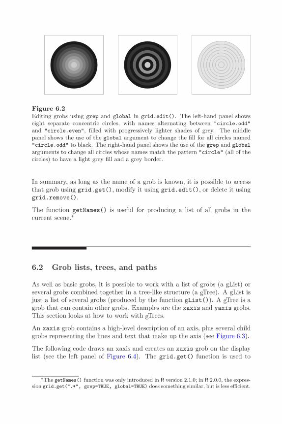
The Grid Graphics Object Model 203
Figure 6.2Editing grobs using grep and global in grid.edit(). The left-hand panel showseight separate concentric circles, with names alternating between "circle.odd"
and "circle.even", filled with progressively lighter shades of grey. The middlepanel shows the use of the global argument to change the fill for all circles named"circle.odd" to black. The right-hand panel shows the use of the grep and global
arguments to change all circles whose names match the pattern "circle" (all of thecircles) to have a light grey fill and a grey border.
In summary, as long as the name of a grob is known, it is possible to accessthat grob using grid.get(), modify it using grid.edit(), or delete it usinggrid.remove().
The function getNames() is useful for producing a list of all grobs in thecurrent scene.∗
6.2 Grob lists, trees, and paths
As well as basic grobs, it is possible to work with a list of grobs (a gList) orseveral grobs combined together in a tree-like structure (a gTree). A gList isjust a list of several grobs (produced by the function gList()). A gTree is agrob that can contain other grobs. Examples are the xaxis and yaxis grobs.This section looks at how to work with gTrees.
An xaxis grob contains a high-level description of an axis, plus several childgrobs representing the lines and text that make up the axis (see Figure 6.3).
The following code draws an xaxis and creates an xaxis grob on the displaylist (see the left panel of Figure 6.4). The grid.get() function is used to
∗The getNames() function was only introduced in R version 2.1.0; in R 2.0.0, the expres-sion grid.get(".*", grep=TRUE, global=TRUE) does something similar, but is less efficient.
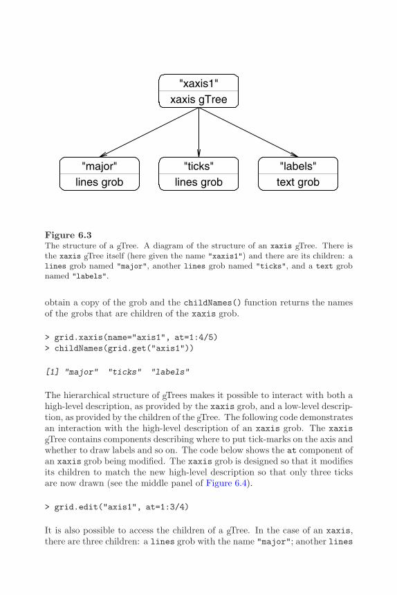
204 R Graphics
"xaxis1"xaxis gTree
"major"lines grob
"ticks"lines grob
"labels"text grob
Figure 6.3The structure of a gTree. A diagram of the structure of an xaxis gTree. There isthe xaxis gTree itself (here given the name "xaxis1") and there are its children: alines grob named "major", another lines grob named "ticks", and a text grobnamed "labels".
obtain a copy of the grob and the childNames() function returns the namesof the grobs that are children of the xaxis grob.
> grid.xaxis(name="axis1", at=1:4/5)> childNames(grid.get("axis1"))
[1] "major" "ticks" "labels"
The hierarchical structure of gTrees makes it possible to interact with both ahigh-level description, as provided by the xaxis grob, and a low-level descrip-tion, as provided by the children of the gTree. The following code demonstratesan interaction with the high-level description of an xaxis grob. The xaxisgTree contains components describing where to put tick-marks on the axis andwhether to draw labels and so on. The code below shows the at component ofan xaxis grob being modified. The xaxis grob is designed so that it modifiesits children to match the new high-level description so that only three ticksare now drawn (see the middle panel of Figure 6.4).
> grid.edit("axis1", at=1:3/4)
It is also possible to access the children of a gTree. In the case of an xaxis,there are three children: a lines grob with the name "major"; another lines
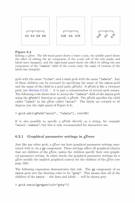
The Grid Graphics Object Model 205
0.2 0.4 0.6 0.8 0.25 0.5 0.750.
25 0.5
0.75
Figure 6.4Editing a gTree. The left-hand panel shows a basic x-axis, the middle panel showsthe effect of editing the at component of the x-axis (all of the tick marks andlabels have changed), and the right-hand panel shows the effect of editing the rot
component of the "labels" child of the x-axis (only the angle of rotation of thelabels has changed).
grob with the name "ticks"; and a text grob with the name "labels". Anyof these children can be accessed by specifying the name of the xaxis groband the name of the child in a grob path (gPath). A gPath is like a viewportpath (see Section 5.5.3) — it is just a concatenation of several grob names.The following code shows how to access the "labels" child of the xaxis grobusing the gPath() function to specify a gPath. The gPath specifies the childcalled "label" in the gTree called "axis1". The labels are rotated to 45degrees (see the right panel of Figure 6.4).
> grid.edit(gPath("axis1", "labels"), rot=45)
It is also possible to specify a gPath directly as a string, for example"axis1::labels", but this is only recommended for interactive use.
6.2.1 Graphical parameter settings in gTrees
Just like any other grob, a gTree can have graphical parameter settings asso-ciated with it via a gp component. These settings affect all graphical objectsthat are children of the gTree, unless the children specify their own graphi-cal parameter setting. In other words, the graphical parameter settings for agTree modify the implicit graphical context for the children of the gTree (seepage 168).
The following expression demonstrates this rule. The gp component of anxaxis grob sets the drawing color to be "grey". This means that all of thechildren of the xaxis — the lines and labels — will be drawn grey.
> grid.xaxis(gp=gpar(col="grey"))

206 R Graphics
Another example of this behavior is given in Section 6.3 and the role of thegp component in the drawing behavior of gTree objects is described in moredetail in Section 7.3.4.
6.2.2 Viewports as components of gTrees
Just like any other grob, a gTree can have a viewport (or viewport tree, orviewport path, etc.) associated with it via a vp component. This viewport ispushed before the gTree is drawn and popped afterwards (see Section 5.5.4).This means that the children of a gTree are drawn within the drawing contextdefined by the viewport in the vp slot of the gTree (see page 173).
The following code demonstrates this rule. The vp component of an xaxisgrob specifies a viewport in the top half of the page. This means that thechildren of the xaxis are positioned relative to that viewport.
> grid.xaxis(vp=viewport(y=0.75, height=0.5))
An example of this behavior is given in Section 6.3 and the role of the vpcomponent in the drawing behavior of gTree objects is described in moredetail in Sections 7.3.4 and 7.3.7.
6.2.3 Searching for grobs
This section provides details about how grob names and gPaths are used tofind a grob.
Grobs are stored on the grid display list in the order that they are drawn.When searching for a matching name, the functions in Table 6.1 search thedisplay list from the beginning. This means that if there are several grobswhose names are matched, they will be found in the order that they weredrawn.
Furthermore, the functions perform a depth-first search. This means that ifthere is a gTree on the display list, and its name is not matched, then itschildren are searched for a match before any other grobs on the display listare searched.
The name to search for can be given as a gPath, which can be usefulto explicitly specify a particular child grob of a particular gTree (as in"axis1::labels").
The argument strict controls whether a complete match must be found.By default, the strict argument is FALSE, so in the previous exam-

The Grid Graphics Object Model 207
ple, the "labels" child of "axis1" could have been accessed simply bygrid.get("labels"). On the other hand, if strict is set to TRUE, thensimply specifying "labels" results in no match as shown by the followingcode (there is no top-level grob with the name "labels").
> grid.edit("labels", strict=TRUE, rot=45)
Error in
editDLfromGPath(gPath, specs, strict, grep, global, redraw) :
’gPath’ (labels) not found
6.3 Working with graphical objects off-screen
The previous section described how grid functions that produce graphicaloutput also produce grobs. In some cases, it is useful to create a grob withoutproducing any output. This section describes how to use grid to producegraphical objects (without drawing them). There are functions to create grobs,functions to combine them, and modify them, and the grid.draw() functionto draw them.
For each grid function that produces graphical output, there is a counterpartthat produces a graphical object and no graphical output. For example, thecounterpart to grid.circle() is the function circleGrob() (see Table 5.1).Similarly, for each function that works with grobs on the grid display list,there is a counterpart for working with grobs off-screen. For example, thecounterpart to grid.edit() is editGrob() (see Table 6.1).
The following example demonstrates the process of creating a grob and work-ing with a grob without drawing it. The code below draws a rectangle that isas wide as a text grob, but the text is not drawn. The function textGrob()produces a text grob, but does not draw it.
> grid.rect(width=grobWidth(textGrob("Some text")))
It can be useful to create a grob and modify it before producing any graphicaloutput (i.e., only draw the final result). The following code creates an axisand modifies the font face for the labels to italic before drawing the axis. Thefunction grid.draw() is used to produce graphical output from a grob.
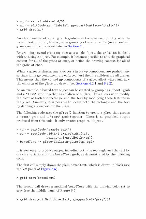
208 R Graphics
> ag <- xaxisGrob(at=1:4/5)> ag <- editGrob(ag, "labels", gp=gpar(fontface="italic"))> grid.draw(ag)
Another example of working with grobs is in the construction of gTrees. Inits simplest form, a gTree is just a grouping of several grobs (more complexgTree creation is discussed later in Section 7.3).
By grouping several grobs together as a single object, the grobs can be dealtwith as a single object. For example, it becomes possible to edit the graphicalcontext for all of the grobs at once, or define the drawing context for all ofthe grobs at once.
When a gTree is drawn, any viewports in its vp component are pushed, anysettings in its gp component are enforced, and then its children are all drawn.This means that the vp and gp components of a gTree affect where and howthe children of the gTree are drawn (see Sections 6.2.1 and 6.2.2).
As an example, a boxed-text object can be created by grouping a "rect" groband a "text" grob together as children of a gTree. This allows us to modifythe color of both the rectangle and the text by modifying these features inthe gTree. Similarly, it is possible to locate both the rectangle and the textby defining a viewport for the gTree.
The following code uses the gTree() function to create a gTree that groupsa "rect" grob and a "text" grob together. There is no graphical outputproduced from this code. It only creates graphical objects.
> tg <- textGrob("sample text")> rg <- rectGrob(width=1.1*grobWidth(tg),
height=1.3*grobHeight(tg))> boxedText <- gTree(children=gList(tg, rg))
It is now easy to produce output including both the rectangle and the text bydrawing variations on the boxedText grob, as demonstrated by the followingcode.
The first call simply draws the plain boxedText, which is drawn in black (seethe left panel of Figure 6.5).
> grid.draw(boxedText)
The second call draws a modified boxedText with the drawing color set togrey (see the middle panel of Figure 6.5).
> grid.draw(editGrob(boxedText, gp=gpar(col="grey")))
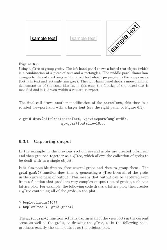
The Grid Graphics Object Model 209
sample text sample text
sam
ple te
xt
Figure 6.5Using a gTree to group grobs. The left-hand panel shows a boxed text object (whichis a combination of a piece of text and a rectangle). The middle panel shows howchanges to the color settings in the boxed text object propagate to the components(both the text and rectangle turn grey). The right-hand panel shows a more dramaticdemonstration of the same idea as, in this case, the fontsize of the boxed text ismodified and it is drawn within a rotated viewport.
The final call draws another modification of the boxedText, this time in arotated viewport and with a larger font (see the right panel of Figure 6.5).
> grid.draw(editGrob(boxedText, vp=viewport(angle=45),gp=gpar(fontsize=18)))
6.3.1 Capturing output
In the example in the previous section, several grobs are created off-screenand then grouped together as a gTree, which allows the collection of grobs tobe dealt with as a single object.
It is also possible first to draw several grobs and then to group them. Thegrid.grab() function does this by generating a gTree from all of the grobsin the current page of output. This means that output can be captured evenfrom a function that produces very complex output (lots of grobs), such as alattice plot. For example, the following code draws a lattice plot, then createsa gTree containing all of the grobs in the plot.
> bwplot(rnorm(10))> bwplotTree <- grid.grab()
The grid.grab() function actually captures all of the viewports in the currentscene as well as the grobs, so drawing the gTree, as in the following code,produces exactly the same output as the original plot.

210 R Graphics
> grid.newpage()> grid.draw(bwplotTree)
Another function, grid.grabExpr() allows complex output to be capturedoff-screen. This function takes an R expression and evaluates it. Any drawingthat occurs as a result of evaluating the expression does not produce anyoutput, but the grobs that would be produced are captured anyway.
The following code provides a simple demonstration. Here a lattice plot iscaptured without drawing any output.∗
> grid.grabExpr(print(bwplot(rnorm(10))))
gTree[GRID.GROB.152]
Both the grid.grab() and grid.grabExpr() functions attempt to create agTree in a sophisticated way so that it is easier to work with the resultinggTree. Unfortunately, this will not always produce a gTree that will exactlyreplicate the original output. These functions issue warnings if they detect asituation where output may not be reproduced correctly, and there is a wrapargument that can be used to force the functions to produce a gTree that isless sophisticated, but is guaranteed to replicate the original output.†
6.4 Placing and packing grobs in frames
It can be useful to position the components of a plot in a way that leavessufficient room for labels or legends. The "grobwidth" and "grobheight"coordinate systems provide a way to determine the size of a grob and canbe used to achieve this sort of arrangement of components by, for example,allocating appropriate regions within a layout.
The following code demonstrates this idea. First of all, some grobs are createdto use as components of a scene. The first grob, label, is a simple text grob.The second grob, gplot, is a gTree containing a rect grob, a lines grob, anda points grob that provide a simple representation of time-series data. The
∗The expression must explicitly print() the lattice plot because otherwise nothingwould be drawn (see Section 4.1).
†The grid.grabExpr() function is only available from R version 2.1.0.

The Grid Graphics Object Model 211
gplot has a viewport in its vp component and the rectangle and lines aredrawn within that viewport.
> label <- textGrob("A\nPlot\nLabel ",x=0, just="left")
> x <- seq(0.1, 0.9, length=50)> y <- runif(50, 0.1, 0.9)> gplot <-
gTree(children=gList(rectGrob(gp=gpar(col="grey60",
fill="white")),linesGrob(x, y),pointsGrob(x, y, pch=16,
size=unit(1.5, "mm"))),vp=viewport(width=unit(1, "npc") - unit(5, "mm"),
height=unit(1, "npc") - unit(5, "mm")))
The next piece of code defines a layout with two columns. The second columnof the layout has its width determined by the width of the label grob createdabove. The first column will take up whatever space is left over.
> layout <- grid.layout(1, 2,widths=unit(c(1, 1),
c("null", "grobwidth"),list(NULL, label)))
Now some drawing can occur. A viewport is pushed with the layout definedabove, then the label grob is drawn in the second column of this layout,which is exactly the right width to contain the text, and the gplot gTree isdrawn in the first column (see Figure 6.6).
> pushViewport(viewport(layout=layout))> pushViewport(viewport(layout.pos.col=2))> grid.draw(label)> popViewport()> pushViewport(viewport(layout.pos.col=1))> grid.draw(gplot)> popViewport(2)
Grid provides a set of functions that make it more convenient to arrange grobslike this so that they allow space for each other. The function grid.frame(),and its off-screen counterpart frameGrob(), produce a gTree with no children.Children are added to the frame using the grid.pack() function and the
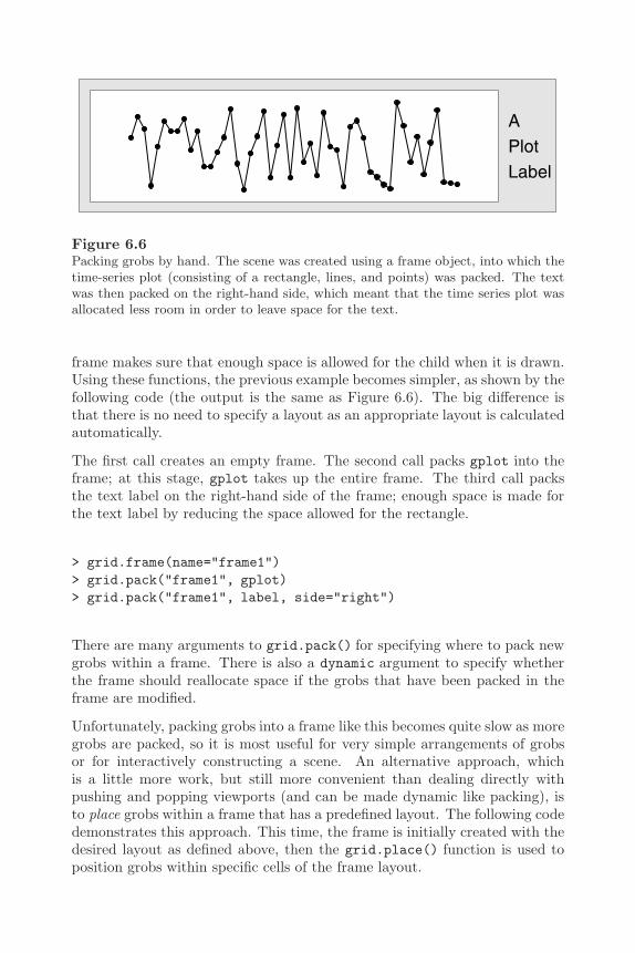
212 R Graphics
APlotLabel
Figure 6.6Packing grobs by hand. The scene was created using a frame object, into which thetime-series plot (consisting of a rectangle, lines, and points) was packed. The textwas then packed on the right-hand side, which meant that the time series plot wasallocated less room in order to leave space for the text.
frame makes sure that enough space is allowed for the child when it is drawn.Using these functions, the previous example becomes simpler, as shown by thefollowing code (the output is the same as Figure 6.6). The big difference isthat there is no need to specify a layout as an appropriate layout is calculatedautomatically.
The first call creates an empty frame. The second call packs gplot into theframe; at this stage, gplot takes up the entire frame. The third call packsthe text label on the right-hand side of the frame; enough space is made forthe text label by reducing the space allowed for the rectangle.
> grid.frame(name="frame1")> grid.pack("frame1", gplot)> grid.pack("frame1", label, side="right")
There are many arguments to grid.pack() for specifying where to pack newgrobs within a frame. There is also a dynamic argument to specify whetherthe frame should reallocate space if the grobs that have been packed in theframe are modified.
Unfortunately, packing grobs into a frame like this becomes quite slow as moregrobs are packed, so it is most useful for very simple arrangements of grobsor for interactively constructing a scene. An alternative approach, whichis a little more work, but still more convenient than dealing directly withpushing and popping viewports (and can be made dynamic like packing), isto place grobs within a frame that has a predefined layout. The following codedemonstrates this approach. This time, the frame is initially created with thedesired layout as defined above, then the grid.place() function is used toposition grobs within specific cells of the frame layout.
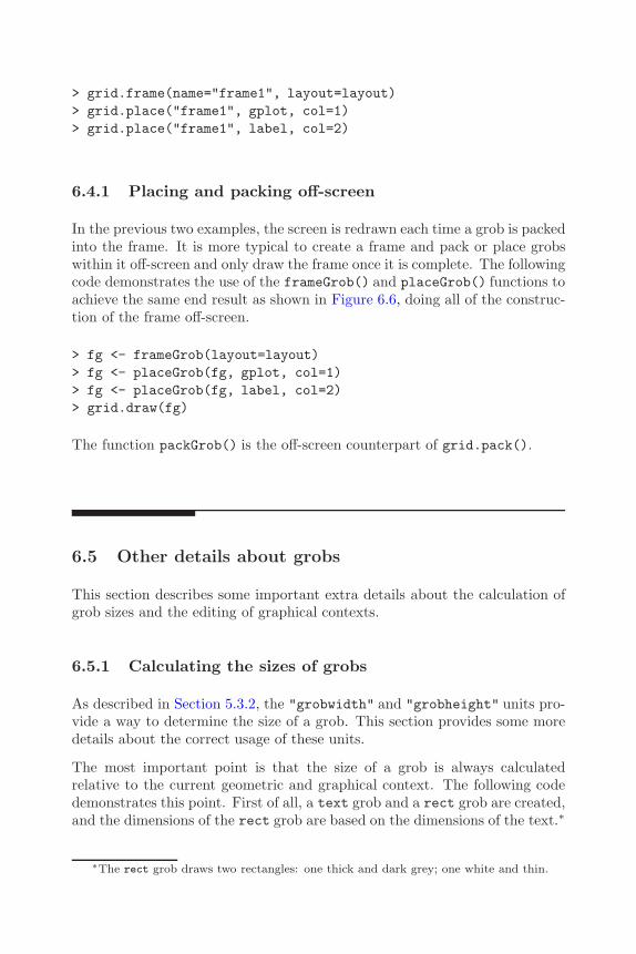
The Grid Graphics Object Model 213
> grid.frame(name="frame1", layout=layout)> grid.place("frame1", gplot, col=1)> grid.place("frame1", label, col=2)
6.4.1 Placing and packing off-screen
In the previous two examples, the screen is redrawn each time a grob is packedinto the frame. It is more typical to create a frame and pack or place grobswithin it off-screen and only draw the frame once it is complete. The followingcode demonstrates the use of the frameGrob() and placeGrob() functions toachieve the same end result as shown in Figure 6.6, doing all of the construc-tion of the frame off-screen.
> fg <- frameGrob(layout=layout)> fg <- placeGrob(fg, gplot, col=1)> fg <- placeGrob(fg, label, col=2)> grid.draw(fg)
The function packGrob() is the off-screen counterpart of grid.pack().
6.5 Other details about grobs
This section describes some important extra details about the calculation ofgrob sizes and the editing of graphical contexts.
6.5.1 Calculating the sizes of grobs
As described in Section 5.3.2, the "grobwidth" and "grobheight" units pro-vide a way to determine the size of a grob. This section provides some moredetails about the correct usage of these units.
The most important point is that the size of a grob is always calculatedrelative to the current geometric and graphical context. The following codedemonstrates this point. First of all, a text grob and a rect grob are created,and the dimensions of the rect grob are based on the dimensions of the text.∗
∗The rect grob draws two rectangles: one thick and dark grey; one white and thin.
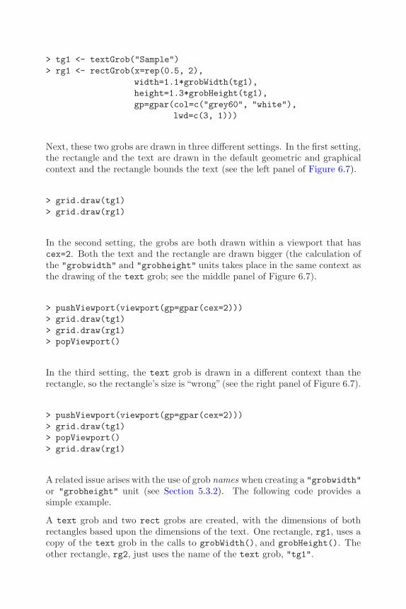
214 R Graphics
> tg1 <- textGrob("Sample")> rg1 <- rectGrob(x=rep(0.5, 2),
width=1.1*grobWidth(tg1),height=1.3*grobHeight(tg1),gp=gpar(col=c("grey60", "white"),
lwd=c(3, 1)))
Next, these two grobs are drawn in three different settings. In the first setting,the rectangle and the text are drawn in the default geometric and graphicalcontext and the rectangle bounds the text (see the left panel of Figure 6.7).
> grid.draw(tg1)> grid.draw(rg1)
In the second setting, the grobs are both drawn within a viewport that hascex=2. Both the text and the rectangle are drawn bigger (the calculation ofthe "grobwidth" and "grobheight" units takes place in the same context asthe drawing of the text grob; see the middle panel of Figure 6.7).
> pushViewport(viewport(gp=gpar(cex=2)))> grid.draw(tg1)> grid.draw(rg1)> popViewport()
In the third setting, the text grob is drawn in a different context than therectangle, so the rectangle’s size is “wrong” (see the right panel of Figure 6.7).
> pushViewport(viewport(gp=gpar(cex=2)))> grid.draw(tg1)> popViewport()> grid.draw(rg1)
A related issue arises with the use of grob names when creating a "grobwidth"or "grobheight" unit (see Section 5.3.2). The following code provides asimple example.
A text grob and two rect grobs are created, with the dimensions of bothrectangles based upon the dimensions of the text. One rectangle, rg1, uses acopy of the text grob in the calls to grobWidth(), and grobHeight(). Theother rectangle, rg2, just uses the name of the text grob, "tg1".
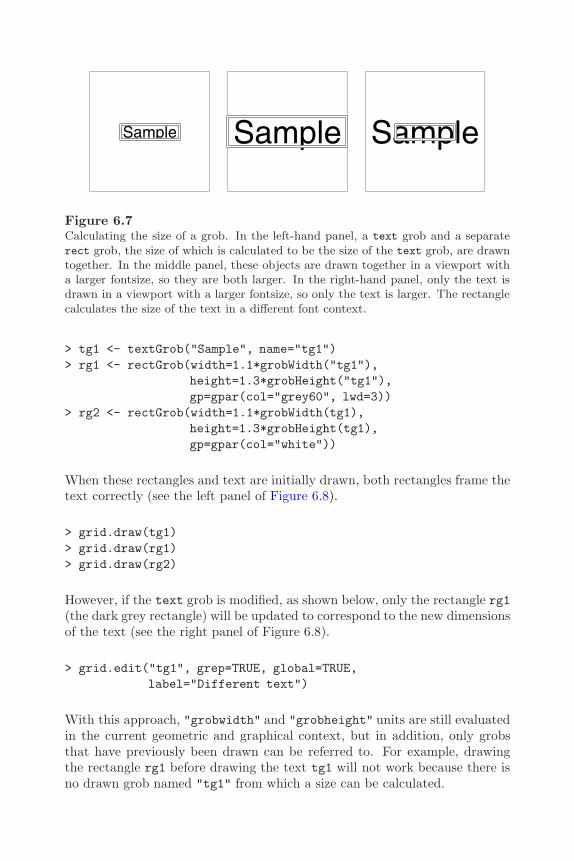
The Grid Graphics Object Model 215
Sample Sample Sample
Figure 6.7Calculating the size of a grob. In the left-hand panel, a text grob and a separaterect grob, the size of which is calculated to be the size of the text grob, are drawntogether. In the middle panel, these objects are drawn together in a viewport witha larger fontsize, so they are both larger. In the right-hand panel, only the text isdrawn in a viewport with a larger fontsize, so only the text is larger. The rectanglecalculates the size of the text in a different font context.
> tg1 <- textGrob("Sample", name="tg1")> rg1 <- rectGrob(width=1.1*grobWidth("tg1"),
height=1.3*grobHeight("tg1"),gp=gpar(col="grey60", lwd=3))
> rg2 <- rectGrob(width=1.1*grobWidth(tg1),height=1.3*grobHeight(tg1),gp=gpar(col="white"))
When these rectangles and text are initially drawn, both rectangles frame thetext correctly (see the left panel of Figure 6.8).
> grid.draw(tg1)> grid.draw(rg1)> grid.draw(rg2)
However, if the text grob is modified, as shown below, only the rectangle rg1(the dark grey rectangle) will be updated to correspond to the new dimensionsof the text (see the right panel of Figure 6.8).
> grid.edit("tg1", grep=TRUE, global=TRUE,label="Different text")
With this approach, "grobwidth" and "grobheight" units are still evaluatedin the current geometric and graphical context, but in addition, only grobsthat have previously been drawn can be referred to. For example, drawingthe rectangle rg1 before drawing the text tg1 will not work because there isno drawn grob named "tg1" from which a size can be calculated.

216 R Graphics
Sample Different text
Figure 6.8Grob dimensions by reference. In the left-hand panel there are three grobs: onetext grob and two rect grobs. The sizes of both rect grobs are calculated from thetext grob. The difference is that the white rectangle is related to the text by valueand the dark grey rectangle is related to the text by reference. The right-hand panelshows what happens when the text grob is edited. Only the dark grey, by-reference,rectangle gets resized.
> grid.newpage()> grid.draw(rg1)
Error in function (name) :
Grob ’tg1’ not found
6.5.2 Editing graphical context
When a grob is edited using grid.edit() or editGrob(), the modification ofa gp component is treated as a special case. Only the graphical parametersthat are explicitly given new settings are modified. All other settings remainuntouched. The following code provides a simple example.
A circle is drawn with a grey fill color (see the left panel of Figure 6.9), thenthe border of the circle is made thick (see the middle panel of Figure 6.9) andthe fill color remains the same. Finally, the border is changed to a dashedline type, but it stays thick (and the fill remains grey — see the right panelof Figure 6.9).
> grid.circle(r=0.3, gp=gpar(fill="grey80"),name="mycircle")
> grid.edit("mycircle", gp=gpar(lwd=5))> grid.edit("mycircle", gp=gpar(lty="dashed"))
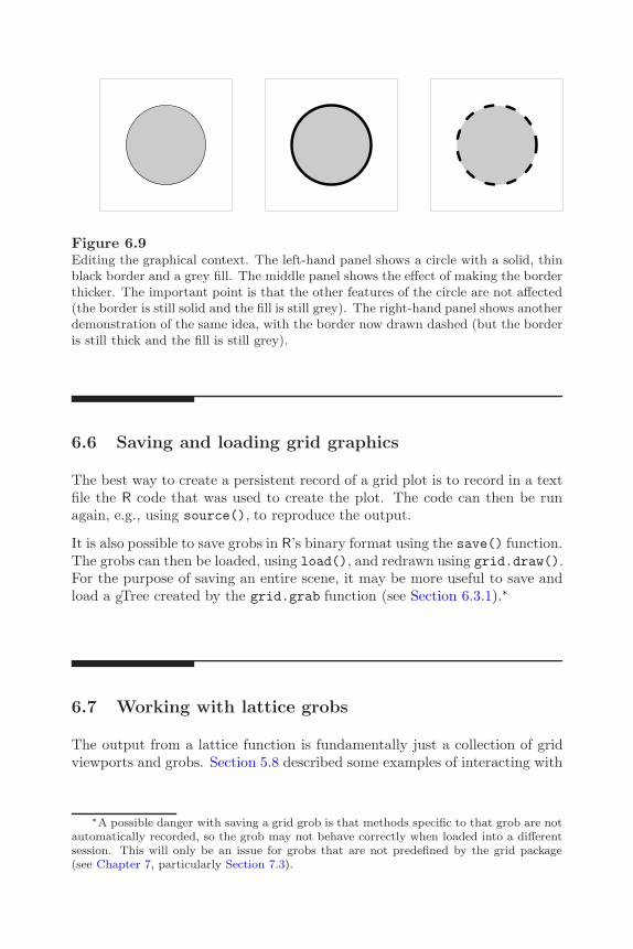
The Grid Graphics Object Model 217
Figure 6.9Editing the graphical context. The left-hand panel shows a circle with a solid, thinblack border and a grey fill. The middle panel shows the effect of making the borderthicker. The important point is that the other features of the circle are not affected(the border is still solid and the fill is still grey). The right-hand panel shows anotherdemonstration of the same idea, with the border now drawn dashed (but the borderis still thick and the fill is still grey).
6.6 Saving and loading grid graphics
The best way to create a persistent record of a grid plot is to record in a textfile the R code that was used to create the plot. The code can then be runagain, e.g., using source(), to reproduce the output.
It is also possible to save grobs in R’s binary format using the save() function.The grobs can then be loaded, using load(), and redrawn using grid.draw().For the purpose of saving an entire scene, it may be more useful to save andload a gTree created by the grid.grab function (see Section 6.3.1).∗
6.7 Working with lattice grobs
The output from a lattice function is fundamentally just a collection of gridviewports and grobs. Section 5.8 described some examples of interacting with
∗A possible danger with saving a grid grob is that methods specific to that grob are notautomatically recorded, so the grob may not behave correctly when loaded into a differentsession. This will only be an issue for grobs that are not predefined by the grid package(see Chapter 7, particularly Section 7.3).

218 R Graphics
the grid viewports that are set up by a lattice plot. This section looks at someexamples of interacting with the grobs that are created by a lattice plot.
Unfortunately, only some of the grobs produced by lattice are given usefulnames. Many grobs only have the default names assigned them by the gridsystem, which are neither sufficiently descriptive nor reliable to be used toaccess a particular component of the plot.∗
Examples of grobs that do have useful names are the "xlab" and "ylab"grobs representing the x-label and y-label on a lattice plot.
One thing that can be done with grobs produced by lattice is to modify themin ways that are not otherwise possible via the interface provided by lattice.For example, at the time of writing, it is possible to control the font face, thecolor, and the size of these labels (using xlab or ylab arguments to a plottingfunction or via trellis.par.set()), but it is not possible to modify the fontfamily or the angle of rotation.
The following code produces a lattice scatterplot, then edits the plot labels tochange the font to a "mono" family and to position the labels at the ends ofthe axes (see Figure 6.10).
> angle <- seq(0, 2*pi, length=21)[-21]> x <- cos(angle)> y <- sin(angle)
> xyplot(y ~ x, aspect=1,xlab="displacement",ylab="velocity")
> grid.edit("[.]xlab$", grep=TRUE,x=unit(1, "npc"), just="right",gp=gpar(fontfamily="mono"))
> grid.edit("[.]ylab$", grep=TRUE,y=unit(1, "npc"), just="right",gp=gpar(fontfamily="mono"))
Other grob operations are also possible. For example, the following coderemoves the labels from the plot.
> grid.remove(".lab$", grep=TRUE, global=TRUE)
∗The default name assigned to a grob by the grid system is of the form "GRID.GROB.n"where n depends on how many other grobs have been created previously in the currentsession.
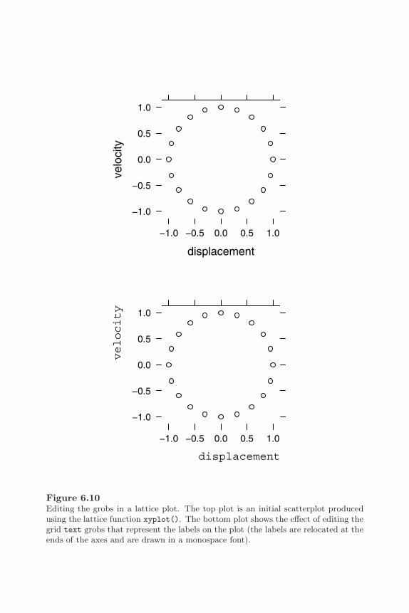
The Grid Graphics Object Model 219
displacement
velo
city
−1.0 −0.5 0.0 0.5 1.0
−1.0
−0.5
0.0
0.5
1.0
displacement
velocity
−1.0 −0.5 0.0 0.5 1.0
−1.0
−0.5
0.0
0.5
1.0
Figure 6.10Editing the grobs in a lattice plot. The top plot is an initial scatterplot producedusing the lattice function xyplot(). The bottom plot shows the effect of editing thegrid text grobs that represent the labels on the plot (the labels are relocated at theends of the axes and are drawn in a monospace font).
220 R Graphics
Finally, it is possible to group all of the grobs from a lattice plot together usinggrid.grab(). This creates a gTree that can then be used as a component increating another picture.
Chapter summary
As well as producing graphical output, all grid functions create grobs(graphical objects) that contain descriptions of what has been drawn.These grobs may be accessed, modified, and even removed, and thegraphical output will be updated to reflect the changes.
There are also grid functions for creating grobs without producing anygraphical output. A complete description of a plot can be producedby creating, modifying, and combining grobs off-screen.
A gTree is a grob that can have other grobs as its children. A gTree canbe useful for grouping grobs and for providing a high-level interfaceto a group of grobs.
The lattice plotting functions generate large numbers of grid grobs.These grobs may be manipulated just like any other grobs to access,edit, and delete parts of a lattice plot.
7
Developing New Graphics Functionsand Objects
Chapter preview
This chapter looks in depth at the task of writing graphical functionsfor others to use.
There are important guidelines for writing simple functions whosemain purpose is to produce graphical output. There is an empha-sis on making sure that users can annotate the output produced by afunction and that users can make use of the function as a componentin larger or more complex plots.
There is also a discussion on how to create a new class of graphical ob-ject. This is important for allowing users to interactively edit output,to ask questions such as how much space a graphical object requires,and to be able to combine graphical objects together in a gTree.
This chapter addresses the issue of developing graphics functions for othersto use. This will involve a discussion of some of the lower-level details ofhow grid works as well as some more abstract ideas of software design. Abasic understanding of programming concepts is recommended, and the latersections assume an understanding of object-oriented concepts such as classesand methods.
Important low-level details of the grid graphics system and important designconsiderations are introduced in increasing levels of complexity to allow devel-opers to construct simple graphics functions at first. Readers aiming to designa new fully-featured grid graphical object should read the entire chapter.
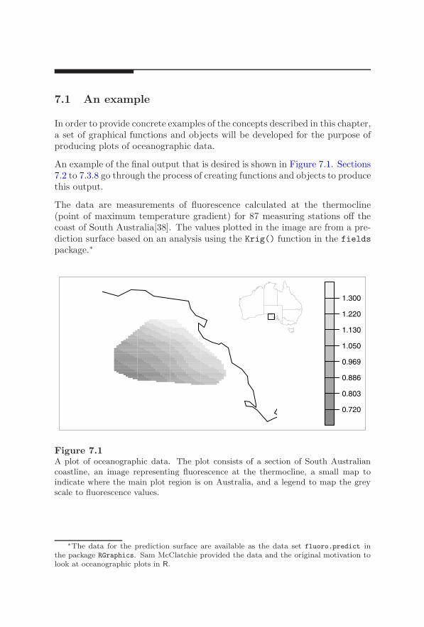
222 R Graphics
7.1 An example
In order to provide concrete examples of the concepts described in this chapter,a set of graphical functions and objects will be developed for the purpose ofproducing plots of oceanographic data.
An example of the final output that is desired is shown in Figure 7.1. Sections7.2 to 7.3.8 go through the process of creating functions and objects to producethis output.
The data are measurements of fluorescence calculated at the thermocline(point of maximum temperature gradient) for 87 measuring stations off thecoast of South Australia[38]. The values plotted in the image are from a pre-diction surface based on an analysis using the Krig() function in the fieldspackage.∗
0.720
0.803
0.886
0.969
1.050
1.130
1.220
1.300
Figure 7.1A plot of oceanographic data. The plot consists of a section of South Australiancoastline, an image representing fluorescence at the thermocline, a small map toindicate where the main plot region is on Australia, and a legend to map the greyscale to fluorescence values.
∗The data for the prediction surface are available as the data set fluoro.predict inthe package RGraphics. Sam McClatchie provided the data and the original motivation tolook at oceanographic plots in R.

Developing New Graphics Functions and Objects 223
7.1.1 Modularity
One decision can be made before writing a single line of code: the code shouldbe modular. This means that the code should consist of several small func-tions, each of which produces a well-defined, self-contained piece of graphicaloutput. It would be a bad idea to to create Figure 7.1 in one big function.Such a function would be unlikely to be very flexible, would be very hard tomaintain (it is easier to see what is going on in smaller functions), and wouldbe very hard to debug (it is much easier to test small functions with a clear,simple purpose).
The following sections look at writing several simple functions, each of whichproduces a conceptually separate part of the final plot. One possible break-down of Figure 7.1 involves the following elements: two maps of Australia (onejust a piece of the coastline), an array of colored rectangles (an image), anda legend. Immediately, the focus is on producing much more basic graphicaloutput. If some useful functions are created for these, the functions willprovide much more reusable graphical elements that could be combined inother ways to create all sorts of other plots (for example, see Section 7.3.9and Figure 7.18).
7.2 Simple graphics functions
The simplest approach is to write a graphics function just for its side-effectof producing graphical output (i.e., using grid graphics functions as describedin Chapter 5). The first example will be a simple graphics function to pro-duce an image. The code in Figure 7.2 provides code defining a functiongrid.imageFun() for this purpose.
This function takes arguments to describe the number of rows and columns inthe image (nrow and ncol), the colors to use for each cell in the image (cols),and the order in which those colors should be applied to the cells (byrow).Output is produced by a call to the grid.rect() function (line 12), whichdraws a rectangle for each cell in the image.
This function can be used to draw an array of rectangles just like any otherplotting function. An example usage is given in the following code. First, aset of grey-scale colors are defined (these will be used throughout the chapter).
> greys <- grey(0.5 + (rep(1:4, 4) - rep(0:3, each=4))/10)

224 R Graphics
1 grid.imageFun <- function(nrow, ncol, cols,2 byrow=TRUE) {3 x <- (1:ncol)/ncol4 y <- (1:nrow)/nrow5 if (byrow) {6 right <- rep(x, nrow)7 top <- rep(y, each=ncol)8 } else {9 right <- rep(x, each=nrow)
10 top <- rep(y, ncol)11 }12 grid.rect(x=right, y=top,13 width=1/ncol, height=1/nrow,14 just=c("right", "top"),15 gp=gpar(col=NA, fill=cols),16 name="image")17 }
Figure 7.2A grid.imageFun() function. This function draws an array of nrow by ncol rect-angles filled with the specified colors.
Now two images are drawn with the same colors, but different byrow settings(see Figures 7.3a and 7.3b).
> grid.imageFun(4, 4, greys)
> grid.imageFun(4, 4, greys, byrow=FALSE)
There is an obvious deficiency in this function because it does not performany checking of its arguments to ensure that the correct information is beingpassed to it. For example, there is no check that nrow and ncol are numericvalues of length 1. In general, in order to reduce the size and complexity ofthe code chunks, the examples will leave out input-checking code. This issueis addressed more seriously in the context of developing new graphical objectsin Section 7.3.3.
The grid.imageFun() example shows that it is quite straightforward to createa new graphics function that just produces output. However, there are threeimportant things to keep in mind when writing such a function: other peoplemight want to embed your function as an element within a more complexscene; other people might want to embed more output within the output fromyour function; and other people might want to interactively modify the output

Developing New Graphics Functions and Objects 225
(a) (b)
Figure 7.3Output from the grid.imageFun() function. The two images use the same set ofcolors, but have different orientations. Image (a) has byrow=TRUE and image (b) hasbyrow=FALSE.
from your function. The following sections look at how you should design yourfunction so that these tasks are straightforward for other people.
7.2.1 Embedding graphical output
The grid system is designed to allow graphical output to be embedded withinother graphical output. All drawing occurs within the current viewport andno assumptions are made about the position or size of that viewport. New gridfunctions should be written with this in mind and it should not be assumedthat output is being drawn into the entire device.
The grid.imageFun() function demonstrates this idea; this function justdraws rectangles within the current viewport, wherever that may be and how-ever large it may be.
On the other hand, it is sometimes important to enforce certain constraintson how graphical output is drawn. A good example is in the drawing of maps.Usually, a map is drawn with a specific aspect ratio so that, for example, 1unit in the x-dimension has the same physical size as 1 unit in the y-dimension.In such cases, it may be necessary for a function to push its own viewports toenforce an aspect ratio before performing any drawing. A function to draw amap of Australia will be developed in order to demonstrate this idea.
The package oz[63] provides data for drawing maps of Australia. The

226 R Graphics
1 grid.ozFun <- function(ozRegion) {2 pushViewport(3 viewport(name="ozlay",4 layout=grid.layout(1,1,5 widths=diff(ozRegion$rangex),6 heights=diff(ozRegion$rangey),7 respect=TRUE)))8 pushViewport(viewport(name="ozvp",9 layout.pos.row=1,
10 layout.pos.col=1,11 xscale=ozRegion$rangex,12 yscale=ozRegion$rangey,13 clip=TRUE))14 index <- 115 for(i in ozRegion$lines) {16 grid.lines(i$x, i$y, default.units="native",17 name=paste("ozlines", index, sep=""))18 index <- index + 119 }20 upViewport(2)21 }
Figure 7.4A grid.ozFun() function. This function draws a map of Australia or some partthereof.
ozRegion() function in the oz package returns an object of class "ozRegion"containing x-axis and y-axis ranges, and a list of x-locations and y-locationsto draw map lines. The grid.ozFun() shown in Figure 7.4 makes use ofozRegion() to draw a map of Australia using grid.
The most important part of this function is the pushing of viewports thatestablish the correct aspect ratio for drawing the map (lines 2 to 13). Thefirst viewport contains a layout with a single cell set to the correct aspect ratioand the second viewport occupies that cell and sets the appropriate "native"coordinate system for the map. This allows the map to be drawn within anyviewport, but retain the appropriate shape.
The rest of the grid.ozFun() function just draws the lines representing theAustralian coastline (and state boundaries) using grid.lines().
The following code shows an example of the grid.ozFun() function beingused to draw all of Australia (see Figure 7.5). The map is not distorted eventhough the region it is drawn in (indicated by the grey rectangle) is very wide.
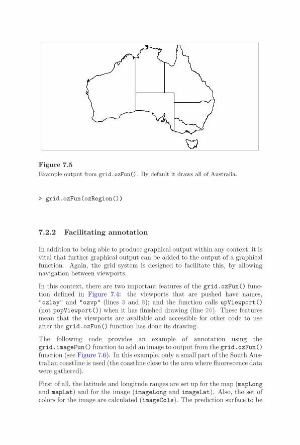
Developing New Graphics Functions and Objects 227
Figure 7.5Example output from grid.ozFun(). By default it draws all of Australia.
> grid.ozFun(ozRegion())
7.2.2 Facilitating annotation
In addition to being able to produce graphical output within any context, it isvital that further graphical output can be added to the output of a graphicalfunction. Again, the grid system is designed to facilitate this, by allowingnavigation between viewports.
In this context, there are two important features of the grid.ozFun() func-tion defined in Figure 7.4: the viewports that are pushed have names,"ozlay" and "ozvp" (lines 3 and 8); and the function calls upViewport()(not popViewport()) when it has finished drawing (line 20). These featuresmean that the viewports are available and accessible for other code to useafter the grid.ozFun() function has done its drawing.
The following code provides an example of annotation using thegrid.imageFun() function to add an image to output from the grid.ozFun()function (see Figure 7.6). In this example, only a small part of the South Aus-tralian coastline is used (the coastline close to the area where fluorescence datawere gathered).
First of all, the latitude and longitude ranges are set up for the map (mapLongand mapLat) and for the image (imageLong and imageLat). Also, the set ofcolors for the image are calculated (imageCols). The prediction surface to be
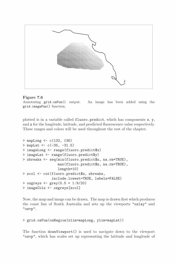
228 R Graphics
Figure 7.6Annotating grid.ozFun() output. An image has been added using thegrid.imageFun() function.
plotted is in a variable called fluoro.predict, which has components x, y,and z for the longitude, latitude, and predicted fluorescence value respectively.These ranges and colors will be used throughout the rest of the chapter.
> mapLong <- c(132, 136)> mapLat <- c(-35, -31.5)> imageLong <- range(fluoro.predict$x)> imageLat <- range(fluoro.predict$y)> zbreaks <- seq(min(fluoro.predict$z, na.rm=TRUE),
max(fluoro.predict$z, na.rm=TRUE),length=10)
> zcol <- cut(fluoro.predict$z, zbreaks,include.lowest=TRUE, labels=FALSE)
> ozgreys <- grey(0.5 + 1:9/20)> imageCols <- ozgreys[zcol]
Now, the map and image can be drawn. The map is drawn first which producesthe coast line of South Australia and sets up the viewports "ozlay" and"ozvp".
> grid.ozFun(ozRegion(xlim=mapLong, ylim=mapLat))
The function downViewport() is used to navigate down to the viewport"ozvp", which has scales set up representing the latitude and longitude of

Developing New Graphics Functions and Objects 229
the map. This is only possible because the grid.ozFun() function specifieduseful names for the viewports it set up.
> downViewport("ozvp")
A further viewport is pushed to occupy the region where the image should bedrawn and the image is drawn within that viewport.
> pushViewport(viewport(y=min(imageLat),height=abs(diff(imageLat)),x=max(imageLong),width=abs(diff(imageLong)),default.units="native",just=c("right", "bottom")))
> grid.imageFun(50, 50, col=imageCols)> upViewport(0)
7.2.3 Editing output
In addition to being able to add further output to a plot, it is useful to makeit easy for others to modify the existing elements of a plot. The importantstep in this case is to provide a name for each piece of graphical output thatyour function produces.
The grid.imageFun() function uses the name "image" for the set of rect-angles that it draws (line 16 in Figure 7.2) and the grid.ozFun() functionnames each map border that it draws "ozlinesi", where i varies from 1 tothe number of borders drawn (line 17 in Figure 7.4).
These names are useful for interacting with the output from these functions,particularly for the purpose of editing the output. The following code presentsa couple of examples of modifying the plot produced in Figure 7.6. The firstedit reverses the set of colors used in the image. The second edit changes thecolor of all map borders to grey and makes the borders thicker (see Figure7.7).
> grid.edit("image", gp=gpar(fill=rev(ozgreys)[zcol]))> grid.edit("^ozlines[0-9]+$", gp=gpar(col="grey", lwd=2),
grep=TRUE, global=TRUE)

230 R Graphics
Figure 7.7Editing grid.ozFun() output. Compared to Figure 7.6, the colors of the image havebeen reversed and the Australian coastline is thicker and colored grey.
7.2.4 Absolute versus relative sizes
Another thing to consider when designing a graphics function is whether touse absolute or relative coordinate systems and graphical parameters for sizinggraphical output. If absolute coordinates systems such as "inches", "cm", or"mm" are used to size output, then the output will remain that size no matterhow large or small the surrounding viewport is made. This is also true ofgraphical parameters such as fontsize (which specifies the size of text inpoints), and lwd. If, on the other hand, relative coordinates such as "npc" or"native" are used for sizing output, the output will resize with its container.Graphical parameters that are relative like this are cex for sizing text andlex for line width.
In general, absolute sizes are more appropriate for producing or fine-tuning apiece of output for a specific use (e.g., a figure in an article). Relative sizesare more appropriate when designing general graphics functions for others touse, where it is unknown how large the final output will be. One possibleexception to this rule is the sizing of text. It is reasonable to set text size inabsolute terms (i.e., a particular point size) in order to ensure that the textis legible.
The coordinate systems used for "char", "lines", "strwidth", or"grobwidth" units depend on the size of other output and so are consideredto be relative.
Developing New Graphics Functions and Objects 231
7.3 Graphical objects
A properly written graphics function can be very useful if it can be reusedin other plots and arbitrarily added to or modified as described in previoussections. There are, however, a number of benefits to be gained from alsocreating a graphical object, or grob, to represent the output that your functionproduces.
The following sections consider again the development of functions to producemaps and images, but this time with an emphasis on creating objects thatrepresent the output, rather than just producing output.
Defining new grobs involves working with classes and generic functions. Thissection assumes a familiarity with the basic ideas of object-oriented program-ming and its implementation in S3 classes and methods (see Section A.4 fora very brief introduction).
The design of classes and methods is a reasonably sophisticated process, thereare often a number of possible designs to choose from, and it can be difficultto determine a “best solution.” This means that it is impossible to providea single definitive statement about how a new graphical object should bedeveloped. Instead, this section presents a number of examples with severaldifferent implementations and there is a discussion of the advantages anddisadvantages of different approaches.
7.3.1 Overview of creating a new graphical class
There are two main steps involved in defining a new graphical class. First ofall, the structure of the class must be described. This consists of specifyingthe components of the new class — the information that is stored in objectsof that class. For example, the "rect" class has components x, y, width,height, and just that describe the location and size of the rectangle.
The functions grob() and gTree() are used to define the structure for anew graphical class (as described in more detail in the next section). Thesefunctions ensure that all grobs have a number of standard components. Forexample, all grobs must have gp, vp, and name components. In addition, allclasses derived from "gTree" (via the gTree() function) also have componentschildren and childrenvp that describe the children of the gTree and howthose children are drawn (see Section 7.3.4).
The second step in defining a new graphical class is to define the behavior

232 R Graphics
of the class. This consists of writing methods for several important genericfunctions. Methods can be written to control the validation of a grob, how agrob is drawn, and what happens when a grob is modified. It is also possibleto write methods for calculating the size of a grob. These generic functionsare described in Sections 7.3.4 to 7.3.7.
7.3.2 Defining a new graphical class
The code in Figure 7.8 gives an example of defining a new graphical class.An "imageGrob" class is defined, which contains a description of the imageoutput generated by the grid.imageFun() function that was defined earlier.
The imageGrob() function calls the function gTree() to create an object ofa new class, "imageGrob". An imageGrob is a gTree with several componentsthat provide a high-level description of the an image (ncol, nrow, cols, andbyrow). There is also a single child, which is a rect grob, representing therectangles that will be drawn to produce the image. The imageGrob() func-tion also provides the standard gp, vp, and name components, which shouldbe available for all grobs.
The makeImageRect() function generates a rect grob from a high-level imagedescription. This is very similar to the function grid.imageFun(), but itproduces an object containing a description of some rectangles rather thandrawing the rectangles and it calls rectGrob() rather than grid.rect() (line11). This function is not intended to be used directly — it is just a “helperfunction” for the main imageGrob() function. This is an example of modularcode that makes it easier to read the main function and it will be used laterwhen some other class examples are considered.
The grid.imageGrob() function is just a convenience for producing graphicaloutput from an imageGrob grob; it just creates an appropriate grob and drawsit. The following code produces the same result as Figure 7.3a.
> grid.imageGrob(4, 4, greys)
There are now functions that define a new class and create an object of thatclass. Sections 7.3.3 to 7.3.7 describe how to define appropriate behavior forthe new class so that it draws correctly and responds appropriately to beingmodified.
Summary of creating a new graphical class
A new class is derived from the "grob" class using the grob() function, orfrom the "gTree" class using the gTree() function (e.g., line 20 in Figure

Developing New Graphics Functions and Objects 233
1 makeImageRect <- function(nrow, ncol, cols, byrow) {2 xx <- (1:ncol)/ncol3 yy <- (1:nrow)/nrow4 if (byrow) {5 right <- rep(xx, nrow)6 top <- rep(yy, each=ncol)7 } else {8 right <- rep(xx, each=nrow)9 top <- rep(yy, ncol)
10 }11 rectGrob(x=right, y=top,12 width=1/ncol, height=1/nrow,13 just=c("right", "top"),14 gp=gpar(col=NULL, fill=cols),15 name="image")16 }
18 imageGrob <- function(nrow, ncol, cols, byrow=TRUE,19 name=NULL, gp=NULL, vp=NULL) {20 igt <- gTree(nrow=nrow, ncol=ncol,21 cols=cols, byrow=byrow,22 children=gList(makeImageRect(nrow, ncol,23 cols, byrow)),24 gp=gp, name=name, vp=vp,25 cl="imageGrob")26 igt27 }
29 grid.imageGrob <- function(...) {30 igt <- imageGrob(...)31 grid.draw(igt)32 }
Figure 7.8An "imageGrob" class. This is a grob-based equivalent of grid.imageFun().

234 R Graphics
7.8). This will ensure standard behavior when drawing and editing grobs,calculating the size of grobs, and so on (Sections 7.3.3 to 7.3.7 provide detailedinformation about the default behavior of grobs). Apart from the cl argumentthat specifies the name of the new class (line 25 in Figure 7.8), the argumentsto these functions provide a list of components for the new class.
There are some standard components common to all grobs: gp, vp, and name.It is sensible to make these available via the constructor function for your newclass (e.g., line 19 in Figure 7.8).
The gp component is designed to contain a gpar object, which is a set ofgraphical parameter settings; the vp component is designed to hold a viewportor a viewport path; and the name component provides the name for the grob.All of these are validated automatically and are used in the drawing andediting of the grob (see Section 7.3.3).
The "gTree" class defines two more standard components: the childrencomponent contains the children of the gTree (as a gList) and the childrenvpcomponent contains viewports for the children to be drawn within (used in thedrawing of the children of the gTree). An example of the use of the childrencomponent is shown in Figure 7.8 on line 22.
All other components are at the discretion of the class designer.
Having defined a new graphical class, it is then necessary to write one or moremethods for some important generic functions as described in the followingsections.
7.3.3 Validating grobs
This section describes the validDetails() function, which is important forensuring that the components of a grob contain valid values.
The code examples used in the examples of simple graphics functions ignoredthe issue of checking user input to ensure that valid values are supplied forarguments or components. This issue becomes particularly important whendealing with grobs because it is not only possible to supply invalid values whena grob is first created, but also whenever a grob is modified via grid.edit()or editGrob().
Default validating behavior
When a grob is created or modified, it is automatically validated. The valida-tion checks that the gp, vp, and name components of a grob are sensible (andfor a gTree, the children and childrenvp components are also checked) and

Developing New Graphics Functions and Objects 235
1 validDetails.imageGrob <- function(x) {2 if (!is.numeric(x$nrow) || length(x$nrow) > 1 ||3 !is.numeric(x$ncol) || length(x$ncol) > 1)4 stop("nrow and ncol must be numeric and length 1")5 if (!is.logical(x$byrow))6 stop("byrow must be logical")7 x8 }
10 validDetails.ozGrob <- function(x) {11 if (!inherits(x$ozRegion, "ozRegion"))12 stop("Invalid ozRegion")13 x14 }
Figure 7.9Some validDetails() methods. These are called when an imageGrob or an ozGrob
is first created, or when such an object is modified using grid.edit().
then the validDetails() generic function is called. By default this functiondoes nothing. A new class should define a method to check the componentsthat are specific to that class.
The imageGrob example
Figure 7.9 shows a validDetails()methods for the "imageGrob" class (thereis also a method for the "ozGrob" class, which is defined in the next section).The validDetails() method for the "imageGrob" class (lines 1 to 8) checksthat the nrow and ncol components are numeric and of length 1 and thatthe byrow component is a logical vector. The return value of the method isthe validated imageGrob (line 7). All validDetails() methods must do thiswhether they modify the grob or not.
With these validation methods defined, both the creation and the modifica-tion of an imageGrob will perform checks to ensure that the components ofthe imageGrob contain valid values. The following code demonstrates the val-idation at work. First of all, the creation of an imageGrob fails because byrowis not a logical value.
> grid.imageGrob(4, 4, greys, byrow="what?")
Error in validDetails.imageGrob(x) :
byrow must be logical
236 R Graphics
In this next example, an imageGrob is created with valid components, butthen it is edited with an invalid nrow component specification.
> ig <- imageGrob(4, 4, greys)
> editGrob(ig, nrow="what?")
Error in validDetails.imageGrob(x) :
nrow and ncol must be numeric and length 1
7.3.4 Drawing grobs
This section describes the drawDetails()generic function, which is importantfor ensuring that appropriate output is produced when a grob is drawn.
The function grid.draw() produces graphical output from a grob and thereis default drawing behavior for all grobs.
Default drawing behavior
By default, if the vp component of a grob contains a viewport (or viewportstack, list, or tree), the viewport is pushed before any output is produced.If the vp component is a vpPath, the path is used to navigate down to therelevant viewport using downViewport().∗ Also, if the gp components con-tains a gpar object, those graphical settings are enforced before any outputis produced.
After the output has been produced, graphical settings are reverted and anyviewports that were pushed are popped. If there was navigation down to aviewport, then that navigation is reversed with a call to upViewport().
By default, no graphical output is produced for a grob. The generic functiondrawDetails() is called so that classes can define a method that calls gridfunctions to produce output. For classes derived from "gTree", as well ascalling the drawDetails() function, all of the children of the gTree are drawn(by calling grid.draw() for each child).
The default behavior for grobs also takes care of recording the grob on thegrid display list.
∗The navigation down is performed with strict=TRUE.
Developing New Graphics Functions and Objects 237
A further default behavior for gTrees is that, before drawing its children, agTree will push any viewports in its childrenvp component, then navigateback up again. This means that all viewports in the childrenvp componentare available for the grobs in the children component of the gTree to navigatedown to. An example is given later (see the sub-section “An ozGrob example”and Figure 7.10).
The imageGrob example
The grid.imageGrob() function in Figure 7.8 draws an image by creating animageGrob object and calling grid.draw(). This provides the same interfaceas the grid.imageFun() function and produces exactly the same output. Thefollowing code shows a simple example. The output is exactly the same asFigure 7.3a.
> grid.imageGrob(4, 4, greys)
The output is generated automatically in the imageGrob case because of thedefault drawing behavior defined for gTrees. When a gTree is drawn, it drawsall of its children, so when an imageGrob is drawn, the rect grob child isdrawn automatically.
The following code demonstrates the other automatic drawing behavior forgrobs (pushing of the vp component and enforcing gp settings). The codedraws an image like the previous one, except that the drawing occurs within aviewport specified via the vp component and the entire image is made trans-parent via the gp component.∗
> grid.imageGrob(4, 4, greys, name="imageGrob",vp=viewport(width=0.5, height=0.5),gp=gpar(alpha=0.5))
An ozGrob example
The "imageGrob" class provides a simple example of the default drawing be-havior for a gTree with children. The code in Figure 7.10 shows the definitionof an "ozGrob" class, which will be used to demonstrate the drawing of agTree with children and a childrenvp component.
∗This example will not work on many graphics devices because they do not supporttransparency and will respond to a non-opaque color by not drawing anything! The PDFand the Quartz devices should behave sensibly.
238 R Graphics
1 makeOzViewports <- function(ozRegion) {2 vpStack(viewport(name="ozlay", layout=grid.layout(1, 1,3 widths=diff(ozRegion$rangex),4 heights=diff(ozRegion$rangey),5 respect=TRUE)),6 viewport(name="ozvp", layout.pos.row=1,7 layout.pos.col=1,8 xscale=ozRegion$rangex,9 yscale=ozRegion$rangey,
10 clip=TRUE))11 }
13 makeOzLines <- function(ozRegion) {14 numLines <- length(ozRegion$lines)15 lines <- vector("list", numLines)16 index <- 117 for(i in ozRegion$lines) {18 lines[[index]] <- linesGrob(i$x, i$y,19 default.units="native",20 vp=vpPath("ozlay", "ozvp"),21 name=paste("ozlines", index, sep=""))22 index <- index + 123 }24 do.call("gList", lines)25 }
27 ozGrob <- function(ozRegion, name=NULL, gp=NULL, vp=NULL) {28 gTree(ozRegion=ozRegion, name=name, gp=gp, vp=vp,29 childrenvp=makeOzViewports(ozRegion),30 children=makeOzLines(ozRegion),31 cl="ozGrob")32 }
34 grid.ozGrob <- function(...) {35 grid.draw(ozGrob(...))36 }
Figure 7.10An "ozGrob" class. This is a grob-based equivalent of grid.ozFun().
Developing New Graphics Functions and Objects 239
In this example, the makeOzViewports() function and the makeOzLines()function are both just helper functions. The functions ozGrob() andgrid.ozGrob() are the only functions that other people will use.
An ozGrob is a gTree with a single component, ozRegion, containing a de-scription of the region of Australia to map (line 28 in Figure 7.10). An ozGrobalso has a number of children, all of which are lines grobs representing thecoastline and state boundaries to draw (line 30), and an ozGrob has a view-port stack in its childrenvp component (line 29). These viewports createa region with the right aspect ratio for drawing a map and the children ofthe ozGrob are all created with viewport paths to specify that they should bedrawn within this region (line 20).
When an ozGrob is drawn, the viewports in its childrenvp component arepushed as part of the default drawing behavior for gTrees, then the grobs in itschildren component are drawn. Each child has a vp component indicatingwhich viewport to navigate to before drawing.
The grid.ozGrob() function is just a convenient front-end for drawing anozGrob. This can be used just like the function grid.ozFun() to draw someor all of a map of Australia. The following code produces exactly the sameoutput as shown in Figure 7.5. There are more examples using ozGrob objectsin later sections.
> grid.ozGrob(ozRegion())
An ozImage example
Both the "imageGrob" class and the "ozGrob" class are derived from the"gTree" class. This means that they have other grobs as children and thedefault drawing behavior for gTrees draws those children correctly when theimageGrob or ozGrob is drawn. This section looks at an example where adrawDetails() method has to be written in order to produce any output.
A typical reason for needing to write a drawDetails() method is that yournew class does not have a fixed set of grobs as children. Axes that mustcalculate tick marks on the fly are a good example (it is only possible tofigure out how many tick marks to draw and where to locate them when theaxis is actually drawn). Sometimes, it may be necessary because the childrenof a gTree need to be combined in a complex way.
In order to demonstrate the definition of a drawDetails() method, an"ozImage" class will be defined. This class combines an ozGrob and animageGrob and has to do the drawing itself to get them combining correctly(for producing output like that in Figure 7.6).

240 R Graphics
1 ozImage <- function(mapLong, mapLat,2 imageLong, imageLat, cols) {3 grob(mapLong=mapLong, mapLat=mapLat,4 imageLong=imageLong, imageLat=imageLat, cols=cols,5 cl="ozImage")6 }
8 drawDetails.ozImage <- function(x, recording) {9 grid.draw(ozGrob(ozRegion(xlim=x$mapLong,
10 ylim=x$mapLat)))11 depth <- downViewport(vpPath("ozlay", "ozvp"))12 pushViewport(viewport(y=min(x$imageLat),13 height=diff(range(x$imageLat)),14 x=max(x$imageLong),15 width=diff(range(x$imageLong)),16 default="native",17 just=c("right", "bottom")))18 grid.draw(imageGrob(50, 50, col=x$col))19 popViewport()20 upViewport(depth)21 }
Figure 7.11An "ozImage" class. This combines an imageGrob with an ozGrob to make a larger,more complex grob.
The code in Figure 7.11 shows the definition of an "ozImage" class. AnozImage is just a grob (it has no children; lines 3 to 5) so without adrawDetails() method, it would produce no output. In order to produceoutput when an ozImage is drawn, a drawDetails() method is defined forthe "ozImage" class (lines 8 to 21). This method creates an ozGrob anddraws it (lines 9 to 10), then navigates down to the "ozvp" viewport, pushesa viewport within which to draw the image, creates and draws an imageGrob(line 18), and finally navigates back up to the viewport that it started in.
With this class defined, Figure 7.6 can be produced as follows.
> grid.draw(ozImage(mapLong, mapLat,imageLong, imageLat, imageCols))
An important point about drawDetails() methods is that none of the draw-ing and viewport operations within a drawDetails() method are recorded

Developing New Graphics Functions and Objects 241
on the display list.∗ For example, as a result of the above code, there isan ozImage grob on the display list, but there is neither an ozGrob nor animageGrob on the display list. This has implications for editing output whichare discussed in’ the next section.
7.3.5 Editing grobs
This section describes the editDetails() generic function, which is impor-tant for ensuring that a grob responds appropriately when it is edited. Itis particularly important for classes derived from "gTree" to ensure that thechildren of the gTree are updated when the high-level components of the gTreeare modified.
One advantage of defining a grob to represent graphical output is that thegrob provides a high-level interface to the graphical output. For example, animageGrob contains components that describe an image in terms of how manyrows and columns it has. The low-level description of the precise location ofindividual rectangles within the image is left to the lower-level rect grob. Thismeans that it is possible to modify the high-level description in order to changethe graphical output. For example, the number of rows in an imageGrob couldbe modified simply by changing the high-level nrow component rather thanby having to modify the location and size of all of the low-level rectangles.Unfortunately, modifying the high-level description of an imageGrob as it hasbeen defined so far will have no effect on the output because it will haveno effect on the children of the imageGrob. For gTrees with children, it isnecessary to provide instructions for how to change the children when thehigh-level description is modified.
Default editing behavior
The grid.edit() function and the editGrob() function are used to modifya grob.
When a grob is modified, the components of the grob are set to the new valuesand the editDetails() generic function is called. The default behavior is todo nothing, but a class can define a method which, for example, propagates achange in its components to its children.
∗Prior to R version 2.1.0, this was not the case and recording had to be explicitly turnedoff by specifying recording=FALSE in all drawing and viewport operations.
242 R Graphics
The imageGrob example
In the case of an imageGrob, an editDetails() method is required to en-sure that the child rect corresponds to the high-level description in theimageGrob. Figure 7.12 shows code defining an editDetails() method forthe "imageGrob" class (lines 1 to 10). This method totally recreates the childrect grob if any of the ncol, nrow, or byrow arguments are modified (lines 2to 5), and edits the child rect grob if the cols argument is modified (lines 6to 8). A very important feature of the function is that it returns the modifiedgrob (line 9). All editDetails() methods must do this.
The ozGrob example
Figure 7.12 also shows an editDetails() method for the "ozGrob" class.This method ensures that changes to the ozRegion component of an ozGrobwill be reflected in the children of the ozGrob by completely recreating thechildrenvp and children components of the ozGrob.
The ozImage example
There is no method for the "ozImage" class because it is only a grob andthere are no children to propagate changes to. The output of an ozImage isrecreated by its drawDetails() method whenever an ozImage is edited.
The imageGrob example again
With the editDetails() method defined for the "imageGrob" class, it ispossible to edit an imageGrob. The following code creates an image (seeFigure 7.13a) and then modifies the orientation via the high-level descrip-tion in the imageGrob. The changes are passed on to the rect child by theeditDetails() method (see Figure 7.13b).
> grid.imageGrob(4, 4, greys, name="imageGrob")
> grid.edit("imageGrob", byrow=FALSE)
A gTree with child grobs not only allows interaction with a high-level descrip-tion of graphical output, but it also makes it possible to access the low-leveldescription as well through the child grobs. For example, it is possible toedit the low-level rect child of an imageGrob. The following code modifiesthe image drawn in the previous example to change the borders of the childrectangles to be white and very wide (see Figure 7.13c). The only important

Developing New Graphics Functions and Objects 243
1 editDetails.imageGrob <- function(x, specs) {2 if (any(c("ncol", "nrow", "byrow") %in% names(specs))) {3 x <- addGrob(x, makeImageRect(x$nrow, x$ncol,4 x$cols, x$byrow))5 }6 if (any(c("cols") %in% names(specs))) {7 x <- editGrob(x, "image", gp=gpar(fill=x$cols))8 }9 x
10 }
12 editDetails.ozGrob <- function(x, specs) {13 if ("ozRegion" %in% names(specs)) {14 x$childrenvp <- makeOzViewports(x$ozRegion)15 x <- setChildren(x, makeOzLines(x$ozRegion))16 }17 x18 }
Figure 7.12Some editDetails() methods for imageGrob and ozGrob objects. These will be runwhen such objects are modified using grid.edit().
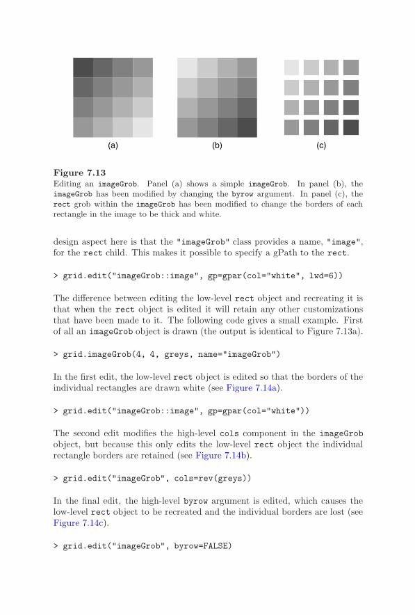
244 R Graphics
(a) (b) (c)
Figure 7.13Editing an imageGrob. Panel (a) shows a simple imageGrob. In panel (b), theimageGrob has been modified by changing the byrow argument. In panel (c), therect grob within the imageGrob has been modified to change the borders of eachrectangle in the image to be thick and white.
design aspect here is that the "imageGrob" class provides a name, "image",for the rect child. This makes it possible to specify a gPath to the rect.
> grid.edit("imageGrob::image", gp=gpar(col="white", lwd=6))
The difference between editing the low-level rect object and recreating it isthat when the rect object is edited it will retain any other customizationsthat have been made to it. The following code gives a small example. Firstof all an imageGrob object is drawn (the output is identical to Figure 7.13a).
> grid.imageGrob(4, 4, greys, name="imageGrob")
In the first edit, the low-level rect object is edited so that the borders of theindividual rectangles are drawn white (see Figure 7.14a).
> grid.edit("imageGrob::image", gp=gpar(col="white"))
The second edit modifies the high-level cols component in the imageGrobobject, but because this only edits the low-level rect object the individualrectangle borders are retained (see Figure 7.14b).
> grid.edit("imageGrob", cols=rev(greys))
In the final edit, the high-level byrow argument is edited, which causes thelow-level rect object to be recreated and the individual borders are lost (seeFigure 7.14c).
> grid.edit("imageGrob", byrow=FALSE)
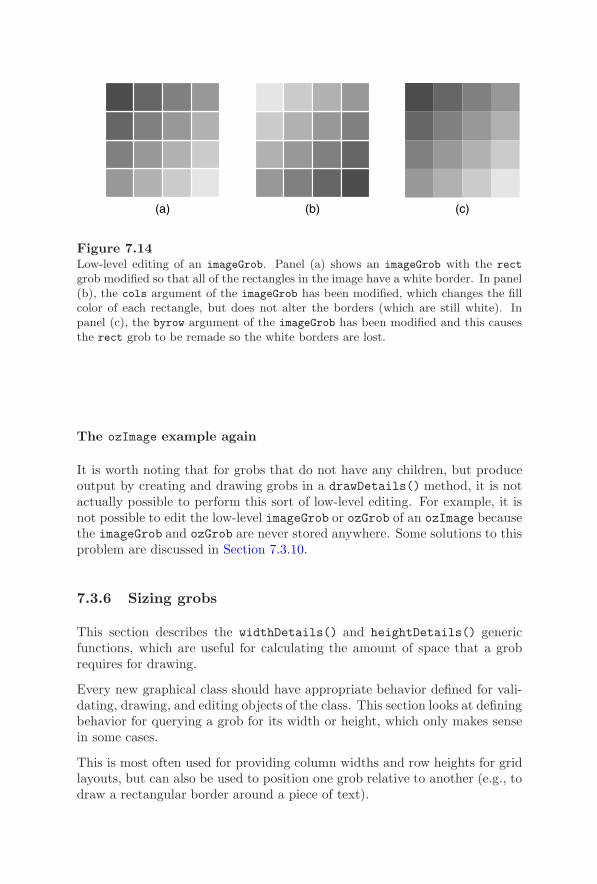
Developing New Graphics Functions and Objects 245
(a) (b) (c)
Figure 7.14Low-level editing of an imageGrob. Panel (a) shows an imageGrob with the rect
grob modified so that all of the rectangles in the image have a white border. In panel(b), the cols argument of the imageGrob has been modified, which changes the fillcolor of each rectangle, but does not alter the borders (which are still white). Inpanel (c), the byrow argument of the imageGrob has been modified and this causesthe rect grob to be remade so the white borders are lost.
The ozImage example again
It is worth noting that for grobs that do not have any children, but produceoutput by creating and drawing grobs in a drawDetails() method, it is notactually possible to perform this sort of low-level editing. For example, it isnot possible to edit the low-level imageGrob or ozGrob of an ozImage becausethe imageGrob and ozGrob are never stored anywhere. Some solutions to thisproblem are discussed in Section 7.3.10.
7.3.6 Sizing grobs
This section describes the widthDetails() and heightDetails() genericfunctions, which are useful for calculating the amount of space that a grobrequires for drawing.
Every new graphical class should have appropriate behavior defined for vali-dating, drawing, and editing objects of the class. This section looks at definingbehavior for querying a grob for its width or height, which only makes sensein some cases.
This is most often used for providing column widths and row heights for gridlayouts, but can also be used to position one grob relative to another (e.g., todraw a rectangular border around a piece of text).

246 R Graphics
Default sizing behavior
The calculation of "grobwidth" and "grobheight" units include calls to thegeneric functions, widthDetails() and heightDetails() respectively, whichshould return a unit describing the width and height of a grob.
The default widthDetails() and heightDetails()methods return unit(1,"null"). Within layouts this means that a grob gets an equal share of theavailable space (see Section 5.5.6). Outside of a layout, this converts to asize of zero. There are predefined widthDetails() and heightDetails()methods for most primitives and for the "frame" class (see Section 6.4).
A ribbonLegend example
In order to demonstrate the use of these methods, a "ribbonLegend" classwill be defined (see Figures 7.15 and 7.16).
A ribbonLegend consists of several components describing the number oflevels to represent in the legend, the colors to use for each level (line 6 inFigure 7.16). It is also possible to control the amount of empty space to leavearound the legend (line 3). The children of a ribbonLegend are a rect grobto draw rectangles for the levels and a lines grob and a text grob to showthe legend scale (see the ribbonKids() function in Figure 7.15). There is achildrenvp component that contains a vpTree: the parent viewport definesa layout and then two child viewports occupy column 2 and column 3 of row2 of that layout (see the ribbonVps() function in Figure 7.15). The layout iscreated with column widths based on the space needed for the scale labels (incolumn 3), one line of text for the “ribbon” of rectangles (in column 2), andthe required empty space around the outside (columns 1 and 4).
A widthDetails()method is defined for the "ribbonLegend" class in Figure7.16 (lines 12 to 14). The width of a ribbonLegend is calculated as the sumof the widths of the layout in the top viewport of the childrenvp component(line 13), which reflects the space required to draw the legend.
This class can be used to produce a ribbon legend as shown at the right-handside of Figure 7.1. If a ribbon legend is used as the data for a "grobwidth"unit, it will request enough space to draw itself. Examples are given in Sections7.3.8 and 7.3.9.
7.3.7 Pre-drawing and post-drawing
There are two more generic functions that have not yet been mentioned:preDrawDetails() and postDrawDetails(). These functions are called as
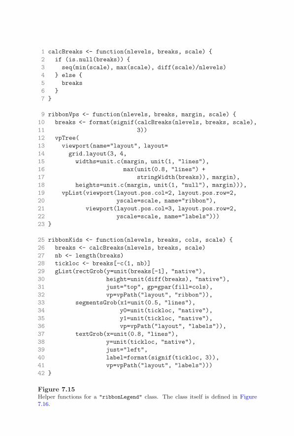
Developing New Graphics Functions and Objects 247
1 calcBreaks <- function(nlevels, breaks, scale) {2 if (is.null(breaks)) {3 seq(min(scale), max(scale), diff(scale)/nlevels)4 } else {5 breaks6 }7 }
9 ribbonVps <- function(nlevels, breaks, margin, scale) {10 breaks <- format(signif(calcBreaks(nlevels, breaks, scale),11 3))12 vpTree(13 viewport(name="layout", layout=14 grid.layout(3, 4,15 widths=unit.c(margin, unit(1, "lines"),16 max(unit(0.8, "lines") +17 stringWidth(breaks)), margin),18 heights=unit.c(margin, unit(1, "null"), margin))),19 vpList(viewport(layout.pos.col=2, layout.pos.row=2,20 yscale=scale, name="ribbon"),21 viewport(layout.pos.col=3, layout.pos.row=2,22 yscale=scale, name="labels")))23 }
25 ribbonKids <- function(nlevels, breaks, cols, scale) {26 breaks <- calcBreaks(nlevels, breaks, scale)27 nb <- length(breaks)28 tickloc <- breaks[-c(1, nb)]29 gList(rectGrob(y=unit(breaks[-1], "native"),30 height=unit(diff(breaks), "native"),31 just="top", gp=gpar(fill=cols),32 vp=vpPath("layout", "ribbon")),33 segmentsGrob(x1=unit(0.5, "lines"),34 y0=unit(tickloc, "native"),35 y1=unit(tickloc, "native"),36 vp=vpPath("layout", "labels")),37 textGrob(x=unit(0.8, "lines"),38 y=unit(tickloc, "native"),39 just="left",40 label=format(signif(tickloc, 3)),41 vp=vpPath("layout", "labels")))42 }
Figure 7.15Helper functions for a "ribbonLegend" class. The class itself is defined in Figure7.16.

248 R Graphics
1 ribbonLegend <- function(nlevels=NULL, breaks=NULL, cols,2 scale=range(breaks),3 margin=unit(0.5, "lines"),4 gp=NULL, vp=NULL, name=NULL) {5 gTree(6 nlevels=nlevels, breaks=breaks, cols=cols, scale=scale,7 children=ribbonKids(nlevels, breaks, cols, scale),8 childrenvp=ribbonVps(nlevels, breaks, margin, scale),9 gp=gp, vp=vp, name=name, cl="ribbonLegend")
10 }
12 widthDetails.ribbonLegend <- function(x) {13 sum(layout.widths(viewport.layout(x$childrenvp[[1]])))14 }
Figure 7.16A "ribbonLegend" class. This consists of a “ribbon” of rectangles filled with thespecified colors, plus an axis showing the scale.
part of the default drawing behavior (see Section 7.3.4).
Default pre/post-drawing behavior
The pushing and popping of viewports in vp components describedin the default drawing behavior (Section 7.3.4) includes a call to thepreDrawDetails() generic function (after the vp component has beenpushed, but before the drawDetails() method is called) and a call to thepostDrawDetails() generic function (after the drawDetails() method hasbeen called, but before the vp component is popped).
By default, the generic functions do nothing, but a new graphical class candefine a method to perform additional pushing, popping, and navigation ofviewports if required.
The pre-drawing and post-drawing are separate actions from the actual draw-ing because they are also performed during the evaluation of "grobwidth"and "grobheight" units. This is done so that the size of a grob is calculatedbased on the context in which it is drawn (i.e., so that the size correspondsto the actual size of the graphical output). This means that any pushing(and popping) of viewports for a new grob class must be performed in apreDrawDetails() (and postDrawDetails()) method if they will have anyeffect on the calculations on the size of the grob.

Developing New Graphics Functions and Objects 249
Summary of graphical object methods
Defining the behavior for a new graphical class requires writing one or moremethods for the standard grid generic functions:
• always write a constructor function for the class to generate a grob ora gTree containing the description of what to draw.
• always write a validDetails() method for checking the validity ofvalues in the non-standard components of the class.
• sometimes write a drawDetails() method to specify how to draw theclass.
• rarely write preDrawDetails() and postDrawDetails() methods ifthe drawing involves pushing viewports that affect the determination ofthe size of the graphical output.
• always (for gTrees) write an editDetails() method so that changesto the high-level description are propagated to child grobs.
• sometimes write widthDetails() and heightDetails() methods ifthe size of the graphical output can be sensibly determined.
7.3.8 Completing the example
Almost all of the components required to produce Figure 7.1 have now beendefined. The following code produces an ozImage that contains a portion ofthe South Australian coastline and an image representing fluorescence just offthe coast.
> ozimage <- ozImage(mapLong, mapLat,imageLong, imageLat, imageCols)
This next piece of code creates a ribbonLegend for the image plot.
> ribbonlegend <- ribbonLegend(breaks=zbreaks,cols=ozgreys,scale=range(zbreaks),gp=gpar(cex=0.7))
The final piece required is the ability to draw a “key” consisting of a map ofAustralia with a rectangle to indicate the region drawn in the main image.The code in Figure 7.17 defines an "ozKey" class for this purpose. An ozKeyis a gTree with an ozGrob and a rect grob as children. An ozKey drawsits children within a viewport, the location and size of which are specified
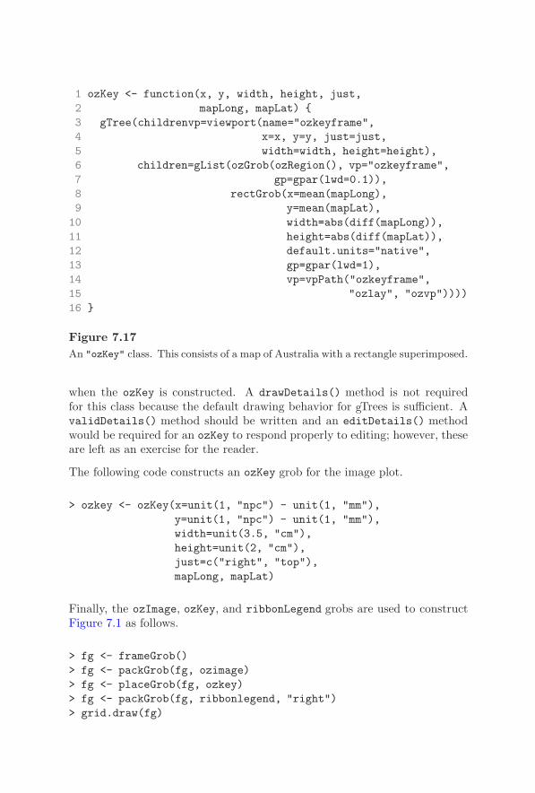
250 R Graphics
1 ozKey <- function(x, y, width, height, just,2 mapLong, mapLat) {3 gTree(childrenvp=viewport(name="ozkeyframe",4 x=x, y=y, just=just,5 width=width, height=height),6 children=gList(ozGrob(ozRegion(), vp="ozkeyframe",7 gp=gpar(lwd=0.1)),8 rectGrob(x=mean(mapLong),9 y=mean(mapLat),
10 width=abs(diff(mapLong)),11 height=abs(diff(mapLat)),12 default.units="native",13 gp=gpar(lwd=1),14 vp=vpPath("ozkeyframe",15 "ozlay", "ozvp"))))16 }
Figure 7.17An "ozKey" class. This consists of a map of Australia with a rectangle superimposed.
when the ozKey is constructed. A drawDetails() method is not requiredfor this class because the default drawing behavior for gTrees is sufficient. AvalidDetails() method should be written and an editDetails() methodwould be required for an ozKey to respond properly to editing; however, theseare left as an exercise for the reader.
The following code constructs an ozKey grob for the image plot.
> ozkey <- ozKey(x=unit(1, "npc") - unit(1, "mm"),y=unit(1, "npc") - unit(1, "mm"),width=unit(3.5, "cm"),height=unit(2, "cm"),just=c("right", "top"),mapLong, mapLat)
Finally, the ozImage, ozKey, and ribbonLegend grobs are used to constructFigure 7.1 as follows.
> fg <- frameGrob()> fg <- packGrob(fg, ozimage)> fg <- placeGrob(fg, ozkey)> fg <- packGrob(fg, ribbonlegend, "right")> grid.draw(fg)
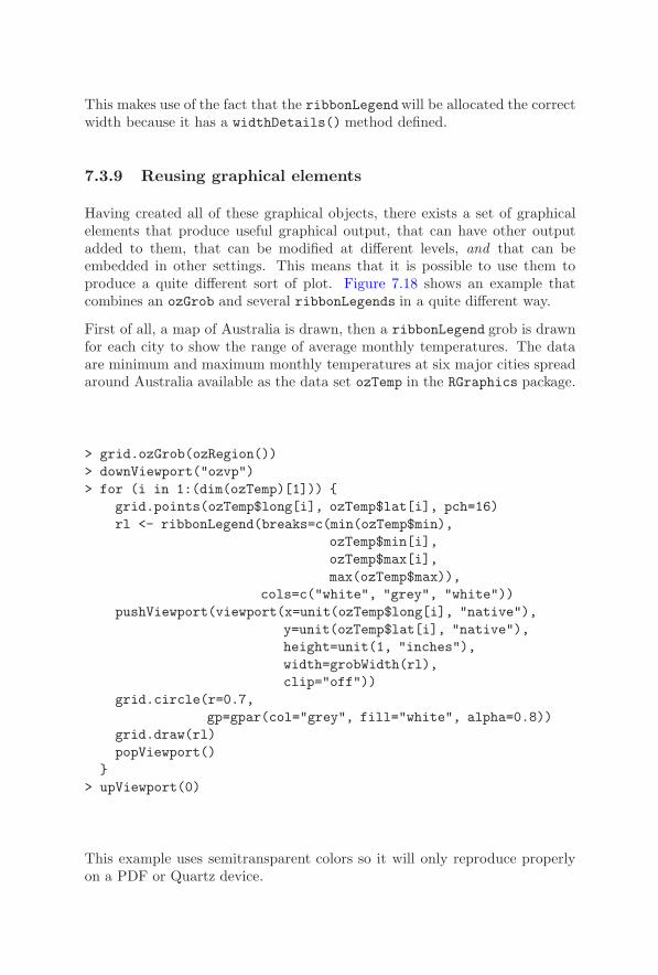
Developing New Graphics Functions and Objects 251
This makes use of the fact that the ribbonLegendwill be allocated the correctwidth because it has a widthDetails() method defined.
7.3.9 Reusing graphical elements
Having created all of these graphical objects, there exists a set of graphicalelements that produce useful graphical output, that can have other outputadded to them, that can be modified at different levels, and that can beembedded in other settings. This means that it is possible to use them toproduce a quite different sort of plot. Figure 7.18 shows an example thatcombines an ozGrob and several ribbonLegends in a quite different way.
First of all, a map of Australia is drawn, then a ribbonLegend grob is drawnfor each city to show the range of average monthly temperatures. The dataare minimum and maximum monthly temperatures at six major cities spreadaround Australia available as the data set ozTemp in the RGraphics package.
> grid.ozGrob(ozRegion())> downViewport("ozvp")> for (i in 1:(dim(ozTemp)[1])) {
grid.points(ozTemp$long[i], ozTemp$lat[i], pch=16)rl <- ribbonLegend(breaks=c(min(ozTemp$min),
ozTemp$min[i],ozTemp$max[i],max(ozTemp$max)),
cols=c("white", "grey", "white"))pushViewport(viewport(x=unit(ozTemp$long[i], "native"),
y=unit(ozTemp$lat[i], "native"),height=unit(1, "inches"),width=grobWidth(rl),clip="off"))
grid.circle(r=0.7,gp=gpar(col="grey", fill="white", alpha=0.8))
grid.draw(rl)popViewport()
}> upViewport(0)
This example uses semitransparent colors so it will only reproduce properlyon a PDF or Quartz device.

252 R Graphics
Figure 7.18A plot of temperature data for several cities in Australia. This plot was composedusing the same ozGrob and ribbonLegend grobs that were used to construct theoceanographic plot in Figure 7.1.

Developing New Graphics Functions and Objects 253
7.3.10 Other details
This section describes some more detailed and abstract issues that can arisein the design of a new graphical object.
Extending other grobs
From a design point of view, the correct implementation of the "imageGrob"class (Figure 7.8) probably would have been to derive it from the predefined"rect" class (rather than deriving it from the "gTree" class and having itcontain a rect object as its child). In other words, from a design perspective,an image is a rect, simply with a different parameterization.
Unfortunately, this sort of implementation is awkward because grid uses theS3 class system, which does not support inheritance of structure. Deriving an"image" class from the "rect" grob class would mean that generic functionsare automatically inherited, but the inheritance of structure (components) hasto be done by hand. This requires knowledge of the internal structure of the"rect" class and will fail if there are any changes to that structure, so thisapproach is not recommended.
This means that the standard approach has to be to derive new classes directlyfrom the "grob" class or the "gTree" class, not from other graphical classes.
Display lists
As mentioned in Section 1.3.3, R’s graphics engine maintains a display list— a record of all graphical output on a device — and this is used to redrawa scene if a device is resized (among other things). The output from bothtraditional and grid graphics functions is recorded on this display list.
Grid also maintains its own separate display list, which is used for accessinggrobs in the current scene and for redrawing the current scene after editing(i.e., after a call to grid.edit()). The grid display list can be replayedexplicitly using the grid.refresh() function.
The grid display list can be disabled using grid.display.list(), whichsaves on grid’s memory usage, but disables grid’s ability to modify and re-draw a scene. If the grid display list is disabled, the functions grid.edit(),grid.get(), grid.add(), and grid.remove() will no longer work.
It is possible to record grid output only on the grid display list with theengine.display.list() function, as shown by the following code. Redraw-ing will be slightly slower, but this avoids the memory cost of having outputrecorded on both the grid display list and the graphics engine display list.

254 R Graphics
> engine.display.list(FALSE)
This action does not turn off the graphics engine display list (so traditionalgraphics output is still recorded on the engine display list — see Section 1.3.3for use of the dev.control() function to turn off the engine display list).
Calculations during drawing
Grid units and layouts make it possible to specify quite complex arrangementsof output in a “declarative” manner. For example, the idea that a particularregion should be square (have an aspect ratio of 1) can be expressed at a highlevel (e.g., by specifying both width and height as unit(1, "snpc")) and thesystem will ensure that this occurs. There is no need to calculate the physicaldimensions of the current viewport and from those determine how to make asquare region.
It is, however, sometimes necessary to perform calculations by hand. Forexample, consider the problem of splitting text into several lines based onthe width of the available space. The code in Figure 7.19 defines a function,splitString(), to perform this operation (in a very simple-minded way). Theimportant part of this function is the use of the convertWidth() function toobtain the size of the current line of text in inches (line 11) for comparisonwith the size of the current region in inches (lines 6 to 8).
The following code uses the splitString() function to draw some text withinthe current viewport (see the left-hand panel in Figure 7.20).
> text <- "The quick brown fox jumps over the lazy dog."> grid.text(splitString(text),
x=0, y=1, just=c("left", "top"))
There is a problem with the above code. If it is used to draw into a windowand then the window is resized, the calculations are not rerun and the linesplitting becomes incorrect. A similar problem occurs if the code is run onone device and then copied to another with different physical dimensions.
The issue is that only drawing actions are recorded on the display list, not anycalculations leading up to the drawing. Anything that works off the displaylist (like redrawing after a resize) only reruns drawing actions.
There are two solutions to this problem. One solution rests on the factthat all code within a drawDetails() method (or a preDrawDetails() orpostDrawDetails()method) is captured on the graphics engine display list.∗
∗Prior to R version 2.1.0, this was not the case. In earlier versions, in order to get
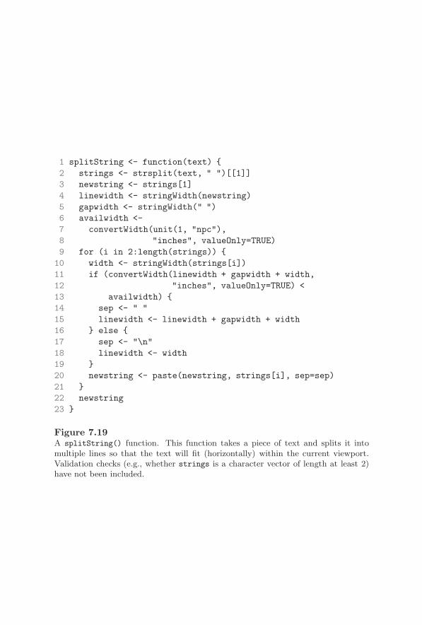
Developing New Graphics Functions and Objects 255
1 splitString <- function(text) {2 strings <- strsplit(text, " ")[[1]]3 newstring <- strings[1]4 linewidth <- stringWidth(newstring)5 gapwidth <- stringWidth(" ")6 availwidth <-7 convertWidth(unit(1, "npc"),8 "inches", valueOnly=TRUE)9 for (i in 2:length(strings)) {
10 width <- stringWidth(strings[i])11 if (convertWidth(linewidth + gapwidth + width,12 "inches", valueOnly=TRUE) <13 availwidth) {14 sep <- " "15 linewidth <- linewidth + gapwidth + width16 } else {17 sep <- "\n"18 linewidth <- width19 }20 newstring <- paste(newstring, strings[i], sep=sep)21 }22 newstring23 }
Figure 7.19A splitString() function. This function takes a piece of text and splits it intomultiple lines so that the text will fit (horizontally) within the current viewport.Validation checks (e.g., whether strings is a character vector of length at least 2)have not been included.

256 R Graphics
The quickbrown foxjumps over thelazy dog.
The quick brown fox jumpsover the lazy dog.
The quick brown foxjumps over the lazydog.
Figure 7.20Performing calculations before drawing. If the drawing of a grob depends on cal-culations (in this case, calculations to split text into multiple lines to fit horizon-tally within the current viewport), the calculations should be included within adrawDetails() method. This means that the calculations will be rerun if the deviceis resized (left panel versus top-right panel) or if the grob is edited to make the fontsize larger (top-right panel versus bottom-right panel).
The code in Figure 7.21 uses this fact to create a "splitText" class with adrawDetails() method that performs the calculations.∗
A splitText grob will recalculate the line breaks when a device is resized oron copies between devices (see the top-right panel of Figure 7.20).
> splitText <- splitTextGrob(text, name="splitText")> grid.draw(splitText)
Another advantage of creating a grob with a drawDetails() method is thatit is possible to edit the grob and have the calculations updated (see thebottom-right panel of Figure 7.20).
> grid.edit("splitText", gp=gpar(cex=1.5))
The other way to encapsulate calculations with drawing operations is to usethe grid.record() function, as shown by the following code.
drawDetails() methods to replay on a device resize, it was necessary to turn off the record-ing of grid operations on the graphics engine display list, engine.display.list(FALSE),which forced grid to do all redrawing.
∗Prior to R version 2.1.0, the call to grid.text() would need to add recording=FALSE.

Developing New Graphics Functions and Objects 257
1 splitTextGrob <- function(text, ...) {2 grob(text=text, cl="splitText", ...)3 }
5 drawDetails.splitText <- function(x, recording) {6 grid.text(splitString(x$text),7 x=0, y=1, just=c("left", "top"))8 }
Figure 7.21A "splitText" class. The drawDetails method for the class recalculates where toplace line breaks in the text, based on the current viewport size.
> grid.record({grid.text(splitString(text),
x=0, y=1, just=c("left", "top"))},list(text=text))
This is convenient for writing code purely for its side-effect (i.e., without hav-ing to deal explicitly with grobs), but it provides less control over the designof the object that is created. There is also a recordGrob() function thatsimply creates a grob encapsulating the calculations and drawing operationswithout drawing anything.
Avoiding argument explosion
Very complex or high-level graphics functions and objects are usually com-posed of several lower-level elements, which in turn may be composed of sev-eral even-lower-level elements. For example, a scatterplot matrix is composedof several scatterplots and each scatterplot contains axes, labels, and datasymbols.
Ideally, it should be possible to control any aspect of a graphical scene. Interms of writing code, this means that an argument or component should besupplied to allow the user to specify a customized value for any parameter ofthe scene.
At the level of graphical primitives, parameters consist of such things as thelocations of lines, the color of lines, and the line thickness. At a higher level, forexample for axes, there are higher-level parameters, such as where to placetick-marks, but it is also desirable to still be able to control the individualelements of the axis.
258 R Graphics
It is tempting to simply provide arguments for the elements of an axis asarguments of the axis itself. An example is where an an axis could have arot argument to specify the angle of rotation of the tick-mark labels, but thisapproach quickly runs into difficulties. For one thing, ambiguities can easilyarise. If an axis had an overall label it is unclear whether the rot argumentwould apply to the tick-mark labels or to the overall label. Another problemis that as elements become more complex, the number of parameters requiredfor all sub-elements grows alarmingly. Consider the number of separate ar-guments required to individually specify the angle of rotation for tick marklabels on all scatterplots within a scatterplot matrix!
Grid provides several features that can help to solve this problem. The func-tions grid.edit() and editGrob() (see Section 6.1) make it possible to accessthe lower-level elements of an object using a gPath. For example, in the fol-lowing code, an x-axis is created and then the labels on the tick marks arerotated by editing the rot component of the text grob called "labels" thatis a child of the xaxis grob.
> grid.xaxis(at=1:3/4, name="xaxis1")> grid.edit("xaxis1::labels", rot=45)
In the case where a grob calculates its children on the fly, it is possible tospecify editing actions that should be applied on the fly. This typically occurswhen a grob has no permanent children to access via a gPath and this willusually correspond to a grob that has a drawDetails() method.
The functions gEdit() and gEditList() allow the user to specify one or moreedit operations and the functions applyEdit() and applyEdits() apply thoseoperations to a grob. The following code demonstrates their use.∗ In this case,an x-axis is created without specifying the at argument, which means thattick-marks are calculated on the fly. The edits argument is used to specifymodifications to the labels that will be generated on the fly.
> grid.xaxis(name="xaxis1")> grid.edit("xaxis1", edits=gEdit("labels", rot=45))
This approach is similar to the concept of panel functions (see Sections 3.4.9and 4.5).
∗The edits component is not available for xaxis or yaxis grobs prior to R version 2.1.0,so this example will not run in earlier versions.

Developing New Graphics Functions and Objects 259
Mixing graphical functions and graphical objects
This chapter has addressed two main ways in which to develop new graphicalfunctionality: as a graphics function (purely for the side-effect of producingoutput); and as a graphical object. There has also been an emphasis onproducing reusable graphical elements, a corollary of which is that existinggraphical elements should be used where possible in the construction of newgraphical elements.
There is no way to force other developers to create graphical objects ratherthan graphical functions, so it is necessary to be able to make use of bothexisting functions and existing objects whether constructing a new functionor a new object.
In order to discuss each of the four possible situations (new functions fromexisting functions, new functions from existing grobs, new grobs from exist-ing functions, and new grobs from existing grobs) the following paragraphsconsider the simple case of drawing a “face,” which consists of a rectangle forthe border, two circles for eyes, and a line for the mouth (see Figure 7.22 forexamples).
Defining a new graphics function is straightforward whether using existinggraphics functions or existing graphical objects. Figure 7.23 defines two newgraphical functions to draw a face. The function faceA() demonstrates themost straightforward case of a graphics function that includes calls to othergraphics functions to produce output. The function faceB() shows a graphicsfunction making use of existing graphical objects, which is done by just passingthe result of the object constructor function to the function grid.draw().
Developing a new graphical object can be a bit trickier, but there are severaltools to help out. Figure 7.24 defines three functions for creating a newgraphical object to represent a face. The function faceC() shows the simplestcase, where a gTree is built from existing graphical objects, by just creatingthe appropriate objects as children of the gTree.
The functions faceD() and faceE() demonstrate the harder problem of cre-ating a new graphical object using only existing graphics functions. In thecase of faceD(), the output of the graphics functions is captured as a gTreeusing the grid.grabExpr() function. The faceE() function shows a differ-ent approach: it creates a grob with a special class, "face", and wraps theexisting graphics functions in a drawDetails() method for that new class.∗
∗The function grid.grabExpr() is not available in R before version 2.1.0 so faceD()
will not run in earlier versions. Also, the drawDetails() method for the "face" class thatfaceE() produces would need to have recording=FALSE added to each function call in orderto run correctly.

260 R Graphics
Figure 7.22Drawing faces. Examples of the output that could be produced using the graphicsfunctions and graphical objects defined in Figures 7.23 and 7.24.

Developing New Graphics Functions and Objects 261
1 faceA <- function(x, y, width, height) {2 pushViewport(viewport(x=x, y=y,3 width=width, height=height))4 grid.rect()5 grid.circle(x=c(0.25, 0.75), y=0.75, r=0.1)6 grid.lines(x=c(0.33, 0.67), y=0.25)7 popViewport()8 }
10 faceB <- function(x, y, width, height) {11 pushViewport(viewport(x=x, y=y,12 width=width, height=height))13 grid.draw(rectGrob())14 grid.draw(circleGrob(x=c(0.25, 0.75), y=0.75, r=0.1))15 grid.draw(linesGrob(x=c(0.33, 0.67), y=0.25))16 popViewport()17 }
Figure 7.23Some face functions. Some different ways to implement a new graphics function todraw a “face.” The function faceA() makes use of existing graphics functions. Thefunction faceB() makes use of existing graphical objects.
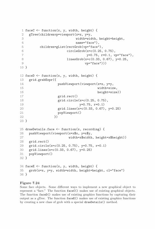
262 R Graphics
1 faceC <- function(x, y, width, height) {2 gTree(childrenvp=viewport(x=x, y=y,3 width=width, height=height,4 name="face"),5 children=gList(rectGrob(vp="face"),6 circleGrob(x=c(0.25, 0.75),7 y=0.75, r=0.1, vp="face"),8 linesGrob(x=c(0.33, 0.67), y=0.25,9 vp="face")))
10 }
12 faceD <- function(x, y, width, height) {13 grid.grabExpr({14 pushViewport(viewport(x=x, y=y,15 width=size,16 height=size))17 grid.rect()18 grid.circle(x=c(0.25, 0.75),19 y=0.75, r=0.1)20 grid.lines(x=c(0.33, 0.67), y=0.25)21 popViewport()22 })23 }
25 drawDetails.face <- function(x, recording) {26 pushViewport(viewport(x=x$x, y=x$y,27 width=x$width, height=x$height))28 grid.rect()29 grid.circle(x=c(0.25, 0.75), y=0.75, r=0.1)30 grid.lines(x=c(0.33, 0.67), y=0.25)31 popViewport()32 }
34 faceE <- function(x, y, width, height) {35 grob(x=x, y=y, width=width, height=height, cl="face")36 }
Figure 7.24Some face objects. Some different ways to implement a new graphical object torepresent a “face.” The function faceC() makes use of existing graphical objects.The function faceD() makes use of existing graphics functions by capturing theiroutput as a gTree. The function faceE() makes use of existing graphics functionsby creating a new class of grob with a special drawDetails() method.
Developing New Graphics Functions and Objects 263
7.4 Querying grid
This section describes some functions that are useful for querying the currentstate of the grid graphics system, which is useful for investigating the structureof the output that is produced by a function and for understanding what hasgone wrong when a function has produced unexpected output (see also SectionA.3.1 for some of the general debugging tools that R provides).
There are a number of functions that print out information about the currentviewports and grobs in the current scene. The functions current.viewport()and current.vpTree() display information about the current viewport tree,the getNames() function lists the names of all top-level grobs in the currentscene, and the function childNames() lists the names of all children of agTree.
It can be particularly frustrating if an error results in output being placedin a strange location or, worse, no output being drawn at all. In such cases,it can be helpful to simply call the grid.rect() function, which will draw arectangle showing the extent of the current viewport. Another useful trick isto calculate the location of the current viewport in inches, as shown by thefollowing code; either a negative value or a very large value is usually a signof trouble.
> convertX(unit(0:1, "npc"), "inches")

264 R Graphics
Chapter summary
It is possible to write simple grid graphics functions for the purpose ofproducing graphical output. Such functions should not assume thatthey have the entire device to draw into. They should only assumethat they are drawing within a grid viewport. Naming any view-ports created in the function and using upViewport() rather thanpopViewport() makes it possible for others to annotate the graphi-cal output produced by the function. Naming all grobs produced bythe function makes it possible for others to edit the output from thefunction (or remove grobs or add grobs or extract grobs).
Creating a graphical object, either a grob or a gTree, to represent theoutput generated by the function requires extra effort to set up meth-ods for the new graphical object class, but provides additional bene-fits. Most graphical objects will be gTrees consisting of a high-leveldescription plus several child grobs representing the output produced.A gTree makes it possible for others to interact with the high-level de-scription, while still being able to access the low-level element grobs.A grob can also be useful to provide information about the amountof space required to produce graphical output. Finally, a grob makesit possible for others to create higher-level gTrees with the grob as achild element.

A
A Brief Introduction to R
This appendix provides a very brief introduction to R. No attempt is made tocover all aspects of R. Instead, the focus is on providing enough knowledge tobe able to make use of the graphics functions described in the main part ofthis book.
An important part of this appendix is the definition of some technical termsthat are used throughout the rest of the book. Each of these terms will bewritten using italics the first time it is used.
A.1 Obtaining and installing R
The R software and documentation can be obtained from the R home page:http://www.r-project.org/. There are binary versions of R for Windows,Mac OS X, and the main flavors of Linux. R is also known to build fromsource on a wide range of platforms, including several 64-bit architectures.
Installation of binary distributions varies depending on the platform, but isstraightforward for anyone familiar with the relevant platform’s standard in-stallation tools.
A.2 An environment for statistical computingand graphics
R is run in the normal fashion (e.g., select it from the “start” menu on Win-dows, or type R at a unix command line). The appearance of the R environ-ment will vary, but for the purposes of this book, the important thing is thatthere is always an R command line, indicated by a prompt, which is usually

266 R Graphics
the “greater than” symbol, >. The various platforms only differ in terms ofhow pretty the surrounding windows look.∗
There are several ways to interact with R. The most simple, and the mostfun, is simply to type expressions at the command line. When an expressionis complete, type <return> or <enter>, and R will evaluate the expressionand print a result. The following code provides an example of typing a simplemathematical expression.
> 1 + 1
[1] 2
As well as mathematical expressions, R understands expressions involvingfunctions (function calls), comparisons, and special control flow statements(see Section A.3). An example of a function call is shown by the followingcode.
> abs(-4)
[1] 4
The function call consists of the function name, abs in this case, followedby one or more arguments within brackets. In this case, there is only oneargument, the number -4. The function abs() calculates the absolute valueof a number.
Arguments to functions may be specified in the form name=value, in whichcase the arguments can be supplied in any order. Furthermore, arguments canhave default values, in which case the argument does not need to be specifiedat all in a call to the function. The following three examples demonstratethese features using the seq() function, which generates regular sequences ofnumbers. The first three arguments to this function are from, a number tostart with, to, a number to end with, and by, an increment. The result ofthe call to seq() is identical in all three cases below — the seq() functionreturns the integers from 1 to 10 inclusive — but each function call specifiesthe arguments in a different way.
∗There are several packages and projects, for example the Rcmdr package[21] , theJGR project (http://stats.math.uni-augsburg.de/JGR/), and the SciViews-R project(http://www.sciviews.org/SciViews-R/), which provide more sophisticated windows-and-dialogs front-ends to R, but this book focuses on producing graphics by typing expressionsat the command line.

A Brief Introduction to R 267
The first expression uses positional arguments (values are matched to argu-ments in the order they are specified, e.g., the first value, 1, is matched to thefirst argument, from).
> seq(1, 10)
[1] 1 2 3 4 5 6 7 8 9 10
The second expression uses named arguments, so values are explicitly matchedto arguments and the order does not matter.
> seq(to=10, from=1)
[1] 1 2 3 4 5 6 7 8 9 10
Both of the expressions above also make use of the default value for the byargument, which is 1, as demonstrated by the third expression.
> seq(to=10, from=1, by=1)
[1] 1 2 3 4 5 6 7 8 9 10
Many of the functions in this book do not return a value, but are used for theirside effect, which is usually the production of graphical output. For example,the following code produces a scatterplot similar to the one shown in Figure1.1, but does not return any value.
> plot(pressure)
A.2.1 Batch processing
Instead of typing expressions one at a time at the command line, it is possibleto save several expressions in a text file (using a text editor and rememberingthat a word processor is not a text editor) and have R evaluate the expressionsall at once. A semi-colon (;) can be used to indicate the end of each expression,but this is not necessary — the standard approach is simply to start eachexpression on a new line in the text file. On the other hand, long expressionsmay extend over several lines. Either way, R will provide errors messages ifsomething is wrong.
268 R Graphics
The expressions in a file are evaluated either by starting R and calling thefunction source()with the name of the text file as an argument, or by runningR in batch mode from a command-line shell. For example, suppose thatyourfile.R is the name of the text file containing your R expressions. To runthe expressions from within an interactive R session, start up R and type theexpression below.
> source("yourfile.R")
To run the expression using R in batch mode, type the following commandwithin a Linux shell or a Windows DOS shell or the equivalent.
R CMD BATCH yourfile.R
This command will produce a file called yourfile.Rout which contains theoutput from running the R code in yourfile.R, plus any graphics files thatyour code creates.
A.2.2 Data types
Unsurprisingly, R recognizes a number when the user types one (see the codeexamples above). To specify a piece of text (also called a string), type itwithin either single or double quotes (double quotes are always used in thisbook). The following code shows the use of one of R’s many string functionsto change text from lowercase to uppercase.
> toupper("some text")
[1] "SOME TEXT"
R also recognizes logical values (also called boolean values), which are typedas TRUE and FALSE, and there is a special value, NA, which represents a missingor unknown value.
In addition to these basic types of data, R provides a number of data structuresthat allow multiple values to be specified as a single object. In fact, the mostbasic type of data in R is a vector (several values) rather than a scalar (singlevalue). A single value in R is actually just a vector of length 1.
There are numerous functions for generating vectors (seq() is one example)and many operations and functions automatically work element-wise on vec-tors. For example, the following code produces a vector of integer values from1 to 10, adds the value 5 to each element of the vector, then calculates theaverage of the values in the vector.

A Brief Introduction to R 269
> seq(10, 1)
[1] 10 9 8 7 6 5 4 3 2 1
> seq(10, 1) + 5
[1] 15 14 13 12 11 10 9 8 7 6
> mean(seq(10, 1) + 5)
[1] 10.5
Many graphics facilities are “vectorised” so that multiple pieces of output canbe produced by a single function call and a vector of graphical parametersettings can be specified to a function call (see examples on pages 154 and170).
In addition to vectors of numbers, strings, and logical values, R recognizesvectors of categorical values, where the elements of the vector may only takeone of a finite set of values, such as "male" or "female". Such a vector iscalled a factor and the set of possible values are the levels of the factor. Factorsare most often automatically generated when data is imported into R, but afactor may also be generated explicitly using the factor() function. Somegraphics functions are designed to work with factors to produce plots that areappropriate for categorical data.
A.2.3 Variables
R allows values to be assigned to (symbolic) variables; in other words, a valuecan be associated with a name and that name can be used to represent thevalue in subsequent expressions. Here is the previous example, using variablesto store intermediate results. The expression 10:1 is just a short-hand forseq(10, 1).
> x <- 10:1> y <- x + 5> mean(y)
[1] 10.5
The expression x <- 10:1 can be read as “the variable x is assigned the value10:1”. The assignment operator, <-, is a less-than sign followed by a minussign without any space between them.

270 R Graphics
A.2.4 Indexing
R provides very powerful indexing facilities for accessing subsets of data. Thefollowing code demonstrates how to extract a single element, in this case thefourth element, from the vector of values in the variable x.
> x[4]
[1] 7
The subset (the bit within the square brackets) can be a vector of values andlogical values can be used as well, as demonstrated by the following code.
> x[4:7]
[1] 7 6 5 4
> x[x > 3 & x < 8]
[1] 7 6 5 4
A.2.5 Data structures
Vectors are the most basic storage format in R, but more complex and high-dimensional structures are also available.
R provides support for matrices and matrix operations. The functionsmatrix(), cbind() and rbind() are useful for constructing matrix objects.Some graphics functions that plot three or more variables will accept the datato plot as a matrix and matrices are also sometimes useful when specifying thelayout of several plots on a page. Matrices can be sub-setted using an indexcontaining two values separated by a comma. The following code shows somesimple examples of creating and sub-setting a matrix. First, a matrix consist-ing of three rows and two columns is created (and assigned to the variable m).Next, the value in the third row and second column is extracted. Finally, theentire second row is extracted.
> m <- cbind(1:3, 11:13)> m

A Brief Introduction to R 271
[,1] [,2]
[1,] 1 11
[2,] 2 12
[3,] 3 13
> m[3, 2]
[1] 13
> m[2,]
[1] 2 12
All of the values in a vector or matrix must have the same basic type (e.g., theymust all be numbers, or all be strings, or all be logical values). R provides liststo allow the user to store information of different types together in a singleobject. The following code shows how to construct a simple list and it alsoshows that names can be associated with components of the list.
> list("a", TRUE, c=1:3)
[[1]]
[1] "a"
[[2]]
[1] TRUE
$c
[1] 1 2 3
Each component of a list can be any type of structure, including a list, so listsprovide a way of creating an arbitrarily complex collection of data. Indexingapplies to a list just as for vectors to provide a sub-list, and there is anadditional operation using double square brackets ([[) to provide the contentsof an individual component of a list. The following code shows some simpleexamples. First, a list is created and assigned to the variable z, then weextract a sub-list, consisting of the first two components of z.
> z <- list("a", TRUE, c=1:3)> z[1:2]
272 R Graphics
[[1]]
[1] "a"
[[2]]
[1] TRUE
Finally, the following code extracts just the contents of the third componentof z, which is a vector (using single square brackets would have produced alist of length 1).
> z[[3]]
[1] 1 2 3
The subset can be specified as the names of components of the list and thereis a short-hand equivalent of the double square brackets using a dollar sign($). The last example above could also be written as z[["c"]] or z$c.
R also supports data frames for storing a complete set of data (a set of variablesobserved on a number of cases). This is the standard way of storing an entiredata set in R and a number of graphics functions allow the user to specify thedata to plot as a data frame. Data frames can be indexed like matrices or likelists (where each variable is a component of the data frame) as shown by thefollowing code.
> df <- data.frame(x=1:3, y=factor(c("M", "F", "M")))> df$x
[1] 1 2 3
> df[[2]]
[1] M F M
Levels: F M
> df[2, 1]
[1] 2
A Brief Introduction to R 273
A.2.6 Formulae
R provides a special notation for specifying formulae that define statisticalmodels. The expression y ~ x indicates that the variable y is (linearly) de-pendent on the variable x. Within a formula, a plus symbol (+) is used toinclude further additive terms, a multiplication symbol (*) is used to indicatecrossing of factors, a colon (:) is used to indicate an interaction, a forwardslash (/) is used to indicate nesting, and a vertical bar (|) is used to indicategrouping.
Some traditional plotting functions allow a formula to express which variablesto plot. For example, a scatterplot of the variables x and y can be obtainedvia the following expression.
> plot(y ~ x)
The Trellis graphics system, described in Chapter 4, makes extensive use offormulae to express the structure of a plot (see Section 4.2.1).
A.2.7 Expressions
Usually, when an expression is typed at the R command line, two thingshappen: R parses what has been typed to create a valid R expression and thenR evaluates the expression. Sometimes it is useful to do just the first step andgenerate an unevaluated expression (see Section 3.4.6). There are several waysto do this, but the most straightforward is to use the expression() function.The following code shows the difference between getting R to evaluate anexpression and getting R to create an expression.
> x <- 10:1> y <- 5
> x + y
[1] 15 14 13 12 11 10 9 8 7 6
> expression(x + y)
expression(x + y)

274 R Graphics
A.2.8 Packages
R functions are organized into separate packages, which has two benefits.Firstly, this makes it possible load only the packages containing the functionsthat are required, so that R runs faster and uses less memory. Secondly, itis very easy to make use of functions that other people have written and putinto a package (the main R download site currently contains more than 400of these “contributed” packages).
The functions install.packages() and update.packages() are useful fordownloading and installing packages from within an R session (the Windowsversion has a menu interface to these). Once a package is installed, it can beloaded (so that the functions in the package can be used) using the library()function.
The traditional graphics system described in Part I of this book is provided bythe graphics package, which is installed and loaded by default in a standardinstallation of R. The grid graphics system is provided by the package grid.It and the lattice package described in Part II are also installed by default,but must be explicitly loaded. See help(Startup) for ways to automate theloading of packages.
A.2.9 Accessing data sets
R has many facilities for obtaining data. There are a number of datasetsprovided with R in the datasets package. Typing data()will produce a list ofthe datasets available in all currently loaded packages. For importing externaldata sets into R, there are several functions for reading plain text files in awide variety of formats (e.g. read.table(), read.csv(), and read.fwf()).The package foreign[49] allows the user to read in data that has been storedin another system’s format (e.g., SAS data sets), and there are functions forworking with database management systems (see the DBI package[50]).
It can also be useful to generate random data, for example, when learninghow to use a function. For this purpose, there are many functions in R forproducing random values from a wide variety of distributions. For example,the rnorm() function generates random values from a Normal distribution.
The manual “R Data Import/Export”, which is distributed with R, containsa comprehensive description of facilities for accessing data.

A Brief Introduction to R 275
A.2.10 Getting help
Every R function and dataset has on-line help associated with it, which canbe viewed by calling the help() function. Try typing help(help). Thehelp pages often include a series of examples and the example() function isuseful for running those examples. The help.start() function starts up abrowser to view HTML versions of the on-line help, plus HTML versions ofthe R manuals. There is also a help.search() function to assist in locatinga function for a particular purpose.
Some packages also provide vignettes, which are usually more extensive anddescriptive than the on-line help. Typing vignette() will show a list of thevignettes that are available for all currently loaded packages.
Finally, there are a number of manuals distributed with R. As well, there arefreely available manuals contributed by users on the R web site (includingseveral in languages other than English), and there are archives of the R-helpmailing list (also linked off the main web site).
If all else fails, try sending a nice clear question to the R-help mailing list (seethe instructions and posting guide for “Mailing lists” on the R home page).
A.3 A programming language
One of the most important features of R is that there is a deliberate blurringof the distinction between users and developers — between people who callfunctions and people who write functions.
It is very easy to write your own function in R, and such a function can beused just like any predefined function. The following code gives an exampleof how to define a function. This function takes a vector and extends it byattaching a mirror image of the vector to the original vector.
> mirror <- function(x) {c(x, rev(x)[-1])
}
It is now possible to call this function just like any other function, as shownby the following code. The result of a function is just the result of the lastexpression in the function (but, see also the return() function).

276 R Graphics
> mirror(1:4)
[1] 1 2 3 4 3 2 1
There are many details to add to this basic recipe (see the manual “An Intro-duction to R” that is distributed with R), but creating simple functions is assimple as it looks.
As more sophisticated functions are written, some of the programming-relatedfeatures of R become more important. R provides the standard control flowfeatures, such as loops and conditional expressions. The following code re-defines the mirror() function above, using a conditional expression to add acheck that it is possible to mirror the value passed in.
> mirror <- function(x) {if (!is.vector(x))stop("x must be a vector")
c(x, rev(x)[-1])}
The call to the stop() function will only occur if an inappropriate value ispassed in the argument x, as shown by the following code.
> mirror(1:4)
[1] 1 2 3 4 3 2 1
> mirror(matrix(1:10, ncol=2))
Error in mirror(matrix(1:10, ncol = 2)) :
x must be a vector
A.3.1 Debugging
When writing your own functions, or even just when calling existing functions,it can sometimes be unclear why a particular error has occurred, or even whereit has occurred. R provides a number of tools for investigating the behaviorof a function more closely, including basic functions like str() that displaythe raw contents of variables, the function traceback(), which shows all thefunctions that were called on the way to getting an error, and the debug()function, which allows the user to step through a function one command ata time. There is also a debug package[9], which provides a GUI debuggerinterface.
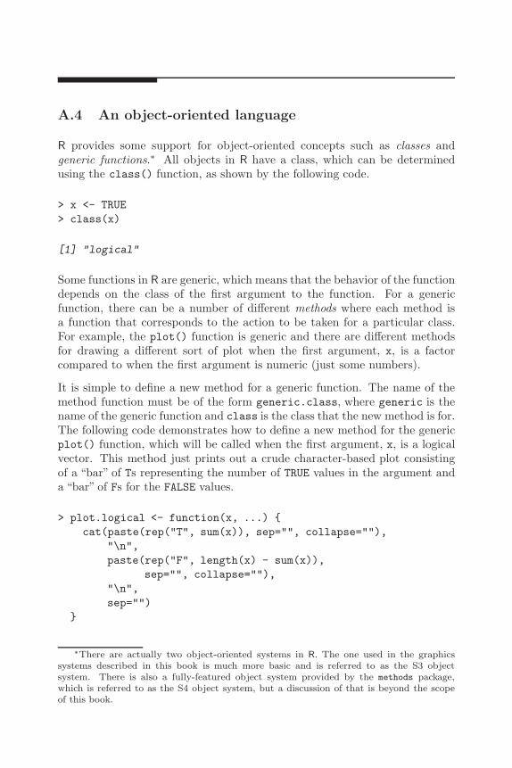
A Brief Introduction to R 277
A.4 An object-oriented language
R provides some support for object-oriented concepts such as classes andgeneric functions.∗ All objects in R have a class, which can be determinedusing the class() function, as shown by the following code.
> x <- TRUE> class(x)
[1] "logical"
Some functions in R are generic, which means that the behavior of the functiondepends on the class of the first argument to the function. For a genericfunction, there can be a number of different methods where each method isa function that corresponds to the action to be taken for a particular class.For example, the plot() function is generic and there are different methodsfor drawing a different sort of plot when the first argument, x, is a factorcompared to when the first argument is numeric (just some numbers).
It is simple to define a new method for a generic function. The name of themethod function must be of the form generic.class, where generic is thename of the generic function and class is the class that the new method is for.The following code demonstrates how to define a new method for the genericplot() function, which will be called when the first argument, x, is a logicalvector. This method just prints out a crude character-based plot consistingof a “bar” of Ts representing the number of TRUE values in the argument anda “bar” of Fs for the FALSE values.
> plot.logical <- function(x, ...) {cat(paste(rep("T", sum(x)), sep="", collapse=""),
"\n",paste(rep("F", length(x) - sum(x)),
sep="", collapse=""),"\n",sep="")
}
∗There are actually two object-oriented systems in R. The one used in the graphicssystems described in this book is much more basic and is referred to as the S3 objectsystem. There is also a fully-featured object system provided by the methods package,which is referred to as the S4 object system, but a discussion of that is beyond the scopeof this book.

278 R Graphics
This method will now get run whenever plot() is called with a logical vectoras the first argument, as shown by the following code.
> plot(1:10 > 4)
TTTTTT
FFFF
These object-oriented features are important in the development of new graph-ical objects for the grid graphics system.

B
Combining Traditional Graphicsand Grid Graphics
The grid graphics system and the traditional graphics system work completelyindependently of each other. However, with care, the output from the twosystems can be combined effectively.∗
B.1 The gridBase package
The grid graphics system offers more power and flexibility than the traditionalgraphics system, and the lattice package provides the standard plot types andsome facilities not available in the traditional system. However, it is oftennecessary to use the traditional system because most plotting functions in add-on packages for R are built on the traditional system. Clearly, a combinationof the wide range of traditional plots and the power and flexibility of grid andlattice would be desirable and this is what the gridBase package[44] provides.
B.1.1 Annotating base graphics using grid
The gridBase package has one function, baseViewports(), that supportsadding grid output to a base graphics plot. This function creates a set ofgrid viewports that correspond to the current base plot. By pushing theseviewports, it is possible to do simple annotations to a traditional plot, such asadding lines and text using grid’s units to locate them relative to a wide vari-ety of coordinate systems, or to attempt more complex annotations involvingpushing further grid viewports.
The baseViewports() function returns a list of three grid viewports. The firstcorresponds to the base “inner” region. This viewport is relative to the entire
∗This appendix is derived from material that first appeared as an article in R News[44].

280 R Graphics
device and it only makes sense to push this viewport from the “top level” (i.e.,only when no other grid viewports have been pushed). The second viewportcorresponds to the base “figure” region and is relative to the inner region, andit only makes sense to push it after the “inner” viewport has been pushed.The third viewport corresponds to the base “plot” region and is relative to thefigure region, and it only makes sense to push it after the other two viewportshave been pushed in the correct order.
A simple application of this facility involves adding text to the margins of abase plot at an arbitrary orientation. The base function mtext() allows textto be located in terms of a number of lines away from the plot region, butonly at rotations of 0 or 90 degrees. The base text() function allows arbitraryrotations, but only locates text relative to the user coordinate system in effectin the plot region (which is inconvenient for locating text in the margins of theplot). By contrast, the grid function grid.text() allows arbitrary rotationsand can be used in any grid viewport. In the following, a base plot is createdwith the x-axis tick labels left off.
> midpts <- barplot(1:10, col="grey90", axes=FALSE)> axis(2)> axis(1, at=midpts, labels=FALSE)
Next, baseViewports() is used to create grid viewports that correspond tothe base plot and those viewports are pushed.
> library(gridBase)> vps <- baseViewports()> pushViewport(vps$inner, vps$figure, vps$plot)
Finally, rotated labels are drawn using grid.text() (and the viewports arepopped to clean up). The final output is shown in Figure B.1.
> grid.text(c("one", "two", "three", "four", "five","six", "seven", "eight", "nine", "ten"),
x=unit(midpts, "native"), y=unit(-1, "lines"),just="right", rot=60)
> popViewport(3)
B.1.2 Embedding base graphics plots in grid viewports
The gridBase package provides several functions for adding base graphics out-put to grid output. There are three functions that allow base plotting regions

Combining Traditional Graphics and Grid Graphics 281
02
46
810
one
two
thre
efo
ur five six
seve
nei
ght
nine ten
Figure B.1Annotating a traditional plot with grid. Most of the plot is drawn using the tra-ditional barplot() function, but the x-axis labels are drawn using grid.text() tomake use of both a convenient coordinate system (lines of text away from the x-axis)and the ability to rotate text to any angle.

282 R Graphics
to be aligned with the current grid viewport. These make it possible to drawone or more base graphics plots within a grid viewport. The fourth function,gridPAR(), provides a set of graphical parameter settings so that base par()settings can be made to correspond to some∗ of the current grid graphicalparameter settings.
The first three functions are gridOMI(), gridFIG(), and gridPLT(). Theyreturn the appropriate par() values for setting the base “inner,”“figure,” and“plot” regions, respectively.
The main usefulness of these functions is to allow the user to create a complexlayout using grid and then draw a base plot within relevant elements of thatlayout. The following example uses this idea to create a lattice plot where thepanels contain dendrograms drawn using base graphics functions.†
The first step just involves preparing some data to plot. A dendrogram objectis created and cut it into four subtrees.‡
> hc <- hclust(dist(USArrests), "ave")> dend1 <- as.dendrogram(hc)> dend2 <- cut(dend1, h=70)
Next, some dummy variables are created that correspond to the four subtrees.
> x <- 1:4> y <- 1:4> height <- factor(round(unlist(lapply(dend2$lower,
attr, "height"))))
Now a lattice panel function is defined to draw the dendrograms. The firstthing this panel function does is push a viewport that is smaller than theviewport lattice creates for the panel. The purpose of this is to ensure thatthere is enough room for the labels on the dendrogram. The space variablecontains a measure of the length of the longest label. The panel function thencalls gridPLT() and makes the base plot region correspond to the viewportthat has just been pushed. Finally, the traditional plot() function is used todraw the dendrogram (and then the viewport is popped).
∗Only lwd, lty, col were available at the time of writing.†Recall that lattice is built on grid so the panel region in a lattice plot is a grid viewport.‡This example uses data on violent crimes in the United States, available as the USAr-
rests data set in the datasets package.

Combining Traditional Graphics and Grid Graphics 283
> space <- 1.2 * max(unit(rep(1, 50), "strwidth",as.list(rownames(USArrests))))
> dendpanel <- function(x, y, subscripts, ...) {pushViewport(viewport(gp=gpar(fontsize=8)),
viewport(y=unit(0.95, "npc"), width=0.9,height=unit(0.95, "npc") - space,just="top"))
par(plt=gridPLT(), new=TRUE, ps=8)plot(dend2$lower[[subscripts]], axes=FALSE)popViewport(2)
}
The final plot is produced by a call to the xyplot() function, using lattice toset up the arrangement of panels and strips (grid viewports) and our panelfunction to draw a traditional dendrogram in each panel (see Figure B.2).
> library(lattice)> plot.new()> print(xyplot(y ~ x | height, subscripts=TRUE,
xlab="", ylab="",strip=function(...) {strip.default(style=4, ...)
},scales=list(draw=FALSE),panel=dendpanel),
newpage=FALSE)
B.1.3 Problems and limitations
The functions provided by the gridBase package allow the user to mix outputfrom two quite different graphics systems and there are limits to how muchthe systems can be combined:
• The gridBase functions attempt to match grid graphics settings withbase graphics settings (and vice versa). This is only possible undercertain conditions. For a start, it is only possible if the device size doesnot change. If these functions are used to draw into a window, then thewindow is resized, the base and grid settings will almost certainly nolonger match and the graph will become nonsensical. This also appliesto copying output between devices of different sizes.
Some solutions to this problem are discussed in Section 7.3.10.
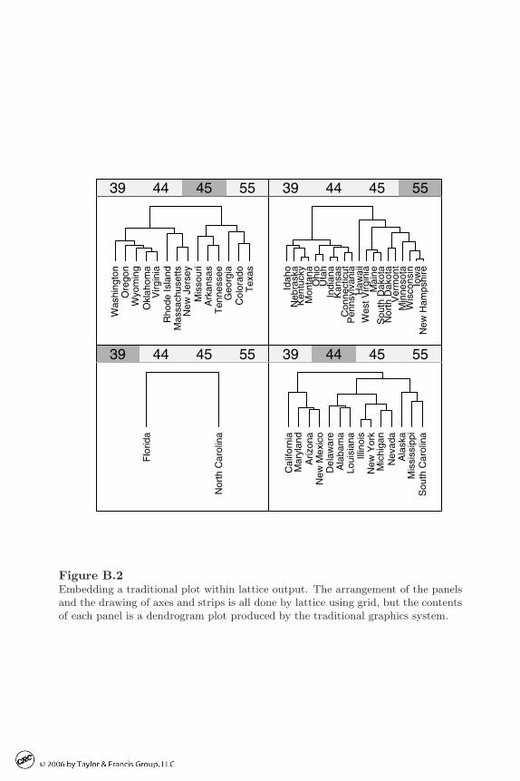
284 R Graphics
Flo
rida
Nor
th C
arol
ina
39 44 45 55
Cal
iforn
iaM
aryl
and
Ariz
ona
New
Mex
ico
Del
awar
eA
laba
ma
Loui
sian
aIll
inoi
sN
ew Y
ork
Mic
higa
nN
evad
aA
lask
aM
issi
ssip
piS
outh
Car
olin
a
39 44 45 55
Was
hing
ton
Ore
gon
Wyo
min
gO
klah
oma
Virg
inia
Rho
de Is
land
Mas
sach
uset
tsN
ew J
erse
yM
isso
uri
Ark
ansa
sT
enne
ssee
Geo
rgia
Col
orad
oT
exas
39 44 45 55
Idah
oN
ebra
ska
Ken
tuck
yM
onta
naO
hio
Uta
hIn
dian
aK
ansa
sC
onne
ctic
utP
enns
ylva
nia
Haw
aii
Wes
t Virg
inia
Mai
neS
outh
Dak
ota
Nor
th D
akot
aV
erm
ont
Min
neso
taW
isco
nsin
Iow
aN
ew H
amps
hire
39 44 45 55
Figure B.2Embedding a traditional plot within lattice output. The arrangement of the panelsand the drawing of axes and strips is all done by lattice using grid, but the contentsof each panel is a dendrogram plot produced by the traditional graphics system.

Combining Traditional Graphics and Grid Graphics 285
• It is not possible to embed base graphics output within a grid viewportthat is rotated.
• There are certain base graphics functions that modify settings like omiand fig themselves (e.g., coplot()). Output from these functions willnot embed properly within grid viewports.

Bibliography
[1] A contribution to computer typesetting techniques: Tables of coordi-nates for Hershey’s repertory of occidental type fonts and graphic sym-bols. NBS Special Publication 424, April 1976.
[2] Daniel Adler. rgl: 3D visualization device system (OpenGL), 2004. Rpackage version 0.64-13.
[3] Adobe Systems Inc. PostScript language reference manual (2nd ed.).Addison-Wesley Longman, 1990.
[4] Jens Henrik Badsberg. dynamicGraph: dynamicGraph, 2004. R packageversion 0.1.7.0.
[5] Richard A. Becker and John M. Chambers. Extending the S System.Chapman & Hall, 1985.
[6] Richard A. Becker, William S. Cleveland, and Ming-Jen Shyu. Thevisual design and control of trellis display. Journal of Computationaland Graphical Statistics, 5:123–155, 1996.
[7] Richard A. Becker, Allan R. Wilks, and R version by Ray Brownriggwith enhancements by Thomas P. Minka. maps: Draw GeographicalMaps, 2005. R package version 2.0-26.
[8] Roger Bivand, Friedrich Leisch, and Martin Machler. pixmap: BitmapImages (“Pixel Maps”), 2004. R package version 0.4-2.
[9] Mark V. Bravington. MVB’s debugger for R, 2004. R package version1.0.1.
[10] Dan Carr and R port by Nicholas Lewin-Koh and Martin Maechler.hexbin: Hexagonal Binning Routines, 2004. R package version 1.1.
[11] J. M. Chambers. Structured computational graphics for data analysis.Proceedings of the International Statistical Institute, 40, 1975.
[12] William S. Cleveland. The Elements of Graphing Data. WadsworthPubl. Co., 1985.
[13] William S. Cleveland. Visualizing Data. Hobart Press, 1993.
[14] William S. Cleveland and Marylyn E. McGill, editors. Dynamic Graphicsfor Statistics. Wadsworth, 1988. ISBN 0-534-09144-X.

288 R Graphics
[15] William S. Cleveland and Robert McGill. Graphical perception: Thevisual decoding of quantitative information on graphical displays of data(C/R: p210-229). Journal of the Royal Statistical Society, Series A,General, 150:192–210, 1987.
[16] A. Cohen. On the graphical display of the significant components ina two-way contingency table. Communications in Statistics — Theoryand Methods, A9:1025–1041, 1980.
[17] D. Cook, A. Buja, J. Cabrera, and C. Hurley. Grand tour and projectionpursuit. Journal of Computational and Graphical Statistics, 4:155–172,1995.
[18] Peter Dalgaard. Introductory Statistics with R. Springer, 2002. ISBN0-387-95475-9.
[19] M.W. Felgate, S.H. Bickler, and P. Murrell. Quantifying broken objects:Estimating the death assemblage by integrating sample assemblage bro-kenness and completeness. Journal of Archaeological Science, submitted.
[20] John Fox. An R and S-Plus Companion to Applied Regression. SagePublications, Thousand Oaks, CA, USA, 2002. ISBN 0761922792.
[21] John Fox. Rcmdr: R Commander, 2005. R package version 0.9-17.
[22] M. Friendly. Graphical methods for categorical data. SAS User GroupInternational Conference Proceedings, 17:190–200, 1992.
[23] M. Friendly. A fourfold display for 2 by 2 by k tables. Technical Report217, Psychology Department, York University, 1994.
[24] M. Friendly. Mosaic displays for multi-way contingency tables. Journalof the American Statistical Association, 89:190–200, 1994.
[25] Michael Friendly. Visualizing Categorical Data. SAS Publishing, 2000.
[26] Frank E Harrell, Jr. Hmisc: Harrell Miscellaneous, 2004. R packageversion 3.0-1.
[27] Mark A. Harrower and Cynthia A. Brewer. Colorbrewer.org: An onlinetool for selecting color schemes for maps. The Cartographic Journal,40:27–37, 2003.
[28] J.A. Hartigan and B. Kleiner. A mosaic of television ratings. The Amer-ican Statistician, 38:32–35, 1984.
[29] Richard Heiberger and Burt Holland. Statistical Analysis and Data Dis-play: An Intermediate Course with Examples in S-PLUS, R, and SAS.Springer, 2004.
[30] Torsten Hothorn, Kurt Hornik, and Achim Zeileis. Unbiased recursivepartitioning: A conditional inference framework. Research Report Se-ries 8, Department of Statistics and Mathematics, WU Wien, 2004.

Combining Traditional Graphics and Grid Graphics 289
[31] Ross Ihaka. colorspace: Colorspace Manipulation, 2005. R package ver-sion 0.9.
[32] L. Kaufman and P.J. Rousseeuw. Finding Groups in Data: An Intro-duction to Cluster Analysis. Wiley, New York, 1990.
[33] Duncan Temple Lang and Debby Swayne. The embedded ggobi R inter-face, 2001. R package version 0.3.
[34] H. W. Lie and B. Bos. Cascading Style Sheets, level 1, 1996. W3CRecommendation.
[35] Uwe Ligges and Martin Machler. Scatterplot3d — an R package forvisualizing multivariate data. Journal of Statistical Software, 8(11):1–20, 2003.
[36] Ulric Lund and R port by Claudio Agostinelli. CircStats: Circular Statis-tics, 2003. R package version 0.1-8.
[37] John Maindonald and John Braun. Data Analysis and Graphics usingR: an example-based approach. Cambridge University Press, 2003.
[38] S. McClatchie and T.M. Ward. Alongshore variation in upwelling in-tensity in the eastern Great Australian Bight. Journal of GeophysicalResearch, in press.
[39] Doug McIlroy and packaged for R by Ray Brownrigg and Thomas P.Minka. mapproj: Map Projections, 2004. R package version 1.1-7.
[40] D. R. McNeil. Interactive Data Analysis. Wiley, 1977.
[41] David Meyer, Achim Zeileis, Alexandros Karatzoglou, and Kurt Hornik.vcd: Visualizing Categorical Data, 2004. R package version 0.1-3.4.
[42] A.E. Miller. The analysis of unreplicated factorial experiments from ageometric perspective. Canadian Journal of Statistics, 31:311–327, 2003.
[43] P. R. Murrell. Layouts: A mechanism for arranging plots on a page.Journal of Computational and Graphical Statistics, 8:121–134, 1999.
[44] Paul Murrell. Integrating grid graphics output with base graphics out-put. R News, 3(2):7–12, October 2003.
[45] Paul Murrell and Ross Ihaka. An approach to providing mathematicalannotation in plots. Journal of Computational and Graphical Statistics,9:582–599, 2000.
[46] Kurt Nassau, editor. Color for Science, Art and Technology. Elsevier,1998. ISBN 0-444-89846-8.
[47] Erich Neuwirth. RColorBrewer: ColorBrewer palettes, 2004. R packageversion 0.2-2.

290 R Graphics
[48] Martyn Plummer, Rolando Herrero, Silvia Franceschi, Chris J.L.M. Mei-jer, Peter Snijders, F. Xavier Bosch, Silvia de Sanjose, and Nubia Munozfor the IARC Multi-centre Cervical Cancer Study Group. Smoking andcervical cancer: pooled analysis of the iarc multi-centric case-controlstudy. Cancer Causes and Control, 14:805–814, 2003.
[49] R Core Team, Saikat DebRoy, Roger Bivand, et al. foreign: Read DataStored by Minitab, S, SAS, SPSS, Stata, Systat, dBase, ..., 2004. Rpackage version 0.8-4.
[50] R Special Interest Group on Databases (R-SIG-DB). DBI: R/S-PlusDatabase Interface, 2003. R package version 0.1-8.
[51] Naomi Robbins. Creating More Effective Graphs. Wiley, 2005.
[52] Peter Rousseeuw, Anja Struyf, Mia Hubert, R port by Kurt Hornik, andMartin Machler. cluster: Functions for clustering (by Rousseeuw et al.),2004. R package version 1.9.7.
[53] P.J. Rousseeuw. A visual display for hierarchical classification. In E. Di-day, Y. Escoufier, L. Lebart, J. Pages, Y. Schektman, and R. Tomassone,editors, Data Analysis and Informatics 4, pages 743–748. North-Holland,Amsterdam, 1986.
[54] Deepayan Sarkar. Lattice. R News, 2(2):19–23, June 2002.
[55] Dave Schreiner. OpenGL Reference Manual: The Official Reference Doc-ument to OpenGL, Version 1.2. Addison-Wesley Longman, 1999.
[56] A. Struyf, M. Hubert, and P.J. Rousseeuw. Integrating robust cluster-ing techniques in S-PLUS. Computational Statistics and Data Analysis,26:17–37, 1997.
[57] Deborah F. Swayne, Duncan Temple Lang, Andreas Buja, and DianneCook. GGobi: evolving from XGobi into an extensible framework forinteractive data visualization. Computational Statistics and Data Anal-ysis, 43:423–444, 2003.
[58] Jurgen Symanzik. Interactive and dynamic graphics. In James E. Gentle,Wolfgang Hardle, and Yuichi Mori, editors, Handbook of ComputationalStatistics. Springer, 2004.
[59] Terry M Therneau, Beth Atkinson, and R port by Brian Ripley. rpart:Recursive Partitioning, 2004. R package version 3.1-21.
[60] E. R. Tufte. The Visual Display of Quantitative Information. GraphicsPress, 1989.
[61] Edward R. Tufte. Envisioning Information. Graphics Press, 1990.
[62] Simon Urbanek. iPlots - interactive graphics for R. R package version0.1-18.

Combining Traditional Graphics and Grid Graphics 291
[63] Bill Venables and R port by Kurt Hornik. oz: Plot the Australian coast-line and states. R package version 1.0-10.
[64] William N. Venables and Brian D. Ripley. Modern Applied Statisticswith S. Fourth Edition. Springer, 2002. ISBN 0-387-95457-0.
[65] John Verzani. Using R for Introductory Statistics. Chapman &Hall/CRC, Boca Raton, FL, 2005. ISBN 1-584-88450-9.
[66] Denis White. maptree: Mapping, pruning, and graphing tree models,2003. R package version 1.3-3.
[67] Leland Wilkinson. The Grammar of Graphics. Springer, 1999.