Embed Size (px)
Citation preview
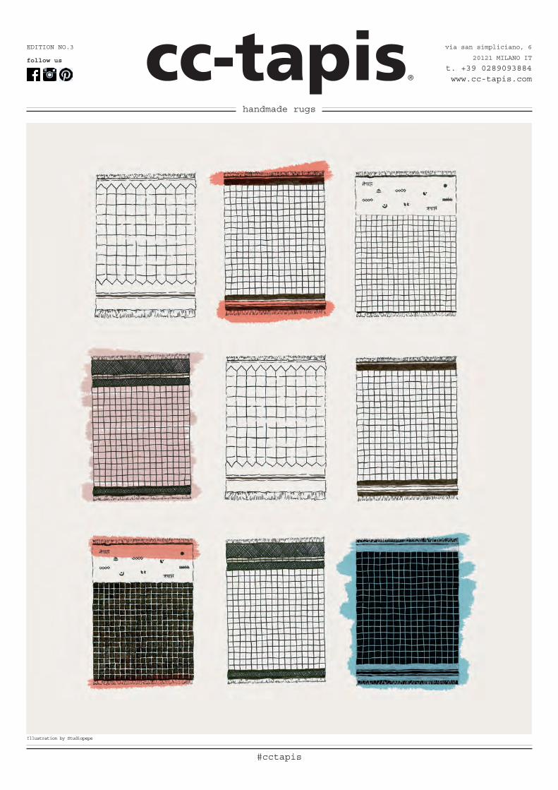
#cctapis
via san simpliciano, 6
20121 MILANO IT
t. +39 0289093884www.cc-tapis.com
EDITION NO.3
follow us
handmade rugs
Illustration by Studiopepe
cc-tapis®
2 collection 2016
cc-tapis®
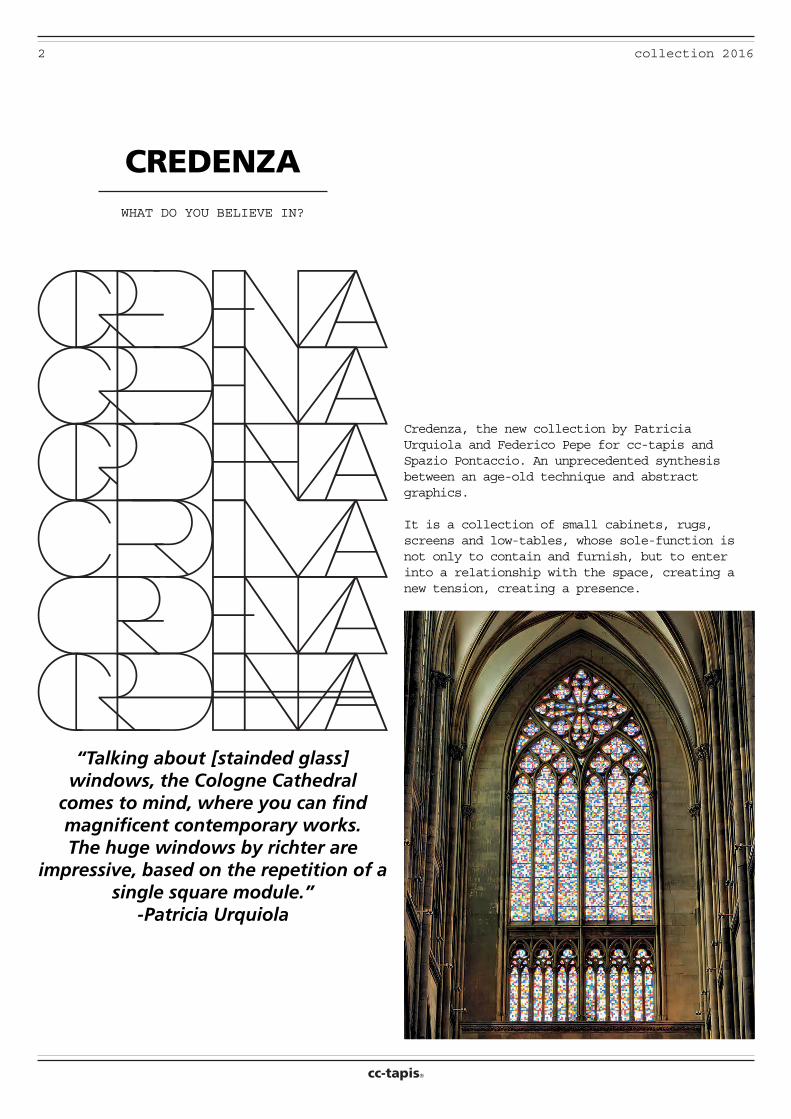
Credenza, the new collection by Patricia Urquiola and Federico Pepe for cc-tapis and Spazio Pontaccio. An unprecedented synthesis between an age-old technique and abstract graphics.
It is a collection of small cabinets, rugs, screens and low-tables, whose sole-function is not only to contain and furnish, but to enter into a relationship with the space, creating a new tension, creating a presence.
CREDENZAWHAT DO YOU BELIEVE IN?
“Talking about [stainded glass] windows, the Cologne Cathedral
comes to mind, where you can find magnificent contemporary works. The huge windows by richter are
impressive, based on the repetition of a single square module.”
-Patricia Urquiola
3collection 2016
cc-tapis®
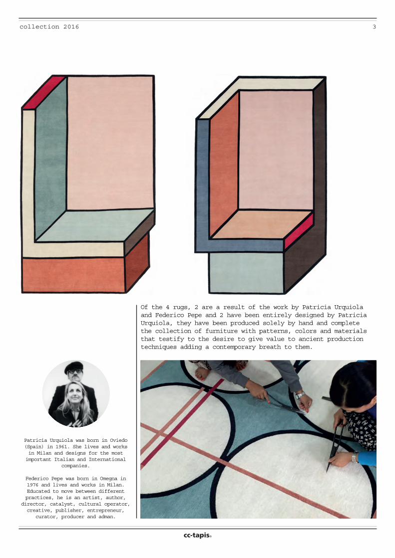
Of the 4 rugs, 2 are a result of the work by Patricia Urquiola and Federico Pepe and 2 have been entirely designed by Patricia Urquiola, they have been produced solely by hand and complete the collection of furniture with patterns, colors and materials that testify to the desire to give value to ancient production techniques adding a contemporary breath to them.
Patricia Urquiola was born in Oviedo (Spain) in 1961. She lives and works in Milan and designs for the most important Italian and International
companies.
Federico Pepe was born in Omegna in 1976 and lives and works in Milan. Educated to move between different practices, he is an artist, author,
director, catalyst, cultural operator, creative, publisher, entrepreneur,
curator, producer and adman.
cc-tapis®
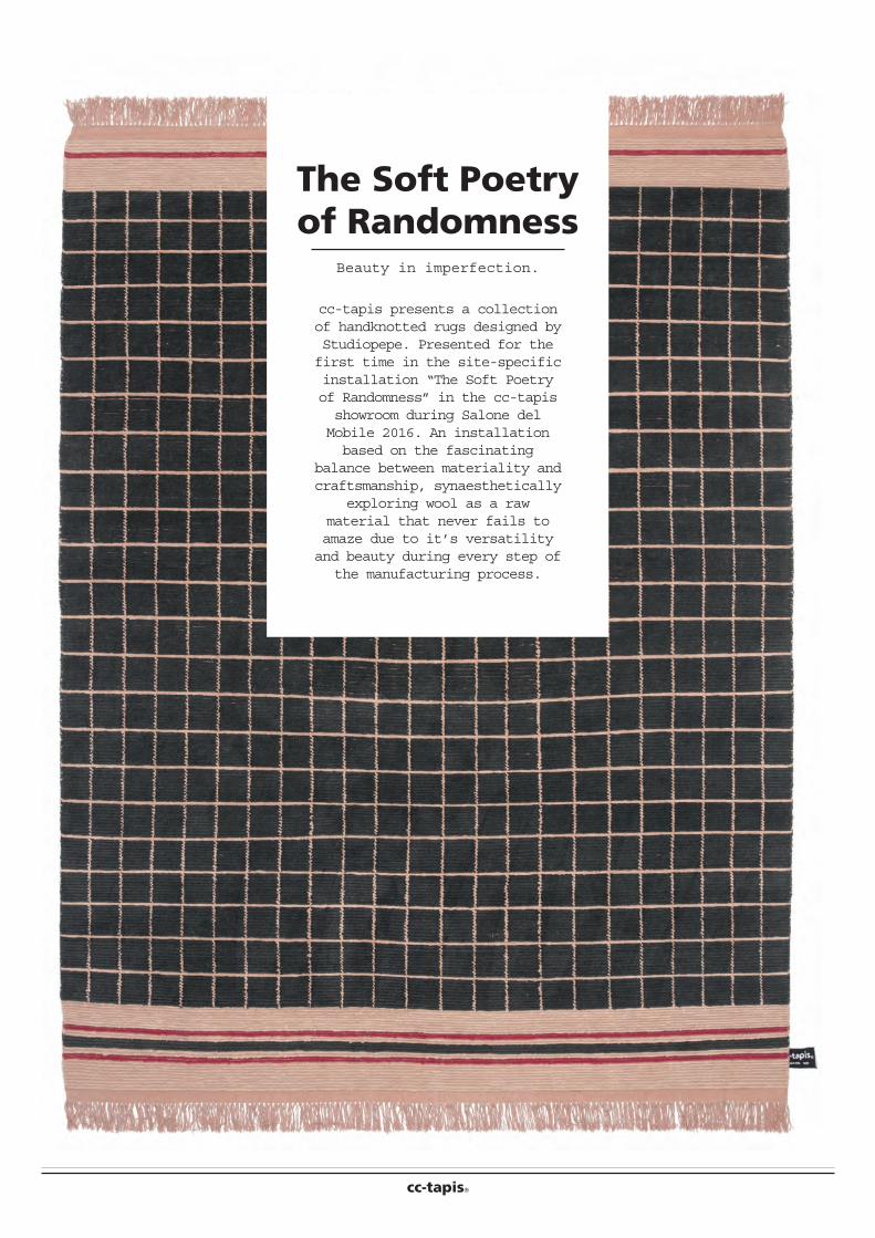
The Soft Poetry of Randomness
Beauty in imperfection.
cc-tapis presents a collection of handknotted rugs designed by Studiopepe. Presented for the first time in the site-specific installation “The Soft Poetry of Randomness” in the cc-tapis showroom during Salone del Mobile 2016. An installation based on the fascinating
balance between materiality and craftsmanship, synaesthetically
exploring wool as a raw material that never fails to amaze due to it’s versatility and beauty during every step of
the manufacturing process.
5collection 2016
cc-tapis®
designed by STUDIOPEPE
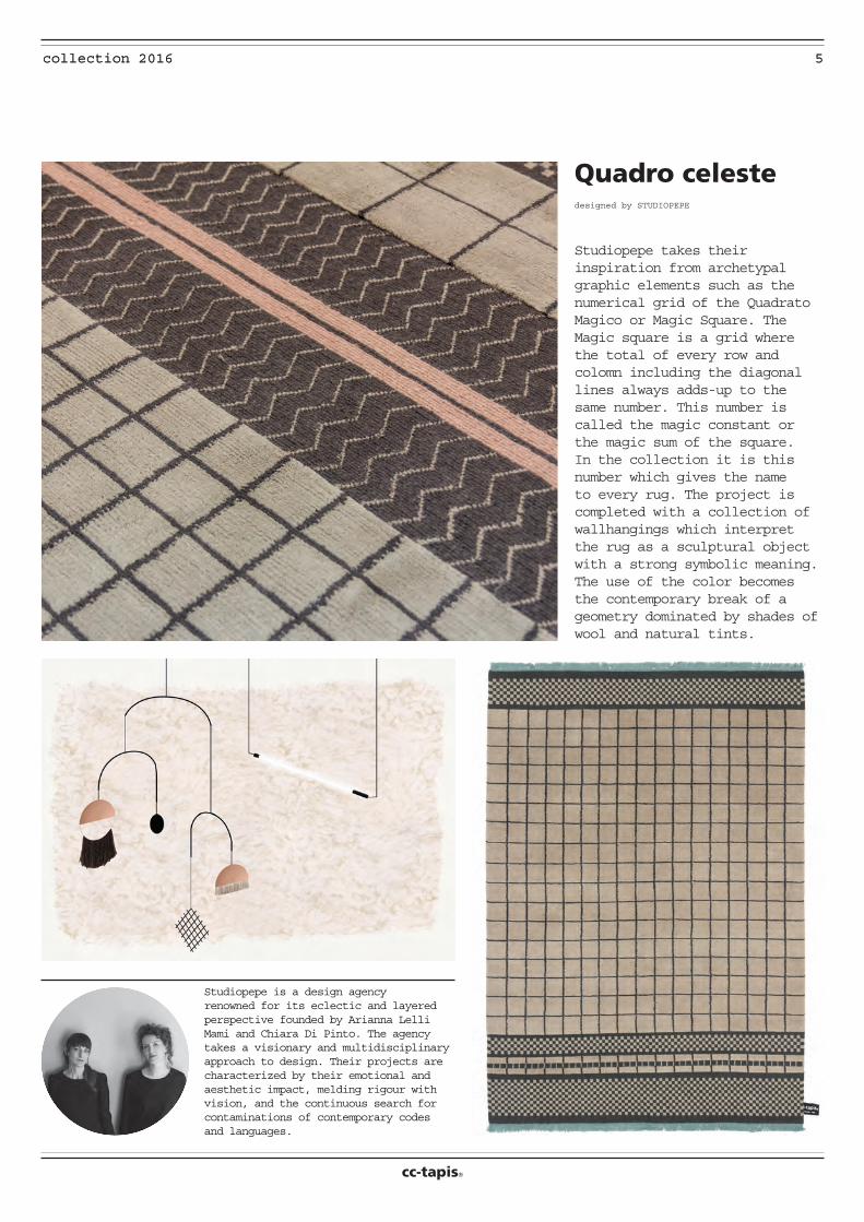
Quadro celeste
5collection 2016
Studiopepe takes their inspiration from archetypal graphic elements such as the numerical grid of the Quadrato Magico or Magic Square. The Magic square is a grid where the total of every row and colomn including the diagonal lines always adds-up to the same number. This number is called the magic constant or the magic sum of the square. In the collection it is this number which gives the name to every rug. The project is completed with a collection of wallhangings which interpret the rug as a sculptural object with a strong symbolic meaning. The use of the color becomes the contemporary break of a geometry dominated by shades of wool and natural tints.
Studiopepe is a design agency renowned for its eclectic and layered perspective founded by Arianna Lelli Mami and Chiara Di Pinto. The agency takes a visionary and multidisciplinary approach to design. Their projects are characterized by their emotional and aesthetic impact, melding rigour with vision, and the continuous search for contaminations of contemporary codes and languages.
6 collection 2016
cc-tapis®
cc-tapis® was created in 2011 by the traditional Persian house Maison Chamszadeh, founded in 1943 and well known in France for the quality of its handknotted rugs. The main headquarters are now in Milan, where a team of designers innovate through a new approach to traditional methods.
All cc-tapis® rugs are completely handknotted by expert Tibetan artisans in Nepal. A strong respect for materials and for the culture of this ancient craft is reflected in the company’s eco-friendly approach in every step of production, ranging from the hand spinning of the softest Himalayan wool to the use of purified rainwater for the
washing of the final products, making each one of cc-tapis® rugs unique. No chemicals, acids or artificial fibres are
ever used in the process.
To produce our carpets exclusively by hand means that we are able to realize any carpet custom made. We can adapt
the dimensions, give many of our models new colors, or work with you on a completely new creation. There are endless possibilities to create your unique carpet with more than 1200 different colors with materials like wool, silk or aloe,
combined to create different textures and different heights of pile.
A Timeless Story in Every Rug
cc-tapis®
7
1
collection 2016
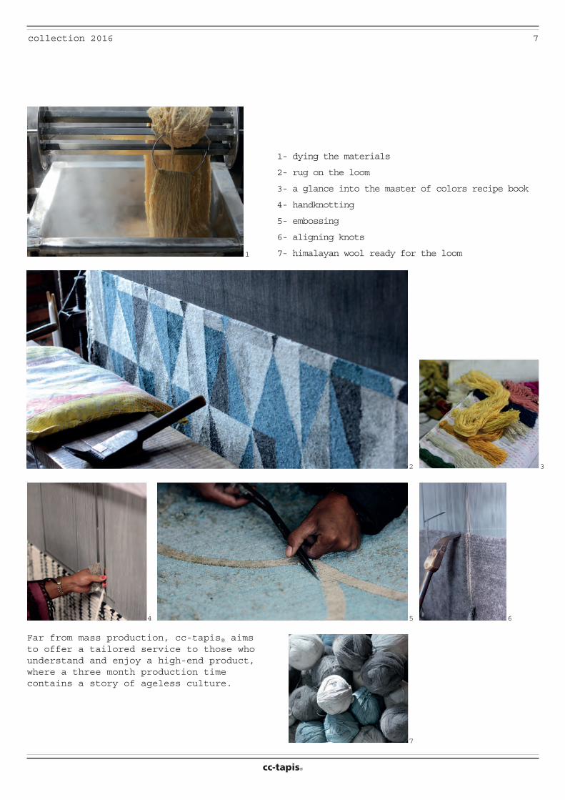
Far from mass production, cc-tapis® aims to offer a tailored service to those who understand and enjoy a high-end product, where a three month production time contains a story of ageless culture.
1- dying the materials
2- rug on the loom
3- a glance into the master of colors recipe book
4- handknotting
5- embossing
6- aligning knots
7- himalayan wool ready for the loom
2 3
4 5
7
6
cc-tapis®
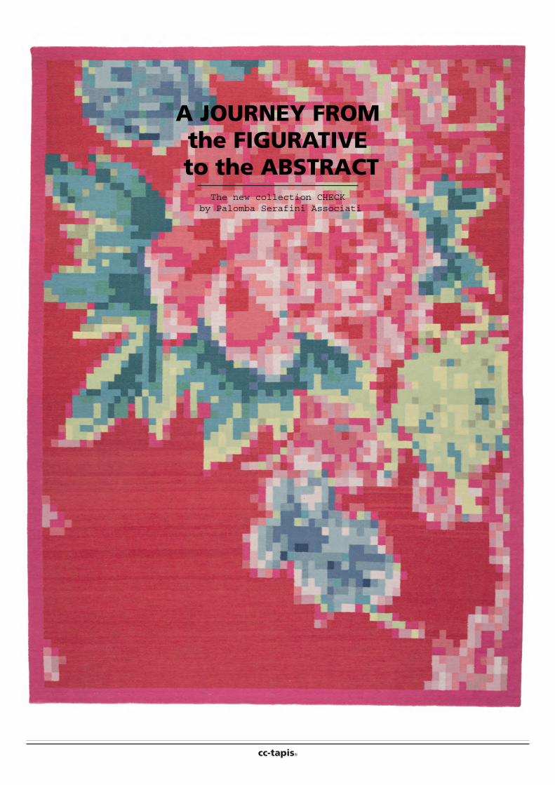
A JOURNEY FROM the FIGURATIVE
to the ABSTRACTThe new collection CHECK
by Palomba Serafini Associati
9collection 2016
cc-tapis®
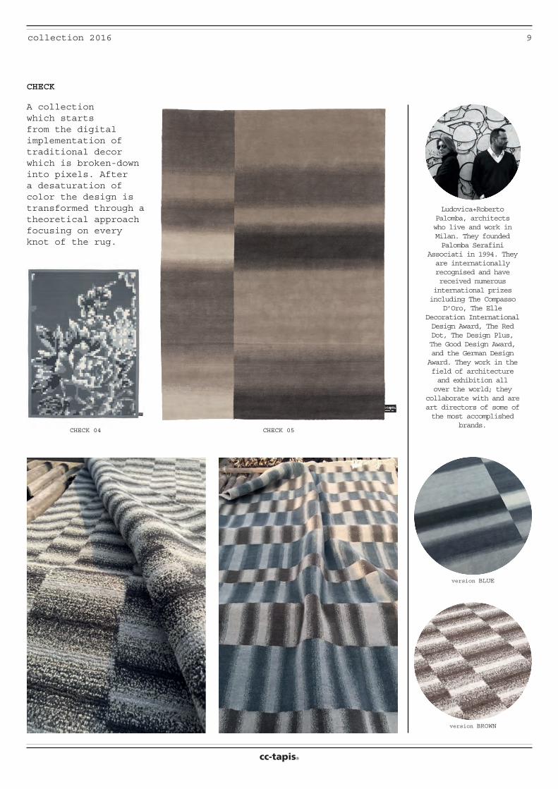
CHECK 04 CHECK 05
version BLUE
version BROWN
CHECK
A collection which starts from the digital implementation of traditional decor which is broken-down into pixels. After a desaturation of color the design is transformed through a theoretical approach focusing on every knot of the rug.
Ludovica+Roberto Palomba, architects who live and work in Milan. They founded Palomba Serafini
Associati in 1994. They are internationally recognised and have received numerous
international prizes including The Compasso
D’Oro, The Elle Decoration International Design Award, The Red Dot, The Design Plus, The Good Design Award, and the German Design Award. They work in the field of architecture and exhibition all over the world; they
collaborate with and are art directors of some of the most accomplished
brands.
10 collection 2016
cc-tapis®
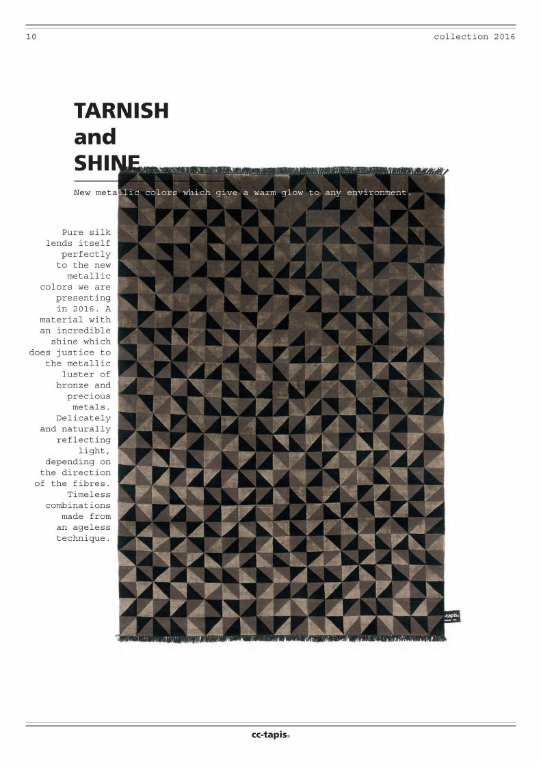
TARNISH and SHINE
Pure silk lends itself
perfectly to the new metallic
colors we are presenting in 2016. A
material with an incredible shine which
does justice to the metallic
luster of bronze and precious metals.
Delicately and naturally
reflecting light,
depending on the direction of the fibres.
Timeless combinations
made from an ageless technique.
New metallic colors which give a warm glow to any environment.
11collection 2016
cc-tapis®
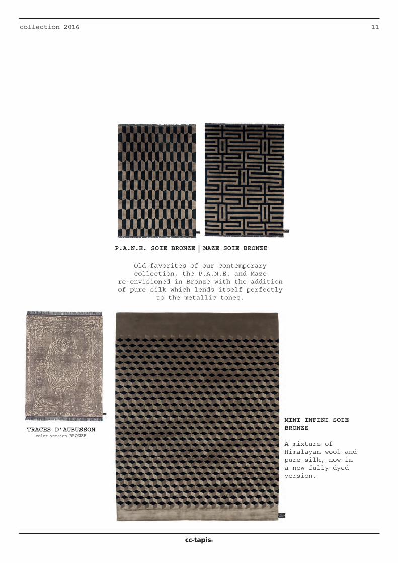
MAZE SOIE BRONZE
MINI INFINI SOIE BRONZE
A mixture of Himalayan wool and pure silk, now in a new fully dyed version.
P.A.N.E. SOIE BRONZE
TRACES D’AUBUSSONcolor version BRONZE
Old favorites of our contemporary collection, the P.A.N.E. and Maze
re-envisioned in Bronze with the addition of pure silk which lends itself perfectly
to the metallic tones.
cc-tapis®
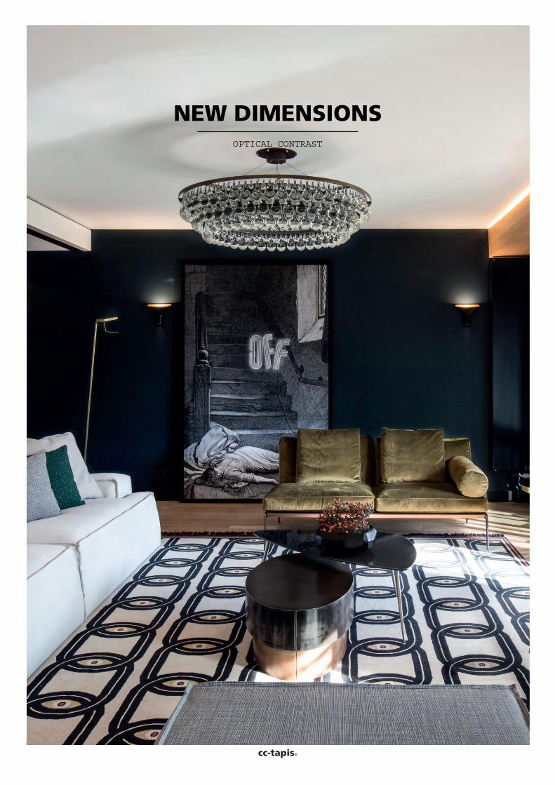
NEW DIMENSIONSOPTICAL CONTRAST
13collection 2016
cc-tapis®
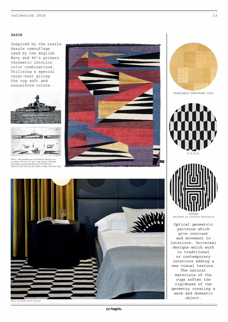
Photo: www.graphicine.com/razzle-dazzle-art-on-ships-the-art-of-war/ and https://upload.wikimedia.org/wikipedia/en/f/f5/Pattern_Sheet%2C_MS-3%2A_6A_for_Essex-class_carriers.jpg
Photo by Studio Erick Saillet
Optical geometric patterns which give contrast and movement to
interiors. Universal designs which work in traditional or contemporary
interiors adding a new visual texture.
The natural materials of the rugs soften the rigidness of the
geometry creating a warm and domestic
object.
P.A.N.E.
OPSTARdesigned by Vincenzo Marsiglia
CASELLARIO MONOCROMO GOLD
RAZOR
Inspired by the razzle dazzle camouflage used by the English Navy and 80’s primary chromatic interior color combinations. Utilizing a special twist-knot giving the rug soft and nonuniform colors.
14 collection 2016
cc-tapis®
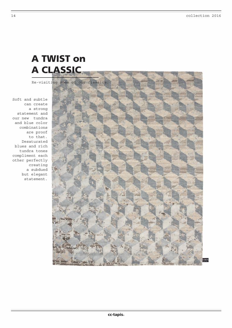
A TWIST onA CLASSIC
Soft and subtle can create a strong
statement and our new tundra and blue color combinations
are proof to that.
Desaturated blues and rich tundra tones
compliment each other perfectly
creating a subdued
but elegant statement.
Re-visiting some of our classics.
15collection 2016
cc-tapis®
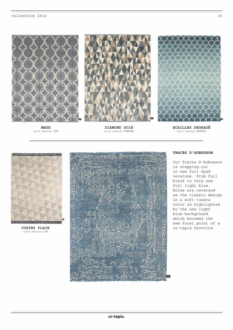
COATES PLACEcolor version ICE
ECAILLES DEGRADÉcolor version PETROL
DIAMOND SOIEcolor version TUNDRA
MESHcolor version ICE
TRACES D’AUBUSSON
Our Traces D’Aubusson is stepping-out in new full dyed versions. From full black to this new full light blue. Roles are reversed as the classic design in a soft tundra color is highlighted by the new light blue background which becomes the new focal point of a cc-tapis favorite.
16 collection 2016
cc-tapis®
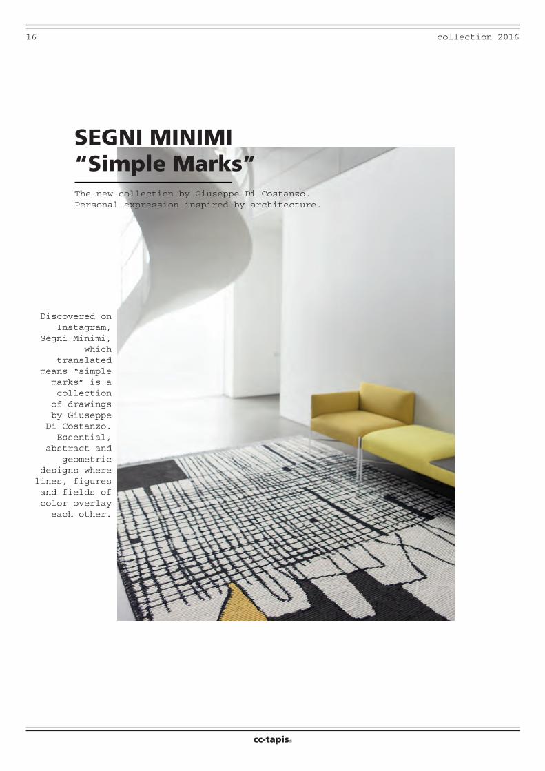
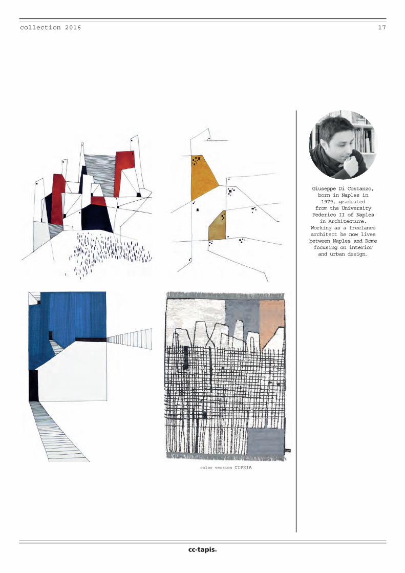
SEGNI MINIMI“Simple Marks”
Discovered on Instagram,
Segni Minimi, which
translated means “simple marks” is a collection of drawings by Giuseppe Di Costanzo. Essential,
abstract and geometric
designs where lines, figures and fields of color overlay each other.
The new collection by Giuseppe Di Costanzo.Personal expression inspired by architecture.
17collection 2016
cc-tapis®
Giuseppe Di Costanzo, born in Naples in 1979, graduated
from the University Federico II of Naples
in Architecture. Working as a freelance architect he now lives between Naples and Rome focusing on interior and urban design.
color version CIPRIA
18 collection 2016
cc-tapis®
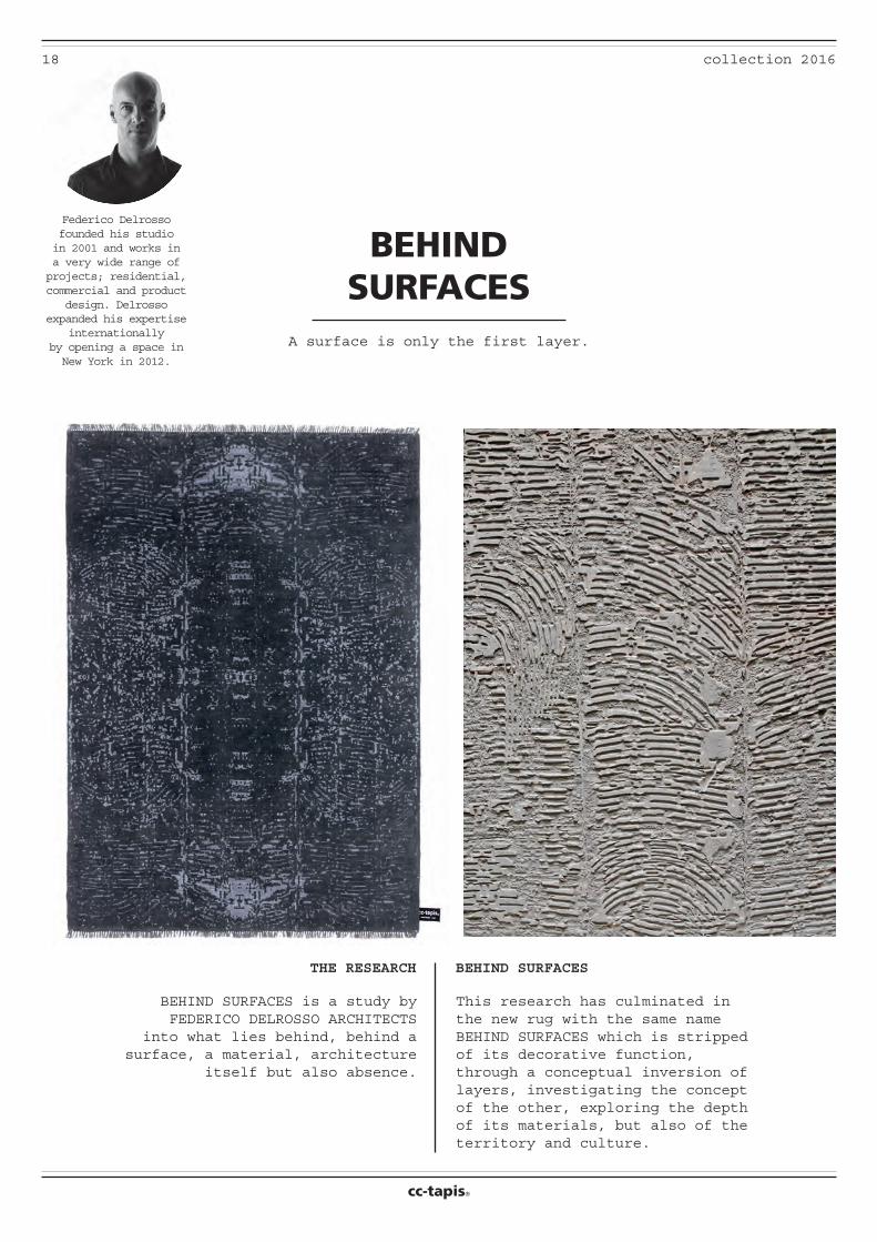
BEHIND SURFACES
A surface is only the first layer.
THE RESEARCH BEHIND SURFACES
BEHIND SURFACES is a study by FEDERICO DELROSSO ARCHITECTS
into what lies behind, behind a surface, a material, architecture
itself but also absence.
This research has culminated in the new rug with the same name BEHIND SURFACES which is stripped of its decorative function, through a conceptual inversion of layers, investigating the concept of the other, exploring the depth of its materials, but also of the territory and culture.
Federico Delrosso founded his studio in 2001 and works in a very wide range of projects; residential, commercial and product
design. Delrosso expanded his expertise
internationallyby opening a space in New York in 2012.
19collection 2016
cc-tapis®
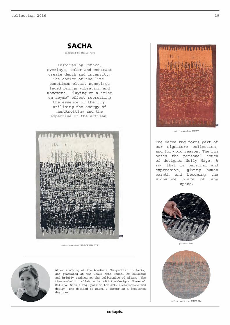
designed by Nelly Maye
color version RUST
color version BLACK/WHITE
The Sacha rug forms part of our signature collection, and for good reason. The rug oozes the personal touch of designer Nelly Maye. A rug that is personal and expressive, giving human warmth and becoming the signature piece of any
space.
Inspired by Rothko, overlays, color and contrast create depth and intensity. The choice of the line,
sometimes clear, sometimes faded brings vibration and movement. Playing on a “mise en abyme” effect recreating the essence of the rug, utilising the energy of handknotting and the
expertise of the artisan.
SACHA
color version CIPRIA
production
After studying at the Academie Charpentier in Paris, she graduated at the Beaux Arts School of Bordeaux and briefly trained at the Politecnico of Milano. She then worked in collaboration with the designer Emmanuel Gallina. With a real passion for art, architecture and design, she decided to start a career as a freelance designer.
20 collection 2016
cc-tapis®
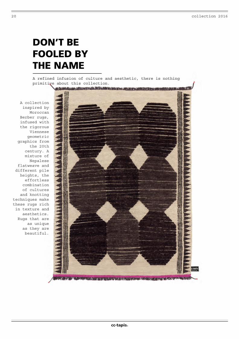
DON’T BE FOOLED BY THE NAME
A collection inspired by
Moroccan Berber rugs, infused with the rigorous
Viennese geometric
graphics from the 20th
century. A mixture of Nepalese
flatweave and different pile heights, the effortless combination of cultures and knotting
techniques make these rugs rich in texture and
aesthetics. Rugs that are
as unique as they are beautiful.
A refined infusion of culture and aesthetic, there is nothing primitive about this collection.
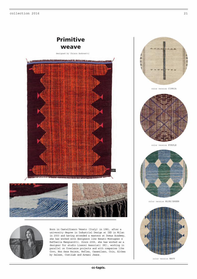
21collection 2016
cc-tapis®
color version CIPRIA
color version PURPLE
color version BLUE/GREEN
color version NAVY
designed by Chiara Andreatti
A collection inspired by Moroccan Berber rugs, infused with the rigorous Vi- ennese geometric graphics from the 20th century. A mixture of Nepalese flatweave and different pile heights, the effortless combination of cultures and knotting techniques make these rugs
rich in texture and aesthetics.
Primitiveweave
Born in Castelfranco Veneto (Italy) in 1981, after a university degree in Industrial Design at IED in Milan in 2003 and having attended a masters at Domus Academy, she has worked with designers like Renato Montagner e Raffaella Mangiarotti. Since 2006, she has worked as a designer for studio Lissoni Associati (MI), working in parallel on freelance projects and with companies like Covo, Non Sans Raison, Reflex, Casamilano, Coin, Althea by Salese, CostiLab and Armani Jeans.
22 collection 2016
cc-tapis®
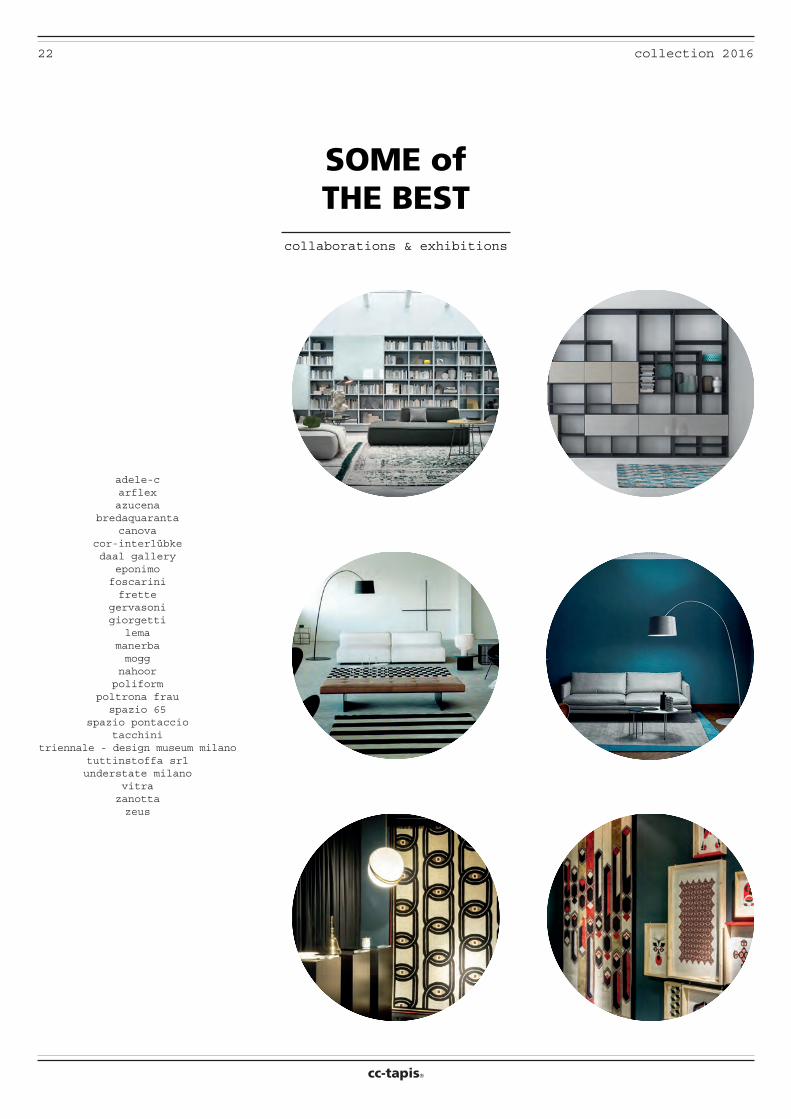
SOME of THE BEST
collaborations & exhibitions
adele-carflexazucena
bredaquarantacanova
cor-interlübkedaal gallery
eponimofoscarinifrette
gervasonigiorgetti
lemamanerbamogg
nahoorpoliform
poltrona frauspazio 65
spazio pontacciotacchini
triennale - design museum milanotuttinstoffa srlunderstate milano
vitrazanottazeus
23collection 2016
cc-tapis®
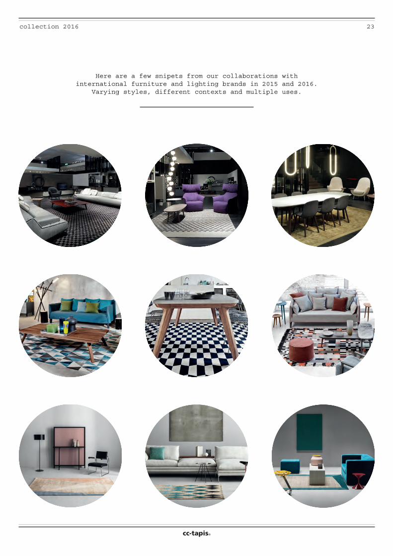
Here are a few snipets from our collaborations with international furniture and lighting brands in 2015 and 2016.
Varying styles, different contexts and multiple uses.
cc-tapis®
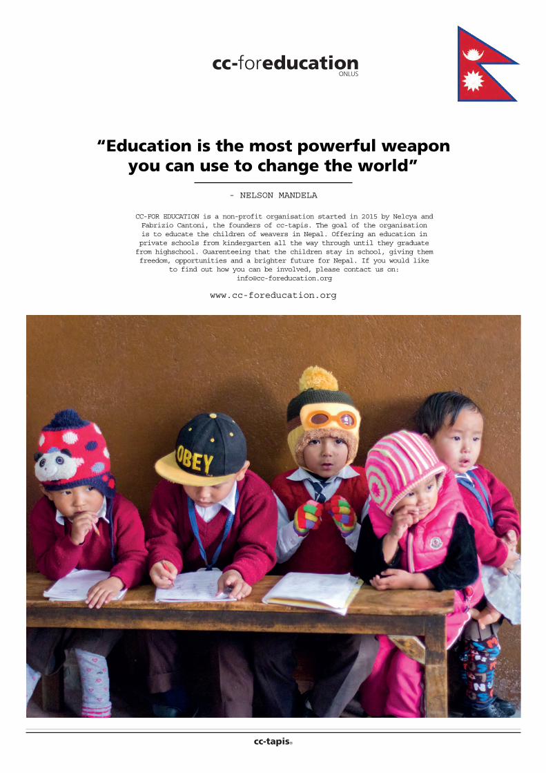
“Education is the most powerful weapon you can use to change the world”
- NELSON MANDELA
www.cc-foreducation.org
CC-FOR EDUCATION is a non-profit organisation started in 2015 by Nelcya and Fabrizio Cantoni, the founders of cc-tapis. The goal of the organisation is to educate the children of weavers in Nepal. Offering an education in private schools from kindergarten all the way through until they graduate from highschool. Guarenteeing that the children stay in school, giving them freedom, opportunities and a brighter future for Nepal. If you would like
to find out how you can be involved, please contact us on: [email protected]
cc-ONLUS


![arm-permit2k.dep.state.fl.usPrickett, Patricia From: Sent: Cc: Subject: Joseph L. Green [Joseph.Green@MascoCabinetry.com] Tuesday, September 06, 2011 5:32 PM Prickett, Patricia](https://img.pdfslide.us/doc/110x75/5e4e30fc400f9719831861da/arm-prickett-patricia-from-sent-cc-subject-joseph-l-green-josephgreenmascocabinetrycom.jpg)