Embed Size (px)
Citation preview
Boletín de la Asociación de Geógra fos Españoles, (91) eISSN: 2605-3322
How to cite this work: Andrés López, G., Herrero Luque, D., & Martínez Arnáiz, M. (2021). Cartographies on COVID-19 and functional divisions of the territory: an analysis on the evolution of the pandemic based on Basic Health Areas (BHA) in Castile and Leon (Spain). Boletín de la Asociación de Geógrafos Españoles, (91). https://doi.org/10.21138/bage.3153
Cartographies on COVID-19 and functional
divisions of the territory: an analysis on the
evolution of the pandemic based on Basic
Health Areas (BHA) in Castile and Leon (Spain)
Cartografías de la COVID-19 y divisiones funcionales del territorio:
un análisis de la evolución de la pandemia basada
en las Zonas Básicas de Salud (ZBS) en Castilla y León (España)
Gonzalo Andrés López [email protected]
Daniel Herrero Luque [email protected]
Marta Martínez Arnáiz [email protected]
Departamento de Historia, Geografía y Comunicación
Universidad de Burgos (Spain)
Abstract
In the face of the confusion and uncertainty that COVID-19 has caused over the last year,
Geography has proven to be a useful aid in the interpretation of the spatial dynamics that explain
the transmission of the virus. Applied cartography and GIS analysis of epidemiological data have
been consolidated as essential tools for interpreting the health crisis. This paper explores the
Receipt: 21.05.2021 Acceptance: 14.09.2021 Publication: 08.11.2021
This work is published under a Creative Commons Attribution-NonCommercial 4.0 International license.
usefulness of maps for the study of the evolution of the pandemic in Castile and Leon, one of the
Spanish regions with the highest levels of infection and mortality. Based on the statistical variables
of sick and dead people at the scale of the Basic Health Area (BHA), a first analytical approach is
carried out by means of a sequence of dynamic maps during the first wave. Afterwards, a
systematic study is carried out using thematic mapping for the period of the three waves, a
period between March 2020 and March 2021. The analysis unravels the differential impact of
the disease between rural and urban areas and reveals the problems of the mismatch between
the functional divisions of the territory (BHA, as units of health analysis) and the scale of
administrative management (municipalities, as the effective scale of action).
Key words: cartography; pandemic maps; GIS; spatial analysis.
Resumen
Ante el desconcierto y el desconocimiento generado en el último año por la COVID-19, la
Geografía ha demostrado su utilidad para la interpretación de las dinámicas espaciales que
explican la transmisión del virus. La cartografía aplicada y el análisis de datos epidemiológicos
mediante SIG se han consolidado como herramientas esenciales para interpretar la crisis
sanitaria. Este trabajo explora la utilidad de los mapas para el estudio de la evolución de la
pandemia en Castilla y León, una de las regiones españolas con mayores niveles de contagio y
mortalidad. A partir de las variables estadísticas de enfermos y fallecidos en la escala de la Zona
Básica de Salud (ZBS), se efectúa una primera aproximación analítica mediante una secuencia de
mapas dinámicos durante la primera ola. Posteriormente, se realiza un estudio sistemático
mediante cartografía temática para las tres olas, entre marzo de 2020 y marzo de 2021. El
análisis muestra el impacto diferencial de la enfermedad entre espacios rurales y núcleos
urbanos y revela los problemas del desajuste entre las divisiones funcionales del territorio (ZBS,
como unidades de análisis sanitario) y la escala de la gestión administrativa (municipios, como
escala efectiva de actuación).
Palabras clave: cartografía; mapas de la pandemia; SIG; análisis espacial.
Boletín de la Asociación de Geógrafos Españoles, (91) 2
1 Introduction
The seriousness of COVID-19 immediately raised global awareness which led to sudden and
traumatic consequences for people’s daily lives. From the moment the World Health
Organization (hereinafter WHO) received the first official notification of cases of pneumonia
caused by a new coronavirus (31 December 2019) from the Wuhan Municipal Health
Commission (Hubei province, China) until the disease was considered a world pandemic (11
March 2020), seventy days of bewilderment went by. The announcement triggered the reactions
of the countries, which resulted in the adoption of uncoordinated and diverse measures. Three
days after the pandemic declaration, the Spanish response was forceful and prompted a radical
lockdown of the population as well as then ban all non-essential activities. This scenario of doubt
and social insecurity gave rise to spontaneous and supportive responses of the population who
put their capacities at the service of the country. At this early stage, everything concerning the
disease and its consequences had yet to be studied, understood, explained and resolved.
Geography has participated in this process through the use of cartographic techniques and
analysis to study the spatial behavior of the virus and with the aim of identifying the territorial
dynamics that the disease may present. In Spain, different universities have put forward initiatives
to develop research projects to map the processes of the transmission of the virus and analyze its
impact during the last year. The Geographical Studies and Territorial Analysis Research Group of
the University of Burgos (hereinafter GEOTER) has joined this trend of initiatives by carrying out
analytical research using cartography applied to the study of the data on COVID-19 provided by
the government in the Region of Castile and Leon.
This region, with a surface area of more than 90,000 km2 and 2,248 municipalities, is one of the
largest in Europe. This territory, which shows a contrasting population pattern, is inhabited by 2.4
million people. Most of its population lives in a dozen urban centers, while the rest of the rural
territory has one of the lowest population density indices on the continent, reaching levels of
severe depopulation (less than 10 inhabitants/km2) in a large part of the area. This territory has
been notably affected by COVID-19, and the disease has reached a relative impact higher
beyond demographic average. By employing cartography as an essential diagnostic tool, this
paper examines the impact of the disease in the region and the spatial patterns of infection
dynamics.
The main goal of this paper is to develop a detailed spatio-temporal analysis of the impact of the
pandemic in a Spanish region. However, we aim not only at showing the evolution of the disease
Boletín de la Asociación de Geógrafos Españoles, (91) 3
through cartography, but also at contributing to a synthetic and comparative reflection in the
national and international context. This study stems from the importance of maps in Health
Geography and the interest of cartography in the analysis of the dynamics of the COVID-19
pandemic. To this end, a state of the art is presented on the usefulness of maps as tools for the
spatial representation of health epidemics. More particularly, new applications of GIS tools in this
process are identified. We reflect on the use of the new geo-dashboards as a basic technique of
digital cartography applied to disease management and identify the geographical contributions
that have so far been made from different Spanish universities to analyze the pandemic through
the use of maps. This knowledge is finally applied to the specific analysis of the territory of
Castile and Leon.
2 Geography, maps and health: COVID-19 cartographies
The transmission of diseases and their spatial spread has historically been one of the main
problems faced by health management. Health problems have been conditioned by a multitude
of factors related to the historical context, location and surroundings, environmental and climatic
aspects, demographic and socioeconomic characteristics, cultural habits, etc. The geographical
setting is a conditioning factor that determines health and the transmission of diseases that
presents a complex spatial logic; even more so in the current context of globalization and its
complicated geopolitical manifestations (Buzai & Santana, 2018; Méndez, 2020; Saracho,
2020).
Geography has been particularly attentive to the spatiality of health by considering not only the
analysis of population health indicators in each territory, but also the study of life habits, medical
care, accessibility to health services, their distribution and the approach to their causes and
consequences. The territorial study of health has combined the geographical analysis of health
services with the spatial consideration of epidemiology, analyzing the dynamics of disease
transmission in different parts of the planet (Gurrutxaga, 2019).
Within this framework, the use of cartography has been consolidated as a useful applied tool; the
spatial representation of disease behavior by means of thematic maps has become an essential
resource for epidemiological study. Maps uncover otherwise unreadable information and allow to
graphically visualize health processes and dynamics in the territory, as well as many other
variables related to risk, fear, vulnerability, isolation or social fragmentation produced by these
processes (Zusman et al., 2020).
Boletín de la Asociación de Geógrafos Españoles, (91) 4
Geography and cartography maps and spatial analysis of health— have served to visualize the
spread of diseases and contributed to a better understanding of the patterns of virus spread as
well as of the effects they lead to at different levels. Geographic analysis cannot solve the health
problem caused by an epidemic, but cartographic techniques can provide a better
understanding of its causes, its development and consequences in the territory (Van der Schee,
2020).
2.1 Spatial representation of epidemics: maps as tools for visualization,
communication and analysis
The spatial representation of the effects of health epidemics through cartography supplies a visual
language that allows to achieve communication and analysis results beyond the traditional study
of data. The use of this tool applied to health dates back to the well-known London cholera map,
a symbol of this technique drawn up by John Snow in 1854. This map enabled the development
of useful hypothesis for the interpretation of the transmission of the disease thus giving rise to a
method that has been amply used in all epidemics throughout the last two centuries (Buzai,
2020b; Dangermond & Pesaresi, 2018; Koch, 2005).
In the contemporary times we are in, socioeconomic progress, the evolution of transportation, the
boost of connectivity and the creation of an increasingly globalized and interconnected society
have fostered the spread of contagion dynamics. The 21st century has brought about a clear
increase in epidemics spreading in several countries or even in most of the world, thus
becoming pandemics (Méndez, 2020).
Faced with this situation, countries need to anticipate real-time and immediate tools that allow the
continuous information management on the health crisis and facilitate government decision-
making. To this end, addressing spatial influence of diseases from a triple dimension is deemed
essential: demographic information (population characteristics), mobility patterns (paths and
routes taken by people) and the characteristics of the infection transmission process (forms of
contagion) (Buzai, 2020a).
Mapping the behavioral patterns of a disease in correlation with other spatial information can be
determining when examining the cause of infection, identifying contributing factors and thereby
strategically targeting intervention efforts to reduce or eliminate factors affecting the spread in the
necessary locations (Lyseen et al., 2014, p. 114). With this approach, spatial analysis
Boletín de la Asociación de Geógrafos Españoles, (91) 5
technologies and mapping of health data are an increasingly relevant dynamic in the scientific
arena (Ahasan et al., 2020b; Franch-Pardo et al., 2020; Lyseen et al., 2014, p. 111).1
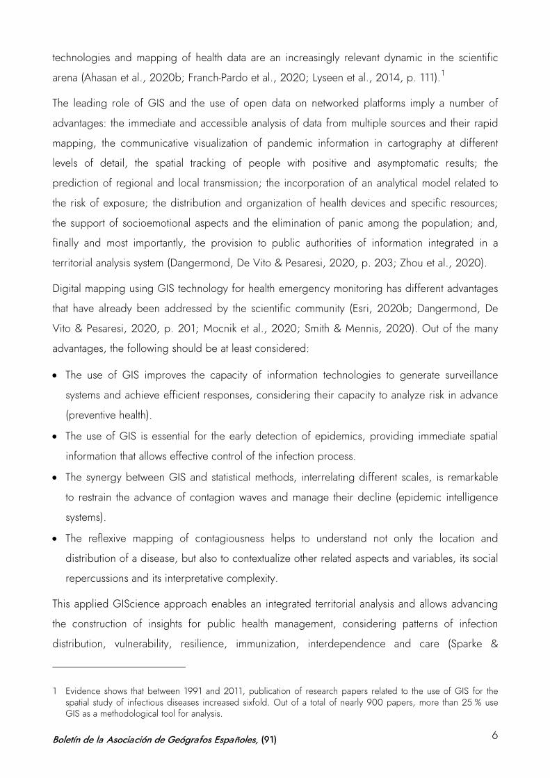
The leading role of GIS and the use of open data on networked platforms imply a number of
advantages: the immediate and accessible analysis of data from multiple sources and their rapid
mapping, the communicative visualization of pandemic information in cartography at different
levels of detail, the spatial tracking of people with positive and asymptomatic results; the
prediction of regional and local transmission; the incorporation of an analytical model related to
the risk of exposure; the distribution and organization of health devices and specific resources;
the support of socioemotional aspects and the elimination of panic among the population; and,
finally and most importantly, the provision to public authorities of information integrated in a
territorial analysis system (Dangermond, De Vito & Pesaresi, 2020, p. 203; Zhou et al., 2020).
Digital mapping using GIS technology for health emergency monitoring has different advantages
that have already been addressed by the scientific community (Esri, 2020b; Dangermond, De
Vito & Pesaresi, 2020, p. 201; Mocnik et al., 2020; Smith & Mennis, 2020). Out of the many
advantages, the following should be at least considered:
• The use of GIS improves the capacity of information technologies to generate surveillance
systems and achieve efficient responses, considering their capacity to analyze risk in advance
(preventive health).
• The use of GIS is essential for the early detection of epidemics, providing immediate spatial
information that allows effective control of the infection process.
• The synergy between GIS and statistical methods, interrelating different scales, is remarkable
to restrain the advance of contagion waves and manage their decline (epidemic intelligence
systems).
• The reflexive mapping of contagiousness helps to understand not only the location and
distribution of a disease, but also to contextualize other related aspects and variables, its social
repercussions and its interpretative complexity.
This applied GIScience approach enables an integrated territorial analysis and allows advancing
the construction of insights for public health management, considering patterns of infection
distribution, vulnerability, resilience, immunization, interdependence and care (Sparke &
1 Evidence shows that between 1991 and 2011, publication of research papers related to the use of GIS for the spatial study of infectious diseases increased sixfold. Out of a total of nearly 900 papers, more than 25 % use GIS as a methodological tool for analysis.
Boletín de la Asociación de Geógrafos Españoles, (91) 6
Anguelov, 2020). The contribution of spatial analysis is the basis for informed decision-making
based on scientific evidence from the evolving geographic distribution provided by maps (Saran
et al., 2020; Rosenkrantz et al., 2021).
GIS technology has brought about a clear paradigm shift in the possibilities of maps for territorial
study and, in the context of digitization and communication technologies, it has become a
reliable transmitter of knowledge. There are many examples of the use of digital cartography
applied to health analysis, such as incidence of meteorological factors in the transmission of
viruses, relationship between cases of diseases and temperature, wind speed, solar radiation,
daylight hours or humidity, linking epidemic spread with communication networks and types of
transport, case counts on maps according to different administrative or management limits,
analysis of critical issues to identify geolocalized concentration of sick or dead people according
to their location, identification, localization and distribution of vulnerable groups, etc. (Ahasan &
Hossain, 2020; Cos de, Castillo & Cantarero, 2020b, 2021; Fatima et al., 2021; Li, 2021; Paez
et al., 2021; Valjarević et al., 2020; Yalcin, 2020; Zhang et al., 2021).
2.2 Geo-dashboards: new GIS tools for the analysis of COVID-19
Considering these patterns, the technical capacity of GIS has been used to develop applied
spatial analysis studies, and their recent integration into mobile devices has further popularized
their effectiveness. The difficulties of interpreting their results have been overcome by integrating
the map into “story map” platforms, where affordable templates are available to create and share
thematic cartography using images, data, texts, audiovisual resources and other materials. Based
on this concept of information interrelated with the map, the application of GIS tools to the
analysis of health emergencies has succeeded in integrating cartography with a variety of
statistical data. The COVID-19 pandemic has brought about a new tool that seems to be here to
stay: geo-dashboards or control panels. Conceived with this approach of data integration and
cartographic visualization, these dashboards display structured statistical and audiovisual
information, geolocalized and integrated with maps. Geo-dashboards are an efficient example of
an applied technique of the use of digital cartography as an integrating element of information at
the service of public administrations (Esri, 2020d, 2020e; Dangermond & Pesaresi, 2018; Koch,
2005).
Geo-dashboards provide immediate visualization of map-centered data, allowing inexperience
users to understand the analytics and spatiality of a framed phenomenon on a single, intuitive and
remotely accessible (web-based) screen. About half of the websites communicating information
Boletín de la Asociación de Geógrafos Españoles, (91) 7
on COVID-19 use the GIS-Web technique by incorporating a geo-dashboard (Bernasconi &
Grandi, 2021; Pászto, Burian & Macku, 2020).
Since COVID-19 started to spread, different organizations and entities worldwide have been
using geo-dashboards. Both the WHO and the World Bank use this type of panels to show the
daily incidence of the disease, its spatial distribution and its incidence levels. Universities such as
those of Virginia or Washington, organizations, foundations and research centers, as well as
large companies and communication emporiums use geo-dashboards as key elements of their
communication on the pandemic and the analysis of its effects. Without doubt, the best known
and most popular initiative is that developed by the Center for Systems Science and Engineering
(CSSE) at Johns Hopkins University in Baltimore. Figure 1 shows some of the major global geo-
dashboards.
The success of this mapping has demonstrated the versatility and value of geographic information
communicated through maps. These geo-dashboards have been replicated in practically all the
countries of the world, thus becoming effective indicators of the health situation of each territory
during the pandemic. Their use as tools for information and communication of the main COVID-
19 data has been amply addressed in different studies (Chiluba & Dube, 2020; Esri, 2020b,
2020c; Guallart, 2020; Kamel & Geraghty, 2020; Müller & Louwsma, 2021; Pászto, Burian &
Macku, 2020);2 and it has been valued by the United Nations Global Expert Committee on
Global Geospatial Information Management (UN-GGIM) as one of the most relevant technologies
for decision making. It has been assessed that geo-dashboards convey the health status message
in a clearer and more useful way than if this communication is done only through statistical data
(Dong, Du & Gardner, 2020; UN-GGIM, 2020).
However, the use of geographic information technologies applied to epidemiological analysis
and, in particular, this type of control panels, present some disadvantages. Scholars have
critically considered that COVID-19 geo-dashboards are developed as “cultural artifacts” that use
biopolitical technology and, therefore, offer a biased perspective of the territory which carries an
ideological and propagandistic load. Although their efficiency as political and social tools for
communicating the impact of the disease is undeniable, their relation to information partially
managed by governments and their inability to adequately address the real consideration of
2 A selection of the world’s leading COVID-19 geo-dashboards can be found at https://storymaps.arcgis.com/stories/a1746ada9bff48c09ef76e5a788b5910
Boletín de la Asociación de Geógrafos Españoles, (91) 8

inequalities produced by health crises have been questioned (Everts, 2020; Fenner, 2020;
Rosenkrantz et al., 2021).
Figure 1. Main geo-dashboards (control panels) of COVID-19 on a global scale
1. World Health Organization (WHO): https://covid19.who.int/ 2. CSSE at Johns Hopkins University: https://gisanddata.maps.arcgis.com/apps/opsdashboard/index.html#/bda7594740fd40299423467b48e9ecf6 3. World Bank: https://datanalytics.worldbank.org/covid-dashboard/ 4. European Centre for Disease Prevention and Control: https://qap.ecdc.europa.eu/public/extensions/COVID-19/COVID-19.html#global-overview-tab 5. Universities of Oxford and Harvard: https://www.healthmap.org/covid-19/ 6. University of Washington: https://hgis.uw.edu/virus/ 7. University of Virginia: https://nssac.bii.virginia.edu/covid-19/dashboard/ 8. KFF. Global Health Policy: https://www.kff.org/global-health-policy/fact-sheet/coronavirus-tracker/ 9. COVID-19 GIS Hub Esri: https://coronavirus-resources.esri.com/ 10. Microsoft COVID-19 Tracker: https://www.bing.com/covid 11. Google COVID-19 Map: https://news.google.com/covid19/map?hl=es 12. National Geographic: https://www.nationalgeographic.com/science/graphics/mapping-coronavirus-infections-across-the-globe
Source: own elaboration
Boletín de la Asociación de Geógrafos Españoles, (91) 9
Likewise, other scholars suggest that the use of GIS in the COVID-19 pandemic has not yet
provided results commensurate with the potential of this tool in the field of predictive analysis.
Basically, maps have been used to visualize the distribution, sequence and evolution of
confirmed cases or the number of deaths. However, it is possible to make progress in the
possibilities of digital cartography and also predict specific locations of future outbreaks with
greater statistical accuracy. In some countries and not without controversy due to the impact on
personal freedoms— applications based on positioning have already been used thus allowing
tracking not only of the affected person but also of other people in contact, facilitating possible
quarantines (Ahasan et al., 2020).
On the other hand, the proliferation of mapping solutions available e to inexperienced users has
led to the dissemination of a plethora of COVID-19 maps on the internet that disseminate
unverified information, distort reality either intentionally or unintentionally– and sometimes
generate the opposite effect intended by the use of GIS applied to health management. Similarly,
some disease maps are misinterpreted because the spatial information is not always easily
understandable and entails a certain cognitive overload, due to the inherent complexity of the
data. Likewise, choosing the wrong map projection means that people may overestimate or
underestimate the nature of the message conveyed by the map. It is not uncommon to find maps
on the web that depict the pandemic situation in the same territory and reflect contradictory
graphic evidence. The misuse of scales, proportions, symbols, colors and any other graphic
elements on the map can generate enormous confusion among the general public for whom the
cartography is designed. The mapping of health information requires enormous rigor in the
treatment of the data. The application of GIS to health management entails a variety of problems
that must be properly addressed in order to map responsibly (Field, 2020; Juergens, 2020;
Kent, 2020; Mooney & Juhász, 2020; Zhang et al., 2021).
2.3 Mapping COVID-19 in Spain: geographic contributions from universities
Spain reached a cumulative incidence of more than 3.4 million people infected by COVID-19 in
April 2021. Information on the pandemic is publicly available thanks to powerful communication
tools that integrate mapping and statistical data. At the national level, this information can be
consulted through the panel of the National Epidemiology Center. Additionally, each region has
developed webpages to monitor the evolution of the process from the first moments of the health
crisis. Currently, there are plenty of sources of information that the public administration has been
making available in relation to the impact of COVID-19 in the country (Cobarsí-Morales, 2020).
Boletín de la Asociación de Geógrafos Españoles, (91) 10
However, despite all this, there seem to be not enough models based on in-depth spatial
analysis; models that allow the public authorities to consider an adequate diagnosis with sufficient
territorialized information on the phenomenon. The study of the spatial distribution patterns of
these cases has unveiled a lack of precise knowledge on the spatial transmission process of the
disease. This has clearly affected the management capacity of regional governments, which have
witnessed the inefficiency and the contradictory application of measures such as perimetral
lockdowns, reduced schedules, curfews and mobility limitations. These needs have especially
highlighted the relevance of responsible mapping (Cos de, Castillo & Cantarero, 2021).
With the aim of solving these problems and contributing to the improvement of the geographical
study of the behavior of the virus to provide useful diagnoses to public administrations, several
projects have emerged from different universities. A large part of these actions has been carried
out from the geographical perspective, by offering its experience and knowledge, its scientific-
technical capabilities and its resources related to GIS and cartography techniques to the service
of the public authorities for the management of the health crisis. Figure 2 shows some of the
initiatives developed by researchers from Spanish universities, such as the projects of Alcalá de
Henares, Barcelona, Burgos, Cantabria, Girona, Lleida, Navarra, Málaga, Santiago de
Compostela, Valencia, Valladolid and Zaragoza.
These universities have made available to the public administrations their analytical potential and
their data processing capacity to develop studies on the spatial incidence of the virus. The
common objective of all of them has been to work with disaggregated information at the
microdata level, with unitary case reference in order to build spatial analytical models interrelated
with the socioeconomic information in each territory. Many of these projects were developed in
the first weeks of the disease. During this time, most of the universities involved set up platforms
to disseminate the mapping obtained on network channels (websites, social networks and other
repositories). In the last months, their results have been disseminated, in many cases as a
consequence of the integration of collaboration networks among different entities (Zuñiga, Pueyo
& Postigo, 2020).
Boletín de la Asociación de Geógrafos Españoles, (91) 11
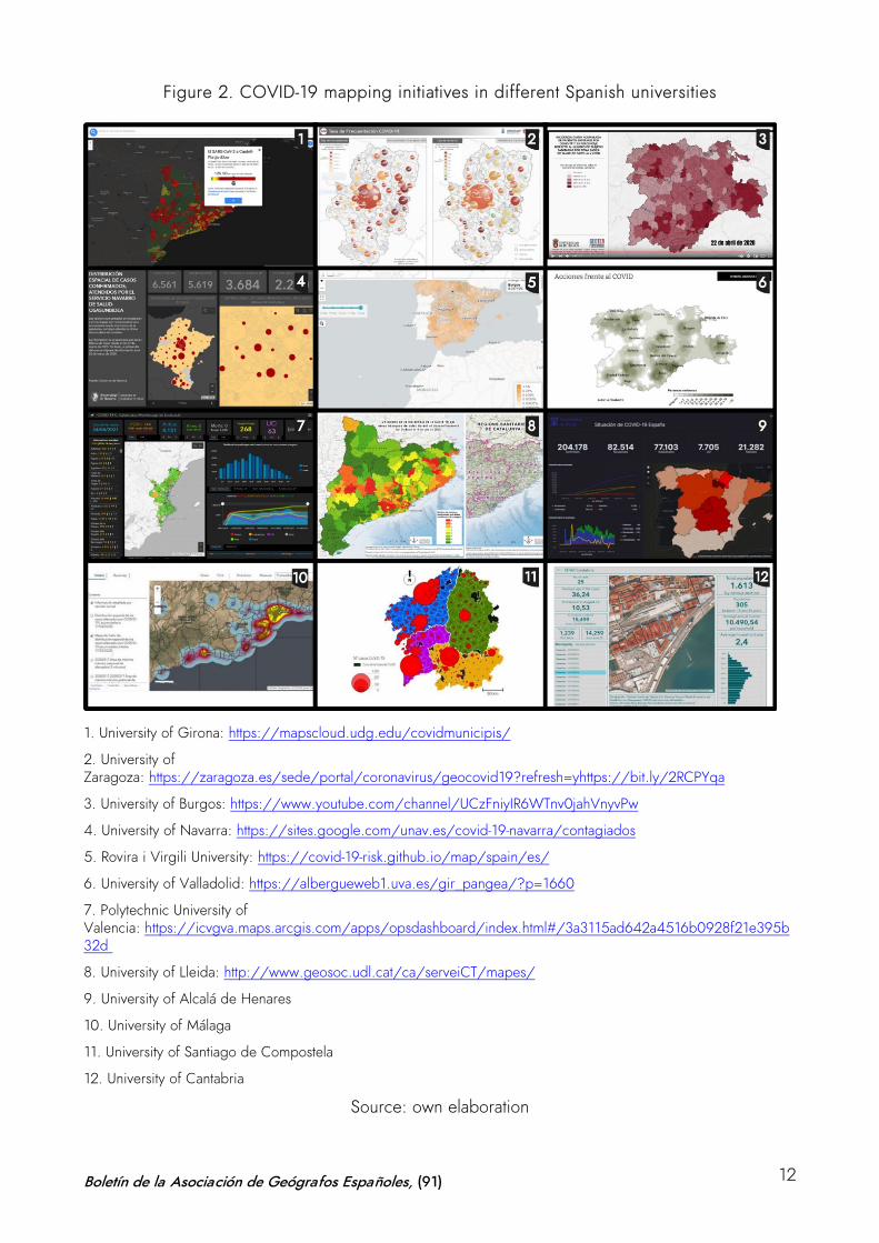
Figure 2. COVID-19 mapping initiatives in different Spanish universities
1. University of Girona: https://mapscloud.udg.edu/covidmunicipis/
2. University of Zaragoza: https://zaragoza.es/sede/portal/coronavirus/geocovid19?refresh=yhttps://bit.ly/2RCPYqa
3. University of Burgos: https://www.youtube.com/channel/UCzFniyIR6WTnv0jahVnyvPw
4. University of Navarra: https://sites.google.com/unav.es/covid-19-navarra/contagiados
5. Rovira i Virgili University: https://covid-19-risk.github.io/map/spain/es/
6. University of Valladolid: https://albergueweb1.uva.es/gir_pangea/?p=1660
7. Polytechnic University of Valencia: https://icvgva.maps.arcgis.com/apps/opsdashboard/index.html#/3a3115ad642a4516b0928f21e395b32d
8. University of Lleida: http://www.geosoc.udl.cat/ca/serveiCT/mapes/
9. University of Alcalá de Henares
10. University of Málaga
11. University of Santiago de Compostela
12. University of Cantabria
Source: own elaboration
Boletín de la Asociación de Geógrafos Españoles, (91) 12
This has been the case of the project put forward by the Department of Geography of the
University of Málaga which, since March 16, 2020, has made a call for voluntary participation to
geographers of Spanish universities for the elaboration of COVID-19 risk cartographies in their
respective territories. Under the title “COVID-19 transmission hazard cartographies in urban areas
oriented to the application of anti-propagation measures”, the Territorial Risk Analysis Research
Group of the aforementioned university devised and launched this initiative which has gradually
integrated geographers from 18 Spanish universities. The applied purpose of the project focused
on the creation of a precise cartography that could be updated in real time for diagnosis, advice
and rapid response capacity adjusted to the different situations that the Spanish cities may
present. Its main goal was to establish comparative dynamics and to favor the integrated study of
the spread of the virus in diverse territories. The project reflects the concern of geography in
Spanish universities to map the transmission behavior of the virus as a useful tool for the analysis,
diagnosis and strategic planning of decisions to be taken by health professionals and policy
makers in charge of its management (Perles et al., 2020).3
However, the results of the initiative have been diverse and uneven, severely conditioned by the
enormous difficulties in accessing the information provided by the administrative units
responsible for data management. The need to meet the requirements of each territory has led
these projects to develop very different methodologies and cartographic proposals. University
research teams have persisted in the elaboration of cartographies, but most regional governments
have not provided disaggregated unit data on cases affected by the disease. This has therefore
hindered the possibility of developing more consistent spatial analysis studies, which would have
allowed to cross-check the temporal evolution and spatial distribution pattern with other
socioeconomic information at the microdata level.
The sensitive nature of the information and the fact that the data are provided in aggregate (by
provinces, BHA or municipalities) has generally prevented the initial purpose of the detailed
study at the urban micro-scale. Detailed data have only been obtained for the cities of Málaga,
Santiago de Compostela and Zaragoza, which have allowed to pursue the project in its original
approach of monitoring, prediction and transmission control based on the mapping of the foci of
contagion in the neighborhoods in collaboration with the city councils. In the rest of the cases,
3 The working team of the COVID-19 cartographies project in Spain is made up of researchers from the universities of Alcalá de Henares, Alicante, Baleares, Barcelona, Burgos, Cantabria, Cádiz, Córdoba, Complutense of Madrid, Granada, Jaén, La Laguna, Málaga, Pablo Olavide, Santiago de Compostela, Seville, Valencia and Zaragoza.
Boletín de la Asociación de Geógrafos Españoles, (91) 13
the scale has been mostly municipal or health units, without a more detailed spatial image with
precise localization of the cases. In fact, several universities announced on their project websites
that the process of developing the cartographies had been abandoned due to the lack of an
adequate level of spatial disaggregation of the information.
Thus, the result has been an expressive cartography of the main foci of contagion and trends in
the spatial behavior of virus transmission, but that does not allow to identify the urban factors with
which it is related at the microscale, nor determine the key areas for action to control the spread
by applying targeted measures. This mismatch between the possible unit of spatial analysis and
the evidence in health management, forced to refer to the detailed case, has highlighted the
difficulties of geographical interpretation of the thematic study of the behavior of the virus, as well
as largely conditioned the development of the cartographies, weighed down by the inconsistency
between the units of health analysis and the administrative and management boundaries with real
powers over the governance of the territory.
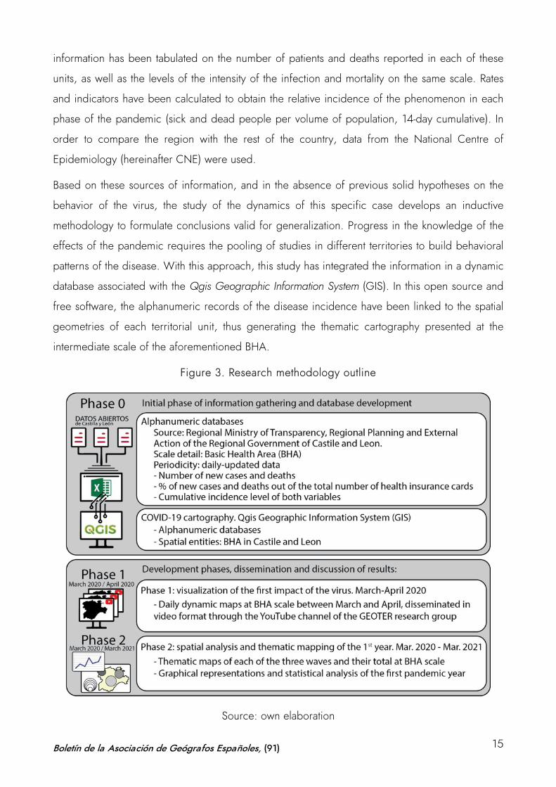
3 Case study, sources and methodology: mapping, health analysis and
territory divisions
In this context, the GEOTER research group has developed during the last year a study on the
evolution of COVID-19 in the Region of Castile and Leon. The project has been undertaken in two
phases. Firstly, an early and rapid response initiative, in which a series of dynamic maps were
produced to interpret the impact of the virus during the most intense phase of the first wave
(March-April 2020). Secondly, a more detailed analysis of the evolution of the pandemic during
the last year through thematic mapping, comparing the time sequence of the three waves (March
2020-March 2021). In both cases –dynamic maps for initial analysis and thematic mapping for
detailed study–, the previously mentioned problem arose: the obvious mismatch between the
health analysis units, which are used as a functional division in the territories, and the
administrative divisions operating in each of them. This paper reflects on the difficulties of the
representation of statistical information and considers this dichotomy between health analysis units
and administrative management units. Under this condition, the sequence that comprises the
provinces, the Basic Health Areas (BHA) and the municipalities in Castile and Leon are identified.
This study is based on the open data on COVID-19 provided by the site of the Ministry of
Transparency, Regional Planning and External Action of the Regional Government of Castile and
Leon. Given the unavailability of disaggregated statistical information at the municipal or
microdata level, the existing variables at the BHA level were used. Specifically, statistical
Boletín de la Asociación de Geógrafos Españoles, (91) 14
information has been tabulated on the number of patients and deaths reported in each of these
units, as well as the levels of the intensity of the infection and mortality on the same scale. Rates
and indicators have been calculated to obtain the relative incidence of the phenomenon in each
phase of the pandemic (sick and dead people per volume of population, 14-day cumulative). In
order to compare the region with the rest of the country, data from the National Centre of
Epidemiology (hereinafter CNE) were used.
Based on these sources of information, and in the absence of previous solid hypotheses on the
behavior of the virus, the study of the dynamics of this specific case develops an inductive
methodology to formulate conclusions valid for generalization. Progress in the knowledge of the
effects of the pandemic requires the pooling of studies in different territories to build behavioral
patterns of the disease. With this approach, this study has integrated the information in a dynamic
database associated with the Qgis Geographic Information System (GIS). In this open source and
free software, the alphanumeric records of the disease incidence have been linked to the spatial
geometries of each territorial unit, thus generating the thematic cartography presented at the
intermediate scale of the aforementioned BHA.
Figure 3. Research methodology outline
Source: own elaboration
Boletín de la Asociación de Geógrafos Españoles, (91) 15
In Castile and Leon, the singularity of the use of Basic Health Areas (BHA) as an essential unit of
health analysis has unveiled contradictions and differences in the management of the different
areas in the region. The inconsistency between these units of analysis and their actual application
to decisions aimed at controlling the pandemic taken at the municipal level has revealed a lack of
real functional territorial delimitation, which has subsequently been transferred to the cartographic
model.
The COVID-19 pandemic and the territorial-based mechanisms tested for its management have
sparked the ongoing debate on the spatial-functional organization of the territory, i.e. the
geometric rigidity of the limits and their operability for functional management. The classic
assimilation of territorial delimitation with administrative divisions poses a contradiction between
the consistency of this administrative boundary –the only management delimitation— and the
functional inconsistency that this manifests for decision-making. It is a well-known fact that, above
and below the political-administrative delimitations, there are territorial structures that serve
organizational (basic health areas, educational districts, judicial districts, military regions, etc.) or
functional criteria, such as regions or the territorialization of services (Ramírez & Reguera, 1994).
However, these delimitations, which strictly adjust to their purpose, do not regulate the political
decisions of territorial government because they lack the power to do so. The management of
units adjusted to management criteria is practical for planning, although their direct translation to
management can rarely be applied due to political and legal factors (Ortega Montequín, 2017).
This dilemma has precipitated a discussion on spatial scales and the duality of functional versus
operational delimitations; both converted into units of cartographic representation, differential in
many cases. In other parts of the world, this debate has also played a leading role in the
management of the pandemic (Valente Cardoso et al., 2020).
The emergency situation caused by COVID-19 has highlighted this contradiction. While the
analysis of the pandemic has been carried out on basic units of analysis determined by the health
division of the territory and its state at any given time (overload of care and hospital resources),
the territorial management for the adoption of containment measures (restrictions on mobility and
economic activities) has been of a state, regional, provincial or municipal nature, and has been
obligatorily determined by the administrative boundaries with legal powers. This is the superiority
of the administrative boundary, which, as stated by Ortega Valcárcel (2000), is the sphere of
management, control, programming and planning, arrangement, and both functional and social
attribution.
Boletín de la Asociación de Geógrafos Españoles, (91) 16
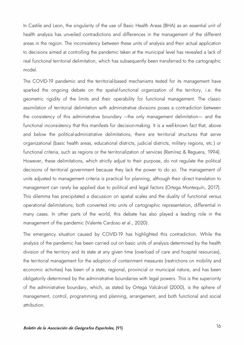
This has been particularly striking in the Region of Castile and Leon. From the beginning of the
health crisis, this region decided to organize the analysis of the pandemic in accordance with the
territorial basis of its health organization, reflected in the cartographic representation. The Basic
Health Areas (BHA) established around each primary health care center in the region, have been
the territorial basis to account for the scope and risk of the pandemic. This has given rise to a
differential cartography with respect to the official mapping provided by other Regions, as shown
in Figure 3, which reflects the map of transition to the “new normal” after the first wave, available
on the Spanish government webpage.
During the first phase of the pandemic, the so-called de-escalation was carried out in most of the
country at the provincial level, and decisions were taken on the pace of the process in that
territorial unit. In almost all regions, as shown in the map, this was the prevailing model.
However, there were some exceptions, such as the Basic Health Areas in Castile and Leon, the
Health Zones in Catalonia and the Health Departments in the Region of Valencia. Subsequently,
the Region of Madrid also applied the BHA as territorial basis at some points in the de-escalation
phases, a process which led to significant problems caused by the obvious difficulty in
compartmentalizing the territory at the urban scale.
This contingency has given rise to evident contradictions and dilemmas somehow difficult to
understand during the pandemic. In Castile and Leon, a dual type of official cartography has
been generated in terms of strategic monitoring data on the disease and the measures adopted
to deal with it. On the one hand, the administration has disseminated an analytical and
prospective cartography on the delimitation of the BHA as basic health units for the gathering of
information, analysis and decision-making. On the other hand, and simultaneously, a cartography
on the limits of the provincial and municipal administrative divisions has been produced as a
reflection of the management organization in the establishment of restrictive and containment
measures. The units of sanitary analysis and the theoretical functional division of the territory are
not compatible with the administrative unit that must apply the management measures.
Boletín de la Asociación de Geógrafos Españoles, (91) 17
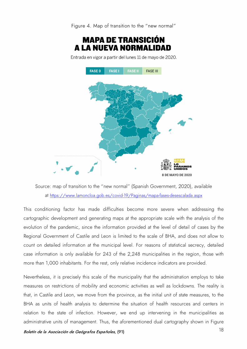
Figure 4. Map of transition to the “new normal”
Source: map of transition to the “new normal” (Spanish Government, 2020), available
at https://www.lamoncloa.gob.es/covid-19/Paginas/mapa-fases-desescalada.aspx
This conditioning factor has made difficulties become more severe when addressing the
cartographic development and generating maps at the appropriate scale with the analysis of the
evolution of the pandemic, since the information provided at the level of detail of cases by the
Regional Government of Castile and Leon is limited to the scale of BHA, and does not allow to
count on detailed information at the municipal level. For reasons of statistical secrecy, detailed
case information is only available for 243 of the 2,248 municipalities in the region, those with
more than 1,000 inhabitants. For the rest, only relative incidence indicators are provided.
Nevertheless, it is precisely this scale of the municipality that the administration employs to take
measures on restrictions of mobility and economic activities as well as lockdowns. The reality is
that, in Castile and Leon, we move from the province, as the initial unit of state measures, to the
BHA as units of health analysis to determine the situation of health resources and centers in
relation to the state of infection. However, we end up intervening in the municipalities as
administrative units of management. Thus, the aforementioned dual cartography shown in Figure
Boletín de la Asociación de Geógrafos Españoles, (91) 18
4 is generated both for the sanitary analysis –at the BHA level– and for taking intervention
measures –at the municipal level.
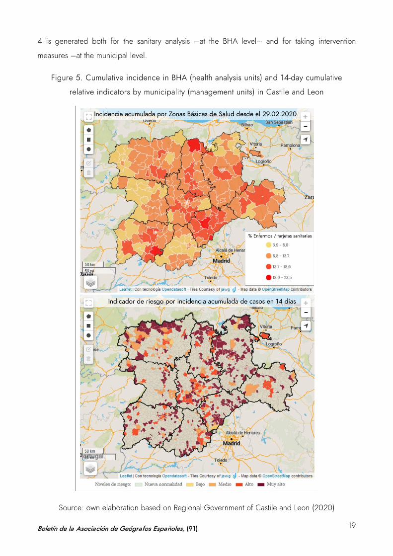
Figure 5. Cumulative incidence in BHA (health analysis units) and 14-day cumulative
relative indicators by municipality (management units) in Castile and Leon
Source: own elaboration based on Regional Government of Castile and Leon (2020)
Boletín de la Asociación de Geógrafos Españoles, (91) 19
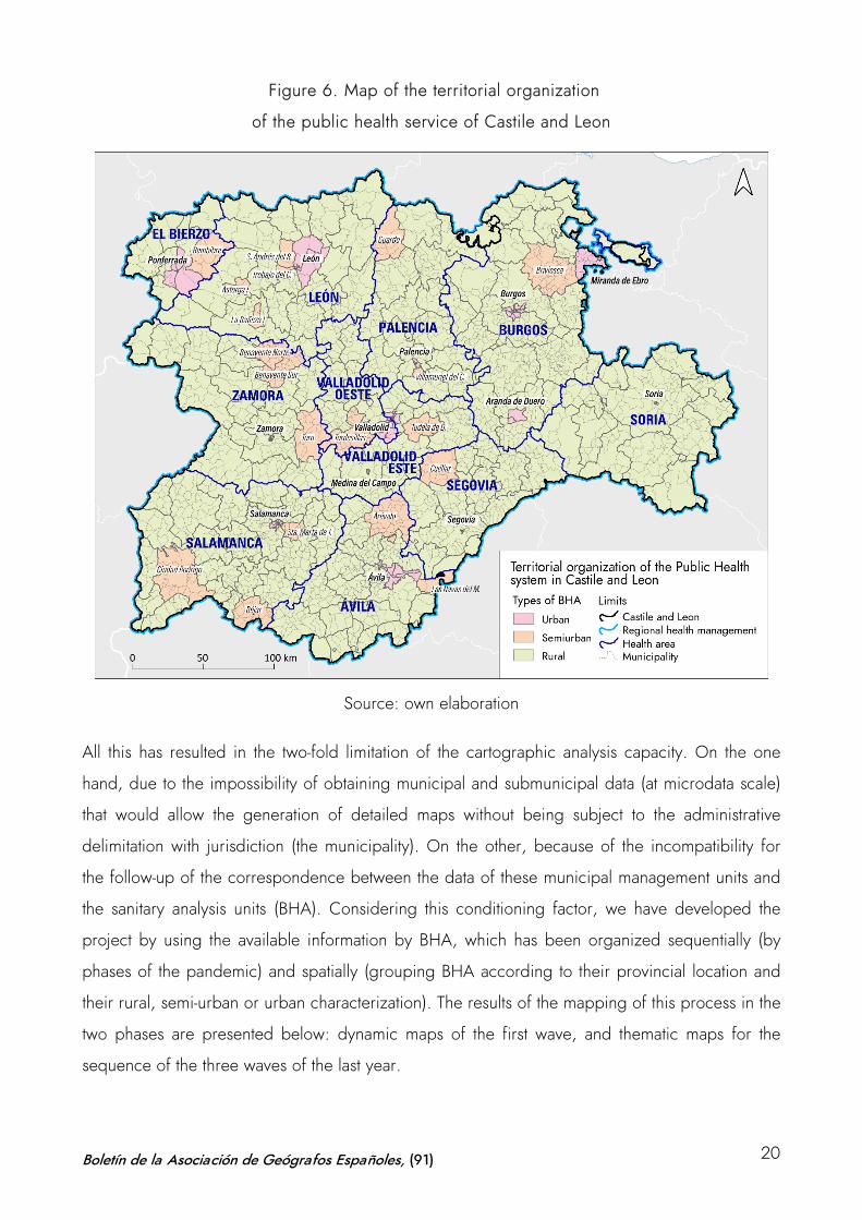
Figure 6. Map of the territorial organization
of the public health service of Castile and Leon
Source: own elaboration
All this has resulted in the two-fold limitation of the cartographic analysis capacity. On the one
hand, due to the impossibility of obtaining municipal and submunicipal data (at microdata scale)
that would allow the generation of detailed maps without being subject to the administrative
delimitation with jurisdiction (the municipality). On the other, because of the incompatibility for
the follow-up of the correspondence between the data of these municipal management units and
the sanitary analysis units (BHA). Considering this conditioning factor, we have developed the
project by using the available information by BHA, which has been organized sequentially (by
phases of the pandemic) and spatially (grouping BHA according to their provincial location and
their rural, semi-urban or urban characterization). The results of the mapping of this process in the
two phases are presented below: dynamic maps of the first wave, and thematic maps for the
sequence of the three waves of the last year.
Boletín de la Asociación de Geógrafos Españoles, (91) 20
4 COVID-19 cartography in Castile and Leon
4.1 Visualizing the first impact of the virus: data animation on dynamic maps (March-
April 2020)
As previously indicated, the first days of the pandemic gave rise to a scenario full of uncertainty
which prioritized the rapid analysis of the information to obtain trends and conclusions on the
dynamics of the spread of the virus. The main objective was to elaborate maps to visualize the
spatial distribution of the infection and to monitor its evolution on a daily basis. As was the case in
many other parts of the world, rapid access to digital cartography, statistical processing of data in
a GIS and audiovisual processing of this information allowed the production of cartographies
aimed at communicating the epidemic situation in almost real time. Given the exceptional nature
of COVID-19, the use of dynamic mapping was necessary (Esri, 2020a, 2020c, 2020f; Kent,
2020).
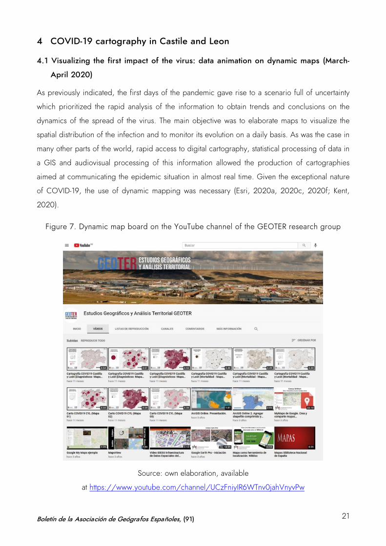
Figure 7. Dynamic map board on the YouTube channel of the GEOTER research group
Source: own elaboration, available
at https://www.youtube.com/channel/UCzFniyIR6WTnv0jahVnyvPw
Boletín de la Asociación de Geógrafos Españoles, (91) 21
The following variables were used to produce these maps using data animation: number of new
cases and deaths (persons affected by the virus), percentage of new cases and deaths out of the
total number of health insurance cards in each area (rate x 100) and cumulative incidence level of
both variables. The data were downloaded daily from the first available date (number of cases as
of February 29 and deaths as of March 1, 2020). These data were then employed to create a
series of dynamic tables in a database that, in turn, was associated with the spatial unit of
correlation of the data (the BHA) in the GIS. Given the regional scale of the map, the urban BHA
were grouped and the daily cartographic image of each of the available variables was obtained.
Once this daily information was sequenced, the data animation and the creation of the dynamic
maps were developed. These were presented in video format and uploaded to the research
group’s YouTube channel for the entire daily sequence for the months of March and April 2020
(Figure 7).
The final result was the presentation of the following series of dynamic maps for the territory of
Castile and Leon, which were daily updated with this time sequence:
• Video with a distribution map of daily diagnoses of COVID-19 patients by BHA in Castile and
Leon. Available at https://youtu.be/dvitqwl5SpE
• Video with a distribution map showing the percentage of COVID-19 patients with respect to
the number of health insurance cards per BHA in Castile and Leon. Available
at https://youtu.be/OjZDS97PNV4
• Video with a distribution map of the cumulative daily incidence of COVID-19 patients and its
percentage with regard to the number of health insurance cards per BHA in Castile and Leon.
Available at https://youtu.be/OrW2mD0KMz8
• Video with a daily distribution map of COVID-19 deaths (confirmed cases and deceased
patients with symptoms compatible with the disease) by BHA in Castile and Leon. Available
at https://youtu.be/4G7Zgsi3AzU
• Video with a distribution map showing the percentage of COVID-19 deaths with respect to the
number of health insurance cards by BHA in Castile and Leon. Available
at https://youtu.be/EK0432qAyKo
• Video with a distribution map of cumulative COVID-19 deaths and their percentage in regard
to the number of health insurance cards by BHA in Castile and Leon. Available
at https://youtu.be/bKDjWAMCXQI
Boletín de la Asociación de Geógrafos Españoles, (91) 22
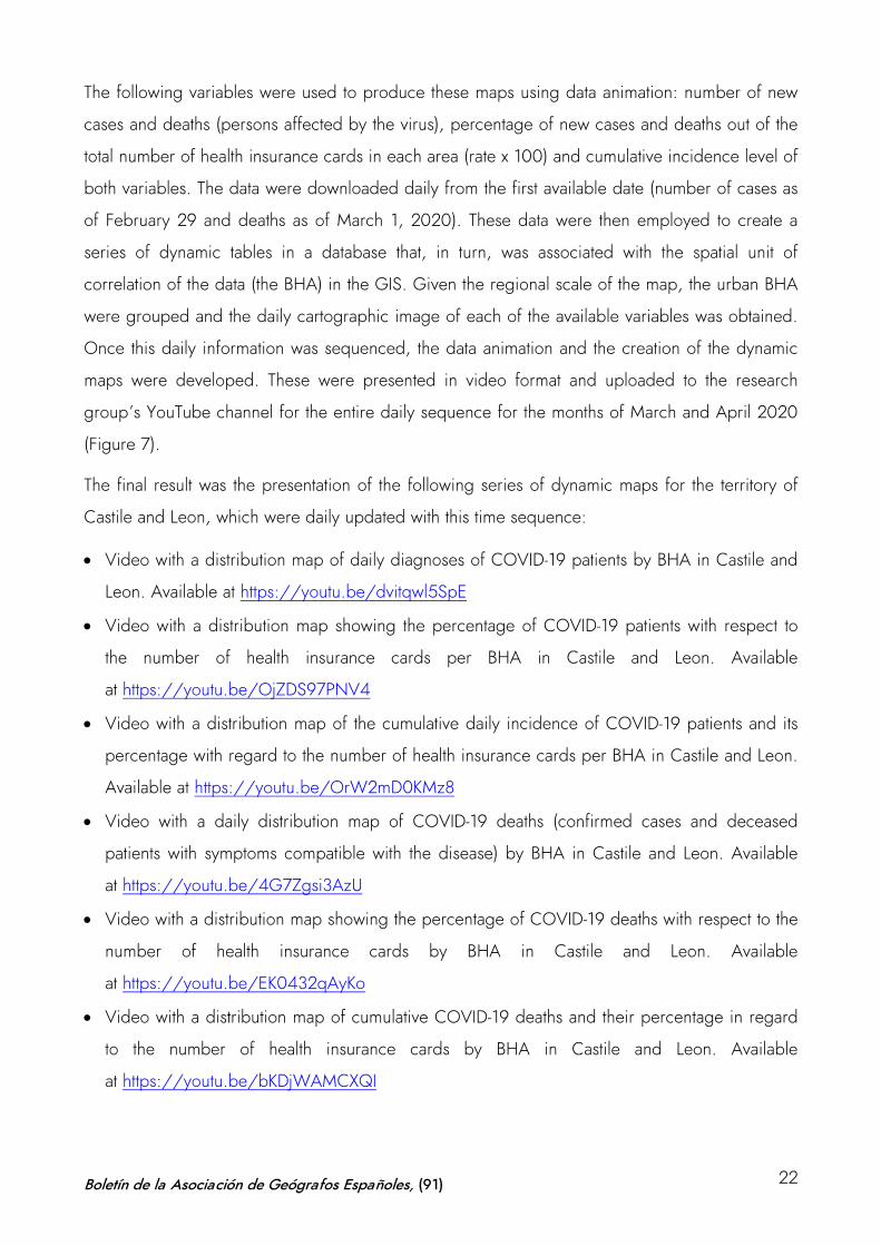
Figure 8. Sequence of the dynamic map representing the number of people daily
diagnosed with COVID-19 by BHA in Castile and Leon
Source: own elaboration
The development of this first dynamic mapping enabled the identification of some of the essential
patterns of virus spread during the early phases of the pandemic. The mapping videos illustrated
the relationship between the spread of the disease and the main communication corridors in the
region, as well as the correlation with the population pattern, identifying the absolute intensity of
the phenomenon in the main urban areas (Figure 8).
However, the problems of data availability during that first period (due to the lack of diagnostic
capacity), the deficiencies in the counting systems (because of the problems of cumulative data
and delays in updating them) and the generalized uncertainty about the process added
considerable doubts to the validity of the results. The intensity curves shown in the dynamic maps
in different territories with similar geographic characterization were not easily explained and, as
has been subsequently verified, in many cases responded to the phenomenon of the lack of
reliability and consistency of the existing information at the time. On the other hand, this dynamic
cartography was an effective and rapid contribution from the University to provide an initial
diagnosis, since this possibility of visualization was not available. However, later on, the regional
administration began to update its information on its web and started to offer cartographic results
that allowed the visualization of the updated data. Besides, the daily sequential elaboration of the
data animation to obtain the videos was very costly and required considerable resources for their
publication. For this reason, it was decided to undertake a more detailed analysis by means of
thematic cartography in a second phase of the project. This second phase began in June 2020, a
Boletín de la Asociación de Geógrafos Españoles, (91) 23
moment when the available information started to be filtered and tables, graphs and sequences
of thematic maps with the different variables related to the spread and distribution of the disease
were elaborated. Between June 2020 and March 2021, this information was gathered and
tabulated so that the statistical sequence could be followed up to elaborate the results of the
mapping on COVID-19 in Castile and Leon during the last year.
4.2 Temporal dynamics and evolutionary sequence of disease spread during the first
year (March 2020–March 2021)
In order to identify the dimension of the pandemic in this region and to situate its evolutionary
dynamics in comparison with the rest of the country, the contextualization of the maps required a
prior analysis of the statistical information available. According to information from March 2021,
the Region of Castile and Leon accumulated more than 285,000 detected cases and more than
10,500 deaths due to COVID-19, figures which represent slightly more than 8% of the total
number of cases and nearly 14% of the total number of deaths in Spain –demographically, it
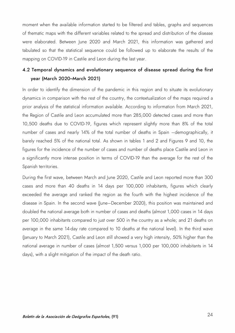
barely reached 5% of the national total. As shown in tables 1 and 2 and Figures 9 and 10, the
figures for the incidence of the number of cases and number of deaths place Castile and Leon in
a significantly more intense position in terms of COVID-19 than the average for the rest of the
Spanish territories.
During the first wave, between March and June 2020, Castile and Leon reported more than 300
cases and more than 40 deaths in 14 days per 100,000 inhabitants, figures which clearly
exceeded the average and ranked the region as the fourth with the highest incidence of the
disease in Spain. In the second wave (June–December 2020), this position was maintained and
doubled the national average both in number of cases and deaths (almost 1,000 cases in 14 days
per 100,000 inhabitants compared to just over 500 in the country as a whole; and 21 deaths on
average in the same 14-day rate compared to 10 deaths at the national level). In the third wave
(January to March 2021), Castile and Leon still showed a very high intensity, 50% higher than the
national average in number of cases (almost 1,500 versus 1,000 per 100,000 inhabitants in 14
days), with a slight mitigation of the impact of the death ratio.
Boletín de la Asociación de Geógrafos Españoles, (91) 24
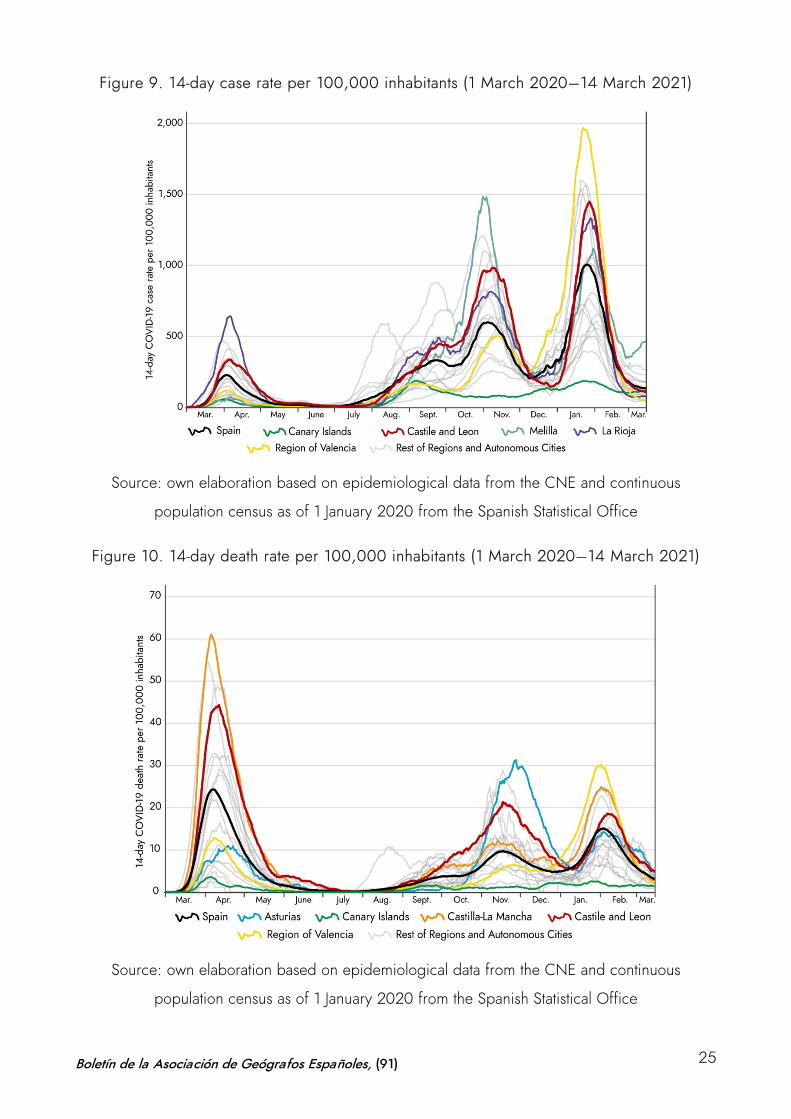
Figure 9. 14-day case rate per 100,000 inhabitants (1 March 2020–14 March 2021)
Source: own elaboration based on epidemiological data from the CNE and continuous
population census as of 1 January 2020 from the Spanish Statistical Office
Figure 10. 14-day death rate per 100,000 inhabitants (1 March 2020–14 March 2021)
Source: own elaboration based on epidemiological data from the CNE and continuous
population census as of 1 January 2020 from the Spanish Statistical Office
Boletín de la Asociación de Geógrafos Españoles, (91) 25
The region only falls below the national average during the valleys of the phases in the three
waves, subsequently rising in a similar way to other regions, but showing higher intensity peaks.
Particularly noteworthy is the maintenance of a high level of sustained incidence in all phases of
increased infection and a strong correlation between high level of infection and high mortality,
which is not reached in other territories –only the regions of Aragón and Castilla-La Mancha
show similar trends with a continued high impact on both variables. There are other regions
where the intensity of the virus has caused the disease to reach higher levels of infection during
some of the waves, but its rates have decreased in the following waves or have been altered in
each of the phases. Likewise, regions such as La Rioja present sustained high levels of infection
over time in all phases, and do not show a high mortality rate as in Castile and Leon. Similarly,
the Region of Valencia, which leads the incidence and mortality ratios in cases and mortality in
the third wave, does not present this condition in the two first waves; or Asturias, which reached
the highest mortality levels during the second wave, but does not maintain such a high ratio in the
other two phases.
Figure 11. Comparison of the 14-day incidence rate in Castile and Leon
Source: own elaboration based on the Regional Government of Castile and Leon (2020–2021)
Boletín de la Asociación de Geógrafos Españoles, (91) 26
Therefore, it can be deemed that the most defining characteristic of the pandemic in the region is
the evidence of its sustained impact over time, showing a high intensity of cases which in turn
evidence a worrying degree of correlation with mortality. Castile and Leon hasone of the highest
cumulative incidence rates of COVID-19 cases in the country over the last year (11.8 cases per
100 inhabitants compared to 6.76 cases in the national average) and also a very high mortality
rate (0.43 deaths per 100 inhabitants compared to 0.16 on average in Spain). In spite of this
fact, as in the rest of the Spanish regions, there is a clear decrease in the intensity of the number
of deaths among the three waves. While the number of infections is clearly increasing in each of
them, the number of deaths is decreasing in accordance with the advances in prevention
systems, detection capacity and health methods applied to the disease.
Figure 12. Weekly evolution of the number of COVID-19 patients
and deaths in Castile and Leon
Source: own elaboration based on the Regional Government of Castile and Leon (2020–2021)
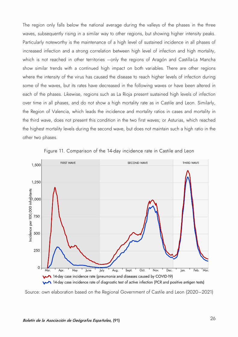
In this regard, the relative incidence graphs clearly reflect the manifest increase in the second
and third waves with respect to the first. However, we ought to consider that this information
does not fully reflect the reality of the impact of the pandemic, since in the first phase the
diagnostic capacity was limited and not all the cases actually affected were counted. Figure 10
Boletín de la Asociación de Geógrafos Españoles, (91) 27
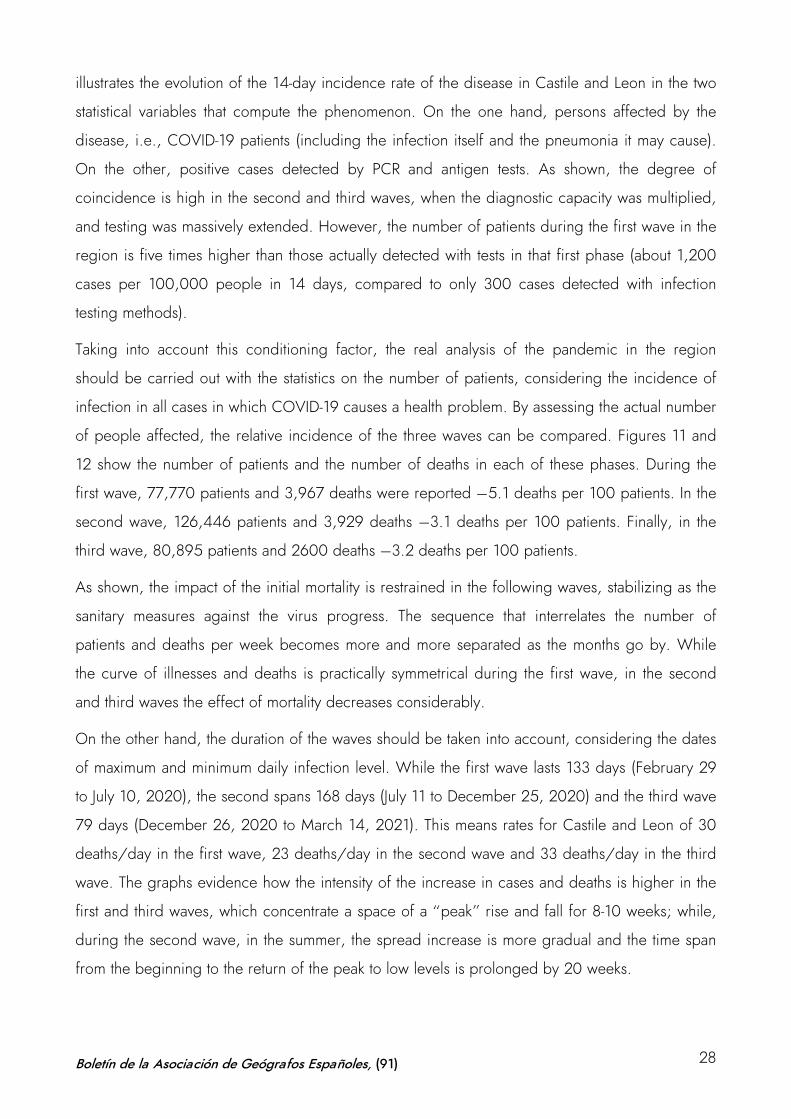
illustrates the evolution of the 14-day incidence rate of the disease in Castile and Leon in the two
statistical variables that compute the phenomenon. On the one hand, persons affected by the
disease, i.e., COVID-19 patients (including the infection itself and the pneumonia it may cause).
On the other, positive cases detected by PCR and antigen tests. As shown, the degree of
coincidence is high in the second and third waves, when the diagnostic capacity was multiplied,
and testing was massively extended. However, the number of patients during the first wave in the
region is five times higher than those actually detected with tests in that first phase (about 1,200
cases per 100,000 people in 14 days, compared to only 300 cases detected with infection
testing methods).
Taking into account this conditioning factor, the real analysis of the pandemic in the region
should be carried out with the statistics on the number of patients, considering the incidence of
infection in all cases in which COVID-19 causes a health problem. By assessing the actual number
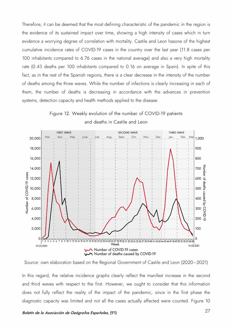
of people affected, the relative incidence of the three waves can be compared. Figures 11 and
12 show the number of patients and the number of deaths in each of these phases. During the
first wave, 77,770 patients and 3,967 deaths were reported –5.1 deaths per 100 patients. In the
second wave, 126,446 patients and 3,929 deaths –3.1 deaths per 100 patients. Finally, in the
third wave, 80,895 patients and 2600 deaths –3.2 deaths per 100 patients.
As shown, the impact of the initial mortality is restrained in the following waves, stabilizing as the
sanitary measures against the virus progress. The sequence that interrelates the number of
patients and deaths per week becomes more and more separated as the months go by. While
the curve of illnesses and deaths is practically symmetrical during the first wave, in the second
and third waves the effect of mortality decreases considerably.
On the other hand, the duration of the waves should be taken into account, considering the dates
of maximum and minimum daily infection level. While the first wave lasts 133 days (February 29
to July 10, 2020), the second spans 168 days (July 11 to December 25, 2020) and the third wave
79 days (December 26, 2020 to March 14, 2021). This means rates for Castile and Leon of 30
deaths/day in the first wave, 23 deaths/day in the second wave and 33 deaths/day in the third
wave. The graphs evidence how the intensity of the increase in cases and deaths is higher in the
first and third waves, which concentrate a space of a “peak” rise and fall for 8-10 weeks; while,
during the second wave, in the summer, the spread increase is more gradual and the time span
from the beginning to the return of the peak to low levels is prolonged by 20 weeks.
Boletín de la Asociación de Geógrafos Españoles, (91) 28
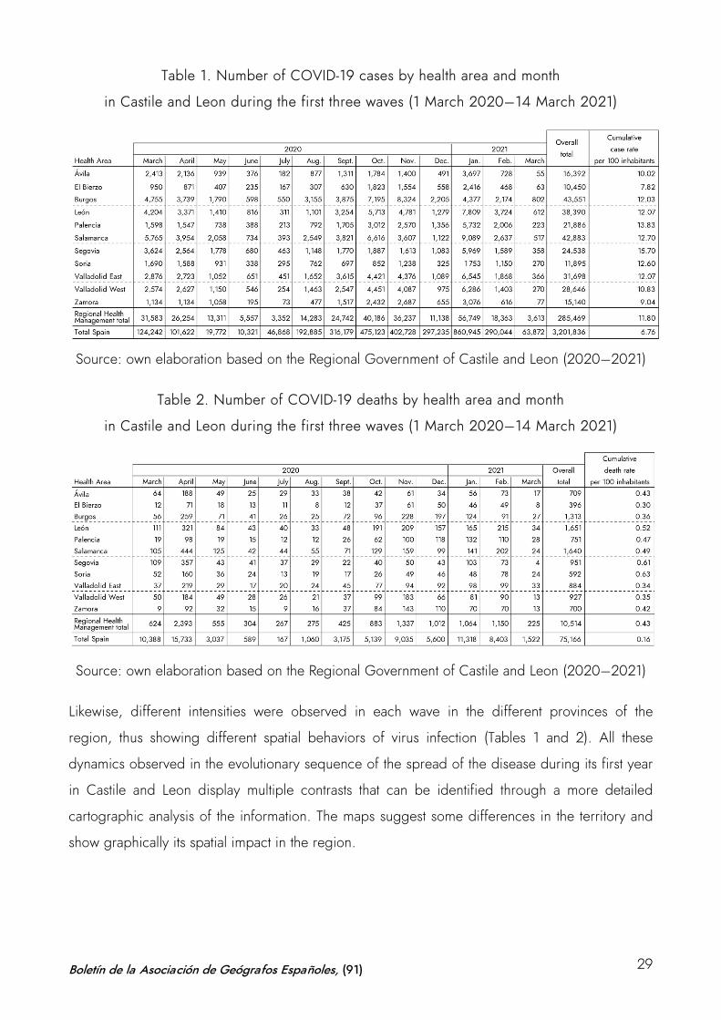
Table 1. Number of COVID-19 cases by health area and month
in Castile and Leon during the first three waves (1 March 2020–14 March 2021)
Source: own elaboration based on the Regional Government of Castile and Leon (2020–2021)
Table 2. Number of COVID-19 deaths by health area and month
in Castile and Leon during the first three waves (1 March 2020–14 March 2021)
Source: own elaboration based on the Regional Government of Castile and Leon (2020–2021)
Likewise, different intensities were observed in each wave in the different provinces of the
region, thus showing different spatial behaviors of virus infection (Tables 1 and 2). All these
dynamics observed in the evolutionary sequence of the spread of the disease during its first year
in Castile and Leon display multiple contrasts that can be identified through a more detailed
cartographic analysis of the information. The maps suggest some differences in the territory and
show graphically its spatial impact in the region.
Boletín de la Asociación de Geógrafos Españoles, (91) 29
4.3 Spatial analysis and thematic mapping: contrasts and trends in COVID-19 maps in
Castile and Leon
From a territorial perspective, there are conditioning factors related to the demographic
characteristics of the disease and the population model in Castile and Leon. The study carried out
by the CNE on factors in the spread of COVID-19 in Spain elucidates that the highest effect on
the spread of the disease in Castile and Leon is related to the high number of nursing home
places per 100 people over 70, with a moderate effect of the percentage of infected health
personnel, as well as the infectious risk of internal mobility (low) and external mobility (moderate-
low in Madrid and very low in the Basque Country). The selective incidence of the pandemic in
the region presents a certain relationship with the aforementioned aging sociodemographic
structure as well as with an extensive territory with a population model concentrated in the cities
and a vast and severely depopulated area (CNE, 2020). However, this initial diagnosis, which
suggests a differential pattern between urban and rural spaces, requires some clarification.
Firstly, the classic epidemic models of expansive contagion by proximity must be considered,
those explained from the generalization of global mobility. Cities have historically been
associated with the spread of infectious diseases, and recent studies on 21st century pandemics
have confirmed the effect of urban density on the ease of spread. It has been shown that while
sparsely populated areas with few air connections and poorly developed traffic networks tend to
be less affected in more connected and dense territories –mainly large urban agglomerations–,
the spread tends to be higher, faster and more intense in territories that are more connected (Cos
de, Castillo & Cantarero, 2020a; Méndez, 2020; Valjarević et al., 2020).
Scholarship has proven that population density especially affects the timing of outbreaks, since
greater connectivity in a denser territory impairs control of spread. However, it is important to
distinguish the differences between the initial spread, at the time of the onset of the infection,
and the subsequent spread, once the transmission phase has started; as well as to discern the
dynamics among cities and within them, which particularly affects the rural-urban dichotomy of
Castile and Leon. In rural areas, the dynamics of contagion and the onset of transmission may
take longer to take place, but when the virus has taken effect, the expansive dynamics usually
reach the same or greater intensity of contagion, relatively speaking. In urban centers, at the
neighborhood level, the socioeconomic profile is more decisive than the density itself in
understanding the distribution relationship of COVID-19. Knowledge of the spatial behavior of
COVID-19 therefore requires a multiscale analysis (Carozzi, Provenzano & Roth, 2020; Orea &
Álvarez, 2020; Páez et al., 2021; Oto-Peralías, 2020).
Boletín de la Asociación de Geógrafos Españoles, (91) 30
The studies relying on urban micro-scale data conclude that neighborhoods with poorer living
conditions, higher unemployment rates, lower qualifications and training of their population, lack
of internet access, lower income levels or high levels of aging have a direct correlation with a
higher disease affection and the impact of virus transmission during an epidemic situation. In
each neighborhood, depending on income levels, housing typology and other socioeconomic
aspects, the effects of COVID-19 are experienced differently. One pattern prevails universally:
COVID-19 knows about class. Pandemic maps show the unequal cities (Bilal, 2020; González &
Piñeira, 2020; Méndez, 2020).
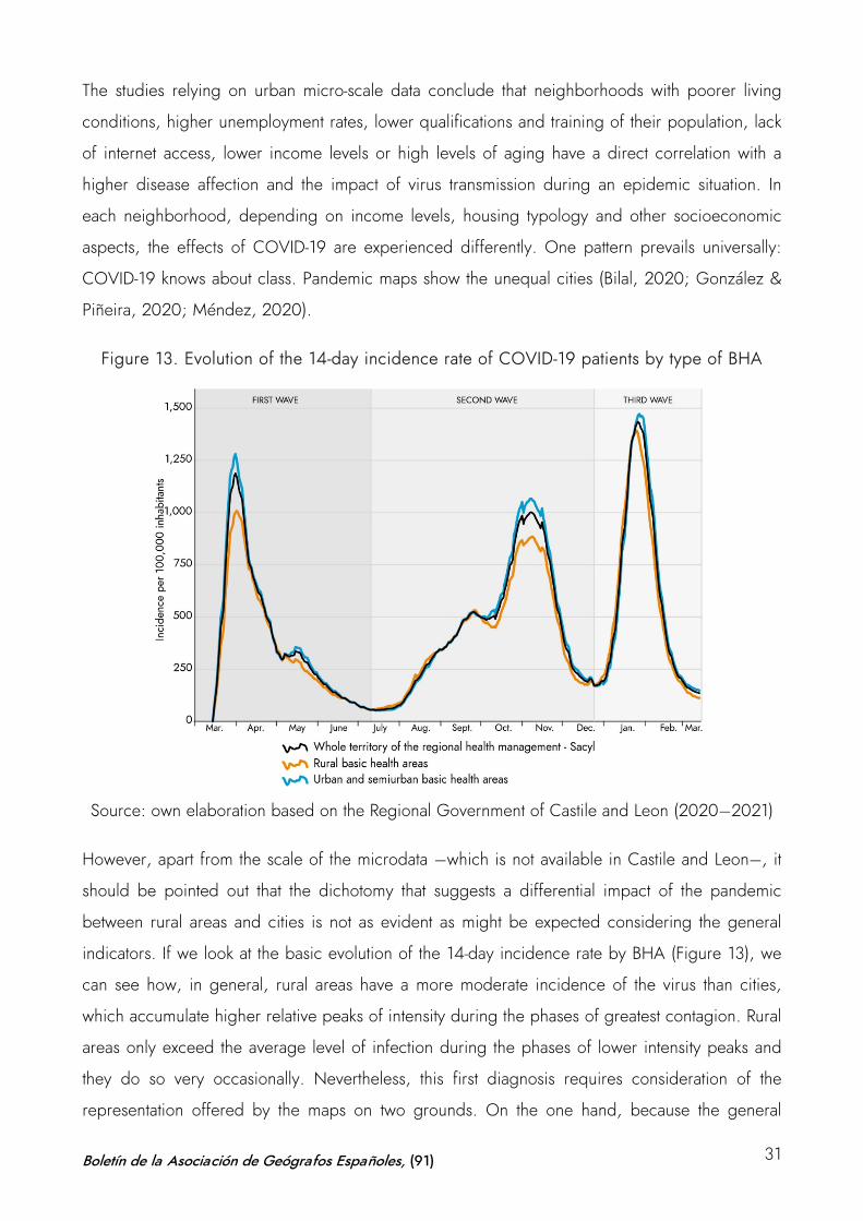
Figure 13. Evolution of the 14-day incidence rate of COVID-19 patients by type of BHA
Source: own elaboration based on the Regional Government of Castile and Leon (2020–2021)
However, apart from the scale of the microdata –which is not available in Castile and Leon–, it
should be pointed out that the dichotomy that suggests a differential impact of the pandemic
between rural areas and cities is not as evident as might be expected considering the general
indicators. If we look at the basic evolution of the 14-day incidence rate by BHA (Figure 13), we
can see how, in general, rural areas have a more moderate incidence of the virus than cities,
which accumulate higher relative peaks of intensity during the phases of greatest contagion. Rural
areas only exceed the average level of infection during the phases of lower intensity peaks and
they do so very occasionally. Nevertheless, this first diagnosis requires consideration of the
representation offered by the maps on two grounds. On the one hand, because the general
Boletín de la Asociación de Geógrafos Españoles, (91) 31
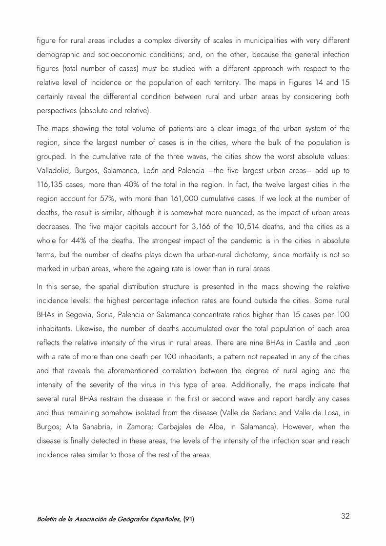
figure for rural areas includes a complex diversity of scales in municipalities with very different
demographic and socioeconomic conditions; and, on the other, because the general infection
figures (total number of cases) must be studied with a different approach with respect to the
relative level of incidence on the population of each territory. The maps in Figures 14 and 15
certainly reveal the differential condition between rural and urban areas by considering both
perspectives (absolute and relative).
The maps showing the total volume of patients are a clear image of the urban system of the
region, since the largest number of cases is in the cities, where the bulk of the population is
grouped. In the cumulative rate of the three waves, the cities show the worst absolute values:
Valladolid, Burgos, Salamanca, León and Palencia –the five largest urban areas– add up to
116,135 cases, more than 40% of the total in the region. In fact, the twelve largest cities in the
region account for 57%, with more than 161,000 cumulative cases. If we look at the number of
deaths, the result is similar, although it is somewhat more nuanced, as the impact of urban areas
decreases. The five major capitals account for 3,166 of the 10,514 deaths, and the cities as a
whole for 44% of the deaths. The strongest impact of the pandemic is in the cities in absolute
terms, but the number of deaths plays down the urban-rural dichotomy, since mortality is not so
marked in urban areas, where the ageing rate is lower than in rural areas.
In this sense, the spatial distribution structure is presented in the maps showing the relative
incidence levels: the highest percentage infection rates are found outside the cities. Some rural
BHAs in Segovia, Soria, Palencia or Salamanca concentrate ratios higher than 15 cases per 100
inhabitants. Likewise, the number of deaths accumulated over the total population of each area
reflects the relative intensity of the virus in rural areas. There are nine BHAs in Castile and Leon
with a rate of more than one death per 100 inhabitants, a pattern not repeated in any of the cities
and that reveals the aforementioned correlation between the degree of rural aging and the
intensity of the severity of the virus in this type of area. Additionally, the maps indicate that
several rural BHAs restrain the disease in the first or second wave and report hardly any cases
and thus remaining somehow isolated from the disease (Valle de Sedano and Valle de Losa, in
Burgos; Alta Sanabria, in Zamora; Carbajales de Alba, in Salamanca). However, when the
disease is finally detected in these areas, the levels of the intensity of the infection soar and reach
incidence rates similar to those of the rest of the areas.
Boletín de la Asociación de Geógrafos Españoles, (91) 32
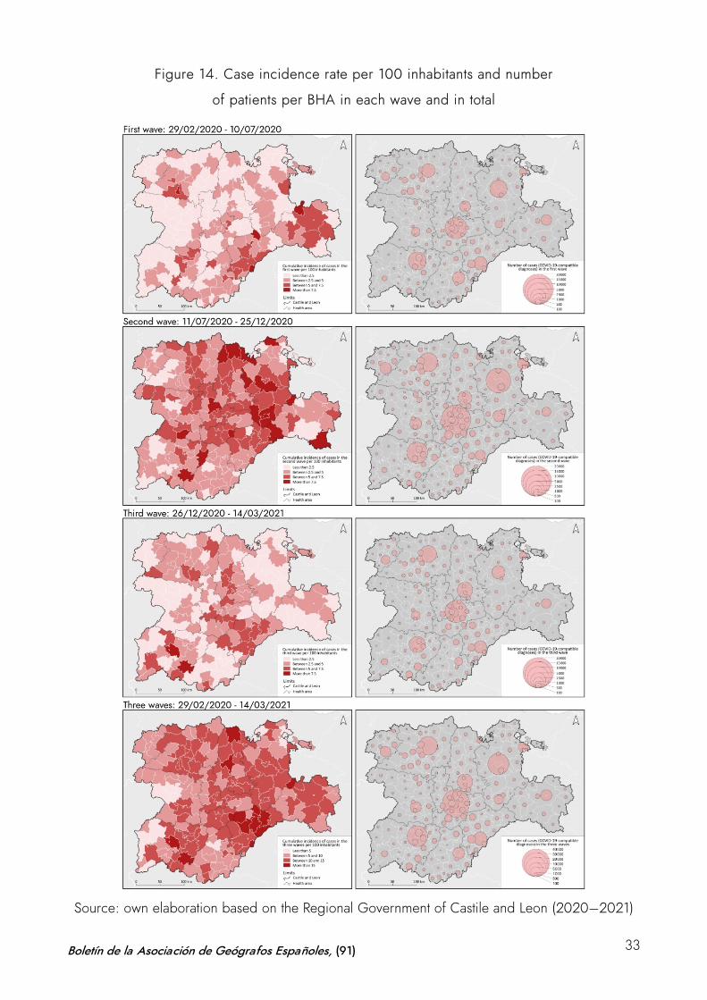
Figure 14. Case incidence rate per 100 inhabitants and number
of patients per BHA in each wave and in total
Source: own elaboration based on the Regional Government of Castile and Leon (2020–2021)
Boletín de la Asociación de Geógrafos Españoles, (91) 33
Figure 15. Death incidence rate per 100 inhabitants and number
of patients per BHA in each wave and in total
Source: own elaboration based on the Regional Government of Castile and Leon (2020–2021)
Boletín de la Asociación de Geógrafos Españoles, (91) 34
Furthermore, the maps show the differential evolution of the three waves over the last year. The
level of intensity of the second phase of the viral infection between July and December 2020 can
be clearly seen, compared to the lower intensity of the first and third waves. It is also possible to
identify the areas most affected by the intensity of the process during each phase.
In the first wave, the number of cases and deaths was mainly concentrated in the cities of
Valladolid, Burgos and Salamanca, on the axis that crosses the region diagonally (France–
Portugal connection), where one out of every three cases reported occurred. However, the main
BHAs in terms of relative intensity of infection were located in the southeast quadrant of the
Region, in the provinces of Segovia and Soria. These same BHAs, and some others in the
provinces of León and Salamanca, had the highest mortality rates.
During the second wave, the most relevant volume of cases continued to be reported in the three
provincial capitals abovementioned, to which the increase in the cities of León and Palencia was
added —these five cities accounted for almost one out of every two cases at that time of the
pandemic. Relatively speaking, the infection especially affected a group of BHAs located in the
center of the Duero basin, with special incidence in the southern part of the province of Burgos
and some areas of Valladolid, Palencia and Soria. In this second phase, two aspects are worth
highlighting: on the one hand, the relative mortality did not stand out in these areas of greater
absolute volume, but was mainly concentrated in the rural BHAs of León, Zamora and
Salamanca,; and, on the other, the high volume of infection also meant that the relative incidence
of some urban BHAs (Burgos, Valladolid, Aranda de Duero...) rose remarkably.
In the third wave different behaviors arose, and the distribution of the virus modified the patterns
described above. At the absolute level, the highest infection rates were again concentrated in
cities, especially in Valladolid, Palencia and León, while Burgos and Salamanca showed a certain
containment. Relatively speaking, the BHAs of the provinces of Soria and Burgos, which were
very affected in the previous waves, also showed more reduced levels of contagion, probably
due to some of the selective measures of perimeter closures and selective closures of activities in
these territories during the second wave. In contrast, the axis made up by Segovia, Valladolid,
Palencia, and León, in the central quadrant of the region, showed the highest relative incidence
rates. The relative number of deaths fell across the board and, although it stood out in some
BHAs of this central axis, it also showed high rates in other areas scattered throughout the
territory (León, Salamanca, Burgos or Soria).
Boletín de la Asociación de Geógrafos Españoles, (91) 35
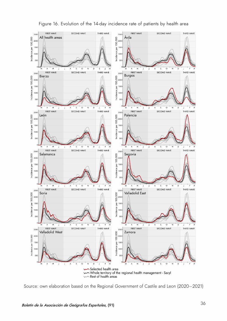
Figure 16. Evolution of the 14-day incidence rate of patients by health area
Source: own elaboration based on the Regional Government of Castile and Leon (2020–2021)
Boletín de la Asociación de Geógrafos Españoles, (91) 36
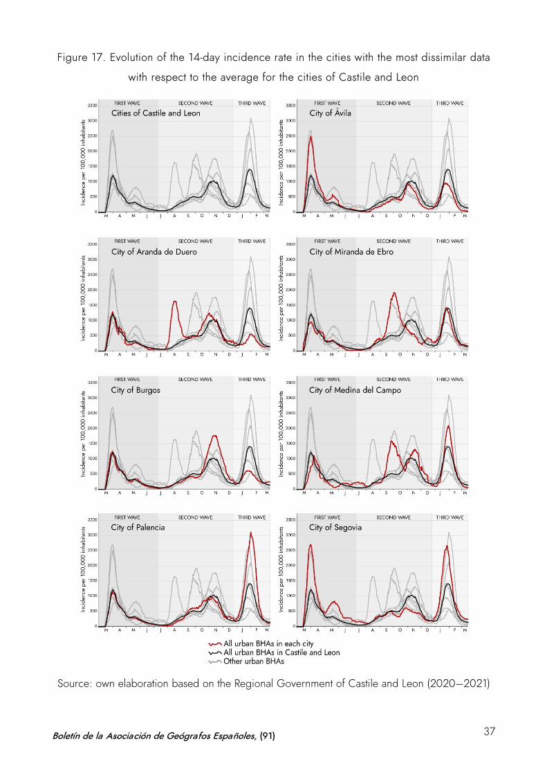
Figure 17. Evolution of the 14-day incidence rate in the cities with the most dissimilar data
with respect to the average for the cities of Castile and Leon
Source: own elaboration based on the Regional Government of Castile and Leon (2020–2021)
Boletín de la Asociación de Geógrafos Españoles, (91) 37
All these spatial trends in the distribution of the infection and the level of incidence of the disease
during the three waves of the last year can also be observed in the Figure 16 and 17, which
represent the differential dynamics of each basic health area of a representative group of cities
respectively.
These graphs ratify the trends shown in the cartography: the highest incidence in Soria, Segovia
or Salamanca during the first wave; the intensity of COVID-19 during the second wave in Burgos;
or the strong concentration of the disease in the axis of Segovia, Valladolid, Palencia in the third
wave. Likewise, urban dynamics confirm these trends and also illustrate some specific cases that
visualize the singular intensity and anticipation of the second wave in cities such as Burgos or
Aranda de Duero and Medina del Campo, where there is a double peak of incidence in this
phase. However, the regional-scale study presented here, based on the systematic processing of
the official information available and its cartographic representation, reveals the difficulty of
understanding the phenomenon, given the impossibility of establishing clear patterns of
contagion and predictable patterns of spatial evolution of a disease about which much remains to
be known.
5 Conclusions
The COVID-19 cartographies in the Spanish region of Castile and Leon verify the use of maps as
useful tools for the analysis of the spatial distribution, the dynamics of infection and the
differential impact of the pandemic in the territory. On the one hand, the mapping of the
dynamics of infection, as a means of geographical analysis from the University, has been useful
to improve the visualization of the spatial distribution of the foci of infection during the first wave
through the creation of dynamic maps. This initial study with sequences of data animation allowed
to contextualize the position of the region within the framework of the country. The data analyzed
placed Castile and Leon as one of the most affected in Spain in terms of volume and relative
intensity of infection and mortality. The statistics handled in the mapping clearly showed the high
impact caused by COVID-19 in the region, which doubles the national average of patients per
100 inhabitants (12 cases versus 6) and triples the number of deaths (0.43 versus 0.16 per 100
inhabitants).
However, beyond the intensity diagnosis, the analytical use of maps offers a detailed
representation that unravels the differential behavior of the virus and shows its temporal and
spatial sequences. Mapping identifies contrasts in the impact of the disease. On the one hand,
the maps confirm the imbalance in each of the waves of infection, highlighting the greater
Boletín de la Asociación de Geógrafos Españoles, (91) 38
intensity of the second, and the more concentrated effect in time of the first and the third. On the
other hand, they reveal the discrepancies of the pandemic in the different territories of the region
and enable to identify more clearly the dichotomies between urban and rural areas in the face of
the impact of COVID-19. The former have a higher absolute incidence and the latter present high
levels of relative incidence, once the disease is detected in them. The greatest number of patients
in absolute terms is found in the cities: the map of those affected by COVID-19 in Castile and
Leon reproduces the urban system. Valladolid, Burgos, León, Salamanca and Palencia, the five
main provincial capitals, account for the largest number of cases. Almost six out of every ten
COVID-19 patients in Castile and Leon are registered in the cities. However, this conclusion
should be clarified, since the relative incidence of the virus is higher, and its effects are more
serious in rural areas. The percentage of sick people in relation to the number of inhabitants is
more intense and generalized in all rural areas of the nine provinces, which also report higher
mortality rated than the cities. Thus, in contrast to the number of cases, in terms of deaths, the
rural environment accounts for six out of every ten deaths; which means that relative mortality is
more intense in the countryside than in the city.
Likewise, the maps reveal differential patterns among the cities and the rural areas. In certain
urban areas, trends of high incidence are marked during the different waves, during the peaks of
infection that divide the sequence of infection (double peaks) in some of the waves. Furthermore,
we observe high levels of infection in rural areas which had been very hardly affected in the
previous phases. These dynamics visualized by the mapping spark a debate on the problems of
interpreting the spatial behavior of the virus and at the same time demonstrate the need for an
adequate scale of interpretation.
The study based on information at the intermediate level of the BHAs has not allowed to
interrelate these trends with specific socioeconomic factors at the appropriate scale. The
mismatches detected between the use of basic health analysis units –as functional divisions– and
municipalities –as the essential scale of administrative management of the pandemic– are
transferred to cartographic representations and highlight the problems in determining specific
patterns in the dynamics of contagion that are useful for decision-making. The contribution of this
study on the spatial distribution of infections and the dynamics of the evolution of COVID-19 in
Castile and Leon can be improved and expanded if the geolocalized database of each of the
cases detected is available. The anonymized processing of this information is compatible with its
introduction into a GIS and its spatial analysis could be cross-checked with other socioeconomic
Boletín de la Asociación de Geógrafos Españoles, (91) 39
information. In a third phase of the project, this process would lead to a study at microdata scale
that could complete the initial conclusions presented in this paper.
Authorship statement: The authors declare no conflict of interest. Gonzalo Andrés López:
Coordination, state of the art review, data analysis and writing of the paper. Daniel Herrero Luque:
statistical analysis and cartography. Marta Martínez Arnáiz: Methodology, state of the art review and
writing of the paper.
Boletín de la Asociación de Geógrafos Españoles, (91) 40
References
Ahasan, R., Alam, M.S., Chakraborty, T., & Hossain, M.M. (2020). Applications of GIS and
geospatial analyses in COVID-19 research: A systematic review. F1000Research, 9,
1379. https://doi.org/10.12688/f1000research.27544.1
Ahasan, R., & Hossain, M.M. (2020). Leveraging GIS Technologies for Informed Decision-
making in COVID-19Pandemic. OSF Preprints. https://osf.io/preprints/socarxiv/v6nuf/
Bernasconi, A., & Grandi, S. (2021). A Conceptual Model for Geo-Online Exploratory Data
Visualization: The Case of the COVID-19 Pandemic. Information,
12(69). https://doi.org/10.3390/info12020069
Bilal, U. (2020). Las dinámicas de contagio en las ciudades. Panorama social,
32. https://www.funcas.es/articulos/las-dinamicas-de-contagio-en-las-ciudades/
Buzai, G. D., & Santana Juarez, M. V. (2018). Condicionantes socioespaciales de la salud.
Anuario de la División de Geografía, Universidad Nacional de Luján, 170-
184. https://ri.unlu.edu.ar/xmlui/handle/rediunlu/626
Buzai, G. D. (2020a). De Wuhan a Luján. Evolución espacial del COVID-19. Posición, 3, 1-
21. http://ri.unlu.edu.ar/xmlui/handle/rediunlu/683
Buzai, G. D. (2020b). The Cholera Map by CATALUÑA Snow (London, 1854): A Health Solution
as a Conceptual Summary of Applied Geography. Anales de la Sociedad Científica Argentina,
268(2), 5-18.
https://www.researchgate.net/publication/344338651_The_Cholera_Map_by_John_Snow_Lon
don_1854_A_Health_Solution_as_a_Conceptual_Summary_of_Applied_Geography
Carozzi, F., Provenzano, S., & Roth, S. (2020). Urban Density and COVID-19 (IZA Institute of
Labor Economics. Discussion Paper No. 13440). http://ftp.iza.org/dp13440.pdf
Centro Nacional de Epidemiología (CNE) (2020). Factores de difusión COVID-19 en España
[Website]. https://coviddifusion.isciii.es/fdd/
Centro Nacional de Epidemiología (CNE) (2020-2021). Situación y evolución de la pandemia de
COVID-19 en España. COVID-19 en España. https://cnecovid.isciii.es/
Chiluba, B.C., & Dube, G. (2020). Descriptive review of epidemiological geographic mapping
of coronavirus disease 2019 (COVID-19) on the Internet. Biomedical and Biotechnology Research
Boletín de la Asociación de Geógrafos Españoles, (91) 41
Journal, 20(4), 83-89. https://www.bmbtrj.org/article.asp?issn=2588-
9834;year=2020;volume=4;issue=2;spage=83;epage=89;aulast=Chiluba
Cobarsí-Morales, J. (2020). Covid-19: Fuentes de información cuantitativa. Anuario ThinkEPI,
14. http://dx.doi.org.ubu-es.idm.oclc.org/10.3145/thinkepi.2020.e14d02
Cos de, O., Castillo, V., & Cantarero, D. (2020a). Covid-19 y densidad de población ¿qué
relación? Enfoque multiescalar con Sitar Cantabria
[Poster]. https://reunionesdeestudiosregionales.org/madridvirtual2020/en/actas-del-
congreso/
Cos de, O., Castillo, V., & Cantarero, D. (2020b). Facing a Second Wave from a Regional
View: Spatial Patterns of COVID-19 as a Key Determinant for Public Health and Geoprevention
Plans. International Journal of Environmental Research and Public Health,
17. https://doi.org/10.3390/ijerph17228468
Cos de, O., Castillo, V., & Cantarero, D. (2021). Differencing the Risk of Reiterative Spatial
Incidence of COVID-19 Using Space–Time 3D Bins of Geocoded Daily Cases. ISPRS
International Journal of Geo-Information, 10(4), 261. https://doi.org/10.3390/ijgi10040261
Dangermond, J., & Pesaresi, C. (2018). The power of GIS language. Journal of Research and
Didactics in Geography, 2(7), 7-12. http://www.j-
reading.org/index.php/geography/article/view/209
Dangermond, J., De Vito, C., & Pesaresi, C. (2020). Using GIS in the Time of the COVID-19
Crisis, casting a glance at the future. A joint discussion. Journal of Research and Didactics in
Geography, 1(9), 195−205. http://www.j-
reading.org/index.php/geography/article/view/257
Dong, E., Du, H., & Gardner, L. (2020): An interactive web-based dashboard to track COVID-19
in real time. The Lancet Infectious Diseases, 20(5), 533-534. https://doi.org/10.1016/S1473-
3099(20)30120-1
Esri (2020a). COVID-19 GIS Hub España. Covid19 Esrispain. https://covid19esrispain-
sitesesrispain.hub.arcgis.com/
Esri (2020b). Esri White Paper. Geographic Information Systems for Coronavirus. Planning and
Response. Esri. https://www.esri.com/content/dam/esrisites/en-us/media/pdf/geographic-
information-systems-for-coronavirus-planning-response-white-paper.pdf
Boletín de la Asociación de Geógrafos Españoles, (91) 42
Esri (2020c). The GIS community responds to the COVID-19 crisis. Esri Story
Maps. https://storymaps.arcgis.com/stories/feaf86dac1584a84978a5e49d62266ca
Esri (2020d). List of novel coronavirus Dashboards. Esri Story
Maps. https://storymaps.arcgis.com/stories/a1746ada9bff48c09ef76e5a788b5910
Esri (2020e). Mapas y aplicaciones globales sobre la pandemia de COVID 19.
Esri. https://www.esri.com/es-es/covid-19/community-maps/gallery#/
Esri (2020f). COVID-19. Mapas, soluciones y recursos para la respuesta y desescalada.
Esri. https://www.esri.com/es-es/covid-19/overview
Everts, J. (2020). The dashboard pandemic. Dialogues in Human Geography, 10(2), 260-
264. https://doi.org/10.1177/2043820620935355
Fatima, M., O’Keefe, K.J., Wei, W., Arshad, S., & Gruebner, O. (2021). Geospatial Analysis of
COVID-19: A Scoping Review. International Journal of Environmental Research and Public Health,
18, 2336. https://doi.org/10.3390/ijerph18052336
Fenner Sánchez, G. (2020). Cartografías en tiempos de COVID. In Laboratorio de Cartografía y
Elaboración de Mapas (LACEM). Centro de Estudios Superiores de México y Centroamérica
(CESMECA). https://notanatlas.org/wp-content/uploads/2020/06/cartograf%C3%ADas-en-
tiempos-de-covid_fenner.pdf
Field, K. (2020). Mapping coronavirus, responsibly. Esri. https://www.esri.com/arcgis-
blog/products/product/mapping/mapping-coronavirus-responsibly/
Franch-Pardo, I., Napoletano, B.M., Rosete-Verges, F., & Billa, L. (2020). Spatial analysis and
GIS in the study of COVID-19. A review. Science of The Total Environment,
739. https://doi.org/10.1016/j.scitotenv.2020.140033
GEOTER (n.d.). Estudios Geográficos y Análisis Territorial GEOTER [Youtube
channel]. https://www.youtube.com/channel/UCzFniyIR6WTnv0jahVnyvPw
González Pérez, J.M., & Piñeira Martiñán, Mª. J. (2020). La ciudad desigual en Palma (Mallorca):
geografía del confinamiento durante la pandemia de la COVID-19. Boletín de la Asociación de
Geógrafos Españoles, (87). https://doi.org/10.21138/bage.2998
Guallart Moreno, C. (2020). La cartografía digital generada por la COVID-19: análisis y
tipologías. Espacio, Tiempo y Forma, Serie VI, Geografía, 13, 103-
134. http://dx.doi.org/10.5944/etfvi.13.2020.27806
Boletín de la Asociación de Geógrafos Españoles, (91) 43
Gurrutxaga, M. (2019). Geografía de la Salud: aplicaciones en la planificación territorial y
urbana. Estudios Geográficos, 80(286), 1−18. https://doi.org/10.3989/estgeogr.201927.007
Juergens C. (2020). Trustworthy COVID-19 Mapping: Geo-spatial Data Literacy Aspects of
Choropleth Maps. KN - journal of cartography and geographic information, 70, 155-
161. https://doi.org/10.1007/s42489-020-00057-w
Junta de Castilla y León. Consejería de Transparencia, Ordenación del Territorio y Acción
Exterior (2020-2021). Situación epidemiológica del coronavirus (COVID-19) en Castilla y León.
[Open dataset]. https://analisis.datosabiertos.jcyl.es/pages/coronavirus/
Kamel Boulos, M., & Geraghty, E.M. (2020). Geographical tracking and mapping of coronavirus
disease COVID-19/severe acute respiratory syndrome coronavirus 2 (SARS-CoV-2) epidemic and
associated events around the world: how 21st century GIS technologies are supporting the global
fight against outbreaks and epidemics. International Journal of Health Geographics, 19,
1−12. https://doi.org/10.1186/s12942-020-00202-8
Kent, A.J. (2020). Mapping and Counter-Mapping COVID-19: From Crisis to Cartocracy. The
Cartographic Journal, 57(3), 187−195. https://doi.org/10.1080/00087041.2020.1855001
Koch, T. (2005). Mapping and mapmaking. In Cartographies of Disease: Maps, Mapping, and
Medicine (pp. 1–15). Esri Press.
Li, R. (2021). Visualizing COVID‐19 information for public: Designs, effectiveness, and
preference of thematic maps. Human Behavior and Emerging Technologies, 3(1), 97-
106. http://dx.doi.org.ubu-es.idm.oclc.org/10.1002/hbe2.248
Lyseen, A. K., Nøhr, C., Sørensen, E. M., Gudes, O., Geraghty, E. M., Shaw, N. T., Bivona-
Tellez, C., & IMIA Health GIS Working Group (2014). A Review and Framework for Categorizing
Current Research and Development in Health Related Geographical Information Systems (GIS)
Studies. Yearbook of medical informatics, 9(1), 110-124. https://doi.org/10.15265/IY-2014-
0008
Méndez Gutiérrez del Valle, R. (2020). Sitiados por la pandemia. Del colapso a la
reconstrucción: apuntes geográficos. REVIVES. http://revives.es/wp-
content/uploads/2020/09/SITIADOS-POR-LA-PANDEMIA.pdf
Mocnik, F.J., Raposo, P., Feringa, W., Kraak, M.J., & Köbben, B. (2020). Epidemics and
pandemics in maps − the case of COVID-19. Journal of Maps, 16(1), 144-
152. https://doi.org/10.1080/17445647.2020.1776646
Boletín de la Asociación de Geógrafos Españoles, (91) 44
Mooney, P., & Juhász, L. (2020). Mapping COVID-19: How web-based maps contribute to the
infodemic. Dialogues in Human Geography, 10(2), 265-
270. https://doi.org/10.1177/2043820620934926
Müller, H., & Louwsma, M. (2021). The role of spatio-temporal information to govern the COVID-
19 pandemic: A european perspective. ISPRS International Journal of Geo-Information, 10(3),
166. http://dx.doi.org.ubu-es.idm.oclc.org/10.3390/ijgi10030166
Orea, L., & Álvarez, M.C. (2020). How effective has been the Spanish lockdown to battle COVID-
19? A spatial analysis of the coronavirus propagation across provinces (Working Papers 2020-
03, FEDEA). https://navarra.opennemas.com/media/navarra/files/2020/04/16/dt2020-
03.pdf
Ortega Montequín, M. (2017). Definición de áreas funcionales como componente de la
ordenación del territorio. El caso del planeamiento general de Gijón. Ería, 1, 83-
98 https://reunido.uniovi.es/index.php/RCG/article/view/11152/11006
Ortega Valcárcel, J. (2000). Los horizontes de la geografía. Ariel.
Oto-Peralías, D. (2020). Regional correlations of COVID-19 in Spain.
OSFPreprints. https://osf.io/tjdgw/
Páez, A., Lopez, F. A., Menezes, T., Cavalcanti, R., & Pitta, M. G. d. R. (2021). A Spatio‐
Temporal Analysis of the Environmental Correlates of COVID‐19 Incidence in Spain.
Geographycal Analisys, 0, 1−25. https://doi.org/10.1111/gean.12241
Pászto, V., Burian, J., & Macku, K. (2020). COVID-19 data source: evaluation of map
applications and analysis of behavior changes in Europe’s population. Geografie, 125, 171-
209. https://doi.org/10.37040/geografie2020125020171
Perles Rosello, M.J., Sortino Barrionuevo, J.F., Cantarero Prados, F.J., Castro Noblejas, H., De la
Fuente Roselló, A.L., Orellana Macías, J.M., Reyes Corredera, S., Miranda Páez, J., & Mérida
Rodríguez, M. (2020). Propuesta metodológica para la elaboración de una cartografía de riesgo
de COVID19 en entornos urbanos. Informe de investigación. Dpto. de Geografía, RIUMA
Universidad de Málaga.
https://riuma.uma.es/xmlui/bitstream/handle/10630/19477/Metodolog%C3%ADa%20Carto
graf%C3%ADa%20Riesgos%20COVID-19.pdf?sequence=1&isAllowed=y
Ramírez Estévez, G., & Reguera de Castro, J. M. (1994). Modelo funcional de la territorialización
de Servicios. Valladolid: Junta de Castilla y León.
Boletín de la Asociación de Geógrafos Españoles, (91) 45
RENAVE-CNE-CNM (ISCIII) (2020-2021). Informes de situación de la COVID-19 en España.
Consultados en varias fechas para los años 2020 y 2021. https://cnecovid.isciii.es/
Rosenkrantz, L., Schuurman, N., Bell, N., & Amram, O. (2021). The need for GIScience in
mapping COVID-19. Health & Place, 67. https://doi.org/10.1016/j.healthplace.2020.102389
Saracho López, F. J. (2020). Espacialidad y pandemia: la crisis del coronavirus vista desde la
geopolítica negative. Geopolítica (s), 11(2), 69-79. https://doi.org/10.5209/geop.69149
Saran, S., Singh, P., Kumar, V., & Chauhan, P. (2020). Review of Geospatial Technology for
Infectious Disease Surveillance: Use Case on COVID-19. Journal of the Indian Society of Remote
Sensing, 1-18. https://doi.org/10.1007/s12524-020-01140-5
Smith, C. D., & Mennis, J. (2020). Incorporating Geographic Information Science and
Technology in Response to the COVID-19 Pandemic. Preventing chronic disease, 17,
E58. https://doi.org/10.5888/pcd17.200246
Sparke, M., &Anguelov, D. (2020). Contextualising coronavirus geographically. Transactions of
the Institute of British Geographers, 45(3), 498-508. https://doi.org/10.1111/tran.12389
United Nations Committee of Experts on Global Geospatial Information Management (UN-GGIM).
(2020). COVID-19: Ready to Respond. The Role of the Geospatial Community in Responding to
COVID-19 (White Paper). https://ggim.un.org/meetings/GGIM-committee/10th-
Session/documents/Covid-19_Ready-to-Respond.pdf
Van der Schee, J. (2020). Thinking through geography in times of the COVID-19 pandemic.
Journal of Research and Didactics in Geography, 2, 21-30. http://www.j-
reading.org/index.php/geography/article/view/259
Valente Cardoso, P., Da Silva Seabra, V., Braz Bastos, I., & De Castro Porto Costa, E. (2020). A
importancia da análise espacial para tomada de decisão: um olhar sobre a pandemia de COVID-
19. Revista Tamoios, 16(1), 125−137. https://doi.org/10.12957/tamoios.2020.50440
Valjarević, A., Milić, M., Valjarević, D., Stanojević-Ristić, Z., Petrović, L., Milanović, M.,
Filipović, D., Ristanović, B., Basarin, B., & Lukić, T. (2020). Modelling and mapping of the
COVID-19 trajectory and pandemic paths at global scale: A geographer’s perspective. Open
Geosciences, 12(1), 1603-1616. https://doi.org/10.1515/geo-2020-0156
World Health Organization (2021, March 9). COVID-19 Weekly Epidemiological
Update. https://www.who.int/docs/default-source/coronaviruse/situation-reports/20200309-
sitrep-49-covid-19.pdf?sfvrsn=70dabe61_4
Boletín de la Asociación de Geógrafos Españoles, (91) 46
Yalcin, M. (2020). Mapping the global spatio-temporal dynamics of COVID-19 outbreak using
cartograms during the first 150 days of the pandemic. GeoCarto
International. https://doi.org/10.1080/10106049.2020.1844310
Zhang, Y., Sun, Y., Padilla, L., Barua, S., Bertini, E., & Parker, A. G. (2021). Mapping the
landscape of COVID-19 crisis visualizations. Ithaca: Cornell University Library,
arXiv.org. http://dx.doi.org.ubu-es.idm.oclc.org/10.1145/3411764.3445381
Zhou, C. Su, F., Pei, T., Zhang, A., Du, Y., Luo, B., Cao, Z., Wang, J., Yuan, W., Zhu, Y.,
Song, C., Chen J., Xu, J., Li, F., Ma, T., Jiang, L., Yan, F., Yi, J., Hu, Y., Liao, Y, & Xiao, H.
(2020). COVID-19: Challenges to GIS with Big Data. Geography and Sustainability, 1(1),
77−87. https://doi.org/10.1016/j.geosus.2020.03.005
Zuñiga Antón, M., Pueyo Campos, A. & Postigo Vidal, R. (2020): Herramientas espaciales para
la mejora de la gestión de la información en alerta sanitaria por COVID-19. Geographicalia, 72,
141-145. https://doi.org/10.26754/ojs_geoph/geoph.2020725005
Zusman, P., Bietti, G.L., & Landini, G. (2020). Las múltiples implicancias espaciales de la
difusión del COVID-19. Un estado de la cuestión. Punto Sur3, julio-diciembre 2020, 234-
262. http://revistascientificas.filo.uba.ar/index.php/RPS/article/view/9707/8519
Boletín de la Asociación de Geógrafos Españoles, (91) 47