Embed Size (px)
Citation preview
P 1 0 / A R T E D I T # 8 # 8 A R T E D I T / p 1 1
project sheet / Love it
Art Edit just loves this Sydney home bursting in personality that balances family comfort and rustic sophistication. Jessa Melicor writes.
PhotograPhy by thomas Dalhoff
Aclassic 1960s faux Cape Cod style home
in Sydney’s leafy north shore comes alive
with bold pops of colour, contemporary
art pieces and vintage charm. Working with his
clients Azra Popo and her husband Weyinmi, while keeping their two children Samuel (10) and
Gabriel (6) in mind, interior designer Brett Mick-an helped to reinvigorate this family
household into “a comfortable, sophis-
ticated and original home with soul”.
The clients wanted to redefine the
open-plan spaces within the home.
“The overriding request was for a
meeting of styles with personality,
art, and bold colour,” says Mickan. The
challenge was to utilise the existing ar-
chitectural structure to create elegant
yet snug living and family spaces. Whilst keeping
the strong period influences, Mickan was mindful
that, “given that the inhabitants are a young con-
temporary family, it was important to establish its
place as a contemporary home, not a restoration.”
Mickan utilised colour to provide spatial con-
text, unity and a fresh feel. He used tones in the
Calacutta marble splash-back in the kitchen as a
colour starting point, informing the palette choices
throughout the home. A subtle grey chosen for the
walls provided grounding, then bold colour and
pattern was injected through window treatments,
wallpaper, rugs and soft furnishings, “completing
the sophisticated, eclectic aesthetic and
sense of timelessness,” says Mickan.
Adding to this eclectic feel, the home
is punctuated by a mix of modern, ex-
otic and vintage accents: “By keeping
the paint scheme simple we were able
to incorporate a strong use of vintage,
contemporary and Asian/tribal pieces
to imbue the home with the personali-
ty the client desired.”
Modern influences are found in the selec-
tion of artwork, from the bold graphic rhinoceros
work by Daimon Downey in the living room to
the large photograph of Bondi Beach, Oasis, by
Aquabumps in the kitchen. Mickan’s advice when
placing artwork in the home is to “consider the
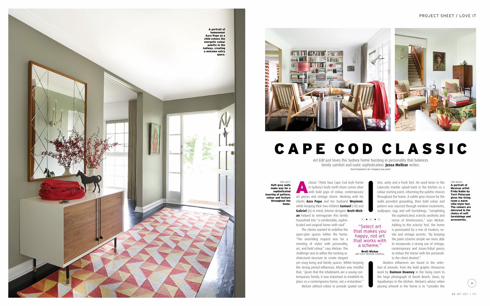
A portrait of homeowner
Azra Popo as a child echoes the energetic colour
palette in the hallway, creating a welcome entry
space.
toP left:
Soft grey walls make way for a
sophisticated layering of pattern, colour and texture
throughout the home.
toP right:
A portrait of Mexican artist Frida Kahlo by Terri Potoczan gives the living room a warm villa-style feel. The colours are mirrored in the choice of soft furnishings and accessories.
c A P e c o d c l A S S i c
“select art that makes you happy, not art
that works with a scheme.”
Brett Mickanart eDit Design CounCil

P 1 2 / A R T E D I T # 8
Love iT / projecT sheeT
entire space and the combination of colours,
texture and scale. I always regard the artwork
as an integrated part of the space it inhabits.”
He continues: “Select art that makes you happy,
not art that works with a scheme. I hang art as
part of a considered balance of colour, space and
movement; often used to define, focus or create
interest to a vignette.” In the case of the living
room, Downey’s rhinoceros is used as a focal
point in an open space, creating a fun and bubbly
atmosphere. “The placement is enhanced by the
use of applied wall moulding and scale, and a
connection to the back of the sofa, drawing you
in both visually and physically to this inviting set-
ting,” says Mickan.
A home is ultimately a place that you want
to feel welcome in, where you can just be you. “I
always believe your home should be a conversa-
tion of the inhabitants,” says Mickan. “The most
enjoyable part of working on this project was the
relationship with, what became, very trusting cli-
ents.” Through finding synergy between his clients
and their design expectations, Mickan achieved a
balance between family comfort and rustic sophis-
tication, resulting in a warm home, bursting with
personality.
toP left: Oasis by Aquabumps adds beachy charm to the modern kitchen, combined with erik Buch stools from Grate dane.toP right: A wall-papered feature wall combined with black and red bamboo chairs gives an eastern flavour to the dining room.
above left: damion downey’s rhinoceros is used as a focal point in this open space, creating a fun and bubbly atmosphere.above right: laura carey’s Cosmoo makes for a fun bedhead in the soft and subtle bedroom.