Embed Size (px)
Citation preview

BY: S AV E Y C AT H E Y
BEST EMAIL MARKETING DESIGN PRACTICES: HOW TO
STEP 1: KEEP THE DESIGN SIMPLE
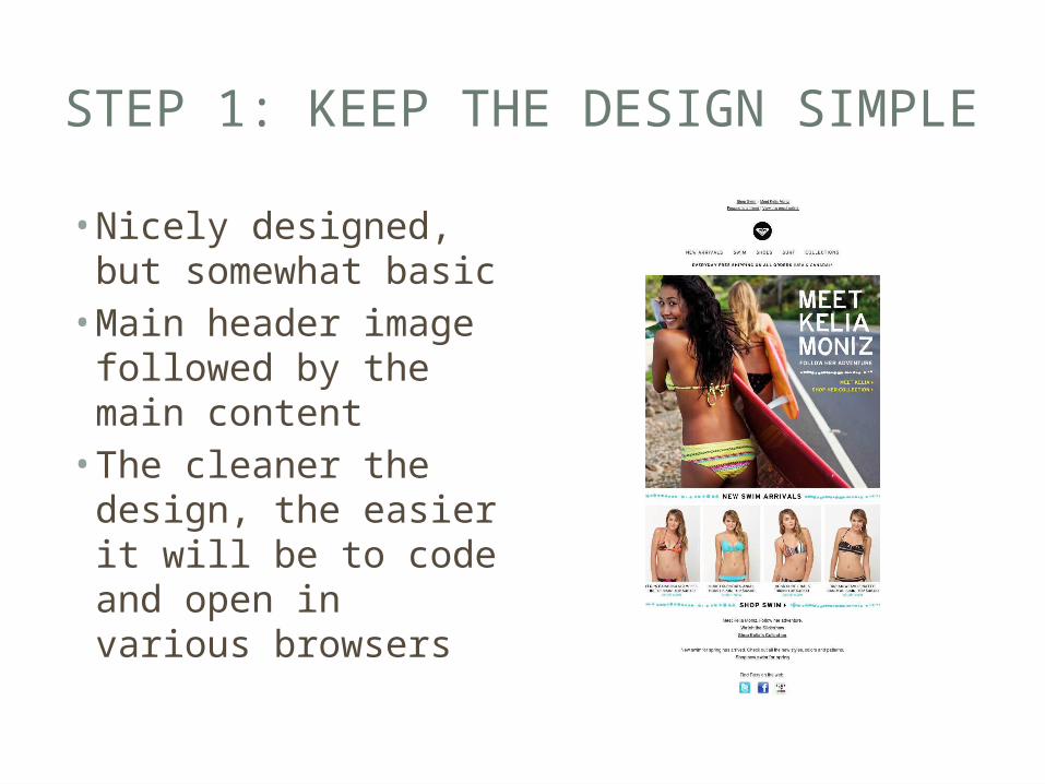
• Nicely designed, but somewhat basic• Main header image
followed by the main content• The cleaner the
design, the easier it will be to code and open in various browsers

STEP 2: AVOID BACKGROUND IMAGES
• Use block colors when you have a lot of text• Use funky gradients• Only uses images as backgrounds when no text is
involved

STEP 3: STICK TO 3 TYPEFACES OR FEWER
• Simple design, less clutter• Easy to read fonts• Don’t junk up your
email with more than 2, or at max, 3 typefaces

STEP 4: USE TABLES
• Email clients live in the past, so all emails must be built using tables for layout• In regards to
coding and CSS code

STEP 5: KEEP MAIN MESSAGE AND CALL-TO-ACTION ABOVE THE FOLD
• If your main call-to-action button falls below the fold, then as many as 70% of recipients won’t see it• Any call-to-action
button should be repeated at least 3 times throughout the email

STEP 6: PUT YOUR LOGO IN THE UPPER LEFT- HAND SIDE OF THE EMAIL
• Eye tracking studies have found that people instinctively look for logos in the upper left-hand side of emails• Put your logo in the upper left-hand side to
ensure it gets more visibility

STEP 7: MINIMIZE COPY AND TEXT
• Don’t overwhelm users with more text than they can read
• Do not include so much text that the email is at risk going to a spam folder or a junk folder
• Use shorter text blocks that link back to full articles or product pages on your website or to landing pages

STEP 8: NO WIDER THAN 600PX
• On average the smallest preview panel is around 600px• If you go wider than 650 pixels, then you’re
asking users to scroll horizontally to read your entire message

STEP 9: MINIMIZE THE USE OF IMAGES
• Always remember that in the vast majority of your subscribers email service providers inboxes images will not load• Do not rely on images alone to sell your product
or convey your message

STEP 10: GIVE ALL IMAGES ALT TAGS
• Always use alt and title text behind images to ensure that there is still a copy appearing even when your images do not load• Styling the <td> for which images are in, with
font types, size and color, will allow for your email to degrade gracefully when images are off by default

STEP 11: DO NOT SET WIDTHS OR HEIGHTS TO IMAGES
• Again, this is a further step to take in order for a lovely gracefully degraded email• If images are off by default, there dimensions will
be present, leaving a lot of unnecessary white space throughout

STEP 12: USERS WANT OPTIONS
• Consider, at the top of the email, to have a link which points to the email on a web server somewhere, so the user can view the email in all its glory

STEP 13: USE INCENTIVES TO INCREASE OPEN RATES
• When you include an incentive in your subject line, you can increase open rates by as much as 50%• “Free shipping when
you spend $25 or more”• “Receive a free iPod
with Demo”

STEP 14: CLOSELY TIE EMAILS TO LANDING PAGES
• Your landing page should match the email in terms of headline, copy, and content.• Make sure to use tracking tools to see which
emails and landing pages performed the best

STEP 15: BE CAN-SPAM COMPLIANT
• It’s the law• Make sure your physical mailing address is in the
email• Make sure users can unsubscribe from your email
with either a single click or by replying to the email• Make sure the email conveys that it is an
advertisement

STEP 16: MAKE IT EASY TO UNSUBSCRIBE
• The risk of making it difficult for users to find a way to unsubscribe from your email is that they will instead mark it as spam• Make it easy and
simple for users to find a way to unsubscribe

STEP 17: TEST IT OUT!
• Always test your email on various email platforms to ensure that it is successful


![l'vlissl'Jannic Cathey Cathey Gap F]oyd County - Intelecgen.intelec.us/coosa/nannie-cathey-diary-p1-45.pdf · D JIARY l'vlissl'Jannic Cathey Cathey Gap F]oyd County Ga,.-."'-' -](https://img.pdfslide.us/doc/110x75/5afca0b37f8b9a814d8c5ba8/lvlissljannic-cathey-cathey-gap-foyd-county-jiary-lvlissljannic-cathey-cathey.jpg)