Embed Size (px)
Citation preview
Bringing our Brand to lifegraphic Standards for third Parties YMCa of the uSa
reviSed 06.30.2010
2
the Y Bringing our Brand to lifeintroduCtion
In July 2010, YMCA of the USA (Y-USA) launched a revitalized brand platform to further understanding of the Y and our impact as a cause-driven nonprofit. Critical to the success is work with donors, partners and vendors. As an extension of the Y, they share in publicly presenting our brand. It is essential they understand our positioning and use the elements of the brand platform correctly. To consistently guide collateral development, we have created the following Graphic Standards for our partners.
3
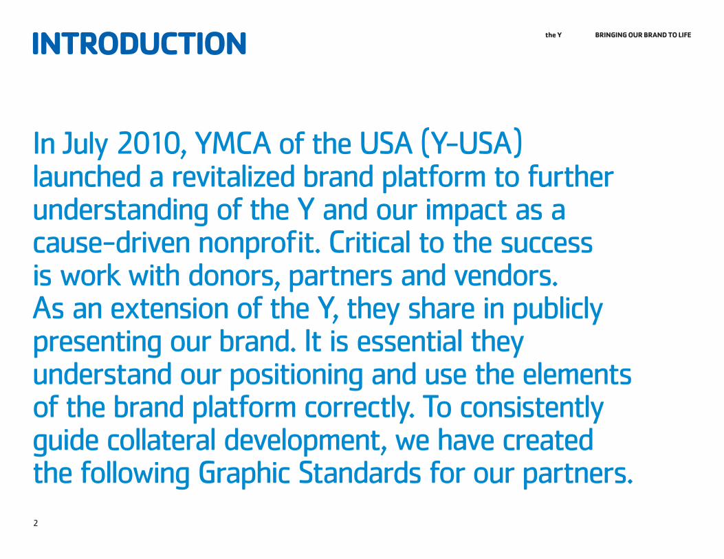
the Y Bringing our Brand to lifetaBle of ContentS04 Who We are05 InTrodUCTIon06 VoICe07 VAlUeS08 AreAS of foCUS
09 eleMentS of our identitY10 InTrodUCTIon11 BASIC eleMenTS oVerVIew12 oUr loGo13 ACCepTABle loGo VerSIonS14 UnACCepTABle USeS16 loGo ArTwork oVerVIew17 Color USAGe18 CleAr SpACe And MInIMUM SIze19 AreAS of foCUS USAGe21 IMAGerY22 fonT/TYpoGrAphY23 BenefIT STATeMenTS
These benefit statements are provided as examples only. YMCA of the USA discourages actual use of these statements due to potential existing federal Trademark protection status. Use of these Benefit Statements may subject your YMCA to legal action for Trademark infringement. YMCA of the USA is diligently working on the clearance of recommended Benefit Statements. Suggested Benefit Statements will be provided as part of the YMCA brand revitalization launch.
the Y Bringing our Brand to life
Who We are
05 InTrodUCTIon06 VoICe07 VAlUeS08 AreAS of foCUS
5
Who We are the Y Bringing our Brand to lifeintroduCtion
To harness its power as an organization, the Y must present itself as a unified cause with shared values and a common voice.
while promise and values will guide the elements of the Y brand, look, voice, architecture and areas of focus will tell the Y story in an insightful and inspiring way.
6
Who We are the Y Bringing our Brand to life
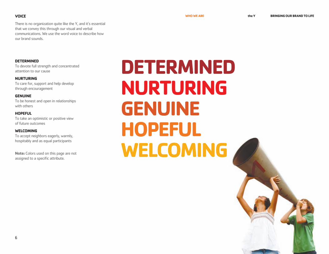
deterMined To devote full strength and concentrated attention to our cause
nurturing To care for, support and help develop through encouragement
genuine To be honest and open in relationships with others
hoPeful To take an optimistic or positive view of future outcomes
WelCoMing To accept neighbors eagerly, warmly, hospitably and as equal participants
note: Colors used on this page are not assigned to a specific attribute.
voiCe
There is no organization quite like the Y, and it’s essential that we convey this through our visual and verbal communications. we use the word voice to describe how our brand sounds.
deterMined nurturing genuine hoPeful WelCoMing
7
Who We are the Y Bringing our Brand to life
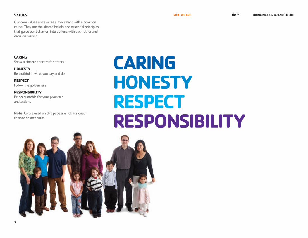
our core values unite us as a movement with a common cause. They are the shared beliefs and essential principles that guide our behavior, interactions with each other and decision making.
Caring Show a sincere concern for others
honeStY Be truthful in what you say and do
reSPeCt follow the golden rule
reSPonSiBilitY Be accountable for your promises and actions
note: Colors used on this page are not assigned to specific attributes.
valueS
Caring honeStY reSPeCt reSPonSiBilitY
8
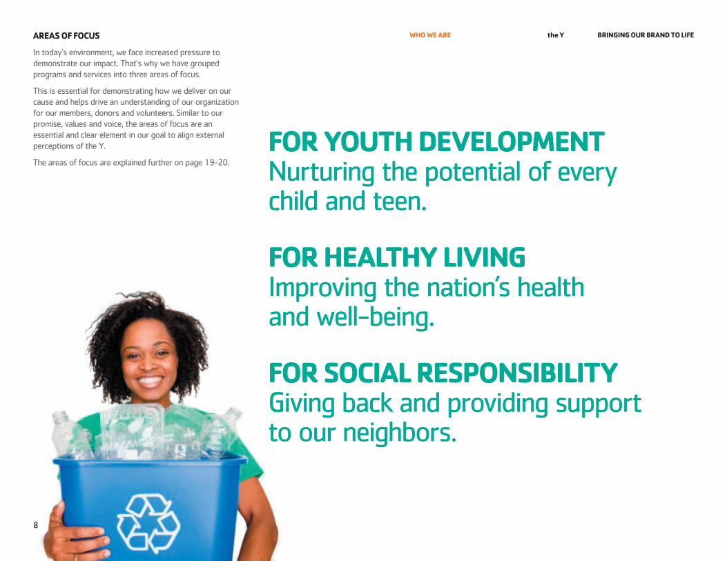
Who We are the Y Bringing our Brand to lifeareaS of foCuS
In today’s environment, we face increased pressure to demonstrate our impact. That’s why we have grouped programs and services into three areas of focus.
This is essential for demonstrating how we deliver on our cause and helps drive an understanding of our organization for our members, donors and volunteers. Similar to our promise, values and voice, the areas of focus are an essential and clear element in our goal to align external perceptions of the Y.
The areas of focus are explained further on page 19-20.
for Youth develoPMent nurturing the potential of every child and teen.
for healthY living Improving the nation’s health and well-being.
for SoCial reSPonSiBilitY Giving back and providing support to our neighbors.
the Y Bringing our Brand to life
eleMentS of our identitY
10 InTrodUCTIon11 BASIC eleMenTS oVerVIew12 oUr loGo13 ACCepTABle loGo VerSIonS14 UnACCepTABle USeS16 loGo ArTwork oVerVIew17 Color USAGe18 CleAr SpACe And MInIMUM SIze19 AreAS of foCUS USAGe21 IMAGerY22 fonT/TYpoGrAphY23 BenefIT STATeMenTS
10
eleMentS of our identitY the Y Bringing our Brand to lifeintroduCtion
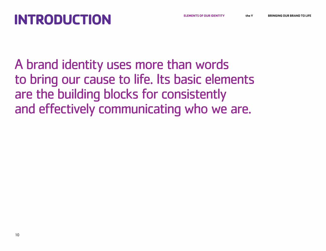
A brand identity uses more than words to bring our cause to life. Its basic elements are the building blocks for consistently and effectively communicating who we are.
11
eleMentS of our identitY the Y Bringing our Brand to life
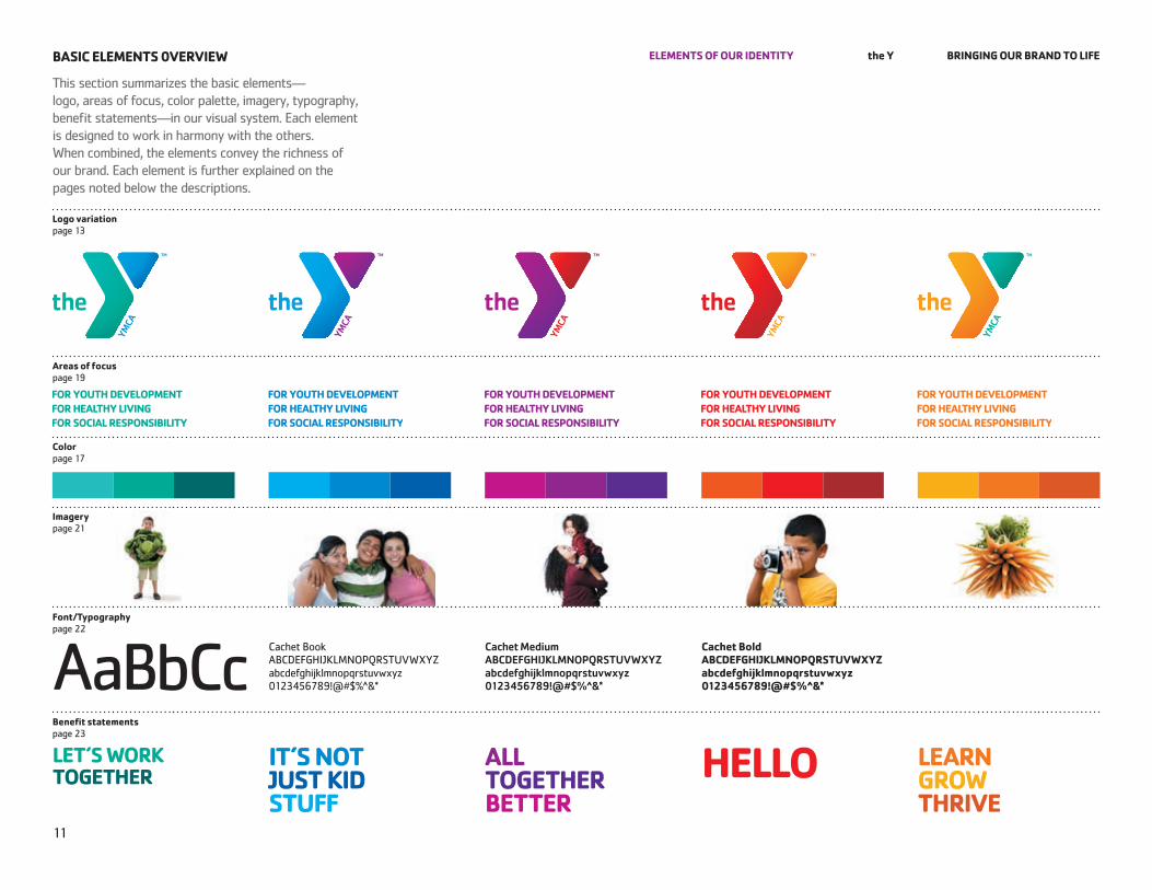
This section summarizes the basic elements— logo, areas of focus, color palette, imagery, typography, benefit statements—in our visual system. each element is designed to work in harmony with the others. when combined, the elements convey the richness of our brand. each element is further explained on the pages noted below the descriptions.
BaSiC eleMentS 0vervieW
logo variation page 13
areas of focus page 19
Color page 17
imagery page 21
font/typography page 22
AaBbCcCachet Book ABCdefGhIJklMnopQrSTUVwXYz abcdefghijklmnopqrstuvwxyz 0123456789!@#$%^&*
Cachet Medium ABCDEFGHIJKLMNOPQRSTUVWXYZ abcdefghijklmnopqrstuvwxyz 0123456789!@#$%^&*
Cachet Bold aBCdefghiJKlMnoPQrStuvWXYZ abcdefghijklmnopqrstuvwxyz 0123456789!@#$%^&*
Benefit statements page 23
let’S WorK together
it’S not JuSt Kid Stuff
all together Better
hello learn groW thrive
12
eleMentS of our identitY the Y Bringing our Brand to life
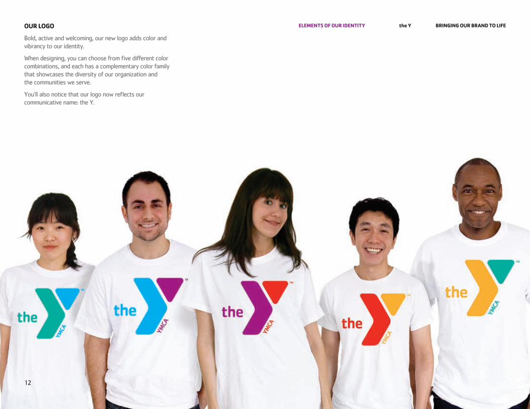
Bold, active and welcoming, our new logo adds color and vibrancy to our identity.
when designing, you can choose from five different color combinations, and each has a complementary color family that showcases the diversity of our organization and the communities we serve.
You’ll also notice that our logo now reflects our communicative name: the Y.
our logo
13
eleMentS of our identitY the Y Bringing our Brand to life
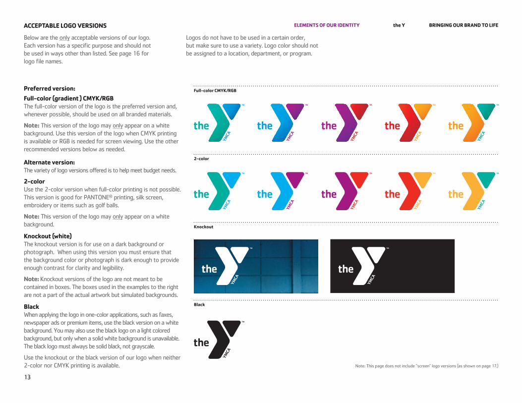
Below are the only acceptable versions of our logo. each version has a specific purpose and should not be used in ways other than listed. See page 16 for logo file names.
logos do not have to be used in a certain order, but make sure to use a variety. logo color should not be assigned to a location, department, or program.
aCCePtaBle logo verSionS
Preferred version:full-color (gradient ) CMYK/rgB The full-color version of the logo is the preferred version and, whenever possible, should be used on all branded materials.
note: This version of the logo may only appear on a white background. Use this version of the logo when CMYk printing is available or rGB is needed for screen viewing. Use the other recommended versions below as needed.
alternate version: The variety of logo versions offered is to help meet budget needs.
2-color Use the 2-color version when full-color printing is not possible. This version is good for pAnTone® printing, silk screen, embroidery or items such as golf balls.
note: This version of the logo may only appear on a white background.
Knockout (white) The knockout version is for use on a dark background or photograph. when using this version you must ensure that the background color or photograph is dark enough to provide enough contrast for clarity and legibility.
note: knockout versions of the logo are not meant to be contained in boxes. The boxes used in the examples to the right are not a part of the actual artwork but simulated backgrounds.
Black when applying the logo in one-color applications, such as faxes, newspaper ads or premium items, use the black version on a white background. You may also use the black logo on a light colored background, but only when a solid white background is unavailable. The black logo must always be solid black, not grayscale.
Use the knockout or the black version of our logo when neither 2-color nor CMYk printing is available. note: This page does not include “screen” logo versions (as shown on page 17.)
full-color CMYK/rgB
2-color
Knockout
Black
YMCA
outh
of A
nyto
wn
the
YMCA
14
eleMentS of our identitY the Y Bringing our Brand to lifeunaCCePtaBle uSeS
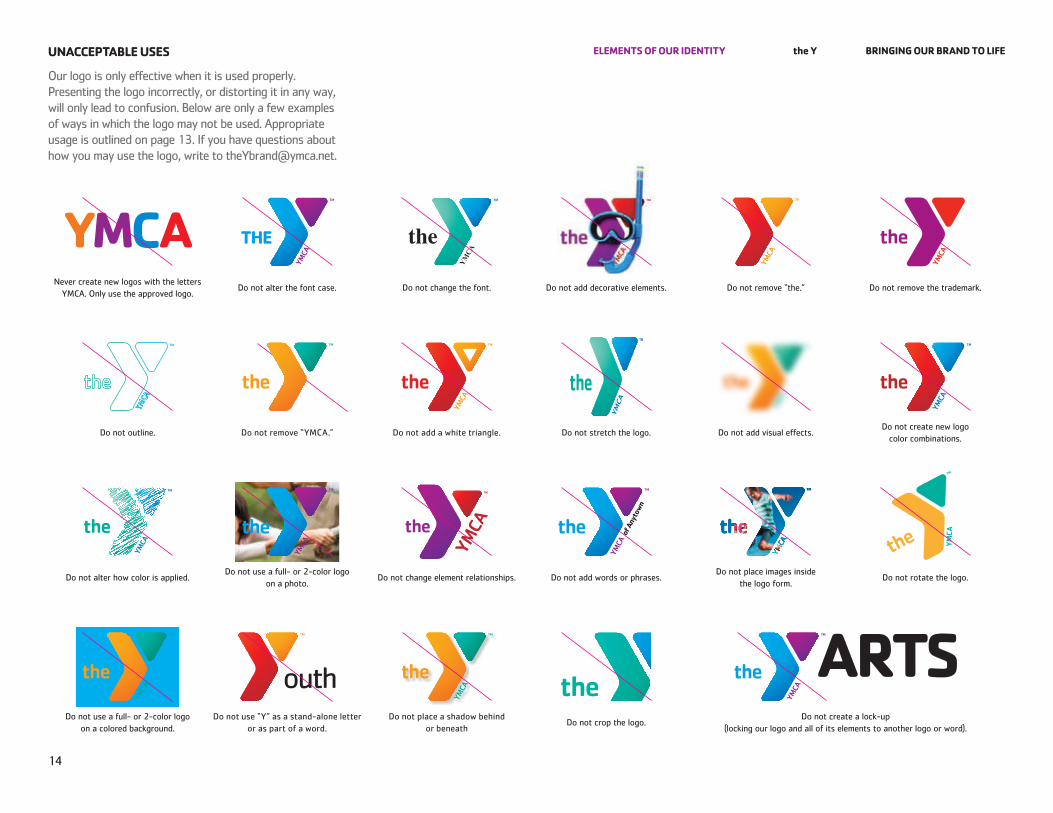
our logo is only effective when it is used properly. presenting the logo incorrectly, or distorting it in any way, will only lead to confusion. Below are only a few examples of ways in which the logo may not be used. Appropriate usage is outlined on page 13. If you have questions about how you may use the logo, write to [email protected].
never create new logos with the letters YMCA. only use the approved logo.
do not alter the font case. do not change the font. do not add decorative elements. do not remove “the.” do not remove the trademark.
do not outline. do not remove “YMCA.” do not add a white triangle. do not stretch the logo. do not add visual effects.do not create new logo
color combinations.
do not alter how color is applied.do not use a full- or 2-color logo
on a photo.do not change element relationships. do not add words or phrases.
do not place images inside the logo form.
do not rotate the logo.
do not use a full- or 2-color logo on a colored background.
do not use “Y” as a stand-alone letter or as part of a word.
do not place a shadow behind or beneath
do not crop the logo.do not create a lock-up
(locking our logo and all of its elements to another logo or word).
YMCA of ANYTOWNServing Community Need.
We build strong kids,strong families,strong communities.
15
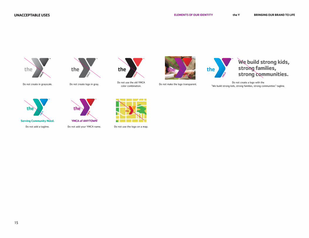
eleMentS of our identitY the Y Bringing our Brand to lifeunaCCePtaBle uSeS
do not create in grayscale. do not create logo in gray.do not use the old YMCA
color combination.do not make the logo transparent.
do not create a logo with the “we build strong kids, strong families, strong communities” tagline.
do not add a tagline. do not add your YMCA name. do not use the logo on a map.
16
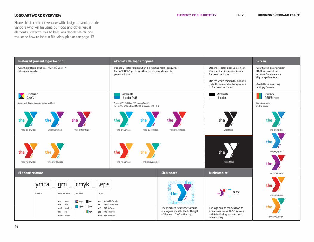
eleMentS of our identitY the Y Bringing our Brand to lifelogo artWorK overvieW
Share this technical overview with designers and outside vendors who will be using our logo and other visual elements. refer to this to help you decide which logo to use or how to label a file. Also, please see page 13.
Preferred gradient logos for print alternate flat logos for print Screen
Use the preferred full-color (CMYk) version whenever possible.
Use the 2-color version when a simplified mark is required for pAnTone® printing, silk screen, embroidery, or for premium items.
Use the 1-color black version for black-and-white applications or for premium items.
Use the white version for printing on bold, single-color backgrounds or for premium items.
Use the full-color gradient (rGB) version of the artwork for screen and digital applications.
Available in .eps, .png, and .jpg formats.
preferred CMYk
Alternate 2-color pMS
Alternate 1-color
primary rGB/Screen
Composed of Cyan, Magenta, Yellow, and Black Green: pMS 3268 Blue: pMS process Cyan C, purple: pMS 2415 C, red: pMS 485 C, orange: pMS 137 C
do not reproduce in other colors.
file nomenclature Clear space Minimum size
The minimum clear space around our logo is equal to the full height of the word “the” in the logo.
The logo can be scaled down to a minimum size of 0.25”. Always maintain the logo’s aspect ratio when scaling.
0.25"
ymca_grn_cmyk.eps ymca_blu_cmyk.eps ymca_prpl_cmyk.eps
ymca_red_cmyk.eps ymca_orng_cmyk.eps
ymca_grn_2pms.eps ymca_blu_2pms.eps ymca_prpl_2pms.eps ymca_blk.eps ymca_grn_rgb.eps
ymca_blu_rgb.eps
ymca_prpl_rgb.eps
ymca_red_rgb.eps
ymca_orng_rgb.eps
ymca_wht.epsymca_red_2pms.eps ymca_orng_2pms.eps
ymca cmyk .epsgrn— — —
Identifier Color Variation
.eps vector file for print
.tif raster file for print
.gif rGB for web
.jpg rGB for screen
.png rGB for screen
grn green
blu blue
prpl purple
red red
orng orange
formatColor Mode
2pms
cmyk blk
wht
rgb
17
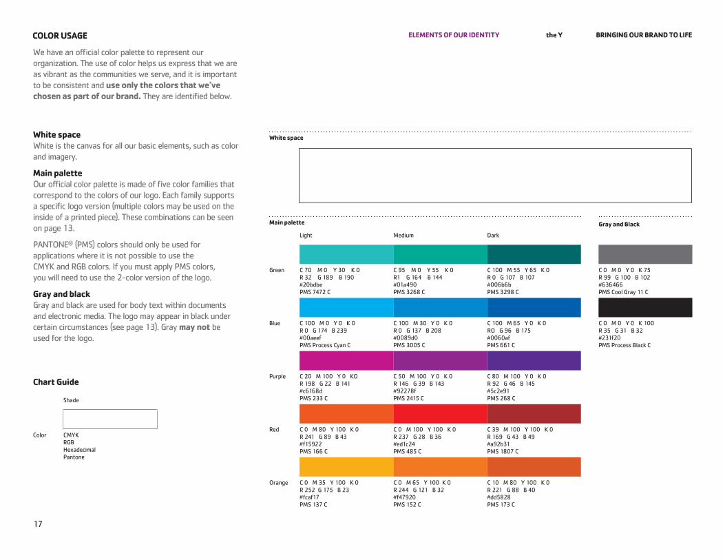
eleMentS of our identitY the Y Bringing our Brand to lifeColor uSage
we have an official color palette to represent our organization. The use of color helps us express that we are as vibrant as the communities we serve, and it is important to be consistent and use only the colors that we’ve chosen as part of our brand. They are identified below.
White space white is the canvas for all our basic elements, such as color and imagery.
Main palette our official color palette is made of five color families that correspond to the colors of our logo. each family supports a specific logo version (multiple colors may be used on the inside of a printed piece). These combinations can be seen on page 13.
pAnTone® (pMS) colors should only be used for applications where it is not possible to use the CMYk and rGB colors. If you must apply pMS colors, you will need to use the 2-color version of the logo.
gray and black Gray and black are used for body text within documents and electronic media. The logo may appear in black under certain circumstances (see page 13). Gray may not be used for the logo.
White space
Main palette gray and Black
light Medium dark
Green C 70 M 0 Y 30 k 0 r 32 G 189 B 190 #20bdbe pMS 7472 C
C 95 M 0 Y 55 k 0 r1 G 164 B 144 #01a490 pMS 3268 C
C 100 M 55 Y 65 k 0 r 0 G 107 B 107 #006b6b pMS 3298 C
C 0 M 0 Y 0 k 75 r 99 G 100 B 102 #636466 pMS Cool Gray 11 C
Blue C 100 M 0 Y 0 k 0 r 0 G 174 B 239 #00aeef pMS process Cyan C
C 100 M 30 Y 0 k 0 r 0 G 137 B 208 #0089d0 pMS 3005 C
C 100 M 65 Y 0 k 0 ro G 96 B 175 #0060af pMS 661 C
C 0 M 0 Y 0 k 100 r 35 G 31 B 32 #231f20 pMS process Black C
purple C 20 M 100 Y 0 ko r 198 G 22 B 141 #c6168d pMS 233 C
C 50 M 100 Y 0 k 0 r 146 G 39 B 143 #92278f pMS 2415 C
C 80 M 100 Y 0 k 0 r 92 G 46 B 145 #5c2e91 pMS 268 C
red C 0 M 80 Y 100 k 0 r 241 G 89 B 43 #f15922 pMS 166 C
C 0 M 100 Y 100 k 0 r 237 G 28 B 36 #ed1c24 pMS 485 C
C 39 M 100 Y 100 k 0 r 169 G 43 B 49 #a92b31 pMS 1807 C
orange C 0 M 35 Y 100 k 0 r 252 G 175 B 23 #fcaf17 pMS 137 C
C 0 M 65 Y 100 k 0 r 244 G 121 B 32 #f47920 pMS 152 C
C 10 M 80 Y 100 k 0 r 221 G 88 B 40 #dd5828 pMS 173 C
Chart guide
Shade
Color CMYk rGB hexadecimal pantone
= Clear space
0.25"
Blue border is not for design replication.
18
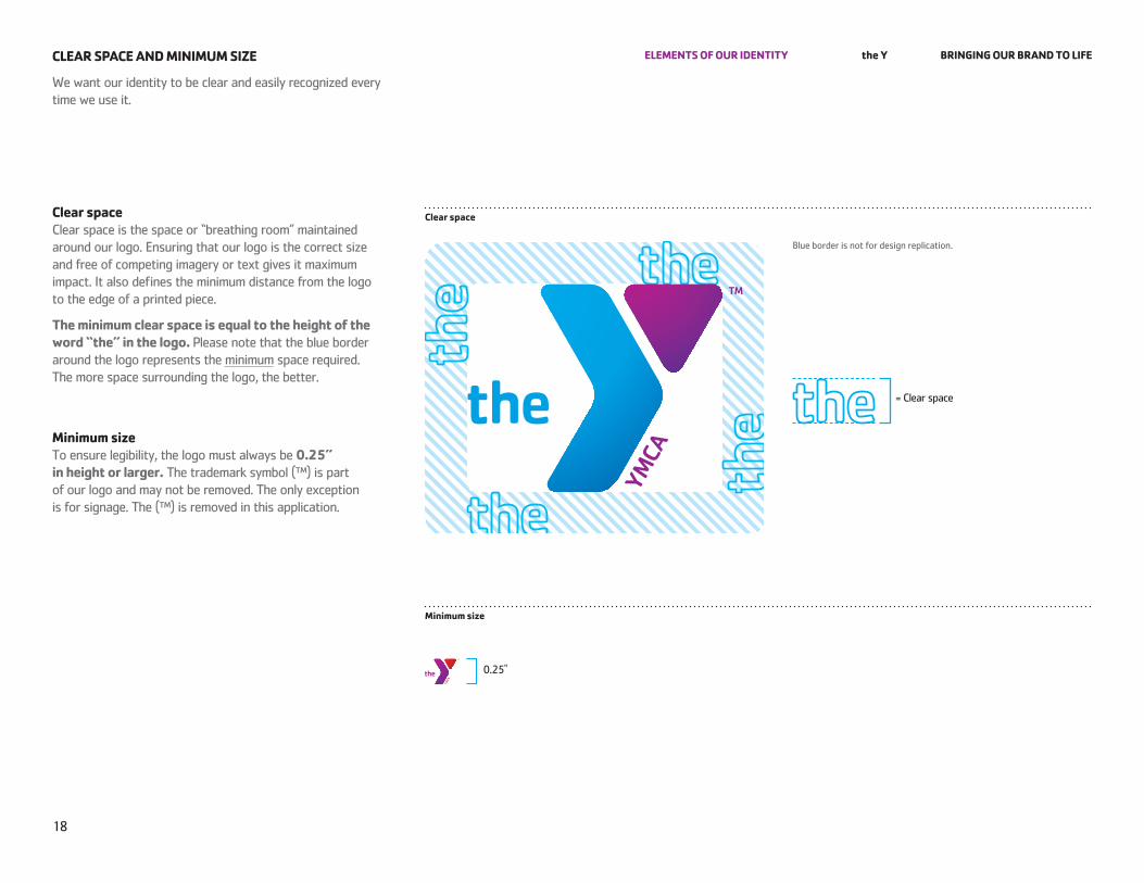
eleMentS of our identitY the Y Bringing our Brand to lifeClear SPaCe and MiniMuM SiZe
we want our identity to be clear and easily recognized every time we use it.
Clear space Clear space is the space or “breathing room” maintained around our logo. ensuring that our logo is the correct size and free of competing imagery or text gives it maximum impact. It also defines the minimum distance from the logo to the edge of a printed piece.
the minimum clear space is equal to the height of the word “the” in the logo. please note that the blue border around the logo represents the minimum space required. The more space surrounding the logo, the better.
Minimum size To ensure legibility, the logo must always be 0.25” in height or larger. The trademark symbol (™) is part of our logo and may not be removed. The only exception is for signage. The (™) is removed in this application.
Clear space
Minimum size
Maintain the minimum required clear space. See page 19.
Maintain the minimum required clear space. See page 19.
for Youth develoPMent for healthY living for SoCial reSPonSiBilitY
for Youth develoPMent for healthY living for SoCial reSPonSiBilitY
19
eleMentS of our identitY the Y Bringing our Brand to life
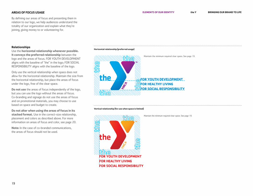
By defining our areas of focus and presenting them in relation to our logo, we help audiences understand the totality of our organization and explain what they’re joining, giving money to or volunteering for.
areaS of foCuS uSage
relationships Use the horizontal relationship whenever possible. it conveys the preferred relationship between the logo and the areas of focus. for YoUTh deVelopMenT aligns with the baseline of “the” in the logo; for SoCIAl reSponSIBIlITY aligns with the baseline of the logo.
only use the vertical relationship when space does not allow for the horizontal relationship. Maintain the size from the horizontal relationship, but place the areas of focus under the logo, free of the clear space.
do not use the areas of focus independently of the logo, but you can use the logo without the areas of focus. Co-branding and signage do not use the areas of focus and on promotional materials, you may choose to use based on space and budget to create.
do not alter when using the areas of focus in its stacked format. Use in the correct-size relationship, placement and colors as described above. for more information on areas of focus and color, see page 20.
note: In the case of co-branded communications, the areas of focus should not be used.
vertical relationship (for use when space is limited)
horizontal relationship (preferred usage)
for this logo, areas of focus must be in Medium green
for this logo, areas of focus must be in Medium purple
for this logo, areas of focus must be in Medium blue
for this logo, areas of focus must be in Medium red
for this logo, areas of focus must be in Medium orange
20
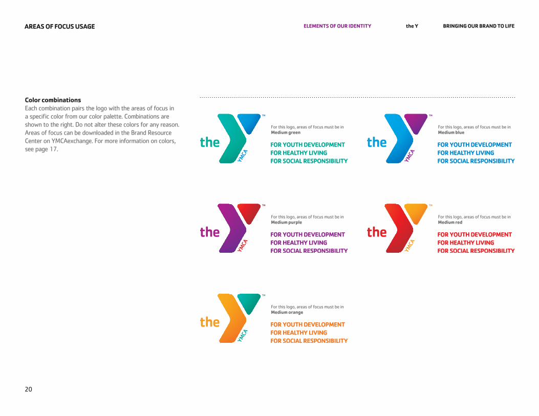
eleMentS of our identitY the Y Bringing our Brand to lifeareaS of foCuS uSage
Color combinations each combination pairs the logo with the areas of focus in a specific color from our color palette. Combinations are shown to the right. do not alter these colors for any reason. Areas of focus can be downloaded in the Brand resource Center on YMCAexchange. for more information on colors, see page 17.
Silhouette
image with a background
illustration
21
eleMentS of our identitY the Y Bringing our Brand to lifeiMagerY
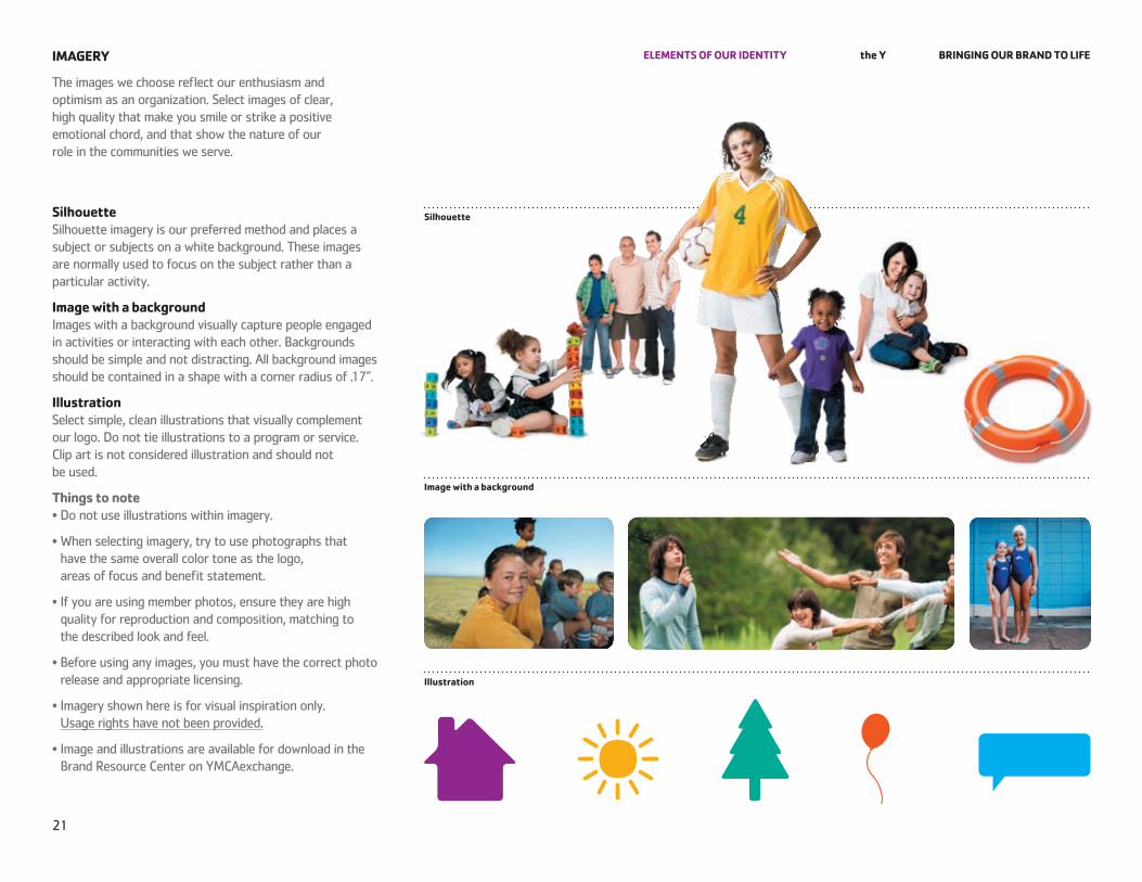
The images we choose reflect our enthusiasm and optimism as an organization. Select images of clear, high quality that make you smile or strike a positive emotional chord, and that show the nature of our role in the communities we serve.
Silhouette Silhouette imagery is our preferred method and places a subject or subjects on a white background. These images are normally used to focus on the subject rather than a particular activity.
image with a background Images with a background visually capture people engaged in activities or interacting with each other. Backgrounds should be simple and not distracting. All background images should be contained in a shape with a corner radius of .17”.
illustration Select simple, clean illustrations that visually complement our logo. do not tie illustrations to a program or service. Clip art is not considered illustration and should not be used.
things to note• Do not use illustrations within imagery.
• When selecting imagery, try to use photographs that have the same overall color tone as the logo, areas of focus and benefit statement.
• If you are using member photos, ensure they are high quality for reproduction and composition, matching to the described look and feel.
• Before using any images, you must have the correct photo release and appropriate licensing.
• Imagery shown here is for visual inspiration only. Usage rights have not been provided.
• Image and illustrations are available for download in the Brand resource Center on YMCAexchange.
22
eleMentS of our identitY the Y Bringing our Brand to lifefont/tYPograPhY
The welcoming and caring feel of our organization is also found in the “form” of our words. Typography is the element that gives our words a distinctive look and feel even before someone reads the text. handle typography sensitively, using a keen eye to keep the overall layout organized yet dynamic.
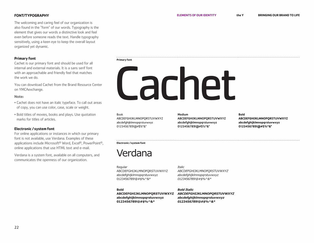
Primary font Cachet is our primary font and should be used for all internal and external materials. It is a sans serif font with an approachable and friendly feel that matches the work we do.
You can download Cachet from the Brand resource Center on YMCAexchange.
note:• Cachet does not have an italic typeface. To call out areas of copy, you can use color, case, scale or weight.
• Bold titles of movies, books and plays. Use quotation marks for titles of articles.
electronic / system font for online applications or instances in which our primary font is not available, use Verdana. examples of these applications include Microsoft® word, excel®, powerpoint®, online applications that use hTMl text and e-mail.
Verdana is a system font, available on all computers, and communicates the openness of our organization.
Primary font
CachetBook ABCdefGhIJklMnopQrSTUVwXYz abcdefghijklmnopqrstuvwxyz 0123456789!@#$%^&*
Medium ABCDEFGHIJKLMNOPQRSTUVWXYZ abcdefghijklmnopqrstuvwxyz 0123456789!@#$%^&*
Bold aBCdefghiJKlMnoPQrStuvWXYZ abcdefghijklmnopqrstuvwxyz 0123456789!@#$%^&*
electronic / system font
VerdanaRegular ABCDEFGHIJKLMNOPQRSTUVWXYZ abcdefghijklmnopqrstuvwxyz 0123456789!@#$%^&*
Italic ABCDEFGHIJKLMNOPQRSTUVWXYZ abcdefghijklmnopqrstuvwxyz 0123456789!@#$%^&*
Bold ABCDEFGHIJKLMNOPQRSTUVWXYZ abcdefghijklmnopqrstuvwxyz 0123456789!@#$%^&*
Bold Italic ABCDEFGHIJKLMNOPQRSTUVWXYZ abcdefghijklmnopqrstuvwxyz 0123456789!@#$%^&*
23
eleMentS of our identitY the Y Bringing our Brand to lifeBenefit StateMentS
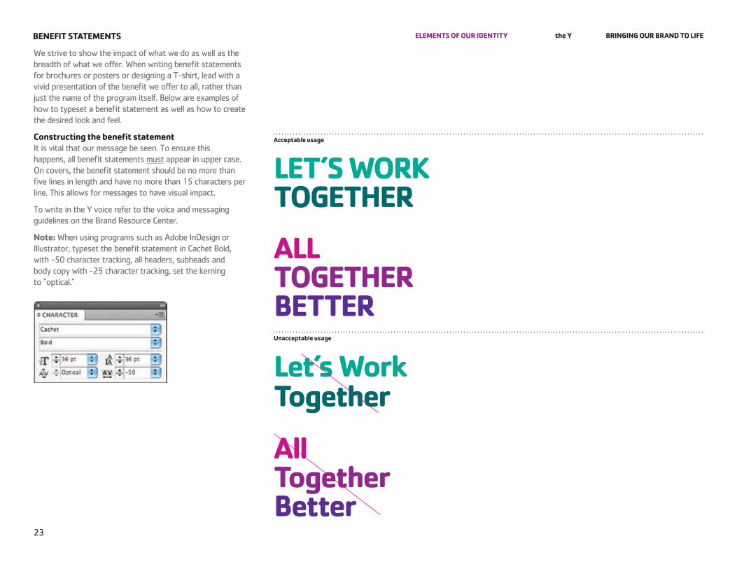
we strive to show the impact of what we do as well as the breadth of what we offer. when writing benefit statements for brochures or posters or designing a T-shirt, lead with a vivid presentation of the benefit we offer to all, rather than just the name of the program itself. Below are examples of how to typeset a benefit statement as well as how to create the desired look and feel.
Constructing the benefit statement It is vital that our message be seen. To ensure this happens, all benefit statements must appear in upper case. on covers, the benefit statement should be no more than five lines in length and have no more than 15 characters per line. This allows for messages to have visual impact.
To write in the Y voice refer to the voice and messaging guidelines on the Brand resource Center.
note: when using programs such as Adobe Indesign or Illustrator, typeset the benefit statement in Cachet Bold, with -50 character tracking, all headers, subheads and body copy with -25 character tracking, set the kerning to “optical.”
acceptable usage
let’S WorK together
all together Betterunacceptable usage
let’s Work together
all together Better
line 1 Use the primary colors of the logo in any order
line 2line 3
line 4 Use the accent colors of the logo in any orderline 5
deSCriPtor lineS
All descriptor lines use one of the accent colors from the logo
Accent colors
primary colors
line 1
Use the accent color of the logo
line 2line 3line 4line 5
deSCriPtor lineS
All descriptor lines use the primary color from the logo
Accent colors
primary colors
24
eleMentS of our identitY the Y Bringing our Brand to lifeBenefit StateMentS
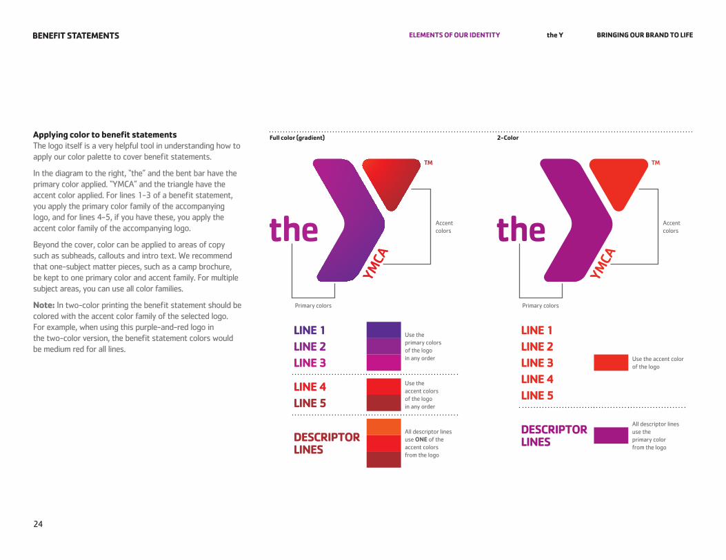
applying color to benefit statements The logo itself is a very helpful tool in understanding how to apply our color palette to cover benefit statements.
In the diagram to the right, “the” and the bent bar have the primary color applied. “YMCA” and the triangle have the accent color applied. for lines 1-3 of a benefit statement, you apply the primary color family of the accompanying logo, and for lines 4-5, if you have these, you apply the accent color family of the accompanying logo.
Beyond the cover, color can be applied to areas of copy such as subheads, callouts and intro text. we recommend that one-subject matter pieces, such as a camp brochure, be kept to one primary color and accent family. for multiple subject areas, you can use all color families.
note: In two-color printing the benefit statement should be colored with the accent color family of the selected logo. for example, when using this purple-and-red logo in the two-color version, the benefit statement colors would be medium red for all lines.
full color (gradient) 2-Color
25
the Y Bringing our Brand to life
All artwork and imagery used in these guidelines are for visual reference only and should not be extracted from this pdf file.
for questions regarding these guidelines, please contact the Y Brand.
ContaCt inforMation
111071 06/10