Embed Size (px)
Citation preview

Bringing AI to BI: Enabling Visual Analytics of Unstructured Data in a Modern Business Intelligence Platform
Abstract
The Business Intelligence (BI) paradigm is challenged
by emerging use cases such as news and social media
analytics in which the source data are unstructured, the
analysis metrics are unspecified, and the appropriate
visual representations are unsupported by mainstream
tools. This case study documents the work undertaken
in Microsoft Research to enable these use cases in the
Microsoft Power BI product. Our approach comprises:
(a) back-end pipelines that use AI to infer navigable
data structures from streams of unstructured text,
media and metadata; and (b) front-end representations
of these structures grounded in the Visual Analytics
literature. Through our creation of multiple end-to-end
data applications, we learned that representing the
varying quality of inferred data structures was crucial
for making the use and limitations of AI transparent to
users. We conclude with reflections on BI in the age of
AI, big data, and democratized access to data analytics.
Author Keywords
Business Intelligence; Visual Analytics; Data; AI; HCI
ACM Classification Keywords
H.5.2. Information interfaces and presentation (e.g.,
HCI): User Interfaces
Permission to make digital or hard copies of all or part of this work for
personal or classroom use is granted without fee provided that copies are
not made or distributed for profit or commercial advantage and that
copies bear this notice and the full citation on the first page. Copyrights
for components of this work owned by others than the author(s) must be
honored. Abstracting with credit is permitted. To copy otherwise, or
republish, to post on servers or to redistribute to lists, requires prior
specific permission and/or a fee. Request permissions from
CHI'18 Extended Abstracts, April 21–26, 2018, Montreal, QC, Canada
© 2018 Copyright is held by the owner/author(s). Publication rights
licensed to ACM.
ACM 978-1-4503-5621-3/18/04…$15.00
https://doi.org/10.1145/3170427.3174367
Figure 1: Overview page from
“Advanced Search with Bing
News” solution template for
Power BI. Shows interactive
summaries of Bing News results
for search terms of interest.
Back-end pipeline uses AI
services to structure articles
based on shared key phrases,
named entities, topics, and
sentiment levels. Front-end
“dashboards” combine visual
representations for exploring
inferred structures. One of four
applications for unstructured data
analysis in this case study.
Darren Edge
Microsoft Research
Cambridge, UK
Jonathan Larson
Microsoft Research
Silverdale, WA, USA
Christopher White
Microsoft Research
Redmond, WA, USA

Introduction
This paper documents work undertaken in Microsoft
Research to extend the Microsoft Power BI product with
support for analysis of unstructured data such as social
media, news, and cyber intelligence. The starting point
for this project was the observation that unstructured
data streams are of growing importance to general
business audiences, yet modern BI platforms require
structured data tables prepared and visualized using
specialized data science skills. We identified two related
opportunities that could help bridge this gap: inferring
information structures from unstructured data using “AI
services” that commoditize the results of machine
learning, and supporting the visualization of text and
metadata by creating representations grounded in the
Visual Analytics literature. From Gartner’s industry
advisory perspective [3], the resulting work has had
significant impact on Microsoft’s 2017 position as a
market leader in BI and Analytics, notably in terms of
“completeness of vision”. In this case study, we report
on both the artifacts produced through our research
(Figures 1–4) and the lessons learned from their
deployment, release, and user adoption and feedback.
Background
Evolution of Business Intelligence
Business Intelligence platforms evolved from the need
to make sense of largely numeric business data in the
structured tables of spreadsheets and databases.
Historically, it has been unwieldly to work with such
tables because of their large size and high
dimensionality. However, the invention of the pivot
table (pioneered in Lotus Improv in 1991 and
popularized by Microsoft Excel since 1994) gave users
the ability to explore tabular summaries of such tables
by interactively pivoting between different numeric
aggregations (e.g., sum, average) for targeted subsets
of rows and columns. In 2000, Polaris [15] extended
pivot tables to enable graphical summaries of large
multidimensional databases, in what laid the
foundations of the Tableau software product. Microsoft
later extended Excel with similar capabilities, leading to
the release of Microsoft Power BI as an independent
product in 2015. Use of BI platforms is now
mainstream in the business world, and adoption is
growing in the public spheres of science, engineering,
education, and government.
Challenges of unstructured text and metadata
BI platforms present data as “dashboards” of multiple
linked visualizations that both summarize and enable
interactive filtering of a common dataset. However,
much of the data relevant to modern organizations is
not in the form of structured numerical tables – it is in
the form of unstructured text and metadata, spread
across documents, social media, and the web (sidebar).
While the scale of such data makes it a candidate for
dashboard analytics, as of early 2016, no major BI
platform supported such unstructured data use cases.
Opportunities to extend Power BI for new use cases
Microsoft Power BI offered two extensibility frameworks
that could be adopted to extend the functionality of the
platform: “visuals” that can be used alongside native
visual representations such as bar, line, and pie charts,
and “solution templates” that automate data access,
processing, and representation in turnkey data
applications running in the Microsoft Azure cloud. Azure
also offers AI as a service through Microsoft Cognitive
Services and Azure Machine Learning, providing key
capabilities for the structuring of unstructured data.
Text and metadata
Text is a primary source of
unstructured data, such as
from the following sources:
1. Social media messages
2. Message board posts
3. Email message bodies
4. Online news articles
5. Enterprise documents
Text is often accompanied by
additional metadata that can
provide an initial means of
grouping associated texts.
Typical metadata include:
1. Title and length
2. Authors and recipients
3. Keywords and hashtags
4. Timestamps and geotags
5. Views, shares, “likes”, etc.
Metadata can be intrinsic or
extrinsic to the text, and
either given or derived (e.g.,
using AI services):
Metadata intrinsic extrinsic
given title url
derived sentiment impact
Textual metadata can also be
derived from unstructured
images, e.g., using OCR,
object recognition, and scene
classification and description.

Phase 1: Representations of text & metadata
In the world of numeric data, aggregation functions like
sum, average, and count scale to data of arbitrary size.
Similarly, visual representations of such aggregate
values (e.g., bar, line, and pie charts) have the same
visual complexity whatever the aggregate values. The
consequence is that all data subsets are self-similar
from a comprehension perspective, and that the
purpose of interactive “drill down” is to specify data
subsets whose aggregations provide direct answers to
the user’s analytic questions, such as “How many
<product> did we sell in <location> in <period>?”. In
comparison, although text attributes like word count
can be aggregated numerically, attributes of text are no
substitute for the text itself. The only complete
aggregation of text data is as a collection of “texts”
whose comprehension cost scales linearly with the
volume of text to be read. Analysis metrics are also
often unspecified or open-ended, such as “What has
happened recently of relevance to the company?” As a
result, interfaces for text analytics perform two key
functions: summarization of text collections through
metadata attributes and relationships, and enumeration
of the texts indexed by these summaries for further
interpretation and exploration. While summaries reveal
insights directly, juxtaposition with enumerated texts
leads indirectly to potential insights, i.e., by guiding
users to filter text collections down to meaningful
subsets that are of manageable size for per-text
review. These observations provided grounding
principles for design: visual representations should
collectively provide complementary views of both
summaries and content, and individually embody visual
notations that are agnostic of both the data domain and
the size of the data subset to be rendered.
We drew inspiration from the inherent scalability of
fundamental mathematical representations including
lists, sets, and graphs, as well as their prior use in
Visual Analytics research, notably Jigsaw (VAST 2007
[13]). Jigsaw is a classic Visual Analytics system for
exploring and understanding document collections. Its
List View for ranking entities by attributes, Calendar
View of activity over time, Graph View of entity co-
occurrence relationships, Document Cluster View for
document partitioning, and Document View for reading
text with entity mark-up all have correlates in our
Power BI visuals, which generalize and extend these
representations. Our Table Sorter visual is also a Power
BI productization of LineUp (InfoVis 2012 [4]). Figure 2
and Table 1 show selected visual representations we
have created and released for Microsoft Power BI.
Figure 2: Power BI visuals

Our Power BI visuals are available as open-source
software on Github1 and as free-to-use downloads
within Power BI or via the Office Store2. The
“metadata” visuals of Attribute Slicer, Time Brush,
Network Navigator, and Table Sorter were released in
May 2016 [6], followed by the “document” visuals of
Cluster Map, Facet Key, and Strippet Browser in July
2016 [7]. Installing users are typically BI specialists
who compose visuals and datasets into reports that are
then shared within an organization for interactive data
exploration by non-specialists. Since each visual is
typically incorporated into multiple reports, with each
report accessed by multiple users across multiple
sessions, it is crucial for visuals to be fast, reliable, and
usable by a general audience. It is also important for
visuals to be useful across domains: emails to our
support alias reveal a core user base in the functional
business areas of sales, operations, and IT, but also
use in a wide range of specialized domains including
logistics, insurance, defense, security, energy,
infrastructure, aid, and healthcare.
Releasing our representations of text and metadata as
visuals enables visual analytics of unstructured data in
Power BI, provided users can:
1. access the data of interest for analysis;
2. process data into the tables required by the visuals;
3. bind the appropriate table columns to visual fields;
4. compose visuals into appropriate dashboard
combinations and filtering relationships for the
analytic questions.
Adoption of our visuals indicates users have
successfully completed all four steps independently.
1 Github visuals: https://github.com/Microsoft
However, each step also poses an obstacle to users
who are not both domain experts and data specialists
(e.g., data scientists, architects, or engineers):
1. domain data of interest often require access through
database scripting or programmatic APIs;
2. extracting meaningful structure from text requires
programmatic analysis (e.g., using AI service APIs);
3. data processing must anticipate the required visuals
so the appropriate columns are available for binding;
4. visual composition must anticipate the right domain
questions and the best interfaces for answering them.
The second phase of our work aimed to democratize
access to data analytics – enabling a large base of
users at low cost and without specialized training. We
sought not just to streamline the above process for
existing users of Power BI, but to reach new audiences
through the turnkey generation of “data applications”
bound to specific data sources and search queries.
Phase 2: Data applications powered by AI
The modular and composable nature of visuals and AI
services (sidebar) allowed rapid construction of end-to-
end data applications in partnership with customers and
business groups across Microsoft, supporting their need
to make sense of unstructured data in diverse areas
including news, social media, and cyber intelligence. In
line with our goal of democratizing data analytics, we
have released several data applications as “solution
template” products for Power BI. We now present three
of these products, plus an internal data application that
supports the work of the Microsoft Digital Crimes Unit.
2 Office Store visuals: https://appsource.microsoft.com/en-us/marketplace/apps?product=power-bi-visuals
AI services
There is a trend across large
software companies to
commoditize the results of
machine learning as “AI
services” accessible via APIs,
such as Amazon AWS AI
Services and IBM Watson
Cognitive Capabilities. Our
back-end data pipelines use
both Microsoft Cognitive
Services and Azure Machine
Learning modules, including:
Sentiment Scoring
Scores text on a continuous
scale from most positive
sentiment to most negative.
Key Phrase Extraction
Extracts key words that
summarize a text and make
connections between texts.
Named Entity Recognition
NER extracts mentions of
entities (e.g., people, places,
organizations) within a text.
Topic Modelling
Infers a topic model from
multiple texts that assigns a
dominant topic to each text.
Optical Character Recognition
OCR extracts text from
images containing text areas.

Campaign/Brand Management for Twitter
Our Twitter solution template was released in August
2016 as a way for social media brand and campaign
managers to monitor relevant activity on Twitter [8].
This template allows anyone with a Twitter API key and
Microsoft Azure subscription to create a live report on
tweet activity around user handles, hashtags, and
search terms of interest. Sentiment scoring provides
additional structure for exploring tweets by their
positive, negative, or neutral sentiment, and tracking
the overall tone of social conversations.
Advanced Search with Bing News
Our Bing News solution template was released in March
2017 as a way for news analysts to track breaking Bing
News stories matching search terms of interest [9]. It
uses AI services for sentiment scoring, key phrase
extraction, topical clustering, and named entity
recognition. These complementary structures provide
users with multiple ways to both summarize the
collection of news results and drill down to individual
articles of interest, which can be opened in a web
browser for further reading. Figure 1 shows a typical
filtering interaction sequence.
Campaign/Brand Management for Facebook
Our Facebook solution template was released in June
2017 as a way for social media brand and campaign
managers to monitor relevant activity on Facebook
Pages [10]. The template allows anyone managing a
Facebook page to analyze posts and comments by
likes, authors, and hashtags, as well as AI-inferred
sentiment levels and key phrases. Network analytics
also reveal patterns of coordinated posting across
users, indicative of organic shared interests,
coordinated brigading, or even automated bot activity.
Visual use in Twitter
solution template
Strippet Browser. Browse text,
metadata of filtered tweets.
Attribute Slicer. View and
filter by author, hashtag, etc.
Time Brush. View tweet
volume and filter by time.
Network Navigator. Explore
author-hashtag relationships.
Table Sorter. Explore tweets
ranked by sentiment, impact.
Visual use in Bing News
solution template
Strippet Browser. Browse text,
metadata of filtered articles.
Attribute Slicer. View and
filter by key phrase, domain.
Time Brush. View publication
volume and filter by time.
Cluster Map. View and filter
articles by topical cluster.
Facet Key. View and filter
articles by mentioned entity.
Visual use in Facebook
solution template
Strippet Browser. Browse text,
metadata of filtered posts.
Table Sorter. Explore posts
ranked by sentiment, impact.
Network Navigator. Explore
co-posting relationships as a
sign of organic, coordinated,
or automated user interaction.
Figure 3. Top: Page from Twitter solution template showing
Table Sorter ranking tweets based on the combination of
retweets, user followers and friends. The top tweet is selected.
Bottom: Page from Facebook solution template showing
Network Navigator of users co-posting in the last 7 days.

Tech Support Fraud Investigation Tool
A 2016 global survey by Microsoft revealed that 2 out
of 3 people had experienced a tech support scam in the
previous 12 months [14]. 1 in 5 users continued with a
fraudulent interaction leading to the download of
malicious software, granting of remote device access,
or sharing of credit card or banking details for
unnecessary repairs or maintenance services. 1 in 10
users ultimately lost money. Such scams are typically
initiated by browser pop-ups that urge the user to call a
toll-free number for live support, often masquerading
as a familiar technology company. The Microsoft Digital
Crimes Unit receives over 10,000 complaints about
such scams each month, and tracking down the
scammers is further complicated by the ever-shifting IP
addresses which serve the pop-ups and the concealing
of scam details in images rather than plain text [5].
We partnered with the Digital Crimes Unit to build a
data application that enables interactive investigation of
tech support fraud. This application mines scam pop-up
images, extracts embedded phone numbers using OCR,
connects related scams through image analysis, and
represents the resulting data structures using our
visuals in Power BI: Network Navigator for viewing the
resulting scam networks, Attribute Slicer for searching
and filtering by phone number and network size, and
Strippet Browser for examining pop-up images and
their extracted details. Use of this tool by DCU analysts
was central to Microsoft’s participation in Operation
Tech Trap, announced by the US Federal Trade
Commission in May 2017 [2]. Just one of the deceptive
tech support organizations targeted by the resulting
actions, Client Care Experts, was responsible for
defrauding 40,000 people out of more than $25 million
(USD) over the period November 2013-2016.
Phase 3: Representations of AI-structured data
A recurring problem we faced in phases 1 and 2
resulted from the varying quality of AI-inferred data
structures. In some cases, AI services augment their
outputs with confidence or uncertainty scores, such as
the confidence that a machine translation is accurate.
In other cases, such scores are mapped to specific
semantics like reputation and trust. In yet other cases,
AI outputs are themselves aggregated to communicate
derived metrics like weight, strength, distance, and
similarity. Such data qualities arising from the
inferential nature of AI span all types of uncertainty in
information visualization [12]: measurement precision
(e.g., of sentiment scores), completeness (e.g., of
entity recognition), inference (e.g., of topical models),
and credibility and disagreement (e.g., of an ensemble
text classifier spanning multiple input models).
For back-end processing, the problem lies in deciding
how to use data quality values as thresholds for dataset
inclusion: set the threshold too low, and the results can
be unmanageably noisy and large; set the threshold too
high, and the results can omit crucial data points that
happen to have low quality values. With visualization,
the problem is one of transparency: for data that have
been pre-filtered by a data quality threshold, it is
unclear (a) what data were filtered out, and (b) what
quality variations exist in the data that remain.
Our solution to these problems has been to modify our
data pipelines and visual representations such that:
1. elements of data structures arising from AI
processing are assigned quantized quality levels;
2. visual representations show the distribution of data
qualities across levels and support filtering by level.
Extending custom visuals
to represent data quality
News analytics example:
revealing uncertainty in
topical clustering and entity
recognition over news articles
Cluster Map. Arcs segmented
and coloured by quality level,
e.g., view articles by topic fit.
Facet Key. Bars segmented
and coloured by quality level,
e.g., view entity mentions by
entity recognition rank.
Strippet Browser. Entity
mention icons showing entity
ambiguity, e.g., view entity
mentions in news article text
by entity recognition rank.
Such “quality aware” interfaces avoid premature
commitment to a threshold, whose appropriate value
cannot be determined in advance of its creation and is
dependent on the user’s analysis task. Instead, they
make data quality a first-class interface element,
allowing users to interactively explore the tradeoff
between data coverage (showing all data) and visual
clarity (showing data subsets of given quality levels).
The resulting information seeking strategy can be
captured in a refinement of Shneiderman’s mantra
[11]: high quality overview first, zoom and filter, then
details-on-demand for lower quality levels in areas of
interest. By juxtaposing AI-inferred structures against
the unstructured data they describe, users can calibrate
system-assigned quality levels against their own quality
judgements or the requirements of the use case.
Discussion
Across the phases of this case study, we sought to
make the structure of text and meta-data navigable,
the operations of data acquisition, processing, and
analysis accessible, and the role of AI in inferring
navigable structures transparent. On a theoretical level,
our work has been influenced by prior review of the
Visual Analytics (VA) literature through the lens of
Activity Theory and HCI [1] – seeking to understand
the broader systems of activity to be supported by VA
tools. This review identifies interaction qualities to aim
for when designing such tools, each addressing a core
trade-off in the activity design space (sidebar, page 8).
We now present three lessons in a similar form – as
tensions we encountered in the design space,
reflections on our practice, and implications for design.
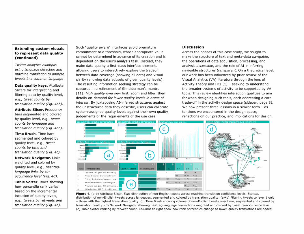
Extending custom visuals
to represent data quality
(continued)
Twitter analytics example:
using language detection and
machine translation to analyze
tweets in a common language
Data quality keys. Attribute
Slicers for interpreting and
filtering data by quality level,
e.g., tweet counts by
translation quality (Fig. 4ab).
Attribute Slicer. Frequency
bars segmented and colored
by quality level, e.g., tweet
counts by language and
translation quality (Fig. 4ab).
Time Brush. Time bars
segmented and colored by
quality level, e.g., tweet
counts by time and
translation quality (Fig. 4c).
Network Navigator. Links
weighted and colored by
quality level, e.g., hashtag-
language links by co-
occurrence level (Fig. 4d).
Table Sorter. Rows showing
how percentile rank varies
based on the incremental
inclusion of quality levels,
e.g., tweets by retweets and
translation quality (Fig. 4e).
Figure 4. (a-b) Attribute Slicer. Top: distribution of non-English tweets across machine translation confidence levels. Bottom:
distribution of non-English tweets across languages, segmented and colored by translation quality. (a�b) Filtering tweets to level 1 only
– those with the highest translation quality. (c) Time Brush showing volume of non-English tweets over time, segmented and colored by
translation quality. (d) Network Navigator showing hashtag-language connections weighted and colored by tweet co-occurrence level.
(e) Table Sorter ranking by retweet count. Columns to right show how rank percentiles change as lower-quality translations are added.

Meaningful summaries vs manageable subsets
We approached the design of our visual representations
with a focus on creating navigable summaries of text
and metadata. Through our repeated use of these
representations for building data applications, we
observed such summaries carry limited meaning in
isolation – accurate comprehension relies on context
from the documents being summarized. For example,
interpreting a key phrase distribution requires viewing
common phrases in juxtaposition with document text.
Until the underlying documents have been filtered to a
manageable subset for review, the main value of visual
representations is their ability to guide such filtering
towards document subsets of interest. Future work
includes using this insight to create sample-driven
summaries of big data that only reach full fidelity once
the data have been filtered to a manageable volume.
Analyzing datasets vs monitoring datastreams
Builders of Power BI reports typically have specialist
data preparation skills, as well as specific datasets to
analyze. In contrast, users of BI reports instantiated
from our solution templates only need to specify
standing search queries for persistent interests, and to
monitor the resulting datastreams through pre-built
reports. While solution templates have the potential to
democratize access to data analytics through ease of
use, it remains a challenge to create dashboard
interfaces that are sufficiently capable for domain
experts whilst also being approachable and learnable by
novice users of BI tools. We have adopted a range of
assistive strategies, including labelling representations
by functional role rather than column bindings,
arranging and numbering representations by page
workflows, and ordering pages by activity workflows.
Future work includes tackling the tradeoff between the
number of visual representations per page and the
number of pages required to cover all use cases.
Automatic insights vs interactive oversight
Using AI services and data visualization to marshal
unstructured data into meaningful representations
automates the initial stages of insight discovery at the
cost of generating inferred structures of varying quality.
Building interfaces around data qualities provides a new
kind of “interactive oversight” for human consumers of
AI services that enables quality-aware filtering of data
to meaningful and manageable subsets. The downside
is that each visual used as a key for data quality levels
occupies space that could have been used for an
additional and complementary view of data structure.
Future work includes investigating the interactive
assignment of “human verified” quality levels shared
among the users of long-lasting, widely-used reports.
Conclusion
This case study described our transformation of Power
BI for visual analytics of unstructured data. The impact
of the work includes fundamental visual representations
with wide adoption, AI-powered “solution templates”
that shape the view of Microsoft as a market leader [3],
an AI-powered data application used for the successful
identification and prosecution of major cybercriminal
operations, and a design philosophy around “data
qualities” that anticipates the growing role of AI in
democratizing access to data analytics.
Acknowledgements
We would like to thank our collaborators in Microsoft
Research, Uncharted Software, Microsoft Power BI, and
the Power BI Solution Templates team for their
substantial contributions to the work of this case study.
Target qualities of Visual
Analytics tools [1]
Presentable analysis:
ability to curate presentable
summaries of the analytic
discovery process. Supported
by visuals that resolve the
tension of acting to make
sense vs artifacts: familiar
metaphors aid sense-making
and can be presented directly
to general audiences.
Portable analysis: ability to
transfer analytic work across
people, places, time, and
devices. Supported by
solution templates that
resolve the tension of acting
as data collector vs analyst:
automation of data collection
frees time for analysis and
enables contributions from
“citizen data analysts”.
Provisional analysis: ability
to view and proactively
reduce the uncertainty of
analytic work at any time.
Supported by representations
of data quality that resolve
the tension of competing
interpretations vs demands:
filtering by data quality level
enables systematic review of
uncertain data structures.

References 1. Darren Edge, Nathalie Henry Riche, Jonathan
Larson, and Christopher White. 2018. Beyond Tasks: An Activity Typology for Visual Analytics. IEEE Transactions on Visualization and Computer Graphics (TVCG) 24(1), 267-277. http://ieeexplore.ieee.org/document/8019880/
2. Federal Trade Commission Press Release (12 May 2017). Retrieved 1 Oct. 2017 from https://www.ftc.gov/news-events/press-releases/2017/05/ftc-federal-state-international-partners-announce-major-crackdown
3. Gartner Report (16 February 2017). Magic Quadrant for Business Intelligence and Analytics Platforms. Retrieved 1 Oct. 2017 from https://www.gartner.com/doc/reprints?id=1-3TYE0CD&ct=170221&st=sb
4. Samuel Gratzl, Alexander Lex, Nils Gehlenborg, Hanspeter Pfister, and Marc Streit. 2013. Lineup: Visual analysis of multi-attribute rankings. IEEE Transactions on Visualization and Computer Graphics (TVCG) 19(12), 2277-2286. http://ieeexplore.ieee.org/document/6634146/
5. Microsoft AI Blog (15 June 2017). Retrieved 1 Oct. 2017 from https://blogs.microsoft.com/ai/2017/06/15/microsoft-used-ai-help-crack-tech-support-scams-worldwide/
6. Microsoft Power BI Blog (9 May 2016). Retrieved 1
Oct. 2017 from https://powerbi.microsoft.com/en-us/blog/custom-visualizations-visual-awesomeness-your-way/
7. Microsoft Power BI Blog (11 July 2016). Retrieved 1 Oct. 2017 from https://powerbi.microsoft.com/en-us/blog/new-power-bi-custom-visuals-for-browsing-and-analyzing-collections-of-text/
8. Microsoft Power BI Blog (15 August 2016). Retrieved 1 Oct. 2017 from https://powerbi.microsoft.com/en-us/blog/twitter-solution-template/
9. Microsoft Power BI Blog (7 March 2017). Retrieved 1 Oct. 2017 from https://powerbi.microsoft.com/en-us/blog/announcing-the-advanced-search-solution-template-for-bing-news/
10. Microsoft Power BI Blog (26 June 2017). Retrieved 1 Oct. 2017 from https://powerbi.microsoft.com/en-
us/blog/announcing-the-campaign-brand-management-for-facebook-pages/
11. Ben Shneiderman. 1996. The eyes have it: A task by data type taxonomy for information visualizations. IEEE Symposium on Visual Languages, 336-343. http://ieeexplore.ieee.org/document/545307/
12. Meredith Skeels, Bongshin Lee, Greg Smith, and George G. Robertson. 2010. Revealing uncertainty for information visualization. Information Visualization 9(1), 70-81. http://journals.sagepub.com/doi/abs/10.1057/ivs.2
009.1
13. John Stasko, Carsten Görg, and Zhicheng Liu. 2008. Jigsaw: supporting investigative analysis through interactive visualization. Information visualization 7(2), 118-132. http://journals.sagepub.com/doi/10.1057/palgrave.ivs.9500180
14. Stay Safe Online Blog (16 October 2016). Retrieved 1 Oct. 2017 from https://staysafeonline.org/blog/new-data-reveals-two-thirds-of-global-consumers-have-experienced-tech-support-scams
15. Chris Stolte, Diane Tang and Pat Hanrahan. 2002. Polaris: A System for Query, Analysis and Visualization of Multi-dimensional Relational Databases. IEEE Transactions on Visualization and Computer Graphics (TVCG) 8(1), 52-65. http://ieeexplore.ieee.org/document/981851/