Embed Size (px)
Citation preview

BRAND GUIDELINESQUICK START GUIDEModified:3/9/15


BRAND ATTRIBUTESBrand attributes are key words and phrases that describe Hope College as it is and aspires to be. This language is used to be clear and relevant to the College’s key audiences.
Rare Combination Rigorous academics and a vibrant, inviting Christian faith combine to prepare students to live in a global society.
Picturesque and Welcoming CommunityOur historic campus is located just blocks from award-winning downtown Holland, and is part of an engaging and increasingly diverse community that approaches relationships with respect, compassion and support.
Close Student-Faculty and Student-Staff Relationships With masterful teachers and talented researchers in small classes, we are committed to the personal, intellectual, social, and career development of our students.
Christian Character We offer many voluntary opportunities to grow one’s faith in an inviting Christian community. Hope College seeks to engage the whole person through academics and co-curricular programs.
Nationally Recognized Academics Known for undergraduate research, scholarship, preparation, and life-shaping experiences.
Holistic Approach Liberal arts and pre-professional programs with high academic standards and exceptional career opportunities. Hope’s holistic approach has been lauded for character, preparedness, service, and life-changing experiences for students.
Championship Athletics Hope College holds a nationally-competitive tradition of scholar athletes, quality facilities, and a community supportive of Hope teams.
Remarkable FacilitiesHope’s world-class facilities support the high caliber of research, athletic, social, and spiritual opportunities throughout the campus experience.
Vibrant Student Life Commitment to the whole person, in mind, body and spirit, with an emphasis on cultivating relationships through award-winning social activities and unique traditions within a thriving and safe residential community.
OVERVIEWContained within this Quick Start Guide are tools to communicate Hope’s brand and story. These are the essentials of Hope’s brand. For a more in-depth discussion of the brand and design examples, please refer to the complete Brand Guidelines. Download or request a printed copy at hope.edu/brand.
Consciously developing and choosing a brand identity is a powerful way to build and strengthen connections with all of our constituents. When we are more thoughtful and consistent about what is most important and relevant about Hope College, we speak with a stronger voice and make the most of our resources.
A brand is the total of all experiences someone has with Hope College. Any representative of Hope College (student, faculty, staff, or alumni) can shape the reputation of the College and how others experience it. The success of Hope College’s brand is up to all of us.
QUICK START GUIDE | 1HOPE COLLEGE BRAND GUIDELINES
BRAND PROMISEThe brand promise defines what Hope College intends to be and the experience an individual can expect to have when engaging with the institution. The brand promise is for internal use and is different than Hope’s mission statement.
Hope College inspires students to be fully alive in mind, body and spirit through an exceptional liberal arts education and a community grounded in a vibrant Christian faith.
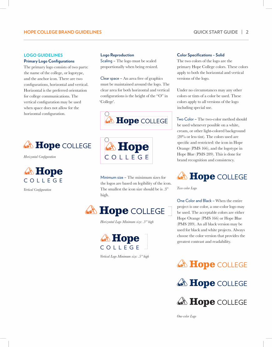
Logo ReproductionScaling – The logo must be scaled proportionally when being resized.
Clear space – An area free of graphics must be maintained around the logo. The clear area for both horizontal and vertical configurations is the height of the “O” in ‘College’.
Minimum size – The minimum sizes for the logos are based on legibility of the icon. The smallest the icon size should be is .3” high.
Color Specifications – SolidThe two colors of the logo are the primary Hope College colors. These colors apply to both the horizontal and vertical versions of the logo.
Under no circumstances may any other colors or tints of a color be used. These colors apply to all versions of the logo including special use.
Two Color – The two-color method should be used whenever possible on a white, cream, or other light-colored background (20% or less tint). The colors used are specific and restricted: the icon in Hope Orange (PMS 166), and the logotype in Hope Blue (PMS 289). This is done for brand recognition and consistency.
One Color and Black – When the entire project is one color, a one-color logo may be used. The acceptable colors are either Hope Orange (PMS 166) or Hope Blue (PMS 289). An all black version may be used for black and white projects. Always choose the color version that provides the greatest contrast and readability.
LOGO GUIDELINESPrimary Logo ConfigurationsThe primary logo consists of two parts: the name of the college, or logotype, and the anchor icon. There are two configurations, horizontal and vertical. Horizontal is the preferred orientation for college communications. The vertical configuration may be used when space does not allow for the horizontal configuration.
QUICK START GUIDE | 2HOPE COLLEGE BRAND GUIDELINES
Horizontal Configuration
Vertical Configuration
Horizontal Logo Minimum size: .3” high
Vertical Logo Minimum size: .5” high
Two-color Logo
One-color Logo

LOGO GUIDELINES CONTINUEDColor Specifications – ReversalsWhen reversing (having the color be white) the logo out of a color background, be sure the logo is large enough for the logotype and icon to be read clearly, with sufficient contrast.
Reversed logo colors – The one-color (white) logo may be reversed out of any of Hope College’s primary or secondary colors with the exception of PMS 106 (Cottage Yellow) and PMS 317 (Macatawa Mist). The two color (PMS 166 and white) logo may be reversed out of a PMS 289 (Hope Blue) background only. This is the only background color permitted for use with this type of reversal.
Color Specifications – With ScreensThe logo may appear in one or two colors when using a background of screened color. Only recommended tints of a color may be used as a background color (see Color Palette, p. 4).
Background Color Screen Percentages• 20% or less, logo prints as solid color • 50% or more, the logo must be
reversed• Screens between 20% and 50% are
not recommended as backgrounds
Color Specifications – With PhotographyThe logo must print in one or two colors or reverse in white. If the logo is placed on top of or reversed out of a photograph, the the background should provide distinct contrast so the logo is legible. Minimum clear space and size should apply.
Color Specifications – Unacceptable Usage• Do not use unacceptable colors for
the entire logo or for parts of the logo. This includes unacceptable use of brand colors.
• Do not add any effects such as bevels or drop shadows to the logo.
• Do not reverse the logo out of unacceptable colors. Do not reverse only part of the logo out of a color.
• Do not reverse the logo out of a tint or screen lighter than 50 percent. Do not use a color or black logo on a tint or screen 50 percent or greater.
• Do not place the logo on busy backgrounds of either photography or vector art. Do not reverse the logo out of a light-colored background. Do not put a color or black logo on a dark background, unless there is sufficient contrast.
QUICK START GUIDE | 3HOPE COLLEGE BRAND GUIDELINES
One-color Reversal
Two-color Reversal on PMS 289 only
Two-color logo on a 20 percent screen of color
One-color logo on a 20 percent screen of color
Reversed logo on a 50 percent screen of color
One-color logo (black) on a 20 percent screen of color

QUICK START GUIDE | 4HOPE COLLEGE BRAND GUIDELINES
COLOR PALETTEPrimary ColorsOrange and Blue are Hope’s primary brand colors. Orange or Blue must be present in every layout with the exception of black and white media. These colors can be used in a variety of elements, including but not limited to type, photography, texture, graphics and the logo.
Secondary ColorsThe secondary color palette is based on colors in the rose window of Dimnent Chapel and also references elements unique to the Hope experience. Secondary colors are an expansion of the color palette and should never be used without the presence of a primary brand color.
TintsEach color has a range of tints that may be used. The range was chosen based on several criteria: whether the tints hold true to the original color, whether the color is too light for use in print, and its overall aesthetic. Hope Orange (PMS 166) is the only color that may not be used as a tint.
C/M/Y/K | C: Coated Spot Color | CP: Coated Process Color | U: Uncoated Spot Color | UP: Uncoated Process Color
Pine Grove Green100–70%, 30-10% tintPMS 568 C89/11/48/47 CPPMS 568 U91/13/62/23 UPHEX # 00685BR: 0, G: 104, B: 91
Cottage Yellow100–30% tintPMS 106 C0/1/70/0 CPPMS 106 U0/1/74/0 UPHEX# F7E654R: 247, G: 230, B: 84
Tulip Orange100–70% tintPMS 130 C0/30/100/0 CP PMS 129 U0/27/86/0 UP HEX# F0AB00R: 240, G: 171, B: 0
Spring Fling Green100–30% tintPMS 382 C28/0/92/0 CPPMS 380 U15/0/65/0 UPHEX # BED600R: 190, G: 214, B: 0
Veneklasen Brick100–70% tintPMS 1535 C8/75/100/40 CPPMS 1535 U10/52/92/24 UPHEX# 91420ER: 145, G: 66, B: 14
Stained Glass Blue100–10% tintPMS 3125 C89/0/20/0 CPPMS 3125 U67/0/18/0 UPHEX # 00B0CAR: 0, G: 176, B: 202
Lake Michigan Blue100–10% tintPMS 646 C73/30/3/10 CPPMS 646 U62/29/10/4 UPHEX # 5482ABR: 84, G: 130, B: 171
Macatawa Mist100–30% tintPMS 317 C24/0/7/0 CPPMS 317 U32/0/14/0 UPHEX # BBE7E6R: 187, G: 231, B: 230
Black River Black100–10% tintPMS Process Black C0/0/0/100 CPPMS Process Black U0/0/0/100 UPHEX # 000000R: 0, G: 0, B: 0
Graves Hall Gray100–10% tintPMS Cool Gray 11 C48/36/24/66 CPPMS Cool Gray 11 U30/17/8/53 UPHEX # 4D4F53R: 77, G: 79, B: 83
Hope Blue100–60% tintPMS 289 C100/76/10/65 CPPMS 289 U97/63/13/41 UPHEX # 002244R: 0, G: 34, B: 68
Hope OrangeTINTS NOT PERMITTED
PMS 166 C0/74/100/0 CPPMS 166 U0/57/84/2 UPHEX# F46A1FR: 244, G: 106, B: 31
Primary Colors Secondary Colors
Reference Key

QUICK START GUIDE | 5HOPE COLLEGE BRAND GUIDELINES
TYPOGRAPHYDisplay, Headline and Subhead/Callout The primary typeface for display, headline and subheads/callouts is Verlag.
Verlag Extra LightABCDEFGHIJKLMNOPQRSTUVWXYZabcdefghijklmnopqrstuvwxyz
Verlag LightABCDEFGHIJKLMNOPQRSTUVWXYZabcdefghijklmnopqrstuvwxyz
Verlag BookABCDEFGHIJKLMNOPQRSTUVWXYZabcdefghijklmnopqrstuvwxyz
Verlag BoldABCDEFGHIJKLMNOPQRSTUVWXYZabcdefghijklmnopqrstuvwxyz
Verlag BlackABCDEFGHIJKLMNOPQRSTUVWXYZabcdefghijklmnopqrstuvwxyz
Body Copy and Callout The secondary typeface for body copy and callouts is Baskerville.
Baskerville RegularABCDEFGHIJKLMNOPQRSTUVWXYZabcdefghijklmnopqrstuvwxyz
Baskerville ItalicABCDEFGHIJKLMNOPQRSTUVWXYZabcdefghijklmnopqrstuvwxyz
Display OnlyThe display typeface is Clarendon BT. Display type refers to the use of type at large sizes.
Clarendon Light BT
ABCDEFGHIJKLMNOPQRSTUVWXYZ
abcdefghijklmnopqrstuvwxyz
Clarendon Roman BTABCDEFGHIJKLMNOPQRSTUVWXYZabcdefghijklmnopqrstuvwxyz
Clarendon Bold BTABCDEFGHIJKLMNOPQRSTUVWXYZabcdefghijklmnopqrstuvwxyz
Clarendon Black BTABCDEFGHIJKLMNOPQRSTUVWXYZabcdefghijklmnopqrstuvwxyz
PHOTOGRAPHYAs a general rule when selecting photography, choose images that are tightly cropped around the subject. Asymmetry, dramatic perspective and uncommon angles all make for a more powerful photo. Even a mediocre image can be improved with an interesting crop. Avoid the centered subject surrounded by lots of empty or dead space.
The best photos have contrast and saturated colors. Avoid flat, under or over-exposed images.
Hope Photography ArchiveHope College has an extensive photography archive that includes both topic specific and general brand imagery. For more information, contact Public Affairs and Marketing at 616.395.7860 or [email protected].
Stock PhotographyWhile stock photography is readily available at a reasonable price, it lacks the personal touch of photos that feature the Hope College campus and people. Stock photography should be used sparingly after careful consideration and not include people.
SUBSTITUTE FONTSAs the number of standard web fonts is limited and not all computers have the brand fonts installed, two substitute typefaces have been chosen for Hope College: Arial and Georgia. Arial is a sans serif substitute for Verlag, and Georgia is a serif substitute for Clarendon and Baskerville. These versions are to be used for digital applications such as web, email, and E-news content and only when absolutely necessary in print when primary brand fonts are not available.
CONTACT PUBLIC AFFAIRS AND MARKETINGPublic Affairs and Marketing is located on the 2nd Floor of the Anderson-Werkman Financial Center at 100 E. 8th Street.
The office is open to serve you Monday through Friday from 8 a.m. until 5 p.m.
Learn more about the resources available to you, including the full version of the Brand Guidelines, at hope.edu/brand.

CONNECT WITH US
hope.edu/brand
facebook.com/ hopecollege
twitter.com/ hopecollege
youtube.com/ hopecollege
PUBLIC AFFAIRS AND MARKETING Anderson-Werkman Financial Center, Suite 230 | 100 East 8th Street | Holland, MI 49423 | 616.395.7860 | hope.edu/brand