Embed Size (px)
Citation preview

Brand GuidelinesFebruary 26, 2020 • VerSION 1.1

2 • Brand Guidelines VersiOn 1.2 | FeBruary 26, 2020

3 • Brand Guidelines VersiOn 1.2 | FeBruary 26, 2020
TabLe OF CONTeNTS
OUR BRAND 4LOGO 16TYPOGRAPHY 26COLORS 30PHOTOGRAPHY 34VOICE 40COMPOSITION 44APPENDIX 50

4 • aBOut Our Brand VersiOn 1.2 | FeBruary 26, 2020
OUR BRAND

5 • aBOut Our Brand VersiOn 1.2 | FeBruary 26, 2020
WHaT IS a braND?
A brand is a collection of words, images, and experiences that dis-tinguish an organization and carry with them a connotative under-standing of its identity.
In the end, “a brand is a person’s gut feeling about [an] organization.” 1
These guidelines allow flexibility for you to be creative but are rigid enough to keep our brand easily recognizable. Each interaction with people in our church, our city, and the nations is an opportunity to lead them into meaningful communion with God’s people, and ultimately, God Himself. These brand standards help us clearly and consistently tell our story. In the process, we are leading those we interact with to see what is true, honorable, just, pure, lovely, com-mendable, and excellent.
Philippians 4:8 exhorts us that “whatever is true, whatever is honor-able, whatever is just, whatever is pure, whatever is lovely, what-ever is commendable, if there is any excellence, if there is anything worthy of praise, think about these things.”
Our brand system is composed of six core elements.
1 the Brand Gap: How to Bridge the distance between Business strategy and design; a Whiteboard Overview, by Marty neumeier, new riders, 2006, p. 14.
lOGO tyPOGraPHy
COlOr PHOtOGraPHy
VOiCe COMPOsitiOn
The Austin StoneThe Austin StoneThe austin StoneThe Austin StoneThe Austin StoneThe Austin Stone

6 • aBOut Our Brand VersiOn 1.2 | FeBruary 26, 2020
Since 2002, The Austin Stone Community Church has been a New Testament church existing for the supremacy of the name and pur-pose of Jesus Christ. Our mission is to love God, love the church, love the city, and love the nations.
THe auSTIN STONe COMMuNITy CHurCH
These brand guidelines clearly and consistently communicate our story so people will encounter Jesus, who is excellent and worthy of praise.
The guidelines expressed in the following pages share the story of the central brand of The Austin Stone and its visual assets and provide guidelines for their use. This brand guide applies to all Austin Stone Church congregations and ministries and is expressed in printed material, digital media, and official communications.
7 • aBOut Our Brand VersiOn 1.2 | FeBruary 26, 2020

8 • aBOut Our Brand VersiOn 1.2 | FeBruary 26, 2020
Our STOry
Digging for Austin Stone
Spend enough time in Austin—or anywhere in Central Texas, for that matter—and you’re bound to see them: historic courthouses, churches, and homes built of impossibly white, expertly carved Texas limestone.
Or, as it’s known to some around here, Austin Stone. These buildings are 100% vintage Austin, an unmistakable part of the landscape. But the stones didn’t just appear ready-made; they were mined from limestone quarries deep underground.
In fact, if you dig deep enough anywhere in Austin, you’ll find the stuff.
Our city is built on Austin Stone.
A good brand is made from sturdy stuff, too. Brands take shape in typography and tone of voice, web pages and signage—but there’s so much more going on beneath the surface. When you dig past color palettes, logo lockups, and sample applications, you’ll find that they all have their origin in something deeper:
A mission. A vision. Or, better yet, a story.

9 • aBOut Our Brand VersiOn 1.2 | FeBruary 26, 2020
A brief history of The Austin Stone
When Matt and Jen Carter moved to Austin to plant a church in 2002, this is the encouragement they got from friends, family, and mentors: “What are you going to do when the church fails?” Matt’s hon-est response was, “I don’t know. We’re just going to preach the Bible.” Matt’s metric for success wasn’t numbers or “outcomes.” It was faithfulness to the vision God gave him. A vision he shared with his hero Charles Spurgeon, 19th-century pastor of London’s Metropolitan Tabernacle. Matt wanted to marry rich theological truth with a deep compas-sion for the city Christ called him to. He dreamed of a church made up of people who love God, love the church, love the city, and love the nations.
So he and Jen started The Austin Stone Community Church in a South Austin apartment with a congregation of ten and a prayer straight from Ephesians 3:20—that God would do far more abundantly than they could ask for or imag-ine. And He did.
The church grew quickly into a middle-school cafeteria on South Congress, and again into Austin High School. We’re still at Austin High School today, but we also meet at four other locations across the greater Austin area.
As we’ve grown, so has our ability to support min-istries that demonstrate the love of Jesus to our city and to the world. Every single ministry of The Austin Stone is an expression of our original vision.
This is what our brand stands for: what Jesus begins in every believer’s heart will work itself out in love, mission, and service to our neighbors—here in Austin and across the globe. That’s our bedrock. Our Austin Stone.

10 • aBOut Our Brand VersiOn 1.2 | FeBruary 26, 2020
What about the Hexagon?
The hexagon has been with our church from the beginning. When we’re inspired by the beauty of creation, it’s almost always by nature’s organic elegance: the gentle curve of leaves and petals, or the vibrant color of wings and feathers. But nature isn’t all soft edges and flowing lines. Sometimes, it can be downright mathe-matical. Take hexagons. They don’t look very “natural”—but from honeycomb to insect eyes, from the Giant’s Causeway to turtle shells, they’re all over God’s good world.
Why? For one thing, hexagons are strong. Each angle in a hexagon is 120 degrees, and when you put hexagons next to each other, those 120-degree intersections create the most sta-ble construction possible. They’re also really good at creating a seamless network. If you were to try to fill a flat surface with circles, you’d only cover 90% of it. You’d leave gaps. But fill that same surface with hexagons, and you can cover every inch. Hexagons are impressive, but they can only do what they do when they’re part of something bigger than themselves. Their strength, structural integrity, and ability to fill space only matter with the company of other hexagons. It’s in their network, their community, that their strength is unleashed.

11 • aBOut Our Brand VersiOn 1.2 | FeBruary 26, 2020
Strength in community is the most important lesson hexagons can teach us. Our calling is to see the gospel spread through our neighborhoods and through the nations. That’s our passion, our focus. But we also believe God has called us to do this together, believing that as we do, we are stronger and further-reaching than we could ever be on our own. Just like the hexagon.

12 • aBOut Our Brand VersiOn 1.2 | FeBruary 26, 2020
Our LOGO HISTOry
From the beginning, a refreshing blue color palette, clean typography, and hexagons were core to our design. The hexagon imaged a church formed around Christ our Cornerstone.
As our church evolved, so did our logo, moving to a more mod-ern and concise layout.
The third logo evolution brought a clean type family and re-clar-ified focus on the hexagon as central to our brand. Today, the hexagon remains core to our identity. Our type is bold and direct, representing the confidence that comes from being built upon the Cornerstone. Our color palette today is an updated version of our beginning palette in 2004.
2002The Austin Stone
Community Church Founded
2004First Recorded Logo
2010Second Logo
2012Third Logo
Today’s Logo

13 • aBOut Our Brand VersiOn 1.2 | FeBruary 26, 2020

14 • aBOut Our Brand VersiOn 1.2 | FeBruary 26, 2020
Our braND aTTrIbuTeS
The Austin Stone’s brand consists of our voice, attributes, visual elements like color and type, and combinations of elements in graphic design. The following five core attributes characterize each written communication and visual deliverable.
CLEARGod is a God of clarity and order. The Austin Stone reflects these characteristics through work that communicates our messages simply and directly, without encumbrance or distraction.
CREDIBLEGod is thoroughly trustworthy. The Austin Stone reflects this characteristic by being consis-tent, accurate, and sincere.
ENGAGINGGod is relational. To reflect this characteristic, The Austin Stone’s environments, resources, and design elements invite interac-tion and thoughtfulness.
ACTIONABLEGod calls His people to act. To reflect this characteristic, The Austin Stone propels people forward to obey God and serve others.
BEAUTIFULGod is beautiful and creates beauty. The Austin Stone’s environments, resources, and design elements reflect these characteristics by being captivat-ing, compelling, and appealing.

15 • aBOut Our Brand VersiOn 1.2 | FeBruary 26, 2020
CHAPTER #—
INSERT HEADER 2 HERE INSERT HEADER 2 HERE INSERT HEADER
Insert Body Text Here. Insert Body Text Here..

16 • aBOut Our lOGO VersiOn 1.2 | FeBruary 26, 2020
LOGO

17 • aBOut Our lOGO VersiOn 1.2 | FeBruary 26, 2020
WORDMARKLOGO MARK
LOGO SIGNATURE

18 • aBOut Our lOGO VersiOn 1.2 | FeBruary 26, 2020
The hexagon logo mark is the core element of our logo and most memorable identifier and reflects the following attributes:
Our LOGO MarK
FOUNDATIONALEphesians 2:20 refers to Christ as the “cornerstone, in whom the whole structure, being joined together, grows into a holy temple in the Lord.” The hexagon, being a strong, firm shape to build upon, represents Jesus Christ, the Rock upon which our church is built.
MULTI–FACETEDGalatians 6:2 instructs Christians to “bear one another’s burdens, and so fulfill the law of Christ.” The hexagon is strong because of the way each side bears the weight of the structure. This is a beautiful picture of how the fam-ily of God supports each other.
ELEMENTALIn 1 Peter 2:5, Peter describes followers of Christ as “living stones, being built up as a spiritual house, to be a holy priesthood.” Just as individual hexagons easily fit together in a solid pattern, believers join together as a unified body to worship God and serve others.
EXPANSIBLE In Matthew 28:19, Jesus gives the church the mission to “make disciples of all nations.” Just as the hexagon can be repeated infinitely across a plane, our church will continue to pursue this task of making disciples until the Lord returns.
Minimum size (Width)0.25 inch / 10 pixels

19 • aBOut Our lOGO VersiOn 1.2 | FeBruary 26, 2020
The primary lockup we prefer to use is the horizontal lockup. If space is constrained, the stacked or centered lockup may be used.
In each lockup, the logotype is bold and clear. These attributes are foundational to our brand. “The Austin Stone” text is set in ALL CAPS to declare strength of purpose. To preserve recogniz-ability, our logo is always displayed as one color.
For the logo to be reproduced as clearly as possible, the mini-mum size for the stacked logo should never be less than 1 inch for print, or 72 pixels for digital.
The minimum size for the horizontal logo should never be less than 1.25 inches for print, and 90 pixels for digital.
PrIMary LOCKuPS
MINIMuM SIZING
HORIZONTAL LOCKUP
Minimum size (Width)1.25 inches / 90 pixels
Minimum size (Width)0.5 inches / 36 pixels
Minimum size (Width)1 inch / 72 pixels
STACKED LOCKUPCENTERED LOCKUP

20 • aBOut Our lOGO VersiOn 1.2 | FeBruary 26, 2020
When we are using our brand we are communicating on behalf of the staff, elders, and the church as a whole. We want to consider our audience as we create for them. If we neglect our logo and design principles, we are not stewarding this responsibility well.
Misuse of the logo lowers equity and trust in our brand and can be confusing. Properly using the logo builds trust and helps people connect with a church family that wants to point them to Jesus.
1. Do not change the color of the logo or elements of the logo.2. Do not put the logo in a container or shape.3. Do not fill the logo or elements of the logo.4. Do not change or alter the logotype.5. Do not add effects to the logo.6. Do not rotate the logo.7. Do not skew or alter proportions of the logo.8. Do not place the logo on low contrasting colors.9. Do not change or alter the lockup of the symbol and logotype.10. Do not place the logo on busy or complicated backgrounds.11. Do not use our parent or ministry hexagons as number, letter,
or punctuation marks.
LOGO MISuSe
THEAUSTINSTONE
note: these rules apply to each level of the brand architecture and to our logo mark as well.
1 2 3 4
5 6 7 8
9 1110

21 • aBOut Our lOGO VersiOn 1.2 | FeBruary 26, 2020
Keeping unobscured space around the logo helps us communi-cate clearly and legibly. The clear space between the logo and any other type or design elements should be roughly 50% of the hexagon’s width.
To ensure full color compliancy for those with visual disabilities, the logo should be Quartz White on darker backgrounds and Basalt Black on lighter backgrounds. These examples demon-strate correct versions that support optimal color contrast. Our parent logos should only be reproduced in Quartz White or Basalt Black. Do not print or display our logo in any other color.
CLear SPaCe arOuND LOGO
aPPrOVeD COLOr VarIaTIONS

22 • aBOut Our lOGO VersiOn 1.2 | FeBruary 26, 2020
The Austin Stone brand architecture brings clarity to our organization through a distinct visual hierarchy.
The master logo consists of the hexagon logo mark and THE AUSTIN STONE text. For most external-facing applications, this parent logo should be used, even by congregations.
While programs, practices, and events can be stylized as headings or designed artfully, they do not have a specific hexagon icon or unique logo in the brand architecture. Do not use our logo for exter-nal purposes that are not directly related to The Austin Stone.
braND arCHITeCTure MASTER LOGO
CONGREGATION LOCATION LOGO
MINISTRY LOGO

23 • aBOut Our lOGO VersiOn 1.2 | FeBruary 26, 2020
Congregation location lockups consist of a solid hexagon icon, THE AUSTIN STONE text, and the congregation name. These should be reserved for internal application to avoid confusion.
CONGreGaTION LOCKuPS

24 • aBOut Our lOGO VersiOn 1.2 | FeBruary 26, 2020
MINISTry LOGOS
The ministry lockups consist of a uniquely designed hexagon icon with the ministry name text. Lockups will be developed for the following ministries:
1. Kids2. Students3. College4. Women5. Men
6. Soul Care7. For the Nations8. Worship9. For the City10. Institute
Ministry lockups are reserved for groups with unified vision and leadership. Practices and events are not “ministries”; they are tools or expressions of ministries. Ministry lockups denote estab-lished personhood and group identity.

25 • aBOut Our lOGO VersiOn 1.2 | FeBruary 26, 2020
CHAPTER #—
INSERT HEADER 2 HERE INSERT HEADER 2 HERE INSERT HEADER
Insert Body Text Here. Insert Body Text Here..

26 • aBOut Our tyPe VersiOn 1.2 | FeBruary 26, 2020
TYPOGRAPHY

27 • aBOut Our tyPe VersiOn 1.2 | FeBruary 26, 2020
Proxima Nova is our primary brand typeface and is used for most applications.
Proxima Nova is a sans-serif typeface designed in 2005 by Mark Simonson and combines a geometric appearance with modern pro-portions. The high x-height makes it an easy-to-read typeface, even at smaller text sizes. Proxima Nova is strong, modern, and friendly in tone, which allows the reader to engage more easily with content. Like The Austin Stone, Proxima Nova is both bold and direct, yet friendly and welcoming.
braND TyPOGraPHy
Proxima NovaaabbCcDdeeFfGgHhIiJjKkLlMmNnOoPpQqrr SsTtuuVvWwXxyyZz1234567890!@#$%^&*(+
Thin / Thin Italiclight / Light ItalicRegular / Regular ItalicMedium / Medium ItalicSemibold / Semibold Italic
Bold / Bold ItalicExtrabold / Extrabold ItalicBlack / Black Italic
Freight Text Pro is our secondary brand typeface used sparingly for more formal long-form content.
Freight Text Pro is a modern serif typeface designed in 2005 by Joshua Darden. Serif typefaces are typically easier on the eyes for long-form text copy. Freight Text’s high x-height provides more space for readability, while the subtle variety of its strokes provide personality. The contrast between the thick and thin parts of each letter give the typeface a trusted tone without being distracting.
Like Proxima Nova, Freight Text Pro comes in a variety of weights.
Freight Text ProAaBbCcDdEeFfGgHhIiJjKkLlMmNnOoPpQqRr SsTtUuVvWwXxYyZz1234567890!@#$%^&*(+
Light / Light ItalicBook / Book ItalicMedium / Medium Italic
Semibold / Semibold ItalicBold / Bold ItalicBlack / Black Italic

28 • aBOut Our tyPe VersiOn 1.2 | FeBruary 26, 2020
The various weights of Proxima Nova, from Regular to Extrabold, make it versatile to use across the entire hierarchy of a layout.
We use a six-set type hierarchy for our brand. This will help guide the reader’s eye to where a section begins and ends, while enabling the user to isolate certain information based on the consistent use of style throughout a body of text.
The typographic hierarchy of any piece should be influenced by the body text, since it’s what appears most. All font sizes should be derived from the body text, since it’ll be read the most on each page.
Most body copy should be set to Proxima Nova Regular. Remaining headers for any layout or project should be directly linked to the body text’s content width. Refer to the hierarchy to the right to see how to calculate headers.
notes: each weight also has an italics and small caps style as well. do not use Proxima nova Condensed or extra Condensed. in certain digital applications where Proxima nova might not be available, Helvetica can be used.
Fractions in typography refers to the font size / line spacing. For example, our caption text is set at 7/10, which refers to 7-point Proxima nova light with 10 points of line spacing (leading).
Glossary: Pt = Points PX = Pixels
HIerarCHy HEADER ONE Header 1 should be set at approximately 350% of body text.
Header TwoSize should be set at approximately 200–210% of body text.
HeaDer THreeSize should be set at approximately 145–160% of body text.
Intro TextSize should be set at approximately 110–120% of body text.
Body TextThe typographic hierarchy of any piece should be influenced by the body text, since it’s what appears most. All font sizes should be derived from the body text, since it’ll be read the most on each page.
Captions text
Captions and small text are often non-essential content that’s the lowest priority on the page, so the design will reflect this.
Proxima nova extrabold
tracking: 34
Pt: 31/32 | PX: 47/73
Proxima nova Bold
tracking: 15
Pt: 19/23 | PX: 37/58
Proxima nova semibold
tracking: 25
Pt: 14/19 | PX: 29/46
Proxima nova Medium
Pt: 11/15 | PX: 23/38
Proxima nova regular
Pt: 9/14 | PX: 18/30
Proxima nova light
Pt: 7/10 | PX:14/25

29 • aBOut Our tyPe VersiOn 1.2 | FeBruary 26, 2020
eXaMPLeS
We are The Austin Stone.We love God, the church, the city, and the nations. Read on to find out more about our church’s beliefs and practices.
We are a community centered on the person and work of Jesus Christ who longs to see our city and the nations renewed and redeemed by the gospel. Read more about our vision below.
You can also check out one of our Sunday worship services.
H2H3
Body
Body
H2H3
Body
Body
We are The Austin Stone.We love God, the church, the city, and the nations. Read on to find out more about our church’s beliefs and practices.
We are a community centered on the person and work of Jesus Christ who longs to see our city and the nations renewed and redeemed by the gospel. Read more about our vision below.
You can also check out one of our Sunday worship services.

30 • aBOut Our COlOrs VersiOn 1.2 | FeBruary 26, 2020
COLORS

31 • aBOut Our COlOrs VersiOn 1.2 | FeBruary 26, 2020
Our color scheme is the primary palette for central communica-tion assets.
The progression from quartz white to basalt black drives the clarity and credibility of our design aesthetic. The subtle neutral grays support content and imagery without overpowering the design.
Water blue helps engage and call our people to action. Its refresh-ing pop of color invites connection and interaction. This color can be used as an accent color in a design or an action color.
When using the color scheme remember to include a healthy amount of white negative space to offset these colors and let the content breathe.
braND COLOr SCHeMe
baSaLT bLaCK
HEX: #282828
RGB: 40.40.40
CMYK: 71.65.64.68
PMS: BLACK 3 U/C
SLaTe Gray
HEX: #ACADAF
RGB: 172.173.175
CMYK: 34.27.26.0
PMS: COOL GRAY 7 U/C
WaTer bLue
HEX: #00A3E1
RGB: 0.163.225
CMYK: 71.19.0.0
PMS: 2191 C / 2995 U
LIMeSTONe Gray
HEX: #D9D8D6
RGB: 217.216.214
CMYK: 14.11.12.0
PMS: COOL GRAY 2 U/C
QuarTZ WHITe
HEX: #FFFFFF
RGB: 255.255.255
CMYK: 0.0.0.0

32 • aBOut Our COlOrs VersiOn 1.2 | FeBruary 26, 2020
HEX: #4CBEEARGB: 76.190.234CMYK: 57.2.2.0
HEX: #525253 RGB: 82.82.83CMYK: 1.1.0.67
HEX: #F4F4F4RGB: 244.244.244CMYK: 3.2.2.0
HEX: #FFFFFFRGB: 0.0.0CMYK: 0.0.0.0
PrIMary braND COLOrS
TINTS aND SHaDeS
This chart gives an ideal estimation of usage percentages for each of our colors. It is important to follow these proportions when cre-ating any brand digital or print communication in order to maintain brand consistency and remain accessible for all people.
Negative Quartz White space should be the base for most design layouts. Content and graphics should have ample negative space in order to breathe.
As the primary accent color of The Austin Stone, Water Blue should be used sparingly for moments of support, assurance, and connection at moments of interaction or connection between a user and the brand.
Use Basalt Black in any application where true black would nor-mally be used, like body copy text.
Use Limestone Gray and Slate Gray to give neutral variation to a layout. Avoid using these as anything more than accent colors.
To enhance and give depth to a design, the use of shades and tints can be applied. These tints and shades are formed by adding either white or black to our color palette. Use a tint with the corresponding brand color to give a bright pop of color. Use a shade with the cor-responding brand color to set apart a darker element in the design.
HEX: #00729DRGB: 0.114.157CMYK: 87.41.20.0
HEX: #202020RGB: 32.32.32CMYK: 0.0.0.87
HEX: #7A7C81RGB: 122.124.129CMYK: 55.45.41.8
HEX: #ACADAFRGB: 172.173.175CMYK: 34.27.26.0
SHADESTINTS

33 • aBOut Our COlOrs VersiOn 1.2 | FeBruary 26, 2020
Ministries with external, institutional presences have a unique action color to aid in their marketing communication. Each ministry can also use the brand black and gray colors to balance out each color scheme.
When communicating on the website, by email, or with certain printed deliverables, the action color can be used to represent each ministry uniquely.
Below are PMS (Pantone Matching System) Color Profiles for each ministry; use these to ensure most accurate printing for your ministry’s color.
For more about each ministry’s unique identity, see Ministry Identities.
Kids PMSCoated: 192 Cuncoated: 199 u
Students PMSCoated: 319 Cuncoated: 319 u
College PMSCoated: 7555 Cuncoated: 7405 u
Worship PMSCoated: 109 Cuncoated: 107 u
Women PMSCoated: 258 Cuncoated: 2355 u
For the Nations PMSCoated: 3395 Cuncoated: 3395 u
Counseling PMSCoated: 7475 Cuncoated: 7476 u
Institute PMSCoated: 2935 Cuncoated: 2935 u
For the City PMSCoated: 61-7 Cuncoated: 3517 u
Men PMSCoated: 7848 Cuncoated: 355 u
note: each of these ministries can use other colors and color schemes for events that require a visual theme or identity.
MINISTry COLOrSKIDS
COUNSELING & SOUL CARE
MEN
STUDENTS
AUSTIN STONE INSTITUTE
WOMEN
FOR THE CITY
WORSHIP
COLLEGE
FOR THE NATIONS
#e31B48
#487a7C
#095e42
#48C2C5 #338789 #81CFd3 #d5757d#8a2932
#224d98
#8C489a #62316B #ae7eB7 #7ea1a3#335556
#24815e #76C8a9 #528e7a#05412e
#C43B46
#Fed107
#d1a02a #91712B #deBC68 #496eBF#002e74
#35B887
#B51F3B #e8486C #Fee780#B19330

34 • aBOut Our PHOtOs VersiOn 1.2 | FeBruary 26, 2020
PHOTOGRAPHY

35 • aBOut Our PHOtOs VersiOn 1.2 | FeBruary 26, 2020
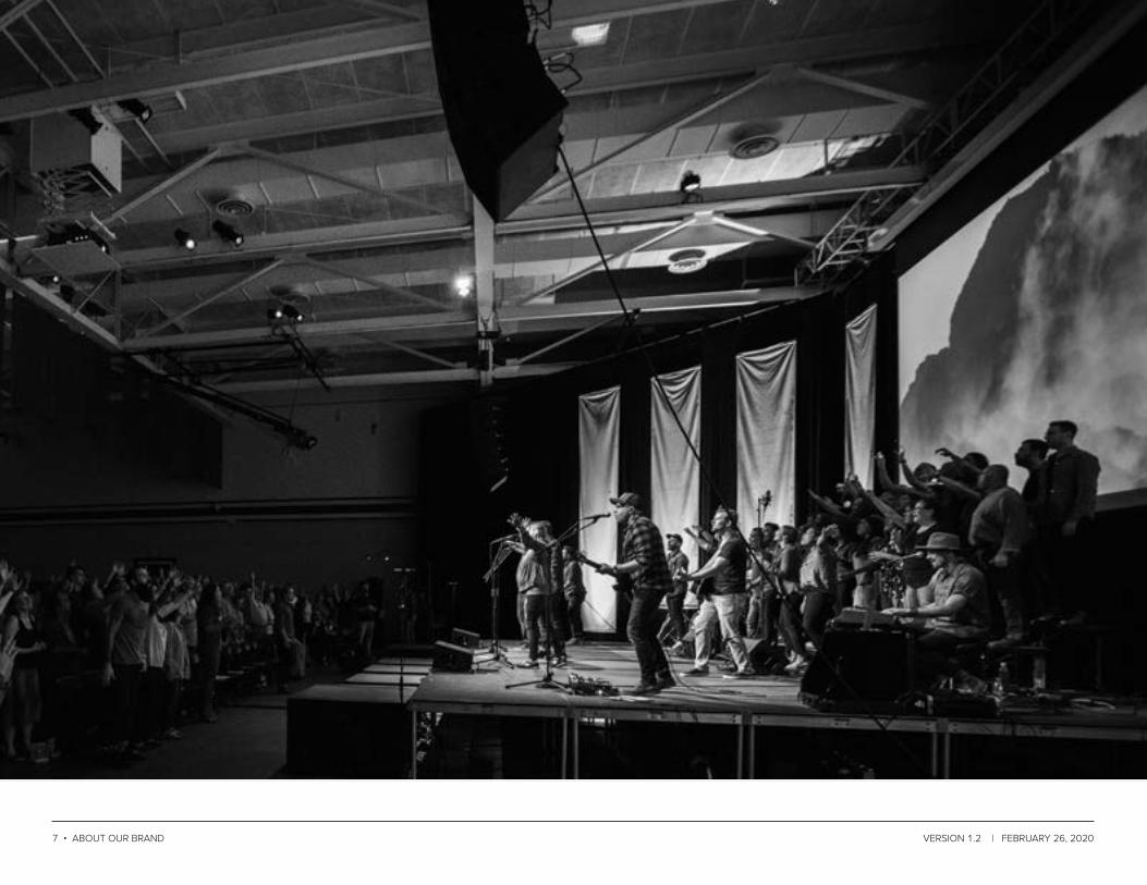
The story we share through photography communicates our brand with consistency and personality. Our photography should ideally show our people, in our places, living through our convictions. Additionally, our photography should:
1. Avoid staged scenes or stiff poses.2. Engage the viewers as a participants and invite them to interact.3. Feature diversity of age, gender, and ethnicity.
MAIN PRINCIPLES1. Shoot in natural light whenever possible and ensure photos
don’t have harsh highlights or shadows on people’s faces.2. Create depth through foreground-middle-background
relationship.3. Capture a wide variety of angles and views, both vertically and
horizontally.4. Capture scope, but also draw attention to details.5. Include negative space around the subject to allow for the
placement of additional design elements such as text.6. Coordinate locations, backgrounds, and wardrobe to establish
a visual simplicity.
PHOTOGraPHy OVerVIeW
36 • aBOut Our PHOtOs VersiOn 1.2 | FeBruary 26, 2020
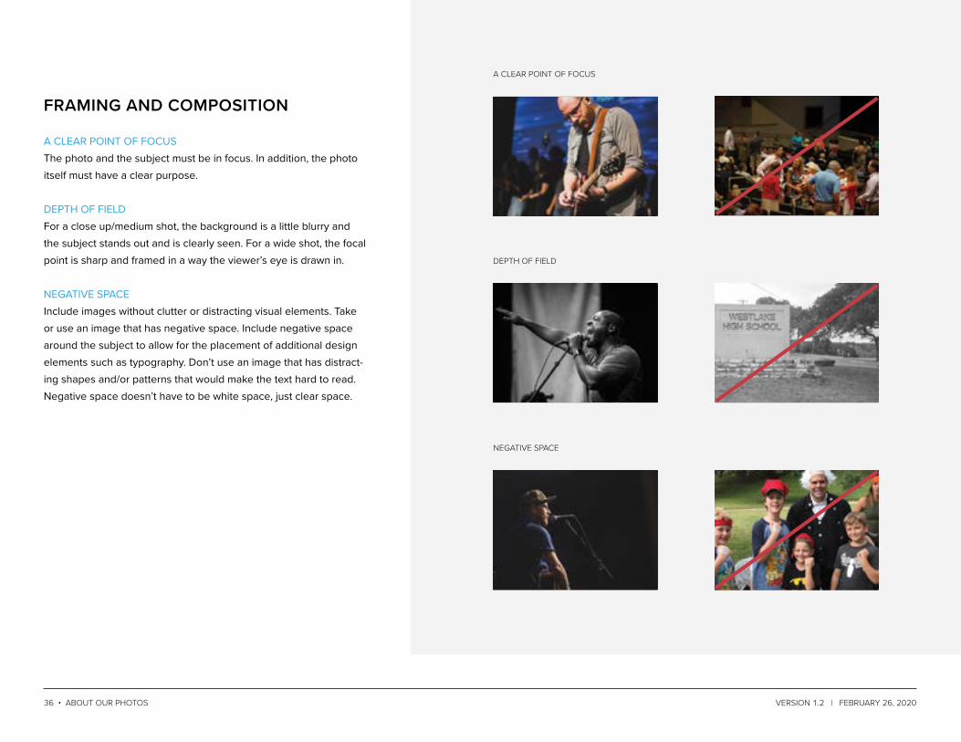
FraMING aND COMPOSITION
a Clear POint OF FOCus
dePtH OF Field
neGatiVe sPaCe
A CLEAR POINT OF FOCUSThe photo and the subject must be in focus. In addition, the photo itself must have a clear purpose.
DEPTH OF FIELD For a close up/medium shot, the background is a little blurry and the subject stands out and is clearly seen. For a wide shot, the focal point is sharp and framed in a way the viewer’s eye is drawn in.
NEGATIVE SPACEInclude images without clutter or distracting visual elements. Take or use an image that has negative space. Include negative space around the subject to allow for the placement of additional design elements such as typography. Don’t use an image that has distract-ing shapes and/or patterns that would make the text hard to read. Negative space doesn’t have to be white space, just clear space.

37 • aBOut Our PHOtOs VersiOn 1.2 | FeBruary 26, 2020
COLOr aND TONe
COlOr teMPerature
BriGHtness, COntrast, & saturatiOn leVel
BlaCK leVel
COLOR TEMPERATUREUse images with cool colors–tones and shades of blue, green, and gray. Avoid warm colors including tones and shades of red, yellow, and orange.
BRIGHTNESS, CONTRAST, & SATURATION LEVELAvoid overly bright, washed out or dark, shadowy images where the details are harder to see. Avoid images with excessive satu-ration colors.
BLACK LEVELThe level of black in a photo should match the luminance of Basalt Black. The black level should be slightly faded and muted, not a rich, deep black.

38 • aBOut Our PHOtOs VersiOn 1.2 | FeBruary 26, 2020
When taking photos or looking for a photo to use in a design, think about these criteria:
IN CONTEXTUse a photo that represents The Austin Stone. Make sure the photo is from Austin or a place that looks like Austin. Try to use photos of people from our church. For photos of the nations, use images of the people and places we are going and sending to.
AVOID CLICHÉS Avoid using photos that do not have the appropriate tone. Avoid goofy or silly photos. Consider the audience when selecting a photo.
AVOID CLIP ARTUse real photos that share real moments so that it engages the viewer.
SubJeCT MaTTer
PeOPle
City
nature

39 • aBOut Our PHOtOs VersiOn 1.2 | FeBruary 26, 2020
natiOns GrOuPs OF PeOPle
Prayer
Classes
OBJeCt
study

40 • VersiOn 1.2 | FeBruary 26, 2020
VOICE

41 • VersiOn 1.2 | FeBruary 26, 2020
We want our organizational voice to be passionate, authentic, and resolute.
Think of our organizational voice as our distinctive personality expressed through all of our written content. What sounds like us? What feels like us? What looks like us on the page?
There should be consistency and clarity in our unified organiza-tional voice; however, there is also room for individual congrega-tional personalities. Our collective audience is best served when we express our individual voices within the broader, consistent voice of The Austin Stone. Choosing an individual congregational voice that is outside the parameters listed below is, therefore, not helpful. Adopting a voice inconsistent with our communal voice will only highlight misalignment—it will feel and sound “wrong” to your audience—and make them less likely to trust and listen to you.
Please refer to the chart on the following page for core guide-lines to follow when communicating as The Austin Stone or as a representative of it. Again, these guidelines apply to each person and ministry communicating anything in written form on behalf of The Austin Stone.
HOW TO COMMuNICaTe WHO We are

42 • VersiOn 1.2 | FeBruary 26, 2020
AUTHENTIC
We want to model Christ in everything we do, including the ways in which we communicate, both internally and externally.
DO DON’T
• Value clarity and consistency to earn trust
• Consider audience needs and diversity
• Marry grace and truth in language and tone
• Use insider or churchy language• Use sarcasm or inappropriate humor• Assume your audience is the same
for every message or medium
We image the trinity through existing in community together in the same way God exists, three in one. You should already know that from MWDP.
We value community at The Austin Stone, because we believe healthy rela-tionships help us know God more and love people.
PASSIONATE
We believe in our vision and mission, and all we do is oriented around those statements.
DO DON’T
• Use simple, action-oriented language
• Compel from Christ-like love• Engage with enthusiasm and
warmth
• Use passive voice• Use lukewarm or watered-down
language• Neglect to give clear action steps
We hope the Story Team film we shared this Sunday greatly encouraged you. Please sign up today to attend a short-term trip info session next week.
A short-term trips info session will be happening soon for anyone interested in taking a trip with The Austin Stone based on the film you saw.

43 • VersiOn 1.2 | FeBruary 26, 2020
Defining our voice should guide you in thinking more robustly about what you’re writing, to whom you’re writing, and how you’re going to best communicate your message.
It will take practice to learn to write with our voice, and that’s okay! Once you become familiar with our organizational voice, you’ll be able to find your own voice within the guidelines.
Like anything else in life, the more you practice and work within this framework, the more comfortable (and likely, compelling) you will become.
Your consistency will build trust with your audience, and over time, more of your written communication will break through the clutter and connect with the people who need to receive your message.
note: the written voice of the austin stone has evolved over time as our culture and congregations have grown and changed. an effective organizational voice will continue to evolve as both the organization and broader cultural context change, so we will update this section at appropriate intervals.
HOW SHOuLD I uSe THIS INFOrMaTION?
RESOLUTE
We’re committed to God and His Word, and we communicate clearly and humbly out of our biblical convictions.
DO DON’T
• Know that our core theology drives what and how we communicate
• Understand which issues are closed-handed and which are open-handed, and communicate accordingly
• Model the humility with which Jesus shared difficult truth
• Confuse your audience with peripheral details
• Be highbrow, dismissive, irreverent, or unapproachable
• Neglect to communicate the “main thing”
The For the City Network launched out of our desire to meet tangible needs in Austin and to share the love of Jesus with our neighbors.
We knew that we were the church that could meet needs in the city that others were ignoring, so we answered the call in Austin and the surrounding area.

44 • COMPOsitiOn VersiOn 1.2 | FeBruary 26, 2020
COMPOSITION

45 • COMPOsitiOn VersiOn 1.2 | FeBruary 26, 2020
Our brand attributes directly inform the guiding design principles used to correctly apply our brand.
GuIDING DeSIGN PrINCIPLeS
CLEARWe design for clarity by:• Using generous, negative
white space that lets con-tent and design elements breathe, while avoiding cluttered or busy design
• Using consistent hierarchy of typography and layout structure
• Valuing simplicity of design and layout
CREDIBLEWe design for credibility by:• Valuing integrity to our Brand
Guidelines above pursuit of uniqueness or trendiness
• Aligning design and content elements within a layout to a uniform grid structure
ENGAGINGWe design for engagement by:• Valuing understandability and
user experience
• Using design elements like color, type, and graphics to move a user easily through the flow of a design layout
• Ensuring important design or content elements are appro-priately emphasized
ACTIONABLEWe design for actionability by:• Strategically using accent
colors and type to draw users toward the next action
• Using design elements to drive home a clear point of the design or layout
BEAUTIFULWe design for beauty by:• Striving for aesthetic sensibil-
ity in our photography, type, layout, and color applications
• Avoiding design clichés• Choosing color palettes based
on proper color technique
note: the above illustration is not an exhaustive depiction of our design style.

46 • Ministry identities VersiOn 1.2 | FeBruary 26, 2020
MINISTRY IDENTITIES

47 • Ministry identities VersiOn 1.2 | FeBruary 26, 2020
Simple and foundational, the KIDS hexagon images a building block. The structural integrity of this block, like our Basic Truths, provides an opportunity for creative play and sets a firm foundation for life and faith.
KIDSCOLOR PALETTE
PATTERNS
#E31B48 #B51F3B #E8486C
RECOMMENDED COLOR COMBINATIONS
HEX: #E31B48CMYK: 0.97.72.0PMS Coated: 192 CPMS Uncoated: 199 U

48 • Ministry identities VersiOn 1.2 | FeBruary 26, 2020
The STUDENTS hexagon plays with perspective and dimensionality to form a unique, abstract “S.” Though complex, the STUDENTS hexagon images firm interconnectedness and continuous motion.
STUDENTSCOLOR PALETTE
PATTERNS
#48C2C5 #338789 #81CFD3
RECOMMENDED COLOR COMBINATIONS
HEX: #48C2C5CMYK: 63.0.17.0PMS Coated: 319 CPMS Uncoated: 319 U

49 • Ministry identities VersiOn 1.2 | FeBruary 26, 2020
The College hexagon involves nested chevron shapes representing Freshmen, Sophomores, Juniors, and Seniors. These chevrons rise upward, imaging the growth of college students into the maturity of adulthood and faith in Christ.
COLLEGECOLOR PALETTE
PATTERNS
#D1A02A #91712B #DEBC68
RECOMMENDED COLOR COMBINATIONS
HEX: #234E99CMYK: 0.17.100.3PMS Coated: 7555 CPMS Uncoated: 7405 U

50 • Ministry identities VersiOn 1.2 | FeBruary 26, 2020
The Women hexagon images an interconnected web, reminding us that in community, we can more evenly share each other’s burdens and together build a stronger structure than we could on our own.
WOMENCOLOR PALETTE
PATTERNS
#8C489A #62316B #AE7EB7
RECOMMENDED COLOR COMBINATIONS
HEX: #8C489ACMYK: 52.100.0.12PMS Coated: 258 CPMS Uncoated: 2355 U

51 • Ministry identities VersiOn 1.2 | FeBruary 26, 2020
The For the Nations hexagon no only images a globe, but reminds us that a pursuit of God’s same heart for all peoples resides in the core form of who we are.
FOR THE NATIONSCOLOR PALETTE
PATTERNS
#35B887 #24815E #76C8A9
RECOMMENDED COLOR COMBINATIONS
HEX: #35B887CMYK: 66.0.60.0PMS Coated: 3395 CPMS Uncoated: 3395 U

52 • Ministry identities VersiOn 1.2 | FeBruary 26, 2020
The ASW hexagon’s five lines represent the directionality of inspira-tion and salvation from God downward and outward to HIs people, and the response of creative worship back upward and inward to Him. Additionally, the five lines represent ASW’s five foundations.
AUSTIN STONE WORSHIPCOLOR PALETTE
#FED107 #B19330 #FEE780
PATTERNS
RECOMMENDED COLOR COMBINATIONS
HEX: #FED107CMYK: 0.0.89.0PMS Coated: 109 CPMS Uncoated: 107 U

53 • Ministry identities VersiOn 1.2 | FeBruary 26, 2020
The ASI hexagon is a regular icosahedron, the equilateral three-di-mensional polygon often rendered two-dimensionally as a hexagon. The complexity of perfect facets images the beautifully complex pursuit of further knowing, loving, and obeying God.
AUSTIN STONE INSTITUTECOLOR PALETTE
PATTERNS
#234E99 #002E74 #496EBF
RECOMMENDED COLOR COMBINATIONS
HEX: #234E99CMYK: 100.69.0.6PMS Coated: 2935 CPMS Uncoated: 2935 U

54 • Ministry identities VersiOn 1.2 | FeBruary 26, 2020
The Counseling / Soul Care hexagon images three interwoven shapes, a “cord of three strands” that is not quickly broken (Ecc. 4:12). These cords surround a simple hexagon, reminding us that our best communities of care are ones formed around core mission.
SOUL CARECOLOR PALETTE
PATTERNS
#487A7C #335556 #7EA1A3
RECOMMENDED COLOR COMBINATIONS
HEX: #487A7CCMYK: 73.28.34.32PMS Coated: 7475 CPMS Uncoated: 7476 U

55 • Ministry identities VersiOn 1.2 | FeBruary 26, 2020
The Men’s hexagon images three interwoven shapes, a “cord of three strands” that is not quickly broken (Ecc. 4:12). These cords surround a simple hexagon, reminding us that our best communi-ties of care are ones formed around core mission.
MENCOLOR PALETTE
PATTERNS
#095E42 #05412E #528E7A
RECOMMENDED COLOR COMBINATIONS
HEX: #095E42CMYK: 95.0.100.0PMS Coated: 7848 CPMS Uncoated: 355 U

56 • Ministry identities VersiOn 1.2 | FeBruary 26, 2020
APPENDIX

57 • Ministry identities VersiOn 1.2 | FeBruary 26, 2020
HEX: #63B246RGB: 99.178.70CMYK: 66.6.100.0
HEX: #E2CD4DRGB: 226.205.77CMYK: 13.13.83.0
HEX: #A34F8BRGB: 163.79.139CMYK: 39.82.16.1
HEX: #A34F8BRGB: 40.40.40CMYK: 71.65.64.68
The Basic Truths colors and icons are used as helpful visual tools to teach children the foundational tenets of Christian faith.
1. God made everything including me.2. God is King of everything including me.3. God is good and is the greatest treasure in the world.4. I’m born a sinner and I need a rescuer.5. Jesus is the rescuer who can bring me to the greatest treasure
in the world.6. Tell the world that Jesus is the rescuer.
KIDS baSIC TruTHS
HEX: #E31B48RGB: 40.40.40CMYK: 5.99.68.0
HEX: #4666A9RGB: 70.102.169CMYK: 80.63.4.0

58 • Ministry identities VersiOn 1.2 | FeBruary 26, 2020
CHAPTER #—
INSERT HEADER 2 HERE INSERT HEADER 2 HERE INSERT HEADER
Insert Body Text Here. Insert Body Text Here..