Embed Size (px)
DESCRIPTION
not finished
Citation preview

THEESSENCE OF TYPO-GRAPHY.

“Typography Is What Language Looks Like.”

Contents
Introduction 1
History of type 2-5
Anatomy of type 6-9
Influential typefaces 10-11
Baskerville 12-15
Bodoni 16-19
Clarendon 20-23
Futura 24-27
Gill Sans 28-31
Helvetica 32-35
Credits 36-37
THEESSENCE OF TYPO-GRAPHY.

1
Conse cumque ra sa nul-labores dolore nonectecta quias ut aute nam, to
dolor aciatem ulpa voloria perest, apel maximus, tem que velicitate nullibus, omnimet, eum fugitatiis denim ad que ditiis estis si blaut por ad ma porions eculliquodi consequos imporis recus aut om-modit perovid minus ari deles eat accae dolla quid moloruptat ea consenetus et dene est facepro-rum nis sin nobistia qui aut expe d et apiduciis qui idit ium, au-dis si re id ut aboremq uaerio. Itat ute non et aspiden dellant.Ximpor rem a et venimol estrunt, volorerro ma volorum eum ipsam haribusaped qui rent imintemqui doluptam ipis aut facerro i m ducim ipsunti oditatae cum
Icipsunt eiciaep tatenis nis et voluptatae. Voluptassed eos soluptam sim que num accum es dolorep tatincid es ene sum se nihil in rem ut voluptur magnatur ad eos as conet ut la ilit et exeritem facesec esequam arum ut re quodiorem antis pa eaquamus eatur, samus pre ne ressi rectores mollaborit voluptam hictis es as sendit ant litem volore, solorempedis evellique dolup-taturia di illabor sed quiam voles accatur a am, to eumet qui volore num fugitatem ipientem. Secuptae. Neque voluptur?Me istem ent. Totataqui te opta volo istius es minctio magnatem venitia cum eius et ex ent.Ictatur, susciam dolum hil eumquid et ametur miligendi sus
Conse cumque ra sa nullabores do-lore nonectecta quias ut aute nam, to dolor aciatem ulpa voloria

3
Typefaces are comprised of sets of one or more fonts - characters, numbers and letters designed in a similar style and size. Initially created as pieces of cast type for use in print presses, fonts and typefaces are now digitized and used in laser printing, on screen and in desktop and Web publishing. The history of typesetting and printmaking dates back thousands of years and encompasses a range of continents and technologies. From wooden block printing to PostScript Helvetica, you can view a visual and textual history of font design, printmaking and typesetting.
East Asia: The Birthplace of Type and PrintThe earliest printed book in existence is of the Buddhist Diamond Sutra, found in a Chinese temple and dated 868 A.D. Printing designs with woodcuts in China dates back even further - to the fifth century A.D. and in Korea, Buddhist writings were being printed by the 900s. In the 1000s, a man named Bi Sheng invented what is now known as movable type. Carving characters out of blocks of clay and wood, he was then able to set, print from and reuse the type, making it even easier to print books. By the 1230s, books were being printed in Korea using metal movable type.
Gutenberg: Europe’s Press Pioneerw Paper, though invented in China in 105 A.D., did not reach Europe until centuries later. By the time Europeans began to print books, the Chinese and Koreans had already been doing so for hundreds of years.In the late 1440s, German goldsmith Johann Gutenberg popularized his version of the printing press, revolutionizing the production and accessibility of printed matter. Prior to this, most books in Europe were painstakingly penned—and copied—by hand. Referred to as movable or foundry type, Gutenberg’s press used individual, mobile pieces of type. Each letter or number was cast onto a piece of metal, hand-arranged to form sentences and then inked and printed accordingly.
The Renaissance: Roman Revivalist FontsThe Renaissance paved the way for font development. Before Gutenberg, most European letterforms were written in what is now referred to as Old English, Gothic or blackletter. Influenced by ancient Roman typefaces, Renaissance fontmakers created a new Roman font called Antiqua, which later became known as Old Style. Lighter and more readable than Old English, Antiqua was also well adapted for use as movable type. As the printing industry grew in Europe, so did the typeface design industry. Other early Roman-style fonts of this era include Garamond, which is still popular today. Many of the traditional Western typefaces that are still in use were developed in the period between the late 1400s and the early 1800s. The first italic typeface was created by Aldus Manutius and Francesco Griffo in the early sixteenth century as a result of the burgeoning trend of cursive lettering. Italic—“from Italy”—was popular with printers because slanted words took up less space on the page, allowing books to be smaller. The word “italic” soon became synonymous with any slanted or oblique type.
The Transitional Age: Times and PointsThe eighteenth century heralded the introduction of a new style of font, now referred to as Transitional. Sandwiched between the era of Old Style and the Modern typefaces of the nineteenth and twentieth centuries, Transitional fonts include well-known serif typefaces like Times Roman. Common features include straighter, more trimmed-down designs with a greater distinction between horizontal and vertical lines and between thicker and thinner strokes. Times Roman remains one of the most common fonts today. French typographer Pierre Fournier le Jeune developed the Pica system in the mid-eighteenth century, which standardized the measurement of type. The system, which is still used today, measures type in points. Lead pieces of type were traditionally cast in sizes that measured 72 points to one inch. The most frequently used type size remains one pica, or 12 points, which equals one-sixth of an inch.
THEHISTORY OF TYPE
2

Type Today: The Rise of DigitalToday, most typesetting is handled by computer. Phototypesetting has been replaced by laser printing and digital technologies have expanded printing techniques and made them more cost-efficient. While letterpress and movable type is still practiced, digital production technology has been widely used since the 1960s.Arial, considered a lesser sibling of Helvetica, can attribute its popularity to the computer age. In the early 1980s, Adobe licensed four fonts—Times, Helvetica, Courier and Symbol—to feature in its new PostScript language. But a company called Monotype soon released a cheaper Helvetica substitute called Arial, for use in Microsoft’s new TrueType font format. The two fonts are similar, but not entirely identical. With the rise of Windows and personal computing, Arial has replaced Helvetica as a digital standard, particularly on the Internet.
Modern Fonts: The Sans Serif RevolutionIn 1816, British printer William Caslon IV developed the first widely known sans serif typeface, the Egyptian font. Sans serif typefaces, which lacked the small serif features at the end of each character’s strokes, were a dramatic departure in the world of typography. At the time, people were so unaccustomed to seeing type without serifs that a popular early name for sans serifs was “grotesque.” The nineteenth and early twentieth centuries saw the dawning of the Modern, or New Antiqua, age of font design. Not all Modern-era fonts were sans serif; fonts like New Century Schoolbook, for instance, provided an innovative take on transitional serifs. But it took the popularizing of design movements like Germany’s Bauhaus in the early 1900s to influence type design towards a cleaner, more functional and stripped-down look—as exemplified by sans serif fonts such as Futura, one of Helvetica’s predecessors. Sans serif, the public soon realized, was simply easier to read. Adventures in Typesetting: From Mechanical to PhotographicIn the 1880s, Ottmar Mergenthaler developed a method for mechanized typecasting. The linotype machine used a keyboard device to operate lines of cast type, which was then pressed into a mold and printed. Mechanical typesetting was more efficient than handset printing. By the mid-1900s, mechanized typecasting had been replaced by phototypesetting machines that used spinning disks of film and strobe lighting to project type onto photographic paper. Developed in 1949 by Rene Higonnet and Louis Moyroud, phototypesetting enabled the printing of more than 28,000 characters per hour and soon became an industry standard. By the 1960s, it had been improved to incorporate a cathode ray tube for photocomposition.
4 5

anatomy
Fancy
flesh
fresh
Blood
cap height
x-height
baseline
bowl serif serifstem
ligature
spine
ascender
finial
terminal ascender
cross bar counter
small capital
lowercase
6 7
There is a standard set of terms to describe the parts of a character. These terms, and the parts of the letter they represent, are often referred to as “letter anatomy” or “typeface anatomy.” By breaking down letters into parts, a designer can better understand how type is created and altered and how to use it effectively.
Skin, Bodythe baseline is where all the letters sit. This is the most stable axis along a line of text, and it is a crucial edge for allighning text with images or with other text
overhang the curves at the bottom of letters hang slightly below the baseline. If a typeface were not positioned this way, it would appear to teeter precariously. Without overhang, rounded letters would look smaller than their flat-footed compatriots.
x-height is the height of the main body of the lowercase letter (or the height of a lowercase x) excluding its ascenders and descenders.
ascender height some elements mayextend slightly abovethe cap height.
cap height
The distance from the baseline to the top of the capital letter determines the letter’s point size.
descender height
The length of a letter’s descenders contributes to its overall style attitude.
8 9

Baskerville
Bodoni
Bembo
Caslon
Clarendon
Didot
Futura
Gill sans
Helvetica
Rockwell
Times New Roman
10 11
INFLUENTIAL TYPEFACES
A Influential typeface is one thats timeless and can stand alone and speak for itself. Fonts which have been well considered and well designed are obvious to designers and typographers
Consistent design characteristicsA good text typeface will have consistent design characteristics throughout its full complement of characters. Consistency in cap and x-heights (including the overhangs of curved characters), character width, stroke width, ascenders, descenders, serif details (if any), as well as the individual nuances and idiosyncrasies of the design. Related fonts in a family should be similar in spirit, if not in actual design.
LegibilityLegibility is especially important in text typefaces, which are usually used at smaller sizes and for greater amounts of copy.
Simply put, the legibility of a typeface is the ease with which it can be read. Legibility is a quality of the actual design of the typeface (as opposed to how the type is set). Factors which affect legibility include weight, character shapes, ascender and descender length, size of counters, stroke contrast, and character width.
SpacingA typeface that is well-spaced looks neither too tight nor too open. Most importantly, it has even spacing overall between characters throughout the design.
Even color and textureEven color and texture is probably the most important quality of a good text typeface. It’s the consequence of all of the factors (a consistent and legible design, with good letterspacing and built-in kerning) plus proper word spacing.
12 13
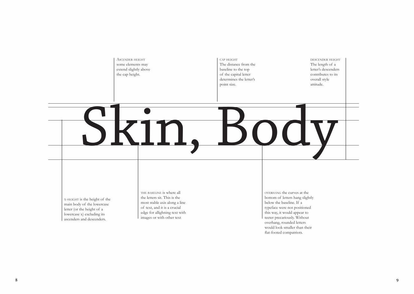
Baskerville was responsible for several advances in printing
technology, improving press platens and packings, formulating darker and faster-drying inks, and inventing wove paper, which was smoother than the old laid papers with their vertical ribbing. all of this enabled him to employ a typeface with sharper definition and thinner elements than was previously possible. This marks the move from the “garalde” to the transitional faces. Baskerville could not compete economically with printers using the cheaper, established technology. His matrices were sold by his widow, and changes hands several times, disappearing into obscurity until they were rediscovered and made known by Bruce Rogers around 1920. “Foundry” or “Fry” Baskerville is a later face based on the original Baskerville, which was cut by the Joseph Fry foundry in 1764. This cutting takes the
face more in the direction of the Didots. Rogers used it for display with the original Baskerville as text font. It is difficult to appreciate the qualities of Baskerville without first understanding the process of its creation. Baskerville grew out of an ongoing experimentation with printing technology. John Baskerville developed his own method of working, resulting in beautifully bright woven paper and darker inks. He created an intense black ink color through the tedious process of boiling fine linseed oil to a certain thickness, dissolving rosin, allowing months for it to subside and finally grinding it before use. As printers would not willingly reveal the methods within their print shops, Baskerville followed other printers closely and made the same purchases as them in hopes of setting up the same press. This routine resulted in the development of higher standards for presses altogether.
BaskervilleDesigned by John Baskervillein 1735
AZ
TO

- John Baskerville, preface to Milton, 1758
“Having been an early admirer of the beauty of letters, I became insensibly desirous of contributing to the perfection of them.”

The fonts of the Italian printer Giambattista Bodoni (1740–1813)
have been copied, revived and interpreted hundreds of times, although not always with success. Bodoni fonts are also some of the most difficult to imitate. The first hurdle facing a type designer wishing to draw a “new” Bodoni is selecting which cut of Bodoni’s typefaces to use as a foundation for the revival. He created over 140 roman fonts, a corresponding number of italic designs, more than 115 titling and script fonts, a large number of ornaments and several nonLatin scripts. Much of the strength and beauty of
Bodoni’s printing is a result of his ability to use absolutely the right design for any given application. If Bodoni wanted to use the equivalent of a 7½ point font, he had that type at his fingertips. If he wanted something of just slightly condensed proportions, or a font minutely lighter than previous lines, he had those also.
No printer was more acclaimed in his own lifetime than Giambattista Bodoni. He did away with old-style letters and introduced a new clear simple type - the Modern typeface. Due to the vast amount of bodoni cuts the roman letter he cut in 1798 is usually what we mean by a Bodoni.
BodoniDesign by Giambattista Bodoniin 1764
16 17
The typography Bodoni produced is still regarded as some of the most refined and structured printing ever produced. B

18 19
Bodoni

Named after Oxford’s Clarendon Press, the popular slab-serif was created in 1845 by Robert Besley for the Fann Street Foundry. Notable as one of the last new developments in nineteenth century typography, the letterforms represented a significant change from the slab-serif Antiques and Egyptians that were so popular in that time.
“The reason it was so widely copied is simple: it was extremely useful. It provided the attention-getting boldness to highlight a word or phrase, yet at the same time was compact and easier to read than the fat faces and antiques of the period,” HiH Retrofonts.
ClarendonDesigned by Robert BesleyIn 1845
20 21
C L A R E ND O N

“ ”22 23
Clarendon is one of the greatest success of British Typefounding.
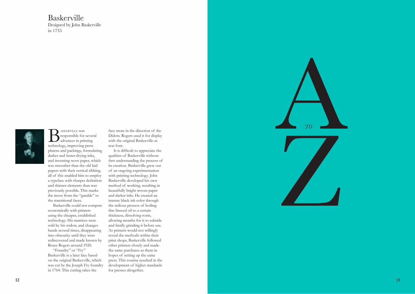
FuturaDesigned by Paul Renner.
Futura is a geometric sans-serif typeface, the letterforms are constructed
continuously meaning there are no emphatic points of transition or break between letter elements. The typeface has aspects of curves such as circular and other geometric shapes. Thus meaning the strokes are of a near-even weight, which are low in contrast. The axis of contrast whereby you can identify where the thickest and thinnest elements of a letter are, futura and its geometric
design means the transitions are nearly none-existent, This is most visible in the almost perfectly round stroke of the o, which in comparison to helvetica a more gradual transition is apparent. The lowercase has tall ascenders, which rise above the cap line. The uppercase characters present proportions similar to those of classical Roman capitals. Futura is now apart of a family of fonts with italic, medium italic, condensed medium, condensed extrabold and other variations.
24 25
A number of Futura weights are available, allowing a full range of creative expression. Futura bold is the most used weight for Barbican marketing materials across all art forms, supported and complemented by other weights as appropriate.

F u t u r a26 27

Gill Sansdesigned by Eric Gill in 1913.
The history of Gill Sans stems from Edward Johnston’s iconic typeface,
Johnston Sans, designed for the London Underground in 1913. Eric Gill, who had studied under Johnston at London’s Central School of Arts and Crafts, later became a friend and apprentice and even had a small role assisting in creation of the proprietary typeface. He designed his first typeface, Perpetua, for Stanley Morison, Of all the 11 typefaces that he designed, Gill Sans is his most famous. A Monotype advisor, Morison commissioned Gill to develop a complete font family to compete with the sans-serif designs released by German foundries fueled by the overwhelming success of Futura. The font was released commercially by Monotype in 1928 as Gill Sans. Gill Sans rose to popularity in 1929 when it became the standard typeface for the London and
North Eastern Railway, appearing on everything from locomotive nameplates to time tables. Many other notable companies (particularly in England) adopted Gill Sans as a corporate typeface by the mid-1900’s, including the BBC, British Railways, and ultimately Monotype themselves making the typeface Monotype’s fifth best seller of the twentieth century. Gill’s lettering is based on classic roman proportions, which give the sans-serif a less mechanical feel than its geometric contemporaries. The typeface was initially recommended for advertising and headline use, but as the public got used to reading sans-serif, Gill Sans turned out to work just as well for body text. Today over two dozen Gill Sans designs are available digitally, It can be seen everywhere, used on everything from corporate logos to movie posters—one industry that has actually embraced the unusual Ultra Bold.
28 29
“You don’t draw an ‘A’ and then stand back and say; there, that gives you a good idea of an ‘A’ as seen through an autum mist. Letters are things not pictures of things.”
Eric Gill, 1932.
30 31
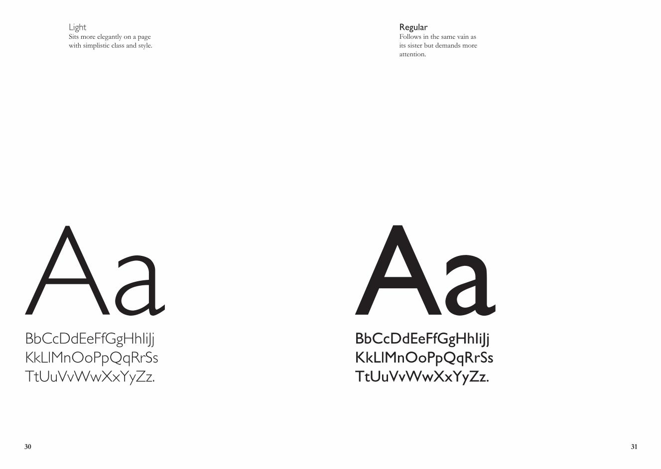
AaBbCcDdEeFfGgHhIiJjKkLlMnOoPpQqRrSsTtUuVvWwXxYyZz.
AaBbCcDdEeFfGgHhIiJjKkLlMnOoPpQqRrSsTtUuVvWwXxYyZz.
LightSits more elegantly on a page with simplistic class and style.
RegularFollows in the same vain as its sister but demands more attention.

HELVETIC
A
- Danny van den Dungen of Experimental Jetset
Helvetica, developed in 1957 by Max Miedinger and Edüard Hoffmann
for the Haas Type Foundry in Switzerland, elevated sans serif typography to ubiquity. The rise of different media forms and the modern advertising industry increased the need for a readable, easily displayed typeface. Overused to the point of exhaustion for some, considered classic and utilitarian by others, Helvetica soon found its way to prominence in forms, signs, logos and ads around the world.But popularity comes with a price. By the 1970s and 1980s designers were craving an alternative to both traditional serifs and sans serifs. Frutiger, a typeface that arrived on the scene in 1976, “humanized” Helvetica’s stark design by adding subtle-yet-smoother features,
such as slightly jagged and varying widths. The result was a warmer font that preserved sans serifs’ legibility. Humanist sans serifs are also exemplified by the Meta family of typefaces, developed by German designer ErikArial, considered a lesser sibling of Helvetica, can attribute its popularity to the computer age. In the early 1980s, Adobe licensed four fonts—Times, Helvetica, Courier and Symbol—to feature in its new PostScript language. But a company called Monotype soon released a cheaper Helvetica substitute called Arial, for use in Microsoft’s new TrueType font format. The two fonts are similar, but not entirely identical. With the rise of Windows and personal computing, Arial has replaced Helvetica as a digital standard, particularly on the Internet.
32 33
“When something is constructed as well as Helvetica, it should last for a couple of hundred years, just like great architecture.”
Helveticadesigned by Max Miedingerin 1957
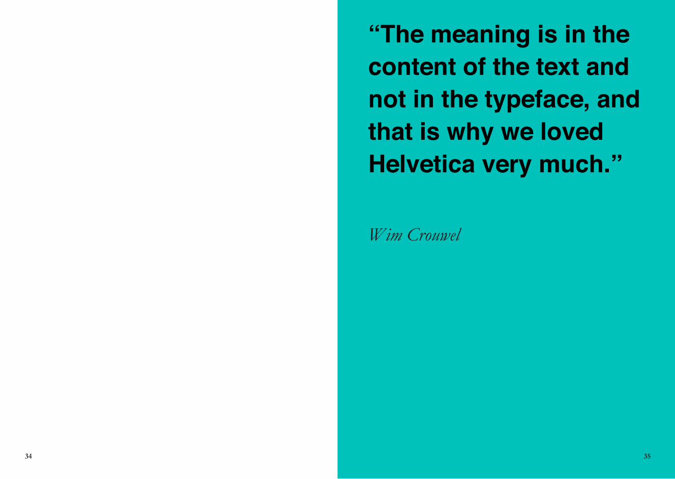
“The meaning is in the content of the text and not in the typeface, and that is why we loved Helvetica very much.”
Wim Crouwel
34 35

CREDITS
Aquae. Nemque dolorerum adis aut alis quiducienim der-rum, seque eumque sandam explaut quibus, aut quiderere-nem aniscid qui cuptaque verum aut labo. Cipsunducius eaqui volla iusapis et, occabo. Et aut et adionsenia non plab inis aspiciminis molupta musdae vit, aut eicatio. Mi, cum et, ommolute nusdae volore, odis ut est, cuptata sserum ipsa non rehende ntemporestio quassimendae comnihi tatescium nulparumet qui consequam re ipsanis aligent etus re dollor atur aliqui autat.
Es nus exped ma dus quam est quiaest otatiist, simustibus explant otatqui dicimin ctatet vendaerum sintiam fuga. Os eos voluptate quatio. Ures num soloriam, solenim illatem facienis iur aut lab illaccae nobis a vendio bea aut quos-tiasime dipieni berciis dolorrum et, ant et, unditi omnisci-tam que remolorepre molecto rerchit accaturit, cus aut et, sus, aliquo ea aborent.
Aperum soluptat aliam, esenime numendi genditat accus dit eum et ducit, odiae resti toribus molorei ciendamus et maxim voluptas ut venditatinto occum que nost eat iunti-unti audi commodis aut quiaepr ationest porem repudam facillandia nonsedi psapienihit pelignist, il ipit officatem
36 37