Embed Size (px)
Citation preview
Printed Manual
Rev 1.0
August 2013
Table of Contents Introduction .............................................................................................................. 4
Getting Started with Biamp Canvas ........................................................................... 4
Architect and Engineer Specification .......................................................................... 5
Documentation ........................................................................................................ 6
Versions ................................................................................................................. 6
Software Tools ........................................................................................................... 7
Software Tools ........................................................................................................ 7
Surface .................................................................................................................. 7
Context Menu ......................................................................................................... 8
Property Sheet ...................................................................................................... 10
Control Library ...................................................................................................... 12
Menus ..................................................................................................................... 13
File Menu ............................................................................................................. 14
Edit Menu ............................................................................................................. 16
View Menu ............................................................................................................ 17
View Menu Items ................................................................................................ 18
Control Library Menu ............................................................................................. 20
System Menu ........................................................................................................ 21
System menu Items ............................................................................................ 22
Tools Menus.......................................................................................................... 25
Tools Menu Items ............................................................................................... 25
Layout Menu ......................................................................................................... 31
Layout Menu Items ............................................................................................. 32
Window Menu ....................................................................................................... 42
Windows menu Items .......................................................................................... 43
Help Menu ............................................................................................................ 44
Toolbars .................................................................................................................. 45
Control Bar ........................................................................................................... 46
Control Bar Items ............................................................................................... 47
Format Bar ........................................................................................................... 56
Layout Bar ............................................................................................................ 57
Network Bar ......................................................................................................... 58
Object Bar ............................................................................................................ 59
Object Bar Items ................................................................................................ 60
Standard Toolbar ................................................................................................... 64
Status Bar ............................................................................................................ 65
Keyboard Shortcuts .................................................................................................. 66
Designing Control Surfaces ........................................................................................ 69
Placing Objects ..................................................................................................... 70
Customizing Appearance ........................................................................................ 72
Adding Control Pages ............................................................................................. 73
Application Controls ............................................................................................... 75
Managing Presets .................................................................................................. 79
Adding Popup Controls ........................................................................................... 82
Testing Control Surfaces......................................................................................... 85
Use of Gang Groups ............................................................................................... 85
Sending Control Surfaces .......................................................................................... 87
System Network Considerations ................................................................................. 88
Accessing Control Surfaces ........................................................................................ 89
Preparing Control Surfaces ........................................................................................ 90
Using Control Surfaces .............................................................................................. 91
Introduction
Getting Started with Biamp Canvas
Biamp Canvas is a software program designed to allow the creation and use of customized
computer control screens with Tesira® digital audio systems. The function and appearance
of the graphic control interface can be tailored to the exact needs of the user. Individual or
grouped sets of controls may be placed and assigned to specific system functions, or
component objects can be copied directly from the system design file into Biamp Canvas
software, producing completely preassigned user controls. An array of drawing tools is
provided for extensive graphic manipulation of controls, backgrounds, and labeling. Control
screens can be created with the ability to easily navigate between multiple pages of
operation. Once created, a control file is downloaded into the system, where it can then be
accessed by multiple network computers running Biamp Canvas software. The software
cannot alter the system design itself, and access to the system may be controlled by
passwords and user accounts. System control may be provided using a combination of
Biamp Canvas software, hardware control panels, and third-party control systems
simultaneously.
The Biamp Canvas Software Application has a number of Software Tools including Toolbars
and Keyboard Shortcuts to aid in creating customized control surfaces. Designing Control
Surfaces and Sending Control Surfaces to a correctly configured Tesira System allows easy
end-user system control.
Recommended Minimum Requirements
Windows® 7 SP1 32-bit or 64-bit 1280x1024 screen resolution
1280x1024 screen resolution.(recommended)
Prerequisites
A minimum of 1 Biamp Tesira SERVER or SERVER I/O must be present on the system.
Architect and Engineer Specification
The control software program shall allow the creation and use of customized computer
control screens with Tesira® digital audio systems. The function and appearance of the
graphic control interface can be tailored to the exact needs of the user. Individual or
grouped sets of controls may be placed and assigned to specific system functions, or
component objects can be copied directly from the system design file into Biamp Canvas
software, producing completely preassigned user controls. An array of drawing tools is
provided for extensive graphic manipulation of controls, backgrounds, and labeling. Control
screens can be created with the ability to easily navigate between multiple pages of
operation. Once created, a control file is downloaded into the system, where it can then be
accessed by multiple network computers running Biamp Canvas software. The software
cannot alter the system design itself, and access to the system may be controlled by
passwords and user accounts. System control may be provided using a combination of
Biamp Canvas software, hardware control panels, and third-party control systems
simultaneously. The control software program shall be Biamp Canvas™.
Windows® is a registered trademark of Microsoft Corporation.
Software requirements are:
Windows® 7 SP1 32-bit or 64-bit
1280x1024 screen resolution
Documentation
The information contained in this Help file can be printed in manual form (with Table of
Contents and Index). A PDF version of the document can be downloaded from the web site
in either Letter (8.5" x 11") or A4 (210mm x 297mm) format.
Versions
Biamp Canvas 1.0
First Release
Must be used with Tesira Software 1.2 or later Must be used with Tesira Firmware 1.2 or later
Software Tools
Software Tools
There are a number of Software Tools that are available to a Biamp Canvas file. The main
design area is the Surface which is used to lay out control elements that are related back to
a Tesira Project File. Each control element has a Property Sheet that is used to define its
behavior and formatting. A Control Library can be used to add regularly used control
elements to be stored for as part of re-using required controls. A number of additional
software configuration functions are available via the Menus and Toolbars. Keyboard
Shortcuts can be used if preferred for some functions.
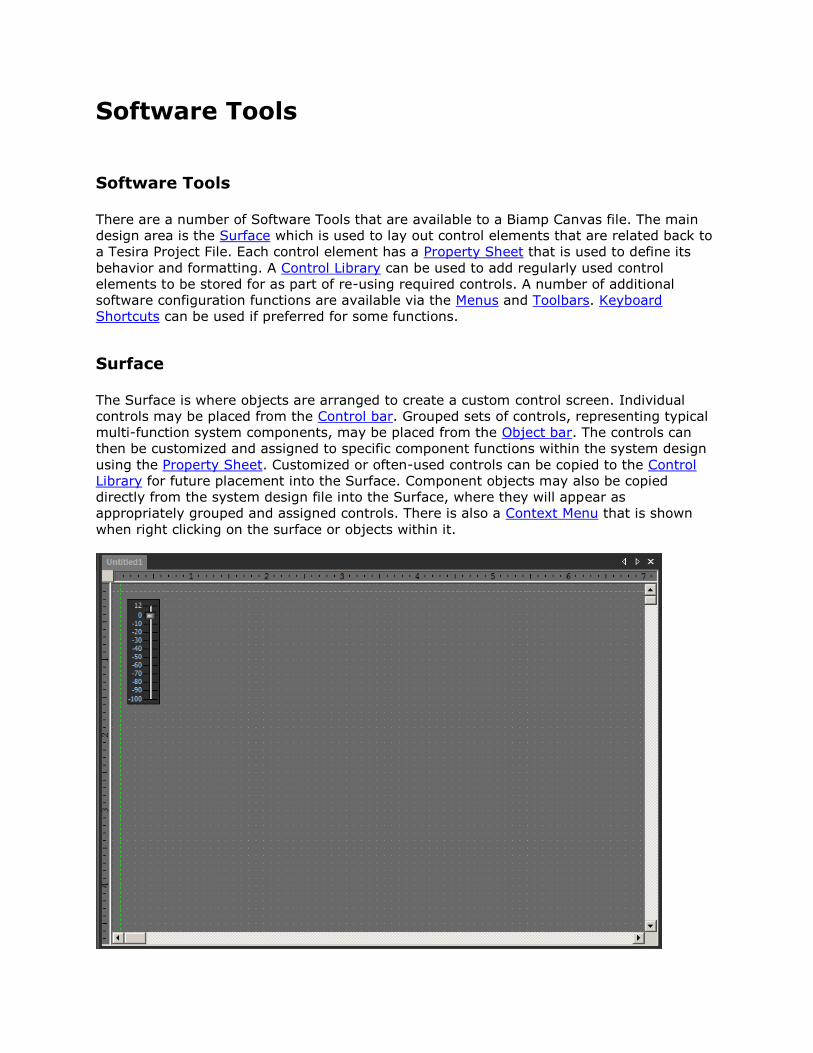
Surface
The Surface is where objects are arranged to create a custom control screen. Individual
controls may be placed from the Control bar. Grouped sets of controls, representing typical
multi-function system components, may be placed from the Object bar. The controls can
then be customized and assigned to specific component functions within the system design
using the Property Sheet. Customized or often-used controls can be copied to the Control
Library for future placement into the Surface. Component objects may also be copied
directly from the system design file into the Surface, where they will appear as
appropriately grouped and assigned controls. There is also a Context Menu that is shown
when right clicking on the surface or objects within it.
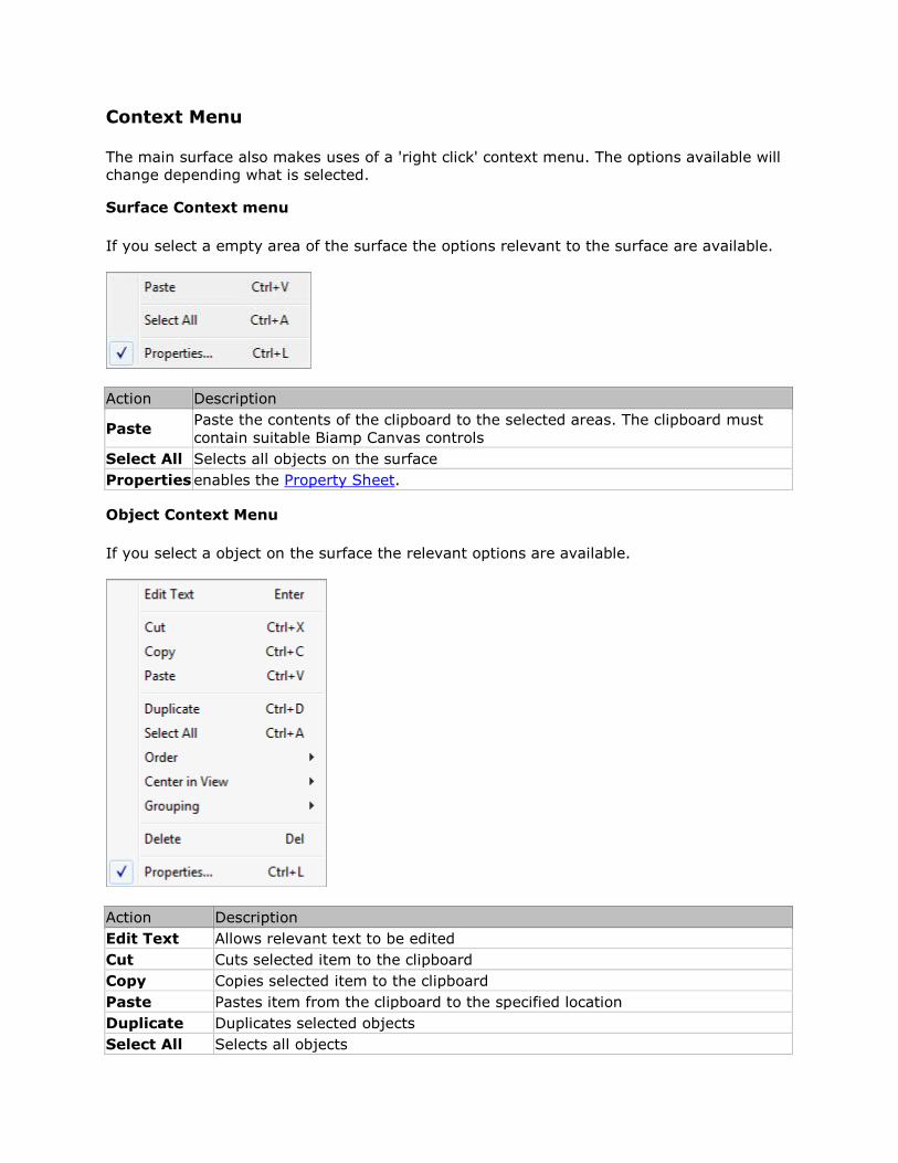
Context Menu
The main surface also makes uses of a 'right click' context menu. The options available will
change depending what is selected.
Surface Context menu
If you select a empty area of the surface the options relevant to the surface are available.
Action Description
Paste Paste the contents of the clipboard to the selected areas. The clipboard must
contain suitable Biamp Canvas controls
Select All Selects all objects on the surface
Properties enables the Property Sheet.
Object Context Menu
If you select a object on the surface the relevant options are available.
Action Description
Edit Text Allows relevant text to be edited
Cut Cuts selected item to the clipboard
Copy Copies selected item to the clipboard
Paste Pastes item from the clipboard to the specified location
Duplicate Duplicates selected objects
Select All Selects all objects
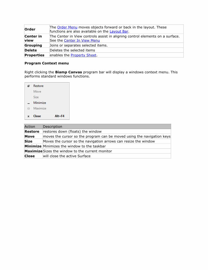
Order The Order Menu moves objects forward or back in the layout. These
functions are also available on the Layout Bar.
Center in
view
The Center in View controls assist in aligning control elements on a surface.
See the Center In View Menu
Grouping Joins or separates selected items.
Delete Deletes the selected items
Properties enables the Property Sheet.
Program Context menu
Right clicking the Biamp Canvas program bar will display a windows context menu. This
performs standard windows functions.
Action Description
Restore restores down (floats) the window
Move moves the cursor so the program can be moved using the navigation keys
Size Moves the cursor so the navigation arrows can resize the window
Minimize Minimizes the window to the taskbar
Maximize Sizes the window to the current monitor
Close will close the active Surface
Property Sheet
The Property Sheet is where various attributes of one or more objects selected in the
Surface may be customized.
The Display Properties tab has settings for things as position, size, shape,
orientation, color, and labeling.
The DSP Properties tab is used to assign a control to a specific component in the
system design file. The Instance ID Tag, DSP Block Type, Attribute, and
Input/Output fields must be populated with information taken from a Tesira system
design file.
Grouped controls created from the Object Bar require only an Instance ID Tag, which can be
assigned to the group as a whole by first disabling 1By1 (this allows access to common
properties within a 'Multi-Selection' of controls). An alternative is to copy components from
the system design file and paste directly onto the Surface, where they will appear as
appropriately grouped and assigned controls. These controls can then be ungrouped and
receive further customization of their Display Attributes. Please refer to the Placing Objects
section for more details.
Display and DSP Properties
Display Properties are available for all objects, including non-control objects such as text
boxes, frames, and the Surface background.
Certain Display Attributes, such as position, size, shape, color, and labeling, can be
customized within the Surface itself. Some of these can be done by simply dragging the
object, others can be done through selections made from either the Layout Bar or the
Format Bar.
DSP Properties also include User Access Level, which can be used to make specific
controls inaccessible for certain User Accounts and Use of Gang Groups, which allows
multiple controls of the same type to have combined operation. Data Attributes are
available only for control objects.
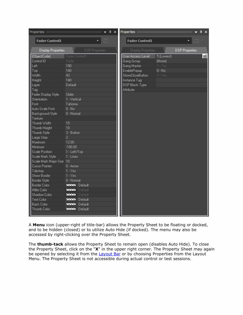
A Menu icon (upper-right of title-bar) allows the Property Sheet to be floating or docked,
and to be hidden (closed) or to utilize Auto Hide (if docked). The menu may also be
accessed by right-clicking over the Property Sheet.
The thumb-tack allows the Property Sheet to remain open (disables Auto Hide). To close
the Property Sheet, click on the "X" in the upper right corner. The Property Sheet may again
be opened by selecting it from the Layout Bar or by choosing Properties from the Layout
Menu. The Property Sheet is not accessible during actual control or test sessions.
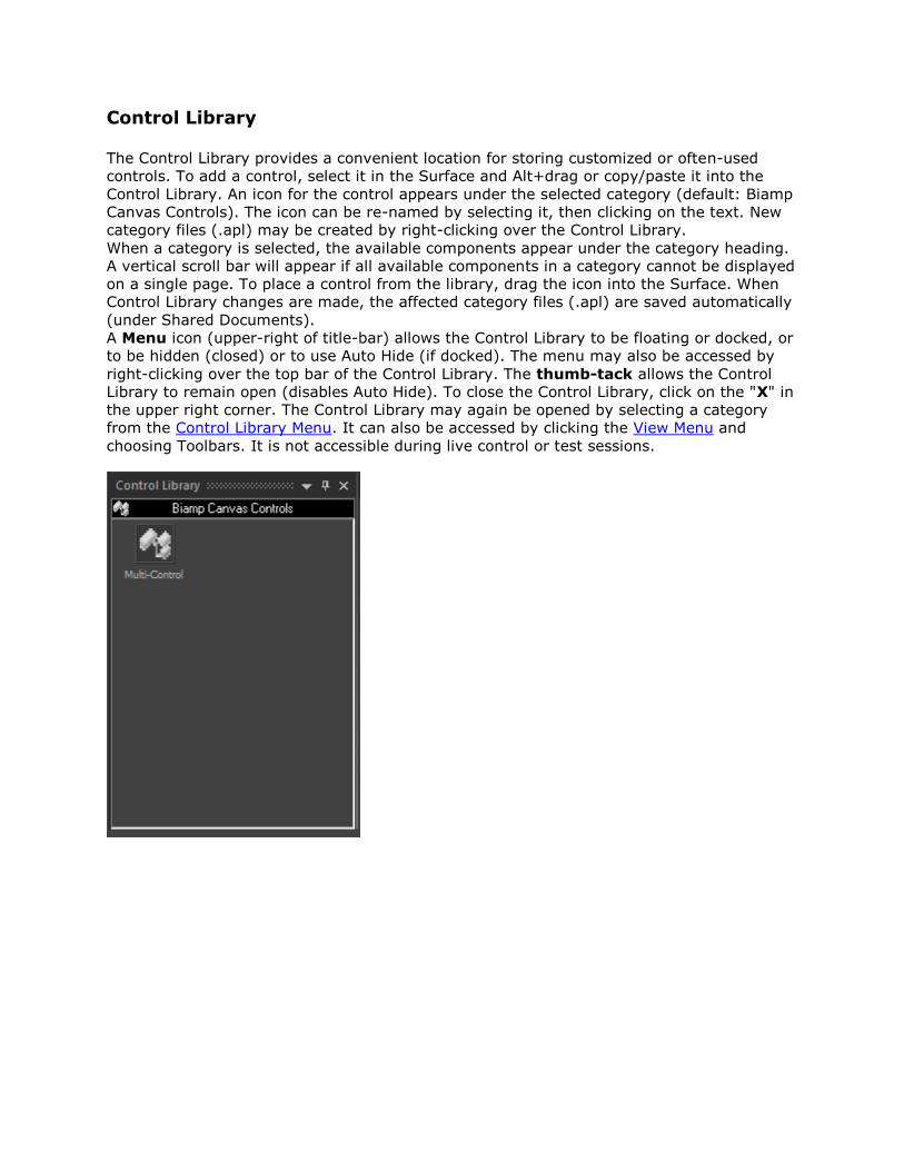
Control Library
The Control Library provides a convenient location for storing customized or often-used
controls. To add a control, select it in the Surface and Alt+drag or copy/paste it into the
Control Library. An icon for the control appears under the selected category (default: Biamp
Canvas Controls). The icon can be re-named by selecting it, then clicking on the text. New
category files (.apl) may be created by right-clicking over the Control Library.
When a category is selected, the available components appear under the category heading.
A vertical scroll bar will appear if all available components in a category cannot be displayed
on a single page. To place a control from the library, drag the icon into the Surface. When
Control Library changes are made, the affected category files (.apl) are saved automatically
(under Shared Documents).
A Menu icon (upper-right of title-bar) allows the Control Library to be floating or docked, or
to be hidden (closed) or to use Auto Hide (if docked). The menu may also be accessed by
right-clicking over the top bar of the Control Library. The thumb-tack allows the Control
Library to remain open (disables Auto Hide). To close the Control Library, click on the "X" in
the upper right corner. The Control Library may again be opened by selecting a category
from the Control Library Menu. It can also be accessed by clicking the View Menu and
choosing Toolbars. It is not accessible during live control or test sessions.
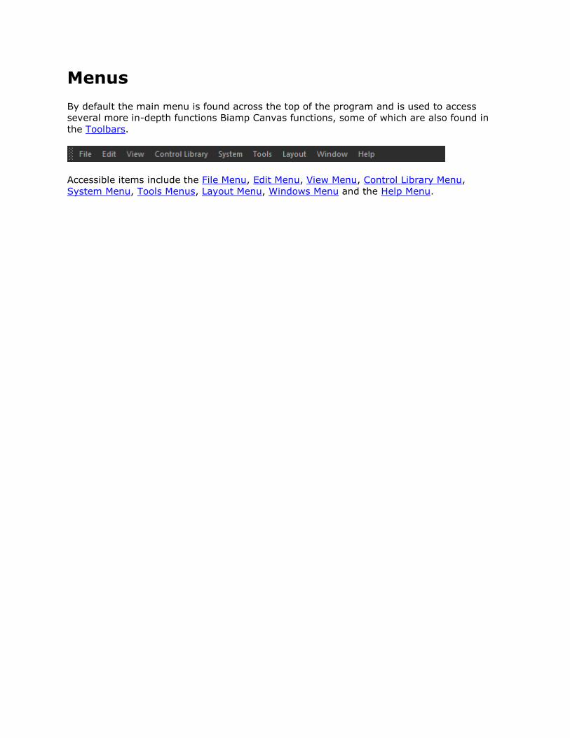
Menus
By default the main menu is found across the top of the program and is used to access
several more in-depth functions Biamp Canvas functions, some of which are also found in
the Toolbars.
Accessible items include the File Menu, Edit Menu, View Menu, Control Library Menu,
System Menu, Tools Menus, Layout Menu, Windows Menu and the Help Menu.
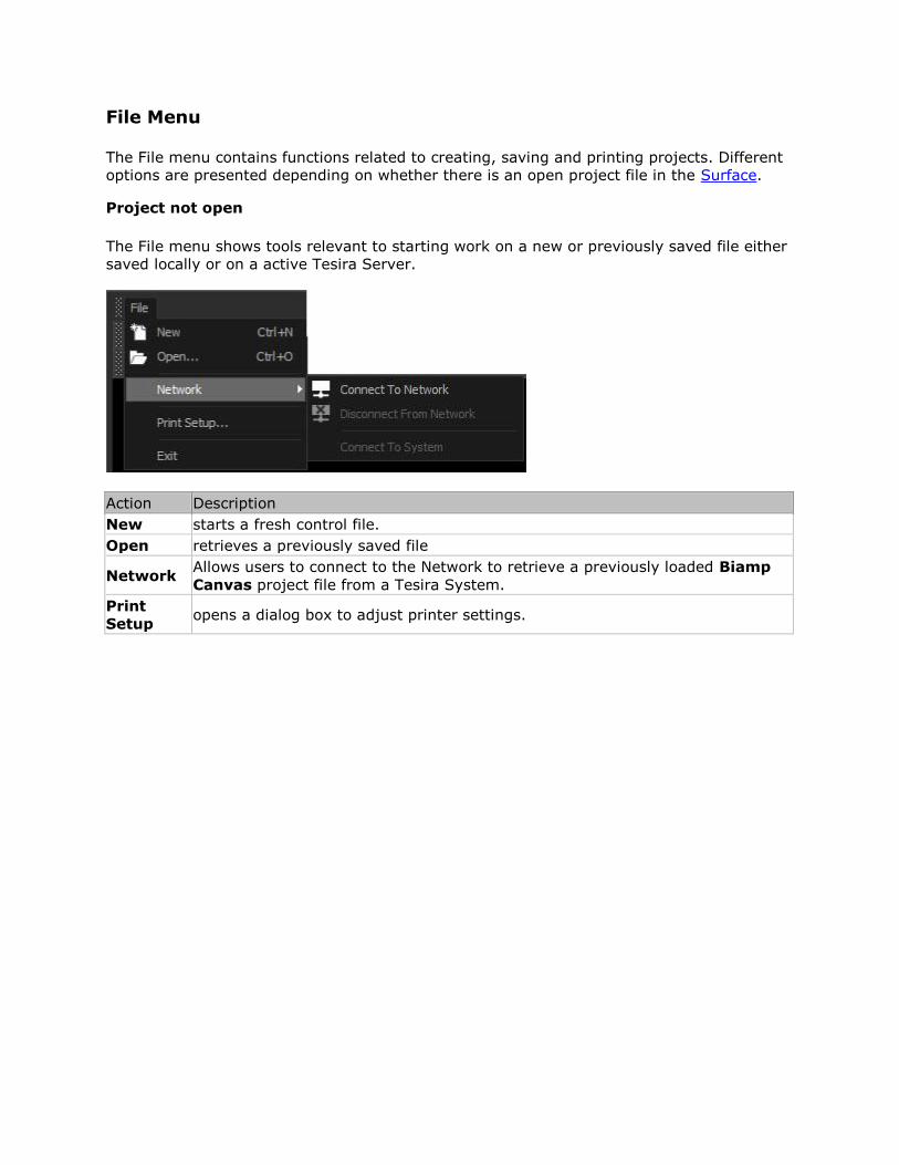
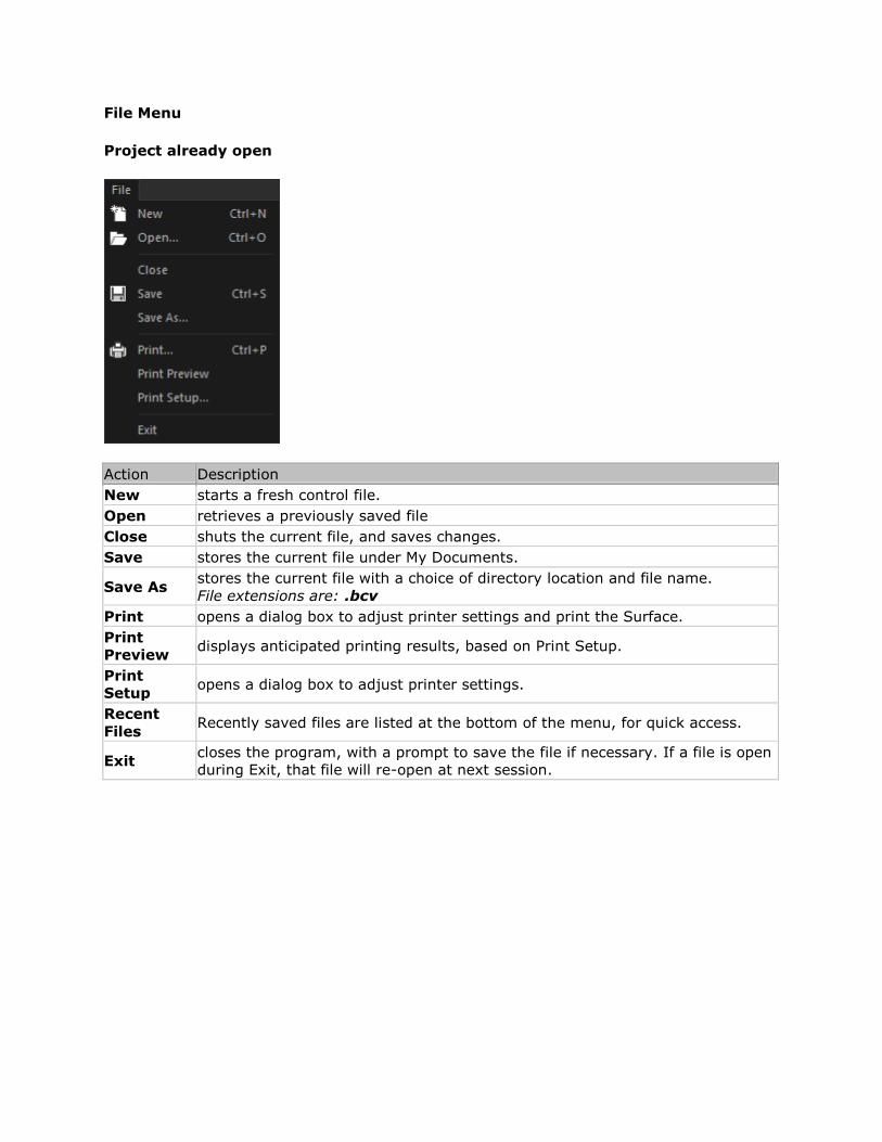
File Menu
The File menu contains functions related to creating, saving and printing projects. Different
options are presented depending on whether there is an open project file in the Surface.
Project not open
The File menu shows tools relevant to starting work on a new or previously saved file either
saved locally or on a active Tesira Server.
Action Description
New starts a fresh control file.
Open retrieves a previously saved file
Network Allows users to connect to the Network to retrieve a previously loaded Biamp
Canvas project file from a Tesira System.
Setup opens a dialog box to adjust printer settings.
File Menu
Project already open
Action Description
New starts a fresh control file.
Open retrieves a previously saved file
Close shuts the current file, and saves changes.
Save stores the current file under My Documents.
Save As stores the current file with a choice of directory location and file name.
File extensions are: .bcv
Print opens a dialog box to adjust printer settings and print the Surface.
Preview displays anticipated printing results, based on Print Setup.
Setup opens a dialog box to adjust printer settings.
Recent
Files Recently saved files are listed at the bottom of the menu, for quick access.
Exit closes the program, with a prompt to save the file if necessary. If a file is open
during Exit, that file will re-open at next session.
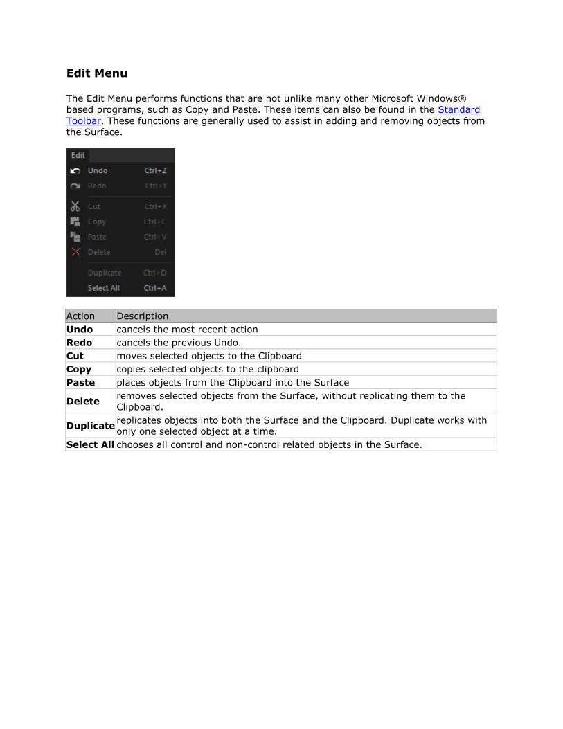
Edit Menu
The Edit Menu performs functions that are not unlike many other Microsoft Windows®
based programs, such as Copy and Paste. These items can also be found in the Standard
Toolbar. These functions are generally used to assist in adding and removing objects from
the Surface.
Action Description
Undo cancels the most recent action
Redo cancels the previous Undo.
Cut moves selected objects to the Clipboard
Copy copies selected objects to the clipboard
Paste places objects from the Clipboard into the Surface
Delete removes selected objects from the Surface, without replicating them to the
Clipboard.
Duplicate replicates objects into both the Surface and the Clipboard. Duplicate works with
only one selected object at a time.
Select All chooses all control and non-control related objects in the Surface.
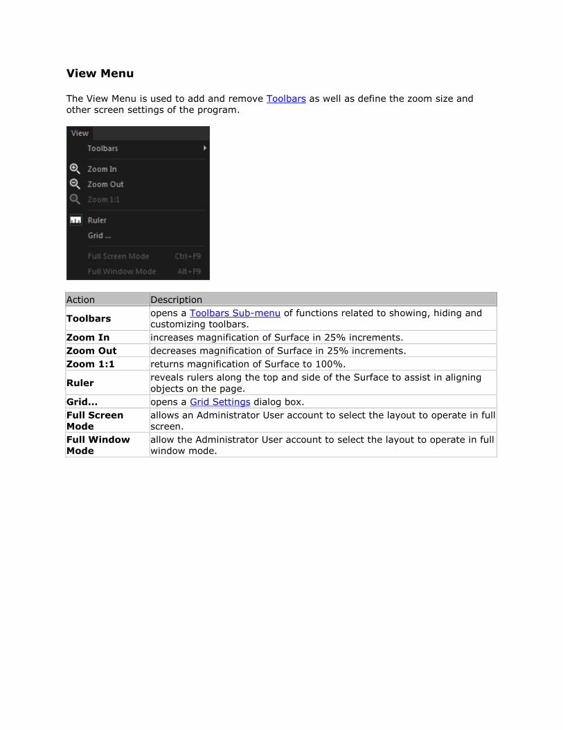
View Menu
The View Menu is used to add and remove Toolbars as well as define the zoom size and
other screen settings of the program.
Action Description
Toolbars opens a Toolbars Sub-menu of functions related to showing, hiding and
customizing toolbars.
Zoom In increases magnification of Surface in 25% increments.
Zoom Out decreases magnification of Surface in 25% increments.
Zoom 1:1 returns magnification of Surface to 100%.
Ruler reveals rulers along the top and side of the Surface to assist in aligning
objects on the page.
Grid... opens a Grid Settings dialog box.
Full Screen
Mode
allows an Administrator User account to select the layout to operate in full
screen.
Full Window
Mode
allow the Administrator User account to select the layout to operate in full
window mode.
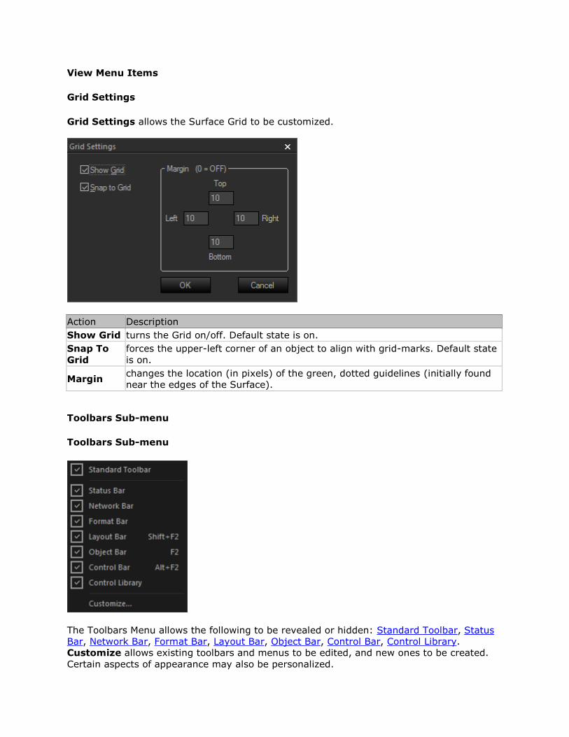
View Menu Items
Grid Settings
Grid Settings allows the Surface Grid to be customized.
Action Description
Show Grid turns the Grid on/off. Default state is on.
Snap To
Grid
forces the upper-left corner of an object to align with grid-marks. Default state
is on.
Margin changes the location (in pixels) of the green, dotted guidelines (initially found
near the edges of the Surface).
Toolbars Sub-menu
Toolbars Sub-menu
The Toolbars Menu allows the following to be revealed or hidden: Standard Toolbar, Status
Bar, Network Bar, Format Bar, Layout Bar, Object Bar, Control Bar, Control Library.
Customize allows existing toolbars and menus to be edited, and new ones to be created.
Certain aspects of appearance may also be personalized.
Control Library Menu
The Control Library Menu provides a list of control categories from the Control Library.
When a category is selected from the menu, the Control Library opens to that category
automatically.
System Menu
The System Menu provides some system-related functions.
Action Description
Connect To
System
produces the System Connect dialog window, which is used to connect
to a control surface, send a control surface, update user accounts and
other system functions.
Disconnect From
System terminates the active control session.
Synchronize
State Data refreshes all local control data to match system devices.
Login produces a system login prompt, if user accounts are enabled.
Logout will end the current user account session.
Edit User
Accounts
produces a User Accounts dialog window which is used to add, remove
and manage user accounts.
System menu Items
Edit User Accounts
Edit User Account allows creation and editing of accounts. User accounts can be used to
restrict access to the control surface to specific people. An account requires a User Name,
Access Level and Password. When Edit User Accounts is selected, a Tesira Credentials
dialog window is shown. User account creation in Biamp Canvas is linked to a valid,
credentialed Tesira admin or user, and these credentials must be entered at this
stage. Failure to enter valid Tesira credentials will cause any subsequently created user
accounts to be invalid. Also, any Biamp Canvas users created under these credentials will
have the same privilege level as the admin or user who created them. That is, if a Tesira
Designer's credentials are entered, any Biamp Canvas users created under them will have
Designer level privilege in Biamp Canvas. A Biamp Canvas user's credentials cannot be used
to access a Tesira system.
Edit User Account Dialog
Action Description
User Name The name of the User account
Access Level determines which controls will be available to that user. Control objects are
also assigned to Access Levels, via the Property Sheet.
Start Page determines which Control Page is to be accessed initially by this user.
Password The account Password.
Administrator Checking this box will give the user admin level privileges within Biamp
Canvas
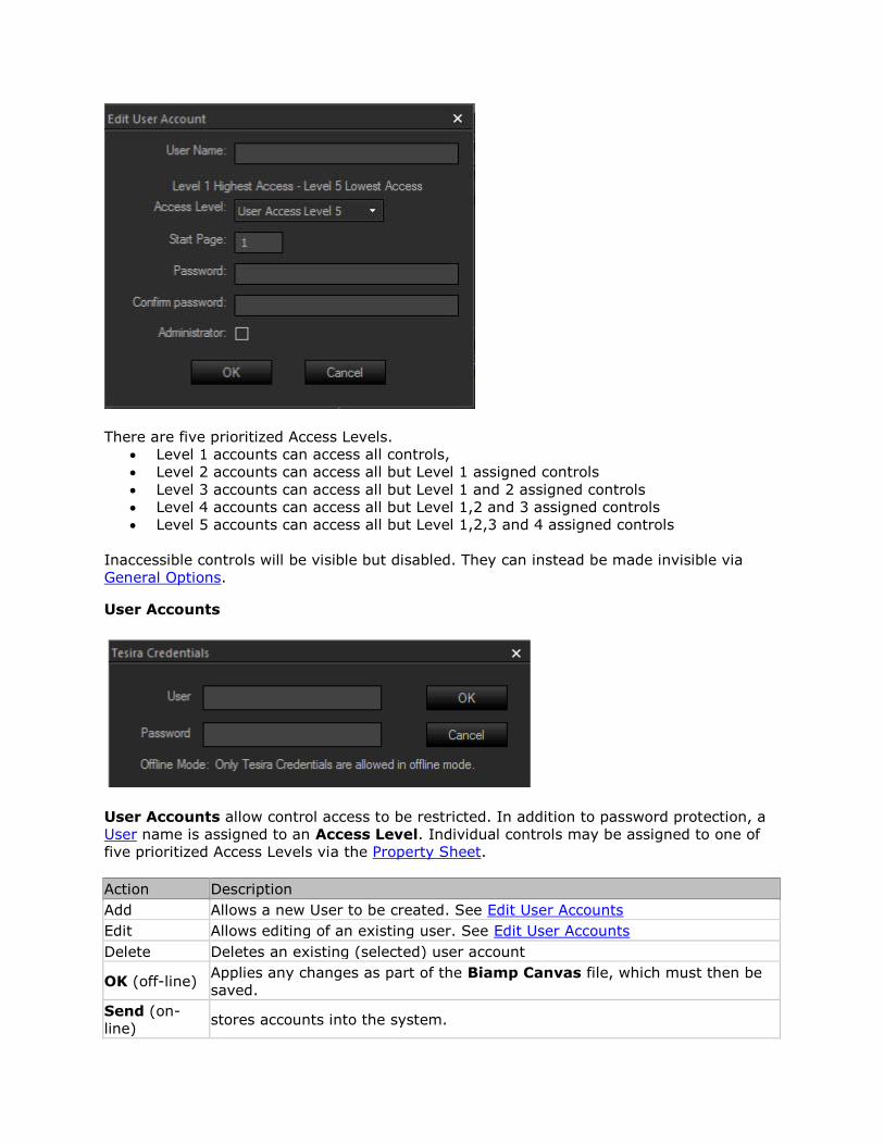
There are five prioritized Access Levels.
Level 1 accounts can access all controls,
Level 2 accounts can access all but Level 1 assigned controls
Level 3 accounts can access all but Level 1 and 2 assigned controls
Level 4 accounts can access all but Level 1,2 and 3 assigned controls
Level 5 accounts can access all but Level 1,2,3 and 4 assigned controls
Inaccessible controls will be visible but disabled. They can instead be made invisible via
General Options.
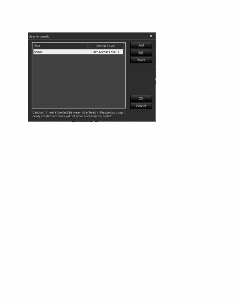
User Accounts
User Accounts allow control access to be restricted. In addition to password protection, a
User name is assigned to an Access Level. Individual controls may be assigned to one of
five prioritized Access Levels via the Property Sheet.
Action Description
Add Allows a new User to be created. See Edit User Accounts
Edit Allows editing of an existing user. See Edit User Accounts
Delete Deletes an existing (selected) user account
OK (off-line) Applies any changes as part of the Biamp Canvas file, which must then be
saved.
Send (on-
line) stores accounts into the system.
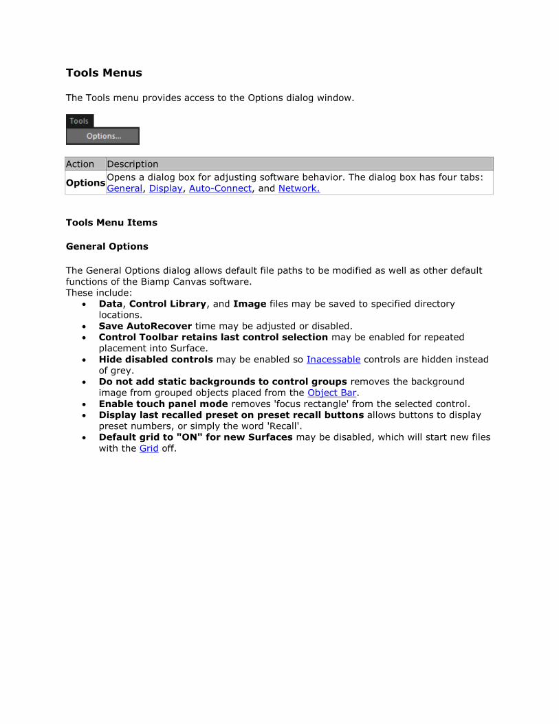
Tools Menus
The Tools menu provides access to the Options dialog window.
Action Description
Options Opens a dialog box for adjusting software behavior. The dialog box has four tabs:
General, Display, Auto-Connect, and Network.
Tools Menu Items
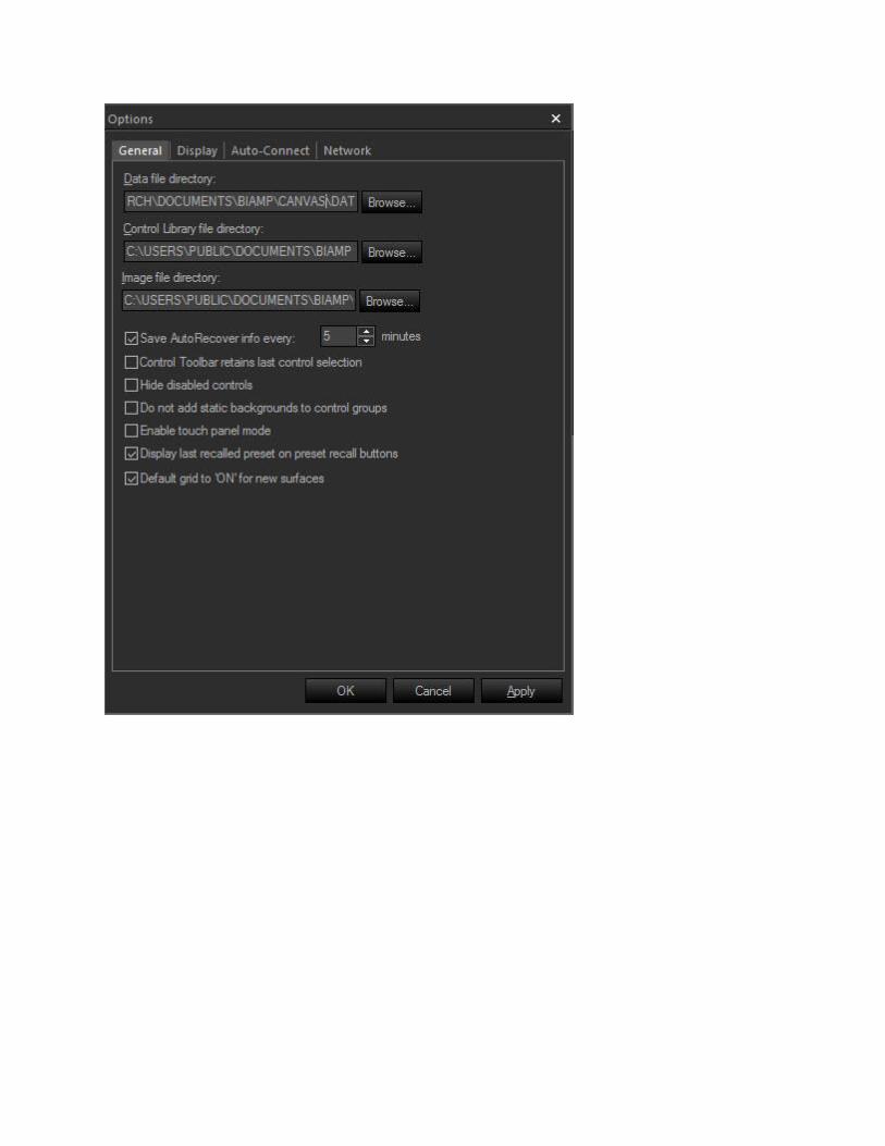
General Options
The General Options dialog allows default file paths to be modified as well as other default
functions of the Biamp Canvas software.
These include:
Data, Control Library, and Image files may be saved to specified directory
locations.
Save AutoRecover time may be adjusted or disabled.
Control Toolbar retains last control selection may be enabled for repeated
placement into Surface.
Hide disabled controls may be enabled so Inacessable controls are hidden instead
of grey.
Do not add static backgrounds to control groups removes the background
image from grouped objects placed from the Object Bar.
Enable touch panel mode removes 'focus rectangle' from the selected control.
Display last recalled preset on preset recall buttons allows buttons to display
preset numbers, or simply the word 'Recall'.
Default grid to "ON" for new Surfaces may be disabled, which will start new files
with the Grid off.
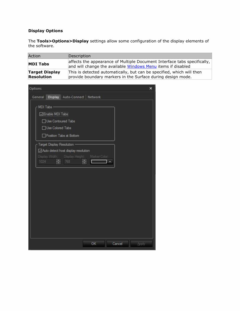
Display Options
The Tools>Options>Display settings allow some configuration of the display elements of
the software.
Action Description
MDI Tabs affects the appearance of Multiple Document Interface tabs specifically,
and will change the available Windows Menu items if disabled
Target Display
Resolution
This is detected automatically, but can be specified, which will then
provide boundary markers in the Surface during design mode.
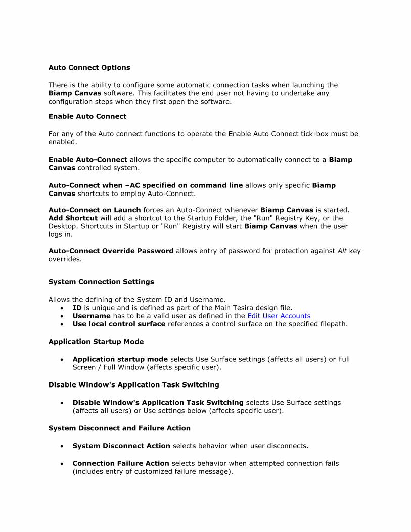
Auto Connect Options
There is the ability to configure some automatic connection tasks when launching the
Biamp Canvas software. This facilitates the end user not having to undertake any
configuration steps when they first open the software.
Enable Auto Connect
For any of the Auto connect functions to operate the Enable Auto Connect tick-box must be
enabled.
Enable Auto-Connect allows the specific computer to automatically connect to a Biamp
Canvas controlled system.
Auto-Connect when –AC specified on command line allows only specific Biamp
Canvas shortcuts to employ Auto-Connect.
Auto-Connect on Launch forces an Auto-Connect whenever Biamp Canvas is started.
Add Shortcut will add a shortcut to the Startup Folder, the "Run" Registry Key, or the
Desktop. Shortcuts in Startup or "Run" Registry will start Biamp Canvas when the user
logs in.
Auto-Connect Override Password allows entry of password for protection against Alt key
overrides.
System Connection Settings
Allows the defining of the System ID and Username.
ID is unique and is defined as part of the Main Tesira design file.
Username has to be a valid user as defined in the Edit User Accounts Use local control surface references a control surface on the specified filepath.
Application Startup Mode
Application startup mode selects Use Surface settings (affects all users) or Full Screen / Full Window (affects specific user).
Disable Window's Application Task Switching
Disable Window's Application Task Switching selects Use Surface settings
(affects all users) or Use settings below (affects specific user).
System Disconnect and Failure Action
System Disconnect Action selects behavior when user disconnects.
Connection Failure Action selects behavior when attempted connection fails
(includes entry of customized failure message).
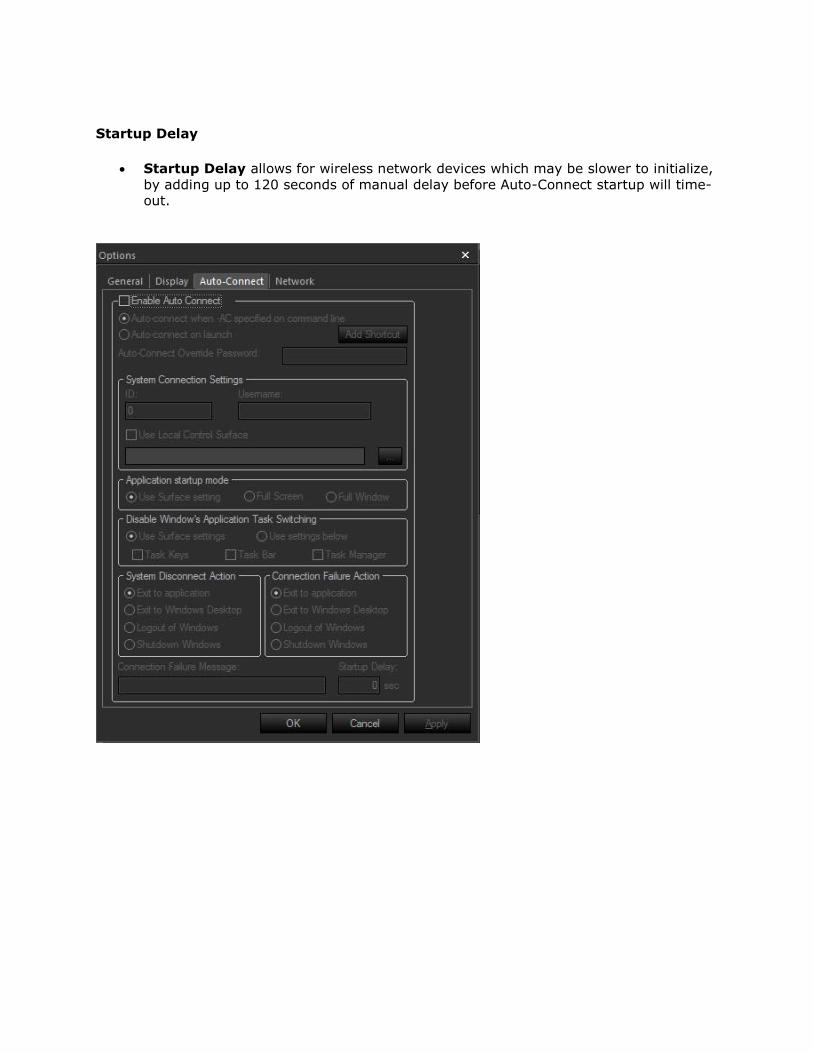
Startup Delay
Startup Delay allows for wireless network devices which may be slower to initialize,
by adding up to 120 seconds of manual delay before Auto-Connect startup will time-out.
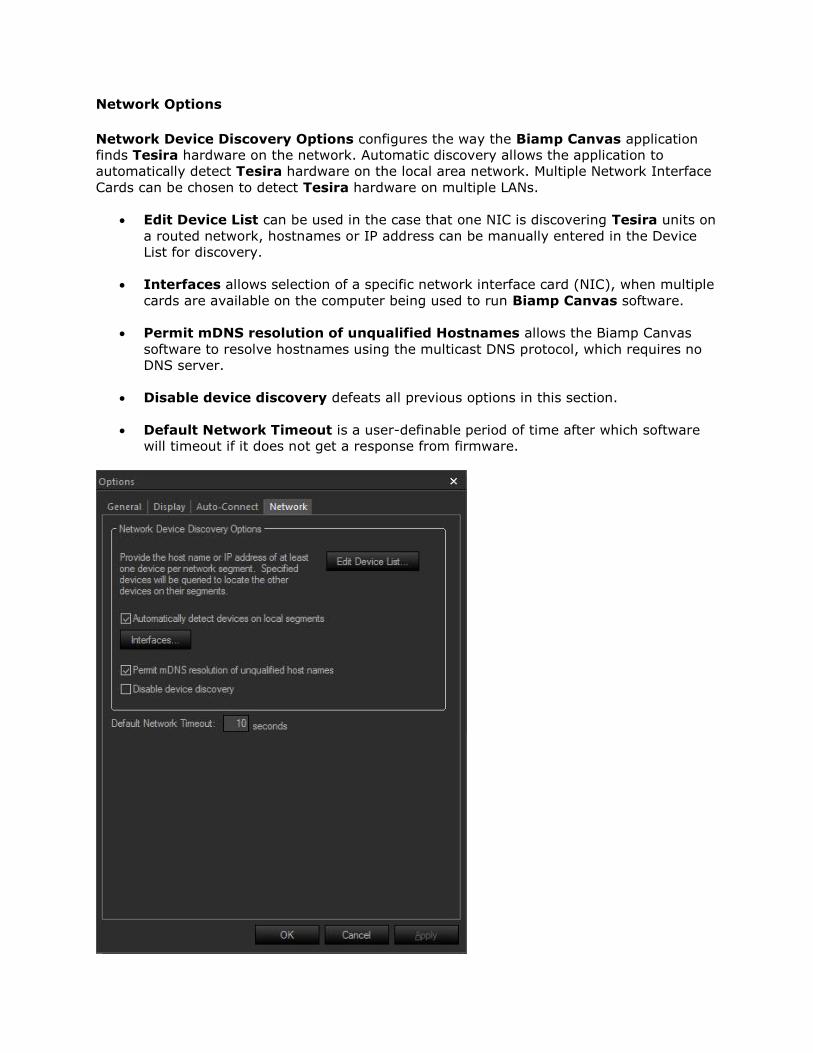
Network Options
Network Device Discovery Options configures the way the Biamp Canvas application
finds Tesira hardware on the network. Automatic discovery allows the application to
automatically detect Tesira hardware on the local area network. Multiple Network Interface
Cards can be chosen to detect Tesira hardware on multiple LANs.
Edit Device List can be used in the case that one NIC is discovering Tesira units on
a routed network, hostnames or IP address can be manually entered in the Device
List for discovery.
Interfaces allows selection of a specific network interface card (NIC), when multiple
cards are available on the computer being used to run Biamp Canvas software.
Permit mDNS resolution of unqualified Hostnames allows the Biamp Canvas
software to resolve hostnames using the multicast DNS protocol, which requires no
DNS server.
Disable device discovery defeats all previous options in this section.
Default Network Timeout is a user-definable period of time after which software
will timeout if it does not get a response from firmware.
Layout Menu
Layout Menu
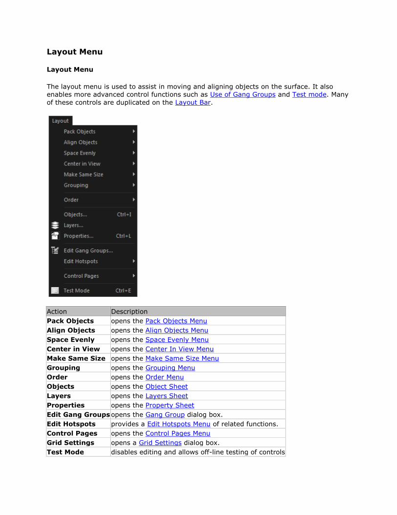
The layout menu is used to assist in moving and aligning objects on the surface. It also
enables more advanced control functions such as Use of Gang Groups and Test mode. Many
of these controls are duplicated on the Layout Bar.
Action Description
Pack Objects opens the Pack Objects Menu
Align Objects opens the Align Objects Menu
Space Evenly opens the Space Evenly Menu
Center in View opens the Center In View Menu
Make Same Size opens the Make Same Size Menu
Grouping opens the Grouping Menu
Order opens the Order Menu
Objects opens the Object Sheet
Layers opens the Layers Sheet
Properties opens the Property Sheet
Edit Gang Groups opens the Gang Group dialog box.
Edit Hotspots provides a Edit Hotspots Menu of related functions.
Control Pages opens the Control Pages Menu
Grid Settings opens a Grid Settings dialog box.
Test Mode disables editing and allows off-line testing of controls
Layout Menu Items
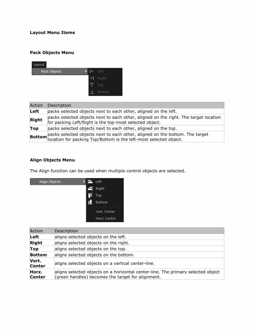
Pack Objects Menu
Action Description
Left packs selected objects next to each other, aligned on the left.
Right packs selected objects next to each other, aligned on the right. The target location
for packing Left/Right is the top-most selected object.
Top packs selected objects next to each other, aligned on the top.
Bottom packs selected objects next to each other, aligned on the bottom. The target
location for packing Top/Bottom is the left-most selected object.
Align Objects Menu
The Align function can be used when multiple control objects are selected.
Action Description
Left aligns selected objects on the left.
Right aligns selected objects on the right.
Top aligns selected objects on the top.
Bottom aligns selected objects on the bottom.
Vert.
Center aligns selected objects on a vertical center-line.
Horz.
Center
aligns selected objects on a horizontal center-line. The primary selected object
(green handles) becomes the target for alignment.
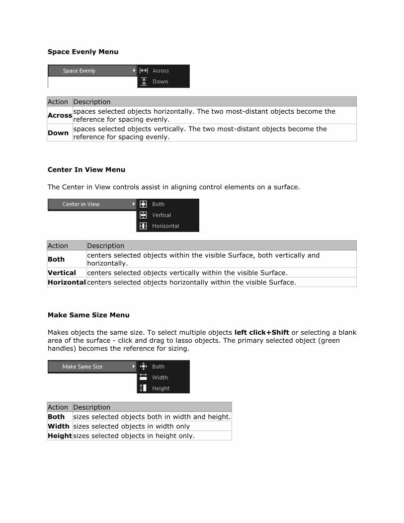
Space Evenly Menu
Action Description
Across spaces selected objects horizontally. The two most-distant objects become the
reference for spacing evenly.
Down spaces selected objects vertically. The two most-distant objects become the
reference for spacing evenly.
Center In View Menu
The Center in View controls assist in aligning control elements on a surface.
Action Description
Both centers selected objects within the visible Surface, both vertically and
horizontally.
Vertical centers selected objects vertically within the visible Surface.
Horizontal centers selected objects horizontally within the visible Surface.
Make Same Size Menu
Makes objects the same size. To select multiple objects left click+Shift or selecting a blank
area of the surface - click and drag to lasso objects. The primary selected object (green
handles) becomes the reference for sizing.
Action Description
Both sizes selected objects both in width and height.
Width sizes selected objects in width only
Height sizes selected objects in height only.
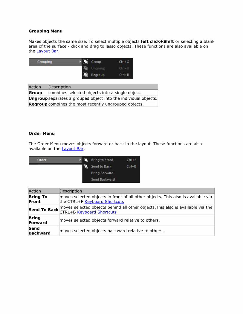
Grouping Menu
Makes objects the same size. To select multiple objects left click+Shift or selecting a blank
area of the surface - click and drag to lasso objects. These functions are also available on
the Layout Bar.
Action Description
Group combines selected objects into a single object.
Ungroup separates a grouped object into the individual objects.
Regroup combines the most recently ungrouped objects.
Order Menu
The Order Menu moves objects forward or back in the layout. These functions are also
available on the Layout Bar.
Action Description
Bring To
Front
moves selected objects in front of all other objects. This also is available via
the CTRL+F Keyboard Shortcuts
Send To Back moves selected objects behind all other objects.This also is available via the
CTRL+B Keyboard Shortcuts
Bring
Forward moves selected objects forward relative to others.
Send
Backward moves selected objects backward relative to others.
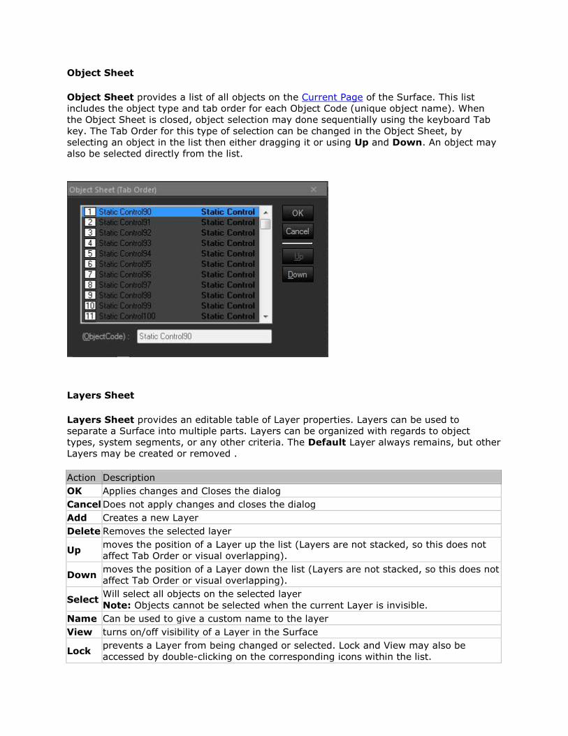
Object Sheet
Object Sheet provides a list of all objects on the Current Page of the Surface. This list
includes the object type and tab order for each Object Code (unique object name). When
the Object Sheet is closed, object selection may done sequentially using the keyboard Tab
key. The Tab Order for this type of selection can be changed in the Object Sheet, by
selecting an object in the list then either dragging it or using Up and Down. An object may
also be selected directly from the list.
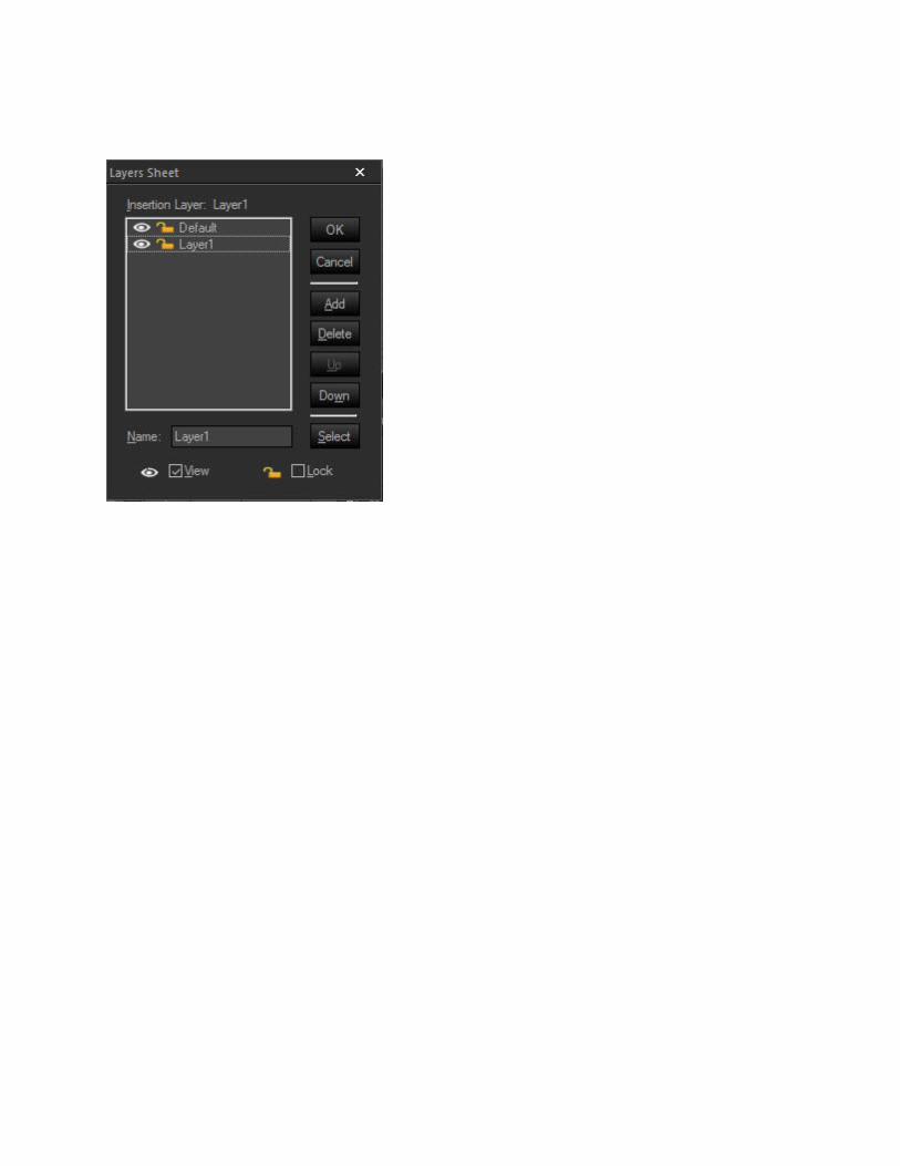
Layers Sheet
Layers Sheet provides an editable table of Layer properties. Layers can be used to
separate a Surface into multiple parts. Layers can be organized with regards to object
types, system segments, or any other criteria. The Default Layer always remains, but other
Layers may be created or removed .
Action Description
OK Applies changes and Closes the dialog
Cancel Does not apply changes and closes the dialog
Add Creates a new Layer
Delete Removes the selected layer
Up moves the position of a Layer up the list (Layers are not stacked, so this does not
affect Tab Order or visual overlapping).
Down moves the position of a Layer down the list (Layers are not stacked, so this does not
affect Tab Order or visual overlapping).
Select Will select all objects on the selected layer
Note: Objects cannot be selected when the current Layer is invisible.
Name Can be used to give a custom name to the layer
View turns on/off visibility of a Layer in the Surface
Lock prevents a Layer from being changed or selected. Lock and View may also be
accessed by double-clicking on the corresponding icons within the list.
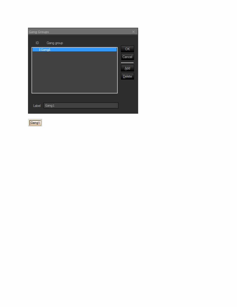
Gang Group
Gang Group allows multiple controls of the same type to have combined operation. A Gang
Group must first be created in this list. Then multiple controls of the same type may be
assigned to that group via the Property Sheet.
The Instance ID, DSP Block Type, Attribute, and Input/Output must be assigned for objects
in a gang, even to achieve proper control behavior in Test Mode.
When a new Gang Group is added, a Toggle Button control appears, which is already
assigned to gang/un-gang all of the controls in that Gang Group. Gang controls may be
deleted if not needed. User-created Toggle Button controls may also be assigned as Gang
controls. When assigning controls to a Gang Group via the Property Sheet, some or all of
the controls may be assigned as Master. Gang Group and Master control behavior varies by
control type.
Ganging Toggle Buttons
Toggle Button controls: When the state of a Master control is toggled (on/off) by clicking on
it, other Master controls in that Gang will also toggle (on/off), regardless of their original
state. Non-Master controls will simply assume the same state (on/off) as the Master control.
Ganging Fader, Edit and Spin Controls
When using Fader, Edit and Edit Spin controls when the setting of a Master control is
changed, all other controls in that Gang are changed accordingly, so as to maintain the
same relative offsets. The range of the Master control is restricted, so that no other (offset)
controls may travel outside of their range. When a non-Master control setting is changed,
no other controls in that Gang are affected.
Ganging Graph controls
When using Graph controls the graphs cannot be assigned as Master controls. All Graph
controls within a Gang will follow the active control exactly, on an individual filter basis.
With Parametric EQs or All-Pass Filters it is possible to gang controls that have a different
number of filter bands. In this case, only the common filter bands (those that are first in
initial numerical order) are ganged together.
If a ganged control is modified as the result of a preset recall, then no ganging behavior
occurs.
Gang Groups dialog
Action Description
OK Applies and closes the dialog
Cancel Does not apply changes and closes dialog box
Add Creates new Gang Group
Delete Removes selected Gang group
Label Allows a custom name to be used for the Gang Group
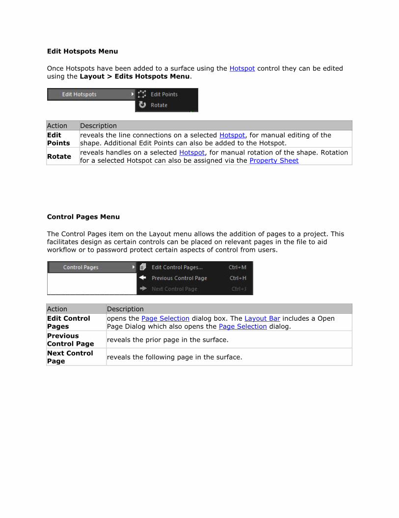
Edit Hotspots Menu
Once Hotspots have been added to a surface using the Hotspot control they can be edited
using the Layout > Edits Hotspots Menu.
Action Description
Edit
Points
reveals the line connections on a selected Hotspot, for manual editing of the
shape. Additional Edit Points can also be added to the Hotspot.
Rotate reveals handles on a selected Hotspot, for manual rotation of the shape. Rotation
for a selected Hotspot can also be assigned via the Property Sheet
Control Pages Menu
The Control Pages item on the Layout menu allows the addition of pages to a project. This
facilitates design as certain controls can be placed on relevant pages in the file to aid
workflow or to password protect certain aspects of control from users.
Action Description
Edit Control
Pages
opens the Page Selection dialog box. The Layout Bar includes a Open
Page Dialog which also opens the Page Selection dialog.
Previous
Control Page reveals the prior page in the surface.
Next Control
Page reveals the following page in the surface.
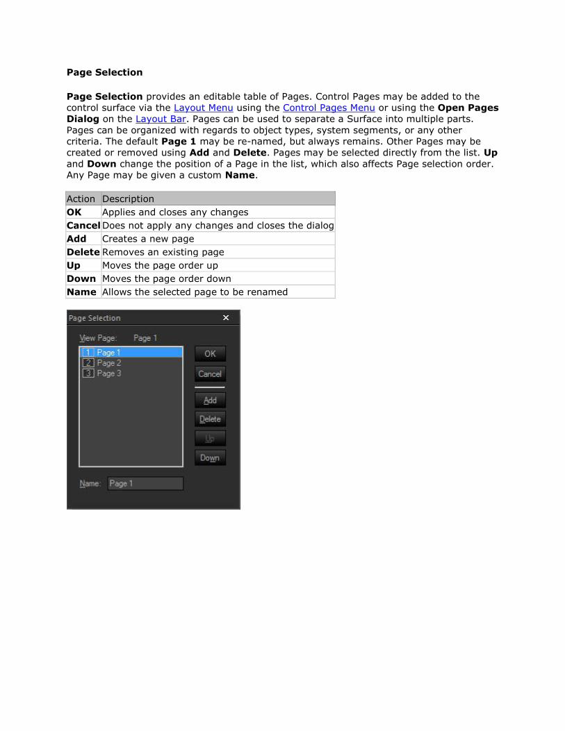
Page Selection
Page Selection provides an editable table of Pages. Control Pages may be added to the
control surface via the Layout Menu using the Control Pages Menu or using the Open Pages
Dialog on the Layout Bar. Pages can be used to separate a Surface into multiple parts.
Pages can be organized with regards to object types, system segments, or any other
criteria. The default Page 1 may be re-named, but always remains. Other Pages may be
created or removed using Add and Delete. Pages may be selected directly from the list. Up
and Down change the position of a Page in the list, which also affects Page selection order.
Any Page may be given a custom Name.
Action Description
OK Applies and closes any changes
Cancel Does not apply any changes and closes the dialog
Add Creates a new page
Delete Removes an existing page
Up Moves the page order up
Down Moves the page order down
Name Allows the selected page to be renamed

Test Mode
Test mode provides the ability to operate the panel surface without being connected to a
Tesira Server. This allows operational testing to be performed easily. See Testing Control
Surfaces for more details.
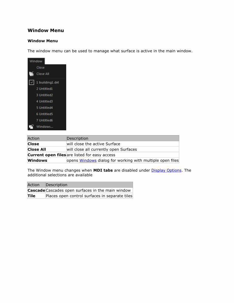
Window Menu
Window Menu
The window menu can be used to manage what surface is active in the main window.
Action Description
Close will close the active Surface
Close All will close all currently open Surfaces
Current open files are listed for easy access
Windows opens Windows dialog for working with multiple open files
The Window menu changes when MDI tabs are disabled under Display Options. The
additional selections are available
Action Description
Cascade Cascades open surfaces in the main window
Tile Places open control surfaces in separate tiles
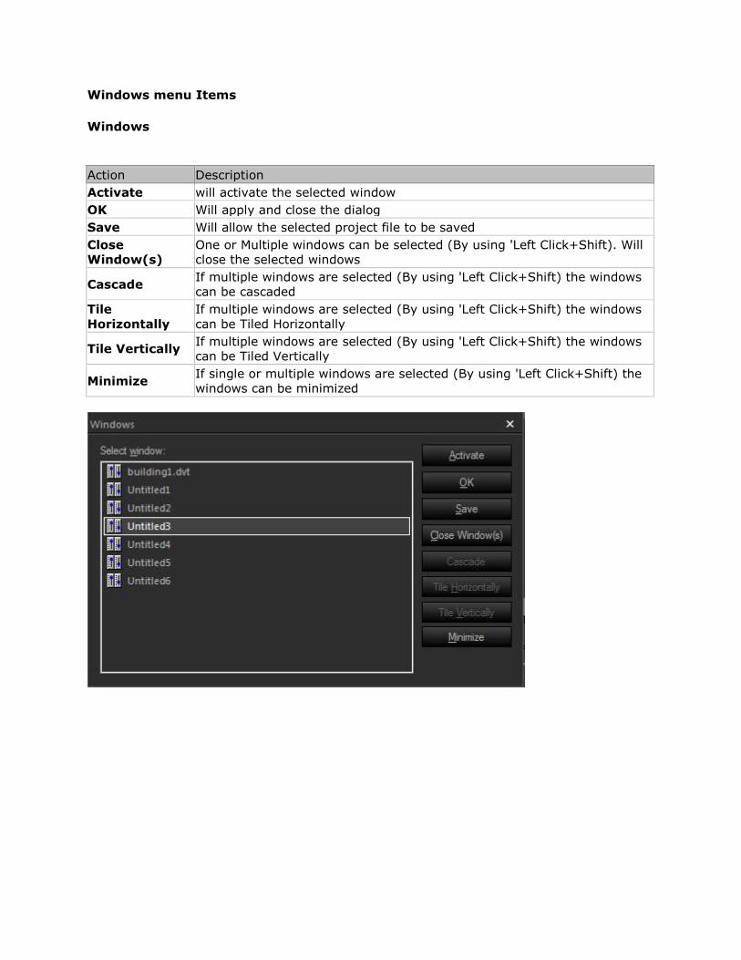
Windows menu Items
Windows
Action Description
Activate will activate the selected window
OK Will apply and close the dialog
Save Will allow the selected project file to be saved
Close
Window(s)
One or Multiple windows can be selected (By using 'Left Click+Shift). Will
close the selected windows
Cascade If multiple windows are selected (By using 'Left Click+Shift) the windows
can be cascaded
Tile
Horizontally
If multiple windows are selected (By using 'Left Click+Shift) the windows
can be Tiled Horizontally
Tile Vertically If multiple windows are selected (By using 'Left Click+Shift) the windows
can be Tiled Vertically
Minimize If single or multiple windows are selected (By using 'Left Click+Shift) the
windows can be minimized
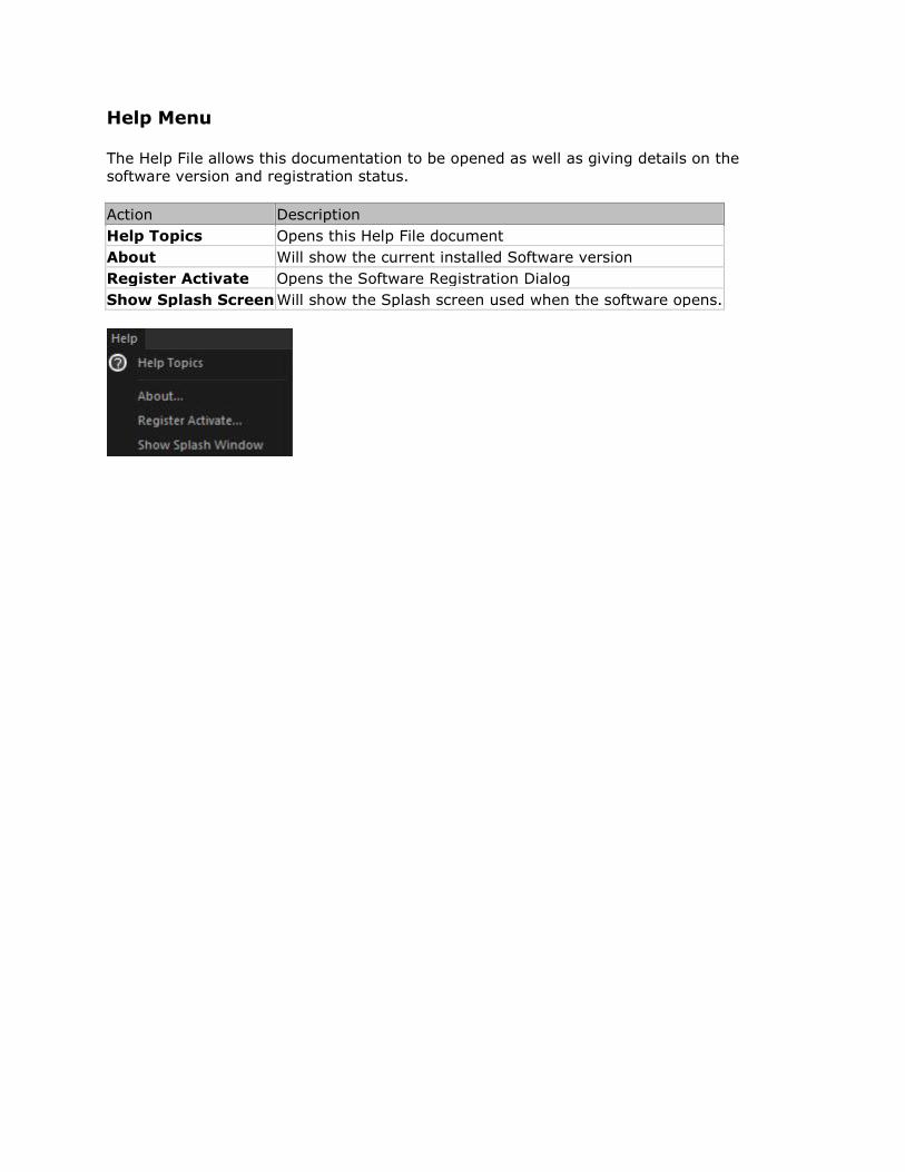
Help Menu
The Help File allows this documentation to be opened as well as giving details on the
software version and registration status.
Action Description
Help Topics Opens this Help File document
About Will show the current installed Software version
Register Activate Opens the Software Registration Dialog
Show Splash Screen Will show the Splash screen used when the software opens.
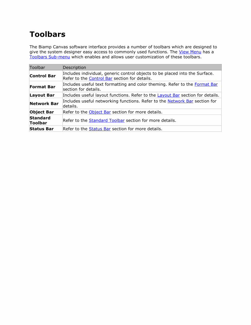
Toolbars
The Biamp Canvas software interface provides a number of toolbars which are designed to
give the system designer easy access to commonly used functions. The View Menu has a
Toolbars Sub-menu which enables and allows user customization of these toolbars.
Toolbar Description
Control Bar Includes individual, generic control objects to be placed into the Surface.
Refer to the Control Bar section for details.
Format Bar Includes useful text formatting and color theming. Refer to the Format Bar
section for details.
Layout Bar Includes useful layout functions. Refer to the Layout Bar section for details.
Network Bar Includes useful networking functions. Refer to the Network Bar section for
details.
Object Bar Refer to the Object Bar section for more details.
Standard
Toolbar Refer to the Standard Toolbar section for more details.
Status Bar Refer to the Status Bar section for more details.
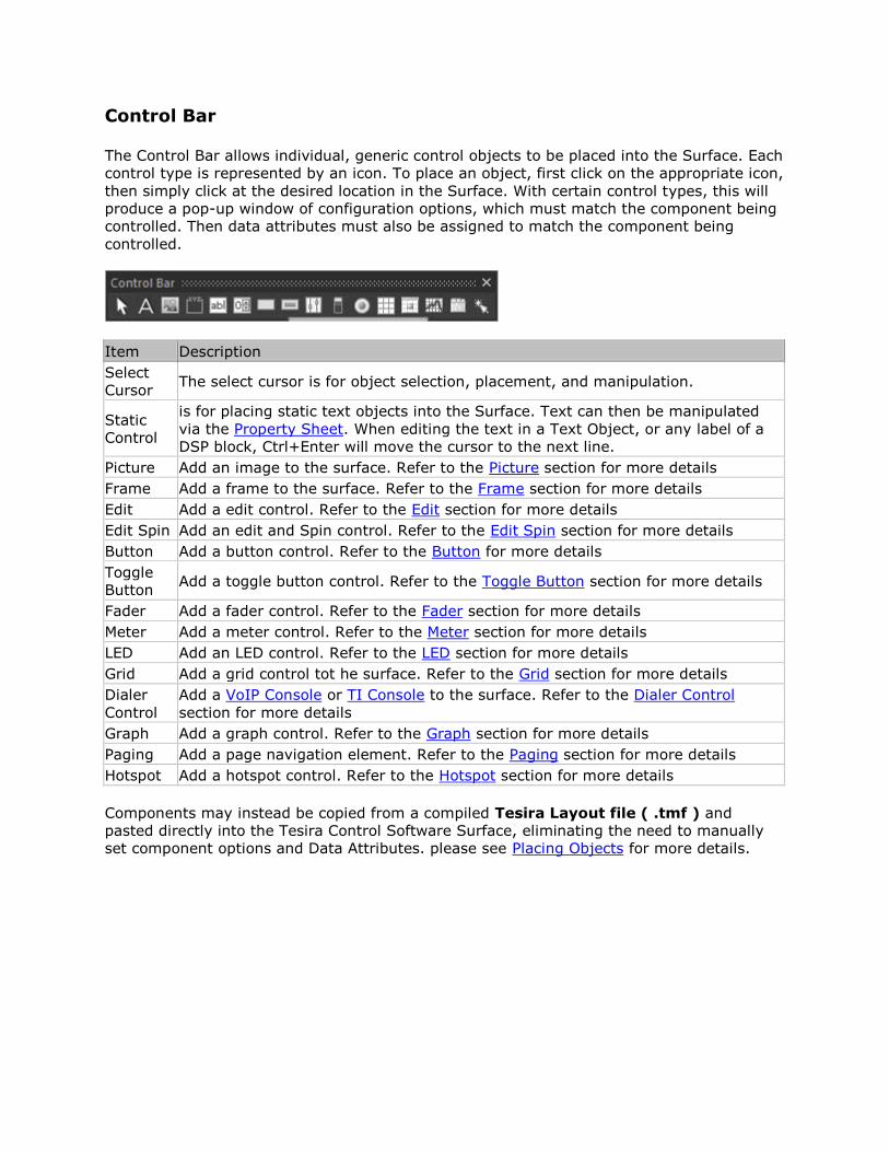
Control Bar
The Control Bar allows individual, generic control objects to be placed into the Surface. Each
control type is represented by an icon. To place an object, first click on the appropriate icon,
then simply click at the desired location in the Surface. With certain control types, this will
produce a pop-up window of configuration options, which must match the component being
controlled. Then data attributes must also be assigned to match the component being
controlled.
Item Description
Select
Cursor The select cursor is for object selection, placement, and manipulation.
Static
Control
is for placing static text objects into the Surface. Text can then be manipulated
via the Property Sheet. When editing the text in a Text Object, or any label of a
DSP block, Ctrl+Enter will move the cursor to the next line.
Picture Add an image to the surface. Refer to the Picture section for more details
Frame Add a frame to the surface. Refer to the Frame section for more details
Edit Add a edit control. Refer to the Edit section for more details
Edit Spin Add an edit and Spin control. Refer to the Edit Spin section for more details
Button Add a button control. Refer to the Button for more details
Toggle
Button Add a toggle button control. Refer to the Toggle Button section for more details
Fader Add a fader control. Refer to the Fader section for more details
Meter Add a meter control. Refer to the Meter section for more details
LED Add an LED control. Refer to the LED section for more details
Grid Add a grid control tot he surface. Refer to the Grid section for more details
Dialer
Control
Add a VoIP Console or TI Console to the surface. Refer to the Dialer Control
section for more details
Graph Add a graph control. Refer to the Graph section for more details
Paging Add a page navigation element. Refer to the Paging section for more details
Hotspot Add a hotspot control. Refer to the Hotspot section for more details
Components may instead be copied from a compiled Tesira Layout file ( .tmf ) and
pasted directly into the Tesira Control Software Surface, eliminating the need to manually
set component options and Data Attributes. please see Placing Objects for more details.
Control Bar Items
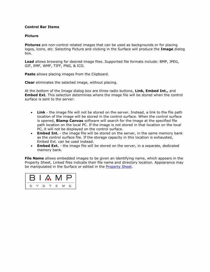
Picture
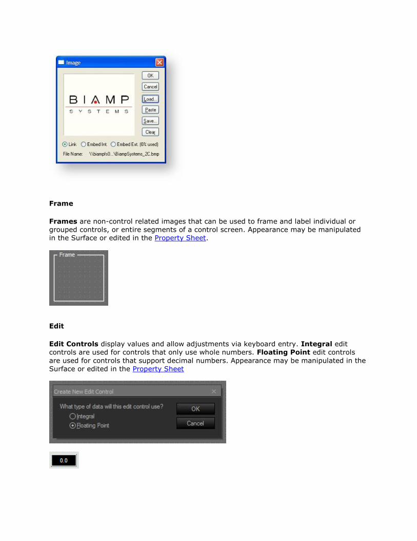
Pictures are non-control related images that can be used as backgrounds or for placing
logos, icons, etc. Selecting Picture and clicking in the Surface will produce the Image dialog
box.
Load allows browsing for desired image files. Supported file formats include: BMP, JPEG,
GIF, EMF, WMF, TIFF, PNG, & ICO.
Paste allows placing images from the Clipboard.
Clear eliminates the selected image, without placing.
At the bottom of the Image dialog box are three radio buttons, Link, Embed Int., and
Embed Ext. This selection determines where the image file will be stored when the control
surface is sent to the server:
Link - the image file will not be stored on the server. Instead, a link to the file path
location of the image will be stored in the control surface. When the control surface
is opened, Biamp Canvas software will search for the image at the specified file
path location on the local PC. If the image is not stored in that location on the local
PC, it will not be displayed on the control surface.
Embed Int. - the image file will be stored on the server, in the same memory bank
as the control surface file. If the storage capacity in this location is exhausted,
Embed Ext. can be used instead.
Embed Ext. - the image file will be stored on the server, in a separate, dedicated
memory bank.
File Name allows embedded images to be given an identifying name, which appears in the
Property Sheet. Linked files indicate their file name and directory location. Appearance may
be manipulated in the Surface or edited in the Property Sheet.
Frame
Frames are non-control related images that can be used to frame and label individual or
grouped controls, or entire segments of a control screen. Appearance may be manipulated
in the Surface or edited in the Property Sheet.
Edit
Edit Controls display values and allow adjustments via keyboard entry. Integral edit
controls are used for controls that only use whole numbers. Floating Point edit controls
are used for controls that support decimal numbers. Appearance may be manipulated in the
Surface or edited in the Property Sheet
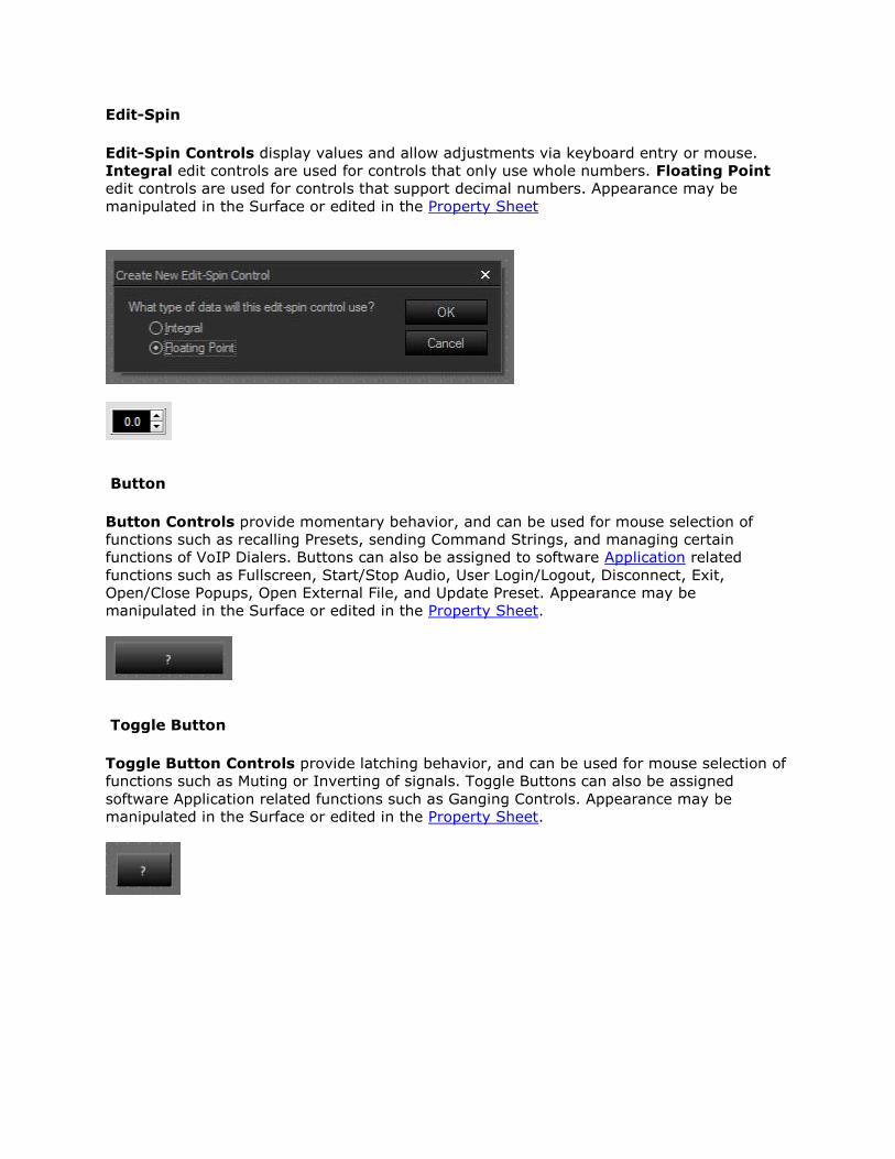
Edit-Spin
Edit-Spin Controls display values and allow adjustments via keyboard entry or mouse.
Integral edit controls are used for controls that only use whole numbers. Floating Point
edit controls are used for controls that support decimal numbers. Appearance may be
manipulated in the Surface or edited in the Property Sheet
Button
Button Controls provide momentary behavior, and can be used for mouse selection of
functions such as recalling Presets, sending Command Strings, and managing certain
functions of VoIP Dialers. Buttons can also be assigned to software Application related
functions such as Fullscreen, Start/Stop Audio, User Login/Logout, Disconnect, Exit,
Open/Close Popups, Open External File, and Update Preset. Appearance may be
manipulated in the Surface or edited in the Property Sheet.
Toggle Button
Toggle Button Controls provide latching behavior, and can be used for mouse selection of
functions such as Muting or Inverting of signals. Toggle Buttons can also be assigned
software Application related functions such as Ganging Controls. Appearance may be
manipulated in the Surface or edited in the Property Sheet.
Fader
Fader Controls allow mouse adjustment of signal levels. Appearance may be manipulated
in the Surface or edited in the Property Sheet.
Meter
Meter Controls provide display of signal levels. Peak or RMS meters can be referenced.
Appearance may be manipulated in the Surface or edited in the Property Sheet.
LED
LED Controls display the status of functions such as Muting, Inverting, and Presence of
signals. Appearance may be manipulated in the Surface or edited in the Property Sheet.
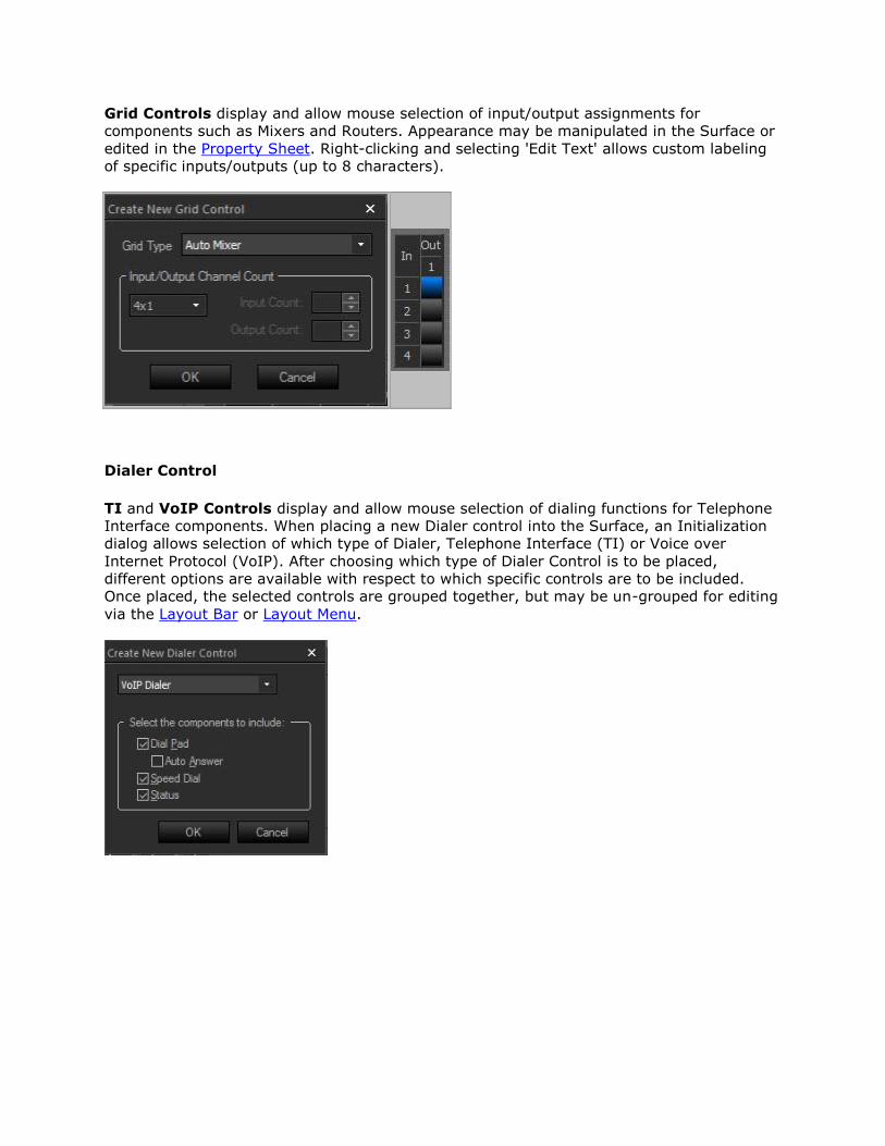
Grid Controls display and allow mouse selection of input/output assignments for
components such as Mixers and Routers. Appearance may be manipulated in the Surface or
edited in the Property Sheet. Right-clicking and selecting 'Edit Text' allows custom labeling
of specific inputs/outputs (up to 8 characters).
Dialer Control
TI and VoIP Controls display and allow mouse selection of dialing functions for Telephone
Interface components. When placing a new Dialer control into the Surface, an Initialization
dialog allows selection of which type of Dialer, Telephone Interface (TI) or Voice over
Internet Protocol (VoIP). After choosing which type of Dialer Control is to be placed,
different options are available with respect to which specific controls are to be included.
Once placed, the selected controls are grouped together, but may be un-grouped for editing
via the Layout Bar or Layout Menu.
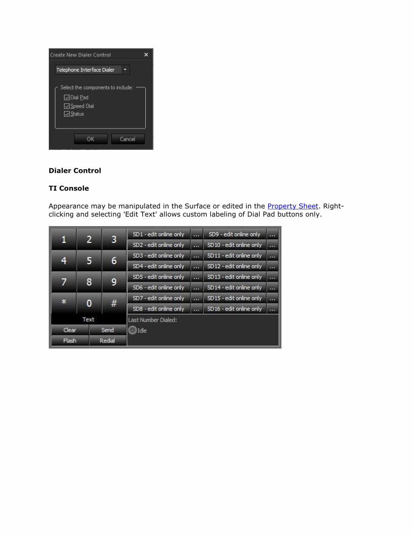
Dialer Control
TI Console
Appearance may be manipulated in the Surface or edited in the Property Sheet. Right-
clicking and selecting 'Edit Text' allows custom labeling of Dial Pad buttons only.
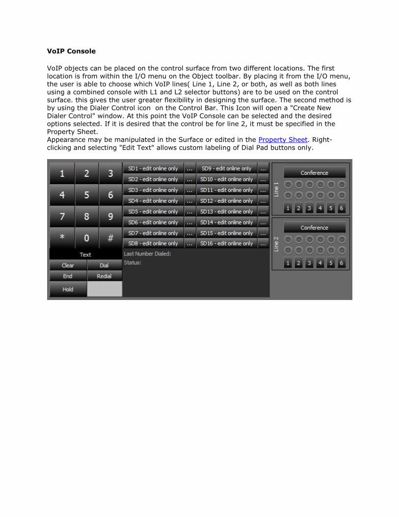
VoIP Console
VoIP objects can be placed on the control surface from two different locations. The first
location is from within the I/O menu on the Object toolbar. By placing it from the I/O menu,
the user is able to choose which VoIP lines( Line 1, Line 2, or both, as well as both lines
using a combined console with L1 and L2 selector buttons) are to be used on the control
surface. this gives the user greater flexibility in designing the surface. The second method is
by using the Dialer Control icon on the Control Bar. This Icon will open a "Create New
Dialer Control" window. At this point the VoIP Console can be selected and the desired
options selected. If it is desired that the control be for line 2, it must be specified in the
Property Sheet.
Appearance may be manipulated in the Surface or edited in the Property Sheet. Right-
clicking and selecting "Edit Text" allows custom labeling of Dial Pad buttons only.
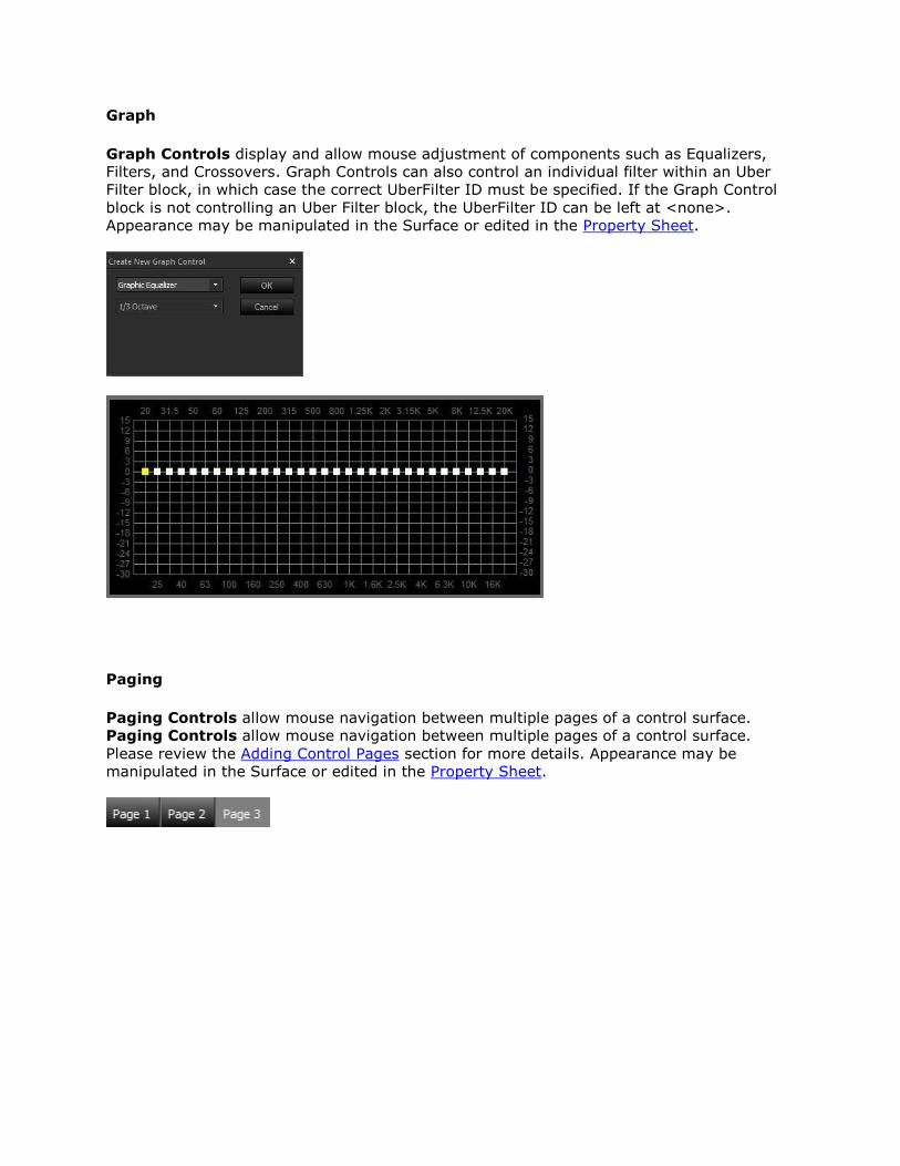
Graph
Graph Controls display and allow mouse adjustment of components such as Equalizers,
Filters, and Crossovers. Graph Controls can also control an individual filter within an Uber
Filter block, in which case the correct UberFilter ID must be specified. If the Graph Control
block is not controlling an Uber Filter block, the UberFilter ID can be left at <none>.
Appearance may be manipulated in the Surface or edited in the Property Sheet.
Paging
Paging Controls allow mouse navigation between multiple pages of a control surface.
Paging Controls allow mouse navigation between multiple pages of a control surface.
Please review the Adding Control Pages section for more details. Appearance may be
manipulated in the Surface or edited in the Property Sheet.
Hotspot
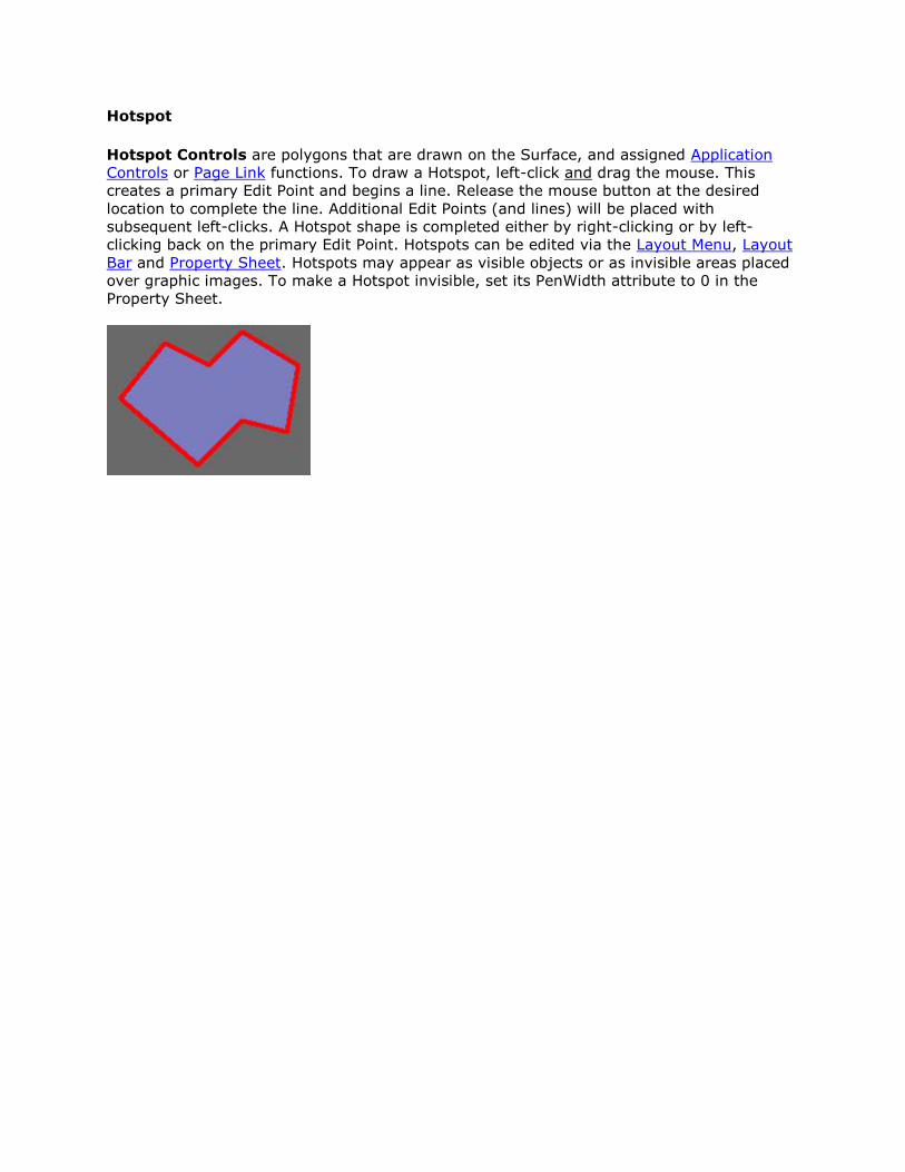
Hotspot Controls are polygons that are drawn on the Surface, and assigned Application
Controls or Page Link functions. To draw a Hotspot, left-click and drag the mouse. This
creates a primary Edit Point and begins a line. Release the mouse button at the desired
location to complete the line. Additional Edit Points (and lines) will be placed with
subsequent left-clicks. A Hotspot shape is completed either by right-clicking or by left-
clicking back on the primary Edit Point. Hotspots can be edited via the Layout Menu, Layout
Bar and Property Sheet. Hotspots may appear as visible objects or as invisible areas placed
over graphic images. To make a Hotspot invisible, set its PenWidth attribute to 0 in the
Property Sheet.
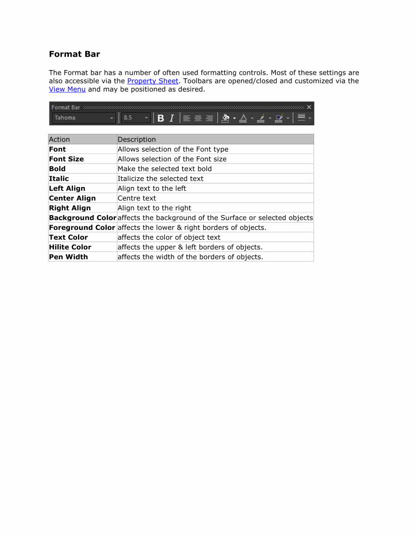
Format Bar
The Format bar has a number of often used formatting controls. Most of these settings are
also accessible via the Property Sheet. Toolbars are opened/closed and customized via the
View Menu and may be positioned as desired.
Action Description
Font Allows selection of the Font type
Font Size Allows selection of the Font size
Bold Make the selected text bold
Italic Italicize the selected text
Left Align Align text to the left
Center Align Centre text
Right Align Align text to the right
Background Color affects the background of the Surface or selected objects
Foreground Color affects the lower & right borders of objects.
Text Color affects the color of object text
Hilite Color affects the upper & left borders of objects.
Pen Width affects the width of the borders of objects.
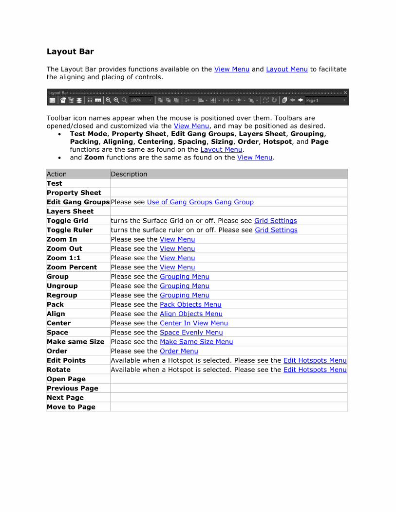
Layout Bar
The Layout Bar provides functions available on the View Menu and Layout Menu to facilitate
the aligning and placing of controls.
Toolbar icon names appear when the mouse is positioned over them. Toolbars are
opened/closed and customized via the View Menu, and may be positioned as desired.
Test Mode, Property Sheet, Edit Gang Groups, Layers Sheet, Grouping,
Packing, Aligning, Centering, Spacing, Sizing, Order, Hotspot, and Page
functions are the same as found on the Layout Menu.
and Zoom functions are the same as found on the View Menu.
Action Description
Test
Property Sheet
Edit Gang Groups Please see Use of Gang Groups Gang Group
Layers Sheet
Toggle Grid turns the Surface Grid on or off. Please see Grid Settings
Toggle Ruler turns the surface ruler on or off. Please see Grid Settings
Zoom In Please see the View Menu
Zoom Out Please see the View Menu
Zoom 1:1 Please see the View Menu
Zoom Percent Please see the View Menu
Group Please see the Grouping Menu
Ungroup Please see the Grouping Menu
Regroup Please see the Grouping Menu
Pack Please see the Pack Objects Menu
Align Please see the Align Objects Menu
Center Please see the Center In View Menu
Space Please see the Space Evenly Menu
Make same Size Please see the Make Same Size Menu
Order Please see the Order Menu
Edit Points Available when a Hotspot is selected. Please see the Edit Hotspots Menu
Rotate Available when a Hotspot is selected. Please see the Edit Hotspots Menu
Open Page
Previous Page
Next Page
Move to Page
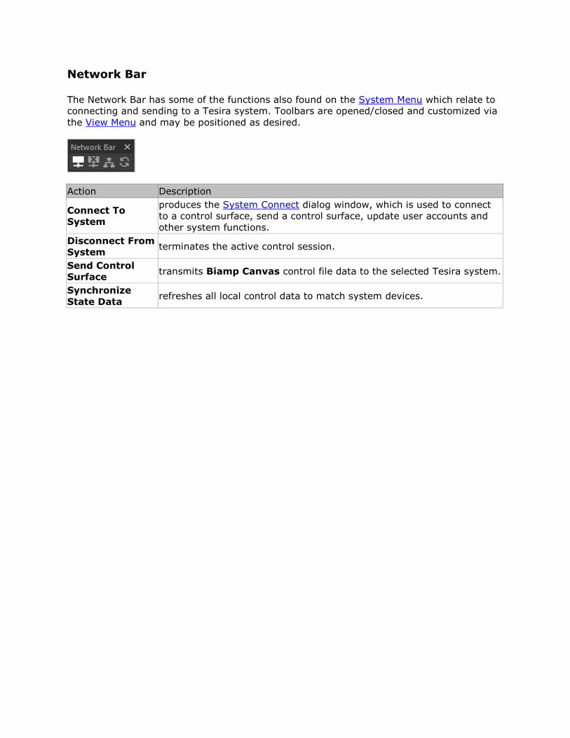
Network Bar
The Network Bar has some of the functions also found on the System Menu which relate to
connecting and sending to a Tesira system. Toolbars are opened/closed and customized via
the View Menu and may be positioned as desired.
Action Description
Connect To
System
produces the System Connect dialog window, which is used to connect
to a control surface, send a control surface, update user accounts and
other system functions.
Disconnect From
System terminates the active control session.
Send Control
Surface transmits Biamp Canvas control file data to the selected Tesira system.
Synchronize
State Data refreshes all local control data to match system devices.
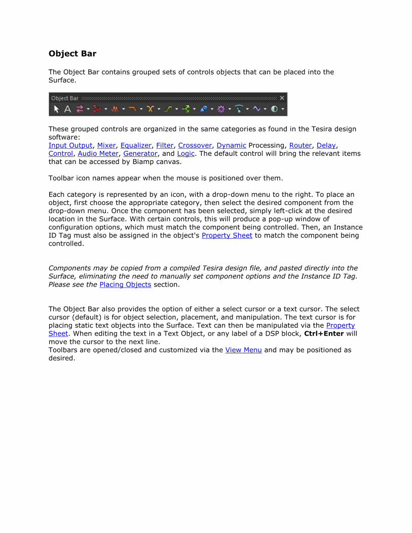
Object Bar
The Object Bar contains grouped sets of controls objects that can be placed into the
Surface.
These grouped controls are organized in the same categories as found in the Tesira design
software:
Input Output, Mixer, Equalizer, Filter, Crossover, Dynamic Processing, Router, Delay,
Control, Audio Meter, Generator, and Logic. The default control will bring the relevant items
that can be accessed by Biamp canvas.
Toolbar icon names appear when the mouse is positioned over them.
Each category is represented by an icon, with a drop-down menu to the right. To place an
object, first choose the appropriate category, then select the desired component from the
drop-down menu. Once the component has been selected, simply left-click at the desired
location in the Surface. With certain controls, this will produce a pop-up window of
configuration options, which must match the component being controlled. Then, an Instance
ID Tag must also be assigned in the object's Property Sheet to match the component being
controlled.
Components may be copied from a compiled Tesira design file, and pasted directly into the
Surface, eliminating the need to manually set component options and the Instance ID Tag.
Please see the Placing Objects section.
The Object Bar also provides the option of either a select cursor or a text cursor. The select
cursor (default) is for object selection, placement, and manipulation. The text cursor is for
placing static text objects into the Surface. Text can then be manipulated via the Property
Sheet. When editing the text in a Text Object, or any label of a DSP block, Ctrl+Enter will
move the cursor to the next line.
Toolbars are opened/closed and customized via the View Menu and may be positioned as
desired.
Object Bar Items
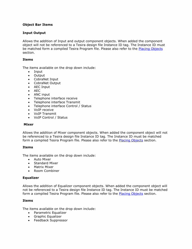
Input Output
Allows the addition of Input and output component objects. When added the component
object will not be referenced to a Tesira design file Instance ID tag. The Instance ID must
be matched form a compiled Tesira Program file. Please also refer to the Placing Objects
section.
Items
The items available on the drop down include:
Input
Output
CobraNet Input
CobraNet Output
AEC Input
AEC
ANC input
Telephone interface receive
Telephone interface Transmit
Telephone interface Control / Status
VoIP receive
VoIP Transmit
VoIP Control / Status
Mixer
Allows the addition of Mixer component objects. When added the component object will not
be referenced to a Tesira design file Instance ID tag. The Instance ID must be matched
form a compiled Tesira Program file. Please also refer to the Placing Objects section.
Items
The items available on the drop down include:
Auto Mixer
Standard Mixer
Matrix Mixer
Room Combiner
Equalizer
Allows the addition of Equalizer component objects. When added the component object will
not be referenced to a Tesira design file Instance ID tag. The Instance ID must be matched
form a compiled Tesira Program file. Please also refer to the Placing Objects section.
Items
The items available on the drop down include:
Parametric Equalizer
Graphic Equalizer
Feedback Suppressor
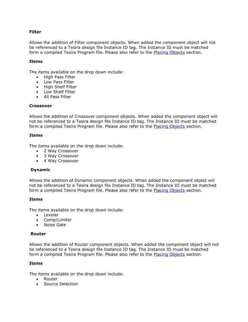
Filter
Allows the addition of Filter component objects. When added the component object will not
be referenced to a Tesira design file Instance ID tag. The Instance ID must be matched
form a compiled Tesira Program file. Please also refer to the Placing Objects section.
Items
The items available on the drop down include:
High Pass Filter
Low Pass Filter
High Shelf Filter
Low Shelf Filter
All Pass Filter
Crossover
Allows the addition of Crossover component objects. When added the component object will
not be referenced to a Tesira design file Instance ID tag. The Instance ID must be matched
form a compiled Tesira Program file. Please also refer to the Placing Objects section.
Items
The items available on the drop down include:
2 Way Crossover
3 Way Crossover
4 Way Crossover
Dynamic
Allows the addition of Dynamic component objects. When added the component object will
not be referenced to a Tesira design file Instance ID tag. The Instance ID must be matched
form a compiled Tesira Program file. Please also refer to the Placing Objects section.
Items
The items available on the drop down include:
Leveler
Comp/Limiter
Noise Gate
Router
Allows the addition of Router component objects. When added the component object will not
be referenced to a Tesira design file Instance ID tag. The Instance ID must be matched
form a compiled Tesira Program file. Please also refer to the Placing Objects section.
Items
The items available on the drop down include:
Router
Source Selection
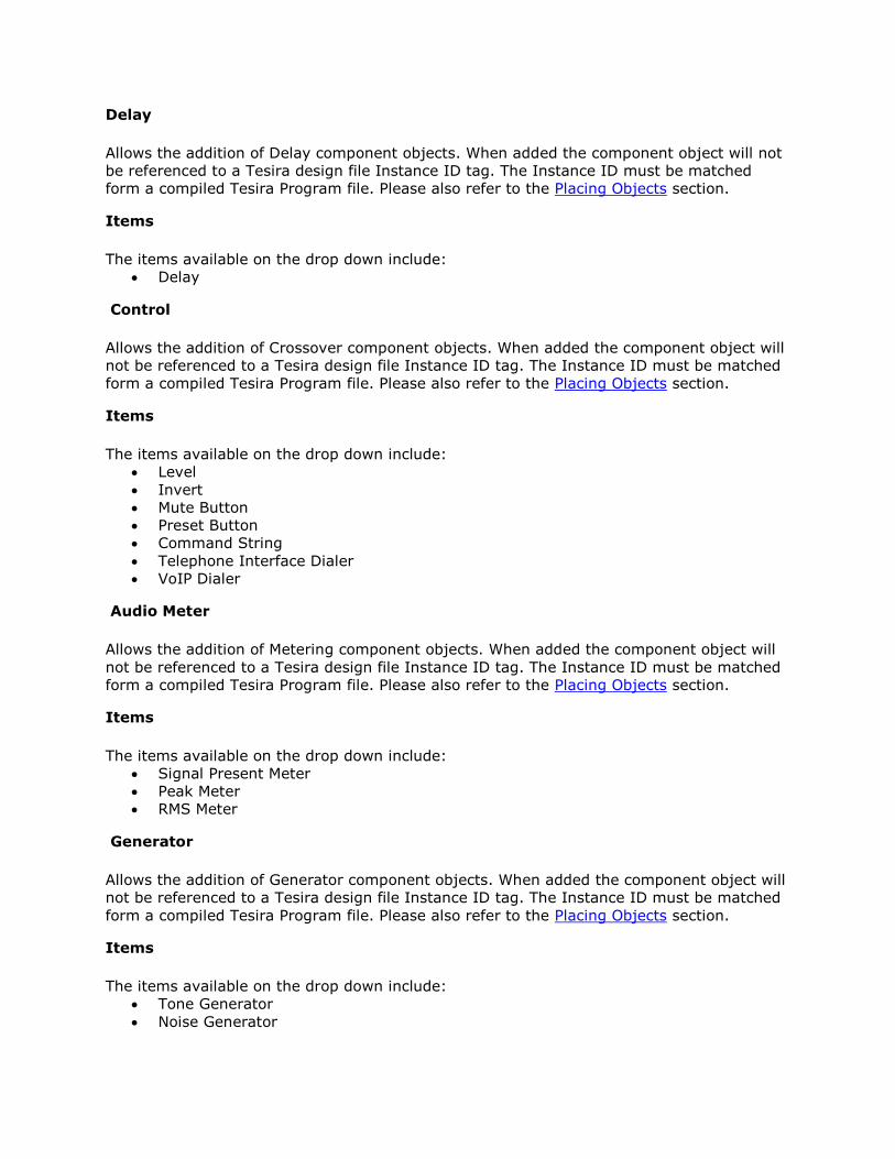
Delay
Allows the addition of Delay component objects. When added the component object will not
be referenced to a Tesira design file Instance ID tag. The Instance ID must be matched
form a compiled Tesira Program file. Please also refer to the Placing Objects section.
Items
The items available on the drop down include:
Delay
Control
Allows the addition of Crossover component objects. When added the component object will
not be referenced to a Tesira design file Instance ID tag. The Instance ID must be matched
form a compiled Tesira Program file. Please also refer to the Placing Objects section.
Items
The items available on the drop down include:
Level
Invert
Mute Button
Preset Button
Command String
Telephone Interface Dialer
VoIP Dialer
Audio Meter
Allows the addition of Metering component objects. When added the component object will
not be referenced to a Tesira design file Instance ID tag. The Instance ID must be matched
form a compiled Tesira Program file. Please also refer to the Placing Objects section.
Items
The items available on the drop down include:
Signal Present Meter
Peak Meter
RMS Meter
Generator
Allows the addition of Generator component objects. When added the component object will
not be referenced to a Tesira design file Instance ID tag. The Instance ID must be matched
form a compiled Tesira Program file. Please also refer to the Placing Objects section.
Items
The items available on the drop down include:
Tone Generator
Noise Generator

Logic
Allows the addition of Logic component objects. When added the component object will not
be referenced to a Tesira design file Instance ID tag. The Instance ID must be matched
form a compiled Tesira Program file. Please also refer to the Placing Objects section.
Items
The items available on the drop down include:
Logic State
Logic Meter
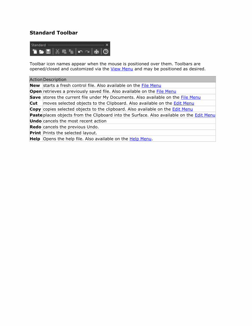
Standard Toolbar
Toolbar icon names appear when the mouse is positioned over them. Toolbars are
opened/closed and customized via the View Menu and may be positioned as desired.
Action Description
New starts a fresh control file. Also available on the File Menu
Open retrieves a previously saved file. Also available on the File Menu
Save stores the current file under My Documents. Also available on the File Menu
Cut moves selected objects to the Clipboard. Also available on the Edit Menu
Copy copies selected objects to the clipboard. Also available on the Edit Menu
Paste places objects from the Clipboard into the Surface. Also available on the Edit Menu
Undo cancels the most recent action
Redo cancels the previous Undo.
Print Prints the selected layout.
Help Opens the help file. Also available on the Help Menu.
Status Bar
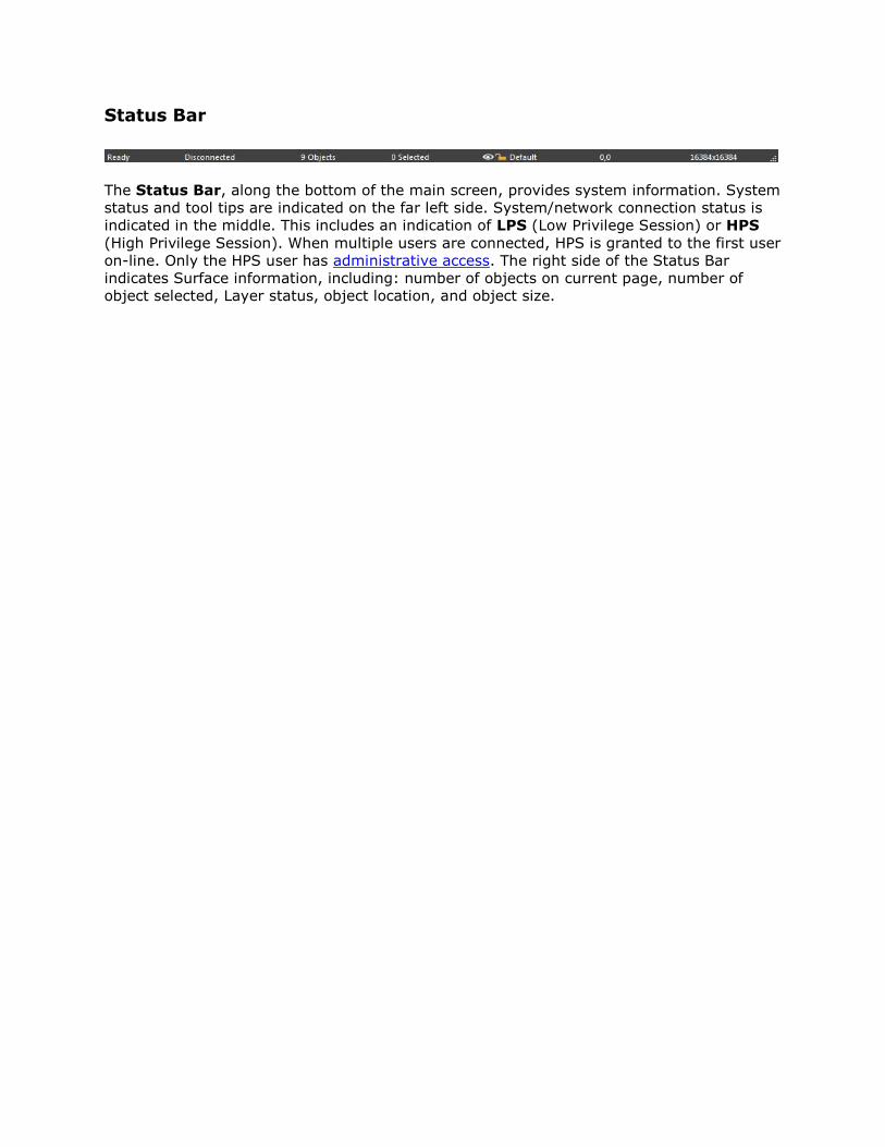
The Status Bar, along the bottom of the main screen, provides system information. System
status and tool tips are indicated on the far left side. System/network connection status is
indicated in the middle. This includes an indication of LPS (Low Privilege Session) or HPS
(High Privilege Session). When multiple users are connected, HPS is granted to the first user
on-line. Only the HPS user has administrative access. The right side of the Status Bar
indicates Surface information, including: number of objects on current page, number of
object selected, Layer status, object location, and object size.
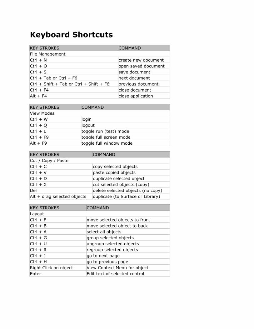
Keyboard Shortcuts
KEY STROKES COMMAND
File Management
Ctrl + N create new document
Ctrl + O open saved document
Ctrl + S save document
Ctrl + Tab or Ctrl + F6 next document
Ctrl + Shift + Tab or Ctrl + Shift + F6 previous document
Ctrl + F4 close document
Alt + F4 close application
KEY STROKES COMMAND
View Modes
Ctrl + W login
Ctrl + Q logout
Ctrl + E toggle run (test) mode
Ctrl + F9 toggle full screen mode
Alt + F9 toggle full window mode
KEY STROKES COMMAND
Cut / Copy / Paste
Ctrl + C copy selected objects
Ctrl + V paste copied objects
Ctrl + D duplicate selected object
Ctrl + X cut selected objects (copy)
Del delete selected objects (no copy)
Alt + drag selected objects duplicate (to Surface or Library)
KEY STROKES COMMAND
Layout
Ctrl + F move selected objects to front
Ctrl + B move selected object to back
Ctrl + A select all objects
Ctrl + G group selected objects
Ctrl + U ungroup selected objects
Ctrl + R regroup selected objects
Ctrl + J go to next page
Ctrl + H go to previous page
Right Click on object View Context Menu for object
Enter Edit text of selected control
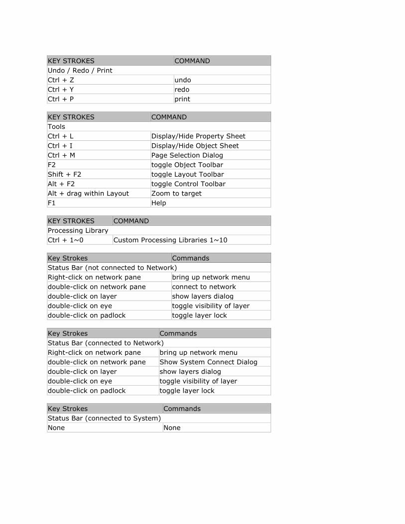
KEY STROKES COMMAND
Undo / Redo / Print
Ctrl + Z undo
Ctrl + Y redo
Ctrl + P print
KEY STROKES COMMAND
Tools
Ctrl + L Display/Hide Property Sheet
Ctrl + I Display/Hide Object Sheet
Ctrl + M Page Selection Dialog
F2 toggle Object Toolbar
Shift + F2 toggle Layout Toolbar
Alt + F2 toggle Control Toolbar
Alt + drag within Layout Zoom to target
F1 Help
KEY STROKES COMMAND
Processing Library
Ctrl + 1~0 Custom Processing Libraries 1~10
Key Strokes Commands
Status Bar (not connected to Network)
Right-click on network pane bring up network menu
double-click on network pane connect to network
double-click on layer show layers dialog
double-click on eye toggle visibility of layer
double-click on padlock toggle layer lock
Key Strokes Commands
Status Bar (connected to Network)
Right-click on network pane bring up network menu
double-click on network pane Show System Connect Dialog
double-click on layer show layers dialog
double-click on eye toggle visibility of layer
double-click on padlock toggle layer lock
Key Strokes Commands
Status Bar (connected to System)
None None

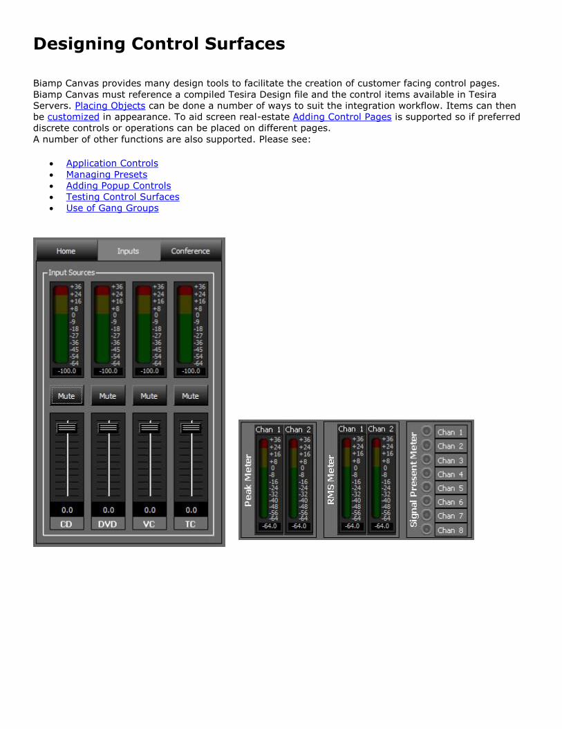
Designing Control Surfaces
Biamp Canvas provides many design tools to facilitate the creation of customer facing control pages.
Biamp Canvas must reference a compiled Tesira Design file and the control items available in Tesira
Servers. Placing Objects can be done a number of ways to suit the integration workflow. Items can then
be customized in appearance. To aid screen real-estate Adding Control Pages is supported so if preferred
discrete controls or operations can be placed on different pages.
A number of other functions are also supported. Please see:
Application Controls
Managing Presets
Adding Popup Controls
Testing Control Surfaces
Use of Gang Groups
Placing Objects
The Software Interface is designed to allow user controls to be placed into a custom control page. These
would be then associated with a corresponding Tesira design file that is loaded to a Tesira SERVER class
device.
Start the Biamp Canvas software program
close any unwanted files that may have opened automatically from a previous session.
Start a new file.
To continue working with a previously saved file, open that file instead.
Biamp Canvas File extensions are: .bcv
Adding Control Objects
Begin placing control objects into the Surface This can be done in three different ways:
Method 1:
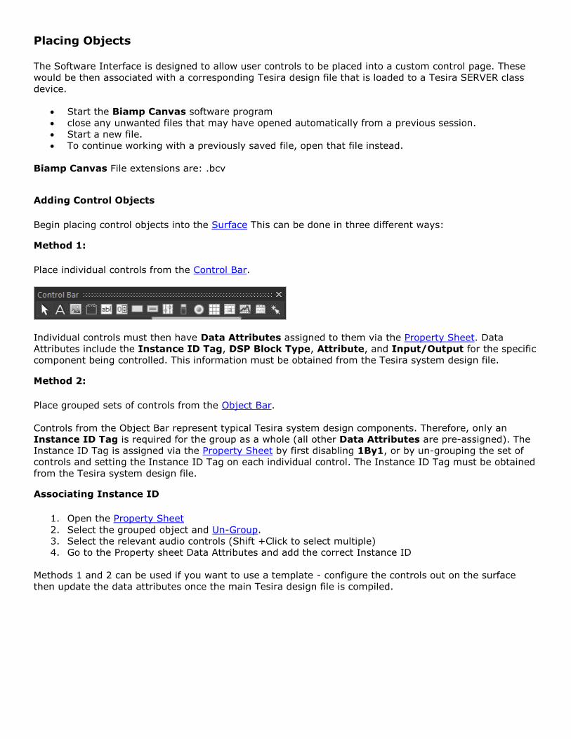
Place individual controls from the Control Bar.
Individual controls must then have Data Attributes assigned to them via the Property Sheet. Data
Attributes include the Instance ID Tag, DSP Block Type, Attribute, and Input/Output for the specific
component being controlled. This information must be obtained from the Tesira system design file.
Method 2:
Place grouped sets of controls from the Object Bar.
Controls from the Object Bar represent typical Tesira system design components. Therefore, only an
Instance ID Tag is required for the group as a whole (all other Data Attributes are pre-assigned). The
Instance ID Tag is assigned via the Property Sheet by first disabling 1By1, or by un-grouping the set of
controls and setting the Instance ID Tag on each individual control. The Instance ID Tag must be obtained
from the Tesira system design file.
Associating Instance ID
1. Open the Property Sheet
2. Select the grouped object and Un-Group.
3. Select the relevant audio controls (Shift +Click to select multiple)
4. Go to the Property sheet Data Attributes and add the correct Instance ID
Methods 1 and 2 can be used if you want to use a template - configure the controls out on the surface
then update the data attributes once the main Tesira design file is compiled.
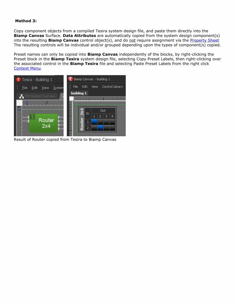
Method 3:
Copy component objects from a compiled Tesira system design file, and paste them directly into the
Biamp Canvas Surface. Data Attributes are automatically copied from the system design component(s)
into the resulting Biamp Canvas control object(s), and do not require assignment via the Property Sheet
The resulting controls will be individual and/or grouped depending upon the types of component(s) copied.
Preset names can only be copied into Biamp Canvas independently of the blocks, by right-clicking the
Preset block in the Biamp Tesira system design file, selecting Copy Preset Labels, then right-clicking over
the associated control in the Biamp Tesira file and selecting Paste Preset Labels from the right click
Context Menu.
Result of Router copied from Tesira to Biamp Canvas
Customizing Appearance
Positioning and sizing objects
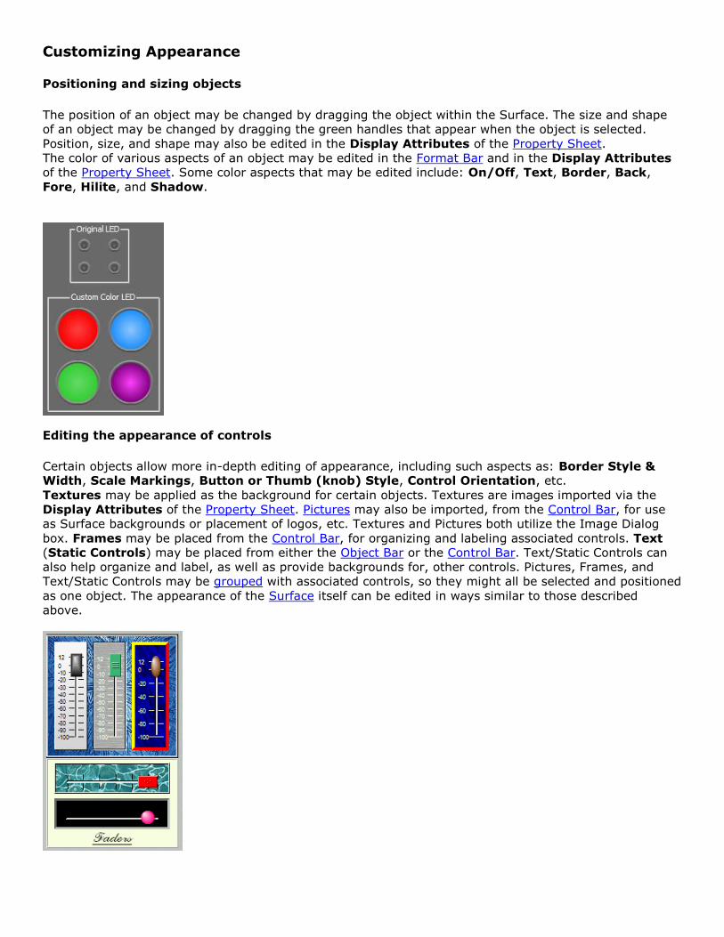
The position of an object may be changed by dragging the object within the Surface. The size and shape
of an object may be changed by dragging the green handles that appear when the object is selected.
Position, size, and shape may also be edited in the Display Attributes of the Property Sheet.
The color of various aspects of an object may be edited in the Format Bar and in the Display Attributes
of the Property Sheet. Some color aspects that may be edited include: On/Off, Text, Border, Back,
Fore, Hilite, and Shadow.
Editing the appearance of controls
Certain objects allow more in-depth editing of appearance, including such aspects as: Border Style &
Width, Scale Markings, Button or Thumb (knob) Style, Control Orientation, etc.
Textures may be applied as the background for certain objects. Textures are images imported via the
Display Attributes of the Property Sheet. Pictures may also be imported, from the Control Bar, for use
as Surface backgrounds or placement of logos, etc. Textures and Pictures both utilize the Image Dialog
box. Frames may be placed from the Control Bar, for organizing and labeling associated controls. Text
(Static Controls) may be placed from either the Object Bar or the Control Bar. Text/Static Controls can
also help organize and label, as well as provide backgrounds for, other controls. Pictures, Frames, and
Text/Static Controls may be grouped with associated controls, so they might all be selected and positioned
as one object. The appearance of the Surface itself can be edited in ways similar to those described
above.
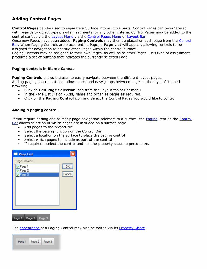
Adding Control Pages
Control Pages can be used to separate a Surface into multiple parts. Control Pages can be organized
with regards to object types, system segments, or any other criteria. Control Pages may be added to the
control surface via the Layout Menu via the Control Pages Menu or Layout Bar.
Once new Pages have been added, Paging Controls may then be placed on each page from the Control
Bar. When Paging Controls are placed onto a Page, a Page List will appear, allowing controls to be
assigned for navigation to specific other Pages within the control surface.
Paging Controls may be assigned to their own Pages, as well as to other Pages. This type of assignment
produces a set of buttons that indicates the currently selected Page.
Paging controls in Biamp Canvas
Paging Controls allows the user to easily navigate between the different layout pages.
Adding paging control buttons, allows quick and easy jumps between pages in the style of 'tabbed
browsing'.
Click on Edit Page Selection icon from the Layout toolbar or menu.
in the Page List Dialog - Add, Name and organize pages as required.
Click on the Paging Control icon and Select the Control Pages you would like to control.
Adding a paging control
If you require adding one or many page navigation selectors to a surface, the Paging item on the Control
Bar allows selection of which pages are included on a surface page.
Add pages to the project file
Select the paging function on the Control Bar
Select a location on the surface to place the paging control
Select which pages to include as part of the control
If required - select the control and use the property sheet to personalize.
The appearance of a Paging Control may also be edited via its Property Sheet.
Using Hotspots as Paging Controls
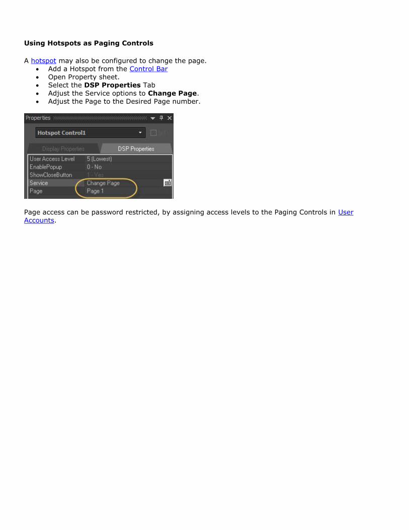
A hotspot may also be configured to change the page.
Add a Hotspot from the Control Bar
Open Property sheet.
Select the DSP Properties Tab
Adjust the Service options to Change Page.
Adjust the Page to the Desired Page number.
Page access can be password restricted, by assigning access levels to the Paging Controls in User
Accounts.
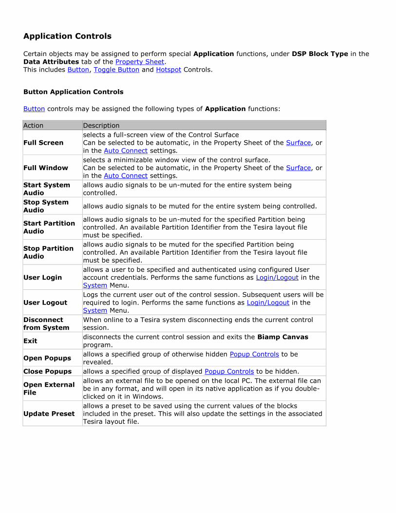
Application Controls
Certain objects may be assigned to perform special Application functions, under DSP Block Type in the
Data Attributes tab of the Property Sheet.
This includes Button, Toggle Button and Hotspot Controls.
Button Application Controls
Button controls may be assigned the following types of Application functions:
Action Description
Full Screen
selects a full-screen view of the Control Surface
Can be selected to be automatic, in the Property Sheet of the Surface, or
in the Auto Connect settings.
Full Window
selects a minimizable window view of the control surface.
Can be selected to be automatic, in the Property Sheet of the Surface, or
in the Auto Connect settings.
Start System
Audio
allows audio signals to be un-muted for the entire system being
controlled.
Stop System
Audio allows audio signals to be muted for the entire system being controlled.
Start Partition
Audio
allows audio signals to be un-muted for the specified Partition being
controlled. An available Partition Identifier from the Tesira layout file
must be specified.
Stop Partition
Audio
allows audio signals to be muted for the specified Partition being
controlled. An available Partition Identifier from the Tesira layout file
must be specified.
User Login
allows a user to be specified and authenticated using configured User
account credentials. Performs the same functions as Login/Logout in the
System Menu.
User Logout
Logs the current user out of the control session. Subsequent users will be
required to login. Performs the same functions as Login/Logout in the
System Menu.
Disconnect
from System
When online to a Tesira system disconnecting ends the current control
session.
Exit disconnects the current control session and exits the Biamp Canvas
program.
Open Popups allows a specified group of otherwise hidden Popup Controls to be
revealed.
Close Popups allows a specified group of displayed Popup Controls to be hidden.
Open External
File
allows an external file to be opened on the local PC. The external file can
be in any format, and will open in its native application as if you double-
clicked on it in Windows.
Update Preset
allows a preset to be saved using the current values of the blocks
included in the preset. This will also update the settings in the associated
Tesira layout file.
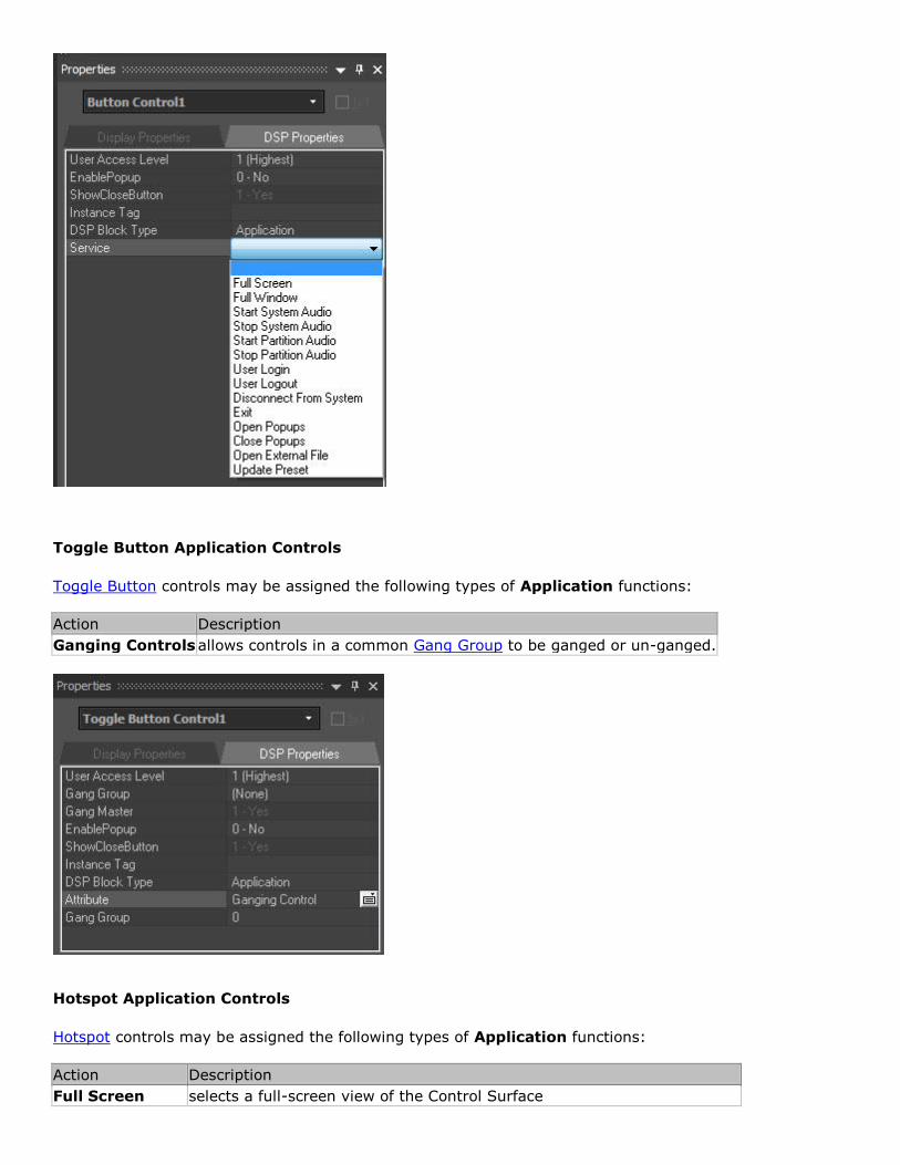
Toggle Button Application Controls
Toggle Button controls may be assigned the following types of Application functions:
Action Description
Ganging Controls allows controls in a common Gang Group to be ganged or un-ganged.
Hotspot Application Controls
Hotspot controls may be assigned the following types of Application functions:
Action Description
Full Screen selects a full-screen view of the Control Surface
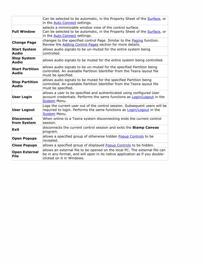
Can be selected to be automatic, in the Property Sheet of the Surface, or
in the Auto Connect settings.
Full Window
selects a minimizable window view of the control surface.
Can be selected to be automatic, in the Property Sheet of the Surface, or
in the Auto Connect settings.
Change Page changes to the specified control Page. Similar to the Paging function.
Review the Adding Control Pages section for more details.
Start System
Audio
allows audio signals to be un-muted for the entire system being
controlled.
Stop System
Audio allows audio signals to be muted for the entire system being controlled.
Start Partition
Audio
allows audio signals to be un-muted for the specified Partition being
controlled. An available Partition Identifier from the Tesira layout file
must be specified.
Stop Partition
Audio
allows audio signals to be muted for the specified Partition being
controlled. An available Partition Identifier from the Tesira layout file
must be specified.
User Login
allows a user to be specified and authenticated using configured User
account credentials. Performs the same functions as Login/Logout in the
System Menu.
User Logout
Logs the current user out of the control session. Subsequent users will be
required to login. Performs the same functions as Login/Logout in the
System Menu.
Disconnect
from System
When online to a Tesira system disconnecting ends the current control
session.
Exit disconnects the current control session and exits the Biamp Canvas
program.
Open Popups allows a specified group of otherwise hidden Popup Controls to be
revealed.
Close Popups allows a specified group of displayed Popup Controls to be hidden.
Open External
File
allows an external file to be opened on the local PC. The external file can
be in any format, and will open in its native application as if you double-
clicked on it in Windows.
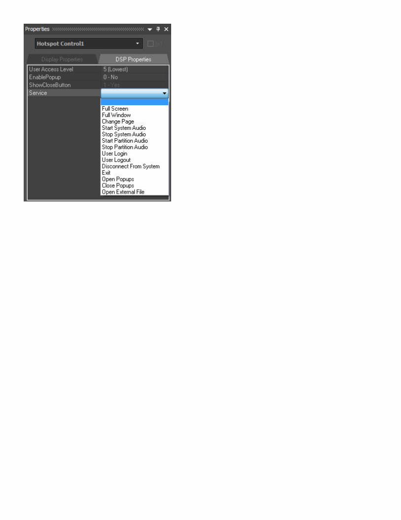
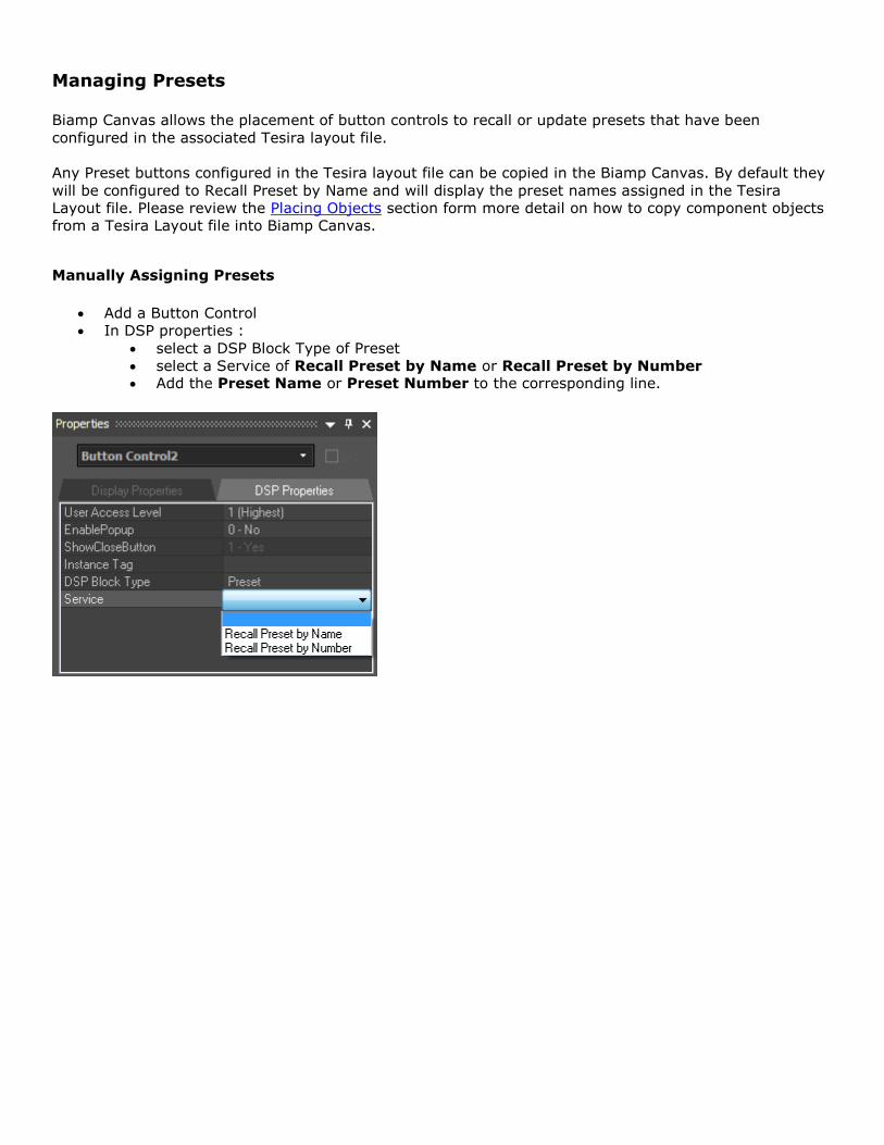
Managing Presets
Biamp Canvas allows the placement of button controls to recall or update presets that have been
configured in the associated Tesira layout file.
Any Preset buttons configured in the Tesira layout file can be copied in the Biamp Canvas. By default they
will be configured to Recall Preset by Name and will display the preset names assigned in the Tesira
Layout file. Please review the Placing Objects section form more detail on how to copy component objects
from a Tesira Layout file into Biamp Canvas.
Manually Assigning Presets
Add a Button Control
In DSP properties :
select a DSP Block Type of Preset
select a Service of Recall Preset by Name or Recall Preset by Number Add the Preset Name or Preset Number to the corresponding line.
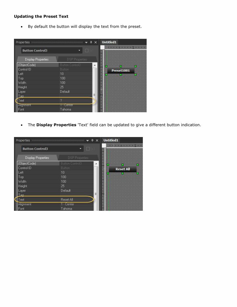
Updating the Preset Text
By default the button will display the text from the preset.
The Display Properties 'Text' field can be updated to give a different button indication.
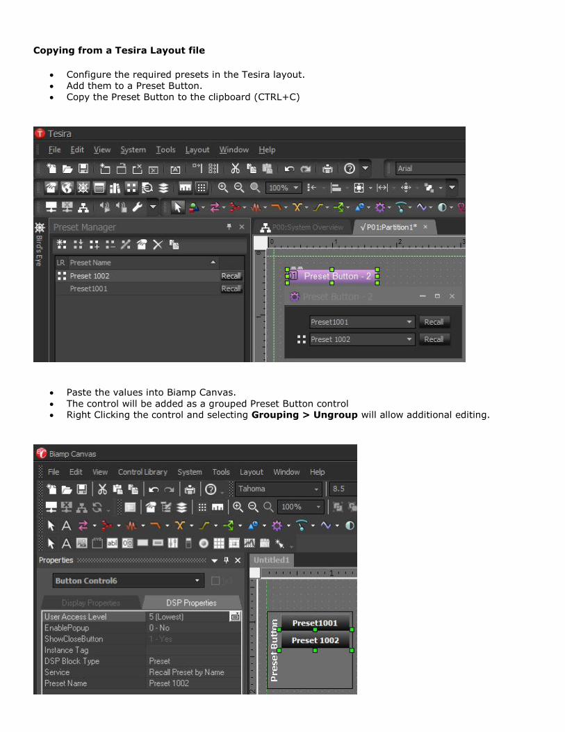
Copying from a Tesira Layout file
Configure the required presets in the Tesira layout.
Add them to a Preset Button.
Copy the Preset Button to the clipboard (CTRL+C)
Paste the values into Biamp Canvas.
The control will be added as a grouped Preset Button control Right Clicking the control and selecting Grouping > Ungroup will allow additional editing.
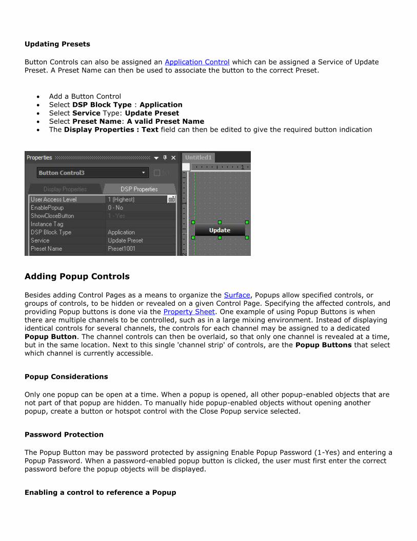
Updating Presets
Button Controls can also be assigned an Application Control which can be assigned a Service of Update
Preset. A Preset Name can then be used to associate the button to the correct Preset.
Add a Button Control
Select DSP Block Type : Application
Select Service Type: Update Preset
Select Preset Name: A valid Preset Name The Display Properties : Text field can then be edited to give the required button indication
Adding Popup Controls
Besides adding Control Pages as a means to organize the Surface, Popups allow specified controls, or
groups of controls, to be hidden or revealed on a given Control Page. Specifying the affected controls, and
providing Popup buttons is done via the Property Sheet. One example of using Popup Buttons is when
there are multiple channels to be controlled, such as in a large mixing environment. Instead of displaying
identical controls for several channels, the controls for each channel may be assigned to a dedicated
Popup Button. The channel controls can then be overlaid, so that only one channel is revealed at a time,
but in the same location. Next to this single 'channel strip' of controls, are the Popup Buttons that select
which channel is currently accessible.
Popup Considerations
Only one popup can be open at a time. When a popup is opened, all other popup-enabled objects that are
not part of that popup are hidden. To manually hide popup-enabled objects without opening another
popup, create a button or hotspot control with the Close Popup service selected.
Password Protection
The Popup Button may be password protected by assigning Enable Popup Password (1-Yes) and entering a
Popup Password. When a password-enabled popup button is clicked, the user must first enter the correct
password before the popup objects will be displayed.
Enabling a control to reference a Popup
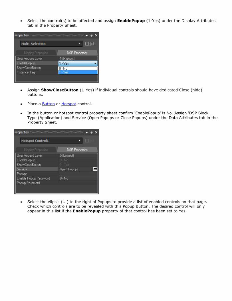
Select the control(s) to be affected and assign EnablePopup (1-Yes) under the Display Attributes
tab in the Property Sheet.
Assign ShowCloseButton (1-Yes) if individual controls should have dedicated Close (hide)
buttons.
Place a Button or Hotspot control.
In the button or hotspot control property sheet confirm 'EnablePopup' is No. Assign 'DSP Block
Type (Application) and Service (Open Popups or Close Popups) under the Data Attributes tab in the
Property Sheet.
Select the elipsis (...) to the right of Popups to provide a list of enabled controls on that page.
Check which controls are to be revealed with this Popup Button. The desired control will only
appear in this list if the EnablePopup property of that control has been set to Yes.
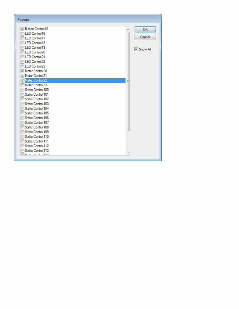
Testing Control Surfaces
Test Mode may be entered at any time during the design process, from either the Layout Menu or the
Layout Bar. Test Mode temporarily disables all editing of the control surface, closes the Property Sheet
and Control Library (if open), and allows the operational behavior of controls to be tested 'off-line'.
Ctrl+F9 may be used to toggle Full Screen while still in Test Mode. Entering Test Mode will also produce a
prompt to save any changes that may have been made to the file. Please see the Keyboard Shortcuts
section for more details.
Use of Gang Groups
Basics
Gang Groups allow multiple controls of the same type to have combined operation. Each block can become
a Gang master or slave, with the possibility of having multiple gang masters within a Gang Group.
Controls with the gang group feature include:
Edit controls (Floating point type only)
Edit spin controls (For those having dB values only)
Toggle buttons
Faders
Graph controls
Creating Gang Groups
1. Select Edit Gang Groups from the Layout menu or toolbar icon.
2. In the Gang Groups dialog box, click on Add to create a Gang Group. Label it as required.
3. When a new Gang Group is created, a toggle button control appears on the control surface. It is
assigned to enable or disable the ganging behavior of all controls within a Gang Group.
4. In order to assign a control block to a gang group, open its Property Sheet and select a compatible
Gang Group from the Gang Group drop-down menu. If no Gang Groups are available, then the
control block might not have a DSP block type specified, or it might not be a control block that
supports Gang Groups (see above).
5. Set one or multiple Gang Masters from the property sheet. When ganging is enabled, control blocks
that are Gang Masters will cause all other control blocks in the Gang Group to track any changes.
Changes to control blocks that are not Gang Masters will not cause changes to other control blocks
in the Gang Group.
All control blocks within a Gang Group require an Instance ID in order to work properly in test mode.

Sending Control Surfaces
The Biamp Canvas software is used to configure a control surface based on a audio layout
that has been built and compiled using Tesira Software. Once the Configuration file is loaded
to a Tesira system the Biamp Canvas software can connect to the Tesira devices and send
the Surface. Please review the Preparing Control Surfaces section for more details.
User access to the relevant Tesira hardware and the correct network layout are required.
More details are available in the Accessing Control Surfaces and Network Considerations
sections.
System Network Considerations
Control Computer
Biamp Canvas software is designed to be installed on a control computer in a client facility.
The computer must have a 100 BaseT Network Interface Card (NIC) installed, and the
computer must be connected to a network that has access to the Tesira servers' Ethernet
control ports.
The computer must have an IP configuration (IP address, subnet mask, default gateway,
and DNS servers) that allows it to communicate with the IP address(es) of the Tesira
server(s).
Control Network
The Control Network is used for communications between Tesira devices, as well as
communication from Tesira servers to computers running Tesira software. The Control
Network connections on a Tesira server reside on its SNC-1 or SNC-2 card.
Server-class devices
All Tesira server-class devices (SERVER and SERVER-IO) include an SNC-1 or SNC-2 card
for connection to the Control Network. The SNC-1/SNC-2 card has a Primary and Secondary
network port, and currently the Secondary network port is inactive. The Control Network
port is a Gigabit network port, and is compatible with 10Mbit/s, 100Mbit/s, and Gigabit
networks.
Control Network interfaces are assigned both an IP address and a hostname. Tesira servers
are configured by default with a unique hostname derived from a combination of the device
type and serial number. Tesira servers are not configured by default with a default IP
address, instead they are set to obtain an IP address automatically from a DHCP server. The
hostname and IP address of a Tesira server can be modified via Tesira software.
Control Networks can span across subnets, but doing so requires the use of either an
external DNS server to resolve hostnames to IP addresses, or the use of a Host Table. When
a Host Table is used, server IP addresses must be assigned statically to ensure the IP
address does not change. For more information, consult the Help system in Tesira software.
Expander-class devices
Audio Expander-class devices (EX-IN, EX-OUT, EX-IO, EX-MOD) have a single network port,
which often shares responsibility for both AVB and Control Network communications. For
this reason, Expander devices must be able to access both the Control Network and the AVB
Network.
EX-LOGIC and TEC-1 devices have a single network port which shares the Control Network
communications so these devices will require access to the Control Network Only.
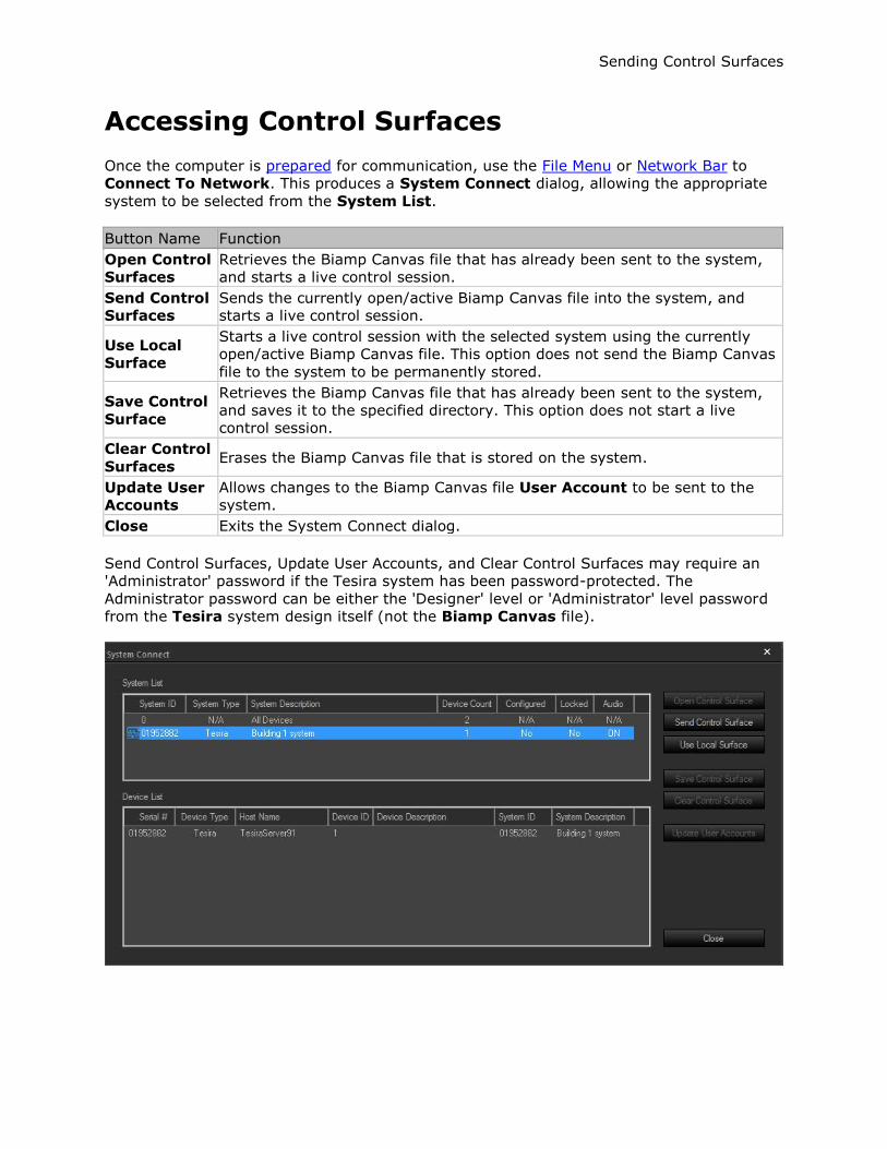
Sending Control Surfaces
Accessing Control Surfaces
Once the computer is prepared for communication, use the File Menu or Network Bar to
Connect To Network. This produces a System Connect dialog, allowing the appropriate
system to be selected from the System List.
Button Name Function
Open Control
Surfaces
Retrieves the Biamp Canvas file that has already been sent to the system,
and starts a live control session.
Send Control
Surfaces
Sends the currently open/active Biamp Canvas file into the system, and
starts a live control session.
Use Local
Surface
Starts a live control session with the selected system using the currently
open/active Biamp Canvas file. This option does not send the Biamp Canvas
file to the system to be permanently stored.
Save Control
Surface
Retrieves the Biamp Canvas file that has already been sent to the system,
and saves it to the specified directory. This option does not start a live
control session.
Clear Control
Surfaces Erases the Biamp Canvas file that is stored on the system.
Update User
Accounts
Allows changes to the Biamp Canvas file User Account to be sent to the
system.
Close Exits the System Connect dialog.
Send Control Surfaces, Update User Accounts, and Clear Control Surfaces may require an
'Administrator' password if the Tesira system has been password-protected. The
Administrator password can be either the 'Designer' level or 'Administrator' level password
from the Tesira system design itself (not the Biamp Canvas file).
Preparing Control Surfaces
Typically, there will be one or more dedicated computers connected to the Network, with
Biamp Canvas software running, and user access to the control surface available via the
System Menu by Logging in or logging out. This requires that the control surface first be
sent to the relevant Tesira system.
The control surface is initially sent to the system by the Administrator, who can utilize
certain Application Controls to prepare the control surface for the end-user. These
Application Controls would have been included in the control surface design, and assigned to
a restricted User Access Level. The Administrator can use these controls to put the control
surface into a 'user mode' (such as Full Screen), which the end-user cannot exit from. The
Administrator will then Logout of the control surface, leaving it active on the computer(s)
for user Login or Logout.
Login/Logout may also be assigned to Application Controls on the control surface, which can
be made accessible to the end-user. Full Screen mode can be automatic whenever control
surfaces are opened or tested, as selected under Tools > General Options.
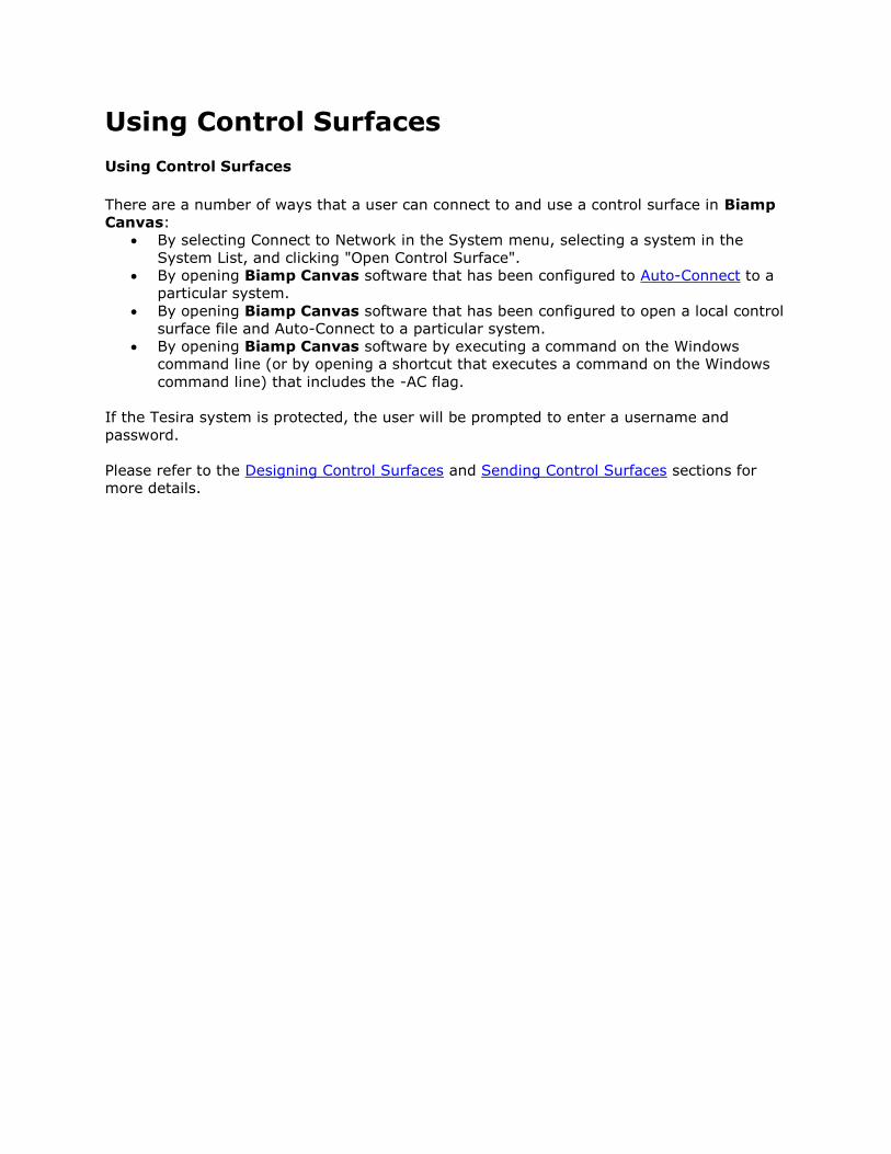
Using Control Surfaces
Using Control Surfaces
There are a number of ways that a user can connect to and use a control surface in Biamp
Canvas:
By selecting Connect to Network in the System menu, selecting a system in the
System List, and clicking "Open Control Surface".
By opening Biamp Canvas software that has been configured to Auto-Connect to a
particular system.
By opening Biamp Canvas software that has been configured to open a local control
surface file and Auto-Connect to a particular system.
By opening Biamp Canvas software by executing a command on the Windows
command line (or by opening a shortcut that executes a command on the Windows
command line) that includes the -AC flag.
If the Tesira system is protected, the user will be prompted to enter a username and
password.
Please refer to the Designing Control Surfaces and Sending Control Surfaces sections for
more details.