Embed Size (px)
Citation preview
Basic Principles of Design
How to make your websites and video graphics look more professional
Basic Principles
Contrast Repetition Alignment Proximity Limit your fonts
Contrast Making elements different from each
other to make them stand out. Guides your eye around the page - or to
where you want the viewer to look Adds visual interest and makes layout
more attractive to the viewer. Rule - if something is different from
another element, be sure to make it very different.
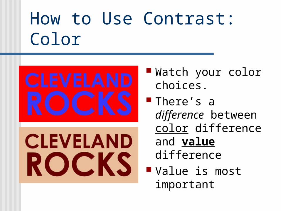
How to Use Contrast: Color
Watch your color choices.
There’s a difference between color difference and value difference
Value is most important
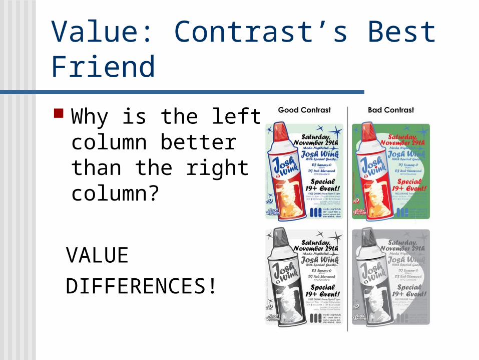
Value: Contrast’s Best Friend
Why is the left column better than the right column?
VALUE
DIFFERENCES!
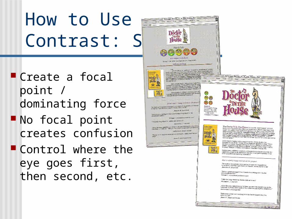
How to UseContrast: Size
Create a focal point / dominating force
No focal point creates confusion
Control where the eye goes first, then second, etc.
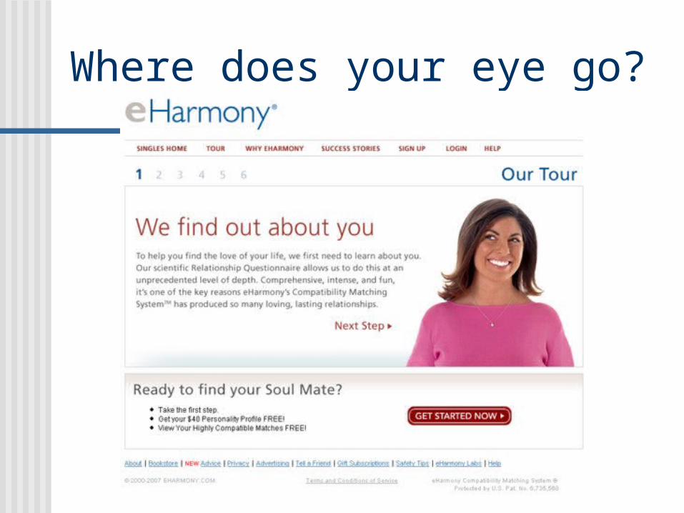
Where does your eye go?
Repetition Repeating certain elements that tie
everything together Each web page or super should look like
it belongs to the same site or video The heart of a theme Helps viewers navigate a site quicker
(they don’t have to re-learn where elements are)
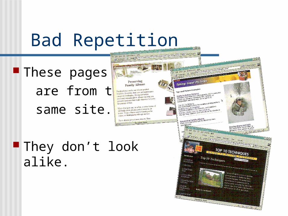
Bad Repetition
These pages
are from the
same site.
They don’t look alike.

Good Repetition Recurring fonts Recurring colors Recurring symbols Recurring placement
Pages don’t have to be exactly the same - only the elements that make them up
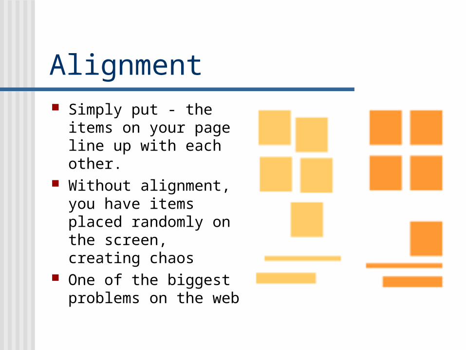
Alignment Simply put - the items on
your page line up with each other.
Without alignment, you have items placed randomly on the screen, creating chaos
One of the biggest problems on the web
What Alignment does creates order organizes page elements groups items creates visual connections
Good alignment is invisible - most readers won't consciously notice that everything is lined up neatly but they will feel it when things are out of alignment.
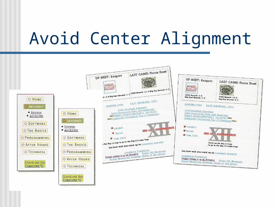
Avoid Center Alignment
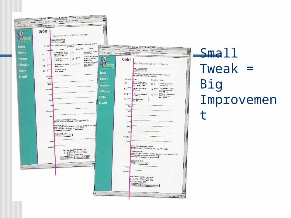
Small Tweak = Big Improvement
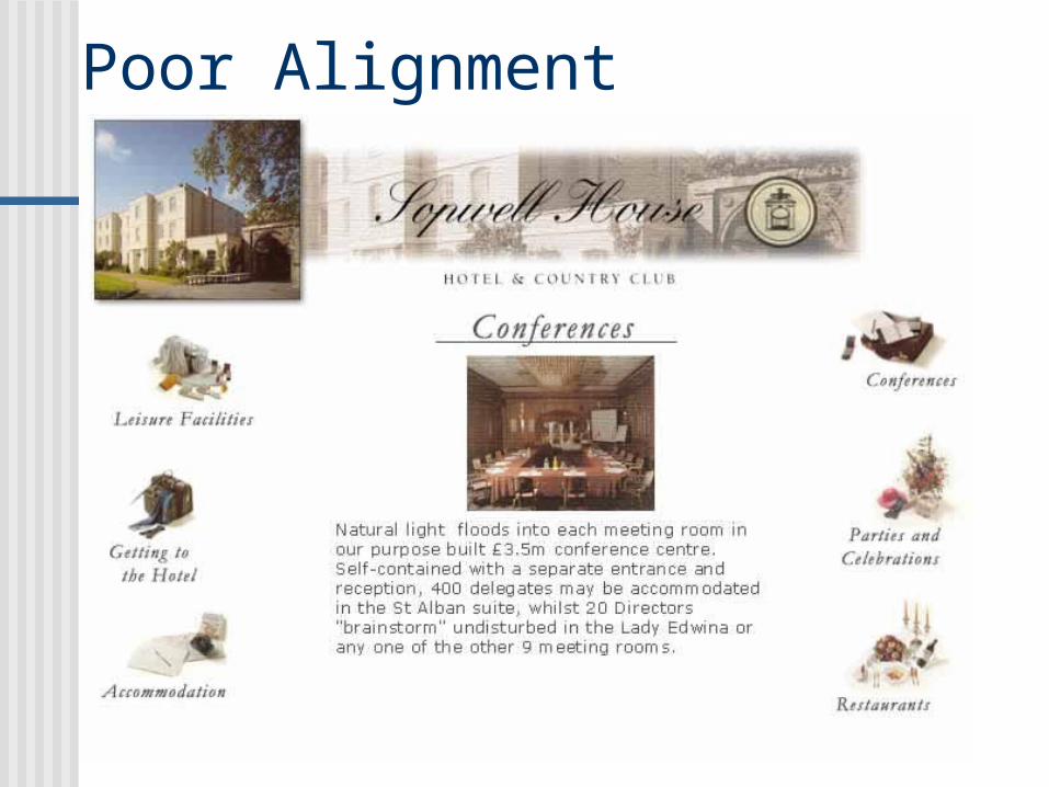
Poor Alignment
Proximity
Relationships that items develop when they’re close together
Used in conjunction with alignment Group things that deserve grouping
Subheads with block text Pictures with captions

Proximity: Grouping Examples
Limit Your Fonts! Good design is based around consistency. An easy way to achieve consistency is by
limiting artistic motifs (themes) on your site or in your video
Fonts are at the core of a theme Long story short: USE ONLY TWO FONTS! A third font is a rule breaker, but can be used
on purpose to make an element stand out
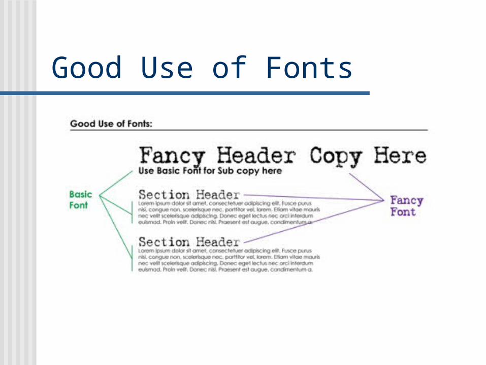
Good Use of Fonts
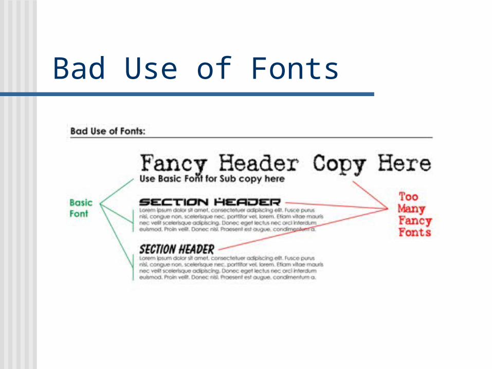
Bad Use of Fonts

Terrible Use of Fonts

One last thought on fonts
According to some experts…
If your fancy font looks modern or contemporary, then your basic font should be a sans-serif.
If your fancy font looks old fashioned, then use a serif font for your secondary font.
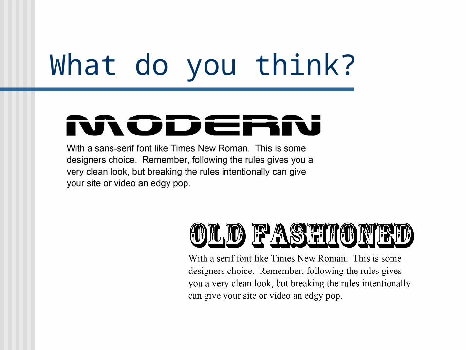
What do you think?